Thinking About Fall - Transitional Style - Tank Top

Before I get into the Pantone color series for Autumn/Winter 2021, I wanted to look at a few options for taking your summer pieces into fall. It seems like common sense to add layers as the weather begins to cool, at least for those of us in the northern part of the country. Even in warmer states, and countries, there are always those rainy days, or cooler evenings where having a layer or two makes a person more comfortable. The question I have to ask myself is why bother transitioning? Why not just change out our summer wardrobes for those fall pieces in deep burgundies and rusty oranges?

I think there are several reasons we need to transition from summer into fall. First of all, even those of us who love fall and enjoy the cooler weather, hate to see summer come to an end. The end of summer means shorter days, and the loss of the freedom and fun we associate with summer. Being able to run around without heavy coats, mittens and scarves is something most of us love being able to do. Summer also means vacations and beach days for many. It is hard to say goodbye to these wonderfully long, lazy days.

Another reason is that transitioning our wardrobes to fall slowly, allows us to extend the life of those summer pieces we love. The tank tops, shorts, light weight dresses and kimonos are still usable as the weather cools if we remember how much fun layering can be. I have already seen many bloggers and Instagram gals showing off these types of outfits.

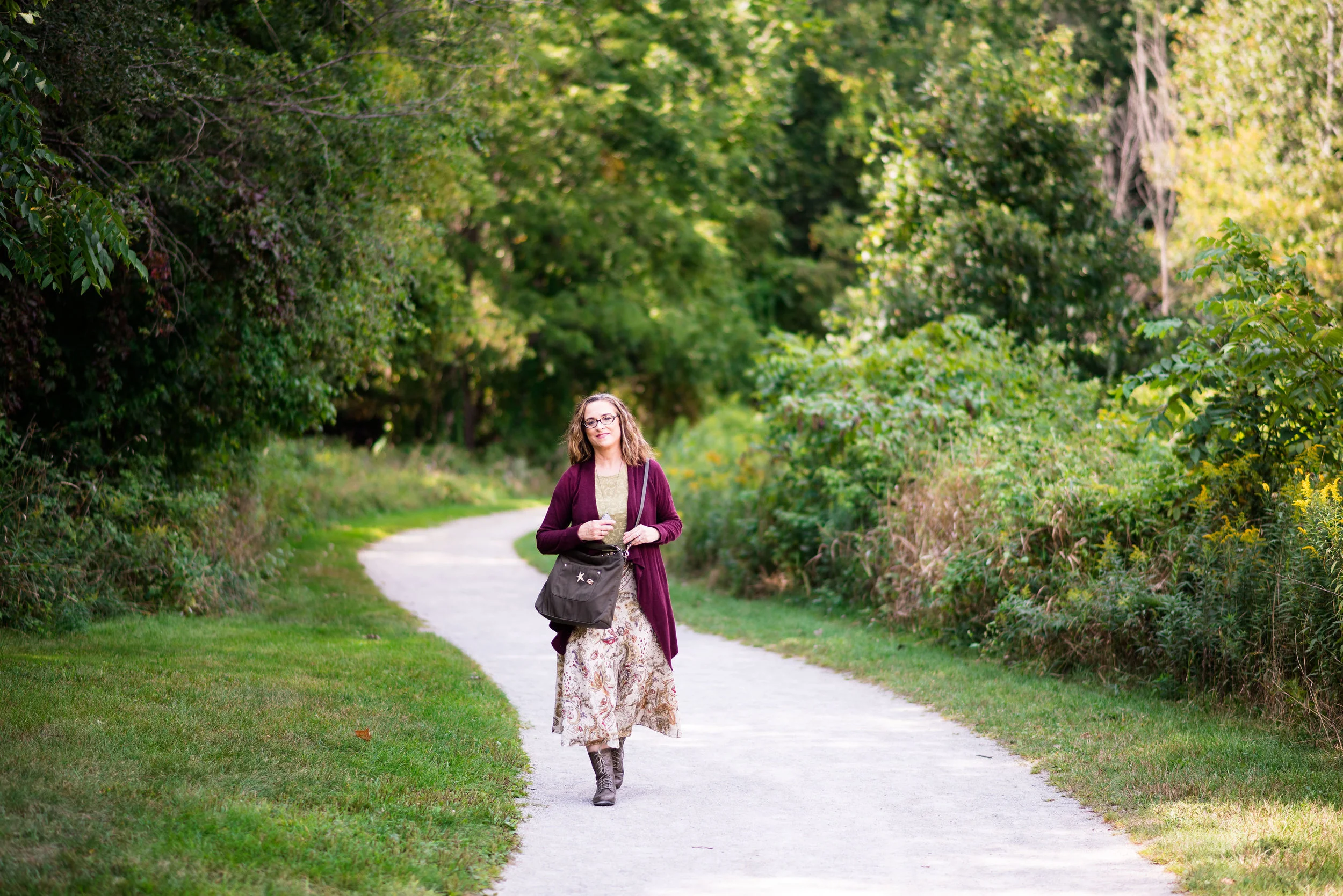
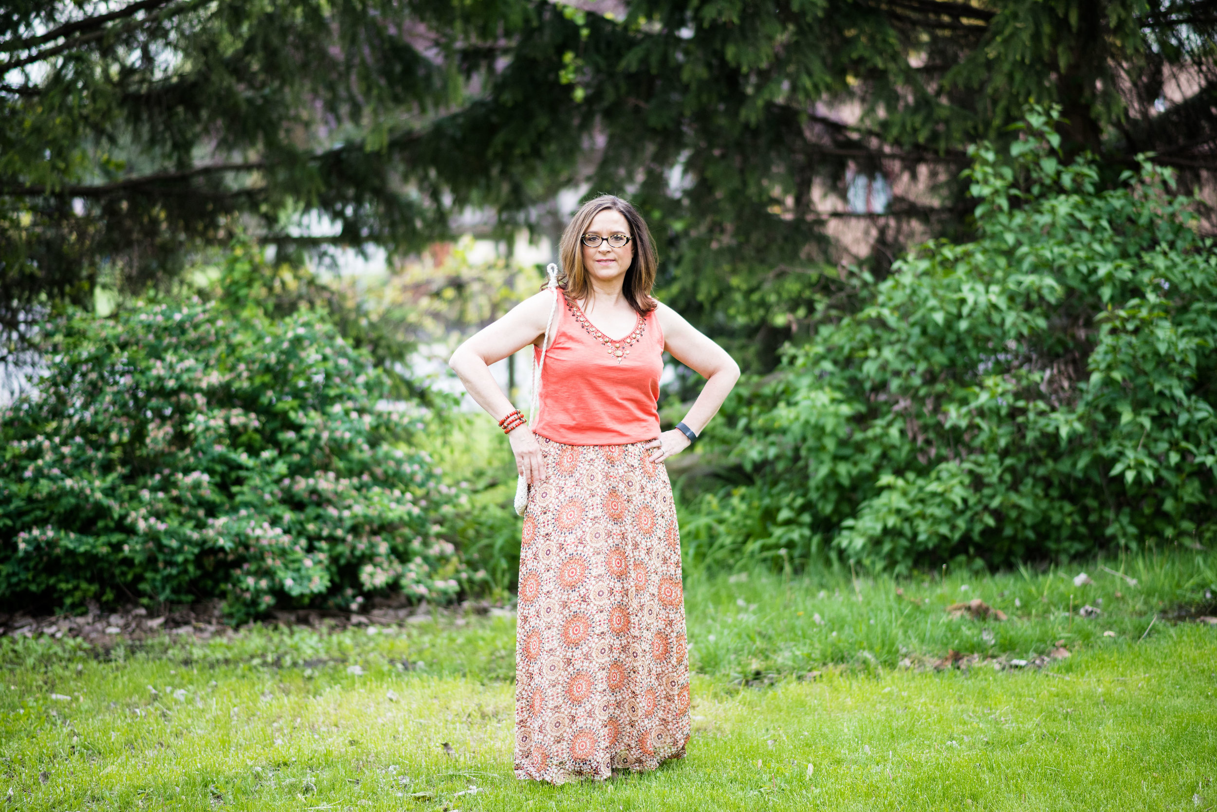
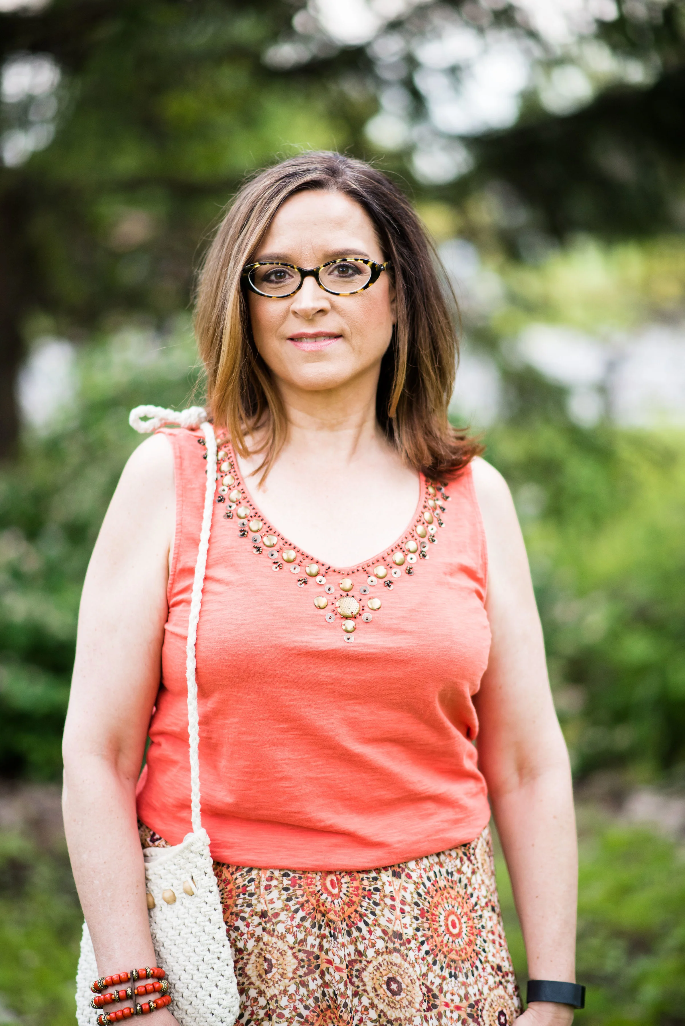
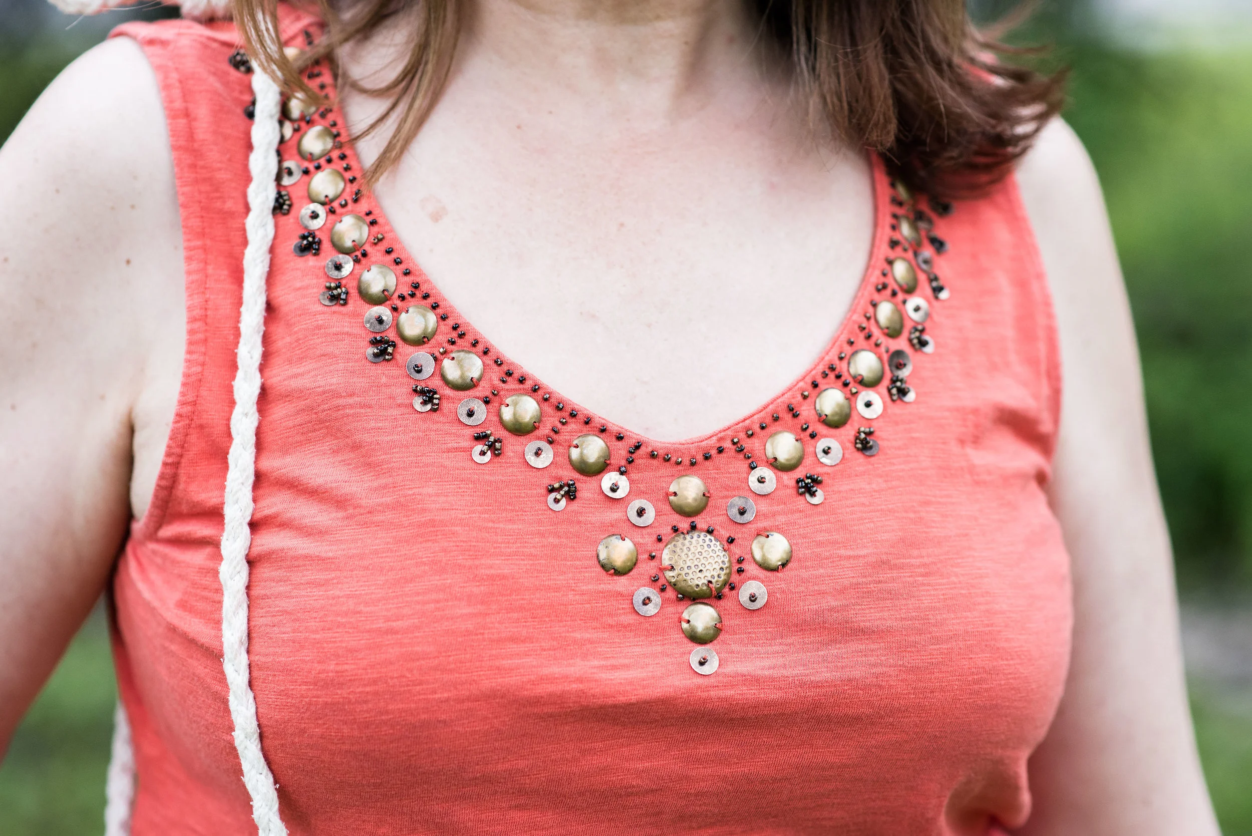
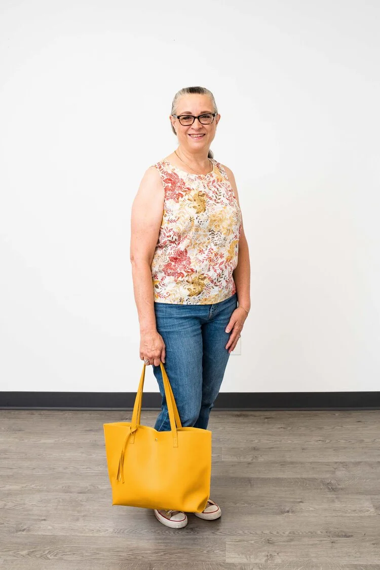
Today’s focus is on tank tops. This could be a simple ribbed tank, or something like this thrifted Christopher & Banks shell, that is more structured and workwear appropriate. Since I am not working, I am showing you a casual look that can easily be taken from summer into fall with three simple changes.

summerfalltransitionoutfit-7.jpg

My daughter hired an assistant and has started training her behind the camera. They asked if we could do pictures in the studio, to give her some practice, not only with outfit photos, but with indoor shots. I love outdoor photos because there are so many possibilities, but there is something to be said for studio photos, especially when the weather is hot, humid and buggy! We just used the wall as a backdrop, but it you follow Rebecca Trumbull Photography, you know she has all sorts of backdrop colors for headshots and puppy pictures.

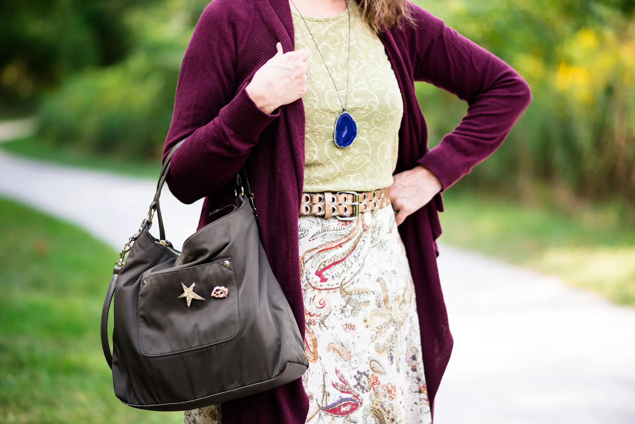
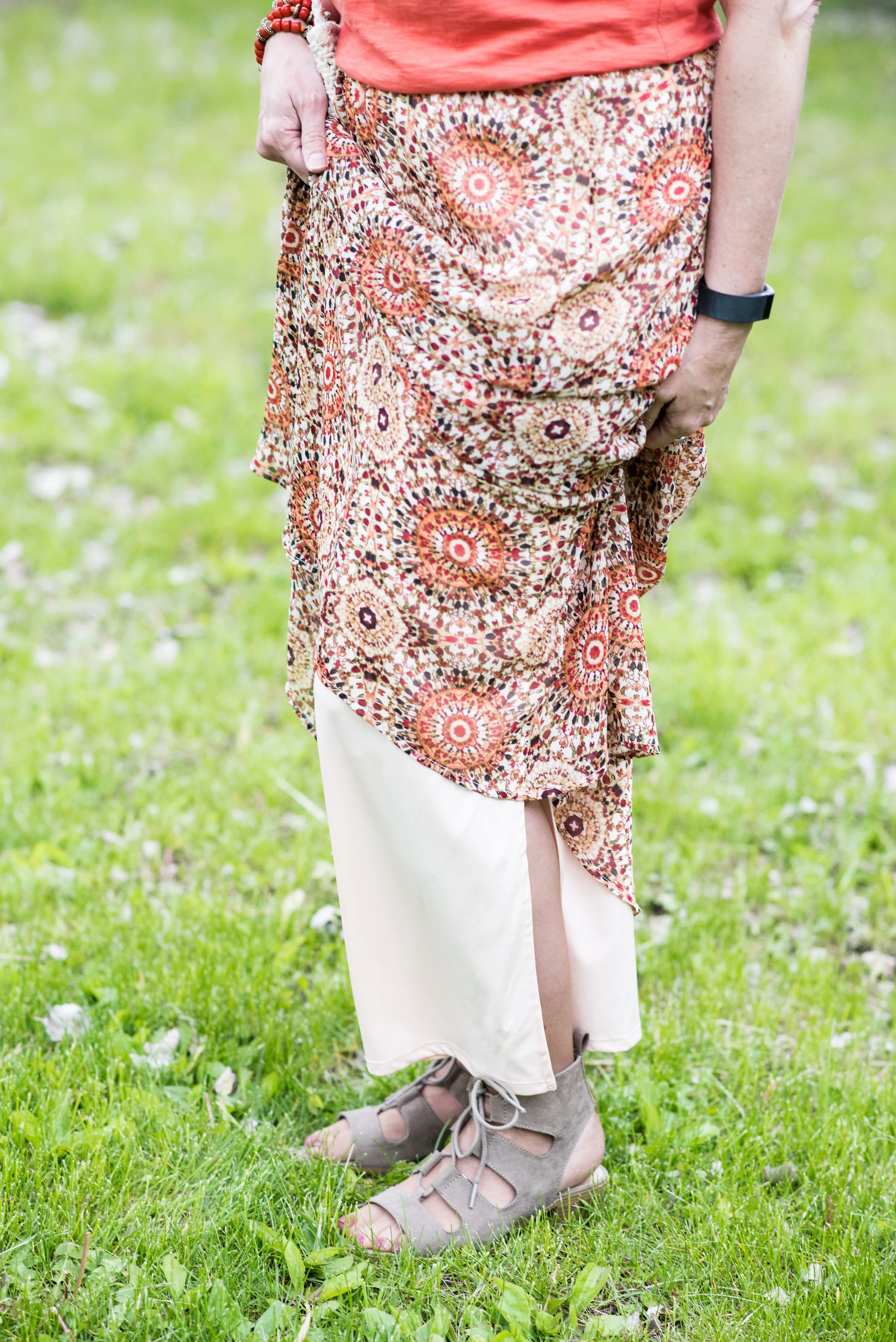
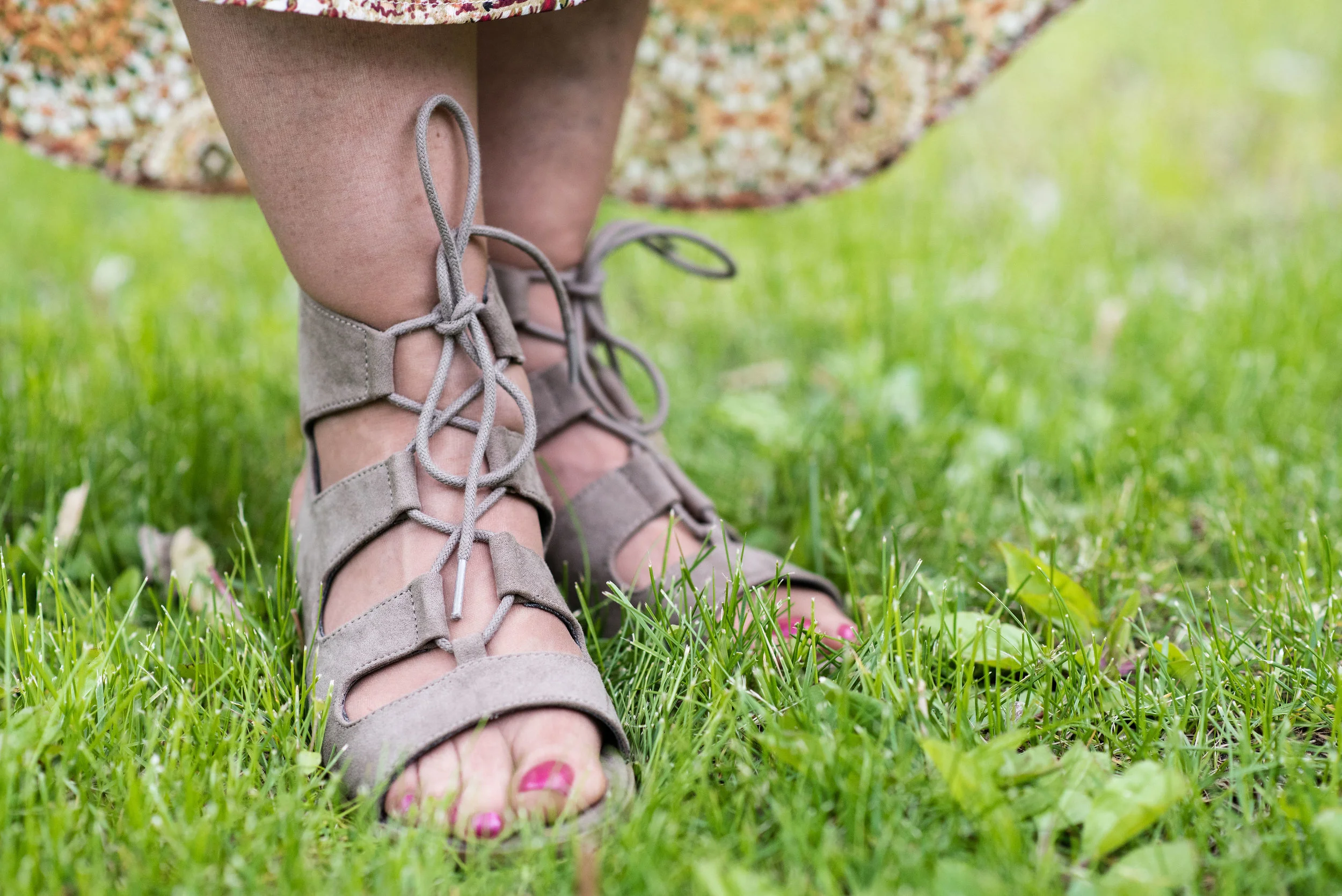
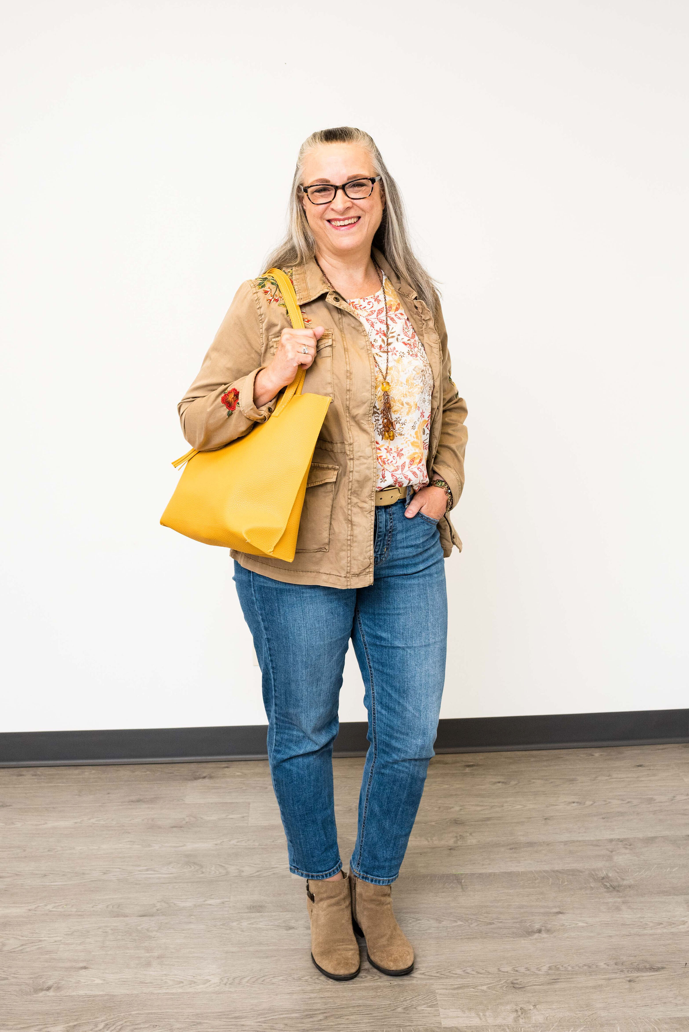
This outfit is easy, peasy. A pair of thrifted Merona boyfriend ankle jeans, a tank top, shoes, bag and a little jewelry. Except for the bag and jewelry, everything in this outfit is thrifted.

summerfalltransitionoutfit-2.jpg

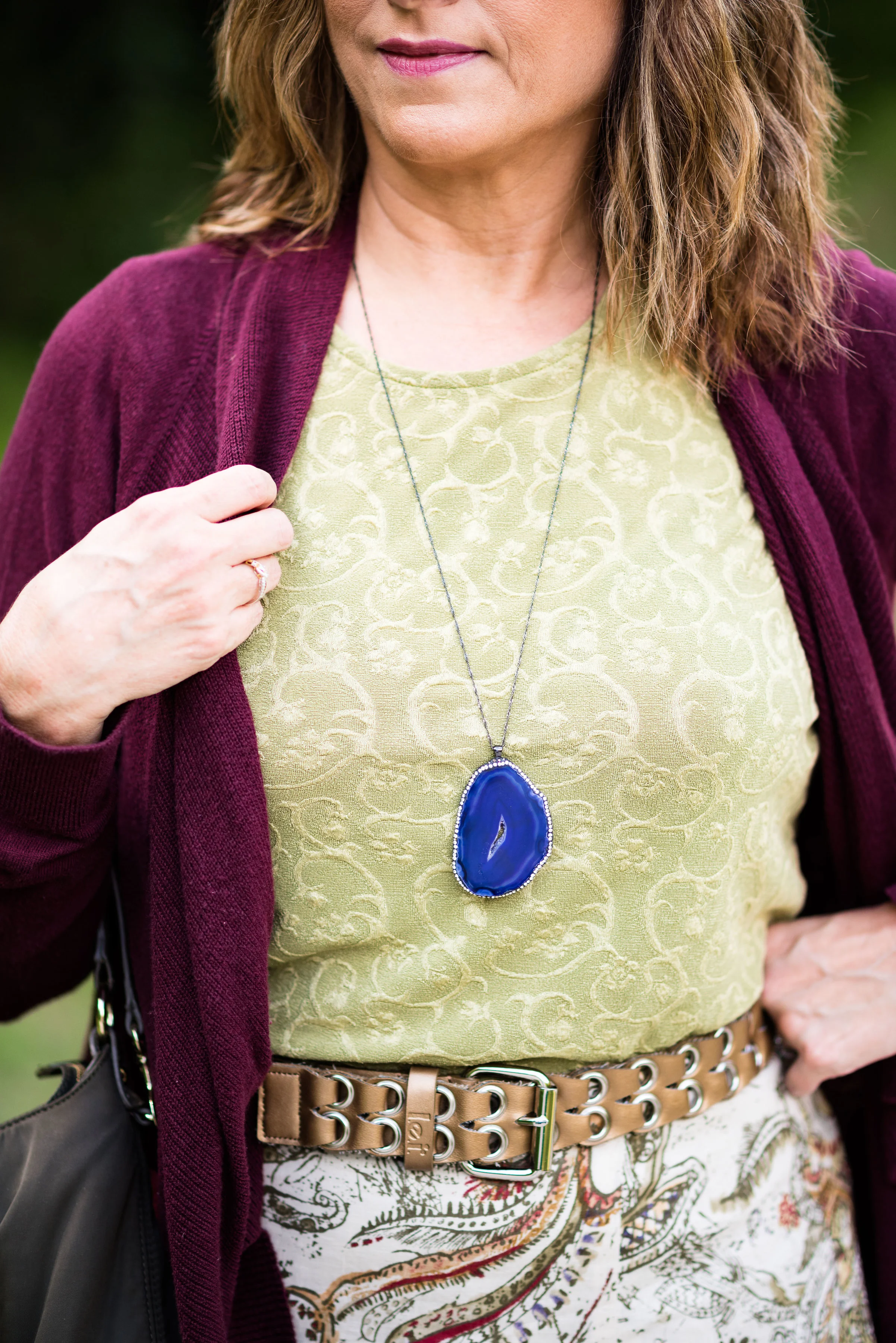
I chose this tank top for a few reasons. The first is, I have been trying to use pieces that I haven’t used in a while in my closet. I actually started keeping track of what I have worn. For my hanging pieces, I turn the hangers backwards after I wash and hang them back up. For my tees, I have started turning the ones I used neck line out, rather than fold out. It might seem silly, but it does help to see what I have been wearing and encourages me to choose other pieces.

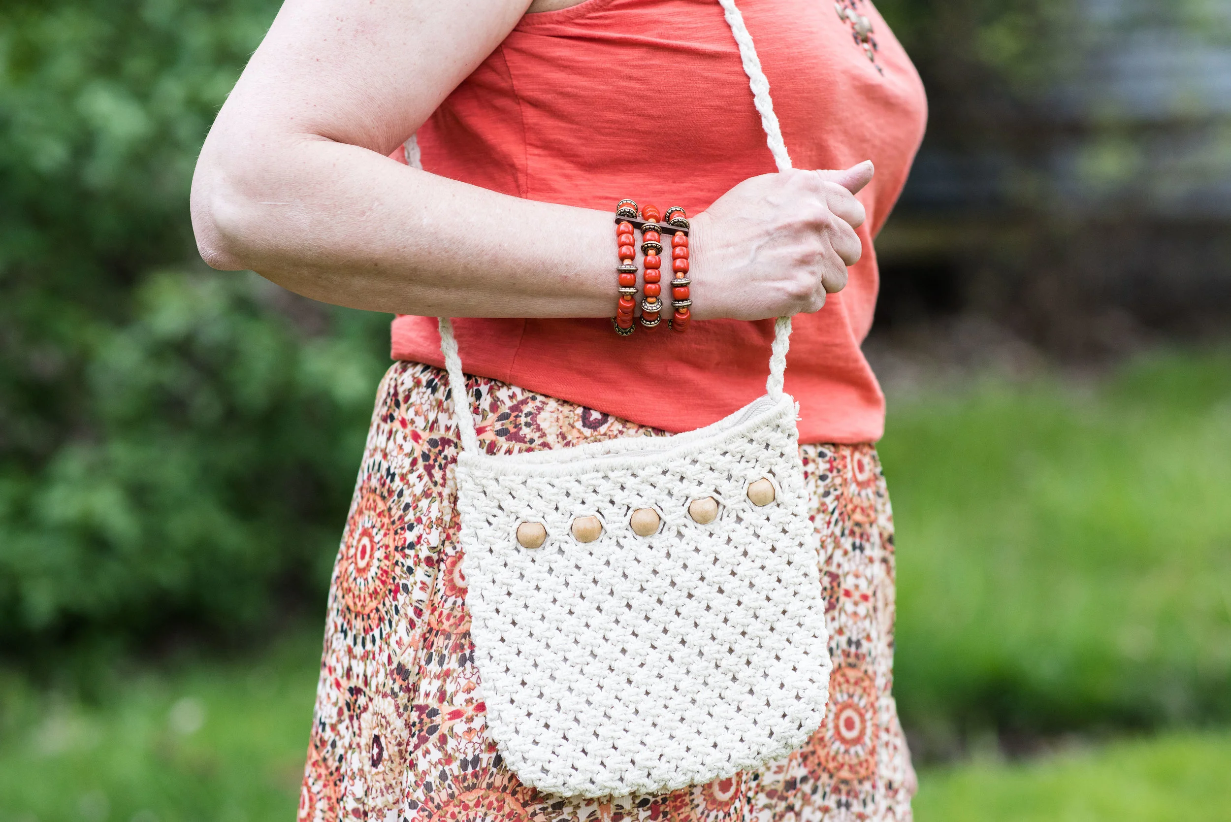
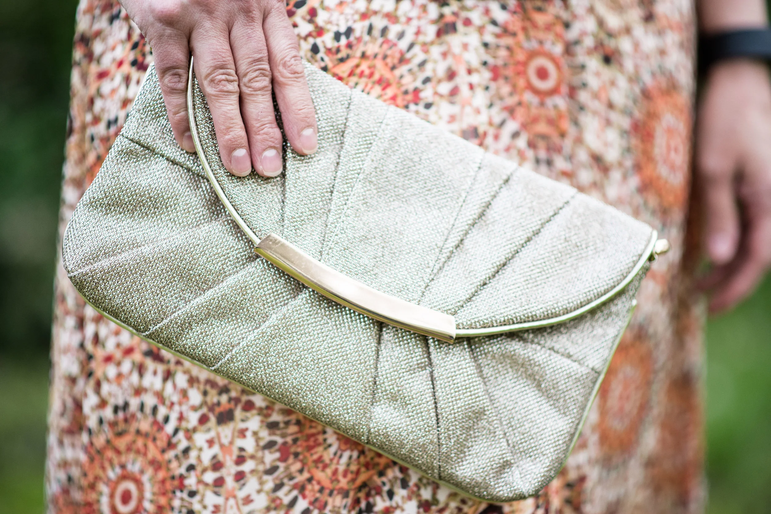
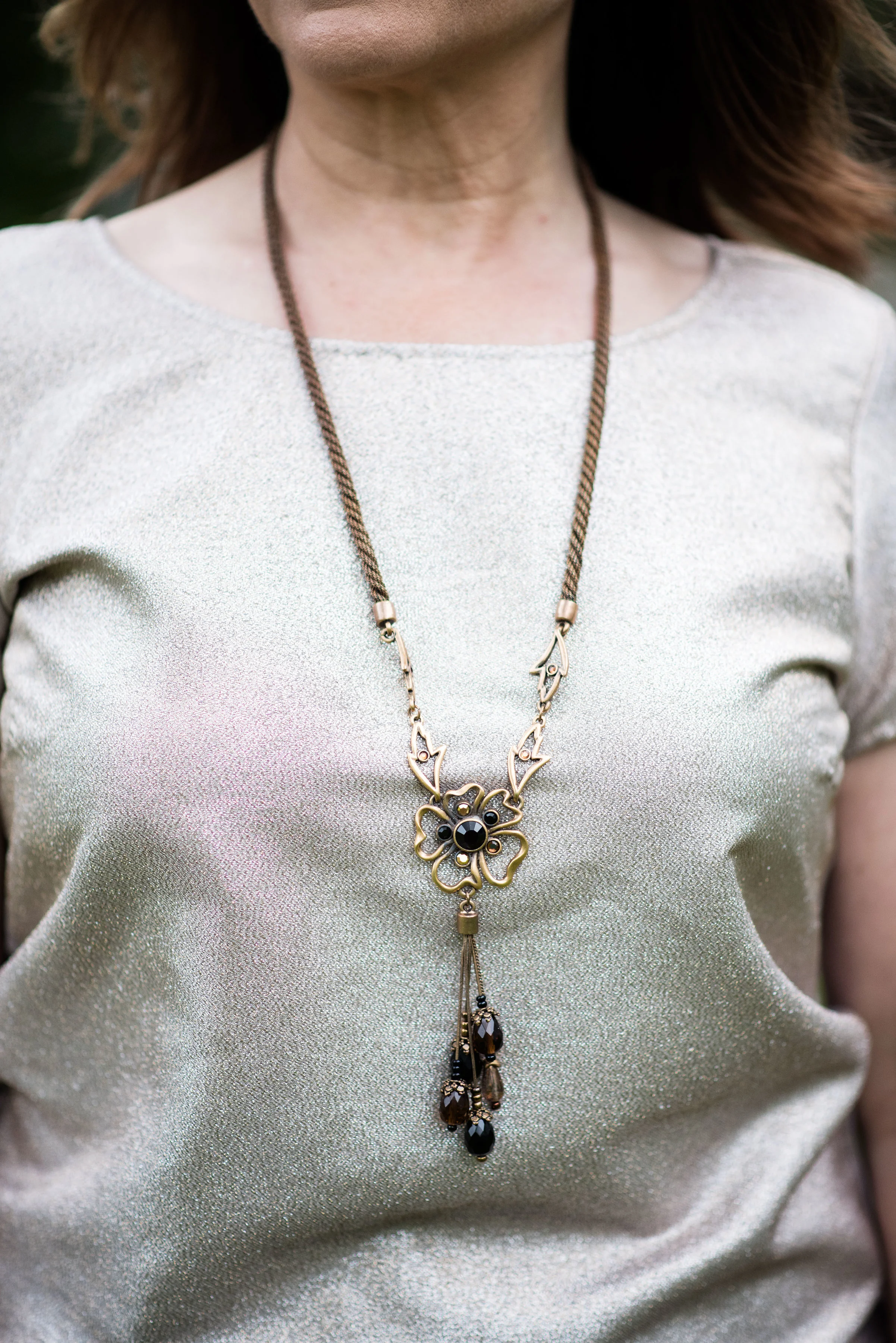
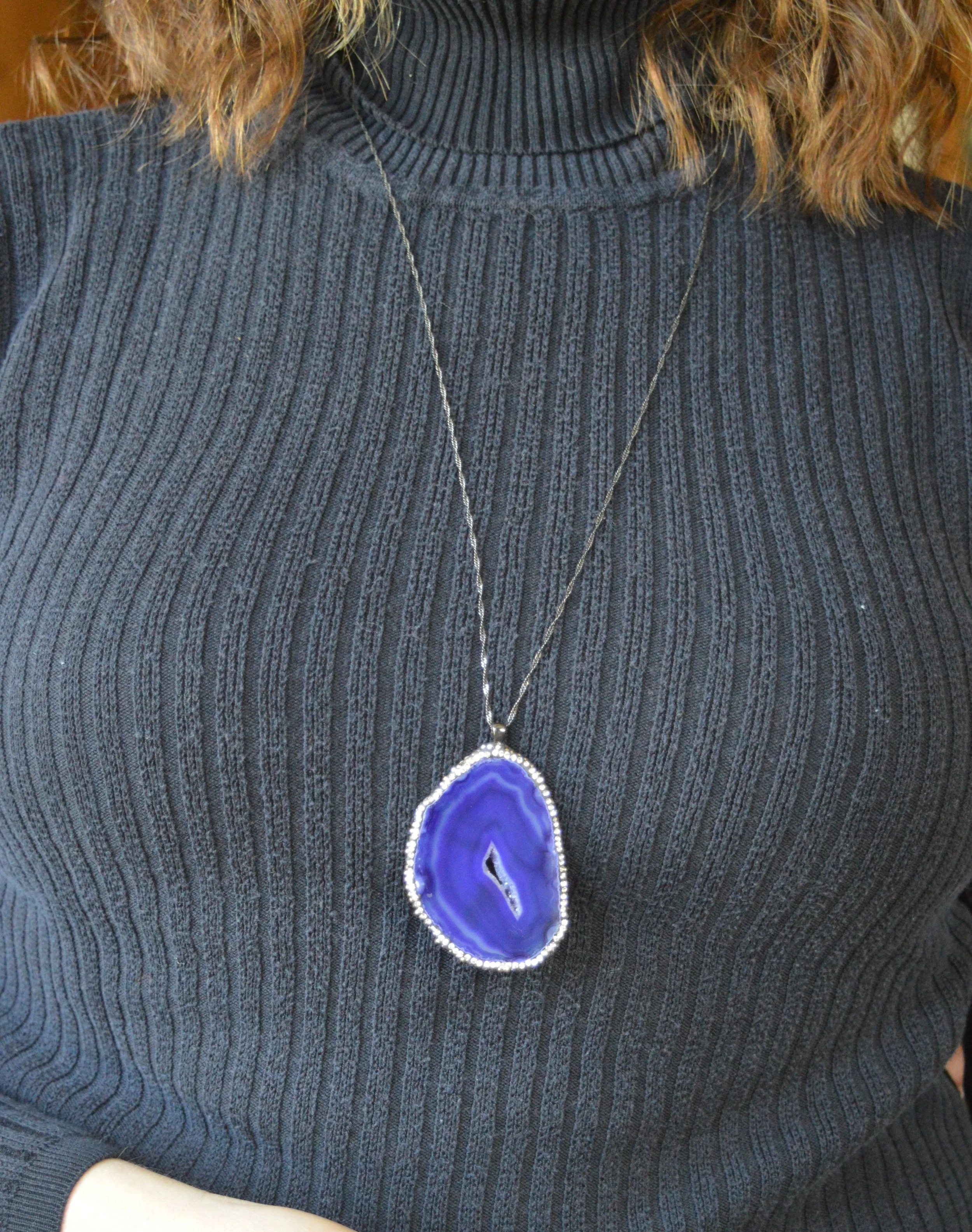
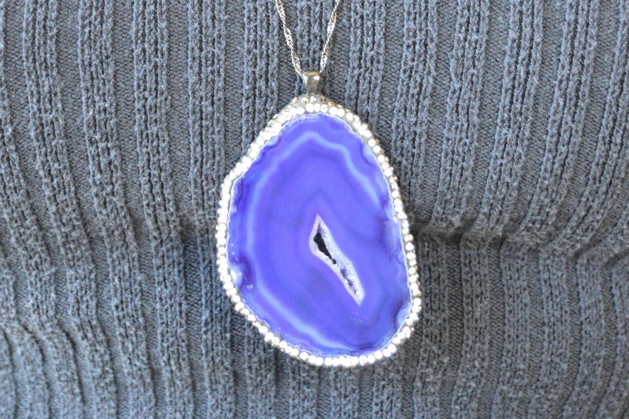
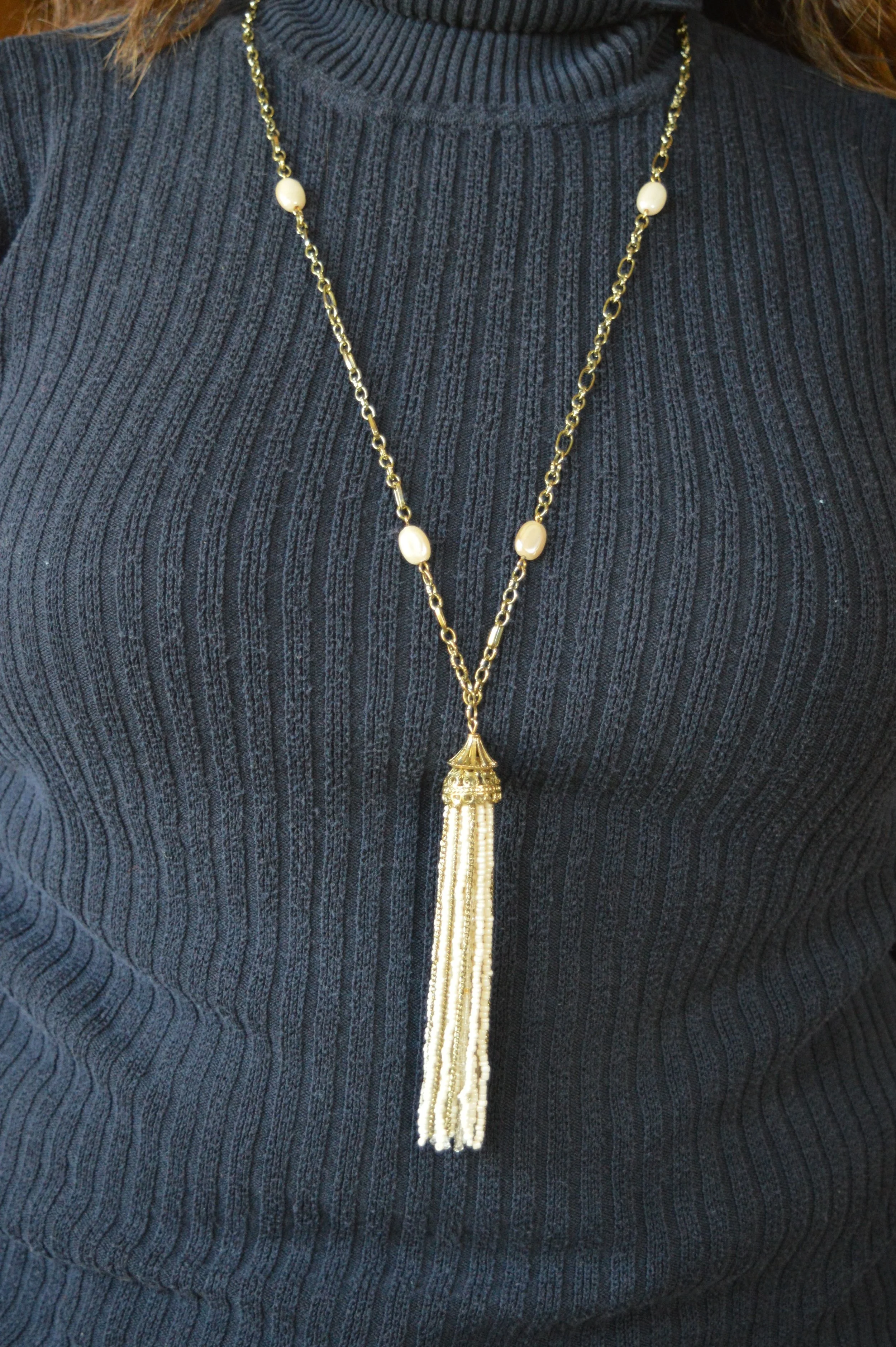
For this easy summer look, I kept my jewelry light and simple.

summerfalltransitionoutfit-9.jpg
summerfalltransitionoutfit-12.jpg

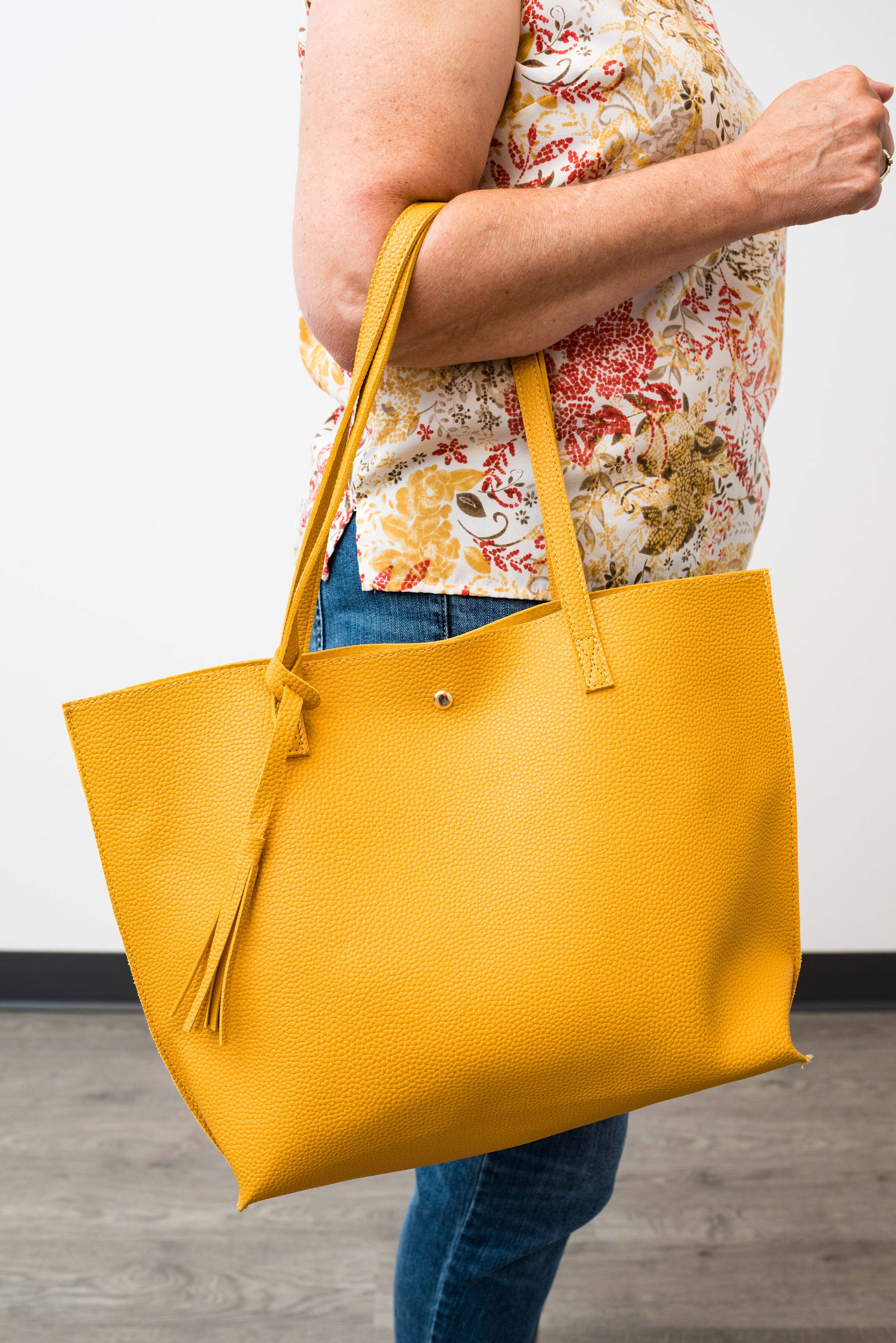
I wanted to chose a bag that could make the transition to fall, so this bright yellow tote was perfect.

summerfalltransitionoutfit-10.jpg

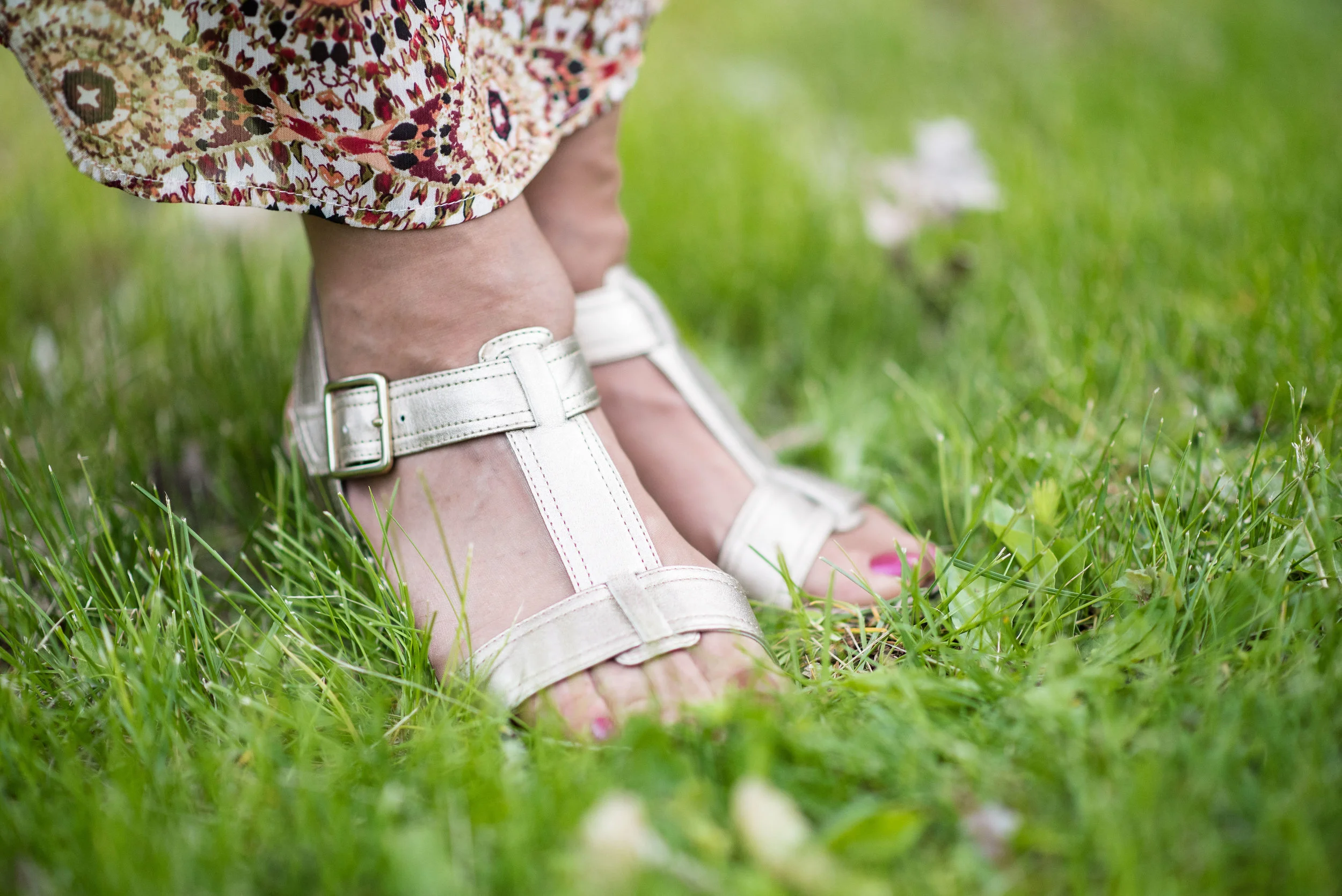
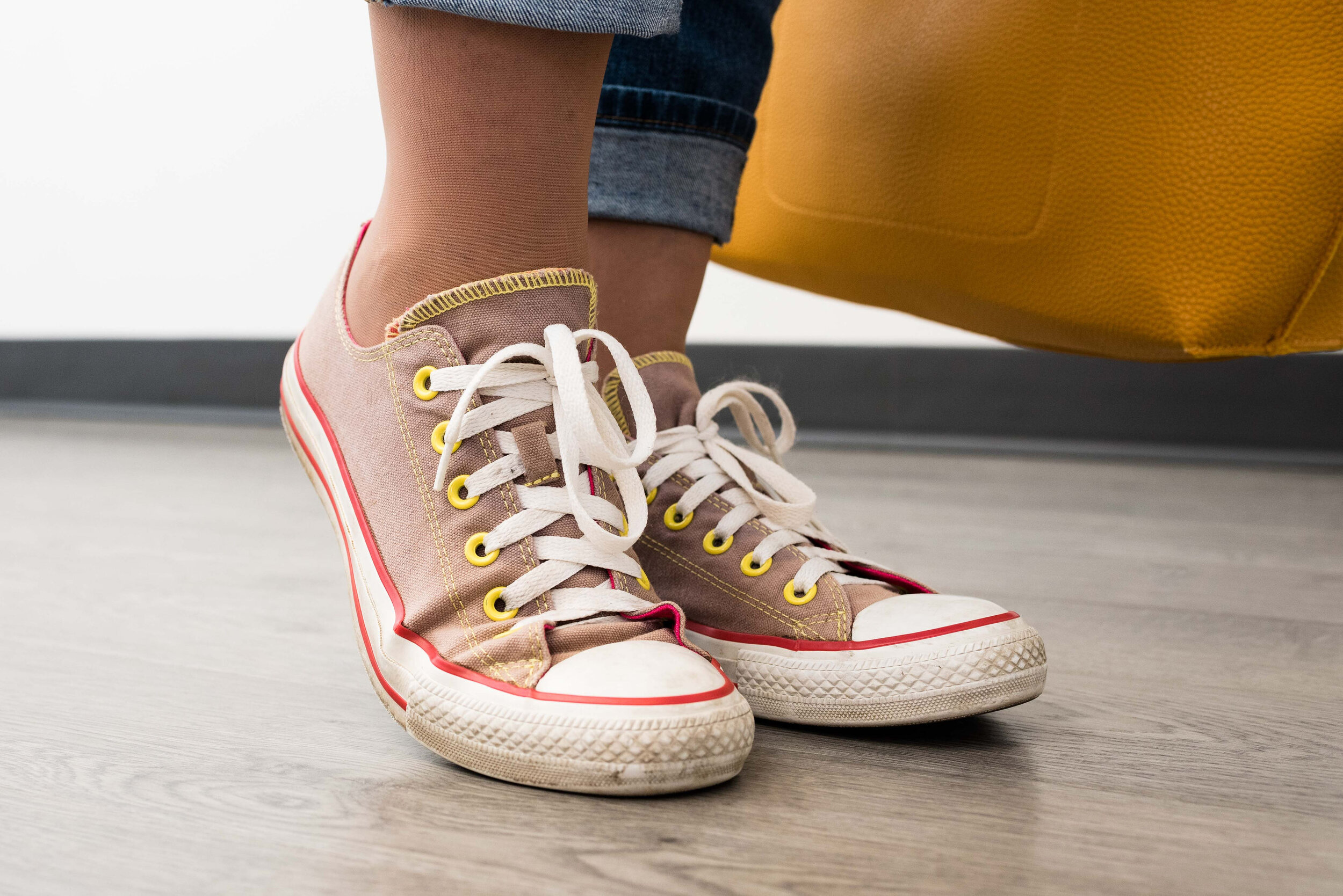
My sneakers are thrifted Converse. I washed them in the washer, but they need a little TLC to make them look pristine, which I haven’t done yet.

summerfalltransitionoutfit-11.jpg

In order to make an outfit like this ready for the cooler weather and changes that fall bring with it, you only need to do three simple things.

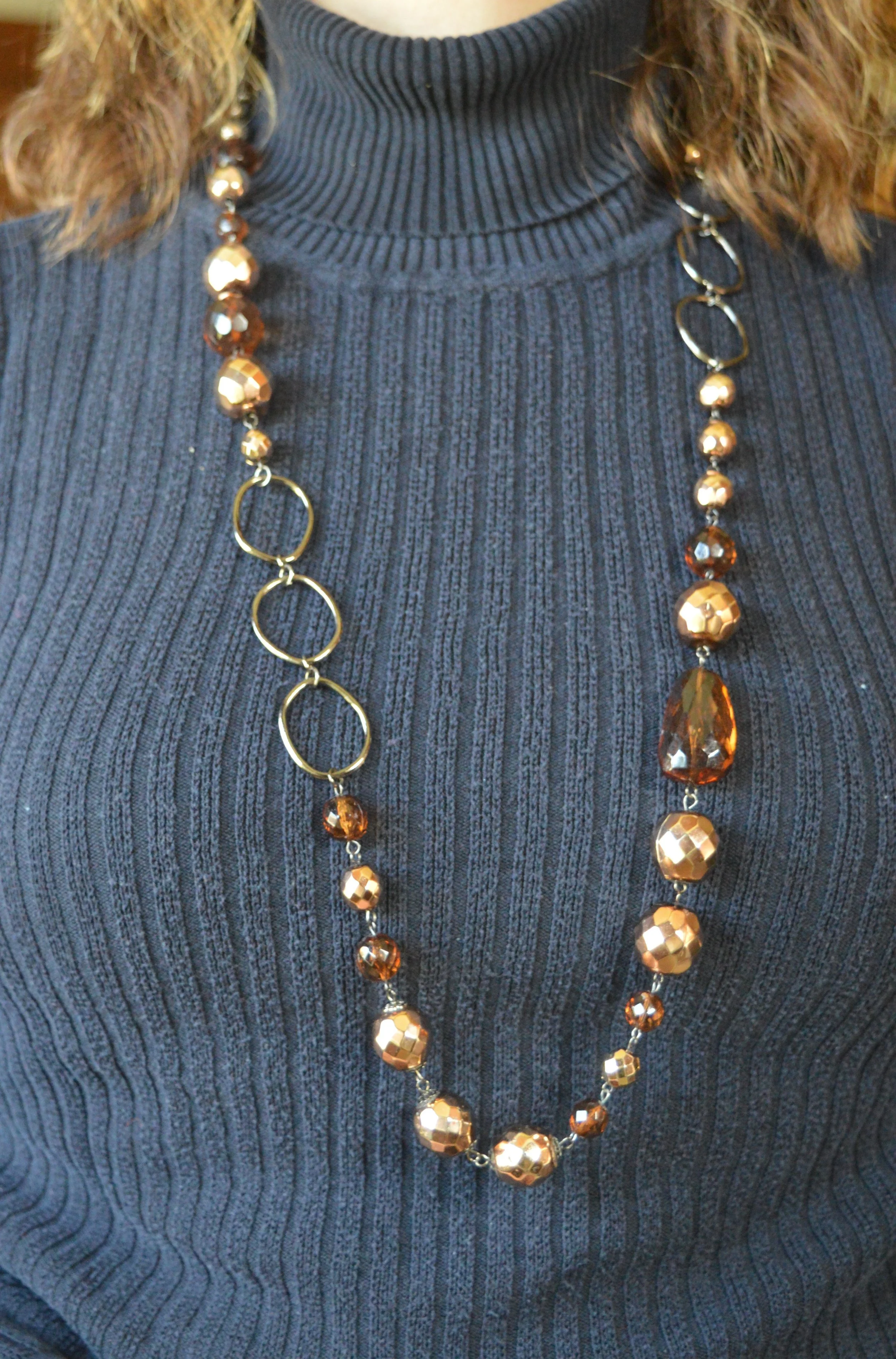
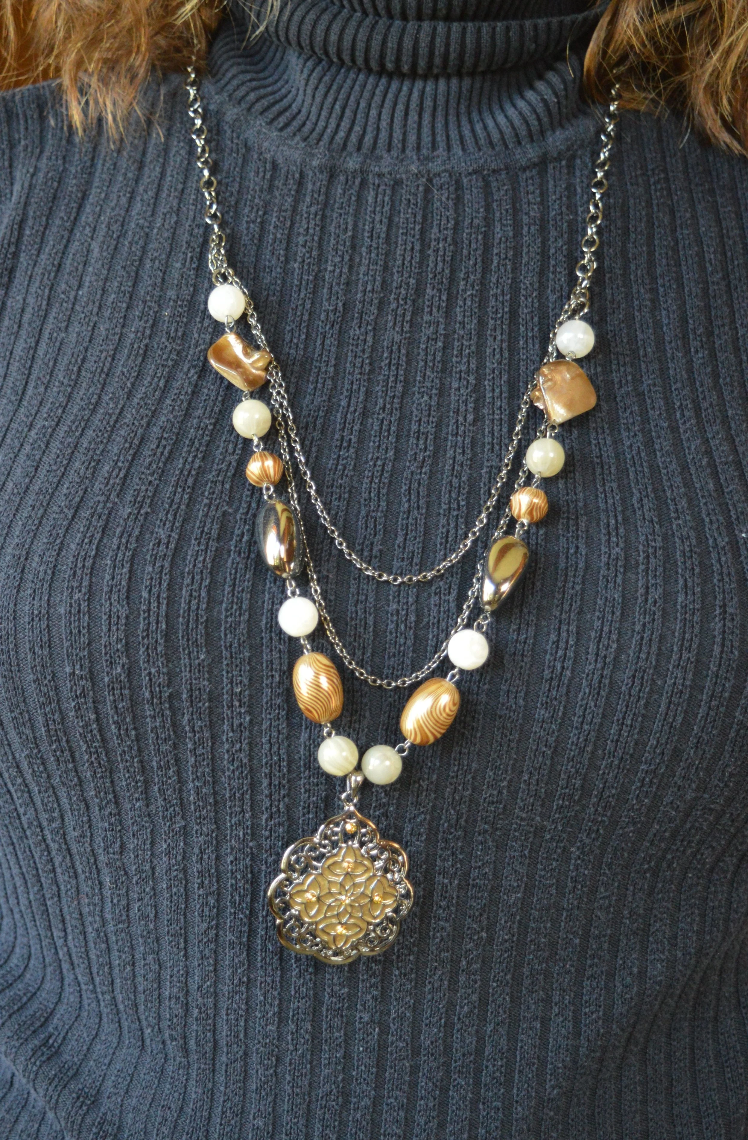
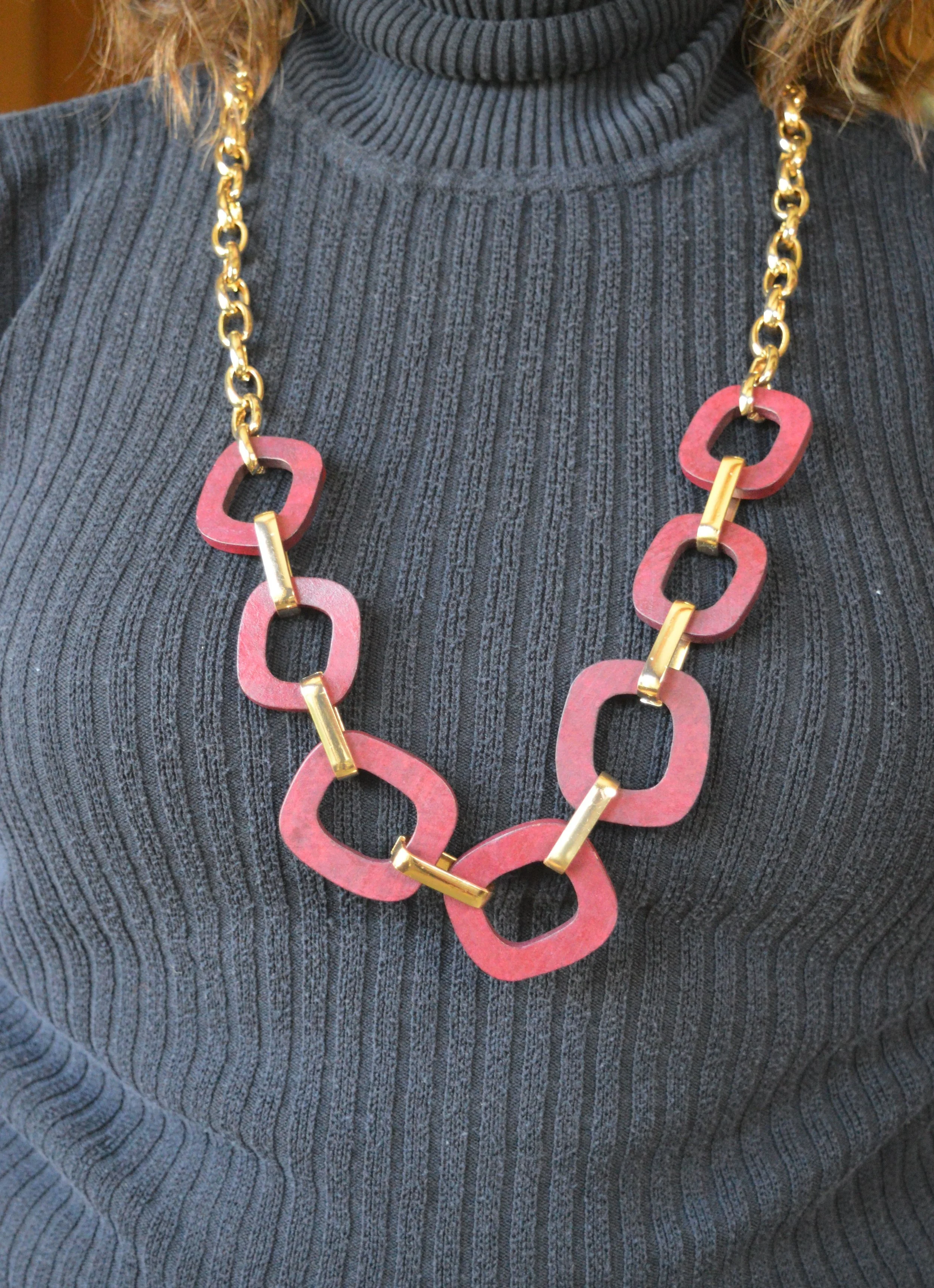
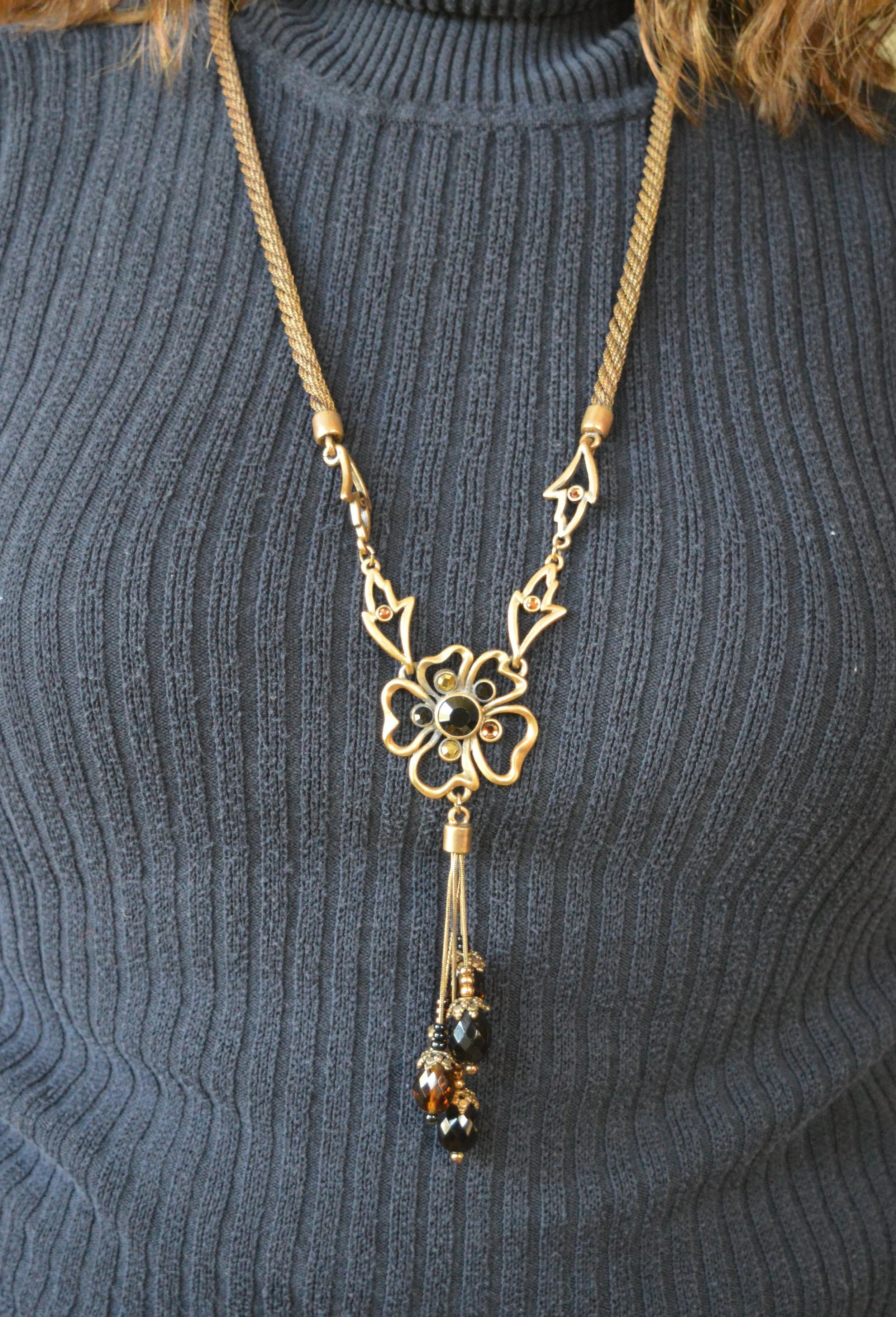
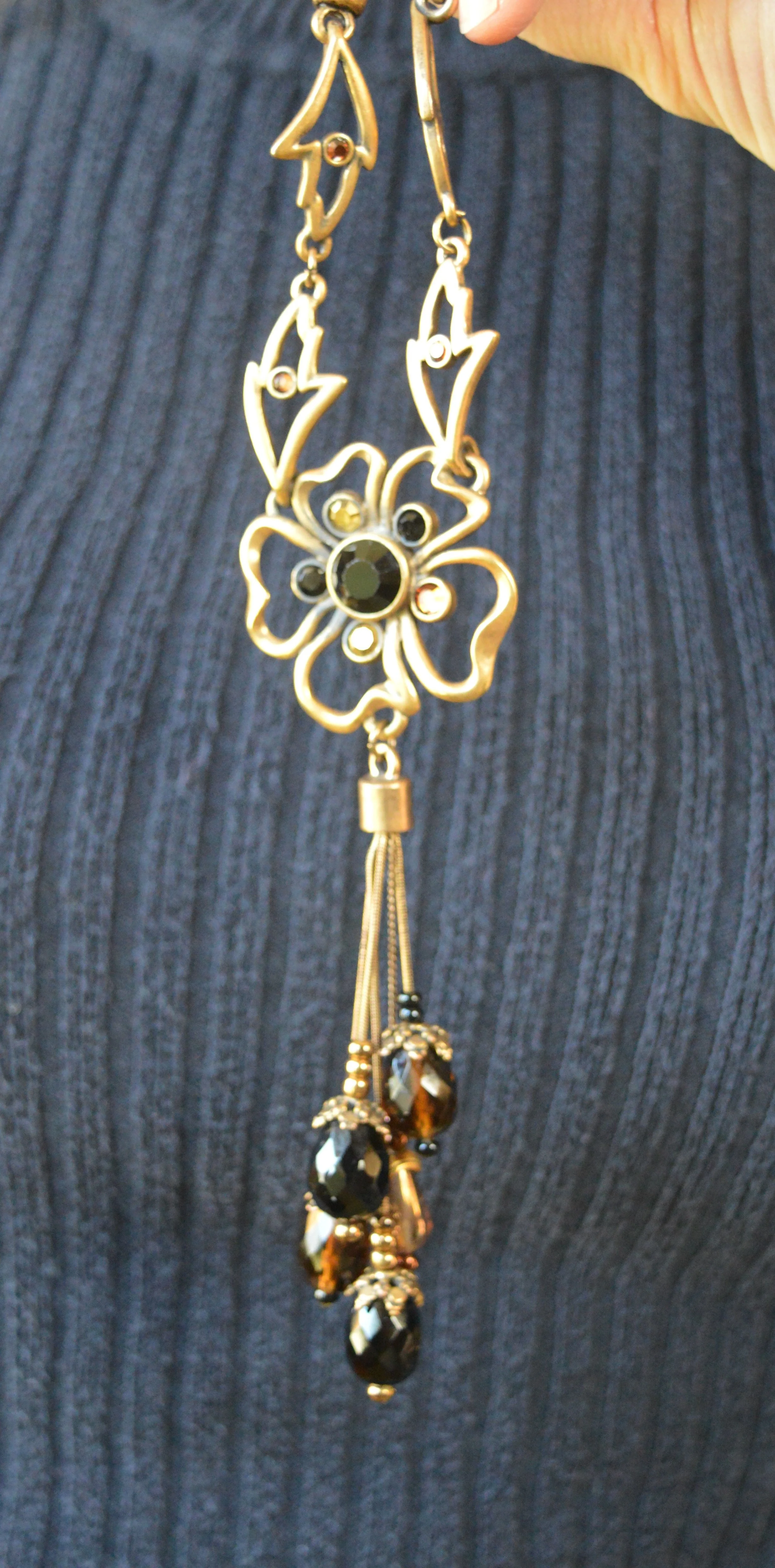
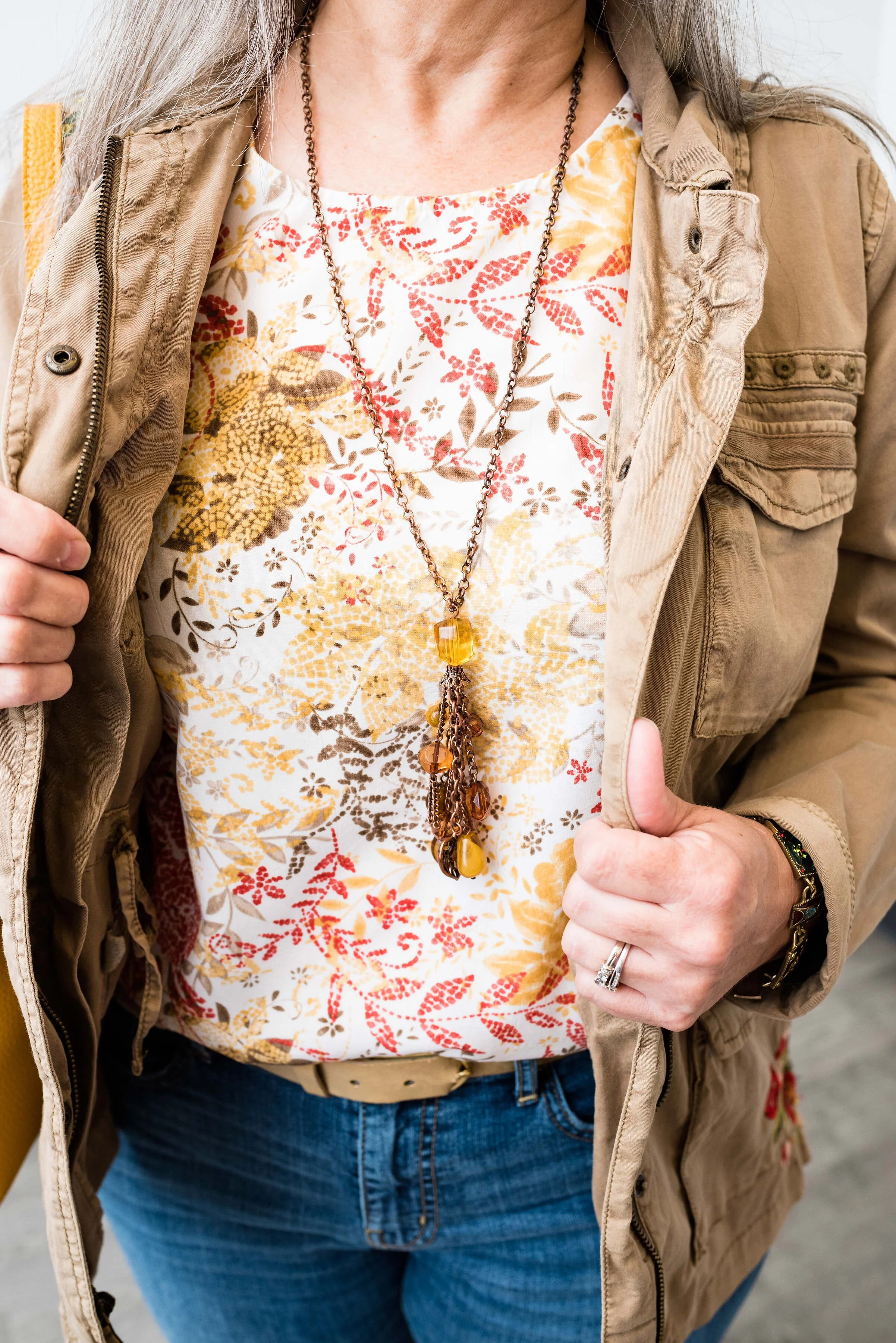
1 - Swap out light, breezy jewelry for jewelry that is bold and chunky.

summerfalltransitionoutfit-26.jpg
summerfalltransitionoutfit-24.jpg

2 - Add a jacket, sweater or other topper.

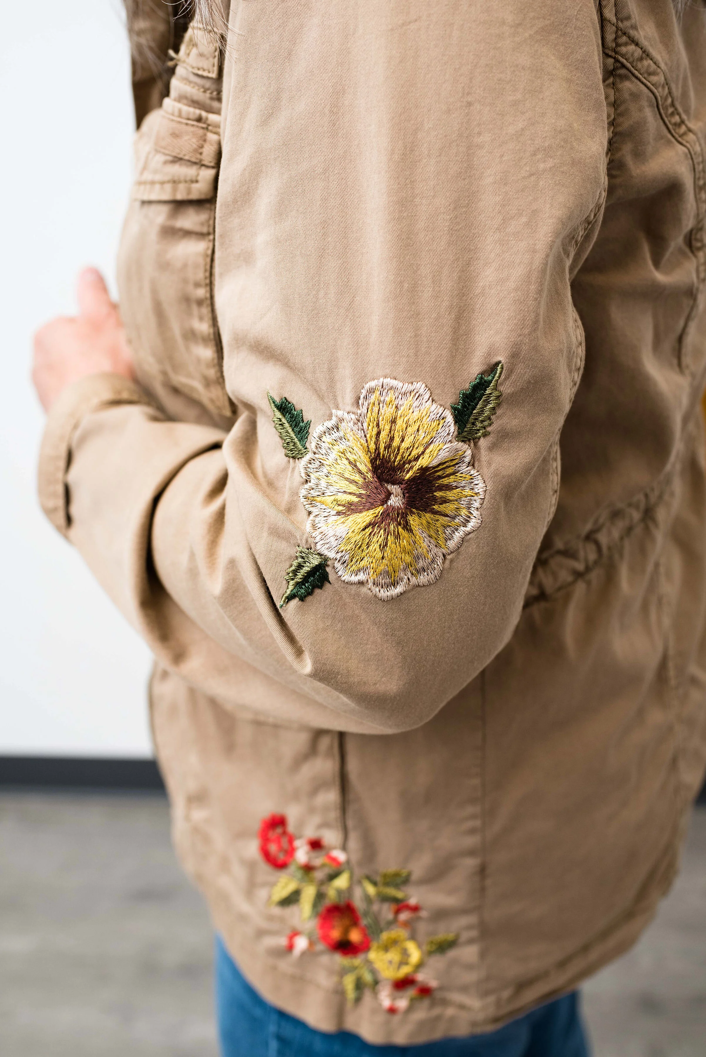
Utility jackets are often my fall and spring go to’s for light layers. This Sonoma piece with its beautiful embroidered embellishments goes perfectly with the leafy print of the tank. Being that it is tan, rather than a darker olive or brown, also gives me that slow transition into the darker, richer colors of fall.

summerfalltransitionoutfit-21.jpg
summerfalltransitionoutfit-28.jpg

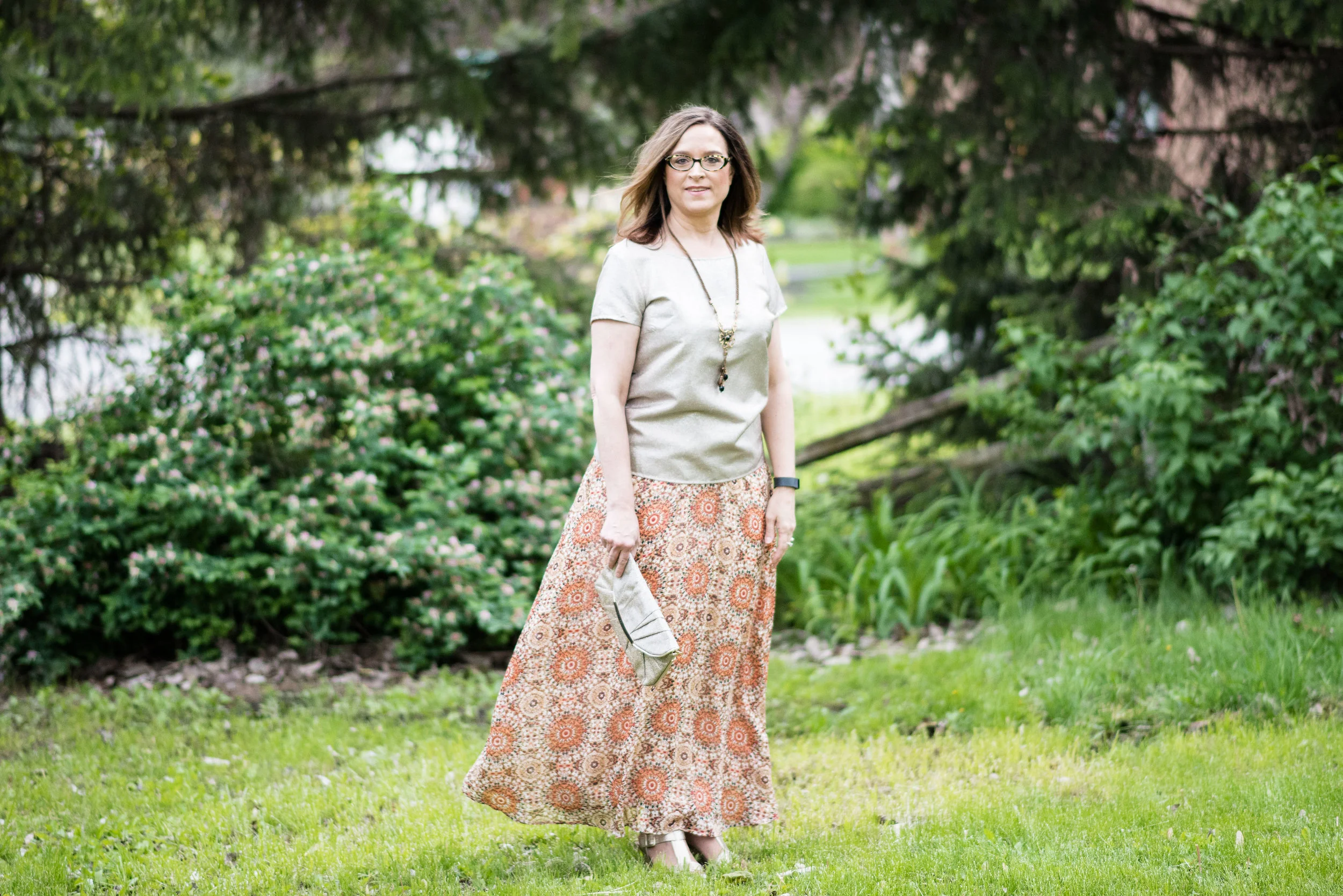
3 - Swap out sneakers for ankle boots.

These are my Sonoma suede heeled booties. They are a regular part of my fall, winter and spring wardrobe.

summerfalltransitionoutfit-23.jpg

Let’s take a look at the outfits side by side.

You can see that in the summer look I rolled the pants up and in the fall look I left them full length. I love ankle pants for this transition time, because they allow me to show off the ankle boots, and they are still not as warm as full length pants.

The other detail I changed was doing the front tuck on the top, to show off the belt and give the outfit a less casual vibe.

summerfalltransitionoutfit-27.jpg

How would you transition a tank top into fall? Do you have tank tops that you love to wear all year round? What do you think of this outfits?

summerfalltransitionoutfit-17.jpg

I’ve included a few shopping links for you to look over. These are affiliate links and are brought to you at no extra cost. If you click on a shopping link, I get a few cents. I appreciate all your clicks and all your comments.

Have a great Wednesday!

Photo credit Rebecca Trumbull.

Pantone Fall/Winter 2020 - New York Palette - Classic Blue, Ultramarine Green and Blue Depths

The Pantone Color of the Year is Classic Blue , so once again we are featuring this medium blue color in the Pantone series. Back in January I showed you this color paired with a furry bomber jacket and plaid skirt. You can also see this color with a multi-print midi dress and with a bright pink top. Classic Blue is a blue that just about anyone can wear. If you prefer not to have this pretty blue to close to your face you could carry it in a lovely bag, or wear it as a brooch pinned on your lapel. I’ll provide a few shopping links at the end with various options.

Pantone Fall/Winter 2020 - New York Palette - Classic Blue, Ultramarine Green and Blue Depths

I didn’t really have anything that seemed to perfectly match the Ultramarine Green, at least not until after the fact. My button up is actually a thrifted men’s shirt; a brand called Zylos. It has very small greenish blue print with white and almost has more of an aqua feel to it. Oh well, I have long ago given up on the idea of trying to be perfect. Ha, ha. You can see a closer look at the pattern, and see my thrifted, fringe, pendant necklace. Actually, the necklace is probably a closer match to the Pantone green.

Pantone Fall/Winter 2020 - New York Palette - Classic Blue, Ultramarine Green and Blue Depths

My Classic Blue pants were a thrifted piece from shopping a friend’s closet. They are Ruby Road brand and I have styled them over and over on the blog. You can see them with a light blue sweater and scarf, Beetroot purple top from last spring’s series, an olive velvet jacket, a plaid bomber jacket, and a multi-print kimono.

Pantone Fall/Winter 2020 - New York Palette - Classic Blue, Ultramarine Green and Blue Depths

I also threw on a few beaded bracelets, just for fun. Sometimes wearing a scarf or jewelry isn’t so much to help with the outfit as a whole, but just to enjoy something I have. Since I rarely go any where other than the grocery store, I occasionally throw on some bracelets, just because I have them and they are pretty.

Pantone Fall/Winter 2020 - New York Palette - Classic Blue, Ultramarine Green and Blue Depths

I thought this outfit would be perfect for my round Nine West snakeskin print bag. It think it adds an element of fall color to this more classic looking outfit.

Pantone Fall/Winter 2020 - New York Palette - Classic Blue, Ultramarine Green and Blue Depths.

My shoes are my old stand by thrifted Relativity loafer heels. If I had an office job, I would probably wear these a lot. They are a nice height for a stacked heel and fairly comfortable.

Pantone - Fall/Winter 2020 - New York Palette - Classic Blue, Ultramarine Green and Blue Depths

What do you think of these colors? Do you like the Classic Blue, or do you prefer the darker tones of Blue Depths? Do you like the color Ultramarine? As it is in the graphic, it seems to be more of a forest green color, which I do like. I like how these three colors worked together into an outfit that would be perfect for a day at the office or a date night with your significant other.

My life would not be complete if I didn’t leave you with a silly picture to make you smile. When I was trying to pose, I almost fell down. Ha, ha.

Pantone - Fall/Winter - 2020 - New York Palette - Classic Blue, Ultramarine and Blue Depths

I hope you enjoyed this post and I hope you’ll leave me a comment or two. Life is lonely around here, so I love to hear from my internet and long distance friends.

I’m including a few shopping links for you to peruse. These are affiliate links. That means when you click on a link I get a few pennies. All opinions are my own.

Graphic and photo credit Rebecca Trumbull.


Pantone Fall 2017 - The New York Palette - Tawny Port and Golden Lime

This week's color combination is a blend of a dark maroon and a more subtle green. Tawny Port is described on the Pantone site as "Taking the red family to new depths..." I think of it as more of purple than a red, but then purple is made up of red and blue. Golden Lime takes on a more tropical hue, so I though pairing these two colors would make for an interesting outfit. 

These pictures were taken at Wildwood Metropark here in Toledo. This is an amazing park and so close to home. It used to be the estate of Champion Spark Plug magnate Robert Stranahan. The park boasts the original Manor house and outbuildings, as well as acres of trails, a covered bridge and boardwalk. It is used for everything from family picnics to all manner of photo opportunities. In December the Manor house will be decorated for Christmas and thousands of people will come to take a tour. 

For today's pics we just found a piece of trail to take pictures on.

I've had this skirt, which is Jones Wear Brand, for a while. Honestly, I don't even remember where I got it. Ha, ha. However, it is a fun skirt with it's whimsical pattern and colors. It is fully lined and would be considered either midi or tea length, depending on what chart you look at. 

This open waterfall cardi is ANA brand. It probably leans more towards purple than what Tawny Port actually is, but I think It works well. The Tawny Port splotches in the skirt actually are more red. It is amazing how you can pair something with a color that has both red and blue in it's undertones and it will lean toward the color of the piece you have on.

This faux lace top from Croft and Barrow appears more green in person, but you get the idea. I like these types of tops as they give the appearance of lace, but you don't have to wear a cami underneath. This one is a silky, stretchy material, so very easy to wear and wash. 

You can also see I added a gold belt to bring out that color in the skirt as well, plus it adds a point of interest and texture as well as defining my shape. I chose this bluish purple agate necklace as the skirt has just a little bit of this color in it too. 

My bag is thrifted and you can see I've used it before in this post. This dark olive bag from Talbots has two handles. One allows you to use it as a top handle hobo bag and the other as a cross body bag. It is nice to have options. 

I was really stumped when it came to what shoes to wear. My casual side won out in the end and I went for the combat boots. These are thrifted and are Falls Creek brand. Falls Creek is a brand sold at Meijer

I thought this was a fun outfit for fall. It is comfy, cozy and for cooler weather could be made wearable by swapping out the short sleeve stretchy tee for a long sleeve top and adding heavier tights under the skirt. 

I hope you enjoyed this post. I've included a few shopping links for Tawny Port and Golden Lime. This post contains affiliate links. All opinions are my own. 

Have a great week and don't forget to stop back on Thursday for another Fun Fall Look.

Photo credit Rebecca Trumbull. Make up Rachel Christensen.

Monday linking up with Catherine of Not Dressed as Lamb. Tuesday linking up with Shelbee of Shelbee on the Edge and Jess of Elegantly Dressed and Stylish

Marvelous Maxis - A+ A-lines

This is the final installment in my Marvelous Maxis series. An A-line skirt is basically a skirt that is narrow at the waist then subtly flares out toward the bottom, thus the "A" look. I have always been a fan of the A-line skirt because it is figure flattering, but still allows for room through the hips and thighs. It is also a great skirt to wear if you want some flare, but don't want a lot of excess material. 

Today's skirt is from Dressbarn. If you are not familiar with Dressbarn they are a women's clothing retailer selling sizes 4-24. I hadn't been in a Dressbarn in ages, but then visited one with my girlfriend while I was back in NY a few months ago. I was glad I did. They have a fun and whimsical style with a variety of prints, colors and cuts in pants, skirts, dresses and tops. They also sell accessories like shoes, bags and jewelry. It took everything in my power to not spend more than I did! 

Look 1 - Casual

I fell in love with the print on this skirt, knowing that I will be able to use it for spring, summer and fall. The skirt is a somewhat sheer material, but is fully lined so you don't have to worry about finding a slip to wear underneath. 

The lining has knee high slits on both sides, making it easy to walk and sit without feeling bound in. Here is a pretty fuschia floral print. 

I paired the skirt with a simple embellished orange tank top. This is a St. John's Bay brand which is found at JC Penney. My tank was thrifted. I tucked the top in, to keep a more figure flattering silhouette. Notice after I tucked it in, I pulled it out a touch, to allow the material to bag out to camouflage my bulges. We have to have a trick or two to hide our baggage!

Since the tank has all this bling, I decided to not wear a necklace. For accessories I just wore a multi-strand beaded bracelet, carried a small macrame bag and wore my lace up sandals. I bought these sandals at Meijer. Meijer is a grocery and clothing retailer here in the midwest. I was surprised to find out that their Massini clothing line is now backed by Stacy London of What Not to Wear fame. Meijer is trying to create a style for every body. 

Look 2 - Dressy

For a more dressy look, I swapped the casual tank for my glitzy taupe short sleeved pullover blouse. This piece was thrifted and is The Limited brand. The Limited is no longer available as they closed their stores back in January. You can see how I styled this blouse in last fall's Pantone series here

I also added a gold clutch and gold Covington wedge sandals, Sears carries Covington brand shoes. I also added a fun pendant necklace. 

Here are the two looks side by side.

I hope you enjoyed this series on maxi skirts. These skirts are a great option when you want to have your legs covered, but don't want to wear pant or hose. Do you have maxi skirts in your closet? How do you like to wear them? I'd love to hear your thoughts. 

Have a great week! 

Photo credit Rebecca Trumbull. Make up Rachel Christensen

This post contains affiliate links. If you click on a shopping link below, I get a few cents. If you purchase something through my site, I get a small commission. All opinions are my own. 

Monday linking up with Catherine of Not Dressed as Lamb. Tuesday linking up with Shelbee in the Spread the Kindness link up and Jess of Elegantly Dressed and Stylish. Thursday linking up with Nicole of High Latitude Style. Friday linking up with Nancy of Nancy's Fashion Style. 

Awesome Accessories - The Statement Necklace - Long

Last month in my Awesome Accessory column I talked about the short statement necklace. You can see that post here. This month, I want to continue that thought, but look at what a longer statement necklace might look like. You might wonder what makes a necklace a statement piece. Obviously, it needs to make a statement! What that means for you, might be a little different than what it means for me. However, there should be something about the piece that makes it stand out and not get swallowed up by your outfit.

Where as a short statement necklace is worn closer to the face and usually includes an element of striking color or style, a longer statement necklace can be colorful, but it is often more about texture and design. Let me show you a few of my own necklaces that I would classify as long statement pieces.

This particular necklace makes a statement, not by its bold color, but by the combination of texture, note the faceting on the beads, and the shape. If you look at the larger metal links they are not perfect circles. They are somewhat squashed looking. In addition, the necklace is not designed to be symmetrical, so some of the bigger beads are higher and some are lower. It is not the same on both sides. I also like this necklace, because it isn't a bold color and will go with many outfits, both dressy and casual. 

This piece is not fancy and doesn't show much flare, but I feel it makes a statement because of it's odd shape and unique color. Cut from an agate you can find these almost anywhere. My daughter got me this for Christmas a couple years ago. It is trimmed all the way around with tiny faux diamonds, which add another element of texture and bling. Here is a close up. 

I love the little streak of light blue and the hole in the middle. It is just a very unique piece.

This piece makes me think of something out of a fairy tale. The color of the beads as well as the filagree on the pendant give it a feel of richness and value, while the additional silver chains make it feel more delicate and feminine. 

Of course I had to throw in a fringe necklace. I love these because they are simply so much fun and they are fun to touch! I chose this one over my other fringe necklaces, not because any one of them couldn't have been a statement piece, but because this particular one seems to stand out above the rest. I just love the look of this elegant necklace. The color is demure and the gold chain and cap on the fringe give it a posh feel. I also feel a little retro when I wear it. 

You have probably seen this necklace in several of my more recent blog and Instagram posts. My other daughter got this for me this past Christmas from Charming Charlie. I think what makes this necklace a statement piece is the contrast of the berry wooden shapes and the gold chain and links. It really stands out.

This unique piece I picked up at a thrift store. I instantly fell in love with it when I saw it. It is in a class all by itself with the rope like chains, metallic flower and the dark beads embellished with gold colored floral caps. Once again, the color is more muted, so can be worn with many different outfits. Here is a close up of the flower and beads. 

I hope you enjoyed this post on the long statement necklace. Do you like longer or shorter statement pieces? I'd love to know your thoughts. Just leave a comment below. 

Have a great weekend. 

This post contains affiliate links, which means if you click on a shopping link below I get a few cents. If you purchase something through one of the links, I get a little bit more. All opinions are my own.

Thursday linking up with Nicole of High Latitude Style, Ada of Elegance and Mommyhood and Laurie of Vanity and Me. Friday linking up with Jo-Lynne Shane in the Fashion Friday link up, Jennie of A Pocketful of Polka Dots, Nancy of Nancy's Fashion Style and Shelbee of Shelbee on the Edge.