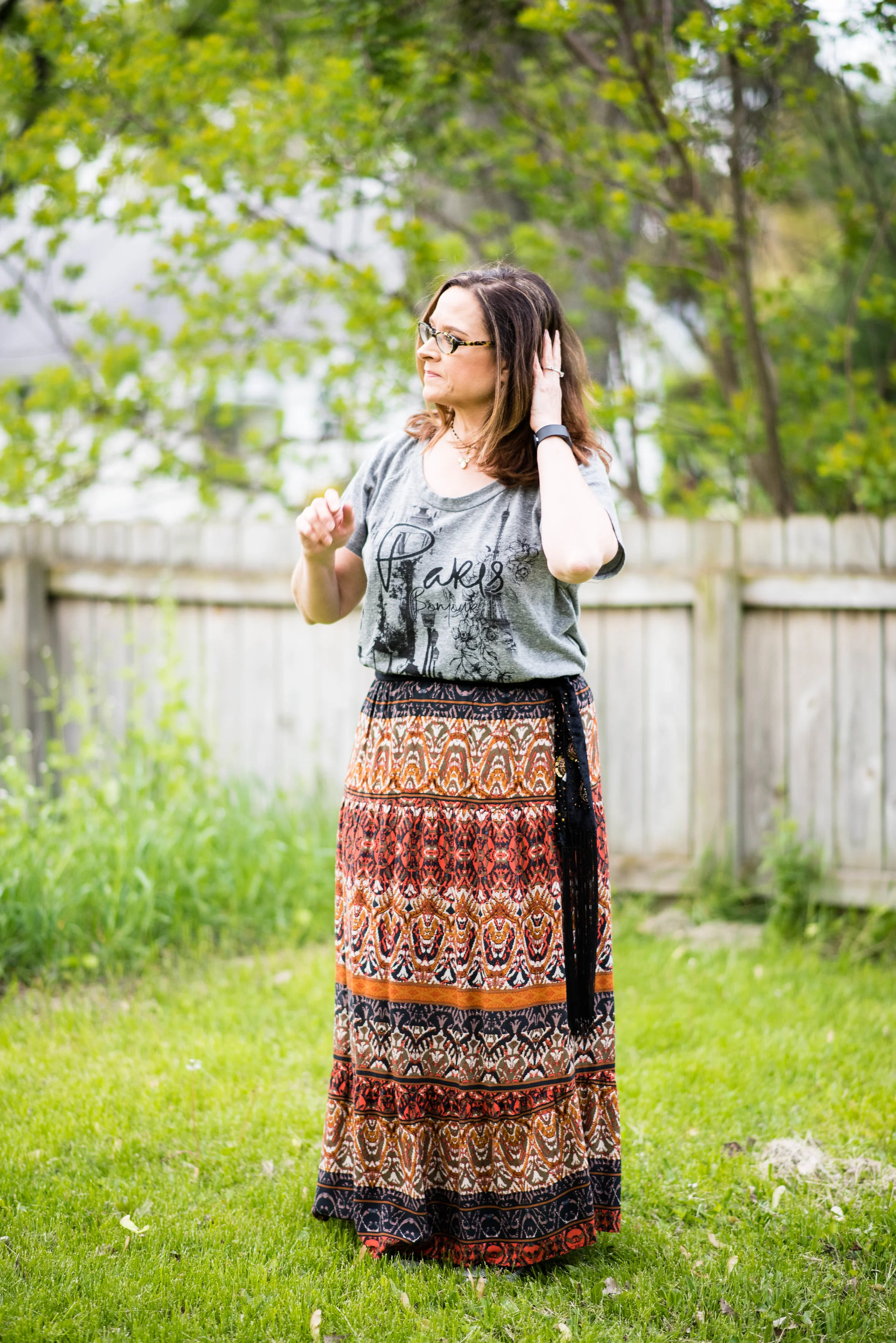
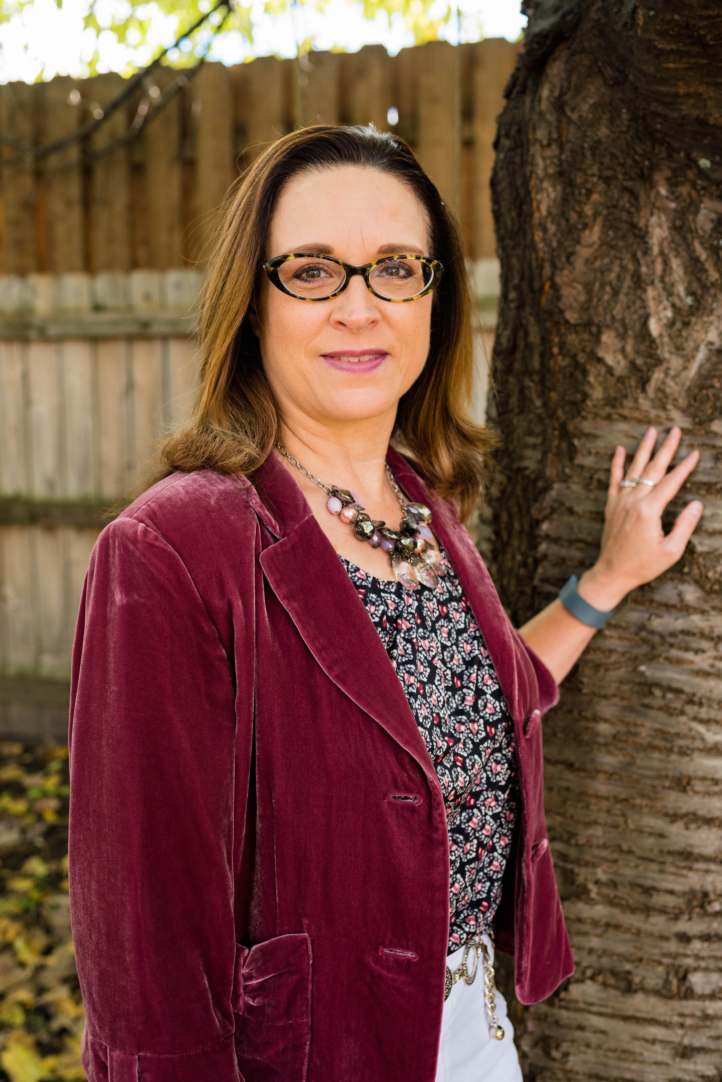
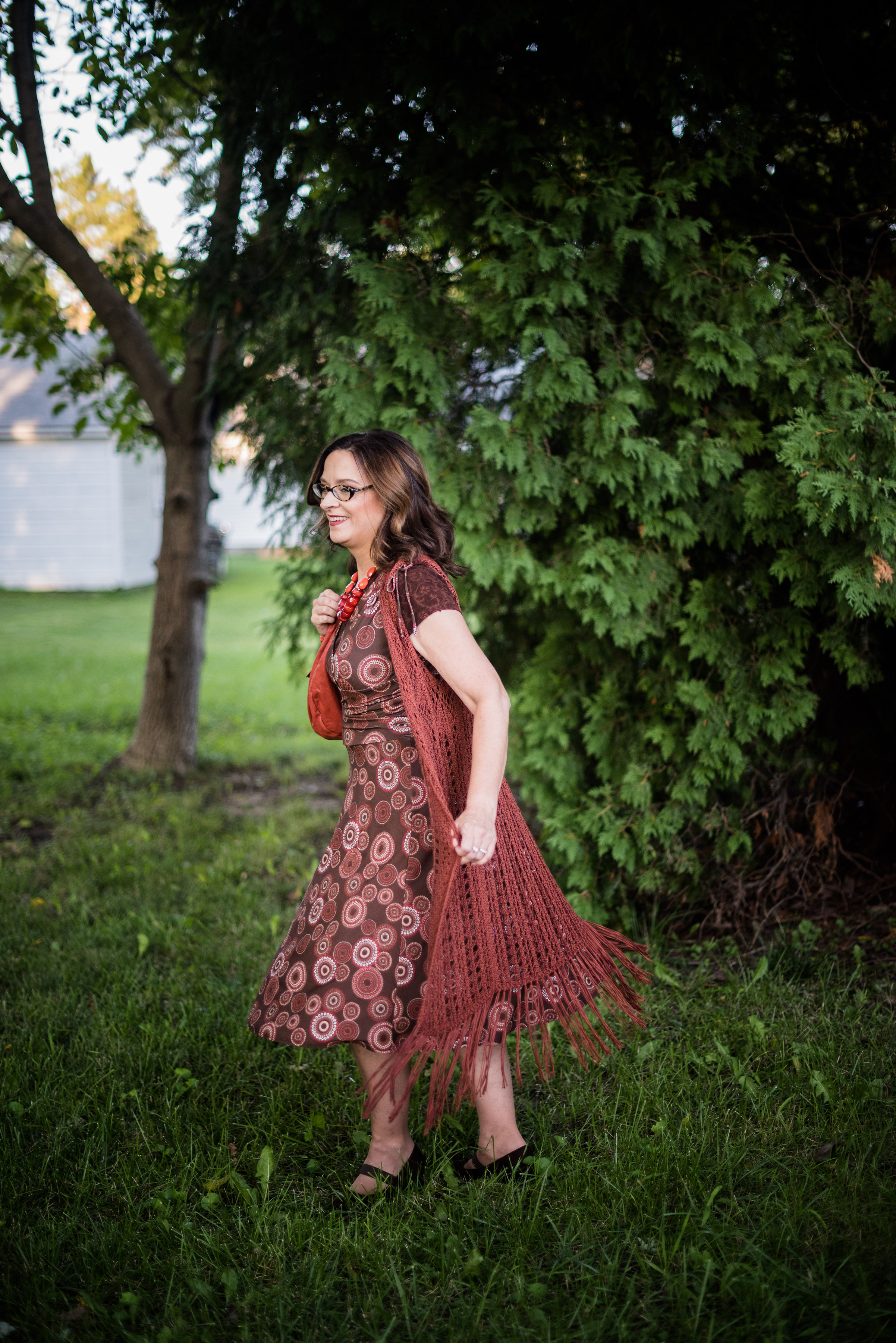
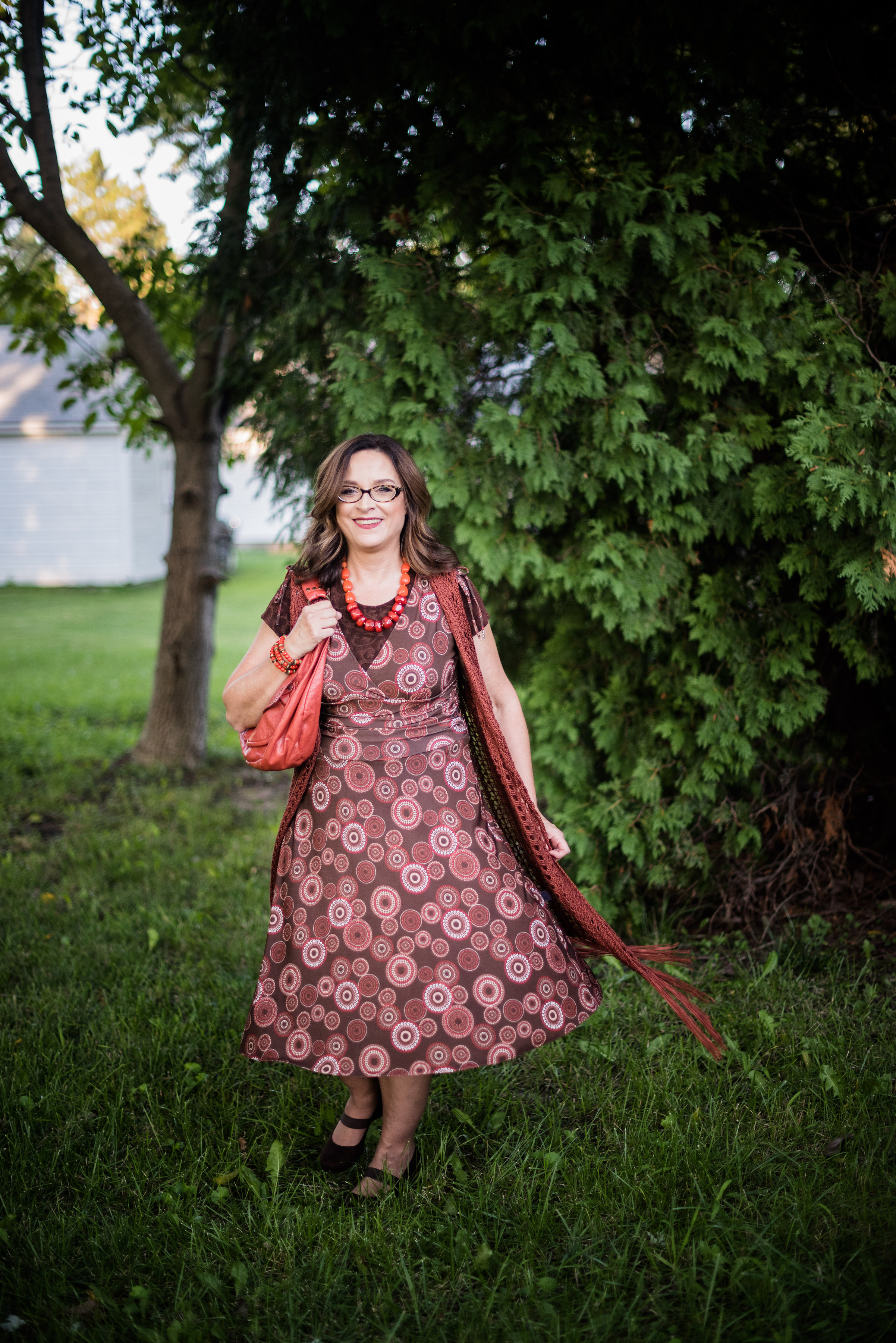
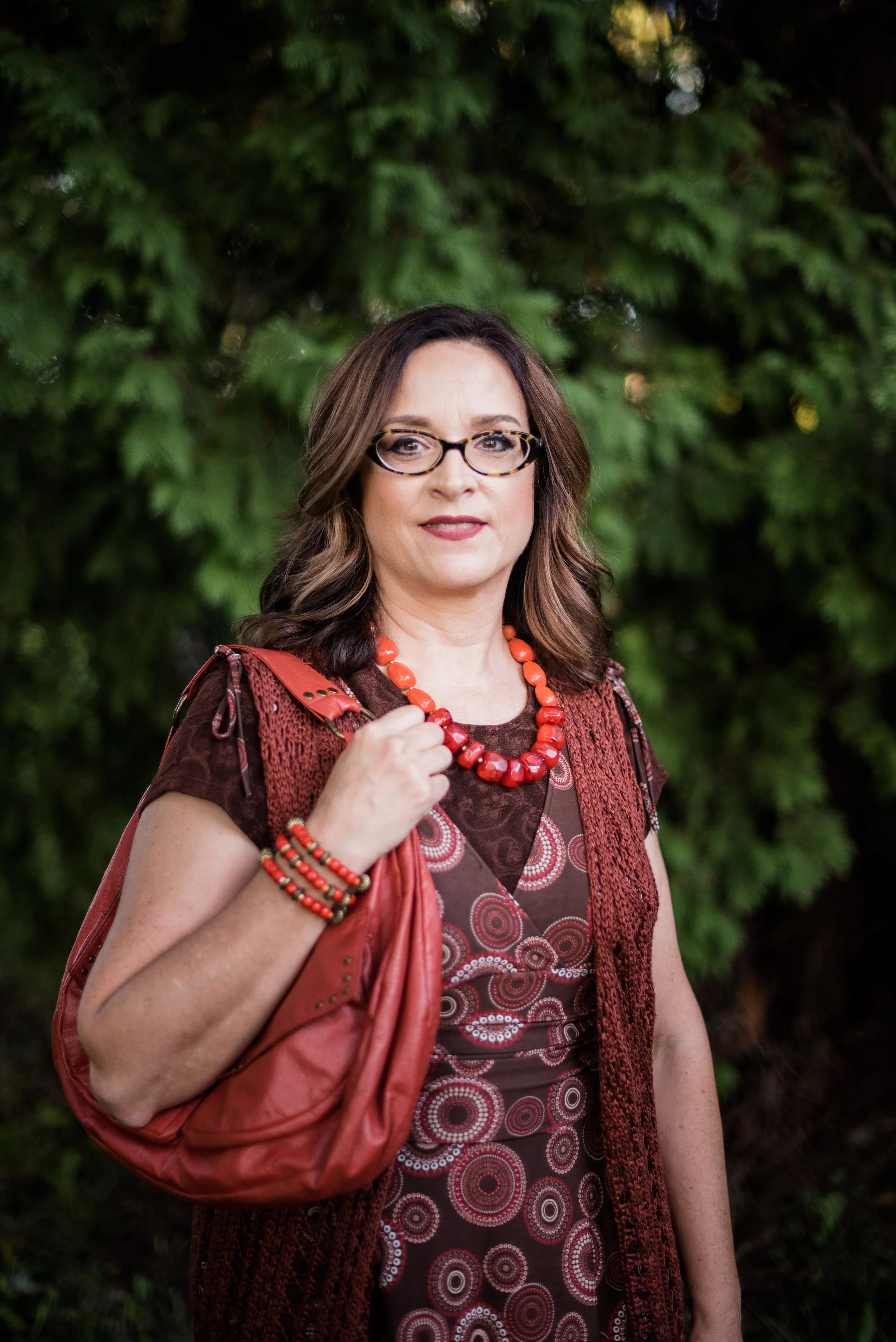
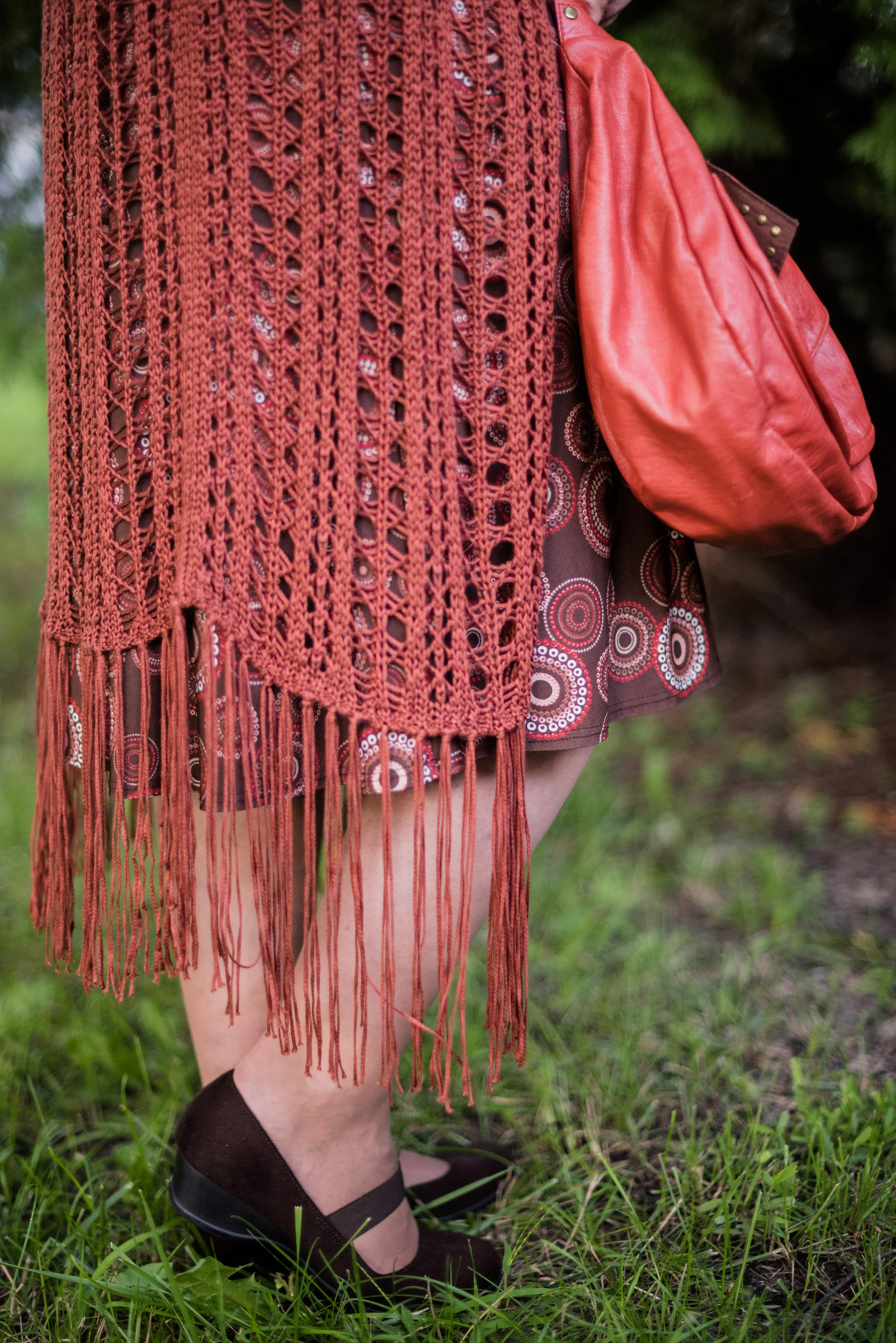
Fall 2017 Trends - Fabulous Florals

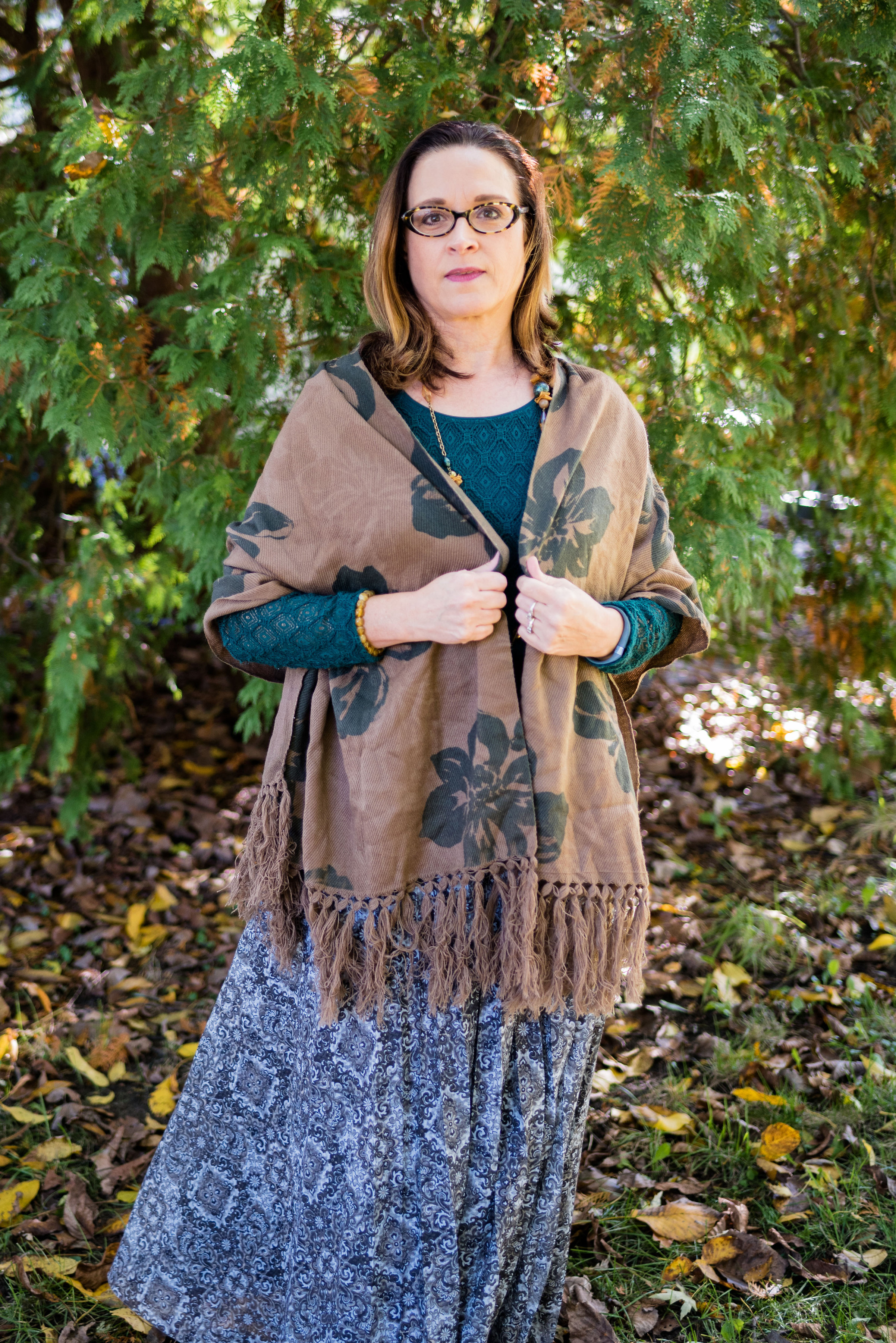
I feel like we have talked about florals before, probably because we have. Floral patterns were trending in spring and they are still trending in fall. However, where spring florals were light and bright, fall florals are dark and bold. There are some fabulous fall florals out there right now and I will include a few shopping links in this post, to give you a few other ideas of what is available. As for my own collection of florals, I have nothing quite like what is trending, but I found a few pieces that I thought would transition well into the fall season. As I did last week, I will show you one outfit, a few flat lays and a few possible shopping options.

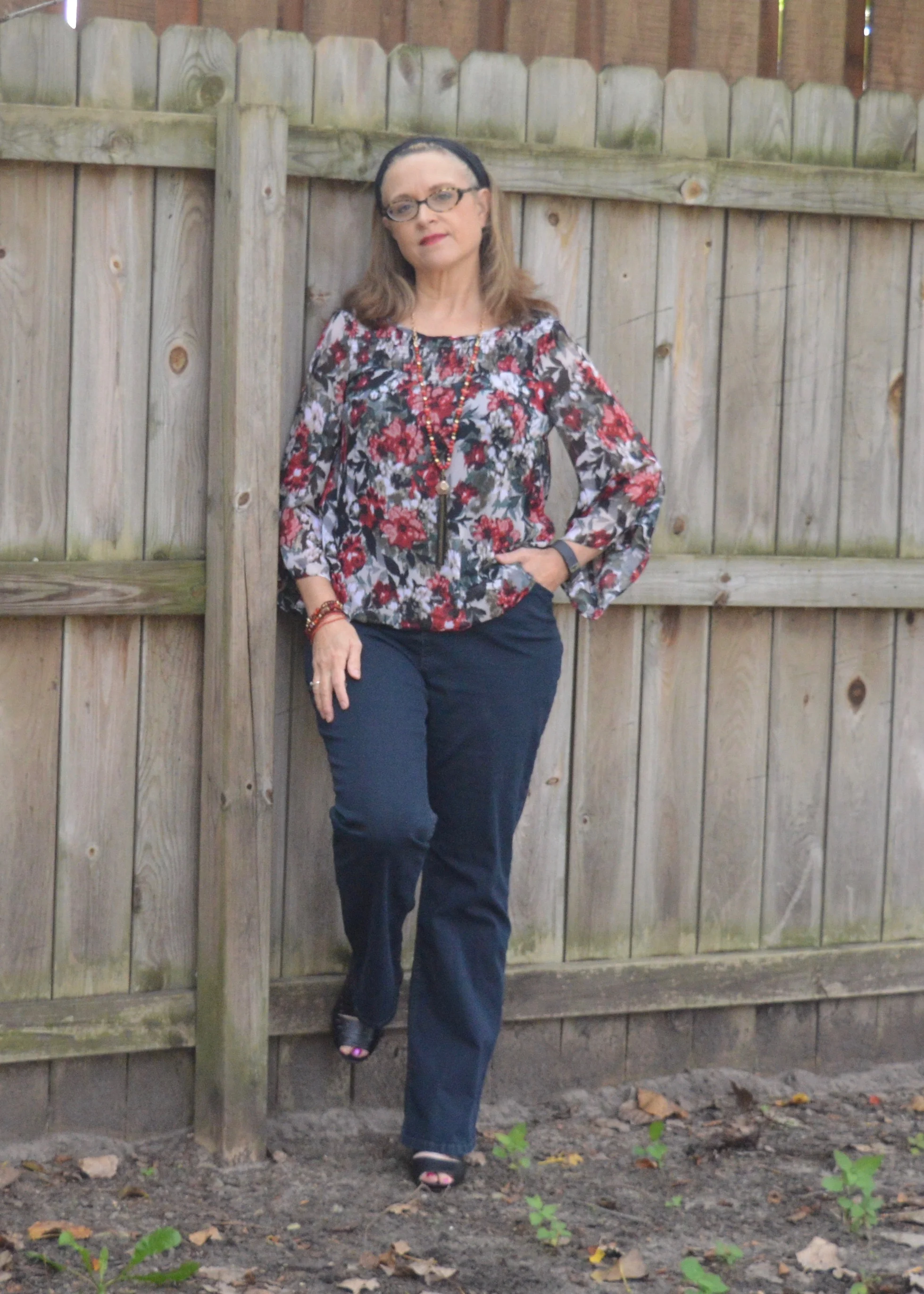
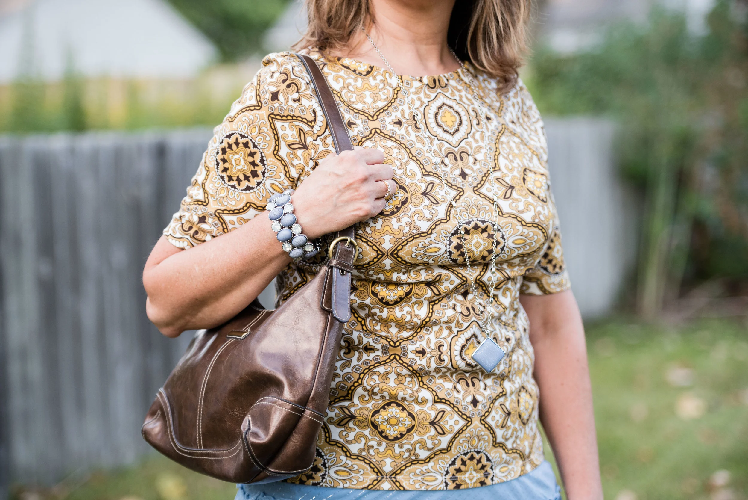
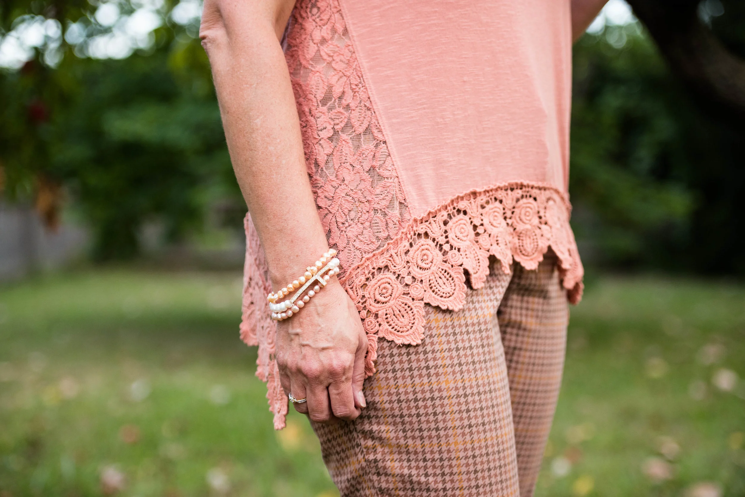
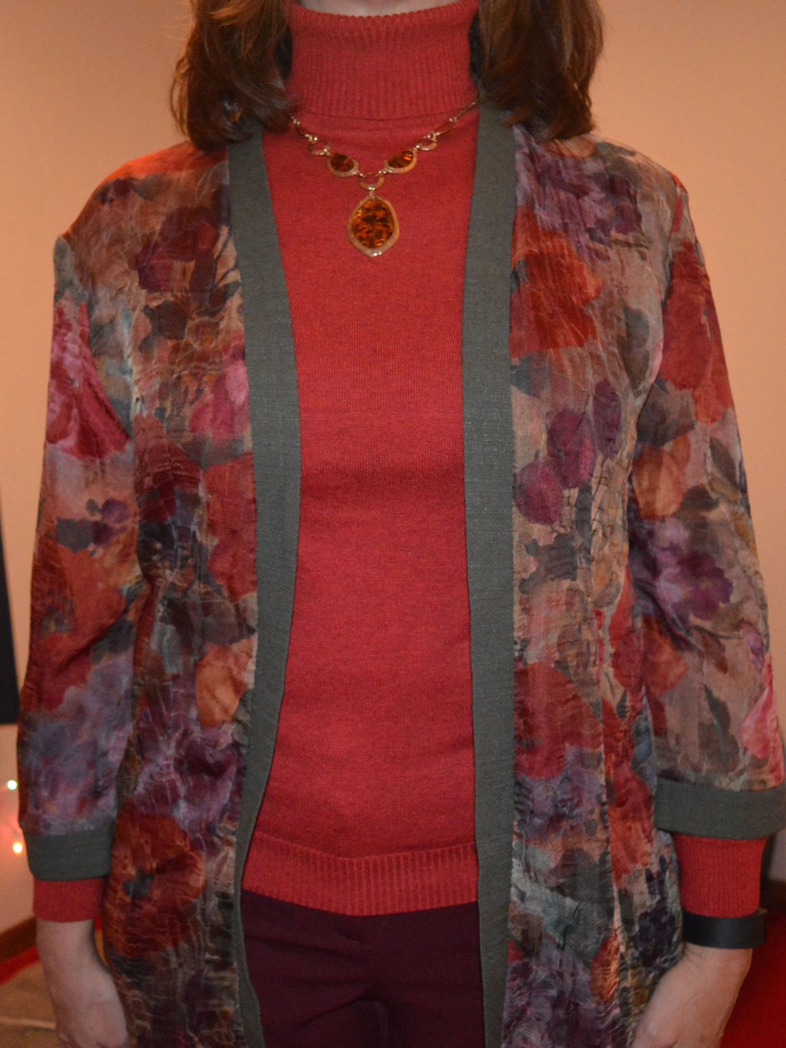
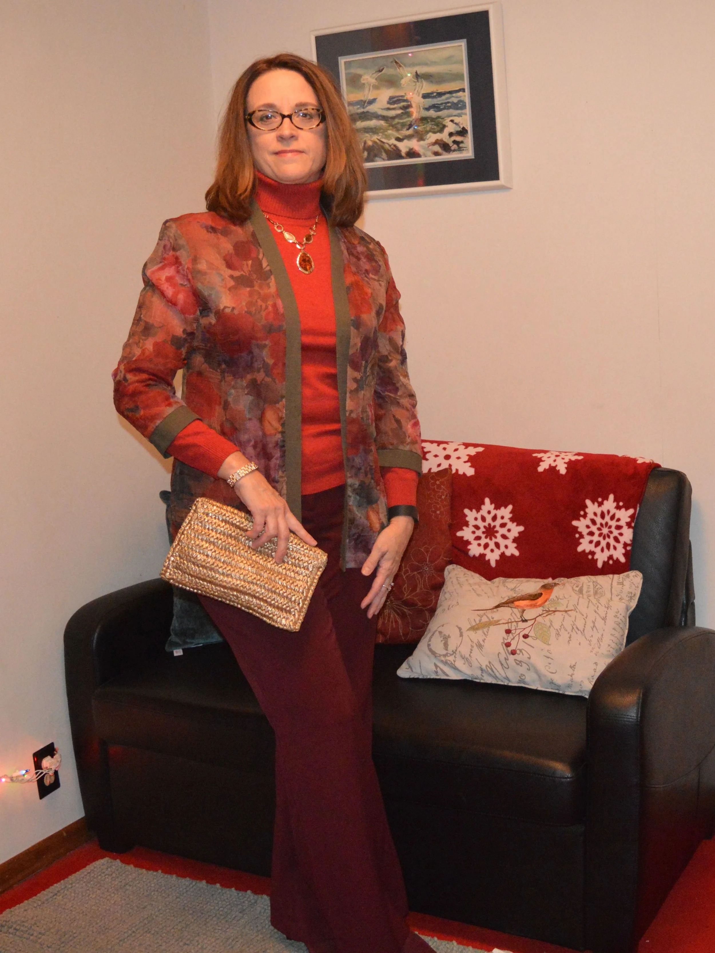
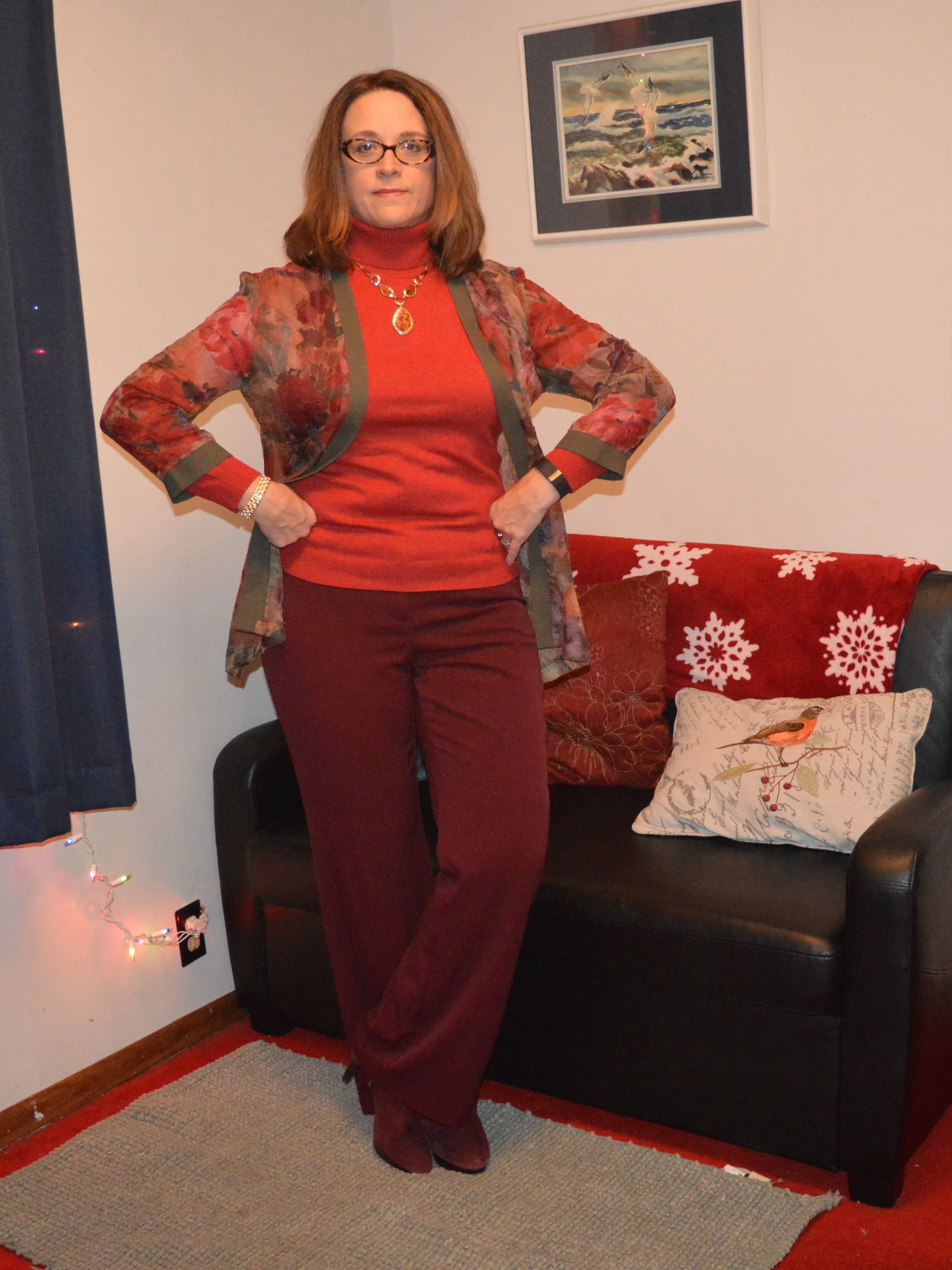
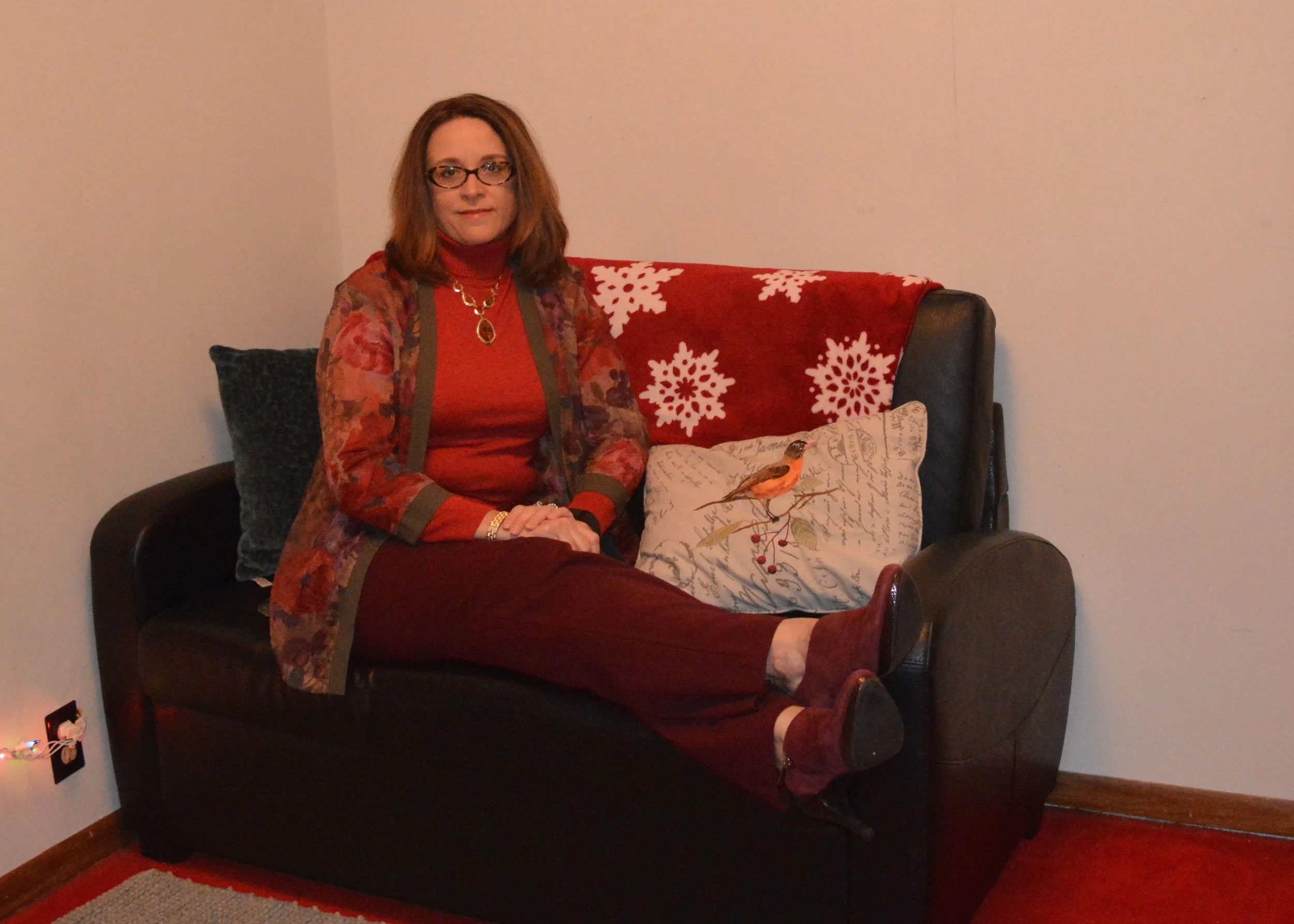
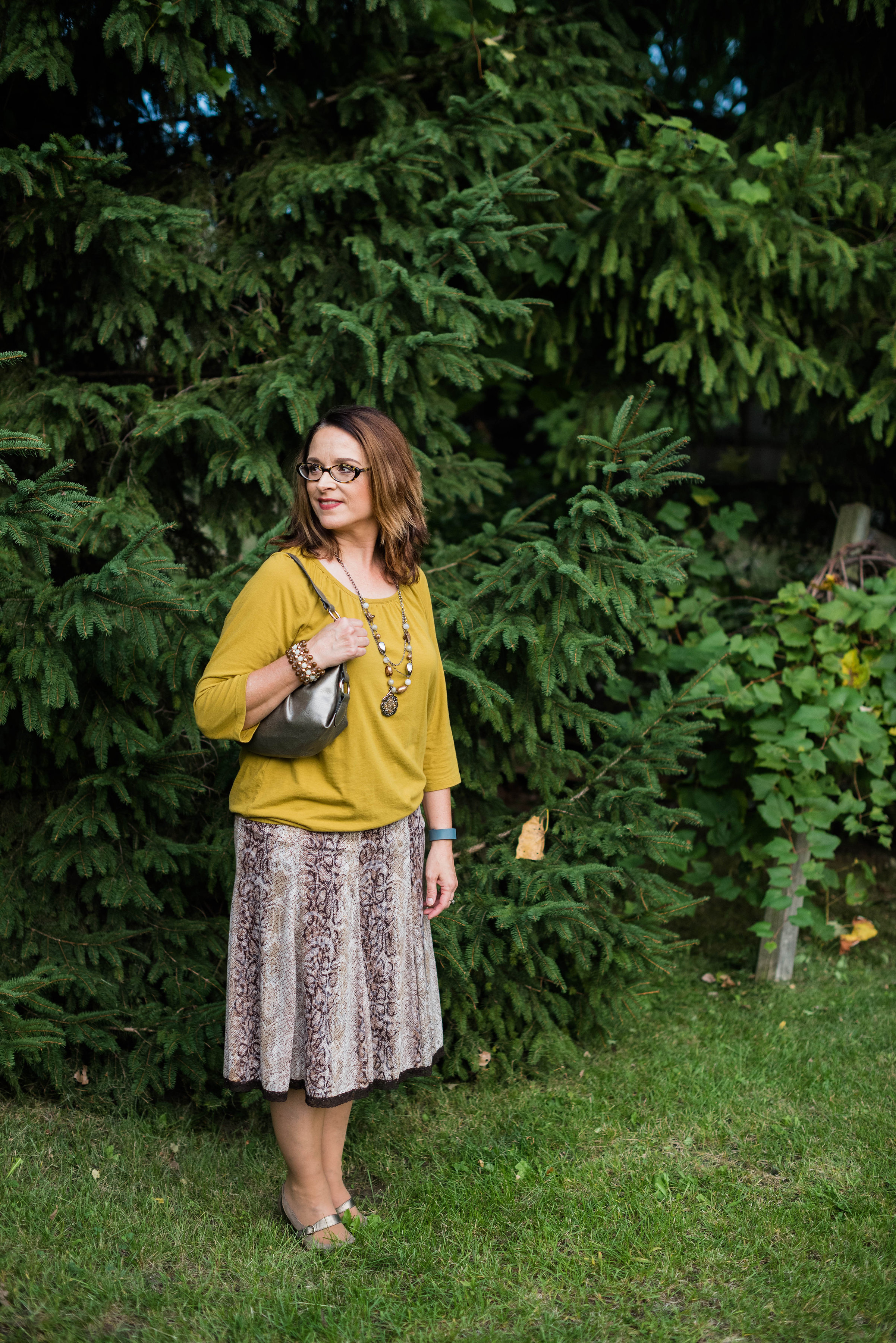
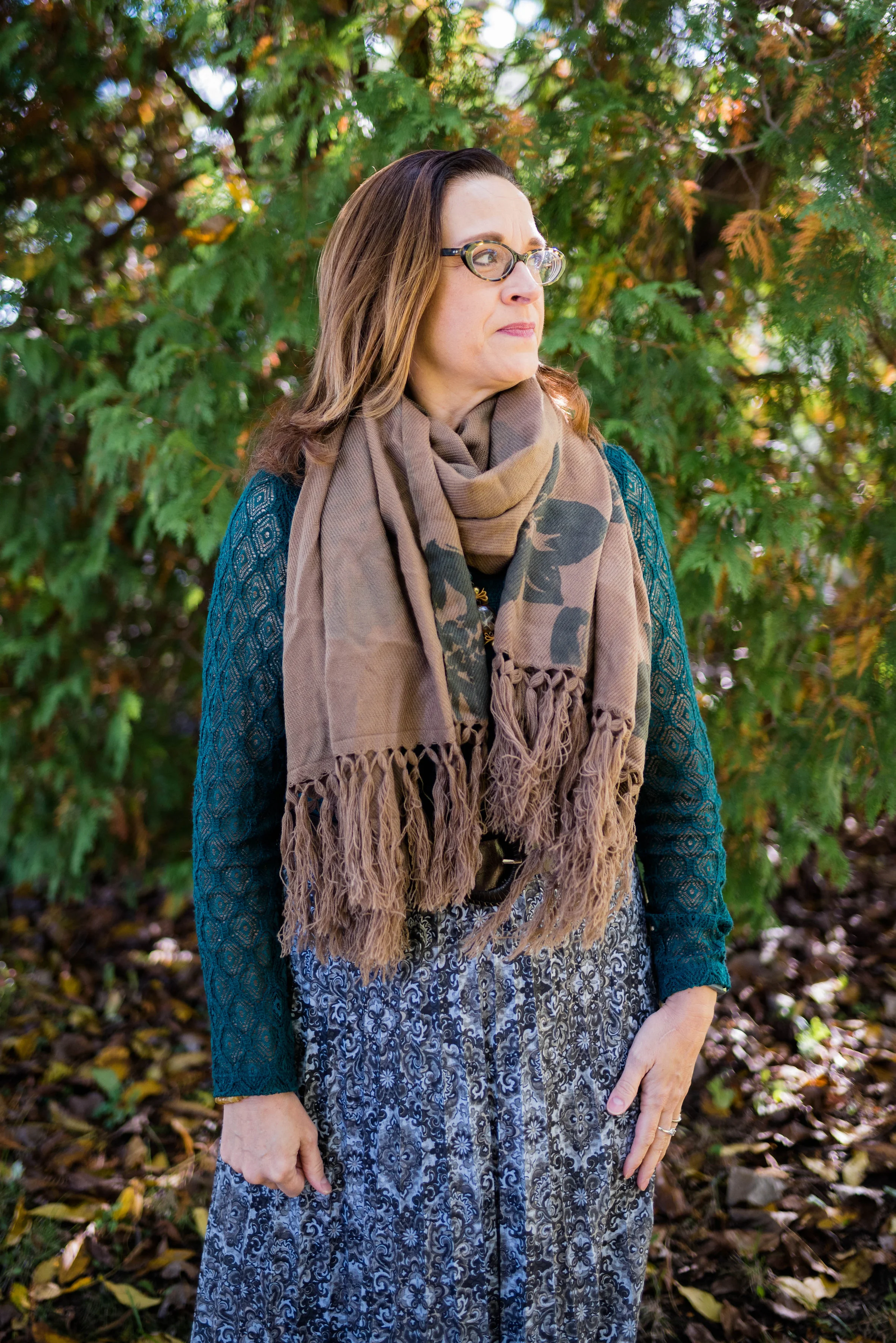
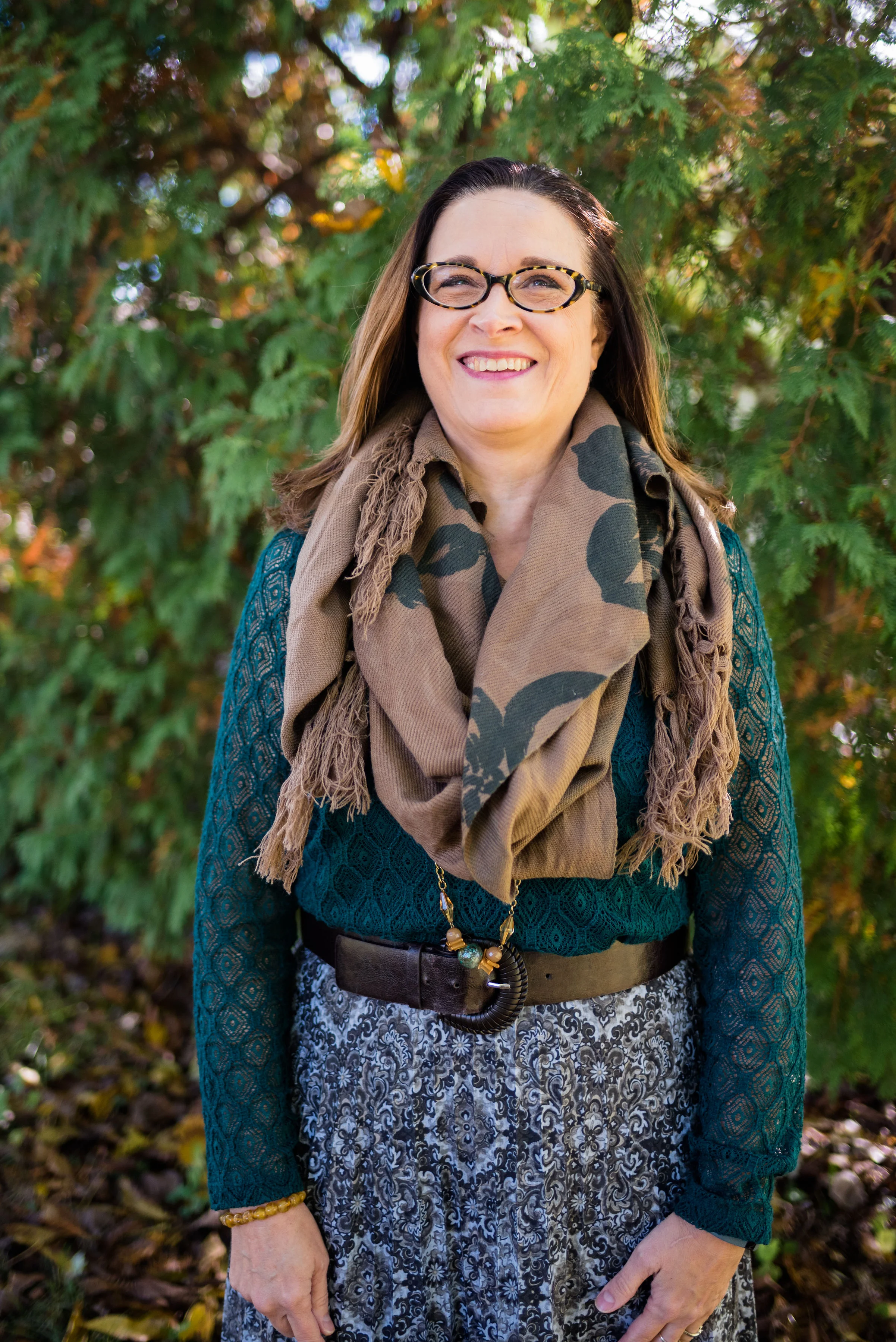
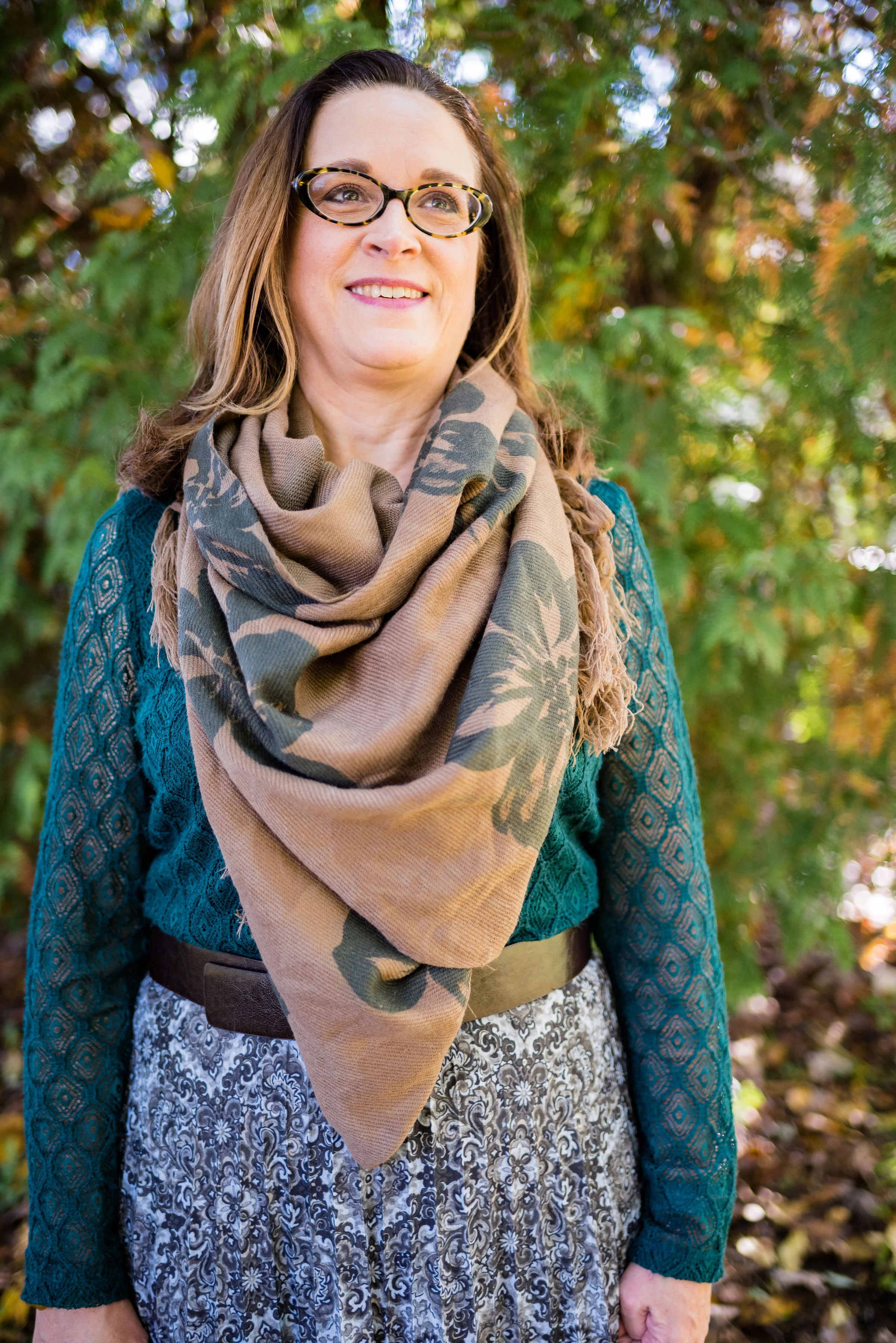
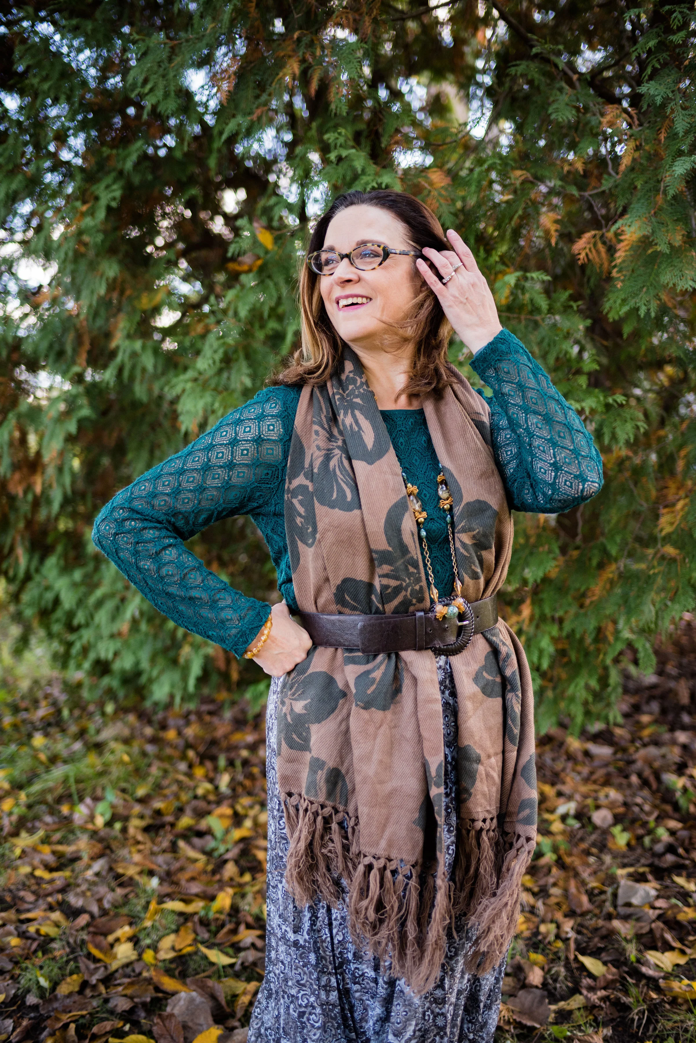
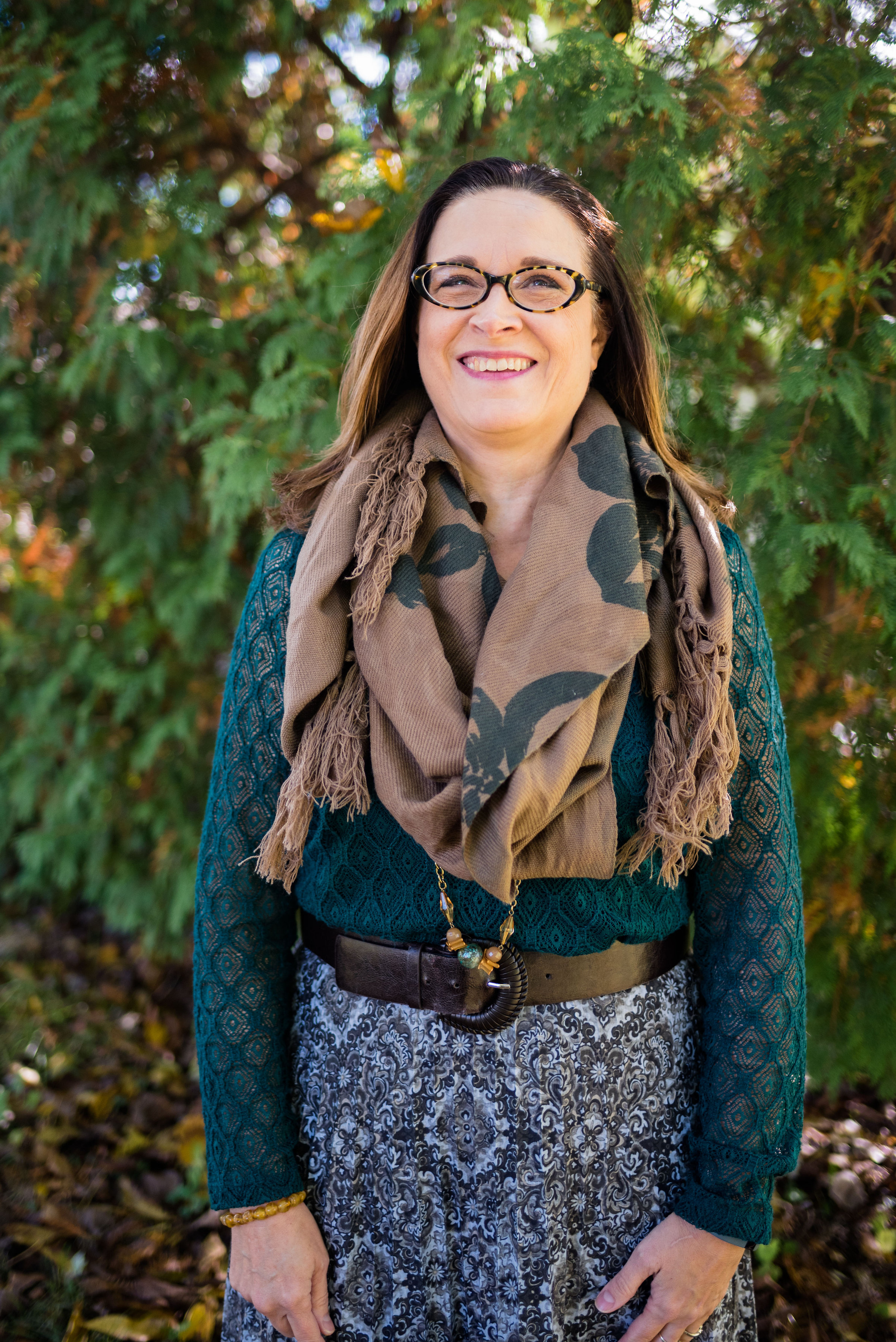
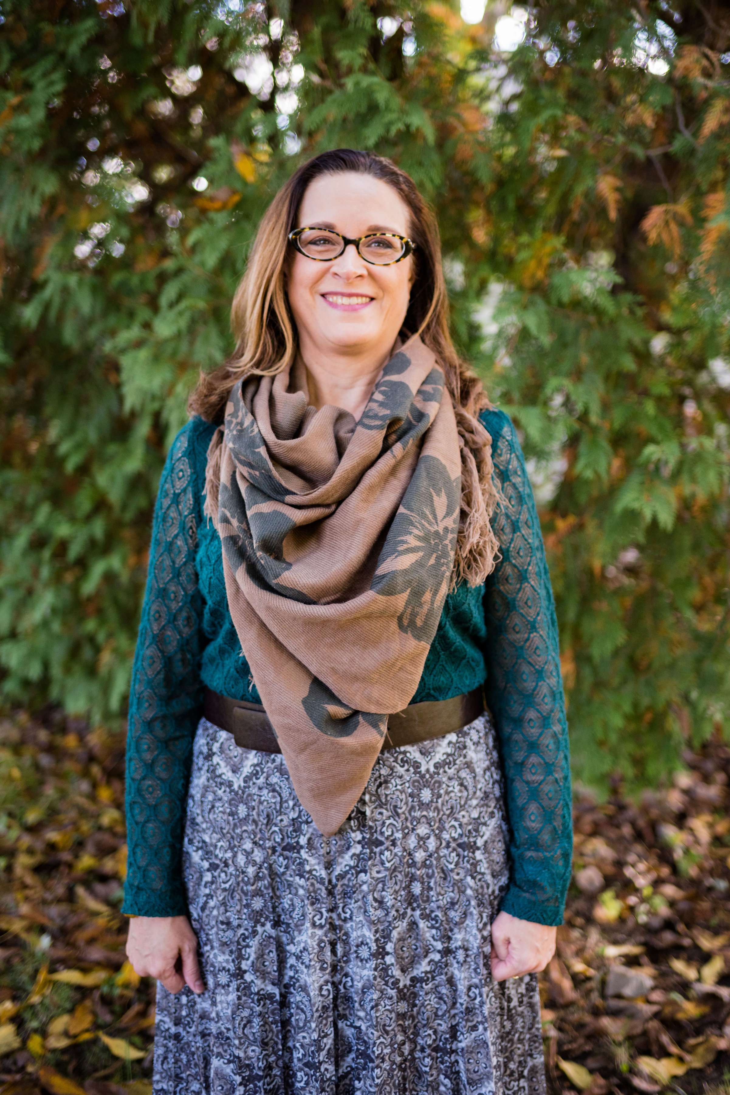
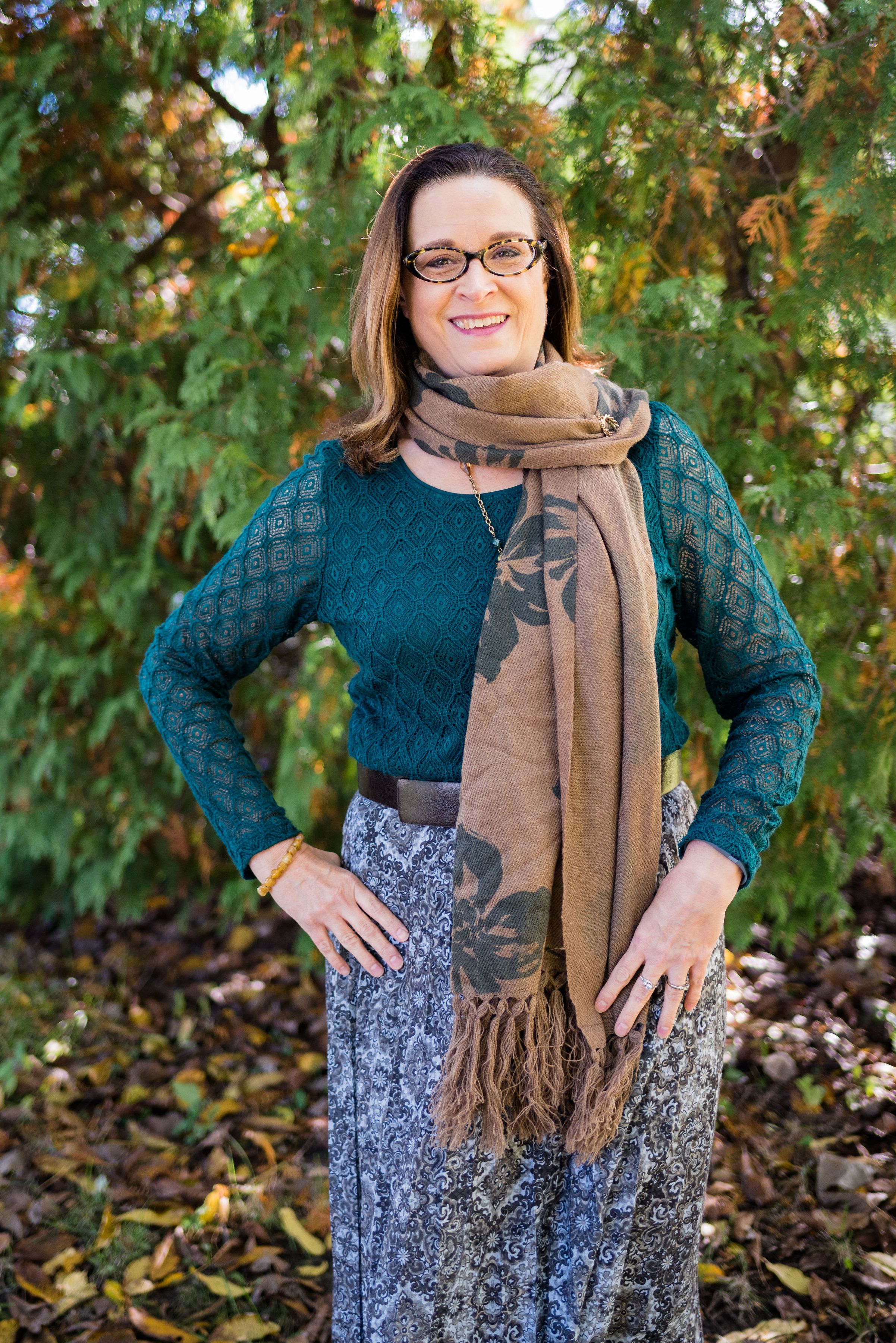
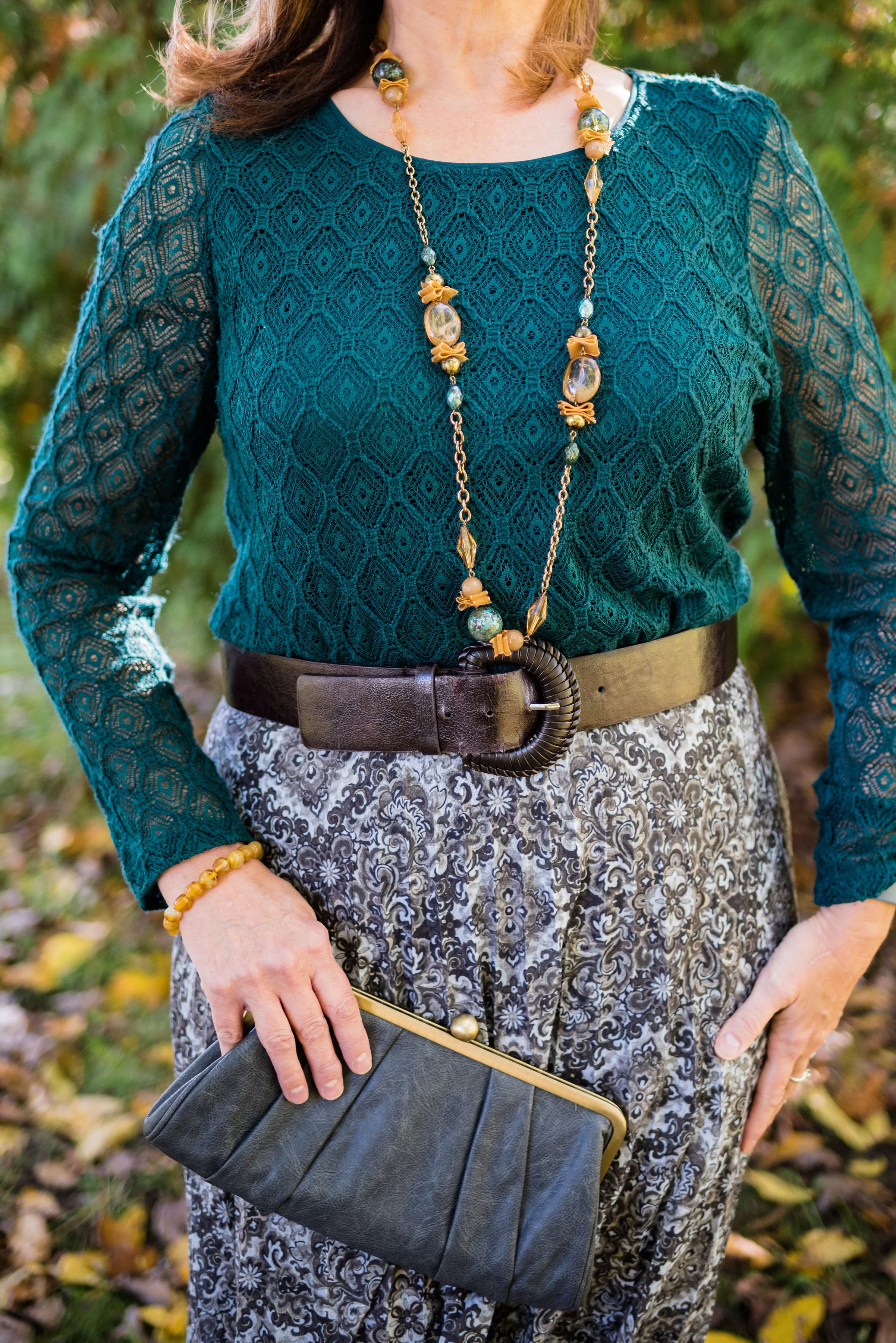
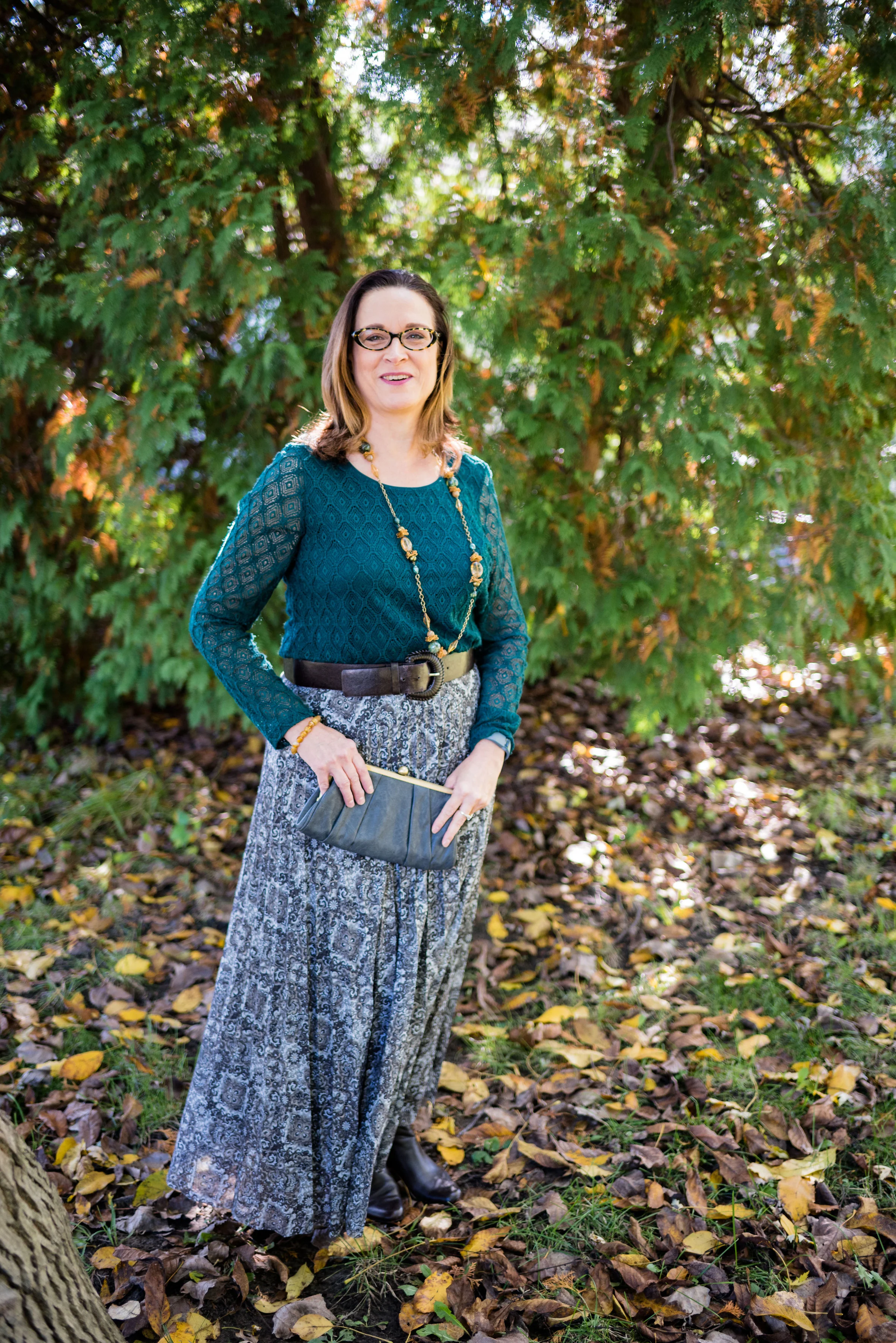
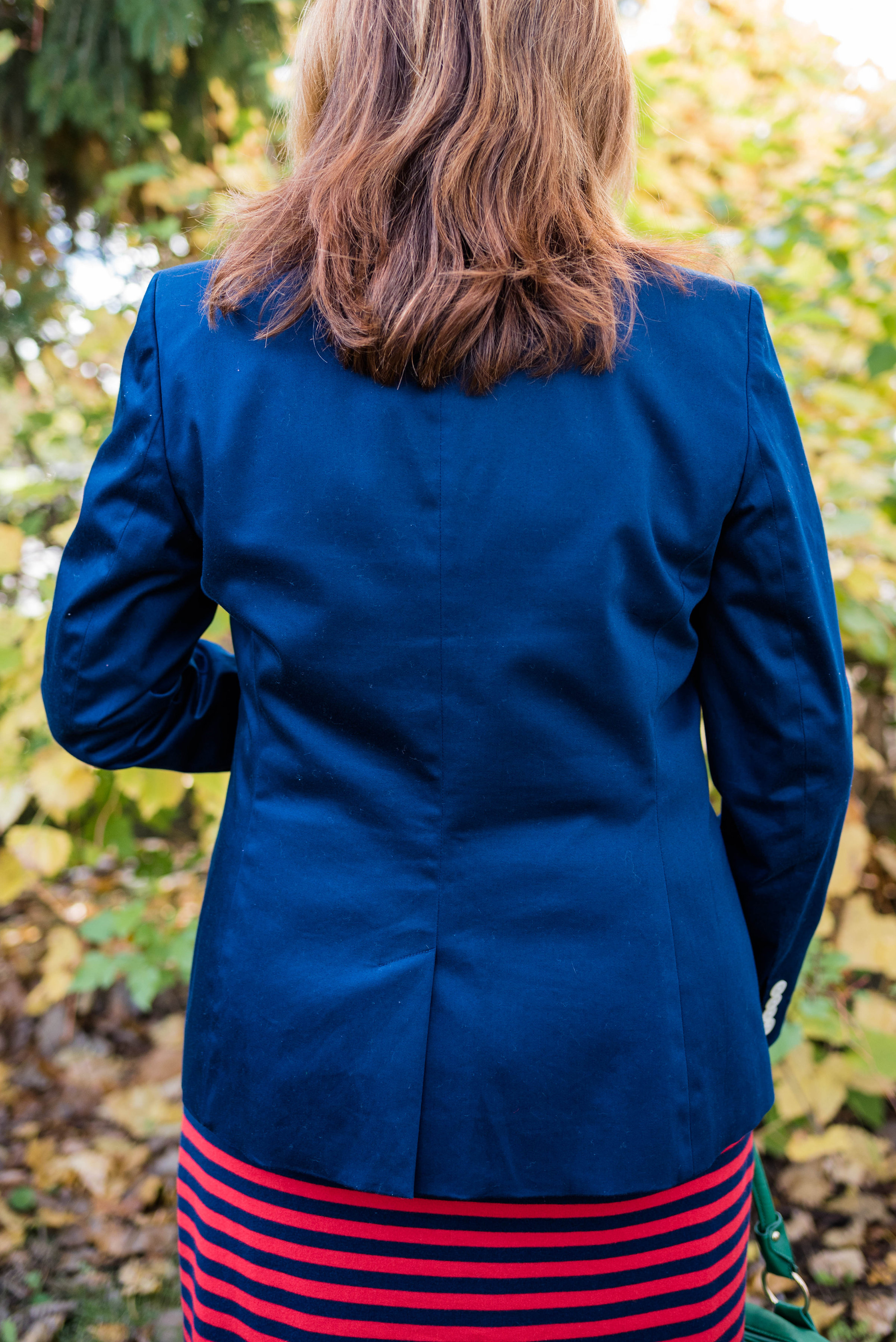
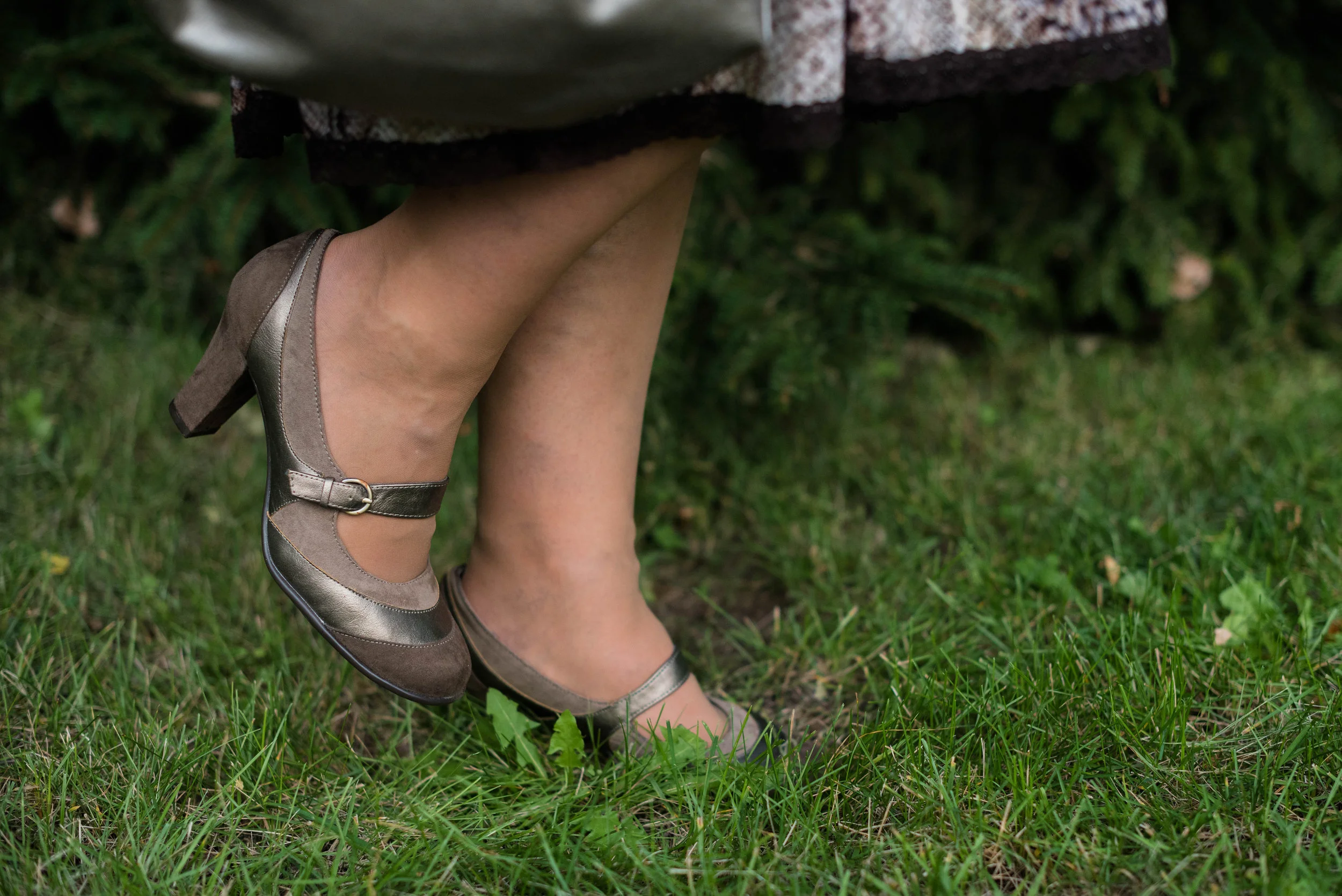
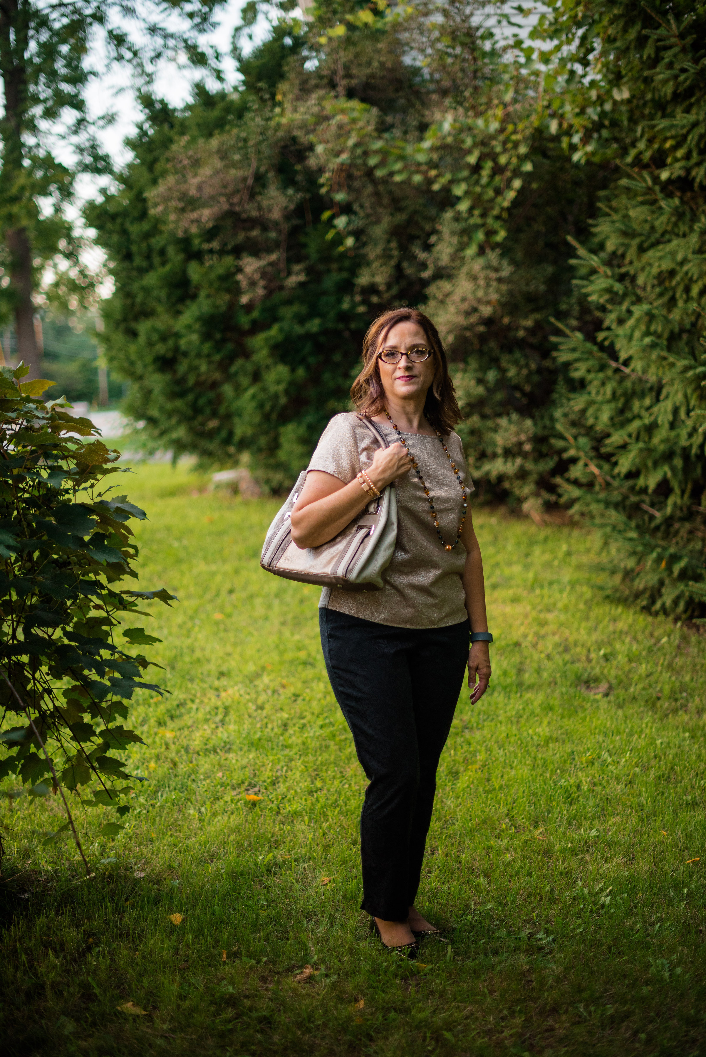
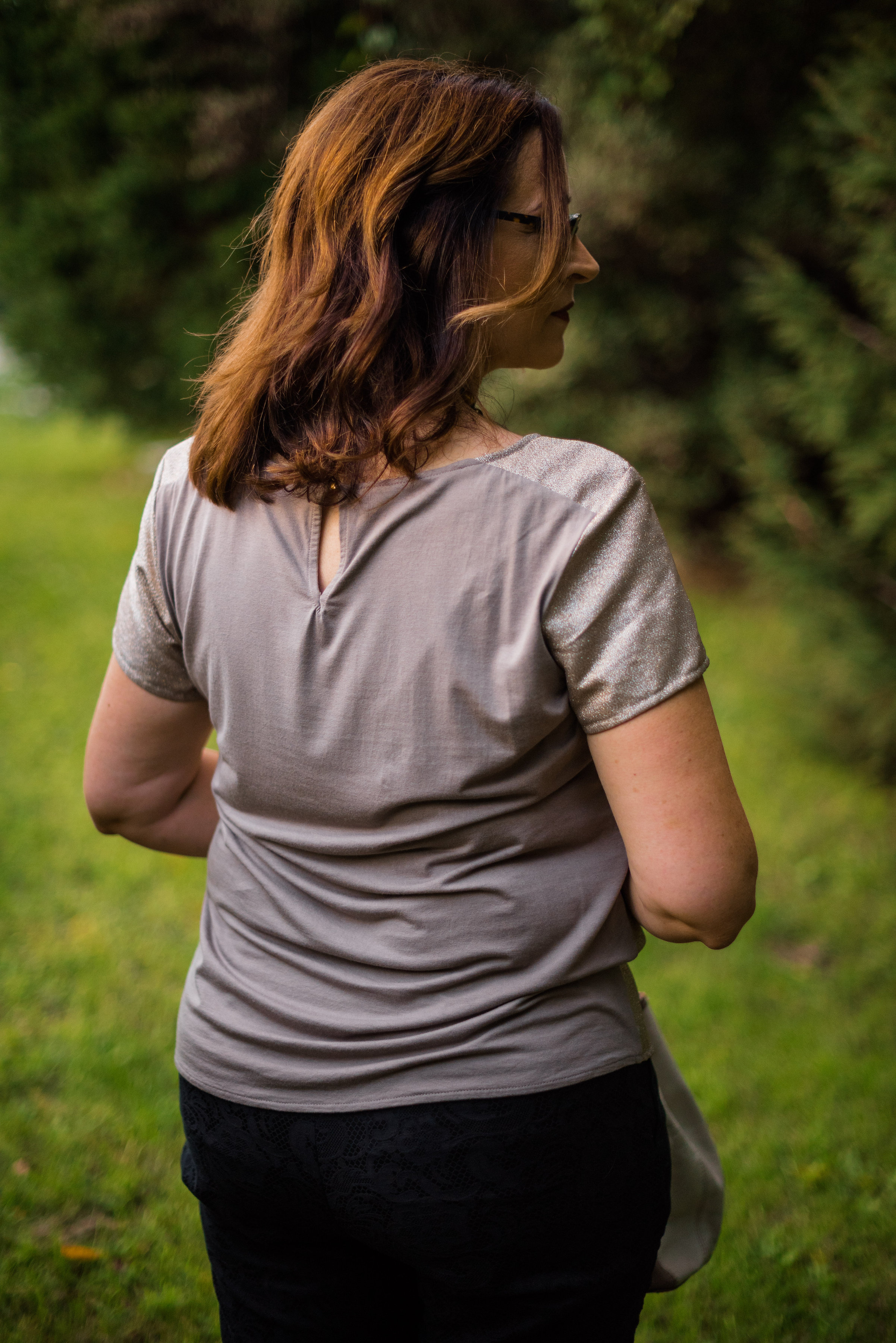
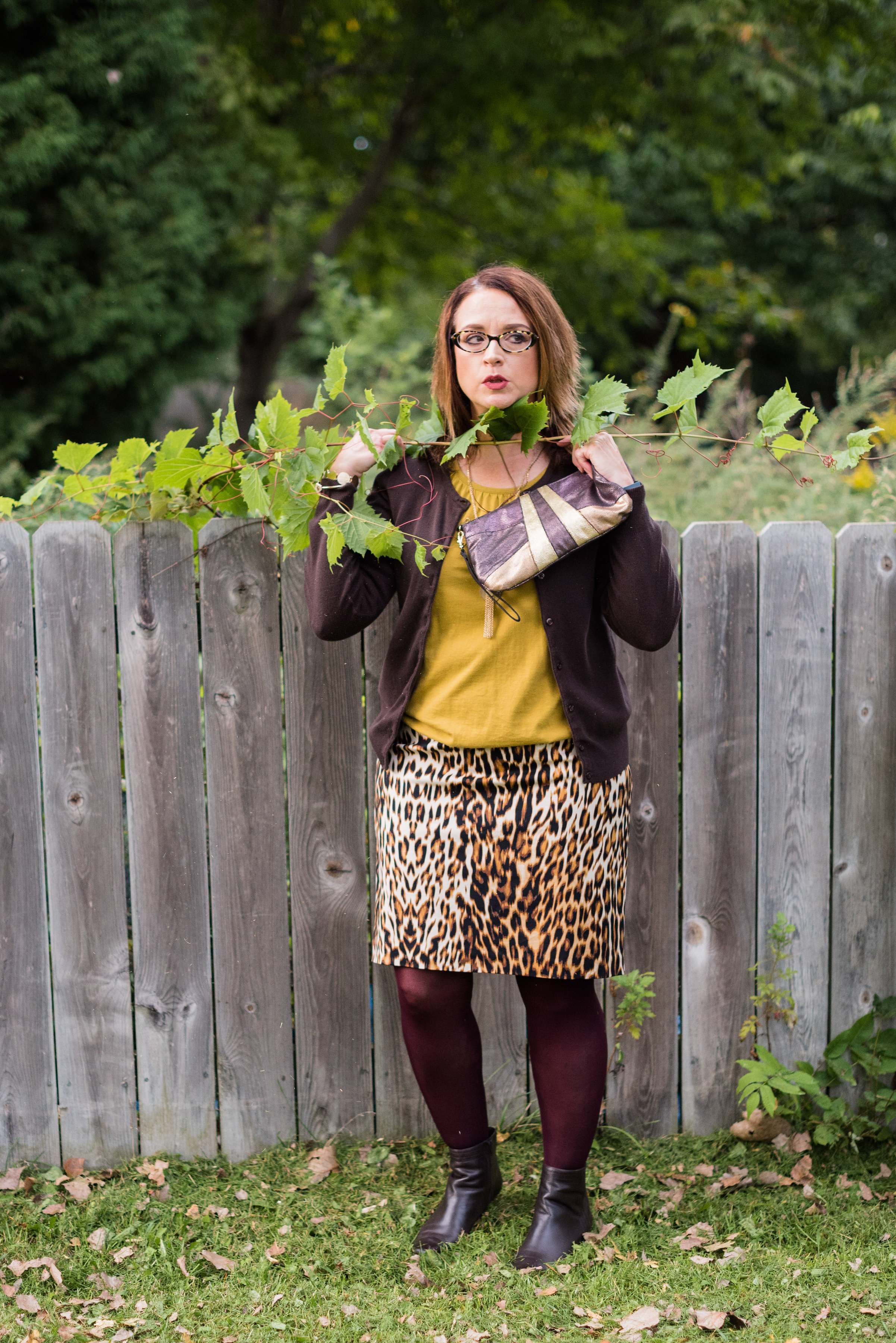
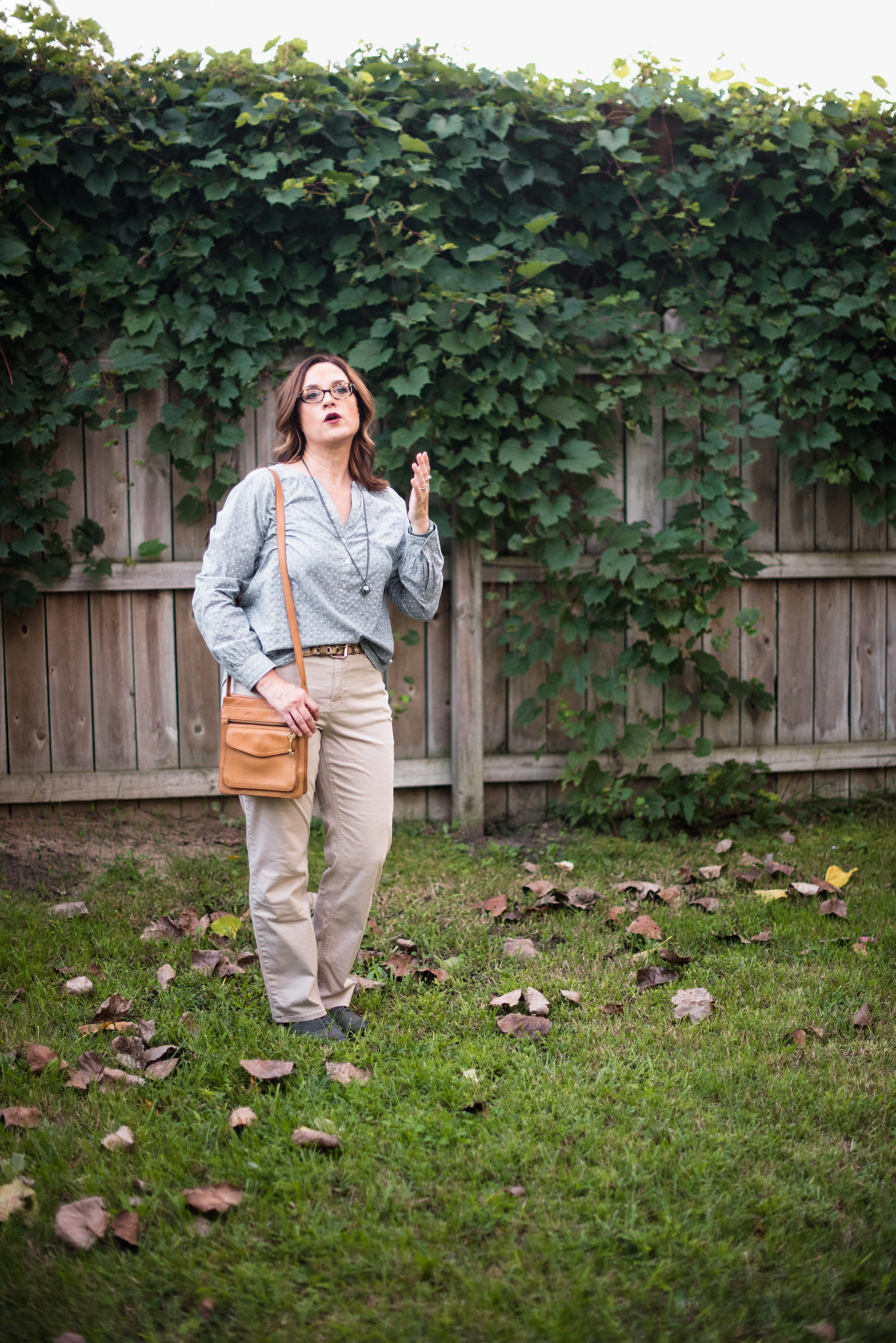
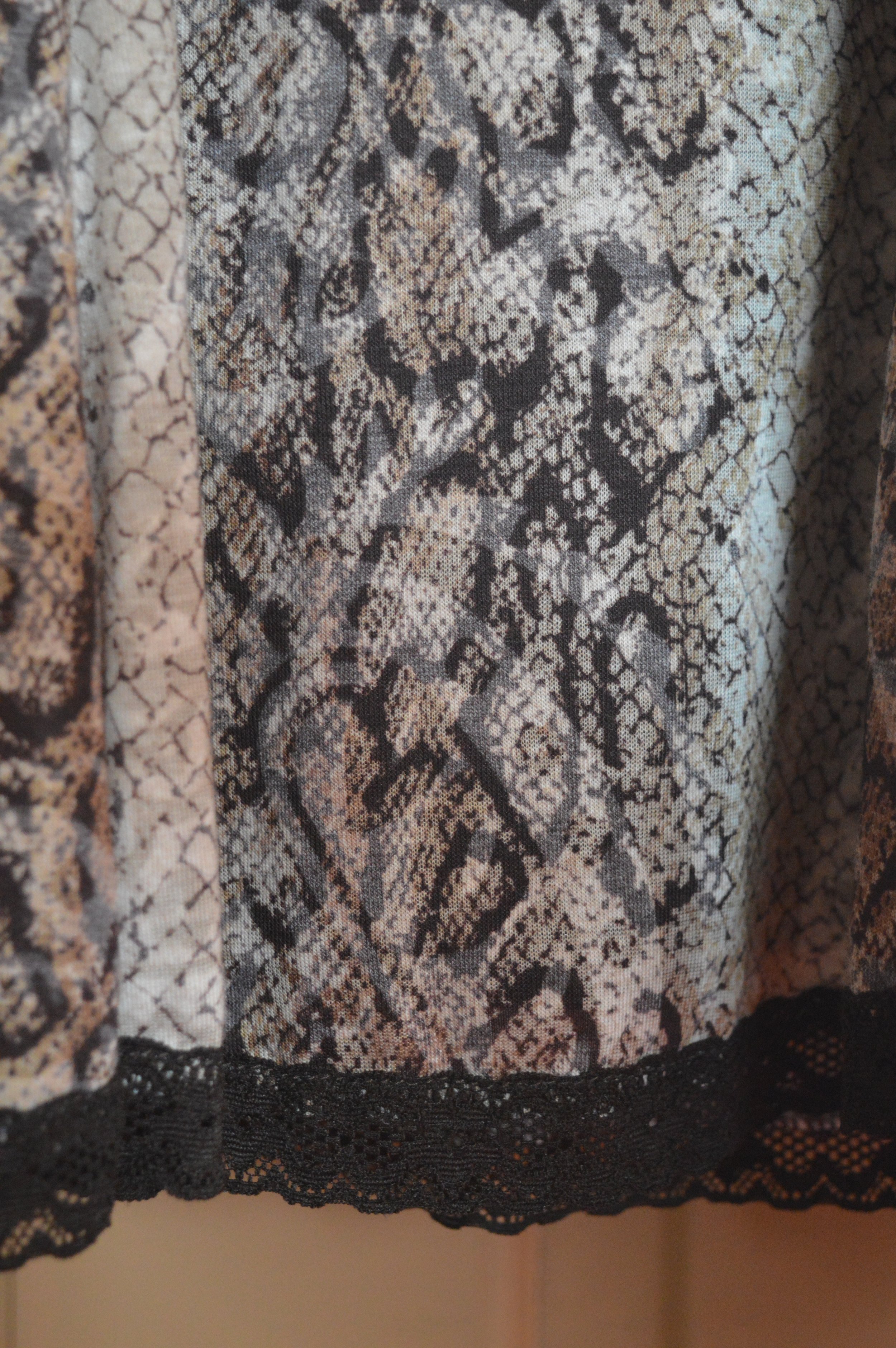
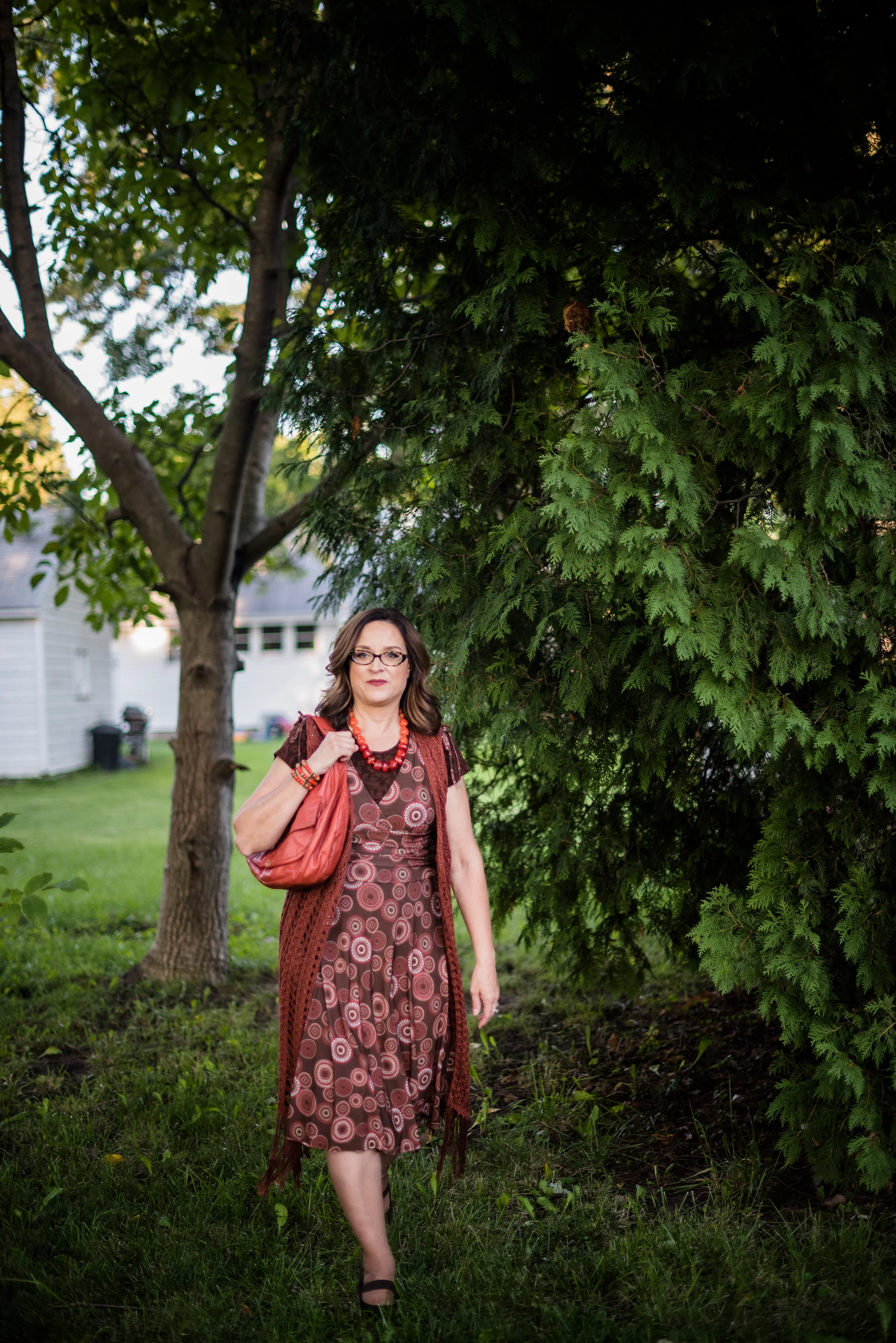
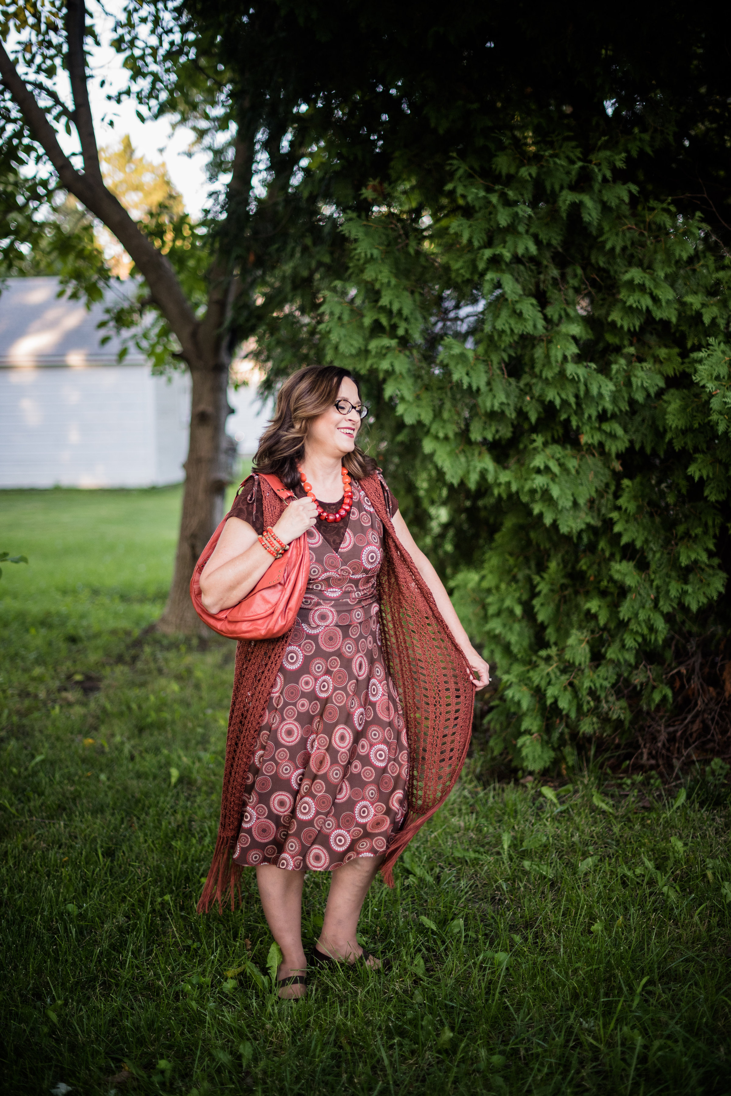
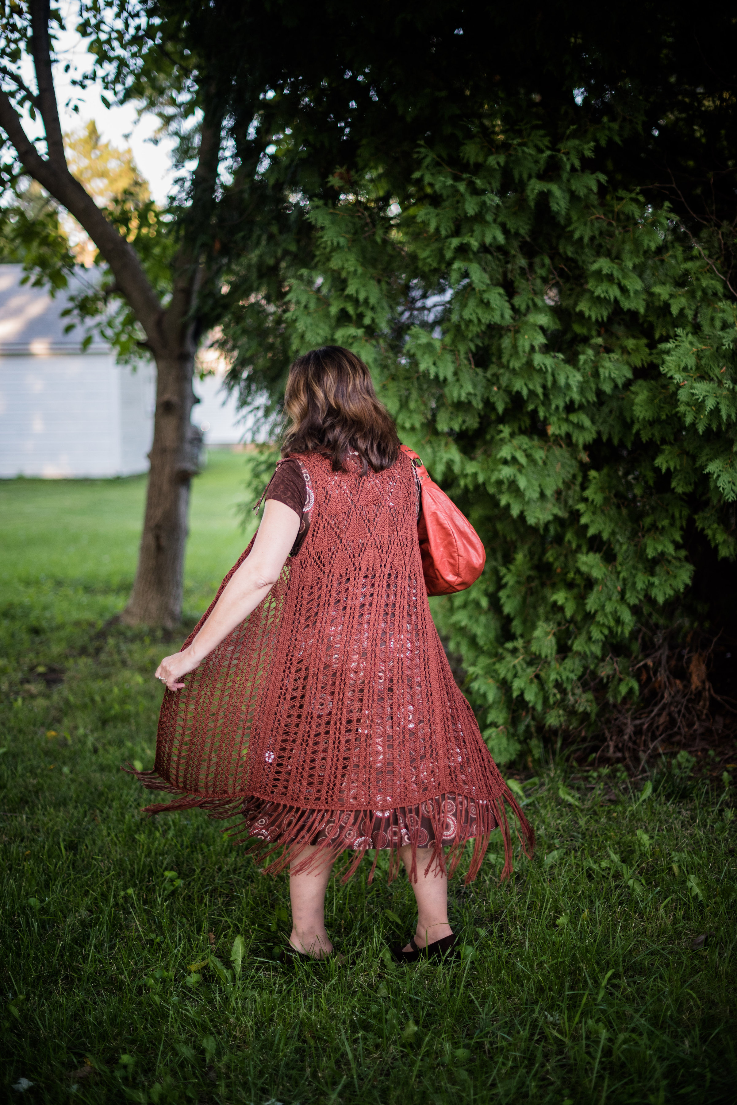
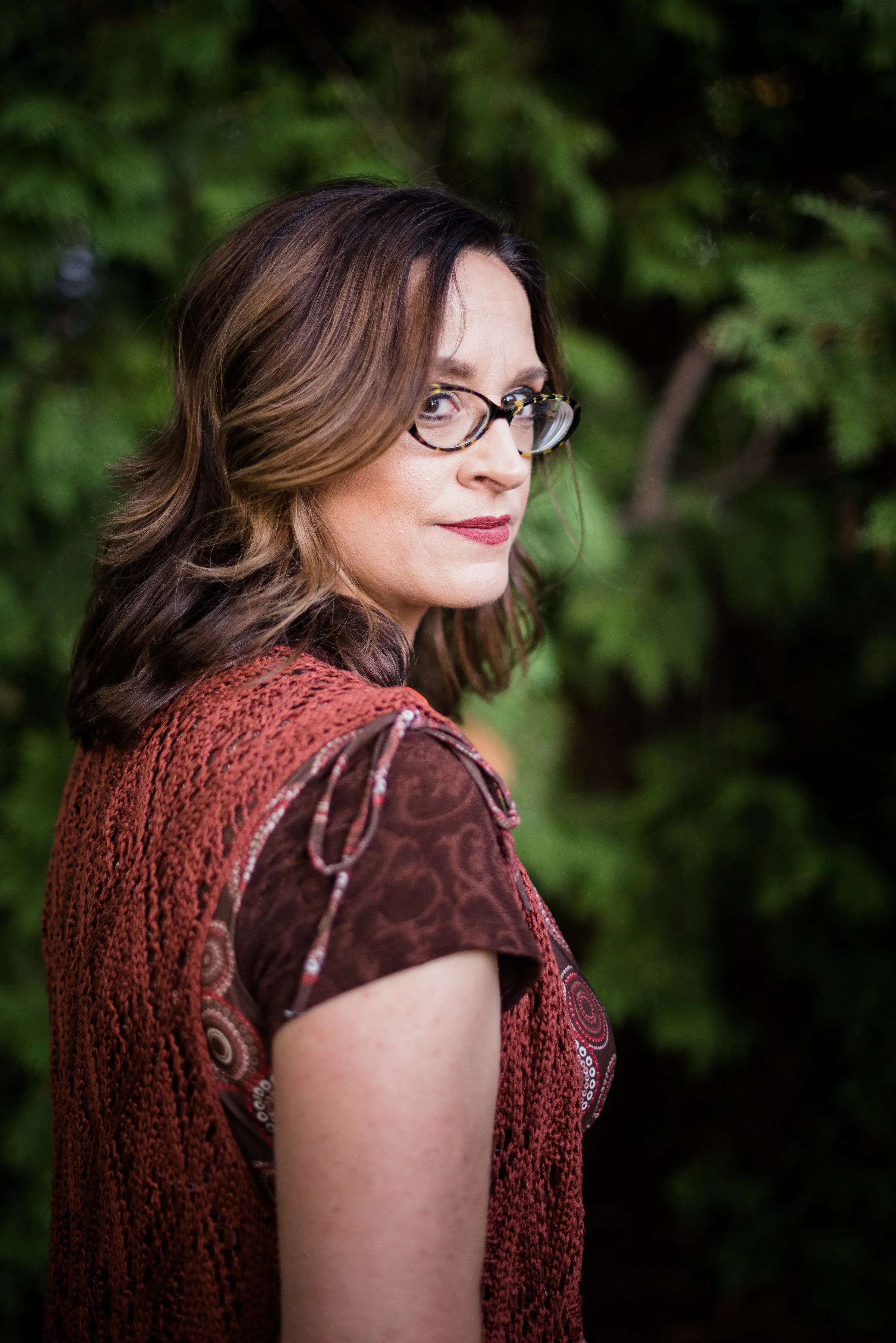
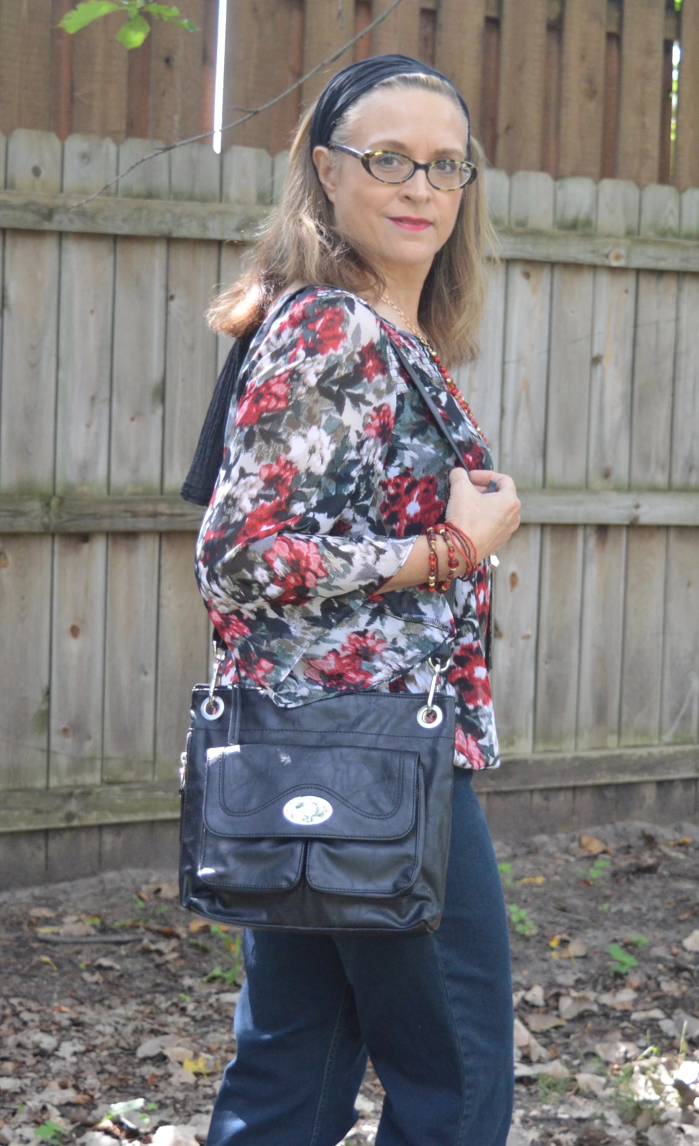
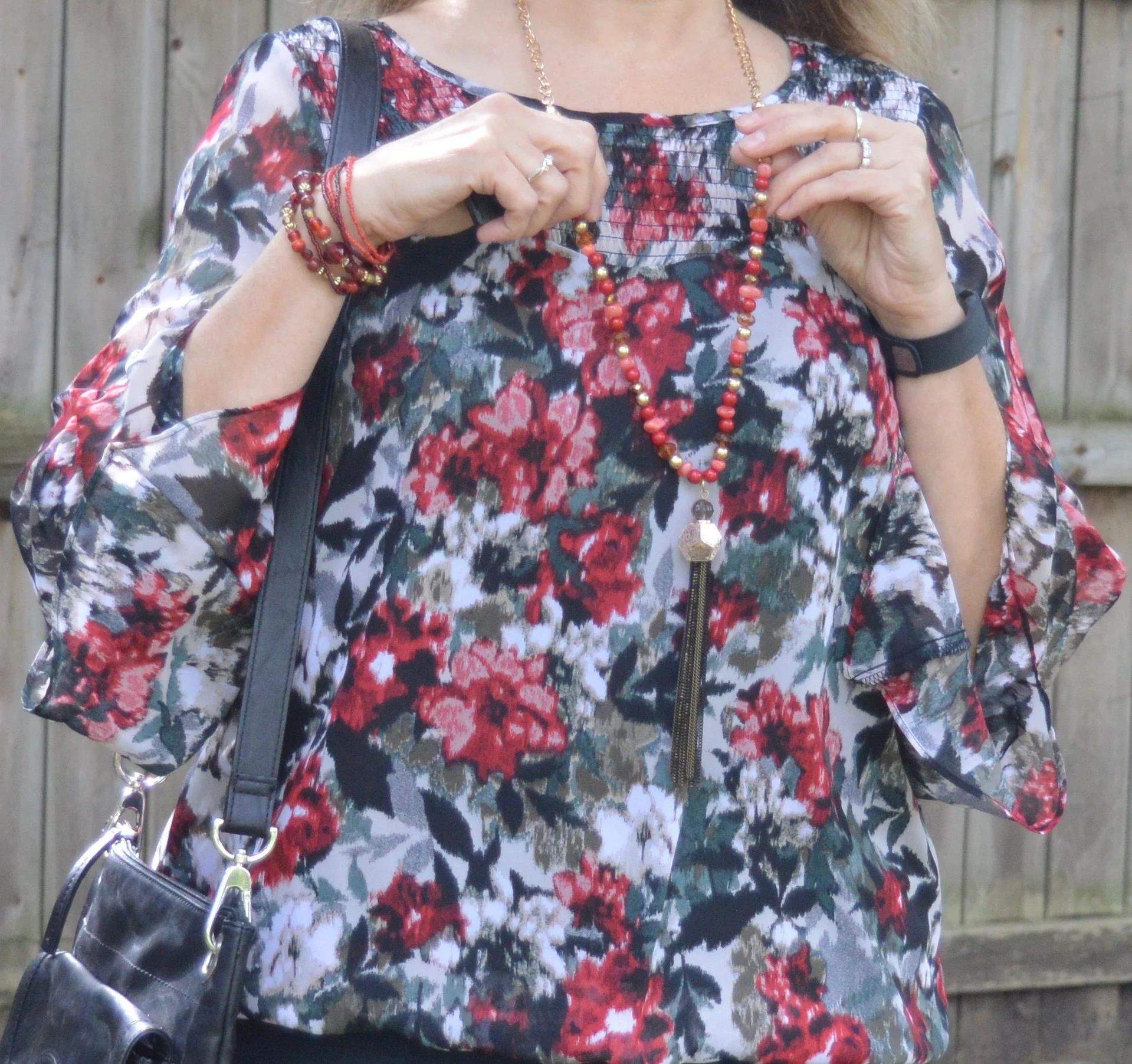
i have a few floral tops in my closet and chose this one for my outfit, because it seems a bit more fall like. The body is lined while the sleeves are sheer. the sleeves also have an asymmetrical hem line, and there is smocking on the upper part by the neck, making it an interesting piece. 

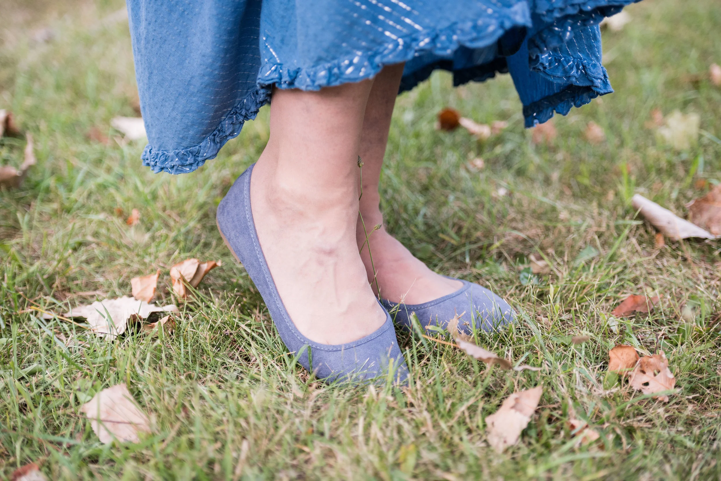
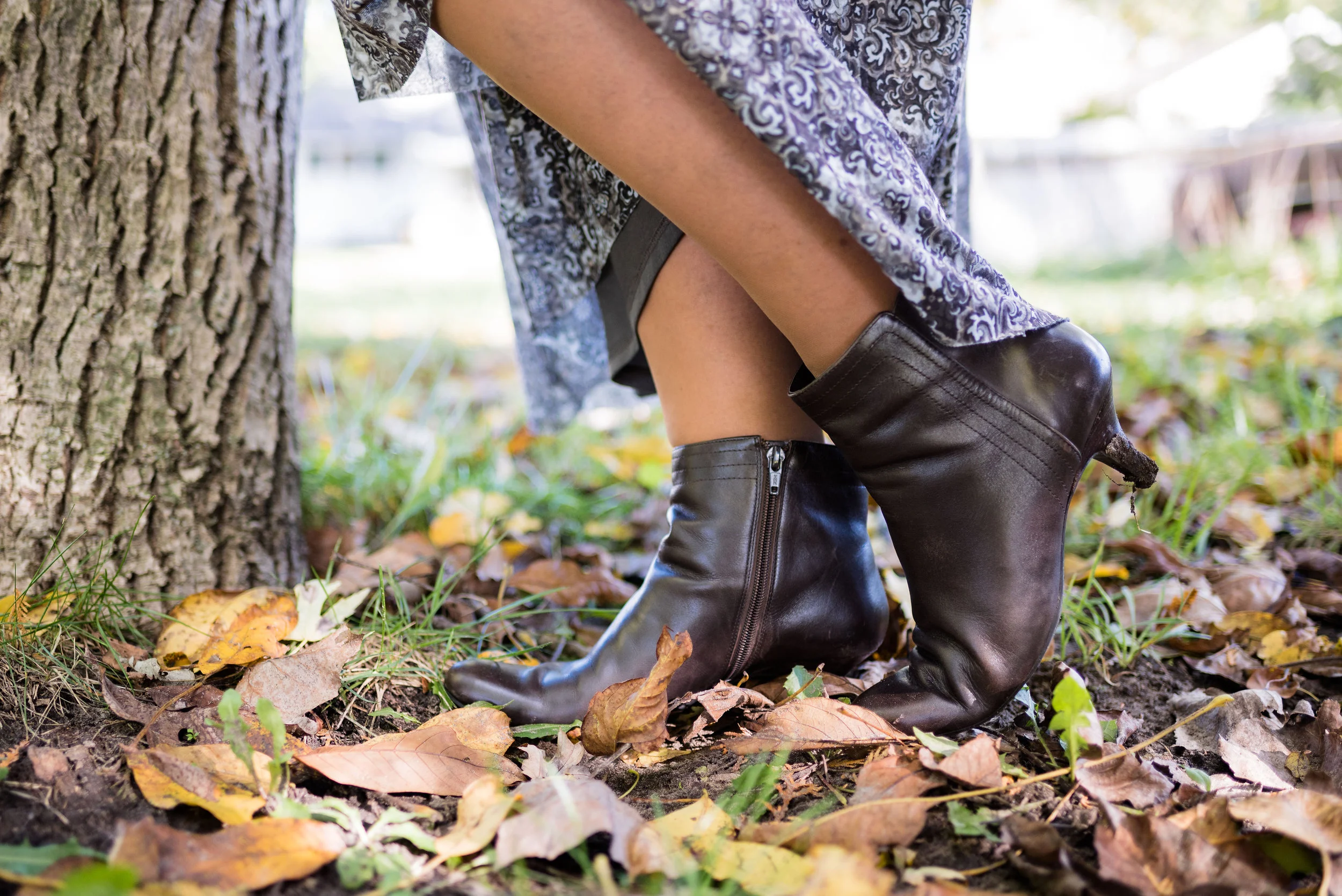
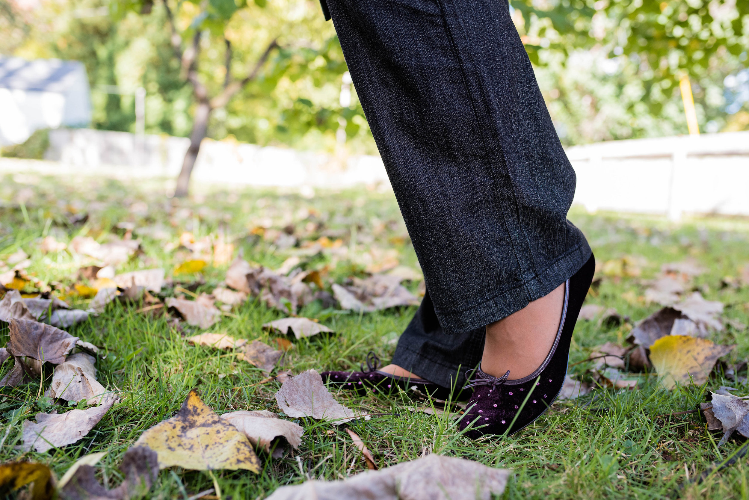
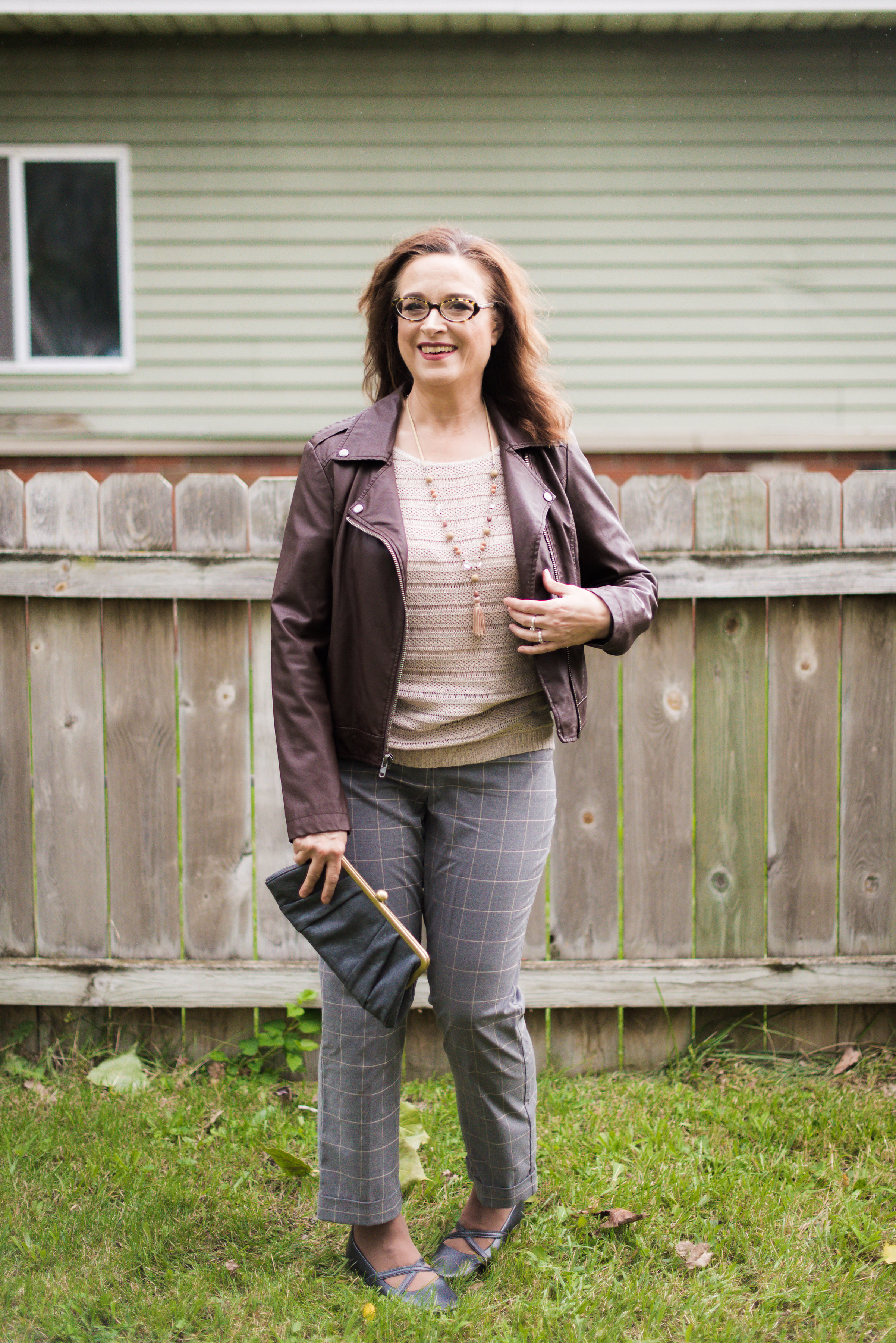
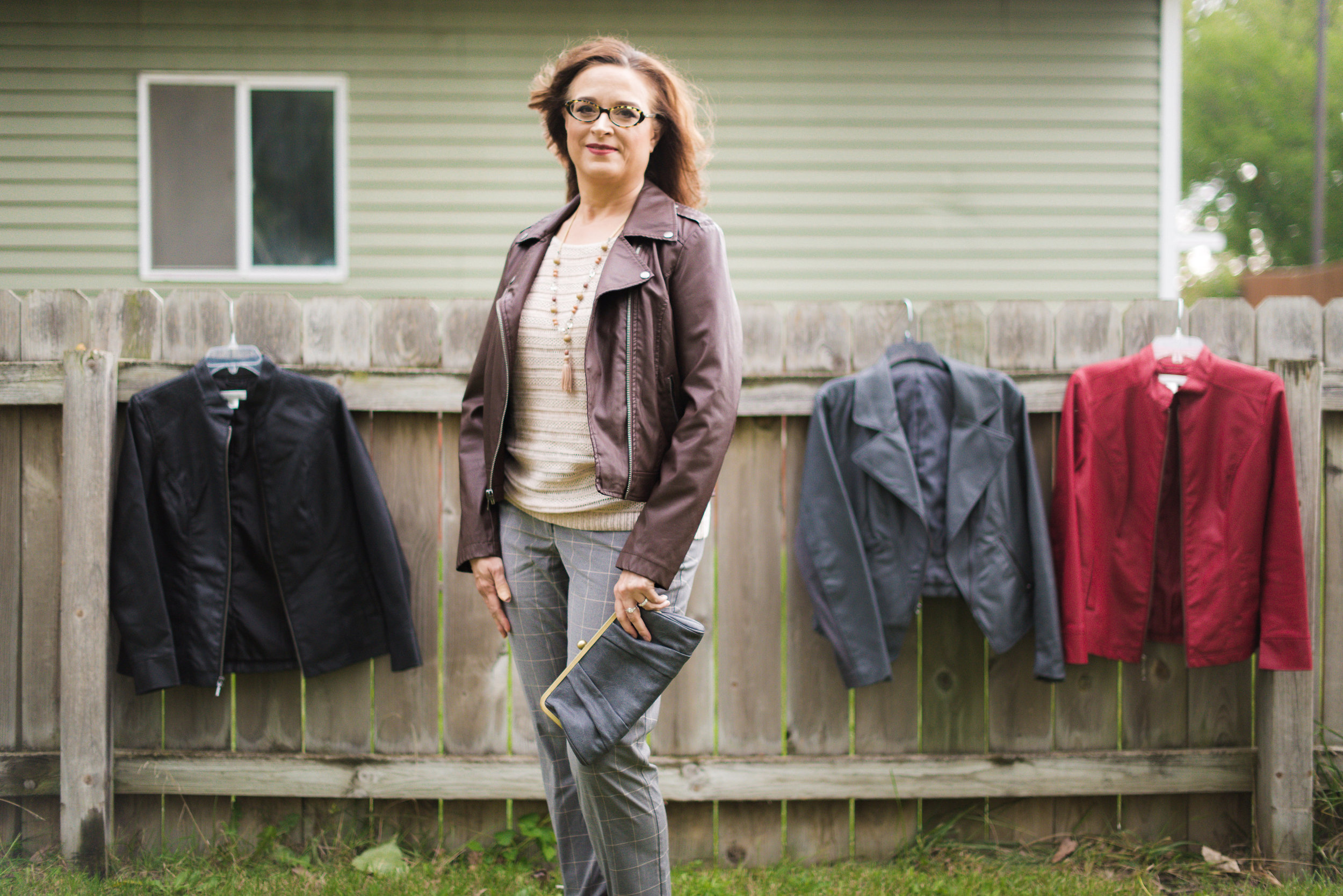
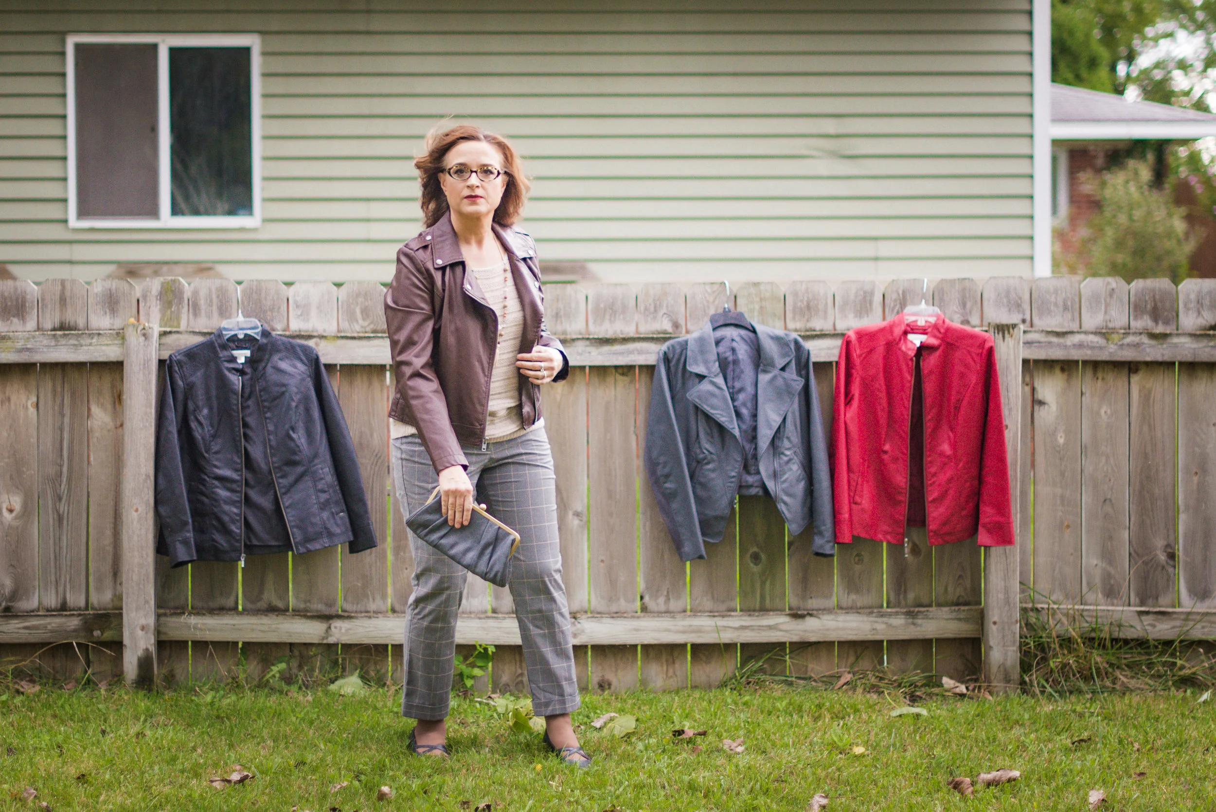
I paired the top with these recently thrifted J.Jill black jeans and my Clarks peep toe shooties.

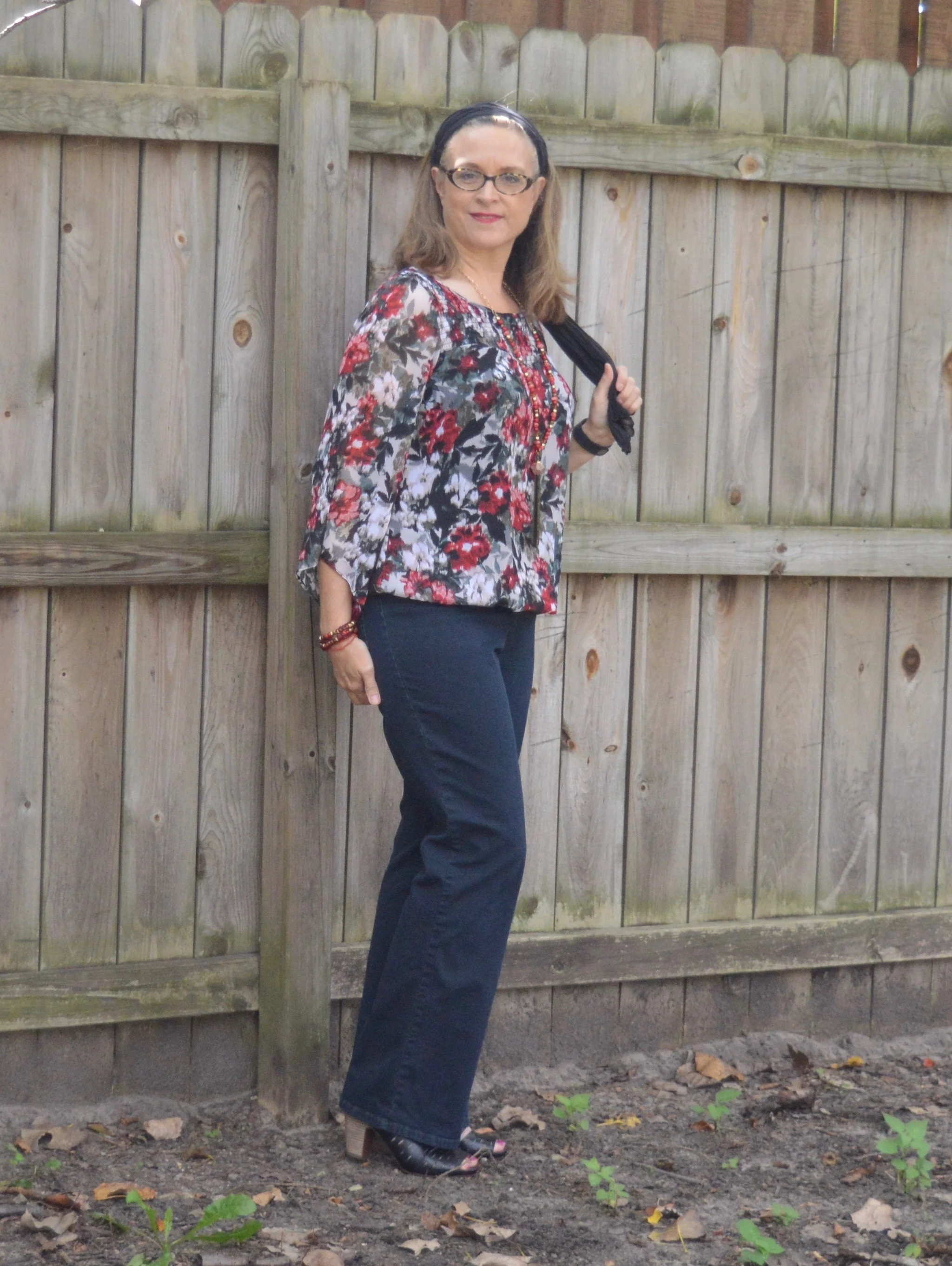
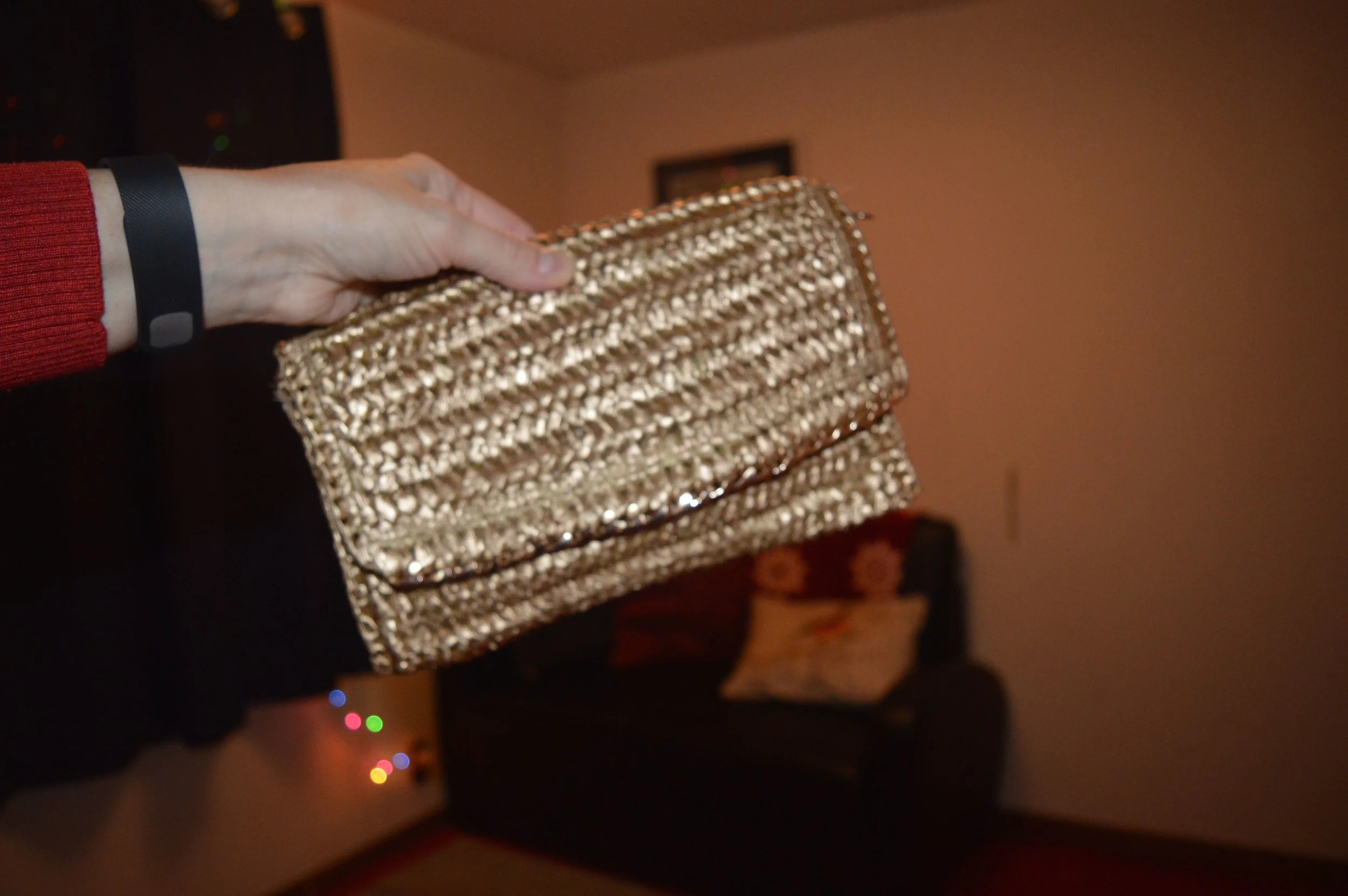
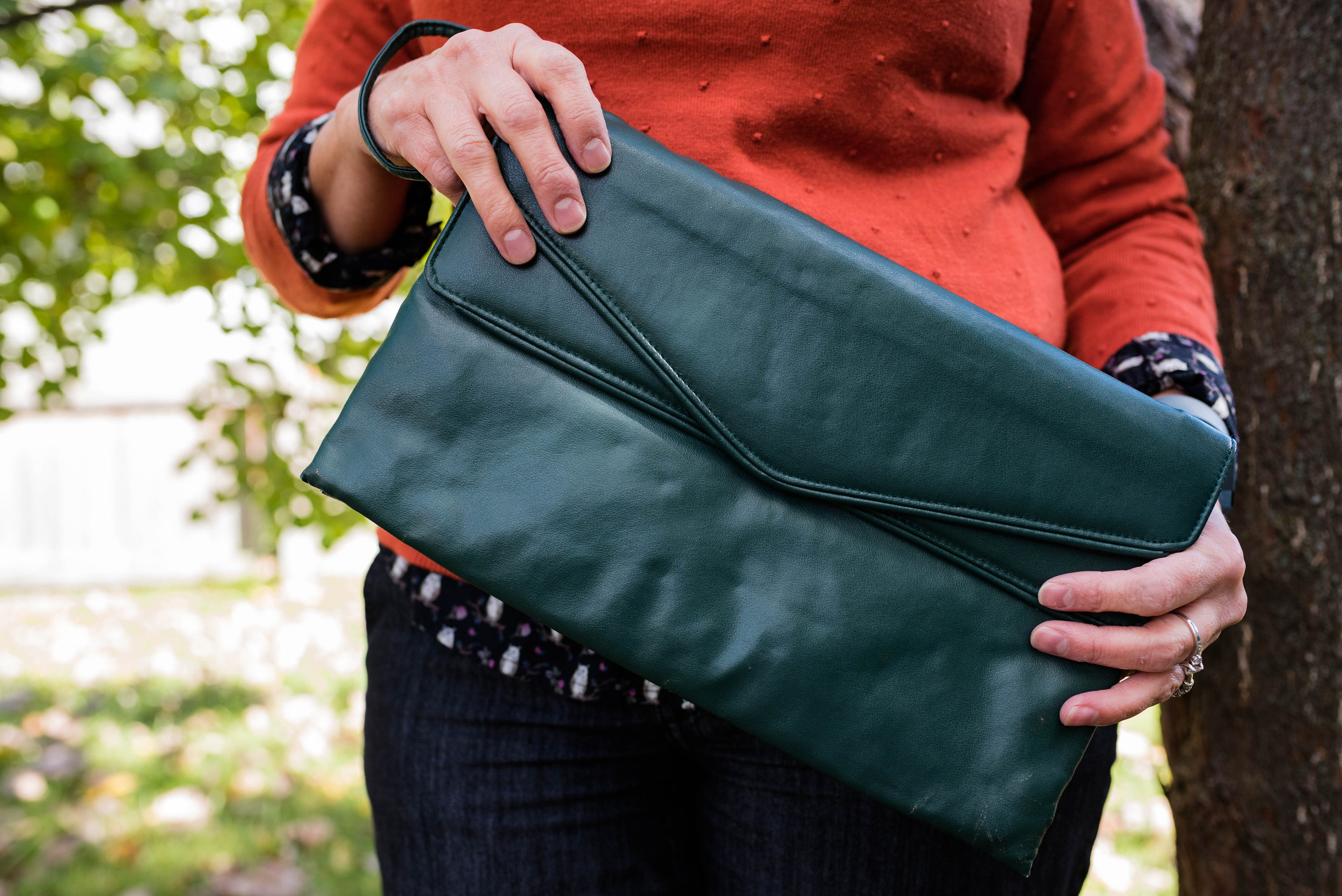
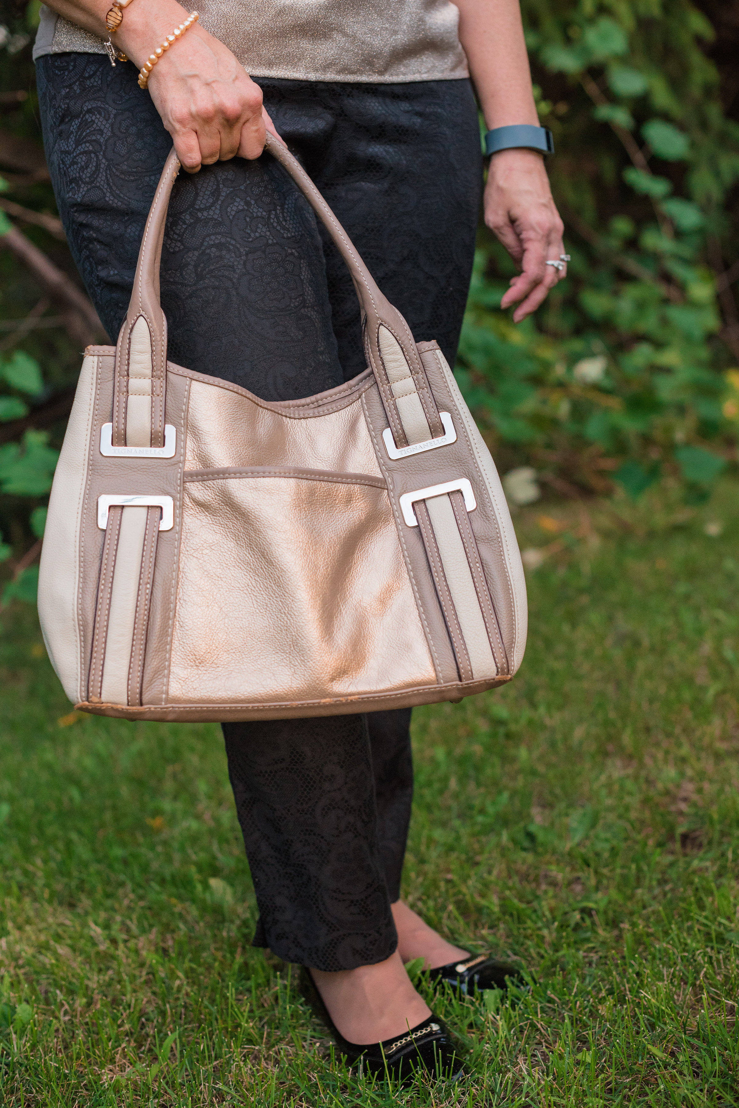
I also had this black Franco Sarto bag in my closet. Here is a cross body bag from their site. 

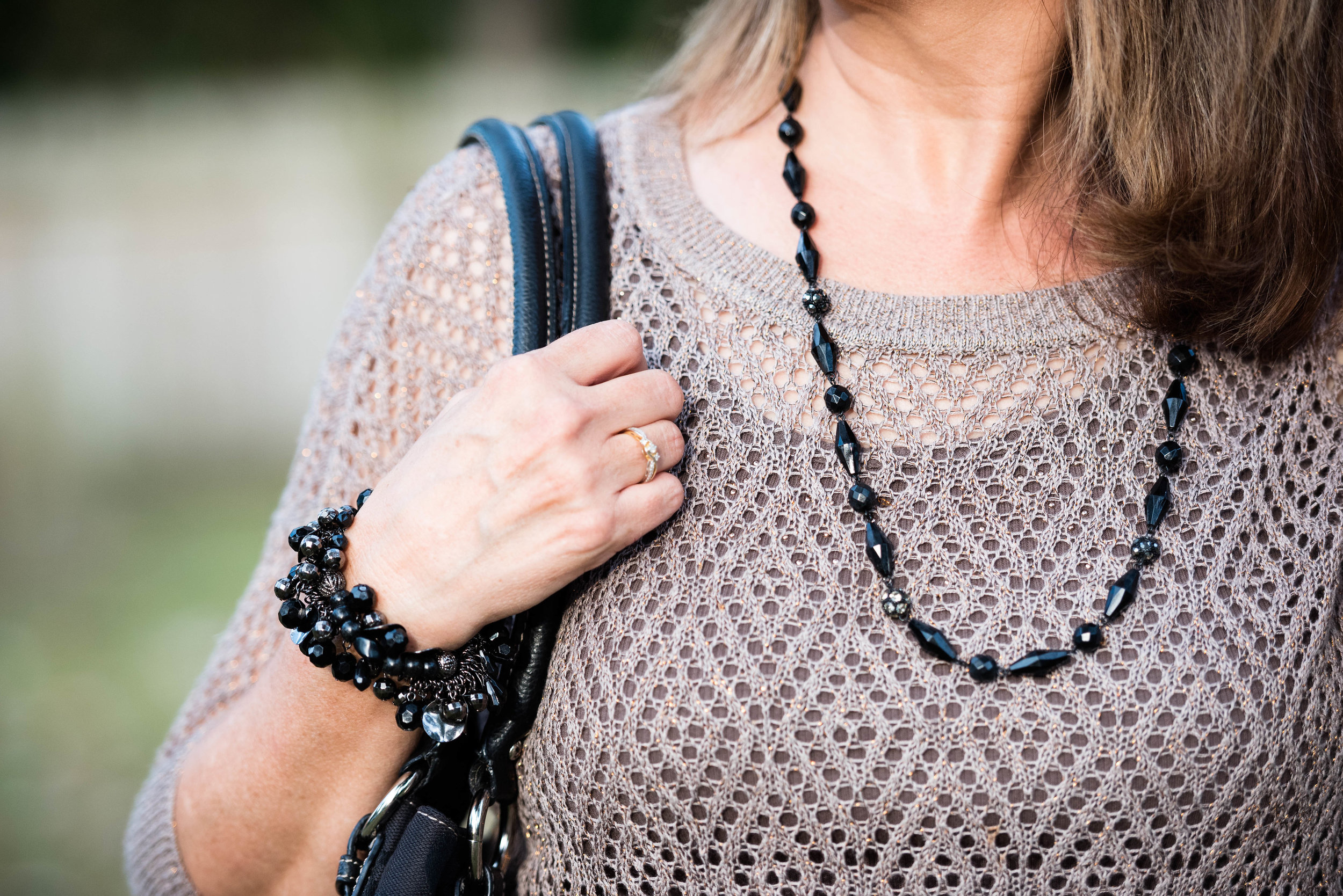
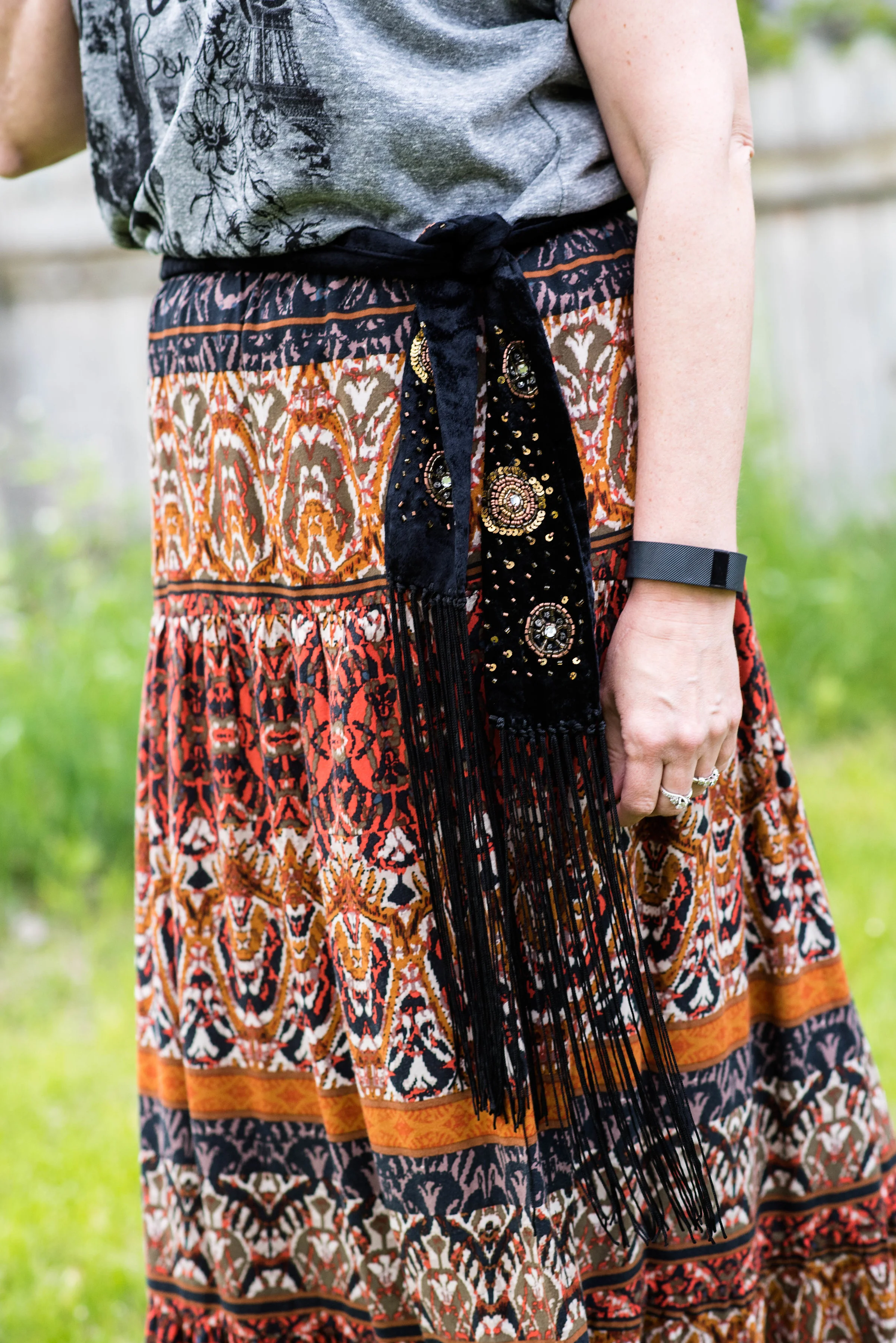
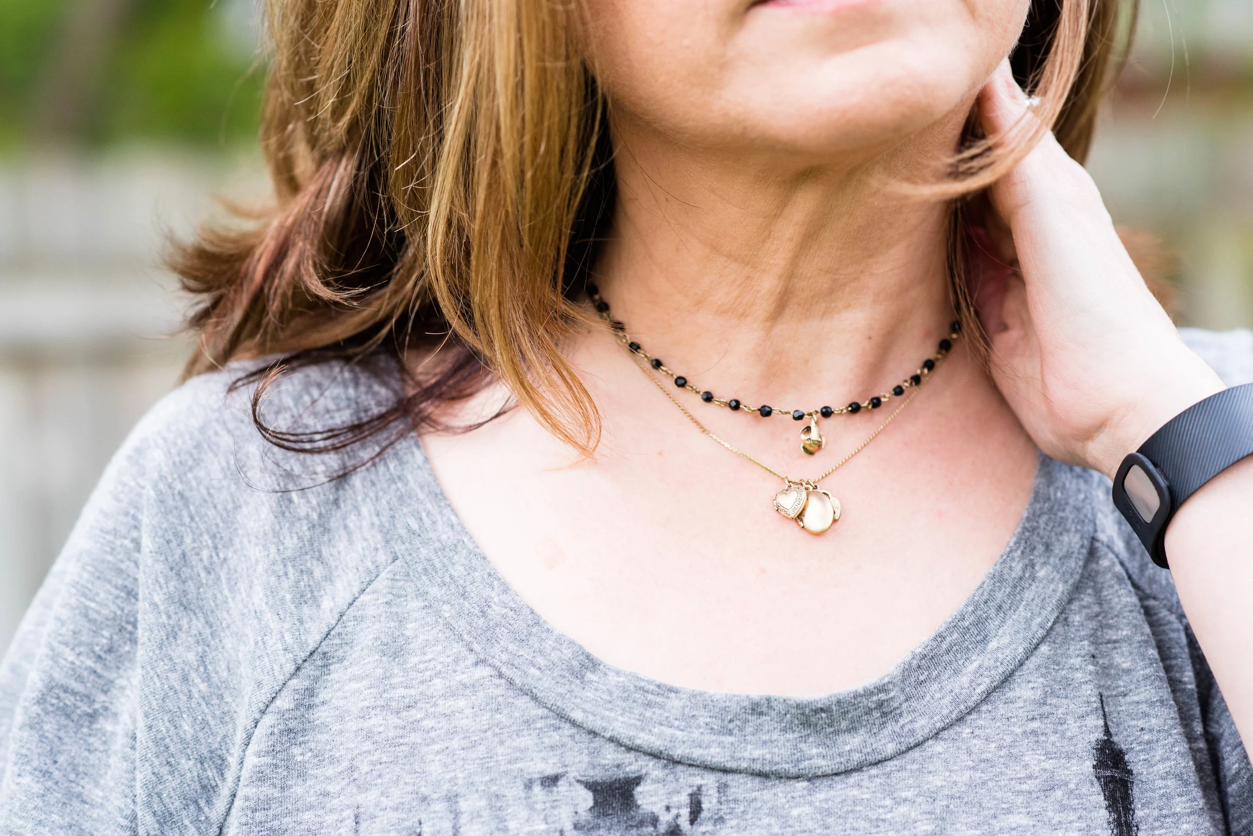
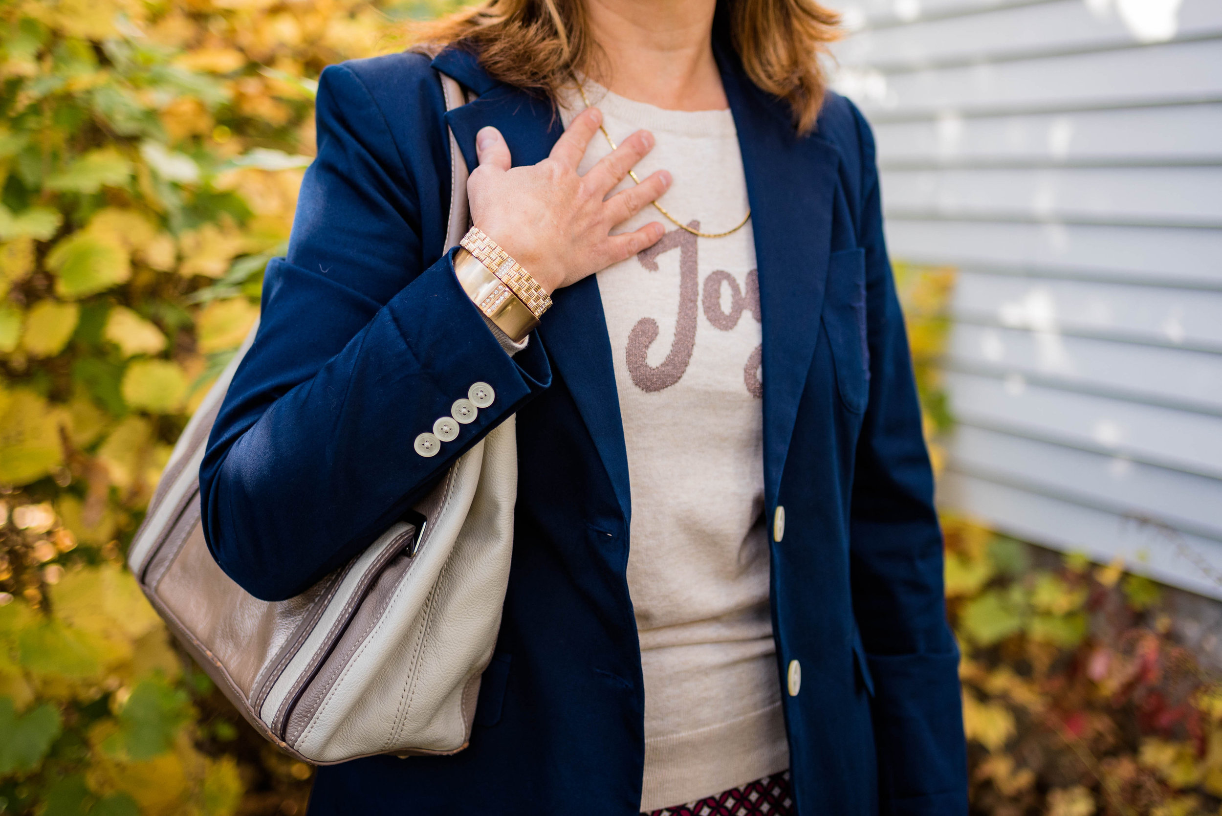
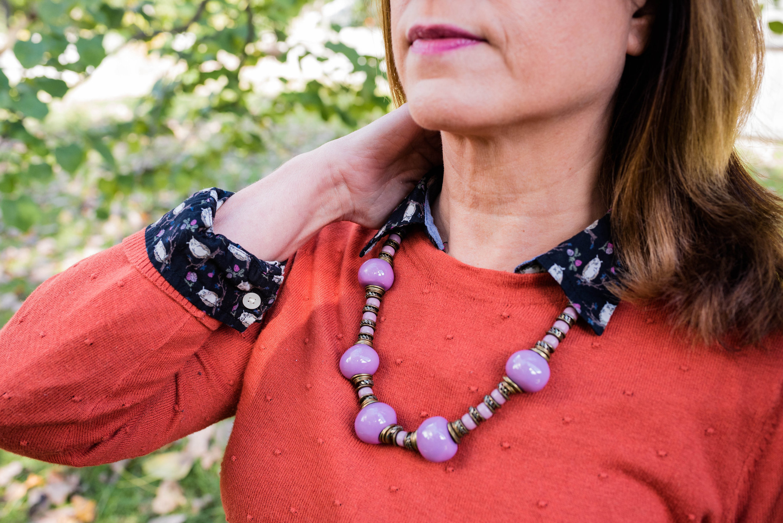
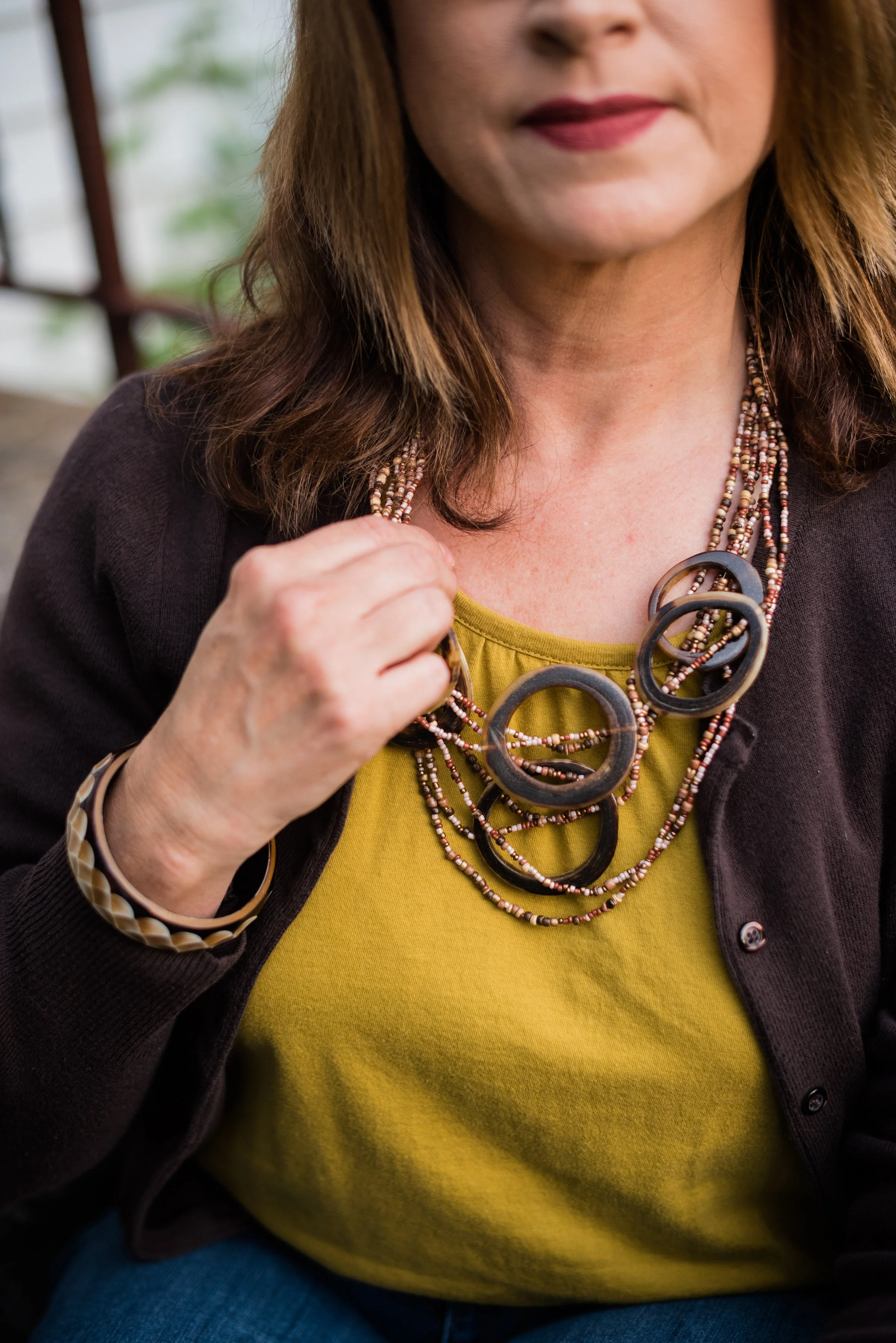
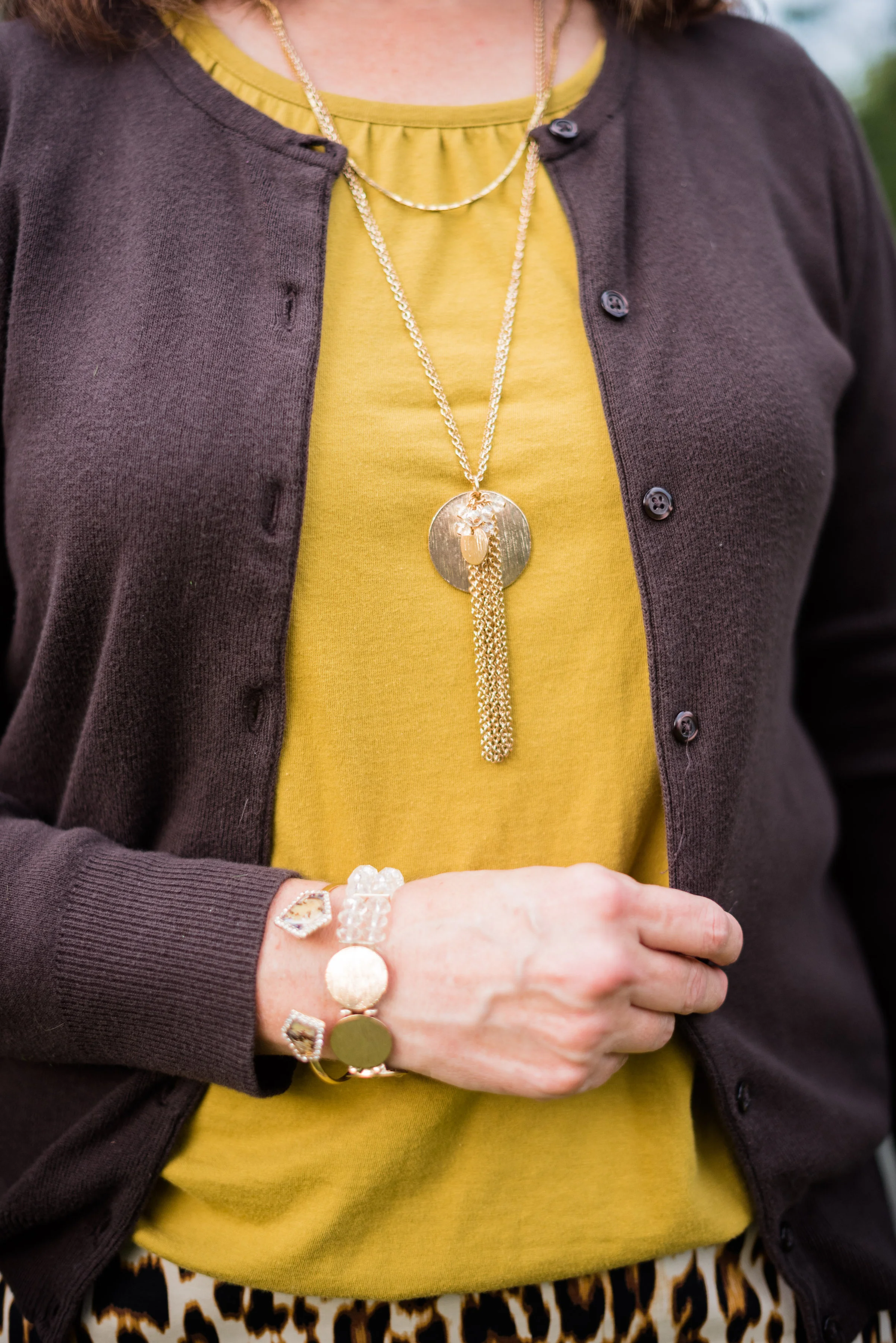
I added a few fun pieces of jewelry to compliment the colors in the top.

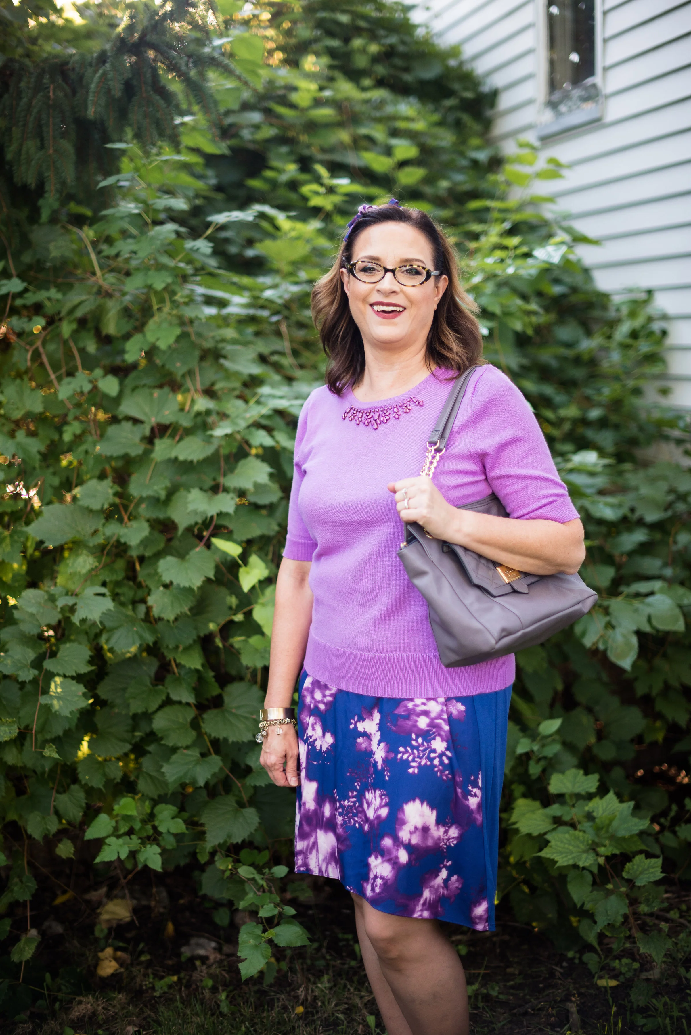
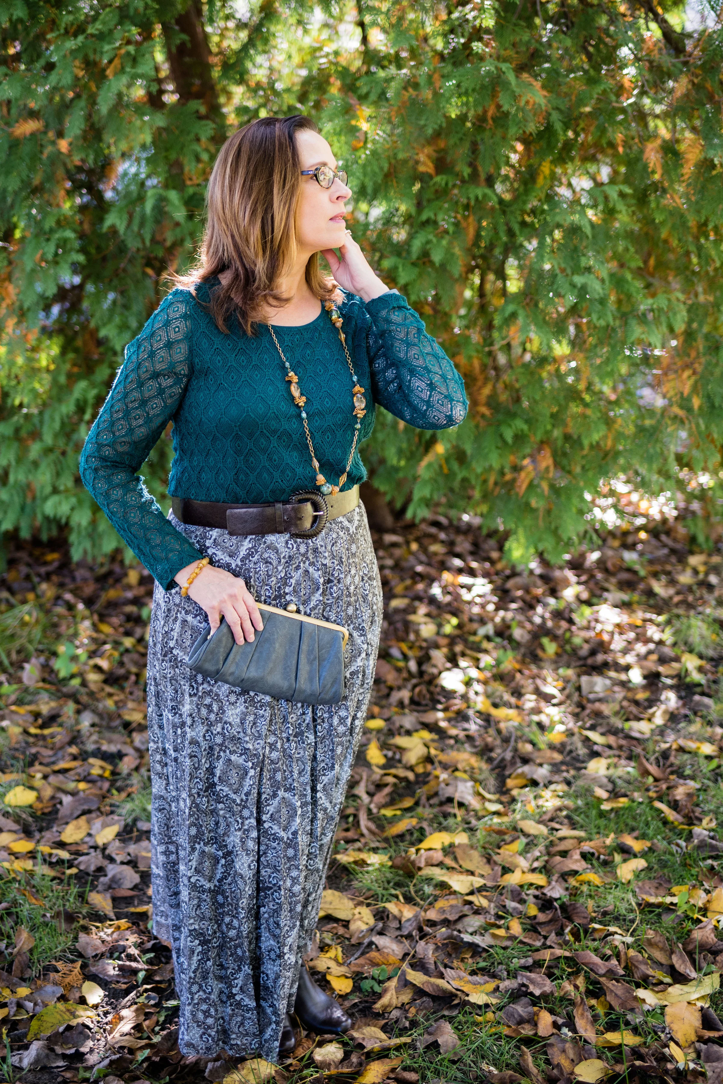
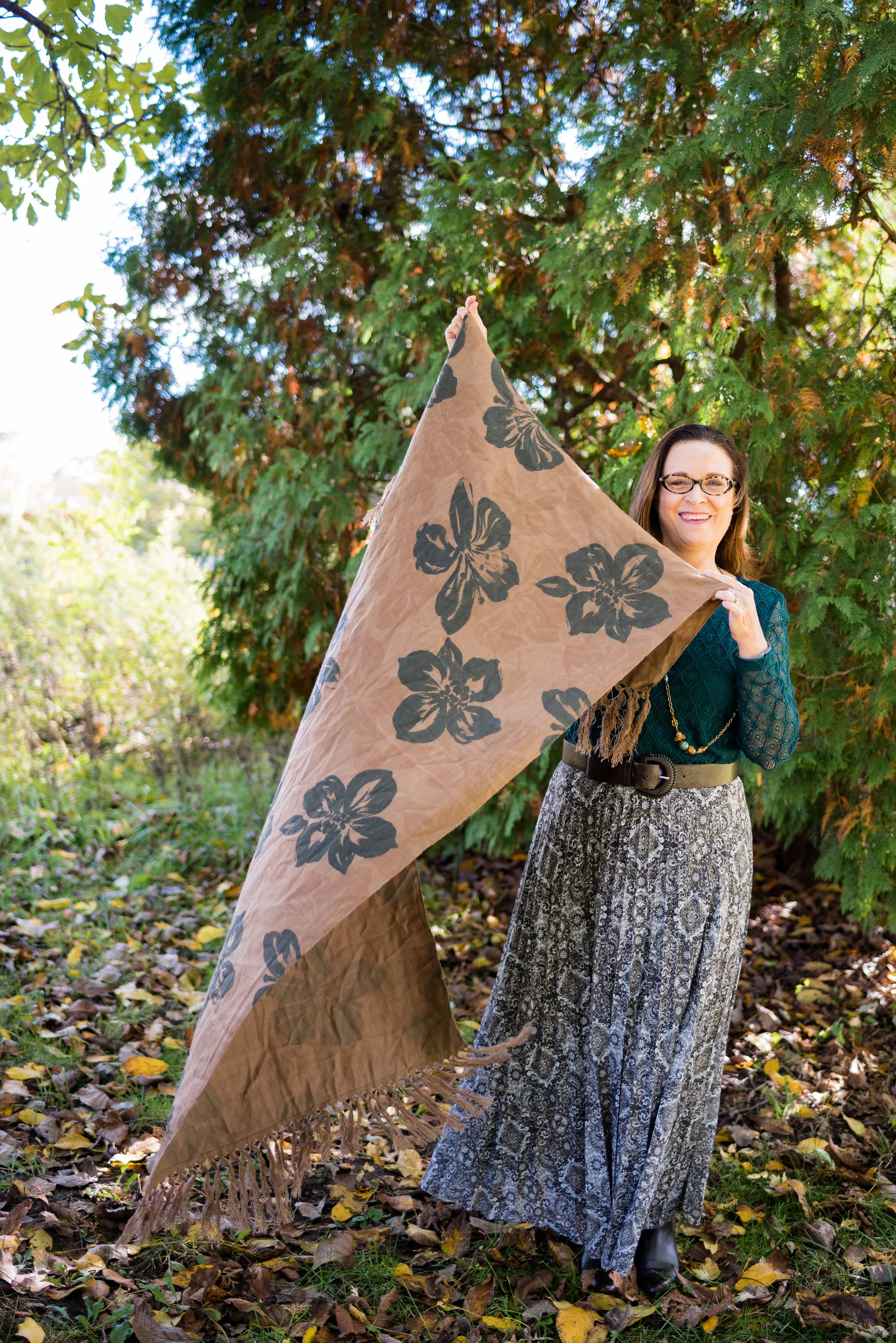
Here are a few other looks that I put together as flat lays.

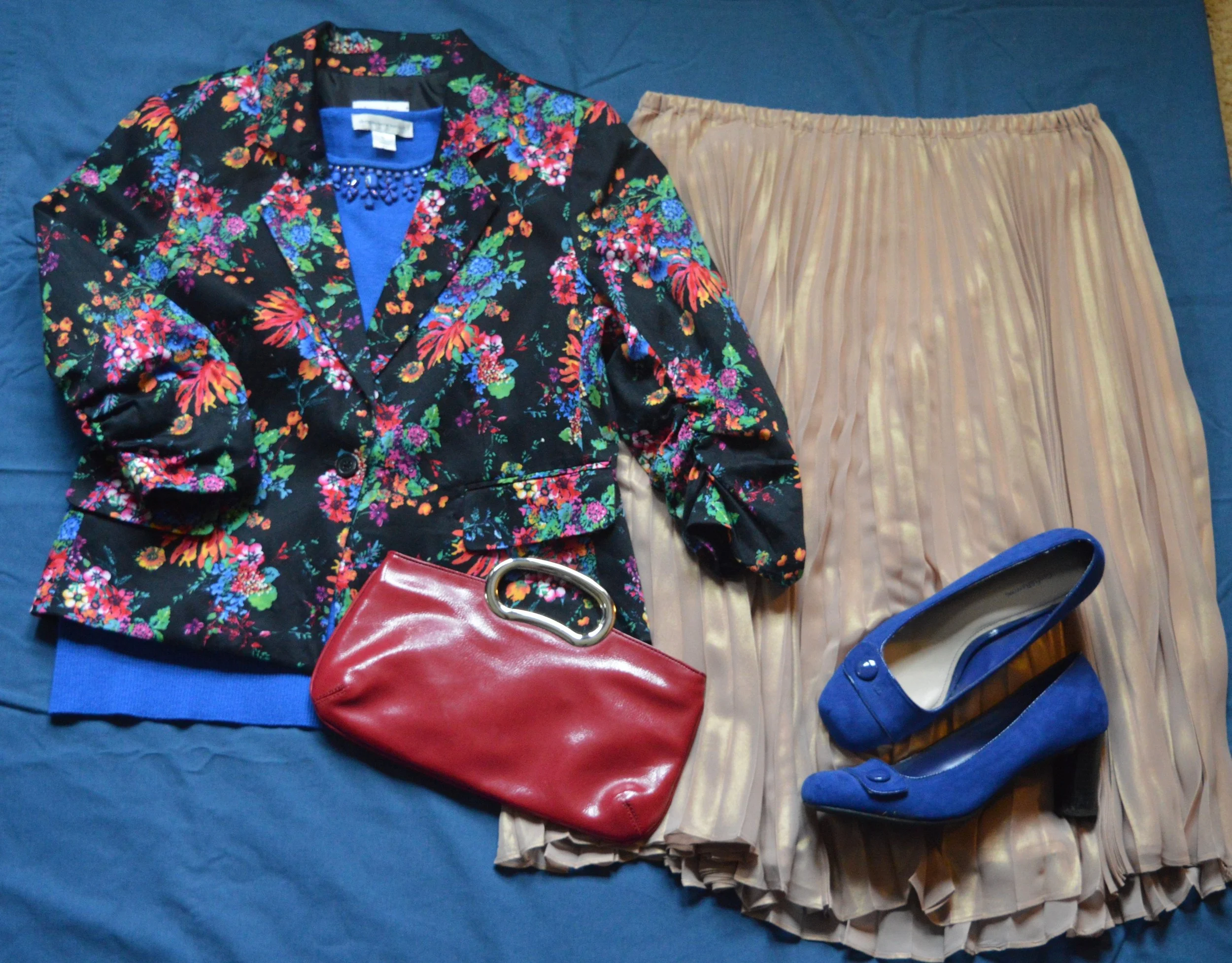
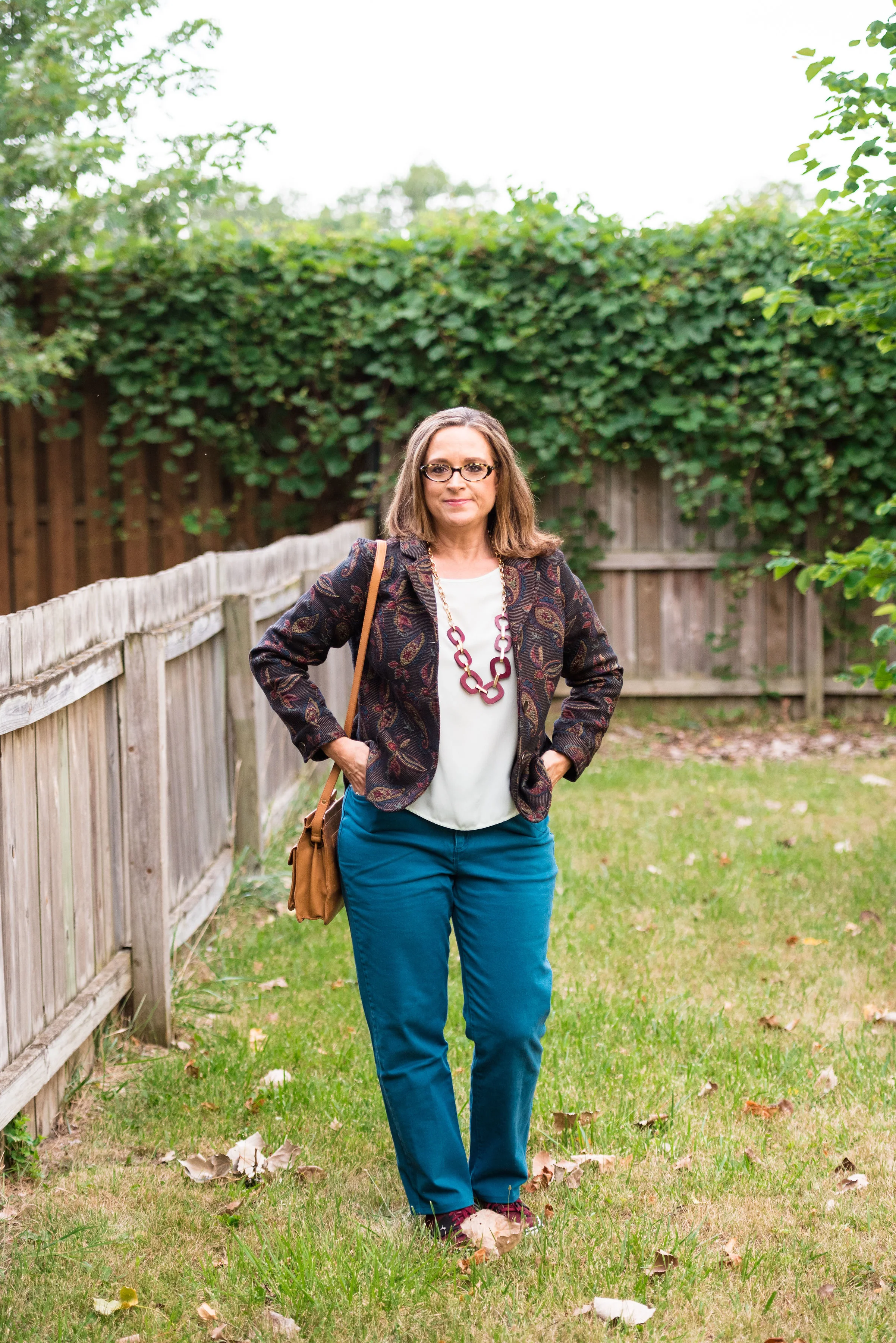
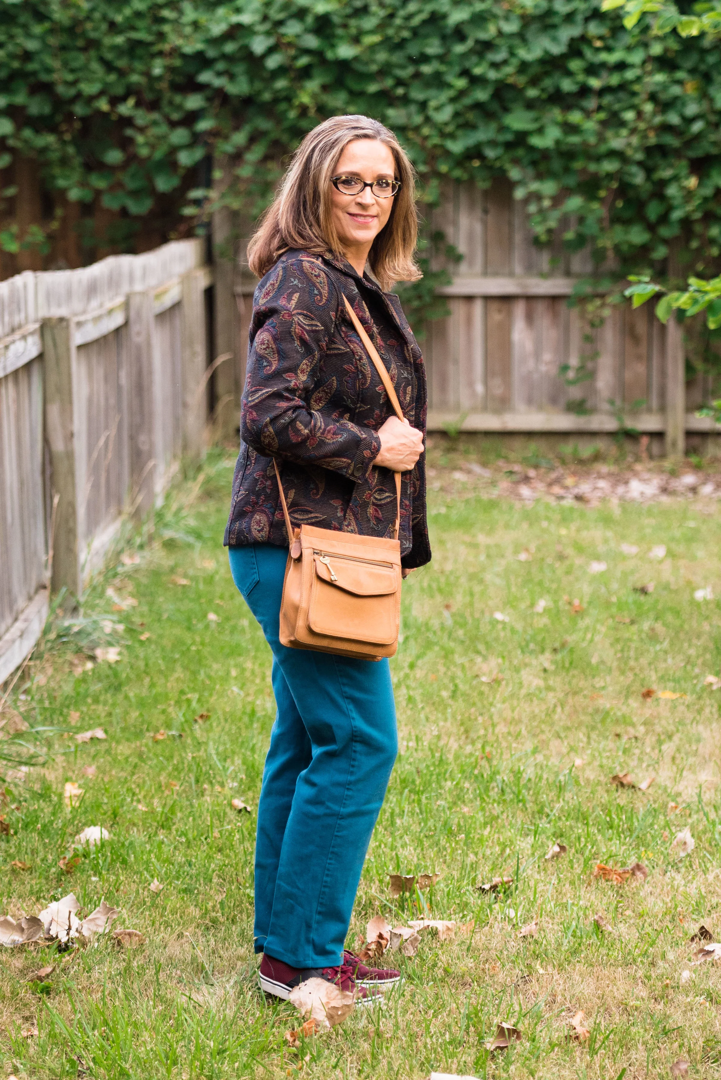
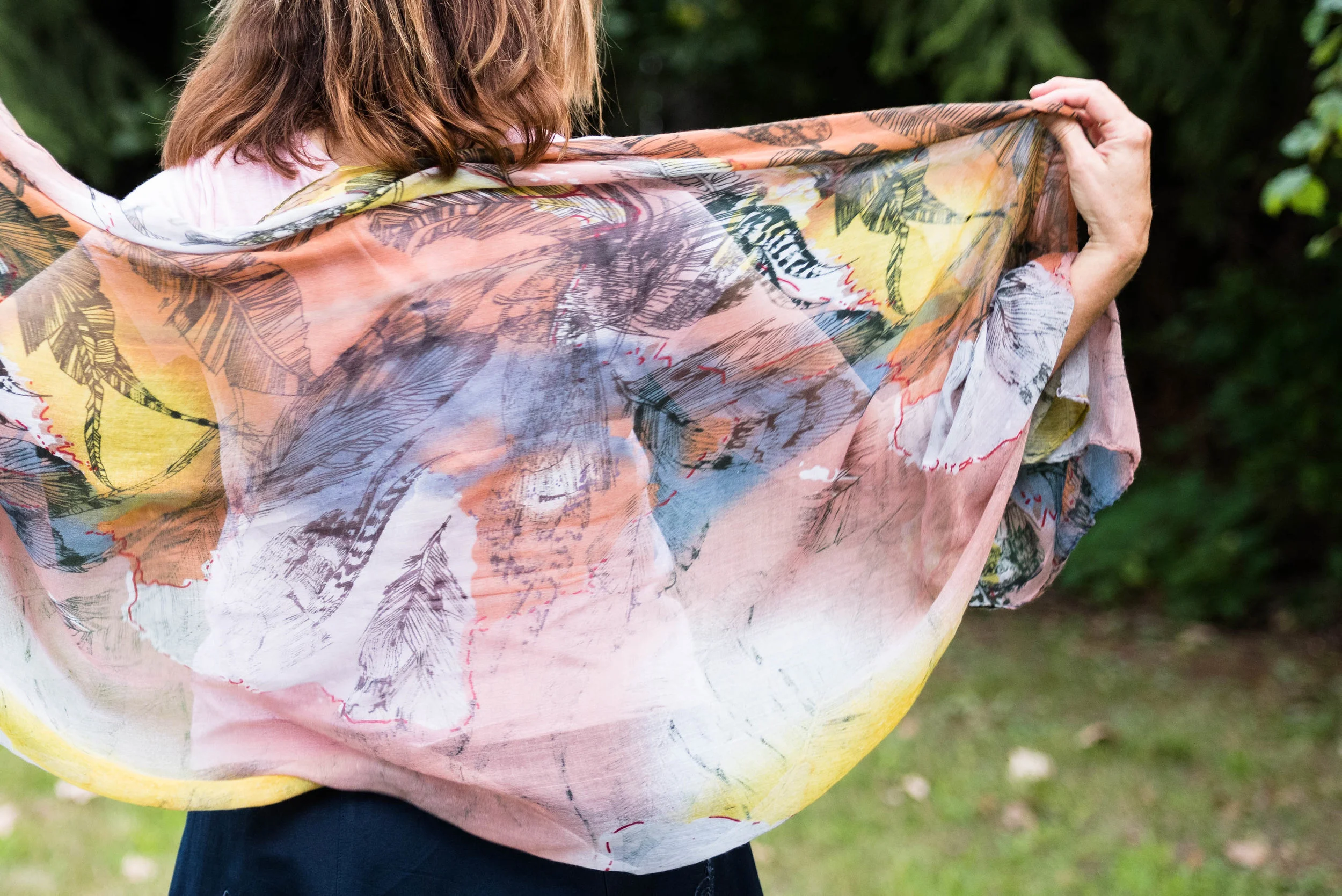
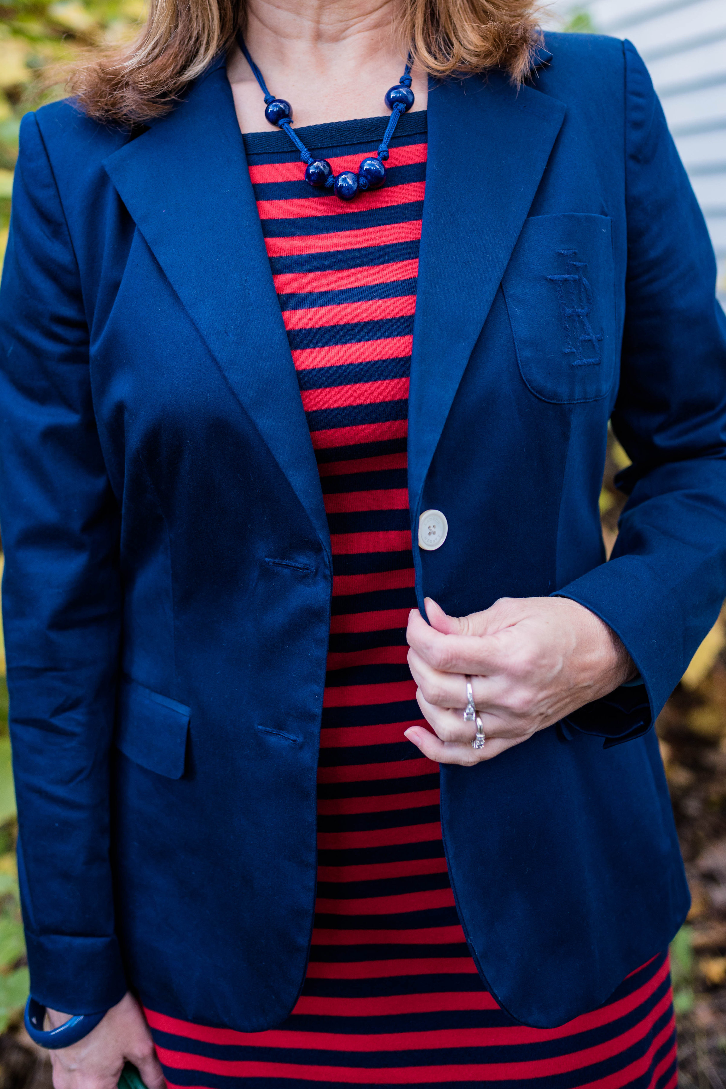
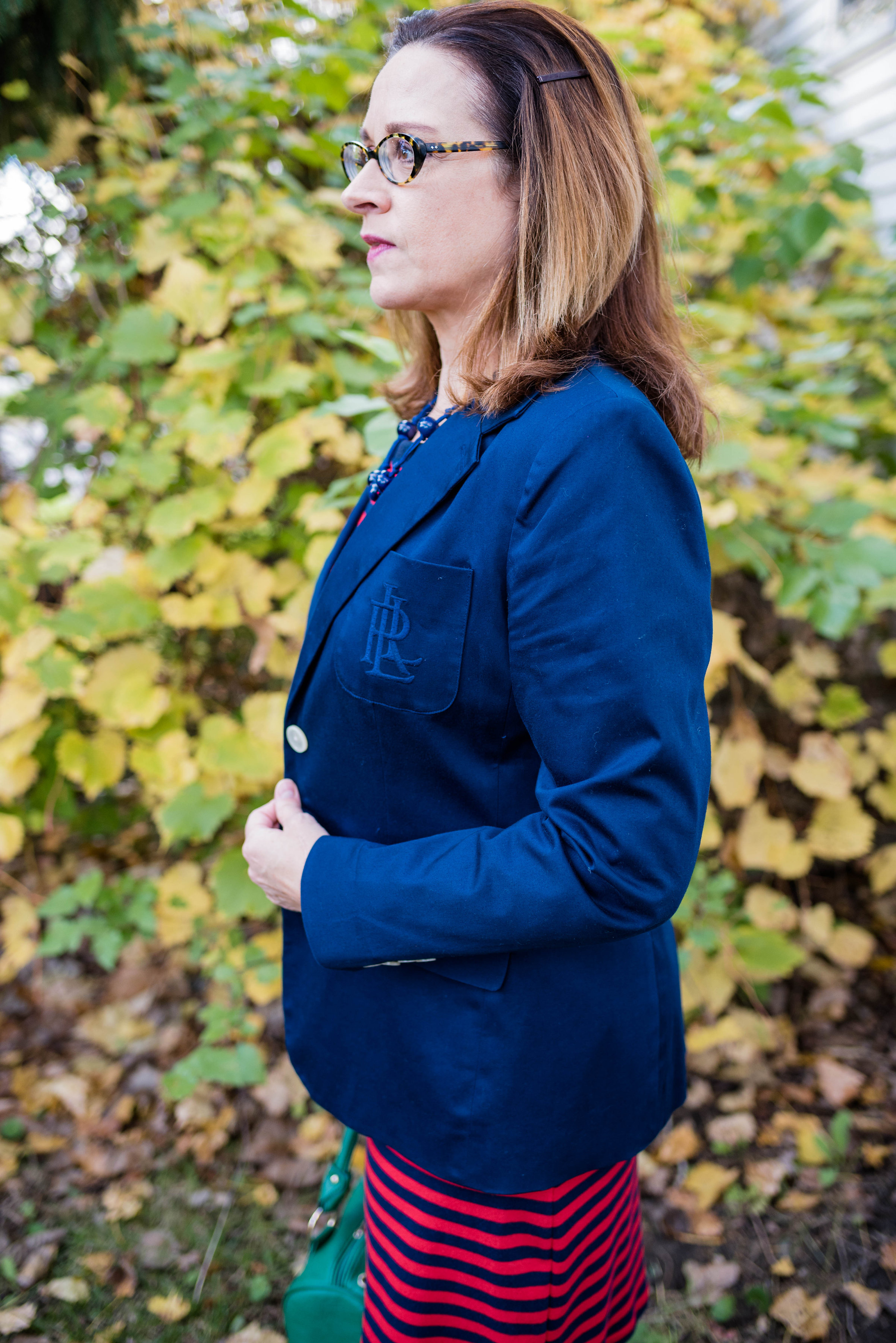
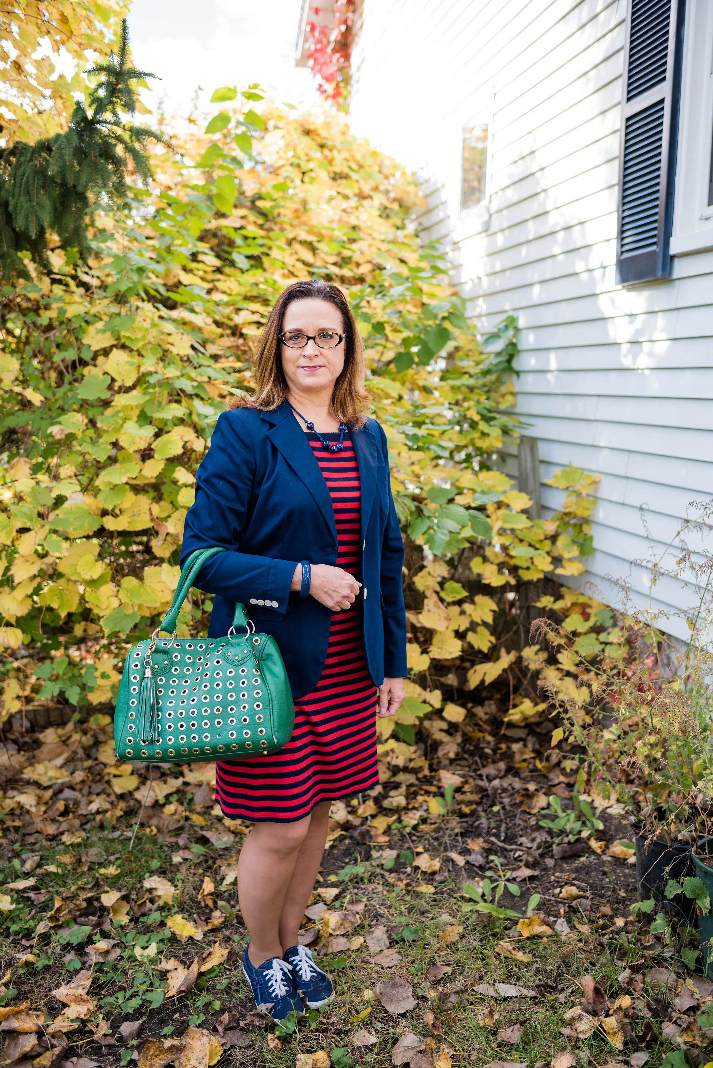
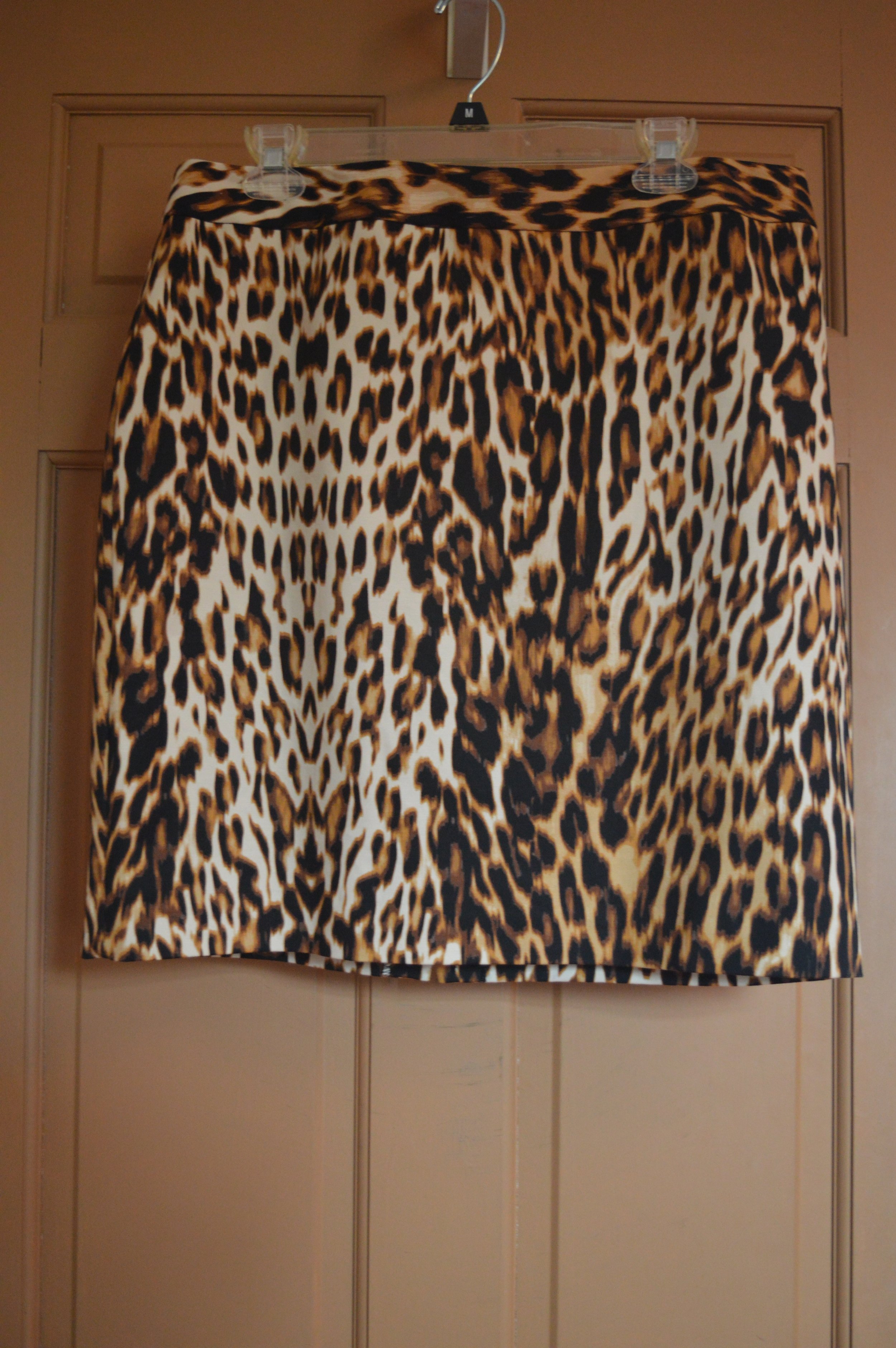
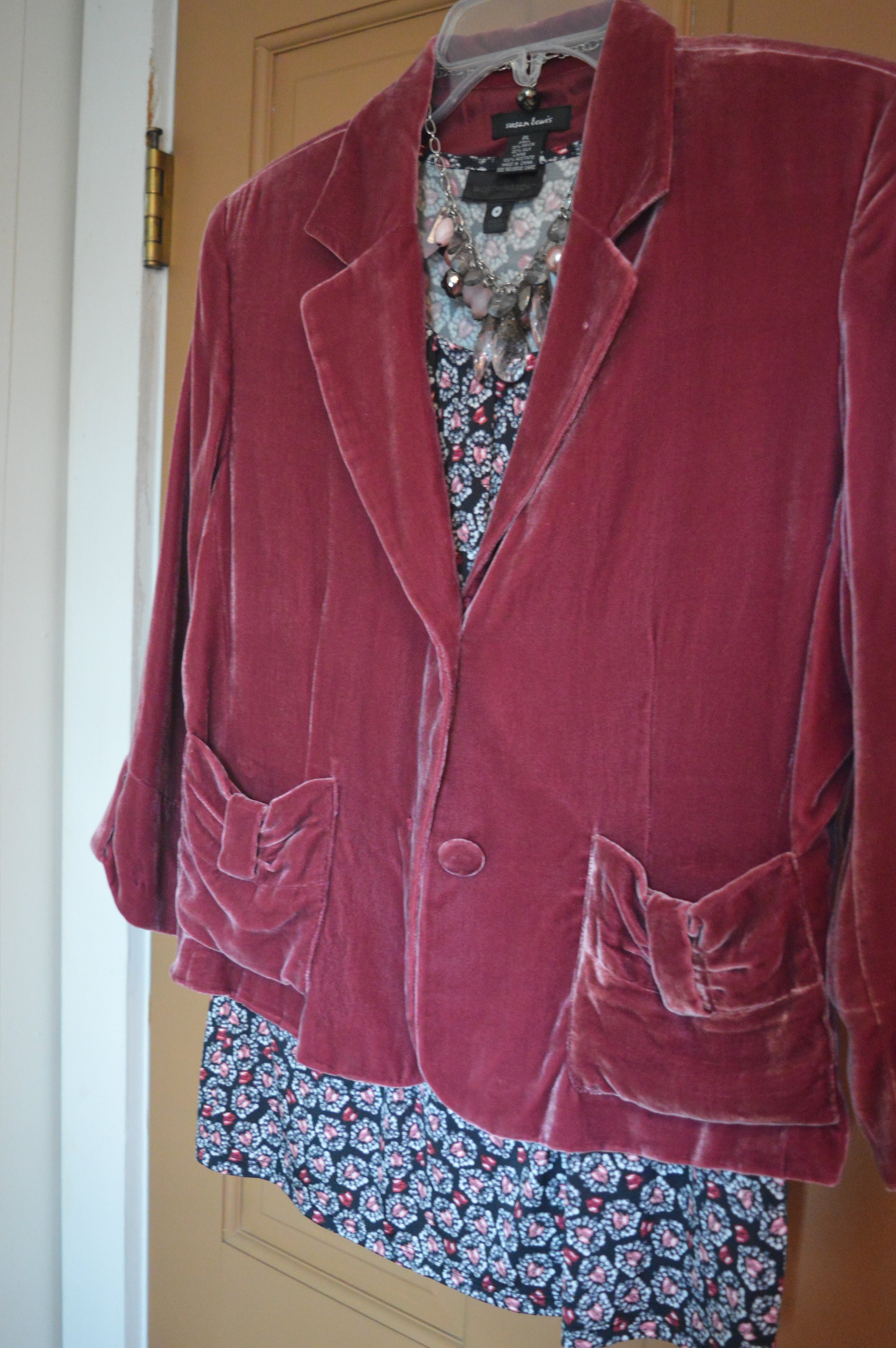
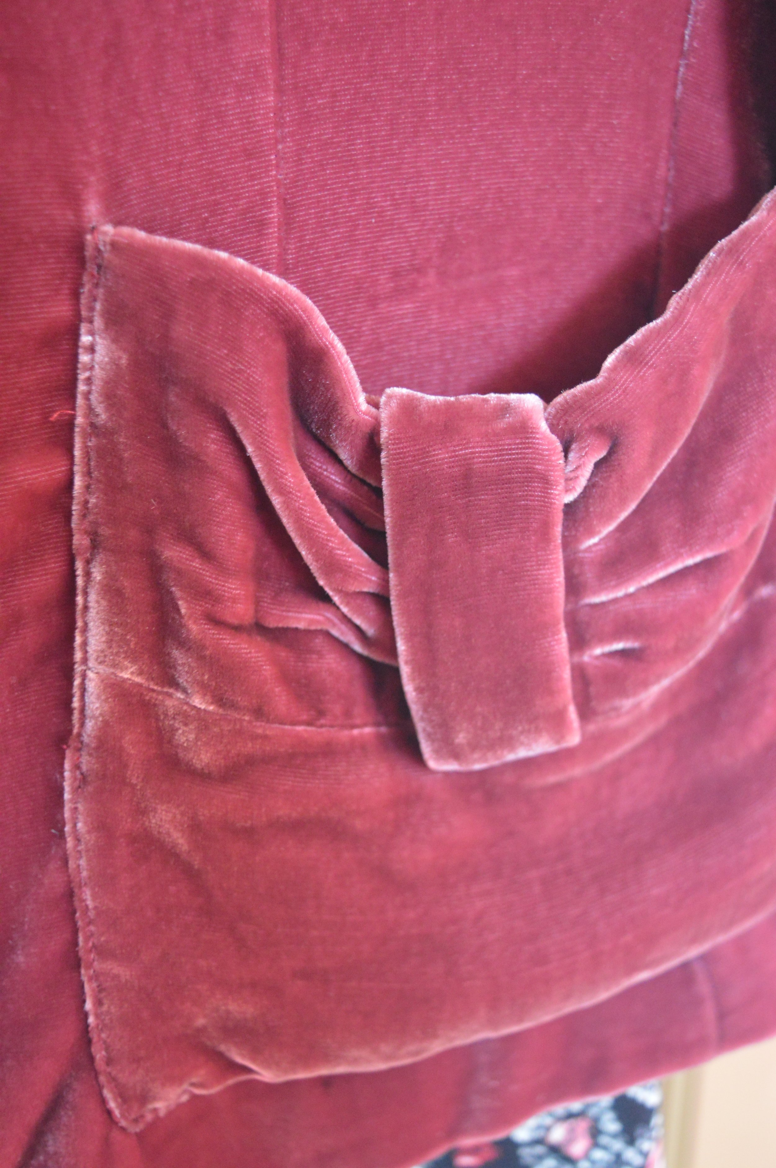
For this one the focal floral piece is the jacket, I opted to pull the blue out of the jacket by pairing it with a blue Christopher and Banks short sleeve sweater and blue heels. Because the jacket has so many colors it could be paired with lots of other pieces. 

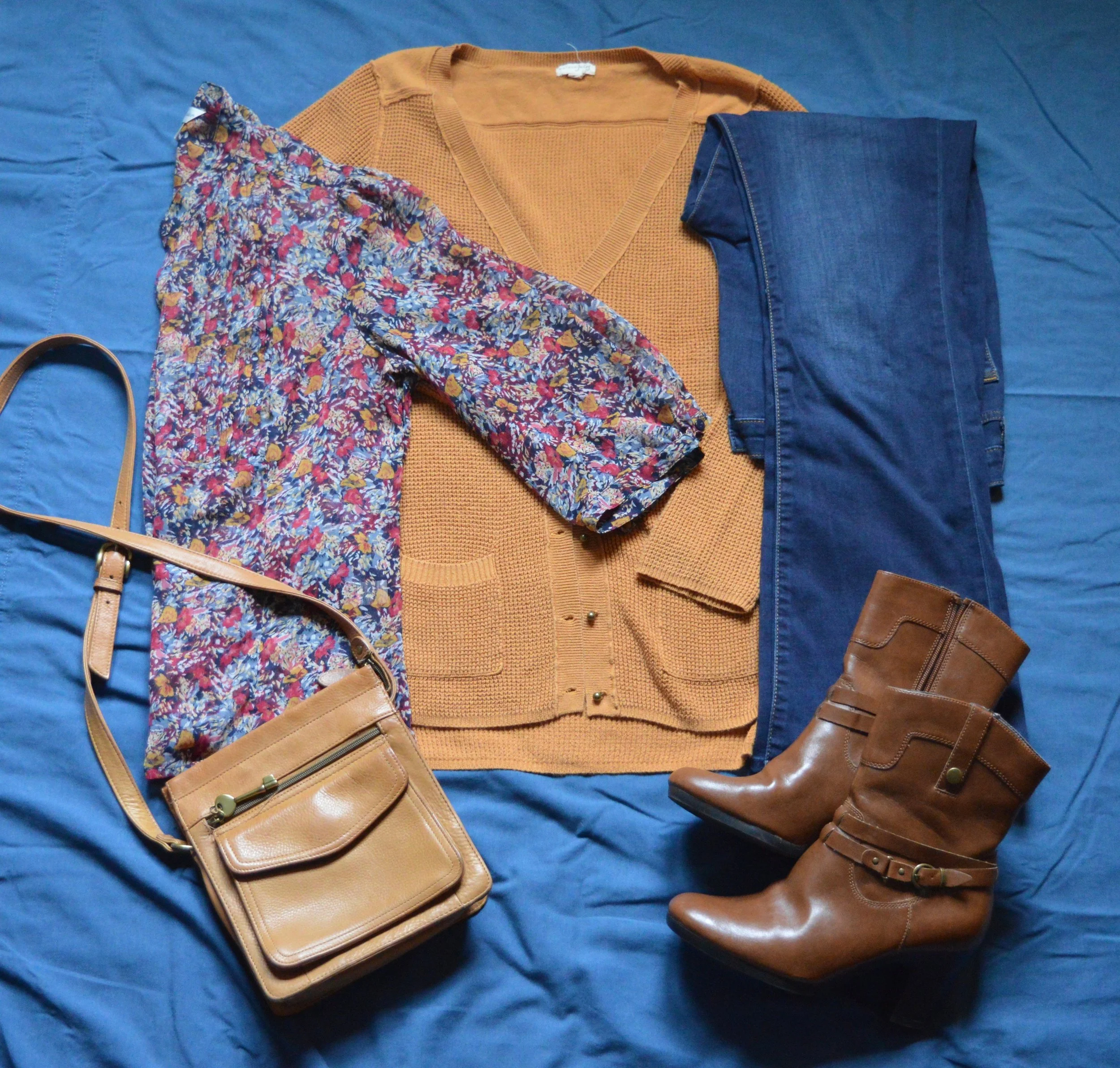
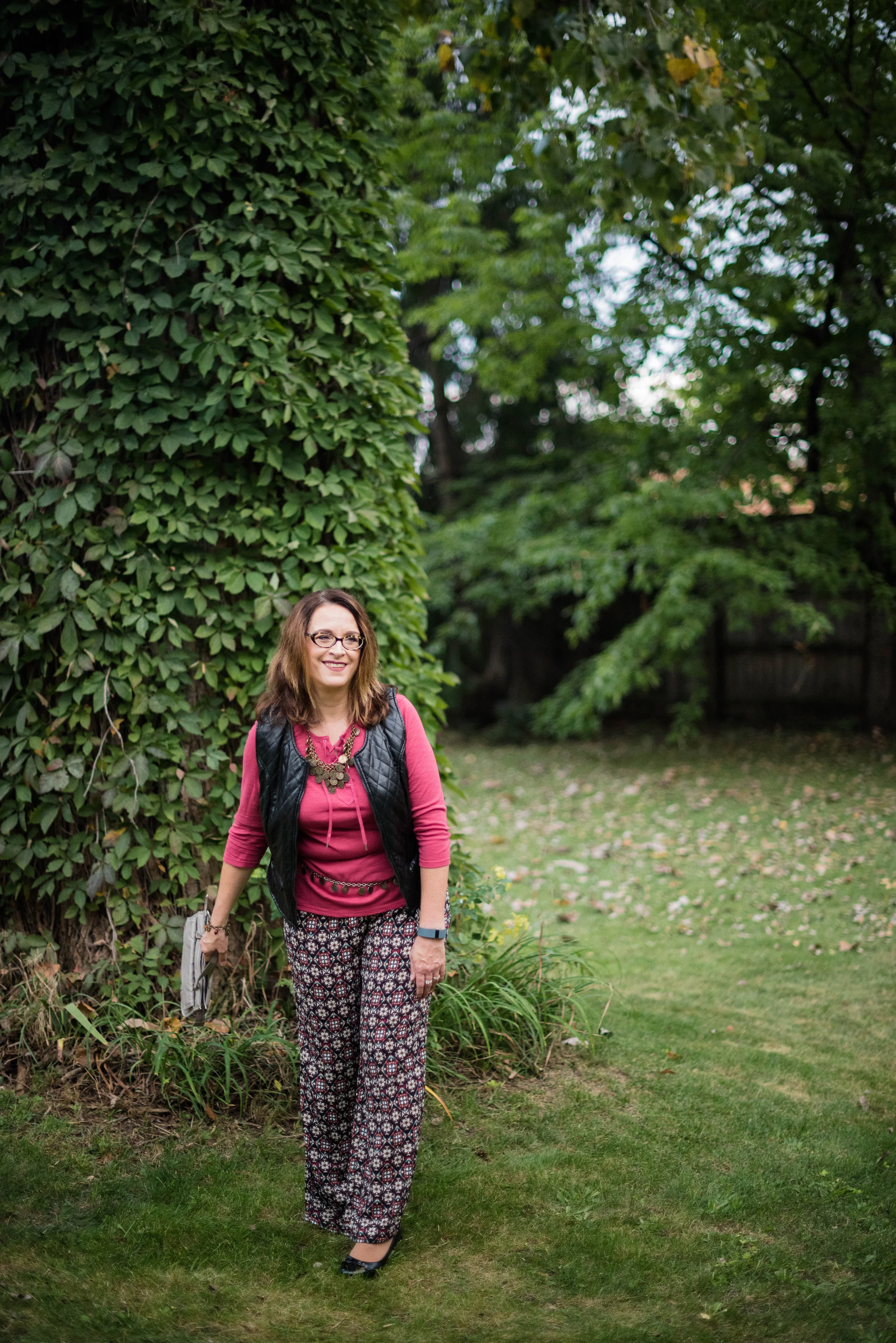
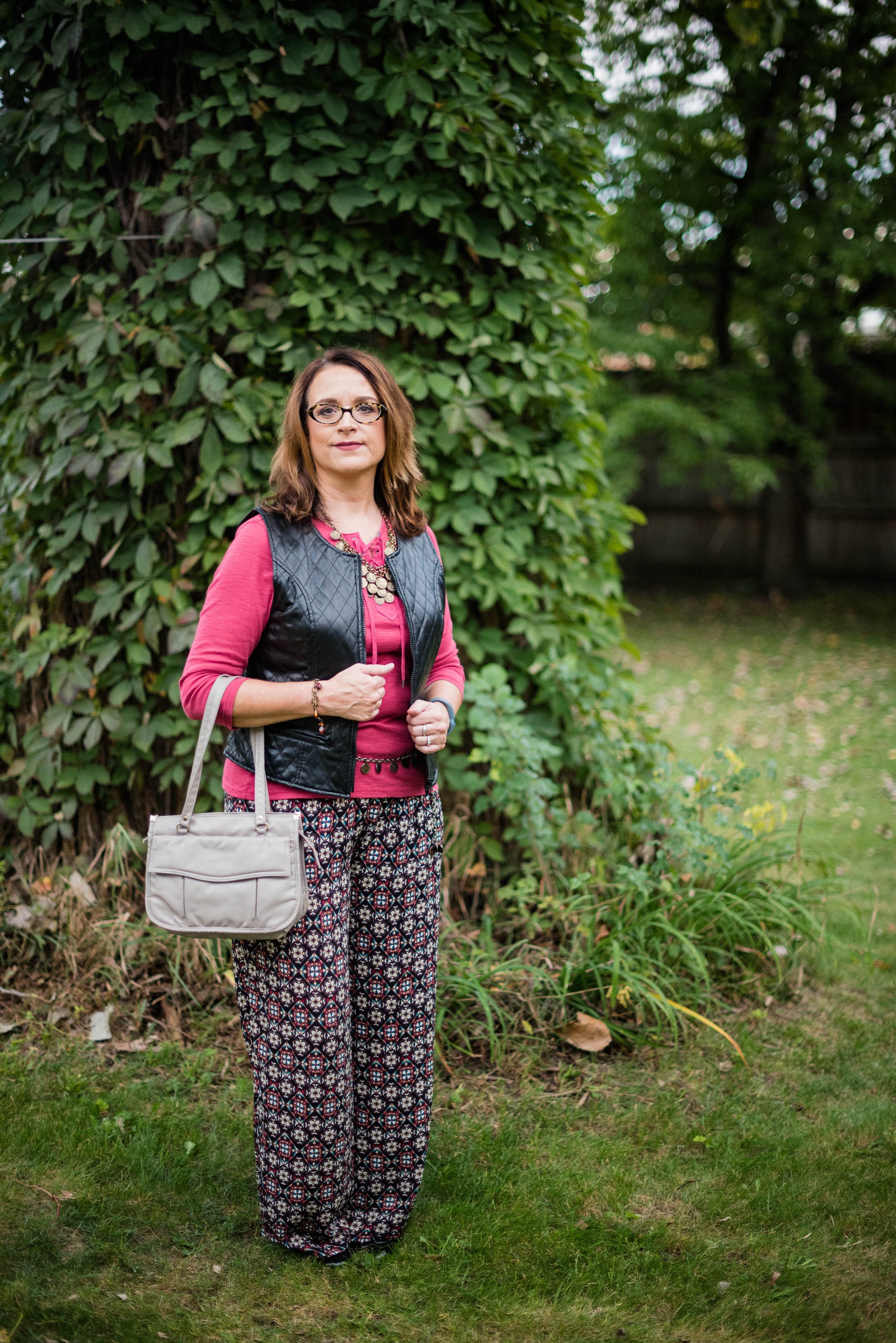
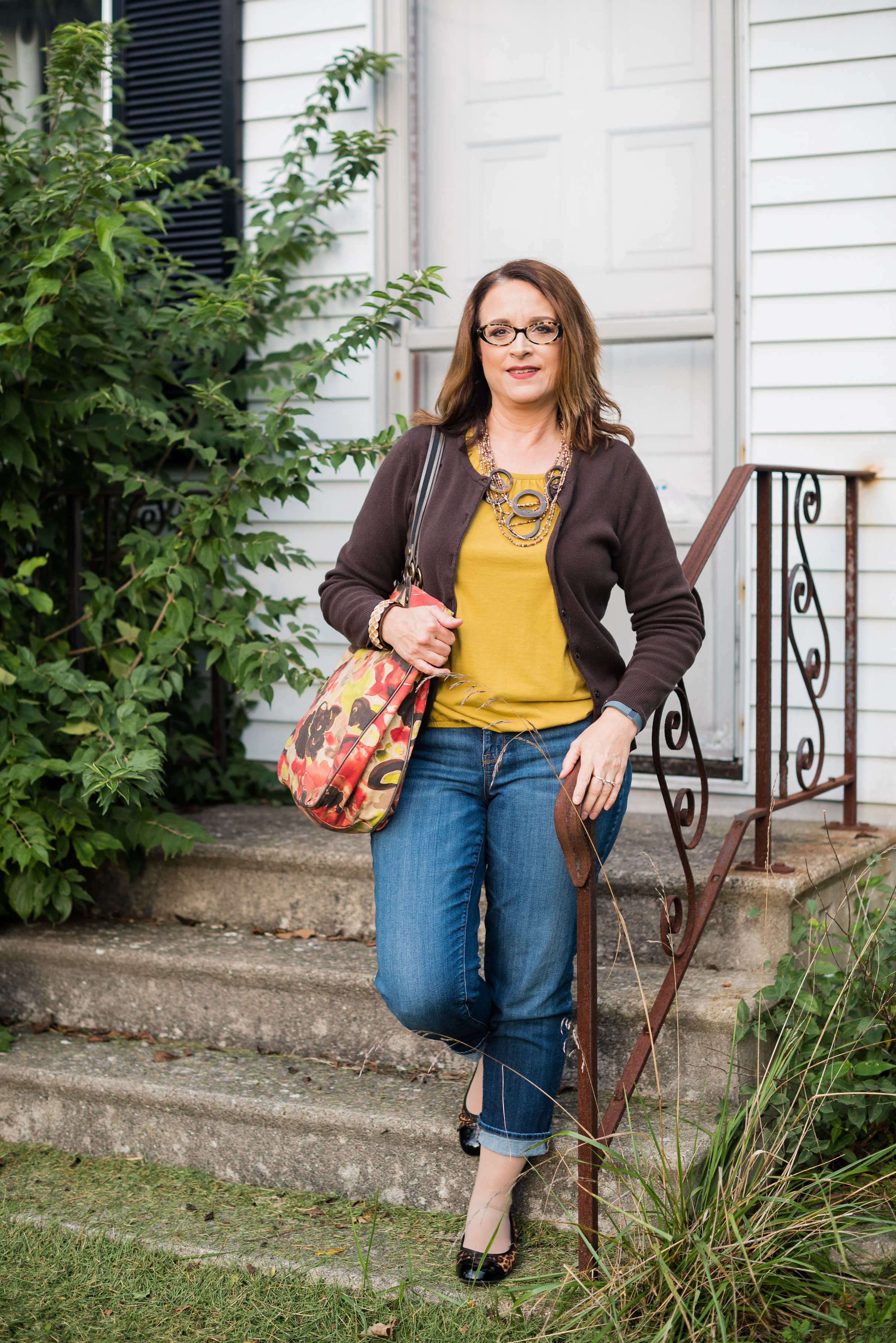
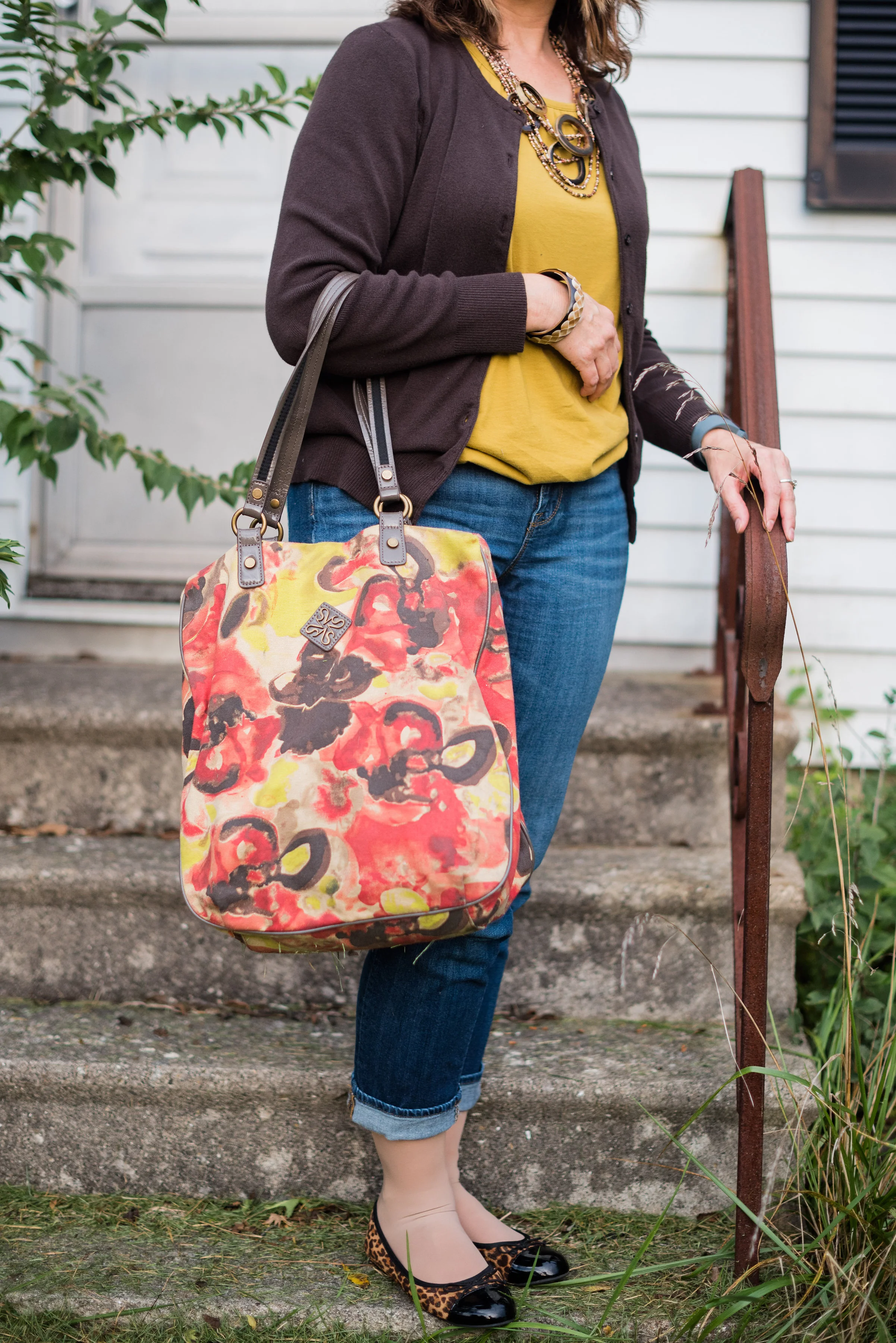
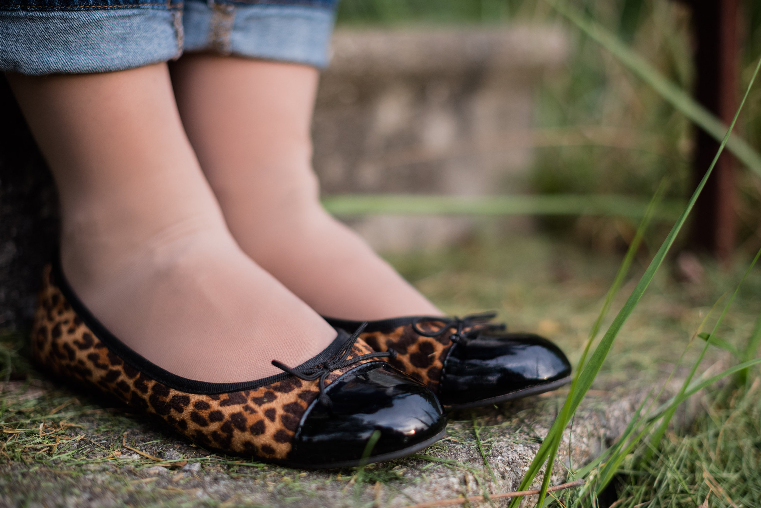
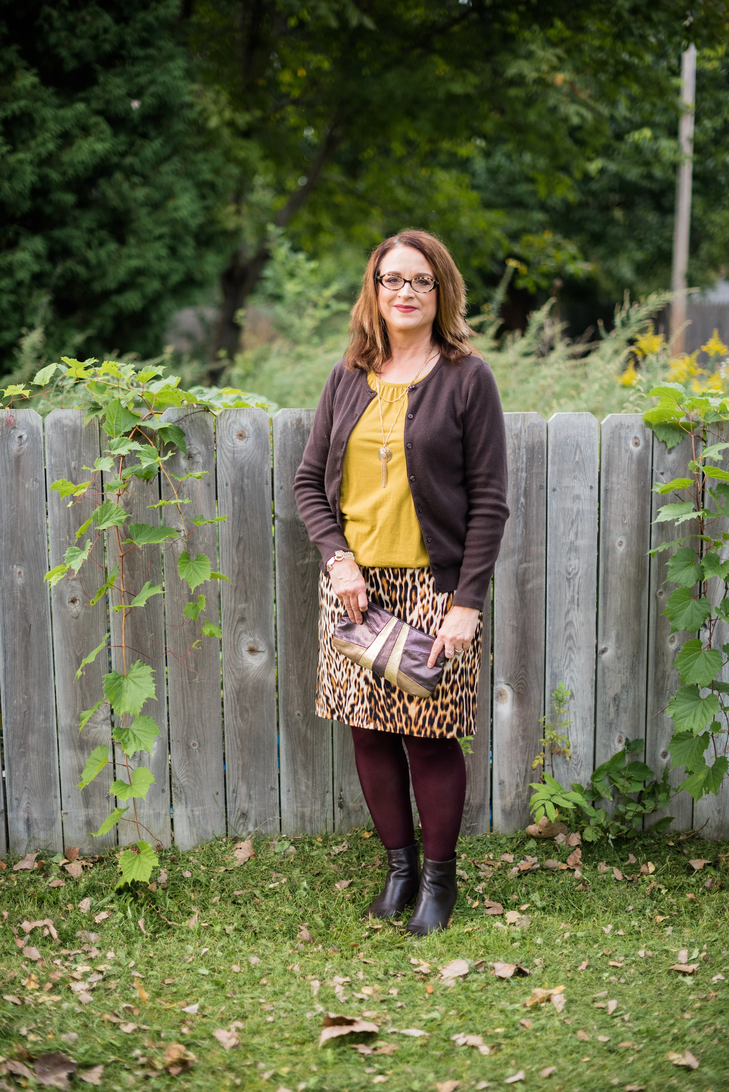
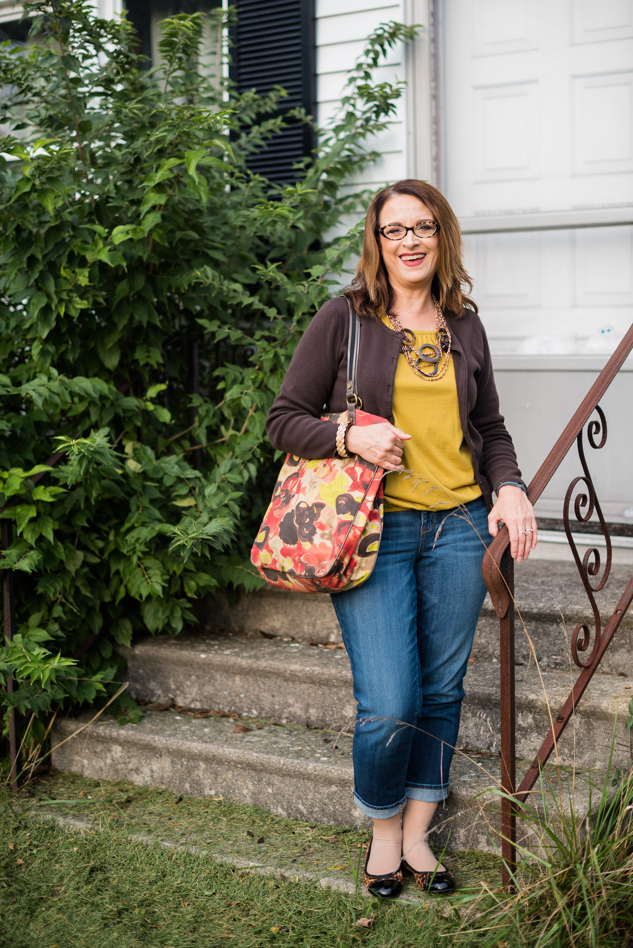
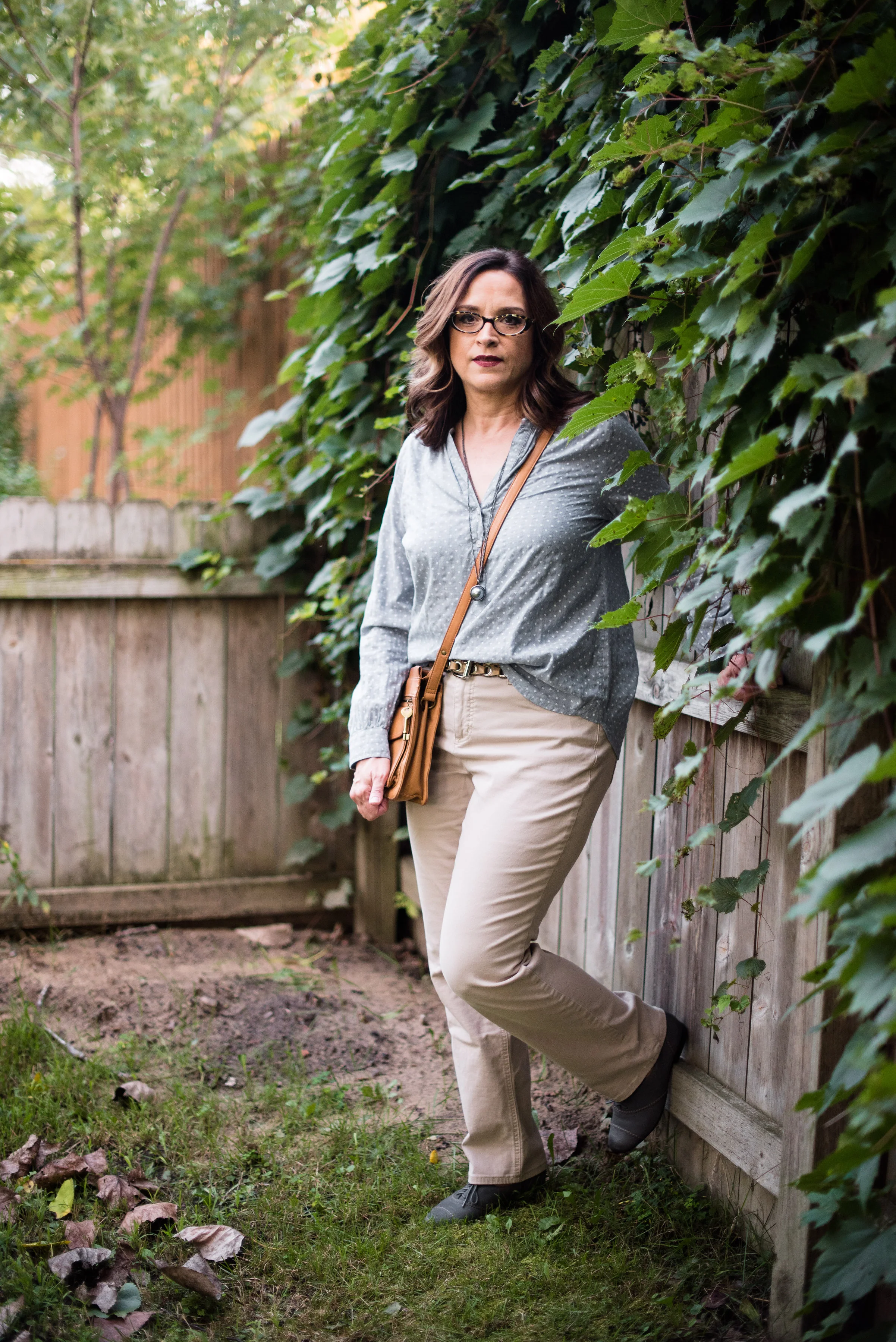
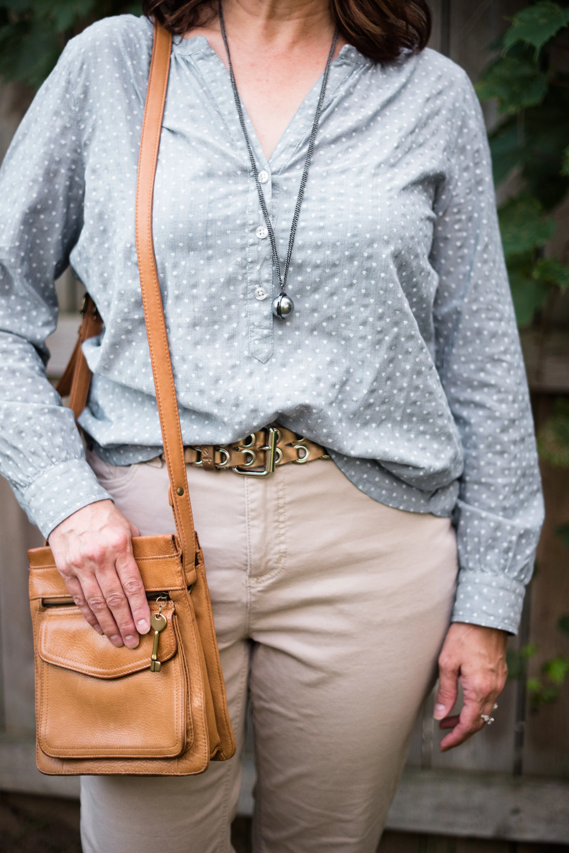
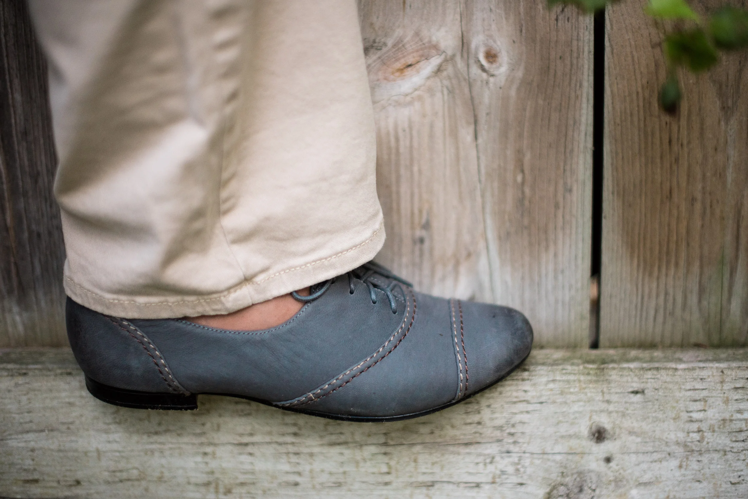
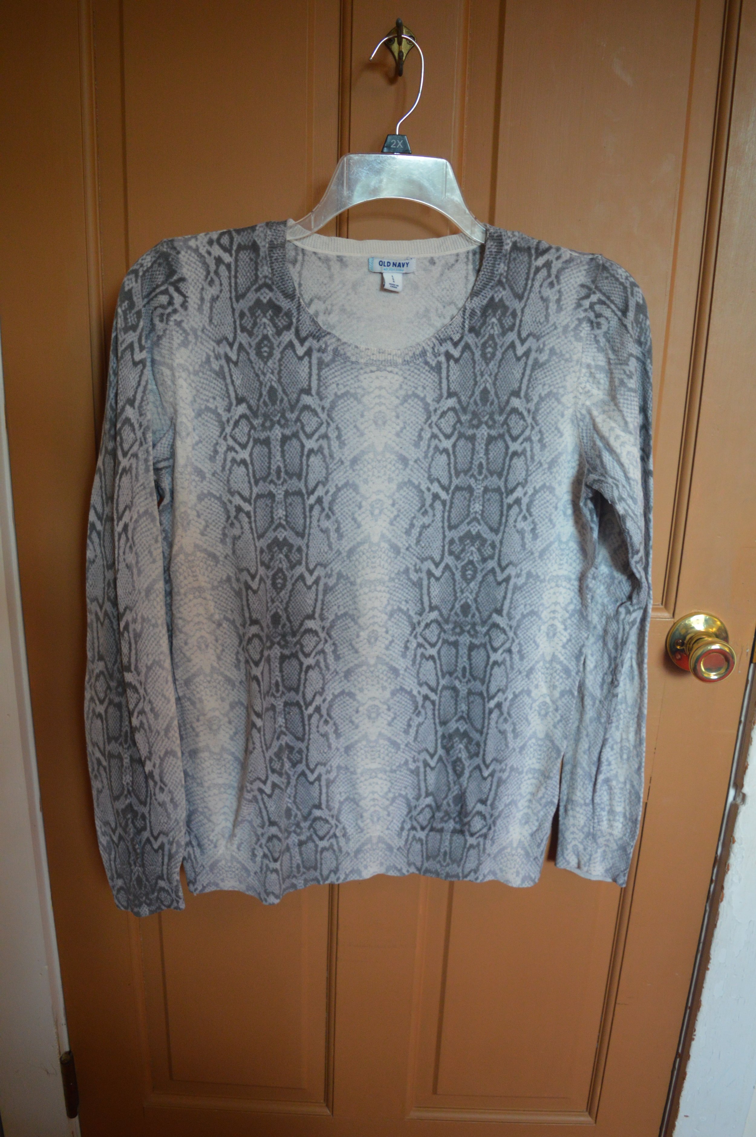
This more casual look revolves around a mini floral print. I've had this yellow sweater for a while and it perfectly pulls out the yellow in the top. Styled with a pair of Rock & Republic boot cut jeans, a leather cross body bag and boots makes for a great casual fall outfit.

Here are a few other options of floral items. This post contains affliate links. All opinions expressed are my own.

I hope you enjoyed this look at another fall trend. Have a great weekend!

Pantone Fall 2017 - The London Palette - Blue Bell and Lemon Curry

Last week I looked at two colors with more of an orange hue from the Pantone Fall 2017 London palette. This week I am going to introduce you to one of the two yellow hues on the palette. Lemon Curry is a spicy yellow that can add a bit of zing to your fall color combinations. I decided to combine this yellow with Blue Bell, a light soothing color. The combination results in an outfit that has both pizzazz and peacefulness. 

My daughter had to teach me a few things about photography when she first sent me this grouping of pictures. The reality is that a camera does not see things the way the human eye does. Our human eye, unless they are unable to translate properly, see colors as they really are. A camera and the image it imprints onto a digital card is affected by lighting, exposure and other factors. 

When I saw these pictures, I texted my daughter and said, "This skirt does not look like it looks in real life." We went back and forth on it for a while and I finally told her to leave it alone. When we got together for my grandson's birthday party yesterday, she took the time to explain to me that a camera, no matter how fancy picks up what it thinks it sees, not necessarily what is really the fact. Who da thunk? Obviously the hombre skirt contains an underlying tone that the camera translates to more of an aqua blue, when in reality it is more of a navy or gray blue. Rebecca was able to adjust the pictures to make the skirt look more like the original color and I learned a few things about digital images. 

For this post, it doesn't really matter, because the blue I am trying to match with the Blue Bell color is the top tier of the skirt, rather than the bottom tier. 

Once again, for this color combination I shopped my closet. I've had this tiered skirt for a while and usually wear it a few times over the summer months, as it is light weight, but also lined. The tee I've had for a long time. I love the pattern, the fit and the longer short sleeves, but I hardly ever wear it. When I came across it looking for something yellow, I realized this would be the perfect piece to represent Lemon Curry.

Even though the top contains some black and white you can clearly tell is has the spicy Lemon Curry vibe. 

To pull the look together I wore Blue Bell colored jewelry including my pendant necklace from Kohls and my bracelet from Chico's. I decided to used a brown bag to keep the look more grounded and earthy.

For shoes, I chose my simple SO flats. Yes, I know I keep wearing these for various outfits, but they are just so cute and comfy!

What do you think of the pairing of these two colors? Which color do you like better?

I think these two colors are perfect for fall and transition easily from summer. 

Photo credit Rebecca Trumbull. Make up Rachel Christensen

The following are few shopping links for possible items in Blue Bell and Lemon Curry. This post contains affiliate links. All opinions are my own. 


Thanks for stopping by the blog. Hope to see you back again soon.


Color Crash Course - Mint Green and Teal

For today's Color Crash Course I thought I would style a transitional outfit. As we near the end of summer and the beginning of fall we see the changes all around us. The leaves begin to turn and drop or if you have a cottonwood, they just drop! Ha, ha. The temperatures begin to cool off and the sun's time in the sky shortens. 

While I love all of these changes, what I think I love even more is that I get to move away from my warm weather clothes and start wearing my cooler weather clothes. However, we all know that cooler weather does not happen over night. Usually, we still have plenty of days in the mid to upper seventies and even a few edging into the eighties. For that reason, I like to think layers. 

As I have told you when I started this blog, I am a woman of layers and that includes my outfit style. For a transitional season like fall, I still want to wear shorter sleeves, but I will add a sweater or jacket to combat the early morning chill on my way to work, or the later evening coolness when the hubby and I are coming home from a night out.

Today's outfit combines the warmth of mint with the coolness of teal. These two colors both come from the green family, but teal edges towards blue and mint edges towards yellow.

This mint, ruffle sleeve popover top is a Lauren Conrad brand from Kohl's. The jeans are Gloria Vanderbilt. Looking at these pics, I began to notice the pants seem a bit big and baggy. Though I love the way baggier pants feel, I really do not like the way they look. I will save that thought for another post! 

This jacket I got on clearance from Christopher and Banks. I like the fall colors and the fit. It is also fully lined, so I will be able to use it as a jacket while the weather is just starting to turn cool. 

The colors in the jacket allowed me to add my maroon necklace and maroon Pumas. I finished off the look with my Fossil cognac cross body bag. 

You can turn just about any of your summer styles (except maybe a swimsuit - ha, ha) into transitional outfits if you think layers. Do you still want to wear those capris? Try adding a pair of ankle boots and top it with a bulky sweater. Want to still wear that light weight tee? Add a denim or camo jacket with a pretty colored scarf. Be creative. You'll be amazed at how many more outfits you can come up with if you just take the time to play with your clothes. 

I hope you enjoyed today's post. Leave me a comment in the comments section. I'd love to hear from you.

I am hoping next week to get back to a more regular schedule. If you follow my faith page, be sure to check back tomorrow for a post on change!

Have a great weekend!

Pantone Fall 2017 - An Intro to Two Color Palettes

This fall, the color institute known as Pantone published their usual ten color New York palette. However, this year they also published the ten color London palette. So what is a fashion blogger to do? Why, feature all twenty of these colors. Don't worry, I won't be featuring one color a week for the next twenty weeks. That would take me into January. Ha, ha. 

For this series on the Pantone colors, I will be combining two colors a week. There are a few colors that overlap on both the London and the New York palettes, and many of the colors while having different names are very similar hues. 

New York Palette

I decided to start the series with the London colors. The graphic above and below was put together by Rebecca, my photographer, web helper and daughter, using Pantone's color coding. The way you see the graphic will be the way I pair the colors. For example, Flame Scarlet will be paired with Otter, Primrose Pink with Navy Peony and so on.

London Palette

You might wonder what got me interested in the Pantone color palettes in the first place. I love color. I love flowers in the summer, changing leaves in the fall, orange pumpkins at Halloween, Christmas lights at Christmas and the soothing colors of nature such as a blue sky, green trees and red cardinals. With my propensity toward color it was only natural when I became interested in fashion that an interest in fashion color choices followed. 

Pantone is the fashion and design industry's go to for color choice. I am not sure what the whole process looks like, as far as how they come up with the colors for each season and how those translate to fabric versus paint or graphic design, but if you start paying attention to the Pantone colors, all of a sudden you will begin to see those colors in the new season's line of clothing, home furnishings, graphics and even architectural designs for offices. 

Here are some sneak peeks at what I have coming up, starting next week, with the Pantone Fall 2017 London color palette.

You can probably tell from looking at the graphic that this was not the easiest grouping of colors to work with. There are lots of pale colors as well as yellows which many people cannot wear. This palette was definitely a challenge, but I find that even more fun. Besides, it is helping my brain stay active to try to figure out how to combine pieces and colors in a ways that will be pleasing to the eye. 

I hope you will join me the next five Tuesday's for my Pantone Fall 2017 London series on the blog. Thanks for stopping by! Be sure to check back on Thursday to see who my Beautiful Blogger Bests choice will be. Until then have a great Tuesday. 

Photo credit Rebecca Trumbull. 

Monday linking up with Catherine of Not Dressed as Lamb. Tuesday linking up with Shelbee of Shelbee on the Edge, and Jess of Elegantly Dressed and Stylish. Wednesday linking up with Hannah and Sara of The Perfect Storm


Beautiful Blogger Bests - Graphic Tee and Bohemian Skirt

This week I am sharing a Beautiful Blogger named Debbie of Fashion Fairy Dust. The name of Debbie's blog, I think, suits her perfectly. She is a sassy red head who's sense of style includes edgy motorcycle jackets and boots blended with lace, ruffles and silk. The post that I derived inspiration from today is called Boho Print Skirt and Graphic Tee, and is the perfect example of Debbie's awesome style. You can read more on Debbie's About page where she shares a few fun tidbits about herself. 

Doesn't she do a great job of pulling off this outfit with an eclectic vibe. The graphic tee, the leather belt, the floral print skirt with ruffle, and the converse sneakers are not items I would normally think of pairing together. After seeing Debbie's look, I was inspired to try it myself.

For my attempt I pulled out this fun printed maxi. Although the colors in this skirt are more, in my opinion, fallish, the skirt is very light weight, so perfect for spring and summer. To celebrate my tiny bit of French heritage, I found this Paris tee at a thrift store and loved it immediately. 

I wasn't sure if this gray tee would work with the brown, orange and yellow of the skirt, but I think it did. What do you think? Instead of a leather belt, like Debbie wore, i went with a velvet fringe number and tied it on the side. This is one of those pieces that can work as a belt or as a scarf. 

This scarf/belt is a fun piece due to the pretty bead work. I'm glad I thought to wear it with this outfit. I think it adds another element of texture and bling.

I love Debbie's statement necklace! I probably could have worn a statement piece that contained orange, yellow, or brown, but I decided to go simple since my shirt and skirt are rather busy. These chokers came as a set from Urban Outfitters. I like that you can wear them together or separately. 

Debbie and I both went for the Converse, but mine are a mesh high top. These are a fun sneaker to pair with all sorts of things. 

I love to see what different bloggers do and am so blessed to have a number of Beautiful Bloggers to chose from. They never cease to inspire me to try something new and sometimes outside my normal style. 

Be sure to click on over to Debbie's site and give her some love. We both appreciate the support.

My hubby and I are going to be heading out on vacation this evening, so in addition to my normal posts next week, you'll probably see a new Travel Log. I did this last year when we went to Florida. You can see those posts, by clicking on the links: Travel Log - Post 1,  Travel Log - Post 2, Travel Log - Post 3, and Travel Log - Post 4.

Hopefully we will have internet along the way some of the time. I hope you'll join me as we travel to Maine. I'll try to post outfits, food and of course scenery. Until then. Have a great weekend!

Photo credit Rebecca Trumbull. Make up Rachel Christensen.

Color Crash Course - Red and Burgundy - A Thanksgiving Outfit

Happy Thanksgiving everyone. This morning as I type this post, I am thankful for a dry home and a furnace to heat it. I am also thankful for family and their safety as they travel. I am thankful for my physical health and my relationship with the God of the universe. What are you thankful for today?

Another thing that I am thankful for is the community of bloggers out there that have taught me so many things about faith and fashion. One thing that I particularly admire is the attitude of throwing the fashion "rules" out the window and dressing how we want to dress. That doesn't mean I dress like a slob or that I dress in barely nothing at all. For me throwing out the rules allows me to experiment with colors, textures and styles of clothing that I formerly might have scoffed at. The very reason I decided to start this Color Crash Course column was to challenge myself to think outside the box when it comes to color combining. 

In the first attempt at color combining I paired orange and red (here). Next I combined the colors of Halloween, orange, black, green and purple (here). Today I am trying my hand at burgundy and red. My first thought was, "There is no way I can make this work, without looking like some sort of clown!" But that caused me to be all the more motivated.

I chose a red turtleneck sweater, burgundy dress pants and my burgundy suede booties, which I just styled on Tuesday's post here. Sorry about my muffin top! Ha, ha. And I haven't even eaten Thanksgiving dinner yet!

Then I threw on a thrift store find, a open front chiffon and knit cardi with a water color type pattern. What drew me to this piece were the variety of colors combined on its surface. Here is a closer look at the actual pattern from the back.

Just to make things even more interesting I added a gold necklace that has some burnt orange in it.

I feel that the open cardi adds dimension and texture to the outfit as well as pulling the whole look together. 

Add a simple gold clutch and gold bracelet and the outfit is complete! I found this gold woven bag at H&M when I was Christmas shopping for other family. At less that five dollars, I thought this little gem filled my need for a gold bag.

So how are you celebrating Thanksgiving today? My husband is out hunting this morning and we will be having a small turkey later for the two of us and one of his students from the university who couldn't make it home to be with family. Our girls have their own celebrations with their significant others and families. However, we will all be together over the weekend. I'm looking forward to that.

I pray God blesses each of you who are following my blog with a happy and fun filled day! Don't eat too much!

Pantone Fall 2016 - Recap

This week I wanted to show all of the outfits I styled based on the Pantone Fall 2016 color line up. To see my original posts click on the color.

Week 1 - Bodacious

Week 2 - Airy Blue

Week 3 - Potter's Clay

Week 4 - Riverside Blue

Week 5 - Sharkskin

Week 6 - Warm Taupe 

Week 7 - Spicy Mustard

Week 8 - Aurora Red

Week 9 - Dusty Cedar

Week 10 - Lush Meadow

Which one is your favorite? Which color(s) would you wear? Let me know in the comments section below or on my Facebook page.

I hope you enjoyed this series. I will be exploring the Pantone Spring 2017 colors next Spring, even though they are already on their website. Let me get through Christmas first before I start thinking about outfits for next spring! Ha, ha.

In the mean time, keep checking back. I hope to begin a series in a few weeks on my own color choices for winter, called Winter Wonderland. Keep an eye out for that. Check back on Thursday to see which Beautiful Blogger I drew inspiration from this week. 

Have a great day.

Photo credit Rebecca Trumbull. Make up Rachel Christensen.

Monday linking up with Catherine of Not Dressed as Lamb. Tuesday linking up with Jess of Elegantly Dressed and Stylish. Wednesday linking up with Tania of 50 is Not Old, and Allison of Sydney Fashion Hunter. Thursday linking up with Nicole of High Latitude Style and Shelbee of Shelbee on the Edge. Friday linking up with Jennie of A Pocketful of Polka Dots and Nancy of Nancy's Fashion Style

Awesome Accessories - The Pashmina Scarf

Since the weather here in the Midwest is beginning to cool down considerably, I thought I would take another look at scarves, but focus on a heavier, longer variety of scarf that we refer to as the pashmina. The original pashmina was type of cashmere wool woven into a garment meant to be worn as a shawl. Today we have a variety of pashmina colors and prints as varied as the flowers and plants in creation. Many of the scarves or shawls that we now term pashmina, are made from a variety of fabrics and realize different weights and textures, thus, not true pashminas. However, there are many stores that sell real wool/silk blend pashminas for very reasonable prices. 

Today's post will look at a variety of ways to wear these longer, rectangular shaped scarves.

This scarf, while having the shape of a pashmina is not made from the soft, silky cashmere wool. It doesn't feel scratchy so I do not think it has any wool in it. It is probably a blend of man made materials. A thrift store find, I thought I could use it like a blanket scarf, but then as I did more research realized a true blanket scarf is square not rectangular. I am learning new things all the time!

1. The shawl - 

2. The simple flip over one shoulder - 

3. Flip ends to the back then pull ends to the front - here the ends are the focal point of what hangs in the front - 

4. Flip ends to back, but leave front loose. Pull front down into more of a long bib, then bring just the fringy ends to the front - the messy look.

5. Triangular bib - similar to above, but make the bib more triangular and tucks the ends under the bib. 

6. Left long and belted - 

Here is a look at all of them:

I hope this post inspires you to dig that pashmina out of your closet and start wearing it. I have quite a few in different colors. It is the perfect toasty addition to any outfit or just wear one with your coat to keep your neck warm. The pashmina is not only stylin' it's practical.

Hope you have a wonderful weekend. 

Photo credit Rebecca Trumbull.

If your are looking for a true pashmina check out The Pashmina Store.

This store is only a recommendation that I found while perusing on line. I have never bought anything from them, but might some time in the future! 

Pantone Fall 2016 - Lush Meadow

The final installment in the Pantone Fall 2016 series is a vibrant, rich color called Lush Meadow. I am not sure I would have given this color that name, because to me it seems to express more of an emerald tone, than a field of green. Unless you are in the jungle, meadows are typically more of a grassy green and perhaps filled with flowers. Something like this:

Pixabay

However, I was not on the committee to name these colors and I am sure they had a reason they named this green what they did. Now that my little tangent is over. Here is my outfit.

I have had this maxi skirt for a long time and just could never find the combination of top and accessories that made me say "Yes! This is it!" When I paired this top with the skirt and then added the belt, I thought I had hit the mark. 

Even though the top is a single color, there is a definite print to it. I am not sure what the process was, but it looks like lace and crochet mixed. I didn't realize it at the time, but seeing these pictures now, I see that the shape of the print on my top, matches the shape of the print on my skirt. How's that for some fancy mixing? Ha, ha.

For my accessories I wore a bead, ribbon and chain necklace which had beads that whisper Lush Meadow and ribbons in the line of Spicy Mustard. I also added a Spicy Mustard bracelet. (To see how I styled Spicy Mustard as an outfit click here.) My bag was a simple charcoal gray clutch that matched one of the colors in the skirt. The skirt also has white and a bit of tan, thus the inclusion of the brown belt and brown ankle boots.

In this shot of the boots, you can also see a bit of the lining of the skirt. (You can also see the mud on the heel of my boot - ha, ha - squishy ground!) It is fully lined from top to bottom, so it provides an extra layer of warmth and no need for a slip. This is a great transitional skirt for fall, but I think I will be wearing this again in the winter with a chunky sweater, knee boots and tights for added warmth.

I hope you have enjoyed this series on the Pantone 2016 Fall colors. Next week I will be doing a recap of all the outfits, so I hope you'll check in again next Tuesday. 

Thursday I will be looking at the Pashmina scarf as another awesome cold weather accessory. Be sure to check back. Until then take care and keep stylin'!

Photo credit Rebecca Trumbull

Shopping for Lush Meadow:

Tops -

Nordstrom - $70.00

Kohl's - $28.80

Roaman's - $49.99 - 54. 99 (Plus Size)

Bag's - 

Kohl's - $69.30

Kohl's - $55.30

DSW -  $49.95

Monday linking up with Catherine of Not Dressed as Lamb. Tuesday linking up with Jess of Elegantly Dressed and Stylish. Wednesday linking up with Allison of Sydney Fashion Hunter, and Tania of  50 is Not Old. Thursday linking up with Nicole of High Latitude Style. Friday linking up with Nancy of Nancy's Fashion Style, Jennie of a Pocketful of Polkadots,  JoLynne Shane on Fashion Friday and Shelbee of Shelbee on the Edge.


Piece Perfect - The Navy Blazer

Today's Perfect Piece is going to be spread out over two months, because I found so many ways to style this fitted navy blazer by Ralph Lauren. Today's post will feature wearing the blazer with a dress and a skirt. Next month I will look at styling it with casual and dressy pants. 

Navy is one of those colors that can be worn with just about any other color. If you look up navy blue on the internet it shows a range of blue from what I would term royal blue to what I would call true navy. For the sake of ease I am referring to this blazer as navy, even thought it is a bit lighter than true navy.

The term blazer refers to a jacket that resembles a suit coat, but more casual. For more info on the origin of blazers see the Wikipedia article here

The three above pictures give you an overview of the fit of the blazer. Blazers can be fitted, flowy or boxy. I like a fitted blazer best because it cinches in at the waist giving me that girlish figure. Ha, ha. This blazer has a breast pocket on one side with the Ralph Lauren initials, two front flap pockets and two buttons. You can also see the split in the lower back allowing movement and flexibility. 

This blazer is also fully lined which means the lining not only covers the entire body, but the sleeves as well. The silky lining not only adds a layer of warmth, but makes it easier to slip into and out of, especially if you have long sleeve layers underneath. 

Here is the first outfit with the blazer. I just threw it on over a striped tee shirt dress, then paired it with my navy Keds. Not to get to matchy, I carried my Lush Meadow tote bag. I accessorized with blue beads and a blue bangle. 

Note the line where the sleeve hits my hand. It is just longer than my wrist, which is where I like most of my jackets to hit. This allows you to show just a little bit of sleeve if you have a top that you want to stick out or if you want your bracelets to show. Some people wear their sleeves longer and some shorter. I'm sure there is a standard, but in the fashion world it's more about personal preference. I also like that the initials are not overwhelming. If you look up Ralph Lauren jackets you will see that many of them have his crest on the pocket in gold. I got this at a thrift store and I am not a huge brand buyer, especially if it is advertised on the pocket, but I like the fit and look so well, that it didn't bother me that the RL was on the pocket.

Here is the blazer paired with a skirt and sweater. The skirt has a navy, red and cream pattern, so I chose a creamy sweater with Joy printed on it. I kept my accessories in the gold/pewter line to go with the lettering on the sweater.

This will be a fun sweater to use again at the holidays. 

Here are the two looks side by side:

So what do you think of this blazer? Do you wear a blazer? How do you style it? I'd love to have your input. Just leave a comment in the comments section below.

Next month in this Piece Perfect column, I'll show you the outfits I put together pairing the blazer with a pair of dress pants and a pair of snakeskin jeans. 

Thanks so much for your support. Be sure to like and share on my Facebook page. You can also see what I've been pinning on Pinterest, and peek at some of my other outfits on Instagram. 

Have a lovely weekend!

Photo credit, Rebecca Trumbull.

Shopping for Blazers:

Ralph Lauren version - Black - Dillards - $198.00

Other brands:

JC Penney - $34.99

Target - $29.99

There are a number of navy blazers available including Ralph Lauren on Poshmark, ModCloth and eBay.

Color Crash Course - Spooky Color Combo (without being scary)

One of the ways I wanted to challenge myself in this Color Crash Course column, was to come up with color combinations that we usually associate with something else. For instance red and yellow make me think of McDonalds; red and green Christmas; green and yellow the Green Bay Packers (my husband's team) and so on. With Halloween only a few days away, I had to look at colors traditionally associated with this holiday. 

It used to be Halloween colors were restricted to orange and black, but in the more recent decades green and purple have been added to that mix. Images of pumpkins, witches, the Frankenstein monster and ghosts flying through a purply black night sky all come to mind. I decided to take those four colors and combine them into an outfit. 

Black jeans make the color subtle, rather than a stark black pant or skirt. Plus the jeans add texture to the outfit. Remember we have been exploring the idea of texture for making an outfit more interesting. 

This orange sweater was from Christopher and Banks last year. I like that it is light weight so perfect for layering and it has.....texture. The little raised bumps give it a polka dot effect. 

You can see the button up I wore under my sweater is black and has little owls on it. What better for Halloween. With the black background the little tan owls really show up as well as the little bits of purple and green in the pattern. I decided to add the lighter purple necklace so as to not overwhelm with a too Halloween-ish outfit. 

I left the shirt tail out to add some color and dimension between the sweater and the black jeans. 

For my bag I decided on a Lush Meadow clutch (more on that color in a few weeks). My shoes are an older pair I just love. A dark purple velvet kitten heel with sequins. They sound quirky, but I really like the way they fit my foot and the dark purple and sequins remind me of that Halloween sky. 

And, of course, I had to throw in a silly one. For another lovely look at black and orange check out Laurie at Vanity and Me. She shows an orange sweater styled two ways.

What do you think of wearing these colors together? What do you think of this outfit? I'd love to have your input. Just leave a comment below. 

I hope you all have a fantastic weekend. Thanks for hanging out with me on the blog!

Photo credit Rebecca Trumbull.

Pantone Fall 2016 - Aurora Red

We only have three weeks left of our Pantone 2016 Fall color series. Today's feature is Aurora Red. By the time we took this picture on the evening we were scrambling to fit some photo's in we were both exhausted. The evening was hot and humid for September and I was literally wilting. My daughter had just worked a full day, then came over to squeeze in a few photos before the light was completely gone. 

So yes, our photos were getting a little silly. I styled the Aurora Red 3/4 length sleeve tee with a pair of Palazzo pants. I styled these before here. For this look I added the vest to give the outfit an extra layer of warmth. Granted on the day we took the pics I didn't need it, but with the cooler weather we are now having this vest is perfect. In keeping with the edgy vibe the vest adds I opted for chain link and coin belt and necklace.

I wore simple black heels, which are hardly visible due to the grass and the length of the pants. The taupe bag I am carrying is a thrift store find. 

I have given these pants a second go round and have decided I am getting rid of them. They are very comfy, but in all honesty are not flattering on me at all. I think it might be the way the pattern encircles the leg. It makes me look stumpy. Ha, ha. I only share that, not to get down on myself or because I have body image problems, but to show that some pieces can flatter and others can detract. 

However, I do like the look of the red tee under the vest and the fun chain link and coin belt and jewelry, perhaps with a skinny pair of jeans, a pencil skirt or a maxi. Aurora Red is a beautiful rich color to add to your wardrobe. If red is not your color, try adding it to your outfit as an accessory. In the shopping links below I listed a pair of ankle boots, and a red bag. You could also add a scarf or a necklace to bring that red pop to any outfit.

I hope you enjoyed this post. Let me know your thoughts good or bad in the comments section below. I appreciate input of all types, because it helps shape me as a blogger and a fashionista. Check back on Thursday for my Color Crash Course. This week I'll be styling a spooky color combo, just in time for Halloween. Have a great day.

Photo credit Rebecca Trumbull. Make up Rachel Christensen.

Shopping for Aurora Red:

Red ankle boots - JC Penney - $44.99

Red skirt - Loft - $59.50

Cross body bag - JC Penney - $24.00

Red tunic - J.Jill - $44.99

Pantone Fall 2016 - Spicy Mustard

Of all the Pantone Fall 2016 color line up, Spicy Mustard is the one that surprised me most. I am not a big fan of yellow. I think yellow is a lovely color, but I don't tend to reach for it and don't have many yellow pieces in my wardrobe. Spicy Mustard, however,  seems to be a versatile yellow, one I keep reaching for. In fact as I write this I am wearing the same tee you see in this post, with a pink fly away cardi and flared jeans. Check out my Instagram post from Monday.

For today's post I decided to style the Spicy Mustard, 3/4 length sleeved tee with a snakeskin print skirt that I have had for a long time. The skirt itself seems to carry a bit of that same yellow throughout the pattern. 

Since the skirt takes on the role of pattern for the outfit, I decided to downplay my accessories and keep them a relatively neutral color. 

The bag and shoes are a pewter color, while the jewelry brings in the browns and creams in the skirt. 

It is hard to get a good picture of shoes when you are standing in grass and the ground is soft! Ha, ha. 

Here is a close up of the skirt snakeskin pattern. 

Be sure to check out Liz at With Wonder and Whimsy for her take on Spicy Mustard. 

What do you think of Spicy Mustard? Would you wear it? How would you style it in an outfit? Let me know in the comments section below. 

I hope you enjoyed this post. Be sure to check back on Thursday and see which Beautiful Blogger inspired my polka dot outfit. Until then, have a great day. 

Photo credit Rebecca Trumbull. Make up Rachel Christensen.

Shopping Options:

Spicy Mustard top - Nordstrom Rack - $34.97

Snakeskin pants (skirts available at Poshmark and other online used retailers) - Macy's - $35.99

Strappy Shoe - DSW - $39.95

Bag - DSW - $49.95

Monday linking up with Catherine of Not Dressed As Lamb. Wednesday linking up with Allison of Sydney Fashion Hunter and Tania of 50 is Not Old. Thursday linking up with Shelbee of Shelbee on the Edge and Nicole of Hight Latitude Style. Friday linking up with JoLynne of JoLynne Shane, Jennie of A Pocketful of Polka Dots, and Nancy of Nancy's Fashion Style.


Pantone Fall 2016 - Warm Taupe

When I think of the color taupe I think of it more as a paint color, not necessarily a color I would wear. However, over the years I have realized that taupe is another one of those colors that can be paired with many other colors. For this post, I decided to keep the look clean and classic, by pairing Pantone's Fall 2016 color Warm Taupe with black.

Here I am checking out what is left in our little grape arbor. Unfortunately, this year, we hardly ate any of the grapes. The squirrels were much quicker at harvesting them, than we were.

To keep my look classic, as I said, I paired my shimmery taupe top with my patterned black ankle pants. I kept the bag similar to the top and the shoes black to go with the pants. However, I could see this outfit taken up a notch with the pop of a red sweater or a teal colored bag or pair of shoes. The warm taupe would easily harmonize with many bright colors.

These two pictures show you more detail. The top is basically a tee shirt, having the tee material in the back and the shimmery material in the front. The other picture shows you the detail of the lace pattern on the black crop pants and the added dimension on the multicolored taupe bag.

The only other colors I added to the outfit was in a single strand of fall colored beads and the blush color of the bracelets. Here you can better see the sparkly detail on the top.

What do you think of my take on Warm Taupe? Is this a color you have in your closet? If not, would you wear it? I'd love to have your input.

Help me out. If you follow me, but haven't subscribed to my blog, do so today. If you are a subscriber leave me a comment either in the comments section below or on Facebook. You can also like and follow me on Instagram. I'm also starting to used Pinterest too. Any of my pics can be pinned to your Pinterest boards by clicking on the little red P button in the top left corner of the picture. Thanks for taking the time to visit my blog and have a great day.

Photo credit Rebecca Trumbull. Make up Rachel Christensen.

Shopping Options:

Taupe top - Chico's - $79.98, Chico's - $34.99

Black patterned crop pants - Nordstrom Rack - $42.97

Taupe bag - Target - $34.99

Black block heels - Macy's - $80.00

Fall beads - Chico's - $45.00

Monday linking up with Catherine of Not Dressed As Lamb. Tuesday linking up with Jess of Elegantly Dressed and Stylish. Wednesday linking up with Tania of 50 is Not Old and Allison of Sydney Fashion Hunter. Thursday linking up with Nicole of High Latitude Style. Friday linking up with Nancy of Nancy's Fashion Style , Jennie of A Pocketful of Polka Dots and JoLynne Shane on the Fashion Friday Link Up

Piece Perfect - Basic Cardigan

I'm pretty sure most of us have, what I would term, a basic cardigan. What makes it a cardigan is that it serves the function of a sweater and usually has long sleeves, along with a button up or zip up front. In today's fashion world, cardigans are anything but basic. There are sleeveless, short sleeve, 3/4 sleeve and long sleeved versions. There are buttons, snaps, toggles and zippers. There are also versions that have no closures, such as tie front and fly away. They vary in length from short to long and anything in between. However, I think a wardrobe is incomplete without the basic cardi.

Today I am styling a brown cardigan two ways. I will not admit to the number of basic cardis that I have, just as I will not admit to the actual number of sweaters that are residing on various shelves throughout my home. Just don't ask my hubby. Ha, ha. For me, brown is a fairly basic fall color, so that is what I chose for my outfits.

1. A Casual Look -

For this basic look I styled the brown cardi over a Spicy Mustard tee. You'll see this top again in the Pantone Fall 2016 color line up when I feature it in a few weeks. I added my comfy boyfriend jeans. 

My accessories included a large multi colored tote which pulls together the browns and the yellows. I also wore a bead and antler necklace that I found on clearance at Cabela's. In keeping with the natural theme I added a simple wood bracelet. To finish off the look I wore my leopard print flats.

2. A Dressed Up Look - 

For this look I kept the same Spicy Mustard tee and basic brown cardigan. Instead of boyfriend jeans I wore eggplant colored hose and a leopard print skirt

In choosing my accessories I went for the purple, gold and brown. My jewelry was mainly gold with a few clear beads. My ankle boots were brown and the small clutch pulled in the purple of my hose. 

Here's the two looks side by side.

Yes, the vine is trying to eat me! 

So there you have it, my take on styling a basic cardigan. I think a cardi is a great piece to invest in, whether you have a couple or one in many different colors. They are versatile and an easy addition to any outfit casual or dressy. 

I hope you enjoyed this piece perfect edition. Let me know what color cardi's you have in your closet. I love to have your feedback. Have a great weekend.

Photo credit Rebecca Trumbull. Make up Rachel Christensen.

Shopping for Cardigans:

JCrew Factory - $32.50

Target - $15.99

Christopher and Banks - $24.00

H&M - $14.99

Saturday linking up with Catherine of Not Dressed As Lamb in the Saturday Share Link Up.

Pantone Fall 2016 - Sharkskin

When I think of sharkskin, I think of every range of gray imaginable from light to dark and everything in between. After all they don't call the ominous star of Jaws, the Great Gray, or the Great Blue. The shark that starts eating people near Amityville, NY is called a Great White. However, the color Sharkskin on Pantone's Fall 2016 color palette could be classified as the gray we often think of when we think of sharks. The range of shades within this color varies, just like the large fish that swim the ocean waters, from light gray to dark gray. 

When I first started searching my closet for a piece that would represent this color, I wasn't able to find just exactly what I was looking for. Every time I would compare a sweater or top to the shade found in Pantone's site, it just didn't match. There is a clarity to Sharkskin that speaks to clear fall days and bright new fallen snow. So what follows is my take, one that I am not completely satisfied with, but then that is all part of the learning process.

This popover top is from Loft, though I found it at a thrift store. The light gray background falls in the lighter shade of Sharkskin and is then pocked with white spots. I paired the light gray with a light pair of khakis.

Here's a close up of the top. I did a front tuck to give a bit of shape to the outfit. The pendant necklace is a simple ball which also mimics a darker shade of Sharkskin. I added a gold belt with silver rivets and buckle. For a bag I chose my cognac cross body. For shoes I went with my Sharkskin gray oxfords.

And, just so you don't think I forgot, here is my silly picture. I look like I am practicing for the opera. Ha, ha.

For another great post on Sharkskin check out Liz at With Wonder and Whimsy. She does a beautiful job styling this new neutral.

I hope you enjoyed this post on Sharkskin. Is this a color you would wear? How would you style this color? I'd love to hear your comments. Thanks for hanging out here on the blog. Be sure to check back on Thursday for a look at my Piece Perfect column where I'll be styling a simple cardigan.

Photo credit Rebecca Trumbull. Make up Rachel Christensen.

Shopping Options:

Popover top - JC Penney - $19.99

Khakis - Old Navy - $20.00

Cognac Cross Body Bag - Target - $27.99

Oxford Shoes - Macy's - $49.00

Ball pendant - Target - $15.99

Monday linking up with Catherine of Not Dressed As Lamb. Tuesday linking up with Jess of Elegantly Dressed and Stylish and Tania of 50 is Not Old in the Ageless Style Link Up. Wednesday linking up Allison of Fash Packing by Sydney Fashion Hunter. Thursday linking up with Nicole of High Latitude Style. Friday linking up with JoLynne Shane in the Fashion Friday Link Up , Nancy of Nancy's Fashion Style and Jennie of A Pocketful of Polka Dots

The Season of Fall

Today's post centers on the season of Fall. Autumn officially started a week ago to the day on the calendar and the weather has changed to reflect the beginning of this glorious season. My husband and I spent this past Saturday raking the leaves that had already fallen and enjoying a fire in our fire pit in the evening, while sipping on mugs of tea. It was cool enough that I threw on a hoodie. 

As the temperatures begins to fall our thoughts turn to changes in our wardrobes. As you can see from my Tuesday posts, the Pantone Fall color report included rich reddish brown and jewel tone green, as well as yellow and red reminiscent of the leaves that we will be raking out of our yards. But the colors are not the only thing that changes with the seasons. Our choice of clothing pieces change as well.

In the past we have usually put our whites and pastels away and opted for darker colors. Now anything goes. I have seen a number of articles and bloggers feature ways to wear white well into the season. Deborah of Fabulous After 40 shares three distinct outfits for wearing white into the fall in her article Can You Wear White After Labor Day?  JoLynn Shane, one of the many wonderful bloggers I follow, shared her take on wearing white jeans in the fall. Her White Jeans Outfit for Fall post is worth reading. You'll see me styling a pair of white jeans in an upcoming post in a few weeks. 

Since we are going to keep our whites out, we might as well rethink those pastels. Here is a good article from the site Bustle called 7 Ways to Wear Pastels in the Fall written by Emily McClure. While this article is from a year ago, her tips are just as applicable today. The one statement that really stands out to me is:

When it comes to styling pastels, it’s all about adding in different textures. Personally, I love pairing pastel pieces with suede or leather in the fall, as it’s such a lovely juxtaposition of sweet and edgy staples. However, if you’re into bold prints and colors you may want to add bits of pastels as well. Bold cranberry pieces mix great with mint and cool blues. Basically, pastels are for everyone, all the time.
— Emily McClure

I love that she talks about adding textures. That is something I am just learning how to do. I also like that she says, "...pastels are for everyone, all the time." Now, does every pastel look good on every complexion or skin tone, maybe not, but you can find the pastels that work for you, or as she says, mix textures. Choose a light pink top under a edgy wine colored moto jacket and maybe throw on a scarf that complements your skin tone. 

Liz of With Wonder and Whimsy, another beautiful blogger I follow, does a perfect job of pairing pastels with fall pieces in this post titled, Color Palettes featuring Pantone's Sharkskin GrayYou can see how she combines light blue and light pink with the darker, edgier Pantone Sharkskin Gray.

In addition to colors, we also think about patterns and how they change in the fall as well. This year in the stores and on the runways we are seeing animal prints like leopard, snakeskin, zebra stripes and tiger stripes. Leopard seems to be the rage right now. Here area a few of my own photos of pieces in my wardrobe.

As you can see in the above pics, I have a few things that have the snakeskin pattern. It is a fun pattern and can go with many different colors, depending on if you want to dress it up or dress it down. 

And just like on the fashion runways and in the stores, leopard print has turned up a few places in my closet. In addition to this fun skirt, I have a button up short sleeve blouse and a pair of flats which turn up occasionally in a blog post. 

Besides the animal prints I have mentioned, florals are also trending, but whereas in the summer the florals were light and backed by whites and pastels, the fall florals are darker shades backed by navy, wine and black. Check out Gemma's take on florals on her blog post The Cherry Blossom Midi Dress. This is the perfect floral look for transitioning to fall. 

Besides colors and patterns the other thing that significantly changes as we move into fall are the textures. Summer fabrics are usually light weight, breathable and moveable. The whole point is to keep you cool. As our weather changes, especially in the northern part of the country, our fabrics become heavier, bulkier and warmer. As women we still appreciate breathability and movement in our clothes, especially if you are menopausal, but we like textures that are soft to the touch and make us feel cozy. Cozy, after all, drums up images of roaring fires, hot cocoa and good books. 

One of the trending textures for fall is velvet. This jacket (which will be featured in a future post) is not real velvet, but it is so soft. Real velvet can be somewhat stiff, so I like this "faux velvet" if you will. It is moveable and fairly light weight.

There are so many other things we can talk about as the season of fall takes center stage. Our shoes transition into boots; our light weight sweaters transition into light weight jackets which transition into trench coats and we pull out scarves to accessorize and add warmth to our necks. Our sweaters become longer and eventually heavier and we begin adding hose or tights to our once bare and sun tanned legs. As I write this, I feel a little sad, but also excited because as you know I am a woman of layers and as the cool weather closes in, I get to create new and interesting outfits full of layers of texture, color and depth. And that will be fun!

Pantone Fall 2016 - Riverside Blue

I have plenty of blue in my closet. Blue just seems to be one of those colors that appeals to me in so many shades and textures and styles. So when I saw that there were two blues in the Pantone Fall 2016 color line up, I was excited to search my closet and see what I could come up with. I showed you how I styled Airy Blue in this post here. Today's post features Riverside Blue.

This blue is a medium blue and I think would look good on everybody. Never say never to a color. So often it is more about how you put an outfit together than whether it is a good color for you. It is true that some colors can make a person look washed out or even peckish, but a color can still be worn on the body while adding a sweater or jacket or scarf closer to the face to brighten up your look.

I found this 3/4 length sleeve tee at a thrift shop and found that it matched the subtle blue lines in this pair of dress pants that I've had for some time, making this an easy outfit to throw on for work. What I especially liked on this top was the embellishment around the neckline.

Here you can see the detail. The lines are raised and the blue threads are interspersed with silver ones. Because of that, I decided to keep my jewelry simple and opted for a cute cross necklace.

I decided to add a little pop of extra color with this mustard and white tote bag. We often think of yellow as a summer color, but it is a fall color as well, think leaves and goldenrod and sun flowers. 

Here you get a better look at my shoes. I featured this pair of oxfords in my Great Transitional Shoe post which you can view here.

Do you like Riverside Blue or Airy Blue better? I think blue is a great color for everyone to wear and because there are so many shades everyone can find a blue that suits them. I hope you enjoyed this post. Let me know in the comments section below or leave me a comment on my Facebook page. 

You can also follow me on Instagram, though I am still working on doing more with that. I don't have a smart phone, so I have to take a pic and then send it to my daughter who posts it for me. I know, I am so living in a cave. Ha ha. At least I am a fashionable cave woman, don't ya think?

Check back on Thursday for a look at the changes our wardrobes make as we move into Fall. Until then have a great week. 

Photo credit Rebecca Trumbull. Make up Rachel Christensen.

Shopping Options:

Blue Top - JCrew - $29.99

Plaid Trousers - Lord and Taylor - $89.00

Tote Bag - Macy's - $46.20

Black Oxfords - DSW - $59.95

Monday linking up with Catherine of Not Dressed As Lamb. Tuesday linking up with Jess of Elegantly Dressed and Stylish. Wednesday linking up with Tania of 50 is Not Old. Thursday linking up with Nicole of High Latitude Style. Friday linking up with Nancy of Nancy's Fashion Style and JoLynn Shane on Fashion Friday link up and with Jennie of A Pocketful of Polka Dots

Pantone Fall 2016 - Potter's Clay

I absolutely love this color. It's earthy and edgy all all the same time. It reminds me of the fringe jacket my oldest brother used to wear back in the late 60's and early 70's. I always wanted one of those. It was suede, had fringe and was the color of late summer deer and it had that wonderful leather smell. Since I wasn't ready to go out and drop hundreds of dollars on a leather jacket with fringe, I got the next best thing, a thrift store vest with fringe. Ha, ha. Again, I try to find pieces that will closely mimic the colors that Pantone puts out, but they may or may not match perfectly.

This swingy dress, I discovered while thrifting a few years back. It is covered in a fun print of geometric circles that look a bit like mums or zinnias. The dress is sleeveless, so in keeping with the transition idea, I layered a dark brown lace tee underneath and added the duster length vest for a playful fall look. I kept to brown for my low wedge shoes and accessorized with orange.

And of course, being a girl, if it twirls, I had to try it! Who can say no to a twirly dress or skirt, even if it is not a huge twirl.

Here you can see the pattern on the dress, and the dark brown lace patterned tee, as well as my orange beads on my necklace and bracelet and my orange bag. I think these colors together give the whole outfit a monochrome look of sorts.

Here you can see how long the fringe is on the vest! Also, my low wedge brown shoes. These are a faux suede material and the elastic band/strap is great for easy on and easy off. 

And of course I had to include the pic where I am looking somewhat sultry. Ha, ha. You also get a closer look at the pattern on the tee and the texture of the vest. Texture, as I am learning from so many of the other bloggers out there, is a big part of making a stylish and interesting outfit.

I hope you enjoyed this post. Do any of you remember the days of those fringe jackets like my bother used to wear? How many of you actually own one? I'd love to hear your answers. Also, let me know what you think of Potter's Clay. Don't forget you can receive emails letting you know when new posts are up by filling in your name and hitting subscribe. Or you can follow me on Facebook and Instagram. 

Thanks for reading. Thursday we'll be looking at mixing orange and red in my Color Crash Course column. Until then, keep stylin'!

Photo credit Rebecca Trumbull. Make up Rachel Christensen.

Shopping for Potter's Clay:

Faux suede vest - Maurice's - $39.00

Faux suede skater dress - Express - $50.99

Faux suede seems to be the closest color match to Potter's Clay that I could find. Finding an item you like in a certain color can be a fun treasure hunt. Enjoy!

Monday linking up with Catherine of Not Dressed as Lamb. Tuesday linking up with Jess of Elegantly Dressed and Stylish. Wednesday linking up with Tania of  50 Is Not Old, and Allison of Sydney Fashion Hunter. Thursday linking up with Nicole of High Latitude Style. Friday linking up with Nancy of Nancy's Fashion Style and JoLynne of JoLynne Shane in Fashion Friday.

Piece Perfect - The Faux Leather Jacket

Our weather, here in Ohio has yet to really cool down. Tonight was rather pleasant with a steady, soft breeze and less humidity, but Labor Day and the week following still looks to be very warm. However, before we know it, the temperatures will drop and I will be pulling out one of my favorite cool weather pieces - the faux leather jacket. 

I own a leather jacket, which I love, but for days when I want to wear a different color, or I am looking for something heavier to wear over my top at work, I frequently turn to my less expensive faux leather.

As you can tell, I just love to be silly and my daughter always seems to capture my silliness quite well. This is an outfit I would wear to work. The stripes on my sweater and the plaid pattern on my crop pants could be a mild attempt at pattern mixing, but the main piece is the brown faux leather biker jacket. This piece was adopted from one of my favorite thrift stores, Savers. The material is soft and pliable, not stiff like some leather or faux leather can be.

The day we did this shoot, it was turning stormy just as we went outside. The wind was blowing and the gray clouds were rolling in. We had just enough time to snap some pictures before it started to rain.

A jacket like this can be worn in so many ways, similarly to a denim jacket or a blazer. It can add warmth to any outfit, without a lot of bulk. Wear it with a nice pair of trousers for work, a distressed pair of skinnies for date night, or with a maxi skirt or dress for some other special occasion. These jackets come in all forms - bombers, bikers, moto (a tad different than a biker), blazers, and trench

You can see in this picture my faux leather collection. I have two moto jackets, the black and red, which I purchased from Christopher and Banks (they currently do not have this style of jacket). I also have two biker jackets, the brown, which as I said, I got at Savers and the gray, which I think I got at Kohl's. 

Is she a Rockette or is she kicking the 4th quarter touch down that wins the game? I think she's just being silly!

And here's one more for good measure! 

Okay, enough of my attempt at being a fashion model! 

I think a faux leather jacket is a great investment. They are reasonably priced, come in a variety of materials, styles, colors and sizes and can be styled in so many ways. You won't regret adding this type of jacket to your fall wardrobe and it will become a piece you turn to again and again. 

Thanks for stopping by and have a great weekend!

Photo credit Rebecca Trumbull. Make up Rachel Christensen.

Friday linking up with Jennie of A Pocketful of Polka Dots.