Pantone Fall 2018 - Martini Olive, Ceylon Yellow and Tofu

I will confess, these colors are not my favorites. It might be due to the fact that I decided to combine them into one outfit.

Martini Olive is more of a gray or brown based olive. I honestly like an olive that is more green. However, for the sake of being open minded this would be a good neutral that could go with many different colors including navy, black or even a rich deep red. Maybe I should have paired Martini Olive with Red Pear. What do you think? These jeans are thrifted and Gloria Vanderbilt brand.

Ceylon Yellow has a bit of a bite. It is not really a mustard, but has a bit of spice underlying it. I have fallen in love with yellow, but my personal tastes tend more towards the yellows that are sunflower or goldenrod. The top is thrifted and Merona brand.

I opted for orange, as the pop of color I felt this outfit needed. Orange bag, orange necklace and bracelet: I feel like it epitomizes the mix of colors in the fall that we so often see in the trees.

This jacket I found at H&M on the clearance rack. Once again, it is a moto type jacket, but tends more towards a tweedy look, which gives it an entirely different vibe from last week’s metallic blush moto jacket. The color is in line with the Pantone classic color labeled Tofu. Not a true white, but not a true cream, it seems to fall somewhere in between. I love the texture details, including the frayed sleeves and bottom hem.

Once again, I am wearing my olive SO ankle boots. Just like my SO ballet flats these boots are very comfortable and look nice. I love the rich texture of the faux suede.

I am not completely satisfied with this look. I don’t like what I did with my hair, even though that is something I do from time to time and this outfit doesn’t have enough color contrast for me. I like bright, rich colors and this palette just leaves me looking washed out. But hey, not every outfit can be a winner. I’m still learning and growing.

I do think these colors would be better paired with another color. The yellow would look pretty with a blue shade or even a rich chocolate brown and like I said earlier, the Martini Olive would pair well with a navy, burgundy or even a purple.

As always, I’d love to hear your thoughts, both good and bad! I’ve included a few shopping links for you to look over. These are affiliate links. All opinions are my own.

Pantone Fall 2018 - Introduction to the Color Palette

Once again, I am visiting the Pantone fall color palette. If you are unfamiliar with the Pantone Institute of Color, they are considered to be the leaders in color technology. Here is a quote from the About Us portion of their website.

Pantone provides a universal language of color that enables color-critical decisions through every stage of the workflow for brands and manufacturers. More than 10 million designers and producers around the world rely on Pantone products and services to help define, communicate and control color from inspiration to realization – leveraging advanced X-Rite technology to achieve color consistency across various materials and finishes for graphics, fashion and product design. Pantone Standards feature digital and physical color specification and workflow tools. The Pantone Color Institute™ provides customized color standards, brand identity and product color consulting as well as trend forecasting inclusive of Pantone Color of the Year, Fashion Runway Color Trend Reports, color psychology and more. Pantone B2B Licensing incorporates the Pantone Color System into different products and services, enabling licensees to communicate and reproduce approved Pantone values and improve efficiencies for their users. Pantone Lifestyle brings color and design together across apparel, home, and accessories
— Pantone website

There are two major cities in the fashion industry that put out their corresponding color palettes for each season. The graphic below shows a combination of the New York and London Fall palettes.

This year’s fall palette is a blend of traditional seasonal hues, soft pastels and pops of bright color making for an interesting color mix. You could pick one color from this palette or all of the colors and when combined with other seasonal trends such as animal prints, plaid and camo make amazing outfits that go beyond our normal expectations for fall.

In addition to the twelve colors above, last spring Pantone also began putting out a classic color palette. While these colors remain more neutral and unchanged, thus the classic descriptor, they present an option for what I call a “grounding” color for our outfits. While some people like to wear color on color, others like to have small pops of color with a more classic foundation to keep their outfits grounded and impeccable.


Next week, I will begin showing you how I put these colors together to form outfits that are both classic and colorful. For now, here are few sneak peeks. I hope you’ll join me then.

Photo credit Rebecca Trumbull.

Ordinary Amy - Lace Hoodie

It is time for another Ordinary Amy post. When I started thinking about this column, I thought it would be fun to let you see a little bit more of who the regular, normal, Amy is. Sometimes, bloggers look as though they have it all together and life seems like a continuous stream of happy thoughts, great outfits, travel, meet ups and food. However, I am an actual woman and I live real life. I like clothes that are easy and comfortable, have always been a jeans sort of girl and don't usually take pictures of my food. If I had done so this morning, you would have seen a small bowl of dry Cheerios! Ha, ha. This virus, has my appetite a bit wonky as well. Oh well, this too shall pass!

I found this lace hoodie a while back at a thrift store and fell in love. After all, what is better than the comfort of zip up hoodie made with a soft lace fabric that makes it look elegant and classy. I've styled this lace hoodie on the blog before. Check out that original post here

When I was growing up my mom and a number of her sisters used to crochet doilies, and other lace decorative items like toppers for dressers and lovely table clothes. Maybe it was those pretty pieces that fueled my fascination with lace, but for some reason I have always loved lace. Maybe it is my inner romantic or my writer's mind that associates lace with epic tales of love, magic and danger. I have always liked the look of a wedding gown that has lace, at least in some form or other on it, as well as curtains or shears made with lace designs. While we have long associate lace with women's underwear and bridal veils, I like that lace is now taking front and center stage on the fashion scene as a functional, wearable clothing piece. 

You can see the all over lace design on this piece has a floral pattern. While lace can come in many patterns and be made today from many different materials, all of them have the quality of being woven or sewn in an open web-like fashion. That is part of what makes lace so beautiful. To me, lace is like art work for the body. Here is a Wikipedia article that gives a bit more information on the different ways of making lace and its early origins. 

For this look, I wore the jacket over my Greenery Merona popover blouse. Remember, Greenery was the Pantone 2017 color of the year. I like this green color as it is more of a true green rather than a yellow green or a blue green. I also wore my Rock & Republic jeans from Kohl's

This particular day from a number of weeks ago, we were just running some errands. I still like to try to look put together, so I threw on the silver and bead necklace and the green bracelet.

Since I was going for ultra casual I chose my SO ankle boots and my green velvet bag. Even though the weather is warming up, I think this pretty green bag with its blue flowers is perfect for spring. If I can wear lace as clothing, more than just underwear, then I can also carry a velvet bag all year round!

Do you have any lace pieces like that, that you love to wear? I'd love to hear your comments. 

I've included a few shopping links below to pretty lace items that would be perfect for spring or summer. Take time to click on a few. Each of your clicks earns me a few pennies. This post contains affiliate links. All opinions are my own. 

Have a great weekend!

Pantone Spring 2018 - Rapture Rose, Palace Blue and Harbor Mist

Once again, this week, I am featuring two more Pantone Spring 2018 colors from the London palette, along with another of the classic colors, Harbor Mist. Rapture Rose is a bright pinkish red that adds a perfect pop of color to any outfit. Palace blue evokes a feeling of royalty and will add a classic element that says regal, complimenting any style. Grounding the whole look is a soft, light gray reminiscent of mists coming off the ocean. 

My sleeveless top, doesn't quite match the Pantone color, but it is clearly a mix of pink and red, so you get the gist of the idea. My Palace Blue cardigan is from Christopher and Banks

Someone was over visiting while we were taking pictures! She's such a ham!

My trousers are Lee brand, and have a classic fit. I use this pair more often in the summer for work, as they are lighter weight. Here is a pair from Kohl's and a pair from Macy's.

You've seen this NY & Co. bag on the blog before. I thought the blush color was a good compliment to the brighter pink and blue, as well as the gray pants. 

For jewelry I went with gold accents on my necklace and bracelets. 

I thought my Comfort Plus heels by Predictions were a good work wear option. 

I think this outfit is a good option for a work day, especially if you work in an office. It shows confidence and style, as well as comfort and ease. The bright blue sweater is a great option for summer, when many places are overly air conditioned. Although, the way our weather is going here in the mid west, it might be August before we have to turn the air on. 

What do you wear to work? Would you be comfortable in an outfit like this? Do you like these colors? I'd love to hear your comments.

Here are a few more pics of my grandpuppy, Beatrice. 

i've included a few shopping links. These are meant to serve as inspiration for you, as well as provide an easy link through which you can shop. These are affiliate links, which means I get a few pennies when you click on a link and a small commission if you purchase something through my site. All opinions are my own. 

Photo credit Rebecca Trumbull. Make up Rachel Christensen

Thursday linking up with Nicole of High Latitude Style and Jacqui of Mummabstylish. Friday linking up with Nancy of Nancy's Fashion Style

Pantone Spring 2018 - Spiced Apple, Warm Sand and Nile Green

We are moving right along in our Pantone Spring 2018 color series. For those of you who may be new to my blog, the Pantone Color Institute are the go-to entity for fashion and design color choices. Twice a year, spring and fall, the Institute puts out a palette of colors, from which many designers find their color inspiration. As a blogger, who loves color, I enjoy building outfits around these colors as well. 

This week, I am featuring two of the colors from the London Palette along with the foundational color of Warm Sand. Say hello to Spiced Apple and Nile Green. 

As I said, last week, the last three posts for this spring series will feature indoor pictures. My daughter and I finally gave up on the snow that was falling fast and wet on the day we took these photos. 

Spiced Apple is a brownish red, bordering on maroon. My skirt might be a tad dark, but you get the idea. This faux leather skirt is a fun, thrifted piece that I have found to be quite versatile. This one is Worthington brand. I topped the skirt with another thrifted piece. This floral, ruffled, bell sleeve blouse is a brand called Sunny Leigh. The blouse contains snippets of Nile Green and I thought it went well with the reddish brown skirt. I added a beaded necklace that also was the Nile Green color. 

I threw the Warm Sand open weave vest over the top as my grounding color. I feel the vest not only adds a layer of warmth for these chilly spring days, but also adds textural interest. 

The bag I am carrying is a bit more yellow than the Nile Green, but it works with the outfit as a whole and without having the color tab right next to the bag, you wouldn't be able to really tell. 

You've seen these cobalt blue heels before on the blog. They go perfectly with the darker shade of blue in the top, so I thought they would be a good pop of color to complete the outfit. 

What do you think of these colors? While I do like both colors, I would not say these are my favorites. Nile Green is a tad light for my taste and the Spiced Apple is a color I would fee better in, come fall. However, it is fun to try out these different colors, because you never know when one of them will strike you in a way that makes you fall in love with it. 

I've included a few shopping links. These are affiliate links, which means if you click on a link, I get a few cents. If you purchase something through one of my links, I get a little commission. All opinions are my own. 

Photo credit Rebecca Trumbull. Make up Rachel Christensen

Monday linking up with Catherine of Not Dressed as Lamb. Tuesday linking up with Shelbee of Shelbee on the Edge and Jess of Elegantly Dresses and Stylish

Pantone Spring 2018 - Spring Crocus, Almost Mauve and Little Boy Blue

This is already week four of my Pantone Spring 2018 series. You can check out the previous weeks' posts by clicking on the links: Week 1, Week 2, and Week 3. This week I am featuring the colors: Spring Crocus, Almost Mauve and Little Boy Blue.

Since my daughter and I have to arrange time to get together for photos, we often shoot as many outfits as we can fit in at a time. If you follow me regularly you already know these pictures were all shot on a wintery day. Not very spring like, but then spring is taking its sweet time to make an appearance this year, so I guess this is appropriate. 

I found this Chaps maxi skirt on the clearance rack at Kohl's back in January. When I began looking for pieces for this Pantone series, I thought the flowers on the skirt were a good representation of both Spring Crocus and Almost Mauve. 

My NY & Co tee is also Almost Mauve. I tucked the tee in to give more definition to my waist and topped it with an H & M Harbor Mist cardigan. Pantone has included four classic foundational colors with their palette this year, which serve as a great way to keep an outfit from getting too overwhelmed with color.

I decided to add the Little Boy Blue color as a bright pop against the floral back ground. It makes me think of a sunny blue spring sky. The crossbody bag is Rosetti brand. My SO flats are also blue and probably a tad bit closer to the actual Little Boy Blue color. 

For jewelry I wore a necklace and bracelet with light blue colored beads and silver embellishments. 

Here are a couple of pictures of me being cold! Ha, ha. Don't I make the goofiest faces? I have always thought I could mimic Lucille Ball and some of her funniest looks. Sound like a future blog post.

The things we do for the blog! Ha, ha. This was the last picture we took outside that day, so the next three weeks you'll see indoor pictures. We had had enough. 

I hope you enjoyed this look at three more of the Pantone Spring 2018 colors. Which one do you like the most? I really love Spring Crocus, but Almost Mauve makes a great neutral that can be paired with almost any color. Little Boy Blue will be great color for the transition from spring into summer. 

I've included a few shopping links. These are affiliate links, which means I get a few cents if you click on a link. I really don't make any money on this blog, but your clicks will add up, so that maybe in the future I will. I appreciate all your support. All opinions are my own. 

Photo credit Rebecca Trumbull. Make up by Rachel Christensen

Monday linking up with Catherine of Not Dressed as Lamb. Tuesday linking up with Jess of Elegantly Dressed and Stylish and Shelbee of Shelbee on the Edge

Pantone Spring 2018 - Pink Lavender, Blooming Dahlia and Emperador

Welcome to the third installment in my Pantone Spring 2018 series. The first week I showed you Chili Oil, Arcadia and Lime Punch.  Last week I featured Ultra Violet, Cherry Tomato and Meadowlark.  This week I am going to style an outfit that revolves around Pink Lavender, Blooming Dahlia and Emperador. 

I wish these photos were a little more spring like; more like the weather today, when I am working on this post which is brilliant sunshine and temps in the 50's, However, working with my photographer means scheduling shoots when she is available, so we make the best of it. In this pic, it almost looks like I am at a studio with a winter background, but I can tell you we were definitely outside and it was cold!!

Pink lavender is a very pretty purply pink. I happened to have this short sleeve Croft and Barrow faux lace tee in my closet and it matched perfectly. My husband also picked up this necklace at a garage sale and thought I would like it. I did! I've told him, any time he sees costume jewelry at estate sales or garage sales to take a peek and pick up things he thinks I might like. I'm pretty easy to please when it comes to jewelry! 

Emperador is a chocolate brown. I often wonder at how they come up with the names for the colors on each season's palette. Some are obvious. Pink Lavender looks like pink and lavender mixed together, but Emperador? I googled the word and a brandy company came up. Brandy is more of an amber color, so I am not sure if that is what they were thinking when they gave this brown it's name. I'm not an alcohol drinker, at all, but if you are interested here is a link to Emperador

My moto jacket is thrifted and is a brand called Celebrity Pink. This brand is sold at stores like Macy's and Burlington Coat Factory. Here is a similar jacket. Mine is a nice faux leather with a silver zipper and snaps. I should have taken a picture with the jacket zipped up. 

This skirt from dressbarn I have featured on the blog last summer in my Marvelous Maxis series. It is roz & Ali brand. The skirt with its fun, whimsical, floral pattern is fully lined and the perfect transition piece for spring. I thought it gave the illusion of Blooming Dahlia, even though it isn't an exact representation. Plus I felt the outfit benefited from a pattern. 

I added a stretchy woven belt to the skirt and chose to carry my George satchel for a bit of that classic color, Warm Sand. I also slipped on my suede American Eagle ankle boots. 

What do you think of these colors? Do you have any of these in your closet? I think all three of these can be great to combine with stronger classic colors like navy, green or black. If you are not real fond of a particular color because you don't think it looks good on you, don't be afraid to try a smattering of the color in the form of an accessory such as a necklace, bracelet or even a bag. That is a wonderful way to add color without letting it overwhelm you. 

Let me know your thoughts on these colors and my outfit. I love hearing from you! 

Here are a few shopping links for you. These are affiliate links which means if you click on a link I get a few pennies. If you purchase through one of my links I get a little commission. I appreciate your clicks! All opinions are my own. 

Photo credit Rebecca Trumbull. Make up Rachel Christensen

Thursday linking up with Nicole of High Latitude Style. Friday linking up with Nancy of Nancy's Fashion Style. 


Pantone Spring 2018 - Ultra Violet, Cherry Tomato and Meadowlark

Welcome to the second installment in my Pantone Spring 2018 series. Since last fall the Pantone Color Institute has been featuring two color palettes for both the fall and spring seasons. With two palettes to choose from there are so many more color combinations to create fun outfits. 

For today's outfit I combined three more colors. All three of these colors are found on both the New York and London palettes. This week my classic grounding color is Warm Sand. I am glad that the four classic colors were added this year to the palette. Sailor Blue, Harbor Mist, Warm Sand and Coconut Milk are the perfect colors to either use as a foundation for an outfit or to accent a more colorful outfit with accessories. Last week I wore Coconut Milk (white) jeans as the grounding color for my three more colorful pieces. You can see that post here

Ultra violet is a lively medium purple. These jeans, which are Not Your Daughter's Jeans, are not truly Ultra Violet, but these colors serve as guidelines for putting an outfit together, not rules. If you don't have the exact shade in your wardrobe, then try a different shade. The outcome will still be a stylish, colorful outfit.

The Cherry Tomato striped tee is has 3/4 length sleeves and a small line of ruffles around the button area at the top. 

For Meadowlark yellow, I added my bright yellow bracelets and necklace. I love how adding just a touch of color can really make a statement. I don't wear a lot of yellow, but using it as an accent in my accessories is a great way to still incorporate the color into my outfit. 

Everything in this outfit is thrifted except the jewelry, purse and shoes. When I bought this sweater it had toggle closures. I'm not a big fan of toggles, so I took them off and simply use the sweater as an open front cardi, or in this case, I added a belt. I thought this worked quite well, as pairing purple and red can be a little bit overwhelming. The sweater really helps to break up the two more bold colors. 

My suede Sonoma ankle boots are old, but I thought they were perfect for this outfit. The pants are very long, so the heel on the boot helps and they are that sandy color, like the sweater, belt and bag. The bag was a recent purchase from Walmart

Do I look like I'm running for the house in this last pic? Ha, ha. It was a cold day when we took these photos as you can no doubt tell by the snow.

I hope you enjoyed this look at more of the Pantone Spring 2018 colors. Dig around in your closet and see if you have any of these colors. I bet you would be surprised at how many you do have!

I've shared a few shopping links below. These are affiliate links. All opinions are my own. 

Photo credit Rebecca Trumbull. Make up Rachel Christensen.

Monday linking up with Catherine of Not Dressed as Lamb. Tuesday linking up with Shelbee of Shelbee on the Edge and Jess of Elegantly Dressed and Stylish

Pantone Spring 2018 - Chili Oil, Arcadia and Lime Punch

As I sit here beginning to type this, it is snowing some of the largest snowflakes I have ever seen! Just two days ago it was almost sixty and now Old Man Winter is back. We expected that, however. Winter will end and spring will come. To help us along it is time to start my Spring Pantone color series. 

I feature the Pantone colors twice a year, spring and fall. The reason I do this is simple. I love color! When I first discovered the Pantone Institute and began keeping track of their seasonal color palettes, I thought it was fun to see all the pretty colors they came up with. Frankly, now I am obsessed. I love to see the new colors each season and try to build outfits around those colors. 

Last week I introduced you to this year's spring palettes for both New York and London. There is a good deal of overlap this year. Considering there are twelve colors on each palette I was relieved for the duplicates. I wasn't about to subject you to that long of a series, just on color. This time around I am combining up to three colors in each outfit, plus a foundational color using one of the featured classic colors as well. 

These pictures will not look very springy, seeing as it was a blustery, snowy day when we had our shoot, but I think they look pretty, even if the wind was whipping and I was freezing. 

These three colors are spicy and fun! Chili Oil and Arcadia are on the New York palette, while Lime Punch is featured on both. My classic color for this outfit is Coconut Milk, or white. 

This thrifted Covington jacket worked perfectly as a Chili Oil piece. Not quite brown and not quite red, this color makes me think of Mexican fiestas and earthy tones. Arcadia partners well with the heat of Chili Oil, as if to cool the temperatures before things get too hot. Then throw in just a smidge of Lime Punch and you have a great transitional outfit. Still warm and grounded, but with just enough color to make you giddy for spring. 

The Arcadia turtleneck sweater is a recent purchase from Chico's. This sweater is soft, stretchy and not at all itchy. They don't seem to have this color any more, unfortunately, but I'll include a few links at the end for similar colored items. 

I found this cute metal and bead necklace at a thrift store. The Lime Punch beads are a nice contrast from yellow or green. 

Once again, I am wearing my Gloria Vanderbilt white jeans. I think white really helped this outfit to pop and to be a great transitional outfit for spring. 

For my bag I chose this cute little thrift store find from Relic. The yellows in the bag are very similar to the Lime Punch color of my necklace. I thought this was a unique piece and I think it works very well to add print to this otherwise solid colored outfit. 

For my shoes I chose this pair of dark burgundy heeled ankle boots. I like the different twist these Life Stride boots have on the side. It is sort of like ruching for a shoe!

What do you think of these Pantone colors? Which is your favorite on this outfit? I've been seeing a lot of Arcadia various places, but Lime Punch is a fun color for the warmer weather. I also like the international flavor of Chili Oil....so many colors and so little time! Ha, ha.

I hope you enjoyed this post. I'd love to hear from you, so leave me some love! 

Photo credit Rebecca Trumbull. Make up Rachel Christensen

This post contains affiliate links. If you click on a shopping link I get a few pennies, if you purchase something through one of my links, I get a little commission. All opinions expressed are my own. 

Monday linking up with Catherine of Not Dressed As Lamb. Tuesday linking up with Jess of Elegantly Dressed and Stylish and Shelbee in the Spread the Kindness link up. Friday linking up with Jennie of A Pocketful of Polka Dots and Jo-Lynne of Jo-Lynne Shane


Pantone Spring 2018 - Introduction to the New York and London Palettes

This spring, the Pantone palette is full of pastels. Both the New York and the London palette have a number of overlapping colors that instantly say spring. I am excited about introducing this series to you and even though the colors have been on the Pantone website since last fall, I feel that the end of February and beginning of March are the perfect times to introduce spring colors. 

I'll confess, up until a few days ago, I couldn't even think about spring. As much as I want it to be here, I know there are still cold days ahead. However, with a forecast of temps in the forties and fifties, I think I can finally blog about spring, knowing that it will soon be here in all of its splendor.

The above graphic as well as the photos in this post are done by Rebecca Trumbull. Rebecca, not only takes amazing photos of all varieties from pets, to weddings, to seniors, to models, she also dabbles with managing social media accounts. If you need someone to manage your social media Rebecca might be a good choice. She is organized, has strong business savy and knows her way around the internet. (She didn't ask me, or pay me to advertise, I get something better, she's my daughter!)

As you can see by comparing the two palettes there are seven overlapping colors that appear on both palettes. These are :

Cherry Tomato - an orangey red described as "...impulsive....demanding attention...courageous..."

Blooming Dahlia - a peachy salmon.."subtly alluring...with understated appeal."

Meadowlark - a pretty yellow, described by Pantone as "glistening with joy and illuminating the world around us."

Pink Lavendar - lavender with a little more pink and a little less blue. Described as, "..soft and romantic...that charms with its soothing sense of quiescence."

Ultra Violet - Medium purple with a "complex and magical" hue. This is Pantone's choice for Color of the Year

Almost Mauve - this ultra light blush is perfect for using as a neutral and pairing with any other color. 

Lime Punch - appropriately named, this color makes me think of citrus fruit and warm sunny days. 

In addition to these duplicate colors each palette has five other colors:

New York Palette

Little Boy Blue - the color of sunny skies and a feeling of "expansiveness"

Chili Oil - think spicy for this deep reddish brown. 

Arcadia - a green with blue undertones, reminiscent of tropical waters.

Emperador - a rich chocolate brown.

Spring Crocus - described as a "...witty and flamboyant...fuchsia shade...."

London Palette

Palace Blue - not quite royal, but "...sparkling with energy...."

Ash Rose - a more earthy darker pink.

Nile Green - reminiscent of sage and honeydew melons.

Spiced Apple - similar to Chili Oil, but with a deeper brown.

Rapture Rose - a pinky red "...that brings flirtatious charm to the Spring 2018 palette."

In addition to each palettes' twelve colors, this year they added four Classic Colors which can be used with any palette choice for a foundation from which to build an outfit. These are the same for both New York and London and are:

Sailor Blue - dark navy.

Harbor Mist - light to medium gray.

Warm Sand - tan with more yellow tones.

Coconut Milk - white to off white. 

The following photos are some sneak peaks at my series that will start next week, where I will feature outfits using two or three of the palette colors as well as a classic color. 


I hope you'll join me next week as I begin my Pantone Spring 2018 series. Check back on Thursday for my Old Becomes New column. 

Have a great day. 

Monday linking up with Catherine of Not Dressed as Lamb. Tuesday linking up with Shelbee in The Spread the Kindness link up and Jess of Elegantly Dressed and Stylish. Friday linking up with Nancy of Nancy's Fashion Style

Pantone Fall 2017 - The New York Palette - Ballet Slipper and Neutral Gray

This week's color combo is a blend of soft shades of pink and gray. When I first saw the Pantone Fall 2017 color line up for both London and New York, I was surprised to see light pink featured on both palettes. Looking back I now realize that blush, which is all the rage right now, really is a very light version of pink. Light pink seems to be another neutral that can be paired with just about any color. For this look I chose to pair Ballet Slipper with Neutral Gray.

I really am in love with this neutral combination. There are so many shades of gray out there, think names like oxford, charcoal, heather and steel. The beauty of this gray is in its ability to go with any other color. It really is a neutral. I personally don't wear oxford gray very often. I feel it is too light. Steel gray is sometimes too blue and charcoal can be too dark for some people. Neutral gray seems like a perfect go-to choice when looking for a gray to pair with any color.

I put this outfit together thinking it would be a prefect choice for a work day. The Neutral Gray crop pants from New York & Co. are fairly light weight and work well for these still warm days that we are having here in the mid-west. I've styled these before here and here

To capture the Ballet Slipper pink I found this Neiman Marcus silk sweater set at a thrift store a few months ago. This is one reason I shop thrift stores so often. I would have never shopped Neiman Marcus as they are way above my pay grade, however I was able to find this beautiful set in a trending color for only a few dollars and it is in great shape. I have never had a sweater set before, For some reason they never appealed to me, or maybe I thought they weren't my style. However, when I saw this and then felt its smooth softness, I knew it would be the perfect addition to my wardrobe. 

To give the outfit more of a fall feel, I decided to add a bag and necklaces that herald a coppery orange color. 

Once again, I chose my SO ballet flats. For work I almost always wear a flat shoe. Heels just aren't as practical for moving heavy textbooks. Here is the same style and it comes in a variety of colors at Kohl's.

What do you think of these colors? Do you think they are too summery or do you feel they work well for a transitional outfit?

While we tend to move toward darker colors for fall, I think it is important to remain open to new ways of looking at our wardrobes and the colors we are used to wearing for each season. Either one of these colors would pair well with the rusty oranges, deep wines or dark pines that we are used to seeing in the fall. Be creative and try pairing your pink top with those burgundy skinny jeans. Or pull out that chunky neutral gray sweater and wear it over a dark green pair of leggings. You'll suddenly find you have even more outfits than you thought. 

I always appreciate your comments. Be sure to leave me some love below. Also check out my Instagram and Pinterest pages too. 

Photo credit Rebecca Trumbull. Make up Rachel Christensen.

This post contains affiliate links. All opinions are my own.

Pantone Fall 2017 - An Intro to Two Color Palettes

This fall, the color institute known as Pantone published their usual ten color New York palette. However, this year they also published the ten color London palette. So what is a fashion blogger to do? Why, feature all twenty of these colors. Don't worry, I won't be featuring one color a week for the next twenty weeks. That would take me into January. Ha, ha. 

For this series on the Pantone colors, I will be combining two colors a week. There are a few colors that overlap on both the London and the New York palettes, and many of the colors while having different names are very similar hues. 

New York Palette

I decided to start the series with the London colors. The graphic above and below was put together by Rebecca, my photographer, web helper and daughter, using Pantone's color coding. The way you see the graphic will be the way I pair the colors. For example, Flame Scarlet will be paired with Otter, Primrose Pink with Navy Peony and so on.

London Palette

You might wonder what got me interested in the Pantone color palettes in the first place. I love color. I love flowers in the summer, changing leaves in the fall, orange pumpkins at Halloween, Christmas lights at Christmas and the soothing colors of nature such as a blue sky, green trees and red cardinals. With my propensity toward color it was only natural when I became interested in fashion that an interest in fashion color choices followed. 

Pantone is the fashion and design industry's go to for color choice. I am not sure what the whole process looks like, as far as how they come up with the colors for each season and how those translate to fabric versus paint or graphic design, but if you start paying attention to the Pantone colors, all of a sudden you will begin to see those colors in the new season's line of clothing, home furnishings, graphics and even architectural designs for offices. 

Here are some sneak peeks at what I have coming up, starting next week, with the Pantone Fall 2017 London color palette.

You can probably tell from looking at the graphic that this was not the easiest grouping of colors to work with. There are lots of pale colors as well as yellows which many people cannot wear. This palette was definitely a challenge, but I find that even more fun. Besides, it is helping my brain stay active to try to figure out how to combine pieces and colors in a ways that will be pleasing to the eye. 

I hope you will join me the next five Tuesday's for my Pantone Fall 2017 London series on the blog. Thanks for stopping by! Be sure to check back on Thursday to see who my Beautiful Blogger Bests choice will be. Until then have a great Tuesday. 

Photo credit Rebecca Trumbull. 

Monday linking up with Catherine of Not Dressed as Lamb. Tuesday linking up with Shelbee of Shelbee on the Edge, and Jess of Elegantly Dressed and Stylish. Wednesday linking up with Hannah and Sara of The Perfect Storm


Thoughts on Thrifting - Part 1 - The Stores

Since I am a bit behind and unorganized during the summer, at least this summer anyway, I am foregoing my Beautiful Blogger Best column this week. Believe it or not, watching a six year old every day does not leave me a lot of time for working on the blog. Usually, by the time he goes home in the evening, I do not have any brain cells left to put together dinner, let alone a blog post for the next day. In lieu of that, today I am writing a post on one of my favorite fashion activities, thrifting.

Stocksnap - Matthew Henry

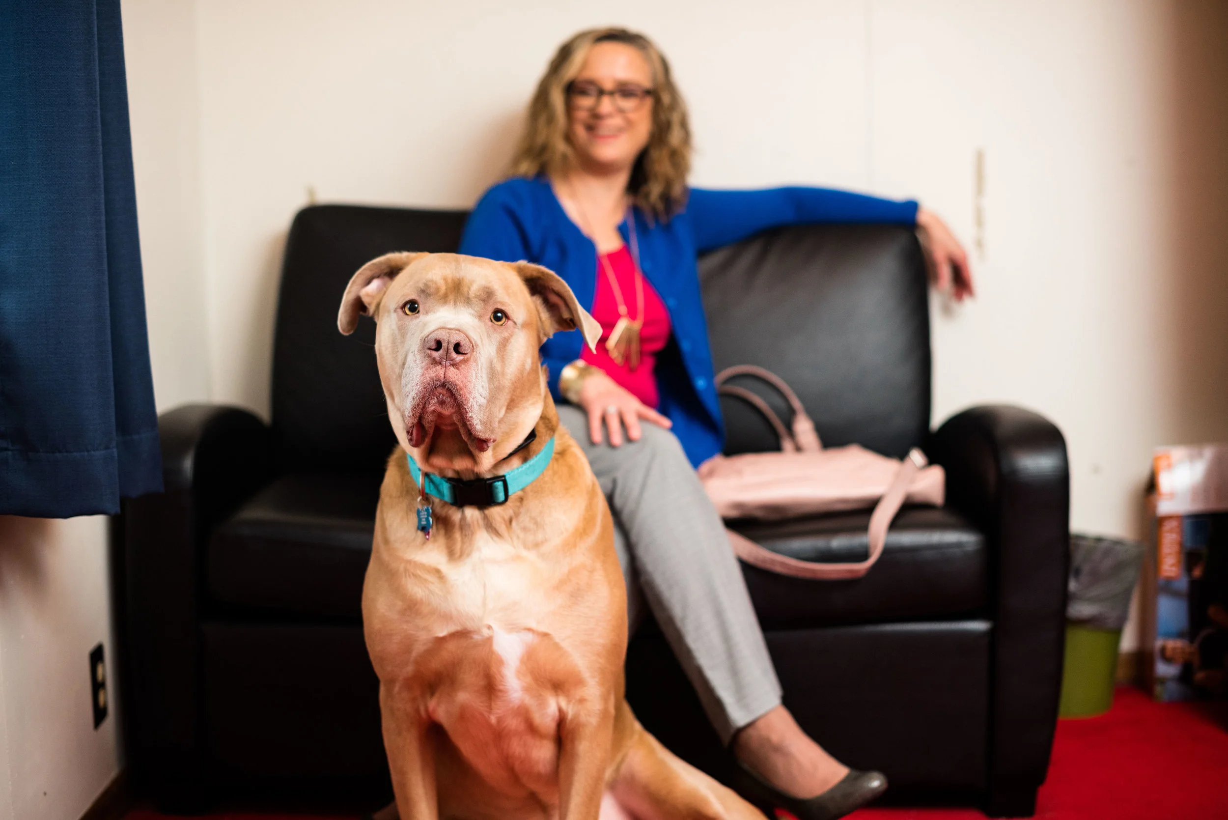
My husband is a detectorist. He owns a metal detector and loves to hunt for treasures buried beneath the ground. His favorite finds are rings, especially gold or silver, but he loves to find any type of ring, even a child's adjustable one. I guess you could call me a "thriftorist". Ha, ha. I made a new word. Just like my husband loves to find treasure, I love to hunt for treasure of the fashionable type in thrift stores.

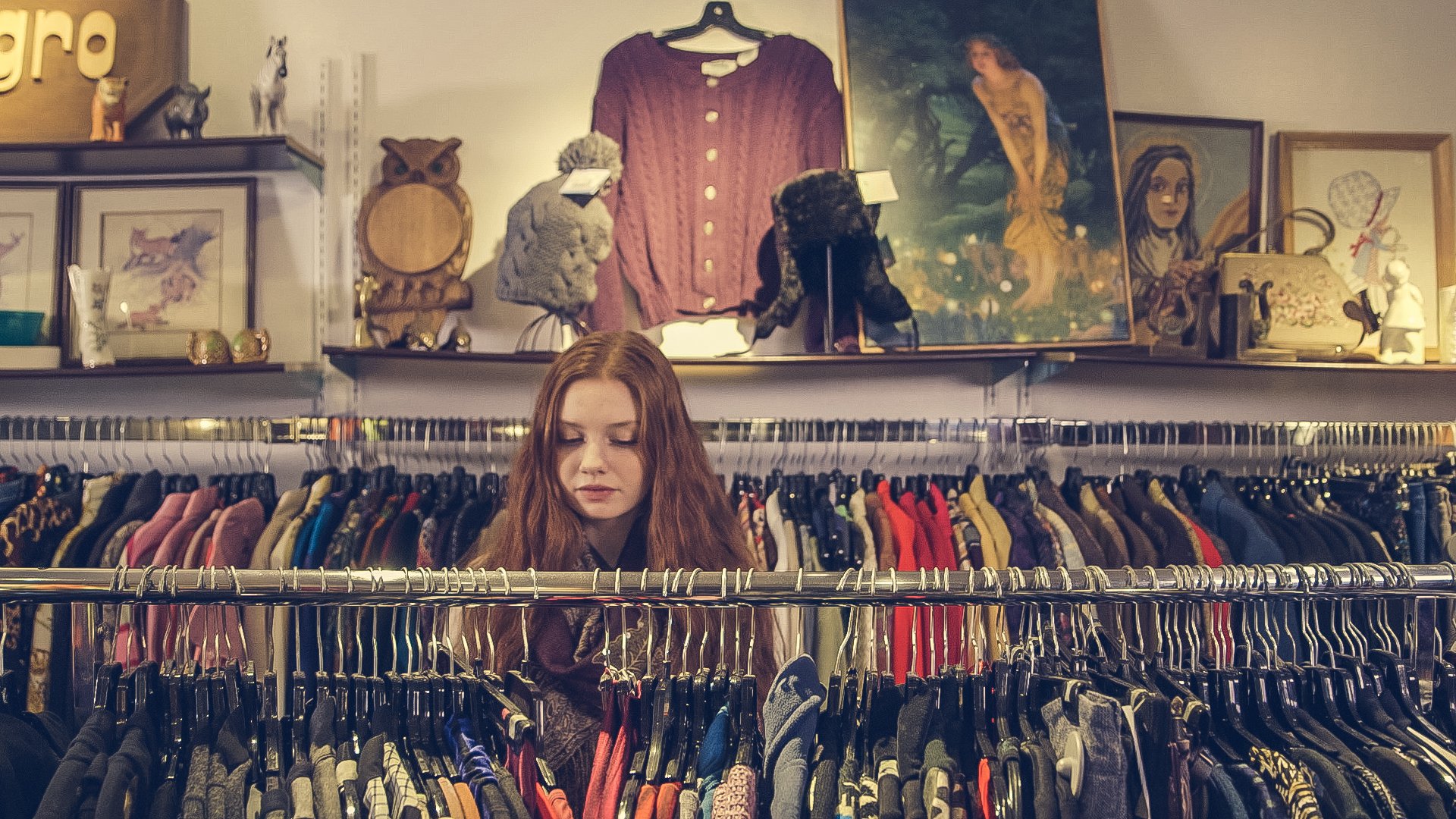
In my town there are several thrift stores. Savers is the largest and the one I go to every few weeks. I have found they have a large selection of gently used items and their prices are fairly reasonable. They also have frequent sales and rewards programs that motivate a treasure shopper like me to stop in more often. We also have Goodwill, Salvation Army, and a number of others like Plato's Closet, Clothes Mentor and The American Cancer Society thrift shop. There are also a number that I haven't yet checked out. As far as treasure hunting goes, I have plenty to choose from.

When looking for the best stores to treasure hunt in you might want to consider a few thoughts. 

1. Location. Since thrift stores are dependent on their own finds and on donations, finding stores in high trafficked locations will usually yield better used goods. Most of the thrift stores that I shop in are nestled with other retail stores. That being said, you can occasionally find uniques treasures in second hand retailers in out of the way places. 

2. Size. I won't be so bold as to say that the bigger the thrift store the better, but the same reasoning I used for location holds true for size as well. Many of the larger thrift stores give you more options. Savers has everything from furniture and electronics to bedding and shoes. My grandson loves to peruse the toys when we go in there, knowing he will be able to find some little treasure that grandma will buy for him. Don't get me wrong, there are some amazing and unique small thrift stores. My Shop on Rugby Dr., is an example of a small boutique that features used upscale women's clothing and accessories here in Toledo.

3. Organization. This is a huge thing for me....not that I am so organized, but that I like my shopping environment to be. Clothing should be organized by type. For instance, groupings such as long sleeve blouses, skirts, and cardigans, are all helpful as I hunt for treasure. If the store is organized by a broader category, such as long sleeve tops, it will take longer to look through all the tops to find that one button up that I am searching for. It is also helpful when a store organizes their clothing by size, at least by small, medium, large, and so on. 

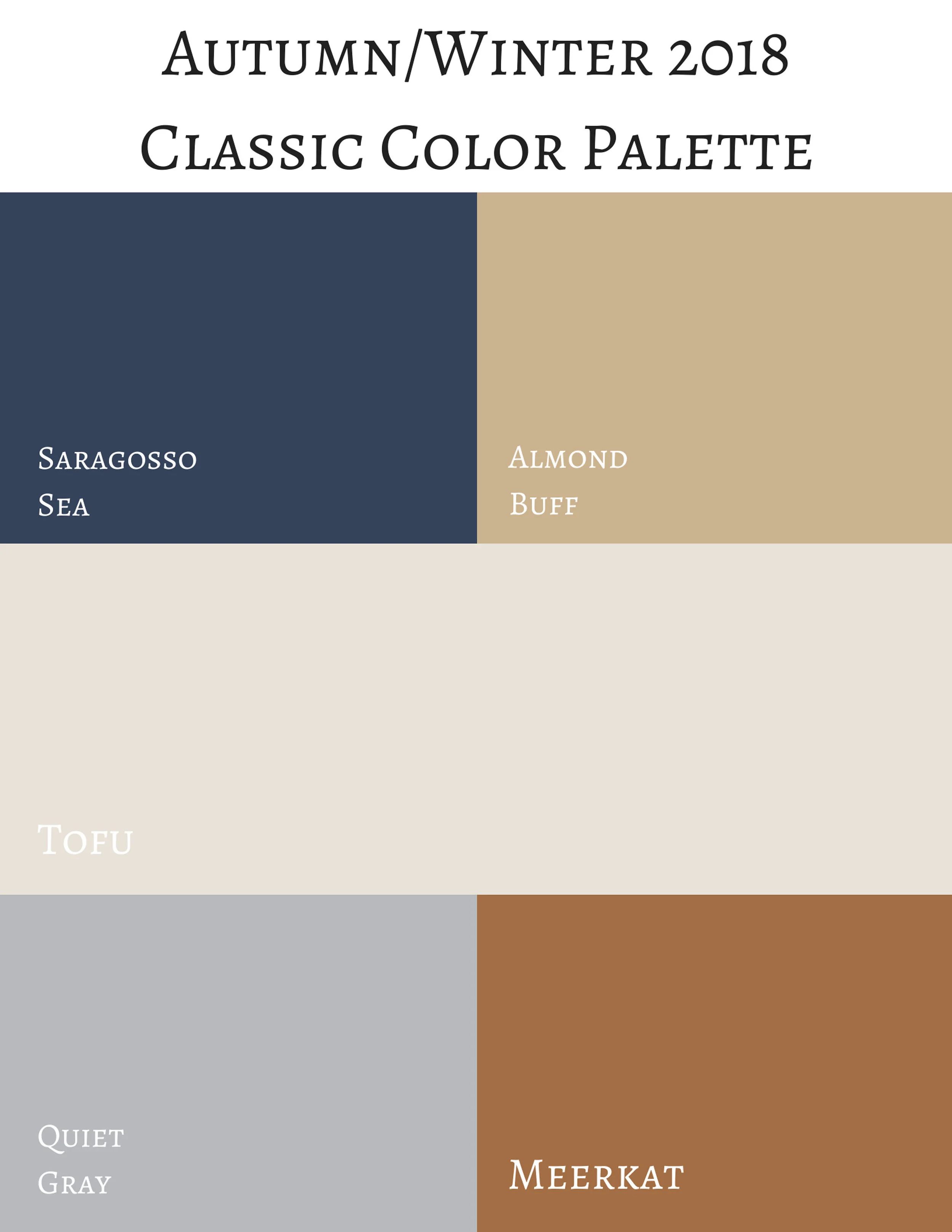
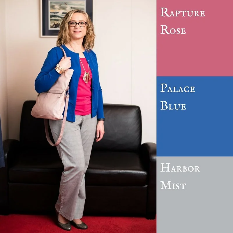
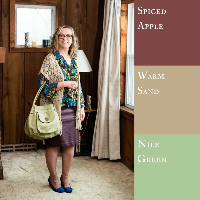
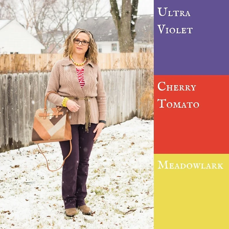
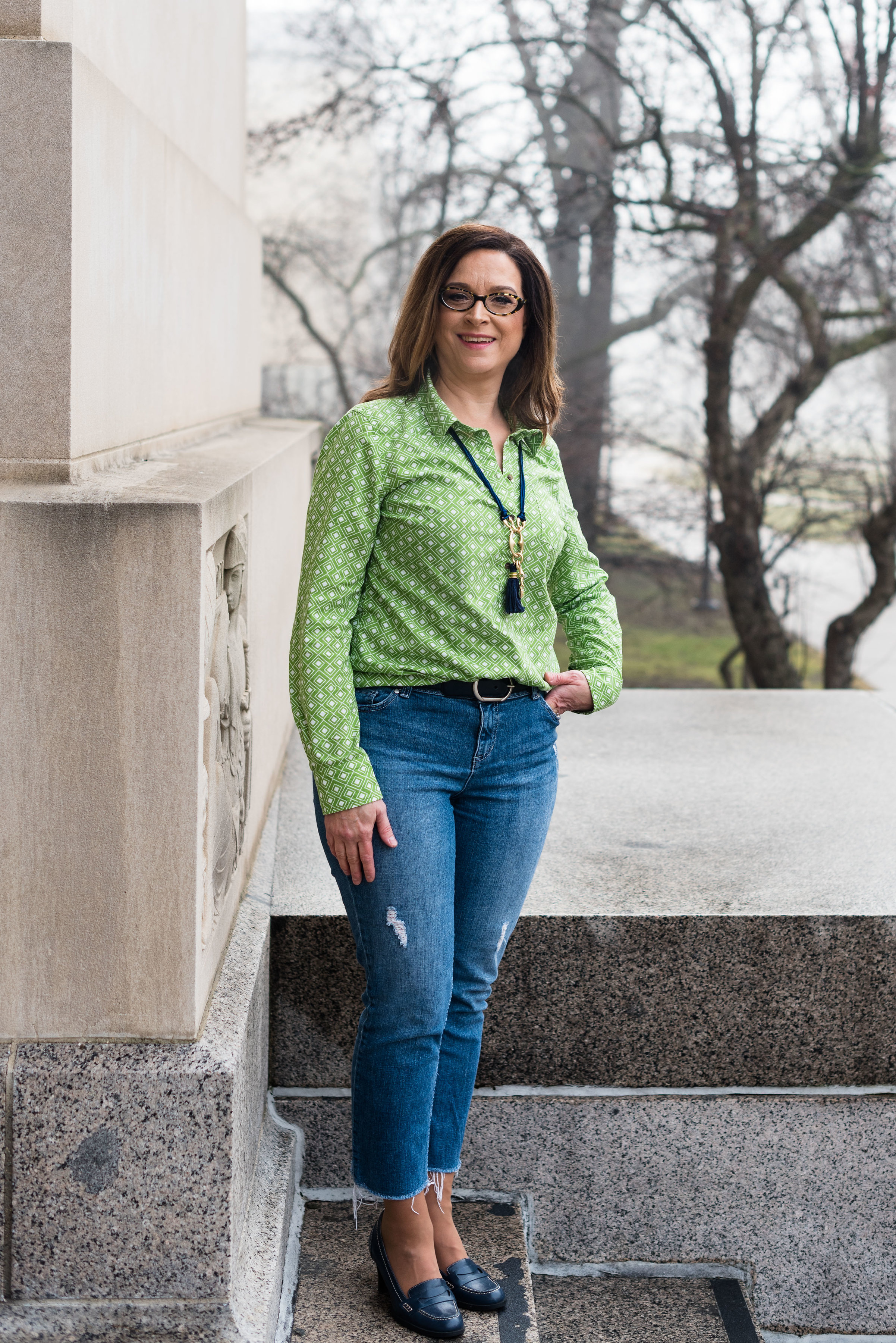
Another way various stores organize their racks of clothes is by color. I really like this, especially if I go in with a specific color item in mind. That way, I only shop those sections with the colors I am looking for, instead of combing through racks and racks of clothes. While it is true, you have to look for your size in the color you want, it does make shopping for the Pantone series that I do, much easier. 

4. Lighting. I don't know about you, but when I am shopping I like to have a bright environment. I want to be able to see the colors I am looking at, as well as be able to read the tags to check out sizing, materials and washing instructions. I also want to be able to check the item over for tears, stains or deformities. 

On a weekend trip earlier this summer my hubby and I checked out a few thrift stores in the area we went to. The one store was beautifully organized, but the lighting was very dim. While I did find a few things that I bought, I kept wanting to ask a staff person if they could turn on the lights. 

5. Cleanliness. While every thrift store has a bit of a second hand air to it, it doesn't have to look and feel like a dump. Floors should be fairly clean. I've been in thrift stores where I wanted to wash my shoes after I left. Changing rooms should be well attended, meaning the staff is removing clothing left behind and picking up things that were left on the floor. Believe me, people can be very rude when it comes to changing rooms...even at regular, full priced retailers!

Clothing should be clean. That doesn't mean it has been washed. Stores do not have the capacity to wash every item that comes in their donation doors. However, they can be particular about what gets put out on the floor. Find stores that take pride in the pieces of clothing they put out.

It is also helpful if the thrift store has a bathroom. I drink a ton of water and having a bathroom on site means they will get to keep my business. 

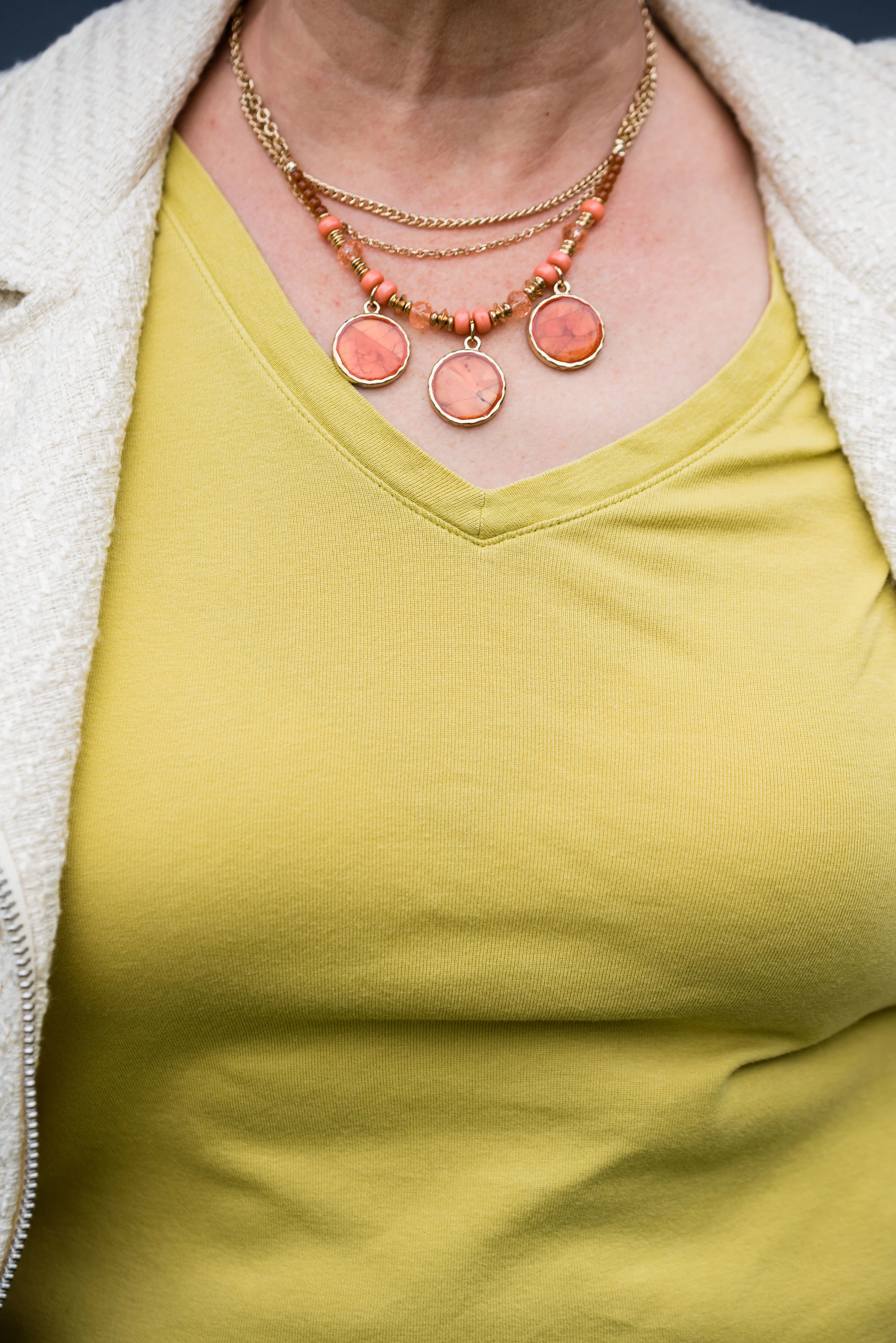
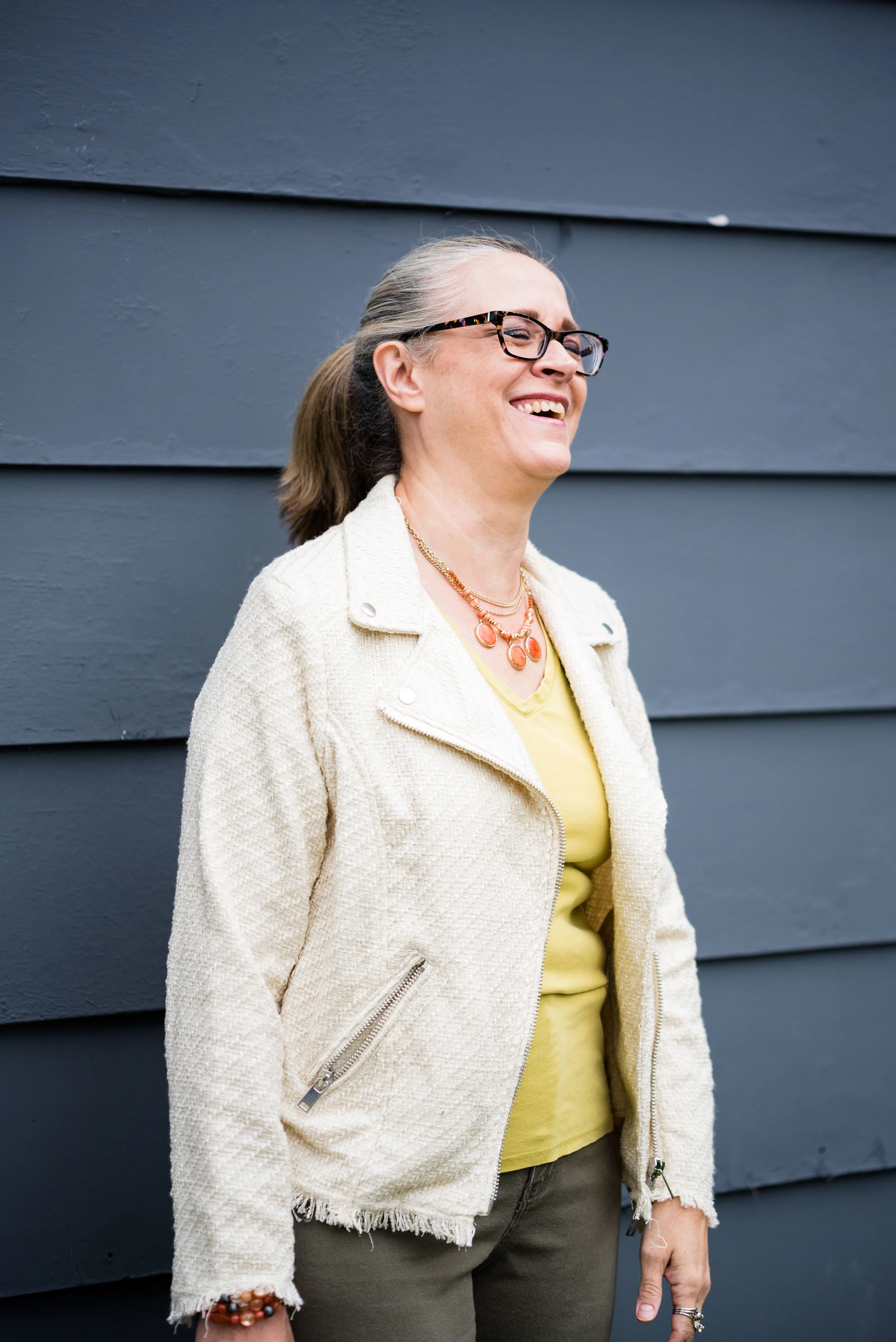
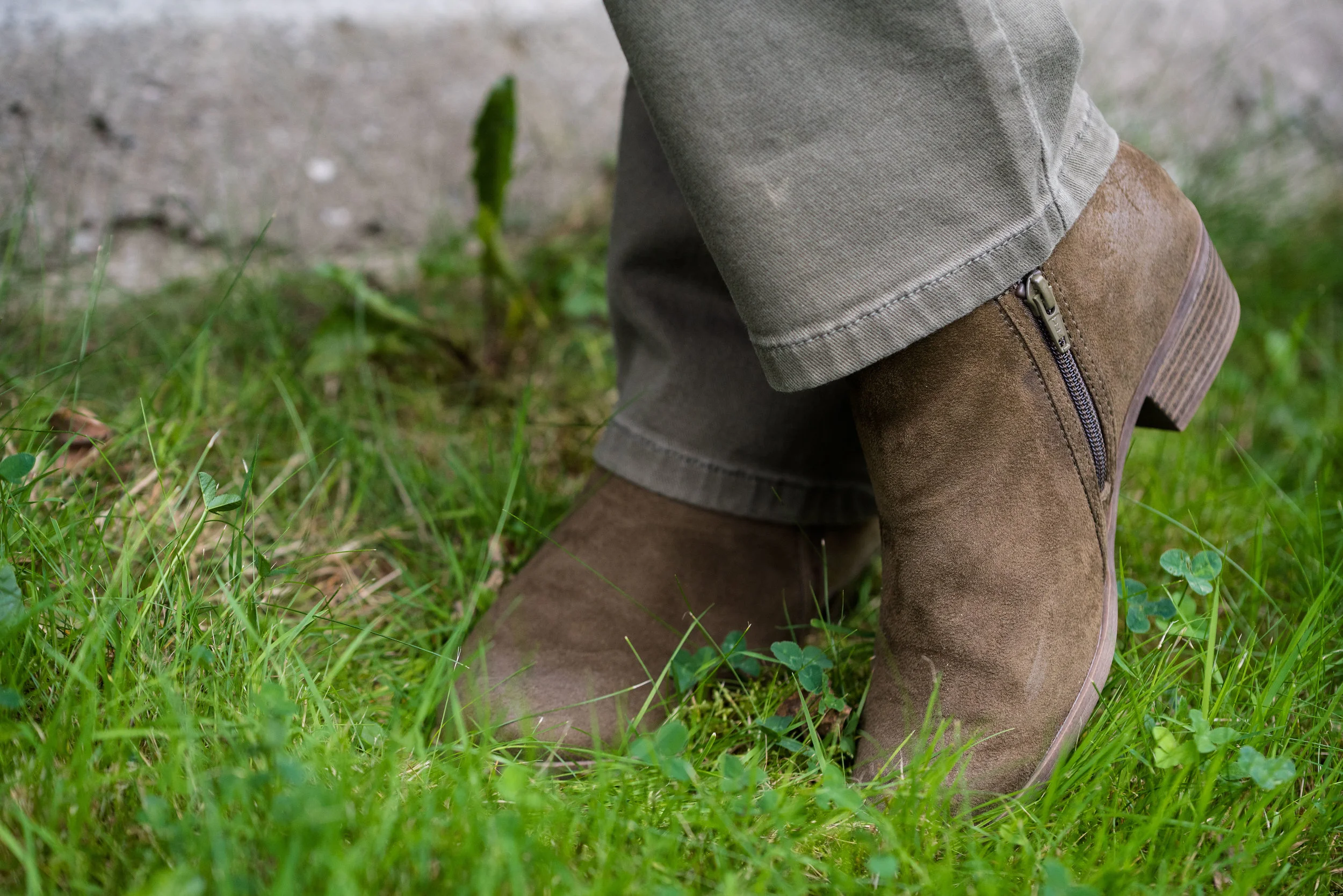
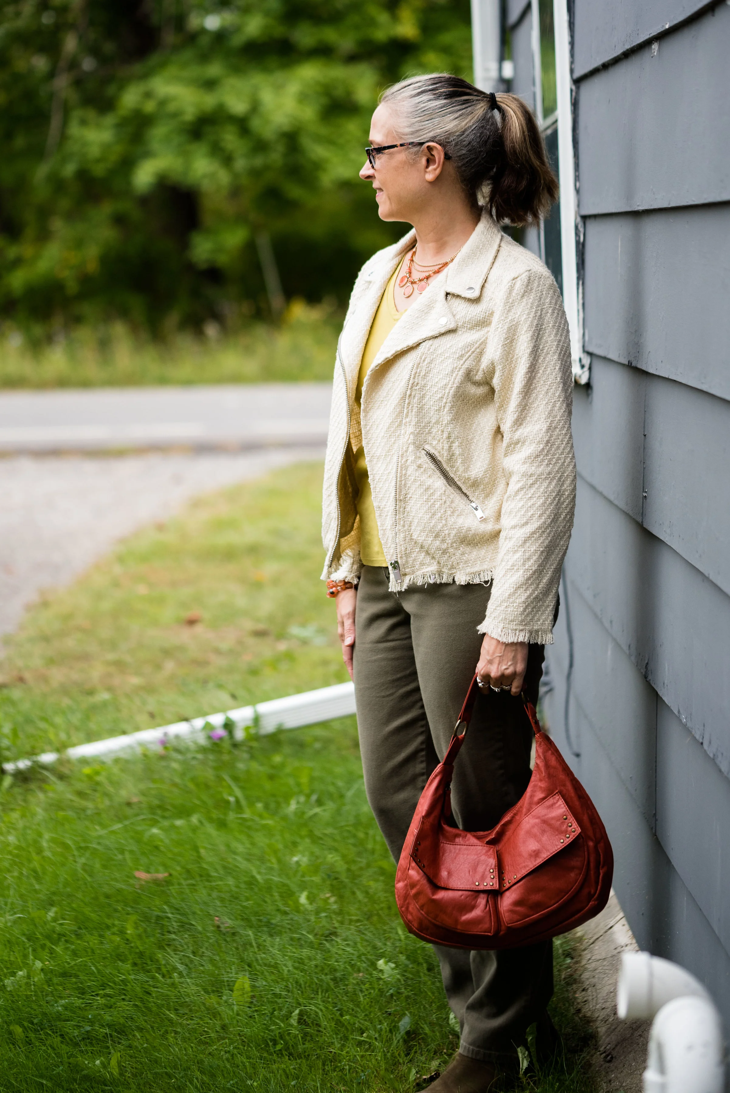
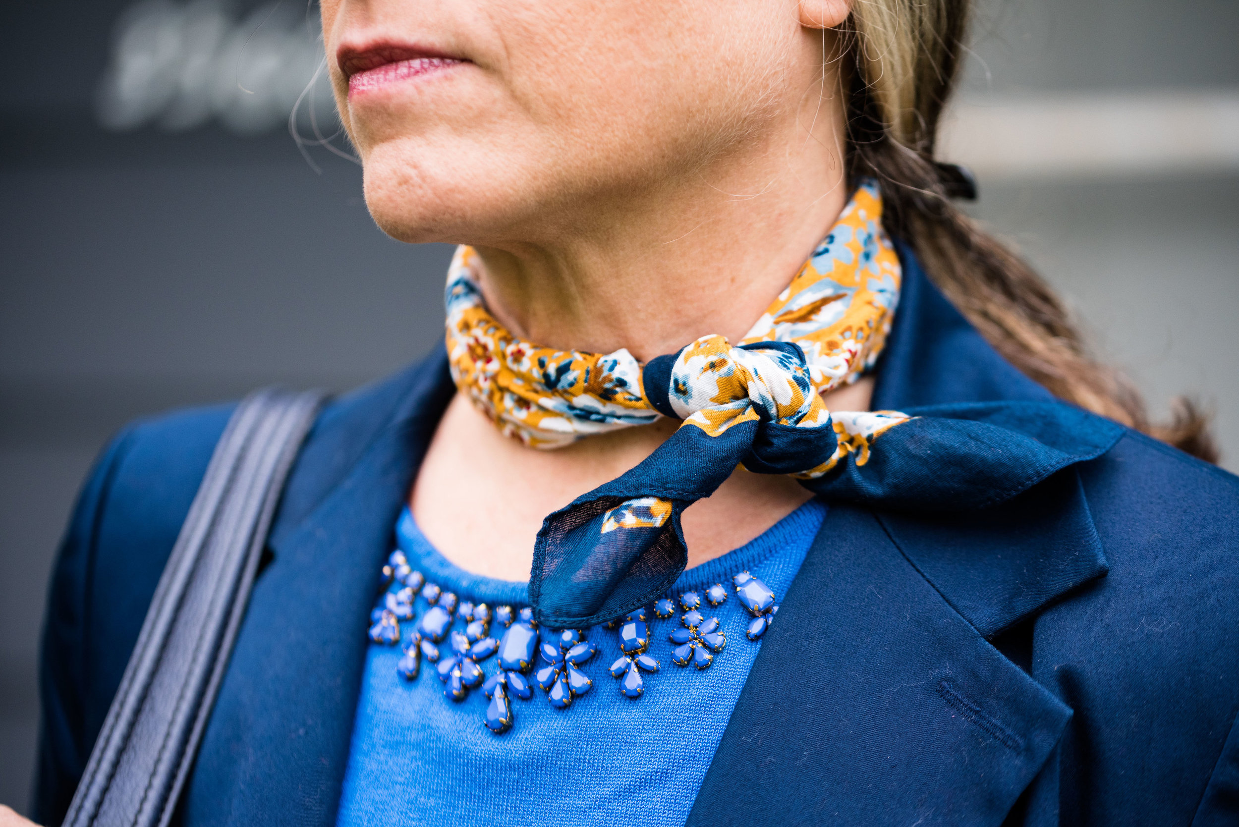
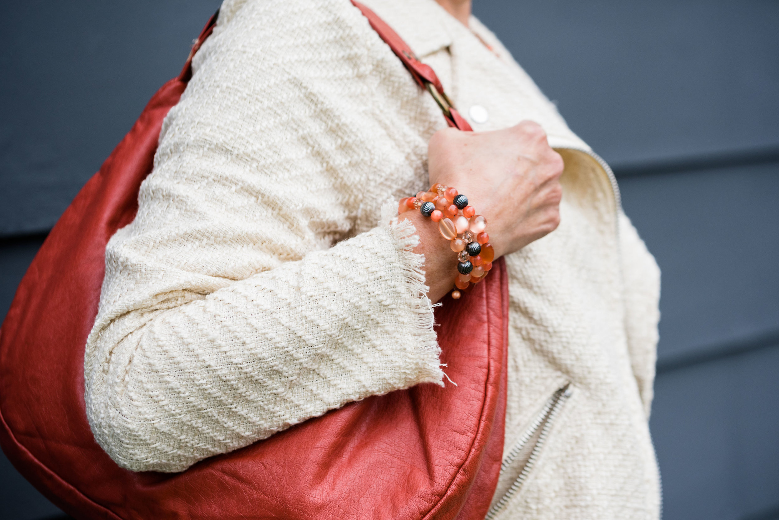
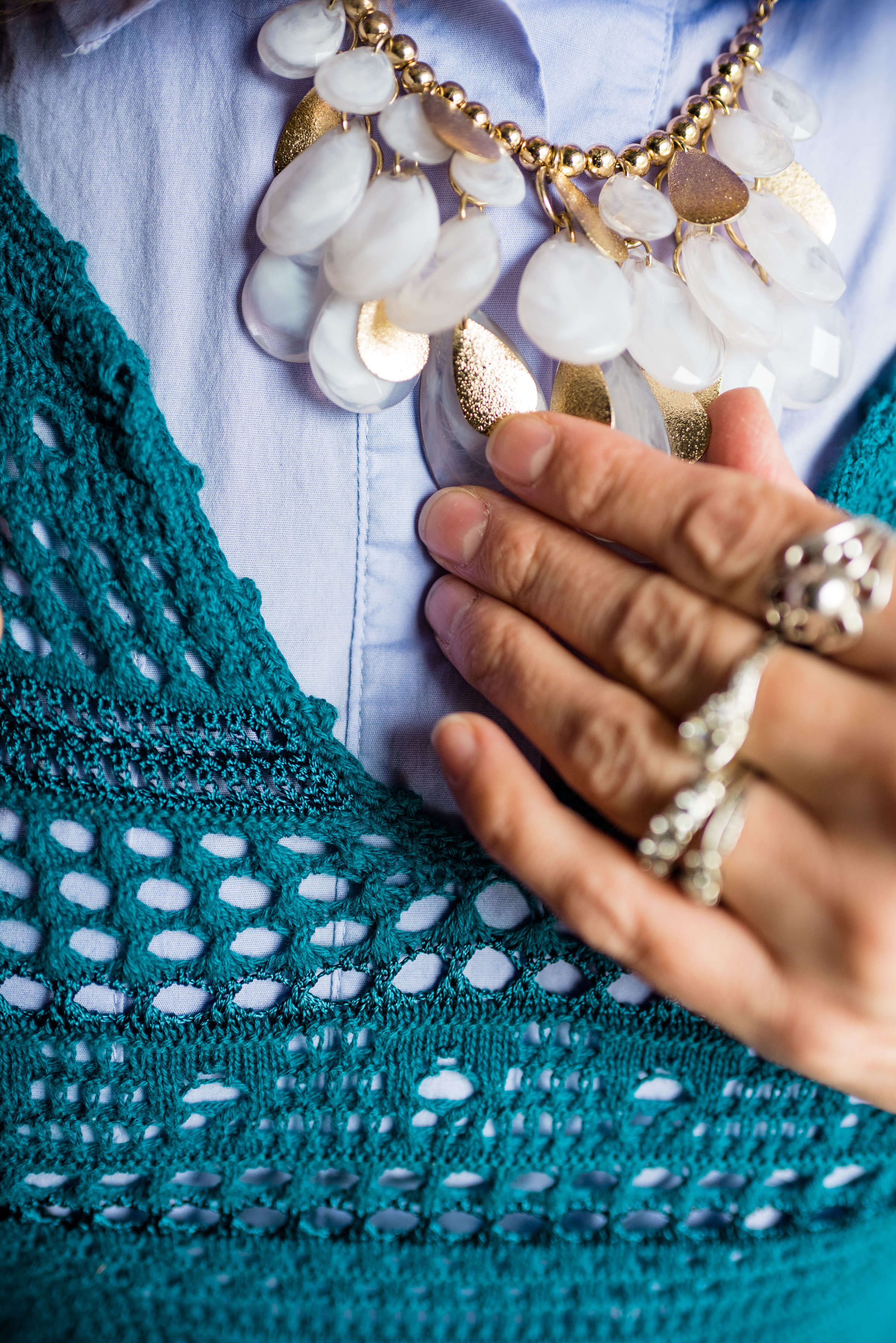
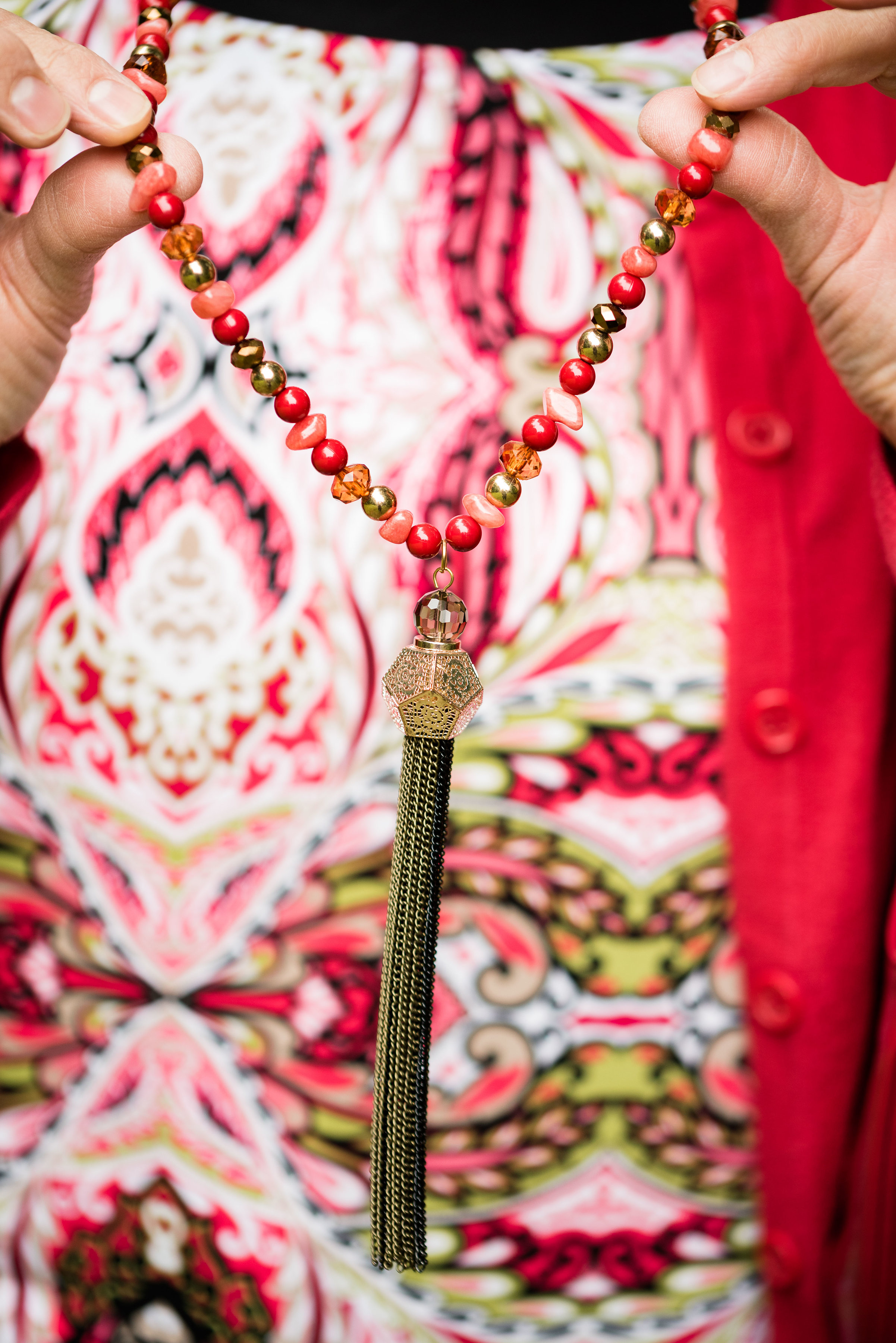
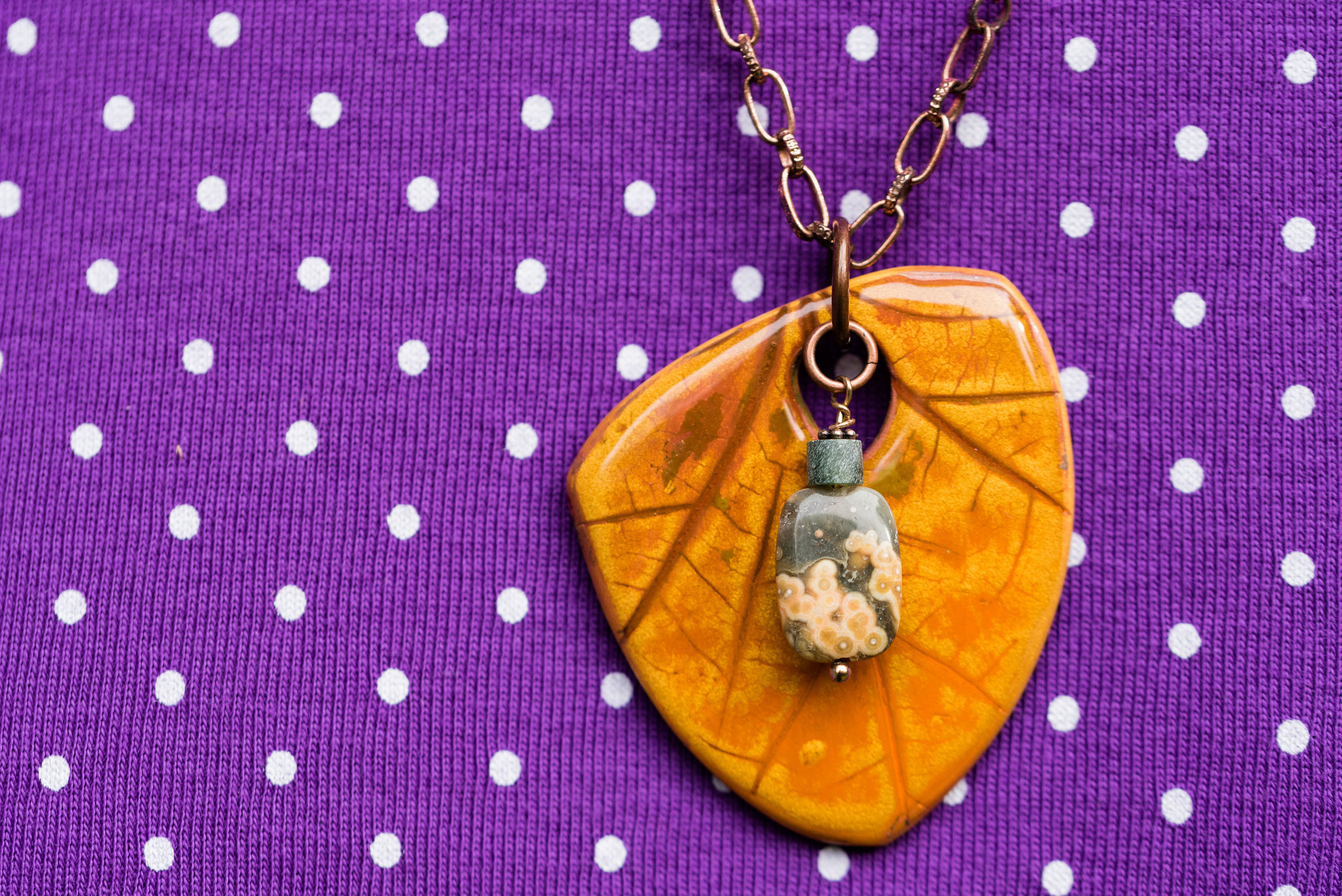
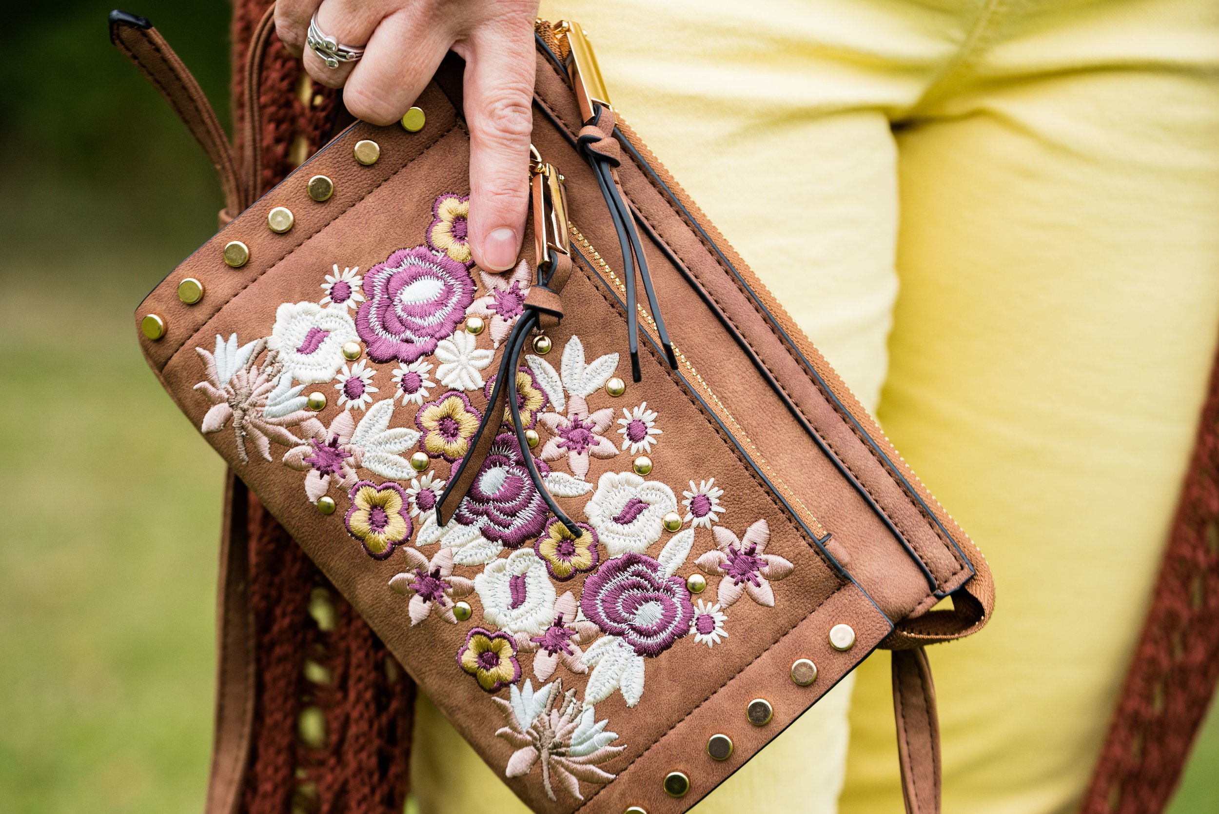
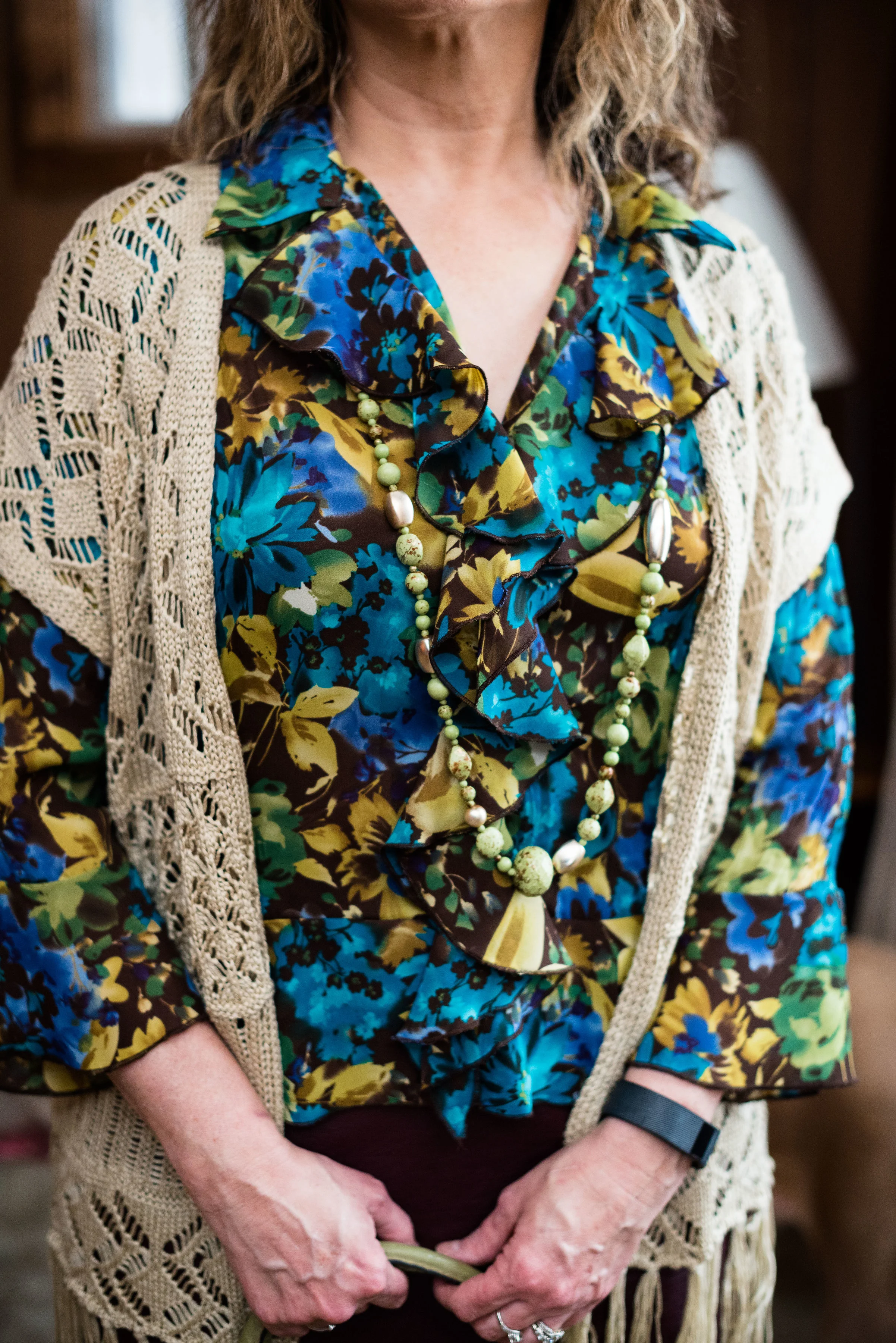
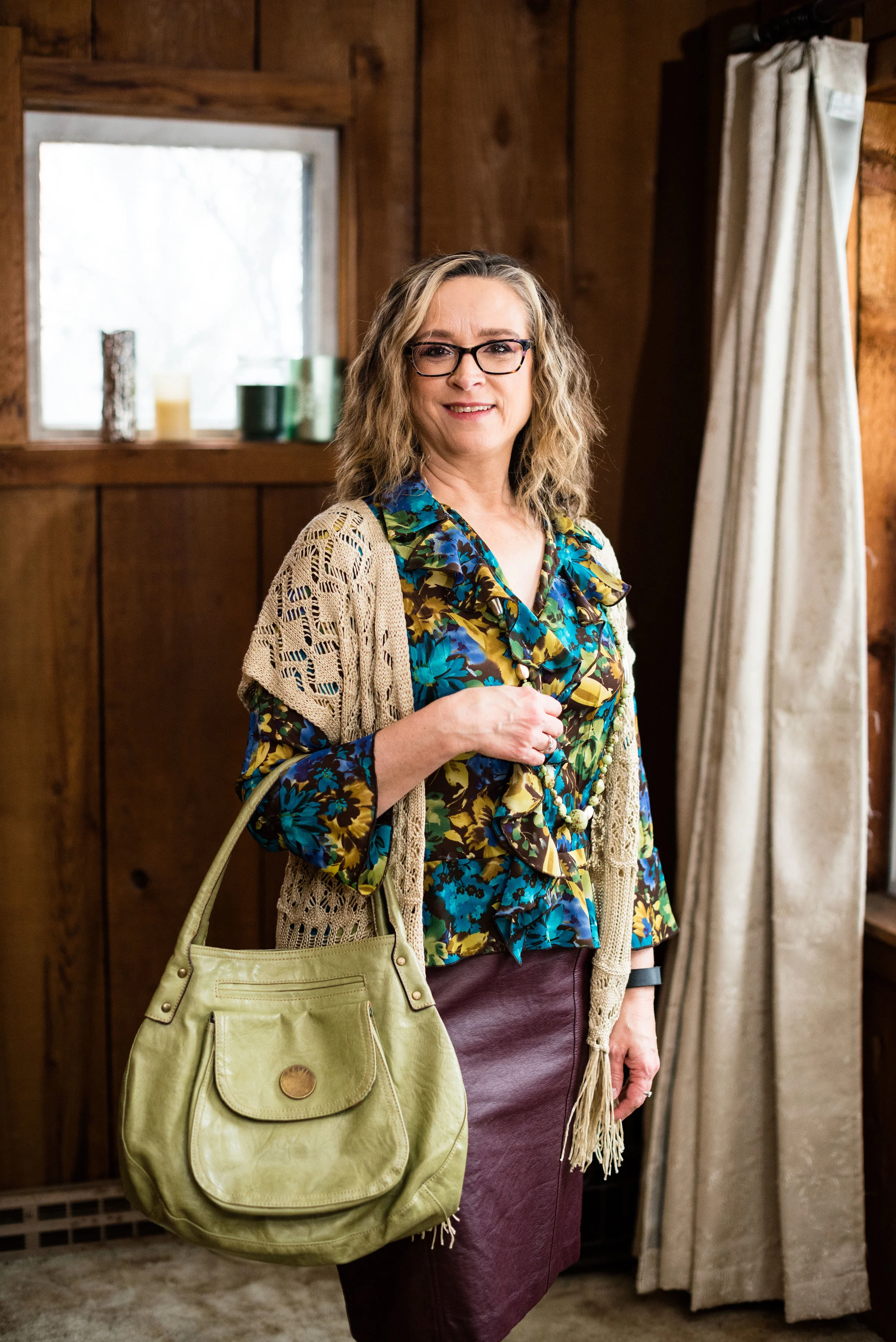
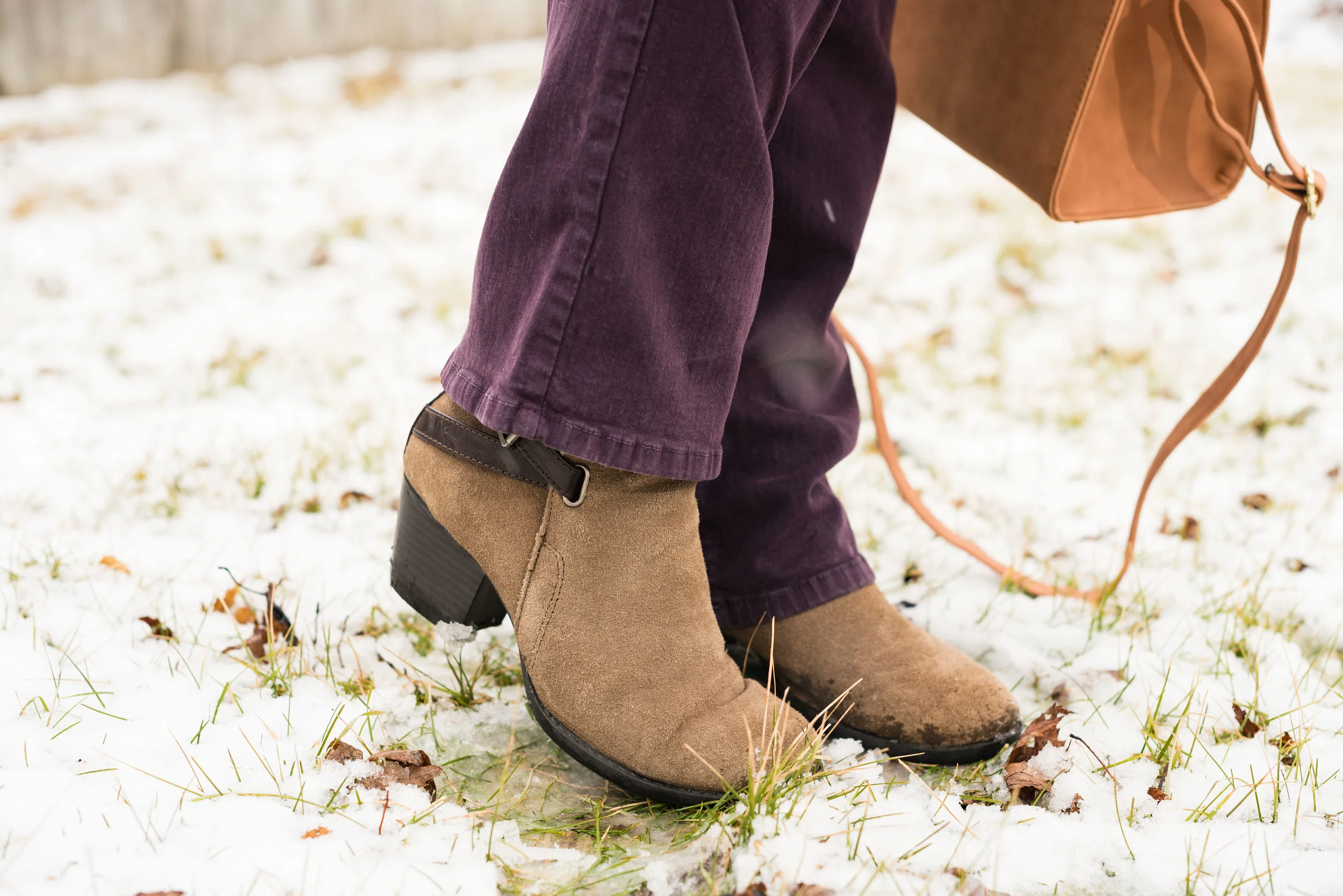
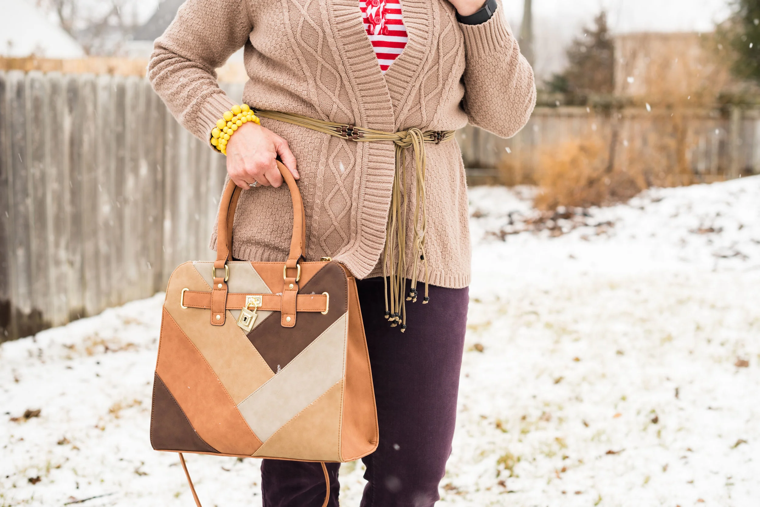
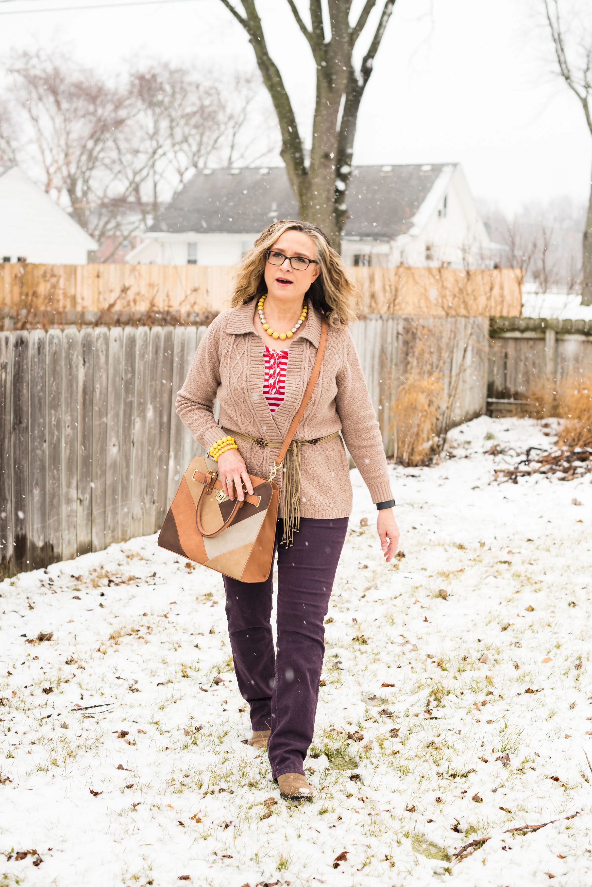
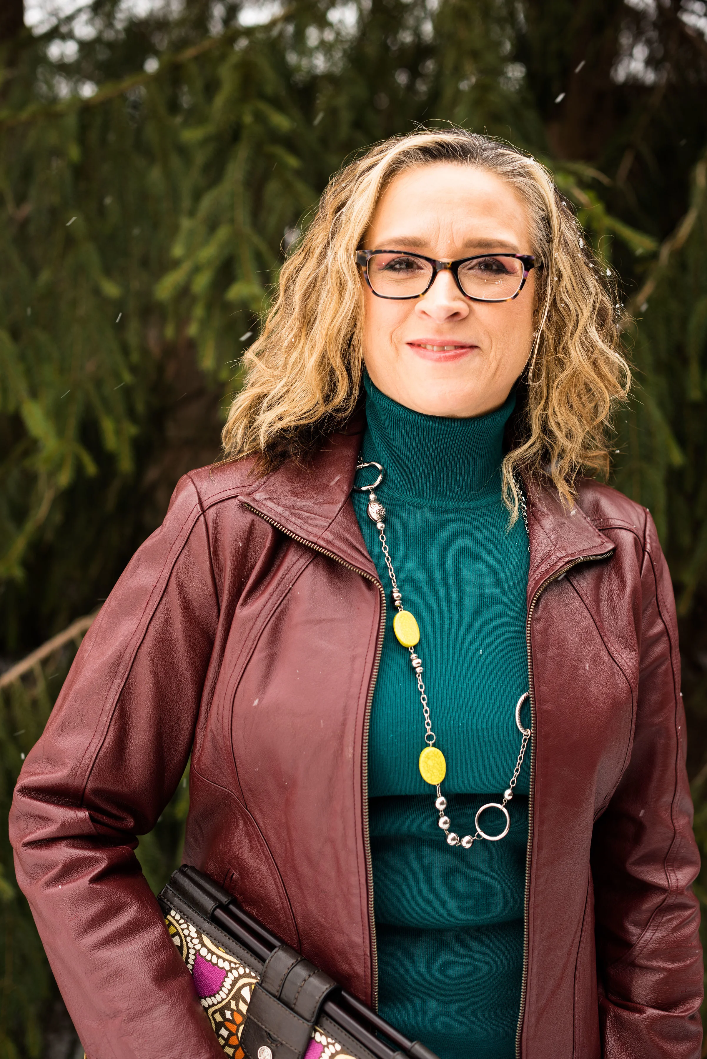
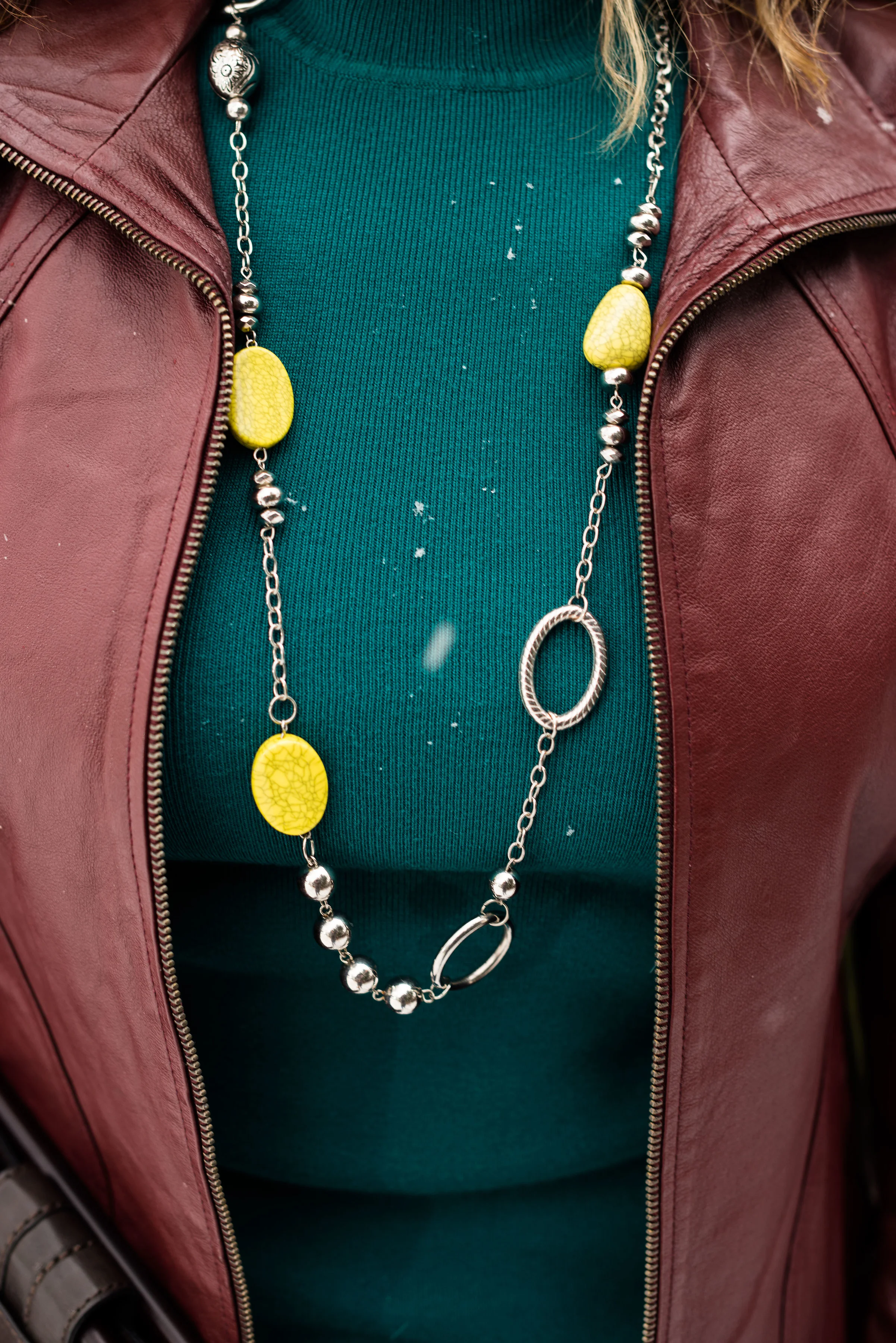
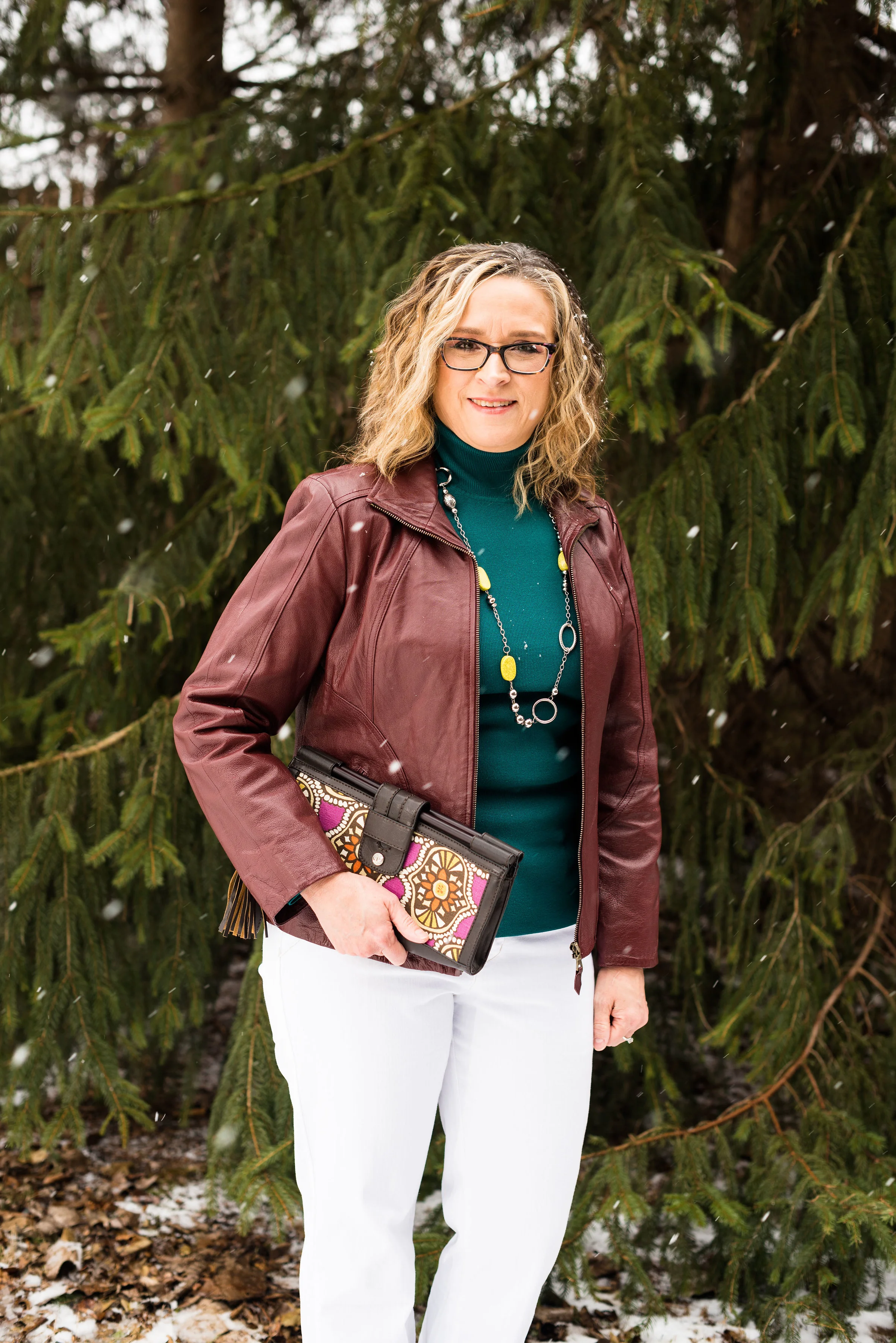
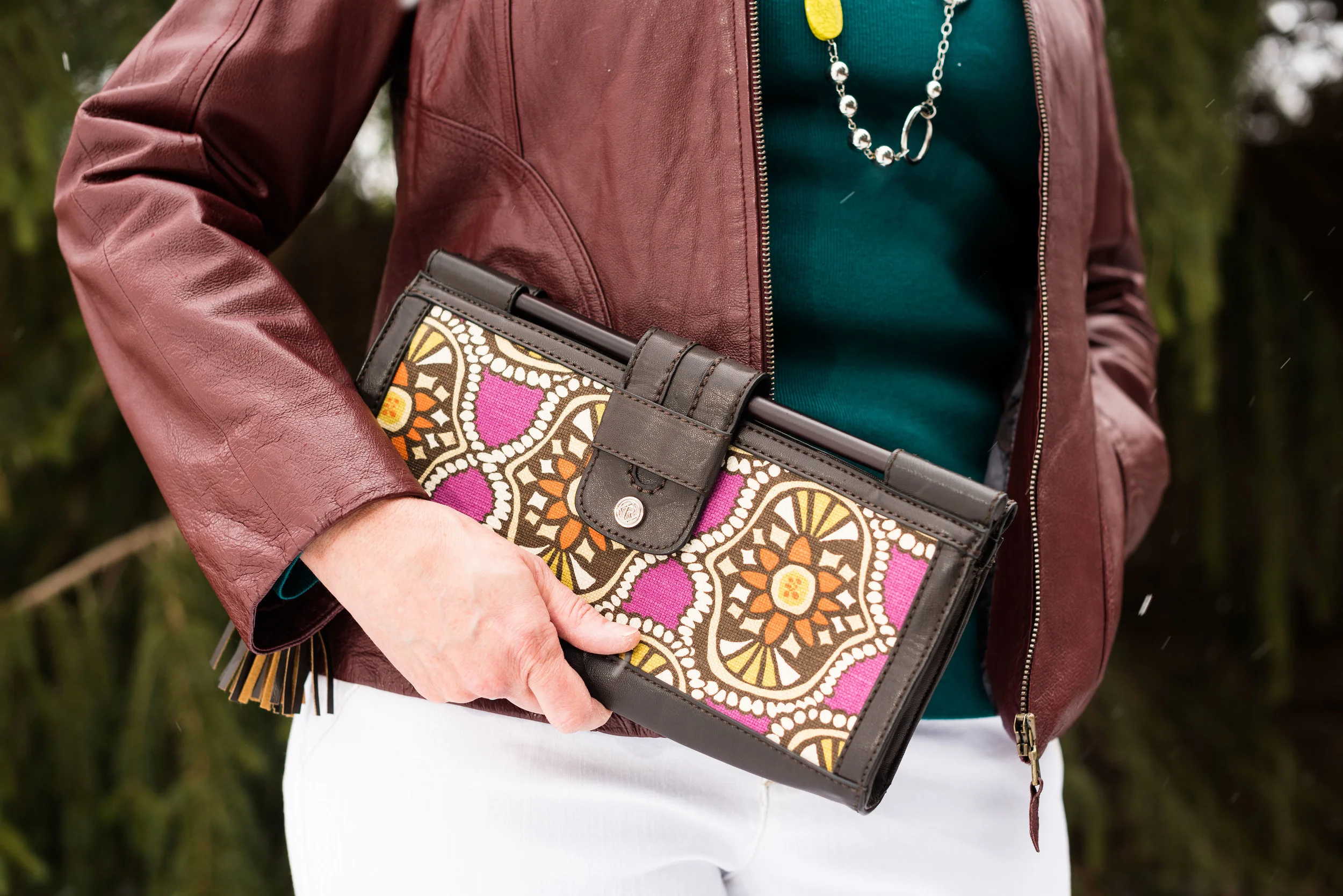
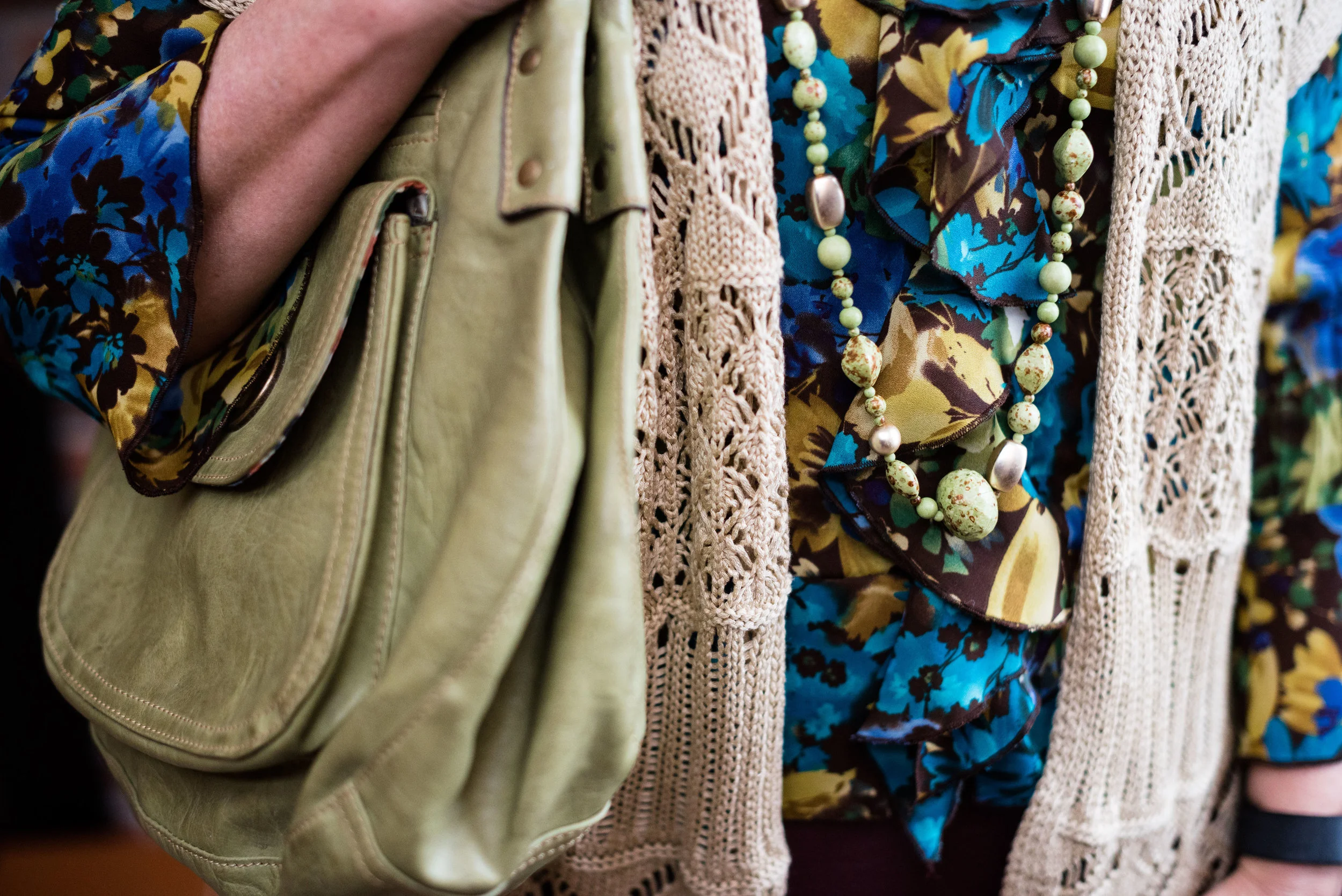
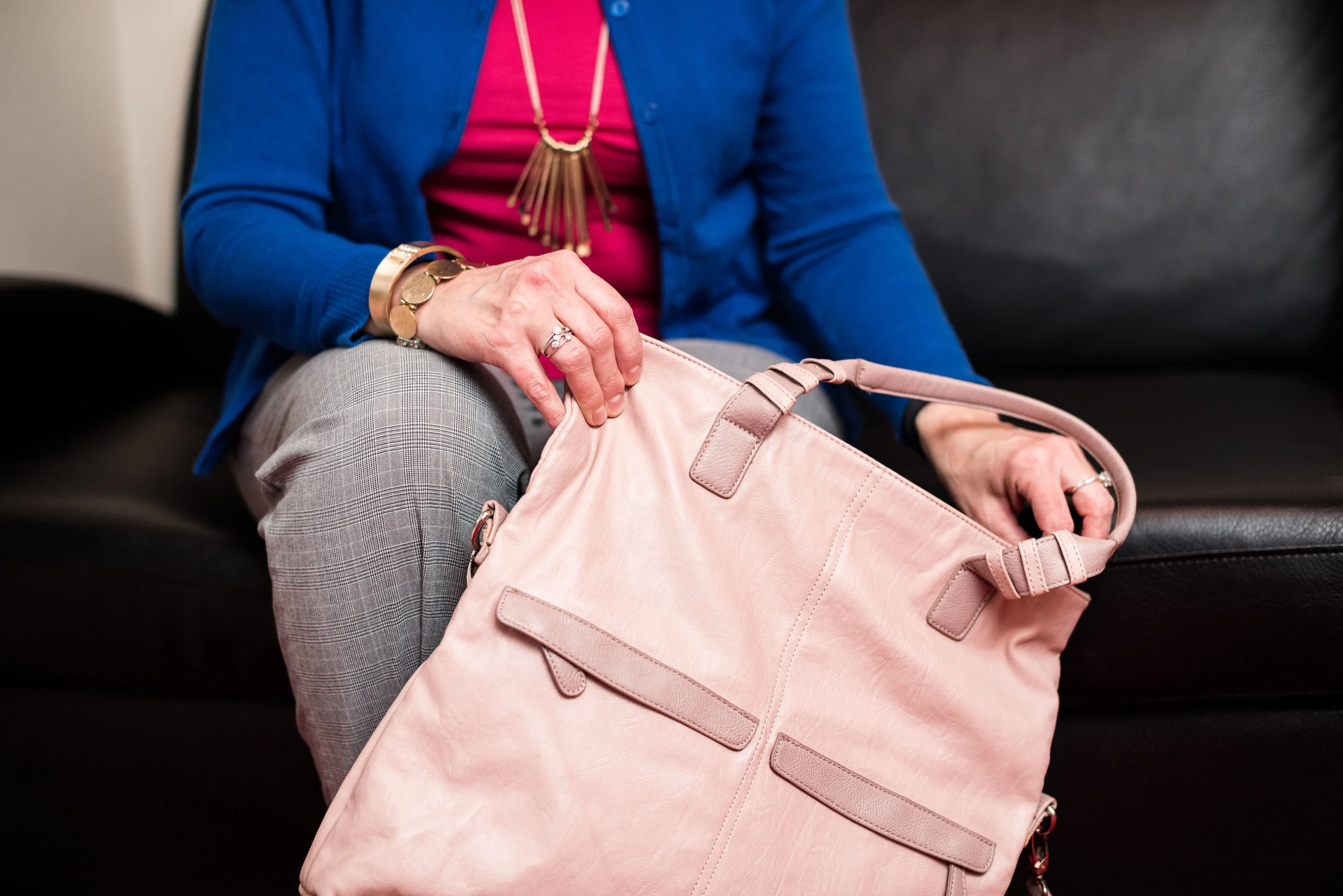
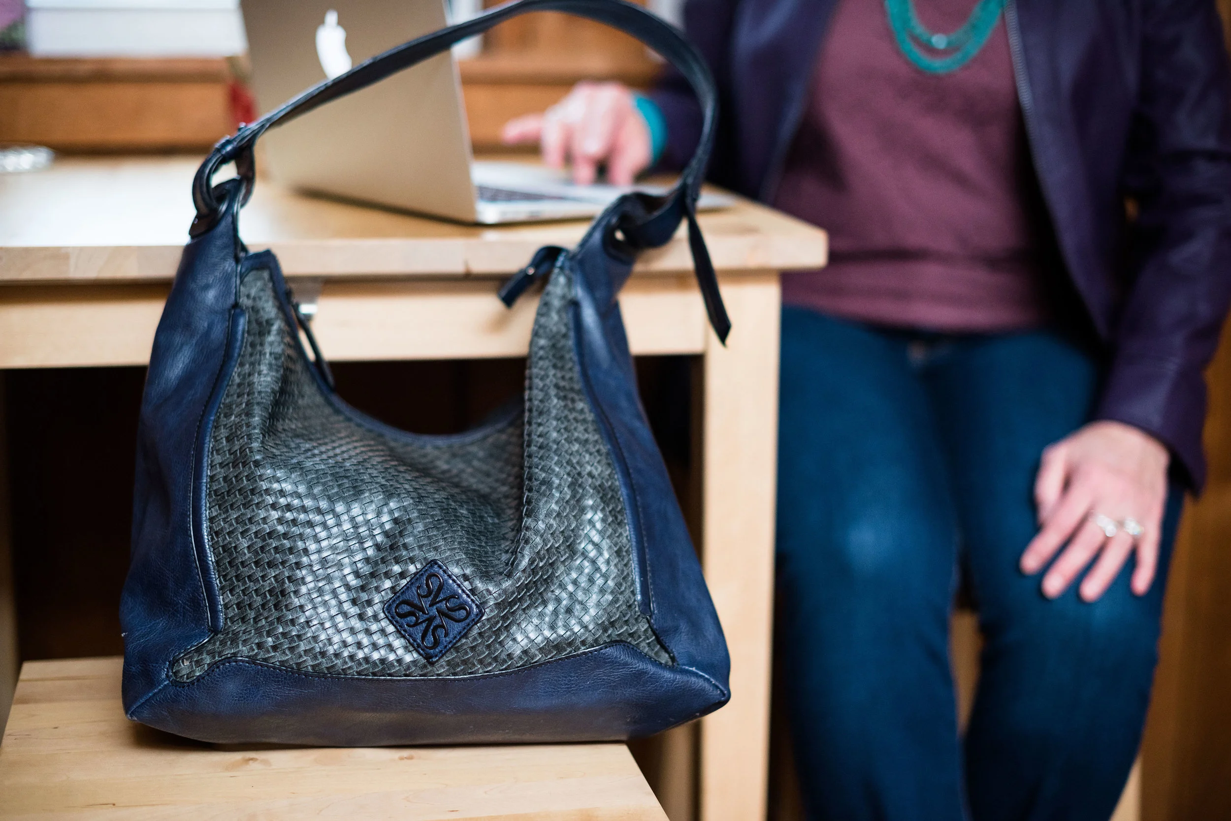
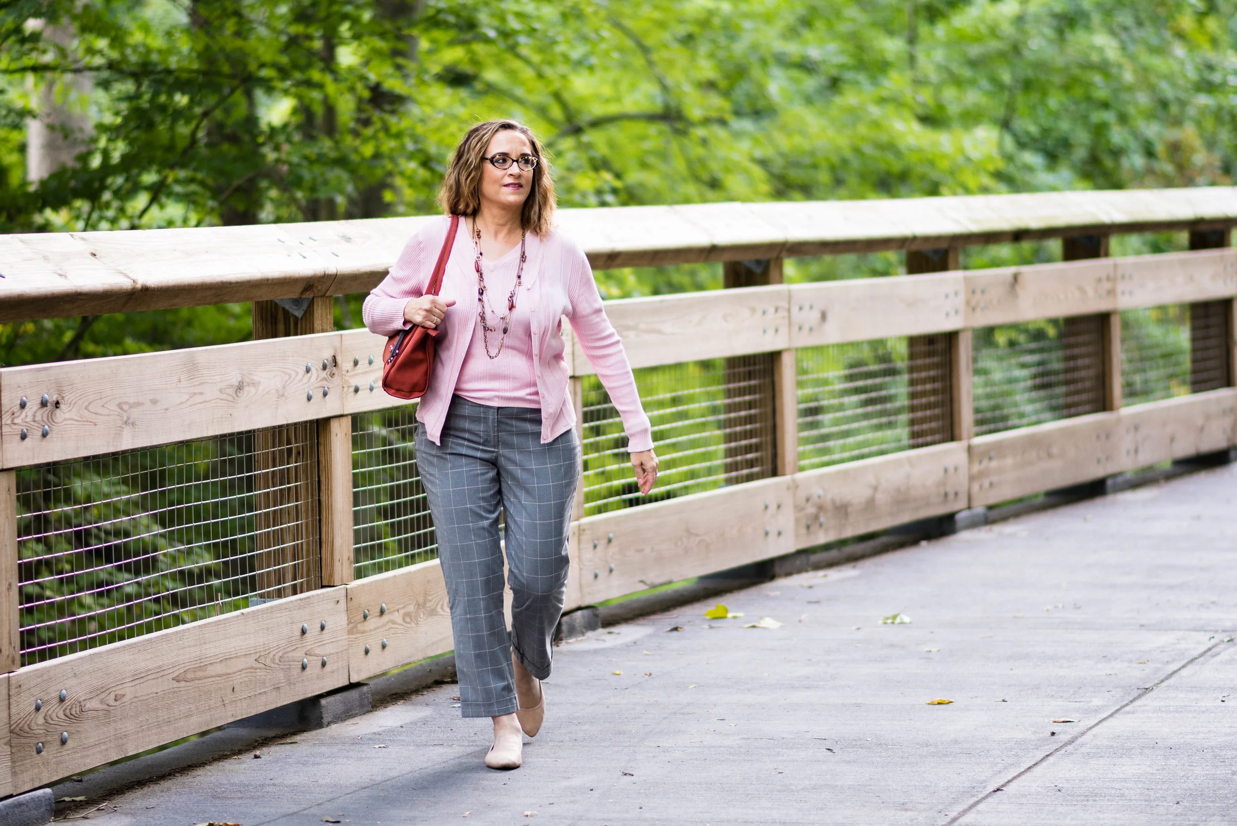
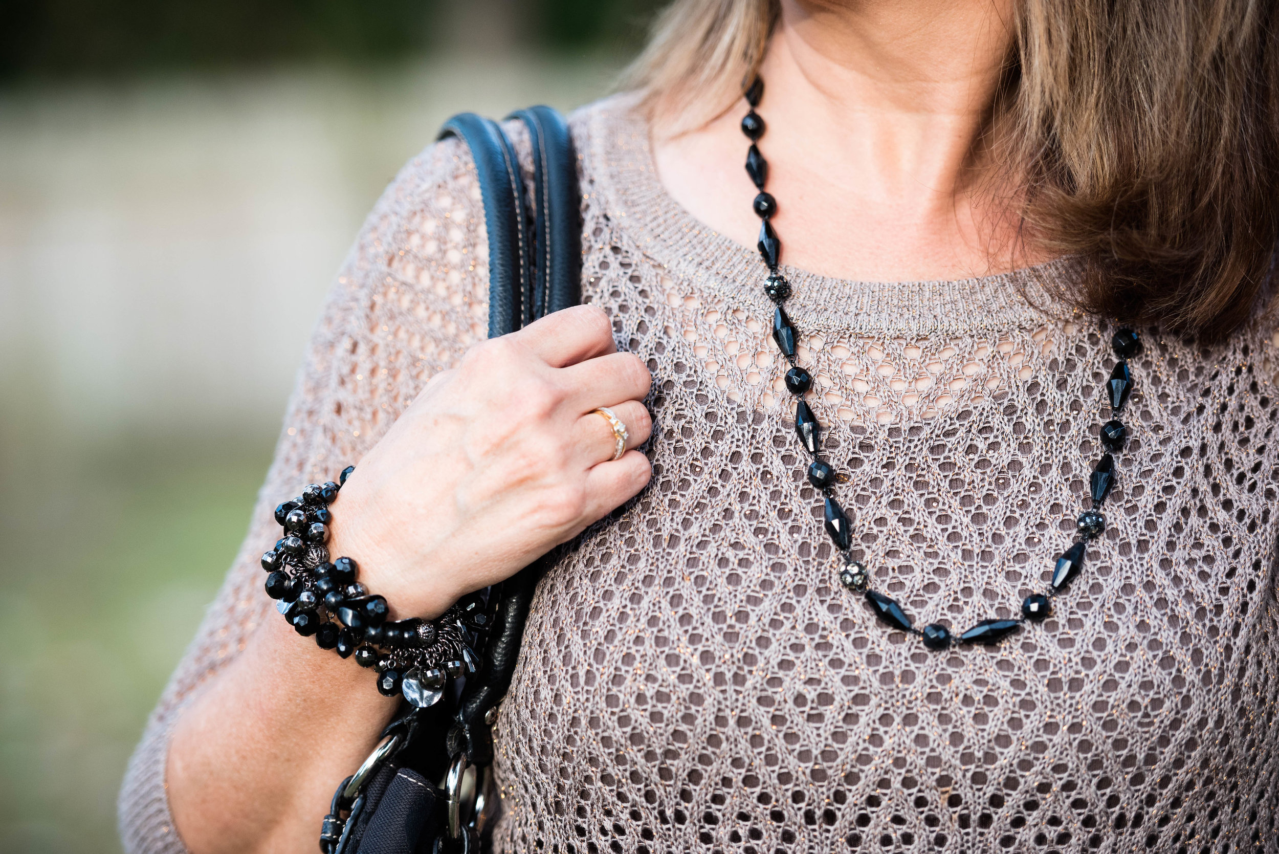
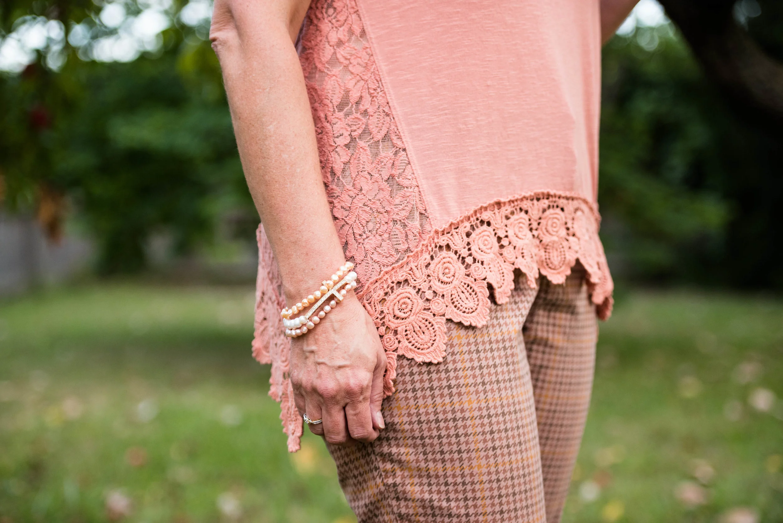
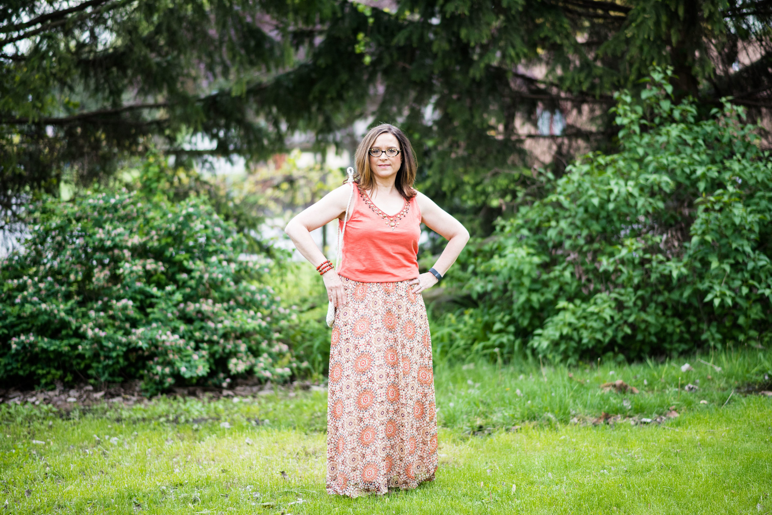
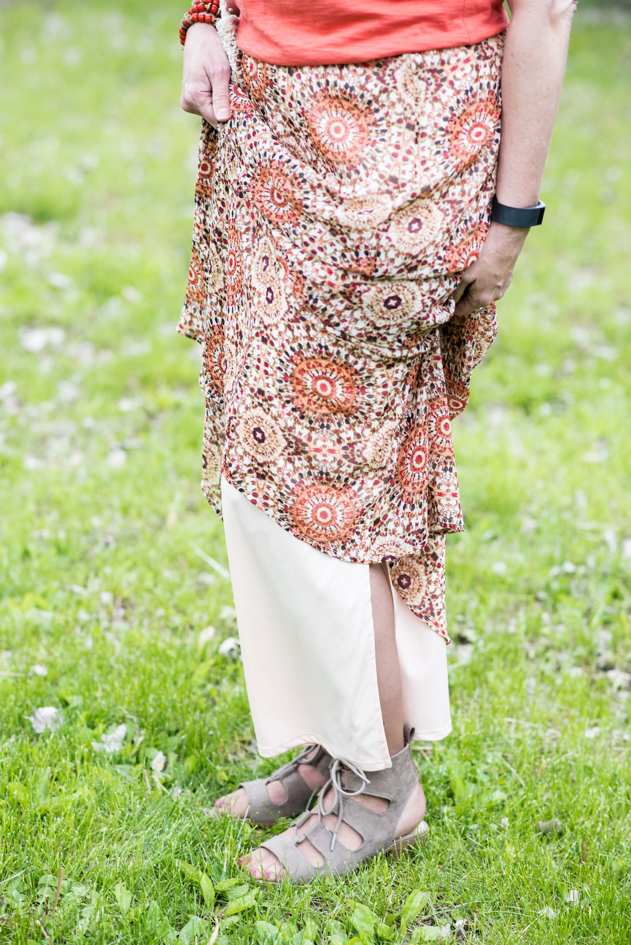
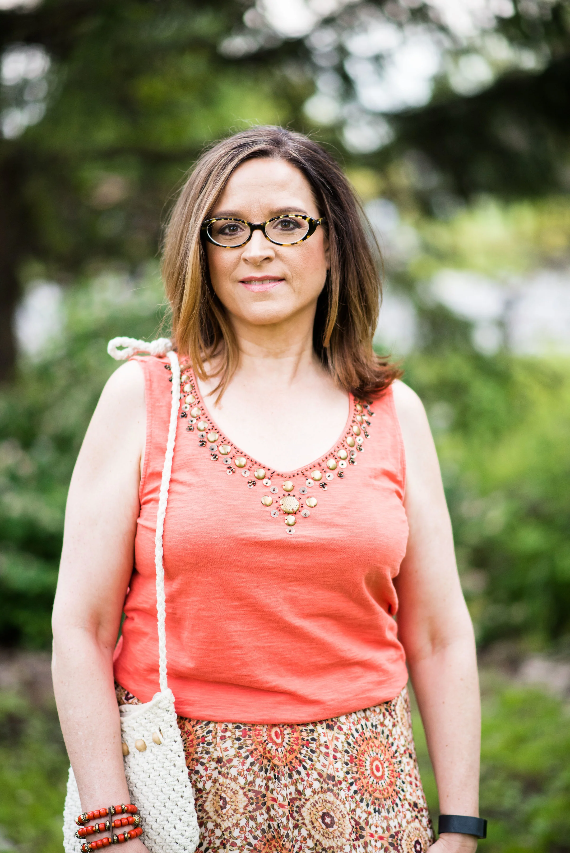
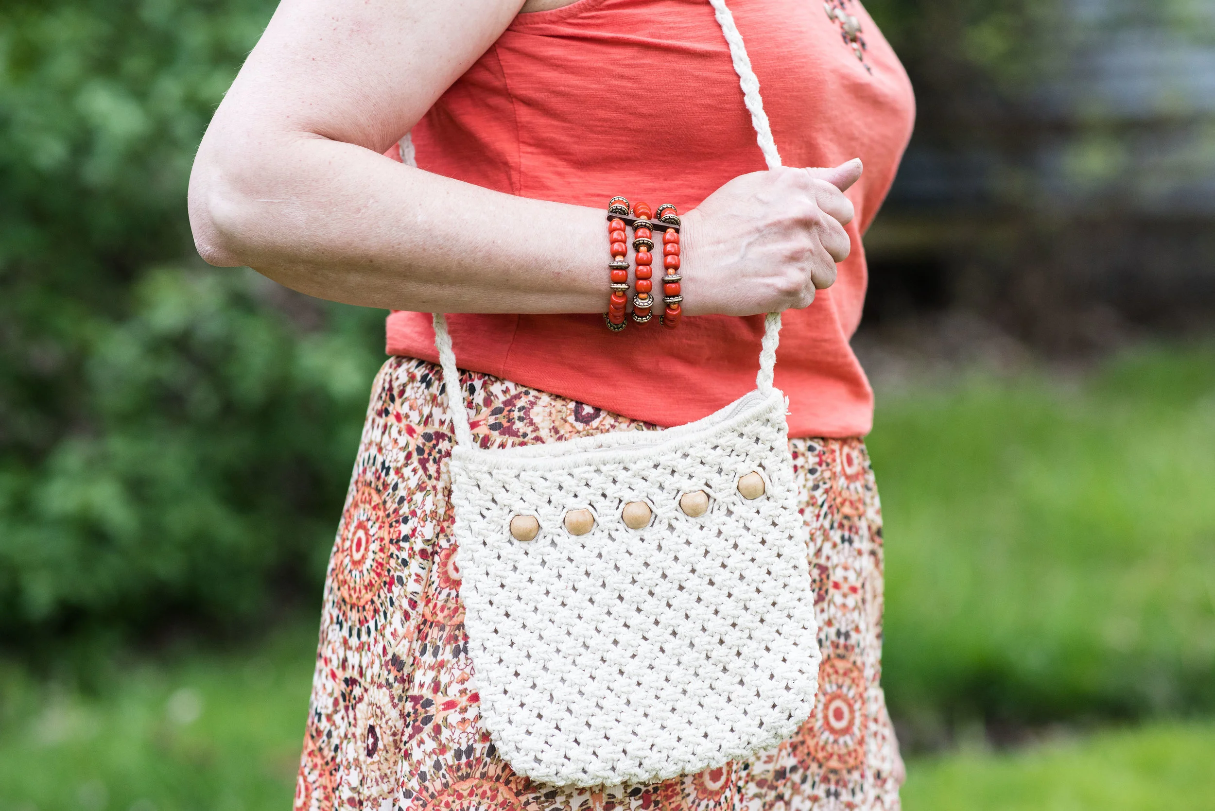
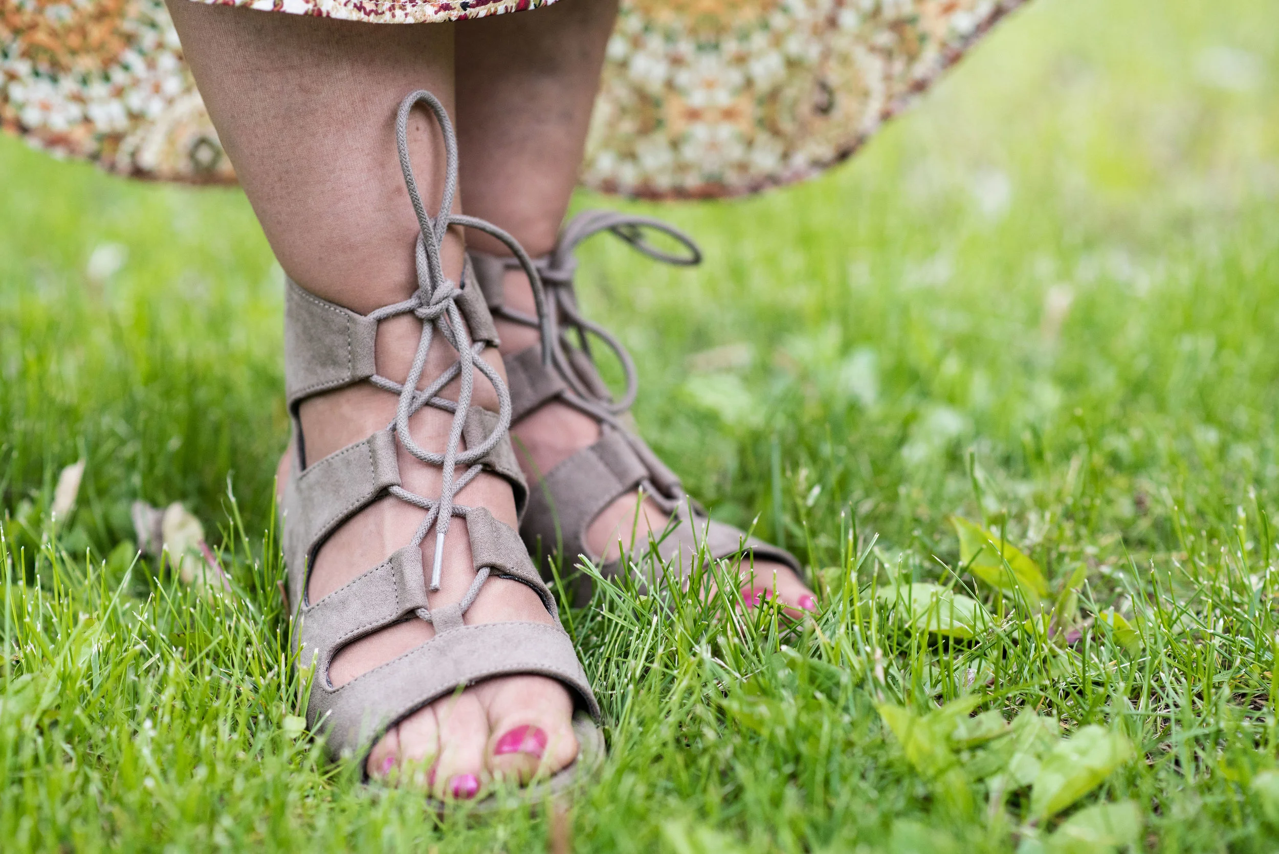
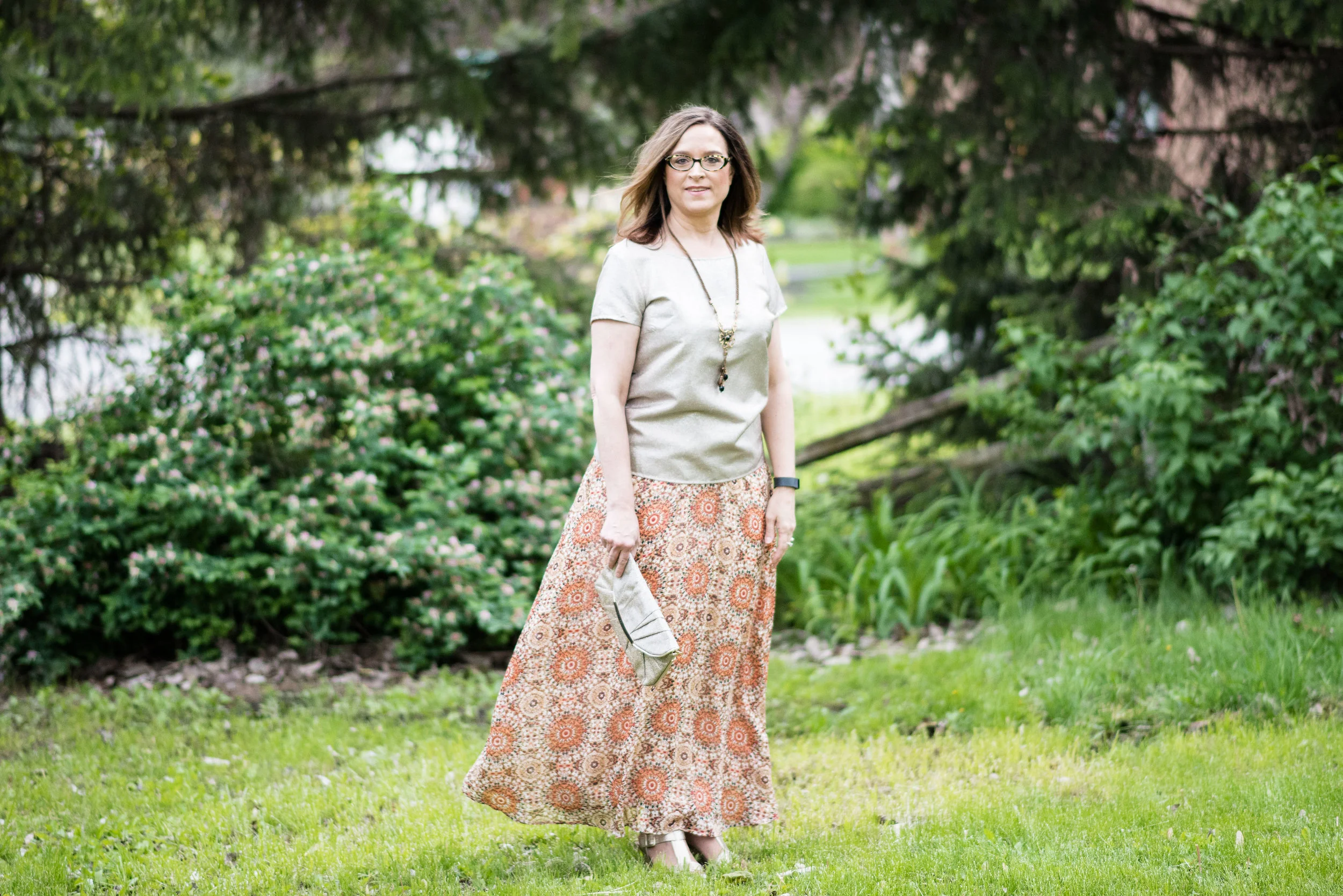
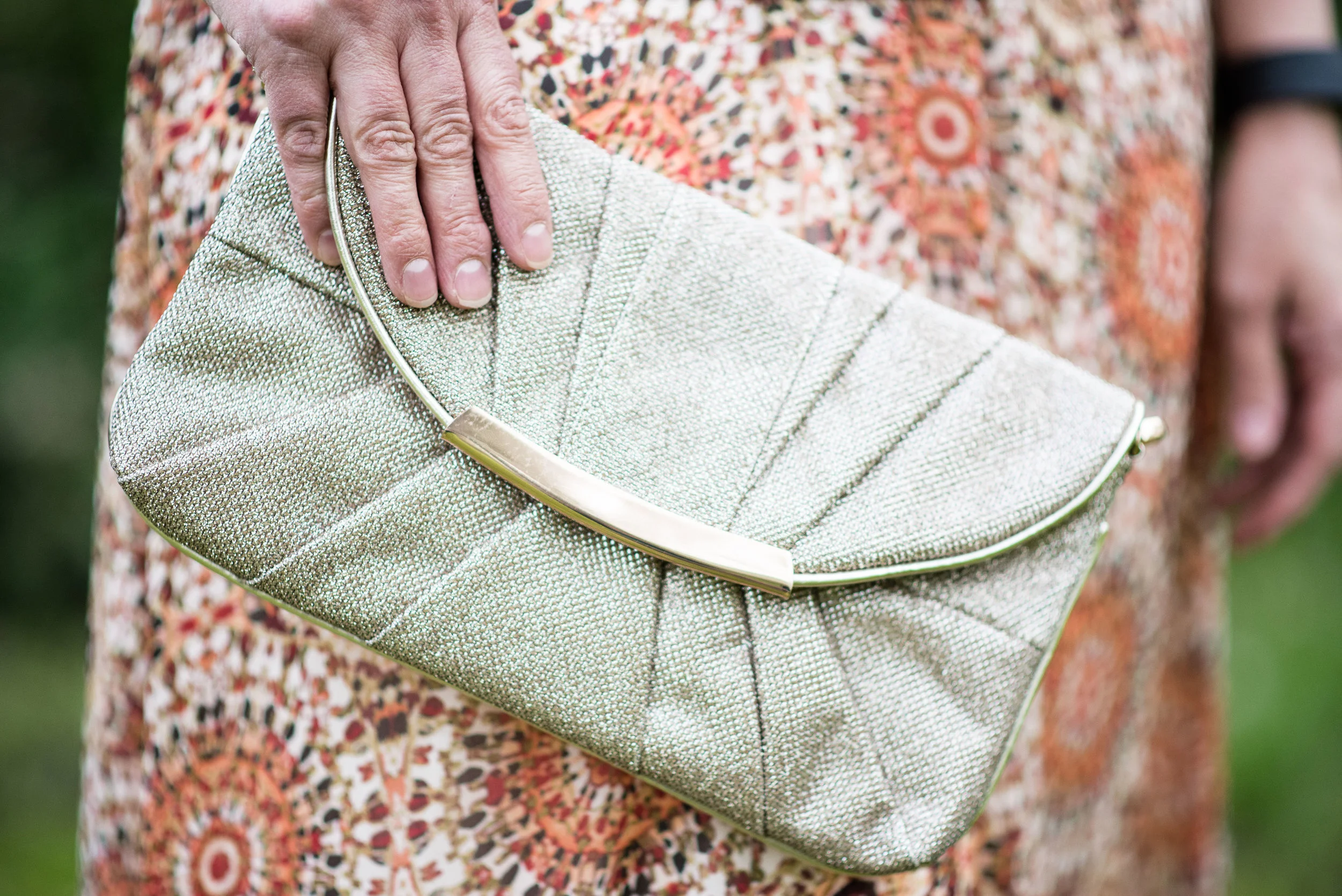
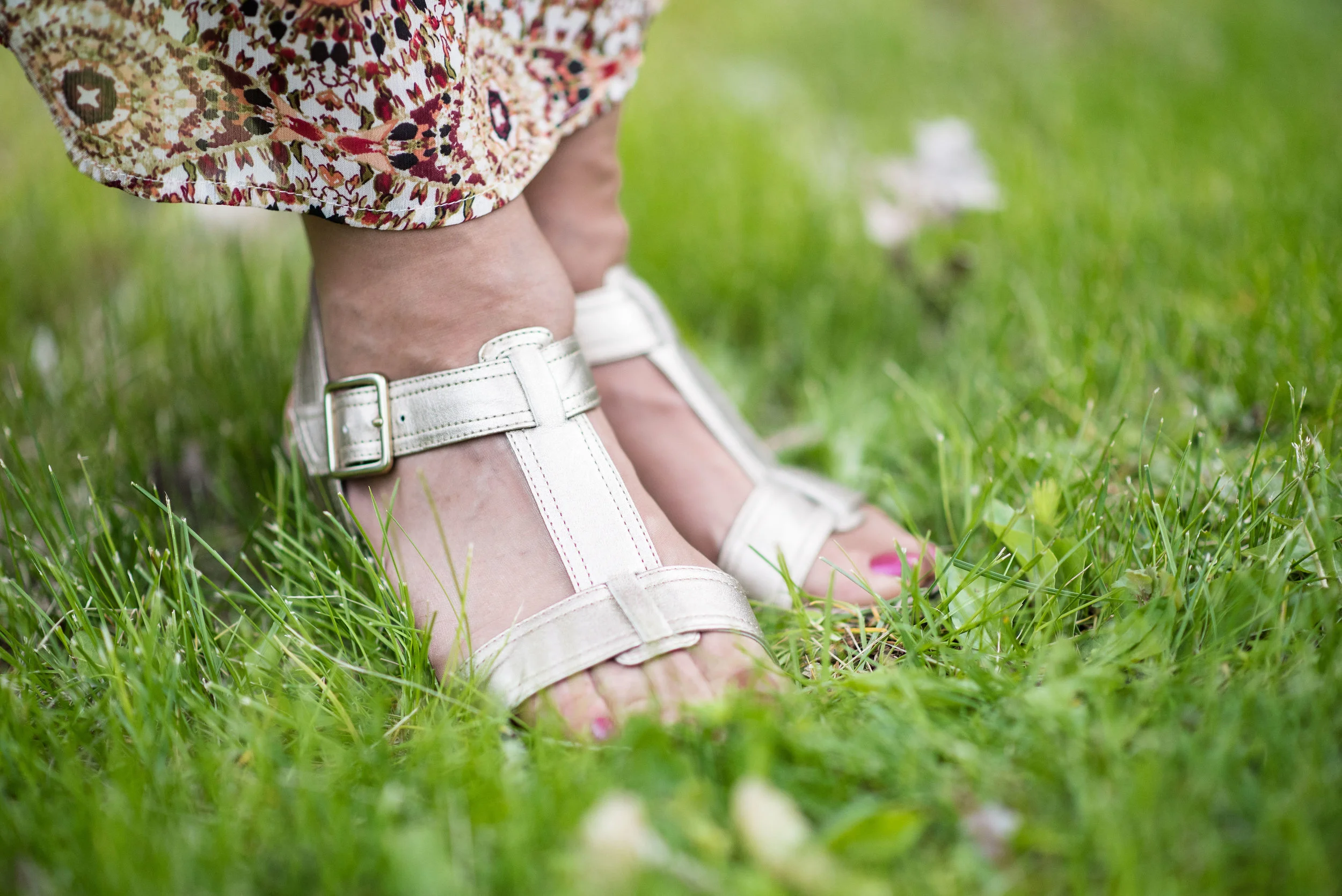
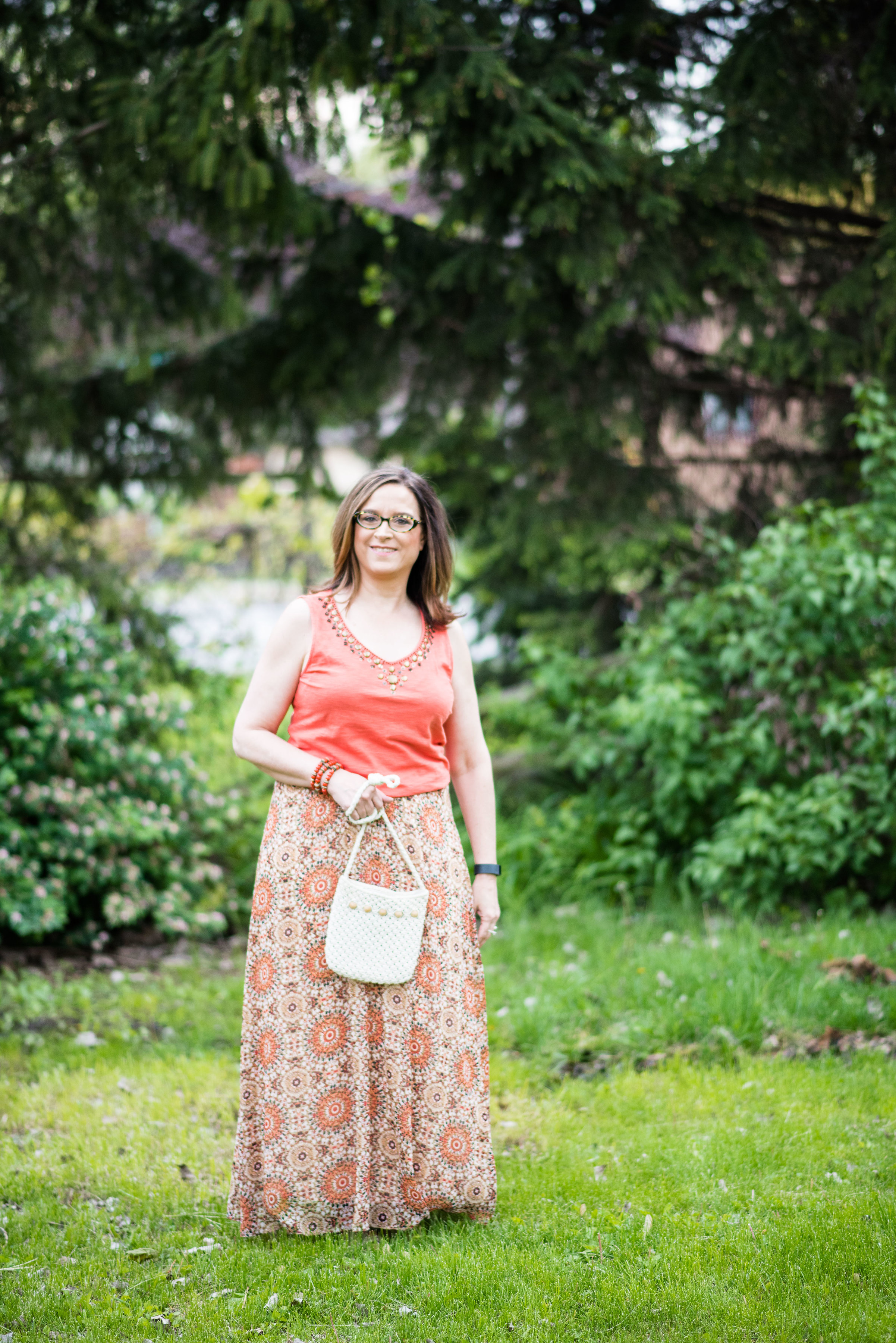
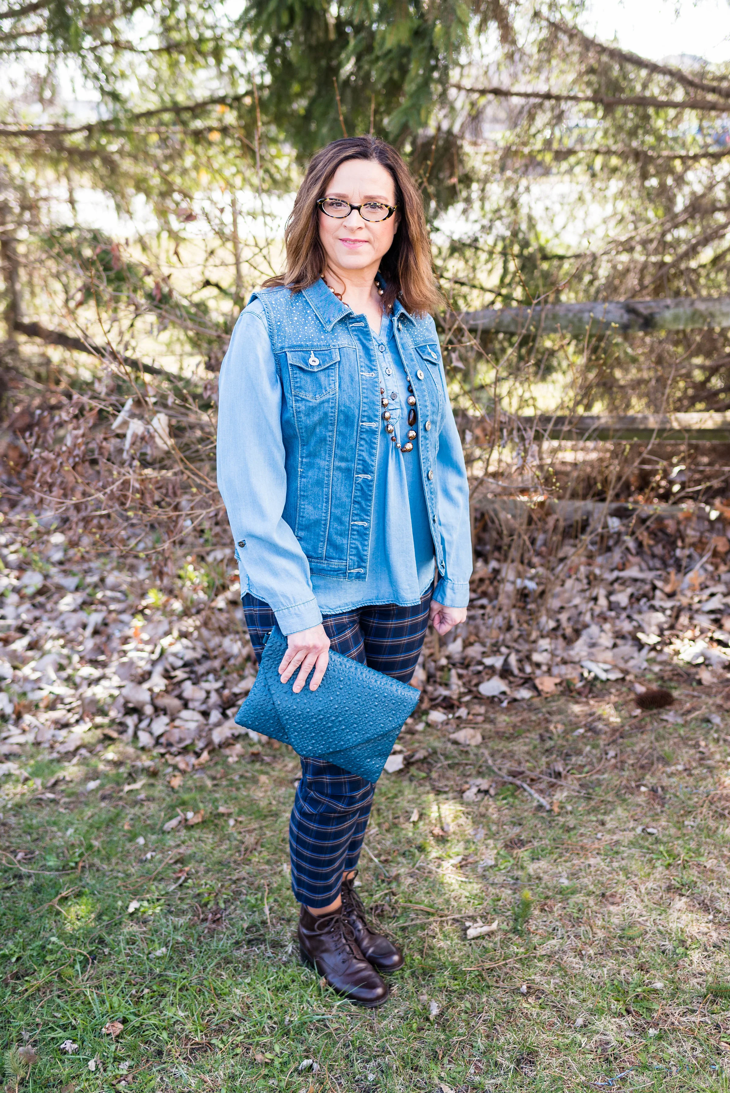
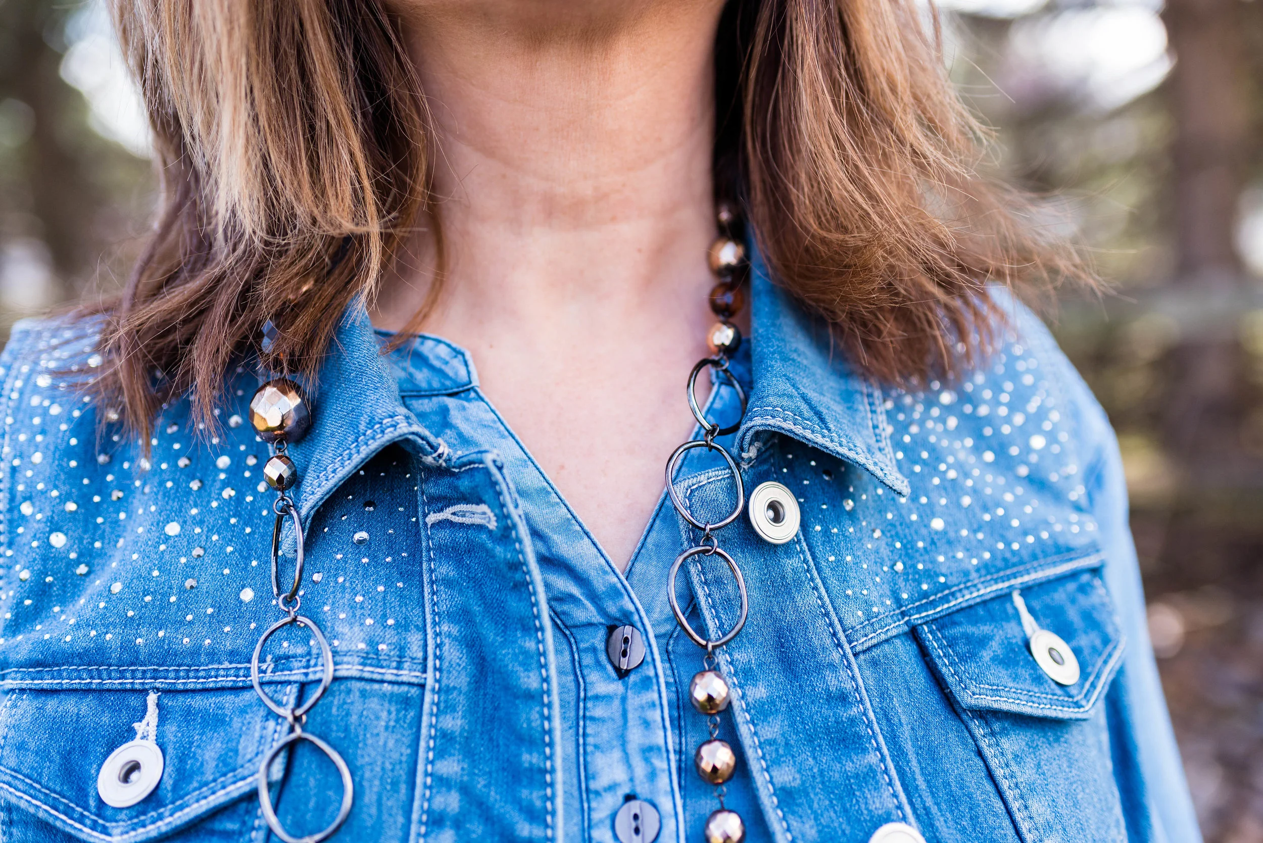
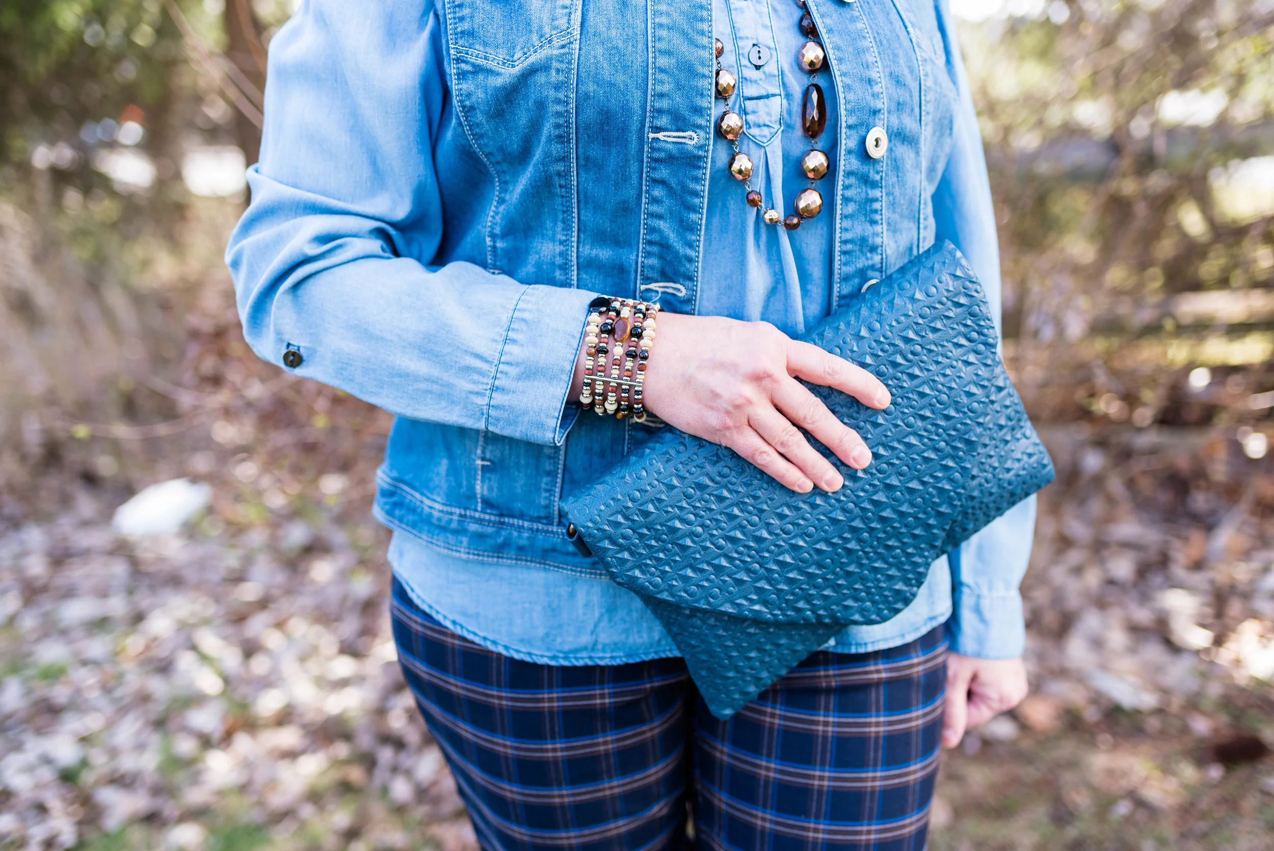
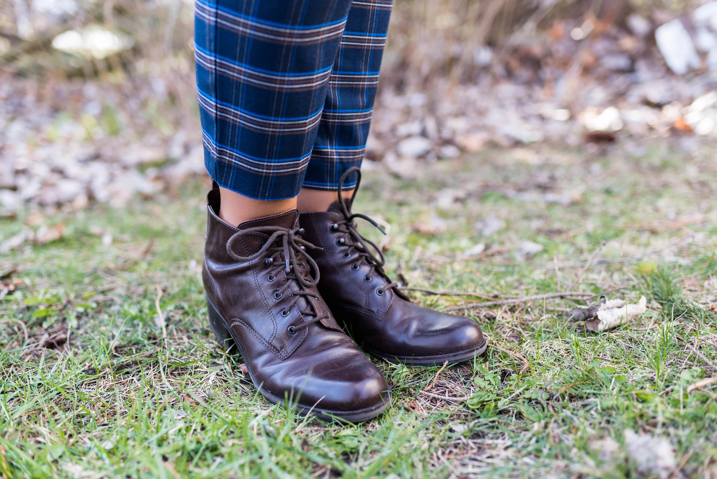
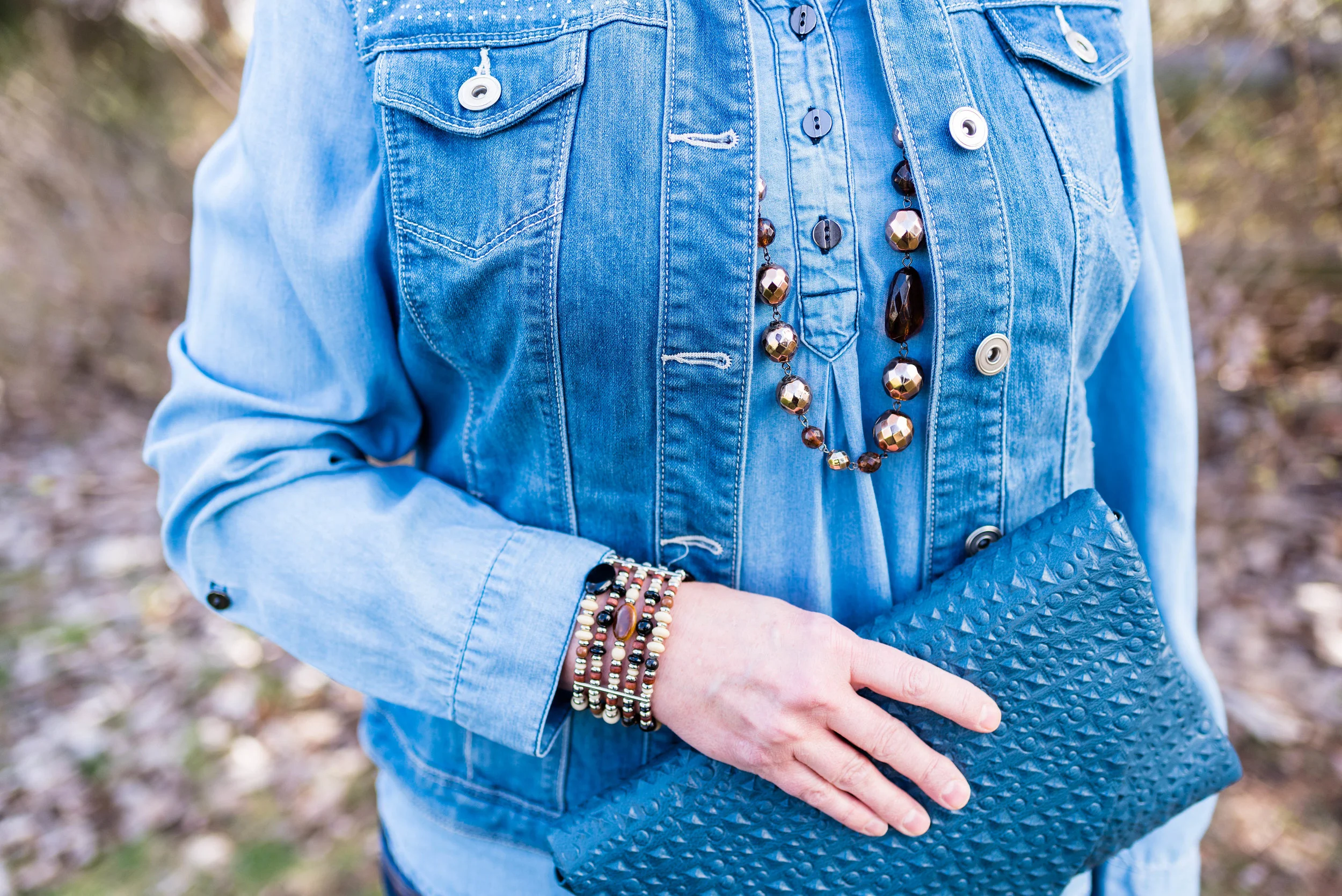
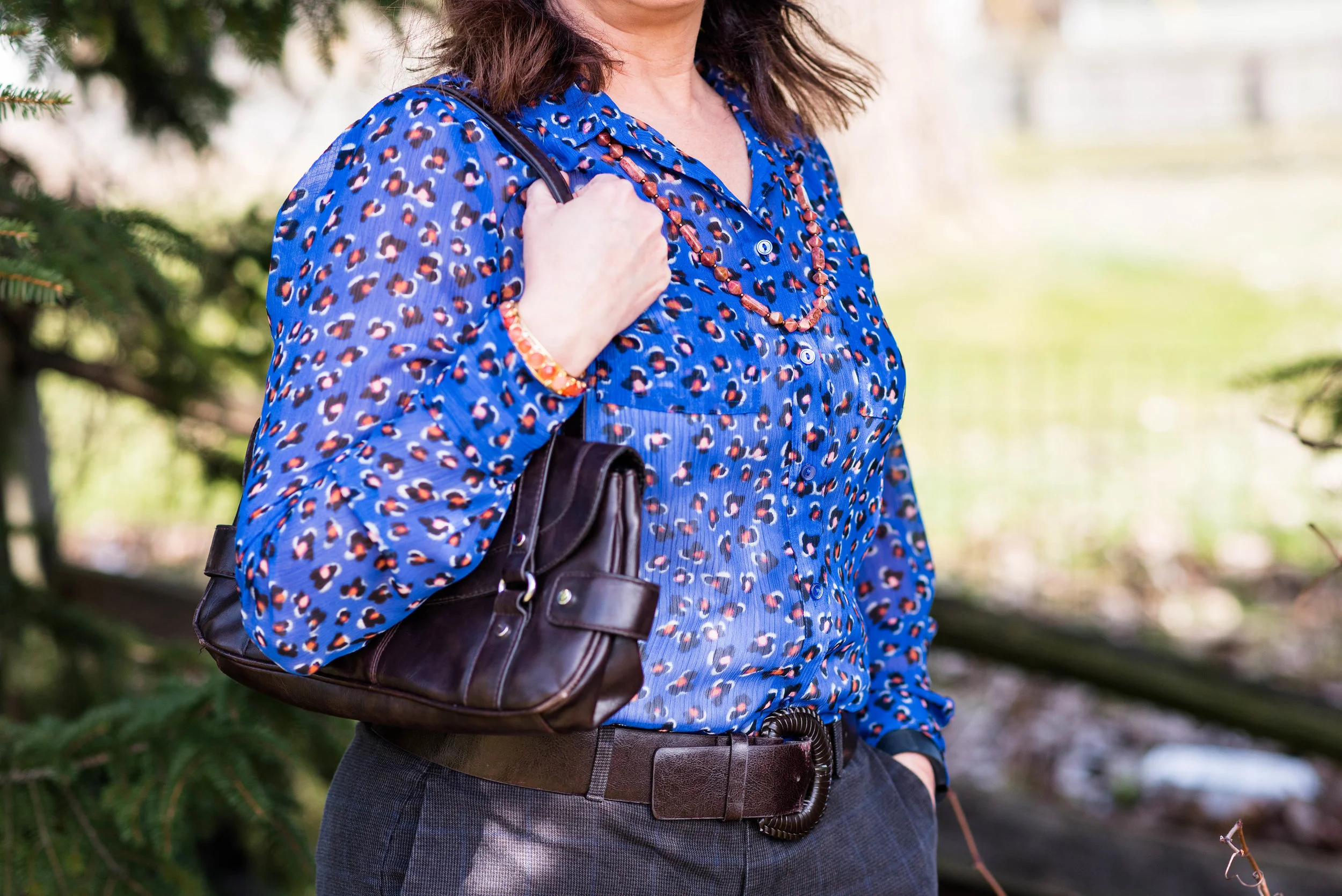
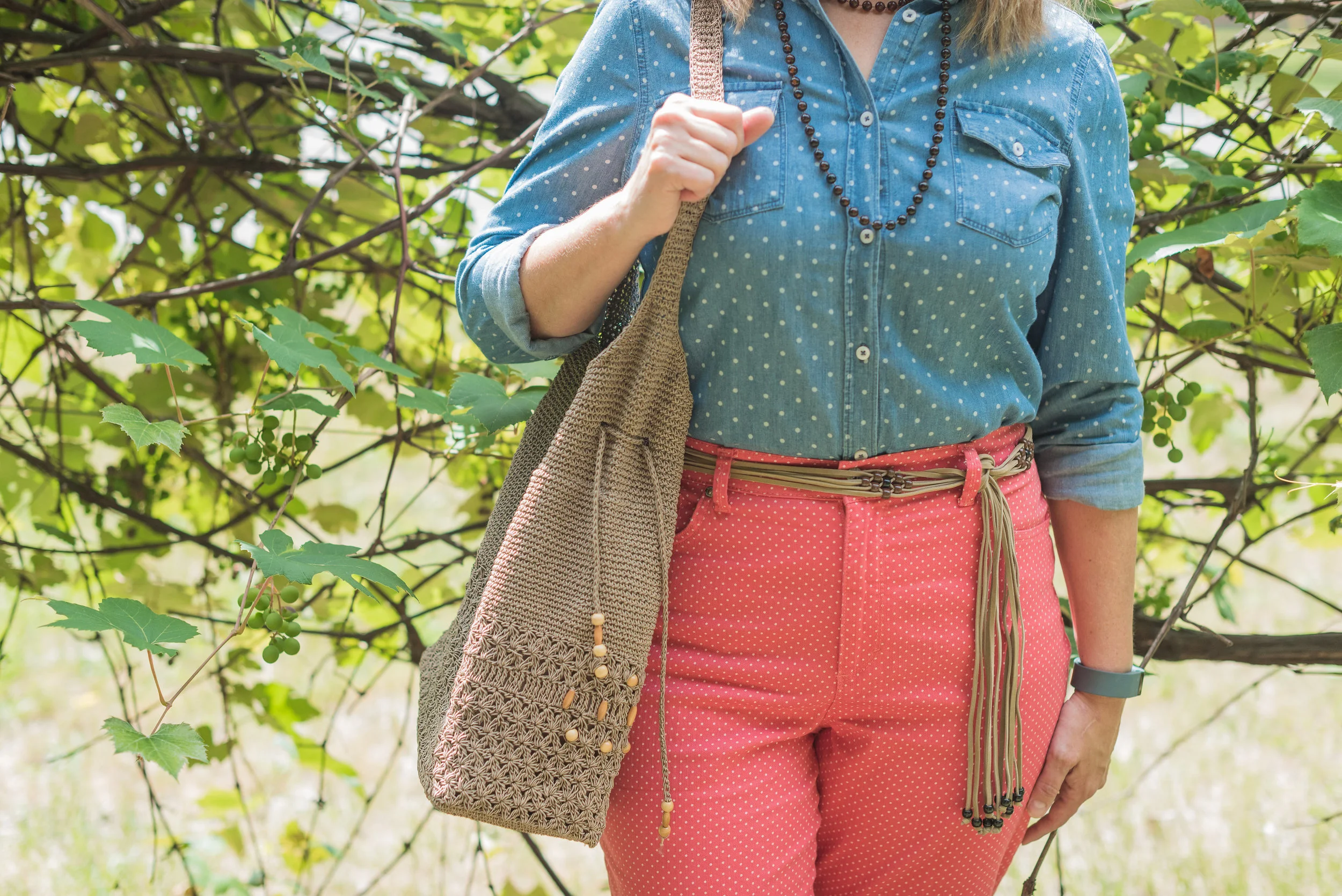
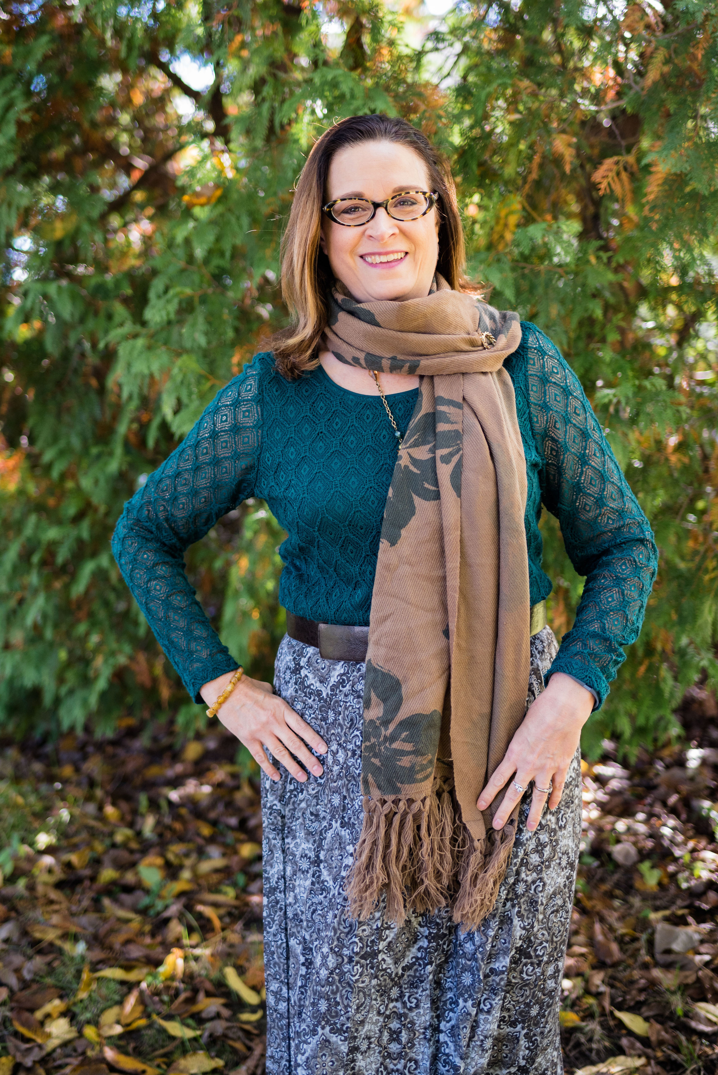
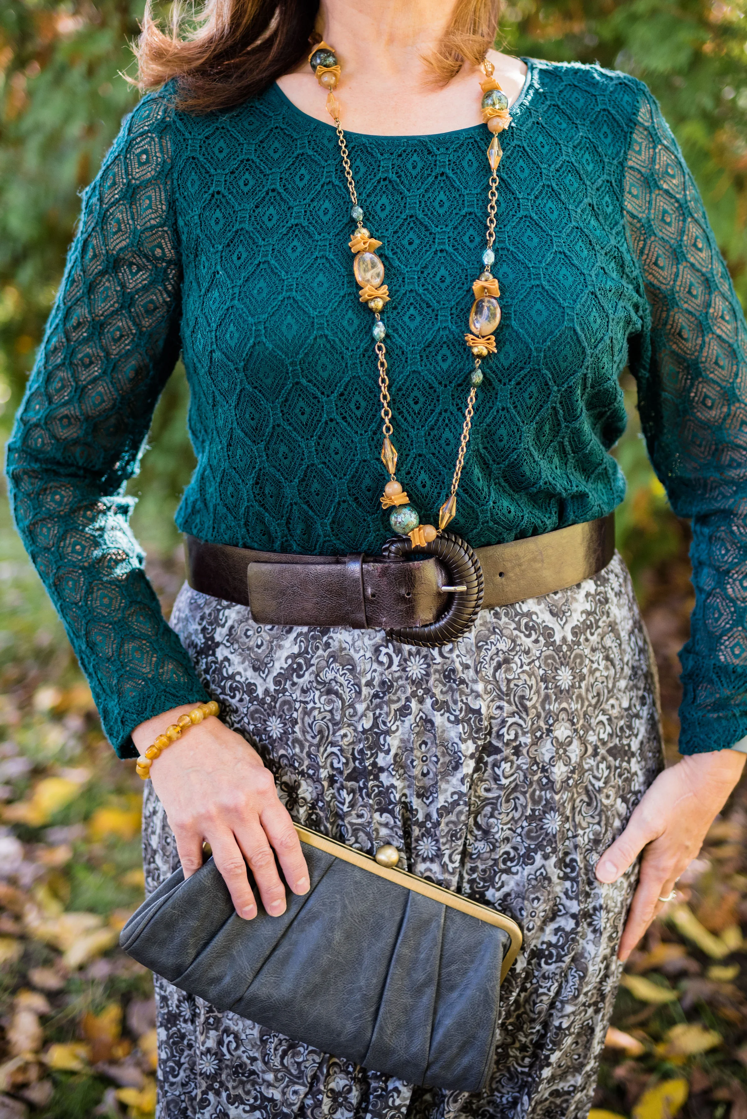
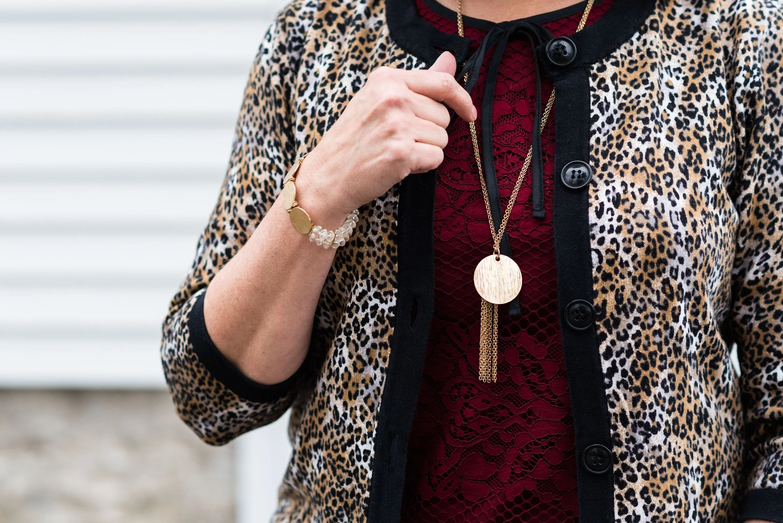
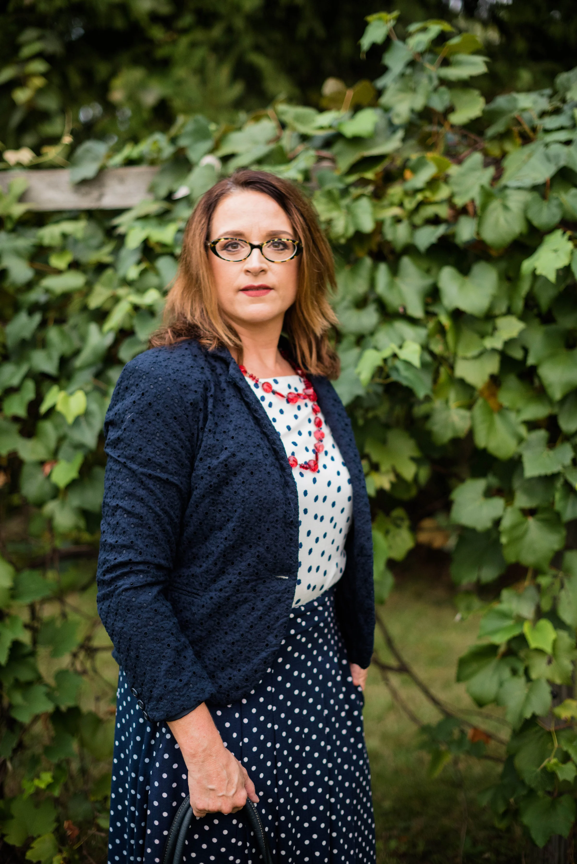
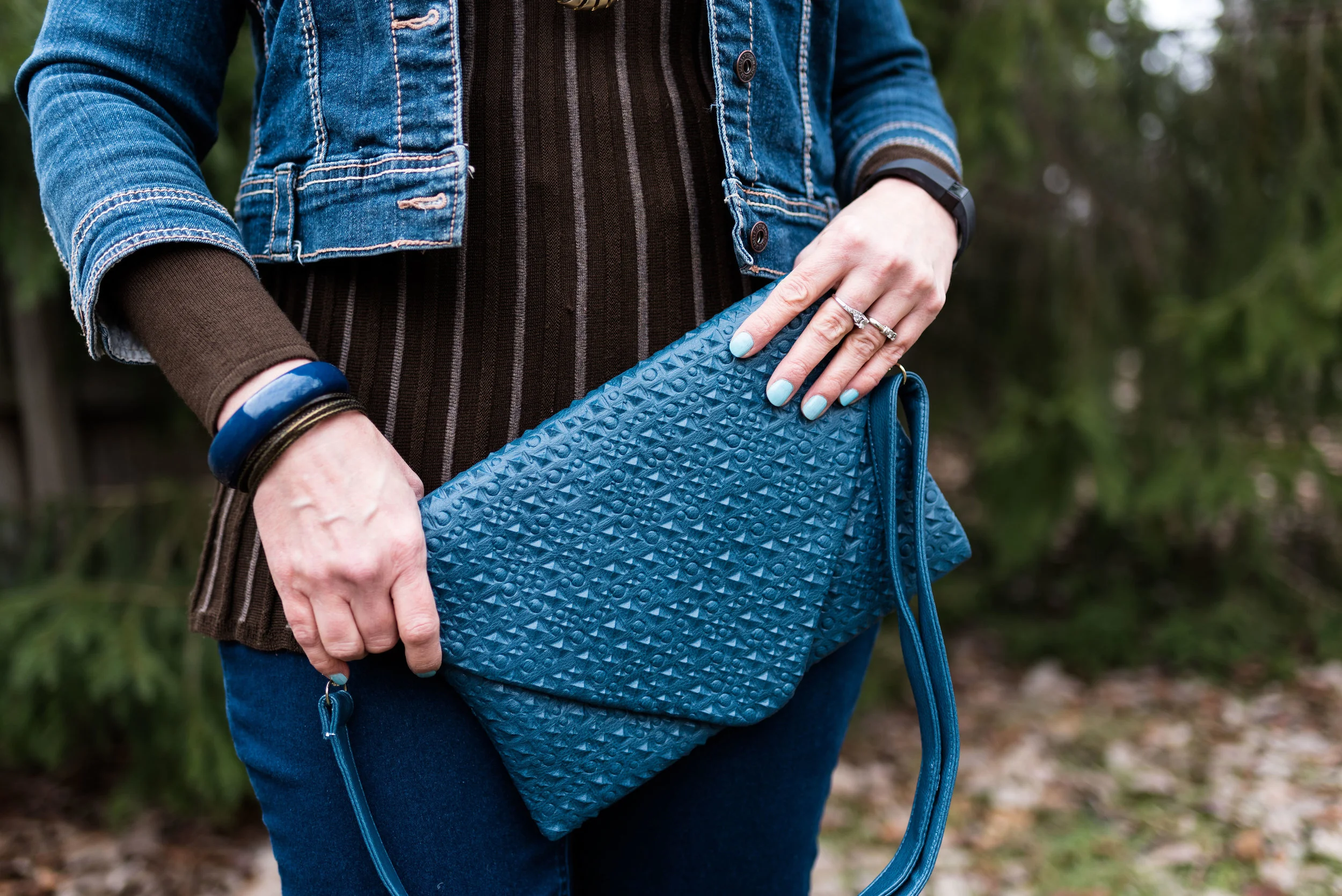
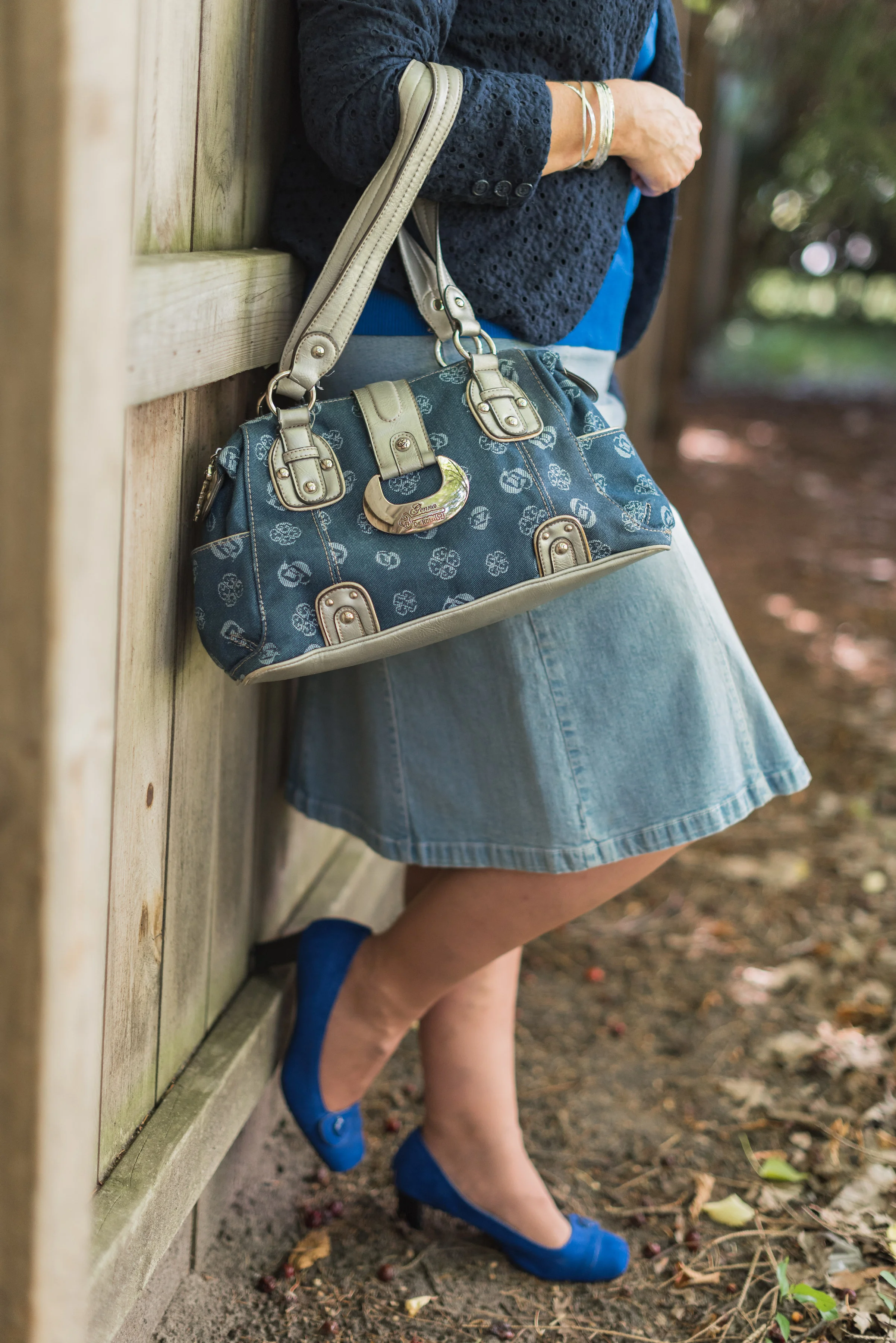
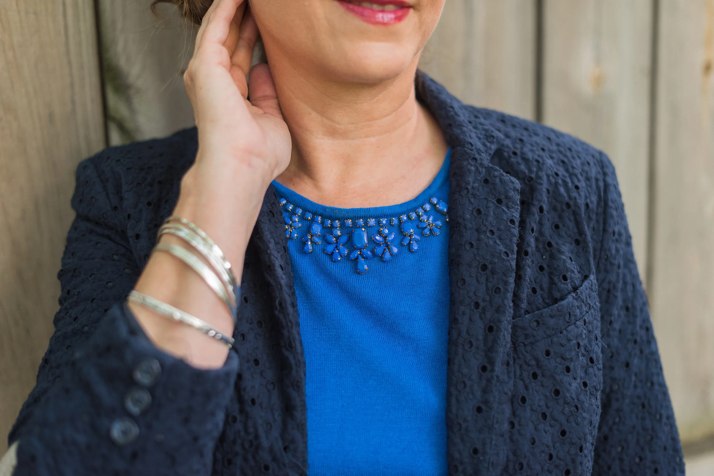
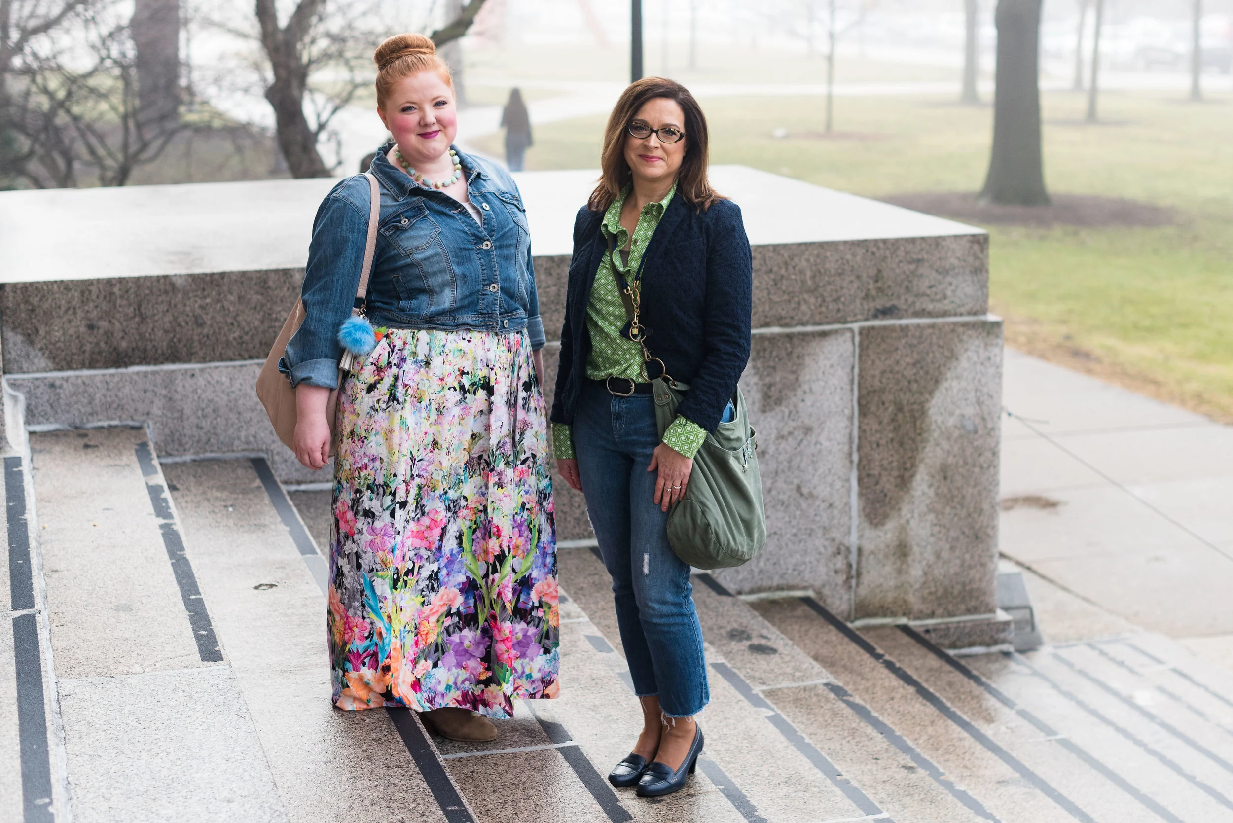
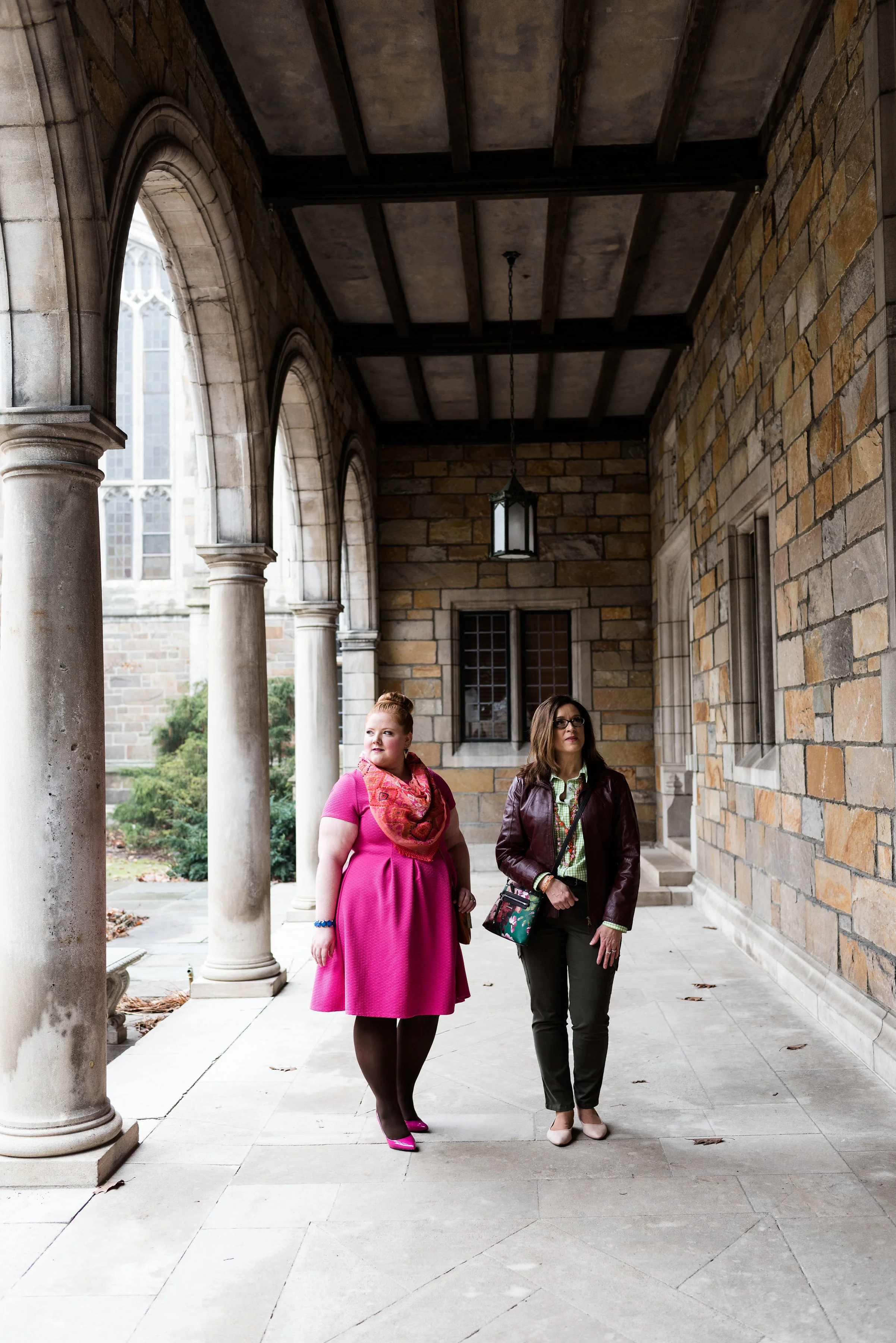
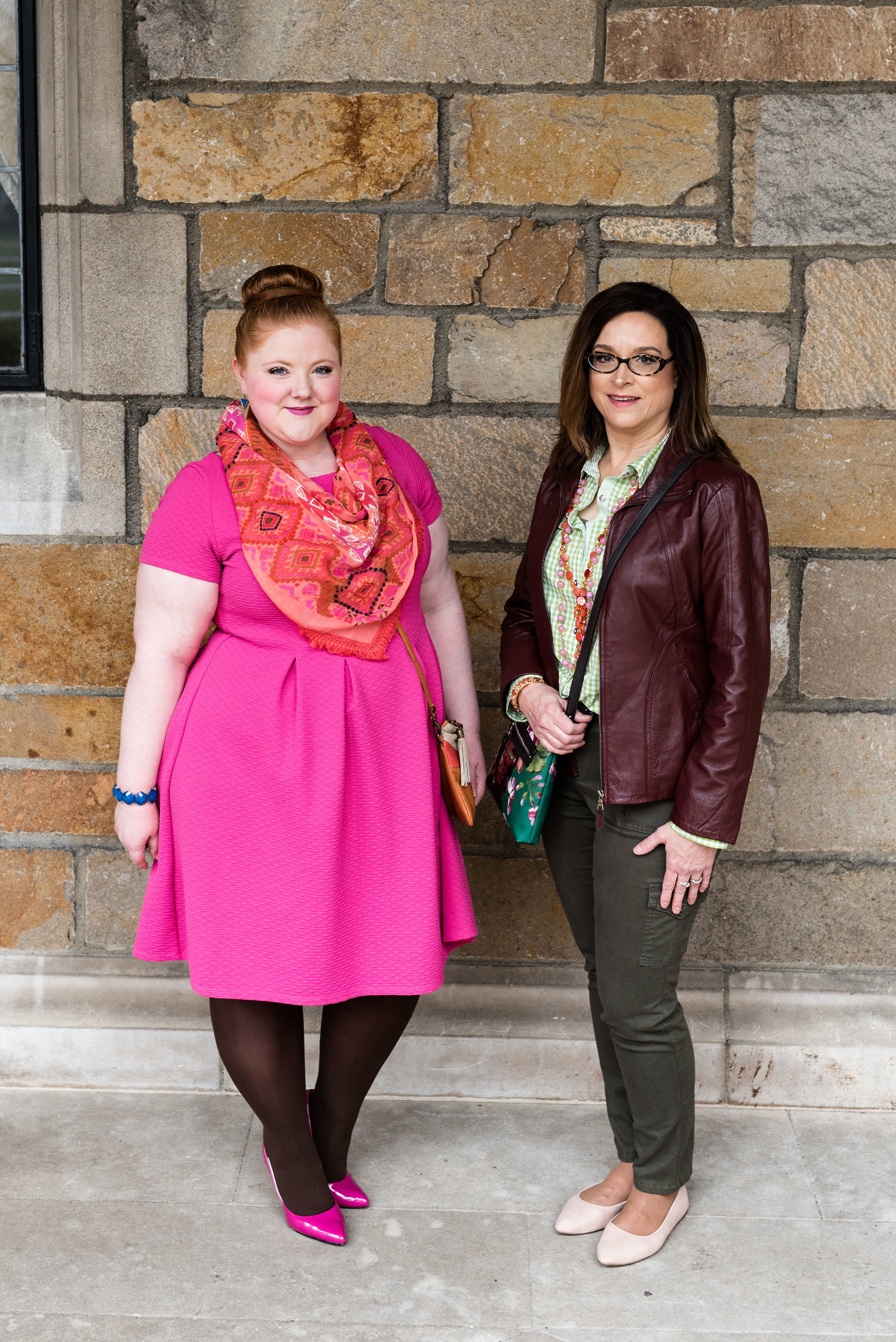
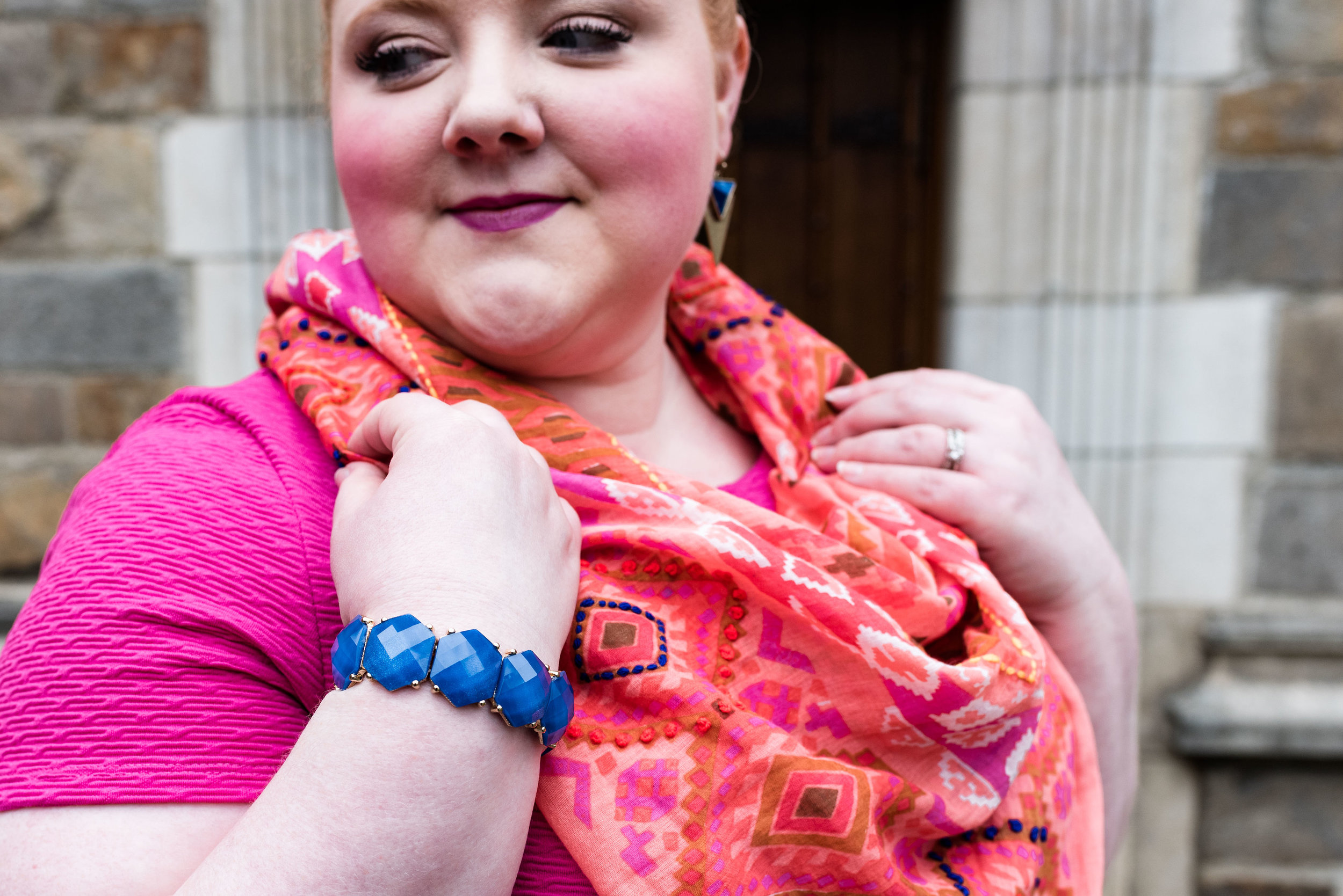
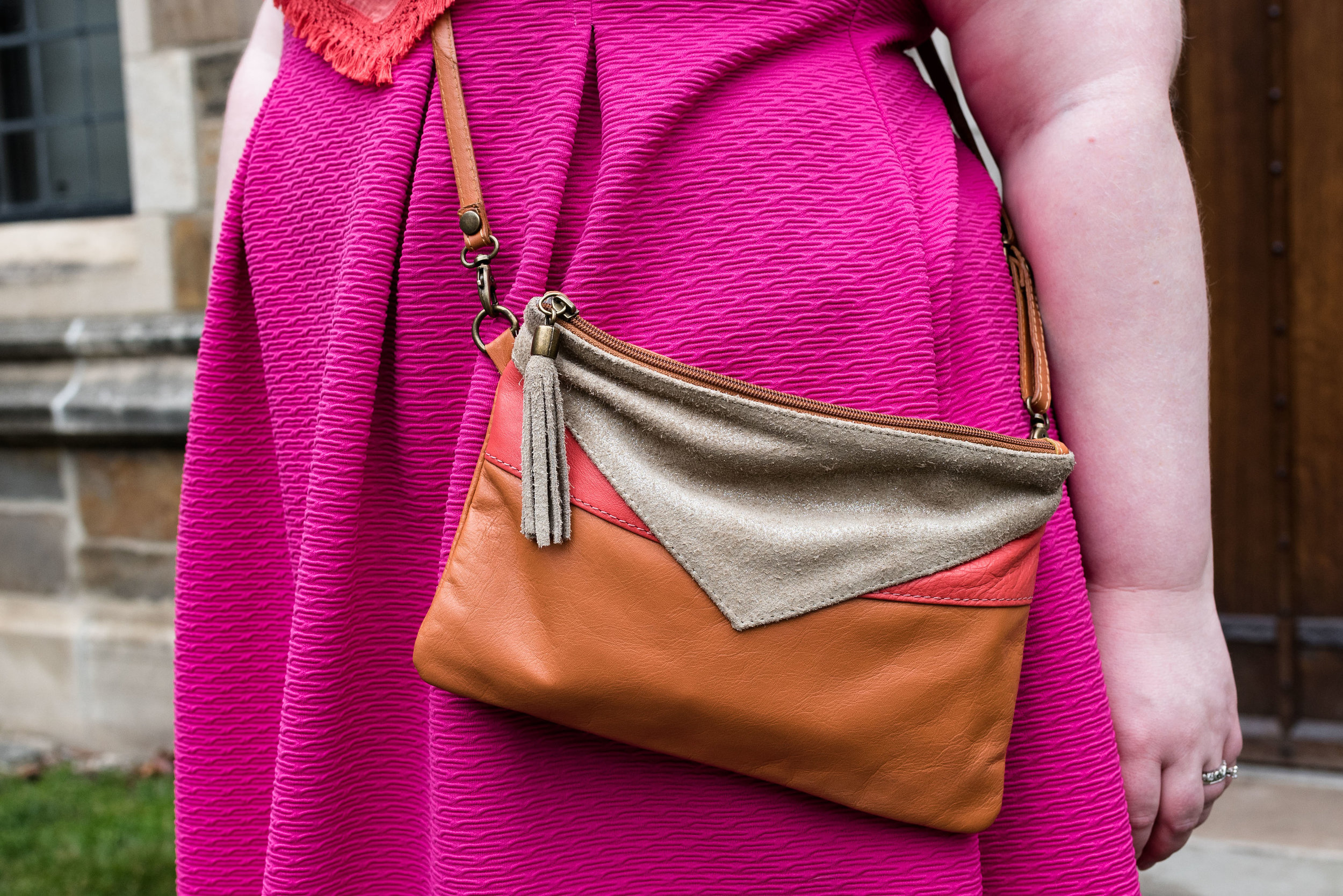
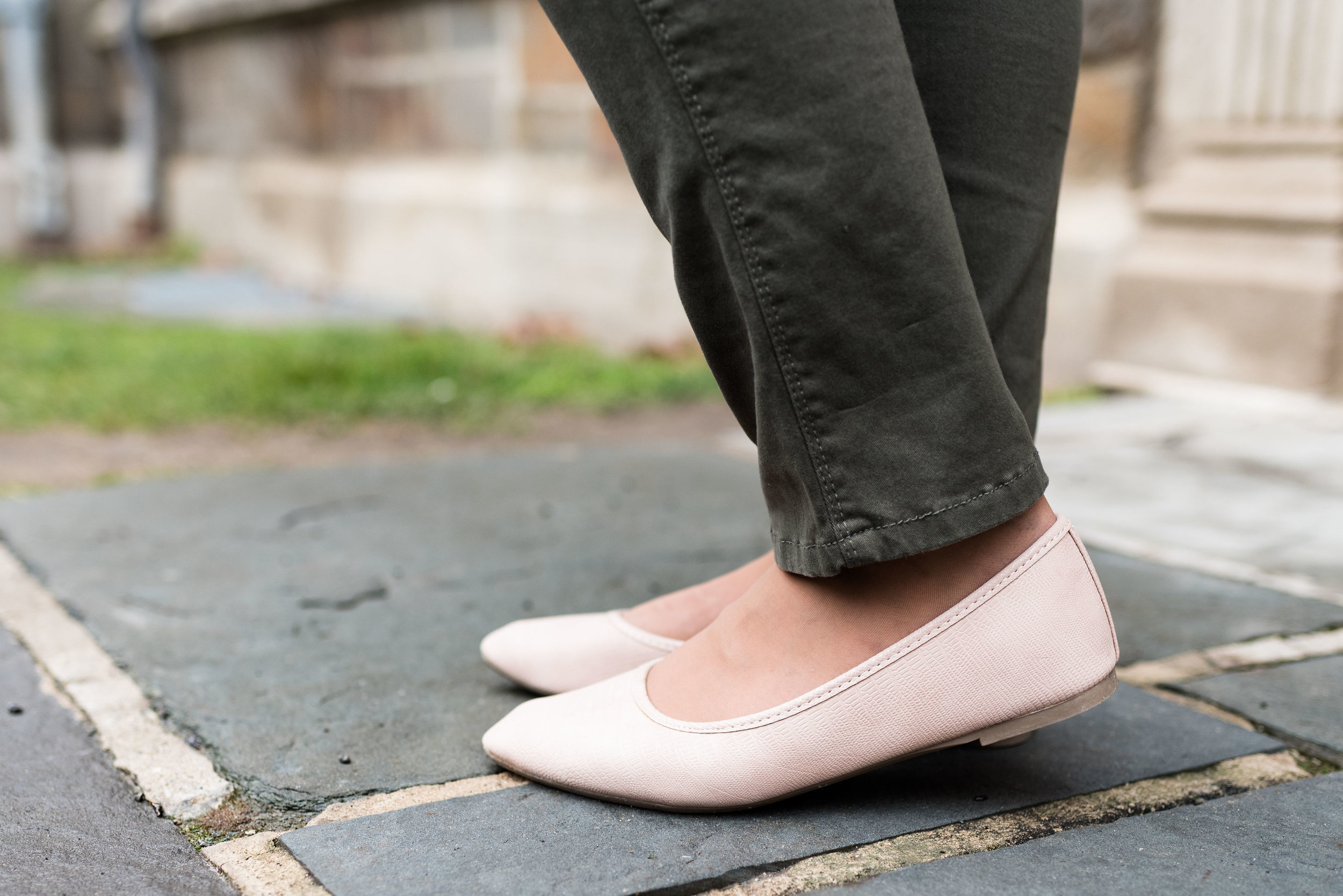
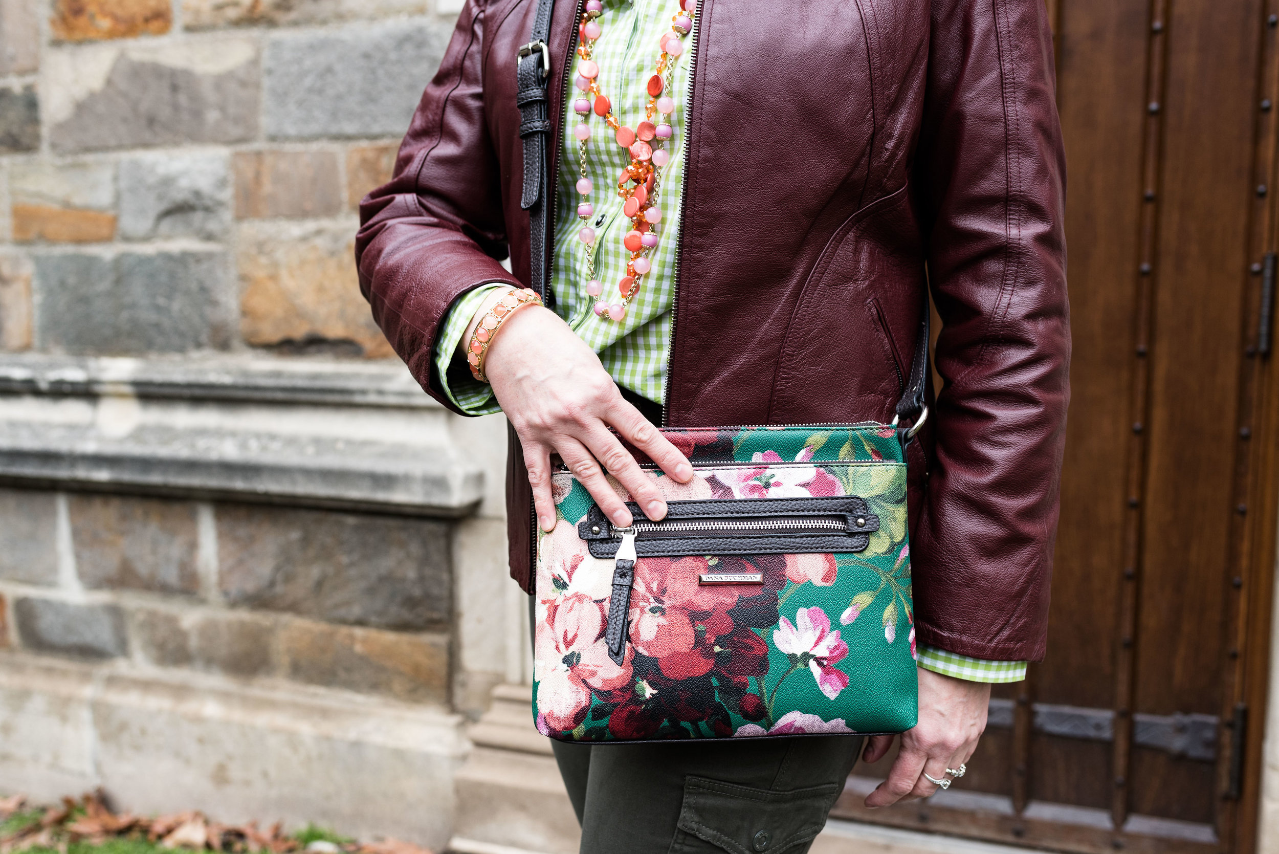
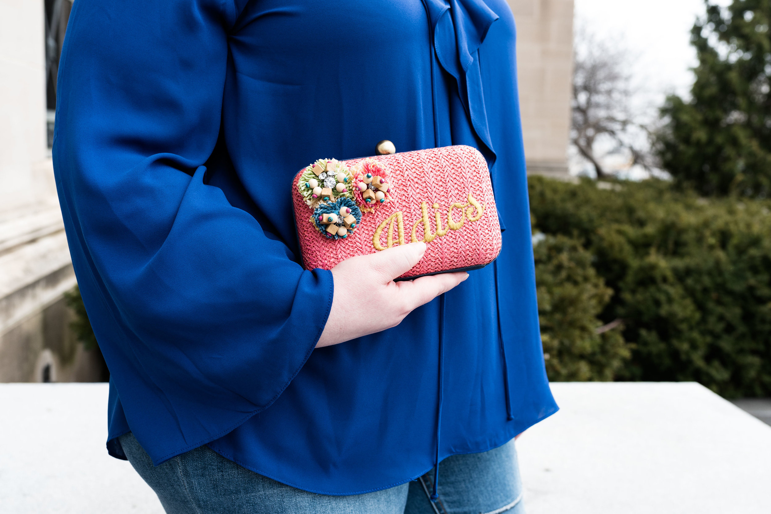
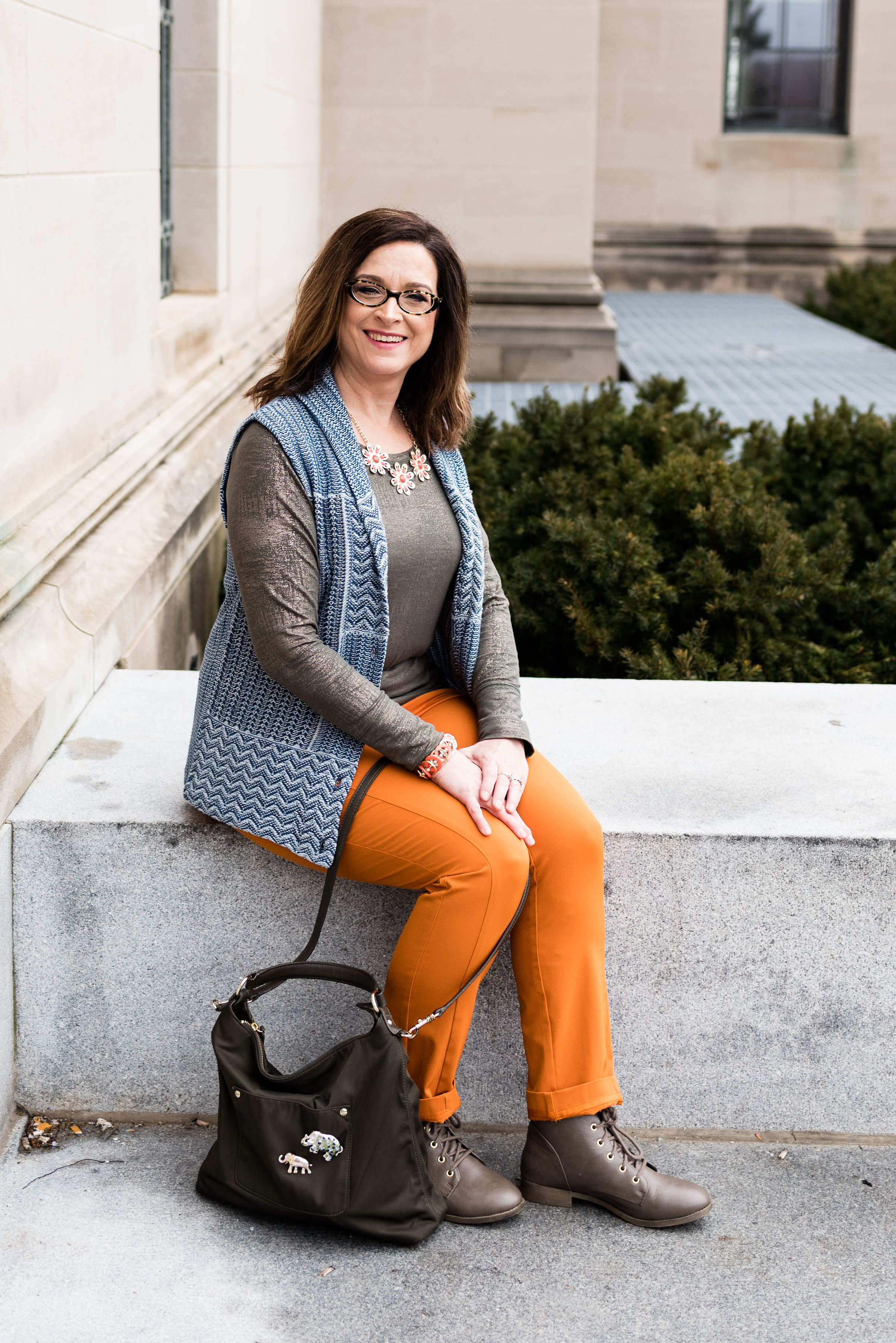
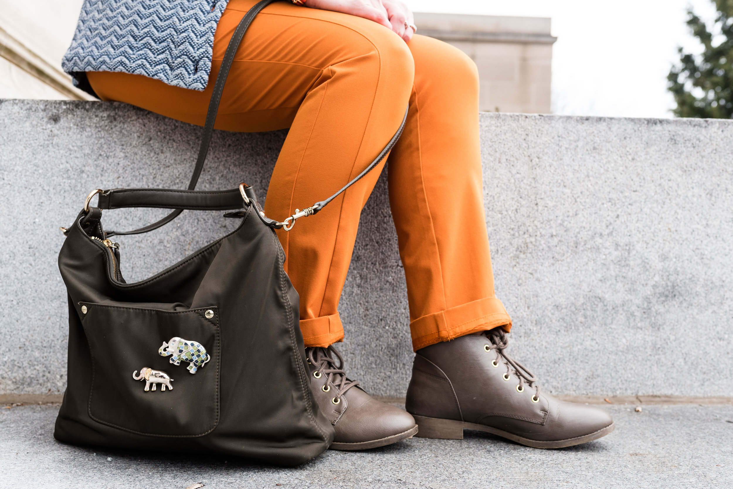
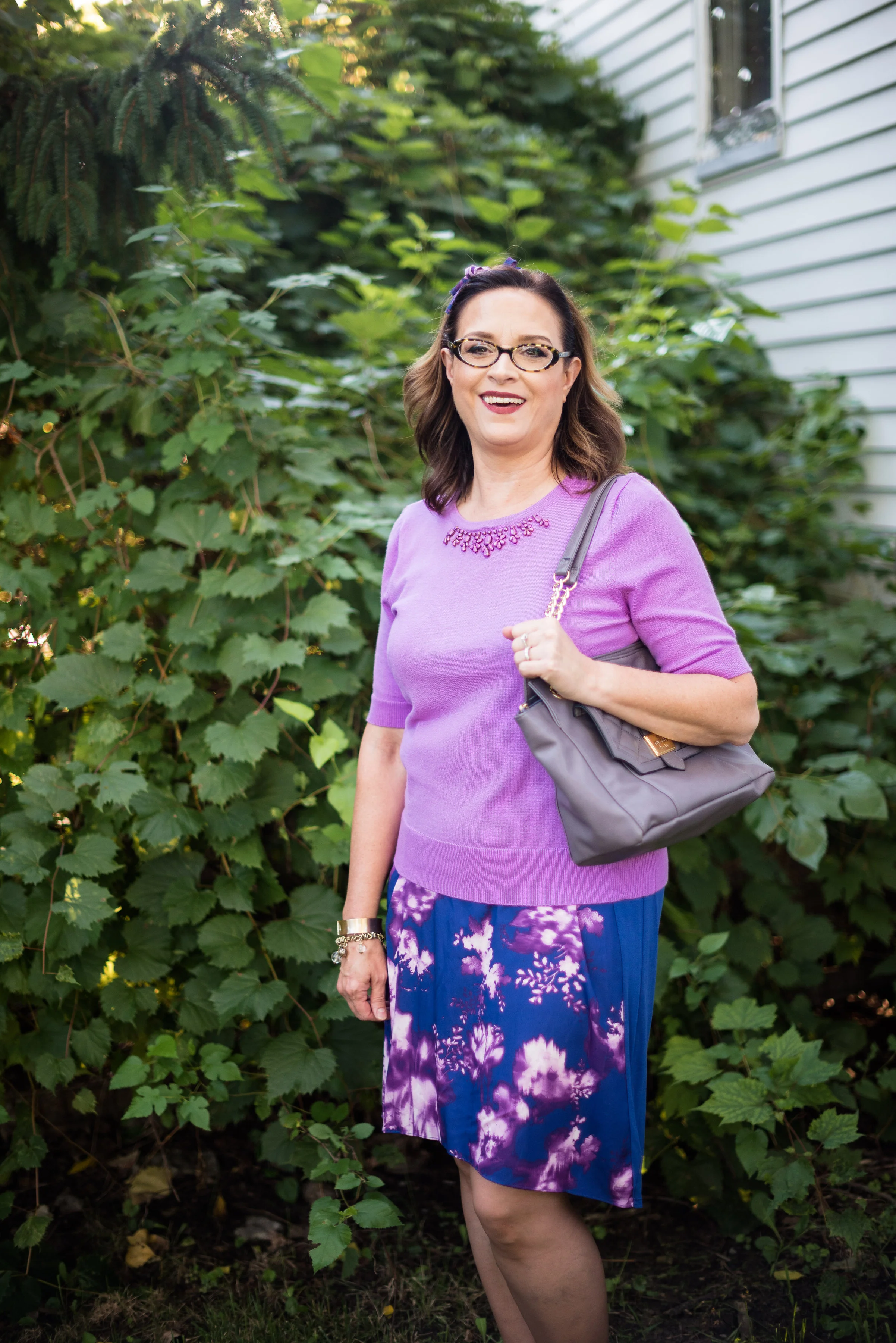
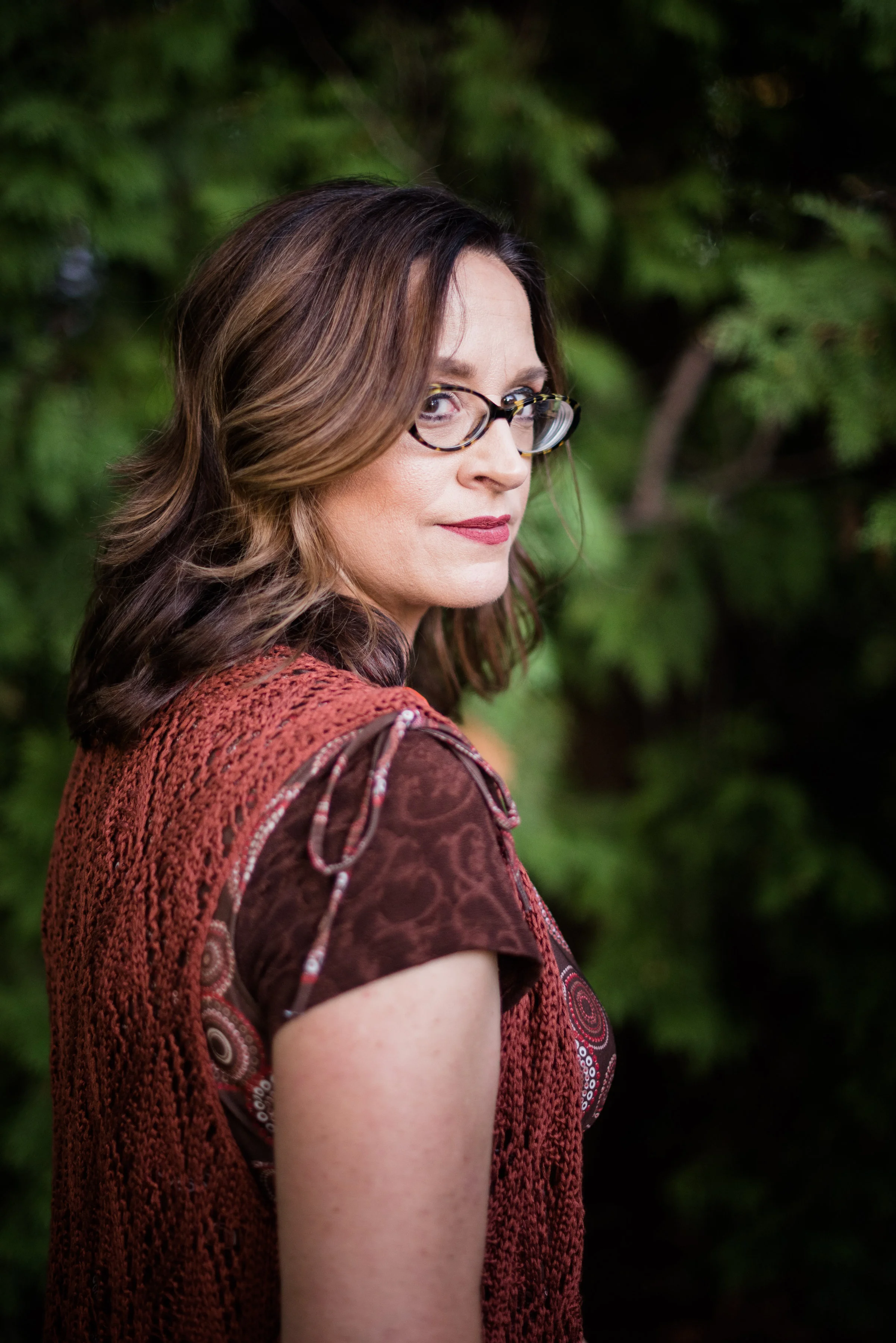
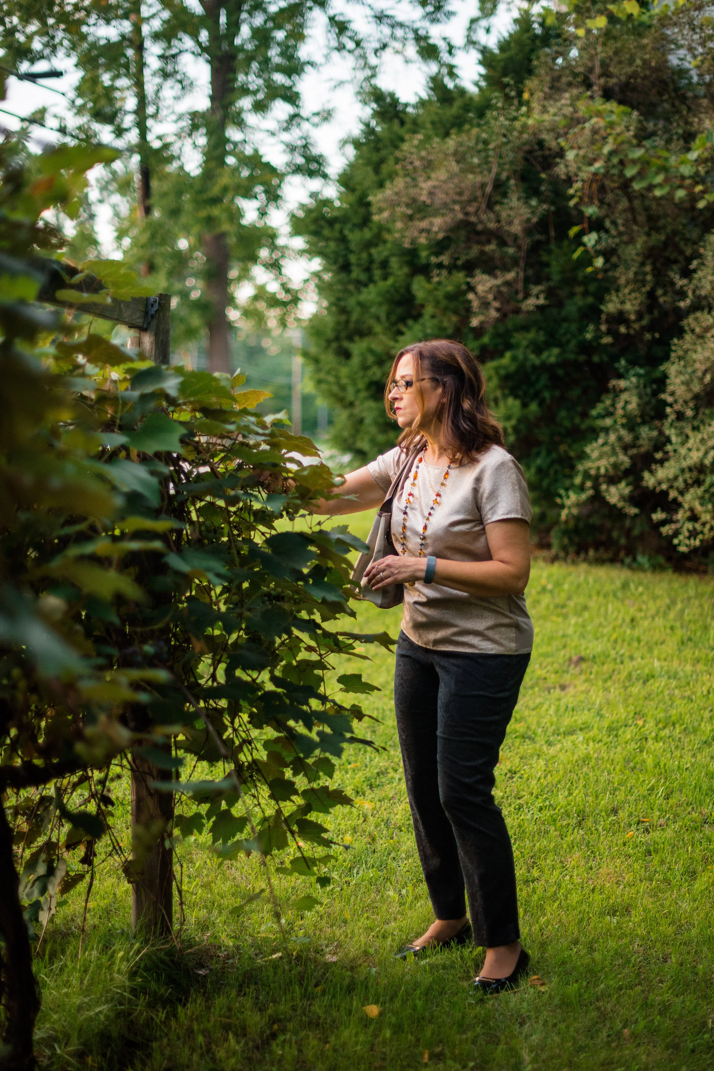
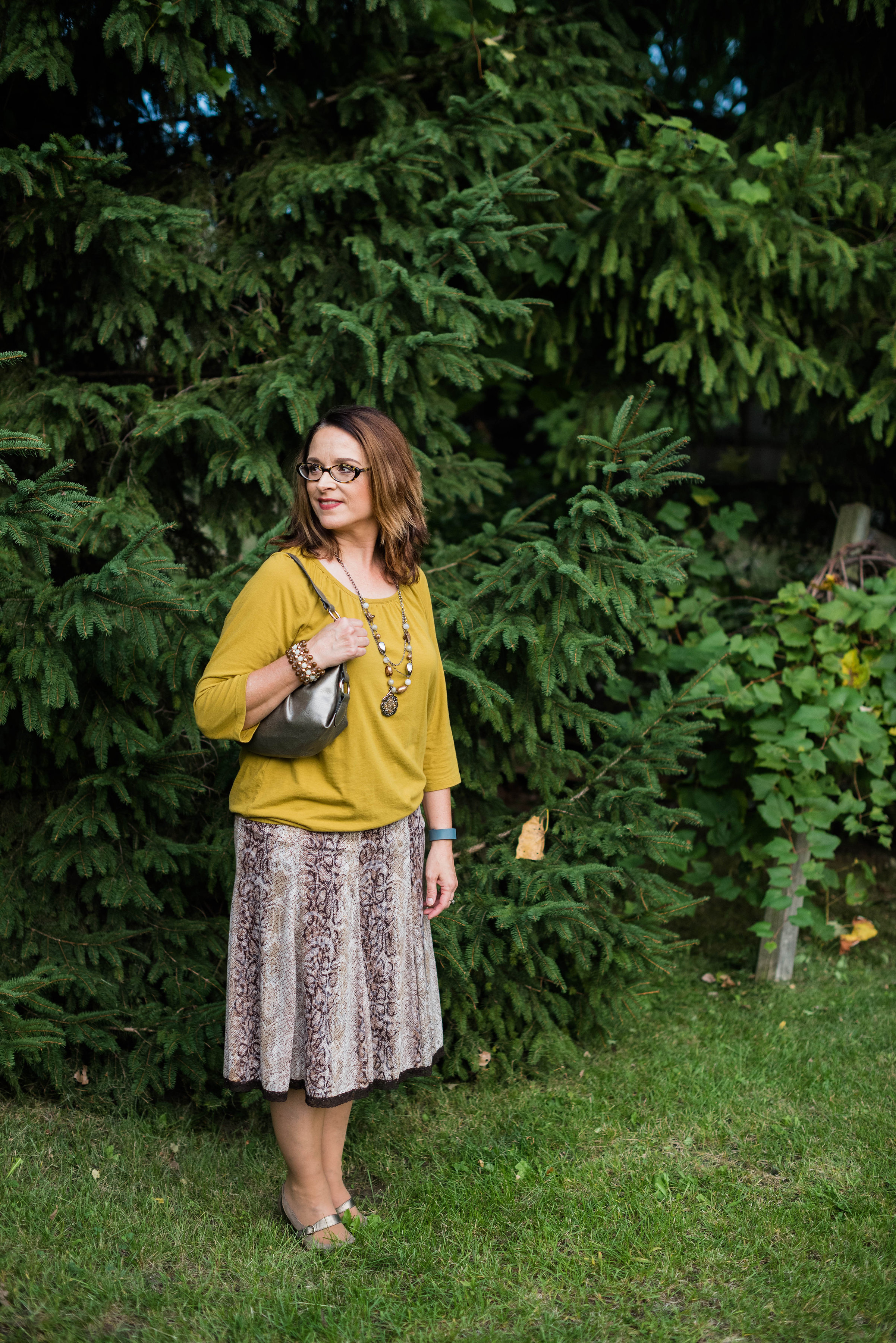
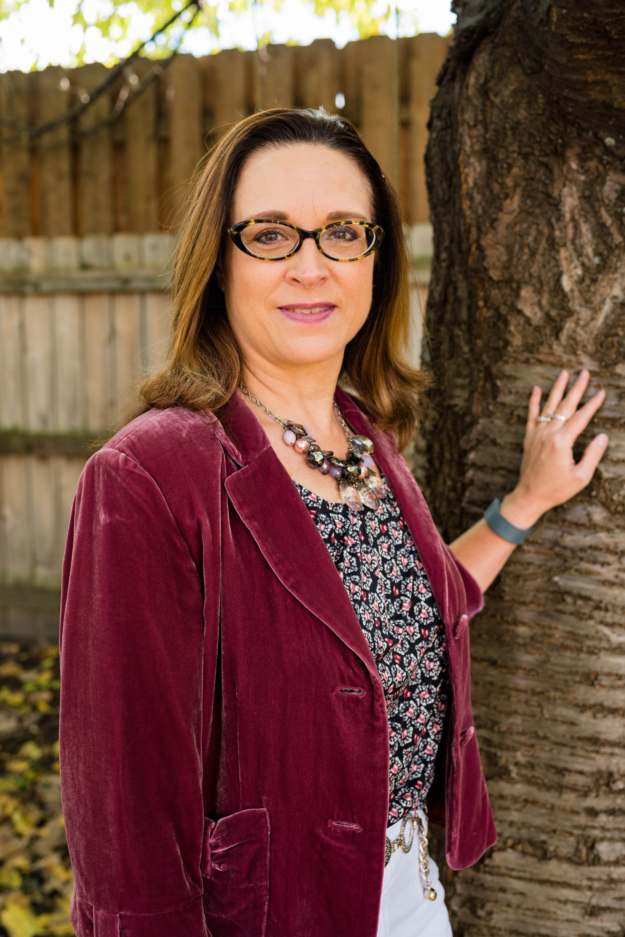
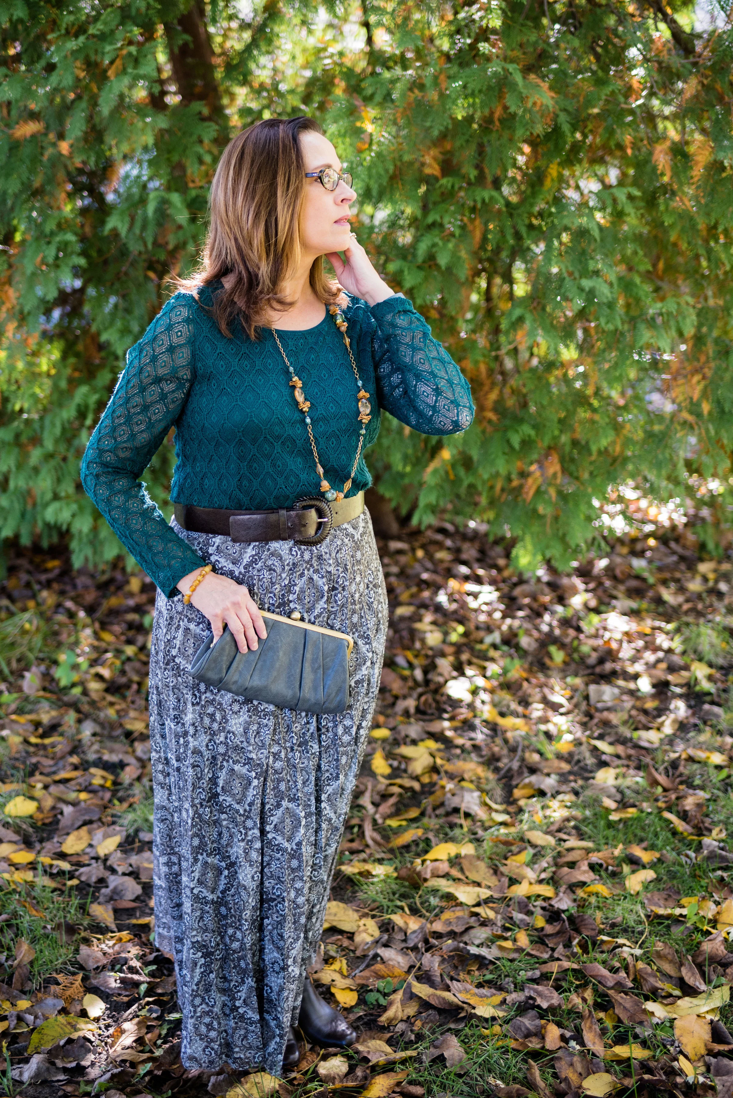
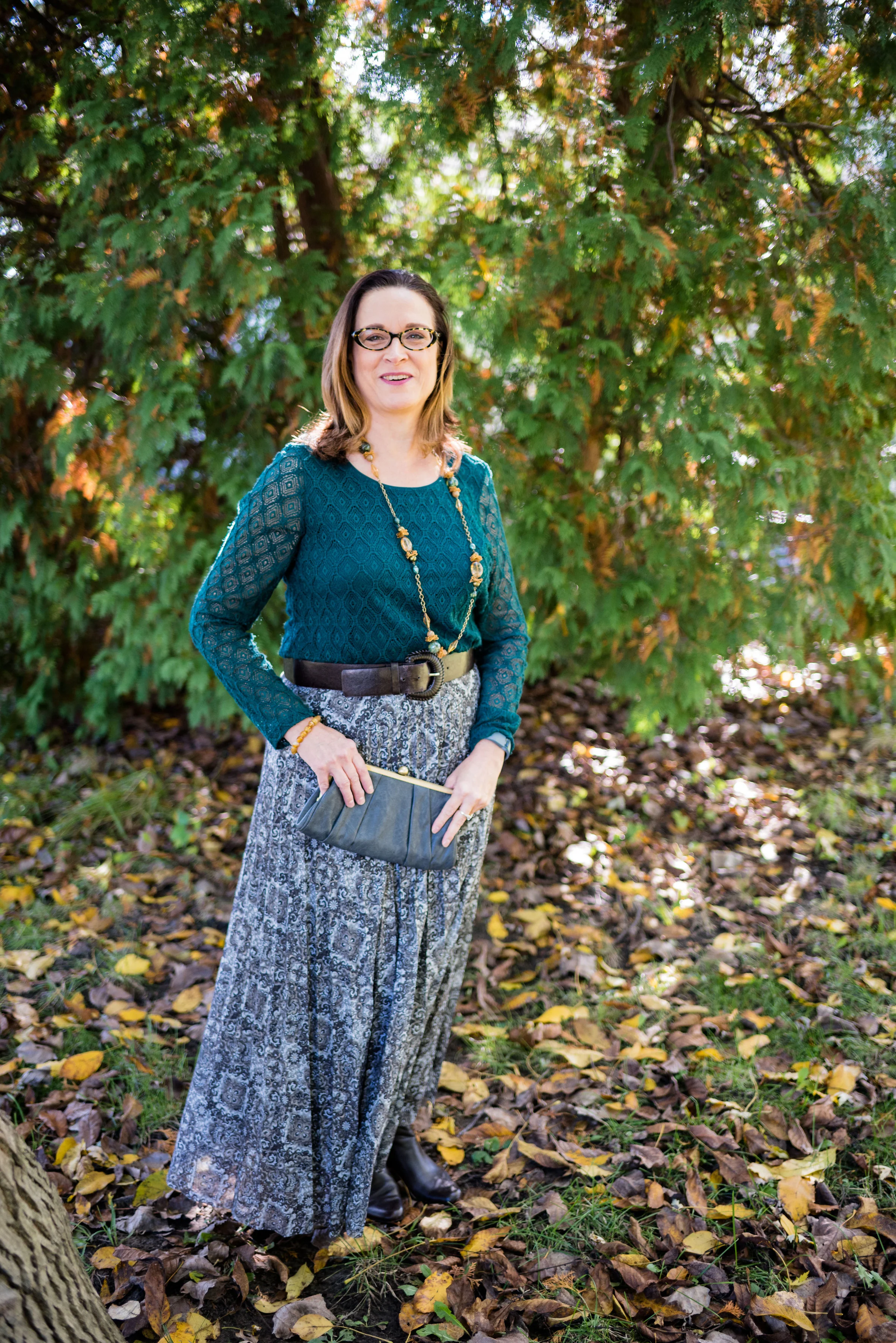
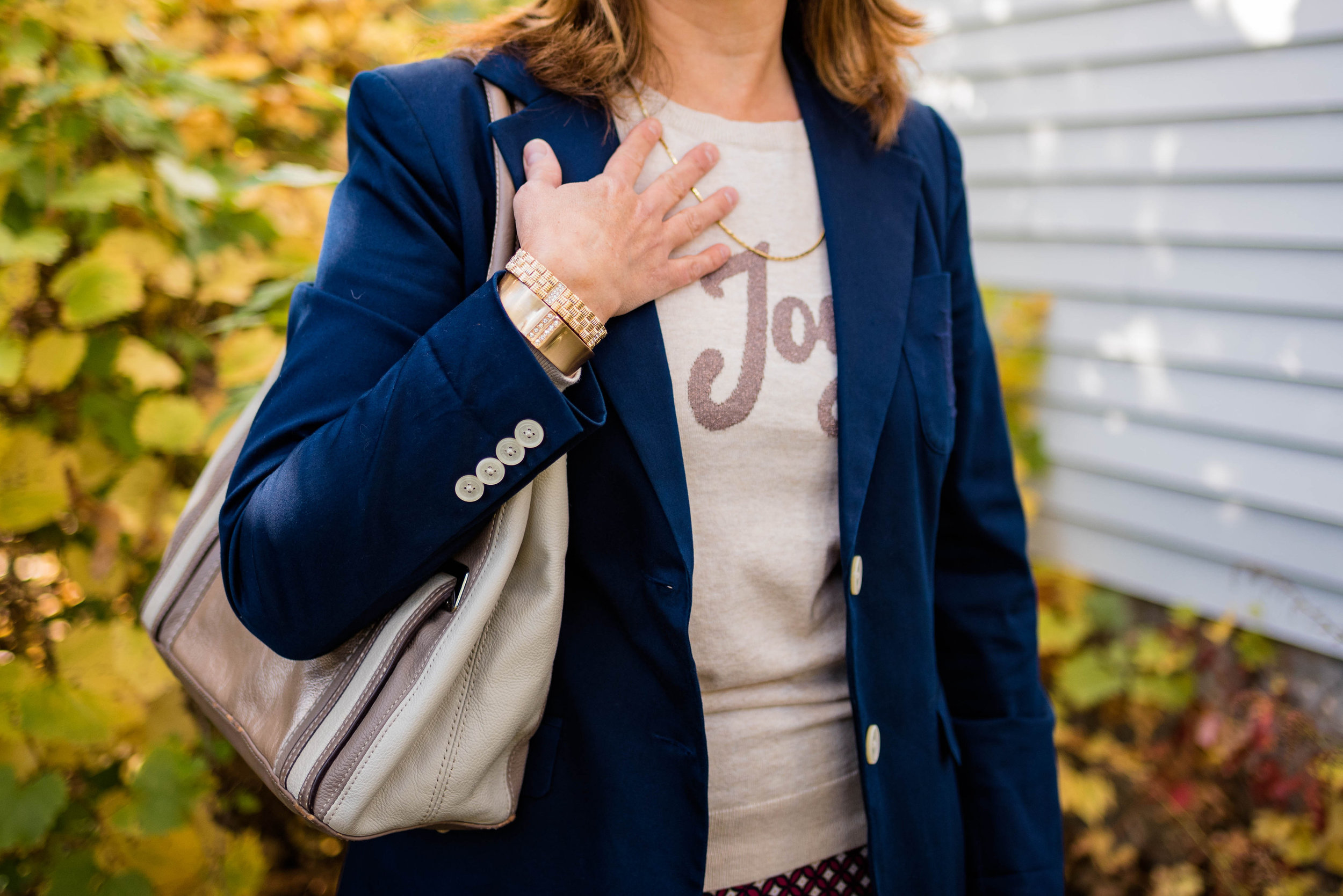
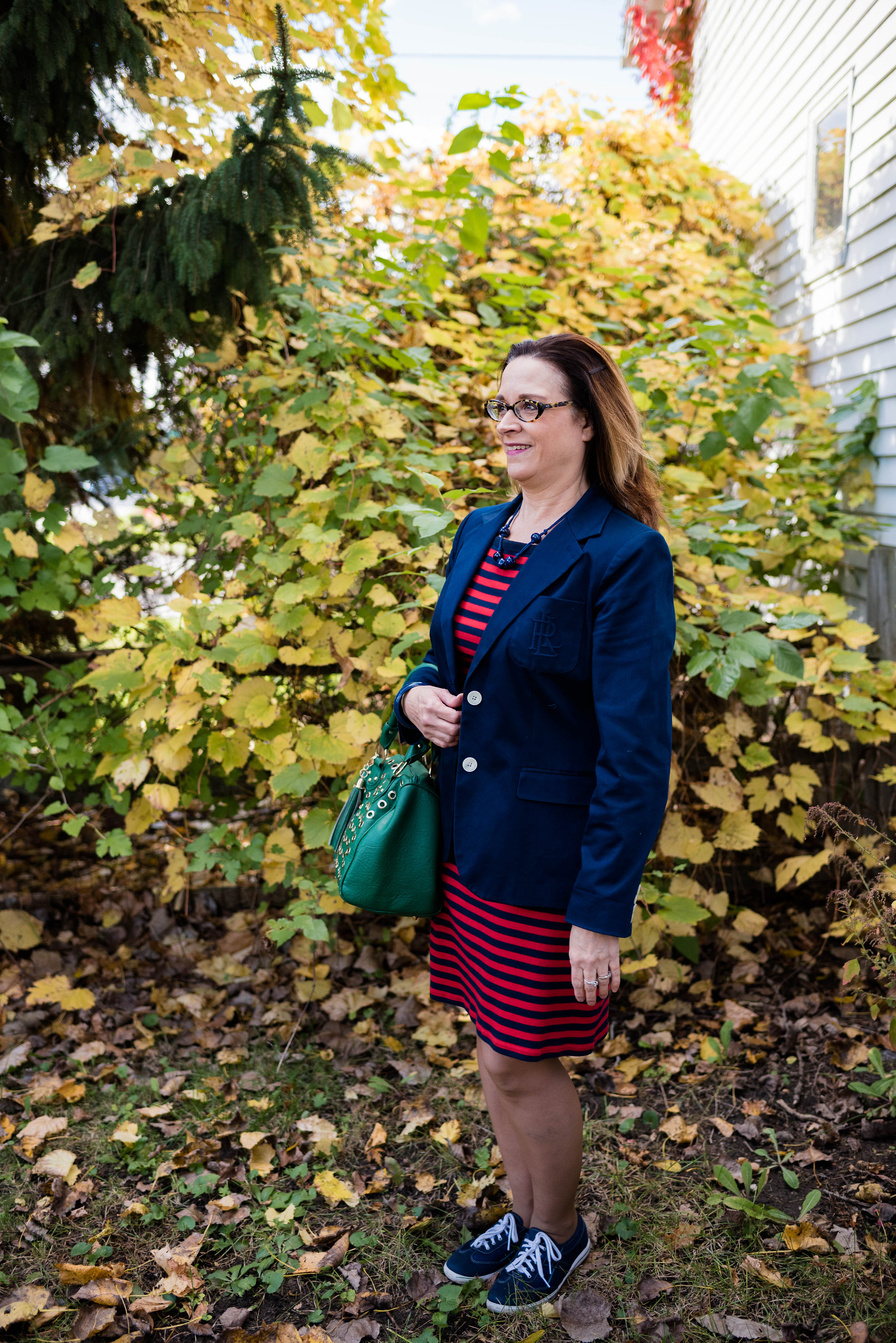
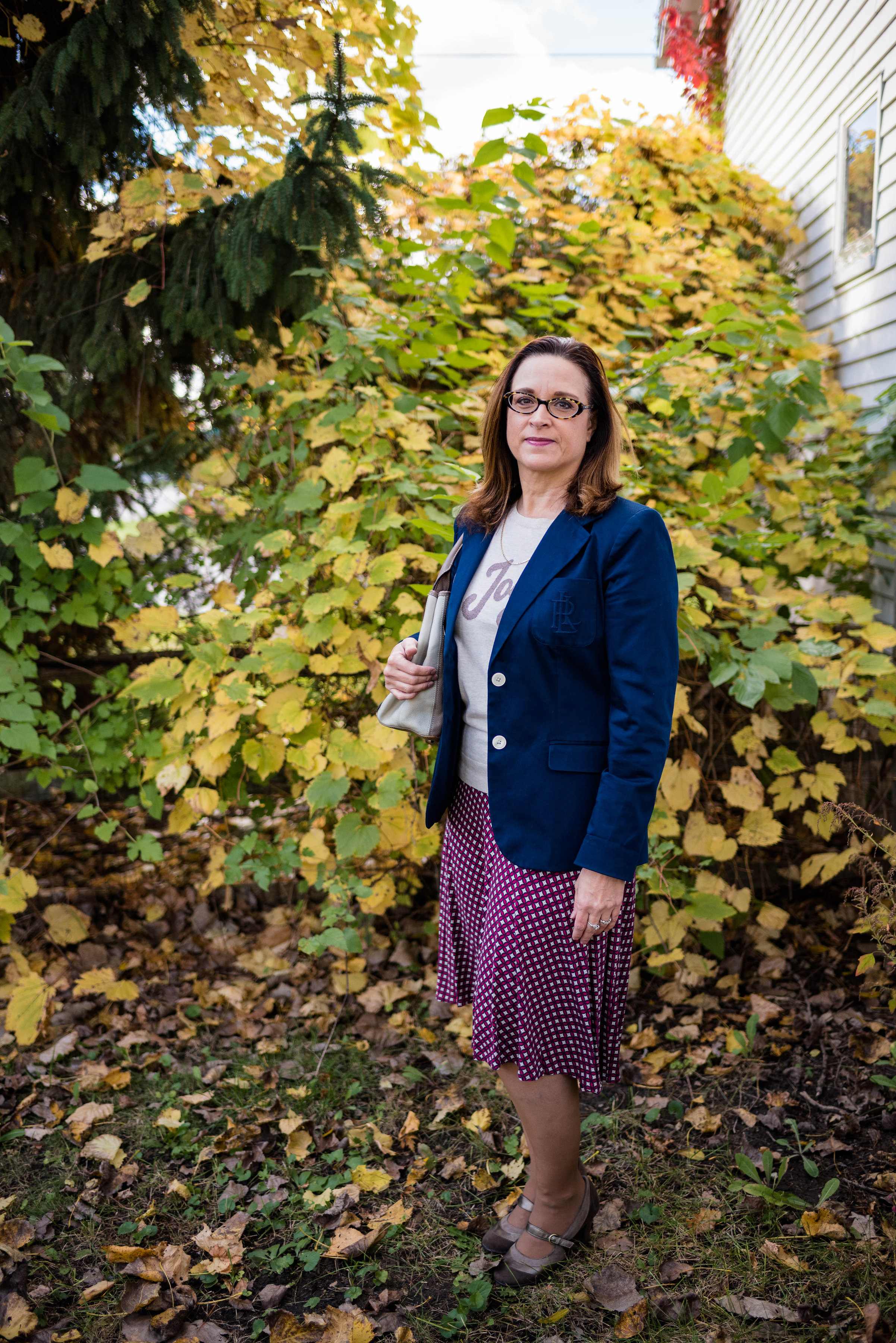
Thrifting is a great way to save money, find unique pieces that are just right for you and have fun. I love to thrift with my daughters and my best girlfriend back in New York. Of course it always involves lunch! You can find jewelry, purses, shoes and, of course, clothing for a fraction of the price you will pay at a regular retailer. 

Next week I'll be back with another post on thrifting where I'll talk about how to turn compulsive buying into shopping science. 

Did you like this post? Did you find it helpful? Are you a thrifter? I'd love to have your feedback in the comments section below. 

Have a great weekend!


Marvelous Maxis - A+ A-lines

This is the final installment in my Marvelous Maxis series. An A-line skirt is basically a skirt that is narrow at the waist then subtly flares out toward the bottom, thus the "A" look. I have always been a fan of the A-line skirt because it is figure flattering, but still allows for room through the hips and thighs. It is also a great skirt to wear if you want some flare, but don't want a lot of excess material. 

Today's skirt is from Dressbarn. If you are not familiar with Dressbarn they are a women's clothing retailer selling sizes 4-24. I hadn't been in a Dressbarn in ages, but then visited one with my girlfriend while I was back in NY a few months ago. I was glad I did. They have a fun and whimsical style with a variety of prints, colors and cuts in pants, skirts, dresses and tops. They also sell accessories like shoes, bags and jewelry. It took everything in my power to not spend more than I did! 

Look 1 - Casual

I fell in love with the print on this skirt, knowing that I will be able to use it for spring, summer and fall. The skirt is a somewhat sheer material, but is fully lined so you don't have to worry about finding a slip to wear underneath. 

The lining has knee high slits on both sides, making it easy to walk and sit without feeling bound in. Here is a pretty fuschia floral print. 

I paired the skirt with a simple embellished orange tank top. This is a St. John's Bay brand which is found at JC Penney. My tank was thrifted. I tucked the top in, to keep a more figure flattering silhouette. Notice after I tucked it in, I pulled it out a touch, to allow the material to bag out to camouflage my bulges. We have to have a trick or two to hide our baggage!

Since the tank has all this bling, I decided to not wear a necklace. For accessories I just wore a multi-strand beaded bracelet, carried a small macrame bag and wore my lace up sandals. I bought these sandals at Meijer. Meijer is a grocery and clothing retailer here in the midwest. I was surprised to find out that their Massini clothing line is now backed by Stacy London of What Not to Wear fame. Meijer is trying to create a style for every body. 

Look 2 - Dressy

For a more dressy look, I swapped the casual tank for my glitzy taupe short sleeved pullover blouse. This piece was thrifted and is The Limited brand. The Limited is no longer available as they closed their stores back in January. You can see how I styled this blouse in last fall's Pantone series here

I also added a gold clutch and gold Covington wedge sandals, Sears carries Covington brand shoes. I also added a fun pendant necklace. 

Here are the two looks side by side.

I hope you enjoyed this series on maxi skirts. These skirts are a great option when you want to have your legs covered, but don't want to wear pant or hose. Do you have maxi skirts in your closet? How do you like to wear them? I'd love to hear your thoughts. 

Have a great week! 

Photo credit Rebecca Trumbull. Make up Rachel Christensen

This post contains affiliate links. If you click on a shopping link below, I get a few cents. If you purchase something through my site, I get a small commission. All opinions are my own. 

Monday linking up with Catherine of Not Dressed as Lamb. Tuesday linking up with Shelbee in the Spread the Kindness link up and Jess of Elegantly Dressed and Stylish. Thursday linking up with Nicole of High Latitude Style. Friday linking up with Nancy of Nancy's Fashion Style. 

Color Crash Course - Print Mixing

It is a beautiful day today, but the wind chill is only seventeen, so as much as I want to go outside and take pictures, I am going to be a wimp and stay inside in a sunny window and use some pics from past posts. 

We hear many things about print mixing and a plethora of bloggers do a wonderful job of mixing all sorts of patterns and colors. What follows are some tips on learning to piece together an outfit that has a mix of patterns and colors that will leave you feeling confident and stylish. 

1. Choose a mix of bold/large patterns with more subtle/small patterns

In the above post from January 24th (click on the date and it will take you to the original post), I wore a maxi dress with a bold black pattern around the hem line. The dress also has a more subtle print throughout. To top the dress off, after adding a similar blue pullover sweater I added a black blazer that has small white polka dots. 

2. Stripes can be mixed easily with anything

If you are at all trendy, then you know one of the big trends this spring is the mix of floral with stripes. I'm seeing this pattern mix everywhere and it works. 

This was my post from Tuesday, the start of my series on the Pantone Spring 2017 colors. The tee from Jacket Society is the perfect mix of stripes and floral. But for another take on this trend see Catherine of Not Dressed as Lamb for her interpretation on floral and stripes together using her own pieces. 

Here is a different idea for mixing stripes with another pattern. This outfit was from a Color Crash Course column. In this outfit the stripes are vertical on the brown sweater. The scarf provides the other pattern. One reason this works is because the scarf pattern is kept tight around my neck and face, while my body is elongated by the stripes on the sweater. They are not competing with one another, but complementing one another. That leads me to the third tip for pattern mixing.

3. When mixing it up, think color, color, color -

Most people who do pattern mixing well, would probably tell you it has to do with choosing a color that complements both pieces. For instance in the above outfit, the taupe is found in both the scarf and the sweater. The blue is also found in the jacket and pants, but I am speaking directly to pattern mixing.

In this post from last week the pattern mix is masculine chic with the blue background of my top bringing up the blue stripe in my plaid trousers.

This outfit from my Denim Days series late last summer mixes different size polka dots on the chambray shirt and pink jeans. Part of what makes this work is the varied size of the dots, but also the muted, soft colors mixed with the more subdued neutral accessories. 

This next outfit was from my Fall 2016 Pantone series and actually fits into two of my mixing tips, so I'll start with it in this color category.

Originally this was just the skirt and top, which is its own version of print mixing. I will address that under the next tip. I added the scarf for a post I did on styling a pashmina scarf, only because the green in the scarf matched the green of the top. Voila! Print mixing with similar colors. 

4. Consider mixing prints with texture

If you a bit hesitant about mixing prints, try mixing a print with a texture. 

My Lush Meadow top is a textured pattern. My maxi skirt is obviously a print. Part of what makes this work is the pattern shape. The diamond shapes on the top are similar to the diamond shapes on the skirt. The other trick to making this look work well is adding the belt. The belt divides the patterns and keeps it from looking too busy. Adding a solid piece, like a belt, vest, cardi or jacket can help tone the busyness of prints down and give the outfit a cohesive look.

In this picture you can see the textured lace pattern of the top works beautifully with the leopard print cardigan. Inspired by Jennie of A Pocketful of Polka Dots, you can see my original post here.  If you still feel a bit intimidated by mixing patterns. try envisioning this same look with a black lace top or a more neutral tan. You are still mixing prints because of the texture, but it will be more subdued. 

5. Go for a monochrome look

This outfit was based on a post by Liz of With Wonder and Whimsy (see her post here). Instead of trying to pull one central color out of two crazy patterned pieces, going for a monochrome look allows print mixing with a crisp, clean vibe. I seem to have this thing for polka dots that I didn't even know I had. Ha, ha. See my original post here

6. Try an accessory

If you want a more subtle look, try just adding a simple patterned accessory to your print. Check out the following ideas:

Patterned Scarf

Adding this scarf to my snake skin jeans is a perfect pattern mix.

Textured Bag

Patterned Bag

Textured jacket

Print mixing can be intimidating, but you probably are already doing it and you didn't even know it. Don't be afraid to mix it up. Print mixing can be fun and it can also make your outfit more colorful and interesting.

Even my daughter likes to print mix. She sent me this pic of her most recent attempt. She pulled this off by using the base color of both her top and her scarf as well as mixing the larger scarf print with the smaller dots on the top. 

We'd love to hear from you. Leave me some love in the comments section!

Have a great weekend!

Photo credit Rebecca Trumbull. Make up Rachel Christensen.

Thursday linking up with Nicole of High Latitude Style.    Friday linking up with Nancy of Nancy's Fashion Style, Jennie of A Pocketful of Polka Dots, Shelbee of Shelbee on the Edge, 

Pantone Fall 2016 - Recap

This week I wanted to show all of the outfits I styled based on the Pantone Fall 2016 color line up. To see my original posts click on the color.

Week 1 - Bodacious

Week 2 - Airy Blue

Week 3 - Potter's Clay

Week 4 - Riverside Blue

Week 5 - Sharkskin

Week 6 - Warm Taupe 

Week 7 - Spicy Mustard

Week 8 - Aurora Red

Week 9 - Dusty Cedar

Week 10 - Lush Meadow

Which one is your favorite? Which color(s) would you wear? Let me know in the comments section below or on my Facebook page.

I hope you enjoyed this series. I will be exploring the Pantone Spring 2017 colors next Spring, even though they are already on their website. Let me get through Christmas first before I start thinking about outfits for next spring! Ha, ha.

In the mean time, keep checking back. I hope to begin a series in a few weeks on my own color choices for winter, called Winter Wonderland. Keep an eye out for that. Check back on Thursday to see which Beautiful Blogger I drew inspiration from this week. 

Have a great day.

Photo credit Rebecca Trumbull. Make up Rachel Christensen.

Monday linking up with Catherine of Not Dressed as Lamb. Tuesday linking up with Jess of Elegantly Dressed and Stylish. Wednesday linking up with Tania of 50 is Not Old, and Allison of Sydney Fashion Hunter. Thursday linking up with Nicole of High Latitude Style and Shelbee of Shelbee on the Edge. Friday linking up with Jennie of A Pocketful of Polka Dots and Nancy of Nancy's Fashion Style

Pantone Fall 2016 - Lush Meadow

The final installment in the Pantone Fall 2016 series is a vibrant, rich color called Lush Meadow. I am not sure I would have given this color that name, because to me it seems to express more of an emerald tone, than a field of green. Unless you are in the jungle, meadows are typically more of a grassy green and perhaps filled with flowers. Something like this:

Pixabay

However, I was not on the committee to name these colors and I am sure they had a reason they named this green what they did. Now that my little tangent is over. Here is my outfit.

I have had this maxi skirt for a long time and just could never find the combination of top and accessories that made me say "Yes! This is it!" When I paired this top with the skirt and then added the belt, I thought I had hit the mark. 

Even though the top is a single color, there is a definite print to it. I am not sure what the process was, but it looks like lace and crochet mixed. I didn't realize it at the time, but seeing these pictures now, I see that the shape of the print on my top, matches the shape of the print on my skirt. How's that for some fancy mixing? Ha, ha.

For my accessories I wore a bead, ribbon and chain necklace which had beads that whisper Lush Meadow and ribbons in the line of Spicy Mustard. I also added a Spicy Mustard bracelet. (To see how I styled Spicy Mustard as an outfit click here.) My bag was a simple charcoal gray clutch that matched one of the colors in the skirt. The skirt also has white and a bit of tan, thus the inclusion of the brown belt and brown ankle boots.

In this shot of the boots, you can also see a bit of the lining of the skirt. (You can also see the mud on the heel of my boot - ha, ha - squishy ground!) It is fully lined from top to bottom, so it provides an extra layer of warmth and no need for a slip. This is a great transitional skirt for fall, but I think I will be wearing this again in the winter with a chunky sweater, knee boots and tights for added warmth.

I hope you have enjoyed this series on the Pantone 2016 Fall colors. Next week I will be doing a recap of all the outfits, so I hope you'll check in again next Tuesday. 

Thursday I will be looking at the Pashmina scarf as another awesome cold weather accessory. Be sure to check back. Until then take care and keep stylin'!

Photo credit Rebecca Trumbull

Shopping for Lush Meadow:

Tops -

Nordstrom - $70.00

Kohl's - $28.80

Roaman's - $49.99 - 54. 99 (Plus Size)

Bag's - 

Kohl's - $69.30

Kohl's - $55.30

DSW -  $49.95

Monday linking up with Catherine of Not Dressed as Lamb. Tuesday linking up with Jess of Elegantly Dressed and Stylish. Wednesday linking up with Allison of Sydney Fashion Hunter, and Tania of  50 is Not Old. Thursday linking up with Nicole of High Latitude Style. Friday linking up with Nancy of Nancy's Fashion Style, Jennie of a Pocketful of Polkadots,  JoLynne Shane on Fashion Friday and Shelbee of Shelbee on the Edge.


Piece Perfect - The Navy Blazer

Today's Perfect Piece is going to be spread out over two months, because I found so many ways to style this fitted navy blazer by Ralph Lauren. Today's post will feature wearing the blazer with a dress and a skirt. Next month I will look at styling it with casual and dressy pants. 

Navy is one of those colors that can be worn with just about any other color. If you look up navy blue on the internet it shows a range of blue from what I would term royal blue to what I would call true navy. For the sake of ease I am referring to this blazer as navy, even thought it is a bit lighter than true navy.

The term blazer refers to a jacket that resembles a suit coat, but more casual. For more info on the origin of blazers see the Wikipedia article here

The three above pictures give you an overview of the fit of the blazer. Blazers can be fitted, flowy or boxy. I like a fitted blazer best because it cinches in at the waist giving me that girlish figure. Ha, ha. This blazer has a breast pocket on one side with the Ralph Lauren initials, two front flap pockets and two buttons. You can also see the split in the lower back allowing movement and flexibility. 

This blazer is also fully lined which means the lining not only covers the entire body, but the sleeves as well. The silky lining not only adds a layer of warmth, but makes it easier to slip into and out of, especially if you have long sleeve layers underneath. 

Here is the first outfit with the blazer. I just threw it on over a striped tee shirt dress, then paired it with my navy Keds. Not to get to matchy, I carried my Lush Meadow tote bag. I accessorized with blue beads and a blue bangle. 

Note the line where the sleeve hits my hand. It is just longer than my wrist, which is where I like most of my jackets to hit. This allows you to show just a little bit of sleeve if you have a top that you want to stick out or if you want your bracelets to show. Some people wear their sleeves longer and some shorter. I'm sure there is a standard, but in the fashion world it's more about personal preference. I also like that the initials are not overwhelming. If you look up Ralph Lauren jackets you will see that many of them have his crest on the pocket in gold. I got this at a thrift store and I am not a huge brand buyer, especially if it is advertised on the pocket, but I like the fit and look so well, that it didn't bother me that the RL was on the pocket.

Here is the blazer paired with a skirt and sweater. The skirt has a navy, red and cream pattern, so I chose a creamy sweater with Joy printed on it. I kept my accessories in the gold/pewter line to go with the lettering on the sweater.

This will be a fun sweater to use again at the holidays. 

Here are the two looks side by side:

So what do you think of this blazer? Do you wear a blazer? How do you style it? I'd love to have your input. Just leave a comment in the comments section below.

Next month in this Piece Perfect column, I'll show you the outfits I put together pairing the blazer with a pair of dress pants and a pair of snakeskin jeans. 

Thanks so much for your support. Be sure to like and share on my Facebook page. You can also see what I've been pinning on Pinterest, and peek at some of my other outfits on Instagram. 

Have a lovely weekend!

Photo credit, Rebecca Trumbull.

Shopping for Blazers:

Ralph Lauren version - Black - Dillards - $198.00

Other brands:

JC Penney - $34.99

Target - $29.99

There are a number of navy blazers available including Ralph Lauren on Poshmark, ModCloth and eBay.