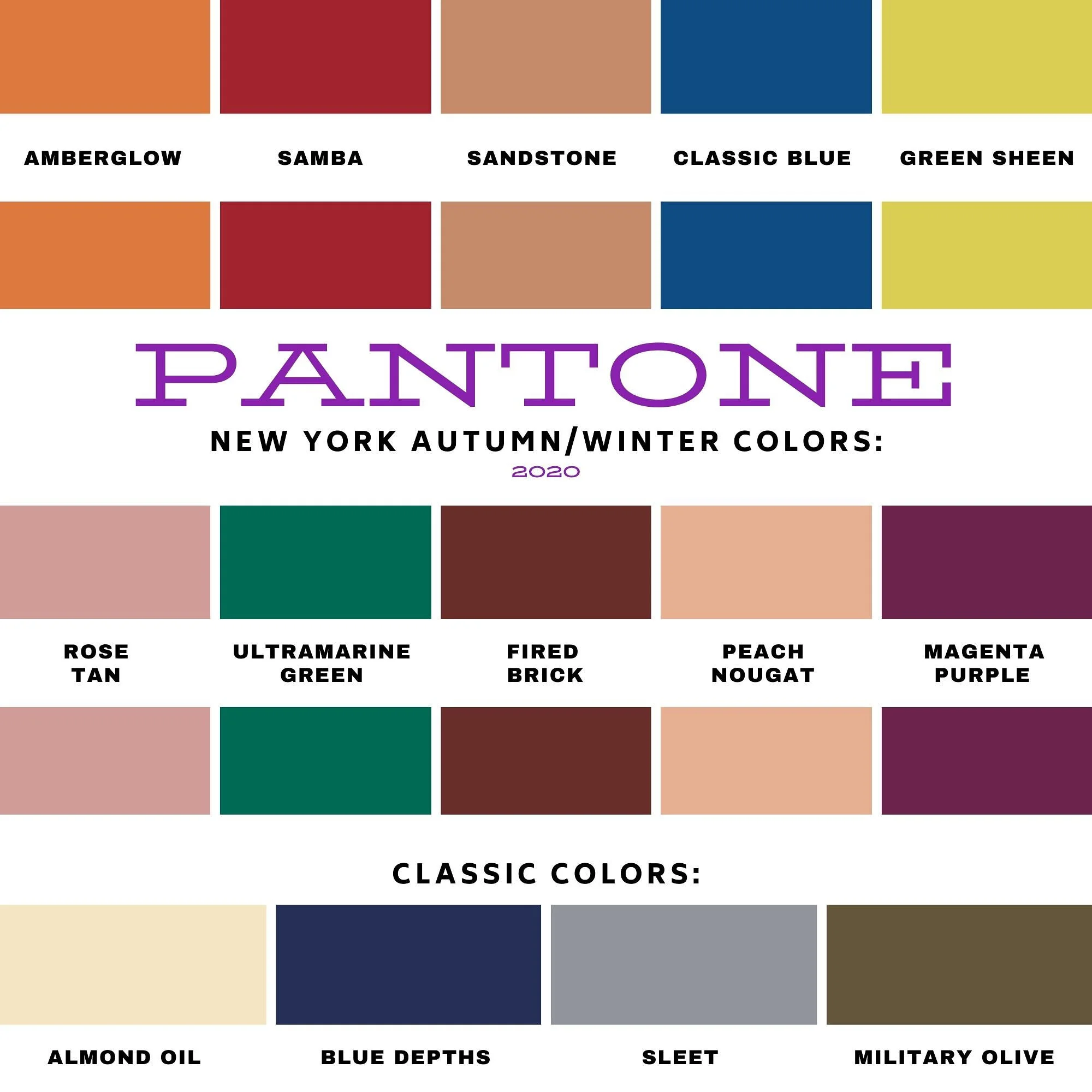
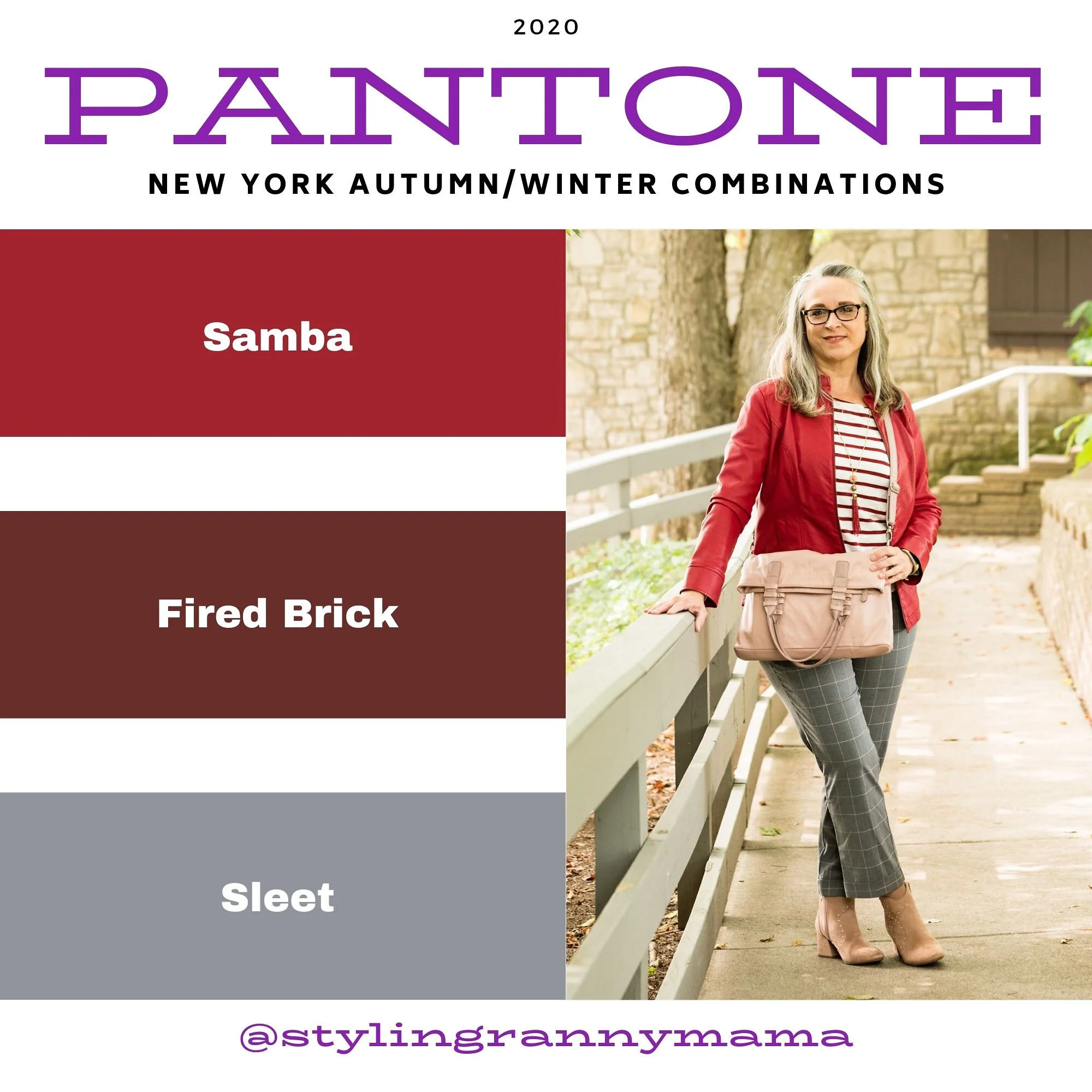
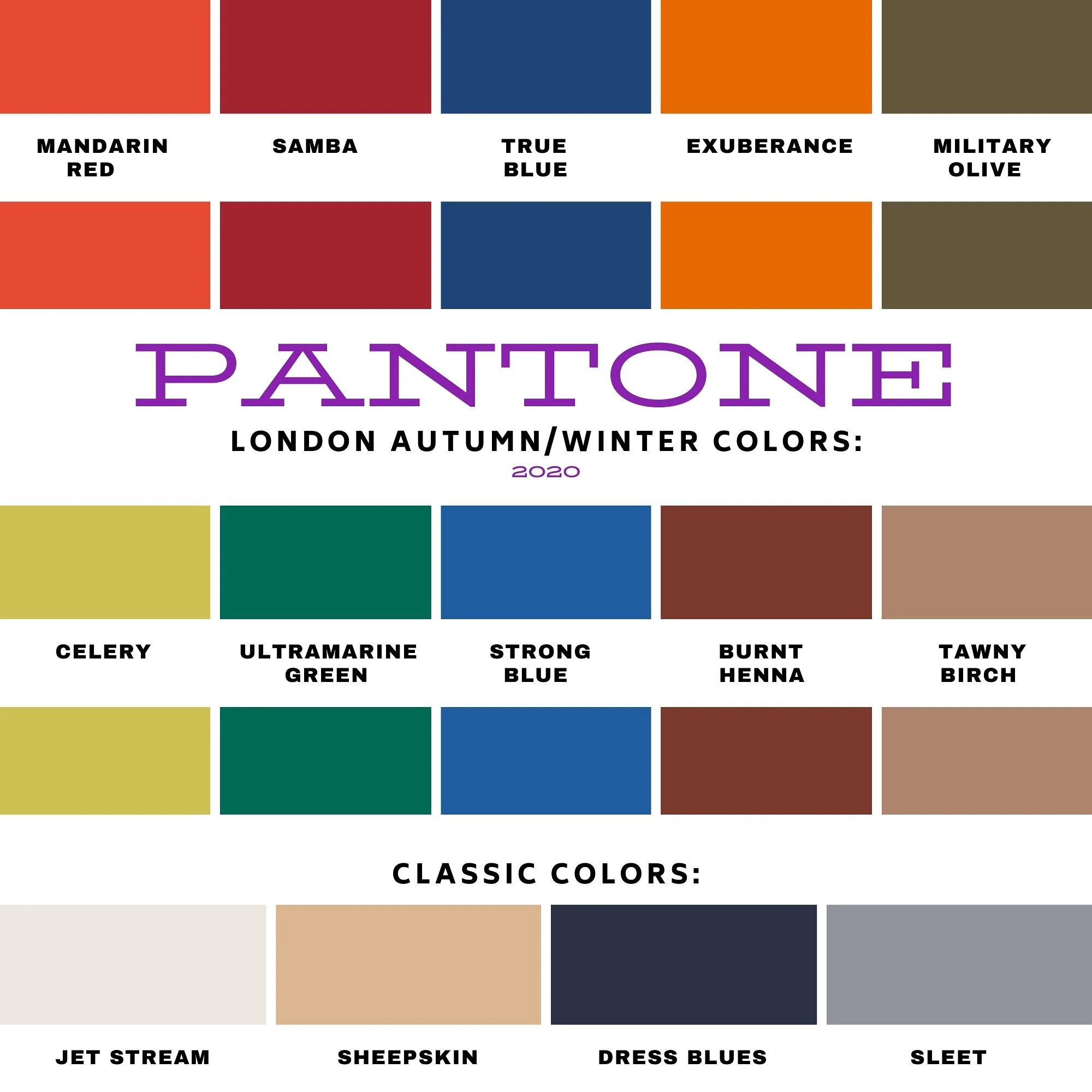
Pantone - Autumn/Winter - 2020 - London Palette - Mandarin, Celery and Sheepskin
I am now able to start the Pantone - Autumn/Winter 2020 - London Palette series. I am not sure why the Pantone Color Institute moved to having two palettes rather than one, except that it is a way to bring in a broader audience to market to. Whatever their reasoning, having two color palettes to draw from to create outfits is a fun challenge for me as a fashion blogger. Some of the colors crossed over from New York to London, but I’ll be showing them again, styled with their London counterparts. Here we go.

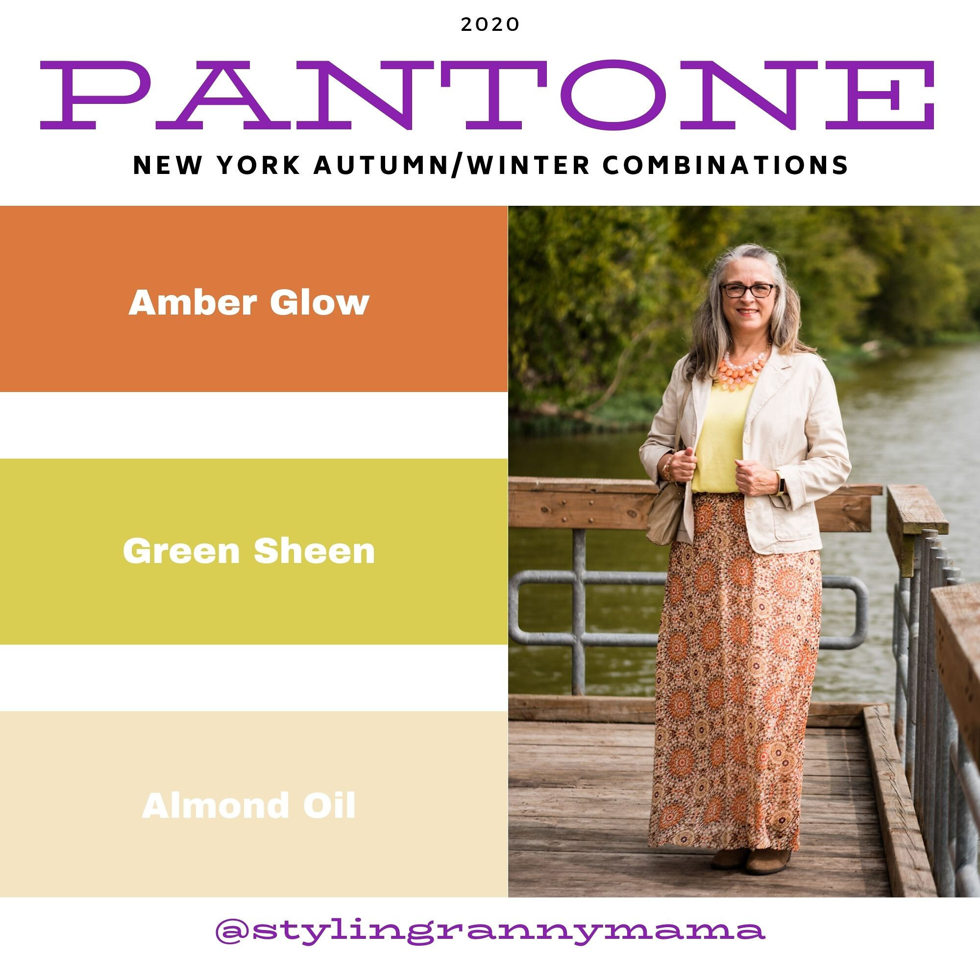
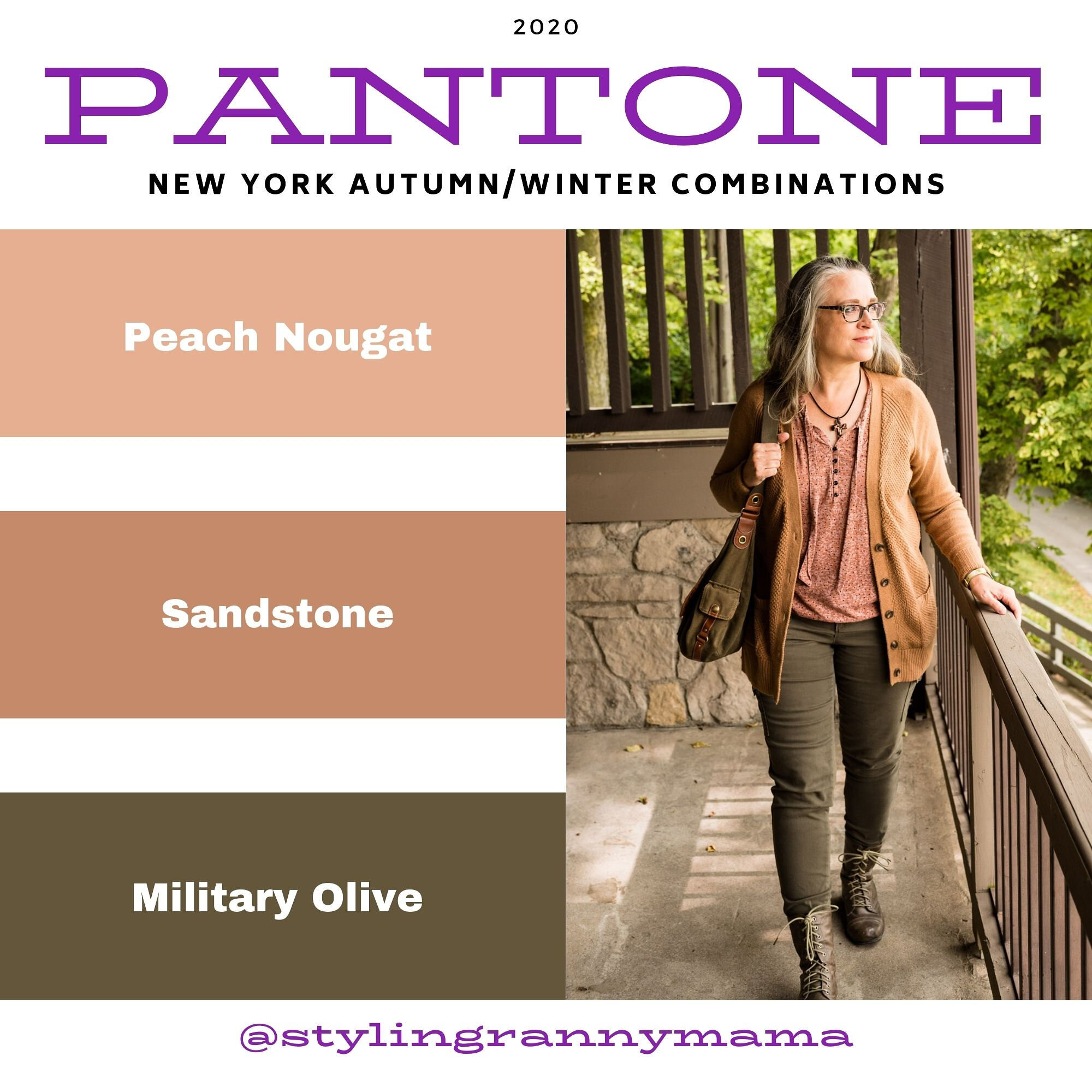
Just as with the New York Palette, the London Palette has four classic colors. I tried to include one of the classics with each of the outfits, just so you know what they look like. With this first outfit, Sheepskin, which is a classic, neutral color, is reminiscent of Peach Nougat and Sandstone from the New York Palette. My jacket isn’t really a dark enough version of this pinky tan, but you still get the idea.

My bright Mandarin red skirt is a thrifted piece by a brand called Kim Rogers. It was not a brand I was familiar with, but seems to be sold at retailers like Belk and online thrift retailers like Poshmark. Once again, the tiered skirt is a fave of mine. I guess I was supposed to be a gypsy. I often imagine that I have gypsy relatives, because my dad always loved to travel and we have French blood via his relatives. Ha, ha.

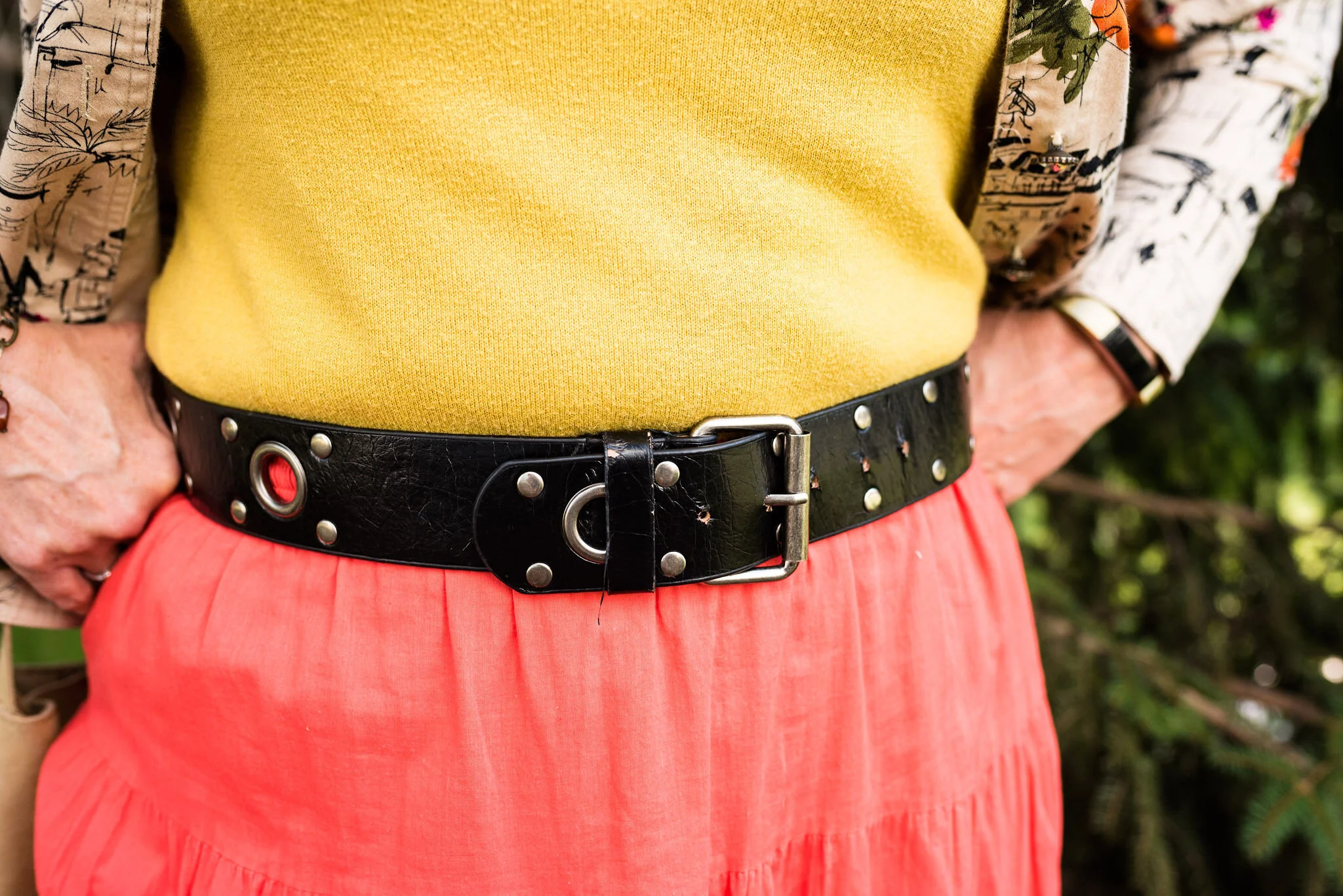
My Celery colored top is a 3/4 sleeve sweater, and a thrifted Banana Republic piece. I decided to tuck it in and add the black belt to go with the black print in the jacket and my black boots. I feel like I should have tightened the belt a notch, so you couldn’t see the skirt at the top. Oh well.

This jacket was a fun piece I found thrifting. I like the bright orange flowers and the artistic sketching on it. It is a brand called Susan Graver Style. Susan Graver is a stylist for the retailer QVC. Once again, I learned something new and found a brand I never would have tried, if I didn’t thrift.
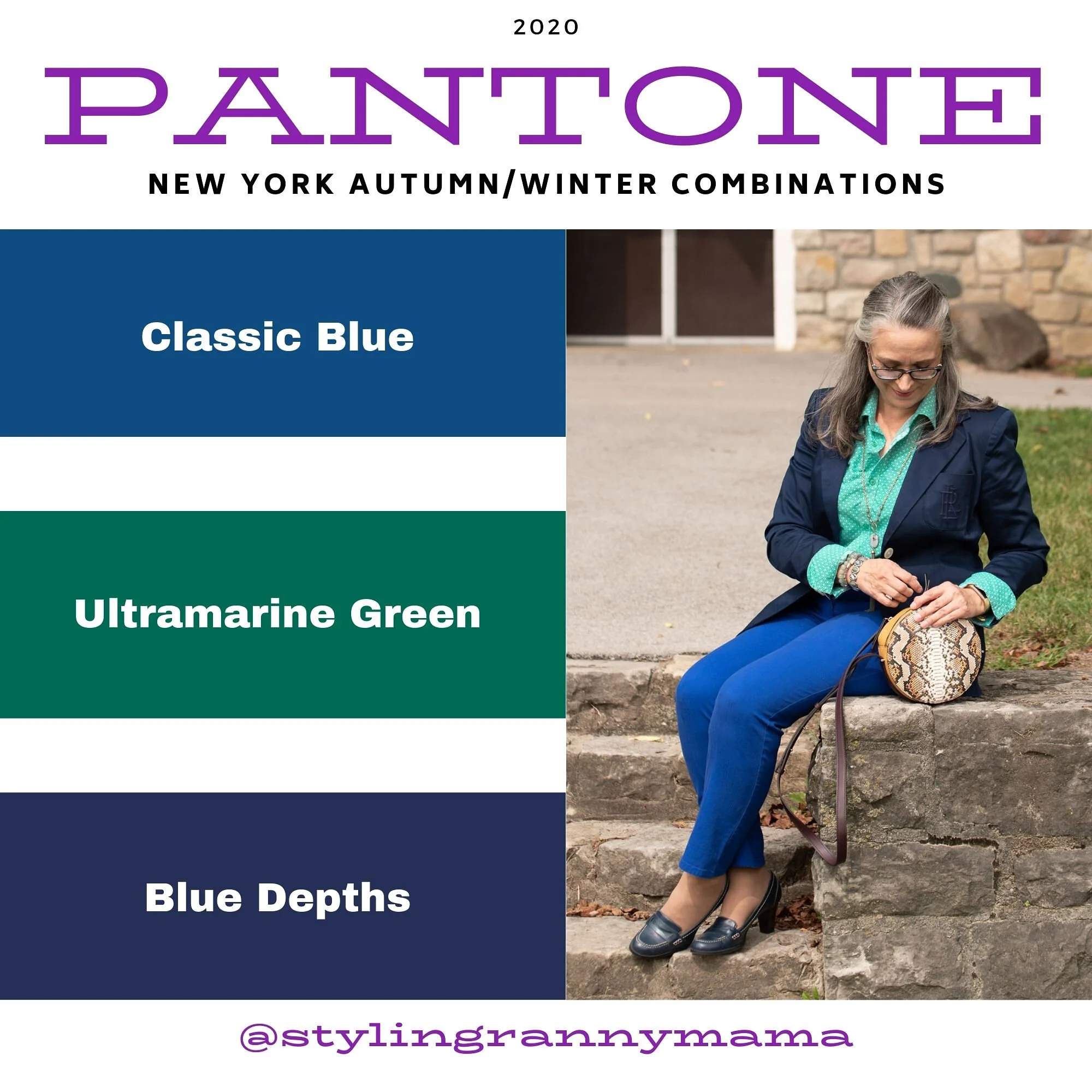
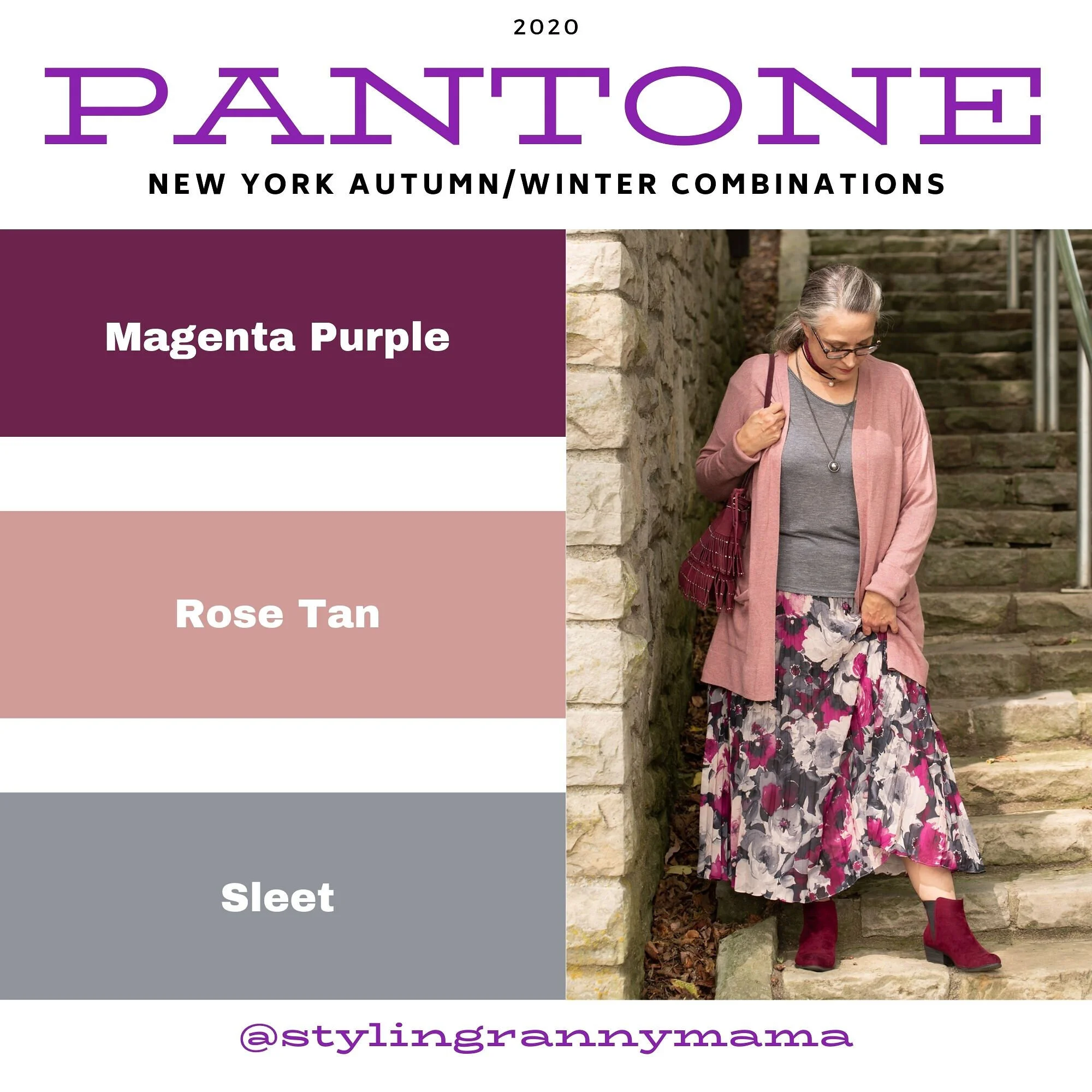
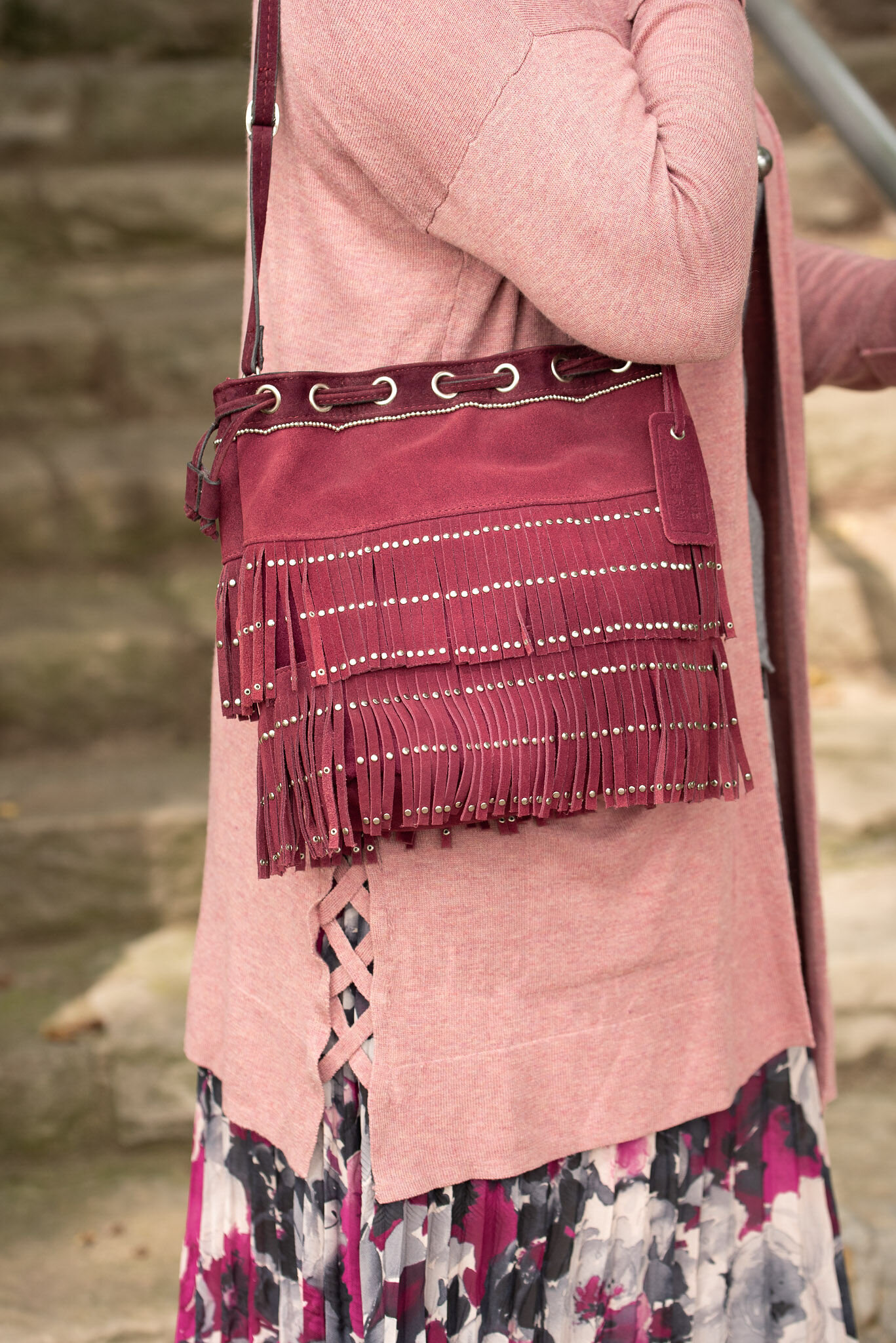
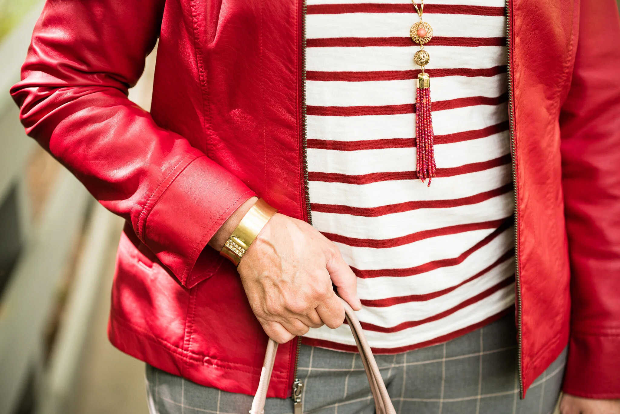
I kept my accessories simple, because there is a lot going on in the print of the jacket and the texture of the skirt and bag. You’ve seen this necklace on the blog before. It is a unique piece I found at an artisan shop up in Grayling, MI a few years ago, when my hubby and I took a short trip up there. You can see it styled for another Pantone color palette here. I also added a simple charm bracelet with rusty fall colors and my thrifted fringe bag.


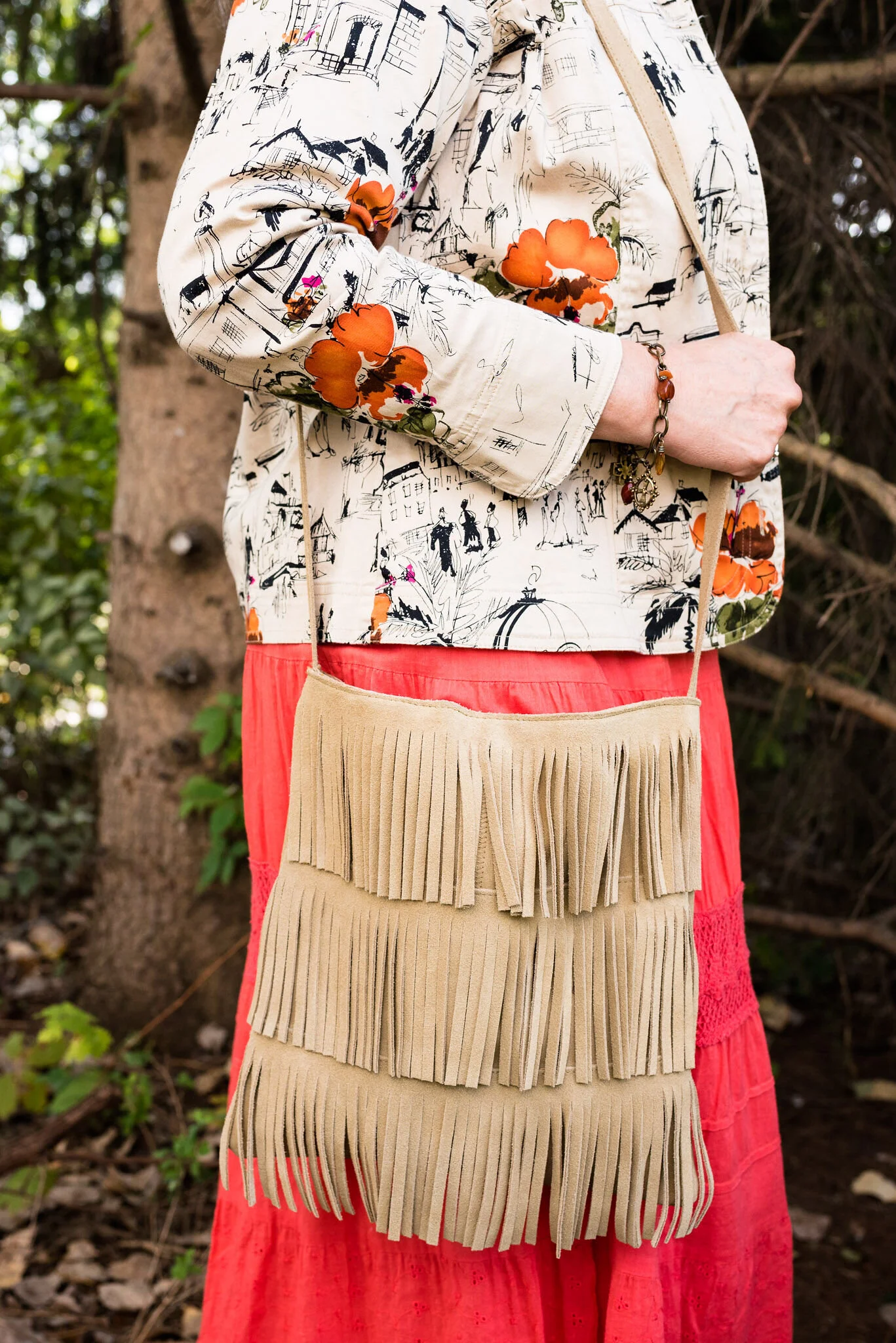
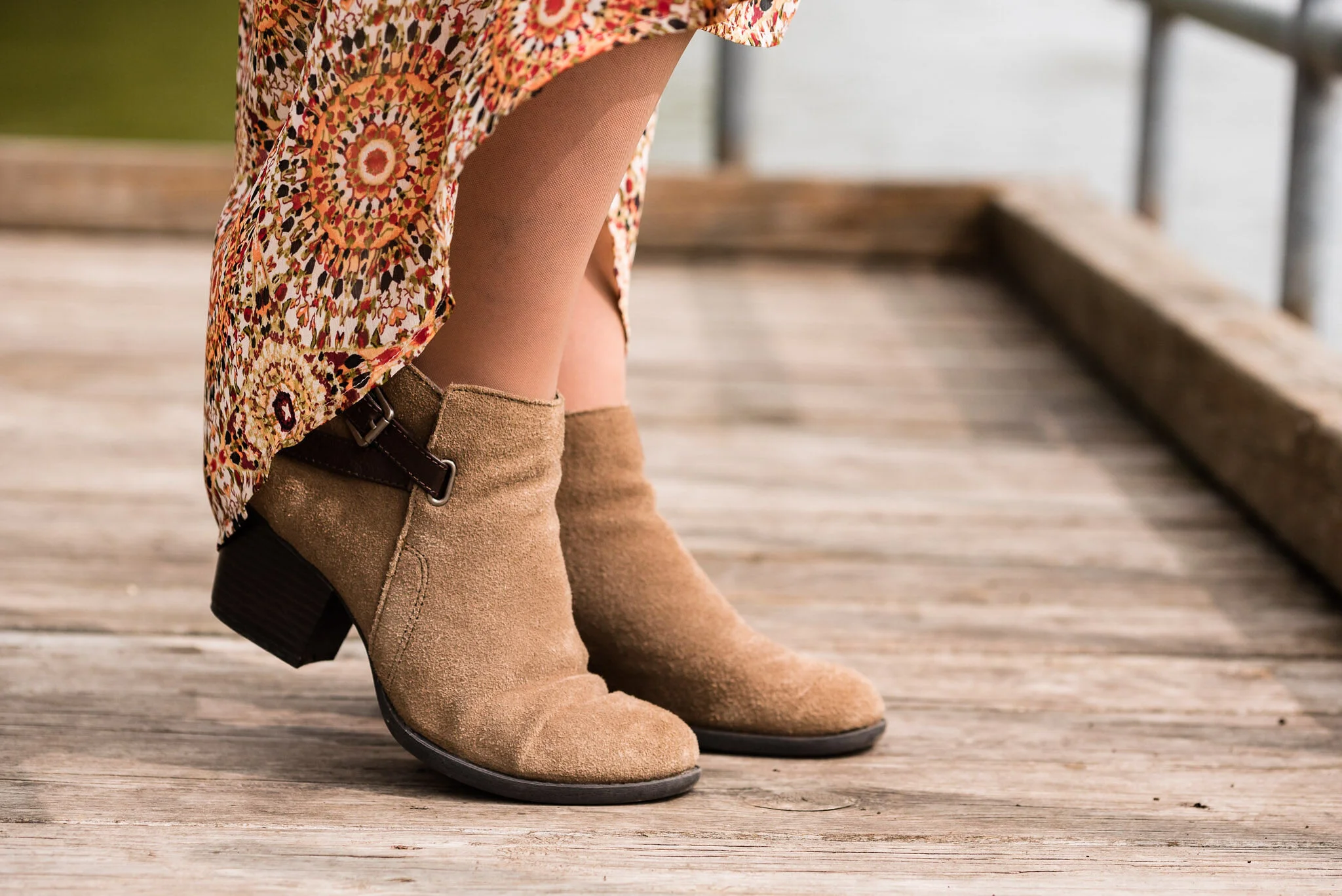
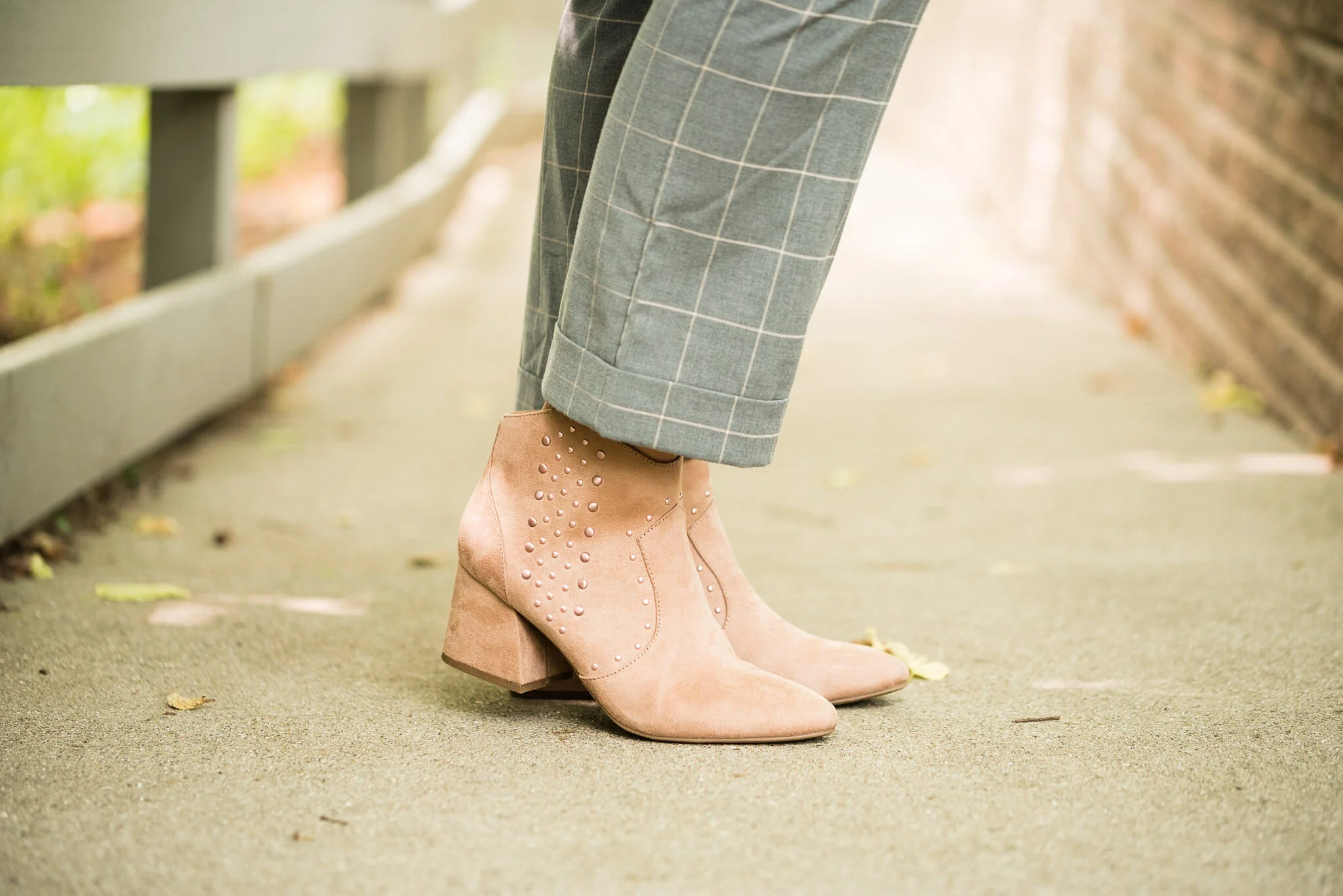
Since we are now fully into fall, I am regularly wearing my boots. I have quite a pile of boots, mostly ankle and knee high. These are Massini brand and are very comfortable. I’ve styled these on the blog before with a black pair of jeans, and a slip dress.

What do you think of these colors? I think if I had worn the colors by themselves without the jacket it would have looked like I was advertising for McDonalds. Ha. ha.

I am including a few shopping links for you to look at. These are affiliate links. It does not cost you a thing to click on a link and look at merchandise, but every time you click I get a few pennies. All opinions are my own.
Here is the London Palette in full.
Graphics and photo credit Rebecca Trumbull.