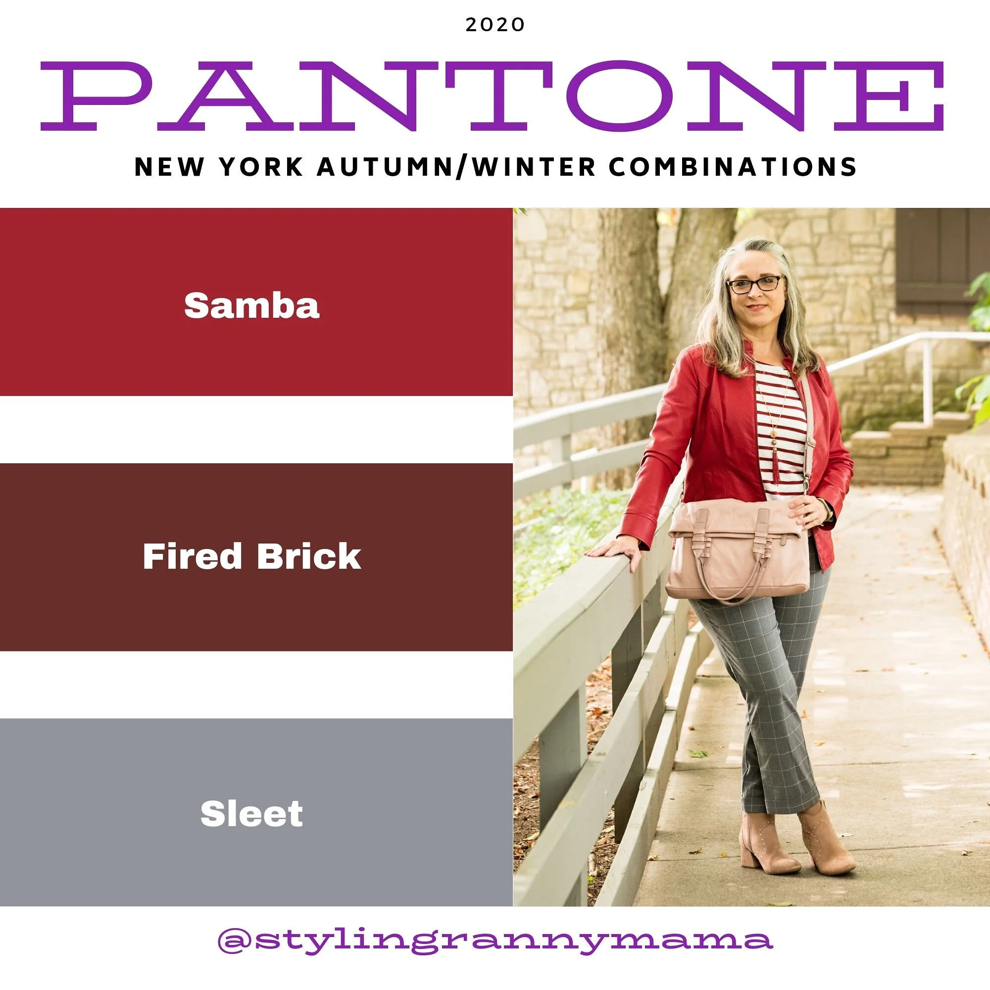
My Style - Pantone Spring 2023 - NY: Classic Green, Love Bird, Leek Green

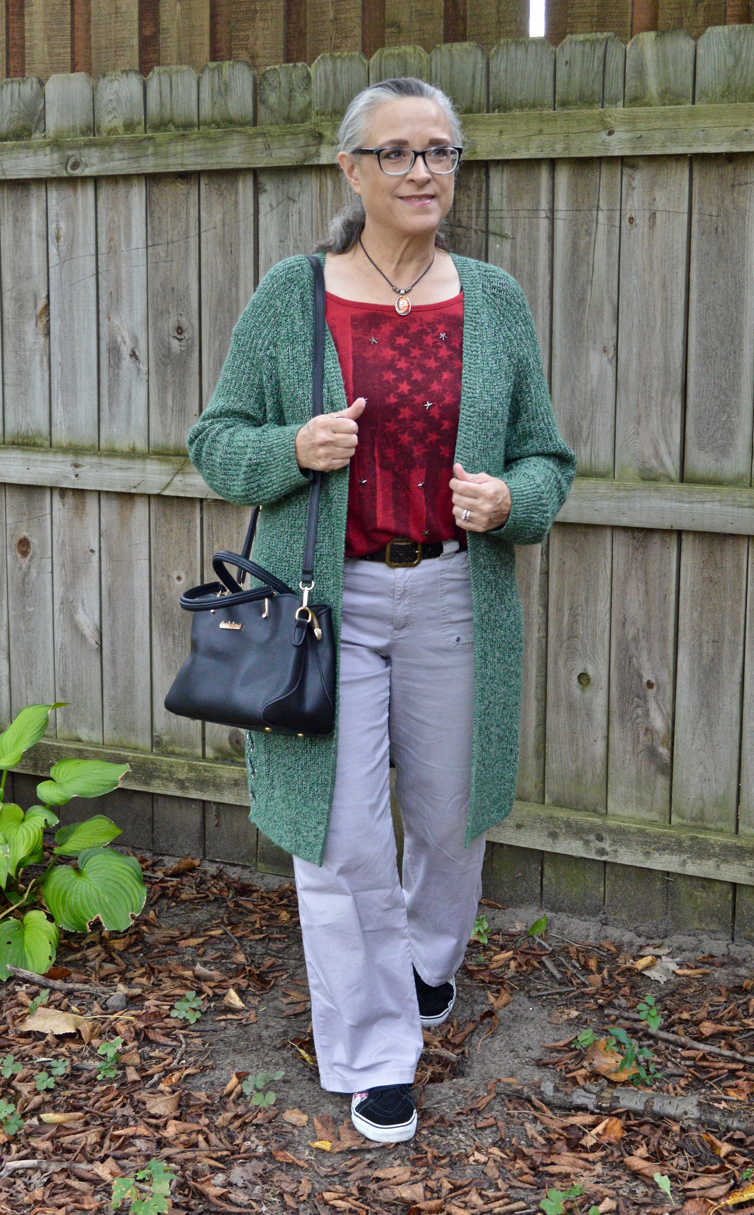
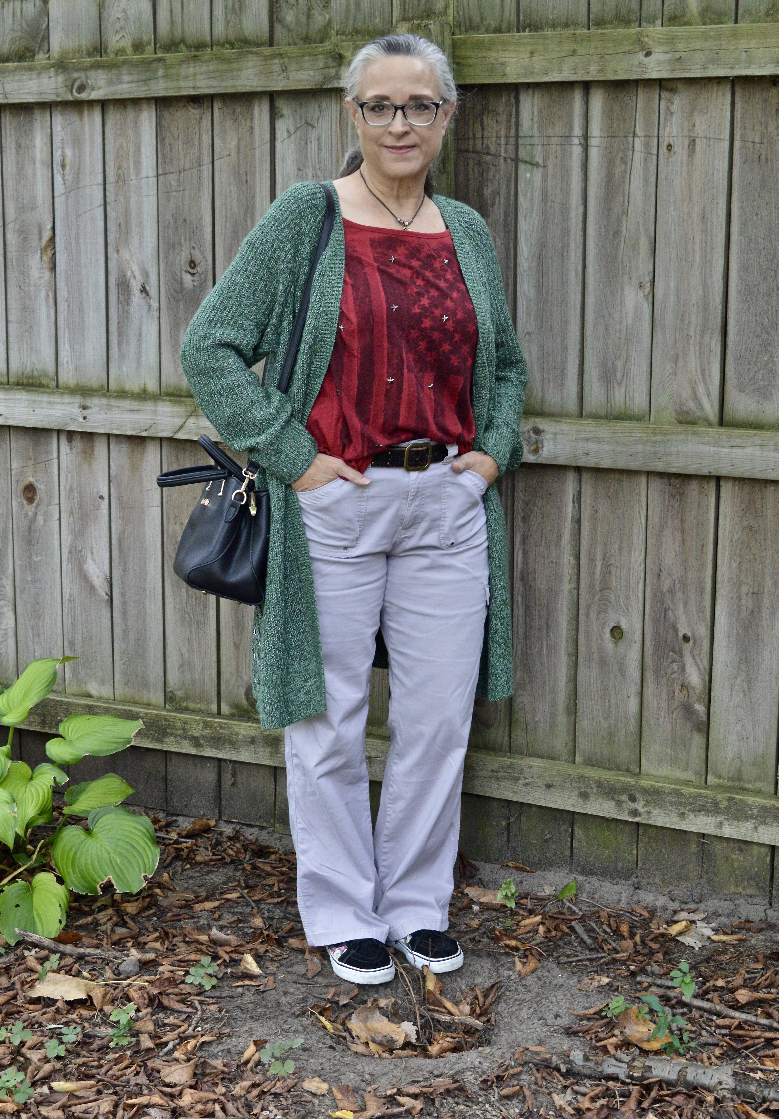
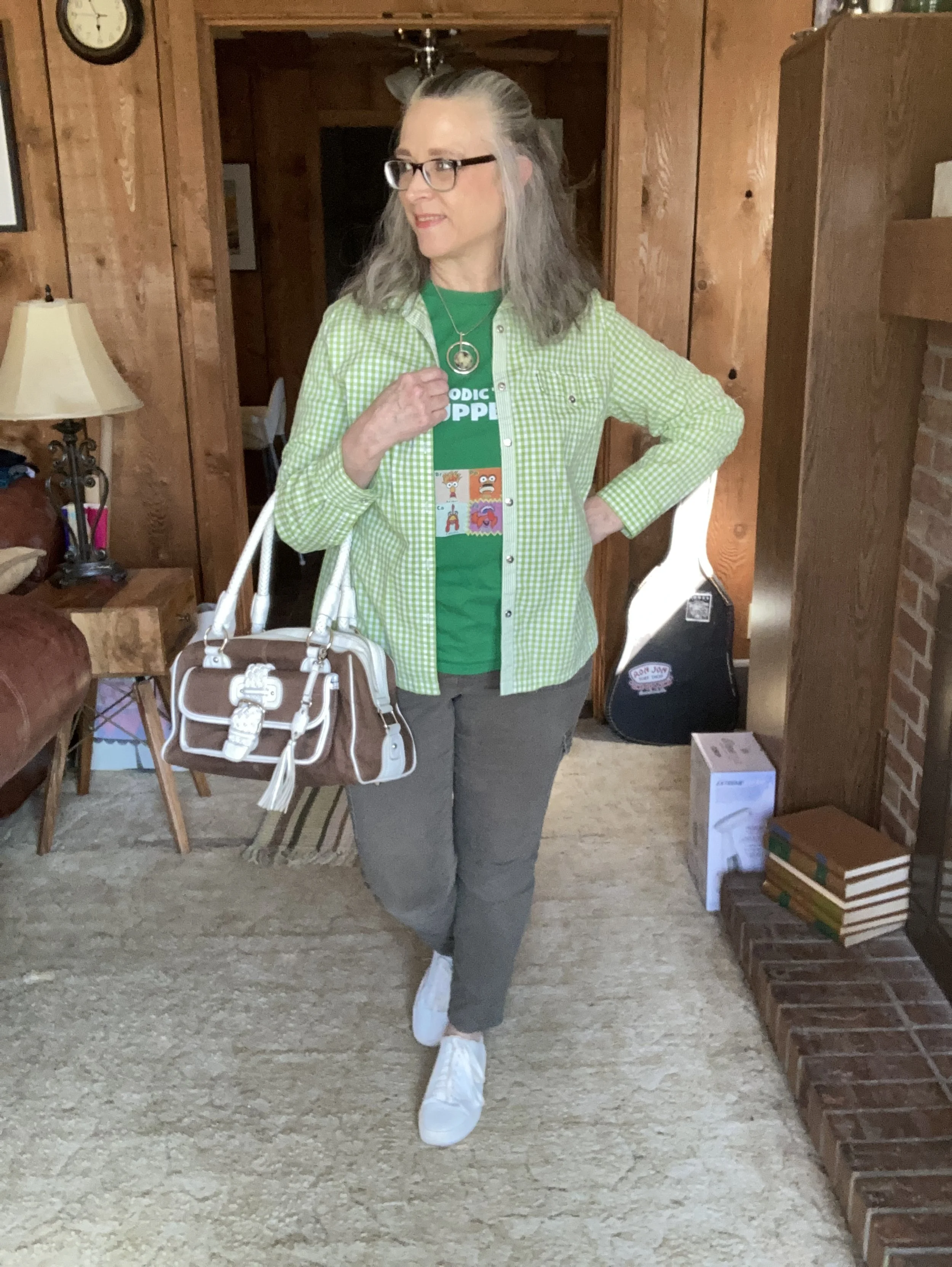
For today’s look, I decided to combine the three greens on the New York Palette into one outfit. These greens are all different, but go together making a fun, bright, spring outfit perfect for any casual occasion.

You know my go to is always casual and comfortable, but aIso like my outfits to look put together, so it at least appears that I gave a little thought to what I am wearing. I always try to plan my outfits out the night before, so that I don’t have to take the time in the morning to make those decisions. Do you pick out your outfits the night before, or do you just throw things on at the last minute?

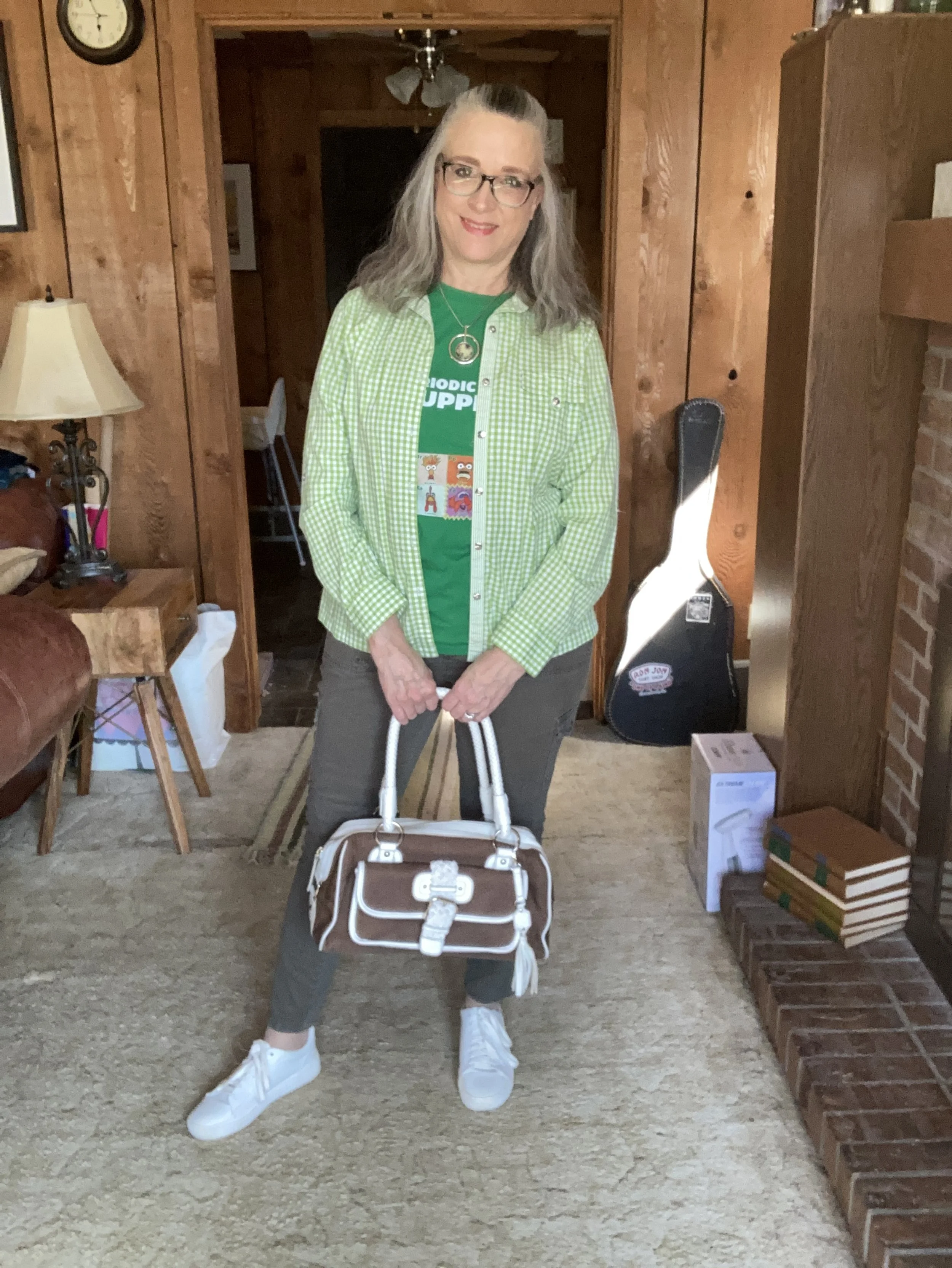
This outfit is my style: casual, cute and comfortable. It is the type of outfit in which I feel most confident and most like myself. I love wearing button downs as a topper over a graphic tee or light weight long sleeve tee. Skinnies are always going to be part of my wardrobe, no matter what the trend forecasters say. I will definitely style other types of pants from boot cut, to straight, to wide leg and flares, but skinnies will still hold a place in my closet.

I thought this Periodic Table of Muppets tee perfect for the Classic Green color on the NY palette. The thing I love about graphic tees is that they allow every individual to speak for themselves. They show the bands we like, the shows we watch, the activities and hobbies we groove on. A graphic tee can tell a lot about a person. What do you suppose this tee says about me? If you guessed that I grew up watching the Muppet Show, then you are right! Ha, ha.

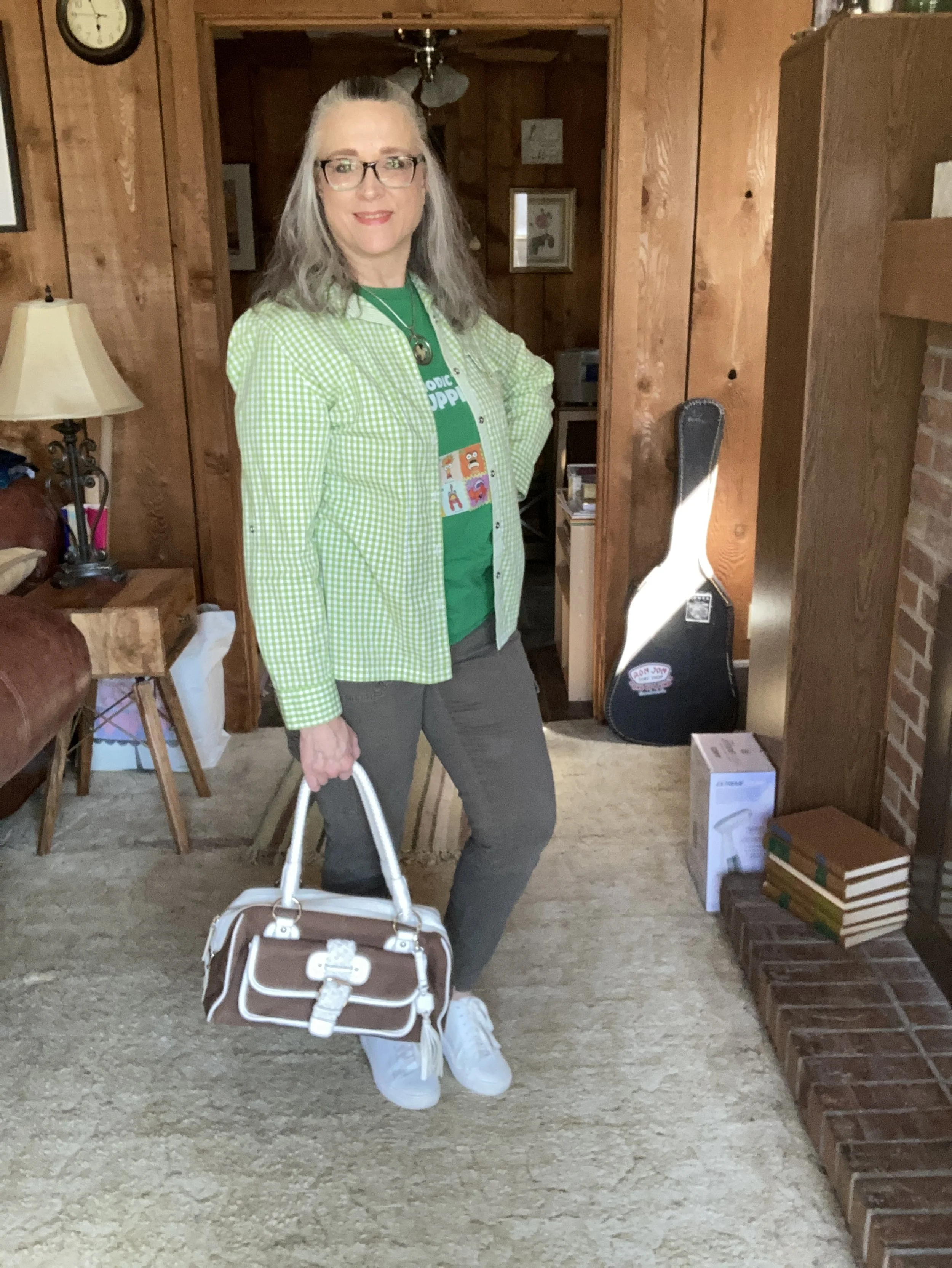
This thrifted Jaclyn Smith Love Bird button down is such a great piece for spring and summer. Gingham always moves our minds towards the warmer days of spring and a summer full of outdoor activities and picnics at the park.

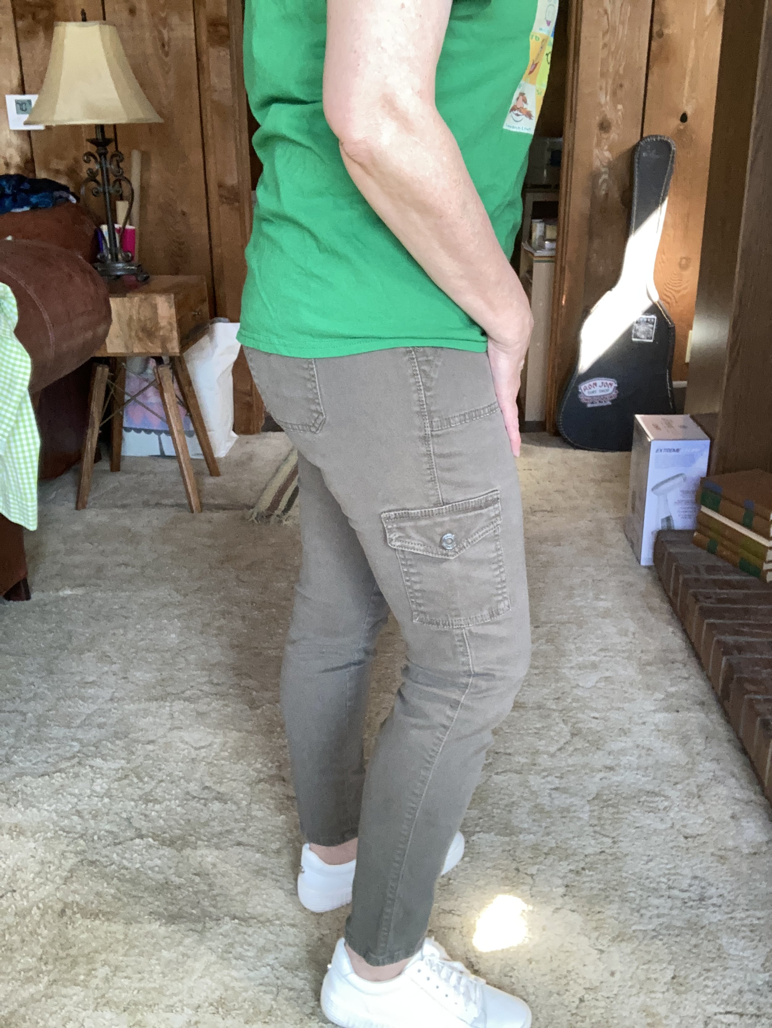
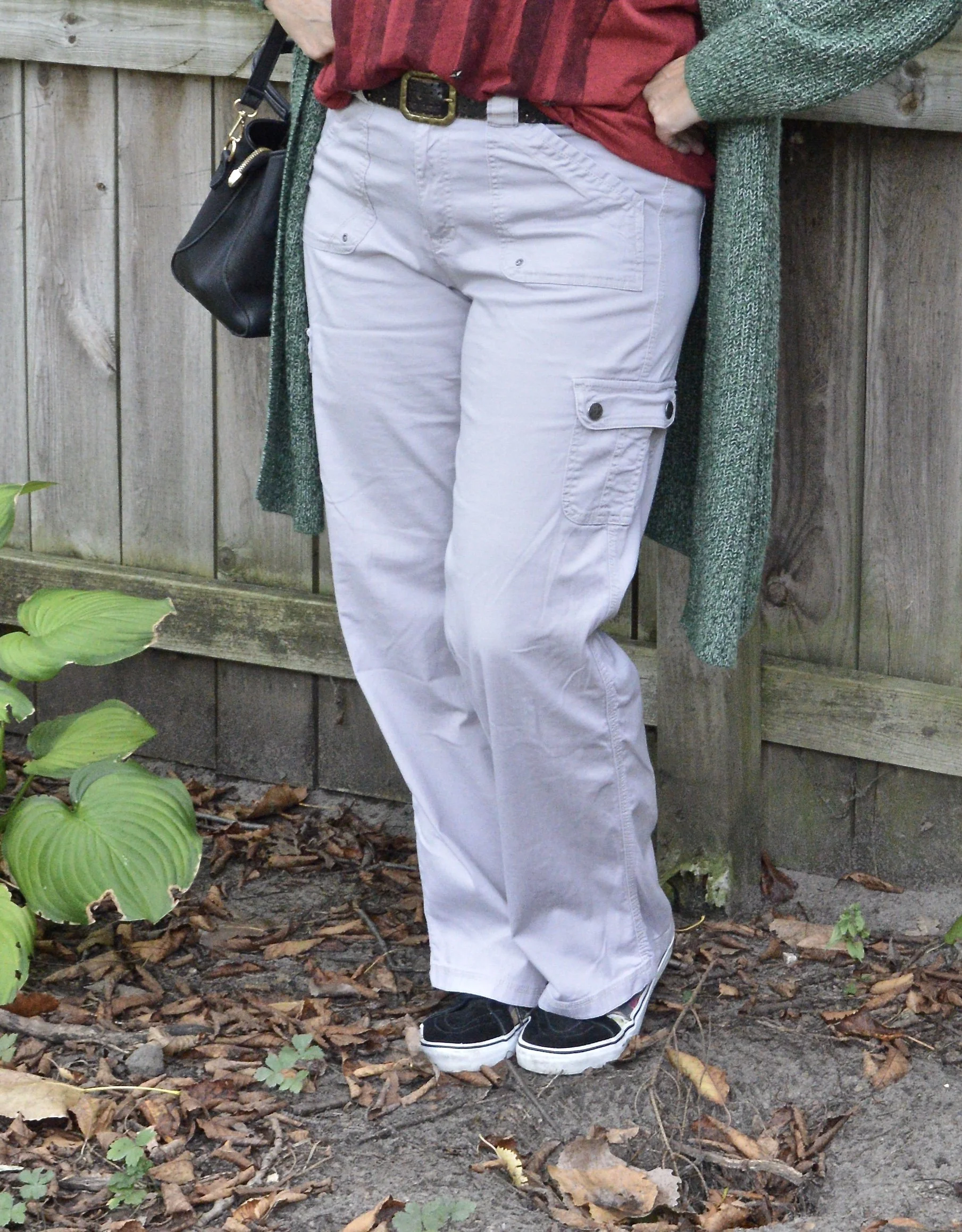
While these olive pants are not as yellowy as the Pantone Leek Green, it still gives you the idea of olive drab, which you know comes in a variety of shades from green gray to green brown and green yellow. I’ve had these Gloria Vanderbilt utility skinnies for a number of years and have styled them multiple times on the blog. You can see them with an olive utility vest, a light weight sweater, a floral bomber jacket, and a snakeskin print jacket.

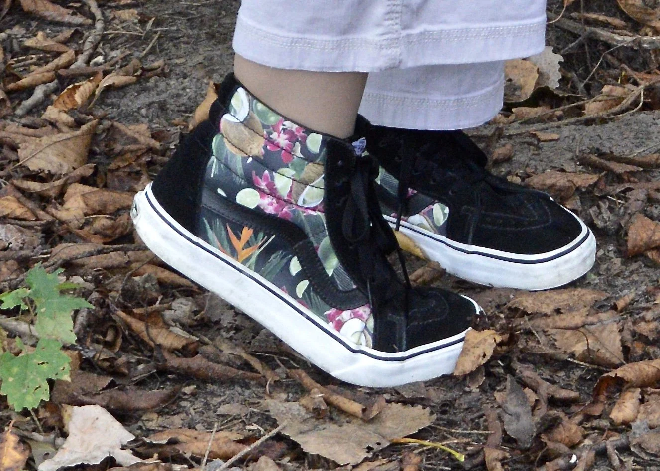
The addition of my Steve Madden white sneakers keeps the outfit feeling springy and fun.

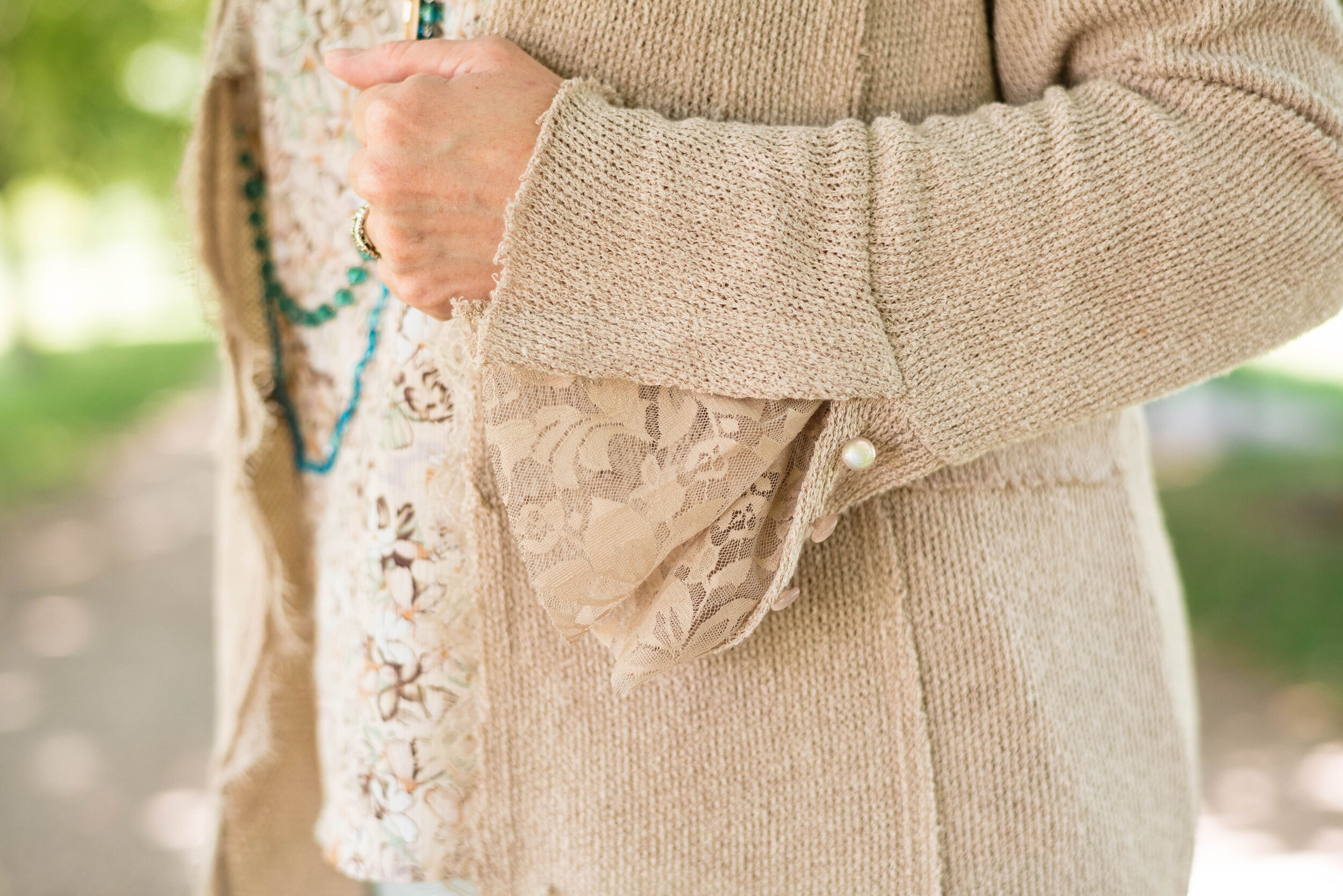
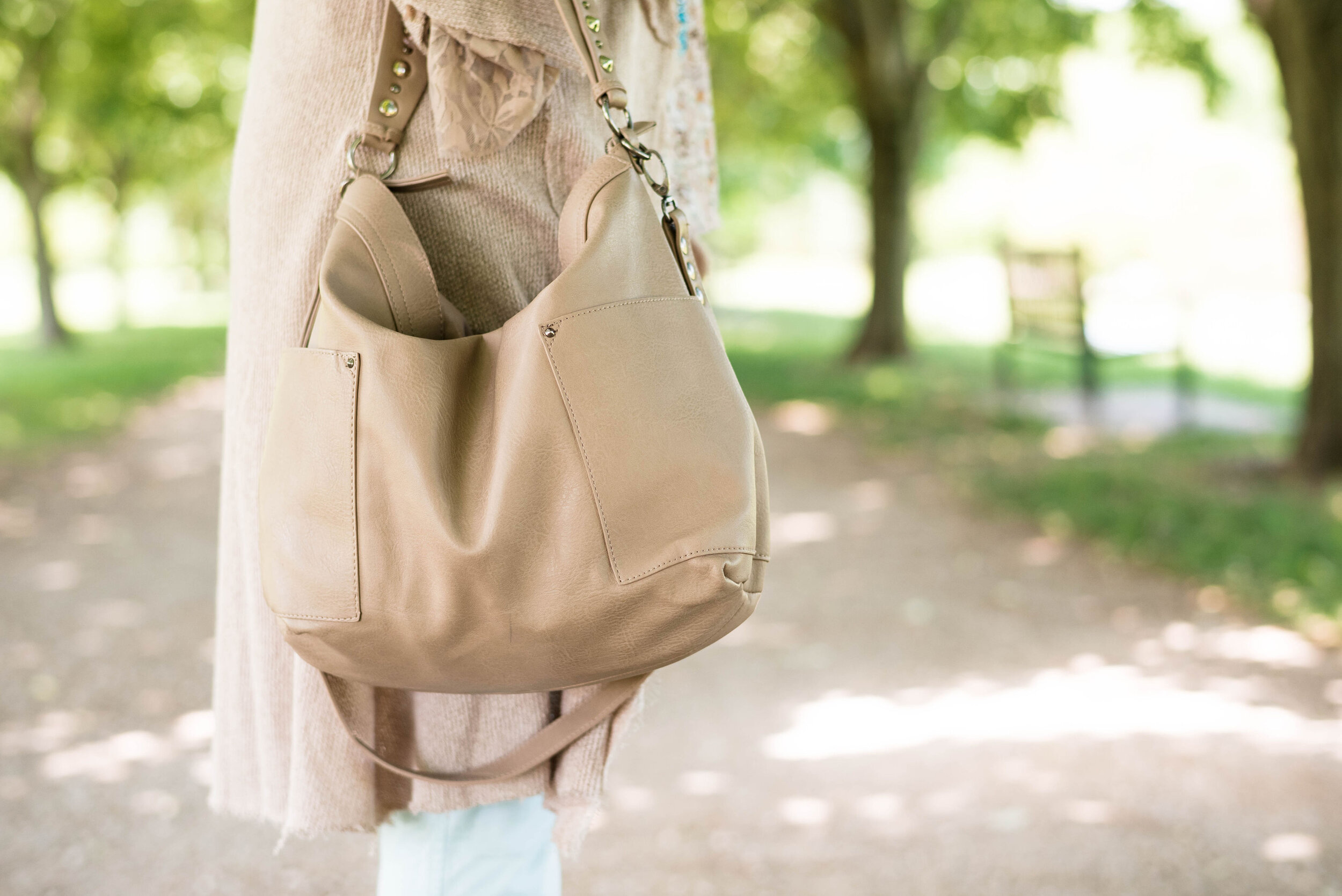
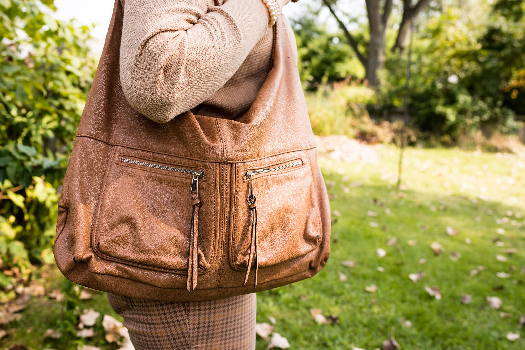
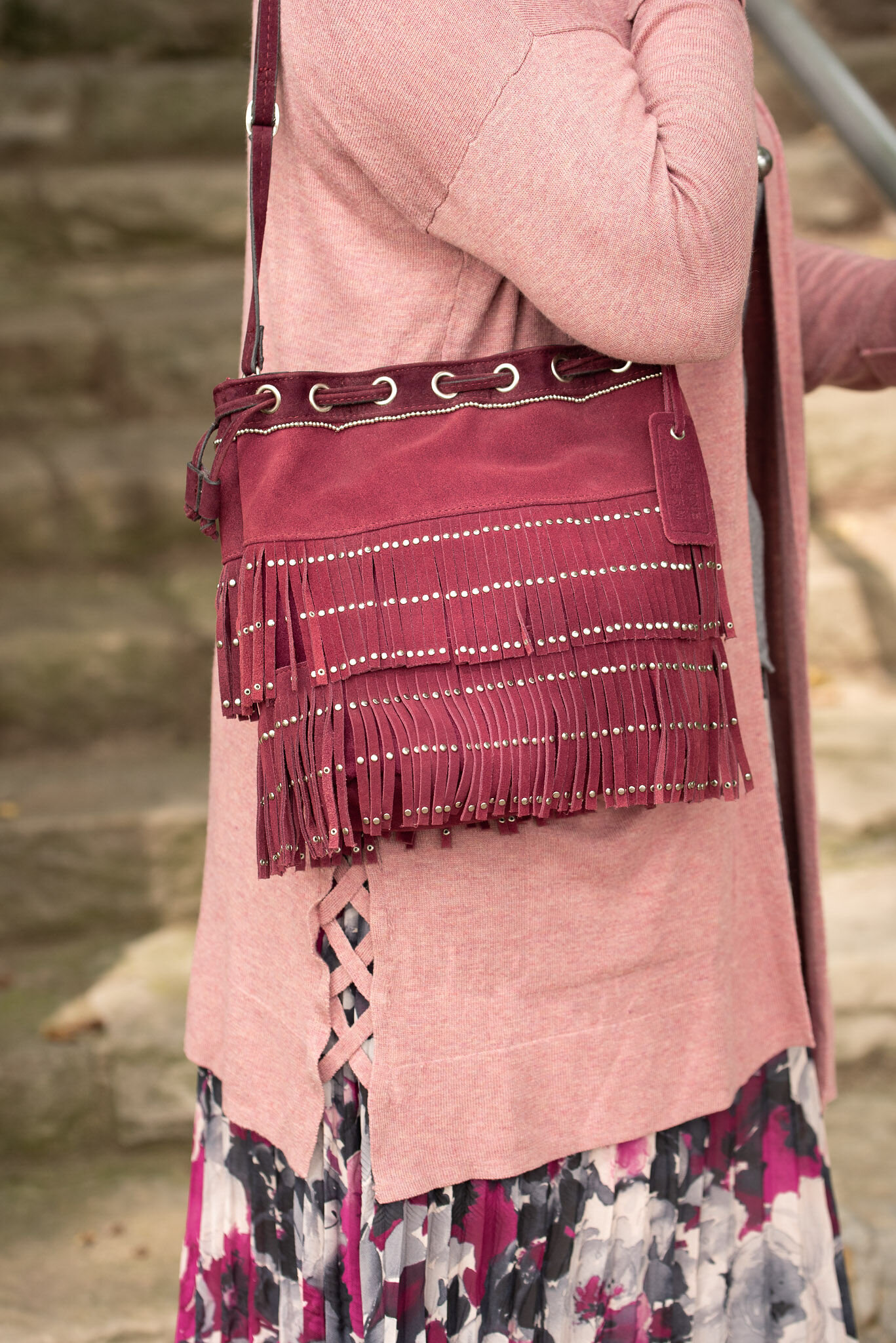
This brown and white bag was a thrifting treasure. It is Rafe NY brand. I really like the style and roominess of the this bag. The fringe tassel and woven buckle strap on the front pocket add such fun details. The bag is a bit heavy, so I won’t be using it for any long shopping trips, but it will make a great travel bag with room for a book and a few snacks. Ha, ha. I felt it went very well with the whole vibe of this outfit. What do you think?

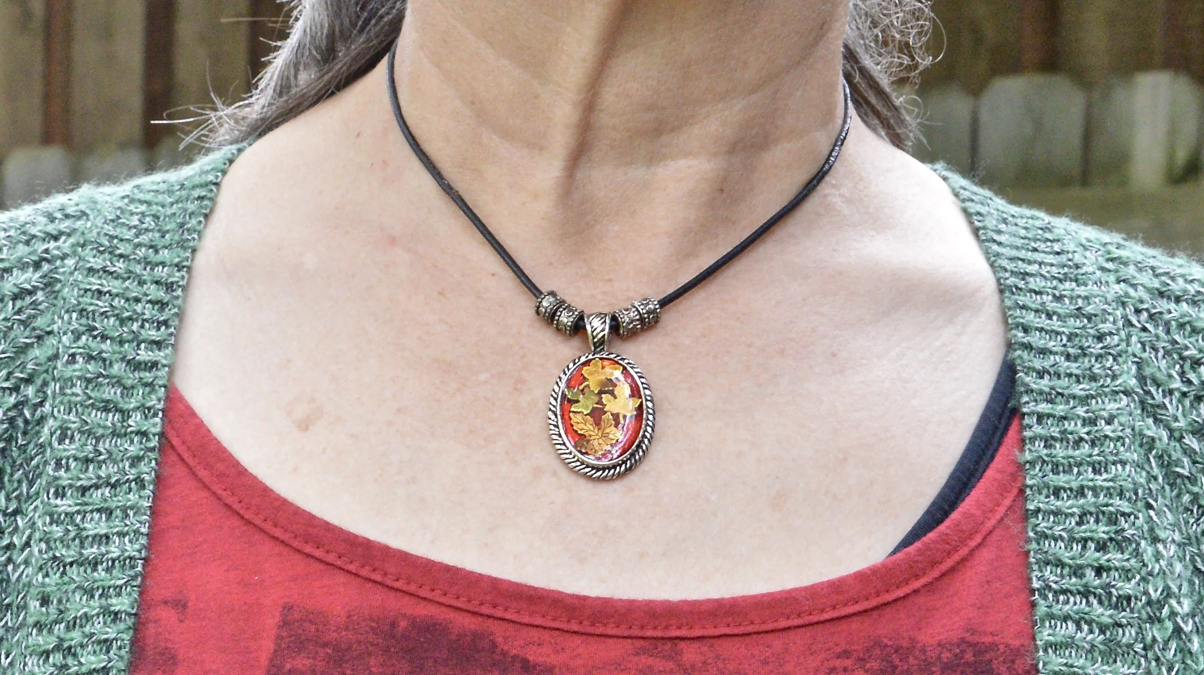
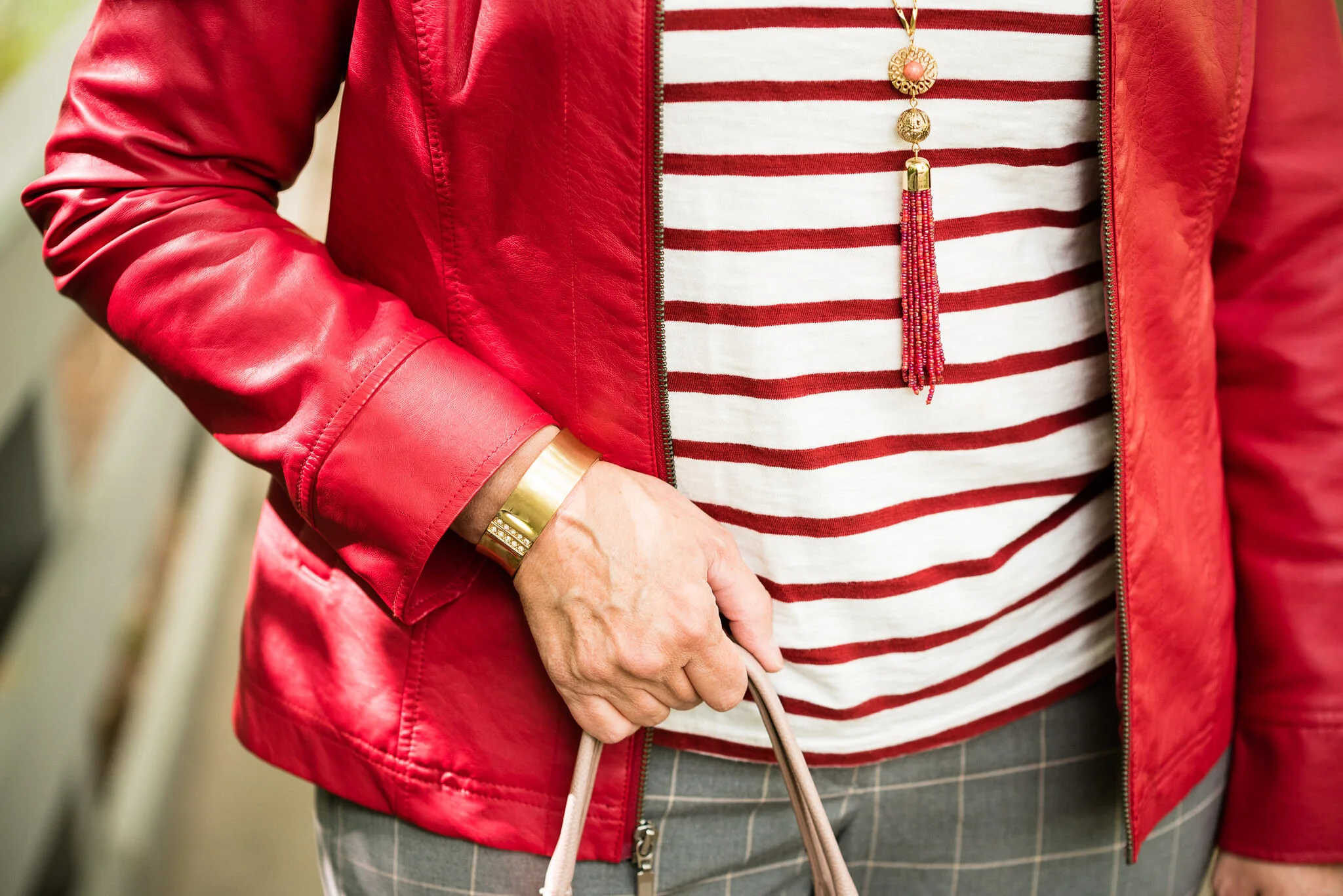
I didn’t get a good close up of my necklace, but it is a simple short pendant and the colors mimic the other colors in the outfit.

Style Tip: Go monochrome without going monochrome. All of these colors are in the green category, but they are all different. Even still, the outfit does have a distinct monochrome feel. This is also a great way to put an outfit together. Pick a color category, then choose various shades from that category to make up your whole outfit. Use your accessories as a way to add a few pops of different color.

What do you think of this outfit? Does this mimic your style? What is your casual go to style? I would love to hear your thoughts in the comments. Leave me some love.

I’m including a few shopping links. These are affiliate links and are brought to you at no extra cost. If you purchase something through a link I get a little bit of a commission. I also now have a Buy Me a Coffee link, so if you are so inclined you can support this little blog by doing that. Thank you so much.

Buy Me a Coffee

I wasn’t able to find anything in the Love Bird color, so you may have to track that one down yourself by Googling it or by looking for it at thrift stores.

Have a great week.

Pantone Autumn/Winter 2022: Lava Falls, Amazon and Arctic Wolf

Here we are, once again, looking at another color palette from the Pantone Color Institute. For the next few weeks I will be concentrating on the New York colors. In the past I have tried to give you both palettes, but with changes in life, so too come changes with the blog. For now, I want to bring you the New York palette which was where the institute was founded in 1962. From the Pantone website it looks as though the London palette was added in 2017.

For this look, I wanted to combine the bright red of Lava Falls with the energetic green of Amazon and see if I could come up with an outfit that didn’t look like I was getting ready for a Christmas get together. Let me know in the comments if you think I pulled it off.

My Lava Falls flag tee was a thrift store find this summer. Unfortunately, I didn’t have it washed to wear for Independence Day celebrations. When I was pulling clothes for this series, I saw the tee and thought, why not. Our gratitude for our country and our freedom shouldn't be restricted to one or two days a year, just like Thanksgiving shouldn’t be the only time we dwell on what we have to be thankful for.

This Amazon green sweater was new from Christopher and Banks a few years ago. I love a longer cardigan like this for fall, and an open front cardigan has no buttons or zippers for things like coats or bags to get caught on. Most of the time, I leave my cardigans open anyway to show off the top underneath, so an open front piece is a great choice.

Arctic Wolf is a creamy off white and these thrifted Gloria Vanderbilt pants probably tend towards a little more gray where as the actual Pantone color has more yellow undertones. However, you get the idea and when it comes to the color cream, off white, ivory or whatever title you want to give it, they are all in the white family.

For accessories I went with black to go with the black stripes on the flag. My black bag was an Amazon purchase a few years ago and is Aidebam brand. My sneakers are new to me, a thrifted pair of Vans high tops with a fun floral design.

For jewelry I added a simple choker pendant. I found this at a thrift store and love the pressed flower look of the pendant.

What do you think of these colors? Would you wear them together, or do you think red and green are strictly for Christmas? I’d love to hear your thoughts.

I’m including a few shopping links for items in similar colors. These are affiliate links, which means when you click on a link, I get a few cents. If you purchase something through my site, I get a little bit more. I appreciate each and every click.

I just tested positive for Covid yesterday, after my hubby tested positive on Friday. Our two friends who came for the weekend have also tested positive. I feel so bad, but here we are. I would appreciate good thoughts and prayers, as with my asthmatic condition it puts me in a higher risk category. Thank you everyone!

Have a good week and stay healthy.

Pantone - Spring/Summer - 2021 - London Palette - Beach Glass, Blue Atoll and Macchiato

We’ve reached the end of the Pantone - London Palette series with these last three colors which make me think of tropical seas and sandy beaches. Like Tuesday’s post, where I combined two different greens from the palette, today’s post combines two summery blues for a light, airy, warm weather look.

beachglass.jpg

I started figuring this outfit out with my light blue, thrifted Sonoma crop pants. Though they are a bit lighter than the Beach Glass color, I think they still work. I pull these out every spring and summer as a light weight alternative to denim.

beachglasspantoneoutfitideas-1.jpg

My multi-print top is another thrift store find. I just loved the soft colors and print on this popover blouse. It has no tag in it, so I have no idea what the brand was. The print has the light Beach Glass blue, as well as the darker Macchiato.. You’ll see a close up in the next photo.

For the darker Blue Atoll color I decided to add a few pieces of jewelry. I had some long, opera length beads and decided to do some layering with the necklaces. I also added a beaded bracelet, that appears to better match the Beach Glass color.

beachglasspantoneoutfitideas-7.jpg

For the Macchiato color, I played around with several pieces, but everything seemed too yellow. This longer sweater was a recent purchase from Cracker Barrel. While they are a restaurant, they also have what they call an Old Country Store. The store is filled with all sorts of items from old fashioned candy, beautiful home decor, quilts, jewelry, cards, music and clothing. If you click on the link, it will take you to the sweater and it is on sale. Whoo, hoo. If you like it snatch it up. Here are a few photos to show you the details of this pretty piece and the movement. It is a light weight material, so it will be great for spring, summer and fall.

beachglasspantoneoutfitideas-13.jpg
beachglasspantoneoutfitideas-14.jpg
beachglasspantoneoutfitideas-15.jpg
beachglasspantoneoutfitideas-16.jpg
beachglasspantoneoutfitideas-17.jpg
beachglasspantoneoutfitideas-18.jpg

My bag is Madden brand; a clearance find from Kohl’s. My perforated peep toe shoes are Sonoma brand and another Kohl’s purchase from a few years ago.

beachglasspantoneoutfitideas-9.jpg
beachglasspantoneoutfitideas-11.jpg
beachglasspantoneoutfitideas-12.jpg

What do you think of these three colors? I really like how this outfit turned out and think the color combination is great for summer. Do you have these colors in your closet?

beachglasspantoneoutfitideas-6.jpg

I’m including a few other shopping links for you to look over. The Cracker Barrel sweater link is not part of the affiliate program, but I wanted to offer it to you, in case you really like the sweater. The rest of the shopping links are through the affiliate program. Every time you click on a link I get a few pennies, and I appreciate every click.

Have a great weekend!

Graphic and photo credit Rebecca Trumbull.

Pantone - Spring/Summer - 2021 - London Palette: Illuminating, Marigold and Ultimate Gray

Illuminating and Ultimate Gray are the two colors of the year, so just like I did for the New York Palette, I decided to pair the two colors together and for this one I added Marigold, which was also on the New York palette.

illuminating.jpg

We decided to go to the Toledo Botanical Gardens again for these pictures and we did come across some beautiful blooms. This particular bush is a rhododendron. I just did some research and found out that all azaleas are rhododendrons, but not all rhododendrons are azaleas. Whether you like azaleas or rhododendrons they are all beautiful.

Once again, I chose my recently thrifted bright yellow jacket to serve as the Illuminating color. The jacket is D&Co. (Denim and Co.). It has a nice stretch to it and I like the 3/4 length sleeves for a change of pace.

londonpantonecoloroutfitideailluminating-8.jpg

I’ve styled my medium yellow tee on the blog before. You can see it styled with a leopard print skirt. Having tees in a variety of colors comes in handy when you want to put an outfit together. This thrifted tee is Apt. 9 brand.

My Gloria Vanderbilt jeans were another Kohl’s clearance find. They are soft and stretchy, so great for my fluctuating weight. I say fluctuating, but it really doesn’t go up and down. It either stays the same or goes up. Ha, ha.

londonpantonecoloroutfitideailluminating-11.jpg

I wanted my accessories to make a statement since the outfit itself was not overwhelmingly interesting. I found this pretty layered necklace in gray tones somewhere along the way. I think it was a thrift shop nearby. I added a few beaded bracelets to tie the jewelry together.

When I decided on the thrifted tan loafers, I knew my Nine West snakeskin print circle bag would be the perfect piece to complete the whole look and bring everything together.

londonpantonecoloroutfitideailluminating-13.jpg
londonpantonecoloroutfitideailluminating-15.jpg
londonpantonecoloroutfitideailluminating-16.jpg

What do you think of these colors together? Do you like the lighter yellow of Illuminating or the richer tone of Marigold? I’d love to hear your thoughts in the comments below. I appreciate when you give me your feedback. It can be kind of lonely as a blogger, when I don’t know if anyone is reading my content or looking at my posts, so I really love to hear from you.

londonpantonecoloroutfitideailluminating-10.jpg

I am including a few shopping link for you to enjoy. These are affiliate links and are brought to you at no cost. If you click on a link I get a few pennies and I appreciate all of your clicks. I do not get paid to write my blog, I do it as a hobby and as a service to whomever wants to follow along. I hope that I inspire you to take a second look at your wardrobe and see new ways to put things together, that you never thought of before.

Photo and graphic credit Rebecca Trumbull.

Pantone - Autumn/Winter - 2020 - All the Outfits

I wanted to end this fall color series by showing you all of the colors from both the Pantone New York Palette and the Pantone London Palette. To make it a little more interesting I thought I would show outfits that have, either a same color or a similar color side by side.

I hope that you enjoyed this series. If there are any other topics in fashion that you are interested in learning more about, or in seeing me talk about or put together in an outfit, I would love for you to let me know. I don’t follow trends too closely and this fall, I totally missed the boat on that, so I do apologize. I know some of you enjoy hearing what the trends are for each season and seeing how I apply those to the “real” world. Often when we look at websites or see magazines with tall, thin models or celebrities who are seamlessly coifed we think there is no way we would want to try this or that, especially when it comes to runway trends. However, there are a lot of trends that we can participate in and enjoy like leopard print, various colors and different types of accessories.

I will keep doing this Pantone series as long as I am blogging, because I feel strongly that even though we might differ from each other in our style, color is something we all have in common. Approaching new, bold and different colors without fear is a way to expand your wardrobe and spice up your style without completely committing to a whole different way of doing things.

The Color Palettes Side by Side.

Samba

I love the color red and I think there is a red for every complexion. I think both of these outfits worked quite well and love that both of them present a more neutral palette with a bright pop of red. In the New York outfit on the left Samba is paired with Fired Brick and Sleet. In the London outfit on the right Samba is paired with Tawny Birch and Sheepskin.

Ultramarine Green

Ultramarine was on both palettes and I think it is a pretty green that can bring a peaceful, yet vibrant feel to any outfit. This color green would look great in a bag, jewelry or a scarf and to me it really seems to draw your eyes to it. Maybe it is just my love for the greens in nature that make me like this color so much. In the New York outfit on the left Ultramarine Green is paired with Classic Blue and Blue Depths. In the London palette on the right Ultramarine Green is paired with Exuberance and Sleet.

Military Olive

While I love bright and bold colors like the two I mentioned previously, I love using olive as a neutral. It goes with every color, and has a different vibe than gray or beige. It is classy, yet subtle. In the New York outfit on the left, Military Olive is paired with Peach Nougat and Sandstone. In the London outfit on the right Military Olive is paired with Strong Blue and Jet Stream.

Green Sheen/Celery

It is hard to tell in these pictures, but Green Sheen and Celery are pretty similar. I think, because the lighting is different the colors look brighter in the shaded picture. They are different colors, but not enough different that they couldn’t be exchanged from one outfit to another. In the New York outfit on the left, Green Sheen is paired with Amber Glow and Almond Oil. In the London outfit on the right, Celery is paired with Mandarin and Sheepskin.

The Other Colors

These last two are paired only because they were the last two and don’t really have anything in common. The New York outfit on the left is a combination of Rose Tan, Magenta Purple and Sleet. The London outfit on the right is a combination of Burnt Henna, True Blue and Dress Blues.

Which outfit do you like most? Which color from the two palettes is one you frequently wear? What new color(s) are going to try to add to your wardrobe. As always, I love to hear your thoughts.

I apologize to those of you who subscribe to my blog. The last three weeks, I have completely forgotten to send out my weekly emails. I’ll just attribute that to “squishy brain syndrome.” Ha, ha.

Thanks for following along on the blog. I hope to use the next couple of weeks leading up to Thanksgiving showing you more fall outfits and maybe a few ideas for what to wear to Thanksgiving dinner whether you are going some place or sheltering in place.

If you follow my Faith page be sure to check back tomorrow for the next installment in my series on the Unseen Enemy.

Have a great weekend!

Graphic and photo credit Rebecca Trumbull.

Pantone - Autumn/Winter - 2020 - London Palette - Burnt Henna, True Blue and Dress Blues

This is the last color combo in the Pantone - Autumn/Winter - 2020 - London Palette series. On Thursday I will have a recap post of all of the outfits from both palettes. Today’s outfit revolves around a cranberry red, a blue that is much like Classic Blue and navy.

sdf.jpg

Both of the Pantone palettes for fall were filled with blues and reds, but they also had plenty of other options, so if you are not a blue or red wearer, you still have other fabulous colors to wear. My Christopher and Banks ankle pants are not exactly Burnt Henna, but they will due. I got these and a pair of green ones when they were on clearance. They are stretchy, which allows for ease of movement. The only thing I don’t like about them is they have no belt loops. If a pair of pants fits perfectly you don’t really need a belt, but a belt always makes me feel more secure. Otherwise, I always feel like I am pulling my pants up. These are a size 12, which is usually my normal for Christopher and Banks.

Pantone - Autumn/Winter - 2020 - Burnt Henna, Strong Blue and Dress Blues

True Blue is very much like Classic Blue. It is not a dark navy, like the Dress Blues, but a nice medium blue that almost everyone can wear. I wanted to wear layers, so I added a Christopher and Banks cardi and the scarf.

My Dress Blues jacket is a thrifted Ruff Hewn piece. It is a moto jacket, but instead of being strictly leather, or faux leather, it is made of a linen/cotton blend and faux leather for the leather like portions.

Pantone - Autumn/Winter - 2020 - Burnt Henna, True blue and Dress Blues

My plaid button down shirt is also a Christopher and Banks purchase from this year. It is a little bit textured which gives it an added dimension, even though in these pictures you can’t see it very well.

Once again, with all the layers and textures, I kept my accessories very simple. I have a navy flower pendant necklace, but unlike many pendant necklaces, mine is shorter.

Pantone - Autumn/Winter -2020 - Burnt Henna, True Blue and Dress Blues

You’ve see this Simply Vera Vera Wang bag on the blog before. This was a thrifted piece and provides a nice, roomy area which is especially good for traveling to pack a few extras like a notebook or reading book. I also added a few beaded bracelets with blues.

Pantone - Autumn/Winter -2020 - Burnt Henna, True Blue and Dress Blues

Finally, these are my newer ankle boots. Once again, these are SO brand, which are my go to faves for ankle boots from Kohl’s. They fit (size up a half size if you want to be able to wear extra thick socks in the colder temps), are easy to get on an off and seem to hold up quite well in our ever changing weather here in the mid west. These are the first pair I’ve gotten that actually have the zipper on the outside of the foot rather than the inside, which is a nice contrast.

Pantone - Autumn/Winter - 2020 - Burnt Henna, True Blue and Dress Blues

What do you think of this outfit? Do you like these colors? Would you put these colors together, or would you find some other color to pair each of these with? I love hearing your thoughts, so be sure to leave me some love in the comments.

Pantone - Autumn/Winter - 2020 - Burnt Henna, True blue and Dress Blues

I am including a few shopping links. You can use these links to shop for yourself or for future Christmas presents for others. There is no extra cost to you to shop through my links. In fact, what it does is generates a tiny bit of income for me. Every click you do, gives me a few pennies. These are affiliate links. All opinions are my own.

Photo and graphic credit Rebecca Trumbull.


Pantone - Autumn/Winter - 2020 - London Palette - Strong Blue, Military Olive and Jet Stream

Happy Thursday friends! Are you all as tired as I am. When morning comes I feel like I could just stay in bed for days. I am sure some of it has to do with our current Covid life. It really is extremely disheartening to see the numbers keep rising and know that there is really nothing different we can do, other than keep on keepin’ on. I implore, those of you who don’t wear masks, to at least consider it for the sake of others. These are very hard times. Do what you can to keep yourself busy and involved in life as much as you can. I have been spending a lot of time alone, when I am not with my family and I don’t think it is good for me. As an introvert, I enjoy my alone time, but I seriously feel like my brain is turning into slush. Anyone else feeling the “squishy brain syndrome”? I have also noticed a lax in my creativity. Going places and doing different things has always fed my creative brain, but being stuck at home, well, it isn’t very interesting. Ha, ha. What do you other creatives do to keep the creative vibes flowing? I’d love to have some feedback.

Today’s outfit centers around another medium blue, olive and white. Strong Blue could be a close cousin of Classic Blue. I was fortunate to have just found this graphic tee while thrifting. I think it matched the color perfectly and I really like the message. I can do the get up part, and being kind isn’t too hard, but being awesome is a bit of a stretch. Ha, ha.

Pantone - Autumn/Winter - 2020 - Strong Blue, Military Olive and Jet Stream

This tee is a brand called Gildan. Once again, I have been exposed to a brand I had never heard of before, by thrifting. This is a basics retailer, selling tees, underwear, sweatpants and hoodies for men, women and children.

Pantone - Autumn/Winter - 2020 - London Palette - Strong Blue, Military Olive and Jet Stream

When we looked at the New York palette, Military Olive was a classic color. If you remember I wore it with Peach Nougat and Sandstone for that palette. You can click here to see the outfit again. For this look I just wanted to do something different from a solid colored sweater or jacket, and then I remembered I had this thrifted plaid piece. This is Jones NY brand and is part wool, so I can’t wear it without something long sleeved underneath. I made an exception with this outfit, because I knew I wouldn’t have it on very long. Wool makes me itch. I doesn’t matter if it is rich Merino wool or cashmere, my skin can tell the moment I put it on.

Pantone - Autumn/Winter - 2020 - London Palette - Strong Blue, Military Olive and Jet Stream

My Gloria Vanderbilt jeans have been on the blog numerous times before. They are a heavier weight, so perfect for the cooler temps of fall, winter and spring. They are really a little too white compared to the Jet Stream color which almost has a hint of tan or gray to it.

My military belt, SO ankle boots and beaded bracelets all have the Military Olive vibe.

Pantone - Autumn/Winter - 2020 - London Palette - Strong Blue, Military Olive and Jet Stream
Pantone - Autumn/Winter - 2020 - London Palette - Strong Blue, Military Olive and Jet stream
Pantone - Autumn/Winter - 2020 - Strong Blue, Military Olive and Jet Stream

I also added a heart necklace that has a sort of greenish colored stone. I think this used to belong to one of my daughters, who did not want it any more, so I snatched it. Ha, ha.

Pantone - Autumn/Winter - 2020 - London Palette - Strong Blue, Military Olive and Jet Stream

While my bag is not really Military Olive it does have an olive leaning and the blue flowers go well with the blue of the tee.

Pantone - Autumn/Winter - 2020 - London Palette - Strong Blue, Military Olive and Jet Stream

What do you think of this color combination? I like olive and blue together and I feel that olive goes with so many different blues, and really with so many different colors. It really can be used as a neutral in many situations.

Pantone - Autumn/Winter - 2020 - London Palette - Strong Blue, Military Olive and Jet Stream

I hope you are enjoying the colors on the London Palette. It is fun to experiment with color, especially when you discover, that color you thought you couldn’t wear, looks fabulous on you. Have a great rest of your week. I am including some shopping links for you to look over. These are affiliate links and are brought to you at no cost to you. If you click on a link, I get a few pennies. I offer these as a way for you to shop similar items in my posts. Since most of my items are from my closet or thrifted, I try to find items as close to mine as possible. All opinions are my own.

Keep in mind, the holidays are quickly approaching, so these shopping links may also offer you a way to shop for others you need to buy for. Enjoy.

Graphic and photo credit Rebecca Trumbull.


Pantone - Autumn/Winter - 2020 - London Palette - Exuberance, Ultramarine Green and Sleet

We are looking at the Pantone - Autumn/Winter - London Palette and just like last Thursday’s post saw a repeat of Samba from the New York palette, today’s outfit offers a repeat of Ultramarine Green. You can see the original outfit from the New York palette here, where I paired it with Classic Blue. Today I am pairing this pretty green with a fall orange called Exuberance. Unlike New York’s Amber Glow, Exuberance is a smidge brighter and more bold.

Pantone - Autumn/Winter - 2020 - London Palette - Exuberance, Ultramarine Green and Sleet

You have seen these bright orange Gloria Vanderbilt pants repeatedly on the blog. I never would have thought they would have been part of so many outfits for the blog, when I bought them. When I was working as an assistant manager at the bookstore, I used to wear them as they are a nice trouser for work.

Pantone - Autumn/ Winter - 2020 - London Palette - Exuberance, Ultramarine Green and Sleet
Pantone - Autumn/Winter - 2020 - London Palette - Exuberance, Ultramarine Green and Sleet

My Ultramarine Green button up is a thrifted Westbound piece. I have had this top for quite a while and don’t wear it that much, but every time I do, I think, I should wear it more often. It has such a pretty mottled green color and I love the embroidered texturing throughout. It just makes it a unique piece.

I also thought this cute little foxy infinity scarf worked perfectly to bring the whole outfit together. In the picture below you can see this statement necklace I got a while back from a shop in Grand Rapids, OH. They have the cutest shops and restaurants. Unfortunately, I haven’t been there since Covid came upon us.

Pantone - Autumn/Winter - 2020 - London Palette - Exuberance, Ultramarine Green, and Sleet

Since there is just a touch of yellow in my necklace I grabbed this bright yellow, thrifted Bueno bag. I love the bright color and the buckles.

Pantone - Autumn/Winter - 2020 - London Palette - Exuberance, Ultramarine Green, Sleet

These gray boots were another thrift store find and are Guess brand. I was very excited when I found them, because I was looking for a knee high gray pair.

Pantone - Autumn/Winter - 2020 - London Palette - Exuberance, Ultramarine, Sleet

I also added a few bracelets in the Ultramarine color.

Pantone - Autumn/Winter - 2020 - London Palette - Exuberance, Ultramarine and Sleet

My Sleet colored jacket was a J.Jill find at a thrift store. It is a tad tight if I try to button it, but I hate to get rid of it, since it is such a beautiful piece. I has a fabulous paisley print lining in pinks and purples.

Pantone - Autumn/Winter - 2020 - London Palette - Exuberance, Ultramarine Green and Sleet

What do you think of this outfit? Do you like these colors? I love to get feedback from you beautiful ladies, so leave a comment or two below. I appreciate all of your input.

I am including a few shopping links. All opinions are my own. These are affiliate links.

Graphic and photo credit Rebecca Trumbull.


Pantone - Autumn/Winter - 2020 - London Palette - Samba, Tawny Birch, and Sheepskin

Today’s neutral palette is interrupted by the bold, daring color red. Samba was in our New York palette and if you don’t remember which outfit that was you can see it again here. In the New York outfit I paired Samba with Fired Brick and Sleet for a chic work outfit with a bit of subtle print mixing. Today’s outfit, once again, would be perfect for the office or a date night with your significant other. In this time of Covid restrictions do you get dressed up to go out, or do you go out at all? Thus far my hubby and I usually get take out and either bring it home or take it to a park and eat it, so I’m afraid I haven’t been getting very dressed up, usually just jeans and a nicer shirt. It really depends on the day. I am not sure what we are going to do when the weather gets real cold.

Pantone - Autumn/Winter - 2020 - London Palette - Samba, Tawny Birch and Sheepskin

When I was looking for pieces for this whole fall Pantone series, I knew I wanted to incorporate this thrifted, red, Calvin Klein, sleeveless sweater. I originally bought the piece thinking I could use it as a sweater vest, which, seeing as it is a larger size will offer enough room to put a blouse or long sleeve tee underneath. It will probably show up again either on the blog or in my Instagram feed. If you don’t follow me on Instagram make sure you do. I show you more of my day to day outfits there and occasional cute pictures of our cat and pretty scenery.

Pantone - Autumn/Winter - 2020 - London Palette - Samba,Tawny Birch and Sheepskin

My Sheepskin colored cardigan was another thrifted piece. I thought it was a good balance between tan and beige and will be wearable with just about any color. This is a thrifted St. John’s Bay piece.

Pantone - Autumn/Winter - 2020 - London Palette - Samba, Tawny Birch and Sheepskin

My Tawny Birch houndstooth patterned ankle pants have been on the blog before. These are Sonoma and were thrifted. You can see them styled in the Pantone Fall 2017 series, and in another series I did on vests.

Since I really wanted the red sweater to be the focal point of the outfit, I kept my bag and shoes a similar neutral tan color to the sweater and pants. Both thrifted, the bag is New Directions and the boots are Aerosoles. Then I added pearls. I thought this made for a great work look.

Pantone - Autumn/Winter 2020 - London Palette - Samba, Tawny Birch, and Sheepskin
Pantone - Autumn/Winter - 2020 - London palette - Samba, Tawny Birch, and Sheepskin
Pantone - Autumn/Winter - 2020 - London Palette - Samba, Tawny Birch, sheepskin

What do you think of these colors? Do you think the more neutral Tawny Birch goes well with the brighter Samba red? I’d love to hear your thoughts.

Pantone - Autumn/Winter - 2020 - London Palette - Samba, Tawny Birch, and Sheepskin

I hope you enjoyed this look and that you are doing well. For those of you who follow my faith page, I hope to have the next installment of my series on Our Unseen Enemy up tomorrow. Have a great evening.

I’m including a few shopping links. These are affiliate links. All opinions are my own.

Graphic and photo credit Rebecca Trumbull.


Pantone - Autumn/Winter - 2020 - New York Palette - Recap

I was going to jump right into the London Palette, but there have been some unforeseen problems, so I am going to put that off for a little bit. I usually do a recap post to show you all the the outfits at the same time, so that is what I am doing today.

Here is the whole New York Palette, along with the classic colors as well. Some people take the classic colors and build their outfits around them and simply add pops of the other colors for a more subdued approach to the palette. I think I need to try that some time. What keeps me from doing that more often is that I don’t have very many classic colored pieces. What I mean is, I don’t have a whole suit with pants or skirt and a jacket in any of the classic colors. In fact, I don’t have very many dress clothes that aren’t made up of colors and prints. Maybe in the spring I will try to focus more on using the classics as a way to build an outfit and add in the regular palette colors as accessories. We’ll see.

I thought I would give you a few of my thoughts about each outfit and why I think it worked or didn’t after each picture.

Pantone - Autumn/ Winter - 2020 - New York Palette

Peach Nougat, Sandstone and Military Olive

Pantone - Autumn/Winter - 2020 - Peach Nougat, Sandstone and Military Olive.

I like this outfit. I am not a big fan of these colors, but I really think the three colors worked well together and I think people found this, a neutral palette they could relate too. Almost everyone has something olive in their closet, so the fact that this was a classic color was a win, in my opinion. Not everyone can wear dark blue, oxford gray or tan, but I think everyone can wear Military Olive.

Samba, Fired Brick and Sleet

Pantone - Autumn/Winter - 2020 - Samba, Fired Brick and Sleet

I think this outfit might be my favorite out of this New York Palette. I like the mix of a more true red with the brick red, even thought my outfit in the photos didn’t do it justice. Putting the colors aside, however, I just like how this outfit looks polished and professional, but has a fun blend of bold and pastel colors along with the subtle print mix.

Amber Glow, Green Sheen and Almond Oil

Pantone - Autumn/Winter - 2020 - Amber Glow, Green Sheen and Almond Oil

This outfit was a surprise. Both my daughter and I thought these two colors just seemed to grate against each other, and well they might have, if I had worn a solid skirt with the solid top, but the printed skirt makes all the difference in the world. I also think the jacket and boots softened the whole look.


Classic Blue, Ultramarine Green and Blue Depths

Pantone - Autumn/Winter 2020 - Classic Blue, Ultramarine Green and Blue Depths

We don’t often think of combining green and blue, or blue with blue, for that matter, but I think this worked. The blue shades are quite different, but worked well next to each other and the green really pops against the blues. I think the addition of the snakeskin patterned round bag completed the look perfectly.

Magenta Purple, Rose Tan and Sleet

Pantone - Autumn/Winter - 2020 - Magenta Purple, Rose Tan and sleet

I really love both of these colors, but I was not thrilled with this outfit. Don’t get me wrong, I love a comfy, boho outfit, but I don’t know if throwing the long pink sweater in with the floral maxi and the gray tee made for a great outfit. I could see this with a long gray sweater, a similar shade to the tee and then a necklace or a scarf in a similar shade to the Magenta Purple. I don’t think it is the worst outfit I have ever done, but not my fave.

I would love to hear which outfit you liked the best from this series and which colors you like best from the New York Palette. Let me know by leaving a comment below, or a comment on Facebook. Thanks for following along. Be sure to check back on Thursday and hopefully I’ll have the first post for the London Palette colors. Also, if you follow my faith page, I am trying to post on Wednesdays, but due to schedule constraints, I am often having to post on Friday’s, so just check back if you don’t see it on Wednesday.

Have a great Tuesday everyone!

Photo and graphic credit Rebecca Trumbull.


Pantone - Fall/Winter 2020 - New York Palette - Magenta Purple, Rose Tan and Sleet

This is the last installment in the Pantone Fall/Winter 2020 New York Palette series. This has been an interesting palette with both rich, bold colors like Classic Blue, Samba and Ultramarine Green and the softer more muted neutrals like Peach Nougat, Sandstone and Almond Oil. Today’s last two colors are a mix of both the bold and muted elements. While Tuesday’s post was full on bold with Classic Blue and Ultramarine paired sided by side, today’s outfit takes the bright Magenta Purple and pairs it with the more subtle Rose Tan. As always, I’ve included a classic color to bring in a more foundational element.

Pantone - Fall/Winter 2020 - New York Palette - Magenta Purple, Rose Tan and Sleet

This outfit, once again, has a rather bohemian vibe with the dark florals, fringe bag, and suede booties. I also feel that the more layered, relaxed look is often indicative of the boho style as well.

Pantone - Fall/winter - 2020 - Magenta Purple, Rose Tan and Sleet

My long, pleated, floral maxi skirt is Chaps brand from Kohl’s. You can see this skirt styled for an earlier Pantone series back in Spring of 2018. I styled it with a blush top and gray sweater. The beauty of this piece is that it can be worn in any season and it is fully lined. I really like when a skirt is lined and I don’t have to wear a slip with it. This is especially nice in the cooler weather.

Pantone - Autumn/Winter 2020 - New York Palette - Magenta Purple, Rose Tan and Sleet

My Sleet colored slouchy tee is SO brand and also from Kohl’s. Do you know I have not been in a Kohl's store in months? Of course I haven’t been in any store, other than grocery stores and a few choice thrift shops since COVID happened. I have ordered a few things online from Kohl’s, so I can’t say I haven’t shopped there. Ha, ha. This tee is very light weight and has been retired to the summer clothing box for now. I have styled this on the blog before too. You can see it with another pleated skirt here.

My long pink sweater is also SO brand from Kohl’s. I bought two of these sweaters, as I mentioned a few weeks ago when I styled the maroon colored one. You can see that post here. This one is an XL and the maroon one is a L. This one is definitely bigger, but it is nice for wearing over multiple layers.

This fringe, suede bucket bag has been around for a few years and makes regular appearances on the blog. I actually haven’t used it as my day to day purse, because the top does not close. I like a little more security when I am out in public, as far as my bag goes. But it is cute and a great color for fall, so I keep it around.

Pantone - Autumn/Winter - 2020 - New York Palette - Magenta Purple, Rose Tan and Sleet

I’ve styled these Easy Spirit ankle boots on the blog before too. I have numerous pairs of faux suede ankle boots. They are so easy to get on and off. They go with all manner of outfits and I can wear them with a variety of types and thicknesses of socks and hose. They are a nice alternative to dress shoes for work or an event where you want to look a little more put together, but still be casual.

Pantone - Autumn/Winter - 2020 - New York Palette - Magenta Purple, Rose Tan and Sleet

I went for a layered look with my necklaces. I started with the ribbon choker, but gradually added the layered pearl choker and then the silver sphere pendant necklace. I like the look and I think it added a finishing touch to the outfit as a whole and still kept the boho vibe.

Pantone - Autumn/Winter - 2020 - New York Palette - Magenta Purple, Rose Tan and Sleet

What do you think of this outfit? Do you think the long cardigan and the long maxi skirt work together? What might you have done differently? I’d love to hear your thoughts.

Here a silly picture to make you smile. This is me, wishing COVID was a thing of the past. Ha, ha.

Pantone - Autumn/winter - 2020 - New York Palette - Magenta Purple, Rose Tan and Sleet

I am including a few shopping links for you. I hope you will check these out. Every click on a link gives me a few cents. It takes a very long time for the clicks to add up, but they do eventually and I appreciate every single one.

Keep laughing. Keep dancing. Keep loving. Keep Safe.

Graphic and photo credit Rebecca Trumbull.


Pantone Fall/Winter 2020 - New York Palette - Amber Glow, Green Sheen and Almond Oil

The colors in today’s post are more pastel, but still encompass colors we think of when fall comes to mind. Oranges and yellows are obvious as we look at the trees around us. The Almond Oil color is an off white. When I was growing up, we never wore white after labor day. Our white shoes, bags, dresses, skirts and pants were all put away until the next year. I can still remember going out shoe shopping with my mom before Easter, because that was always when we would get out our white shoes to wear to church. Obviously, those days are gone, but many people still like the idea of wearing white in the summer and darker colors during the cooler, darker months of the year. Almond Oil might be a good alternative for those of you who would rather stay away from a pure white for the Fall/Winter seasons.

Pantone Fall/winter 2020 - Amber glow, Green Sheen and Almond oil

You’ve see this Roz & Ali maxi skirt numerous times on the blog. I got this one at dressbarn. All the dressbarn stores in the area have closed, but I know they still have a pretty major online shop, so be sure to check them out. I used this skirt last fall in the Pantone London series styled with a purple sweater. You can also see it styled with an orange tank top and a brown moto jacket.

Pantone Fall/Winter - New York Palette - Amber Glow, Green Sheen and Almond Oil

My yellowish green short sleeve sweater is a thrifted Gap piece. It is a tad big, but I like the slouchy look of it and tucking it in works great with this skirt.

Pantone Fall/Winter 2020 - Amber Glow, Green Sheen and Almond Oil

The cream colored jacket is a thrifted NY&Co. It is made of a stiff fabric with a good amount of stretch to it. It almost has a bit of a linen feel to it and it tends to be more wrinkly.

Pantone Fall/winter 2020 - Amber Glow, Green Sheen and almond oil

I opted for the orange for my jewelry. I love this tiered statement necklace and hardly ever get to wear it. I have two more in different colors. It just makes a lovely statement, especially in this outfit. It really makes the whole outfit look cohesive. Many people don’t want their outfits to have that kind of matching game, but personally I love it. There is a symmetry and completion about an outfit when it has this sort of cohesion.

Pantone Fall/Winter 2020 - Amber Glow, Green Sheen and Almond Oil

My top handle bag is another Stone Mountain thrift find. It seems to match the Almond Oil color even better than the jacket.

Pantone Fall/Winter 2020 - Amber Glow, Green Sheen, and Almond Oil

Once again, I pulled out my Sonoma suede ankle boots. The small heel gives me less of a chance for tripping over the skirt. Ha, ha.

Pantone - Fall/Winter 2020 - Amber Glow, Green Sheen and Almond Oil

What do you think of these two colors? When my daughter was editing these photos, she said it seemed these two colors would grate on each other, but she really liked the outfit. Pairing a print with a solid in these colors definitely makes the outfit softer and easier on the eye. This is something I would definitely wear…if I had some place to go. Ha, ha.

Pantone Fall/Winter 2020 - Amber Glow, Green Sheen and Almond Oil

I hope you are enjoying this series. If you are leave me some love in the comments. I hope you are having a good week.

Graphic and photo credit Rebecca Trumbull.

Feel free to shop a few links below. These are affiliate links. All opinions are my own.

Pantone Fall/Winter 2020 - New York Palette - Samba, Fired Brick and Sleet

Red is not everyone’s choice of color, but this fall, both the New York and the London Color palettes offer a number of red shades that are sure to suit in one form or another. Whether you wear a whole outfit of red, red pants so they are not near your face, or just little splashes of red in your accessories, red is meant to be worn by everyone. I decided to pair these two different reds together, unfortunately the pictures don’t really pick up the Fired Brick stripes on my tee. They actually are a more brick red color. Oh well, this is about real life, so real life doesn’t always work out exactly as we planned. In fact, more often than not, it seems to be just the opposite. However, I do like this outfit, so let’s take a closer look.

Pantone Fall/Winter 2020 - Samba, Fired Brick and Sleet

I thought a little print mixing would be fun, so I pulled out these gray plaid crop pants from NY&Co. I’ve styled these on the blog before. You can see them styled with a brown moto jacket, with a silk sweater set, and with an asymmetrical vest.

Pantone Fall/Winter 2020 - Samba, Fired Brick and Sleet

My faux moto jacket is from Christopher and Banks. They do have some nice jackets, so I am always checking on their website to see what’s new. Right now they seem to have gotten away from the moto jackets, but they have this pretty plaid trucker jacket and this fun corduroy one.

sambaredfashionoutfit-8.jpg

My thrifted striped tee is Levis brand. Like I said, in person, you can tee it is a different red than the jacket, but for some reason it looks exactly the same. So many factors are involved in photography as my daughter would tell you.

Since the gray plaid has a light stripe in it that could be blush or tan or cream, I thought blush accessories would be fun and an interesting choice for a fall outfit. The thrifted blush bag you’ve see on the blog before and is also NY&Co brand. The booties are also making another appearance. I found these on clearance at Kohl’s a couple seasons ago and had to have them because they have bling. Ha, ha. they are SO brand.

Pantone Fall/Winter 2020 - New York Palette - Samba, Fired Brick and Sleet

My jewelry is very simple: a bead fringe necklace and a gold bangle bracelet.

Pantone Fall/Winter 2020 - Samba. Fired Brick and Sleet

What do you think of these colors? I do have quite a bit of red in my wardrobe, both the brighter, bolder Samba and the darker, more moody Fired Brick. What about you?

Pantone Fall/Winter 2020 - New York Palette - Samba, Fired Brick and Sleet

I hope you are enjoying this series. I am going to forego my Thursday columns for the next few weeks so I can get through the Pantone colors before we head into Halloween and the holiday season. Hard to believe we are already thinking about that.

Here is another look at the entire New York Palette.

Pantone - Fall/Winter 2020 - New York Palette

Have a great week everyone.

Graphic and photo credit Rebecca Trumbull.

Here are a few shopping links. Be sure to take a look. These are brought to you at no cost to you, unless you purchase something of course. Every time you click on a link, I get a few cents. I appreciate every click. These are affiliate links. All opinions are my own.


'