
Pantone Spring 2018 - Introduction to the New York and London Palettes
This spring, the Pantone palette is full of pastels. Both the New York and the London palette have a number of overlapping colors that instantly say spring. I am excited about introducing this series to you and even though the colors have been on the Pantone website since last fall, I feel that the end of February and beginning of March are the perfect times to introduce spring colors.
I'll confess, up until a few days ago, I couldn't even think about spring. As much as I want it to be here, I know there are still cold days ahead. However, with a forecast of temps in the forties and fifties, I think I can finally blog about spring, knowing that it will soon be here in all of its splendor.
The above graphic as well as the photos in this post are done by Rebecca Trumbull. Rebecca, not only takes amazing photos of all varieties from pets, to weddings, to seniors, to models, she also dabbles with managing social media accounts. If you need someone to manage your social media Rebecca might be a good choice. She is organized, has strong business savy and knows her way around the internet. (She didn't ask me, or pay me to advertise, I get something better, she's my daughter!)
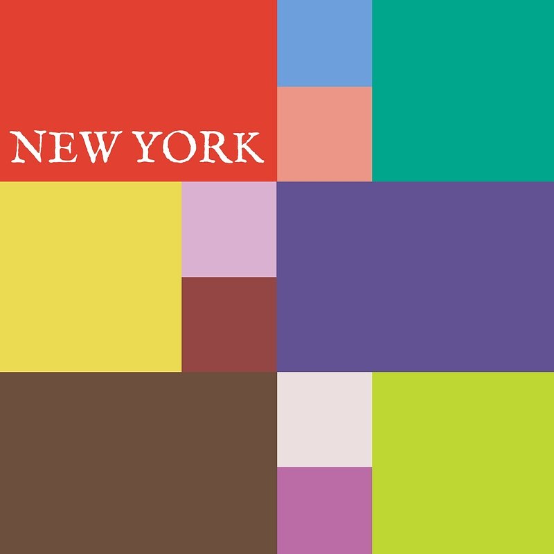
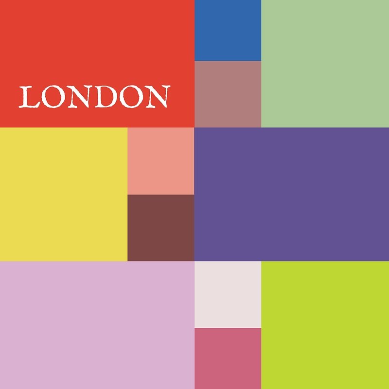
As you can see by comparing the two palettes there are seven overlapping colors that appear on both palettes. These are :
Cherry Tomato - an orangey red described as "...impulsive....demanding attention...courageous..."
Blooming Dahlia - a peachy salmon.."subtly alluring...with understated appeal."
Meadowlark - a pretty yellow, described by Pantone as "glistening with joy and illuminating the world around us."
Pink Lavendar - lavender with a little more pink and a little less blue. Described as, "..soft and romantic...that charms with its soothing sense of quiescence."
Ultra Violet - Medium purple with a "complex and magical" hue. This is Pantone's choice for Color of the Year.
Almost Mauve - this ultra light blush is perfect for using as a neutral and pairing with any other color.
Lime Punch - appropriately named, this color makes me think of citrus fruit and warm sunny days.
In addition to these duplicate colors each palette has five other colors:
New York Palette
Little Boy Blue - the color of sunny skies and a feeling of "expansiveness".
Chili Oil - think spicy for this deep reddish brown.
Arcadia - a green with blue undertones, reminiscent of tropical waters.
Emperador - a rich chocolate brown.
Spring Crocus - described as a "...witty and flamboyant...fuchsia shade...."
London Palette
Palace Blue - not quite royal, but "...sparkling with energy...."
Ash Rose - a more earthy darker pink.
Nile Green - reminiscent of sage and honeydew melons.
Spiced Apple - similar to Chili Oil, but with a deeper brown.
Rapture Rose - a pinky red "...that brings flirtatious charm to the Spring 2018 palette."
In addition to each palettes' twelve colors, this year they added four Classic Colors which can be used with any palette choice for a foundation from which to build an outfit. These are the same for both New York and London and are:
Sailor Blue - dark navy.
Harbor Mist - light to medium gray.
Warm Sand - tan with more yellow tones.
Coconut Milk - white to off white.
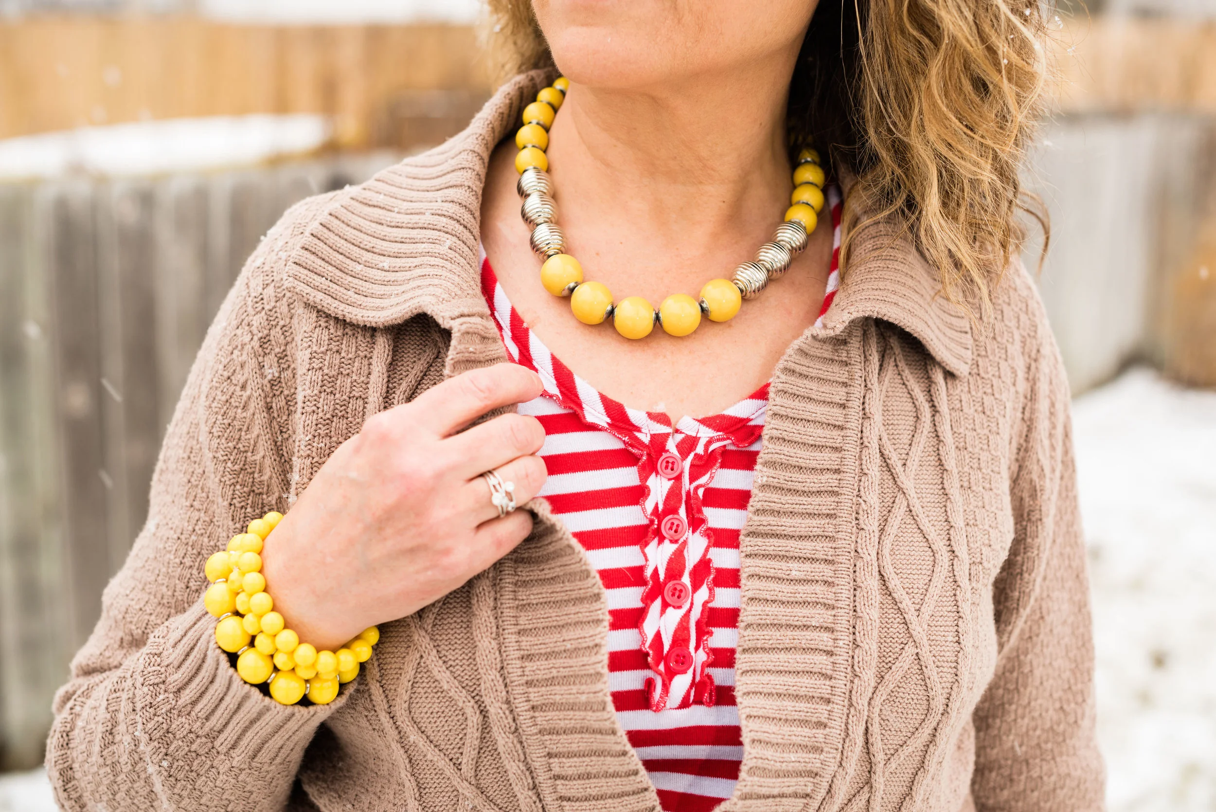
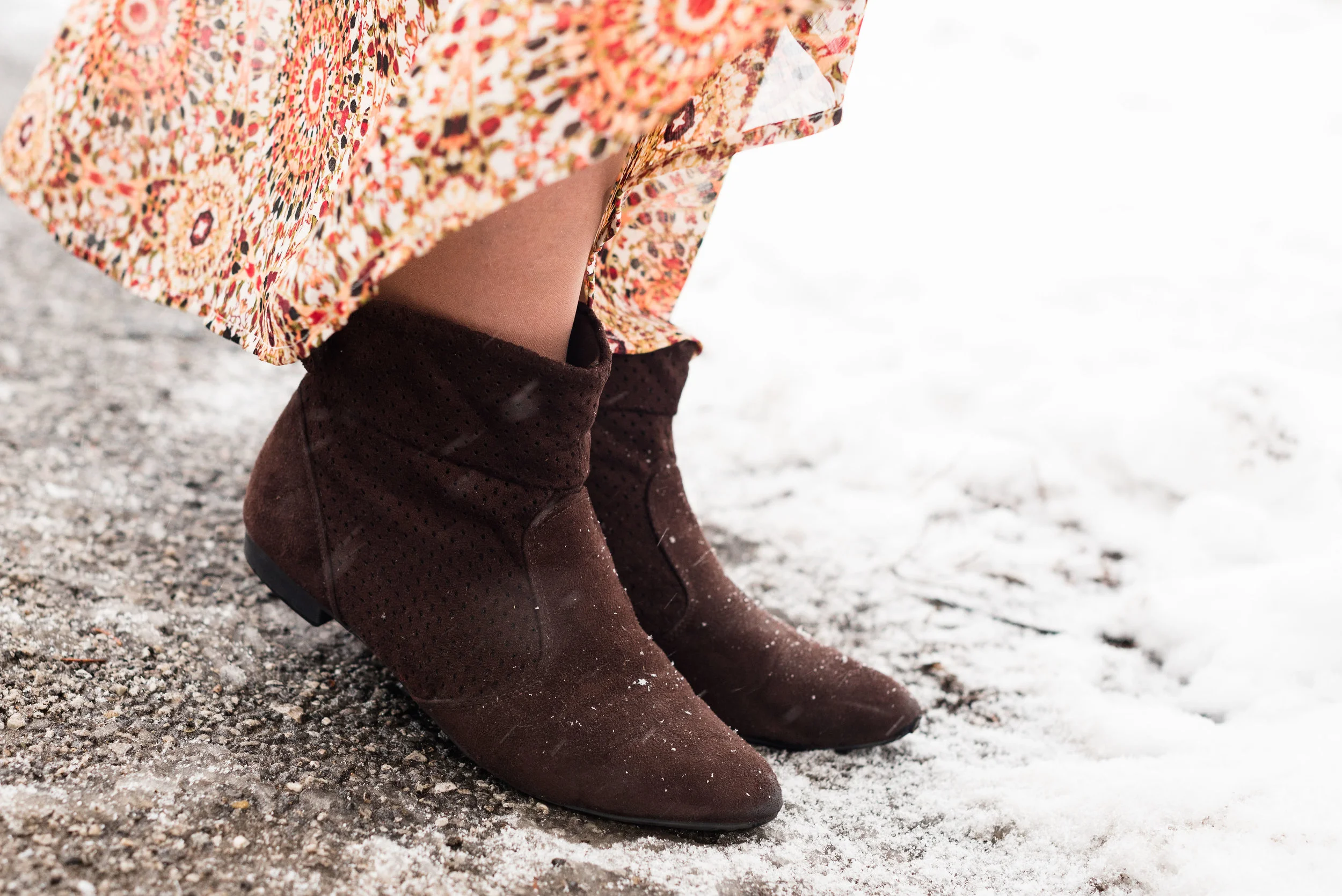
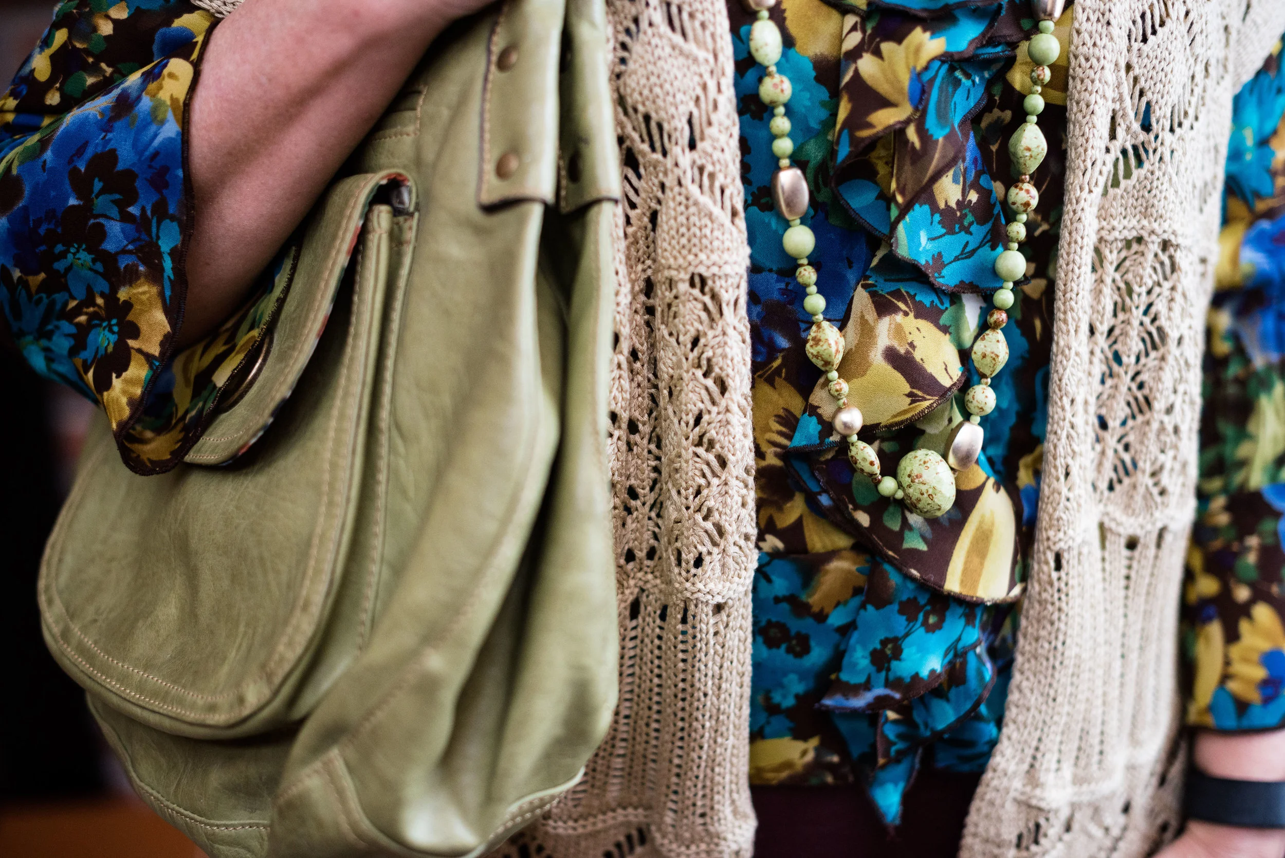
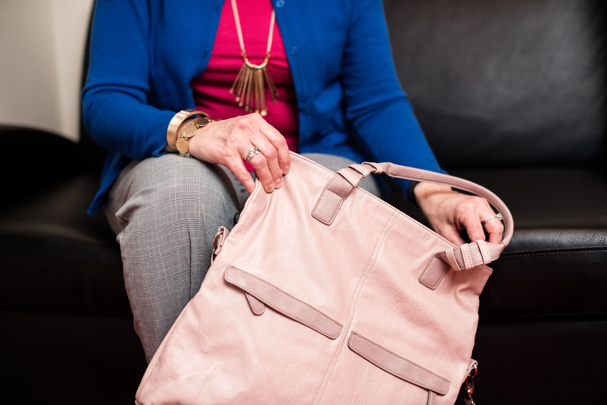
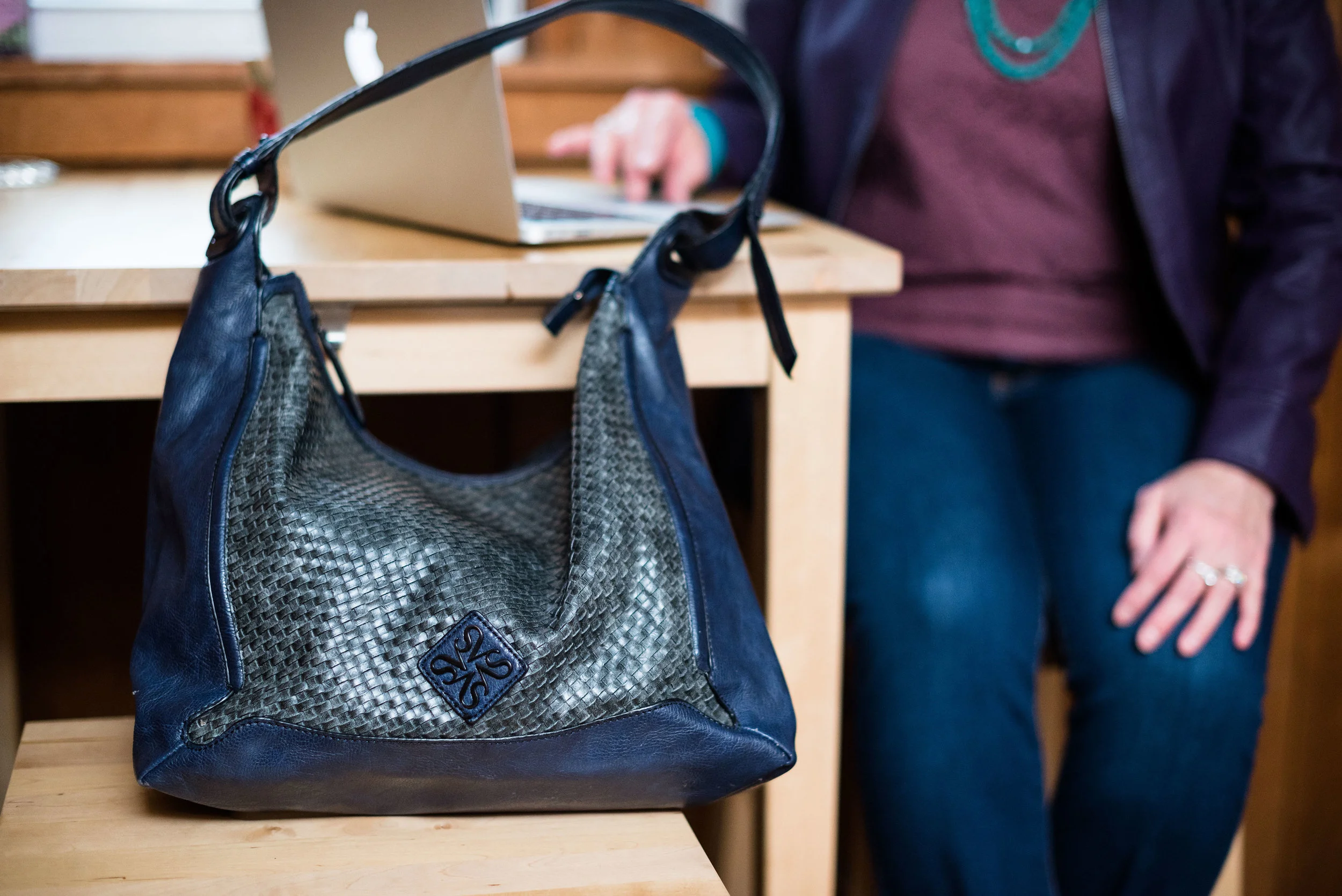
The following photos are some sneak peaks at my series that will start next week, where I will feature outfits using two or three of the palette colors as well as a classic color.

I hope you'll join me next week as I begin my Pantone Spring 2018 series. Check back on Thursday for my Old Becomes New column.
Have a great day.
Monday linking up with Catherine of Not Dressed as Lamb. Tuesday linking up with Shelbee in The Spread the Kindness link up and Jess of Elegantly Dressed and Stylish. Friday linking up with Nancy of Nancy's Fashion Style.