Outfit Inspiration - A Spring Look

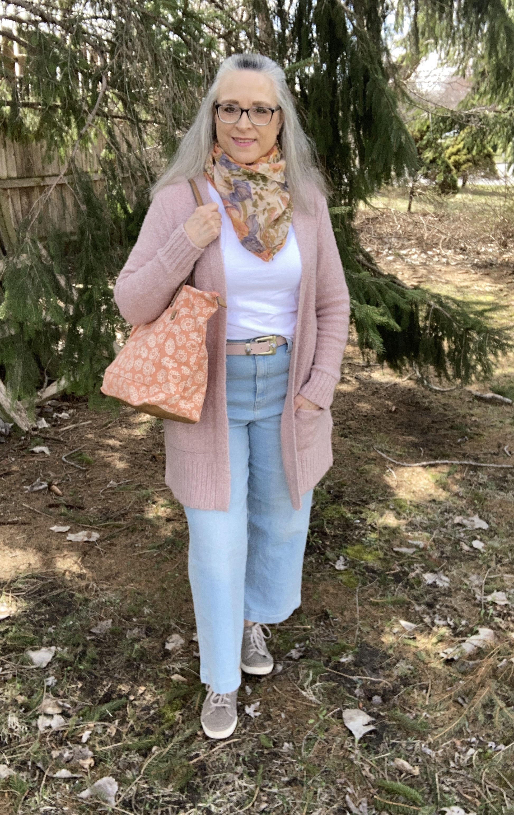
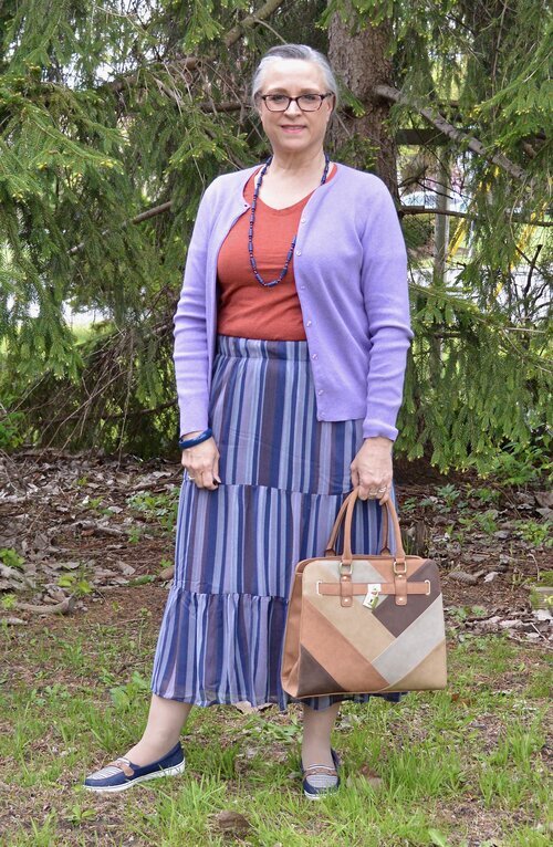
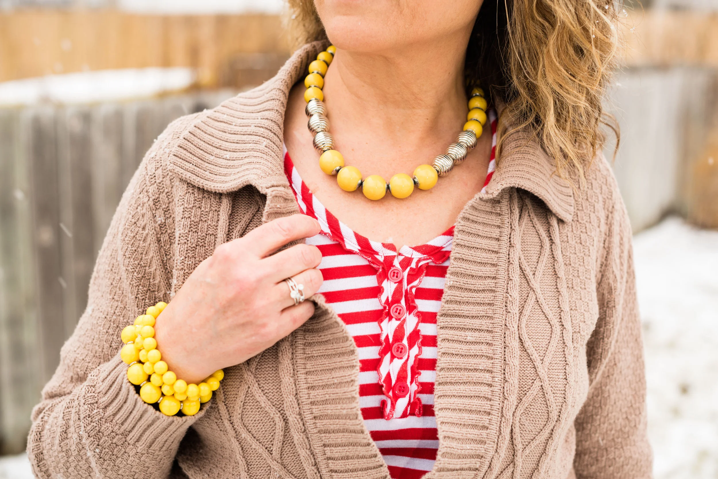
Spring is here, at least the calendar says so, even if the temps don’t feel quite like it yet. As I worked on taking pictures of this outfit I was glad for my long sleeve tee and bulky, longer cardigan, because, dang it, it’s still cold outside! The sun is shining brilliantly, but not quite up to the task of warming our northern states. It will come, so we just have to be patient.

While we wait I thought it would be fun to post a few spring outfits that cater perfectly to our crazy midwestern changing weather. Fall and Spring are our transitional seasons and our temperatures can fluctuate from below freezing in the morning to the mid 70’s during the day. In addition, we can almost always expect rain, rain, more rain and plenty of wind, all of which continue to make me feel cold and want to dress in cozy layers.

Today’s Outfit Inspiration comes from Pinterest where I have a board titled Spring Fashion. Do you use Pinterest? I find that it can be a great source of inspiration and ideas from everything fashion, to holiday decor to recipes. I get tired of the same thing all the time, and I can’t tell you how many times I walk into my closet and just feel overwhelmed. Pinterest and the challenges I participate in on Instagram help me to think differently about my wardrobe and help me rediscover the joy I get from creating a fun outfit.

Style Tip: Look to other sources for outfit inspiration. Instagram, Pinterest, bloggers, and other social media platforms can be overwhelming, but they can also keep things from getting stale and get you looking at your closet with new joy. If you are not a social media kind of gal, then look at the fashion magazines at a bookstore or grocery store. Even though many of those don’t cater to your average woman, many of them can still give you color combinations, acceptable trends and outfit ideas.

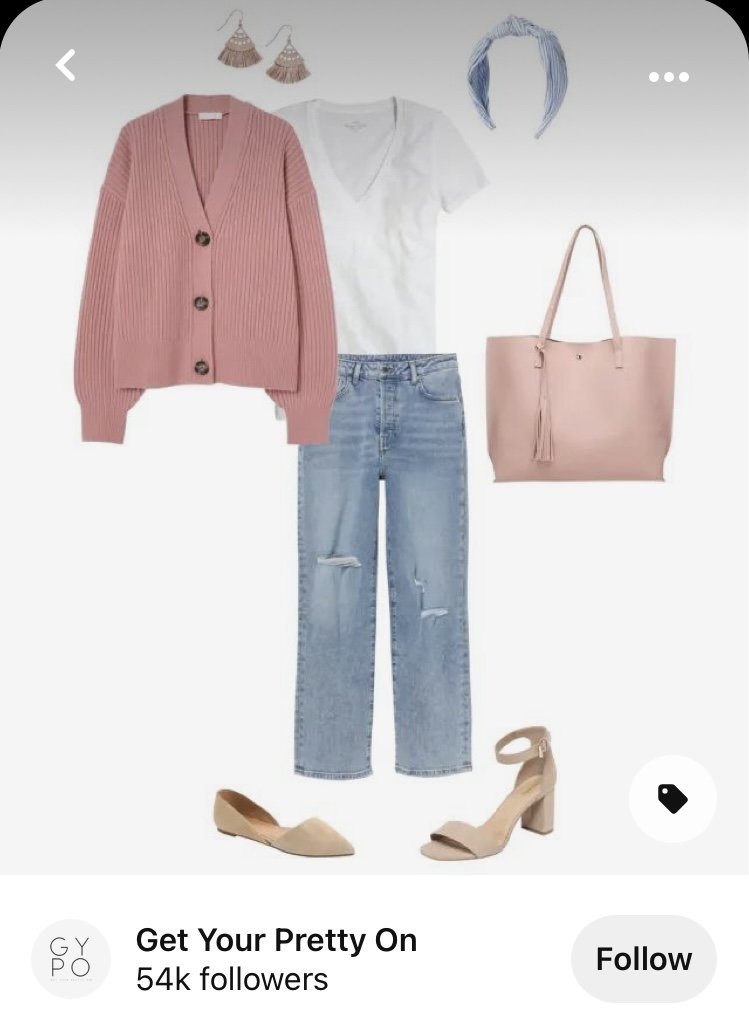
The pin, which I will show you at the end is from an influencer Get Your Pretty On. Founder, Alison Lumbatis has a classic, petite, feminine style that works perfectly for busy moms. You can check out her website by clicking on the link. However, it doesn’t look like she has posted anything since last July, so I am not sure if she is still current. Anyway, the pin is for a spring outfit and features a pink cardigan, light wash jeans, a white v-neck tee, a pink tote, and neutral colored flats or sandals.

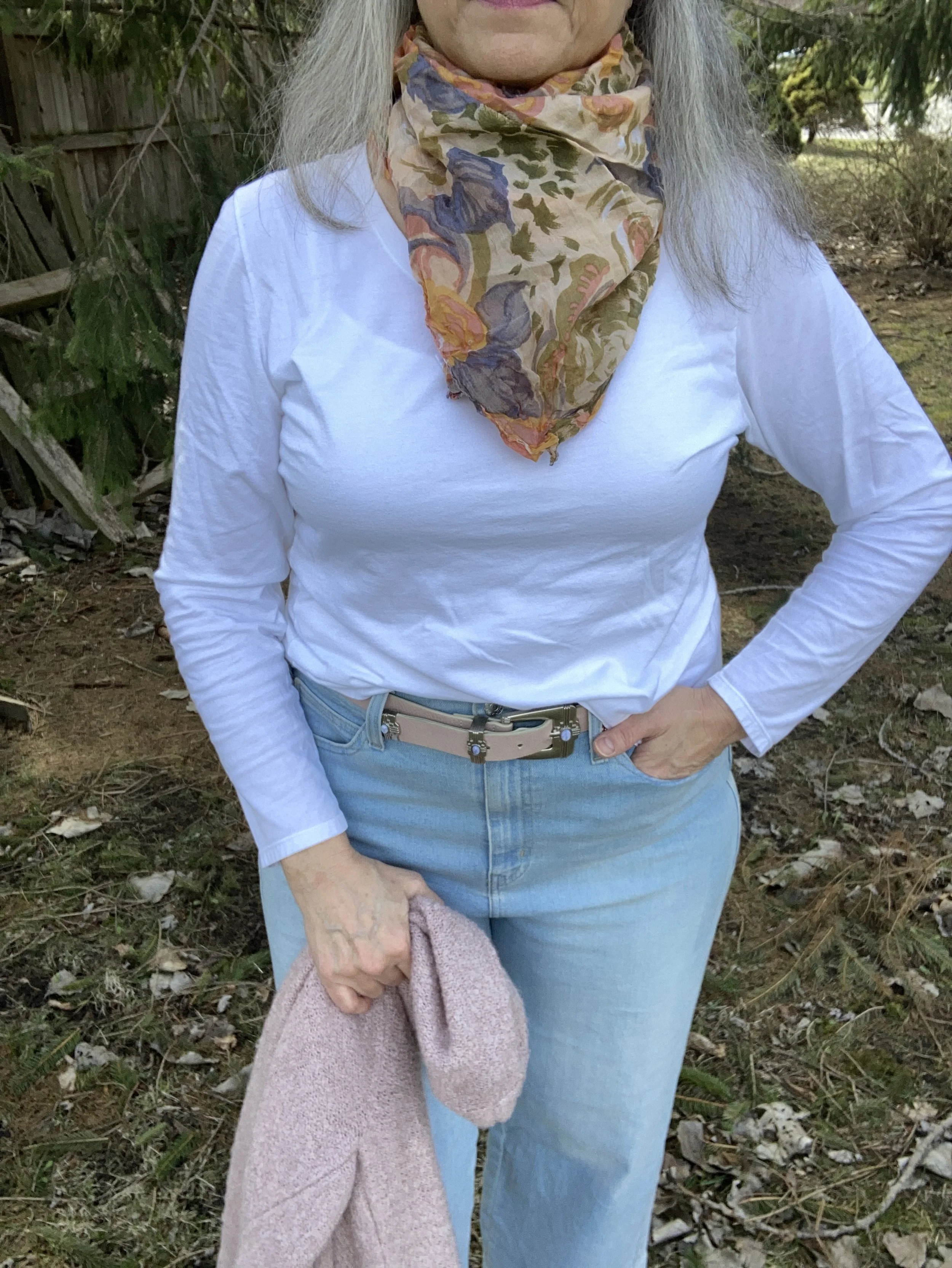
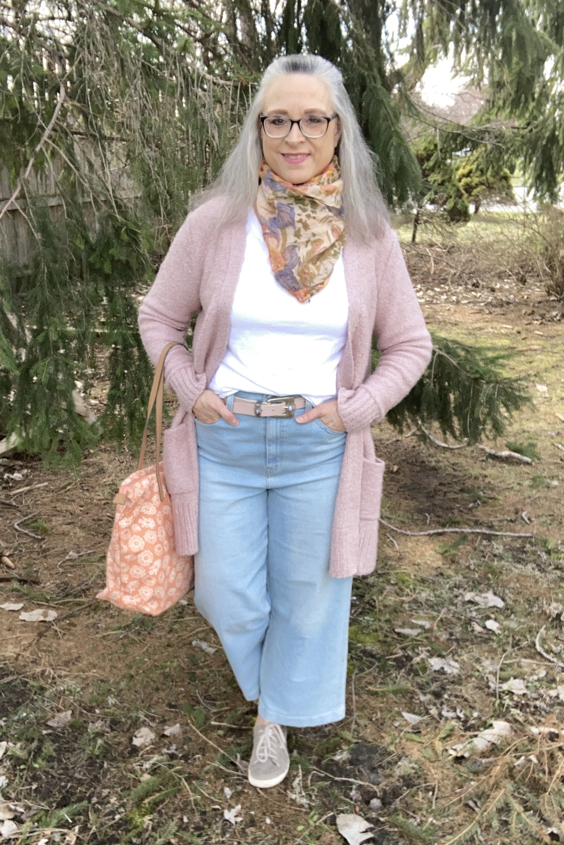
This white long sleeve tee is just a basic Hanes tee shirt. Basics like this are good to have in your wardrobe, especially if you have a more casual style. You can see I did a bit of a front tuck and added a pink belt to complement the sweater.

I actually had these Signature Levi Strauss jeans from the clearance rack at Meijer in the bag to return, but when I saw this pin, I began to think about other ways I could style these wide leg ankle pants for spring and summer and decided to keep them. They are super comfy and have a high waist that actually fits over my bulges, making it a good choice for wearing with tees that I might want to tuck in.

My thigh length, open front cardigan is Old Navy brand and was a thrift find. I’d say this has been one of my favorite sweater finds while thrifting. I love the length, the pockets, and the cozy fabric. The fact that it will be useful over three seasons is an added benefit.

Style Tip: When using an outside source for outfit inspiration, think about ways you can change up or add accessories to make the look completely your own.

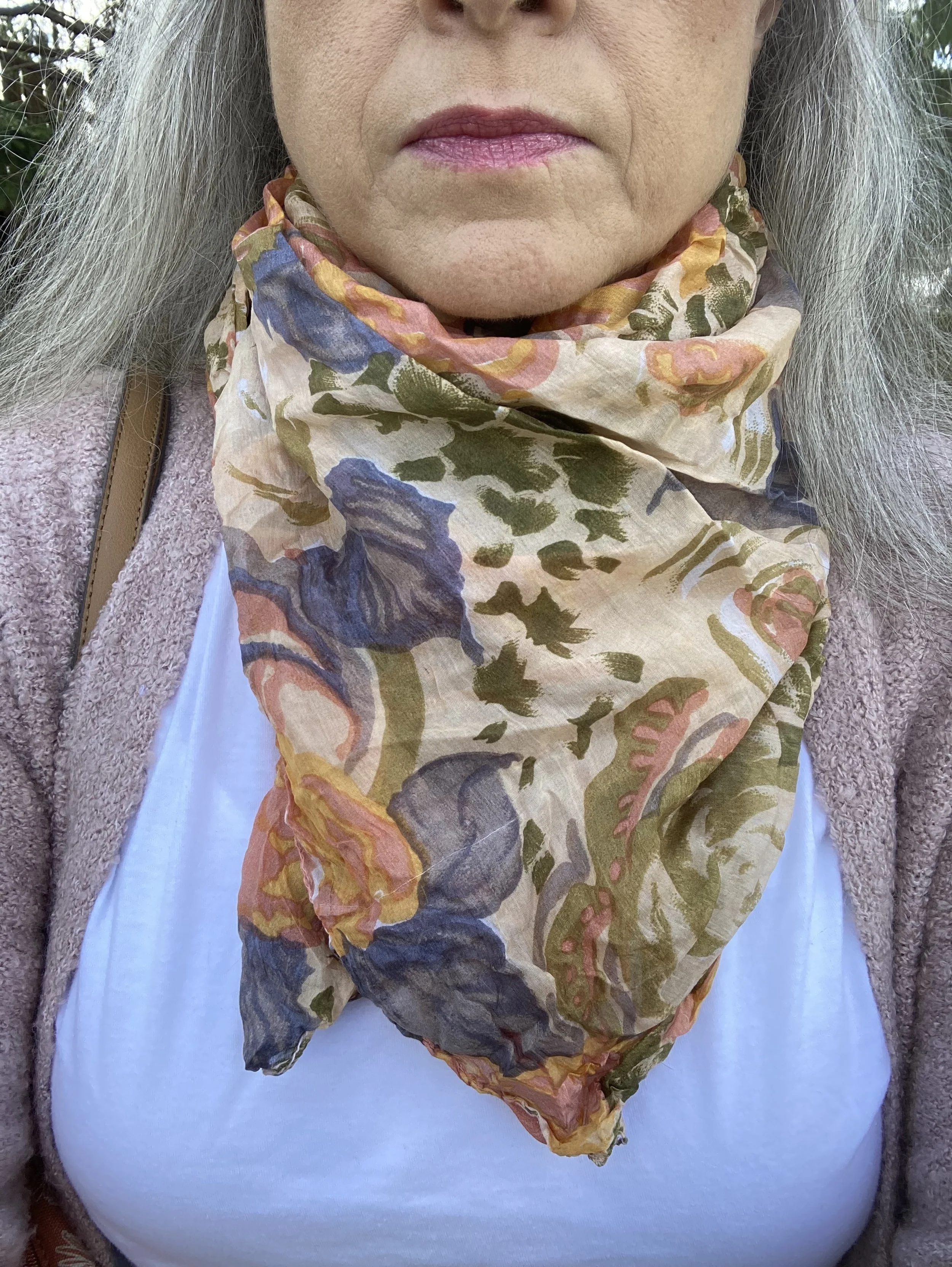
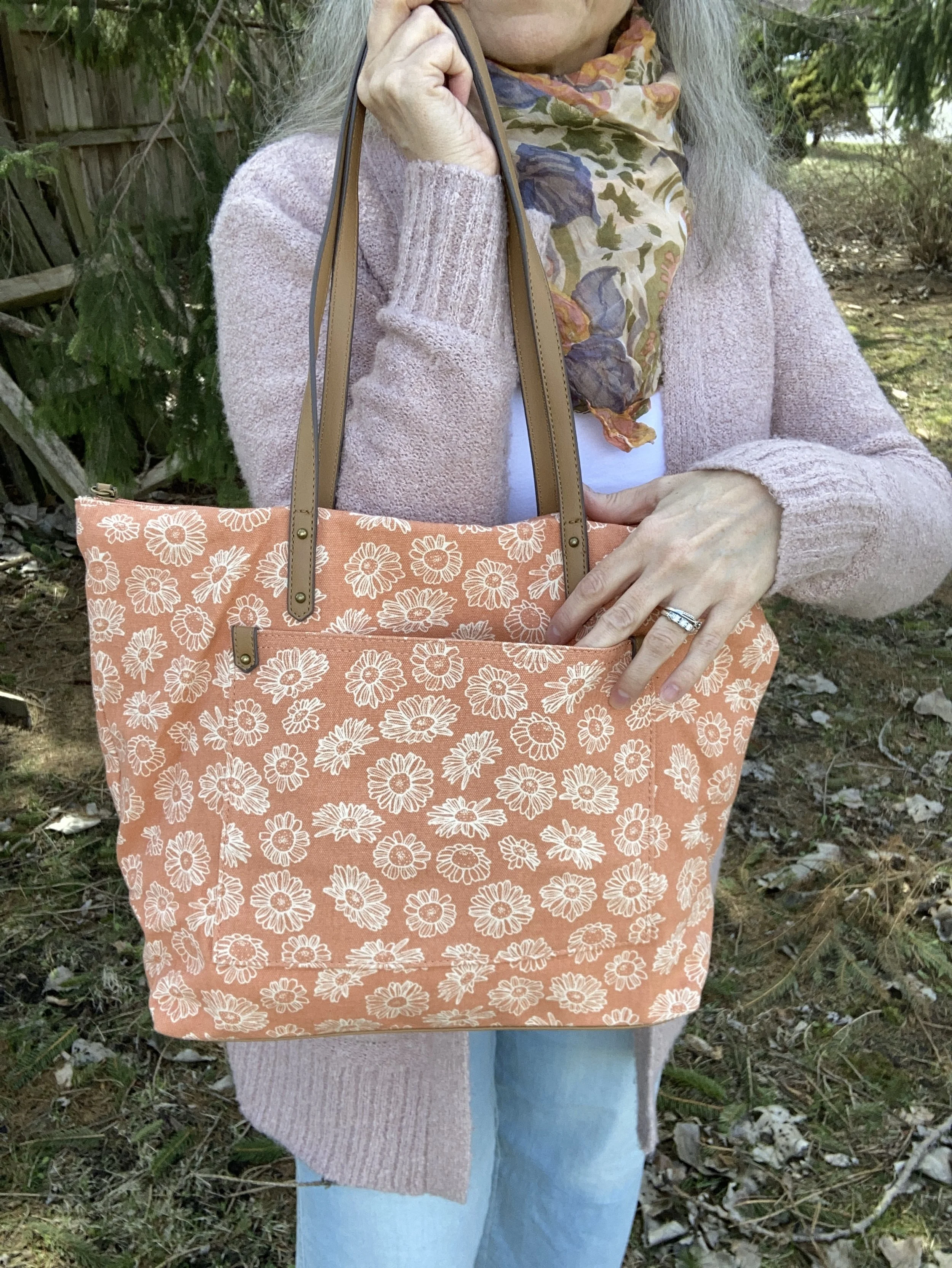
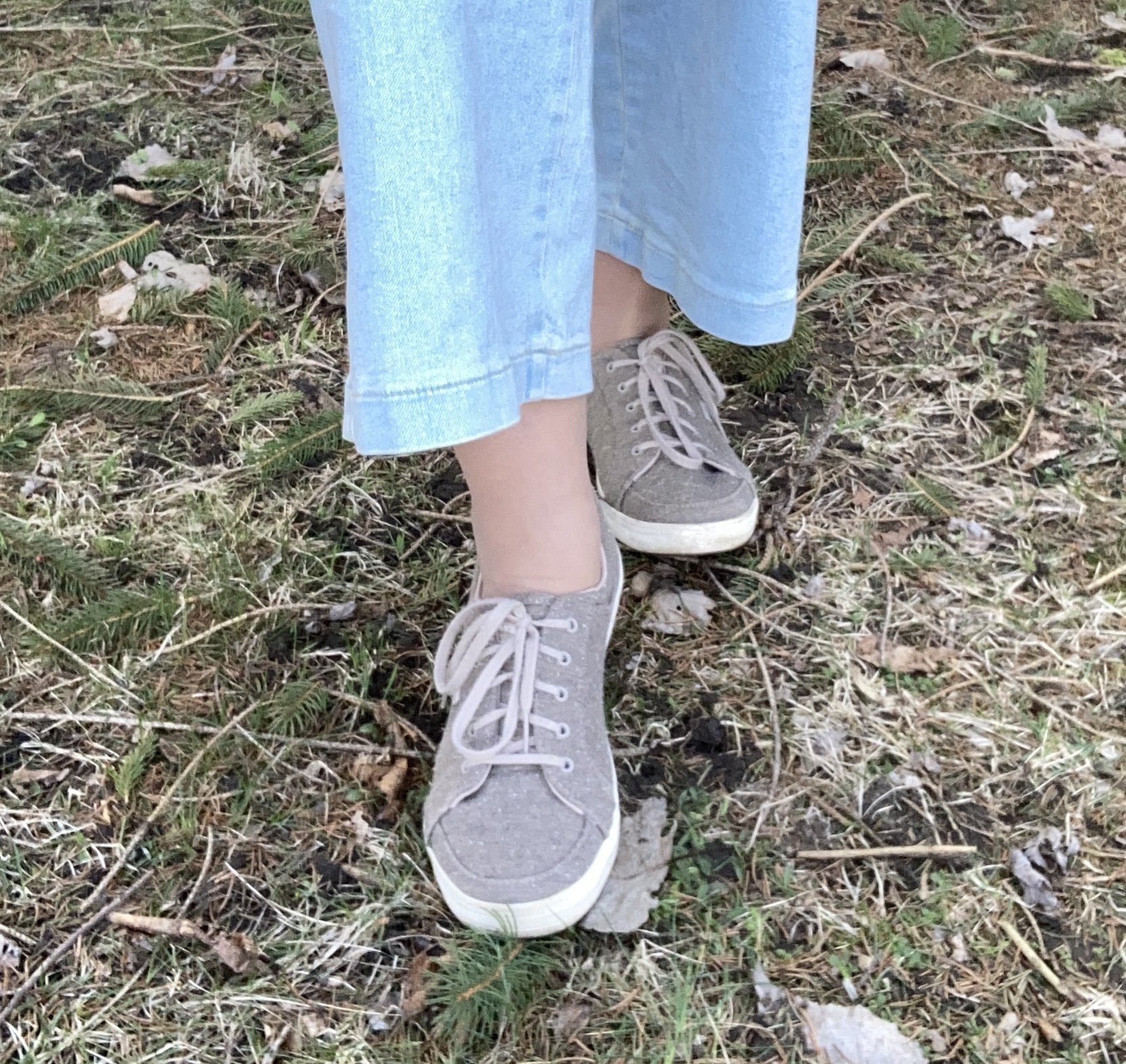
As you can see I did just that with this outfit. I added this thrifted floral silk scarf for a bit a warmth, chose a coral floral Sonoma bag instead of pink to go with the coral tones in the scarf, and chose my neutral Keds sneakers instead of flats or sandals.

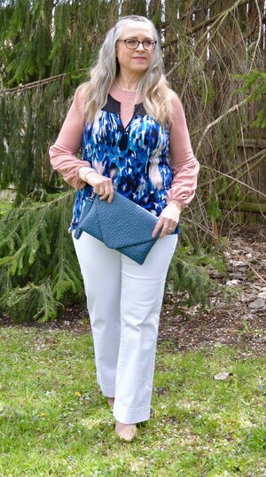
Here is my outfit next to the outfit I pinned.

Let me know what you think? Did I do a good job using the pin as inspiration, and did I do a good job of making the look my own? What would you do with this outfit inspiration? I always love to hear your thoughts. You inspire me to keep posting my blog posts and to keep playing with clothes!

I have added some shopping links to give you more ideas.

Buy Me a Coffee.

Have a great week!
Spring/Summer - 2021 - Spark Joy

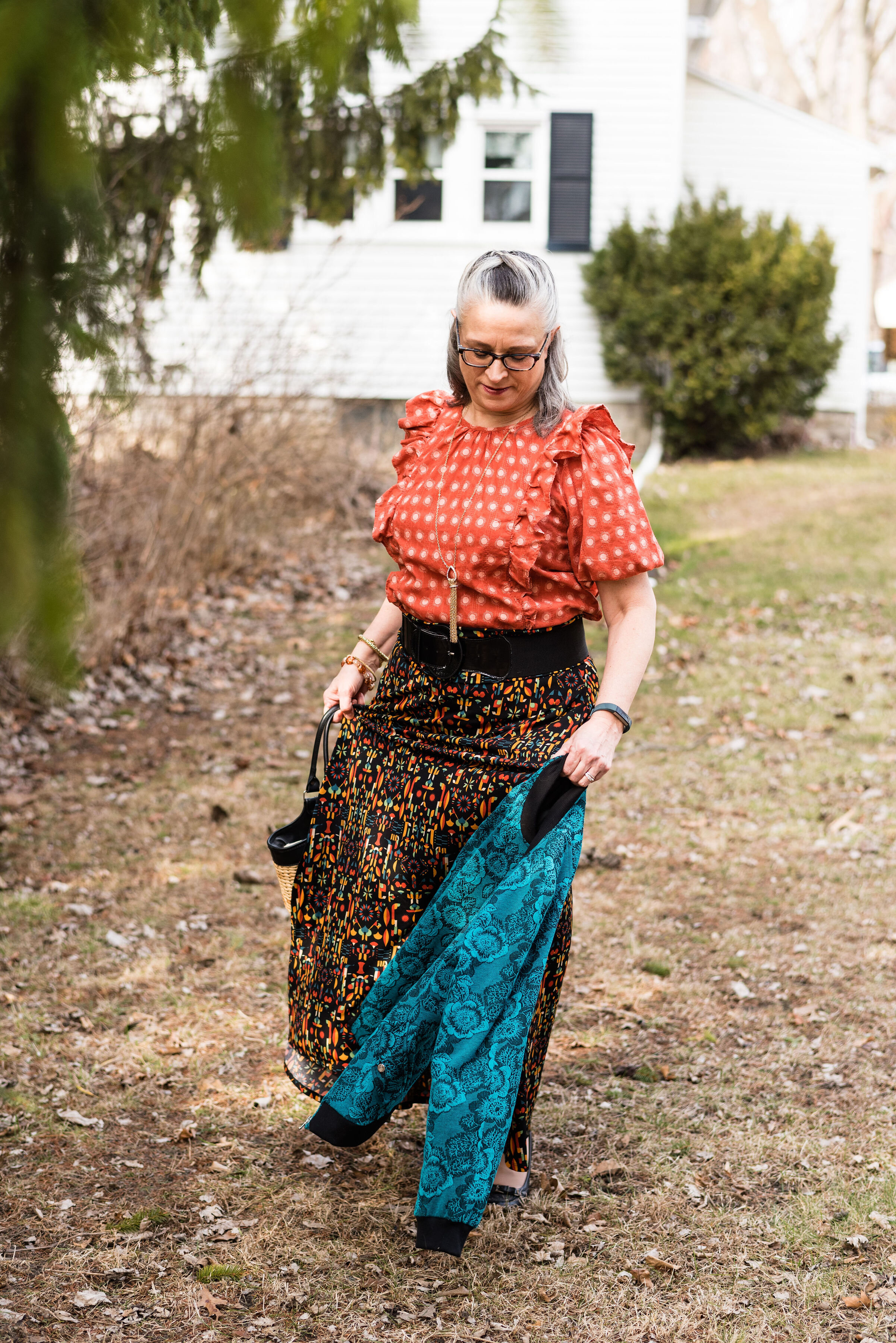
This trend is a bit different and I think really open to each individual’s own interpretation. The idea of Spark Joy is color and print combinations that make you feel like you are wearing a party. I actually enjoyed putting this together. You know I love print mixing and this pushed me even further outside of my color and print mixing box. Let’s take a closer look.

sparkjoyspringtrend-3.jpg

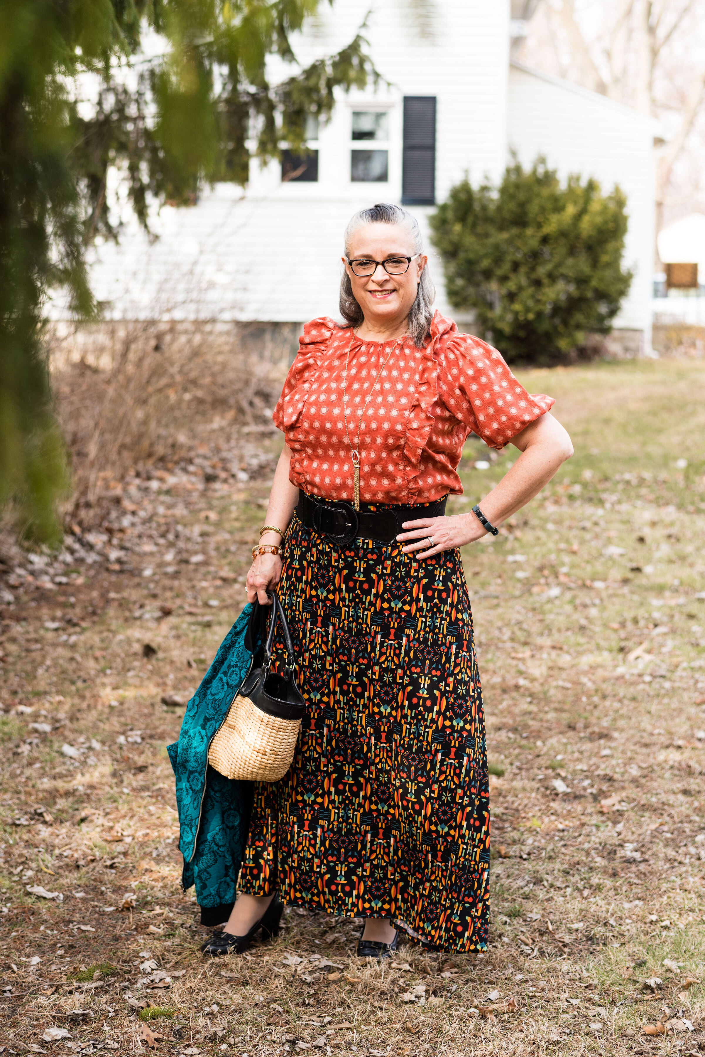
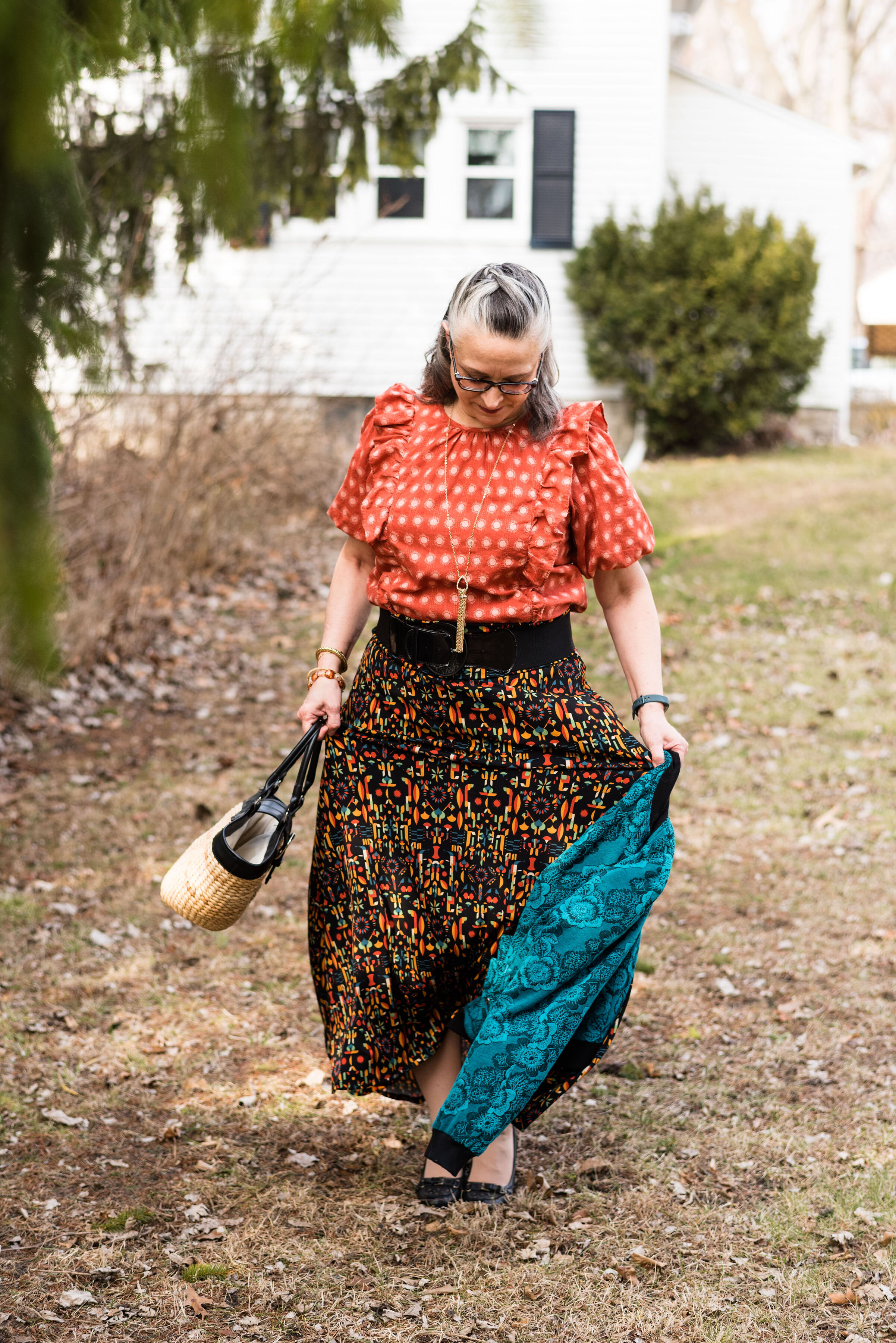
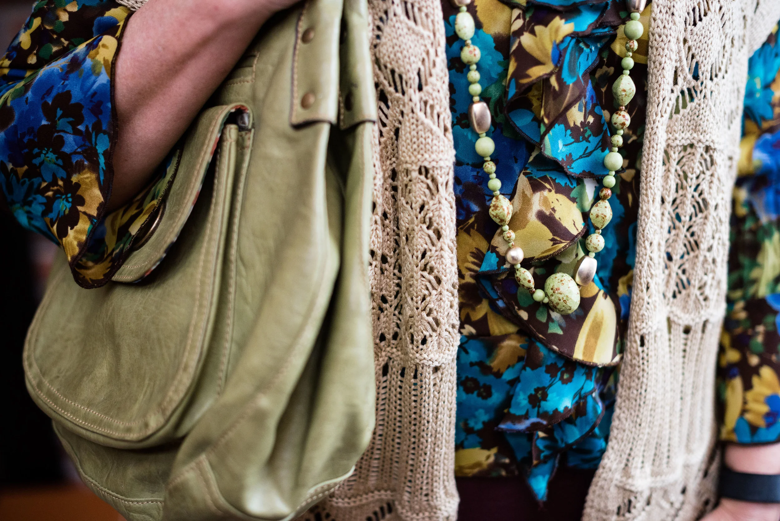
I got this Universal Threads, sun print top at Target at the same time I got my pastel colored eyelet shirt (seen last week on the blog). Once again, you can see the puffed sleeves. Usually, I am not a ruffle girl, but once in a while, I find something that doesn’t make me look like a clown and this top was one of those times. I think the gathering around the neck helps and that the ruffles are vertical rather than horizontal. Horizontal patterns on us larger ladies are harder to pull off, and that goes for ruffles as well. In fact, when placed as they are on this top, I think it balances out my wider bottom.

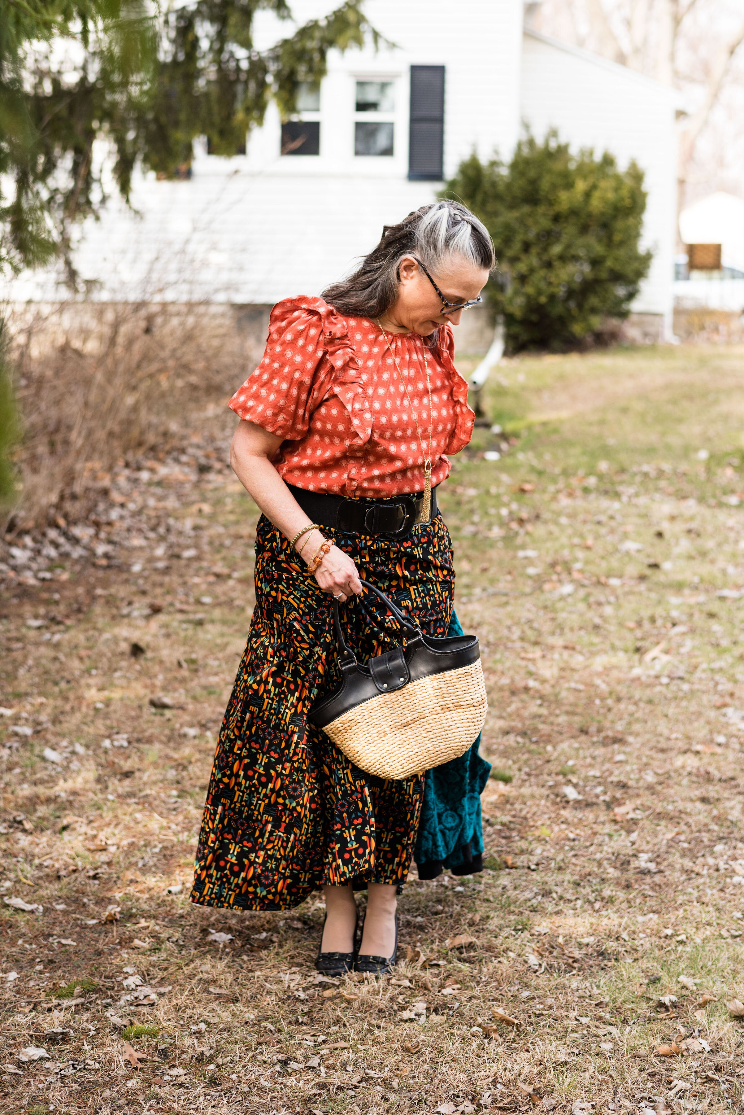
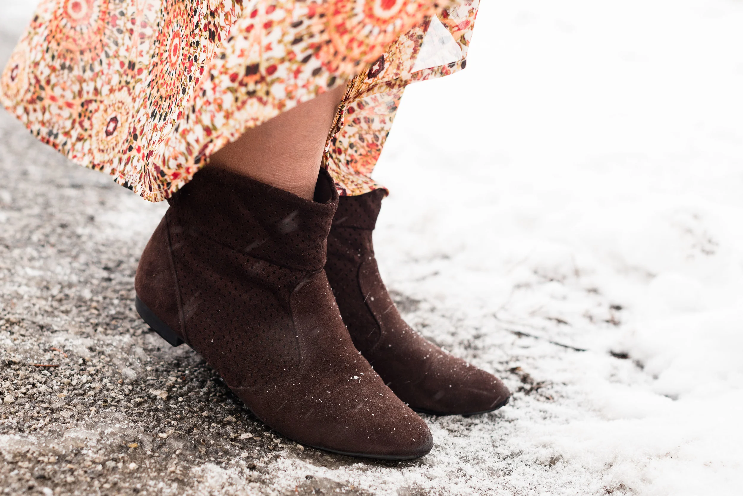
This is another LuLaRoe skirt that I found at a local thrift store. The thing I like about these maxi skirts is that I don’t have to worry about wearing a slip. They are comfortable and easy to wear. The fun patterns are great for print mixing as in this outfit, or you can pick any color in the pattern and match up to it. I know not everyone can wear a maxi skirt and I will include a few shopping links at the end for shorter printed skirts for those of you who prefer a midi or knee length style.

sparkjoyspringtrend-11.jpg

My floral, Erin London, bomber jacket you’ve seen before. It was a purchase from Shop National from their mark down section a few years ago. You can see it here with a floral top.

My accessories were simple since there was already plenty going on in this outfit. I chose another long pendant necklace, this time with some bling and fringe. I also opted for a wide black belt to make more of a definition between my top and the skirt. I added a few bracelets, my thrifted, black, a.n.a. loafer heels and my thrifted bucket bag. My daughter does not like this bag. What do you think? She doesn’t like the shape of it. I told her I would ask for your opinion, so be sure to comment below.

sparkjoyspringtrend-10.jpg
sparkjoyspringtrend-13.jpg
sparkjoyspringtrend-8.jpg

So what do you think of this crazy print mixing outfit? I do not really expect you to go out and wear something like this, but it is truly fun to experiment and push ourselves outside of our normal outfit ideas. Would I wear something like this? Probably not exactly as I have it here. I might swap out the skirt for a solid black skirt or pair of pants, or I might change the top for a solid tee. I might even wear the top and skirt together, but switch out the floral bomber for a solid cardi or light weight jacket. You can still have joy with bright colors and print mixing, but you can also look polished and classy.

sparkjoyspringtrend-2.jpg

I’m including a few shopping links for fun prints. Be sure to check those out. These are affiliate links. When you click on a link, I get a few cents. I appreciate every click. All opinions are my own.

Photo credit Rebecca Trumbull.

I hope you are having a great week.

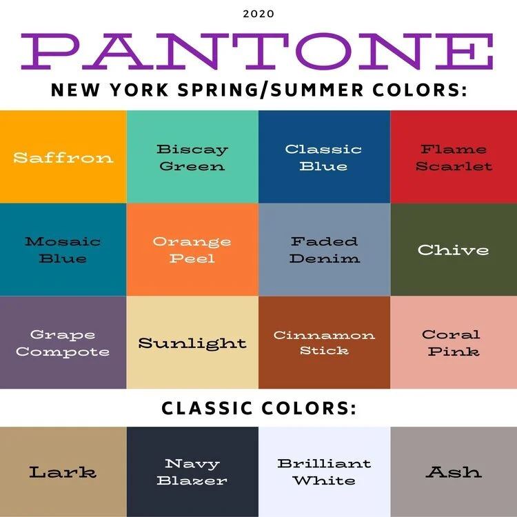
Pantone Spring/Summer 2020 - Recap

I hope you have enjoyed this Pantone color series. Today I just want to show you a recap where you can see all the outfits in one post. Here we go.

New York Palette

Pantone Spring/Summer 2020 - New York Palette

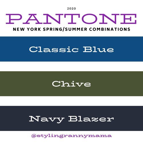
Classic Blue, Chive and Navy Blazer

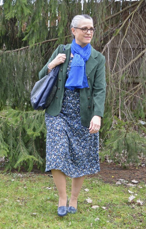
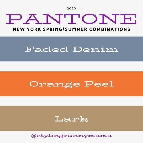
Faded Denim, Orange Peel and Lark

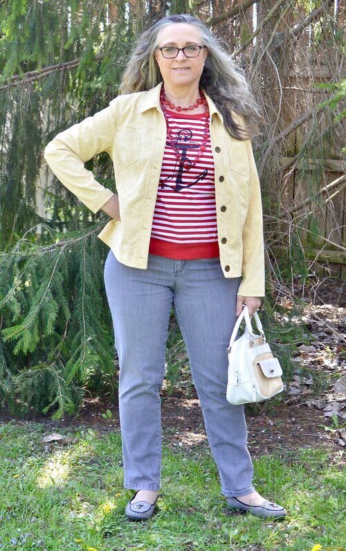
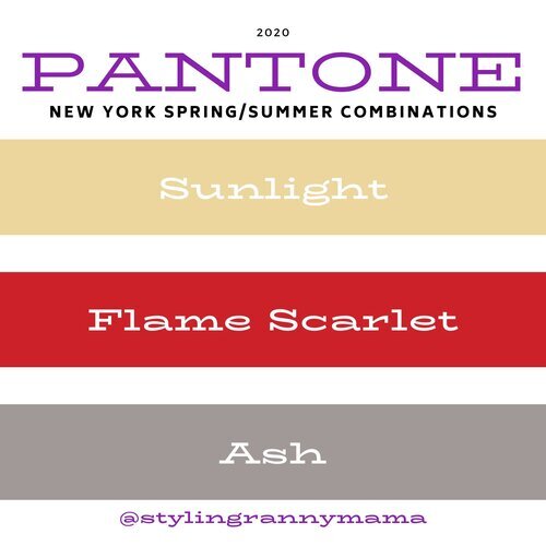
Sunlight, Flame Scarlet and Ash

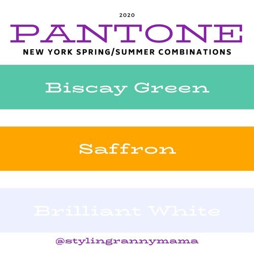
Biscay Green, Saffron and Brilliant White

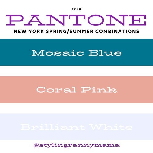
Mosaic Blue, Coral Pink and Brilliant White

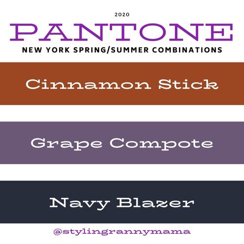
Cinnamon Stick, Grape Compote and Navy Blazer

London Palette

Pantone Spring/Summer 2020 London Palette

Classic Blue, Beetroot Purple and Oyster Mushroom

Pantone Spring/Summer - London Palette

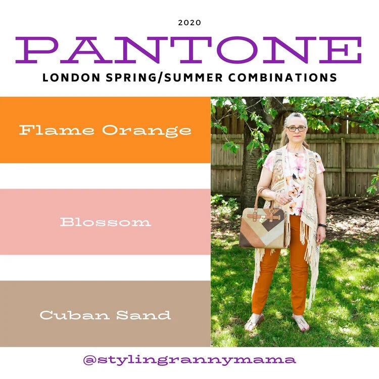
Flame Orange, Blossom and Cuban Sand

Pantone Spring/Summer 2020 - London Palette

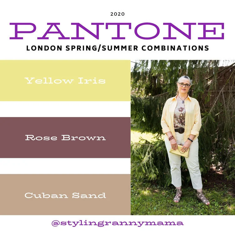
Yellow Iris, Rose Brown and Cuban Sand

Pantone Spring/Summer 2020 - London Palette

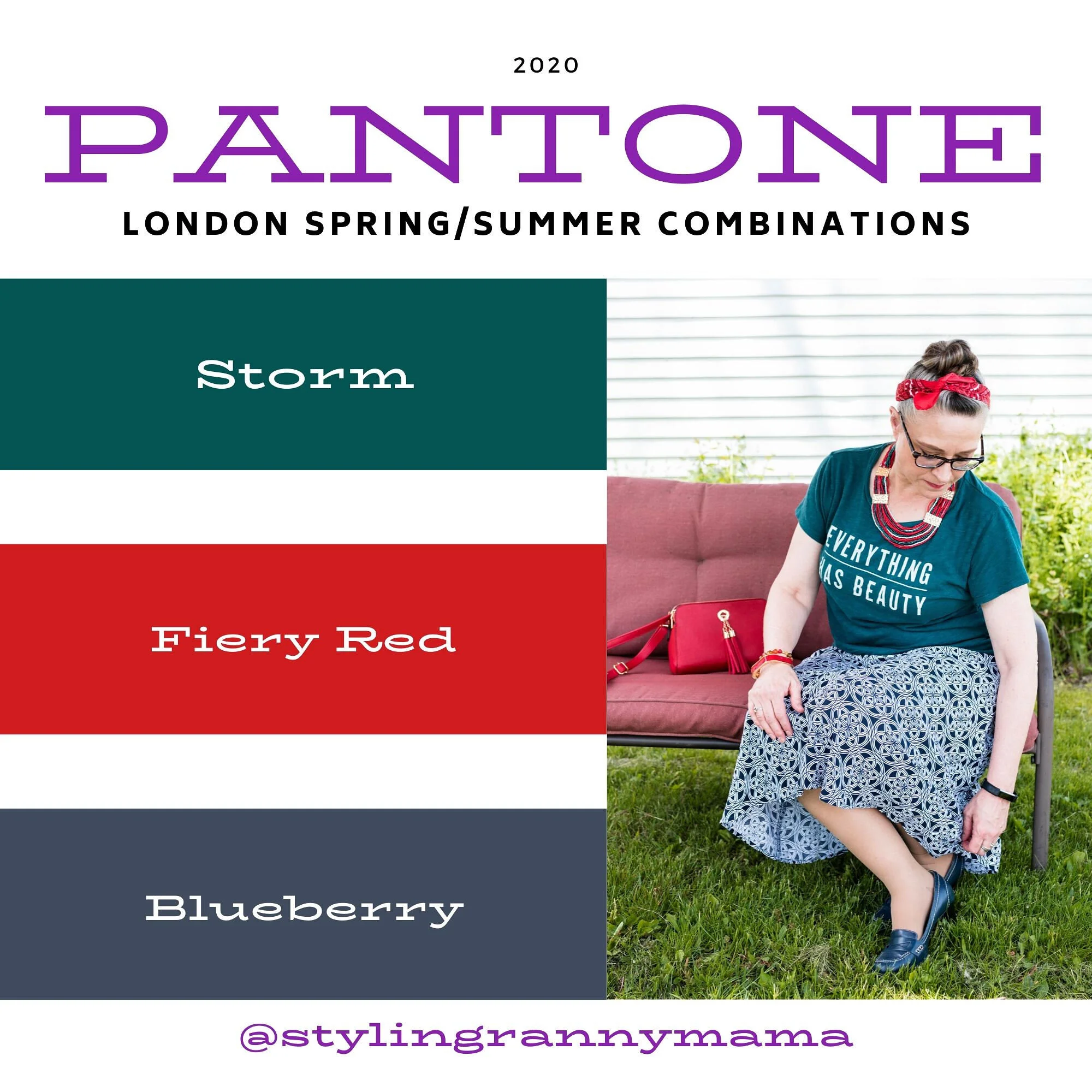
Storm, Fiery Red and Blueberry

Pantone Spring/Summer 2020 - London Palette

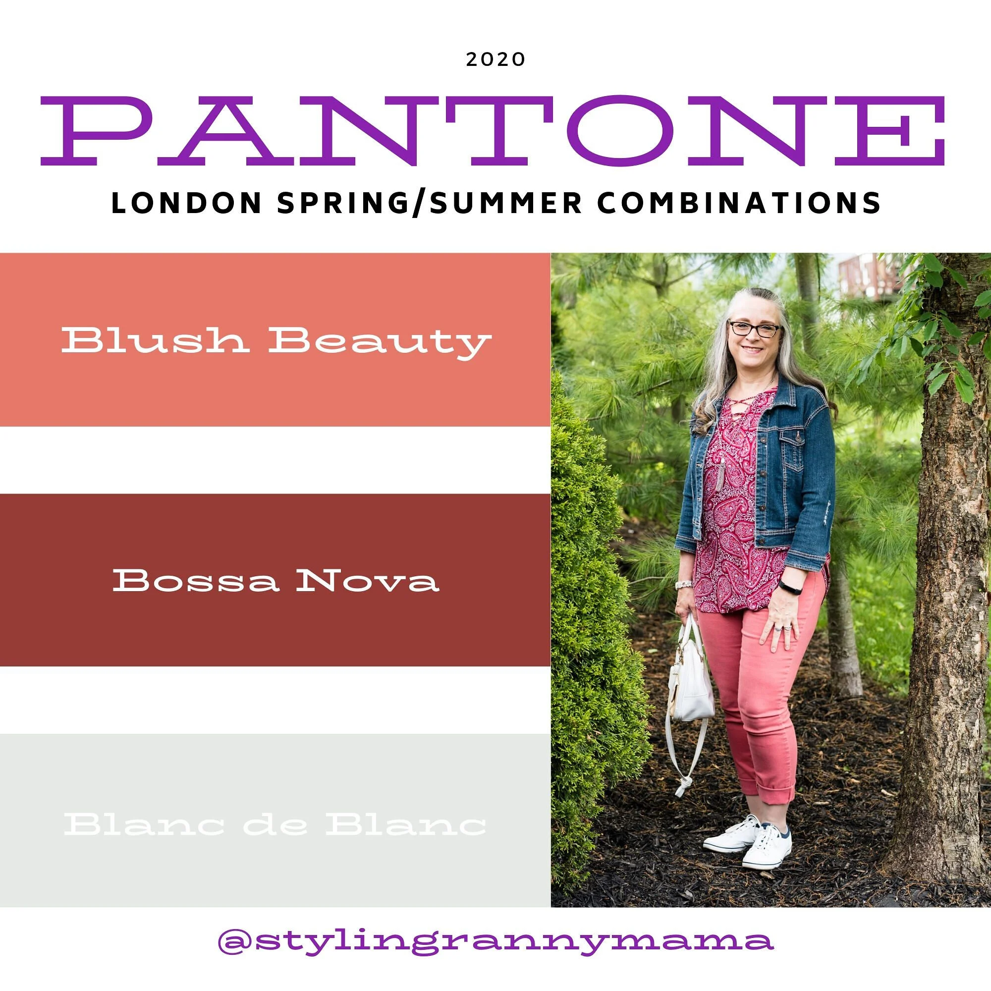
Blush Beauty, Bossa Nova and Blanc de Blanc

Pantone Spring/Summer 2020 - London Palette

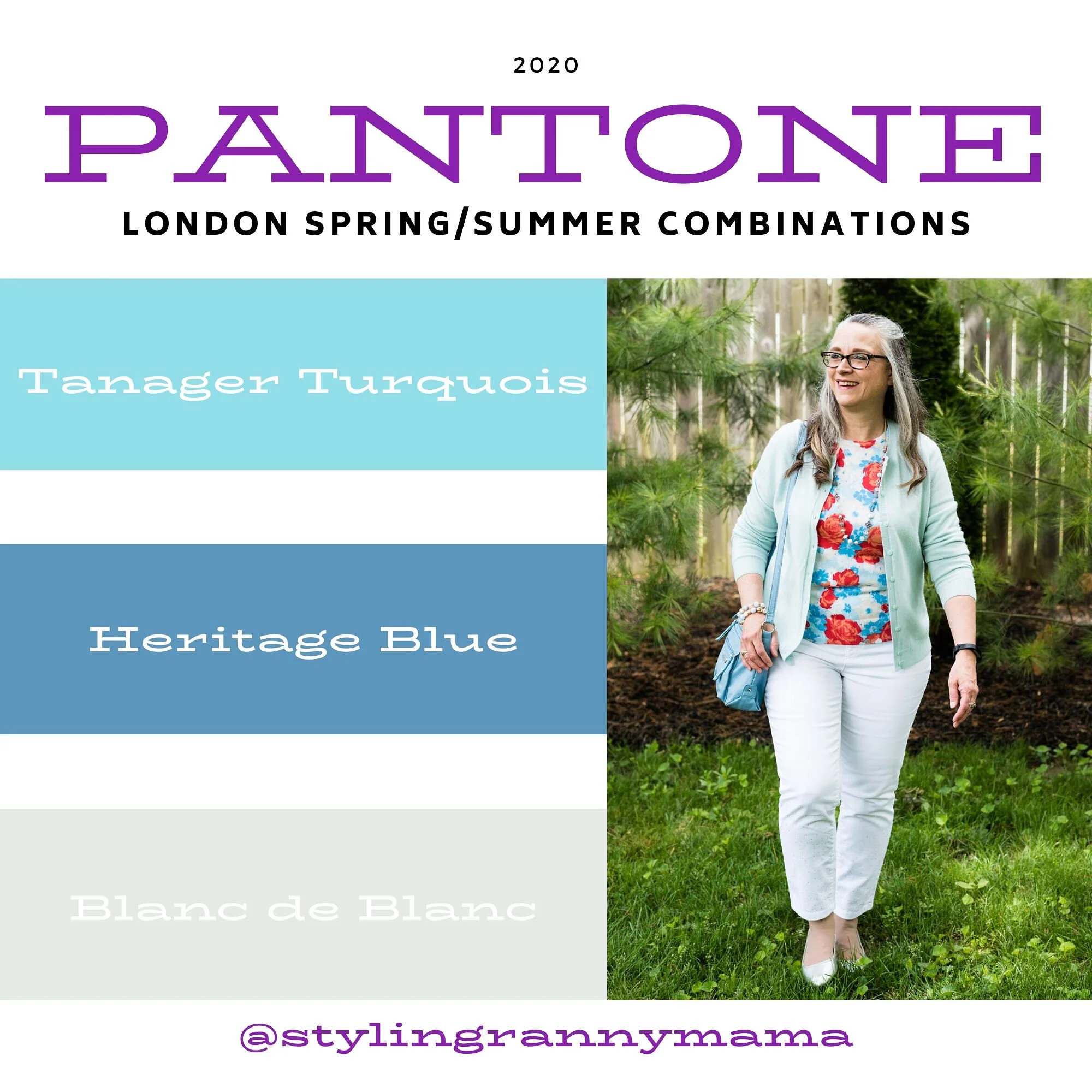
Tanager Turquoise, Heritage Blue and Blanc de Blanc

Pantone Spring/Summer 2020 - London Palette

Which color palette was your favorite? Which outfit did you like the best? I would love to hear your thoughts. I hope you all have a wonderful weekend. We will be celebrating Father’s Day with our kids on different days, since schedules wouldn’t allow for everyone getting together. God bless each of you with peace and joy.

All graphics and London color palette photos by Rebecca Trumbull.

Pantone Spring/Summer - 2020 - Classic Blue, Beetroot Purple and Oyster Mushroom

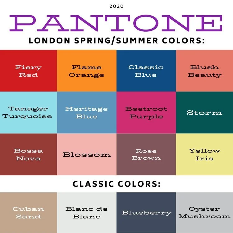
I am now starting the Pantone Spring/Summer London color palette. Once again, as you saw in the intro post from last Thursday these colors vary across the spectrum from blues and reds, to greens and purples. I like the variety in the Spring/Summer palette this year. There really are so many ways you could combine and wear these bright colors, so let my combinations be a spring board for your own creative style. Try combining different colors that you already have in your closet, rather than going out and purchasing new pieces. In addition, if you are more of a classic color kind of gal, think of these brighter colors as accent colors for choices in your jewelry, shoes, bags and scarves.

Pantone Spring/Summer 2020 - Classic Blue, Beetroot Purple and Oyster Mushroom

Once again, I am starting the series with the Pantone Color of the Year, which for 2020 is Classic Blue. These Ruby Rd. pants are a bit more like royal blue, but I thought they worked well enough. These pants were from a friend’s closet when she no longer wanted them. I have styled these repeatedly on the blog. You can see them with a blue sweater, a pink sweater, a plaid bomber jacket, and a colorful kimono.

Pantone - Spring/Summer 2020 - Classic Blue, Beetroot Purple and Oyster Mushroom

My Beetroot Purple button up top is a piece I picked up from my daughter who was getting rid of it. It is A New Day brand. I would call this color fuschia, but I am not the one making up the names. Ha, ha. They can call it whatever they want, but basically it is a bright pink.

Pantone Spring/Summer 2020 - Classic Blue, Beetroot Purple and Oyster Mushroom

This light gray, or Oyster Mushroom moto jacket is another thrifted piece and Christopher and Banks brand. I love when I can find brands I already love at a thrift store. Especially older styles and colors that aren’t around any more. This is a simple, no frills jacket, which makes it perfect for this kind of outfit when the color is doing the talking.

Pantone Spring/Summer 2020 - Classic Blue, Beetroot Purple and Oyster Mushroom

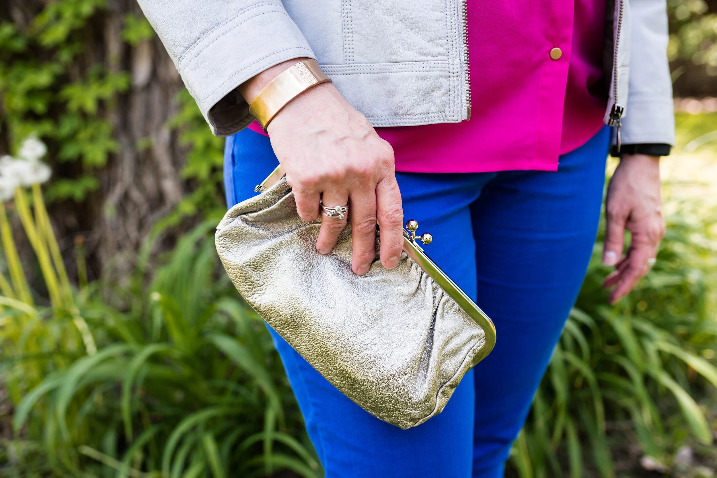
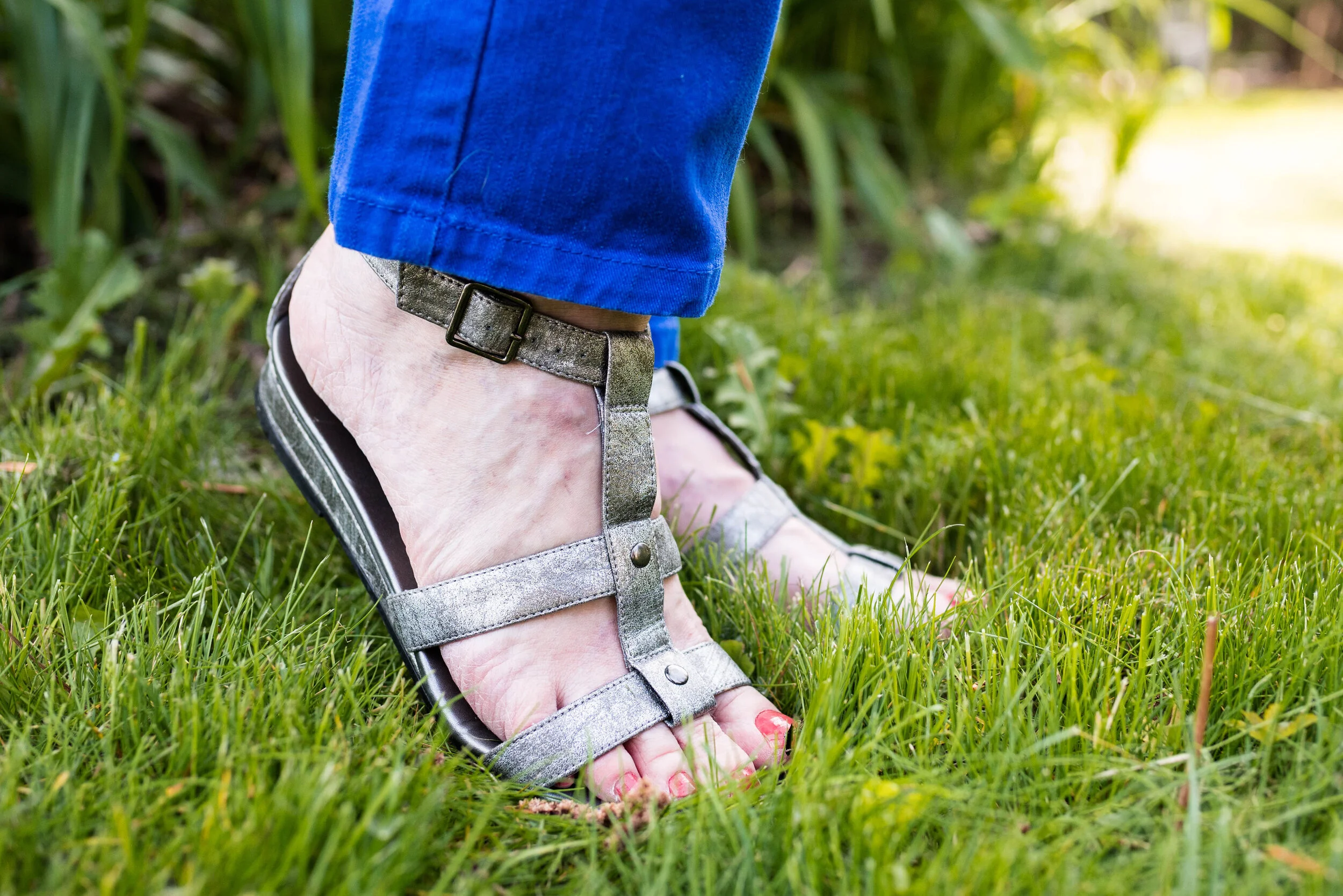
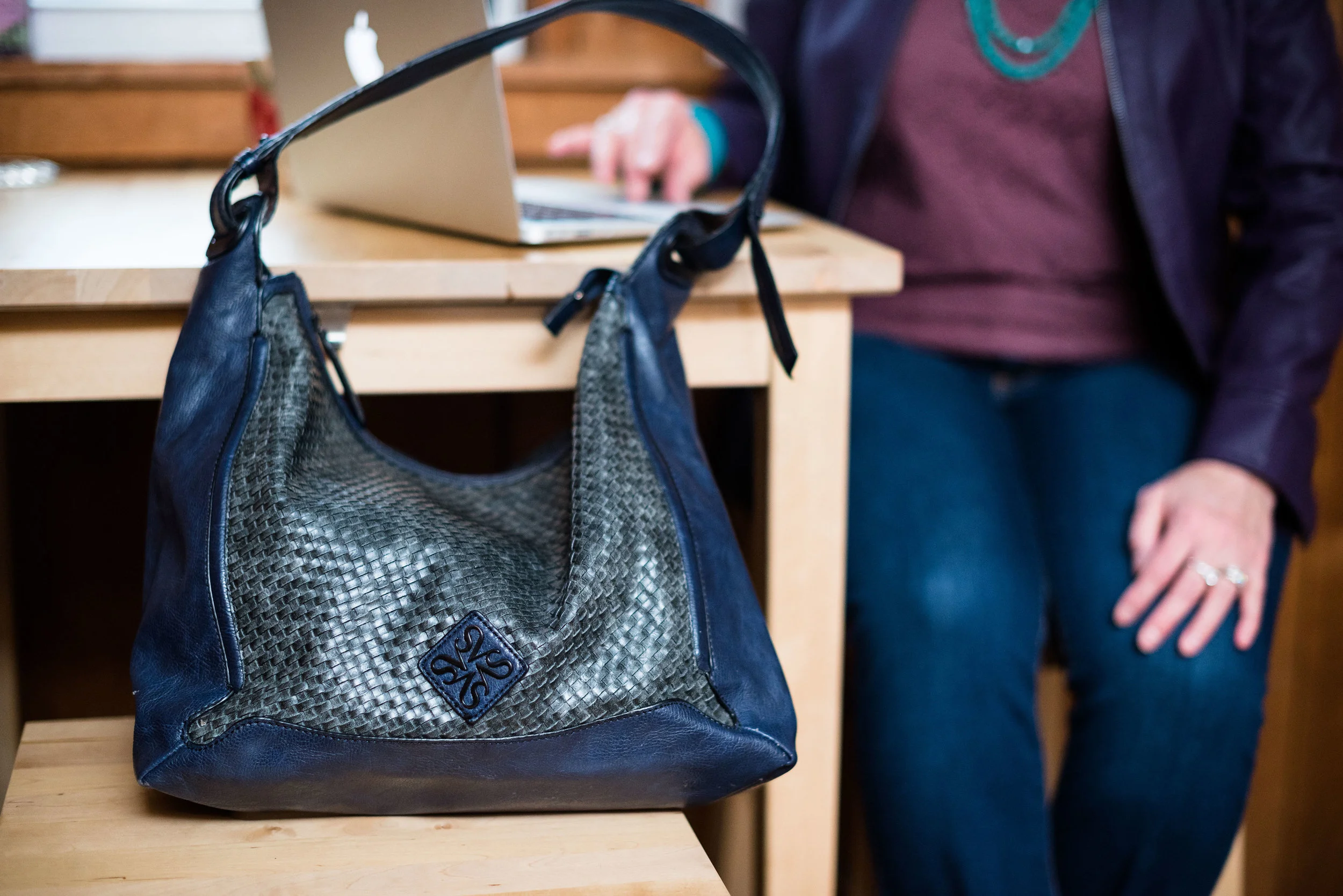
I decided to do a mixed metals sort of thing with my accessories. The statement necklace and bracelet take on the gold hue of my shirt buttons, while my clutch and simple gladiator sandals go for more of a silvery look.

Pantone Spring/Summer 2020 - Classic blue, beetroot purple and oyster mushroom
Pantone Spring/Summer - 2020 - Classic blue, beetroot purple and oyster mushroom

What do you think of these colors? Do you think the bright blue and pink is too bold? What would you wear these colors with? Leave me a comment or two below. I love to hear from you.

Pantone Spring/Summer 2020 - Classic Blue, beetroot purple and oyster mushroom

I hope you are enjoying learning more about the Pantone color palettes.

I am including a few shopping links. These are affiliate links which means if you click on a link I get a few cents. I blog for a hobby, but a few cent here and does help to defray the cost of my platform. I appreciate every click and purchase, but even more I appreciate your kind comments on the blog and the emails some of you send me. Thank you.

Photo credit and graphic Rebecca Trumbull.


Pantone Spring 2018 - Spring Crocus, Almost Mauve and Little Boy Blue

This is already week four of my Pantone Spring 2018 series. You can check out the previous weeks' posts by clicking on the links: Week 1, Week 2, and Week 3. This week I am featuring the colors: Spring Crocus, Almost Mauve and Little Boy Blue.

Since my daughter and I have to arrange time to get together for photos, we often shoot as many outfits as we can fit in at a time. If you follow me regularly you already know these pictures were all shot on a wintery day. Not very spring like, but then spring is taking its sweet time to make an appearance this year, so I guess this is appropriate. 

I found this Chaps maxi skirt on the clearance rack at Kohl's back in January. When I began looking for pieces for this Pantone series, I thought the flowers on the skirt were a good representation of both Spring Crocus and Almost Mauve. 

My NY & Co tee is also Almost Mauve. I tucked the tee in to give more definition to my waist and topped it with an H & M Harbor Mist cardigan. Pantone has included four classic foundational colors with their palette this year, which serve as a great way to keep an outfit from getting too overwhelmed with color.

I decided to add the Little Boy Blue color as a bright pop against the floral back ground. It makes me think of a sunny blue spring sky. The crossbody bag is Rosetti brand. My SO flats are also blue and probably a tad bit closer to the actual Little Boy Blue color. 

For jewelry I wore a necklace and bracelet with light blue colored beads and silver embellishments. 

Here are a couple of pictures of me being cold! Ha, ha. Don't I make the goofiest faces? I have always thought I could mimic Lucille Ball and some of her funniest looks. Sound like a future blog post.
The things we do for the blog! Ha, ha. This was the last picture we took outside that day, so the next three weeks you'll see indoor pictures. We had had enough. 

I hope you enjoyed this look at three more of the Pantone Spring 2018 colors. Which one do you like the most? I really love Spring Crocus, but Almost Mauve makes a great neutral that can be paired with almost any color. Little Boy Blue will be great color for the transition from spring into summer. 

I've included a few shopping links. These are affiliate links, which means I get a few cents if you click on a link. I really don't make any money on this blog, but your clicks will add up, so that maybe in the future I will. I appreciate all your support. All opinions are my own. 

Photo credit Rebecca Trumbull. Make up by Rachel Christensen

Monday linking up with Catherine of Not Dressed as Lamb. Tuesday linking up with Jess of Elegantly Dressed and Stylish and Shelbee of Shelbee on the Edge

Pantone Spring 2018 - Introduction to the New York and London Palettes

This spring, the Pantone palette is full of pastels. Both the New York and the London palette have a number of overlapping colors that instantly say spring. I am excited about introducing this series to you and even though the colors have been on the Pantone website since last fall, I feel that the end of February and beginning of March are the perfect times to introduce spring colors. 

I'll confess, up until a few days ago, I couldn't even think about spring. As much as I want it to be here, I know there are still cold days ahead. However, with a forecast of temps in the forties and fifties, I think I can finally blog about spring, knowing that it will soon be here in all of its splendor.

The above graphic as well as the photos in this post are done by Rebecca Trumbull. Rebecca, not only takes amazing photos of all varieties from pets, to weddings, to seniors, to models, she also dabbles with managing social media accounts. If you need someone to manage your social media Rebecca might be a good choice. She is organized, has strong business savy and knows her way around the internet. (She didn't ask me, or pay me to advertise, I get something better, she's my daughter!)

As you can see by comparing the two palettes there are seven overlapping colors that appear on both palettes. These are :

Cherry Tomato - an orangey red described as "...impulsive....demanding attention...courageous..."

Blooming Dahlia - a peachy salmon.."subtly alluring...with understated appeal."

Meadowlark - a pretty yellow, described by Pantone as "glistening with joy and illuminating the world around us."

Pink Lavendar - lavender with a little more pink and a little less blue. Described as, "..soft and romantic...that charms with its soothing sense of quiescence."

Ultra Violet - Medium purple with a "complex and magical" hue. This is Pantone's choice for Color of the Year

Almost Mauve - this ultra light blush is perfect for using as a neutral and pairing with any other color. 

Lime Punch - appropriately named, this color makes me think of citrus fruit and warm sunny days. 

In addition to these duplicate colors each palette has five other colors:

New York Palette

Little Boy Blue - the color of sunny skies and a feeling of "expansiveness"

Chili Oil - think spicy for this deep reddish brown. 

Arcadia - a green with blue undertones, reminiscent of tropical waters.

Emperador - a rich chocolate brown.

Spring Crocus - described as a "...witty and flamboyant...fuchsia shade...."

London Palette

Palace Blue - not quite royal, but "...sparkling with energy...."

Ash Rose - a more earthy darker pink.

Nile Green - reminiscent of sage and honeydew melons.

Spiced Apple - similar to Chili Oil, but with a deeper brown.

Rapture Rose - a pinky red "...that brings flirtatious charm to the Spring 2018 palette."

In addition to each palettes' twelve colors, this year they added four Classic Colors which can be used with any palette choice for a foundation from which to build an outfit. These are the same for both New York and London and are:

Sailor Blue - dark navy.

Harbor Mist - light to medium gray.

Warm Sand - tan with more yellow tones.

Coconut Milk - white to off white. 

The following photos are some sneak peaks at my series that will start next week, where I will feature outfits using two or three of the palette colors as well as a classic color. 


I hope you'll join me next week as I begin my Pantone Spring 2018 series. Check back on Thursday for my Old Becomes New column. 

Have a great day. 

Monday linking up with Catherine of Not Dressed as Lamb. Tuesday linking up with Shelbee in The Spread the Kindness link up and Jess of Elegantly Dressed and Stylish. Friday linking up with Nancy of Nancy's Fashion Style

Color Crash Course

The forth in a series of monthly columns on Thursdays, the Color Crash Course, will focus on color. Color is an important part of how we dress. Sometimes I pick my outfits according to color. Let's say pink. Maybe for a few days I pick something pink to center my outfits around. Usually it is a top or a cardigan or jacket. Now that I am learning more, I might pick a bag with pink in it and center my outfits around that bag, or maybe it is a statement necklace or a scarf. Color brings depth and dimension to our outfits.

Pantone is the gold standard in the fashion and interior design industry for determining seasonal colors. For example in the spring they came out with colors called Serenity Blue and Rose Quartz. You can see the outfits I designed around those colors here (Serenity) and here (Rose Quartz). Fall colors are now out and include names like Airy Blue, Sharkskin and Lush Meadow. I look forward to Pantone's seasonal color report because I like to draw on their ideas as a spring board for my own outfits. You might wonder how I do this without going out and buying a whole new wardrobe. Think small. I recently found a clutch at a thrift store in the green spectrum of Lush Meadow. I also own a number of items that would qualify as Sharkskin. My colors may not be exact matches to Pantone's, but again, they provide a spring board for my own fashion designs. Cyndi Spivey of Grace and Beauty did a great overview of Pantone's Fall color line up in her post Fall Fashion Color Report.

While I will be focusing in September on those fall colors put out by Pantone, this column will not be limited to those colors only. I want to use this 4th Thursday of the month to encourage you to try different color combinations as well as revisit some of the old classics. Have you ever thought, "I would never wear those colors together!" You know the saying, never say never! These days anything goes. Brown with black, red with pink, orange and green, you name it, it can go together. It's all about shades and undertone. Maybe you have also thought, "I'd never wear denim with denim or like color with like color." Again, never say never. Next month this column will feature a post on wearing denim with denim. If you can't wait that long, see what Janeane did of Designing From My Closet. She nailed the denim with denim look.

Occasionally, I will also look at pattern mixing. Mixing patterns is new to me, so I am still learning, but it will be fun to experiment. I would love your input. In the comments section below let me know what colors you like to wear, or what colors you have never thought to put together. Let's have fun with color!

Top pictures Pixabay. Bottom pictures Rebecca Trumbull.


Spring Preview

While spring is still a few weeks away, the fashion world has been at work since sometime last year planning the color line up for Spring 2016. Pantone is the color guru. Not only do their color choices affect what the models are wearing on the fashion run ways, but they affect the colors used in design and decorating. You can see their website and the Spring color choices by clicking here.

In my fashion posts for the next few weeks I have taken Pantone's color choices and shopped in my closet. Most colors put out by the designers fall into similar color categories and you probably already have something that resembles some of the colors in your closet. For example the color "Serenity" is very close to a light denim blue. "Peach echo" is related to the dark coral family and "Buttercup" the vibrant yellow. 

Pantone picks two colors that become the central focus of the spring line up. This year it is "Rose Quartz" and "Serenity". While you can be trendy just focusing on those two colors, I love to see what I can do with all ten colors put forth in the spring line up. I have so many clothes and I was able to find most of the colors already hanging in my closet or folded in my drawers. A few things I ended up purchasing, but mostly at thrift shops.

The color guide is there as that, a guide. Not everyone can wear "Fiesta" or "Iced Coffee", but you can find the colors that suit your skin tone and make up scheme best and then accent with pieces in the other tones and colors. For instance, maybe your outfit consists mainly of "Snorkel blue" and "Green flash". You could then accent that with "Buttercup" beads around your neck and wrists, or use a "Lilac gray" bag or "Iced coffee" shoes. You will see some of my "Spring line up" over the next few weeks. 

In the mean time don't be afraid to try new things. I will confess, I have a hard time getting out of my comfort zone, but that is part of what writing this blog is about. Learning, changing, adapting and growing. We should never be stagnant, and when we find that we are, well, it is time to do some spring cleaning. Continue reading for our first Closet Clean Out Tip...


Closet Clean Out - Tip 1 - Organize

If you are like me, you love to shop, or maybe you don't, but you have a closet full of clothes, many of which you don't even wear. The first thing to do is organize. I know this may be counterintuitive, but I find that if I organize first then I can more easily see what I have and what I don't. Also, I have a second reason for organizing first, as I organize I purge.

I like to organize things in different ways. Sometimes I organize strictly by color; all the yellows together, reds together and so on. I do this by hanging rack and drawers. Right now, I have short sleeve shirts with prints by color, short sleeve shirts without print by color, 3/4 sleeve shirts with prints by color, 3/4 sleeve shirts without print by color and so on. I would love to be more of a minimalist, the whole capsule wardrobe has it's appeal, but I love options and I love colors and I love different shapes and lengths. I guess I just love clothes!

So as you delve into your closet, don't be afraid to pull everything out...but be aware this does take time and you and your spouse want to be able to sleep on that bed where you are piling all your clothes. As you organize according to your own system, get rid of stuff. That pink blazer your never wear because it is just not the right pink for your skin tone...donate it. That turtleneck you love but it's covered in pills, throw it away. Pilling does not look attractive on any clothing. That skirt that is a tad too tight, give it to your skinny friend. I hate to tell you girlfriend, but if you are anything like me, that weight is not coming off very fast and by the time it does, you will want to buy a new skirt.

I know organizing can be an overwhelming task, but look at it in bite size chunks. Look at your hanging racks first. How can you organize your tops, dresses or skirts so that you have a better idea of what you have? Start with the long sleeve tops. Leave everything else on the rack, but the long sleeve tops. Take those out and pile them on your bed or hang them on an empty rack. As you are handling each shirt, decide do I want to keep it, do I want to donate it, or do I need to try it on and decide after I look in the mirror. An item you bought because it was such a good deal, may now not look so great. Even if you never wore it, get rid of it, because keeping it will not guarantee you will wear it.

One thing I read about reducing clutter said to get rid of ten things at a time. So your assignment today, ladies, is to reorganize your closet and as you do, try to get rid of at least ten things. If you do more than ten you are awesome and I feel good that I inspired you to do that much! Tell me your success stories in the comments section below. I'd love to hear from you!

Next week we'll talk about those pesky socks and underwear.