Pantone - Autumn/Winter - 2019 - London Palette - Intro
Past Pantone seasons, I have tried to combine both the New York and the London color palettes into one series. Most of the time there were plenty of overlapping colors, so I was able to take colors from both palettes to make my outfits. This fall there were only two overlapping colors, Galaxy Blue and Bluestone. It was for this reason, that I decided to break the series into two parts. We just finished the New York palette last week. You can see a recap of those outfits here.
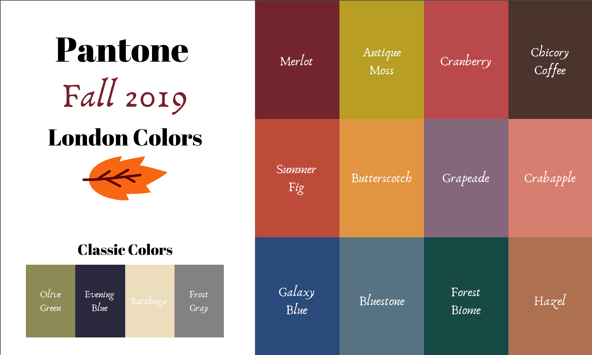
Today’s post will introduce you to the London palette and give you a few sneak peeks at the upcoming outfits.
Both the New York and the London palettes included numerous fall yellows, reds and browns. They both included a green, some blues and hues with pink undertones, but the London palette is the only one to include purple, which I thought was interesting since purple is trending right now. Purple has always been one of my favorite colors, so I was excited to see it included on this palette.
In all honesty, I like this palette better than the New York one. I always veer towards richer more saturated colors, rather than pastels and I felt that I had an easier time finding pieces in my wardrobe that better personified the color palette. In this palette we find words like vital, fortifying, robust, delicious, rich, baked, arresting, mellow and distinctive to describe the colors.
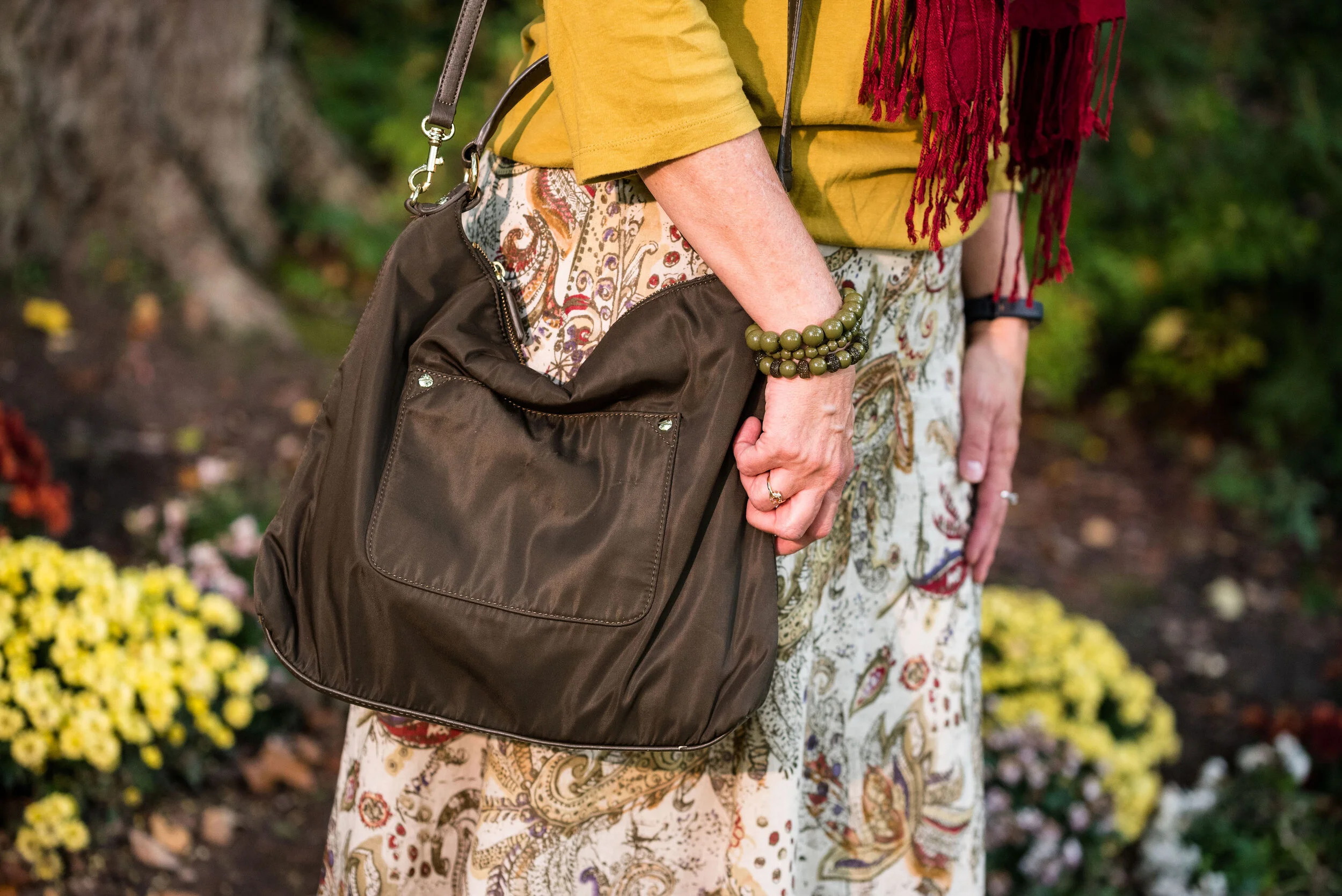
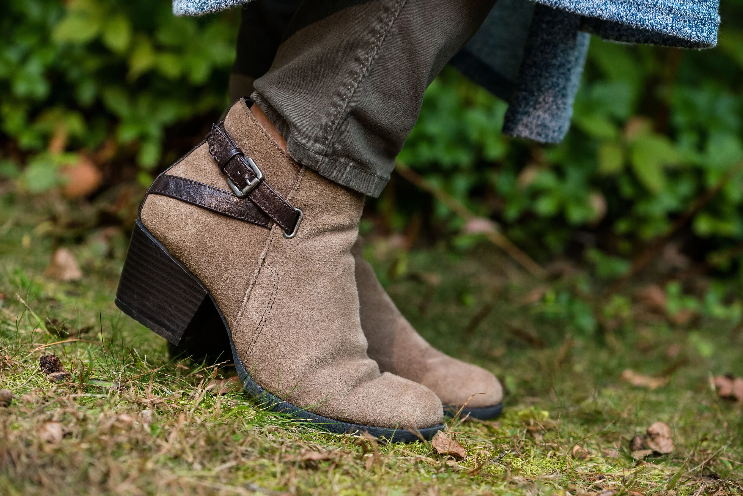
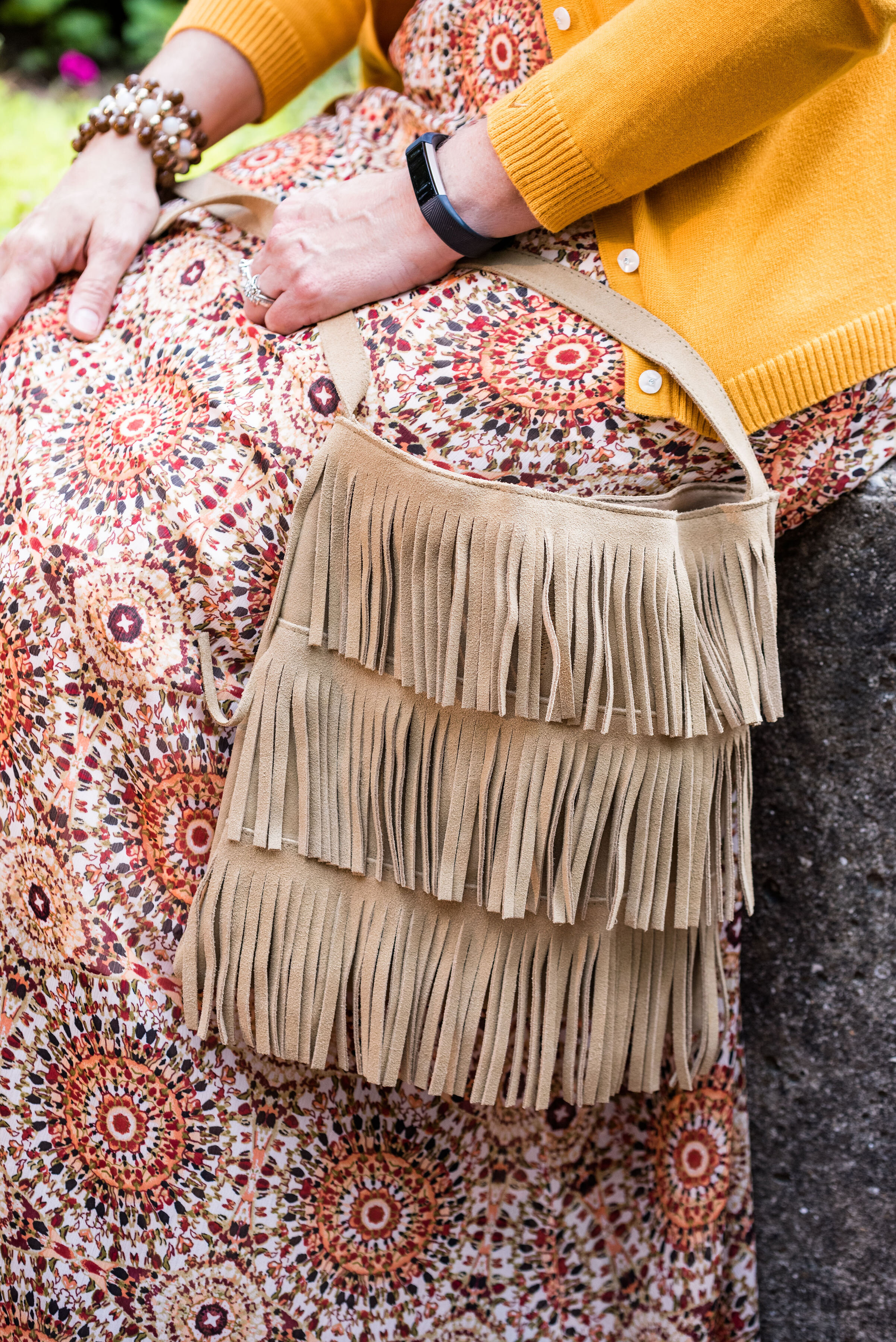
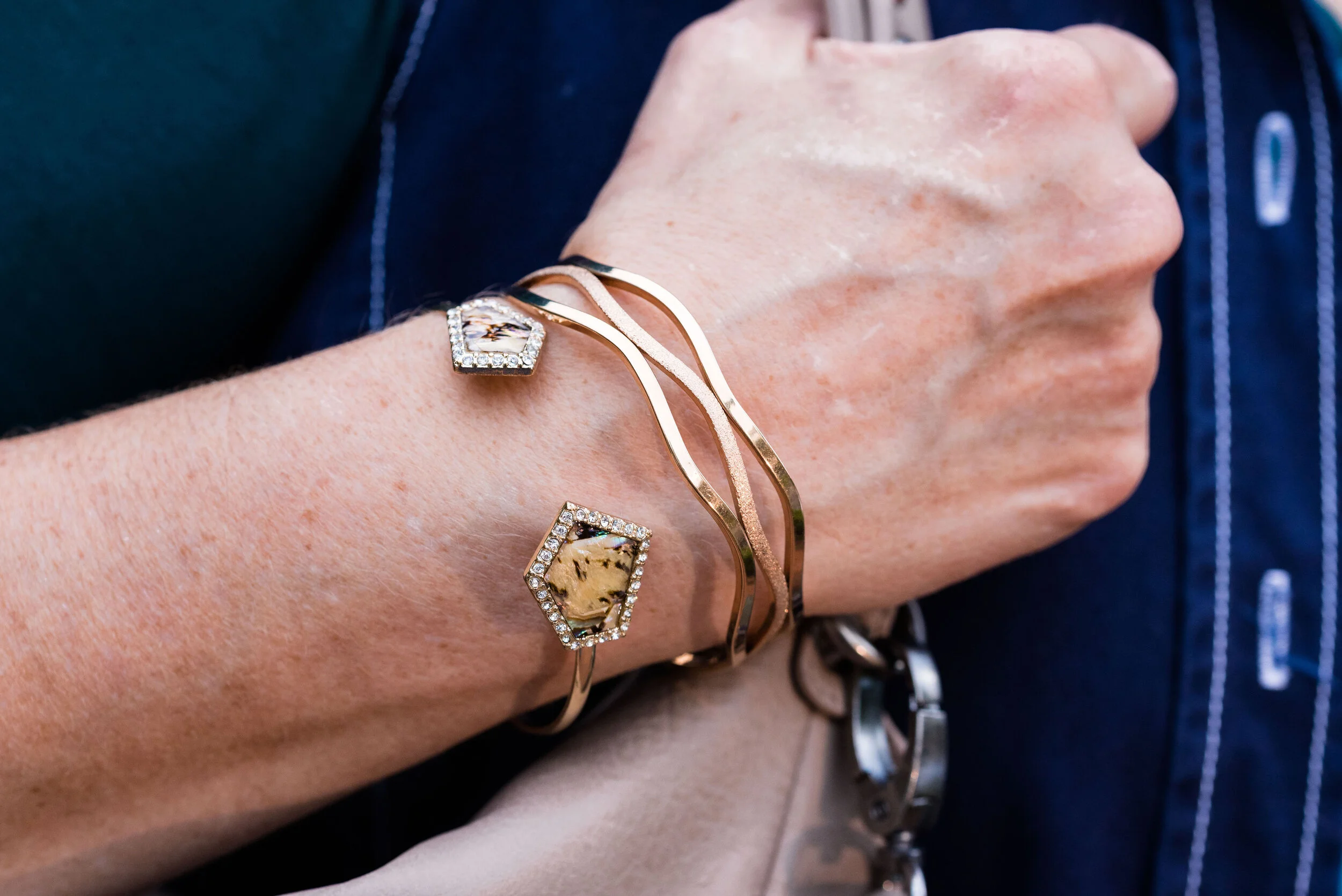
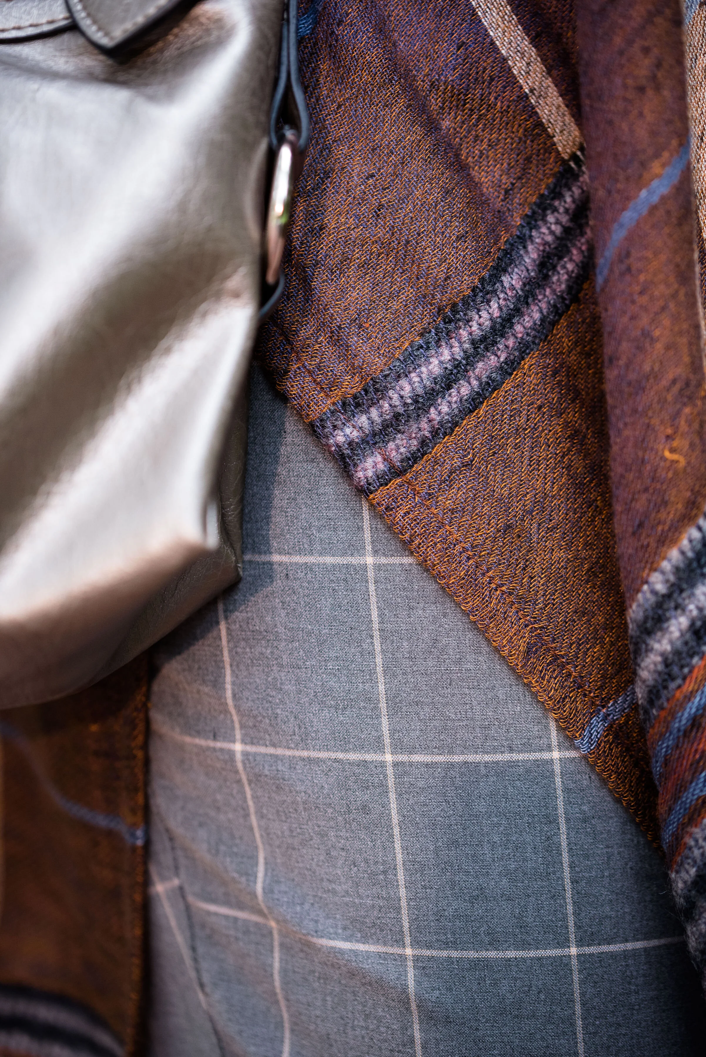
I hope you will join me on Thursday as I take a closer look at the London color palette for this fall. Here are a few peeks at what is coming up.
I hope you will join me on Thursday for the start of this series and a look at the first two colors.
Have a great day.
Photo and graphic credit Rebecca Trumbull.

