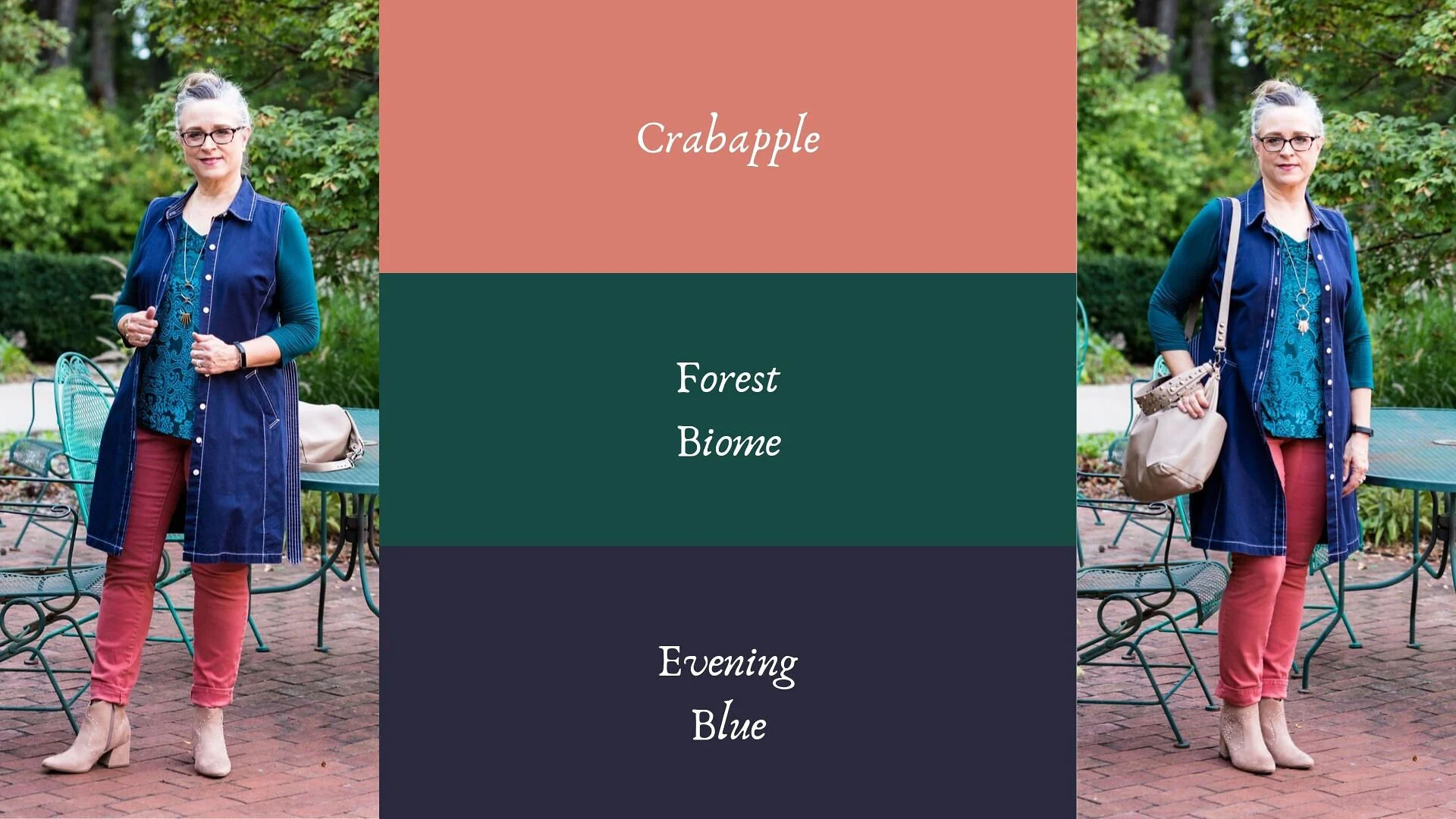
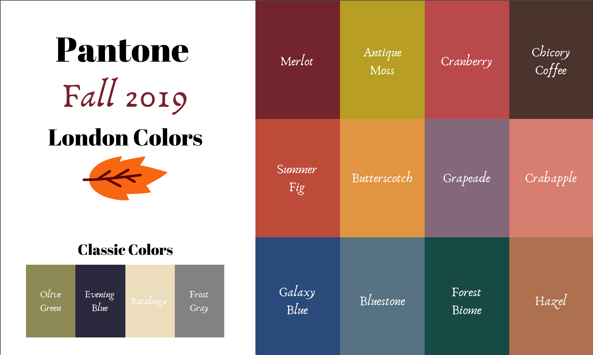
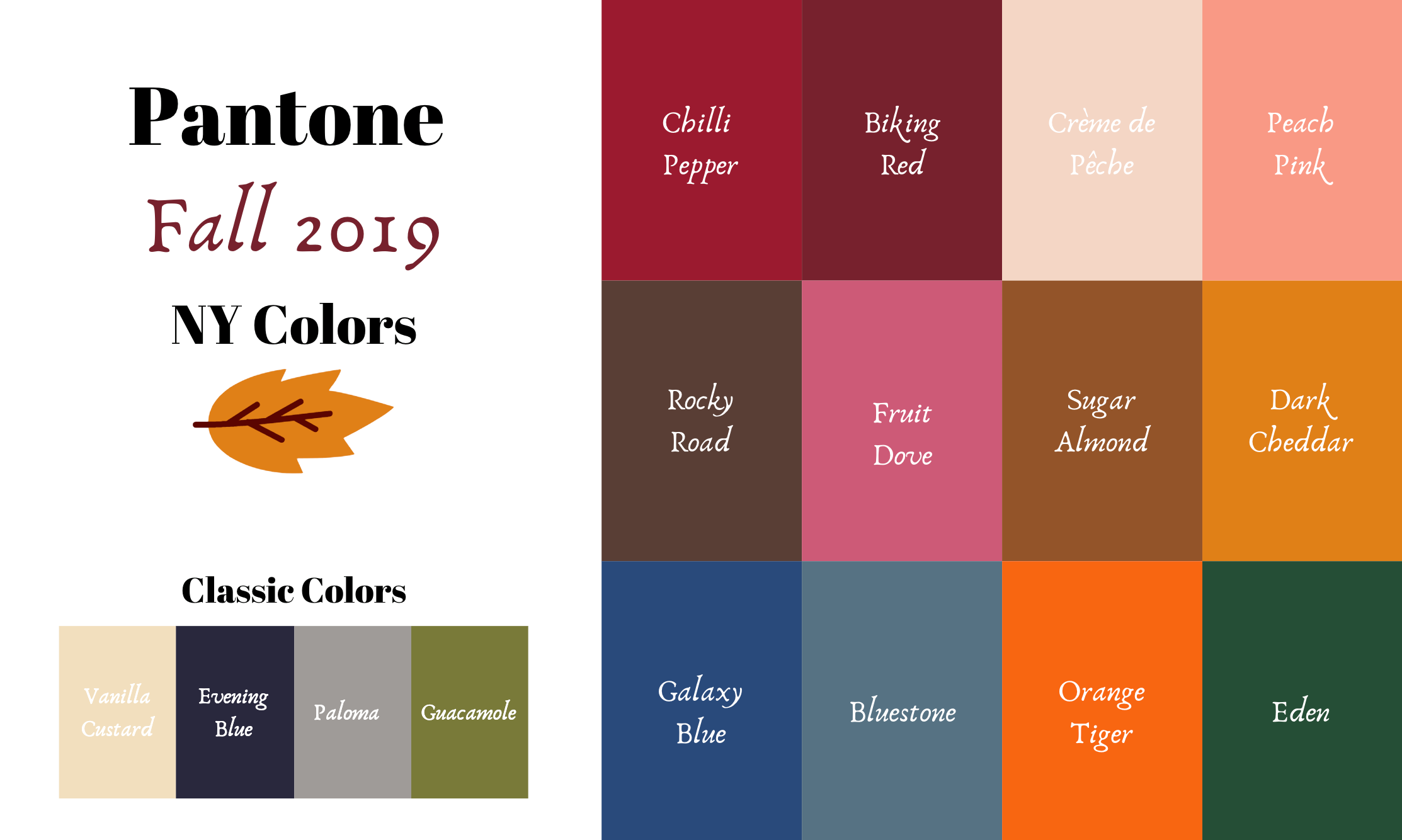
Pantone - Autumn/Winter - Galaxy Blue and Hazel

I neglected to get my post done for Tuesday. Monday and Tuesday, my grandson had off from school. It was parent/teacher conference days. My daughter had her appointment right away on Monday morning and Quintin is doing very well. He is nationally high ranking in his reading ability and math, so this Grandma is proud of a certain nine year old.

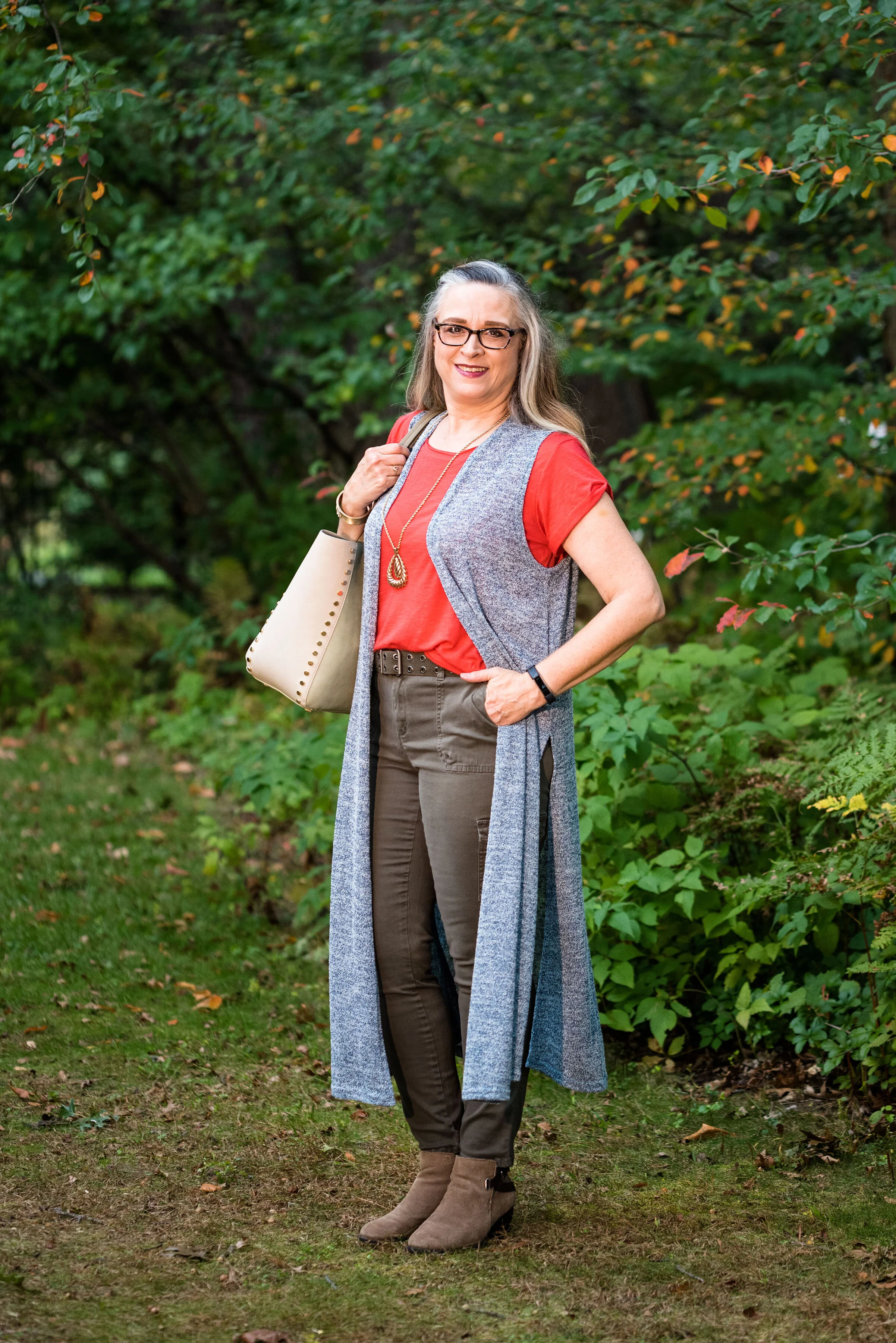
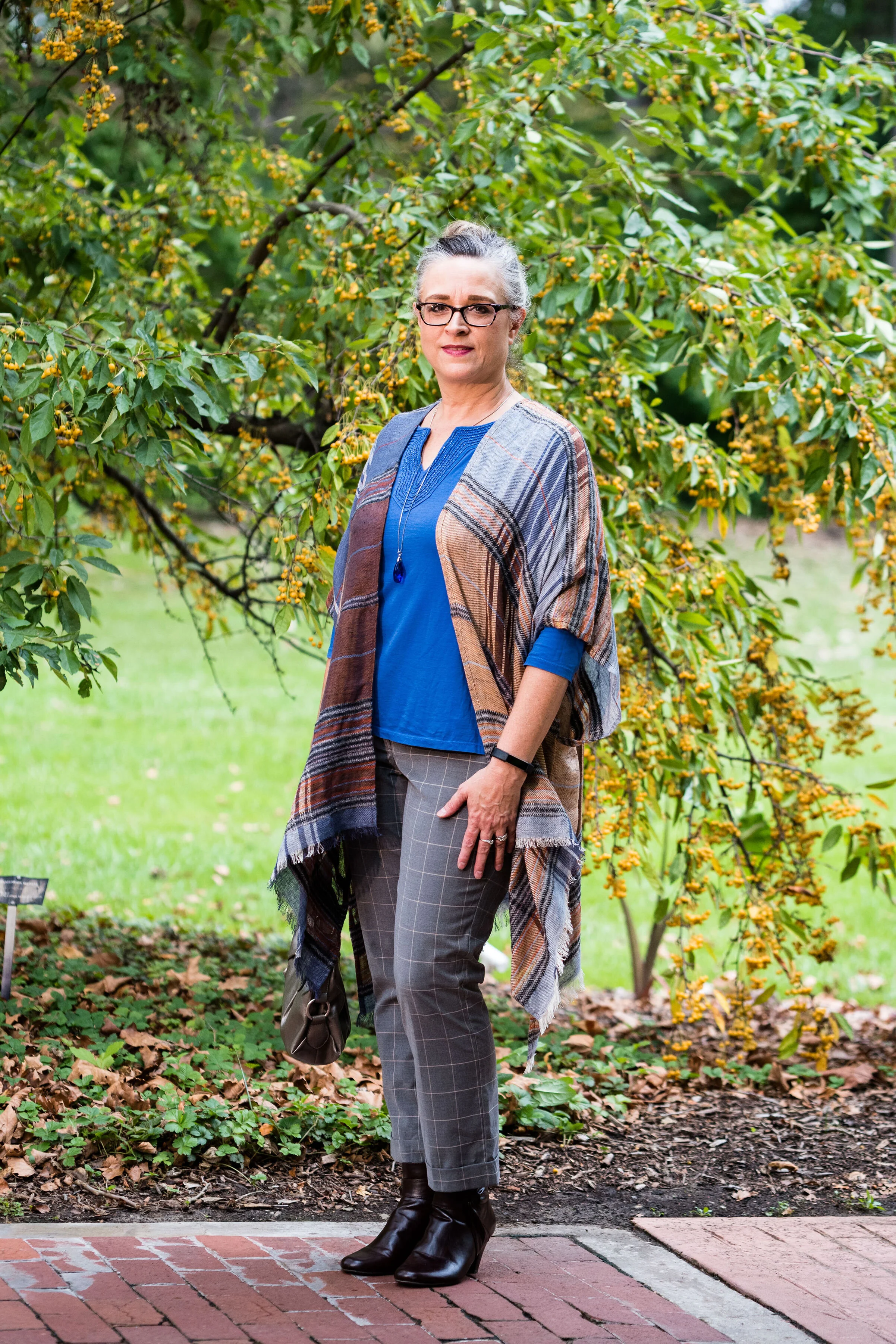
This is the last outfit from the Pantone - Autumn/Winter - 2019 London Palette. Next week, I’ll have another recap post to show you all the London colors and then we will put the Pantone Institute aside until spring. For your information, the Spring/Summer colors for 2020 are already up on the website and have been for a couple of months, so if you are really curious, you can go the to the Pantone website and see what they look like. As for this blogger, you won’t get to view them here until spring.

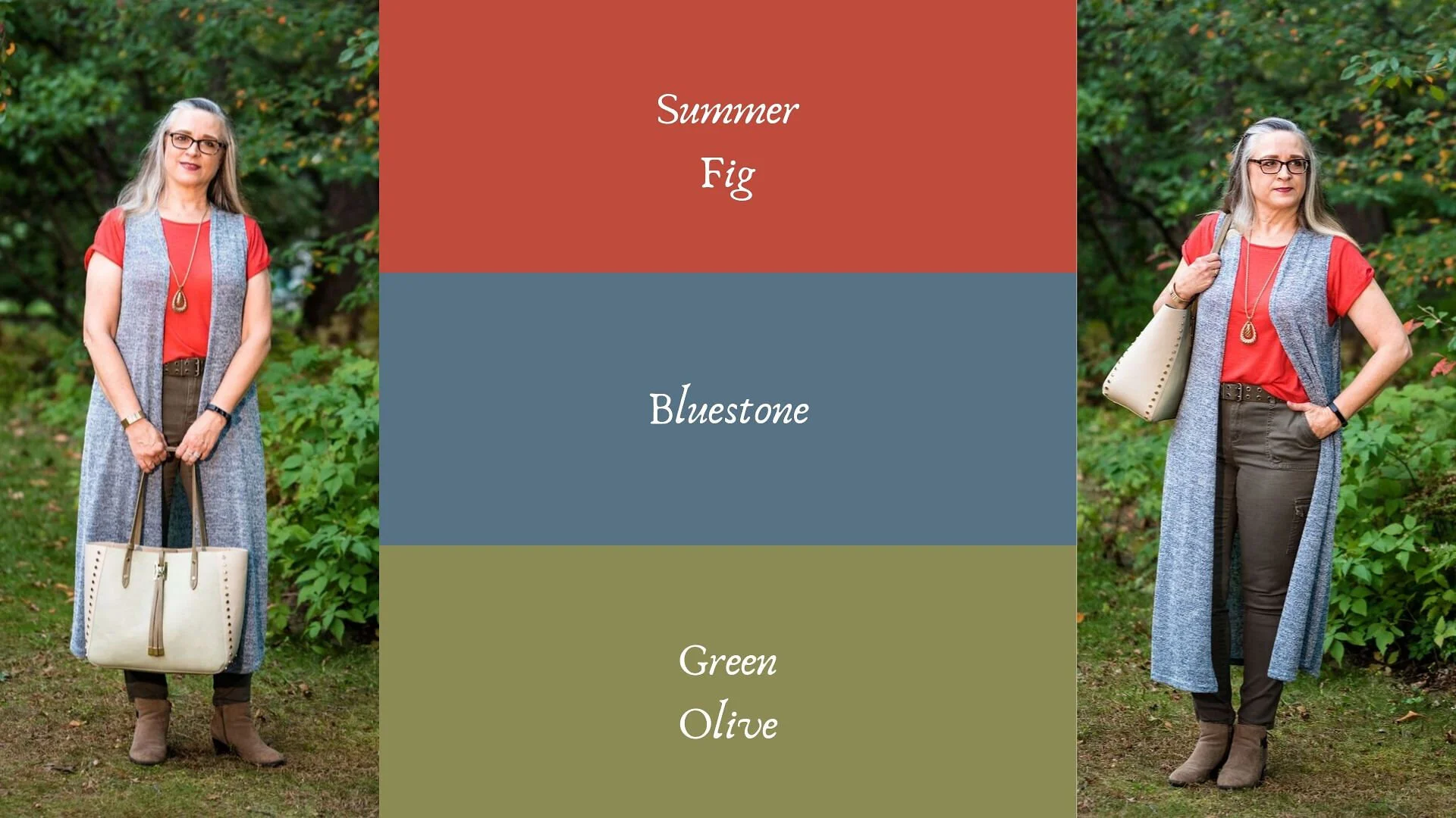
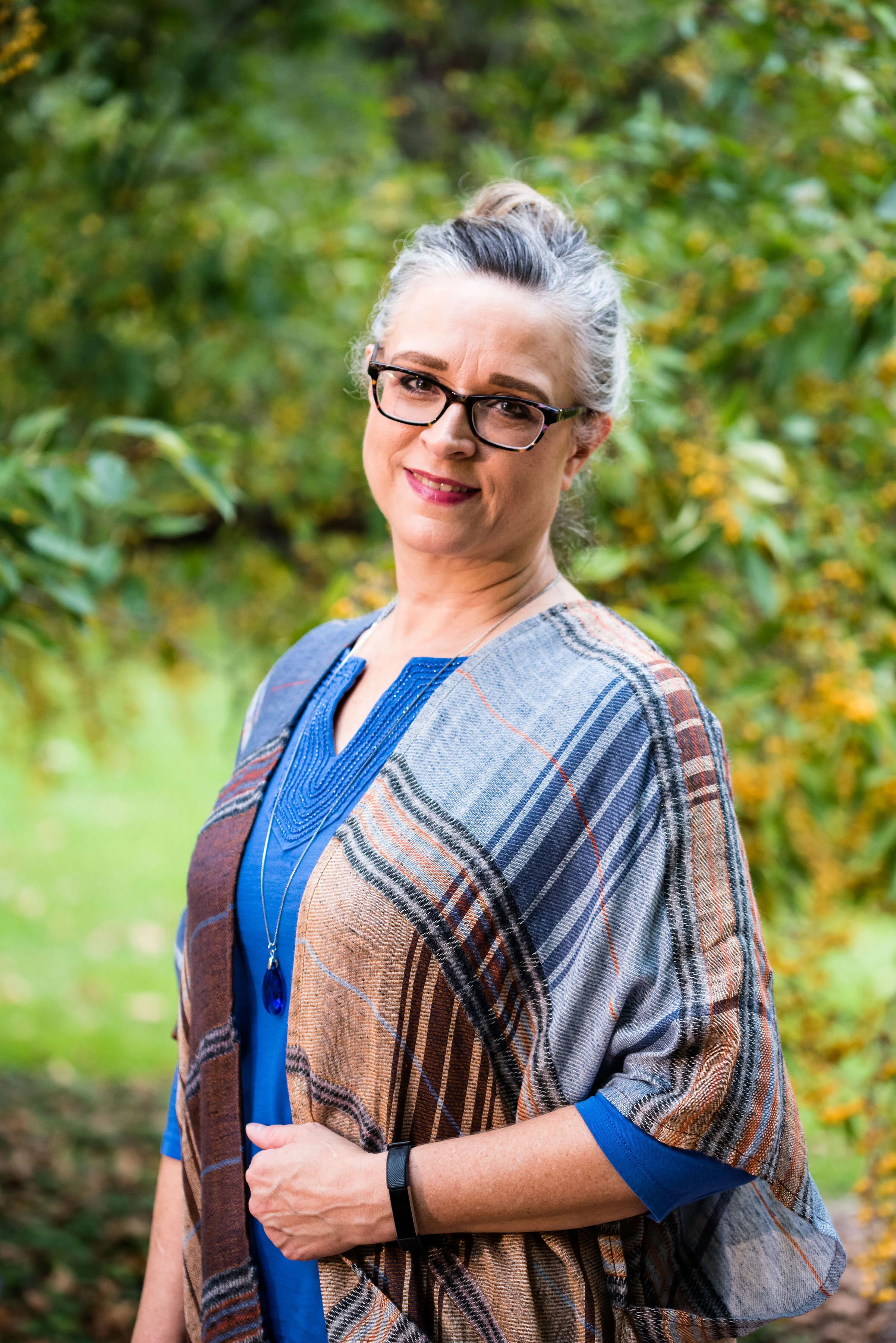
Our last two colors are Galaxy Blue, which was also on the New York palette and a mellow brown called Hazel. This brown is not one I would regularly reach for. I like colors that are more rich and saturated. In the Crayola Crayon box, this color might be similar to Antique Brass. See the complete list of current crayon colors here. Talk about fun color names! Be sure to read some of those. They are not merely called red, pink or blue any more. Ha, ha.

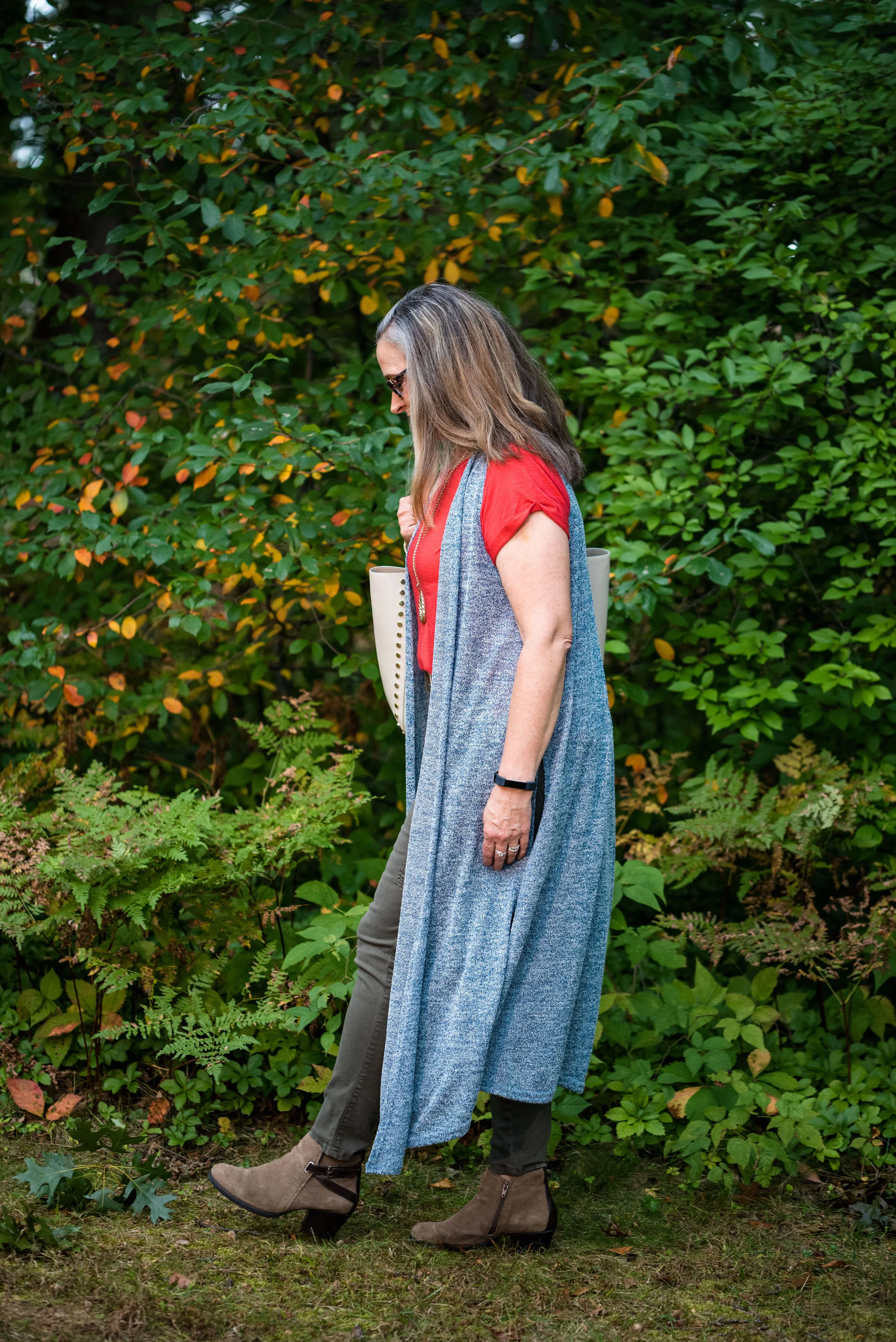
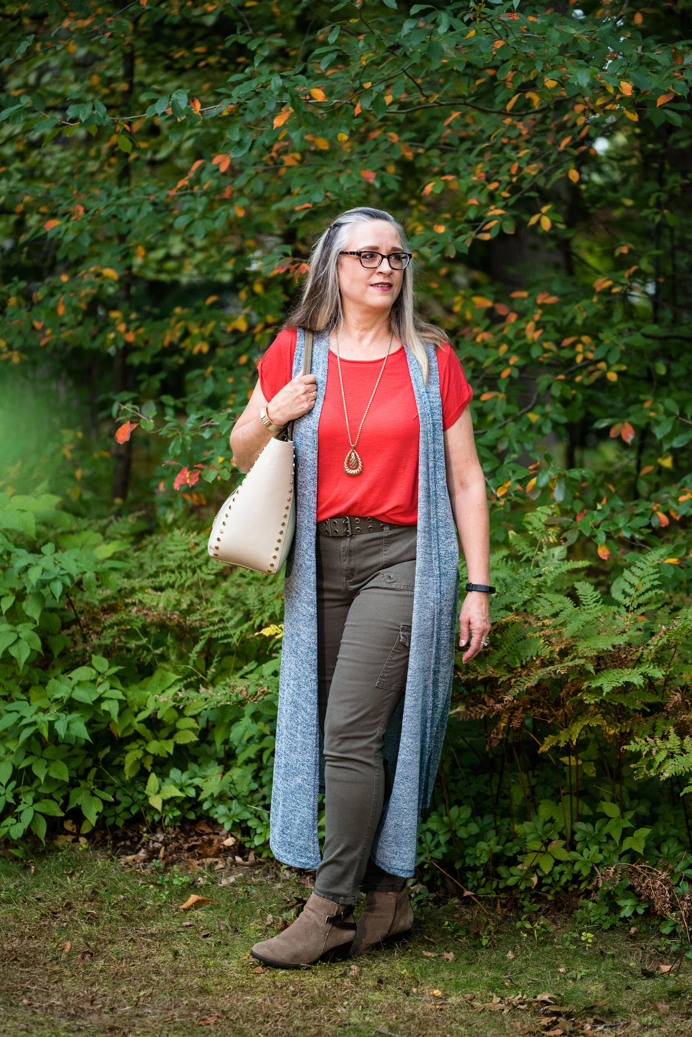
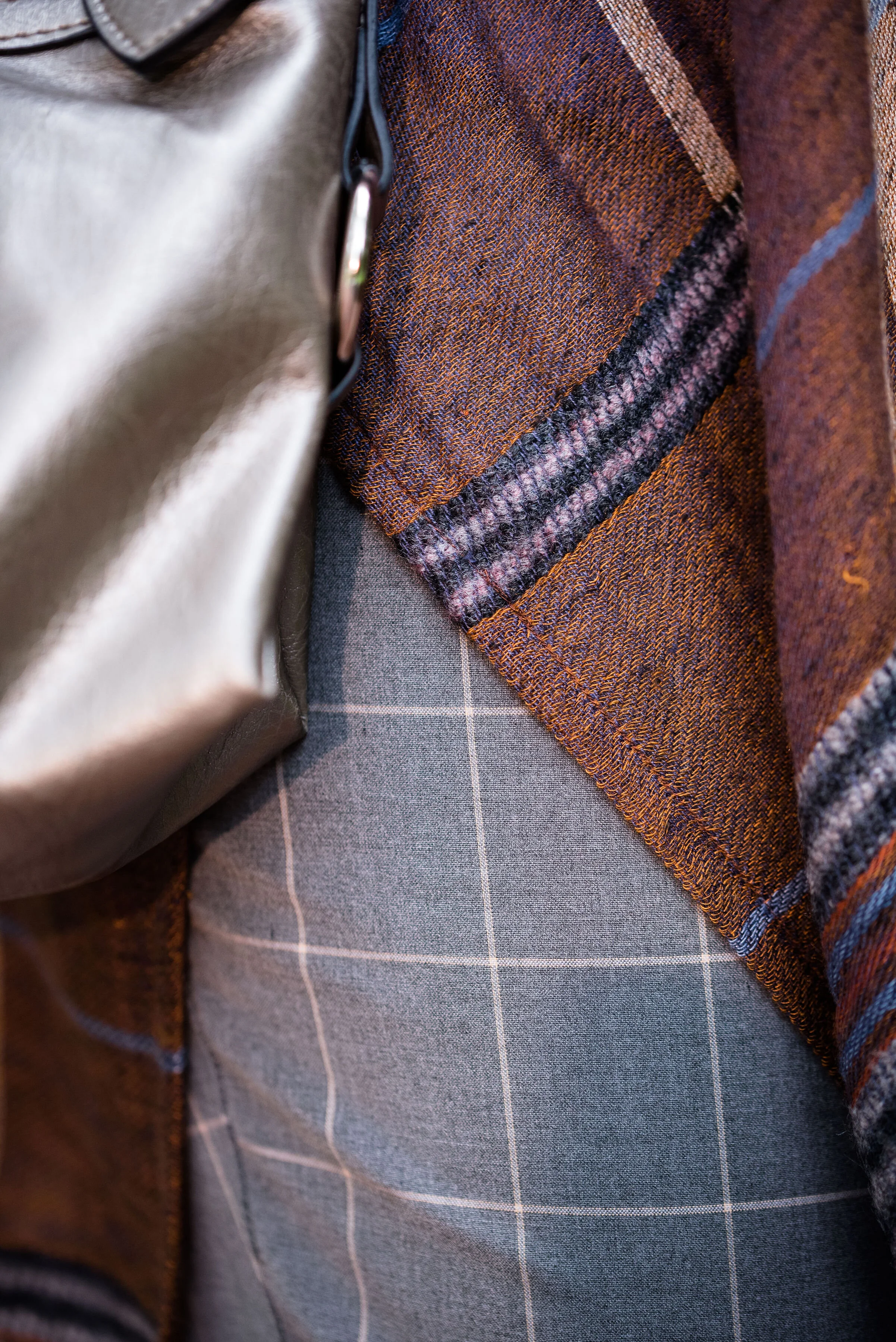
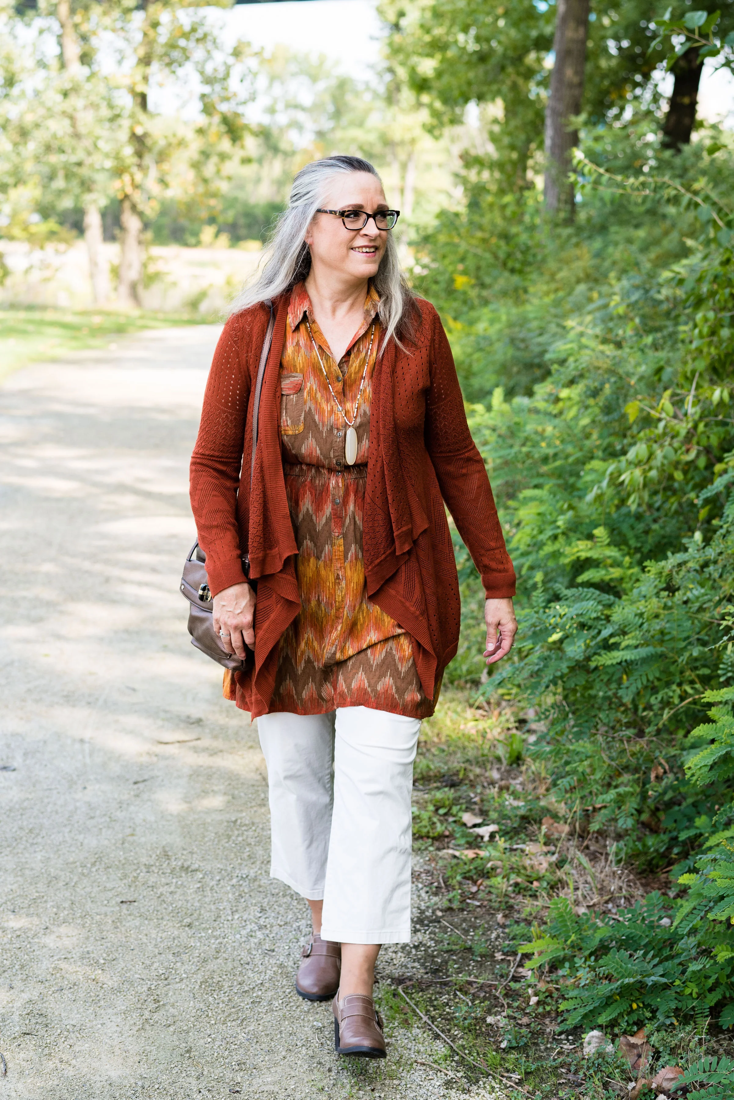
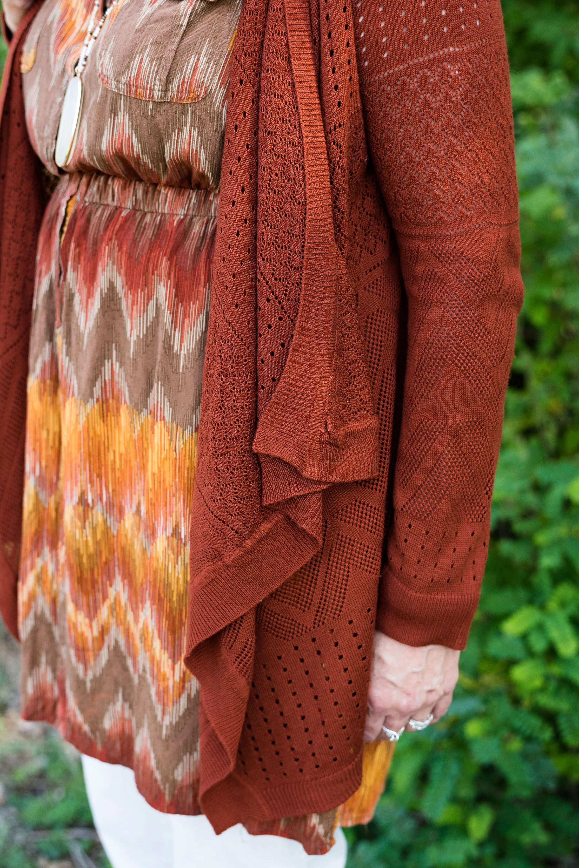
I decided to do some plaid print mixing in this outfit, as you can see with my ruana and my pants. I must tell you how I came to own this beautiful ruana. My hubby and I were out on a date. We try to go out once a week, usually for dinner and then to Barnes and Noble bookstore. We both love spending time around books and we usually end up getting a hot drink and sometimes a treat. On this particular night we went out for Mexican. After we were finished eating he told me that before we head to Barnes and Noble he had to stop at Bass Pro Shop and get something for his trailer hitch. I don’t even think twice about it. I don’t mind going to Bass Pro or Cabelas, because they both have fun things to look at, like mounted animals and clothing that I like, but would never purchase, because it is out of my price range.

We walked into the store and were heading down the center aisle. On the right side of the aisle are all the women’s clothes. We got to this lovely display where this ruana was styled over an ivory sweater. It immediately caught my eye. My husband said, “I thought you might like this.” I was shocked. Not only had he thought of me, but he had picked out something he thought I would both like and look nice in. He let me pick out a few other things besides the ruana to try on and just hung out while I did. I picked out the ruana and a rusty orange sweater, that I haven’t worn yet, but that looks great under the plaid. My husband does not do things like this very often, but it sure makes an impact on me, when he does.

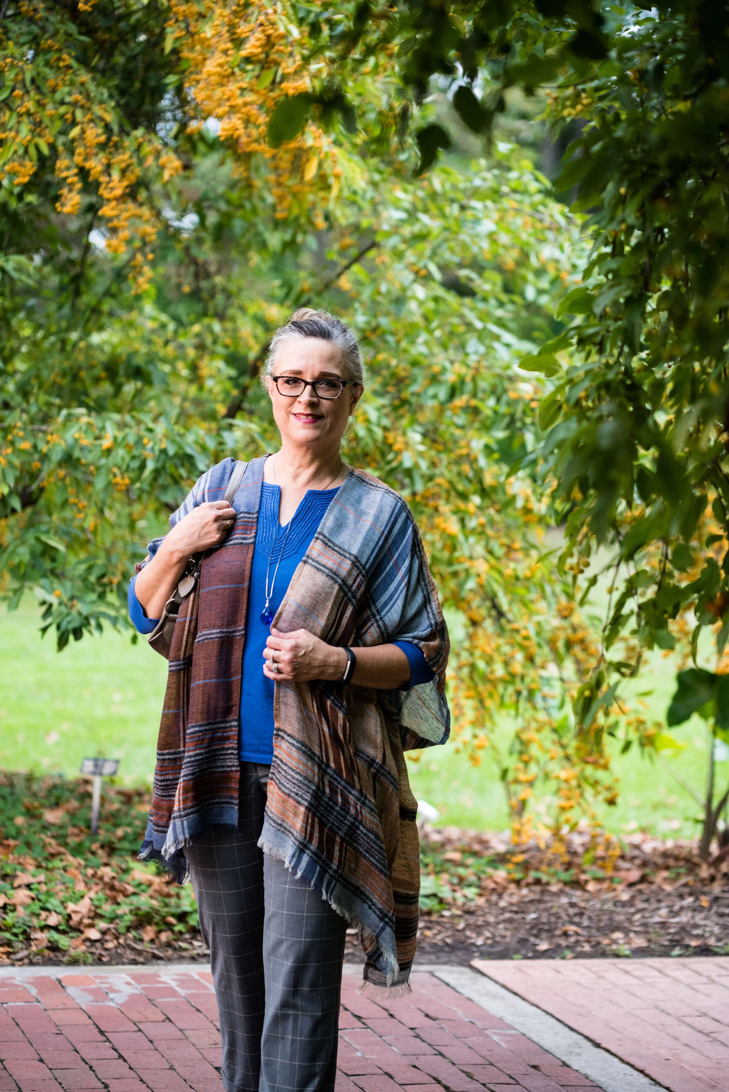
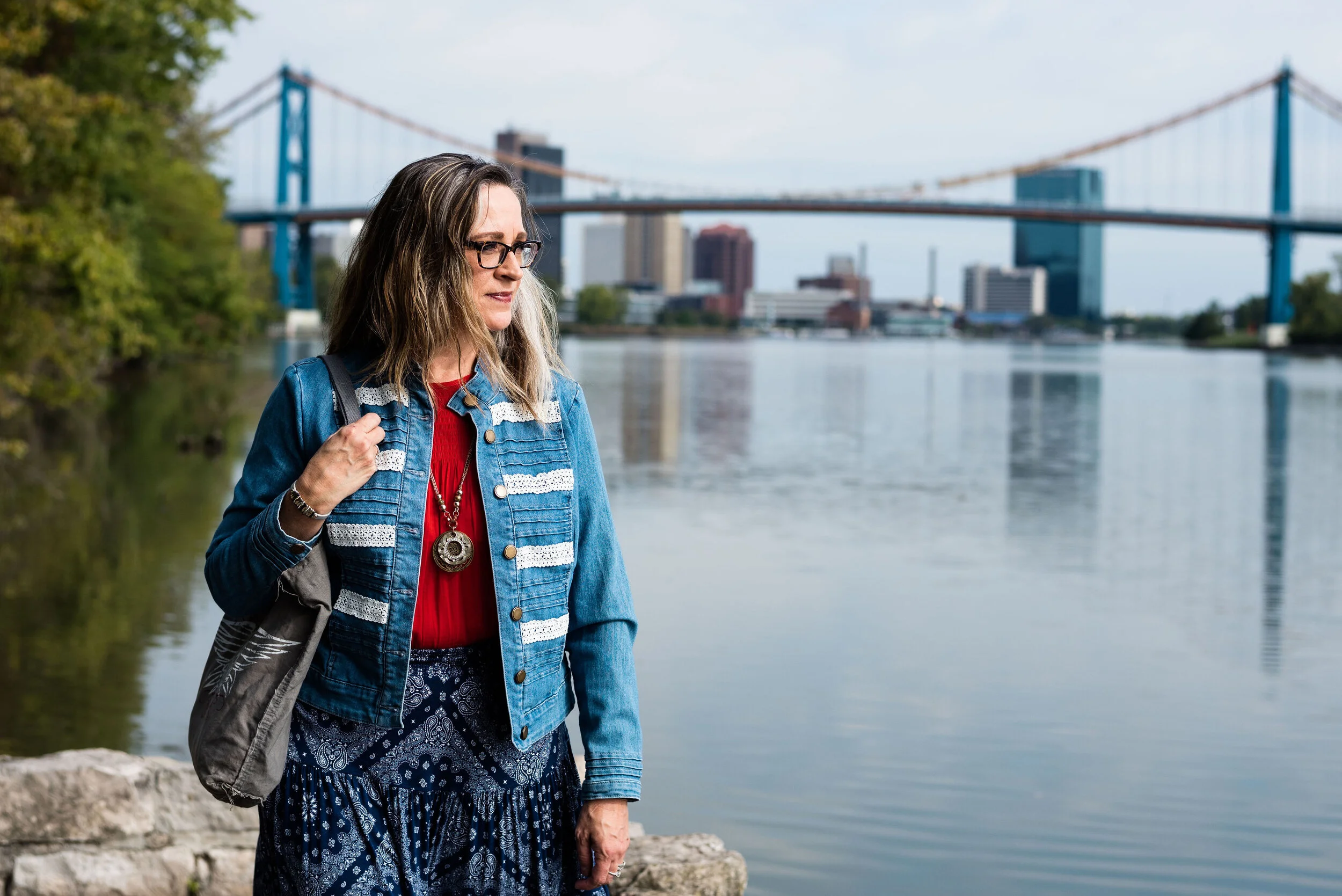
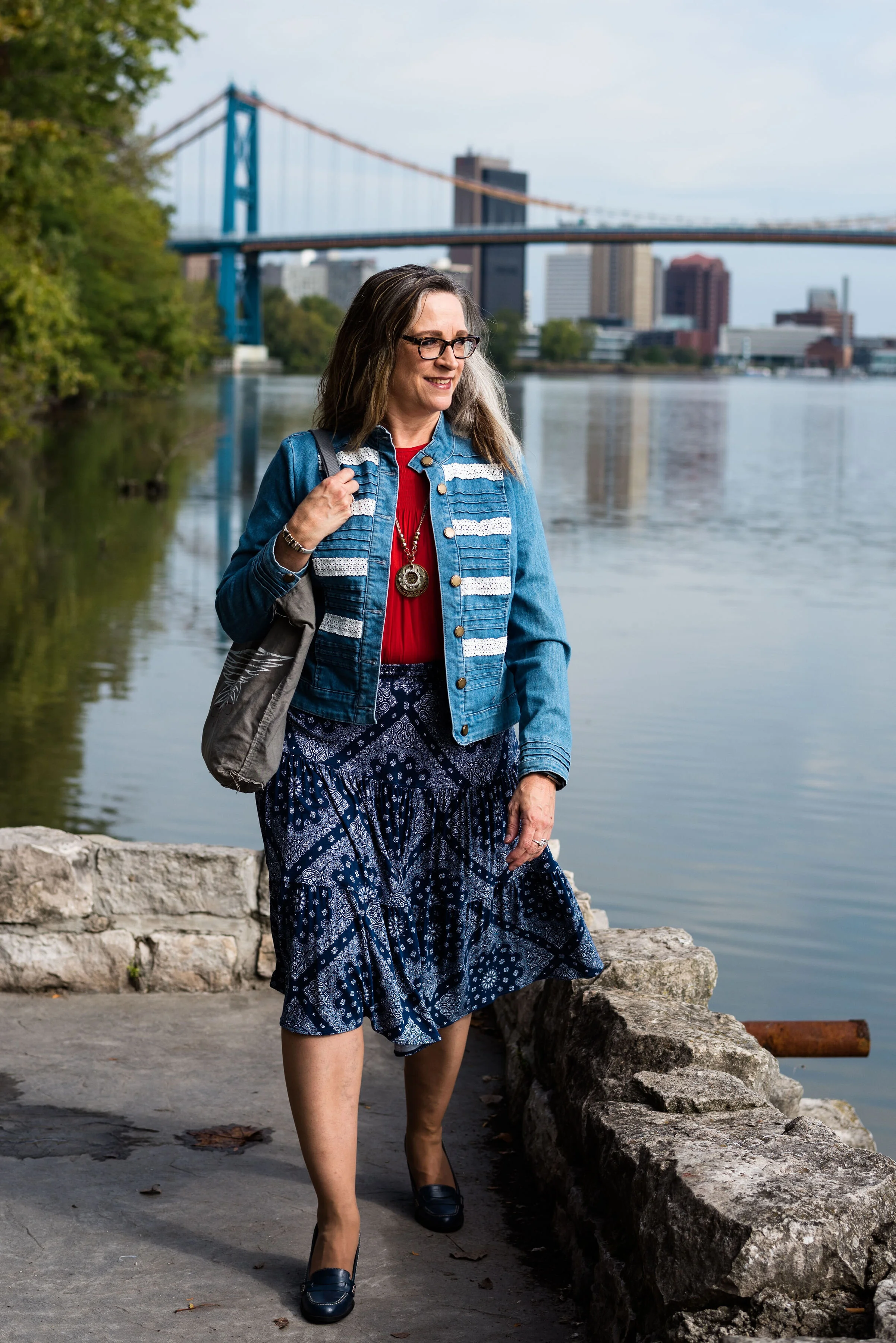
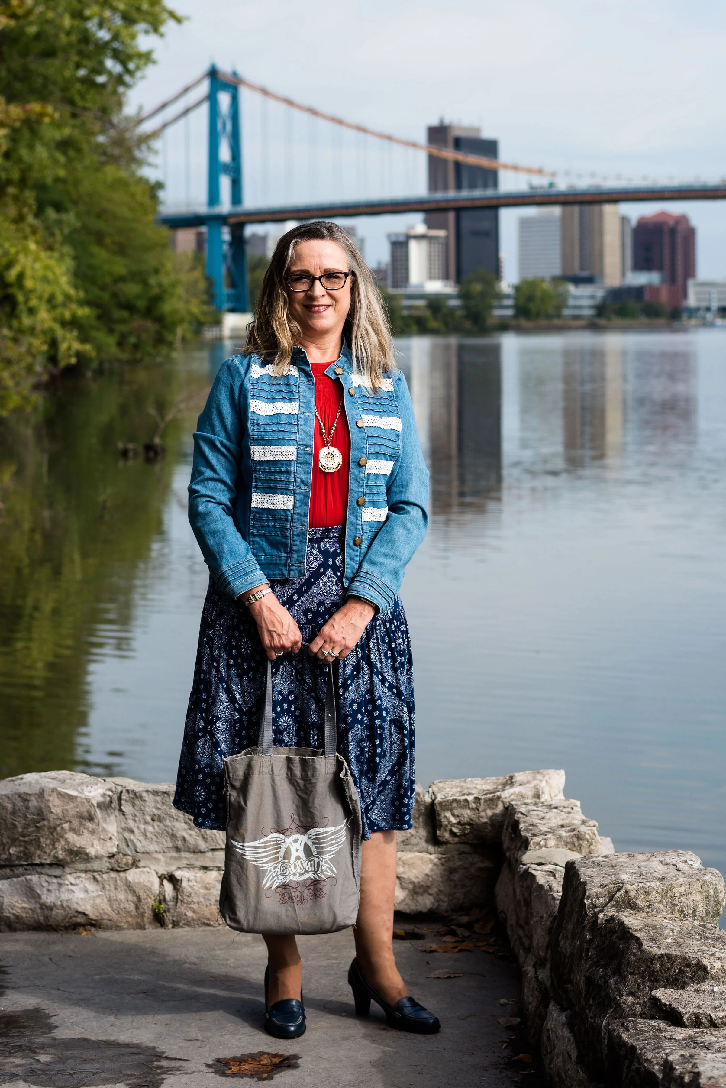
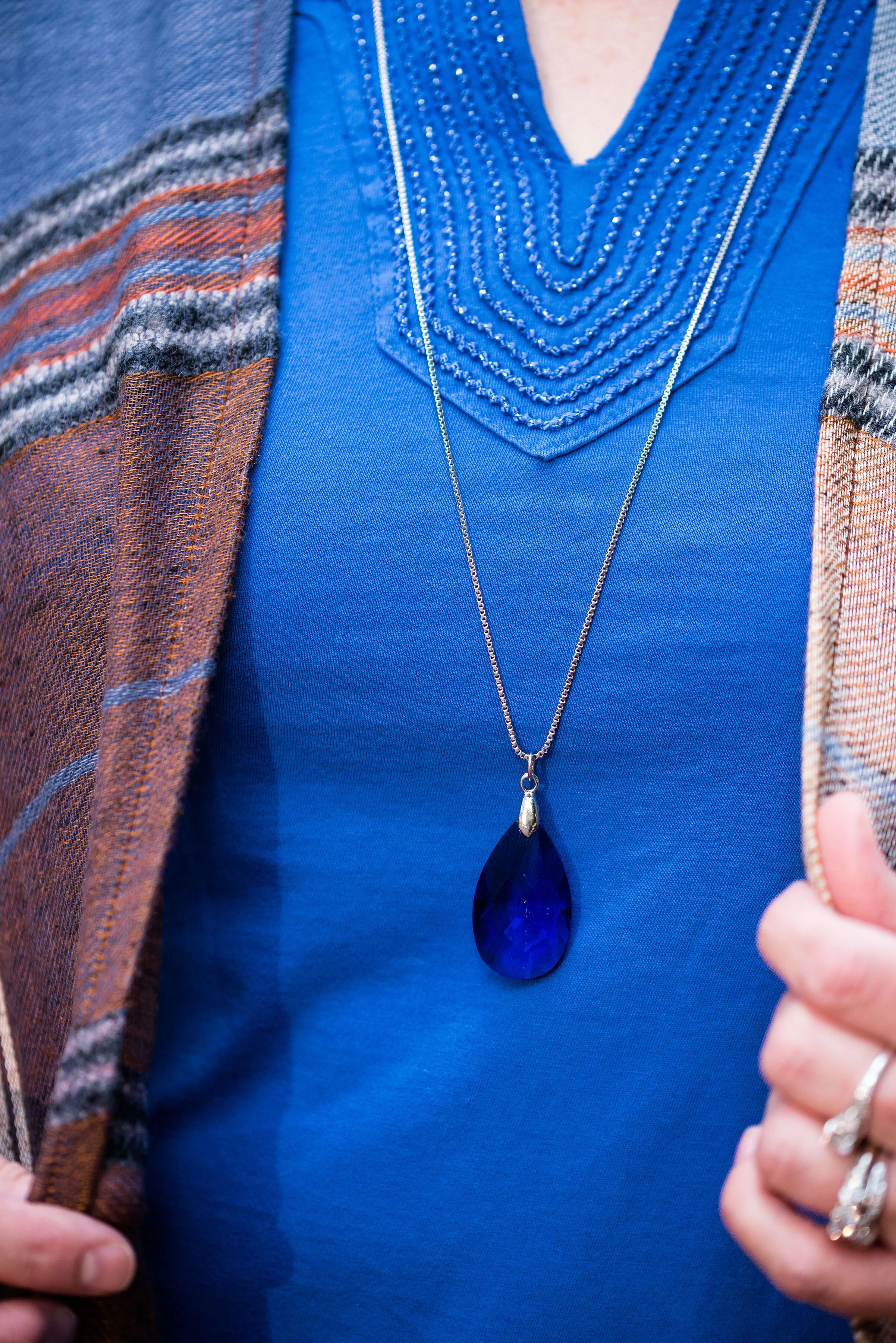
My thrifted blue tee is Charter Club brand. It is a bit brighter than Galaxy Blue, but once again, you get the idea. I like the detailing around the neckline.

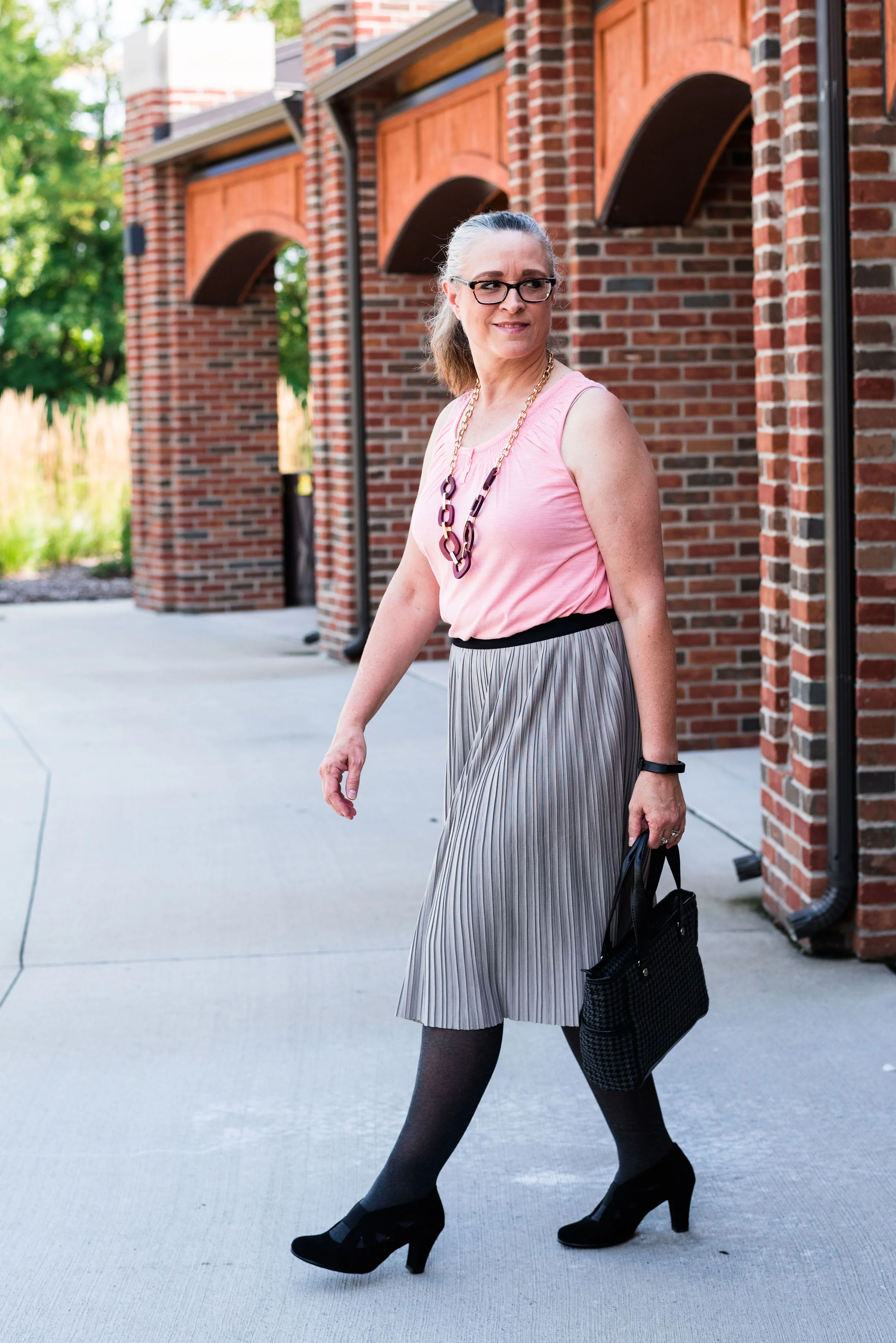
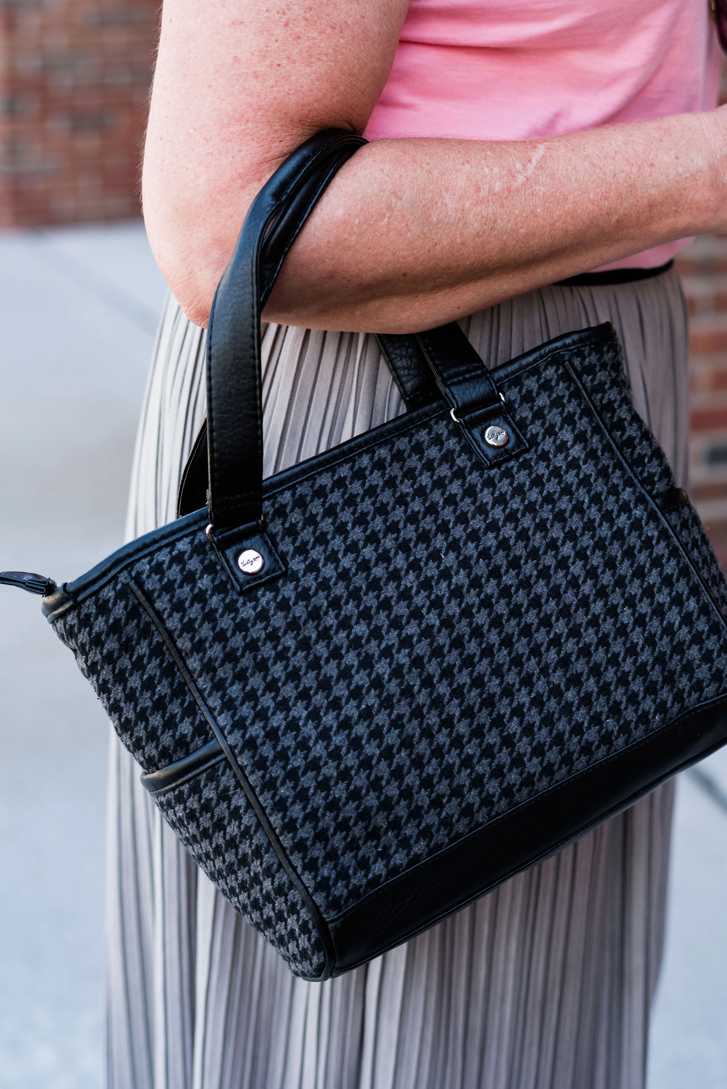
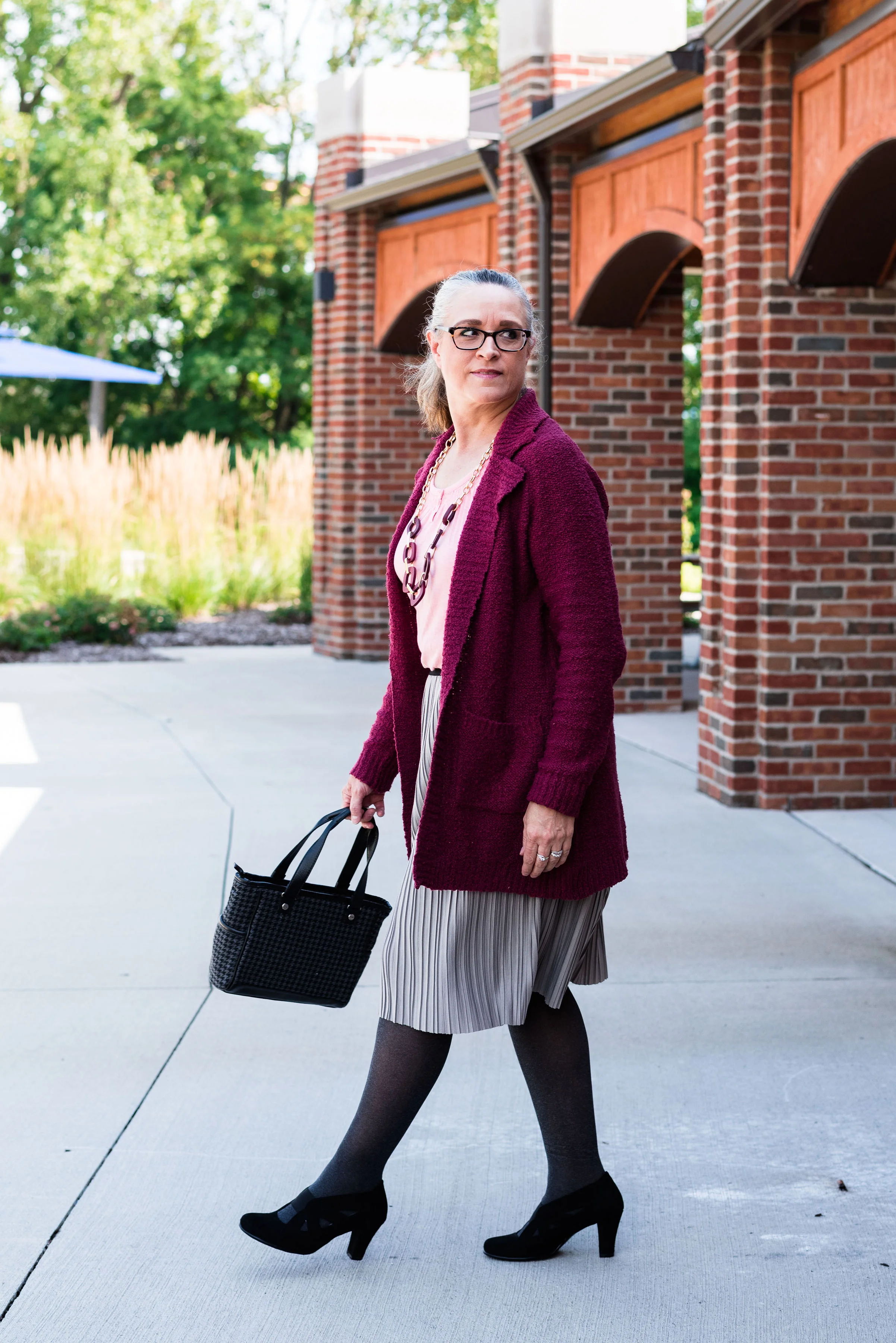
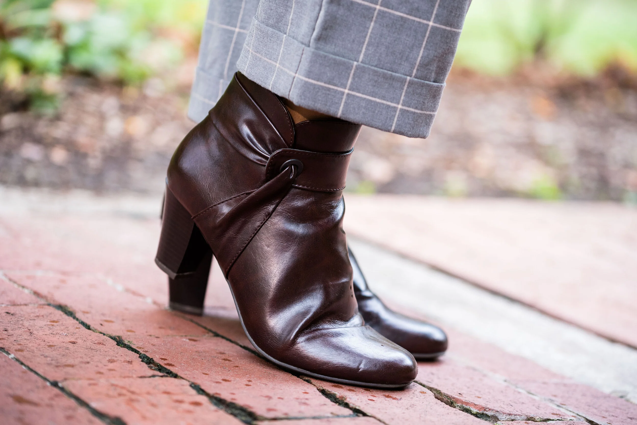
These gray pants are also thrifted and you can see how I styled them with a faux leather jacket, and with a pink sweater set.

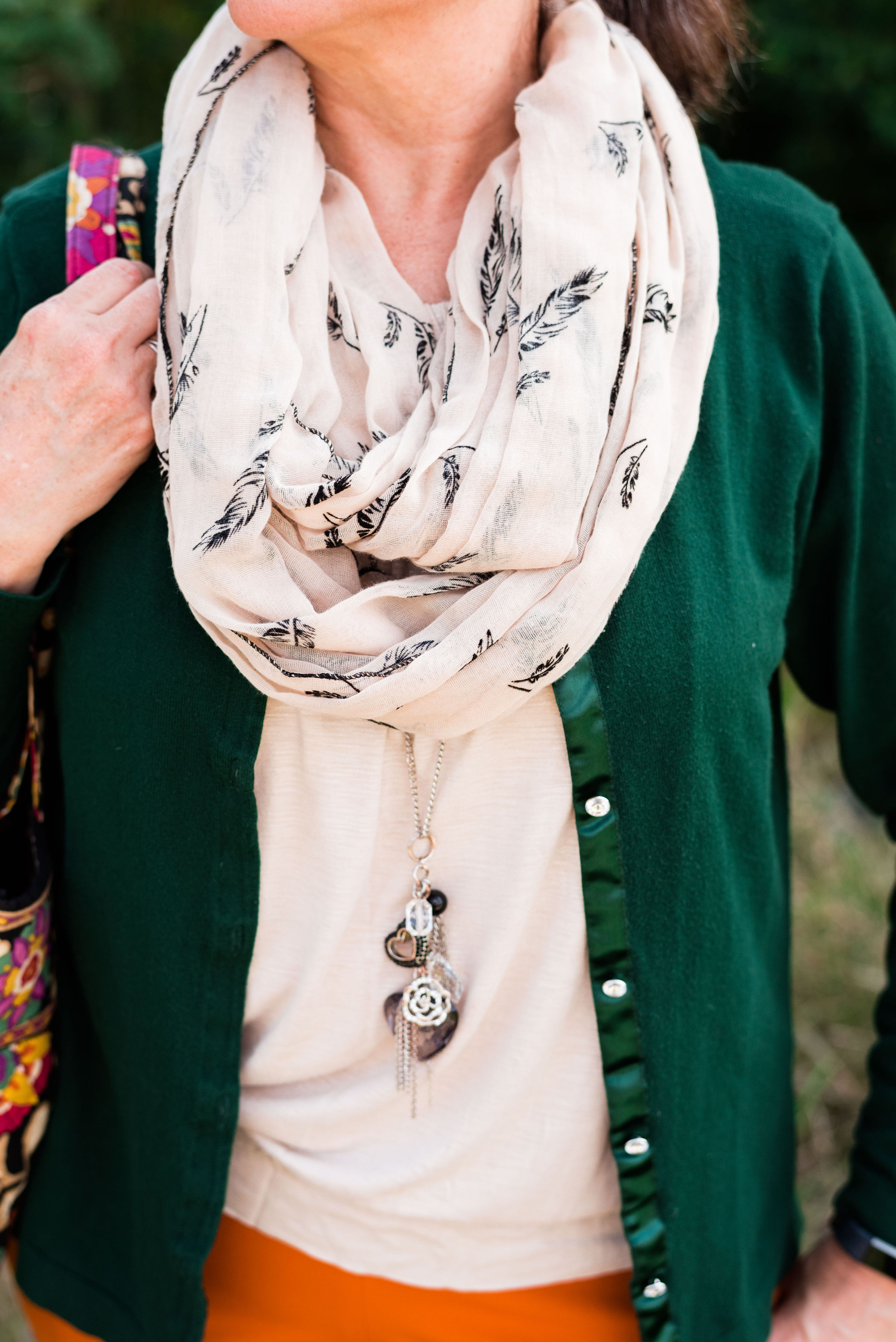
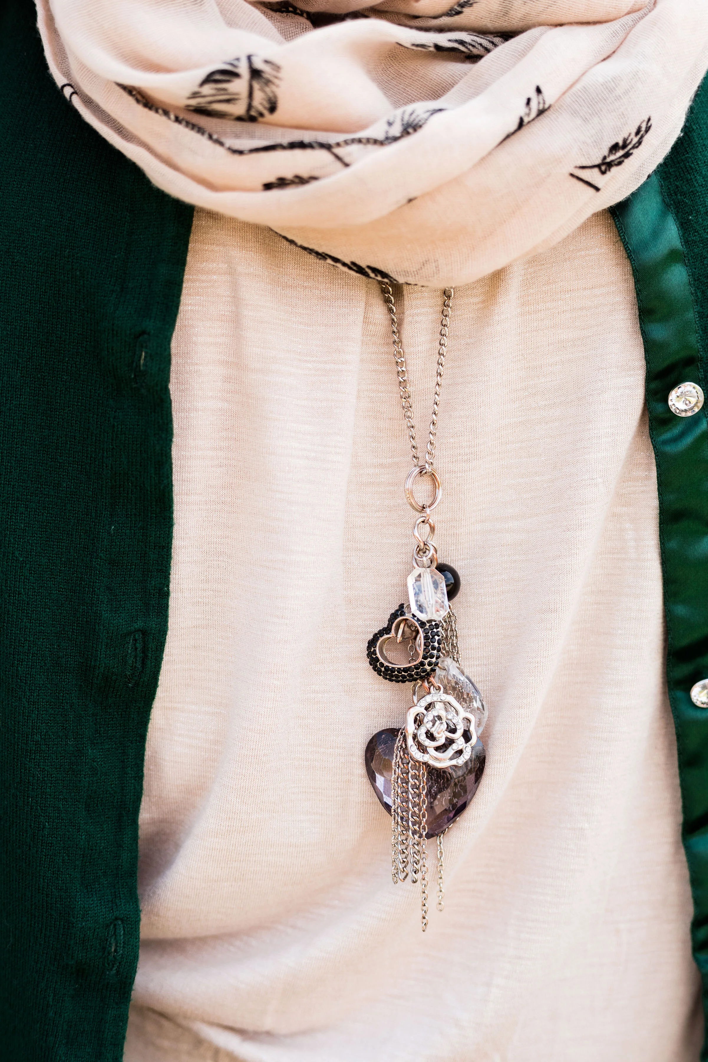
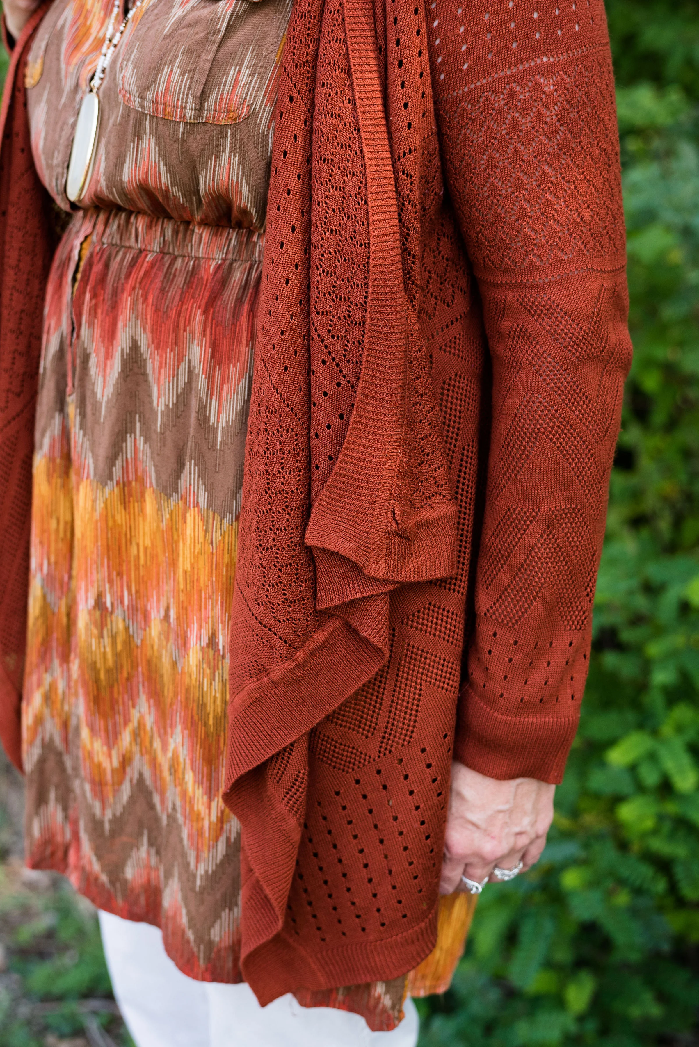
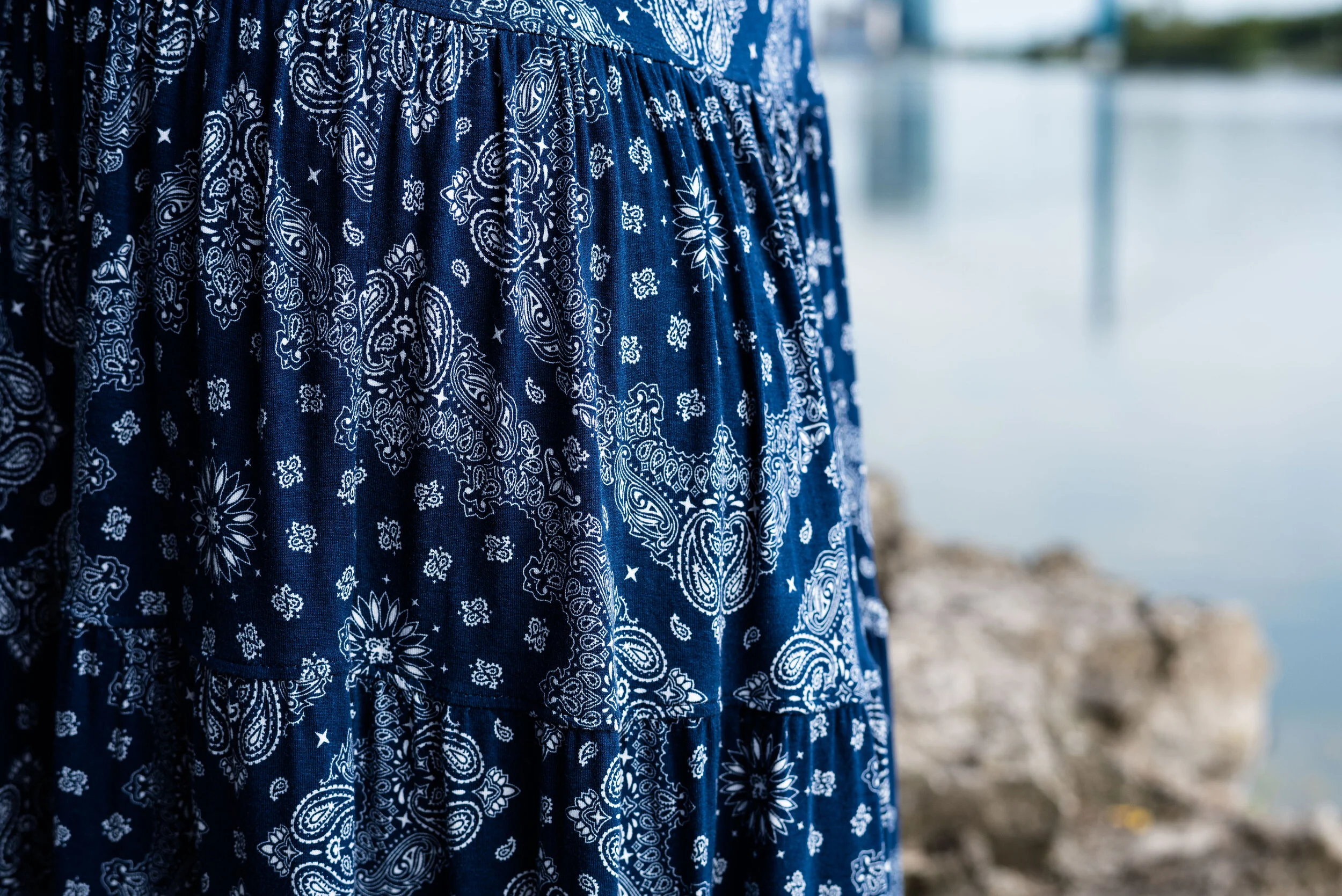
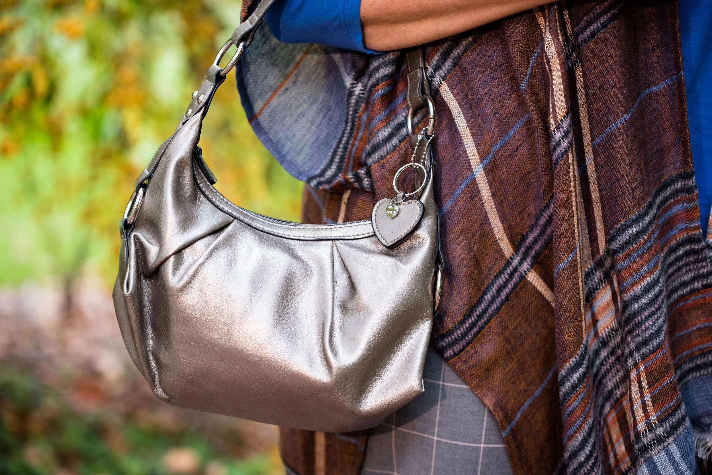
Here is a close up of my print mixing.

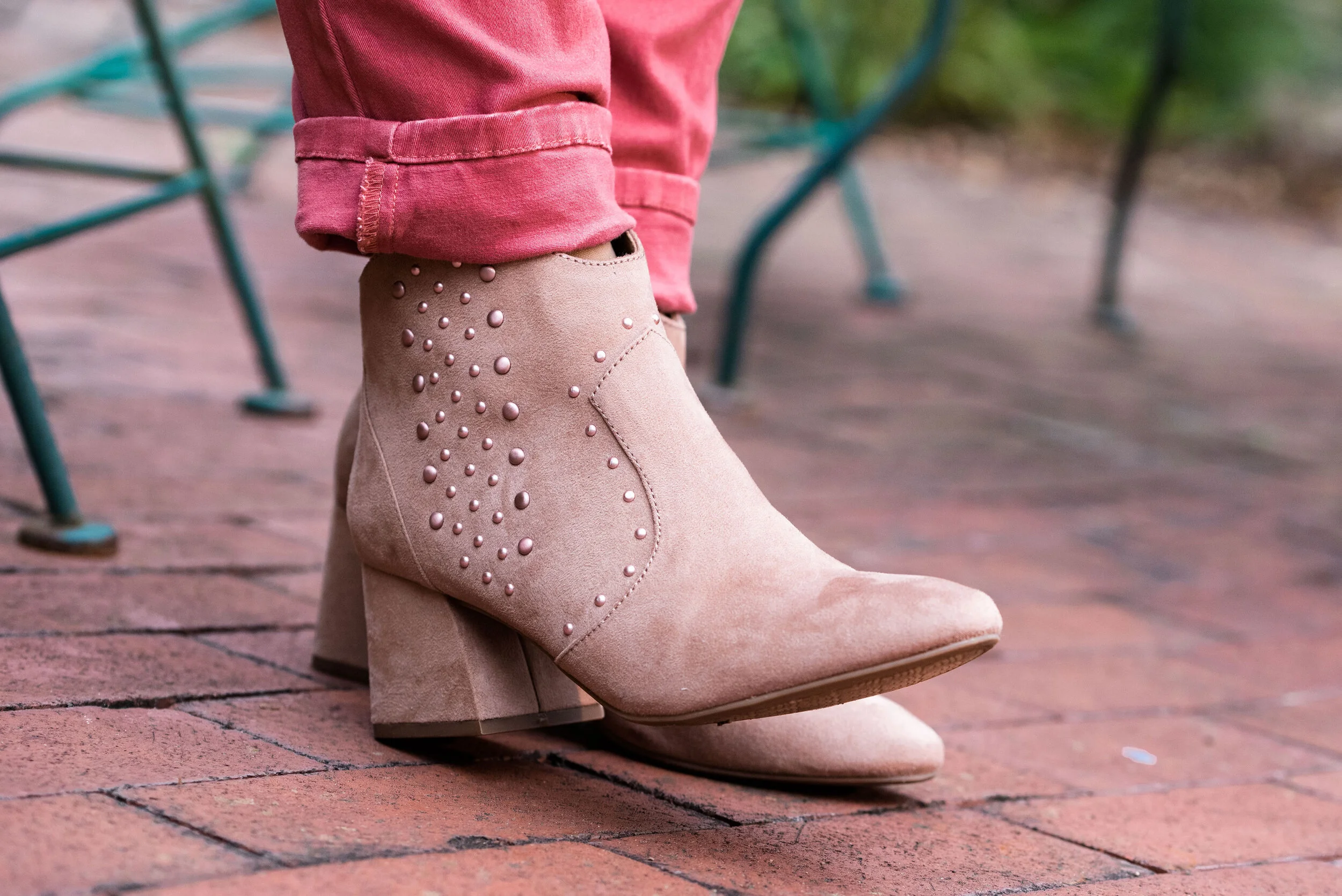
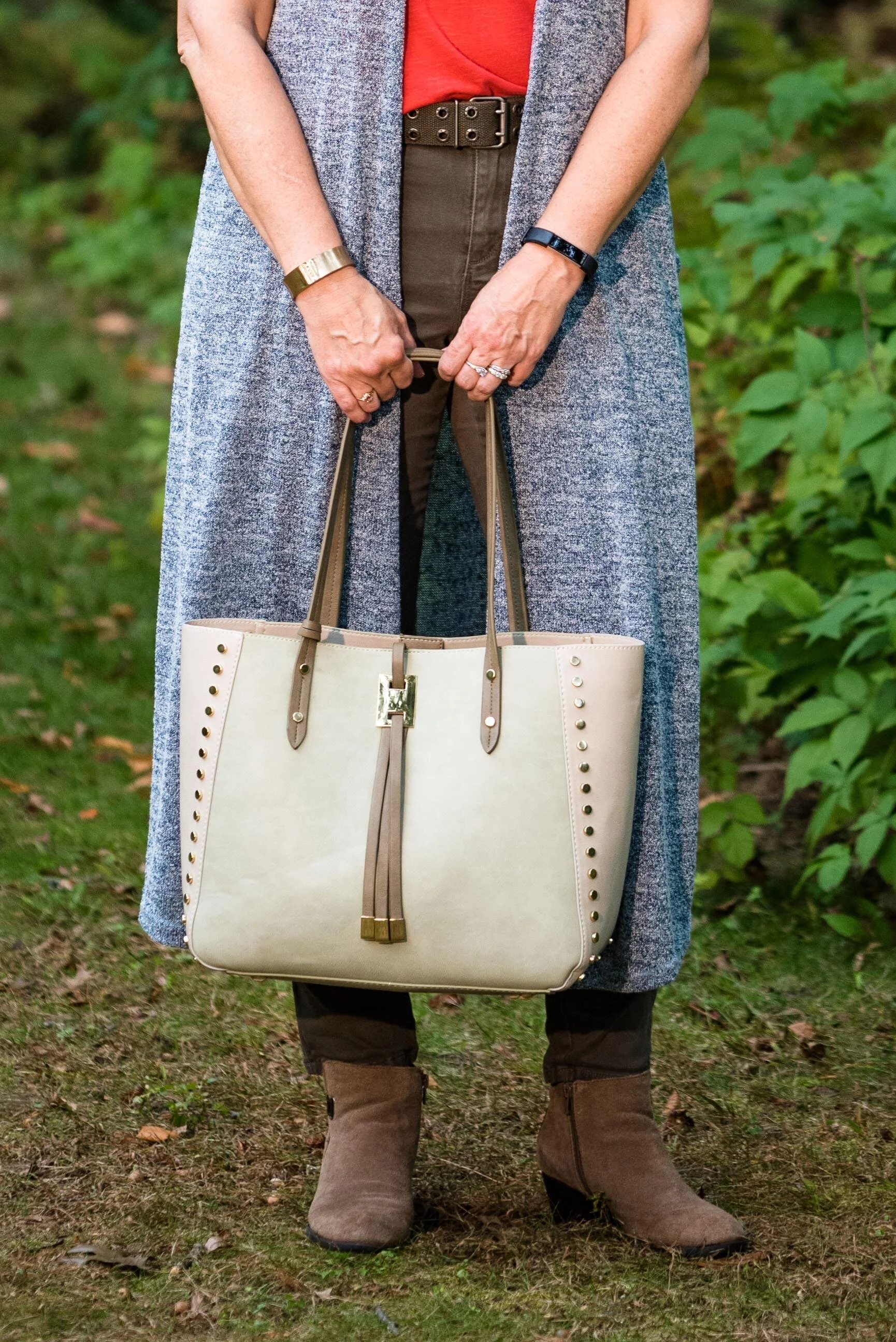
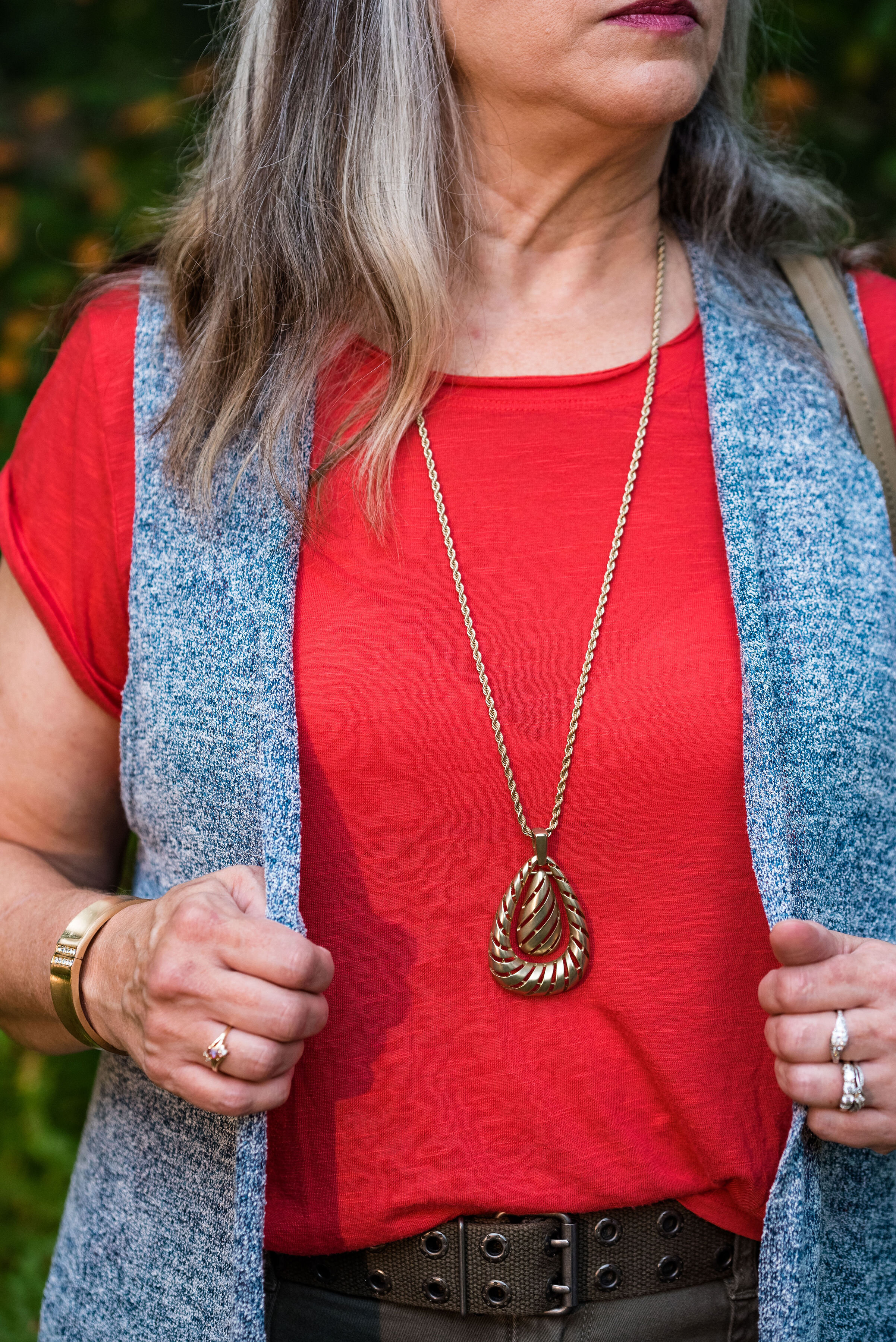
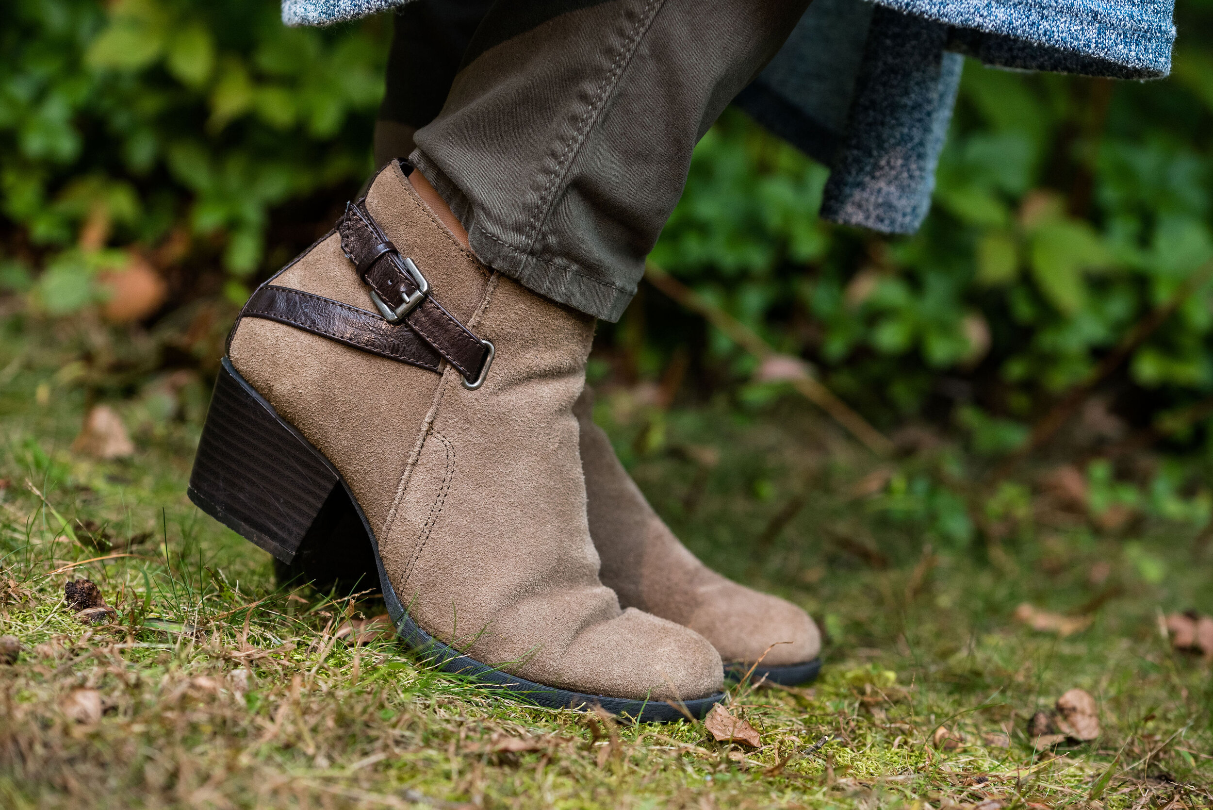
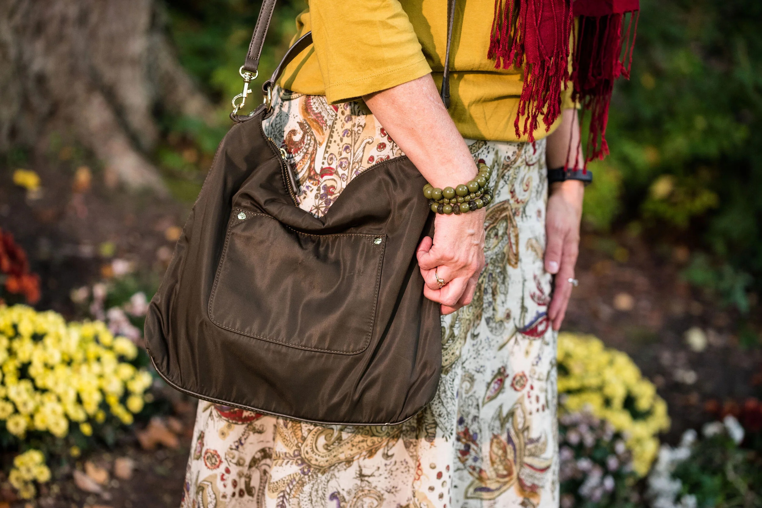
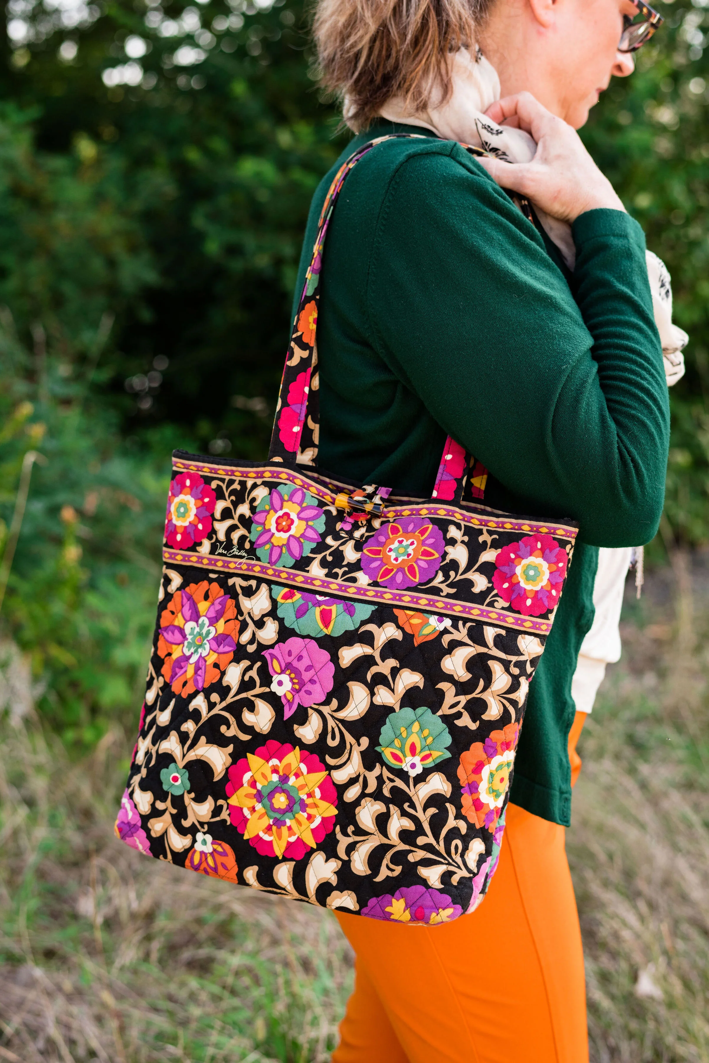
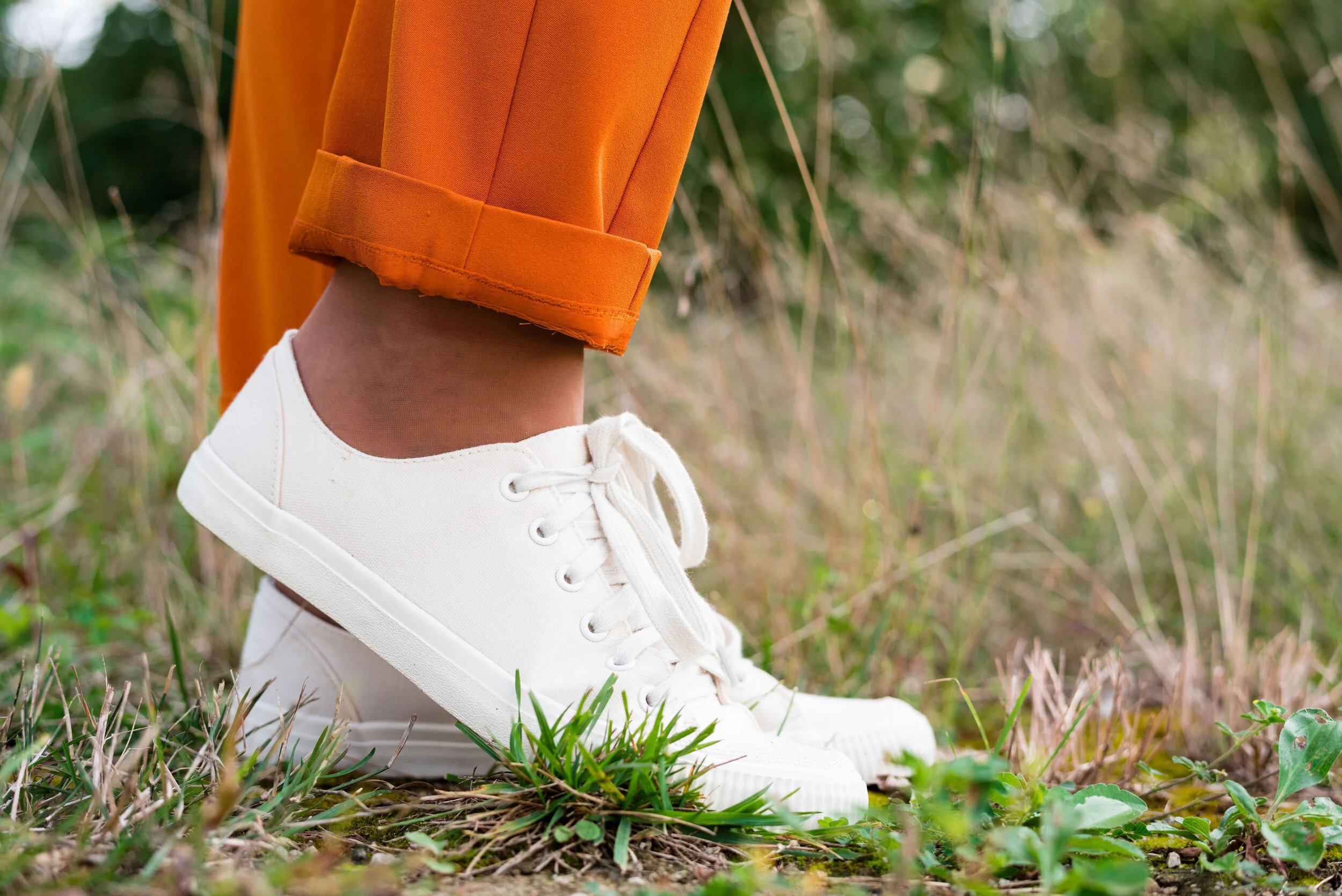
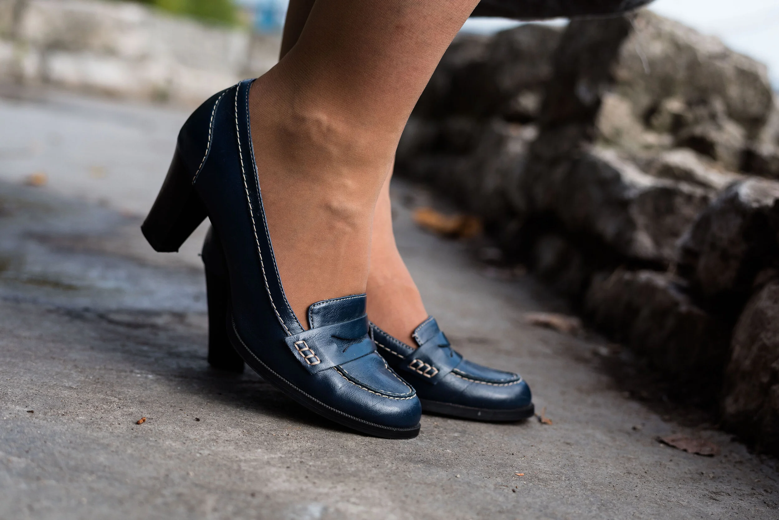
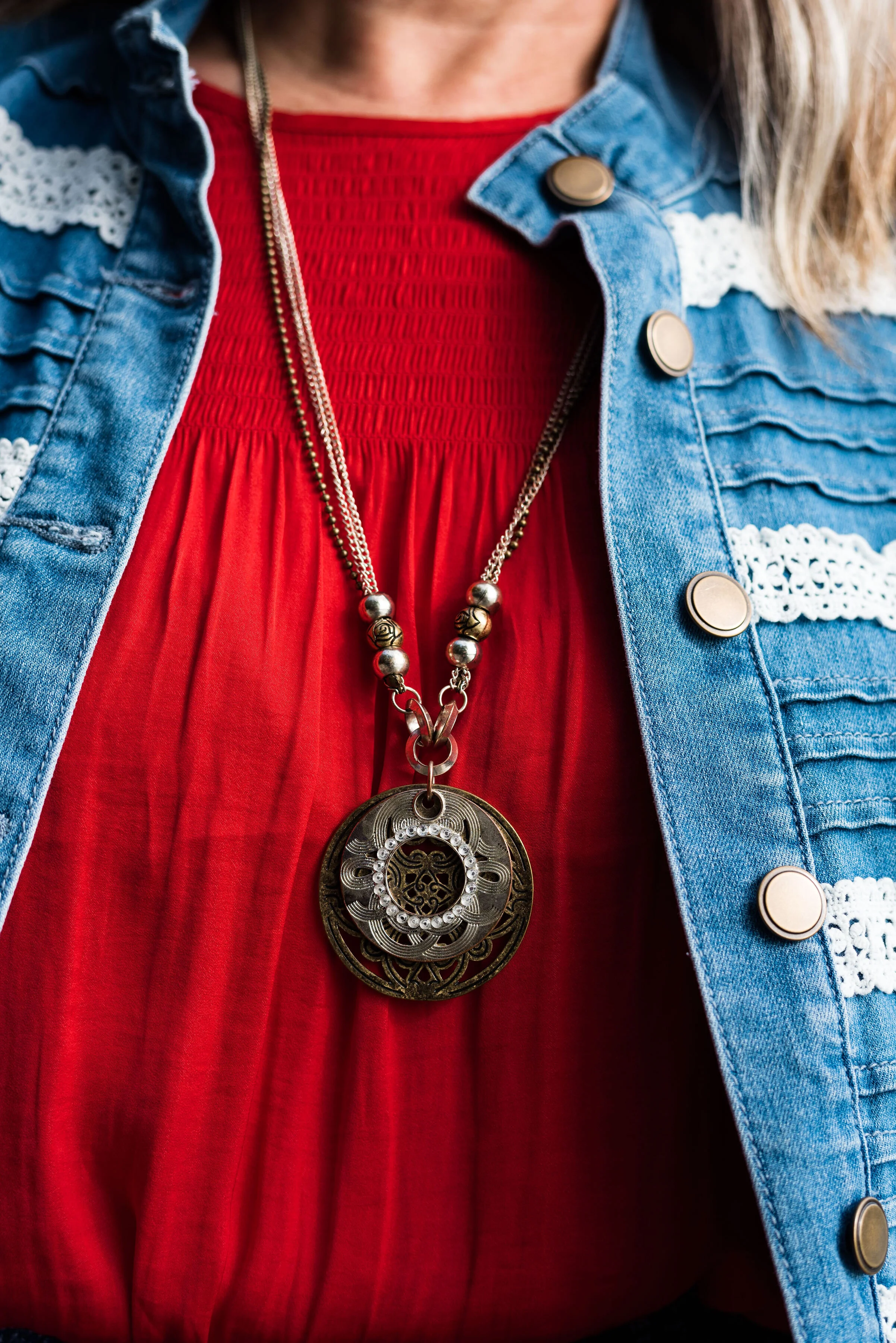
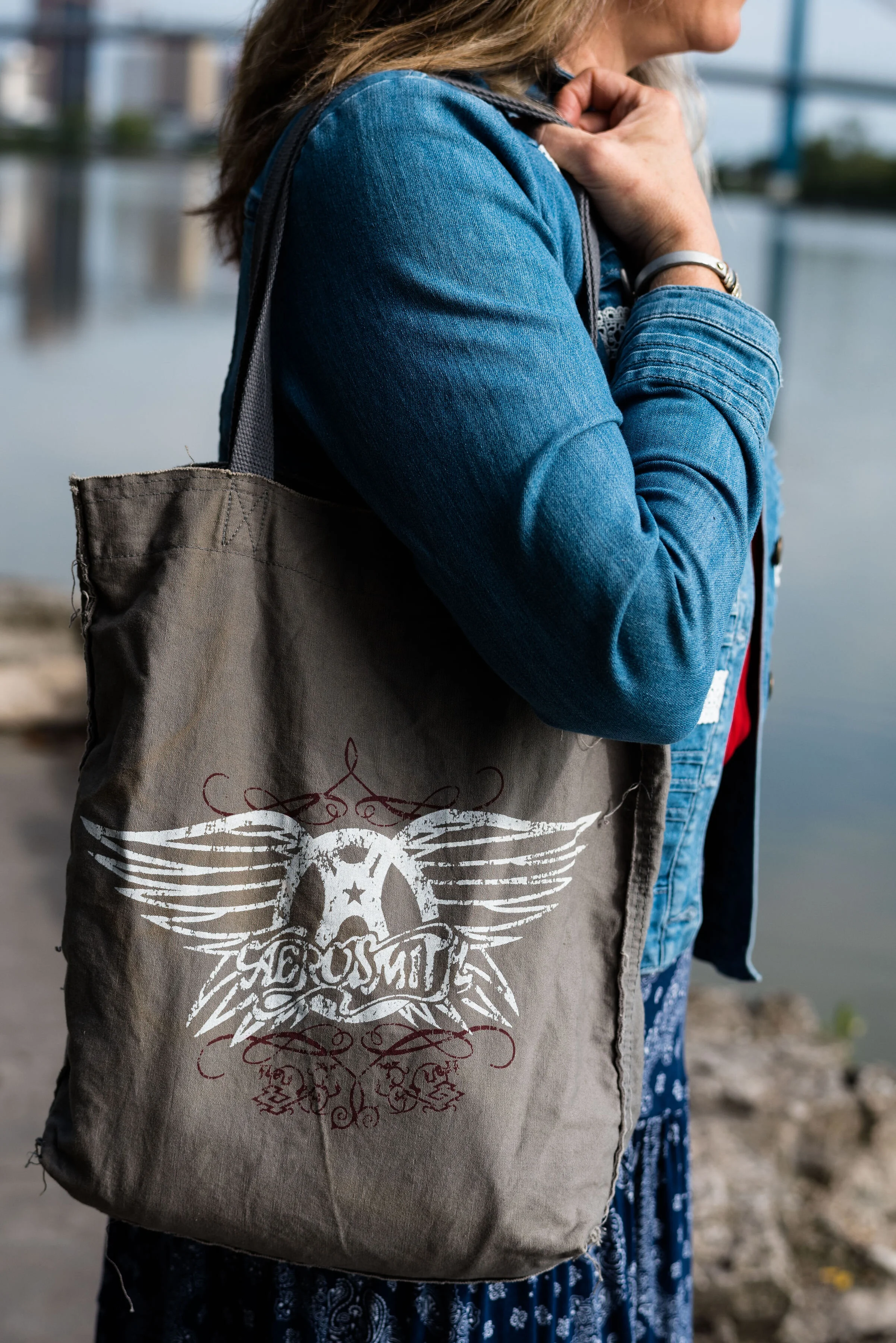
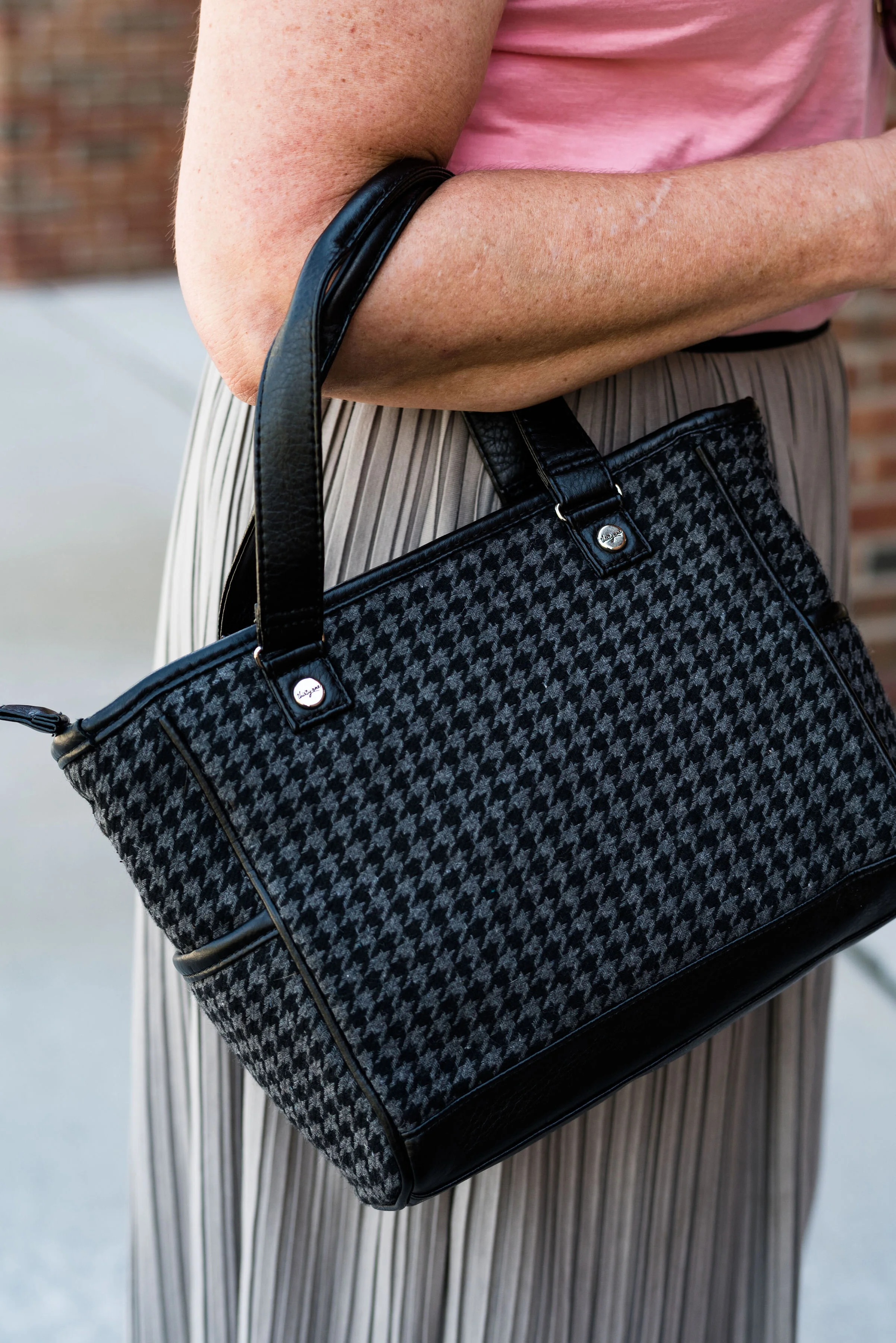
I kept my accessories simple since there was already so much going on in the outfit with the two plaids. A bright blue crystal pendant, a simple gray Rosetti bag, and these thrifted Lifestride maroon ankle boots.

What do you think of these colors? Do you like plaid? I’d love to hear your thoughts so be sure to leave me a comment or two. Your support and feedback mean a lot to me and help give me ideas and direction for the blog.

Graphic and photo credit Rebecca Trumbull.

I’ve included a few shopping links for you to peruse. With the holidays coming up maybe these will give you some inspiration for someone on your list. These are affiliate links. All opinions are my own.


Pantone - Autumn/Winter - 2019 - Crabapple and Forest Biome

The next two colors in the Pantone - Autumn/Winter - 2019 - London Palette are Crabapple and Forest Biome. I grew up with crabapple trees in our back yard and I thought they were one of the prettiest of spring’s trees. We had a pink and a white, and they had a glorious scent that just floated on the air. Obviously this Crabapple color is meant to mimic, not only the pinky flowers, but the tiny little fruits that hang from the branches. As for Forest Biome, we know that it is a dark green, but I had to look up the word biome, to fully understand it. A biome is an ecological community system, such as a rain forest or dessert. Forest Biome, then would refer to an area of forested land probably brimming with pines and cedars and perhaps a few deciduous trees. Wherever they come up with the names for the colors and just what meaning they had in choosing the name, we don’t really need to know, but it is fun to think about.

My Forest Biome is a little more blue and my Crabapple is a bit more pink than their colors, but again, you get the idea. I thought Evening Blue would be a good classic color to pair the other two colors with.

This was a neat little sitting area at the Toledo Botanical Gardens where we took the pictures for this series. I’d love to have a patio like this with an English type garden all around, and fun outdoor furniture, but I have neither the resources, the time or the energy. They always say you will find time for the things you really want to do, but I think it would be more accurate to say, we can always find time for the things we know we should do. Ha, ha. My Grandson is a priority. Picking him up after school and hanging out with him when he has a day off are priorities. Do those things cause other things to be put off or put on the back burner? You bet, but that is what I choose to do because I love him and my daughter. What we really need to do, is stop beating ourselves up for all the other things we are not able to get to.

My jeans are W62 brand from dressbarn. They are very comfy and contain a good amount of stretch. I wear these again and again for work or when I just want a different color skinny jean.

This thrifted, embellished, 3/4 length sleeve top is Dana Buchman brand. I do love the swirling pattern and glistening sheen of the front portion of the top. The sleeves and the back are more like a plain jersey knit.

The dark navy vest is really a belted dress that I found at a thrift store a while ago. It is Issac Mizrahi brand and if I was thin enough, I might consider wearing it as a dress, but it works beautifully as a vest. What do you think?

I went with a little metallic bling with my accessories including a rose gold pendent and bracelets, a Madden bag that I got on clearance at Kohl’s and my SO heeled boots, which were also a clearance purchase at Kohl’s.

What do you think of these colors? Would you wear an outfit like this? I’d love to hear from you.

I’m leaving you with a few shopping links. These are affiliate links. All opinions are my own.

Have a great weekend.

Photo and graphic credit Rebecca Trumbull.


Pantone - Autumn/Winter - 2019 - Summer Fig and Bluestone

You’ll remember from the New York Pantone series the color Bluestone. This is one of only two colors that showed up on both palettes. I’m not sure how the Pantone Color Institute comes up with the colors they choose. Is there a committee? If so who is on the committee? How do they come up with the names for each of the colors? Yes, these are the things a fashion blogger wonders when she is tired and needing a burst of writing motivation. Ha, ha. I am speaking the truth when I say, I had to look up what a fig looked like to understand where they came up with this red color. This red coincides with the bright red interior of the fig fruit. I have never eaten a fig, have you?

This bright red tee is SO brand from Kohl’s. It is a few years old. I find Kohl’s and JCPenney my go to’s for things like short and long sleeve tees.

The Bluestone vest is a LuLaRoe piece. This particular style is called Joy. I like that some clothing companies name each of their styles. Not that I will remember what they are called, but I just think it adds another dimension to a retailer, that they have taken the time and effort to specify a certain line has a name. This is the only vest I have that is this length and I like how it looks in this outfit. The fabric has plenty of stretch, but doesn’t lose its shape.

Once again, I turned to the classic color of Olive Green for my pants, bag, and belt. Olive just seems to be an easy color to pair other colors with and it grounds an outfit and keeps it looking chic with a bit of an edge. These utility pants are Gloria Vanderbilt brand and I’ve styled them before on the blog. You can see them styled with an olive utility vest here and in a flat lay with a snakeskin jacket here. I got the tote bag from Charming Charlie a couple years before they went out of business. Belts are so expensive, I usually try to pick them up at thrift stores.

I kept the jewelry simple with a gold pendant necklace and a gold bracelet.

This old pair of Sonoma ankle boots has been with me for a while, but they are the perfect neutral finishing touch and the suede texture is just right for a fall outfit.

What do you think of these colors? They are very similar to the New York palette using Bluestone and Chili Pepper. Do you like to wear vests? Do you have a long one like this? What are some other ways you could style a long vest? I’d love to have your feedback.

I’m including a few shopping links. These are affiliate links. All opinions are my own.

Photo and graphic credit Rebecca Trumbull.


Pantone - Autumn/Winter - 2019 - London Palette - Intro

Past Pantone seasons, I have tried to combine both the New York and the London color palettes into one series. Most of the time there were plenty of overlapping colors, so I was able to take colors from both palettes to make my outfits. This fall there were only two overlapping colors, Galaxy Blue and Bluestone. It was for this reason, that I decided to break the series into two parts. We just finished the New York palette last week. You can see a recap of those outfits here.

Today’s post will introduce you to the London palette and give you a few sneak peeks at the upcoming outfits.

Both the New York and the London palettes included numerous fall yellows, reds and browns. They both included a green, some blues and hues with pink undertones, but the London palette is the only one to include purple, which I thought was interesting since purple is trending right now. Purple has always been one of my favorite colors, so I was excited to see it included on this palette.

In all honesty, I like this palette better than the New York one. I always veer towards richer more saturated colors, rather than pastels and I felt that I had an easier time finding pieces in my wardrobe that better personified the color palette. In this palette we find words like vital, fortifying, robust, delicious, rich, baked, arresting, mellow and distinctive to describe the colors.

I hope you will join me on Thursday as I take a closer look at the London color palette for this fall. Here are a few peeks at what is coming up.

I hope you will join me on Thursday for the start of this series and a look at the first two colors.

Have a great day.

Photo and graphic credit Rebecca Trumbull.


Pantone - Autumn/Winter - 2019 - Peach Pink and Biking Red

These are the last two colors from the Pantone - Autumn/Winter - New York palette. Peach Pink is reminiscent of coral, which never really seemed like a fall color to me, but I must remember that the old rules don’t apply…at least to some things. I know many people buy into the old adage, the rules are meant to be broken, but I don’t always believe that is the best mindset to have, and that mindset trickles down to our children and our grandchildren. As far as rules, I think that many of them are in place for our protection and our benefit. Rules like, look both ways before you cross the street, floss your teeth once a day and eat your fruits and veggies are not bad. Actually, they are for our well being. Rules about color, really no longer apply, so I am okay with wearing white after Labor Day and wearing coral in October. Why not?

The other color in this ensemble is a dark red. It reminds me of the Brick Red from my Crayola Crayon box. How many of you remember those wonderful boxes of crayons? I used to obsess about having all the similar colors arranged by shade in my box. I didn’t want to hunt around for Brick Red, so I put it in the “red” section. Ha, ha.

As you can see, once again, my colors were not perfect matches. You will see I did a little better with the London Palette, which I will be introducing on Thursday.

The heavy gauge sweater is Candies brand from the Koh’s clearance rack at end of last winter’s season. I find this is the best time to shop for those pieces you want for the season, if you don’t want to pay full price. I have found most of my non-thrifted clothing pieces this way.

My Peach Pink tank top was a thrift find from a few years ago. It is Eddie Bauer brand. You’ll be able to see the ruching on the neckline in an upcoming picture.

My Paloma gray pleated skirt was also a Kohl’s clearance find a few years ago and is Apt. 9 brand.

My chunky wood ring necklace is making an appearance again. I love this necklace my daughter gave me for Christmas. It is so handy for making a statement and pulling the colors in an outfit together. A necklace like this works much the same way a scarf will, but without the added heat around your neck.

My little thrifted Houndstooth bag works both as a satchel and a cross body. The shoulder strap is inside the bag, but can easily be taken out and attached so I can wear this for hands free activities.

I really like these black Aerosole heels. They are comfortable and stay on my feet with no slipping or sliding. I decided to add the dark tights at the last minute for two reasons. The first was to keep the leg more monochrome and thus make the legs look longer. The other was to make the outfit seem more ready for fall weather. The day we took these pics it was hot!

What do you think of this outfit? Is this something you would wear? Do you like these Pantone colors? Why or why not? I’d love to hear from you, so leave a comment or two.

I’ve included a few shopping links. These are affiliate links. All opinions are my own.

Photo and graphic credit, Rebecca Trumbull.

Have a great day.

Pantone - Autumn/Winter - 2019 - Orange Tiger and Eden

I mentioned in Tuesday’s post on Sugar Almond and Dark Cheddar, that not everyone can or wants to wear orange. I love orange, but it has to be the right shade for me to wear it near my face. Some oranges make me look sallow or washed out. Today’s colors are bold and what caused me to put these two colors together, was the contrast of dark with light, deep with bright. Today’s colors are a “fearless” Tiger Orange, and a rich “stately forest green” called Eden. I think Pantone’s description of these colors is perfect.

These two colors are the first in this series that I felt truly matched with the Pantone colors. I looked for a while in thrift stores for the perfect green and I really think this dark cardi nailed it. the sweater is Jaclyn Smith brand.

These bright orange pants are Worthington brand and I got them at JC Penney a number of years ago. These are more of a skinny leg trouser than a wide leg trouser. I got them for the bright color and do find occasions in the spring, summer and fall to wear them. You can see how I styled these with a floral tunic here.

This cream colored tank top is a thrifted Loft piece. I actually have two of them, found on different occasions, but the exact same style. This one is a large and has a sheen to it, that you can’t really see in the picture. The other one I have is a medium and is more of a true white. Why do I need two of these? Comfort and ease of wear. They work perfectly for something like this, but I will also be able to use them as a light weight under layer when the temps grow cold. The piece is banded on the bottom, making for a great fit without showing off the bulges. Here are a few to look at.

The scarf I added was another thrifted piece. I don’t have many pieces that are cream or ivory, like this. I am also looking for a cream fisherman sweater and/or turtleneck. I don’t need anything, because I am a clothes horse, but every now and then, I do realize I am lacking something I would love to incorporate into my closet. What about you? What pieces have you been hoping to add to your closet?

In addition to the scarf I wanted to add a long charm pendant necklace to break up the plain back drop of the tank. I think this outfit would have been equally good with a printed tank under the sweater.

My other accessories included my Vera Bradley tote bag and my thrifted Mossimo sneakers.

What did you think of this outfit? Would you wear a pair of bright orange pants like this? What is the brightest color you have ever worn in pants or a skirt? I’d love to hear you thoughts, so leave me some love in the comments.

I’ve included a few shopping links. These are affiliate links. All opinions are my own.

Photo and graphic credit Rebecca Trumbull.

Have a great weekend, everyone!


Pantone - Autumn/Winter - 2019 - Sugar Almond and Dark Cheddar

Today’s colors, in my opinion are the epitome of fall. The browns and oranges remind me of pumpkins and firewood stacked as it waits to be used. Red’s and yellows are other bright colors associated with this season and we will be seeing more of those in the London color palette, which will be coming up shortly. Let’s take a closer look at Sugar Almond and Dark Cheddar.

This thrifted, Sonoma, chevron print, dress caught my eye a few months ago and I knew it would be perfect for fall. Originally, I was going to used the waterfall cardi for the Sugar Almond color, but I actually think the colors in the dress are more suited to both of these Pantone colors.

Since I don’t normally wear dresses this short, I thought it would be fun to pair it with cropped pants. This pair of St. John’s Bay, creamy colored pants were another thrift store find. I almost didn’t get them, because I thought they were a little tight, but then, what isn’t on me right now. Ha, ha. However, I ‘m glad I put them in my cart. I think they make a cute addition to this dress. I want to try them with boots, when the weather gets colder. I might even try this dress with a chunky sweater, tights or leggings and boots. If I have success with that, I’ll post pictures either on Instagram, or I’ll do a post about it.

You can see in the above picture, the dress has a partial button front and an elastic waist. Wearing a belt with this would be another fashion forward idea, but I wanted an uninterrupted look from collar to hem, especially since I chose to wear this with cropped pants.

Let’s take just a moment to talk about the rule of thirds. The rule of thirds is a photography guideline that suggests mentally dividing your picture into thirds, horizontally and vertically. You then place the image you wish to photograph at the intersection of two lines. This can make for a more interesting picture, that draws the eye to the image.

Fashion also has a rule of thirds. The body is divided into thirds: head to waist, waist to knees and knees to feet. This is an approximation and as we all know, some people have longer necks, shorter torsos and longer legs, so each individual will be a little different. This rule is good to be aware of when putting together an outfit.

If you look at the above picture, the dress would be considered in the first two thirds of my body and the crop pants and shoes in the last third. Take a look at this article to learn more about the rule of thirds in fashion, and why it helps to keep it in mind when you dress. Dressing Your Best: Rule of Thirds.

This Pink Rose, waterfall cardi is another thrift find. I love the open weave, and as you can see, it also has the chevron pattern on it. I did not plan that. Ha, ha. I just thought the color went perfectly with the colors in the dress. This is a great piece for these fall days that are still warm.

For accessories, I went with a coppery bag and my thrifted Naturalizer shooties. I also added the pendant bead necklace as a way to bring out the cream in the dress and tie in the pants. Accessories are the best way to pull an entire outfit together and make it look finished.

What do you think of these colors? Do you wear orange? Orange is often an intimidating color to wear, but there are so many different shades and tones that there is probably one out there you could wear. Would you wear crop pants with a dress like this? Let me know your thoughts. I love to hear from you.

Be sure to check back Thursday for two more Pantone colors.

Photo and graphic credit Rebecca Trumbull.

I’ve included a few shopping links for you to look at. These are affiliate links. Any time you click on a link, I get a few pennies. If you purchase something through my links, I get a a small commission. I appreciate all your support and all opinions are my own.

Have a great week.

Pantone Autumn/Winter - 2019 - Chili Pepper and Bluestone

Before I get started showing the outfits I put together for this color series, let me refresh what the Pantone colors are. The Pantone Color Institute is an entity that provides color related solutions across the industry for designers of graphics, products and fashion. It is their color choices for seasons and color of the year that influence the fashion and interior design fields. You can read more on their About Page.

When I began blogging over three years ago, I decided to include the Pantone seasonal color series as a regular feature of my blog. Many bloggers share their favorites with you, but I like to really explore how each of these colors can be combined to make creative outfits that are both fashionable and reasonable financially as almost all of these colors are already in my wardrobe.

This season’s outfits turned out a bit differently than some of the specific colors due to shade variances on different computers, phones and so on. However, the point is not to get perfect matches, but to broaden our thinking about color over all. I ask myself questions like, “How can I combine these colors into one outfit? How can I take this color I am not fond of and use it? How can colors in an outfit make us feel happier, more put together and more confident?”

Today’s outfit combines a cool grayish blue with a spicy red. Meet Bluestone and Chili Pepper. The third color is from Panone’s Classics palette, which I have tried to incorporate into each outfit.

This bright red top is most definitely not the exact same red at Chili Pepper. It was rather strange. I have used my phone before to look at the colors when trying to pick things out of my closet and for some reason I really thought this red was good. However, I think I just wanted to wear this Popsugar top from Kohl’s again because it’s so cute. Ha, ha. I styled this same blouse last spring in another Pantone series. You can see that post here.

My denim jacket is from Christopher & Banks and isn’t exactly Bluestone either, but I was having trouble finding that exact color.

For these pictures we went to Middlegrounds Metropark in downtown Toledo. What a beautiful park right close to the downtown area of our city. I just love the urban chic vibe that these pictures have. I don’t do a lot in the city, but there is a lot more there than I realized. Unfortunately, I may get more familiar with it, as I got summoned for jury duty in October and the Common Pleas court is downtown. Ha, ha.

I decided to pair my top and jacket with my dark blue printed St. John’s Bay, skirt from JC Penney. I thought it matched well with the Pantone classics color Evening Blue. This is a fun, easy to wear skirt with a wide elastic waist, and tiered layers which gives it swing.

Since I had a lot going on in this outfit with prints and textures I wanted to keep my accessories fairly simple. My thrifted Relativity loafer heels are a go to for a look that is classy and work ready.

I thought this pendant necklace a good piece that makes its own statement with this outfit.

Adding this Aerosmith tote bag was my way to show off my inner rocker. Ha, ha.

What do you think of Chili Pepper and Bluestone? Do you have these colors in your closet? How would you wear these?

I’d love to hear your thoughts, so leave me some love in the comments.

I’m including a few shopping links to look at. These are affiliate links. All opinions are my own.

Photo and graphic credit, Rebecca Trumbull.


Pantone Autumn/Winter - New York Palette - Intro

For those of you who like my Pantone color series, you’ll will be glad to know, it is finally here. Due to scheduling issues my photographer and I finally got together to take the pictures and let me tell you, it was another scorcher! Ha, ha. I don’t know why, but it seems whenever we are scheduled to do pictures the weather is unreasonable. When we did the Pantone 2019 Spring/Summer shoot it was snowing. Now for the Pantone 2019 Autumn/Winter shoot it was sunny and hot. Oh well, there is no planning for the weather around here.

This year the color palettes between New York and London are quite varied, so I decided to do this in two separate series, rather than combining the palettes. Starting on Thursday i’ll be covering just the New York palette. When that palette is finished then I will cover the London palette.

This year’s New York palette is made up of colors described with terms like spicy, adventurous, extroverted and appetizing. Hopefully these descriptors will whet your appetites to follow along with this fall’s color series.

I really like this season’s colors. I feel like there is a good mix of tones that will give all skin colors lots of choices. The palette has a wide array of colors from classic blues, reds and green, to earthy browns and oranges to lighter pastels. Some of my favorites are Bluestone, Eden and Sugar Almond.

In addition, Pantone also includes a palette of classic colors which work well to use as the foundation of your outfit or as add on colors to tone down the brighter more jazzy color combinations. I can’t wait for you to see the outfits I came up with right out of my very own closet.

Here are a few sneak peeks. Join me Thursday for the start of the series.

Photo and graphic credit, Rebecca Trumbull.