Fashion Fun: Men's Oversized Button Down
When it comes to thrifting for fashion, I like to think outside the box. I always peruse all the sizes, because so often size is relative. What I mean by that is, it is relative to the brand. A size 12 in one brand might fit you perfectly, but a size 12 in another brand, might be too big or too small. I honestly believe sizing is different than it used to be. If you shop vintage clothing, at all, you will see that most of the pieces are relatively small. Women tended towards being smaller in the waist, hips, and shoulders than we are now. Not sure why, but it does seem to be the case.
I have also started looking in the men’s section of thrift stores for fun pieces like tees and printed button downs. I like the roomier cut of a men’s medium or even large shirt and they often have textures, prints and fabrics that are different than those on the women’s racks. Today, I am going to show you three different outfits using three men’s button downs that I purchased while thrifting.
Outfit 1 - Men’s Button Down as a Tunic
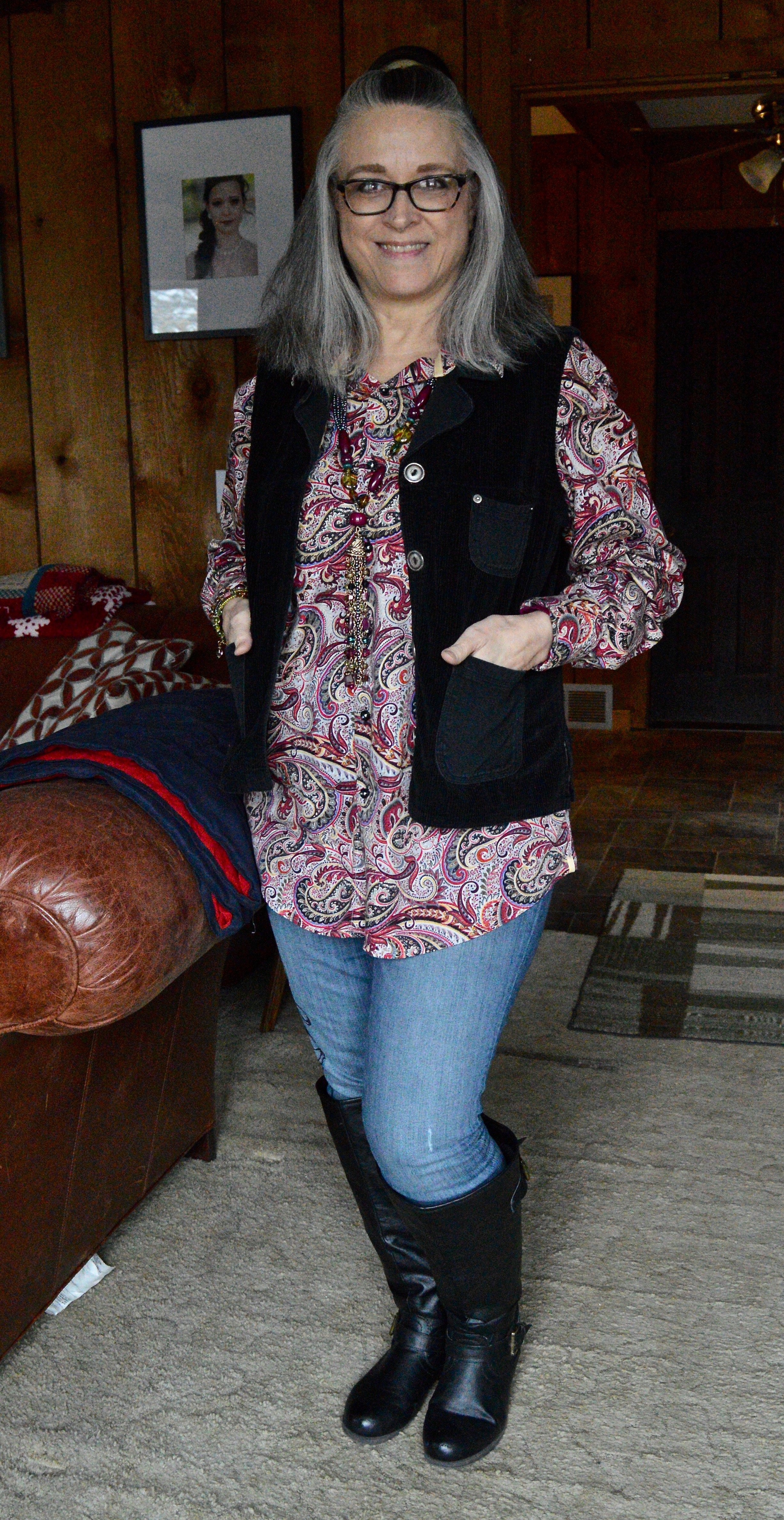
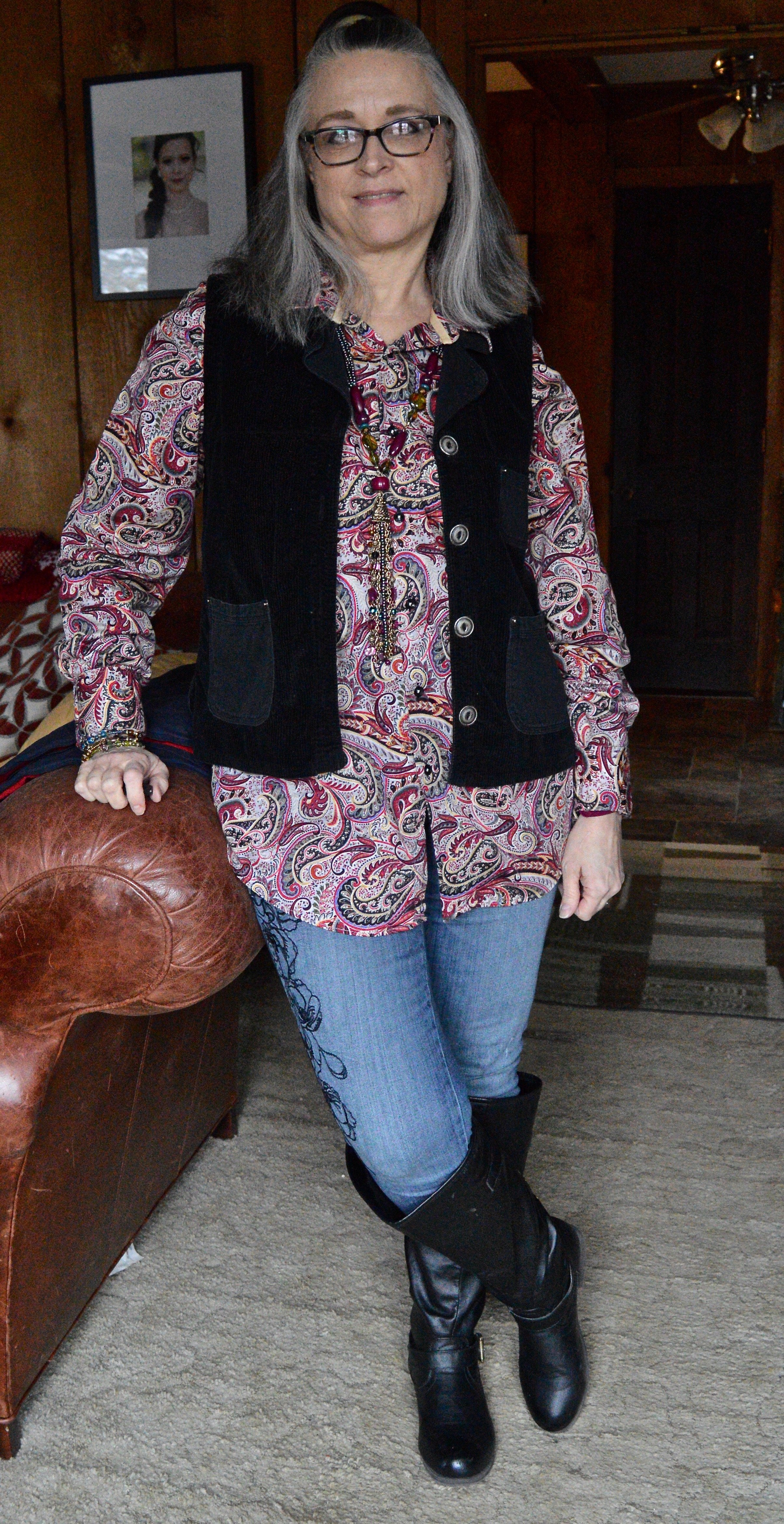
When I saw this paisley madness, I knew I had to have it. This is Visconti brand. If you type the name be sure to type in Visconti clothing. and you’ll see they have them at Dillards. They also have their own website, but I am not here to encourage you to buy a new shirt. This to encourage you to look at the men’s racks if you thrift, or even if you shop clearance. I absolutely love the colors in this piece and it is easily worn all year round as a top or as a “shacket”.
I topped this look with a thrifted, black Nadia brand, corduroy vest. I added my Simply Vera, Vera Wang skinny jeans and my black knee high boots. The black embroidery on these jeans are what sold me. The abstract floral print goes with so many other pieces.
I didn’t really need to add any jewelry since the print is so busy, but I thought it would be fun to add this piece that has a variety of colors and textures. It blends in, yet also stands on its own.
Outfit 2 - Men’s Button Down as a Work Wear Top
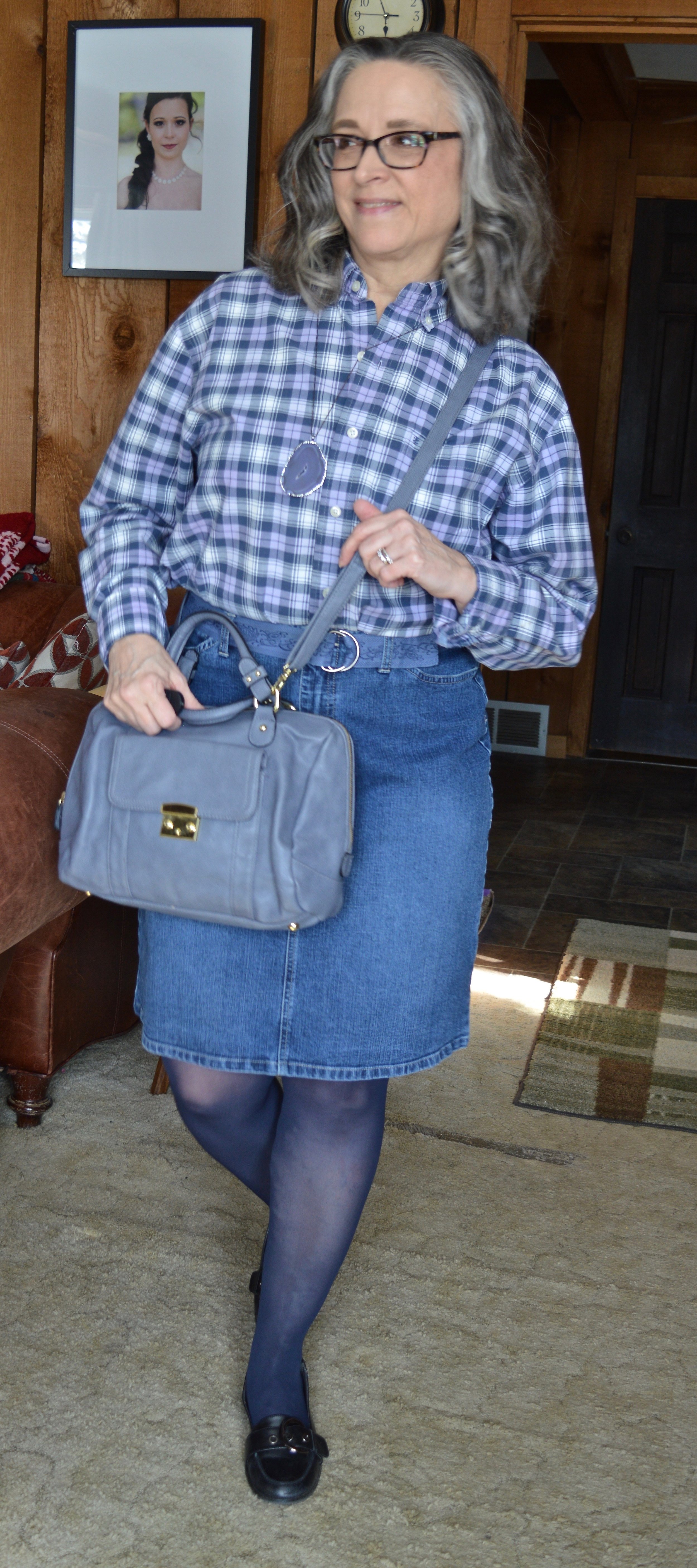
This shirt is Izod brand. This year’s Pantone Color of the Year is called Very Peri. I think it is a very pretty color reminiscent of the Periwinkle flowers, which can come in blue, purple or white. I thought this checked shirt fit the color well. One thing I have to do with most of the men’s shirts I purchase is roll up the sleeves, but rolling up the width of the cuff is just the right amount, so you can hardly tell.
My denim pencil skirt is also thrifted and Gloria Vanderbilt brand. I like the length of this and if I still had a reason to wear a skirt would definitely be wearing this often. I added the navy hose to cover my veiny legs and thought the black, thrifted Nine West loafers gave it a work wear look. I also added the denim blue cloth belt and the dark purple agate pendant necklace. My thrifted, Merona bag, also brings in that Very Peri vibe.
Outfit 3 - Men’s Button Down as a Shacket
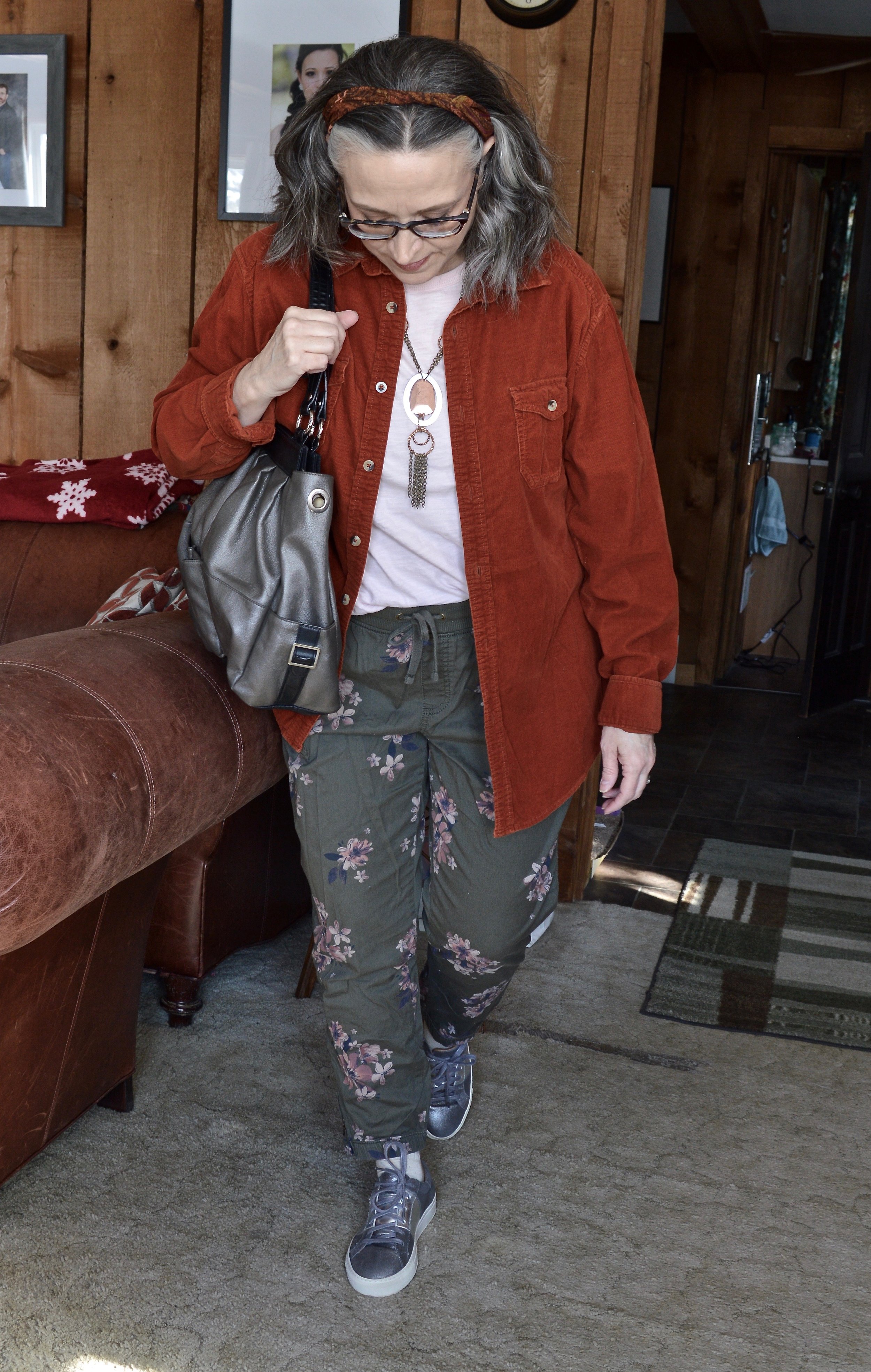
I’ve had this thrifted, Ruff Hewn corduroy button down for a few years now. I love the color and typically think of it as a fall piece. It is soft, warm and roomy, so a perfect piece for wearing over lightweight sweaters, sweatshirts or long sleeve tees.
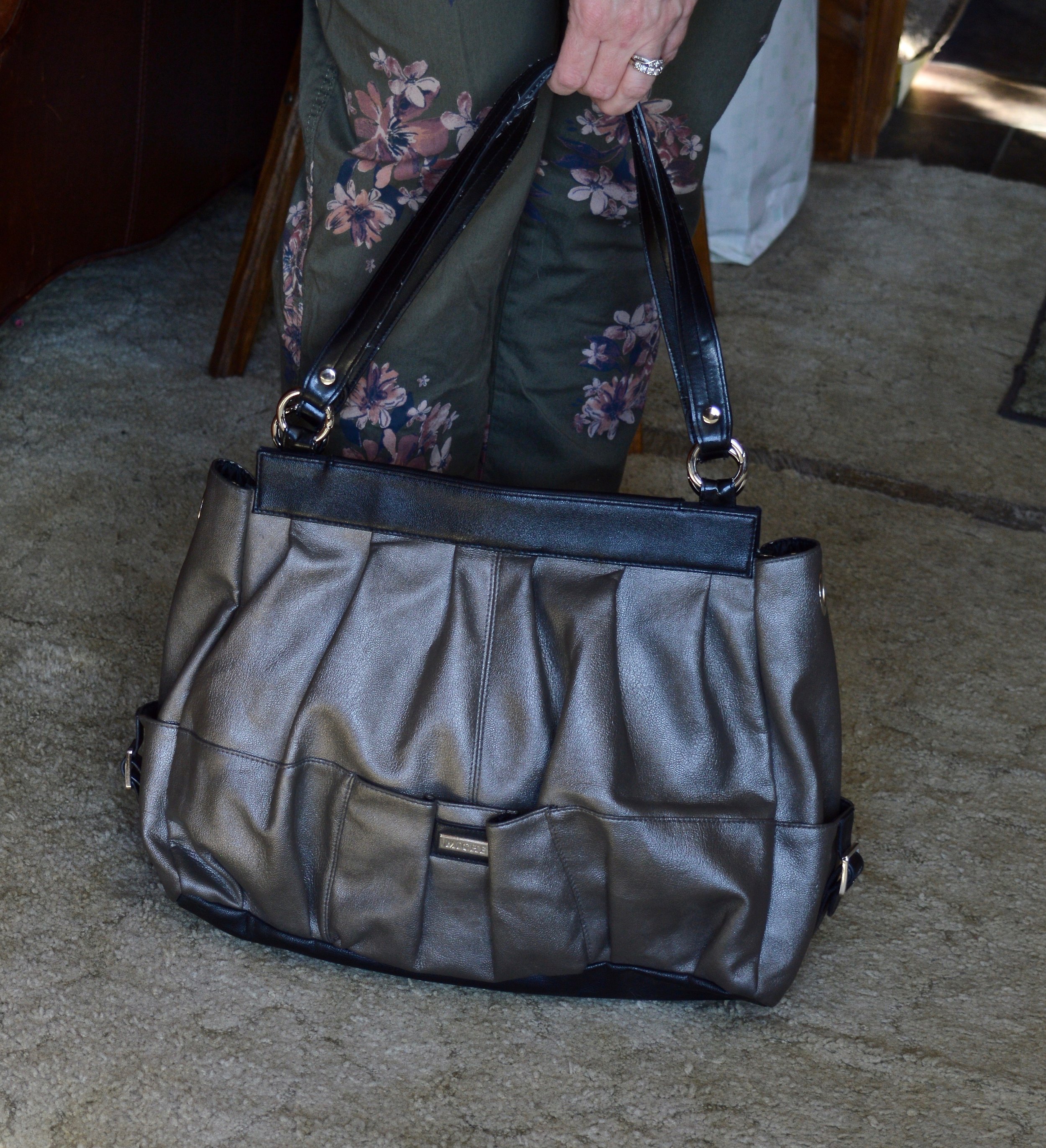
I wanted this outfit to have more of a spring vibe, so I went with my Sonoma floral joggers, and a thrifted light pink Express short sleeve tee. I opted for metallic accessories including my silver Sketcher sneakers, pewter hand-me-over bag, and my silver and copper necklace.
Here are the three outfits side by side.
I hope you enjoyed this look at how to style a men’s oversized button down. It is fun to explore other options in your fashion wardrobe, and you never know when something you try will become your new favorite style. Which outfit was your favorite? Do you wear men’s clothing? How do you like to style a men’s or women’s oversized shirt? I’d love to hear your thoughts, so leave me some love in the comments.
Thanks for stopping by the blog. I have provided a few shopping links for your enjoyment. These are affiliate links. All opinions are my own.

