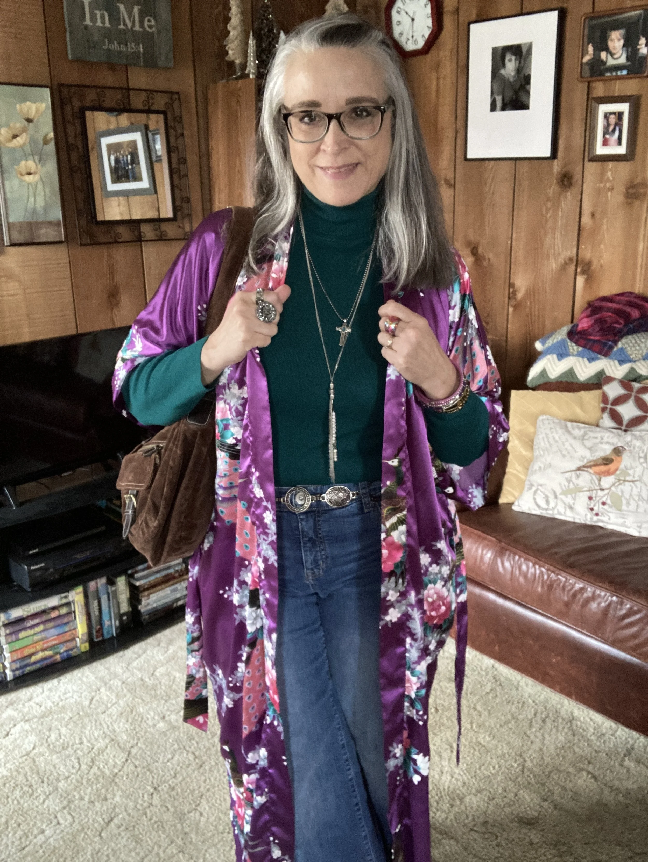
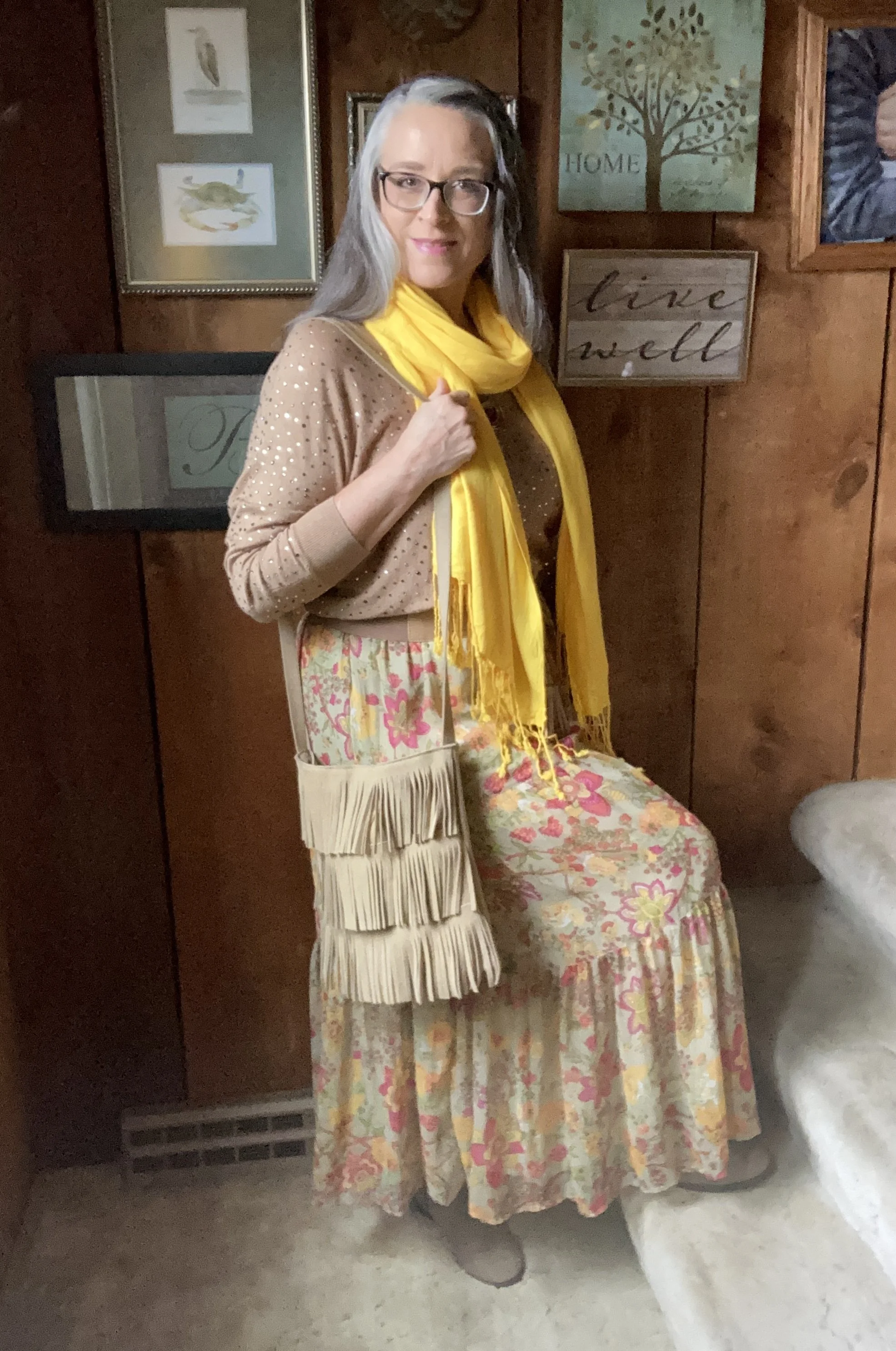
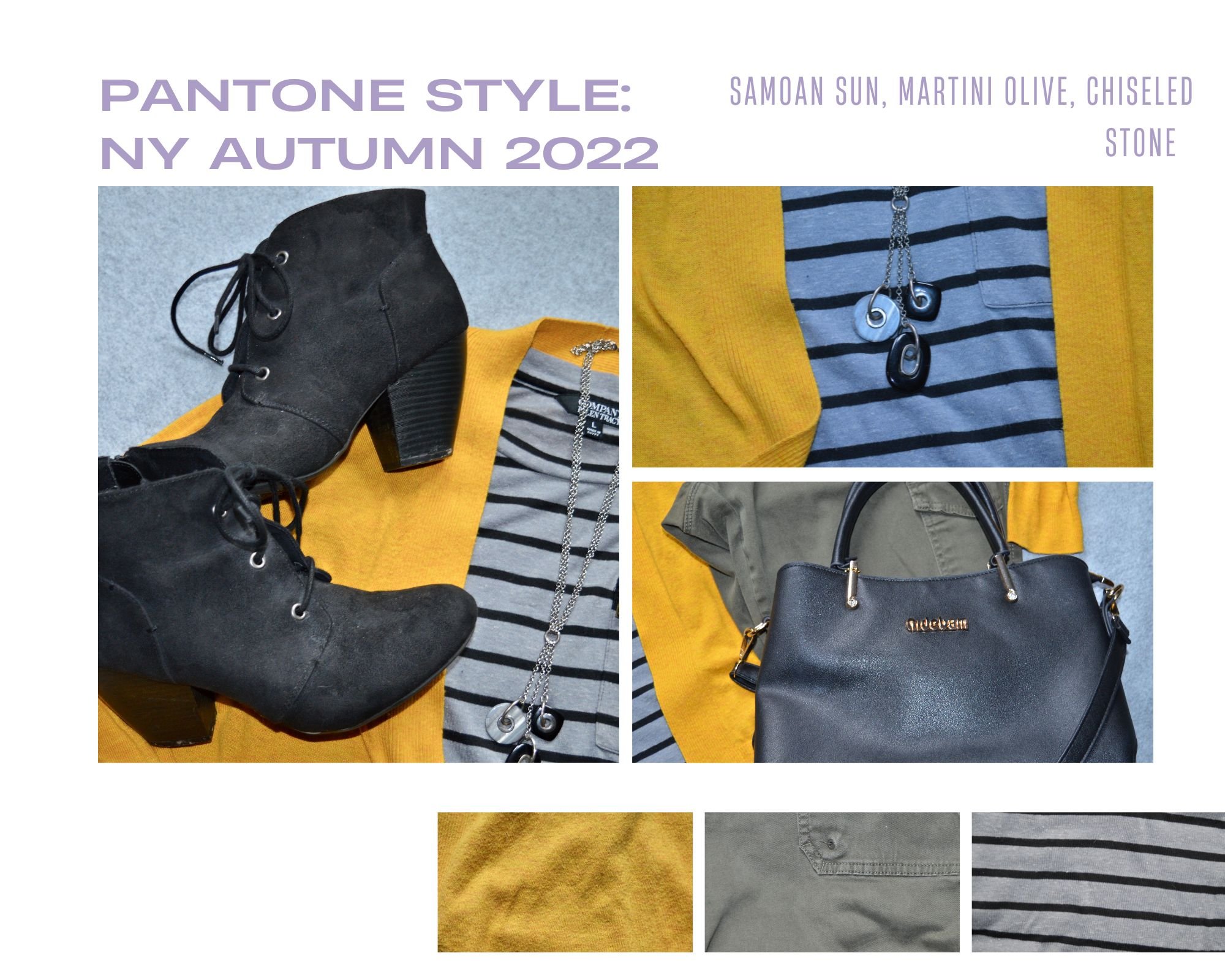
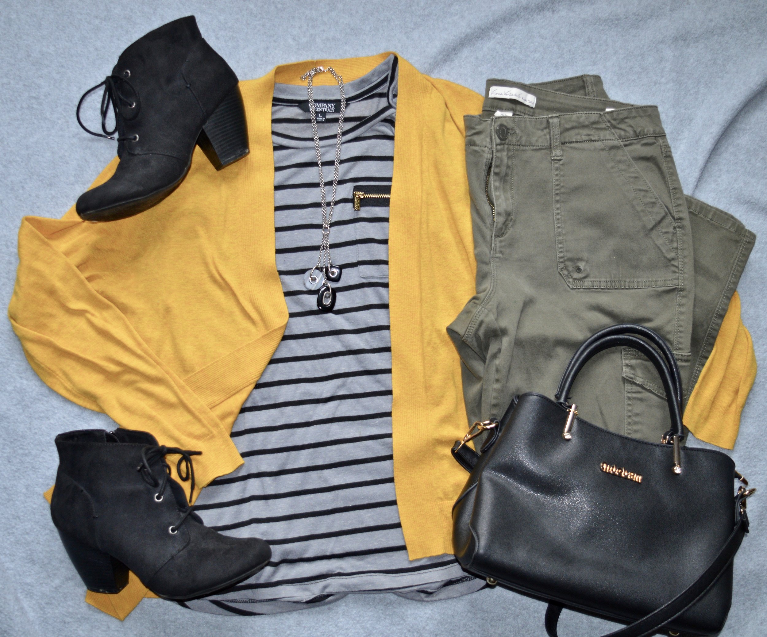
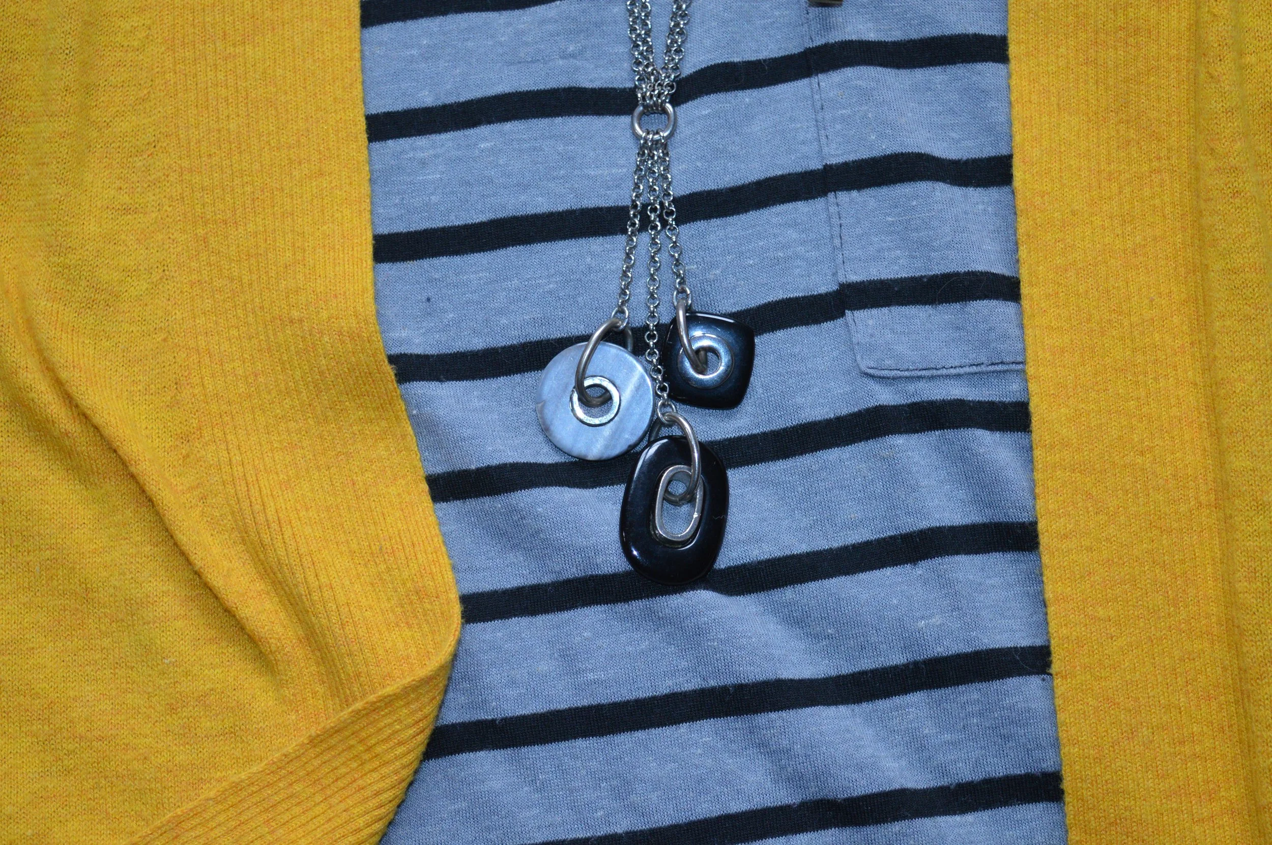
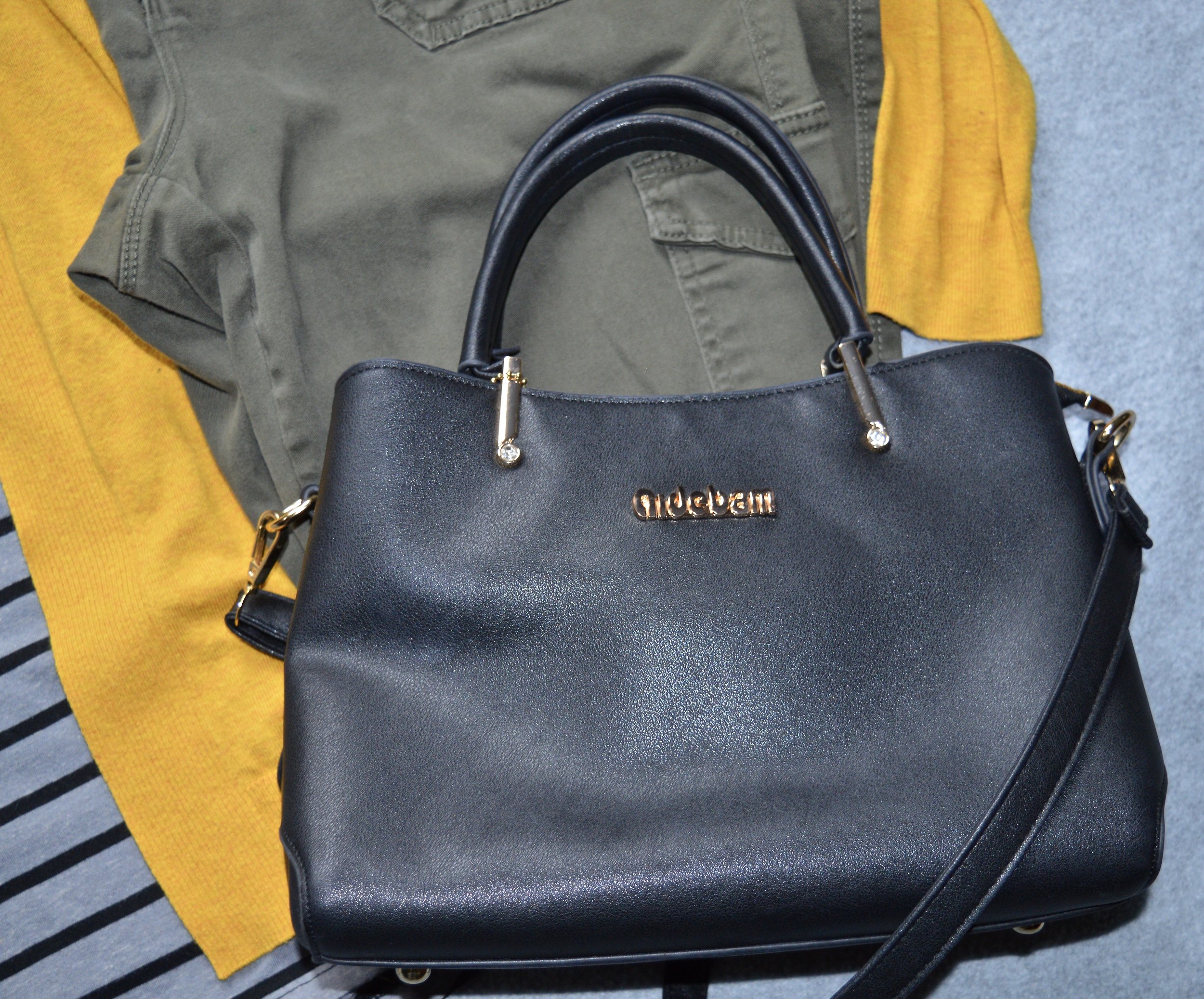
Outfit Inspiration: Valentine's Day Inspo from Pinterest

Today I am showing you an outfit that was inspired from a Pinterest pin. I have a number of Pinterest boards and with this being the month of Heart Health Awareness and Valentine’s Day I thought I would create a new board and pin outfits that contain the color red. This is the pin that inspired today’s outfit.

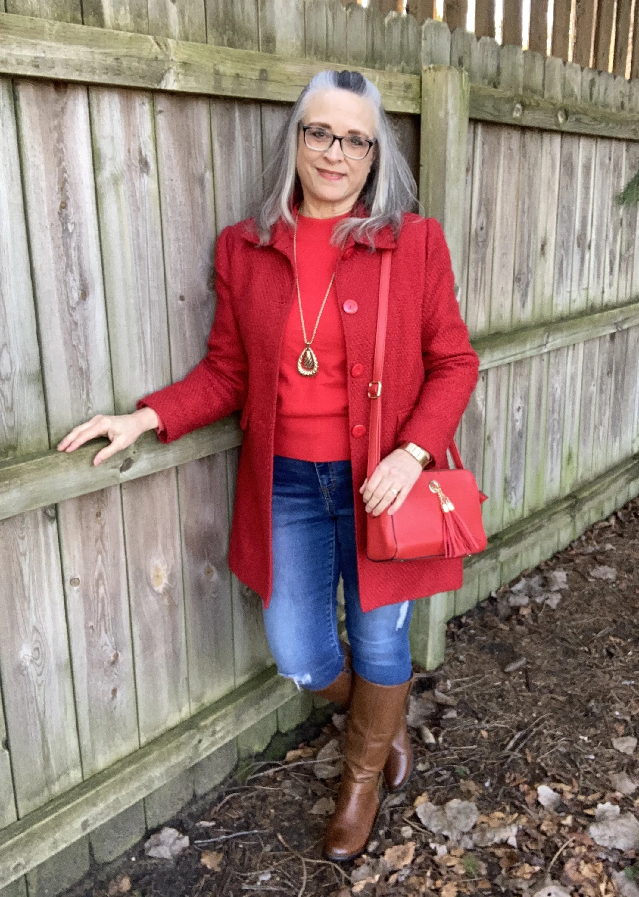
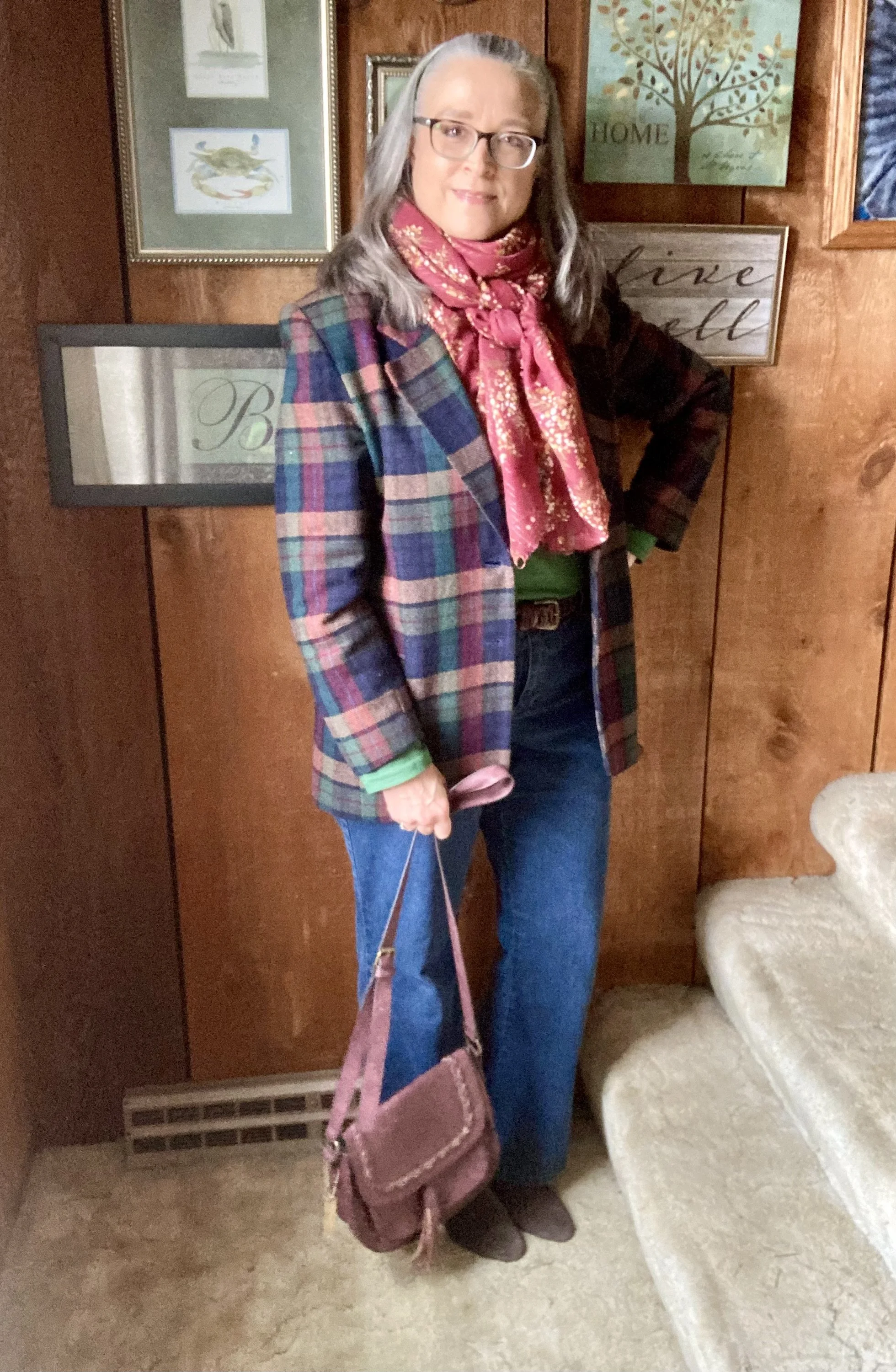
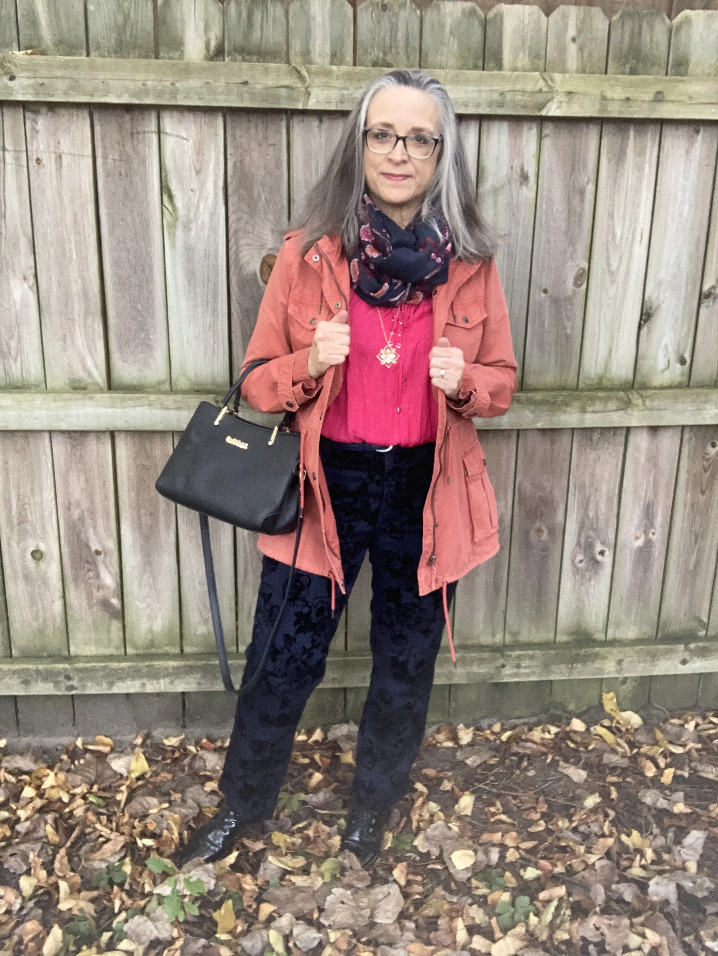
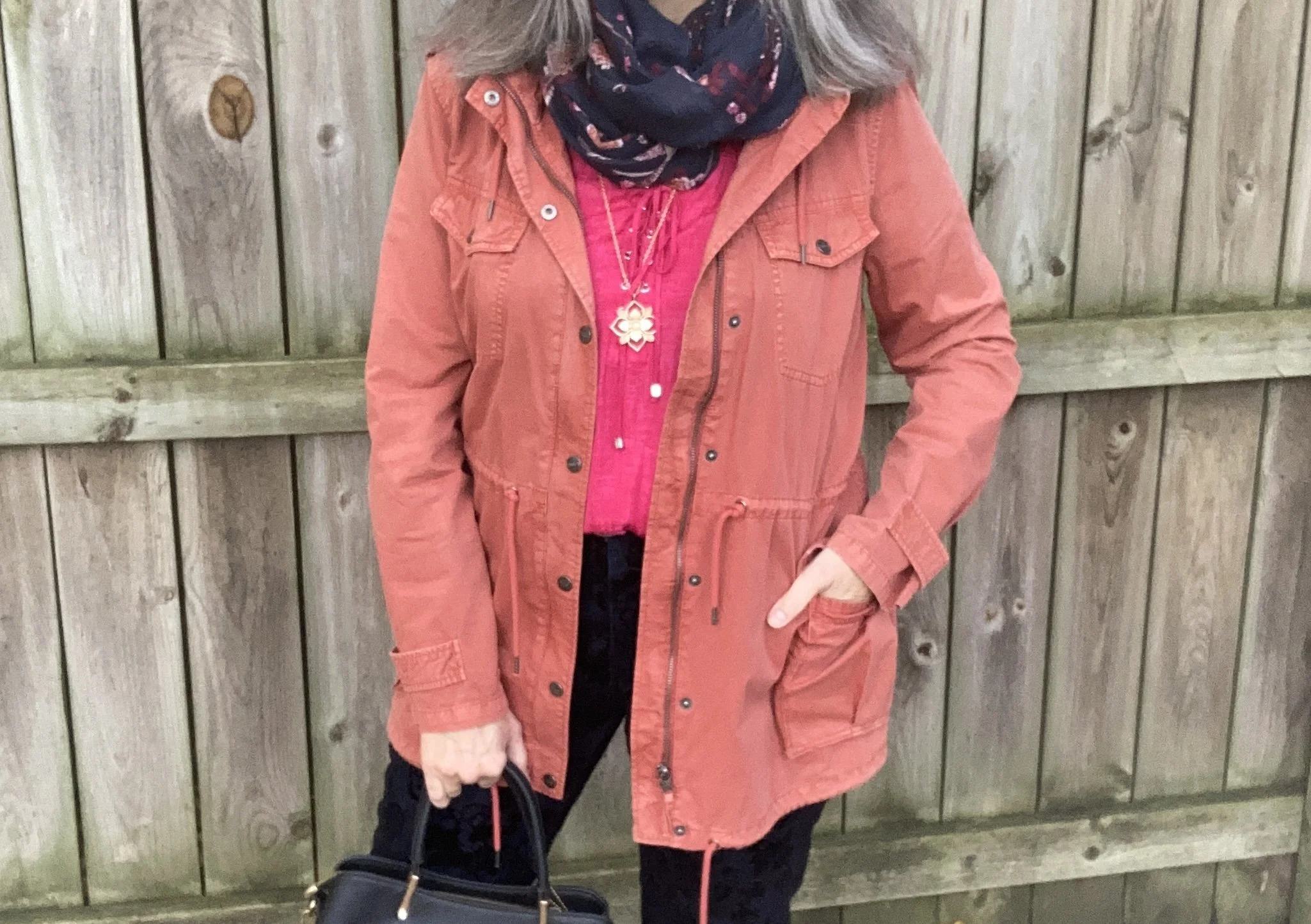
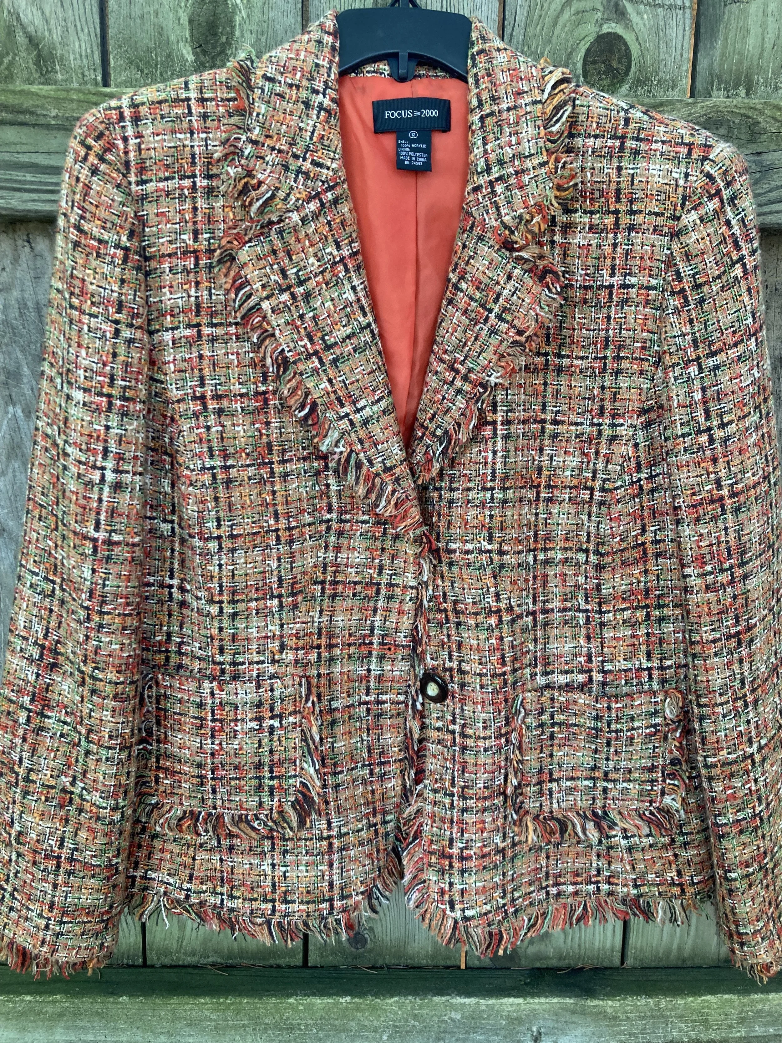
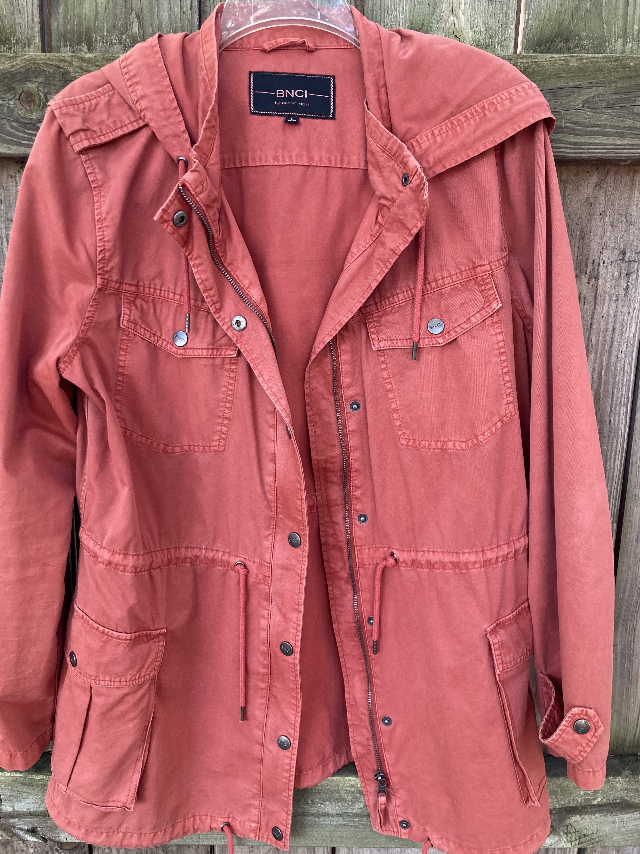
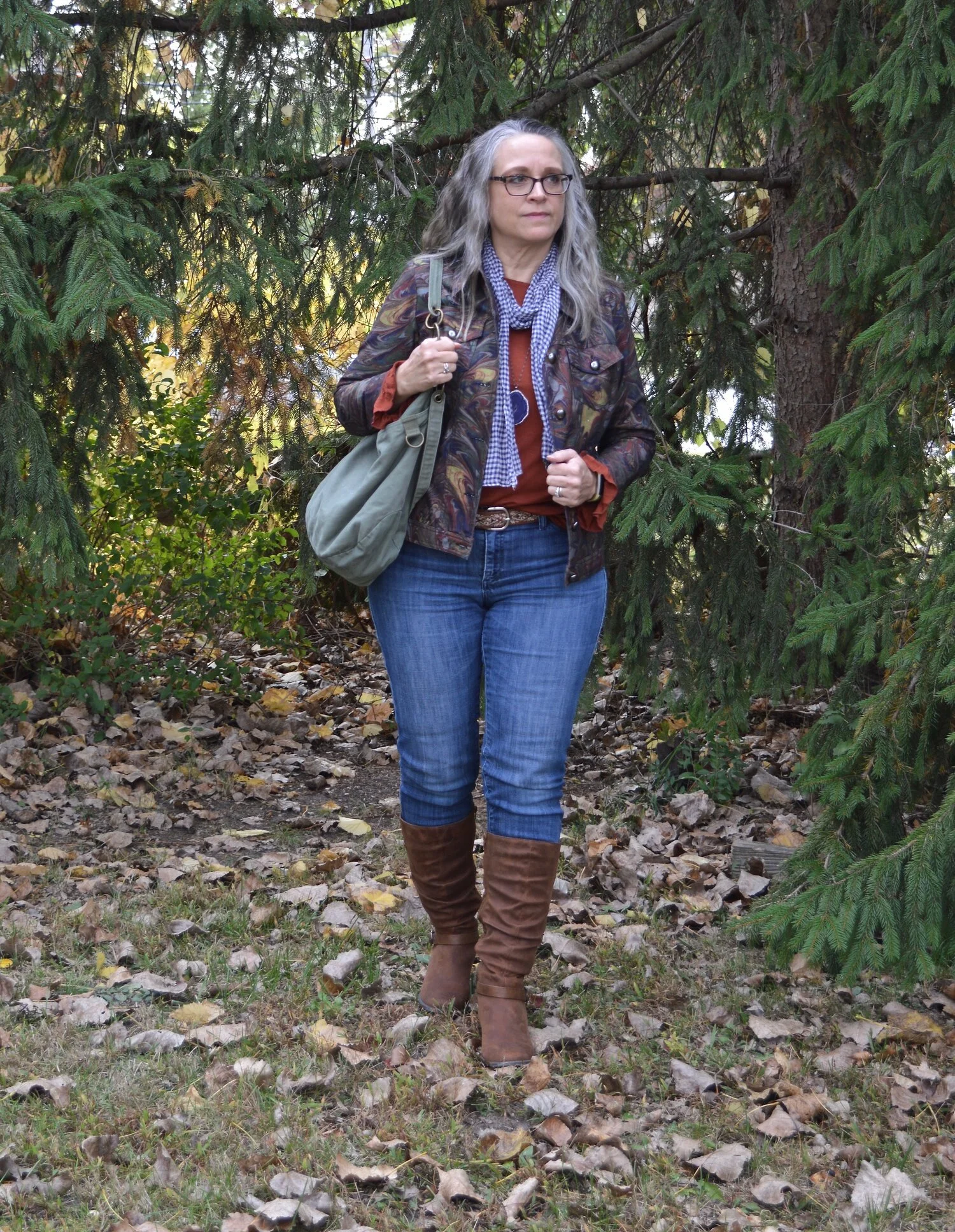
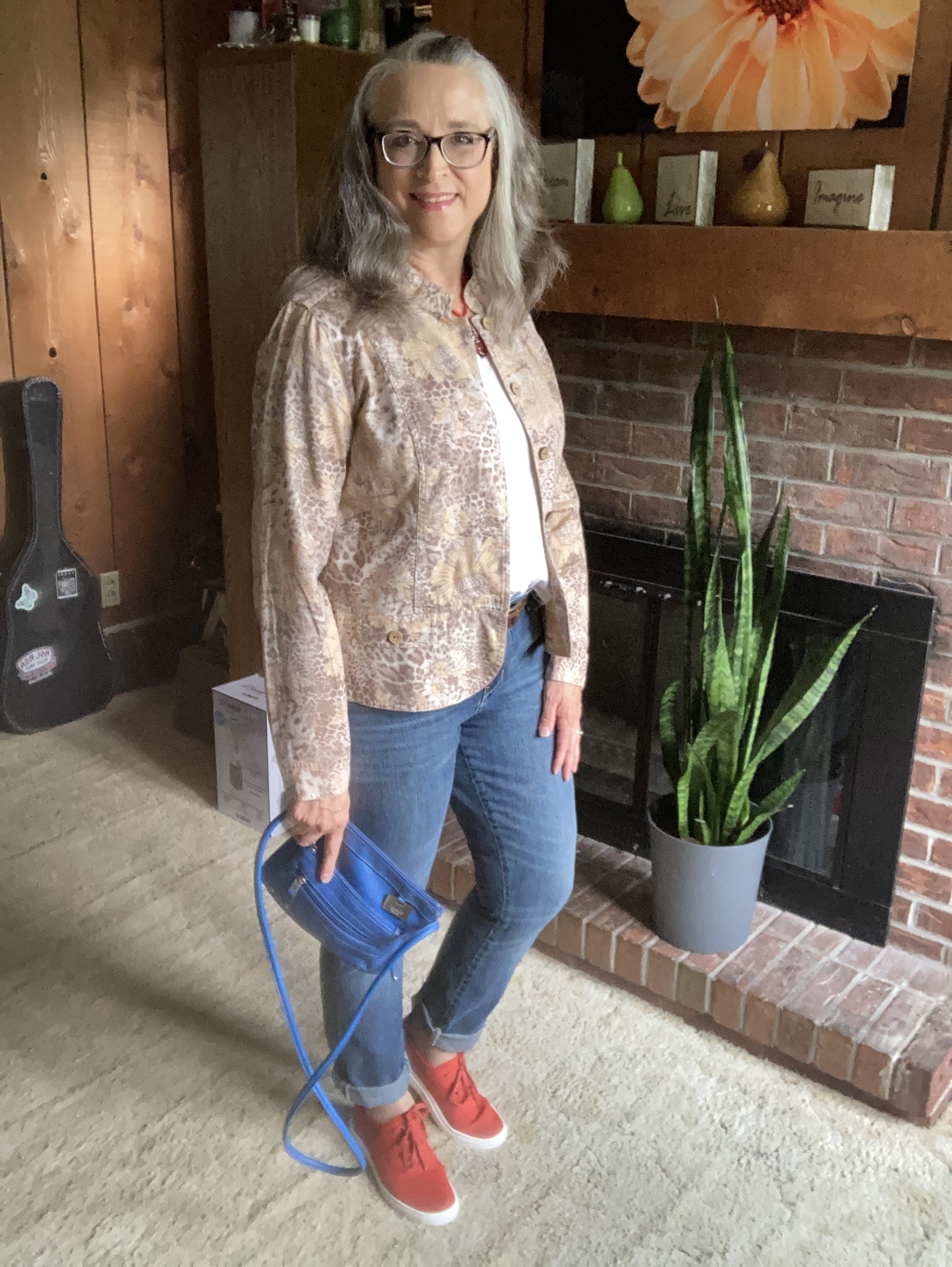
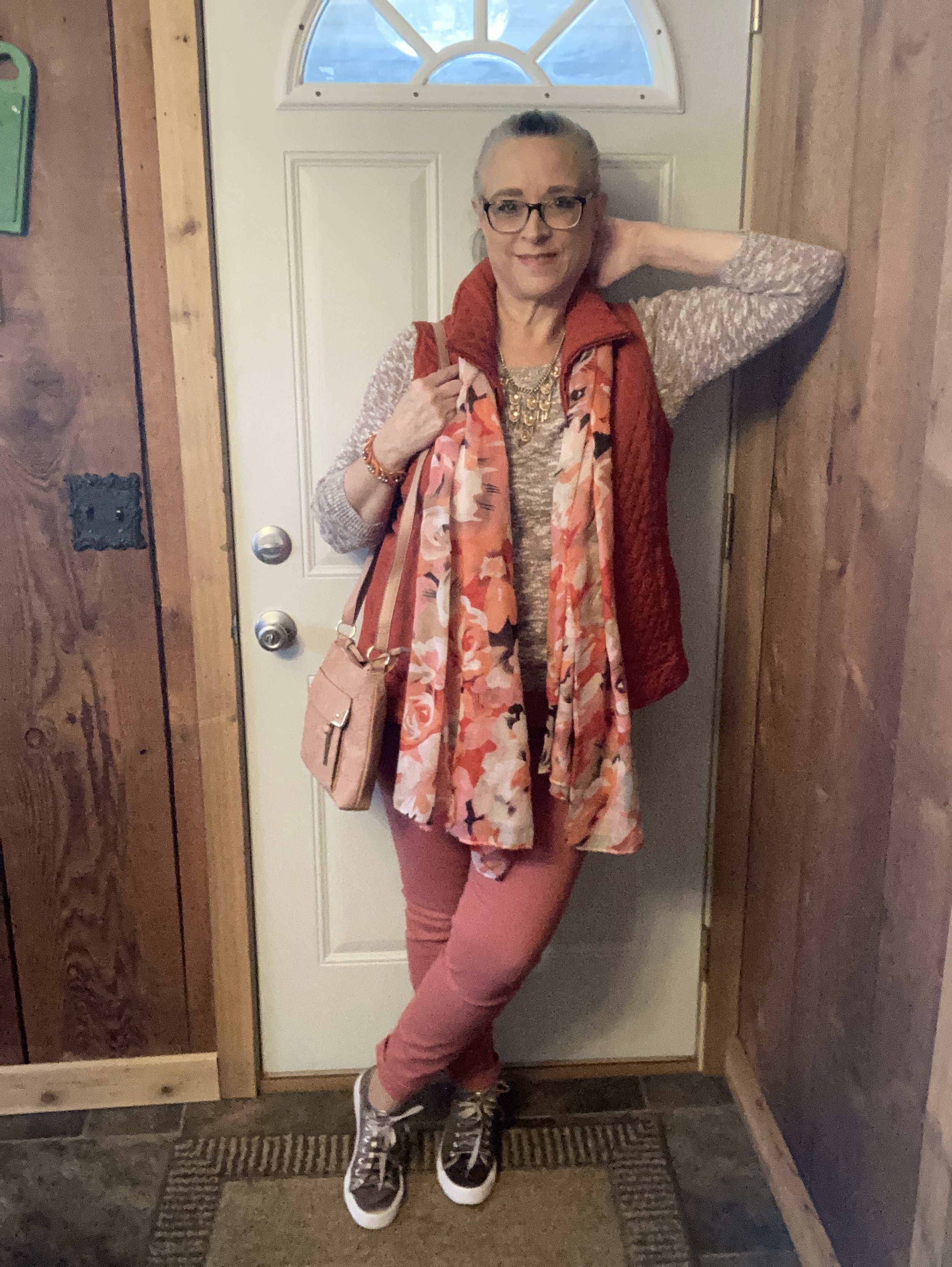
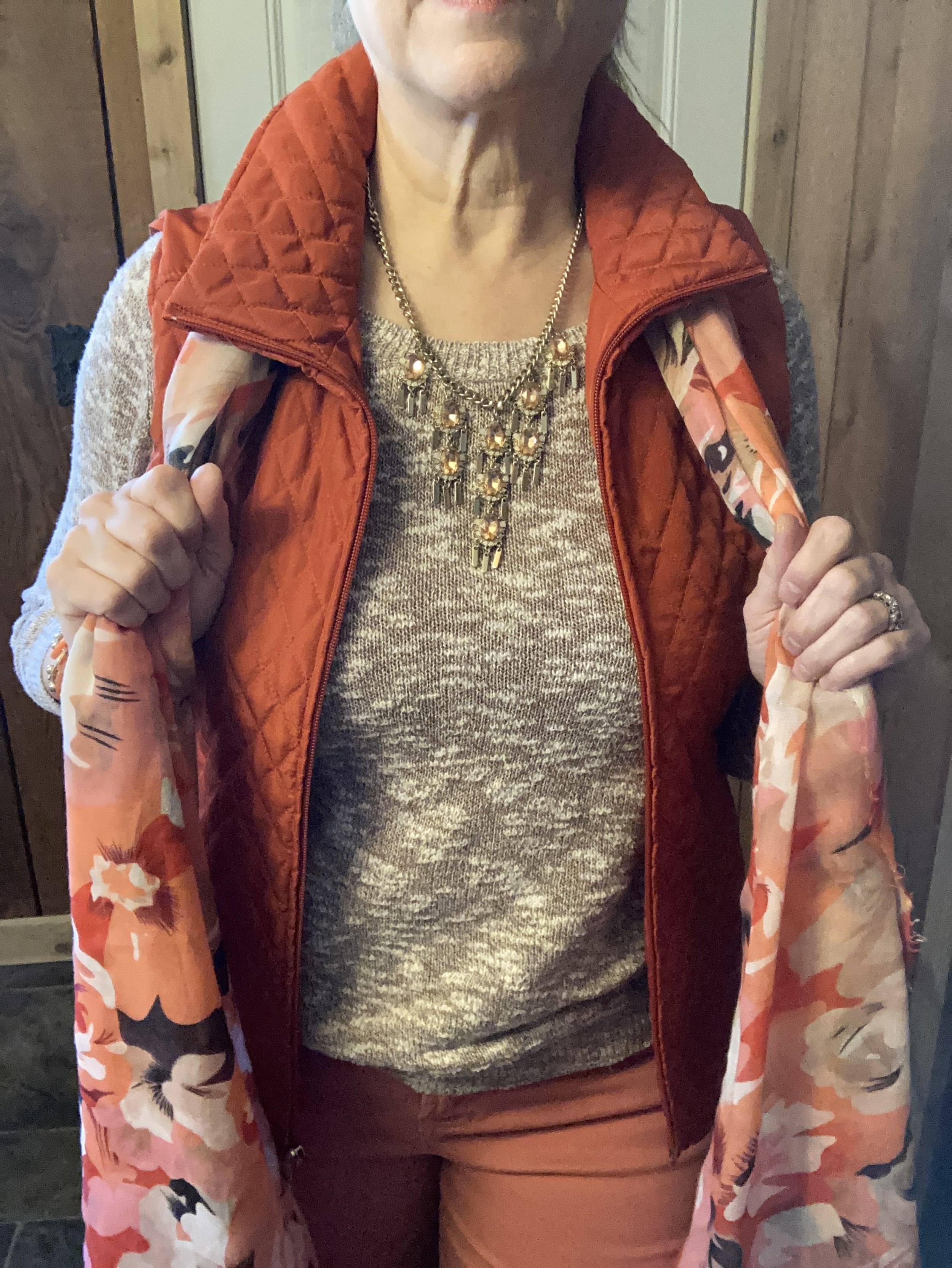
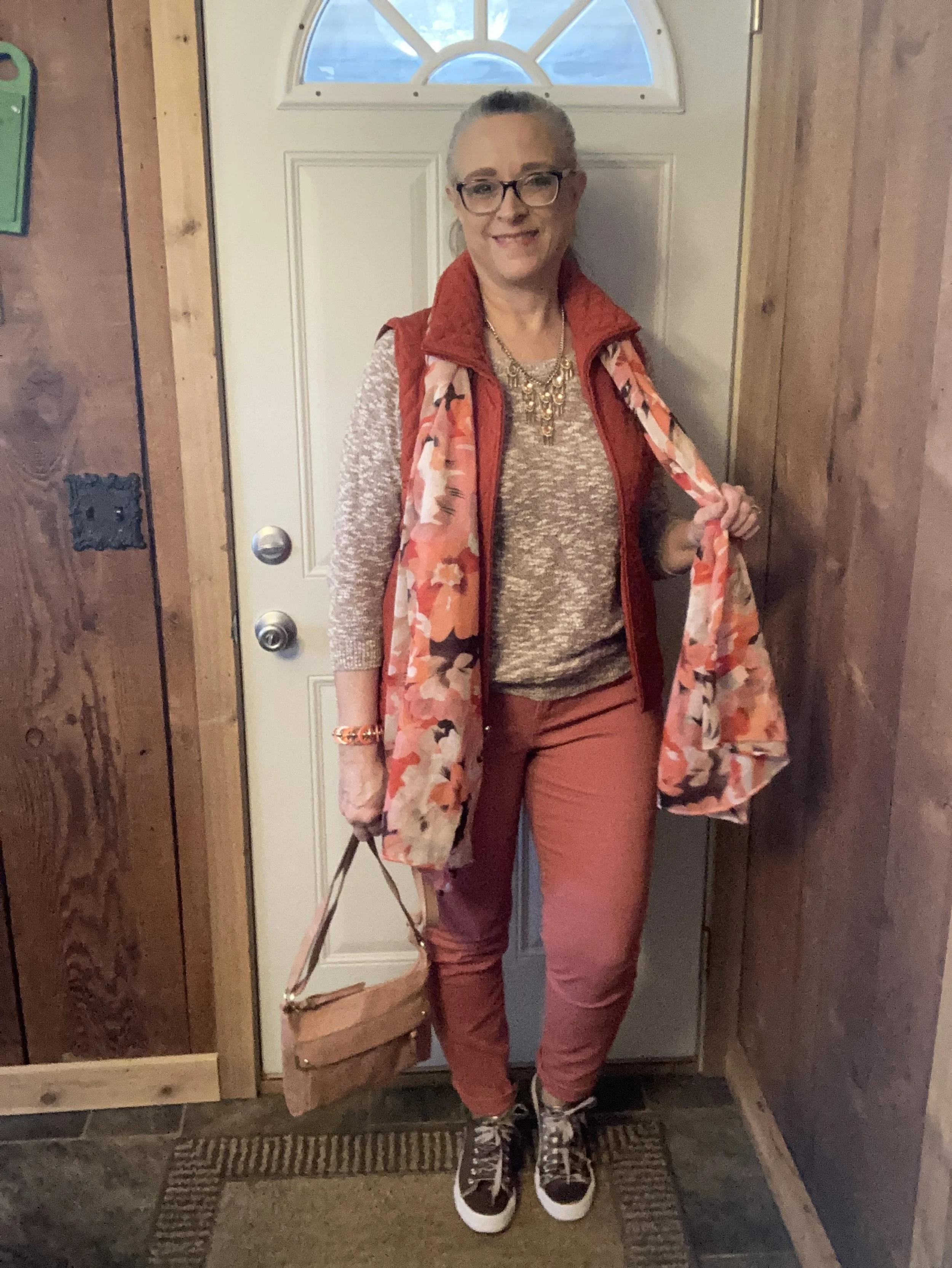
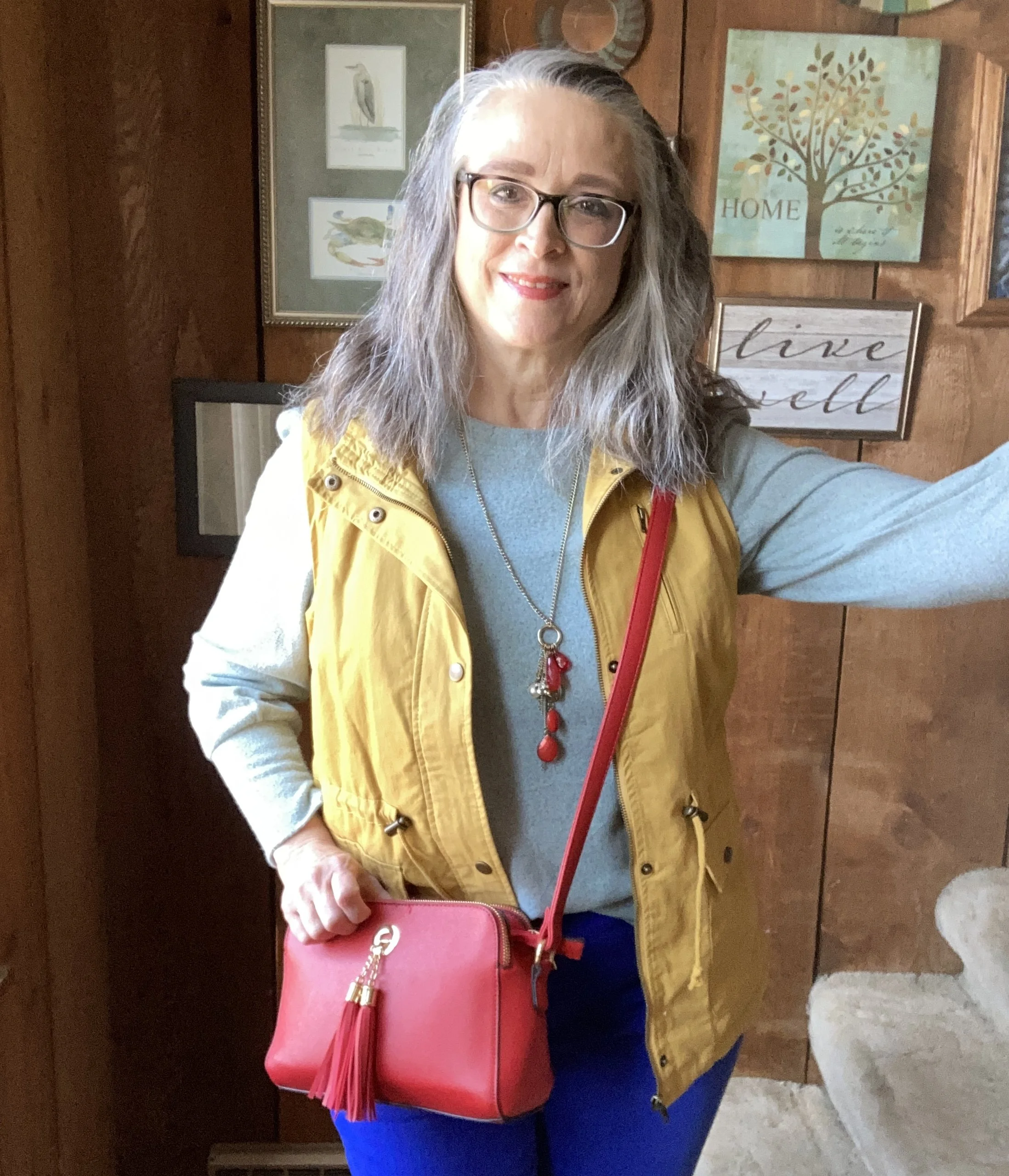
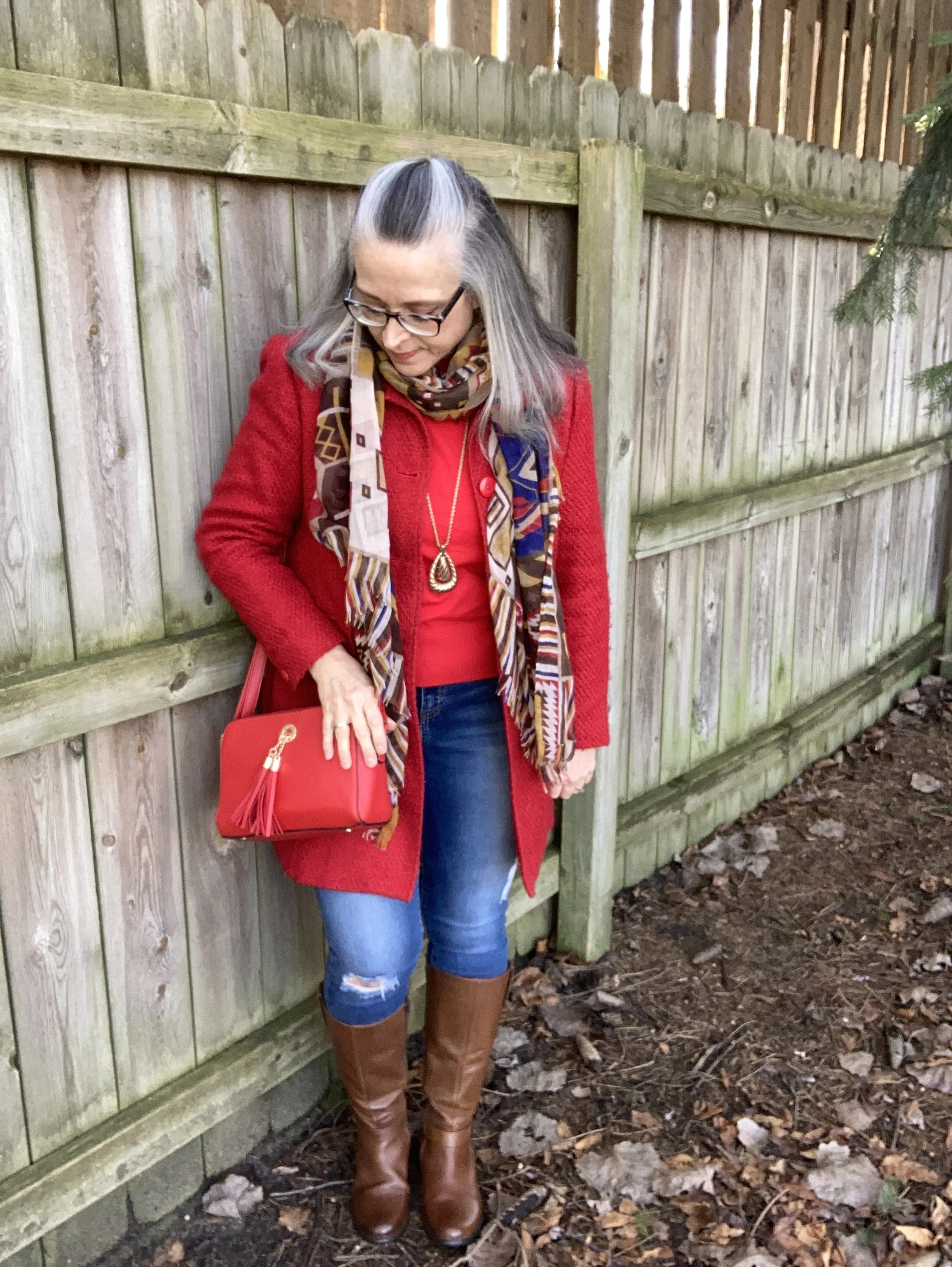
Red on red is definitely a bold choice, but so is any bright color combo. I knew I wanted to do this when I rediscovered this red coat out on our back porch covered with a plastic garbage bag to keep it clean. I hang a few of our winter things out there when we are off season. How could I have forgotten this beauty? Truth be told it is a tad tight around the middle since I have put on a few pounds, but that doesn’t mean I need to get rid of it.

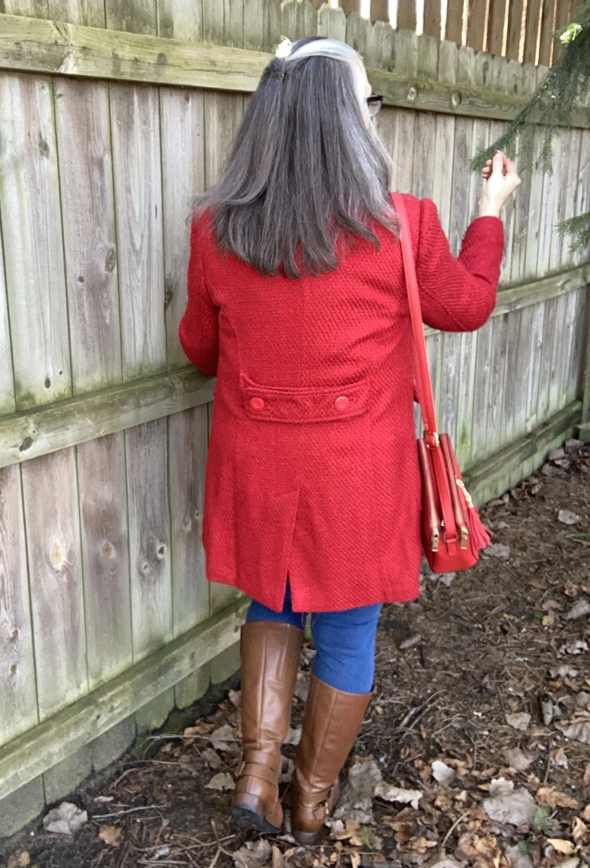
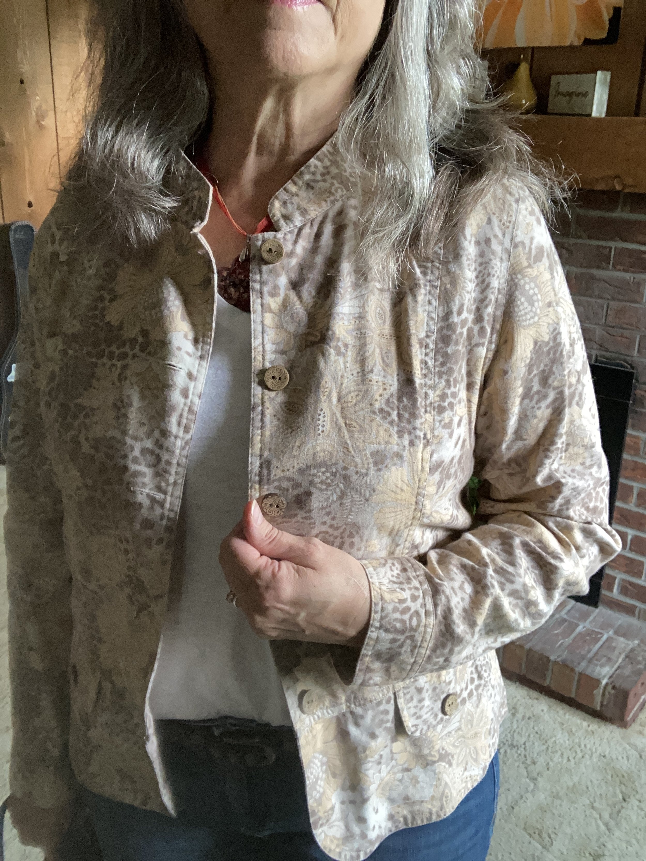
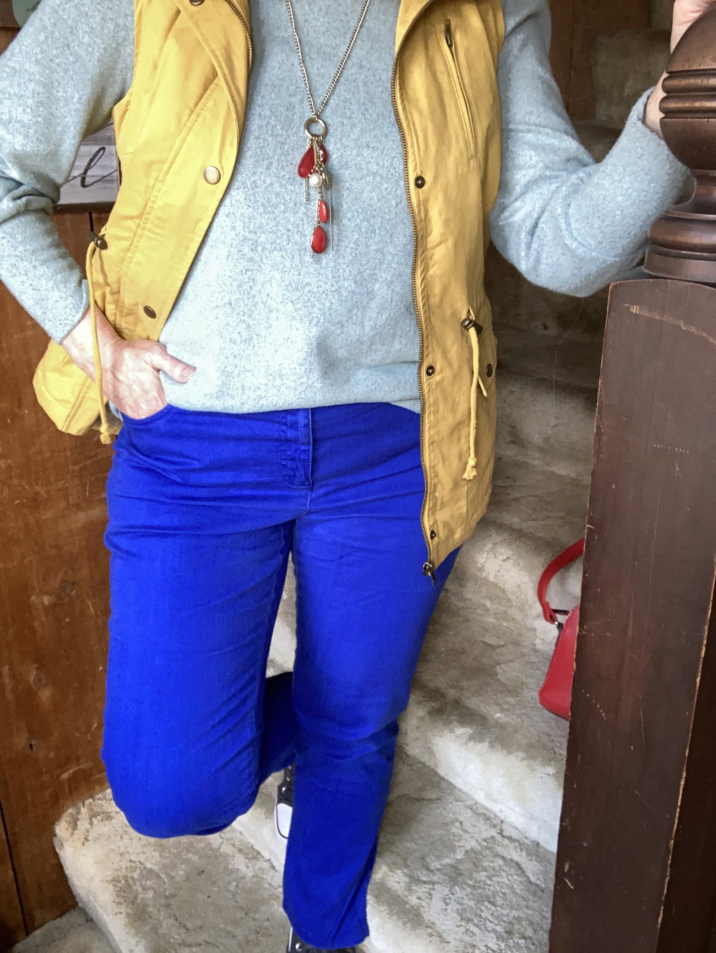
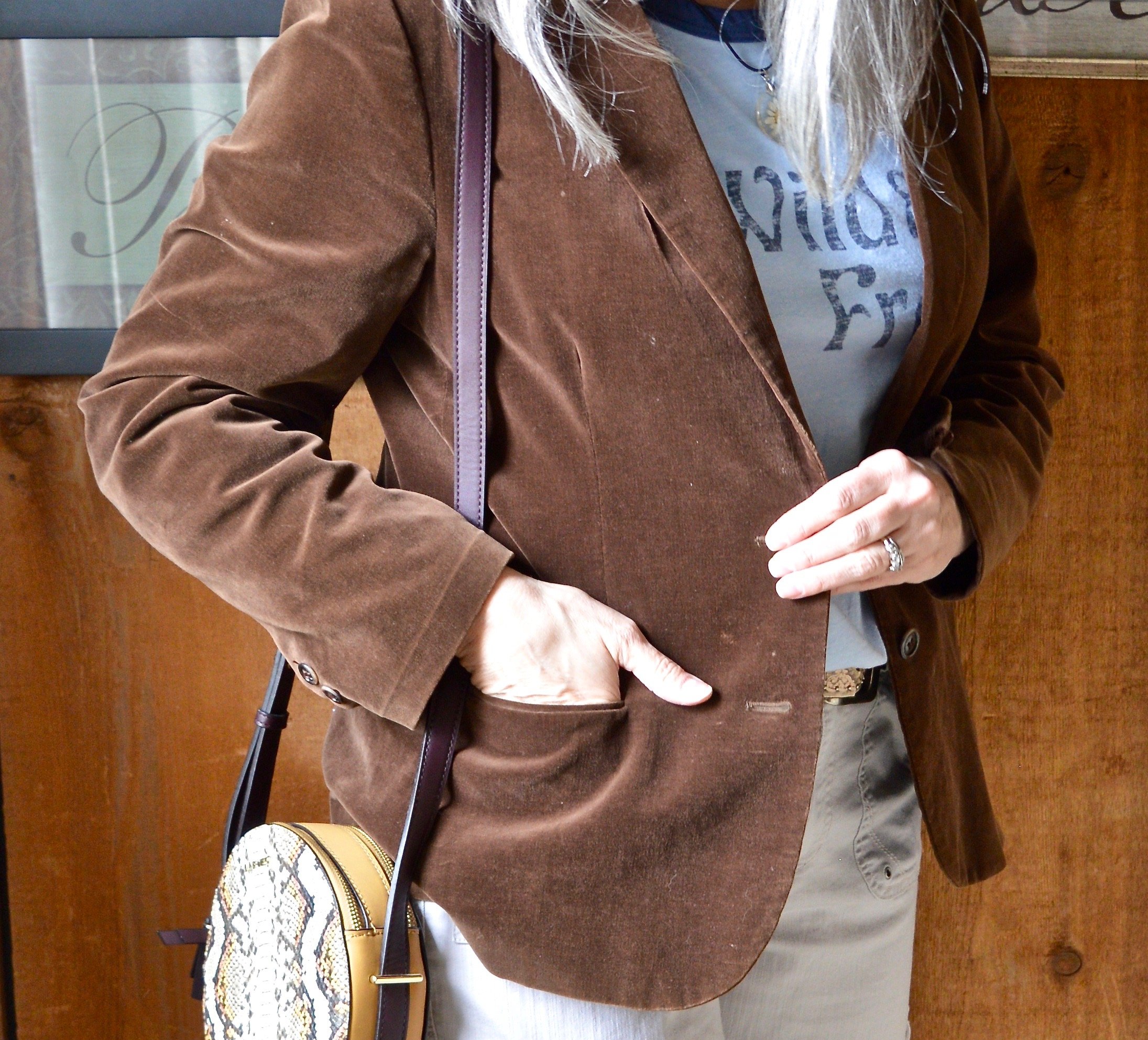
This lighter weight, thrifted jacket works well for those not super cold days. It is Worthington brand. I love the textured fabric and the buttons on the back. My pictures do not do it justice.

Style Tip: If you are a thrift shopper always check out the coats and jackets. You never know what beautiful piece you will find, especially in the off seasons. If you don’t do a lot of thrifting, buy coats at the end of the season. This is when you will find the best sales, and if you shop stores like Kohl’s or JCPenney you might get an additional percent off with coupons.

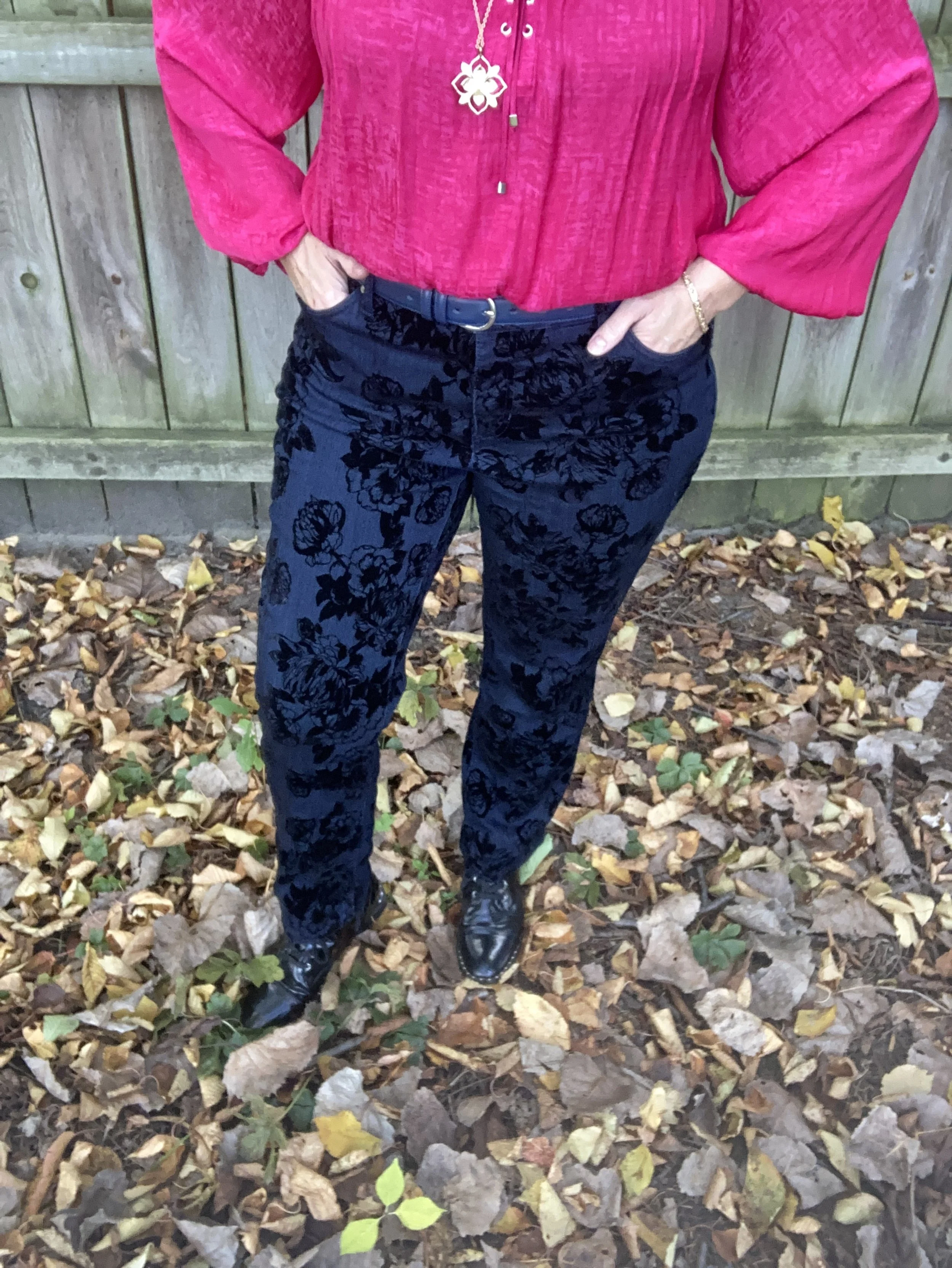
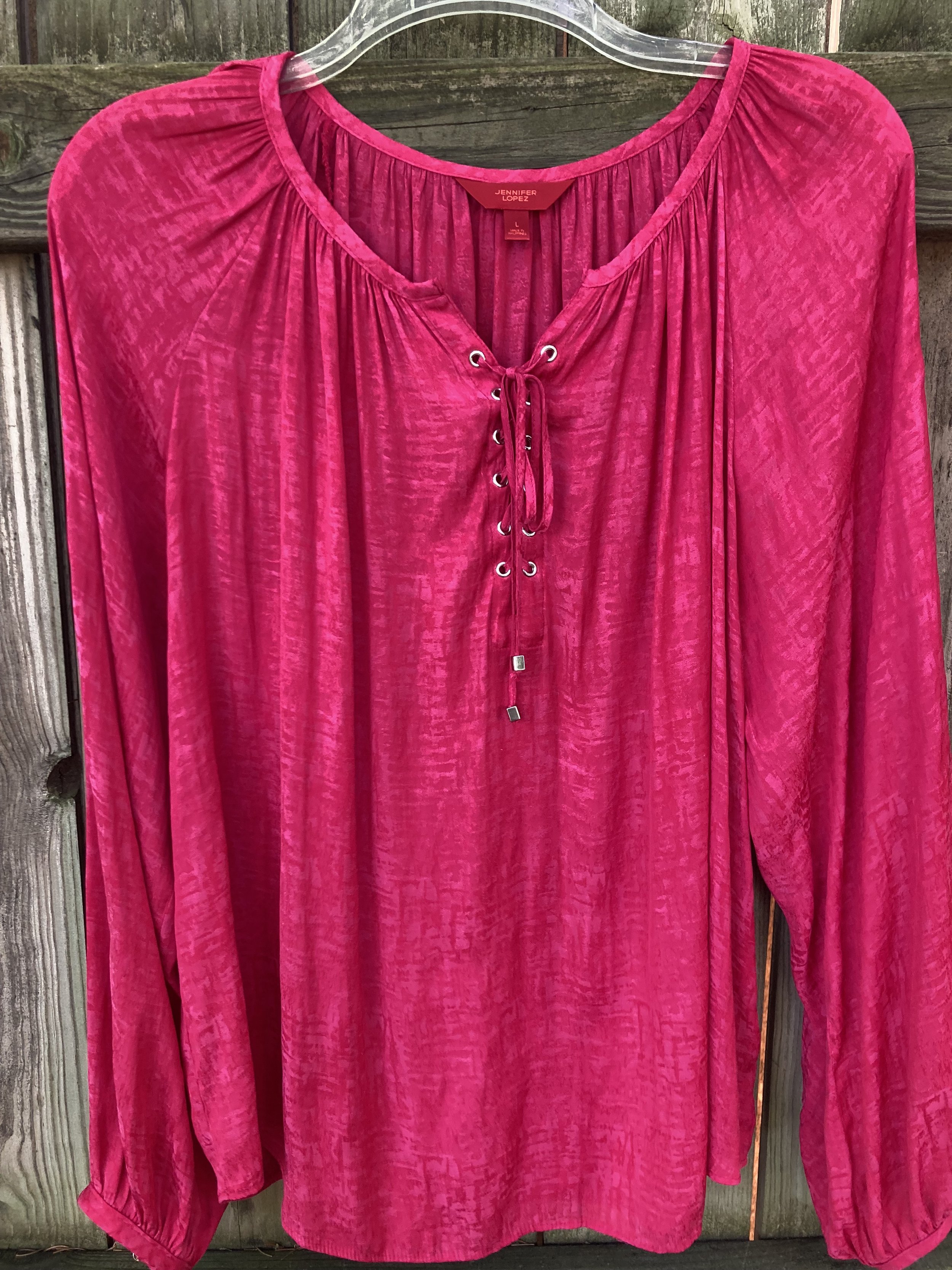
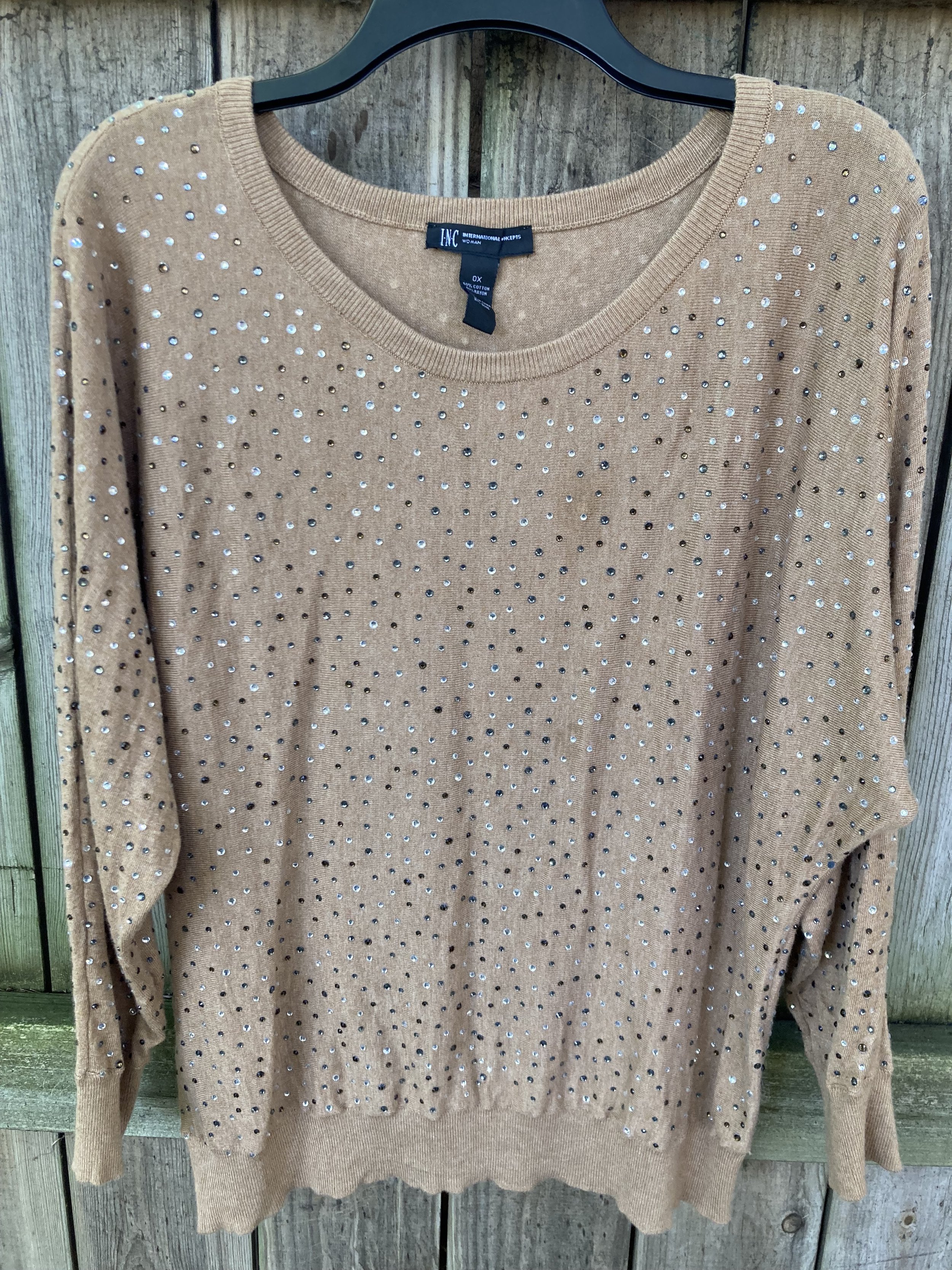
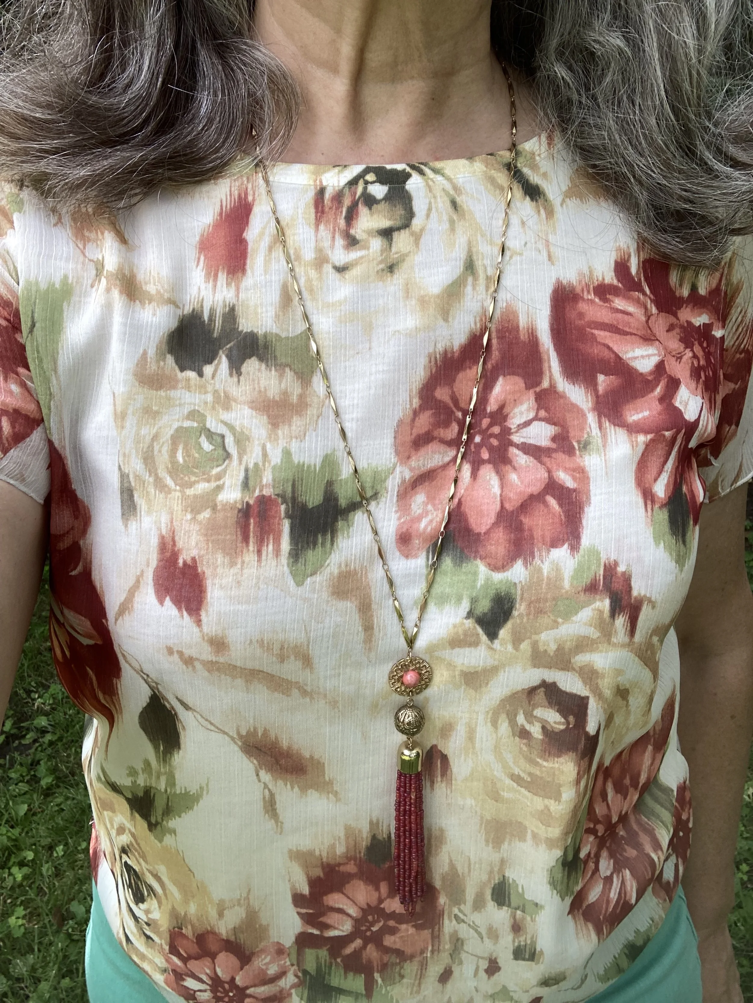
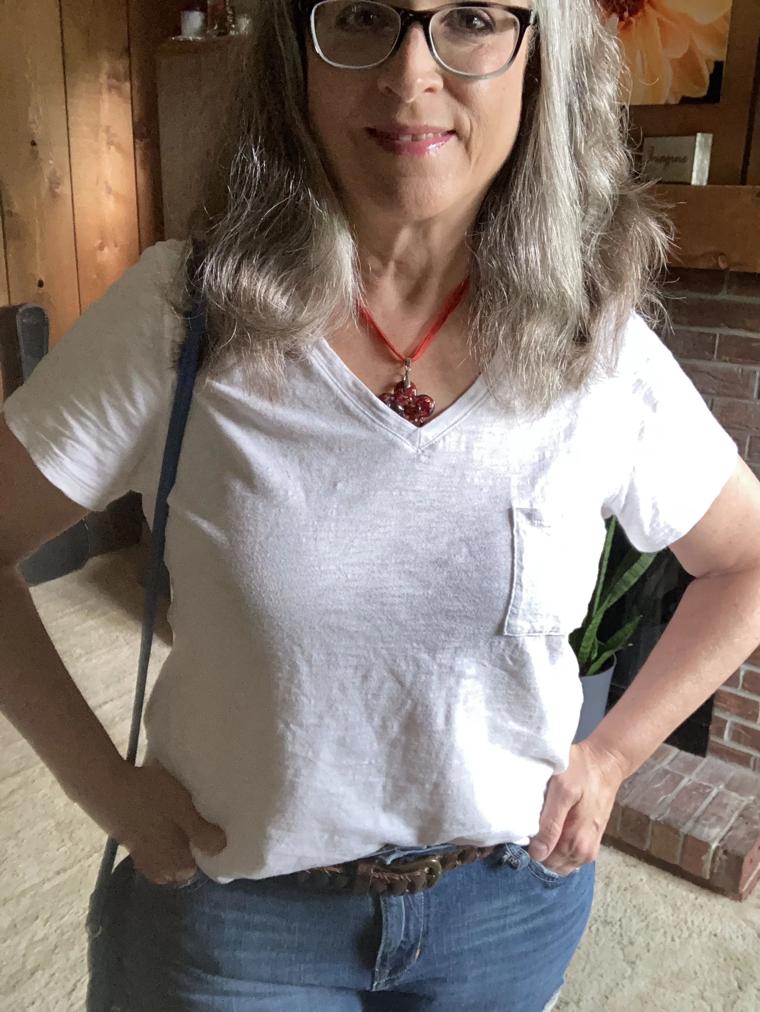
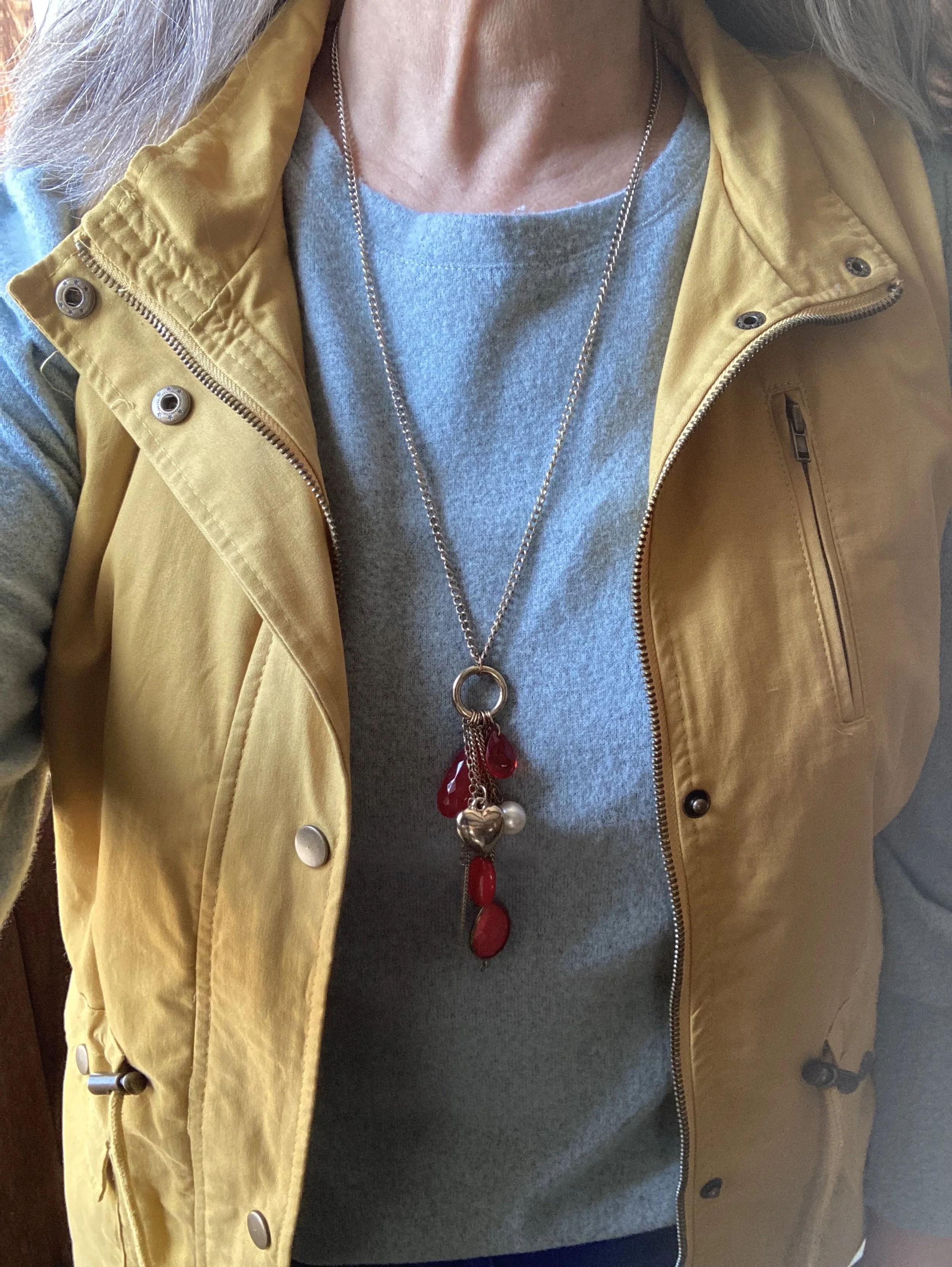
My bright red mock turtleneck sweater was just thrifted; I didn’t even wash it yet. When I decided to do this outfit, I knew it would be a perfect partner for the coat. This is A New Day brand.

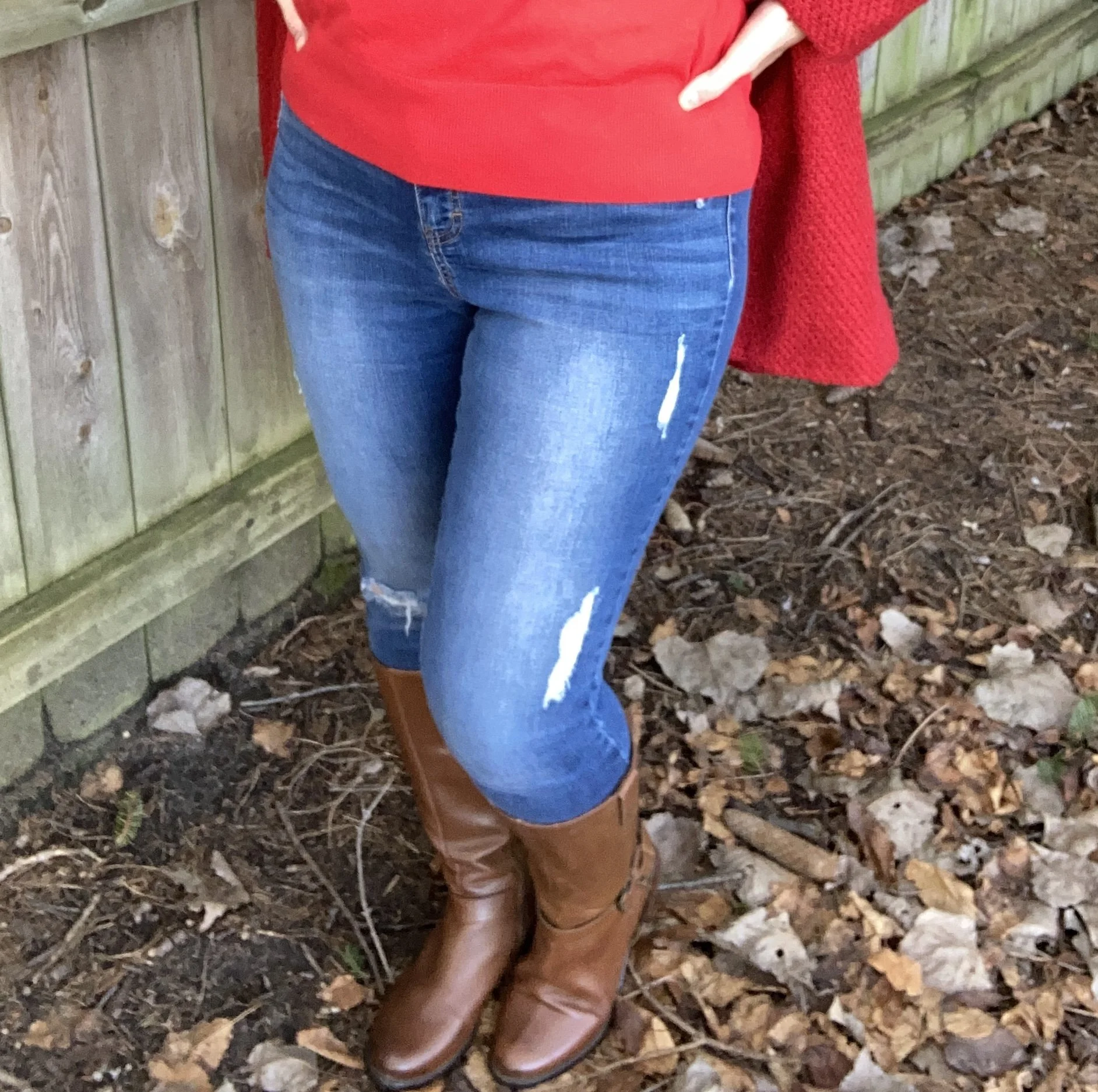
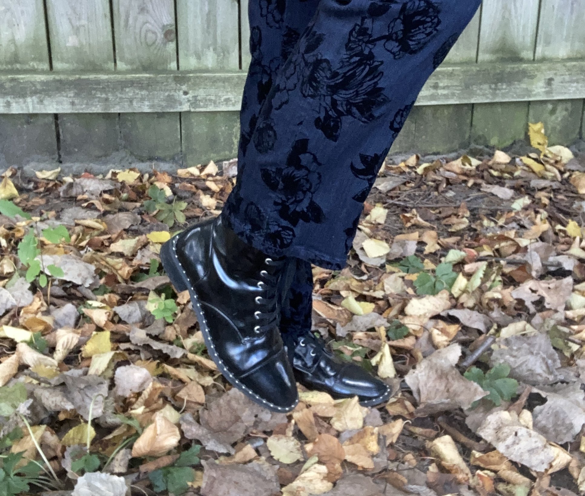
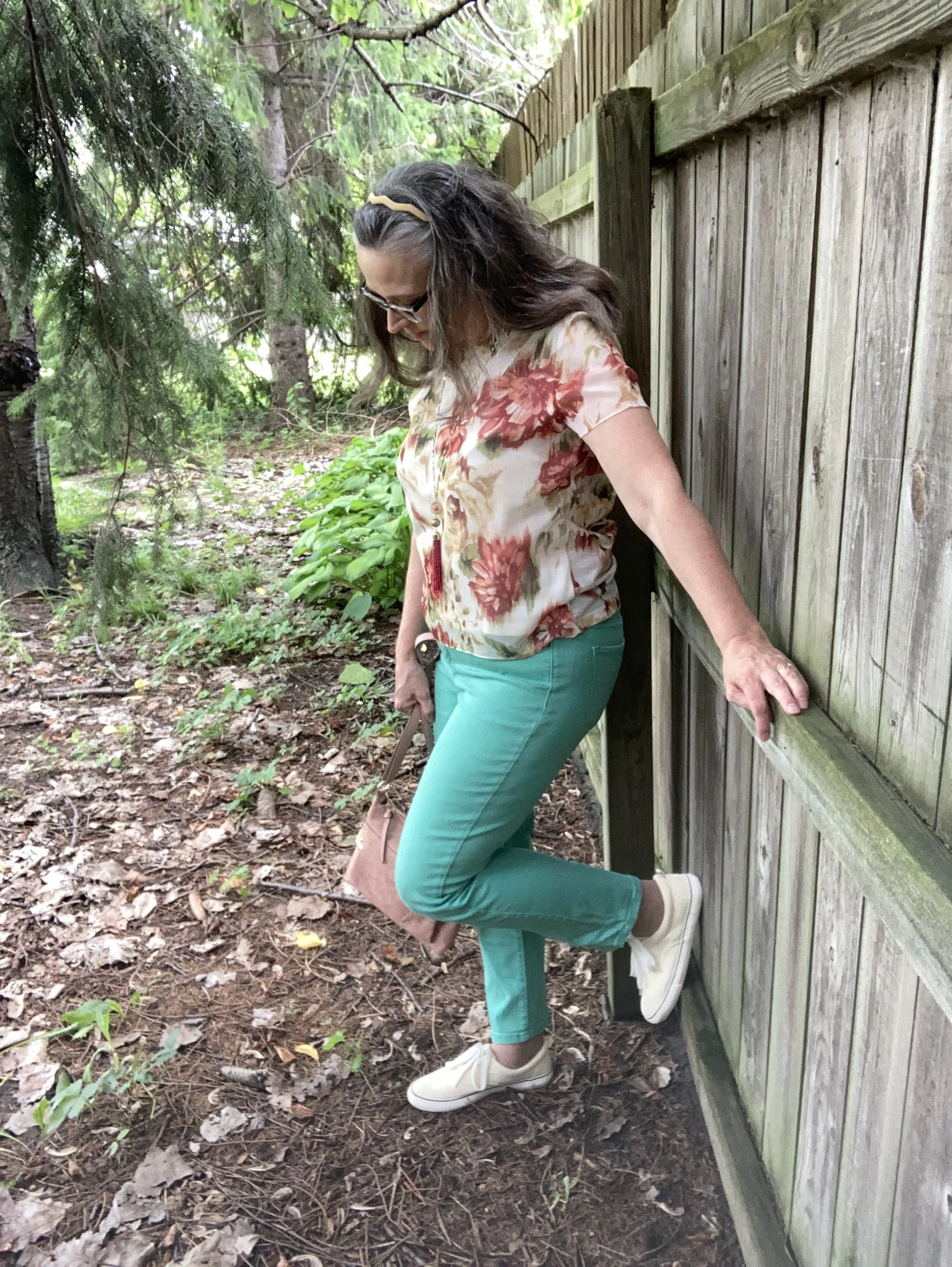
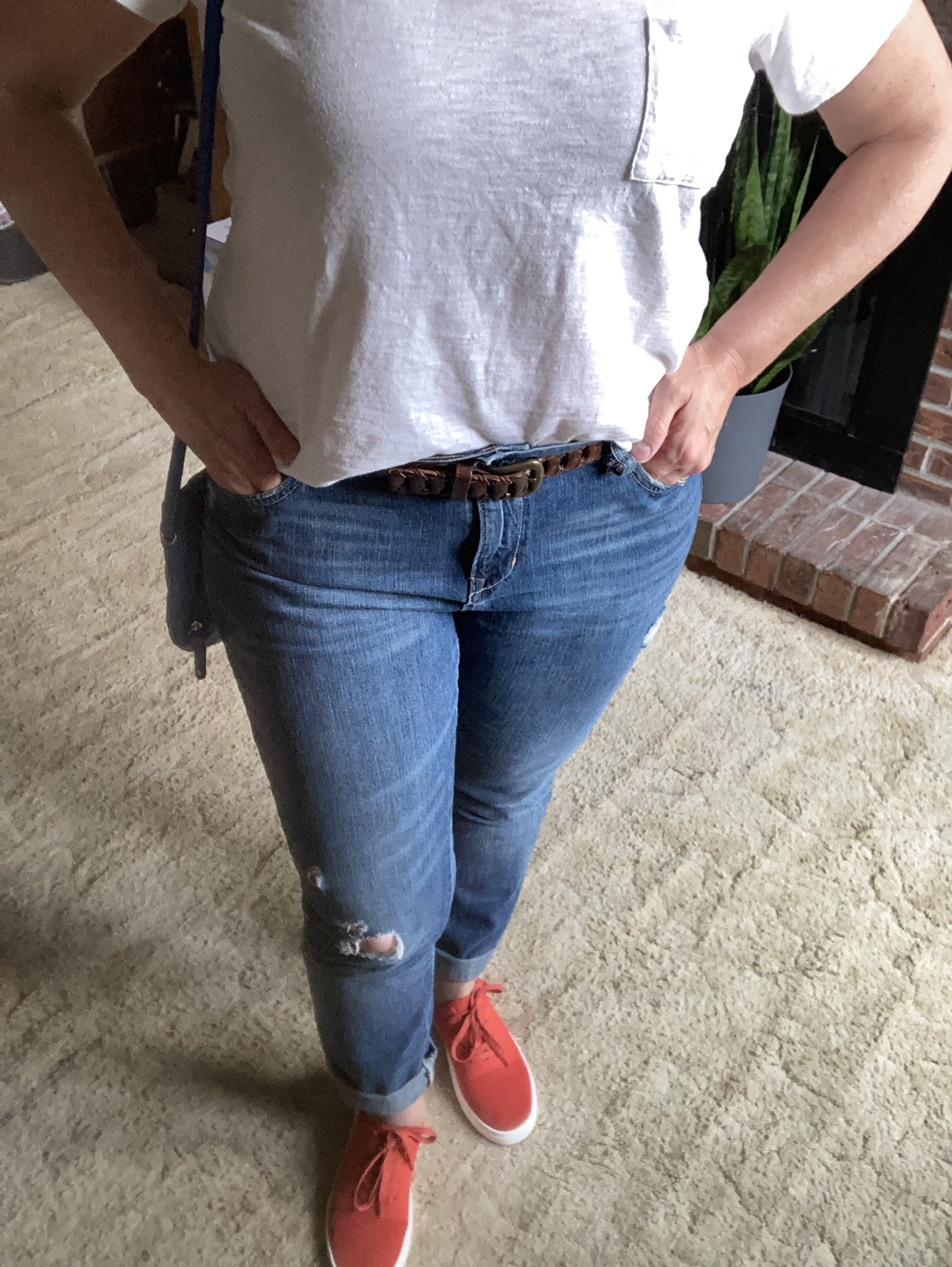
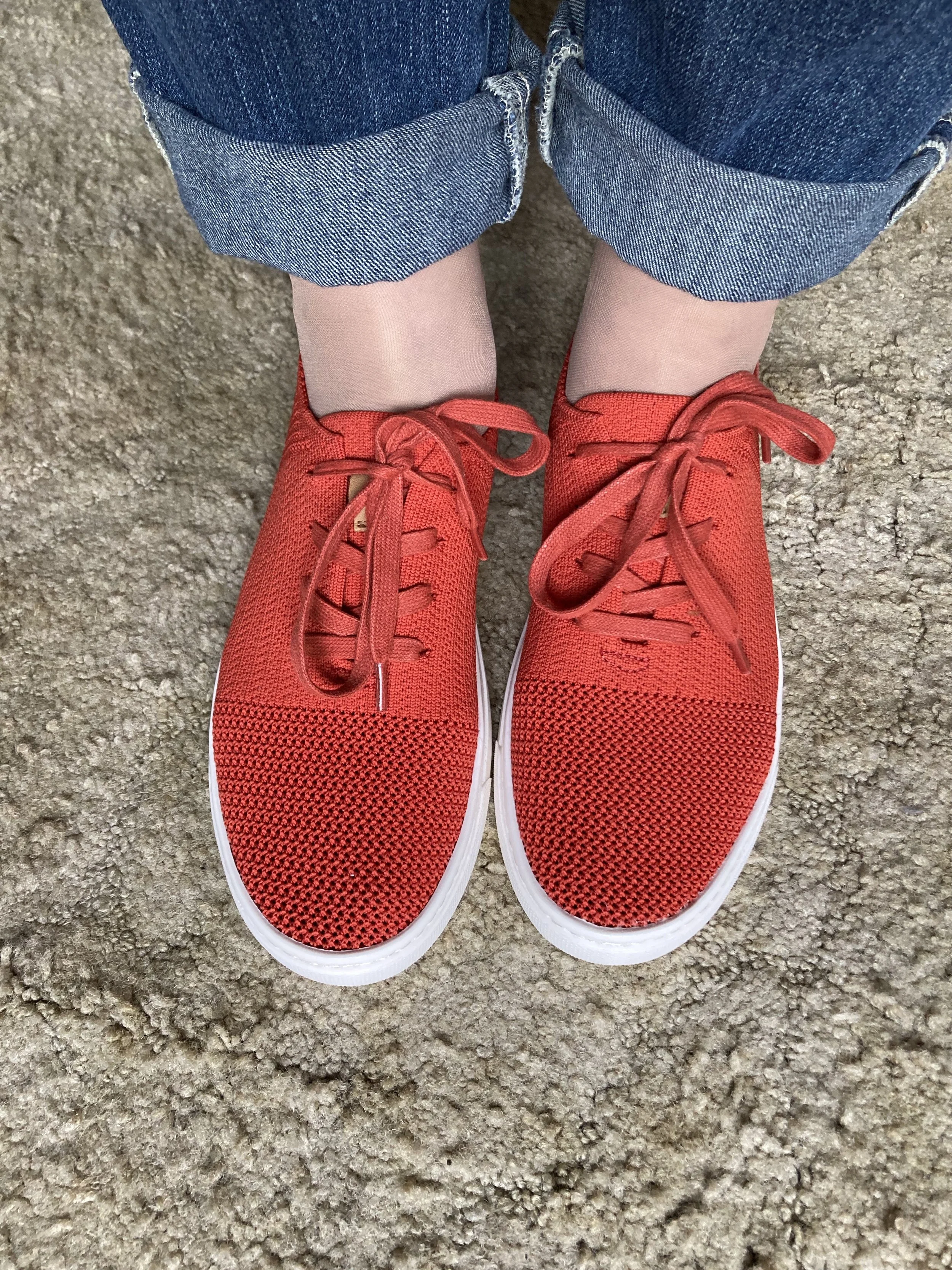
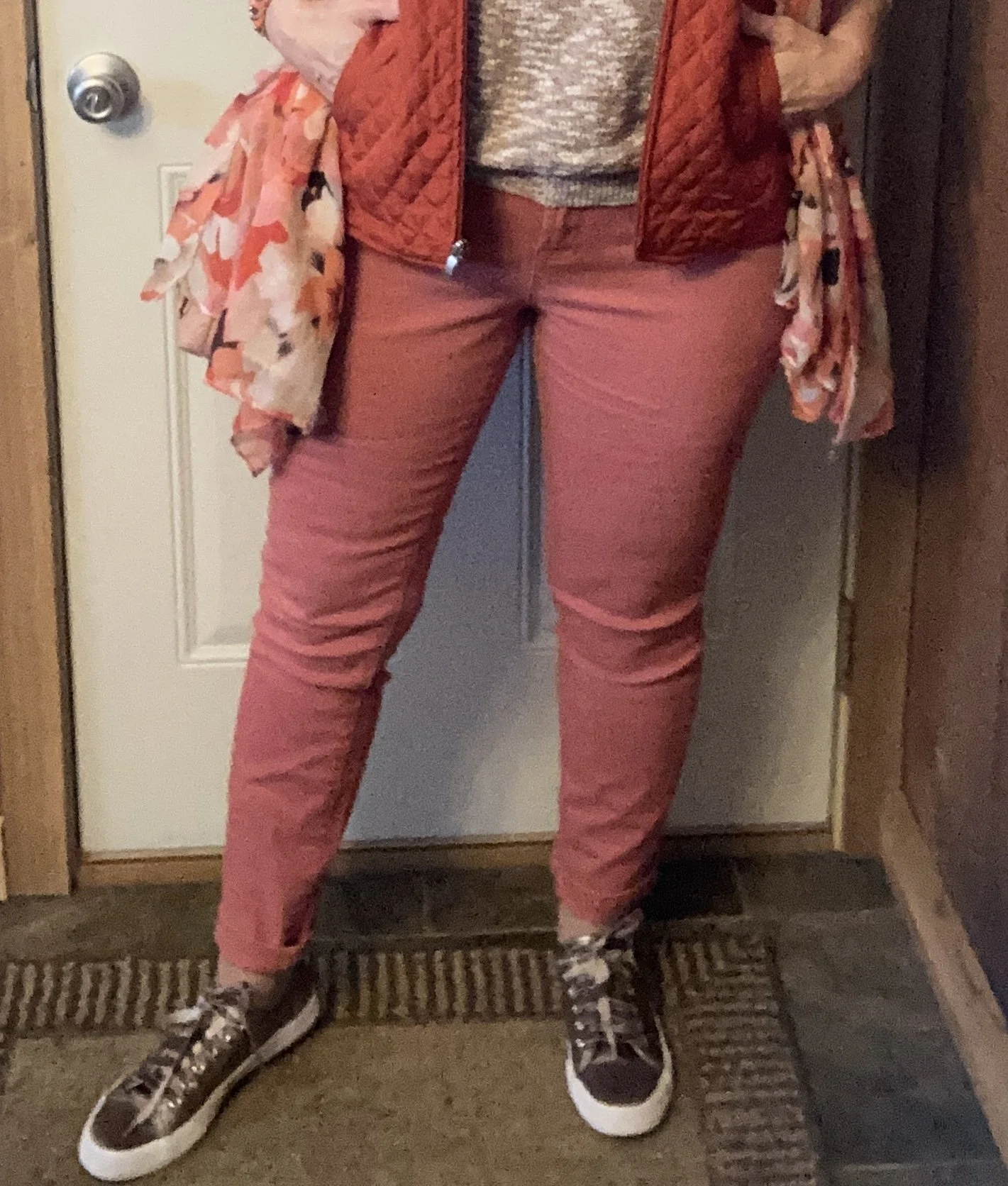
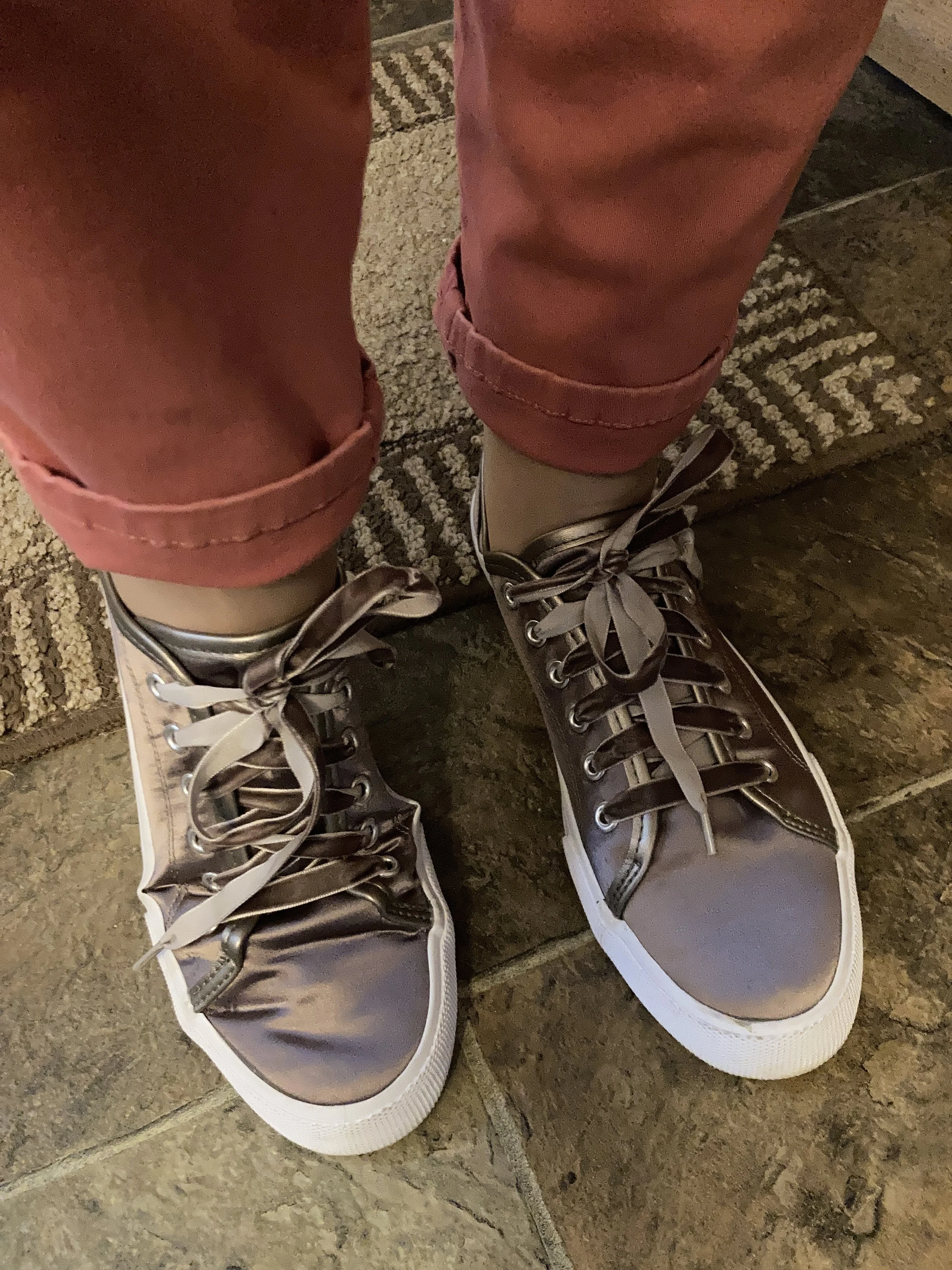
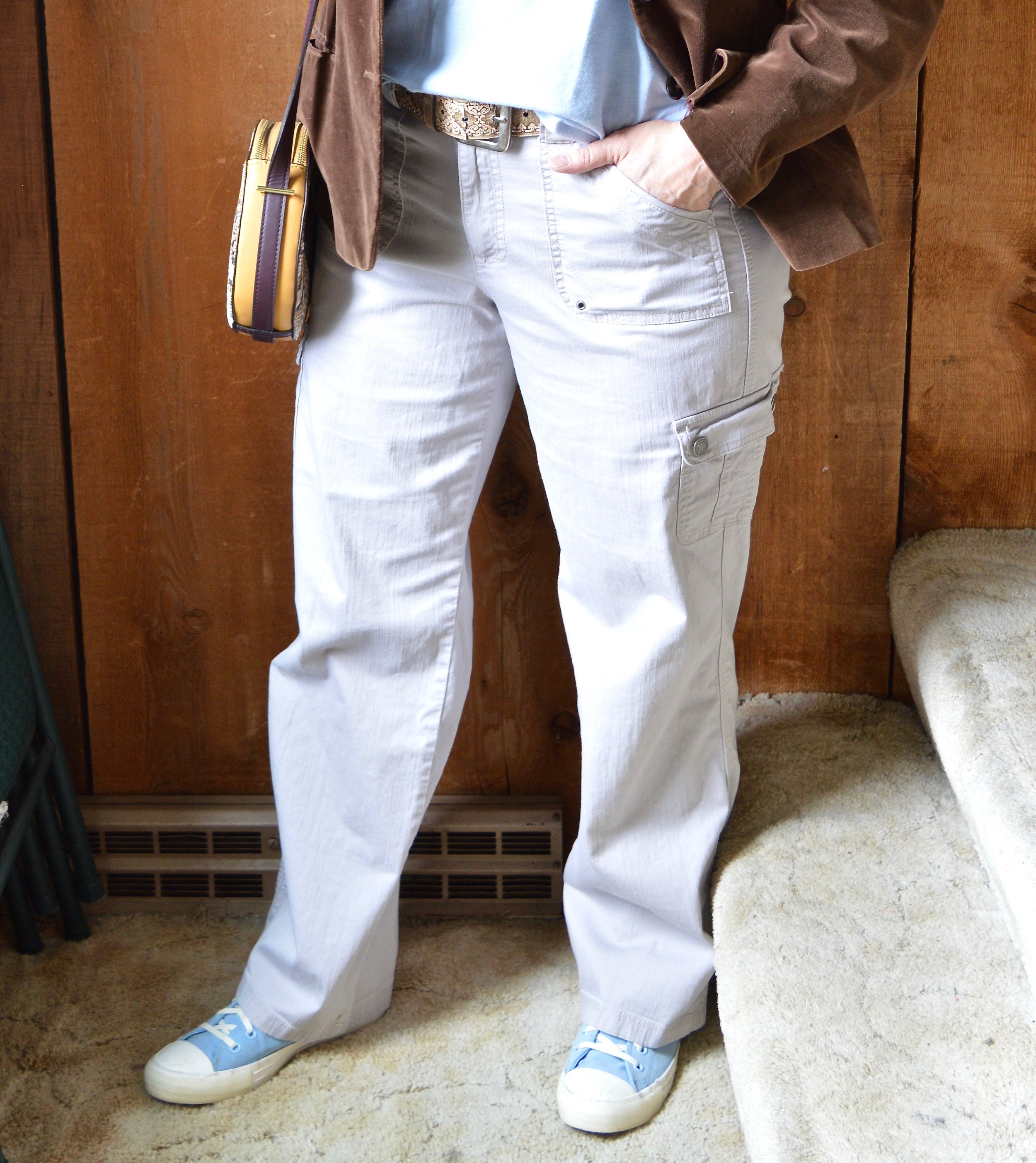
My jeans were also thrifted and are Jennifer Lopez brand. I know Kohl’s used to sell her clothing, but they stopped carrying her line in 2020. These are slightly distressed skinnies and comfortably stretchy, making them perfect for boots.

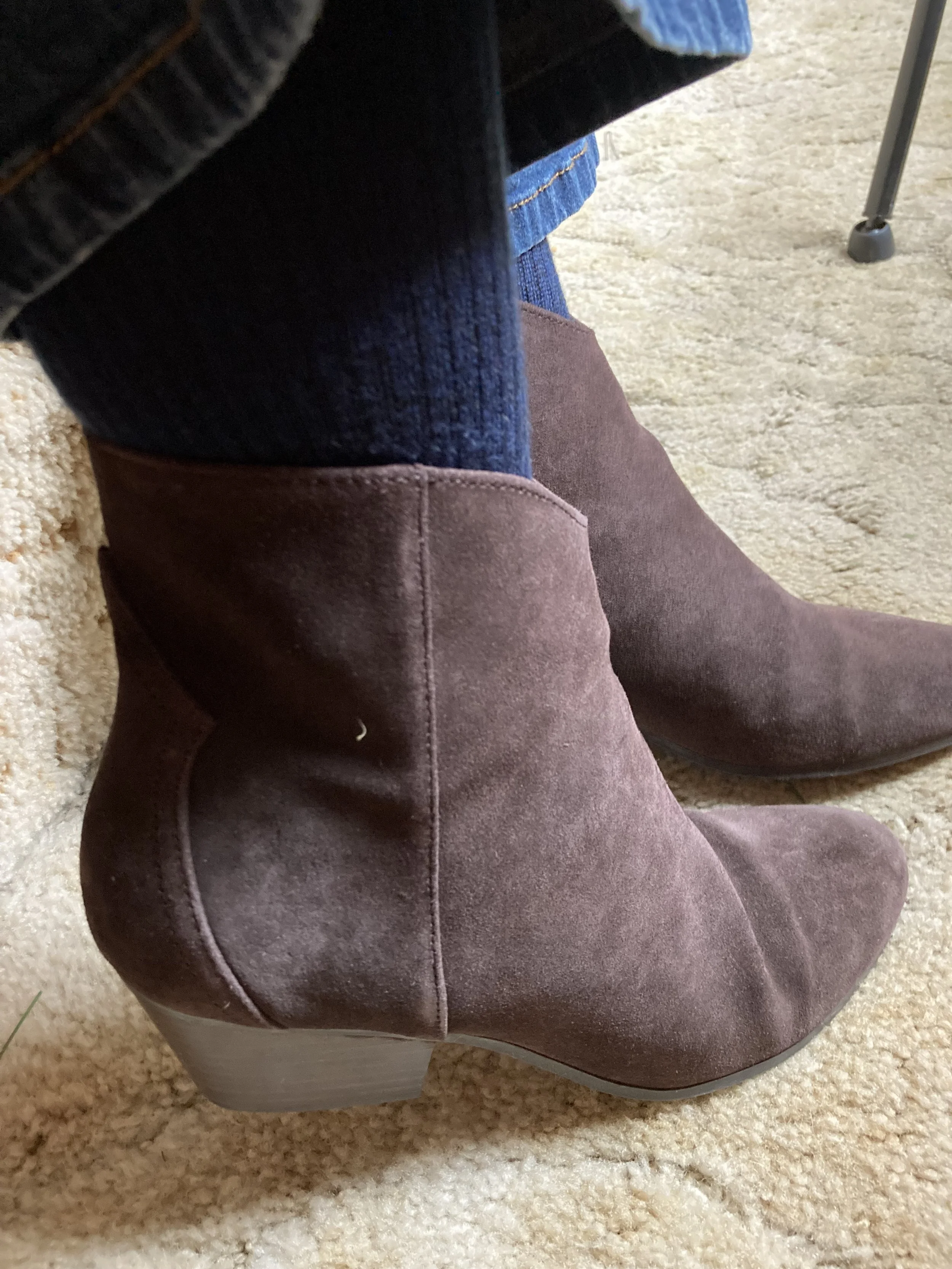
I found these leather, Clarks boots at the same thrift store as the red sweater. How awesome is that? I have really been trying to find a least a couple of pairs of leather boots at thrift stores. They are so expensive to buy full price, even though they do last almost forever. When I saw these I was so excited they were in my size. They had a little bit of scuffing, but my hubby has a shoe polish kit and was able to shine them up.

Style Tip: Whether you are a pro second hand store shopper or and avid fan of regular retail, it is always helpful to make a list. Keeping a running list of things you are regularly looking for or in need of is good planning and will help you save money in the long run and keep you from overbuying.

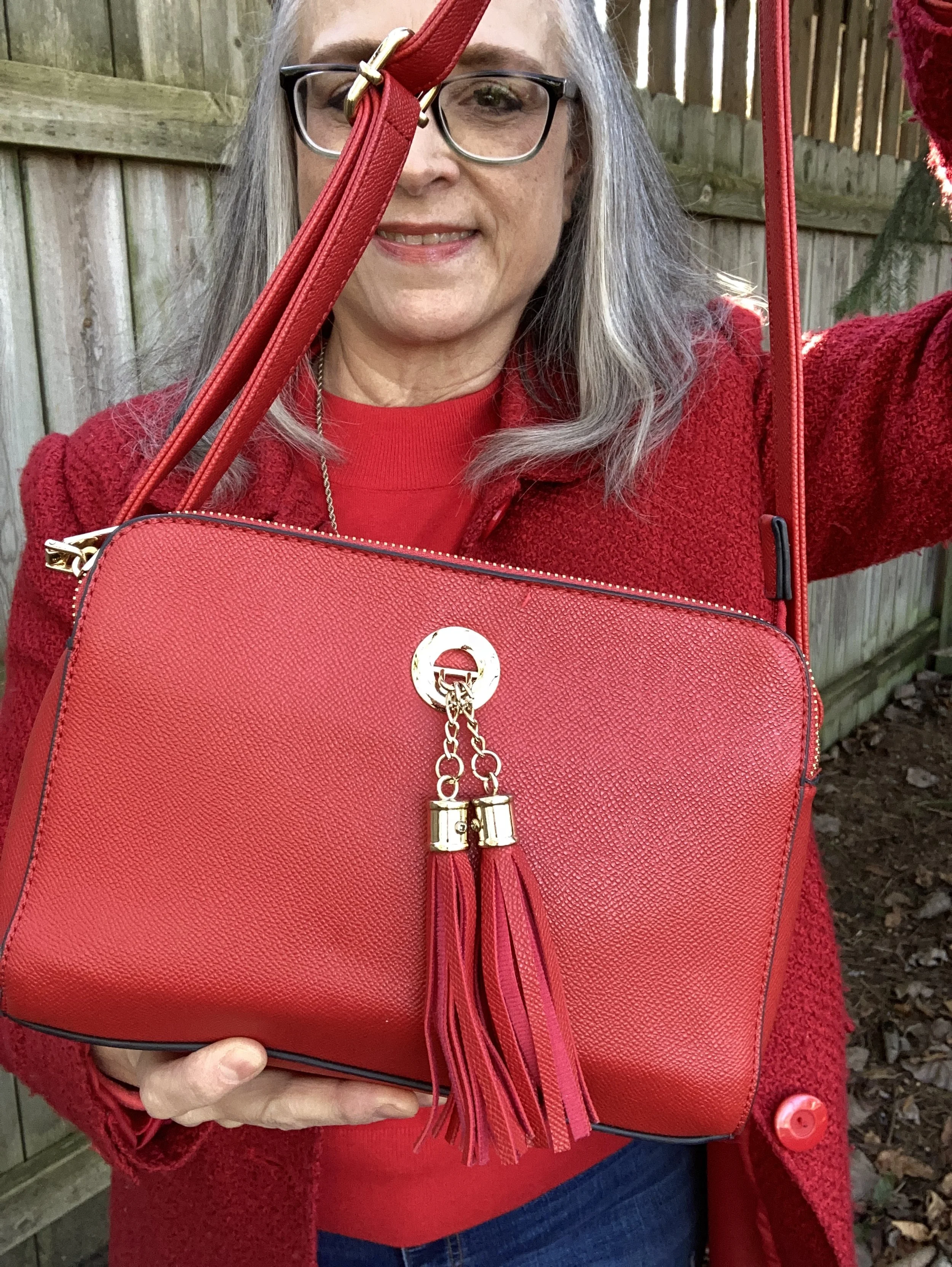
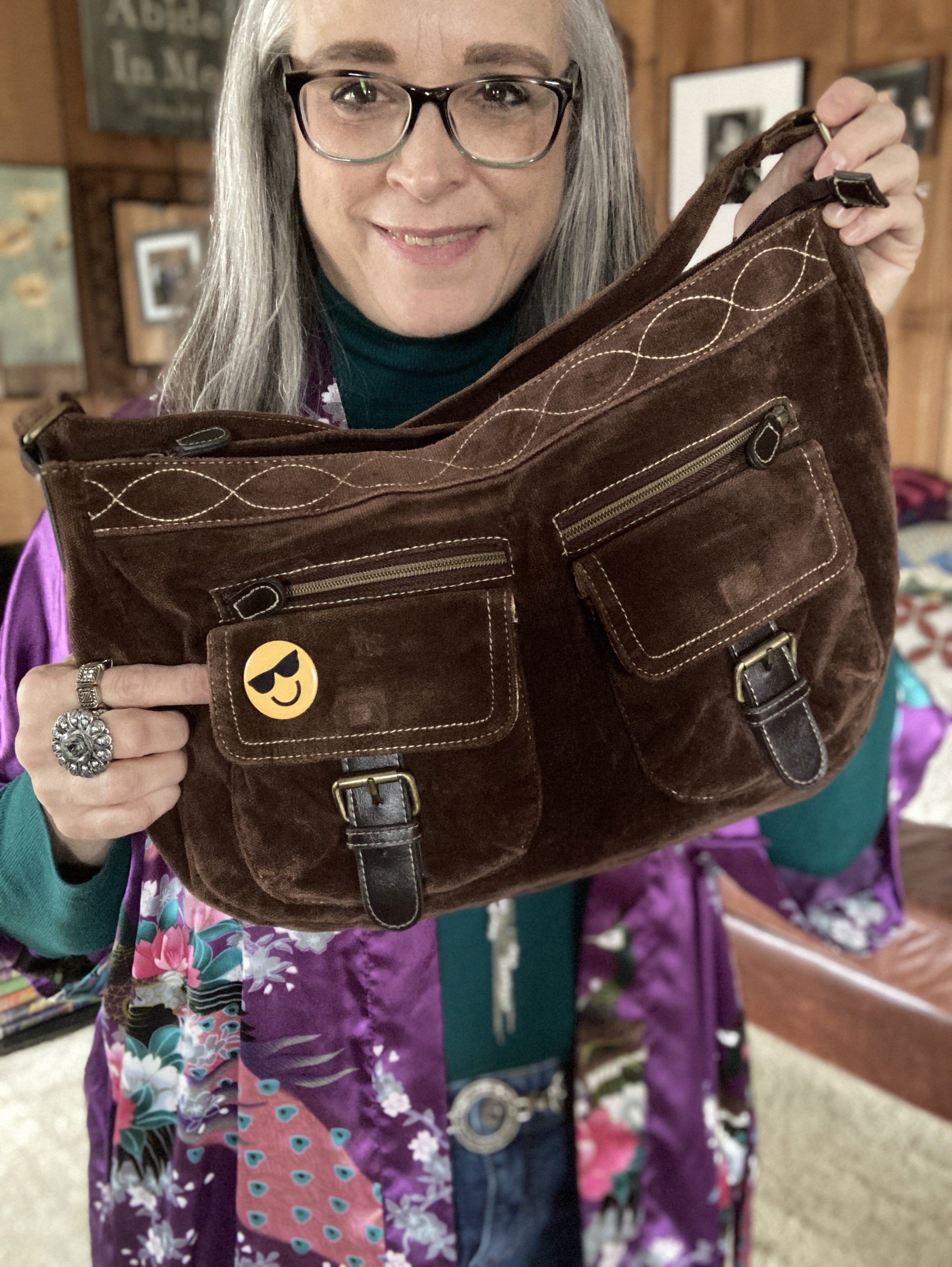
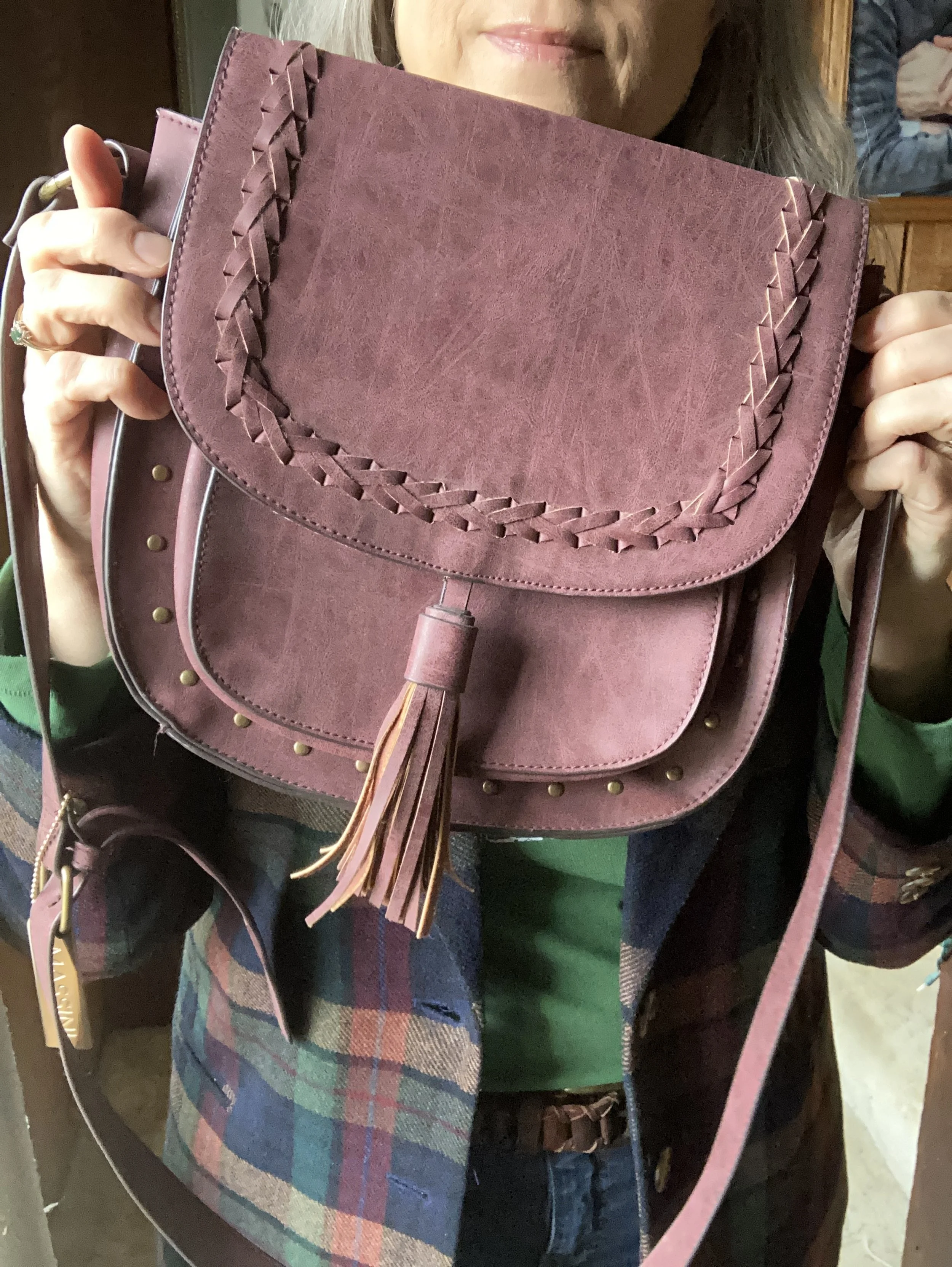
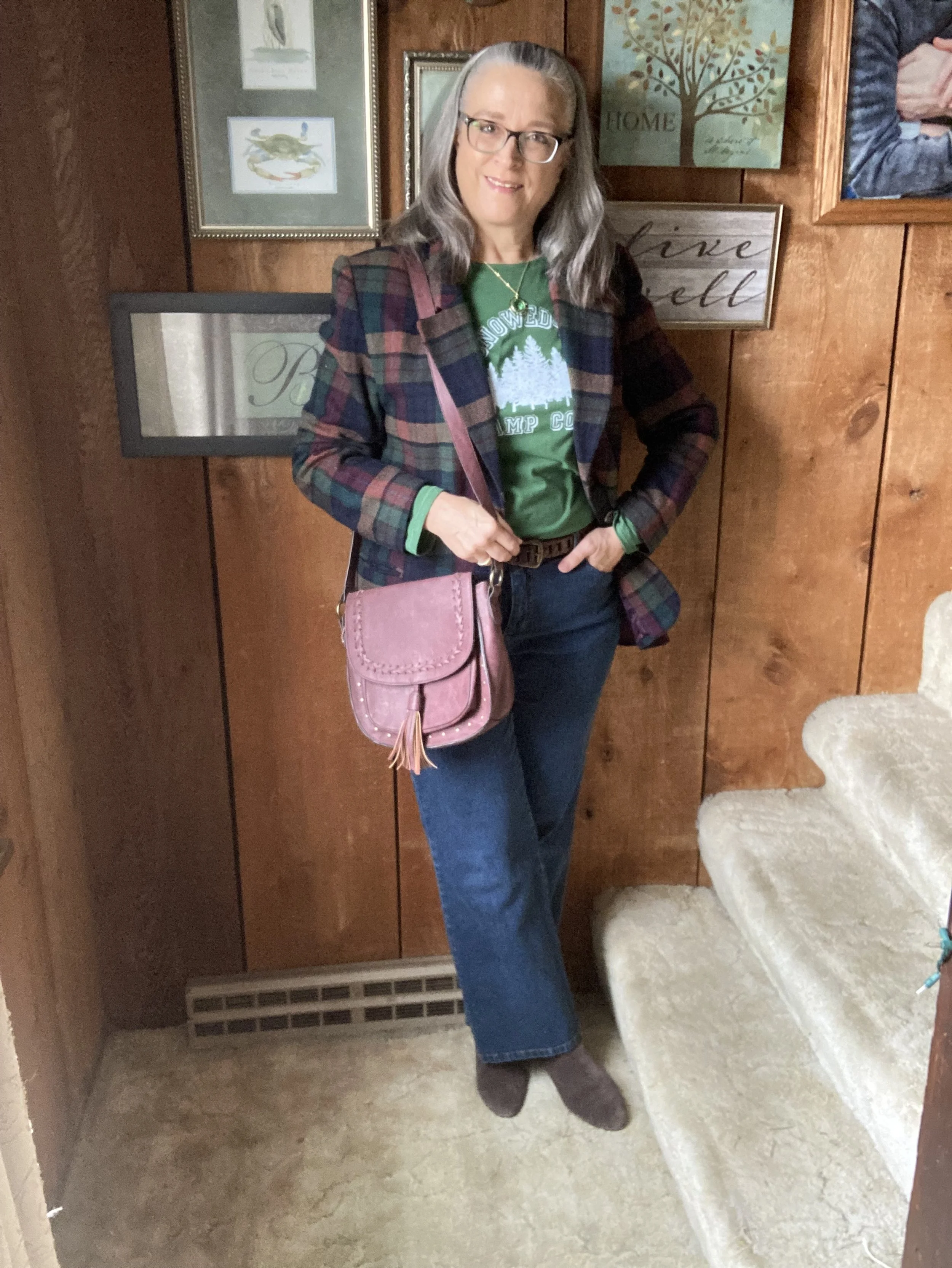
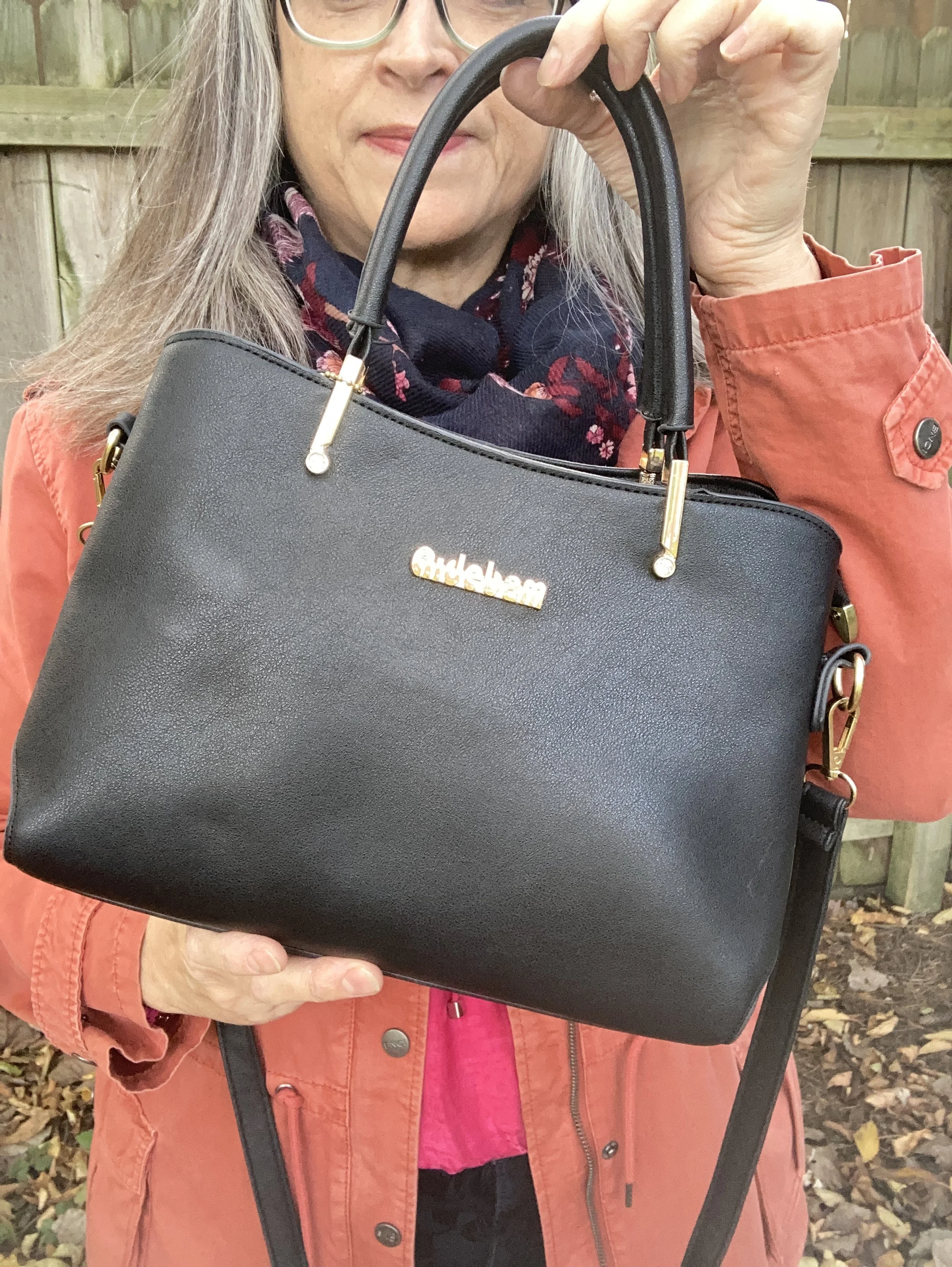
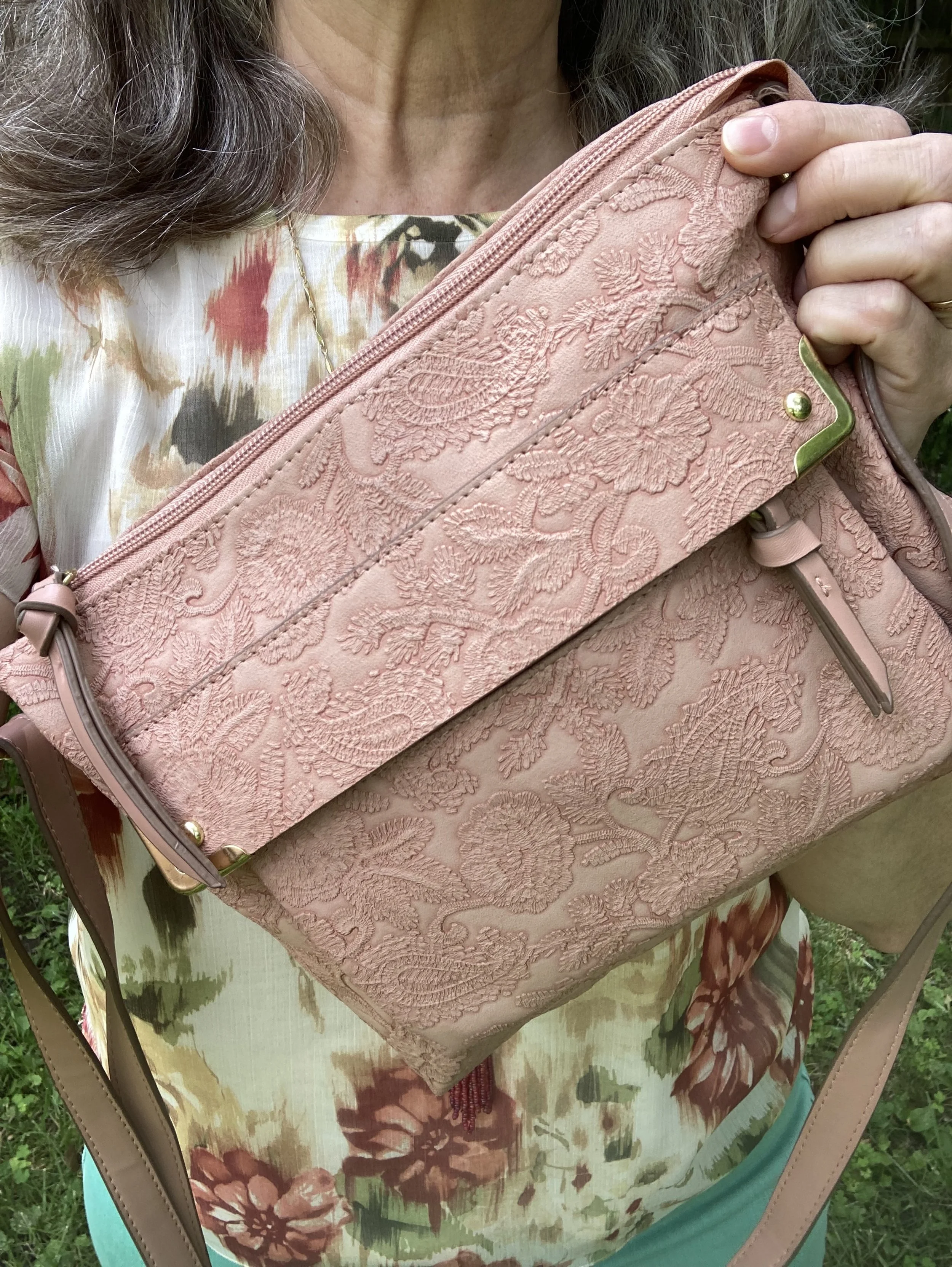
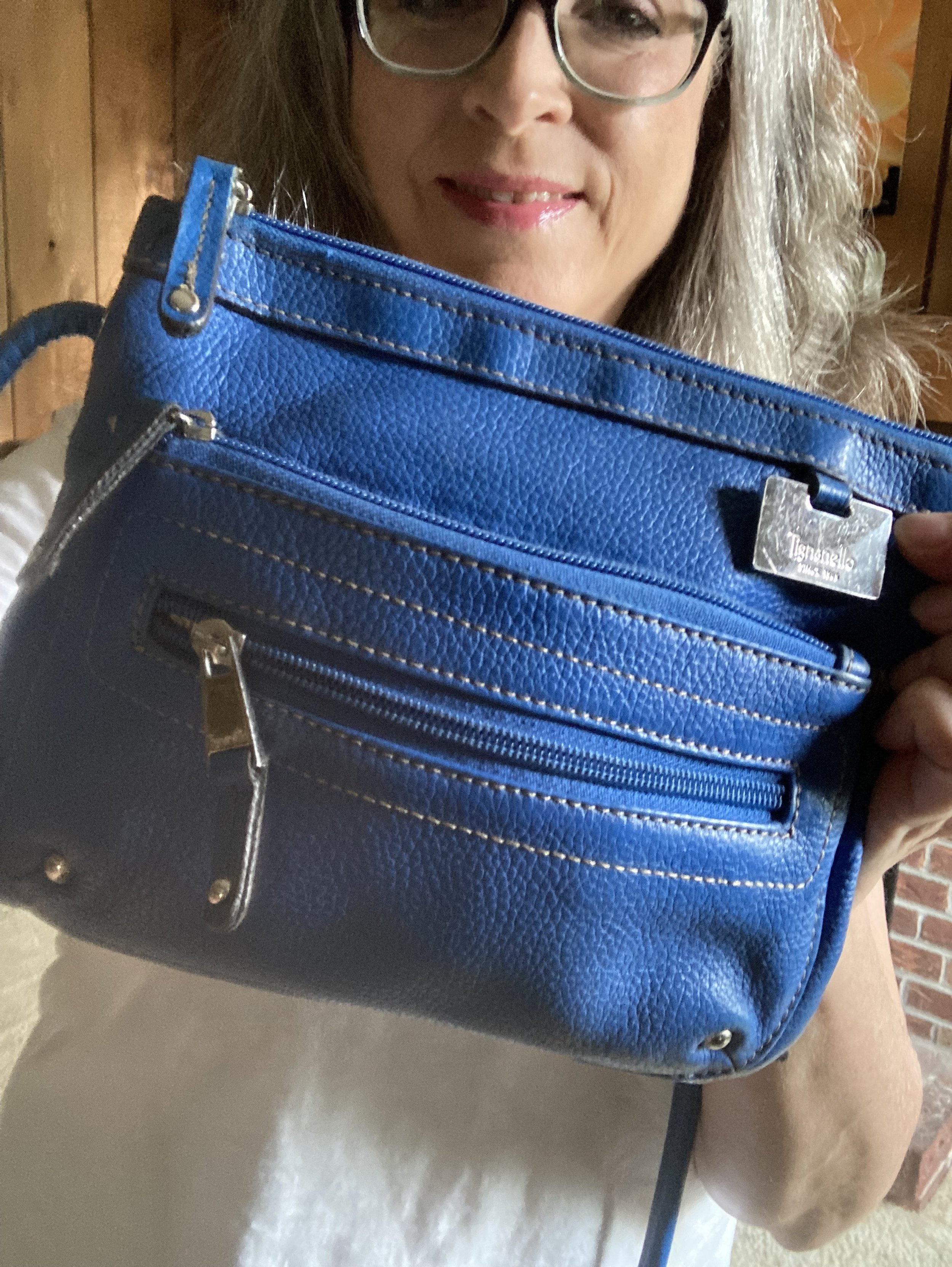
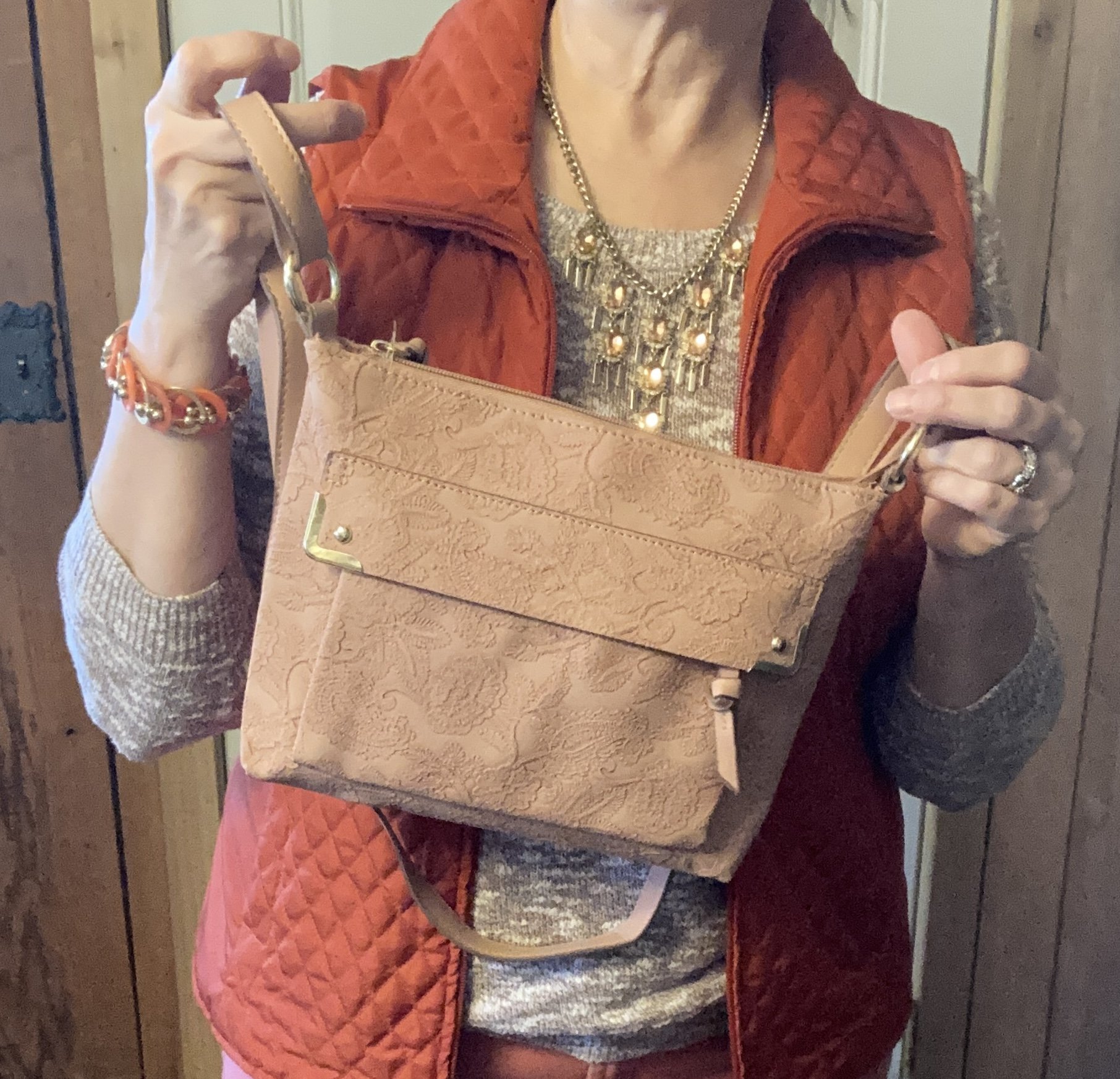
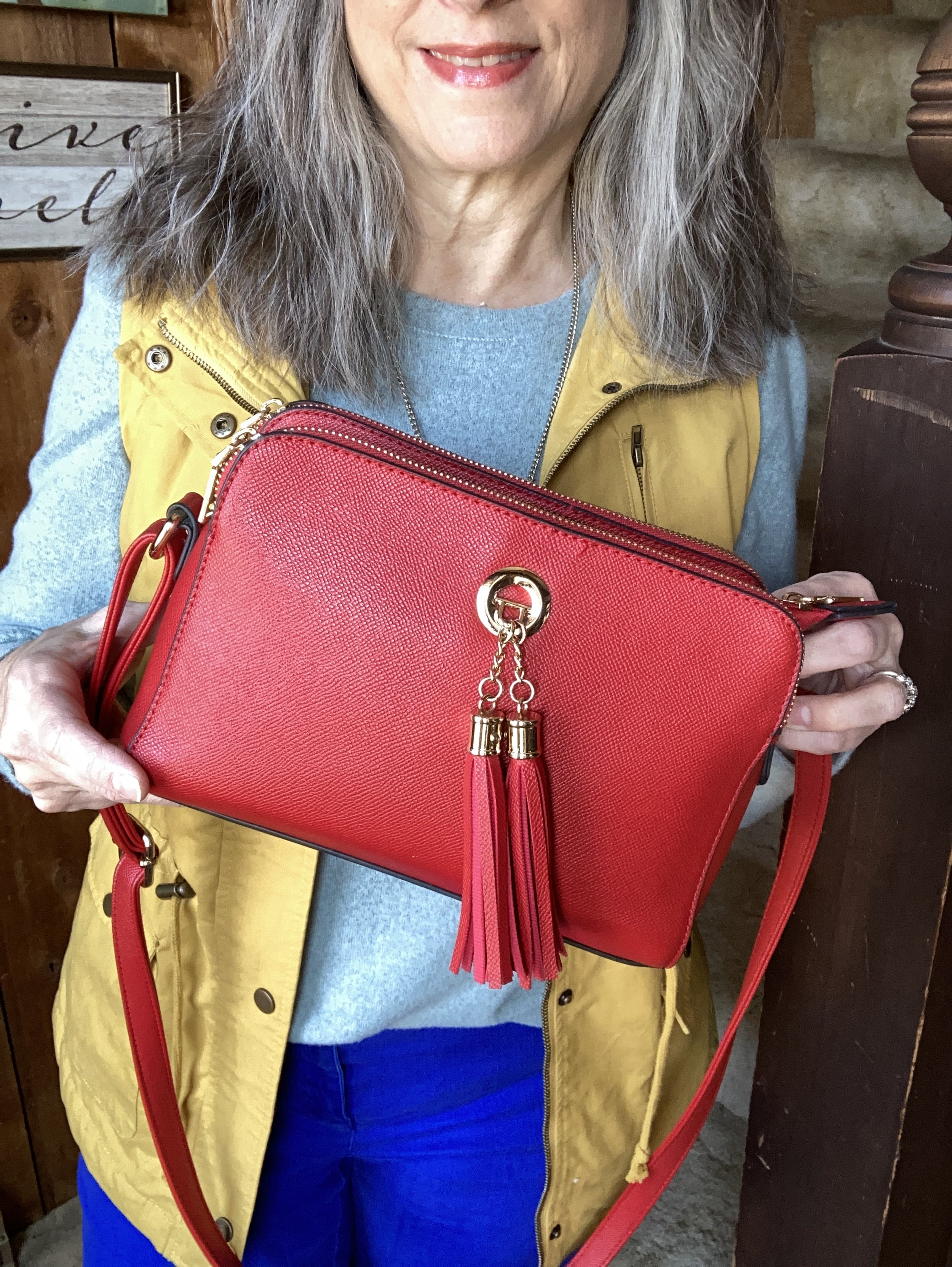
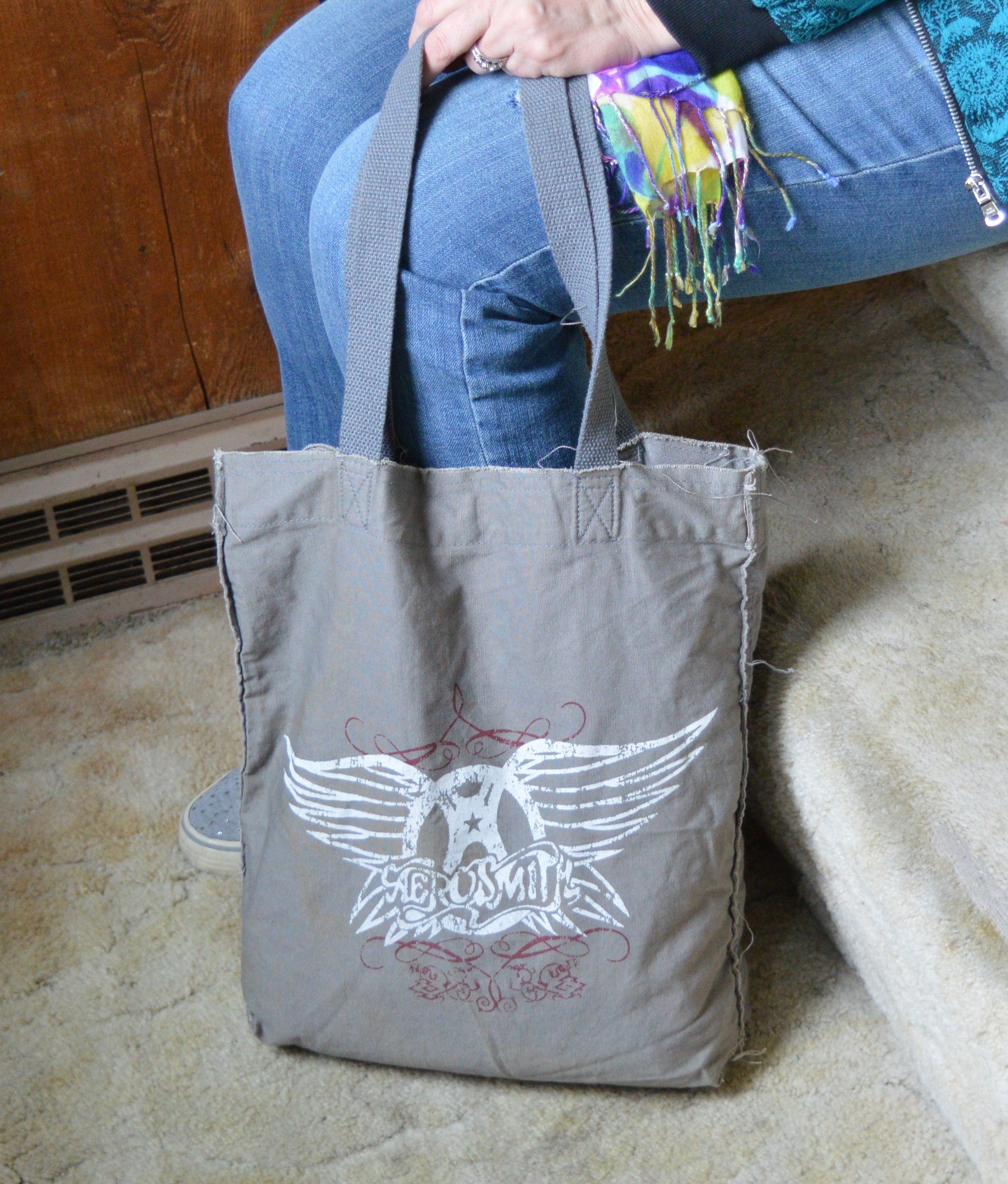
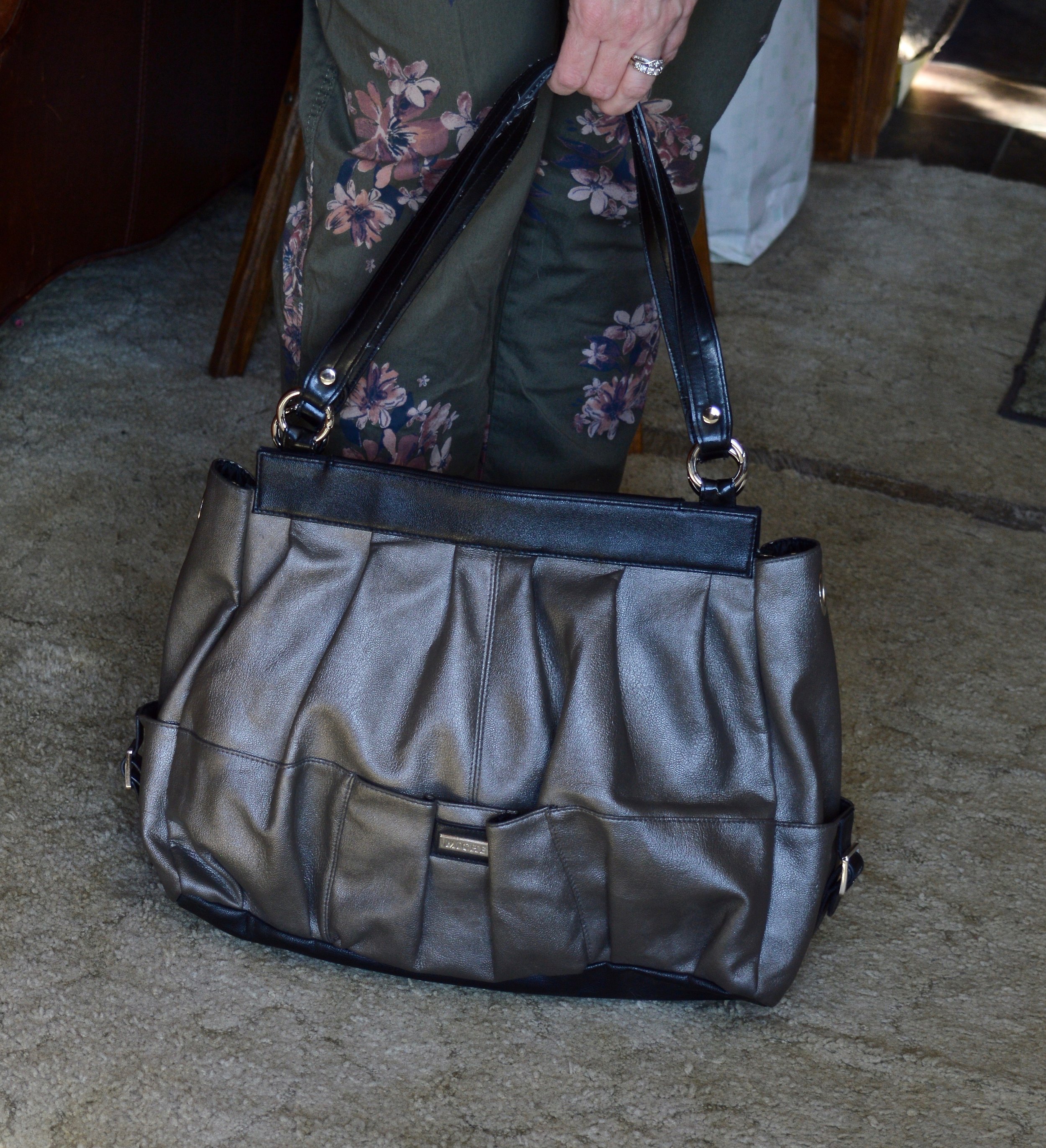
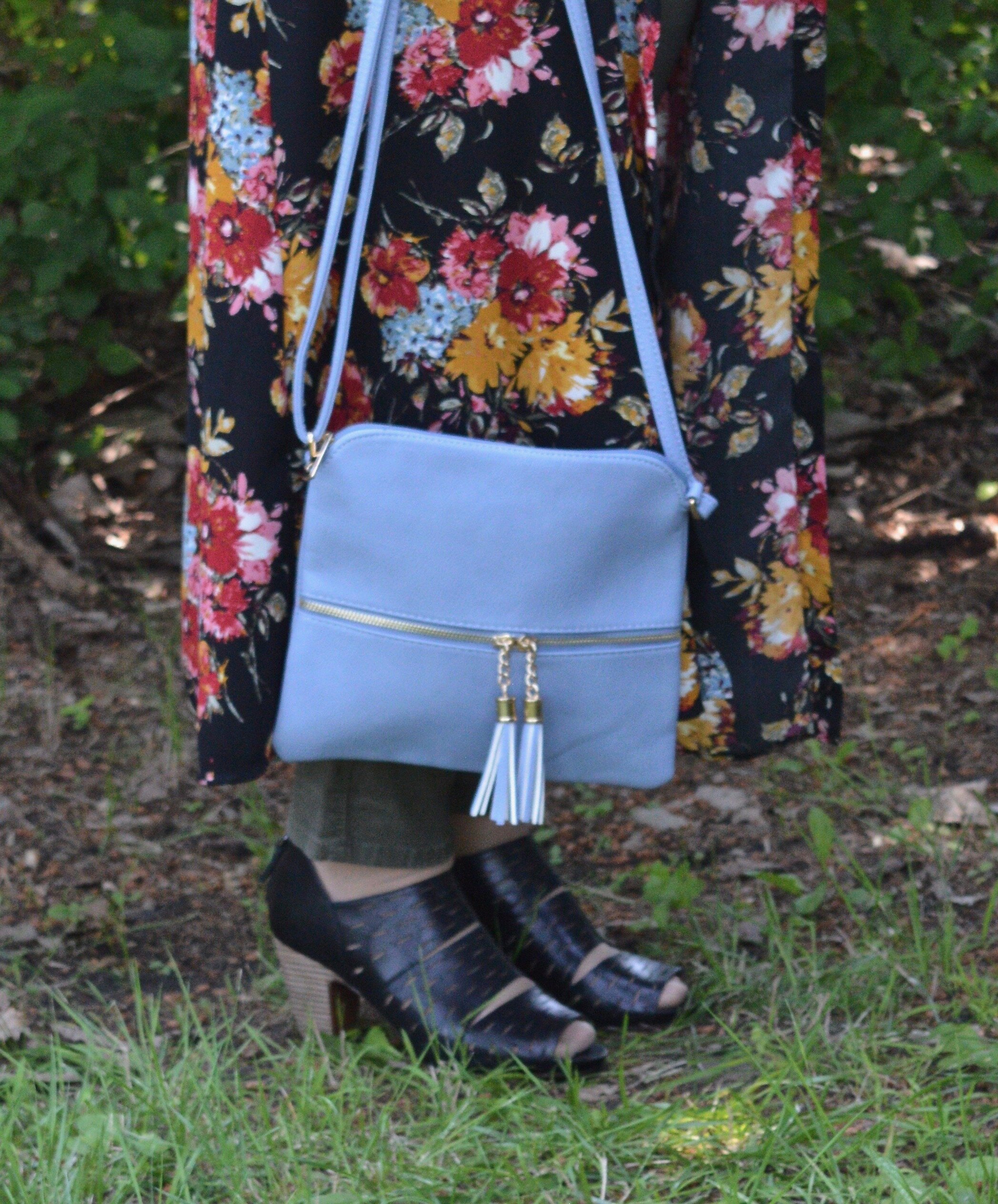
My bag was from Amazon and a gift.

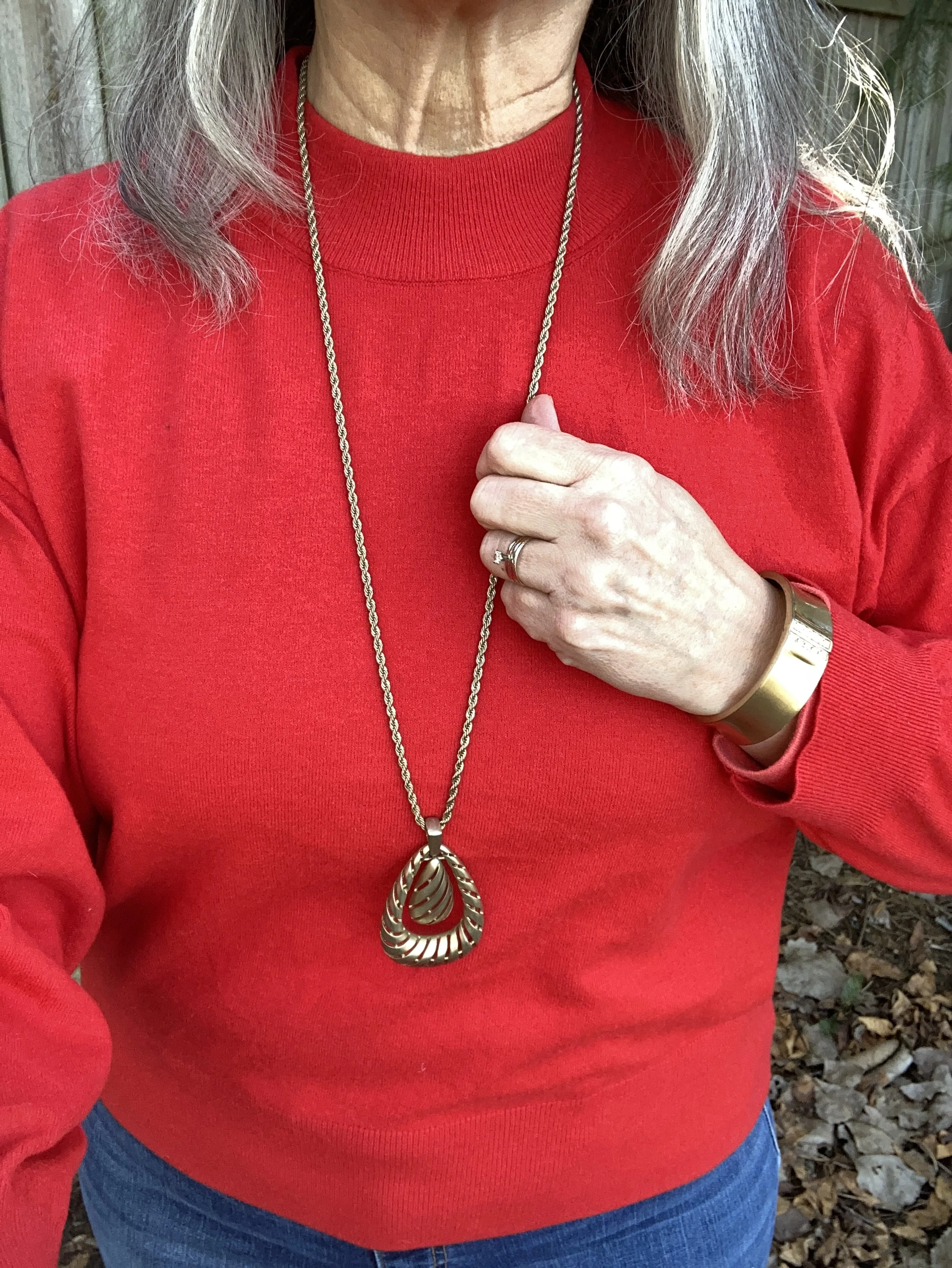
Style Tip: I think most of us know we don’t have to match our bag to our shoes anymore, but what about matching our bag to our clothes? Isn’t that too much matching? You tell me. I think anything goes, and I am loving this monochrome look on the top. Plus the little bits of gold on the bag goes perfectly with my gold jewelry.

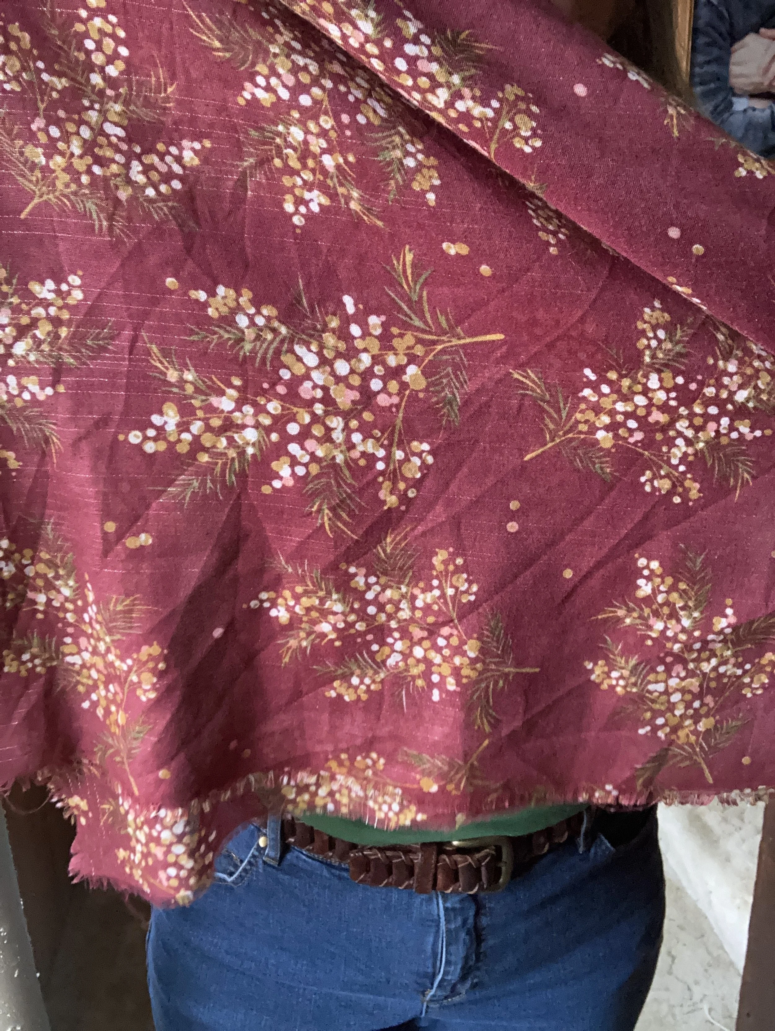
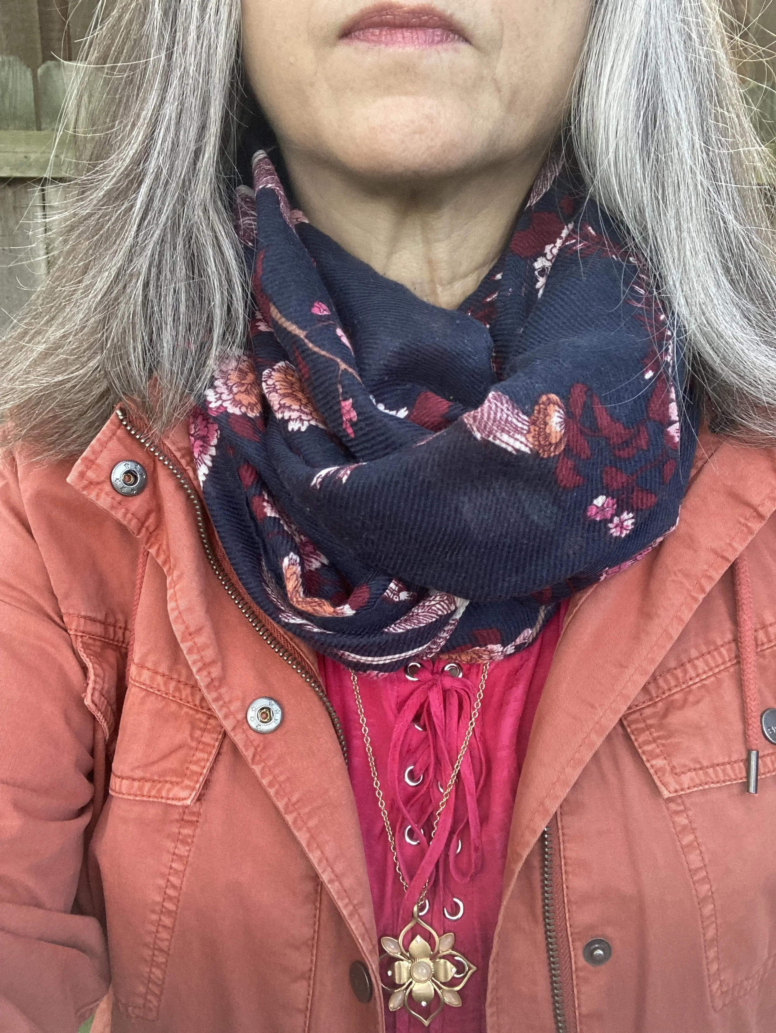
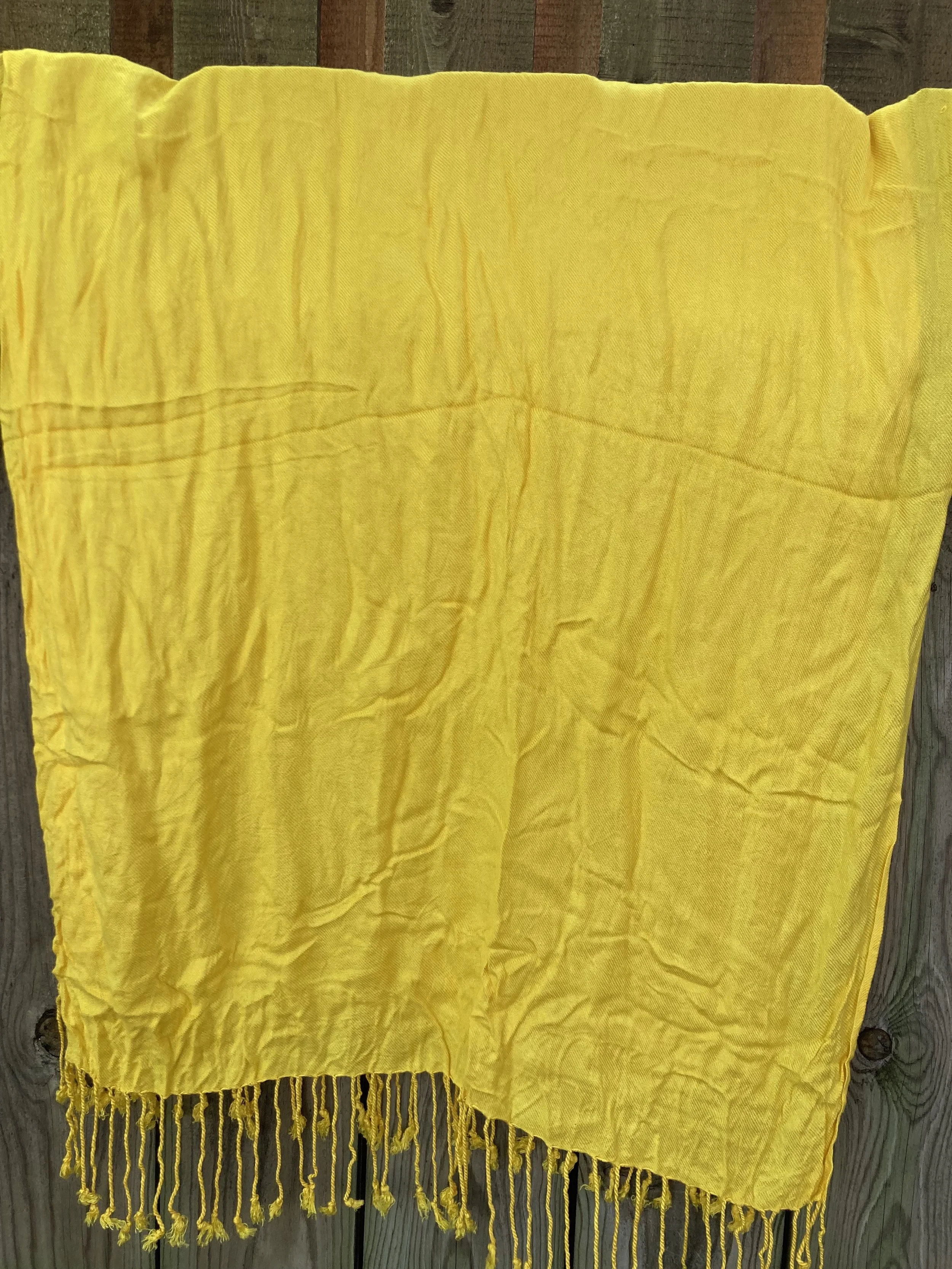
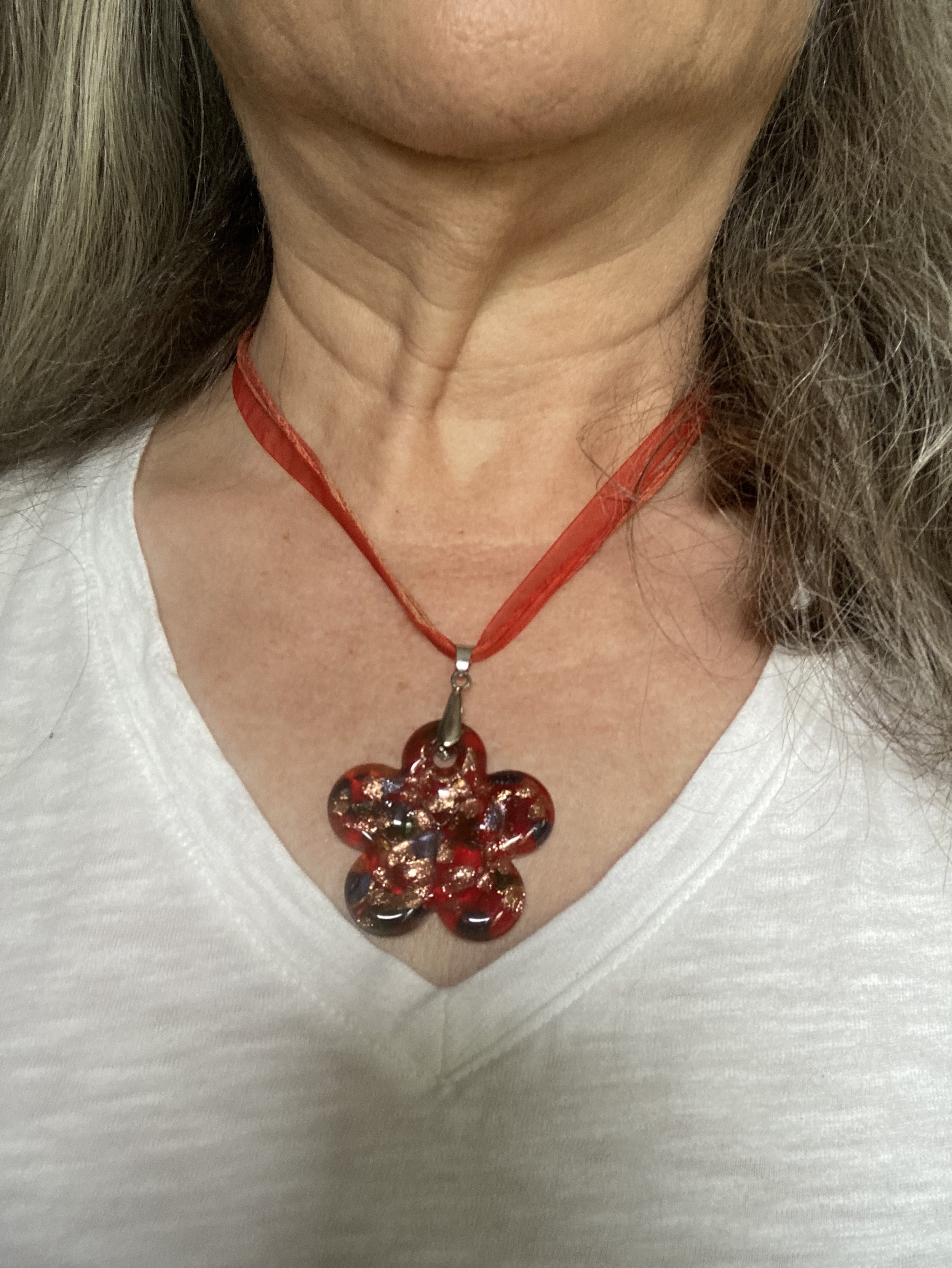
As is the outfit is great, but what if you want just a little bit of extra color or warmth around you neck by adding a scarf? Why not? I chose my Southwest oblong scarf that I have had for a number of years. It does a great job of pulling it all together with the reds, browns and blues of my outfit.

What do you think of this outfit? Does this look like a good Valentine’s outfit? Would you wear something like this? What would you do differently to make it your own? I love to hear what you think. Those of you who take time to comment always give me things to think about as well.

A few shopping links for you to peruse. We are coming to the end of boot and coat season, at least in the retail world. Ha, ha. Have a great week.

Hello "60"! Growing up in the 70's.

To spend time celebrating me is outside of my comfort zone, but one thing I am learning from the Lord, and from really listening to other people is that I am valuable and I have something to give back to the world. Many of you have reached out to me over the years and some of you are regular supporters of this blog and I appreciate all of you. When you have felt invisible most of your life it is hard to get outside of that box and start thinking differently, but I want to think in a way that is accurate to who I am in God’s eyes, and He has called me, Beloved, so it’s time I start acting like it.

My birthday is January 7th, and this year I turned 60. Wow! For six decades God has given me the grace and strength to walk this planet and He has also drawn me closer and closer to Him, showing me more than ever how important it is to be in His word and in fellowship with others who walk in His ways.

My faith is the spring board to everything I do, but the last few years as I have been dealing with illness and the stress and fatigue that comes with it, I have really not been walking and doing with excellence, and I truly believe that is what God wants from us. That doesn’t mean we don’t screw up, get tired or fall of the wagon once in a while, but when we start to use difficulty as a crutch to not show up or to let things slide, then we need to do some self examination.

Once again, I am evaluating where I want this little blog to go and you know what? I am happy to let it keep going the direction its going, but with just a little more effort and planning. This month I just want to celebrate me and the person God has formed me into, so my outfits are going to revolve around that theme.

Today’s look is celebratory. My spouse got us tickets to go to an Abba cover band on Sunday evening. This is not the outfit I wore, but since Abba was big in the 70’s, I thought it would be fun to build an outfit from my memories of that decade. While I was born in the 60’s, it is the 70’s that had the most influence on my clothing, my music and my memories.

The decade of the 70’s saw great changes in the world of music, fashion, and government. With the death of Elvis Presley in 1977, and the official split up of the Beatles in 1974, the music industry continued to look for bands and beats that appealed to people buying albums and listening to the radio. Along with hard rockers like Aerosmith, Alice Cooper, Led Zeppelin and Black Sabbath, the Rolling Stones carried over from the 60’s and soft rock like the Eagles and Fleetwood Mac appealed to a maturing generation. In addition, disco splashed onto the scene in the form of Abba, the Bee Gees, KC and the Sunshine Band, and others. Rock also took an angry turn in the form of punk with names like the Sex Pistols, the Ramones and the Runaways.

While the United States, much to its’ citizen’s dismay, had troupes fighting in Vietnam, our country pulled out in 1973, leaving South Vietnam to be assimilated into the Communist control of North Vietnam. War found a new front in the form of nuclear threats and posturing between capitalist West and communist East. Did you have to do “bomb” drills in school? I remember doing them when I was in early elementary school, where the alarm would go off and we would have to get under our desks. Things have changed. Now our kids and grandkids just have to worry about school shooters! Ugh!

Fashion continued to influence the world and everyone was looking to music and Hollywood to determine what we would be wearing. Pant legs got wide with wide leg flares and bell bottoms. Clothes were bright, colorful and printed with flowers, animals and our favorite brands and bands. Clothes were made to show movement, and sass. Vests and jackets were often trimed with fringe, and dresses and tops donned crocheted embellishments. Turtleneck sweaters replaced button down shirts under sports jackets, and monochrome sweater outfits with slouchy boots were seen regularly in the work place. Jewelry was bold, and layered.

It has been fun to look back at this decade I grew up in. Of course my outfit might not be exact to some of the trends and styles of the time but I thought each piece gave a shout out to some of the fashion vibes of those years. My kimono was a gift from my younger daughter for my birthday a couple of years ago when she and her sister did a spa day for me at her apartment. That was fun. I think the kimono has that 70’s feel with its bright colors and the peacocks going up the one side in the back.

My wide leg flares, the turtleneck, and the boots were all similar to things I remember people wearing. The pants would have been more likely worn with platform shoes, but I don’t have any of those anymore.

What do you think of this outfit? Does it remind you of the 70’s? What fashion trends do you remember from the 70’s? I’d love to hear your thoughts.

I hope you enjoyed this post.

Heading Toward the Holidays - Blazers and Scarves

One of the things I like about the cold weather seasons is the ability to wear layers. Layering is possible in the warmer weather, but we reach for light weight tops, sweaters and kimonos. In the winter I can get out my blazers and layer them over sweaters, buttons downs or long sleeve tees. I can also add scarves and boots to the ensemble for a warm work wear look. Today’s look is just that.

I thought I would go step by step to show you how I put this look together. I wanted to give you a less casual outfit than last week since I know some of you like to get more dressed up for holiday gatherings. I thought this look, while still leaning towards casual works perfectly for an office Christmas get together.

Step 1 - Pick a top. I got this cute tee from Kohl’s online when I was looking to use some Kohl’s cash and a 40% off coupon. I paid less than five dollars for this tee. I got this one and a navy blue with a woodsy vibe, both of which will work all winter, not just for the holidays. You certainly don’t have to pick a long sleeve tee. You could go with a light weight pullover sweater or a button down blouse. You do you.

Step 2 - Pick a blazer. Blazers are such versatile pieces and I think most of us have at least a couple in our closets. I have plenty (yes, clothes horse, most likely a Clydesdale - ha, ha), but I opted for this one I thrifted this past summer due to the green in the plaid. Green has been on my radar over the last few months. You could just as easily choose a plain colored blazer. I love plaid, and this definitely works for a holiday look.

Step 3 - Choose your bottoms. Since my outfit was business casual, I chose a wider leg, dark wash jean, because I think they look a more dressy than a skinny, and definitely more appropriate than a distressed pair with holes. I love those, but that would not necessarily be the right choice for a more corporate setting.

Step 4 - Pick a bag and shoes. I wanted my bag to draw out the reds in the jacket, so I chose my burgundy saddle bag.

I tried on several pairs of boots and ended up choosing my Nine West brown suede boots, also from Kohl’s a couple of years ago. I wish I would have tried on my burgundy ankle boots, because they might have looked just a tiny bit better.

Step 5 - Choose a scarf. A scarf is the perfect finishing touch on an outfit, especially when you want a little more class, and a little more warmth. You never know when you go to a gathering what the temperature is going to feel like. Often where there are a lot of people someone might open a door or a window because they are feeling too hot (this often happens when alcohol is being served). A scarf will be that added touch of warmth, and you can always take it off if you feel too warm. Again, I chose burgundy. I think this thrifted piece has a bit of a Christmas feel.

Would you wear an outfit like this? What would you do differently? I love to hear your thoughts and ideas, so leave me a comment or two.

No shopping links this week. I think all of us are trying to watch our spending as things have gotten so expensive. I do not like to push buying products because I feel we have enough pressure to spend, spend, spend. I just watched the Grinch, so I can hear his voice saying “All the noise, noise, noise…” I will continue to make recommendations and provide shopping links on occasion, but my motto is, if you haven’t tried thrifting it is a great way to find all sorts of fun and interesting clothes and try brands you might not know about.

As always, thank you for following along. I appreciate each and every one of you who support me and my blog. Have a great day!

If you follow my Faith page, be sure to stop by in a day or two to see my next installment as I head towards Christmas by looking over the names of Christ in Isaiah 9:6.

Pantone Autumn/Winter 2023 - New York Palette: Viva Magenta, Red Orange, and Eclipse

I have been wandering in the wilderness for a few weeks trying to maneuver the hard bits of life and the emotional drain that comes with it. That said, I want to keep bringing you content as often as I can and I appreciate your support and patience during these times when I am struggling.

Getting back to my Pantone color series we are looking at another combination of colors from the Autumn/Winter New York Palette. This trio is perfect for fall and I thought the classy, casual vibe of this outfit would be great for your Thanksgiving Day festivities.

I really like how this outfit turned out. Let’s look at each piece.

This Viva Magenta top was actually a piece I gifted to my daughter, but it ended up on her get rid of pile, so of course I snatched it back. Ha, ha. I have so few really classy, dress tops and I just love the bishop sleeves on this piece.

This Red Orange utility jacket was one of the first few utility pieces that I bought, so I have had it for six years. I purchased this at Nordstrom Rack because I fell in love with the color. You can see another Pantone post I did using this piece here.

Another thrift find, these Eclipse pants are so fun with their embellished velvet flowers. I have a feeling I will be pulling these out multiple times for the holidays. Not only are they unique, but they are comfy.

The accessories really pulled this whole look together. The scarf actually had all of the colors in it. My bag, and patent leather ankle boots added a classy element to the outfit, and the pendant necklace was a nice finishing touch.

What did you think of this outfit? Do you like these colors? Do you have these colors in your closet? Let me know what you think in the comments.

I hope you are having a great week!

Pantone Autumn/Winter 2023 - New York Palette: Rose Violet, High Visibility, and Doe

Today I am bringing you another outfit in my Pantone Autumn/Winter color series. I find these colors on the Pantone website. My renditions of their color palette may not always be an exact match, but I shop my closet and try to find the pieces that come as close as possible to their color choices. I want you to be able to shop your wardrobe as well. You may not have all of these colors in your closet like I do, but you will certainly have two or three. The idea is to take those colors and use them in new ways to make outfits you never thought of before.

I love the boho vibe of this outfit. The bright colors, tiered skirt and fringe bag are all indicative of many Bohemian outfits.

I was having a hard time decided which piece to use for the Rose Violet color. It is a bright, fuchsia pink and though I had my Button Front Maxi Dress from Closet52 (no longer in business), it was too overwhelming. I felt the bright pink and the bright yellow were needed in small doses, thus this fun, thrifted, tiered maxi skirt.

I added the old Christopher and Banks cat eye necklace to pull the Rose Violet color upwards, and I also wore make up allowing for a softer version of the bright pink on my face.

My Doe colored sweater was a fabulous thrift find. I thought the neutral color with the glistening, metallic dots would be great for the up coming holidays with a versatility that allows for dressing up or down.

High Visibility is certainly so. This bright yellow is so cheerful and definitely a pick-me-up on a cloudy, rainy day. Again, the skirt uses a paler version of the yellow to keep the outfit completely compatible through out.

Here is another way to wear the pashmina.

My accessories remained in the neutral shade to allow the bright pink and yellow to be the focal points for the outfit. The sweater is quite long, hanging below my bottom so I tucked it in and added the belt. It brings additional interest, texture and gives me a more refined hour glass silhouette.

I added the thrifted fringe bag, and my older suede ankle boots which have a low heel helping to keep the skirt off the floor.

What do you think of this outfit? Do you like the combination of bright colors with more neutral colors? What would you do differently? I love to hear your ideas and thoughts, so leave me some love in the comments.

I hope you enjoyed this outfit featuring the Pantone New York Palette colors: Rose Violet, High Visibility, and Doe.

No shopping links this week, but I hope you are having a great day and a good week. Check back next Tuesday for another outfit post.

Pantone Autumn/Winter 2023 - New York Palette

The following are my renderings of the Pantone Color Institute’s Fall 2023 New York Palette. These are not going to be exact representations, but close to what the palette consists of. For actual color comparisons go to Pantone.

Happy fall everyone! The season is official and the leaves are beginning their seasonal change here in the midwest. My husband and I got out for a hike on Sunday afternoon and it was beautiful. It was actually a little warm for my preferences, but a lovely day to take a walk. The leaves around here are just showing touches, but many of those swatches are vibrant. I’m sorry Pantone, but no one creates a color palette like the God of Creation! These are few shots I took with my phone.

I am going to introduce the New York fall palette to you today. I decided to take pictures of the corresponding color pieces from my wardrobe to give you an idea of what the colors look like. Next week I will actually start showing you the outfits. In the mean time you can try to guess how I might put these pieces together, or you can come up with your own combinations, just for fun. Let me know in the comments which colors you would put together.

Tender Peach

As Pantone often does they include a few pastels. I am not as much a pastel girl, but I know many of you are, so it is fun to think about how I would include a pastel in a fall outfit.

Rose Violet

This hot pink fuchsia color is bright and sassy. Originally, I was going to use my fuchsia dress from Closet52, but it just wasn’t coming together, so I opted for this thrifted skirt with the Rose Violet flowers. I am not even sure what happened to Closet52. I can no longer find their website. So crazy, the way things come and go so fast.

Viva Magenta

This is the Pantone Color of the Year. You can see the post I did on that earlier this year. This is a lovely, bright color that really works in all seasons, and just about everyone can wear it, but it is hard to find.

Red Orange

This is a color we often equate with fall, especially when we think of changing leaves. The red orange can be easier to wear for some than a true orange. Either way it is a great fall color.

Red Dahlia

Fall wouldn’t be complete without some sort of maroon, burgundy or berry color. Red Dahlia is more towards the maroon side. This picture doesn’t really do it justice. The sweater is a dark maroon, but for some reason it kept looking lighter and more red. Silly phone photos!

High Visibility

Pantone almost always has some sort of bright yellow on its fall palettes. This is another color reminiscent of the changing leaves and sunflowers that are in full bloom at the end of summer.

Persian Jewel and Carnival Glass

These two colors you know will go together for my future outfits. They both were hard colors to find in my closet. I actually had a few pieces that met the Carnival Glass qualifications, but the Persian Jewel is a particular blue akin to Periwinkle, which is a purply blue. I do not have much of that particular blue in my wardrobe.

Burnt Sienna

This earthy orange is another fall staple in my opinion. It goes so well with many other colors and exudes that autumn feel.

Kohlrabi

This bright green works well with the fall palette, once again mimicking the changing tones of the leaves as they grown pale in comparison to their spring attire.

Classic Colors

As always the Pantone color palettes include a few classic colors that work well as foundational or accessory colors.

Coconut Milk

Not a pure, snow white, but not a true cream or ivory, this white does well for casual pieces like this jacket.

Eclipse

This dark, midnight blue is reminiscent of a fall, night sky as after the sun has completely set. A close cousin to navy, this blue is versatile enough to wear with any color.

Doe

This soft, light brown exudes warmth and can replace other common neutral colors like beige, tan, or camel.

Hot Fudge

A dark brown that can be the perfect color to ground an outfit, weather as a skirt or pair of pants or as a pair of boots or leather bag.

Silver Birch

This light gray is the perfect transition color for fall, when you are not ready for the dark grays like oxford or charcoal. This is another color that will combine with just about anything.

So there you have all the fall colors. The next few weeks I will show you which colors I combined to make five fall worthy looks.

What are your favorite colors? Which colors would you combine to make an outfit? Which of these colors do you have in your closet. I look forward to hearing your thoughts.

Have a great Tuesday!

My Style: Collection of My Favorite Fall Looks

It was an extremely busy weekend with two birthday parties, housecleaning, set up and take down, and so on. I am starting the week exhausted so I thought I would put together a collection of my favorite fall outfits from past falls. These are outfits that exhibit my style best. I will include a little synopsis on what I like about it. I hope you enjoy these pics and outfits.

2016

September

I love this all brown look. It really says fall with the medallion print on the dress and the long fringe vest. I am sad that I got rid of all of these pieces, but the reality is the vest was a little bit small and I have put on weight since then, and I don’t wear dresses much at all any more.

October

This is a look I would wear again. I still have all of these pieces including the large tote bag. It is relaxed and casual, but perfectly stylish for a day of shopping or hanging out with the grandkids. Although, these days I would swap out the flats for more supportive sneakers or shoes.

November

I think the contrast of prints and textures is part of the allure of this outfit. Another fun look for a date night. Unfortunately, I washed the skirt and it was never the same. I got rid of it. I still have the top, belt, necklace and bag.

2017

September

I love this purple and mustard yellow combination. It has a bit of a boho Halloween vibe, but it is right up my alley as far as comfort and color.

October

I had to pick two for this month.

I absolutely love this skirt and still have it. I really need to pull it out and try some other combinations with it. This look is so full of texture, rich color and detail making it one of my faves.

This fall look is all about the contrast between the deep rich berry color of the sweater, and the lighter green of the top and skirt. I still have the skirt, boots, sweater and bag, but got rid of the top.

November

I wore this for Thanksgiving that year, and I absolutely loved it. I’m a fan of tiered skirts, sweatshirts, flannel, boots and scarves so this whole look was fun and definitely outside my normal wheel house, but I think it worked and was fun. Unfortunately, the skirt is gone, the boots are worn out, and the bag started showing signs of wear.

2018

September

This cute cropped moto jacket was a find at Nordstrom Rack. With the camo shirt pecking out and the Rock & Republic jeans I thought it was a fun look, and very much my style.

October

I loved this look. The velvet top with the velvety leopard print jacket complimented each other. Adding the jeans made it one of those dressy casual looks that I love to wear.

November

This is actually a summer maxi dress that I wanted to make work for fall. Adding the yellow sweater, boots and a brown moto jacket did just that.

2019

September

Once again, just like me, a study in contrasts. Print mixing, different blues, different textures along with a lovely pop of red. And yes, I am carrying an Aerosmith tote bag. Ha, ha.

October

I just love the colors and the flowing, fun lines of this look. A fun work outfit, or lunch out with friends.

November

Plaid with plaid? Why not? Especially when the one plaid is flannel! A great office look with superb print mixing. (Yes, I can say that about my print mixing ability. Ha, ha.)

2020

September

Who can resist a color mix like this for fall? Doesn’t it remind you of the many colors as the leaves change?

October

Fashion reasons I love fall: print mixing, layers, scarves, boots, dark hues, and jeans, always jeans!

November

This is my go to casual outfit: jeans, fun sneakers, graphic tee, sweater and bag. I love incorporating similar colors into my outfits and accessories like the dark maroon in the bag, sneakers and tee in this outfit.

2021 (This was the fall I was sick, so I wasn’t doing a lot of regular posting, but I found a few things.)

September

Vests are always popular in the fall as a layering piece and for me I love them all, from puffers, to waist coats, to pieces like these with fringe, they provide warmth, texture and interest.

October

I think we all have pieces we look forward to pulling out every fall. This jacket is definitely one of those! As you can see, it is on repeat in my wardrobe.

November

Many of these outfits are from Pantone color palettes, which I usually try to do in the fall and spring. I am still debating about this year. But this outfit proves we can wear pastels in the fall.

2022

September

Why not wear red and green in the fall? It is all about shades and textures. Plus the American flag gives the outfit an end of summer feel.

October

Though these may not be the “typical” fall colors, I really like the romantic, fall vibe this outfit is giving off.

November

This was actually an Instagram post, but the inspiration for it was a fashion trend called Dark Academia, which I really have gotten into. I don’t wear it as much as I would like, but perhaps I will do a blog post about it soon.

I hope you have enjoyed this look back at my favorite fall outfits since I started the blog. It was fun for me to look back and see what I have done in the past. It is challenging me to re-up my game plan to bring ideas and outfits to you that will continue to inspire and help you grow in your fashion knowledge and abilities.

Have a great evening!

Color Play - Peach and Sea Foam Green

My grandson was here for the weekend, so I asked him to give me an unusual color combination. First he came up with orange and purple, which is definitely on my list of colors to pair in the future. He also mentioned red and green, but when I said Christmas, he decided not that. Finally, he said, “Peach and Sea Foam Green.”

We proceeded to have a mini discussion about what peach and sea foam green or blue actually look like. I finally had to Google both colors to see what the internet said. Sea Foam green is pretty straight forward. It is akin to minty green, but with a touch more blue in it. Peach, however, is another story. There are so many versions of peach: yellow-pink, pink-orange, yellow-orange…the list goes on. When you open up the peach fruit, the center is a yellowy orange, but the skin can have shades of pink in it.

When I started looking for these colors in my closet I was leaning towards the pinky orange, but everything I have leans more towards coral than peach. I finally settled on this floral tee blouse. I call it a tee blouse because it looks and feels like a tee, but the sleeves and front have a sheer material, giving it a lovely dressy vibe. The sea foam green jeans were just right for this post.

Style Tip: Think outside the box when it comes to color. You don’t have to wear the same colors all the time, because that’s what the color gurus say you look best in. Try adding color in small amounts with a bag or shoes, or other accessories. I know I have said this before, but color is just too fun to not wear it.

This pretty floral piece is Alfred Dunner brand and was either a thrift find or a clearance find at Kohl’s. It has been a few years, so I can’t remember. Ha, ha. I like the water color feel of the flowers. Since peach is yellow, but also pink, I thought this blend of colors a good compromise. You might not think it looks very peachy, but the point is not about perfect matches, but color inspiration.

Style Tip: Let color be a guide rather than a prison. Maybe you don’t have anything peach, or orange or yellow. Maybe your clothes revolve around neutrals. Why not use beige or tan with your sea foam green instead?

These bright green jeans are a brand called NYJD. I found these thrifting, but they do have a website and it looks like a decent brand. I love the fit and feel of these jeans. They are a bit stretchy, but not so much so they get slouchy. Check out their website, NYJD. I am not receiving anything in exchange for telling you about this retailer, it just looks like a decent place to get jeans that fit well.

I decided to add a pinky-peach cross body bag to tie in the pink colors in the top. I also added my pale yellow Universal Thread sneakers, clearance from Target. Isn’t the embellishment on this bag so much fun? It looks like embroidery.

When you really pay attention you can see that this top isn’t really peach. You can also see that the green in the top, which is almost a citron green is nothing like the sea foam green of my pants, but I think the outfit works. Again, think in terms of inspiration rather than firm rules.

What do you think of this outfit? Do you think these colors work together? What is the brightest pair of pants you have in your closet? Do you have anything in the sea foam color? I love hearing your thoughts so leave a comment or two.

Don’t forget you can buy me a coffee by clicking on the link below. It is a great way to support people like me who bring you inspiration and ideas without receiving compensation for it.

Buy Me a Coffee.

I’m including some shopping links for you to peruse. These are affiliate links. I do not receive any compensation unless you buy a product through the links below. All opinions are my own.

Clara Sunwoo - Mosaic Petal Top with Techno Knit Blue Denim Pant

For the last few months I have been sharing with you retailer Clara Sunwoo. The mother/daughter team based out of New York City is known nationwide for their comfortable, stylish pieces that meet the needs of today’s modern women. Made with knits and materials that move with you, each piece is perfect for day to day life, from the office to dinner out.

All of the the outfits I have shown you, including today’s, have been gifted to me, in exchange for posts on my blog and my other social media accounts. All opinions regarding the retailer and the clothing pieces are my own.

Today’s look is probably my favorite so far. You can see the first outfit, side tie water color top and brown straight leg pant here. You can see the second outfit, wide leg pocket pant and parachute hem tunic, here. Today’s look features the Mosaic Petal Top paired with the Techno Knit - Skinny Ankle Pocket Pant in Blue Denim.

You know how I love color, so this top really caught my eye. Not only is it a beautiful combination of colors, but it is so comfortable. The 3/4 length sleeves, wide scoop neck line, and a-line silhouette provide a cool, confidence-boosting vibe.

The Techno Knit pants are very comfortable, and like all the others easy on, easy off. There are no belt loops, zippers or large back pockets adding bulk. All of Clara Sunwoo’s pants are made to be easy to wear, comfortable, and lasting. The Techno Knit pants are more structured than the other two pants I received, which I do like better for every day wear. My only issue with these has to do with my legs, not so much the retailer’s manufacturing. With my wider calves, the Skinny Ankle pant has a tendency to gather and wrinkle just below my knee. Once again, I wonder if I had sized up if that would have made a difference. I am wearing the Large in both the tunic and the pants.

I thought it would be fun to show you a few pictures of me sitting and moving in this outfit, to show you how easy going and comfortable these pieces are while still making you look fabulous.

Clara Sunwoo clothing is worn by big name stars including Kathie Lee Gifford, Hoda Kotb, Jane Fonda, and more. I like the fact that this retailer is using bloggers and social media influencers to get their product out to people like me. You may be a working woman who regularly needs to update your wardrobe to keep it looking fresh, or you may be a stay at home mom, who just needs the occasional outfit that still feels comfortable, but also makes you feel dressed up and stylish. You might even be a retiree who doesn’t really need a whole new wardrobe every season, but just needs something once in a while for a special occasion. The retailer’s price points are higher than what I normally pay as a thrifter, but as I have stated before, I look at these pieces as investment pieces that will be used over and over again. You can also look for their “final sale” items which decrease the prices by 25% - 50%.

I hope you are enjoying your summer, and that you enjoyed this post. Let me know what you think of this outfit from Clara Sunwoo. Have you bought anything from this retailer? If you see something you like, be sure to use my code STYLINGRANNY10 for a 10% discount. Because I am an affiliate with Clara Sunwoo, I get a little kickback when you purchase something with my code. I appreciate all your support and that you are also supporting a retailer that lives, designs, and manufactures most of their pieces right here in the USA.

Have a great week!

Color Play - Finding Inspiration in Wall Art

We don’t just have to go to Pinterest to find inspiration for our outfits, although that is a great source for all sorts of color combinations. All you need to do is type in your color combo and outfits of all sorts will pop up. For example if I type in, “Neon green with brown outfit,” or “Outfits with neon green and brown,” you’ll get a variety. If you want to only search casual outfits, add the word casual to your search.

I am one who likes variety when it comes to where I am getting my color inspiration, so it is a good thing the sources are unlimited. Besides nature, one of my favorite places for inspiration is wall art. From water colors to oils, to photographs to tiles in kitchen back splashes or bathroom trim, I love to create outfits using those colors.

Today’s outfit revolves around two pieces of wall art that were hanging at the house we staying at on our trip to Kentucky. I loved the colors in each. (I had to take the pictures at an angle to cut the glare on the glass that was over the prints.)

As I started looking through my closet I was struck by how many different outfits could be derived from these prints. I may have to revisit these at a future date. Today’s casual outfit pulled out the bold red, dark and medium blue, and the creamy light brown.

Everything in this outfit is second hand, except for the tee shirt. My white v-neck tee is Time and Tru brand from Walmart from a year or two ago. These make great basic tees and are totally affordable. If you click on the Walmart link you’ll see they have two packs of these types of tees in various colors.

I pulled out a pair of straight leg jeans as it was going to be a little cool and rainy on the day I took these pictures. These are Old Navy brand and are called The Sweetheart. As I usually do, I rolled these. Having my ankles showing makes me stay cooler and it just seems more appropriate for the summer weather.

My print jacket is a Christopher and Banks piece. It seems to be a blend of leopard, and floral. I thought the lighter colors would be good for the warmer weather. It is also lighter weight than a denim or utility jacket. Once again, the beauty of thrift shopping is that you can find all your favorite brands at reduced prices and keep them out of the landfill.

Since the jeans incorporated the darker blue of the picture, I added the brighter blue crossbody bag to pull in the pretty blue of the vase in the second print. This is Tignanello brand.

Now let’s talk about the color red. Red provides such a wonderful pop of color in any outfit that is somewhat understated. I think the red flower necklace and the red shoes make this outfit more fun and interesting. I just found these awesome red shoes at my favorite dollar thrift store. They are like brand new and are a brand called Comfortiva.

If you want shoes that are super comfortable, and affordable, check out their website. They have some cute sandals like the Erena, the Parrea, and the Ganata. I’m not getting any compensation to recommend this retailer, I just know my dollar thrifted shoes are super comfy and cute.

So what do you think? Did my outfit look a little like the prints I took inspiration from?

As I said before, I might have to revisit these color inspiring prints for another outfit. Do you ever get your outfit inspiration from paintings, wall tiles or nature? I would love to hear your sources for outfit inspiration, so leave me a comment or two below.

I hope you are having a great week.

Color Play - 2 - Pantone Spring 2023 - NY Palette: Tangelo, Peach Pink, Machiatto

These are the final three colors from the Pantone Spring 2023 NY Palette and I wanted to let you see them. This is also going to be a color block outfit, though not as distinct as the previous one with the more primary colors. These colors are softer and make me think more of light spring showers and Easter flowers. This outfit has almost a monochromatic feel as the colors are similar in their hues.

With Easter only a week away, I thought it might be nice to focus on an outfit that would work for a casual Easter get together. It used to be we dressed up for this holiday, and I think many people still do, but while many are still donning their white shoes and pretty spring dresses, there are others who will reach for a more casual, practical outfit for a day of cooking and preparing treats for the grandkids’ Easter hunts.

This outfit is made up of three main components: bottom, top and accessories. I am including the vest in with the accessories because it is not essential to the outfit. You could easily wear a top and bottom without a topper like a vest or blazer. For this outfit, the vest was representing another of the Pantone colors and not only does it add an element of warmth, but an element of texture and interest.

My Peach Pink pants are W62 brand and I believe were from Dress Barn. I have styled these on the blog before. You can see them styled here in a monochrome look, with a red moto jacket, with a pastel pink cardigan, with a LuLaRoe tee, with a cropped blazer, and with a different set of Pantone colors,

Sorry for the poor picture quality. Phone pictures are great, but not so much when it comes to editing.

My Tangelo vest was a Christopher and Banks purchase a few years ago. I love the deep orange color and it serves well for both spring and fall.

You can also see in the above picture my thrifted Old Navy sweater top. I had a Machiotto colored jean jacket picked out, but I didn’t have any other orange that worked as well as my vest. Even though there is a distinct marled print you can see the brown color throughout.

I added the scarf as a way to pull the entire look together.

My daughter was getting rid of this pretty, statement necklace, so I snatched it up. I thought it went great with this outfit.

My sneakers are Mossimo and were thrift find. They also mimic the Machiotto color almost perfectly and add another bit of shine to the look.

My bag was a gift from my daughter. Both my girls know I love purses, so I am always excited when I get a new one as a gift. I love the embellished detail on this piece.

What do you think of these colors? Would you wear these together? What are you going to wear for your Easter Day celebration?

I’m not sharing any shopping links to day, but hope you have a marvelous weekend.

Buy Me A Coffee.

Color Play - Pantone Spring 2023 - NY Palette: Fiery Red, Empire Yellow, Blue Perennial, Light Aqua

Today I am looking at a color combining technique that is known as color blocking. Color blocking is the combination of solid colors creating distinct blocks of color. I don’t use the color block technique very often because I love prints. Many times I will combine something like a pair of jeans with a vest or sweater in a solid color, combined with a print top. I guess in that case I am almost always doing a type of color blocking. However, jeans are a type of material that don't typically look solid. Does that make sense to anyone else out there besides myself? Ha, ha.

This outfit is bright and colorful and a great ensemble for the crazy fluctuating temperatures of spring.

The color block technique is a great way to combine one color with another without worrying if they match. The whole point is to combine different colors to create a fun, statement worthy outfit. All of these pieces have been in my closet for a while. I have worn each of them separately, and I have worn the vest and pants together before, but not this combination.

My Light Aqua top is Massini brand and was a clearance find from Kohl’s a few years ago. It is a medium weight knit with a cozy feel.

My secondhand pants have made numerous appearances on the blog and are Ruby Rd. brand. You can see a number of my posts in this one post, Why You Should Have a Pair of Colored Pants - Bright Blue. While I don’t pull these out real frequently for my day to day outfits. I have used them over and over for a special occasion or for the blog.

This yellow vest is a brand called Love Tree. I really like this piece. It came with a detachable hood, and the inside of the vest has a fuzzy, warm sherpa lining. I think I got this at a local boutique, but I actually cannot remember. I know, I know! Too many clothes. I’ll save my clothing muses for another day.

I decided to focus on Fiery Red as an accent color, so my bag, and my pendant charm necklace do the trick. Isn’t it cool, how the red pops against this already colorful outfit? I have this crossbody bag in a similar style, but different brand (both from Amazon), in black. They are great bags with three separate compartments to keep all your things organized. They are not huge, but big enough for the essentials. I’ll give a few shopping links below. A crossbody bag has become my regular go to, because I like the hands free approach. This is especially helpful when you are chasing grandkids, or shopping.

I really wasn’t sure which shoes to wear, and the only reason I ended up with my high top mesh Converse was due to the red stripe around the sole. Ha, ha. Really, my thought process for putting an outfit together is not all that complex. I tried the outfit with a pair of white sneakers first, but it just didn’t look right. I think the heaviness of the fabrics and the vest needed something a little less springy, but I also didn’t want to use knee high boots as those seemed too wintery…thus the Converse.

So what do you think of this outfit? Do you like the color blocking technique? Tell me about an outfit where you have used it. Your comments mean so much to me. You are the reason I keep this blog going, so it is wonderful to hear from you.

Please feel free to show your support for me and the blog by using my Buy Me a Coffee link. When you contribute to my page I can use that money to buy a treat when I am working on the blog at a coffee shop. I appreciate all your support.

I’m including a few shopping links. I only make money off of these links if you purchase something through a link, however, I bring these to you to give you ideas. All opinions are my own.

Have a great Tuesday!

Pantone Autumn/Winter 2022 - New York Palette: Samoan Sun, Martini Olive and Chiseled Stone

Today is my last post for the Pantone Autumn/Winter 2022 New York palette series. I decided to do a flat lay for a change due to several factors that are affecting my ability to get posts done. The first is time. I do not know where time goes, but it sure seems like I have less of it than ever before and I am not even working a regular job right now. Second, I injured my knee a few years ago and recently I tweaked it and it has been very painful. I have an appointment Thursday to have it checked out, but I knew it was going to be hard to get pictures done with changing clothes, running up and down the stairs and going outside, so I thought a flat lay the next best thing.

The three colors today’s outfit revolved around are great colors for fall and I think this outfit would be perfect for a casual Thanksgiving celebration. My yellow Samoan Sun sweater is a thrifted Old Navy piece. It has more orange undertones to it, but I still think it works great for this outfit.

My Chiseled Stone striped tee is another thrift find from a brand called Company Ellen Tracy. I looked up Ellen Tracy and it is a clothing retailer with some nice pieces. You can check it out by clicking on the link. The brand seems to exude class and modesty. Prices are a tad high for my limited resources, but I like to show you retailers you might be interested in. If I had the money, I would definitely shop this brand more often.

My Martini Olive utility skinny pants have made multiple appearances on the blog. They are Gloria Vanderbilt brand. You can see these pants styled with a floral bomber, a light weight pullover, a snakeskin print jacket, a floral dress, a lace vest, and a floral dress as a jacket.

My accessories were simple and I chose to emphasize the black to coordinate with the stripes in the tee.

I love this simple charm pendant necklace. It adds a touch of interest to almost any outfit without being overly garish. I couldn’t even tell you where I got it, but knowing my past shopping habits it was either thrifted, or bought at Kohl’s or JC Penney. Ha, ha.

I’ve shown you this black Aidebam bag on the blog before. I got this one from Amazon, but Amazon’s inventory changes pretty regularly and I don’t see this exact style on there anymore. I will include a few shopping links at the end. Here is a very similar one.

These black boots are a very recent thrift find. They were my size and I loved the “witchy” vibe of them. They are a brand called Rampage. I have a wedding coming up and right now I am planning to build my outfit around one of two pairs of ankle boots. I also found a blue velvet pair, another thrifting treasure that I wasn’t lookin for, (but I was). I hope to do a blog post next week on what to wear to a fall wedding using the outfit I come up with. Keep a look out.

Style Tip - The right shoes or boots with an outfit can absolutely make the outfit. If you are not sure about which pair of shoes to wear when going to an event or celebration, try on a few different pairs. Remember, heels of any height will upgrade a look, even when wearing distressed jeans and a tee. If you are going for a more casual look, then think flatter souls and a heel that is an inch or less.

I hope you enjoyed this flat lay and the conclusion of my Pantone series. From now through the end of the the year I hope to bring you holiday inspired and winter looks. Leave me a comment or two, letting me know what you thought of this outfit. Which was your fave in the series? 1 - Lava Falls, Amazon, and Arctic Wolf, 2 - Orange Tiger, Nosegay, and Autumn Blonde, 3 - Rose Violet, Caramel Cafe, and Polar Night, 4 - Waterspout, Midnight and Loden Frost or today’s.

I am including a few shopping links for you to look over. Remember these are affiliate links, which are brought to you at no extra cost. You do not pay anything extra to purchase something through one of my links. In fact, it helps me by putting a few cents into my pocketbook. I really appreciate every little bit.

Have a great week!

Pantone Spring/Summer 2022 - NY Palette: Harbor Blue, Dahlia, and Northern Droplet

These are the last three colors from the Pantone Spring/Summer 2022 New York Palette. Today’s colors are festive and fun, the perfect combination for a summer event. I always love a brighter, richer approach to color anyway, so these are probably two of my faves from this palette. Click here to see the actual Pantone colors.

Harbor Blue is a medium blue green giving it a teal vibe, but with a little less intensity. Dahlia is a beautiful shade of purple that reminds me of spring and summer flowers like Azaleas, Cosmos and Pansies. Northern Droplet is a light shade of gray much like an early morning fog over a mountain lake.

For my outfit today, I ended up using a slightly darker gray rather than a light gray. I don’t own a lot of light gray because it is one of those colors that doesn’t do me justice. It is also what I would term, a non color, meaning it doesn’t really do a whole lot for very many people. Certainly there are women who look wonderful in a light shade of gray, but it seems to me that a medium to dark gray is a better choice for most of us.

As of the posting of these photos it is still cool in the midwest. We have had so many gray and rainy days, I am honestly starting to think we are turning into the new northwest and joining our friends in Seattle. However, I did want to give you an outfit where I at least showed a little bit of skin on my legs, just to give the feeling of oncoming summer and warmer weather.

My Harbor Blue bomber jacket was a clearance purchase from ShopNational a few seasons ago. I love the floral textured pattern. The banding at the neck, sleeves and bottom makes it extra comfy to wear. It is a unique piece that I don’t wear a lot, but one that I will hang on to for its versatility and vibrant color.

My thrifted jeans are a brand called Stylus. This appears to be a discontinued brand that may have once been sold at JC Penney and Walmart. I like that they have a tiny bit of distressing near the pocket and above the knee.

My Bambi tee is a thrifted Sonoma piece. When I first got it I knew the print was of deer, but after closer inspection it is definitely Bambi’s silhouette. You can also see my silver necklace that my bestie gave me back in March when we were in NY visiting my mom. I opted for the olive canvas belt because there is a bit of olive in the scarf.

My beautiful scarf was gifted to me by a dear friend who was clearing out her home in preparation for their move to Tennessee. Every time I wear it, I am reminded of her and her husband who moved to be near their youngest daughter, her husband, and their first baby. I just love all the colors in this scarf and feel like it is the perfect piece for every season.

Style Tip: When you don’t know what outfit to put together, pull out a favorite printed scarf. Take cues from the scarf on putting the ensemble together by choosing pieces with matching or similar colors. It really helps for picking out outfits and I do this often, when I am going away for the weekend.

My Ked’s sparkly sneakers are quite old, and perhaps need another run through the washer. I chose my simple Aerosmith tote (a hand me over from my younger girl) for my bag.

Do you like these colors? Would you wear these colors together? Let me know what you think of this outfit by leaving me a comment.

I’m including a few shopping links for you to look over. These are affiliate links. All opinions are my own. Thank you for all of your support. Have a great weekend!

Pantone Spring/Summer 2022 - NY Palette: Spun Sugar, Coca Mocha, and Perfectly Pale

Today’s Pantone colors are a blend of earthy and pastels. Spun Sugar is a light, airy blue reminiscent of hazy summer skies. Coca Mocha makes me think of a double scoop of chocolate ice cream and Perfectly Pale is the perfect summer alternative to basic white. See the actual Pantone colors here.

I think these colors are a great pairing for spring and summer. We often think of brown as a fall color, just like we think of white as only a summer color. Well, girlfriends, we definitely needing to change our thinking about color, as in all colors work at any time of year. I will forever love my darker browns, oranges, yellows and burgundies in the fall, but that doesn’t mean I won’t occasionally put them on in the heat of summer. God made color and color is good, all year round.

My Sugar Spun tee is a Sonoma piece. I don’t know that I consider myself wild, but I definitely am glad I live in a free country. That is something I never want to take for granted. I am thankful for all who have fought for so many years to keep our country the free nation it is. I have come to have a deep affection for graphic tees, especially those with words on them.

This outfit is all me. The colors work for me and the pieces are all thrift finds except the necklace, bag and sneakers. The Coca Mocha velvet blazer is a brand called SSA, and is definitely showing wear. I need to do some stitching around the cuffs as it has been wanting to come apart. But overall, I think the blazer still has some wear left in it. This is not something I would normally gravitate towards in the summer, but with our weather being so wacky, I think I will keep this available.

Style Tip: Don’t put your blazers away for spring and summer. Think of them as light weight jackets that you can throw on with cropped pants, capris and even shorts. They make any casual outfit look classy and put together.

My pants are Gloria Vanderbilt and a newer thrift purchase. I knew I wanted a few other lighter weight and lighter colored pants for spring, so this utility pair does the trick.

Style Tip: If pure white is not your bag, find light colored bottoms for summer in pale creams, tans and yellows. You’ll get a similar effect to wearing white and won’t have to worry as much about your colored underwear showing through.

Summer for me means less in the accessory department. I can’t wear most scarves as I get too hot and many of my jewelry pieces make me break out in the warmer weather. These warm months are where I turn to pieces with hippie vibes that use cording, or heavyweight string for pendants and bracelets. I am thinking about taking a few of my hubby’s metal detecting finds and turning them into jewelry, so I guess this would be the time.

My daisy necklace was a Christmas gift from my husband. I like the little quirk it has, because that’s me, just a little quirky. Ha. ha. I am also showing off my round Nine West snakeskin print bag, that I got a few seasons ago from Kohl’s on clearance. Last, but not least, I had to use my bright blue Converse again, since they went along with the Spun Sugar color.

What do you think of these colors? Do you like the colors together, or would you put them with other colors? I love hearing your thoughts and ideas. You inspire me too!

I’m including a few shopping links for you to peruse. These are affiliate links. All opinions are my own.

Have a great day!

Pantone Spring/Summer 2022: Glacier Lake, Daffodil and Snow White

Welcome to the New York Palette of the Pantone Spring/Summer 2022 colors. Pantone has changed the way it allows usage of products, so images are no longer free. Now you have to have a subscription to use the color swatches via the internet, so I have had to get creative in putting together my graphics. I am also not using my daughter’s photography services now, as she is very busy with her business and her baby. I am definitely creating new pathways in my brain, but that is good.

If you want to see the actual Pantone colors click on the following link: Spring/Summer 2022 - New York Palette. I try to get my colors as close to the palette colors as possible, but they are not exact. I appreciate the Pantone Institute’s use of color and always enjoy seeing what the colors are for each season.

For today’s outfit, I thought the mix of yellow, blue and white perfect for spring and even for the upcoming Easter holidays. This color combo makes me think of the sunny flowers the color is named for, and the many blues of summer including skies, lakes and denim. White is always classic, not only for summer, but every season.

My Glacier Lake vest is a Christopher and Banks piece that I found at a thrift store. It has the utility look with the larger, square pockets, encased drawstring and metal buttons. I love using my utility vests in the spring and fall.

Style Tip: If you want an extra layer but don’t want all the bulk choose a light weight vest. A utility vest or a dressier suit vest will provide extra warmth, but won’t add the bulk of a quilted, or sherpa type piece.

My bright, yellow cable knit pullover is St. John’s Bay piece. I honestly can’t remember if I bought it at JCPenney or if I got it thrifting. Ha, ha. My white Gloria Vanderbilt jeans I have had for a number of years now. They are just the right weight and thickness for no-show issues, and can be dressed up or down.

My floral scarf is a piece I recently thrifted. I love scarves. I think they add so much to an outfit.

Style Tip: When styling an outfit with two or three solid colors, add a printed scarf for additional color and interest.

You’ve seen my Merona thrifted bag a few times now on the blog. I thought it was a good choice for this springy look. I also opted to wear my Steve Madden platform sneakers. When it comes to platforms, these are very low, which I like. I really don’t like all the extra bulk of a thicker platform or a really thick lug sole on boots.

What do you think of these colors? Would you wear them together? Do you have these colors in your closet? I’d love to hear your thoughts, so leave me a comment or two. I am including a few shopping links for you to look over. These are affiliate links, which means I get a small commission when you click on a link. All opinions are my own.

Have a great week everyone!

Fashion Fun: Men's Oversized Button Down

When it comes to thrifting for fashion, I like to think outside the box. I always peruse all the sizes, because so often size is relative. What I mean by that is, it is relative to the brand. A size 12 in one brand might fit you perfectly, but a size 12 in another brand, might be too big or too small. I honestly believe sizing is different than it used to be. If you shop vintage clothing, at all, you will see that most of the pieces are relatively small. Women tended towards being smaller in the waist, hips, and shoulders than we are now. Not sure why, but it does seem to be the case.

I have also started looking in the men’s section of thrift stores for fun pieces like tees and printed button downs. I like the roomier cut of a men’s medium or even large shirt and they often have textures, prints and fabrics that are different than those on the women’s racks. Today, I am going to show you three different outfits using three men’s button downs that I purchased while thrifting.

Outfit 1 - Men’s Button Down as a Tunic

When I saw this paisley madness, I knew I had to have it. This is Visconti brand. If you type the name be sure to type in Visconti clothing. and you’ll see they have them at Dillards. They also have their own website, but I am not here to encourage you to buy a new shirt. This to encourage you to look at the men’s racks if you thrift, or even if you shop clearance. I absolutely love the colors in this piece and it is easily worn all year round as a top or as a “shacket”.

I topped this look with a thrifted, black Nadia brand, corduroy vest. I added my Simply Vera, Vera Wang skinny jeans and my black knee high boots. The black embroidery on these jeans are what sold me. The abstract floral print goes with so many other pieces.

I didn’t really need to add any jewelry since the print is so busy, but I thought it would be fun to add this piece that has a variety of colors and textures. It blends in, yet also stands on its own.

Outfit 2 - Men’s Button Down as a Work Wear Top

This shirt is Izod brand. This year’s Pantone Color of the Year is called Very Peri. I think it is a very pretty color reminiscent of the Periwinkle flowers, which can come in blue, purple or white. I thought this checked shirt fit the color well. One thing I have to do with most of the men’s shirts I purchase is roll up the sleeves, but rolling up the width of the cuff is just the right amount, so you can hardly tell.

My denim pencil skirt is also thrifted and Gloria Vanderbilt brand. I like the length of this and if I still had a reason to wear a skirt would definitely be wearing this often. I added the navy hose to cover my veiny legs and thought the black, thrifted Nine West loafers gave it a work wear look. I also added the denim blue cloth belt and the dark purple agate pendant necklace. My thrifted, Merona bag, also brings in that Very Peri vibe.

Outfit 3 - Men’s Button Down as a Shacket

I’ve had this thrifted, Ruff Hewn corduroy button down for a few years now. I love the color and typically think of it as a fall piece. It is soft, warm and roomy, so a perfect piece for wearing over lightweight sweaters, sweatshirts or long sleeve tees.

I wanted this outfit to have more of a spring vibe, so I went with my Sonoma floral joggers, and a thrifted light pink Express short sleeve tee. I opted for metallic accessories including my silver Sketcher sneakers, pewter hand-me-over bag, and my silver and copper necklace.

Here are the three outfits side by side.

I hope you enjoyed this look at how to style a men’s oversized button down. It is fun to explore other options in your fashion wardrobe, and you never know when something you try will become your new favorite style. Which outfit was your favorite? Do you wear men’s clothing? How do you like to style a men’s or women’s oversized shirt? I’d love to hear your thoughts, so leave me some love in the comments.

Thanks for stopping by the blog. I have provided a few shopping links for your enjoyment. These are affiliate links. All opinions are my own.

What's Trending for Spring 2022?

Even though I don’t follow trends closely, I still like to do a post for you about what the fashion gurus are saying is trending for the upcoming season. I typically look at websites known for their fashion panache such as: Cosmopolitan, Marie Claire, Vogue, Harper’s Bazaar, and a variety of others. You certainly can do a search under Spring Trends 2022 and you’ll get a list of websites to visit. Just understand these are fashion websites, not sites for real women like you and I. We can go to these and find inspiration, but don’t buy into the craziness that they often call fashion. It is not only impractical, but often times extremely immodest.

With that being said, there are always a few trends I like, and that I am willing to spend time thinking about how to work them into my daily wardrobe. This spring it was tough. To me it seems that fashion, in keeping with the rest of the world, is just getting crazier and more out there. It is definitely getting further and further away from what I think is appropriate for women to wear. If you have followed me for a while, you know I can be quite earthy and real, but I am also a girl who highly values modesty and self-dignity. I will save my deeper thoughts on the subject for a different day.

Here are a few of the trends I found interesting for Spring/Summer 2022:

Gingham

I love that this simple check pattern is back. It is a wonderful print for spring and summer, reminiscent of picnics and warm days at the beach.

Style Tip:

Add a gingham blouse under a pullover, cardigan or vest for a smaller touch of this pretty print.

Crochet

Crochet is something I look for when I thrift. I personally probably wouldn’t wear a crocheted dress or tank top, but I like the top with the crochet trim. Crochet can be a beautiful addition to an outfit in the form of a sweater, shawl, handbag, or trim on a top, skirt or dress.

Style Tip:

For summer, look for open weave crocheted pieces to keep you from getting too warm. If buying a crocheted handbag, look for ones that are fully lined to keep small things like pens and change from slipping through the weave.

Everything White

Once again, white is trending for the warmer weather. Wearing all white is where it’s at, but of course, don’t let that stop you from just wearing a little white here or there. I really liked this idea for the creamy winter whites, so now I need to try it with the brighter whites for spring and summer.

Style Tip

Not everyone likes to wear white near their face, so try adding a printed scarf or a bright pink or red lipstick for a colorful touch.

Black and White

There is just something so classic and chic about the combination of black and white. You all know I am a color girl, but I really like this trend and there are lots of cute styles out there. I already have numerous black and white striped sweaters and tees and I am sure a few other things as well.

Style Tip:

Be sure to shop your closet for trends. It is most likely these have been around before. Otherwise, build the trend yourself by combining black and white pieces. Wear a black skirt with a white tee, or a black cardigan with white pants.

Metallics

I love things that bling, so metallics are always on my radar. This is the type of thing you can do a little or a lot of and it still looks fabulous. Type metallic tops, shoes, bags, jackets and so on in your search bar and you will get all sorts of pieces. Metallics are a great way to take an outfit from okay to spectacular, just by adding a simple bag, pair of shoes or a top.

Style Tip:

Wear a gold or silver metallic blouse with black or navy pieces and you’ll easily get an outfit that can take you from the office to a night out.

Colorful Bags

Who doesn’t love a bright colorful bag for the warmer weather? Purses are one thing I have too many of, so I will be digging through my pile to find my brightest ones for this spring/summer season.

Style Tip:

Try styling a neutral outfit of tans, creams or blush with a bright bag and jewelry. You will look beautiful and confident with just a pop of color.

There are many other spring trends and I will be talking about a few of the others over the next few weeks. I hope you enjoyed this post. Feel free to shop the samples I gave. I try to include pieces that I think are fun and interesting as well as try to keep the price points below $100. These are affiliate links, which means every time you click I get a few pennies. I appreciate each and every click. All opinions are my own.

Have a wonderful Tuesday!

Oh, Olive! Workwear Look

Tuesday I showed you a casual look with olive pants and today I am showing you a workwear look that might be doable for the office. We are looking at the color olive as a neutral. I know many of us have olive in our wardrobes and are becoming more aware of what a great color it is. Tuesday, I showed you how well it goes with orange and white. Check out today’s outfit, which combines dark florals and black for a sassy look.

DSC_0035.jpg

I found this fabulous dark floral Time and Tru dress while thrifting on one of our trips. I had started really looking over the dress racks at thrift stores recently after seeing Instagram gal, jbowenandcompany using a button up dress like a kimono. It makes a piece like this so much more versatile. When I decided to do this series on olive pieces, I knew this dress as a duster would be a perfect topper for a fun workwear look.

DSC_0027.jpg

Once again, my olive Gloria Vanderbilt skinny pants are the focal piece. This time I paired them with another neutral, black. My black v-neck polo is a sleeveless piece that I found thrifting a few weeks ago. Black and olive has always been a classic combination. Throwing the dark floral piece over the top really makes the outfit pop.

DSC_0037.jpg

You’ve seen these Clark peep toe shoeties on the blog before. They are great shoes, I just really have no place to wear them right now. I know many bloggers and Instagram babes who post outfits they are actually wearing, but some of us have a more laid back approach. I would wear these and this whole outfit if I had an office job, but right now I don’t. Still, it is fun to have choices, and to be able to show you all a few of my fun wardrobe pieces, even if I don’t wear them as often.

DSC_0039.jpg

I thought adding the light blue bag would pull out the light blue in the duster and with the dark florals it still gives the outfit a summer feel. You could have done the same thing with the light pink, yellow, or white. For the same reason I went with the light blue pendant. Just that little extra pop of color adds more interest to the outfit.

DSC_0041.jpg

What do you think of this outfit? Have you ever worn a button up dress as a duster or kimono? It is a great way to extend the use of your dresses. If you are like me, you don’t have too many excuses to wear a dress. I know some ladies wear them all the time, and if my legs were less blemished by veins, I probably would too, but using a dress in this way still gives me an excuse to get more dressed up.

DSC_0031.jpg

I hope you enjoyed this post. I am going to include a few shopping links for you to look over. These are affiliate links. All opinions are my own.

Have a great weekend. I will not be posting next week once again, as I am going to spend the week with my mom while my brother and his family are out of town. I’ll be back the following week. Until then, take care.

Pantone - Spring/Summer - 2021 - London Palette - Purple Rose, Lava Falls and Baby's Breath

Today’s colors are a blend of pastel purple, bold red and creamy off white. I have always loved purple, but it really isn’t a color I regularly wear. I easily got on board with Purple Rose which is a medium purple that goes well with many other colors, especially things like brown, olive and navy. Why, then did I decide to pair it with a fierce red like Lava Falls? Because I always like to show you things outside the box. It is not very often, that I think to put purple and red together.

purplerose.jpg

The factor that clinched the deal on putting these colors together, was that my thrifted Old Navy, Lava Falls, paisley popover top had both of these colors in it. How fortuitous was that? Ha, ha. This is a fun, tunic type shirt that has short sleeves, and the interesting details of a shirt tail hem line and a lace up v-neck. I love the paisley print too, which always reminds me of the 70’s.

The Croft and Barrow cardigan is older and I like I said, doesn’t get a lot of regular wear, but i just love the color so I keep it around.

purplerosepantoneoutfitideas-2.jpg

You’ve seen these creamy, Baby’s Breath, thrifted, St. John’s Bay ankle pants on the blog before. I really think this look would have been cuter with a creamy denim pencil skirt or a pair of Bermuda shorts, but I don’t have either of those. I am not as fond of the silhouette, but it is okay, just not great.

purplerosepantoneoutfitideas-7.jpg

I didn’t need to wear a necklace and this long opera length beaded strand is exactly the same color as the top, but sometimes I like the subtle texture and shine of a piece, even if it is a similar color. Wrapping this long strand of beads around my neck makes it look like I have on a choker.

purplerosepantoneoutfitideas-8.jpg

I added a few beaded bracelets with similar reds, although there is plenty going on in the top, so it wasn’t really needed. Often, less is more.

purplerosepantoneoutfitideas-9.jpg

My thrifted Simply Vera, Vera Wang cross body bag is making another appearance. This is a great little bag for the warmer months. The off white color goes perfectly with the Baby’s Breath color of the pants.

purplerosepantoneoutfitideas-10.jpg

These Steve Madden platform sneakers were a new purchase from DSW. I had a coupon and I had been looking at this type of sneaker since last summer. I finally took the plunge. They are not something I would use for walking, but they are cute for a casual day of picnicking or window shopping.

purplerosepantoneoutfitideas-4.jpg

What do you think of these colors? Do you think you would ever combine red with purple? I’d love to hear your thoughts, so leave me some love.

I am including a few shopping links in these colors, so if you have time, give those a look. I hope you have a wonderful weekend!

Graphic and photo credit, Rebecca Trumbull.