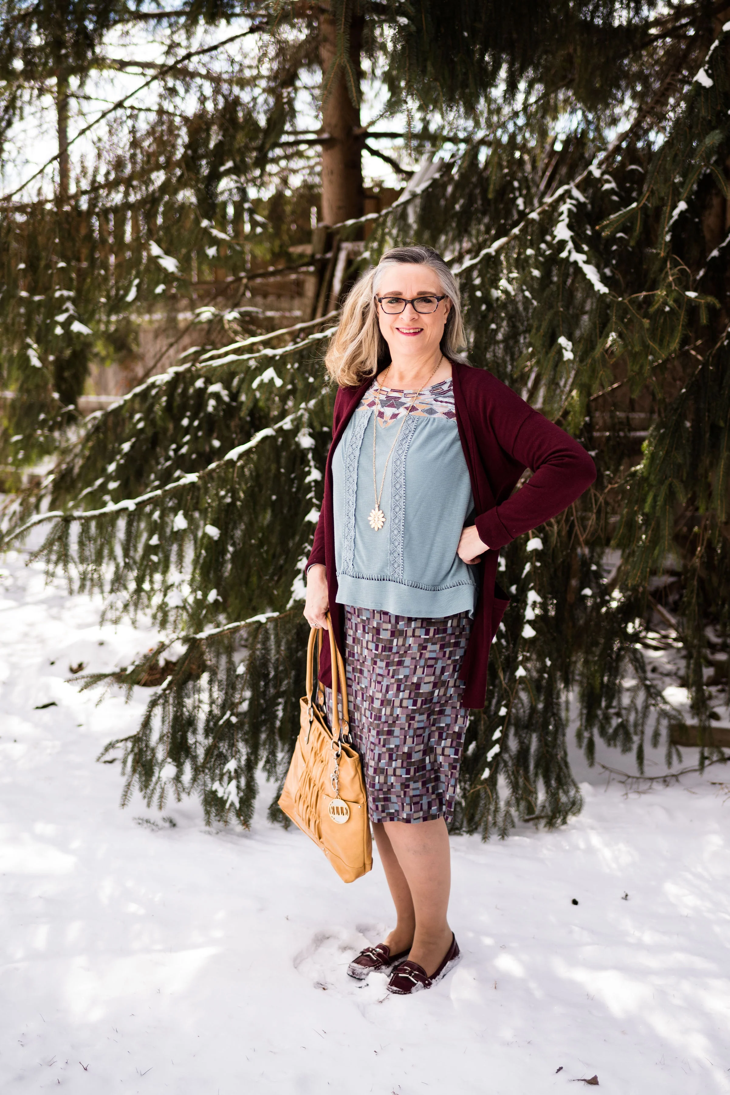
Print Mixing Mash Up - Checked Trousers - Outfit 1

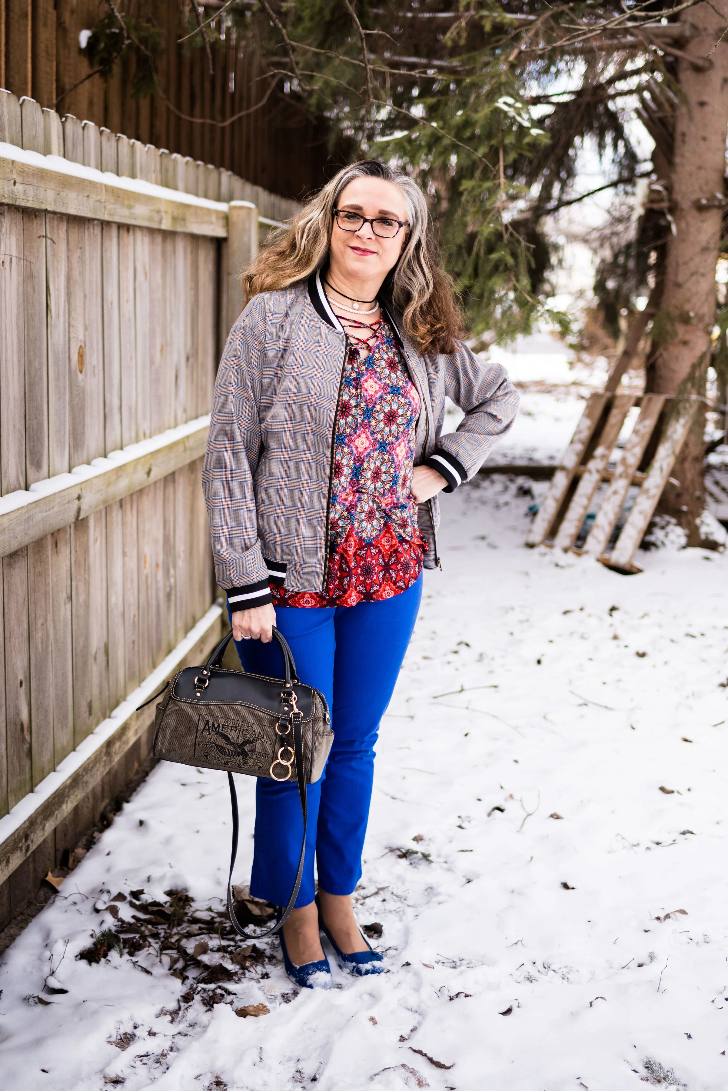
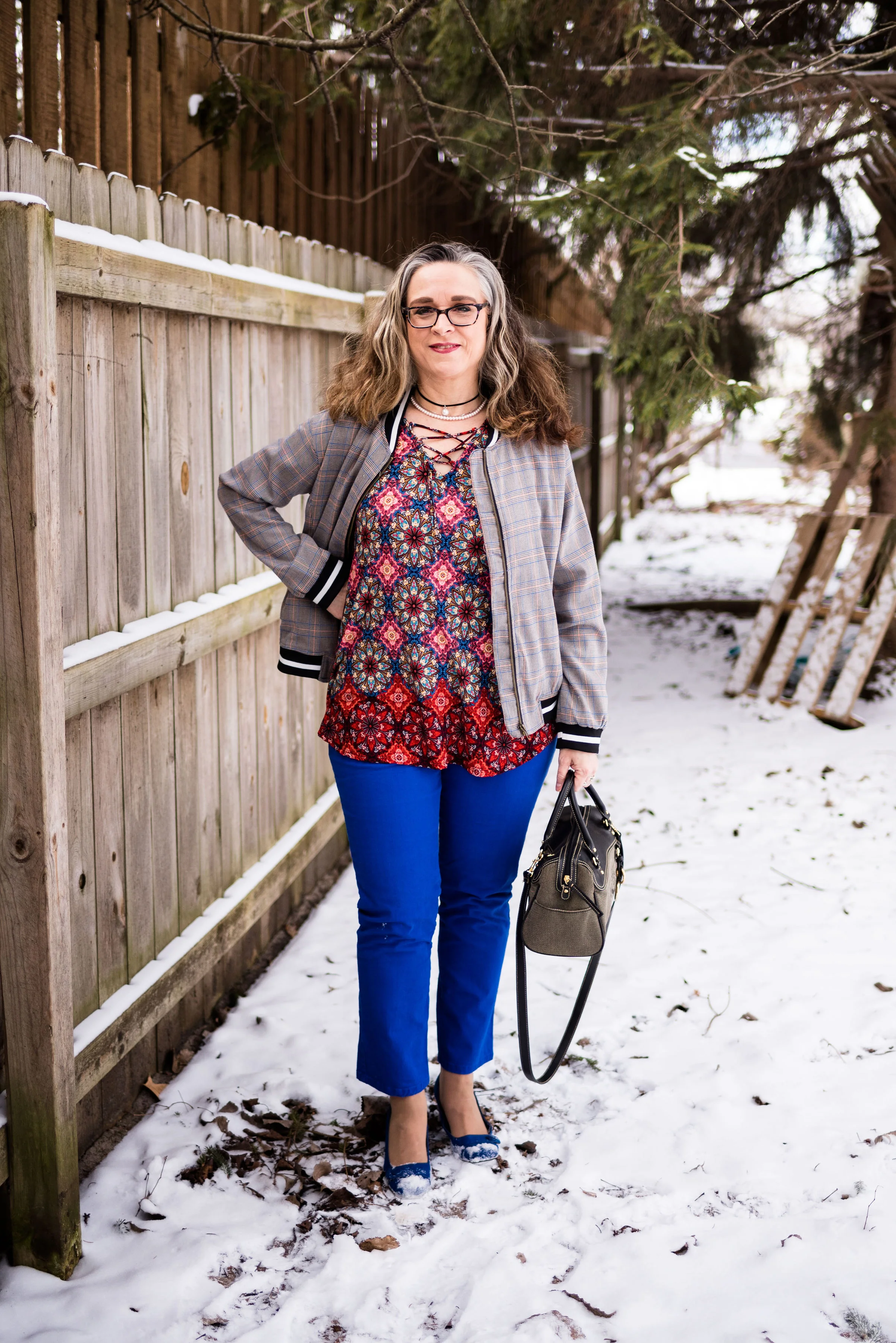
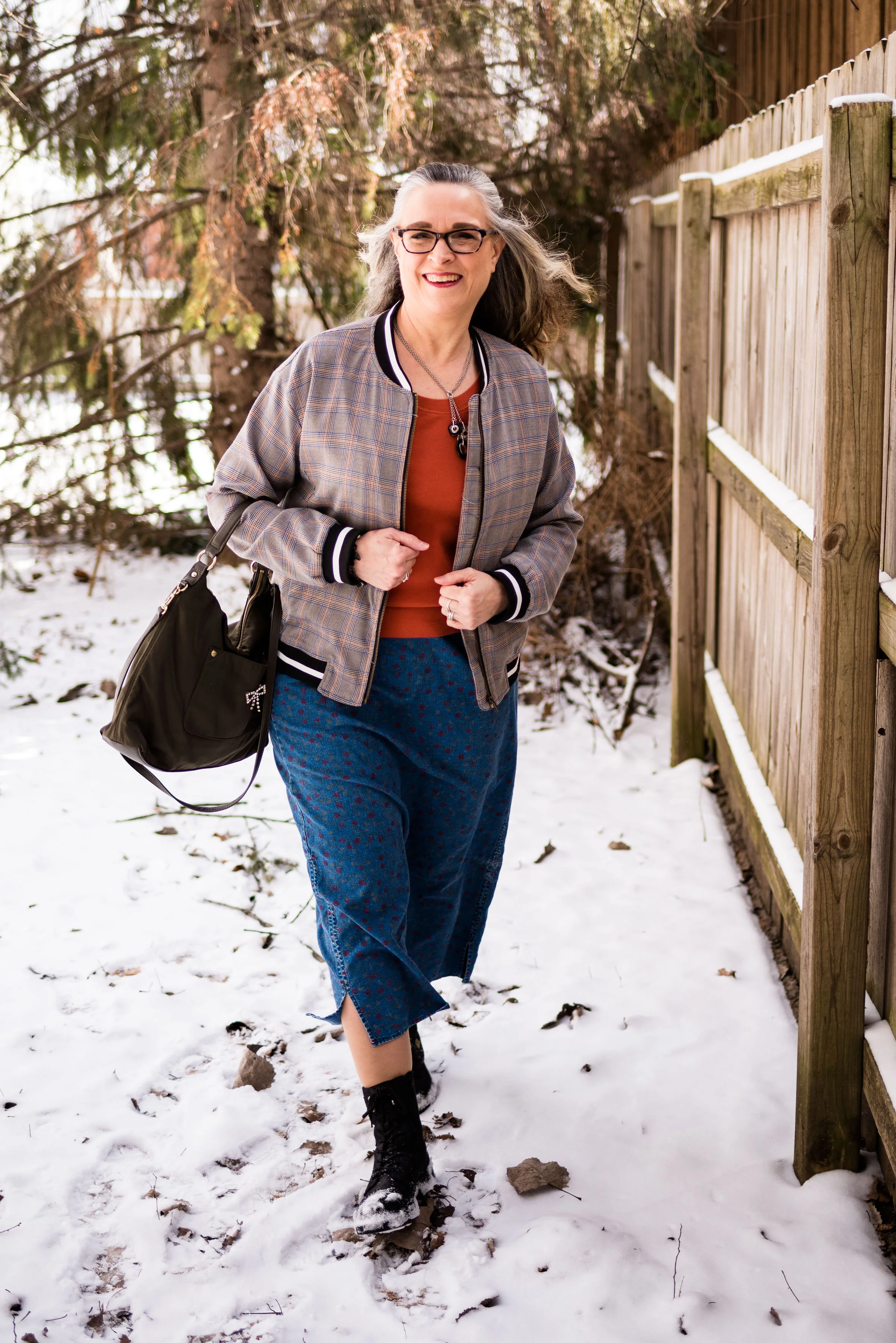
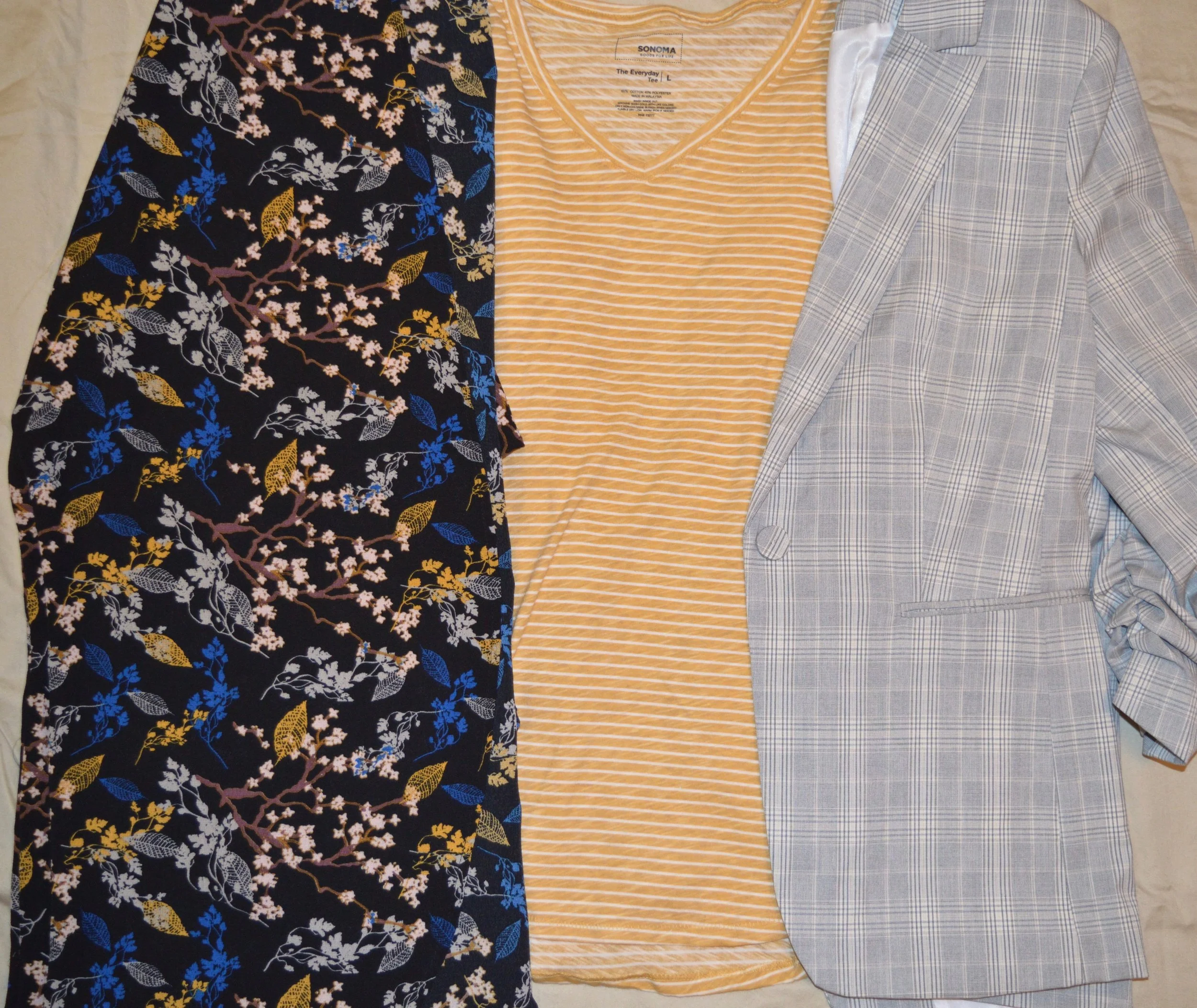
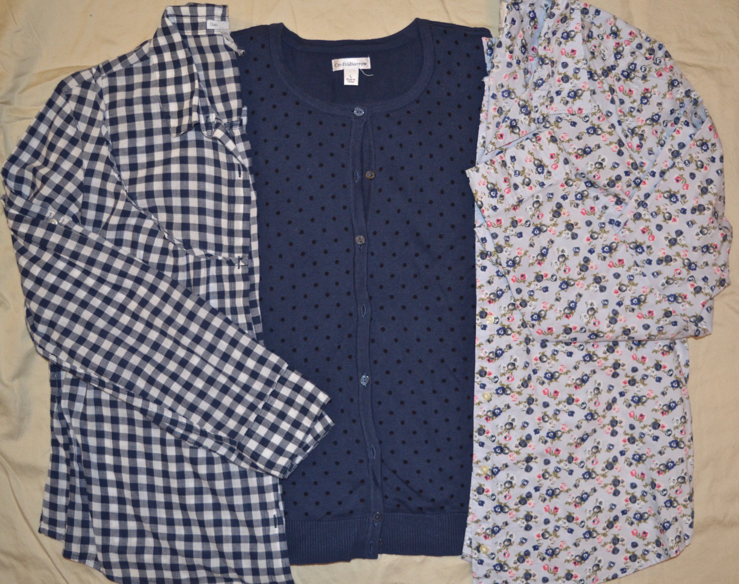
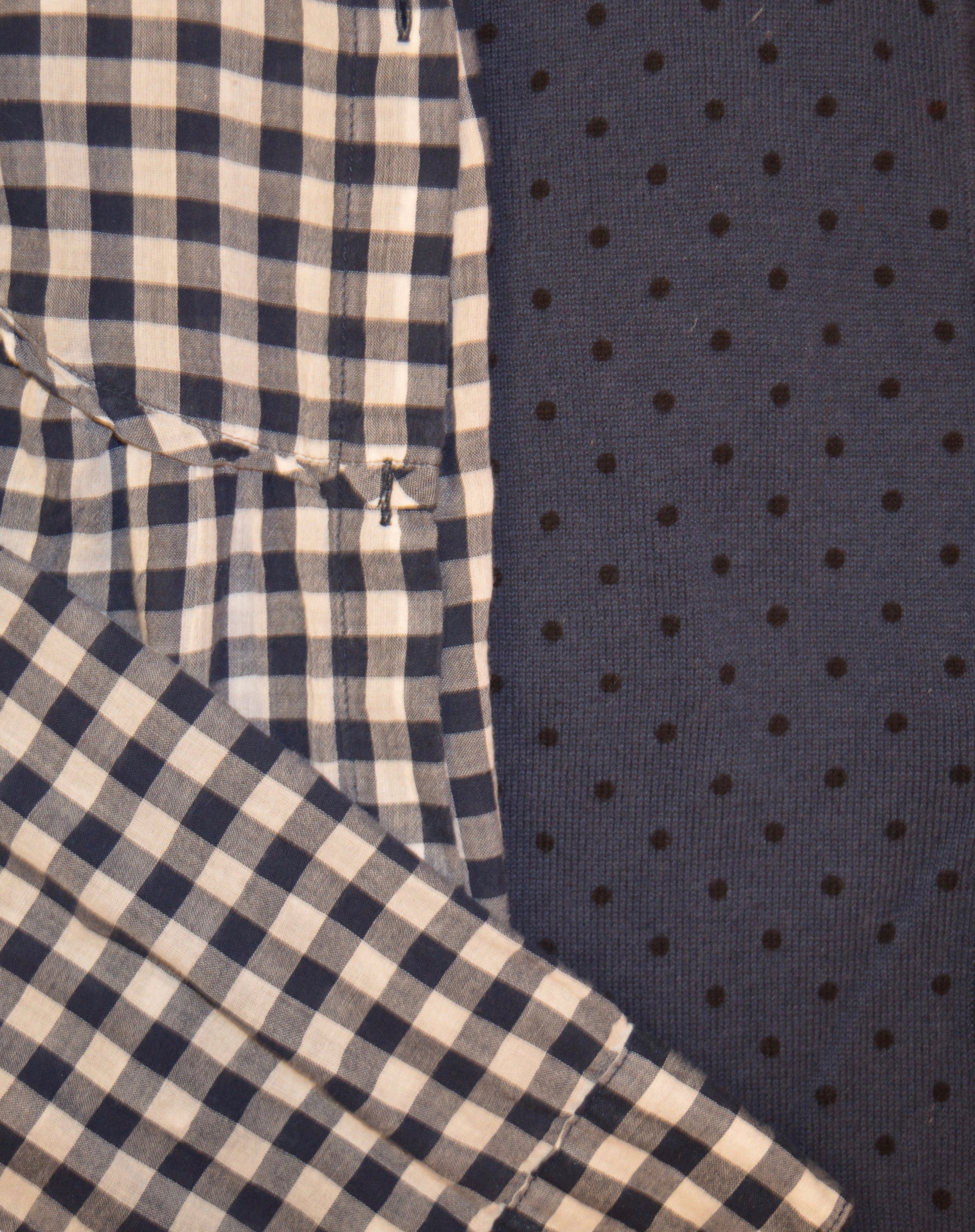
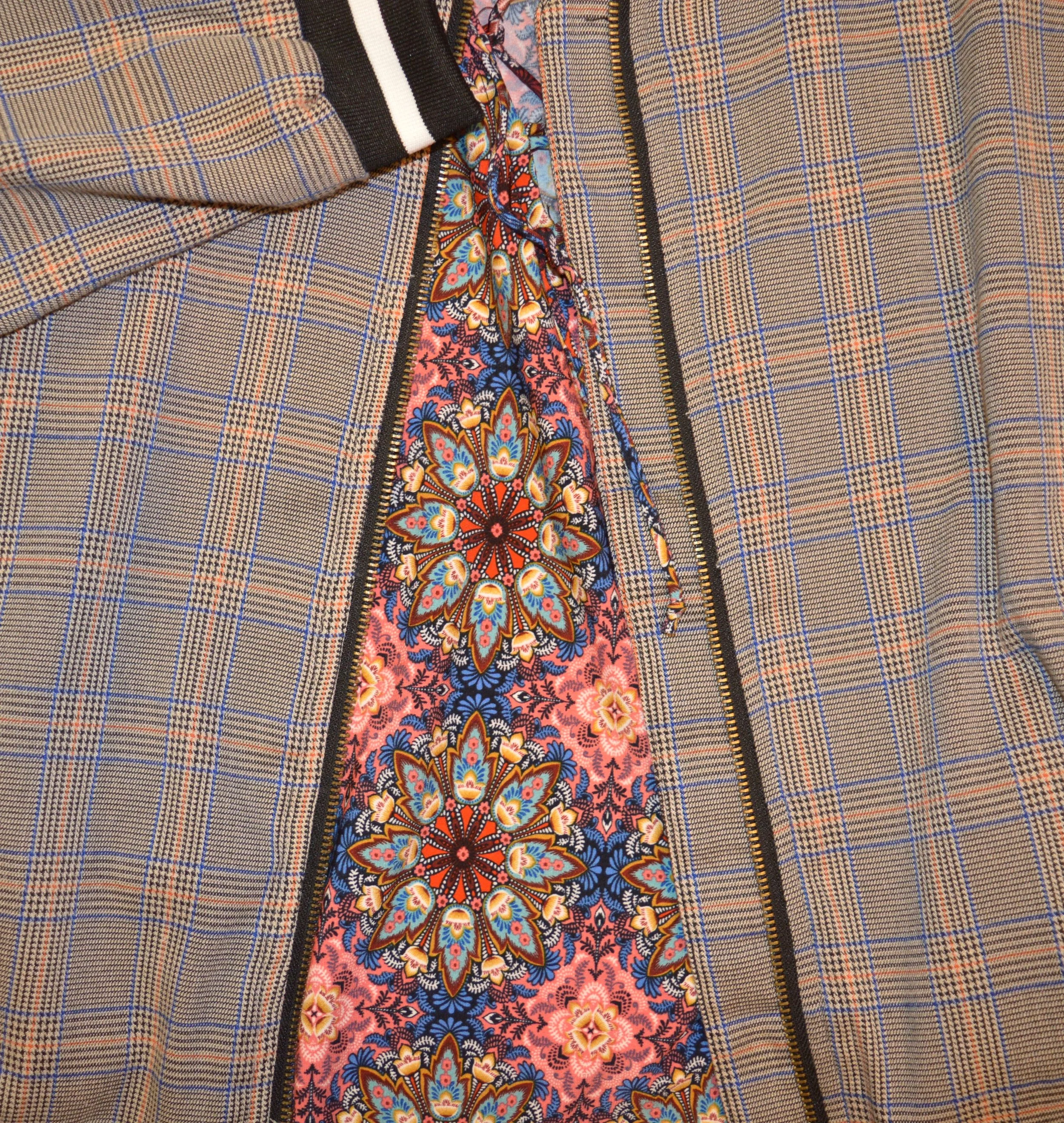
This week the Print Mixing Mash up features a pair of Worthington black and gray checked trousers. The checkered pattern on these is very subtle, but it is definitely a print, rather than a solid. Worthington has been making reliable dress pants and women’s work clothes for JCPenney since 1985. I have several pairs of their pants, and they are long lasting, wrinkle resistant and fit pretty well.

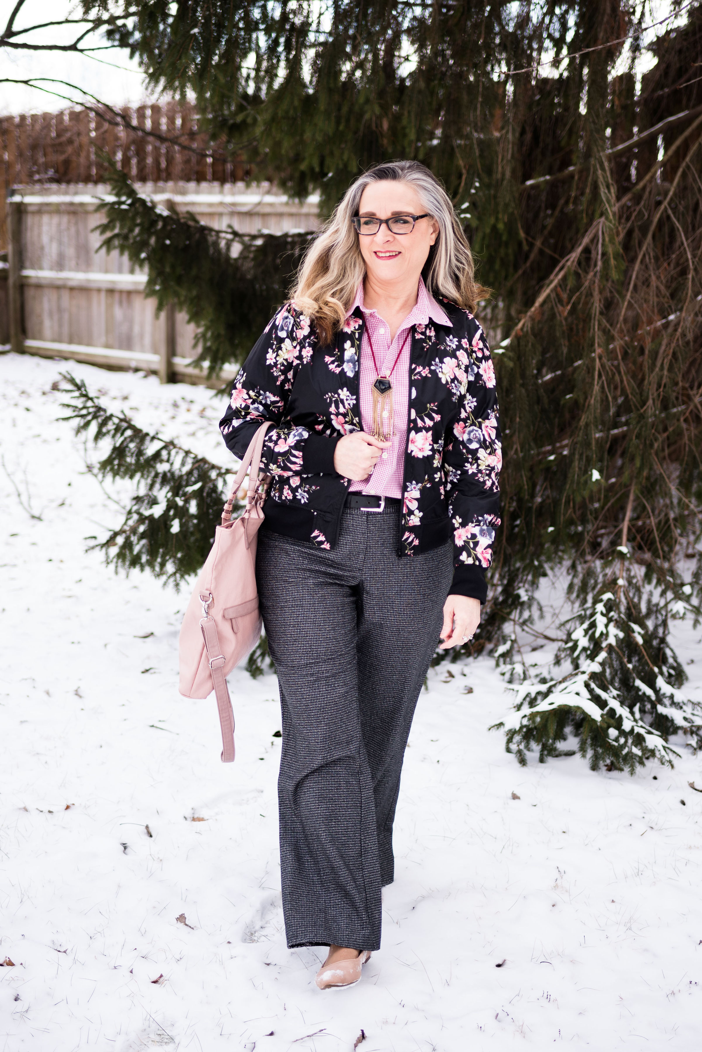
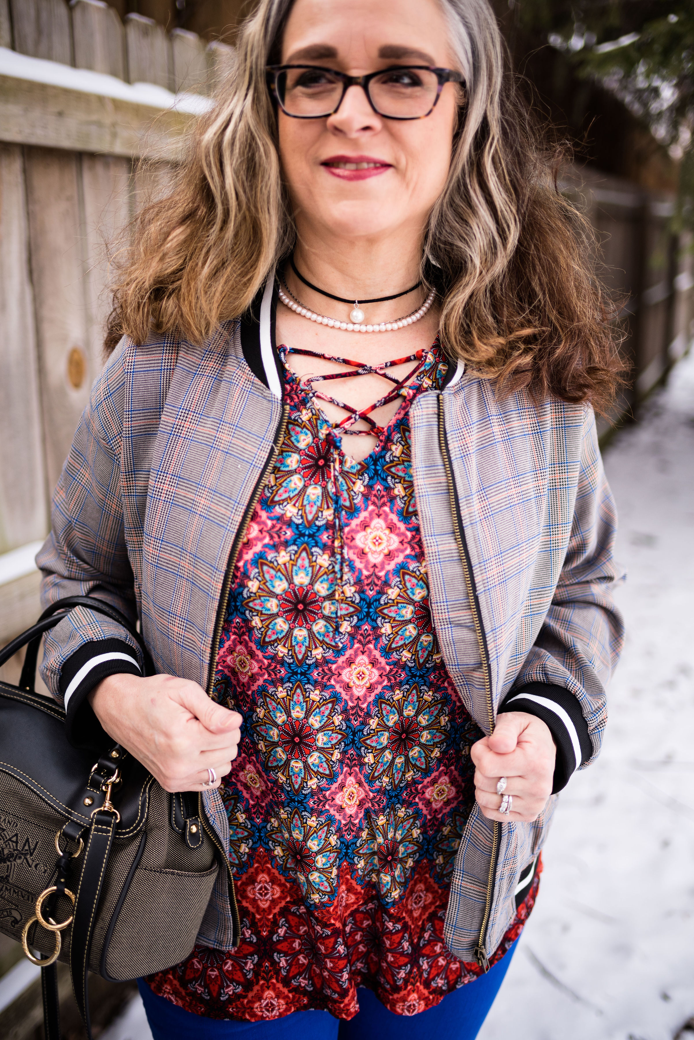
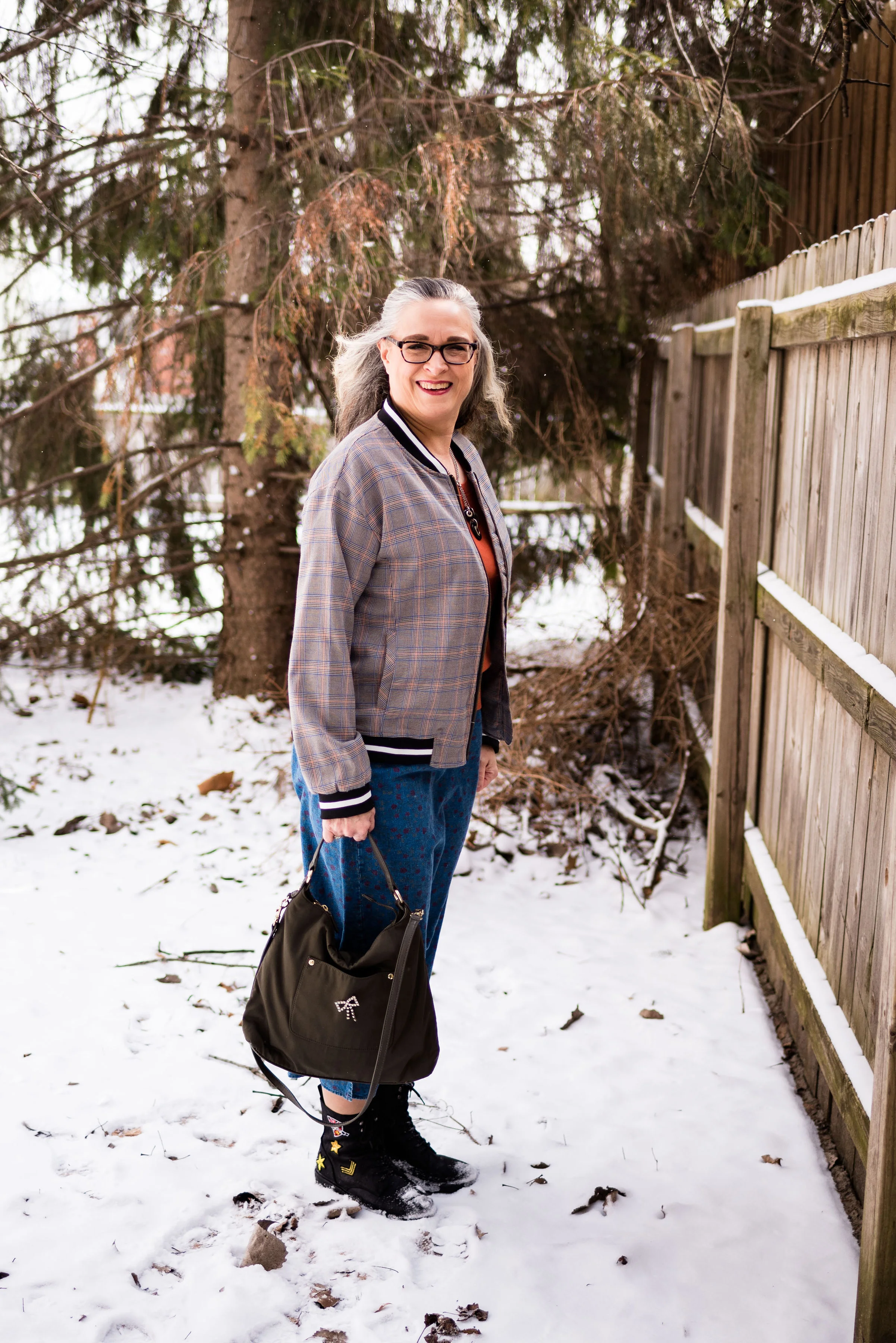
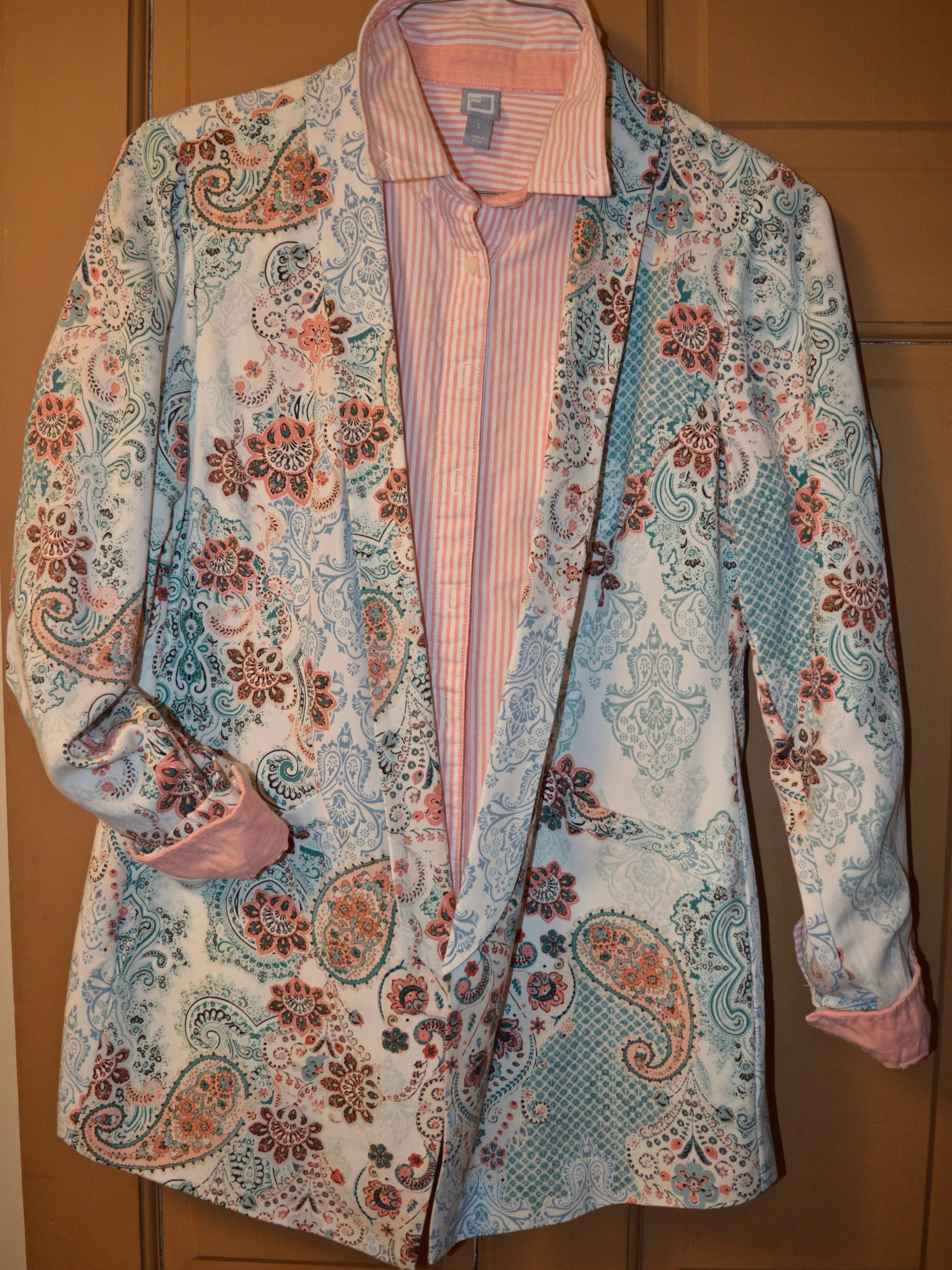
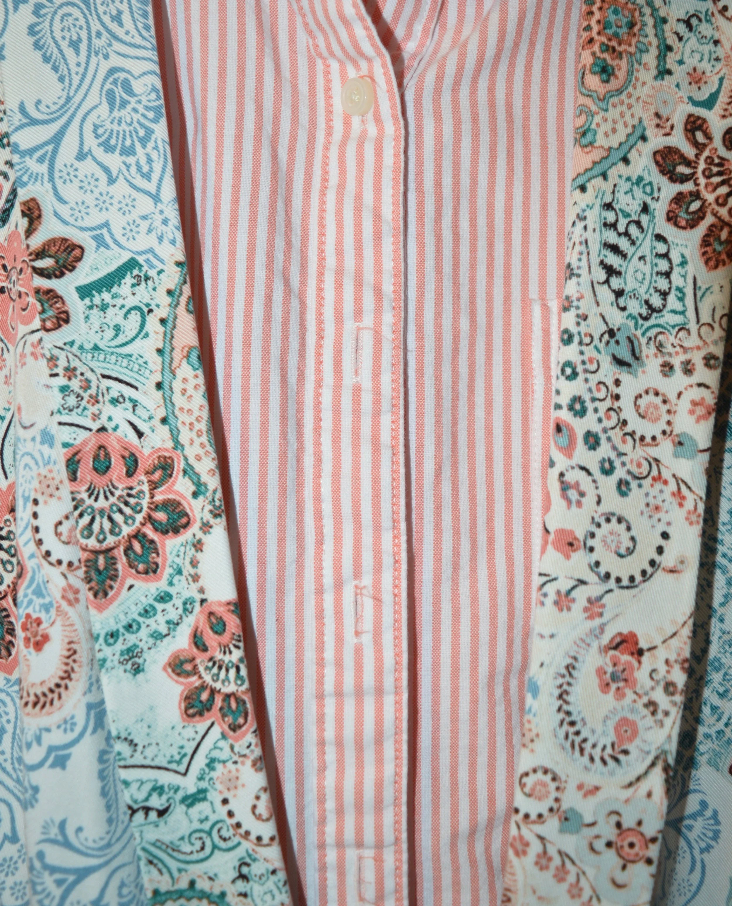
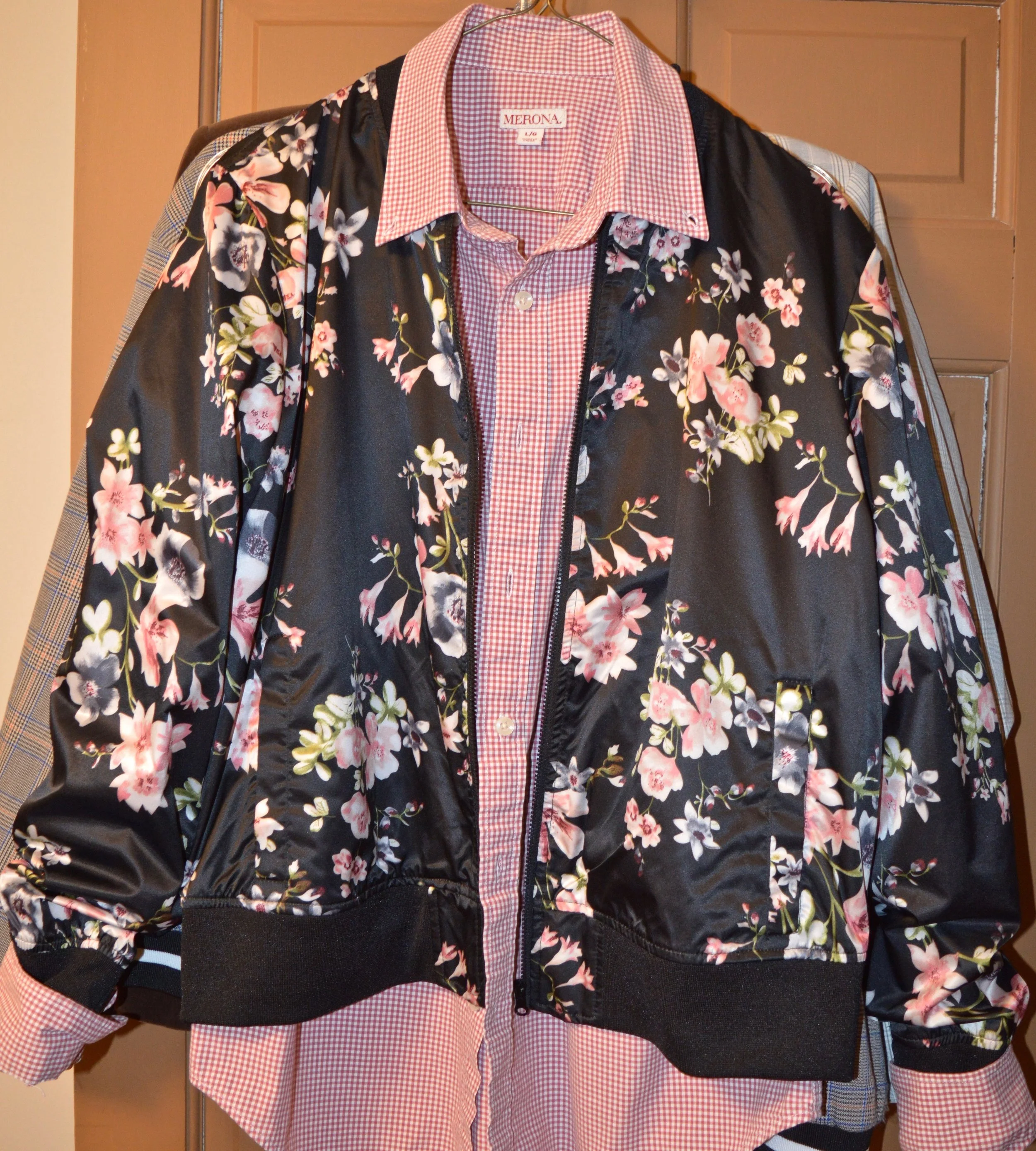
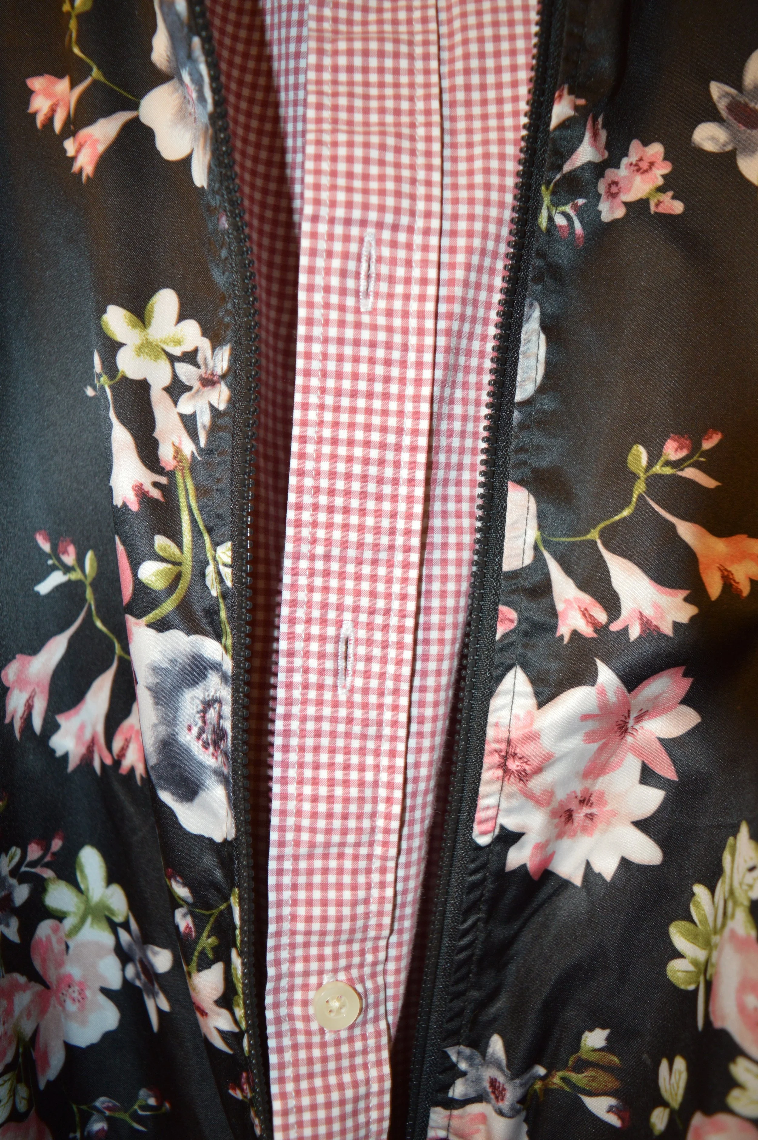
I have had these pants for many years and have worn them to work and for special outings where I need to be more dressed up. I wanted this first look to be a bit more casual, so chose a thrifted, pinkish red, Merona, gingham blouse, along with my City Streets floral bomber jacket, also from JCPenney. So, yes, I am mixing three prints here. Ha, ha. See how easy it becomes after a little practice.

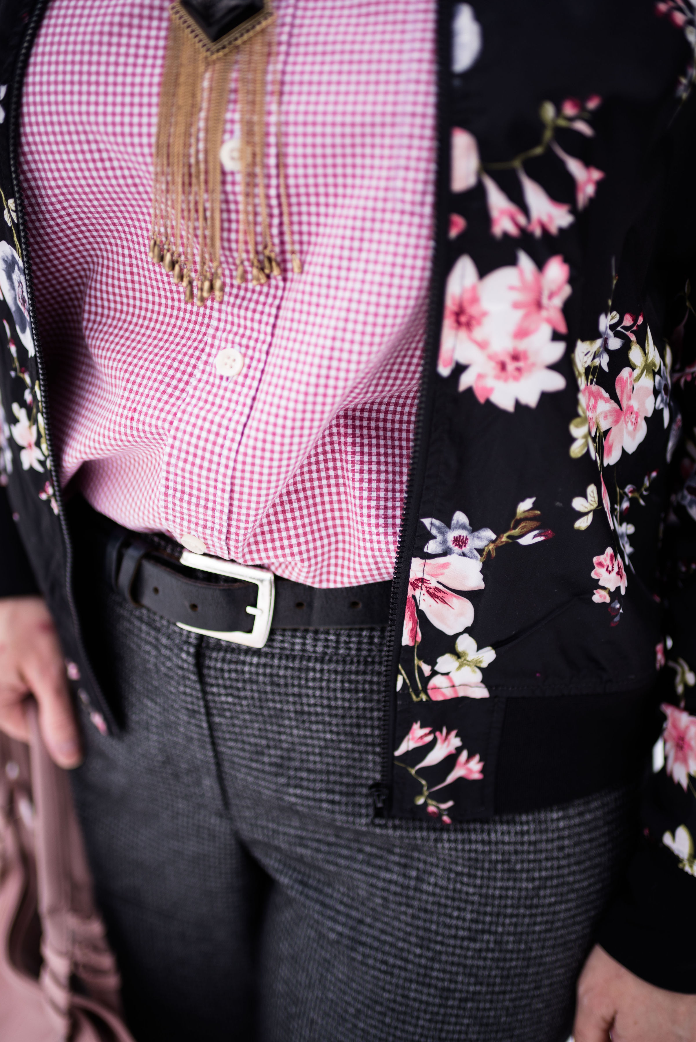
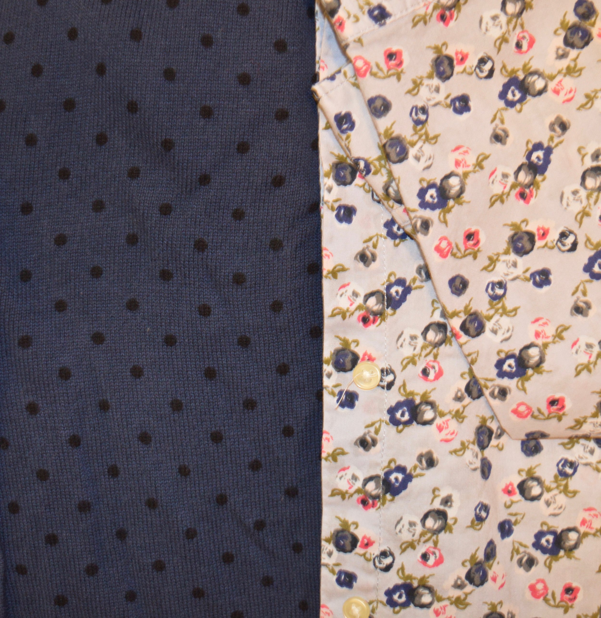
The prints on the blouse and the trousers are almost an exact match for size, which gives the outfit a more uniform look, even though they are a different color. With the floral bomber on top it pulls the two colored prints together.

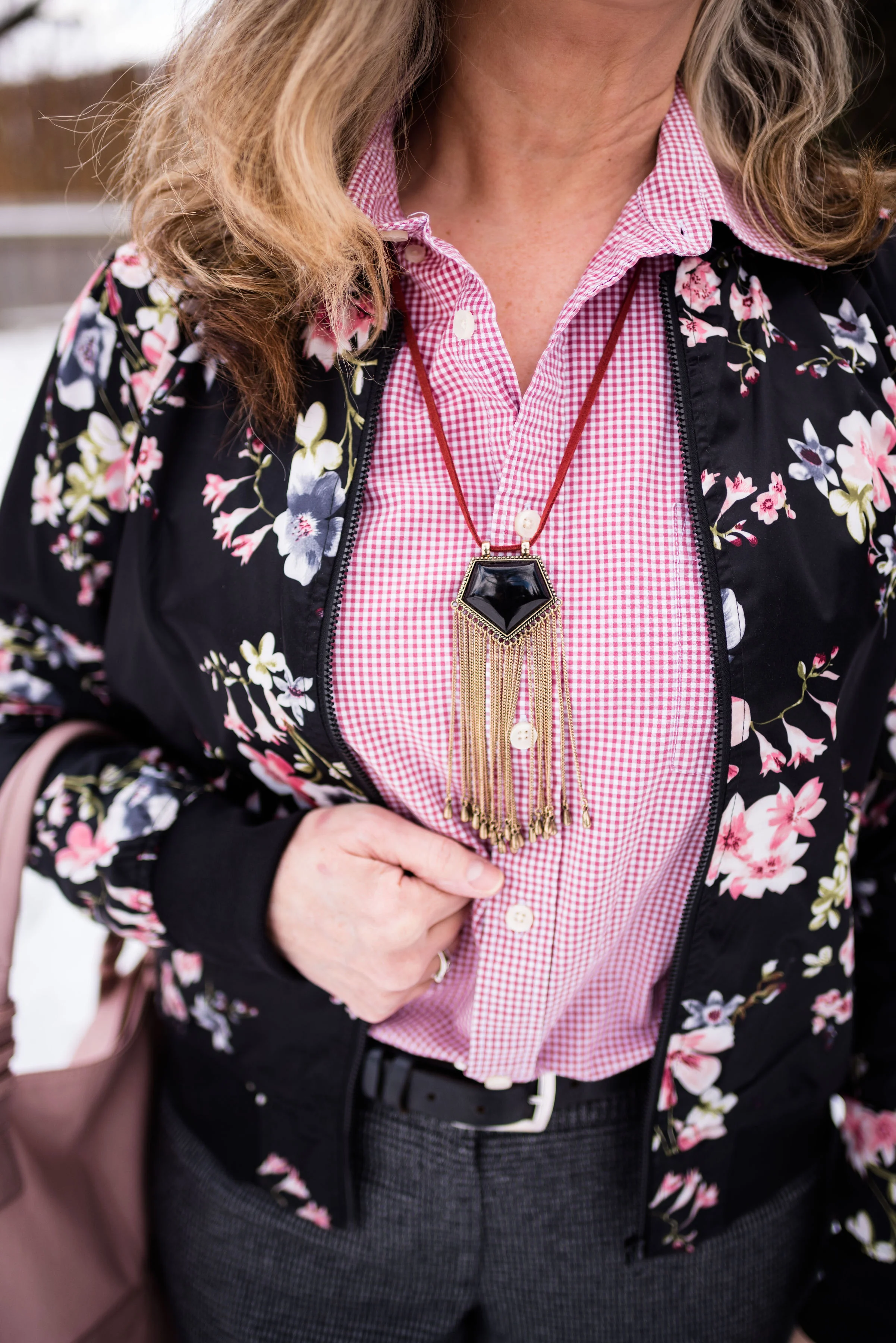
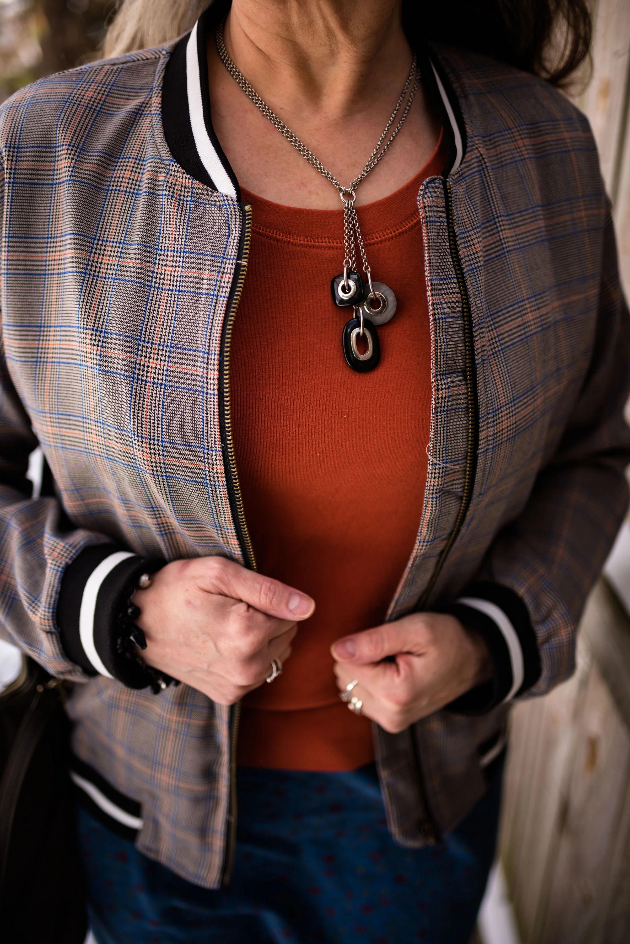
This black and gold fringe necklace on a berry colored cord was the perfect accompaniment.

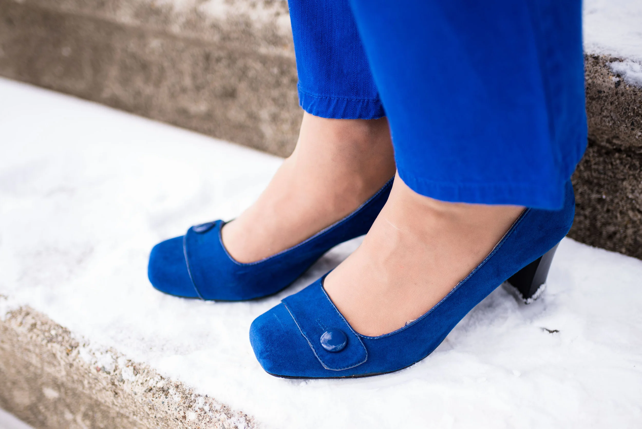
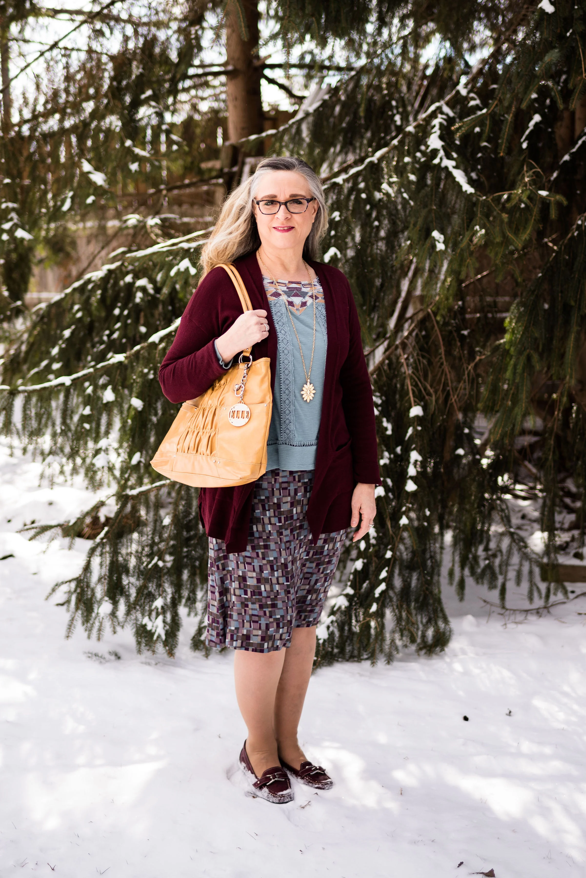
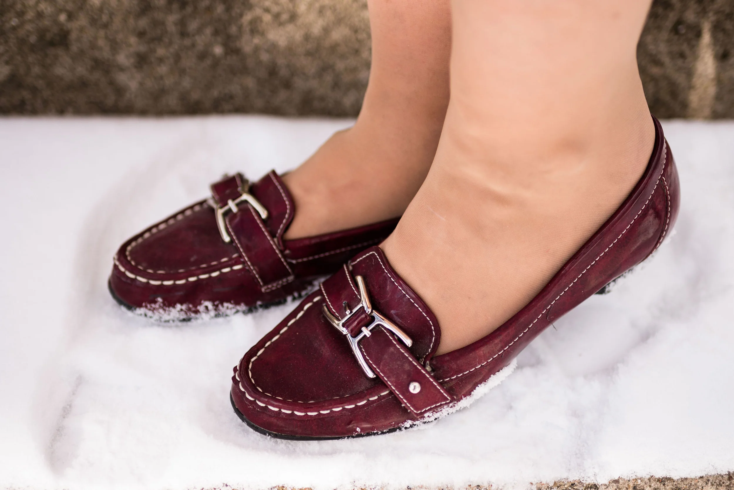
Hello, again, my favorite ballerina flats. These SO flats have a memory foam footbed that make them very comfy. Right now Kohl’s is having a sale on these for only $19.99. They also added a few new colors, so if you are looking for a fun, comfy flat check those out here.

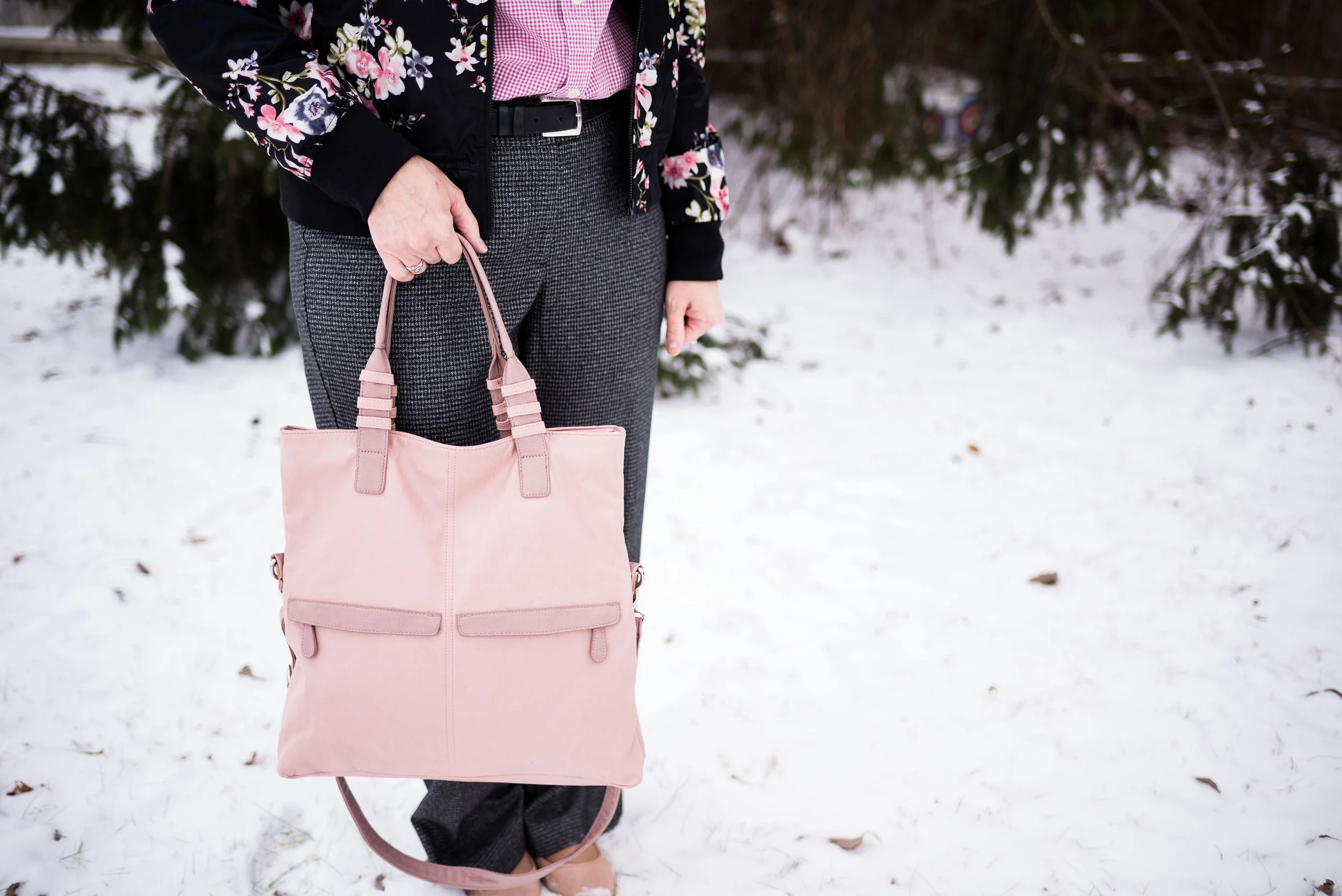
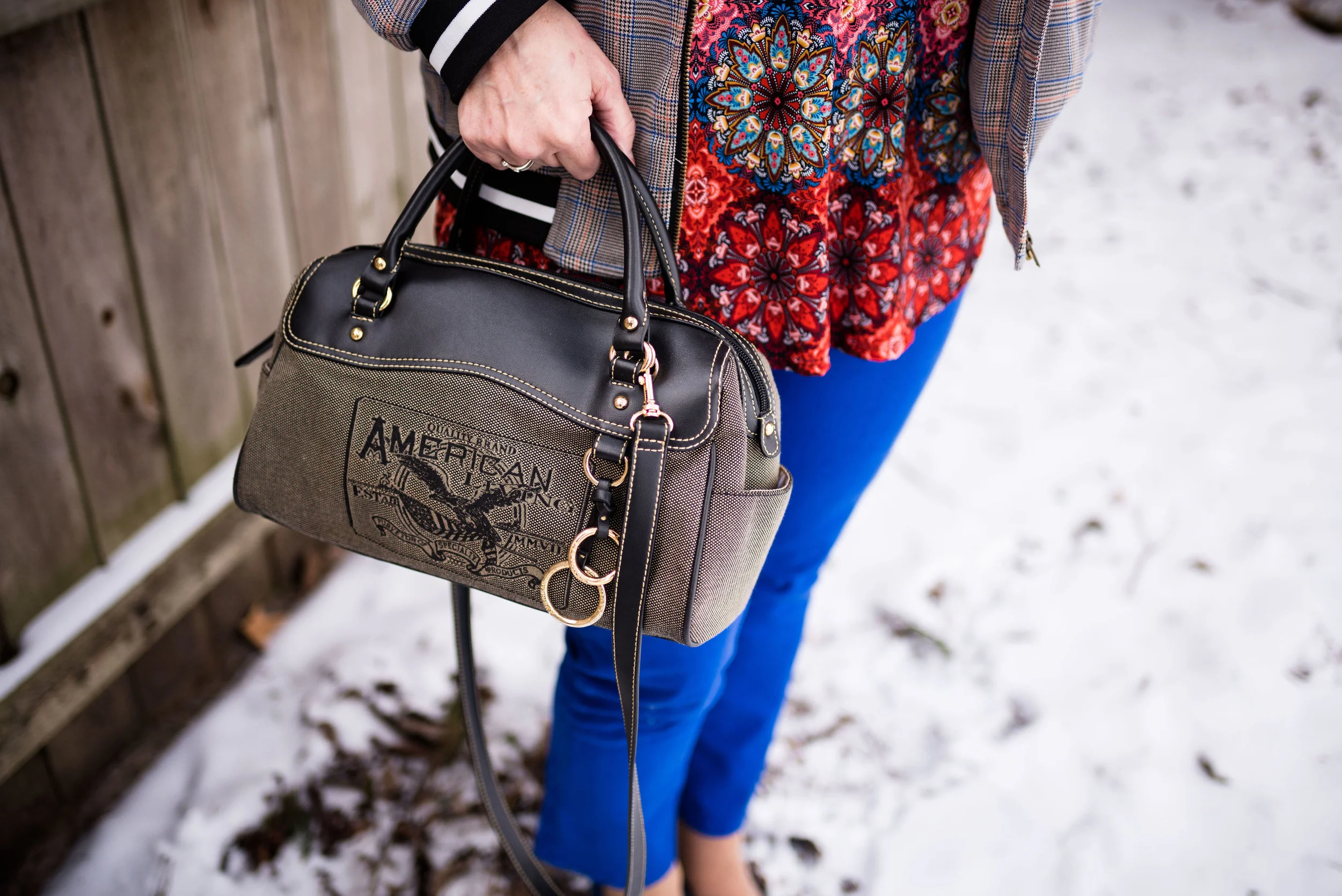
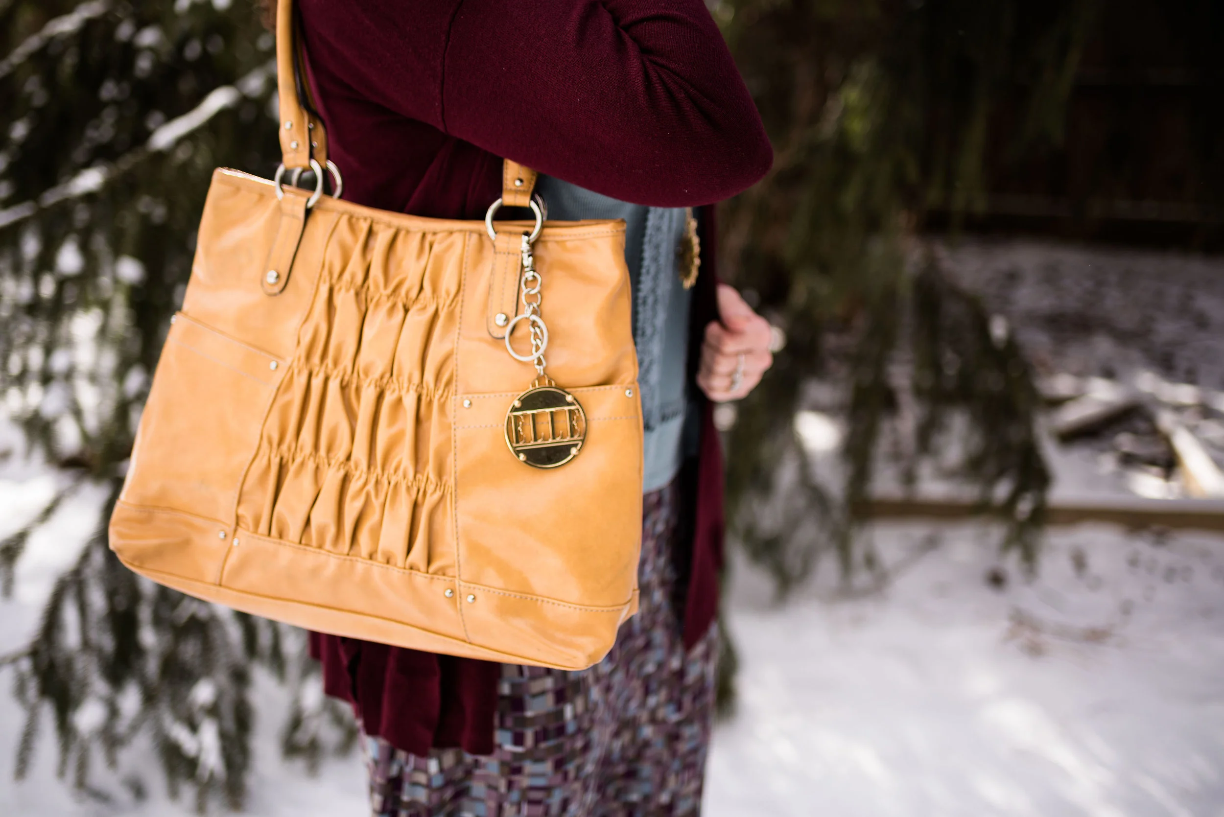
It used to be the trend to match our bags with our shoes. Now the trend has gotten away from that, but every once in a while, I like to match. It just makes an outfit looks polished and balanced. This NY & Co tote was a thrift find. Do you like to match your shoes with your bag? Do you carry the same purse all the time, or do you like to change them frequently? My hubby put me on a purse fast, because I have so many. I keep telling myself I need to use more of them, so they aren’t just laying around, but I get lazy and don’t want to take the time to change everything to a different bag. Ha, ha. How about you? Are you a purse hog like me?

What do you think of this outfit? Do you have a pair of printed trousers, jeans or ankle pants in your closet? How about grabbing a few of your printed tops or jackets and see what new combinations you can come up with.

I’ve included a few shopping links for Worthington pants and floral bombers. Have fun shopping. These are affiliate links. All opinions are my own.

Photo credit Rebecca Trumbull.

Print Mixing Mash Up - Plaid Bomber Jacket - Outfit 2

This second look featuring my plaid bomber jacket from Eden Fashion Boutique, might seem a tad overwhelming if you are new to print mixing. Some might say there is too much going on, but I think it works. In fact, it was this combination that inspired me to use the plaid bomber as a print mixer in the first place. Besides, why not get a little crazy once in a while!

When I saw this multi print tunic hanging in my closet, I thought this might be a good opportunity to get it out. This festive, colorful roz & Ali piece is a past purchase from dressbarn. I think of it as a party shirt. It seems so bright, cheery and happy, that it just wants to dance and party. That’s a little bit of a contrast to my more subdued, introverted nature, but it is good to get out of our comfort zones once in a while.

Pairing it with the plaid jacket, I let it hang around for a while and kept looking at it, wondering how I could make it work for this print mixing series. Then I remembered my thrifted, cobalt blue, Gloria Vanderbilt jeans.

You can see more of the details in this photo. The tunic has a lace up v-neck. Since there is already so much going on with the print, I opted for shorter necklaces in a more classic style. Rev it up and tone it down. I know some might go for bright beads in various lengths, but my objective with this outfit was to party, but party conservatively. That’s me in a nutshell. I don’t drink, but I do like to dance. I also liked the way the pearls and black cord on the choker, compliment the black and white stripes on the jacket.

Funny story about these cobalt shoes. I have had these shoes for a long time. I’ve worn them on the blog before with various outfits and I really like that they are so bright. The last time I remembered wearing them for the blog was summer of last year. My daughter and son-in-law were in the process of moving out of their apartment into a house and we had planned a shoot at the apartment complex so I could help do some packing. That was the last time I ever saw them (the shoes, not my daughter and son-in-law). I thought for sure, they had gotten thrown away in the chaos of helping to pack and purge at the apartment. I gave them up for lost, even though I searched my house all over thinking I may have just misplaced them when I got home to put things away after the shoot.

The other day when I was working on outfits for this series, I was going through shoe boxes looking for some of the pairs I had put away that were more spring/summery. Lo and behold there my shoes were in a box in my closet. Ha, ha, ha. Maybe I am starting to lose the plot, as my hubby likes to say. Dementia is highly likely with my family history, but I just pray I’ll be sweet!


This bag is another thrift store find. I like the style. Now, being a fashion blogger, I do have a few Pinterest boards, that I like to play with. I need to do more with those, but there are only so many hours in a day, as everyone of you know. However, I do have a board that is called Fashion Vocabulary and I put things on there like different types of bag styles, dress styles, skirt lengths, heel heights and so on. Anyway, I looked for the proper name for this bag and I would say that it is a hybrid between a doctor bag and a barrel bag. A true doctor bag style would have a metal frame connected to the opening. So now you know.

I personally feel, what makes this outfit work is the bright blue pants and shoes. Obviously, you could have done the same thing with black pants or a skirt, or orange. The solid color ties the two pieces together, and compliments the blues in each pieces.

What do you think? Am I helping you to get over your fear of print mixing? I certainly hope that these posts are inspiring you to think outside your fashion box.

Photo credit Rebecca Trumbull.

I’ve included a few shopping links for you to have fun with. These are affiliate links. If you click on a link I get a few pennies. All opinions are my own.

Print Mixing Mash Up - Plaid Bomber Jacket - Outfit 1

If you are just joining me here on my blog, I am doing a series on print mixing. Week one focused on a yellow and white long sleeved tee ( Outfit 1, Outfit 2). Week two focused on a printed skirt (Outfit 1, Outfit 2). You can see the original posts for each outfit, by clicking on the links. My goal for each of these outfits is to show you three things: 1) You don’t have to spend buckets of money to look fashionable and be trendy, 2) Print mixing is not that hard, and 3) Your ability to print mix starts in your own closet. The only way I learned to print mix was practice, just like so many things in life that we aren’t born with an innate knowledge of.

This week’s outfits revolve around a plaid bomber jacket. I found this fun piece at Eden Fashion Boutique. It was marked down and I also had a coupon, so it was one of those win, win combos. Eden is a local boutique with stores in Sylvania, Ohio and Bowling Green, Ohio. I did a post on the Sylvania location and if you are interested, you can read about that here.

My daughter and I were doing some thrifting and shopping in Bowling Green and stopped in at their location. We both tried on numerous fun pieces and I bought this bomber jacket and a long sleeve tee that I posted on Instagram last Thursday.

The plaid jacket is a mix of orange and blue stripes on a gray background. I thought it would be fun to pair it with a print containing those same colors. When I came across this longer denim skirt, I thought to give it a try. While, I think the print mix works, I really don’t like the silhouette of the outfit. Just a little too baggy for my taste.

Here you can see the mix of prints closer up.

The fact that the outfit was going to be ultra casual made me reach for this olive hobo bag that I have used on the blog before. It is always fun to add a pretty brooch or two, to an otherwise more plain piece, whether it be a blouse, a jacket, a scarf or a bag like this one.

I also decided to wear my Seven Dials black combat boots. The reason I chose these was to bring together the black and white cuffs and collar on the jacket with the shoes.

To keep the edgy look I went for a necklace that I have had for many years. A combination of metal and beads, I like that it has a utility look to it.

The dark orange tee is a thrifted Chico’s tee. It really brings out the orange in the plaid jacket, as well as the rusty orange floral print of the skirt. This is another way to bring printed pieces together in a harmonious blend. (Yes, I am listening to Celtic music right now and I love the harmonies in their music, whether instrumental or vocal.) Pick a solid piece that is a common color in both pieces. You’ll see this idea again in Thursday’s post with this same jacket.

As always, I love to hear your thoughts on these outfits. Is this something your would wear? Do you like denim skirts? Do you like skirts that are this length or shorter? Do you have a bomber jacket that you like to wear? I value your input, so leave a comment or two below.

My hubby and I had a nice weekend away, but now I am fighting the crud. I was hoping to get through the whole winter without getting sick, but my grandson and daughter both got it, so I had to join the fun. Hope this post finds you all well.

Have a great Tuesday.

Print Mixing Mash Up - Printed Skirt - Outfit 1

This week, I’ll be styling a printed skirt two different ways. Remember, the goal of this series is to show you how you can take a printed piece in your closet and combine it with another printed piece for a print mixing mash up that will make all your girlfriends and colleagues envious of your print mixing panache.

Today’s outfit centers around a thrifted Gianni skirt I have had in my closet for a while. I love purple, so when I found this purple, blue mix, I thought it would be fun to work with. I like the a-line style. It is light weight, but fully lined, so easily wearable for at least three of our four seasons. You could probably extend its season into winter if you wore leggings or a heavy pair of tights. Since we are talking about and looking forward to spring, I wanted to make both of these outfits more transitional looks.

What I love about this skirt, is its ability to change hues. When you look at the skirt by itself, the purples look more purple and the blues look more like a denim blue. When I started looking for a piece to pair this with, I saw this Knox Rose top that I found at Bass Pro Shop a while back on the clearance rack. I thought, even though the colors weren’t exact, at least they were similar enough that it might work. Once I put the SO sweater, from Kohl’s, with it, I knew I had a winner.

Technically this print mixing, isn’t so much mixed, because the print on the top is not next to the print on the skirt. However, the whole point of trying to print mix is to think outside the box. I would have never put these two pieces together, had I not been thinking about mixing prints and colors. The top, which is more of a greenish blue, looks as though it pairs perfectly with the blue of the skirt, just as the more reddish burgundy color on the top and the sweater, look as though they combine perfectly with the purple. Isn’t color wonderful? Ha, ha.

It was so cold when we were taking these pictures. My daughter was running back into the house after each outfit was finished, and she had on a hat, coat, gloves and boots. Ha, ha. My face is set in defiance of the blustery cold! That is definitely not my most flattering face.

I decided to draw on the little bits of yellow in the top for my necklace and purse. Once again, I would have never thought to pair yellow with this color combination, but once I put it together, I loved it.

By the way, those are little fleck of snow on my sweater, not dandruff or lint. Ha, ha . Just thought I had better clarify.

I think this thrifted yellow Elle tote is a great number for spring. I love the shirring on the front, the sunflower yellow color and the metal rivets, rings and Elle charm. This just goes to show, you don’t have to spend lots of money to have a nice bag.

I have a tendency to get into a rut with my bags. Right now I am using my yellow thrifted cross body. It is so convenient for shopping. Often, if I am carrying a large tote like this one, which already has some weight to it, I overfill it and then wonder why my shoulder and back is bothering me. What kind of purse do you like to use?

These burgundy Naturalizer loafers were another thrift find. When I put the outfit together, I knew these would be the perfect casual finishing touch.

One of the things I like about thrift shopping is the ability to try different brands without spending a ton of money. I normally don’t buy high end. My hubby and I just don’t have the income, to support a shopping habit of that nature. Ever since I was a young girl, I have always been somewhat conscious of getting more for my money. My mom used coupons, made our clothes and made the most of what we had. Things were not always easy for our family, but I grew to appreciate the ability to save money by looking for cheaper options. Now when I thrift I am drawn to higher end name brands, because often they are a better fit and are well made. I still like my Kohl’s, Penney’s and Target clearance finds, but thrifting is always my first muse.

I hope you are enjoying this print mixing series. Let me know your thoughts. Have you done any print mixing in the last few weeks? Tell me about what you mixed. I love hearing from you and you are what keeps this blog going, so thank you.

I’ve included a few printed skirts to look over. These are affiliate links. All opinions are my own.


Revisiting Print Mixing - An Introduction

While print mixing may come naturally to many of us, I think I can safely say for me it wasn’t always the case. I didn’t know the first thing about print mixing before I became a fashion blogger, and even now, I wouldn’t say it comes naturally. For me, as with cooking, I really have to have a recipe, or at least have my brain working on 3 of its 4 cylinders to be able to figure out a good print mix. Back in March of 2017, I did my first how to print mixing post. You can read that post, by clicking on the link here.

I have decided to do a short series on print mixing. I have had numerous people tell me, that while they are trying the print mixing trend themselves, they do not always feel confident with how to put pieces together that mix prints. After all, most of us don’t want to look like a walking garage sale. I am far from an expert on this, but I thought I would put together a series of posts, that will lay out what to look for when mixing prints and how to mix prints without having to put a lot of time, thought or effort into it.

This week I want to do an introduction of sorts and give you a few basic how to’s, then the next few post will show you outfits of my own and give explanations for what I chose and how I put the prints together.

There is a method to this madness. There are all sorts of prints including stripes, florals, polka dots, paisley and a plethora of others. How, then, do you decide which patterns to put together? Here are a few pointers.

Start with a foundational print.

1 - Stripes, whether vertical or horizontal, are one of the easiest patterns to pair other patterns with. Here are a few examples.

This striped yellow tee goes quite well with the floral kimono and the plaid blazer. The floral kimono contains yellow leaves which really draws the two pieces together. The plaid blazer doesn’t contain yellow, but has a light neutral colored stripe, which almost looks yellow when paired with the tee. I also think it goes splendidly with the leopard blazer and the Aztec print jacket, even though neither of them contains the same yellow color.

Here is another example with a vertical striped blouse.

As you can see from these examples, all of these prints are different, but the stripes work with all of them.

2 - Gingham is another pattern that is easy to pair with almost any other print.

3 - The one other pattern that is easily mixed , besides stripes or gingham is polka dots. Polka dots show up here and there in fashion trends, but I find, like stripes and gingham, polka dots are classic and timeless.

Stripes, gingham and polka dots can be easily mixed with other prints, partly because they are spatially consistent. Usually the stripes are the same distance apart, the squares are the same size and the dots are equally sized as well. If you are just starting to mix prints, look for pieces in your wardrobe or at the store that have those characteristics.

Next find pieces with coordinating colors.

You probably noticed that in the photos above, not all the print mixes have similar color schemes, but for an easier time of print mixing once you choose your foundational print find other pieces in your closet that have similar colors. For instance, the striped yellow tee that I chose above pulls in the yellow leaves on the floral kimono. The coral striped blouse coordinates with the coral colors in the jacket and the navy polka dot cardigan is a natural compliment for the navy gingham or floral blouses.

Here is another example.

I got these two pieces at completely different times. The Jaclyn Smith gingham top was thrifted and the skirt is from LuLaRoe. Matching the green in each piece make it a perfect print mixing combination. You could have also used the black gingham top that was shown above. I hope to include this in my series of outfits over the next few weeks.

This might seem overwhelming at first, but read on for another tip.

Try choosing pieces that have the small/large print ratio.

One of the other techniques for making a perfect print mix outfit is to pair a small pattern with a large pattern. This is especially helpful if you are choosing pieces that include a skirt or pants with a top or jacket. In the previous picture I used the smaller gingham pattern with the larger pattern of the skirt. This is also a good way to mix outfits that are monochrome in appearance. Here is another example.

This combination would be great with a black pullover tee or sweater, silver jewelry, and then a brighter color for shoes and a bag, like yellow, or red.

Using the small/large print ratio as well as choosing pieces that have at least one coordinating color will take you a long way to creating outfits that are not only spot on in the print mixing realm, but outfits that you can be proud of because you created them yourself.

Walk on the wild side.

Once you get the hang of print mixing you might want to venture out into combinations that are a little more bold. This is the one I came up with.

I recently acquired this plaid bomber jacket at Eden, a local boutique. I featured their Sylvania location on the blog a few months ago. You can see that post here. I love the colors that make up the plaid and the bright black and white stripes on the collar and cuffs. When I was going through my closet and came across this tunic, I thought I would see how the two pieces worked together. This is a perfect example of using the print mixing tips to create a unique looking outfit.

The plaid represents the foundational piece. Plaid, in this case is the more subtle print. After choosing the jacket, I looked for a piece that had at least one of the colors in the jacket. When I saw that this tunic contained all the colors, I thought, why not. The more subtle plaid, tones down the busy pattern of the tunic and all of it is pulled together by pairing it with the bright blue pants. I hope to feature this outfit in my series as well.

I hope this post will help you find your own love of print mixing. It takes practice, but over time you can be a print mixing whiz, just by following these tips and by not being afraid to give it a try.

What print combinations do you like to see put together? Are you a print mixing diva, or is it a trend you have shied away from? Did you find this post helpful? I’d love to hear your thoughts.

I hope you have a great weekend.