
Revisiting Print Mixing - An Introduction
While print mixing may come naturally to many of us, I think I can safely say for me it wasn’t always the case. I didn’t know the first thing about print mixing before I became a fashion blogger, and even now, I wouldn’t say it comes naturally. For me, as with cooking, I really have to have a recipe, or at least have my brain working on 3 of its 4 cylinders to be able to figure out a good print mix. Back in March of 2017, I did my first how to print mixing post. You can read that post, by clicking on the link here.
I have decided to do a short series on print mixing. I have had numerous people tell me, that while they are trying the print mixing trend themselves, they do not always feel confident with how to put pieces together that mix prints. After all, most of us don’t want to look like a walking garage sale. I am far from an expert on this, but I thought I would put together a series of posts, that will lay out what to look for when mixing prints and how to mix prints without having to put a lot of time, thought or effort into it.
This week I want to do an introduction of sorts and give you a few basic how to’s, then the next few post will show you outfits of my own and give explanations for what I chose and how I put the prints together.
There is a method to this madness. There are all sorts of prints including stripes, florals, polka dots, paisley and a plethora of others. How, then, do you decide which patterns to put together? Here are a few pointers.
Start with a foundational print.
1 - Stripes, whether vertical or horizontal, are one of the easiest patterns to pair other patterns with. Here are a few examples.
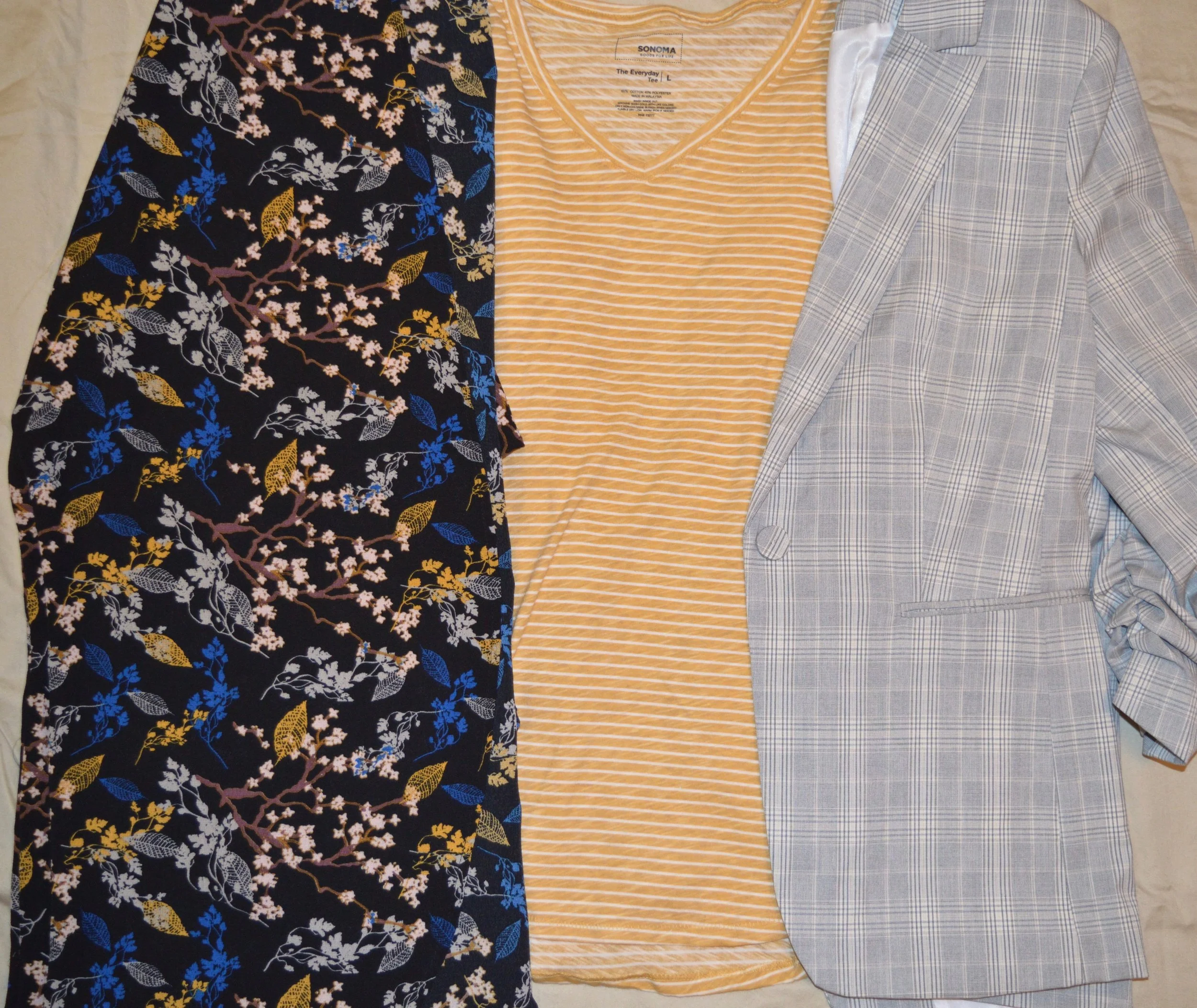

This striped yellow tee goes quite well with the floral kimono and the plaid blazer. The floral kimono contains yellow leaves which really draws the two pieces together. The plaid blazer doesn’t contain yellow, but has a light neutral colored stripe, which almost looks yellow when paired with the tee. I also think it goes splendidly with the leopard blazer and the Aztec print jacket, even though neither of them contains the same yellow color.
Here is another example with a vertical striped blouse.
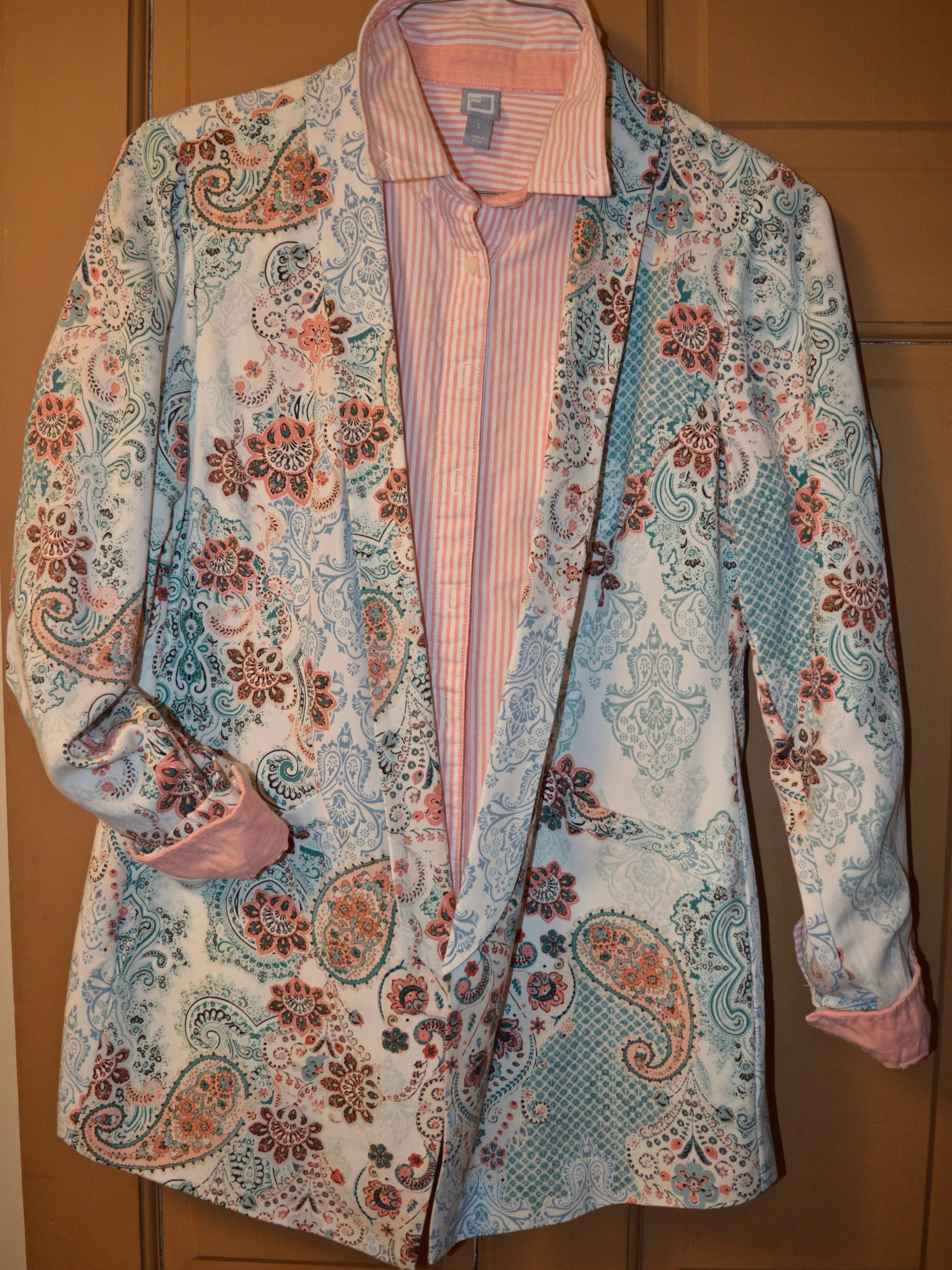
As you can see from these examples, all of these prints are different, but the stripes work with all of them.
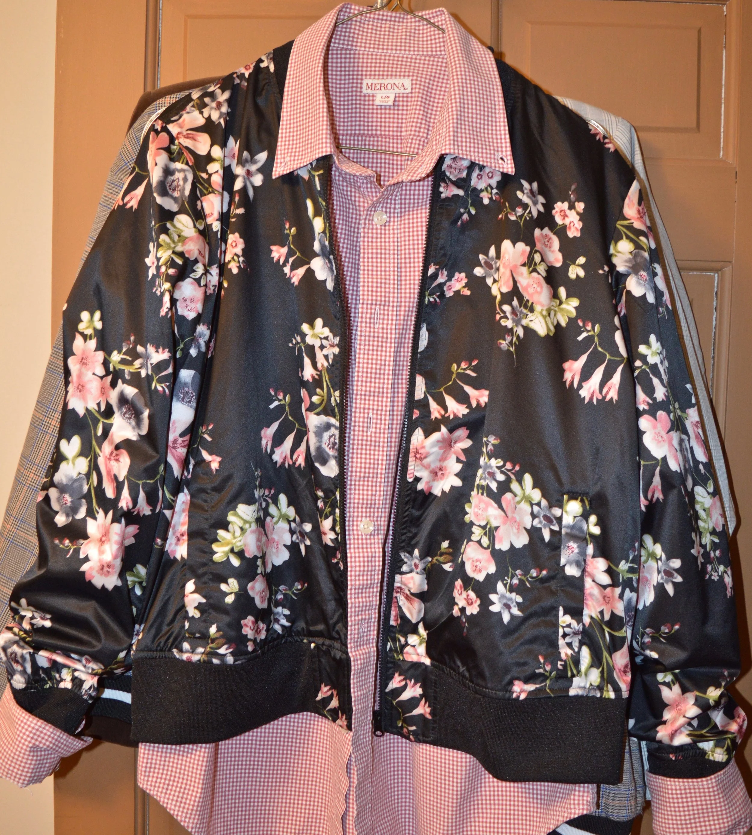
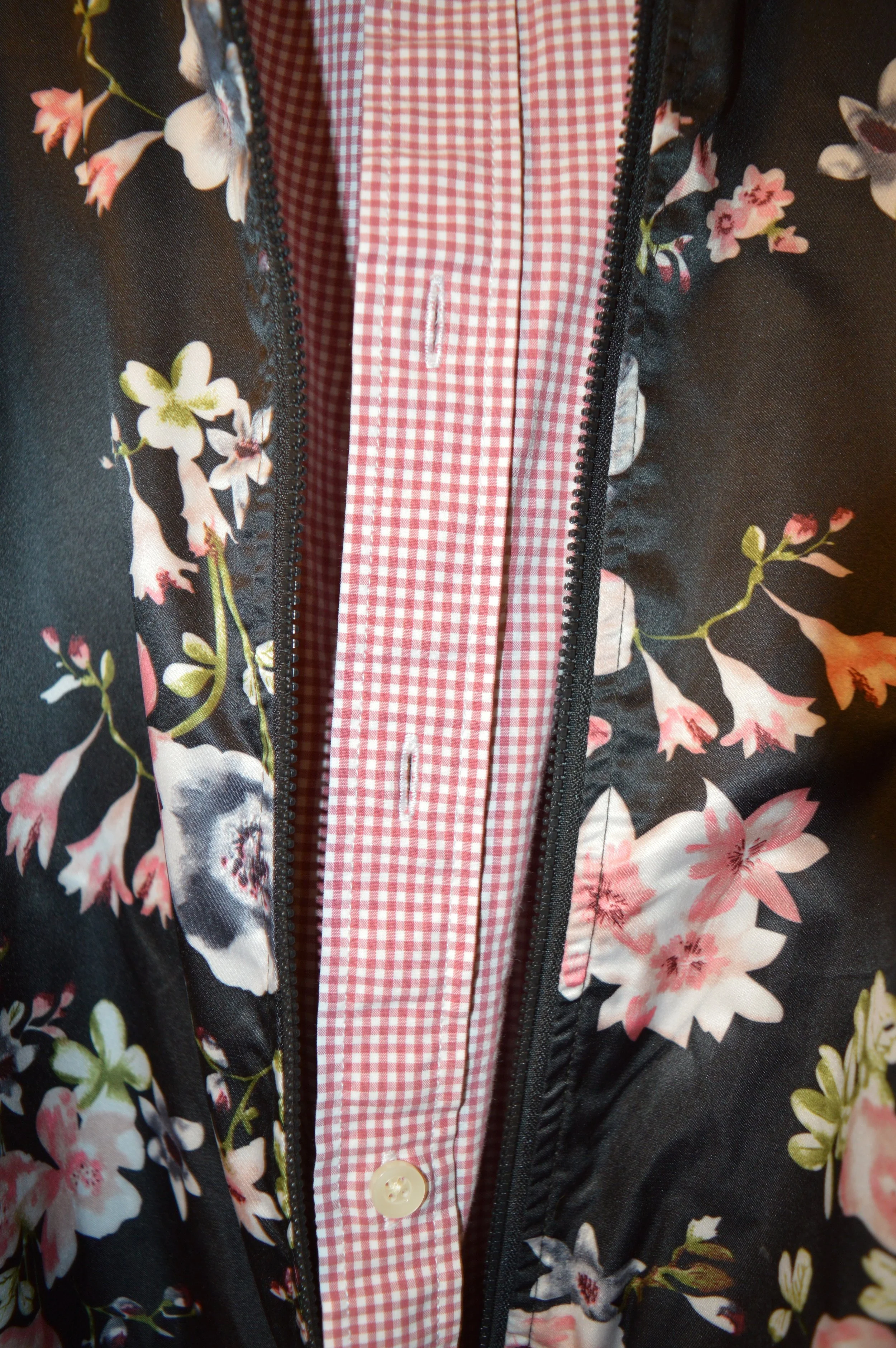
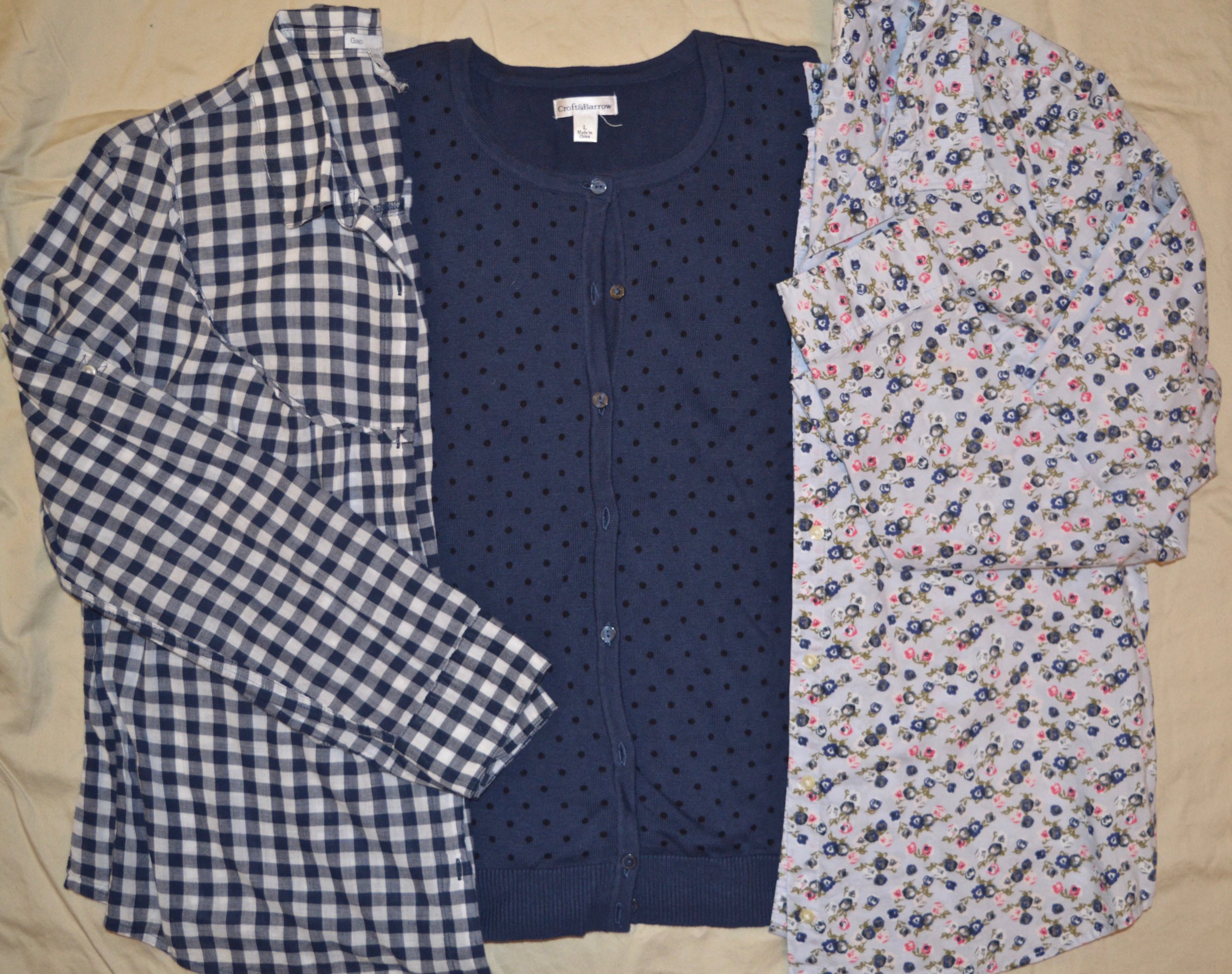
2 - Gingham is another pattern that is easy to pair with almost any other print.
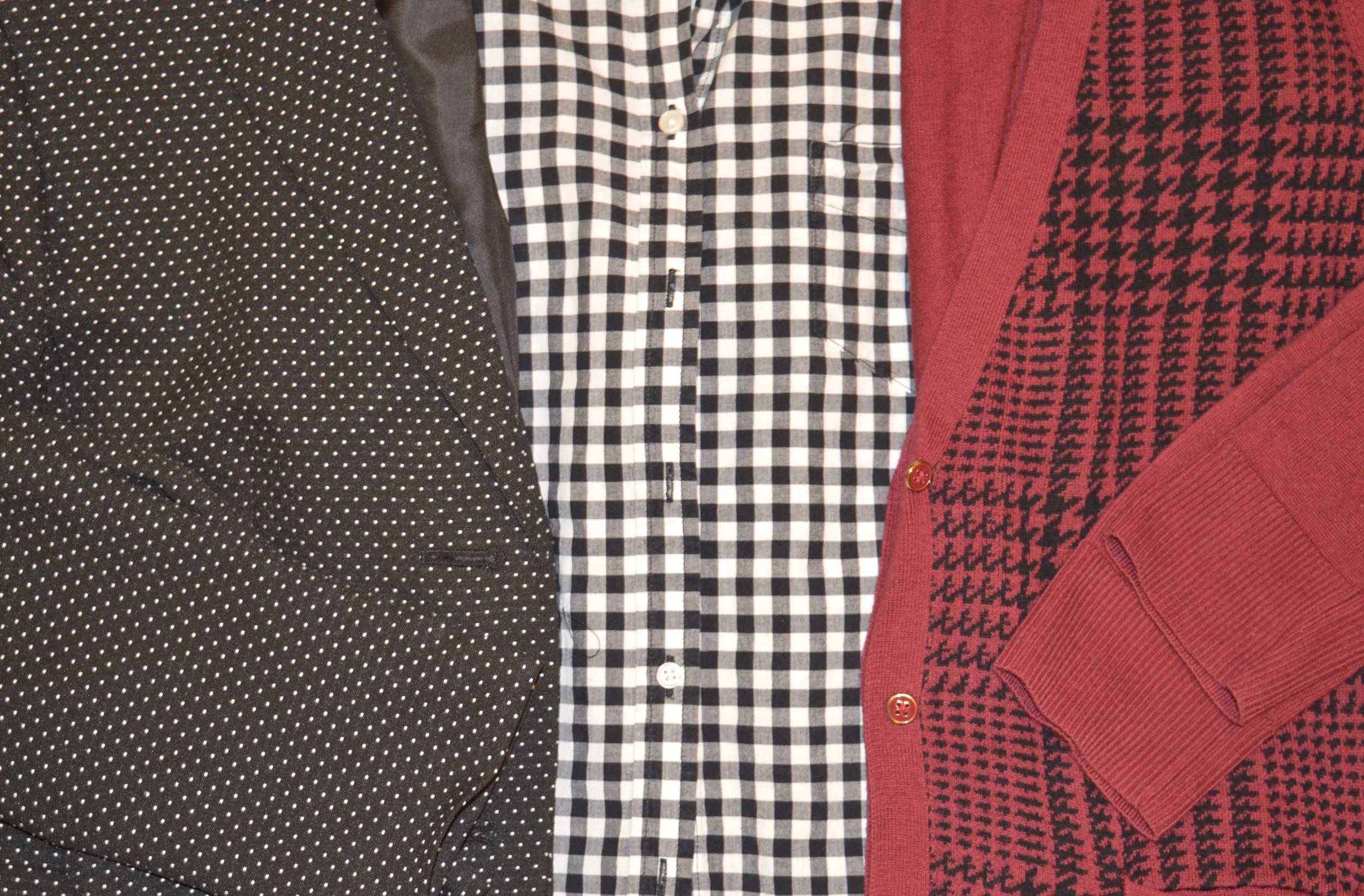
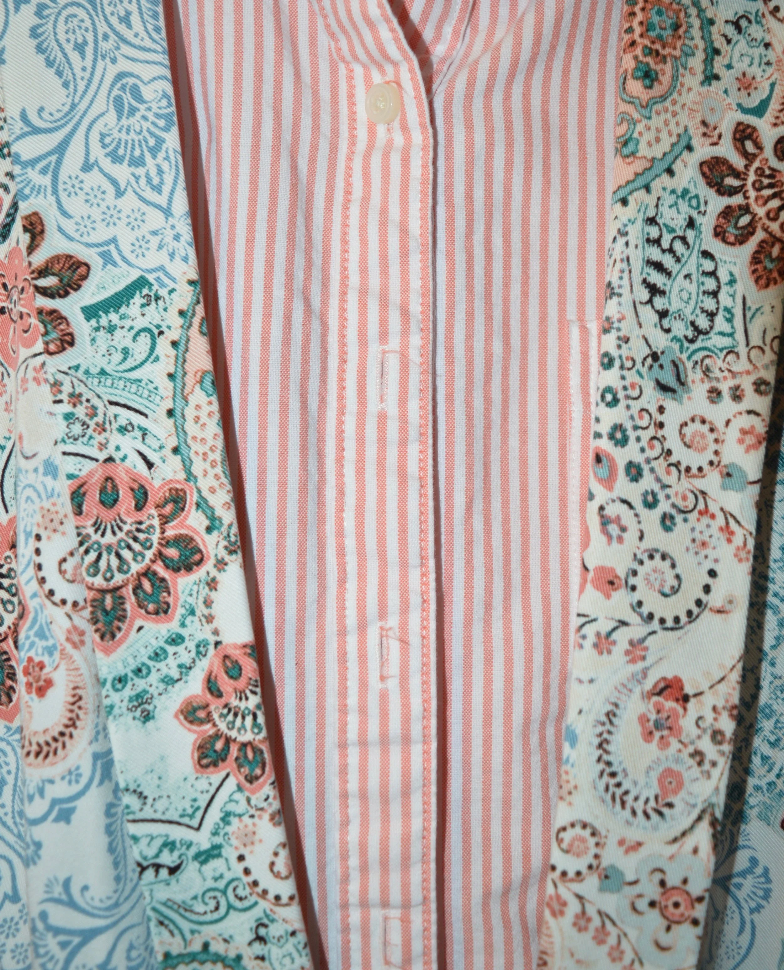
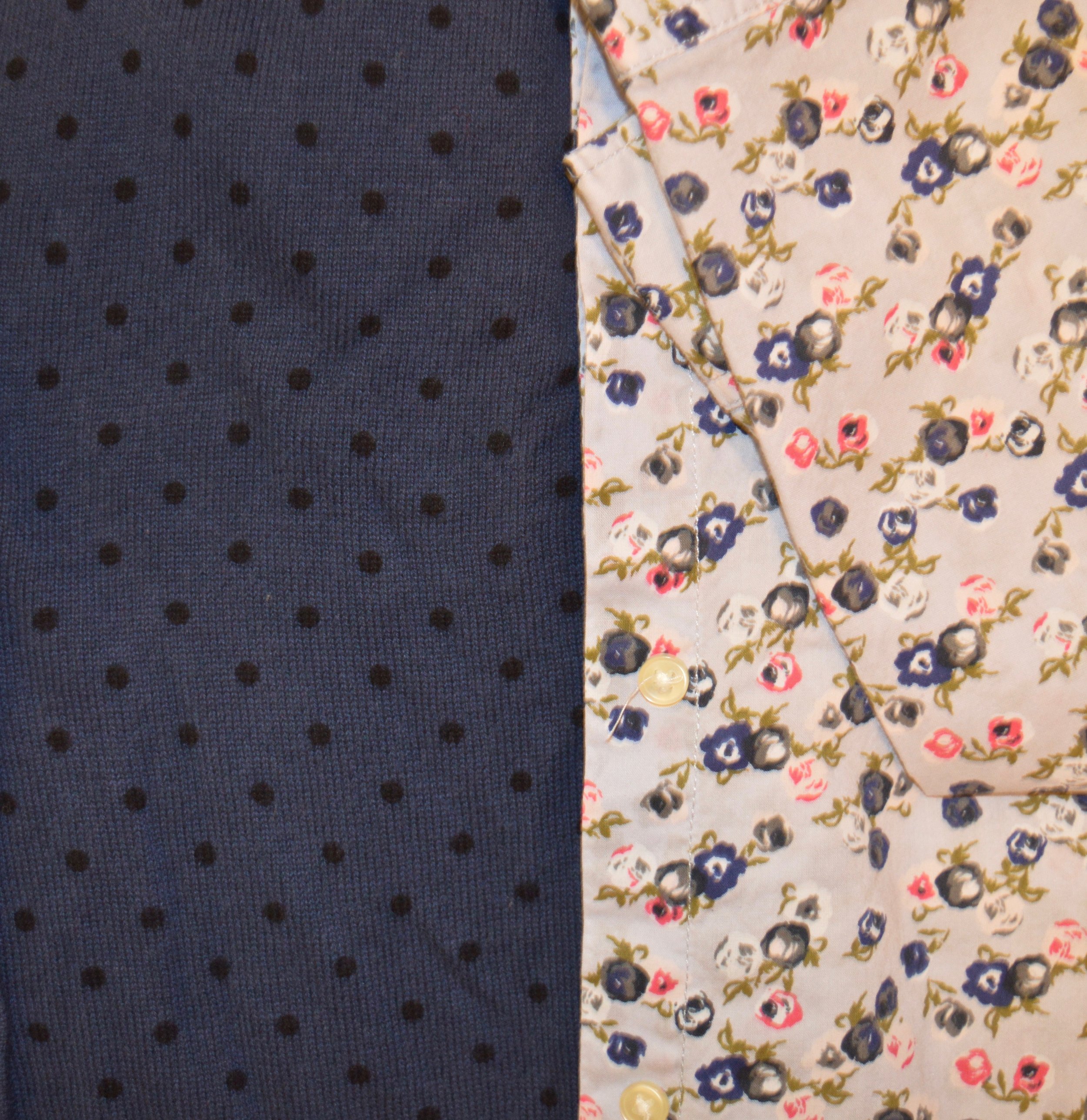
3 - The one other pattern that is easily mixed , besides stripes or gingham is polka dots. Polka dots show up here and there in fashion trends, but I find, like stripes and gingham, polka dots are classic and timeless.
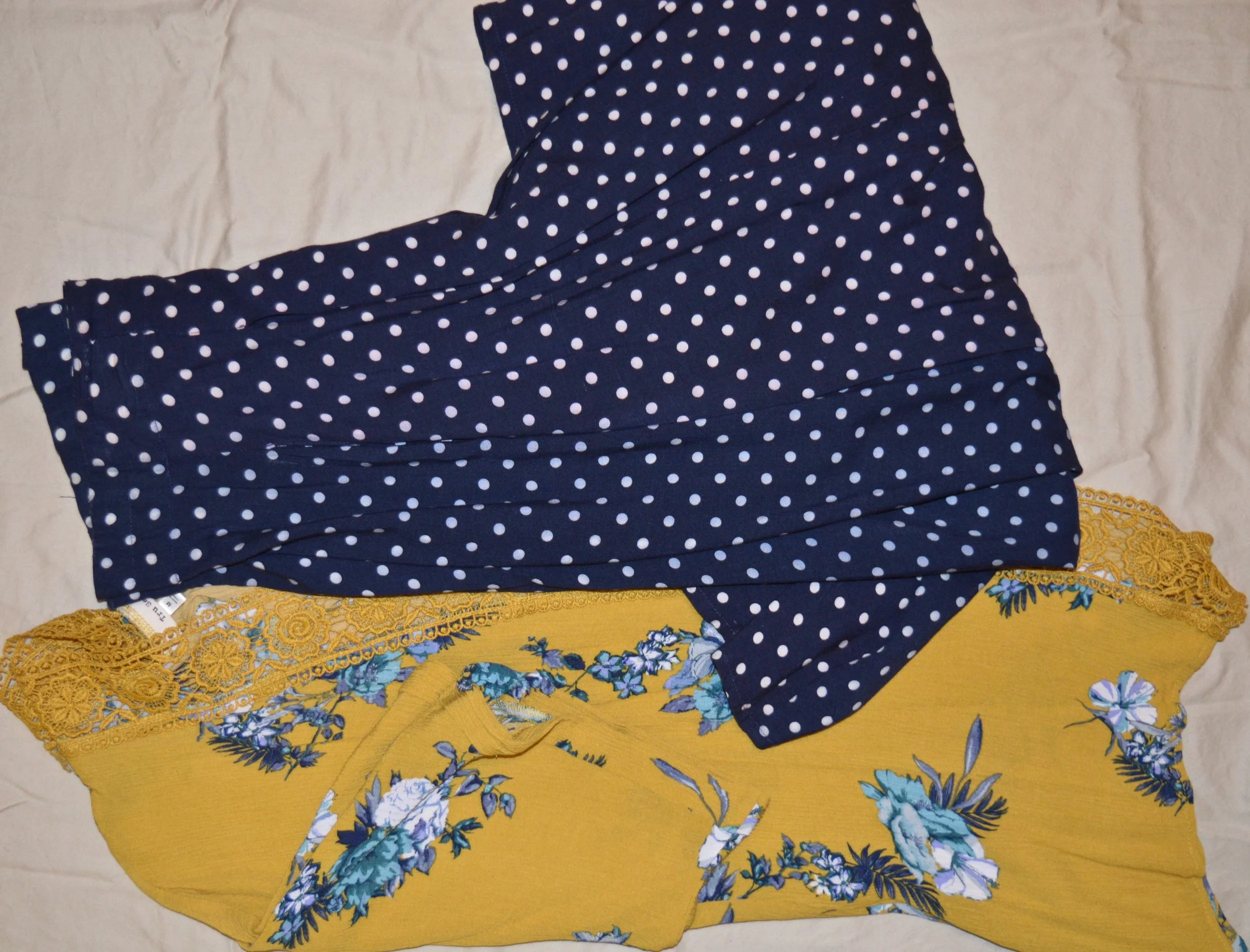
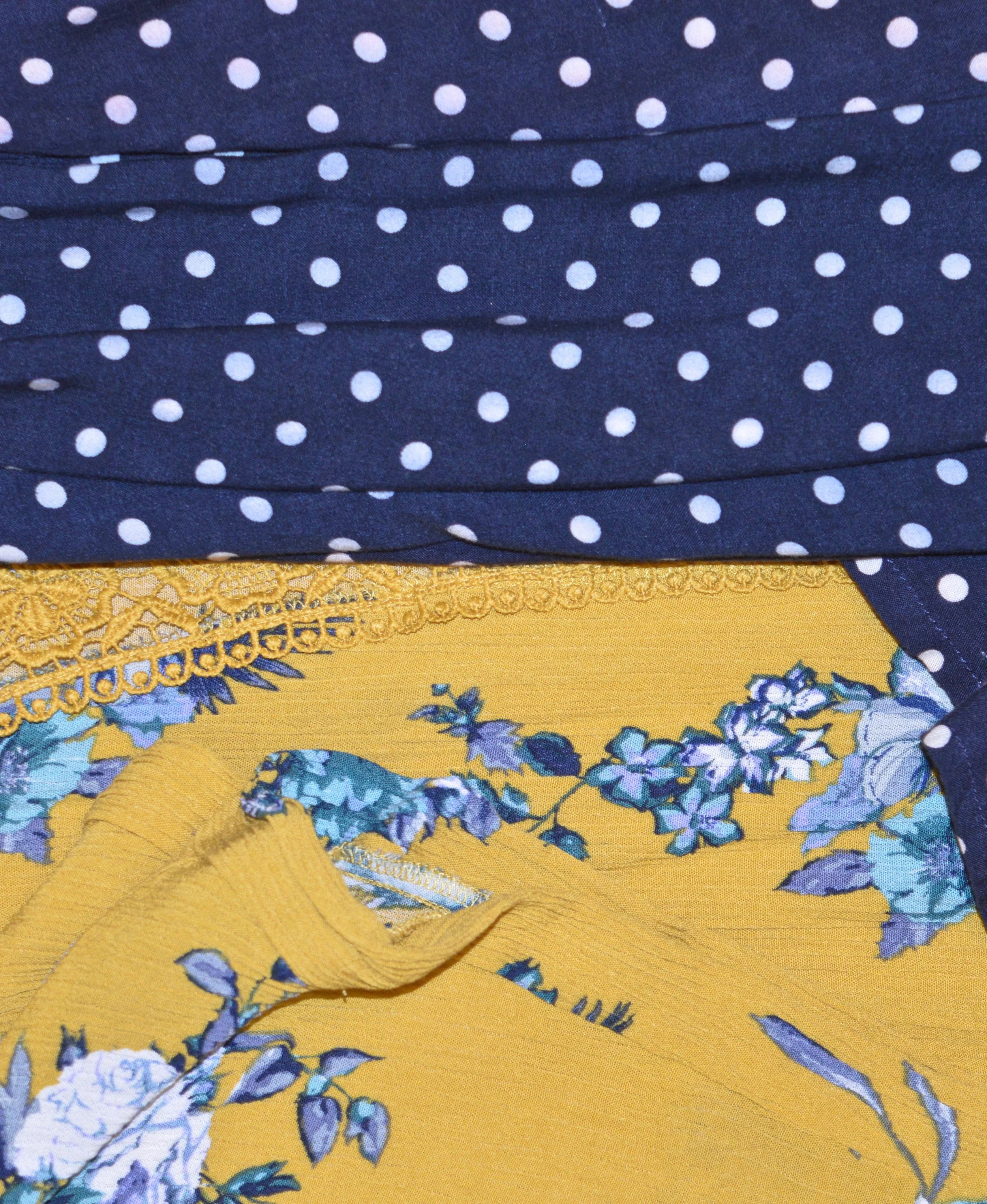
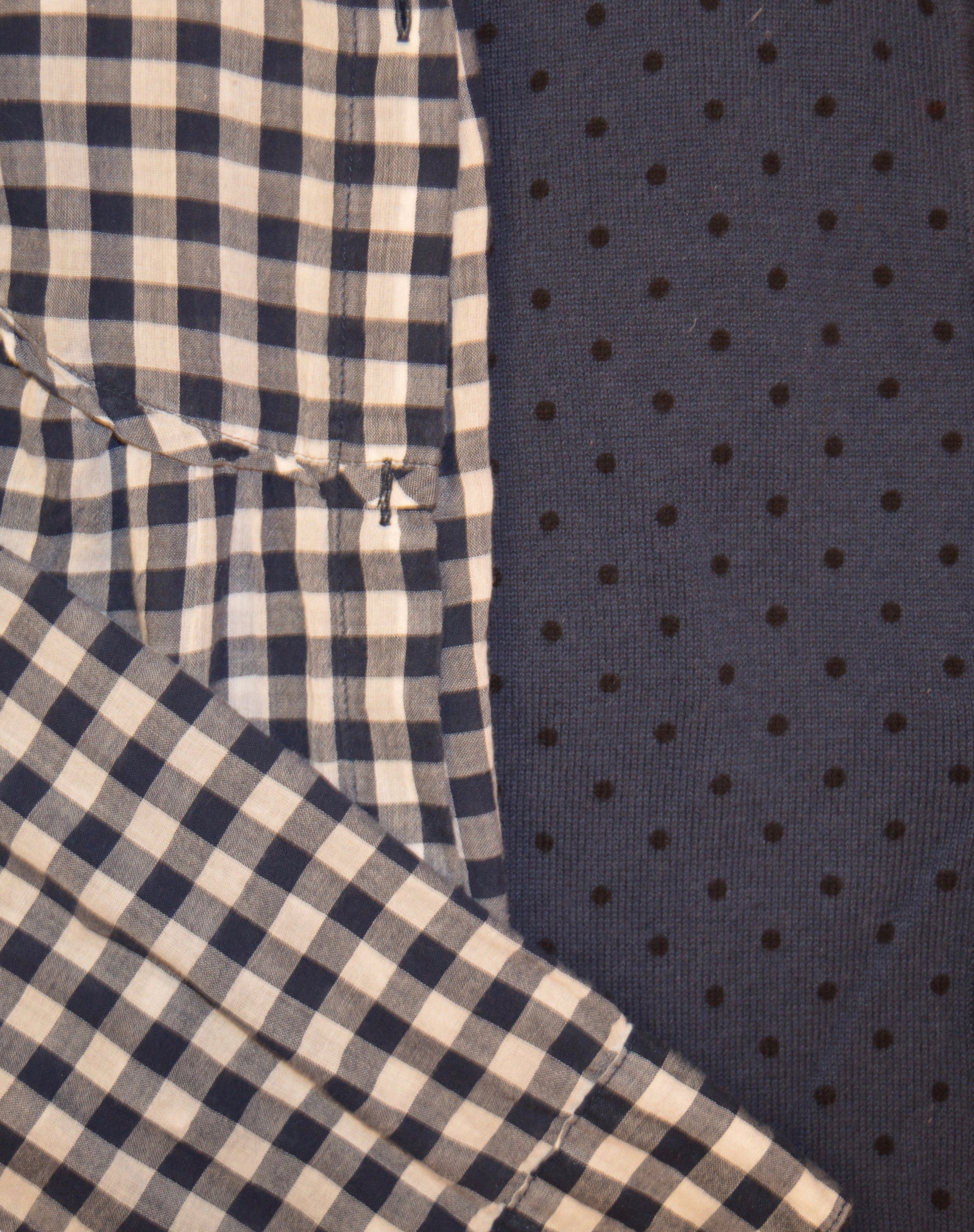
Stripes, gingham and polka dots can be easily mixed with other prints, partly because they are spatially consistent. Usually the stripes are the same distance apart, the squares are the same size and the dots are equally sized as well. If you are just starting to mix prints, look for pieces in your wardrobe or at the store that have those characteristics.
Next find pieces with coordinating colors.
You probably noticed that in the photos above, not all the print mixes have similar color schemes, but for an easier time of print mixing once you choose your foundational print find other pieces in your closet that have similar colors. For instance, the striped yellow tee that I chose above pulls in the yellow leaves on the floral kimono. The coral striped blouse coordinates with the coral colors in the jacket and the navy polka dot cardigan is a natural compliment for the navy gingham or floral blouses.
Here is another example.
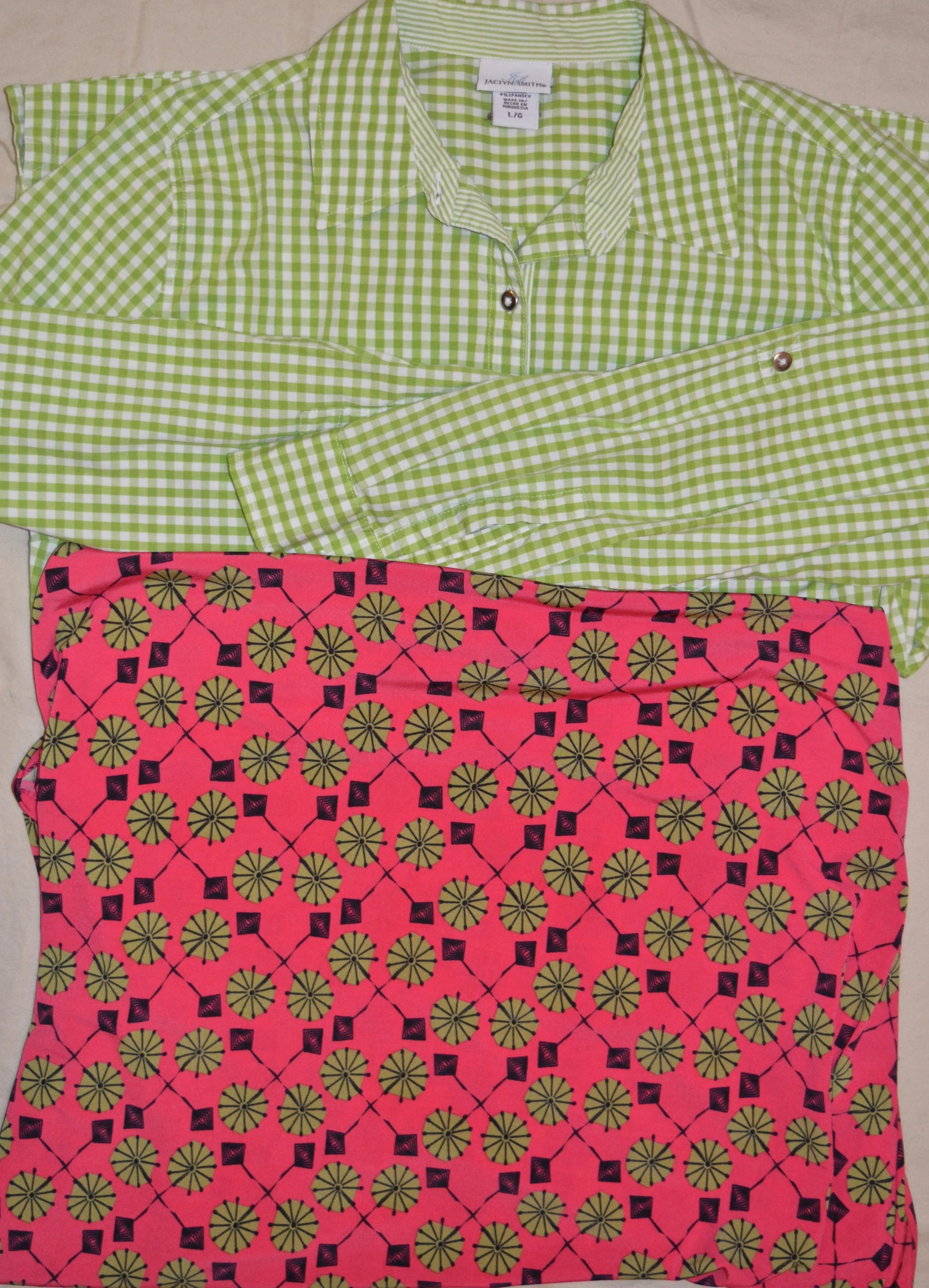
I got these two pieces at completely different times. The Jaclyn Smith gingham top was thrifted and the skirt is from LuLaRoe. Matching the green in each piece make it a perfect print mixing combination. You could have also used the black gingham top that was shown above. I hope to include this in my series of outfits over the next few weeks.
This might seem overwhelming at first, but read on for another tip.
Try choosing pieces that have the small/large print ratio.
One of the other techniques for making a perfect print mix outfit is to pair a small pattern with a large pattern. This is especially helpful if you are choosing pieces that include a skirt or pants with a top or jacket. In the previous picture I used the smaller gingham pattern with the larger pattern of the skirt. This is also a good way to mix outfits that are monochrome in appearance. Here is another example.

This combination would be great with a black pullover tee or sweater, silver jewelry, and then a brighter color for shoes and a bag, like yellow, or red.
Using the small/large print ratio as well as choosing pieces that have at least one coordinating color will take you a long way to creating outfits that are not only spot on in the print mixing realm, but outfits that you can be proud of because you created them yourself.
Walk on the wild side.
Once you get the hang of print mixing you might want to venture out into combinations that are a little more bold. This is the one I came up with.

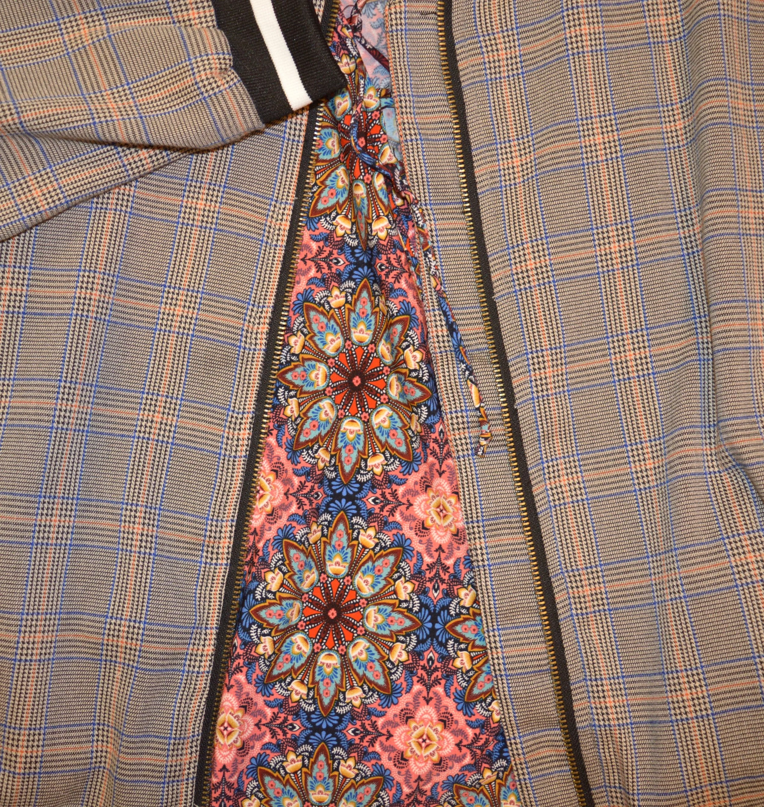
I recently acquired this plaid bomber jacket at Eden, a local boutique. I featured their Sylvania location on the blog a few months ago. You can see that post here. I love the colors that make up the plaid and the bright black and white stripes on the collar and cuffs. When I was going through my closet and came across this tunic, I thought I would see how the two pieces worked together. This is a perfect example of using the print mixing tips to create a unique looking outfit.
The plaid represents the foundational piece. Plaid, in this case is the more subtle print. After choosing the jacket, I looked for a piece that had at least one of the colors in the jacket. When I saw that this tunic contained all the colors, I thought, why not. The more subtle plaid, tones down the busy pattern of the tunic and all of it is pulled together by pairing it with the bright blue pants. I hope to feature this outfit in my series as well.
I hope this post will help you find your own love of print mixing. It takes practice, but over time you can be a print mixing whiz, just by following these tips and by not being afraid to give it a try.
What print combinations do you like to see put together? Are you a print mixing diva, or is it a trend you have shied away from? Did you find this post helpful? I’d love to hear your thoughts.
I hope you have a great weekend.