
Color Crash Course - Blush and Pastel Orange
Color inspiration can come from anywhere. I love the bold greens of new plants and bright blues of summer skies. I also have many fond memories of childhood trips to the corner store for candy, bubble gum and popsicles. All of these things, not only evoke memories, but also provide a spring board for fashion creativity. As with any visual creative venture, whether drawing, painting, photography, working with ceramics or fabric, color plays a part in our designs. Have you ever looked at a painting and wondered, "What were they thinking?" Have you ever thought that about a person's outfit? I've had that thought about pieces that I have brought home from the store that lay dormant in my closet, until some such time as I pull it out and that bell goes off. "What was I thinking?"
Intentionality is as important to outfits as it is to a painting, a story or a musical composition. I want what I wear to mean something, even if it is as simple as saying, "I feel attractive in this." Sure there is a time for improvisation, just like in jazz, a time to just throw on that comfy pair of jeans, a cute graphic tee and those fun sneakers and just wander around town, with no real intention at all.
I think we can be intentional about the colors we choose in our outfits as well. My outfit today revolves around two colors that we often associate with summer, blush and pastel orange.
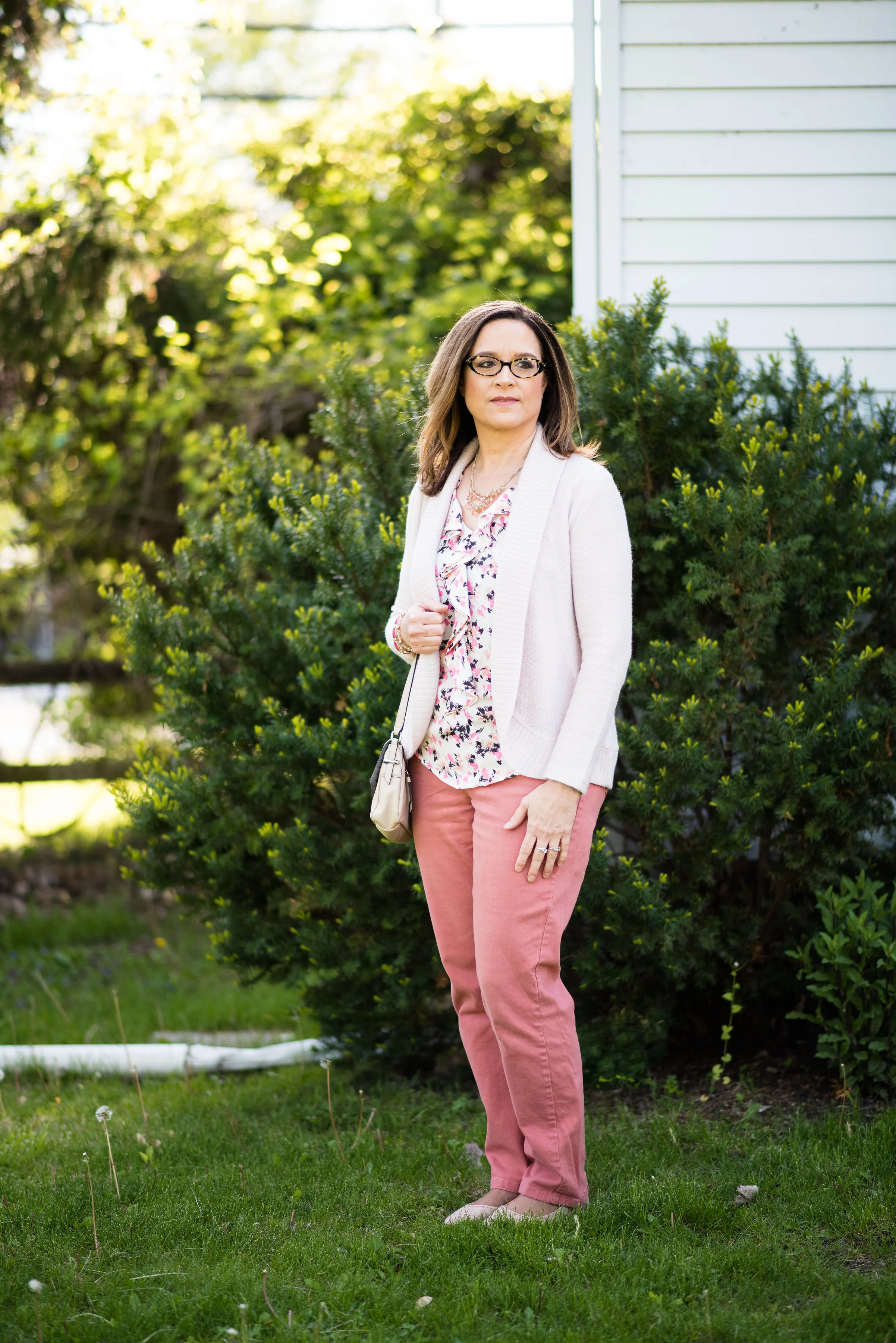
I wore this outfit to work, one of my last days there. It was a cool day, thus the sweater. What inspired me to pull this outfit together was the top.

Have you ever had one of those mornings where you just don't know what to wear? Instead of pulling out the bottoms first, pick a printed top, then chose all your other pieces, including your accessories to compliment the top. In this case, this sleeveless top with a ruffle down the front heralds hues of pink, blush, orange and black all on a white background. I pulled out my blush sweater, bag and flats to go with the lighter pink. I added my pastel orange pants to emphasize the light orange and I added just a pop of Pink Yarrow for one of my accessories.
This works great for planning a weekend getaway. Pick your favorite printed bag or scarf and build all of your outfits around it. If you are like me, the disadvantage of having a bulging closet is having too many choices. Building an outfit around a top, a scarf or a bag limits the options. See my posts on styling an outfit around a bag, here and here.
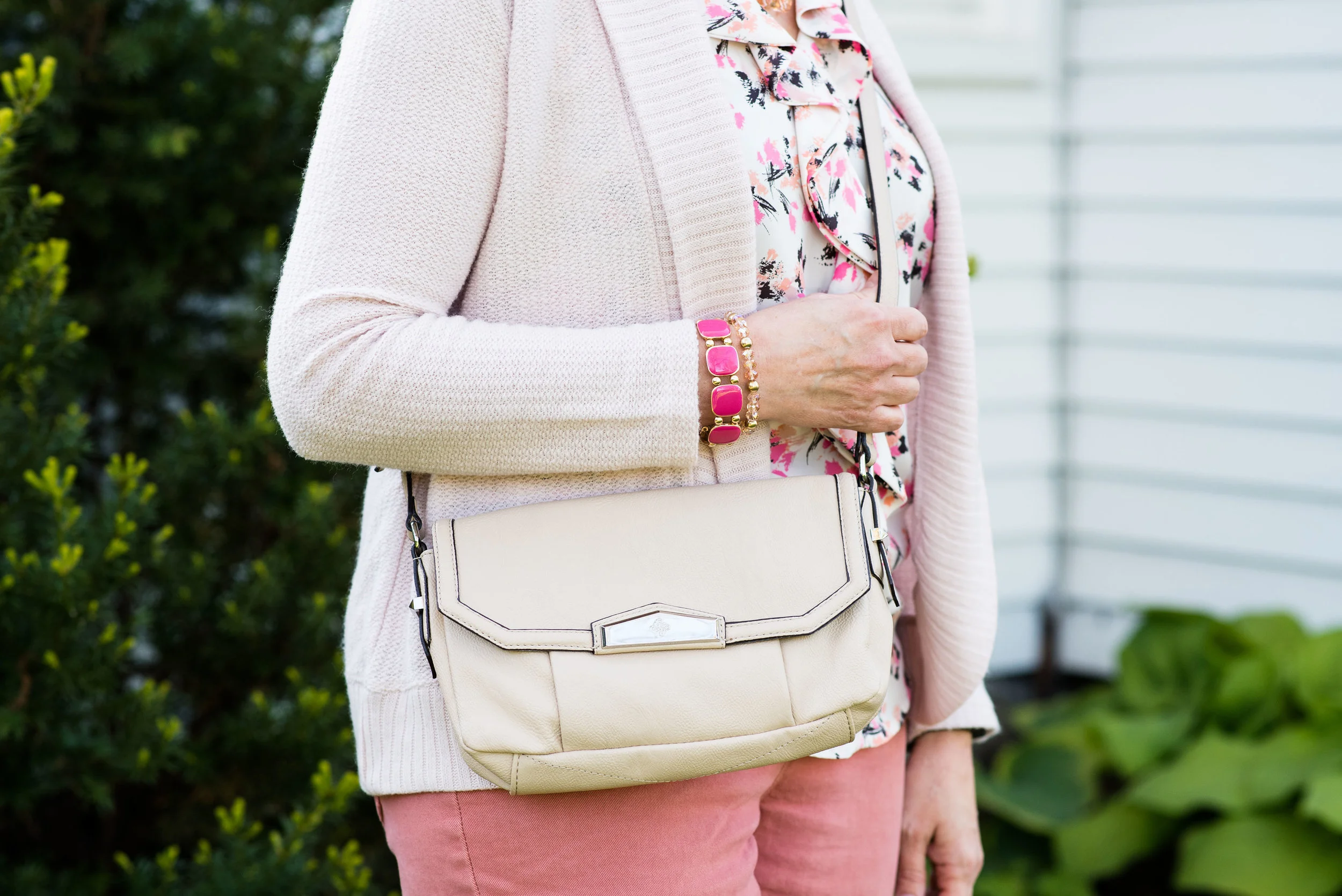
Both the sweater and bag are from a thrift store. I don't know the brand of the sweater as, the tag was torn out, but I like its ribbed shawl type collar, open front and waffle weave. Here is a cute option from H&M. The cross body bag is a Vera Wang. Here is a more pinky version from Kohl's. I love to use a cross body bag when I shop. It let's me have both hands free to peruse the merchandise! Thus my bulging closet! Ha, ha.
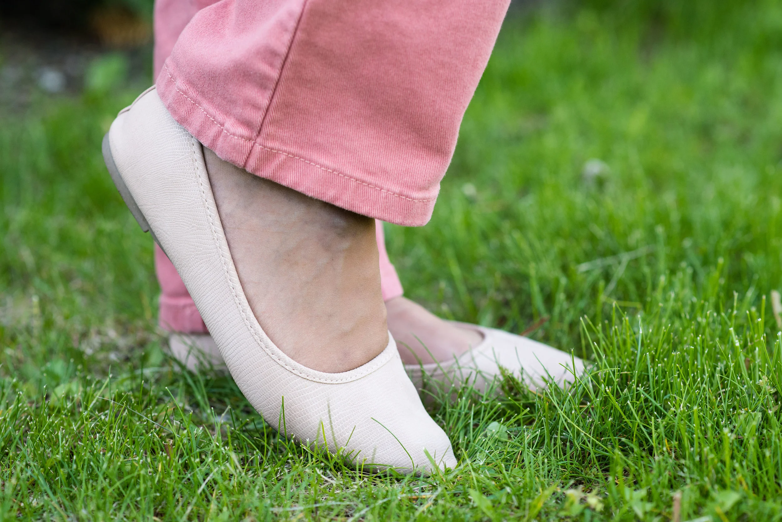
I picked up these SO flats from Kohl's this year. They are cute, comfy and were very reasonably priced. I have already worn them a number of times. They are on sale for $17.99 right now and come in a variety of colors. Now that I looked at them again, I am thinking I may want another pair. The floral ones are both cute and so are the light blue!


I hope you enjoyed this month's Color Crash Course column and I hope it will inspire you to think more about the colors you choose for your outfits. Any color combination can work. It is just a matter of intentionality.
Have a great weekend and thanks for stopping by the blog!
Photo credit Rebecca Trumbull. Make up Rachel Christensen.
Friday linking up with Nancy of Nancy's Fashion Style, and JoLynn Shane in the Fashion Friday link up.