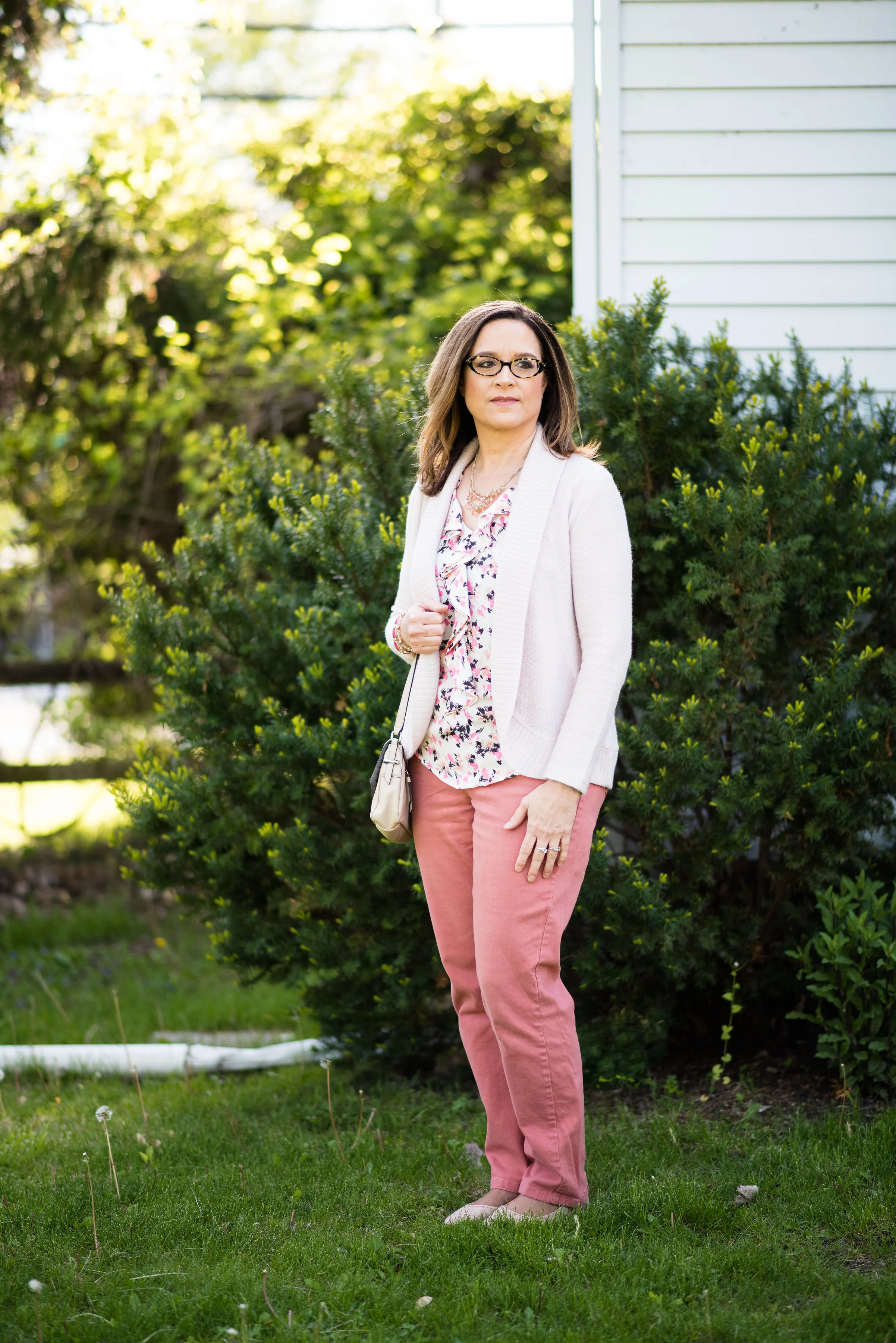
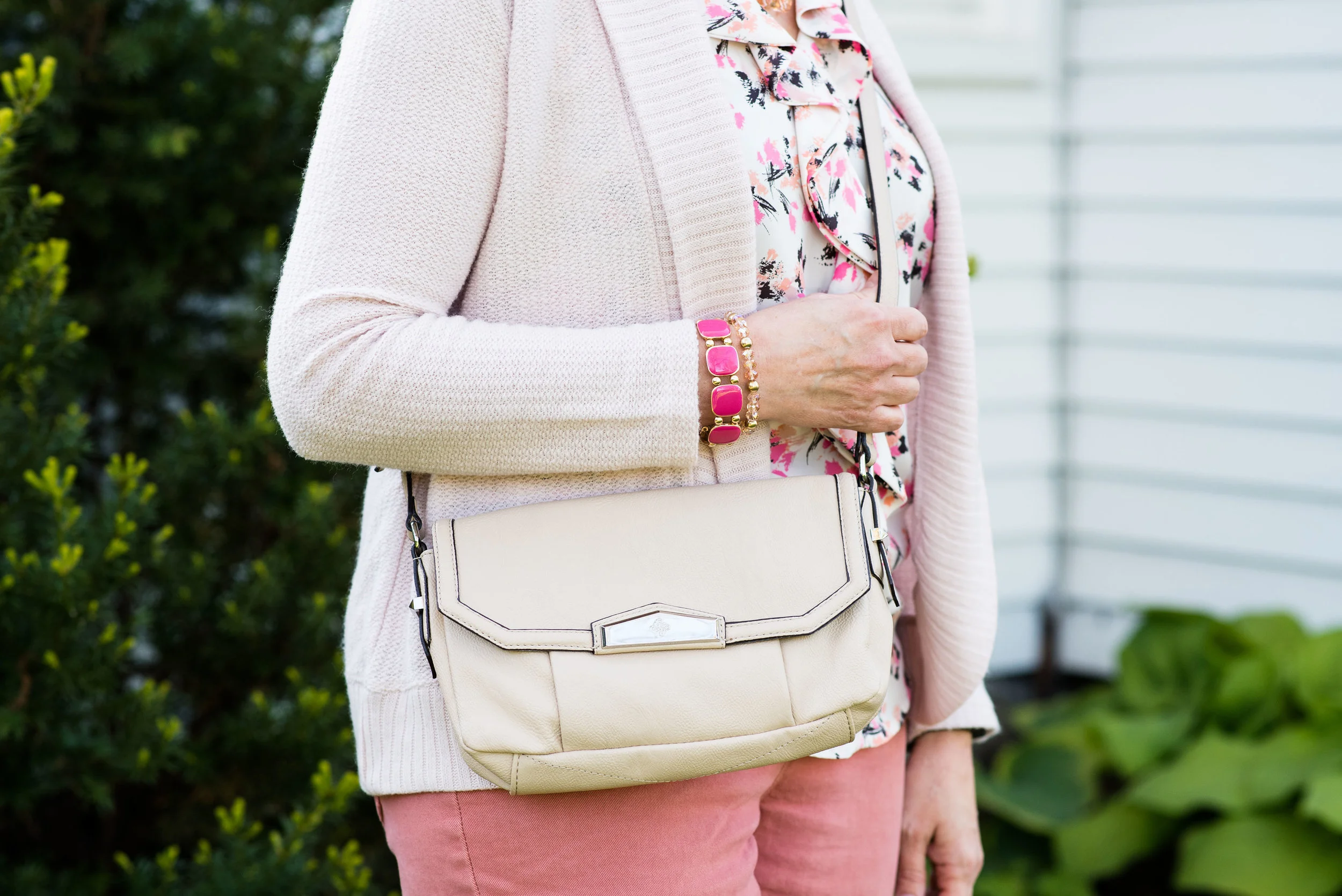
Denim Daze 2.0 - Vest - Casual
During the summer of my first year blogging, I did a series called Denim Daze. During this series, I featured different denim pieces and showed you how I styled them both in a casual way and a dressy way. I’ve decided to reboot this series using different denim pieces and giving each outfit a full post, so one day for the casual look and one day for the dressy look. You can see the original Denim Daze posts by clicking on the following links: Intro, Bermuda Shorts, Chambray Shirt, Knee Length Skirt, Flared Jeans, and the Denim Jacket.
For this series I am starting with a denim vest. You have seen this Christopher and Banks denim vest on the blog before, with a maxi skirt, a pair of olive crop pants, in a Pantone outfit, and in a holiday outfit. It is one I return to again and again.
I thought it would be fun to give you the rationale behind each of the pieces I have chosen for this series, and why I styled them the way I did. This vest has several characteristics that I love.
1 - The color. I love denim in all washes, but for a vest, jacket or top, I often go for a medium wash. I’ve seen denim vests in light, medium and dark washes, but for me the medium wash seems to be easier to style with a lot of different options as far as colors, textures and patterns.
2 - The fit. I have a variety of vests. Many of them are knit with cascading fronts, or puffy for when the weather cools down. For a denim vest I like a more fitted profile. This one is pieced together with panels, rather than being one whole piece in the back or sides. These seams and the panels give a more fitted silhouette.
3 - The bling. What takes this simple denim vest up a notch is the bling. The sparkly studs on the yoke are the perfect compliment and make it quite simple to dress this cutie up or down.
The next piece I chose for this outfit was the thrifted floral tee. I knew I wanted to jazz up the outfit with a print and with some color. There is a little bit of blue in the top that matches the denim blue of the vest perfectly. I just love the cohesiveness of at least something matching in an outfit.
Once I picked out the top, I immediately thought of these jeans, which I have worn on the blog before as well. These thrifted Gloria Vanderbilt jeans are fun with their bright pinky red vibe and of course, the polka dots. They also match the shirt.
The tee, honestly, became the driving force in picking out the rest of this bright, casual outfit. I had blue and pinky red, the last color I wanted to accent was the green, thus the jewelry and the bag.
If you have a hard time putting outfits together, it is often easier to pick a piece with a few different colors in it and then use those to guide you to your next pieces. You can use a floral top like I did, a printed scarf or even a bag with multiple colors. Once you choose that piece, then find a skirt or pair of pants that comes in one of the other others, then a top or scarf, etc. Even your jewelry can be part of the color combination. When you are done, you will have an outfit that is cohesive and looks fantastic. For those of you who like to follow a recipe when you cook this method of picking out an outfit will work especially well for you.
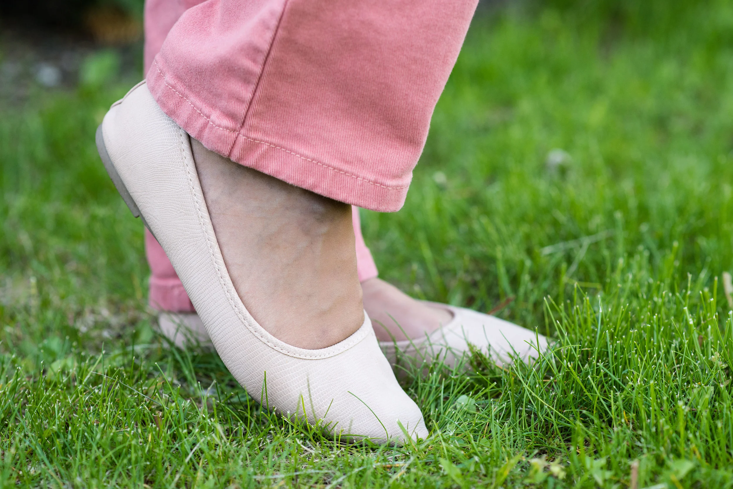
For shoes, I am sure you could have guessed, I chose my blue SO flats.
I like the bright, happy look of this outfit and I think it would be perfect for lunch or shopping with your girlfriends, or for me a casual date night with my husband. I would even wear an outfit like this to work.
What do you think of this outfit? Do you own a denim vest? Do you ever wear it? If not, why not? I hope this provided a bit of inspiration for taking that denim vest out and putting it to work for you. Be sure to check back on Thursday for the dressed up version of this sparkly vest.
I’ve included a few shopping links. These are affiliate links. All opinions are my own.
Photo credit Rebecca Trumbull. Make up Rachel Christensen.


