
Pantone Autumn/Winter - 2019 - Chili Pepper and Bluestone
Before I get started showing the outfits I put together for this color series, let me refresh what the Pantone colors are. The Pantone Color Institute is an entity that provides color related solutions across the industry for designers of graphics, products and fashion. It is their color choices for seasons and color of the year that influence the fashion and interior design fields. You can read more on their About Page.
When I began blogging over three years ago, I decided to include the Pantone seasonal color series as a regular feature of my blog. Many bloggers share their favorites with you, but I like to really explore how each of these colors can be combined to make creative outfits that are both fashionable and reasonable financially as almost all of these colors are already in my wardrobe.
This season’s outfits turned out a bit differently than some of the specific colors due to shade variances on different computers, phones and so on. However, the point is not to get perfect matches, but to broaden our thinking about color over all. I ask myself questions like, “How can I combine these colors into one outfit? How can I take this color I am not fond of and use it? How can colors in an outfit make us feel happier, more put together and more confident?”
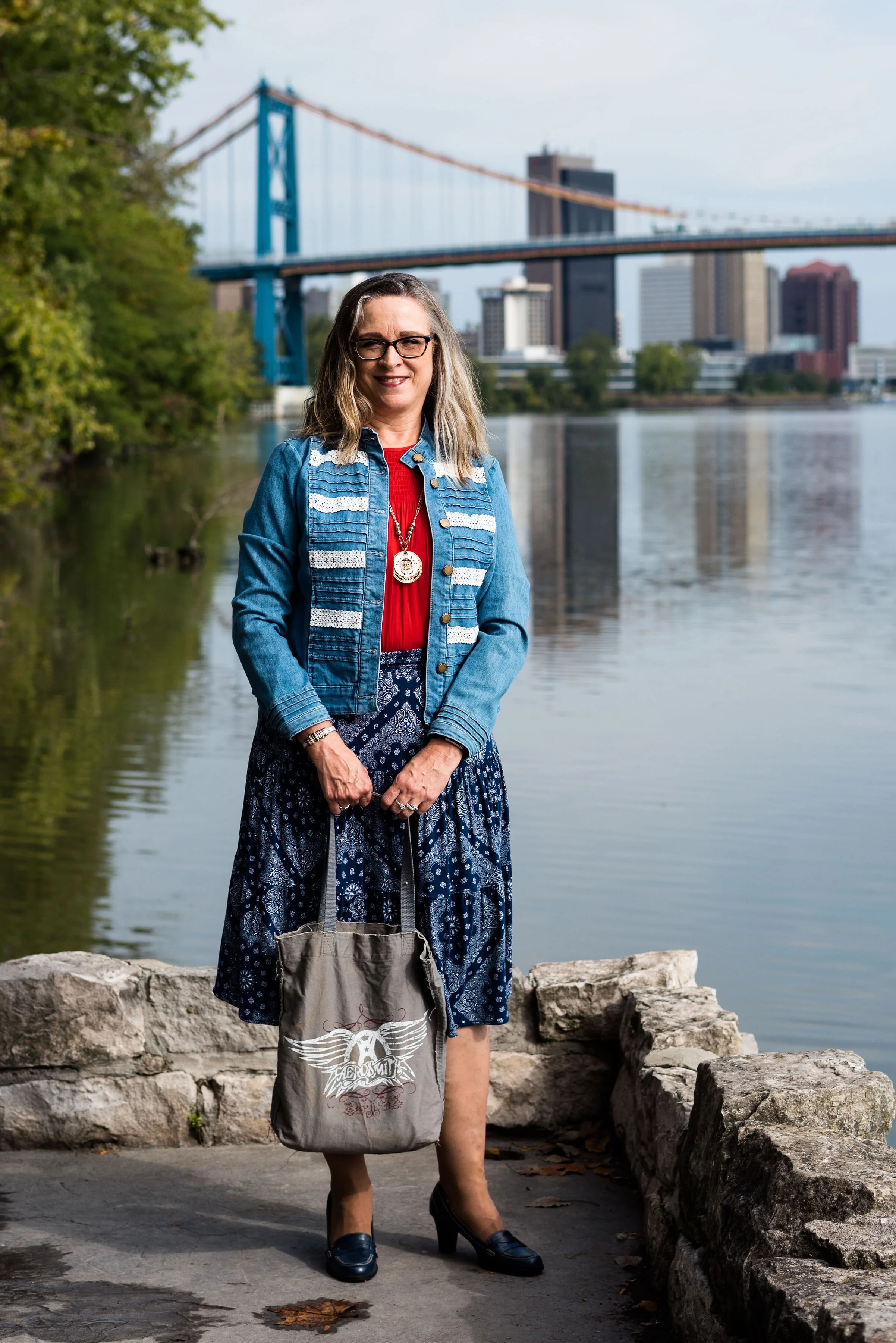
Today’s outfit combines a cool grayish blue with a spicy red. Meet Bluestone and Chili Pepper. The third color is from Panone’s Classics palette, which I have tried to incorporate into each outfit.
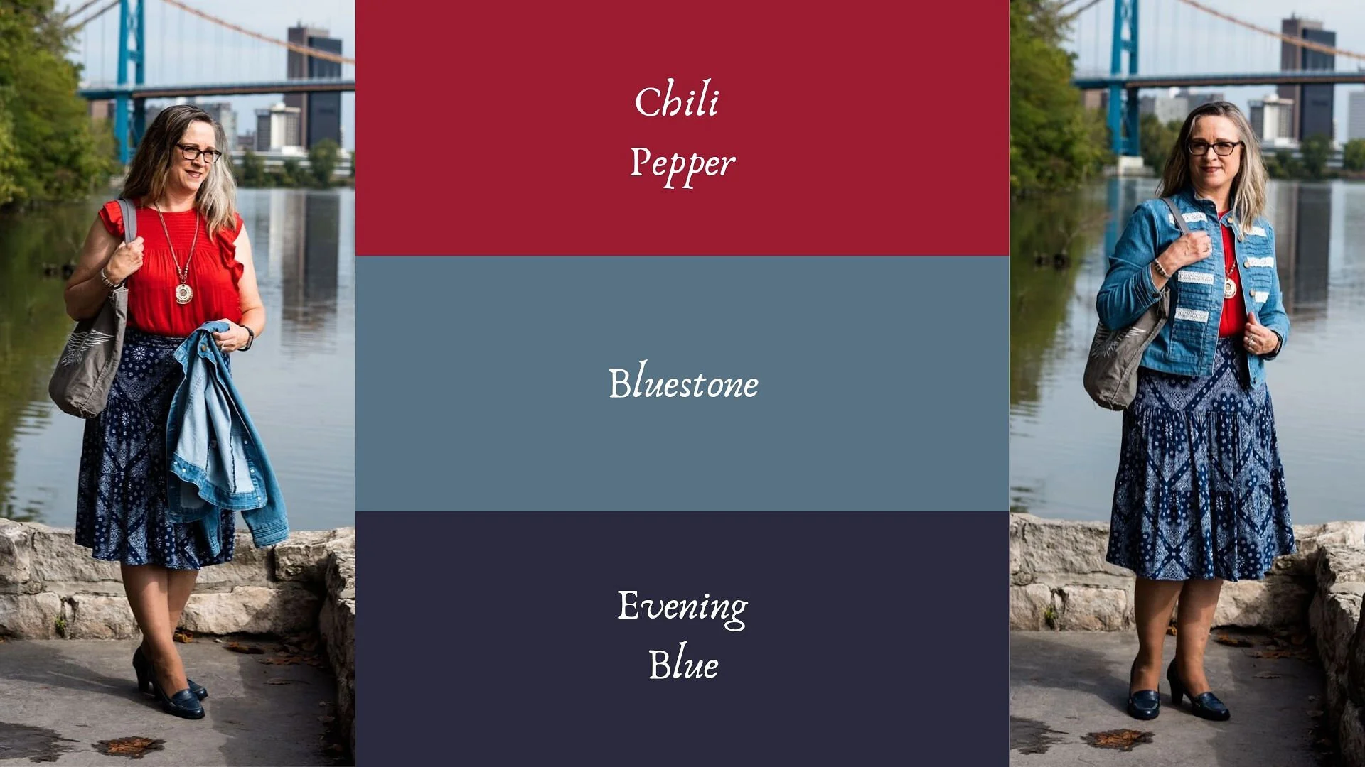
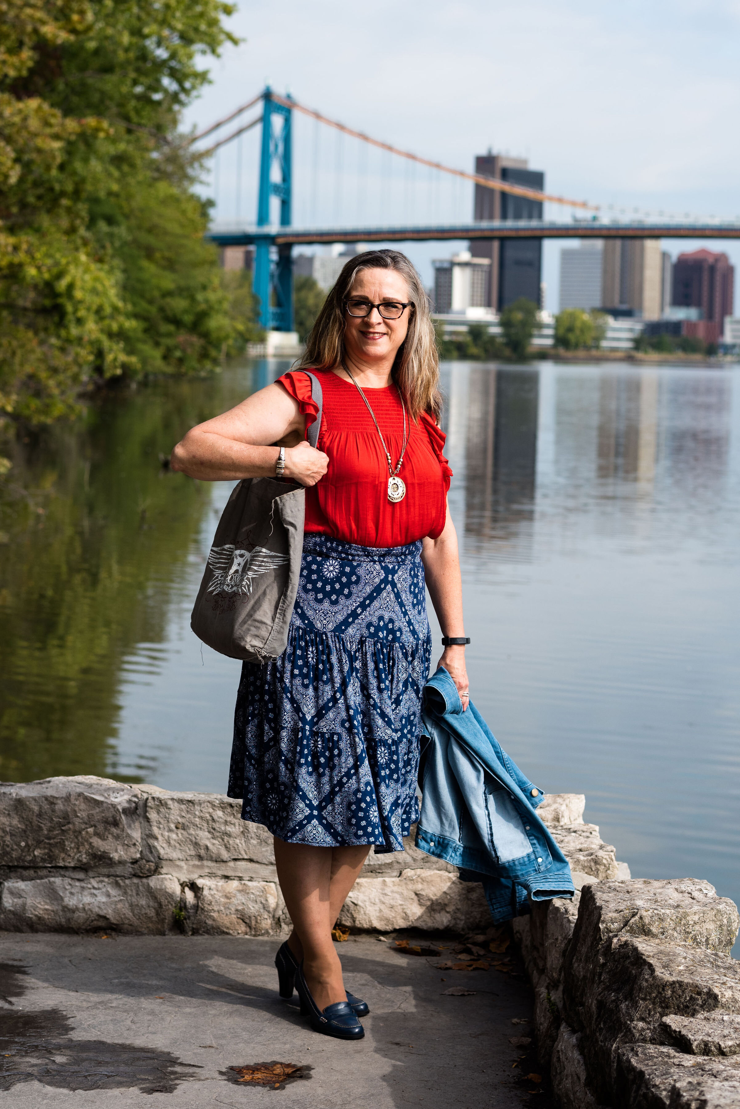
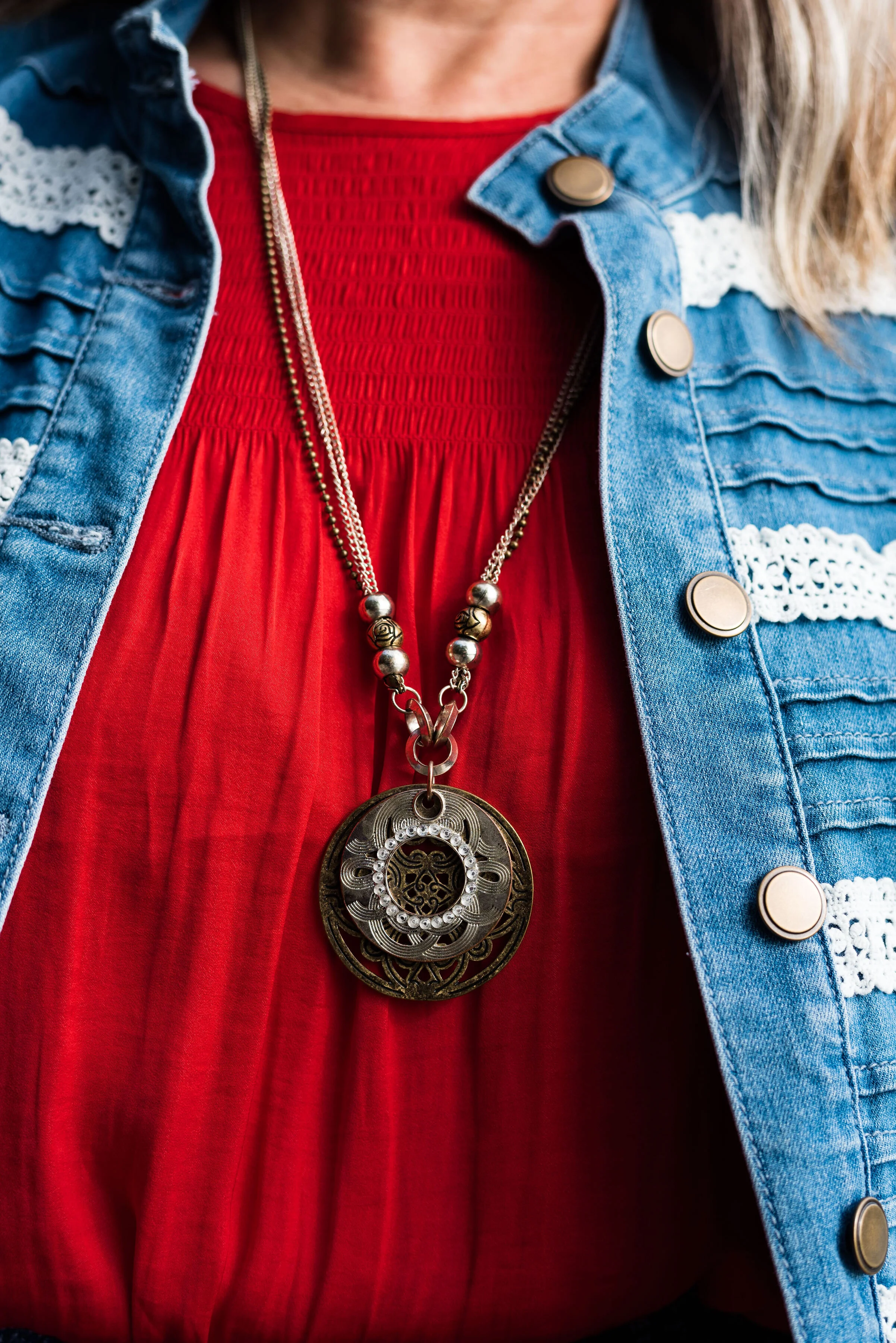
This bright red top is most definitely not the exact same red at Chili Pepper. It was rather strange. I have used my phone before to look at the colors when trying to pick things out of my closet and for some reason I really thought this red was good. However, I think I just wanted to wear this Popsugar top from Kohl’s again because it’s so cute. Ha, ha. I styled this same blouse last spring in another Pantone series. You can see that post here.
My denim jacket is from Christopher & Banks and isn’t exactly Bluestone either, but I was having trouble finding that exact color.
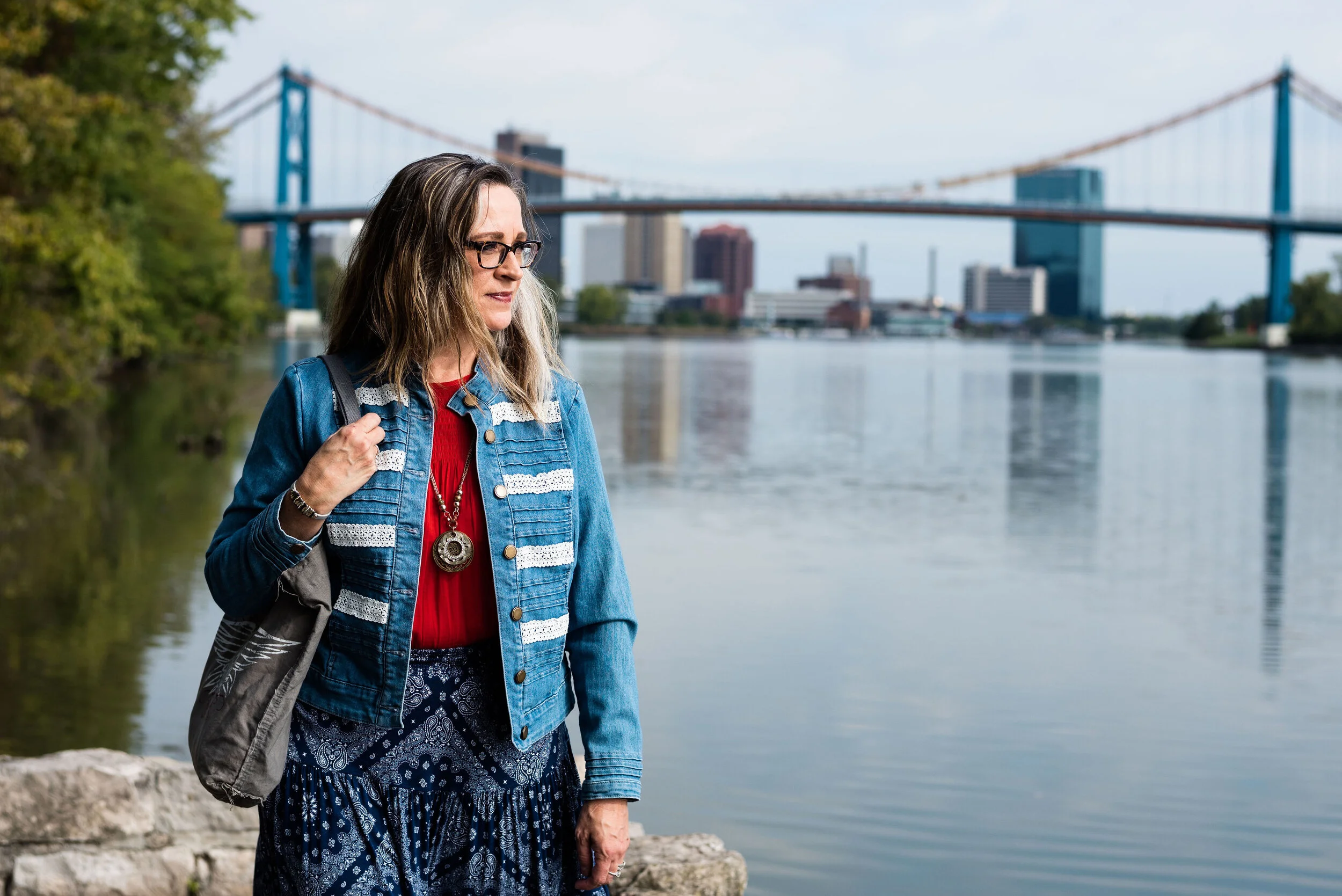
For these pictures we went to Middlegrounds Metropark in downtown Toledo. What a beautiful park right close to the downtown area of our city. I just love the urban chic vibe that these pictures have. I don’t do a lot in the city, but there is a lot more there than I realized. Unfortunately, I may get more familiar with it, as I got summoned for jury duty in October and the Common Pleas court is downtown. Ha, ha.
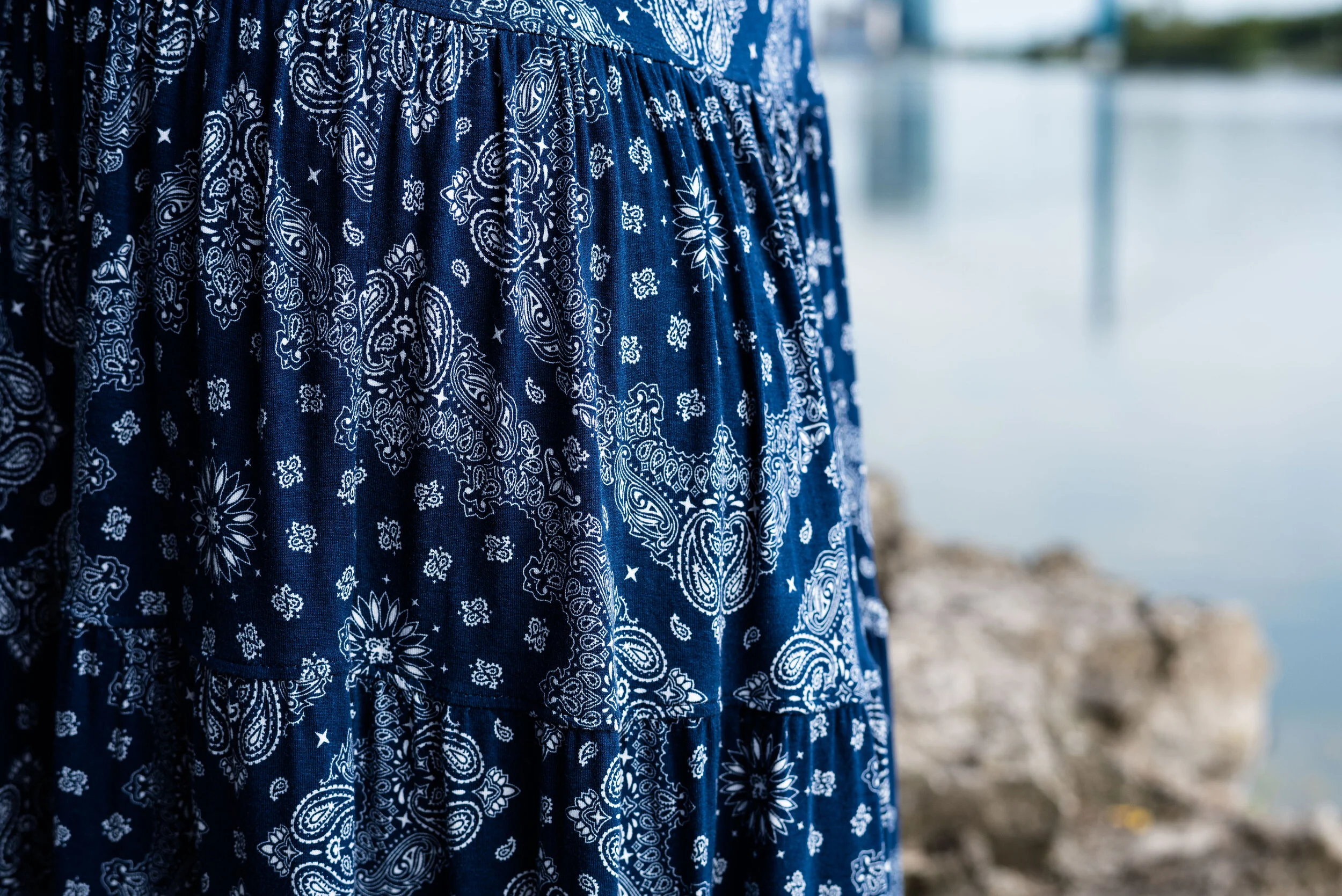
I decided to pair my top and jacket with my dark blue printed St. John’s Bay, skirt from JC Penney. I thought it matched well with the Pantone classics color Evening Blue. This is a fun, easy to wear skirt with a wide elastic waist, and tiered layers which gives it swing.
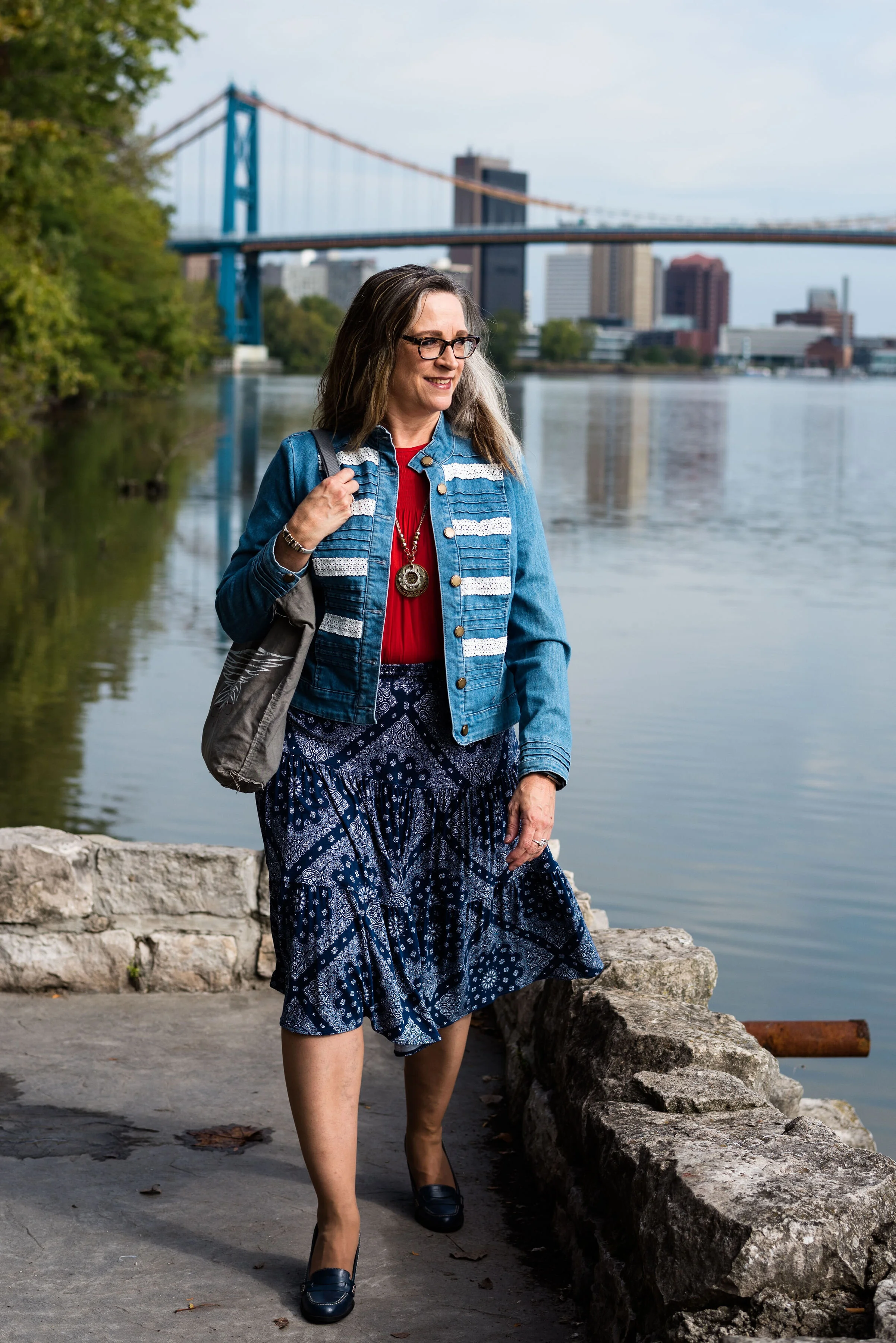
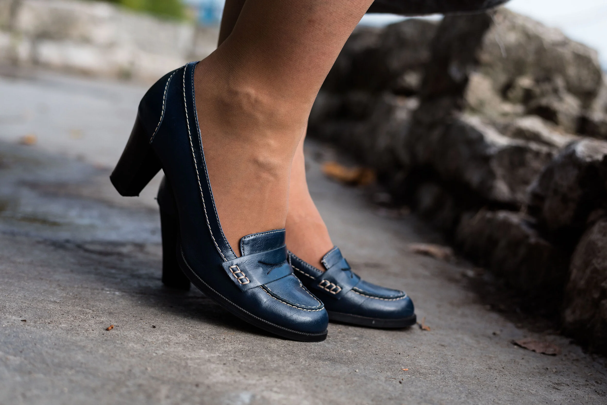
Since I had a lot going on in this outfit with prints and textures I wanted to keep my accessories fairly simple. My thrifted Relativity loafer heels are a go to for a look that is classy and work ready.
I thought this pendant necklace a good piece that makes its own statement with this outfit.
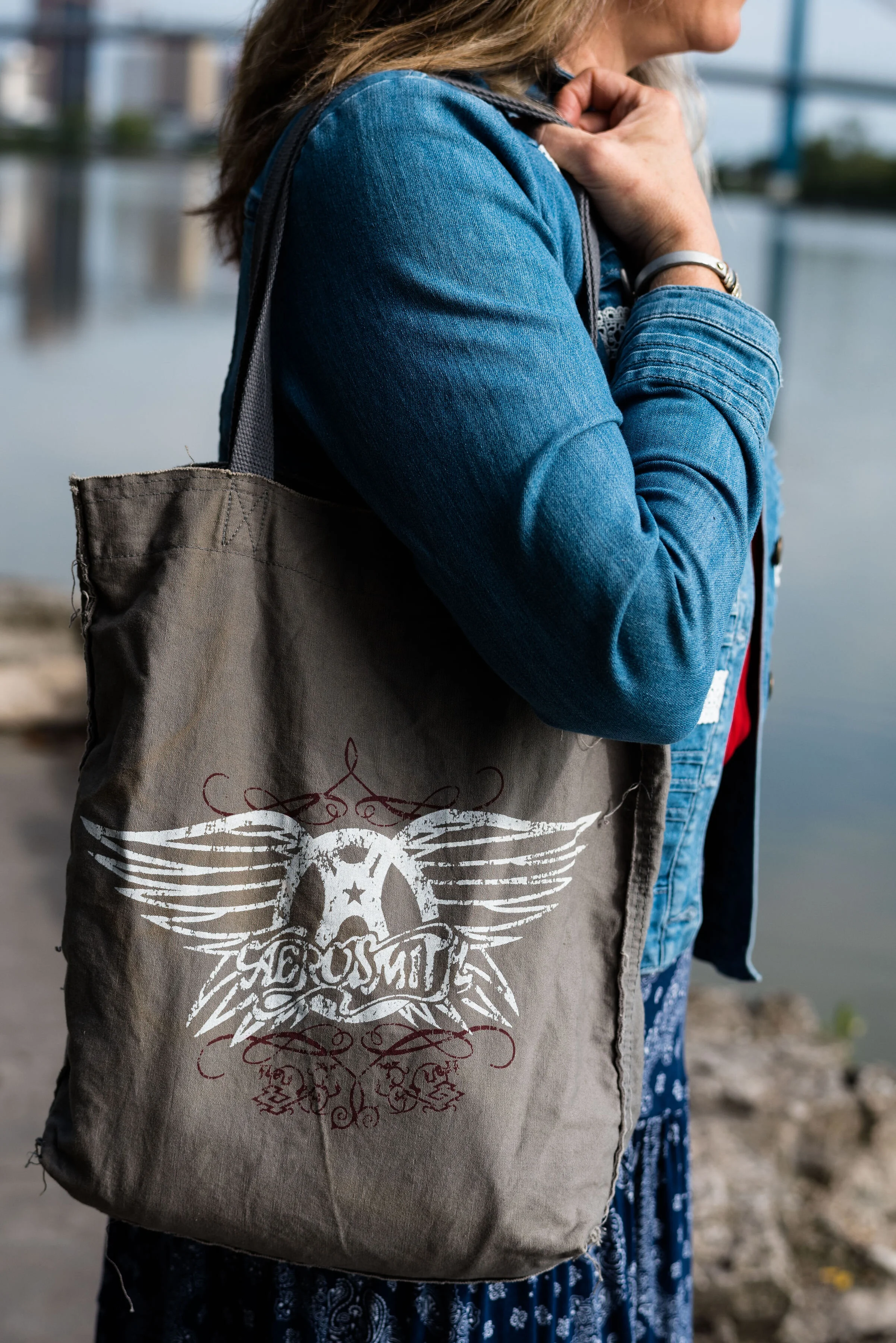
Adding this Aerosmith tote bag was my way to show off my inner rocker. Ha, ha.
What do you think of Chili Pepper and Bluestone? Do you have these colors in your closet? How would you wear these?
I’d love to hear your thoughts, so leave me some love in the comments.
I’m including a few shopping links to look at. These are affiliate links. All opinions are my own.
Photo and graphic credit, Rebecca Trumbull.