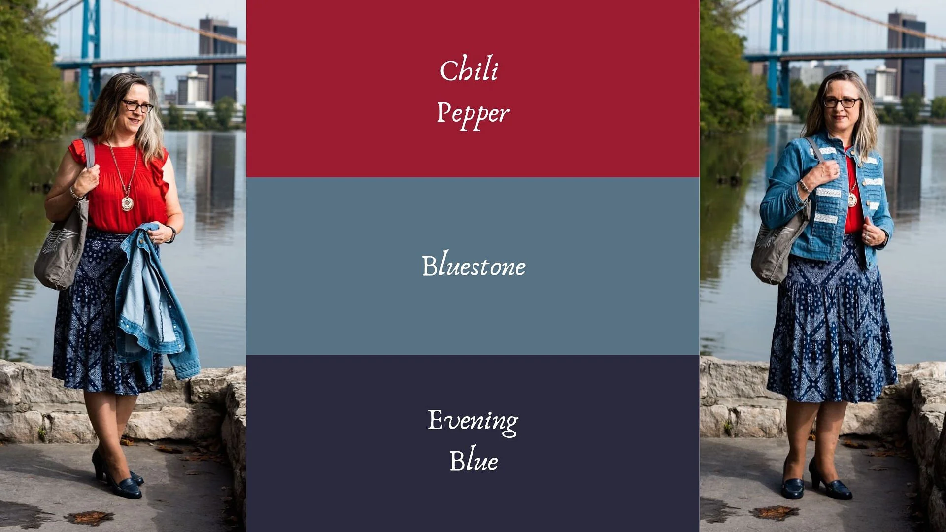
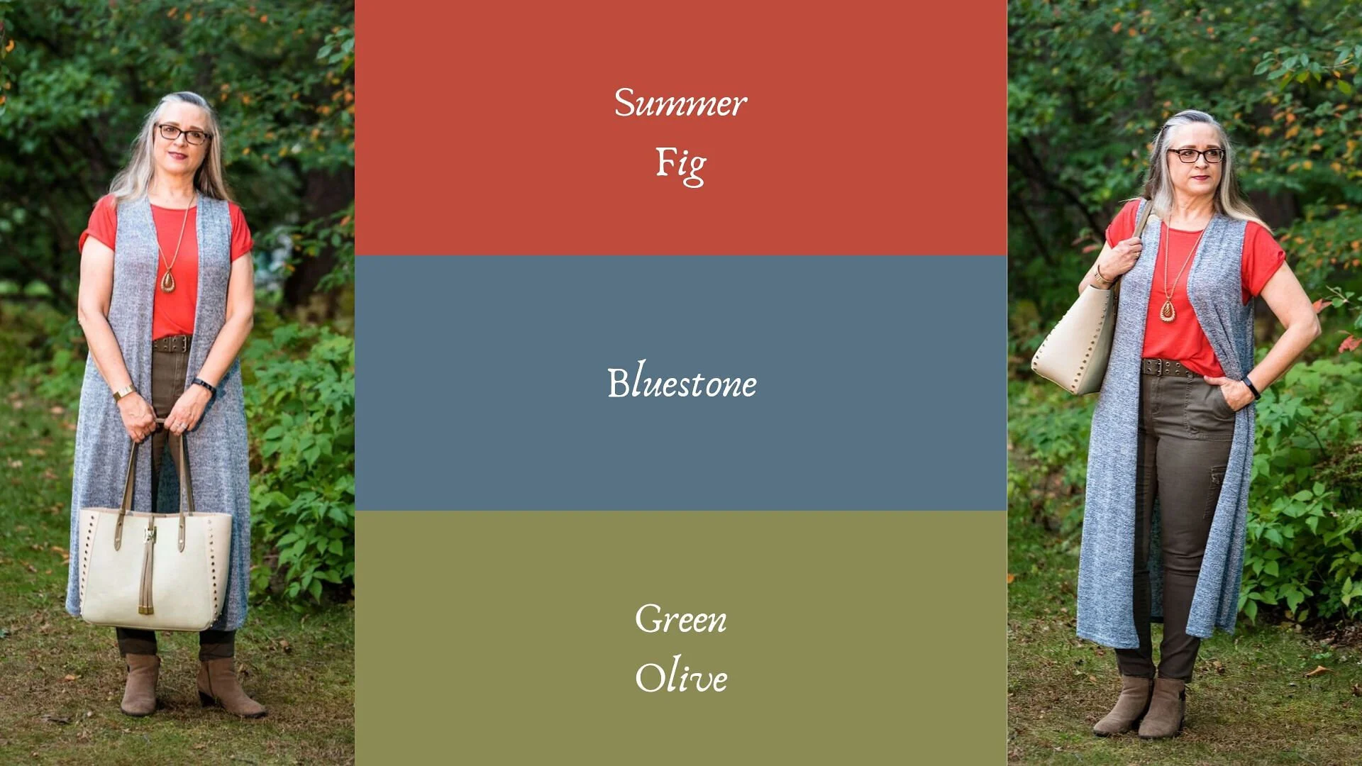
Pantone - Autumn/Winter - 2019 - Summer Fig and Bluestone

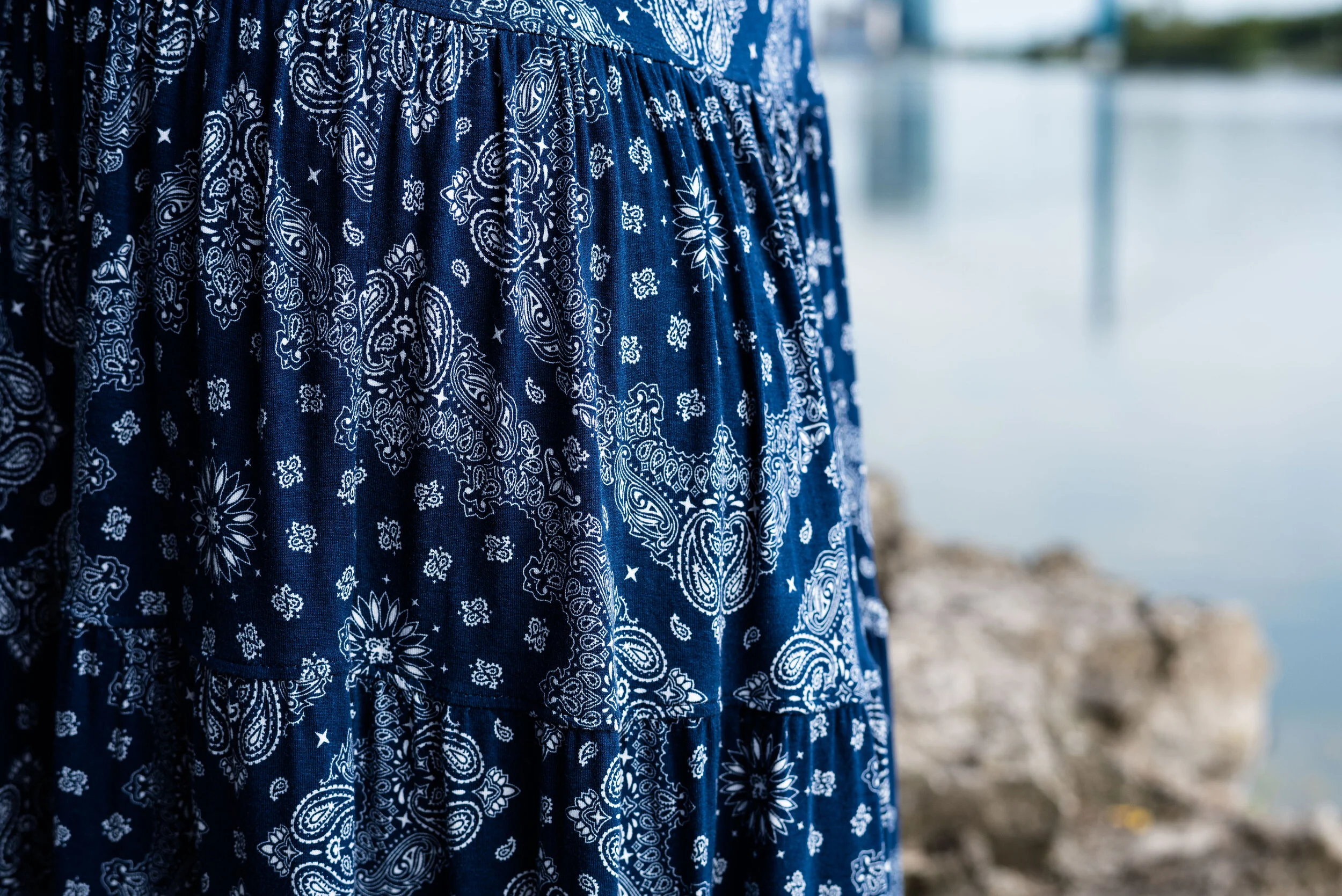
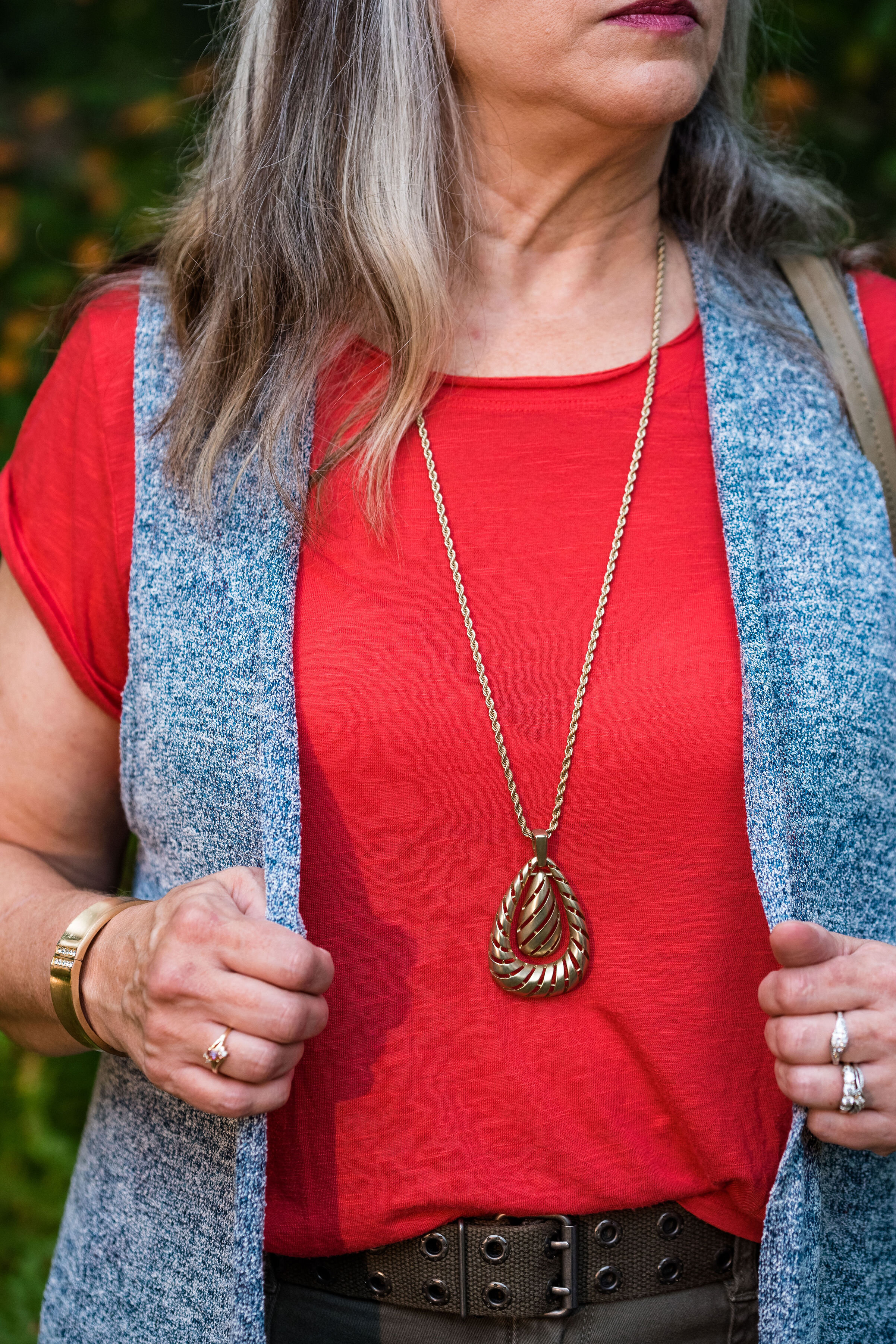
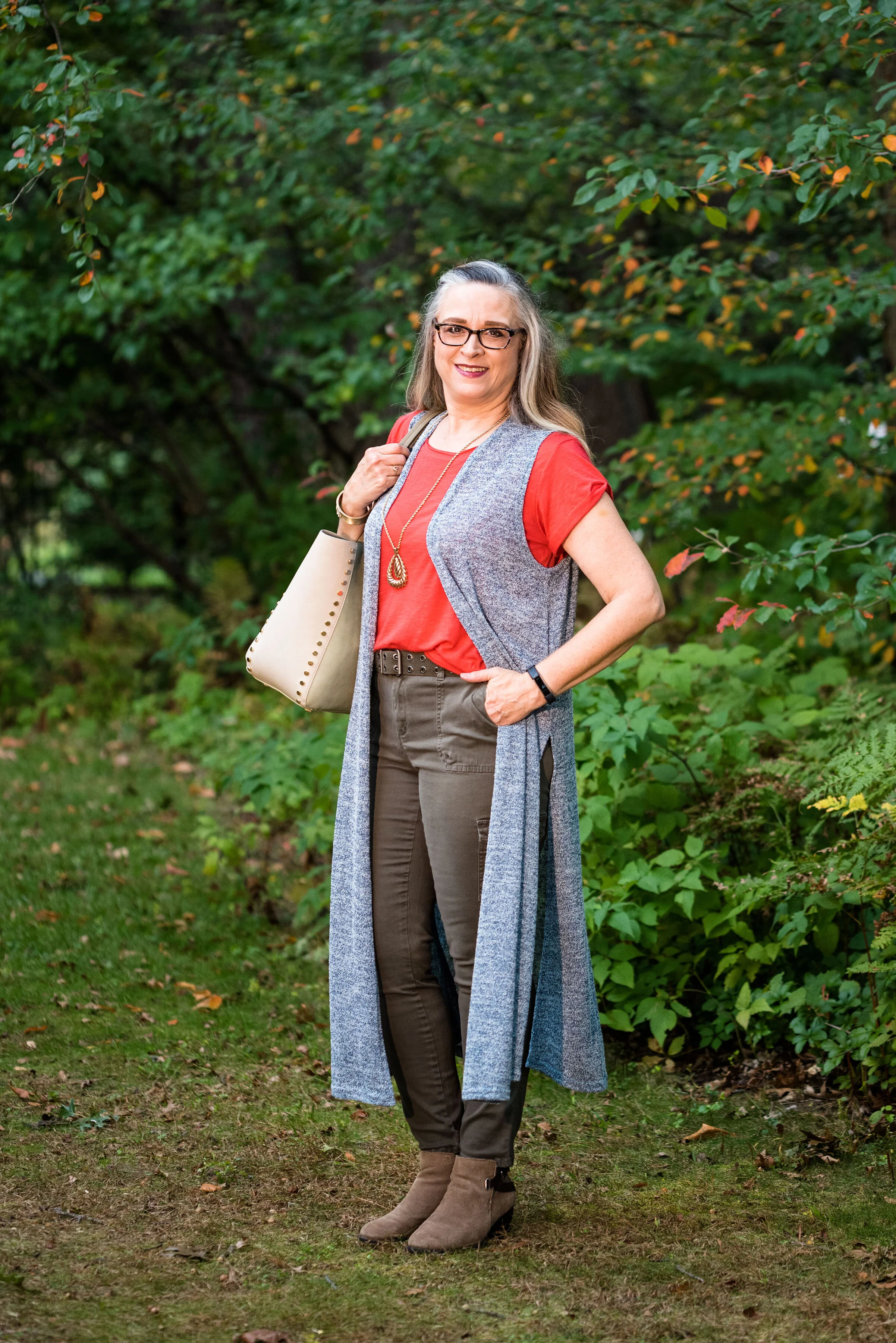
You’ll remember from the New York Pantone series the color Bluestone. This is one of only two colors that showed up on both palettes. I’m not sure how the Pantone Color Institute comes up with the colors they choose. Is there a committee? If so who is on the committee? How do they come up with the names for each of the colors? Yes, these are the things a fashion blogger wonders when she is tired and needing a burst of writing motivation. Ha, ha. I am speaking the truth when I say, I had to look up what a fig looked like to understand where they came up with this red color. This red coincides with the bright red interior of the fig fruit. I have never eaten a fig, have you?

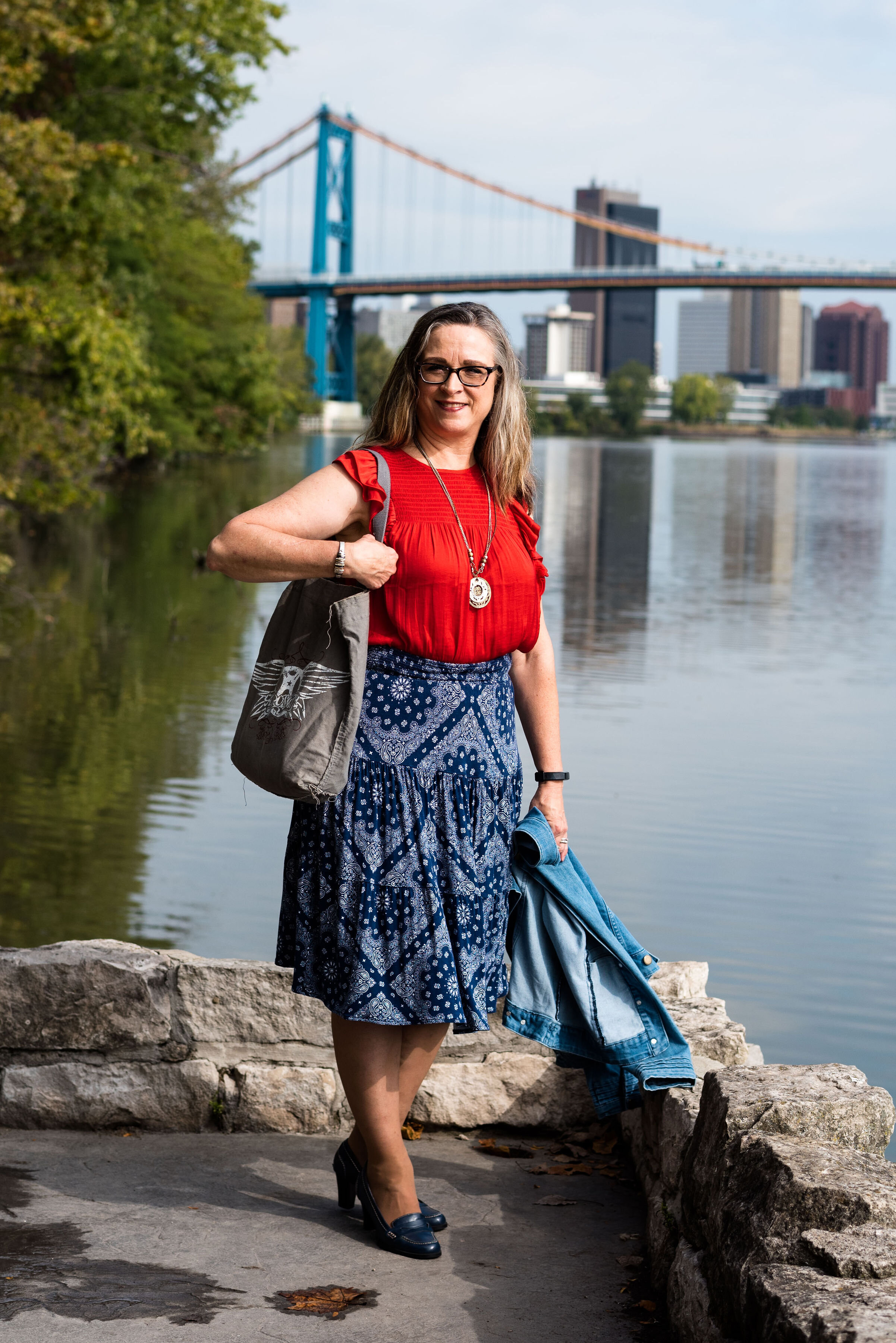
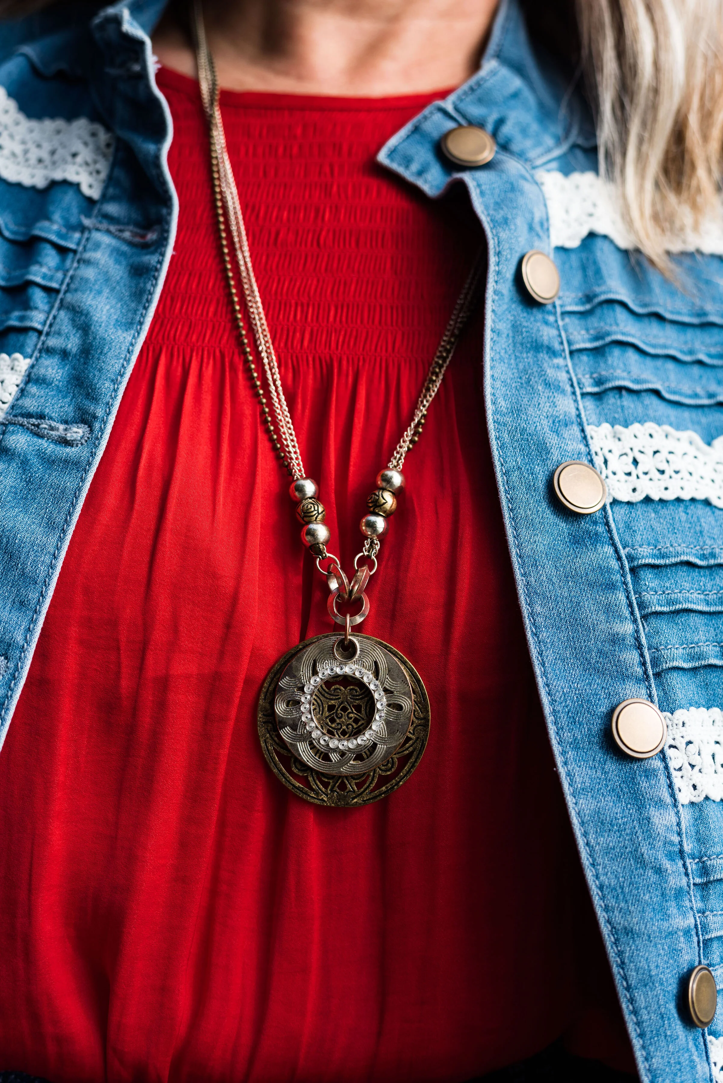
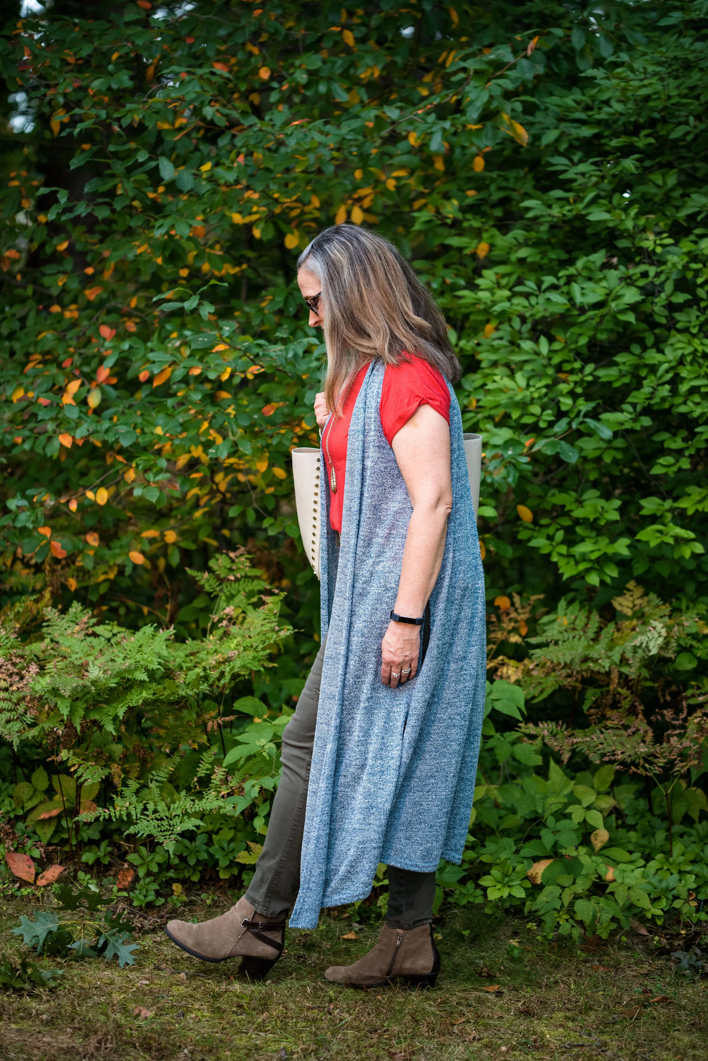
This bright red tee is SO brand from Kohl’s. It is a few years old. I find Kohl’s and JCPenney my go to’s for things like short and long sleeve tees.

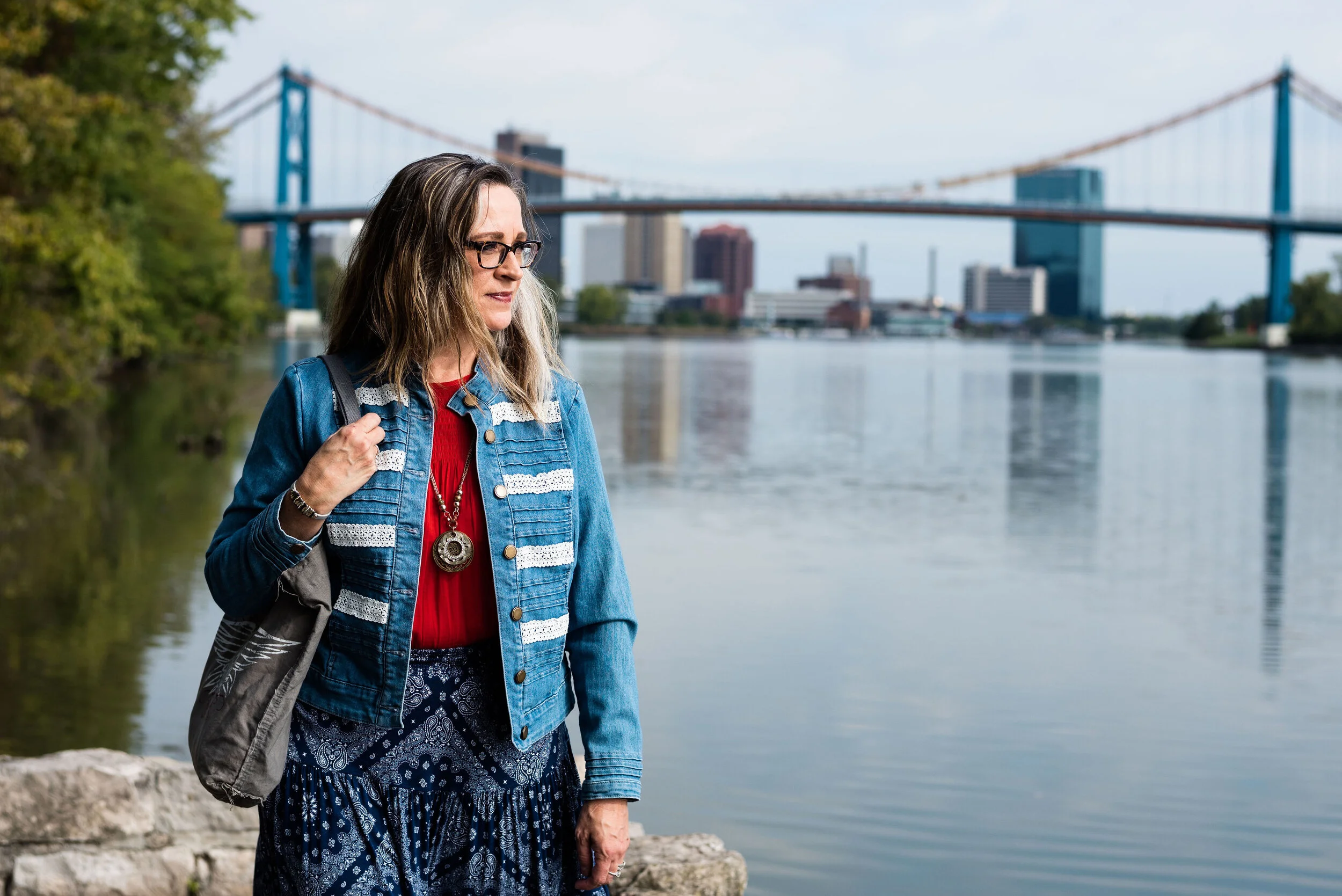
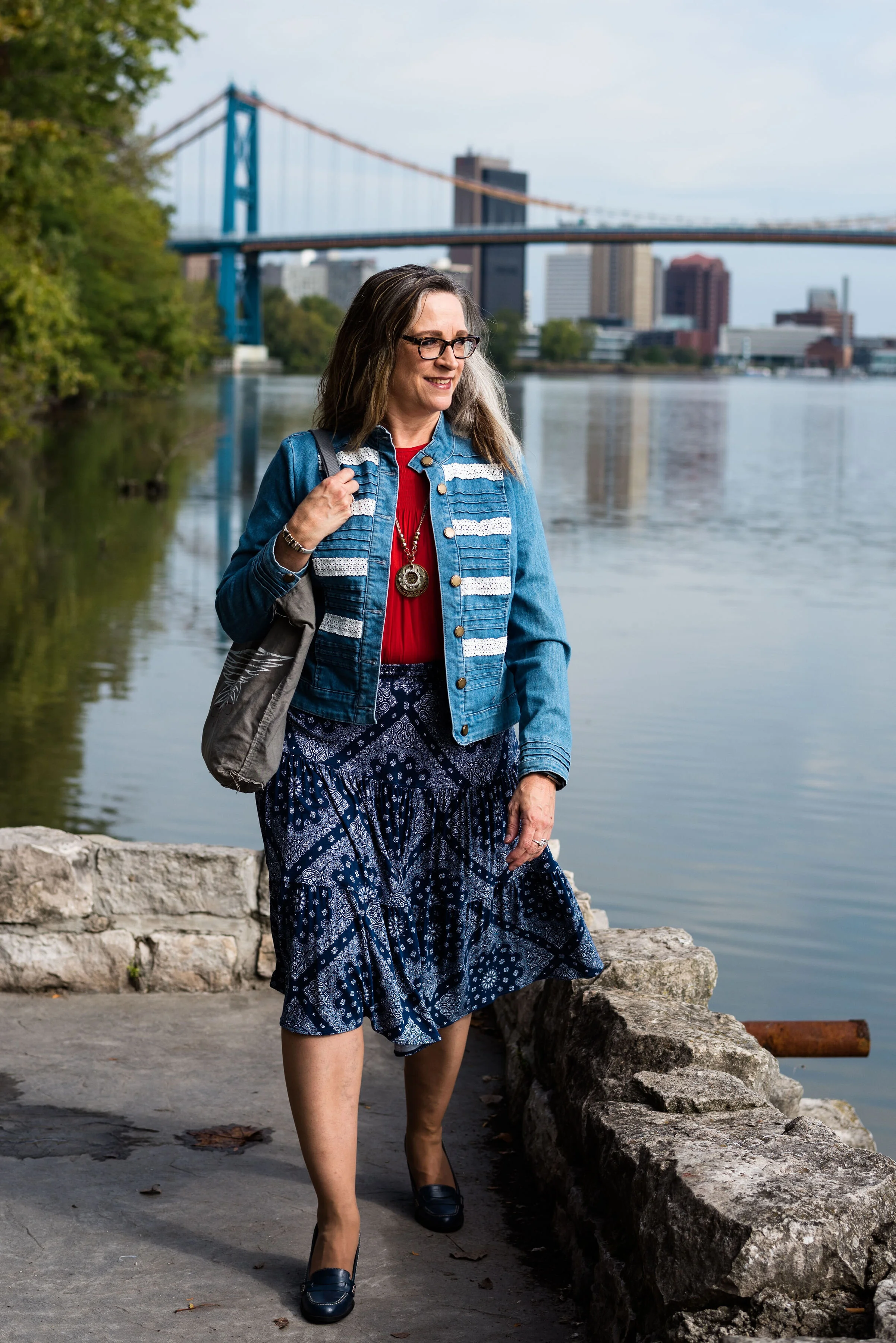
The Bluestone vest is a LuLaRoe piece. This particular style is called Joy. I like that some clothing companies name each of their styles. Not that I will remember what they are called, but I just think it adds another dimension to a retailer, that they have taken the time and effort to specify a certain line has a name. This is the only vest I have that is this length and I like how it looks in this outfit. The fabric has plenty of stretch, but doesn’t lose its shape.

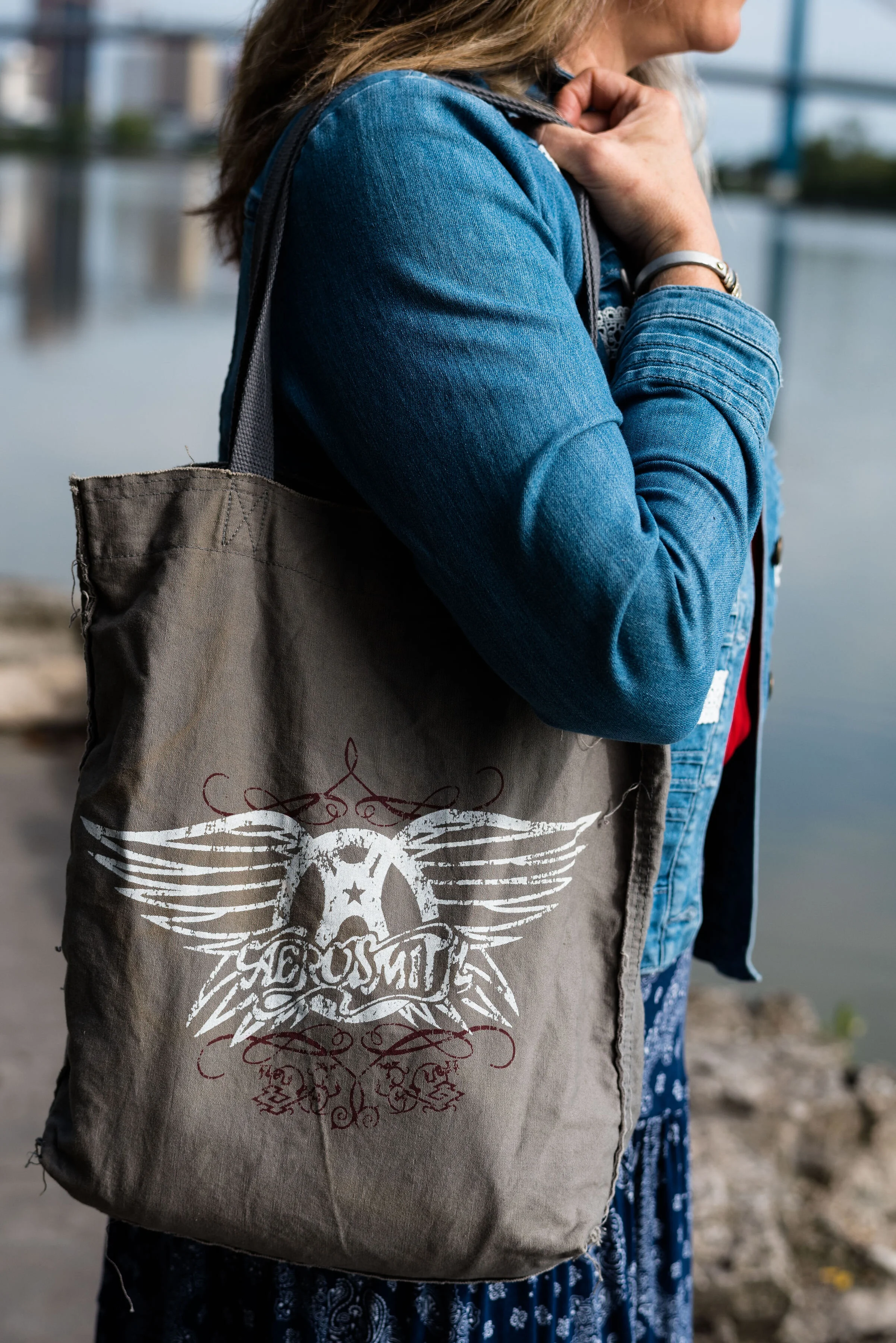
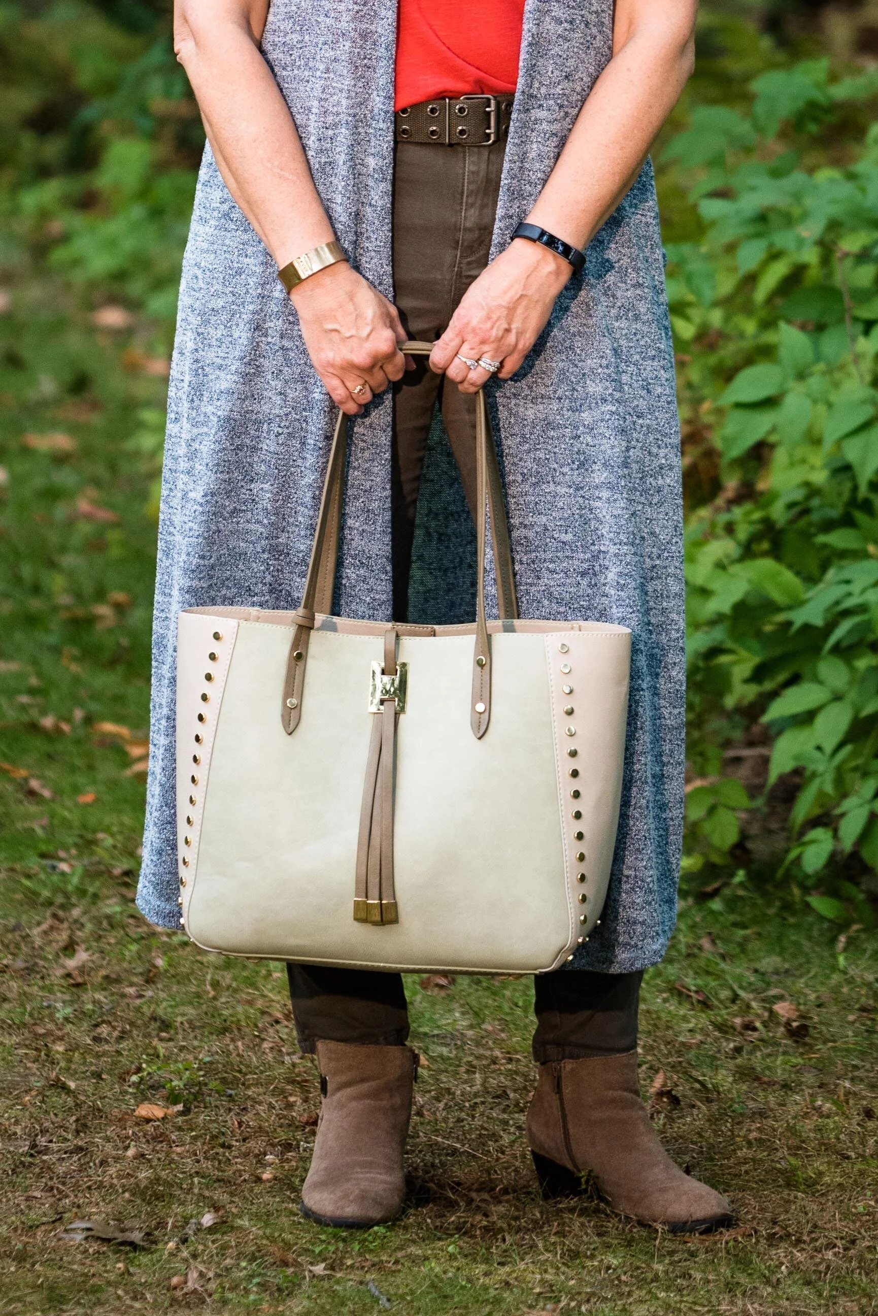
Once again, I turned to the classic color of Olive Green for my pants, bag, and belt. Olive just seems to be an easy color to pair other colors with and it grounds an outfit and keeps it looking chic with a bit of an edge. These utility pants are Gloria Vanderbilt brand and I’ve styled them before on the blog. You can see them styled with an olive utility vest here and in a flat lay with a snakeskin jacket here. I got the tote bag from Charming Charlie a couple years before they went out of business. Belts are so expensive, I usually try to pick them up at thrift stores.

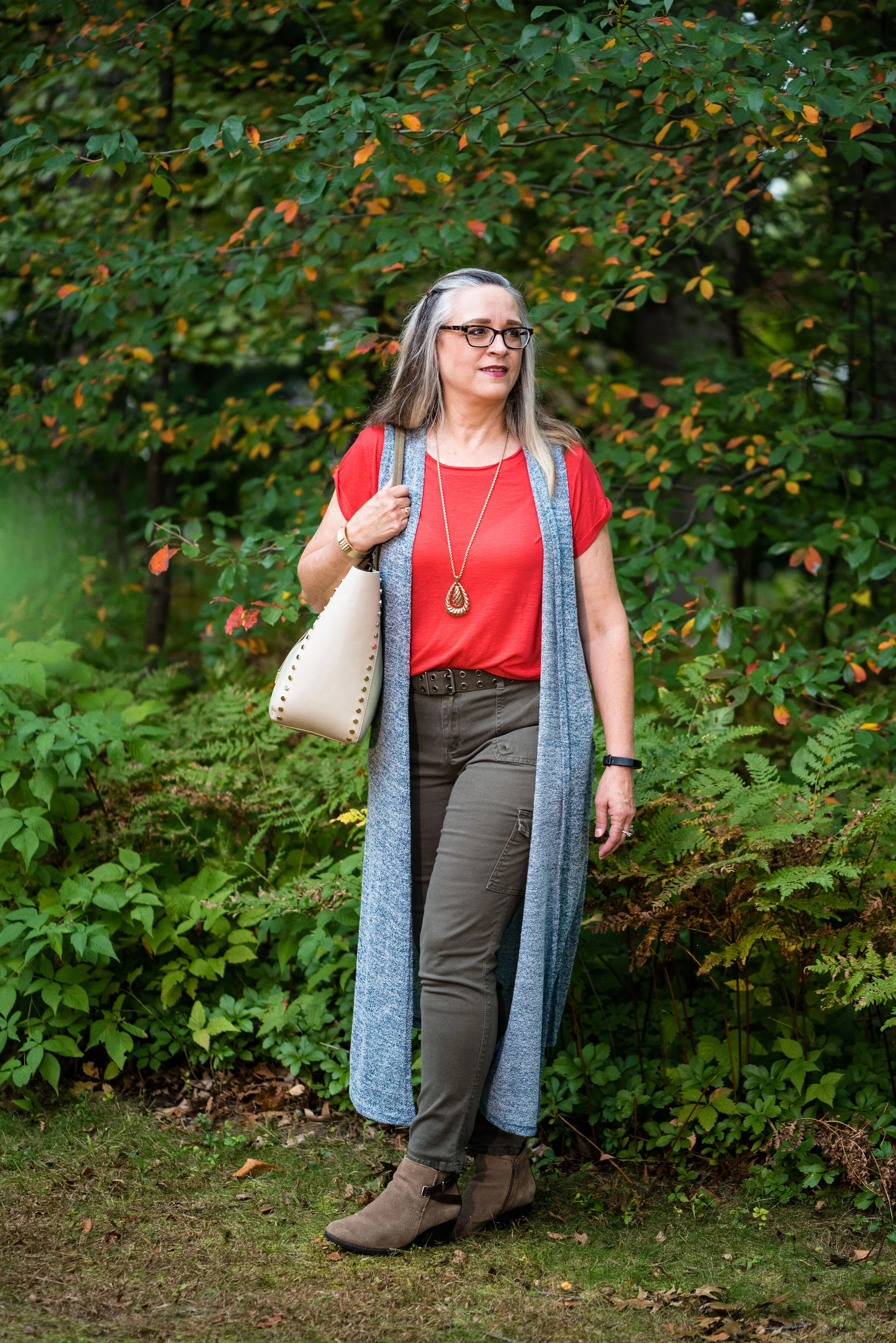
I kept the jewelry simple with a gold pendant necklace and a gold bracelet.

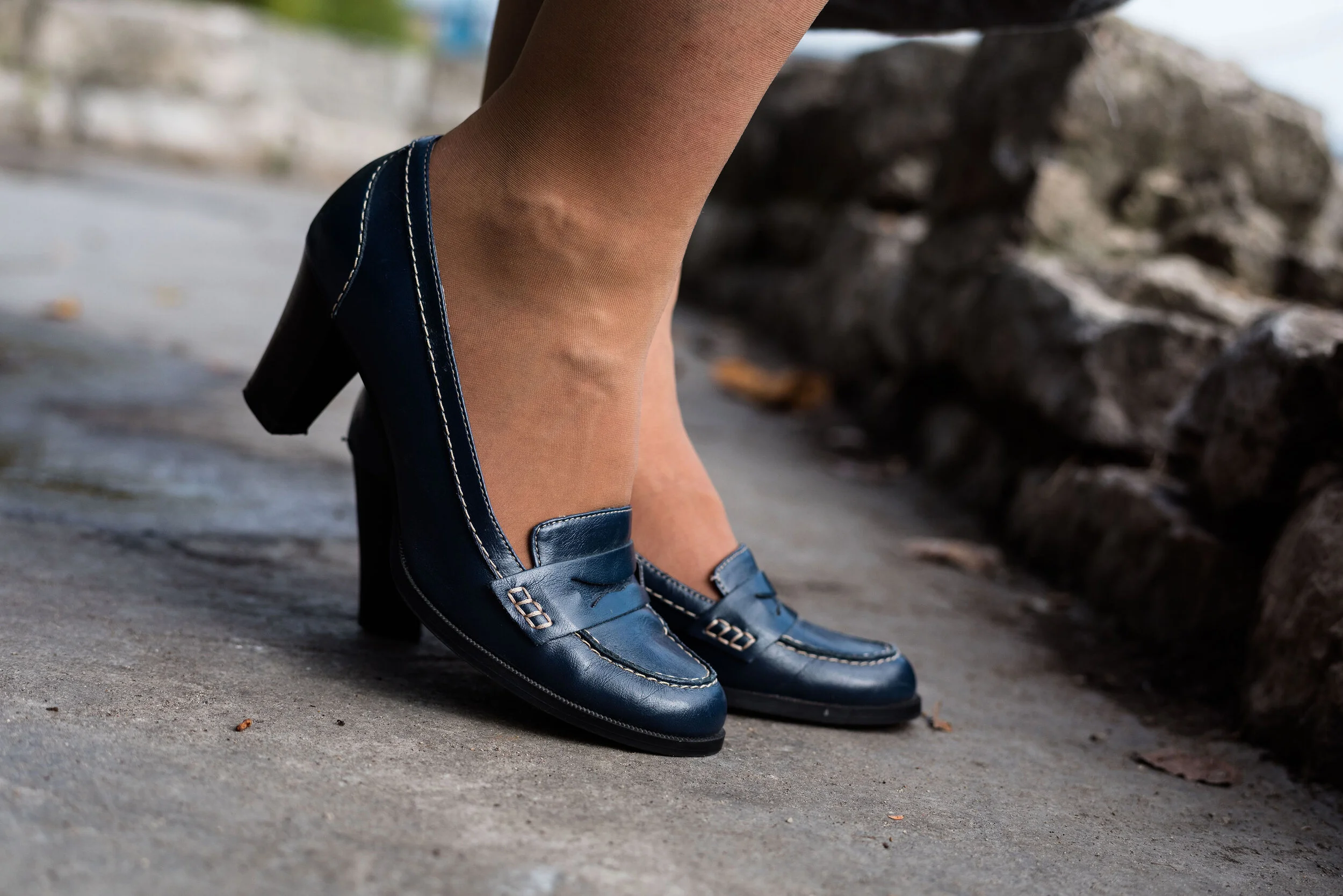
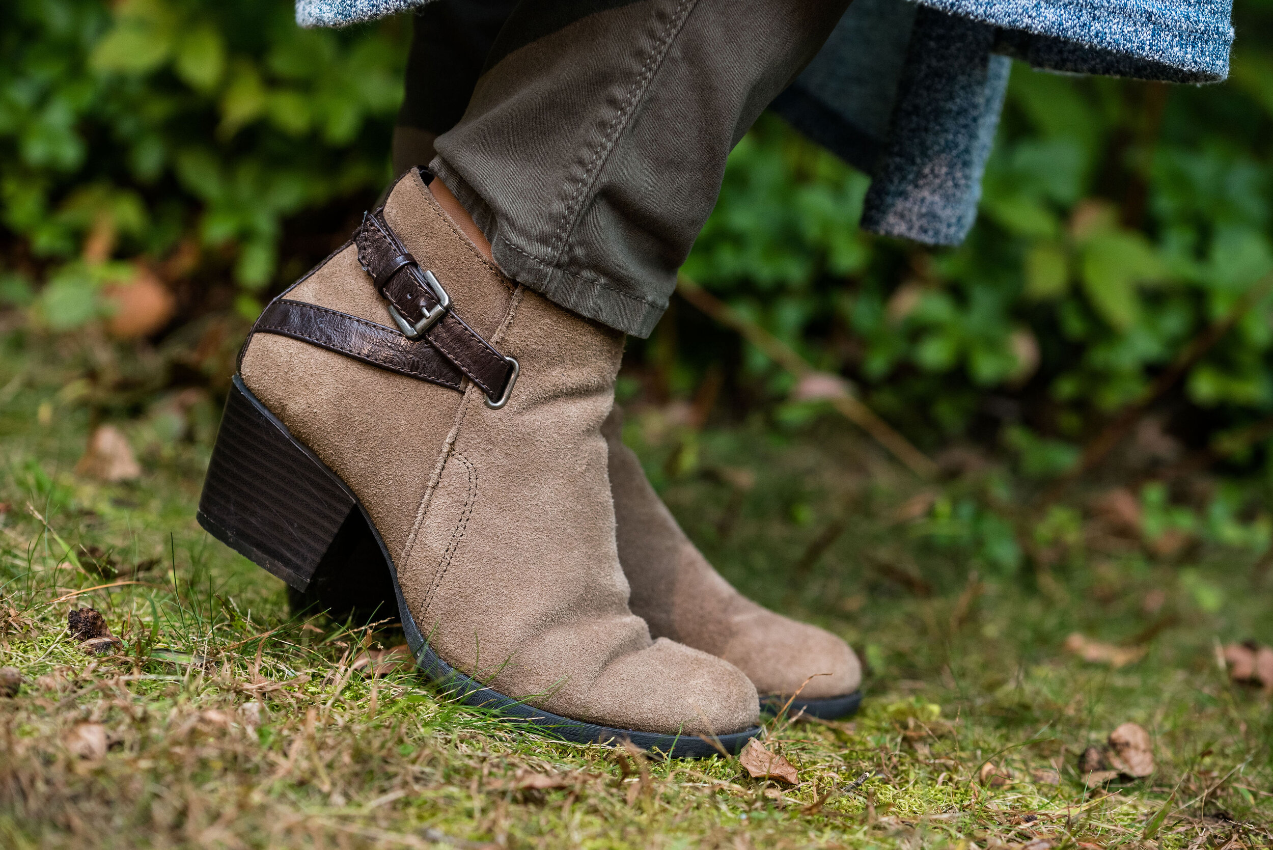
This old pair of Sonoma ankle boots has been with me for a while, but they are the perfect neutral finishing touch and the suede texture is just right for a fall outfit.

What do you think of these colors? They are very similar to the New York palette using Bluestone and Chili Pepper. Do you like to wear vests? Do you have a long one like this? What are some other ways you could style a long vest? I’d love to have your feedback.

I’m including a few shopping links. These are affiliate links. All opinions are my own.

Photo and graphic credit Rebecca Trumbull.


Pantone Autumn/Winter - 2019 - Chili Pepper and Bluestone

Before I get started showing the outfits I put together for this color series, let me refresh what the Pantone colors are. The Pantone Color Institute is an entity that provides color related solutions across the industry for designers of graphics, products and fashion. It is their color choices for seasons and color of the year that influence the fashion and interior design fields. You can read more on their About Page.

When I began blogging over three years ago, I decided to include the Pantone seasonal color series as a regular feature of my blog. Many bloggers share their favorites with you, but I like to really explore how each of these colors can be combined to make creative outfits that are both fashionable and reasonable financially as almost all of these colors are already in my wardrobe.

This season’s outfits turned out a bit differently than some of the specific colors due to shade variances on different computers, phones and so on. However, the point is not to get perfect matches, but to broaden our thinking about color over all. I ask myself questions like, “How can I combine these colors into one outfit? How can I take this color I am not fond of and use it? How can colors in an outfit make us feel happier, more put together and more confident?”

Today’s outfit combines a cool grayish blue with a spicy red. Meet Bluestone and Chili Pepper. The third color is from Panone’s Classics palette, which I have tried to incorporate into each outfit.

This bright red top is most definitely not the exact same red at Chili Pepper. It was rather strange. I have used my phone before to look at the colors when trying to pick things out of my closet and for some reason I really thought this red was good. However, I think I just wanted to wear this Popsugar top from Kohl’s again because it’s so cute. Ha, ha. I styled this same blouse last spring in another Pantone series. You can see that post here.

My denim jacket is from Christopher & Banks and isn’t exactly Bluestone either, but I was having trouble finding that exact color.

For these pictures we went to Middlegrounds Metropark in downtown Toledo. What a beautiful park right close to the downtown area of our city. I just love the urban chic vibe that these pictures have. I don’t do a lot in the city, but there is a lot more there than I realized. Unfortunately, I may get more familiar with it, as I got summoned for jury duty in October and the Common Pleas court is downtown. Ha, ha.

I decided to pair my top and jacket with my dark blue printed St. John’s Bay, skirt from JC Penney. I thought it matched well with the Pantone classics color Evening Blue. This is a fun, easy to wear skirt with a wide elastic waist, and tiered layers which gives it swing.

Since I had a lot going on in this outfit with prints and textures I wanted to keep my accessories fairly simple. My thrifted Relativity loafer heels are a go to for a look that is classy and work ready.

I thought this pendant necklace a good piece that makes its own statement with this outfit.

Adding this Aerosmith tote bag was my way to show off my inner rocker. Ha, ha.

What do you think of Chili Pepper and Bluestone? Do you have these colors in your closet? How would you wear these?

I’d love to hear your thoughts, so leave me some love in the comments.

I’m including a few shopping links to look at. These are affiliate links. All opinions are my own.

Photo and graphic credit, Rebecca Trumbull.