Oh, Olive! Workwear Look

Tuesday I showed you a casual look with olive pants and today I am showing you a workwear look that might be doable for the office. We are looking at the color olive as a neutral. I know many of us have olive in our wardrobes and are becoming more aware of what a great color it is. Tuesday, I showed you how well it goes with orange and white. Check out today’s outfit, which combines dark florals and black for a sassy look.

DSC_0035.jpg

I found this fabulous dark floral Time and Tru dress while thrifting on one of our trips. I had started really looking over the dress racks at thrift stores recently after seeing Instagram gal, jbowenandcompany using a button up dress like a kimono. It makes a piece like this so much more versatile. When I decided to do this series on olive pieces, I knew this dress as a duster would be a perfect topper for a fun workwear look.

DSC_0027.jpg

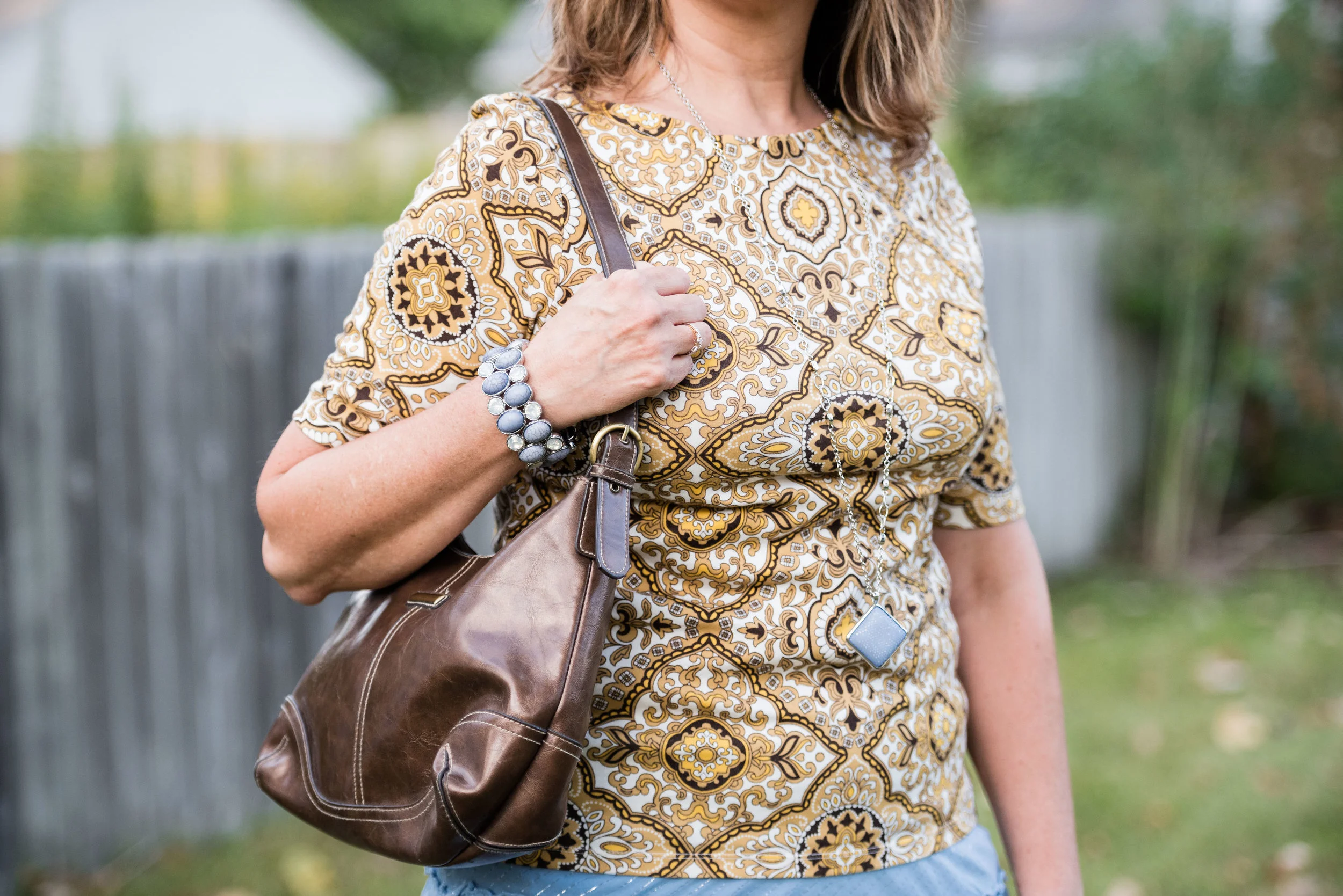
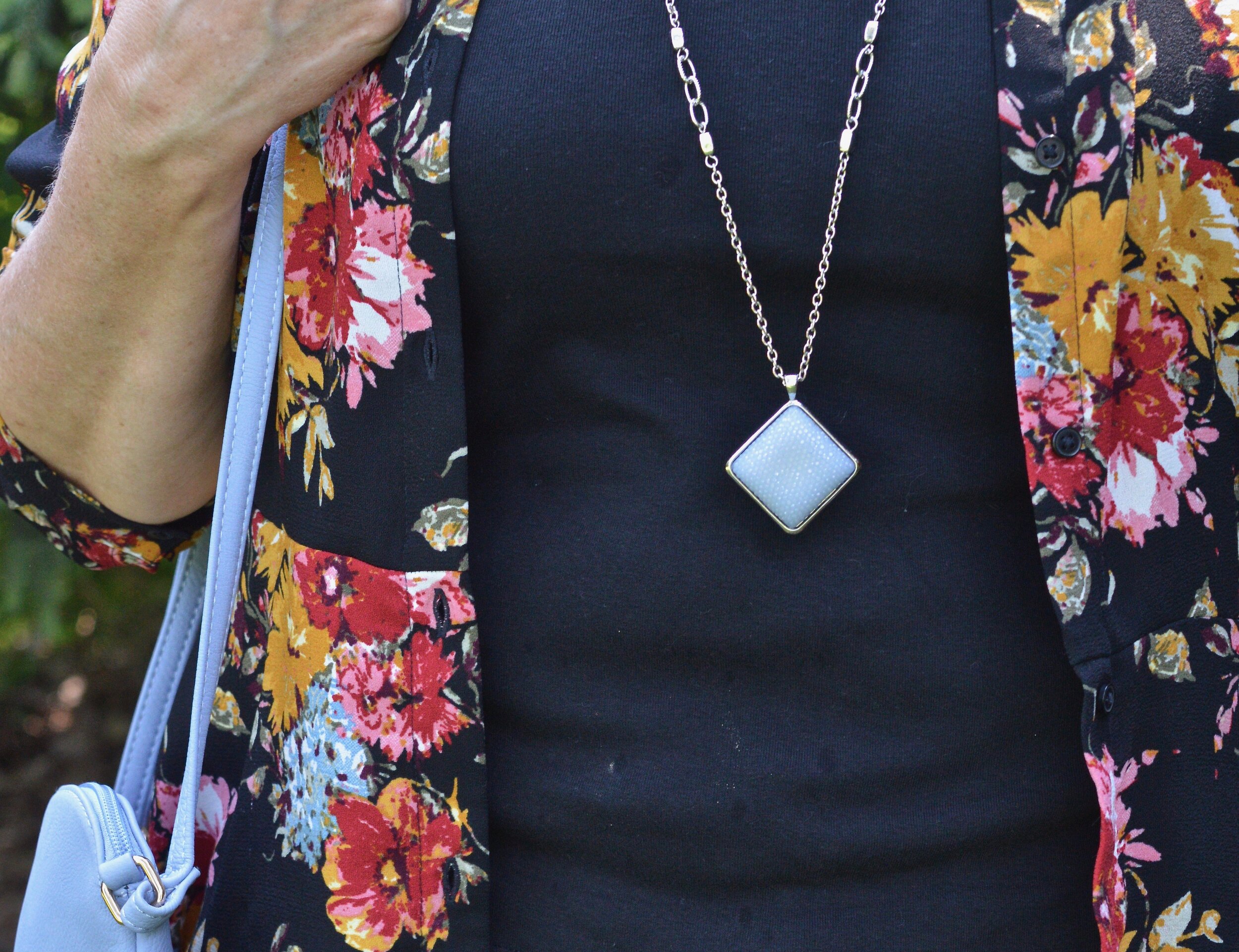
Once again, my olive Gloria Vanderbilt skinny pants are the focal piece. This time I paired them with another neutral, black. My black v-neck polo is a sleeveless piece that I found thrifting a few weeks ago. Black and olive has always been a classic combination. Throwing the dark floral piece over the top really makes the outfit pop.

DSC_0037.jpg

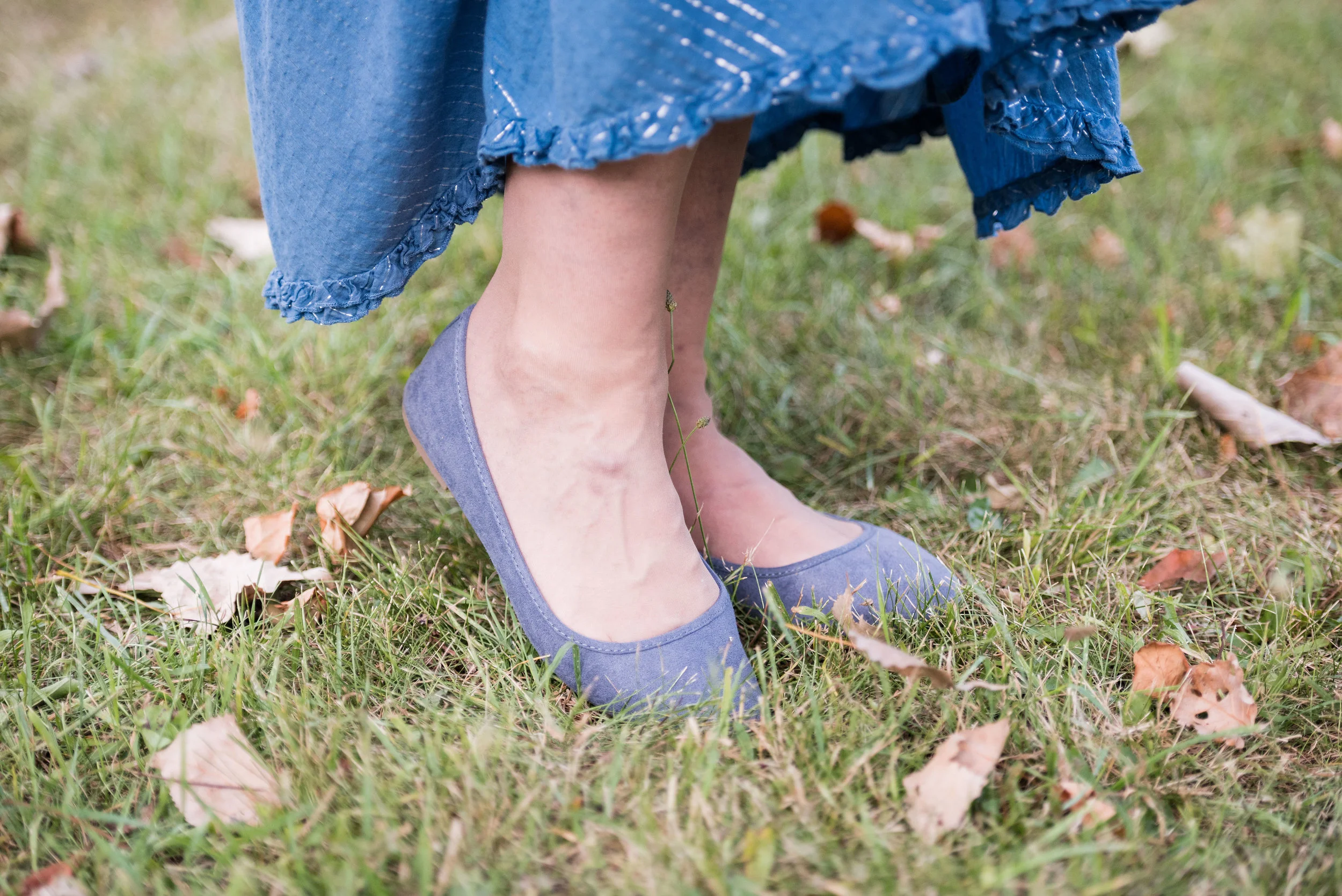
You’ve seen these Clark peep toe shoeties on the blog before. They are great shoes, I just really have no place to wear them right now. I know many bloggers and Instagram babes who post outfits they are actually wearing, but some of us have a more laid back approach. I would wear these and this whole outfit if I had an office job, but right now I don’t. Still, it is fun to have choices, and to be able to show you all a few of my fun wardrobe pieces, even if I don’t wear them as often.

DSC_0039.jpg

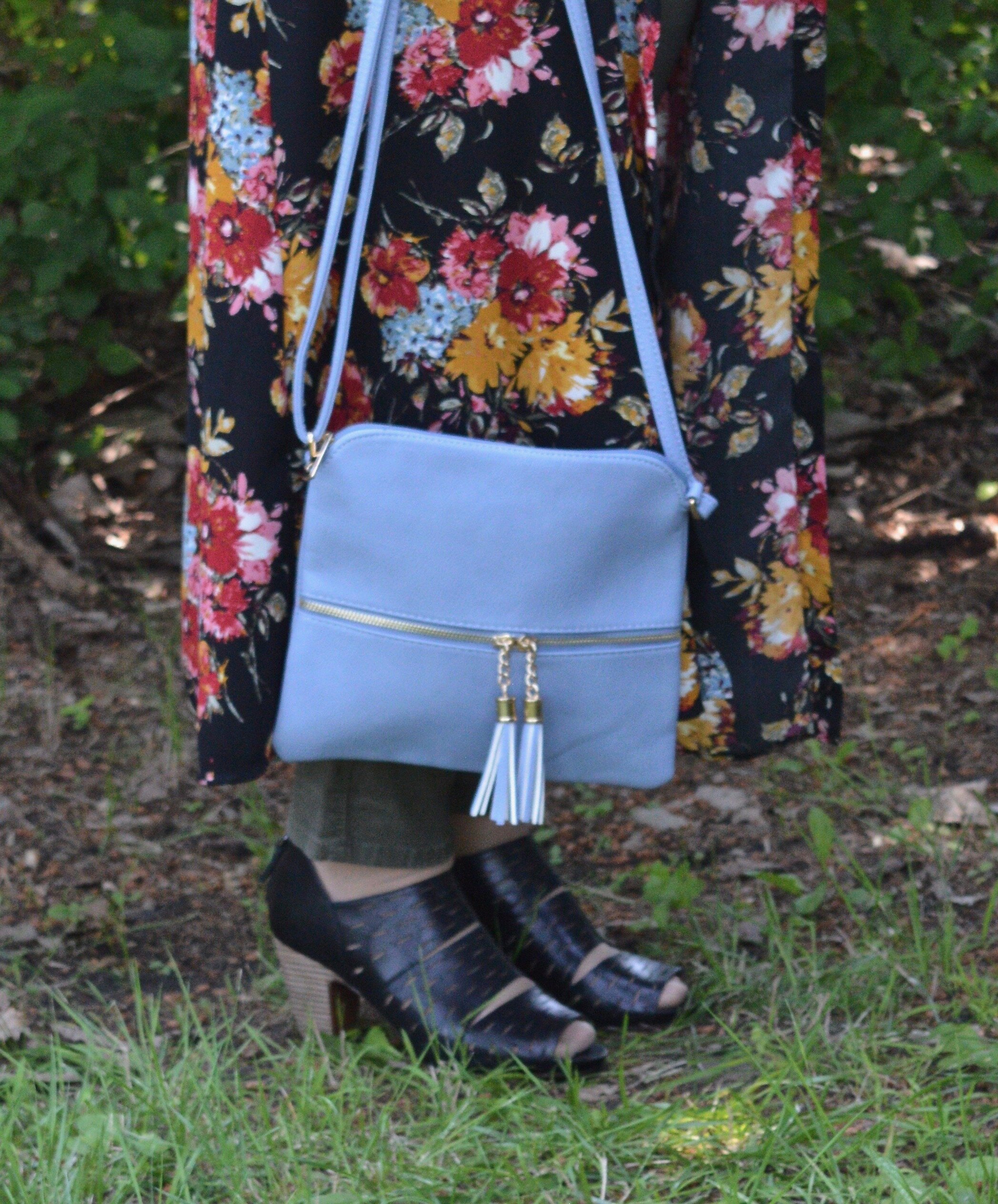
I thought adding the light blue bag would pull out the light blue in the duster and with the dark florals it still gives the outfit a summer feel. You could have done the same thing with the light pink, yellow, or white. For the same reason I went with the light blue pendant. Just that little extra pop of color adds more interest to the outfit.

DSC_0041.jpg

What do you think of this outfit? Have you ever worn a button up dress as a duster or kimono? It is a great way to extend the use of your dresses. If you are like me, you don’t have too many excuses to wear a dress. I know some ladies wear them all the time, and if my legs were less blemished by veins, I probably would too, but using a dress in this way still gives me an excuse to get more dressed up.

DSC_0031.jpg

I hope you enjoyed this post. I am going to include a few shopping links for you to look over. These are affiliate links. All opinions are my own.

Have a great weekend. I will not be posting next week once again, as I am going to spend the week with my mom while my brother and his family are out of town. I’ll be back the following week. Until then, take care.

Pantone Fall 2017 - The London Palette - Blue Bell and Lemon Curry

Last week I looked at two colors with more of an orange hue from the Pantone Fall 2017 London palette. This week I am going to introduce you to one of the two yellow hues on the palette. Lemon Curry is a spicy yellow that can add a bit of zing to your fall color combinations. I decided to combine this yellow with Blue Bell, a light soothing color. The combination results in an outfit that has both pizzazz and peacefulness. 

My daughter had to teach me a few things about photography when she first sent me this grouping of pictures. The reality is that a camera does not see things the way the human eye does. Our human eye, unless they are unable to translate properly, see colors as they really are. A camera and the image it imprints onto a digital card is affected by lighting, exposure and other factors. 

When I saw these pictures, I texted my daughter and said, "This skirt does not look like it looks in real life." We went back and forth on it for a while and I finally told her to leave it alone. When we got together for my grandson's birthday party yesterday, she took the time to explain to me that a camera, no matter how fancy picks up what it thinks it sees, not necessarily what is really the fact. Who da thunk? Obviously the hombre skirt contains an underlying tone that the camera translates to more of an aqua blue, when in reality it is more of a navy or gray blue. Rebecca was able to adjust the pictures to make the skirt look more like the original color and I learned a few things about digital images. 

For this post, it doesn't really matter, because the blue I am trying to match with the Blue Bell color is the top tier of the skirt, rather than the bottom tier. 

Once again, for this color combination I shopped my closet. I've had this tiered skirt for a while and usually wear it a few times over the summer months, as it is light weight, but also lined. The tee I've had for a long time. I love the pattern, the fit and the longer short sleeves, but I hardly ever wear it. When I came across it looking for something yellow, I realized this would be the perfect piece to represent Lemon Curry.

Even though the top contains some black and white you can clearly tell is has the spicy Lemon Curry vibe. 

To pull the look together I wore Blue Bell colored jewelry including my pendant necklace from Kohls and my bracelet from Chico's. I decided to used a brown bag to keep the look more grounded and earthy.

For shoes, I chose my simple SO flats. Yes, I know I keep wearing these for various outfits, but they are just so cute and comfy!

What do you think of the pairing of these two colors? Which color do you like better?

I think these two colors are perfect for fall and transition easily from summer. 

Photo credit Rebecca Trumbull. Make up Rachel Christensen

The following are few shopping links for possible items in Blue Bell and Lemon Curry. This post contains affiliate links. All opinions are my own. 


Thanks for stopping by the blog. Hope to see you back again soon.