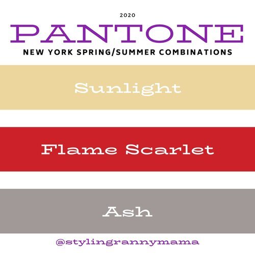
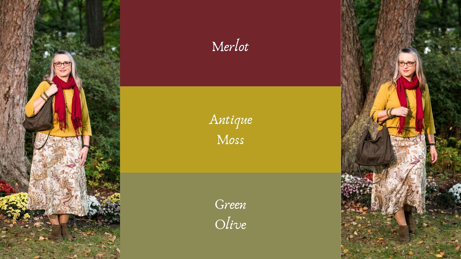
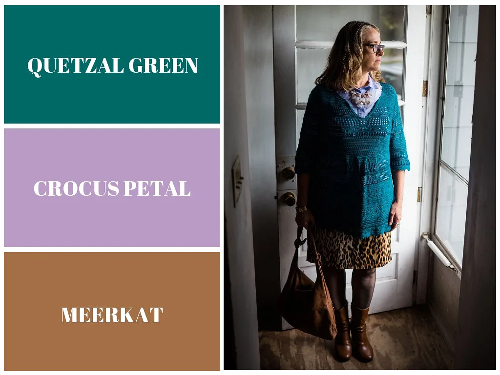
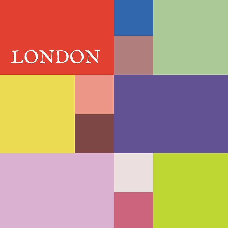
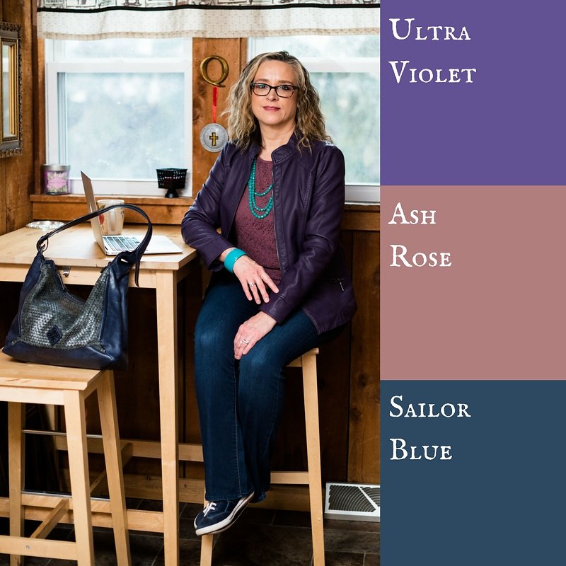
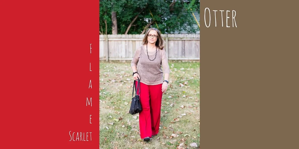
Pantone - Spring/Summer - 2021 - London Palette - Pirouette, Indigo Bunting and Polar Night

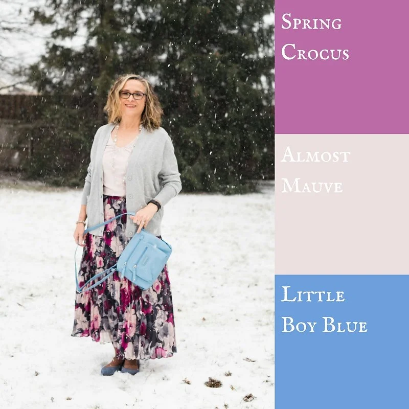
As always, with the Pantone color series, I find their choice of names for their colors intriguing. Today’s colors center on a pretty purply pink, called Pirouette, which, of course, makes me think of a ballerina. Indigo Bunting is a pretty blue, much like the bird after which it is named. I have had the privilege of seeing an Indigo Bunting flitting through the trees at one of our local metro parks a few years back. They regularly reside in Ohio in the summer time, but like to hang out in abandoned fields, scrubby bush areas and areas with red cedar trees, none of which I have around my house. Polar Night, much like its New York partner Inkwell, is a very dark navy blue.

pirouette.jpg

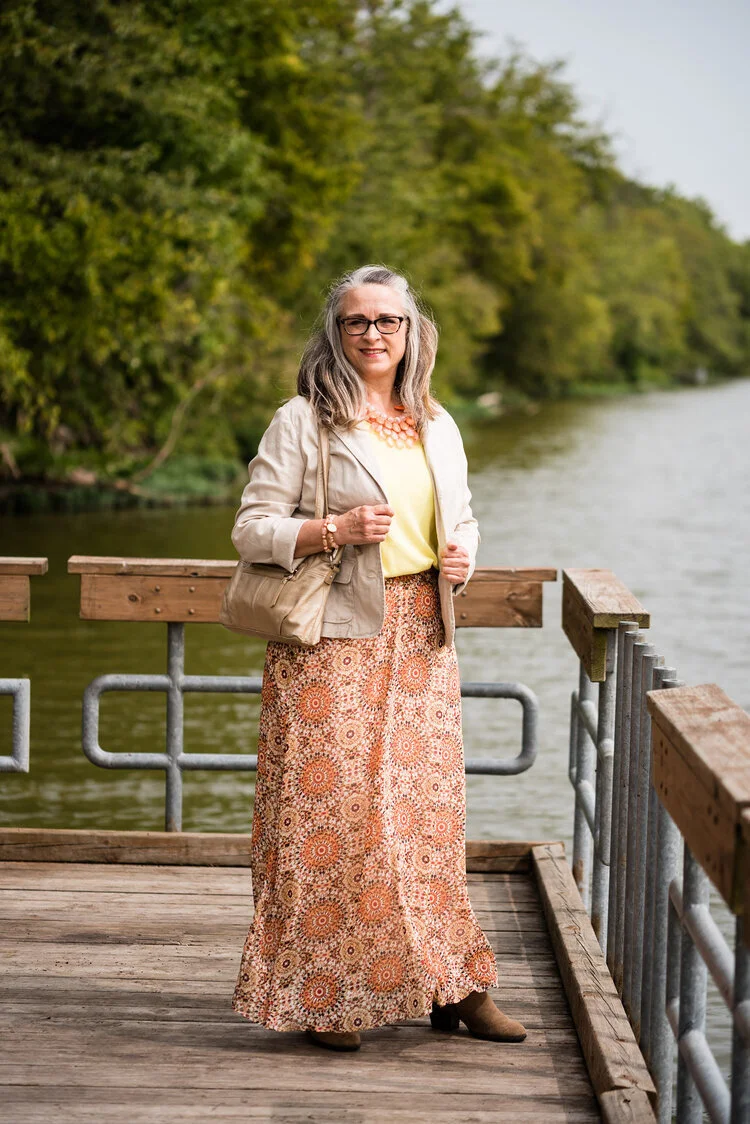
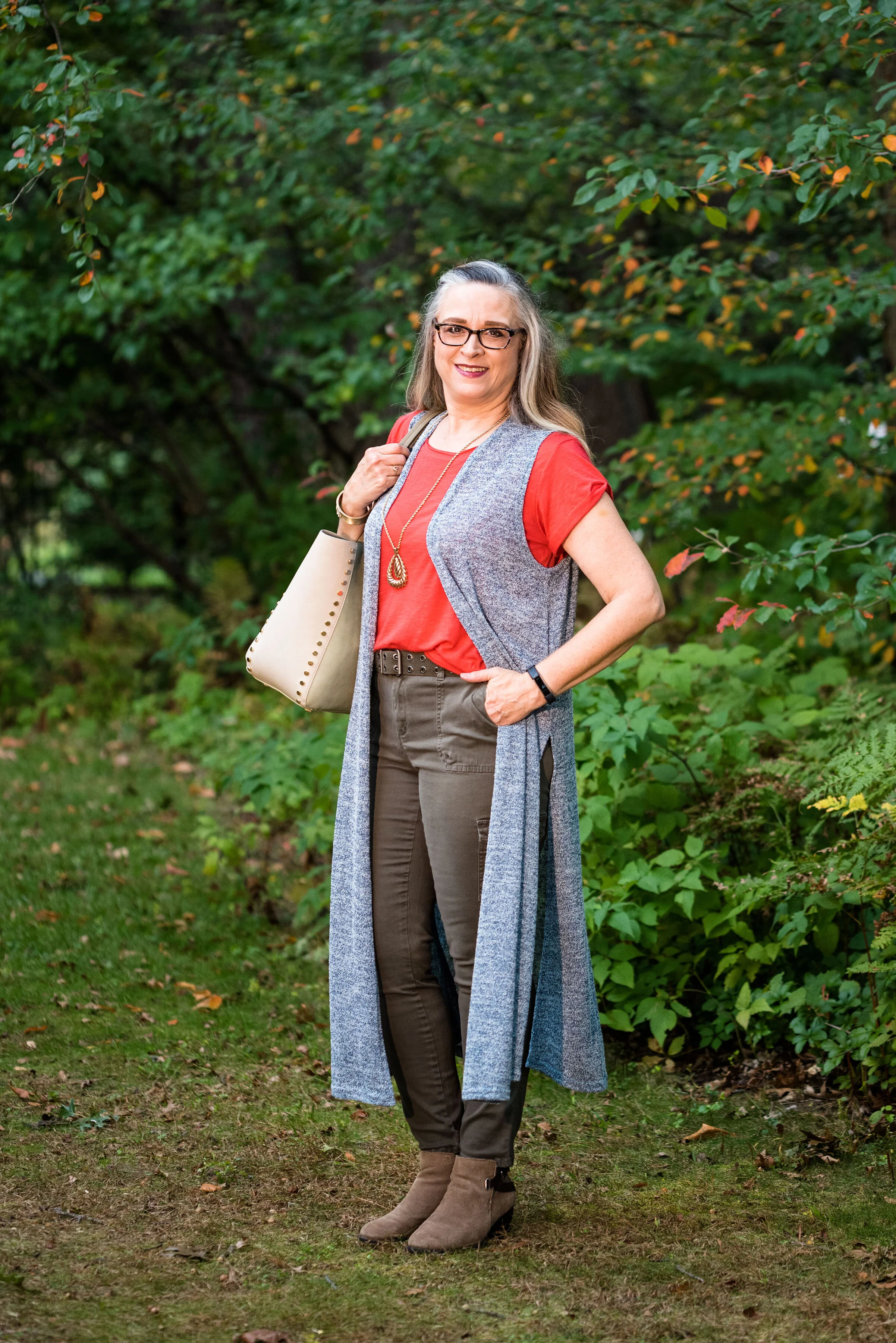
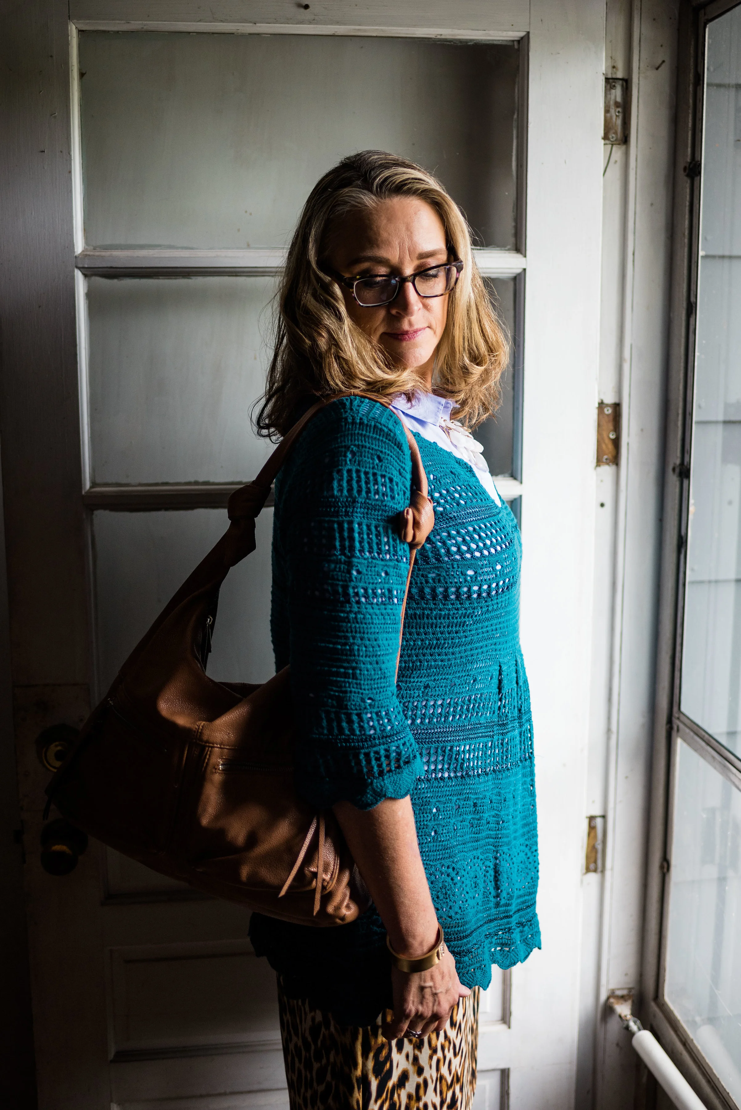
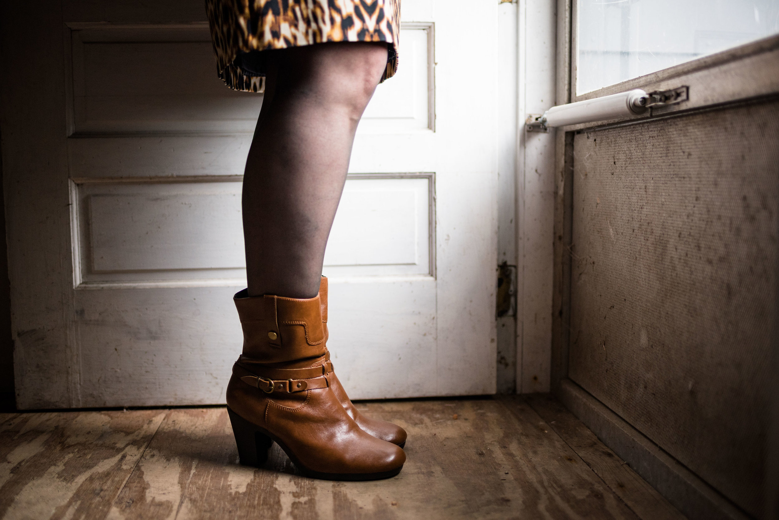
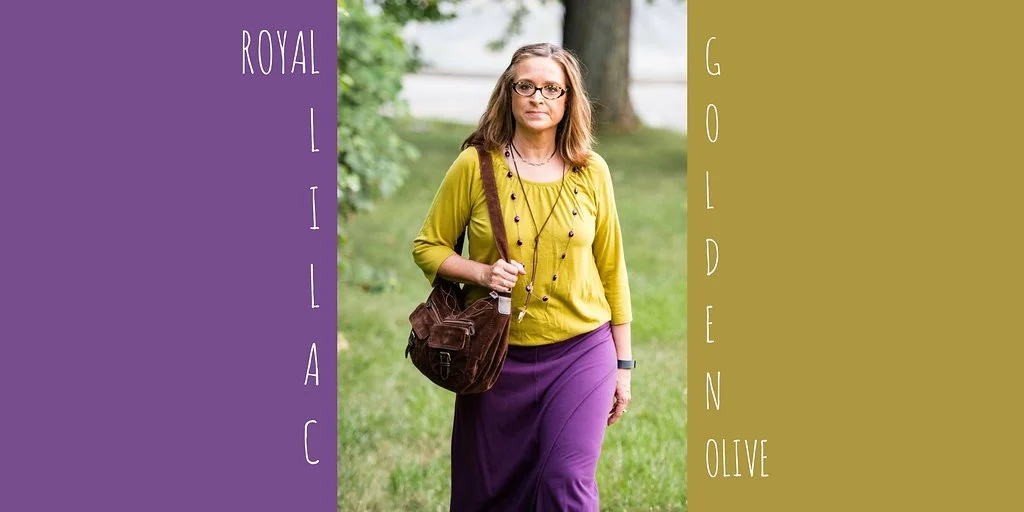
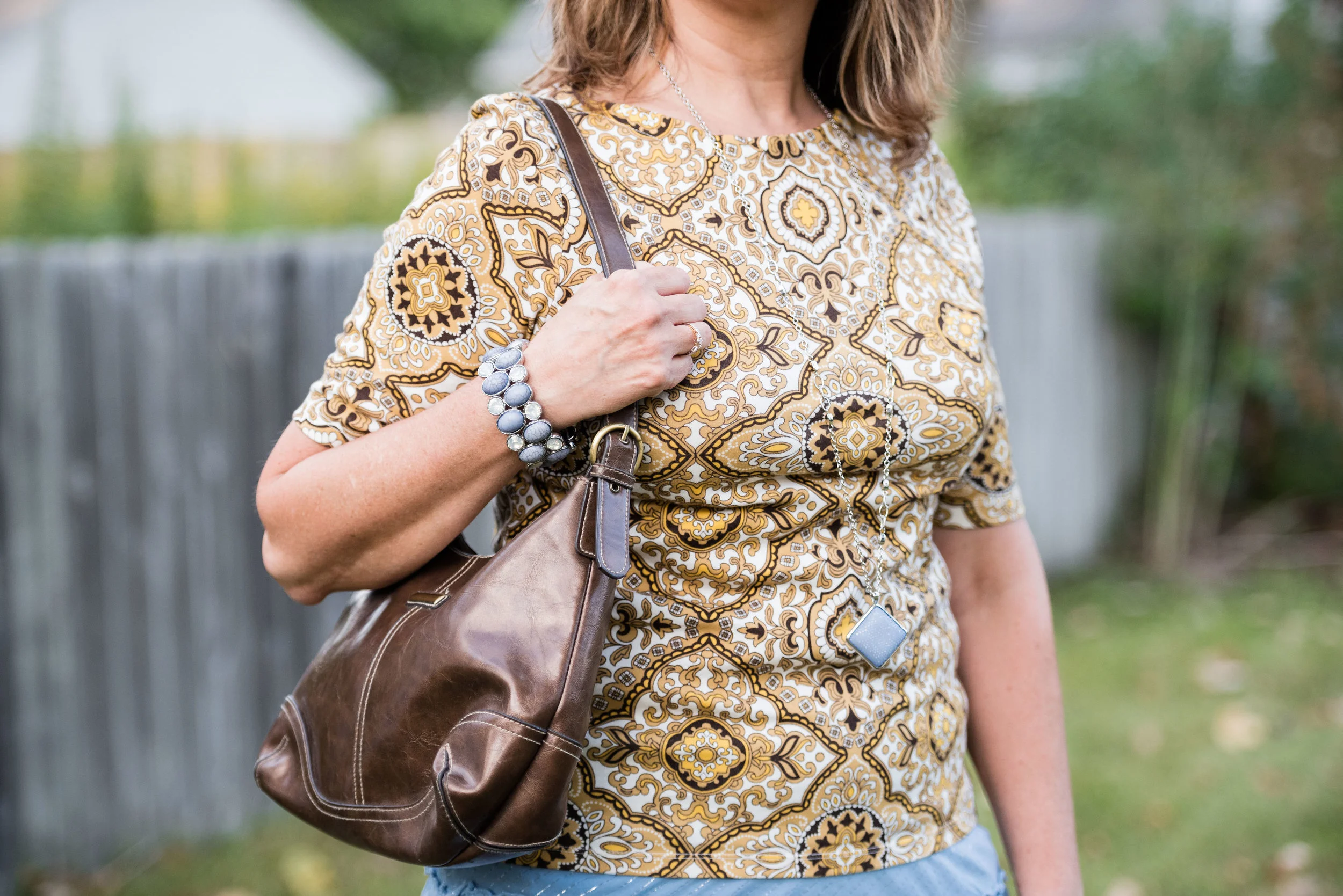
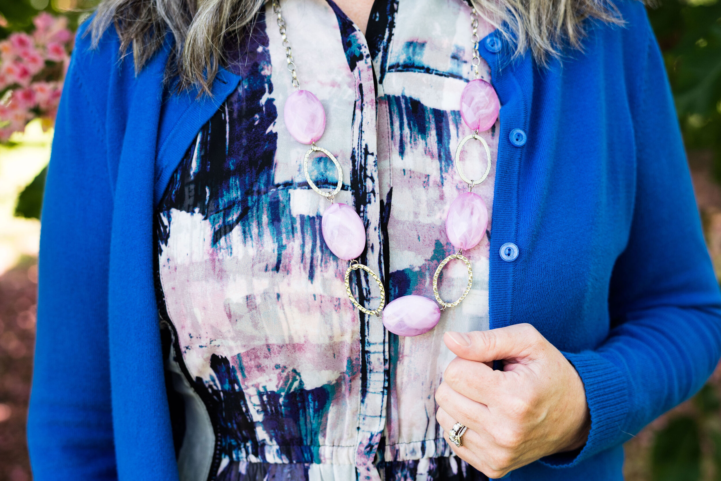
This fun, multi-print dress is a few years old and was a Kohl’s clearance purchase. I really like many of the pieces by Vera Wang, made specifically for this retailer and called Simply Vera by Vera Wang. These are the pieces that real world women like myself can afford and wear. I have styled this dress, like a tunic for a trip we took to Florida a few years ago. You can see that post here. The dress really contains all three colors, except that its blue borders on being more of a teal.

londonpantonecoloroutfitideapiurouette-8.jpg

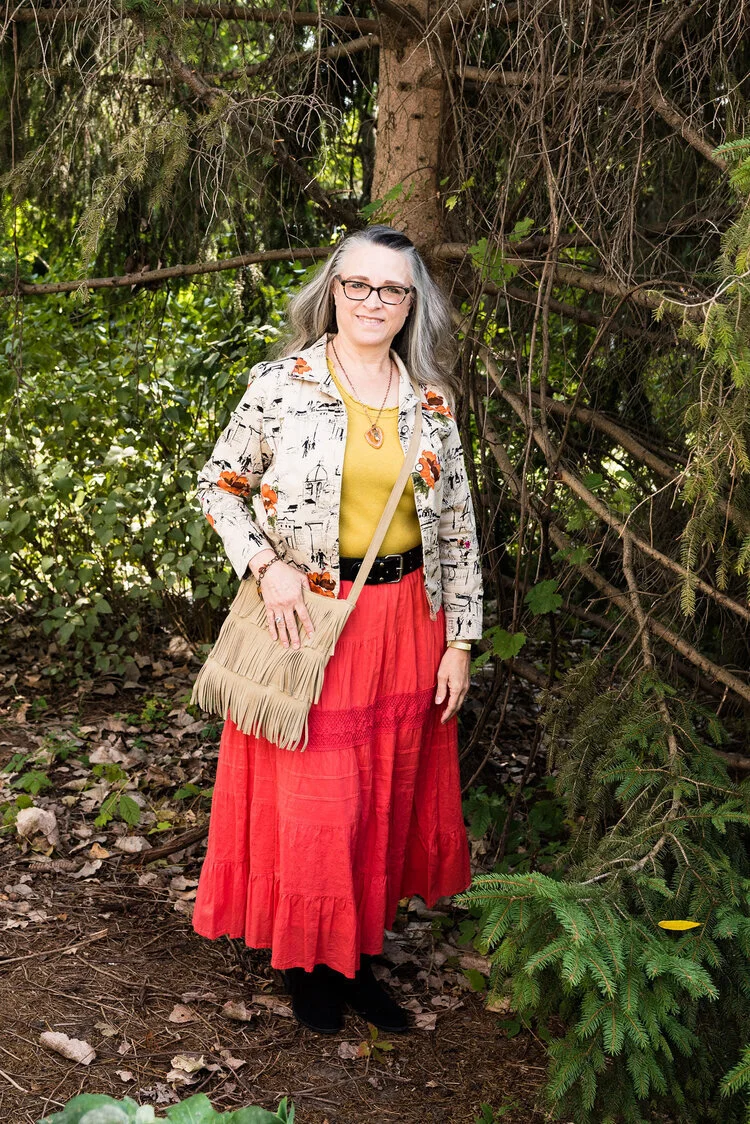
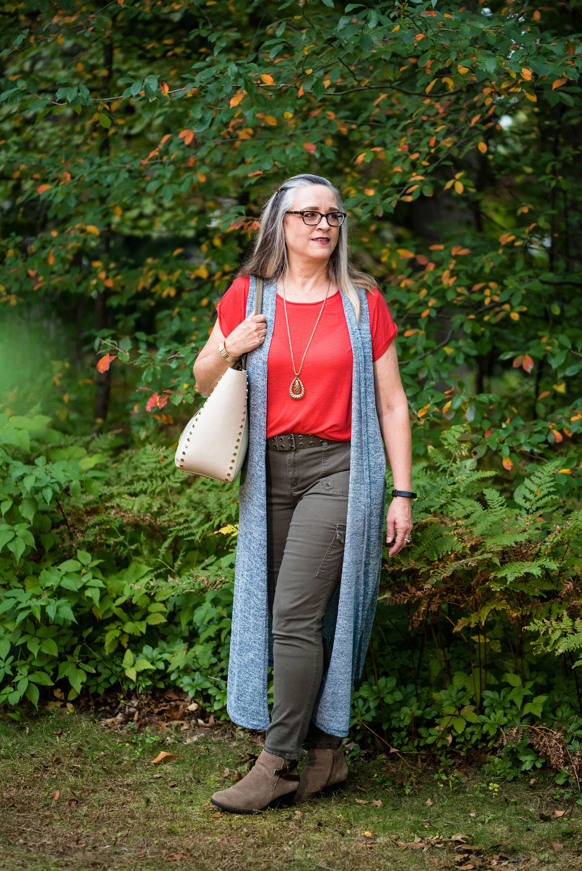
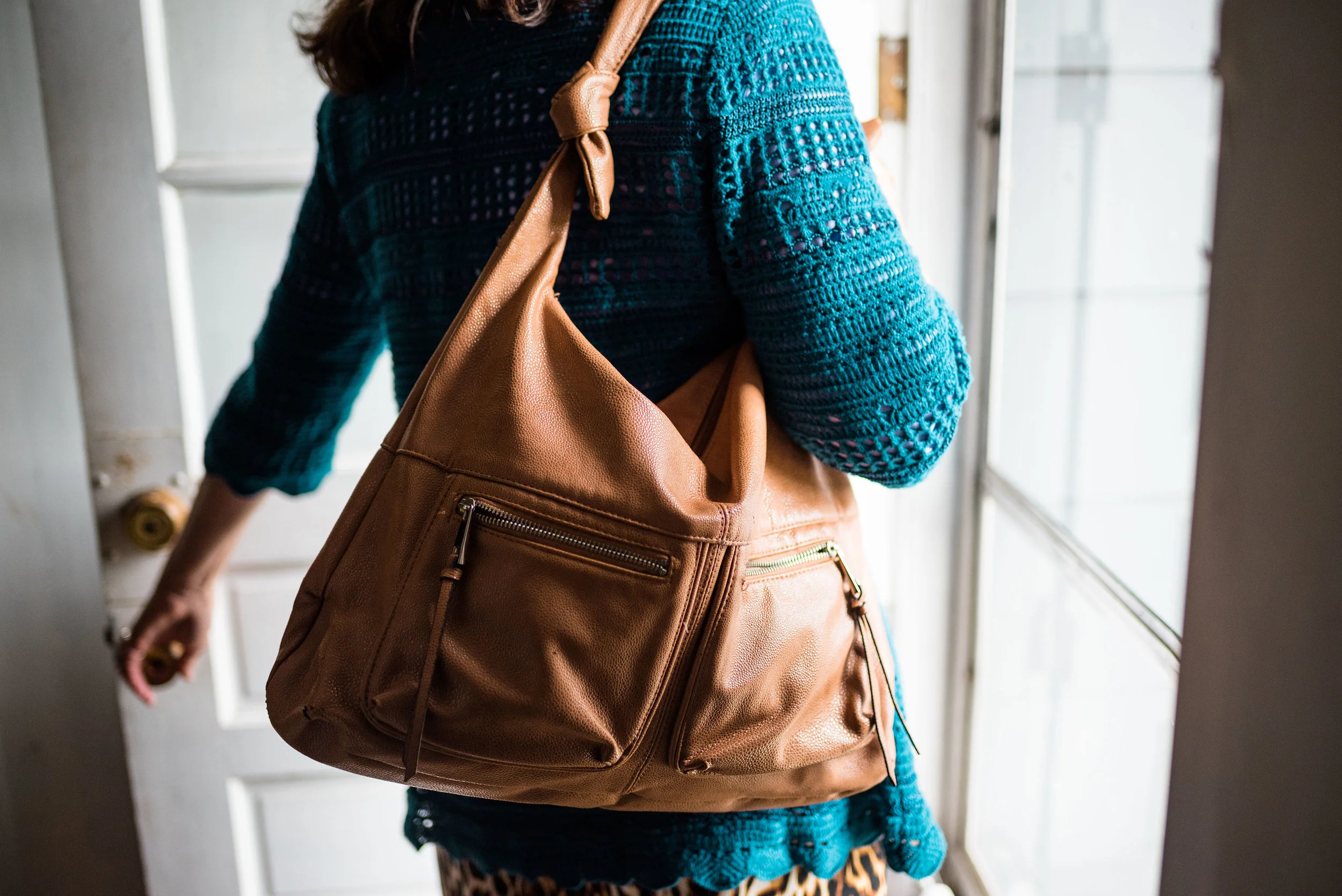
I decided to add the bright blue sweater, another Christopher and Banks cardi, as my attempt at the Indigo Bunting. It is a tad bit bluer and maybe brighter, but I think it works well. I would have never thought to pair it with this dress, but I like how it looks.

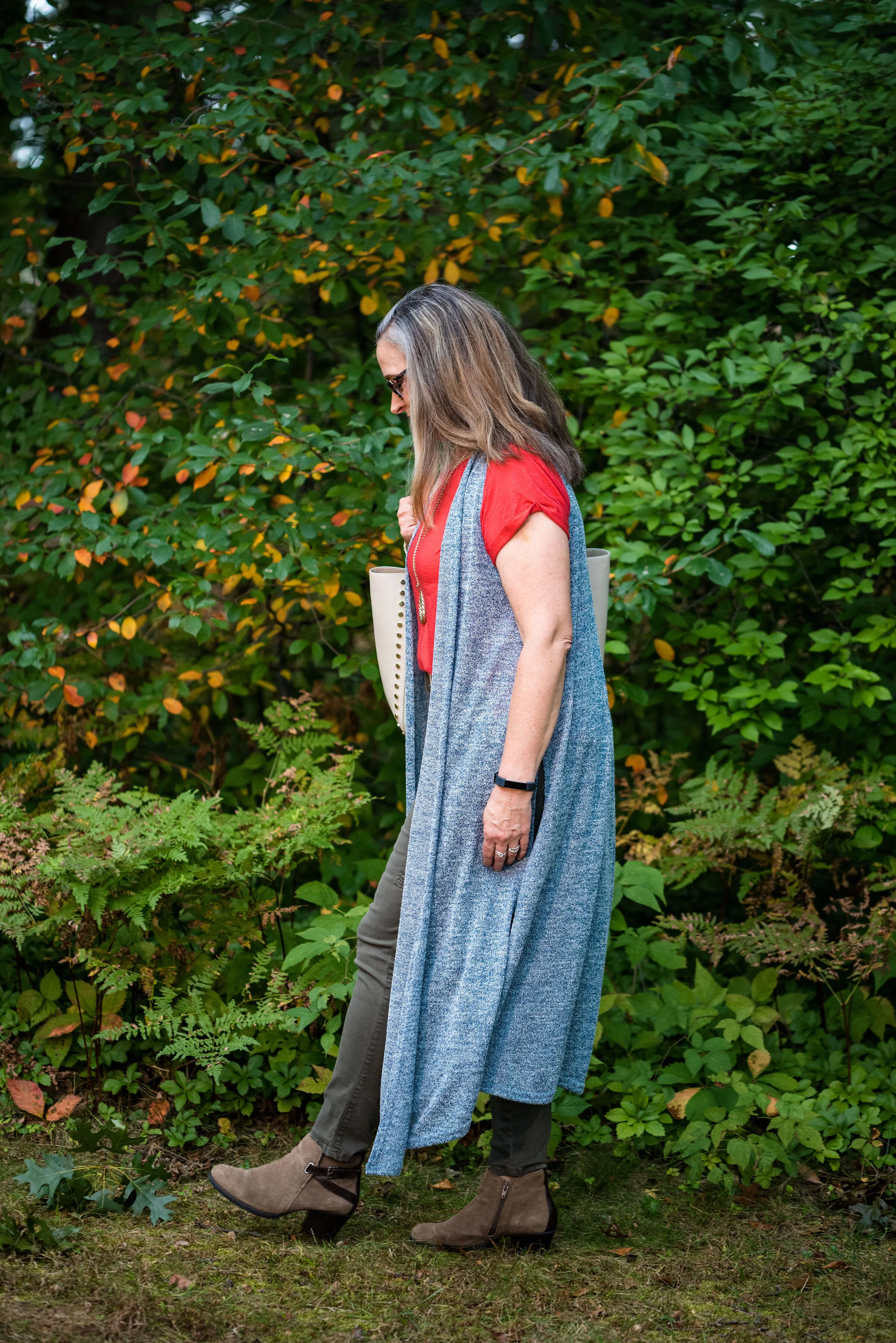
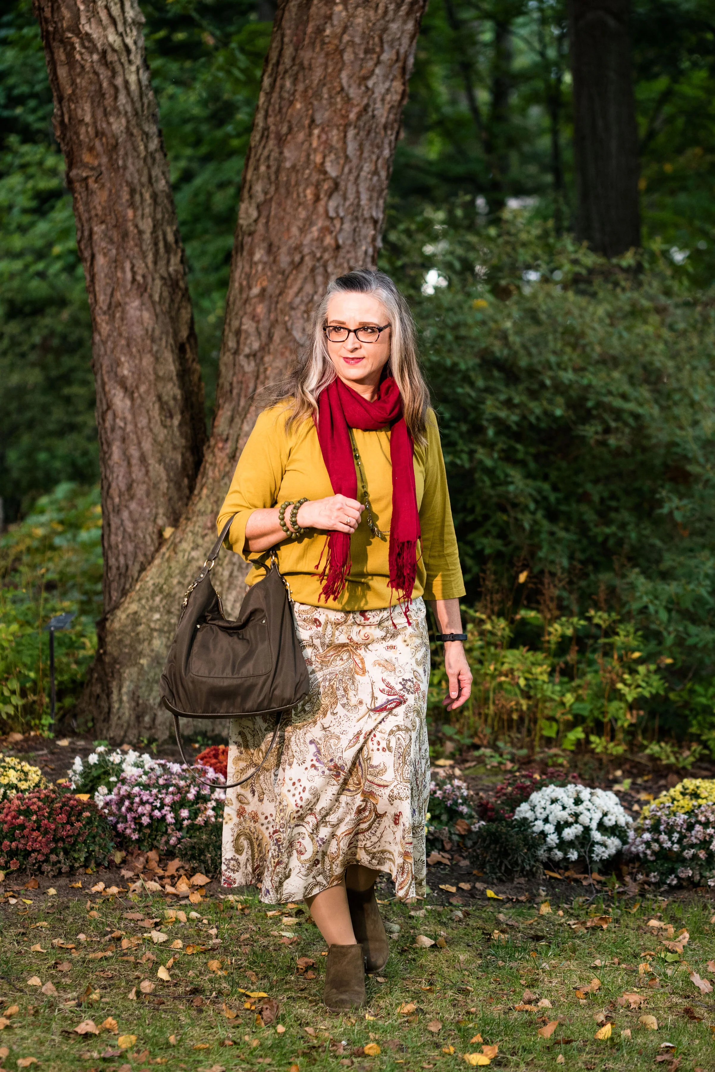
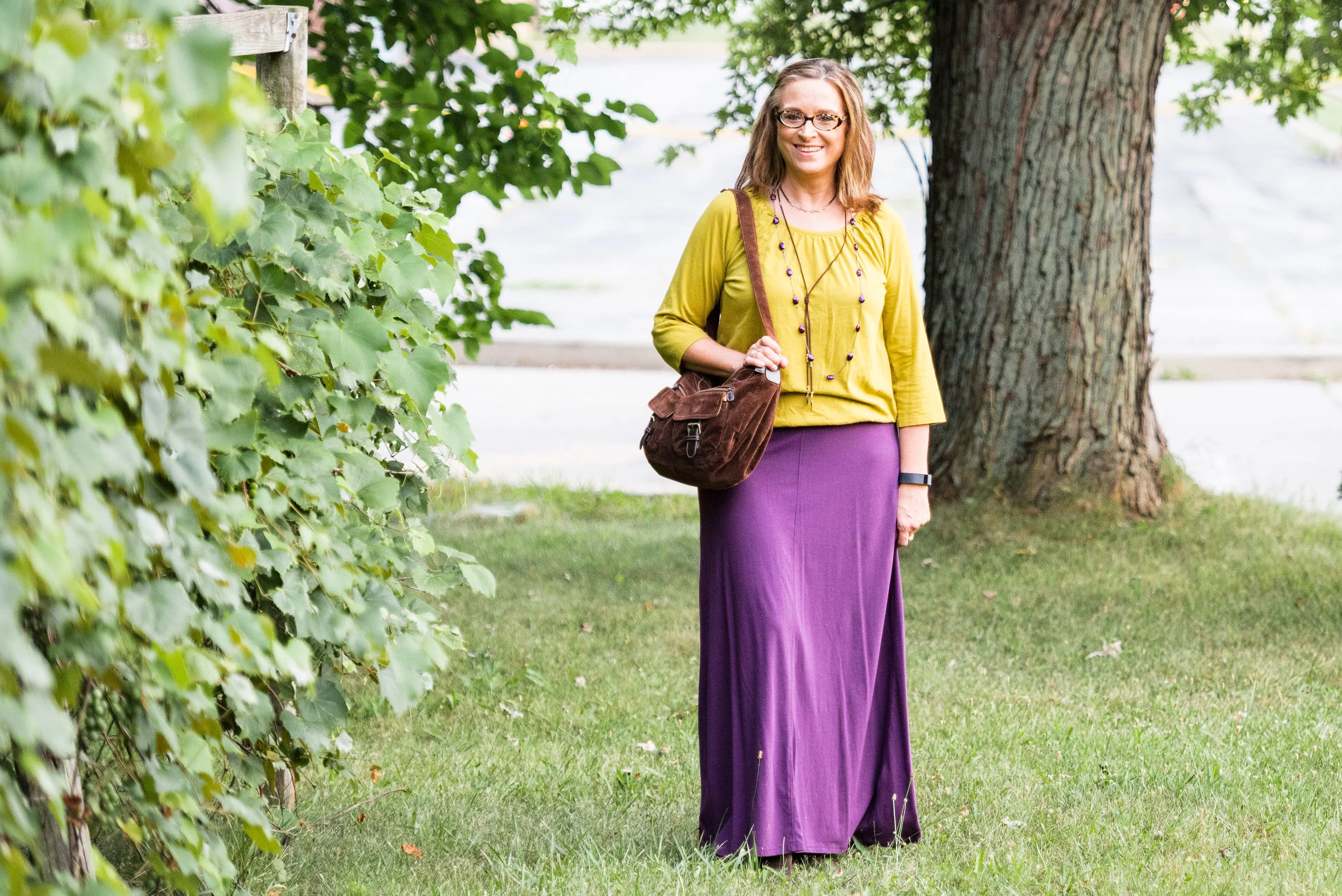
This is me being silly as I commune with nature. Ha, ha.

londonpantonecoloroutfitideapiurouette-5.jpg

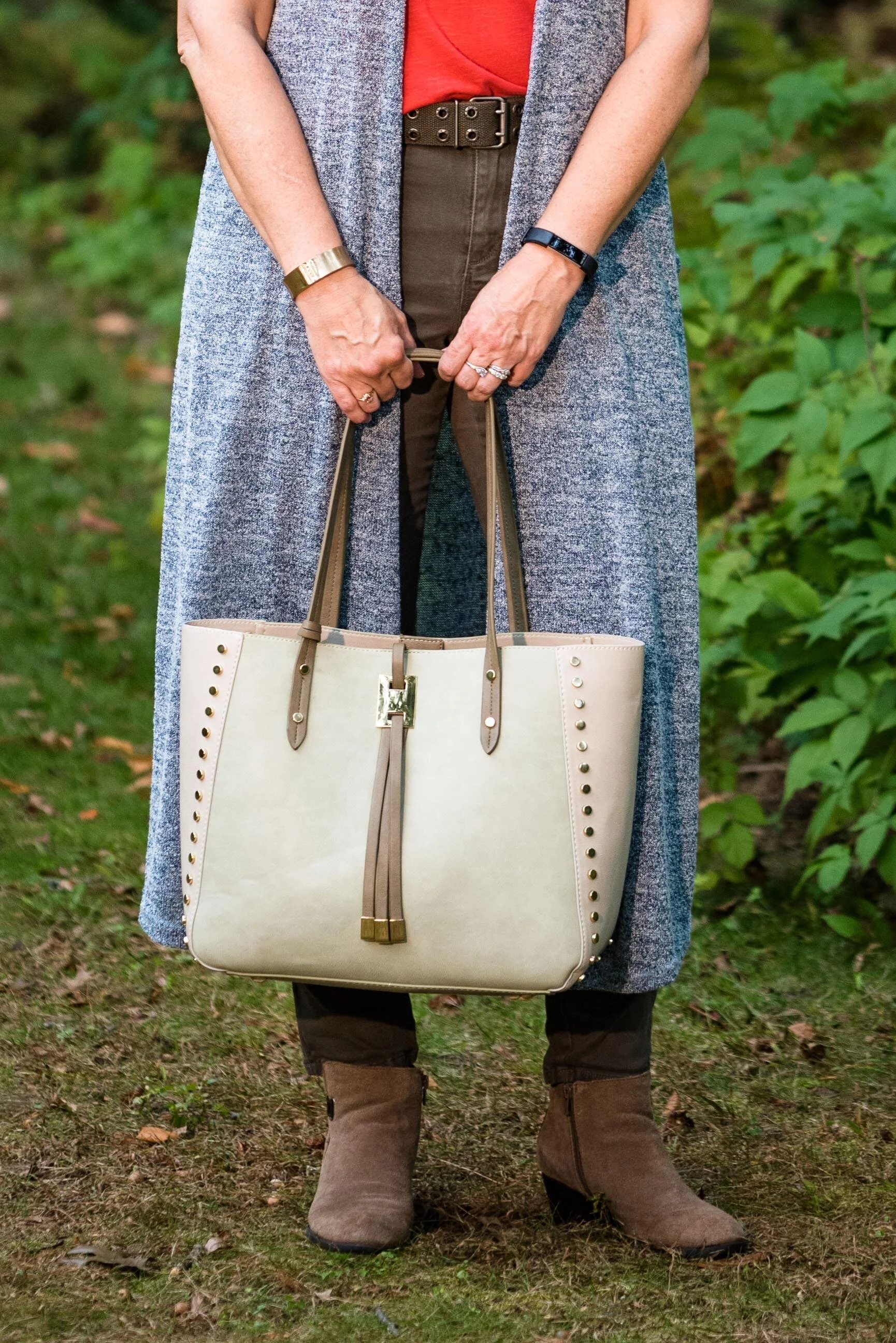
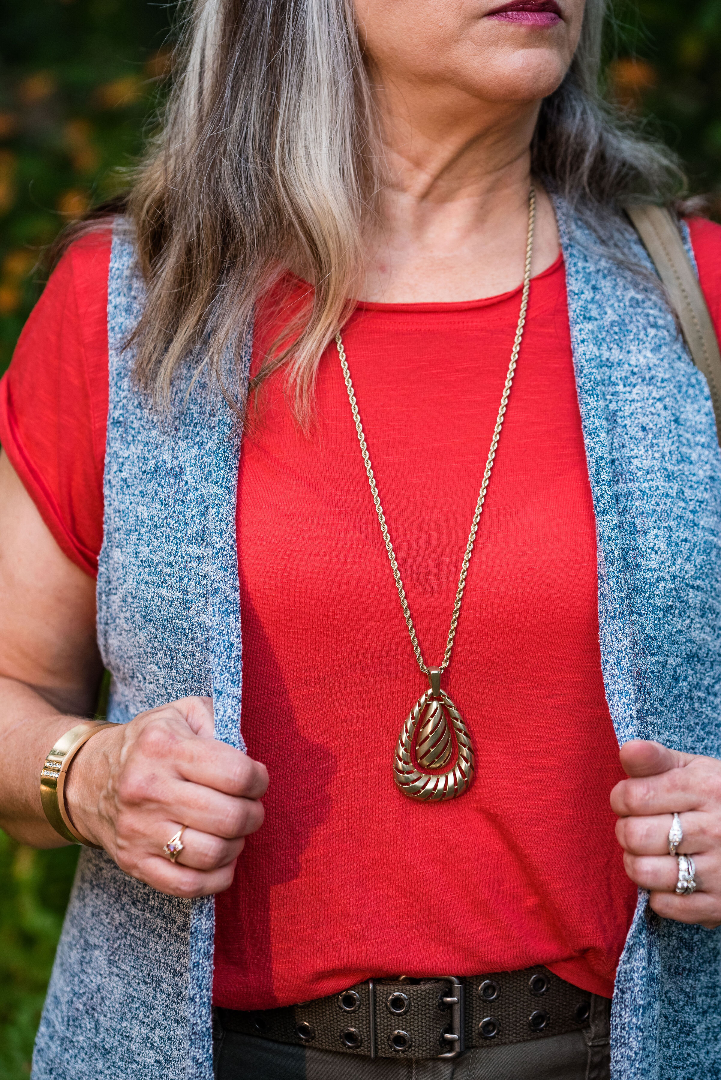
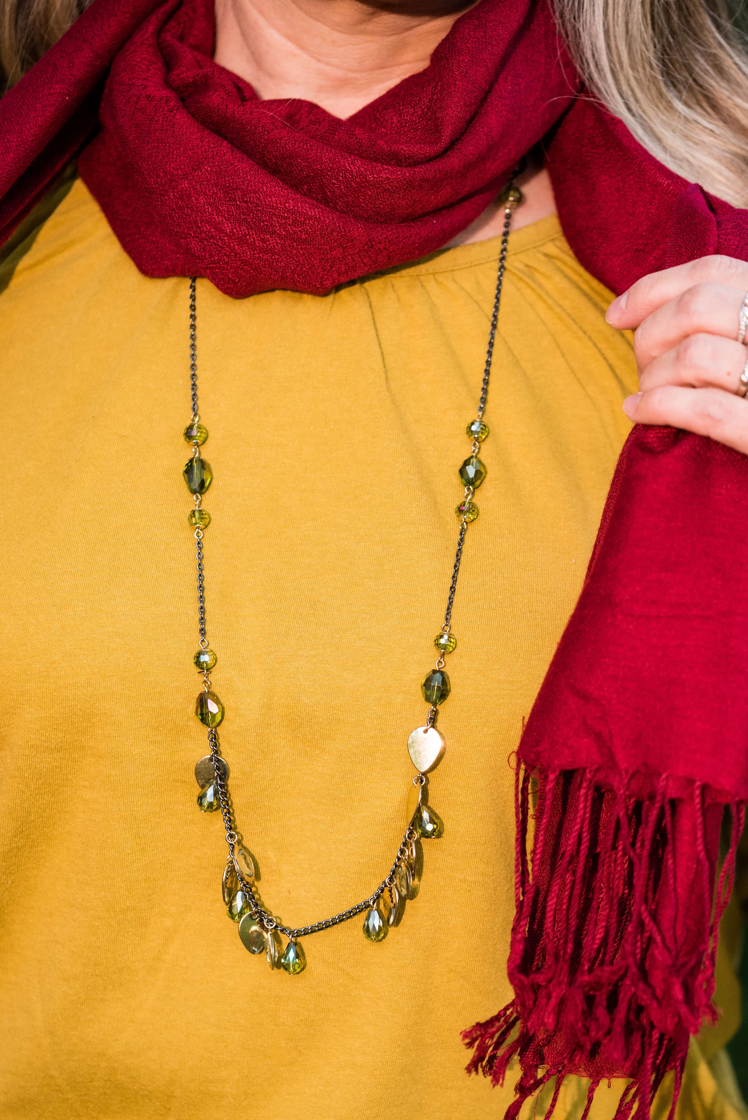
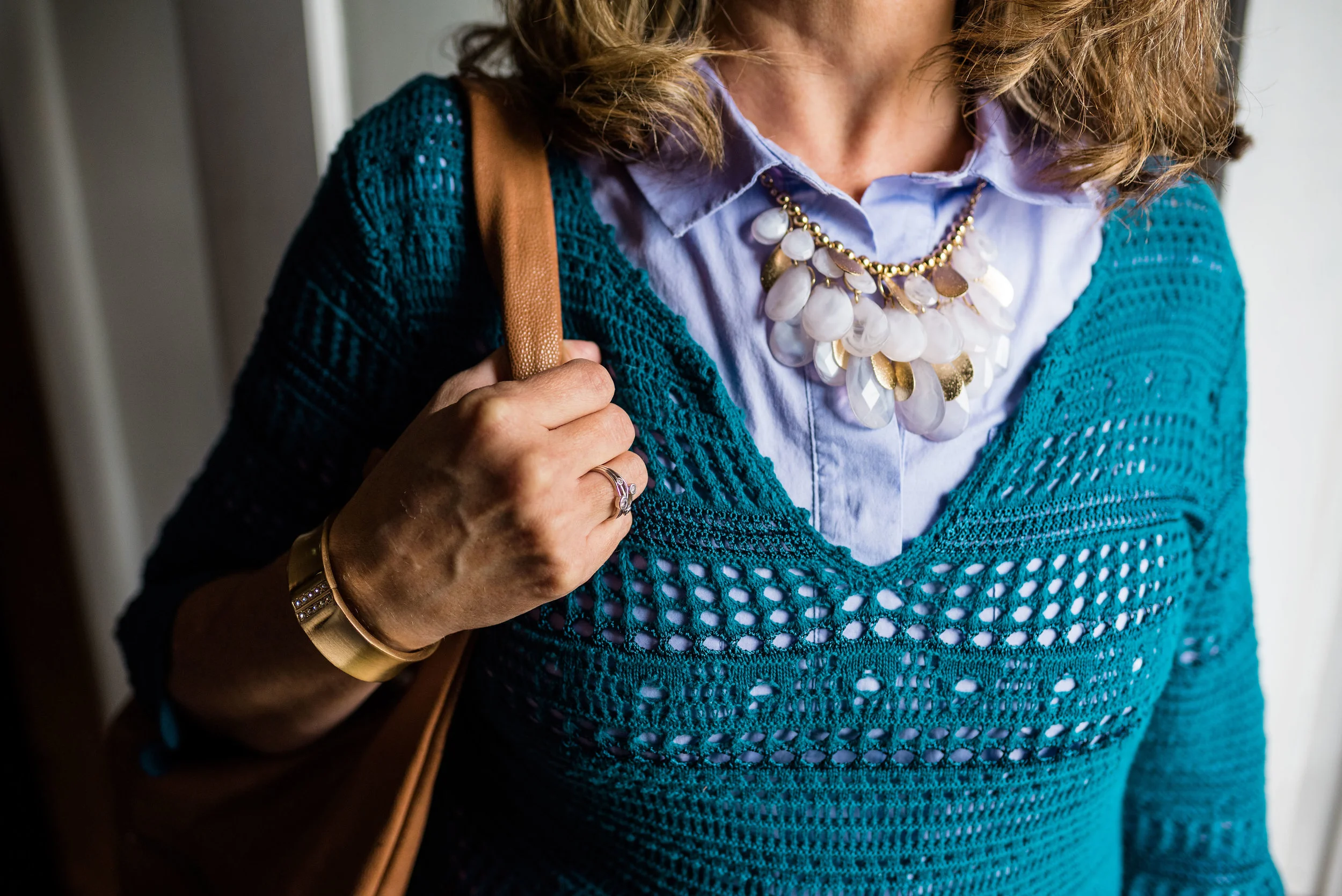
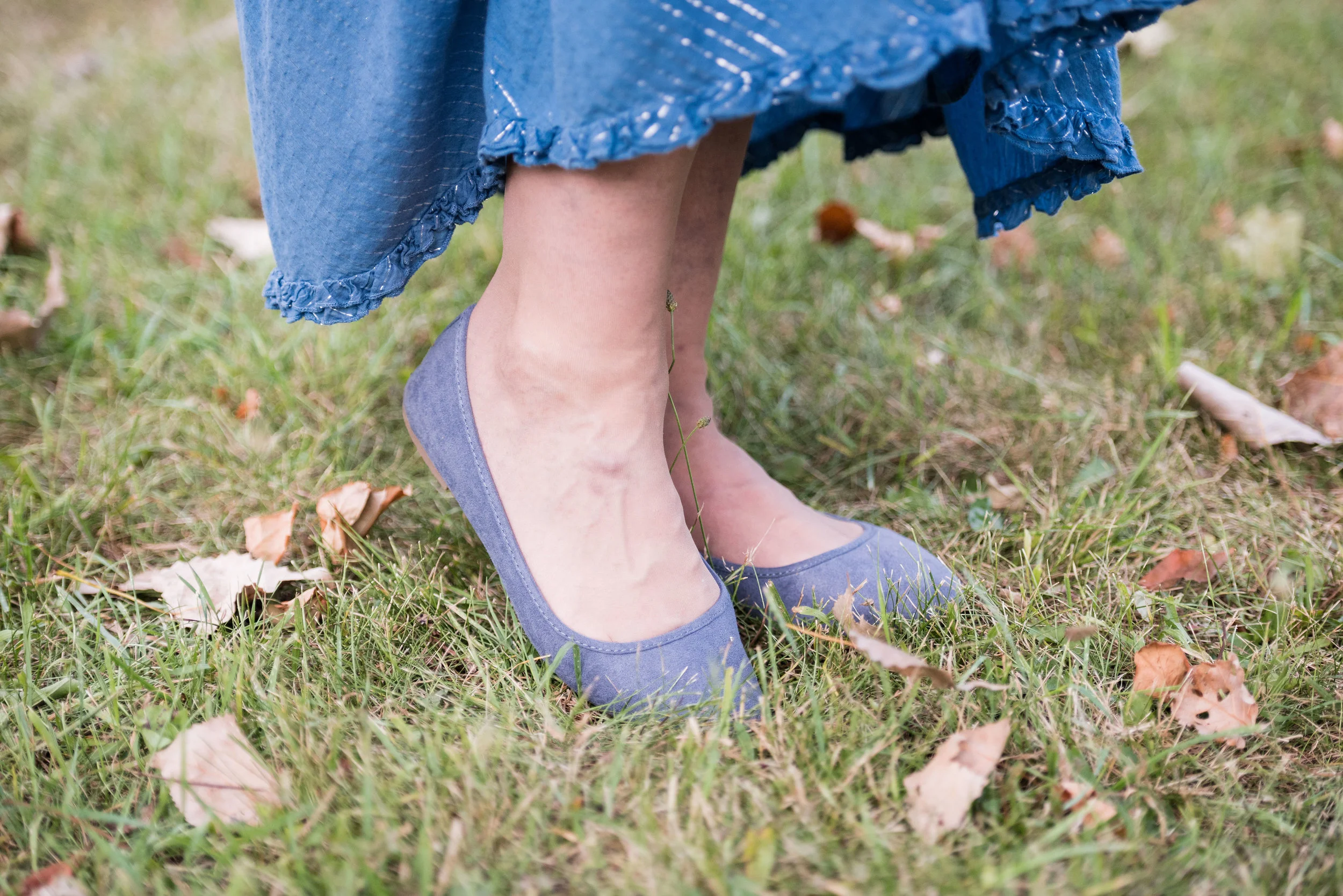
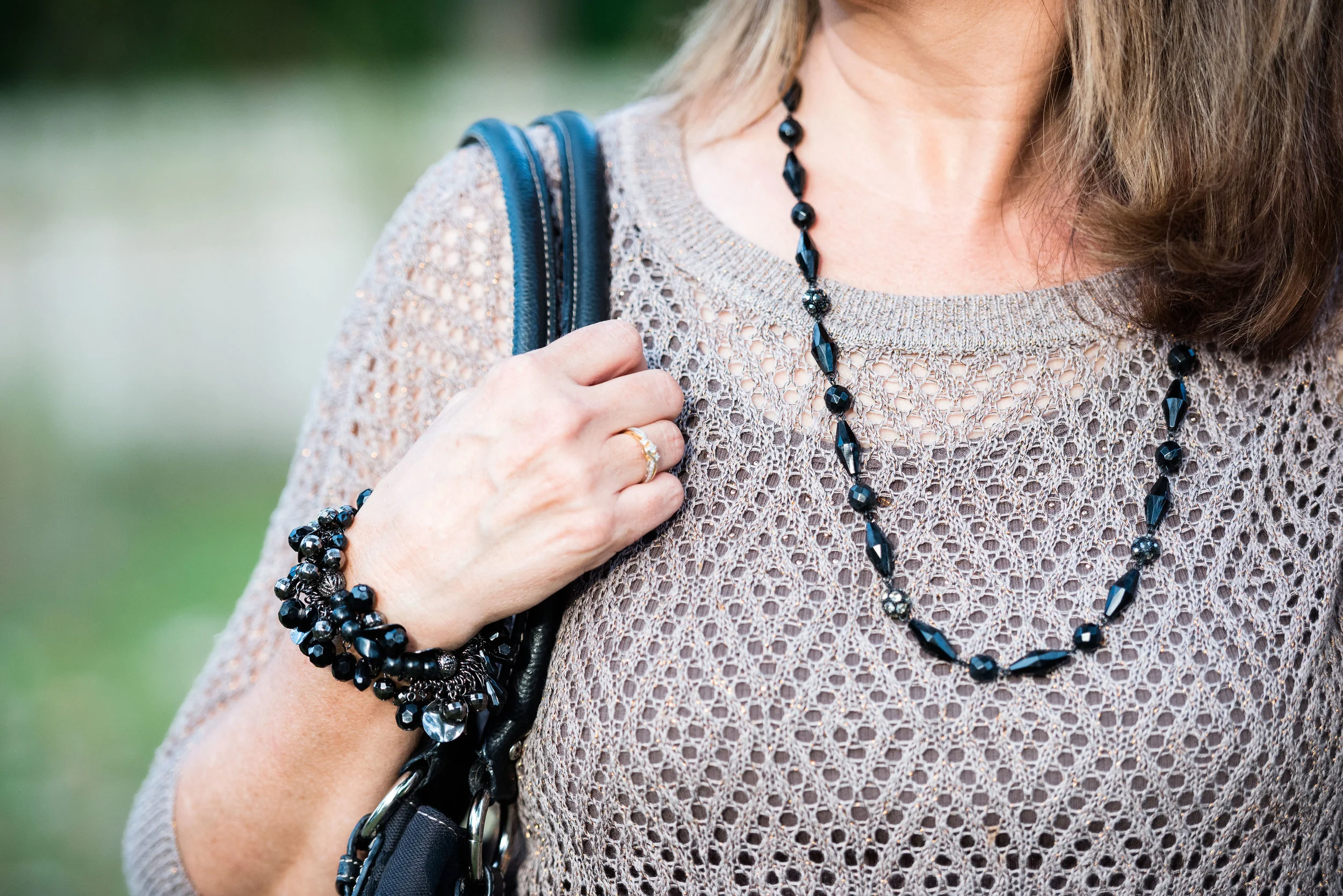
I centered all my accessories around the necklace that is perfectly Pirouette. Since the beads are strung along a silver chain, I went for silver as my accessory color of choice. My thrifted silver clutch and my SO ballerina flats makes the outfit just a little more dressy.

londonpantonecoloroutfitideapiurouette-12.jpg
londonpantonecoloroutfitideapiurouette-14.jpg
londonpantonecoloroutfitideapiurouette-15.jpg

What do you think of these colors? Would you wear them? Do you have any of these colors in your closet? Let me know what you think by leaving me a comment here on the blog or on Facebook.

londonpantonecoloroutfitideapiurouette-9.jpg

Don’t forget, I also post on Instagram and typically you’ll see more of what I wear on a regular basis. Right now my daily looks are very casual, since I am not working, but you’ll definitely get to see more of my clothes, that don’t make it to the blog.

As usual, I am including a few shopping links for these colors. These are affiliate links, but all opinions are my own.

Have a great day!

Graphic and photo credit, Rebecca Trumbull.

Pantone - Spring/Summer - 2021 - London Palette - Intro

I am finally getting around to sharing the Pantone London Palette with you. It has been hard to get things posted in a timely fashion. Even though I would normally try to get these colors to you, much earlier in the Spring, I figure they are meant for spring and summer, so we are still okay. Today’s post will introduce you to the colors and give you a few little sneak peeks from our recent photo shoot.

londonspring2021.jpg

These are all great colors for spring and summer. The palette is a nice mix of warm and cool colors and there is likely to be a color for everyone. The classic colors, while still showcasing your typical navy, gray and creamy white, also includes a soft light brown and an mossy olive green. I really like the blues included with this palette. They make me think of tropical waters and blue skies.

Enjoy these sneak peeks.

pantonefashionideassummer-1.jpg
pantonefashionideassummer-3.jpg
pantonefashionideassummer-4.jpg
pantonefashionideassummer-5.jpg
pantonefashionideassummer-6.jpg

Be sure to check back on Thursday for the first outfit in this series. I hope you had a lovely Memorial Day weekend.

Photo and graphic credit Rebecca Trumbull.

Pantone - Autumn/Winter - 2020 - All the Outfits

I wanted to end this fall color series by showing you all of the colors from both the Pantone New York Palette and the Pantone London Palette. To make it a little more interesting I thought I would show outfits that have, either a same color or a similar color side by side.

I hope that you enjoyed this series. If there are any other topics in fashion that you are interested in learning more about, or in seeing me talk about or put together in an outfit, I would love for you to let me know. I don’t follow trends too closely and this fall, I totally missed the boat on that, so I do apologize. I know some of you enjoy hearing what the trends are for each season and seeing how I apply those to the “real” world. Often when we look at websites or see magazines with tall, thin models or celebrities who are seamlessly coifed we think there is no way we would want to try this or that, especially when it comes to runway trends. However, there are a lot of trends that we can participate in and enjoy like leopard print, various colors and different types of accessories.

I will keep doing this Pantone series as long as I am blogging, because I feel strongly that even though we might differ from each other in our style, color is something we all have in common. Approaching new, bold and different colors without fear is a way to expand your wardrobe and spice up your style without completely committing to a whole different way of doing things.

The Color Palettes Side by Side.

Samba

I love the color red and I think there is a red for every complexion. I think both of these outfits worked quite well and love that both of them present a more neutral palette with a bright pop of red. In the New York outfit on the left Samba is paired with Fired Brick and Sleet. In the London outfit on the right Samba is paired with Tawny Birch and Sheepskin.

Ultramarine Green

Ultramarine was on both palettes and I think it is a pretty green that can bring a peaceful, yet vibrant feel to any outfit. This color green would look great in a bag, jewelry or a scarf and to me it really seems to draw your eyes to it. Maybe it is just my love for the greens in nature that make me like this color so much. In the New York outfit on the left Ultramarine Green is paired with Classic Blue and Blue Depths. In the London palette on the right Ultramarine Green is paired with Exuberance and Sleet.

Military Olive

While I love bright and bold colors like the two I mentioned previously, I love using olive as a neutral. It goes with every color, and has a different vibe than gray or beige. It is classy, yet subtle. In the New York outfit on the left, Military Olive is paired with Peach Nougat and Sandstone. In the London outfit on the right Military Olive is paired with Strong Blue and Jet Stream.

Green Sheen/Celery

It is hard to tell in these pictures, but Green Sheen and Celery are pretty similar. I think, because the lighting is different the colors look brighter in the shaded picture. They are different colors, but not enough different that they couldn’t be exchanged from one outfit to another. In the New York outfit on the left, Green Sheen is paired with Amber Glow and Almond Oil. In the London outfit on the right, Celery is paired with Mandarin and Sheepskin.

The Other Colors

These last two are paired only because they were the last two and don’t really have anything in common. The New York outfit on the left is a combination of Rose Tan, Magenta Purple and Sleet. The London outfit on the right is a combination of Burnt Henna, True Blue and Dress Blues.

Which outfit do you like most? Which color from the two palettes is one you frequently wear? What new color(s) are going to try to add to your wardrobe. As always, I love to hear your thoughts.

I apologize to those of you who subscribe to my blog. The last three weeks, I have completely forgotten to send out my weekly emails. I’ll just attribute that to “squishy brain syndrome.” Ha, ha.

Thanks for following along on the blog. I hope to use the next couple of weeks leading up to Thanksgiving showing you more fall outfits and maybe a few ideas for what to wear to Thanksgiving dinner whether you are going some place or sheltering in place.

If you follow my Faith page be sure to check back tomorrow for the next installment in my series on the Unseen Enemy.

Have a great weekend!

Graphic and photo credit Rebecca Trumbull.

Pantone Spring/Summer 2020 - Recap

I hope you have enjoyed this Pantone color series. Today I just want to show you a recap where you can see all the outfits in one post. Here we go.

New York Palette

Pantone Spring/Summer 2020 - New York Palette

Classic Blue, Chive and Navy Blazer

Faded Denim, Orange Peel and Lark

Sunlight, Flame Scarlet and Ash

Biscay Green, Saffron and Brilliant White

Mosaic Blue, Coral Pink and Brilliant White

Cinnamon Stick, Grape Compote and Navy Blazer

London Palette

Pantone Spring/Summer 2020 London Palette

Classic Blue, Beetroot Purple and Oyster Mushroom

Pantone Spring/Summer - London Palette

Flame Orange, Blossom and Cuban Sand

Pantone Spring/Summer 2020 - London Palette

Yellow Iris, Rose Brown and Cuban Sand

Pantone Spring/Summer 2020 - London Palette

Storm, Fiery Red and Blueberry

Pantone Spring/Summer 2020 - London Palette

Blush Beauty, Bossa Nova and Blanc de Blanc

Pantone Spring/Summer 2020 - London Palette

Tanager Turquoise, Heritage Blue and Blanc de Blanc

Pantone Spring/Summer 2020 - London Palette

Which color palette was your favorite? Which outfit did you like the best? I would love to hear your thoughts. I hope you all have a wonderful weekend. We will be celebrating Father’s Day with our kids on different days, since schedules wouldn’t allow for everyone getting together. God bless each of you with peace and joy.

All graphics and London color palette photos by Rebecca Trumbull.

Pantone - Autumn/Winter - 2019 - Summer Fig and Bluestone

You’ll remember from the New York Pantone series the color Bluestone. This is one of only two colors that showed up on both palettes. I’m not sure how the Pantone Color Institute comes up with the colors they choose. Is there a committee? If so who is on the committee? How do they come up with the names for each of the colors? Yes, these are the things a fashion blogger wonders when she is tired and needing a burst of writing motivation. Ha, ha. I am speaking the truth when I say, I had to look up what a fig looked like to understand where they came up with this red color. This red coincides with the bright red interior of the fig fruit. I have never eaten a fig, have you?

This bright red tee is SO brand from Kohl’s. It is a few years old. I find Kohl’s and JCPenney my go to’s for things like short and long sleeve tees.

The Bluestone vest is a LuLaRoe piece. This particular style is called Joy. I like that some clothing companies name each of their styles. Not that I will remember what they are called, but I just think it adds another dimension to a retailer, that they have taken the time and effort to specify a certain line has a name. This is the only vest I have that is this length and I like how it looks in this outfit. The fabric has plenty of stretch, but doesn’t lose its shape.

Once again, I turned to the classic color of Olive Green for my pants, bag, and belt. Olive just seems to be an easy color to pair other colors with and it grounds an outfit and keeps it looking chic with a bit of an edge. These utility pants are Gloria Vanderbilt brand and I’ve styled them before on the blog. You can see them styled with an olive utility vest here and in a flat lay with a snakeskin jacket here. I got the tote bag from Charming Charlie a couple years before they went out of business. Belts are so expensive, I usually try to pick them up at thrift stores.

I kept the jewelry simple with a gold pendant necklace and a gold bracelet.

This old pair of Sonoma ankle boots has been with me for a while, but they are the perfect neutral finishing touch and the suede texture is just right for a fall outfit.

What do you think of these colors? They are very similar to the New York palette using Bluestone and Chili Pepper. Do you like to wear vests? Do you have a long one like this? What are some other ways you could style a long vest? I’d love to have your feedback.

I’m including a few shopping links. These are affiliate links. All opinions are my own.

Photo and graphic credit Rebecca Trumbull.


Pantone - Autumn/Winter - 2019 - Merlot and Antique Moss

The first two colors from the Pantone - Autumn/Winter - London palette that I am featuring are Merlot and Antique Moss. As you can imagine, Merlot, like the wine is a rich burgundy red, while Antique Moss is a yellowy green. Often when we think of pairing red and yellow, we are concerned we will come out looking like an advertisement for McDonald’s, but let me reassure you these two colors pair in a perfectly un-Ronald like way and I love the combination.

The London color palette classic colors were just a bit different. Green Olive is comparable to Guacamole from the New York palette, with a little more of a gray tinge. My version of olive in my accessories is much darker, but you get the idea.

This Jones Wear skirt you’ve seen on the blog before. I styled it for the Pantone Fall 2017 New York Palette in a very similar fashion. I even used the same dark olive bag. Ha, ha. You can see that post here. I also used it this past spring for the Pantone Spring/Summer 2019 colors. You can see that post here. In addition you can see it with a green cardigan, here. I keep coming back to this skirt, because it works so well for these color schemes due to the reds and greens in the print of the skirt. I could easily used this printed skirt for a Christmas outfit as well, so you might see it come up again later this year. I love a versatile piece and when I purchased this skirt, I never knew how often I would use it for the blog.

We took the pictures for this series at the Toledo Botanical Gardens, which are just down the street from where my daughter lives. The gardens are beautiful in all seasons and with walking paths through the grounds, it is a lovely place to visit and I don’t do it nearly enough. In the picture below, I am watching several bus loads of kids scramble on to the grounds and thinking, “Oh boy!” Ha, ha.

I obtained this red scarf from a friend’s closet. It looked a little more like Merlot, when it was in the low light of my closet, but here it looks much brighter. However, It is not a true red, but more of a burgundy. My 3/4 sleeve tee, I’ve worn on the blog before too. It is a thrifted Sonoma piece and has elastic on the bottom, which allows for freedom of movement and bulge camouflage. Ha, ha. You can see the tee styled with boyfriend jeans and a leopard print skirt here, and with a snakeskin print skirt here.

As I said earlier, I opted for olive green accessories which included my necklace, bracelets, thrifted bag and SO booties.

What do you think of these colors? Would you wear either of these? Would you wear them together? I’d love to have your feedback. Your support means a lot to me. I always respond to your comments. Just check back in a few days if you are interested in my reply.

I’m including a few shopping links for Merlot and Antique Moss if those colors got you excited. These are affiliate links, which means I get a few cents when you click on a link. All opinions are my own.

Photo and graphic credit Rebecca Trumbull.


Pantone Fall 2018 - Quetzal Green, Crocus Petal and Meerkat

I am on my last Pantone Fall 2018 post. I hope you have enjoyed seeing these colors and the way I have managed to put outfits together using the inspiration from the 2018 Fall palette. As in anything where fashion is concerned we can take it our leave it. Fashion is for you. It is about putting together outfits and colors that you like, make you feel confident and that you will enjoy wearing. In some ways what we wear is like our second skin. It provides a covering for a bodies and how we put that cover together can boost our self-image and help us better manage our wardrobes and our pocket books.

I have found, in the fashion realm, just like in cooking, having a source of inspiration really helps. Whether you follow a recipe or cook from memories of you and your mom or grandmother working together to make wonderful creations in the kitchen, you use that inspiration to put food on your table. In the same way inspiration for fashion can come from magazines, bloggers, color palettes or even things out in nature. That is the reason I always like to use the Pantone color palettes as a spring board for creating fun and interesting outfits.

These last two colors, Quetzal Green and Crocus Petal, I decided to pair, once again, with Meerkat. Crocus Petal is a lighter, more spring like color found on the London palette. I feel that pairing it with Quetzal Green and Meerkat was the perfect way to keep the light color grounded and more fall like.

This top is a Kohl’s clearance find and is Dana Buchman brand. It is a button up with 3/4 length sleeves and a longer silhouette. It has some stretch and is more fitted. I opted to wear this bead and metal statement necklace, which incorporates the Crocus Petal color as well. I wore a simple gold cuff on my arm.

I found the open weave sweater thrifting, I love the variations in the knit. I am not a yarn girl, though I would love to be. I think this is crocheted, but it might be knit. Can any of you readers tell? Whatever it is I love the different stitch sizes and open versus more closed aspect to the piece. Here we are talking about texture again and how essential is is to making an outfit more interesting.

I thought these two colors when great with the browns, black and cream of my leopard print pencil skirt. This skirt is another JC Penney find and is Worthington brand.

The boots, Aerosoles and bag, both thrifted were the perfect accessories to pair with this outfit. I think black would have worked well or even a cream colored boot, which are trending right now, but I love the luxe feel of the Meerkat color.

Next week I’ll have a recap of all the Pantone Fall 2018 colors. I hope you’ve enjoyed this series and that it provided you with some inspiration for trying new color combinations. Always shop your closet before going out to purchase what is currently trending. You might already have a leopard print top or the perfect color piece that matches with one of the Pantone seasonal colors.

I’ve included a few shopping links. These are affiliate links. All opinions are my own.

Have a great day.

Photo credit Rebecca Trumbull.

Pantone Spring 2018 - Recap

Now that my series is over, I thought I would show you all of the outfits together for a fun review. Just a refresher, the Pantone Color Institute puts out a palette of colors twice a year, once in the spring and once in the fall. These colors are the basis from which designers, both fashion and interior, draw their inspiration for fabrics, clothing, paint and furnishings. I always consider it a challenge to draw outfit inspiration from these colors, even the ones I may personally not like. Let's face it, not all colors are necessarily pretty in everyone's eyes. However, I think it can be good for our brains to think outside the box and try new things. 

These were the two palettes. Many of the colors overlapped and I made reference to that in the posts. I personally think these two palettes were perfect for spring. Most of the colors were bright or light, with a few more earthy tones, which combined rendered great spring outfits. 

Here were my outfits. If you click on the picture it will take you to the original post.

I was glad that Pantone added the four classic colors of Sailor Blue, Harbor Mist, Warm Sand and Coconut Milk. These colors are perfect for grounding an outfit and keeping it from getting too over the top with color. Is there such a thing? Ha, ha. 

I think out of all of the colors from both palettes my favorites are Ultra Violet, (no surprise there, since I love purple), Arcadia, Pink Lavender and Ash Rose. All but Arcadia fall into the purple range. What can I say, I love purple! If I ever had a sports car it would be dark sparkly purple. Ha, ha. 

I hope you enjoyed this series. Let me know in the comments what your favorite colors were from this spring's two palettes. I always love to hear what you are thinking. 

Join me on Thursday for my Outside the Box column. You never know what I'll be showing off there. If you follow my Faith page, check back tomorrow for more on my Mulling It Over series as we delve further into 2 Timothy 2. 

Have a great Tuesday!

Photo credit Rebecca Trumbull. Make up Rachel Christensen.

Monday linking up with Catherine of Not Dressed as Lamb. Tuesday linking up with Jess of Elegantly Dressed and Stylish and Shelbee of Shelbee on the Edge

Pantone Fall 2107 - The London Palette - Royal Lilac and Golden Olive

This is the final installment in the London series of colors from the Pantone Fall 2017 palette. I love the brightness of these two colors, especially together. For some reason they make me think of fall and of a Bohemian gypsy vibe. Maybe it is a flash back from the bright psychedelic colors of the late 60's and early 70's. Royal Lilac is a purple worthy of a king. Purple is one of my favorite colors and we rarely see it on the runways and magazines of the fashion world. Purples in those realms seem to tend more towards wines, burgundies or maroons.

Once again, let me say that when I look for these colors I try to get as close as possible to the color that is being portrayed in the Pantone palette. My colors do not always match exactly, but the point is to introduce you to the colors on the palette and show you ways to style those colors. Just like Toast and Copper Tan, Golden Olive was a difficult color to find. I had this top in my closet and the actual color seems a bit more green than what appears in the pictures, but not quite like the Golden Olive.

Out of all the color pairings that I did from the London palette, I like this one the best. There is something about the contrast between the purple and the mustardy yellow, that appeals to my inner gypsy. In keeping with that idea, I thought I would accessorize with a brown hobo bag and brown slouchy boots. 

For my jewelry I added a brown lariat choker and a long metal and bead necklace that tied into the purple skirt

One of the other things I like about this outfit is the comfort. The material of the top and the skirt is basically heavy weight tee shirt material, so it moves with me and there is no binding or pinching. This is also a great transitional outfit as the weather cools. The 3/4 length sleeves on the shirt, the maxi length skirt and the boots all provide full coverage for those chilly days ahead. 

What do you think of these two colors? Do you like them? Would you wear them? I hope you will leave me a comment in the comments section below. I appreciate when you do and it helps my blog grow.

This post contains affiliate links. If you click on a shopping link below, I get a few cents. Every lttle bit helps, so thank you for the clicks. Part of why I include the links is to show you real items that are currently available in the colors I post, or at least close. All opinions expressed are my own.

Photo credit Rebecca Trumbull. Make up Rachel Christensen.

Thanks for hanging out on the blog today. Check back on Thursday for another Fall 2017 trend.

Pantone Fall 2017 - The London Palette - Blue Bell and Lemon Curry

Last week I looked at two colors with more of an orange hue from the Pantone Fall 2017 London palette. This week I am going to introduce you to one of the two yellow hues on the palette. Lemon Curry is a spicy yellow that can add a bit of zing to your fall color combinations. I decided to combine this yellow with Blue Bell, a light soothing color. The combination results in an outfit that has both pizzazz and peacefulness. 

My daughter had to teach me a few things about photography when she first sent me this grouping of pictures. The reality is that a camera does not see things the way the human eye does. Our human eye, unless they are unable to translate properly, see colors as they really are. A camera and the image it imprints onto a digital card is affected by lighting, exposure and other factors. 

When I saw these pictures, I texted my daughter and said, "This skirt does not look like it looks in real life." We went back and forth on it for a while and I finally told her to leave it alone. When we got together for my grandson's birthday party yesterday, she took the time to explain to me that a camera, no matter how fancy picks up what it thinks it sees, not necessarily what is really the fact. Who da thunk? Obviously the hombre skirt contains an underlying tone that the camera translates to more of an aqua blue, when in reality it is more of a navy or gray blue. Rebecca was able to adjust the pictures to make the skirt look more like the original color and I learned a few things about digital images. 

For this post, it doesn't really matter, because the blue I am trying to match with the Blue Bell color is the top tier of the skirt, rather than the bottom tier. 

Once again, for this color combination I shopped my closet. I've had this tiered skirt for a while and usually wear it a few times over the summer months, as it is light weight, but also lined. The tee I've had for a long time. I love the pattern, the fit and the longer short sleeves, but I hardly ever wear it. When I came across it looking for something yellow, I realized this would be the perfect piece to represent Lemon Curry.

Even though the top contains some black and white you can clearly tell is has the spicy Lemon Curry vibe. 

To pull the look together I wore Blue Bell colored jewelry including my pendant necklace from Kohls and my bracelet from Chico's. I decided to used a brown bag to keep the look more grounded and earthy.

For shoes, I chose my simple SO flats. Yes, I know I keep wearing these for various outfits, but they are just so cute and comfy!

What do you think of the pairing of these two colors? Which color do you like better?

I think these two colors are perfect for fall and transition easily from summer. 

Photo credit Rebecca Trumbull. Make up Rachel Christensen

The following are few shopping links for possible items in Blue Bell and Lemon Curry. This post contains affiliate links. All opinions are my own. 


Thanks for stopping by the blog. Hope to see you back again soon.


Pantone Fall 2107 - The London Palette - Toast and Copper Tan

Out of all of the London Palette colors, I felt these two were the hardest to find. They are also hard colors for many people to wear. Toast and Copper Tan are not truly tan, but also not truly orange or brown. As this is not a color I saw in the stores, I did some thrifting and found that even there these are not popular colors. In the end, I shopped my closet and this is what I came up with. You have seen all of these pieces before.

With this pairing, I am going for a more monochrome look.

This asymmetrical hem top I have styled before here. I love the detailing on this tee. The bottom is trimmed with lace and there are two side triangular insets that add texture and interest to the top. 

While the pants I am wearing are not truly the Copper Tan color, I felt, due to the yellowy orange stripes in the pants that it makes them seem more of a coppery hue. I styled these Sonoma ankle pants before in my summer InVestments series. 

In keeping with the neutral monochrome vibe, I decided to go with faux pearl jewelry that stood out due to its iridescent quality.

i felt the addition of the chocolate brown moto jacket kept the outfit from being too soft. The jacket adds an edgy vibe and epitomizes my style personality. Of course if I am going for that look, I had to add my favorite taupe SO brand ankle boots as well. 

Due to the fact that I love color, I felt it necessary to add at least one piece that made the outfit pop. The bright blue bag reminds me of the blue skies so prevalent on many midwest fall days. This bag that was thrifted is Nine & Co. brand. 

What do you think of these two colors? Do they seem like fall colors to you, or do you feel they are more reminiscent of a pale sunset on a summer evening? I hope you enjoy following along as I look at the Pantone color palettes for each season. 

Below are a few tops I found that are a similar color. This post contains affiliate links. If you click on a link I get a few cents. All opinions expressed are my own. Thank you for all your support. 

Thursday I am planning a series on this year's fall trends. For the month of September we'll take a closer look at what some of this year's fun fall trends look like from my closet! Stay tuned!

Pantone Fall 2017 - The London Palette - Flame Scarlet and Otter

This year the Pantone Color Institute decided to share two color palettes for fall. Both the London and the New York palettes have similarities, such as Navy Peony and differences. However, I feel that both palettes feature rich colors that easily transition us into fall. You might feel that these colors are not for you and when I first looked them over, I was not excited, but as I began to ruminate on them and look for pieces in my closet and at the store that would best represent each of these colors, I grew excited to see how each of these palettes would translate to real outfits that an actual woman would wear. 

To keep this series to a minimum I decided to challenge myself to come up with outfits that use two of the colors at a time. This week I am featuring a bold, rich red labeled Flame Scarlet, paired with a warm hue called Otter.

I've styled these Worthington brand trousers before on the blog. You can see that post here. This light weight open weave sweater is a great piece for transitioning to fall. Days can still be warm, but mornings and evenings can be cool. I just put a similar colored tank underneath.

I opted for black accessories and kept them to a minimum. I felt the black was a suitable contrast for this two toned outfit. A single strand beaded necklace and a beaded bracelet were my only jewelry. 

I dug this black top handle bag out of my closet, all the while wondering why I have so many purses and bags that I don't use! It is like clothes and shoes. I keep intending to come up with other ways to style all these different pieces, but life!

As you can tell by the fact that this post is a day later than I normally post, that my life is crazy busy. I have been back at work putting in about 30 hours a week, picking up my grandson from school and then trying to spend time with my spouse in the evenings, after which I simply have no energy left to work on the blog! Oh well, that's me...Hi! My name is Amy and I am an actual woman!

My shoes are a simple black pump that I've worn on the blog before. 

I like Flame Scarlett paired with Otter. What do you think? A bold color with a more subdued neutral? Or do you like to pair two bold colors? Maybe you like a more neutral palette all over. I'd love to hear your thoughts in the comments section below. You feedback is very important to me. 

Below you will find some shopping suggestions. These are just options so you know what is available in these colors. This post contains affiliate links. If you click on a shopping link I get a few cents. If you purchase something through my blog, I get a little commission. I appreciate all your clicks. 

I hope you enjoyed this look at the first two colors of the Pantone Fall 2017 London color palette. Thank you for stopping by the blog.