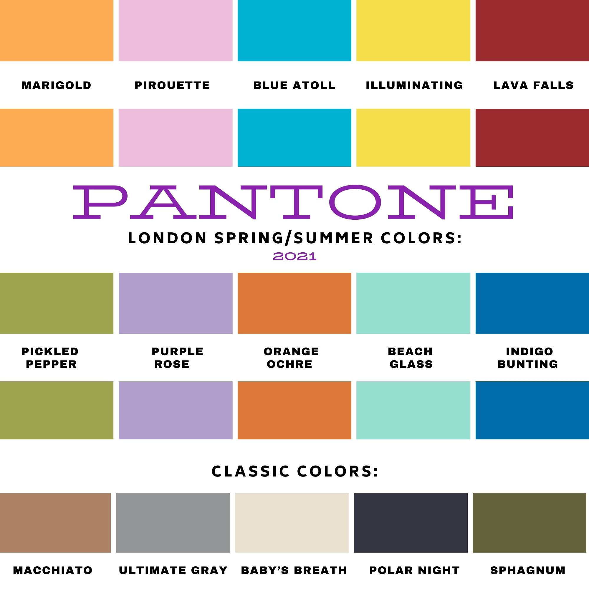
Pantone - Spring/Summer - 2021 - Both Palettes with all the Outfits.

I always think it is fun to do a post featuring all the outfits from my Pantone color series. I really spread these out this year due to scheduling issues, so that’s even more of a reason to look back at all of the outfits. I will also let you know, which ones were my faves.

New York Palette

ClassicColors_(12).jpg
illuminating (1).jpeg
amethystorchid.jpeg
raspberrysorbet.jpeg
burntcoral.jpeg
frenchblue.jpeg

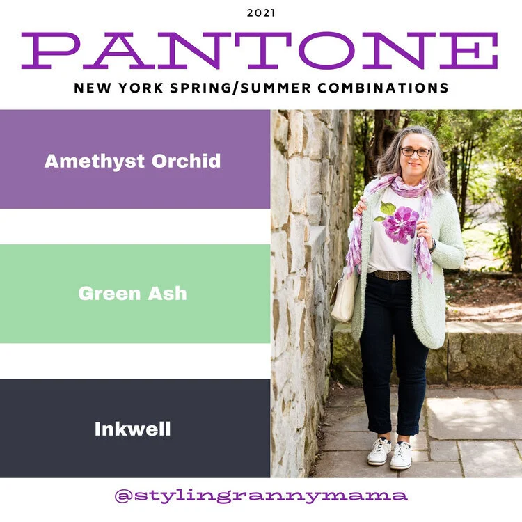
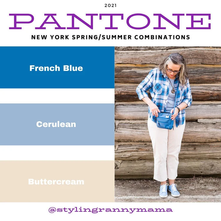
I would have to say, from the New York Palette, my favorite combination is the Amethyst Orchid, Ash Green and Inkwell. I love the contrast of the dark navy blue and the pastel colors. It just makes the outfit pop. I also love the light green with the light purple. It is a very pretty combo for spring and summer. In addition, I really liked the casual vibe of the French Blue, Cerulean and Butter Cream combo. both of these are outfits I would wear. What were your favorite colors? What is your favorite outfit from this series?

London Palette

londonspring2021 (1).jpg
illuminating (1).jpg
pirouette.jpg
purplerose.jpg
pickledpepper.jpg
beachglass.jpg

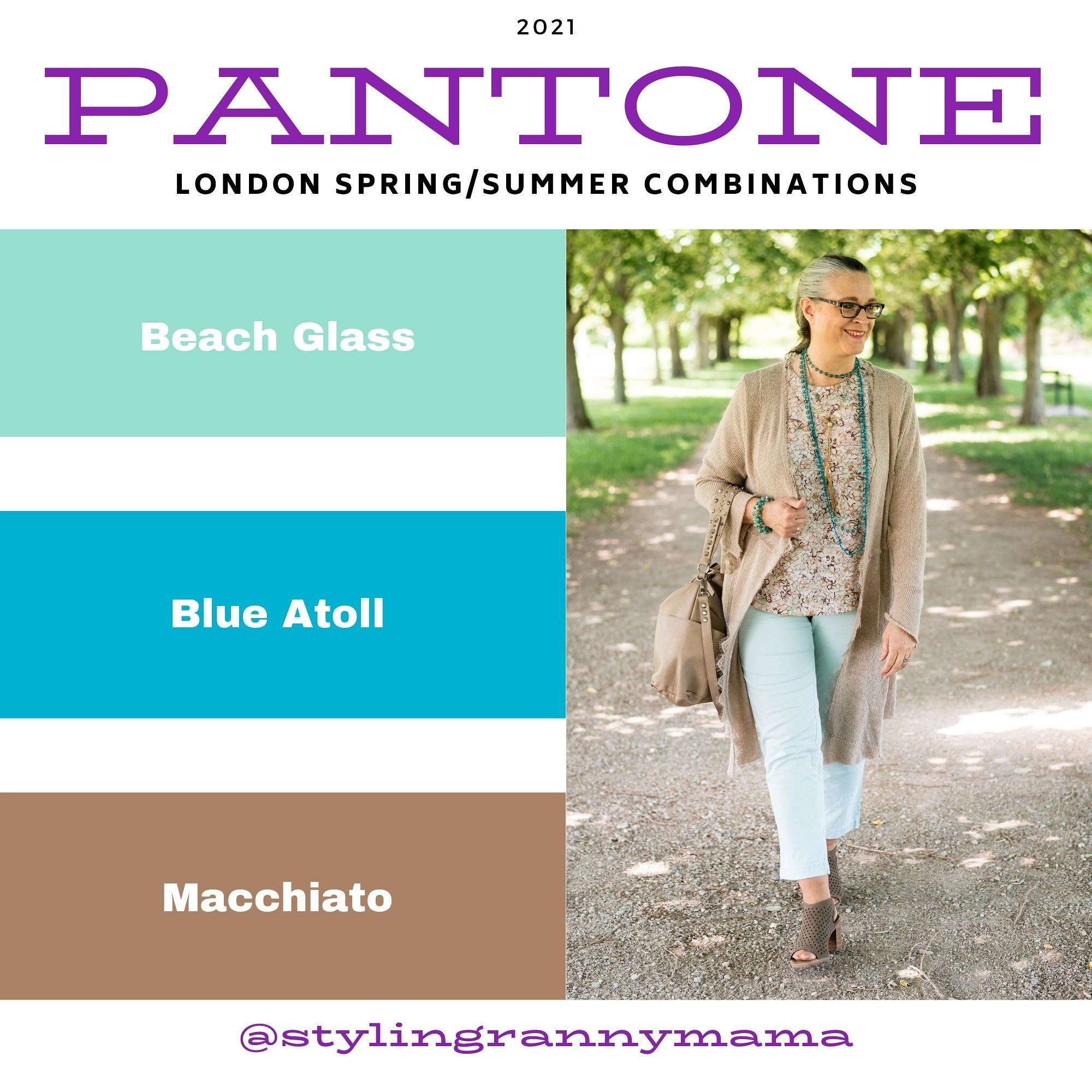
I really liked this palette over all, because I love all of the colors. My favorite combination was the outfit that I got the most positive feedback on, Beach Glass, Blue Atoll and Macchiato. There is just something so summery and uplifting about these tropical blues and warm brown. I also liked the challenge of combining Purple Rose and Lava Falls. I would have never thought to pair this medium purple with a bold red, but I think it worked. What were your favorite colors from this palette? What is your favorite outfit?

I’d love to hear back from you. Your comments help me to know if the content I am putting out is pertinent to your life. I hope that my outfits and posts are inspiring you to shop your own closet and to think outside the box when it comes to the clothing pieces you wear and how you put them together.

Have a wonderful day!

Pantone - Spring/Summer - 2021 - NY Palette - Amethyst Orchid, Green Ash and Inkwell

Today’s combination of Pantone colors from the New York palette is a study in contrasts. The dark, moody blue of Inkwell, which mimics a night sky is a type of color disparity when side by side with the pale pastel of Green Ash. When I pair colors I often go for bold with bold, or light with light, but I wanted to experiment by creating an outfit with an eye catching difference in color. The addition of Amethyst Orchid gives the perfect compliment of medium purple color.

amethystorchid.jpg

Let me start the outfit details by talking about this recently thrifted tee. I love the bold flower on the front and purple has long been a favorite color of mine, so I was glad it was on the palette. This tee is St. John’s Bay brand. The darker inner petals are actually separate pieces of material, which gives the tee added dimension.

To go along with the Amethyst Orchid color in the tee, I also added this recently thrifted scarf. I love the large gingham pattern. It was the perfect accompaniment to the whole look. Another interesting feature of this scarf is the ruching of elastic throughout its length adding texture.

amethystorchidpantonecolorsoutfit-9.jpg

These thrifted, Inkwell pants are a brand called Hydrant. A dark pant like this is great for making our lower halves look longer and slimmer. I really like these, but they are a lint magnate. Wearing them with a fuzzy sweater like this is probably not the best idea. Ha, ha. You can also see I added a wider, olive belt since belts are trending and did my usual front tuck.

My fuzzy Green Ash sweater might be a little light, but it is pretty close to the Pantone color. This was a Christopher and Banks purchase last year. Before I bought this piece I had very little of this color in my wardrobe. I have picked up a few things since then. It is a pretty pastel color to wear, especially in the spring and summer. I really like how well it goes with the Amethyst Orchid color.

amethystorchidpantonecolorsoutfit-6.jpg

I decided to go with white for my shoes and bag. White is definitely a go to in the warmer months. My white Keds will be on repeat. My white shoulder bag is a new thrift find. I have been searching for a different white bag and this one has plenty of room and can also be worn as a cross body bag. This is a brand called Bueno.

amethystorchidpantonecolorsoutfit-10.jpg
amethystorchidpantonecolorsoutfit-12.jpg

What do you think of these colors? Would you wear a light pastel with a dark color like navy or black? I’d love to hear your thoughts. Thanks so much for taking the time to comment.

amethystorchidpantonecolorsoutfit-15.jpg

I’m including a few shopping links. These are affiliate links. All opinions are my own.

Photo and graphic Rebecca Trumbull.