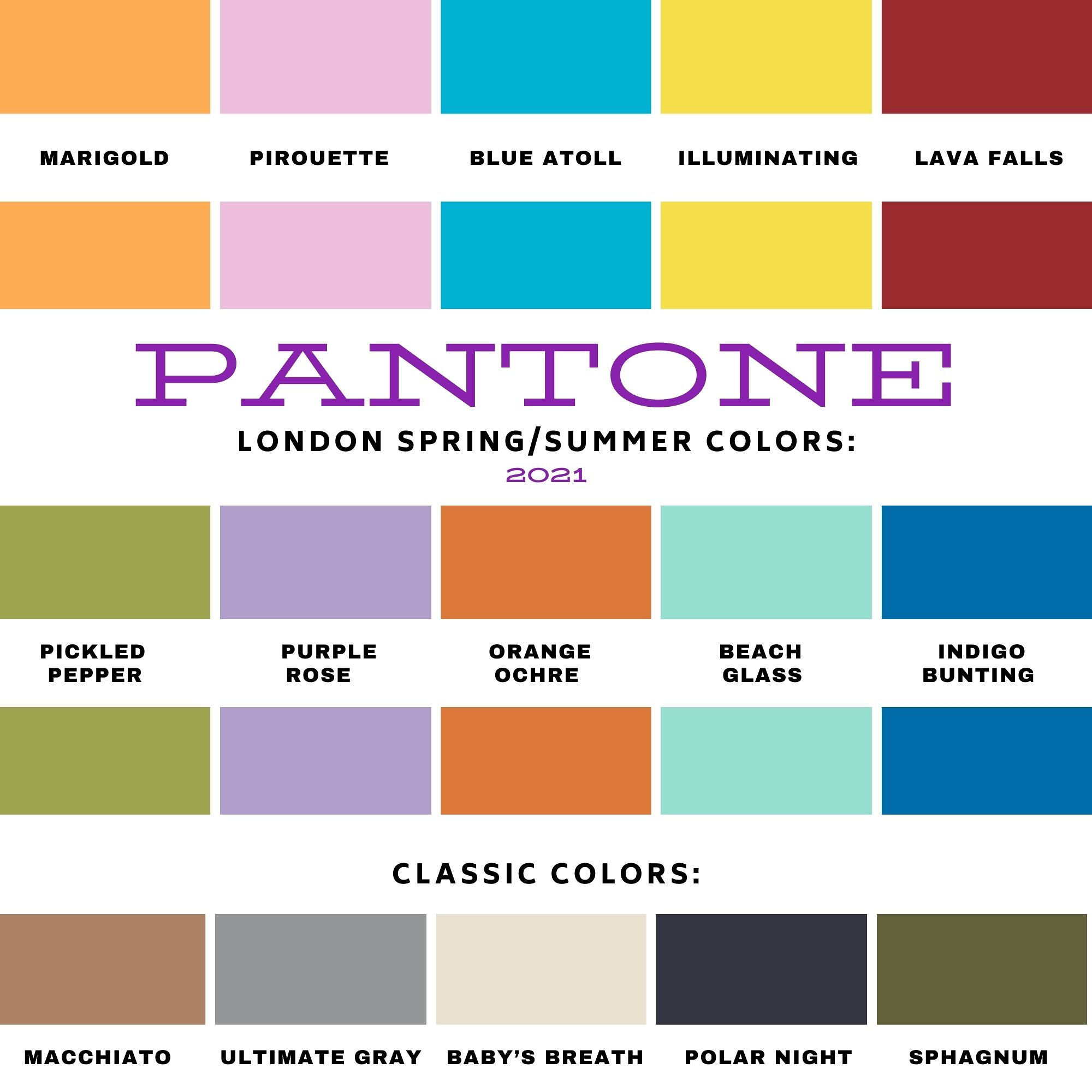
Pantone Autumn/Winter 2022: Lava Falls, Amazon and Arctic Wolf
Here we are, once again, looking at another color palette from the Pantone Color Institute. For the next few weeks I will be concentrating on the New York colors. In the past I have tried to give you both palettes, but with changes in life, so too come changes with the blog. For now, I want to bring you the New York palette which was where the institute was founded in 1962. From the Pantone website it looks as though the London palette was added in 2017.

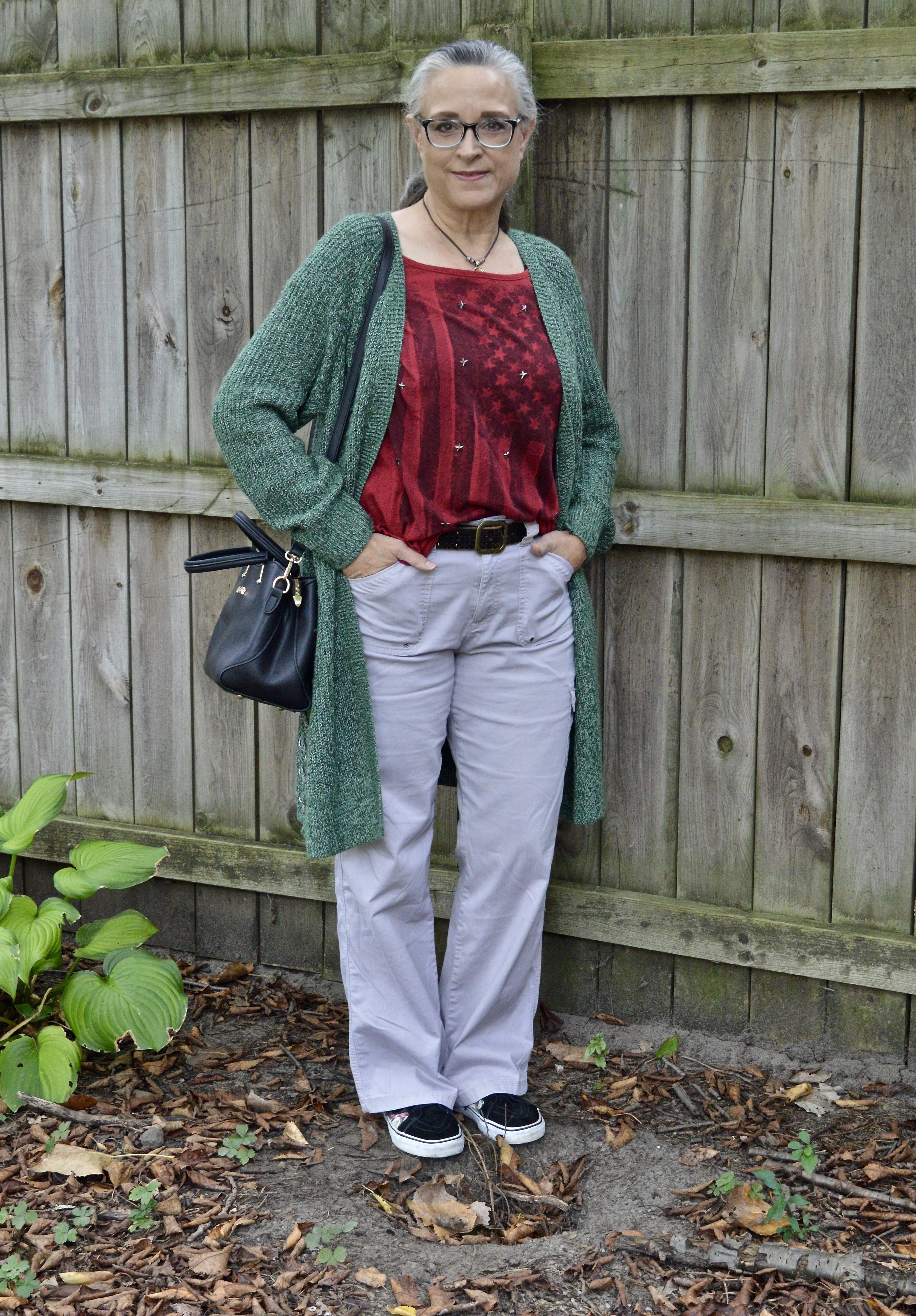
For this look, I wanted to combine the bright red of Lava Falls with the energetic green of Amazon and see if I could come up with an outfit that didn’t look like I was getting ready for a Christmas get together. Let me know in the comments if you think I pulled it off.
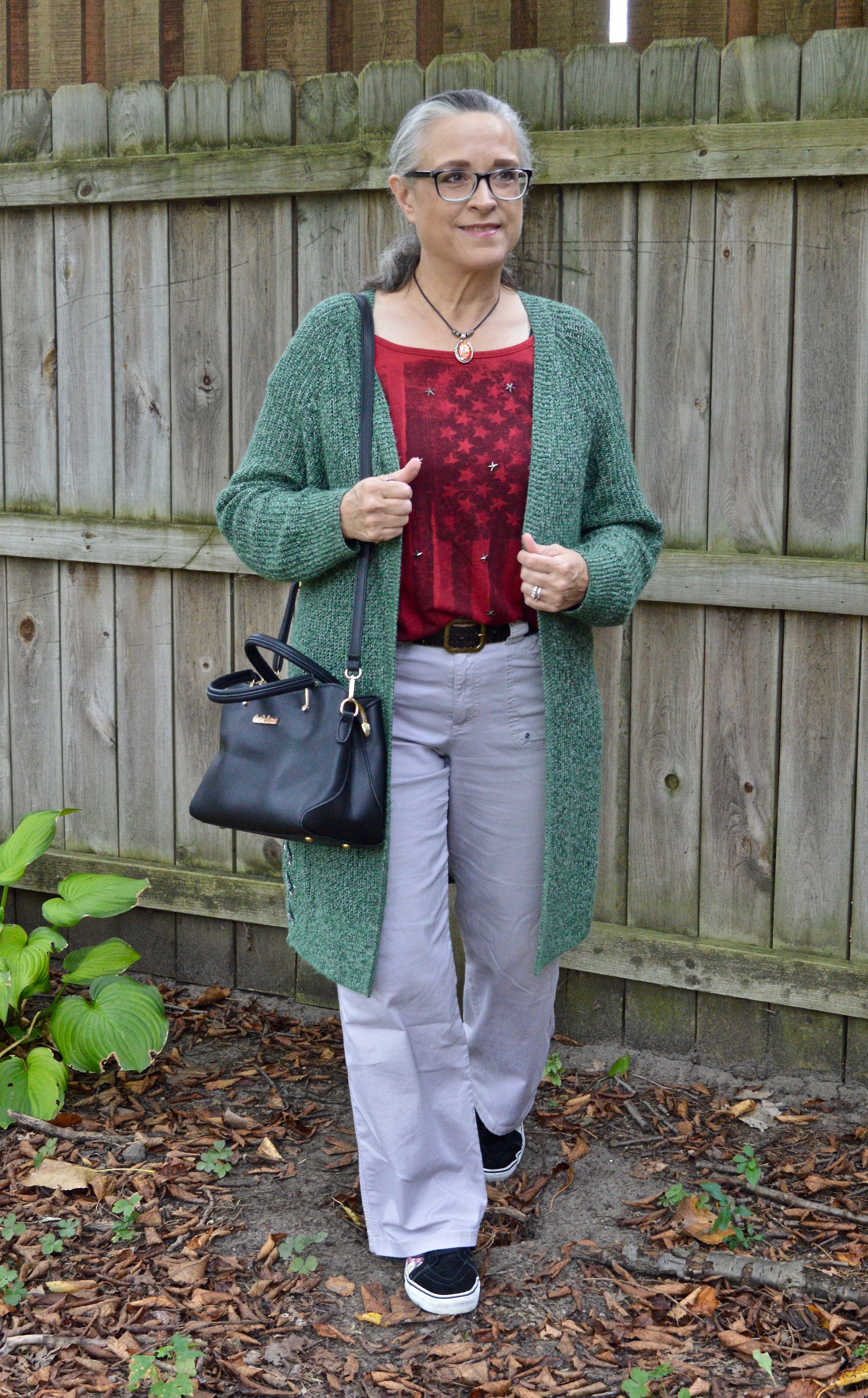
My Lava Falls flag tee was a thrift store find this summer. Unfortunately, I didn’t have it washed to wear for Independence Day celebrations. When I was pulling clothes for this series, I saw the tee and thought, why not. Our gratitude for our country and our freedom shouldn't be restricted to one or two days a year, just like Thanksgiving shouldn’t be the only time we dwell on what we have to be thankful for.

This Amazon green sweater was new from Christopher and Banks a few years ago. I love a longer cardigan like this for fall, and an open front cardigan has no buttons or zippers for things like coats or bags to get caught on. Most of the time, I leave my cardigans open anyway to show off the top underneath, so an open front piece is a great choice.
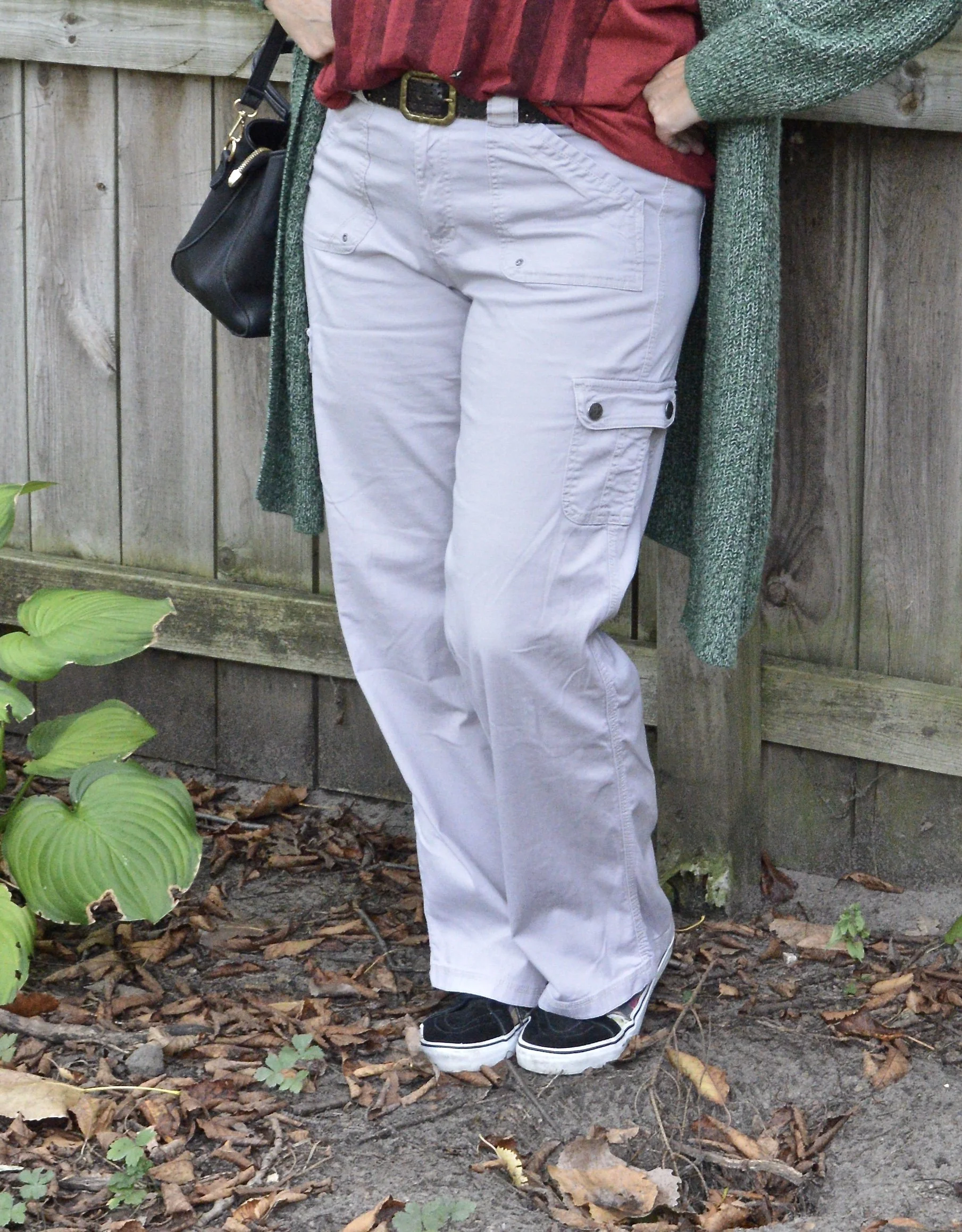
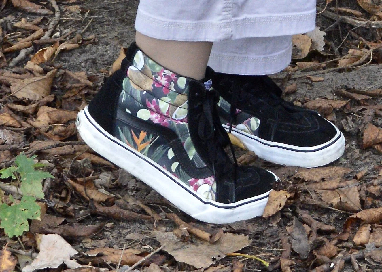
Arctic Wolf is a creamy off white and these thrifted Gloria Vanderbilt pants probably tend towards a little more gray where as the actual Pantone color has more yellow undertones. However, you get the idea and when it comes to the color cream, off white, ivory or whatever title you want to give it, they are all in the white family.
For accessories I went with black to go with the black stripes on the flag. My black bag was an Amazon purchase a few years ago and is Aidebam brand. My sneakers are new to me, a thrifted pair of Vans high tops with a fun floral design.

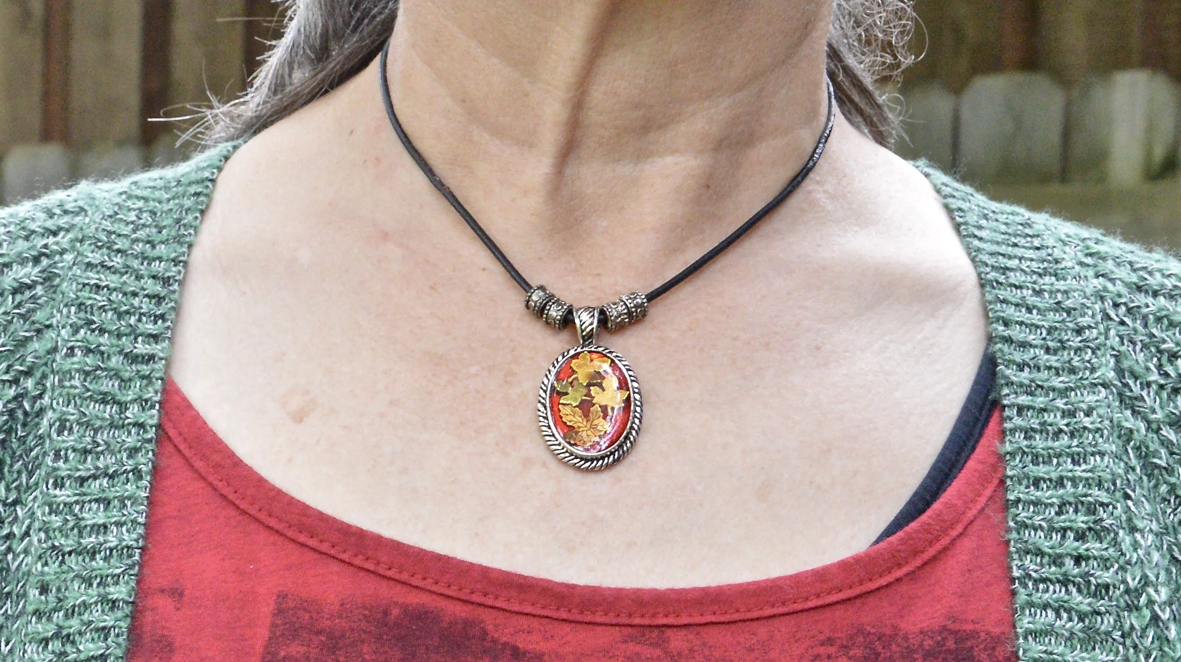
For jewelry I added a simple choker pendant. I found this at a thrift store and love the pressed flower look of the pendant.
What do you think of these colors? Would you wear them together, or do you think red and green are strictly for Christmas? I’d love to hear your thoughts.
I’m including a few shopping links for items in similar colors. These are affiliate links, which means when you click on a link, I get a few cents. If you purchase something through my site, I get a little bit more. I appreciate each and every click.
I just tested positive for Covid yesterday, after my hubby tested positive on Friday. Our two friends who came for the weekend have also tested positive. I feel so bad, but here we are. I would appreciate good thoughts and prayers, as with my asthmatic condition it puts me in a higher risk category. Thank you everyone!
Have a good week and stay healthy.