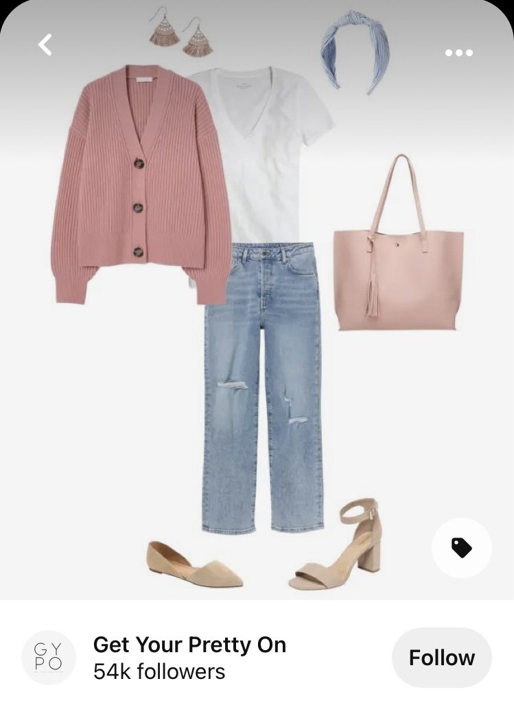
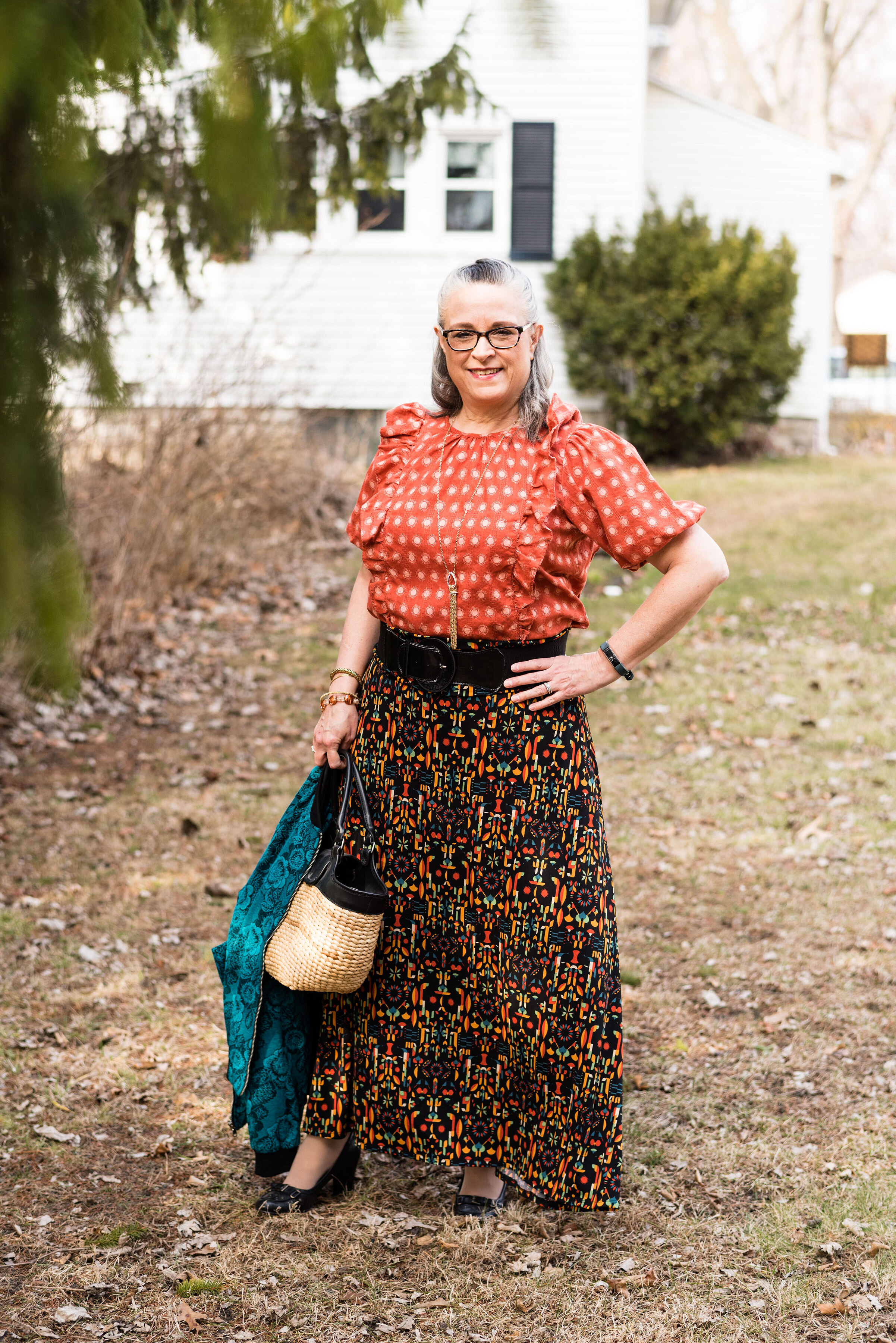
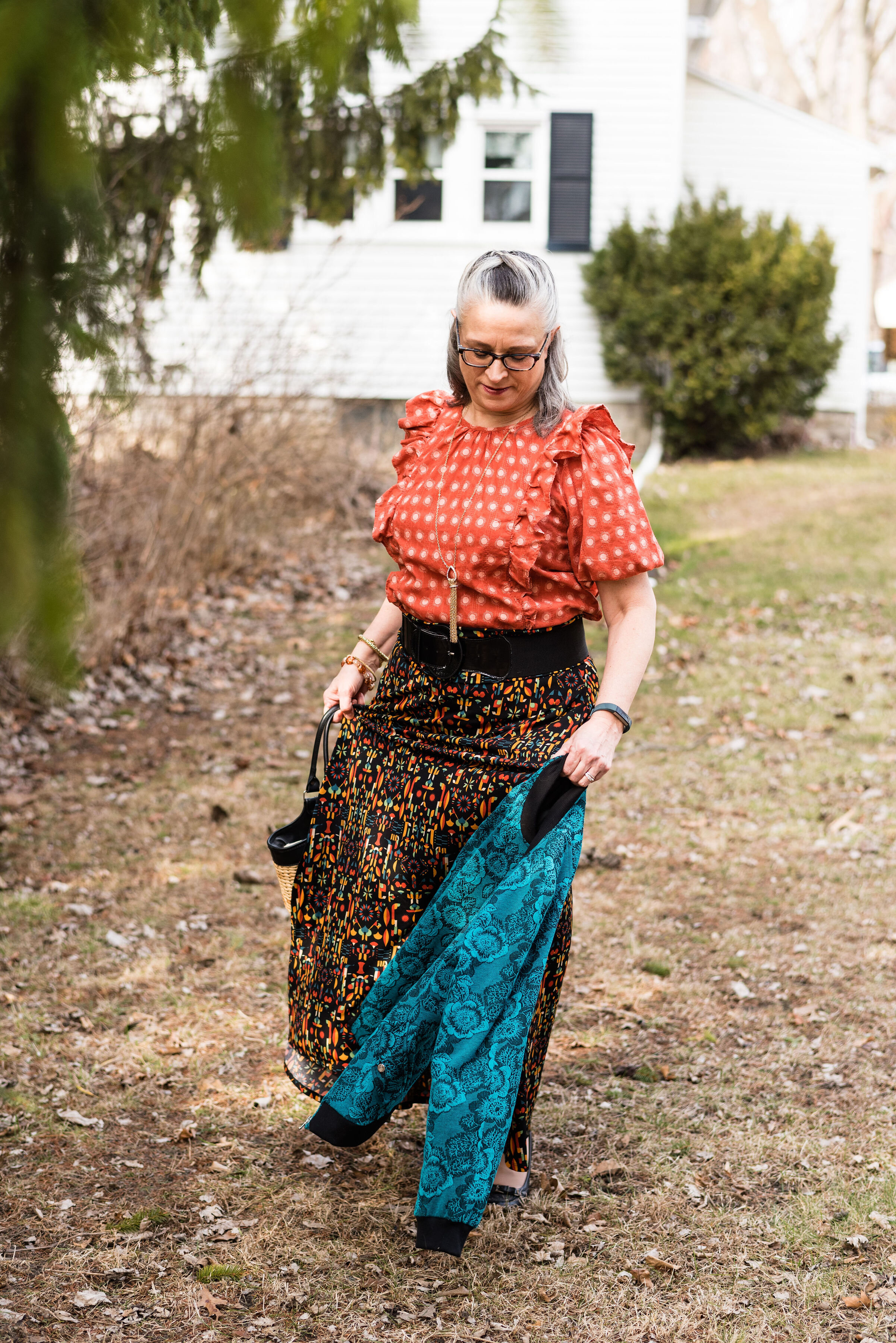
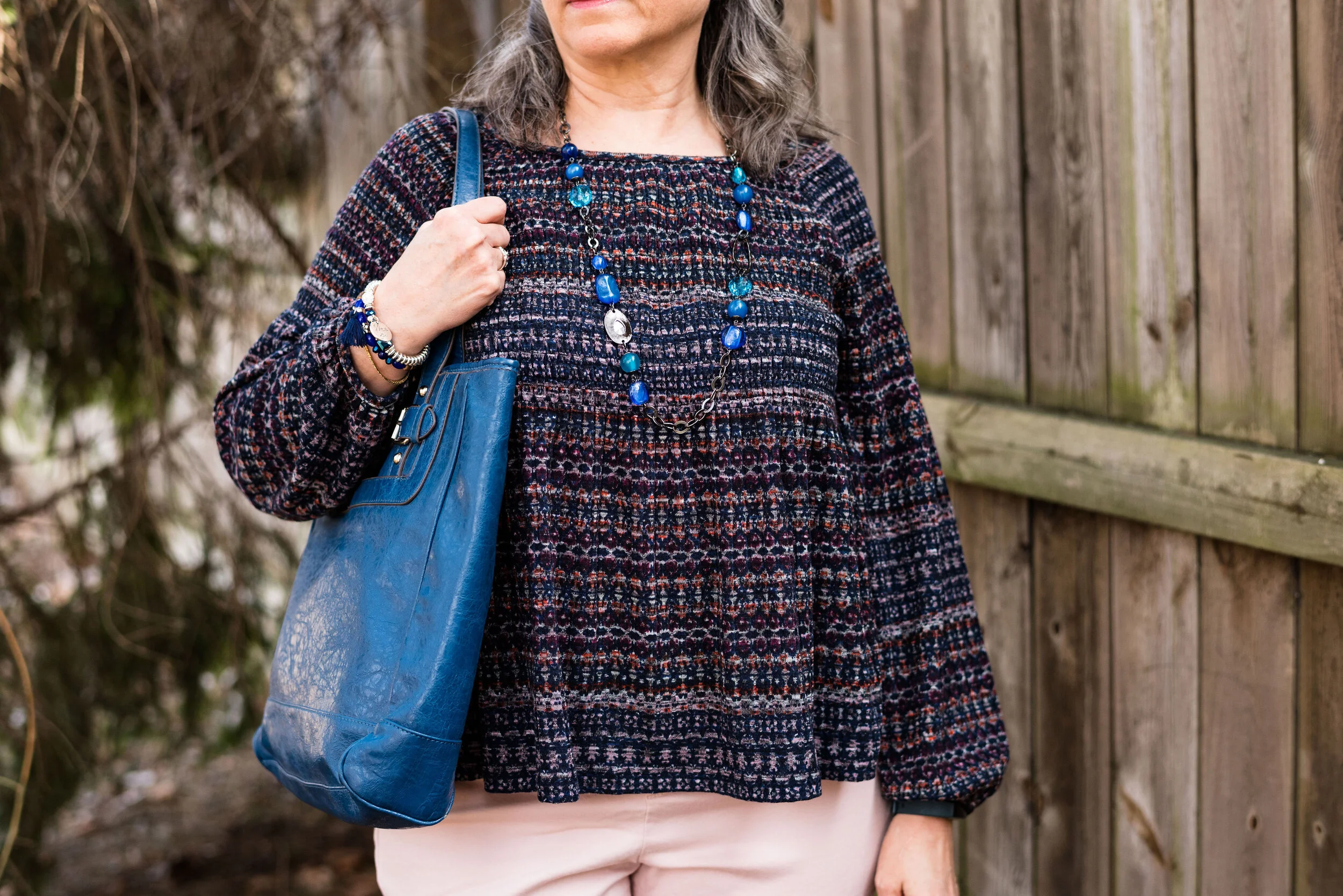
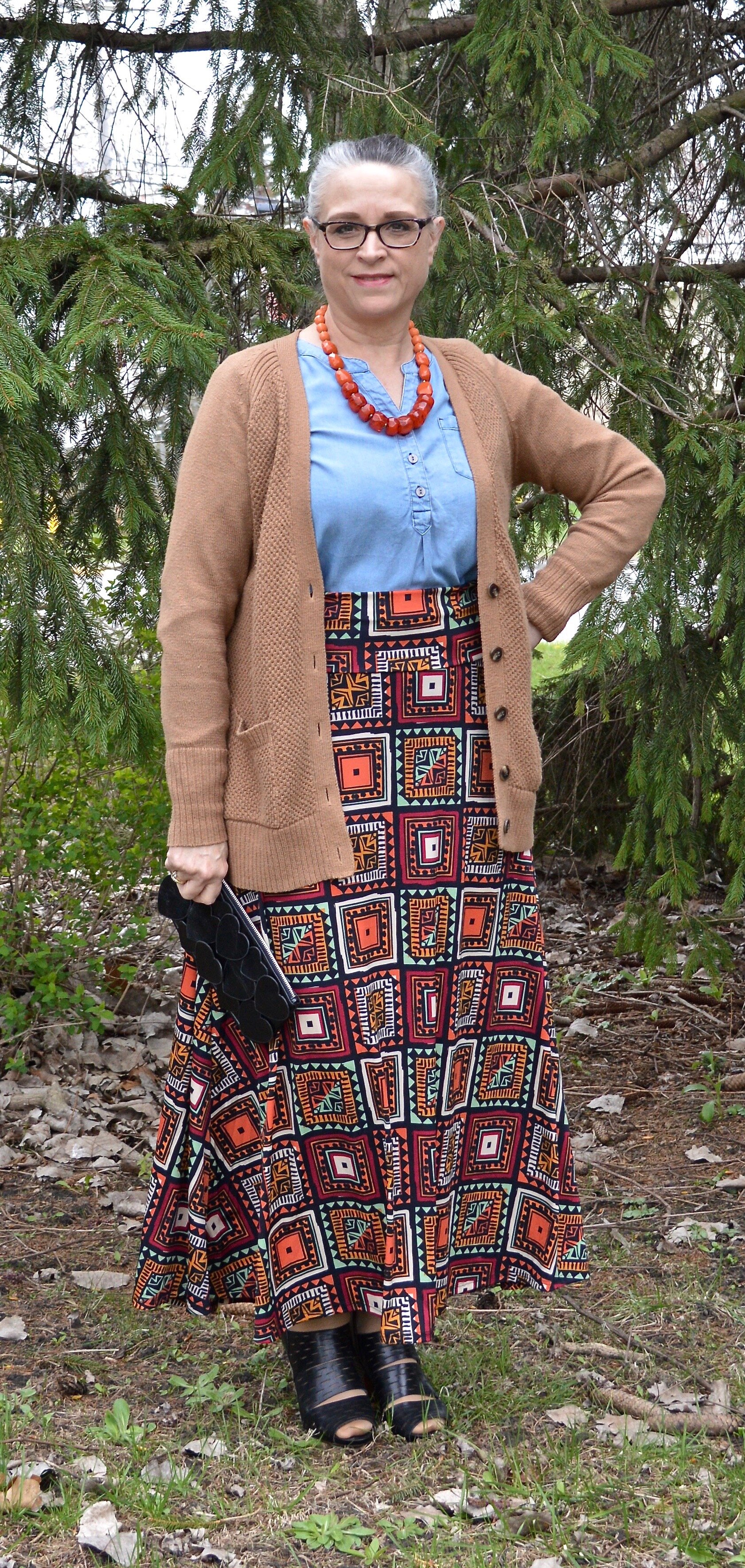
Shopping Our Closets - Utility Vest

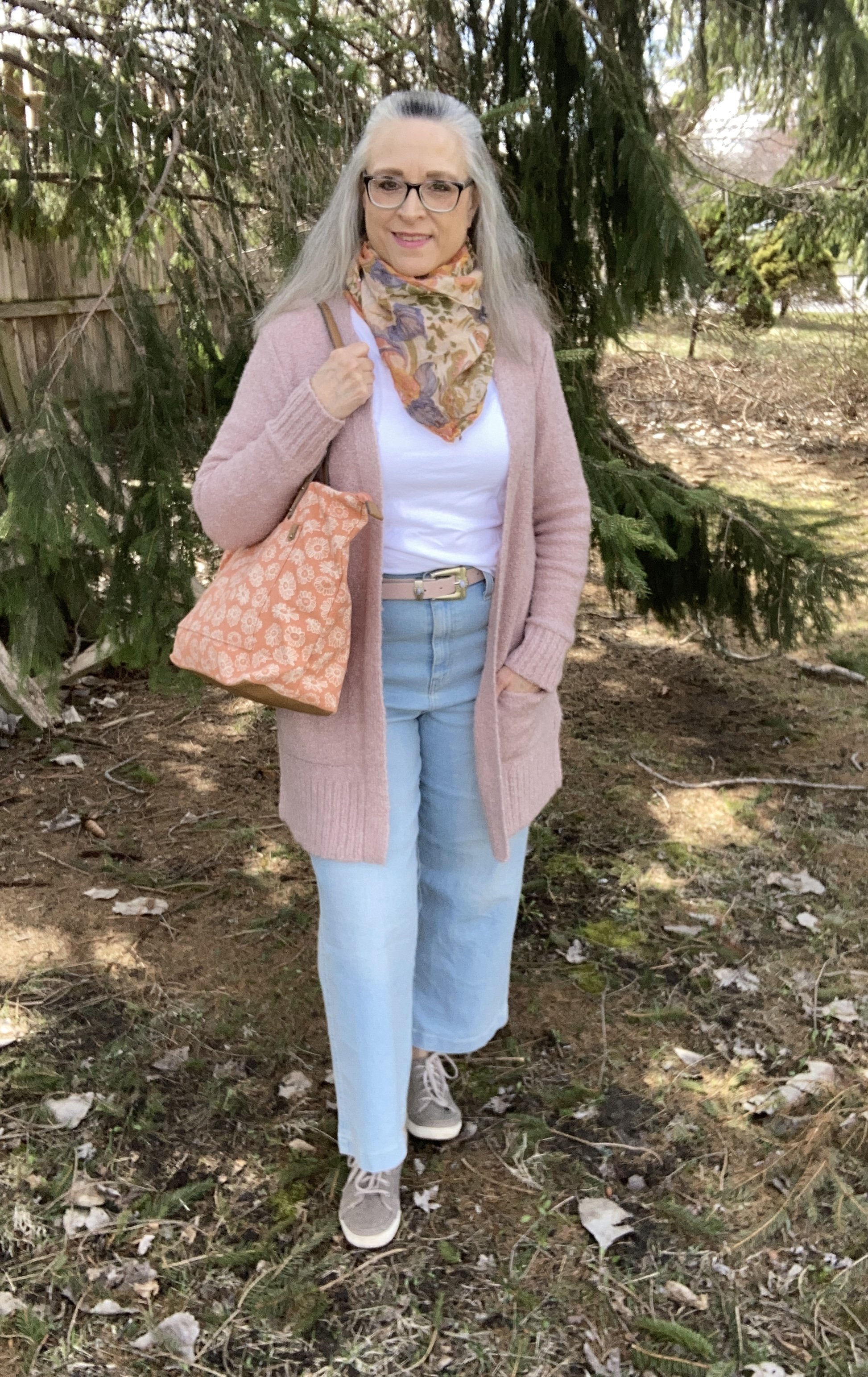
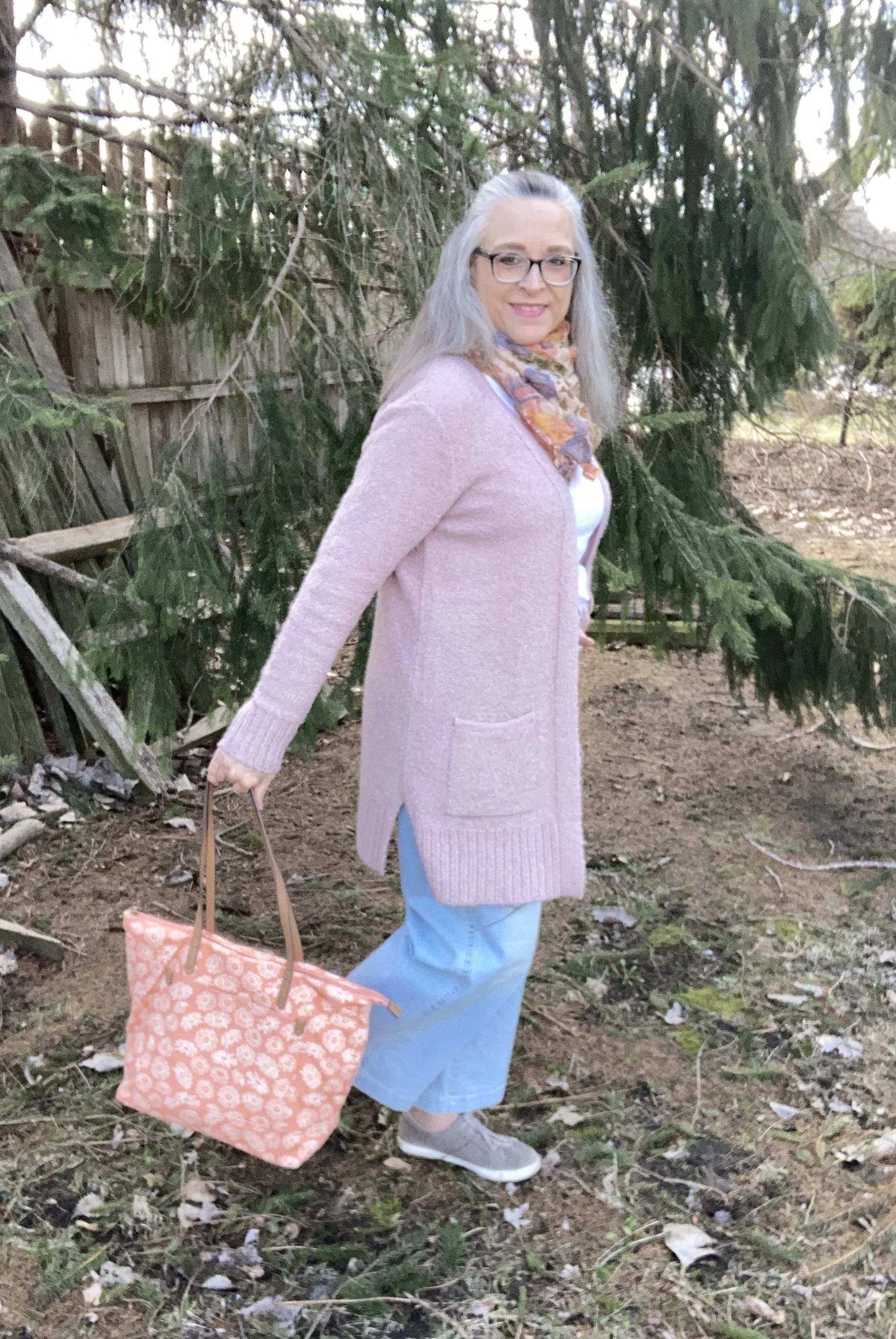
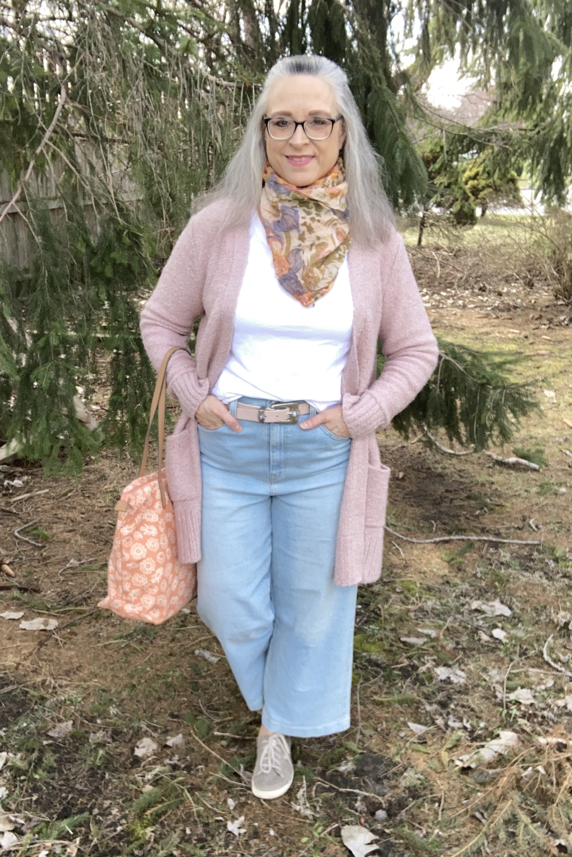
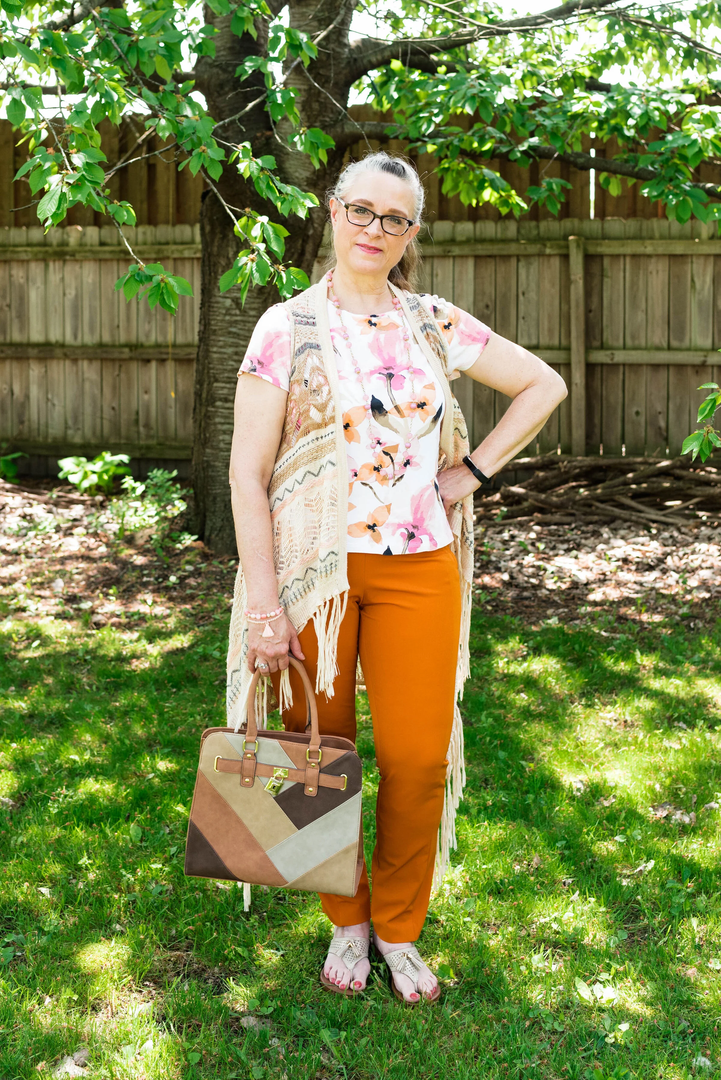
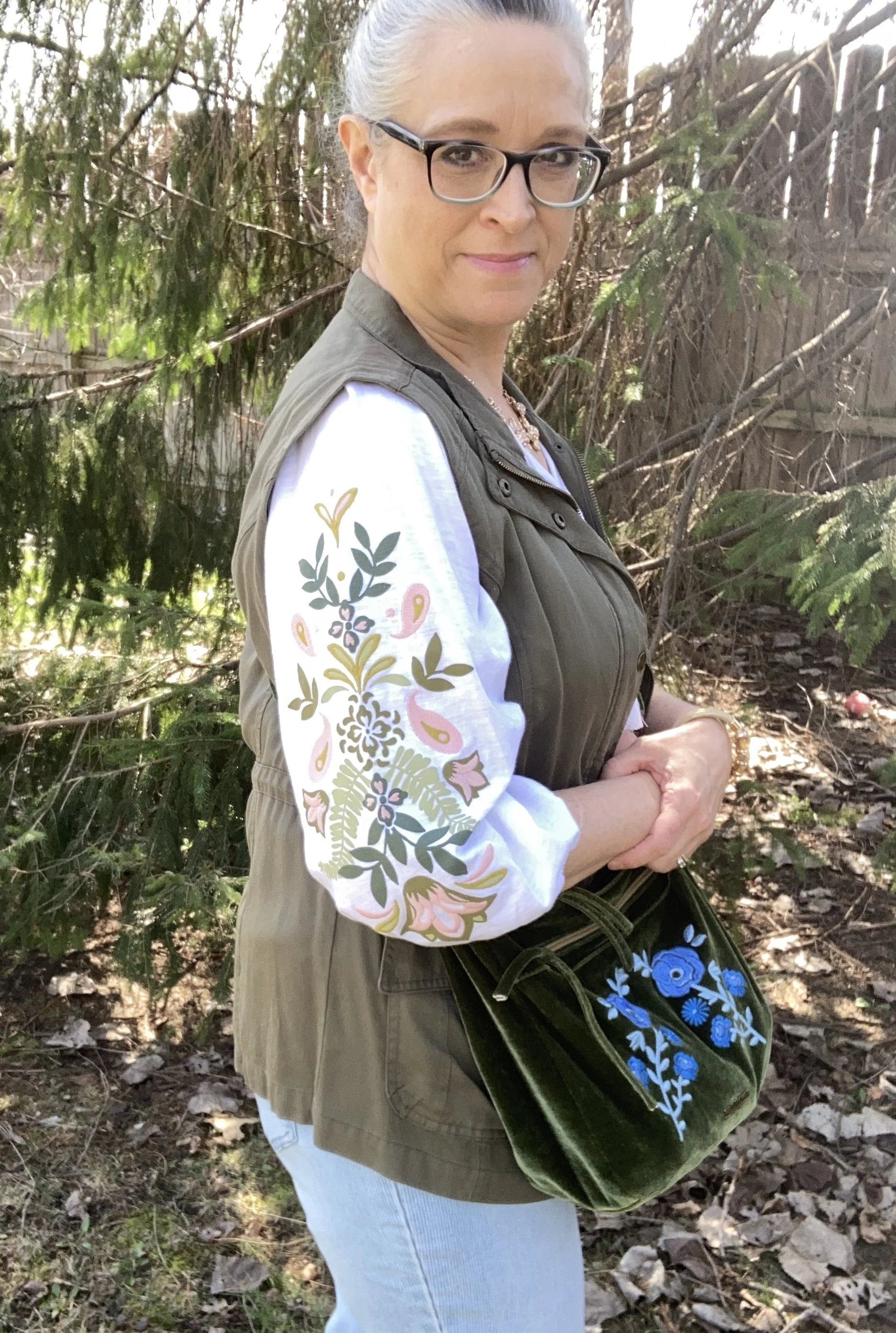
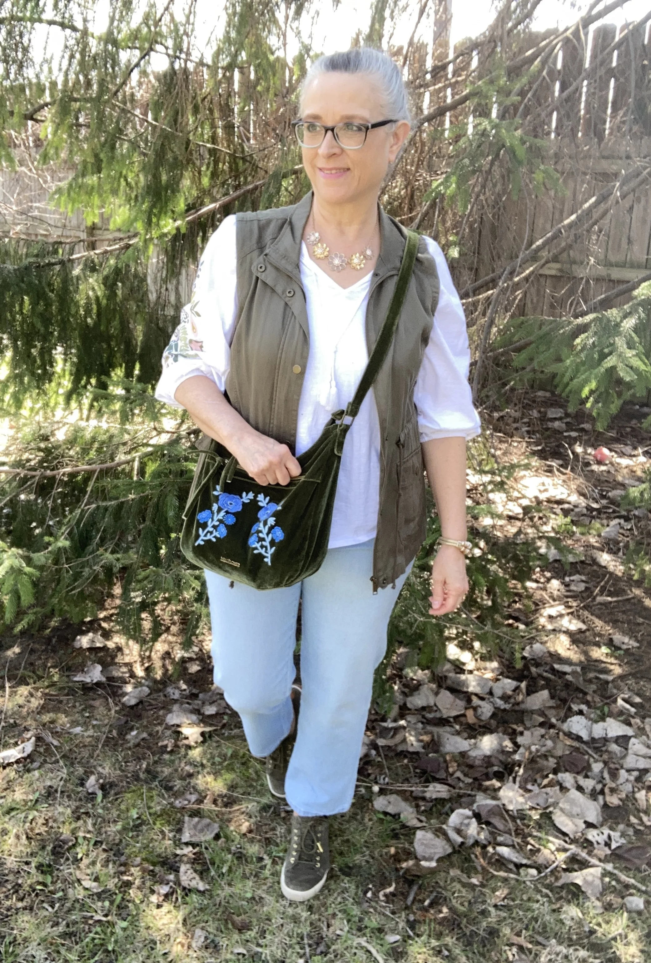
Today’s outfit revolves around a utility vest. Vests are great pieces to have in your closet. Whether you wear them as an extra layer in the winter, or style them as a fun topper in the summer, a vest can add interest and depth to an outfit. Spring is the perfect time to pull out those lighter weight vests and change up your looks from dark, cozy colors to lighter pastels and brights.

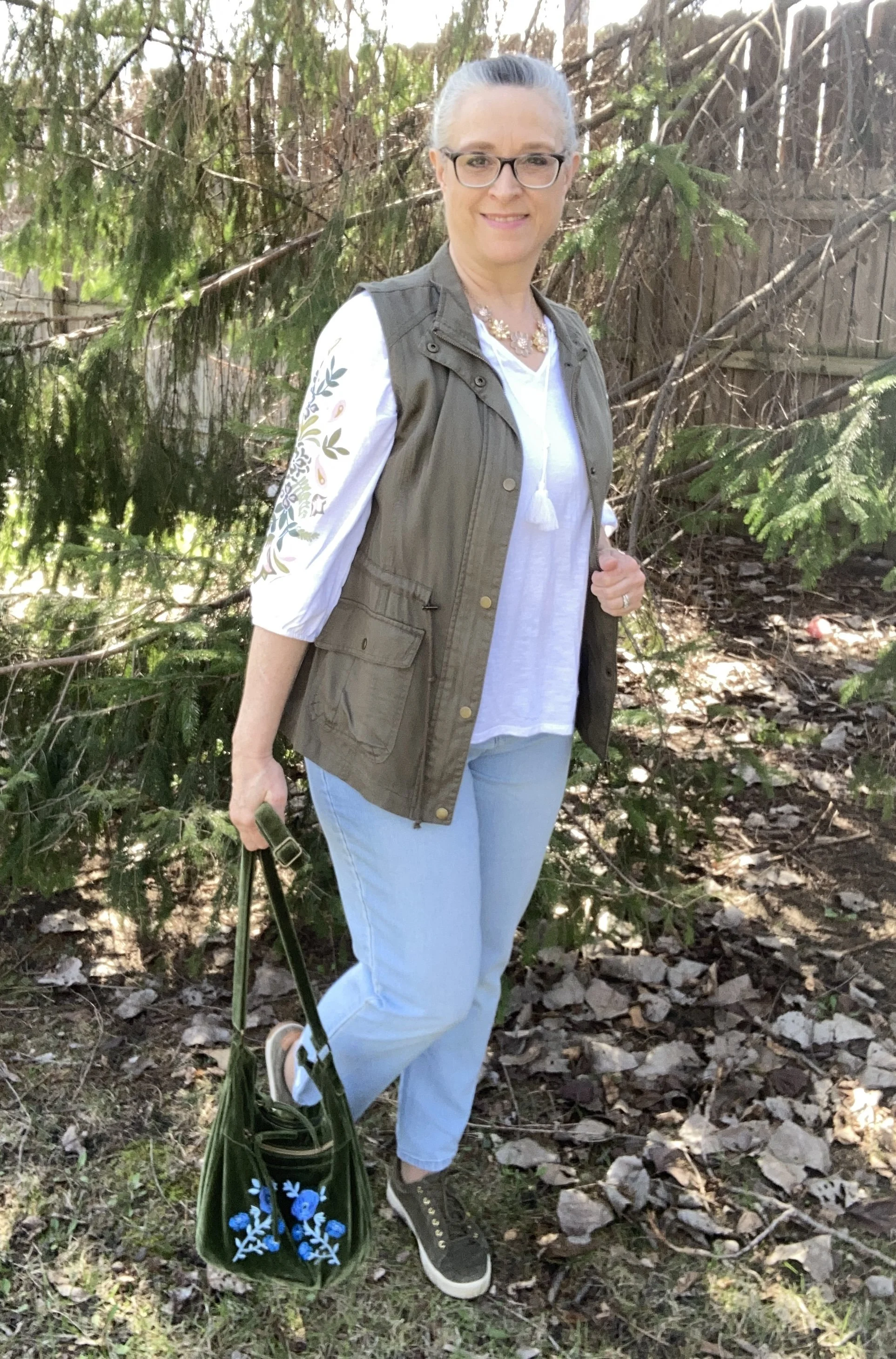
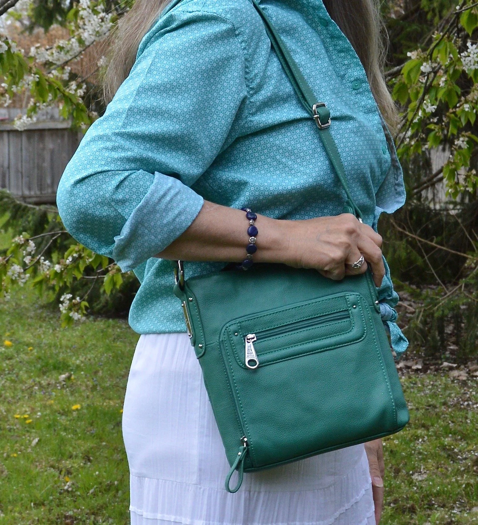
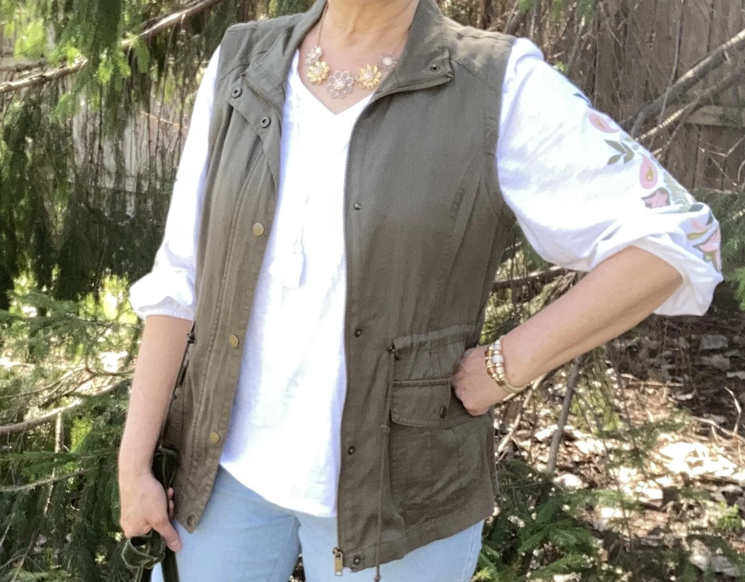
Style Tip: Try using olive as a neutral in your outfits. It is a nice change from the typical tan, beige or gray, and works great in any season.

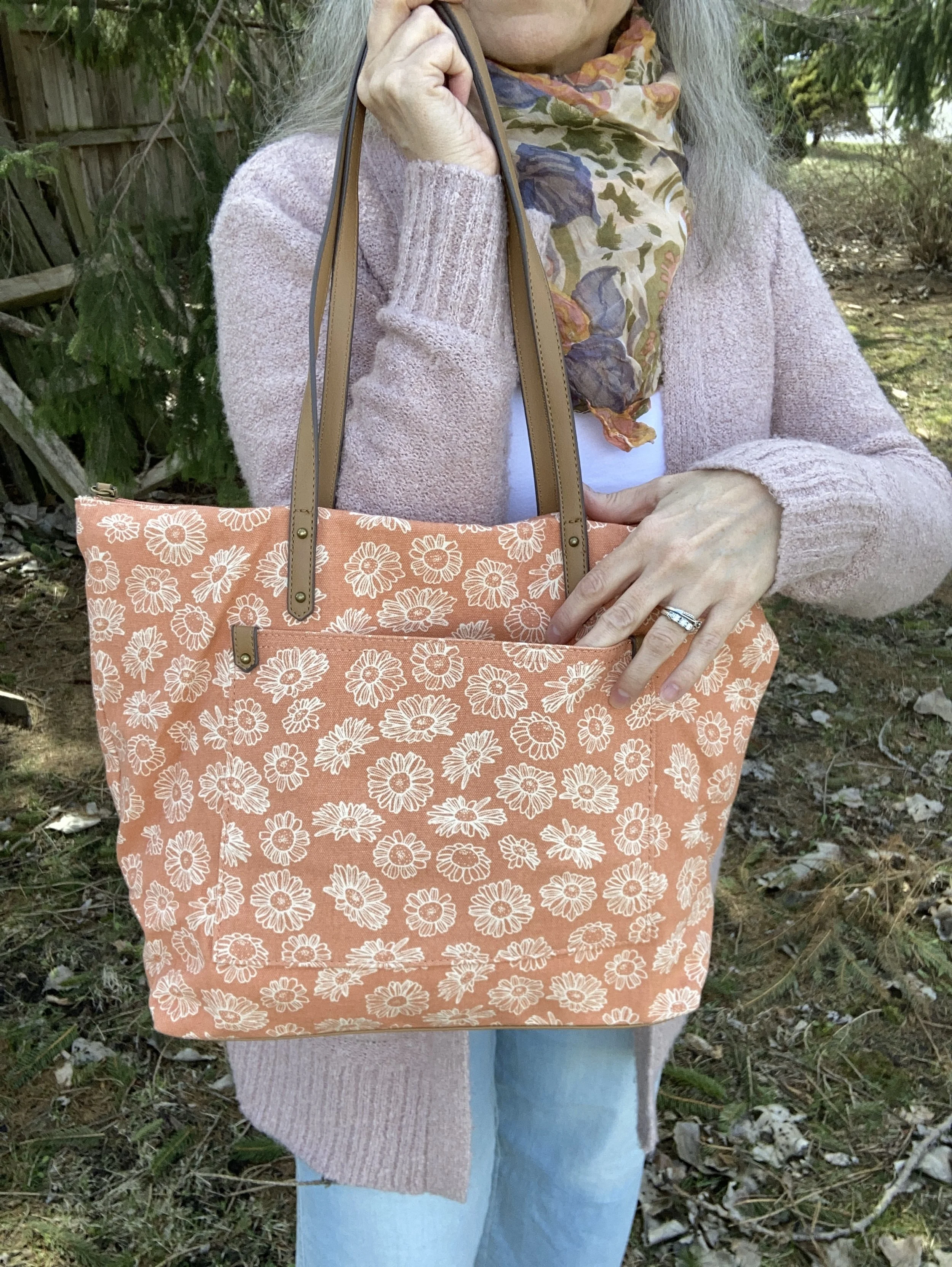
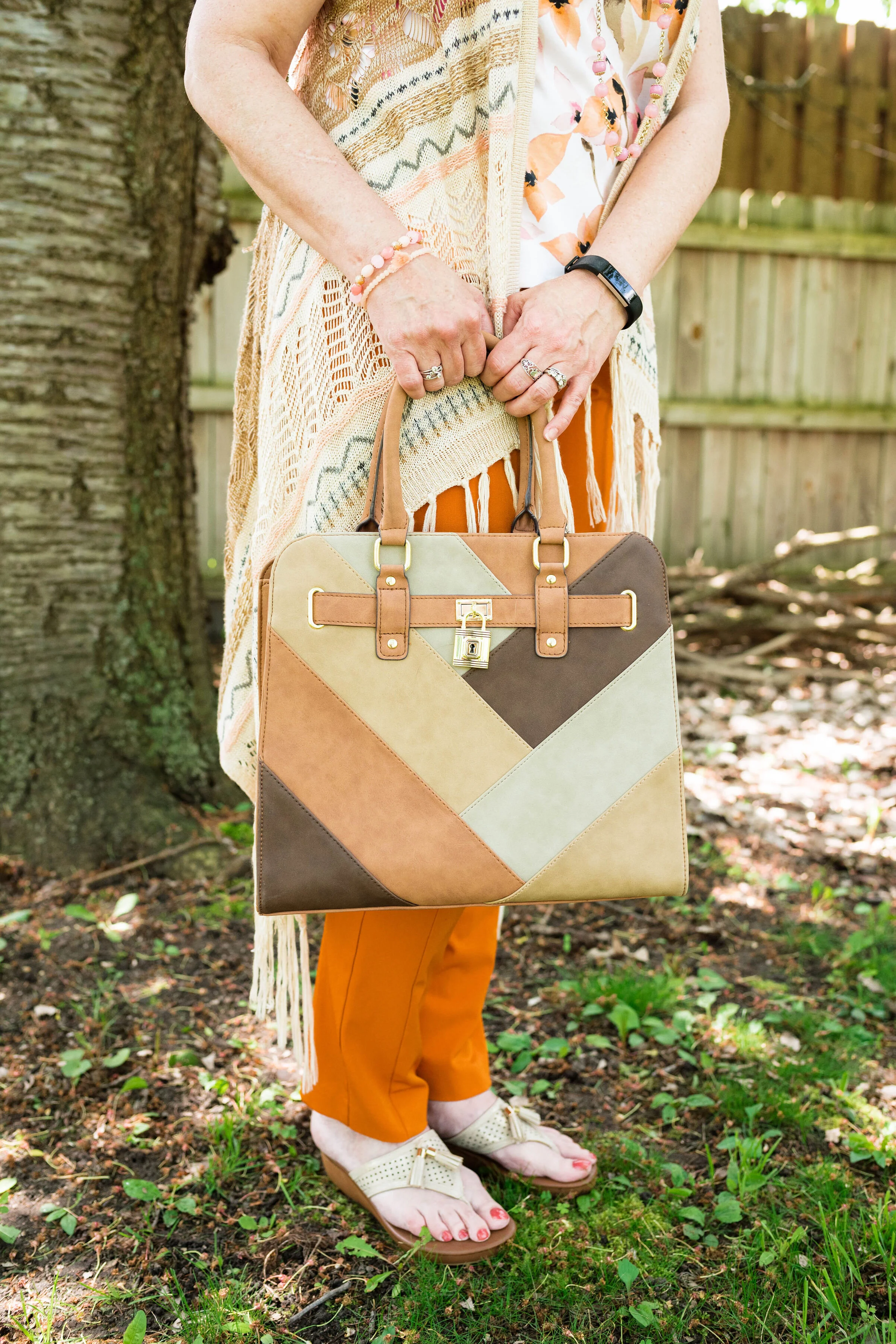
My Mudd brand vest was a clearance find at Target a few years ago. I have a few utility jackets, but I liked that this was a vest, and is made of a soft, medium weight fabric making it perfect for warmer days. For those of you who like pockets a utility vest is a practical workhorse for your wardrobe.

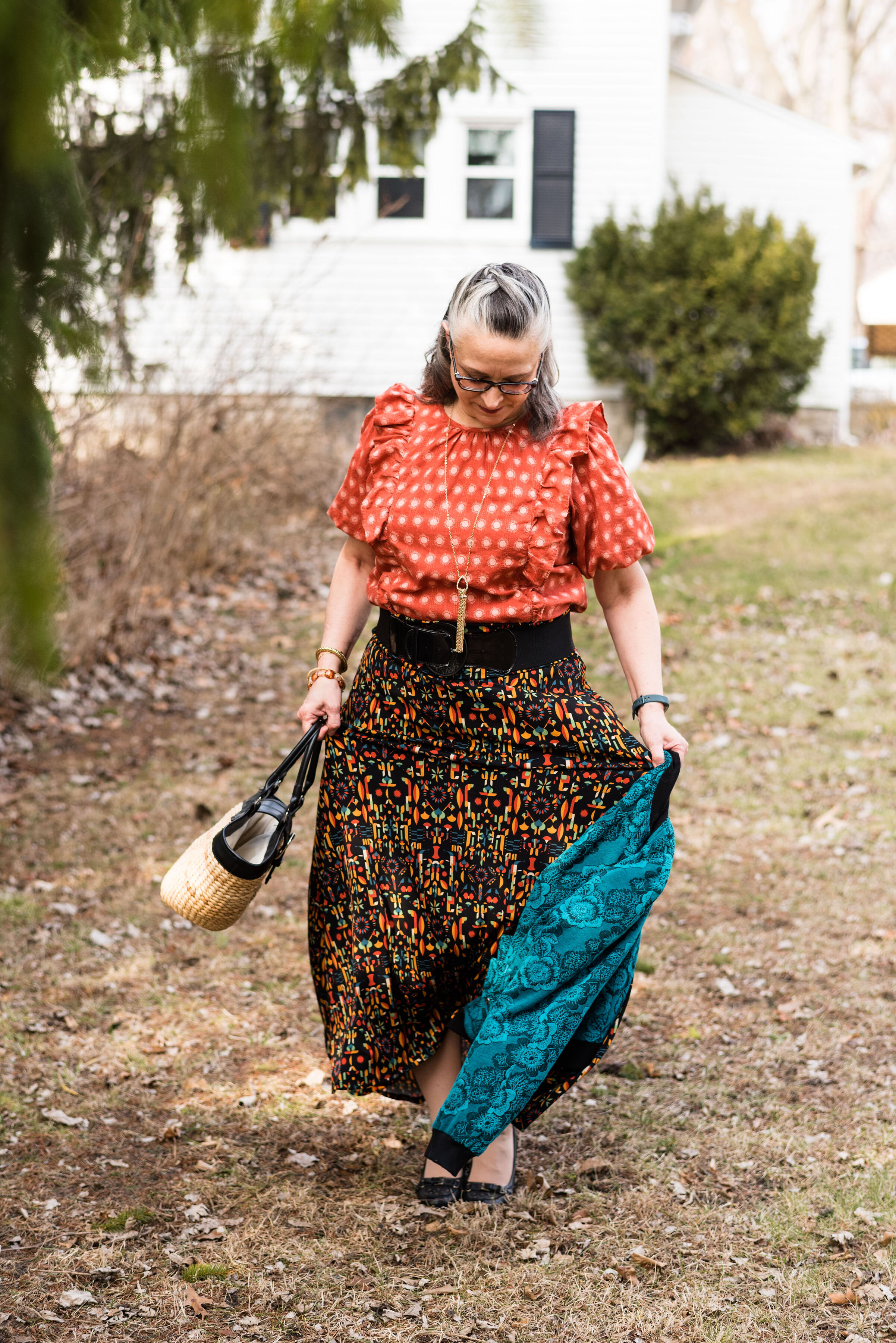
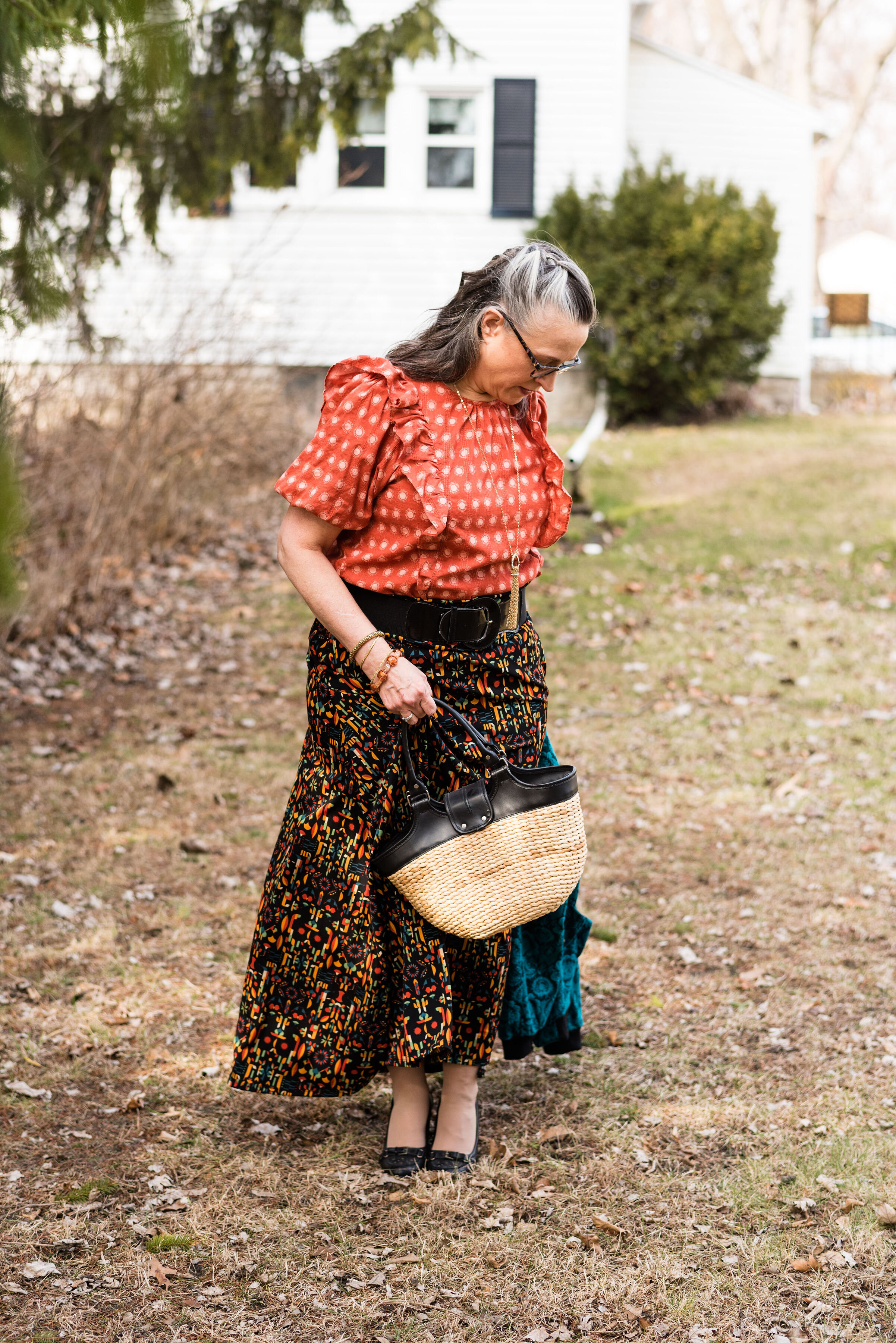
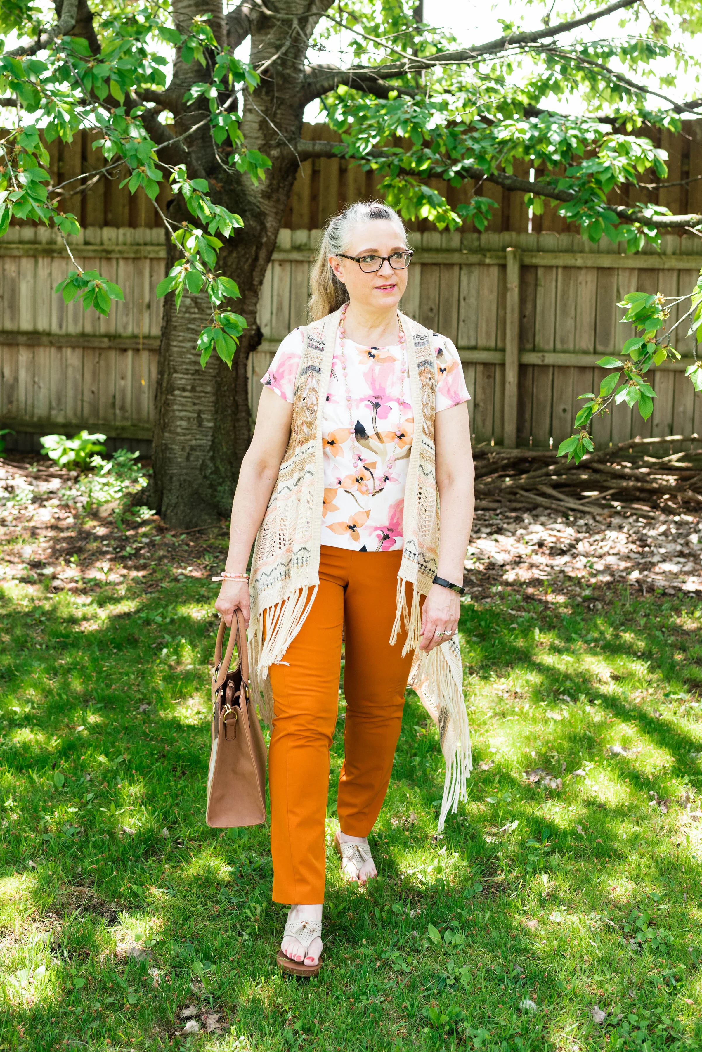
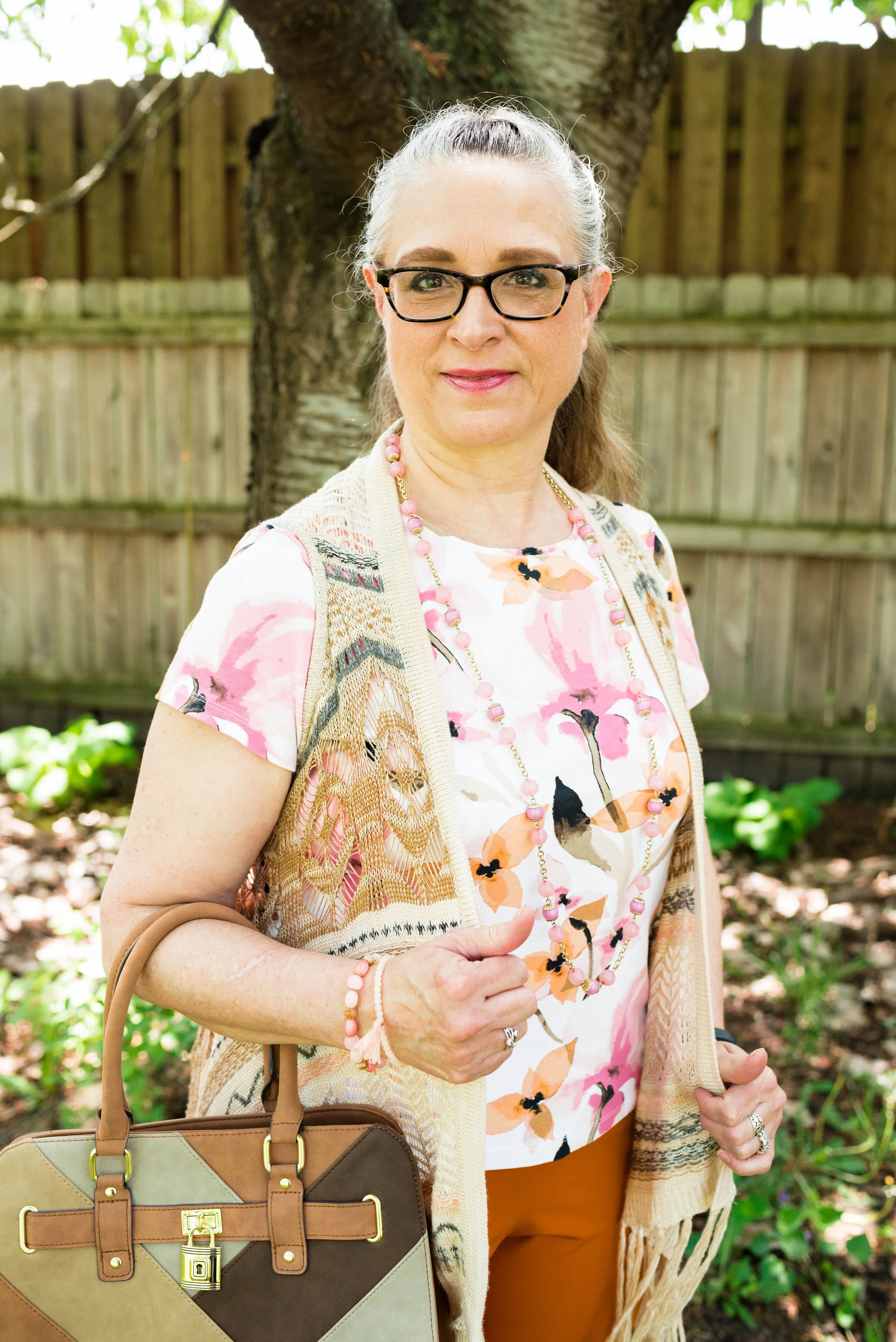
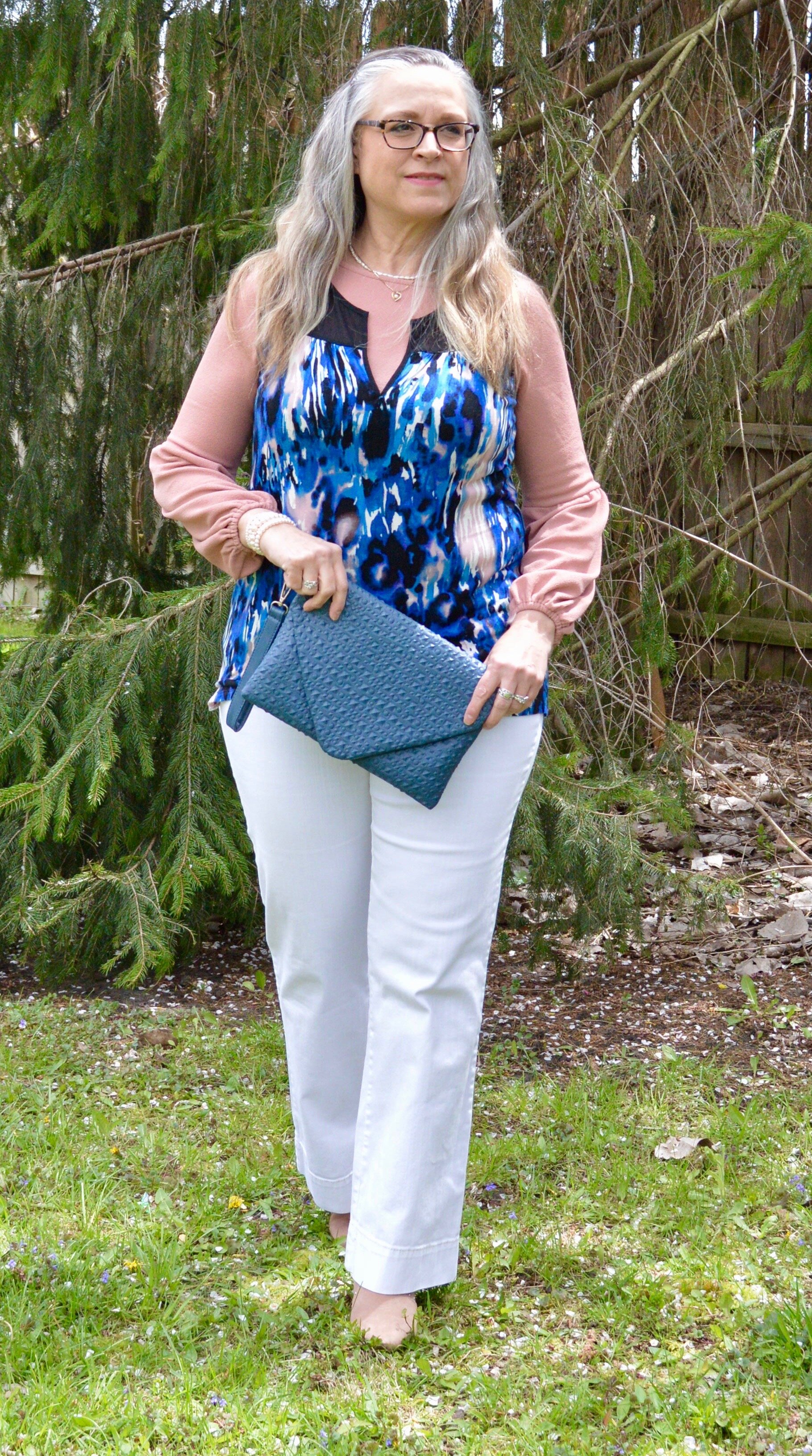
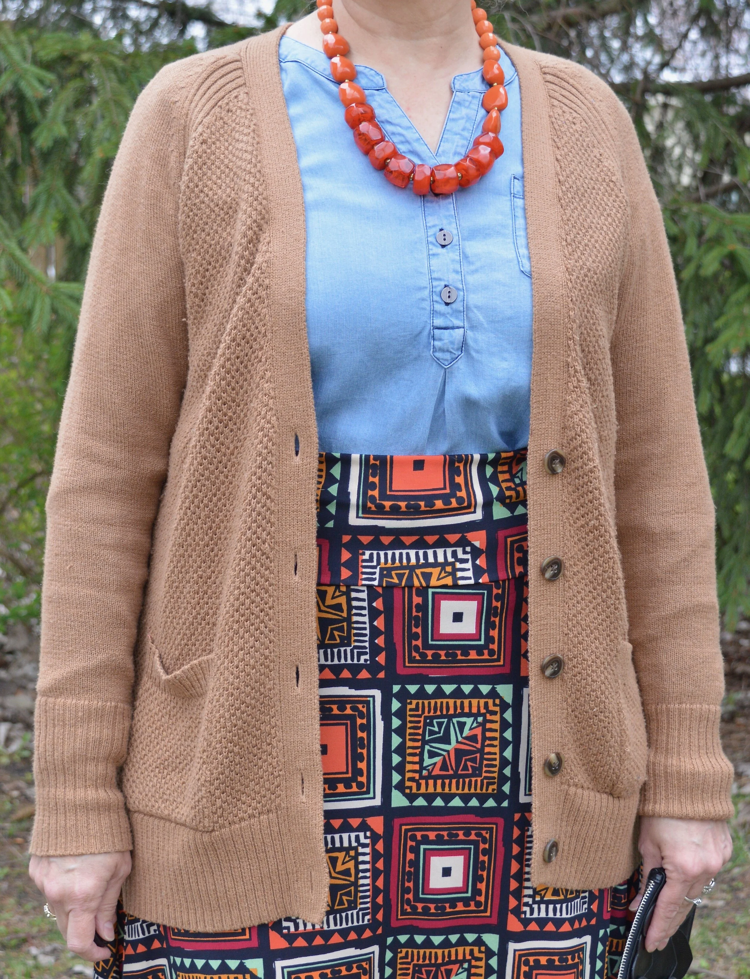
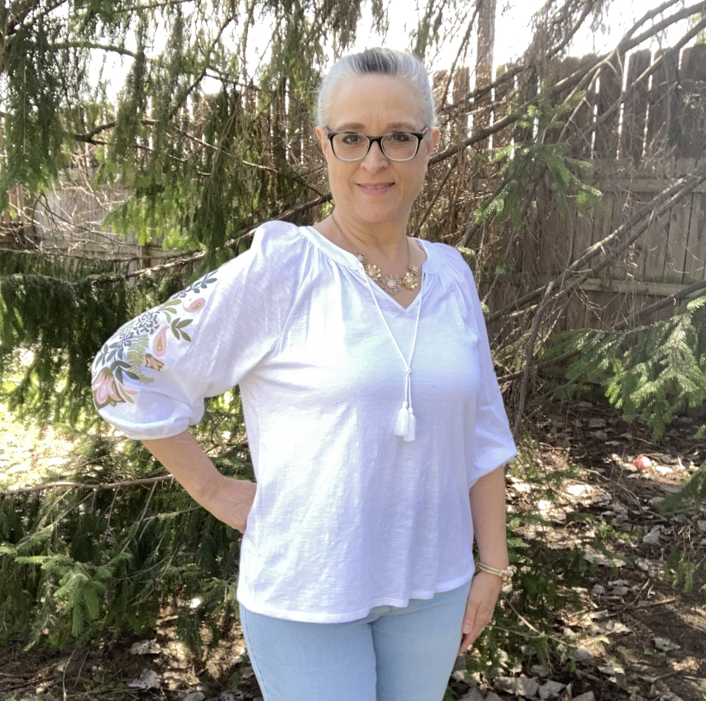
I just nabbed this Croft and Barrow puff sleeve top on the Kohl’s clearance rack. You know how I love embroidery and the sleeves on this were pure perfection. While the whole print isn’t embroidered, but the combination of print and embroidery really stands out.

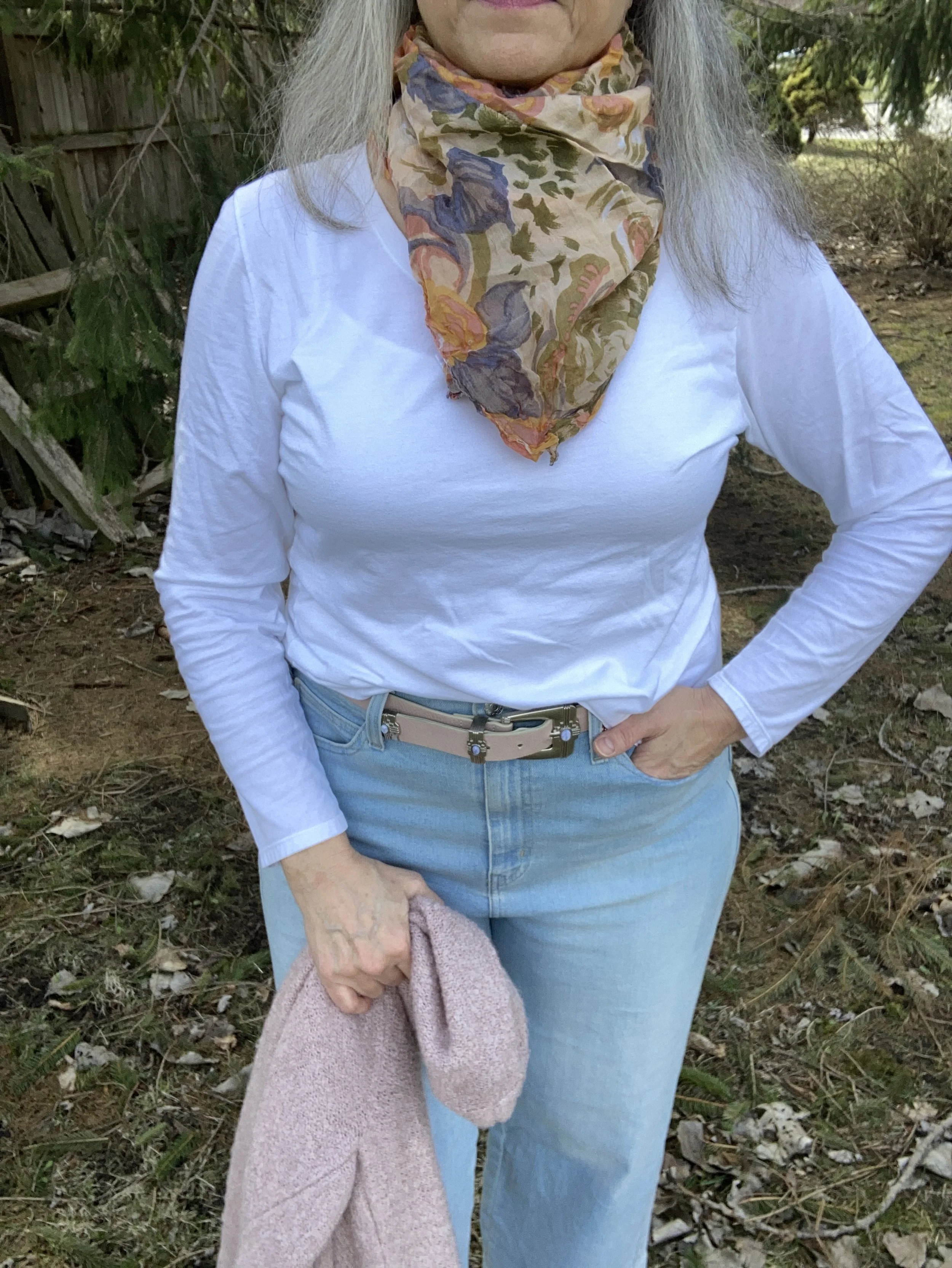
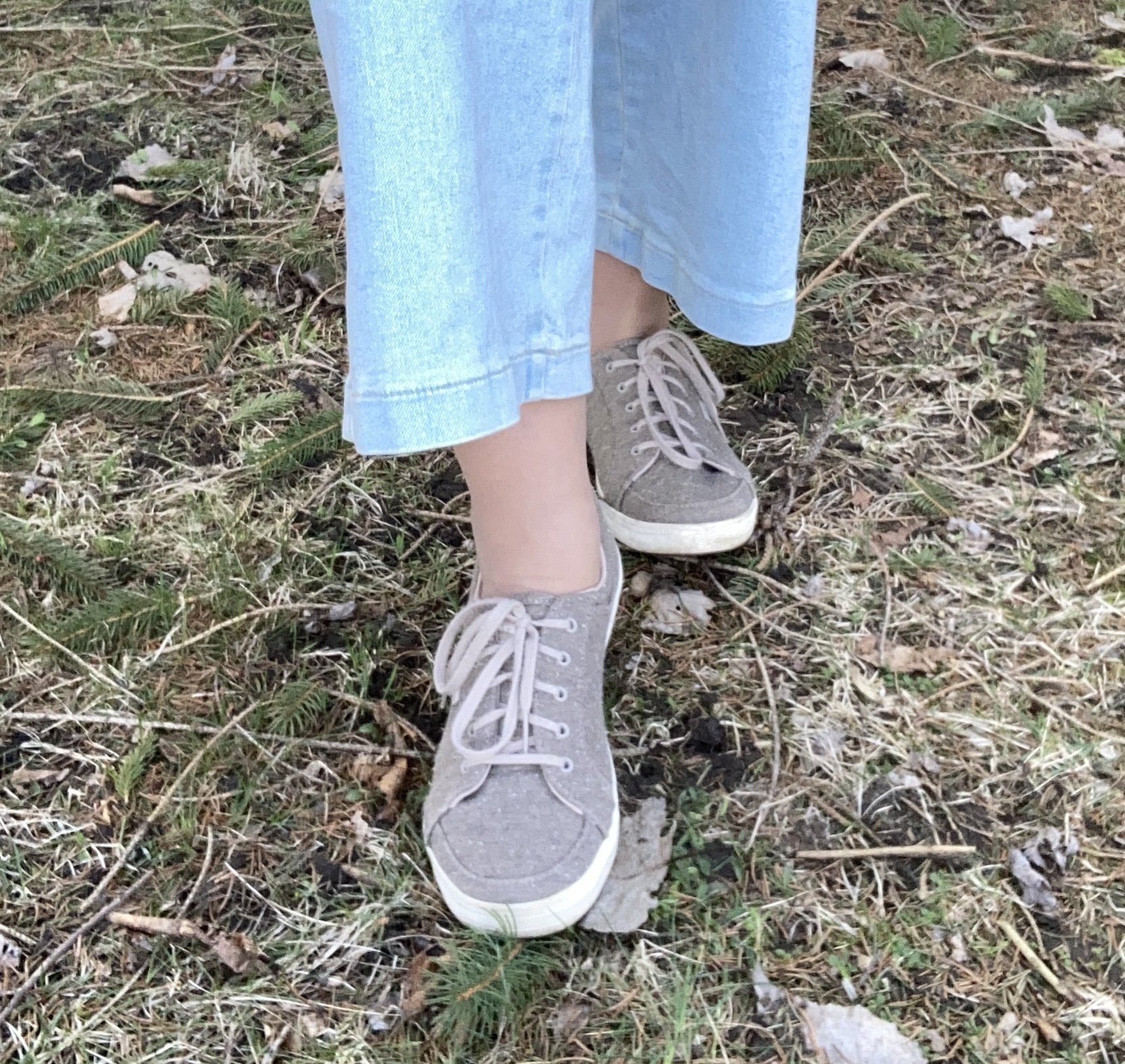
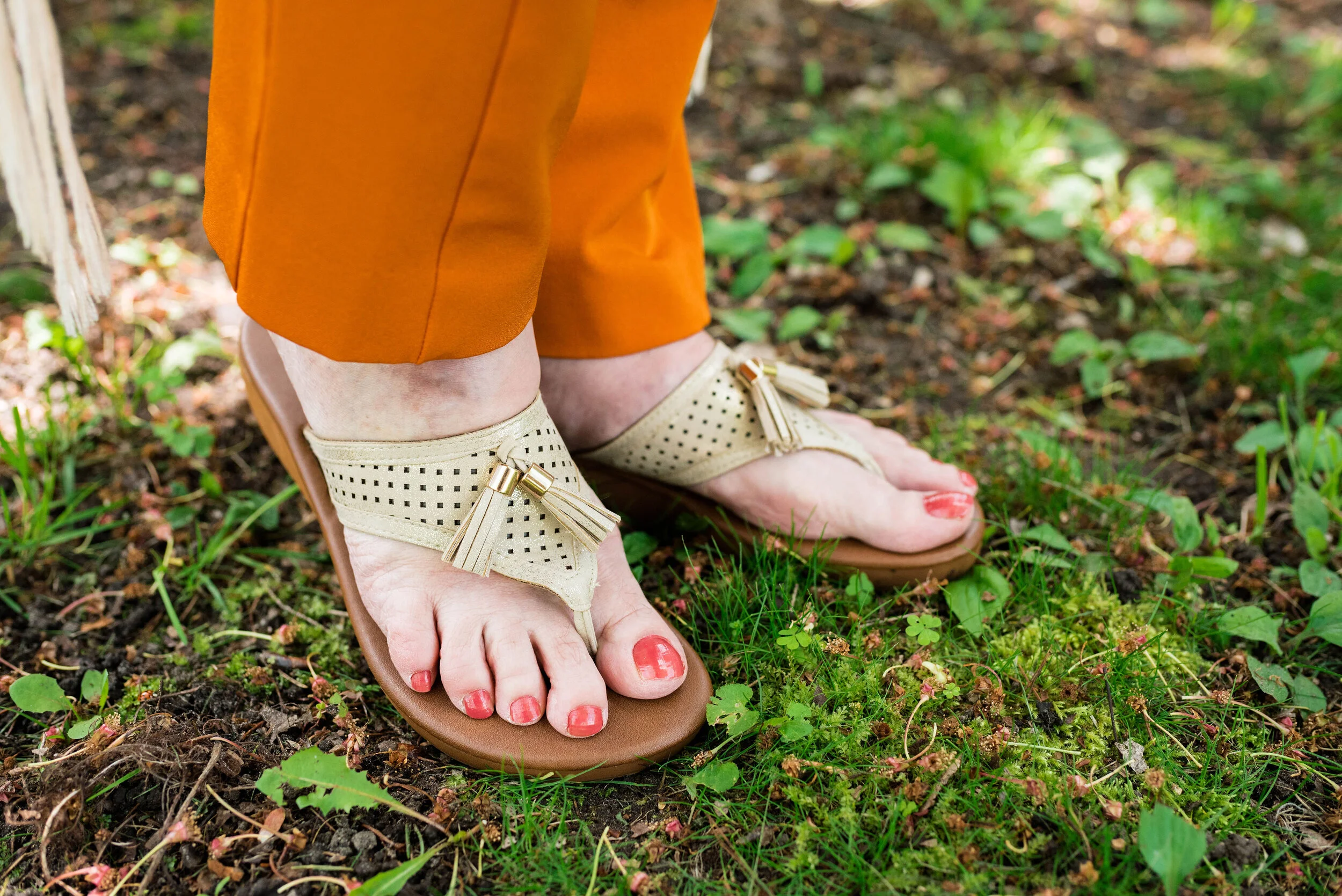
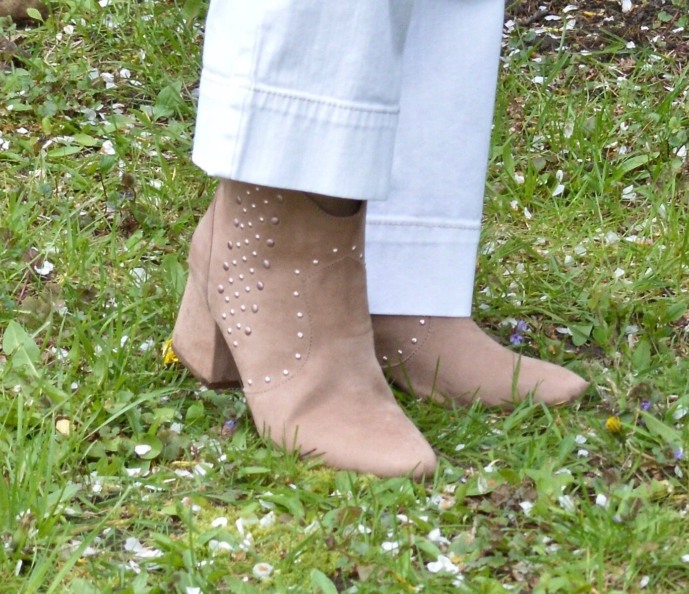
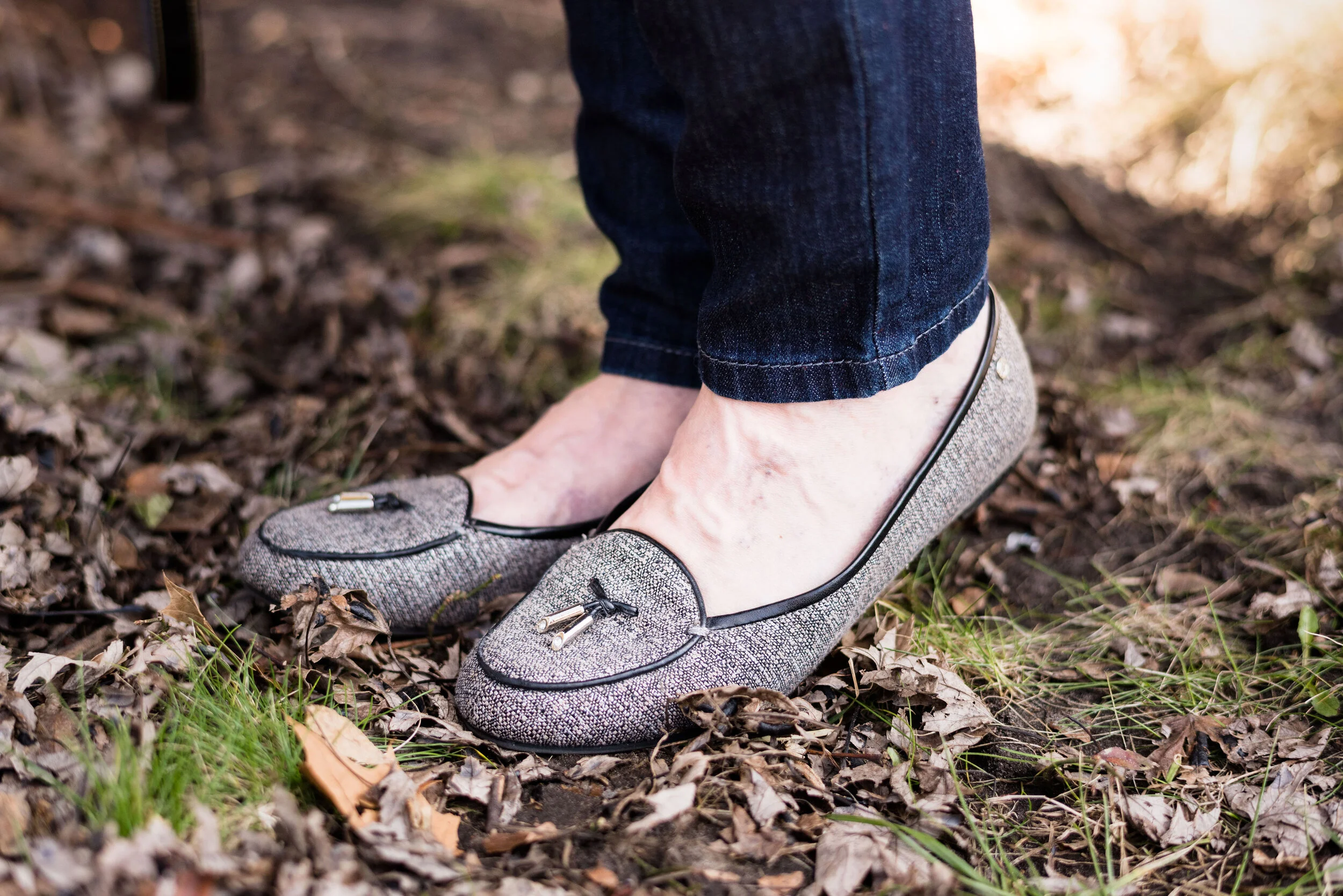
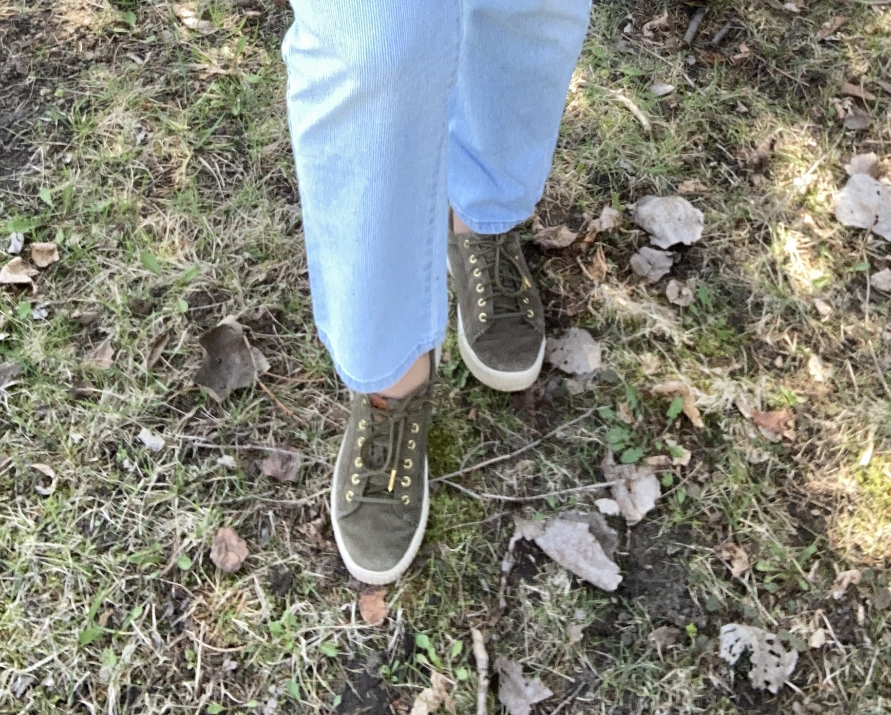
I wanted to show you another ankle length jeans look. Last week I showed you a wide leg jean. This week is a thrifted, Gloria Vanderbilt, straight leg version, and once again, it is in a lighter wash. These are also a pinstripe, which is harder to find, but you can’t really tell unless you get close.

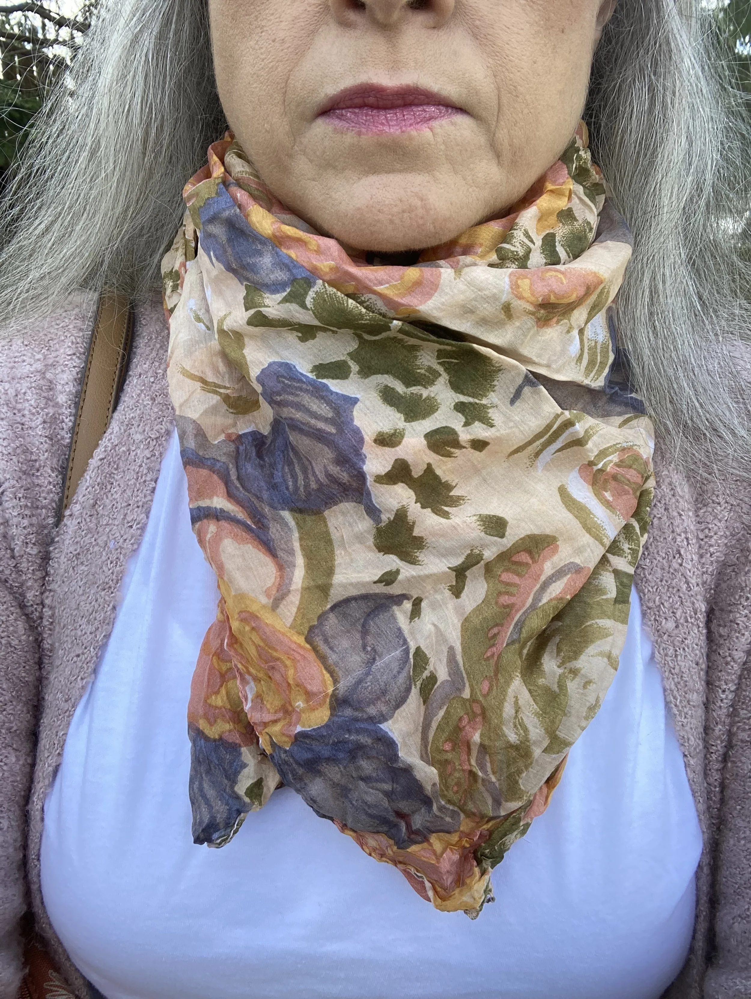
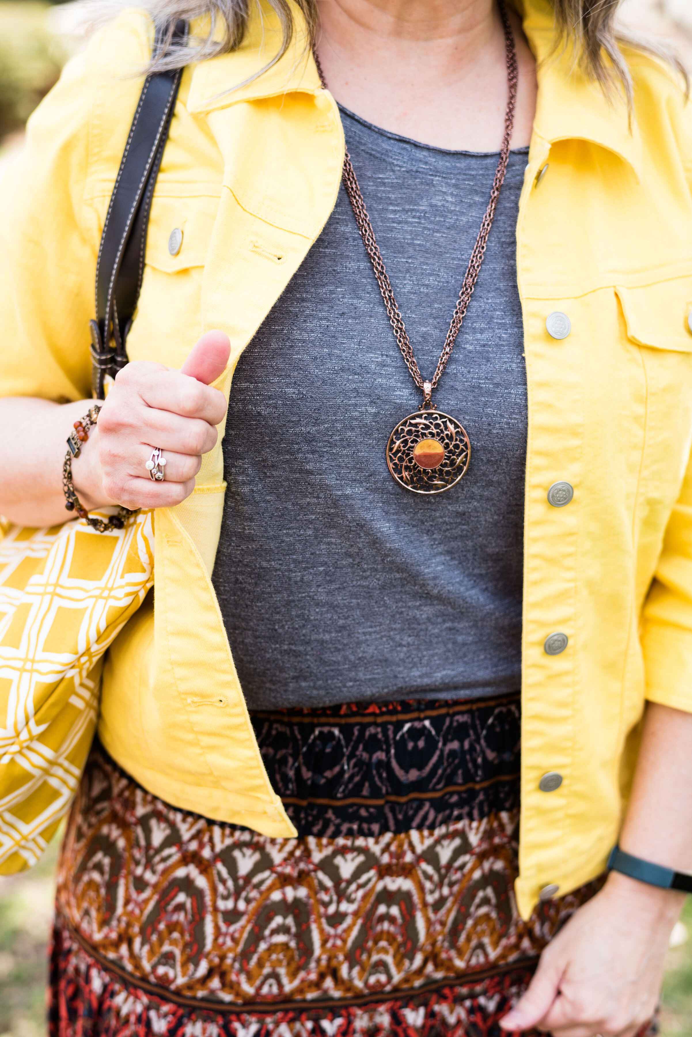
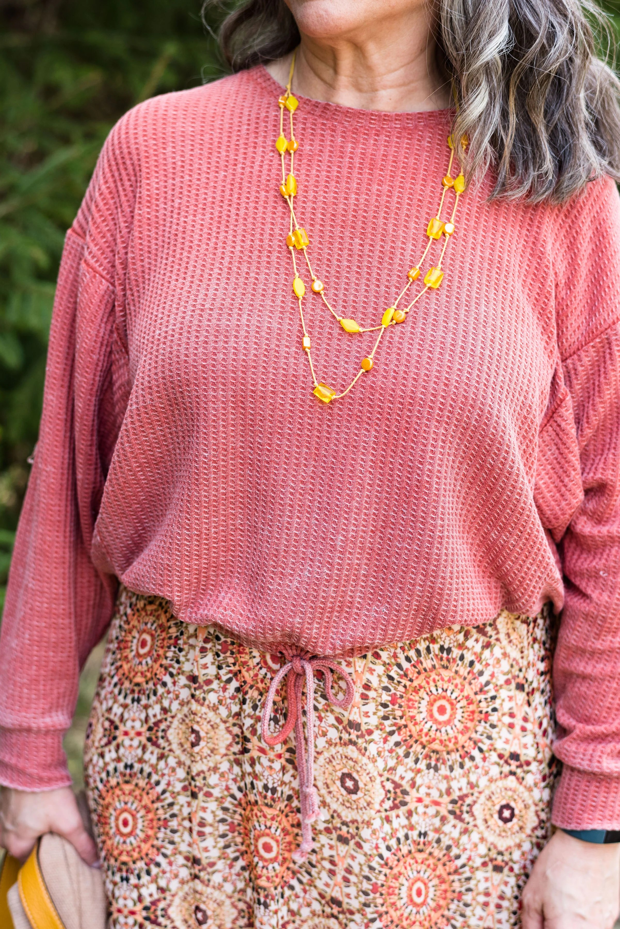
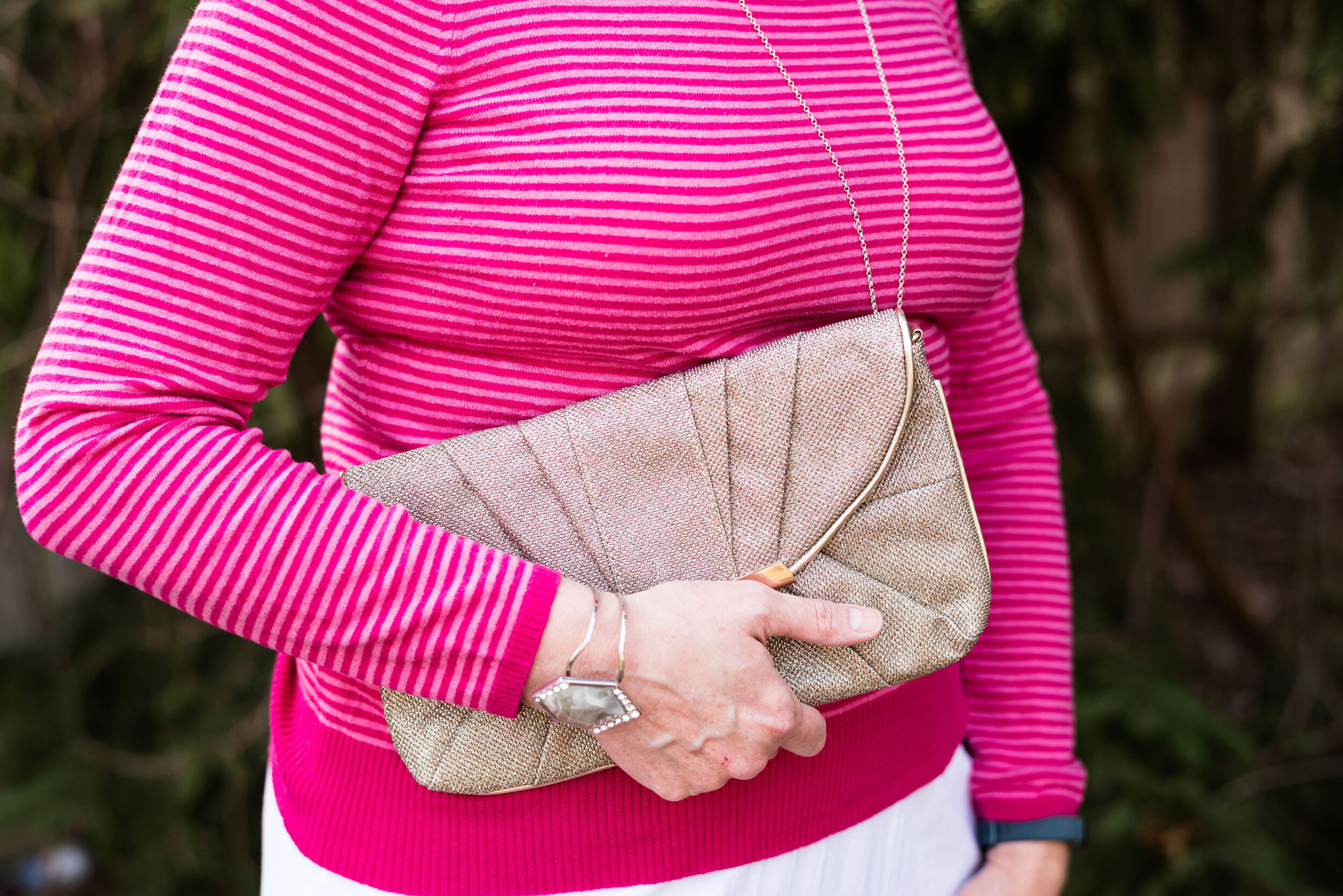
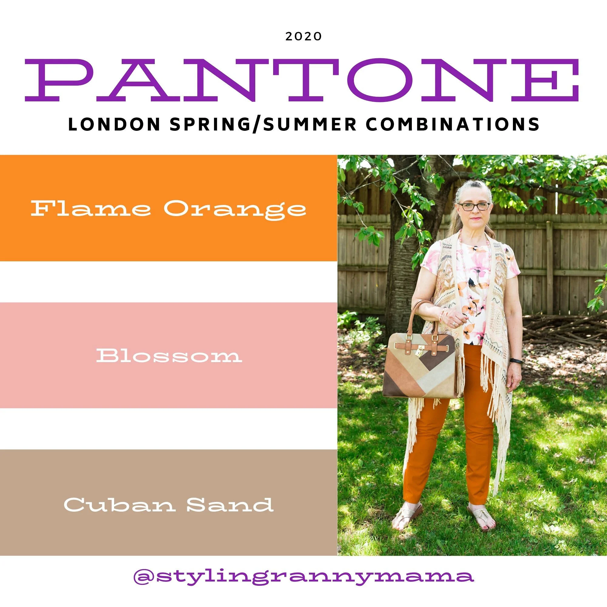
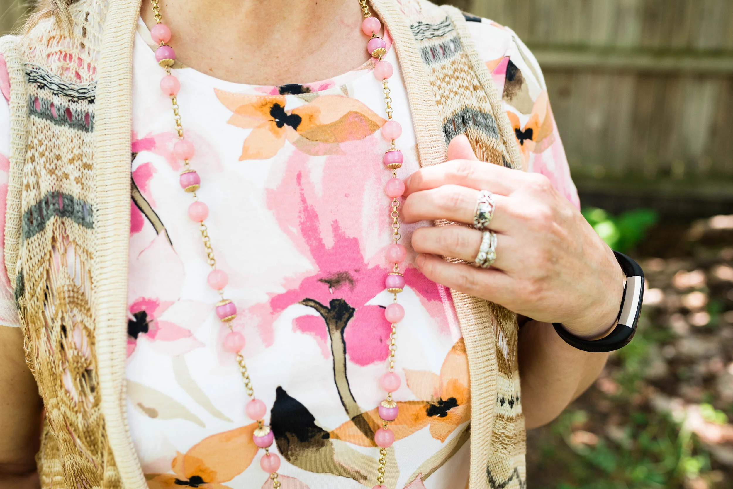
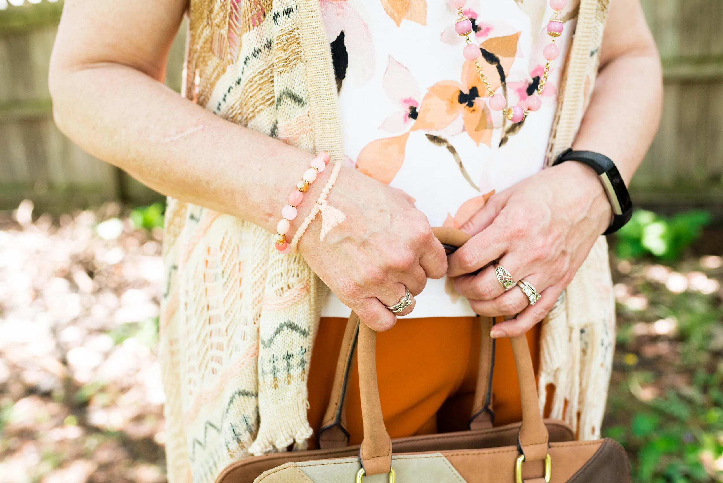
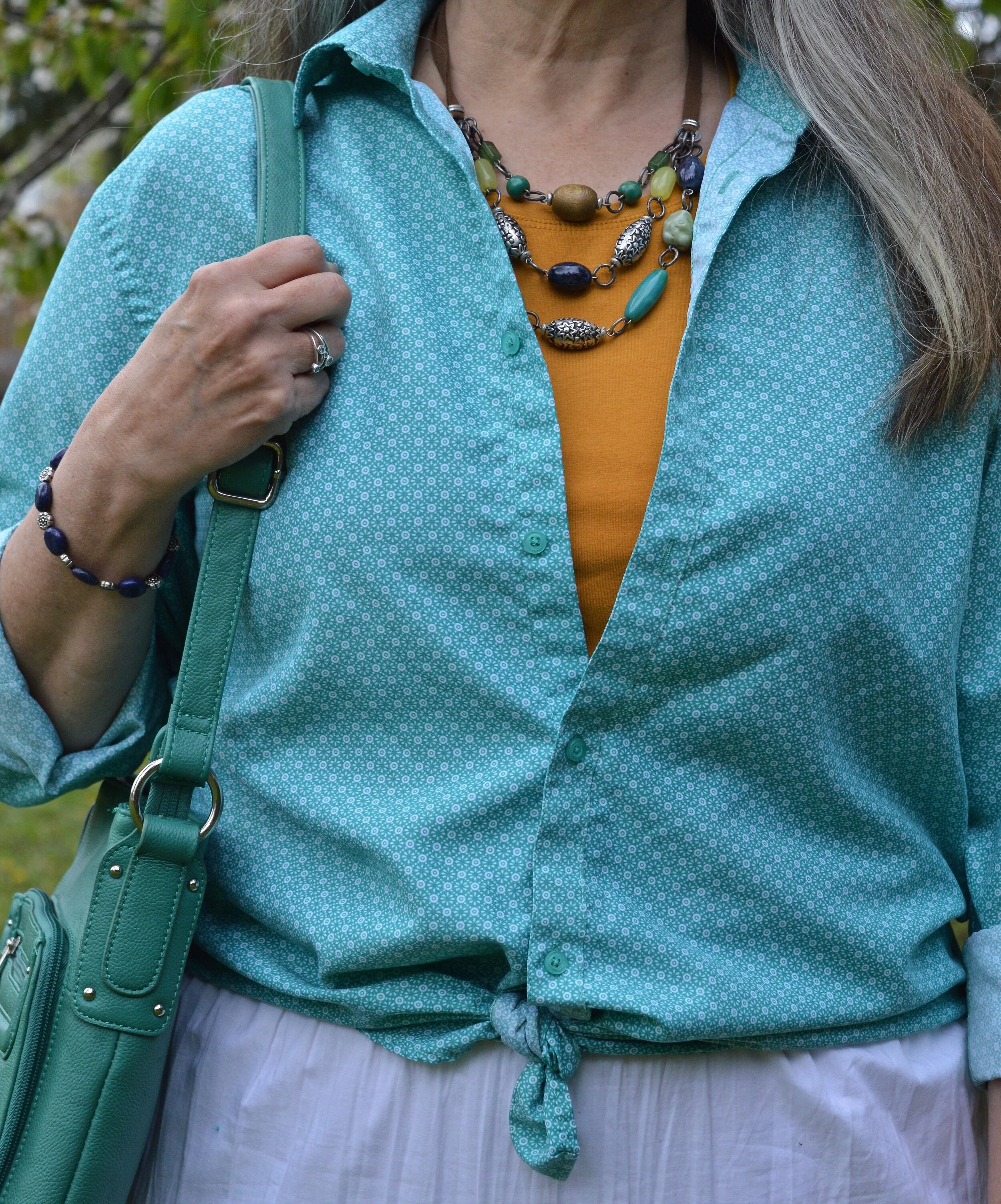
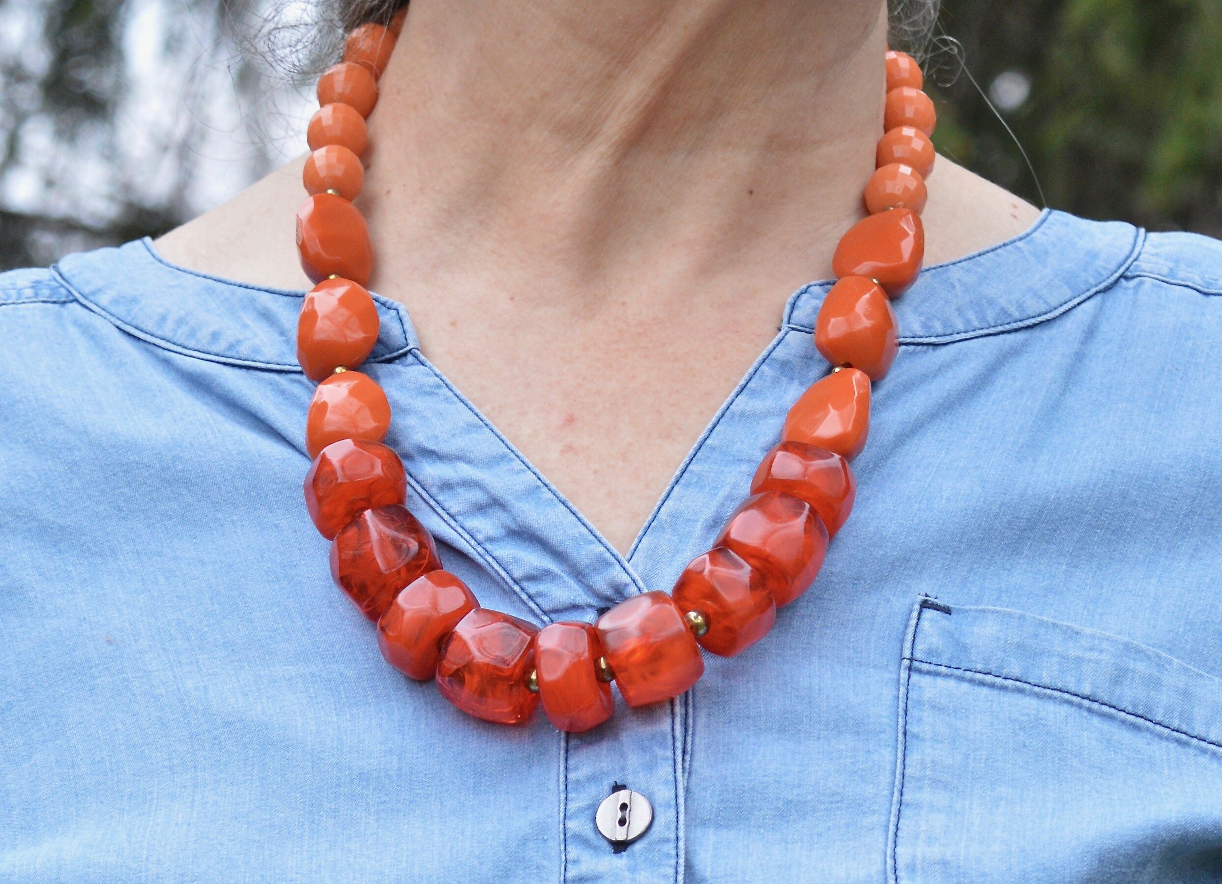
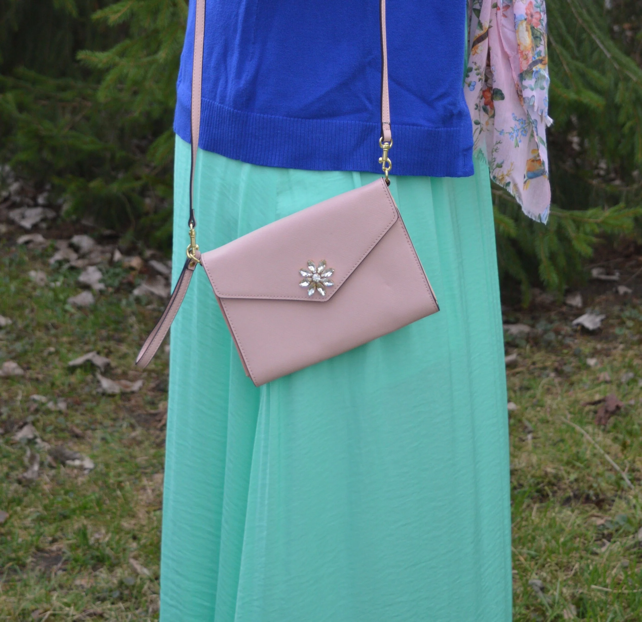
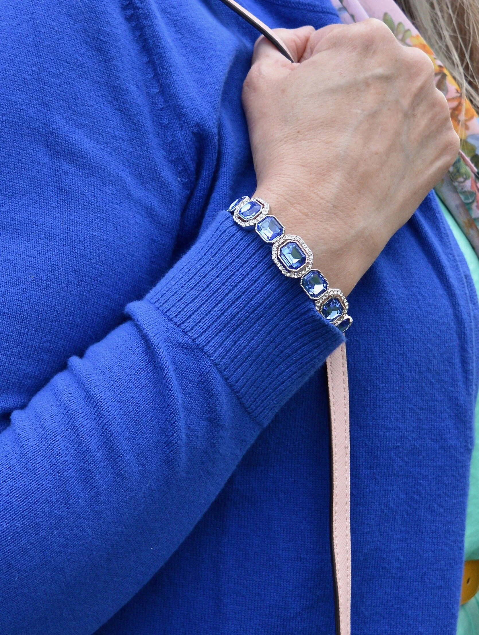
I knew I wanted to do something pink and gold for my jewelry so I chose this floral statement necklace and the gold bracelet for a bit of bling.

My bag was a clearance find at Meijer a few years ago when velvet was trending. My sneakers are Sperry’s.

What do you think of this outfit? Is this a style you would wear? Do you have a utility jacket or a utility vest? How do you like to wear them? I love to get your feedback, so leave me a comment or two.

I am including a few shopping links. These are affiliate links. They are brought to you by me and I do not receive compensation for your clicks, but only if you make a purchase through the link. These are provided for your benefit, to give you ideas and options for items you might like to purchase. All opinions are my own.

Buy Me a Cup of Coffee. I provide this link for you to monetarily support my blog. I do not make money on my blog, but I do sacrifice my time to bring you fresh ideas and thoughts. If you enjoy these posts this is a small way to support my efforts.

I hope you are having a great week.

Outfit Inspiration - A Spring Look

Spring is here, at least the calendar says so, even if the temps don’t feel quite like it yet. As I worked on taking pictures of this outfit I was glad for my long sleeve tee and bulky, longer cardigan, because, dang it, it’s still cold outside! The sun is shining brilliantly, but not quite up to the task of warming our northern states. It will come, so we just have to be patient.

While we wait I thought it would be fun to post a few spring outfits that cater perfectly to our crazy midwestern changing weather. Fall and Spring are our transitional seasons and our temperatures can fluctuate from below freezing in the morning to the mid 70’s during the day. In addition, we can almost always expect rain, rain, more rain and plenty of wind, all of which continue to make me feel cold and want to dress in cozy layers.

Today’s Outfit Inspiration comes from Pinterest where I have a board titled Spring Fashion. Do you use Pinterest? I find that it can be a great source of inspiration and ideas from everything fashion, to holiday decor to recipes. I get tired of the same thing all the time, and I can’t tell you how many times I walk into my closet and just feel overwhelmed. Pinterest and the challenges I participate in on Instagram help me to think differently about my wardrobe and help me rediscover the joy I get from creating a fun outfit.

Style Tip: Look to other sources for outfit inspiration. Instagram, Pinterest, bloggers, and other social media platforms can be overwhelming, but they can also keep things from getting stale and get you looking at your closet with new joy. If you are not a social media kind of gal, then look at the fashion magazines at a bookstore or grocery store. Even though many of those don’t cater to your average woman, many of them can still give you color combinations, acceptable trends and outfit ideas.

The pin, which I will show you at the end is from an influencer Get Your Pretty On. Founder, Alison Lumbatis has a classic, petite, feminine style that works perfectly for busy moms. You can check out her website by clicking on the link. However, it doesn’t look like she has posted anything since last July, so I am not sure if she is still current. Anyway, the pin is for a spring outfit and features a pink cardigan, light wash jeans, a white v-neck tee, a pink tote, and neutral colored flats or sandals.

This white long sleeve tee is just a basic Hanes tee shirt. Basics like this are good to have in your wardrobe, especially if you have a more casual style. You can see I did a bit of a front tuck and added a pink belt to complement the sweater.

I actually had these Signature Levi Strauss jeans from the clearance rack at Meijer in the bag to return, but when I saw this pin, I began to think about other ways I could style these wide leg ankle pants for spring and summer and decided to keep them. They are super comfy and have a high waist that actually fits over my bulges, making it a good choice for wearing with tees that I might want to tuck in.

My thigh length, open front cardigan is Old Navy brand and was a thrift find. I’d say this has been one of my favorite sweater finds while thrifting. I love the length, the pockets, and the cozy fabric. The fact that it will be useful over three seasons is an added benefit.

Style Tip: When using an outside source for outfit inspiration, think about ways you can change up or add accessories to make the look completely your own.

As you can see I did just that with this outfit. I added this thrifted floral silk scarf for a bit a warmth, chose a coral floral Sonoma bag instead of pink to go with the coral tones in the scarf, and chose my neutral Keds sneakers instead of flats or sandals.

Here is my outfit next to the outfit I pinned.

Let me know what you think? Did I do a good job using the pin as inspiration, and did I do a good job of making the look my own? What would you do with this outfit inspiration? I always love to hear your thoughts. You inspire me to keep posting my blog posts and to keep playing with clothes!

I have added some shopping links to give you more ideas.

Buy Me a Coffee.

Have a great week!

Pantone Spring/Summer 2022: Glacier Lake, Daffodil and Snow White

Welcome to the New York Palette of the Pantone Spring/Summer 2022 colors. Pantone has changed the way it allows usage of products, so images are no longer free. Now you have to have a subscription to use the color swatches via the internet, so I have had to get creative in putting together my graphics. I am also not using my daughter’s photography services now, as she is very busy with her business and her baby. I am definitely creating new pathways in my brain, but that is good.

If you want to see the actual Pantone colors click on the following link: Spring/Summer 2022 - New York Palette. I try to get my colors as close to the palette colors as possible, but they are not exact. I appreciate the Pantone Institute’s use of color and always enjoy seeing what the colors are for each season.

For today’s outfit, I thought the mix of yellow, blue and white perfect for spring and even for the upcoming Easter holidays. This color combo makes me think of the sunny flowers the color is named for, and the many blues of summer including skies, lakes and denim. White is always classic, not only for summer, but every season.

My Glacier Lake vest is a Christopher and Banks piece that I found at a thrift store. It has the utility look with the larger, square pockets, encased drawstring and metal buttons. I love using my utility vests in the spring and fall.

Style Tip: If you want an extra layer but don’t want all the bulk choose a light weight vest. A utility vest or a dressier suit vest will provide extra warmth, but won’t add the bulk of a quilted, or sherpa type piece.

My bright, yellow cable knit pullover is St. John’s Bay piece. I honestly can’t remember if I bought it at JCPenney or if I got it thrifting. Ha, ha. My white Gloria Vanderbilt jeans I have had for a number of years now. They are just the right weight and thickness for no-show issues, and can be dressed up or down.

My floral scarf is a piece I recently thrifted. I love scarves. I think they add so much to an outfit.

Style Tip: When styling an outfit with two or three solid colors, add a printed scarf for additional color and interest.

You’ve seen my Merona thrifted bag a few times now on the blog. I thought it was a good choice for this springy look. I also opted to wear my Steve Madden platform sneakers. When it comes to platforms, these are very low, which I like. I really don’t like all the extra bulk of a thicker platform or a really thick lug sole on boots.

What do you think of these colors? Would you wear them together? Do you have these colors in your closet? I’d love to hear your thoughts, so leave me a comment or two. I am including a few shopping links for you to look over. These are affiliate links, which means I get a small commission when you click on a link. All opinions are my own.

Have a great week everyone!

Pantone - Spring/Summer - 2021 - New York Palette: French Blue, Cerulean and Buttercream

Today’s three color combo is the last of the Pantone Spring/Summer New York Palette. I am going to take a week off, as I hope to go visit my mom next week. In due time, I will proceed with the London Palette, but I haven’t even begun to pick out outfits. Breaking my wrist has really thrown a wrench into the works, so bear with me. I got my second Covid shot yesterday, so getting up this morning was grueling. I got the shot in my left arm, figuring it already hurts and I wanted my right arm to remain relatively pain free. I say relatively because there is some pain in my wrist and rib cage on that side, from having to do all the work. This is making me see how much I need to get back to exercising, especially weight lifting and walking since I have osteoporosis. We ladies need to take of them bones, and all the other parts as well. Ha, ha.

I thought it would be fun to pair these two blues, for a fun, casual summer look. Adding the off white of buttercream gives the outfit that perfect warm weather vibe. I kept my accessories casual to add to the picnic ready style. This would be a great outfit for a Fourth of July get together, just add some red jewelry or a bag.

frenchblue.jpg

French Blue and Cerulean are two cool colors that make me think of blue skies and water. I found this French blue plaid shirt while thrifting. I really like this medium blue for spring and summer, as opposed to a dark blue like navy. This button down is Faded Glory brand.

frenchbluepantonespringcoloroutfitideas-2.jpg

My Buttercream ankle pants have made an appearance on the blog before. These were thrifted St. John’s Bay. You can see these styled for two other Pantone series. This one is styled with a yellow button down and this with my Chevron print dress.

Cerulean is a different light blue. I like the sky blue feel of this color, yet it leans towards a bit more pastel. My top is a thrifted Ralph Lauren piece. I like that it has a lining that is similar t-shirt type material to the outside. It has a fun faux lace texture to it.

frenchbluepantonespringcoloroutfitideas-13.jpg

I kept my accessories simple. This thrifted French Blue bag was a recent find and I had to grab it since it matched the color perfectly. This is a nice small bag for carrying just the essentials.

frenchbluepantonespringcoloroutfitideas-7.jpg

My pendant necklace had little flecks of all the colors. I have been on the search for more of these large beads with the hole in the middle. It is so easy to make a necklace out of them.

frenchbluepantonespringcoloroutfitideas-5.jpg

Lastly, my thrifted Keds finally fit the Pantone color. Cerulean is the right name for these sneakers that are great for warm weather outfits.

frenchbluepantonespringcoloroutfitideas-8.jpg

What do you think of these colors? Do you have these blues in your closet? What about Buttercream? I’d love to hear your thoughts. I’d also love to hear which of these colors you would put together to make an outfit.

frenchbluepantonespringcoloroutfitideas-10.jpg

I hope you have enjoyed this look at the Pantone Spring/Summer 2021 New York Palette colors.

I am including a few shopping links, so be sure to check those out. These are affiliate links. I get a few pennies when you click on a link, so I appreciate all the clicks.

Photo credit and graphic Rebecca Trumbull.

Pantone - Spring/Summer - 2021 - New York Palette: Burnt Coral, Marigold and Desert Mist

Today’s outfit blends three colors that seem to epitomize summer with all of its beauty. The deep orange yellow of Marigold, combined with the rustic feel of Burnt Coral and the soft pastel of Desert Mist makes me think of picnics, outdoor parties and long walks on the beach. While my outfit today is probably too warm for summer temperatures, I works well for that in between time when the weather is still unsure of what it is going to do.

burntcoral.jpg

I ordered this waffle weave dolman sleeve top from Maurices earlier this year. It has elastic on the bottom, so has more of a cropped feel to it, which isn’t always my favorite, but I think this works well with pieces where the top can be worn without the need for tucking or wearing a belt.

burntcoralpantonespringcoloroutfitideas-10.jpg

I wasn’t going to use this Roz & Ali medallion print skirt again, but I was having a hard time finding things in my closet that were going to work with these colors. Besides this is a pretty skirt, so I don’t mind using it again. You can see how I styled this piece for several other Pantone color series. Last fall I styled it with a neon yellow short sleeve sweater, and the fall before that with a purple short sleeve sweater. I like that this skirt works perfectly for spring, summer and fall. The skirt contains all the colors from the graphic, even though you can’t see Marigold as well, you can definitely see the Burnt Coral and Desert Mist.

burntcoralpantonespringcoloroutfitideas-6.jpg

My Desert Mist sweater is a little light compared to the Pantone color, but again, this isn’t about having an exact match, but about giving you options that you can find in your closet. This is a thrifted St. John’s Bay piece. It is always good to have a neutral cardigan or jacket that will work well with many different outfits and colors.

burntcoralpantonespringcoloroutfitideas-8.jpg

For the Marigold color, I just added a few accessories, similar to what I did in last Thursday’s post with Raspberry Sorbet. The necklace and Sophia Caperelli bag are both thrift finds.

burntcoralpantonespringcoloroutfitideas-11.jpg

You were recently introduced to these Clark’s flats. They are perfect for wearing with a skirt, whether long or short.

burntcoralpantonespringcoloroutfitideas-13.jpg

What do you think of these colors? Do you have all of these in your closet? Would you wear them together? I’d love to hear your thoughts, so leave me some love.

burntcoralpantonespringcoloroutfitideas-4.jpg

I’m including a few shopping links. These are affiliate links. All opinions are my own. Here’s a picture, just for your enjoyment. Ha, ha.

burntcoralpantonespringcoloroutfitideas-7.jpg

Have a great evening!

Photo and graphic credit Rebecca Trumbull.

Pantone - Spring/Summer - 2021 - Raspberry Sorbet, Mint and Willow

Today’s Pantone outfit revolves around a tantalizing pink, a refreshing green and another earthy color reminiscent of the weeping willow trees that hug the banks of lakes and streams. Raspberry Sorbet, Mint and Willow combine in an outfit that is both sleek, colorful and casual.

raspberrysorbet.jpg

When I think of the color mint, I am more inclined to think of the light Green Ash color from Tuesday’s post. I guess my rendering of mint is based more on ice cream and Christmas candies than it is the actual plant. The mint plant is a bright, living green, so I think the Pantone color is much truer to the natural source. My Mint green top is a thrifted Falls Creek piece. I wore it for this shoot and then I got rid of it. It has been hanging in my closet for a while and I wasn’t certain, why I didn’t reach for it more often. After putting it on, I just didn’t like how stiff the fabric was. I’m all for structured pieces, but a piece has to move with me for me to want to wear it.

raspberrysorbetpantonecolorsoutfit-4.jpg

My camouflage pants, also Falls Creek, are a recent clearance find from Meijer. They are light weight, so good for summer. Unlike some camo that is more green, these tend towards more brown and gray. The Willow color is in there as you can see in the following picture. Willow was hard color to find. Most of my pieces are more olive green and Willow has more of a brown undertone.

raspberrysorbetpantonecolorsoutfit-10.jpg

Instead of choosing another clothing piece for the Raspberry Sorbet color, I opted to include it in my accessories. My necklace, bracelets, and the Vera Bradley tote were the perfect pop of this bright, saturated pink.

raspberrysorbetpantonecolorsoutfit-6.jpg
raspberrysorbetpantonecolorsoutfit-8.jpg

I went for my silver SO flats to tie in with the silver chains on the necklaces.

raspberrysorbetpantonecolorsoutfit-9.jpg

What do you think of these Pantone colors? Do you have the color Willow in your closet? I love to hear back from you, so leave a comment or two.

raspberrysorbetpantonecolorsoutfit-3.jpg

I’m including a few shopping links for you to peruse. These links are brought to you at no cost, but using them to purchase something gives me a few pennies as a kick back. I appreciate all your support. These are affiliate links. All opinions are my own.

Photo and graphic credit Rebecca Trumbull.

Have a great weekend everyone!

Pantone - Spring/Summer - 2021 - NY Palette - Amethyst Orchid, Green Ash and Inkwell

Today’s combination of Pantone colors from the New York palette is a study in contrasts. The dark, moody blue of Inkwell, which mimics a night sky is a type of color disparity when side by side with the pale pastel of Green Ash. When I pair colors I often go for bold with bold, or light with light, but I wanted to experiment by creating an outfit with an eye catching difference in color. The addition of Amethyst Orchid gives the perfect compliment of medium purple color.

amethystorchid.jpg

Let me start the outfit details by talking about this recently thrifted tee. I love the bold flower on the front and purple has long been a favorite color of mine, so I was glad it was on the palette. This tee is St. John’s Bay brand. The darker inner petals are actually separate pieces of material, which gives the tee added dimension.

To go along with the Amethyst Orchid color in the tee, I also added this recently thrifted scarf. I love the large gingham pattern. It was the perfect accompaniment to the whole look. Another interesting feature of this scarf is the ruching of elastic throughout its length adding texture.

amethystorchidpantonecolorsoutfit-9.jpg

These thrifted, Inkwell pants are a brand called Hydrant. A dark pant like this is great for making our lower halves look longer and slimmer. I really like these, but they are a lint magnate. Wearing them with a fuzzy sweater like this is probably not the best idea. Ha, ha. You can also see I added a wider, olive belt since belts are trending and did my usual front tuck.

My fuzzy Green Ash sweater might be a little light, but it is pretty close to the Pantone color. This was a Christopher and Banks purchase last year. Before I bought this piece I had very little of this color in my wardrobe. I have picked up a few things since then. It is a pretty pastel color to wear, especially in the spring and summer. I really like how well it goes with the Amethyst Orchid color.

amethystorchidpantonecolorsoutfit-6.jpg

I decided to go with white for my shoes and bag. White is definitely a go to in the warmer months. My white Keds will be on repeat. My white shoulder bag is a new thrift find. I have been searching for a different white bag and this one has plenty of room and can also be worn as a cross body bag. This is a brand called Bueno.

amethystorchidpantonecolorsoutfit-10.jpg
amethystorchidpantonecolorsoutfit-12.jpg

What do you think of these colors? Would you wear a light pastel with a dark color like navy or black? I’d love to hear your thoughts. Thanks so much for taking the time to comment.

amethystorchidpantonecolorsoutfit-15.jpg

I’m including a few shopping links. These are affiliate links. All opinions are my own.

Photo and graphic Rebecca Trumbull.

Pantone - Spring/Summer - 2021 - NY Palette - Illuminating, Rust and Ultimate Gray

I wanted to share this outfit with you first, because it contains the two colors that were chosen by the Pantone Color Institute as the colors of the year. Illuminating is a bright, sunny yellow. Pantone describes this yellow as, “Friendly and joyful, an optimistic yellow offering the promise of a sunny day.” Rust is typically a fall color, yet it is an earth tone, thus its inclusion in the spring palette. Ultimate Gray is a classic and comfortable gray that everyone can wear.

illuminating.jpg

I have plenty of yellow in my closet. It is a color that has quickly become a favorite. I love the many different shades of yellow. I have mustard, sunflower, lemon, blonde and pineapple. Look up shades of yellow in your search bar and see all the fun names they give for these lovely pieces of sunshine. Illuminating is not really a different shade, but a different name for a shade that might also be called bumblebee, butter or dandelion.

Since I love the color so much, it was a no brainer that I add this thrifted, bright yellow, denim jacket to my closet. This is a brand called d & co, or denim and company. When I looked it up, it is a brand that is sold at retailers like QVC, Walmart and others. I like the relaxed style of this piece, as well as the 3/4 sleeves. It will be a great topper for cooler summer days.

pantone2021illuminating-7.jpg

We were back at the Toledo Botanical Gardens for pictures and things are starting to bloom over there. This tree was gorgeous and I had no idea what is was because the blooms were so big. It turned out to be a white magnolia. I grew up with a pink magnolia in my parents’ yard. I didn’t even know there were white ones.

You’ve seen my boho skirt on the blog before. I looked at other Rust colored options in my closet, but just wasn’t satisfied with how the outfit looked. Choosing this skirt not only gave me a print, but the perfect blend of classic and bohemian. This skirt is a brand called Notations, but I can’t remember where I got it. Ha, ha. You can see it styled with a green top and a different gray top.

This simple Ultimate Gray tee is from Kohl’s and is SO brand. I got this one and a red one a few years ago. I love that they are light weight, but still provide coverage. The hemline is a straight cut and the length is shorter, so perfect for wearing out. I did the front tuck, just for a more polished look.

pantone2021illuminating-15.jpg

When I was rummaging through my necklaces, I saw this one and thought it would pull in both the rusty oranges in the skirt and the yellow of the jacket and bag. To go with the coppery colors I also put on my thrifted beaded bracelet. My yellow diamond patterned tote was a fun find at a thrift store. Another thrift store find, my ID Required combat boots get plenty of wear.

pantone2021illuminating-11.jpg
pantone2021illuminating-12.jpg
pantonespring2021preview-2.jpg

What do you think of these colors? Would you wear rust in the summer time or do you think it is a color strictly for fall? I’d love to hear your thoughts, so leave me some love in the comments. Your comments keep me motivated to keep providing content to you all.

pantone2021illuminating-1.jpg

I’m providing a few shopping links for you to look over in your spare time. These are affiliate links brought to you at no cost. When you click on a link, I get a few pennies, so I appreciate every click. All opinions are my own.

Photo and graphic Rebecca Trumbull.

Pantone - Spring/Summer - 2021 - New York Palette: Introduction

I am a bit behind on the Pantone colors this year. I had a hard time getting back into the swing of regularly posting, but here I am. While we are a few weeks into spring, the Pantone colors for this season are for spring and summer. I don’t pay attention too much to their time table, because they already have the colors out for the fall/winter season. Who wants to think about fall/winter when we have barely made it into spring? Ha, ha.

Just as a quick review, the Pantone Color Institute is an entity that provides the color trends for both the fashion and interior design industries. If you go to their website you can see all sorts of information from color swatches you can order to educational opportunities. Obviously, these are not the only colors that you see trending on the runways, but Pantone is easily considered a color authority by both design areas.

Every year, Pantone chooses a color of the year. Last year it was Classic Blue. In 2019 it was Living Coral. This year they picked two colors, Illuminating, a sunny yellow and Ultimate Gray, which is a classic medium gray. Typically, the colors of the year are seen on both the New York and the London Palettes. As I have done in the past I will be starting my series with the New York Palette. This year, the palettes are quite dissimilar, which makes it more interesting for me, as I pick out outfits and for you, my lovely subscribers.

Here is the New York Palette.

ClassicColors_(12).jpg

This is a mix of jewel tones and pastels, so if you lean towards one or the other, this palette will make everyone happy. Rust is a different color for summer, but I think it can work well with many of the others colors. Once again there is a selection of classic colors, which to me are helpful if you want to tone down an outfit and just accent with the brighter colors through jewelry and other accessories.

The following are a few photos from our shoot which give you some sneak peeks at how I combined these colors.

pantonespring2021preview-1.jpg
pantonespring2021preview-2.jpg
pantonespring2021preview-3.jpg
pantonespring2021preview-4.jpg
pantonespring2021preview-5.jpg
pantonespring2021preview-6.jpg

I hope you will join me on Thursday as I start the series. Have a great day!

Photo and graphic credit Rebecca Trumbull.

Spring/Summer - 2021 - Spark Joy

This trend is a bit different and I think really open to each individual’s own interpretation. The idea of Spark Joy is color and print combinations that make you feel like you are wearing a party. I actually enjoyed putting this together. You know I love print mixing and this pushed me even further outside of my color and print mixing box. Let’s take a closer look.

sparkjoyspringtrend-3.jpg

I got this Universal Threads, sun print top at Target at the same time I got my pastel colored eyelet shirt (seen last week on the blog). Once again, you can see the puffed sleeves. Usually, I am not a ruffle girl, but once in a while, I find something that doesn’t make me look like a clown and this top was one of those times. I think the gathering around the neck helps and that the ruffles are vertical rather than horizontal. Horizontal patterns on us larger ladies are harder to pull off, and that goes for ruffles as well. In fact, when placed as they are on this top, I think it balances out my wider bottom.

This is another LuLaRoe skirt that I found at a local thrift store. The thing I like about these maxi skirts is that I don’t have to worry about wearing a slip. They are comfortable and easy to wear. The fun patterns are great for print mixing as in this outfit, or you can pick any color in the pattern and match up to it. I know not everyone can wear a maxi skirt and I will include a few shopping links at the end for shorter printed skirts for those of you who prefer a midi or knee length style.

sparkjoyspringtrend-11.jpg

My floral, Erin London, bomber jacket you’ve seen before. It was a purchase from Shop National from their mark down section a few years ago. You can see it here with a floral top.

My accessories were simple since there was already plenty going on in this outfit. I chose another long pendant necklace, this time with some bling and fringe. I also opted for a wide black belt to make more of a definition between my top and the skirt. I added a few bracelets, my thrifted, black, a.n.a. loafer heels and my thrifted bucket bag. My daughter does not like this bag. What do you think? She doesn’t like the shape of it. I told her I would ask for your opinion, so be sure to comment below.

sparkjoyspringtrend-10.jpg
sparkjoyspringtrend-13.jpg
sparkjoyspringtrend-8.jpg

So what do you think of this crazy print mixing outfit? I do not really expect you to go out and wear something like this, but it is truly fun to experiment and push ourselves outside of our normal outfit ideas. Would I wear something like this? Probably not exactly as I have it here. I might swap out the skirt for a solid black skirt or pair of pants, or I might change the top for a solid tee. I might even wear the top and skirt together, but switch out the floral bomber for a solid cardi or light weight jacket. You can still have joy with bright colors and print mixing, but you can also look polished and classy.

sparkjoyspringtrend-2.jpg

I’m including a few shopping links for fun prints. Be sure to check those out. These are affiliate links. When you click on a link, I get a few cents. I appreciate every click. All opinions are my own.

Photo credit Rebecca Trumbull.

I hope you are having a great week.

Spring/Summer Trends - 2021 - Wearing White, Bubblegum Pink and Ballerina Flats

You know how much I love color, so I was excited the Spring Trends for 2021 included a few fun colors. Once again, white is on the scene, and like pastels, seems to now be a year round staple. Winter whites this past winter were very popular and I felt it was an easier color for many to wear than a stark, brilliant white, but even bright white has a place, and this spring and summer it will have its day. In addition to white, this spring/summer season is heralding the addition of bubblegum pink. This bright, deep pink can be worn full on, or sprinkled. Just like ice cream toppings, you can decide if you want to drizzle or drench. Today’s outfit is a simple combination of these two colors. Let me know what you think.

pinkstripedtop-4.jpg

My bright pink striped sweater is a thrift find from a few years ago. This Old Navy brand top is comfortable and light weight, so perfect for these still chilly days of spring. My biggest problem with pullovers right now are my belly flaps, or as they are more commonly known - the spare tire. I don’t really have as much of a bulge in the front, but definitely on my sides. At the suggestion of my daughter, I am discreetly hiding the fact behind my clutch. Ha, ha.

pinkstripedtop-12.jpg

This picture is silly, but I put it in here for several reasons. First, I thought you might enjoy a good laugh. I think this was one of my dance moves: maybe the wave? The second reason has to do with what I did with my pullover top. I often do the front tuck. Doing this helps to hide some of the middle area bulge that many of us are carrying around. I did this as an after thought, so it isn’t as pretty as it could be, but you get the idea. Finally, I wanted you to see this maxi skirt that I have styled before on the blog. This St. John’s Bay skirt from JC Penny is one of my favorite summer pieces, as it is fully lined, has an elastic waist and groovy texture. You can see it styled with a green jacket and an orange striped tee.

I like to give you links to past posts, to show you the versatility of the pieces in your wardrobe and how they can be styled for different seasons and with different pieces. You don’t have to have a clothing fetish like I do to have a full and interesting wardrobe. Having a few key pieces, like a white skirt, whether maxi, midi or mini; a-line, pleated or pencil, will give you lots of options for warm weather looks.

I’ve included a couple of pictures that show you up close the details on the skirt.

pinkstripedtop-10.jpg
pinkstripedtop-11.jpg

Once again, I chose a long, pendant necklace. I also added a silver and gray stone bracelet. To keep my accessories similar I grabbed my silver clutch and my silver SO ballerina flats. As I said last week, low soles are back in style, so grab your flats and your sandals and walk in comfort.

pinkstripedtop-8.jpg
pinkstripedtop-7.jpg
pinkstripedtop-9.jpg

Do you wear white in the summer time? Do you like this bright, bubblegum pink? Let me know your thoughts in the comments below.

pinkstripedtop-1.jpg

I hope you enjoyed this post. I am including a few shopping links for you to look over. These are affiliate links. All opinions are my own.

Photo credit Rebecca Trumbull.

Spring/Summer - 2021 - Eyelet, Luxe Leather, and Long Necklaces

I am continuing my look at Spring/Summer trends today with a focus on eyelet, metallic faux leather, and long necklaces. I have always like eyelet. I think it is a pretty, feminine material that is light weight, making it perfect for the warmer weather. Besides the feminine aspect of eyelet, I also like the textural element that a fabric like this adds to the outfit.

Eyelettopspringtrends-2.jpg

This top is Universal Thread brand. I added a similar colored tank top underneath for warmth. I thought it was appropriate that this top also has puffed sleeves since these are trending as well, as you saw last week. I personally like the puffed sleeve better when it is puffed at the end of the sleeve on a long sleeve top like last week’s. However, when I saw this top at Target, I fell in love with it, and I do like the way it looks. It will be a fun piece for summer with cropped pants and sneakers, or a skirt and flats.

Eyelettopspringtrends-13.jpg

The choice to wear my straight leg high waisted Gloria Vanderbilt jeans was a no brainer. The embroidered flowers on the leg, not only fit in with the fantasy floral trend, but they also went so well with the top. As I have said before, I am not getting rid of my skinny jeans, but I will gladly wear a pair of straight leg jeans on occasion.

Eyelettopspringtrends-12.jpg

You’ve seen this metallic faux leather moto jacket on the blog before. I got it at Nordstrom Rack and is a brand called Coffee Shop NY. It is a tad tight right now, due to my excess pandemic bulge, but I can still wear it open and I think it looks perfect with this outfit. You can see how I styled it with a camo shirt, and with a graphic tee and pin striped shirt combo.

Eyelettopspringtrends-9.jpg

Long necklaces are in this spring, as I mentioned before. I have quite a collection of pendant necklaces, like the one above, but I don’t think the trend is strictly limited to pendants. I think long dainty chains and multiple layers are trending too, so it really is what you want to make of it. I find almost all of my jewelry on clearance racks and at thrift shops. Once in a while I’ll get something brand new from one of my family members as a gift for Christmas, Mother’s day or my birthday, but otherwise I prefer cheap. Ha, ha.

Eyelettopspringtrends-8.jpg

My large pale green tote is making another appearance. I have used this numerous times on the blog and it was a purchase a few years ago from Charming Charlie. Big tote bags are also trending for spring. I think this often comes around again, because people are looking forward to traveling and going to the beach. We will see if Covid allows these simple pleasures in life again.

Eyelettopspringtrends-14.jpg

I figured since I was styling a moto jacket I might as well add my moto boots as well. You’ve also see these on the blog before too. These were a Kohl’s clearance purchase and are Sonoma brand.

What do you think of this outfit? Do you like eyelet? Do you like to wear moto jackets? Wear do you get most of your jewelry from? I’d love to hear your thoughts in the comments below. You are what keeps this blog going. I know I don’t spend time talking about make up or hair products, and other fashion related ideas, but if you would like to see more of that kind of content, just leave a comment and let me know.

I am including a few shopping links. These are affiliate links, which means I get a few pennies if you click on a link. I appreciate all your clicks. All opinions are my own.

Have a great Tuesday!

Photo credit Rebecca Trumbull.

Spring/Summer - 2021 - Puffed Sleeves, Pastels and Pops of Blue

I think most of you who follow me regularly know I love to combine ideas. For example, when I do my Pantone color series, I try to combine several colors at the same time. Part of why I do this is to save time, but it also stretches myself outside the normal, jeans and tees, types of outfits. I wanted to do the same thing with the Spring Trends, and today’s outfit also added the fun literary technique called alliteration. If you don’t already know what that is, it is the combining of words that all start with the same beginning sound. My grandson recently finished up a poetry unit at school. Why they think ten years olds need to know all the poetry terms and examples to go with them is beyond me. My grandson, came away with an unfortunate loathing for poetical form, which makes this writer sad. But I digress!

Today’s outfit revolves around three spring trends that we have seen before. Puffed sleeves keep coming back around, as do pastels. I think pastels are here to stay, as they can be used in so many ways as neutrals. The color blue is always classic, but I really liked the idea of using it as a pop of color in any outfit, so I might try to incorporate this trend into some of my future looks, just for fun.

Spring Trends - 2021 - Puffed sleeves, pastels and pops of blue

I started this outfit with a recently thrifted top by John Paul Richard. I love the pattern and the puff sleeves. We often think of puffed sleeves as being puffy on the top, but on this particular top the puff is on the lower part of the sleeve. I won’t get a ton of wear out of this before the warmer weather hits as it is a heavier weight material, but it is perfect for those in between days. I also love the smocking on the bodice, through the back and upper sleeves. Having it loose through the body is a plus right now too, for my lovely love handles.

Spring trends 2021 - Puffed sleeves, pastels and pops of blue

At first I had the top paired with some jeans that were more of a cognac color, but then I pulled out these blush Christopher & Banks trousers and thought it worked quite well. As you can see there is a light pink in the top, so my matchy mind likes the combination. However, I did like the way the top looked with the other colored pants as well, but I was trying to triple up on my trends. Ha, ha.

Spring trends 2021 - Puffed sleeves, pastels and pops of blue

For my pops of blue, I added a beaded necklace, I got two Christmases ago, a couple of beaded bracelets with a few blue beads and my thrifted blue Nine & Co. bag.

Spring trends 2021 - puffed sleeves, pastels and pops of blue
Spring trends 2021 - Puffed sleeves, pastels and pops of blue
Spring trends 2021 - puffed sleeves, pastels, and pops of blue

The warmer weather always brings out my SO ballerina flats, and this year they are back on trend. However, the colors are more metallics and statement making patterns, but flat soles are in.

Spring trends 2021 - Puffed sleeves, pastels and pops of blue

What do you think of these three trends? Do you like puffed sleeves? Do you like to wear pastels? Do you have any blue accessories that you can boost up your outfits with? I’d love to hear your thoughts, so leave me a comment or two. Your comments help keep me blogging.

Spring trends 2021 - Puffed sleeves, pastels and pops of blue

I’m including a few shopping links. These are affiliate links. All opinions are my own.

Have a great weekend!

Photo credit Rebecca Trumbull.

Pantone Spring/Summer - 2020 - Flame Orange, Blossom and Cuban Sand

Today’s colors are bright and light and make me think of late night bon fires and light pink peonies. The classic color of Cuban Sand makes me want to take my shoes off and walk on the beach. The combination of these three colors together makes for the perfect summer look, complete with my own version of print mixing and boho vibrations.

Pantone Spring/Summer 2020 - Flame Orange, blossom and cuban sand

This very casual look revolves around my bright orange Worthington pants from JCPenney. I have styled these slimming skinny trousers many times on the blog before. You can see them with a dress, a sheer summery top, a dark green cardigan, and a multi print scarf. They are such a different color from what I normally wear and I like that I have been able to use them for so many different outfits. The fact that they are skinnies makes pairing them with a dress a fun option that I never would have thought of before.

Pantone Spring/Summer 2020 - Flame Orange, blossom and cuban sand

My fringe, asymmetrical, open weave vest has been on the blog before too. You can see it styled with a pair of checked ankle pants. Say What brand is sold by a number of stores including Kohl’s, Target and Macy’s. I am not sure that this brand is as popular any more. Here is a fun shot of me twirling. In the second picture you can see the print at the top of the vest and notice the print mixing.

springpantonecolorfashionstyles-11.jpg
Pantone Spring/Summer 2020 - Flame Orange, Blossom and Cuban Sand

My thrifted, floral Croft and Barrow tee was really the inspiration for the outfit. Seeing as it had the orange and the light pink, I knew I could make this work. I am a sucker for floral anything. It is an easy place to find inspiration for an outfit and you don’t even really have to worry about accessorizing if you don’t want to.

Pantone Spring/Summer - 2020 - Flame Orange, blossom and cuban sand

You can see my Blossom colored necklace in the above pic as well. Another way I wear it is to double it so it looks more like a layered piece closer to my neck. I also chose a few light pink beaded bracelets to go with the necklace and bring more of the blossom color out.

Pantone Spring/Summer 2020 - Flame Orange, blossom and cuban sand

I went for my George bag again from Walmart. While it is not exactly Cuban Sand, the patchwork mix goes well with the tan colors in the top and the vest.

Pantone Spring/Summer 2020 - Flame Orange, Blossom and Cuban Sand

My little thong sandals were a thrift find a few years ago. I don’t wear sandals all that much, but I wanted to give you all a feeling of summer. I would wear them a lot more, but I am very self-conscious about my bunions and my varicose veins. I know, I know! Get over yourself. Ha, ha. I’ll keep trying to push myself out of those boxes that confine me, but on the other hand we should choose to wear what makes us feel good about ourselves. Right?

Pantone Spring/Summer 2020 - Flame Orange, Blossom and Cuban Sand

What do you think of these colors? Do you have these in your closet? Let me know your thoughts in the comments below. I love hearing your ideas.

Pantone Spring/Summer 2020 - Flame Orange, Blossom and Cuban Sand

I am including a few shopping links just for fun. These are affiliate links. All opinions are my own. I hope you all have a wonderful weekend. Thanks for following along on the blog.

Photos and graphic by Rebecca Trumbull.


Pantone Spring/Summer 2020 - Mosaic Blue, Coral Pink and Brilliant White

Today features another pretty blue and a version of a coral color that comes around almost every summer. Just like Biscay Green, Mosaic Blue makes me think of tropical waters, blue skies and palm trees. Coral Blush reminds me of the light pink peonies that used to grow in my mother’s yard every spring. I have always loved peonies for their beautiful, large blooms and delicate scent. Once again, I am pairing these two lovely colors with Brilliant White from the Classic collection of colors.

The sleeveless, abstract print top is from a Kohl’s clearance rack a few years ago. I have always liked Vera Wang’s Simply Vera line at Kohl’s, but have to be choosy about which pieces I buy because of the fit. I love the bright, abstract patterns and the way she combines different textures and styles all in one piece. Her pieces have a little bit higher price point than what I normally like to pay, so I try to find pieces on clearance. The only problem with that is I often miss out on some really fun, eclectic looks because they sell out quickly. You can see some of the other Simply Vera pieces I have styled on the blog by clicking on the links: thrifted navy bag, thrifted cross body bag, embroidered skinny jeans, a floral top, and summer dress.

DSC_0018 (2).jpg

The Coral Pink long sleeve top that I put underneath matches the Coral Pink splotches in the Vera top perfectly. Obviously if it was warmer I wouldn’t have had to layer, but it is spring here in the midwest. Ha, ha. This coral colored piece is also a Kohl’s clearance find and is Lauren Conrad brand. Lauren Conrad is another brand I like from Kohl’s, but again, unless I find it on the clearance rack I don’t usually buy her pieces. I do love her take on pastels and feminine details.

Pantone Spring summer 2020 - Mosaic Blue, Pink Coral and Brilliant White

I’ve also styled these Gloria Vanderbilt jeans from JC Penney on the blog before. These are my favorite white jeans, as they are thick and fit fairly well, even with my extra COVID pounds. Ha, ha. I like the flared style for a little dressier look and they go well with heels.

For my accessories, I thought some pearls would look good. I also grabbed my blue textured clutch and my blush SO ankle boots. Obviously, when the weather warms up I’ll exchange my ankle boots for sneakers and sandals, but these light colored booties work well for spring.

Pantone Spring/summer 2020 - Mosaic Blue, Coral Blush and Brilliant White
Pantone Spring/Summer 2020 - Mosaic Blue, Coral Pink and Briliiant White
Pantone Spring/Summer 2020 - Mosaic Blue, Coral Pink and Brilliant White

What do you think of these colors? Do you have either of these colors in your closet? I think both of these colors would look good on many complexions. Sometimes coral can be too orange, but this seems to be a happy medium.

Pantone Spring/Summer 2020 - Mosaic Blue, Coral Pink and Brilliant White

Did you like this post? If you did, do my blog some good by hitting the like button and by leaving a comment. I appreciate all your feedback.

I’m leaving you with a few shopping links to enjoy. These are affiliate links and all you clicks give me a few cents here and there. Thank you for that as well. All opinions are my own.

Graphic designed by Rebecca Trumbull.


Pantone Spring/Summer - 2020 - Biscay Green, Saffron and Brilliant White

Today’s outfit revolves around three colors from the Pantone Spring 2020 New York Palette that are described as flavorful, cleansing and pristine. Saffron is a rich orangey yellow color, while Biscay Green leans towards a more soothing aqua. Both colors to me are perfect for summer and when paired with a bright white give a warm weather, party ready look.

When I saw Biscay Green on the palette, I knew that I had nearly nothing in my closet that was this pretty greenish blue, so I started keeping an eye out at my local thrift stores last fall for an item or two that would add this medium green to my closet. This oversized button-up caught my eye. It is a brand called Zylos, which appears to be a past men’s brand in dress shirts and ties. As I have mentioned before, I am liking the oversized button up shirts for a fun, casual way to dress up a pair of jeans or in this case a skirt. For this outfit, I tied the bottom of the shirt and buttoned two buttons.

Pantone Spring/Summer 2020 - Biscay Green, Saffron and Brilliant White

The Saffron colored Apt. 9 tee, is another thrift find and I have used it on the blog before for another Pantone series. Last year a similar color was called Mango Mojito and I used this same tee to represent that color. You can see that post here. I thought the color was independent enough that I didn’t need the whole tee shirt to show. The bright pop of yellow orange stands out quite nicely with the peaceful green.

Pantone Spring/Summer 2020 - Biscay Green, Saffron and Brilliant White

I’ve styled this skirt on the blog before. It is St. John’s Bay brand and I got it at JC Penney a few years ago. I was drawn to it for two reasons. The first was that it was white and it was lined. It is so hard to find white you can wear in the summer that doesn’t require a slip or some other underwear that won’t show. This skirt is completely lined. You can still see through it if you have on a dark pair of panties, like red, black or navy, but for the most part they won’t be noticeable. The other reason was the beautiful lace detailing. It is a very pretty piece and can be dressed up or down, depending if you are feeling classic or boho.

DSC_0012 (2).jpg

I have had this layered beaded necklace for a while. I really like it, but don’t think to wear it that much. When I saw how well it complimented this outfit I was excited to include it. So much of my jewelry I can’t even remember where or when I got it. Ha, ha. Maybe that’s because I have so much of it. I also included a navy beaded bracelet, which you will see in the next picture, to pair with the navy beads in the necklace.

Pantone Spring/Summer 2020 - Biscay Green, Saffron and Brilliant White

I found this bag at another thrift store when my girls took me thrifting back on my birthday in January. Ahh, those were the days, when we could get together, go shopping and get lunch. Hopefully, those days will come again. I love the color and feel of this bag. It is a brand called Stone Mountain and is very well made. It has a long handle which can be adjusted, so you can either use it for a shoulder bag or a cross body bag.

Pantone Spring/Summer 2020 - Biscay Green, Saffron and Brilliant white

My perforated peep toe shoeties are Sonoma brand and from Kohl’s. I need to paint my toes. I don’t wear sandals a lot because my feet are like my legs and covered with nasty looking varicose veins. Last fall I went to a vascular surgeon who did an ultra sound to see what could be done. Unfortunately, most of the veins in my legs are in the same bad condition, so having them worked on would provide some temporary relief, but over the course of time, they would develop the same issues. I am putting that off for now, but one day may revisit the idea.

Pantone Spring/summer -Biscay Green, Saffron and Brilliant White

Do you like these colors? How would you wear them? Remember you don’t have to put the colors together as I do. I am simply trying to show you what the colors are for the Pantone seasons and ways you might combine them. Do you wear white in the summer? Do you have a white skirt or do you prefer to wear pants, capris or shorts? I’d love to hear from you, so leave a comment or two.

Graphic designed by Rebecca Trumbull.

I’ve included a few shopping links for you. These are affiliate links. All opinions are my own.

Have a great day and be safe as the world begins to open back up!

.

Pantone Spring/Summer - 2020 - Faded Denim, Orange Peel and Lark

I must give the creators at the Pantone Color Institute credit for coming up with interesting names for their colors. It is especially mind boggling when they have been doing it for so long. Coming up with new words to describe color has to be no easy task. The name Faded Denim is cute and evokes memories of well worn jean jackets and tattered jeans. Orange Peel, mmmm, can’t you just smell the juicy, citrusy goodness? A Lark is a type of bird and you can see a few images of one here. On seeing the images the color will make perfect sense. On to our outfit.

The Pantone version of Faded Denim is a more of a medium wash denim that has paled a bit from repetitive washing. I chose my light wash Christopher and Banks pop over chambray top, which is a bit lighter than the Pantone color, but it serves the purpose. I’ve used this top on the blog before. You can see how I styled it with white pants, and with a denim vest. Here is a picture without the sweater, which I’ll come back to.

This Lu La Roe maxi skirt has a fun multi-colored print that includes Orange Peel. I like a printed skirt like this because I can match it up with so many different colored tops or sweaters. Even in this situation where the top is not one of the colors in the skirt, it works because the light blue goes well with all of the other colors. You probably could do this with numerous other colors.

I found this Lark (or camel by any other name), colored sweater thrifting. It is Old Navy brand. It has a bit of a grunge vibe, which I like. I thought pairing it with this more dressed up skirt and top gave the look a cozy feel.

This chunky orange necklace was perfect for this outfit and the small little black clutch with heart appliques kept the whole look from being too overwhelming. Some times a big skirt and a big sweater and a big top with a big bag, just gets to be too much.

This black pair of peep toe shoeties from Clarks are so comfy and I like the zipper on the heel. They are very easy to get in and out of.

What do you think of Faded Denim and Orange Peel? Would you wear these colors? I’d love to hear your thoughts, so leave me some love in the comments.


I’ve included a few shopping links, just for fun. These are affiliate links. All opinions are my own.

Graphic by Rebecca Trumbull.

Transitional Spring Outfit

Before I get to my Pantone series I decided to do a few more posts featuring transitional spring outfits. If you are unsure what a transitional outfit is, let me explain by first giving you the definition of the word transition. Webster’s online dictionary gives several definitions for this word:

- passage from one state, stage, subject, or place to another

- a movement, development, or evolution from one form, stage, or style to another

- a musical passage leading from one section of a piece to another

There are a few other definitions which are not as pertinent to our fashion content. The second definition seems to be the one that suits our needs the best, but I really like the third definition. Aren’t we a musical score, written by an Almighty Creator? The seasonal changes in our natural world and in the fashion world are akin to a piece of music changing and modulating from one section to another.

When it pertains to fashion we enjoy moving from one season to another just as much as we enjoy the change of the nakedness of winter to the covering bloom of spring. We enjoy moving our heavy, dark winter clothes to the back of the closet, or the bins in the basement and pulling out our bright, light weight tops and fun colorful maxi dresses. What often becomes a problem is that period of time when winter has not yet loosened its grip and the chill in the spring air is too cool for our light weight layers. The transition is this time period we, in the midwest, now find ourselves in. We still need our sweaters and our booties, but we crave our bright colors and layers that allow the sun to caress our skin.

Today’s outfit is another attempt at styling a look around a scarf. I have so many pretty, colorful scarves, so I thought why not use them as focal points for outfits.

The beauty of styling an outfit around a colorful scarf like this is it is so easy to do. This scarf has several colors including a light and dark pink, a light purple, a light blue and the orange. I wanted to stay away from pink for this outfit so I chose the orange, light blue and purple to focus on.

My Worthington orange pants have made many appearances on the blog. You can see them worn with a green sweater, a floral dress, and a print top. Worthington is a JC Penney brand and I find them to be a good brand if you are looking for durable, decent fitting work/dress pants.

My light blue Sonoma tee was a thrift find. I typically wear these crew neck or v-neck types of tees as layering pieces under sweaters or long sleeve button ups during the winter, but for a transitional outfit like this it was perfect to wear on its own, or in this case with a vest.

The above picture gives you a closer view of the scarf. It is a large square, which I folded into a triangle. The point point of the triangle is at the front. The two other long, narrow points fold towards the back and then around to the front. I tied those into a double knot over the bib part of the triangle.

I chose this open weave black marled vest to go with the black lines in the scarf. This vest is Croft and Barrow brand from the Kohl’s clearance racks a number of years ago. (I am not sure what was going on with my pants, but please don’t judge my crotch ailment — ha, ha! Probably because they are a little tight, bleh!)

This Nicole Miller bag was another Kohl’s clearance find a few years ago. It has appeared on the blog numerous times. I chose it for its purplish color. I also opted for a few purple bangle bracelets to add to the purple vibe of the scarf.

I chose my tasseled Dana Buchman loafers as I thought they went with the vest and as you learned earlier this year, loafers are back in.

Do I have you thinking about those pretty scarves in your closet? Do you have a few that you feel qualify as spring scarves due to their color and weight? I think it would be fabulous if you built an outfit around one of those scarves and told me about it in the comments below. I would love to hear your thoughts on how you put a transitional spring outfit together, using one of your scarves.

As usual, I am including a few shopping links for you to look over. These are affiliate links, which means when you click on a link, I get a few cents. If you purchase something through one of my links I get a few more cents. I appreciate every click. All opinions are my own.

I hope you week is off to a good start.

Be sure to check back tomorrow for another post on my Faith page, where we are working our way very slowly through Romans chapter 8. In addition if you follow my Fashion pages, Thursday will feature another transitional spring outfit, this time with a new maxi dress I got from a local retailer before the stay at home order went into effect.

Have a good day!

Styling an Easter Outfit Around a Scarf - Dressy Look

This week I am using a spring scarf around which to build two Easter outfits. On Tuesday I showed you a casual look with blush pants, a polka dot denim shirt, and a utility jacket. That look was something you could wear to your kids’ Easter egg hunt, a spring picnic at the park or even to a more casual church service. Obviously, right now, we are not doing any of those things, but you could also use either one of these outfits for some other event later in the summer when, hopefully, things will be open again.

Today’s look still revolves around the pretty floral print scarf that was a gift from my daughter. It is the perfect piece to draw inspiration from because of all the beautiful colors. However, for this look I wanted to be more dressed up.

This long, silky, Jennifer Lopez dress was a Kohl’s purchase a number of years ago. I have styled this on the blog before with my cropped denim jacket and with a floral bag.

I wanted to add a belt and thought this recent clearance purchase would be a fun pop of color around my waist, and it went with the scarf.

Once again you can see a closer view of the scarf and all its pretty colors. The bright blue cardigan Is from Christopher and Banks.

You’ve seen this little blush clutch on the blog before and I thought it went well with the pink scarf and the dressy vibe of the outfit. I found this on clearance at Meijer, a few seasons ago.

My pretty blue bracelet was a Christmas gift from my hubby. I love the sparkle.

I went with my silver SO flats to go with the silver in the bracelet and on the clutch.

What do you think of this outfit? Would you wear something like this for Easter? What pieces do you have in your closet to build an outfit similar to this? What scarf do you own that you could build an outfit around?

With all that is going on right now to keep us at home, it is kind of fun to go rummaging through your closet for ways to style pieces you already own differently. Try it and find out. You might have several new outfits you didn’t know you had. Think outside the box.

I hope you enjoyed these Easter outfits and I hope and pray you are doing well, both physically and mentally. Hang in there and have a lovely Easter weekend!

I’m including a few shopping links, just for fun. These are affiliate links. All opinions are my own.


Spring Trends 2020 - Outfit Inspiration - Pinstripes, Leather and Loafers

This outfit was inspired by a Kenneth Cole ad from an In Style magazine, three years ago. I often pulled pages from magazines I had subscriptions to in the past. For a while it was Women’s Day, then Better Homes and Gardens and more recently In Style. I rarely did anything more than look at pictures, so thought a better use of my money was to put it towards thrifting rather than magazine subscriptions. Ha, ha. Anyway, when I came across this ad, which was for shoes, I thought the outfit was rather cute and it fit the bill for a number of the spring trends.

There are several spring trends going on in this outfit. The metallic, blush leather jacket fits right into the bright and light leather trend for spring. I got this cute cropped moto jacket at Nordstrom Rack last year, after I had gotten a gift card. It is a brand called, Coffee Shop NY.

My Mickey Mouse crop top is a thrifted Disney tee. In the original add, the model had on a cropped sweater, that was really cute, but I didn’t seem to have one that was the right length.

My pinstriped button up is a men’s Izod brand and another thrift find. I have fallen in love with oversized button up shirts, either men’s or women’s it doesn’t matter, as long as it is slightly large. When I think of something being oversized, I go for a piece that has sleeves that are long enough they might need to be rolled once. The shirt, especially a button up will be fully or at least partially covering my butt. I also look for something that isn’t too wide. There is a fine line, I believe, as to what looks cute as something oversized and what merely makes us look like, a “walking pile of laundry”, as my husband says. An oversized shirt like this can be worn by itself, under a sweater with part of it hanging out and as a jacket over a cute tee or cami. Be creative. There are lots of fun button ups at the thrift stores.

My skinny jeans are a clearance find from Kohl’s and are Vera Wang brand. They are a bit tight right now. Ladies, I am just being real here. This whole weight thing is a real struggle. It isn’t that I think being larger is a bad thing. I think every individual has to be comfy in their own skin. The best thing is to be healthy and you can do that at 250 pounds or 110 pounds. My biggest struggle is eating junk. It seems like it is worse lately. All I want is chips, bread and sweets, and I don’t even get a period any more. Anybody else out there struggle like this?

I wanted to wear some sort of necklace, but didn’t want to interfere with Mr. Mouse, so I chose this very old letter pendant necklace. I’ve had this for years, and it still holds its shine.

This American Living bag was a thrift find. It can be used like a doctor bag with the short handles or worn as a cross body bag with the longer strap. I really do like bags that have this versatility.

In the original ad, the model had on black heeled boots, but I wanted to bring in another trend that is back in the fashion world, that of loafers. I used to think I wasn’t really much of a loafer fan, but then I started looking through my shoes and realized, somewhere along the way, I changed my mind. From the traditional loafer to loafer heels, to loafer mules, these simple shoes are a wardrobe staple and can be worn with everything from skinny jeans, to crop pants to skirts and dresses. They are great for work, especially if you find a comfy pair and have to be on your feet a lot. This pair of loafers is another Kohl’s clearance find and is Dana Buchman brand. They are made of a tweedy material.

I hope you enjoyed today’s outfit. Inspiration can come from all sorts of places, so be sure to look at those magazines while you are waiting at your dentist appointment, or check out Pinterest for tons of outfit combinations. You can check out my Pinterest boards as well and see what sorts of outfits, inspire me.

Have a wonderful weekend.

Photo credit Rebecca Trumbull.

As always, I’m providing a few shopping links for you to look over. These are affiliate links. All opinions are my own.