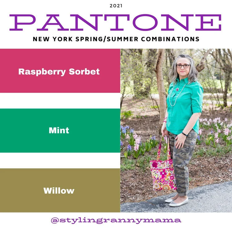
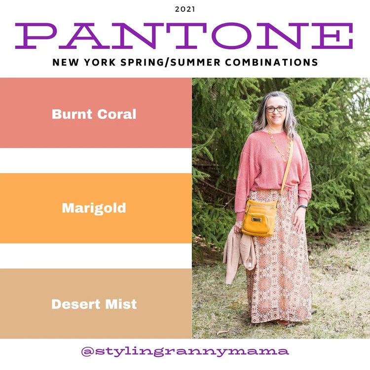
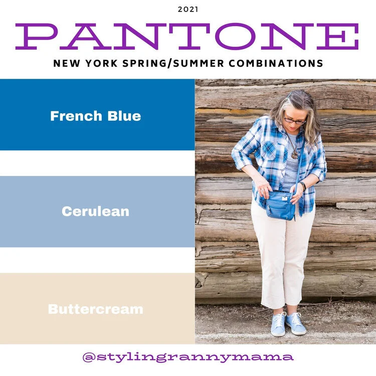
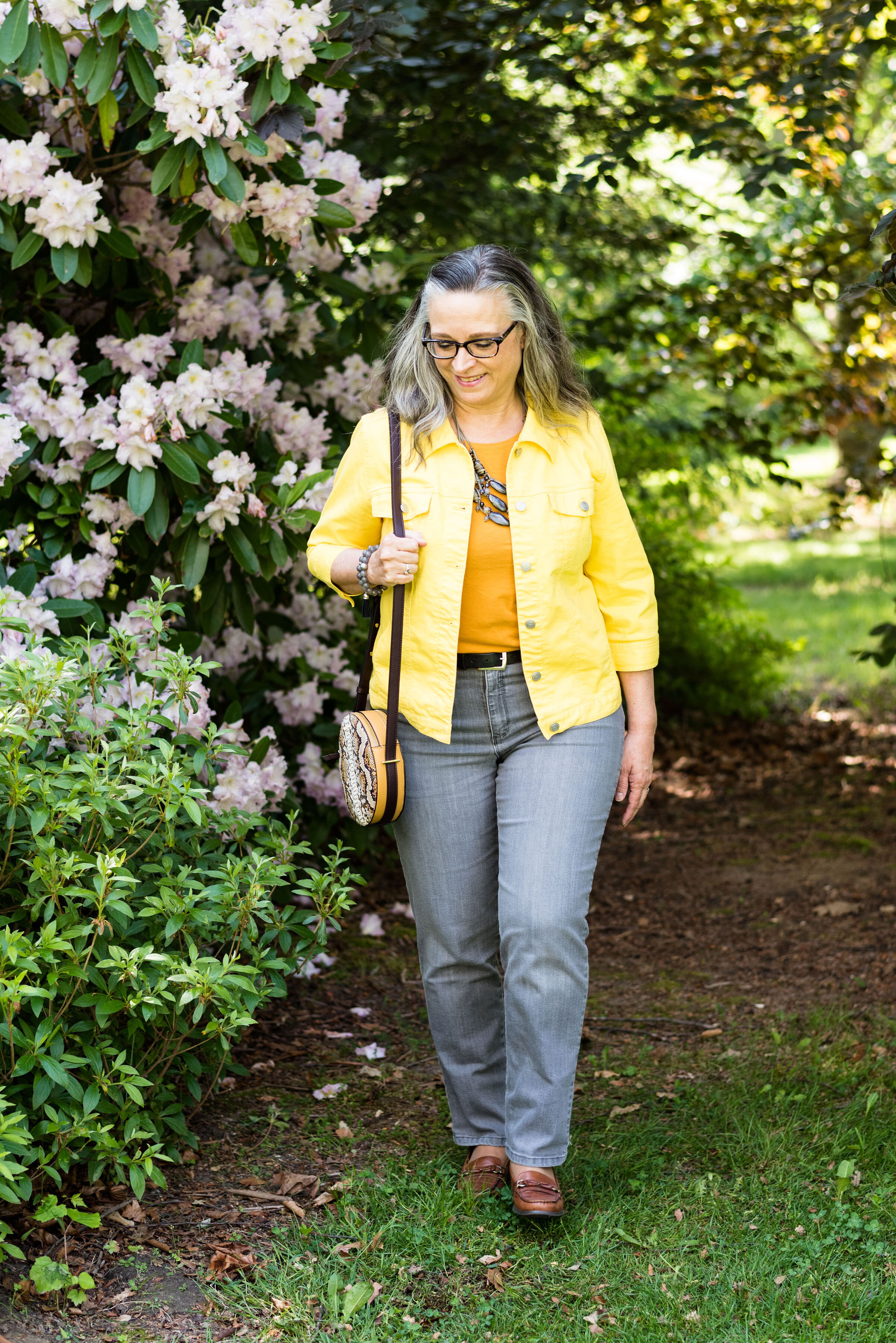
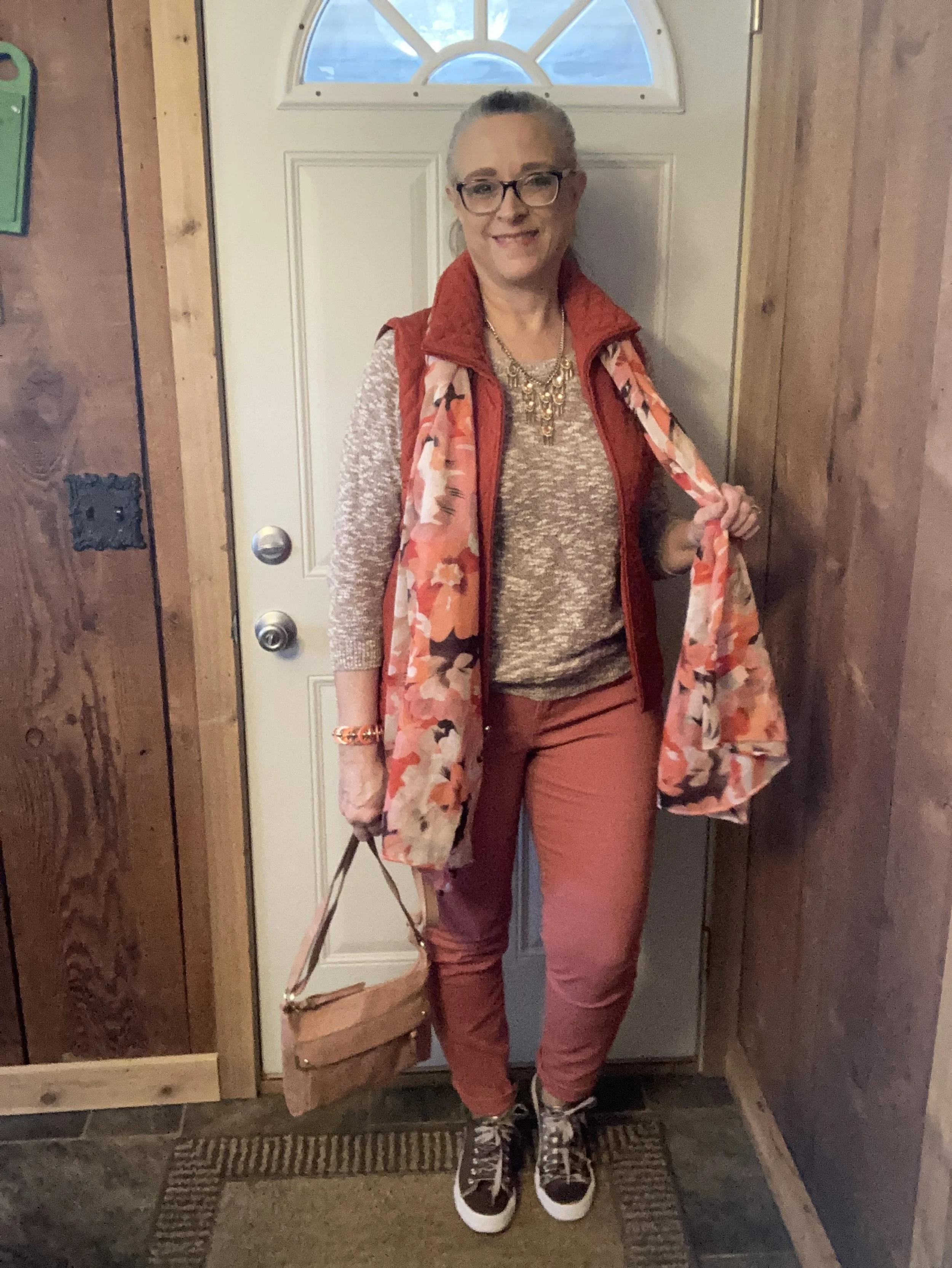
Color Play - 2 - Pantone Spring 2023 - NY Palette: Tangelo, Peach Pink, Machiatto

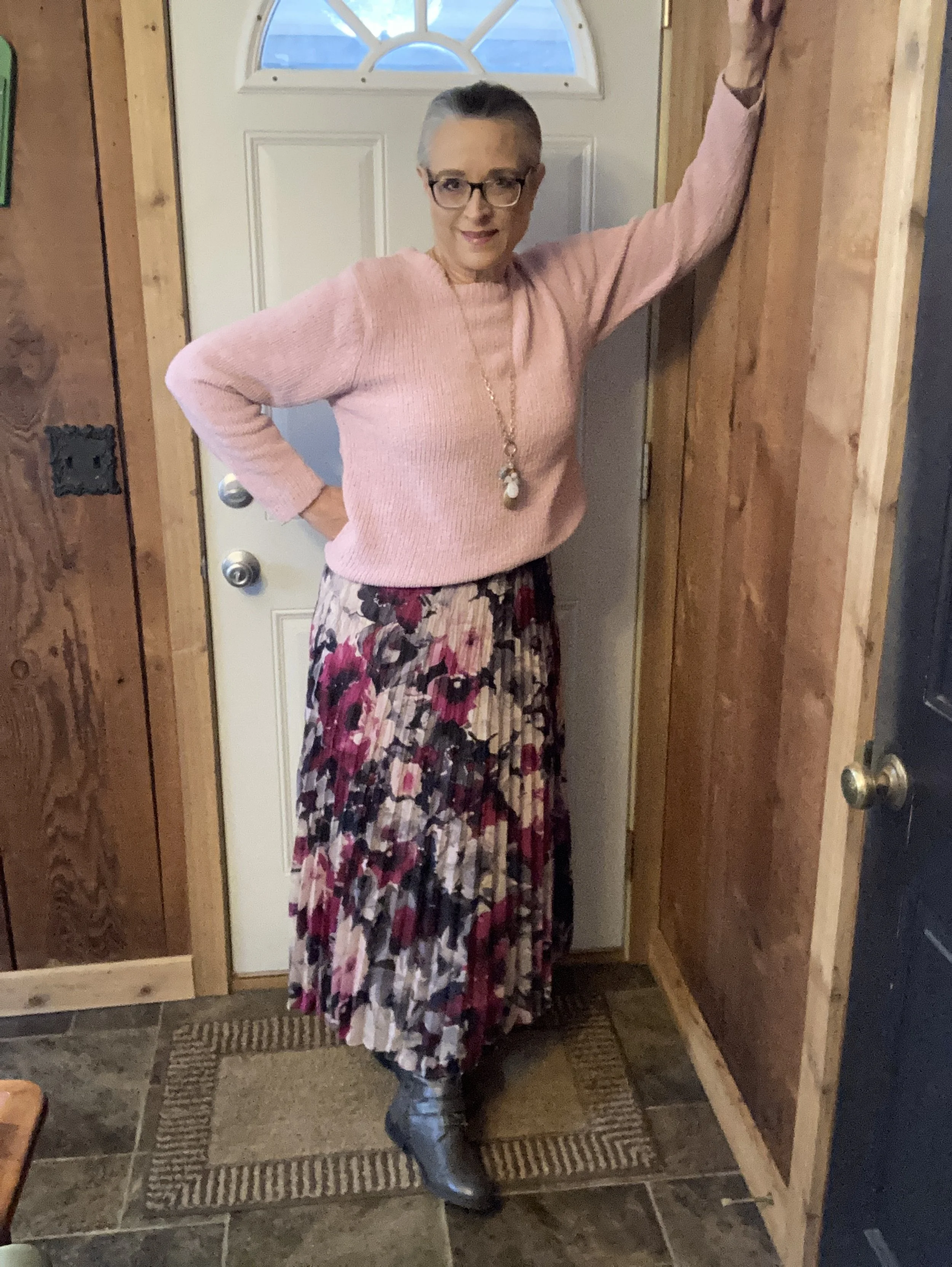
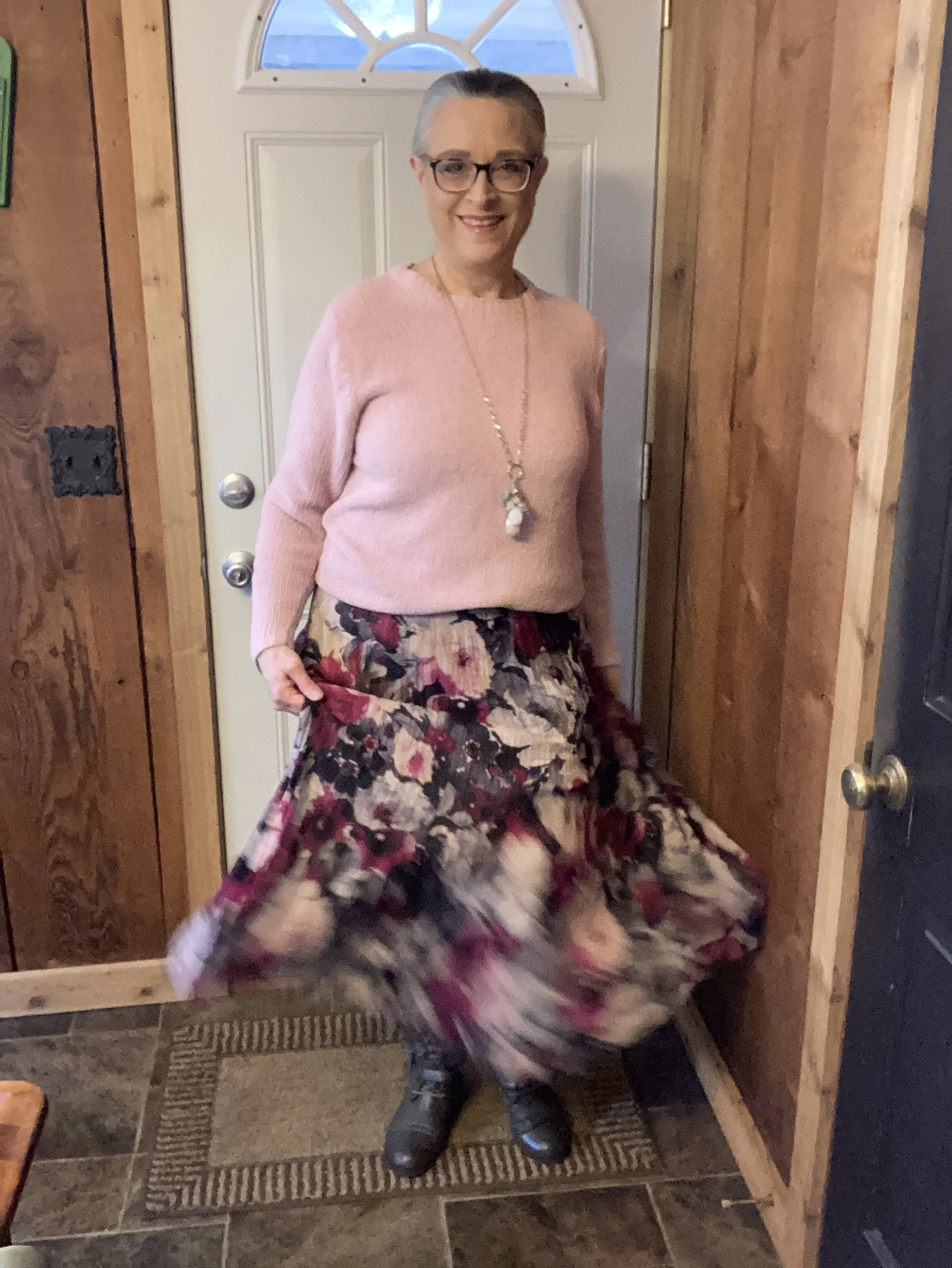
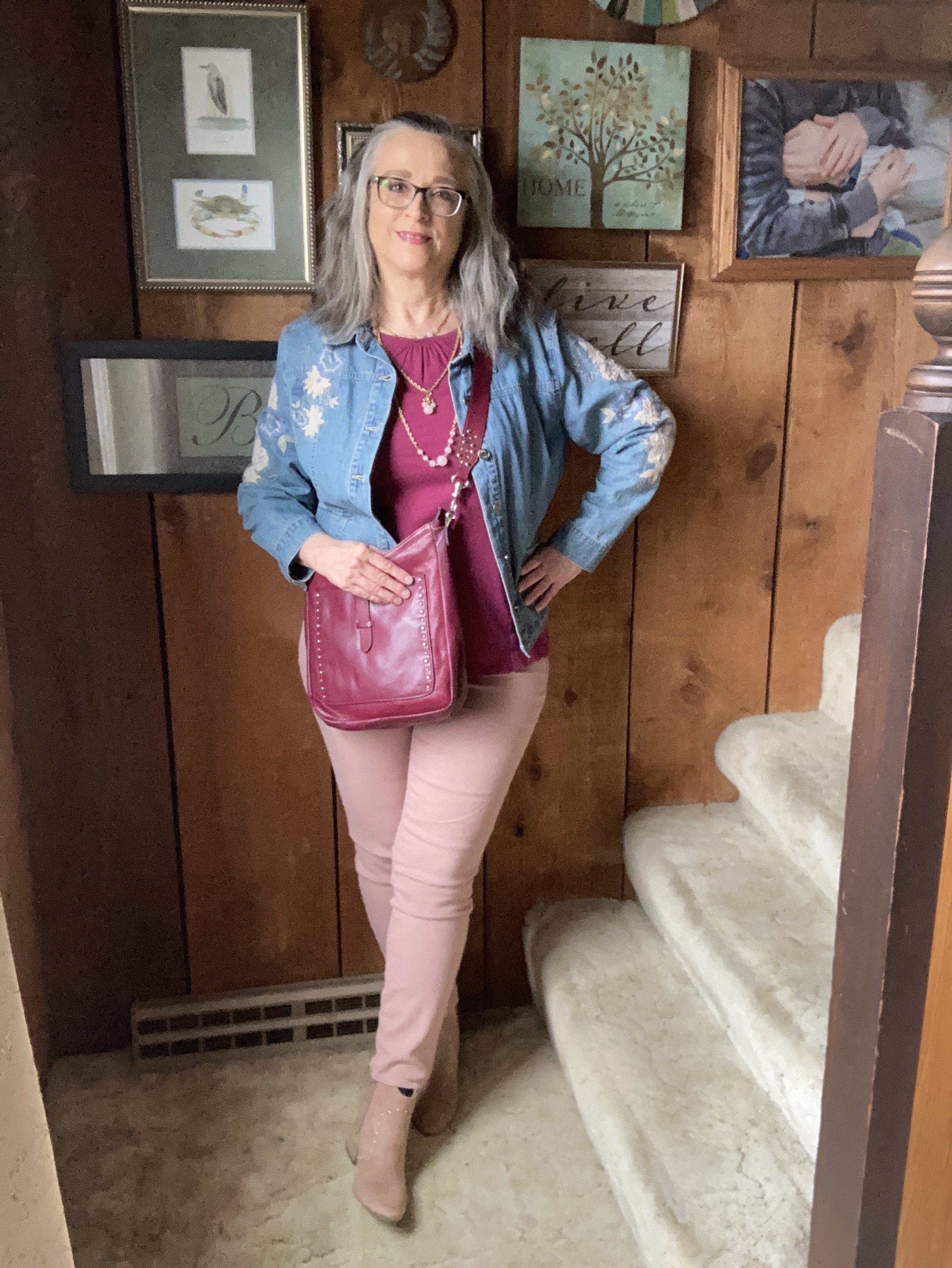
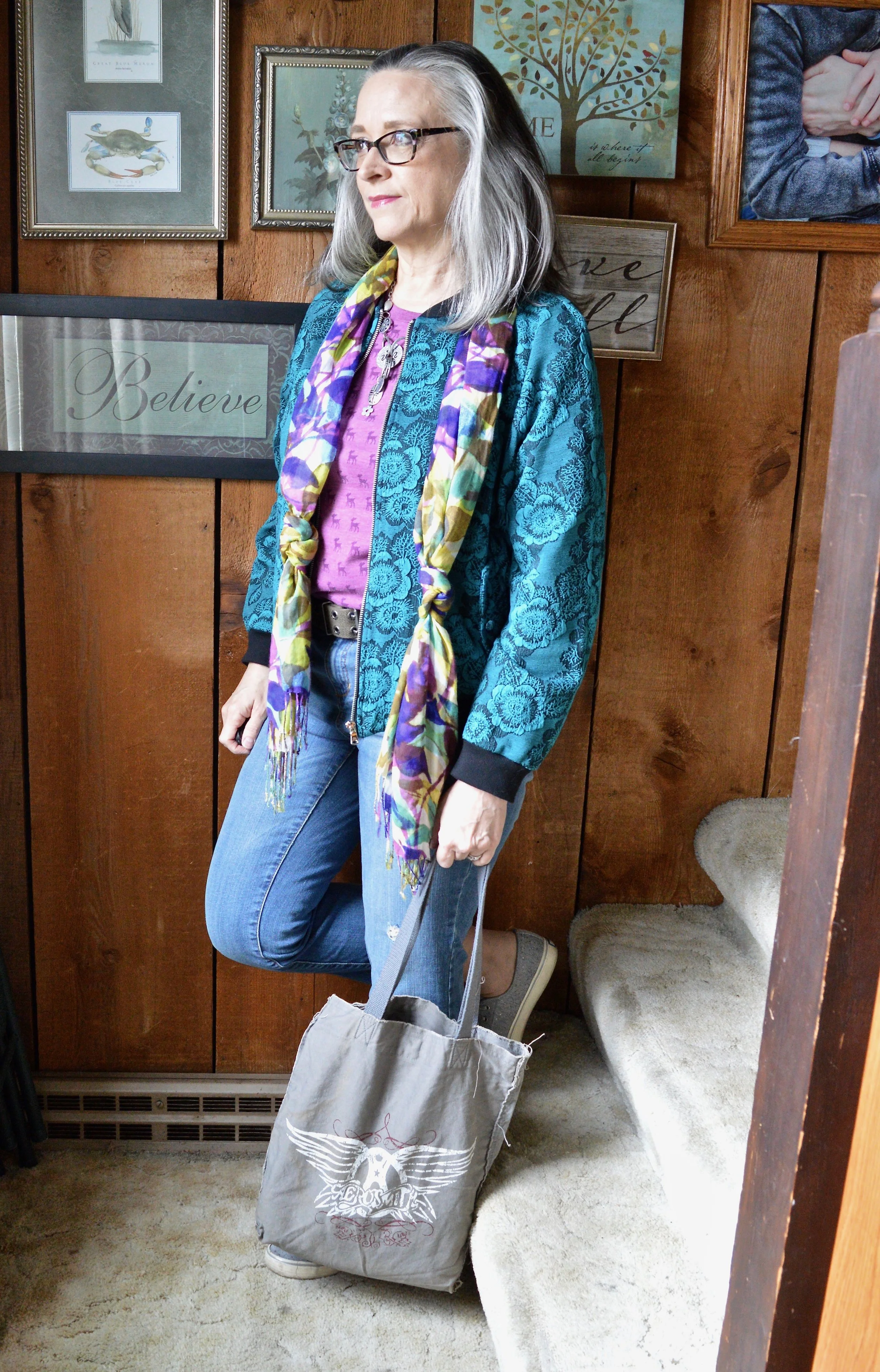
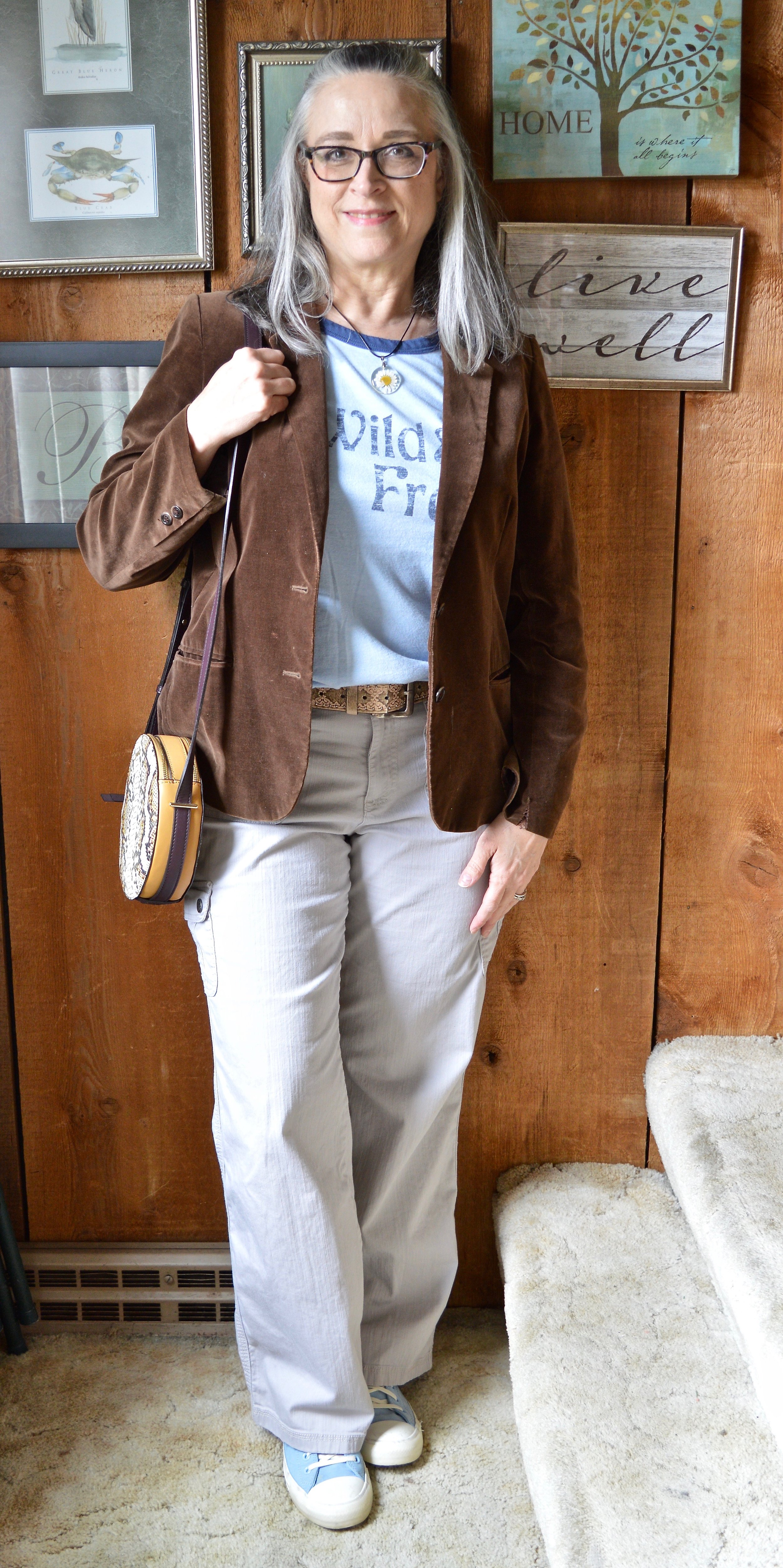
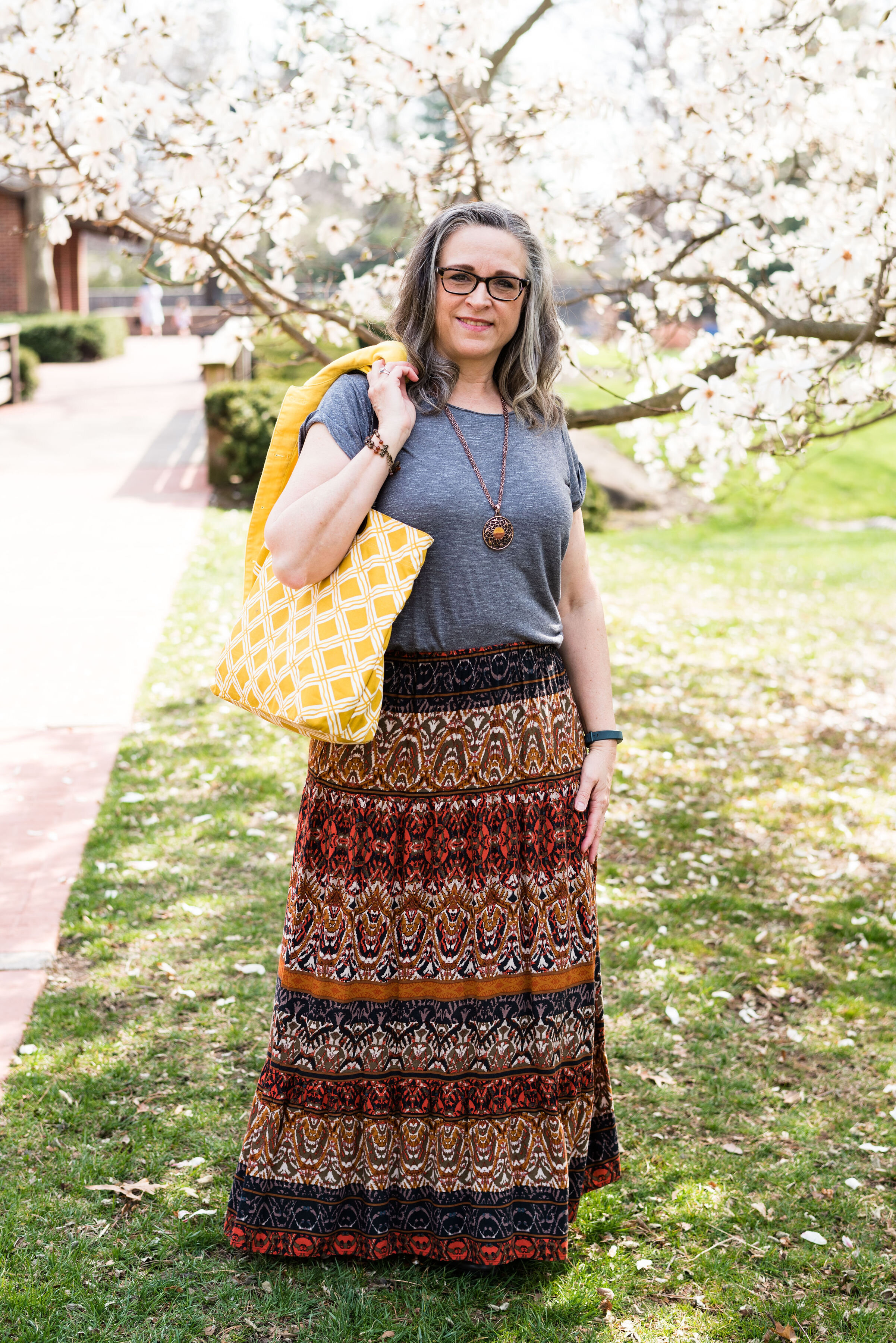
These are the final three colors from the Pantone Spring 2023 NY Palette and I wanted to let you see them. This is also going to be a color block outfit, though not as distinct as the previous one with the more primary colors. These colors are softer and make me think more of light spring showers and Easter flowers. This outfit has almost a monochromatic feel as the colors are similar in their hues.

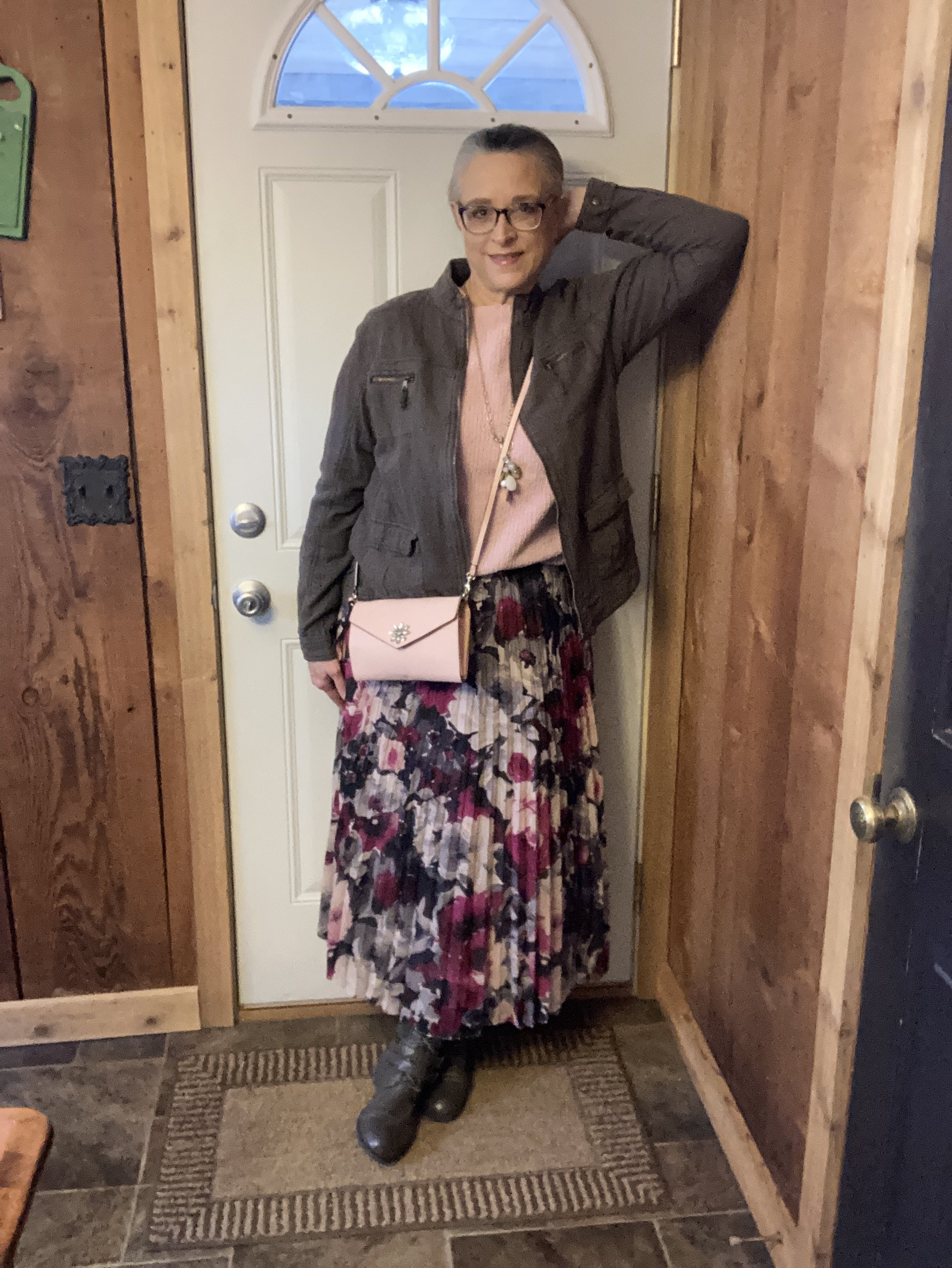
With Easter only a week away, I thought it might be nice to focus on an outfit that would work for a casual Easter get together. It used to be we dressed up for this holiday, and I think many people still do, but while many are still donning their white shoes and pretty spring dresses, there are others who will reach for a more casual, practical outfit for a day of cooking and preparing treats for the grandkids’ Easter hunts.

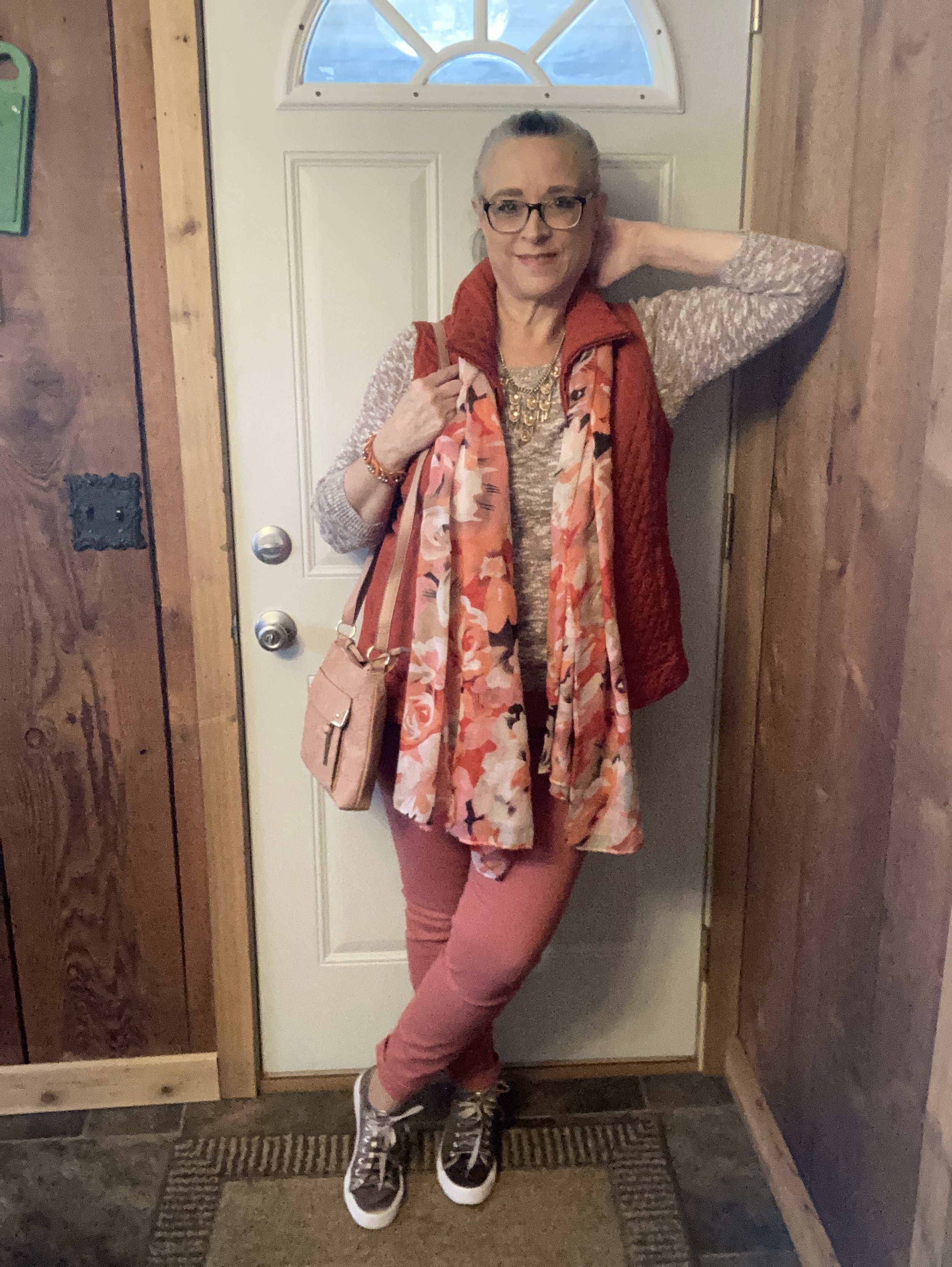
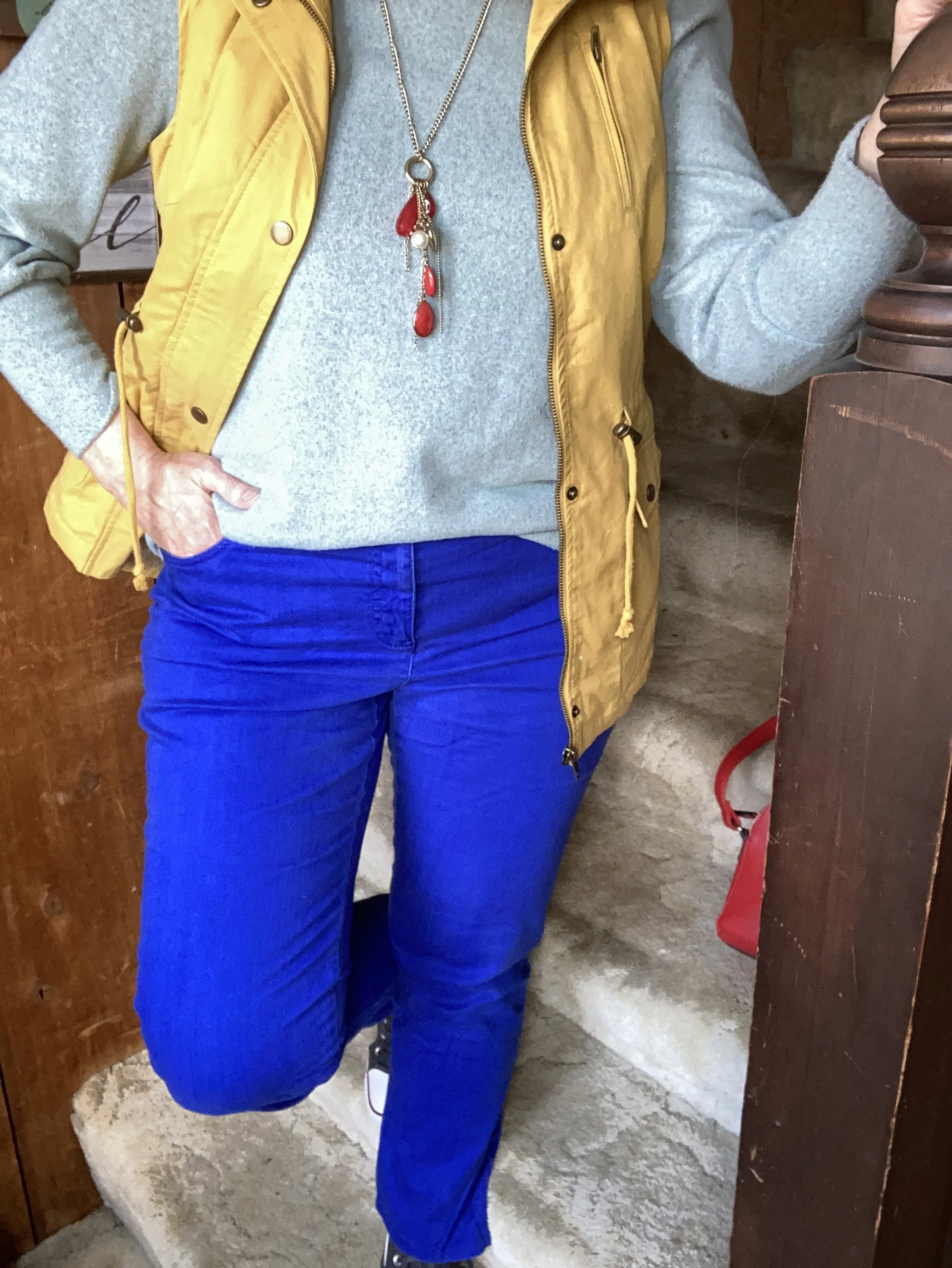
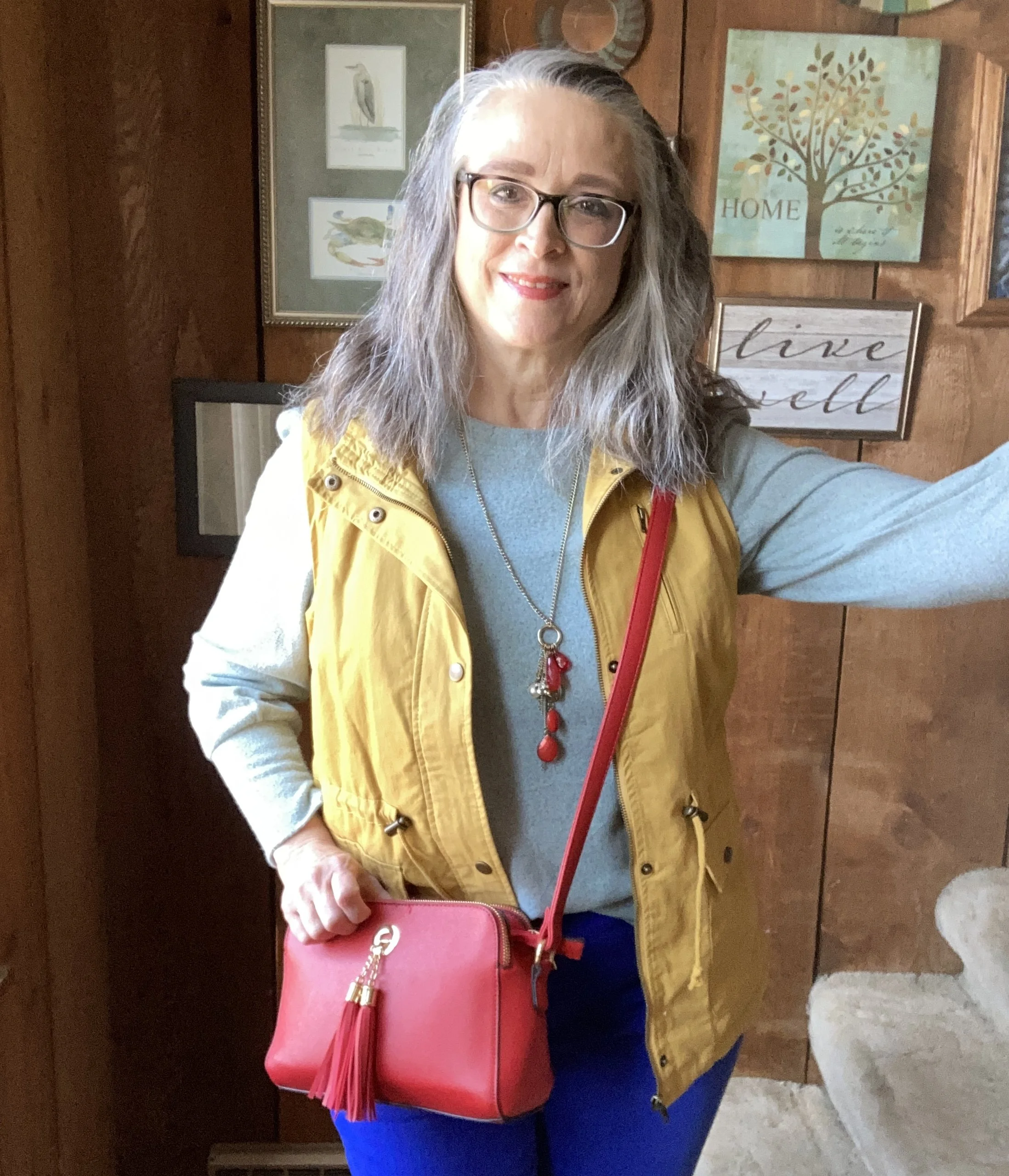
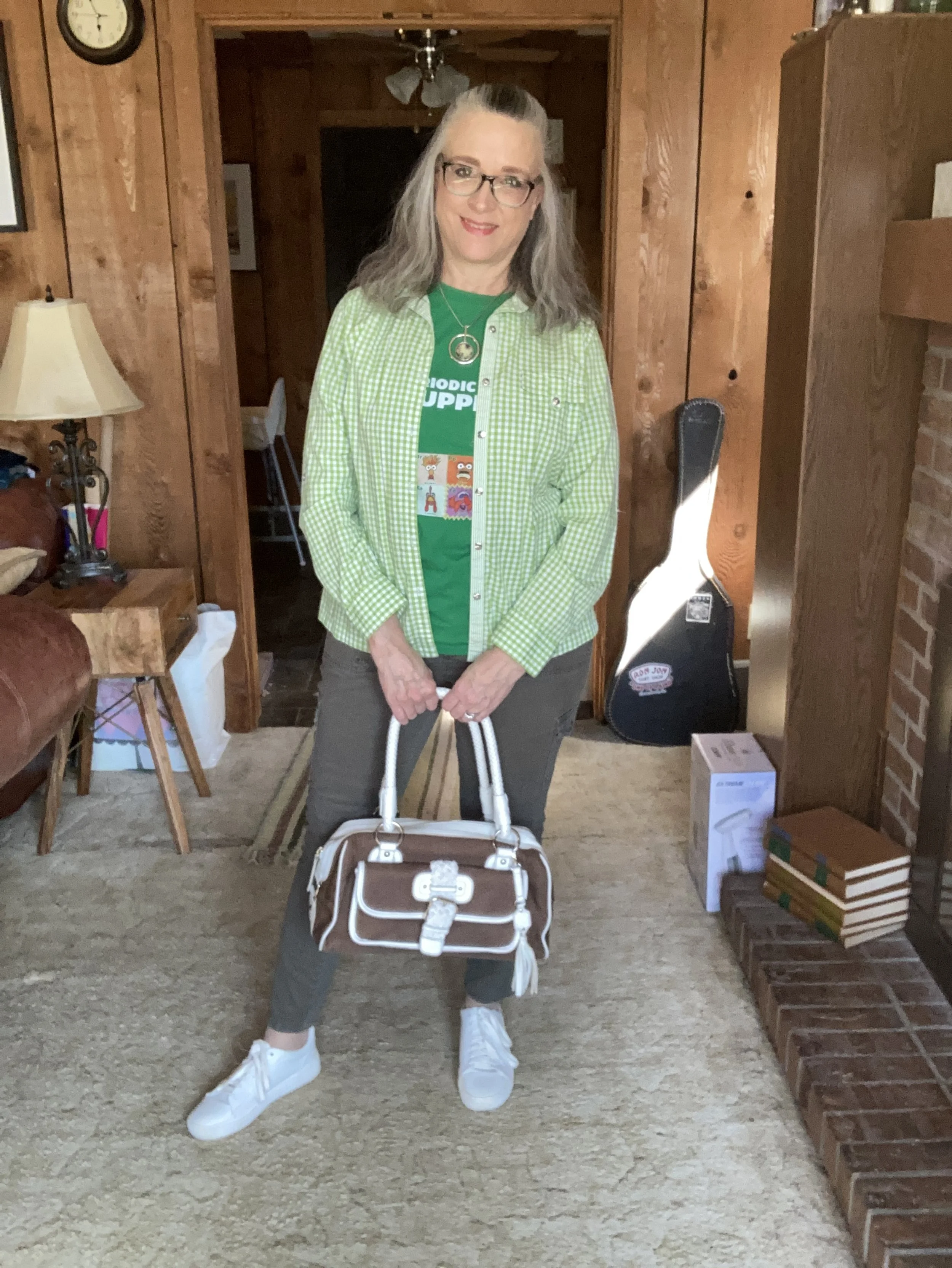
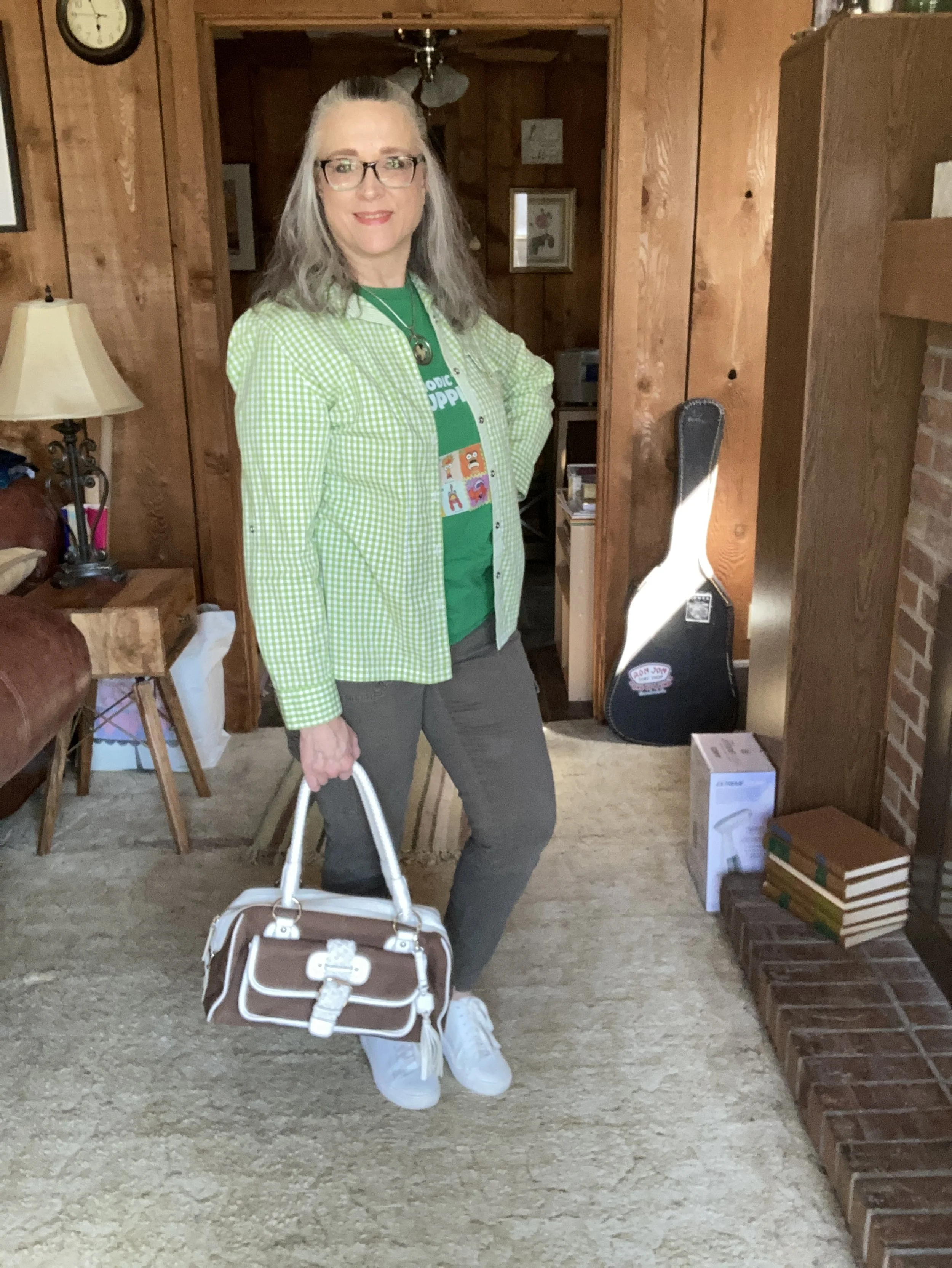
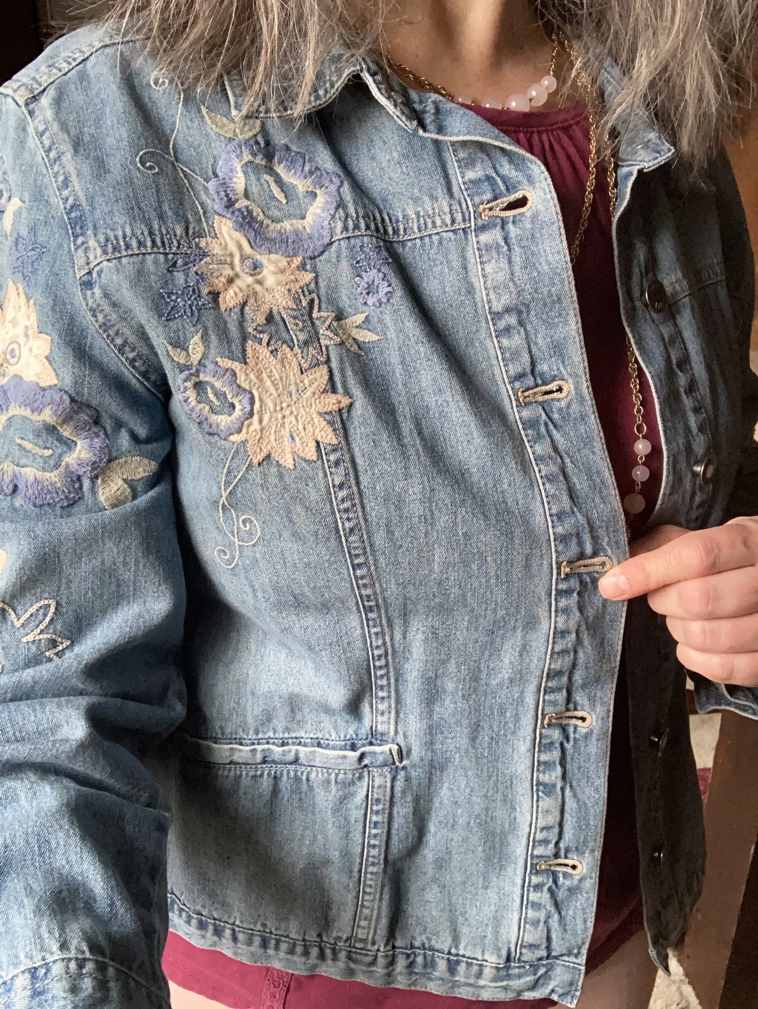
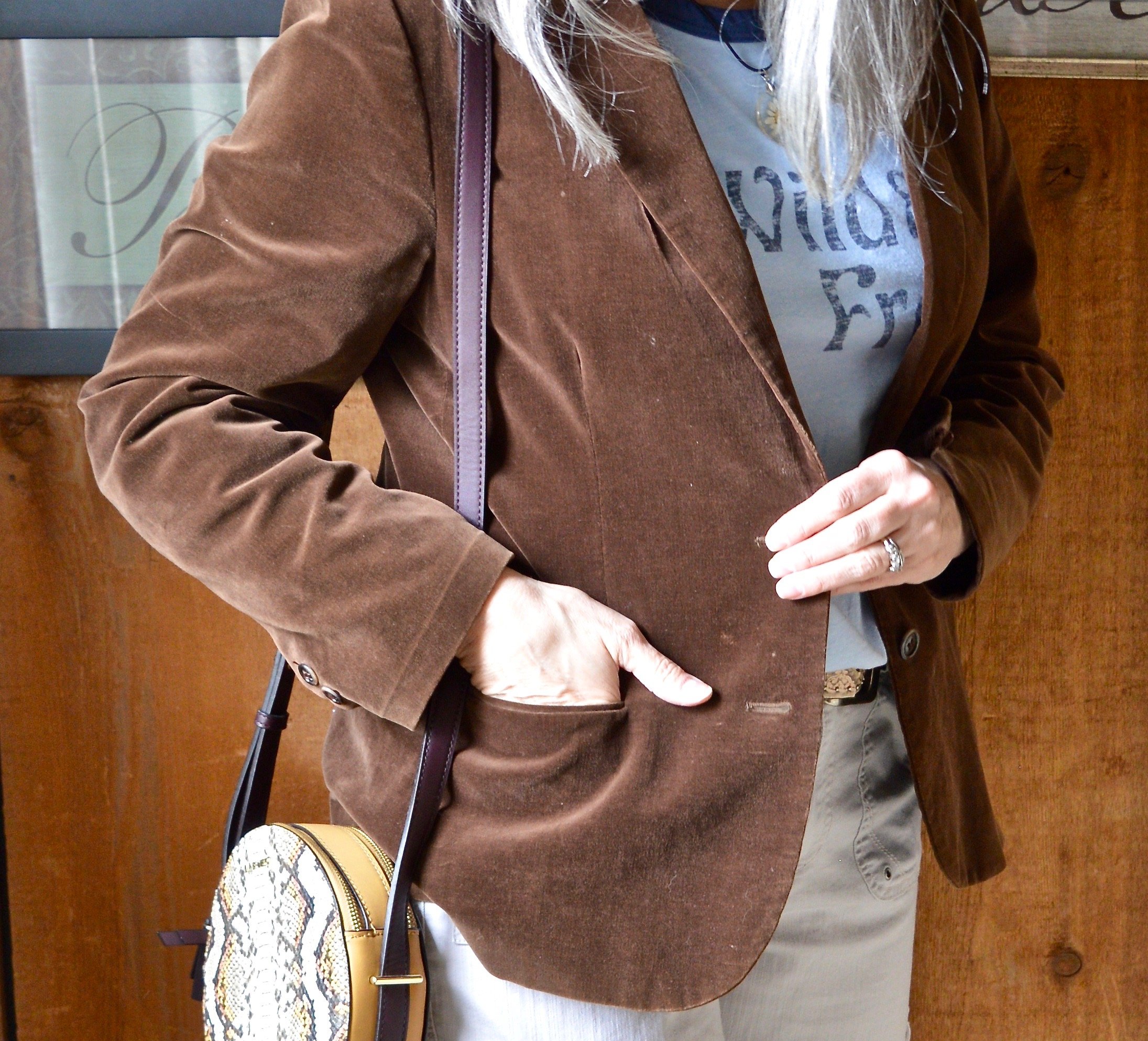
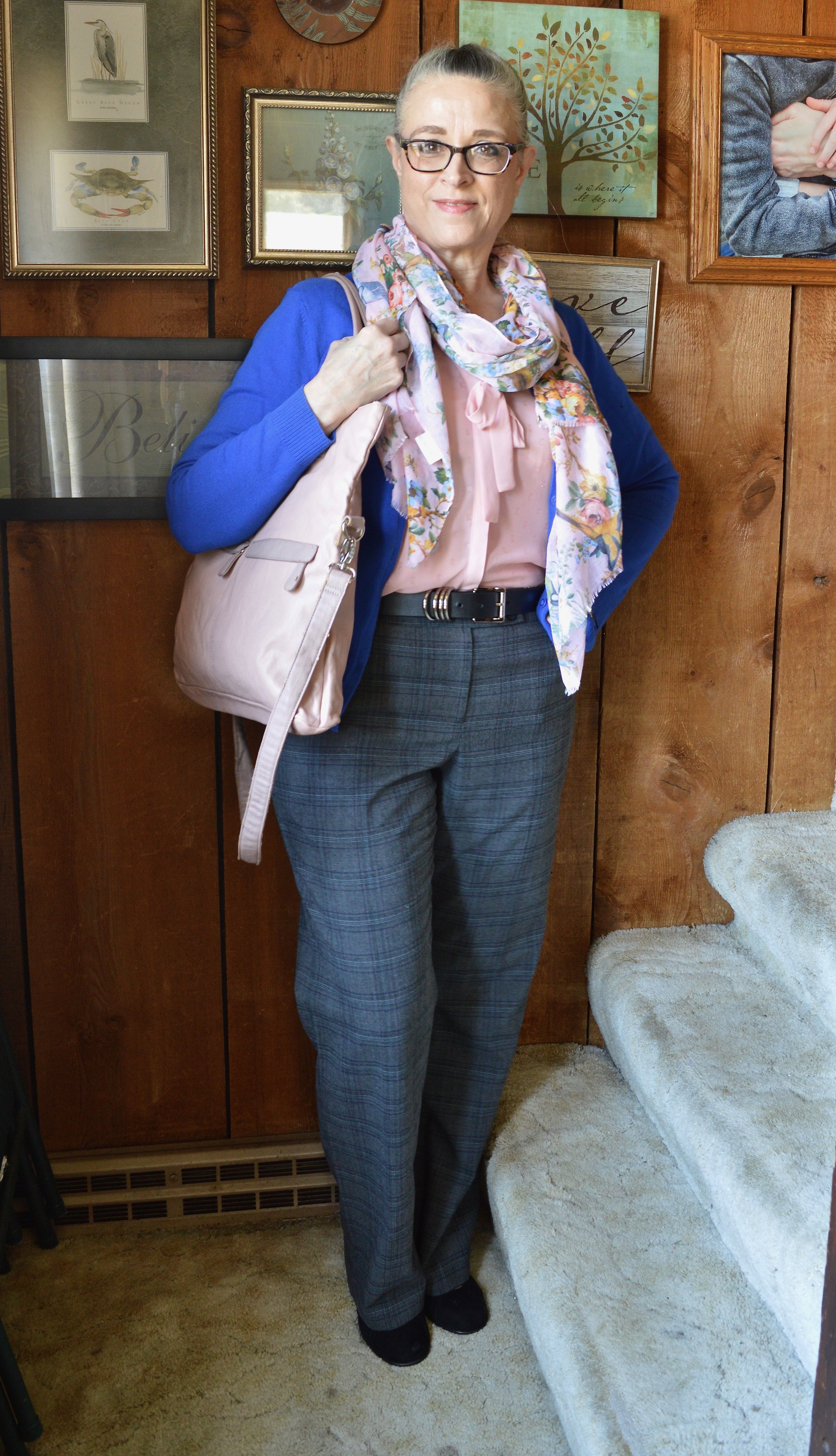
This outfit is made up of three main components: bottom, top and accessories. I am including the vest in with the accessories because it is not essential to the outfit. You could easily wear a top and bottom without a topper like a vest or blazer. For this outfit, the vest was representing another of the Pantone colors and not only does it add an element of warmth, but an element of texture and interest.

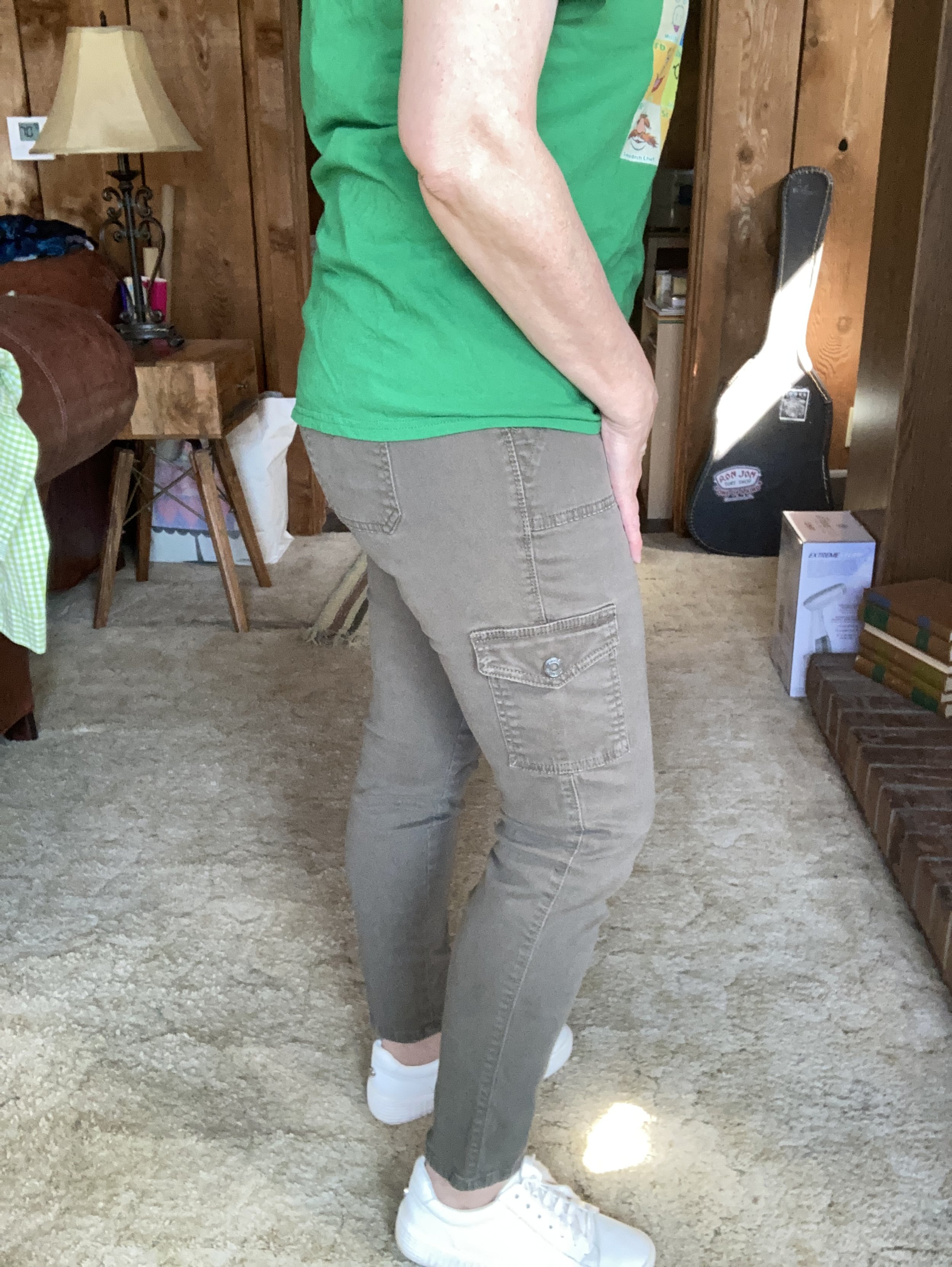
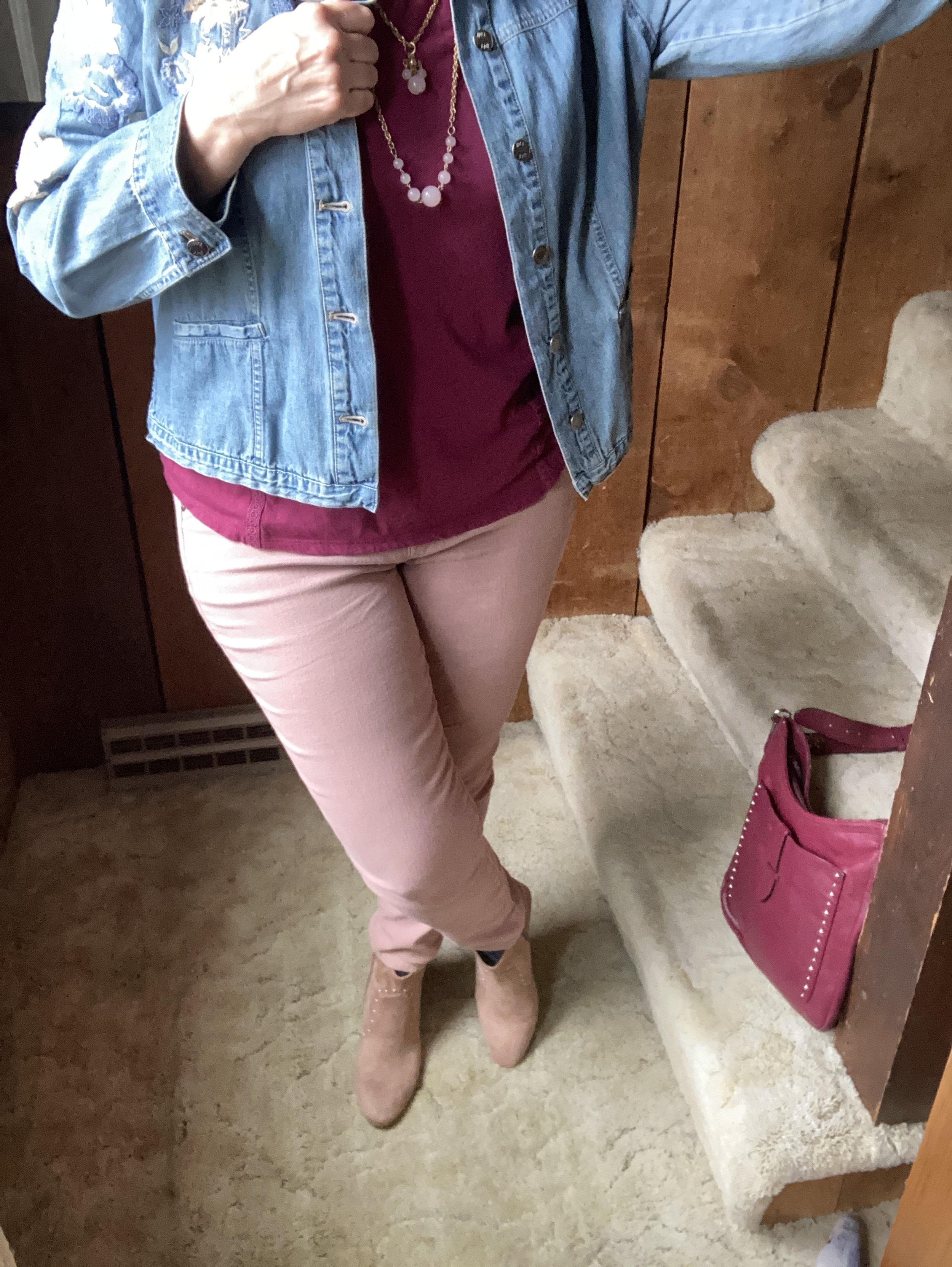
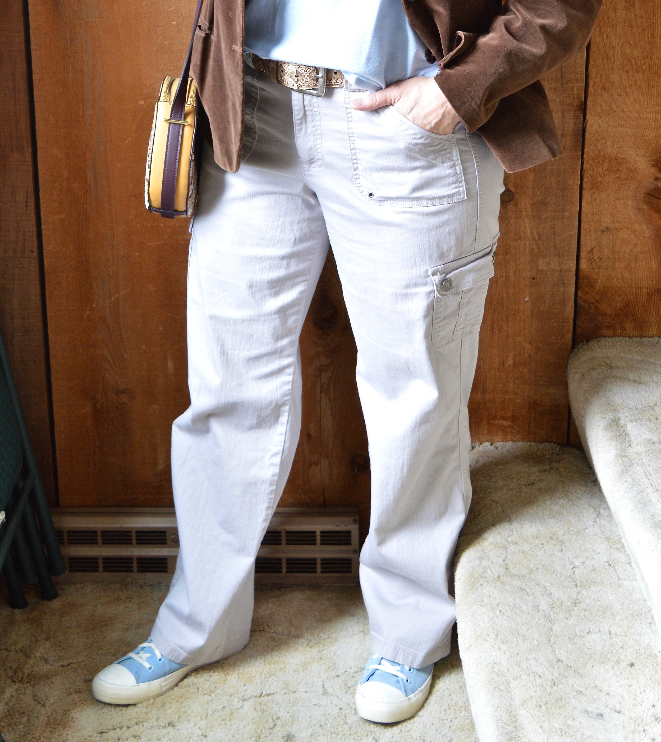
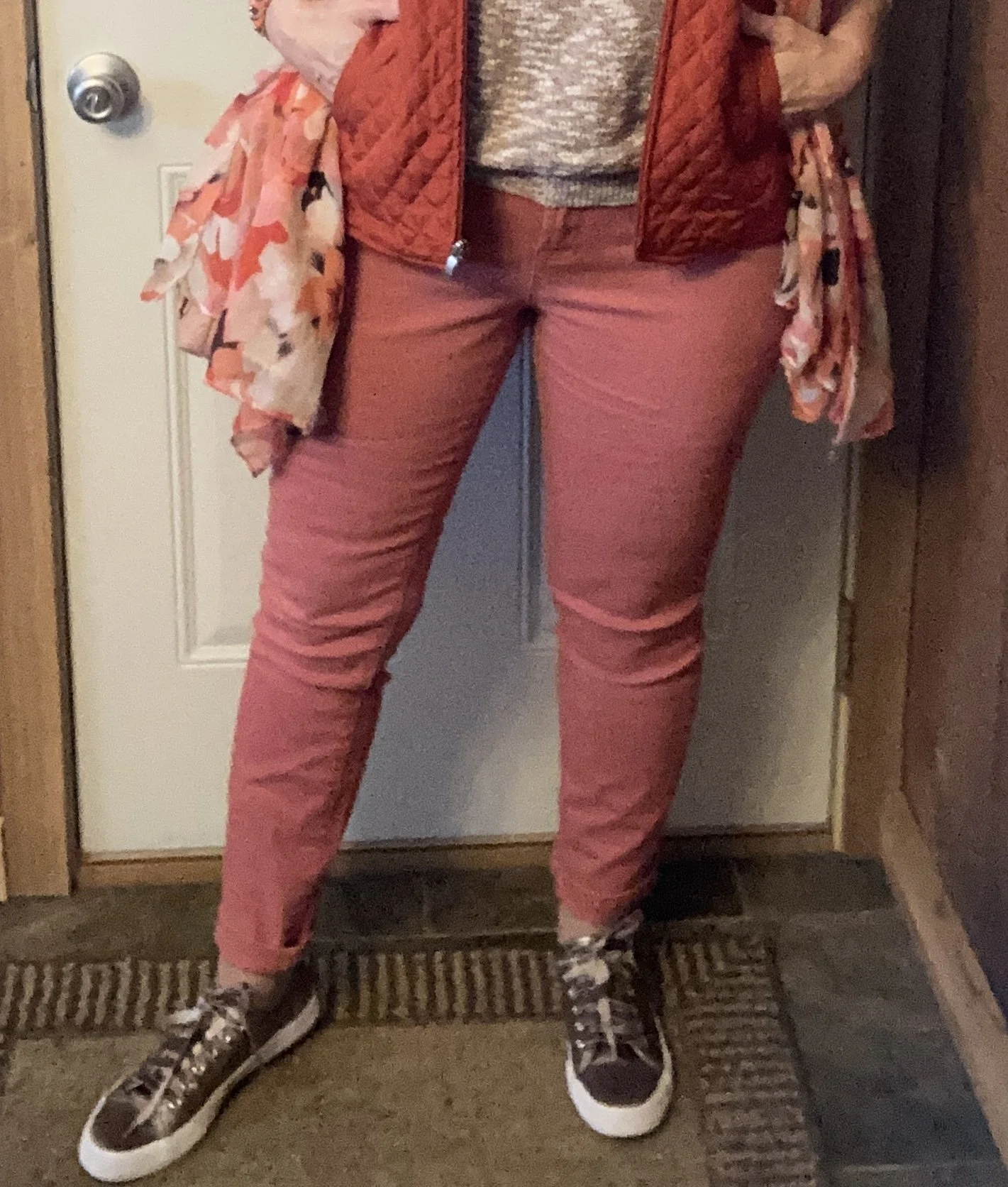
My Peach Pink pants are W62 brand and I believe were from Dress Barn. I have styled these on the blog before. You can see them styled here in a monochrome look, with a red moto jacket, with a pastel pink cardigan, with a LuLaRoe tee, with a cropped blazer, and with a different set of Pantone colors,

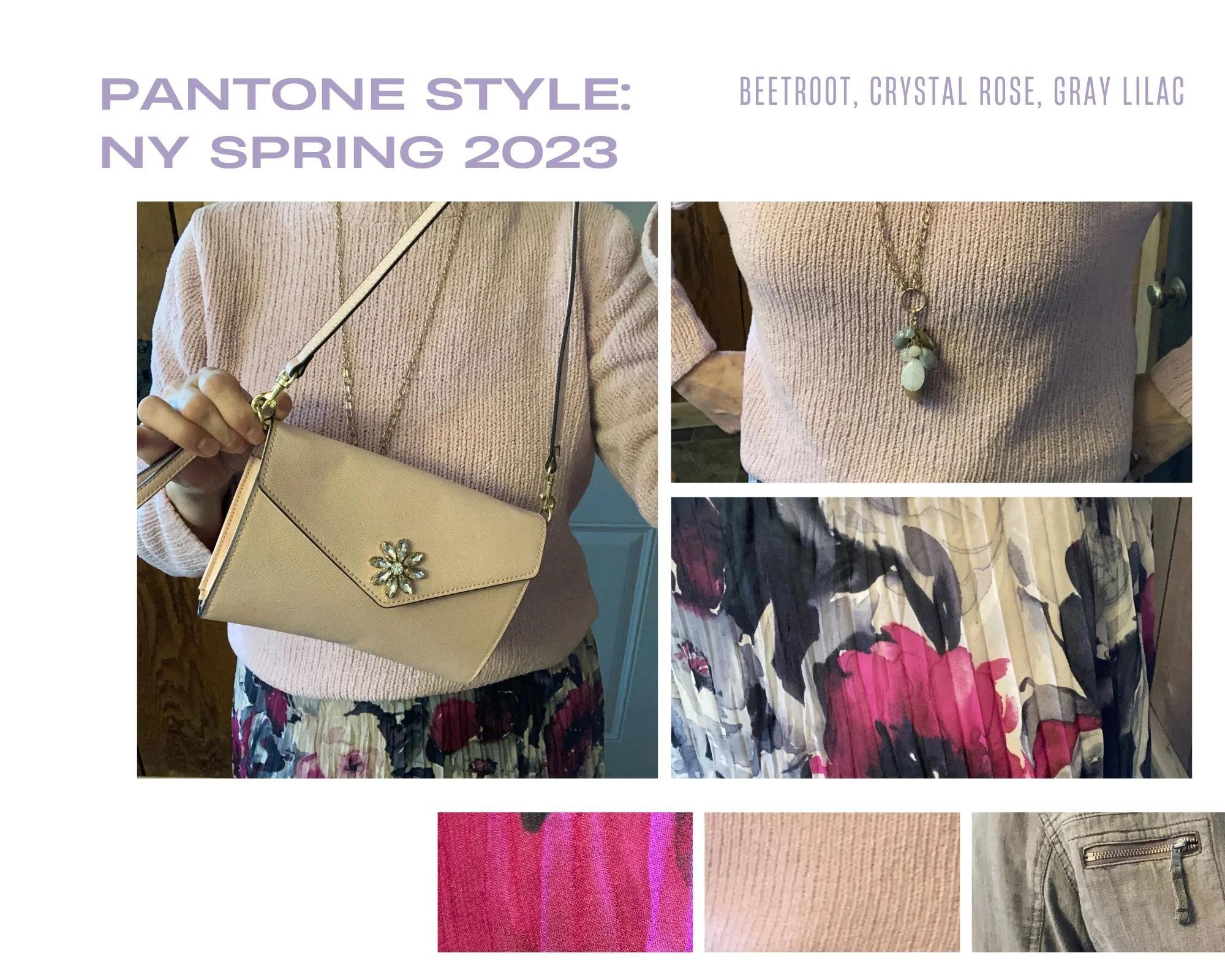
Sorry for the poor picture quality. Phone pictures are great, but not so much when it comes to editing.

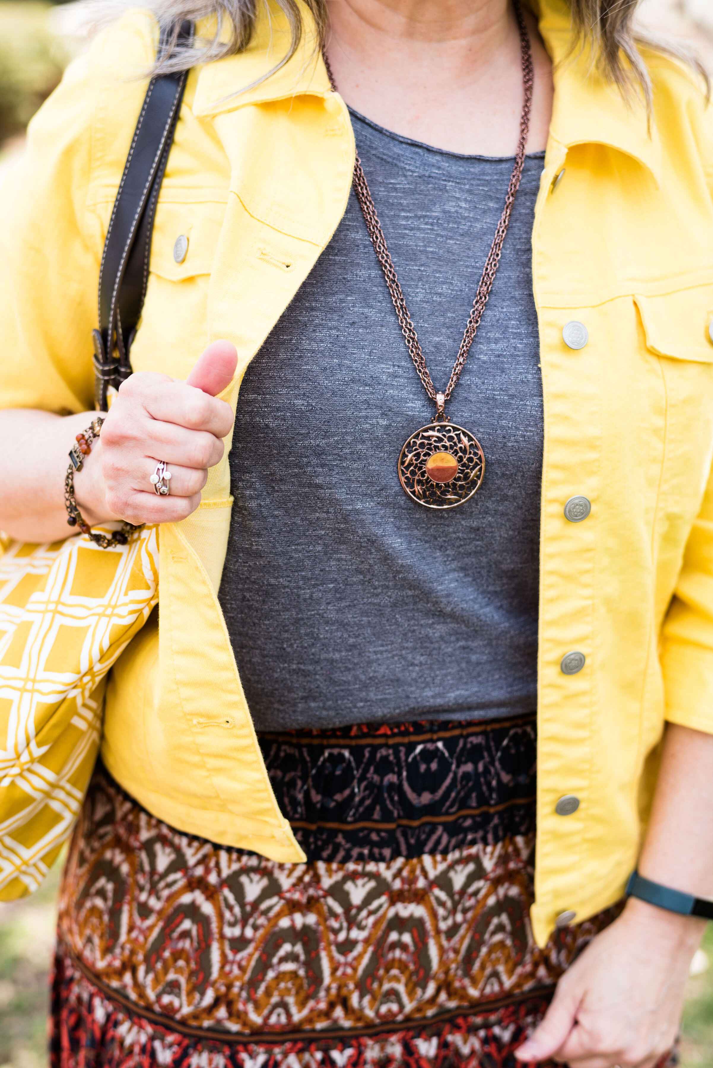
My Tangelo vest was a Christopher and Banks purchase a few years ago. I love the deep orange color and it serves well for both spring and fall.

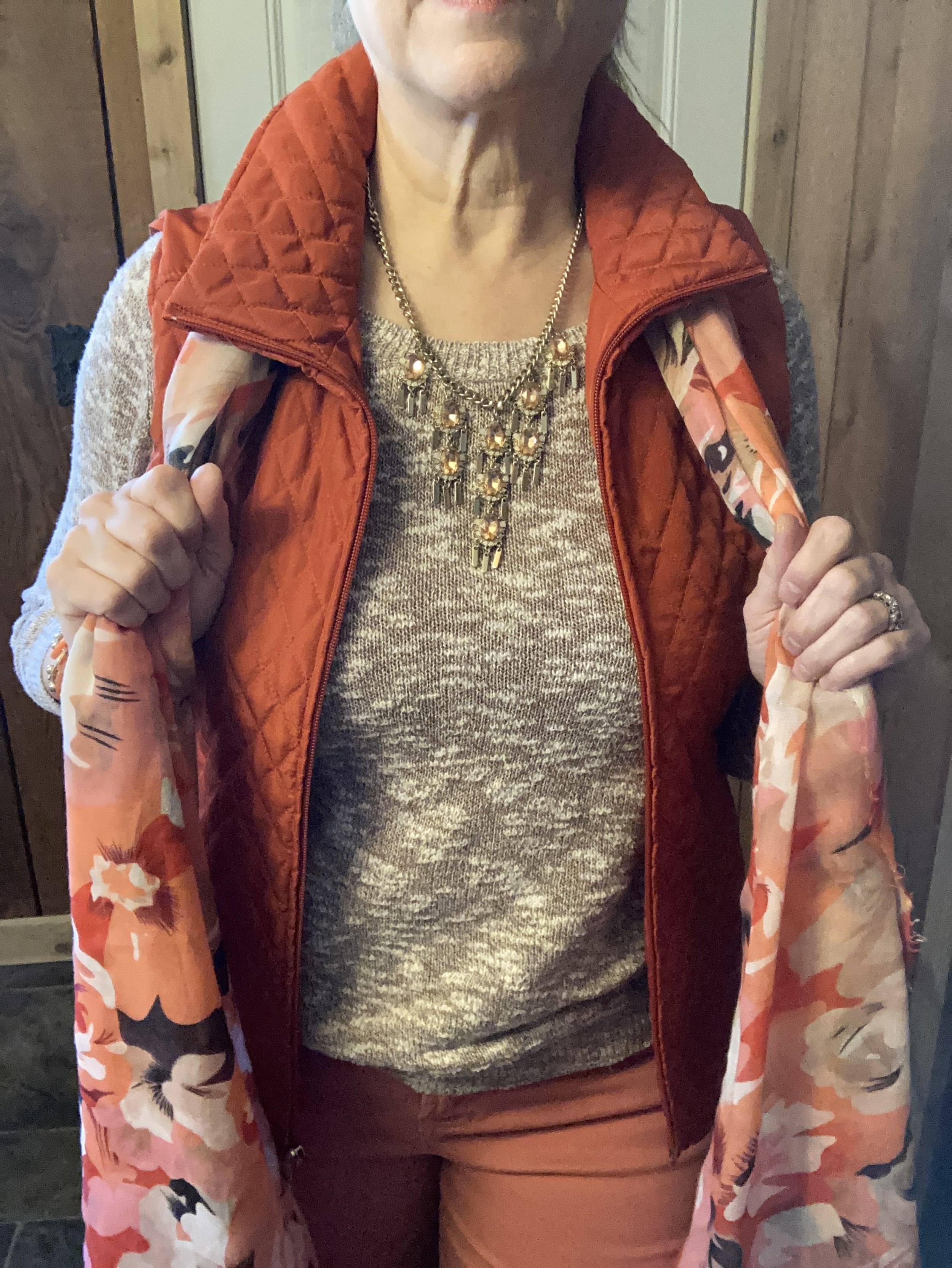
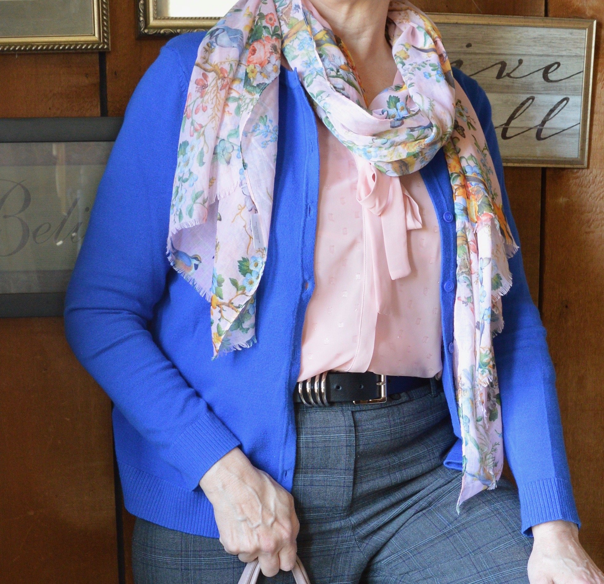
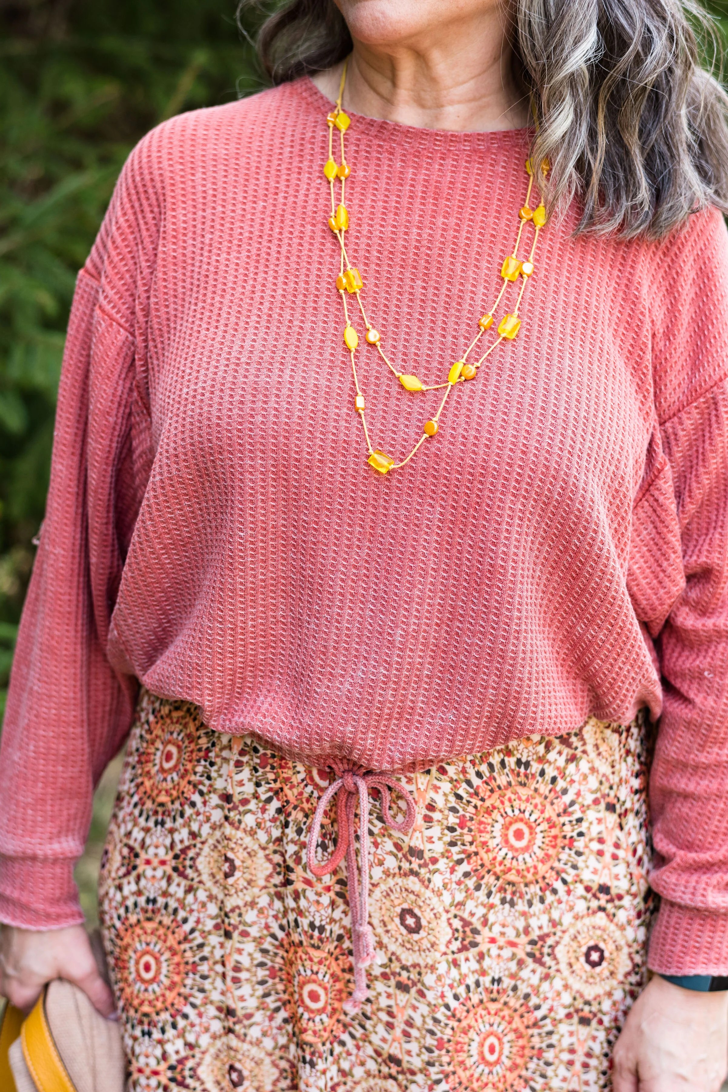
You can also see in the above picture my thrifted Old Navy sweater top. I had a Machiotto colored jean jacket picked out, but I didn’t have any other orange that worked as well as my vest. Even though there is a distinct marled print you can see the brown color throughout.

I added the scarf as a way to pull the entire look together.

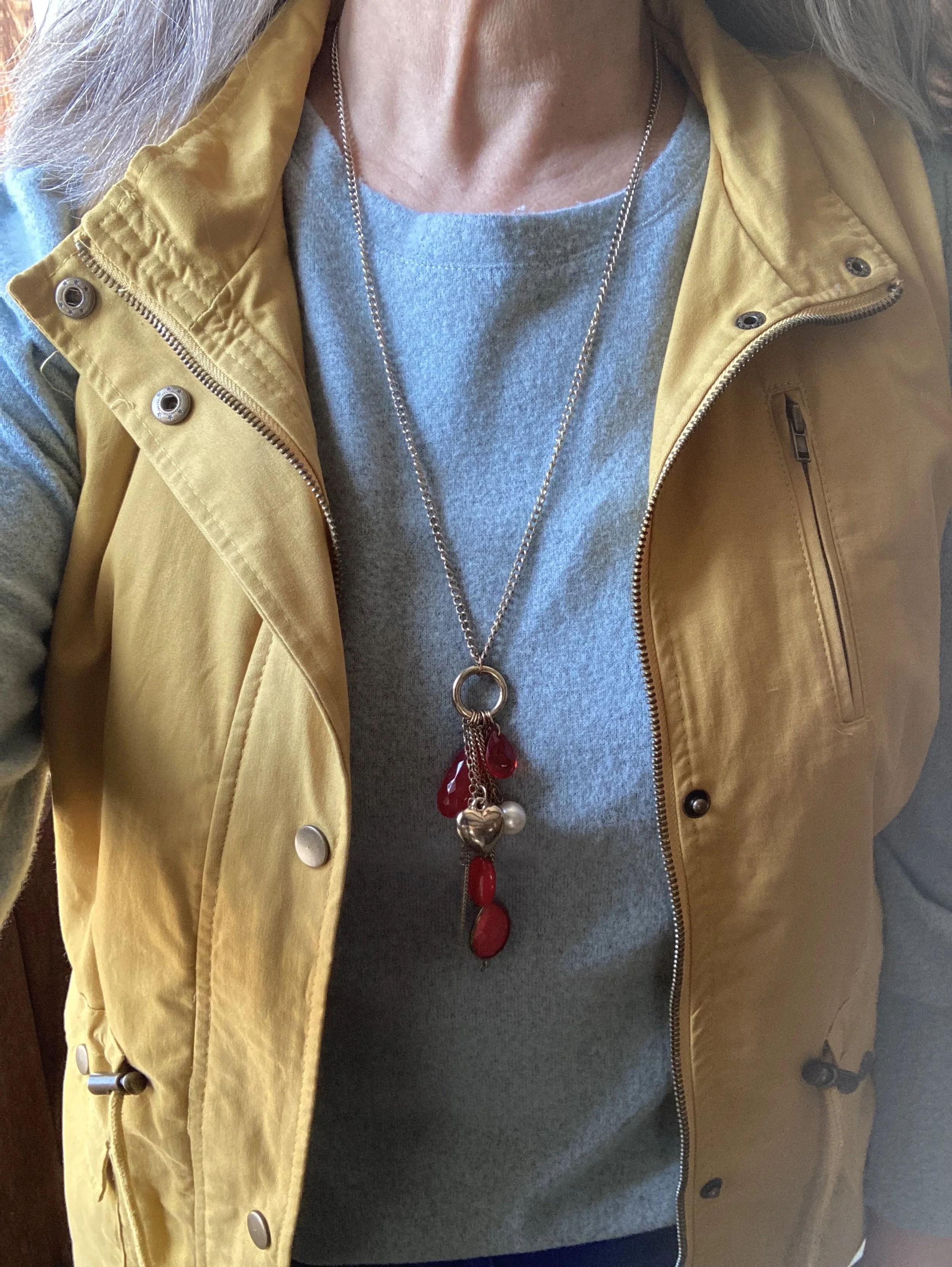
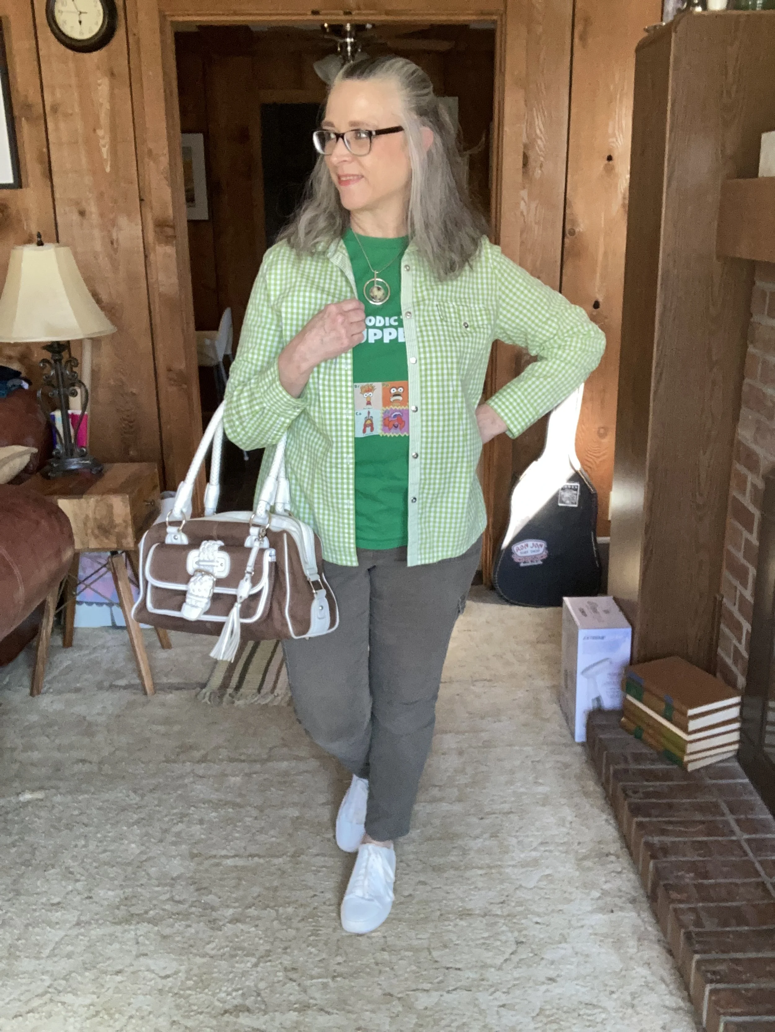
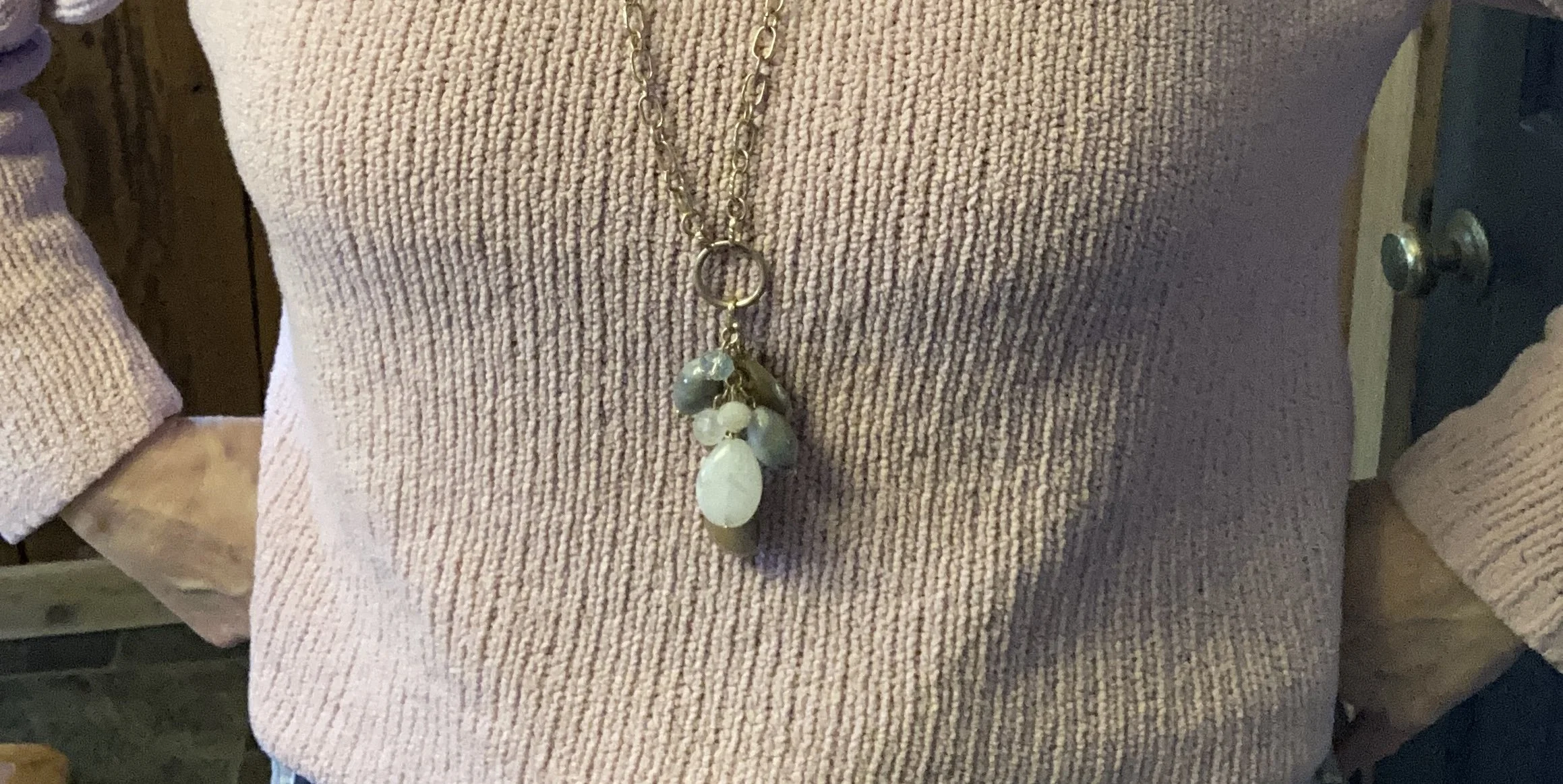
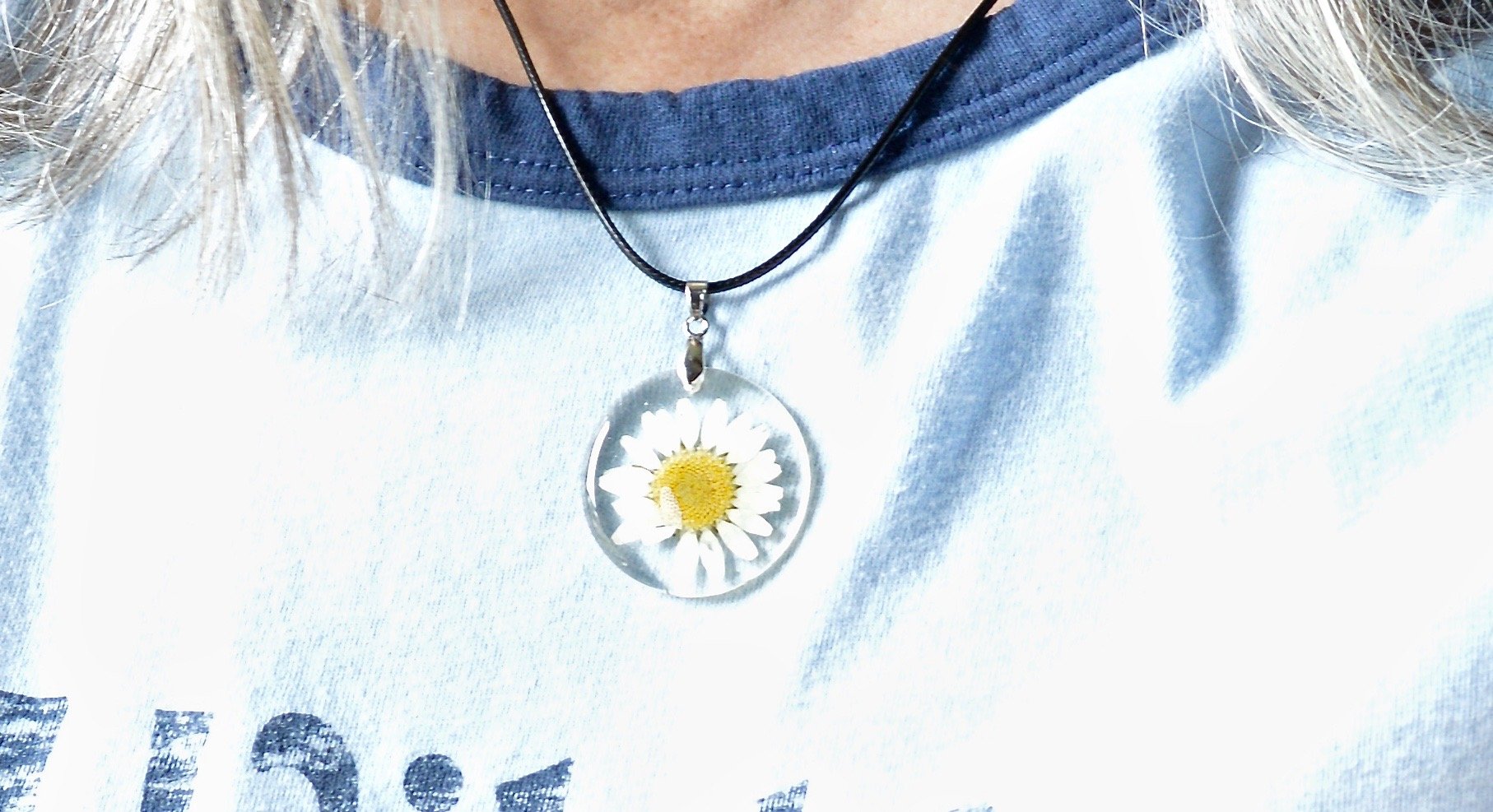
My daughter was getting rid of this pretty, statement necklace, so I snatched it up. I thought it went great with this outfit.

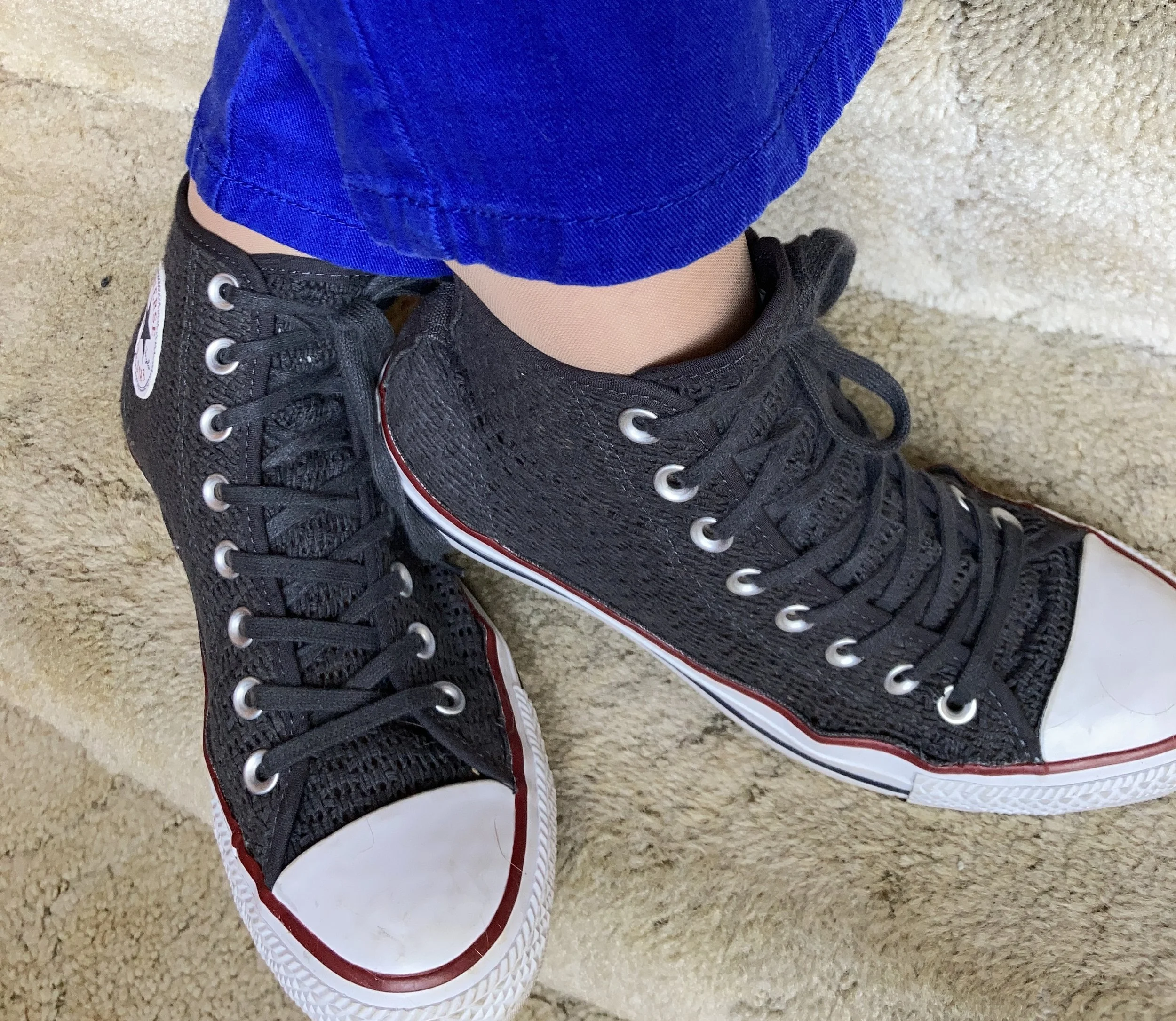
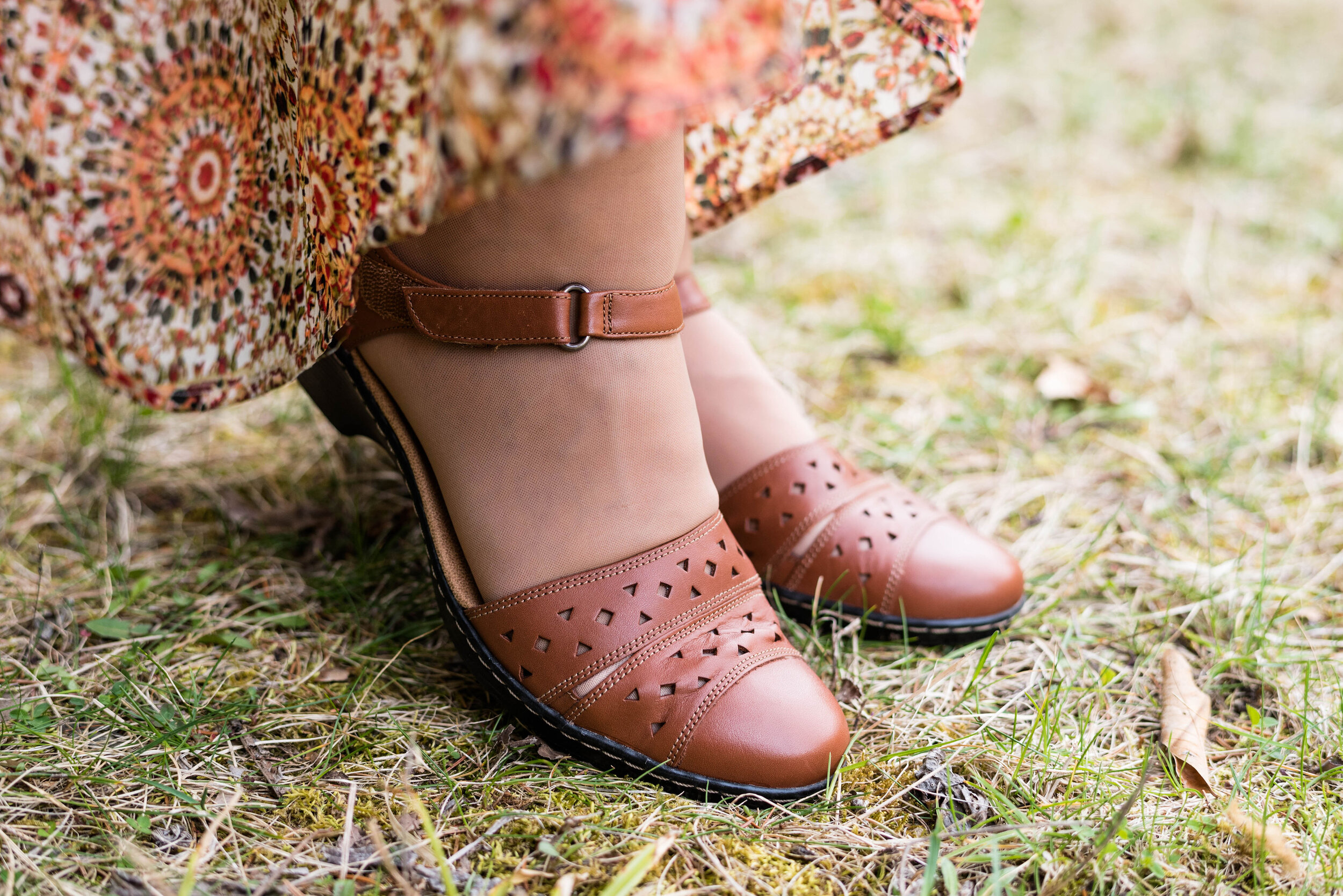
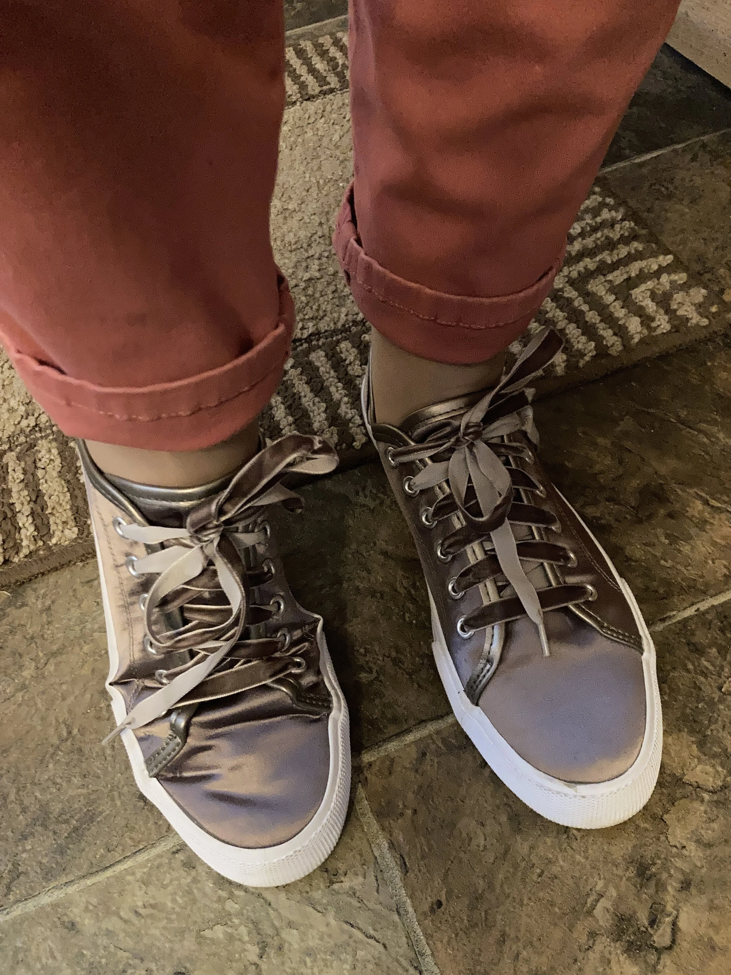
My sneakers are Mossimo and were thrift find. They also mimic the Machiotto color almost perfectly and add another bit of shine to the look.

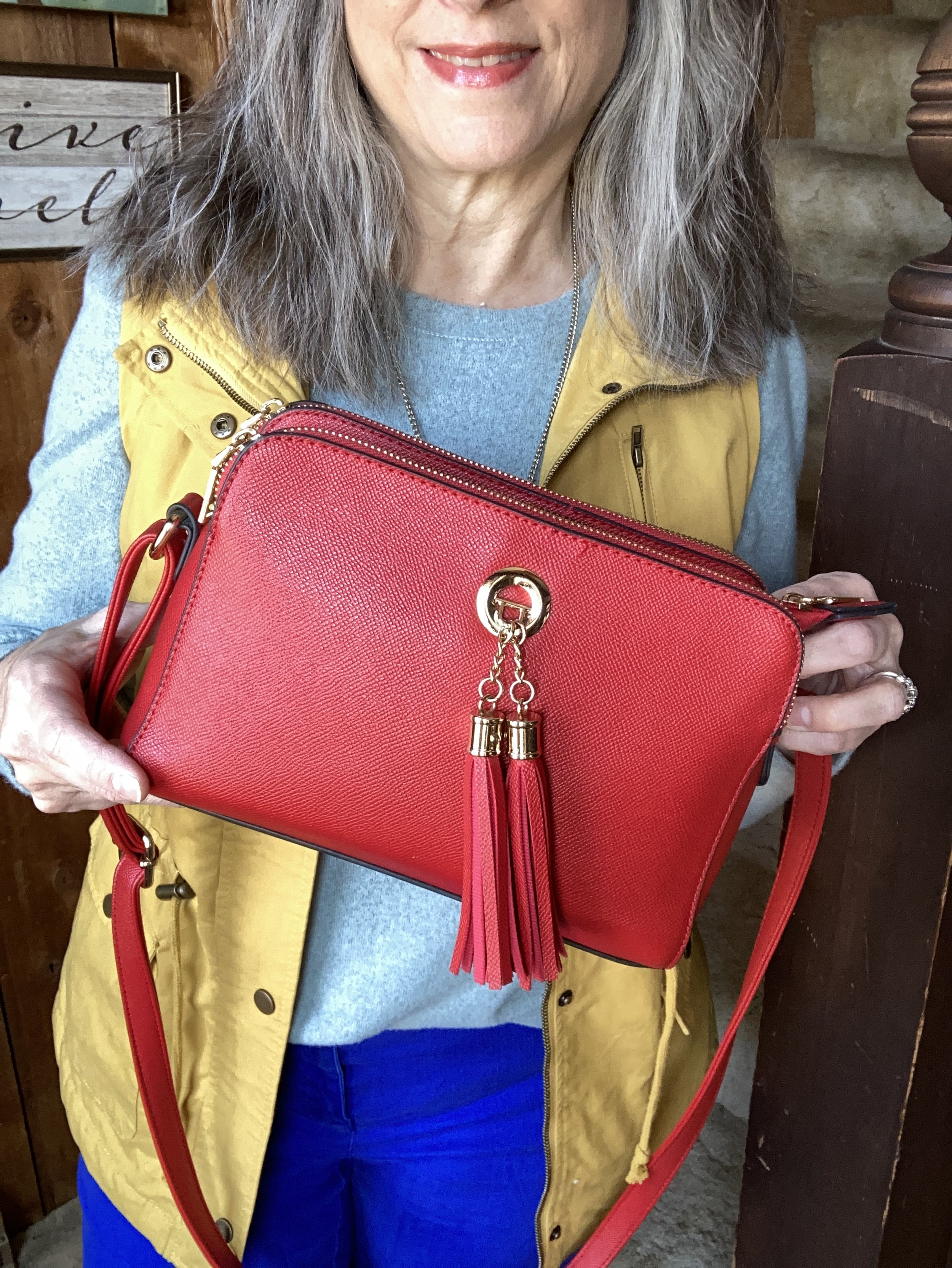
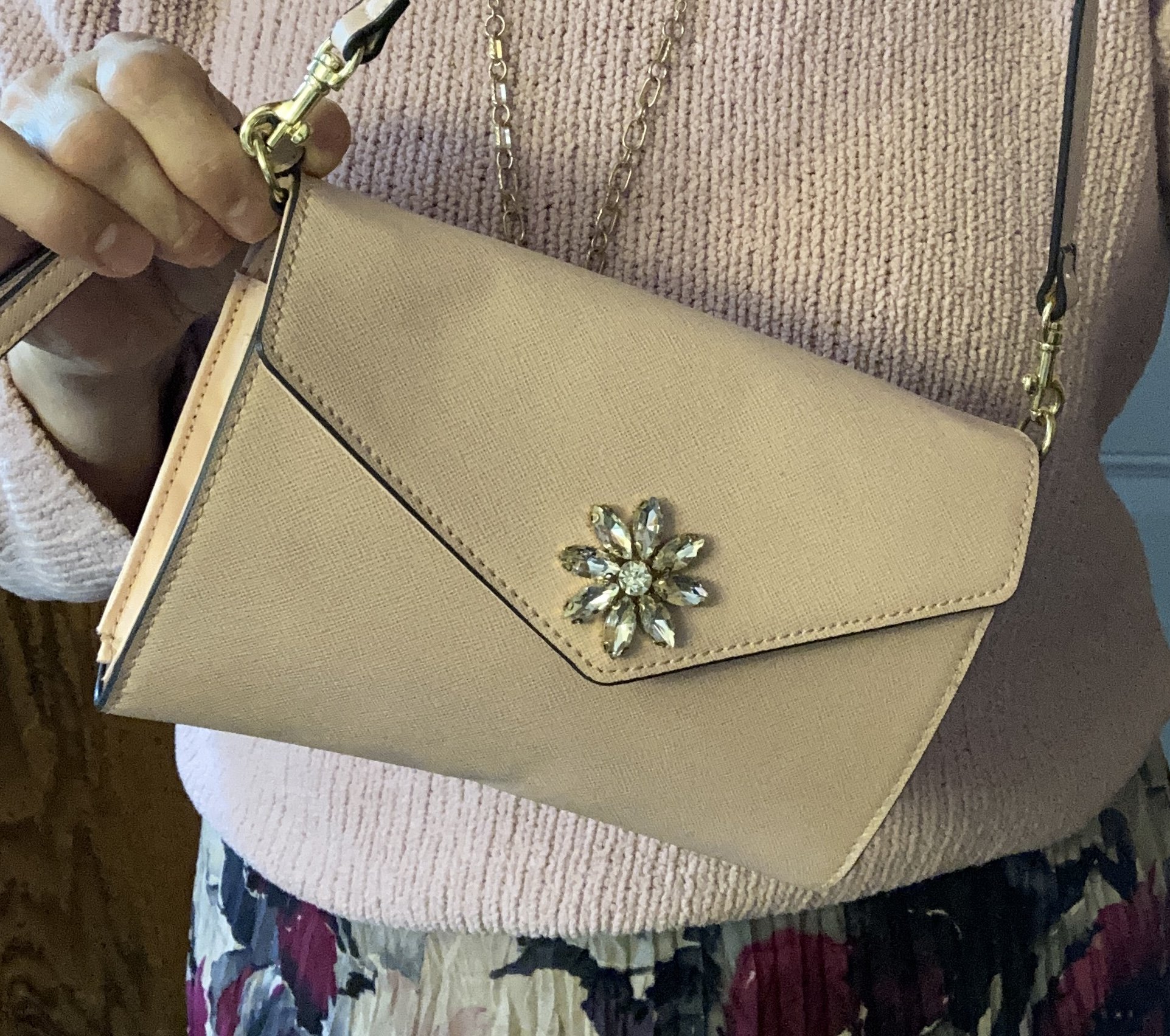
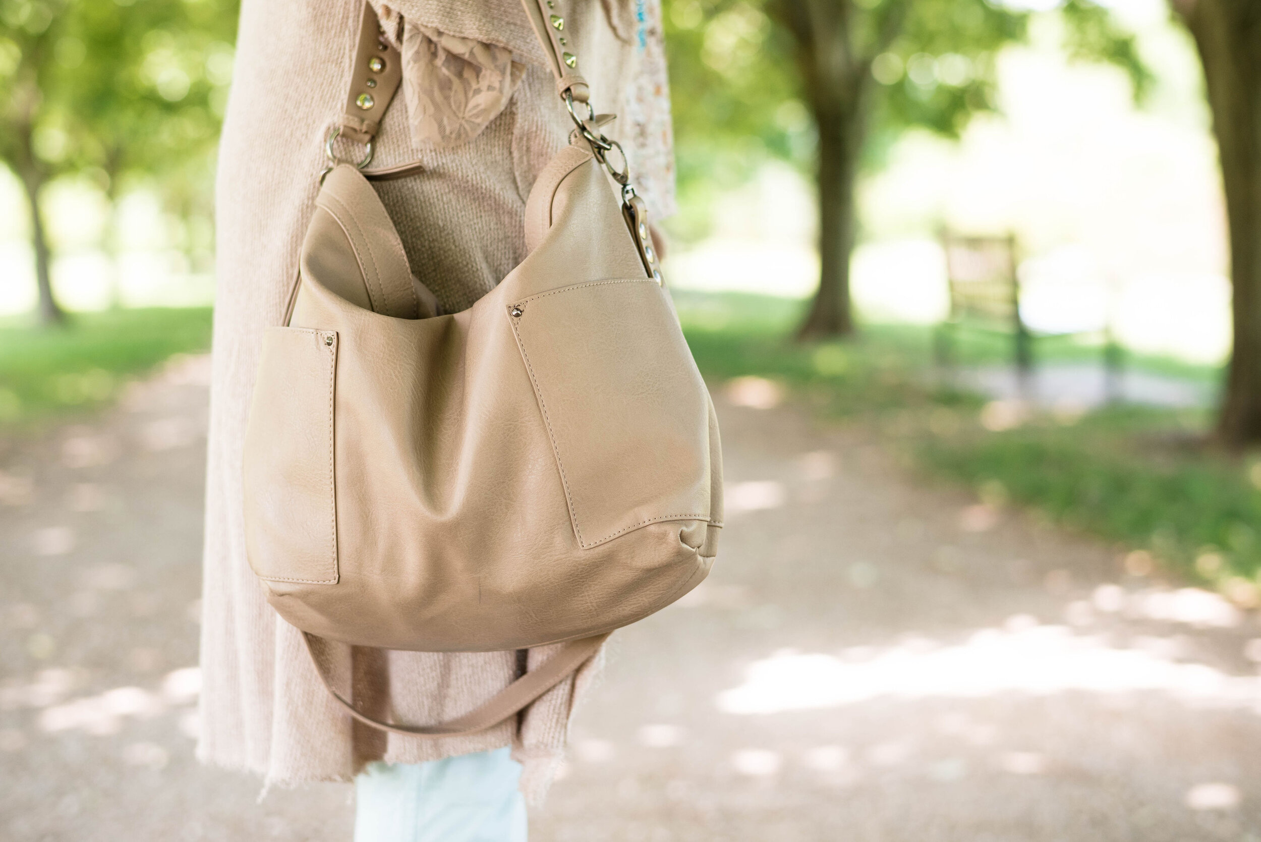
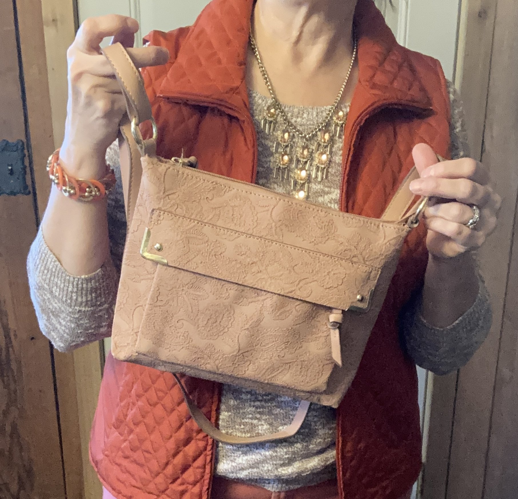
My bag was a gift from my daughter. Both my girls know I love purses, so I am always excited when I get a new one as a gift. I love the embellished detail on this piece.

What do you think of these colors? Would you wear these together? What are you going to wear for your Easter Day celebration?

I’m not sharing any shopping links to day, but hope you have a marvelous weekend.

Buy Me A Coffee.

Color Play - Pantone Spring 2023 - NY Palette: Fiery Red, Empire Yellow, Blue Perennial, Light Aqua

Today I am looking at a color combining technique that is known as color blocking. Color blocking is the combination of solid colors creating distinct blocks of color. I don’t use the color block technique very often because I love prints. Many times I will combine something like a pair of jeans with a vest or sweater in a solid color, combined with a print top. I guess in that case I am almost always doing a type of color blocking. However, jeans are a type of material that don't typically look solid. Does that make sense to anyone else out there besides myself? Ha, ha.

This outfit is bright and colorful and a great ensemble for the crazy fluctuating temperatures of spring.

The color block technique is a great way to combine one color with another without worrying if they match. The whole point is to combine different colors to create a fun, statement worthy outfit. All of these pieces have been in my closet for a while. I have worn each of them separately, and I have worn the vest and pants together before, but not this combination.

My Light Aqua top is Massini brand and was a clearance find from Kohl’s a few years ago. It is a medium weight knit with a cozy feel.

My secondhand pants have made numerous appearances on the blog and are Ruby Rd. brand. You can see a number of my posts in this one post, Why You Should Have a Pair of Colored Pants - Bright Blue. While I don’t pull these out real frequently for my day to day outfits. I have used them over and over for a special occasion or for the blog.

This yellow vest is a brand called Love Tree. I really like this piece. It came with a detachable hood, and the inside of the vest has a fuzzy, warm sherpa lining. I think I got this at a local boutique, but I actually cannot remember. I know, I know! Too many clothes. I’ll save my clothing muses for another day.

I decided to focus on Fiery Red as an accent color, so my bag, and my pendant charm necklace do the trick. Isn’t it cool, how the red pops against this already colorful outfit? I have this crossbody bag in a similar style, but different brand (both from Amazon), in black. They are great bags with three separate compartments to keep all your things organized. They are not huge, but big enough for the essentials. I’ll give a few shopping links below. A crossbody bag has become my regular go to, because I like the hands free approach. This is especially helpful when you are chasing grandkids, or shopping.

I really wasn’t sure which shoes to wear, and the only reason I ended up with my high top mesh Converse was due to the red stripe around the sole. Ha, ha. Really, my thought process for putting an outfit together is not all that complex. I tried the outfit with a pair of white sneakers first, but it just didn’t look right. I think the heaviness of the fabrics and the vest needed something a little less springy, but I also didn’t want to use knee high boots as those seemed too wintery…thus the Converse.

So what do you think of this outfit? Do you like the color blocking technique? Tell me about an outfit where you have used it. Your comments mean so much to me. You are the reason I keep this blog going, so it is wonderful to hear from you.

Please feel free to show your support for me and the blog by using my Buy Me a Coffee link. When you contribute to my page I can use that money to buy a treat when I am working on the blog at a coffee shop. I appreciate all your support.

I’m including a few shopping links. I only make money off of these links if you purchase something through a link, however, I bring these to you to give you ideas. All opinions are my own.

Have a great Tuesday!

My Style - Pantone Spring 2023 - NY: Classic Green, Love Bird, Leek Green

For today’s look, I decided to combine the three greens on the New York Palette into one outfit. These greens are all different, but go together making a fun, bright, spring outfit perfect for any casual occasion.

You know my go to is always casual and comfortable, but aIso like my outfits to look put together, so it at least appears that I gave a little thought to what I am wearing. I always try to plan my outfits out the night before, so that I don’t have to take the time in the morning to make those decisions. Do you pick out your outfits the night before, or do you just throw things on at the last minute?

This outfit is my style: casual, cute and comfortable. It is the type of outfit in which I feel most confident and most like myself. I love wearing button downs as a topper over a graphic tee or light weight long sleeve tee. Skinnies are always going to be part of my wardrobe, no matter what the trend forecasters say. I will definitely style other types of pants from boot cut, to straight, to wide leg and flares, but skinnies will still hold a place in my closet.

I thought this Periodic Table of Muppets tee perfect for the Classic Green color on the NY palette. The thing I love about graphic tees is that they allow every individual to speak for themselves. They show the bands we like, the shows we watch, the activities and hobbies we groove on. A graphic tee can tell a lot about a person. What do you suppose this tee says about me? If you guessed that I grew up watching the Muppet Show, then you are right! Ha, ha.

This thrifted Jaclyn Smith Love Bird button down is such a great piece for spring and summer. Gingham always moves our minds towards the warmer days of spring and a summer full of outdoor activities and picnics at the park.

While these olive pants are not as yellowy as the Pantone Leek Green, it still gives you the idea of olive drab, which you know comes in a variety of shades from green gray to green brown and green yellow. I’ve had these Gloria Vanderbilt utility skinnies for a number of years and have styled them multiple times on the blog. You can see them with an olive utility vest, a light weight sweater, a floral bomber jacket, and a snakeskin print jacket.

The addition of my Steve Madden white sneakers keeps the outfit feeling springy and fun.

This brown and white bag was a thrifting treasure. It is Rafe NY brand. I really like the style and roominess of the this bag. The fringe tassel and woven buckle strap on the front pocket add such fun details. The bag is a bit heavy, so I won’t be using it for any long shopping trips, but it will make a great travel bag with room for a book and a few snacks. Ha, ha. I felt it went very well with the whole vibe of this outfit. What do you think?

I didn’t get a good close up of my necklace, but it is a simple short pendant and the colors mimic the other colors in the outfit.

Style Tip: Go monochrome without going monochrome. All of these colors are in the green category, but they are all different. Even still, the outfit does have a distinct monochrome feel. This is also a great way to put an outfit together. Pick a color category, then choose various shades from that category to make up your whole outfit. Use your accessories as a way to add a few pops of different color.

What do you think of this outfit? Does this mimic your style? What is your casual go to style? I would love to hear your thoughts in the comments. Leave me some love.

I’m including a few shopping links. These are affiliate links and are brought to you at no extra cost. If you purchase something through a link I get a little bit of a commission. I also now have a Buy Me a Coffee link, so if you are so inclined you can support this little blog by doing that. Thank you so much.

Buy Me a Coffee

I wasn’t able to find anything in the Love Bird color, so you may have to track that one down yourself by Googling it or by looking for it at thrift stores.

Have a great week.

Shopping our Closets - Colorful Skirt and Pantone Spring 2023 NY: Beetroot, Crystal Rose, Gray Lilac

(The colors used in these Pantone posts are approximations and not exact matches. The reference to the Pantone Color Institute is meant as a guide and only for your consideration. I do not receive any money from Pantone for these posts. I do it because I love color.)

This week we are shopping our closets looking for a colorful printed skirt to build an outfit around. I chose this floral maxi skirt that I have styled on the blog before as the place to start. Once again, I am incorporating three of the colors from the New York color palette just to give you a sampling of what the Color Institute came up with for this spring and summer.

These colors definitely fall into our radar for spring and summer. For some people pastels are a year round affair. For me, I tend to reach for these lighter, pale colors in the summer months as a way to stay and look cool. In my opinion Beetroot is very similar to Viva Magenta, although a bit more pink. Unlike years past, this year, the Color of the Year is not on the New York or London palettes. I guess they decided they could add one more color on each if they left the Color of the Year as its own entity.

My pleated maxi skirt was a clearance find from Kohl’s a few years ago. Chaps brand, it has a full lining and is very fun to style with its swishy, pleated loveliness. You can see this skirt styled with a gray tee and pink cardigan another Pantone season a few years ago.

Style Tip: As with our unique cardigan from last month’s Shopping our Closets post, start with your printed skirt and build your outfit around it, either focusing on one color in the skirt or a few different colors.

My Crystal Rose pullover sweater is a brand called Colorado Clothing and was thrifted. One of the reasons I give you the brand names on my thrifted pieces is so that if you like the brand you can take the name and plug it in on second hand clothing apps like Ebay or Poshmark and maybe find something you like.

My utility jacket from Maurices is the closest thing I have to the color called Gray Lilac. I had a bag, but in my messiness of clutter, I couldn’t find, it and might have gotten rid of it, but don’t remember. Oh dear, my brain! Ha, ha. It is a darker shade, but if you look it up on the Pantone Spring/Summer 2023 New York Palette page on their website you can see that it is similar.

I kept the accessories fairly simple as I wanted the skirt to be the focal point. I also made it my own by adding combat boots with a blingy clutch.

Style Tip: Make outfits about you and your personality. Just because a particular outfit typically is worn with a certain type of shoe or blazer, doesn’t mean you can’t mix it up a bit and choose pieces that are more to your liking and make your personality shine. The necklace and clutch were both clearance finds; the clutch at Kohl’s and the necklace at Meijer. My boots are a brand called ID Required and are thrifted.

What do you think of these Pantone colors? Do you have these in your closet? Do you have a love/hate relationship with pastels? Share your thoughts in the comments below or on Facebook. I’d love to hear from you.

How would you change up a style like this to make it your own? What do you like about this outfit? What do you not like? Let me know what you think!

I’m including a few shopping links for you to look over. These are affiliate links. All opinions are my own. Have a great day!

You can now also buy me a cup of coffee by clicking on this link. I appreciate all of your support.

Outfit Inspiration: Pantone's Color of the Year - Viva Magenta

I still want to bring you a look at the Pantone Color Institutes color selections for this year, so this month I am going to feature a few of the New York Palette Spring/Summer 2023 colors for each of my monthly columns. The Pantone website has become increasingly user unfriendly for just the average joe. If you want to buy their services and products they are great, but I can no longer get specific color info. If you look at their page for the Palettes, the colors are now featured as these tiny, almost imperceptible to the human eye, swatches. Ha, ha.

Before I start, let me reiterate, these are my interpretations of the Pantone colors. They are not exact matches, but correspond as closely as I am able to make them with my limited information from the website and my limited wardrobe.

Viva Magenta is a bright, rich pinky red that easily catches the eye. It is a pretty color that can be combined with loads of other shades for a spring and summer worthy outfit palette. I don’t have a lot of pieces this color in my closet, so I was glad to see I had this Sonoma 3/4 bell sleeve top and the thrifted Libby Edelman shoulder bag.

I decided to combine the Viva Magenta with two of the other colors from the Spring New York Palette. Summer Song is a soft, light blue that reminds me of a light wash denim, which is why I chose my thrifted J. Jill - Out of the Blue embroidered, jacket as a topper. I love the embroidered details on this piece. I’ve worn this on the blog before. You can see it with a white skirt for summer, and with a pair of wide leg jeans.

Vanilla Cream is one of the classic colors on the palette this year. I would say it is a cross between a pale pink and a pale coral. The Crayola Crayon box might call this one Flesh, ha, ha! These thrifted Refuge jeggings, seemed to come pretty close to the Pantone color. I don't typically wear leggings or jeggings without a longer top, but these have back pockets and do look more like jeans than leggings, even though they are incredibly soft and stretchy. You can see how I styled these with a black floral top, a belted orange tank top, in a pink monochrome look, and in a flat lay.

My SO ankle boots were a clearance find from Kohl’s a number of years ago. You can see how I styled them with my cognac jeans, a yellow knit cape, dark pink cords, and gray plaid cropped pants.

Are you a fan of Pantone’s color of the year, Viva Magenta? Do you like it combined with these other spring Pantone colors? Do you have any of these colors in your wardrobe? Leave me a comment or two. I always love to hear your thoughts. I do try to respond to all of your comments, so be sure to check back after a few days.

I am including a few shopping links for you to look over. I do apologize that I have not yet gotten linked up with some other affiliate partners. It’s all about the research which takes time. I haven’t given up, but for now I will keep bringing you at least some possible options through my ShopStyle affiliate program. These are brought to you at no additional cost, unless you purchase something of course. Ha, ha.

Pantone Spring/Summer 2022 - NY Palette: Harbor Blue, Dahlia, and Northern Droplet

These are the last three colors from the Pantone Spring/Summer 2022 New York Palette. Today’s colors are festive and fun, the perfect combination for a summer event. I always love a brighter, richer approach to color anyway, so these are probably two of my faves from this palette. Click here to see the actual Pantone colors.

Harbor Blue is a medium blue green giving it a teal vibe, but with a little less intensity. Dahlia is a beautiful shade of purple that reminds me of spring and summer flowers like Azaleas, Cosmos and Pansies. Northern Droplet is a light shade of gray much like an early morning fog over a mountain lake.

For my outfit today, I ended up using a slightly darker gray rather than a light gray. I don’t own a lot of light gray because it is one of those colors that doesn’t do me justice. It is also what I would term, a non color, meaning it doesn’t really do a whole lot for very many people. Certainly there are women who look wonderful in a light shade of gray, but it seems to me that a medium to dark gray is a better choice for most of us.

As of the posting of these photos it is still cool in the midwest. We have had so many gray and rainy days, I am honestly starting to think we are turning into the new northwest and joining our friends in Seattle. However, I did want to give you an outfit where I at least showed a little bit of skin on my legs, just to give the feeling of oncoming summer and warmer weather.

My Harbor Blue bomber jacket was a clearance purchase from ShopNational a few seasons ago. I love the floral textured pattern. The banding at the neck, sleeves and bottom makes it extra comfy to wear. It is a unique piece that I don’t wear a lot, but one that I will hang on to for its versatility and vibrant color.

My thrifted jeans are a brand called Stylus. This appears to be a discontinued brand that may have once been sold at JC Penney and Walmart. I like that they have a tiny bit of distressing near the pocket and above the knee.

My Bambi tee is a thrifted Sonoma piece. When I first got it I knew the print was of deer, but after closer inspection it is definitely Bambi’s silhouette. You can also see my silver necklace that my bestie gave me back in March when we were in NY visiting my mom. I opted for the olive canvas belt because there is a bit of olive in the scarf.

My beautiful scarf was gifted to me by a dear friend who was clearing out her home in preparation for their move to Tennessee. Every time I wear it, I am reminded of her and her husband who moved to be near their youngest daughter, her husband, and their first baby. I just love all the colors in this scarf and feel like it is the perfect piece for every season.

Style Tip: When you don’t know what outfit to put together, pull out a favorite printed scarf. Take cues from the scarf on putting the ensemble together by choosing pieces with matching or similar colors. It really helps for picking out outfits and I do this often, when I am going away for the weekend.

My Ked’s sparkly sneakers are quite old, and perhaps need another run through the washer. I chose my simple Aerosmith tote (a hand me over from my younger girl) for my bag.

Do you like these colors? Would you wear these colors together? Let me know what you think of this outfit by leaving me a comment.

I’m including a few shopping links for you to look over. These are affiliate links. All opinions are my own. Thank you for all of your support. Have a great weekend!

Pantone Spring/Summer 2022 - NY Palette: Spun Sugar, Coca Mocha, and Perfectly Pale

Today’s Pantone colors are a blend of earthy and pastels. Spun Sugar is a light, airy blue reminiscent of hazy summer skies. Coca Mocha makes me think of a double scoop of chocolate ice cream and Perfectly Pale is the perfect summer alternative to basic white. See the actual Pantone colors here.

I think these colors are a great pairing for spring and summer. We often think of brown as a fall color, just like we think of white as only a summer color. Well, girlfriends, we definitely needing to change our thinking about color, as in all colors work at any time of year. I will forever love my darker browns, oranges, yellows and burgundies in the fall, but that doesn’t mean I won’t occasionally put them on in the heat of summer. God made color and color is good, all year round.

My Sugar Spun tee is a Sonoma piece. I don’t know that I consider myself wild, but I definitely am glad I live in a free country. That is something I never want to take for granted. I am thankful for all who have fought for so many years to keep our country the free nation it is. I have come to have a deep affection for graphic tees, especially those with words on them.

This outfit is all me. The colors work for me and the pieces are all thrift finds except the necklace, bag and sneakers. The Coca Mocha velvet blazer is a brand called SSA, and is definitely showing wear. I need to do some stitching around the cuffs as it has been wanting to come apart. But overall, I think the blazer still has some wear left in it. This is not something I would normally gravitate towards in the summer, but with our weather being so wacky, I think I will keep this available.

Style Tip: Don’t put your blazers away for spring and summer. Think of them as light weight jackets that you can throw on with cropped pants, capris and even shorts. They make any casual outfit look classy and put together.

My pants are Gloria Vanderbilt and a newer thrift purchase. I knew I wanted a few other lighter weight and lighter colored pants for spring, so this utility pair does the trick.

Style Tip: If pure white is not your bag, find light colored bottoms for summer in pale creams, tans and yellows. You’ll get a similar effect to wearing white and won’t have to worry as much about your colored underwear showing through.

Summer for me means less in the accessory department. I can’t wear most scarves as I get too hot and many of my jewelry pieces make me break out in the warmer weather. These warm months are where I turn to pieces with hippie vibes that use cording, or heavyweight string for pendants and bracelets. I am thinking about taking a few of my hubby’s metal detecting finds and turning them into jewelry, so I guess this would be the time.

My daisy necklace was a Christmas gift from my husband. I like the little quirk it has, because that’s me, just a little quirky. Ha. ha. I am also showing off my round Nine West snakeskin print bag, that I got a few seasons ago from Kohl’s on clearance. Last, but not least, I had to use my bright blue Converse again, since they went along with the Spun Sugar color.

What do you think of these colors? Do you like the colors together, or would you put them with other colors? I love hearing your thoughts and ideas. You inspire me too!

I’m including a few shopping links for you to peruse. These are affiliate links. All opinions are my own.

Have a great day!

Pantone Spring/Summer 2022 - NY Palette: Gossamer Pink, Skydiver and Poppy Seed

Hi everyone. It is time for another set of colors from the Pantone Spring/Summer New York Palette. These colors include the pastel Gossamer Pink, the pretty, bright, Skydiver blue, and a charcoal gray called Poppy Seed. I was glad to see a darker gray on the Classic color palette, as that has always appealed to me more than the lighter gray. These are my choices from my closet for each of these colors. To see the actual Pantone New York palette colors, click here.

My blue cardigan is not a perfect match for the Pantone color, but I try to give you ideas for outfits with interesting color combinations, not do a paint by number. I love this light Gossamer Pink with the bright contrast of the Skydiver blue. This would have been another pretty combo for Easter, but any spring activity where you have to dress up a little would welcome these colors. This would be perfect office attire as well.

I have had this Christopher and Banks cardi for a few years. It is a lighter weight sweater that is perfect for the spring, or for summer when you need a little something in the air conditioning. They don’t seem to be carrying this same type of sweater, but you can always check here at Kohl’s for a few solids and prints on a basic button down cardigan.

My pink blouse is Elle brand, and was a clearance purchase from Kohl’s a few seasons ago. It is a sheer material with little sparkles throughout, which are not visible in the picture. It has 3/4 sleeves and ties to make a bow. I also added this pretty spring scarf that one of my daughters gave me a few years ago.

My Poppy Seed gray plaid trousers have been around forever. They are Style & Co. brand. I know Macy’s and a few other retailers sell Style & Co. brand, but I honestly can’t remember if I got these at Macy’s or if I thrifted them. Macy’s isn’t a retailer I have typically frequented, but I have gone a few times with my bestie and might have bought these on one of those trips.

My black belt was a recent thrift find.

My shoes are my Aerosoles black heeled pumps. I like the lower more stocky heel in my older years. My feet are not used to wearing heels at all anymore, so when I do they have to be ultra comfortable. Aerosoles fit the bill in that regard. Check out their website for great looking shoes at reasonable prices.

My bag is a thrifted NY & Co. and can be a tote or fold it over for a smaller clutch option.

Do you have these colors in your closet? How would you were these, with each other, or with other colors? What is your favorite spring color combination? I’d love to hear your thoughts, so leave a comment or two below.

I’m including a few shopping links below. These are affiliate links, which means I get a little money when you click on a link. These are brought to you at no cost and I appreciate all the clicks. All opinions are my own.

Have a super week everyone!

Pantone - Spring/Summer - 2021 - Both Palettes with all the Outfits.

I always think it is fun to do a post featuring all the outfits from my Pantone color series. I really spread these out this year due to scheduling issues, so that’s even more of a reason to look back at all of the outfits. I will also let you know, which ones were my faves.

New York Palette

ClassicColors_(12).jpg
illuminating (1).jpeg
amethystorchid.jpeg
raspberrysorbet.jpeg
burntcoral.jpeg
frenchblue.jpeg

I would have to say, from the New York Palette, my favorite combination is the Amethyst Orchid, Ash Green and Inkwell. I love the contrast of the dark navy blue and the pastel colors. It just makes the outfit pop. I also love the light green with the light purple. It is a very pretty combo for spring and summer. In addition, I really liked the casual vibe of the French Blue, Cerulean and Butter Cream combo. both of these are outfits I would wear. What were your favorite colors? What is your favorite outfit from this series?

London Palette

londonspring2021 (1).jpg
illuminating (1).jpg
pirouette.jpg
purplerose.jpg
pickledpepper.jpg
beachglass.jpg

I really liked this palette over all, because I love all of the colors. My favorite combination was the outfit that I got the most positive feedback on, Beach Glass, Blue Atoll and Macchiato. There is just something so summery and uplifting about these tropical blues and warm brown. I also liked the challenge of combining Purple Rose and Lava Falls. I would have never thought to pair this medium purple with a bold red, but I think it worked. What were your favorite colors from this palette? What is your favorite outfit?

I’d love to hear back from you. Your comments help me to know if the content I am putting out is pertinent to your life. I hope that my outfits and posts are inspiring you to shop your own closet and to think outside the box when it comes to the clothing pieces you wear and how you put them together.

Have a wonderful day!

Pantone - Spring/Summer - 2021 - London Palette - Beach Glass, Blue Atoll and Macchiato

We’ve reached the end of the Pantone - London Palette series with these last three colors which make me think of tropical seas and sandy beaches. Like Tuesday’s post, where I combined two different greens from the palette, today’s post combines two summery blues for a light, airy, warm weather look.

beachglass.jpg

I started figuring this outfit out with my light blue, thrifted Sonoma crop pants. Though they are a bit lighter than the Beach Glass color, I think they still work. I pull these out every spring and summer as a light weight alternative to denim.

beachglasspantoneoutfitideas-1.jpg

My multi-print top is another thrift store find. I just loved the soft colors and print on this popover blouse. It has no tag in it, so I have no idea what the brand was. The print has the light Beach Glass blue, as well as the darker Macchiato.. You’ll see a close up in the next photo.

For the darker Blue Atoll color I decided to add a few pieces of jewelry. I had some long, opera length beads and decided to do some layering with the necklaces. I also added a beaded bracelet, that appears to better match the Beach Glass color.

beachglasspantoneoutfitideas-7.jpg

For the Macchiato color, I played around with several pieces, but everything seemed too yellow. This longer sweater was a recent purchase from Cracker Barrel. While they are a restaurant, they also have what they call an Old Country Store. The store is filled with all sorts of items from old fashioned candy, beautiful home decor, quilts, jewelry, cards, music and clothing. If you click on the link, it will take you to the sweater and it is on sale. Whoo, hoo. If you like it snatch it up. Here are a few photos to show you the details of this pretty piece and the movement. It is a light weight material, so it will be great for spring, summer and fall.

beachglasspantoneoutfitideas-13.jpg
beachglasspantoneoutfitideas-14.jpg
beachglasspantoneoutfitideas-15.jpg
beachglasspantoneoutfitideas-16.jpg
beachglasspantoneoutfitideas-17.jpg
beachglasspantoneoutfitideas-18.jpg

My bag is Madden brand; a clearance find from Kohl’s. My perforated peep toe shoes are Sonoma brand and another Kohl’s purchase from a few years ago.

beachglasspantoneoutfitideas-9.jpg
beachglasspantoneoutfitideas-11.jpg
beachglasspantoneoutfitideas-12.jpg

What do you think of these three colors? I really like how this outfit turned out and think the color combination is great for summer. Do you have these colors in your closet?

beachglasspantoneoutfitideas-6.jpg

I’m including a few other shopping links for you to look over. The Cracker Barrel sweater link is not part of the affiliate program, but I wanted to offer it to you, in case you really like the sweater. The rest of the shopping links are through the affiliate program. Every time you click on a link I get a few pennies, and I appreciate every click.

Have a great weekend!

Graphic and photo credit Rebecca Trumbull.

Pantone - Spring/Summer - 2021 - London Palette - Pickled Pepper, Orange Ochre and Sphagnum

For today’s outfit I decided to combine the two greens that were on the London Palette. Both Pickled Pepper and Sphagnum are great green shades for summer time. While Pickled Pepper is one of the main palette colors, Sphagnum is one of the palette classic colors. Olive is a great neutral and goes with just about every color out there, so Sphagnum, (which is actually a type of moss), makes for the perfect classic color.

pickledpepper.jpg

My Pickled Pepper popover top is Sonoma from Kohl’s a few years ago. This top is easy to wear, as well as cool for these hot, humid days. I don’t usually prefer to wear sleeves with elastic, but as long as the elastic isn’t cutting off the circulation in my arms I’m okay with it.

pickledpepperpantoneoutfitideas-12.jpg

My Sphagnum utility vest is Mudd brand, and was another clearance purchase from Kohl’s a few seasons ago.

pickledpepperpantoneoutfitideas-4.jpg

These light wash jeans were a recent thrift find. A brand called Ella Moss, this brand is available at stores like Nordstrom, Bloomingdales, Amazon, Dillards, and others. I like the cropped length and the high waist of this pair.

For the Orange Ochre color, I grabbed my thrifted, orange suede bag and a fun pendant choker. It is much easier to include a brighter color, if you do it with accessories.

pickledpepperpantoneoutfitideas-9.jpg
pickledpepperpantoneoutfitideas-7.jpg

I had to show off my new clearance Converse sneakers from DSW. They are very comfy and I love the blue color. They are similar in color to my thrifted Keds, which are showing a bit of wear, so these were a great find.

pickledpepperpantoneoutfitideas-11.jpg

Here are a few silly pictures. I was jumping for joy. Ha, ha.

pickledpepperpantoneoutfitideas-5.jpg
pickledpepperpantoneoutfitideas-6.jpg

What do you think of these colors? Do you like to wear green? Do you have Sphagnum (olive) in your closet? I would love to hear from you. I’m including a few shopping links for you to look over. These are affiliate links. All opinions are my own.

pickledpepperpantoneoutfitideas-3.jpg

Graphic and photo credit Rebecca Trumbull.

Pantone - Spring/Summer - 2021 - London Palette - Purple Rose, Lava Falls and Baby's Breath

Today’s colors are a blend of pastel purple, bold red and creamy off white. I have always loved purple, but it really isn’t a color I regularly wear. I easily got on board with Purple Rose which is a medium purple that goes well with many other colors, especially things like brown, olive and navy. Why, then did I decide to pair it with a fierce red like Lava Falls? Because I always like to show you things outside the box. It is not very often, that I think to put purple and red together.

purplerose.jpg

The factor that clinched the deal on putting these colors together, was that my thrifted Old Navy, Lava Falls, paisley popover top had both of these colors in it. How fortuitous was that? Ha, ha. This is a fun, tunic type shirt that has short sleeves, and the interesting details of a shirt tail hem line and a lace up v-neck. I love the paisley print too, which always reminds me of the 70’s.

The Croft and Barrow cardigan is older and I like I said, doesn’t get a lot of regular wear, but i just love the color so I keep it around.

purplerosepantoneoutfitideas-2.jpg

You’ve seen these creamy, Baby’s Breath, thrifted, St. John’s Bay ankle pants on the blog before. I really think this look would have been cuter with a creamy denim pencil skirt or a pair of Bermuda shorts, but I don’t have either of those. I am not as fond of the silhouette, but it is okay, just not great.

purplerosepantoneoutfitideas-7.jpg

I didn’t need to wear a necklace and this long opera length beaded strand is exactly the same color as the top, but sometimes I like the subtle texture and shine of a piece, even if it is a similar color. Wrapping this long strand of beads around my neck makes it look like I have on a choker.

purplerosepantoneoutfitideas-8.jpg

I added a few beaded bracelets with similar reds, although there is plenty going on in the top, so it wasn’t really needed. Often, less is more.

purplerosepantoneoutfitideas-9.jpg

My thrifted Simply Vera, Vera Wang cross body bag is making another appearance. This is a great little bag for the warmer months. The off white color goes perfectly with the Baby’s Breath color of the pants.

purplerosepantoneoutfitideas-10.jpg

These Steve Madden platform sneakers were a new purchase from DSW. I had a coupon and I had been looking at this type of sneaker since last summer. I finally took the plunge. They are not something I would use for walking, but they are cute for a casual day of picnicking or window shopping.

purplerosepantoneoutfitideas-4.jpg

What do you think of these colors? Do you think you would ever combine red with purple? I’d love to hear your thoughts, so leave me some love.

I am including a few shopping links in these colors, so if you have time, give those a look. I hope you have a wonderful weekend!

Graphic and photo credit, Rebecca Trumbull.

Pantone - Spring/Summer - 2021 - London Palette: Illuminating, Marigold and Ultimate Gray

Illuminating and Ultimate Gray are the two colors of the year, so just like I did for the New York Palette, I decided to pair the two colors together and for this one I added Marigold, which was also on the New York palette.

illuminating.jpg

We decided to go to the Toledo Botanical Gardens again for these pictures and we did come across some beautiful blooms. This particular bush is a rhododendron. I just did some research and found out that all azaleas are rhododendrons, but not all rhododendrons are azaleas. Whether you like azaleas or rhododendrons they are all beautiful.

Once again, I chose my recently thrifted bright yellow jacket to serve as the Illuminating color. The jacket is D&Co. (Denim and Co.). It has a nice stretch to it and I like the 3/4 length sleeves for a change of pace.

londonpantonecoloroutfitideailluminating-8.jpg

I’ve styled my medium yellow tee on the blog before. You can see it styled with a leopard print skirt. Having tees in a variety of colors comes in handy when you want to put an outfit together. This thrifted tee is Apt. 9 brand.

My Gloria Vanderbilt jeans were another Kohl’s clearance find. They are soft and stretchy, so great for my fluctuating weight. I say fluctuating, but it really doesn’t go up and down. It either stays the same or goes up. Ha, ha.

londonpantonecoloroutfitideailluminating-11.jpg

I wanted my accessories to make a statement since the outfit itself was not overwhelmingly interesting. I found this pretty layered necklace in gray tones somewhere along the way. I think it was a thrift shop nearby. I added a few beaded bracelets to tie the jewelry together.

When I decided on the thrifted tan loafers, I knew my Nine West snakeskin print circle bag would be the perfect piece to complete the whole look and bring everything together.

londonpantonecoloroutfitideailluminating-13.jpg
londonpantonecoloroutfitideailluminating-15.jpg
londonpantonecoloroutfitideailluminating-16.jpg

What do you think of these colors together? Do you like the lighter yellow of Illuminating or the richer tone of Marigold? I’d love to hear your thoughts in the comments below. I appreciate when you give me your feedback. It can be kind of lonely as a blogger, when I don’t know if anyone is reading my content or looking at my posts, so I really love to hear from you.

londonpantonecoloroutfitideailluminating-10.jpg

I am including a few shopping link for you to enjoy. These are affiliate links and are brought to you at no cost. If you click on a link I get a few pennies and I appreciate all of your clicks. I do not get paid to write my blog, I do it as a hobby and as a service to whomever wants to follow along. I hope that I inspire you to take a second look at your wardrobe and see new ways to put things together, that you never thought of before.

Photo and graphic credit Rebecca Trumbull.

Pantone - Spring/Summer - 2021 - London Palette - Intro

I am finally getting around to sharing the Pantone London Palette with you. It has been hard to get things posted in a timely fashion. Even though I would normally try to get these colors to you, much earlier in the Spring, I figure they are meant for spring and summer, so we are still okay. Today’s post will introduce you to the colors and give you a few little sneak peeks from our recent photo shoot.

londonspring2021.jpg

These are all great colors for spring and summer. The palette is a nice mix of warm and cool colors and there is likely to be a color for everyone. The classic colors, while still showcasing your typical navy, gray and creamy white, also includes a soft light brown and an mossy olive green. I really like the blues included with this palette. They make me think of tropical waters and blue skies.

Enjoy these sneak peeks.

pantonefashionideassummer-1.jpg
pantonefashionideassummer-3.jpg
pantonefashionideassummer-4.jpg
pantonefashionideassummer-5.jpg
pantonefashionideassummer-6.jpg

Be sure to check back on Thursday for the first outfit in this series. I hope you had a lovely Memorial Day weekend.

Photo and graphic credit Rebecca Trumbull.

Pantone - Spring/Summer - 2021 - New York Palette: French Blue, Cerulean and Buttercream

Today’s three color combo is the last of the Pantone Spring/Summer New York Palette. I am going to take a week off, as I hope to go visit my mom next week. In due time, I will proceed with the London Palette, but I haven’t even begun to pick out outfits. Breaking my wrist has really thrown a wrench into the works, so bear with me. I got my second Covid shot yesterday, so getting up this morning was grueling. I got the shot in my left arm, figuring it already hurts and I wanted my right arm to remain relatively pain free. I say relatively because there is some pain in my wrist and rib cage on that side, from having to do all the work. This is making me see how much I need to get back to exercising, especially weight lifting and walking since I have osteoporosis. We ladies need to take of them bones, and all the other parts as well. Ha, ha.

I thought it would be fun to pair these two blues, for a fun, casual summer look. Adding the off white of buttercream gives the outfit that perfect warm weather vibe. I kept my accessories casual to add to the picnic ready style. This would be a great outfit for a Fourth of July get together, just add some red jewelry or a bag.

frenchblue.jpg

French Blue and Cerulean are two cool colors that make me think of blue skies and water. I found this French blue plaid shirt while thrifting. I really like this medium blue for spring and summer, as opposed to a dark blue like navy. This button down is Faded Glory brand.

frenchbluepantonespringcoloroutfitideas-2.jpg

My Buttercream ankle pants have made an appearance on the blog before. These were thrifted St. John’s Bay. You can see these styled for two other Pantone series. This one is styled with a yellow button down and this with my Chevron print dress.

Cerulean is a different light blue. I like the sky blue feel of this color, yet it leans towards a bit more pastel. My top is a thrifted Ralph Lauren piece. I like that it has a lining that is similar t-shirt type material to the outside. It has a fun faux lace texture to it.

frenchbluepantonespringcoloroutfitideas-13.jpg

I kept my accessories simple. This thrifted French Blue bag was a recent find and I had to grab it since it matched the color perfectly. This is a nice small bag for carrying just the essentials.

frenchbluepantonespringcoloroutfitideas-7.jpg

My pendant necklace had little flecks of all the colors. I have been on the search for more of these large beads with the hole in the middle. It is so easy to make a necklace out of them.

frenchbluepantonespringcoloroutfitideas-5.jpg

Lastly, my thrifted Keds finally fit the Pantone color. Cerulean is the right name for these sneakers that are great for warm weather outfits.

frenchbluepantonespringcoloroutfitideas-8.jpg

What do you think of these colors? Do you have these blues in your closet? What about Buttercream? I’d love to hear your thoughts. I’d also love to hear which of these colors you would put together to make an outfit.

frenchbluepantonespringcoloroutfitideas-10.jpg

I hope you have enjoyed this look at the Pantone Spring/Summer 2021 New York Palette colors.

I am including a few shopping links, so be sure to check those out. These are affiliate links. I get a few pennies when you click on a link, so I appreciate all the clicks.

Photo credit and graphic Rebecca Trumbull.

Pantone - Spring/Summer - 2021 - New York Palette: Burnt Coral, Marigold and Desert Mist

Today’s outfit blends three colors that seem to epitomize summer with all of its beauty. The deep orange yellow of Marigold, combined with the rustic feel of Burnt Coral and the soft pastel of Desert Mist makes me think of picnics, outdoor parties and long walks on the beach. While my outfit today is probably too warm for summer temperatures, I works well for that in between time when the weather is still unsure of what it is going to do.

burntcoral.jpg

I ordered this waffle weave dolman sleeve top from Maurices earlier this year. It has elastic on the bottom, so has more of a cropped feel to it, which isn’t always my favorite, but I think this works well with pieces where the top can be worn without the need for tucking or wearing a belt.

burntcoralpantonespringcoloroutfitideas-10.jpg

I wasn’t going to use this Roz & Ali medallion print skirt again, but I was having a hard time finding things in my closet that were going to work with these colors. Besides this is a pretty skirt, so I don’t mind using it again. You can see how I styled this piece for several other Pantone color series. Last fall I styled it with a neon yellow short sleeve sweater, and the fall before that with a purple short sleeve sweater. I like that this skirt works perfectly for spring, summer and fall. The skirt contains all the colors from the graphic, even though you can’t see Marigold as well, you can definitely see the Burnt Coral and Desert Mist.

burntcoralpantonespringcoloroutfitideas-6.jpg

My Desert Mist sweater is a little light compared to the Pantone color, but again, this isn’t about having an exact match, but about giving you options that you can find in your closet. This is a thrifted St. John’s Bay piece. It is always good to have a neutral cardigan or jacket that will work well with many different outfits and colors.

burntcoralpantonespringcoloroutfitideas-8.jpg

For the Marigold color, I just added a few accessories, similar to what I did in last Thursday’s post with Raspberry Sorbet. The necklace and Sophia Caperelli bag are both thrift finds.

burntcoralpantonespringcoloroutfitideas-11.jpg

You were recently introduced to these Clark’s flats. They are perfect for wearing with a skirt, whether long or short.

burntcoralpantonespringcoloroutfitideas-13.jpg

What do you think of these colors? Do you have all of these in your closet? Would you wear them together? I’d love to hear your thoughts, so leave me some love.

burntcoralpantonespringcoloroutfitideas-4.jpg

I’m including a few shopping links. These are affiliate links. All opinions are my own. Here’s a picture, just for your enjoyment. Ha, ha.

burntcoralpantonespringcoloroutfitideas-7.jpg

Have a great evening!

Photo and graphic credit Rebecca Trumbull.

Pantone - Spring/Summer - 2021 - Raspberry Sorbet, Mint and Willow

Today’s Pantone outfit revolves around a tantalizing pink, a refreshing green and another earthy color reminiscent of the weeping willow trees that hug the banks of lakes and streams. Raspberry Sorbet, Mint and Willow combine in an outfit that is both sleek, colorful and casual.

raspberrysorbet.jpg

When I think of the color mint, I am more inclined to think of the light Green Ash color from Tuesday’s post. I guess my rendering of mint is based more on ice cream and Christmas candies than it is the actual plant. The mint plant is a bright, living green, so I think the Pantone color is much truer to the natural source. My Mint green top is a thrifted Falls Creek piece. I wore it for this shoot and then I got rid of it. It has been hanging in my closet for a while and I wasn’t certain, why I didn’t reach for it more often. After putting it on, I just didn’t like how stiff the fabric was. I’m all for structured pieces, but a piece has to move with me for me to want to wear it.

raspberrysorbetpantonecolorsoutfit-4.jpg

My camouflage pants, also Falls Creek, are a recent clearance find from Meijer. They are light weight, so good for summer. Unlike some camo that is more green, these tend towards more brown and gray. The Willow color is in there as you can see in the following picture. Willow was hard color to find. Most of my pieces are more olive green and Willow has more of a brown undertone.

raspberrysorbetpantonecolorsoutfit-10.jpg

Instead of choosing another clothing piece for the Raspberry Sorbet color, I opted to include it in my accessories. My necklace, bracelets, and the Vera Bradley tote were the perfect pop of this bright, saturated pink.

raspberrysorbetpantonecolorsoutfit-6.jpg
raspberrysorbetpantonecolorsoutfit-8.jpg

I went for my silver SO flats to tie in with the silver chains on the necklaces.

raspberrysorbetpantonecolorsoutfit-9.jpg

What do you think of these Pantone colors? Do you have the color Willow in your closet? I love to hear back from you, so leave a comment or two.

raspberrysorbetpantonecolorsoutfit-3.jpg

I’m including a few shopping links for you to peruse. These links are brought to you at no cost, but using them to purchase something gives me a few pennies as a kick back. I appreciate all your support. These are affiliate links. All opinions are my own.

Photo and graphic credit Rebecca Trumbull.

Have a great weekend everyone!

Pantone - Spring/Summer - 2021 - NY Palette - Amethyst Orchid, Green Ash and Inkwell

Today’s combination of Pantone colors from the New York palette is a study in contrasts. The dark, moody blue of Inkwell, which mimics a night sky is a type of color disparity when side by side with the pale pastel of Green Ash. When I pair colors I often go for bold with bold, or light with light, but I wanted to experiment by creating an outfit with an eye catching difference in color. The addition of Amethyst Orchid gives the perfect compliment of medium purple color.

amethystorchid.jpg

Let me start the outfit details by talking about this recently thrifted tee. I love the bold flower on the front and purple has long been a favorite color of mine, so I was glad it was on the palette. This tee is St. John’s Bay brand. The darker inner petals are actually separate pieces of material, which gives the tee added dimension.

To go along with the Amethyst Orchid color in the tee, I also added this recently thrifted scarf. I love the large gingham pattern. It was the perfect accompaniment to the whole look. Another interesting feature of this scarf is the ruching of elastic throughout its length adding texture.

amethystorchidpantonecolorsoutfit-9.jpg

These thrifted, Inkwell pants are a brand called Hydrant. A dark pant like this is great for making our lower halves look longer and slimmer. I really like these, but they are a lint magnate. Wearing them with a fuzzy sweater like this is probably not the best idea. Ha, ha. You can also see I added a wider, olive belt since belts are trending and did my usual front tuck.

My fuzzy Green Ash sweater might be a little light, but it is pretty close to the Pantone color. This was a Christopher and Banks purchase last year. Before I bought this piece I had very little of this color in my wardrobe. I have picked up a few things since then. It is a pretty pastel color to wear, especially in the spring and summer. I really like how well it goes with the Amethyst Orchid color.

amethystorchidpantonecolorsoutfit-6.jpg

I decided to go with white for my shoes and bag. White is definitely a go to in the warmer months. My white Keds will be on repeat. My white shoulder bag is a new thrift find. I have been searching for a different white bag and this one has plenty of room and can also be worn as a cross body bag. This is a brand called Bueno.

amethystorchidpantonecolorsoutfit-10.jpg
amethystorchidpantonecolorsoutfit-12.jpg

What do you think of these colors? Would you wear a light pastel with a dark color like navy or black? I’d love to hear your thoughts. Thanks so much for taking the time to comment.

amethystorchidpantonecolorsoutfit-15.jpg

I’m including a few shopping links. These are affiliate links. All opinions are my own.

Photo and graphic Rebecca Trumbull.

Pantone - Spring/Summer - 2021 - NY Palette - Illuminating, Rust and Ultimate Gray

I wanted to share this outfit with you first, because it contains the two colors that were chosen by the Pantone Color Institute as the colors of the year. Illuminating is a bright, sunny yellow. Pantone describes this yellow as, “Friendly and joyful, an optimistic yellow offering the promise of a sunny day.” Rust is typically a fall color, yet it is an earth tone, thus its inclusion in the spring palette. Ultimate Gray is a classic and comfortable gray that everyone can wear.

illuminating.jpg

I have plenty of yellow in my closet. It is a color that has quickly become a favorite. I love the many different shades of yellow. I have mustard, sunflower, lemon, blonde and pineapple. Look up shades of yellow in your search bar and see all the fun names they give for these lovely pieces of sunshine. Illuminating is not really a different shade, but a different name for a shade that might also be called bumblebee, butter or dandelion.

Since I love the color so much, it was a no brainer that I add this thrifted, bright yellow, denim jacket to my closet. This is a brand called d & co, or denim and company. When I looked it up, it is a brand that is sold at retailers like QVC, Walmart and others. I like the relaxed style of this piece, as well as the 3/4 sleeves. It will be a great topper for cooler summer days.

pantone2021illuminating-7.jpg

We were back at the Toledo Botanical Gardens for pictures and things are starting to bloom over there. This tree was gorgeous and I had no idea what is was because the blooms were so big. It turned out to be a white magnolia. I grew up with a pink magnolia in my parents’ yard. I didn’t even know there were white ones.

You’ve seen my boho skirt on the blog before. I looked at other Rust colored options in my closet, but just wasn’t satisfied with how the outfit looked. Choosing this skirt not only gave me a print, but the perfect blend of classic and bohemian. This skirt is a brand called Notations, but I can’t remember where I got it. Ha, ha. You can see it styled with a green top and a different gray top.

This simple Ultimate Gray tee is from Kohl’s and is SO brand. I got this one and a red one a few years ago. I love that they are light weight, but still provide coverage. The hemline is a straight cut and the length is shorter, so perfect for wearing out. I did the front tuck, just for a more polished look.

pantone2021illuminating-15.jpg

When I was rummaging through my necklaces, I saw this one and thought it would pull in both the rusty oranges in the skirt and the yellow of the jacket and bag. To go with the coppery colors I also put on my thrifted beaded bracelet. My yellow diamond patterned tote was a fun find at a thrift store. Another thrift store find, my ID Required combat boots get plenty of wear.

pantone2021illuminating-11.jpg
pantone2021illuminating-12.jpg
pantonespring2021preview-2.jpg

What do you think of these colors? Would you wear rust in the summer time or do you think it is a color strictly for fall? I’d love to hear your thoughts, so leave me some love in the comments. Your comments keep me motivated to keep providing content to you all.

pantone2021illuminating-1.jpg

I’m providing a few shopping links for you to look over in your spare time. These are affiliate links brought to you at no cost. When you click on a link, I get a few pennies, so I appreciate every click. All opinions are my own.

Photo and graphic Rebecca Trumbull.

Pantone - Spring/Summer - 2021 - New York Palette: Introduction

I am a bit behind on the Pantone colors this year. I had a hard time getting back into the swing of regularly posting, but here I am. While we are a few weeks into spring, the Pantone colors for this season are for spring and summer. I don’t pay attention too much to their time table, because they already have the colors out for the fall/winter season. Who wants to think about fall/winter when we have barely made it into spring? Ha, ha.

Just as a quick review, the Pantone Color Institute is an entity that provides the color trends for both the fashion and interior design industries. If you go to their website you can see all sorts of information from color swatches you can order to educational opportunities. Obviously, these are not the only colors that you see trending on the runways, but Pantone is easily considered a color authority by both design areas.

Every year, Pantone chooses a color of the year. Last year it was Classic Blue. In 2019 it was Living Coral. This year they picked two colors, Illuminating, a sunny yellow and Ultimate Gray, which is a classic medium gray. Typically, the colors of the year are seen on both the New York and the London Palettes. As I have done in the past I will be starting my series with the New York Palette. This year, the palettes are quite dissimilar, which makes it more interesting for me, as I pick out outfits and for you, my lovely subscribers.

Here is the New York Palette.

ClassicColors_(12).jpg

This is a mix of jewel tones and pastels, so if you lean towards one or the other, this palette will make everyone happy. Rust is a different color for summer, but I think it can work well with many of the others colors. Once again there is a selection of classic colors, which to me are helpful if you want to tone down an outfit and just accent with the brighter colors through jewelry and other accessories.

The following are a few photos from our shoot which give you some sneak peeks at how I combined these colors.

pantonespring2021preview-1.jpg
pantonespring2021preview-2.jpg
pantonespring2021preview-3.jpg
pantonespring2021preview-4.jpg
pantonespring2021preview-5.jpg
pantonespring2021preview-6.jpg

I hope you will join me on Thursday as I start the series. Have a great day!

Photo and graphic credit Rebecca Trumbull.