Outfit Inspiration - Cottage Core with an Edge

This week’s source of inspiration started with an Instagram challenge that I am trying to participate in for the month of May. The challenge, #mismatchmay revolves around outfit combinations that might seem unusual or outside the norm. It isn’t just a matter of putting different prints together, although that does have something to do with it. Every week has a different focus. For the first week we are to build outfits with the ideas in mind of character play, pose play and mix of hard and soft.

I thought I would focus, at least for one of the days on the mix of hard and soft. This would be combinations of fabrics like soft silks, tiered tulle, lace, and other feminine fabrics with moto jackets, structured vests or blazers, or leather and vinyl. As I began shopping my closet, I wanted to get a little more knowledge, which led me to Pinterest. There I discovered something I had heard of but didn’t know a lot about, Cottage Core.

Cottage Core delves into fashion that examplifies a romanticized version of pastoral life. You will find floral prints, feminine tiered skirts and maxi dresses, and oversized cozy cardigan sweaters. There is a focus on natural fibers, vintage inspiration and a closeness to nature. There is a Cottage Core aesthetic in the architectural realm as well with home decor turning towards English gardens, and rustic baskets and floral arrangements.

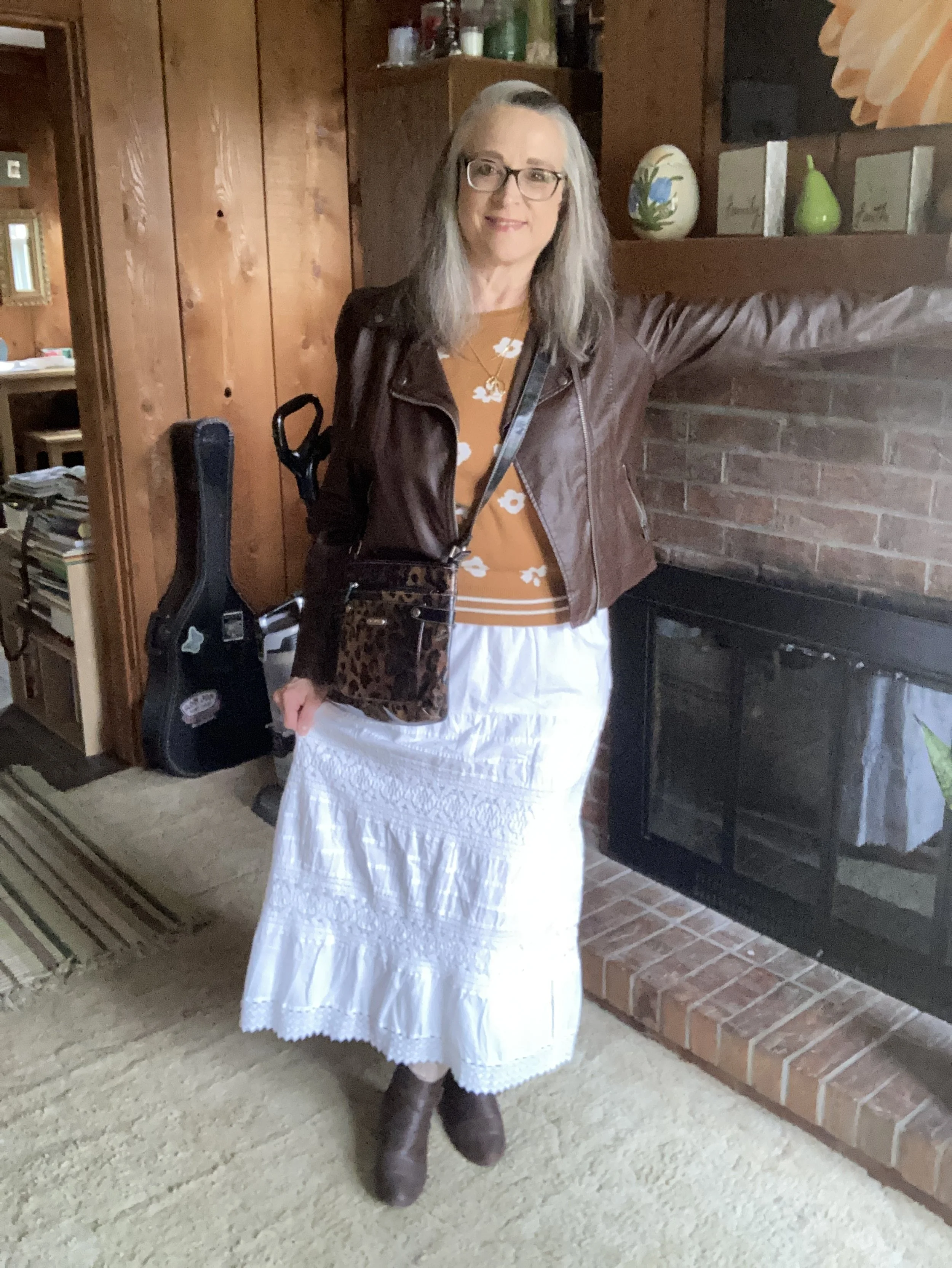
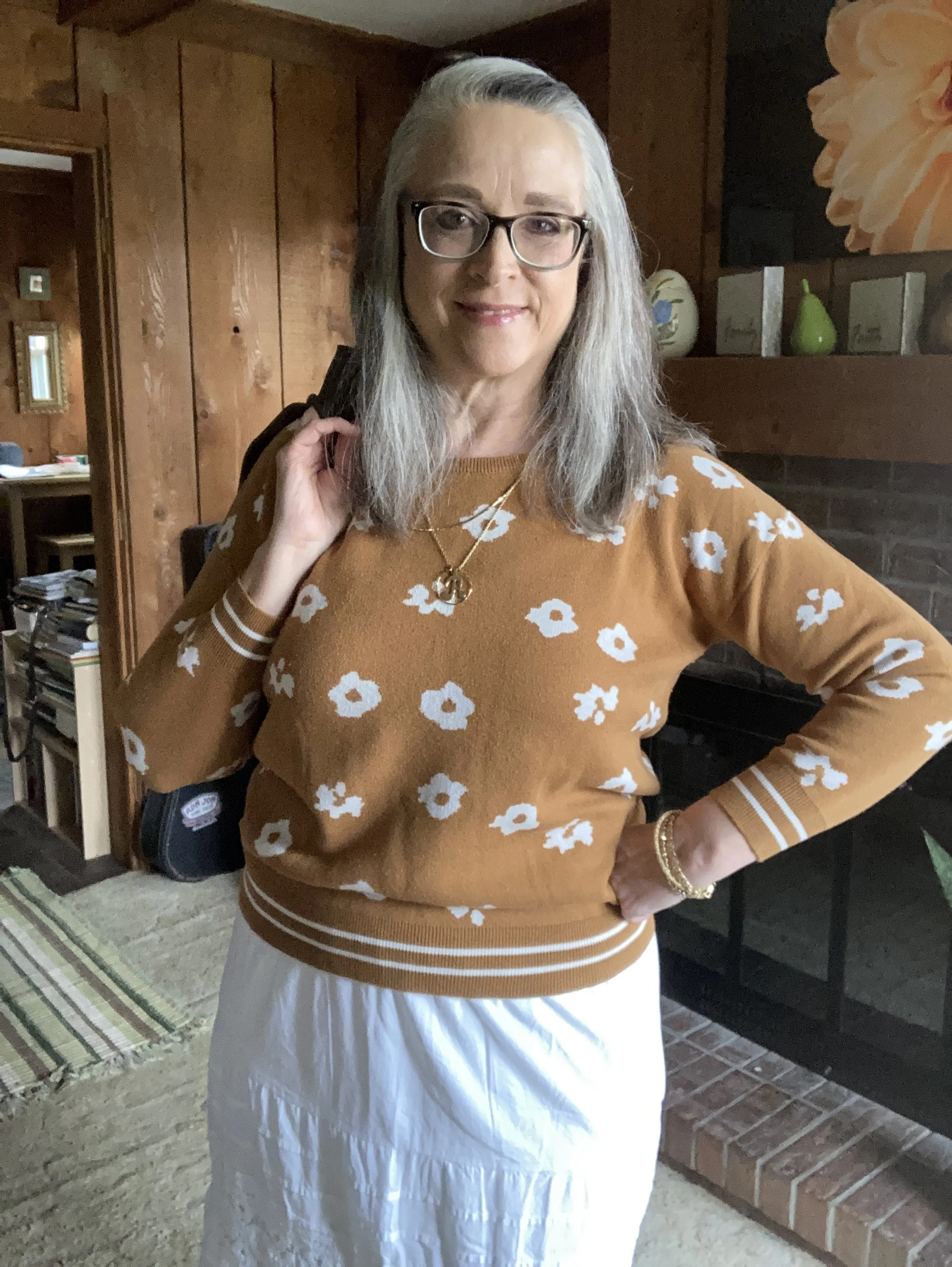
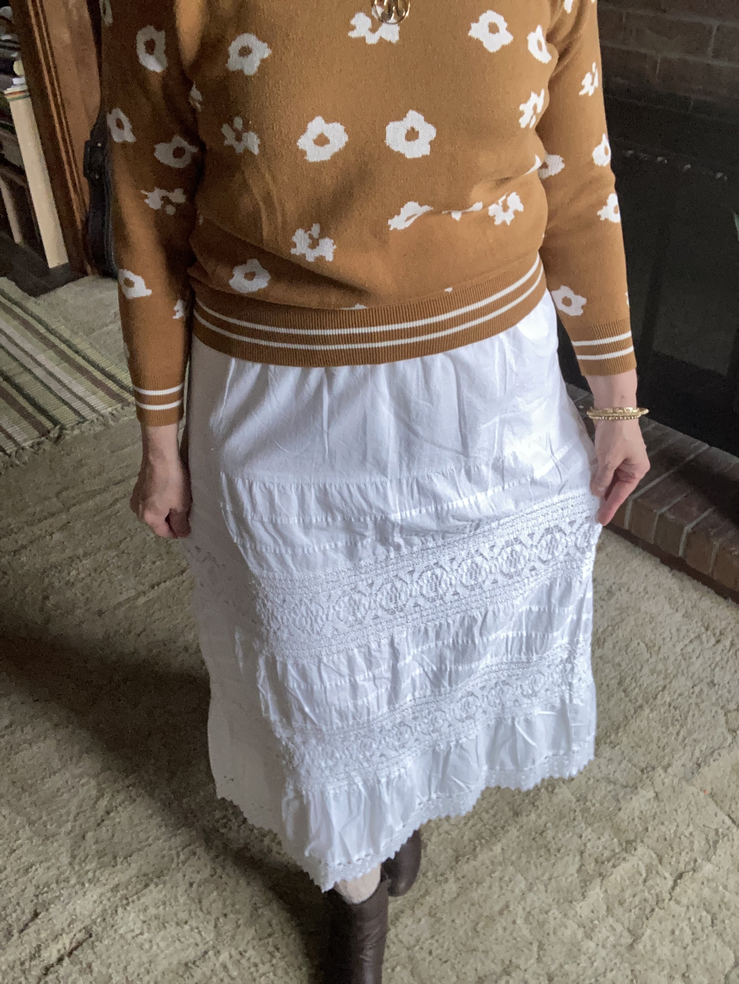
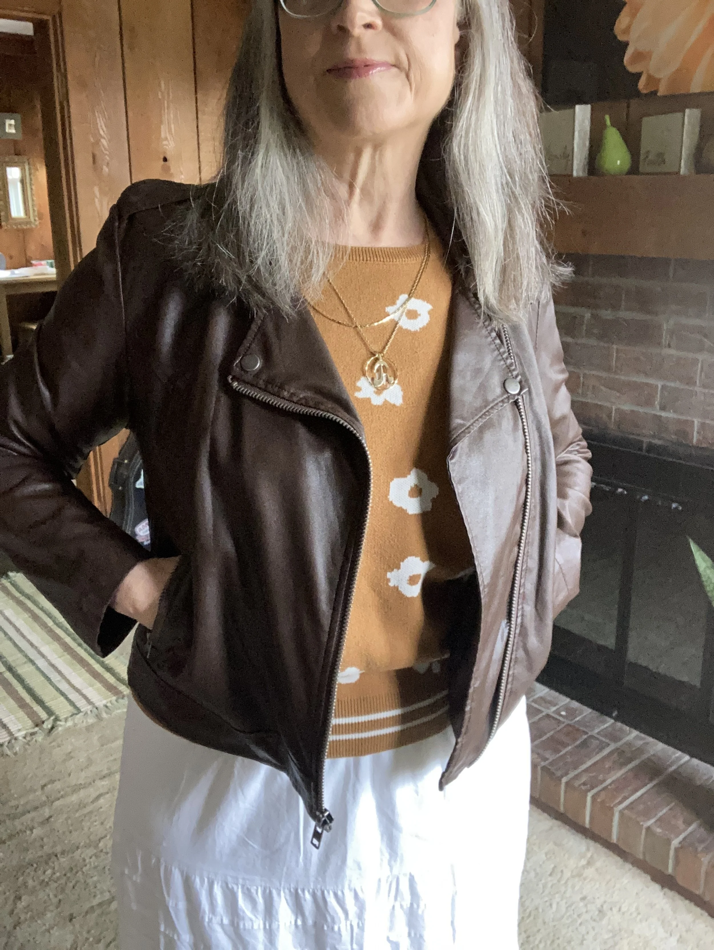
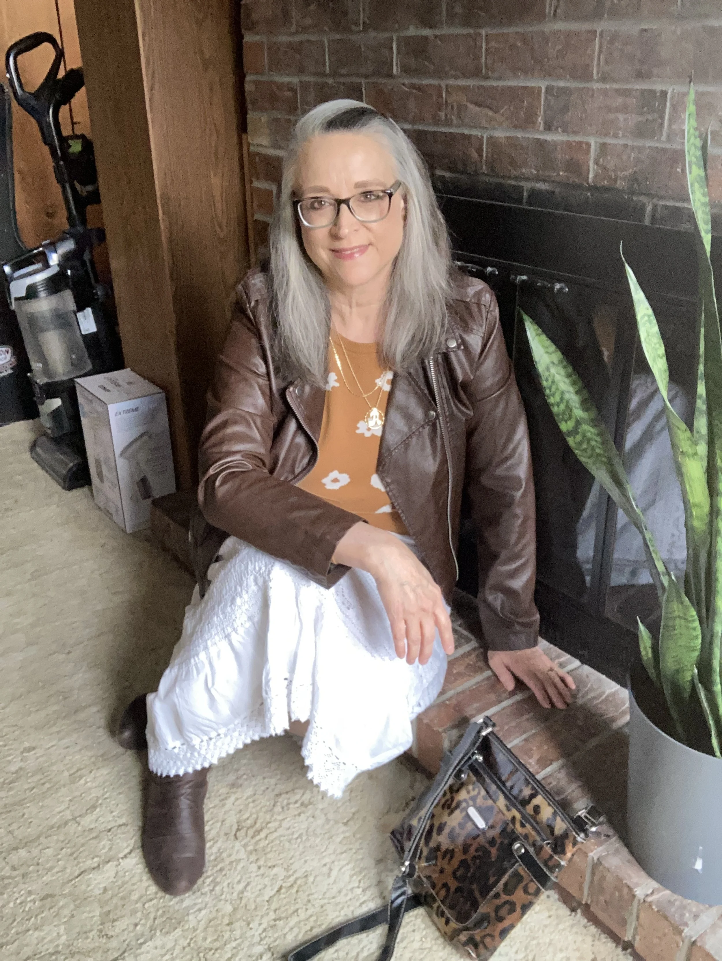
This outfit is my attempt to do Cottage Core (for the soft) with an edge (for the hard). There are two things in this outfit that fall into the Cottage Core aesthetic: the white tiered, lacy skirt, and the floral print on the sweater.

My floral pullover was a clearance find a few years ago from Maurice’s. It is a good piece for spring, as it is not the heavy weight of many of my pullover sweaters. Unfortunately, the weather has been cold and rainy, so my warm weather clothes are on hold.

I have had this skirt for a while. It is St. John’s Bay from JCPenney. I have styled it on the blog before. You can see it styled with a green blouse and jacket, with a pink striped pullover, and with a striped tee and navy eyelet jacket.

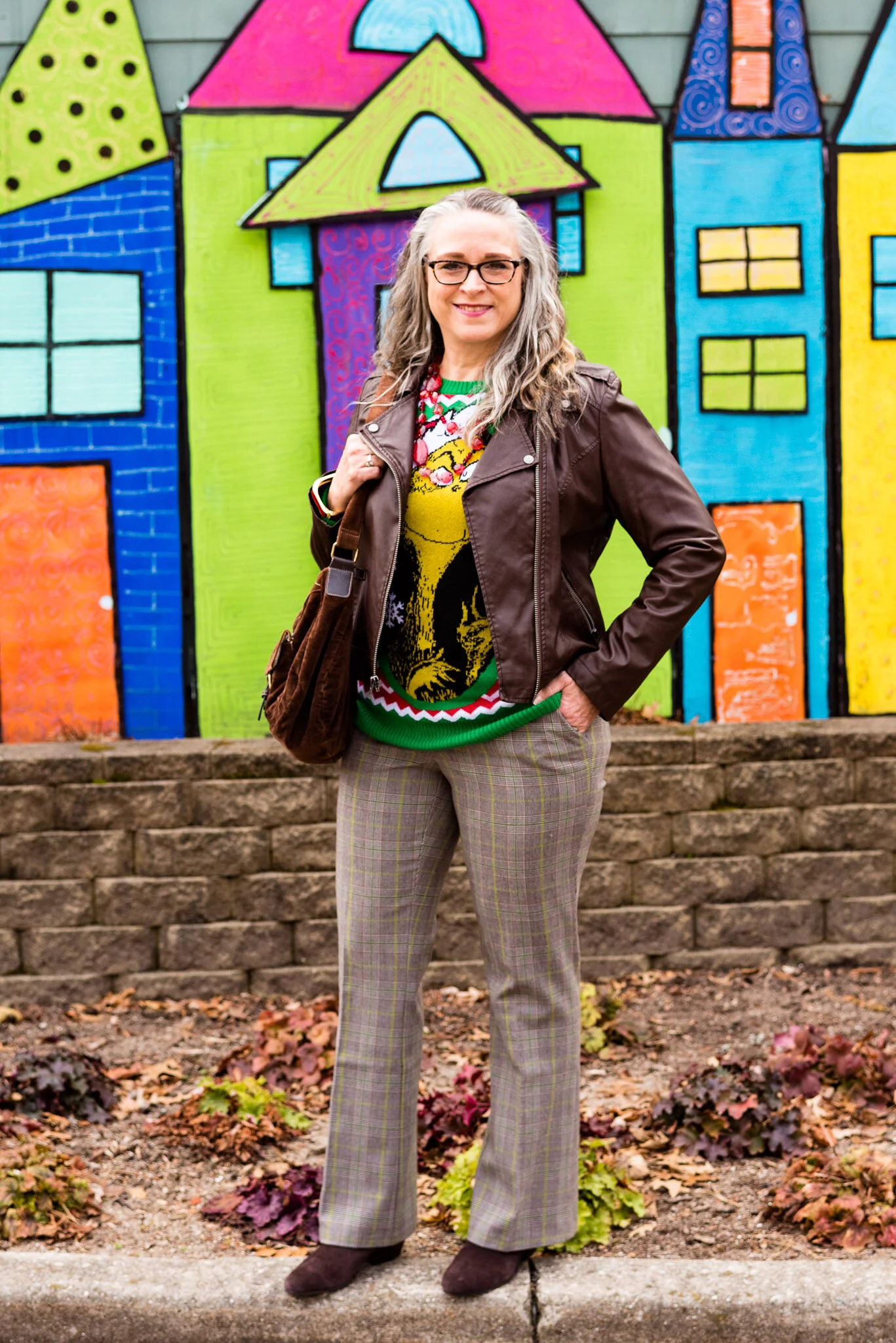
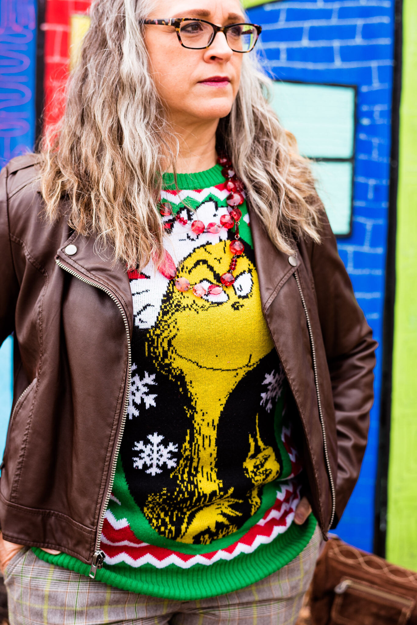
My brown moto jacket has been around for a while too. A thrifted piece it is Celebrity Pink brand and you can see how I styled it with an orange medallion skirt, a Grinch sweater, olive utility pants, a printed maxi dress, and a peachy monochrome look.

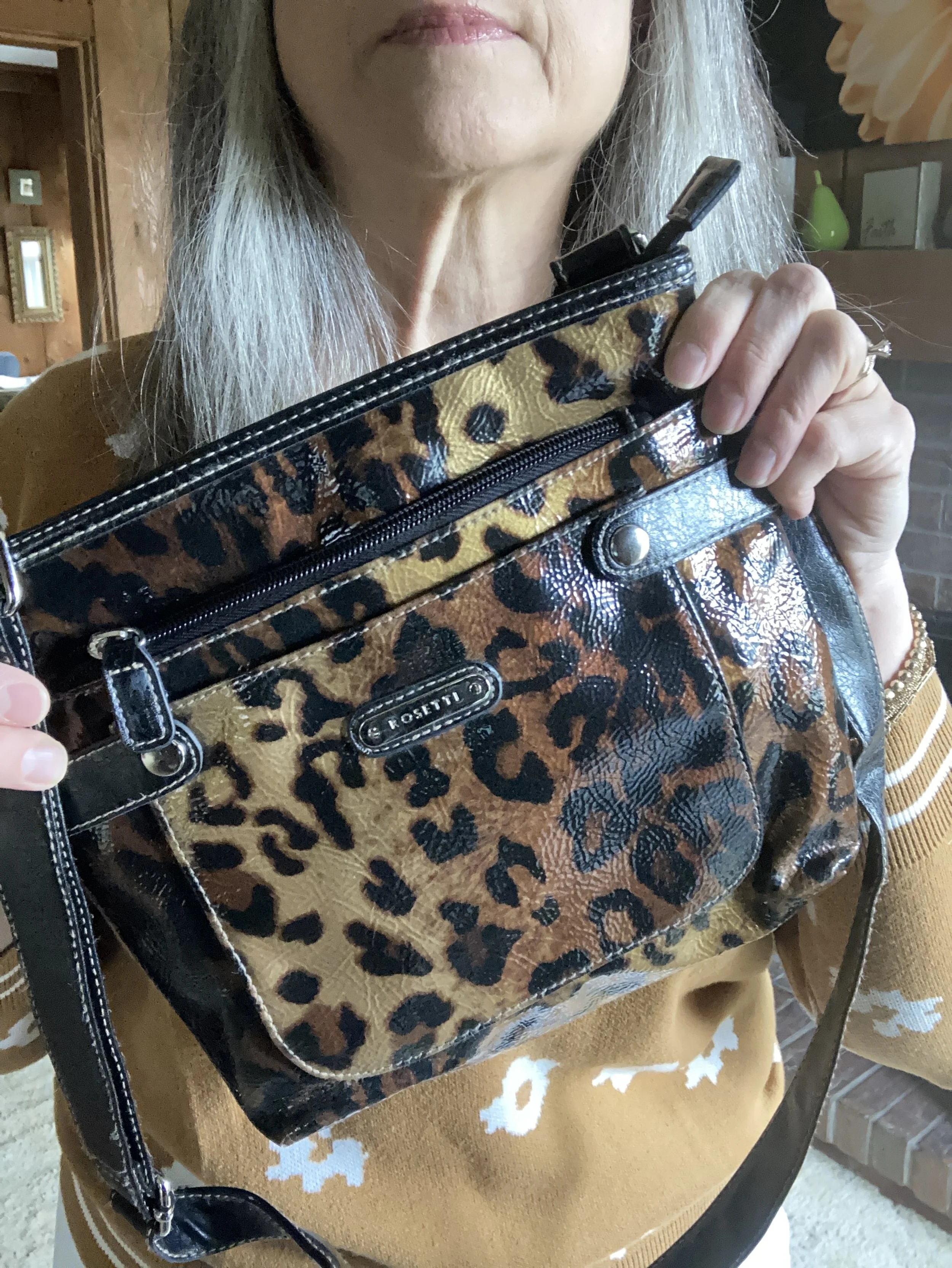
I added a bit of gold bling in the form of my layered necklaces and multiple bracelets. I addition I thought it would be fun to add another print, so I reached for my thrifted leopard print bag.

I chose a pair of hand-me-over ankle boots from my daughter to finish the outfit.

What do you think of this outfit? Are you familiar with Cottage Core fashion? Do you have tiered skirts, and florals in your closet? What about this style do you like or dislike?

I hope you enjoyed this post. I am including a few shopping links for Cottage Core types of pieces. These are affiliate links which means if you purchase something through the link, I get a little bit of a commission. These are brought to you at no additional cost. All opinions are my own.

Buy Me a Coffee.

Color Play - The Grinch - Green, Red and Brown

When it comes to Christmas we are inundated with red, green, silver and gold, but today people are using blues, teals, purples and pinks to decorate their homes and wrap their presents. Check out Liz from With Wonder and Whimsy. I adore her whimsical style and her love for all things pastel. She does such an amazing job decorating for all occasions and Christmas in her home is simply beautiful. See her Holiday Home Tour by clicking on the link.

I love the red and green color combo for Christmas, but it really doesn’t work for many people in a fashion sense. I wanted to show how you could put together a fun, festive red and green outfit that could be easily worn for work and give a nod to our friend, The Grinch.

Color Play - the Grinch - Green, Red and Brown

What could possibly be more fun, than styling my very “Grinchy” work outfit in front of something that looks like it was taken right out of Whoville? This colorful 3D mural is another of the fascinating places at the Toledo Botanical Gardens. This little scene is just outside the Unruly Arts Studio, which is a studio that focuses on providing a creative space for artists with developmental disabilities. Check out their site at UnrulyArts.org , their Instagram page @unrulyartsstudio or their Facebook page.

Color Play - the Grinch - Green, Red and Brown

I have always loved The Grinch by Dr. Suess and my favorite holiday movie version is the animated one narrated by Boris Karloff. I think part of my affection for that version was that I was a fan of Karloff and his horror movies like Frankenstein and The Mummy. However, the movie that came out in 2018, where Benedict Cumberbatch plays our grumbling, green friend, is now my second fave. I actually was reluctant for a long time to watch the Jim Carey version, since I am not a big fan, but I finally did watch it and I was pleasantly surprised. I will say that Jim’s version which was directed by Ron Howard is much more geared toward adult humor, so not as appropriate for younger kids.

I got this Grinch sweater last year when I was working at Kohl’s for the holiday season. I knew I wanted a more typical ugly Christmas sweater and I thought this one was more gaudy with its candy cane stripes and the Grinch’s face plastered across the front, but I still thought it was cute.

My plaid trousers are a thrift store find and are Mossimo brand. I do love plaid in all its forms and while these slacks would feel a little better if I were a few pounds lighter, they still fit. I love that they have the green stripes throughout, and that they have a bootcut silhouette.

Color Play - The Grinch - Green, Red and Brown

My brown, faux leather moto jacket was a thrifted piece from a few years ago and I have styled it on the blog a few different times. You can see it with a maxi dress, a maxi skirt and a pair of plaid crop pants. The name of the brand is Celebrity Pink.

Color Play - The Grinch - Green, Red and Brown

You can see in the above picture I also added a little bit of red jewelry in my wrap around red beads. When these are not doubled they are more of an opera length string. I also threw on a red bracelet.

Color Play - The Grinch - Green, Red and Brown

I decided to use brown for the bag and boots to add to the more grounded vibe. You’ve seen this thrifted brown, corduroy, hobo bag on the blog before. The ankle boots are a Nine West purchase from Kohl’s.

Color Play - The Grinch - Green, Red and Brown

What do you think of this outfit? Do you like How the Grinch Stole Christmas? Which movie version is your favorite? I’d love to hear your thoughts in the comments.

Color Play - The Grinch - Red, Green and Brown

I hope you enjoyed this post. Be sure to check back next week for the final two outfits in my Christmas series. I’ve included a few shopping links for you to check out. These are affiliate links. All opinions are my own.

Photo credit, Rebecca Trumbull.


Pantone Spring 2018 - Pink Lavender, Blooming Dahlia and Emperador

Welcome to the third installment in my Pantone Spring 2018 series. The first week I showed you Chili Oil, Arcadia and Lime Punch.  Last week I featured Ultra Violet, Cherry Tomato and Meadowlark.  This week I am going to style an outfit that revolves around Pink Lavender, Blooming Dahlia and Emperador. 

I wish these photos were a little more spring like; more like the weather today, when I am working on this post which is brilliant sunshine and temps in the 50's, However, working with my photographer means scheduling shoots when she is available, so we make the best of it. In this pic, it almost looks like I am at a studio with a winter background, but I can tell you we were definitely outside and it was cold!!

Pink lavender is a very pretty purply pink. I happened to have this short sleeve Croft and Barrow faux lace tee in my closet and it matched perfectly. My husband also picked up this necklace at a garage sale and thought I would like it. I did! I've told him, any time he sees costume jewelry at estate sales or garage sales to take a peek and pick up things he thinks I might like. I'm pretty easy to please when it comes to jewelry! 

Emperador is a chocolate brown. I often wonder at how they come up with the names for the colors on each season's palette. Some are obvious. Pink Lavender looks like pink and lavender mixed together, but Emperador? I googled the word and a brandy company came up. Brandy is more of an amber color, so I am not sure if that is what they were thinking when they gave this brown it's name. I'm not an alcohol drinker, at all, but if you are interested here is a link to Emperador

My moto jacket is thrifted and is a brand called Celebrity Pink. This brand is sold at stores like Macy's and Burlington Coat Factory. Here is a similar jacket. Mine is a nice faux leather with a silver zipper and snaps. I should have taken a picture with the jacket zipped up. 

This skirt from dressbarn I have featured on the blog last summer in my Marvelous Maxis series. It is roz & Ali brand. The skirt with its fun, whimsical, floral pattern is fully lined and the perfect transition piece for spring. I thought it gave the illusion of Blooming Dahlia, even though it isn't an exact representation. Plus I felt the outfit benefited from a pattern. 

I added a stretchy woven belt to the skirt and chose to carry my George satchel for a bit of that classic color, Warm Sand. I also slipped on my suede American Eagle ankle boots. 

What do you think of these colors? Do you have any of these in your closet? I think all three of these can be great to combine with stronger classic colors like navy, green or black. If you are not real fond of a particular color because you don't think it looks good on you, don't be afraid to try a smattering of the color in the form of an accessory such as a necklace, bracelet or even a bag. That is a wonderful way to add color without letting it overwhelm you. 

Let me know your thoughts on these colors and my outfit. I love hearing from you! 

Here are a few shopping links for you. These are affiliate links which means if you click on a link I get a few pennies. If you purchase through one of my links I get a little commission. I appreciate your clicks! All opinions are my own. 

Photo credit Rebecca Trumbull. Make up Rachel Christensen

Thursday linking up with Nicole of High Latitude Style. Friday linking up with Nancy of Nancy's Fashion Style. 


Pantone Fall 2107 - The London Palette - Toast and Copper Tan

Out of all of the London Palette colors, I felt these two were the hardest to find. They are also hard colors for many people to wear. Toast and Copper Tan are not truly tan, but also not truly orange or brown. As this is not a color I saw in the stores, I did some thrifting and found that even there these are not popular colors. In the end, I shopped my closet and this is what I came up with. You have seen all of these pieces before.

With this pairing, I am going for a more monochrome look.

This asymmetrical hem top I have styled before here. I love the detailing on this tee. The bottom is trimmed with lace and there are two side triangular insets that add texture and interest to the top. 

While the pants I am wearing are not truly the Copper Tan color, I felt, due to the yellowy orange stripes in the pants that it makes them seem more of a coppery hue. I styled these Sonoma ankle pants before in my summer InVestments series. 

In keeping with the neutral monochrome vibe, I decided to go with faux pearl jewelry that stood out due to its iridescent quality.

i felt the addition of the chocolate brown moto jacket kept the outfit from being too soft. The jacket adds an edgy vibe and epitomizes my style personality. Of course if I am going for that look, I had to add my favorite taupe SO brand ankle boots as well. 

Due to the fact that I love color, I felt it necessary to add at least one piece that made the outfit pop. The bright blue bag reminds me of the blue skies so prevalent on many midwest fall days. This bag that was thrifted is Nine & Co. brand. 

What do you think of these two colors? Do they seem like fall colors to you, or do you feel they are more reminiscent of a pale sunset on a summer evening? I hope you enjoy following along as I look at the Pantone color palettes for each season. 

Below are a few tops I found that are a similar color. This post contains affiliate links. If you click on a link I get a few cents. All opinions expressed are my own. Thank you for all your support. 

Thursday I am planning a series on this year's fall trends. For the month of September we'll take a closer look at what some of this year's fun fall trends look like from my closet! Stay tuned!