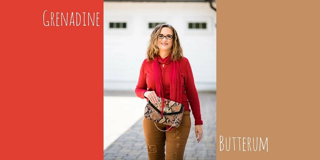
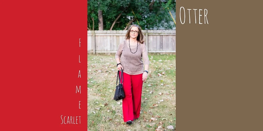
Pantone Fall 2017 - The New York Palette - Autumn Maple and Shaded Spruce

Believe it or not, this is the final installment in my Pantone Fall 2017 Series. Next week I'll do a recap of all the colors on both the London and New York palettes. After that I'll be starting a new series on camouflaging those problem areas, so keep coming back!

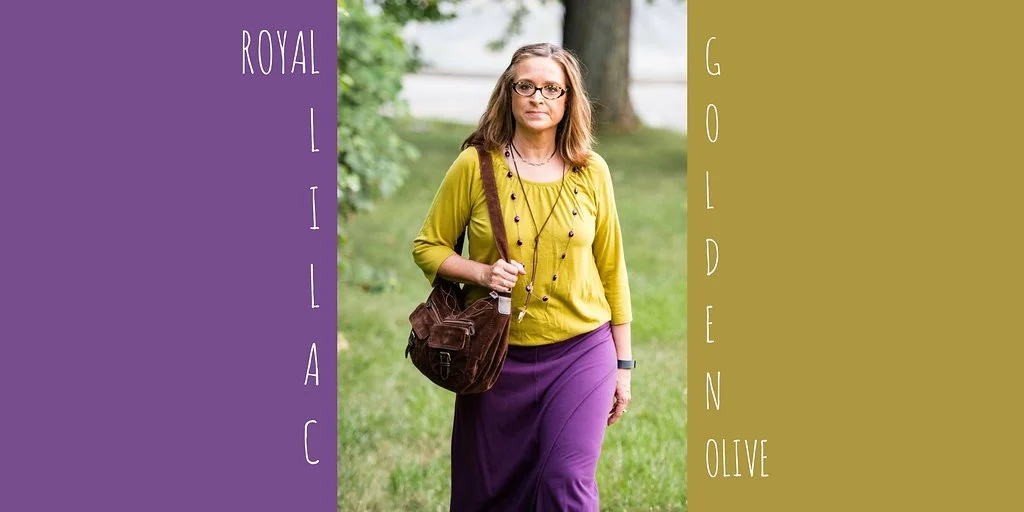
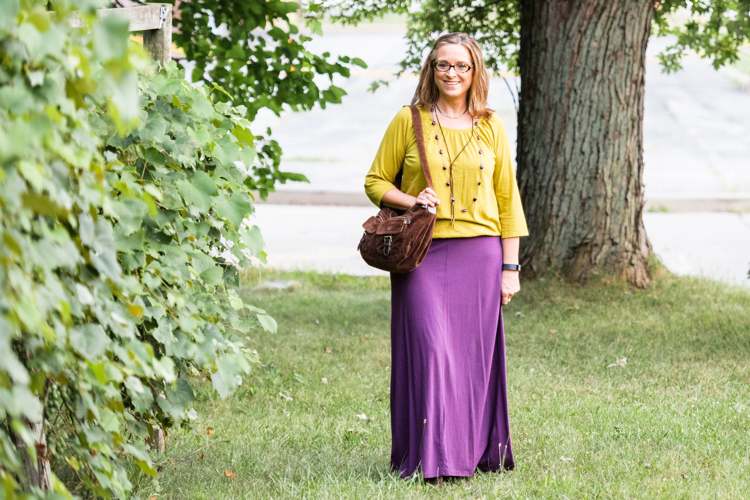
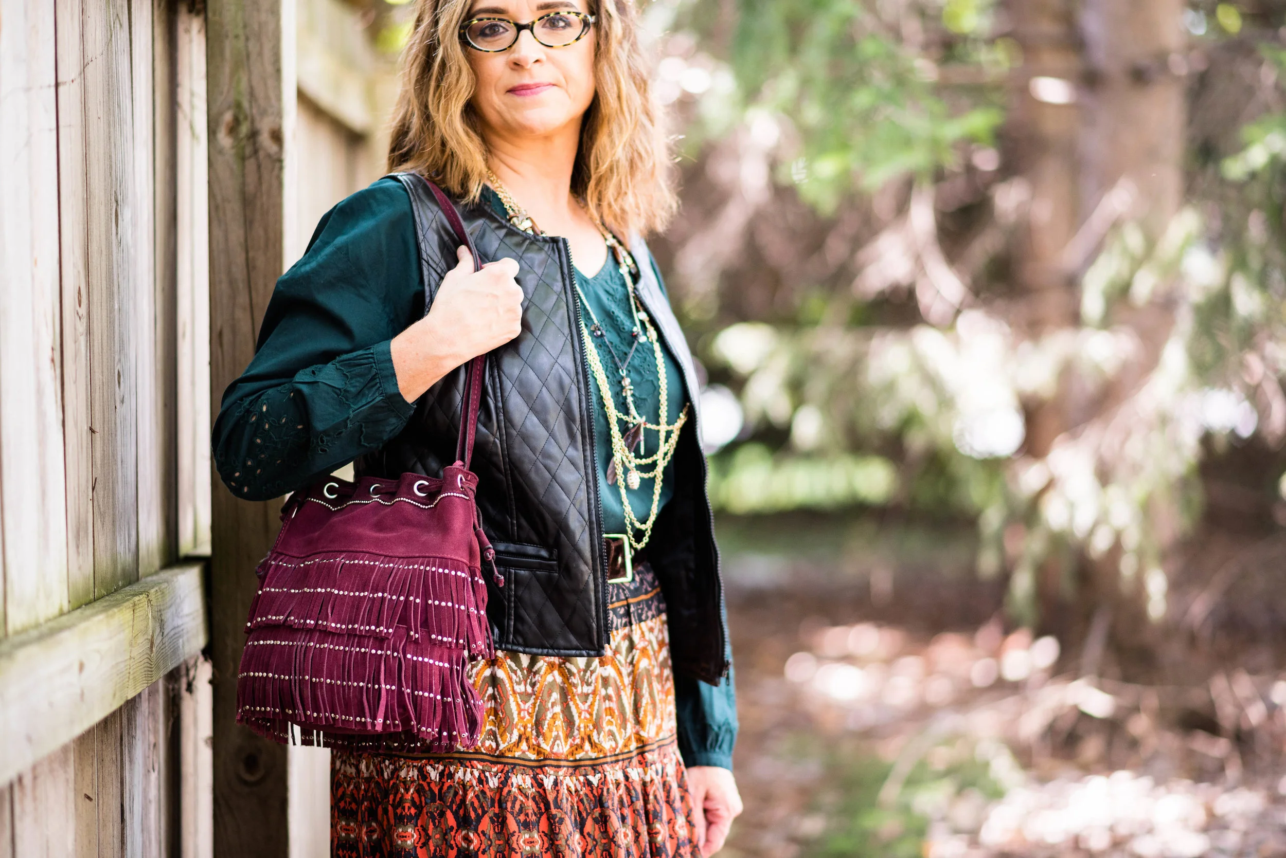
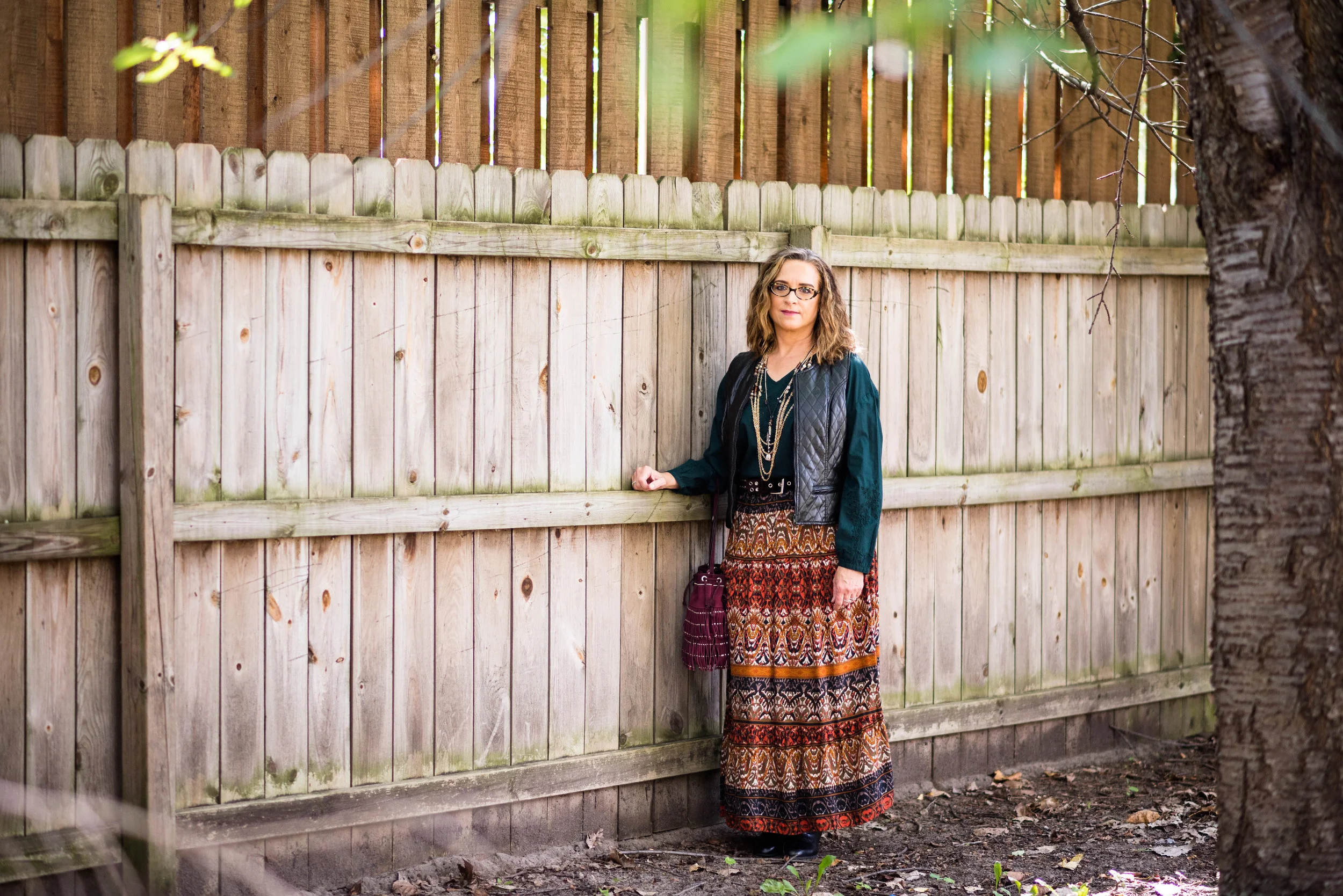
Originally I was going to pair the rusty orange called Autumn Maple with one of the blues, but after mulling it over,  thought what could be a better fall combination. mimicking nature, than orange and green; the very colors we see combined on the trees as they go through their metamorphosis. One of my favorite fall scenes is to see the dark green of pine surrounded by the bright oranges and reds of the changing leaf landscape. It is for that reason I combined Autumn Maple and Shaded Spruce in this rather bohemian outfit for today's post. 

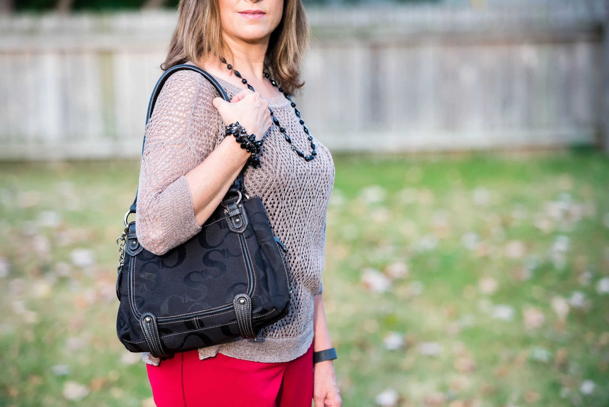
You've seen several of the pieces in this outfit before. I wore the tiered skirt here and the black vest here and here. I also used the bag in this post here. i like to show you that you don't always have to go out and buy new clothes, even though that is way more fun! You can shop you closet and find new ways to reinvent a piece you already have. 

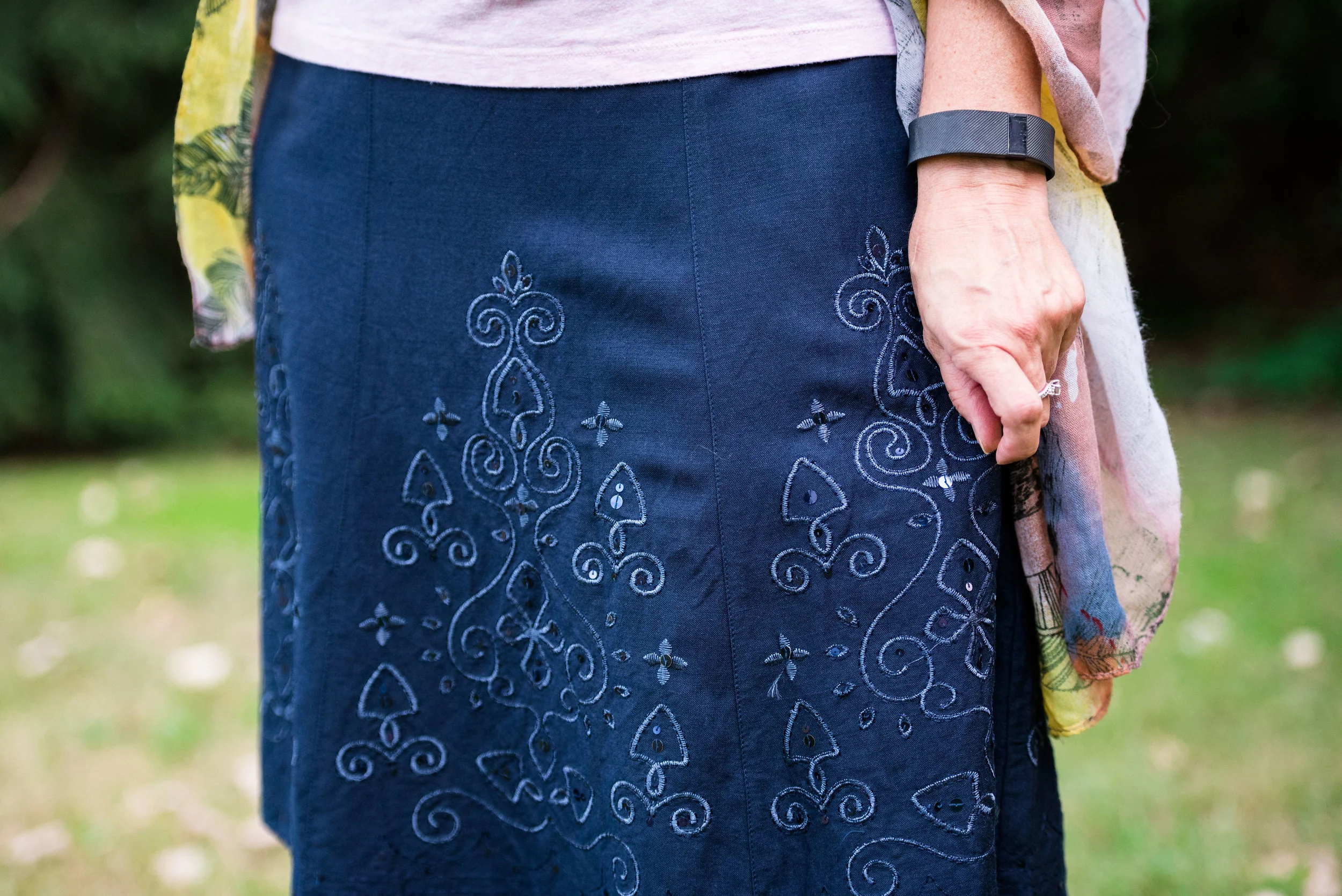
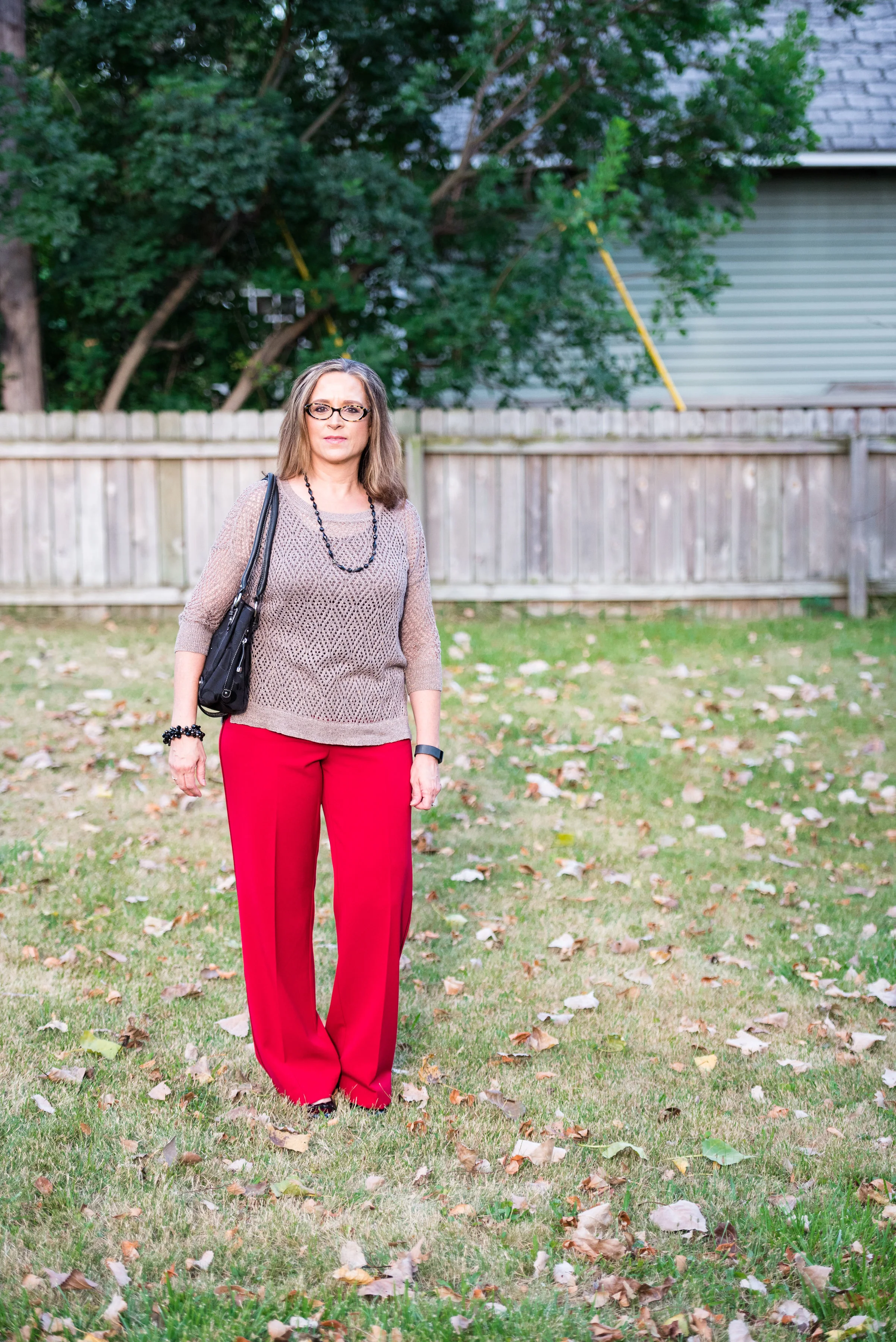
Though this skirt is not a solid color, orange is really what you see when you look at it. I thought it was the perfect companion piece for my Shaded Spruce Sonoma popover top. 

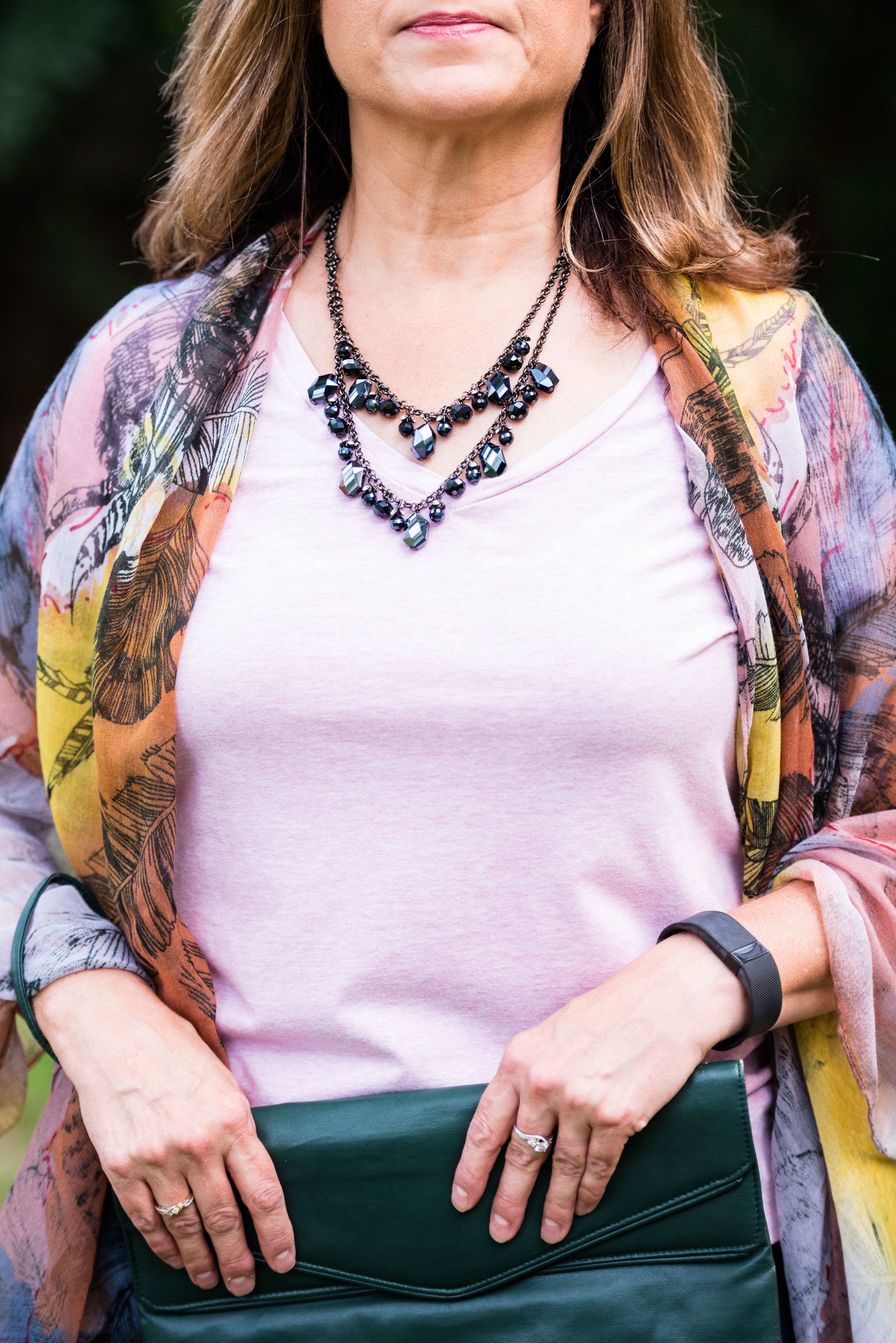
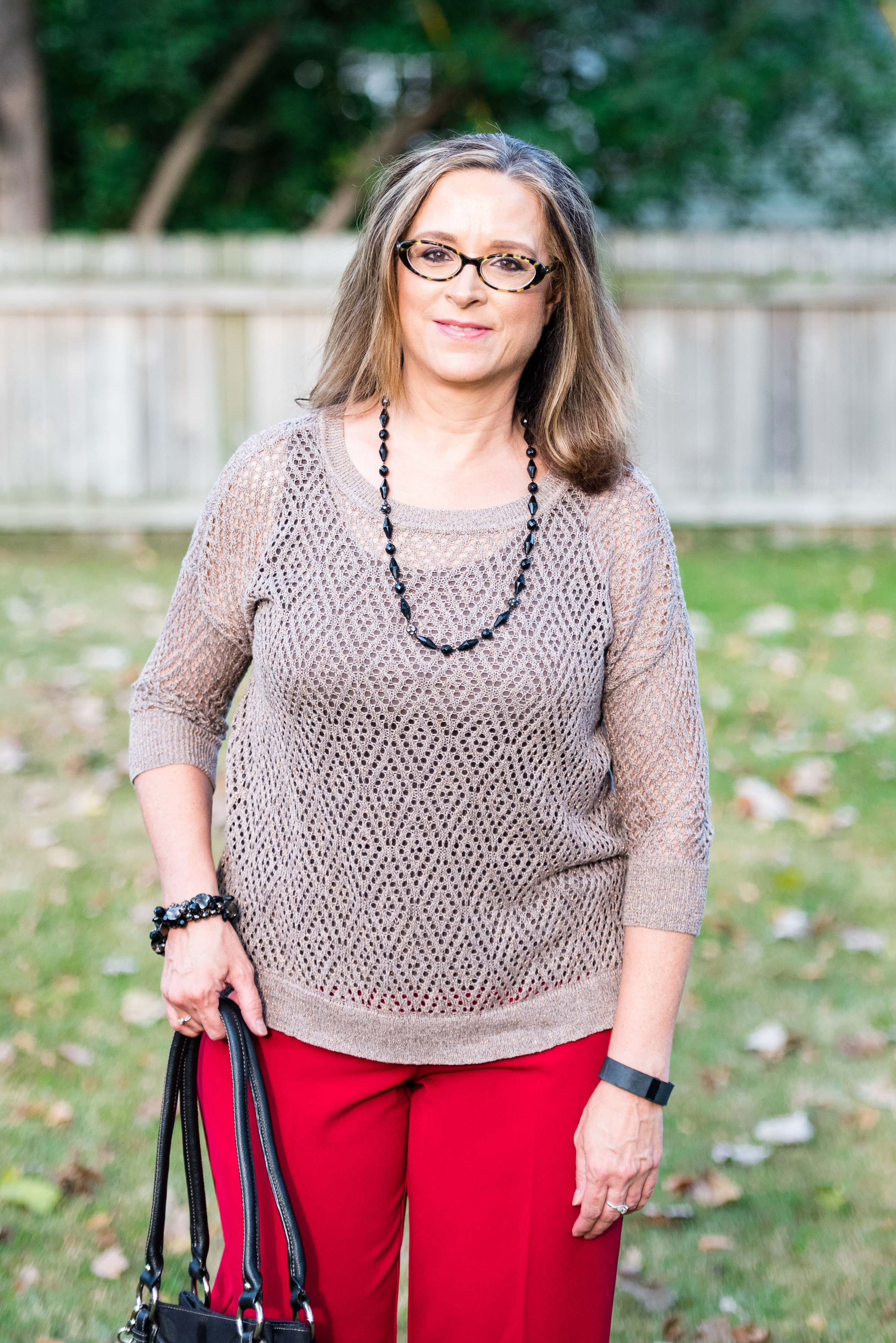
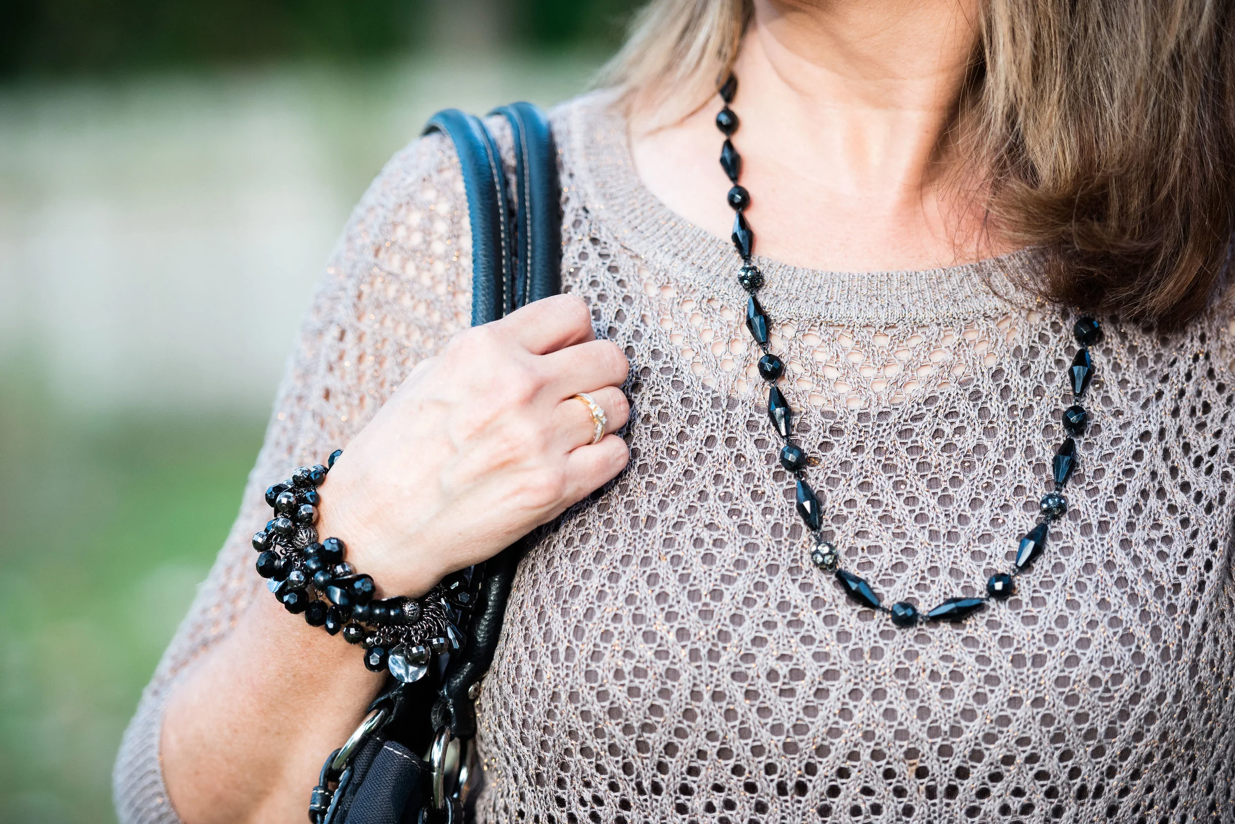
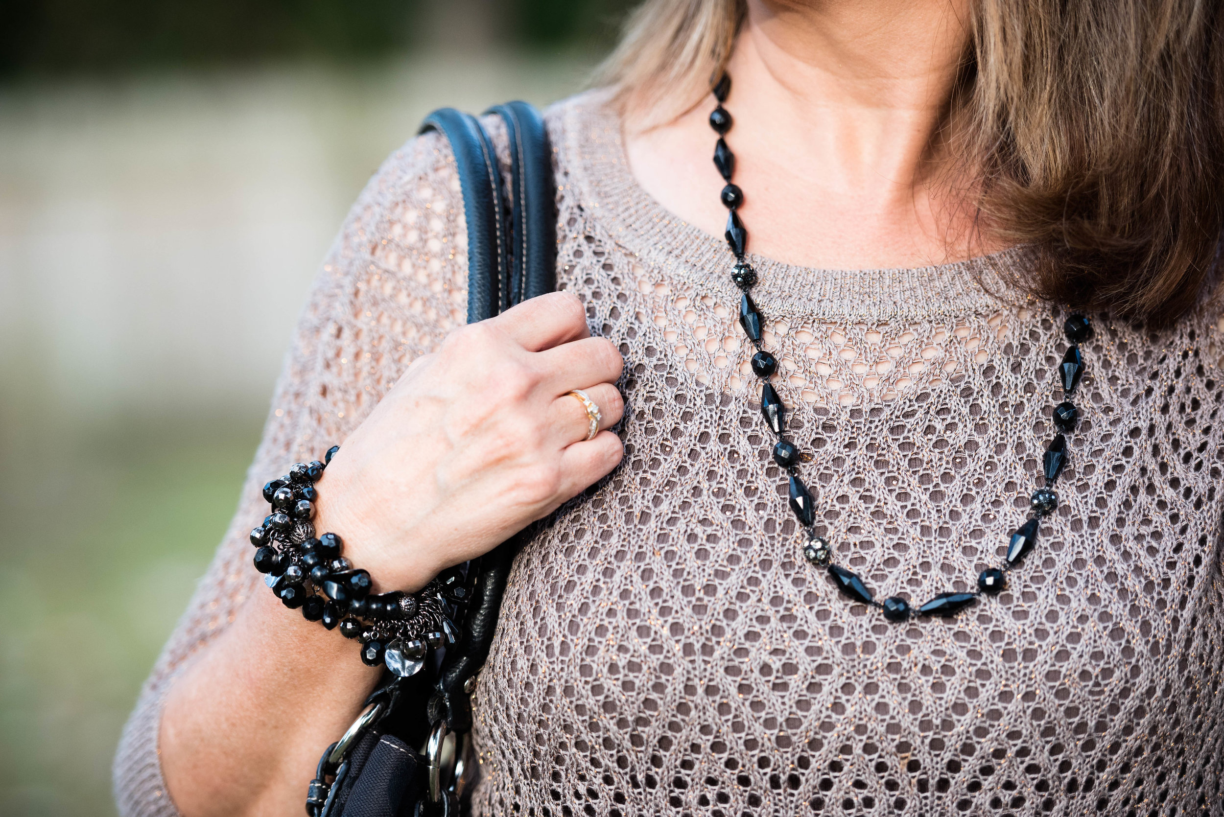
Here you can see some of the pretty perforated detailing on the top. I added a brown belt and lots of necklaces. The belt is velvet. I like a belt with this type of outfit as I feel it adds a touch of class to a more casual look. I tried my hand at the multiple necklace look. Did I pull it off, or do you think it looks to chaotic? I have mixed feelings. I also grabbed my berry fringe drawstring bag. I like this additional pop of color. What do you think?

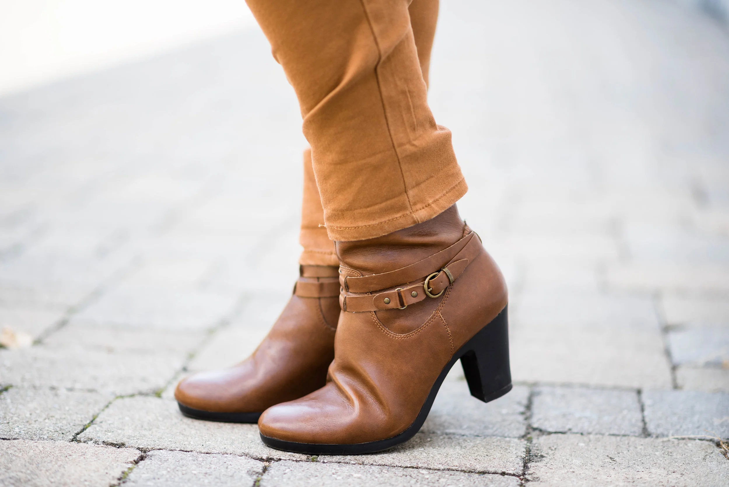
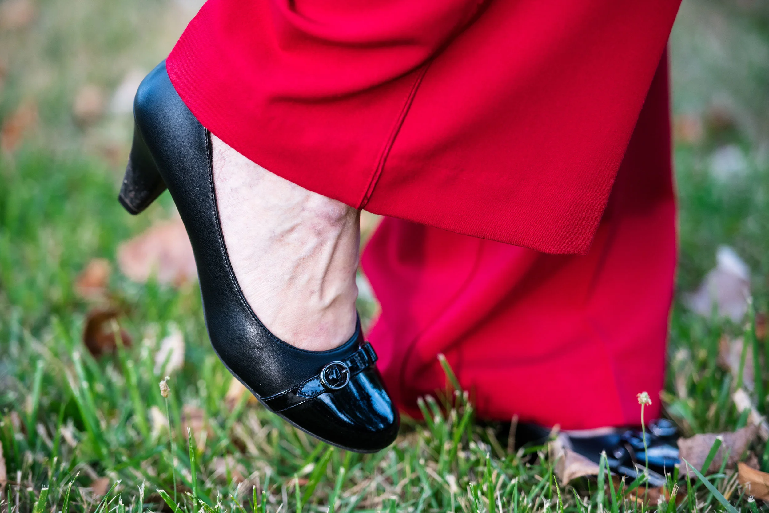
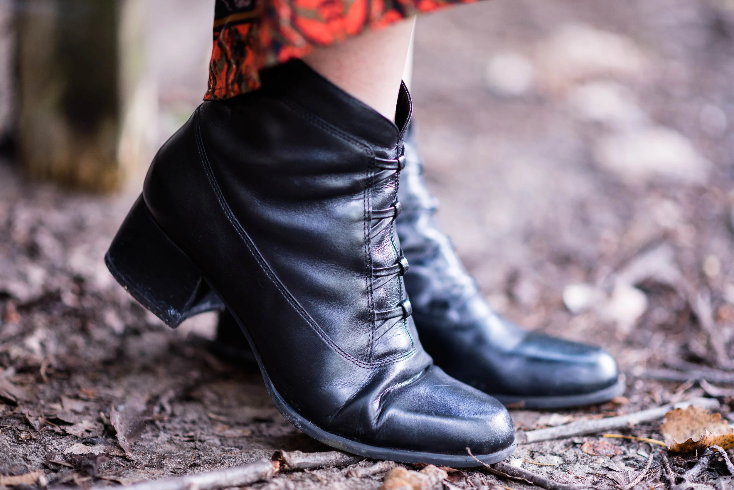
I topped the whole outfit with the quilted black vest, and my black ankle boots. I think this pulled the outfit together and broke up the differing color scheme. 

I hope you enjoyed this series on the Pantone Fall 2017 colors. Next week, I'll have a recap of all the outfits from this series. 

Check back Thursday for another Fun Fall Look.

Below are a few shopping links in case you are looking for Shaded Spruce or Autumn Maple. This post contains affiliate links. All opinions are my own. 

Pantone Fall 2017 - The New York Palette - Marina and Navy Peony

I wan't sure about pairing the two blues together that appear on the New York palette, but after mulling it over, I decided to give it a try. Navy Peony is the only color that appeared on both the Pantone London palette and the New York palette this fall. While many of the other colors came close to being similar such as Grenadine and Scarlet Flame or Butterum, Toast and Copper Tan, Navy Peony seemed to be embraced all over. I have heard it said that navy is the new black and is a go to for styling an outfit that is classic and slimming. 

Marina is a lighter blue and reminded me of the beautiful fall sky on a sunny day. Going along with that idea, I decided to add white pants, keeping the outfit light and bright, but still filled with warm layers for a perfect fall transitional outfit. 

For my Navy Peony piece I chose an Isaac Mizrahi denim dress that I found at a thrift store. This dress was made for Target, but Mizrahi no longer has an affiliation with Target. I thought the dress, which comes with an attached belt would make a great jumper or, as in this case, the perfect cool weather longer length vest. It has a row of white buttons up the front and two roomy pockets at the sides. For this outfit I left it unbelted and open. Here is a navy longer length utility vest that would work. 

The Marina button up top is a thrifted Dana Buchman brand from Kohl's. I was looking for a few blouses that I could wear out or tucked in, but that didn't have a lot of bulk to them. This is a silky poly blend and layers well under the heavier vest. 

The pants I have styled before on the blog and are Gloria Vanderbilt boot cut jeans. I'll list a few other shopping links at the end for similar options.

We took these pictures at a local Toledo Metropark named Wildwood. We are very fortunate to have numerous beautiful parks throughout the Toledo area boasting great walking trails and historicbuildings such as this old school house which is still used for various events. 

To keep my outfit still connected to the changing colors of fall, I decided to add a few cognac or Butterum accessories. 

The boots are thrifted Aerosoles and the bag is thrifted New Directions. Here are a cute pair of similar colored boots from DSW. Here is a cute bag from Nordstrom Rack. This color is perfect for fall, not to too dark and not too light. It gives any outfit a warm, toasty feel. 

i also went for the browns in my simple bead necklace and hinged bead bracelet. 

What do you think of this color combination? Do you have many navy pieces in your closet? Be sure to take them out and start wearing them and you'll be right in style. I'd love to hear from you either in the comments section below or leave me a message on Facebook. You can also follow me on Instagram and Pinterest. I appreciate all your support.

This post contains affiliate links. All opinions are my own.

Join me Thursday where I will be feature another Fun Fall Look. See you then.

Photo credit Rebecca Trumbull. Make up Rachel Christensen.

Pantone Fall 2107 - The London Palette - Royal Lilac and Golden Olive

This is the final installment in the London series of colors from the Pantone Fall 2017 palette. I love the brightness of these two colors, especially together. For some reason they make me think of fall and of a Bohemian gypsy vibe. Maybe it is a flash back from the bright psychedelic colors of the late 60's and early 70's. Royal Lilac is a purple worthy of a king. Purple is one of my favorite colors and we rarely see it on the runways and magazines of the fashion world. Purples in those realms seem to tend more towards wines, burgundies or maroons.

Once again, let me say that when I look for these colors I try to get as close as possible to the color that is being portrayed in the Pantone palette. My colors do not always match exactly, but the point is to introduce you to the colors on the palette and show you ways to style those colors. Just like Toast and Copper Tan, Golden Olive was a difficult color to find. I had this top in my closet and the actual color seems a bit more green than what appears in the pictures, but not quite like the Golden Olive.

Out of all the color pairings that I did from the London palette, I like this one the best. There is something about the contrast between the purple and the mustardy yellow, that appeals to my inner gypsy. In keeping with that idea, I thought I would accessorize with a brown hobo bag and brown slouchy boots. 

For my jewelry I added a brown lariat choker and a long metal and bead necklace that tied into the purple skirt

One of the other things I like about this outfit is the comfort. The material of the top and the skirt is basically heavy weight tee shirt material, so it moves with me and there is no binding or pinching. This is also a great transitional outfit as the weather cools. The 3/4 length sleeves on the shirt, the maxi length skirt and the boots all provide full coverage for those chilly days ahead. 

What do you think of these two colors? Do you like them? Would you wear them? I hope you will leave me a comment in the comments section below. I appreciate when you do and it helps my blog grow.

This post contains affiliate links. If you click on a shopping link below, I get a few cents. Every lttle bit helps, so thank you for the clicks. Part of why I include the links is to show you real items that are currently available in the colors I post, or at least close. All opinions expressed are my own.

Photo credit Rebecca Trumbull. Make up Rachel Christensen.

Thanks for hanging out on the blog today. Check back on Thursday for another Fall 2017 trend.

Pantone Fall 2107 - The London Palette - Toast and Copper Tan

Out of all of the London Palette colors, I felt these two were the hardest to find. They are also hard colors for many people to wear. Toast and Copper Tan are not truly tan, but also not truly orange or brown. As this is not a color I saw in the stores, I did some thrifting and found that even there these are not popular colors. In the end, I shopped my closet and this is what I came up with. You have seen all of these pieces before.

With this pairing, I am going for a more monochrome look.

This asymmetrical hem top I have styled before here. I love the detailing on this tee. The bottom is trimmed with lace and there are two side triangular insets that add texture and interest to the top. 

While the pants I am wearing are not truly the Copper Tan color, I felt, due to the yellowy orange stripes in the pants that it makes them seem more of a coppery hue. I styled these Sonoma ankle pants before in my summer InVestments series. 

In keeping with the neutral monochrome vibe, I decided to go with faux pearl jewelry that stood out due to its iridescent quality.

i felt the addition of the chocolate brown moto jacket kept the outfit from being too soft. The jacket adds an edgy vibe and epitomizes my style personality. Of course if I am going for that look, I had to add my favorite taupe SO brand ankle boots as well. 

Due to the fact that I love color, I felt it necessary to add at least one piece that made the outfit pop. The bright blue bag reminds me of the blue skies so prevalent on many midwest fall days. This bag that was thrifted is Nine & Co. brand. 

What do you think of these two colors? Do they seem like fall colors to you, or do you feel they are more reminiscent of a pale sunset on a summer evening? I hope you enjoy following along as I look at the Pantone color palettes for each season. 

Below are a few tops I found that are a similar color. This post contains affiliate links. If you click on a link I get a few cents. All opinions expressed are my own. Thank you for all your support. 

Thursday I am planning a series on this year's fall trends. For the month of September we'll take a closer look at what some of this year's fun fall trends look like from my closet! Stay tuned!

Pantone Fall 2017 - The London Palette - Navy Peony and Primrose Pink

For this week's post I am looking at the Pantone London color palette combination of Navy Peony and Primrose Pink. The Pantone site describes Primrose Pink as a gentle shade and Navy Peony as a strong and dependable color that takes some of the burden off black for a fashion mainstay. 

Navy has long been touted as a neutral, pairing well will just about any other color, even black. Navy worn on the bottom can make us look long and lean, while navy worn on the top can hide a world of flaws. One of my favorite clothing pieces is my Ralph Lauren navy blazer. You can read my post on that here

For today's outfit I shopped my closet and came up with this navy skirt that seems to show off the Navy Peony color perfectly. This embellished skirt I got a while back from dressbarn. It is an a-line shape and falls just at the knee. 

For the top I am wearing a Liz Claiborne tee that I got at a thrift store. Primrose pink is a light pastel pink. It is a little unusual to see a color this light on the fall Pantone palette, but I think this soft pink can be a great color to help us transition from summer to fall. 

I thought the outfit looked a little bland with just the navy and pink, so I added a scarf with a variety of colors including blue and pink, to pull the outfit together and add interest. I styled this wide oblong scarf as a shawl. 

Here is a photo of what the scarf looks like open.

Because the scarf had just a touch of green in it I decided to carry my green clutch. Green is another color that will show up later when I do the New York colors. Be sure to check back for that. 

I chose navy for my shoes, and jewelry and I also wore navy hose. 

What do you think of these two colors? Do you have some of these larger scarves that you like to wear as a shawl?

I hope you enjoyed this look at two more of the Pantone Fall 2017 London color palette. Check back next week for two more colors. 

Be sure to check back Thursday for a look at a new retailer that I'll be featuring.

This post contains affiliate links. All opinions are my own. 

Pantone Fall 2017 - The London Palette - Flame Scarlet and Otter

This year the Pantone Color Institute decided to share two color palettes for fall. Both the London and the New York palettes have similarities, such as Navy Peony and differences. However, I feel that both palettes feature rich colors that easily transition us into fall. You might feel that these colors are not for you and when I first looked them over, I was not excited, but as I began to ruminate on them and look for pieces in my closet and at the store that would best represent each of these colors, I grew excited to see how each of these palettes would translate to real outfits that an actual woman would wear. 

To keep this series to a minimum I decided to challenge myself to come up with outfits that use two of the colors at a time. This week I am featuring a bold, rich red labeled Flame Scarlet, paired with a warm hue called Otter.

I've styled these Worthington brand trousers before on the blog. You can see that post here. This light weight open weave sweater is a great piece for transitioning to fall. Days can still be warm, but mornings and evenings can be cool. I just put a similar colored tank underneath.

I opted for black accessories and kept them to a minimum. I felt the black was a suitable contrast for this two toned outfit. A single strand beaded necklace and a beaded bracelet were my only jewelry. 

I dug this black top handle bag out of my closet, all the while wondering why I have so many purses and bags that I don't use! It is like clothes and shoes. I keep intending to come up with other ways to style all these different pieces, but life!

As you can tell by the fact that this post is a day later than I normally post, that my life is crazy busy. I have been back at work putting in about 30 hours a week, picking up my grandson from school and then trying to spend time with my spouse in the evenings, after which I simply have no energy left to work on the blog! Oh well, that's me...Hi! My name is Amy and I am an actual woman!

My shoes are a simple black pump that I've worn on the blog before. 

I like Flame Scarlett paired with Otter. What do you think? A bold color with a more subdued neutral? Or do you like to pair two bold colors? Maybe you like a more neutral palette all over. I'd love to hear your thoughts in the comments section below. You feedback is very important to me. 

Below you will find some shopping suggestions. These are just options so you know what is available in these colors. This post contains affiliate links. If you click on a shopping link I get a few cents. If you purchase something through my blog, I get a little commission. I appreciate all your clicks. 

I hope you enjoyed this look at the first two colors of the Pantone Fall 2017 London color palette. Thank you for stopping by the blog. 

Pantone Fall 2017 - An Intro to Two Color Palettes

This fall, the color institute known as Pantone published their usual ten color New York palette. However, this year they also published the ten color London palette. So what is a fashion blogger to do? Why, feature all twenty of these colors. Don't worry, I won't be featuring one color a week for the next twenty weeks. That would take me into January. Ha, ha. 

For this series on the Pantone colors, I will be combining two colors a week. There are a few colors that overlap on both the London and the New York palettes, and many of the colors while having different names are very similar hues. 

New York Palette

I decided to start the series with the London colors. The graphic above and below was put together by Rebecca, my photographer, web helper and daughter, using Pantone's color coding. The way you see the graphic will be the way I pair the colors. For example, Flame Scarlet will be paired with Otter, Primrose Pink with Navy Peony and so on.

London Palette

You might wonder what got me interested in the Pantone color palettes in the first place. I love color. I love flowers in the summer, changing leaves in the fall, orange pumpkins at Halloween, Christmas lights at Christmas and the soothing colors of nature such as a blue sky, green trees and red cardinals. With my propensity toward color it was only natural when I became interested in fashion that an interest in fashion color choices followed. 

Pantone is the fashion and design industry's go to for color choice. I am not sure what the whole process looks like, as far as how they come up with the colors for each season and how those translate to fabric versus paint or graphic design, but if you start paying attention to the Pantone colors, all of a sudden you will begin to see those colors in the new season's line of clothing, home furnishings, graphics and even architectural designs for offices. 

Here are some sneak peeks at what I have coming up, starting next week, with the Pantone Fall 2017 London color palette.

You can probably tell from looking at the graphic that this was not the easiest grouping of colors to work with. There are lots of pale colors as well as yellows which many people cannot wear. This palette was definitely a challenge, but I find that even more fun. Besides, it is helping my brain stay active to try to figure out how to combine pieces and colors in a ways that will be pleasing to the eye. 

I hope you will join me the next five Tuesday's for my Pantone Fall 2017 London series on the blog. Thanks for stopping by! Be sure to check back on Thursday to see who my Beautiful Blogger Bests choice will be. Until then have a great Tuesday. 

Photo credit Rebecca Trumbull. 

Monday linking up with Catherine of Not Dressed as Lamb. Tuesday linking up with Shelbee of Shelbee on the Edge, and Jess of Elegantly Dressed and Stylish. Wednesday linking up with Hannah and Sara of The Perfect Storm