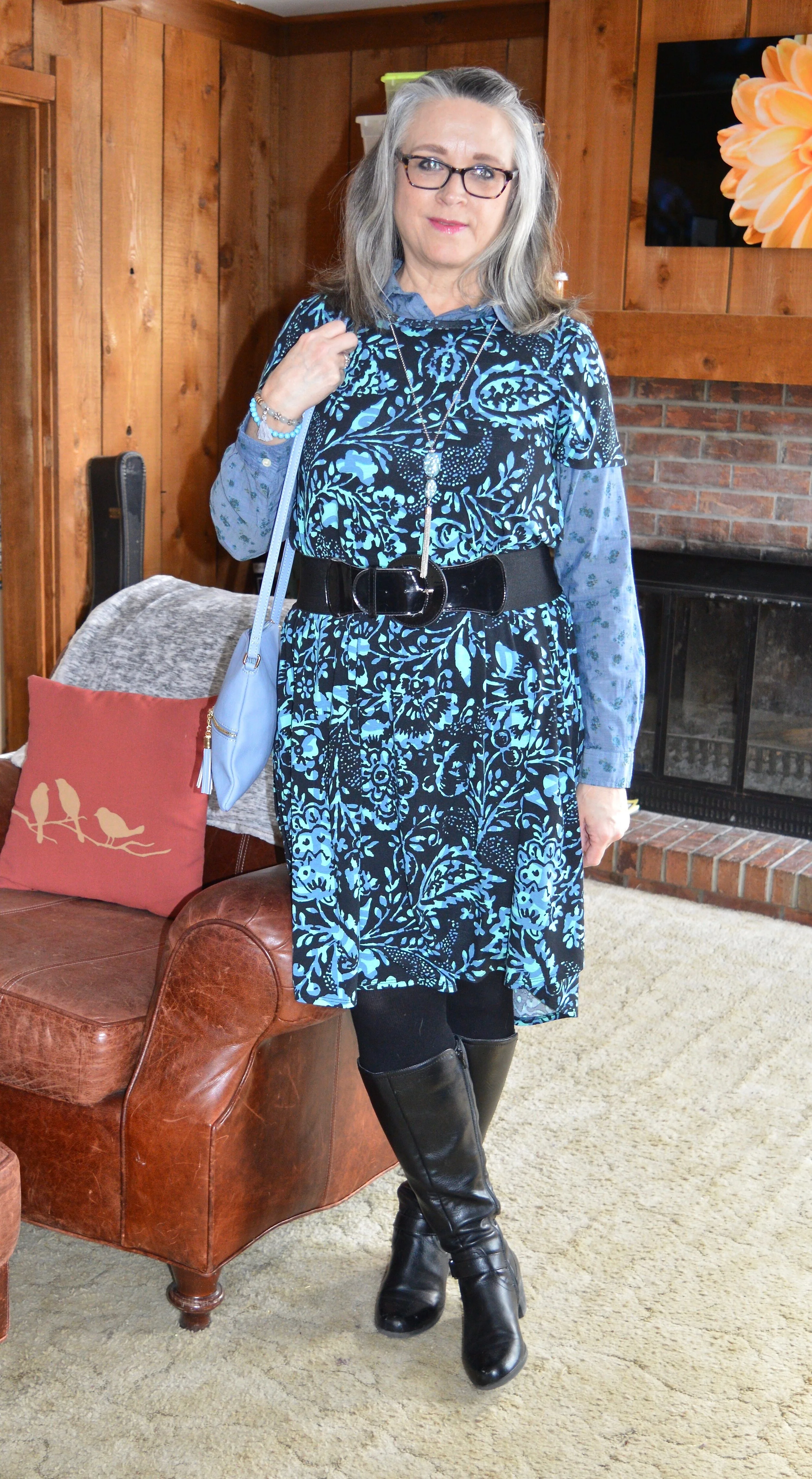
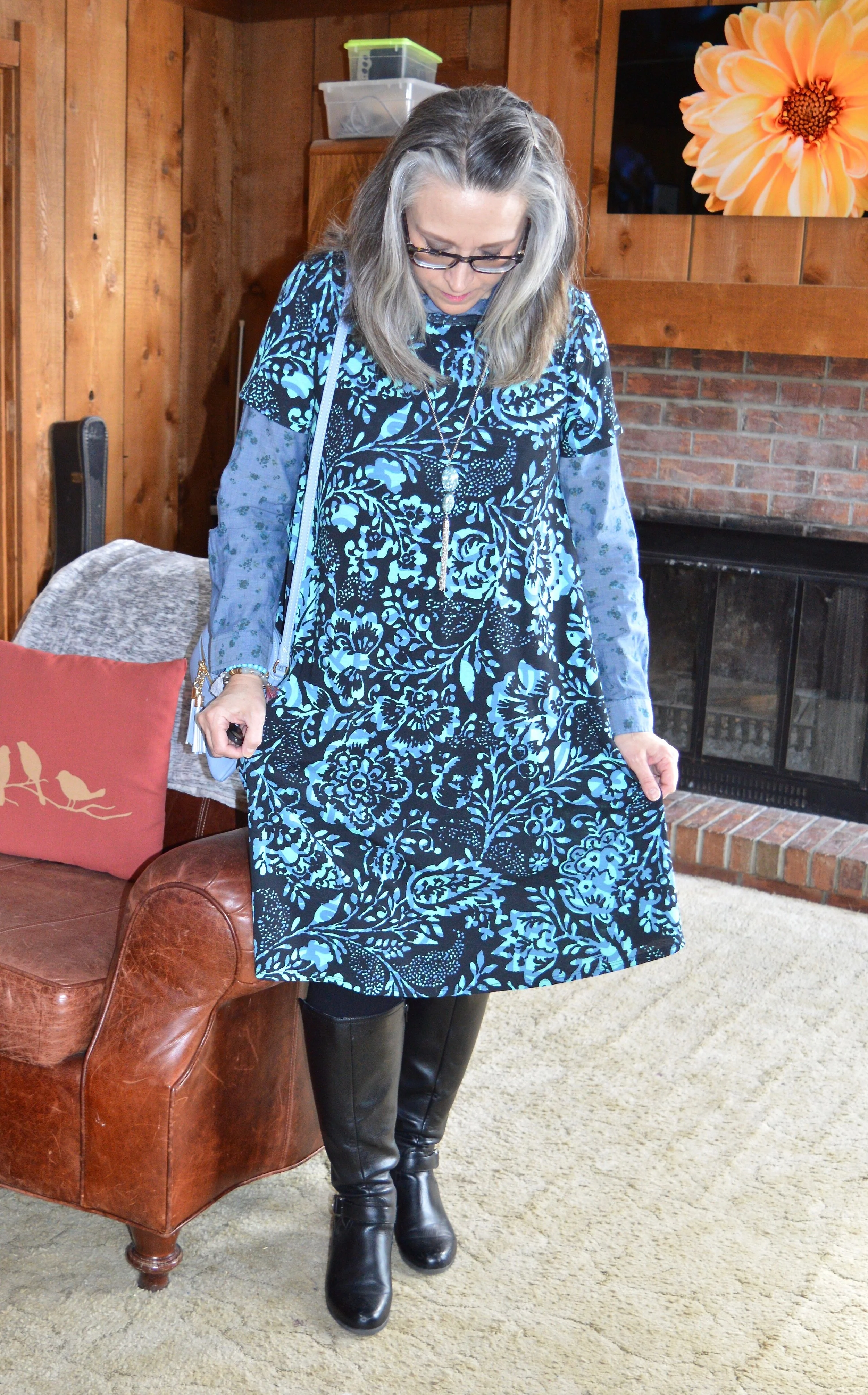
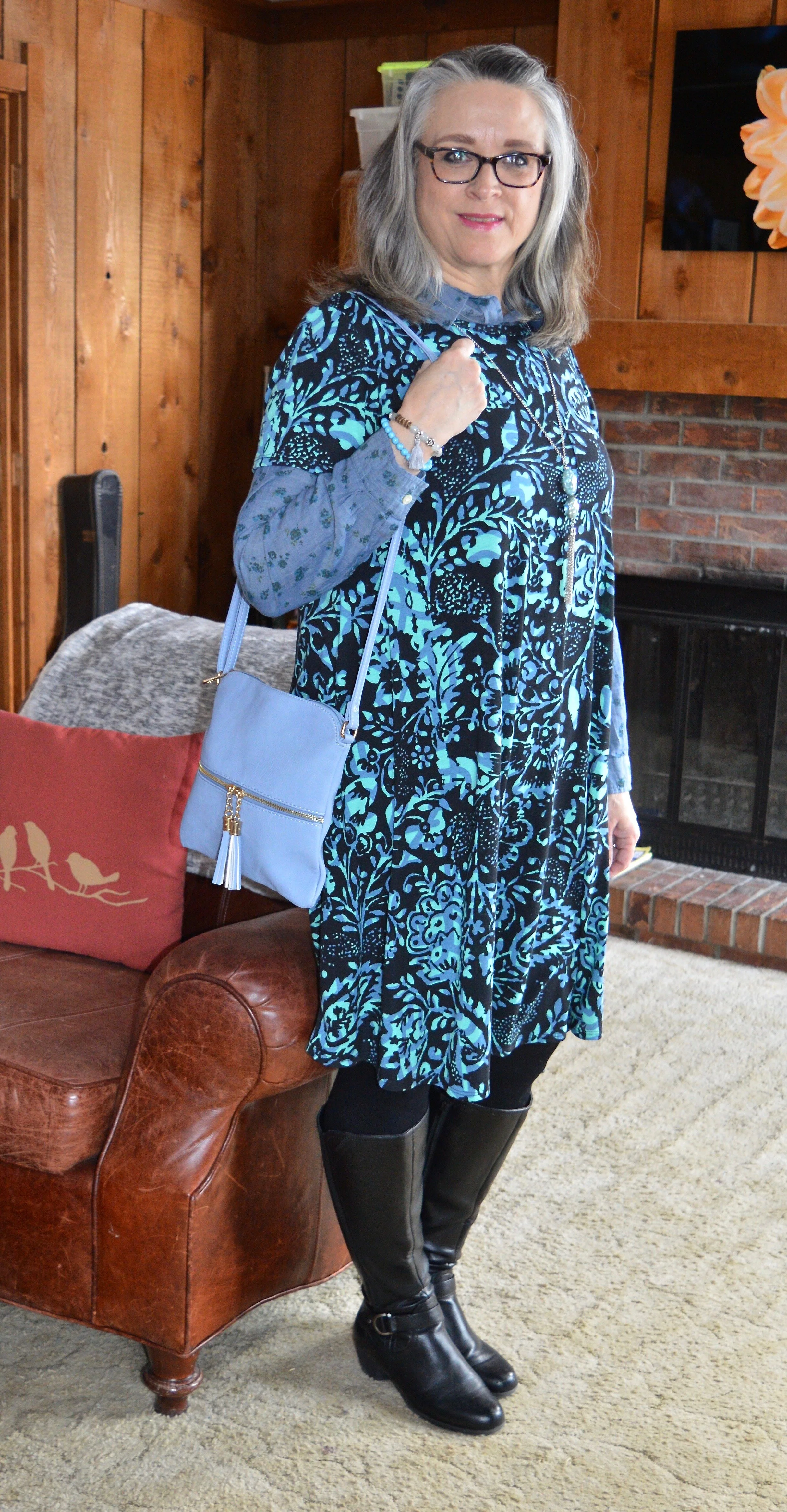
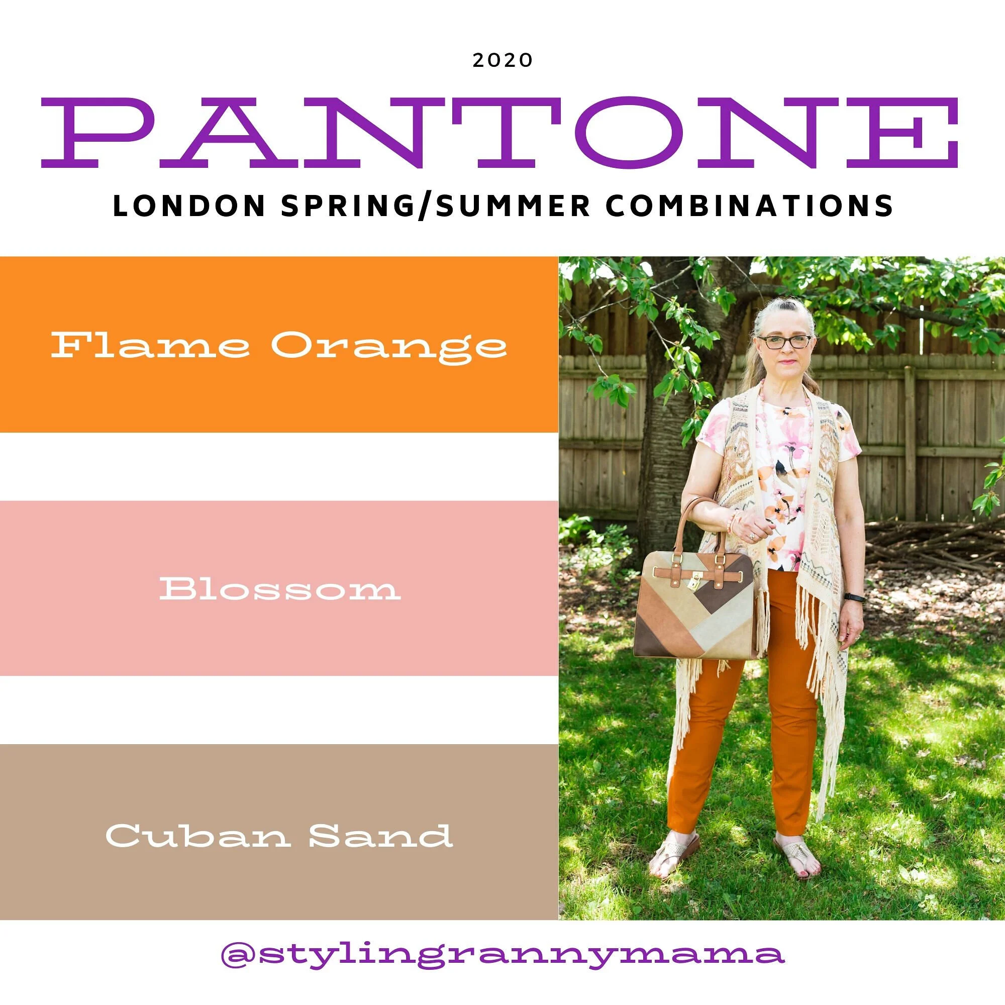
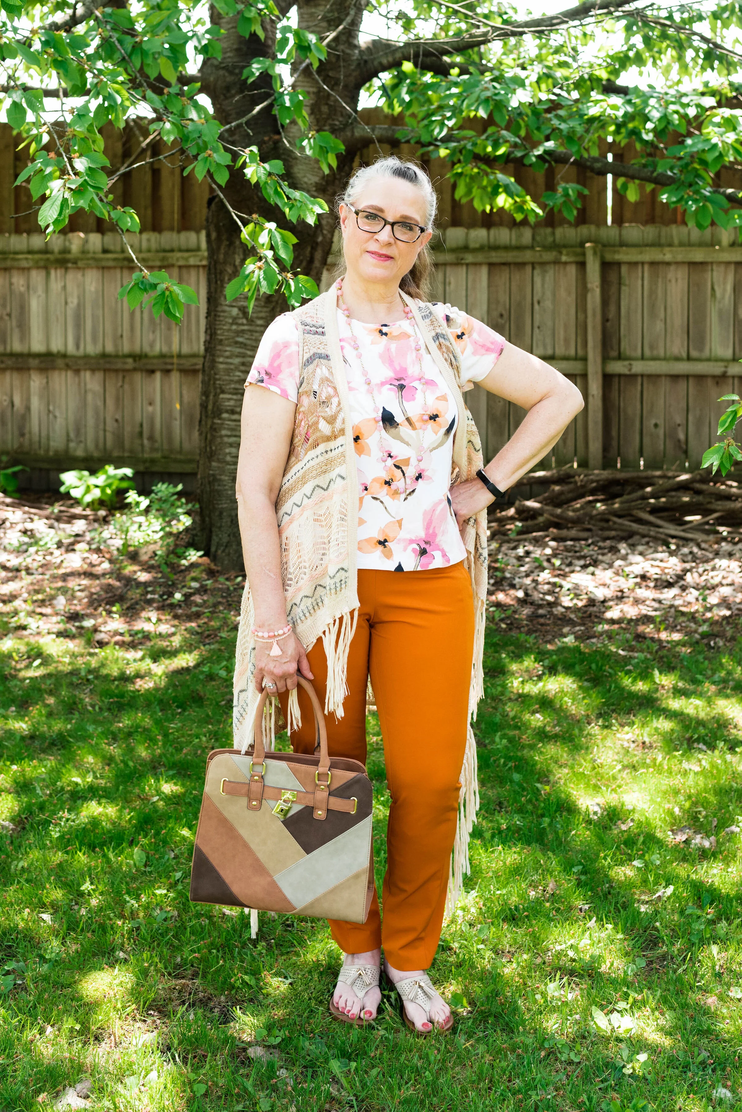
Color Play - Dark Plaid in the Spring and Summer

Today, I am going to show you how to take a darker plaid and make it spring and summer ready. I know many of us put our darker colors away replacing them with pastels and the bright happy colors of warmer weather, but not everyone has as big of a wardrobe as I do. Indeed, for those who are more into a capsule wardrobe, this is a great way to use a darker print all year round.

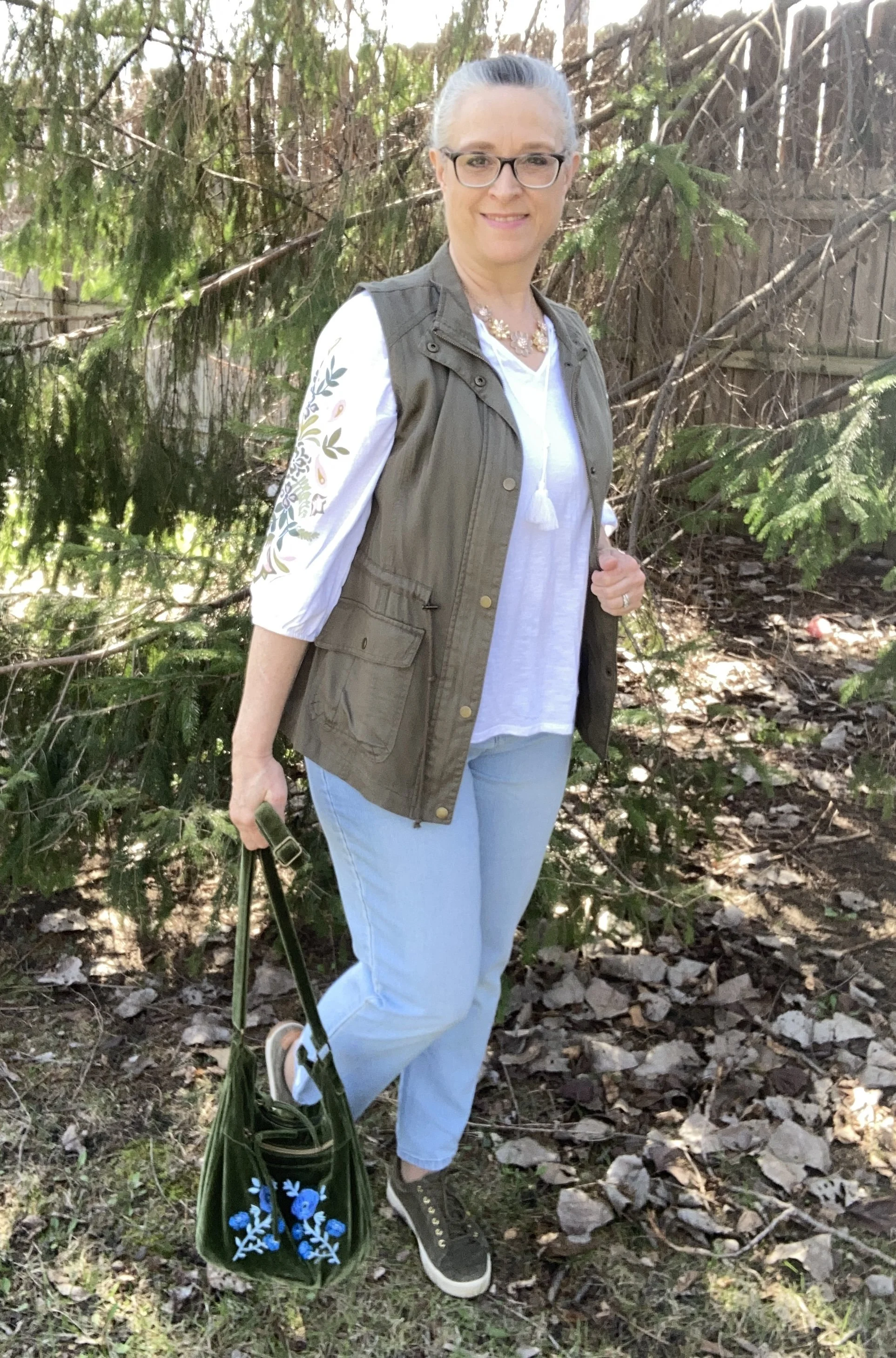
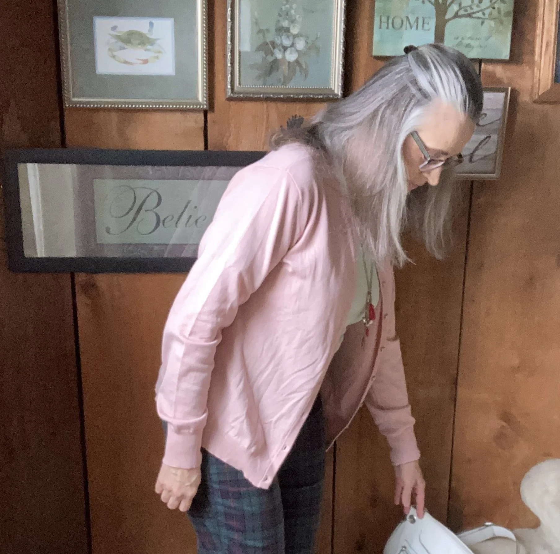
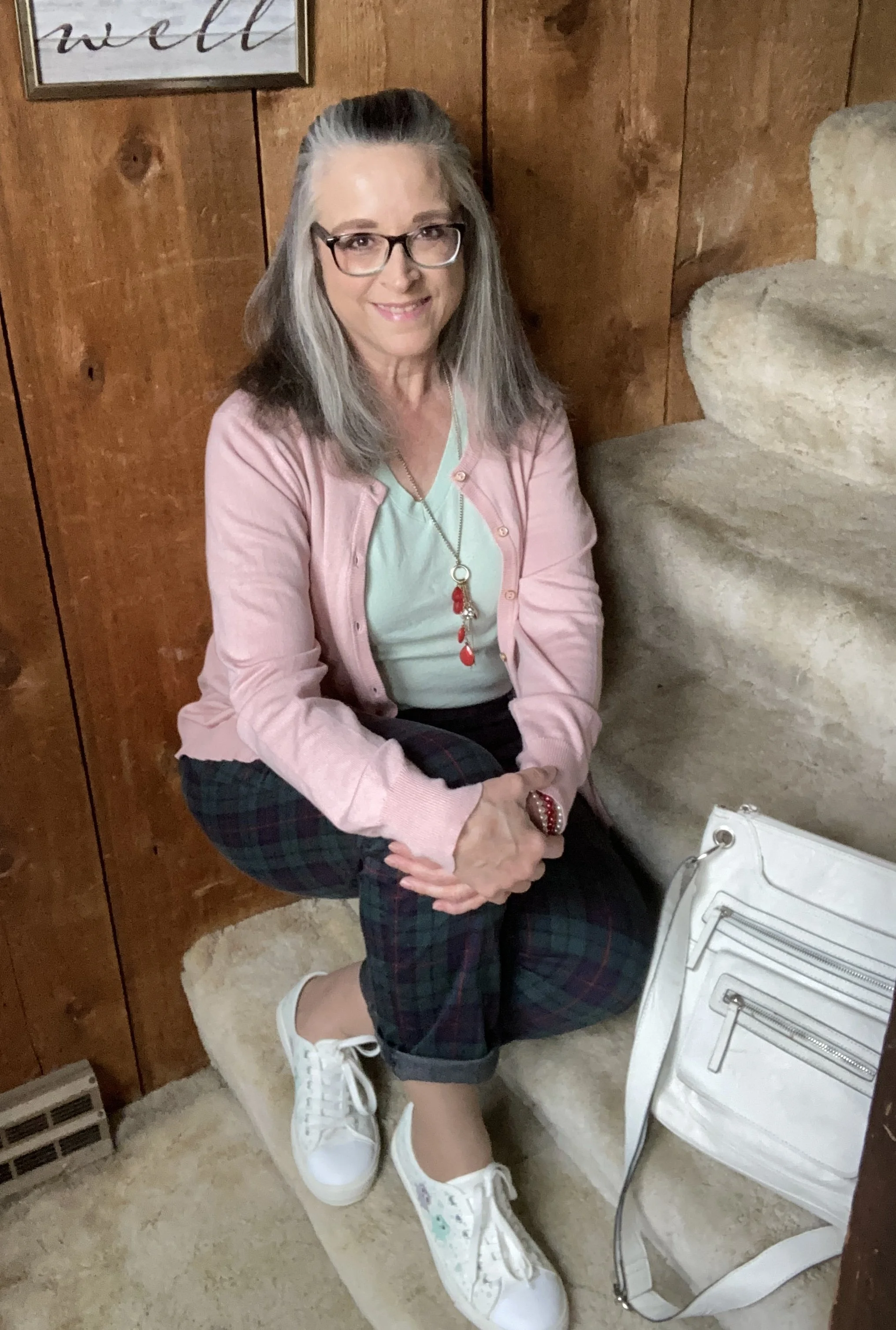
I found these plaid Croft and Barrow pants a few months ago while thrifting. When I tried them on, I liked the way they fit, and knew they would be great for the holidays, but I also thought it would be fun to wear these any time of year by just adjusting what I pair them with. I decided to pull them out for this post.

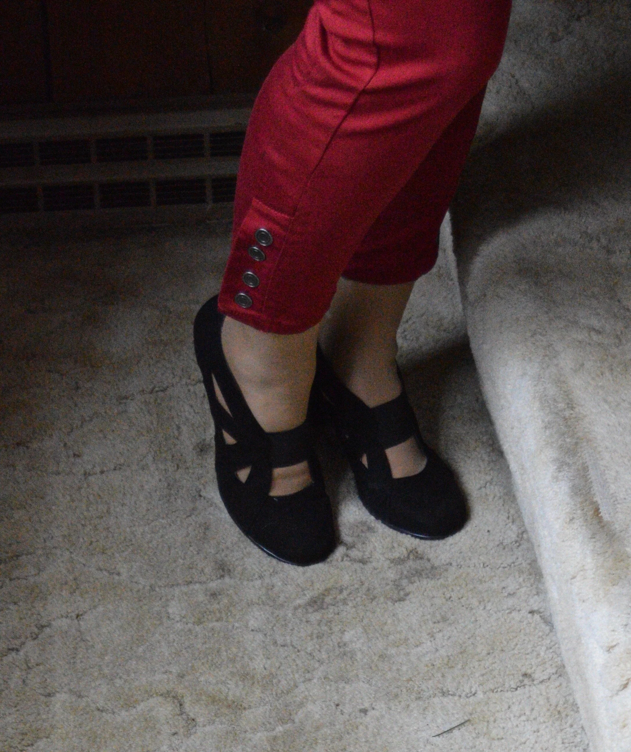
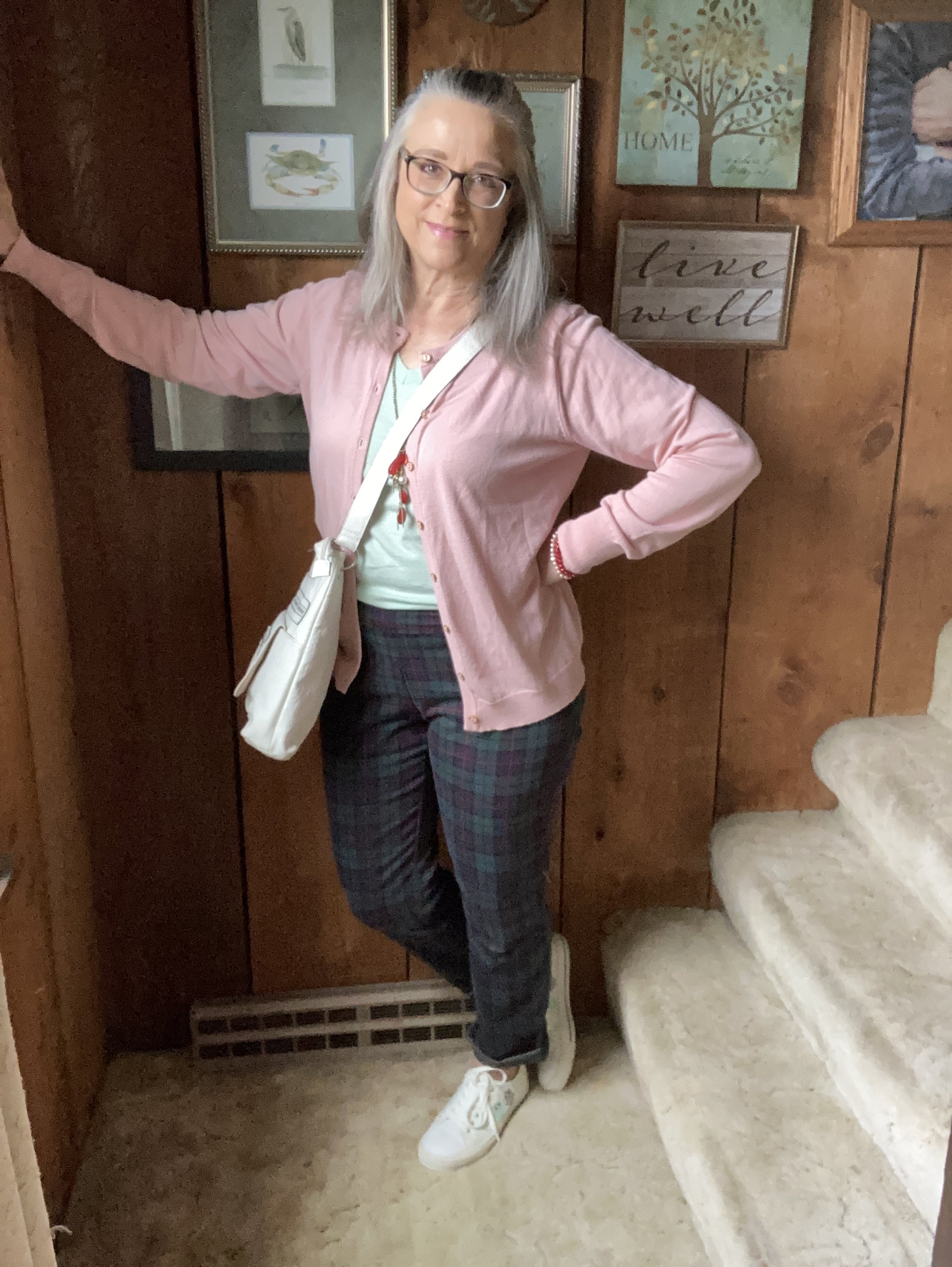
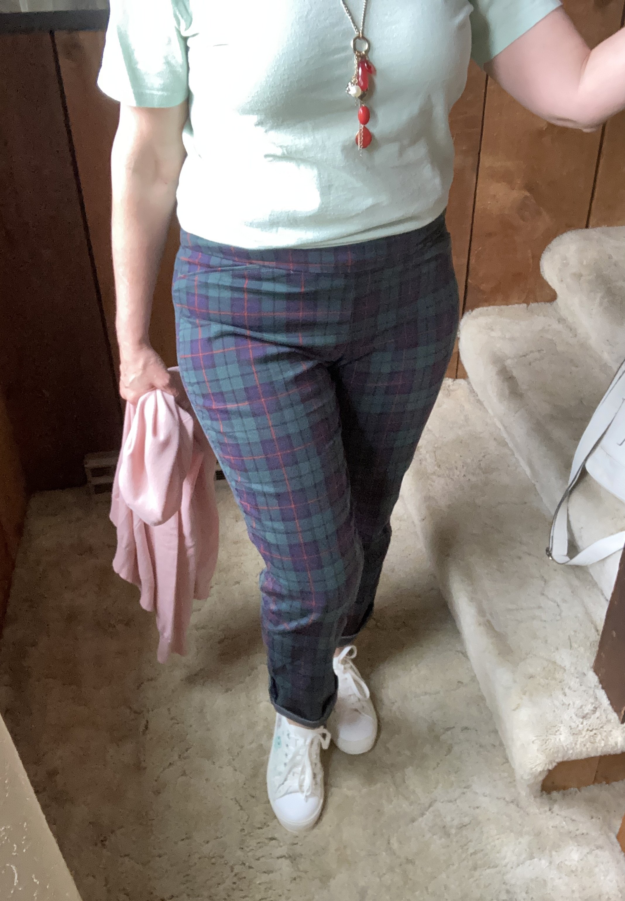
As you can see in the picture below they are a simple pull on knit, thus the name inside the waist band - Effortless Stretch Pant. The older I get, the more I like that idea. Ha, ha. But then, the younger generation all wear leggings, which is really just a stretch pant, right? You can see these are perfect for Christmas with the red stripes, and green and blue plaid.

Style Tip: Roll up the hems on your straight leg pants, creating a narrow cuff, to give them a current, casual, and youthful look.

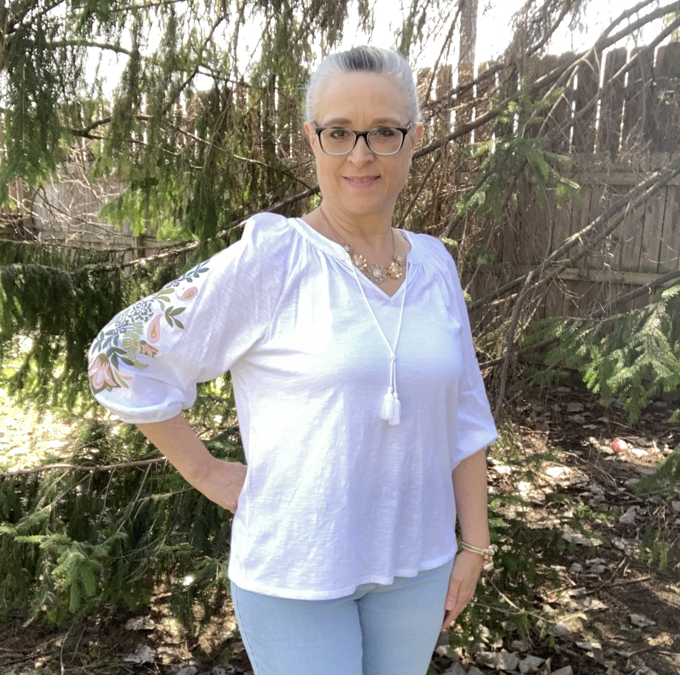
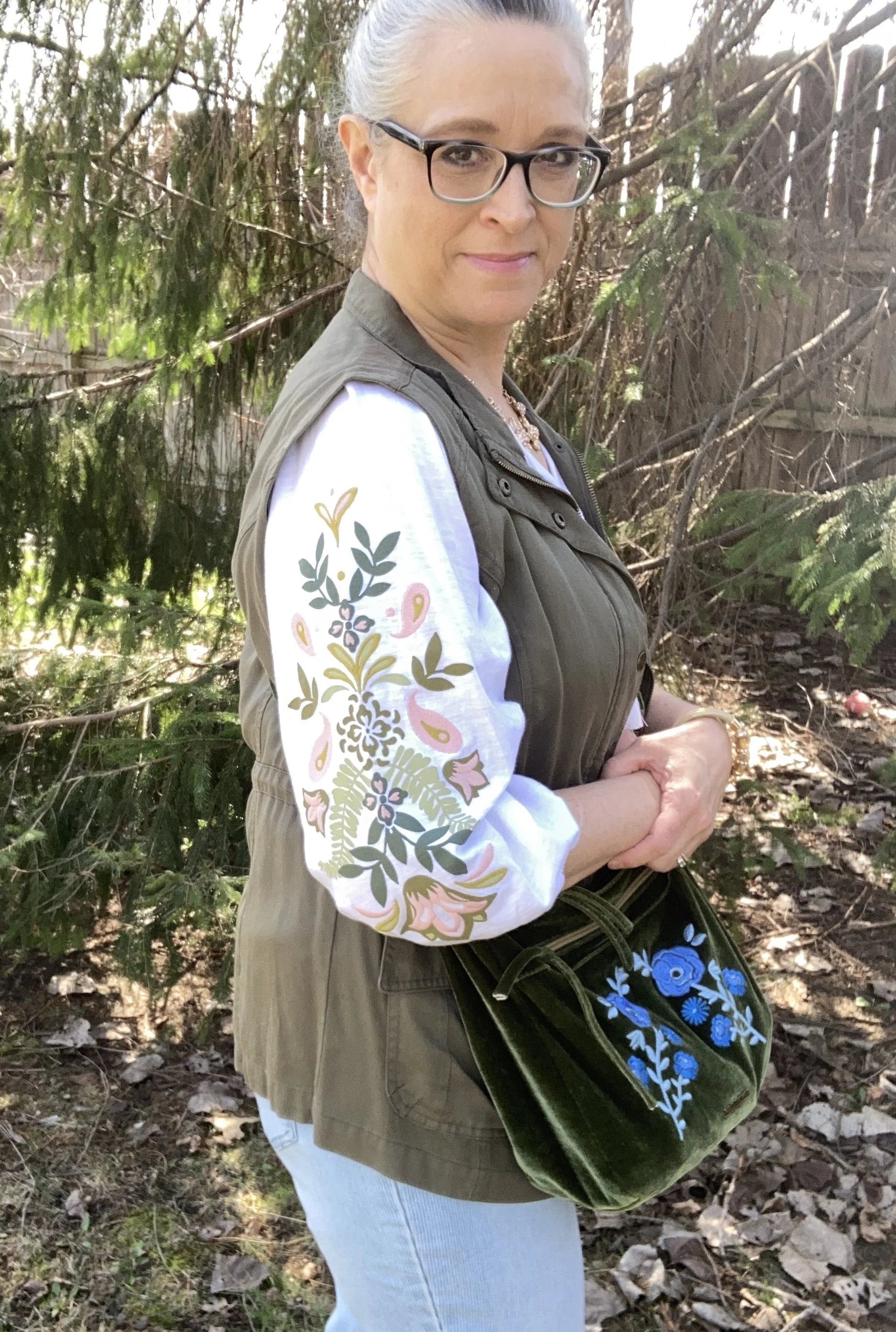
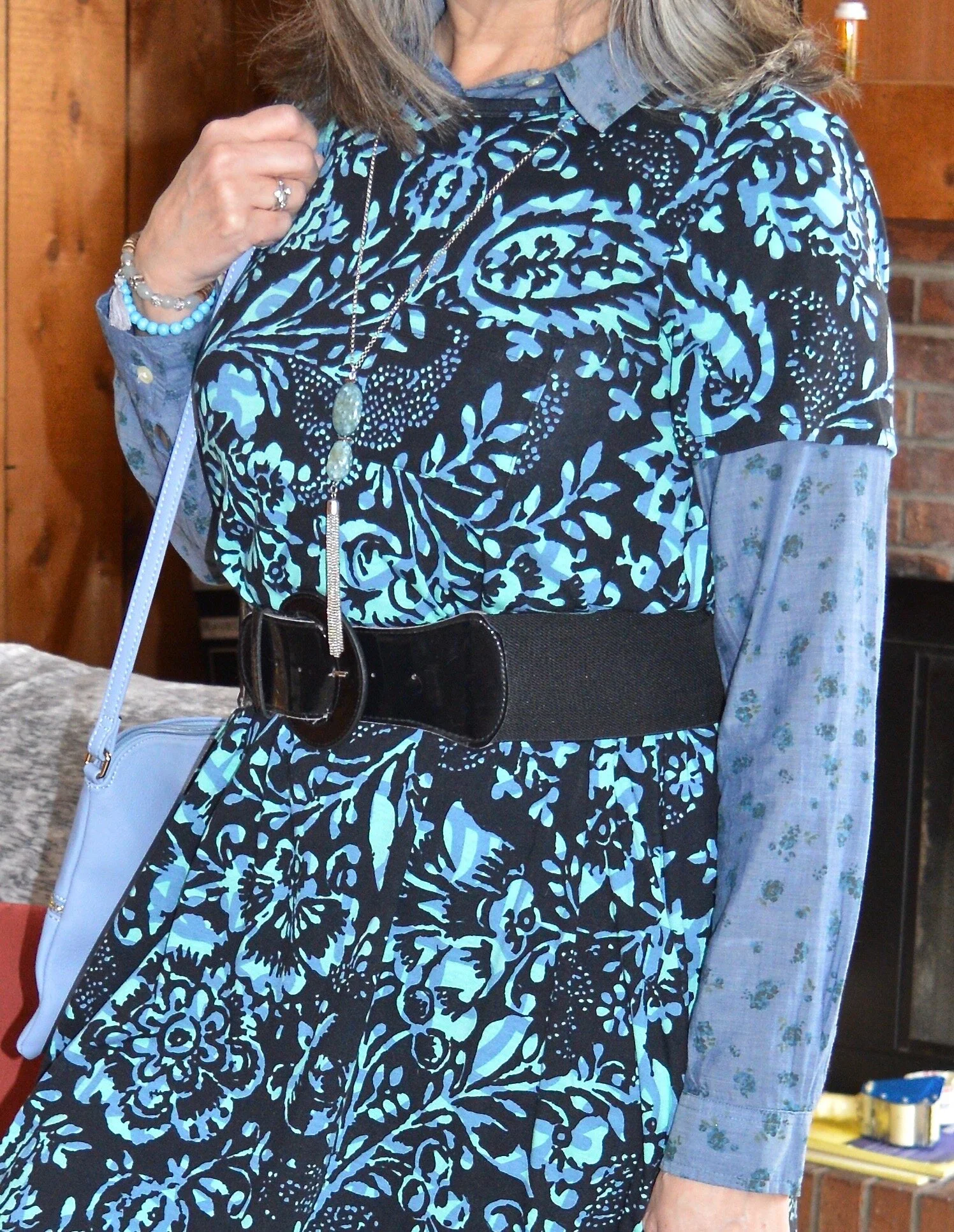
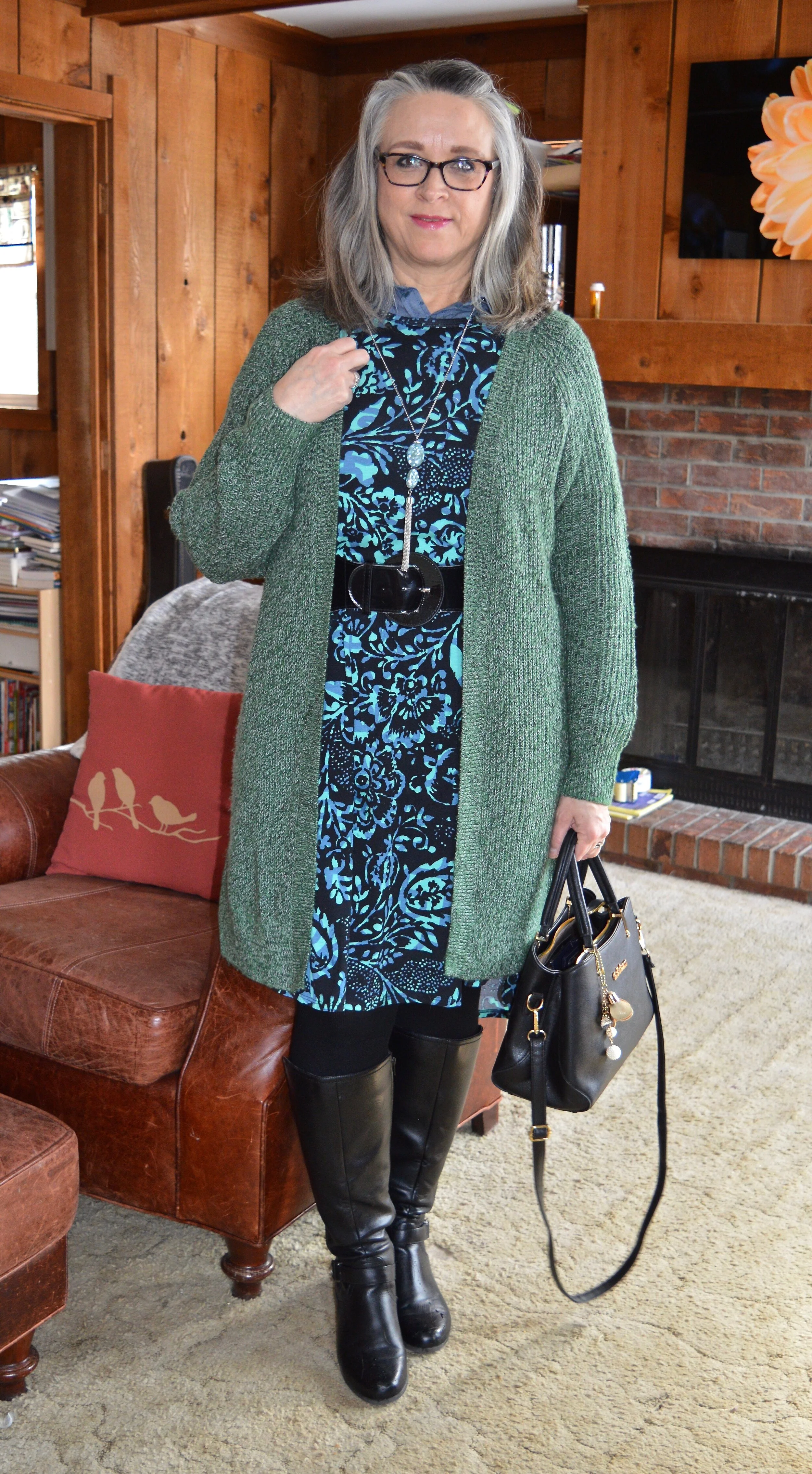
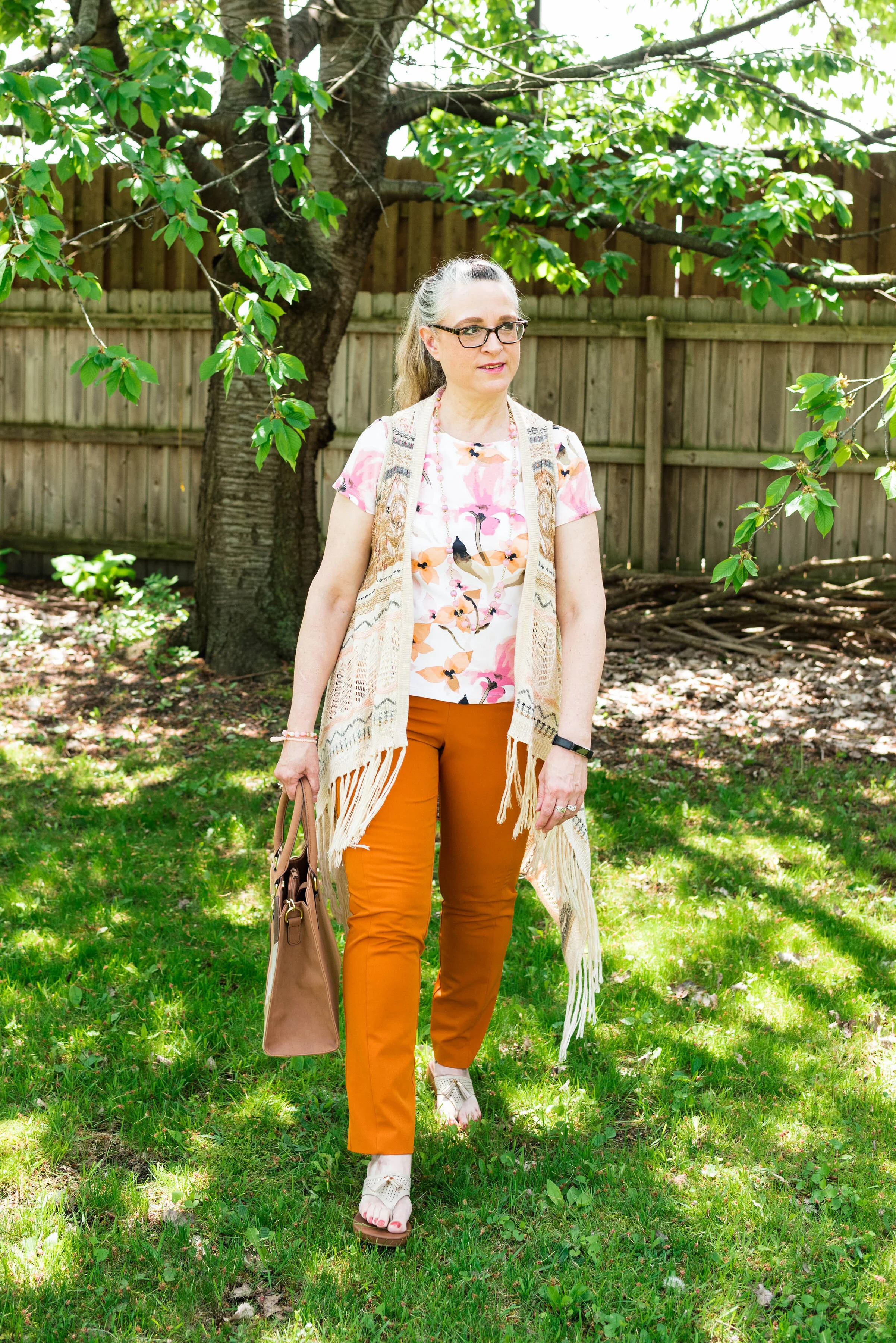
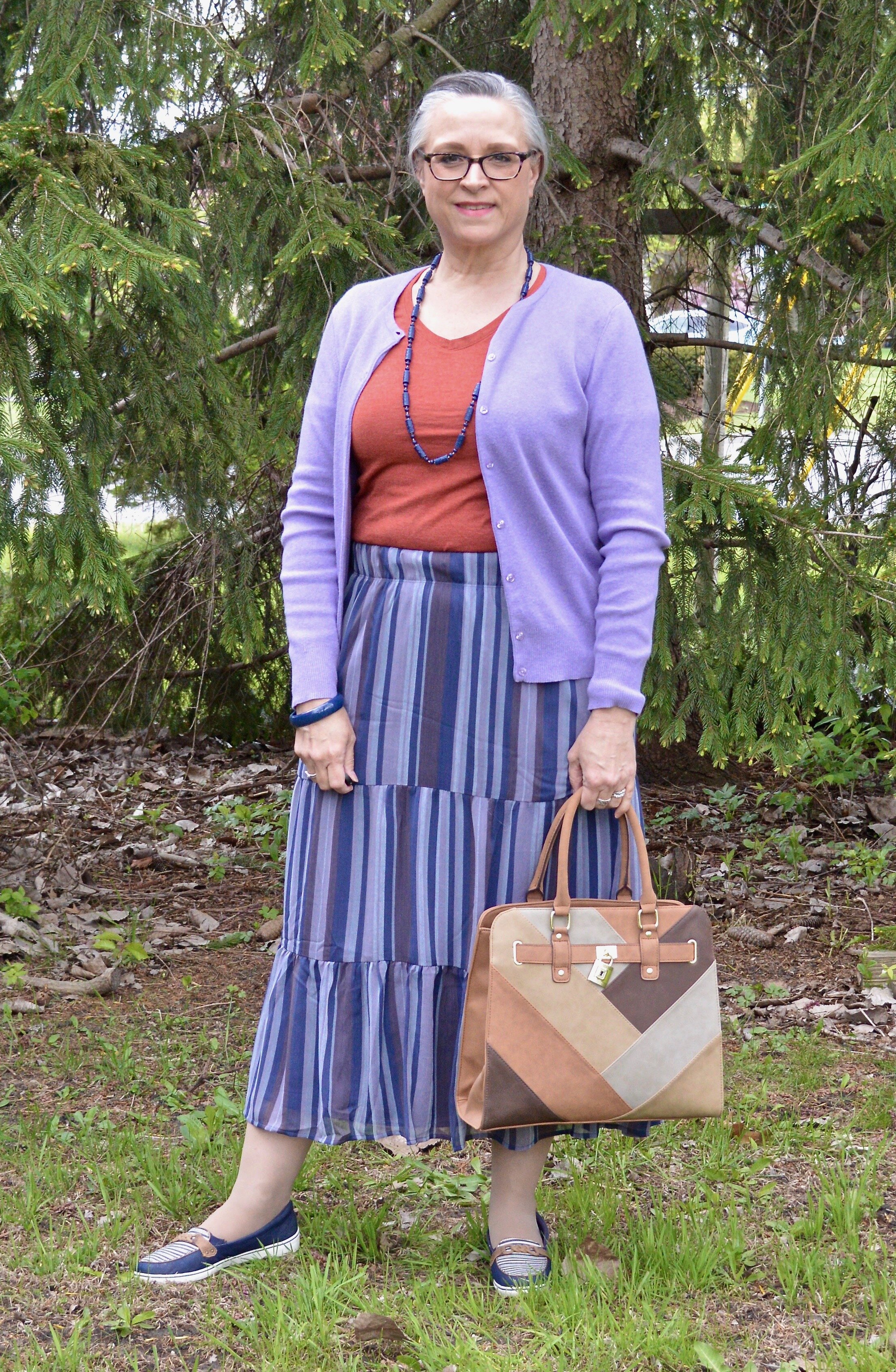
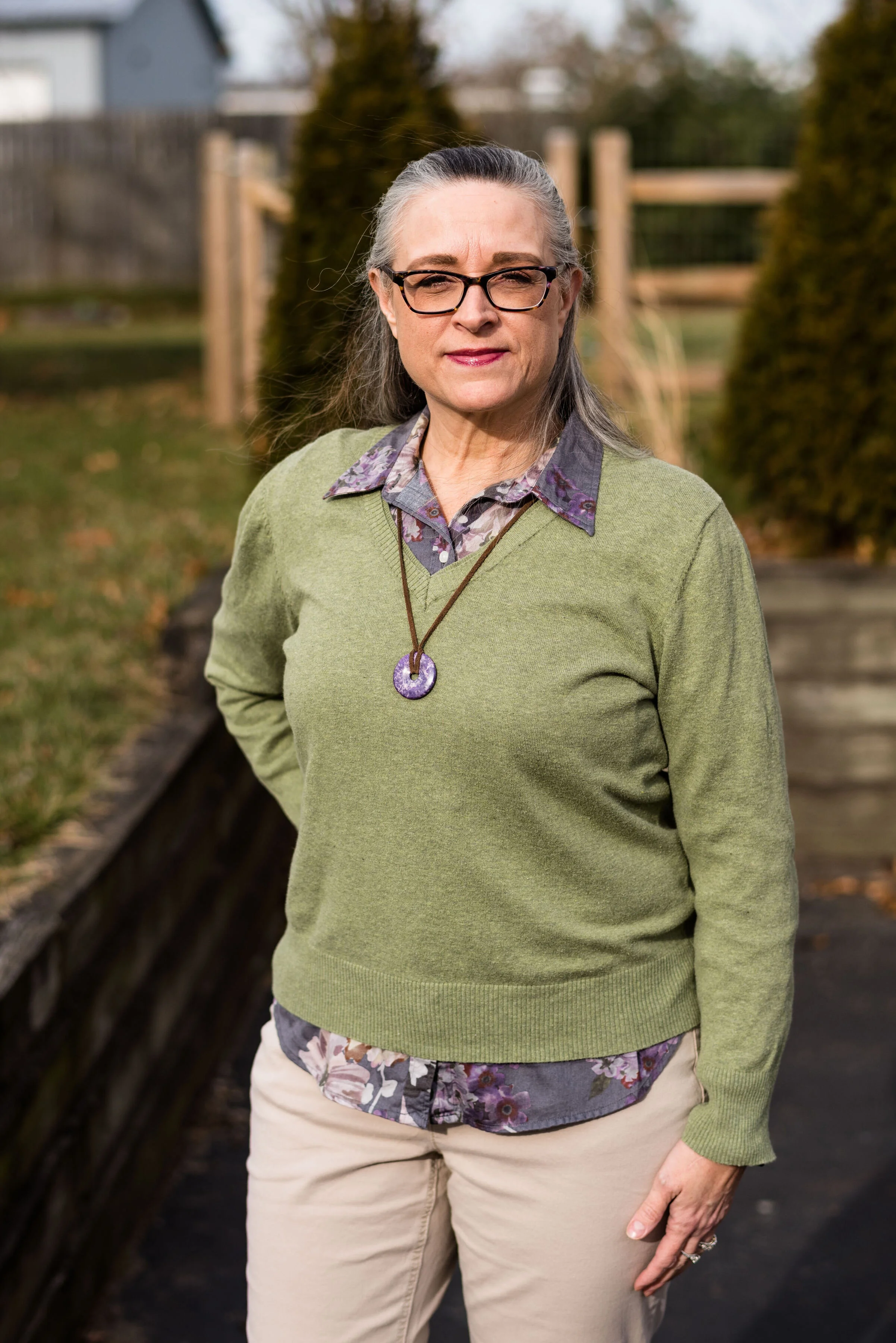
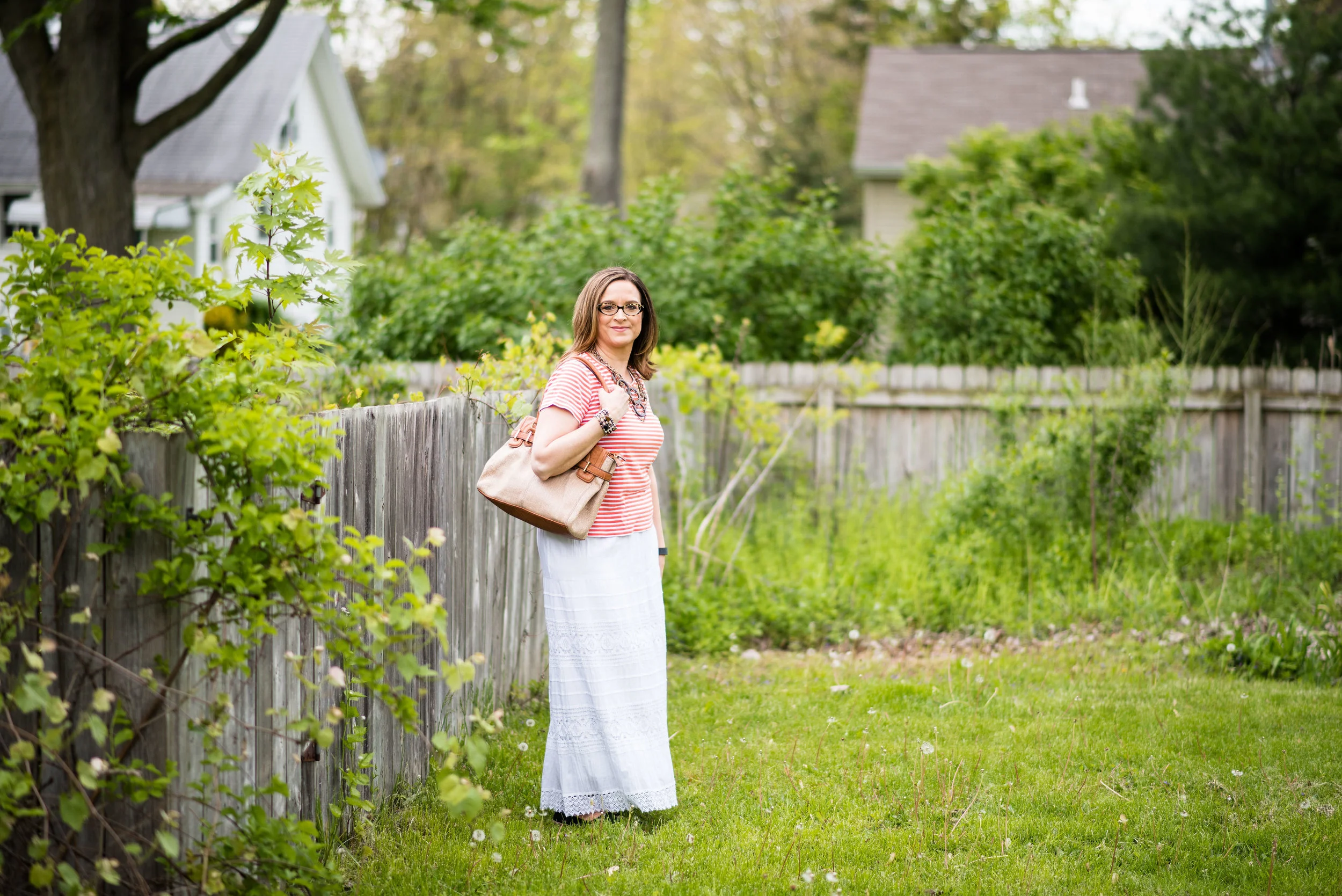
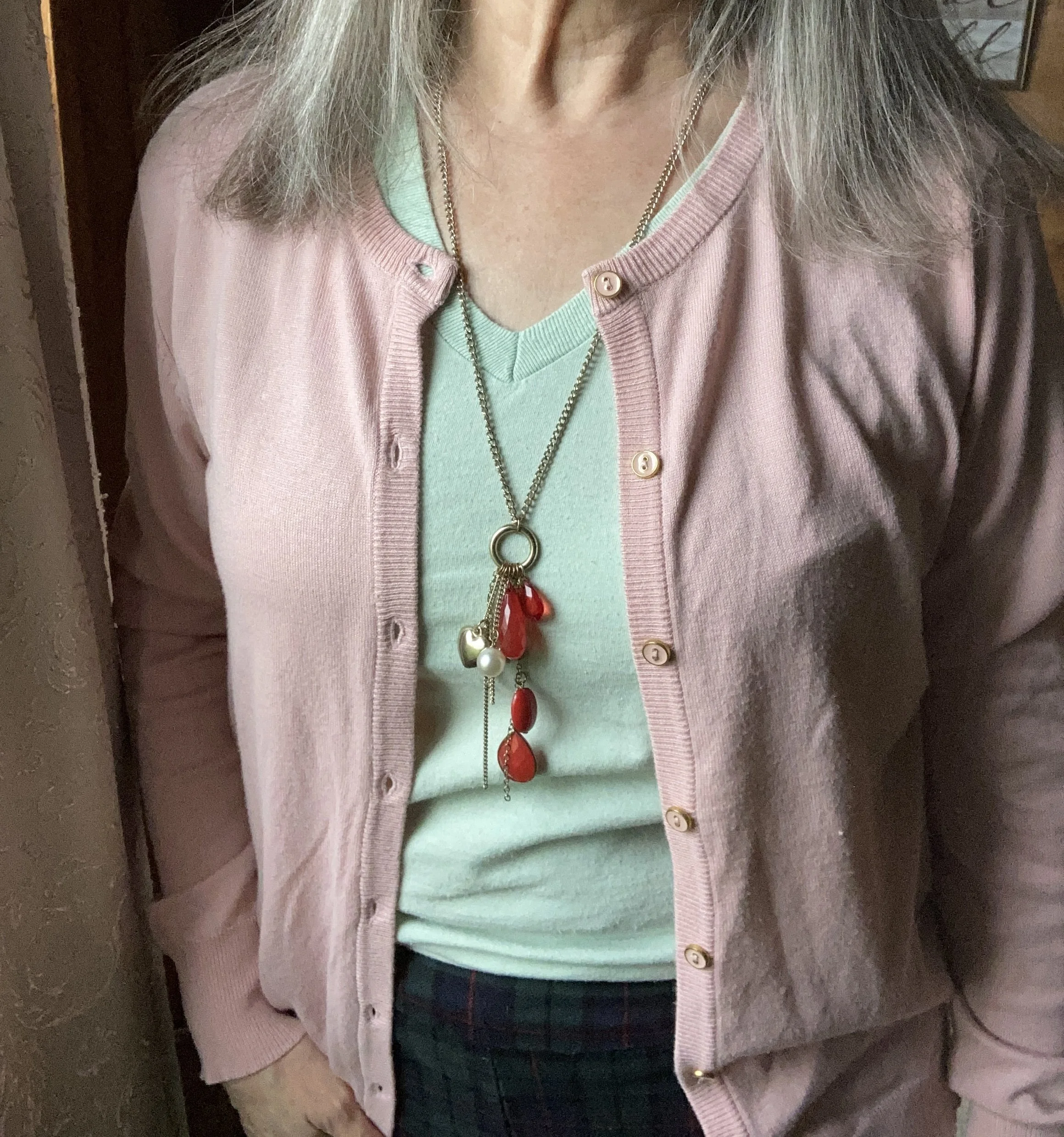
You might be wondering how I chose the sweater and the tee. I wanted to keep to the color scheme of the pants, but with lightening up the shades to a pastel, minty green, and a pastel, blush pink, it changes the feel of the whole outfit. I could have done a similar thing with a lighter reddish orange, and a lighter blue, but in similar shades to the original.

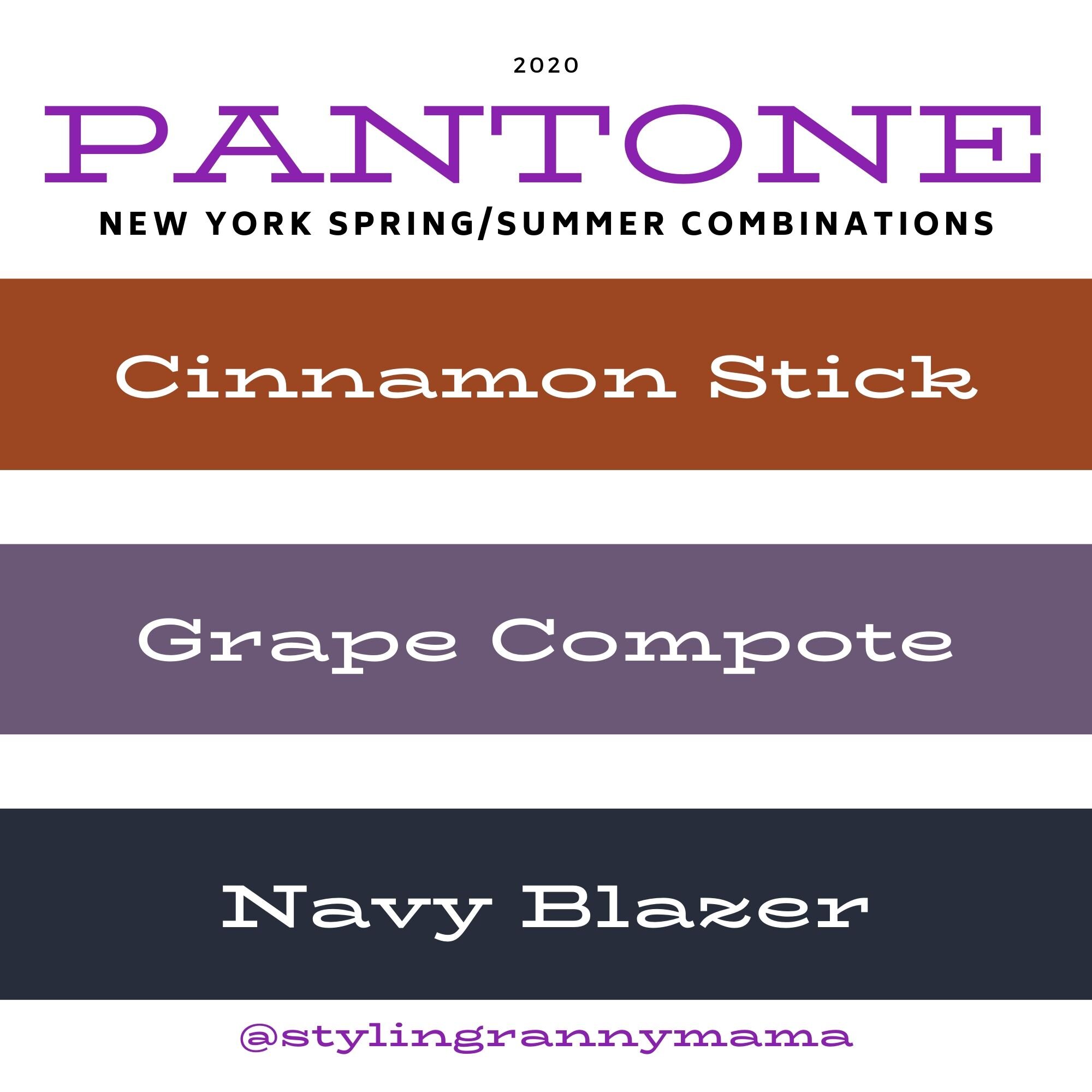
The whole idea behind Color Play is to play with colors and color combinations. I am not a color “trekkie”, boldly going where no woman has gone before in my color combinations. I still like things to look classic, polished, and put together in a way that makes a person think, wow, that’s a cool outfit. But, I still want to experiment and try new things, and I hope I am inspiring you to do that as well.

Style Tip: In order to lighten up an outfit when using a darker print, think in terms of shades of the darker print’s colors. If it is navy, evergreen and maroon, think in terms of light blue, minty green and pink.

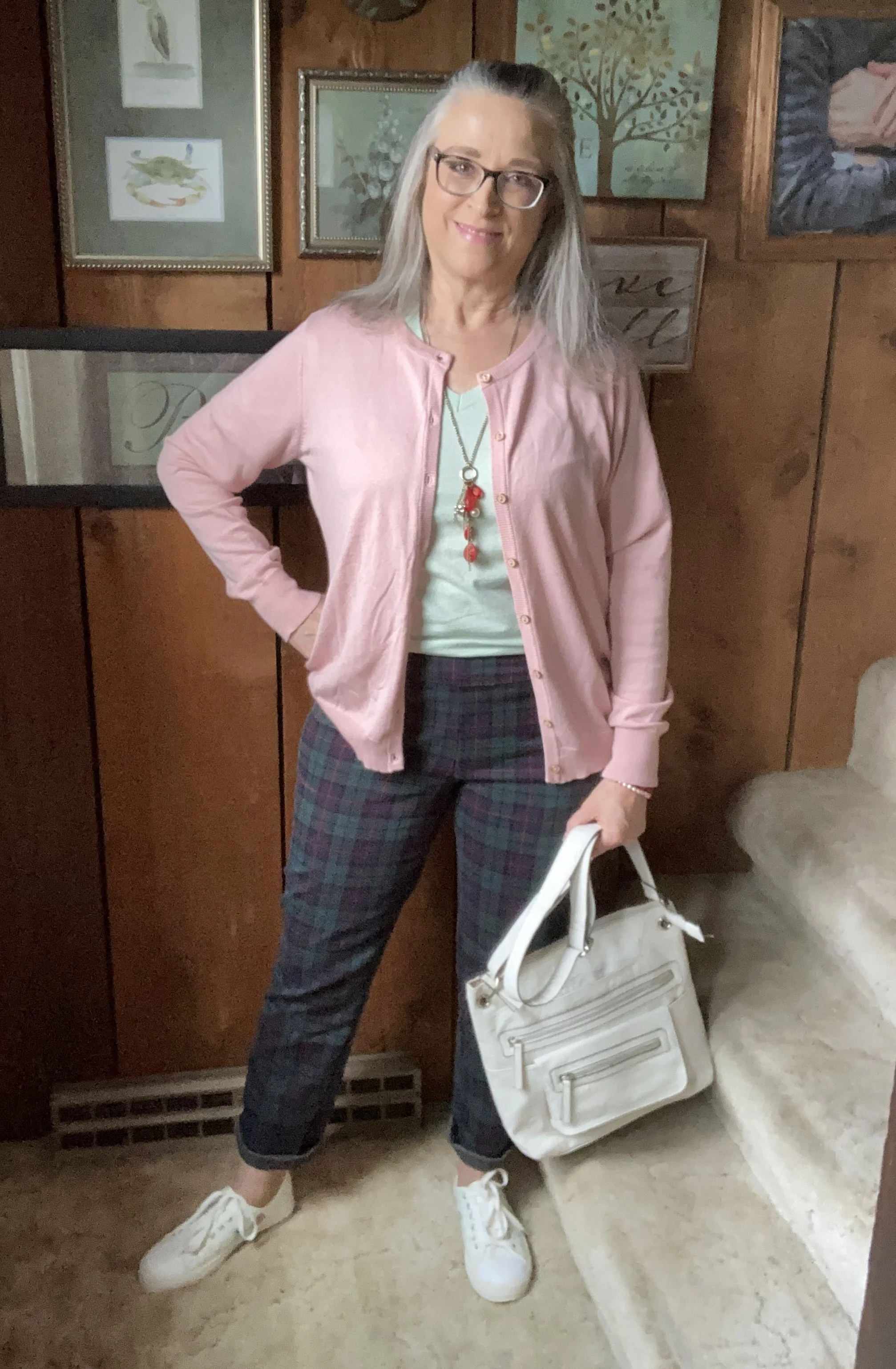
My pink sweater was a Nordstrom Rack find, and is a brand called BYdesign. You can click on the link for a variety of color options. This is a great spring, and summer sweater as it is light weight. I got an XL, as I often like a roomier option. These are also on sale right now, so feel free to click on through.

My minty green v-neck tee is Hanes brand and a second hand find. Long sleeve and short sleeve plain colored tees are great pieces to stock up on at thrift stores. It doesn’t matter as much if they are not new as they are typically worn underneath other things.

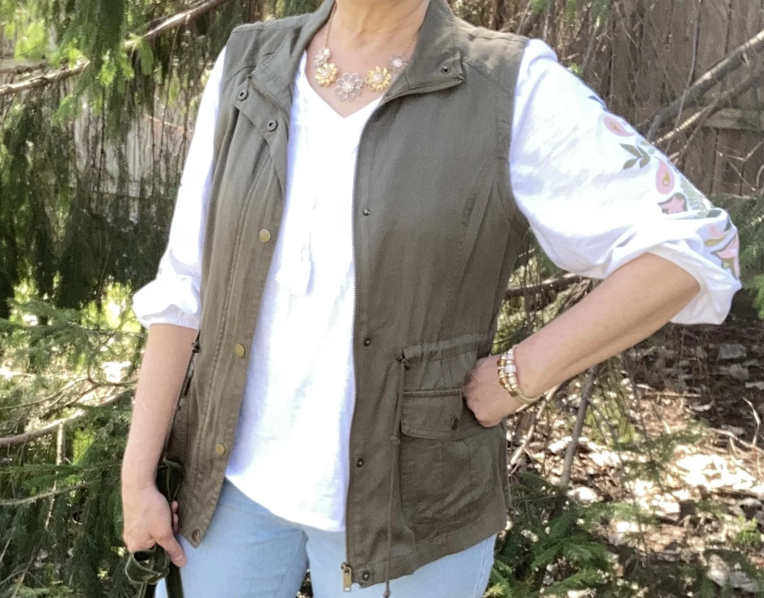
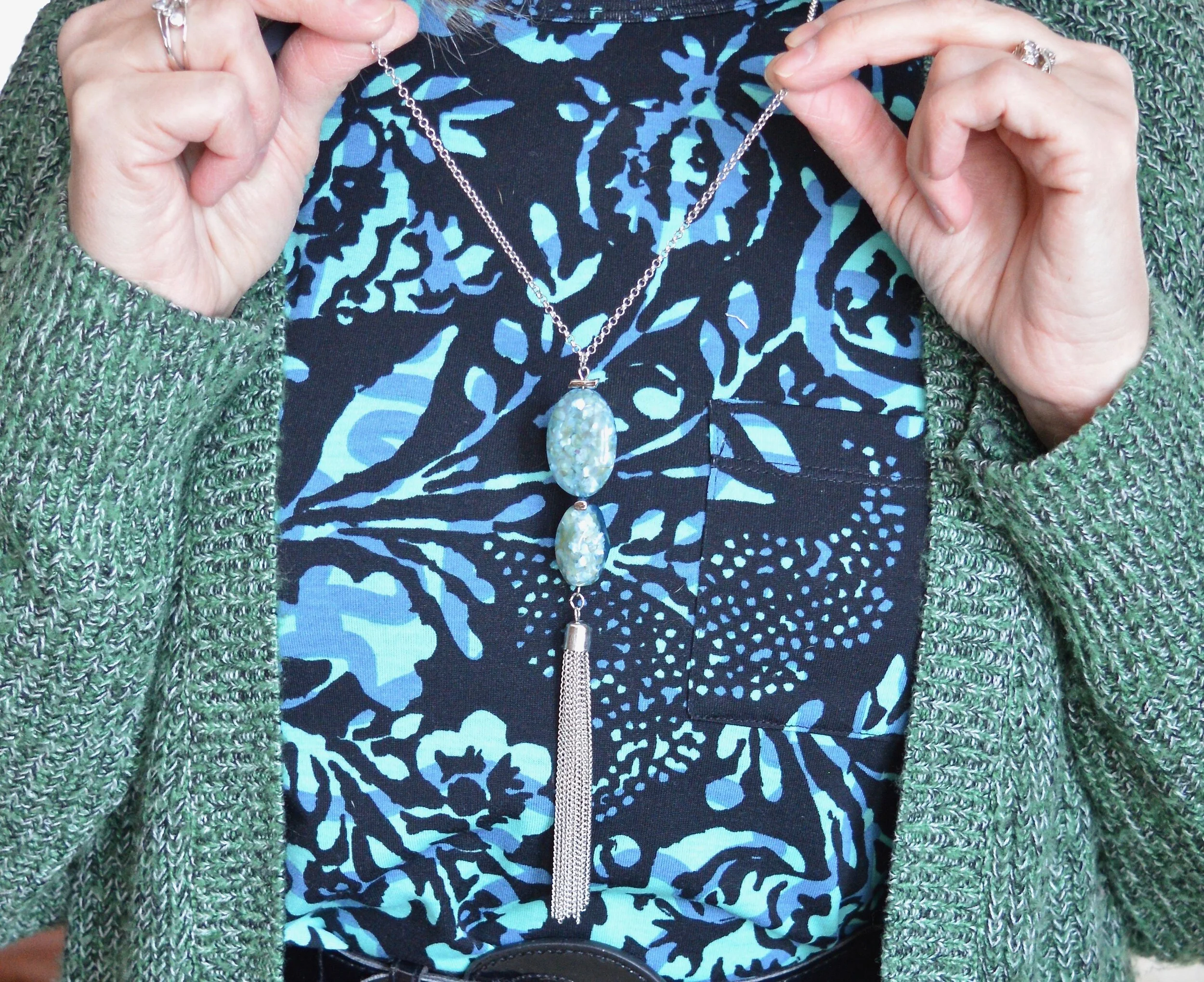
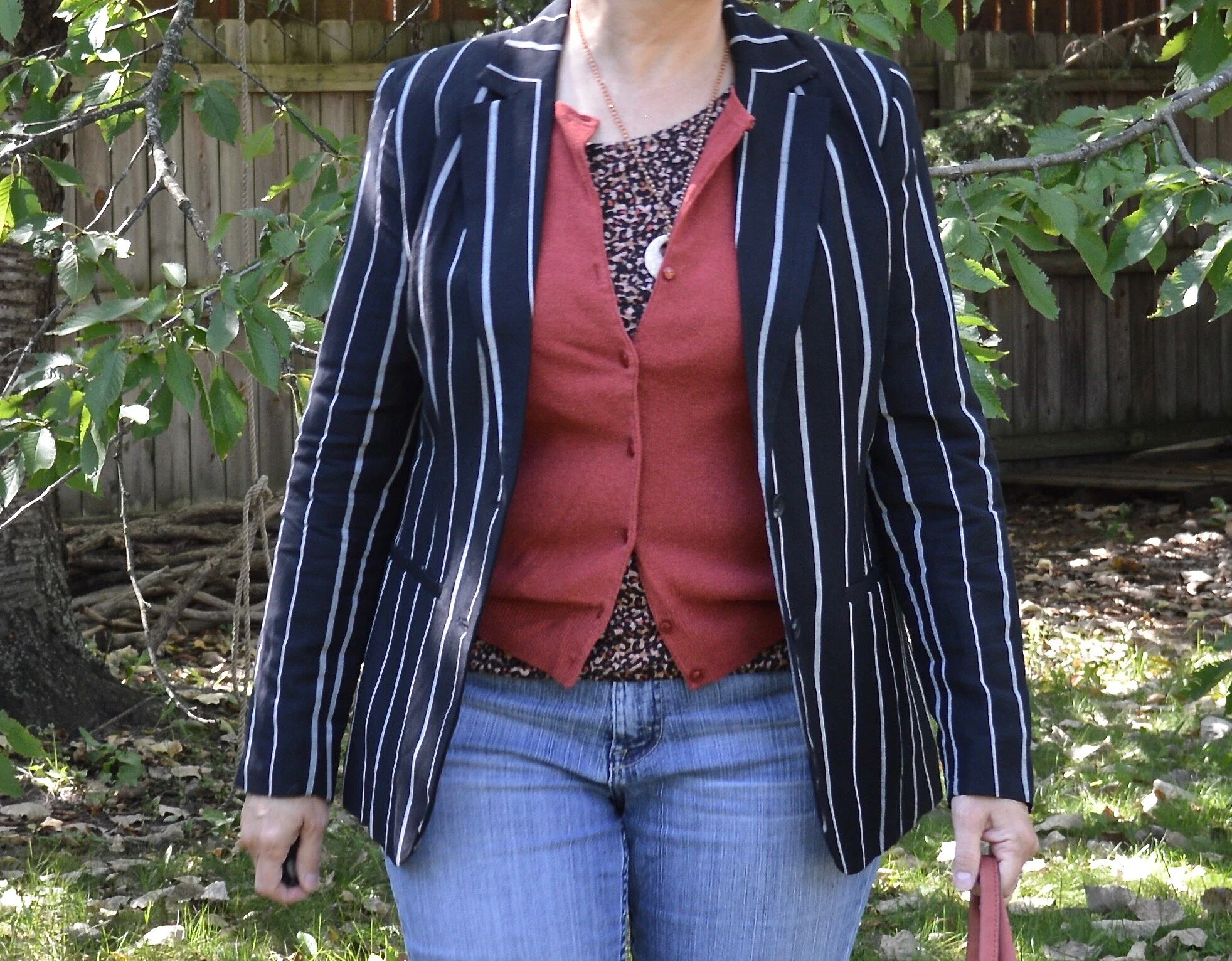
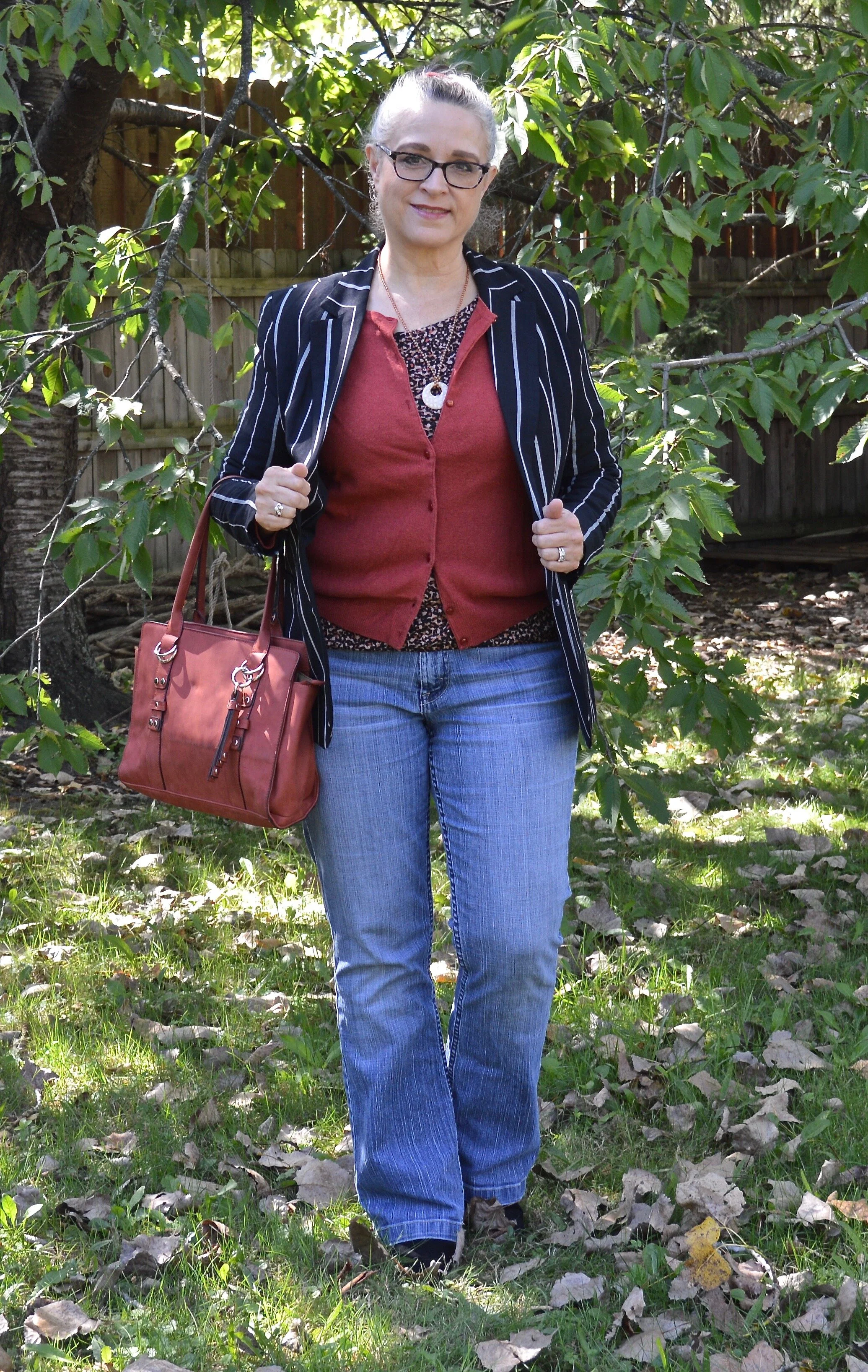
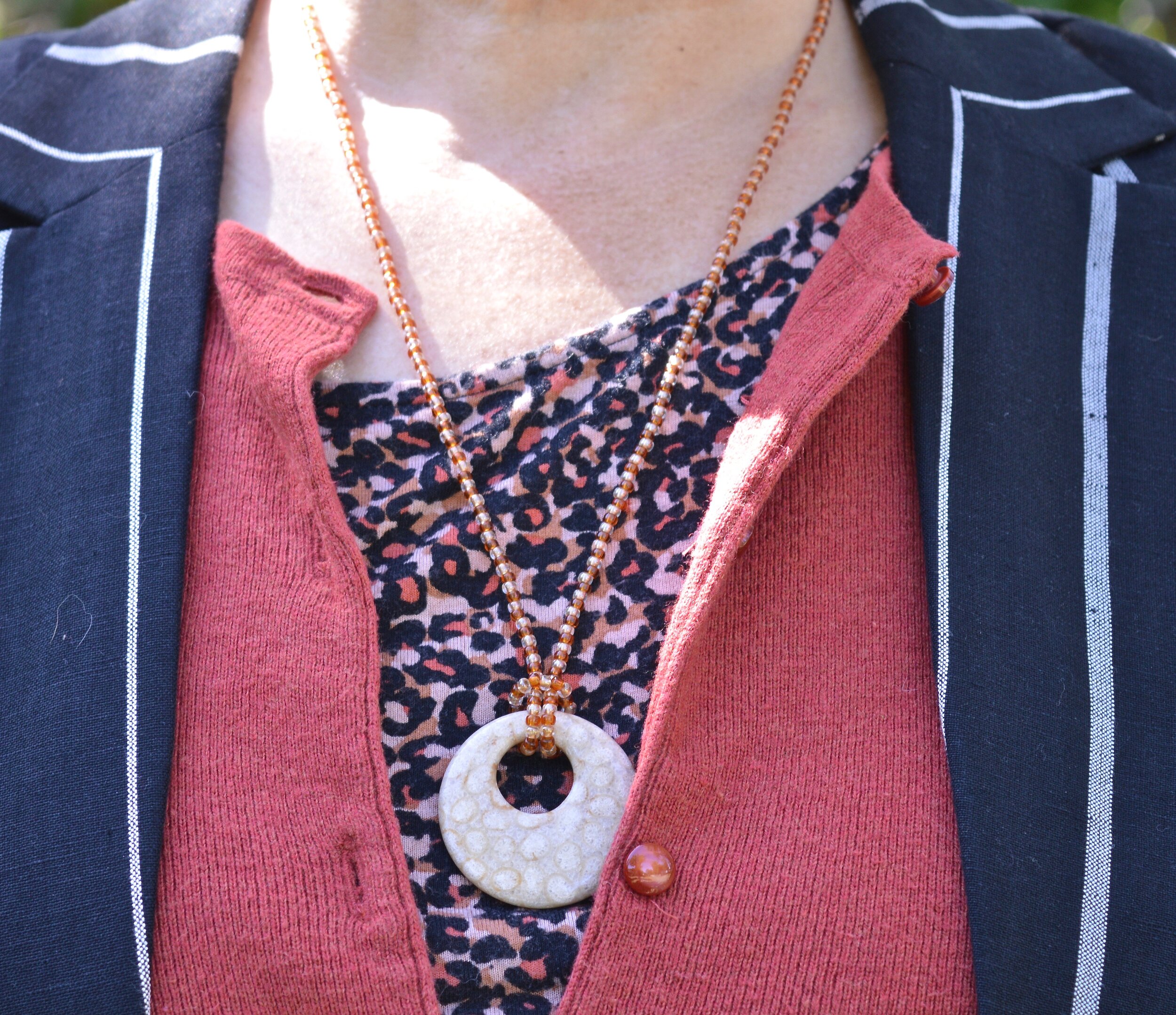
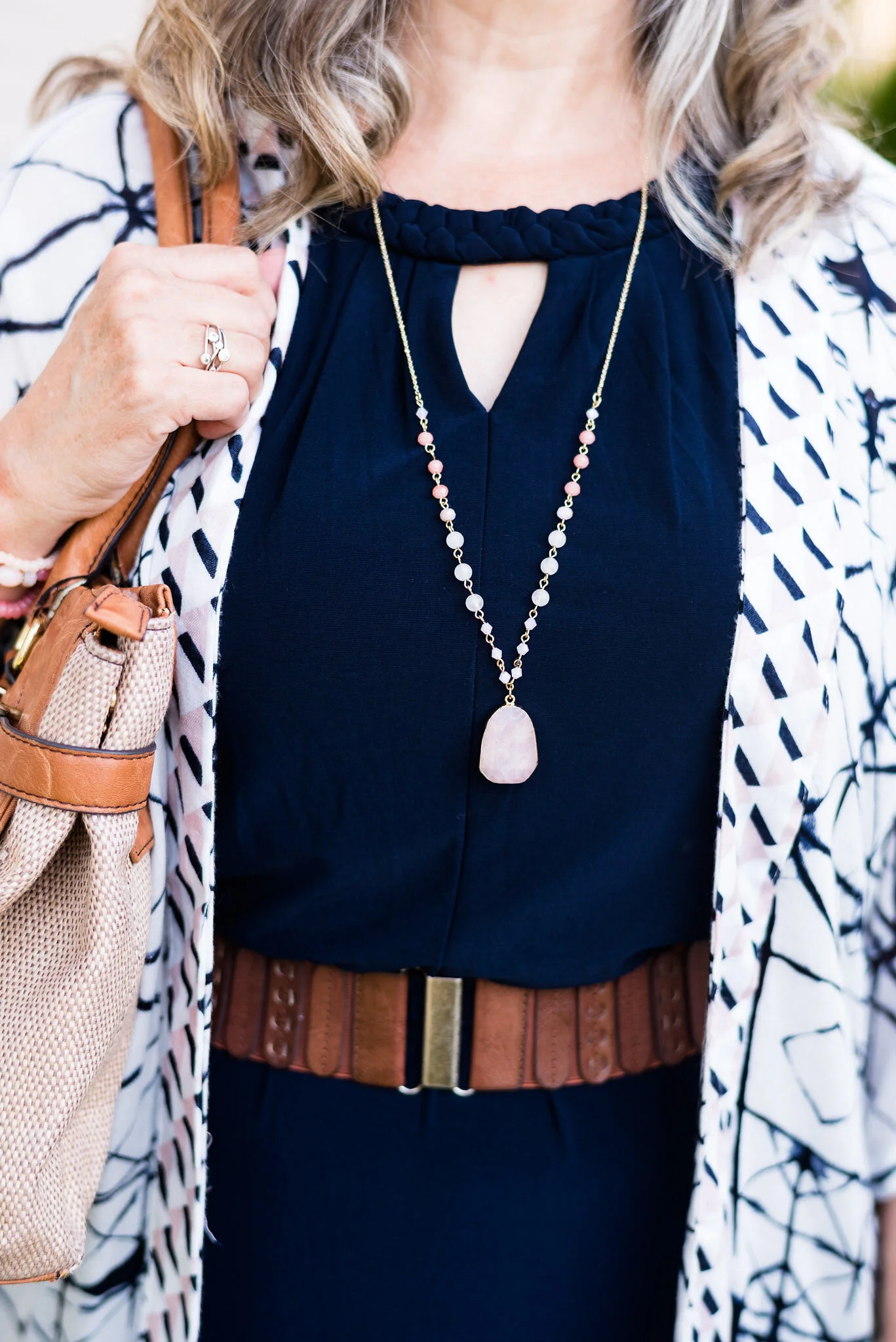
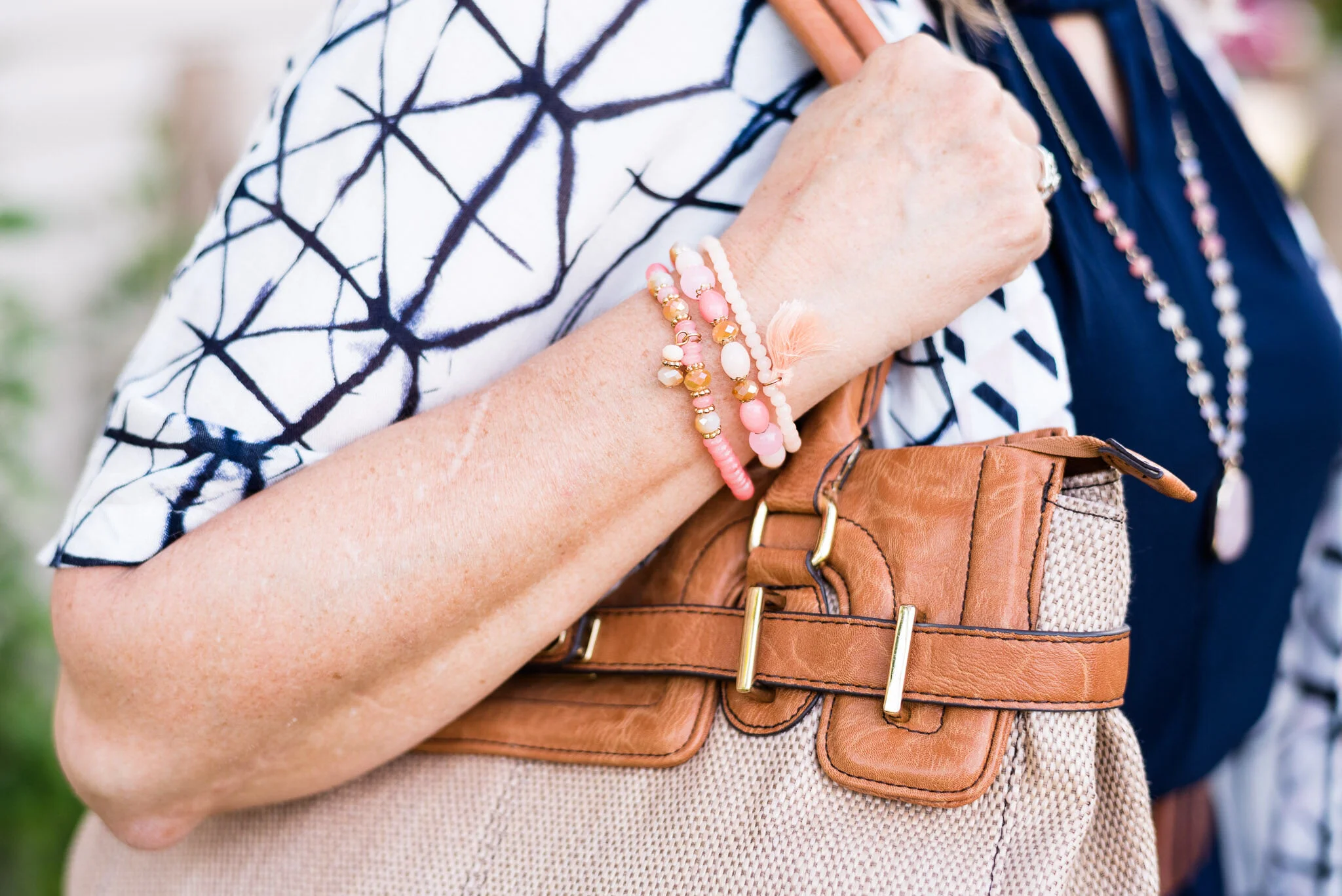
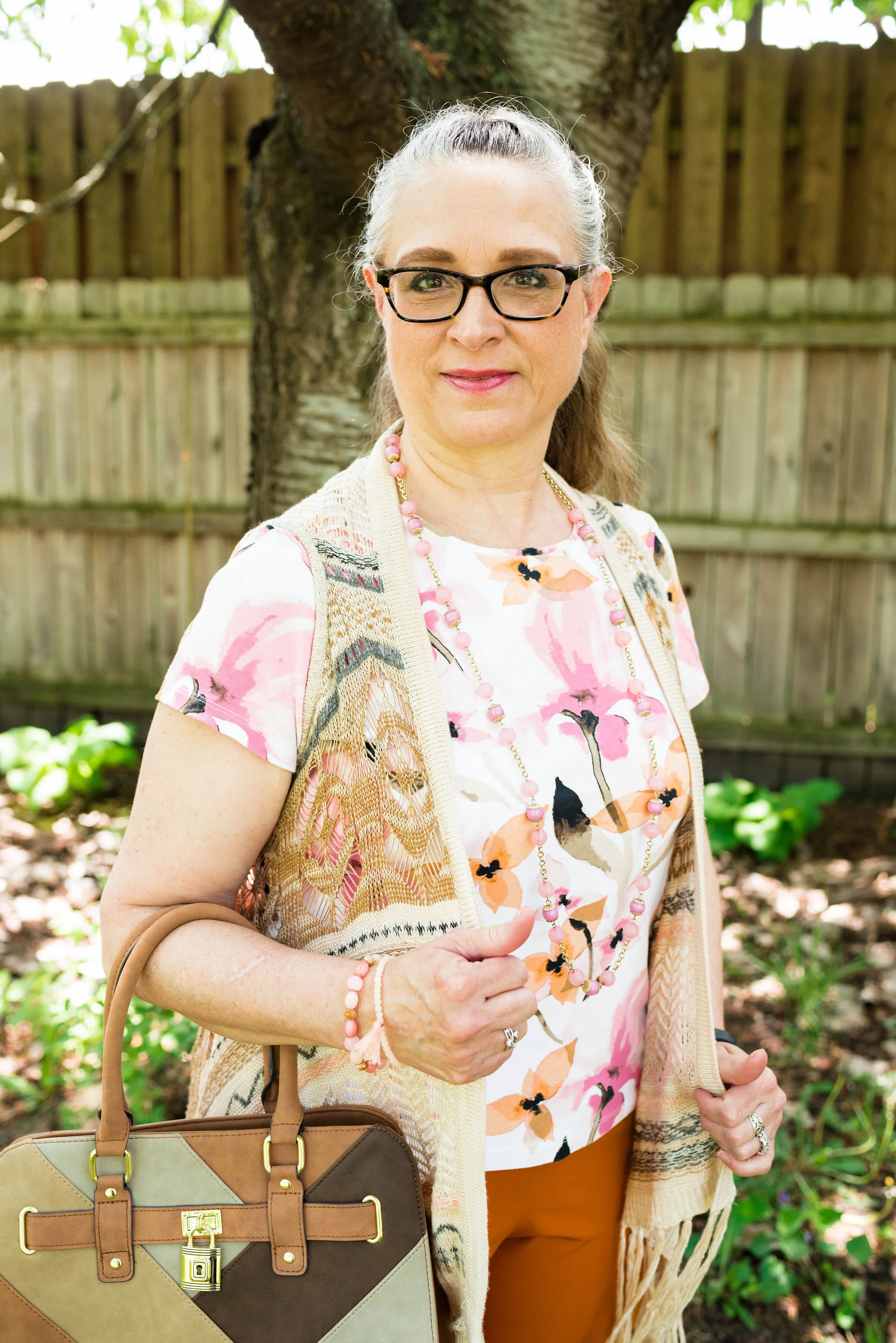
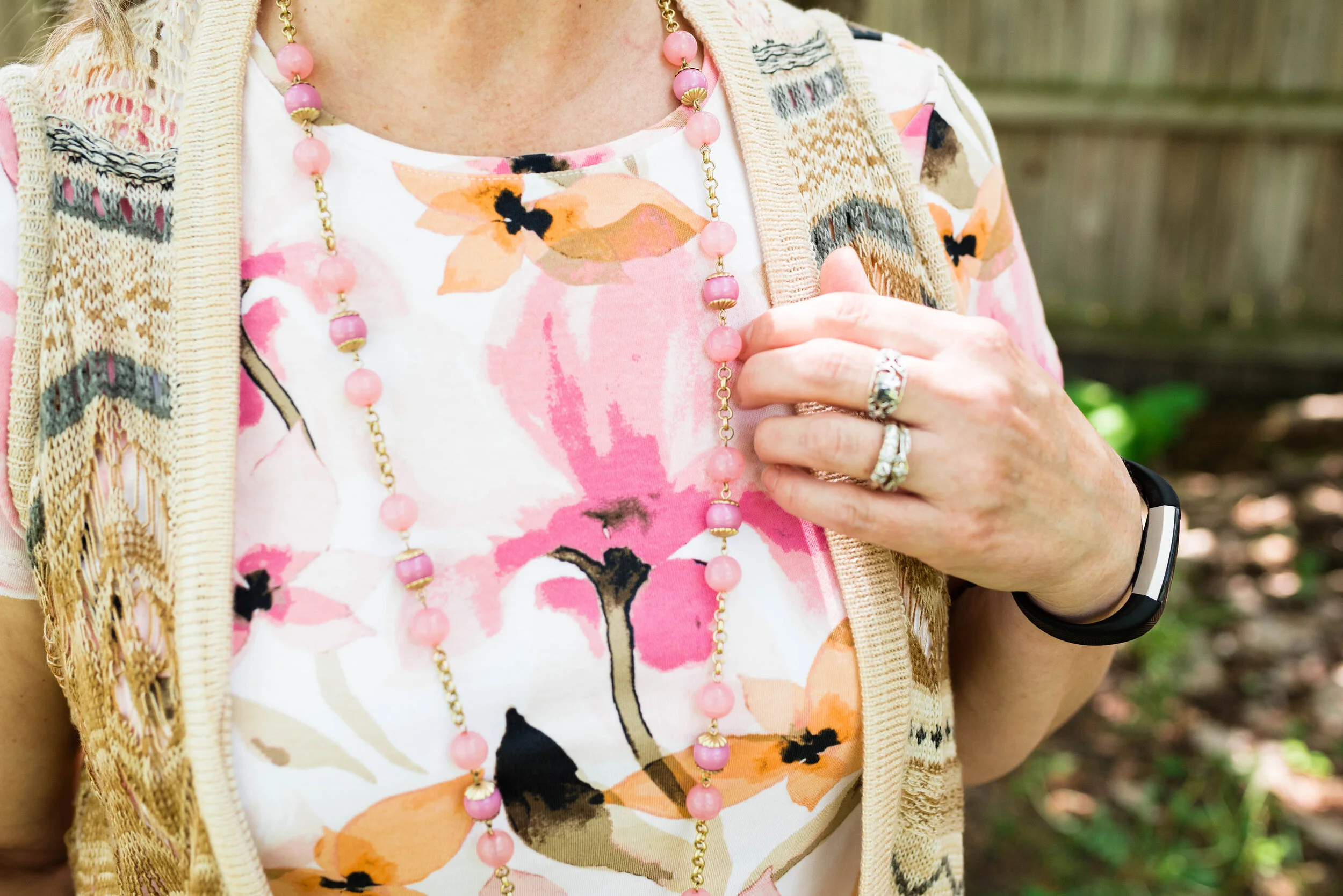
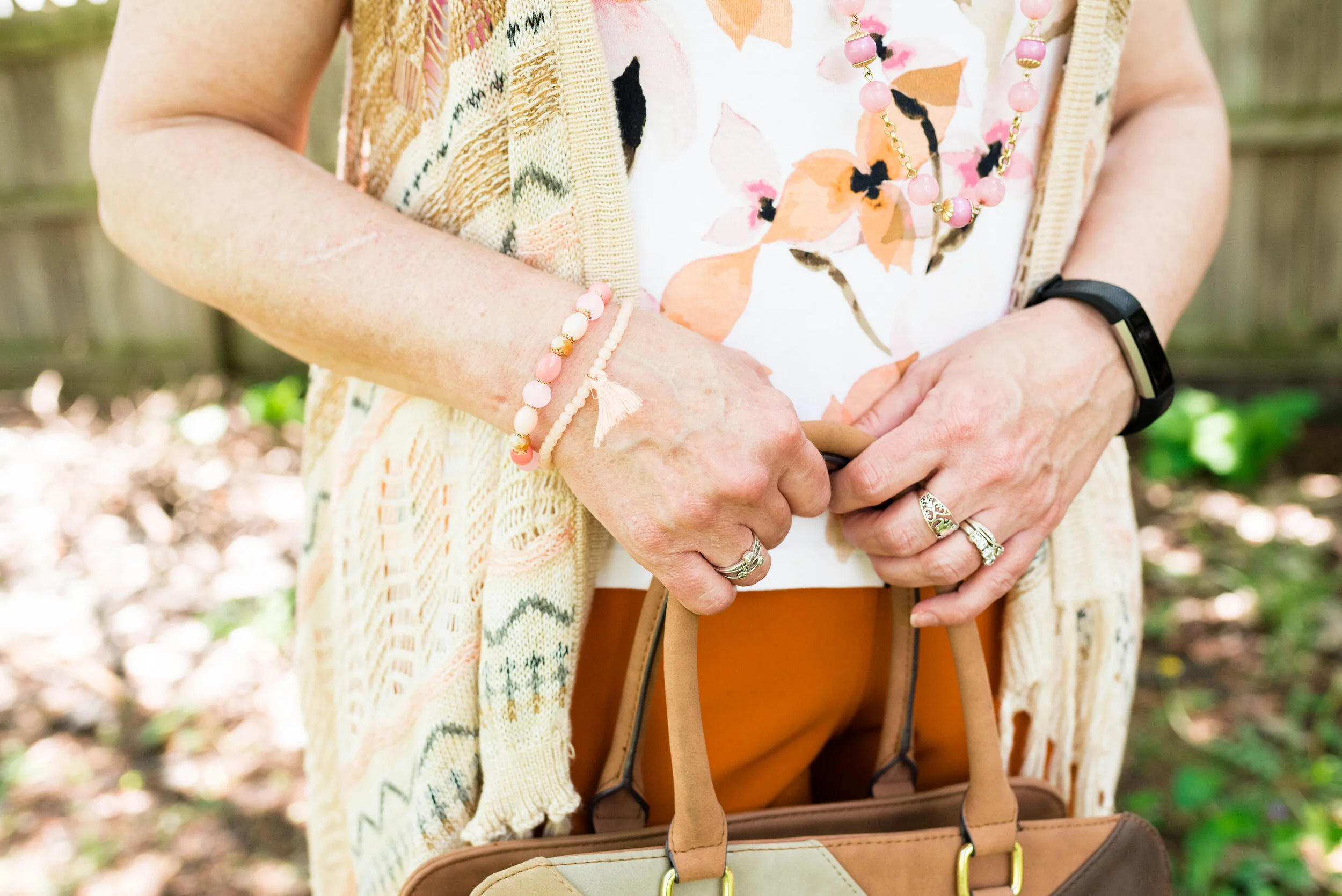
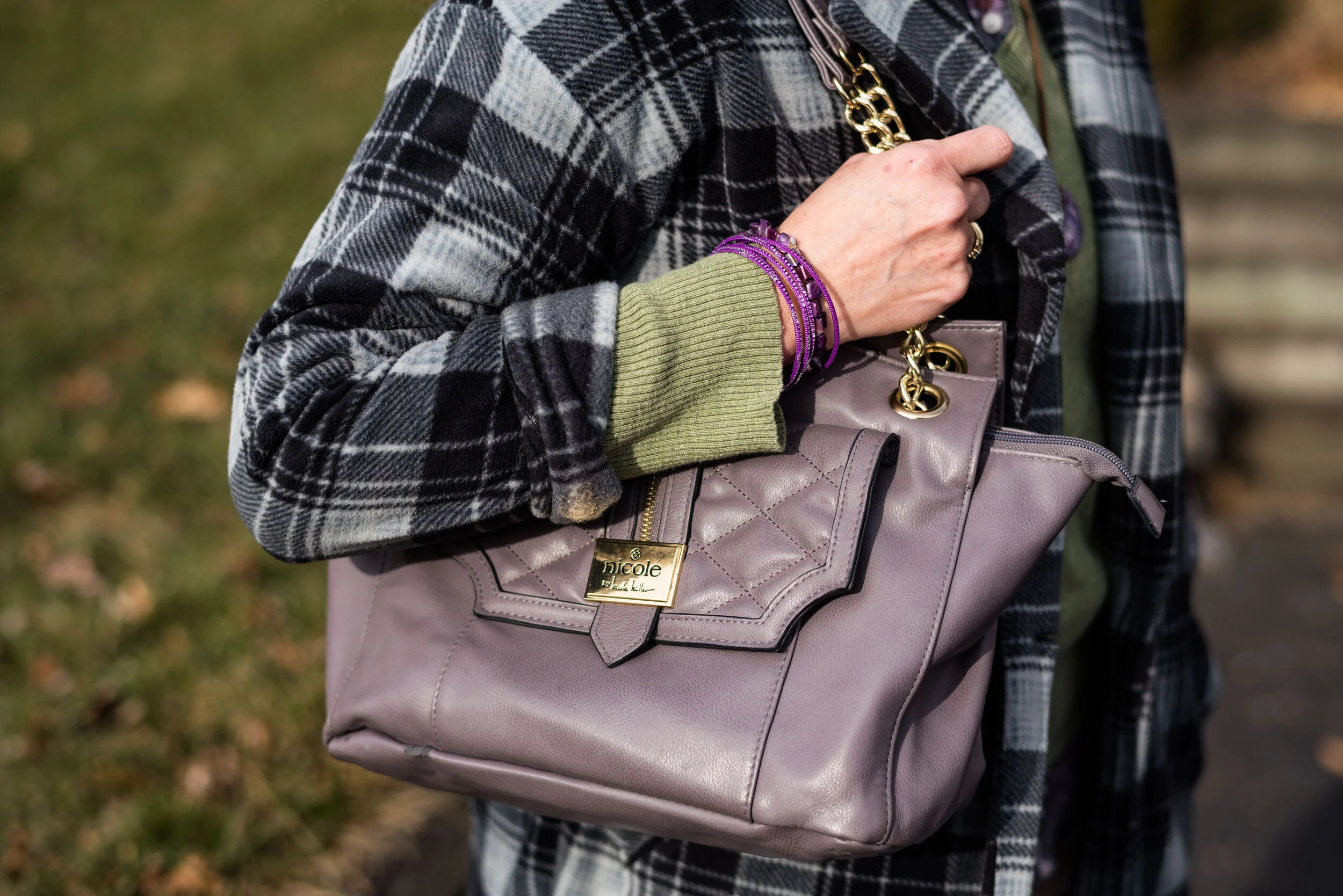
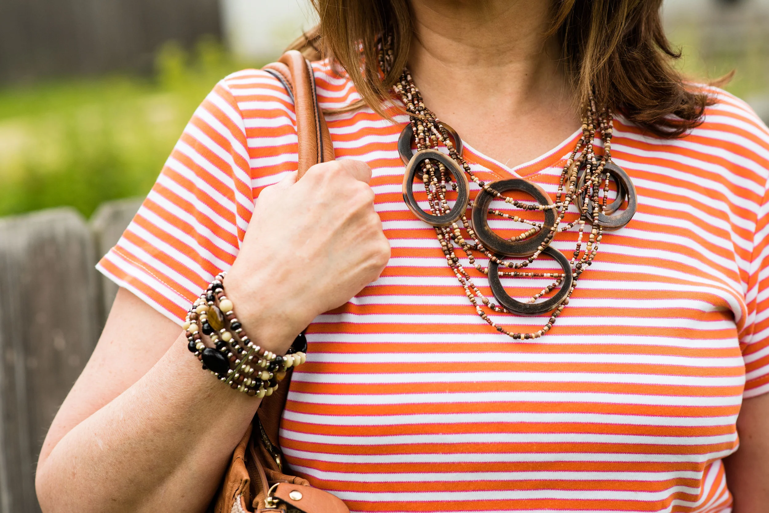
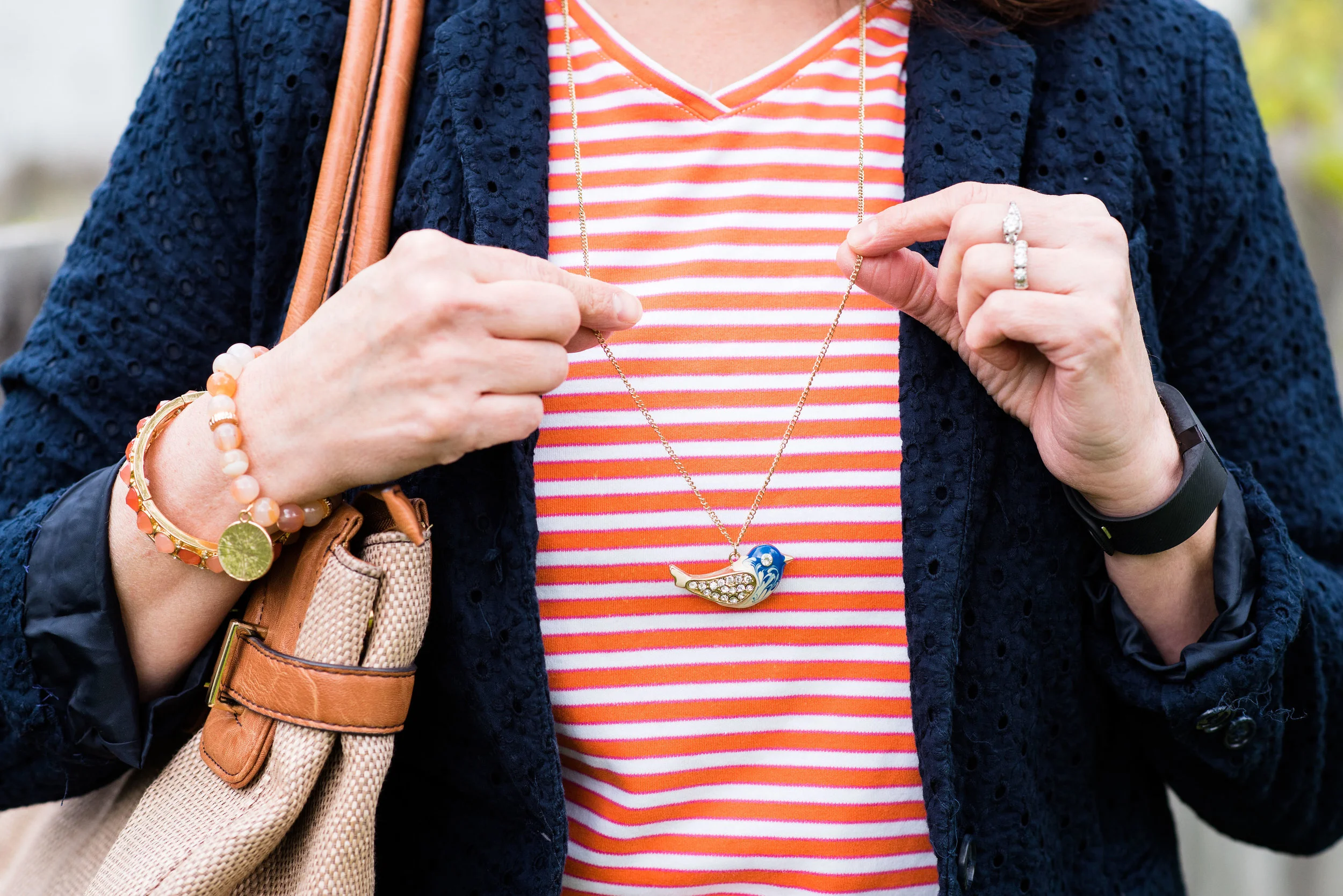
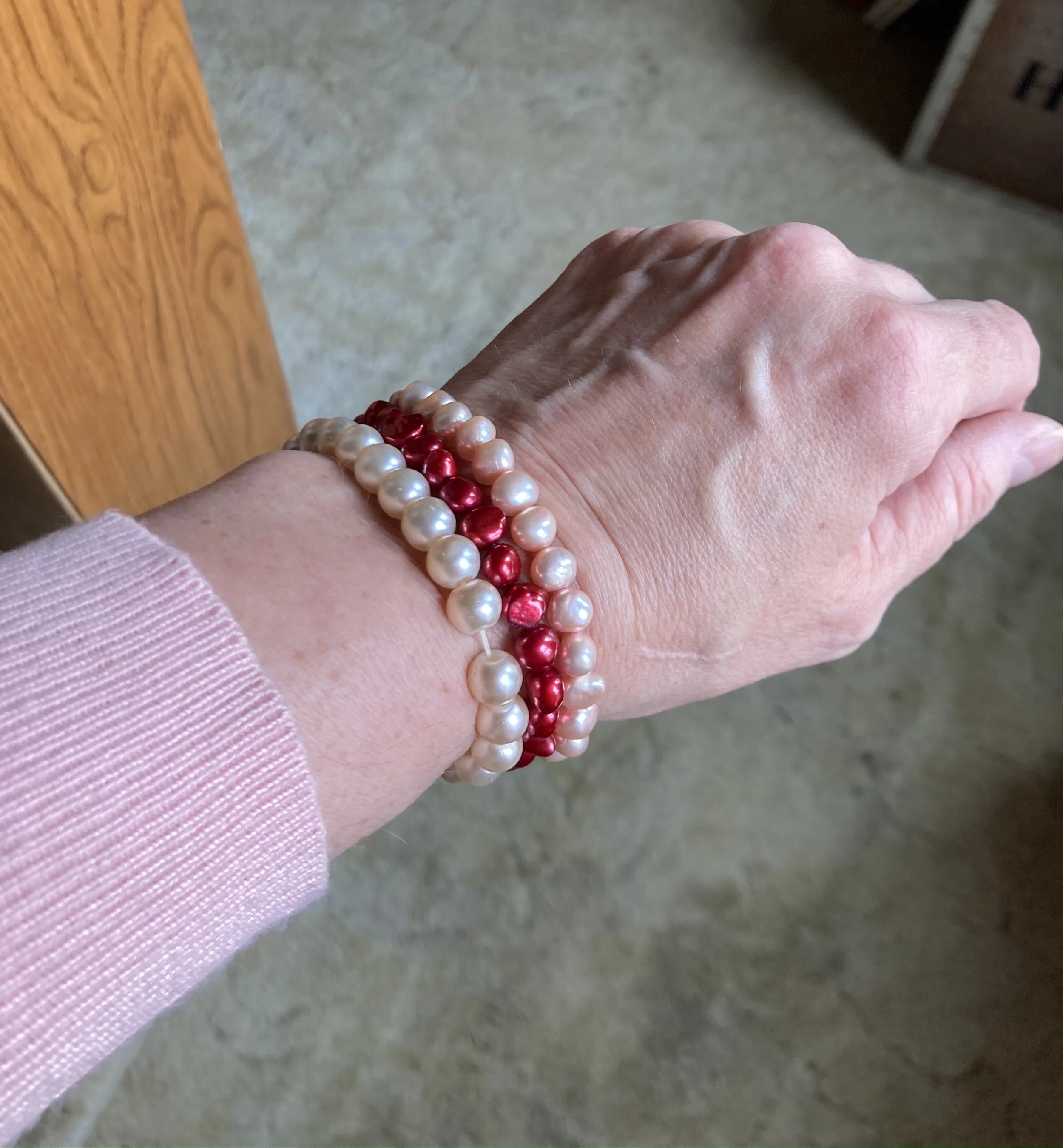
I decided to wear a few red pieces of jewelry to coordinate with the red stripes in the pants.

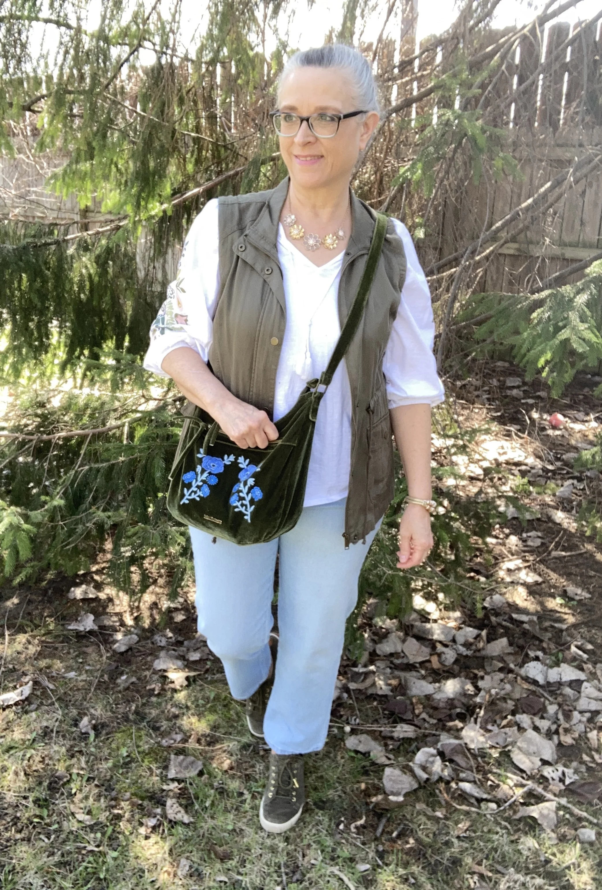
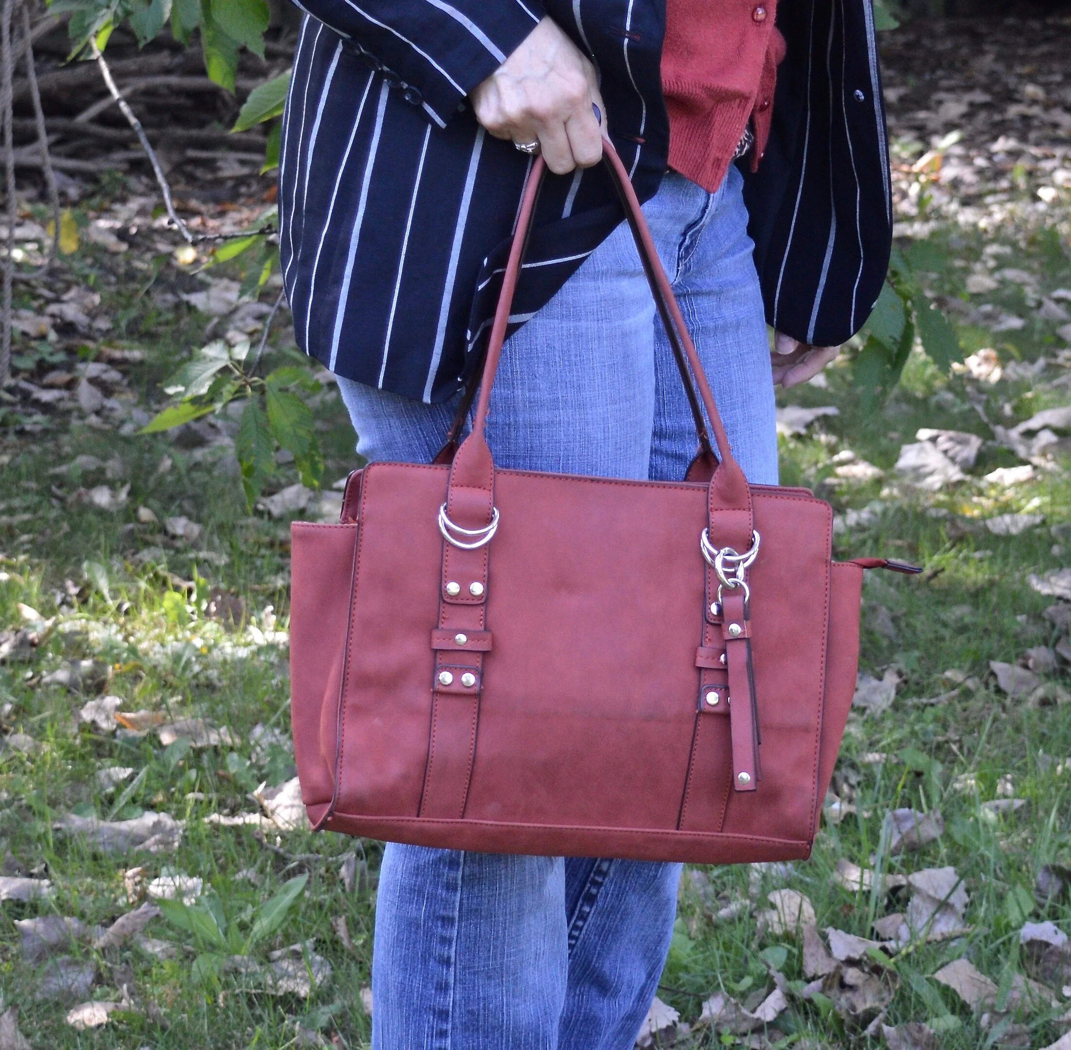
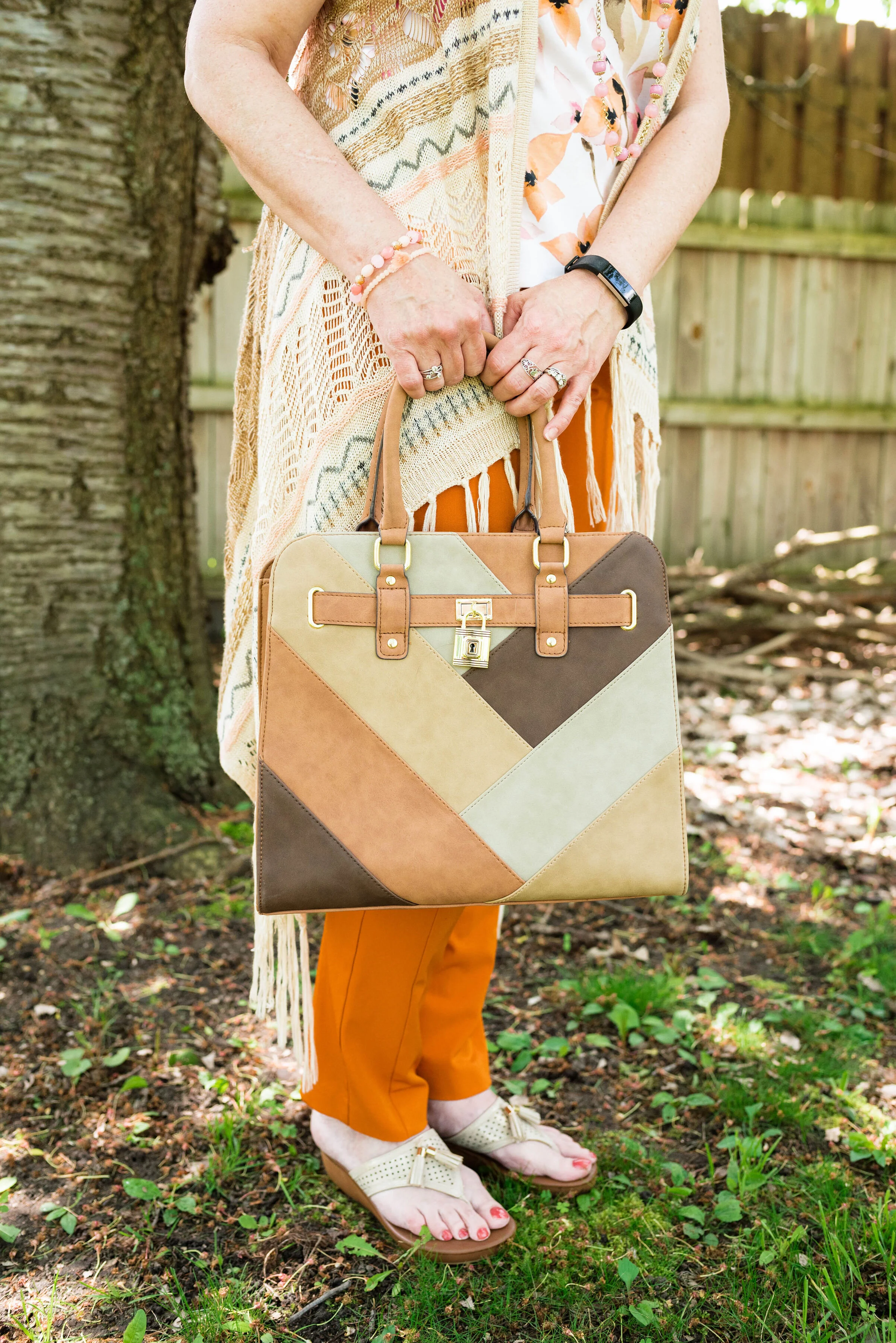
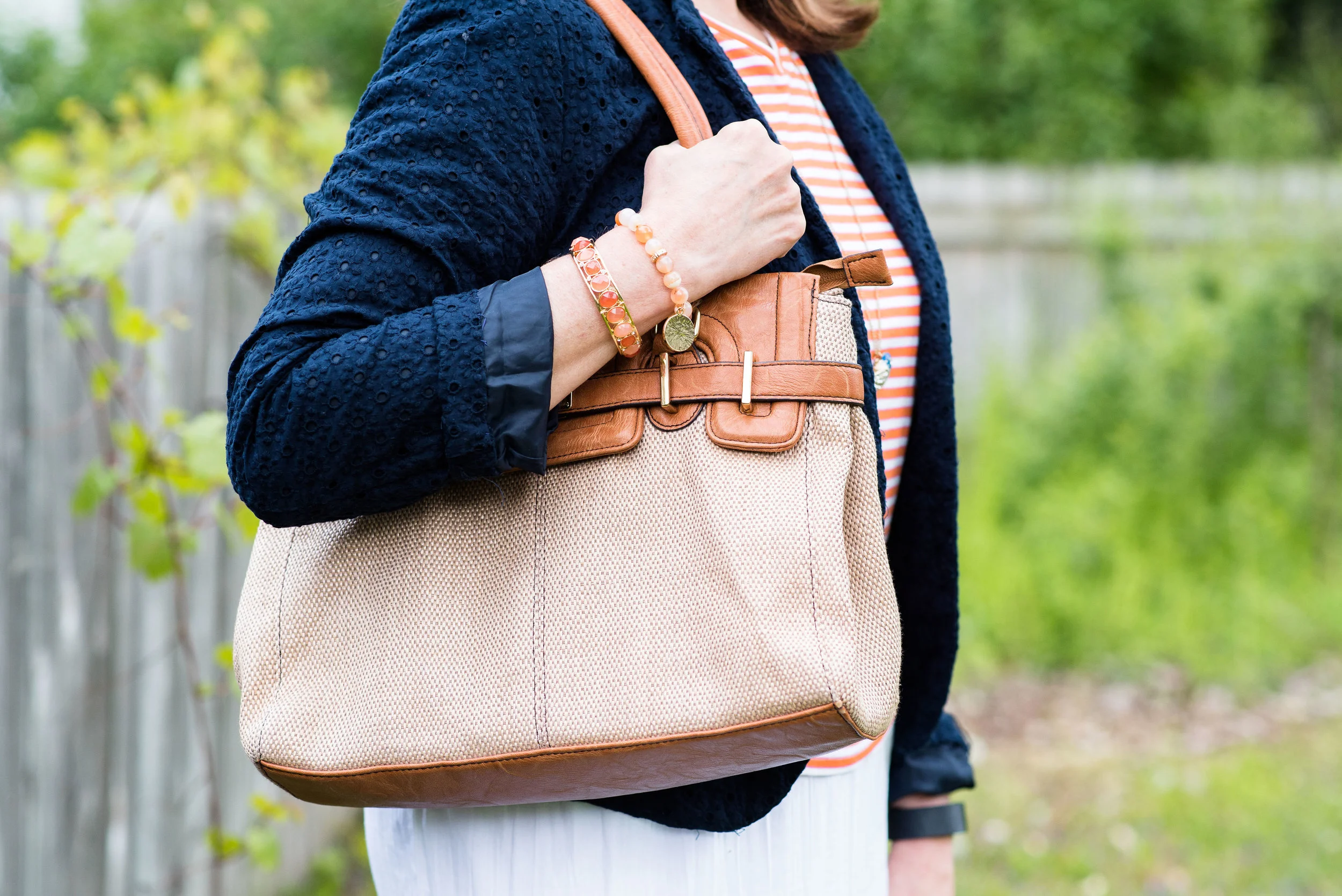
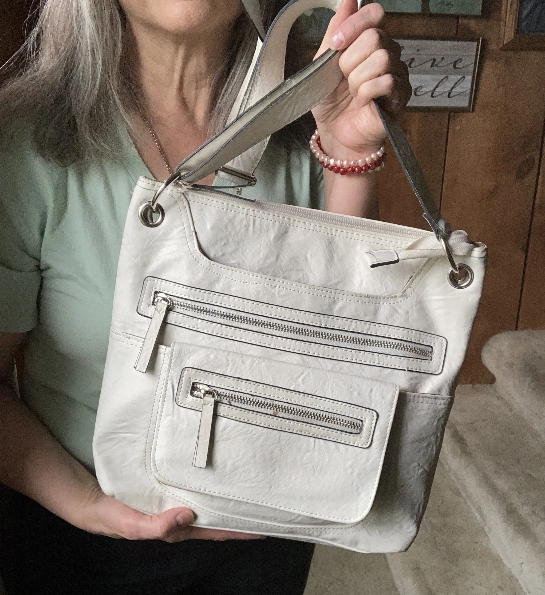
My white bag is another thrift find that I typically pull out in the summer. I still have that “wear white in the warmer months” mentality, not so much about pants or tops, but definitely bags. In our current time anything goes, as they say, but we certainly still have our own personal preferences.

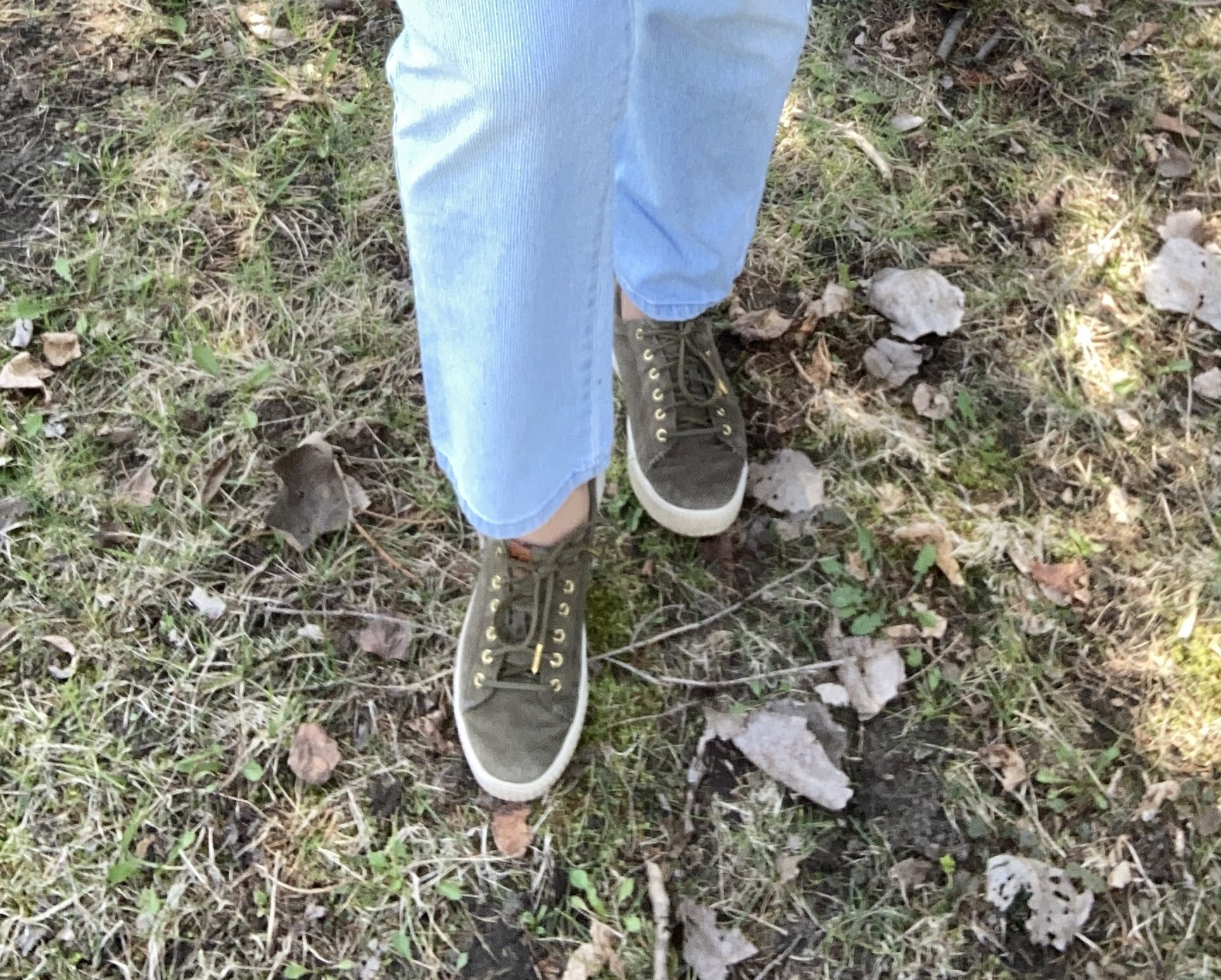
These cute sneakers were another thrift find. They are brand called vaisb, which looked to be a brand that used to be sold on Amazon.

What do you think of this outfit? Do you think I accomplished a spring or summer look by incorporating lighter colored pieces with the darker plaid pants? I personally like the way the outfit turned out, but I know it is not for everyone. However, the idea is to play with color. Don’t be afraid to think outside the crayon box when it comes to what colors you are brave enough to wear, and the color combinations you might create. Getting dressed should be fun and that is one of the reasons I share this blog with you.

I am including a few other shopping links below. Don’t forget to check out the BYdesign link above if you are in need of a light weight cardigan for summer. These are affiliate links. I do not earn any money from these links unless you purchase the item through the link. I provide these links to give you information and they are brought to you at no additional cost. All opinions are my own.

Buy Me A Coffee.

Shopping Our Closets - Utility Vest

Today’s outfit revolves around a utility vest. Vests are great pieces to have in your closet. Whether you wear them as an extra layer in the winter, or style them as a fun topper in the summer, a vest can add interest and depth to an outfit. Spring is the perfect time to pull out those lighter weight vests and change up your looks from dark, cozy colors to lighter pastels and brights.

Style Tip: Try using olive as a neutral in your outfits. It is a nice change from the typical tan, beige or gray, and works great in any season.

My Mudd brand vest was a clearance find at Target a few years ago. I have a few utility jackets, but I liked that this was a vest, and is made of a soft, medium weight fabric making it perfect for warmer days. For those of you who like pockets a utility vest is a practical workhorse for your wardrobe.

I just nabbed this Croft and Barrow puff sleeve top on the Kohl’s clearance rack. You know how I love embroidery and the sleeves on this were pure perfection. While the whole print isn’t embroidered, but the combination of print and embroidery really stands out.

I wanted to show you another ankle length jeans look. Last week I showed you a wide leg jean. This week is a thrifted, Gloria Vanderbilt, straight leg version, and once again, it is in a lighter wash. These are also a pinstripe, which is harder to find, but you can’t really tell unless you get close.

I knew I wanted to do something pink and gold for my jewelry so I chose this floral statement necklace and the gold bracelet for a bit of bling.

My bag was a clearance find at Meijer a few years ago when velvet was trending. My sneakers are Sperry’s.

What do you think of this outfit? Is this a style you would wear? Do you have a utility jacket or a utility vest? How do you like to wear them? I love to get your feedback, so leave me a comment or two.

I am including a few shopping links. These are affiliate links. They are brought to you by me and I do not receive compensation for your clicks, but only if you make a purchase through the link. These are provided for your benefit, to give you ideas and options for items you might like to purchase. All opinions are my own.

Buy Me a Cup of Coffee. I provide this link for you to monetarily support my blog. I do not make money on my blog, but I do sacrifice my time to bring you fresh ideas and thoughts. If you enjoy these posts this is a small way to support my efforts.

I hope you are having a great week.

Pantone - Spring/Summer - 2021 - London Palette - Purple Rose, Lava Falls and Baby's Breath

Today’s colors are a blend of pastel purple, bold red and creamy off white. I have always loved purple, but it really isn’t a color I regularly wear. I easily got on board with Purple Rose which is a medium purple that goes well with many other colors, especially things like brown, olive and navy. Why, then did I decide to pair it with a fierce red like Lava Falls? Because I always like to show you things outside the box. It is not very often, that I think to put purple and red together.

purplerose.jpg

The factor that clinched the deal on putting these colors together, was that my thrifted Old Navy, Lava Falls, paisley popover top had both of these colors in it. How fortuitous was that? Ha, ha. This is a fun, tunic type shirt that has short sleeves, and the interesting details of a shirt tail hem line and a lace up v-neck. I love the paisley print too, which always reminds me of the 70’s.

The Croft and Barrow cardigan is older and I like I said, doesn’t get a lot of regular wear, but i just love the color so I keep it around.

purplerosepantoneoutfitideas-2.jpg

You’ve seen these creamy, Baby’s Breath, thrifted, St. John’s Bay ankle pants on the blog before. I really think this look would have been cuter with a creamy denim pencil skirt or a pair of Bermuda shorts, but I don’t have either of those. I am not as fond of the silhouette, but it is okay, just not great.

purplerosepantoneoutfitideas-7.jpg

I didn’t need to wear a necklace and this long opera length beaded strand is exactly the same color as the top, but sometimes I like the subtle texture and shine of a piece, even if it is a similar color. Wrapping this long strand of beads around my neck makes it look like I have on a choker.

purplerosepantoneoutfitideas-8.jpg

I added a few beaded bracelets with similar reds, although there is plenty going on in the top, so it wasn’t really needed. Often, less is more.

purplerosepantoneoutfitideas-9.jpg

My thrifted Simply Vera, Vera Wang cross body bag is making another appearance. This is a great little bag for the warmer months. The off white color goes perfectly with the Baby’s Breath color of the pants.

purplerosepantoneoutfitideas-10.jpg

These Steve Madden platform sneakers were a new purchase from DSW. I had a coupon and I had been looking at this type of sneaker since last summer. I finally took the plunge. They are not something I would use for walking, but they are cute for a casual day of picnicking or window shopping.

purplerosepantoneoutfitideas-4.jpg

What do you think of these colors? Do you think you would ever combine red with purple? I’d love to hear your thoughts, so leave me some love.

I am including a few shopping links in these colors, so if you have time, give those a look. I hope you have a wonderful weekend!

Graphic and photo credit, Rebecca Trumbull.

Having Fun with Layers - Plaid Skirt

I have been trying to get back to more of a regular posting schedule, but I am still struggling, so bear with me for a little while longer. Everything takes time, which is often the thing I am not really good at managing. Just when I am on the cusp of making changes and doing better, something seems to happen to throw me off. Last night I hardly got any sleep due to a sore neck. I have no idea what happened. I didn’t twist it or jerk it, but during the day I got a bad headache and by evening, my neck on one side felt like it was cramping up. Ugg. Now I have a big lump back there. Like many people, I carry my stress in my neck and shoulders. Yes, we carry the weight of the world on our shoulders. Ha. ha. Anyway, thank the Lord for ibuprofen, heating pads and frozen bags of corn and peas!

Having fun with layers - plaid skirt

Today’s outfit revolves around a thrifted plaid skirt. I have styled this Michelle brand skirt on the blog before. You can see how I styled it with a gingham shirt. It is a simple a-line piece with a fair amount of stretch, but still enough structure. The plaid pattern is embellished with an embroidered floral arrangement in the lower front corner of the skirt.

Having fun with layers - plaid skirt

Because I love when things have some continuity I chose to wear a sweater that matches the blue in the flowers. This is a thrifted Croft & Barrow cable knit piece. As you can tell, I like these types of sweaters and have a number of them in various colors.

I have been looking for an excuse to wear this thrifted HSZ Studio wide wale corduroy jacket and this seemed to be the perfect look to combine it with. The lighter color says spring, yet the material is still plenty warm for the chilly days still to come. I almost got rid of this piece, because after I got it I never wore it. The sleeves are a little short and for a time, I thought about cutting off the sleeves and making it into a vest. However, I hung it back in closet and now I am glad I did. I think it will work well, even with the shorter sleeves as then I can have other colors peeking out by my wrists with long sleeve tees, sweaters, or button downs.

Having fun with layers - plaid skirt

Once again I used my heavier sweater tights to keep my legs warm. I chose my thrifted, Nine West, black, buckle loafers instead of boots and my green Axcess bag.

Having fun with layers - plaid skirt

I like the length of this skirt. Do you like your skirts shorter, longer or in between. I’d love to hear your thoughts in the comments section down below. Since so much of this outfit is thrifted, what the best piece you have found thrifting?

Having fun with layers - plaid skirt

I am including a few shopping links for you to look over. These are affiliate links, but are brought to you at no cost. If you click on the link, I get a few cents, but every penny counts.

I hope you are having a great first week of March!

Having Fun with Layers - Summer Dress in Winter

The beauty of layering is that it allows you to wear many of your wardrobe pieces over multiple seasons. In fact, when you layer you can wear any lighter weight spring or summer pieces all year long. For people like me, who have way too many clothes for every season, I don’t really have to worry about wearing summer skirts in the winter, but there is an element of desire here. Once we get into the month of March, all of us are over winter and want to pull out our light weight pieces and at least look like spring has sprung.

Today, I am going to show you how to layer an outfit with a summer dress that makes it perfectly wearable during a polar vortex. It is most likely you won’t be going anywhere anyway, but why not look springy and bright in your own home for a needed change of pace. You could turn the heat up to 80 F, or you could just add a few layers.

I am also trying to add a few tips to my blog posts when applicable that help you in the how to’s of outfit building. These will be highlighted in bold text.

Having fun with layers - summer dress in winter

My daughter was getting rid of this LuLaRoe swing dress with a high-low hem and I just fell in love with the colors, so I grabbed it. In the picture below, you can see it without the belt, but I wanted to have more of an hour glass silhouette so I added the wide black stretchy belt.

Layering fun - summer dress in winter

Once again, I used my black knit tights and my black tank top as my under layers. I simply use what I have available, but every woman is different. You might prefer more silky fabrics agains your skin and choose pretty cami’s and slips for your foundational under layers. Or you might prefer a set of heat keeping thermal (or something like Under Armor) underwear. Whatever you use, if you live in a climate that gets cold, snow and ice in the winter you know how essential layering is.

Layering Tip: Use multiple light weight layers to alleviate bulk.

For this look I also chose to add a button down blouse under the dress. This thrifted chambray printed top is Old Navy brand and I thought the colors in it went well with the colors in the dress. I get a bit of print mixing as well.

Print Mixing Tip: Choose patterns that have at least one or two similar colors.

Having fun with layers - Summer dress in winter

For this first look, I added a bright blue bag, a Christmas gift from my younger daughter a few years ago. I like how it makes the blue in the dress really pop. It also adds that element of spring we are all longing for.

Having fun with layers - summer dress in winter
Having fun with layers - summer dress in the winter

Once I added the belt, I thought I would also add a longer sweater over the top. Ladies, I live in an old, drafty house that is almost 100 years old. We have done a few things over the years to help insulate, like add loose insulation and get new windows, but without actually tearing the place down and starting over, we still live in a drafty, older home. I’m fine with that, but it does require multiple layers. I often feel silly wearing as many layers as I do, but this is life. All that to say, yes, I would wear these layers at home.

Having fun with layers - summer dress in winter

This cozy open front sweater was a Christopher and Banks purchase from a year ago. I love this medium green, marled look and I thought it went really well with the dress, even though it isn’t exactly matchy, matchy. Sometimes a little different shade of color or added texture can really add to an outfit.

Outfit Building Tip: Adding texture to your outfit will add interest, and often extra warmth.

Since the background of the dress is black, I thought black was a good choice for the belt and boots, and in this look with the sweater I added my black Aidebam bag, which I got this past Christmas from the same daughter who got me the blue bag. Both my daughters know, I love my accessories. My boots are Croft & Barrow, a few years old, from Kohl’s.

Having fun with layers - summer dress in winter

For jewelry I wore a simple bead pendant necklace with a similar color scheme and a couple of beaded bracelets, that I didn’t get a close up of.

Accessory Tip: Less is more. If wearing busy pattern all over, chose accessories that compliment rather than detract from the pattern.

Having fun with layers - summer dress in winter

What do you think of this outfit? Do you like your pieces to match or do you like to think outside the box when it comes to blending colors and patterns? I’d love to hear your thoughts, so leave me some love in the comments section below.

Now, for the winners of the Bloggiversary giveaway. The winners are Jessica Klimesh and April White. Congratulations, ladies! I will be contacting you soon, to arrange getting your gift card!

Have a great day everyone. Stay warm, stay safe and stay sane!

Actual Amy - Layering Up

As most of you know, I love layers. Layering in these transitional times, from summer to fall, and fall to winter, gives us the ability to create outfits with even more interest and texture. Easy layering pieces include cardigans, blazers, jackets and scarves. These can all add a fun change to your wardrobe and give you layers to put on or take off as needed with the changing temperatures. We are expecting a warm spell these next few days, followed by falling temps for the beginning of October.

In today’s outfit, the focal point is a recent clearance find from Target. This A New Day striped blazer was uniquely different from my other blazers and jackets being that it is striped, so I knew I had to have it.

Actual Amy - Layering Up

It was a chillier day when I took these pictures, so I already had the fall colored knit top and rust colored cardigan on in the house. We are hoping to make it until October before we turn on the heat. Ha, ha.

Actual Amy - Layering Up

My knit, short sleeve multi-print top is a thrifted Loft piece. The rust colored cardigan is Croft & Barrow brand. There is some subtle print mixing going on here with the multi-print tee and the stripes on the blazer. This is one way to print mix without it being overwhelming. The solid color cardigan provides a border between the two prints, but you still see the mix.

Actual Amy - Layering up

These are my favorite thrifted jeans. This is an older brand called Kikit, which are only available from thrift retailers like Poshmark and Thredup. You can see how I styled these on the blog before with a leopard print blazer.

DSC_0026.jpg

Less is more, when it comes to accessories for an outfit like this. This hand made pendent necklace is a simple piece, but makes just the right statement.

Actual Amy - Layering up

You’ve seen this pretty bag just recently on the blog when I used it with a fall colored fringe kimono.

Actual Amy - Layering up

I chose my black faux suede ankle boots. These are Natural Reflections which are a brand Cabela’s carries. My hubby and I go there every so often and usually pass through the shoe department to see what’s on sale. i really love the buckle detailing on these and I use them a lot throughout the cooler seasons.

Actual Amy - Layering up

What do you think of this outfit? Do you wear lots of layers when it gets cooler? How do you like to put your layers together? I love hearing your thoughts so be sure to leave a comment or two.

I’m including a few shopping links, so be sure to stop by. Every time you click on a link I get a few cents. These are affiliate links. All opinions are my own.

Have a great weekend everyone. If you follow my faith posts be sure to stop by tomorrow to see the latest.


Kickin' It with Kimonos - White Print

Today’s outfit features a longer kimono with the more traditional rectangular shape with sleeves. I have styled this pretty Sonoma kimono one other time on the blog. You can see it styled for a casual look with ankle jeans and a silk sweater top. I found this piece on the Kohl’s clearance rack last summer. Speaking of Kohl’s, I got a 40% off coupon in my wallet that I need to use before the day is over. Plus, my hubby had gotten me a Kohl’s gift card for our anniversary, so I guess I will be doing a little online shopping today. Ha. ha.

Kickin' It with Kimonos - white print

I have shown you how to wear kimonos and ruanas with skirts, shorts, white pants, short dresses and jeans. Today I thought it would be appropriate to show you, that you can also wear a kimono or ruana with a maxi dress.

I have had this navy, column type maxi dress from Christopher & Banks for a few years. It is a medium weight knit, so no need for a slip. It drapes nicely and can be dressed up or down, depending on where you want to wear it. The heavier knit has stayed fresh over the years, so the dress never looks worn or faded. The dress has its own elastic waistline and came with a simple cloth, tie belt. I typically use other belts to jazz it up a bit, but you really wouldn’t have to use a belt at all. You can see how I styled this sleeveless piece before in my Marvelous Maxis series.

Kickin' it with kimonos - white print

When I chose my accessories, I wanted to keep the look slightly more casual, so I opted for browns and a little blush in my jewelry to pull out the very light pink along the front edge and neck line of the kimono. My sandals are Croft & Barrow, Ortholite brand and they are very comfy. The bag was a thrifted Aldo piece. I really like how the earth tones of the bag, sandals and belt really compliment the whole outfit.

Kickin' it with kimonos - white print
Kickin' it with kimonos

Here’s a few twirling pictures. What little and big girls don’t love a good twirl…but not too much, or I’ll get sick. Ha, ha. The joys of aging!

I do like how this outfit turned out. What do you think? Have your worn a kimono with a maxi dress? I’d love to hear your thoughts. Your comments do help my blog grown and they also help me to know what content you enjoy reading, so if you have a moment, leave me some love.

Kickin it with kimonos - White print

I am including a few shopping links for you to look over. Have fun shopping! All you clicks give me a little bit of money. These are affiliate links. All opinions are my own.

Photo credit Rebecca Trumbull.


Pantone Spring/Summer - 2020 - Flame Orange, Blossom and Cuban Sand

Today’s colors are bright and light and make me think of late night bon fires and light pink peonies. The classic color of Cuban Sand makes me want to take my shoes off and walk on the beach. The combination of these three colors together makes for the perfect summer look, complete with my own version of print mixing and boho vibrations.

Pantone Spring/Summer 2020 - Flame Orange, blossom and cuban sand

This very casual look revolves around my bright orange Worthington pants from JCPenney. I have styled these slimming skinny trousers many times on the blog before. You can see them with a dress, a sheer summery top, a dark green cardigan, and a multi print scarf. They are such a different color from what I normally wear and I like that I have been able to use them for so many different outfits. The fact that they are skinnies makes pairing them with a dress a fun option that I never would have thought of before.

Pantone Spring/Summer 2020 - Flame Orange, blossom and cuban sand

My fringe, asymmetrical, open weave vest has been on the blog before too. You can see it styled with a pair of checked ankle pants. Say What brand is sold by a number of stores including Kohl’s, Target and Macy’s. I am not sure that this brand is as popular any more. Here is a fun shot of me twirling. In the second picture you can see the print at the top of the vest and notice the print mixing.

springpantonecolorfashionstyles-11.jpg
Pantone Spring/Summer 2020 - Flame Orange, Blossom and Cuban Sand

My thrifted, floral Croft and Barrow tee was really the inspiration for the outfit. Seeing as it had the orange and the light pink, I knew I could make this work. I am a sucker for floral anything. It is an easy place to find inspiration for an outfit and you don’t even really have to worry about accessorizing if you don’t want to.

Pantone Spring/Summer - 2020 - Flame Orange, blossom and cuban sand

You can see my Blossom colored necklace in the above pic as well. Another way I wear it is to double it so it looks more like a layered piece closer to my neck. I also chose a few light pink beaded bracelets to go with the necklace and bring more of the blossom color out.

Pantone Spring/Summer 2020 - Flame Orange, blossom and cuban sand

I went for my George bag again from Walmart. While it is not exactly Cuban Sand, the patchwork mix goes well with the tan colors in the top and the vest.

Pantone Spring/Summer 2020 - Flame Orange, Blossom and Cuban Sand

My little thong sandals were a thrift find a few years ago. I don’t wear sandals all that much, but I wanted to give you all a feeling of summer. I would wear them a lot more, but I am very self-conscious about my bunions and my varicose veins. I know, I know! Get over yourself. Ha, ha. I’ll keep trying to push myself out of those boxes that confine me, but on the other hand we should choose to wear what makes us feel good about ourselves. Right?

Pantone Spring/Summer 2020 - Flame Orange, Blossom and Cuban Sand

What do you think of these colors? Do you have these in your closet? Let me know your thoughts in the comments below. I love hearing your ideas.

Pantone Spring/Summer 2020 - Flame Orange, Blossom and Cuban Sand

I am including a few shopping links just for fun. These are affiliate links. All opinions are my own. I hope you all have a wonderful weekend. Thanks for following along on the blog.

Photos and graphic by Rebecca Trumbull.


Pantone Spring/Summer 2020 - Cinnamon Stick, Grape Compote and Navy Blazer

Today ends my look at the Pantone New York colors for Spring/Summer 2020. Thursday I’ll be introducing the London Palette, so be prepared for more fun colors. Today’s outfit features the colors Cinnamon Stick and Grape Compote with splashes of Navy Blazer and Lark in my accessories. I felt like Cinnamon Stick was a reach for me, not because I don’t like the color, but because it seemed misplaced on a summer palette. I definitely think this rusty red is perfect for fall, but my brain has a hard time making it a first choice for summer. However, when I thought about pairing it with the medium purple of Grape Compote, I knew I might have something that could work for a casual, but fun summer day.

The focal point of this outfit is this Christopher and Banks tiered skirt that I ordered mid-lockdown to cheer myself up. I just love it and it is so easy to wear. It is fully lined, so again, no worries about slips or coverage. It also has an elastic waist, but because it is more of a band, doesn’t look so crinkled. I should have adjusted it a bit, as my paunch was sticking out. Ha, ha. I think I have finally hit that age, where the weight is piling on very fast and it is much harder to get rid of. I have started exercising again, counting calories and doing the 12/12 fasting thing, but I think losing weight is going to be a bit more challenging. I need to focus on better food choices and cutting back on carbs. How about you? Is the whole pandemic affecting your weight?

Pantone Spring/Summer 2020 - Cinnamon Stick, Grape Compote and Navy Blazer

Once I decided to use the skirt, I looked for a rusty colored piece to epitomize the Cinnamon Stick Color. I think this Time & Tru tee from Walmart is probably a little too orange, but I liked how it ended up looking with the outfit and was a more summery choice than a heavy sweater, which were the only other pieces I had in this color.

Pantone Spring/Summer 2020 - Cinnamon Stick, Grape Compote and Navy Blazer

My purple cardigan is an old Croft and Barrow piece, that I don’t wear a lot, but I hung onto because I don’t have anything that color. Now I am even more glad I did, because it goes so well with the skirt.

Seeing as the skirt had navy stripes in it, I added navy accessories with a simple bangle bracelet, bead necklace and my navy Grasshopper shoes.

Pantone Spring/Summer 2020 - Cinnamon Stick, Grape Compote and Navy Blazer

I was going to grab my thrifted Simply Vera navy bag, but decided to go back to the Classic Palette and pull in Lark. My shoes have those decorative braids and my George patchwork top handle bag was just the right shade for the classic color.

Pantone Spring/Summer 2020 - Cinnamon Stick, Grape Compote and Navy Blazer

What do you think of these colors? Purple has long been one of my favorite colors, but it’s funny that I don’t reach for it as often as my yellows or my blues. However, with this cute skirt, I may have to wear it a little more often. I can see this skirt being worn well into Fall with a few of my chunkier purple sweaters and some boots.

Pantone Spring/Summer 2020 - Cinnamon Stick, Purple Compote and Navy Blazer

I hope you enjoyed this post and this outfit. I’d love to hear your thoughts so be sure to leave a comment or two. I do try to respond to all of your comments, so if you are curious, just check back in a few days.

I’m including a few shopping links. These are affiliate links. If you click on a link I get a few pennies. If you purchase something through my links I might get a little more. I appreciate all your clicks. All opinions are my own.

Graphic designed by Rebecca Trumbull.


Transitional Spring Outfit

Before I get to my Pantone series I decided to do a few more posts featuring transitional spring outfits. If you are unsure what a transitional outfit is, let me explain by first giving you the definition of the word transition. Webster’s online dictionary gives several definitions for this word:

- passage from one state, stage, subject, or place to another

- a movement, development, or evolution from one form, stage, or style to another

- a musical passage leading from one section of a piece to another

There are a few other definitions which are not as pertinent to our fashion content. The second definition seems to be the one that suits our needs the best, but I really like the third definition. Aren’t we a musical score, written by an Almighty Creator? The seasonal changes in our natural world and in the fashion world are akin to a piece of music changing and modulating from one section to another.

When it pertains to fashion we enjoy moving from one season to another just as much as we enjoy the change of the nakedness of winter to the covering bloom of spring. We enjoy moving our heavy, dark winter clothes to the back of the closet, or the bins in the basement and pulling out our bright, light weight tops and fun colorful maxi dresses. What often becomes a problem is that period of time when winter has not yet loosened its grip and the chill in the spring air is too cool for our light weight layers. The transition is this time period we, in the midwest, now find ourselves in. We still need our sweaters and our booties, but we crave our bright colors and layers that allow the sun to caress our skin.

Today’s outfit is another attempt at styling a look around a scarf. I have so many pretty, colorful scarves, so I thought why not use them as focal points for outfits.

The beauty of styling an outfit around a colorful scarf like this is it is so easy to do. This scarf has several colors including a light and dark pink, a light purple, a light blue and the orange. I wanted to stay away from pink for this outfit so I chose the orange, light blue and purple to focus on.

My Worthington orange pants have made many appearances on the blog. You can see them worn with a green sweater, a floral dress, and a print top. Worthington is a JC Penney brand and I find them to be a good brand if you are looking for durable, decent fitting work/dress pants.

My light blue Sonoma tee was a thrift find. I typically wear these crew neck or v-neck types of tees as layering pieces under sweaters or long sleeve button ups during the winter, but for a transitional outfit like this it was perfect to wear on its own, or in this case with a vest.

The above picture gives you a closer view of the scarf. It is a large square, which I folded into a triangle. The point point of the triangle is at the front. The two other long, narrow points fold towards the back and then around to the front. I tied those into a double knot over the bib part of the triangle.

I chose this open weave black marled vest to go with the black lines in the scarf. This vest is Croft and Barrow brand from the Kohl’s clearance racks a number of years ago. (I am not sure what was going on with my pants, but please don’t judge my crotch ailment — ha, ha! Probably because they are a little tight, bleh!)

This Nicole Miller bag was another Kohl’s clearance find a few years ago. It has appeared on the blog numerous times. I chose it for its purplish color. I also opted for a few purple bangle bracelets to add to the purple vibe of the scarf.

I chose my tasseled Dana Buchman loafers as I thought they went with the vest and as you learned earlier this year, loafers are back in.

Do I have you thinking about those pretty scarves in your closet? Do you have a few that you feel qualify as spring scarves due to their color and weight? I think it would be fabulous if you built an outfit around one of those scarves and told me about it in the comments below. I would love to hear your thoughts on how you put a transitional spring outfit together, using one of your scarves.

As usual, I am including a few shopping links for you to look over. These are affiliate links, which means when you click on a link, I get a few cents. If you purchase something through one of my links I get a few more cents. I appreciate every click. All opinions are my own.

I hope you week is off to a good start.

Be sure to check back tomorrow for another post on my Faith page, where we are working our way very slowly through Romans chapter 8. In addition if you follow my Fashion pages, Thursday will feature another transitional spring outfit, this time with a new maxi dress I got from a local retailer before the stay at home order went into effect.

Have a good day!

Seeing Red - Red with Black - Taking Care of Our Hearts

We don’t often think of pairing red and black for Valentine’s Day. More often we style red with white or some version of red and pink. There are also many of us who don’t even visit the red or pink idea for Valentine’s because we either don’t celebrate that special day, we don’t like traditional holiday color schemes in our outfits or maybe are more into blues and greens than reds and pinks.

For these February posts, I’ve chosen to focus on red or darker versions of red like burgundy. I also wanted to make each of these outfits, not be so much about Valentine’s Day, although you could use them for a Valentine’s or Galentine’s outing, but more about the color red.

February is Heart Disease awareness month, and the color red certainly represents the age old idea of what a Valentine’s heart looks like, but it also represents that most important muscle in our bodies. This major fireball, which is about the size of your fist, works hard, pumping blood to keep us alive. Try to envision the heart as the UPS hub, where everything comes to and goes out that our bodies need to survive. Heart disease, like cancer, drug addictions and infectious diseases can be life threatening. It can manifest itself with high blood pressure, high cholesterol, hardening of the arteries and many other complications. Take a look at some of these statistics that I got off the CDC (Centers for Disease Control) website:

Heart disease is the leading cause of death for men, women, and people of most racial and ethnic groups in the United States.1
One person dies every 37 seconds in the United States from cardiovascular disease.1
About 647,000 Americans die from heart disease each year—that’s 1 in every 4 deaths.2,3
Heart disease costs the United States about $219 billion each year from 2014 to 2015.3 This includes the cost of health care services, medicines, and lost productivity due to death.
— Centers for Disease Control Website

As you look at the pictures of this outfit I put together, I’m sure you can think of at least one person you know that has been affected by heart disease. This past fall at the college my husband teaches at, a 24 year old student died from a massive heart attack. It was a tragedy.

The Heart Association, formed in 1924, is the major force behind raising awareness about heart disease in the United States. Their website has a bucket load of information. You can see some interesting historical facts on their history page here. I am not getting paid to mention this, but merely want to raise awareness of a disease that affects so many people. You would think in our world where we have so much awareness about health, good eating, exercise and so on, that heart disease would be a thing of the past, but it’s not. We all struggle to make good choices and taking care of our hearts should be no exception.

I have not touched my camera for months, but this is what you get when schedules for taking pictures don’t coincide. Ha, ha. I just did not want to stand outside and try to get my settings figured out, so I tried to stand by the windows to get enough natural light. The skies were gray, as usual, thus the shadows on my face. Oh well, I tired and the pictures are good enough that you get the idea.

For this outfit I wanted to showcase this cute black Croft and Barrow tunic that I found a few weeks ago thrifting. It is probably meant to be more of a summer piece, and when I saw it, I thought it would look cute with cropped jeans and a tee or tank top in the warmer weather, but I also thought it would be the perfect topper for a winter look, thus this red and black combo.

My red cropped pants, I have styled on the blog before. You can see them with a black kimono and with a navy blazer. I found these a while ago at Meijer on the clearance rack and they are a brand called Stitch Star.

The lace 3/4 sleeve, Lauren Conrad top was a thrift find. Typically I would wear a cami underneath, but because I knew the black tunic was going over the top, I didn’t bother. The idea was to create a monochrome layer underneath and even though the pants and top are not the exact same shade of red, it works fine because they are not right next to each other.

To keep the look fairly stream lined I chose my thrifted black and gray houndstooth, Thirty One purse and my Aerosole black suede heels.

The jewelry I am wearing I bought for my oldest daughter’s wedding, so I am often looking for other reasons to wear the necklace and bracelet. I thought this was the perfect finishing touch. You can also see the fun metal rings on the tunic.

Would you wear red and black? What sort of occasion would you wear it for? I could see wearing this outfit for a date night with my hubs where we go somewhere more fancy than Five Guys. Ha, ha.

Do you take care of your heart? I need too. My cholesterol is borderline high, so I have started eating oatmeal more. Exercise is very important, especially cardiovascular. I try to walk a few days a week, but I know I need to be more purposeful in that area as well. I want to do better and my heart needs me to. I hope you all are taking care of your hearts. What better way to celebrate Valentine’s Day than to give the gift of health to our hearts.

Have a great Tuesday!

I’ve included a few shopping links for black tunics. These would be great to pair with red pants, pencil skirts or shorts. They could go with all sorts of colors. Feel free to peruse at your leisure. These are affiliate links. All opinions are my own.


Color Play - Inspiration from Art

One of my monthly columns is going to be this one called Color Play. You know how much I love color and enjoy finding different combinations that are new and unique. Color is all around us in nature, in our homes and in many places we don’t really think about. For this month’s outfit, I was inspired by a painting and table arrangement in my daughter’s house.

This is a watercolor painting by my son-in-law’s grandfather, John Trumbull (not to be confused with the American Revolutionary painter by the same name). While he is not famous, he has done some teaching and won a few awards and ribbons for his work. I was gifted one of this paintings last year for Christmas and just love it.

The table arrangement was put together by my daughter and I really like how the painting and arrangement compliment each other. This is when I was inspired to come up with an outfit using a similar arrangement of colors. This is what I did.

I just obtained this plaid ANA jacket from the JC Penney clearance rack. It was still a little more than I wanted to pay, but I had a coupon. I almost put it back, but I just have this thing for plaid. I kept looking at it thinking, I love it. I can come up with fun blog outfits with it and I’ll actually wear it. It came home with me and I don’t regret it. I could also justify the purchase because I was using birthday money to buy it. Ha, ha.

The piece is not lined, but has deep, welt pockets a notched lapel and button front. The color is a very light bluish gray and it made me think of the two tall, slender vases in the picture.

The two under layers consisted of a thrifted Chaps, floral button up, and a thrifted Sonoma, v-neck sweater. I felt the green sweater went with the lighter greens in the painting and the floral top picks up the sublte purples. I get into these moods when I am thrifting where I buy similar type items, usually patterns. For a while it was gingham, then it was stripes, now it is florals and plaid. That is part of the reason I have so many clothes. It’s that time of year where I will need to do some thinning out of my wardrobe.

My light colored Croft and Barrow jeans are also thrifted. I was looking for something in a lighter color that wasn’t white and these seemed to fit the bill.

Accessories included a simply handmade bead necklace, purple bangle bracelets. and a Nicole tote bag. I love the purply gray color of this purse. The gold accents make it look high class.

Since we are still in the cold weather season I decided to include my Sonoma shearling ankle boots. These are warm, comfy and stylish for this chilly time of year.

What do you think of this color combination? Do you like to wear plaid? What’s your favorite pattern to wear? Leave me some love in the comments. It always gives me a boost to hear from you.

I’m including a few shopping links. These are affiliate links, which means I get a few cents if you click on a link. I get a little more if you purchase something through my website. All opinions are my own.

Photo credit Rebecca Trumbull.


Pantone Fall 2018 - Pink Peacock, Valiant Poppy and Almond Buff

Welcome back to outfit number three in this fall’s Pantone color series. Today I am featuring two colors which the Pantone site describes as a “bright and bold dramatic pink” and a “brave and outgoing red.” I didn’t go into this series thinking I would pair these two colors, but when I started looking for the pink and decided on this multi-print tunic, it was only natural to choose another color in the tunic to pair with it, which obviously turned out to be red. I have always thought of pairing red and pink as a Valentine’s Day idea, but when I began putting this outfit together, I saw a subtle shift from cupids and hearts to fall apples and fuzzy pink slippers.

This tunic is a brand called East Fifth and while I can’t remember, I think I got it at JC Penney. Although, when I checked on their website, it looks like they currently only carry East Fifth shoes. and a few bags. I have styled this tunic on the blog before. You can see that post here.

When I realized I had this thrifted Merona cardigan, I knew that would add the perfect pop of red, in addition to my red clutch.

To keep the outfit grounded I picked the Pantone color Almond Buff from the classic palette. These pants are a little on the light side to truly mimic the color, but my swede ankle boots are a closer match. Yes, I am doing the Robot.

The pants are Croft and Barrow brand. The boots are Sonoma. Both items were from Kohl’s.

I chose my bright red clutch to add to the Valiant Poppy vibe. Because the tunic is so busy the only jewelry I added was a gold bangle bracelet and the pink and red tassel necklace, which as you can see, blends in with the top, but still adds a little textural detail.

Isn’t it funny that I bought this necklace a while back, never realizing that Pink Peacock and Valiant Poppy would be a thing, or that I would end up pairing these two colors on the blog? This next picture is just me at my silliest! Ha, ha.

Would you combine these two colors? Do you think they are what we would classify as fall colors? I’d love to hear you thoughts. It means a great deal to me when you take the time to stop by, read my posts and comment (when technology is cooperating). I have learned a lot from your comments, especially when you share, how you would have done it differently or what you like about a particular post, so keep it up.

Be sure to check back Thursday for a new Old Becomes New post, where I’ll be sharing a colorful blazer styled in a fall outfit. I need your help to decide whether I should keep it or not. Until then, have a great day.

I’ve included a few shopping links for pink tops and red bags, just for fun. These are affiliate links which means I get a penny or two when you click on a link. If you purchase something through my site, I get a little commission.

Photo credit Rebecca Trumbull.


Is it a Kimono or a Ruana? Week 3

If you are new to my blog or to this series, I am looking at the difference between a kimono and a ruana. You can see the definition of each as I explained it here in last week's post. This week's outfit revolves around a more traditional kimono. The first post in this series featured an outfit with a short kimono. You can see that post here. Front and center this week is a longer kimono, which to me, seems more traditional to what I think a kimono is supposed to look like as far as shape and length. 

This kimono is thrifted Massini brand. Since the kimono has a lot going on with its vivid floral print, I decided to go with a more monochrome outfit underneath. 

This gray, embellished tank is Croft and Barrow and was thrifted. The pants are Falls Creek and a recent clearance purchase from Meijer. Once again, I like the idea of print mixing stripes and floral. This time the stripes are vertical rather than horizontal and worn on the bottom rather than the top. 

No outfit is complete without a few accessories. I added a silver necklace and a couple of unique bracelets. Since the tank has the beaded embellishment I went for a simple, understated necklace. 

I have also fallen in love with the color yellow and I couldn't resist adding the bright sunflower feel of this thrifted Elle bag to the berry and gray mix. Do you think it works?

I decided on my gray oxfords instead of sandals, which makes this a work approved outfit. We can't wear open toed shoes at the bookstore. Although, I'll tell you even a shoe like this will not keep your foot from getting injured when you drop a 1st Semester Nursing package on it. Ha, ha. 

Here is a back view of the kimono. The hem line is higher in the front and lower in the back. 

What do you think of this outfit? Do you have a kimono hanging in your closet? If not, I'm sharing a few pretty ones that I found in my shopping section. I also shared how you might put them together with pants and a top. These are just suggestions. These are affiliate links. If you click on a link I get a few pennies. If you purchase something through my links, I might get a small commission. All opinions are my own. 

I hope you enjoyed today's post. I'd love to hear from you. You can also see what I am wearing on a daily basis by checking out my Instagram account. I try to post on there at least three or four days a week. 

Have a great week everyone. 

Pantone Spring 2018 - Pink Lavender, Blooming Dahlia and Emperador

Welcome to the third installment in my Pantone Spring 2018 series. The first week I showed you Chili Oil, Arcadia and Lime Punch.  Last week I featured Ultra Violet, Cherry Tomato and Meadowlark.  This week I am going to style an outfit that revolves around Pink Lavender, Blooming Dahlia and Emperador. 

I wish these photos were a little more spring like; more like the weather today, when I am working on this post which is brilliant sunshine and temps in the 50's, However, working with my photographer means scheduling shoots when she is available, so we make the best of it. In this pic, it almost looks like I am at a studio with a winter background, but I can tell you we were definitely outside and it was cold!!

Pink lavender is a very pretty purply pink. I happened to have this short sleeve Croft and Barrow faux lace tee in my closet and it matched perfectly. My husband also picked up this necklace at a garage sale and thought I would like it. I did! I've told him, any time he sees costume jewelry at estate sales or garage sales to take a peek and pick up things he thinks I might like. I'm pretty easy to please when it comes to jewelry! 

Emperador is a chocolate brown. I often wonder at how they come up with the names for the colors on each season's palette. Some are obvious. Pink Lavender looks like pink and lavender mixed together, but Emperador? I googled the word and a brandy company came up. Brandy is more of an amber color, so I am not sure if that is what they were thinking when they gave this brown it's name. I'm not an alcohol drinker, at all, but if you are interested here is a link to Emperador

My moto jacket is thrifted and is a brand called Celebrity Pink. This brand is sold at stores like Macy's and Burlington Coat Factory. Here is a similar jacket. Mine is a nice faux leather with a silver zipper and snaps. I should have taken a picture with the jacket zipped up. 

This skirt from dressbarn I have featured on the blog last summer in my Marvelous Maxis series. It is roz & Ali brand. The skirt with its fun, whimsical, floral pattern is fully lined and the perfect transition piece for spring. I thought it gave the illusion of Blooming Dahlia, even though it isn't an exact representation. Plus I felt the outfit benefited from a pattern. 

I added a stretchy woven belt to the skirt and chose to carry my George satchel for a bit of that classic color, Warm Sand. I also slipped on my suede American Eagle ankle boots. 

What do you think of these colors? Do you have any of these in your closet? I think all three of these can be great to combine with stronger classic colors like navy, green or black. If you are not real fond of a particular color because you don't think it looks good on you, don't be afraid to try a smattering of the color in the form of an accessory such as a necklace, bracelet or even a bag. That is a wonderful way to add color without letting it overwhelm you. 

Let me know your thoughts on these colors and my outfit. I love hearing from you! 

Here are a few shopping links for you. These are affiliate links which means if you click on a link I get a few pennies. If you purchase through one of my links I get a little commission. I appreciate your clicks! All opinions are my own. 

Photo credit Rebecca Trumbull. Make up Rachel Christensen

Thursday linking up with Nicole of High Latitude Style. Friday linking up with Nancy of Nancy's Fashion Style. 


Layering Love - A Leopard Print Jacket

Every now and then I come across a piece in a store I just love. Sometimes I don't know I'm in love until I try it on, other times I can tell as soon as I see or feel it. When I saw this leopard print jacket on the clearance rack at JC Penney, I had to touch it. When I felt its soft velvety texture, I had to try it on. When I tried it on, I said, "This is coming home with me."

I tried to take pictures outside, but it was only 11 degrees. Which would have been doable, if the camera hadn't decided it was too cold to be outside. I kept trying to use the remote and it wasn't having it! Ha, ha. I did take a few photos right next to the house, but when I looked at them I realized I had an electric meter coming out of my head, and green mold decorating the aluminum siding. I want to be real, but maybe not that real! Instead you get indoor pictures with bits of clutter and Christmas decorations here and there. I probably should take down the Christmas decor pretty soon. What do you think? How many of you still have Christmas up at your house? Please tell me, I am not the only one.

I wore this outfit to work and I was so glad. The heat was off on one side of the store. Did I mention it was only 11 degrees? Of course it was the side with the cash registers, so anytime we had a customer we had to leave our toasty back office and go to the cold side...sort of like the dark side, but you don't get a light saber. This Libby Edelman jacket and Croft and Barrow turtleneck kept me warm and cozy all day. Here is the link to the jacket online. I'm not sure why, but the it is still full price, unless you buy more than one thing, and they only have small sizes left.

For this casual work look, I paired the jacket with my Rock & Republic skinny jeans, and my Rialto black riding boots. 

I chose my Butterum hobo bag and added a simple beaded pendant necklace that I just found at Penney's on clearance. I thought it linked well with the colors in the jacket. 

I think this jacket would look fantastic with a red or burgundy dress or skirt, as well as navy or even cobalt blue pants. A leopard print jacket like this can be worn with many other pieces for both dressy and casual occasions. What do you think? Would you wear a jacket like this?

Be sure to leave me some love in the comments section. I appreciate your input.

Here are a few shopping options. This post contains affiliate links. All opinions are my own. 

Monday linking up with Catherine of Not Dressed as Lamb. Friday linking up with Jo-Lynne of Jo-Lynne Shane. 

Layering Love - Using a Scarf for Added Interest

There is no end to how you can layer an outfit. While I spent the last few weeks looking at how you can add warmth in a functional way, there is also the idea of adding warmth, while adding a textural element to the outfit. A great way to add texture is to throw on a scarf. 

I wore this outfit to church on Sunday. I love to get dressed up, but it is also nice to be more casual. I like that more churches do both. The scarf I am wearing is a large oblong one made of a medium weight material. To tie it, I wrapped the scarf from front to back, then crossed both ends over and brought them back to the front. I tied the front ends together. You can do all sorts of things to tie a scarf. Check out this link that shows a video tutorial for 15 Chic and Creative Ways to Tie a Scarf. 

This dark purple Loft pullover sweater is soft and comfortable. In addition to the ribbing on on the sleeve cuffs and band on the bottom, there is a type of shirring across the yoke and shoulders. Here is a different one, but very cute. 

You can see that I kept the colors of the outfit simple by matching pieces up with those in the scarf. This dark purple sweater goes perfectly with the purple in the scarf as does the light pink or blush color of the waterfall cardi. This thrifted cardi is Jennifer Lopez brand. Here is a current one with fur trim at Kohl's.

While I used a different bag when I went to church, I thought this burgundy Massini saddle bag goes well with the casual look of the outfit and the colors in the scarf. You can see more about Meijer's Massini brand on Stacy London's blog

These are one of my favorite pair of knee high black books. They have a slight heel and the detailing of the buckle and shape of the boot give it a more dressed up feel. I would wear these with a skirt or dress. These are Croft and Barrow brand. These are very similar and not a bad price. 

My skinny jeans are also a brand called Angel that I recently found at Kohl's. They are very soft and hold their shape pretty well. These must have been some sort of a trial brand, because I do not see them any more on their website. However, here is a Lee pair and a Rock and Republic pair. As with most clothing, I recommend going to the store and trying things on. Every pair of jeans fits a little bit different. 

I hope you enjoyed this post. 

For those of you who follow my faith posts, I am a little behind this week. I am hoping to get my faith post up tomorrow. Sorry about that. 

Have a great weekend everyone.

Pantone Fall 2017 - The New York Palette - Tawny Port and Golden Lime

This week's color combination is a blend of a dark maroon and a more subtle green. Tawny Port is described on the Pantone site as "Taking the red family to new depths..." I think of it as more of purple than a red, but then purple is made up of red and blue. Golden Lime takes on a more tropical hue, so I though pairing these two colors would make for an interesting outfit. 

These pictures were taken at Wildwood Metropark here in Toledo. This is an amazing park and so close to home. It used to be the estate of Champion Spark Plug magnate Robert Stranahan. The park boasts the original Manor house and outbuildings, as well as acres of trails, a covered bridge and boardwalk. It is used for everything from family picnics to all manner of photo opportunities. In December the Manor house will be decorated for Christmas and thousands of people will come to take a tour. 

For today's pics we just found a piece of trail to take pictures on.

I've had this skirt, which is Jones Wear Brand, for a while. Honestly, I don't even remember where I got it. Ha, ha. However, it is a fun skirt with it's whimsical pattern and colors. It is fully lined and would be considered either midi or tea length, depending on what chart you look at. 

This open waterfall cardi is ANA brand. It probably leans more towards purple than what Tawny Port actually is, but I think It works well. The Tawny Port splotches in the skirt actually are more red. It is amazing how you can pair something with a color that has both red and blue in it's undertones and it will lean toward the color of the piece you have on.

This faux lace top from Croft and Barrow appears more green in person, but you get the idea. I like these types of tops as they give the appearance of lace, but you don't have to wear a cami underneath. This one is a silky, stretchy material, so very easy to wear and wash. 

You can also see I added a gold belt to bring out that color in the skirt as well, plus it adds a point of interest and texture as well as defining my shape. I chose this bluish purple agate necklace as the skirt has just a little bit of this color in it too. 

My bag is thrifted and you can see I've used it before in this post. This dark olive bag from Talbots has two handles. One allows you to use it as a top handle hobo bag and the other as a cross body bag. It is nice to have options. 

I was really stumped when it came to what shoes to wear. My casual side won out in the end and I went for the combat boots. These are thrifted and are Falls Creek brand. Falls Creek is a brand sold at Meijer

I thought this was a fun outfit for fall. It is comfy, cozy and for cooler weather could be made wearable by swapping out the short sleeve stretchy tee for a long sleeve top and adding heavier tights under the skirt. 

I hope you enjoyed this post. I've included a few shopping links for Tawny Port and Golden Lime. This post contains affiliate links. All opinions are my own. 

Have a great week and don't forget to stop back on Thursday for another Fun Fall Look.

Photo credit Rebecca Trumbull. Make up Rachel Christensen.

Monday linking up with Catherine of Not Dressed as Lamb. Tuesday linking up with Shelbee of Shelbee on the Edge and Jess of Elegantly Dressed and Stylish

Marvelous Maxis - Wearable White

White has long been a summer staple for many women. I can remember when I was a girl, going shopping with my mom before Easter to get a new pair of white church shoes. Back then, we didn't wear white until after Memorial Day, with the exception of Easter Sunday. White is now a year long embraceable color. Spring, summer, winter and fall are all appropriate seasons for wearing white. In the warmer months our white clothing will usually gravitate to capris, shorts and lighter weight tanks and sleeveless tops. I have also found white skirts are a fun item to have in your wardrobe. 

Today's skirt is St. John's Bay brand from JC Penney. They currently do not have a white maxi version, but they do have a knee length version here

Look 1 - Casual

I topped the white skirt with a simple orange and white striped tee that I found at a thrift store. I like the bright color of this tee. 

I added my antler and bead necklace from Cabelas and a bracelet that matched. It's funny how sometimes you can buy two separate pieces of jewelry, at two different places, at two different times and end up having them look great together. 

To keep the look ultra casual I wore my black flat espadrilles. These are Easy Spirit brand and have a nice cushy insole. Here is a very cute low wedge version. Espadrilles are a great shoe for summer as they are usually made of canvas, which keeps your feet from getting too hot. They also look cute with just about everything.

Look 2 - Dressier

I didn't dress this outfit up as, much because I wanted to show you that making only a few little changes can make a casual outfit look a bit more dressy. 

I kept the same tee, but topped it with a Joe Fresh navy eyelet jacket from JC Penney. Penneys no longer carries Joe Fresh, but they have their own website. Here is a cute version from Old Pueblo Traders. 

You can see I also kept the same bag. This roomy top handle bag is from shopping a friend's closet. It is an Aldo brand bag and is well constructed with a burlap looking body and tan leather trim and handles. 

I swapped out my antler and bead jewelry for a few orange beaded bracelets and a bird pendant, with a gold chain and pretty faux rhinestones. 

I also swapped out my flat espadrilles for my Croft and Barrow Ortholite sandals. These are very comfortable, look stylish and come in two other colors. You can see them here

Here are the two outfits side by side.

Do you own a white maxi skirt? How do you style it? Do you wear it all year round or just in the summer? I actually could see wearing this skirt with a heavy sweater and boots in the colder weather, so I may just have to try that. I'd love to hear your input in the comments section below. 

Check back Thursday for a colorful outfit on my Color Crash Course column.

Photo credit Rebecca Trumbull. Make up Rachel Christensen.

This post contains affiliate links. All opinion are my own. 

Linking up with Catherine of Not Dressed as Lamb, Nicole of High Latitude Style