Color Play: Building an Outfit Around a Jacket

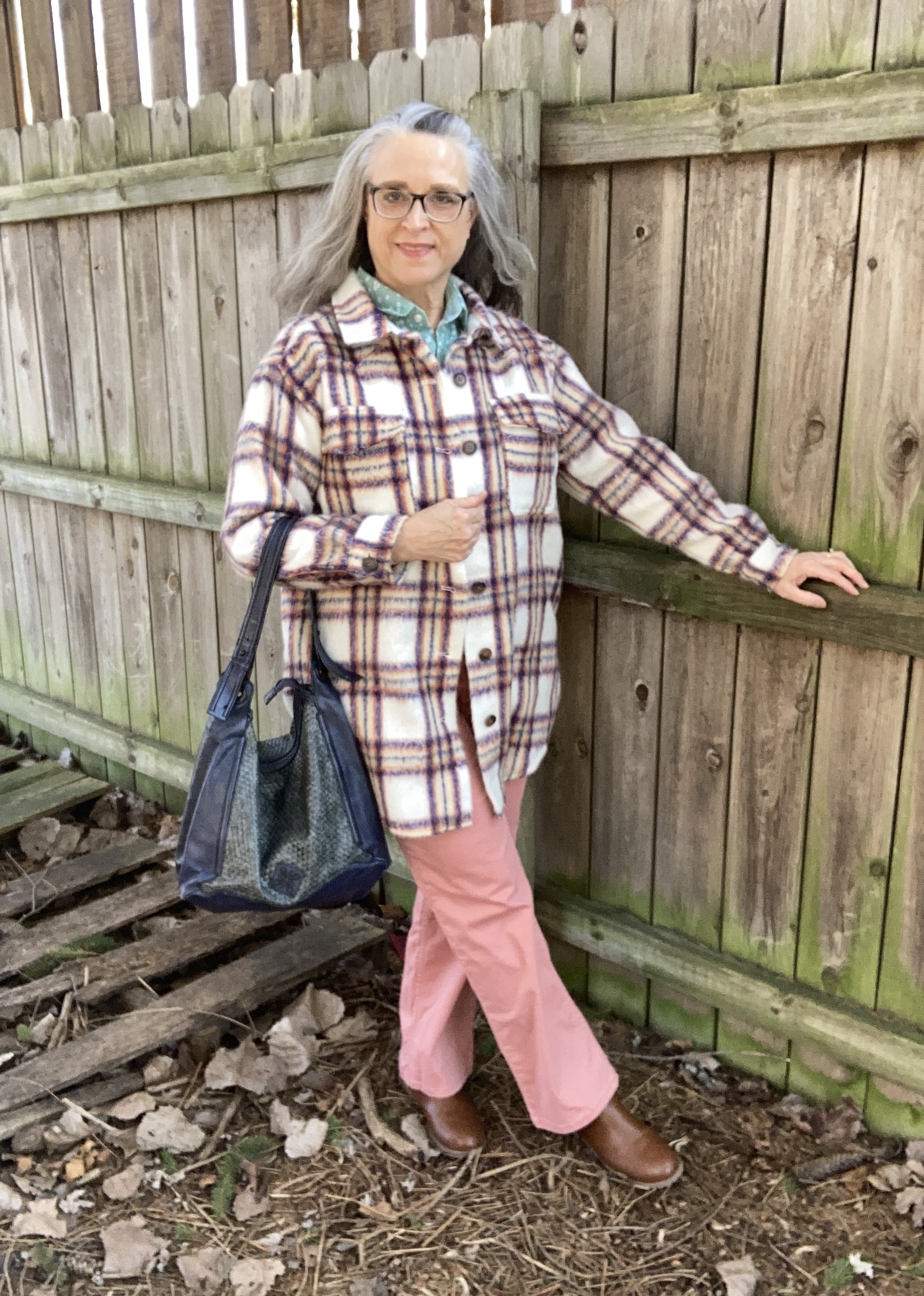
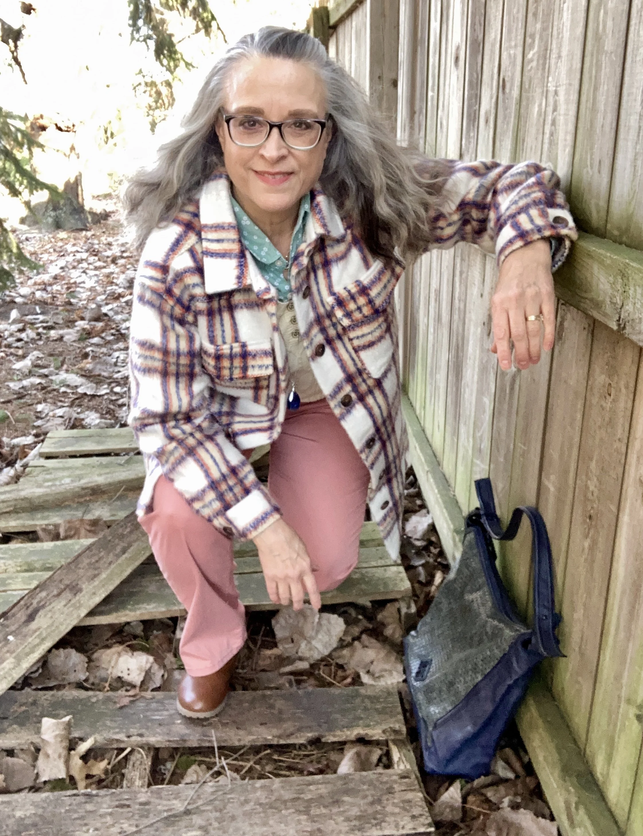
It has been a while since I have done a Color Play post. You know I love color and finding creative ways to put colors together that might not be typical color combo choices. Today’s look revolves around a heavy weight plaid shacket that I got from Maurice’s last year when they had end of the season clearance. They always have such good prices on their clearance items, but you have to act fast because sizes and styles disappear quickly.

We are having such weird weather here in the midwest. It is February and it is acting like late March or April. Today as I write this it is supposed to be almost 70 degrees (F). I don’t like the drastic changes and they don’t do anything for headache and allergy sufferers, let alone for all the viruses and bacteria that keep making our grandkids get sick.

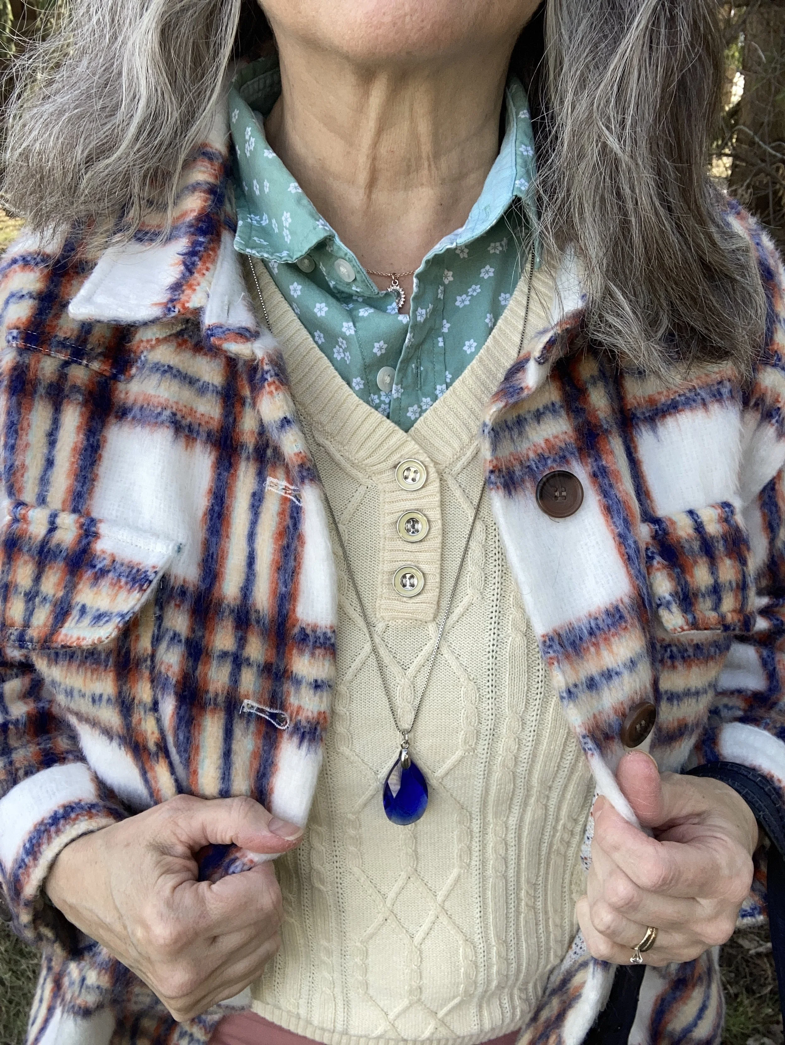
This plaid shacket has the shirt vibe, but it is heavy enough to wear as a coat on the chillier spring days. When I decided to use this piece for my color inspiration, I decided to lean towards pastels rather than the more primary blue, orange and yellow. You can see the colors better in this close up shot. Do you see the very faint minty green line?

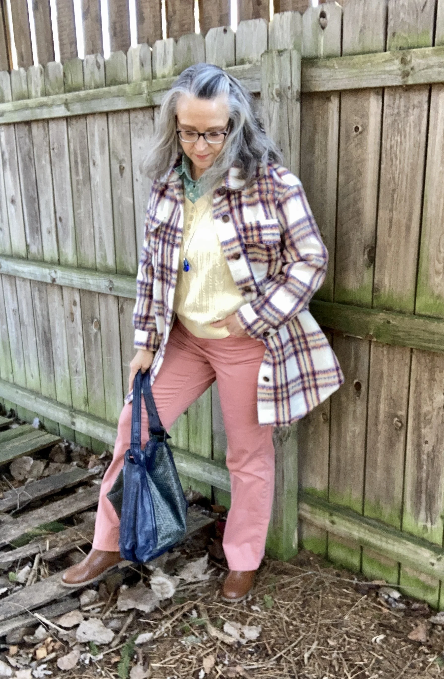
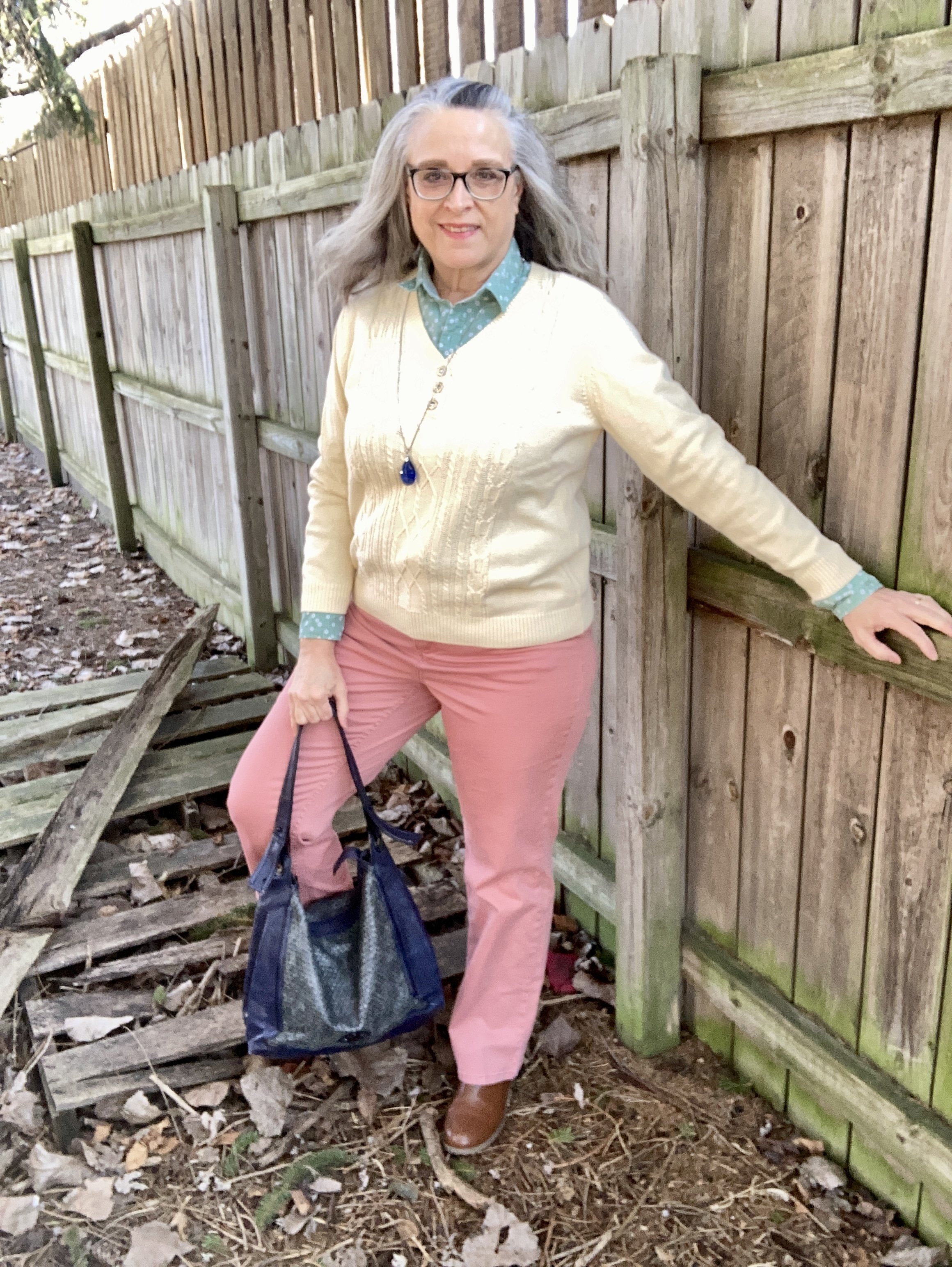
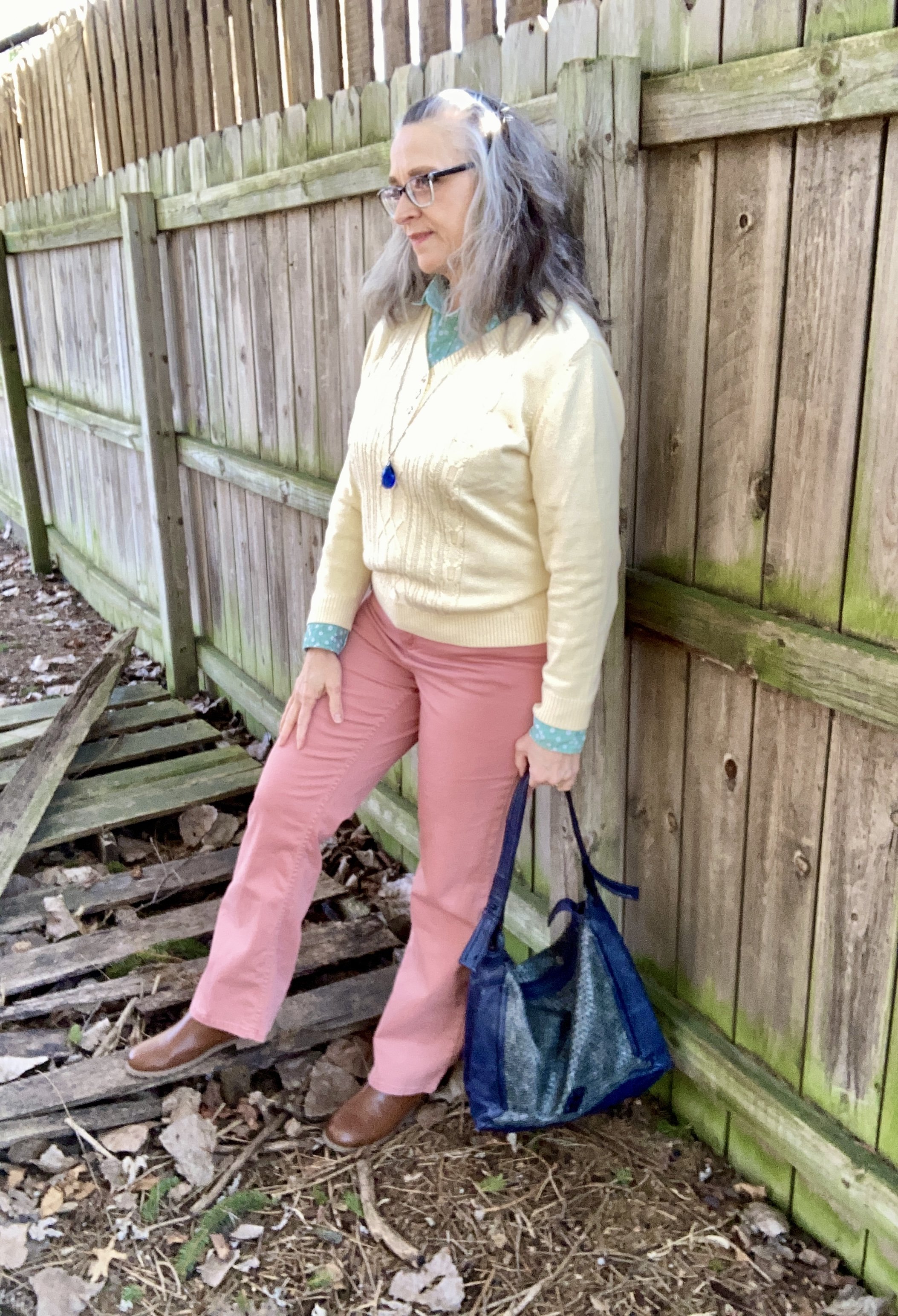
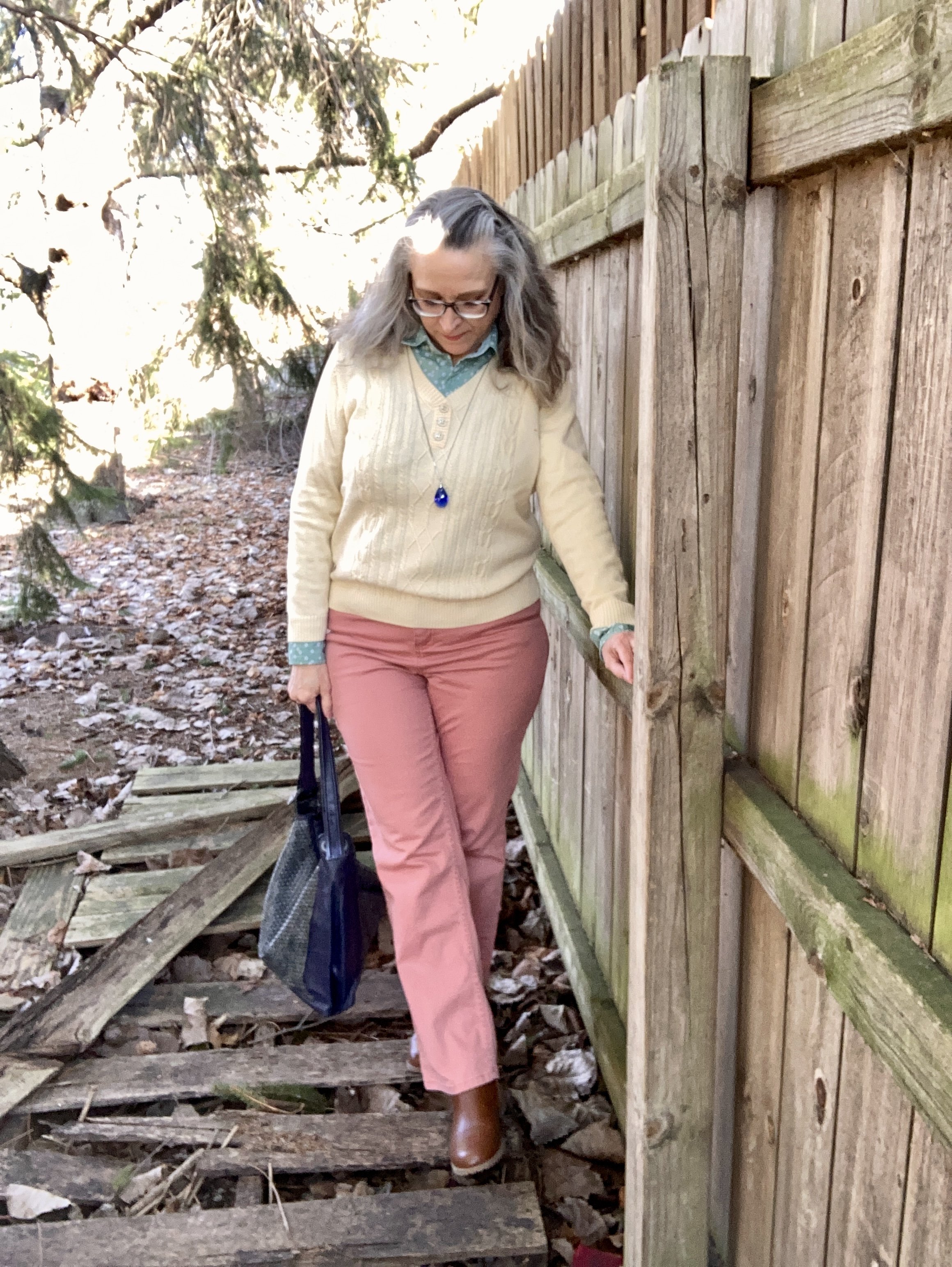
With these colors in mind, I plaid with two variations, but the pastels won out. It seemed appropriate as we move towards spring.

All three pastel pieces are thrift store finds. The coral pants are Croft & Barrow. Theses are a light weight cotton blend, so they will be great for the warmer months.

The men’s button down shirt is Express brand. It has tiny white flowers on it, and I love how it goes withe the pale yellow and the coral .

The yellow pullover is a brand called Karen Scott. I her brand used to be sold at Macy’s and perhaps Walmart. Not sure if they still are. I don’t wear pale color too often near my face, but the minty green does the job of providing a border between my skin and the pale yellow.

Style Tip: I will never tire of saying, you can wear all colors. If a certain color doesn’t look good right next to your face, just add a scarf or some statement jewelry, or layer a collared shirt under or over it. That doesn’t mean certain colors won’t look better with your skin tone, but if you love a color wear it.

My navy blue bag was a thrifted Simply Vera by Vera Wang piece. Big tote bags are back in for spring, so dig around in your closet and find those larger bags.

My tan, ankle boots are Sonoma brand and were a pre-winter purchase online from Kohl’s.

I kept my jewelry simple with a blue bead, pendant necklace.

What do you think of this outfit? Do you like pastels? How do find color inspiration for your outfits?

Thanks for hanging out on the blog. I am including a few shopping links for you to look over. These links are brought to you at no additional cost. These are affiliate links. All opinions are my own.

Have a great week!

Outfit Inspiration: Pantone's Color of the Year - Viva Magenta

I still want to bring you a look at the Pantone Color Institutes color selections for this year, so this month I am going to feature a few of the New York Palette Spring/Summer 2023 colors for each of my monthly columns. The Pantone website has become increasingly user unfriendly for just the average joe. If you want to buy their services and products they are great, but I can no longer get specific color info. If you look at their page for the Palettes, the colors are now featured as these tiny, almost imperceptible to the human eye, swatches. Ha, ha.

Before I start, let me reiterate, these are my interpretations of the Pantone colors. They are not exact matches, but correspond as closely as I am able to make them with my limited information from the website and my limited wardrobe.

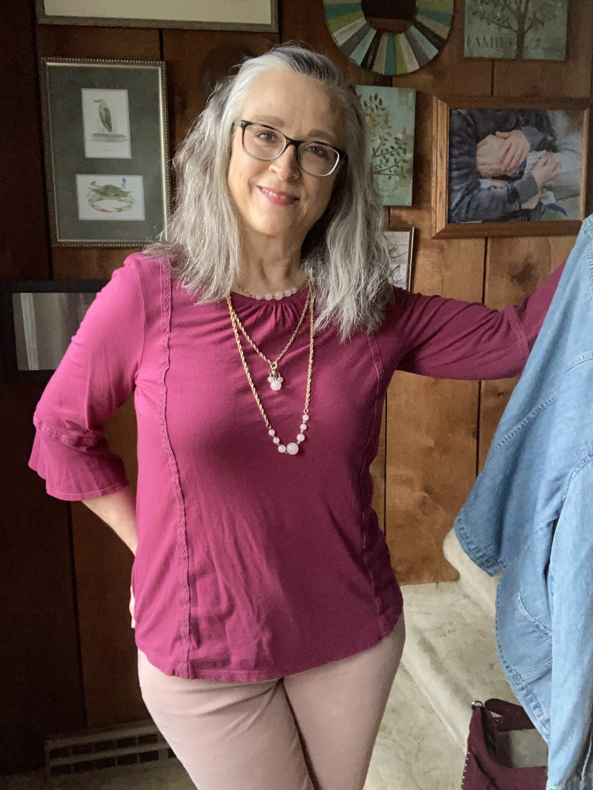
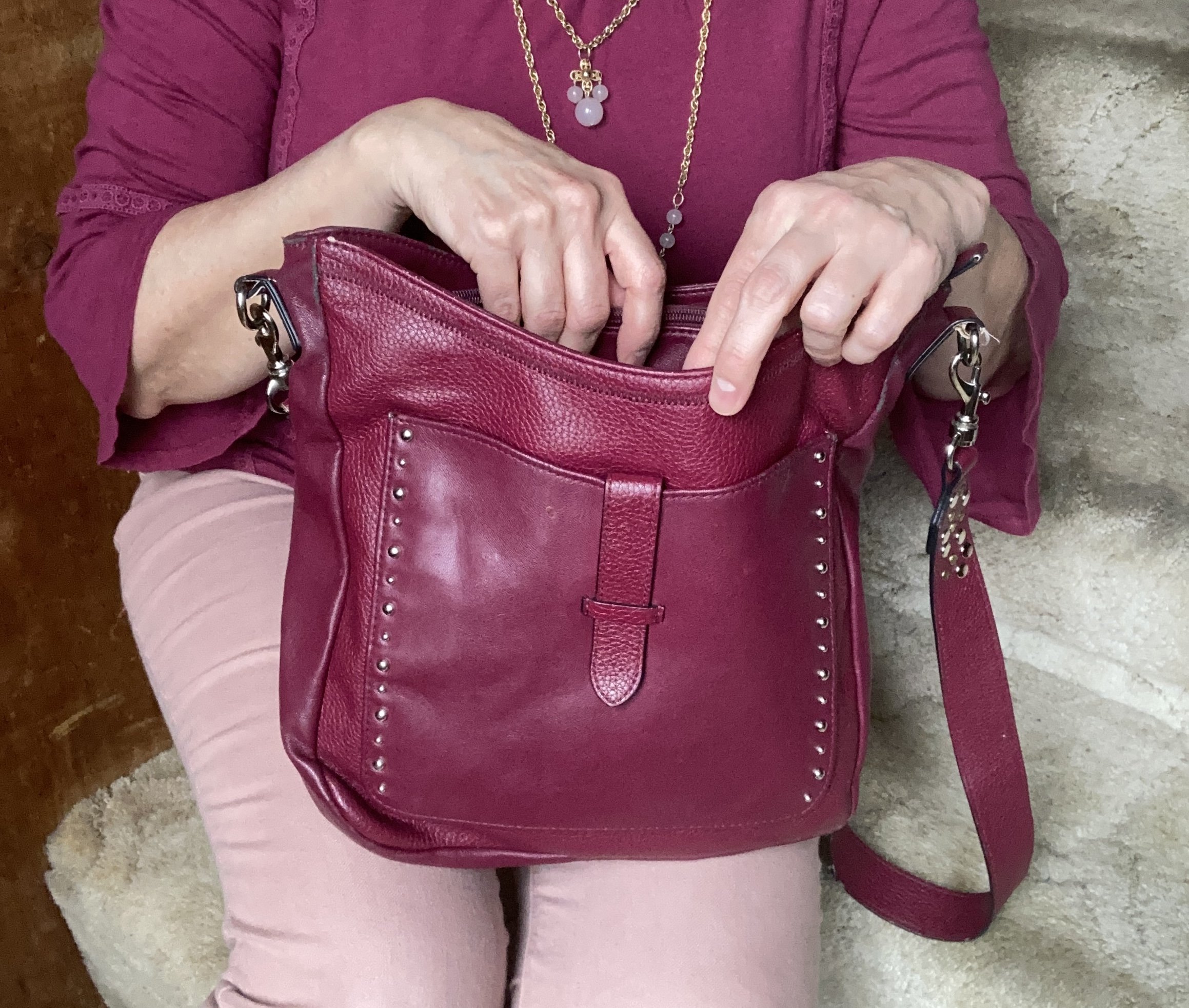
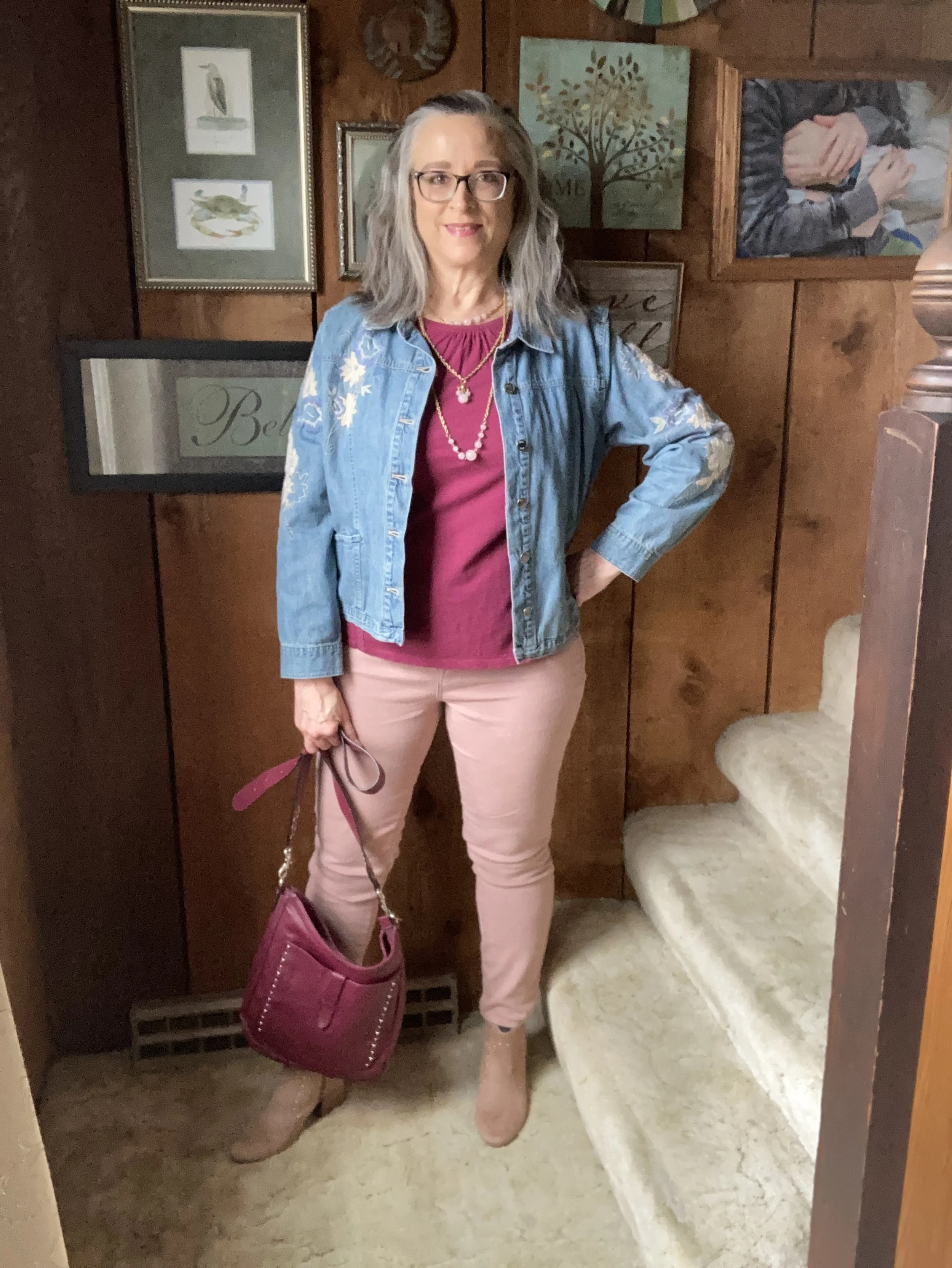
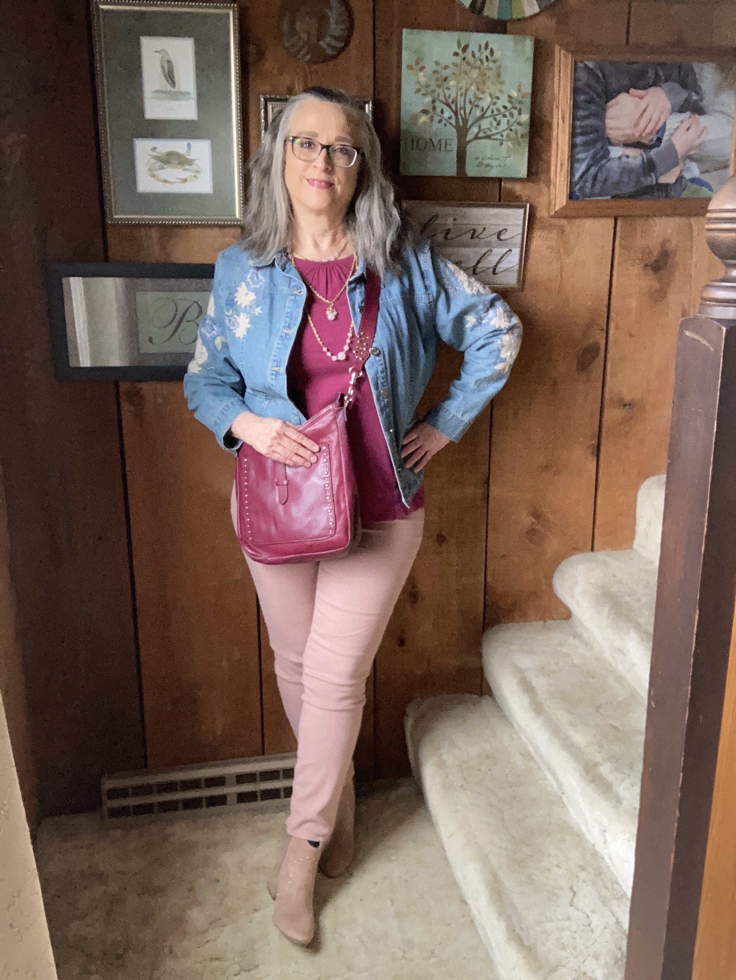
Viva Magenta is a bright, rich pinky red that easily catches the eye. It is a pretty color that can be combined with loads of other shades for a spring and summer worthy outfit palette. I don’t have a lot of pieces this color in my closet, so I was glad to see I had this Sonoma 3/4 bell sleeve top and the thrifted Libby Edelman shoulder bag.

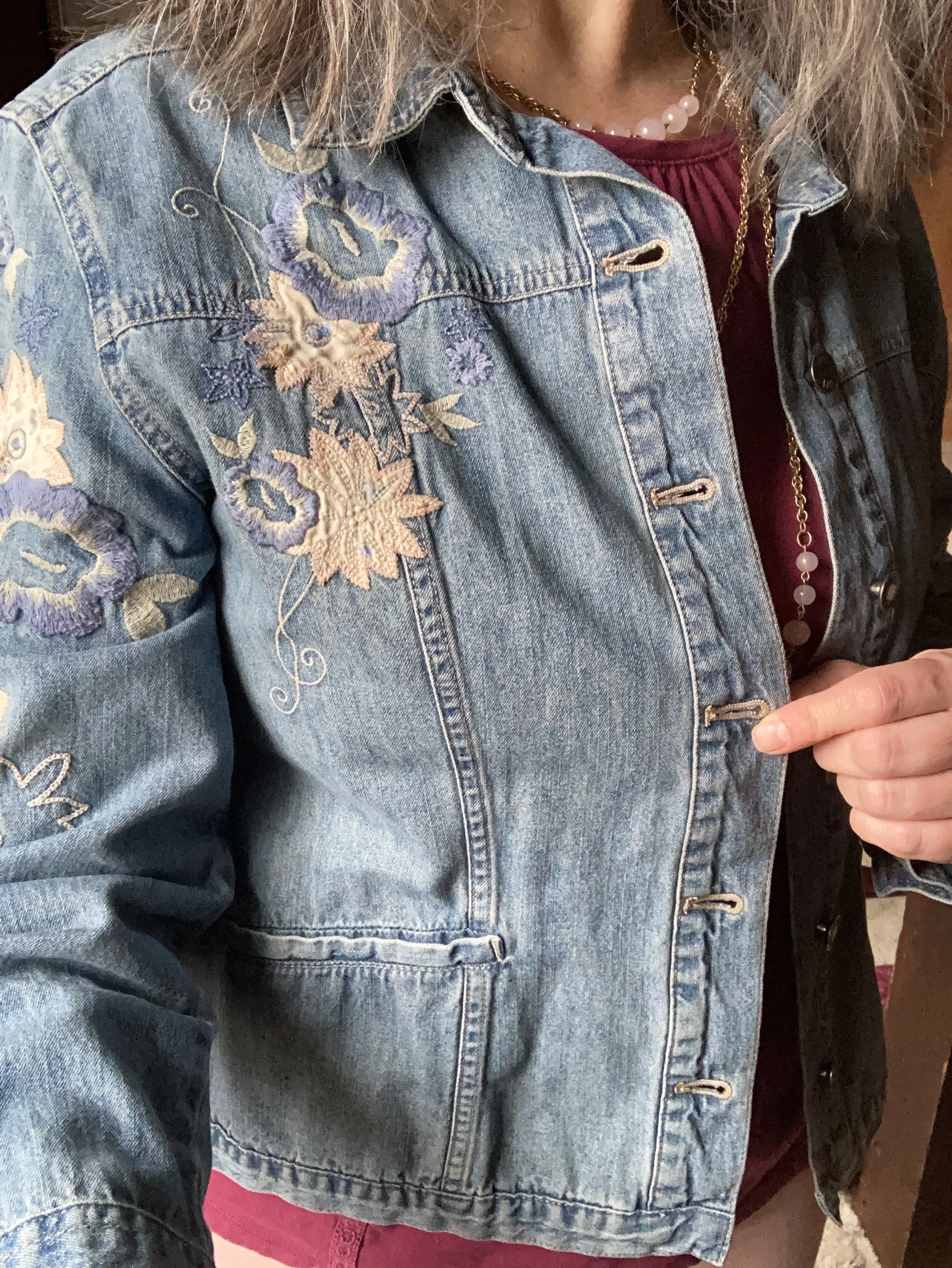
I decided to combine the Viva Magenta with two of the other colors from the Spring New York Palette. Summer Song is a soft, light blue that reminds me of a light wash denim, which is why I chose my thrifted J. Jill - Out of the Blue embroidered, jacket as a topper. I love the embroidered details on this piece. I’ve worn this on the blog before. You can see it with a white skirt for summer, and with a pair of wide leg jeans.

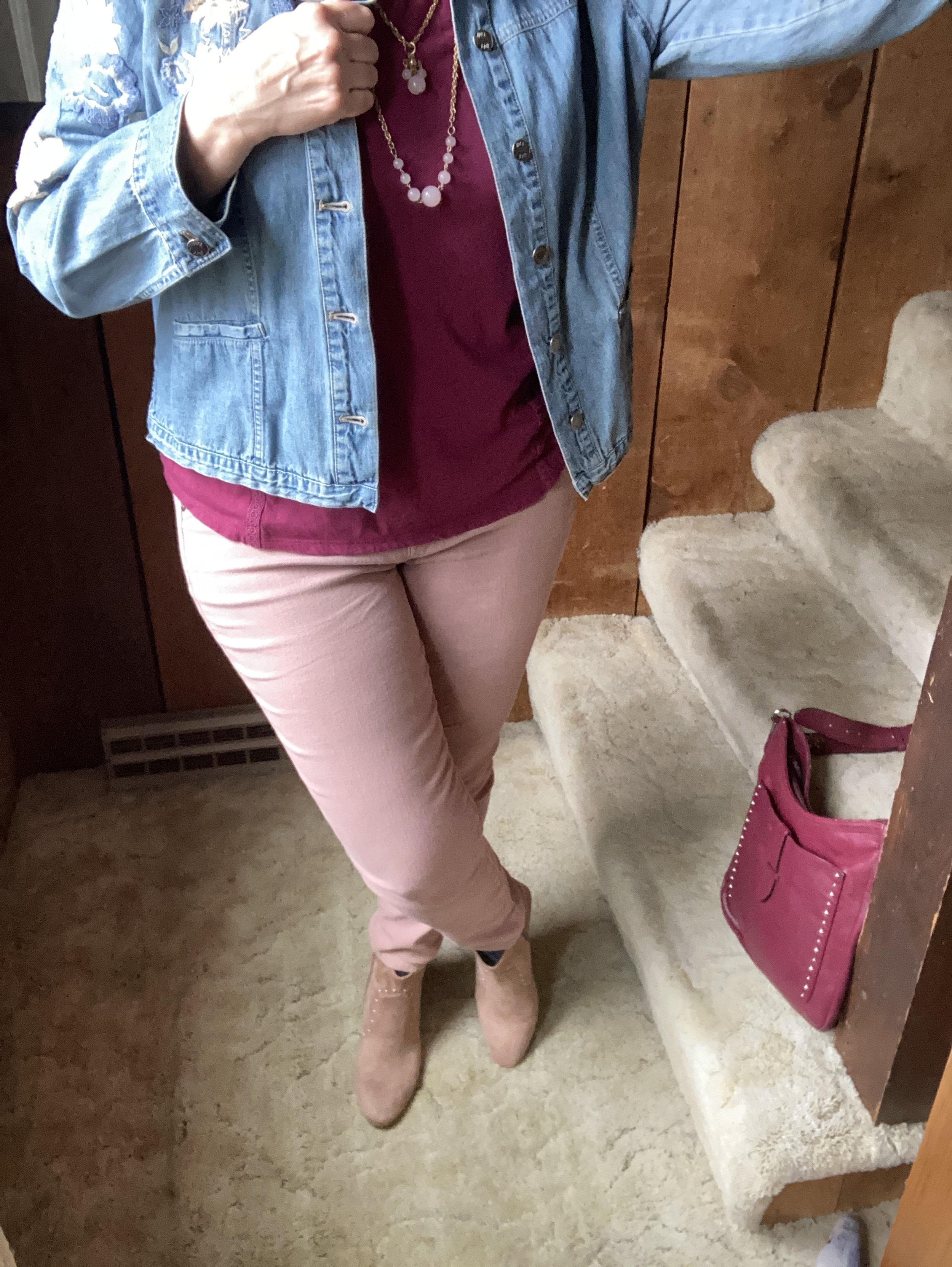
Vanilla Cream is one of the classic colors on the palette this year. I would say it is a cross between a pale pink and a pale coral. The Crayola Crayon box might call this one Flesh, ha, ha! These thrifted Refuge jeggings, seemed to come pretty close to the Pantone color. I don't typically wear leggings or jeggings without a longer top, but these have back pockets and do look more like jeans than leggings, even though they are incredibly soft and stretchy. You can see how I styled these with a black floral top, a belted orange tank top, in a pink monochrome look, and in a flat lay.

My SO ankle boots were a clearance find from Kohl’s a number of years ago. You can see how I styled them with my cognac jeans, a yellow knit cape, dark pink cords, and gray plaid cropped pants.

Are you a fan of Pantone’s color of the year, Viva Magenta? Do you like it combined with these other spring Pantone colors? Do you have any of these colors in your wardrobe? Leave me a comment or two. I always love to hear your thoughts. I do try to respond to all of your comments, so be sure to check back after a few days.

I am including a few shopping links for you to look over. I do apologize that I have not yet gotten linked up with some other affiliate partners. It’s all about the research which takes time. I haven’t given up, but for now I will keep bringing you at least some possible options through my ShopStyle affiliate program. These are brought to you at no additional cost, unless you purchase something of course. Ha, ha.