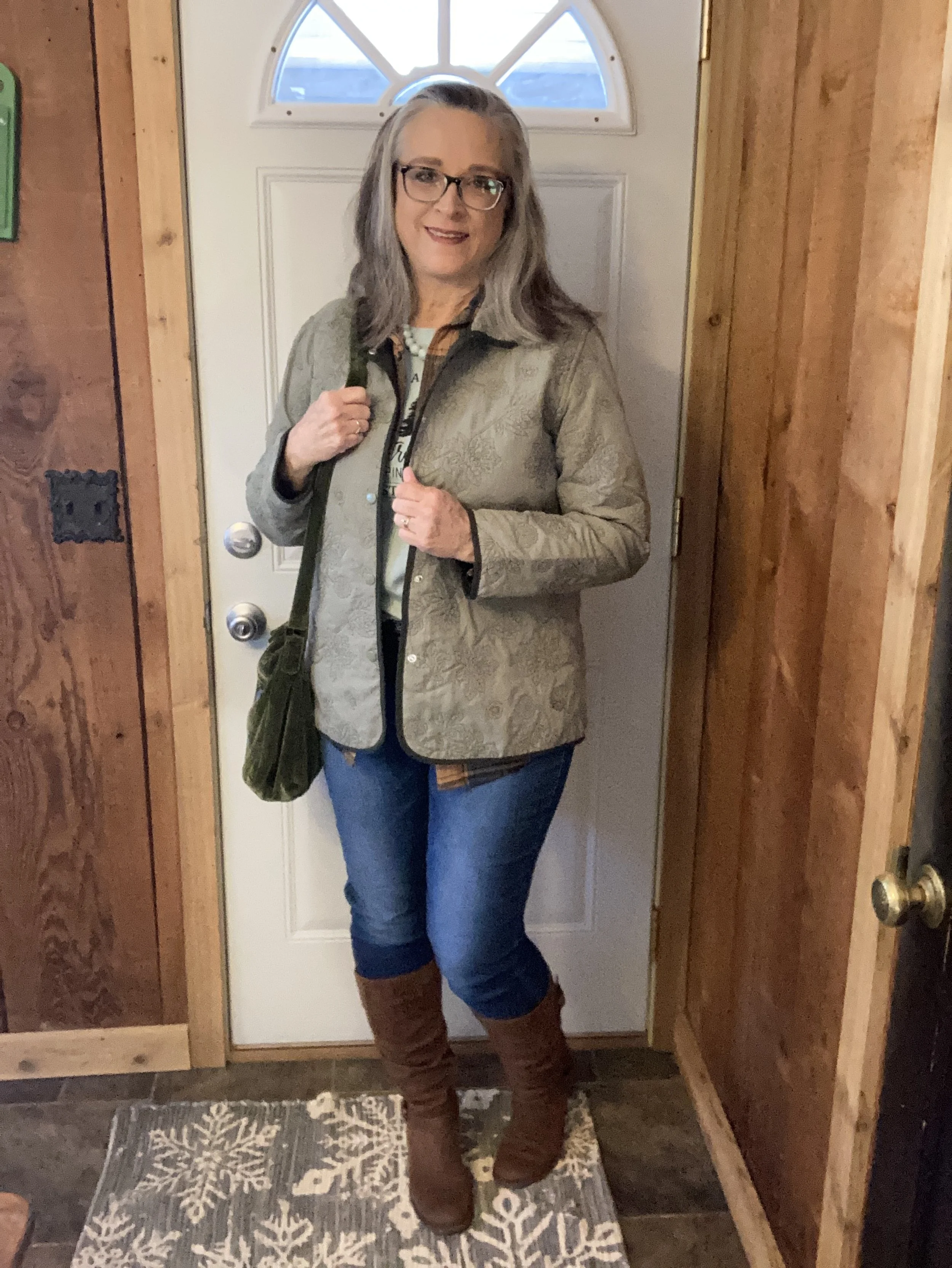
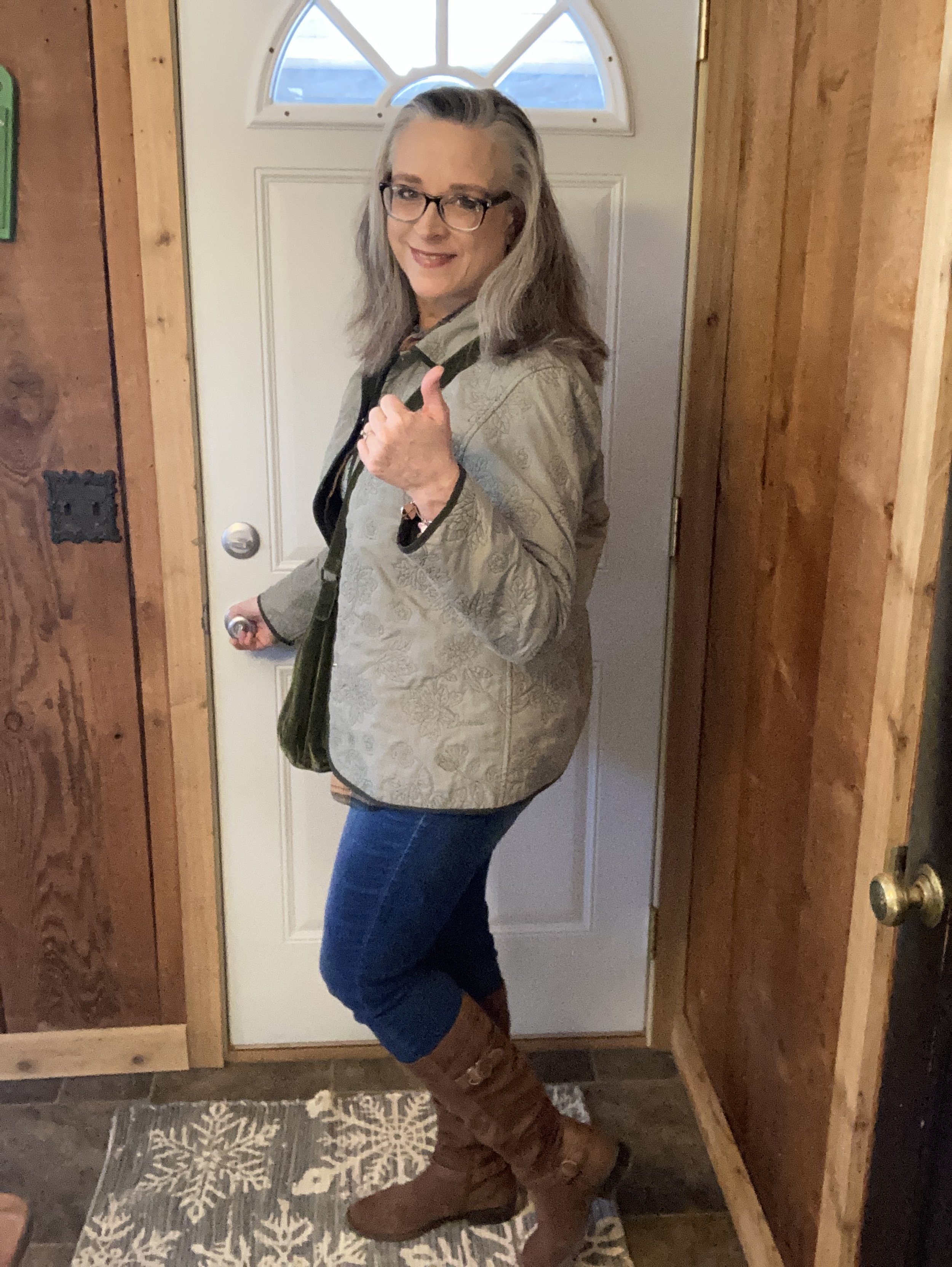
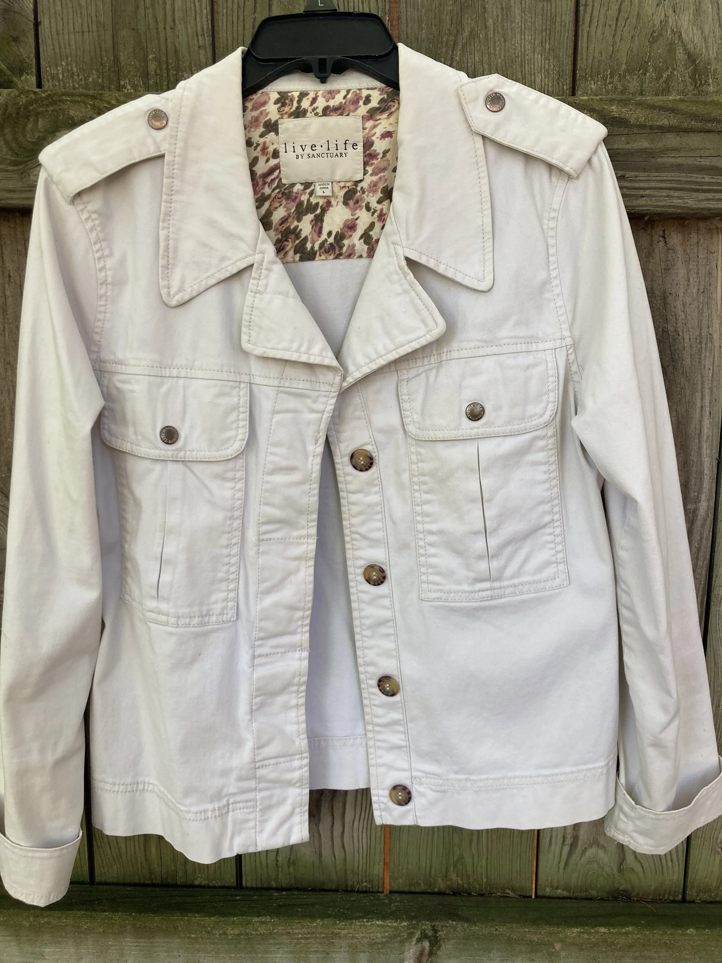
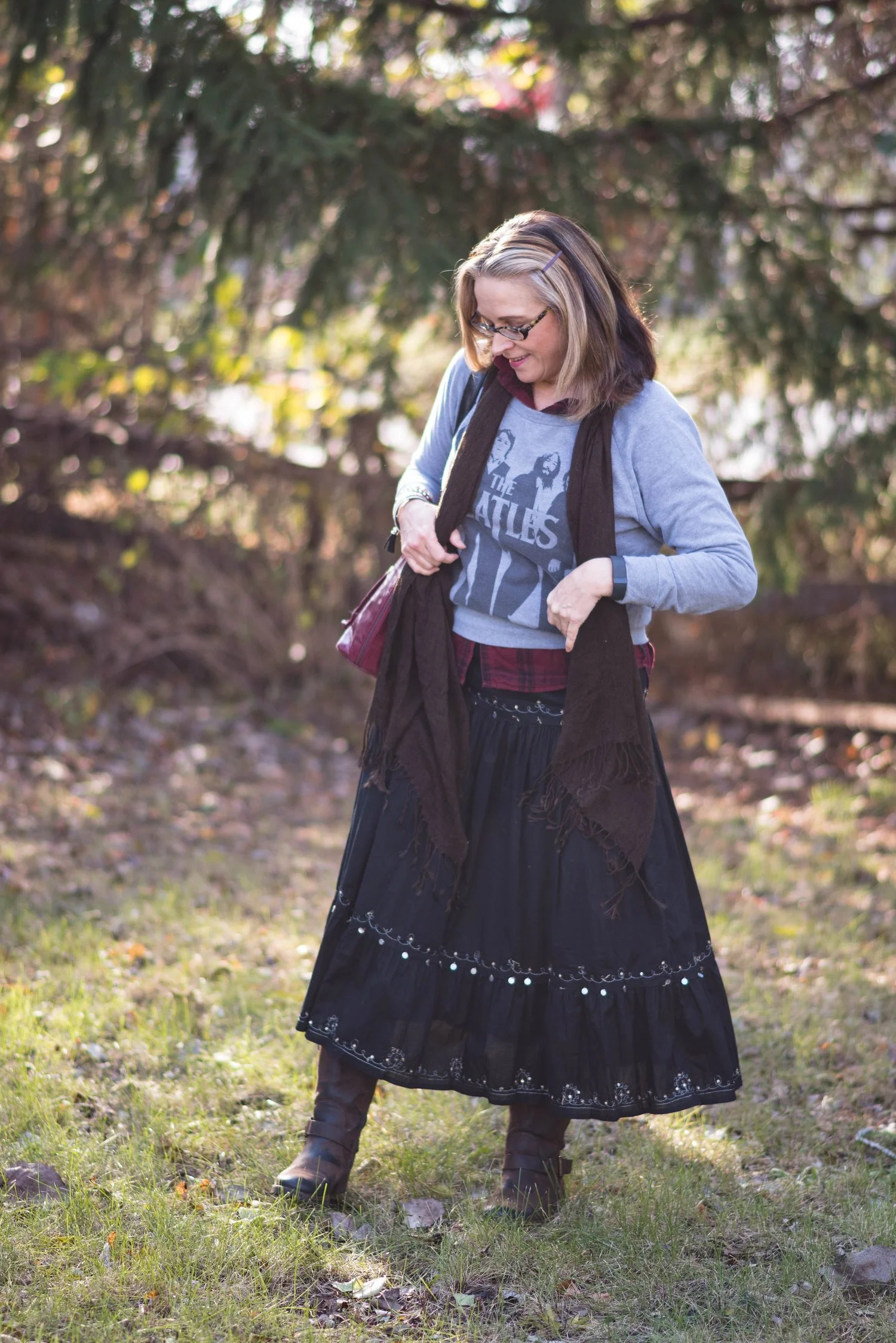
Color Play: Building an Outfit Around a Jacket

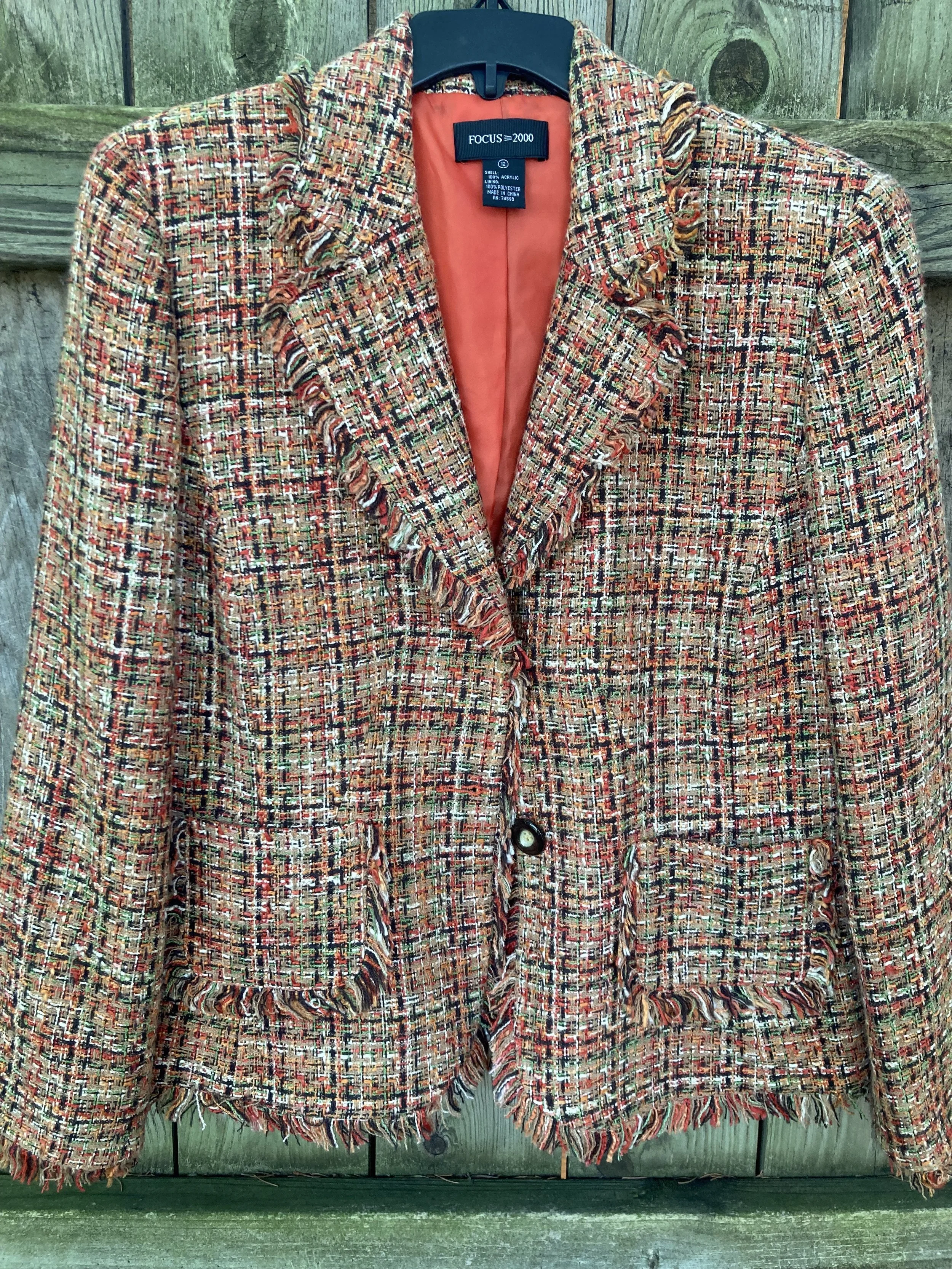
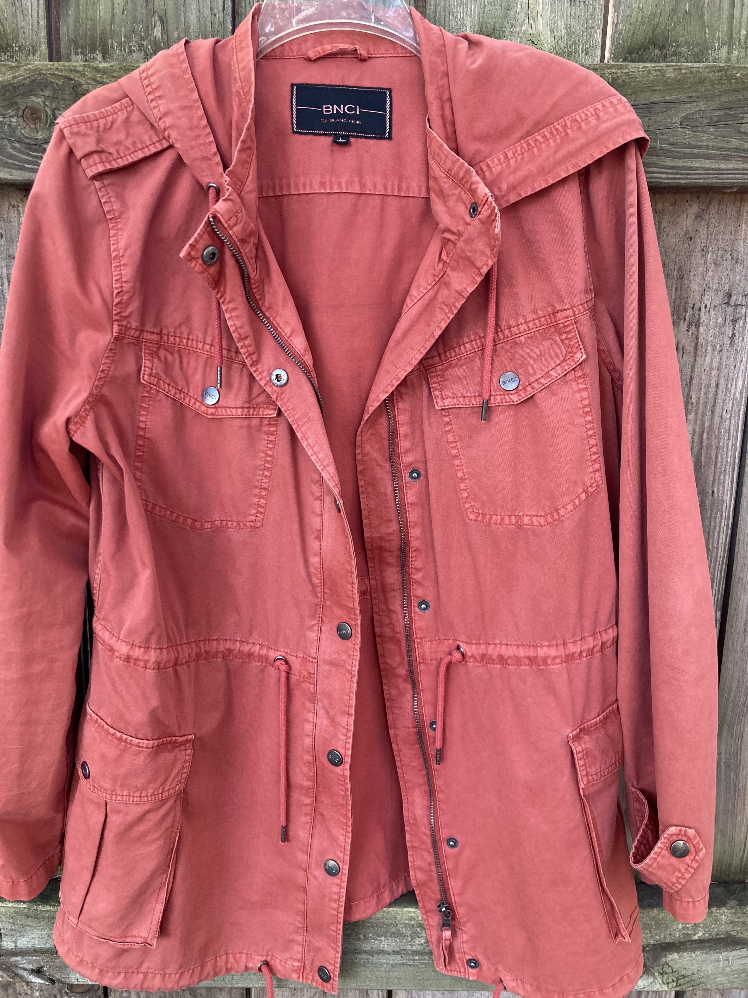
It has been a while since I have done a Color Play post. You know I love color and finding creative ways to put colors together that might not be typical color combo choices. Today’s look revolves around a heavy weight plaid shacket that I got from Maurice’s last year when they had end of the season clearance. They always have such good prices on their clearance items, but you have to act fast because sizes and styles disappear quickly.

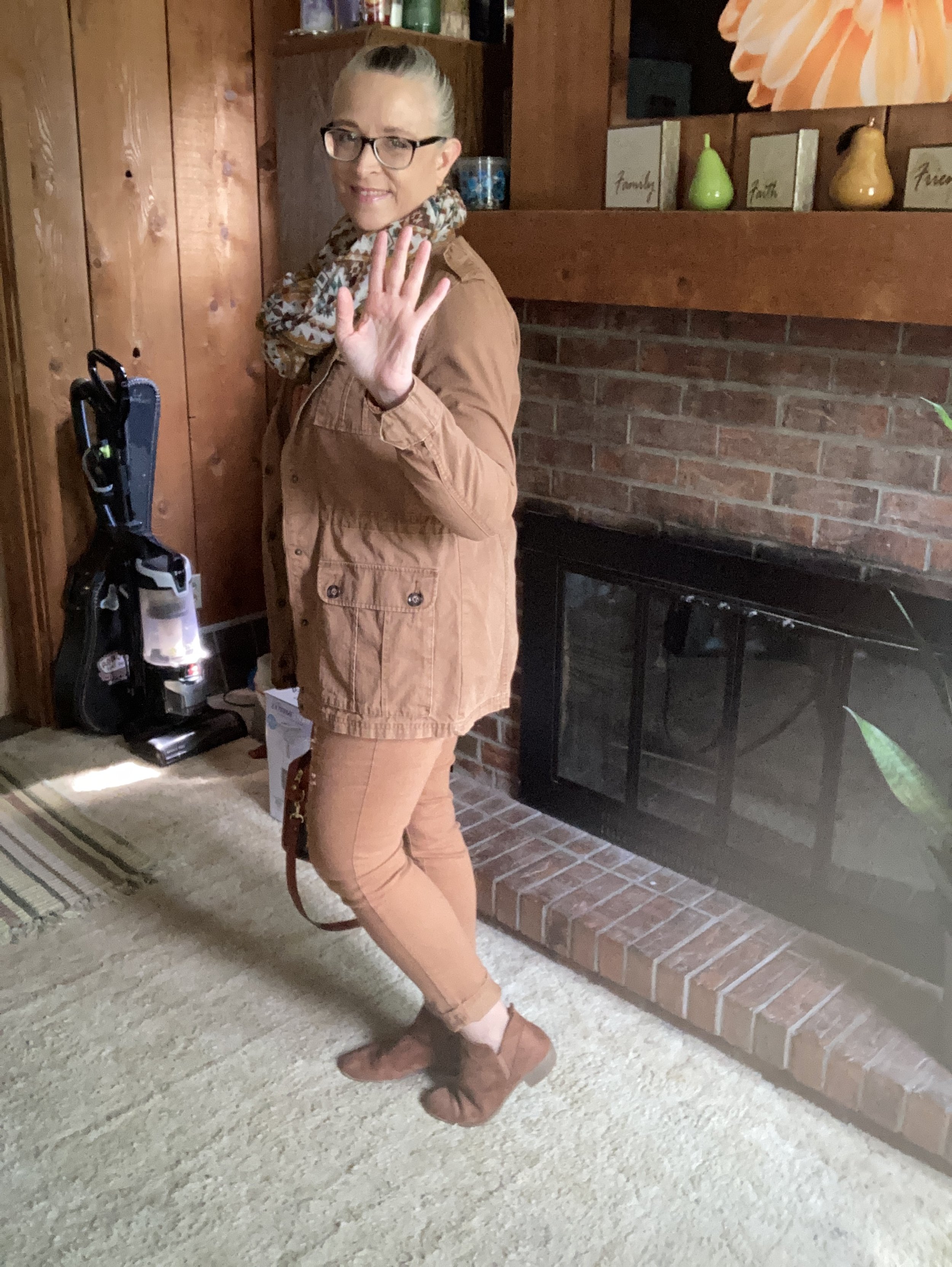
We are having such weird weather here in the midwest. It is February and it is acting like late March or April. Today as I write this it is supposed to be almost 70 degrees (F). I don’t like the drastic changes and they don’t do anything for headache and allergy sufferers, let alone for all the viruses and bacteria that keep making our grandkids get sick.

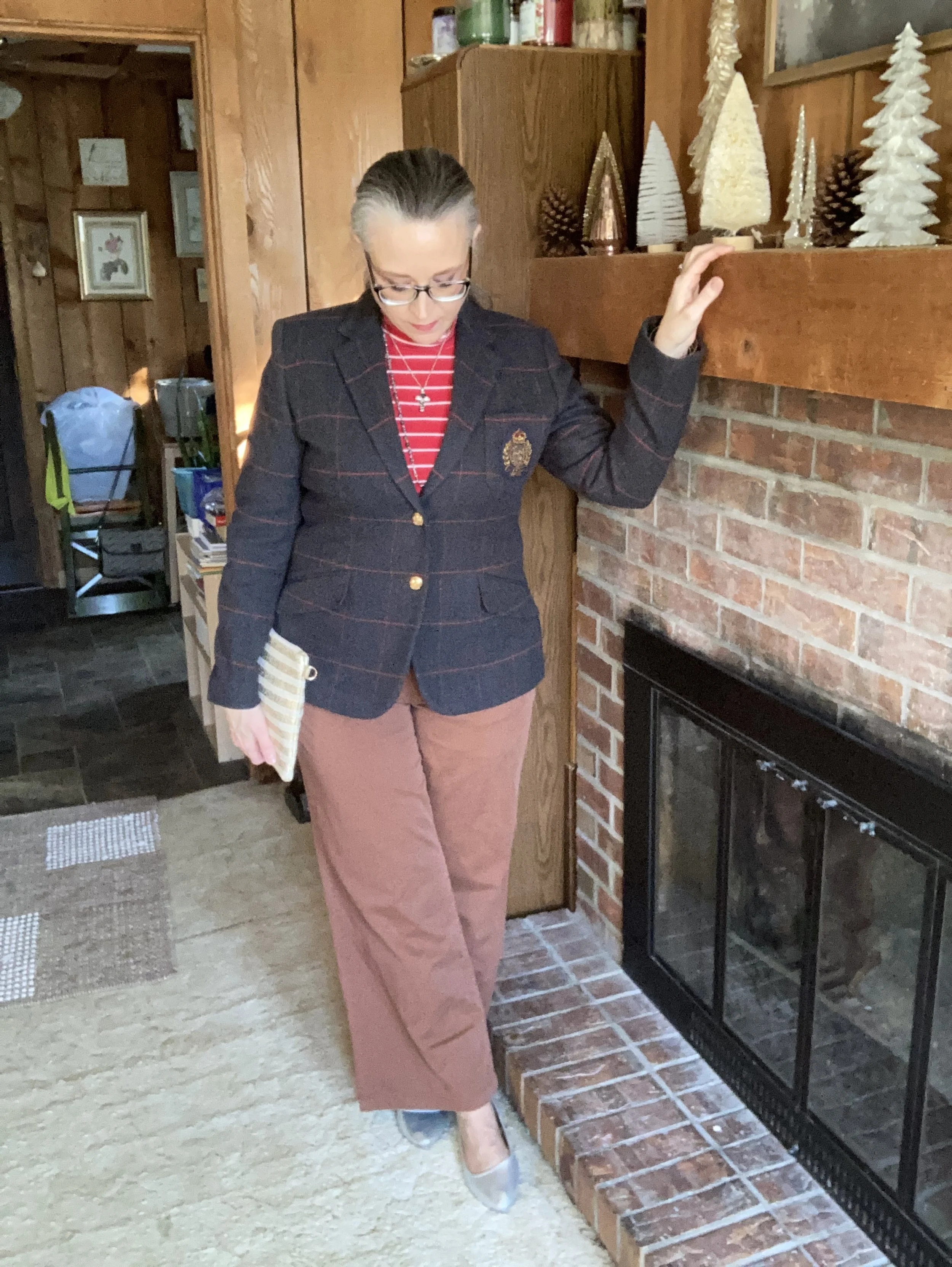
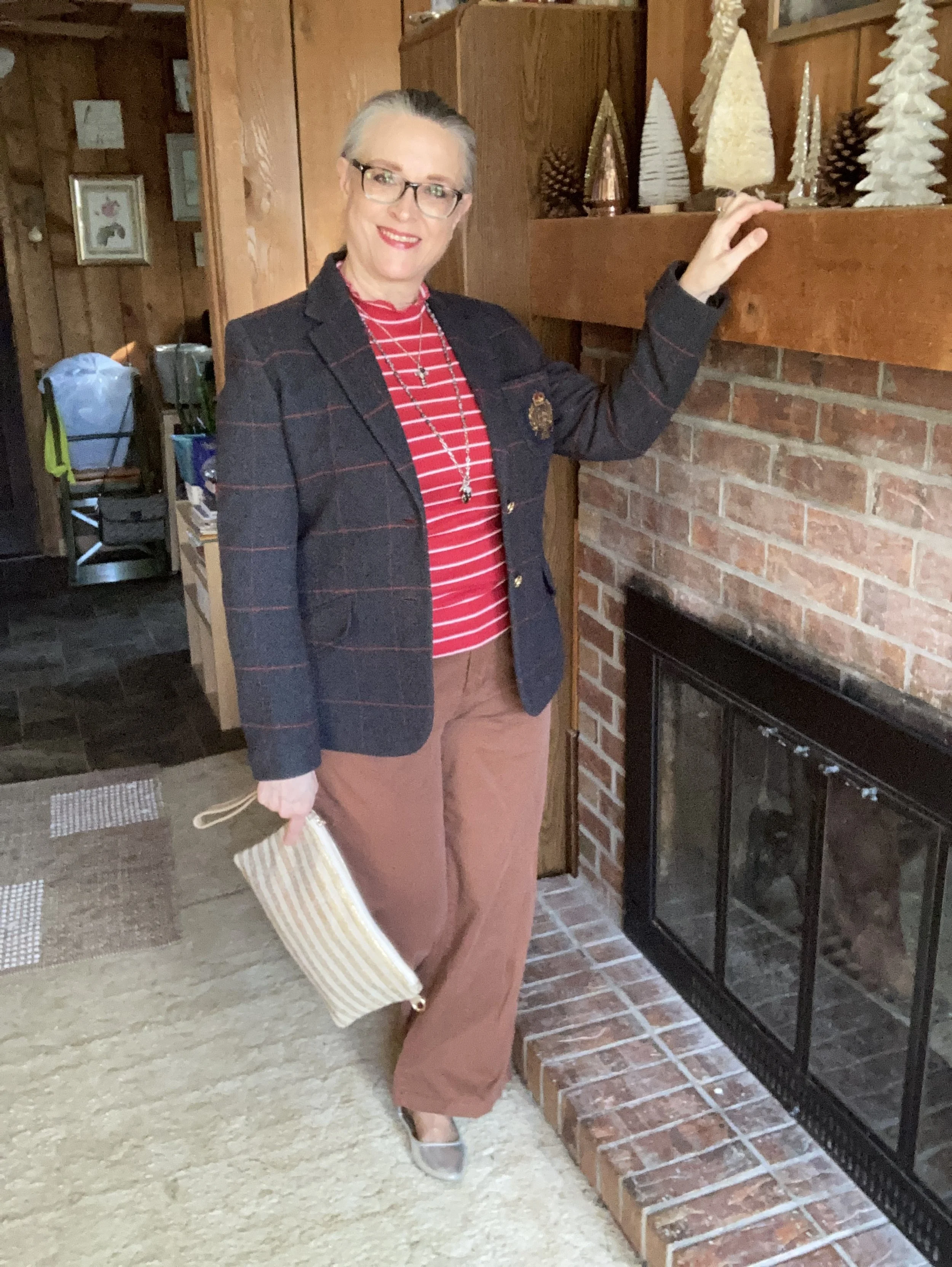
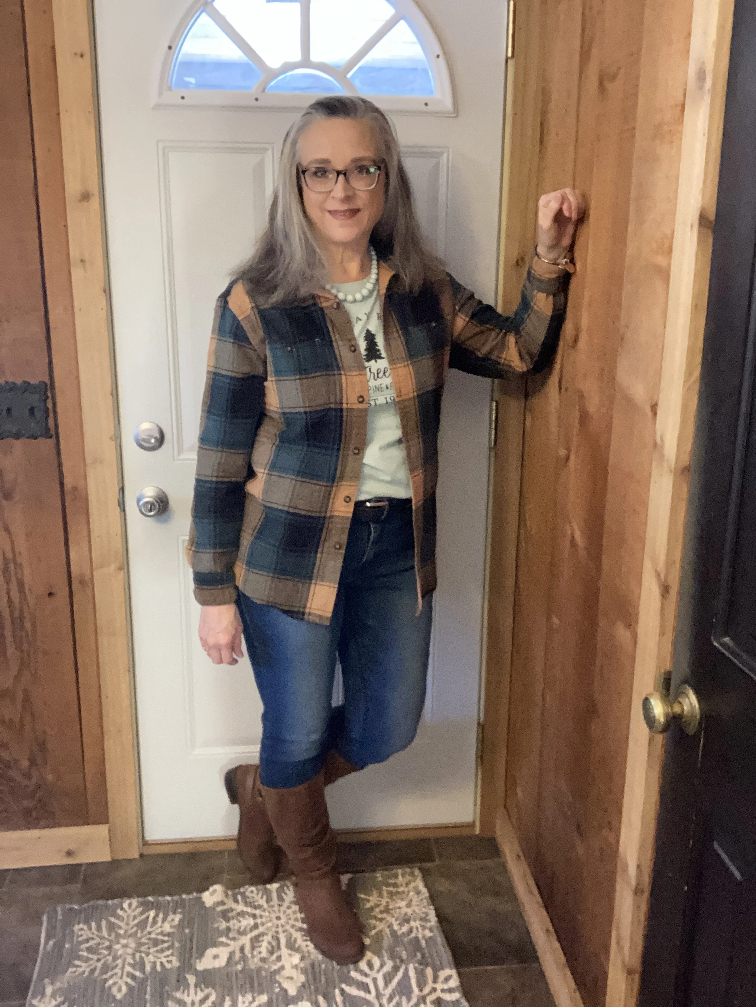
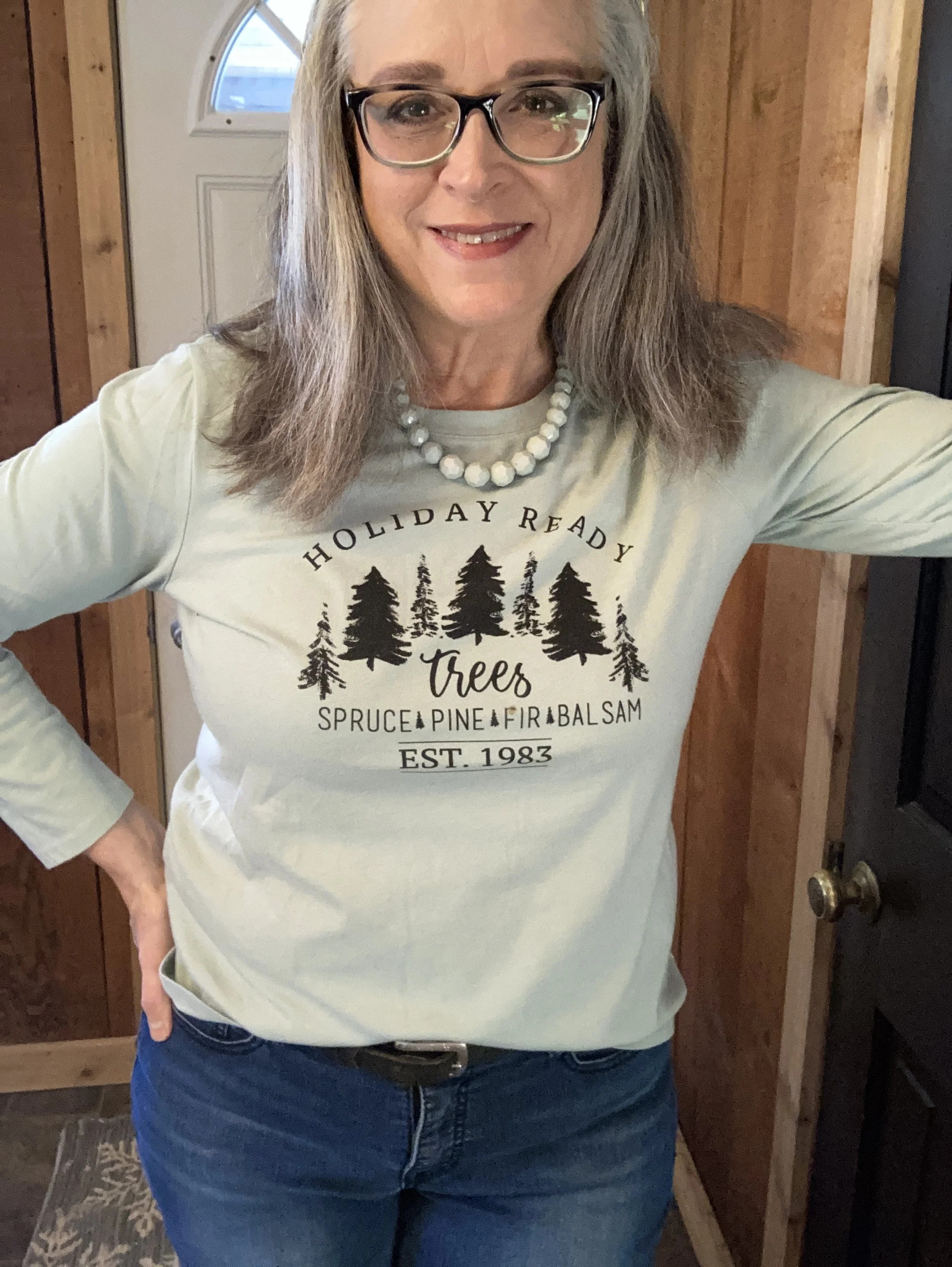
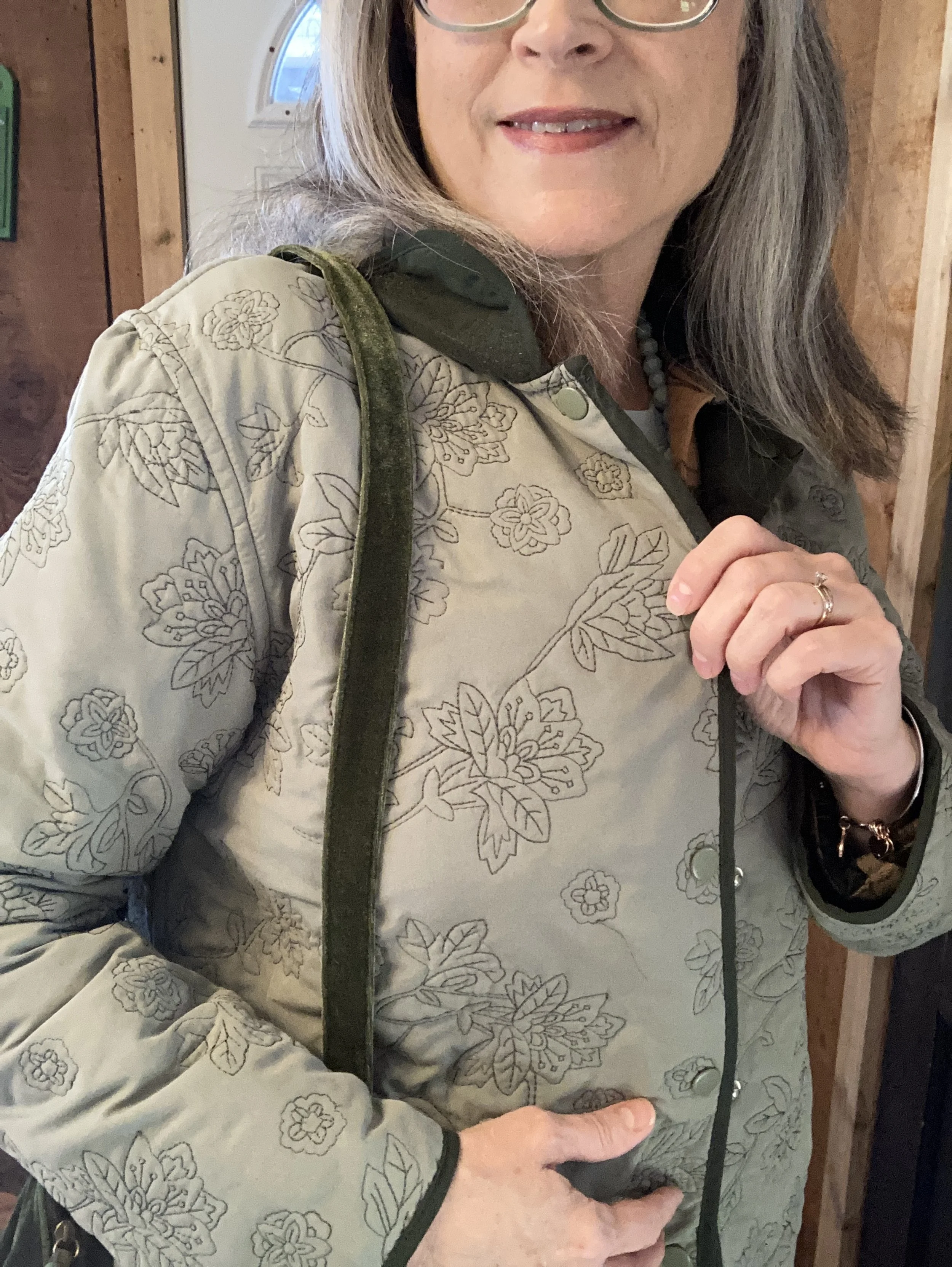
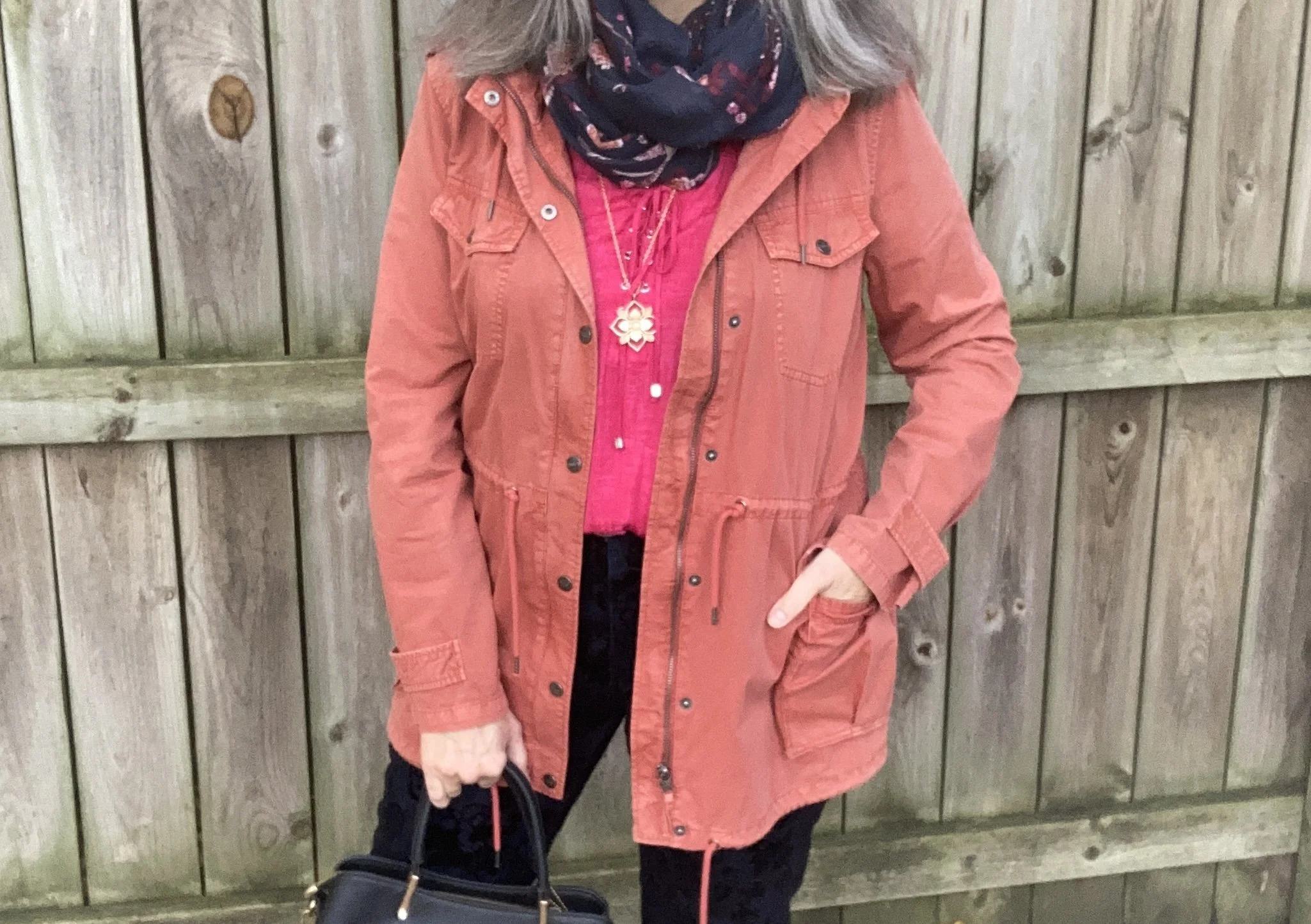
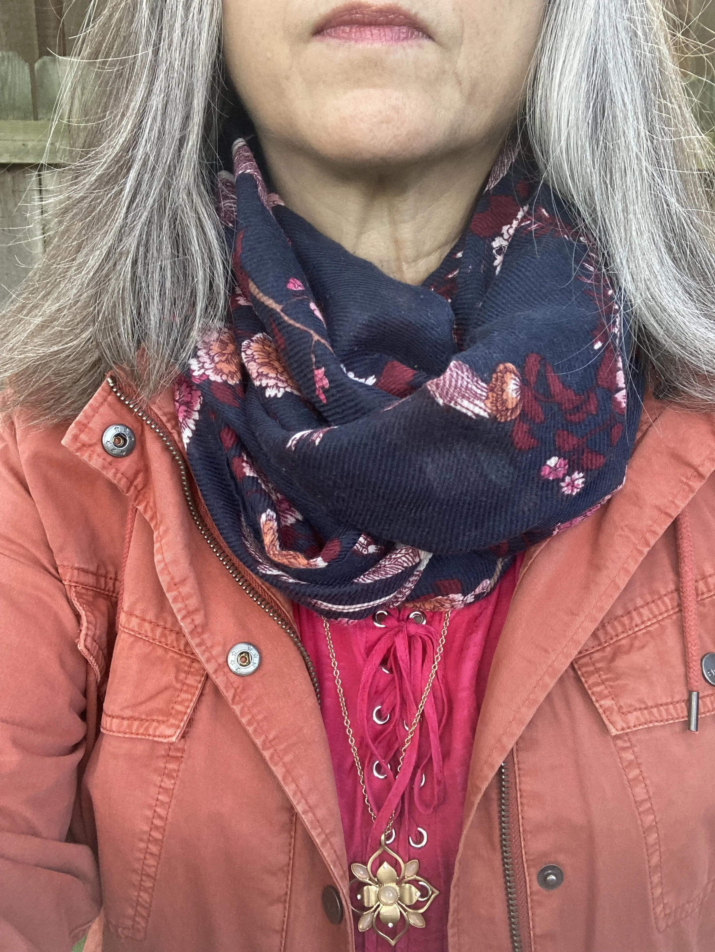
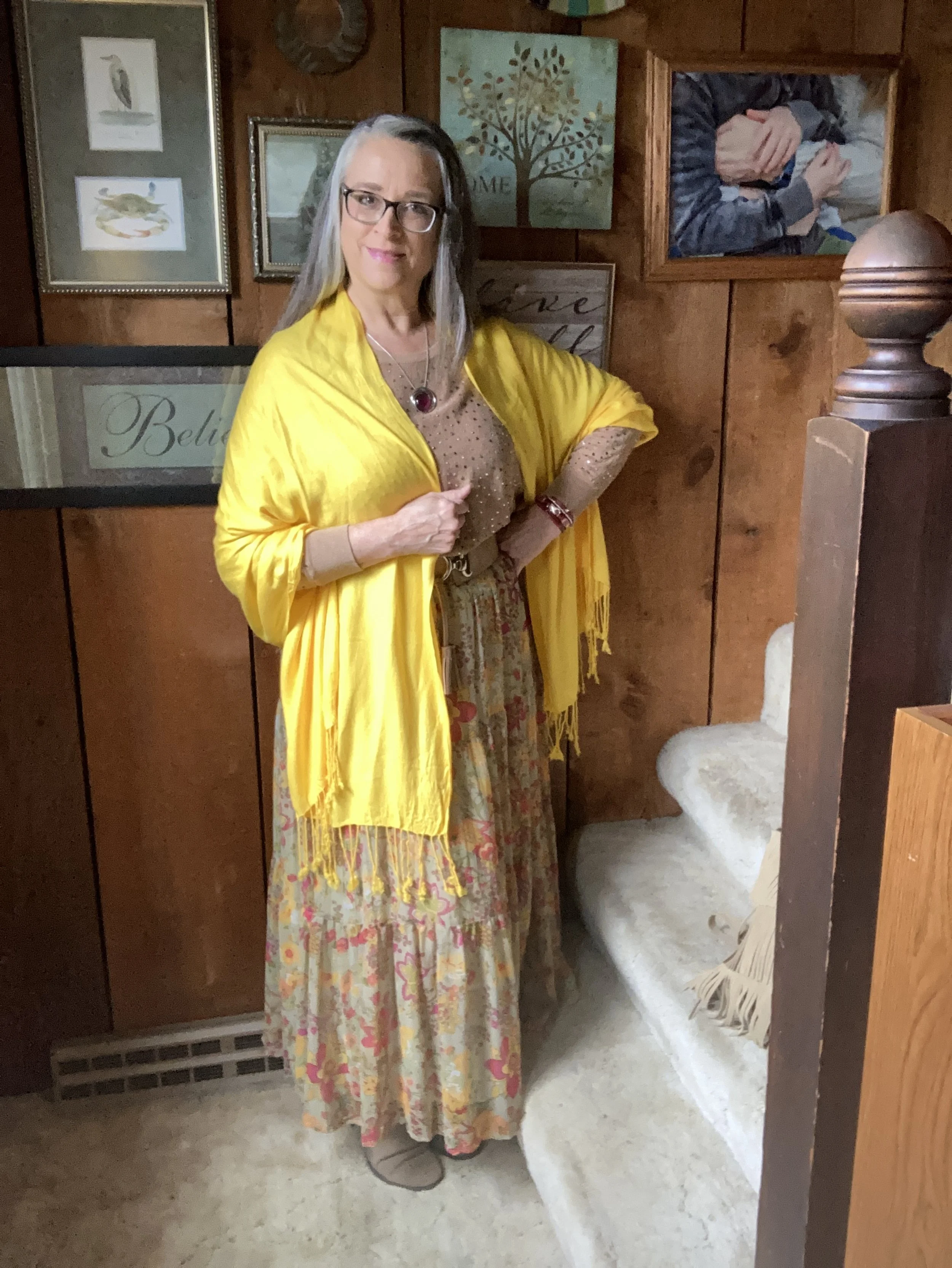
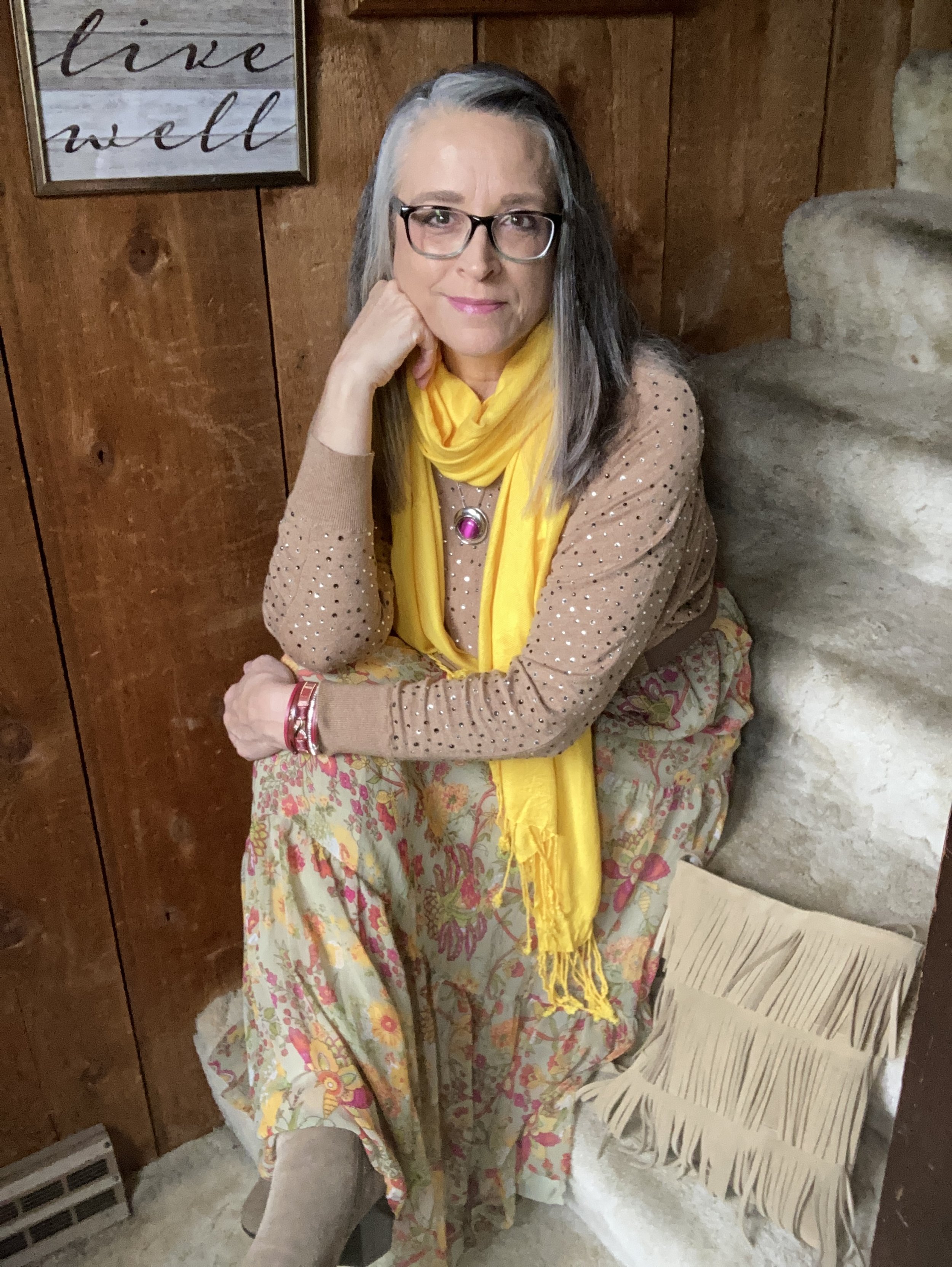
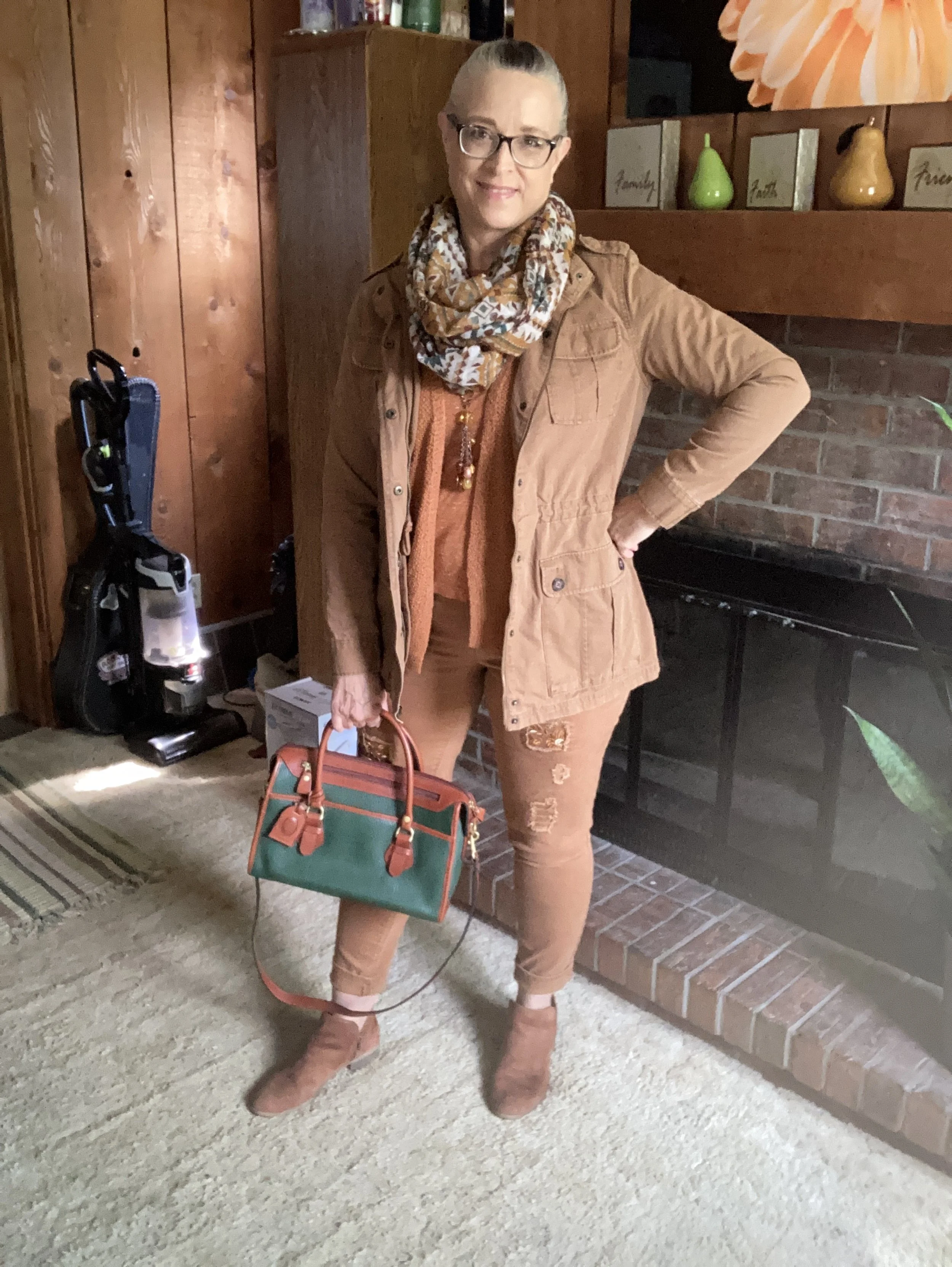
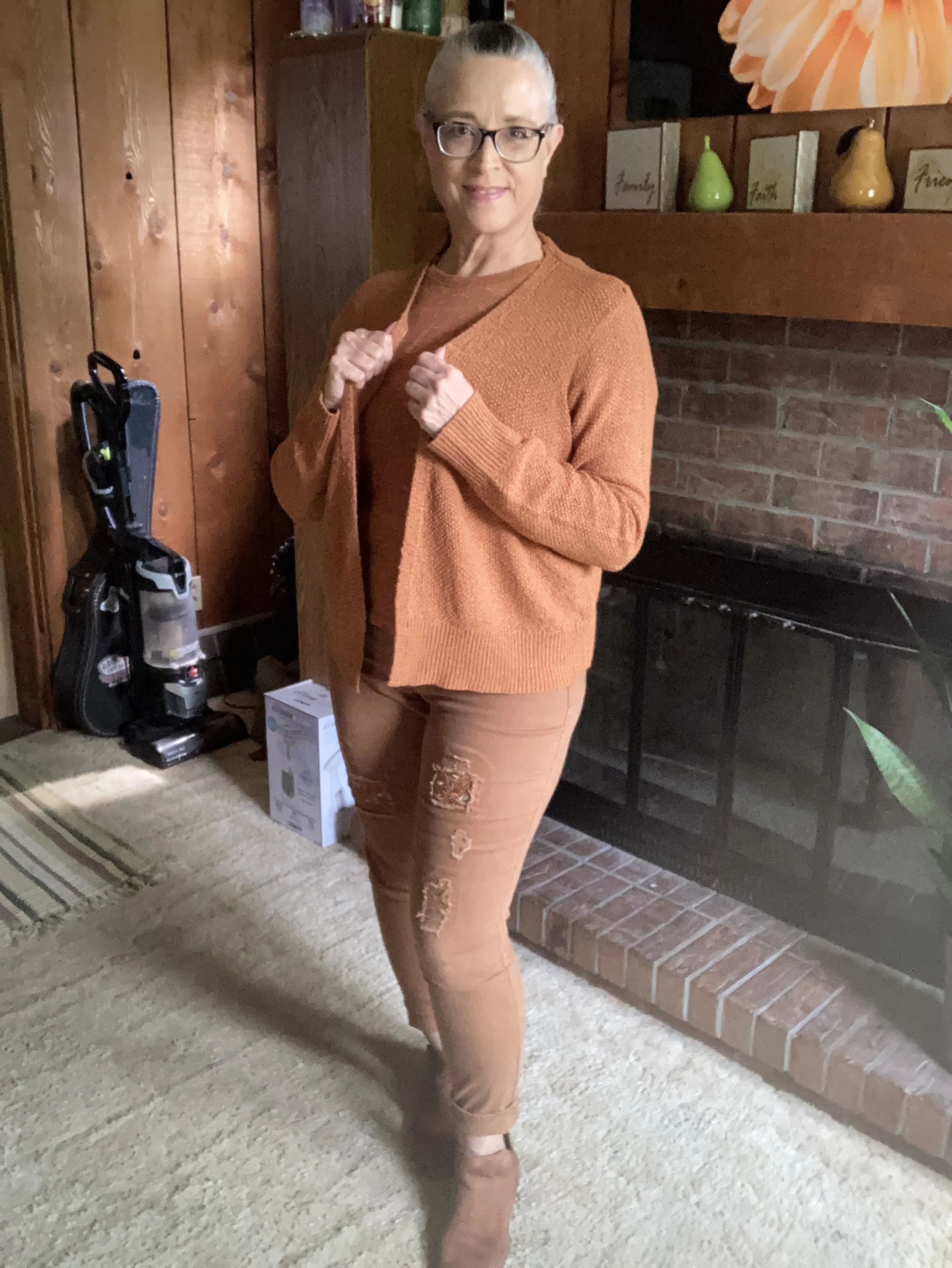
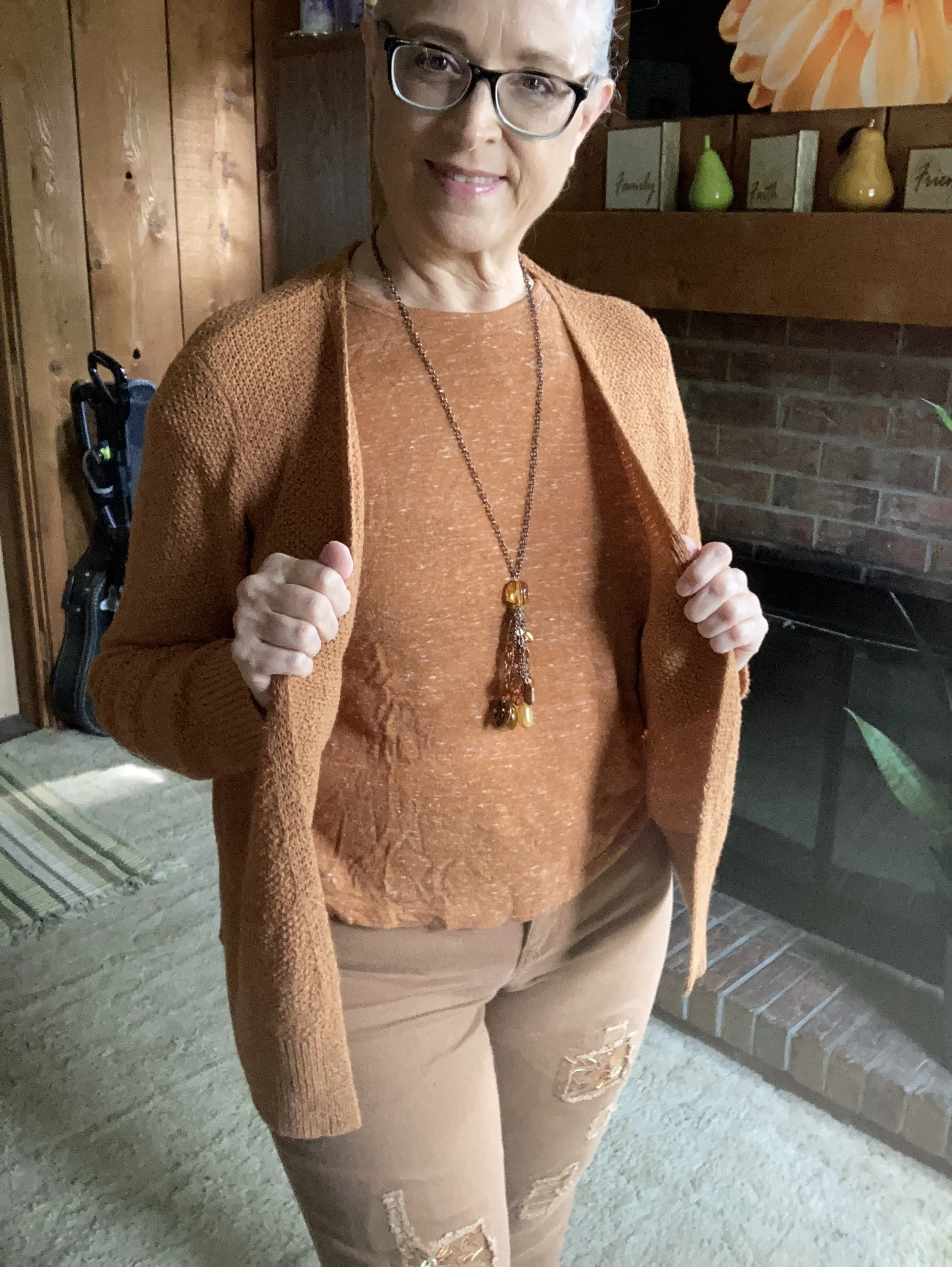
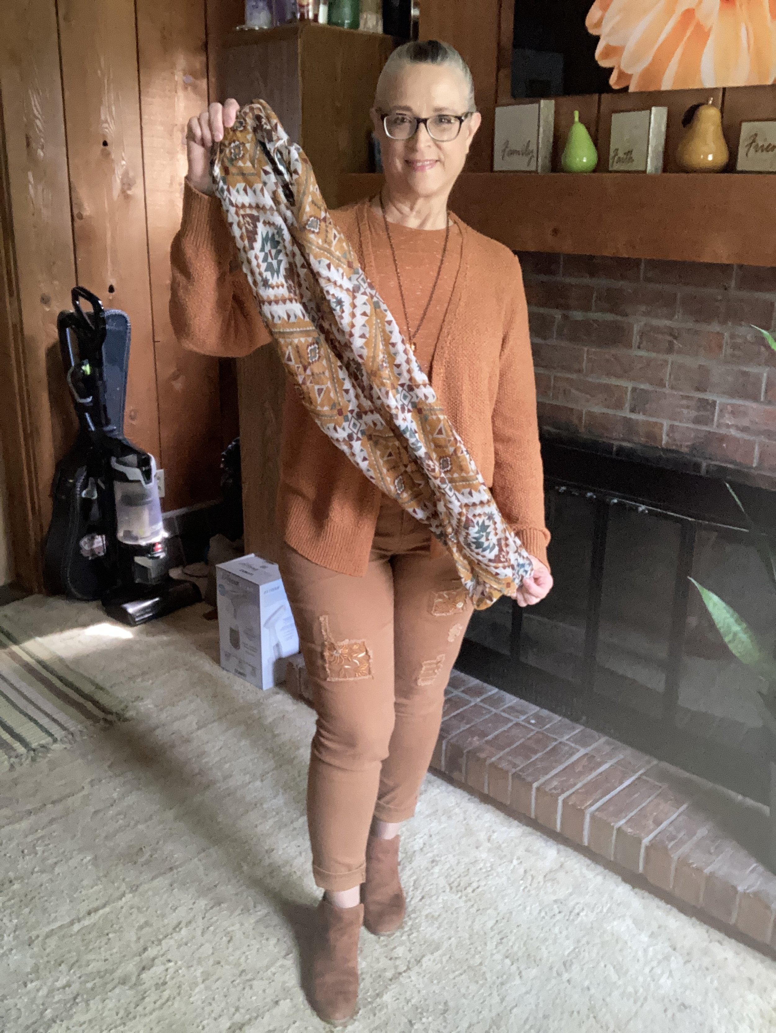
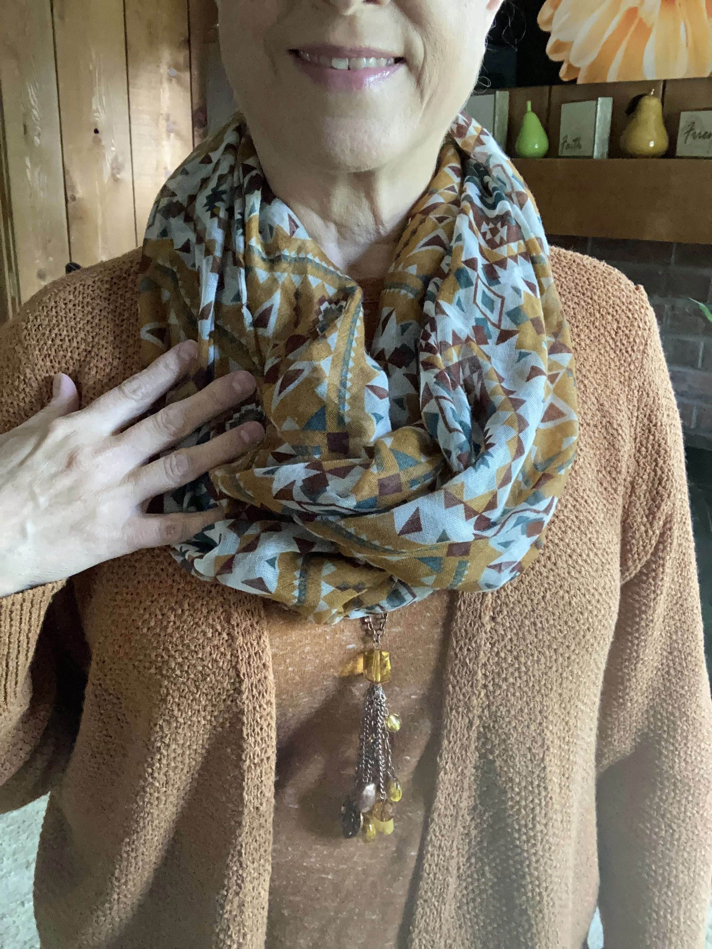
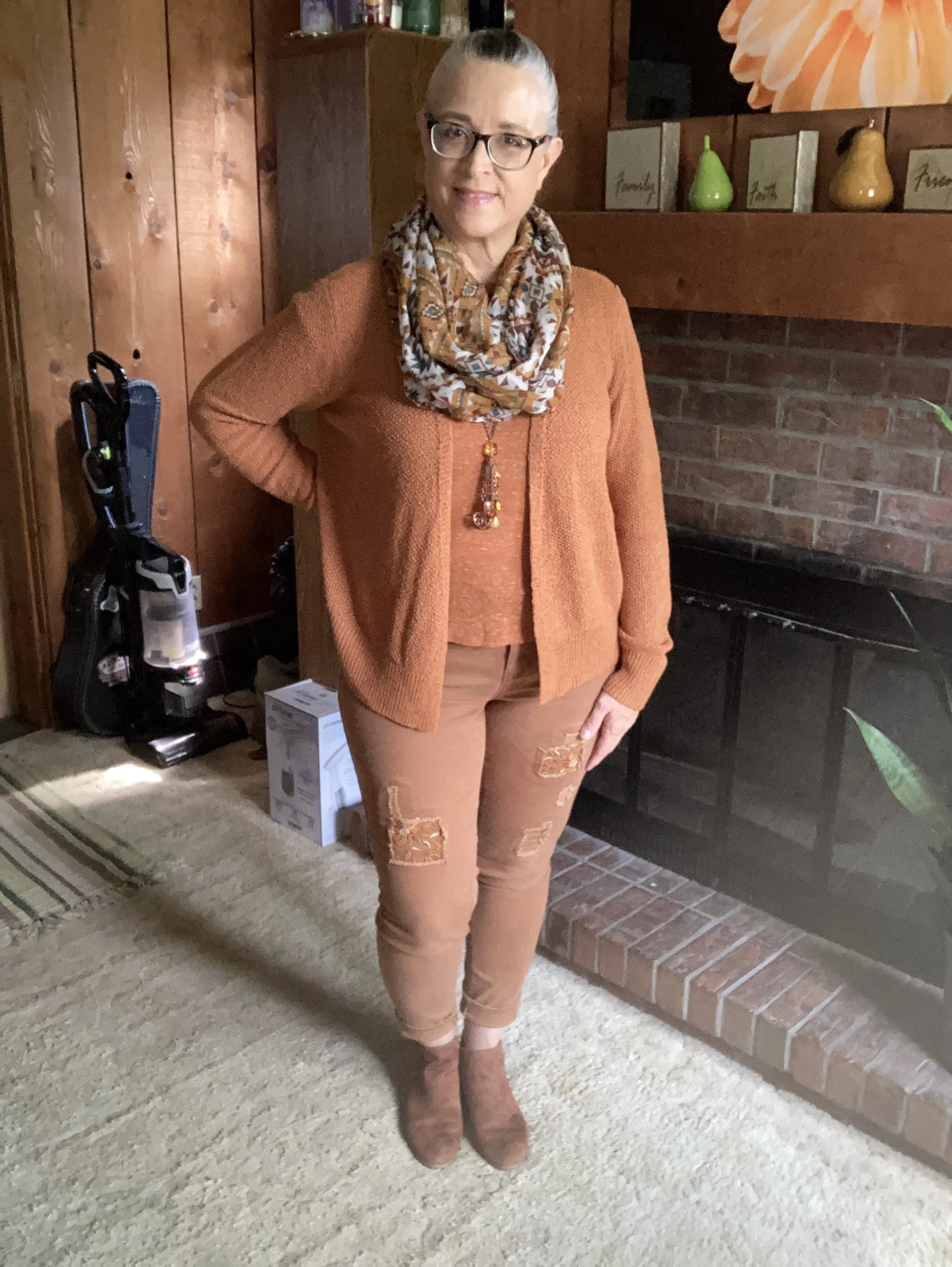
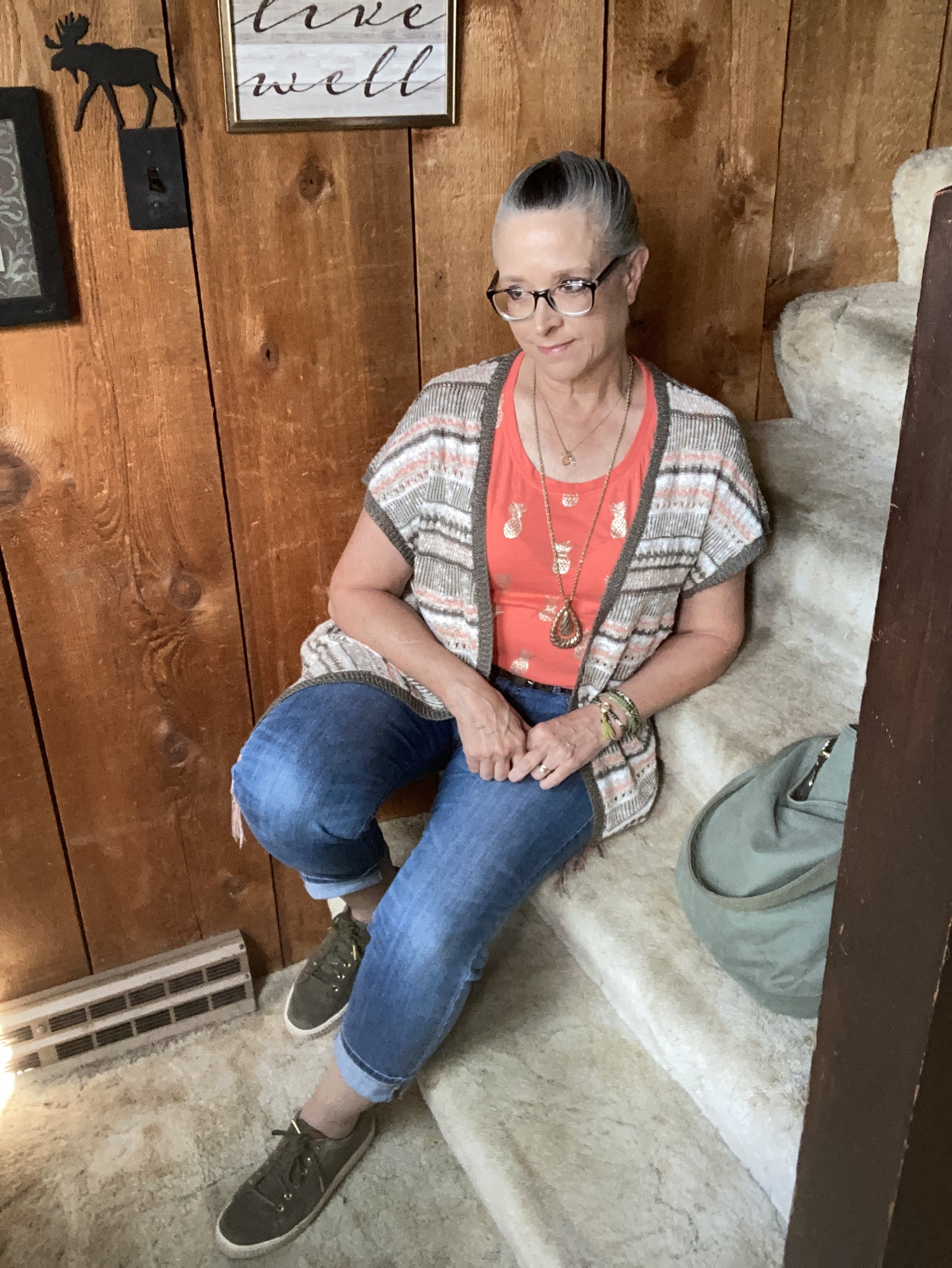
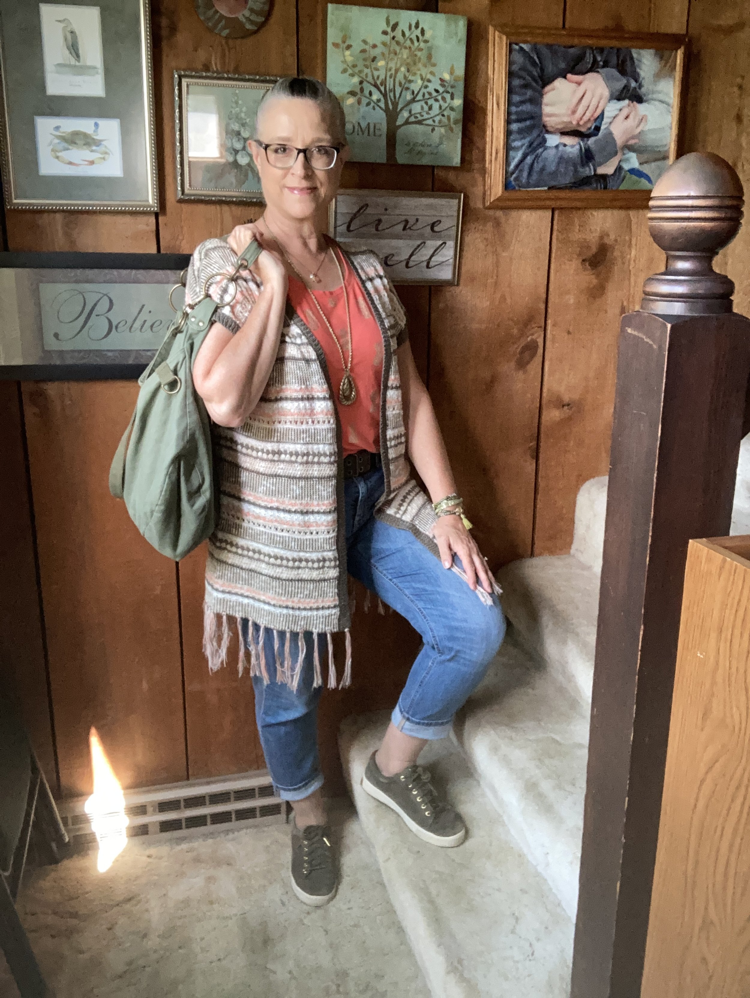
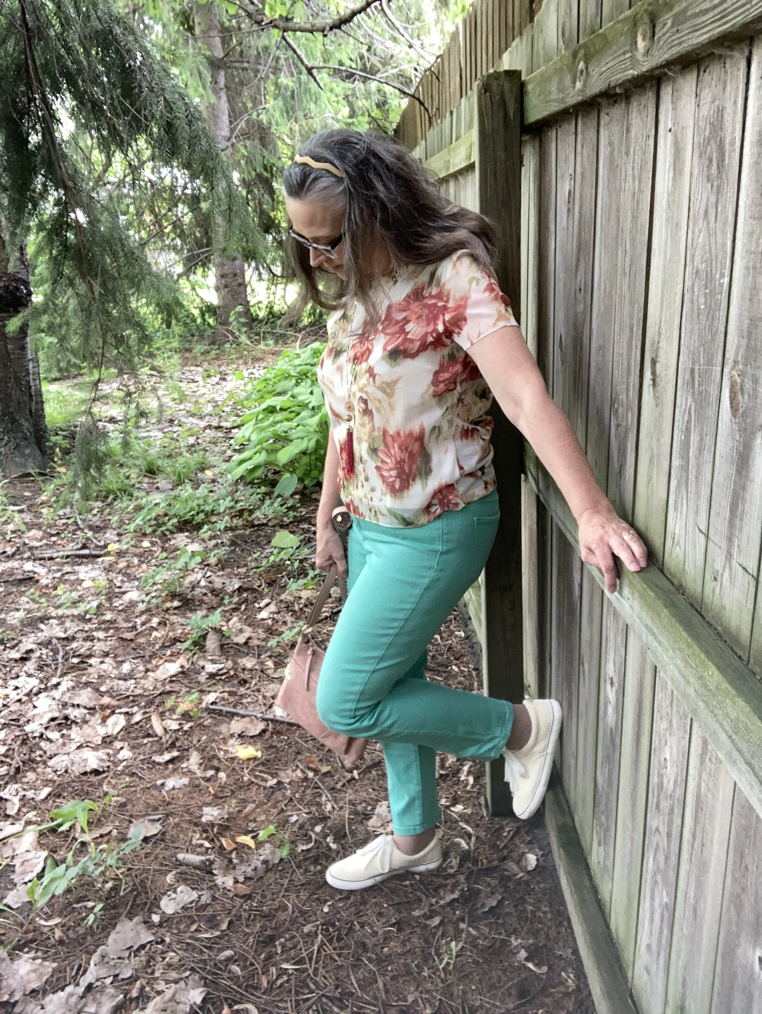
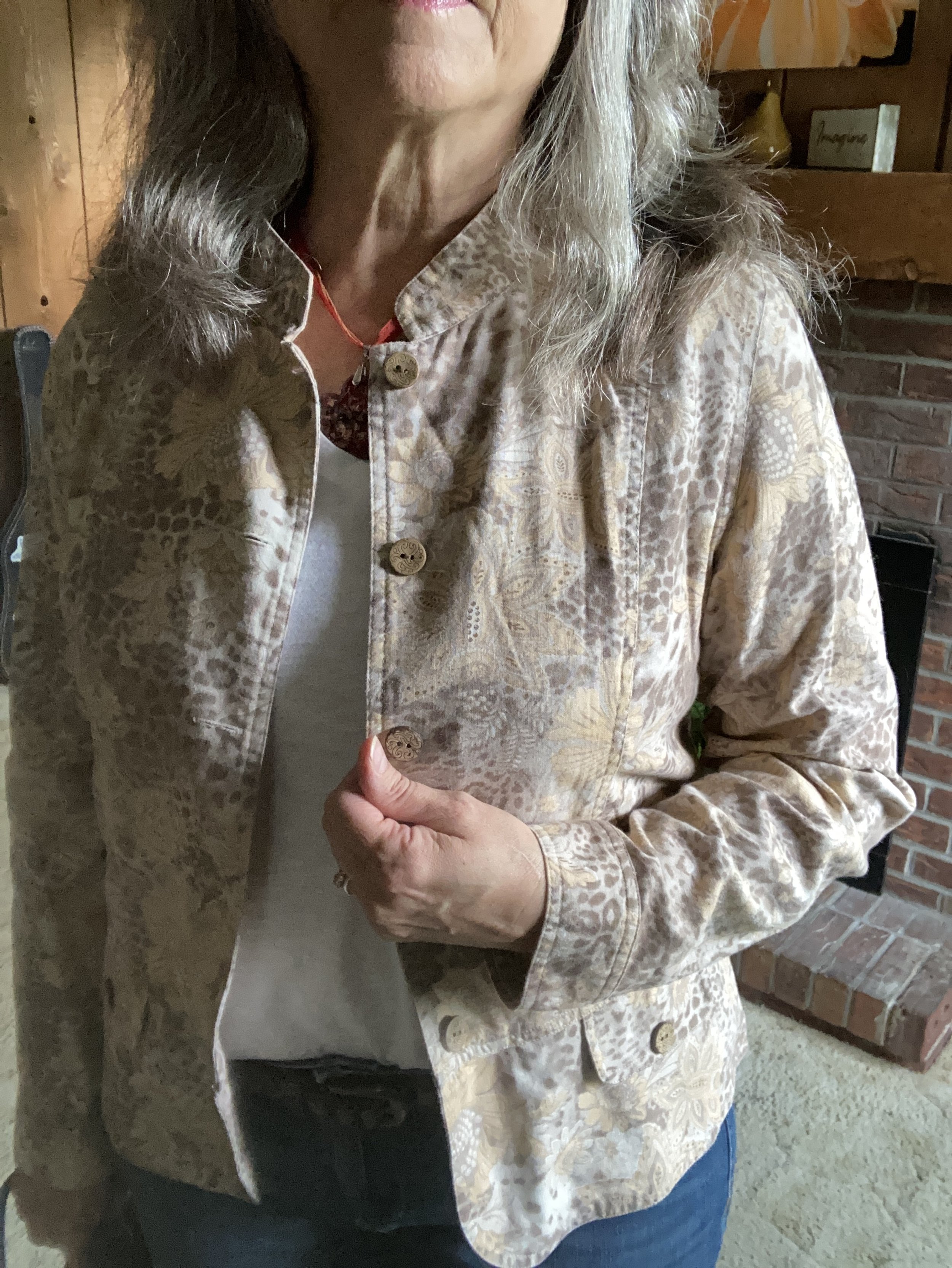
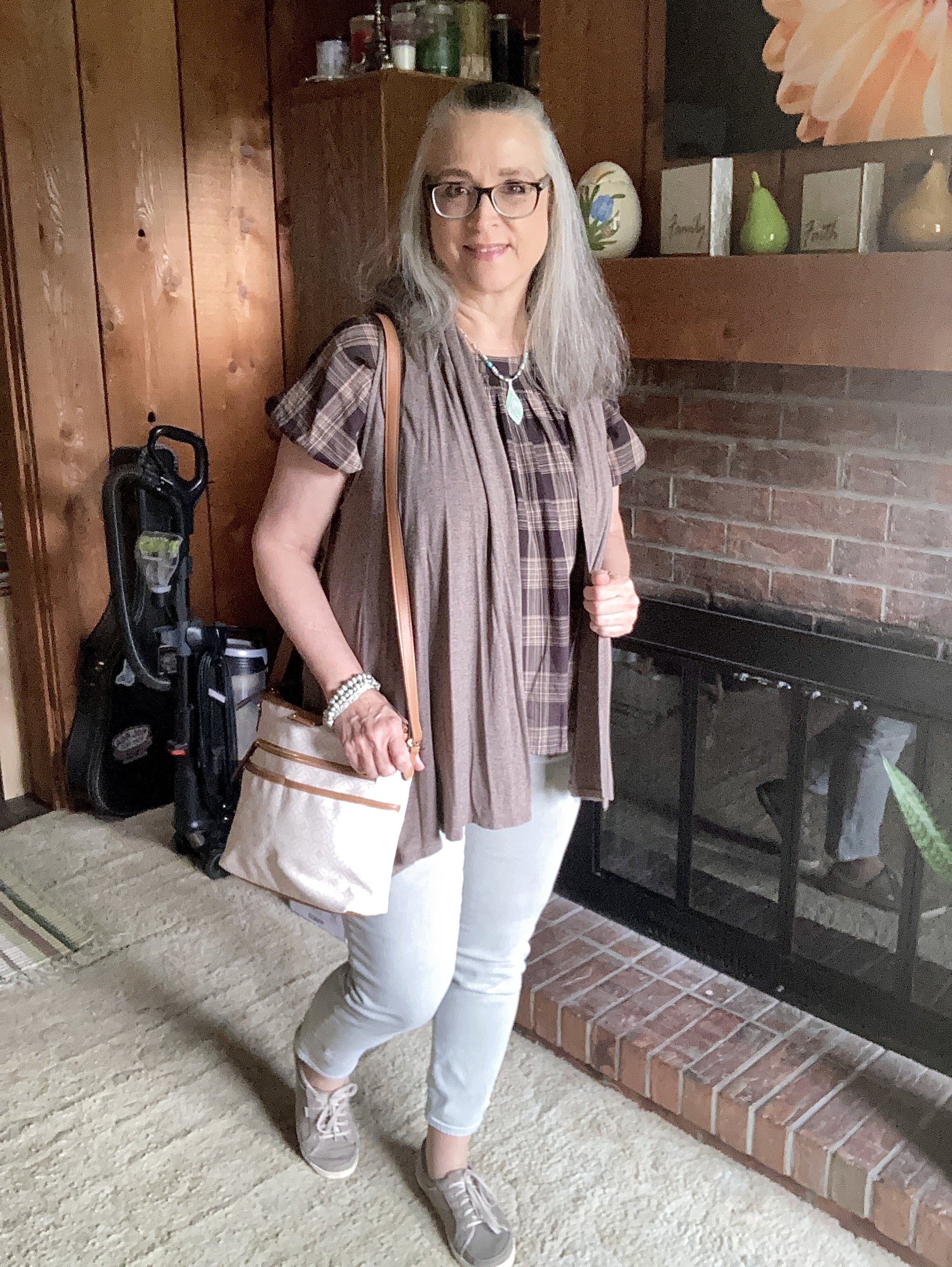
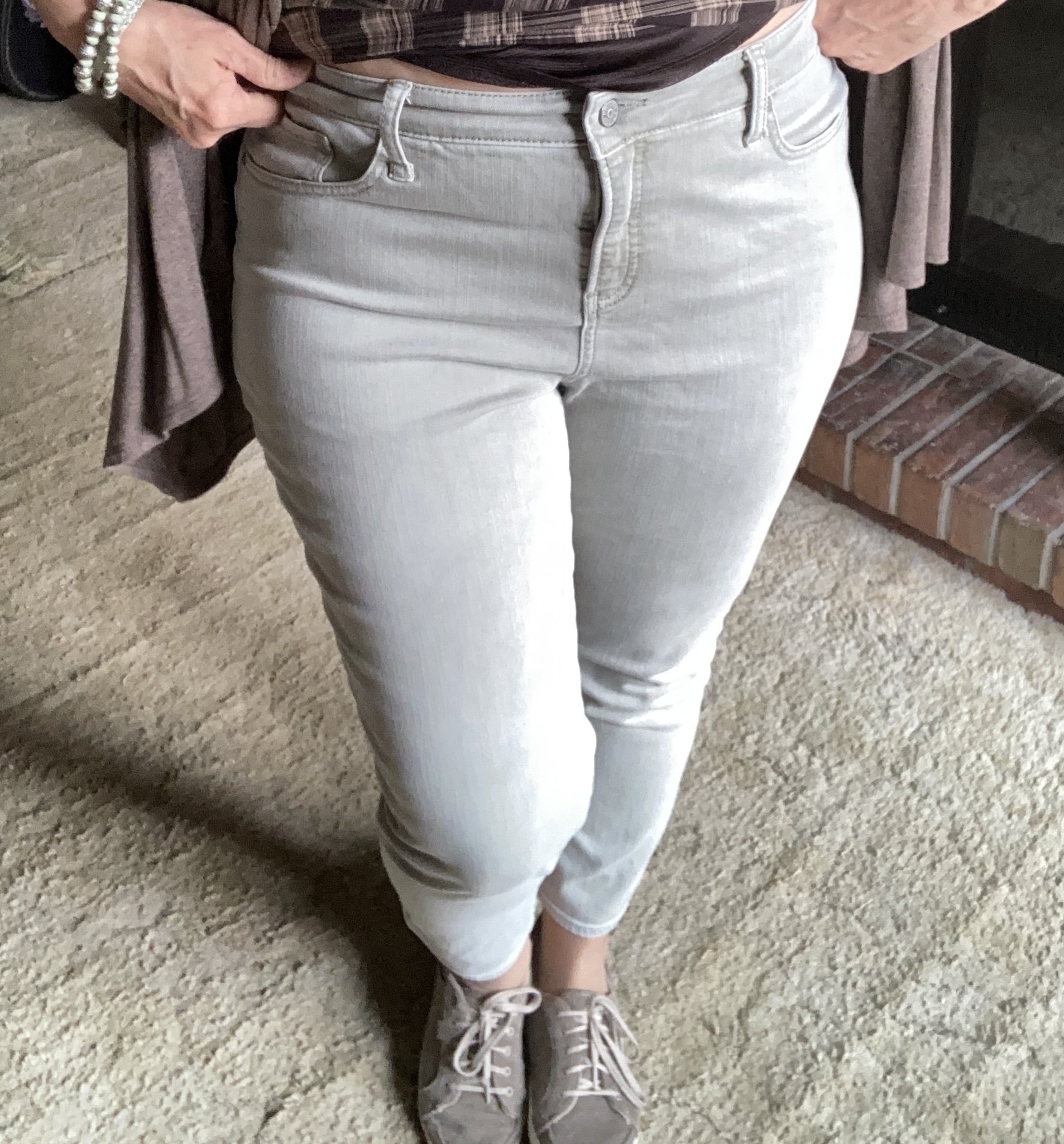
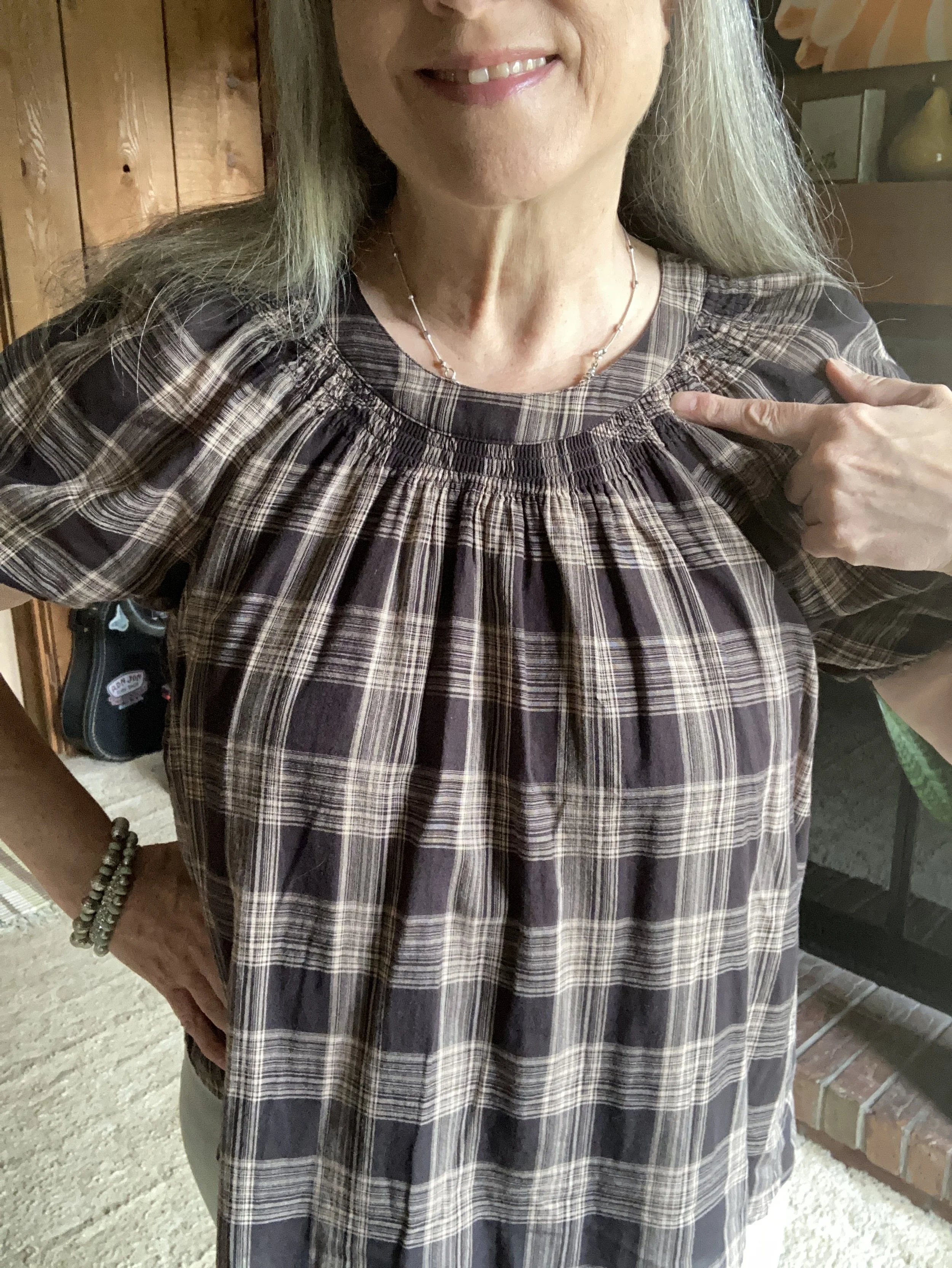
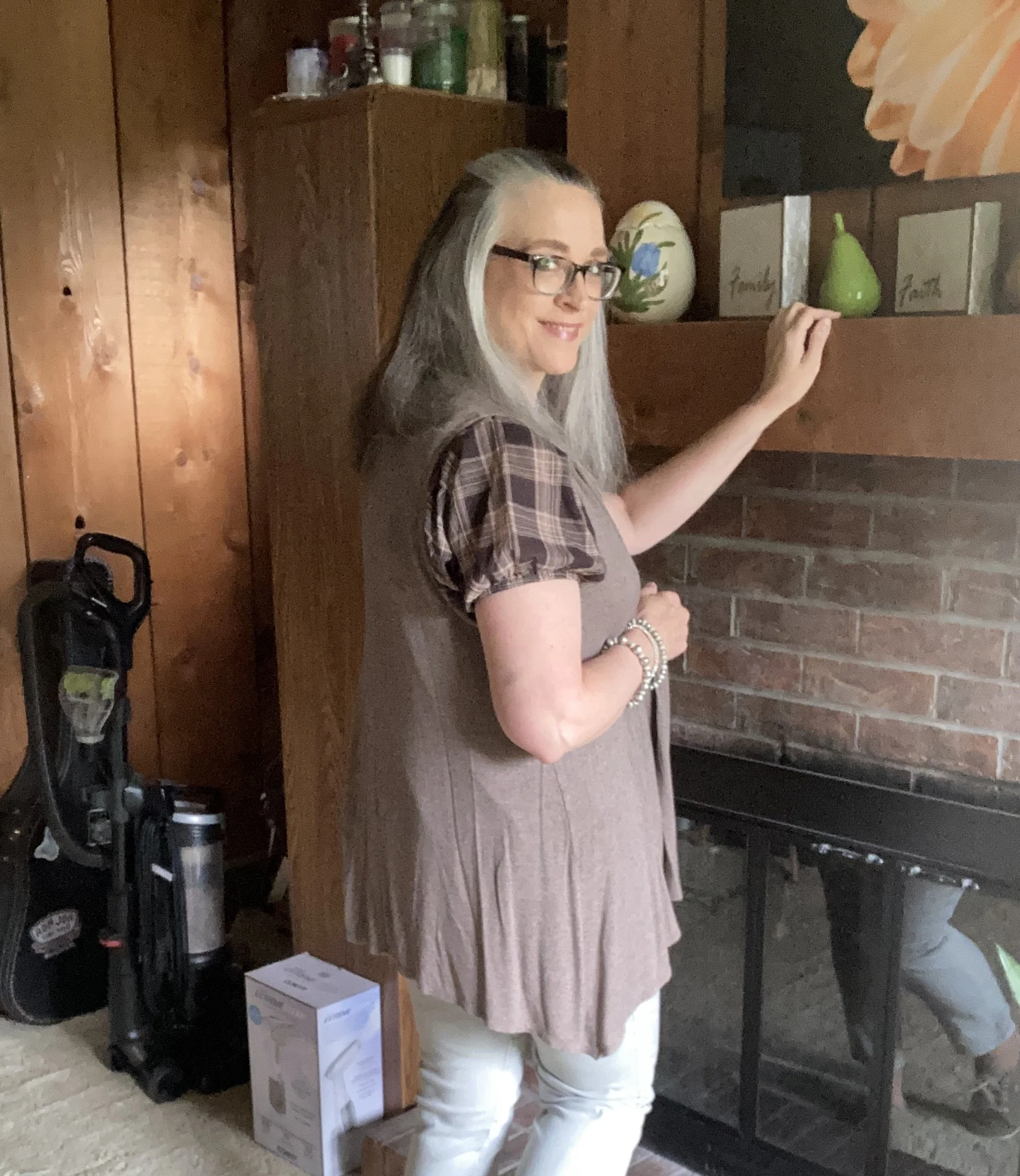
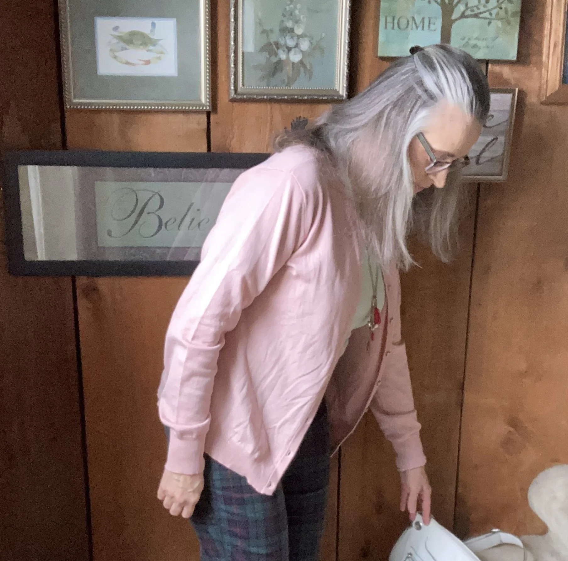
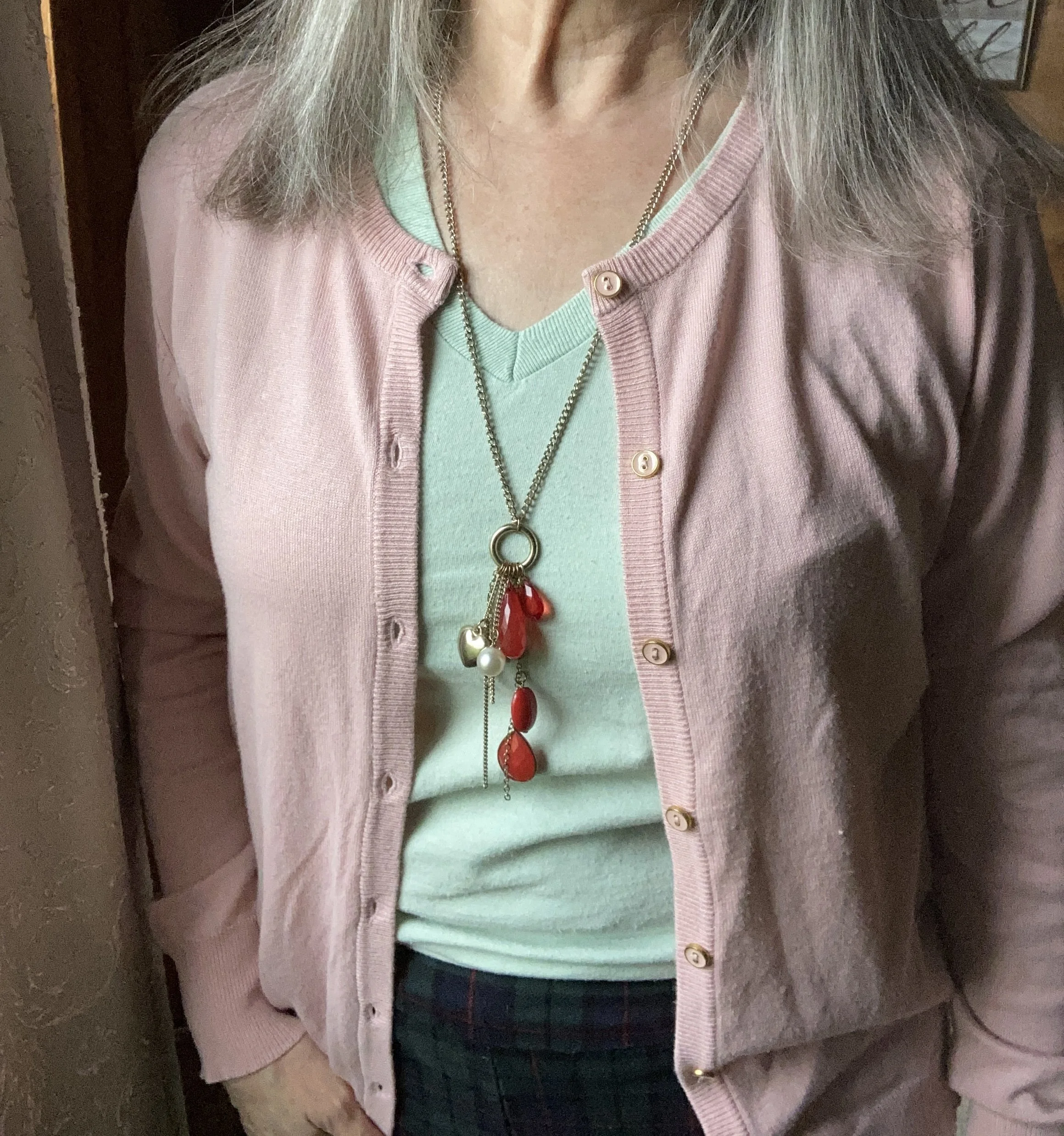
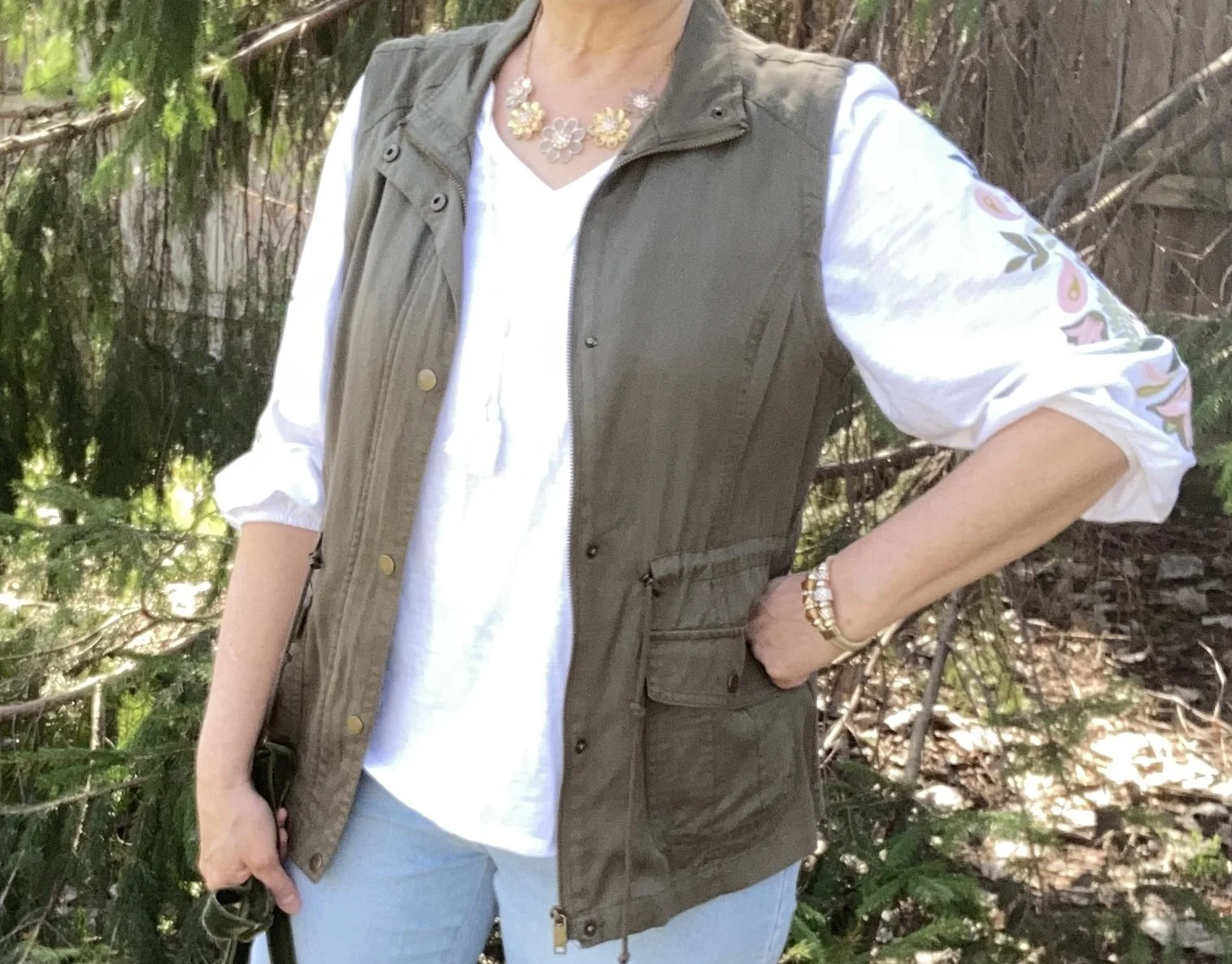
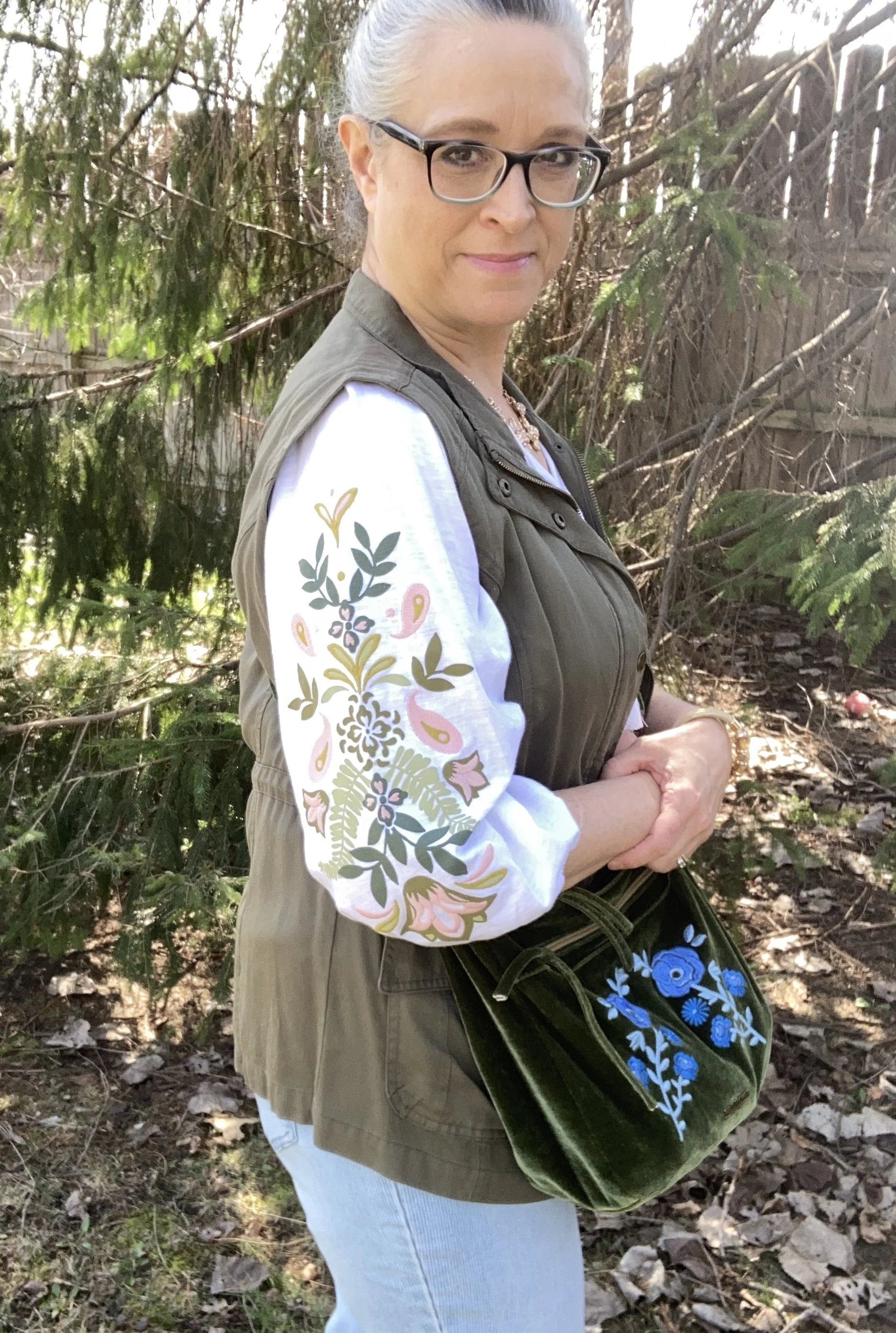
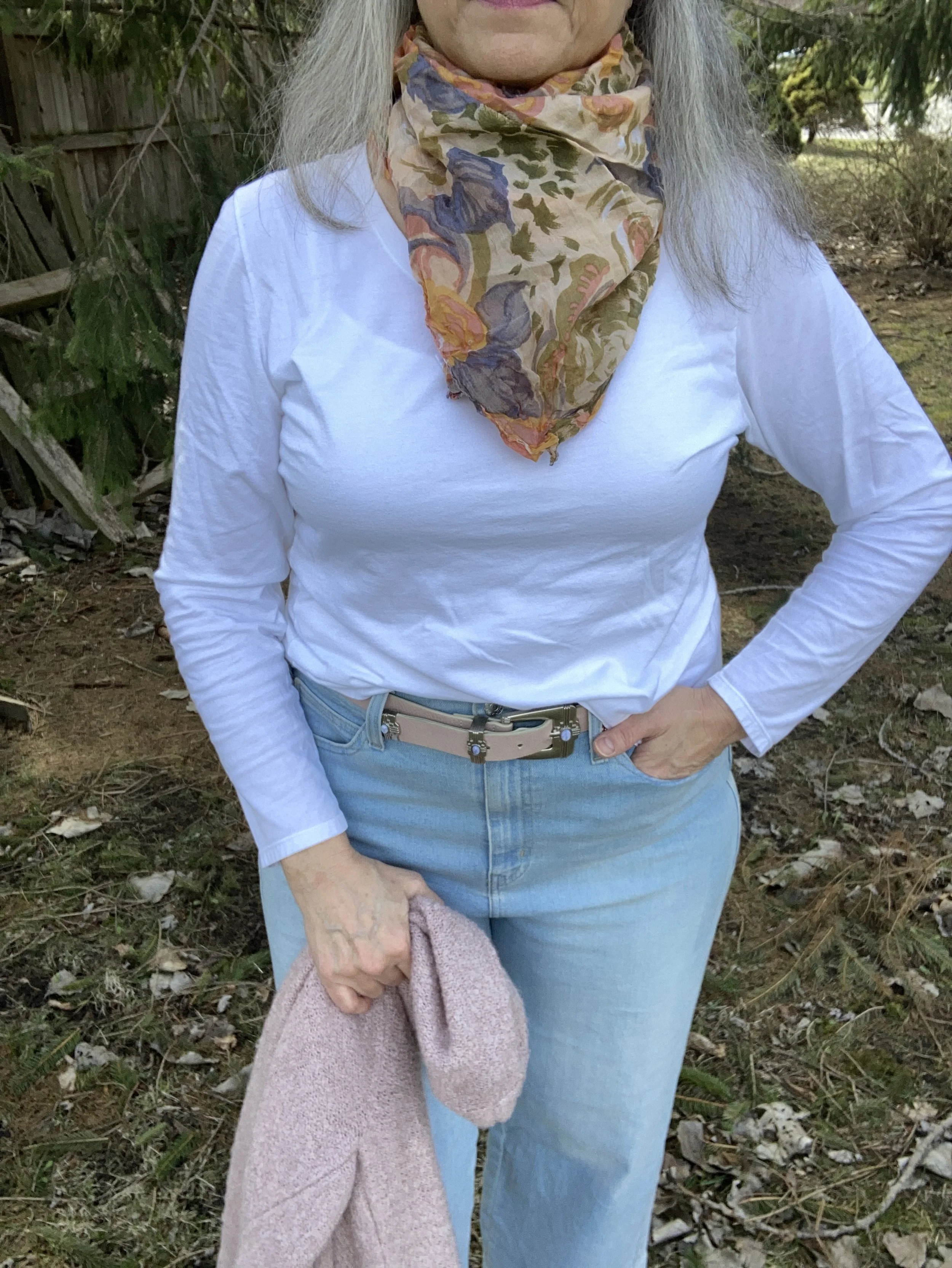
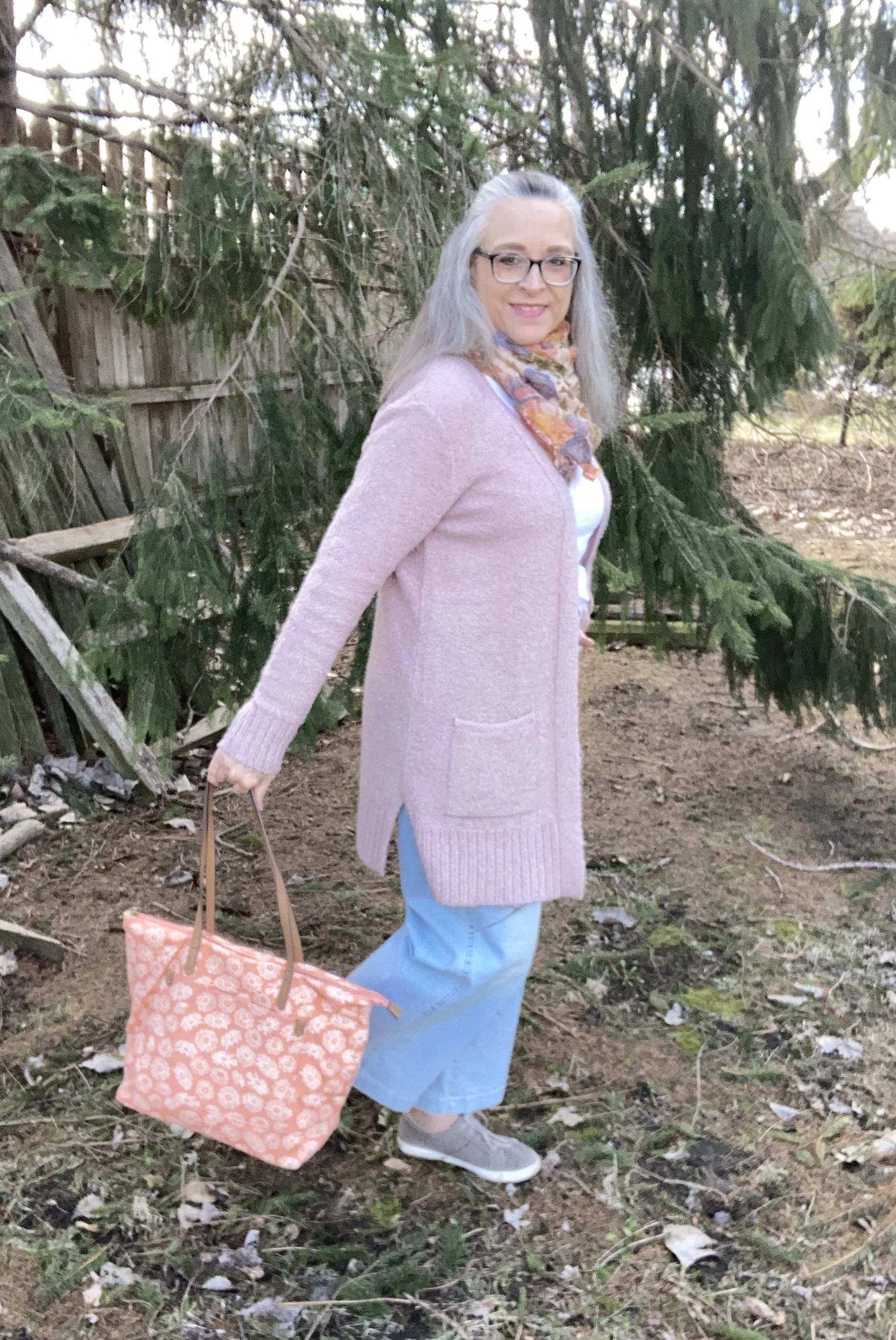
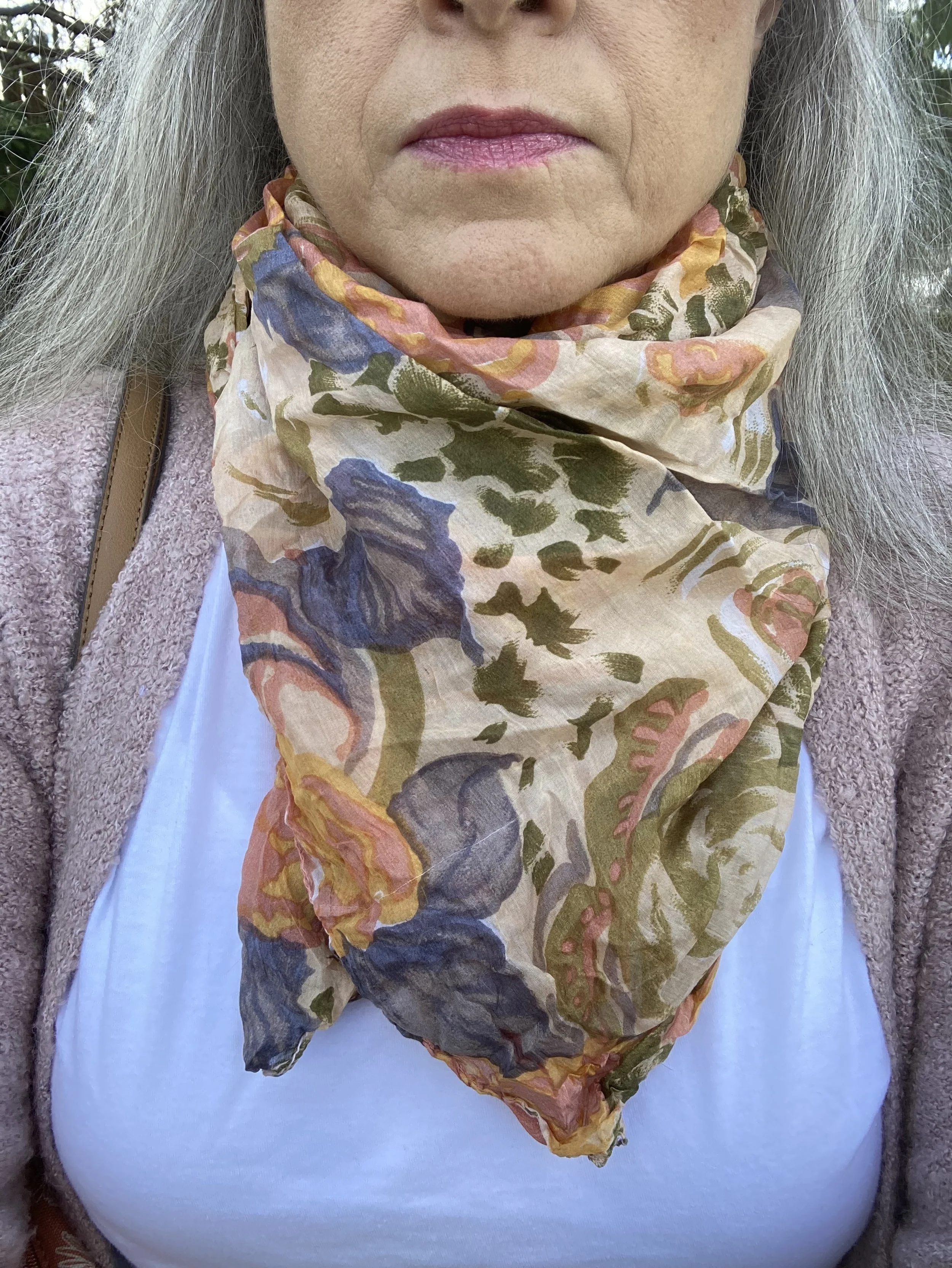
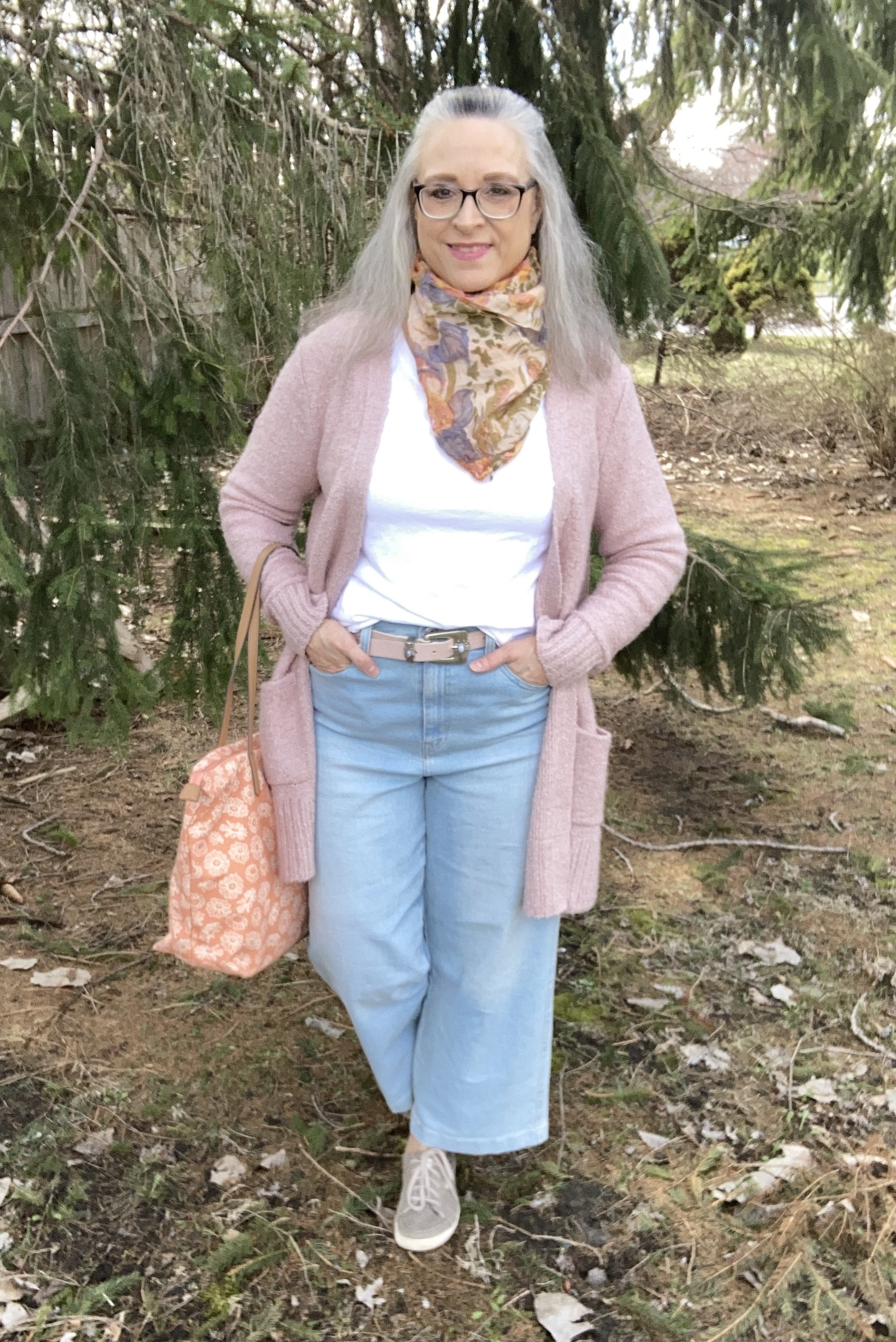
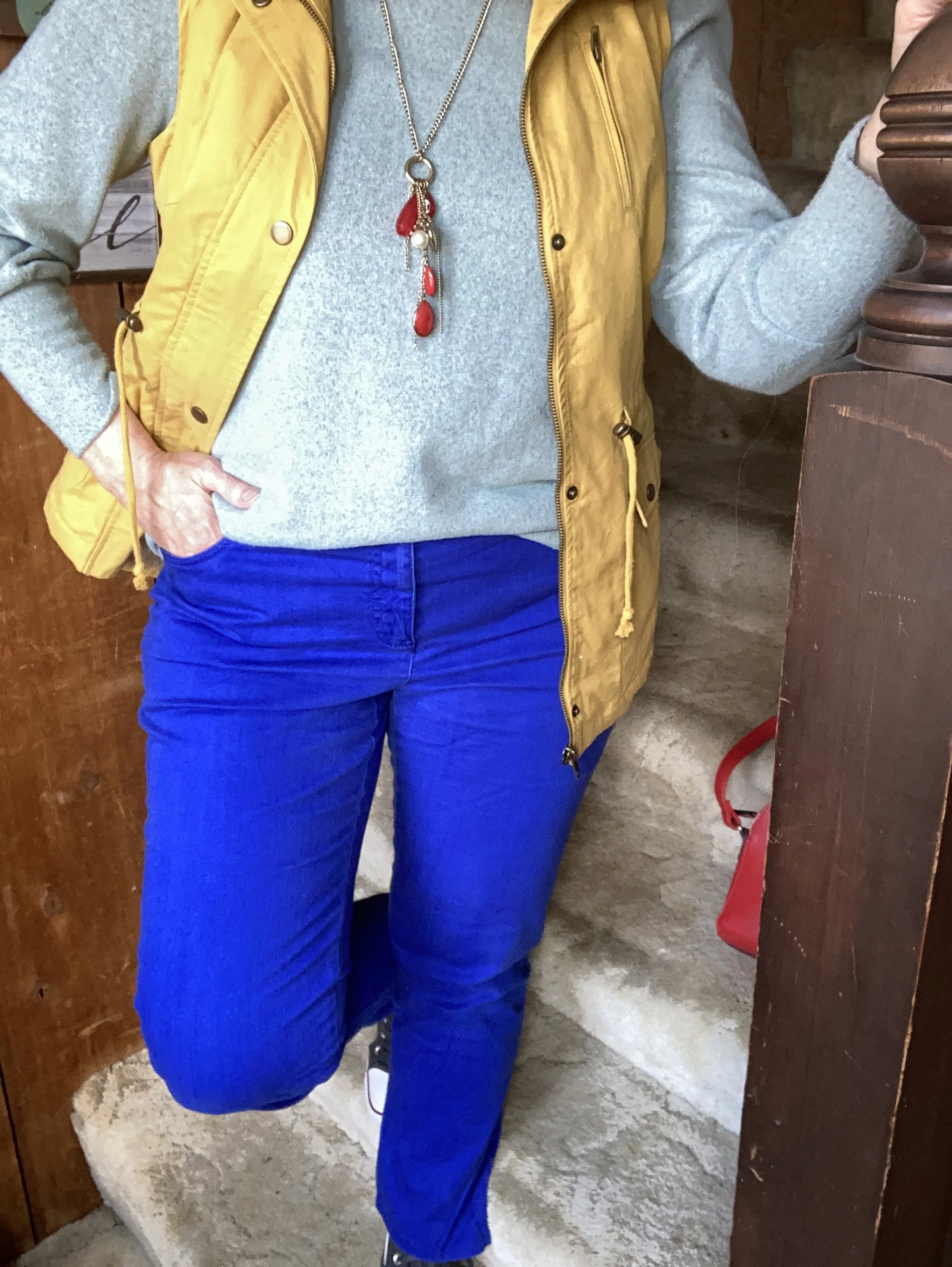
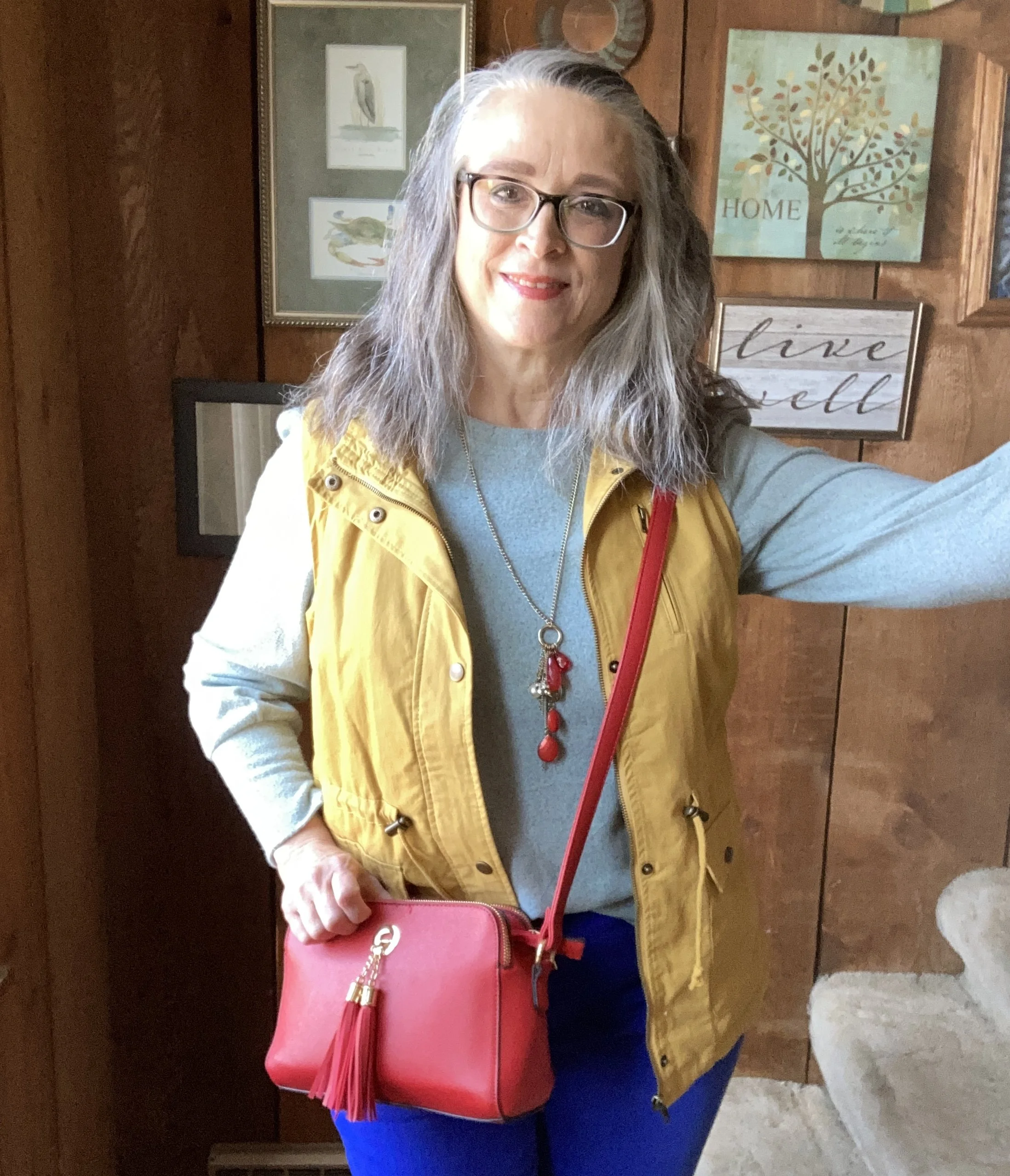
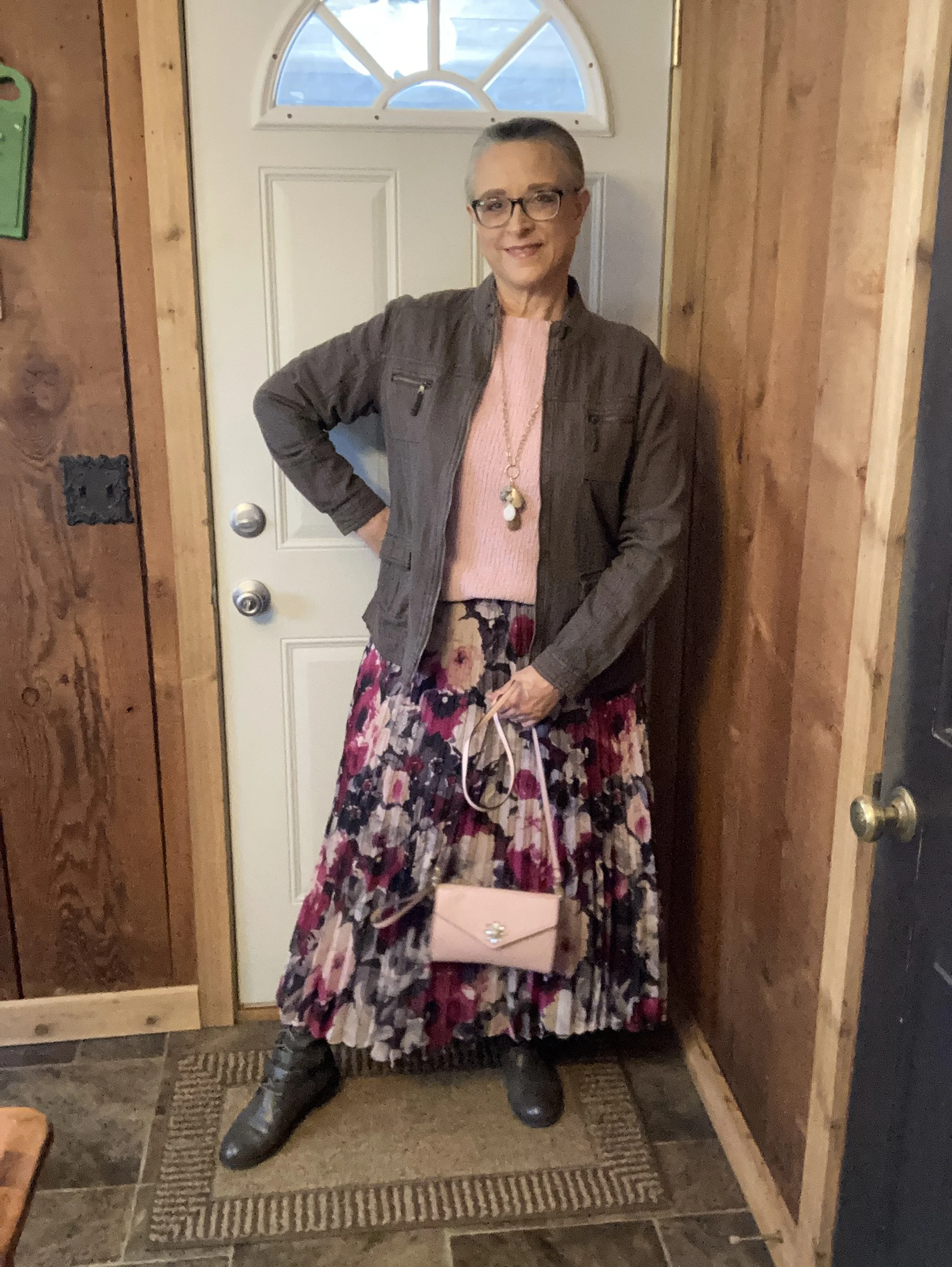
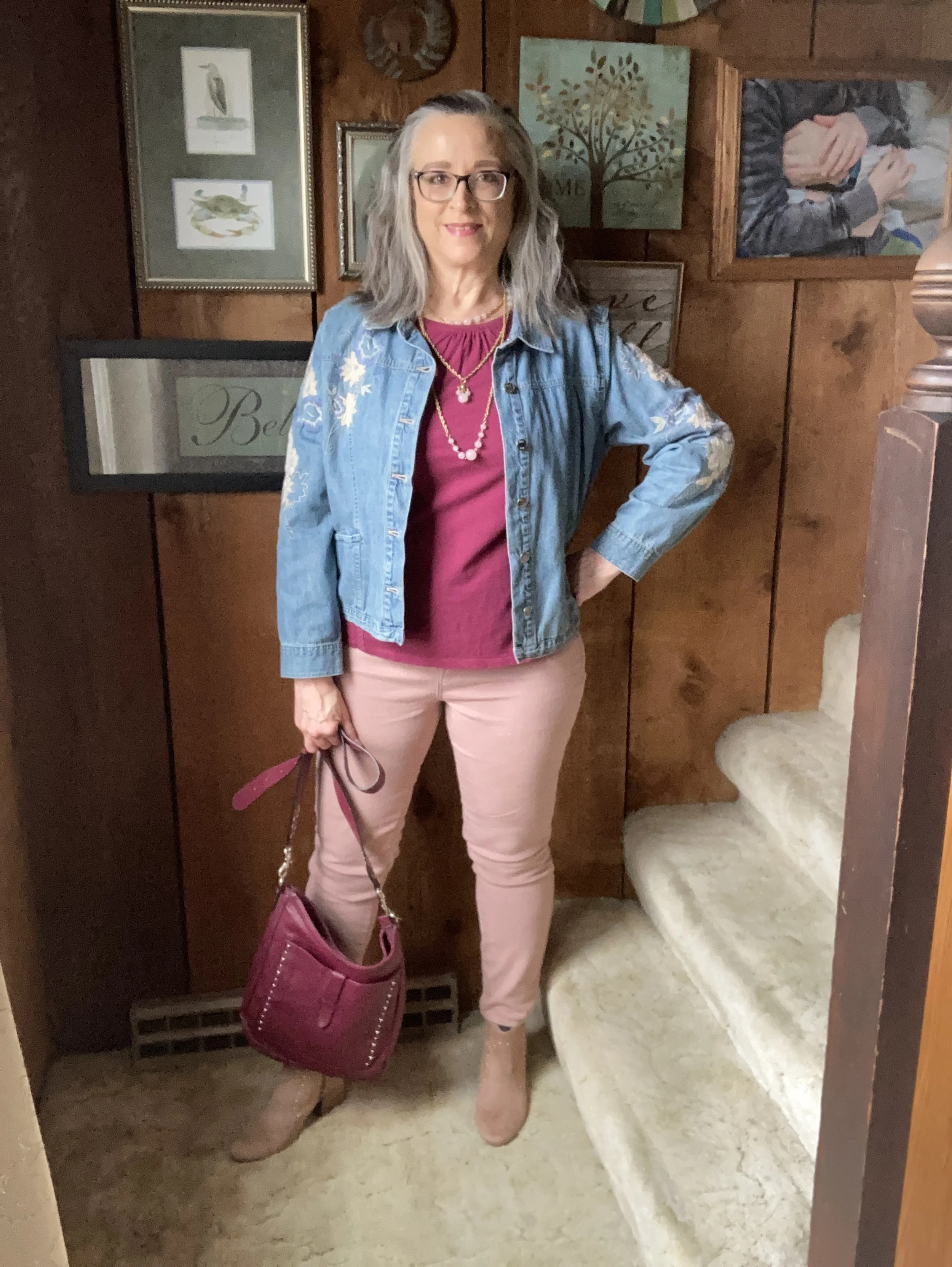
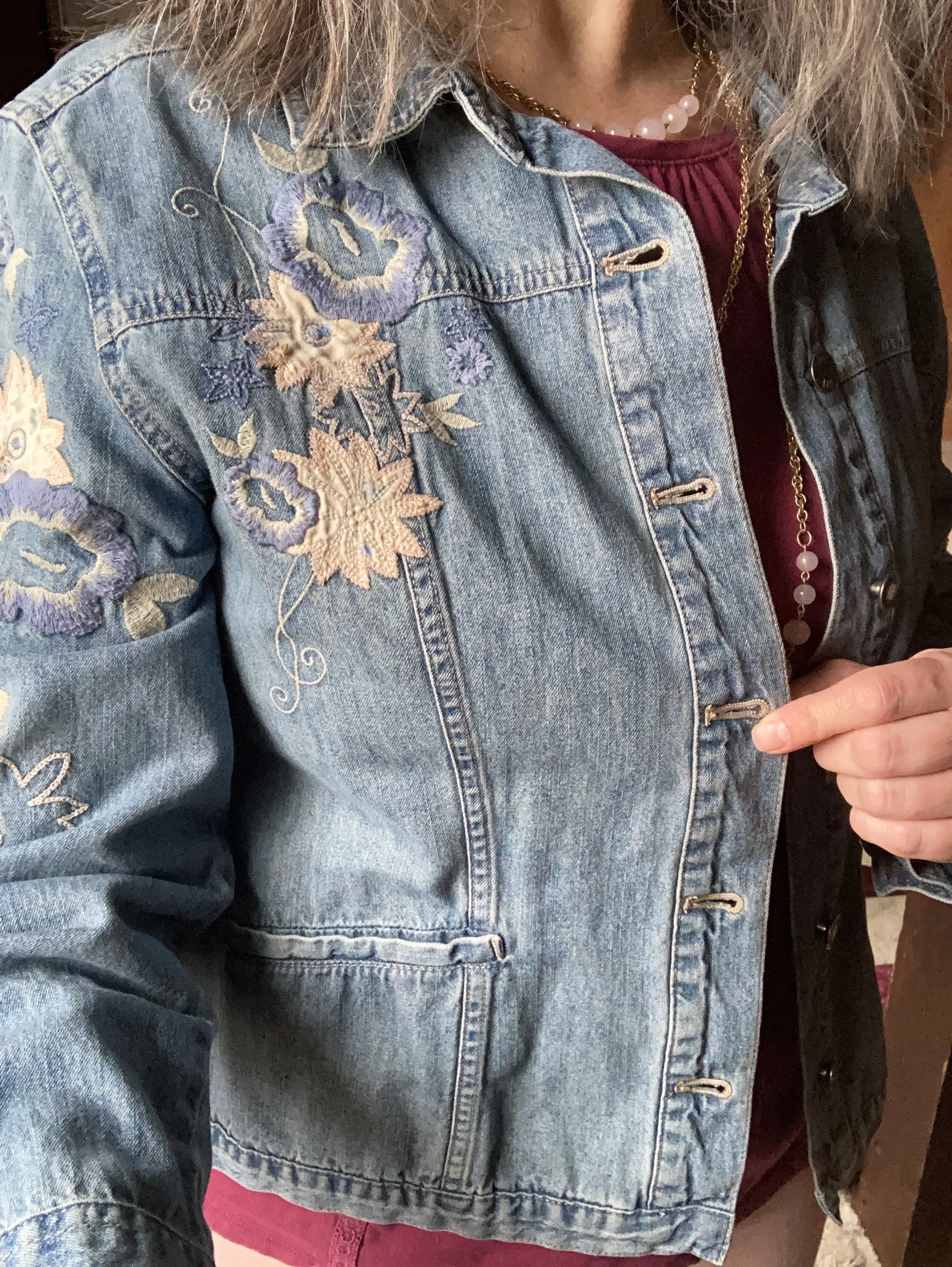
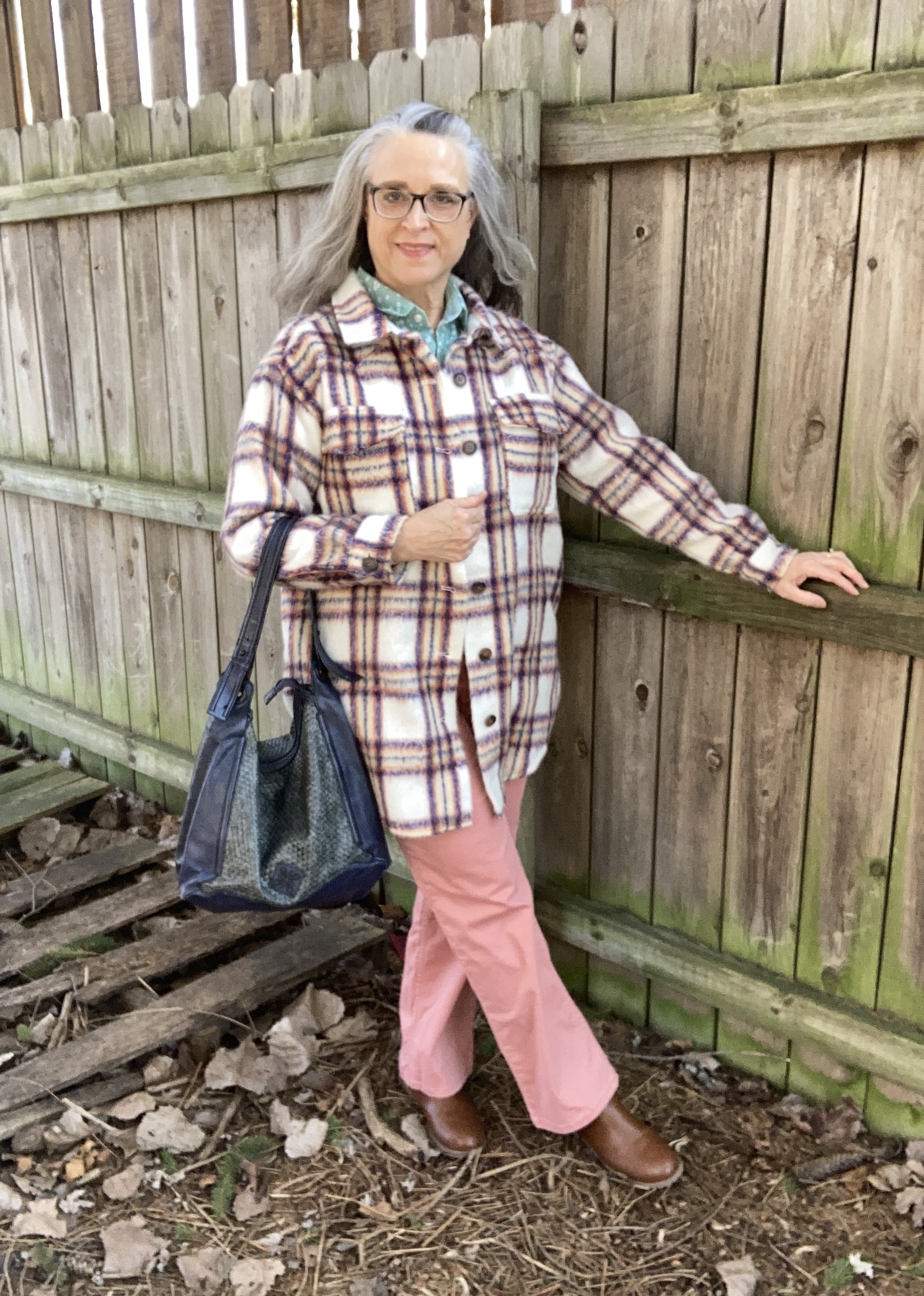
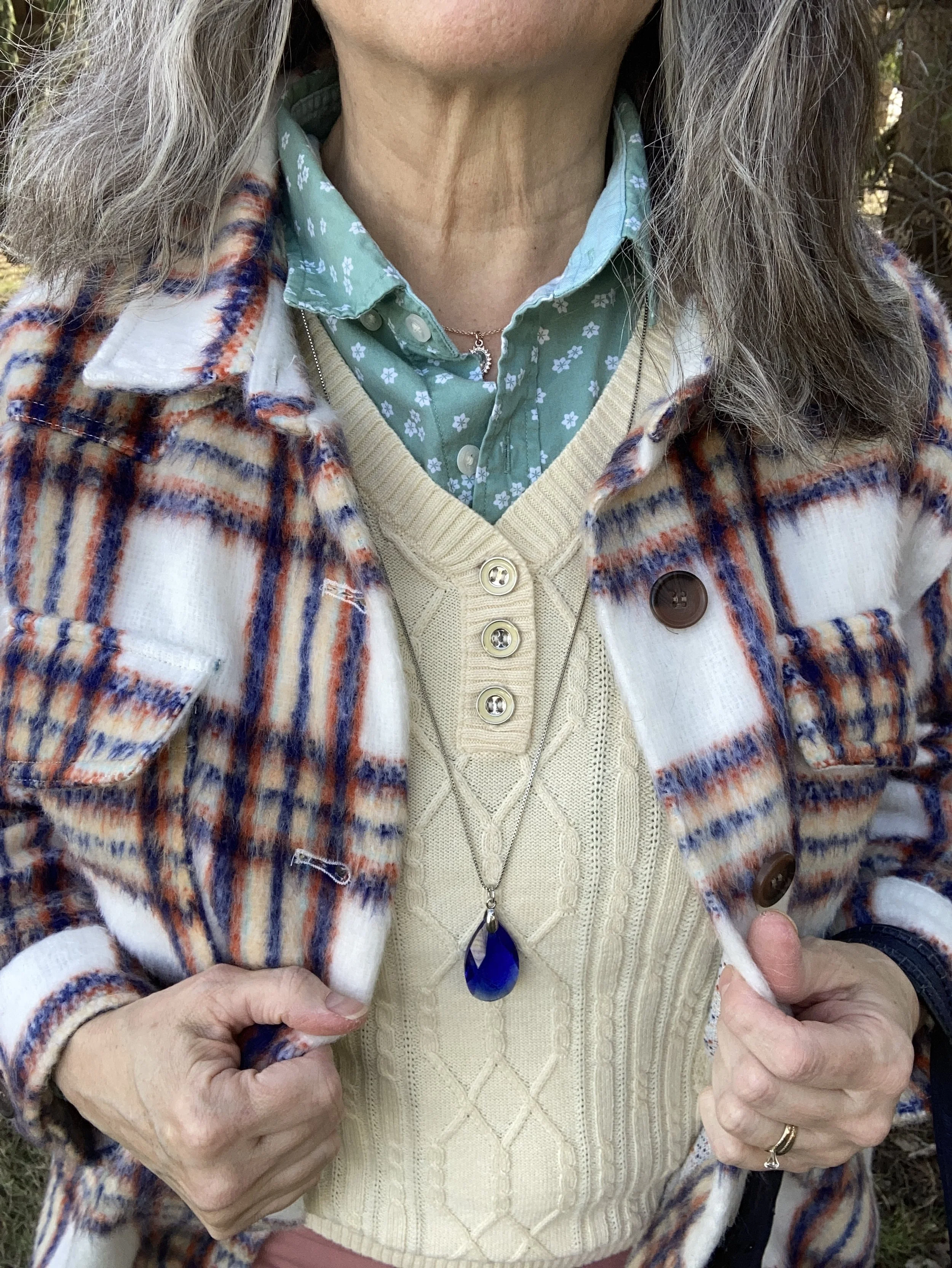
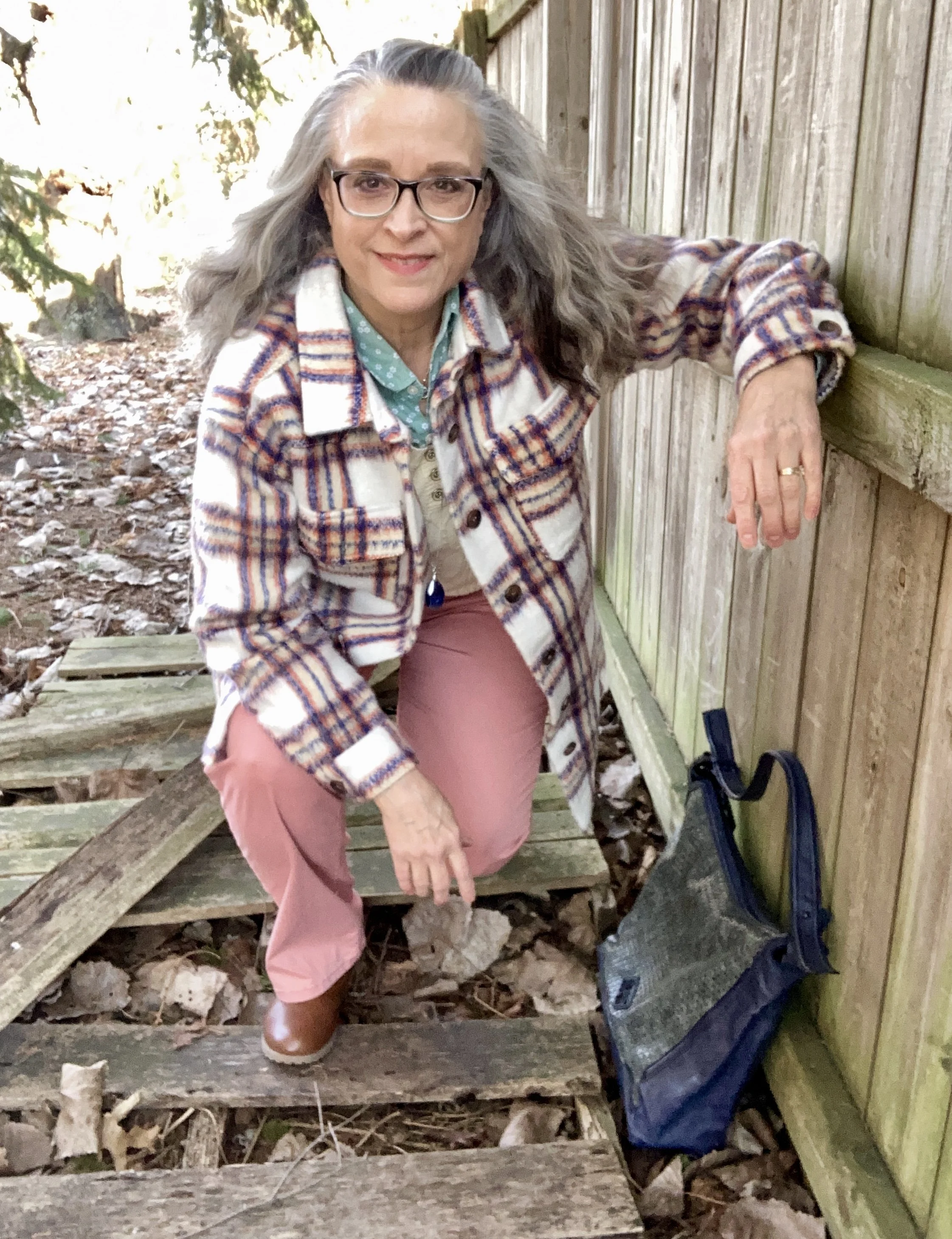
This plaid shacket has the shirt vibe, but it is heavy enough to wear as a coat on the chillier spring days. When I decided to use this piece for my color inspiration, I decided to lean towards pastels rather than the more primary blue, orange and yellow. You can see the colors better in this close up shot. Do you see the very faint minty green line?

With these colors in mind, I plaid with two variations, but the pastels won out. It seemed appropriate as we move towards spring.

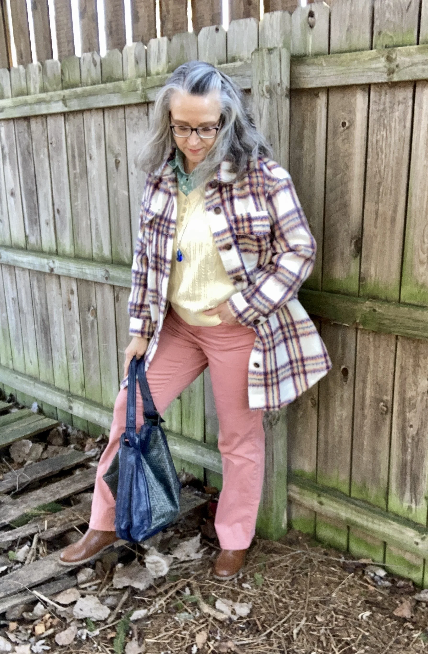
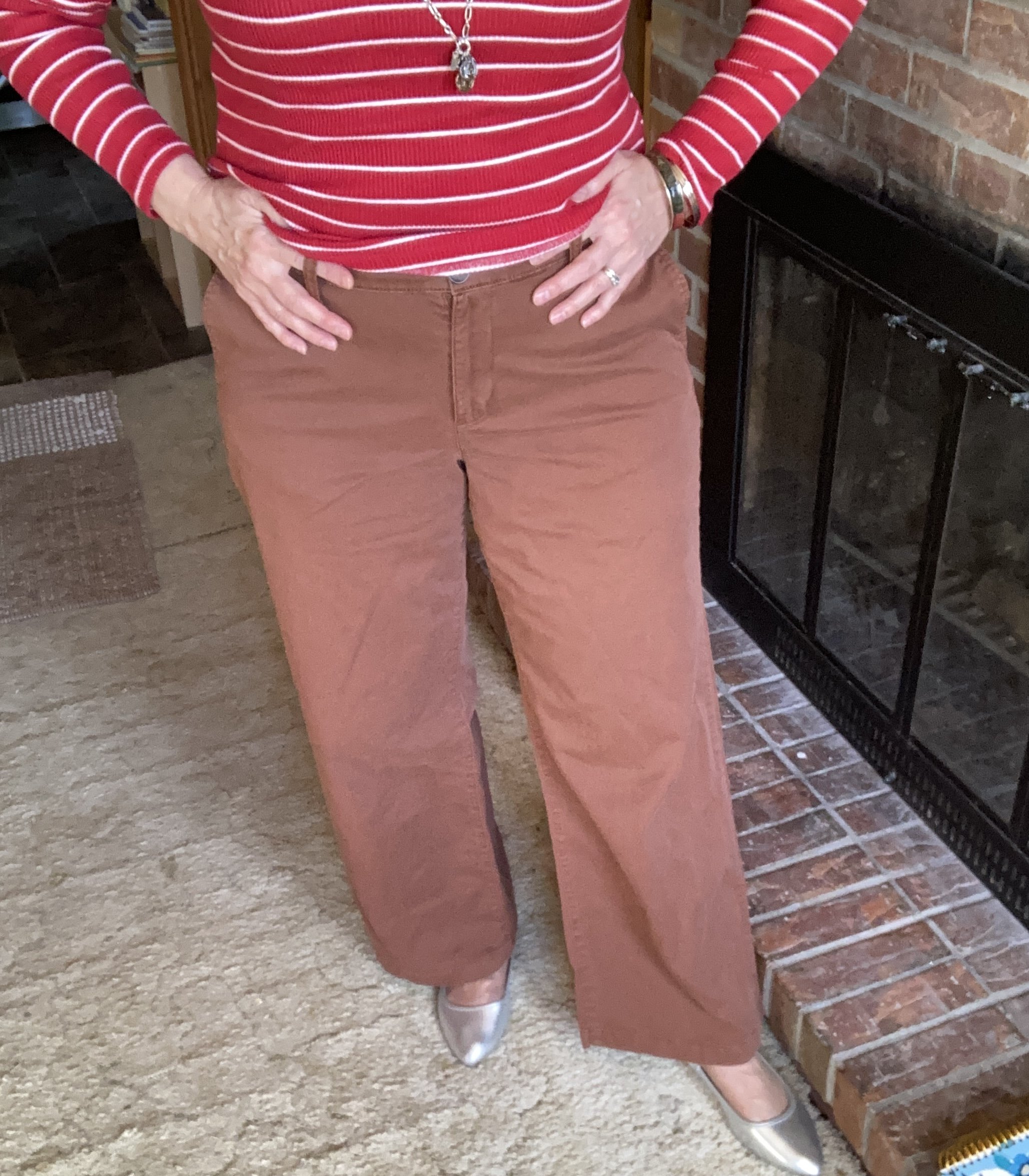
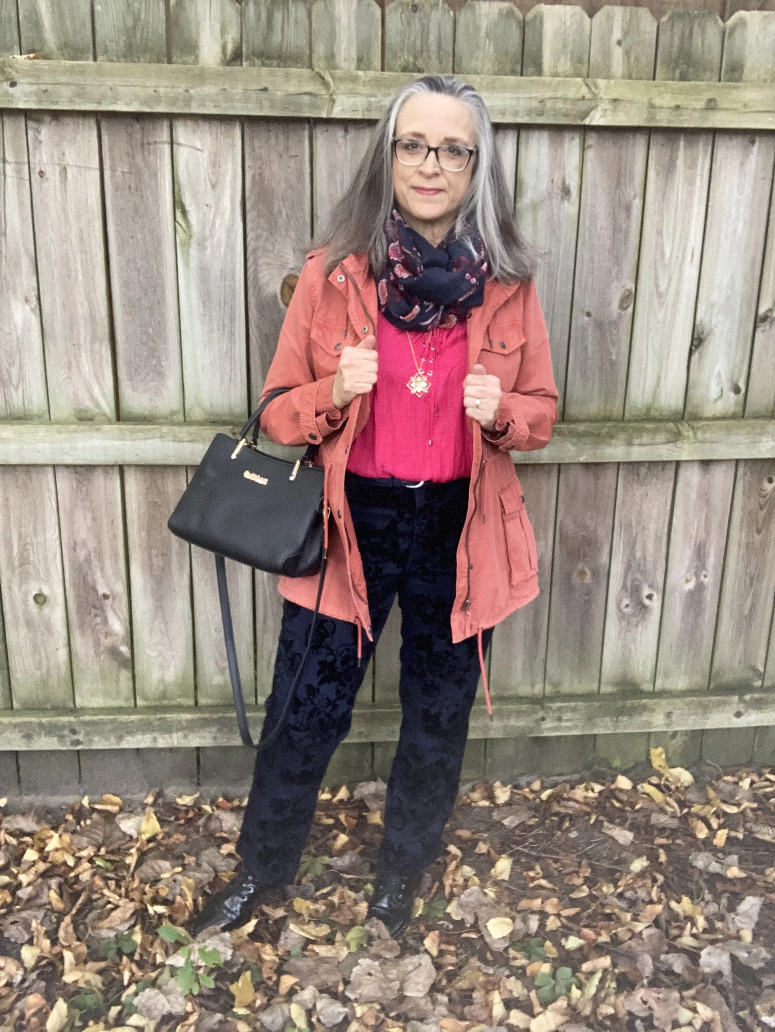
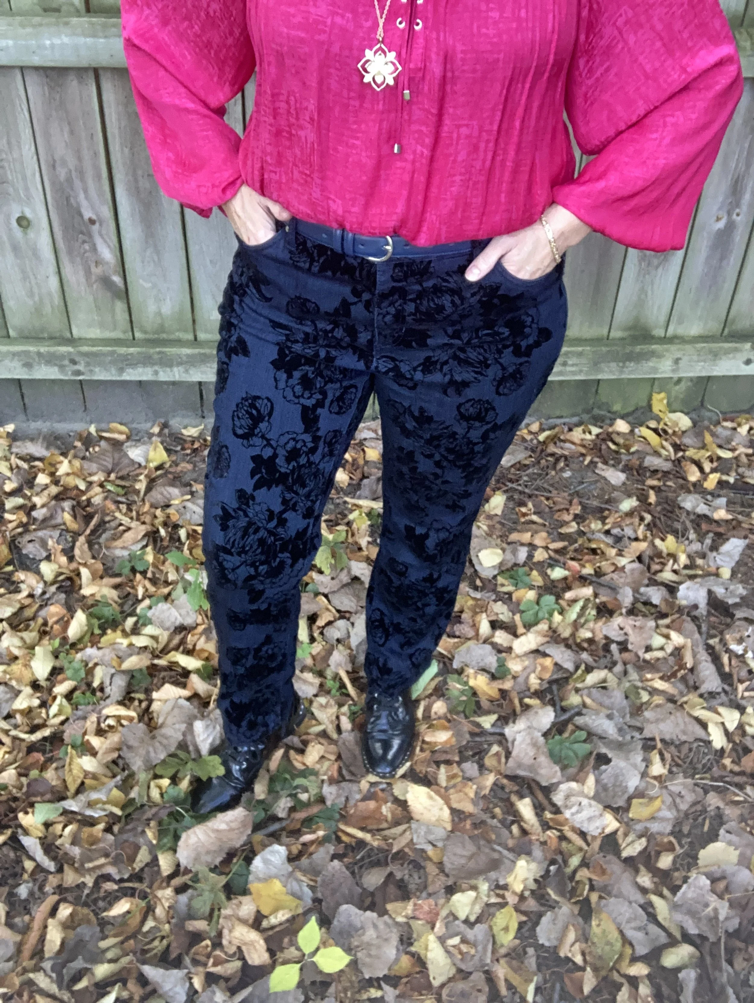
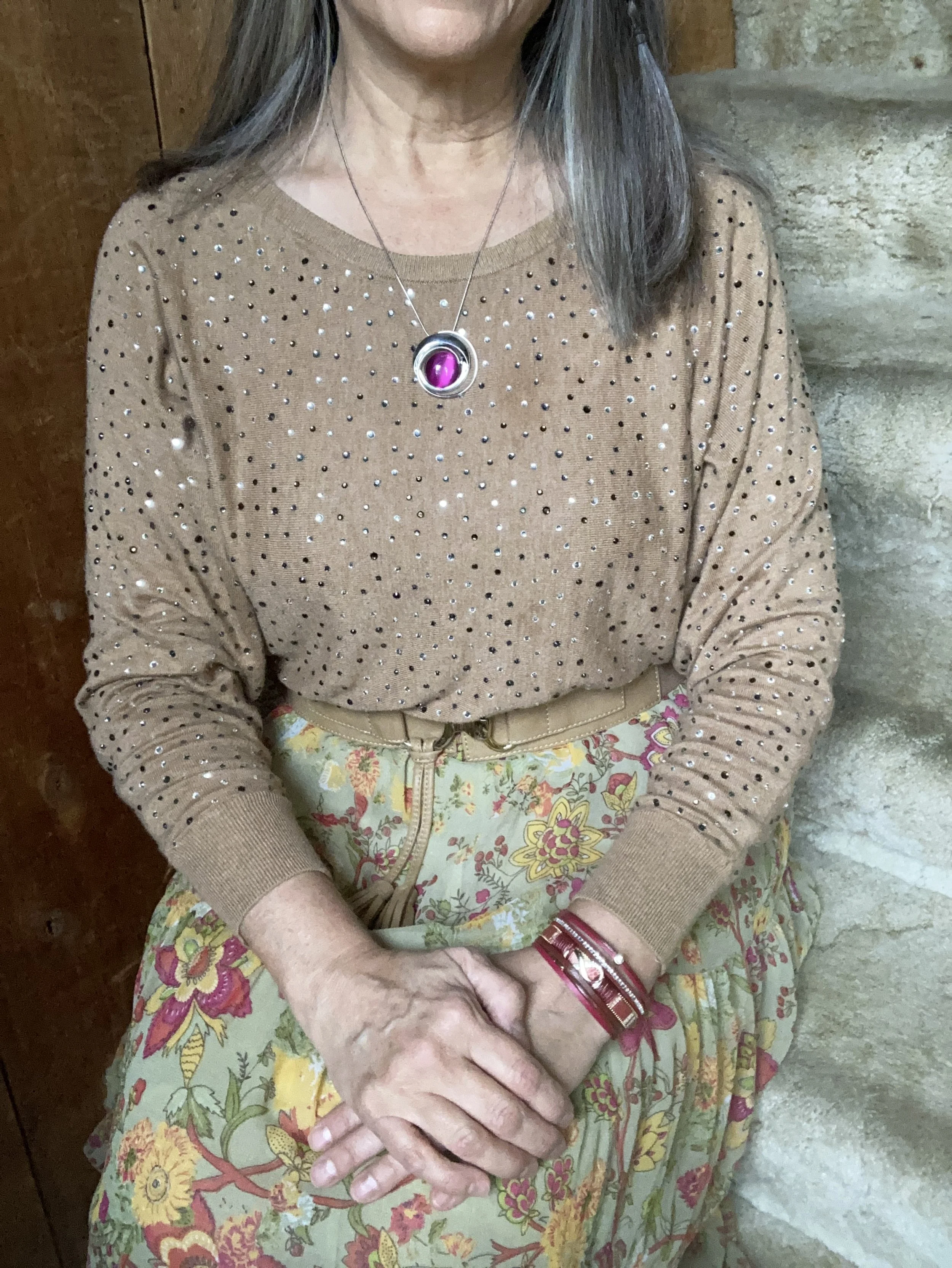
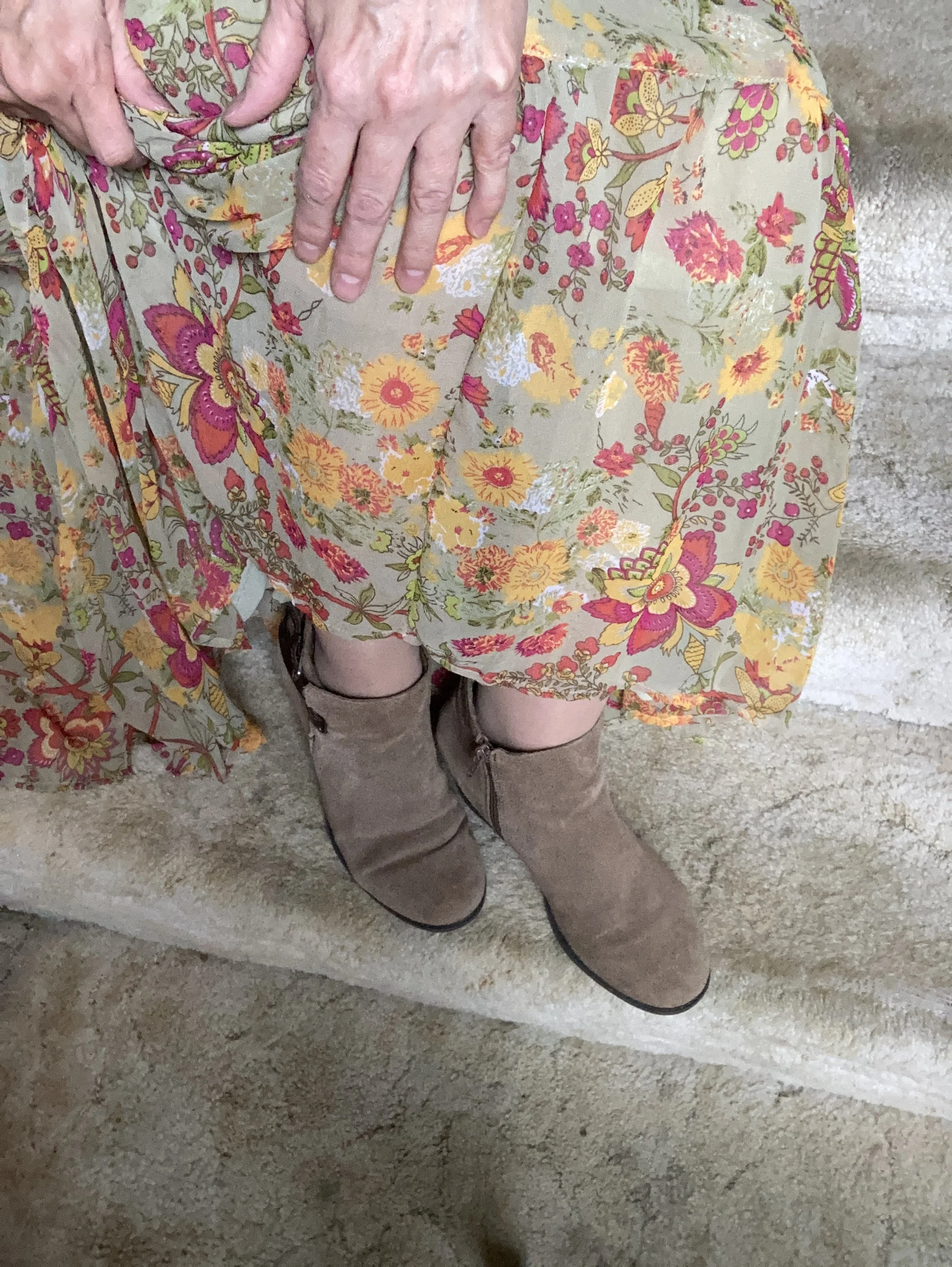
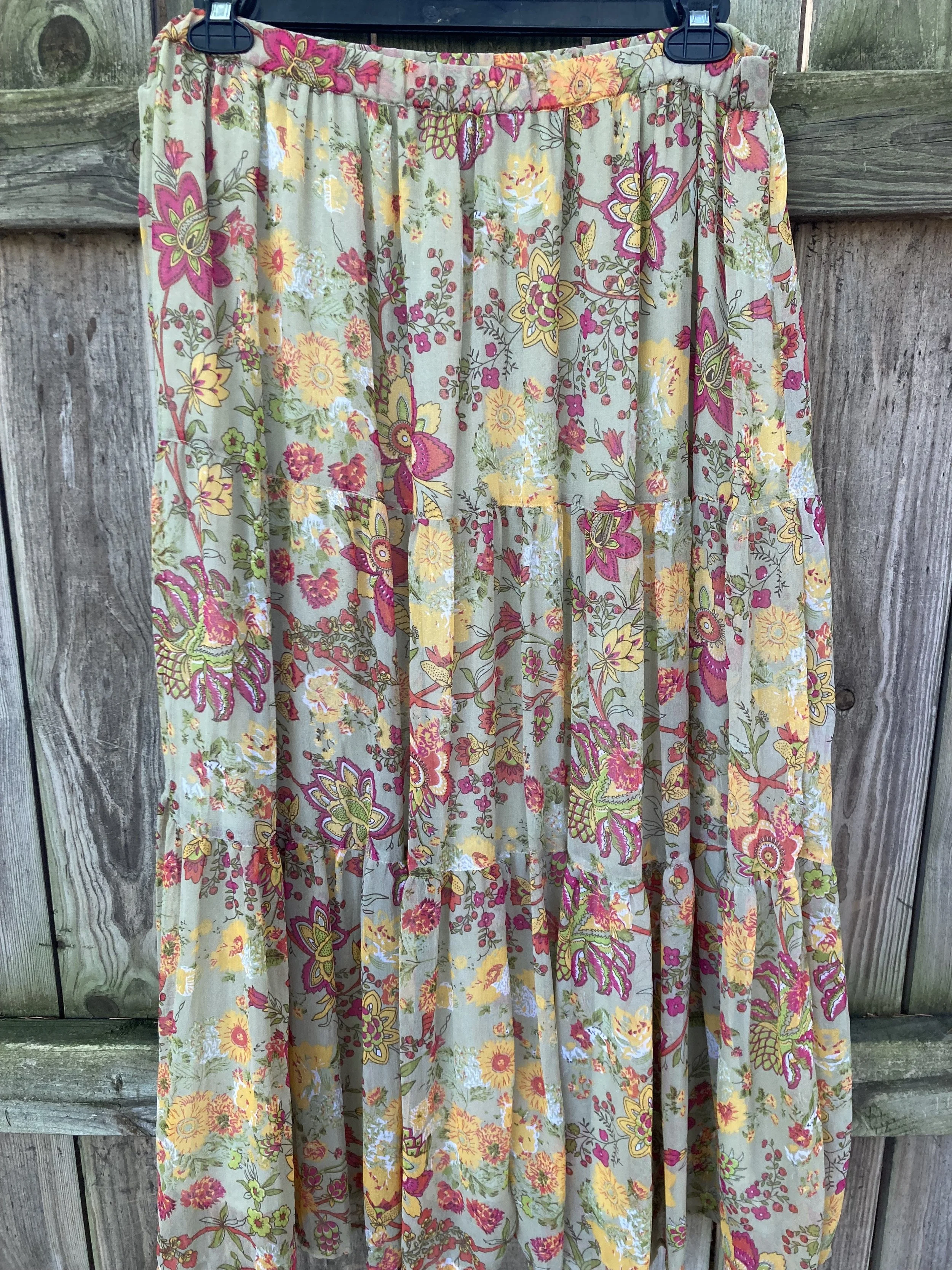
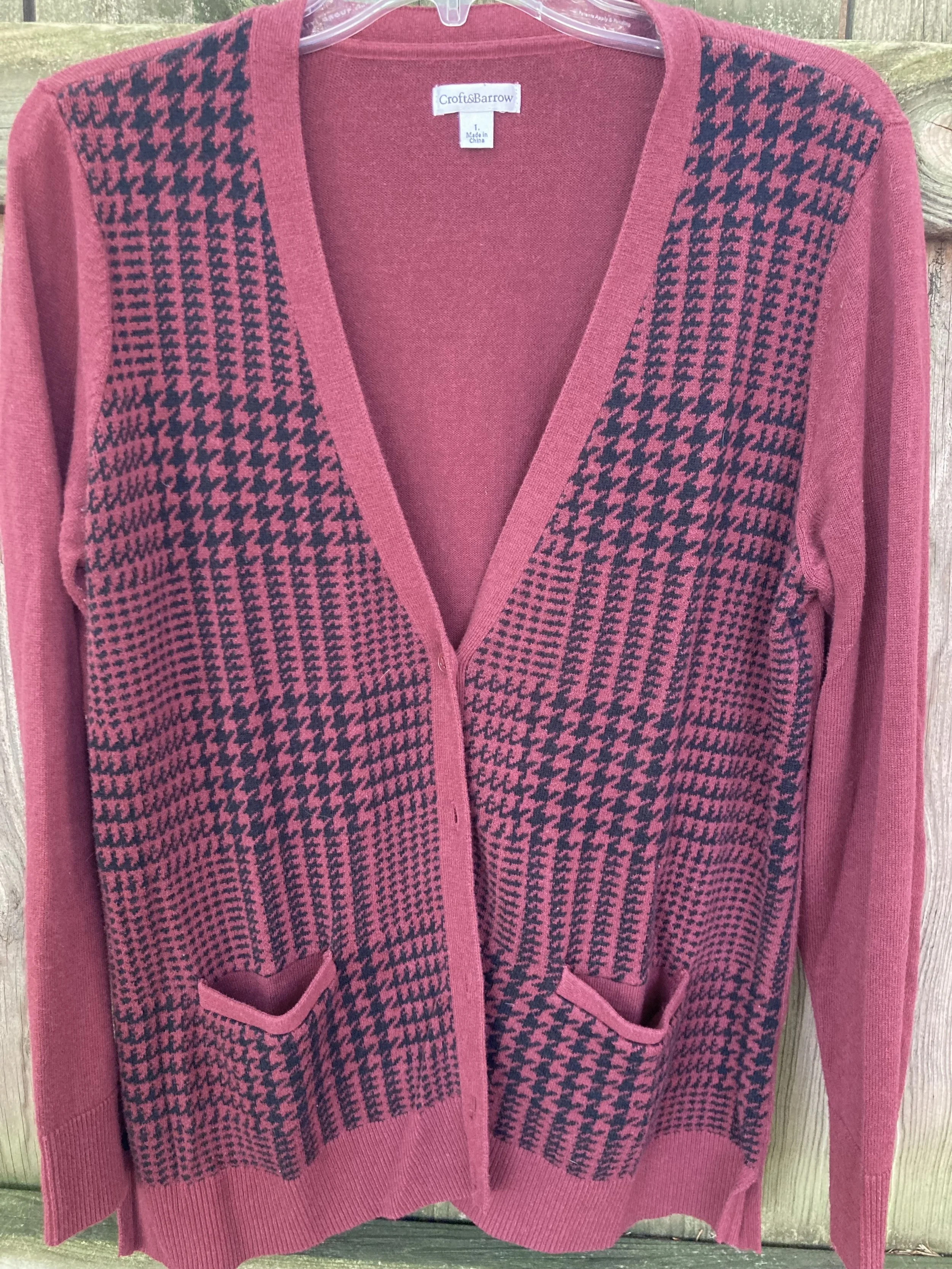
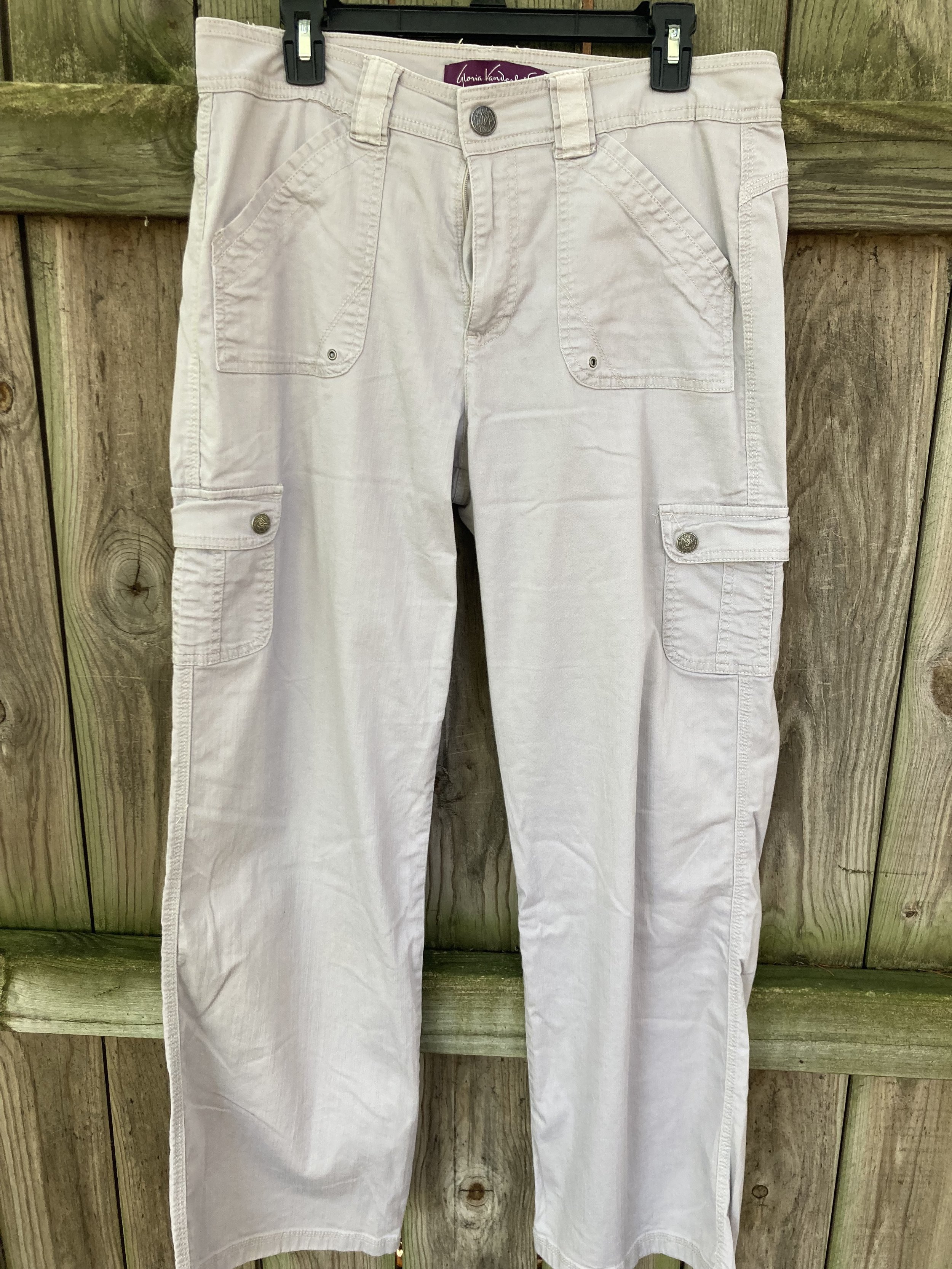
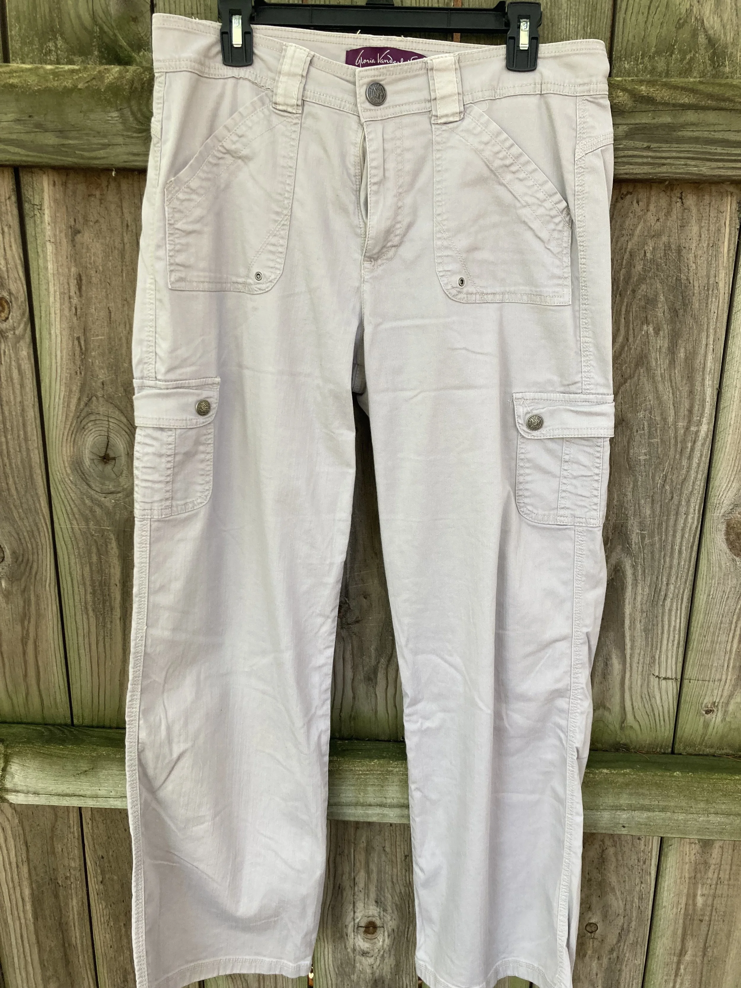
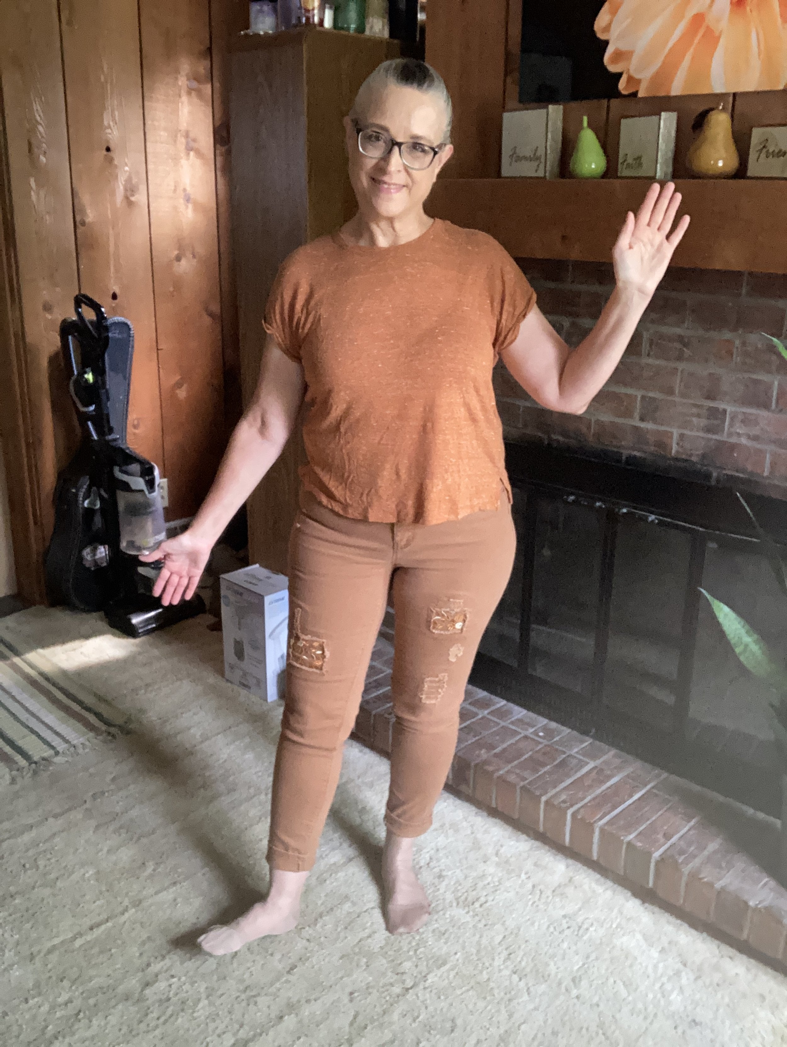
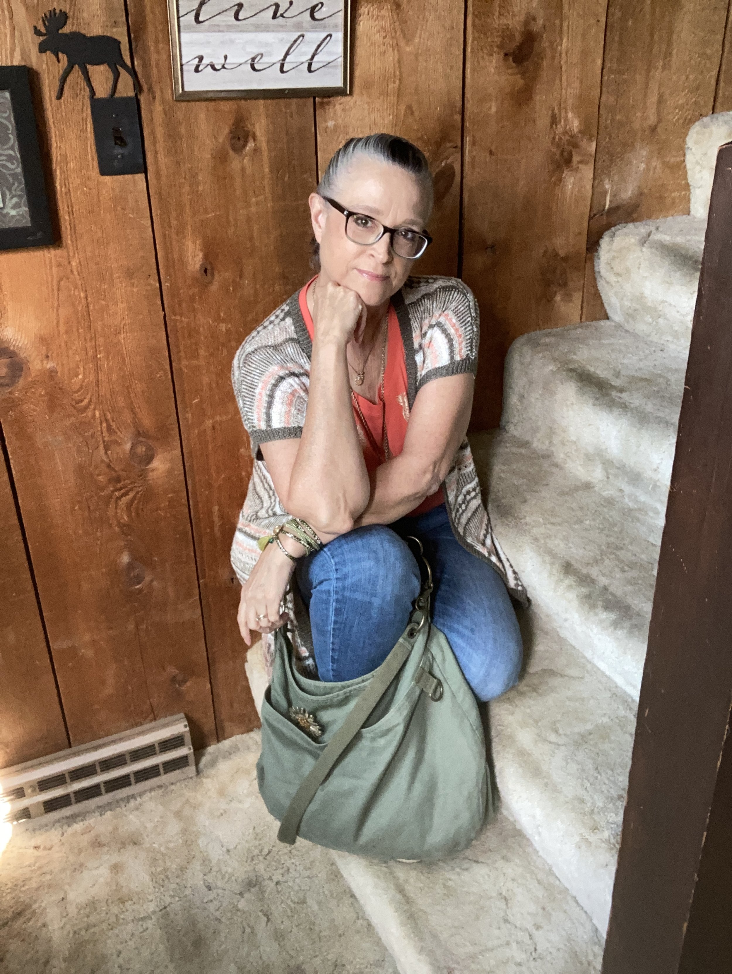
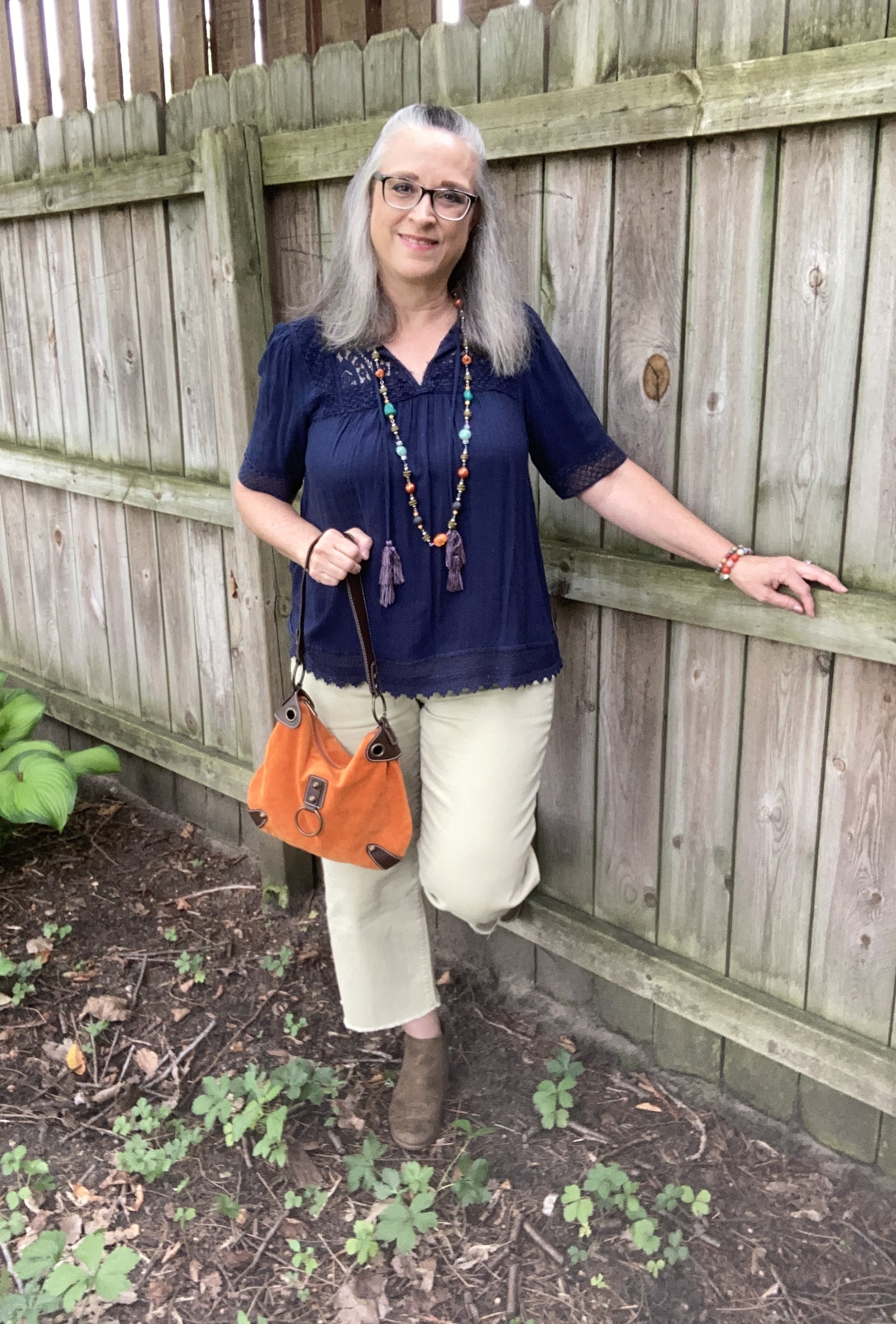
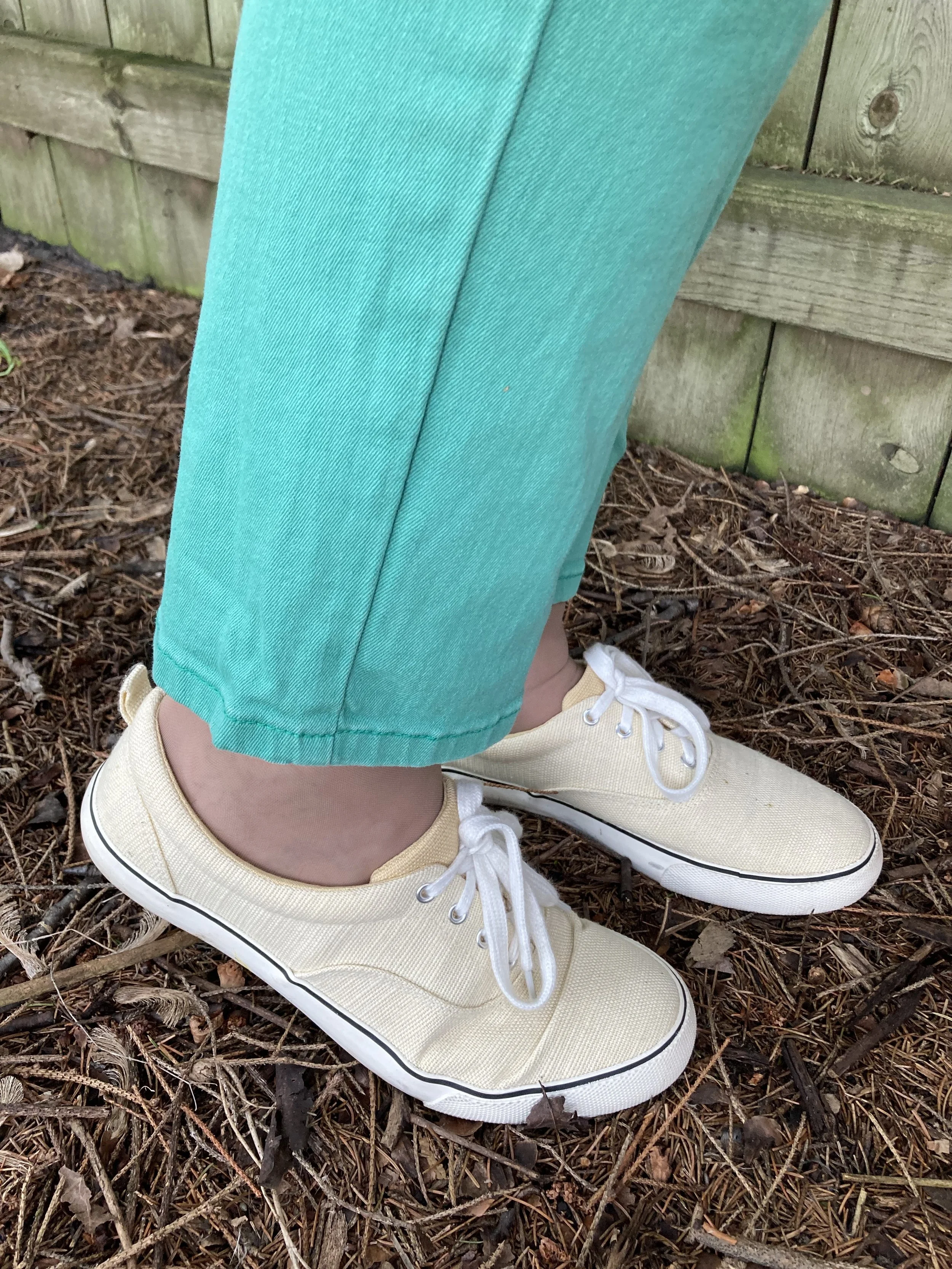
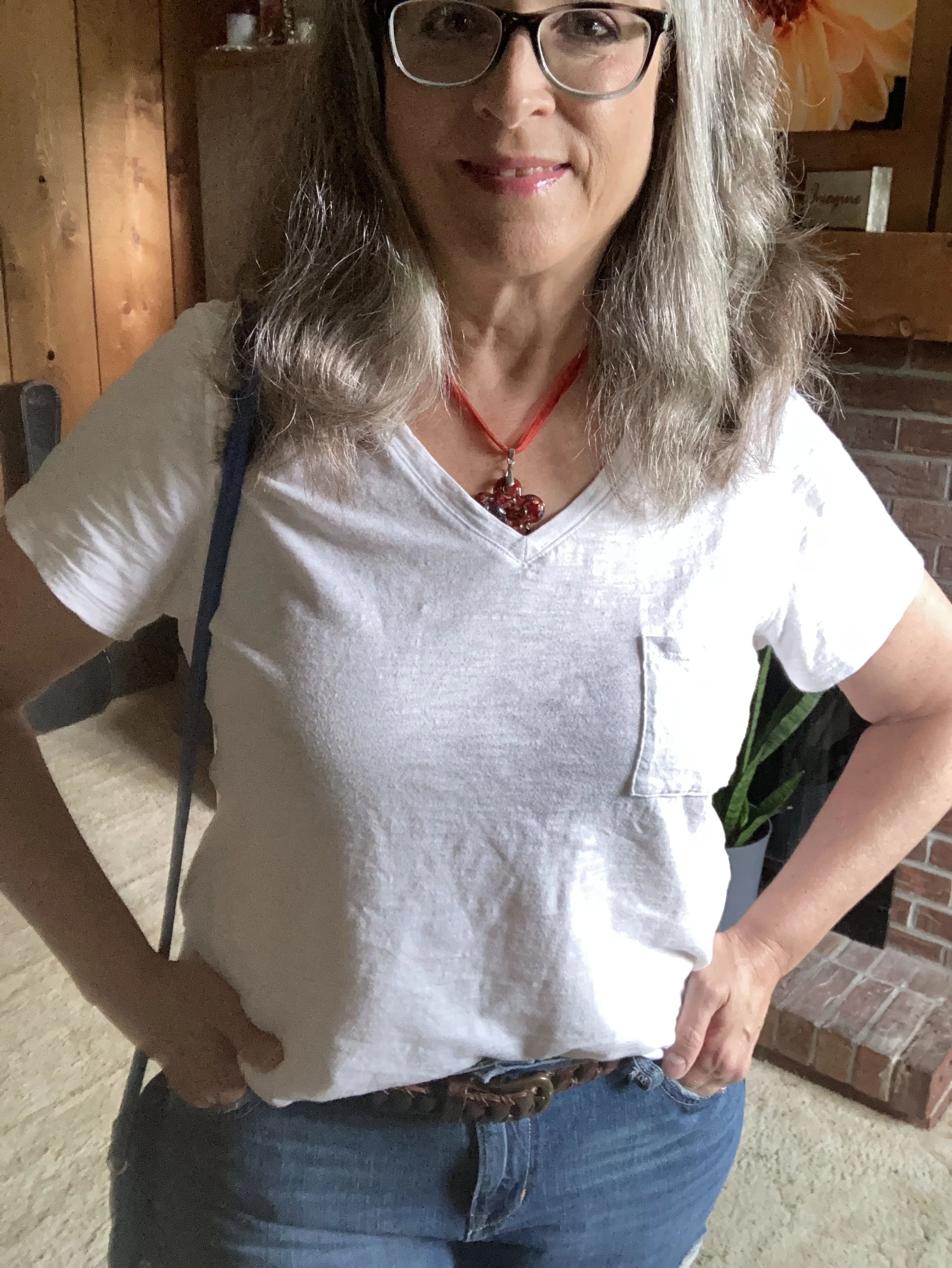
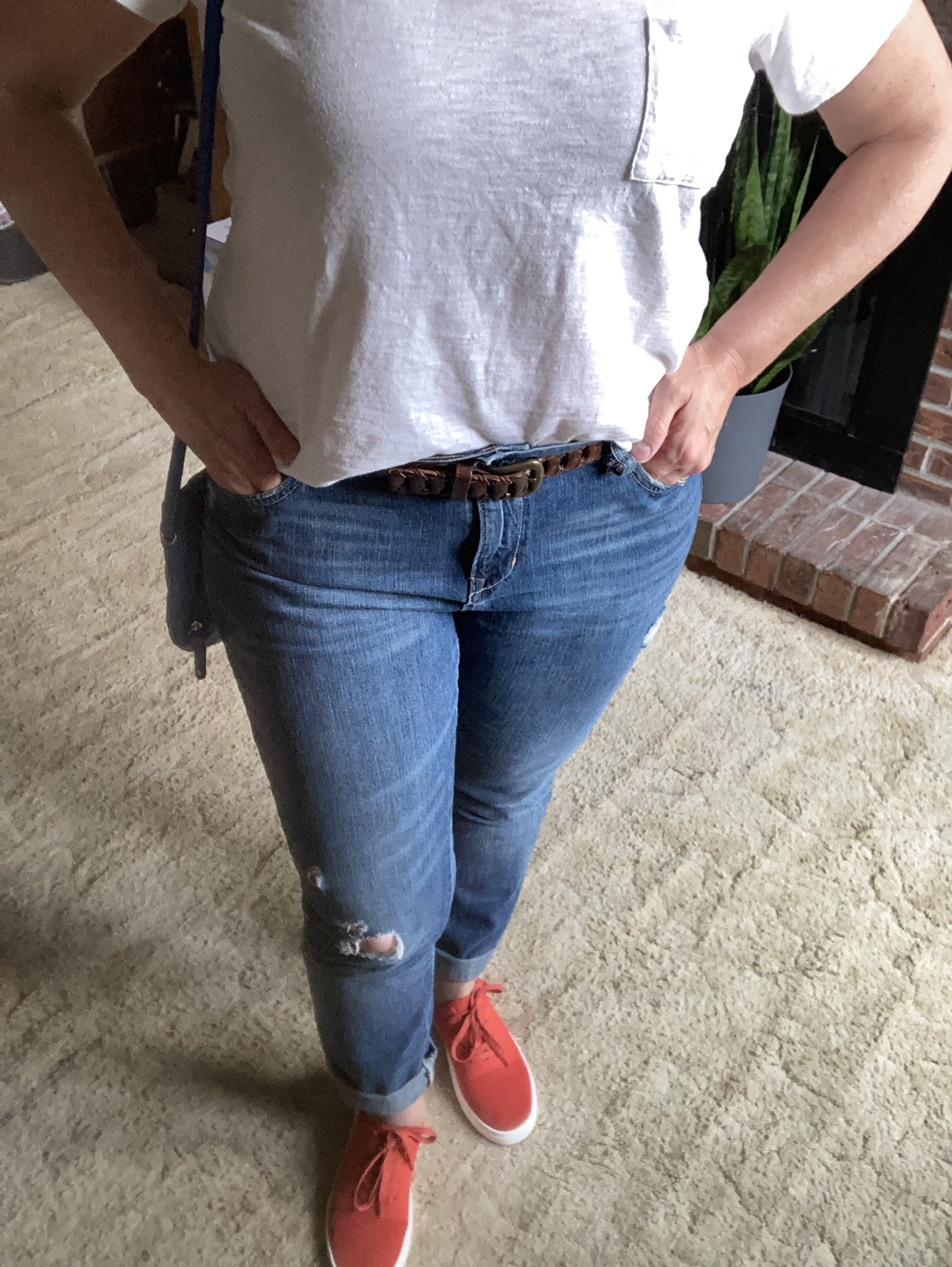
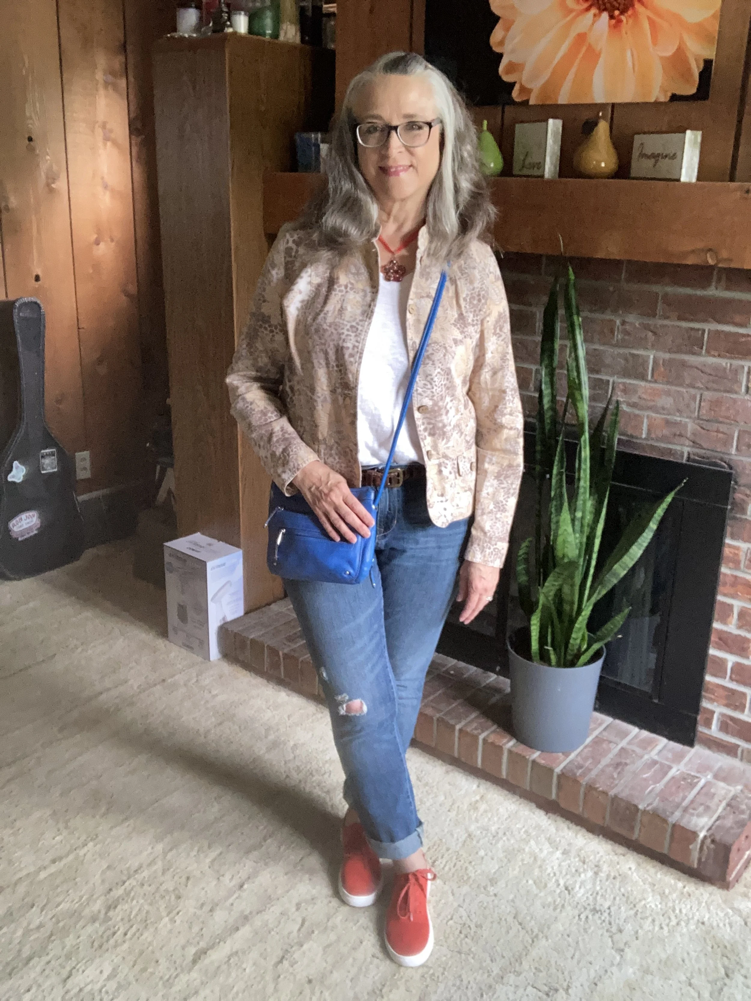
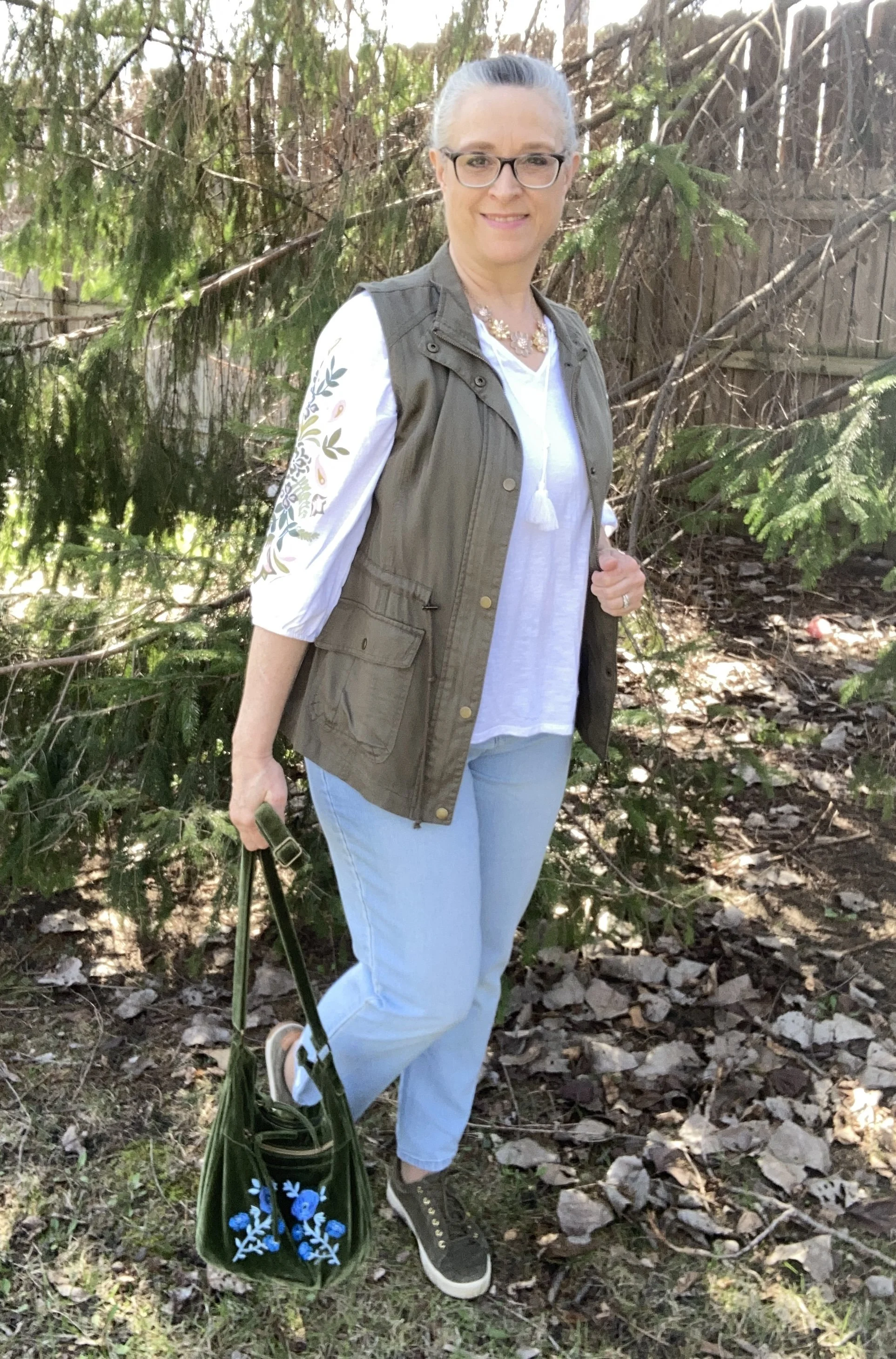
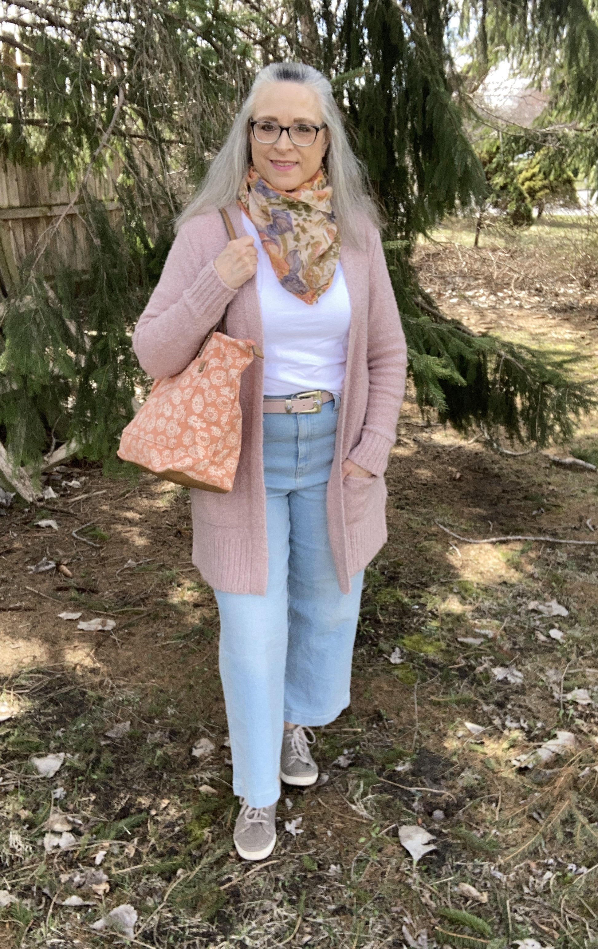
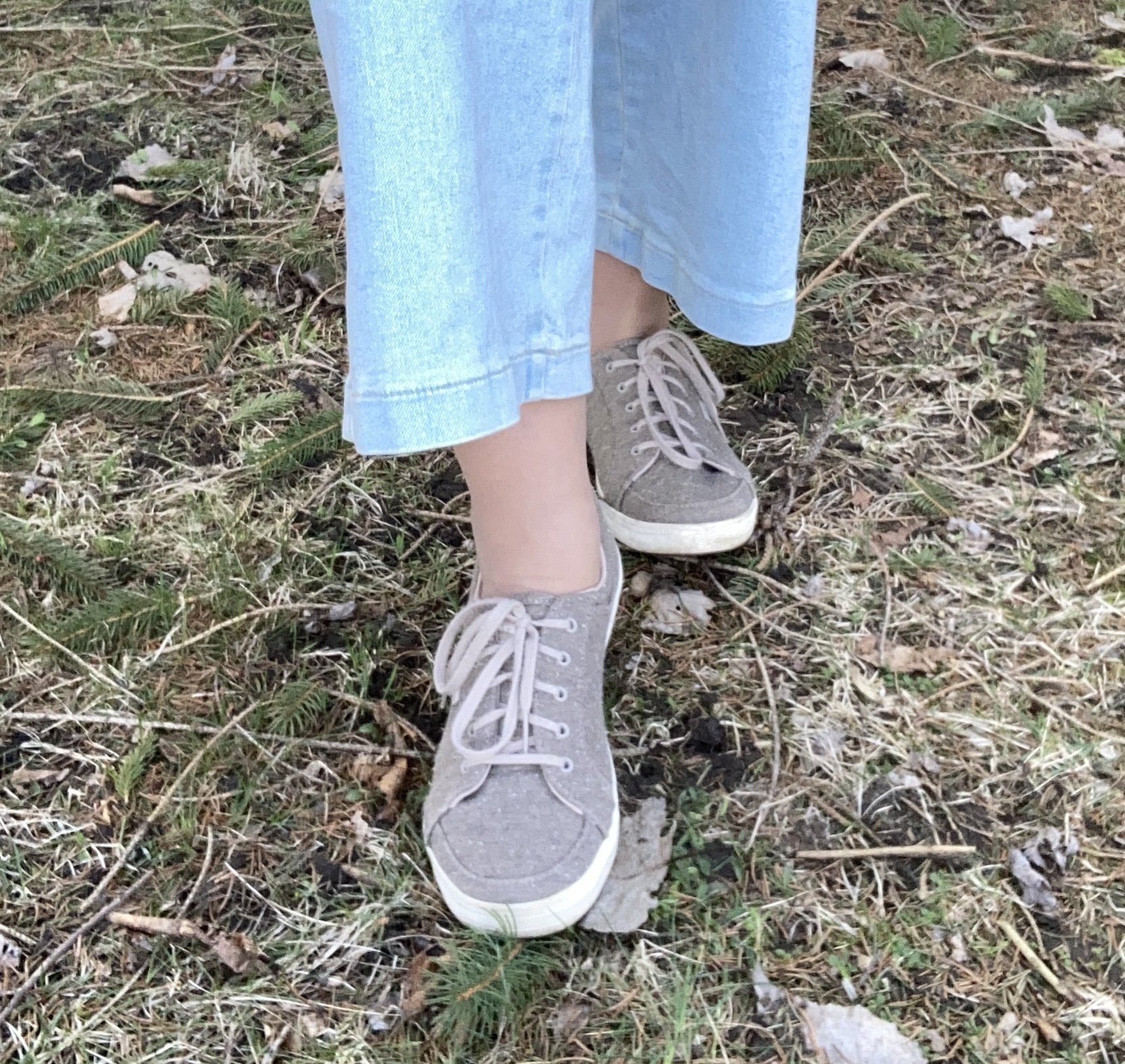
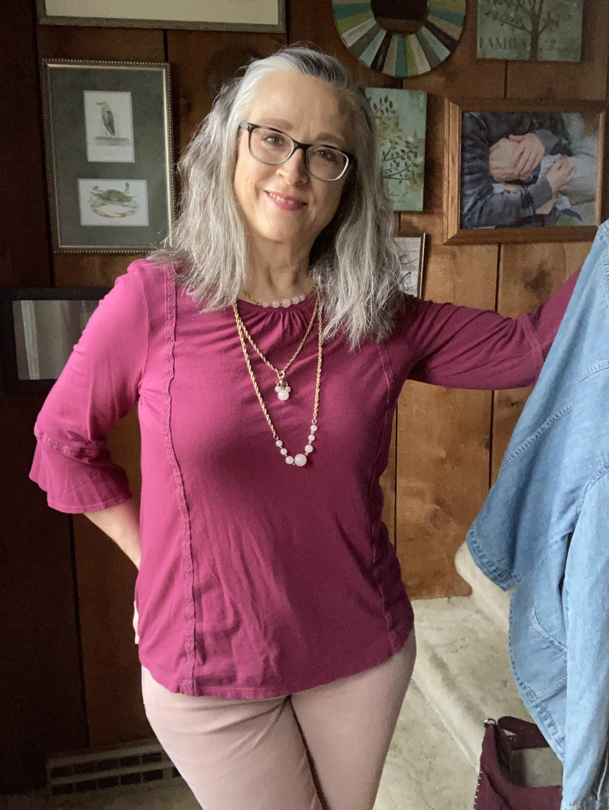
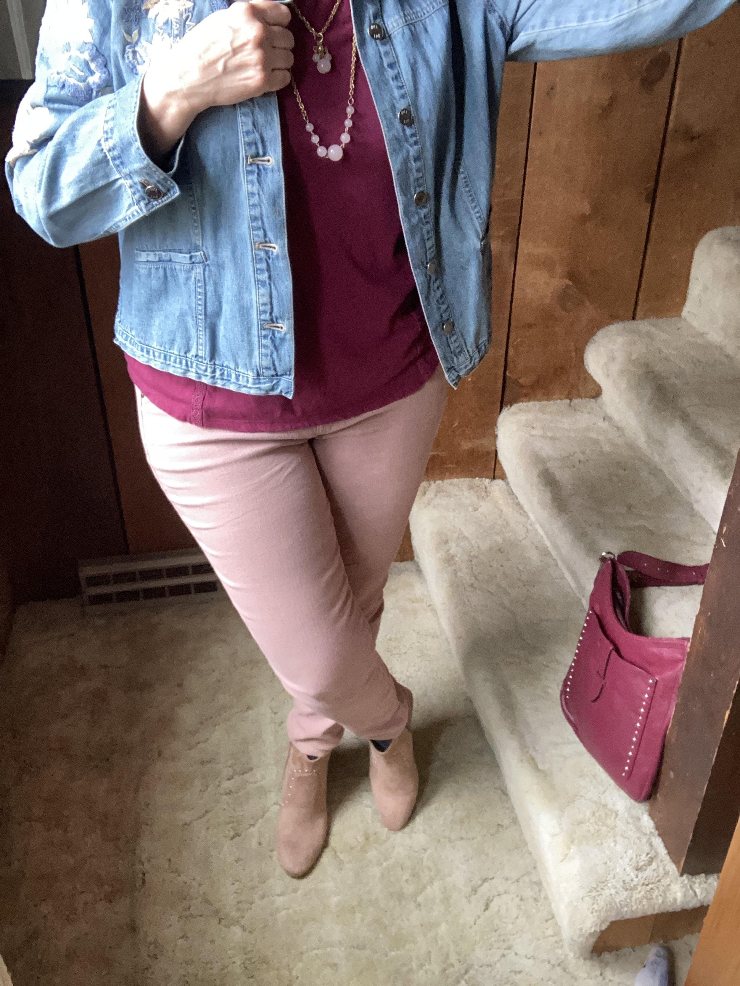
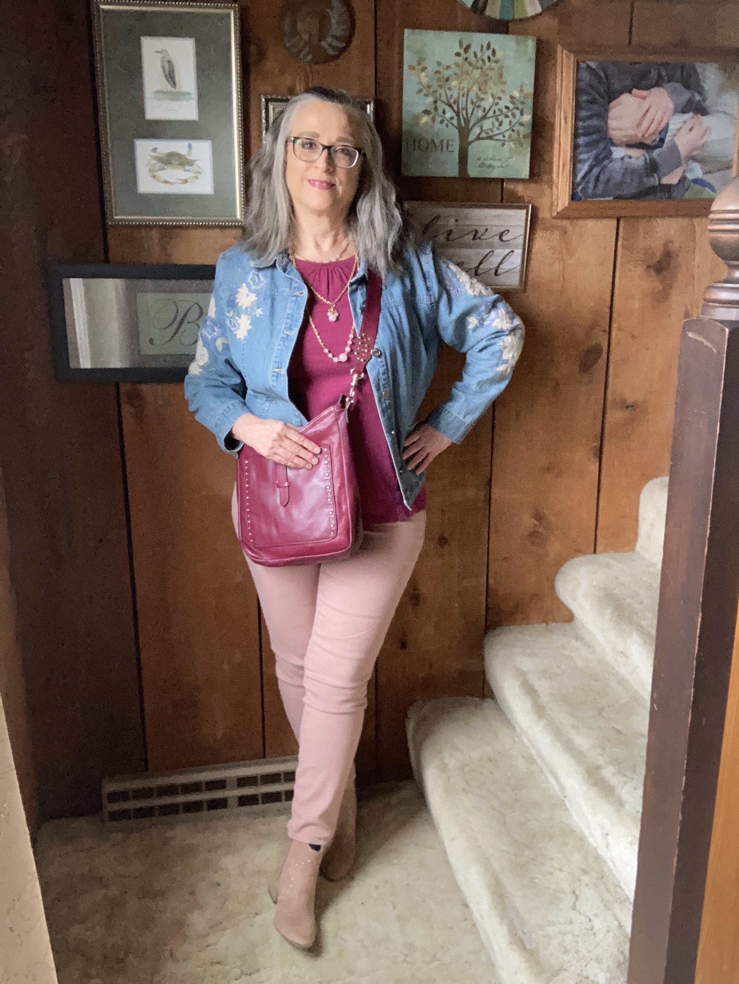
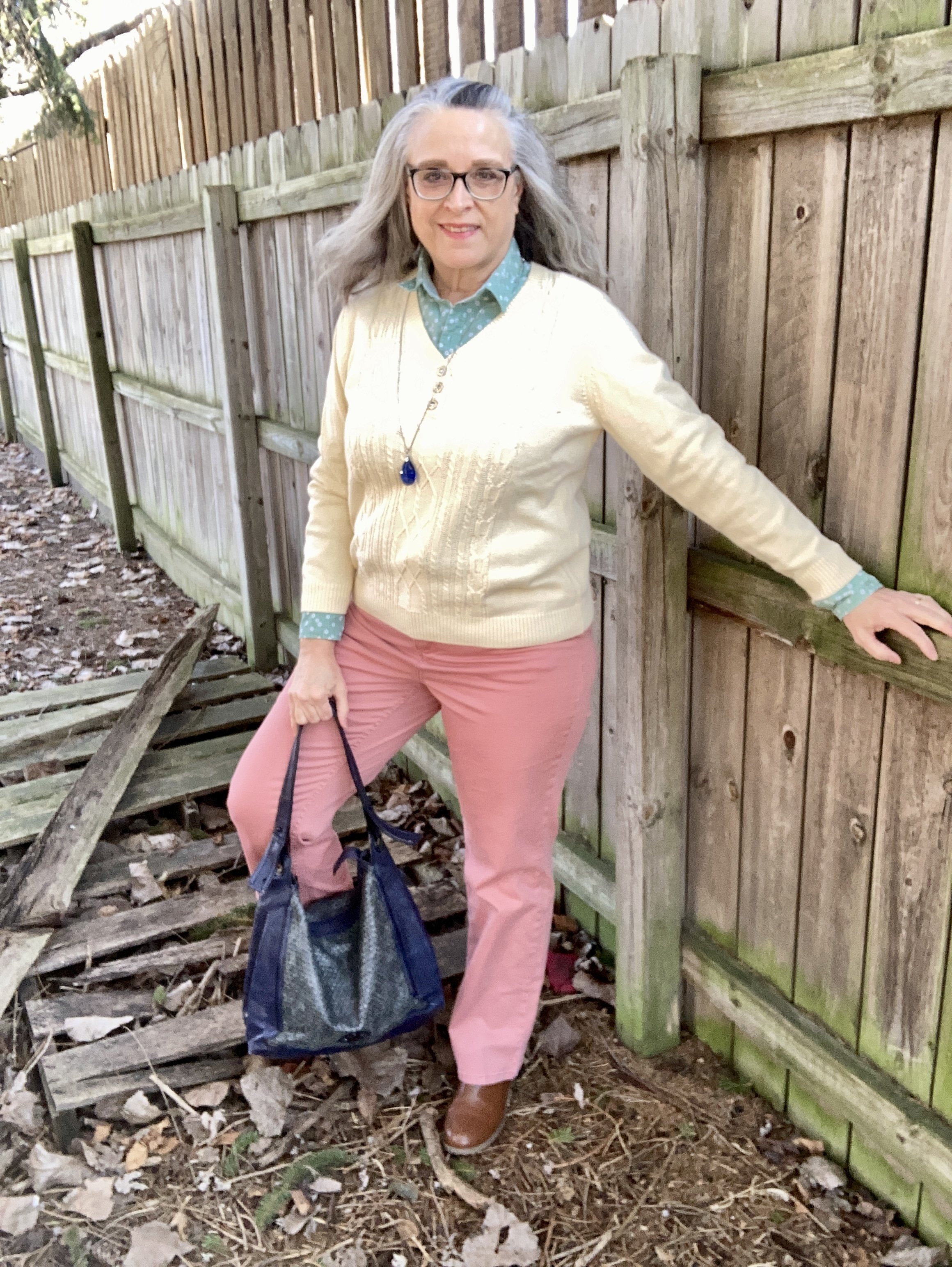
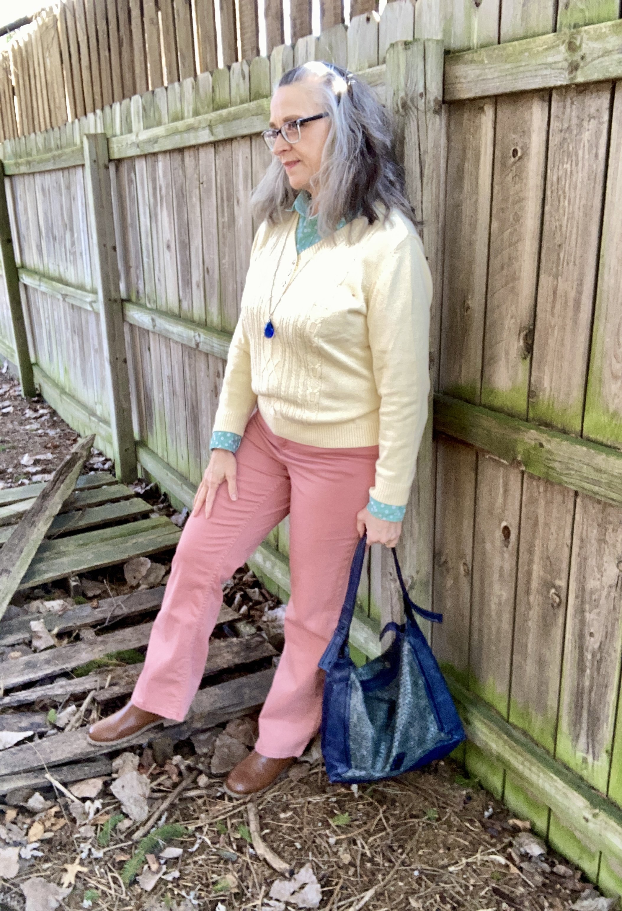
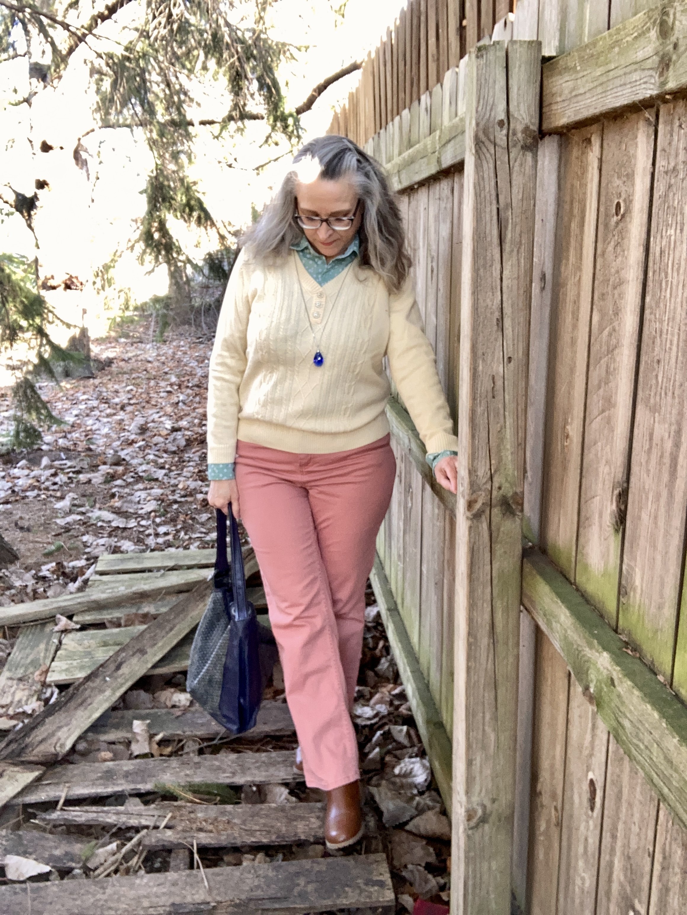
All three pastel pieces are thrift store finds. The coral pants are Croft & Barrow. Theses are a light weight cotton blend, so they will be great for the warmer months.

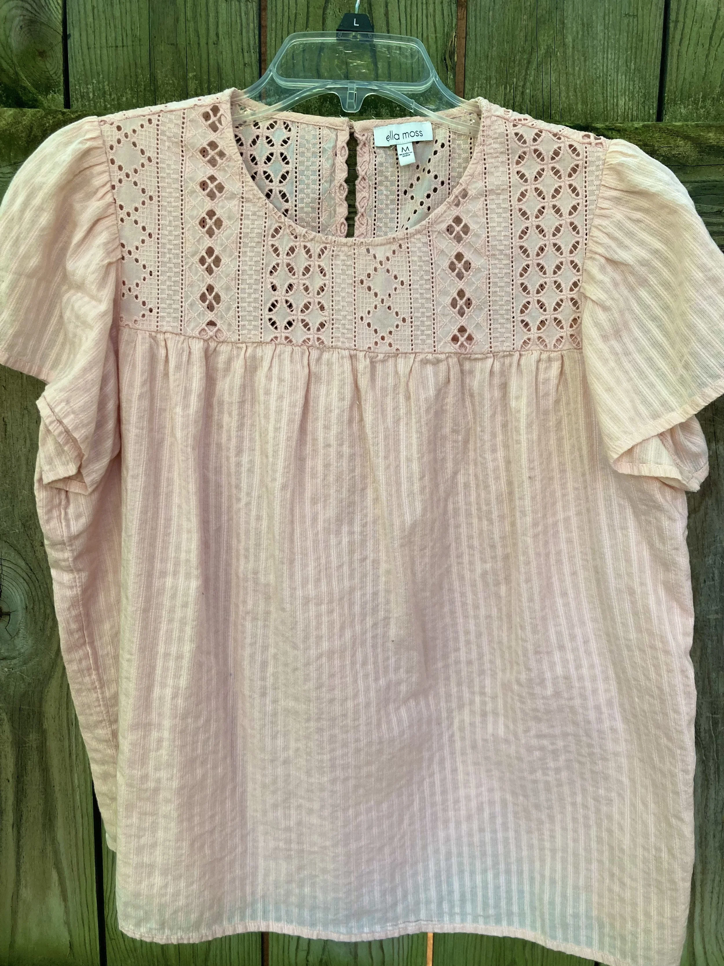
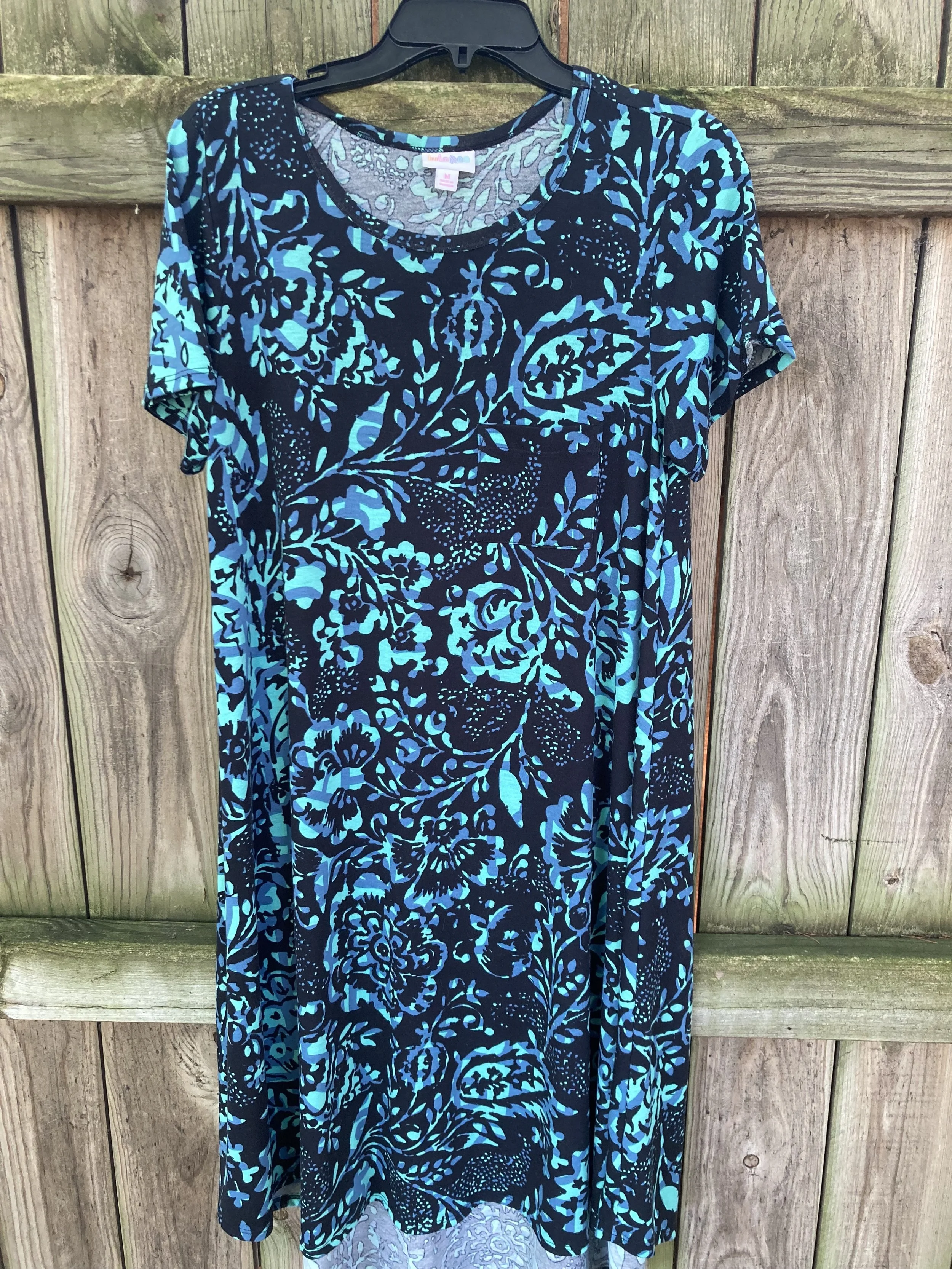
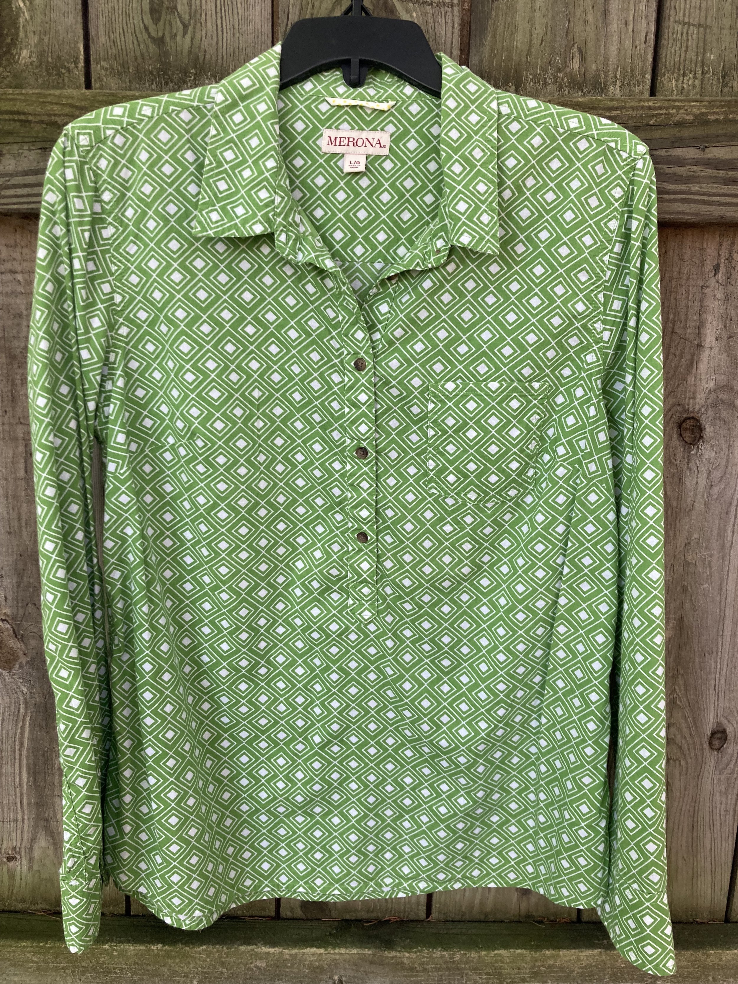
The men’s button down shirt is Express brand. It has tiny white flowers on it, and I love how it goes withe the pale yellow and the coral .

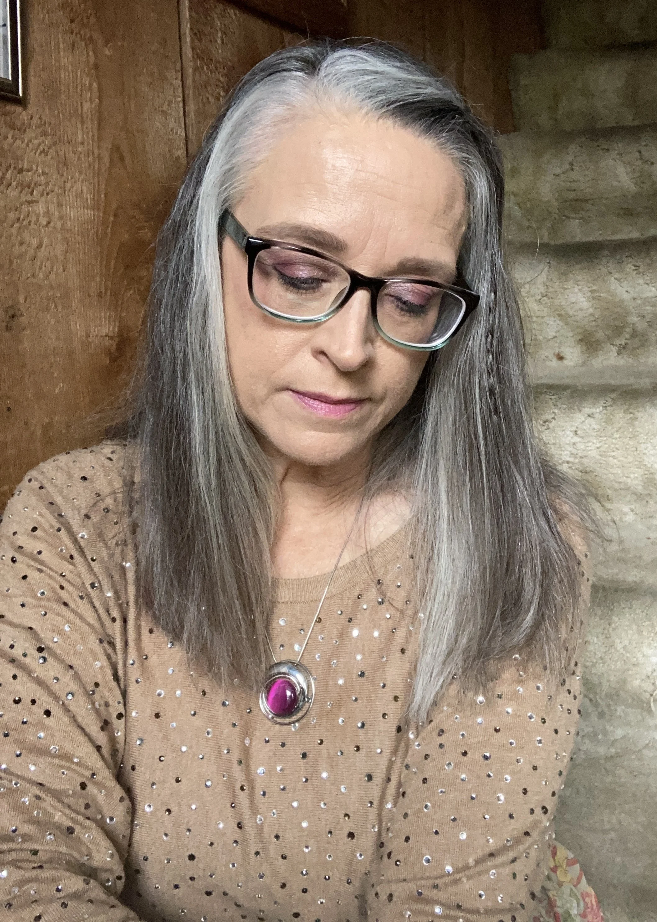
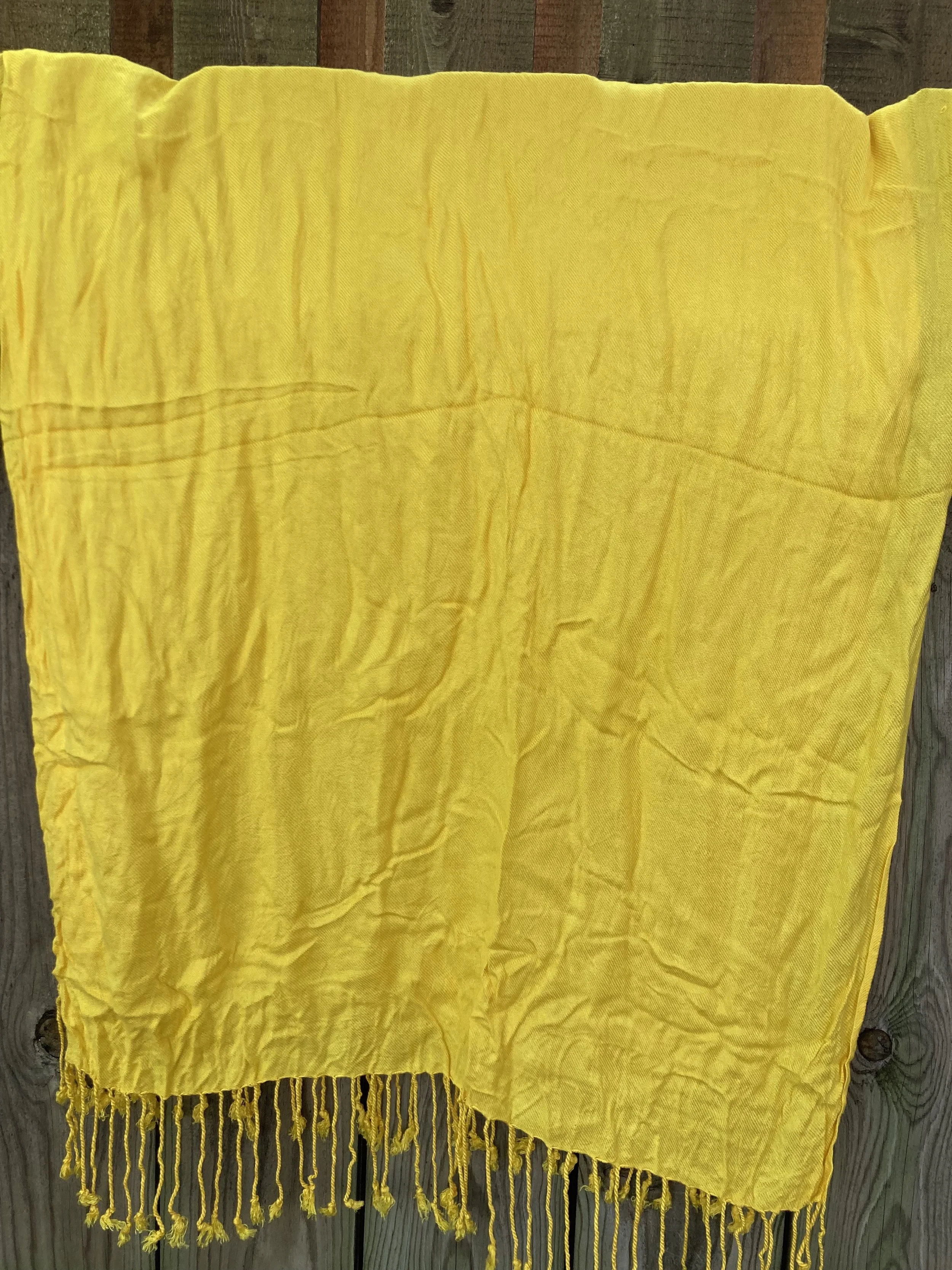
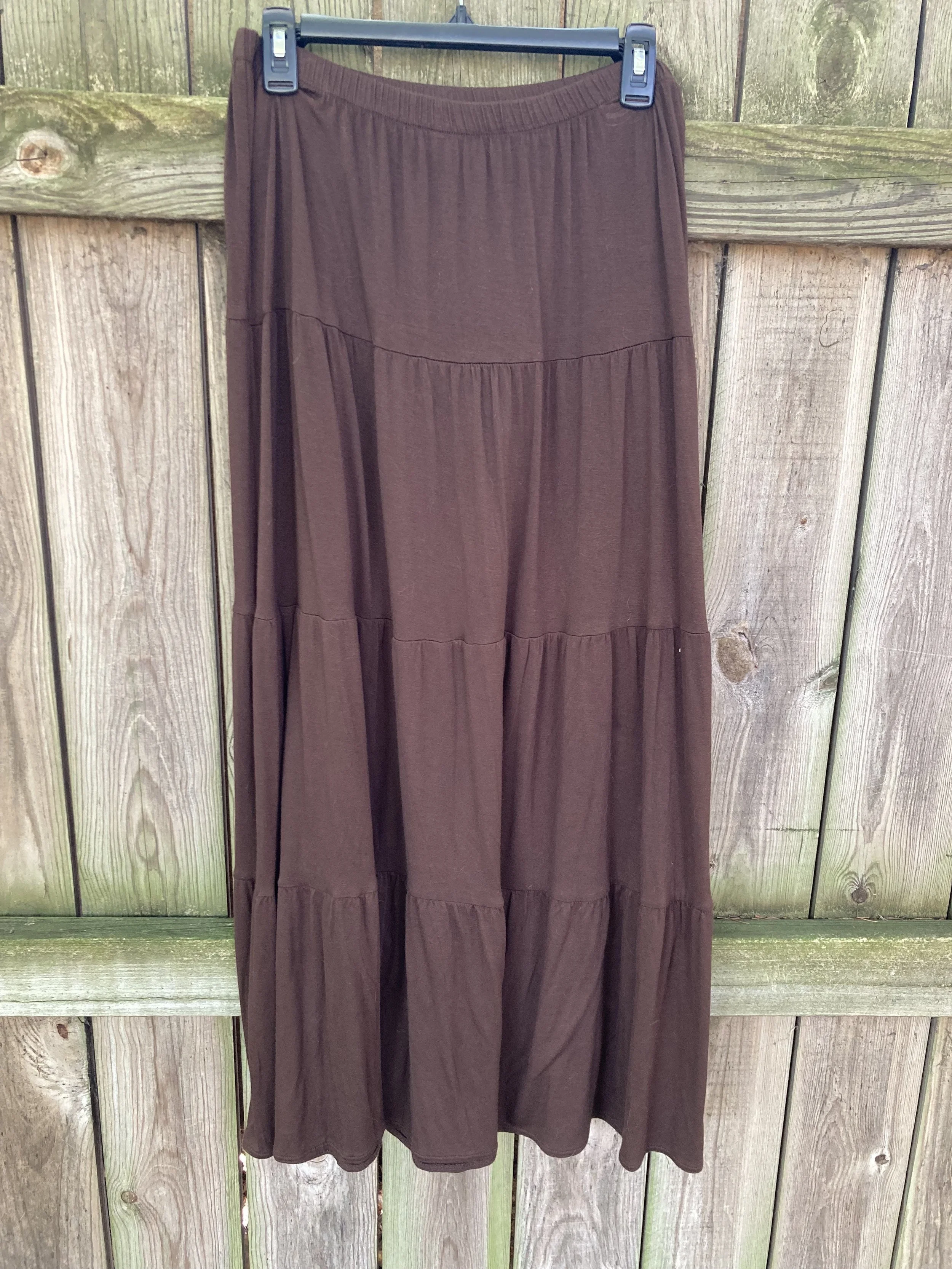
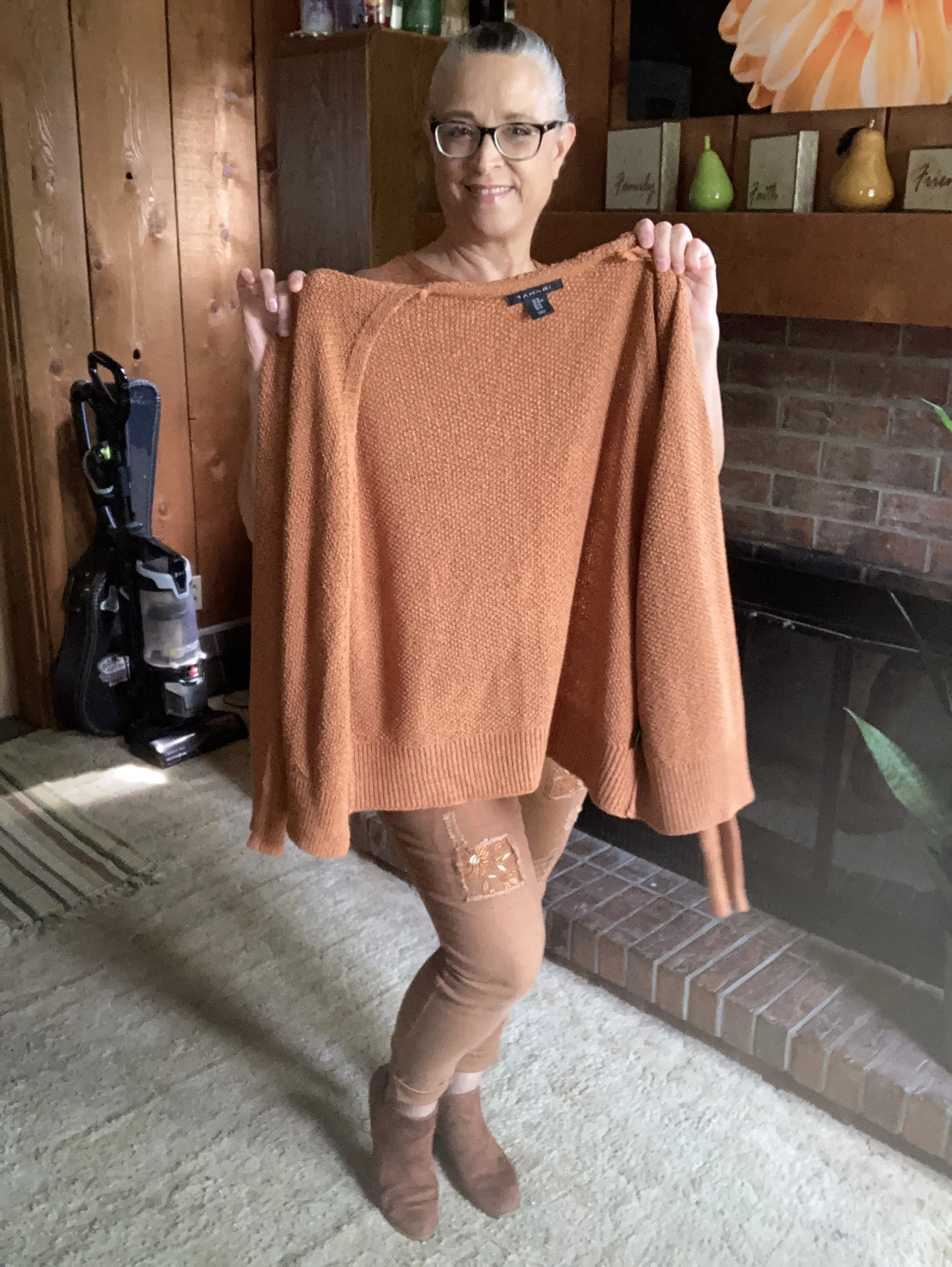
The yellow pullover is a brand called Karen Scott. I her brand used to be sold at Macy’s and perhaps Walmart. Not sure if they still are. I don’t wear pale color too often near my face, but the minty green does the job of providing a border between my skin and the pale yellow.

Style Tip: I will never tire of saying, you can wear all colors. If a certain color doesn’t look good right next to your face, just add a scarf or some statement jewelry, or layer a collared shirt under or over it. That doesn’t mean certain colors won’t look better with your skin tone, but if you love a color wear it.

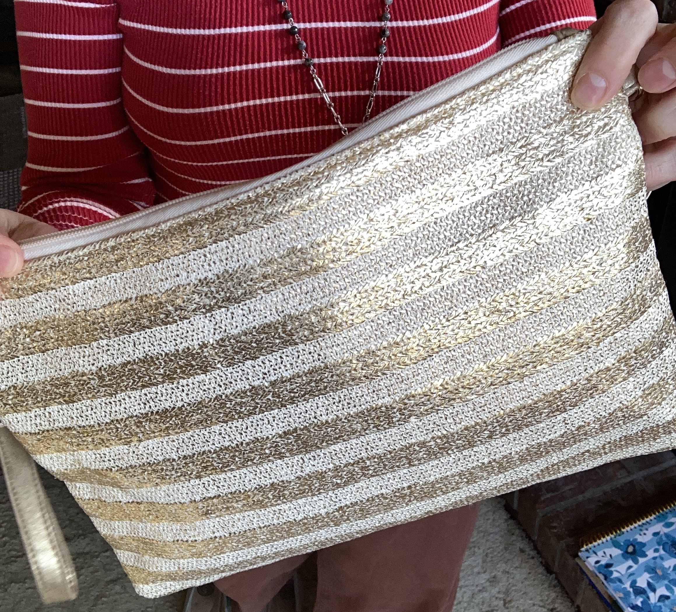
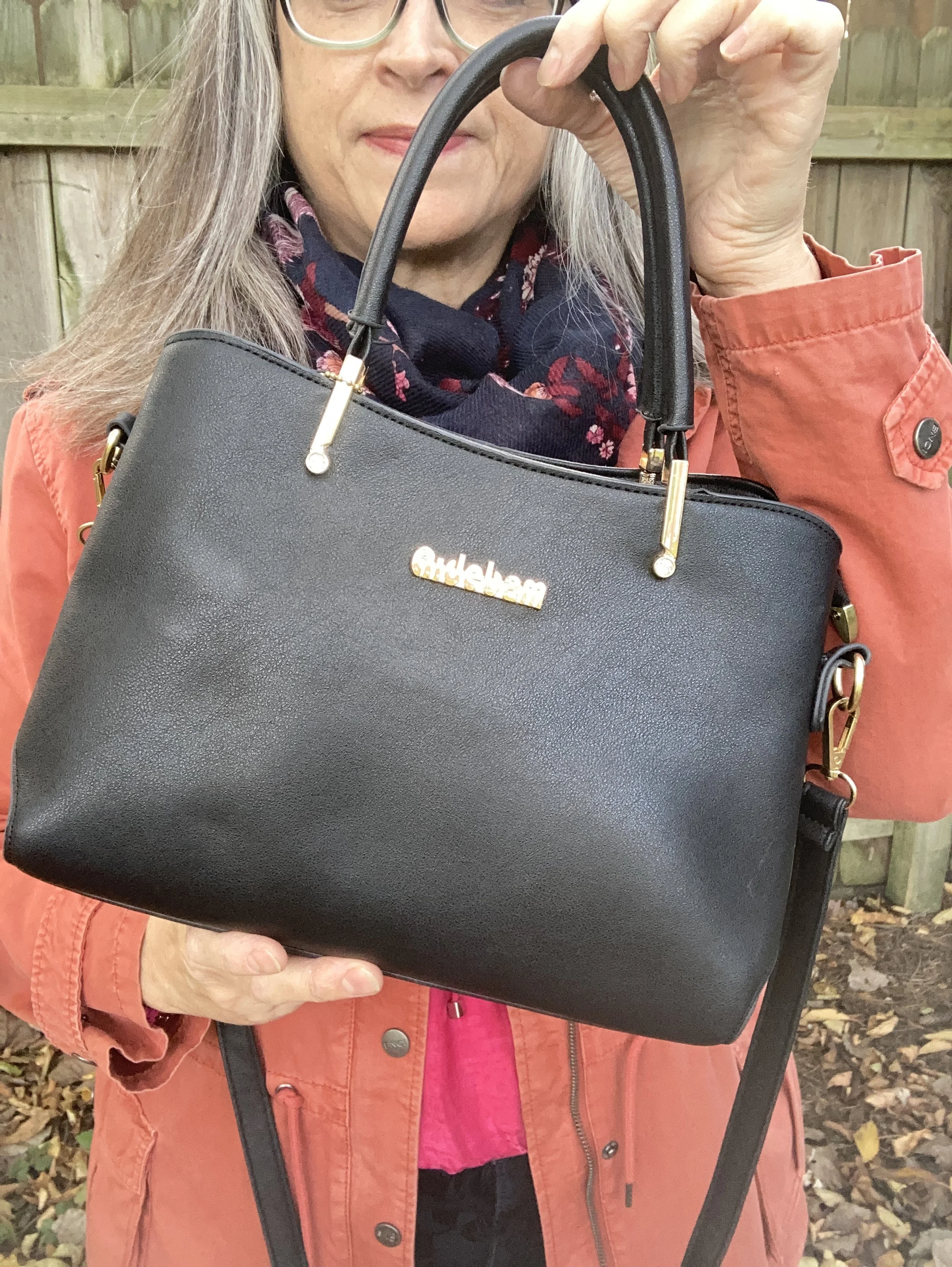
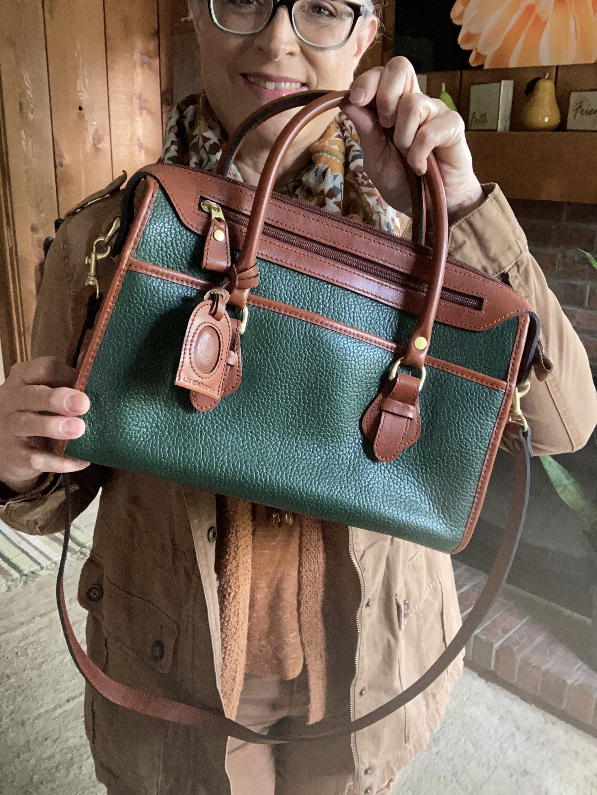
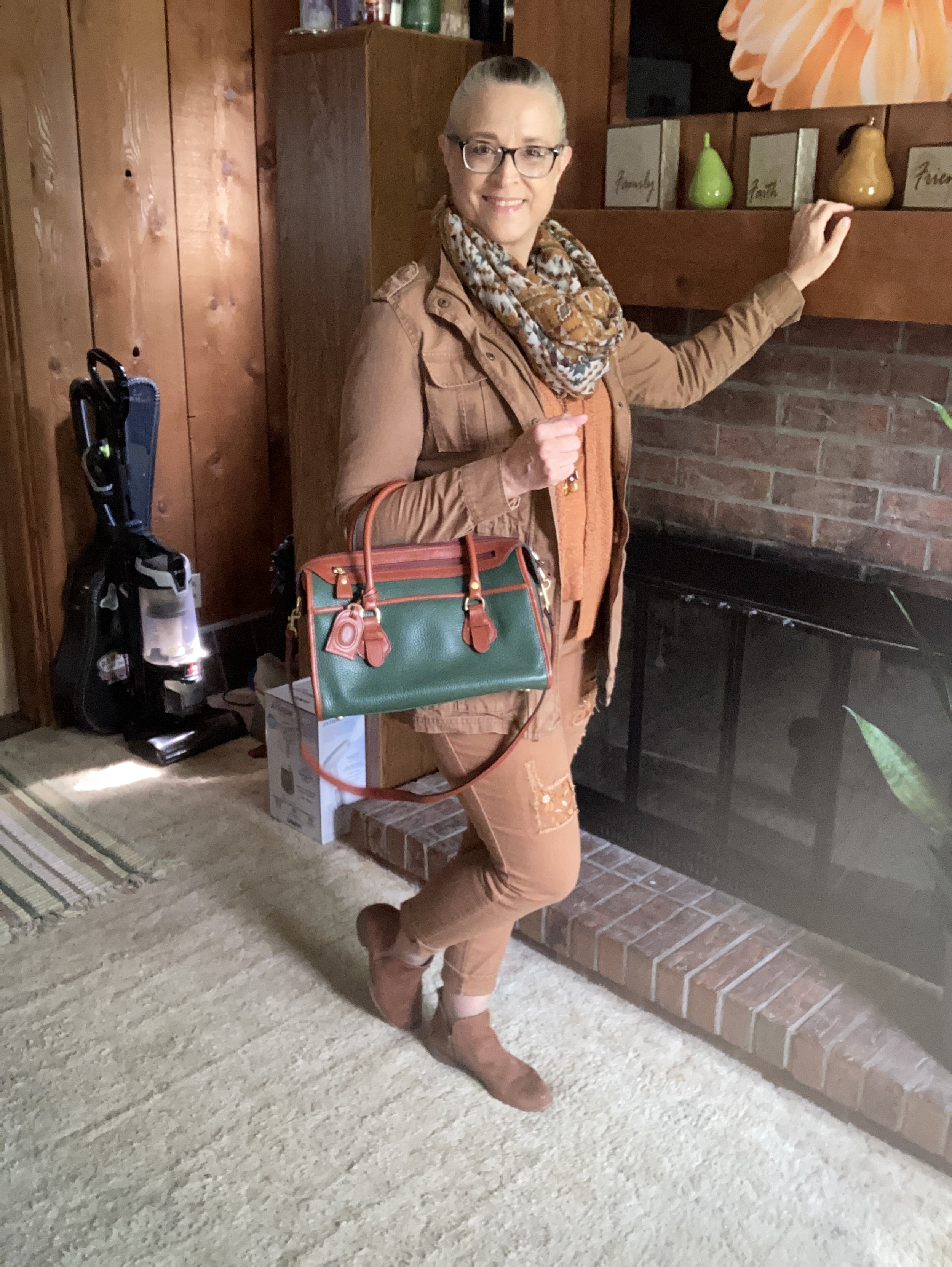
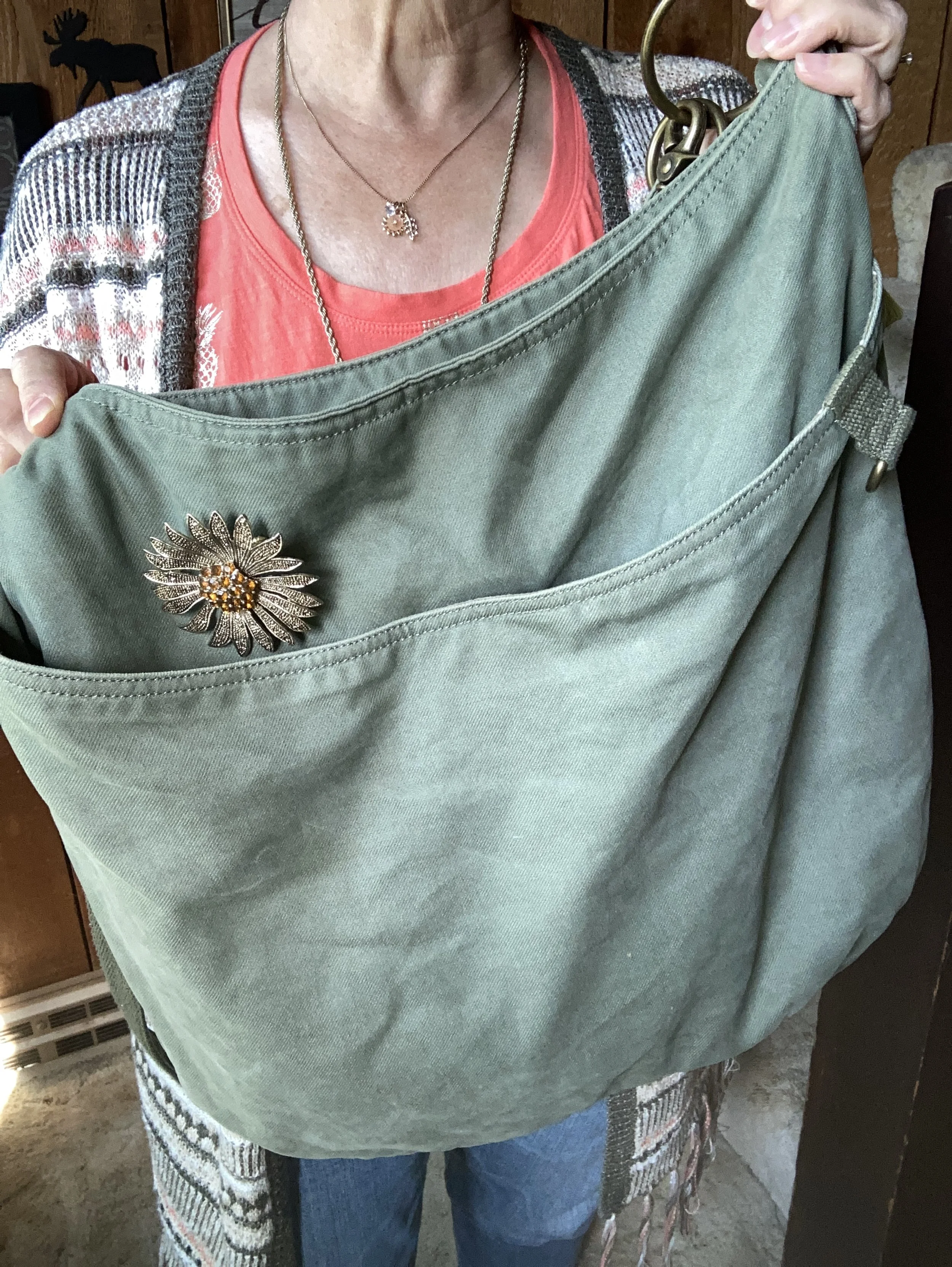
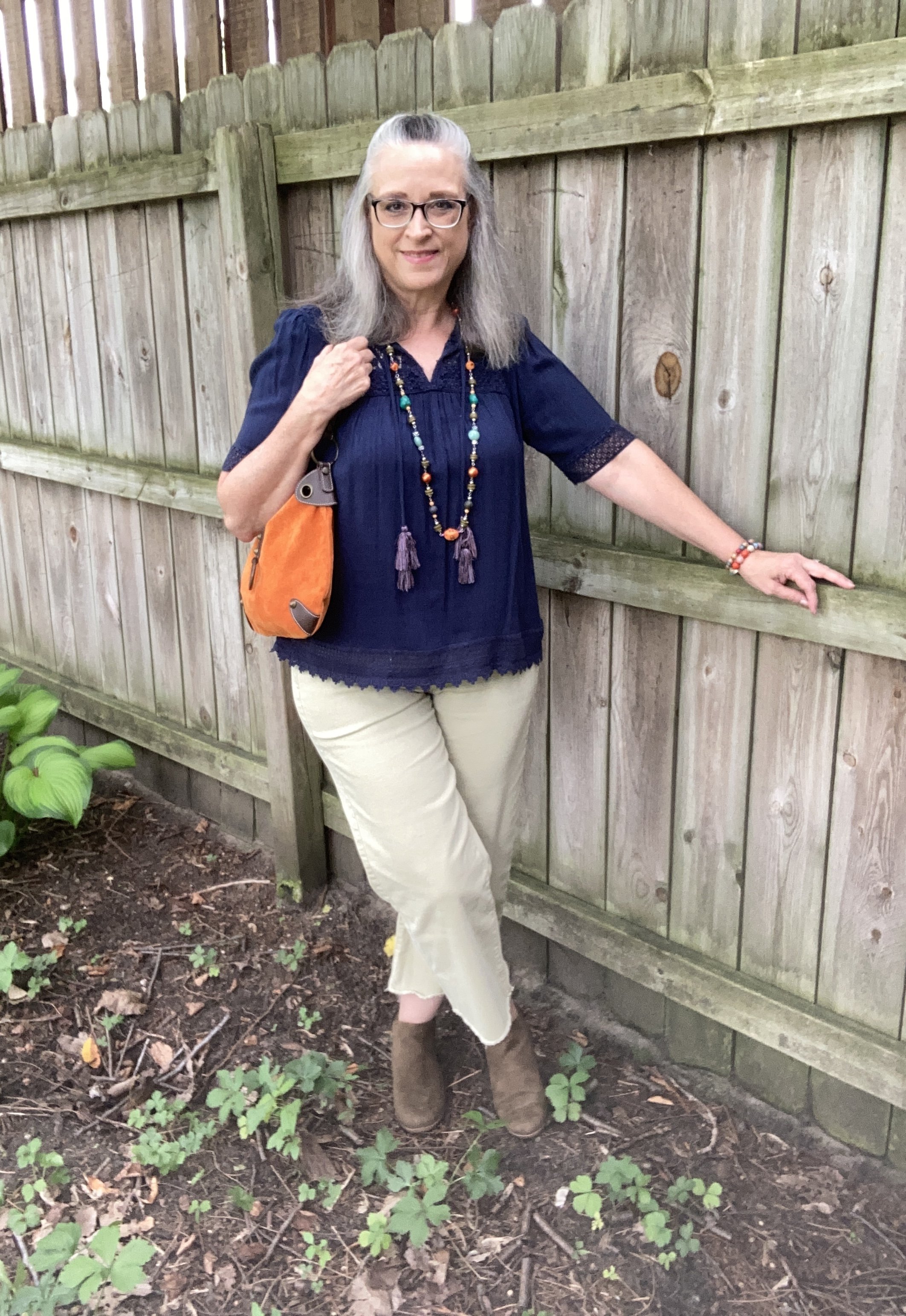
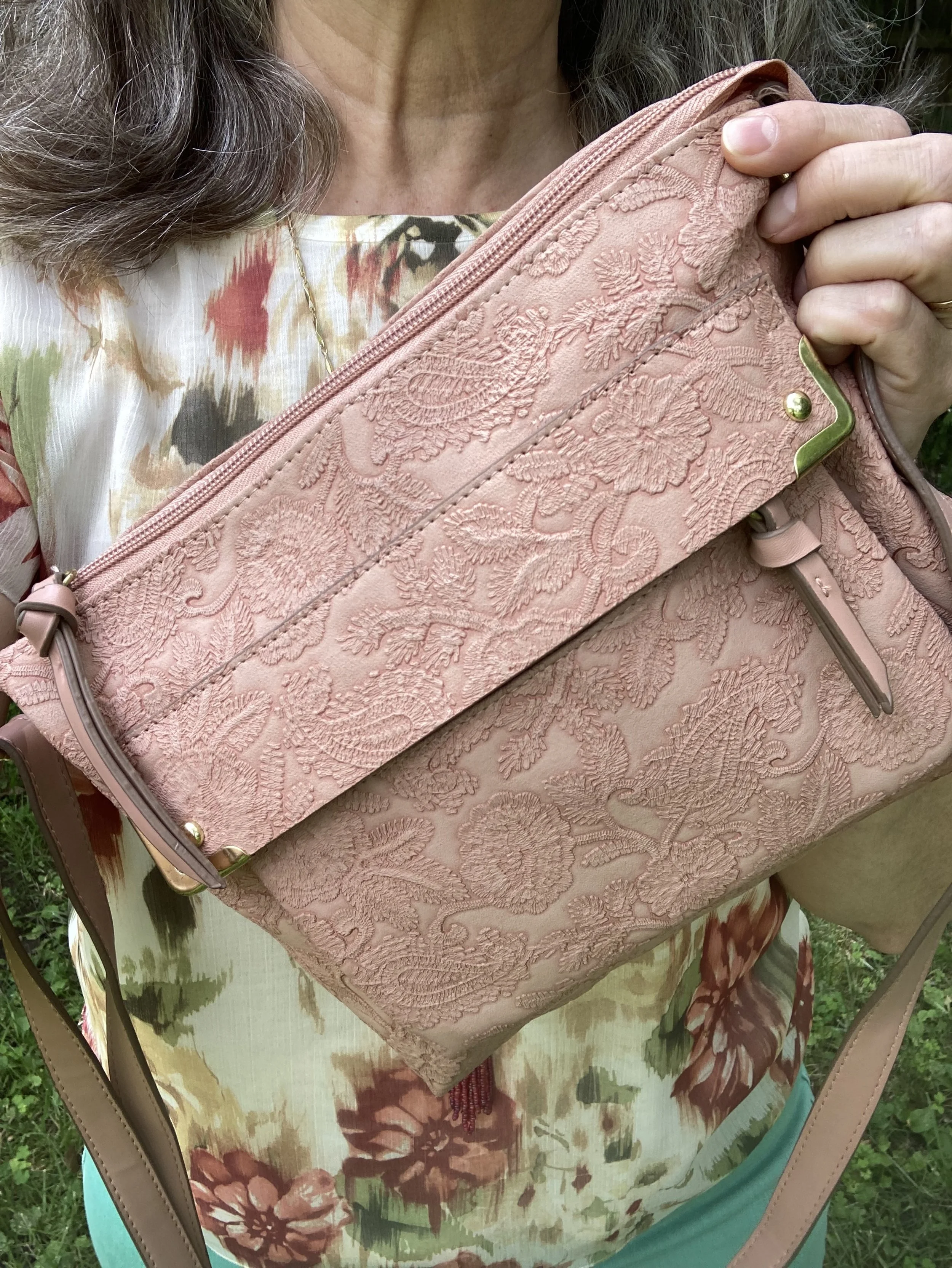
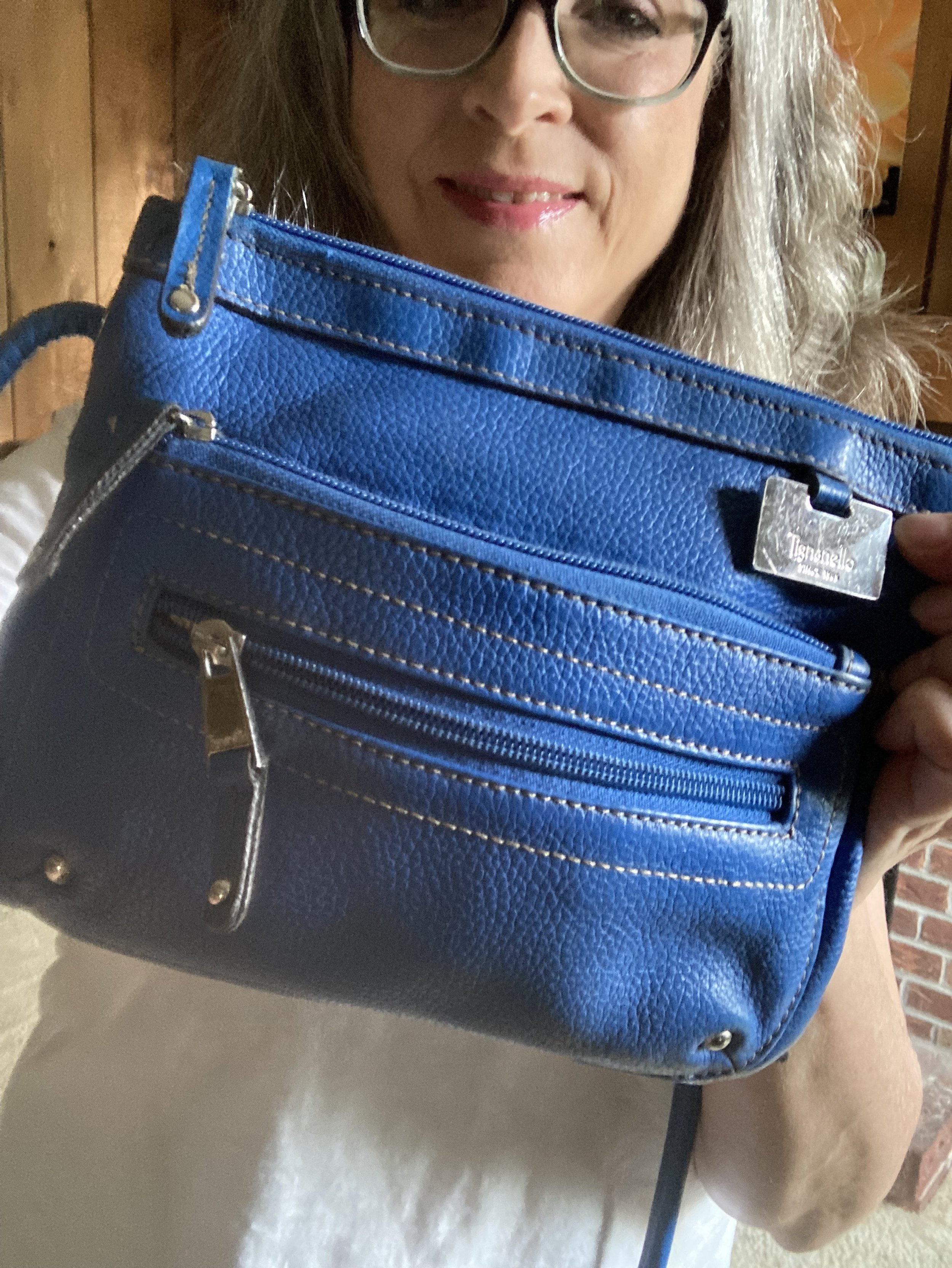
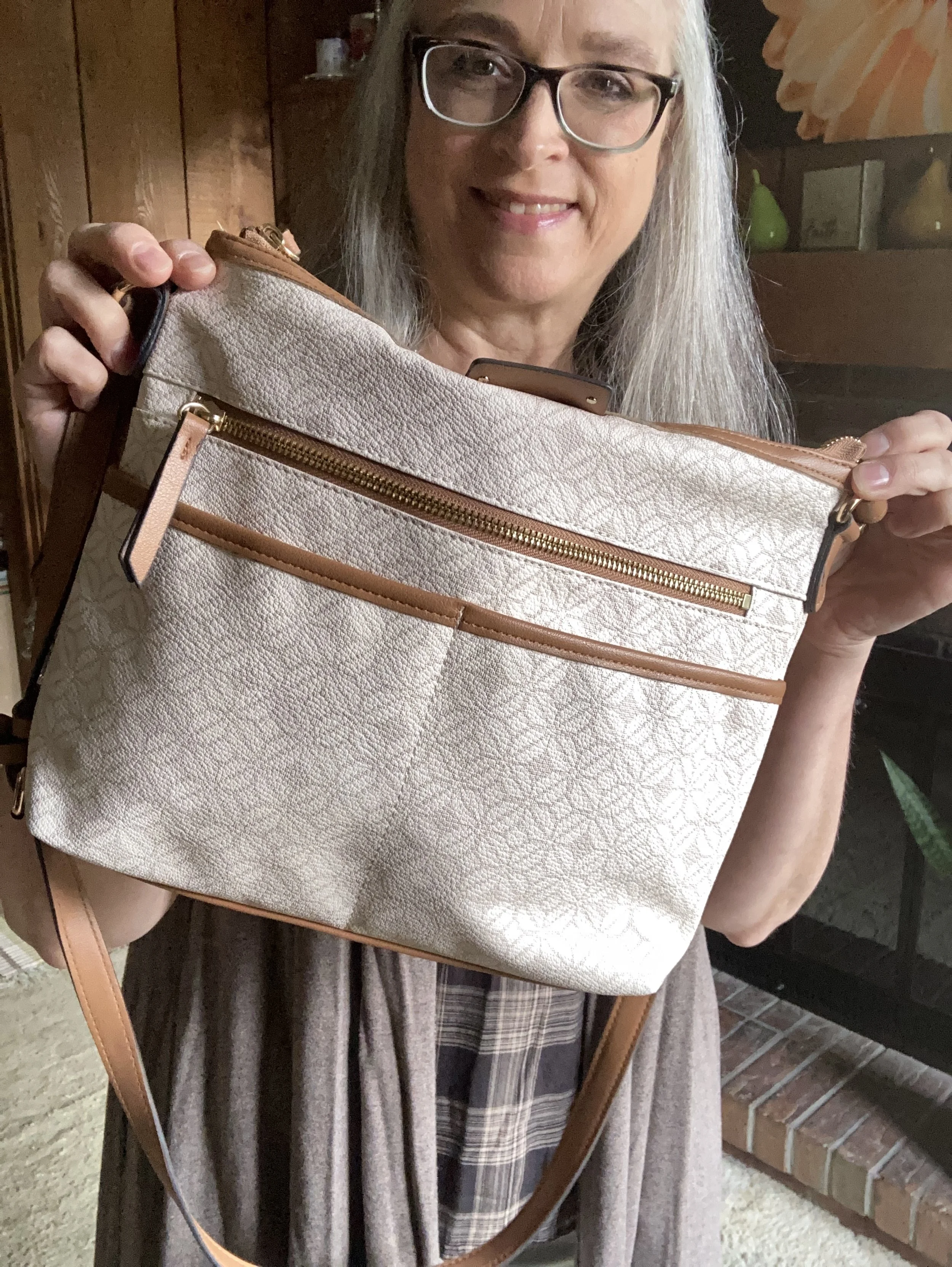
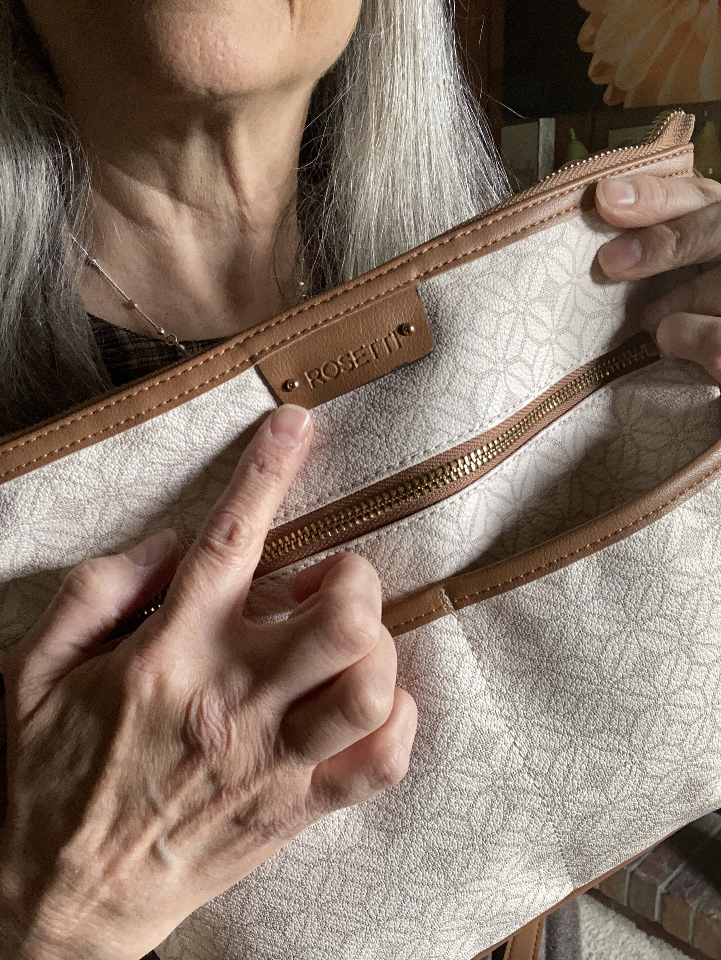
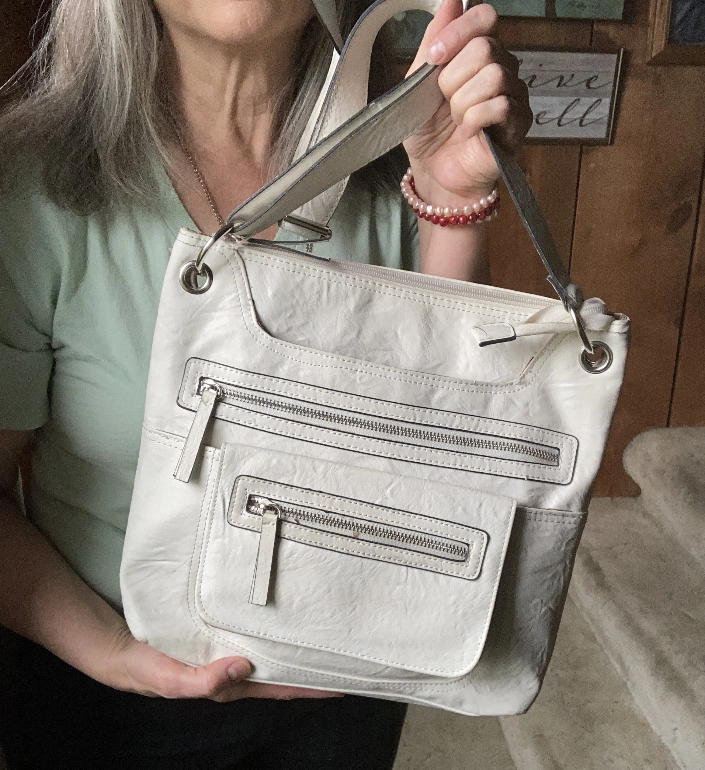
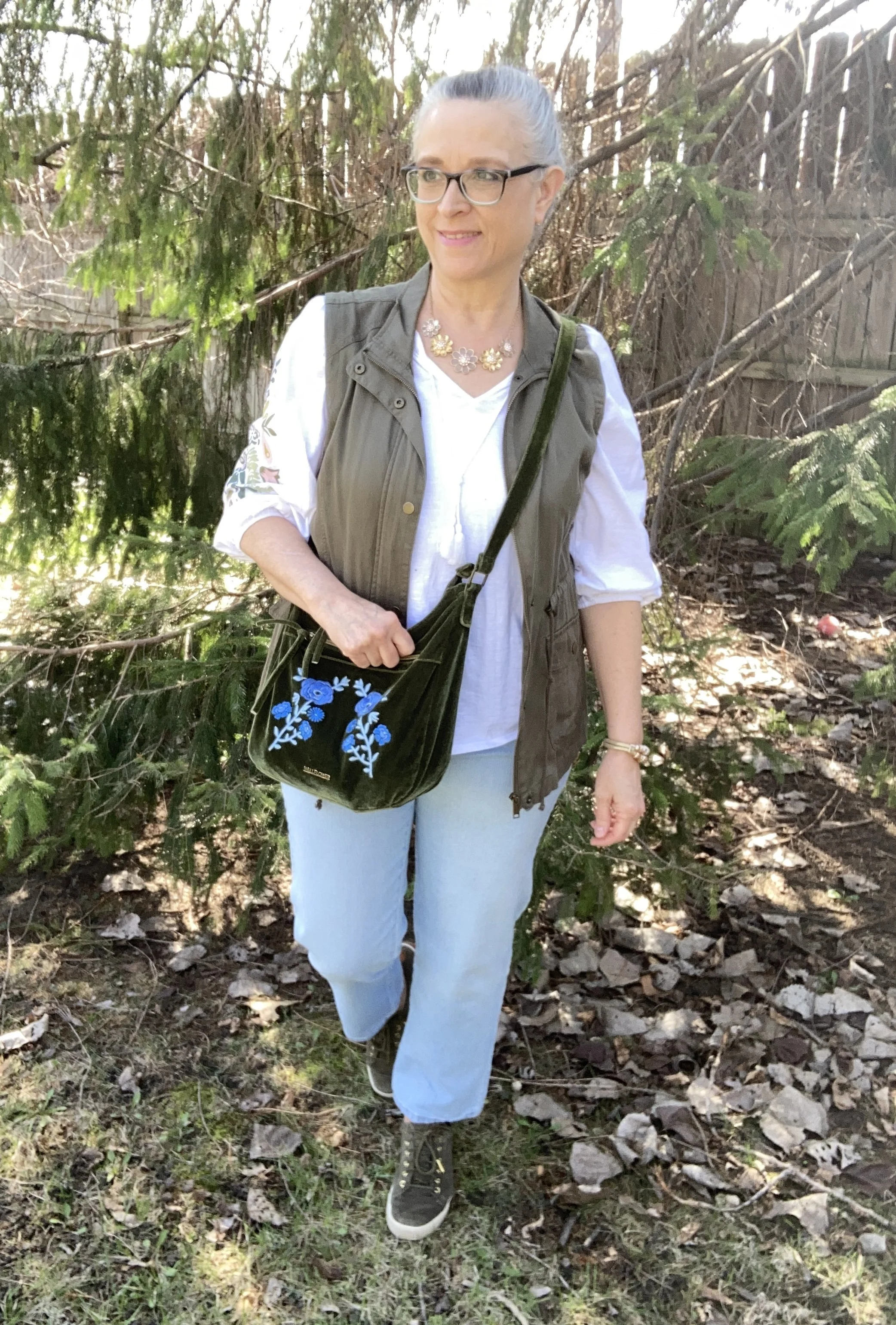
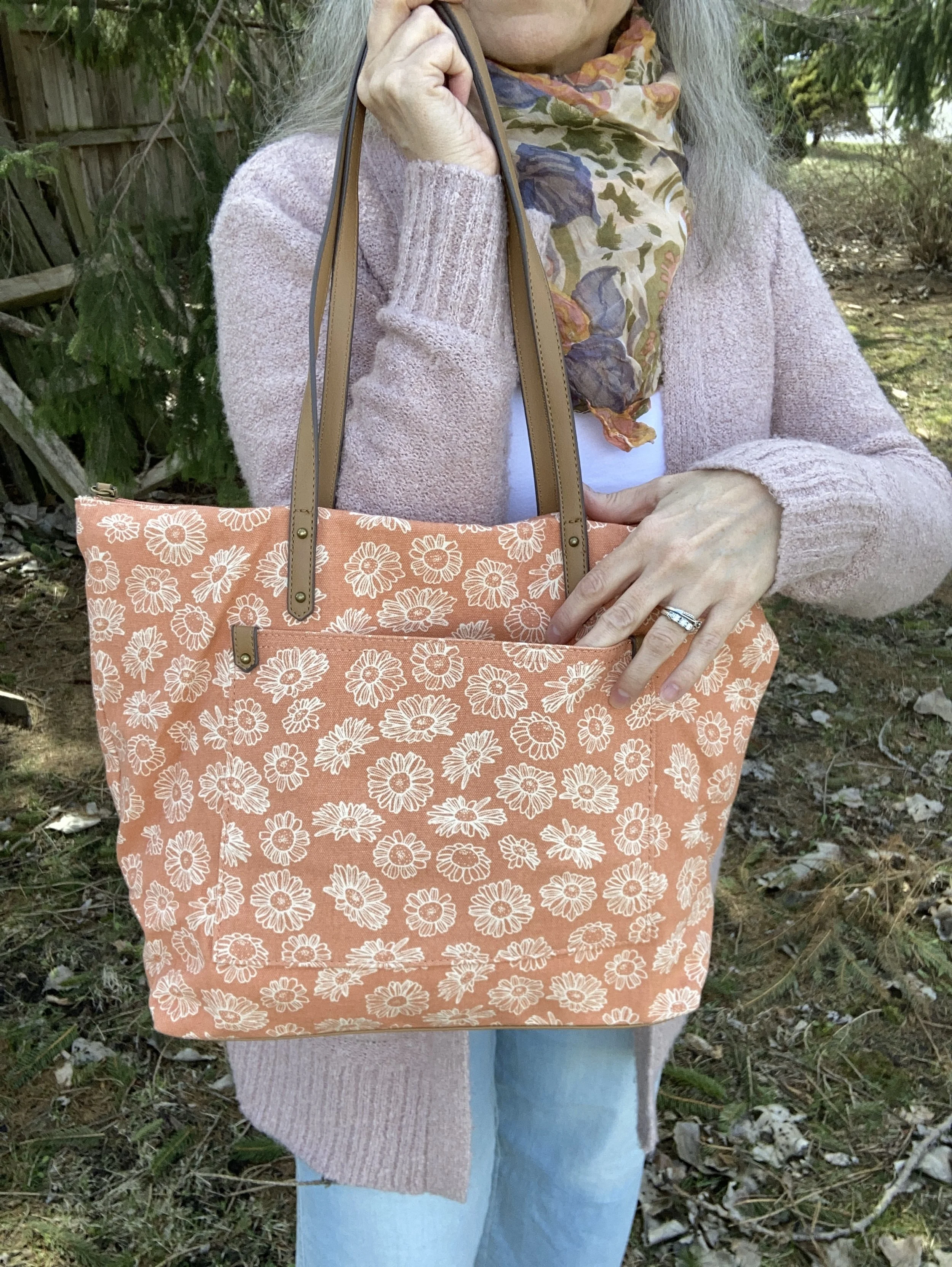
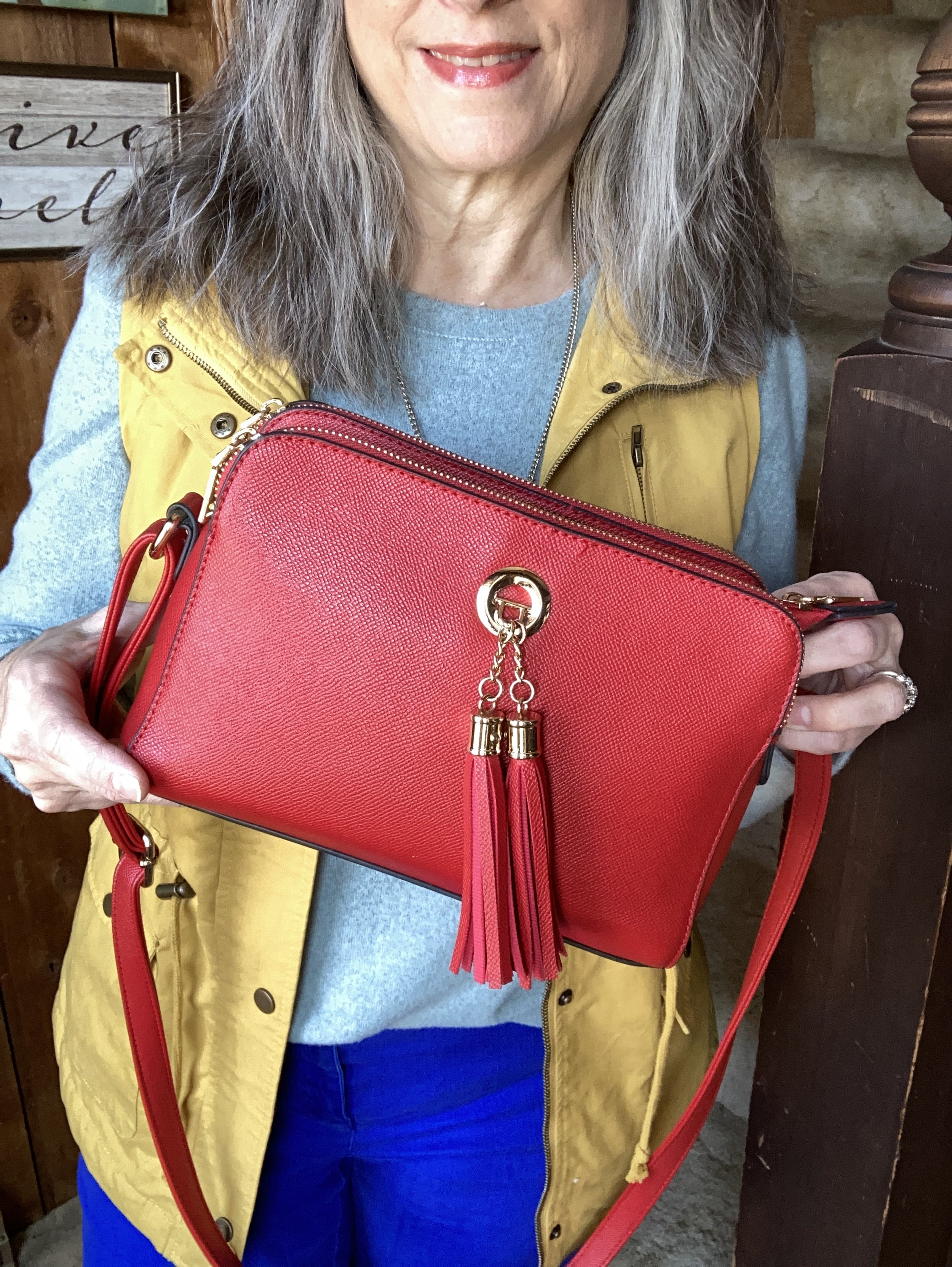
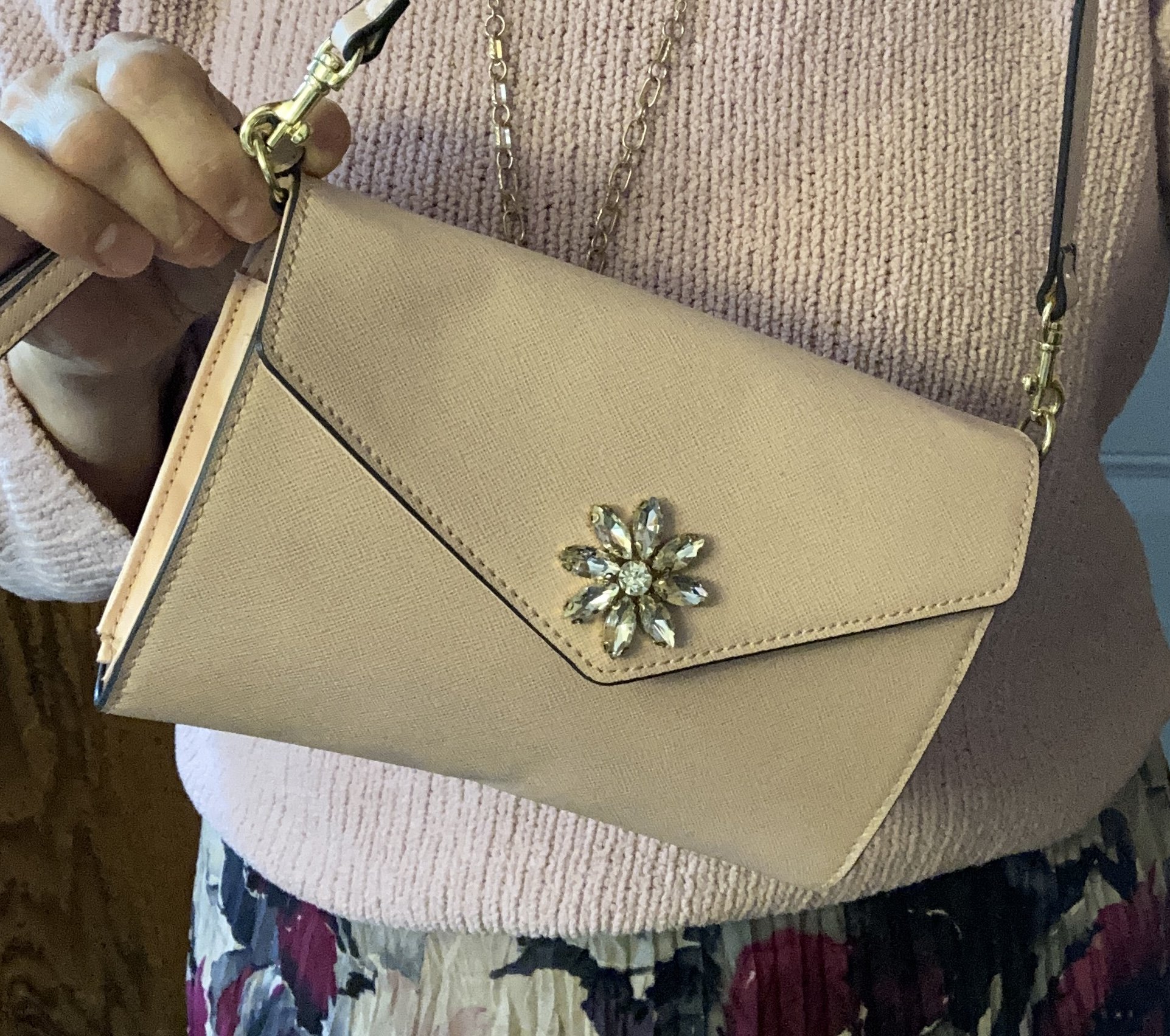
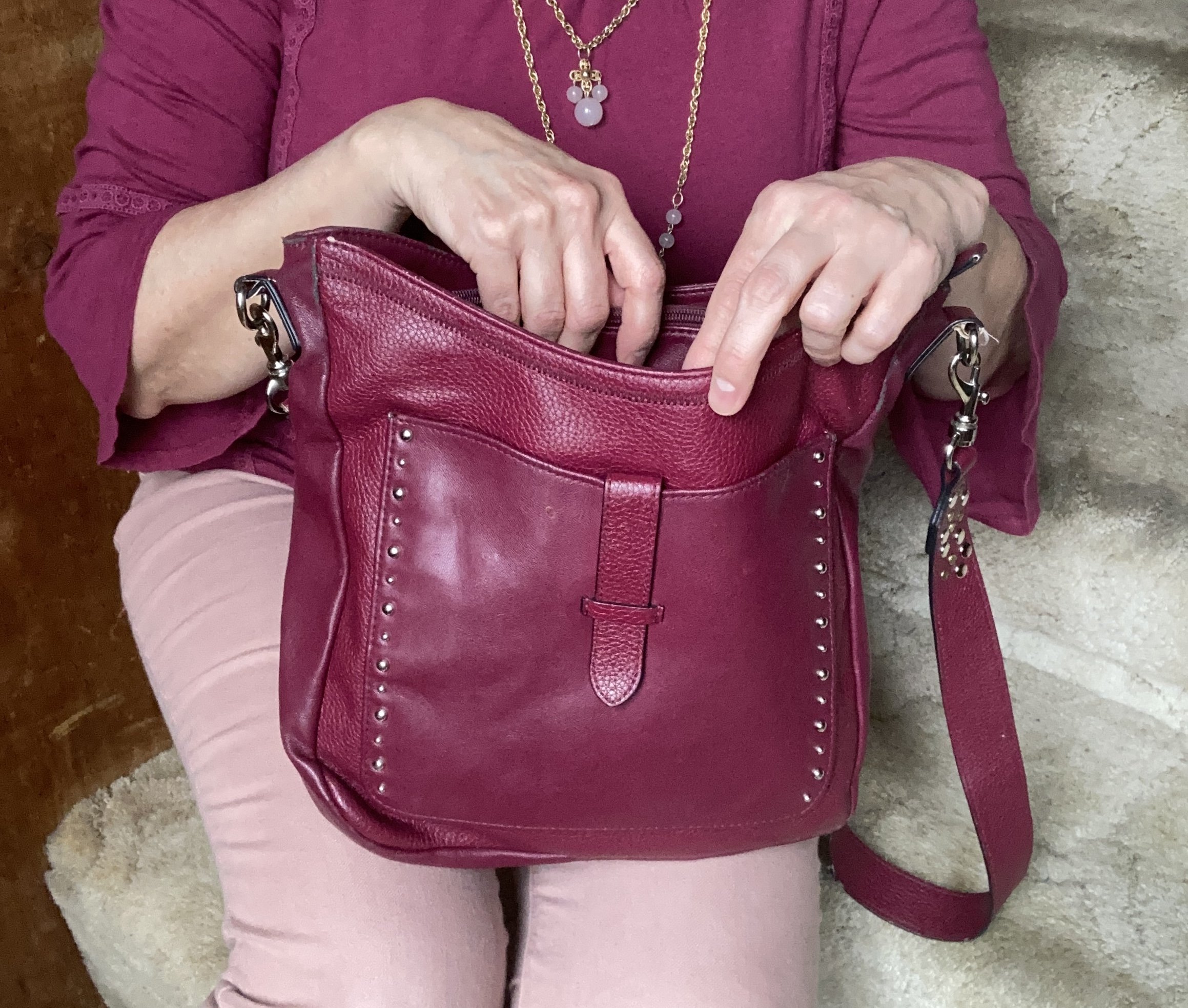
My navy blue bag was a thrifted Simply Vera by Vera Wang piece. Big tote bags are back in for spring, so dig around in your closet and find those larger bags.

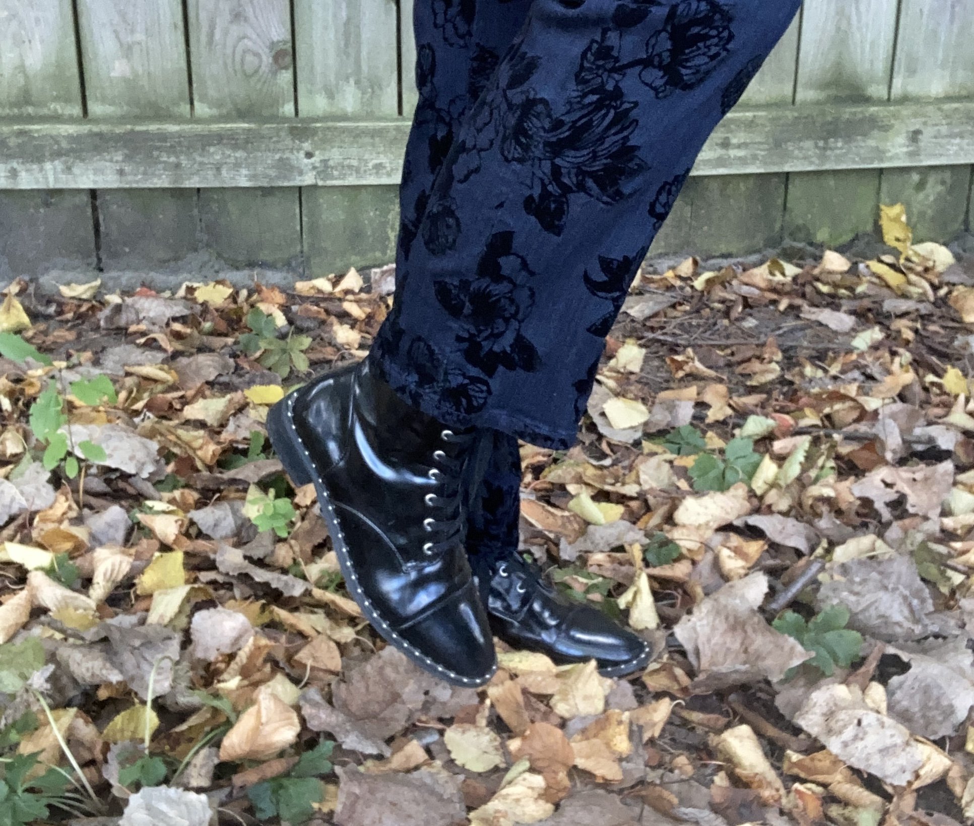
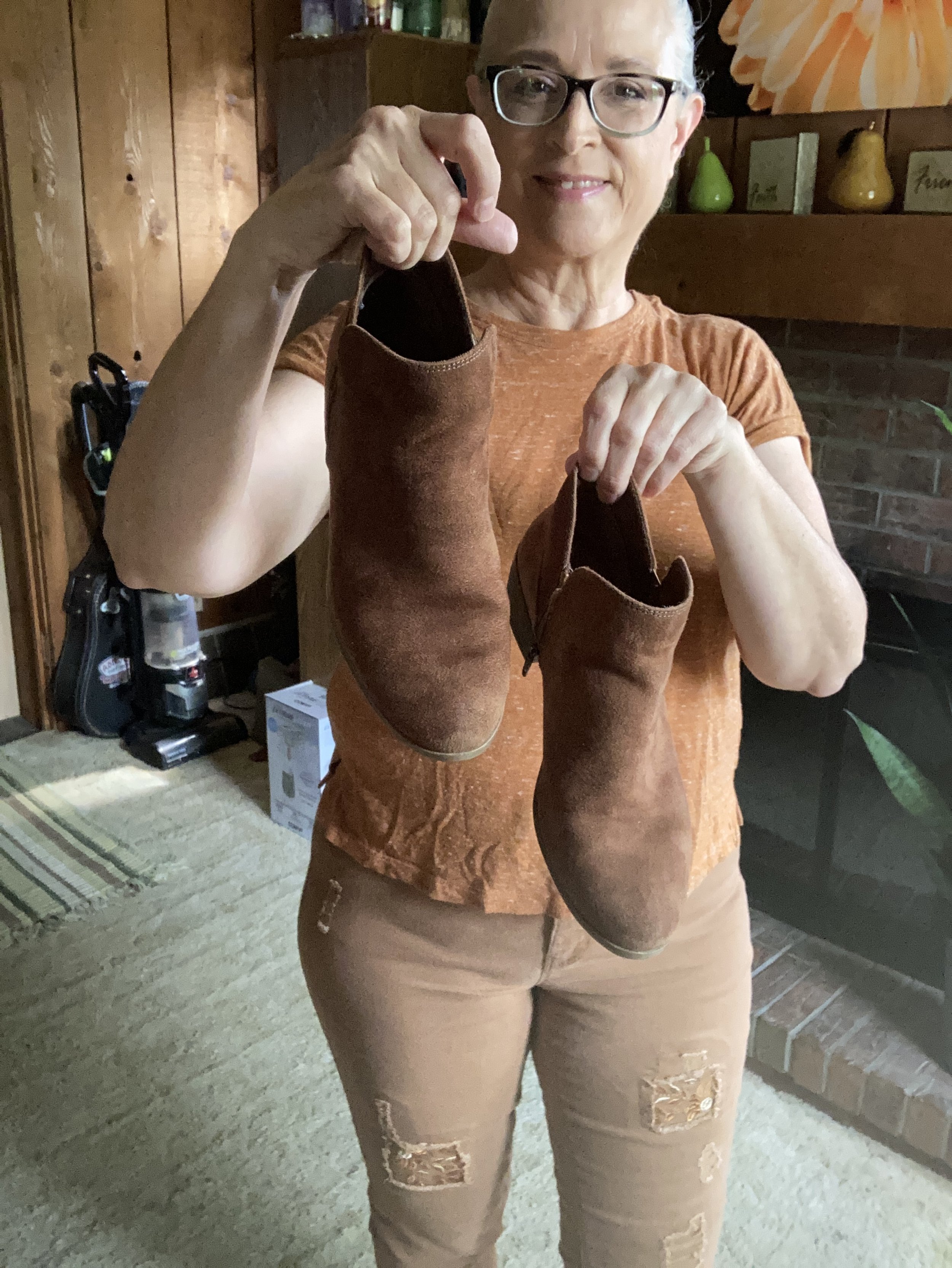
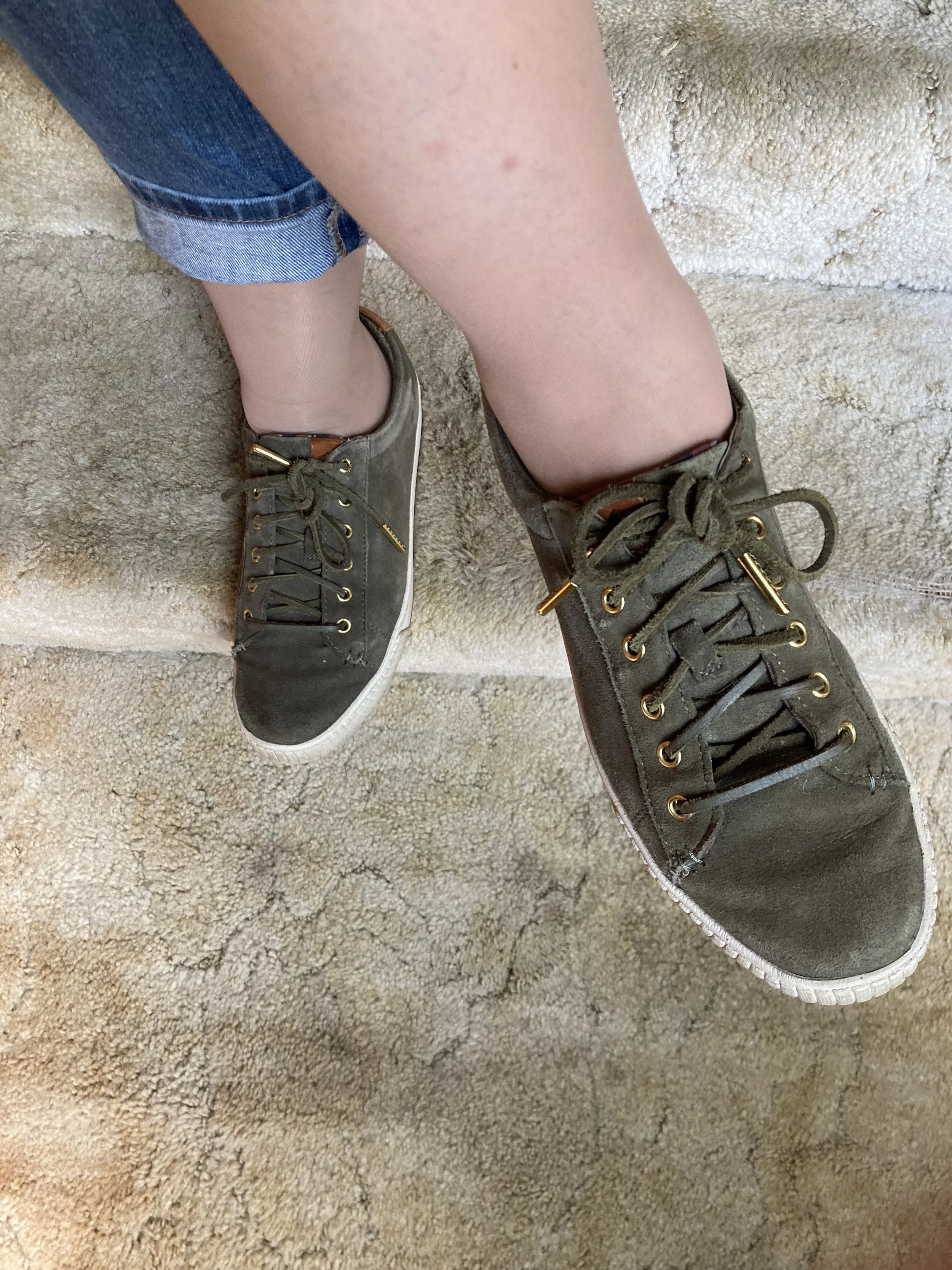
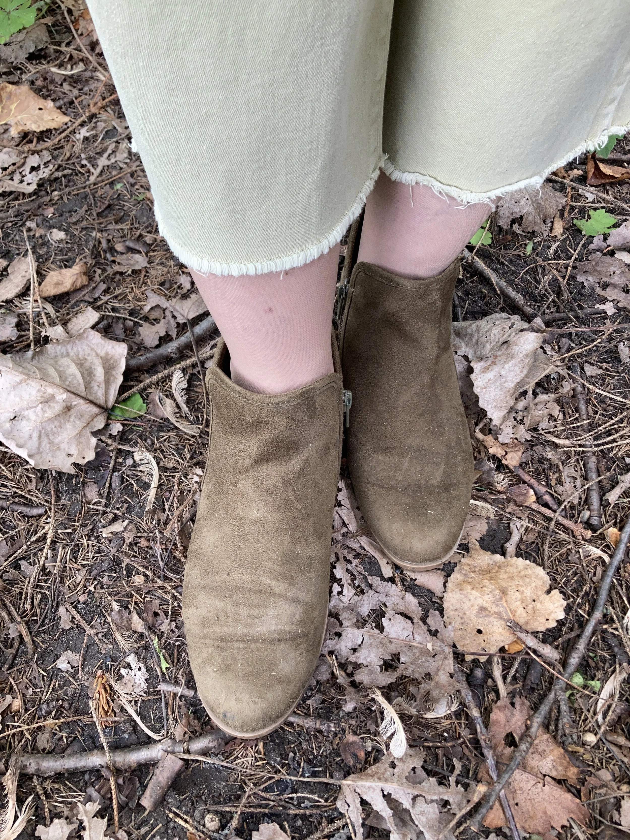
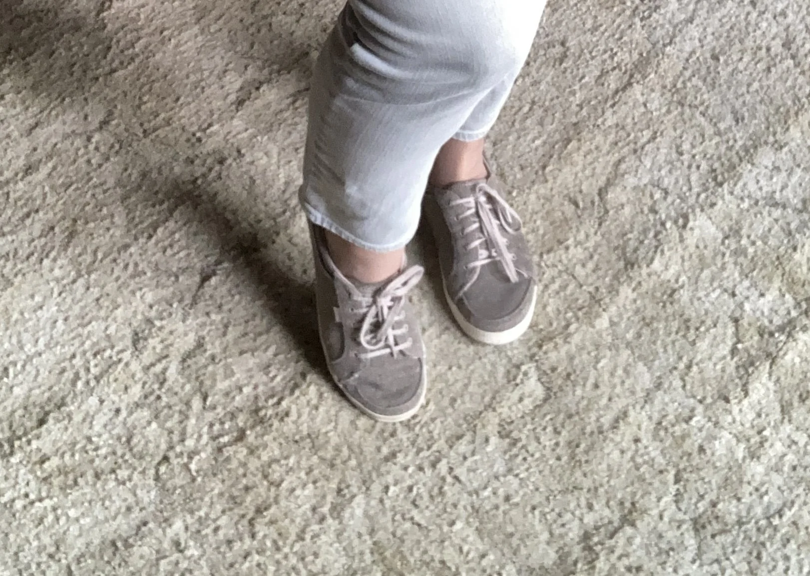
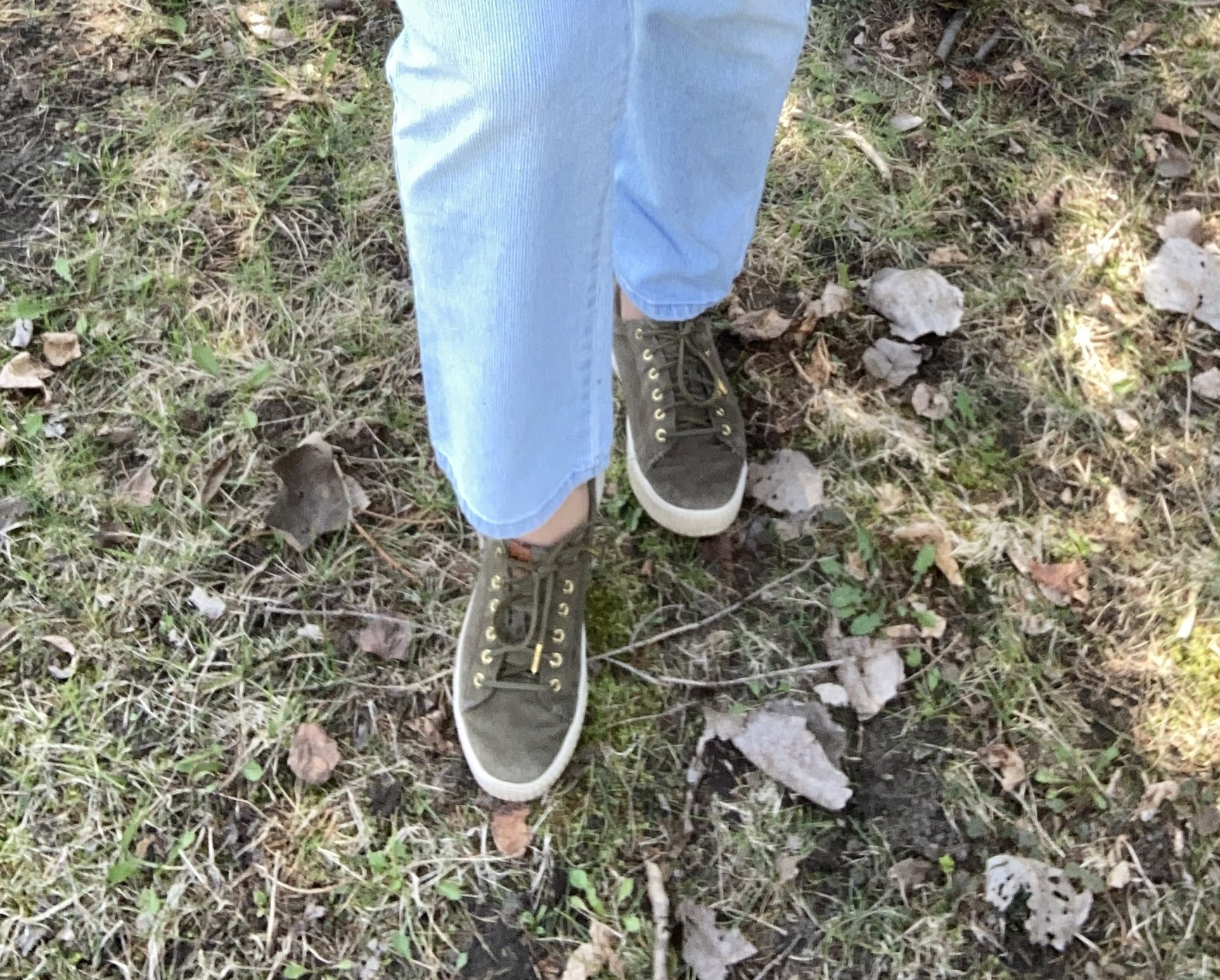
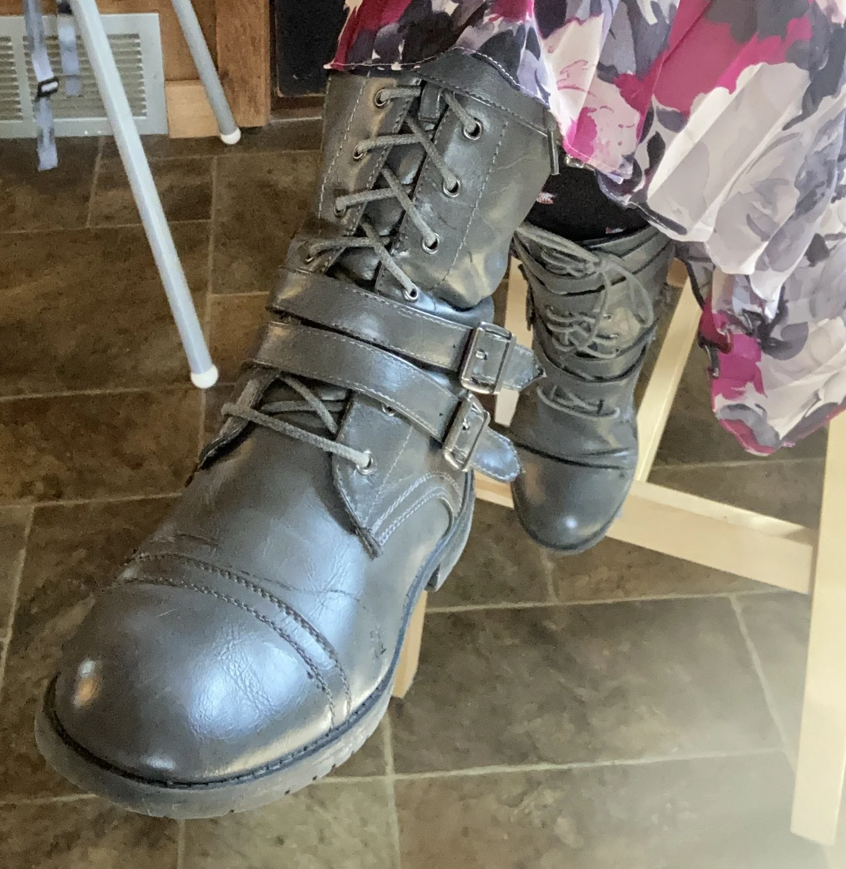
My tan, ankle boots are Sonoma brand and were a pre-winter purchase online from Kohl’s.

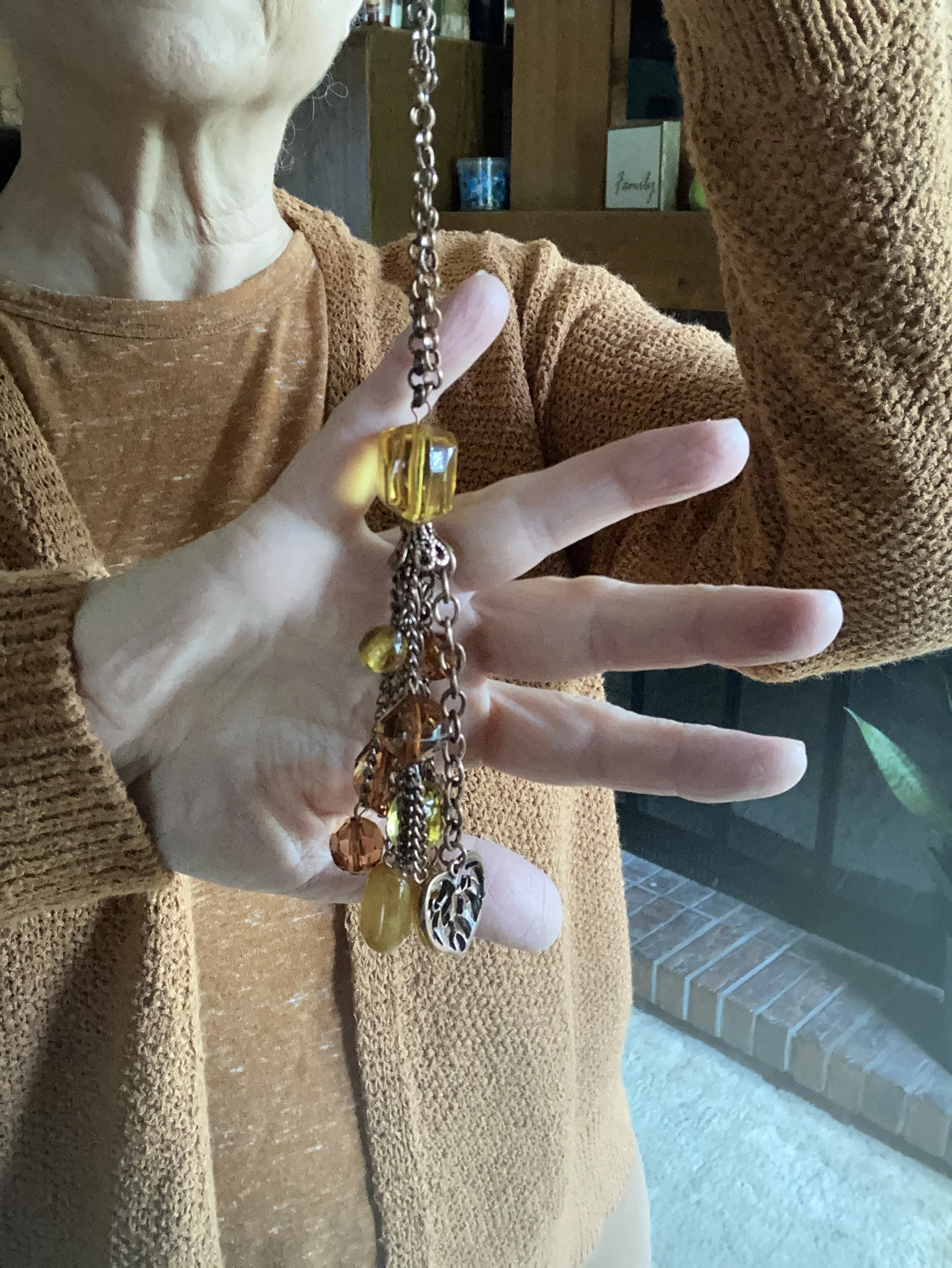
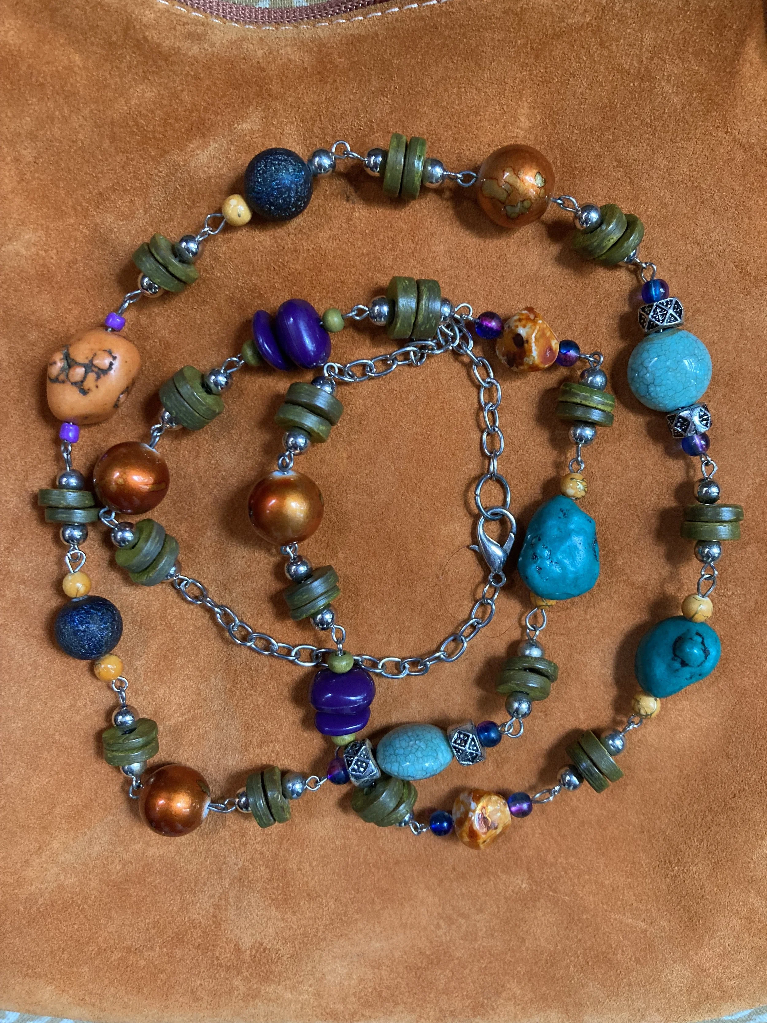
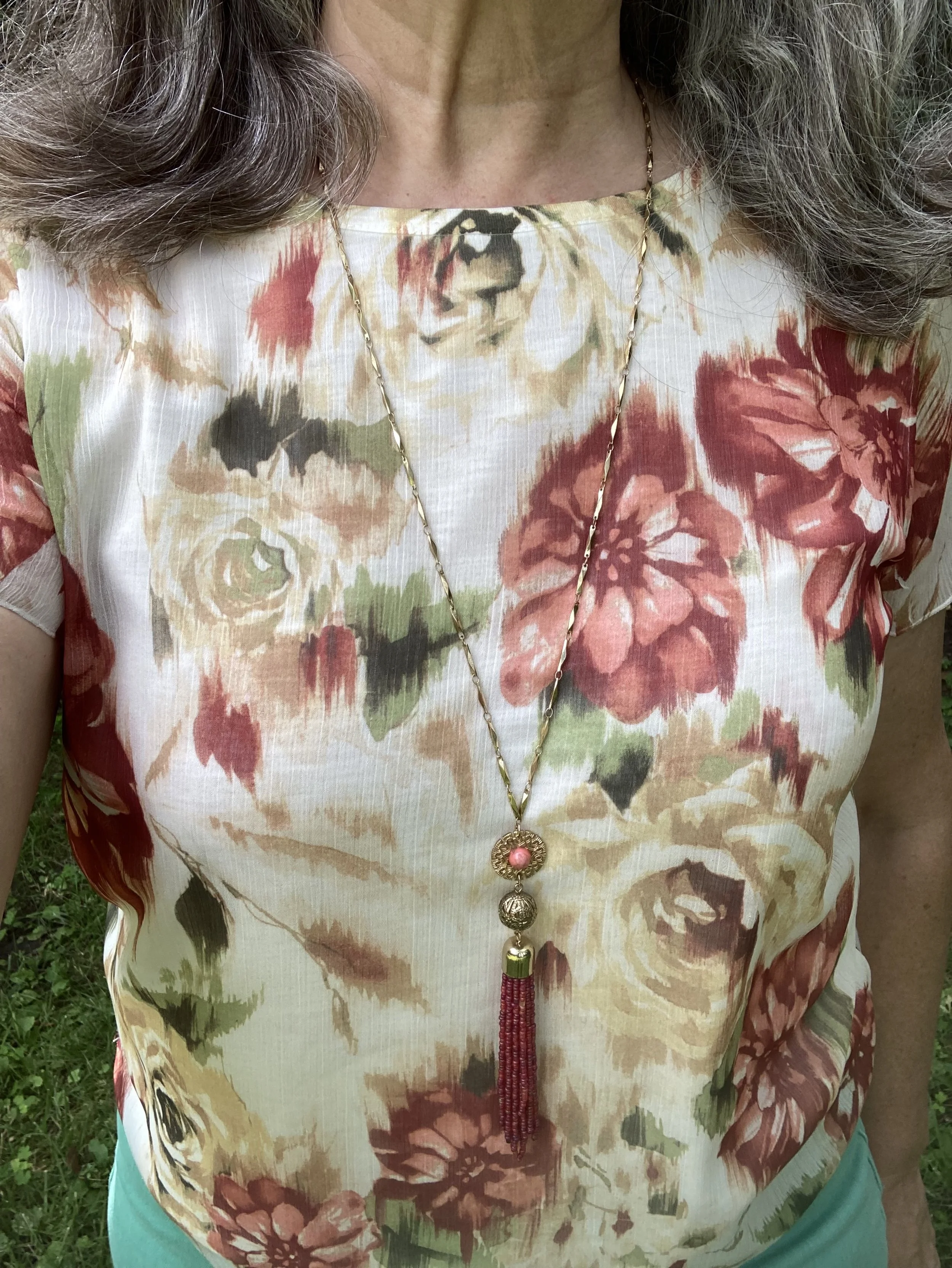
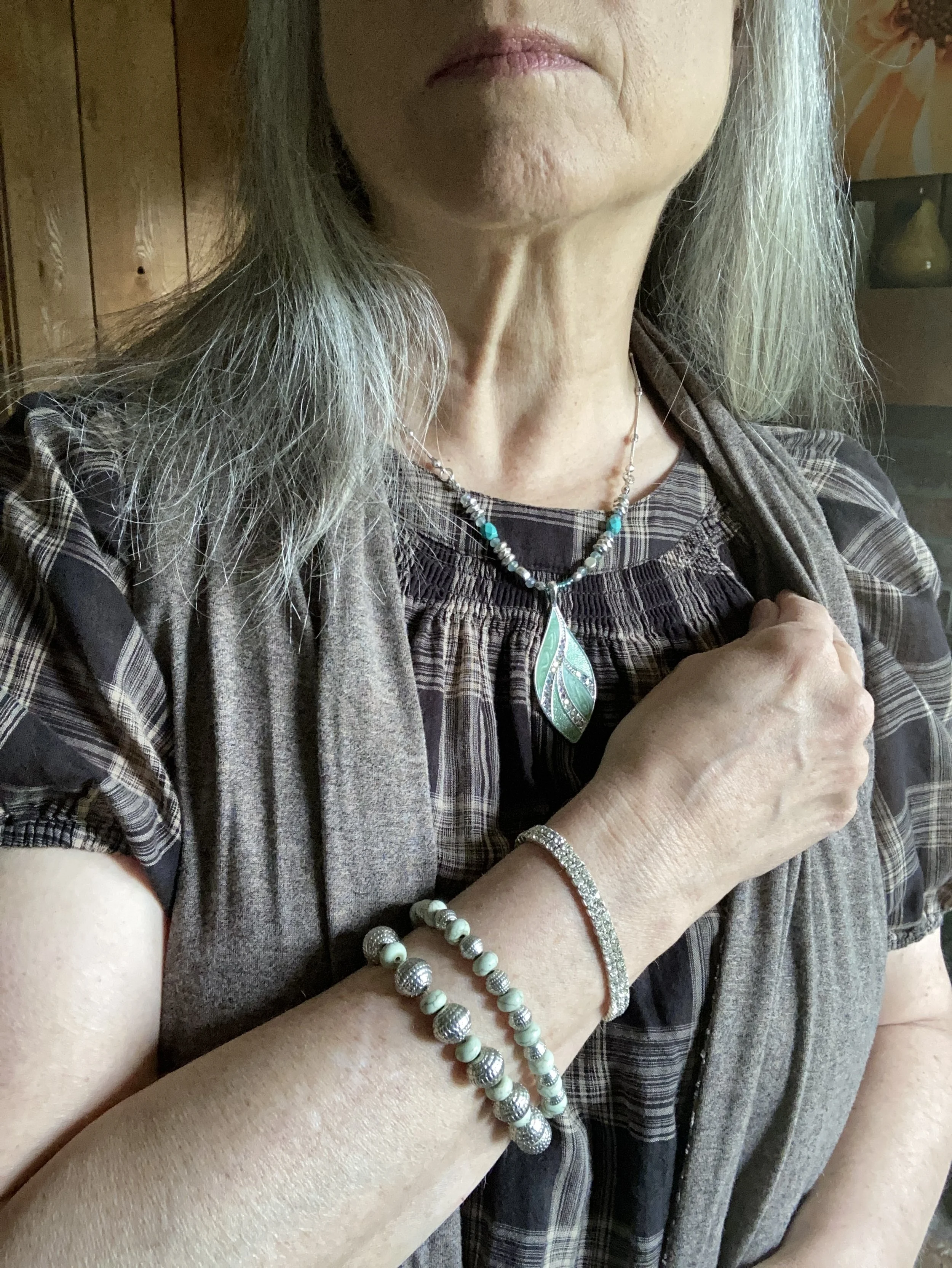
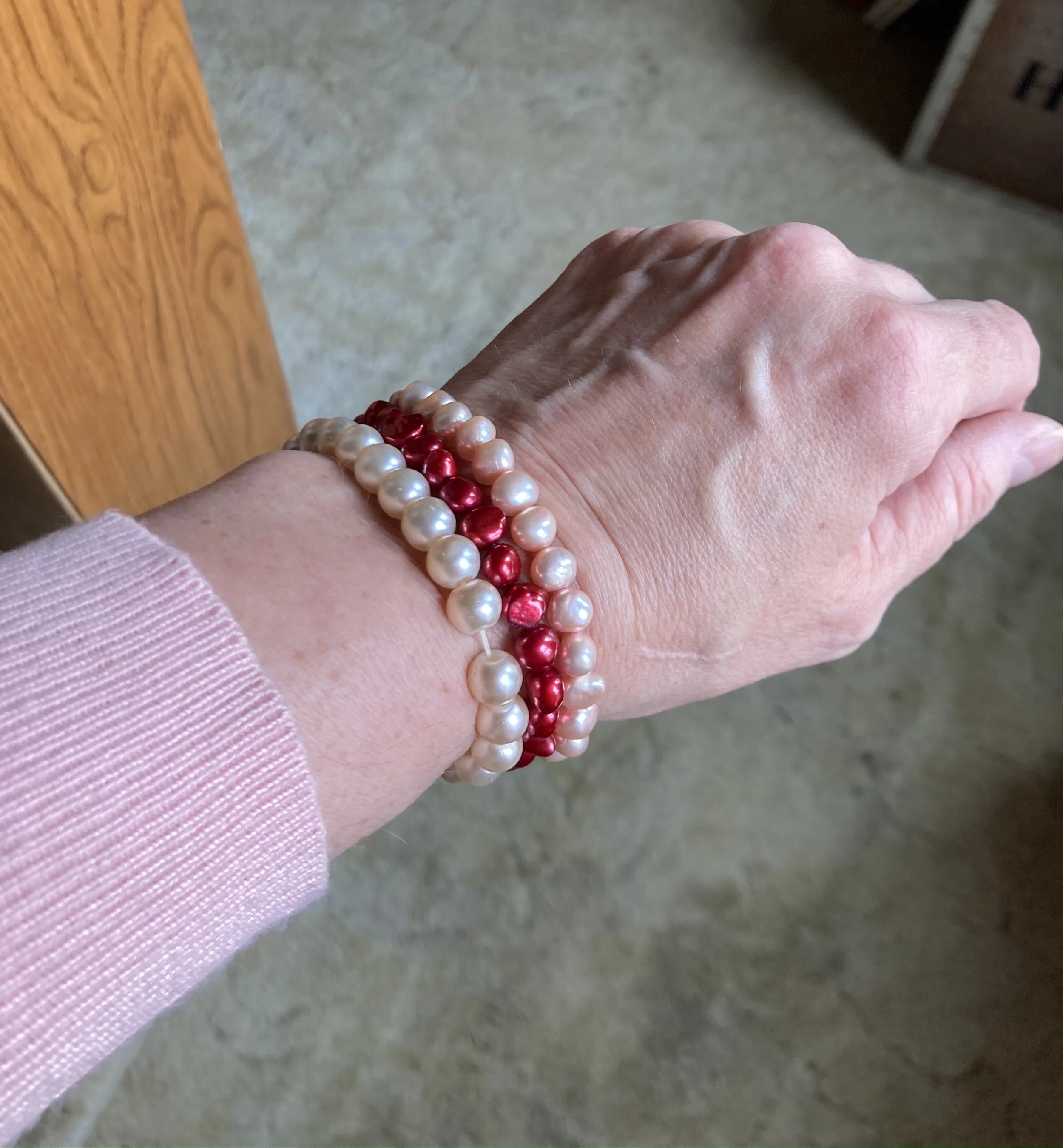
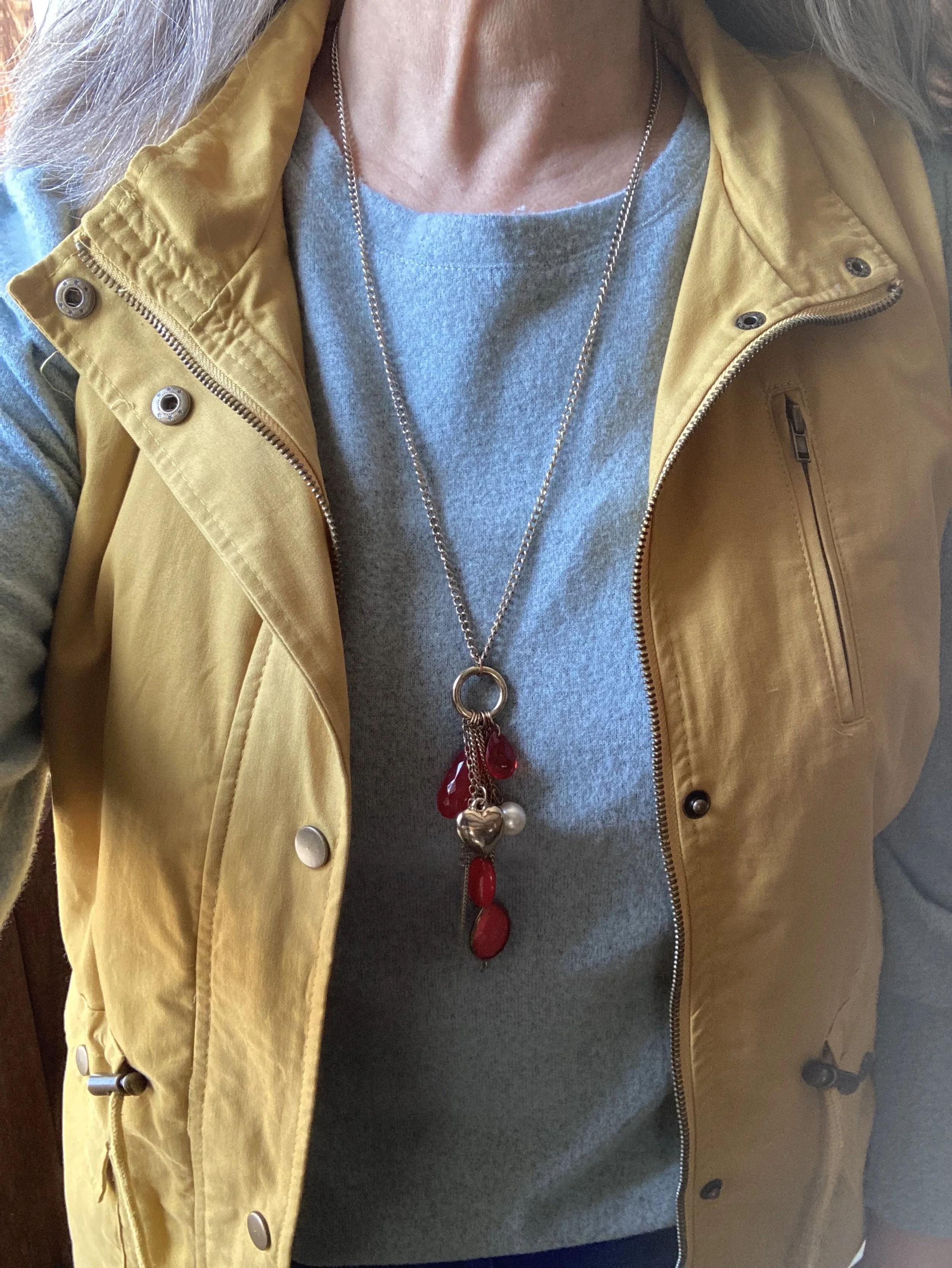
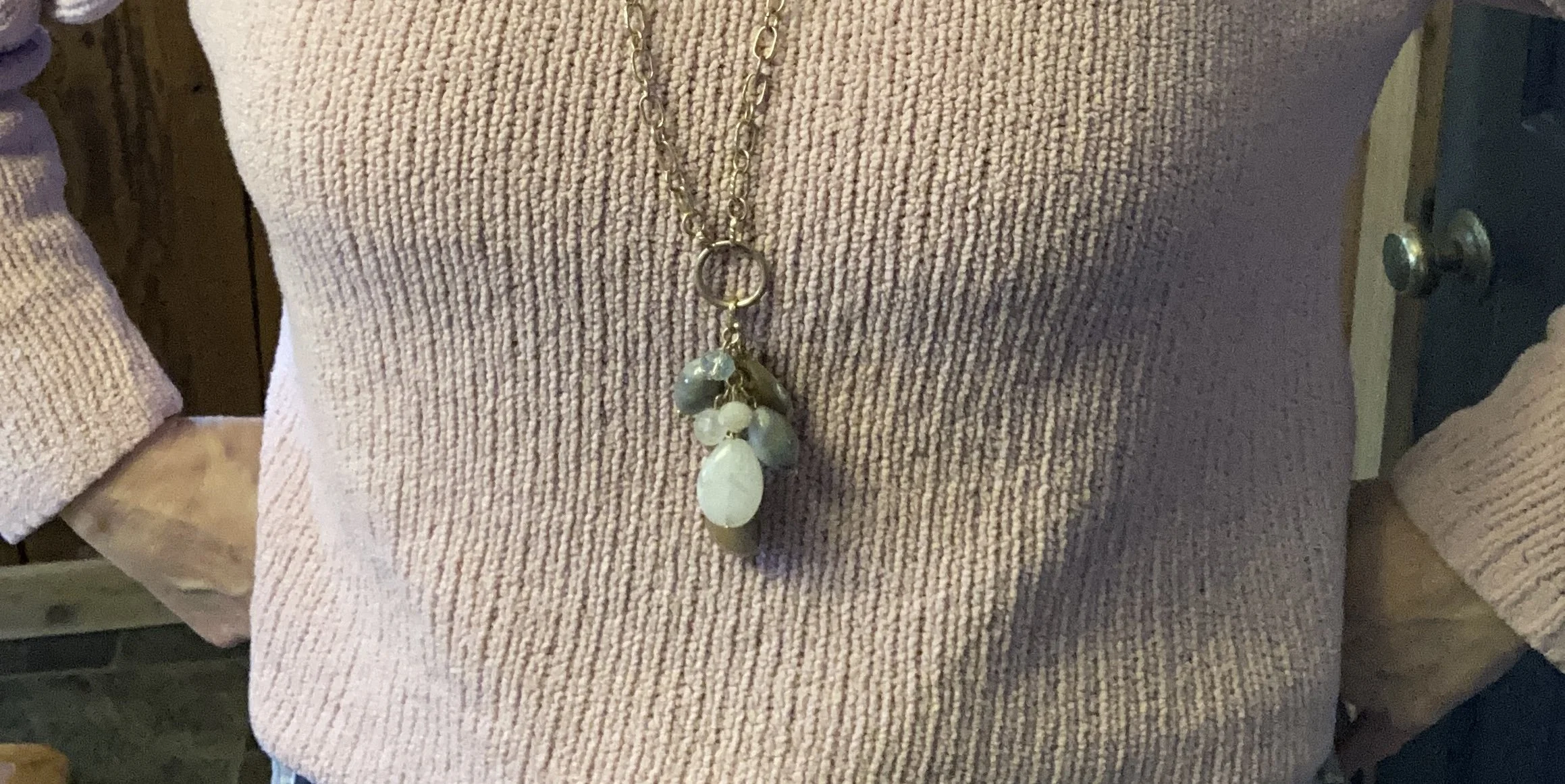
I kept my jewelry simple with a blue bead, pendant necklace.

What do you think of this outfit? Do you like pastels? How do find color inspiration for your outfits?

Thanks for hanging out on the blog. I am including a few shopping links for you to look over. These links are brought to you at no additional cost. These are affiliate links. All opinions are my own.

Have a great week!

Shopping Our Closets: Spring Trends Edition

Today’s post revolves around several Spring 2024 fashion trends. While I don’t follow every trend that comes along, I like to be aware of what is happening from season to season. Frankly, most things have already been done, and just keep coming back into the trend rotation. Certain colors and prints, fabrics and styles come around again and again. For instance, leopard print is once again in; not that it really went out. I always hang on to a few leopard print pieces. That choice is less about what is trendy and more about what I like.

I’m not even going to give you links to forecasted spring trends because they are all so different. One says high waisted pants are out, another says they are in. The same thing for corduroys, and other styles. As I always say, wear the things that make you happy and feel good about how you look and who you are. You don’t need a high priced fashion entity to tell you what to wear. That being said, in today’s post I will share a few of the trends I like.

Prep School

Academic blazers, button down shirts and polos are all part of this preppy aesthetic. You can’t go wrong with a thrifted Ralph Lauren blazer. This is my second Ralph Lauren blazer. You can see my navy blue one here and here.

Style Tip: Second hand stores, and retailers like Poshmark, Ebay and ThredUp are great places to find cast off high end brand names.

Color Combos

This dark gray and brown pairing was another item on the trends list for this year. It seems there are few color combinations that seem a little different, but you know I love a color combo challenge, so this was perfect. Dark gray and chocolate brown would not be my first go to color combo, but I like it.

Cherry Red

Red is in and it speaks volumes, adding a pop of color to any outfit dressy or casual, and there are so many ways to make a statement with red. Try a red top, a red skirt, a red jacket or coat, a red scarf, a red bag, red shoes, or keep it simple with bright red lipstick.

Wide Legs

The wide leg look is sticking around, and you can wear it in any fabric or texture. Dress up in a wide leg trouser for work or a night out, or dress casual with a variety of wide leg jeans.

Metallics and Flats

Metallic fabric is shimmering on the run ways, but that doesn’t mean we have to go all out. Just a little dab of metals is all you need to take an outfit up a notch. I added mine in the form of my gold clutch and my silver SO flats. Flats are also on trend this spring, so take those ballet flats from the back of your closet and let them shine.

I added a few silver necklaces for a layered jewelry look, along with a few silver bangles.

Before going out shopping for new trends, be sure to take a look in your closet. Without a doubt, you have one or two pieces that are back in the trend revolving door. Out of the trends I listed above a nice structured blazer, and metallic shoes or a bag are great pieces to hang on to. They are easily styled with dressy or casual outfits, and are perfect for parties, special events and work.

I hope you enjoyed today’s outfit, and that it will inspire you to check out the spring 2024 trends on the web. You might find you have some of the ones I mentioned or others already in your wardrobe.

I’m including a few shopping links for you to look over. These are affiliate links. All opinions are my own.

Have a great day!

Heading Toward the Holidays - Graphics and Flannels

Once again, I apologize for my inconsistency in getting things posted on the blog. Life has been busy and often overwhelming with various difficulties, but I will keep trying to show up. I decided to forego my Pantone color series. Just like in life, we often have to review and measure what is important and meaningful in our lives. The things that don’t give us the spark they once did might better be set aside for a time, and maybe even left forever.

The whole Pantone entity has become much less user friendly. The graphics are no longer available to use without paying for them, and even their website seems less geared toward the fashion industry and more towards color as it is used in building and designing interior spaces. That is fine, but I am a bit underwhelmed by it all, so for now, I am setting that part of my color interest aside.

For this month, December, I want to focus on building outfits for the holidays from our closets. Winter colors, textures and pieces can be so much fun to play with and even more fun to think about putting together as we deck the halls, make the cookies, shop, wrap presents, and gather together with friends coworkers and family.

Today’s simple, casual look revolves around a Christmas themed long sleeve tee and a plaid, flannel shirt.

Style Tip: When dressing for the cold weather holidays think textures and layers. Chunky beads, or scarves, fabrics like flannel or fleece, and faux suede boots with a bit of slouch make for interesting outfits whether dressing in jeans, skirts or even dresses.

This outfit is a mix of new and old. Let’s start at the top. This men’s flannel shirt was purchased last year on line from Kohl’s when they had a good sale. You know my love for flannel and I didn’t have anything with this combination of tan and dark green. The Christmas Tree Farm tee was also a Kohl’s purchase last year. Both of these pieces are Sonoma brand.

My string of beads are a thrift find. Don’t they match perfectly with the tee?

My jeans I’ve had for a few years. They were also a Kohl’s purchase and are a brand called Angels. Kohl’s only seemed to carry them for a short time, as the brand is no longer available. I really like them and was sad when the brand disappeared. These are a skinny leg, which are still my faves for sliding into boots.

As I mentioned earlier faux suede or real suede is a great textural element to add to your winter outfits. My boots, which are also a Sonoma purchase from Kohl’s clearance a few years ago, are one of my favorite pairs and they went so well with this casual outfit. I took a few close up pics of the boots, but for some weird reason they would not download like the other ones did. Go figure. It honestly is ALWAYS something! Ha, ha.

My fun, velvet bag comes out every year in the colder weather. It’s a different green, but I think it works because it is just different enough it stands out on its own, but the blue flowers complement the blue jeans and pull the outfit together.

Style Tip: Pick accessories, especially bags and boots that you know you will reach for again and again. These are the easiest to use with multiple different outfits and if you love them you’ll want to show them off.

At the last minute I decided to add one other piece to this outfit to make it perfect for a run to the store for those last minute stocking stuffers. I found this beautiful reversible jacket on one of my last thrift runs with my girlfriend when I was back to see my mom. It’s a brand called Jenny Buchanan, but seems to be only available now on second hand websites like Poshmark and Thread Up. I love the detailed quilting on this piece. It isn’t lined, so definitely won't work for a really cold day, but this will be great three season piece. I probably will use it more like a blazer in the winter.

Do you like to wear casual outfits like this? What would you do differently? What is one of your favorite casual brand names for winter clothes? I love to hear your thoughts.

I’m including a few shopping links for you to look through. I provide these as a service to you, to give you ideas or places to look for similar pieces. These are affiliate links. all opinions are my own.

Have a great week everyone!

Pantone Autumn/Winter 2023 - New York Palette: Viva Magenta, Red Orange, and Eclipse

I have been wandering in the wilderness for a few weeks trying to maneuver the hard bits of life and the emotional drain that comes with it. That said, I want to keep bringing you content as often as I can and I appreciate your support and patience during these times when I am struggling.

Getting back to my Pantone color series we are looking at another combination of colors from the Autumn/Winter New York Palette. This trio is perfect for fall and I thought the classy, casual vibe of this outfit would be great for your Thanksgiving Day festivities.

I really like how this outfit turned out. Let’s look at each piece.

This Viva Magenta top was actually a piece I gifted to my daughter, but it ended up on her get rid of pile, so of course I snatched it back. Ha, ha. I have so few really classy, dress tops and I just love the bishop sleeves on this piece.

This Red Orange utility jacket was one of the first few utility pieces that I bought, so I have had it for six years. I purchased this at Nordstrom Rack because I fell in love with the color. You can see another Pantone post I did using this piece here.

Another thrift find, these Eclipse pants are so fun with their embellished velvet flowers. I have a feeling I will be pulling these out multiple times for the holidays. Not only are they unique, but they are comfy.

The accessories really pulled this whole look together. The scarf actually had all of the colors in it. My bag, and patent leather ankle boots added a classy element to the outfit, and the pendant necklace was a nice finishing touch.

What did you think of this outfit? Do you like these colors? Do you have these colors in your closet? Let me know what you think in the comments.

I hope you are having a great week!

Pantone Autumn/Winter 2023 - New York Palette: Rose Violet, High Visibility, and Doe

Today I am bringing you another outfit in my Pantone Autumn/Winter color series. I find these colors on the Pantone website. My renditions of their color palette may not always be an exact match, but I shop my closet and try to find the pieces that come as close as possible to their color choices. I want you to be able to shop your wardrobe as well. You may not have all of these colors in your closet like I do, but you will certainly have two or three. The idea is to take those colors and use them in new ways to make outfits you never thought of before.

I love the boho vibe of this outfit. The bright colors, tiered skirt and fringe bag are all indicative of many Bohemian outfits.

I was having a hard time decided which piece to use for the Rose Violet color. It is a bright, fuchsia pink and though I had my Button Front Maxi Dress from Closet52 (no longer in business), it was too overwhelming. I felt the bright pink and the bright yellow were needed in small doses, thus this fun, thrifted, tiered maxi skirt.

I added the old Christopher and Banks cat eye necklace to pull the Rose Violet color upwards, and I also wore make up allowing for a softer version of the bright pink on my face.

My Doe colored sweater was a fabulous thrift find. I thought the neutral color with the glistening, metallic dots would be great for the up coming holidays with a versatility that allows for dressing up or down.

High Visibility is certainly so. This bright yellow is so cheerful and definitely a pick-me-up on a cloudy, rainy day. Again, the skirt uses a paler version of the yellow to keep the outfit completely compatible through out.

Here is another way to wear the pashmina.

My accessories remained in the neutral shade to allow the bright pink and yellow to be the focal points for the outfit. The sweater is quite long, hanging below my bottom so I tucked it in and added the belt. It brings additional interest, texture and gives me a more refined hour glass silhouette.

I added the thrifted fringe bag, and my older suede ankle boots which have a low heel helping to keep the skirt off the floor.

What do you think of this outfit? Do you like the combination of bright colors with more neutral colors? What would you do differently? I love to hear your ideas and thoughts, so leave me some love in the comments.

I hope you enjoyed this outfit featuring the Pantone New York Palette colors: Rose Violet, High Visibility, and Doe.

No shopping links this week, but I hope you are having a great day and a good week. Check back next Tuesday for another outfit post.

Pantone Autumn/Winter 2023 - New York Palette

The following are my renderings of the Pantone Color Institute’s Fall 2023 New York Palette. These are not going to be exact representations, but close to what the palette consists of. For actual color comparisons go to Pantone.

Happy fall everyone! The season is official and the leaves are beginning their seasonal change here in the midwest. My husband and I got out for a hike on Sunday afternoon and it was beautiful. It was actually a little warm for my preferences, but a lovely day to take a walk. The leaves around here are just showing touches, but many of those swatches are vibrant. I’m sorry Pantone, but no one creates a color palette like the God of Creation! These are few shots I took with my phone.

I am going to introduce the New York fall palette to you today. I decided to take pictures of the corresponding color pieces from my wardrobe to give you an idea of what the colors look like. Next week I will actually start showing you the outfits. In the mean time you can try to guess how I might put these pieces together, or you can come up with your own combinations, just for fun. Let me know in the comments which colors you would put together.

Tender Peach

As Pantone often does they include a few pastels. I am not as much a pastel girl, but I know many of you are, so it is fun to think about how I would include a pastel in a fall outfit.

Rose Violet

This hot pink fuchsia color is bright and sassy. Originally, I was going to use my fuchsia dress from Closet52, but it just wasn’t coming together, so I opted for this thrifted skirt with the Rose Violet flowers. I am not even sure what happened to Closet52. I can no longer find their website. So crazy, the way things come and go so fast.

Viva Magenta

This is the Pantone Color of the Year. You can see the post I did on that earlier this year. This is a lovely, bright color that really works in all seasons, and just about everyone can wear it, but it is hard to find.

Red Orange

This is a color we often equate with fall, especially when we think of changing leaves. The red orange can be easier to wear for some than a true orange. Either way it is a great fall color.

Red Dahlia

Fall wouldn’t be complete without some sort of maroon, burgundy or berry color. Red Dahlia is more towards the maroon side. This picture doesn’t really do it justice. The sweater is a dark maroon, but for some reason it kept looking lighter and more red. Silly phone photos!

High Visibility

Pantone almost always has some sort of bright yellow on its fall palettes. This is another color reminiscent of the changing leaves and sunflowers that are in full bloom at the end of summer.

Persian Jewel and Carnival Glass

These two colors you know will go together for my future outfits. They both were hard colors to find in my closet. I actually had a few pieces that met the Carnival Glass qualifications, but the Persian Jewel is a particular blue akin to Periwinkle, which is a purply blue. I do not have much of that particular blue in my wardrobe.

Burnt Sienna

This earthy orange is another fall staple in my opinion. It goes so well with many other colors and exudes that autumn feel.

Kohlrabi

This bright green works well with the fall palette, once again mimicking the changing tones of the leaves as they grown pale in comparison to their spring attire.

Classic Colors

As always the Pantone color palettes include a few classic colors that work well as foundational or accessory colors.

Coconut Milk

Not a pure, snow white, but not a true cream or ivory, this white does well for casual pieces like this jacket.

Eclipse

This dark, midnight blue is reminiscent of a fall, night sky as after the sun has completely set. A close cousin to navy, this blue is versatile enough to wear with any color.

Doe

This soft, light brown exudes warmth and can replace other common neutral colors like beige, tan, or camel.

Hot Fudge

A dark brown that can be the perfect color to ground an outfit, weather as a skirt or pair of pants or as a pair of boots or leather bag.

Silver Birch

This light gray is the perfect transition color for fall, when you are not ready for the dark grays like oxford or charcoal. This is another color that will combine with just about anything.

So there you have all the fall colors. The next few weeks I will show you which colors I combined to make five fall worthy looks.

What are your favorite colors? Which colors would you combine to make an outfit? Which of these colors do you have in your closet. I look forward to hearing your thoughts.

Have a great Tuesday!

My Style: Collection of My Favorite Fall Looks

It was an extremely busy weekend with two birthday parties, housecleaning, set up and take down, and so on. I am starting the week exhausted so I thought I would put together a collection of my favorite fall outfits from past falls. These are outfits that exhibit my style best. I will include a little synopsis on what I like about it. I hope you enjoy these pics and outfits.

2016

September

I love this all brown look. It really says fall with the medallion print on the dress and the long fringe vest. I am sad that I got rid of all of these pieces, but the reality is the vest was a little bit small and I have put on weight since then, and I don’t wear dresses much at all any more.

October

This is a look I would wear again. I still have all of these pieces including the large tote bag. It is relaxed and casual, but perfectly stylish for a day of shopping or hanging out with the grandkids. Although, these days I would swap out the flats for more supportive sneakers or shoes.

November

I think the contrast of prints and textures is part of the allure of this outfit. Another fun look for a date night. Unfortunately, I washed the skirt and it was never the same. I got rid of it. I still have the top, belt, necklace and bag.

2017

September

I love this purple and mustard yellow combination. It has a bit of a boho Halloween vibe, but it is right up my alley as far as comfort and color.

October

I had to pick two for this month.

I absolutely love this skirt and still have it. I really need to pull it out and try some other combinations with it. This look is so full of texture, rich color and detail making it one of my faves.

This fall look is all about the contrast between the deep rich berry color of the sweater, and the lighter green of the top and skirt. I still have the skirt, boots, sweater and bag, but got rid of the top.

November

I wore this for Thanksgiving that year, and I absolutely loved it. I’m a fan of tiered skirts, sweatshirts, flannel, boots and scarves so this whole look was fun and definitely outside my normal wheel house, but I think it worked and was fun. Unfortunately, the skirt is gone, the boots are worn out, and the bag started showing signs of wear.

2018

September

This cute cropped moto jacket was a find at Nordstrom Rack. With the camo shirt pecking out and the Rock & Republic jeans I thought it was a fun look, and very much my style.

October

I loved this look. The velvet top with the velvety leopard print jacket complimented each other. Adding the jeans made it one of those dressy casual looks that I love to wear.

November

This is actually a summer maxi dress that I wanted to make work for fall. Adding the yellow sweater, boots and a brown moto jacket did just that.

2019

September

Once again, just like me, a study in contrasts. Print mixing, different blues, different textures along with a lovely pop of red. And yes, I am carrying an Aerosmith tote bag. Ha, ha.

October

I just love the colors and the flowing, fun lines of this look. A fun work outfit, or lunch out with friends.

November

Plaid with plaid? Why not? Especially when the one plaid is flannel! A great office look with superb print mixing. (Yes, I can say that about my print mixing ability. Ha, ha.)

2020

September

Who can resist a color mix like this for fall? Doesn’t it remind you of the many colors as the leaves change?

October

Fashion reasons I love fall: print mixing, layers, scarves, boots, dark hues, and jeans, always jeans!

November

This is my go to casual outfit: jeans, fun sneakers, graphic tee, sweater and bag. I love incorporating similar colors into my outfits and accessories like the dark maroon in the bag, sneakers and tee in this outfit.

2021 (This was the fall I was sick, so I wasn’t doing a lot of regular posting, but I found a few things.)

September

Vests are always popular in the fall as a layering piece and for me I love them all, from puffers, to waist coats, to pieces like these with fringe, they provide warmth, texture and interest.

October

I think we all have pieces we look forward to pulling out every fall. This jacket is definitely one of those! As you can see, it is on repeat in my wardrobe.

November

Many of these outfits are from Pantone color palettes, which I usually try to do in the fall and spring. I am still debating about this year. But this outfit proves we can wear pastels in the fall.

2022

September

Why not wear red and green in the fall? It is all about shades and textures. Plus the American flag gives the outfit an end of summer feel.

October

Though these may not be the “typical” fall colors, I really like the romantic, fall vibe this outfit is giving off.

November

This was actually an Instagram post, but the inspiration for it was a fashion trend called Dark Academia, which I really have gotten into. I don’t wear it as much as I would like, but perhaps I will do a blog post about it soon.

I hope you have enjoyed this look back at my favorite fall outfits since I started the blog. It was fun for me to look back and see what I have done in the past. It is challenging me to re-up my game plan to bring ideas and outfits to you that will continue to inspire and help you grow in your fashion knowledge and abilities.

Have a great evening!

Shopping Our Closets: Monochrome Madness

I know I typically talk about color in my Color Play column at the end of the month, but this week I decided we should shop our closets for similar colored pieces to create a little monochrome magic. After all, I wouldn't go out shopping for same or like colored pieces to create a monochrome look, because generally we have pieces already in our closets that match.

The creation of a monochrome outfit in the fashion realm occurs when clothing pieces of similar or same color are combined to make an outfit that appears to be a column of a single color. Once you get started this is as easy as matching pants or skirts with tops or sweaters. An easy way to create a monochrome look is to use a dress, either short, midi or maxi with matching shoes and even, if you dare, matching hose.

Today I will show you step by step how I came up with this perfectly fall outfit.

I guess I should have taken these pictures outside because I am blending in with the cedar planking in our house. Ha, ha. I decided to use this cognac color to create my monochrome look. Here are the steps I took to put this look together.

Step 1 - Choose your color.

This might seem rather obvious, and for some this will be easier than it was for me, because I have so many darn clothes in just about every color. I thought this cognac brown a good color for fall, but I also thought about rust, burgundy and green. You can also use prints in a monochrome outfit as long as it stays mainly within the color scheme.

I started with my StitchStar jeans as I knew I had a pair of ankle boots that matched perfectly. My top is older and is Mudd brand. The idea that your shoes, pants, or skirt and top should all be pretty close to a match makes sense for a monochrome look.

Step 2 - Decide on a topper.

For my topper I chose an open front Tahari cardigan that I had found on clearance at Kohl’s a number of years ago. You could pick anything that matches your monochrome color from a pullover to a blazer.

Step 3 - Choose your jewelry.

I chose a piece that was in the same color scheme as the rest of my outfit, but you certainly don’t have to do that. Your jewelry can be whatever your choose and the outfit will still exude a monochrome vibe. My goal was to stay as close as possible to the cognac colors.

At this point you could be done with your monochrome outfit, but you know me! Why stop there? Ha, ha. While I love monochrome looks, I am too much a fan of color, texture and interest, so I had to add a few colored accessories.

Step 4 - Add a little interest.

I chose a scarf and a thrifted Liz Claiborne bag that matched the green in the scarf.

Step 5 - Finish it off.

Since fall is truly just around the corner layers are going to be essential, so I decided to finish this look with a recently thrifted Merona utility jacket. When I saw this cognac colored jacket I knew I had to have it. While it is a little snug for me, it works great as an open front piece and still allows the under layers to be visible.

Style Tip: When thrifting make sure to look at all different size racks. You never know what you will find if you think outside the box in how you wear various pieces.

I hope you enjoyed this post and that it gave you quick and easy tips on building your own monochrome look. Shop your closets with new eyes. You will find new outfits you never knew existed. No shopping links today, because I know you are all running to your closets right now to see what you can create!

Until next time, think creative and be creative. Your wardrobe is yours to explore and have fun with.

Outfit Inspiration - Knit Vest

The outfit I am showing you today was styled around a knit vest. I didn’t post anything last week as life was extra busy and we had company for the Labor Day weekend. Today, Monday, I was feeling tired and unmotivated, so I decided to just you give a post on what I had on. It’s certainly nothing fancy, but it incorporates some last minute print mixing and fun textures.

This longer knit vest is a Christopher & Banks piece. I like the colors, and thought they were perfectly suited for a summer day in the air conditioning. We are having a little heat wave right now, which puts off wearing layers, but this worked for being at home all day. This vest is great for spring, summer, and fall. My biggest trouble is remembering I have it. Ha, ha.

I chose my cute a.n.a. pineapple print tee which went well with the coral/orange in the vest. My girlfriend visiting this weekend has several pineapple tees and tanks, so she inspired me to wear mine. I love the gold pineapples and they make it easy to accessorize with gold jewelry.

Style Tip: Remember when picking pieces for a print mix try to coordinate at least one color. This is part of what makes print mixing fun and easy to do.

My jeans are a thrifted pair of Merona’s. I finished out the look with my olive Sperry suede sneakers, and my thrifted American Eagle hobo bag. I also added a green with gold wrap bracelet.

This outfit is casual but cute. I still look like I made an effort, even though the pieces are comfortable and easy to wear. Do you like to wear long vests? What is your every day, go to outfit? I’d love to hear your thoughts, so leave me some love.

I’m including a few shopping links for you to look over. These are affiliate links. If you purchase something through one of my links I might get a little kick back. All opinions are my own.

Have a wonderful evening.

Color Play - Building an Outfit Around Jewelry

Since my Color Play column can encompass all aspects of color, I thought it would be fun to show you how I build an outfit around a colorful piece of jewelry. Let’s face it, not all of us are into fine jewelry. Yes, I do have a few silver and gold items that my spouse gave me over the years, but those are mainly rings and a few chain necklaces. Most of my jewelry is costume jewelry that I have either found on clearance at regular retail stores like Kohl’s, JC Penney, or Maurice’s, or it is from a thrift store. The piece I will be using today was actually gifted to me by a friend.

I love all the colors in this piece, but it does make it more difficult to combine with printed pieces, of which I have many. However, that makes it more challenging, which I love. Today, I decided to go for more of a color block style, and used solid colors for each of the pieces in my outfit. Take a look.

I am grooving on my wide leg cropped pants right now, so if they are not your cup of tea, then just swap them out for your own version of pants. You could also just as easily choose a skirt. Remember my job is to inspire you to look at your own clothes in a new and innovative way, to make them work for you and your style preferences.

Today’s style tips are going to cater to styling an outfit around a piece of jewelry.

Style Tip 1 - Choose a piece of jewelry that makes a statement, then figure out how to monopolize on that statement effect.

As you can see in the first picture my necklace contains so many colors: orange, dark blue, turquoise, or aqua, purple, olive, light green, orange and a light yellowy orange. If I wore this piece with a printed top it might easily get lost, but pairing it with this navy popover blouse was the perfect way to make the colors of the necklace pop. You could have used any of the colors in the necklace, but I love the way it looks against the navy.

I have two of these Knox Rose tops. The other is a pale purple color. I love the lace, the longer length short sleeves and the flowy silhouette. The trim on the bottom is pretty as well. I honestly can’t remember if I found these on the clearance rack at Target, or at a Goodwill store where I often find like new Knox Rose items.

Style Tip 2 - Choose pieces that go with the colors in the jewelry or at least compliment it.

The navy top almost matched exactly the navy beads on the necklace. However, I chose to wear a pair of pants that was less matchy and more complimentary. The light green borders on olive, but not exactly. It’s almost a very pale chartreuse. I know in the picture they look more gray or beige than green, but believe me they have a green cast to them.

These raw hem jeans are Sonoma brand and they were a clearance find at Kohl’s a summer season ago.

After choosing my main two pieces I decided on shoes and a bag. I also added a few other bright beaded bracelets for fun. My SO ankle boots have been around for a while. I thought it appropriate to start throwing in a few fall like pieces since we all know it is coming at some point. My thrifted orange suede bag is not one I use very often, but I simply love the bright color, and it works so well as an accent piece.

Style Tip 3 - Pull in one or two other colors from you chosen piece of jewelry (if it has more than two colors) by adding them in as accessories: shoes or boots, bags, scarves or a sweater or jacket.

I thought about adding a sweater to this, but I wanted to still look summery, and it was nearing 90F when I took these pictures. I was already beginning to sweat. Ha, ha.

What do you think of this outfit? Have you ever styled an outfit around a piece of jewelry? If so, what was it? I’d love to hear your thoughts. You feedback is always welcome, good or bad.

I’m including a few shopping links for fun necklaces. These are affiliate links. All opinions are my own. Have a great day!

Color Play - Peach and Sea Foam Green

My grandson was here for the weekend, so I asked him to give me an unusual color combination. First he came up with orange and purple, which is definitely on my list of colors to pair in the future. He also mentioned red and green, but when I said Christmas, he decided not that. Finally, he said, “Peach and Sea Foam Green.”

We proceeded to have a mini discussion about what peach and sea foam green or blue actually look like. I finally had to Google both colors to see what the internet said. Sea Foam green is pretty straight forward. It is akin to minty green, but with a touch more blue in it. Peach, however, is another story. There are so many versions of peach: yellow-pink, pink-orange, yellow-orange…the list goes on. When you open up the peach fruit, the center is a yellowy orange, but the skin can have shades of pink in it.

When I started looking for these colors in my closet I was leaning towards the pinky orange, but everything I have leans more towards coral than peach. I finally settled on this floral tee blouse. I call it a tee blouse because it looks and feels like a tee, but the sleeves and front have a sheer material, giving it a lovely dressy vibe. The sea foam green jeans were just right for this post.

Style Tip: Think outside the box when it comes to color. You don’t have to wear the same colors all the time, because that’s what the color gurus say you look best in. Try adding color in small amounts with a bag or shoes, or other accessories. I know I have said this before, but color is just too fun to not wear it.

This pretty floral piece is Alfred Dunner brand and was either a thrift find or a clearance find at Kohl’s. It has been a few years, so I can’t remember. Ha, ha. I like the water color feel of the flowers. Since peach is yellow, but also pink, I thought this blend of colors a good compromise. You might not think it looks very peachy, but the point is not about perfect matches, but color inspiration.

Style Tip: Let color be a guide rather than a prison. Maybe you don’t have anything peach, or orange or yellow. Maybe your clothes revolve around neutrals. Why not use beige or tan with your sea foam green instead?

These bright green jeans are a brand called NYJD. I found these thrifting, but they do have a website and it looks like a decent brand. I love the fit and feel of these jeans. They are a bit stretchy, but not so much so they get slouchy. Check out their website, NYJD. I am not receiving anything in exchange for telling you about this retailer, it just looks like a decent place to get jeans that fit well.

I decided to add a pinky-peach cross body bag to tie in the pink colors in the top. I also added my pale yellow Universal Thread sneakers, clearance from Target. Isn’t the embellishment on this bag so much fun? It looks like embroidery.

When you really pay attention you can see that this top isn’t really peach. You can also see that the green in the top, which is almost a citron green is nothing like the sea foam green of my pants, but I think the outfit works. Again, think in terms of inspiration rather than firm rules.

What do you think of this outfit? Do you think these colors work together? What is the brightest pair of pants you have in your closet? Do you have anything in the sea foam color? I love hearing your thoughts so leave a comment or two.

Don’t forget you can buy me a coffee by clicking on the link below. It is a great way to support people like me who bring you inspiration and ideas without receiving compensation for it.

Buy Me a Coffee.

I’m including some shopping links for you to peruse. These are affiliate links. I do not receive any compensation unless you buy a product through the links below. All opinions are my own.

Clara Sunwoo - Mosaic Petal Top with Techno Knit Blue Denim Pant

For the last few months I have been sharing with you retailer Clara Sunwoo. The mother/daughter team based out of New York City is known nationwide for their comfortable, stylish pieces that meet the needs of today’s modern women. Made with knits and materials that move with you, each piece is perfect for day to day life, from the office to dinner out.

All of the the outfits I have shown you, including today’s, have been gifted to me, in exchange for posts on my blog and my other social media accounts. All opinions regarding the retailer and the clothing pieces are my own.

Today’s look is probably my favorite so far. You can see the first outfit, side tie water color top and brown straight leg pant here. You can see the second outfit, wide leg pocket pant and parachute hem tunic, here. Today’s look features the Mosaic Petal Top paired with the Techno Knit - Skinny Ankle Pocket Pant in Blue Denim.

You know how I love color, so this top really caught my eye. Not only is it a beautiful combination of colors, but it is so comfortable. The 3/4 length sleeves, wide scoop neck line, and a-line silhouette provide a cool, confidence-boosting vibe.

The Techno Knit pants are very comfortable, and like all the others easy on, easy off. There are no belt loops, zippers or large back pockets adding bulk. All of Clara Sunwoo’s pants are made to be easy to wear, comfortable, and lasting. The Techno Knit pants are more structured than the other two pants I received, which I do like better for every day wear. My only issue with these has to do with my legs, not so much the retailer’s manufacturing. With my wider calves, the Skinny Ankle pant has a tendency to gather and wrinkle just below my knee. Once again, I wonder if I had sized up if that would have made a difference. I am wearing the Large in both the tunic and the pants.

I thought it would be fun to show you a few pictures of me sitting and moving in this outfit, to show you how easy going and comfortable these pieces are while still making you look fabulous.

Clara Sunwoo clothing is worn by big name stars including Kathie Lee Gifford, Hoda Kotb, Jane Fonda, and more. I like the fact that this retailer is using bloggers and social media influencers to get their product out to people like me. You may be a working woman who regularly needs to update your wardrobe to keep it looking fresh, or you may be a stay at home mom, who just needs the occasional outfit that still feels comfortable, but also makes you feel dressed up and stylish. You might even be a retiree who doesn’t really need a whole new wardrobe every season, but just needs something once in a while for a special occasion. The retailer’s price points are higher than what I normally pay as a thrifter, but as I have stated before, I look at these pieces as investment pieces that will be used over and over again. You can also look for their “final sale” items which decrease the prices by 25% - 50%.

I hope you are enjoying your summer, and that you enjoyed this post. Let me know what you think of this outfit from Clara Sunwoo. Have you bought anything from this retailer? If you see something you like, be sure to use my code STYLINGRANNY10 for a 10% discount. Because I am an affiliate with Clara Sunwoo, I get a little kickback when you purchase something with my code. I appreciate all your support and that you are also supporting a retailer that lives, designs, and manufactures most of their pieces right here in the USA.

Have a great week!

Color Play - Finding Inspiration in Wall Art

We don’t just have to go to Pinterest to find inspiration for our outfits, although that is a great source for all sorts of color combinations. All you need to do is type in your color combo and outfits of all sorts will pop up. For example if I type in, “Neon green with brown outfit,” or “Outfits with neon green and brown,” you’ll get a variety. If you want to only search casual outfits, add the word casual to your search.

I am one who likes variety when it comes to where I am getting my color inspiration, so it is a good thing the sources are unlimited. Besides nature, one of my favorite places for inspiration is wall art. From water colors to oils, to photographs to tiles in kitchen back splashes or bathroom trim, I love to create outfits using those colors.

Today’s outfit revolves around two pieces of wall art that were hanging at the house we staying at on our trip to Kentucky. I loved the colors in each. (I had to take the pictures at an angle to cut the glare on the glass that was over the prints.)

As I started looking through my closet I was struck by how many different outfits could be derived from these prints. I may have to revisit these at a future date. Today’s casual outfit pulled out the bold red, dark and medium blue, and the creamy light brown.

Everything in this outfit is second hand, except for the tee shirt. My white v-neck tee is Time and Tru brand from Walmart from a year or two ago. These make great basic tees and are totally affordable. If you click on the Walmart link you’ll see they have two packs of these types of tees in various colors.

I pulled out a pair of straight leg jeans as it was going to be a little cool and rainy on the day I took these pictures. These are Old Navy brand and are called The Sweetheart. As I usually do, I rolled these. Having my ankles showing makes me stay cooler and it just seems more appropriate for the summer weather.

My print jacket is a Christopher and Banks piece. It seems to be a blend of leopard, and floral. I thought the lighter colors would be good for the warmer weather. It is also lighter weight than a denim or utility jacket. Once again, the beauty of thrift shopping is that you can find all your favorite brands at reduced prices and keep them out of the landfill.

Since the jeans incorporated the darker blue of the picture, I added the brighter blue crossbody bag to pull in the pretty blue of the vase in the second print. This is Tignanello brand.

Now let’s talk about the color red. Red provides such a wonderful pop of color in any outfit that is somewhat understated. I think the red flower necklace and the red shoes make this outfit more fun and interesting. I just found these awesome red shoes at my favorite dollar thrift store. They are like brand new and are a brand called Comfortiva.

If you want shoes that are super comfortable, and affordable, check out their website. They have some cute sandals like the Erena, the Parrea, and the Ganata. I’m not getting any compensation to recommend this retailer, I just know my dollar thrifted shoes are super comfy and cute.

So what do you think? Did my outfit look a little like the prints I took inspiration from?

As I said before, I might have to revisit these color inspiring prints for another outfit. Do you ever get your outfit inspiration from paintings, wall tiles or nature? I would love to hear your sources for outfit inspiration, so leave me a comment or two below.

I hope you are having a great week.

Color Play - Brown and Pale Green

Brown is a color that not everyone likes to wear, but you know me and my motto which is all colors for all women. Color and how we wear it and look good in it has to do with shades of color, and placement of the color on our bodies.

Today I am showing you an outfit that uses different browns, as well as different pale greens. The thought that brown and green go well together is not new, just think about trees and their branches. Many of the color combinations we see in nature work in the fashion world too.

It is hard to tell that these pants are actually green, but they are. They almost look gray, but when you set them next to a gray pair of pants, they definitely have a green tint. I found these recently on a thrift run and they are Chico’s Girlfriend style.

My plaid brown top was also a thrift find and is Lauren Conrad brand. I love the poofy sleeves and the smocking around the neckline. The fact that it is brown and plaid are what ultimately made me buy it. I have a hard time finding the color brown, especially for summer weight clothing. This one is perfect for the season. Of course, it also helps hide one thousand sins, you know the ones, the extra ice cream sin, the extra serving of potato chips sin, the double serving of just about any kind of chocolate sin…Ha, ha. Ugh! I can’t even really taste things right now, but I just keep on eating.

I added this other second hand treasure, the Apt. 9 vest, for interest and to tone down the volume of the top. The vest adds its own volume, but I think together it looks cute .

For accessories I added my Keds sneakers, a minty green necklace and some beaded bracelets with mint and silver like the necklace. I am also showing off this Rosetti bag that I recently found at a thrift store.

The only things in this outfit that aren’t second hand are the necklace, bracelets and sneakers. It is a satisfying feeling to be wearing an entire outfit that didn’t end up in a land fill.

What do you think of this outfit? I would like to hear your thoughts, so leave me some love in the comments below, or leave a comment on my Facebook page.

I hope you are having a marvelous week.

No shopping links today, but if you appreciate the blog and the content I put on here please consider buying me a coffee. Just click on the link below.

Buy Me a Coffee.

Color Play - Dark Plaid in the Spring and Summer

Today, I am going to show you how to take a darker plaid and make it spring and summer ready. I know many of us put our darker colors away replacing them with pastels and the bright happy colors of warmer weather, but not everyone has as big of a wardrobe as I do. Indeed, for those who are more into a capsule wardrobe, this is a great way to use a darker print all year round.

I found these plaid Croft and Barrow pants a few months ago while thrifting. When I tried them on, I liked the way they fit, and knew they would be great for the holidays, but I also thought it would be fun to wear these any time of year by just adjusting what I pair them with. I decided to pull them out for this post.

As you can see in the picture below they are a simple pull on knit, thus the name inside the waist band - Effortless Stretch Pant. The older I get, the more I like that idea. Ha, ha. But then, the younger generation all wear leggings, which is really just a stretch pant, right? You can see these are perfect for Christmas with the red stripes, and green and blue plaid.

Style Tip: Roll up the hems on your straight leg pants, creating a narrow cuff, to give them a current, casual, and youthful look.

You might be wondering how I chose the sweater and the tee. I wanted to keep to the color scheme of the pants, but with lightening up the shades to a pastel, minty green, and a pastel, blush pink, it changes the feel of the whole outfit. I could have done a similar thing with a lighter reddish orange, and a lighter blue, but in similar shades to the original.

The whole idea behind Color Play is to play with colors and color combinations. I am not a color “trekkie”, boldly going where no woman has gone before in my color combinations. I still like things to look classic, polished, and put together in a way that makes a person think, wow, that’s a cool outfit. But, I still want to experiment and try new things, and I hope I am inspiring you to do that as well.

Style Tip: In order to lighten up an outfit when using a darker print, think in terms of shades of the darker print’s colors. If it is navy, evergreen and maroon, think in terms of light blue, minty green and pink.

My pink sweater was a Nordstrom Rack find, and is a brand called BYdesign. You can click on the link for a variety of color options. This is a great spring, and summer sweater as it is light weight. I got an XL, as I often like a roomier option. These are also on sale right now, so feel free to click on through.

My minty green v-neck tee is Hanes brand and a second hand find. Long sleeve and short sleeve plain colored tees are great pieces to stock up on at thrift stores. It doesn’t matter as much if they are not new as they are typically worn underneath other things.

I decided to wear a few red pieces of jewelry to coordinate with the red stripes in the pants.

My white bag is another thrift find that I typically pull out in the summer. I still have that “wear white in the warmer months” mentality, not so much about pants or tops, but definitely bags. In our current time anything goes, as they say, but we certainly still have our own personal preferences.

These cute sneakers were another thrift find. They are brand called vaisb, which looked to be a brand that used to be sold on Amazon.

What do you think of this outfit? Do you think I accomplished a spring or summer look by incorporating lighter colored pieces with the darker plaid pants? I personally like the way the outfit turned out, but I know it is not for everyone. However, the idea is to play with color. Don’t be afraid to think outside the crayon box when it comes to what colors you are brave enough to wear, and the color combinations you might create. Getting dressed should be fun and that is one of the reasons I share this blog with you.

I am including a few other shopping links below. Don’t forget to check out the BYdesign link above if you are in need of a light weight cardigan for summer. These are affiliate links. I do not earn any money from these links unless you purchase the item through the link. I provide these links to give you information and they are brought to you at no additional cost. All opinions are my own.

Buy Me A Coffee.

Shopping Our Closets - Utility Vest

Today’s outfit revolves around a utility vest. Vests are great pieces to have in your closet. Whether you wear them as an extra layer in the winter, or style them as a fun topper in the summer, a vest can add interest and depth to an outfit. Spring is the perfect time to pull out those lighter weight vests and change up your looks from dark, cozy colors to lighter pastels and brights.

Style Tip: Try using olive as a neutral in your outfits. It is a nice change from the typical tan, beige or gray, and works great in any season.

My Mudd brand vest was a clearance find at Target a few years ago. I have a few utility jackets, but I liked that this was a vest, and is made of a soft, medium weight fabric making it perfect for warmer days. For those of you who like pockets a utility vest is a practical workhorse for your wardrobe.

I just nabbed this Croft and Barrow puff sleeve top on the Kohl’s clearance rack. You know how I love embroidery and the sleeves on this were pure perfection. While the whole print isn’t embroidered, but the combination of print and embroidery really stands out.

I wanted to show you another ankle length jeans look. Last week I showed you a wide leg jean. This week is a thrifted, Gloria Vanderbilt, straight leg version, and once again, it is in a lighter wash. These are also a pinstripe, which is harder to find, but you can’t really tell unless you get close.

I knew I wanted to do something pink and gold for my jewelry so I chose this floral statement necklace and the gold bracelet for a bit of bling.

My bag was a clearance find at Meijer a few years ago when velvet was trending. My sneakers are Sperry’s.

What do you think of this outfit? Is this a style you would wear? Do you have a utility jacket or a utility vest? How do you like to wear them? I love to get your feedback, so leave me a comment or two.

I am including a few shopping links. These are affiliate links. They are brought to you by me and I do not receive compensation for your clicks, but only if you make a purchase through the link. These are provided for your benefit, to give you ideas and options for items you might like to purchase. All opinions are my own.

Buy Me a Cup of Coffee. I provide this link for you to monetarily support my blog. I do not make money on my blog, but I do sacrifice my time to bring you fresh ideas and thoughts. If you enjoy these posts this is a small way to support my efforts.

I hope you are having a great week.

Outfit Inspiration - A Spring Look

Spring is here, at least the calendar says so, even if the temps don’t feel quite like it yet. As I worked on taking pictures of this outfit I was glad for my long sleeve tee and bulky, longer cardigan, because, dang it, it’s still cold outside! The sun is shining brilliantly, but not quite up to the task of warming our northern states. It will come, so we just have to be patient.

While we wait I thought it would be fun to post a few spring outfits that cater perfectly to our crazy midwestern changing weather. Fall and Spring are our transitional seasons and our temperatures can fluctuate from below freezing in the morning to the mid 70’s during the day. In addition, we can almost always expect rain, rain, more rain and plenty of wind, all of which continue to make me feel cold and want to dress in cozy layers.

Today’s Outfit Inspiration comes from Pinterest where I have a board titled Spring Fashion. Do you use Pinterest? I find that it can be a great source of inspiration and ideas from everything fashion, to holiday decor to recipes. I get tired of the same thing all the time, and I can’t tell you how many times I walk into my closet and just feel overwhelmed. Pinterest and the challenges I participate in on Instagram help me to think differently about my wardrobe and help me rediscover the joy I get from creating a fun outfit.

Style Tip: Look to other sources for outfit inspiration. Instagram, Pinterest, bloggers, and other social media platforms can be overwhelming, but they can also keep things from getting stale and get you looking at your closet with new joy. If you are not a social media kind of gal, then look at the fashion magazines at a bookstore or grocery store. Even though many of those don’t cater to your average woman, many of them can still give you color combinations, acceptable trends and outfit ideas.

The pin, which I will show you at the end is from an influencer Get Your Pretty On. Founder, Alison Lumbatis has a classic, petite, feminine style that works perfectly for busy moms. You can check out her website by clicking on the link. However, it doesn’t look like she has posted anything since last July, so I am not sure if she is still current. Anyway, the pin is for a spring outfit and features a pink cardigan, light wash jeans, a white v-neck tee, a pink tote, and neutral colored flats or sandals.

This white long sleeve tee is just a basic Hanes tee shirt. Basics like this are good to have in your wardrobe, especially if you have a more casual style. You can see I did a bit of a front tuck and added a pink belt to complement the sweater.

I actually had these Signature Levi Strauss jeans from the clearance rack at Meijer in the bag to return, but when I saw this pin, I began to think about other ways I could style these wide leg ankle pants for spring and summer and decided to keep them. They are super comfy and have a high waist that actually fits over my bulges, making it a good choice for wearing with tees that I might want to tuck in.

My thigh length, open front cardigan is Old Navy brand and was a thrift find. I’d say this has been one of my favorite sweater finds while thrifting. I love the length, the pockets, and the cozy fabric. The fact that it will be useful over three seasons is an added benefit.

Style Tip: When using an outside source for outfit inspiration, think about ways you can change up or add accessories to make the look completely your own.

As you can see I did just that with this outfit. I added this thrifted floral silk scarf for a bit a warmth, chose a coral floral Sonoma bag instead of pink to go with the coral tones in the scarf, and chose my neutral Keds sneakers instead of flats or sandals.

Here is my outfit next to the outfit I pinned.

Let me know what you think? Did I do a good job using the pin as inspiration, and did I do a good job of making the look my own? What would you do with this outfit inspiration? I always love to hear your thoughts. You inspire me to keep posting my blog posts and to keep playing with clothes!

I have added some shopping links to give you more ideas.

Buy Me a Coffee.

Have a great week!

Color Play - Pantone Spring 2023 - NY Palette: Fiery Red, Empire Yellow, Blue Perennial, Light Aqua

Today I am looking at a color combining technique that is known as color blocking. Color blocking is the combination of solid colors creating distinct blocks of color. I don’t use the color block technique very often because I love prints. Many times I will combine something like a pair of jeans with a vest or sweater in a solid color, combined with a print top. I guess in that case I am almost always doing a type of color blocking. However, jeans are a type of material that don't typically look solid. Does that make sense to anyone else out there besides myself? Ha, ha.

This outfit is bright and colorful and a great ensemble for the crazy fluctuating temperatures of spring.

The color block technique is a great way to combine one color with another without worrying if they match. The whole point is to combine different colors to create a fun, statement worthy outfit. All of these pieces have been in my closet for a while. I have worn each of them separately, and I have worn the vest and pants together before, but not this combination.

My Light Aqua top is Massini brand and was a clearance find from Kohl’s a few years ago. It is a medium weight knit with a cozy feel.

My secondhand pants have made numerous appearances on the blog and are Ruby Rd. brand. You can see a number of my posts in this one post, Why You Should Have a Pair of Colored Pants - Bright Blue. While I don’t pull these out real frequently for my day to day outfits. I have used them over and over for a special occasion or for the blog.

This yellow vest is a brand called Love Tree. I really like this piece. It came with a detachable hood, and the inside of the vest has a fuzzy, warm sherpa lining. I think I got this at a local boutique, but I actually cannot remember. I know, I know! Too many clothes. I’ll save my clothing muses for another day.

I decided to focus on Fiery Red as an accent color, so my bag, and my pendant charm necklace do the trick. Isn’t it cool, how the red pops against this already colorful outfit? I have this crossbody bag in a similar style, but different brand (both from Amazon), in black. They are great bags with three separate compartments to keep all your things organized. They are not huge, but big enough for the essentials. I’ll give a few shopping links below. A crossbody bag has become my regular go to, because I like the hands free approach. This is especially helpful when you are chasing grandkids, or shopping.

I really wasn’t sure which shoes to wear, and the only reason I ended up with my high top mesh Converse was due to the red stripe around the sole. Ha, ha. Really, my thought process for putting an outfit together is not all that complex. I tried the outfit with a pair of white sneakers first, but it just didn’t look right. I think the heaviness of the fabrics and the vest needed something a little less springy, but I also didn’t want to use knee high boots as those seemed too wintery…thus the Converse.

So what do you think of this outfit? Do you like the color blocking technique? Tell me about an outfit where you have used it. Your comments mean so much to me. You are the reason I keep this blog going, so it is wonderful to hear from you.

Please feel free to show your support for me and the blog by using my Buy Me a Coffee link. When you contribute to my page I can use that money to buy a treat when I am working on the blog at a coffee shop. I appreciate all your support.

I’m including a few shopping links. I only make money off of these links if you purchase something through a link, however, I bring these to you to give you ideas. All opinions are my own.

Have a great Tuesday!

Shopping our Closets - Colorful Skirt and Pantone Spring 2023 NY: Beetroot, Crystal Rose, Gray Lilac

(The colors used in these Pantone posts are approximations and not exact matches. The reference to the Pantone Color Institute is meant as a guide and only for your consideration. I do not receive any money from Pantone for these posts. I do it because I love color.)

This week we are shopping our closets looking for a colorful printed skirt to build an outfit around. I chose this floral maxi skirt that I have styled on the blog before as the place to start. Once again, I am incorporating three of the colors from the New York color palette just to give you a sampling of what the Color Institute came up with for this spring and summer.

These colors definitely fall into our radar for spring and summer. For some people pastels are a year round affair. For me, I tend to reach for these lighter, pale colors in the summer months as a way to stay and look cool. In my opinion Beetroot is very similar to Viva Magenta, although a bit more pink. Unlike years past, this year, the Color of the Year is not on the New York or London palettes. I guess they decided they could add one more color on each if they left the Color of the Year as its own entity.

My pleated maxi skirt was a clearance find from Kohl’s a few years ago. Chaps brand, it has a full lining and is very fun to style with its swishy, pleated loveliness. You can see this skirt styled with a gray tee and pink cardigan another Pantone season a few years ago.

Style Tip: As with our unique cardigan from last month’s Shopping our Closets post, start with your printed skirt and build your outfit around it, either focusing on one color in the skirt or a few different colors.

My Crystal Rose pullover sweater is a brand called Colorado Clothing and was thrifted. One of the reasons I give you the brand names on my thrifted pieces is so that if you like the brand you can take the name and plug it in on second hand clothing apps like Ebay or Poshmark and maybe find something you like.

My utility jacket from Maurices is the closest thing I have to the color called Gray Lilac. I had a bag, but in my messiness of clutter, I couldn’t find, it and might have gotten rid of it, but don’t remember. Oh dear, my brain! Ha, ha. It is a darker shade, but if you look it up on the Pantone Spring/Summer 2023 New York Palette page on their website you can see that it is similar.

I kept the accessories fairly simple as I wanted the skirt to be the focal point. I also made it my own by adding combat boots with a blingy clutch.

Style Tip: Make outfits about you and your personality. Just because a particular outfit typically is worn with a certain type of shoe or blazer, doesn’t mean you can’t mix it up a bit and choose pieces that are more to your liking and make your personality shine. The necklace and clutch were both clearance finds; the clutch at Kohl’s and the necklace at Meijer. My boots are a brand called ID Required and are thrifted.

What do you think of these Pantone colors? Do you have these in your closet? Do you have a love/hate relationship with pastels? Share your thoughts in the comments below or on Facebook. I’d love to hear from you.

How would you change up a style like this to make it your own? What do you like about this outfit? What do you not like? Let me know what you think!

I’m including a few shopping links for you to look over. These are affiliate links. All opinions are my own. Have a great day!

You can now also buy me a cup of coffee by clicking on this link. I appreciate all of your support.

Outfit Inspiration: Pantone's Color of the Year - Viva Magenta

I still want to bring you a look at the Pantone Color Institutes color selections for this year, so this month I am going to feature a few of the New York Palette Spring/Summer 2023 colors for each of my monthly columns. The Pantone website has become increasingly user unfriendly for just the average joe. If you want to buy their services and products they are great, but I can no longer get specific color info. If you look at their page for the Palettes, the colors are now featured as these tiny, almost imperceptible to the human eye, swatches. Ha, ha.

Before I start, let me reiterate, these are my interpretations of the Pantone colors. They are not exact matches, but correspond as closely as I am able to make them with my limited information from the website and my limited wardrobe.

Viva Magenta is a bright, rich pinky red that easily catches the eye. It is a pretty color that can be combined with loads of other shades for a spring and summer worthy outfit palette. I don’t have a lot of pieces this color in my closet, so I was glad to see I had this Sonoma 3/4 bell sleeve top and the thrifted Libby Edelman shoulder bag.

I decided to combine the Viva Magenta with two of the other colors from the Spring New York Palette. Summer Song is a soft, light blue that reminds me of a light wash denim, which is why I chose my thrifted J. Jill - Out of the Blue embroidered, jacket as a topper. I love the embroidered details on this piece. I’ve worn this on the blog before. You can see it with a white skirt for summer, and with a pair of wide leg jeans.

Vanilla Cream is one of the classic colors on the palette this year. I would say it is a cross between a pale pink and a pale coral. The Crayola Crayon box might call this one Flesh, ha, ha! These thrifted Refuge jeggings, seemed to come pretty close to the Pantone color. I don't typically wear leggings or jeggings without a longer top, but these have back pockets and do look more like jeans than leggings, even though they are incredibly soft and stretchy. You can see how I styled these with a black floral top, a belted orange tank top, in a pink monochrome look, and in a flat lay.

My SO ankle boots were a clearance find from Kohl’s a number of years ago. You can see how I styled them with my cognac jeans, a yellow knit cape, dark pink cords, and gray plaid cropped pants.

Are you a fan of Pantone’s color of the year, Viva Magenta? Do you like it combined with these other spring Pantone colors? Do you have any of these colors in your wardrobe? Leave me a comment or two. I always love to hear your thoughts. I do try to respond to all of your comments, so be sure to check back after a few days.

I am including a few shopping links for you to look over. I do apologize that I have not yet gotten linked up with some other affiliate partners. It’s all about the research which takes time. I haven’t given up, but for now I will keep bringing you at least some possible options through my ShopStyle affiliate program. These are brought to you at no additional cost, unless you purchase something of course. Ha, ha.