Pantone Autumn/Winter 2023 - New York Palette: Viva Magenta, Red Orange, and Eclipse

I have been wandering in the wilderness for a few weeks trying to maneuver the hard bits of life and the emotional drain that comes with it. That said, I want to keep bringing you content as often as I can and I appreciate your support and patience during these times when I am struggling.

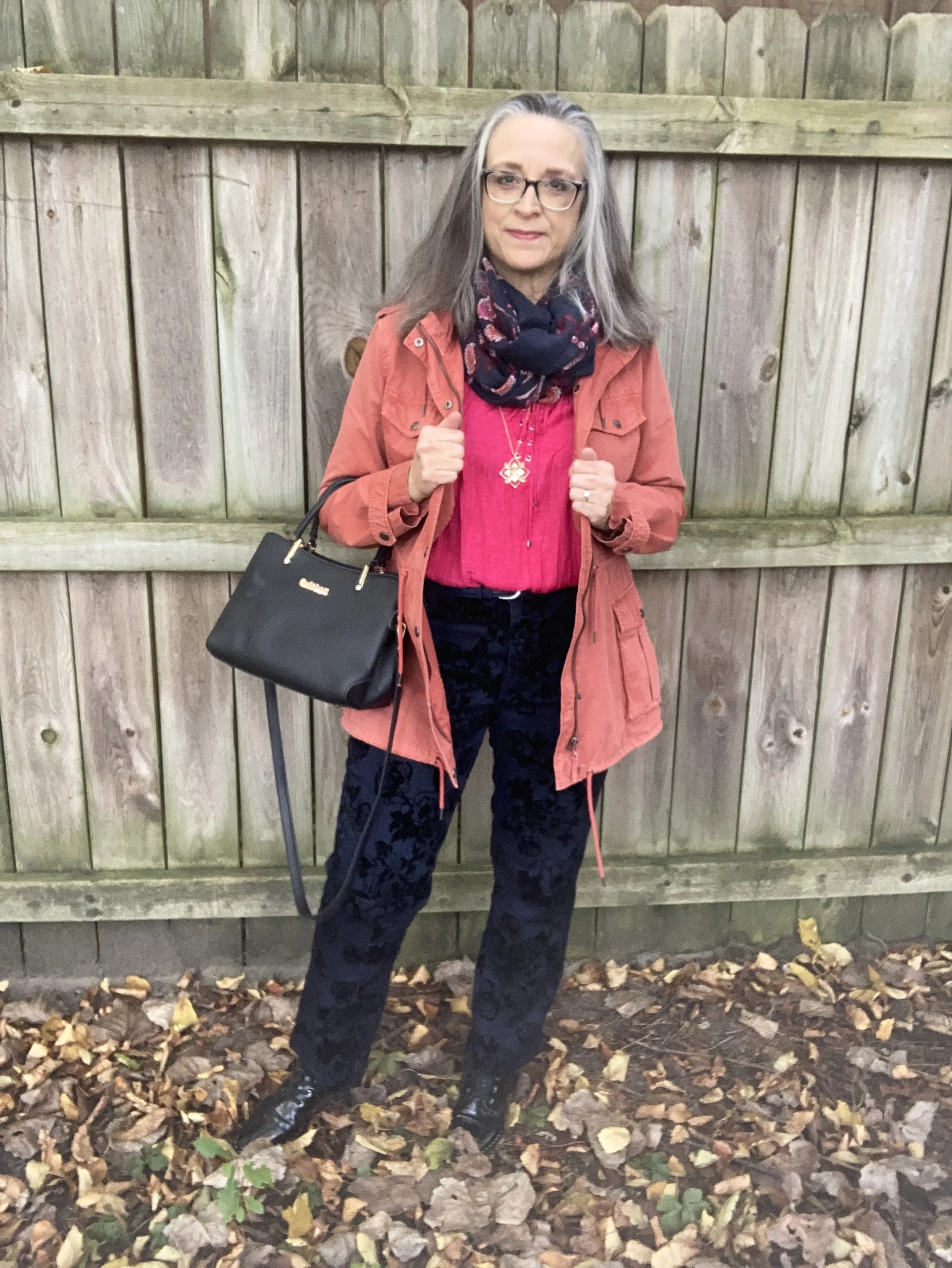
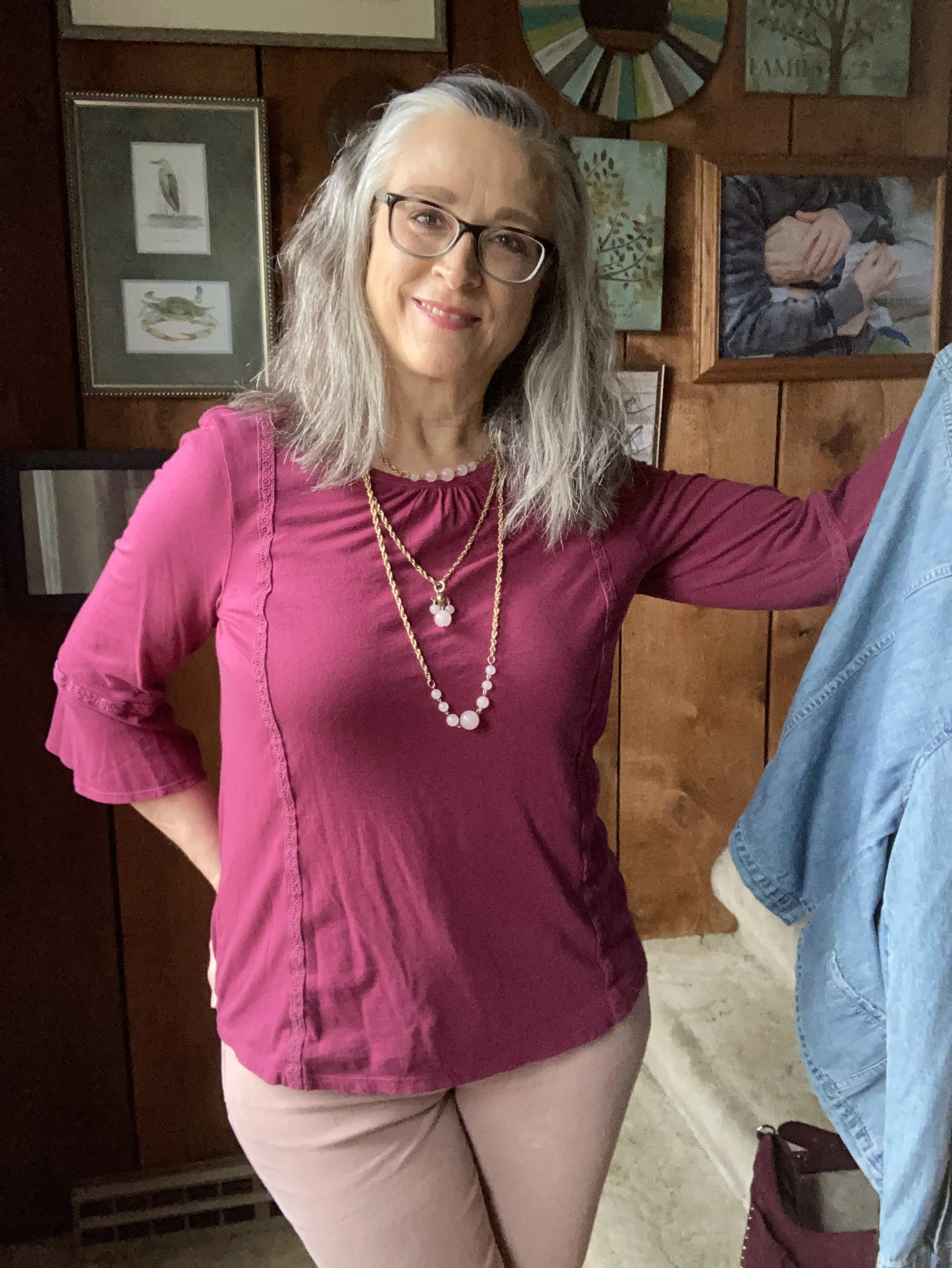
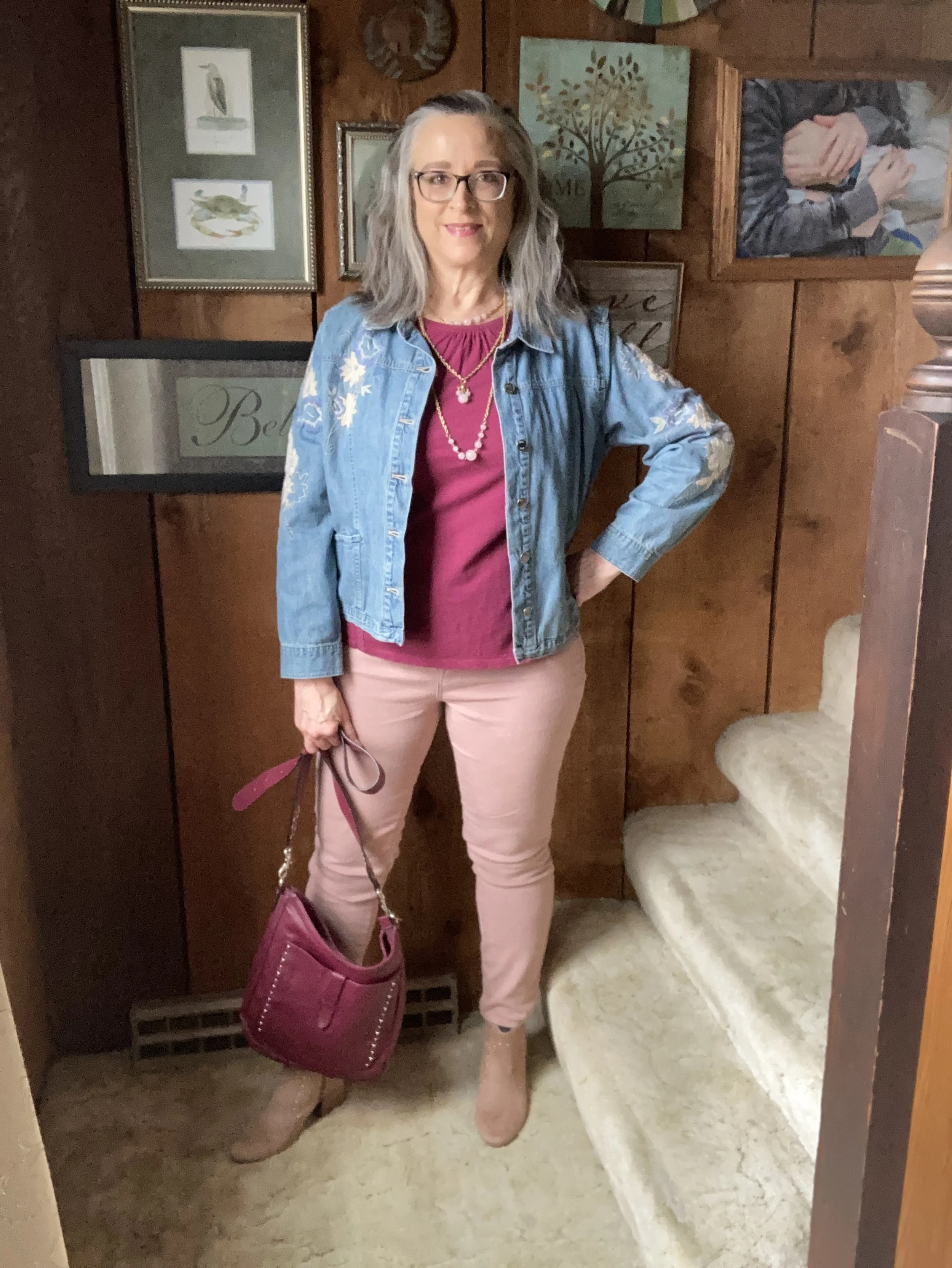
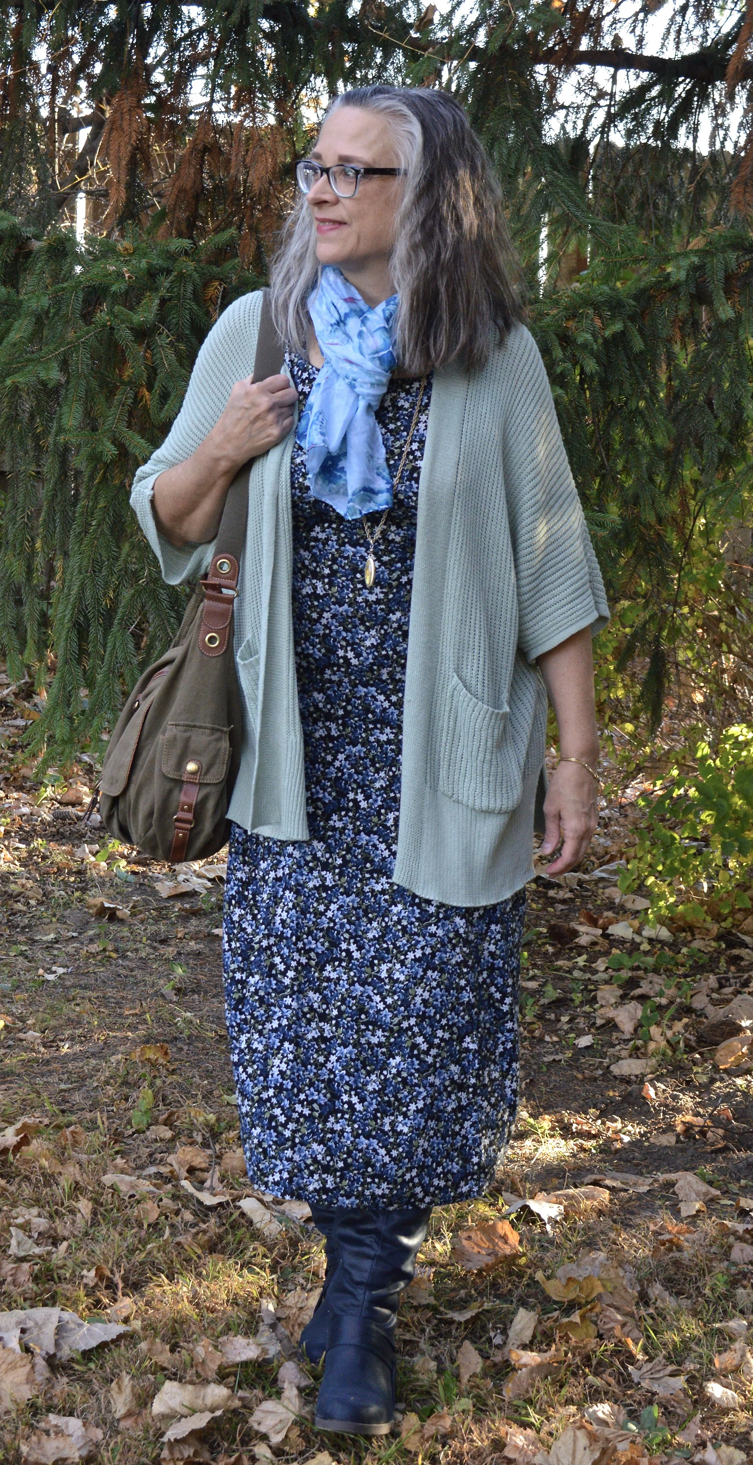
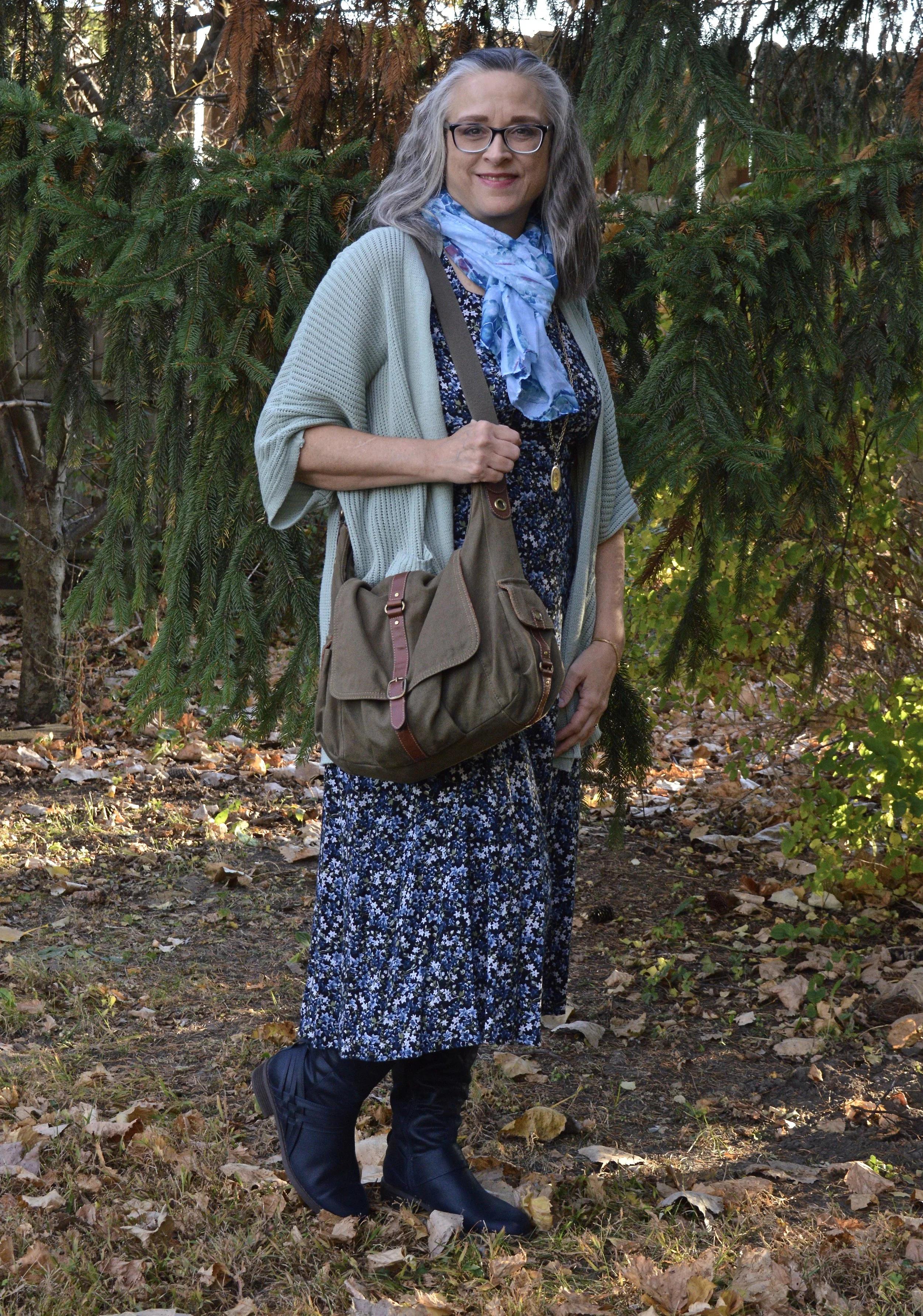
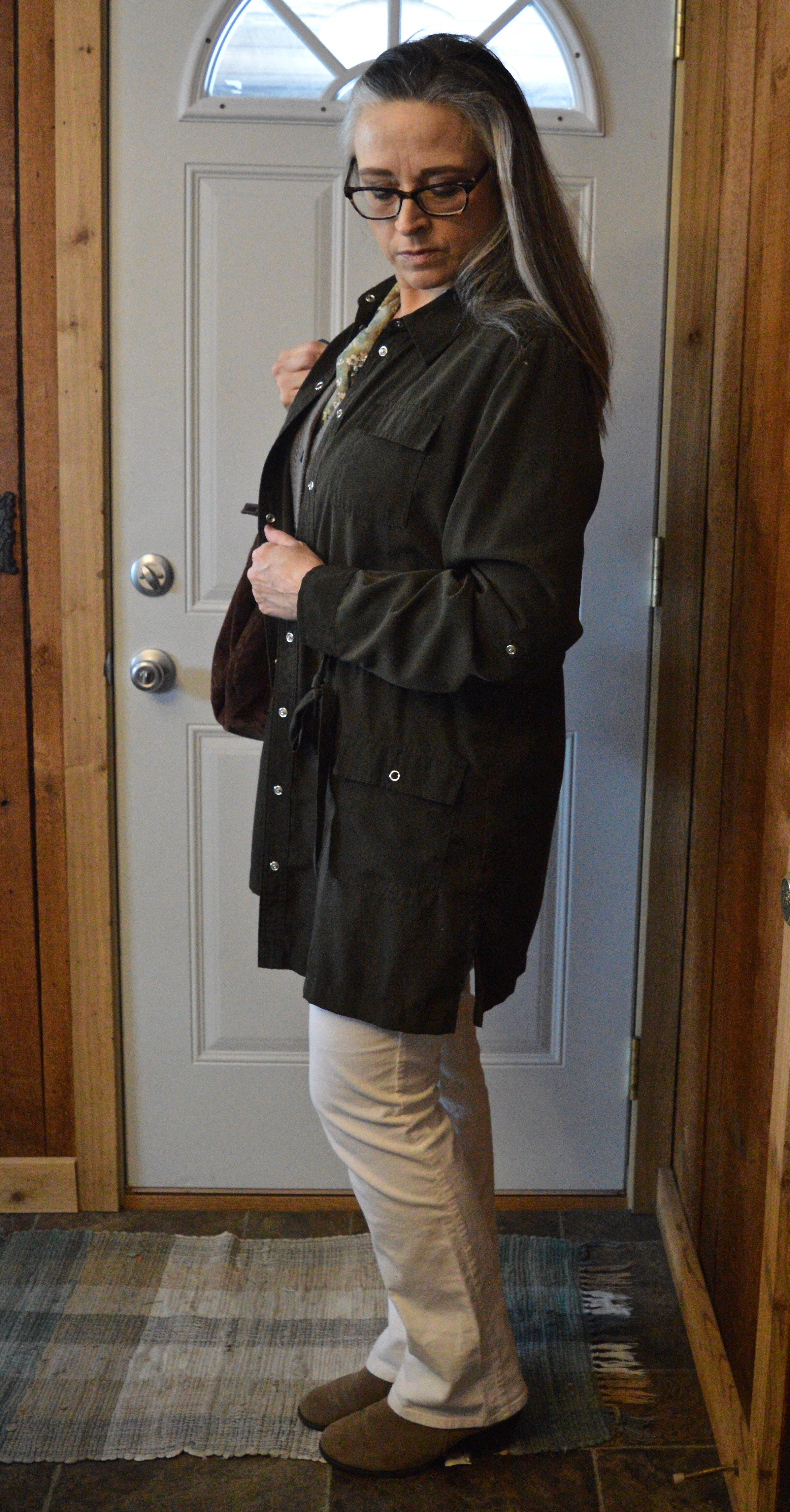
Getting back to my Pantone color series we are looking at another combination of colors from the Autumn/Winter New York Palette. This trio is perfect for fall and I thought the classy, casual vibe of this outfit would be great for your Thanksgiving Day festivities.

I really like how this outfit turned out. Let’s look at each piece.

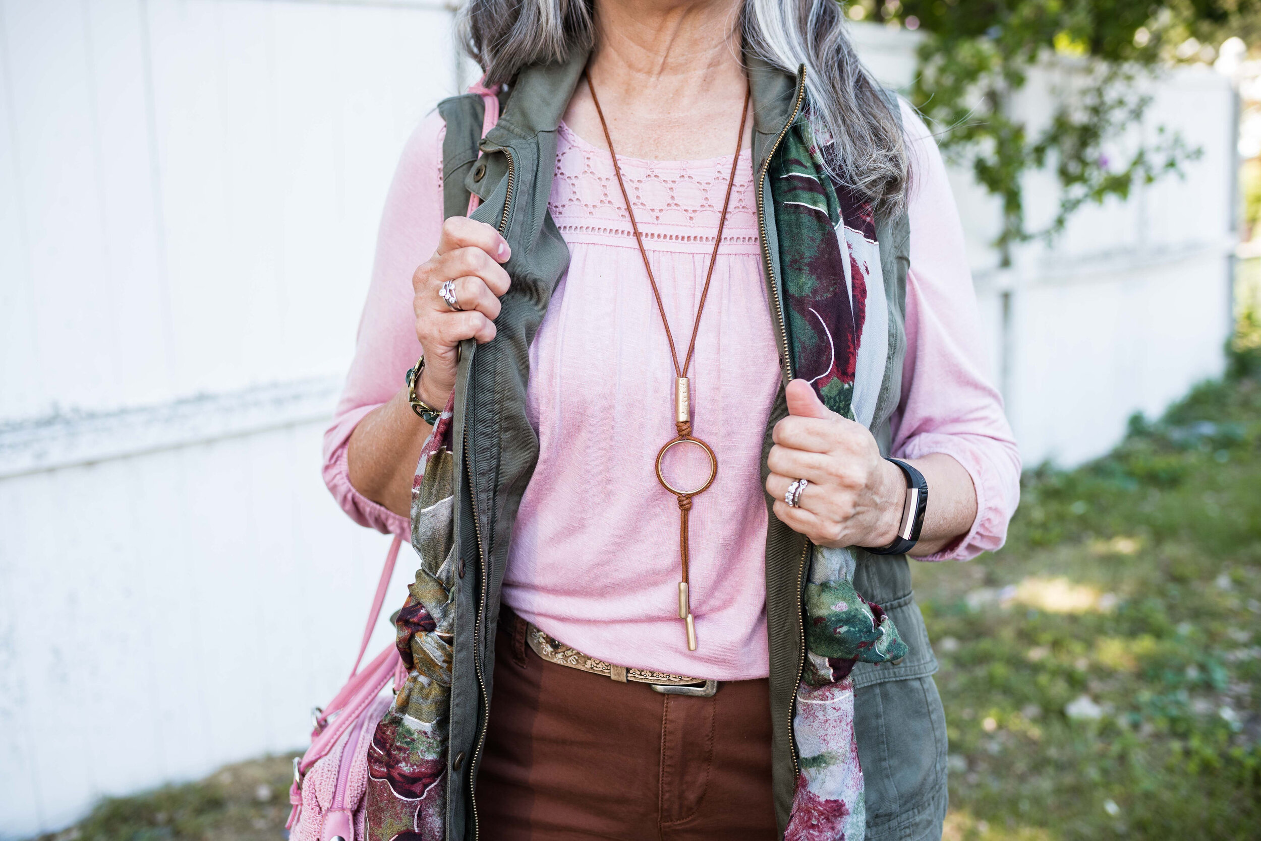
This Viva Magenta top was actually a piece I gifted to my daughter, but it ended up on her get rid of pile, so of course I snatched it back. Ha, ha. I have so few really classy, dress tops and I just love the bishop sleeves on this piece.

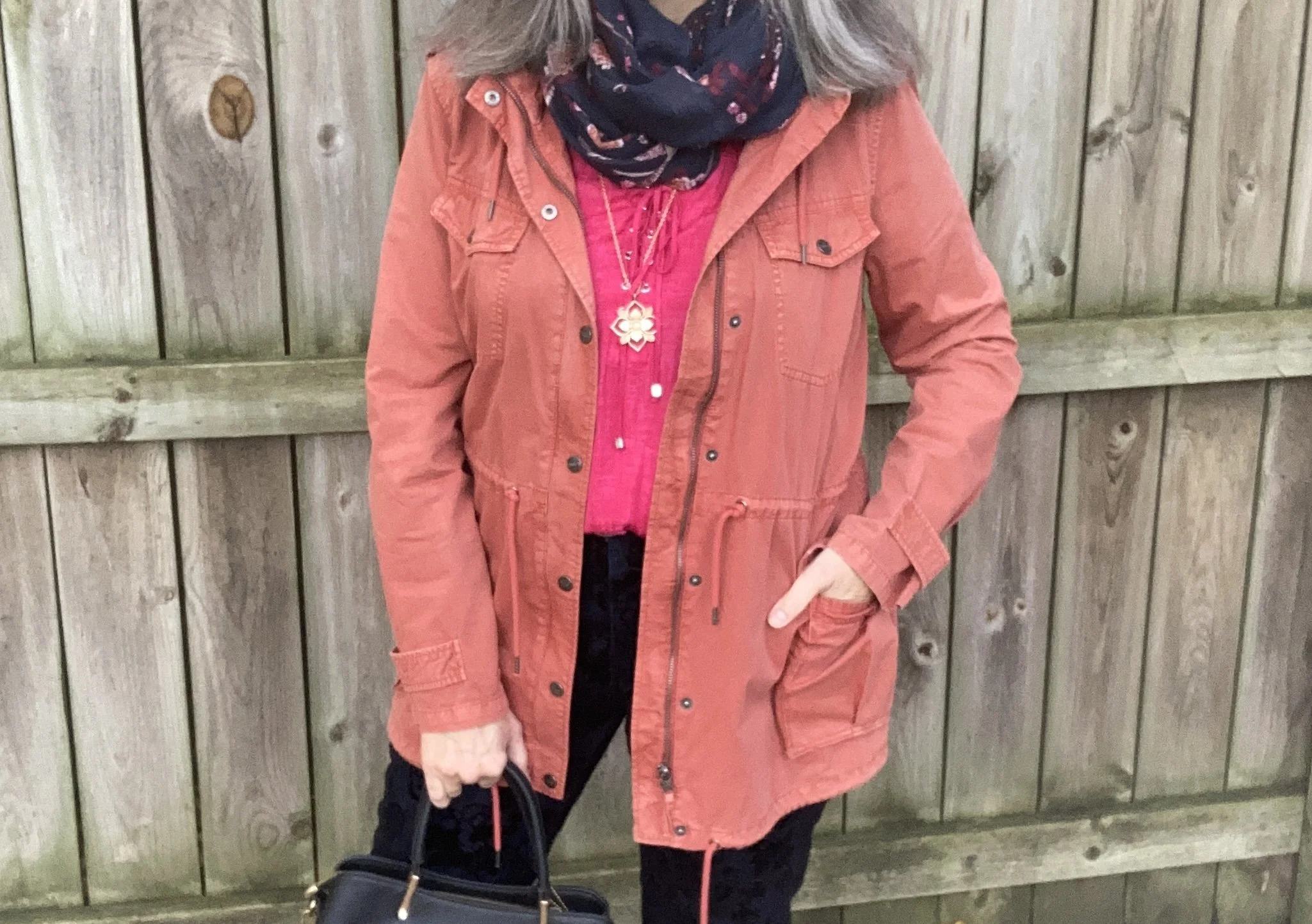
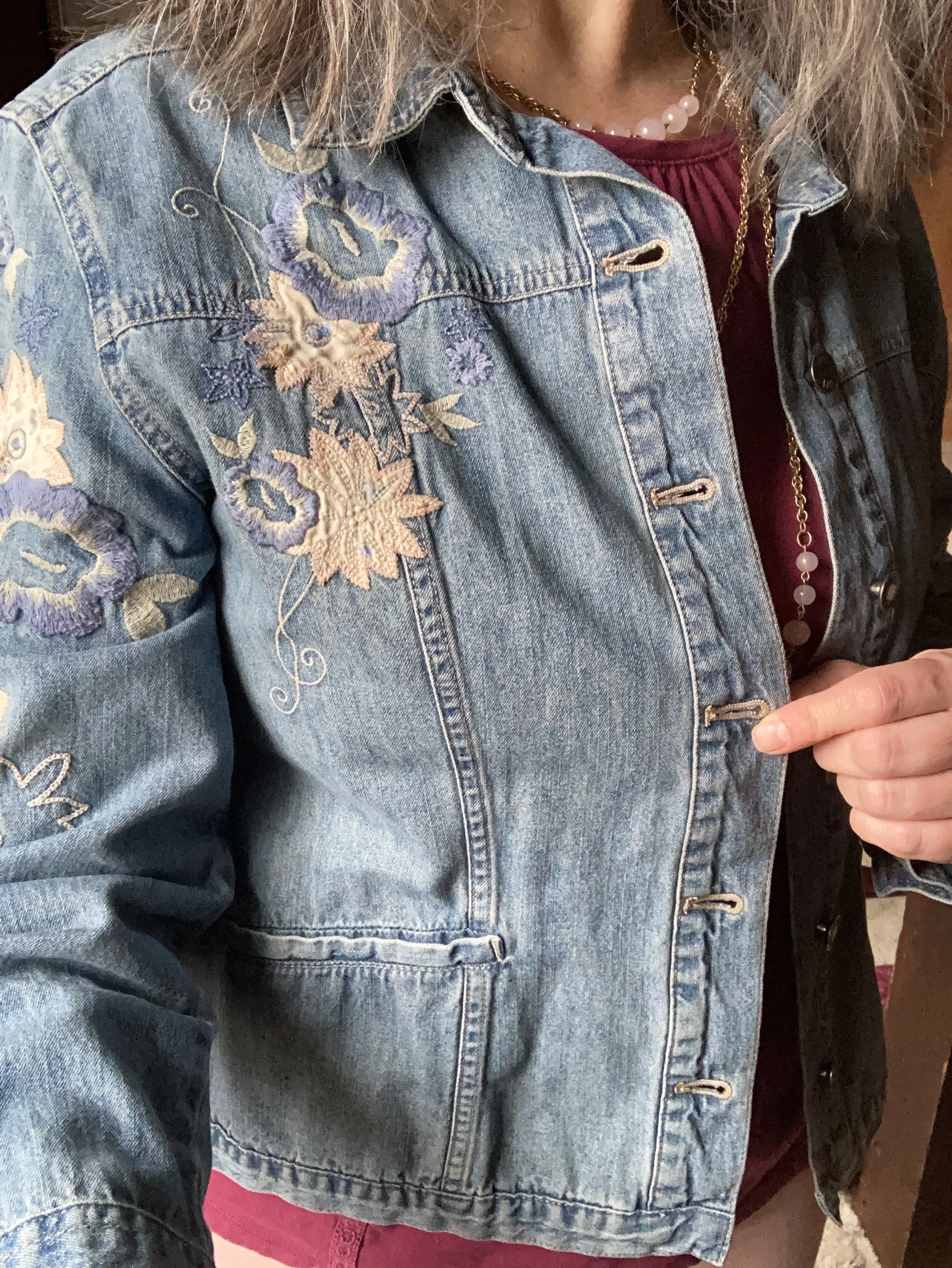
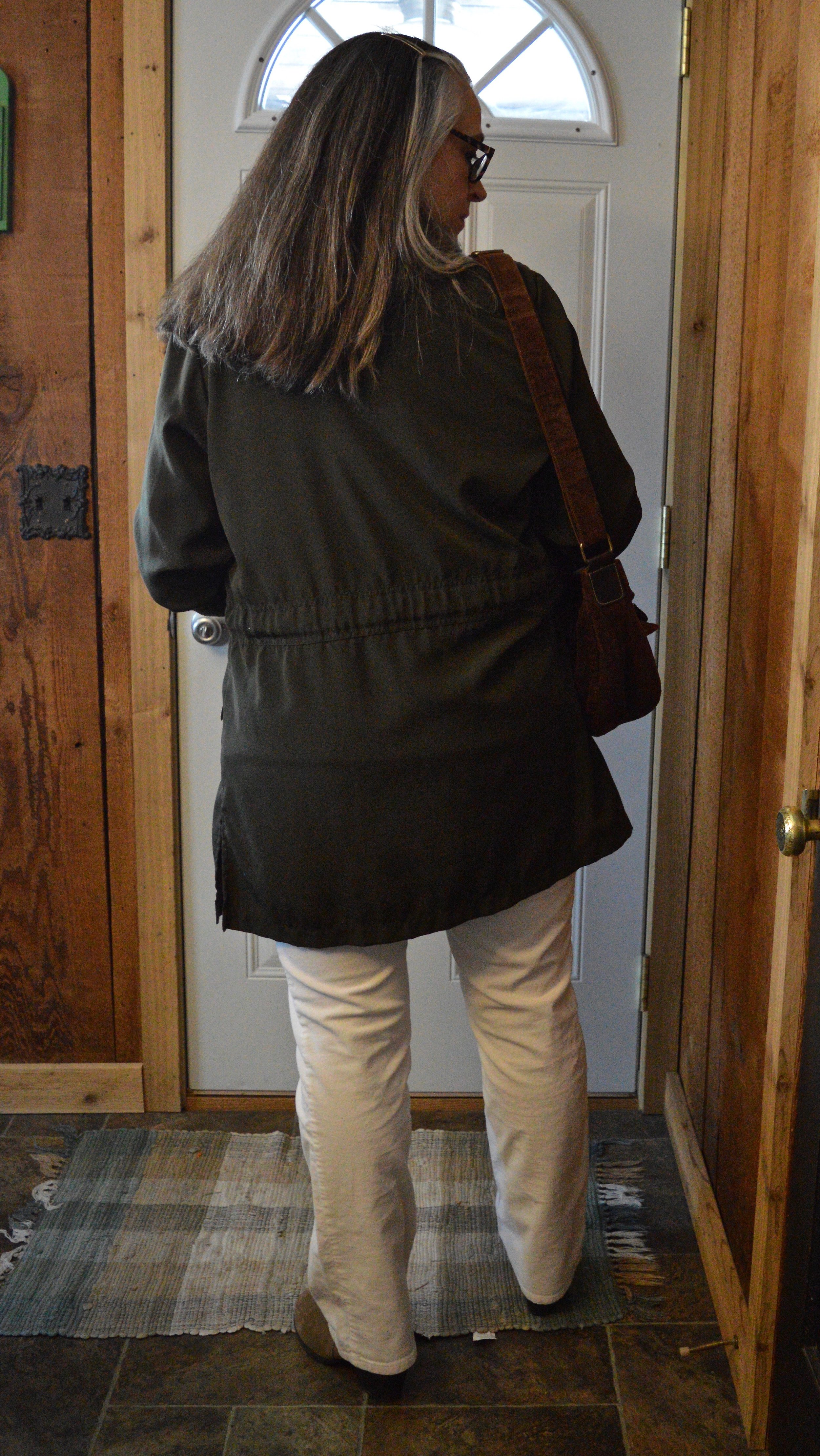
This Red Orange utility jacket was one of the first few utility pieces that I bought, so I have had it for six years. I purchased this at Nordstrom Rack because I fell in love with the color. You can see another Pantone post I did using this piece here.

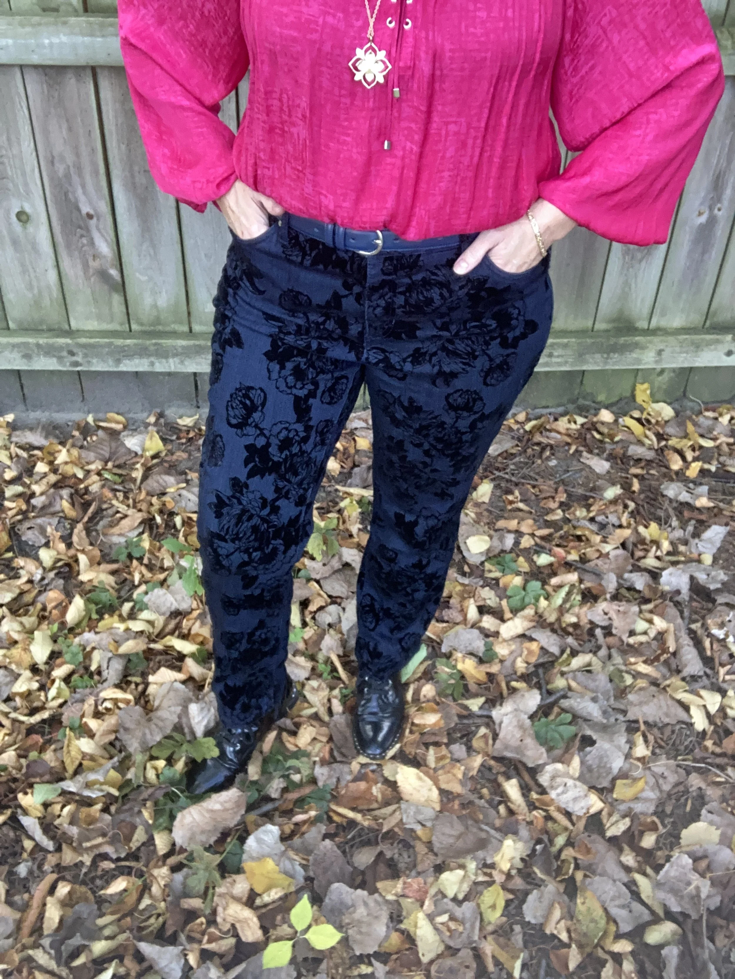
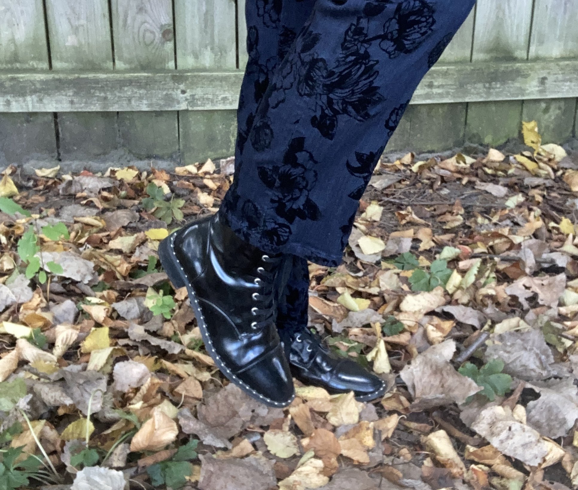
Another thrift find, these Eclipse pants are so fun with their embellished velvet flowers. I have a feeling I will be pulling these out multiple times for the holidays. Not only are they unique, but they are comfy.

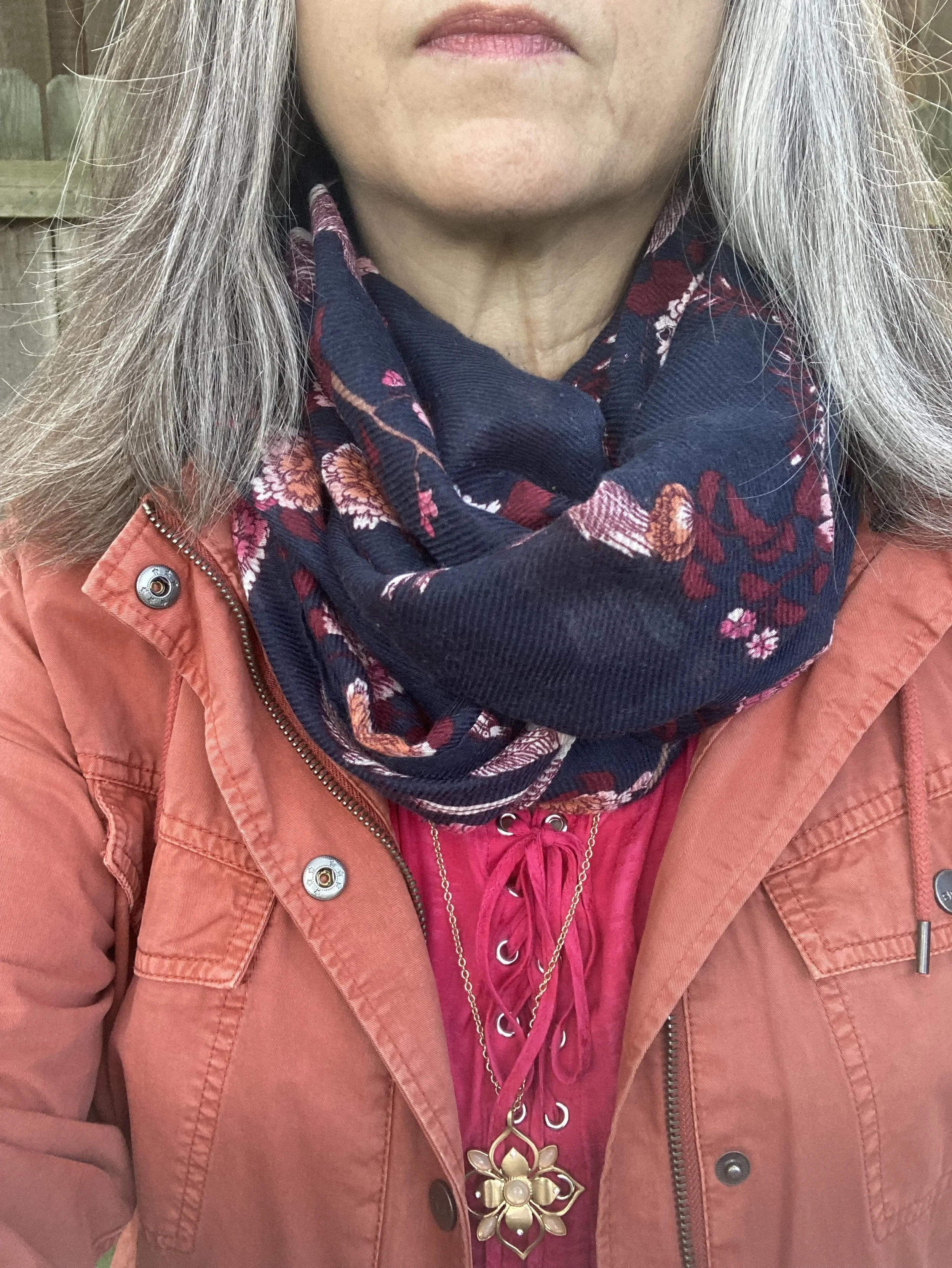
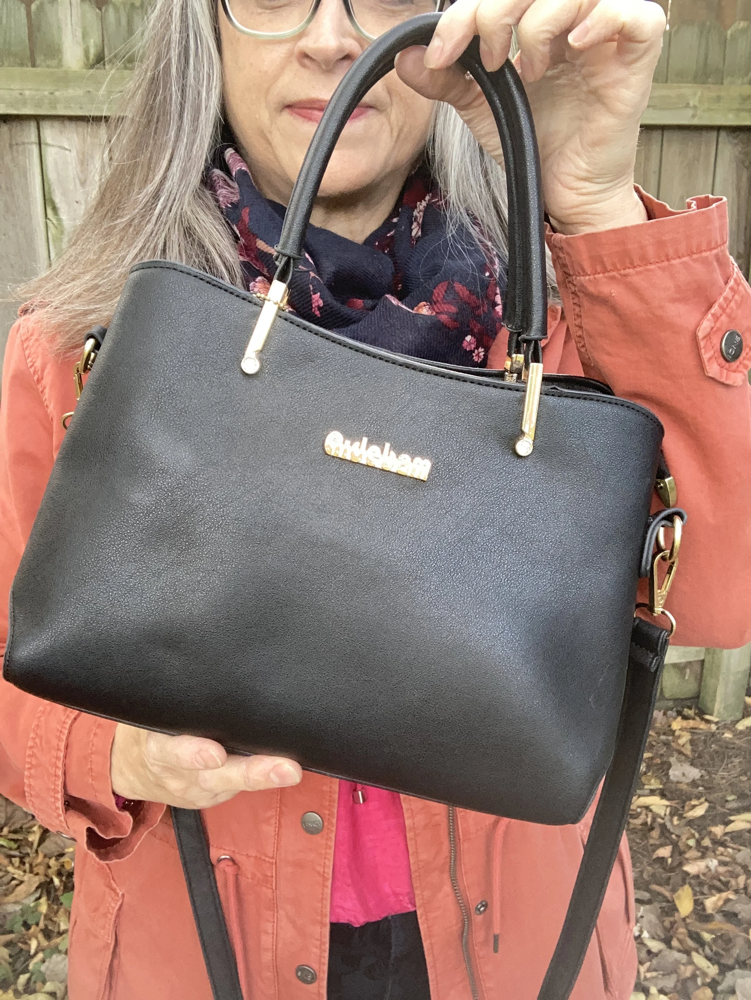
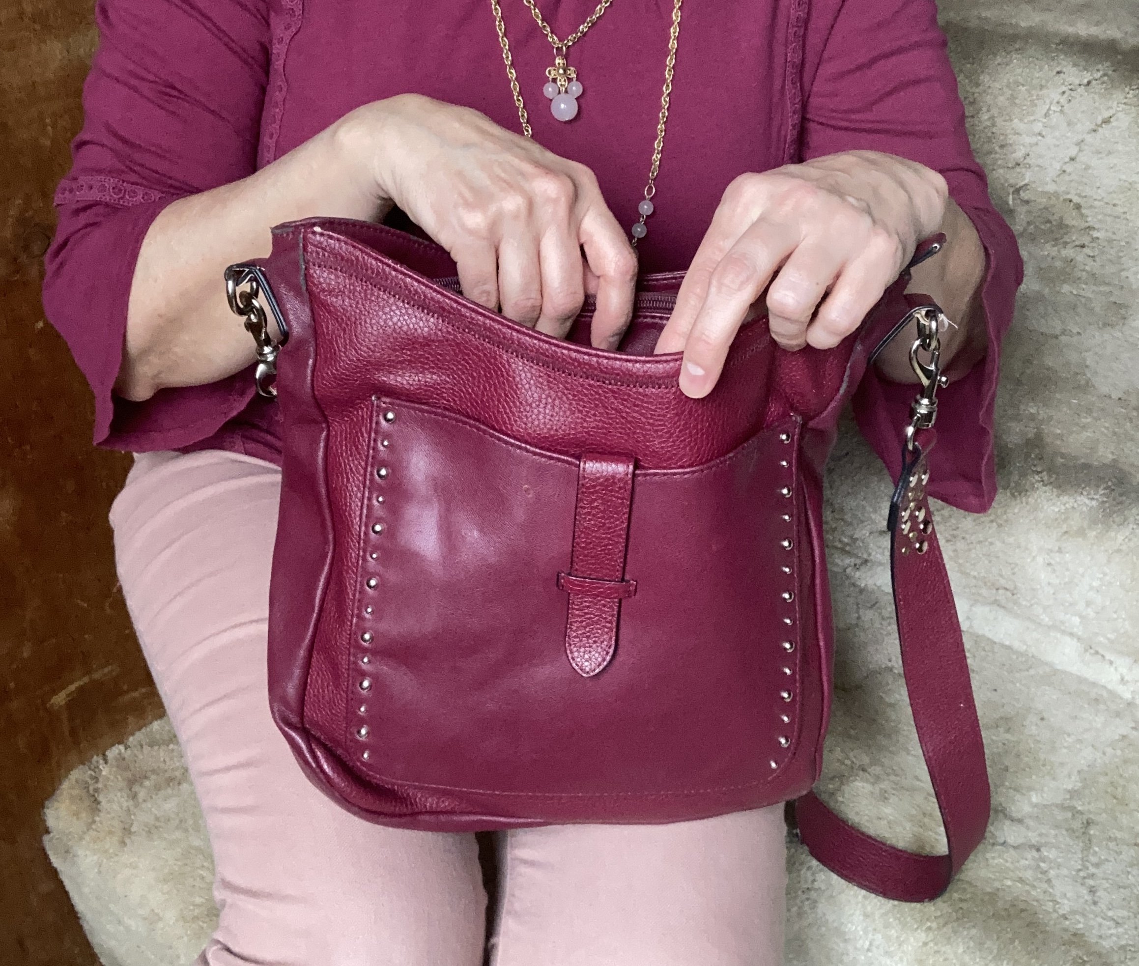
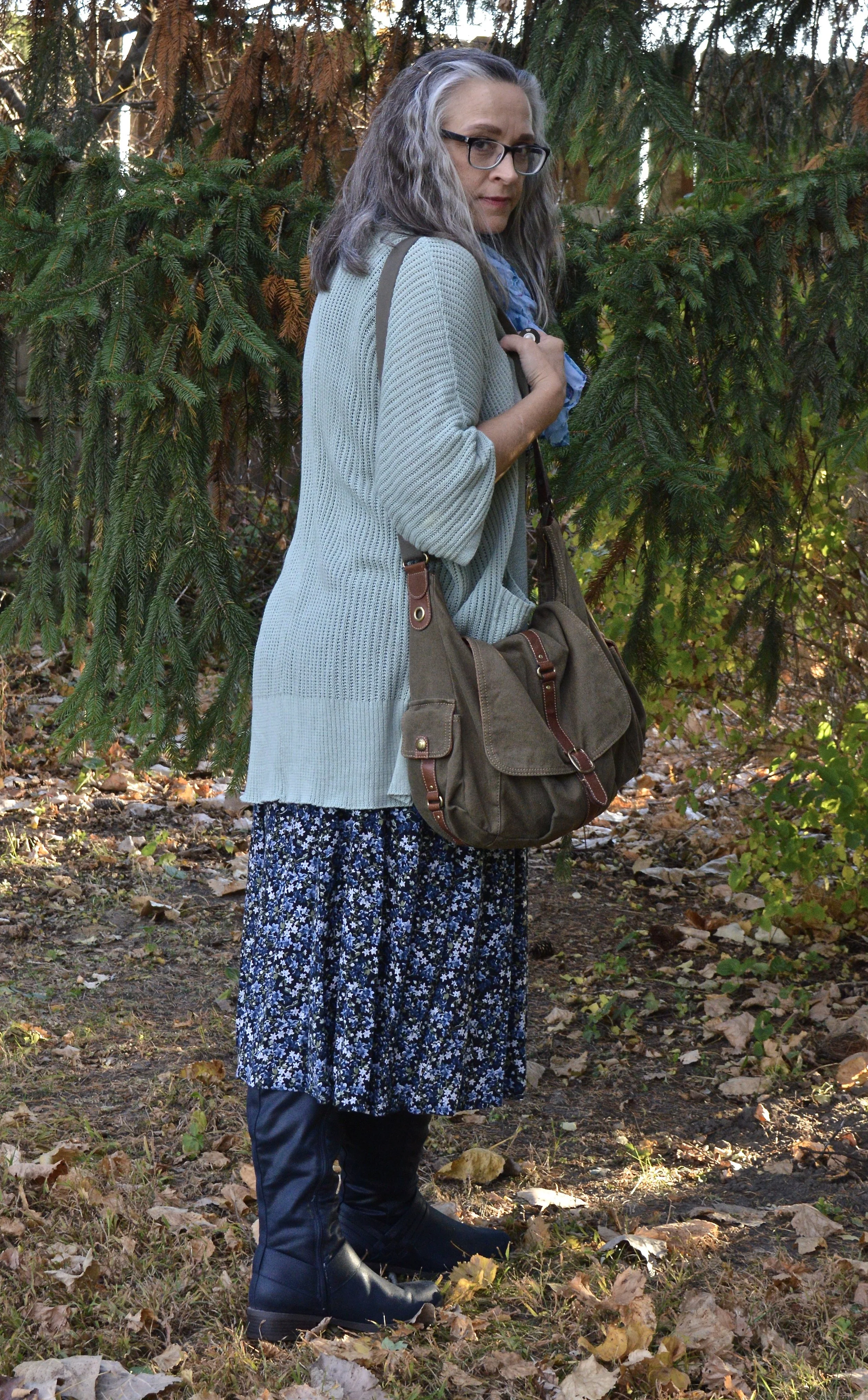
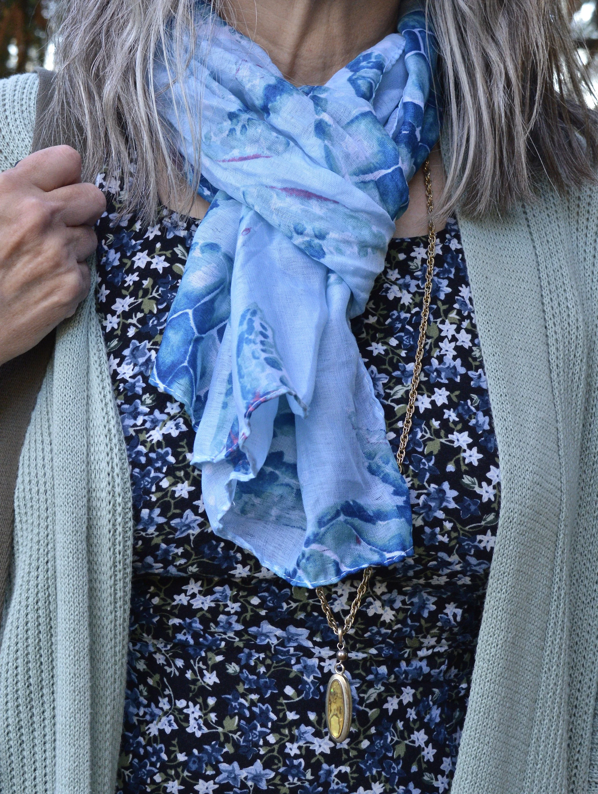
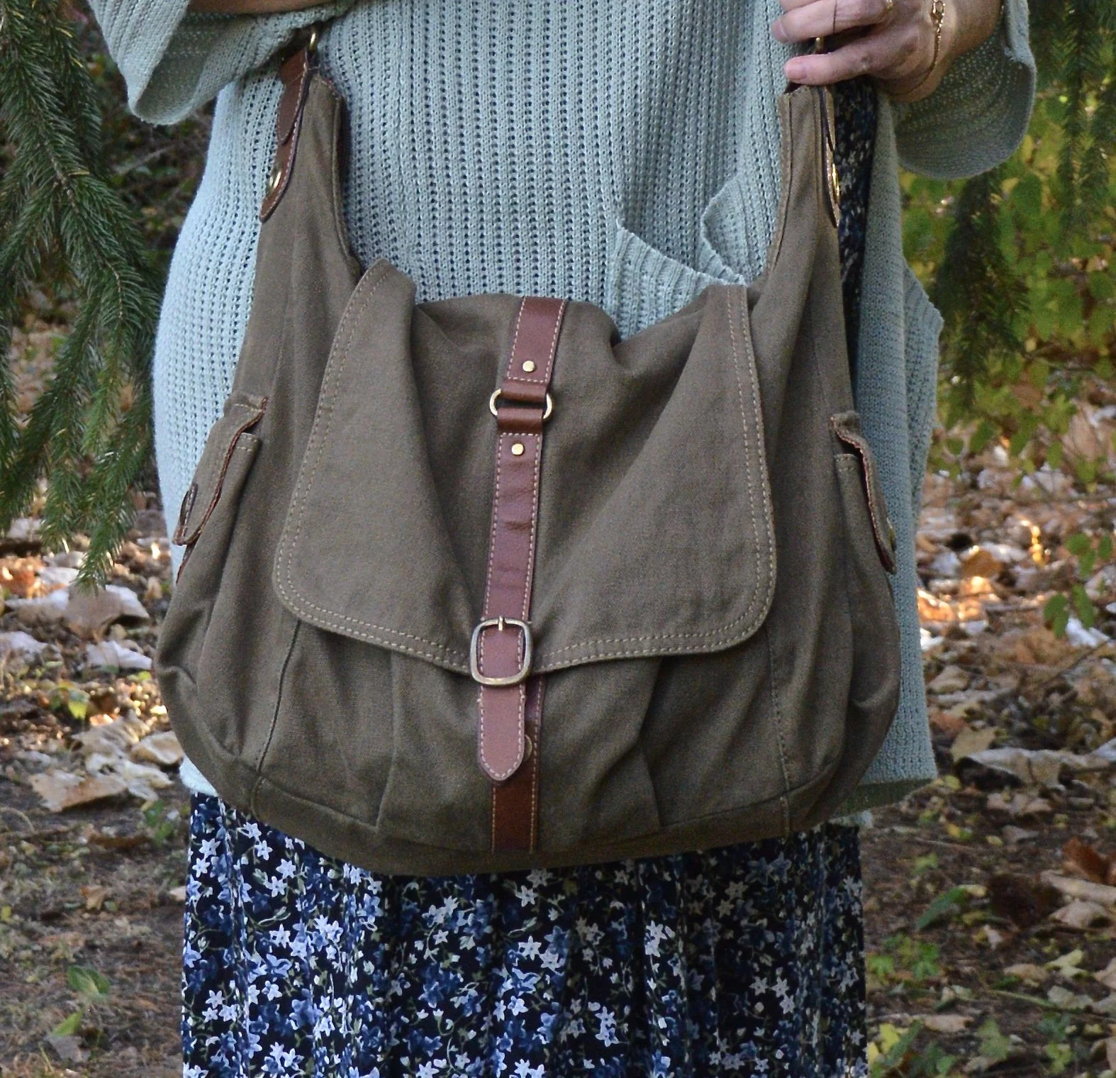
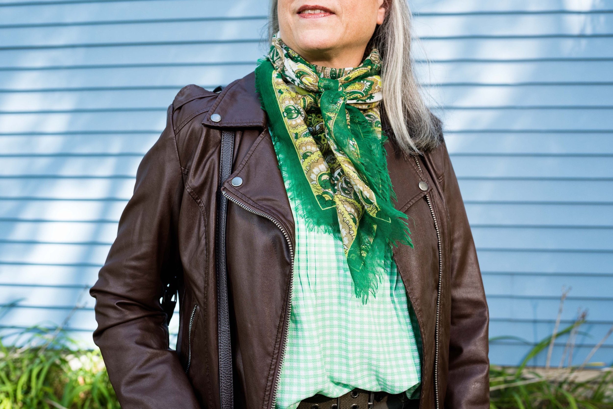
The accessories really pulled this whole look together. The scarf actually had all of the colors in it. My bag, and patent leather ankle boots added a classy element to the outfit, and the pendant necklace was a nice finishing touch.

What did you think of this outfit? Do you like these colors? Do you have these colors in your closet? Let me know what you think in the comments.

I hope you are having a great week!

Color Play - Building an Outfit Around Jewelry

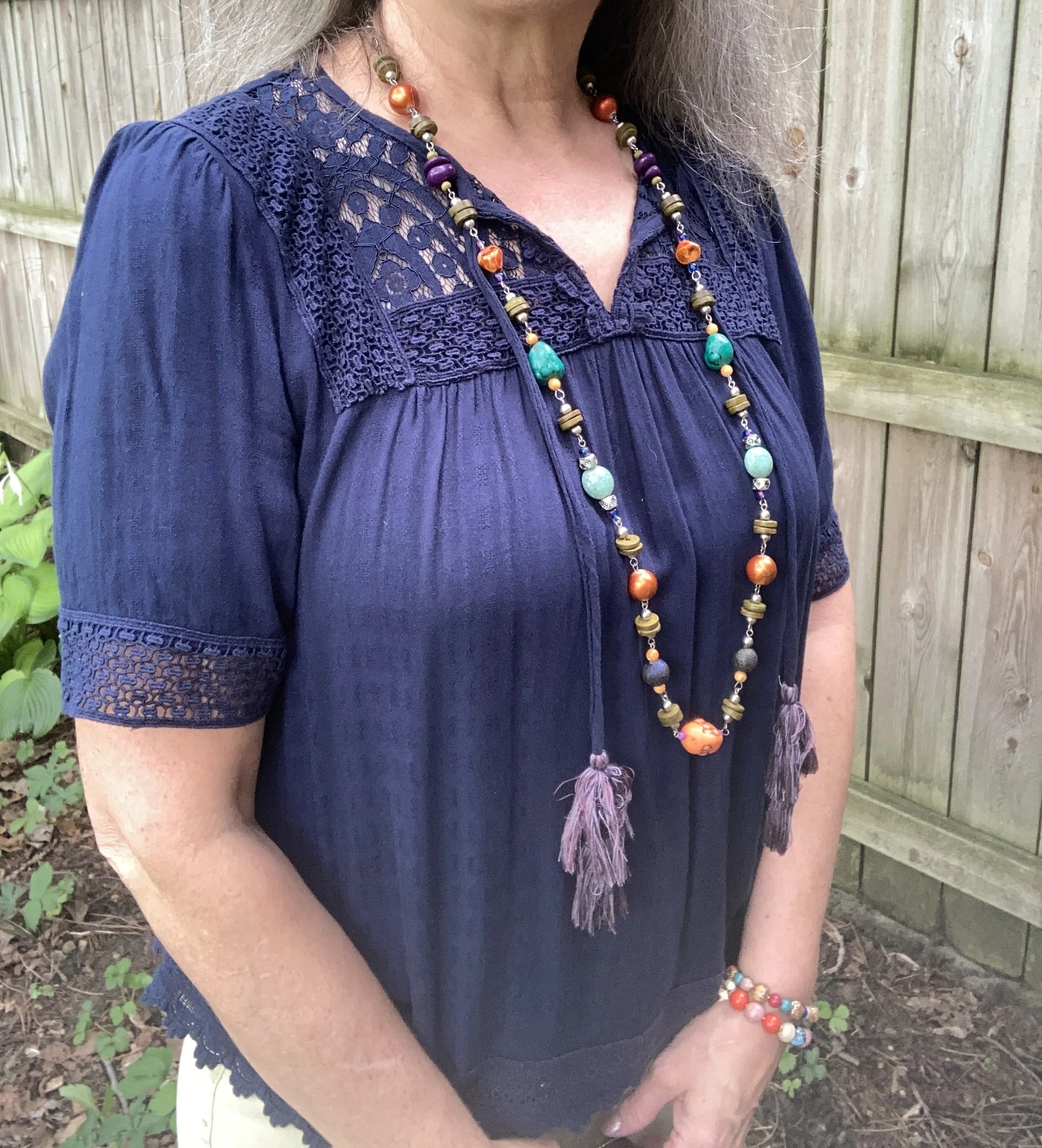
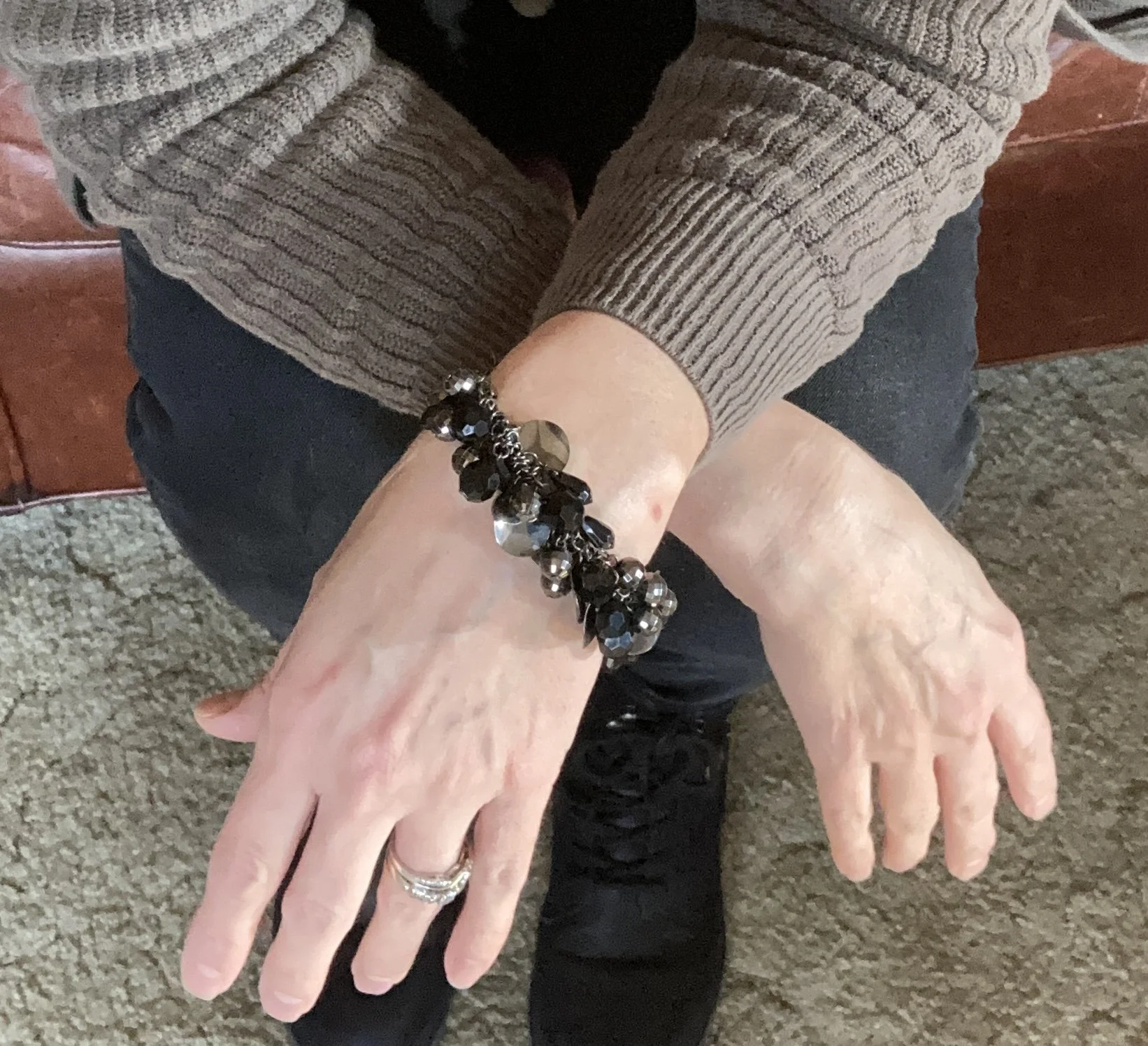
Since my Color Play column can encompass all aspects of color, I thought it would be fun to show you how I build an outfit around a colorful piece of jewelry. Let’s face it, not all of us are into fine jewelry. Yes, I do have a few silver and gold items that my spouse gave me over the years, but those are mainly rings and a few chain necklaces. Most of my jewelry is costume jewelry that I have either found on clearance at regular retail stores like Kohl’s, JC Penney, or Maurice’s, or it is from a thrift store. The piece I will be using today was actually gifted to me by a friend.

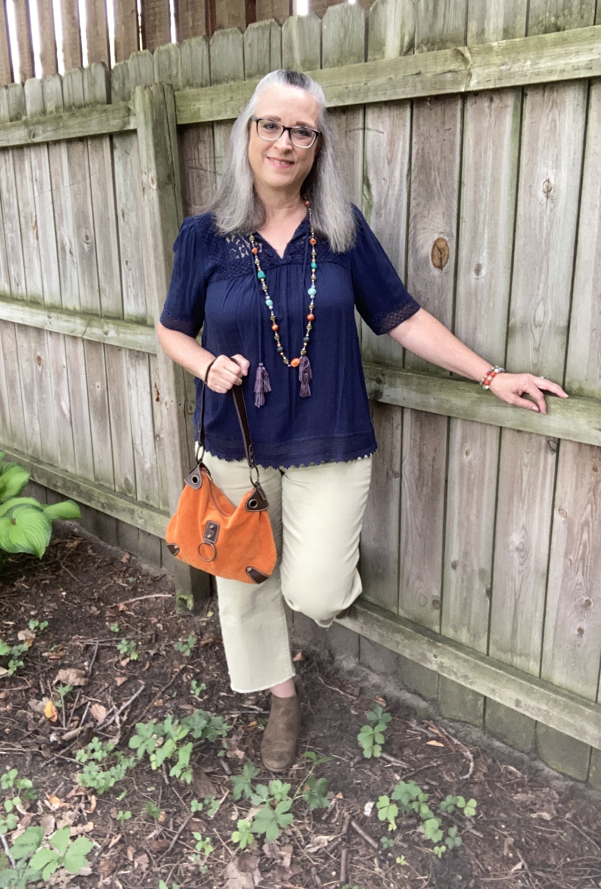
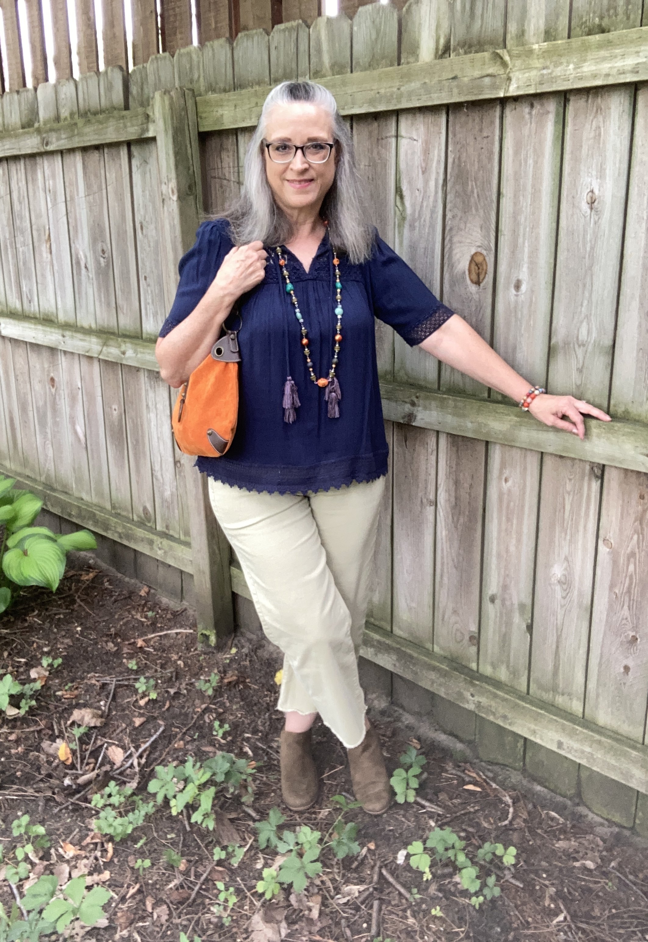
I love all the colors in this piece, but it does make it more difficult to combine with printed pieces, of which I have many. However, that makes it more challenging, which I love. Today, I decided to go for more of a color block style, and used solid colors for each of the pieces in my outfit. Take a look.

I am grooving on my wide leg cropped pants right now, so if they are not your cup of tea, then just swap them out for your own version of pants. You could also just as easily choose a skirt. Remember my job is to inspire you to look at your own clothes in a new and innovative way, to make them work for you and your style preferences.

Today’s style tips are going to cater to styling an outfit around a piece of jewelry.

Style Tip 1 - Choose a piece of jewelry that makes a statement, then figure out how to monopolize on that statement effect.

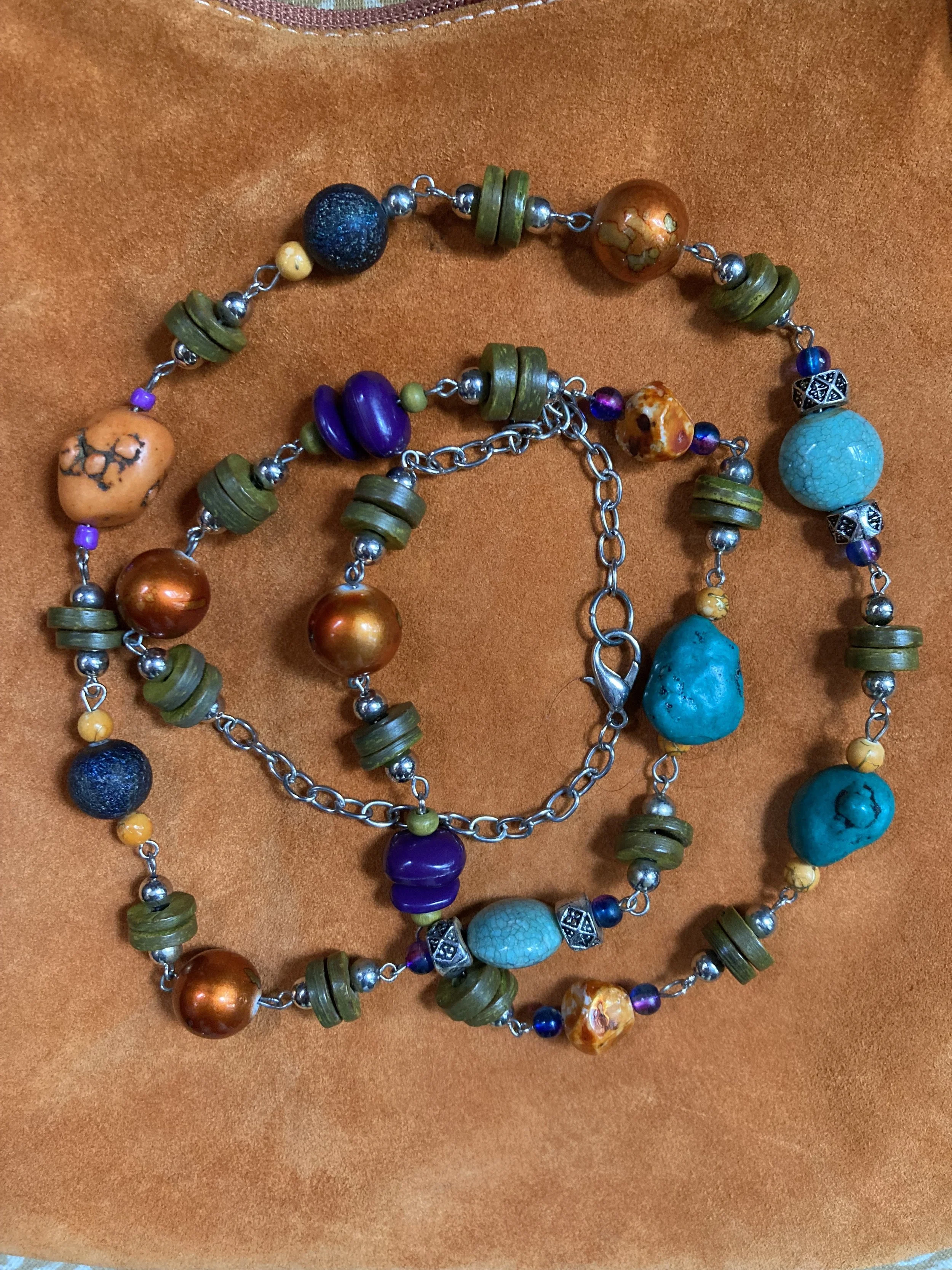
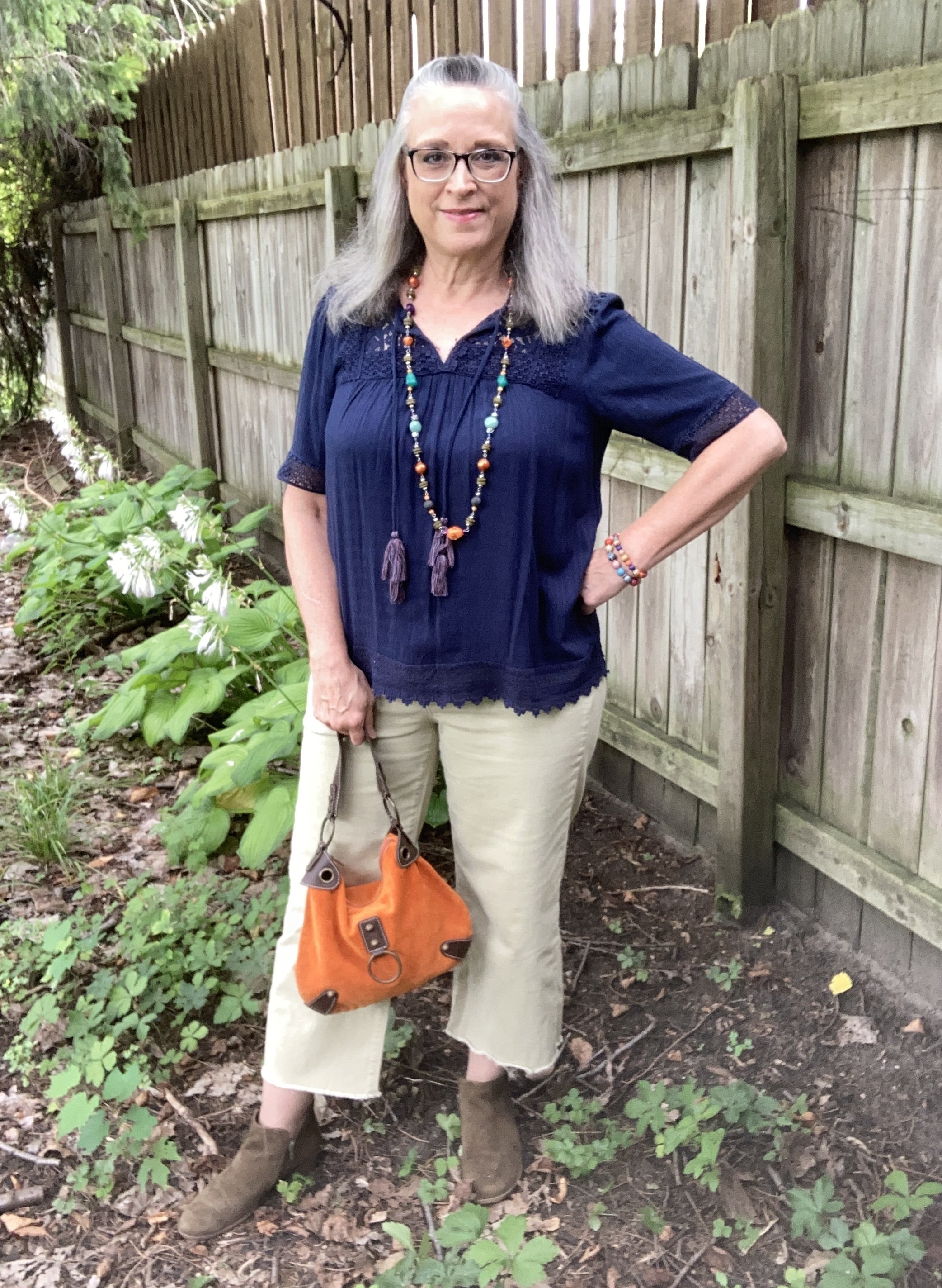
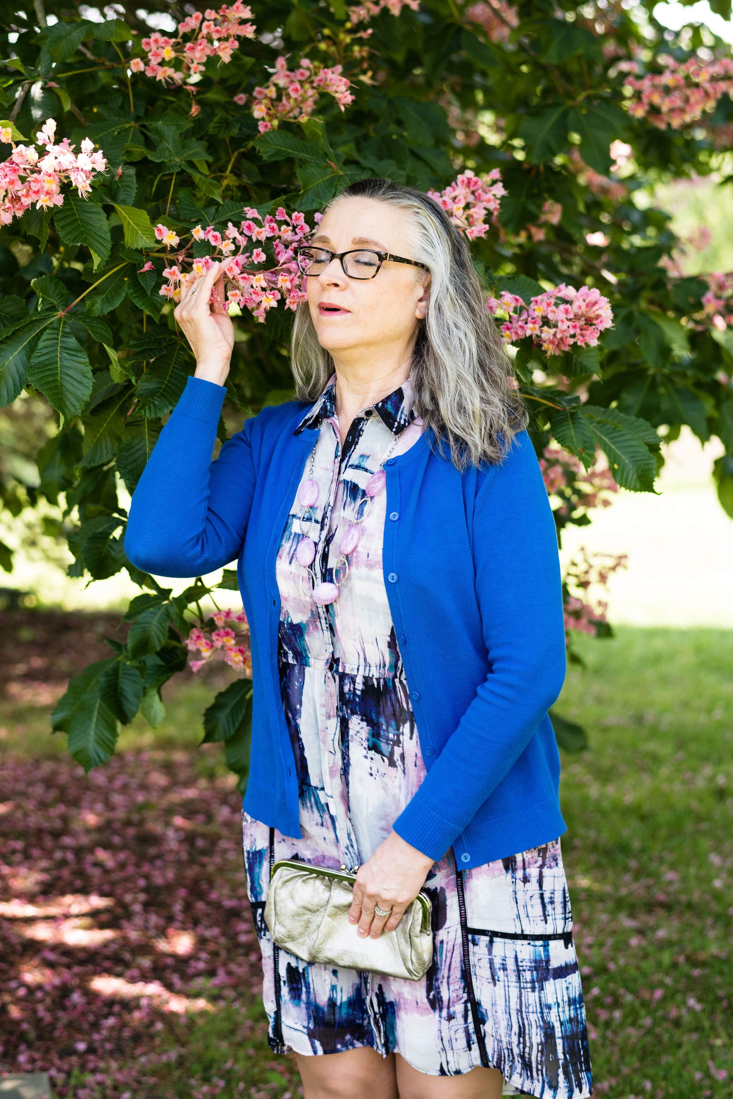
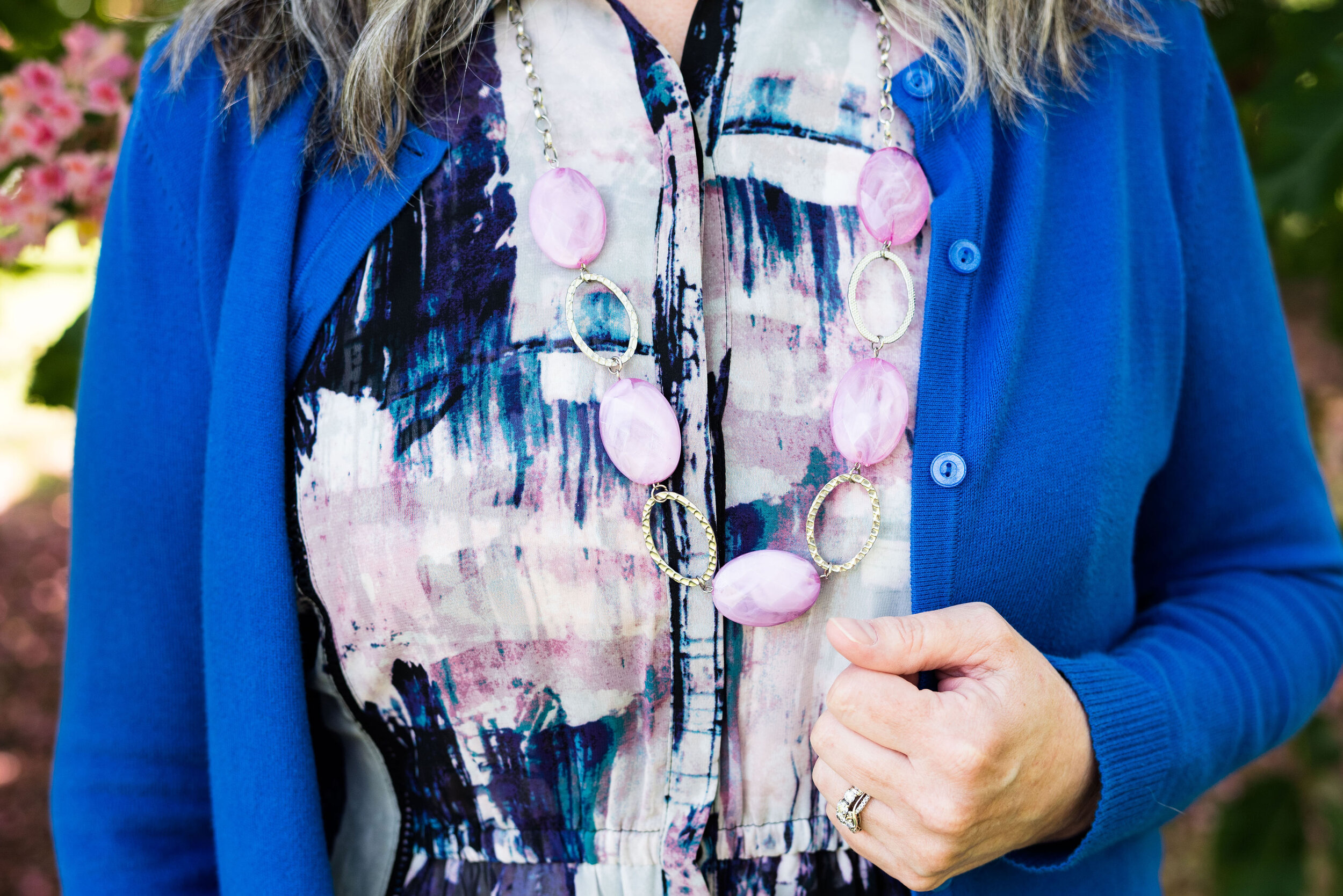
As you can see in the first picture my necklace contains so many colors: orange, dark blue, turquoise, or aqua, purple, olive, light green, orange and a light yellowy orange. If I wore this piece with a printed top it might easily get lost, but pairing it with this navy popover blouse was the perfect way to make the colors of the necklace pop. You could have used any of the colors in the necklace, but I love the way it looks against the navy.

I have two of these Knox Rose tops. The other is a pale purple color. I love the lace, the longer length short sleeves and the flowy silhouette. The trim on the bottom is pretty as well. I honestly can’t remember if I found these on the clearance rack at Target, or at a Goodwill store where I often find like new Knox Rose items.

Style Tip 2 - Choose pieces that go with the colors in the jewelry or at least compliment it.

The navy top almost matched exactly the navy beads on the necklace. However, I chose to wear a pair of pants that was less matchy and more complimentary. The light green borders on olive, but not exactly. It’s almost a very pale chartreuse. I know in the picture they look more gray or beige than green, but believe me they have a green cast to them.

These raw hem jeans are Sonoma brand and they were a clearance find at Kohl’s a summer season ago.

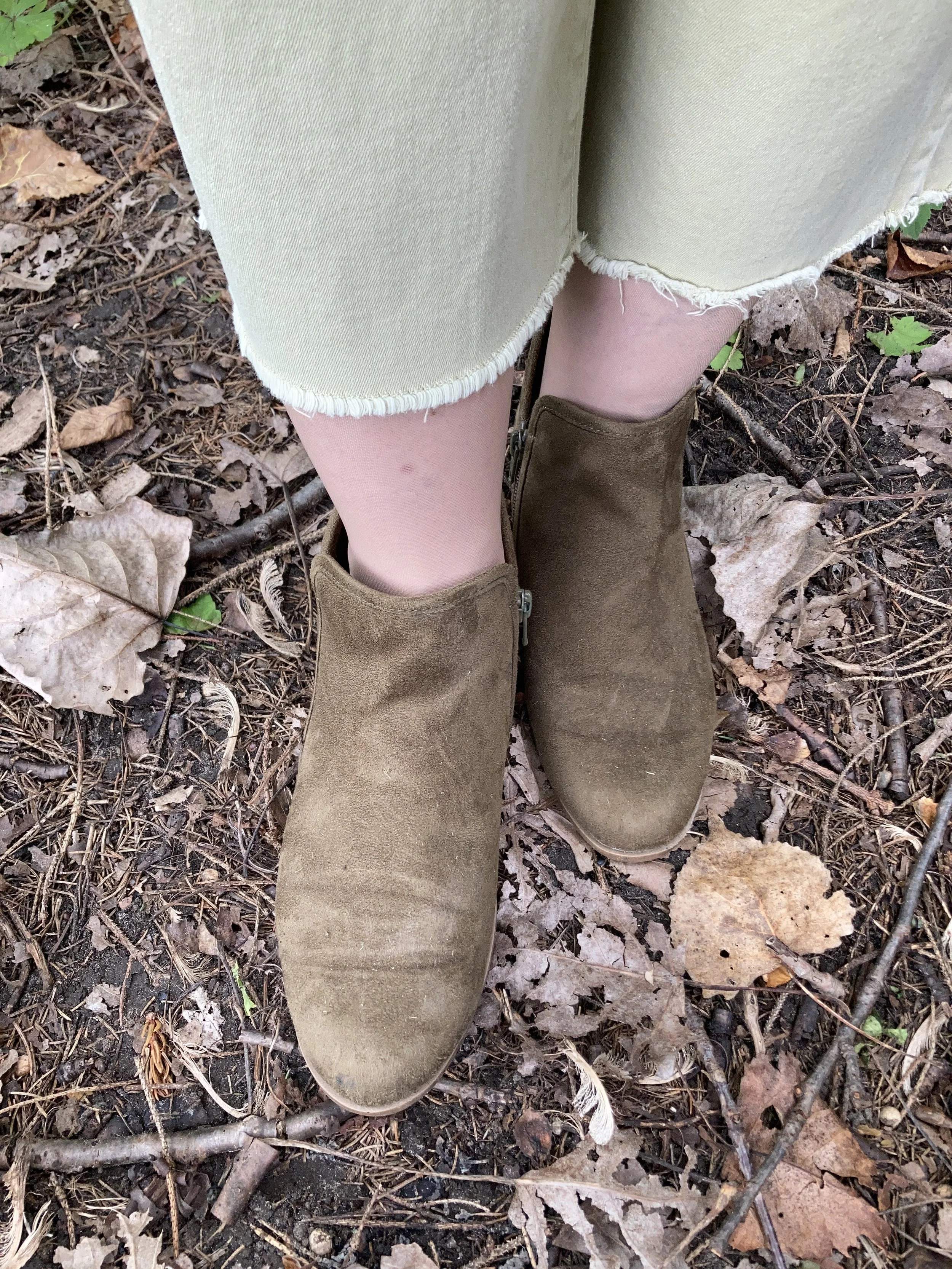
After choosing my main two pieces I decided on shoes and a bag. I also added a few other bright beaded bracelets for fun. My SO ankle boots have been around for a while. I thought it appropriate to start throwing in a few fall like pieces since we all know it is coming at some point. My thrifted orange suede bag is not one I use very often, but I simply love the bright color, and it works so well as an accent piece.

Style Tip 3 - Pull in one or two other colors from you chosen piece of jewelry (if it has more than two colors) by adding them in as accessories: shoes or boots, bags, scarves or a sweater or jacket.

I thought about adding a sweater to this, but I wanted to still look summery, and it was nearing 90F when I took these pictures. I was already beginning to sweat. Ha, ha.

What do you think of this outfit? Have you ever styled an outfit around a piece of jewelry? If so, what was it? I’d love to hear your thoughts. You feedback is always welcome, good or bad.

I’m including a few shopping links for fun necklaces. These are affiliate links. All opinions are my own. Have a great day!
Outfit Inspiration: Pantone's Color of the Year - Viva Magenta

I still want to bring you a look at the Pantone Color Institutes color selections for this year, so this month I am going to feature a few of the New York Palette Spring/Summer 2023 colors for each of my monthly columns. The Pantone website has become increasingly user unfriendly for just the average joe. If you want to buy their services and products they are great, but I can no longer get specific color info. If you look at their page for the Palettes, the colors are now featured as these tiny, almost imperceptible to the human eye, swatches. Ha, ha.

Before I start, let me reiterate, these are my interpretations of the Pantone colors. They are not exact matches, but correspond as closely as I am able to make them with my limited information from the website and my limited wardrobe.

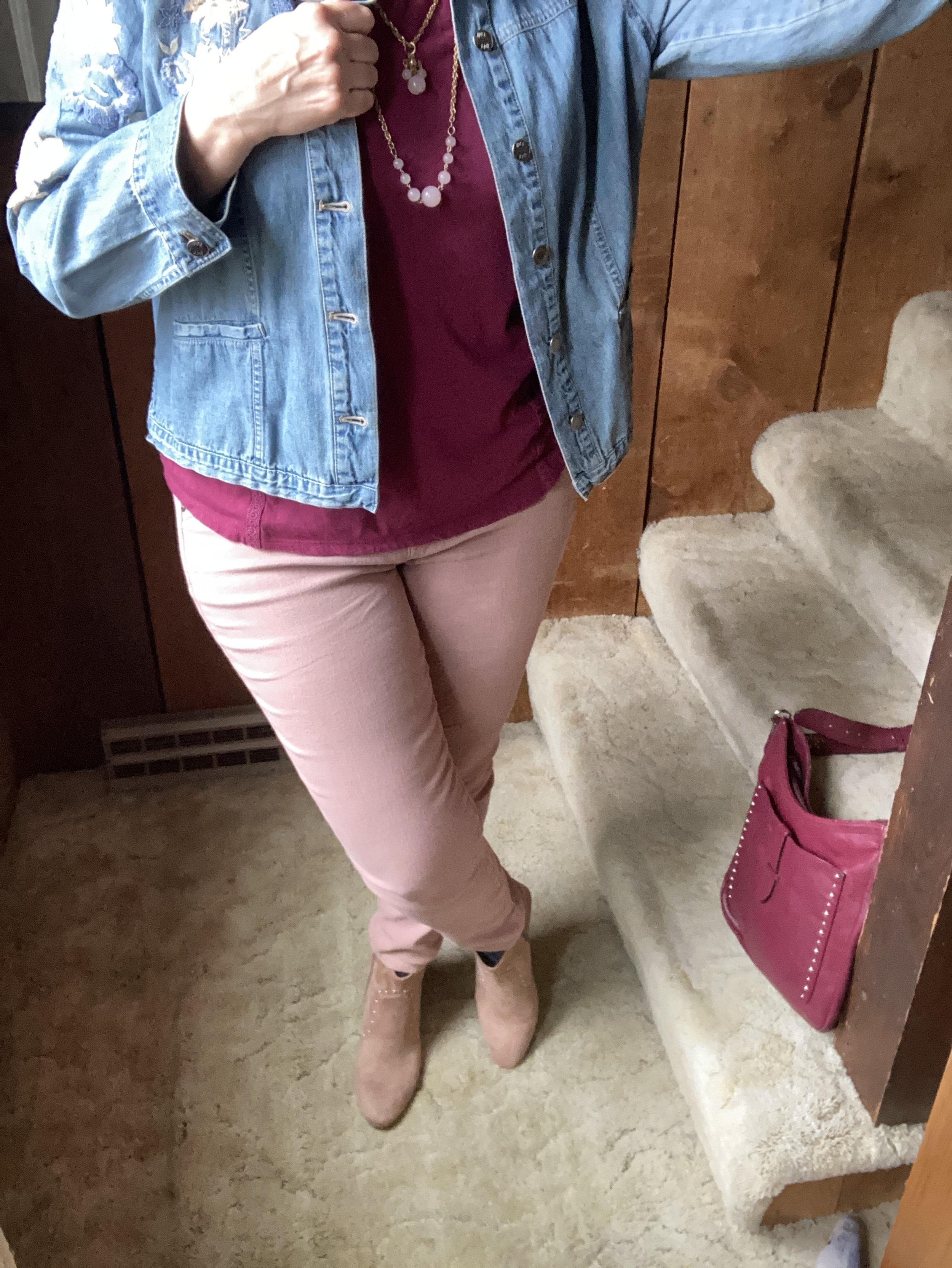
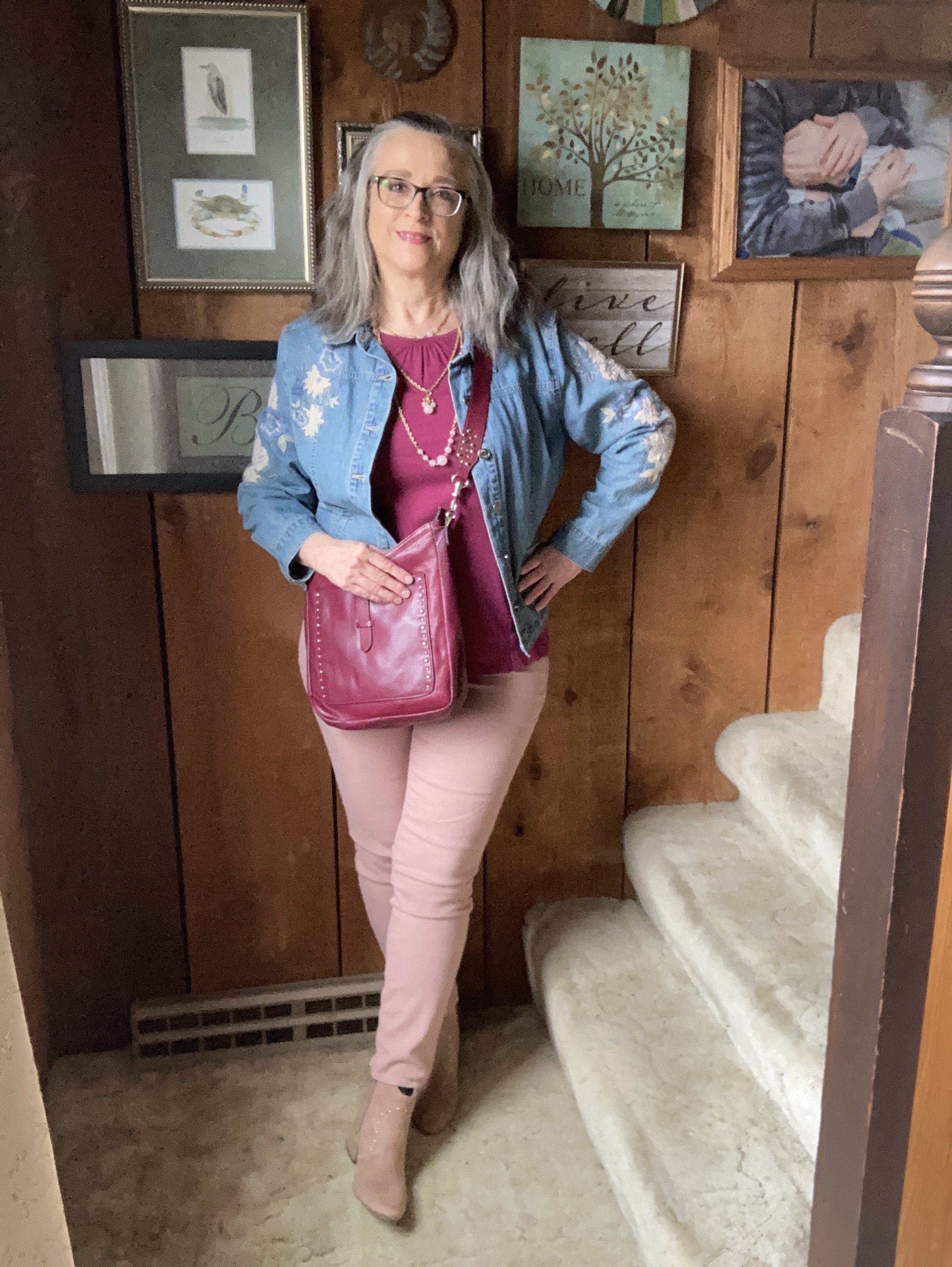
Viva Magenta is a bright, rich pinky red that easily catches the eye. It is a pretty color that can be combined with loads of other shades for a spring and summer worthy outfit palette. I don’t have a lot of pieces this color in my closet, so I was glad to see I had this Sonoma 3/4 bell sleeve top and the thrifted Libby Edelman shoulder bag.

I decided to combine the Viva Magenta with two of the other colors from the Spring New York Palette. Summer Song is a soft, light blue that reminds me of a light wash denim, which is why I chose my thrifted J. Jill - Out of the Blue embroidered, jacket as a topper. I love the embroidered details on this piece. I’ve worn this on the blog before. You can see it with a white skirt for summer, and with a pair of wide leg jeans.

Vanilla Cream is one of the classic colors on the palette this year. I would say it is a cross between a pale pink and a pale coral. The Crayola Crayon box might call this one Flesh, ha, ha! These thrifted Refuge jeggings, seemed to come pretty close to the Pantone color. I don't typically wear leggings or jeggings without a longer top, but these have back pockets and do look more like jeans than leggings, even though they are incredibly soft and stretchy. You can see how I styled these with a black floral top, a belted orange tank top, in a pink monochrome look, and in a flat lay.

My SO ankle boots were a clearance find from Kohl’s a number of years ago. You can see how I styled them with my cognac jeans, a yellow knit cape, dark pink cords, and gray plaid cropped pants.

Are you a fan of Pantone’s color of the year, Viva Magenta? Do you like it combined with these other spring Pantone colors? Do you have any of these colors in your wardrobe? Leave me a comment or two. I always love to hear your thoughts. I do try to respond to all of your comments, so be sure to check back after a few days.

I am including a few shopping links for you to look over. I do apologize that I have not yet gotten linked up with some other affiliate partners. It’s all about the research which takes time. I haven’t given up, but for now I will keep bringing you at least some possible options through my ShopStyle affiliate program. These are brought to you at no additional cost, unless you purchase something of course. Ha, ha.

Color Play - Black and Olive

I love color. Bright color, dark color, bold color, muted color, neutral color, pastel color, and all manner of prints and print mixes. I do not think I have met a color I didn’t like, or at least that I didn’t see potential for its use. Many people will disagree with me when I say, every woman can wear every color, but my reasoning is based on two factors: the shade or hue of the color, and where the color is worn on the body. While it is true that not every woman can wear a stark black next to her face, there are numerous shades and hues of black from gray black, to blue black and even brown black. In addition, if a woman just doesn’t like any shade of black near her face, there is no reason she can’t wear black pants, or have plentiful black shoes and bags.

My desire with this monthly look at color is to open your mind to embracing colors outside your normal comfort zone. There is no problem with being an all neutrals kind of gal, but start thinking about adding a little pizzazz to your outfit with a bright pink beaded necklace and earrings , or a lovely printed scarf with rusty oranges, reds and yellows. This isn’t just about how you look to the outside world. This is also about loving yourself and enjoying all the beautiful color in this world we live in.

For today’s post, I decided to start with two colors that are fairly classic and unobtrusive: black and olive.

Let me first say, having a daughter who is a professional photographer always makes me keenly aware of what I lack in the picture taking realm. I will give you pictures. I will either take them on my phone or on my camera, but they won’t be to the standard I would like, ha, ha. Now that I have said my piece, on with the post.

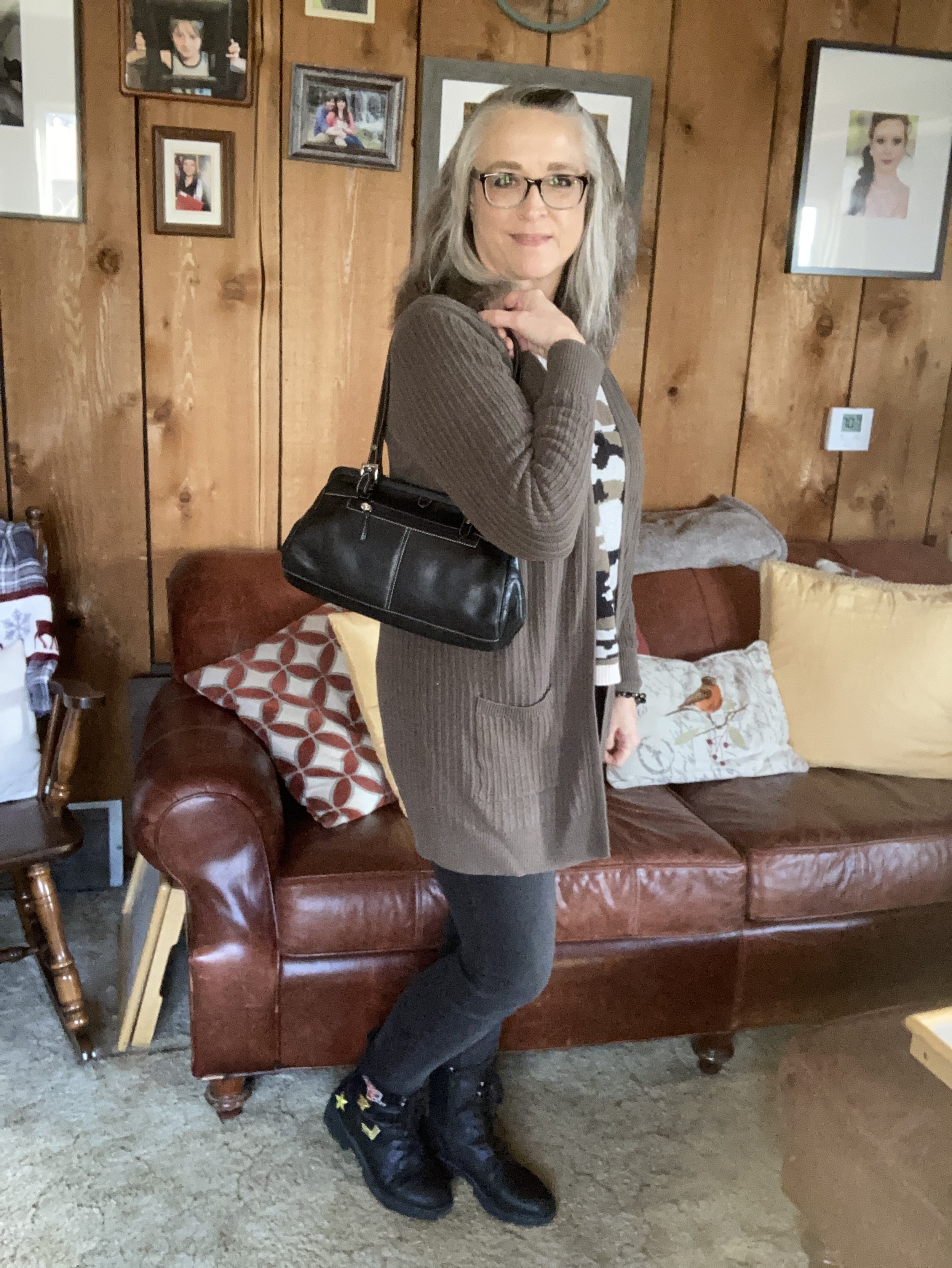
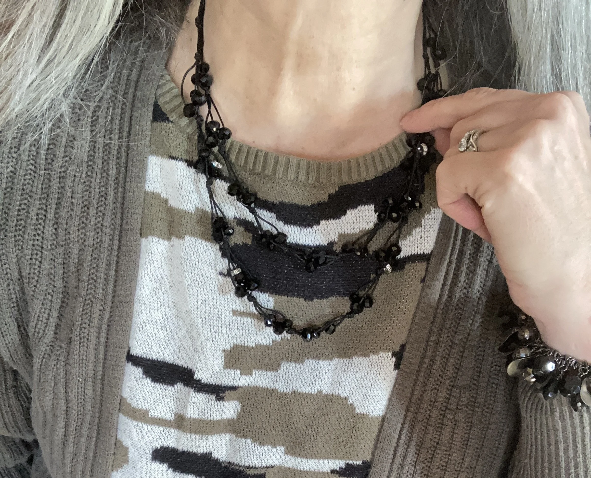
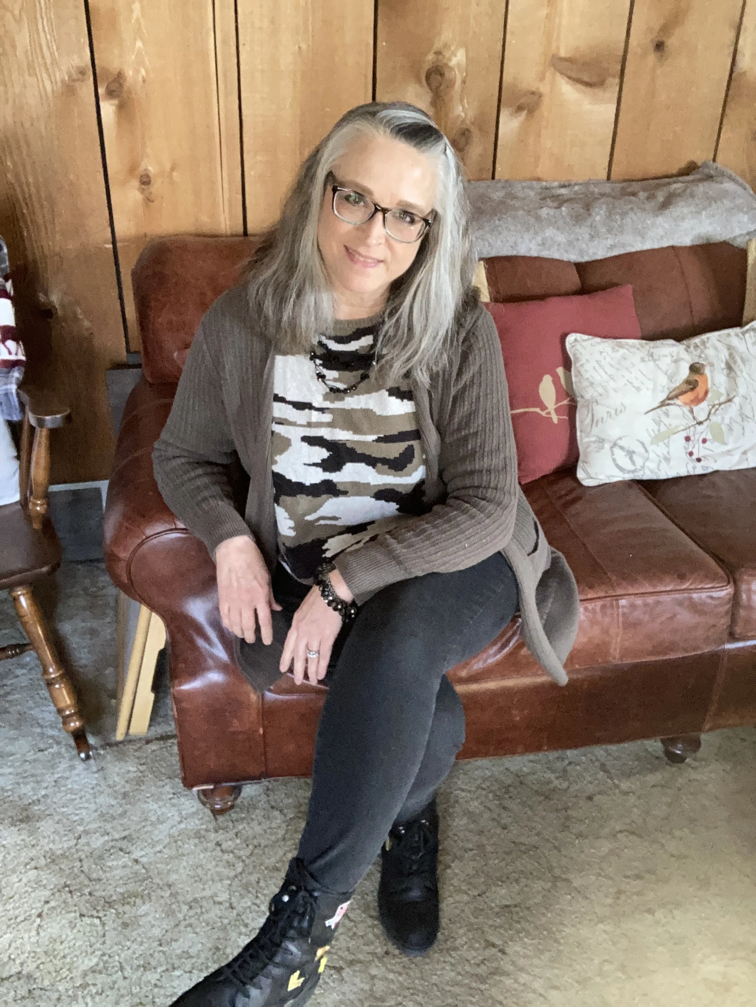
Olive is one of those greens that can come in a variety of shades. Check out this page from when I Googled olive color shades. The olive color of my older Sonoma cardigan from Kohl’s, and on this thrifted, Forever 21, camouflage sweater is what I would call olive drab, or military olive. It leans more towards brown than a true olive green. However, if you put it next to a brown sweater, it definitely looks green.

It is easy to pair olive with black. For that matter, any color pairs just as well with black as with white. Just envision this same outfit with a pair of white wide leg jeans instead of the black skinnies. It would work perfectly and give the look a whole new vibe.

My black skinnies are Simply Vera by Vera Wang and I either got them on the clearance rack at Kohl’s or at a thrift store. I really can’t remember. Yes, I know! I am still wearing my skinnies. They will likely come back around, as most things do, so I won’t be getting rid of them.

My Seven Dials combat boots are starting to show some wear, but they are one of my faves and so comfortable.

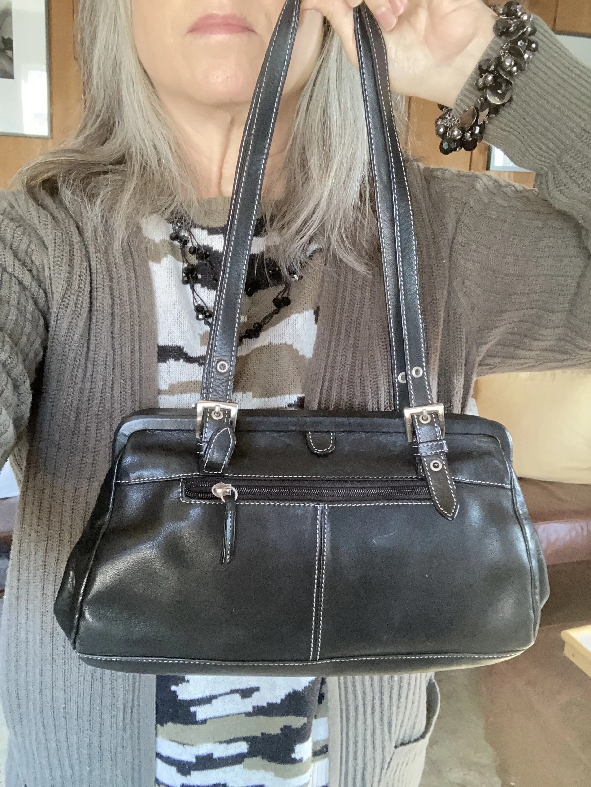
I added a few pieces of jewelry and a thrifted Tignanello bag.

I actually got this cute little bag when we were in Wisconsin for my father-in-law’s funeral. Since we ended up staying the whole week we were a bit underprepared, so I went to a thrift store to get us a few things for the funeral.

Olive and black are a great color combination for any season. In the spring you could combine a pair of black joggers with an olive zip up hoodie for a cozy, casual lunch as the temps are still cool. In the summer try pairing olive trousers with a black silky sleeveless for a classic work look. In the fall reach for that warm olive pullover to wear with your black maxi skirt.

Remember you don’t have to go full bore with these colors. You can just use each of these colors as accents with any other colored outfit. Wearing a navy dress? Reach for a set of olive beads and an olive bag and shoes. You can still have fun with a variety of colors without having to invest a lot of money.

What do you think of these colors? Do you wear olive and black together, or do you wear them separately? I’d love to hear your thoughts so leave me some love in the comments.

I’m including a few shopping links. I am going to try to find a few other affiliate programs so I can bring you more moderately priced shopping and brands you know and love. Keep an eye out for that.

Have a great Tuesday. Be sure to check back on Thursday for the first installment in a creative fiction series brought to you by me. Ha, ha.

Love and hugs!

Pantone Autumn/Winter 2022 - New York Palette: Waterspout, Midnight and Loden Frost

Today’s Pantone Autumn/Winter colors include a bright blue, a dark blue and a light green. Waterspout is a bright aqua blue which seems an odd choice for an autumn palette, but the color gurus will do what they do, and actually it is rather nice to have a few brighter, lighter choices as the days get shorter and the skies begin to gray. Midnight is not really like the midnight blue crayon we all had in our big boxes of Crayolas growing up, but perhaps more like the night sky just after the sun sets, but before the stars start to come out. Loden Frost is a sage green with a little bit of depth and richness.

So far in this series, I think this is my favorite outfit. I like the combination of blues and greens and thought it was an appropriate look for a warm fall day.

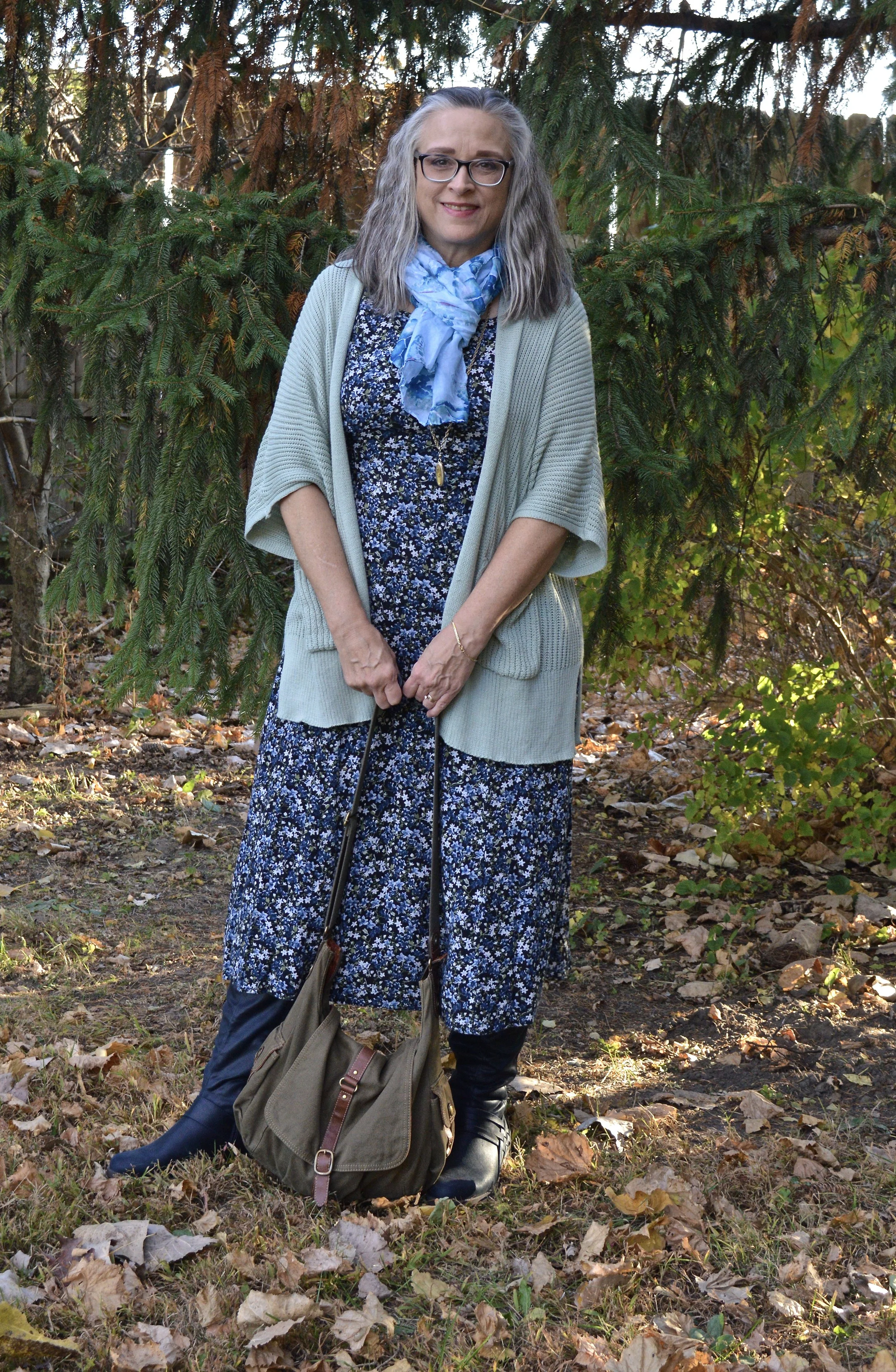
I’ve styled this thrifted dress before on the blog. I have had it for years and it is getting a little snug since all my weight has done its post menopausal thing and moved to my mid section. Ha, ha. But that is the beauty of layering. You don’t notice it as much. This is a brand called Oliva Rose, however, there are numerous brands out there with that name, so I have no idea where it originated.

I found this Maurice’s brand sweater at a thrift store. I really like Maurice’s, but I try to stay out of that store. They have so many cute things every season. I like their tees, tops and jeans, but I wait for good sales and coupons, because things cost more now than ever. I am also really trying to curb my buying all around.

My sea turtle scarf is from the dollar store. Back when my oldest was pregnant and we were putting together the shower the theme was Sea creatures. I found a few cute scarves for game give aways and this was a left over. My necklace was a product of two different thrifted pieces that ended up breaking, so I put them together.

My olive Fossil hobo bag is also thrifted. It is another work horse in my closet and is continually in and out of rotation. Fossil brand is a good quality brand and while I never buy them full price, I do love when I can find one on clearance or at a thrift store. This one is a great utility bag with multiple pockets and compartments for everything you need.

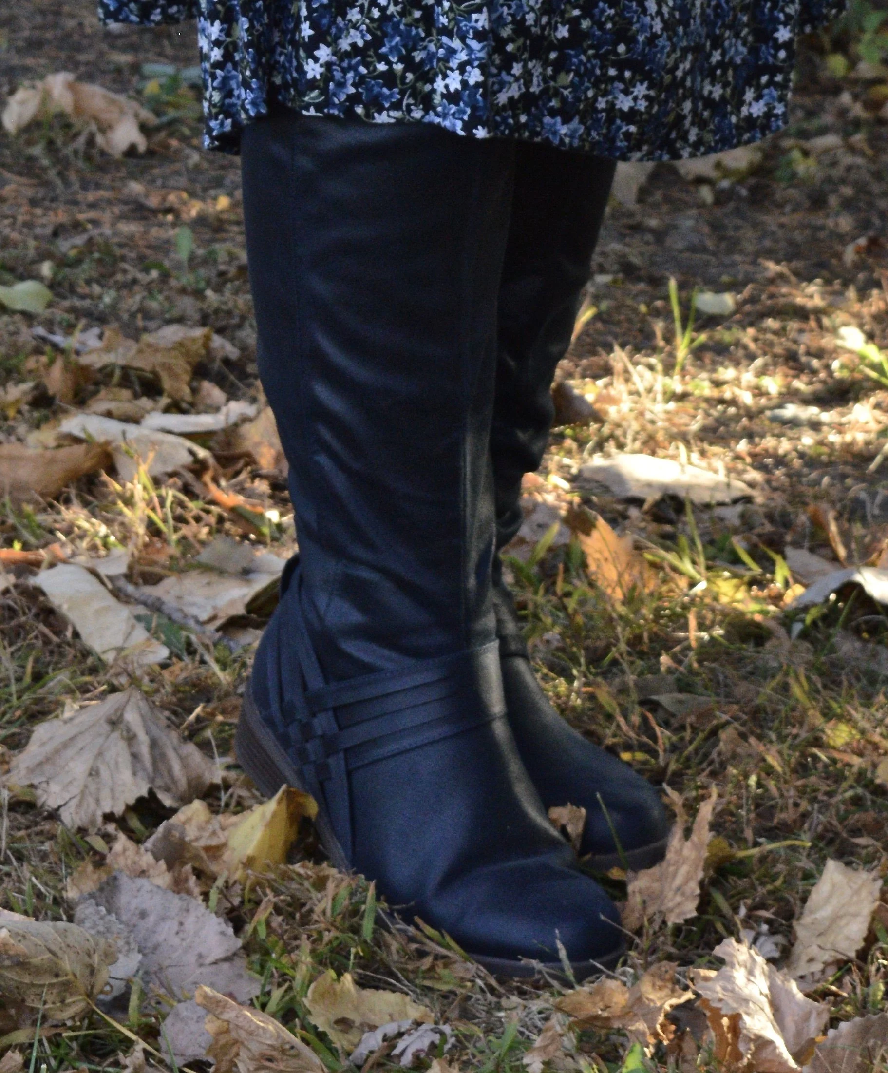
I found these navy boots last year online at Kohl’s. They are Journee brand. I am not too adventurous when it comes to my boot colors. I like browns, black, and gray, but I thought it would be nice to have a navy pair, specifically of knee high boots, for a different vibe. Do you like your boots to be a more basic color, or do you like a bright, bold look for your feet?

I hope you enjoyed this post. Let me know what you think of these colors. I am including a few shopping links. These are affiliate links. When you click on a link, I get a few pennies. When you purchase the item through the provided link, I get a little bit more. I appreciate all you clicks. All opinions are my own.

I hope you are having a great week.

Dreamy Dresses from Closet52 - Button Front Maxi Dress

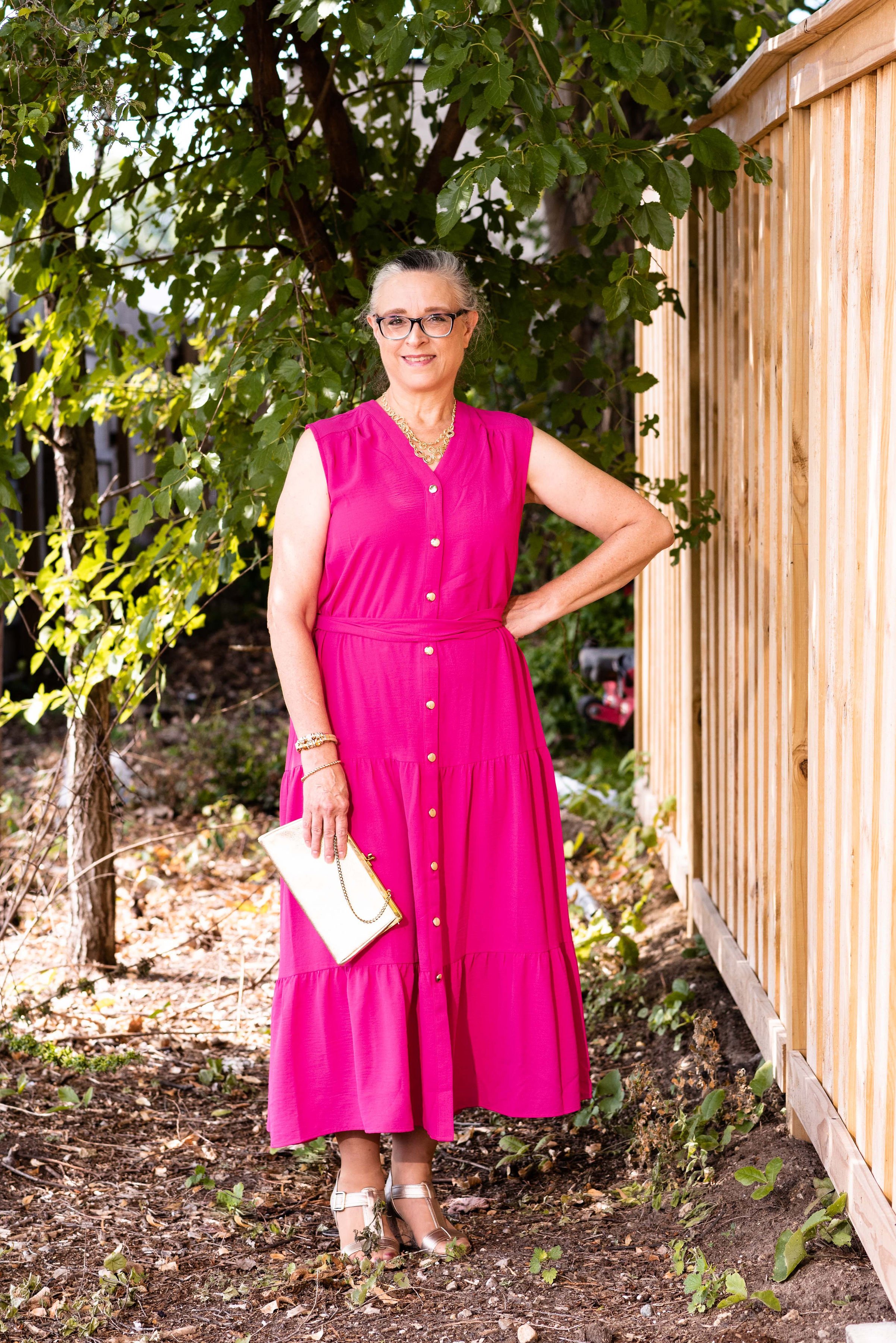
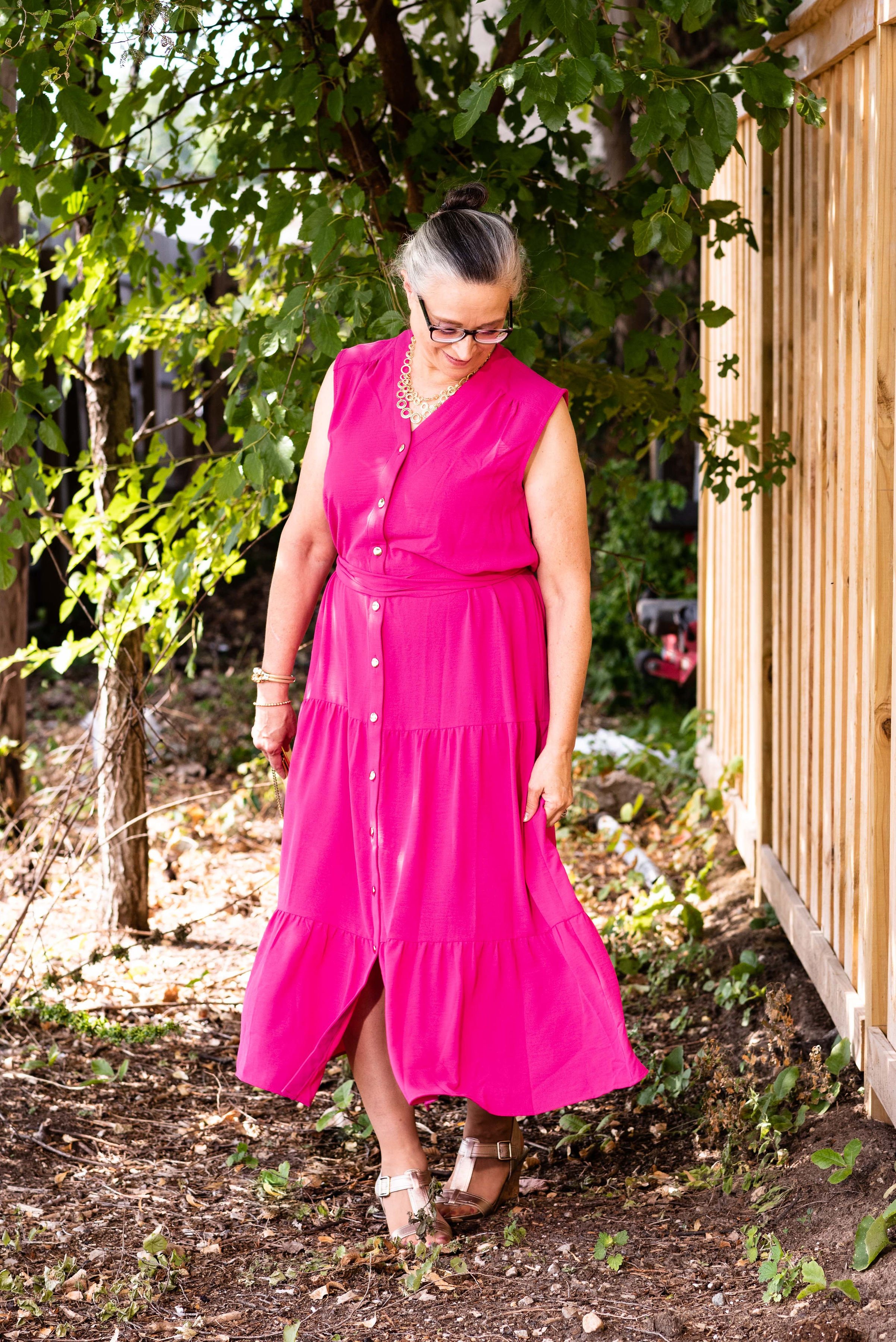
Today’s outfit is another piece gifted to me by Closet52. Closet52 provides quality dresses for women at reasonable prices. Whether you need a dress for work, a special occasion or every day, Closet52 is a great place to start you search.

Today’s featured dress is the Button Front Maxi.

I love the simplicity and elegance of this maxi dress. Once again, the fabric is a medium weight, 100% polyester knit. The description on their websites lists this as a capped sleeve, and on their model it does look that way, but on me, it lays as a wide sleeveless. A capped sleeve usually extends a little bit onto the arm.

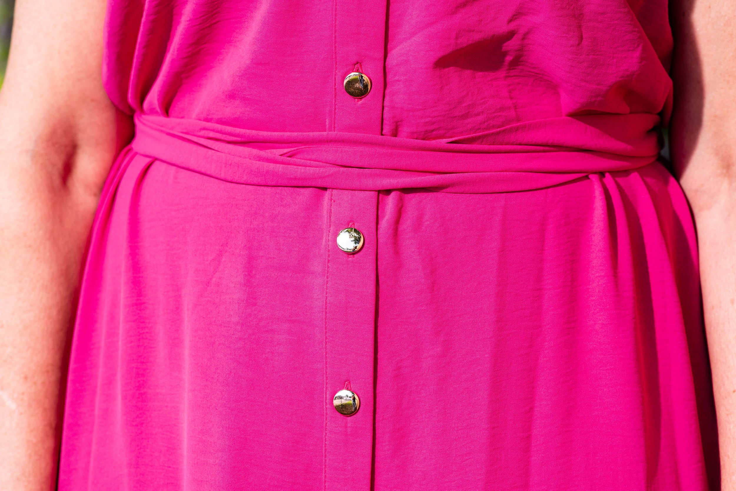
I should have taken a picture without the included belt to show you the dress actually doesn’t have a waist. From the bodice to the first tier on the skirt the dress is more of a column. What I like about this idea is I can style it with different belts, or even scarves to create unique looks. I decided to wrap the belt around and tie it at the back for a different look.

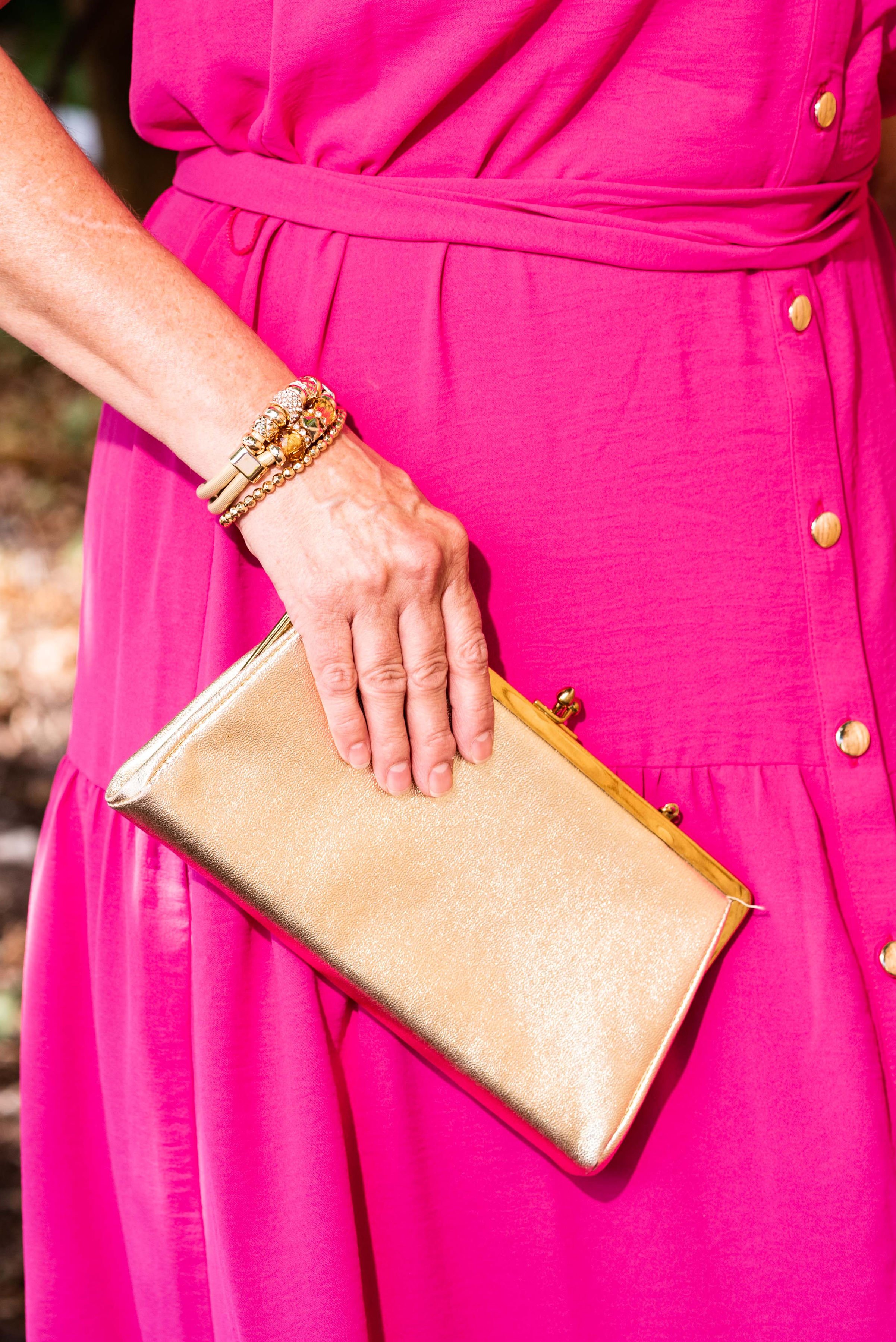
The gold buttons are a beautiful addition to the bright fuchsia color of the dress. I think it is small details like this that make Closet52’s selection a step above other dress retailers. Gold allows this dress to be taken from the work place to a night on the town, with just a quick change of accessories. I wanted to focus on the gold buttons so my accessory choices were all gold.

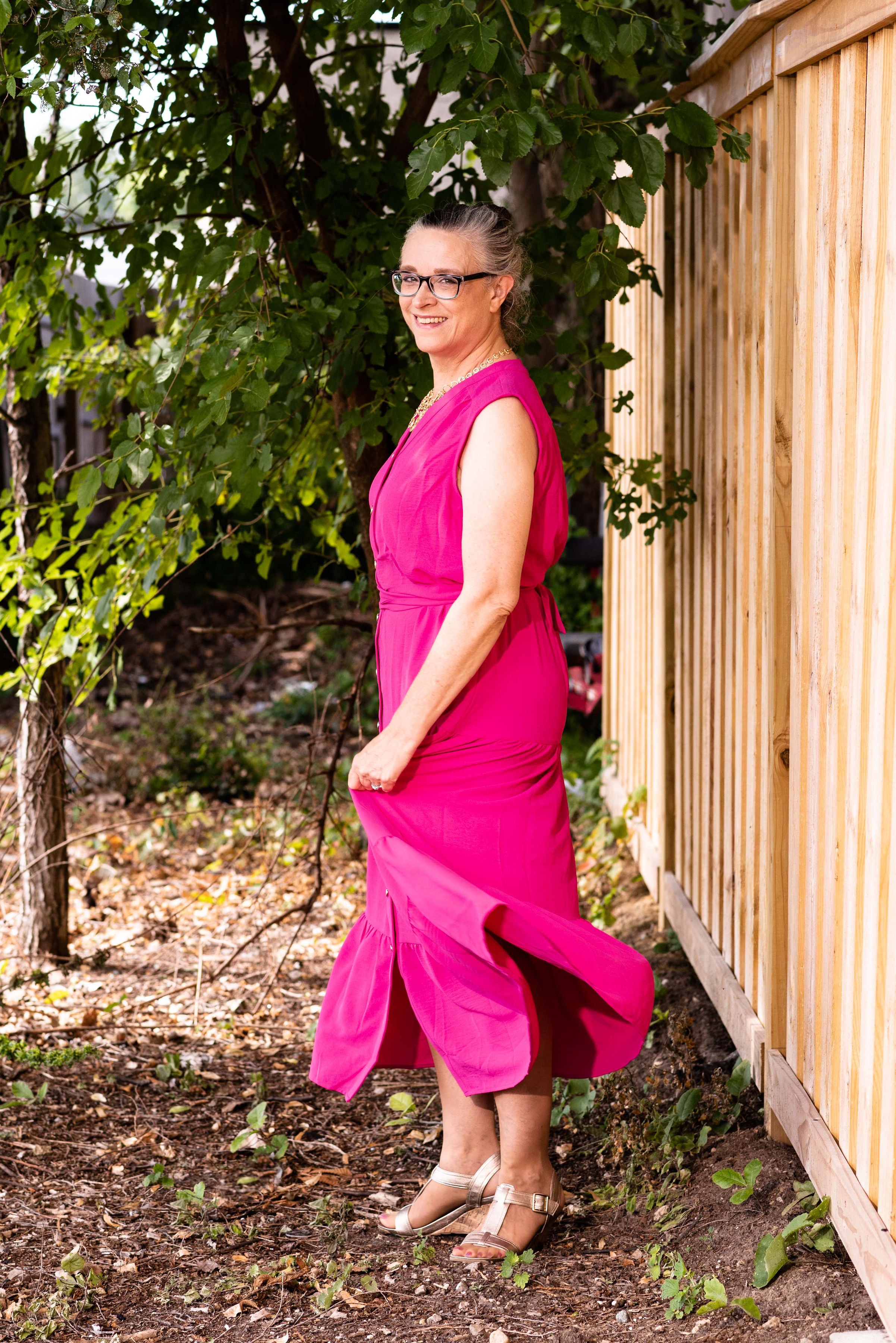
I love a tiered maxi skirt anyway, so the tiering on this piece is perfect. It gives the look a little bit of that prairie girl, boho chic vibe while still looking modern and classic. This is another piece I am excited about trying to style in different ways. I can see this working quite well as a jumper with a flowy button down top and knee high boots. You could even leave a few of the lower buttons unbuttoned to better show off your boots.

With the tiered skirt giving it a bit more volume a girl’s gotta twirl!

Once again, I am very impressed with the quality and detailing on this piece from Closet52. The easy on, easy off ability and the way the dress hangs are just added benefits of this beautiful dress. Check out the great selection at Closet52 by clicking on any of the included links.

This dress was gifted to me by Closet52. All opinions are my own.

Photo credit Jessica Trumbull for Rebecca Trumbull Photography.

Pantone Spring/Summer 2022 - NY Palette: Harbor Blue, Dahlia, and Northern Droplet

These are the last three colors from the Pantone Spring/Summer 2022 New York Palette. Today’s colors are festive and fun, the perfect combination for a summer event. I always love a brighter, richer approach to color anyway, so these are probably two of my faves from this palette. Click here to see the actual Pantone colors.

Harbor Blue is a medium blue green giving it a teal vibe, but with a little less intensity. Dahlia is a beautiful shade of purple that reminds me of spring and summer flowers like Azaleas, Cosmos and Pansies. Northern Droplet is a light shade of gray much like an early morning fog over a mountain lake.

For my outfit today, I ended up using a slightly darker gray rather than a light gray. I don’t own a lot of light gray because it is one of those colors that doesn’t do me justice. It is also what I would term, a non color, meaning it doesn’t really do a whole lot for very many people. Certainly there are women who look wonderful in a light shade of gray, but it seems to me that a medium to dark gray is a better choice for most of us.

As of the posting of these photos it is still cool in the midwest. We have had so many gray and rainy days, I am honestly starting to think we are turning into the new northwest and joining our friends in Seattle. However, I did want to give you an outfit where I at least showed a little bit of skin on my legs, just to give the feeling of oncoming summer and warmer weather.

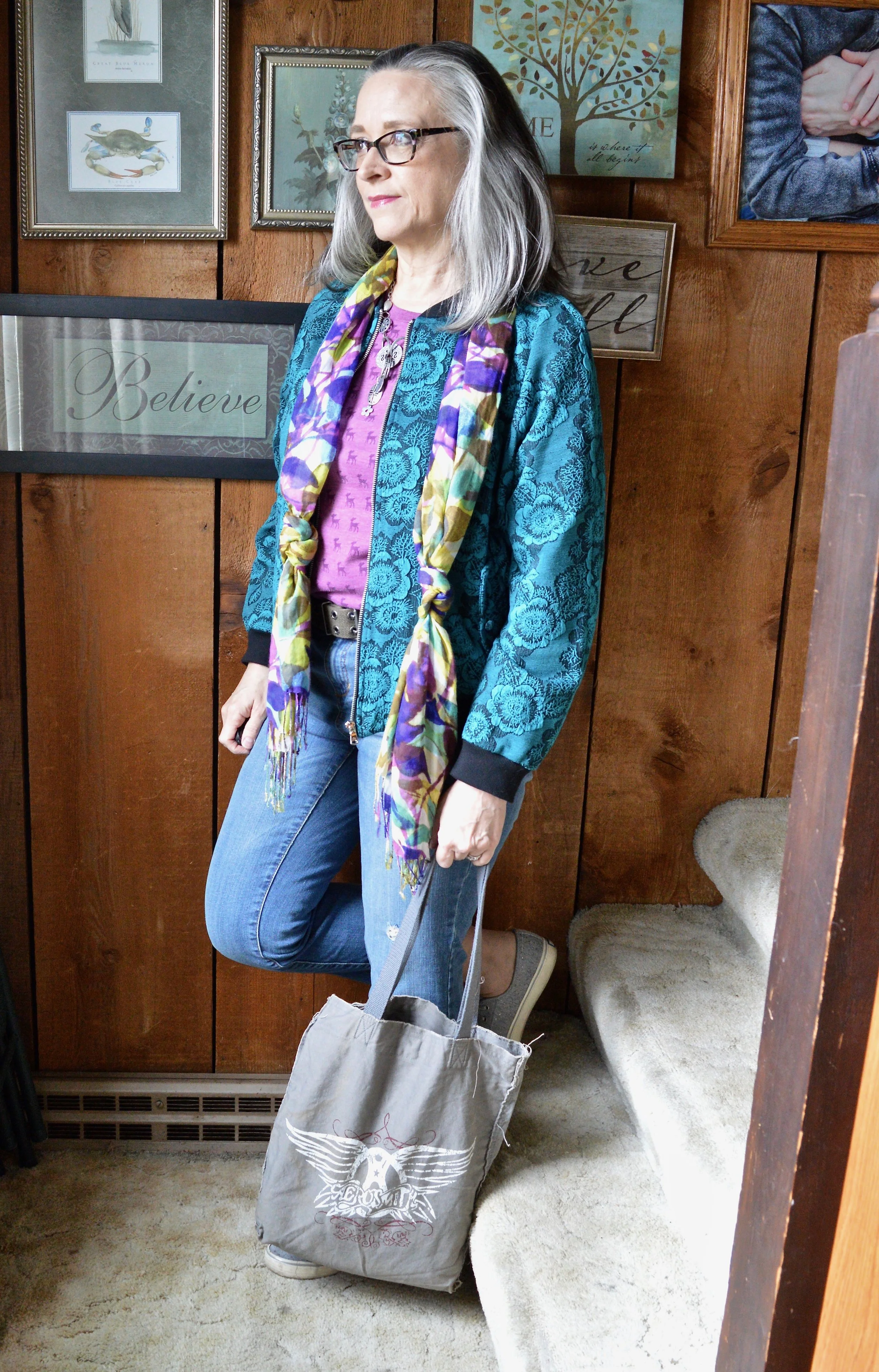
My Harbor Blue bomber jacket was a clearance purchase from ShopNational a few seasons ago. I love the floral textured pattern. The banding at the neck, sleeves and bottom makes it extra comfy to wear. It is a unique piece that I don’t wear a lot, but one that I will hang on to for its versatility and vibrant color.

My thrifted jeans are a brand called Stylus. This appears to be a discontinued brand that may have once been sold at JC Penney and Walmart. I like that they have a tiny bit of distressing near the pocket and above the knee.

My Bambi tee is a thrifted Sonoma piece. When I first got it I knew the print was of deer, but after closer inspection it is definitely Bambi’s silhouette. You can also see my silver necklace that my bestie gave me back in March when we were in NY visiting my mom. I opted for the olive canvas belt because there is a bit of olive in the scarf.

My beautiful scarf was gifted to me by a dear friend who was clearing out her home in preparation for their move to Tennessee. Every time I wear it, I am reminded of her and her husband who moved to be near their youngest daughter, her husband, and their first baby. I just love all the colors in this scarf and feel like it is the perfect piece for every season.

Style Tip: When you don’t know what outfit to put together, pull out a favorite printed scarf. Take cues from the scarf on putting the ensemble together by choosing pieces with matching or similar colors. It really helps for picking out outfits and I do this often, when I am going away for the weekend.

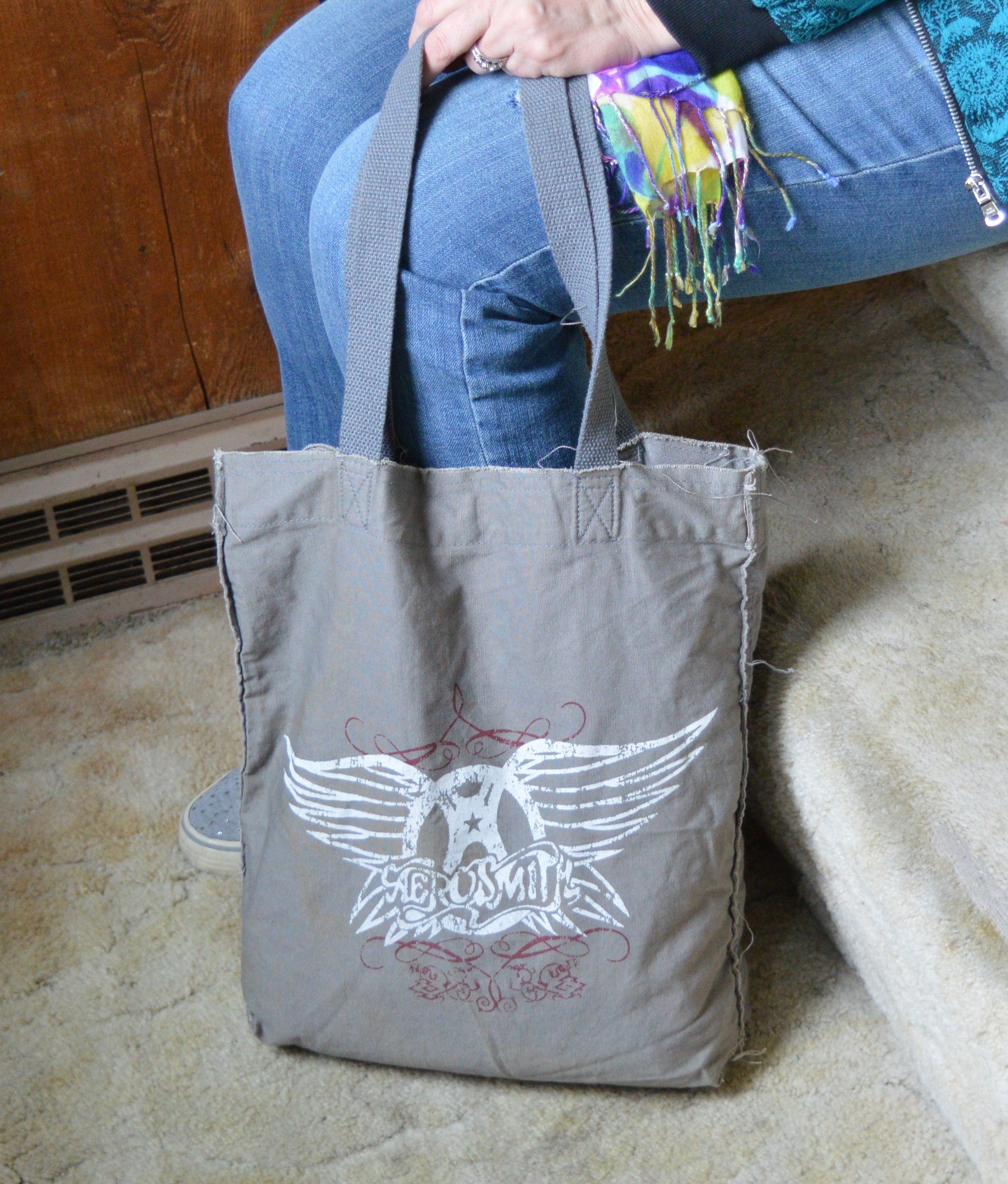
My Ked’s sparkly sneakers are quite old, and perhaps need another run through the washer. I chose my simple Aerosmith tote (a hand me over from my younger girl) for my bag.

Do you like these colors? Would you wear these colors together? Let me know what you think of this outfit by leaving me a comment.

I’m including a few shopping links for you to look over. These are affiliate links. All opinions are my own. Thank you for all of your support. Have a great weekend!

Pantone Spring/Summer 2022 - NY Palette: Spun Sugar, Coca Mocha, and Perfectly Pale

Today’s Pantone colors are a blend of earthy and pastels. Spun Sugar is a light, airy blue reminiscent of hazy summer skies. Coca Mocha makes me think of a double scoop of chocolate ice cream and Perfectly Pale is the perfect summer alternative to basic white. See the actual Pantone colors here.

I think these colors are a great pairing for spring and summer. We often think of brown as a fall color, just like we think of white as only a summer color. Well, girlfriends, we definitely needing to change our thinking about color, as in all colors work at any time of year. I will forever love my darker browns, oranges, yellows and burgundies in the fall, but that doesn’t mean I won’t occasionally put them on in the heat of summer. God made color and color is good, all year round.

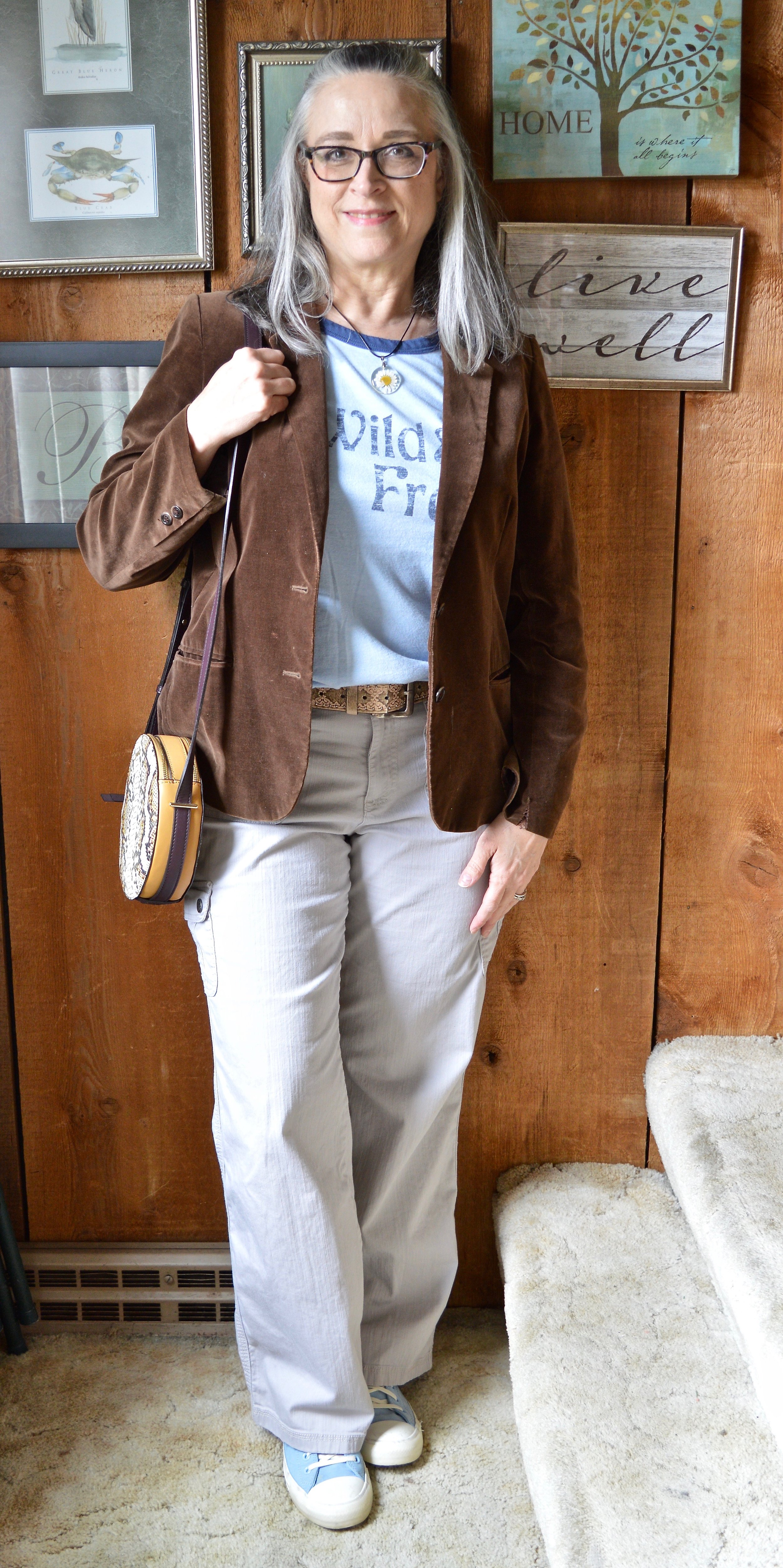
My Sugar Spun tee is a Sonoma piece. I don’t know that I consider myself wild, but I definitely am glad I live in a free country. That is something I never want to take for granted. I am thankful for all who have fought for so many years to keep our country the free nation it is. I have come to have a deep affection for graphic tees, especially those with words on them.

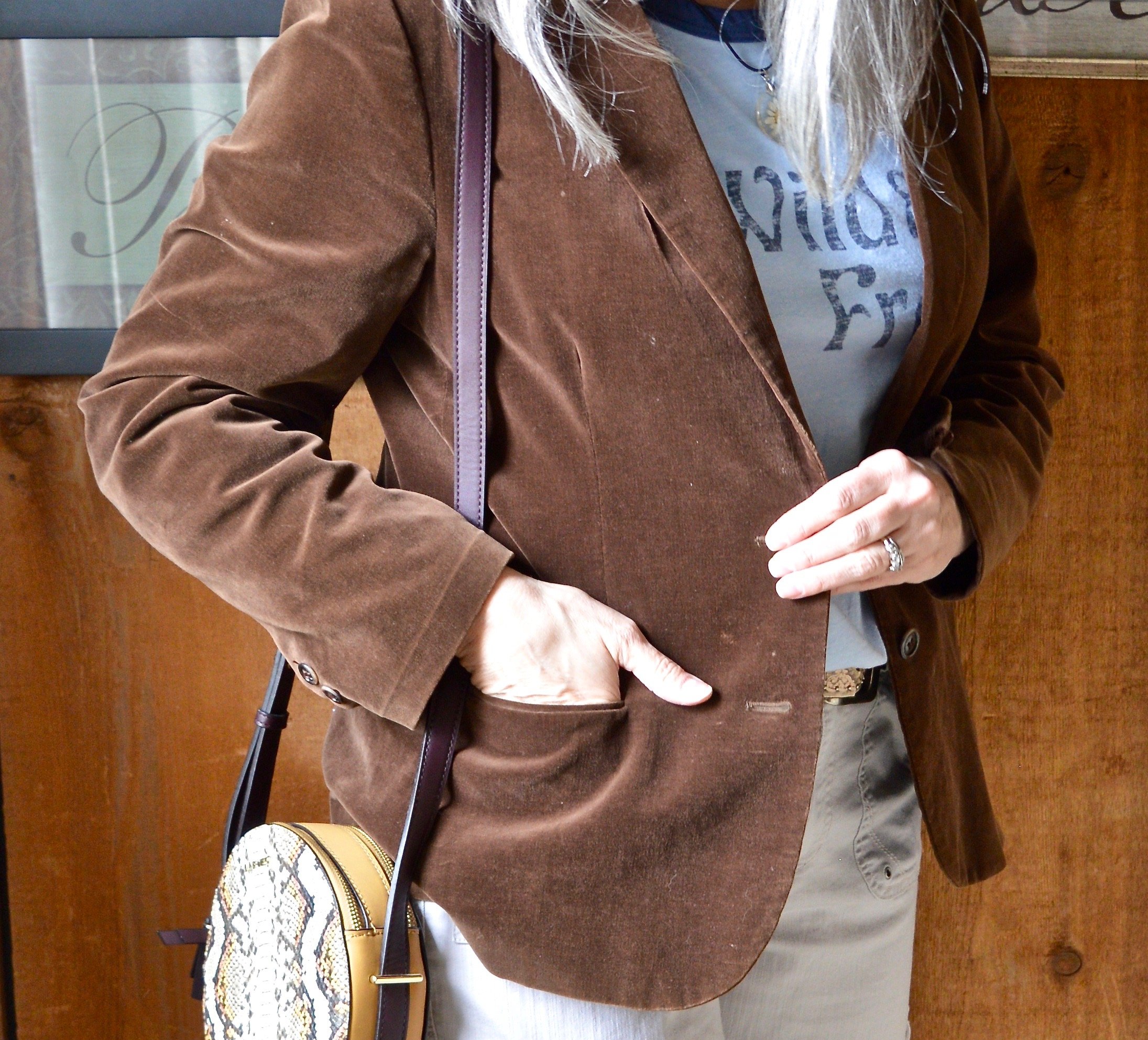
This outfit is all me. The colors work for me and the pieces are all thrift finds except the necklace, bag and sneakers. The Coca Mocha velvet blazer is a brand called SSA, and is definitely showing wear. I need to do some stitching around the cuffs as it has been wanting to come apart. But overall, I think the blazer still has some wear left in it. This is not something I would normally gravitate towards in the summer, but with our weather being so wacky, I think I will keep this available.

Style Tip: Don’t put your blazers away for spring and summer. Think of them as light weight jackets that you can throw on with cropped pants, capris and even shorts. They make any casual outfit look classy and put together.

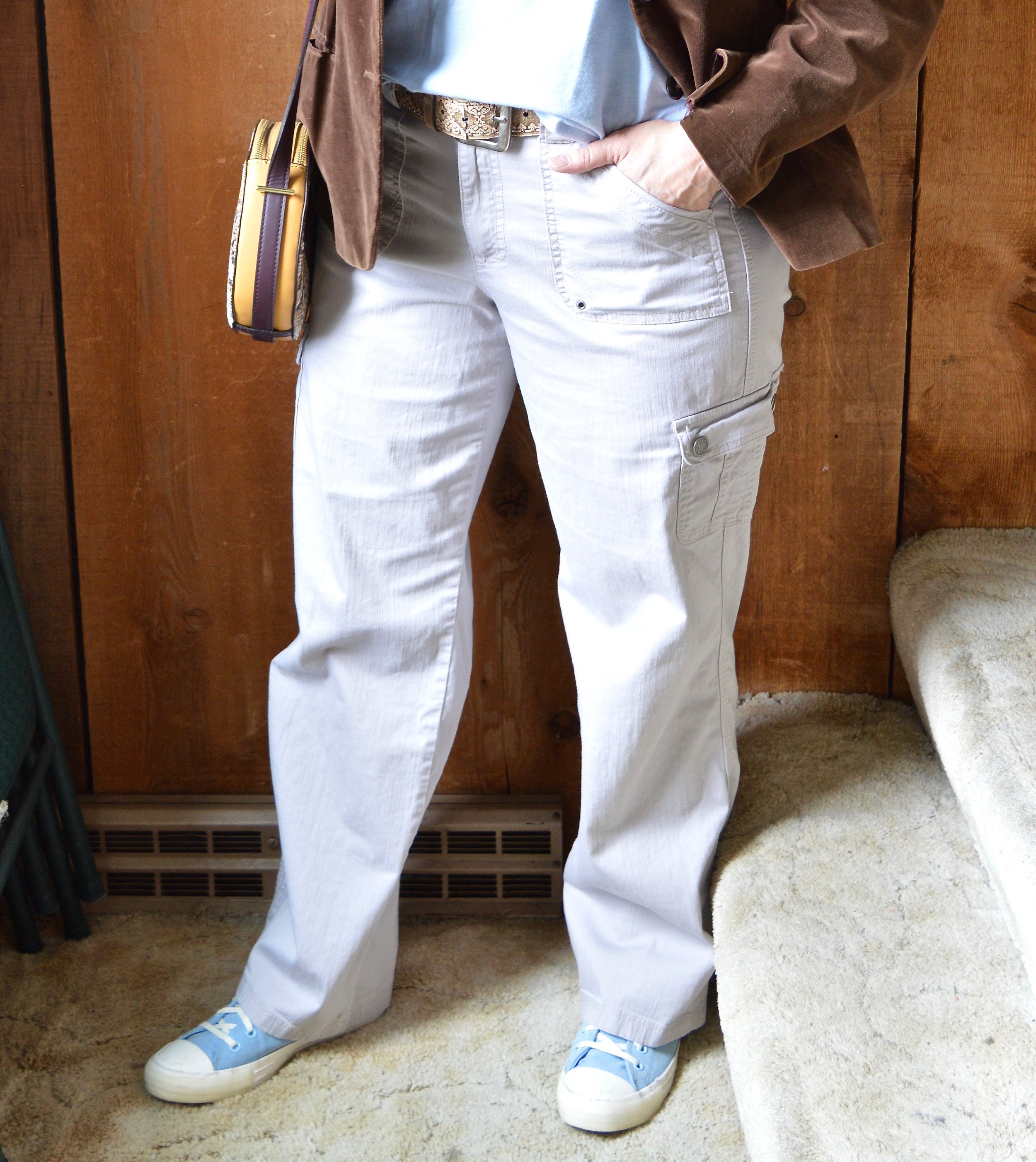
My pants are Gloria Vanderbilt and a newer thrift purchase. I knew I wanted a few other lighter weight and lighter colored pants for spring, so this utility pair does the trick.

Style Tip: If pure white is not your bag, find light colored bottoms for summer in pale creams, tans and yellows. You’ll get a similar effect to wearing white and won’t have to worry as much about your colored underwear showing through.

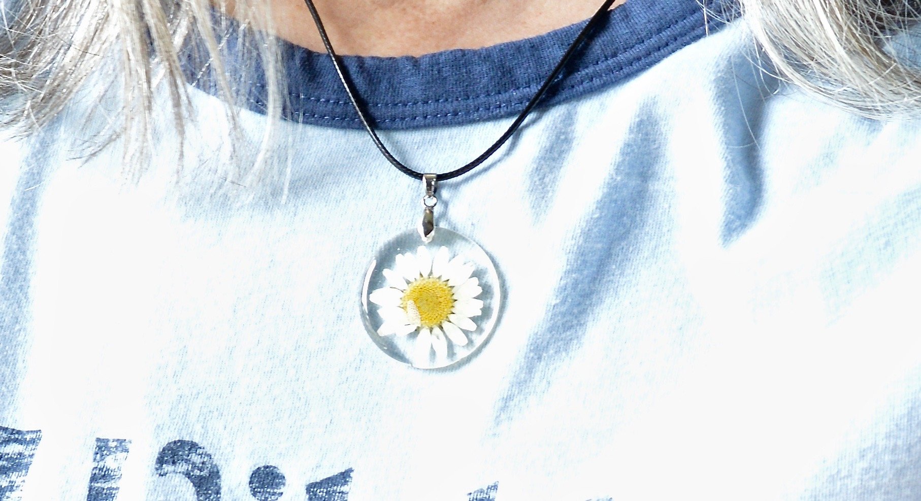
Summer for me means less in the accessory department. I can’t wear most scarves as I get too hot and many of my jewelry pieces make me break out in the warmer weather. These warm months are where I turn to pieces with hippie vibes that use cording, or heavyweight string for pendants and bracelets. I am thinking about taking a few of my hubby’s metal detecting finds and turning them into jewelry, so I guess this would be the time.

My daisy necklace was a Christmas gift from my husband. I like the little quirk it has, because that’s me, just a little quirky. Ha. ha. I am also showing off my round Nine West snakeskin print bag, that I got a few seasons ago from Kohl’s on clearance. Last, but not least, I had to use my bright blue Converse again, since they went along with the Spun Sugar color.

What do you think of these colors? Do you like the colors together, or would you put them with other colors? I love hearing your thoughts and ideas. You inspire me too!

I’m including a few shopping links for you to peruse. These are affiliate links. All opinions are my own.

Have a great day!

Pantone Spring/Summer 2022 - NY Palette: Gossamer Pink, Skydiver and Poppy Seed

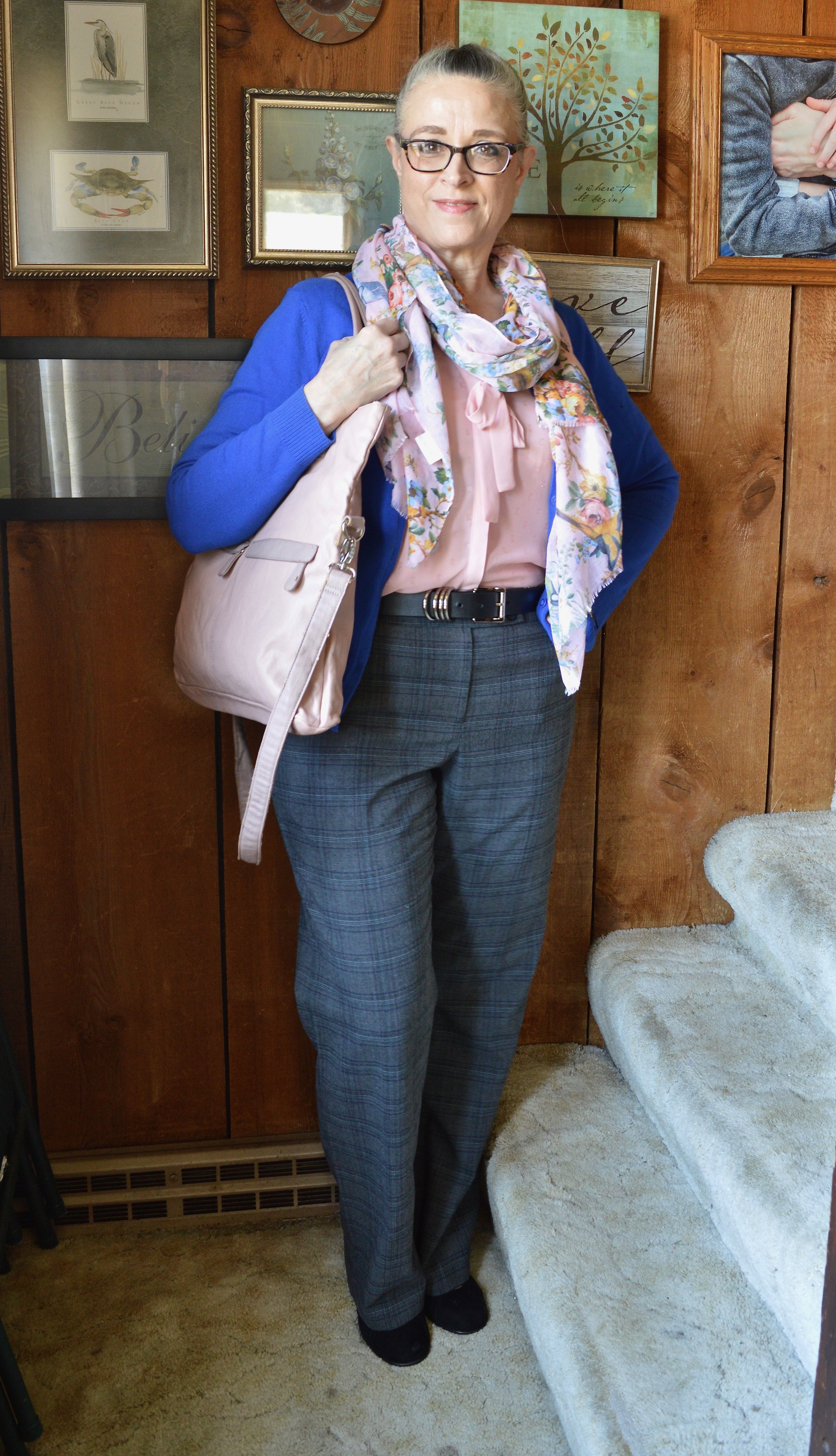
Hi everyone. It is time for another set of colors from the Pantone Spring/Summer New York Palette. These colors include the pastel Gossamer Pink, the pretty, bright, Skydiver blue, and a charcoal gray called Poppy Seed. I was glad to see a darker gray on the Classic color palette, as that has always appealed to me more than the lighter gray. These are my choices from my closet for each of these colors. To see the actual Pantone New York palette colors, click here.

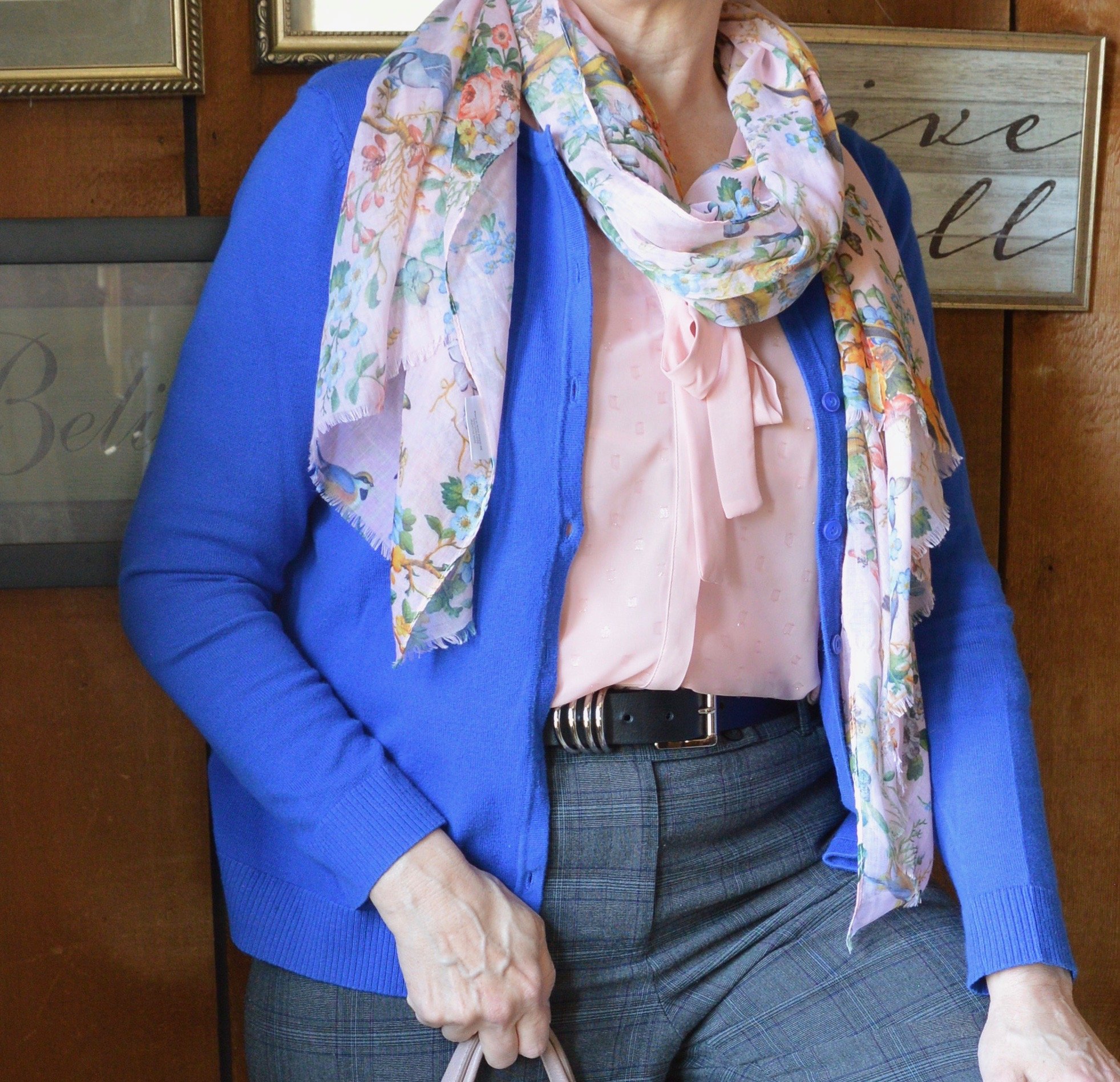
My blue cardigan is not a perfect match for the Pantone color, but I try to give you ideas for outfits with interesting color combinations, not do a paint by number. I love this light Gossamer Pink with the bright contrast of the Skydiver blue. This would have been another pretty combo for Easter, but any spring activity where you have to dress up a little would welcome these colors. This would be perfect office attire as well.

I have had this Christopher and Banks cardi for a few years. It is a lighter weight sweater that is perfect for the spring, or for summer when you need a little something in the air conditioning. They don’t seem to be carrying this same type of sweater, but you can always check here at Kohl’s for a few solids and prints on a basic button down cardigan.

My pink blouse is Elle brand, and was a clearance purchase from Kohl’s a few seasons ago. It is a sheer material with little sparkles throughout, which are not visible in the picture. It has 3/4 sleeves and ties to make a bow. I also added this pretty spring scarf that one of my daughters gave me a few years ago.

My Poppy Seed gray plaid trousers have been around forever. They are Style & Co. brand. I know Macy’s and a few other retailers sell Style & Co. brand, but I honestly can’t remember if I got these at Macy’s or if I thrifted them. Macy’s isn’t a retailer I have typically frequented, but I have gone a few times with my bestie and might have bought these on one of those trips.

My black belt was a recent thrift find.

My shoes are my Aerosoles black heeled pumps. I like the lower more stocky heel in my older years. My feet are not used to wearing heels at all anymore, so when I do they have to be ultra comfortable. Aerosoles fit the bill in that regard. Check out their website for great looking shoes at reasonable prices.

My bag is a thrifted NY & Co. and can be a tote or fold it over for a smaller clutch option.

Do you have these colors in your closet? How would you were these, with each other, or with other colors? What is your favorite spring color combination? I’d love to hear your thoughts, so leave a comment or two below.

I’m including a few shopping links below. These are affiliate links, which means I get a little money when you click on a link. These are brought to you at no cost and I appreciate all the clicks. All opinions are my own.

Have a super week everyone!

Updating Your Wardrobe: Part 2 - Old Becoming New

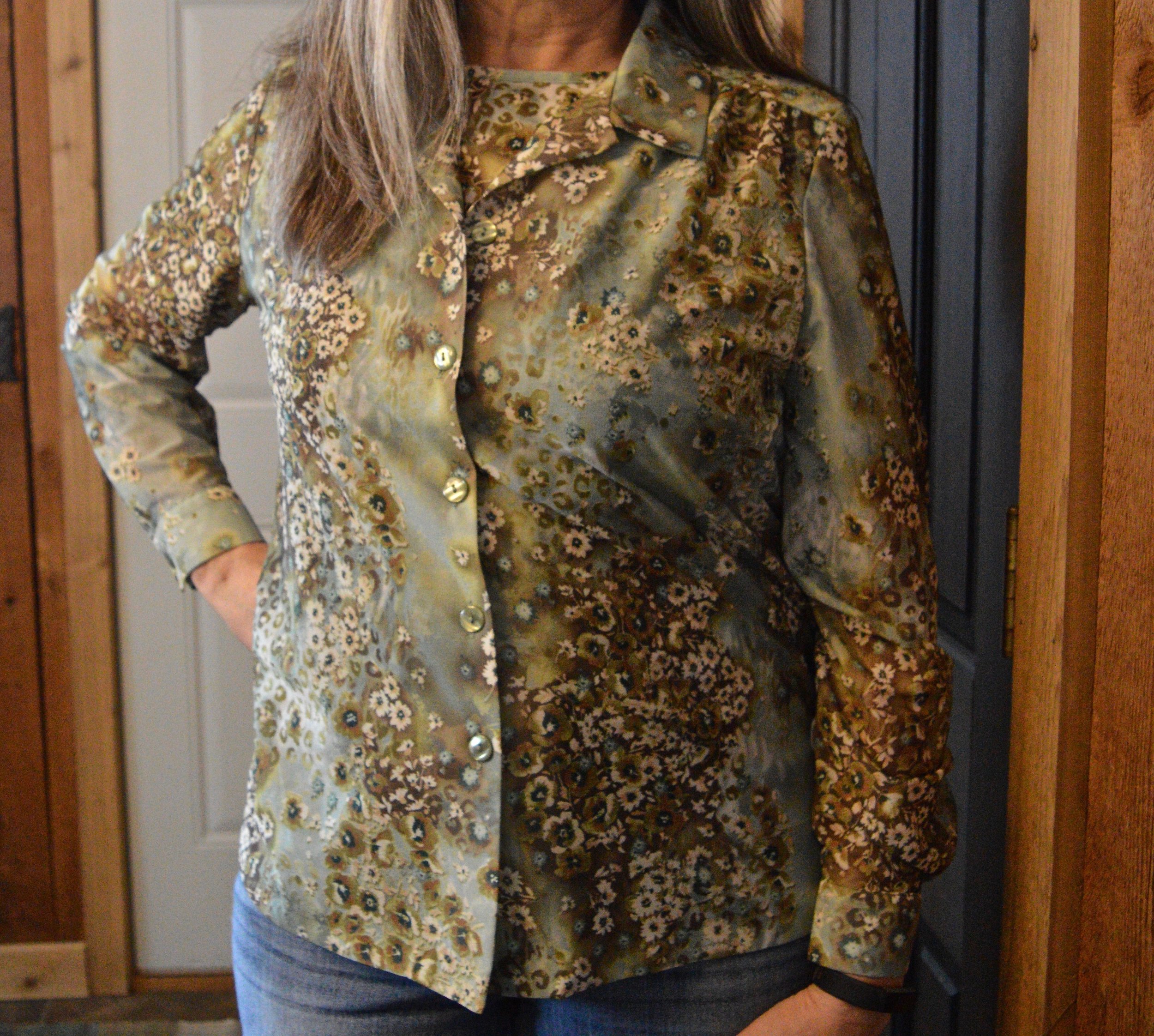
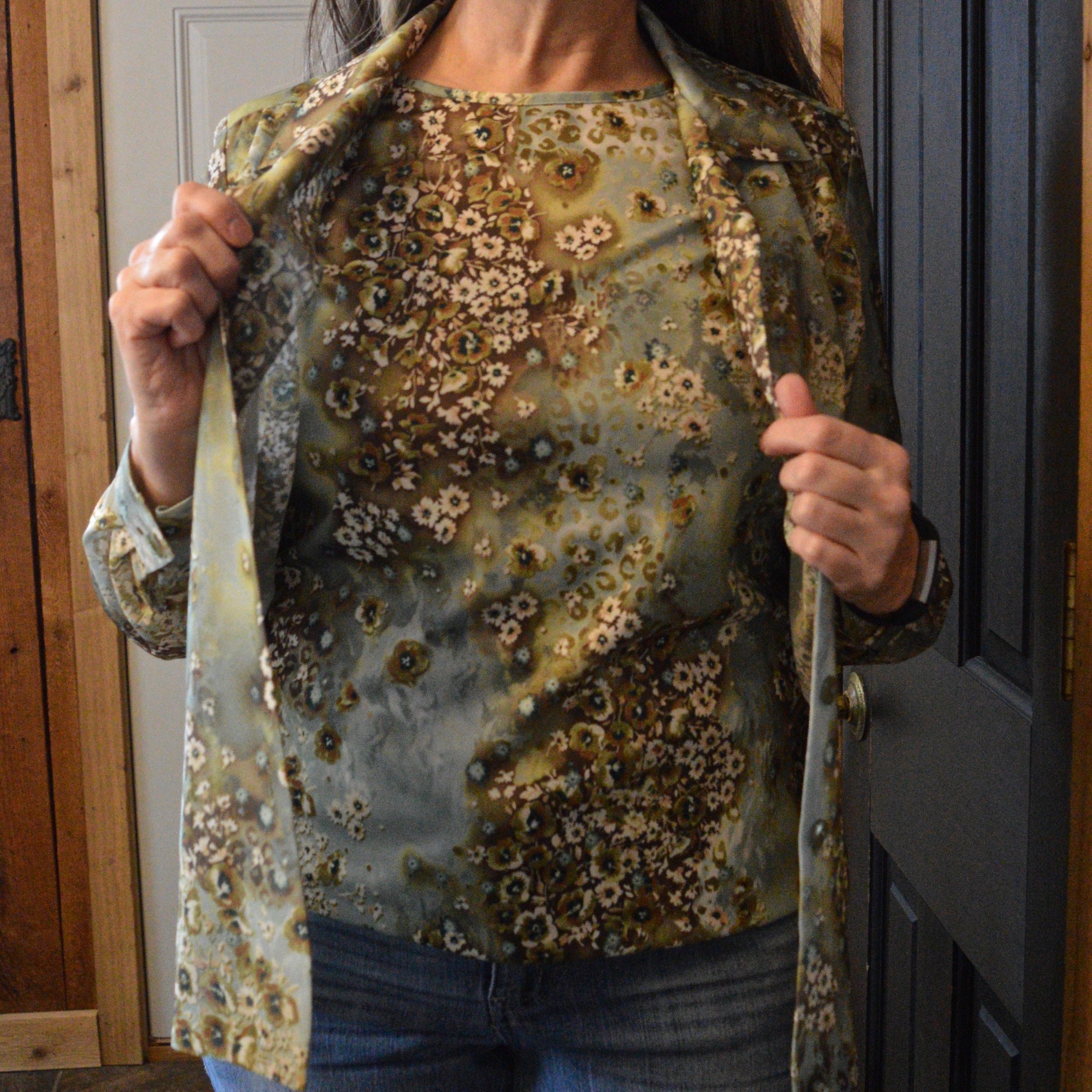
I thought I would take another week to look at ways we can update our wardrobe using older style pieces by showing you my own rendering of a couple of outfits with a recent thrift purchase I made. This two piece set is from Blair. I don’t know about you, but I have often felt that mail order retailers like Blair are old school and really gear their products to women, who like the simplicity of shopping via mail and buying products that are easily mix and match and easy to take care of. Don’t get me wrong, they do have many lovely pieces, like this Fair Isle sweater, this spring jacket, and these cute Skechers sneakers.

What I am going to attempt to show you is how you can use this two piece set three different ways for looks that are up to date and appropriate for work, date night or church.

I think the pattern and the colors of this set are lovely. It can be worn all year round, but will be especially pretty in the spring and the fall. The under piece is short sleeve and the over piece is sheer.

Look 1 - Casual

The first way I wanted to style it was casual, since that is pretty much all I wear right now. I decided to wear both pieces together, and added a heavier sweater coat that I recently thrifted as a warm layering piece. I love the winter white of this sweater and the textured waffle weave. It has two silver clasps in the front, but I wore it open so the two piece set could be shown off. I added my old olive combat boots, an olive belt and a dark olive bag. I did the front tuck to show off the belt. This is a great casual look and I would definitely wear it for a date night with my hubby.

Look 2 - Church

Obviously, this look doesn’t just have to be for church. You could also wear it to work or on a fun day out with your girlfriends. In this look I got rid of the sheer overlay piece and used a Kohl’s moto jacket I purchased last year. The jacket is rather heavy, so would definitely be better as an outerwear piece rather than just a layering piece. Often, I will use jackets as layering pieces in the winter, but this one will be better as a spring or fall jacket when the temps are cool, but not freezing.

The skirt is another thrift find. I like the buckskin look of this piece, and thought it could be styled with lots of other colors. The skirt actually could be hemmed up, if you prefer at the knee or above the knee. With these tall brown boots, which were a hand me over from my older daughter, I almost think having the skirt above the knee would look a little better. I added a gray thrifted bag as a point of contrast.

Look 3 - Work

For this last look, I got rid of the short sleeved under piece and donned the long sleeved over piece. I do have a cami on, so I could have worn it like that, but I wanted to add another layer for the cold and more texture. I switched to corduroy winter white pants, heeled suede ankle boots and added another layering piece that could be removed if I got too warm. The office I used to work in was cold in the winter months, so layering was essential. The dark olive jacket is thrifted and is probably a dress. The vest was a Christmas gift two years ago. I went for my dark brown, thrifted corduroy bag as a final touch.

There are so many options when it comes to your clothing. Your closet is a space with unlimited possibilities. Don’t worry about what the media says about what women should or shouldn’t wear at this or that age. Wear what you like, just figure out how to wear it to make yourself feel your best and most confident.

Thanks to everyone who follows along with my blog. I really appreciate it. I hope to bring you more fun content in the weeks and months ahead. If you like to read my Faith posts, be sure to check back Thursday for a new post on what I am learning about the word rejoice! Until then, I hope you are having a great week.

I am including a few shopping links for you to peruse. These are affiliate links, which means I earn a few cents every time you click on a link. I don’t receive compensation for what I do on the blog. I do it for myself, because it stretches my creative boundaries, and I do it for you, because I want to encourage and inspire you.

Pantone - Autumn/Winter - 2021 - London Palette: Green Bee, Downtown Brown, and Olive Branch

Hi everyone! November is zooming along and I am still trying to get back into some sort of rhythm, not only here on the blog, but in life. Anyone who suffers from a long term illness can relate to what I am talking about. Not being able to sleep for such a long period of time and still dealing with unresolved symptoms make it hard to get back to what I would say is a normal routine. However, I know there are people who are struggling with much worse situations and I am thankful that I am able to do as much as I can. In fact, this past weekend, we were able to travel to celebrate my mother-in-law’s 80th birthday with her, so that was good.

Unfortunately, there has also been other difficult things along the way. My son-in-law lost his grandfather this past week and I know that has been a great loss for the whole family. He was a dear man, a wonderful painter and loved his family, so he will be missed. As many of you can relate, it seems as we get older, we see loss happening around us at a more frequent pace. This too is part of life, and for me knowing God is holding me and my loved ones during these times, makes it a little less painful.

Now on to another outfit. As I said last week, while I am wildly behind, I decided to go ahead and show you these Pantone London Palette outfits as possible sources of inspiration for Thanksgiving Day wear. Many of you will be celebrating with friends or family and it is a good reason, to get out of those sweat pants and dress up a little bit, if just for your own mental well being.

You can’t go wrong with a pair of trousers, a pretty top and a fun scarf and bag. Obviously, you can pick your colors, but I chose to combine these earthy tones for a look that is a mix of military meets, moto chic.

My Downtown Brown moto jacket is a thrifted piece that I have styled on the blog before. It is a brand called Celebrity Works. I do like this medium milk chocolate brown. Browns can be tricky to wear, especially when they contain a little too much gray or a little more red, or well, you get the idea. A true brown is hard to find, but I think this brown hits the mark, so thank you Pantone for that one.

You’ve seen my Olive Branch pants numerous times on the blog as well. As I look at them in these pictures, I am thinking I might need to find a replacement pair. These are starting to look worn and really don’t look very flattering. Of course that may have had something to do with my chubby thighs. Ha, ha. These were Gloria Vanderbilt brand and I probably got them at Kohl’s.

For the Green Bee color I chose a thrifted Studio Works popover top that I did the front tuck on, which gave it the blouson effect. I also added the Green Bee paisley print scarf. The thought to add the Dana Buchman floral bag was a last minute addition, but I like how it pulled everything together. A fun floral bag is a great addition to your wardrobe, especially when it can serve multiple season duty. This one works just as well in spring, summer and fall.

I chose my trusty Olive Branch SO ankle boots for my shoes. My ankle boots definitely get used in these cooler fall temps.

What do you think of these colors? Would you wear an outfit like this to your Thanksgiving celebration? I’d love to hear your thoughts, so leave me some love in the comments below.

I am including a few shopping links. These are affiliate links and are brought to you at no extra cost. If you click on a link, I get a few cents. If you purchase something through one of my links I get a few more pennies. I appreciate every penny! All opinions are my own. Please note, I am not familiar with all of the retailers I list in my links, so be sure to read and understand their return policies in case something doesn’t fit or isn’t to your liking.

I hope you enjoyed today’s post. Until next time, have a great day.

Photo credit Jessica Trumbull with Rebecca Trumbull.

Pantone - Autumn/Winter - 2021 - New York Palette: Pale Rosette, Root Beer and Olive Branch

I want to start off with an apology for my lack of consistency with the blog lately. It has been a rough couple of months and I just haven’t had the motivation to post as regularly. It seems every time I want to make more of an effort at getting more disciplined or being more consistent, I get blindsided by something. At the beginning of the summer it was a broken wrist. Mid summer, I came down with this stuff, that still has me coughing. I just have no idea if I will ever be back to “normal”, whatever that was.

There have been some good bits along the way as well. Early summer we were able to take my in-laws on a nice trip up through the Upper Peninsula, down through Michigan and back to our place where they enjoyed visiting family for a few days. I also got to see my mom, two different weeks and spend time with her. That also afforded me the opportunity to see my best girlfriend, and do some thrifting. On September 19th, our second grandson arrived. He is a doll and I am enjoying opportunities here and there to see him, even if I do have to wear a mask. He’s been born into a world of half blue faces, but that is okay, if we can give him a healthier start. He, my daughter and son-in-law are doing well.

Today’s outfit revolve around three colors on the Pantone New York Palette that I thought combined well into a work wear ready fall outfit.

PaleRosette.jpg

I am still trying to get used to seeing pastels during the fall season. This year, they were quite popular and besides this pale pink, also included a pretty lavender. I guess, we like what we like right, so pastels for me might be more of a spring and summer color scheme, while rusts, browns and burgundies are the colors I reach for in the fall. While we still live in a free country, you are in control of what colors you wear when. Ha, ha.

pantonefallcolortrendspalerosette-8.jpg

The Pale Rosette, 3/4 length tee is a thrifted piece, and a brand called Suzanne Betro. It is actually a longer tunic, but I just tucked it in for this outfit. I love the detailing at the bodice.

pantonefallcolortrendspalerosette-6.jpg

You’ve seen my Olive Branch utility vest on the blog before when I did my series on olive pieces. This vest isn’t quite the right shade. Who would have thought there are so many shades of olive? Another clearance find from Kohl’s, I don’t have a ton of Mudd pieces as it typically has more of a junior’s fit, but the few that I have, I really like.

You’ve also seen these brown trousers when I talked about wide leg pants back in the spring. I am not a big fan. I have enough bulk on my bottom. However, I will hang on to this pair, as I like the color, and occasionally it is nice to have a different option when it comes to pants. These were thrifted and are St. John’s Bay brand.

I added the multi-print scarf to add an extra dimension of color and interest to the outfit. I like how it ties the whole look together.

You can also see the fun necklace I scored while thrifting at the local shop around the corner. I have found some great jewelry there. I goes perfectly with the pants.

pantonefallcolortrendspalerosette-9.jpg

Even though this little thrifted, Rosetti bag screams summer, I thought it was a great way to keep this outfit looking modern and updated, yet still in tune with the fall vibes.

My SO snakeskin print boots were a clearance purchase from Kohl’s last season. I haven’t really had the opportunity to wear them very much, so hopefully this season they will be out and about.

pantonefallcolortrendspalerosette-10.jpg

What do you think of these colors? Do you like them combined? Do you like them each separately?

pantonefallcolortrendspalerosette-1.jpg

I’d love to hear your thought, so leave me some love in the comments.

As I usually do, I am adding a few shopping links in things similar to these colors. These are affiliate links. All opinions are my own.

Thanks for following along on the blog. I hope you are having a great week.

Photo credit Jessica Trumbull with Rebecca Trumbull.


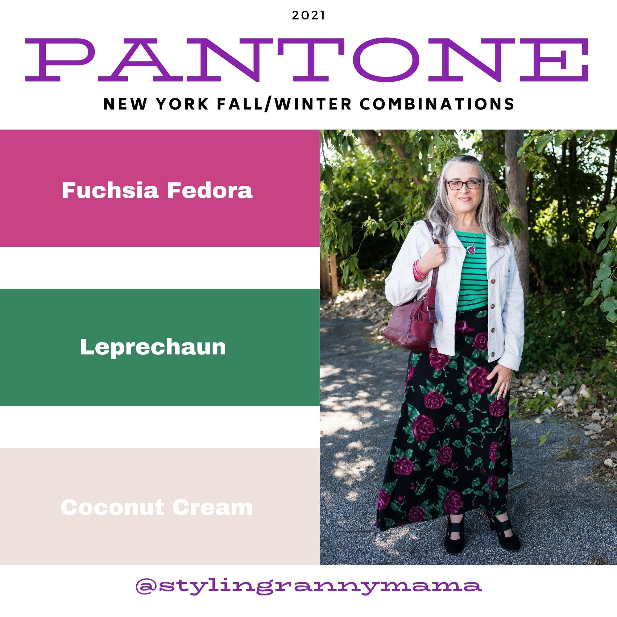
Pantone - Autumn/Winter - 2021 - New York Palette: Fuchsia Fedora, Leprechaun, and Coconut Cream

The colors I am showing you today were ones that surprised me a bit for a fall palette. The bright Fuchsia Fedora is not a color that I have very many pieces in, thus why I used it more as an accessory color. Leprechaun was also a different choice. I was thinking there would be a darker, more forest green color, but this bright, cheeky color is what appeared on the palette. However, that is one of the reasons I like doing this color series. It forces me to think outside the box.

FuschiaFedora.jpg

Even though I wasn’t particularly fond of these colors for fall, I actually liked the way this outfit turned out. Even though the light jacket looks nothing like Coconut Cream, these colors and their combinations are just guidelines for us. Not rules…and just for fun….

I loved The Pirates of the Caribbean movie, and that whole idea of rules versus guidelines was amusing as it kept coming up in the movie and was used according who benefited the most. I guess we could take a lesson from that when we look at our closets. The combinations you put together are for your benefit. You get to decide what you like and what you don’t. You make the choice of what colors or prints to put together, and whether you want to buy into the trends or not. I think we can safely say those fashion “rules”, are really more like “guidelines.” My job as a fashion blogger is to give you ideas of how to make these combinations and hopefully inspire you to think outside your own boxes.

pantonefallcolortrendsfuchsiafedora-10.jpg

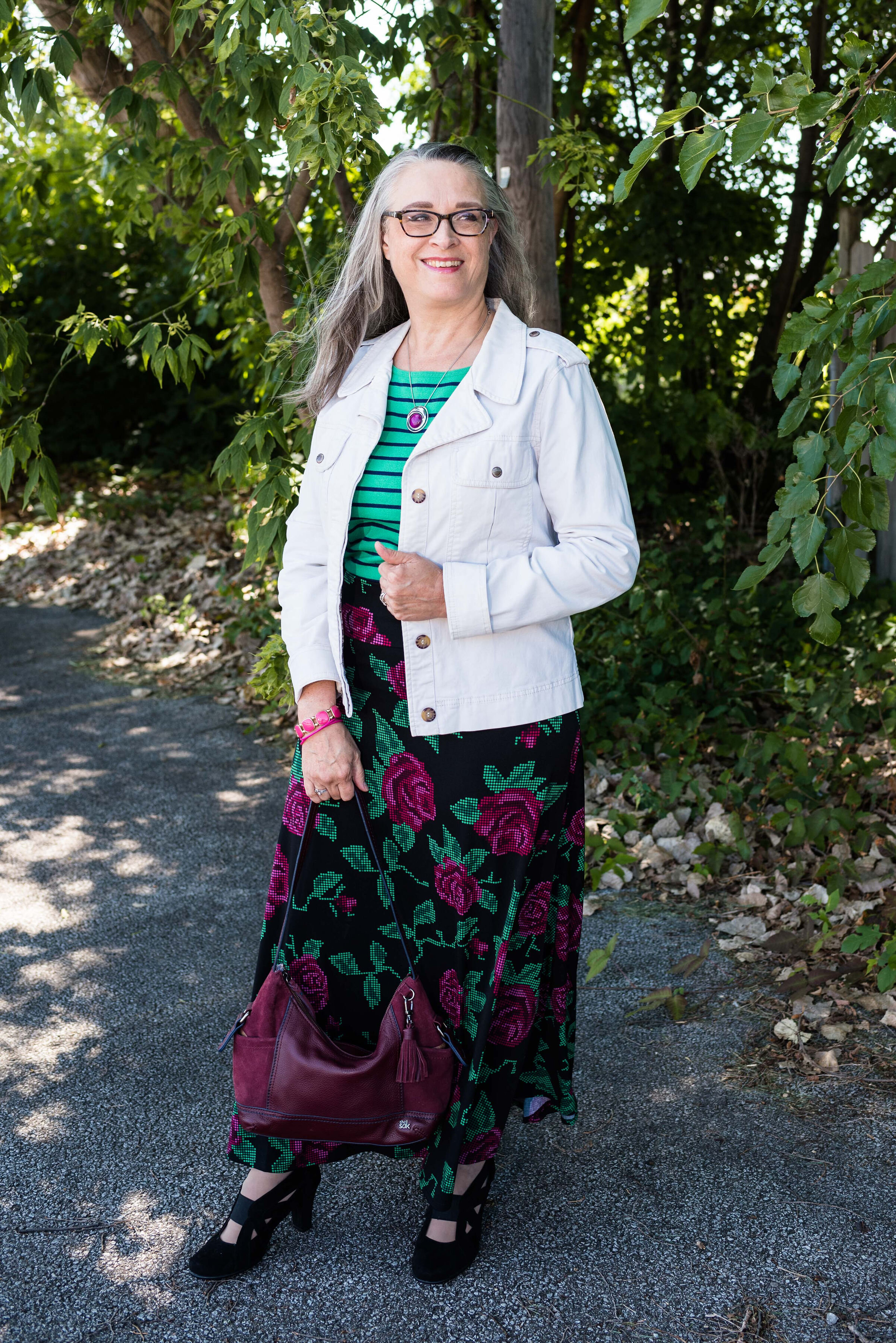
My LuLaRoe skirt was the perfect choice to build this outfit around. I actually had the thrifted striped tee already pulled out as a match for Leprechaun, and as I started figuring out which colors and pieces to put together, I remembered this skirt. I always have a little celebration party when pieces come together. When I try things on I do a little dance in front of the mirror and say, “This is it!” Ha, ha. The stripes in the tee are actually navy, but with the two prints taking center stage, you can’t really tell the colors are different.

pantonefallcolortrendsfuchsiafedora-3.jpg

My cream jacket by Sanctuary is a thrifted piece you have seen before on the blog. You can see it with a leopard print skirt and with my bright blue pants. It is actually more of a canvas than a denim, but it works much the same as a denim jacket providing light weight coverage for cooler weather and adding a casual touch to a dressier outfit.

pantonefallcolortrendsfuchsiafedora-5.jpg

You can see my Fuchsia Fedora necklace and bracelets. I think I have jewelry in just about every color under the sun, but you know, a girl can never have too many fun accessories! Is that a rule, or a guideline? Ha, ha.

pantonefallcolortrendsfuchsiafedora-8.jpg

My bestie, Stacey, gave me this beautiful, leather the Sak bag last time she came to visit. I thought the berry color went perfectly with the darker berry color in the flowers on the skirt.

pantonefallcolortrendsfuchsiafedora-9.jpg

These beautiful black suede heels never get to go anywhere, so I do like to bring them out and show them off on the blog. These are Aerosoles and I bought them a few years ago at a Clarks shoe outlet. I like that they are comfortable, have a reasonable heel, stay perfectly in place and look classy.

pantonefallcolortrendsfuchsiafedora-2.jpg

What do you think of these colors? Do you like them for fall? Now that I am thinking about it, I might need to revisit the idea of fuchsia as a fall color. I could see it with other fall colors like golden yellow, burgundy and rusty orange. Hmmm. I may have to get a little further outside of my color box.

Let me know what you think. I’m including a few shopping links for things of similar color. These are affiliate links and are brought to you at no extra cost. If you click on a link, I get a few pennies. If you purchase something through my site, I get a few more. I appreciate every click.

Have a great day!

Photo credit Jessica Trumbull with Rebecca Trumbull.

Oh, Olive! Utility Vest - Casual

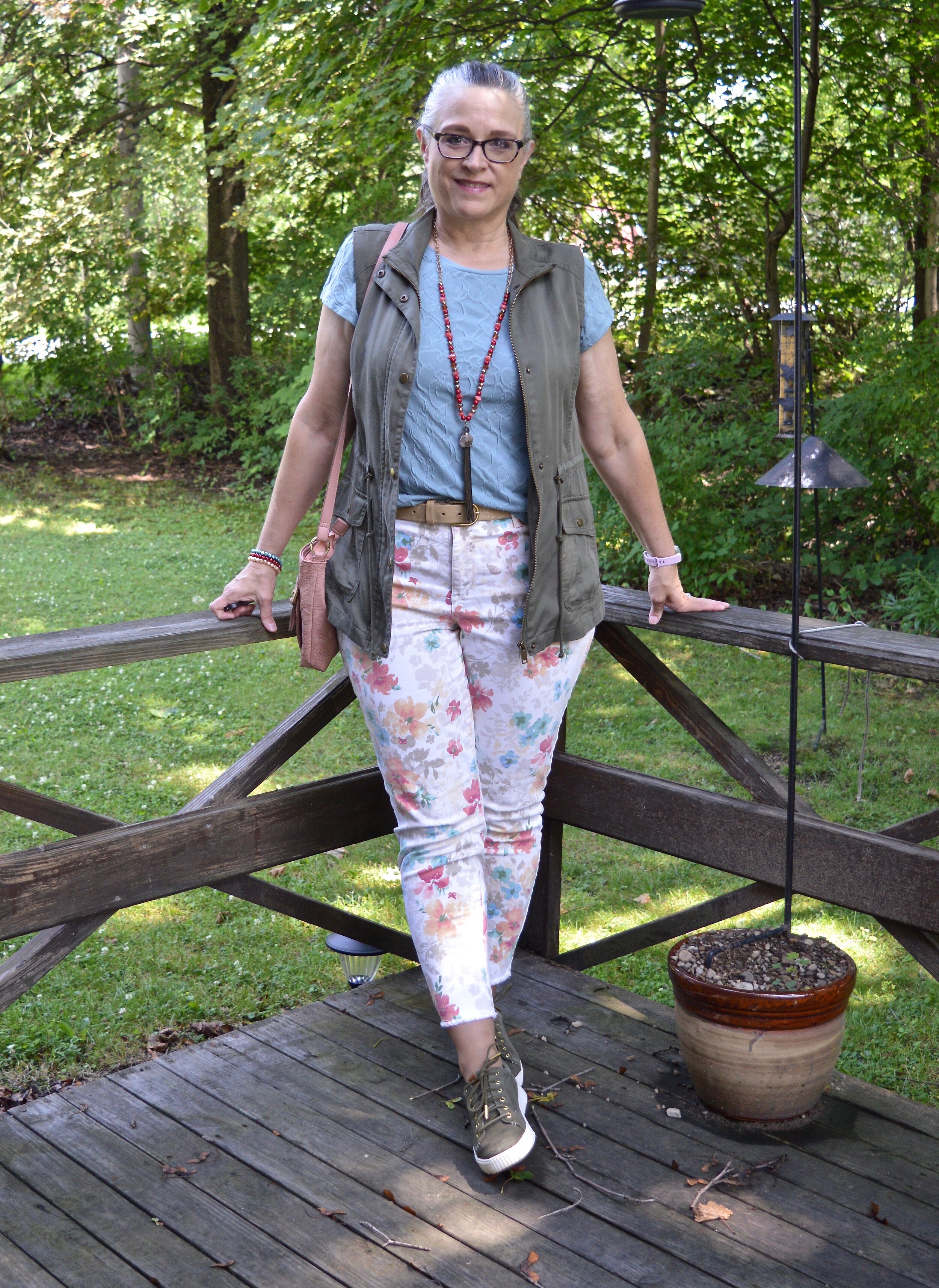
Another olive work horse in my closet is this utility vest. I have a number of vests. My fuzzy and quilted ones are great for fall and winter, while a vest like this, that is lighter weight, is perfect for spring, summer and into fall. I have been focusing on these olive pieces as the perfect neutral add on for a variety of outfits. I have been styling both casual and workwear looks, so that you have more to think about.

DSC_0058.jpg

This olive, Mudd brand, vest was a clearance find a few seasons back from Kohl’s. I was paying attention when olive was becoming popular as the new neutral, so I snatched this up. That, and I love vests. They are a great way to add warmth, interest and texture to an outfit. I made my outfit extra colorful, but you could easily tone a look like this down by going for monochrome layers topped by the vest. A black maxi dress, a tan tee and capris or a navy top and denim skirt would look fabulous topped by an olive vest like this. Let me know if you would like to see me style a few monochrome looks with this vest or the jacket from last week.

Fall Trend Alert - Florals

Florals are still in. Harper’s Bazaar listed florals in Finding Patterns on their fall list, and WhoWhatWear called theirs Charming Chinz. However, you label it, it seems that florals are holding their own as a print that is here to stay.

DSC_0061.jpg

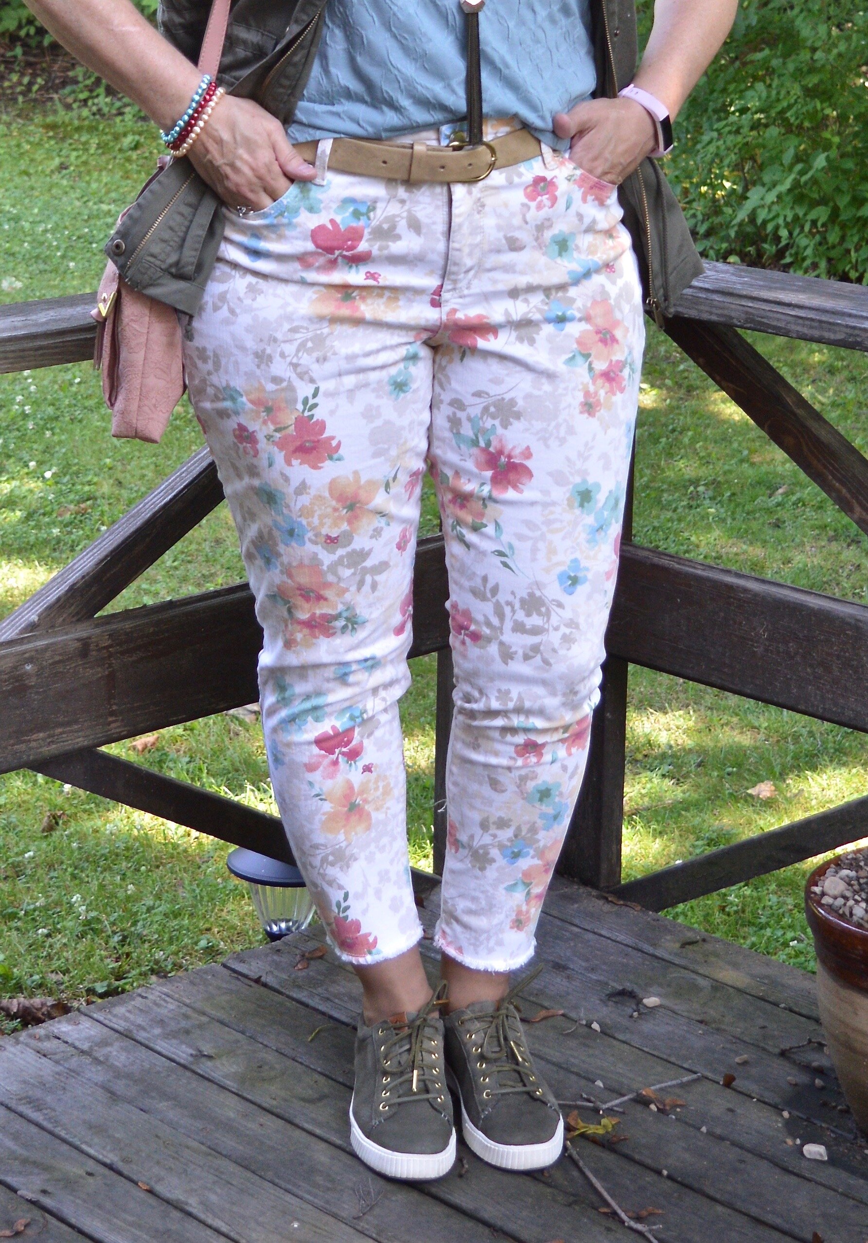
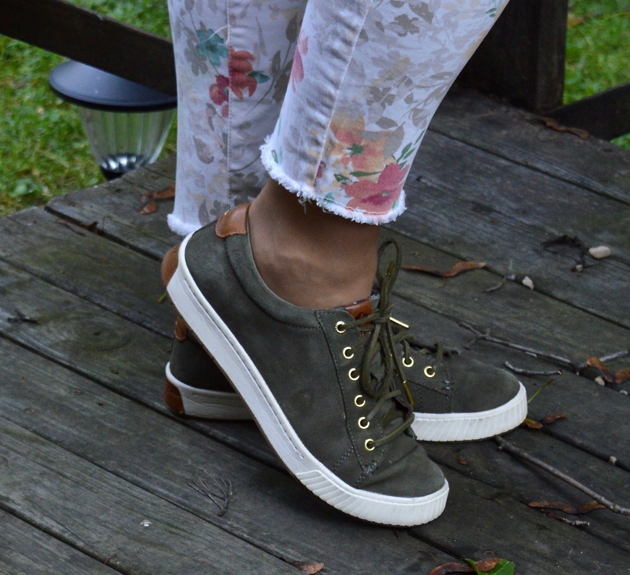
My Bandolino floral jeans are thrifted. They definitely brighten up any summer outfit. I love the floral print and the raw hem on the bottom. It also helps that they have some stretch and are very comfy.

DSC_0068.jpg

My textured tee is a thrifted Simply Vera, Vera Wang. I love the textured floral print and thought the color and print went perfectly with my pants. You can also see here, I added the long bead and fringe pendant necklace and a few freshwater pearl bracelets in similar colors for an added party vibe. I did the front tuck with the tee and added a gold belt.

DSC_0069.jpg

Wearing my olive Sperry’s again. These have become a favorite in my summer show wardrobe. I grabbed these instead of the white Steve Madden’s, because I like how the olive on top and on the bottom made the whole look more unified. You could wear any color with this outfit, like my blue Converse or my tan Keds.

Fall Trend Alert - Blush

Bright colors are definitely in for fall, but so are pastels. It seems any more that you really can wear whatever you want and at least a few things in your closet will be on trend.

DSC_0070.jpg

I didn’t plan it this way, but it seems, most of my outfit has some sort of floral theme. It’s funny when it works out that way. This pretty blush bag was a gift from my younger daughter. Both my girls give me wonderful presents and they are very good at knowing my tastes.

DSC_0062.jpg

What do you think of this outfit? Do you like the combination of olive with blue? Do you like florals and will you be wearing them this fall? I’d love to hear you thoughts. I’m sorry that I have gotten a little bit behind in responding to your comments, but I promise, I will respond. I appreciate your input.

I’m including a few shopping links for you to look over. These are affiliate links. All opinions are my own.

Have a great day!

Pantone - Spring/Summer - 2021 - London Palette - Pickled Pepper, Orange Ochre and Sphagnum

For today’s outfit I decided to combine the two greens that were on the London Palette. Both Pickled Pepper and Sphagnum are great green shades for summer time. While Pickled Pepper is one of the main palette colors, Sphagnum is one of the palette classic colors. Olive is a great neutral and goes with just about every color out there, so Sphagnum, (which is actually a type of moss), makes for the perfect classic color.

pickledpepper.jpg

My Pickled Pepper popover top is Sonoma from Kohl’s a few years ago. This top is easy to wear, as well as cool for these hot, humid days. I don’t usually prefer to wear sleeves with elastic, but as long as the elastic isn’t cutting off the circulation in my arms I’m okay with it.

pickledpepperpantoneoutfitideas-12.jpg

My Sphagnum utility vest is Mudd brand, and was another clearance purchase from Kohl’s a few seasons ago.

pickledpepperpantoneoutfitideas-4.jpg

These light wash jeans were a recent thrift find. A brand called Ella Moss, this brand is available at stores like Nordstrom, Bloomingdales, Amazon, Dillards, and others. I like the cropped length and the high waist of this pair.

For the Orange Ochre color, I grabbed my thrifted, orange suede bag and a fun pendant choker. It is much easier to include a brighter color, if you do it with accessories.

pickledpepperpantoneoutfitideas-9.jpg
pickledpepperpantoneoutfitideas-7.jpg

I had to show off my new clearance Converse sneakers from DSW. They are very comfy and I love the blue color. They are similar in color to my thrifted Keds, which are showing a bit of wear, so these were a great find.

pickledpepperpantoneoutfitideas-11.jpg

Here are a few silly pictures. I was jumping for joy. Ha, ha.

pickledpepperpantoneoutfitideas-5.jpg
pickledpepperpantoneoutfitideas-6.jpg

What do you think of these colors? Do you like to wear green? Do you have Sphagnum (olive) in your closet? I would love to hear from you. I’m including a few shopping links for you to look over. These are affiliate links. All opinions are my own.

pickledpepperpantoneoutfitideas-3.jpg

Graphic and photo credit Rebecca Trumbull.

Pantone - Spring/Summer - 2021 - London Palette - Pirouette, Indigo Bunting and Polar Night

As always, with the Pantone color series, I find their choice of names for their colors intriguing. Today’s colors center on a pretty purply pink, called Pirouette, which, of course, makes me think of a ballerina. Indigo Bunting is a pretty blue, much like the bird after which it is named. I have had the privilege of seeing an Indigo Bunting flitting through the trees at one of our local metro parks a few years back. They regularly reside in Ohio in the summer time, but like to hang out in abandoned fields, scrubby bush areas and areas with red cedar trees, none of which I have around my house. Polar Night, much like its New York partner Inkwell, is a very dark navy blue.

pirouette.jpg

This fun, multi-print dress is a few years old and was a Kohl’s clearance purchase. I really like many of the pieces by Vera Wang, made specifically for this retailer and called Simply Vera by Vera Wang. These are the pieces that real world women like myself can afford and wear. I have styled this dress, like a tunic for a trip we took to Florida a few years ago. You can see that post here. The dress really contains all three colors, except that its blue borders on being more of a teal.

londonpantonecoloroutfitideapiurouette-8.jpg

I decided to add the bright blue sweater, another Christopher and Banks cardi, as my attempt at the Indigo Bunting. It is a tad bit bluer and maybe brighter, but I think it works well. I would have never thought to pair it with this dress, but I like how it looks.

This is me being silly as I commune with nature. Ha, ha.

londonpantonecoloroutfitideapiurouette-5.jpg

I centered all my accessories around the necklace that is perfectly Pirouette. Since the beads are strung along a silver chain, I went for silver as my accessory color of choice. My thrifted silver clutch and my SO ballerina flats makes the outfit just a little more dressy.

londonpantonecoloroutfitideapiurouette-12.jpg
londonpantonecoloroutfitideapiurouette-14.jpg
londonpantonecoloroutfitideapiurouette-15.jpg

What do you think of these colors? Would you wear them? Do you have any of these colors in your closet? Let me know what you think by leaving me a comment here on the blog or on Facebook.

londonpantonecoloroutfitideapiurouette-9.jpg

Don’t forget, I also post on Instagram and typically you’ll see more of what I wear on a regular basis. Right now my daily looks are very casual, since I am not working, but you’ll definitely get to see more of my clothes, that don’t make it to the blog.

As usual, I am including a few shopping links for these colors. These are affiliate links, but all opinions are my own.

Have a great day!

Graphic and photo credit, Rebecca Trumbull.

Pantone - Spring/Summer - 2021 - London Palette: Illuminating, Marigold and Ultimate Gray

Illuminating and Ultimate Gray are the two colors of the year, so just like I did for the New York Palette, I decided to pair the two colors together and for this one I added Marigold, which was also on the New York palette.

illuminating.jpg

We decided to go to the Toledo Botanical Gardens again for these pictures and we did come across some beautiful blooms. This particular bush is a rhododendron. I just did some research and found out that all azaleas are rhododendrons, but not all rhododendrons are azaleas. Whether you like azaleas or rhododendrons they are all beautiful.

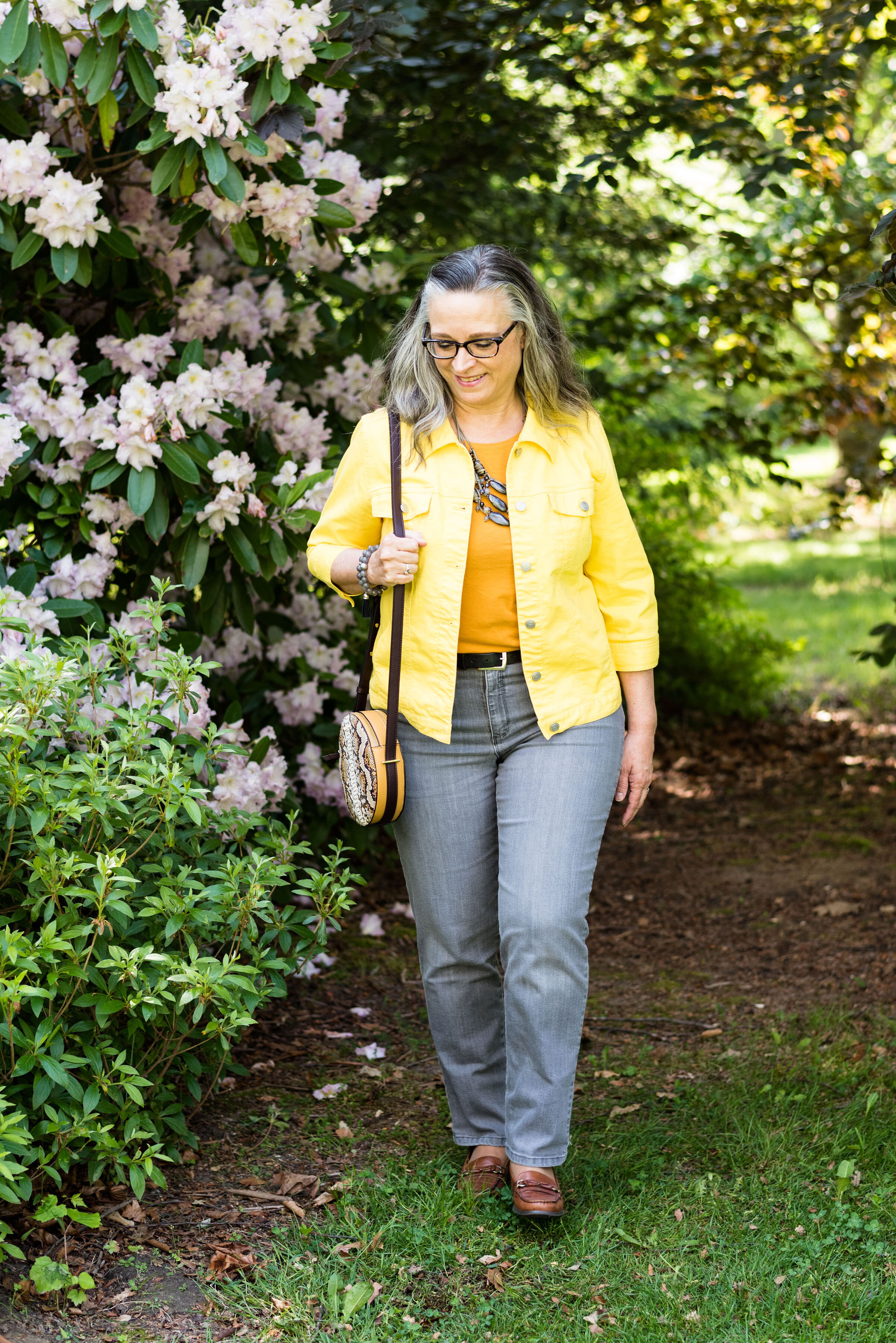
Once again, I chose my recently thrifted bright yellow jacket to serve as the Illuminating color. The jacket is D&Co. (Denim and Co.). It has a nice stretch to it and I like the 3/4 length sleeves for a change of pace.

londonpantonecoloroutfitideailluminating-8.jpg

I’ve styled my medium yellow tee on the blog before. You can see it styled with a leopard print skirt. Having tees in a variety of colors comes in handy when you want to put an outfit together. This thrifted tee is Apt. 9 brand.

My Gloria Vanderbilt jeans were another Kohl’s clearance find. They are soft and stretchy, so great for my fluctuating weight. I say fluctuating, but it really doesn’t go up and down. It either stays the same or goes up. Ha, ha.

londonpantonecoloroutfitideailluminating-11.jpg

I wanted my accessories to make a statement since the outfit itself was not overwhelmingly interesting. I found this pretty layered necklace in gray tones somewhere along the way. I think it was a thrift shop nearby. I added a few beaded bracelets to tie the jewelry together.

When I decided on the thrifted tan loafers, I knew my Nine West snakeskin print circle bag would be the perfect piece to complete the whole look and bring everything together.

londonpantonecoloroutfitideailluminating-13.jpg
londonpantonecoloroutfitideailluminating-15.jpg
londonpantonecoloroutfitideailluminating-16.jpg

What do you think of these colors together? Do you like the lighter yellow of Illuminating or the richer tone of Marigold? I’d love to hear your thoughts in the comments below. I appreciate when you give me your feedback. It can be kind of lonely as a blogger, when I don’t know if anyone is reading my content or looking at my posts, so I really love to hear from you.

londonpantonecoloroutfitideailluminating-10.jpg

I am including a few shopping link for you to enjoy. These are affiliate links and are brought to you at no cost. If you click on a link I get a few pennies and I appreciate all of your clicks. I do not get paid to write my blog, I do it as a hobby and as a service to whomever wants to follow along. I hope that I inspire you to take a second look at your wardrobe and see new ways to put things together, that you never thought of before.

Photo and graphic credit Rebecca Trumbull.

Pantone - Spring/Summer - 2021 - London Palette - Intro

I am finally getting around to sharing the Pantone London Palette with you. It has been hard to get things posted in a timely fashion. Even though I would normally try to get these colors to you, much earlier in the Spring, I figure they are meant for spring and summer, so we are still okay. Today’s post will introduce you to the colors and give you a few little sneak peeks from our recent photo shoot.

londonspring2021.jpg

These are all great colors for spring and summer. The palette is a nice mix of warm and cool colors and there is likely to be a color for everyone. The classic colors, while still showcasing your typical navy, gray and creamy white, also includes a soft light brown and an mossy olive green. I really like the blues included with this palette. They make me think of tropical waters and blue skies.

Enjoy these sneak peeks.

pantonefashionideassummer-1.jpg
pantonefashionideassummer-3.jpg
pantonefashionideassummer-4.jpg
pantonefashionideassummer-5.jpg
pantonefashionideassummer-6.jpg

Be sure to check back on Thursday for the first outfit in this series. I hope you had a lovely Memorial Day weekend.

Photo and graphic credit Rebecca Trumbull.

Why You Should have a Pair of Colored Pants - Orange

I thought I would do one more week on colored pants. This denim wearing diva, never imagined in all my years that I would learn to love brightly colored pants, but I have. I do remember when I was young, being a child of the sixties and seventies, I had a pair of bright red, cuffed bell bottom pants that I loved to wear to school. I am not sure what drew me away from the bright colored bottoms, except maybe that feeling of not wanting to be noticed or seen. I still struggle with that bit, but now I don’t worry so much about what other people are thinking or looking at. That is not my problem. I do try to dress modestly, but I love my bright colors and think they help to make me happy. This week I want to focus on my orange pants.

These orange pants were a clearance purchase at JC Penney about four years ago. They are Worthington brand, have a side zipper and an extra seam towards the front, giving the leg a long, lean line and less bulk around the middle, for a more streamlined look. The waist sits near my natural waist, so a little less of the spare tire problem. Here are past posts from the blog where I used these pants.

Outfit 1 - Orange with Sheer Light Blue Top

Pantone+Spring+2017+-+Island+Paradise.jpeg

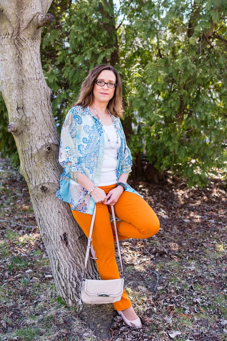
I love the summery vibe of this outfit. The light blue, sheer top over the white tank combined with the bright orange pants seems very fitting for dinner under the palm trees at a tropical resort.

Outfit 2 - Orange Pants with a Dress

Spring+Transition+-+floral+dress.jpeg

This is one of my favorite outfits with these pants. It just happened that I found this dress at H&M and that the orange in the dress matched perfectly with the pants. I have no problem with women wearing shorter dresses. I know lots of women who will wear them with bike shorts underneath, so nothing is revealed if they blow up or if they bend over. I personally do not have the legs to wear a shorter dress, so wearing pants with a dress has become something I do more often. It is a fun way to display a short piece without any worry of revealing veiny legs or other leg flaws.

Outfit 3 - Orange with Bright Purple and Gray

Pantone+Fall+2018+-+Russet+Orange,+Ultra+Violet+and+Quiet+Gray.jpeg

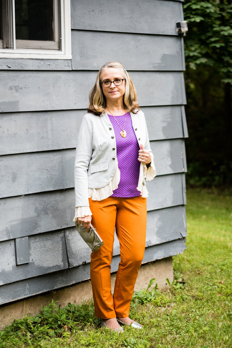
Who would have thought to pair bright purple with orange? Well, I did and I think it turned out perfectly. I think the light gray jacket over the top helps to pull this whole look together. The pretty leaf necklace ties the orange pants to the purple top. This is a trick you can do to bring cohesiveness to an outfit that might seem a little outside the color box.

Outfit 4 - Orange with Dark Green

Pantone+-+Autumn_Winter+-+2019+-+Orange+Tiger+and+Eden.jpeg

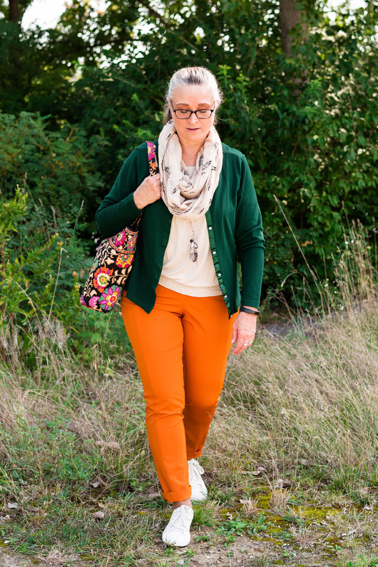
Once again, you see a color block pattern, but one that is complimented by the printed accessories in the form of a leaf print scarf and a Vera Bradley tote bag. Since this was a more casual look, I added a hem roll to the bottom of the pants. This would be a great outfit to wear for an early fall shopping trip.

Outfit 5 - Orange with Marled Black Vest

Transitional+spring+outfit.jpeg

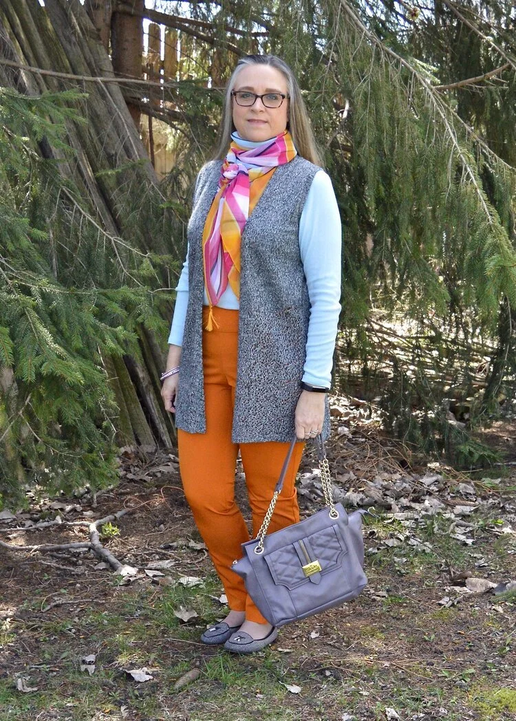
Vests are a great way to transition from cooler seasons to warmer ones and warmer ones to cooler ones. They keep our cores warm, but our arms from being bound under bulky sweaters or coats. The focal point of this outfit, was not the pants, but the scarf, but I drew on the colors in the scarf to create the complete look.

Outfit 6 - Orange with an Asymmetrical Vest

Pantone+Spring_Summer+2020+-+Flame+Orange,+Blossom+and+Cuban+Sand.jpeg

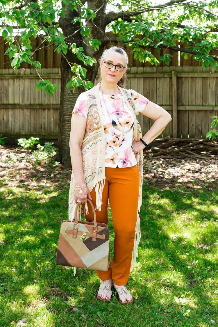
The solid colored orange pants are the grounding point in this outfit that is filled with busy prints. The floral tee, the open weave asymmetrical vest and the patchwork bag would probably be too much, if the pants were also printed. The bright orange once again announces that summer is just around the corner.

Outfit 7 - Orange with Teal, Gray and Yellow

Pantone+-+Autumn_+Winter+-+2020+-+London+Palette+-+Exuberance,+Ultramarine+Green+and+Sleet.jpeg

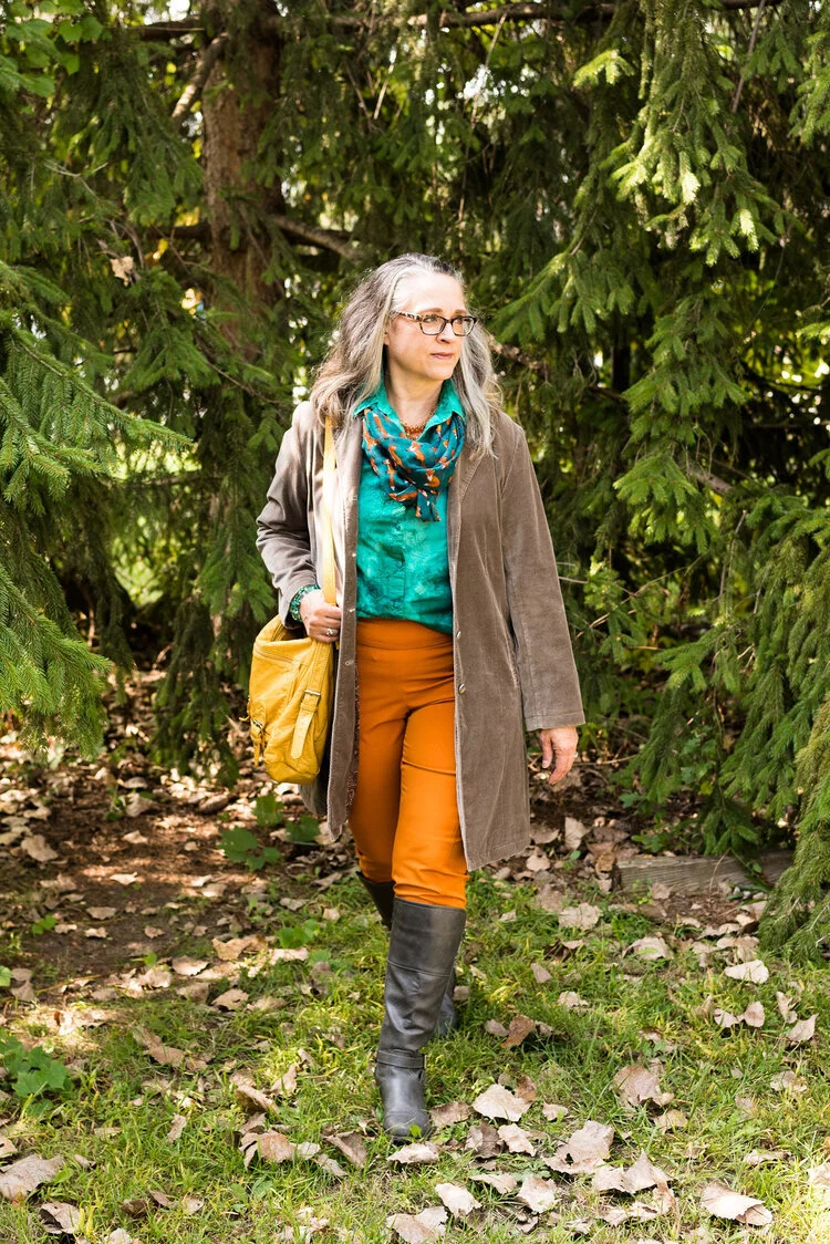
Here we are, back to fall. Orange is a no brainer for fall outfits, but we often reach for rust or darker versions of orange. However, I think I have shown that this bright orange is perfect spring through fall. You probably could even dress it up for winter with a chunky fisherman sweater and some suede ankle boots. This particular pair of pants is lighter weight, so if I wore them in the winter, I might put a pair of tights underneath.

So what do you think of orange pants? For all practical purposes I think more women would choose a bright blue pair rather than the orange, but what I wanted to show you is that there are so many different ways to style a bright colored pair of pants and still have a classy outfit that you can wear for a night out with the hubby, a lunch with friends or to a summer picnic. Pick your favorite color and get a pair of bright colored pants now.

I plan on showing you another outfit on Thursday with these same pants that has a more work oriented feel. Be sure to check back then.

I am leaving you with shopping links for a variety of bright colored pants. I hope you find a pair that will be perfect for you. These are affiliate links. All opinions are my own.

Photo credit Rebecca Trumbull.