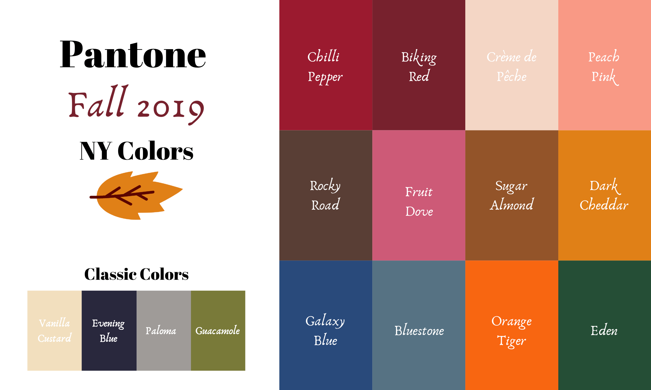
Pantone - Autumn/Winter - 2019 - New York Palette Recap

I was going to start the Pantone London color palette today, but decided to do a recap of all the New York colors. Some people have told me they like to see all of the outfits and colors together in one post, so here we go.

Outfit 1 - Chili Pepper and Bluestone

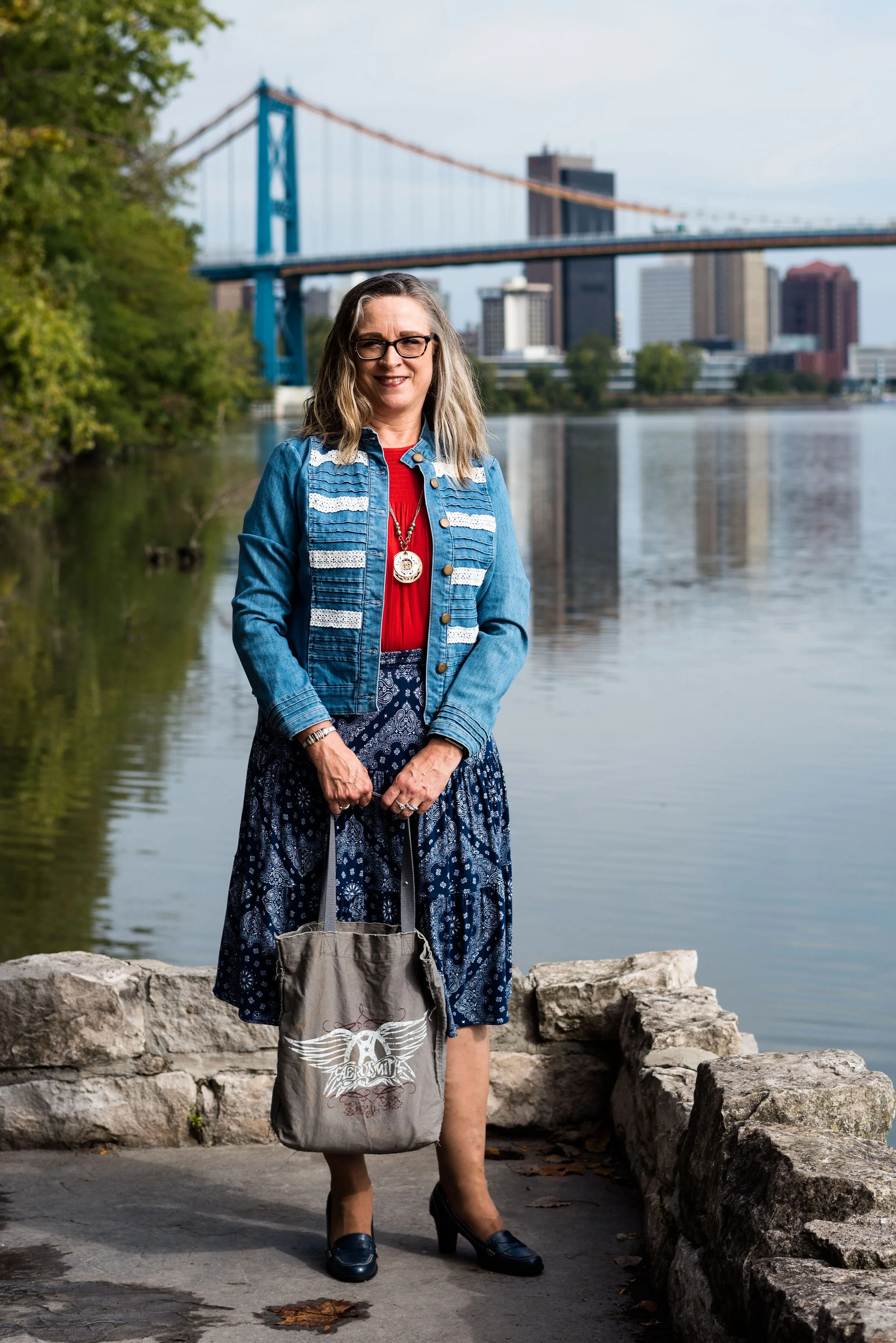
Outfit 2 - Fruit Dove and Galaxy Blue

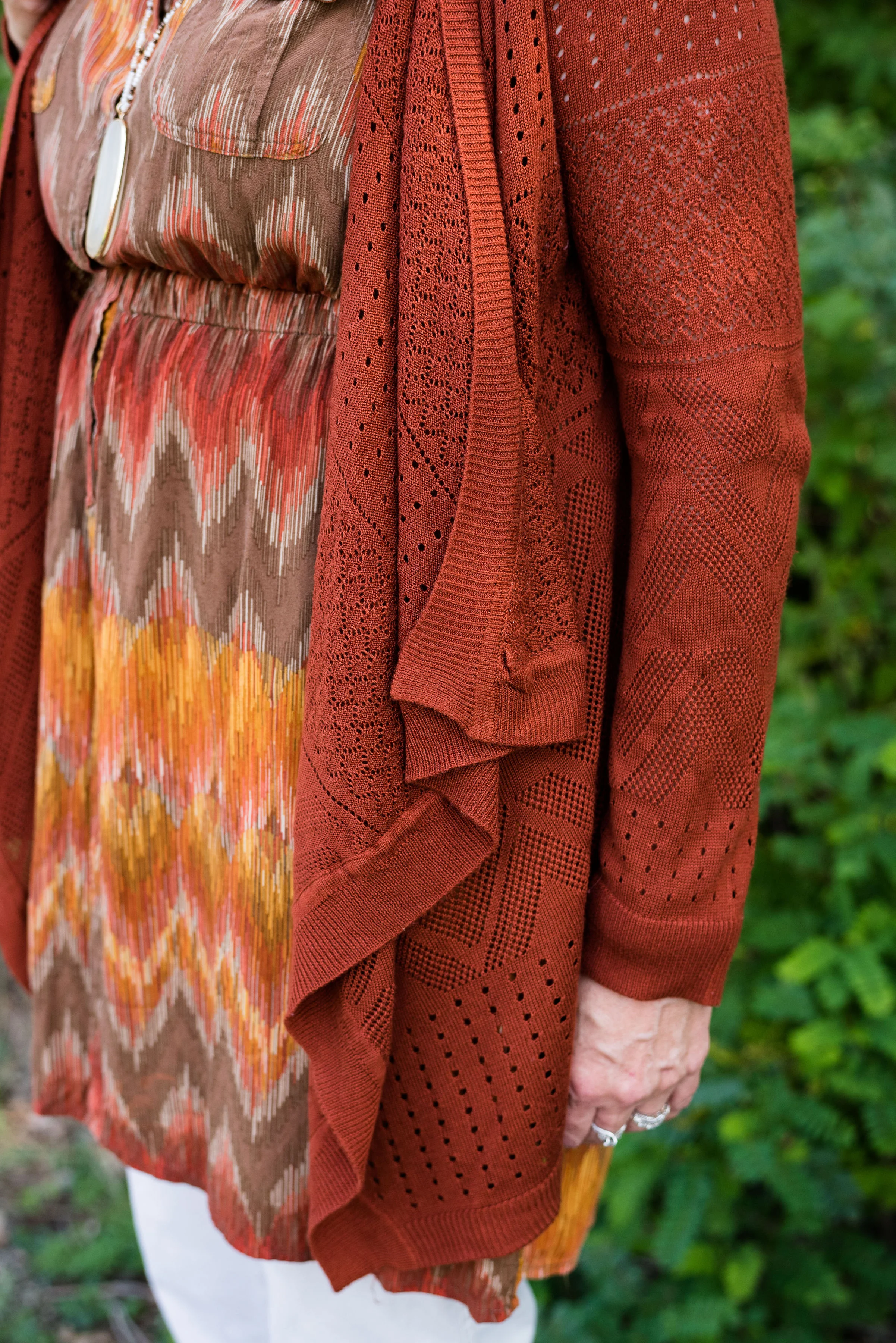
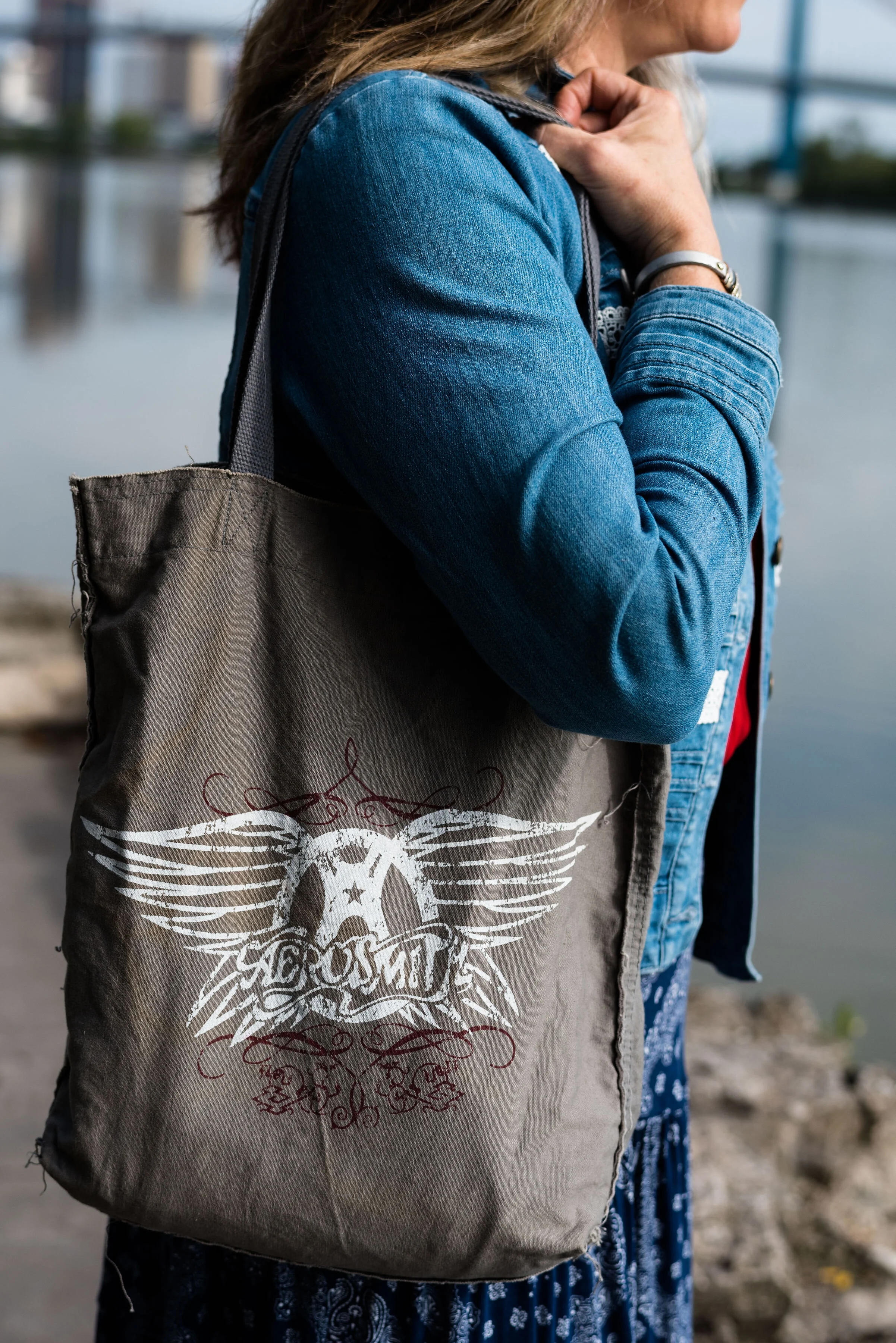
Outfit 3 - Crème de Pêche and Rocky Road

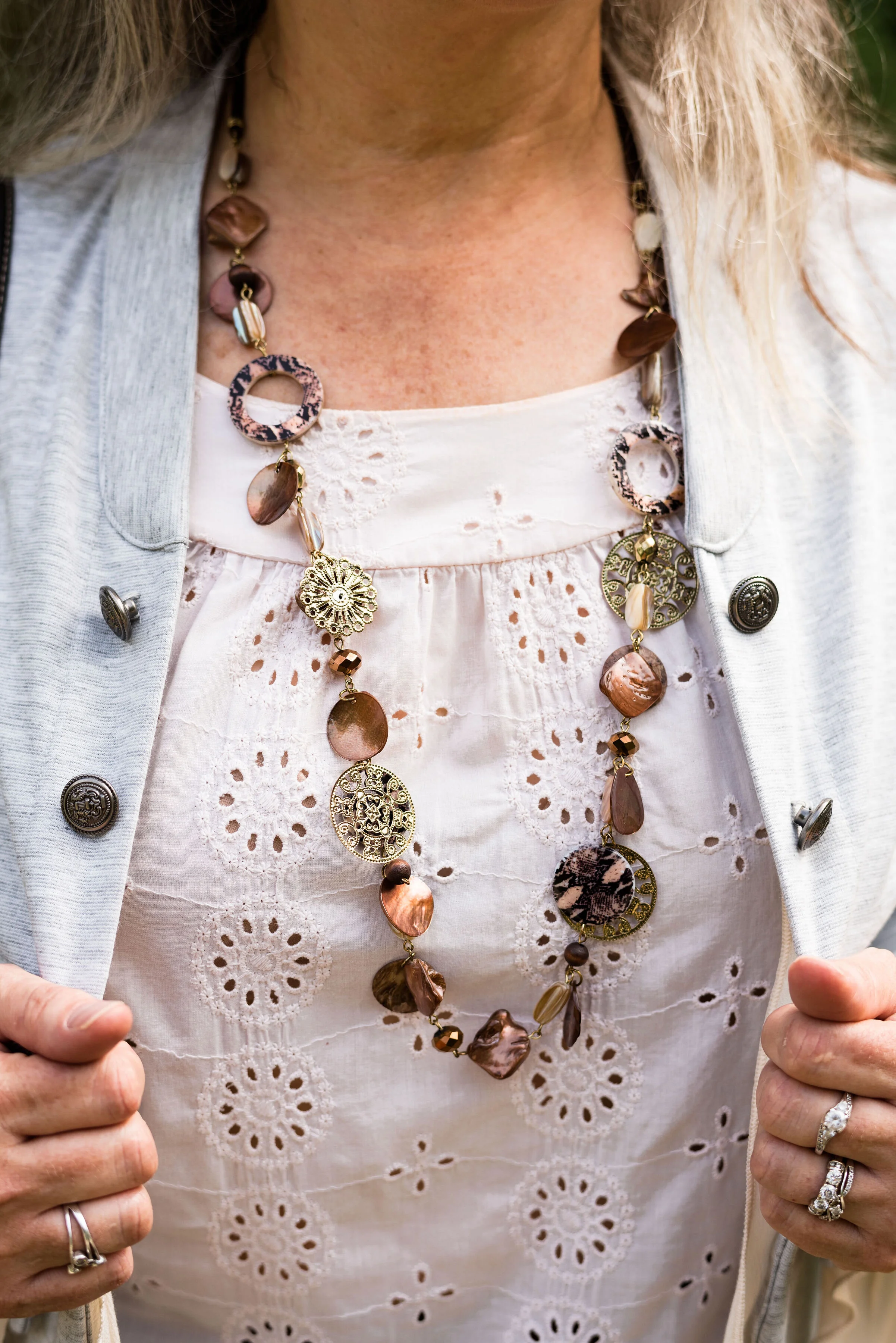
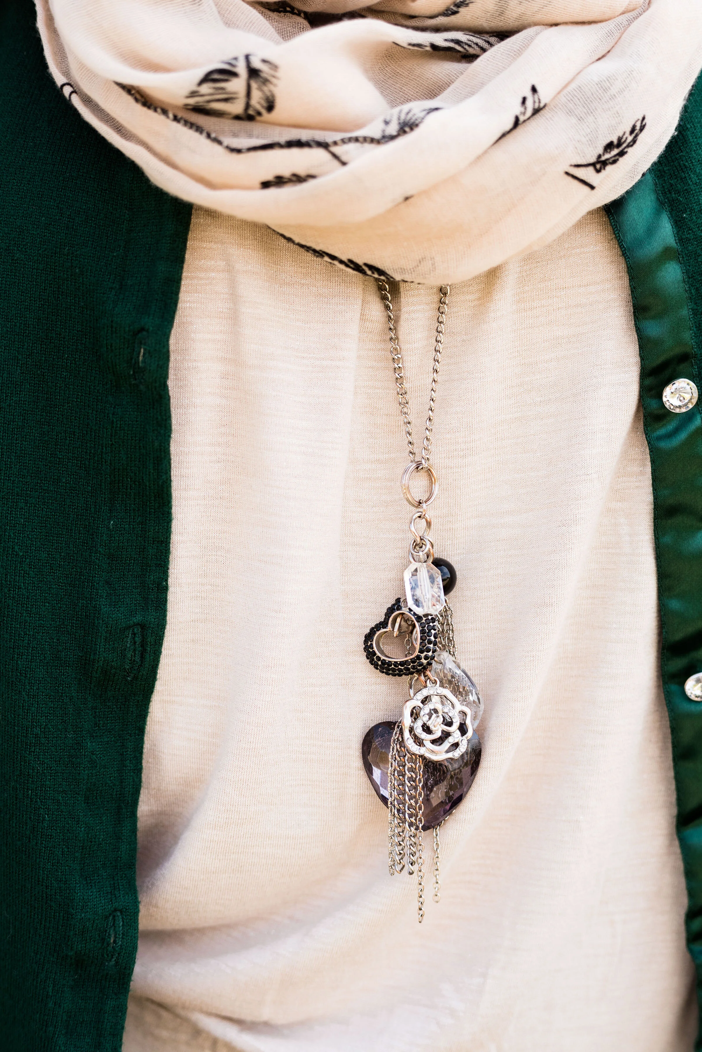
Outfit 4 - Sugar Almond and Dark Cheddar


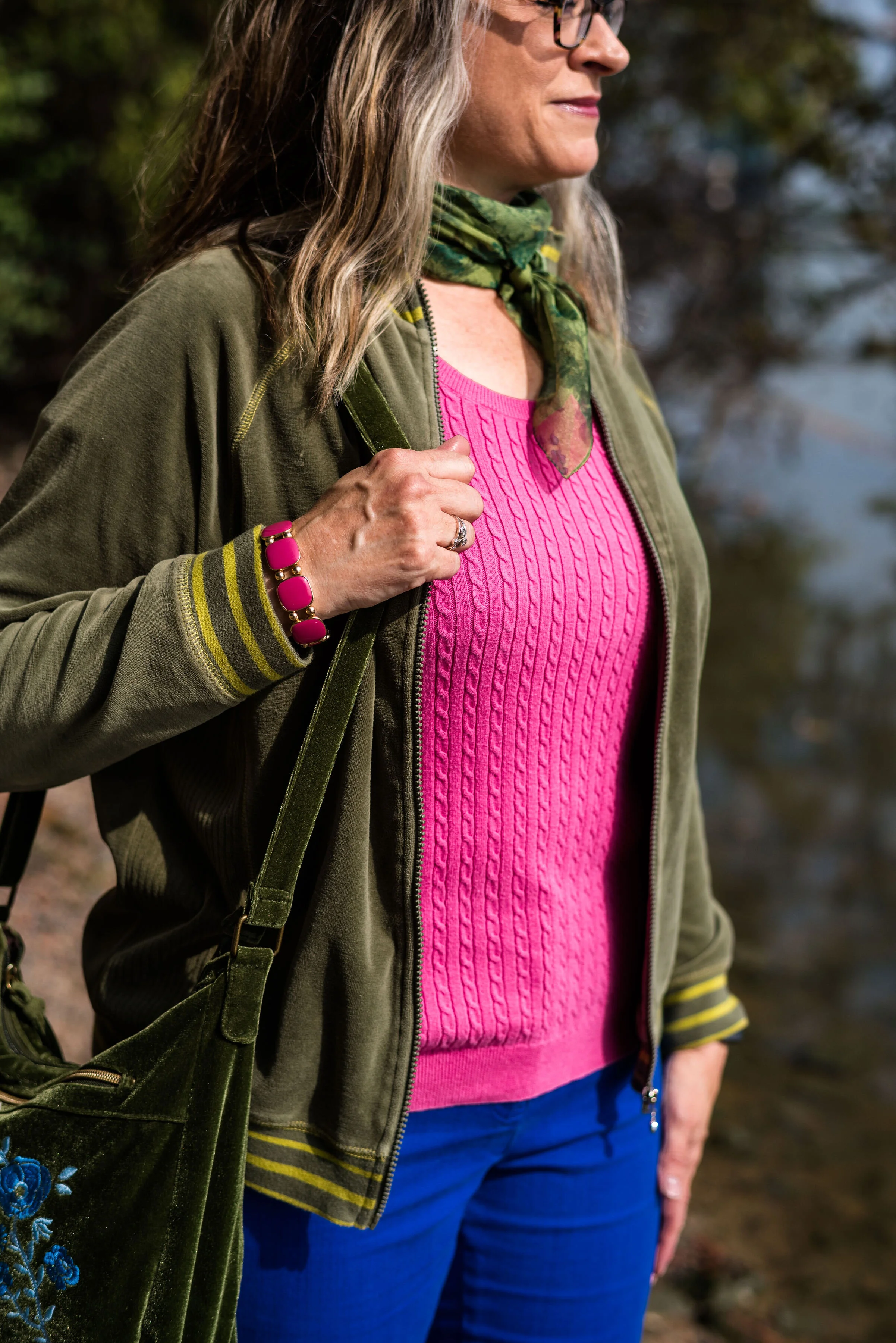
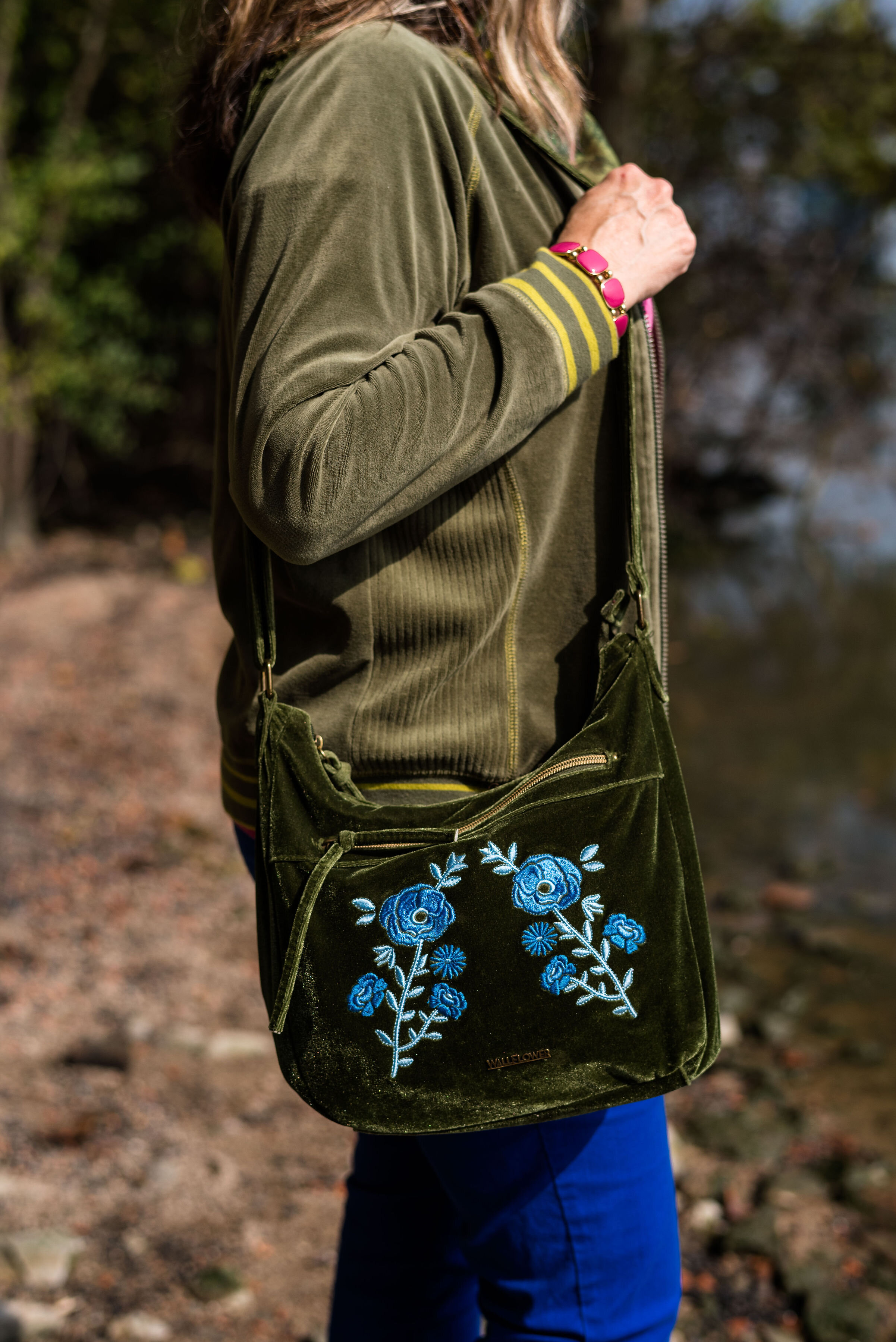
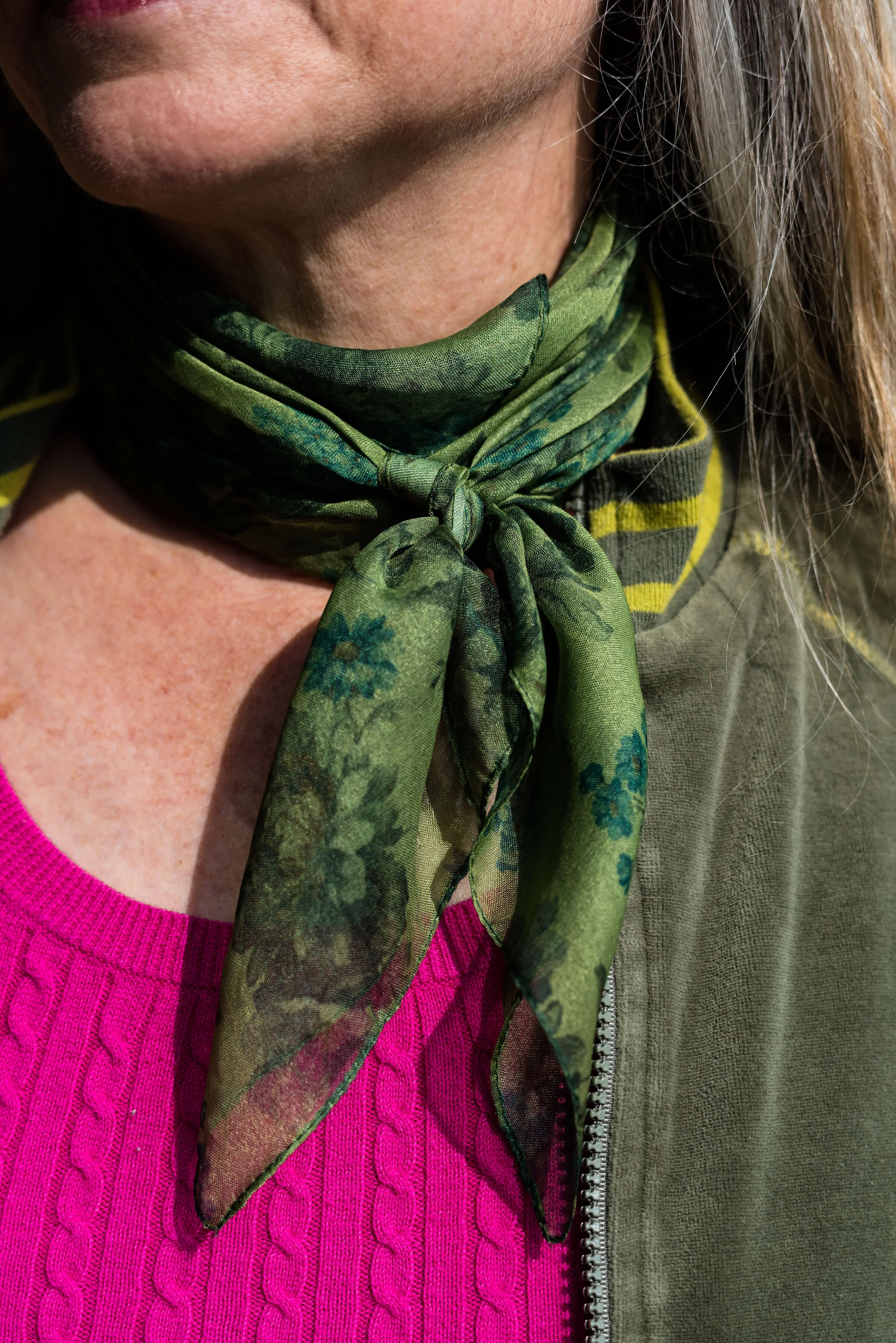
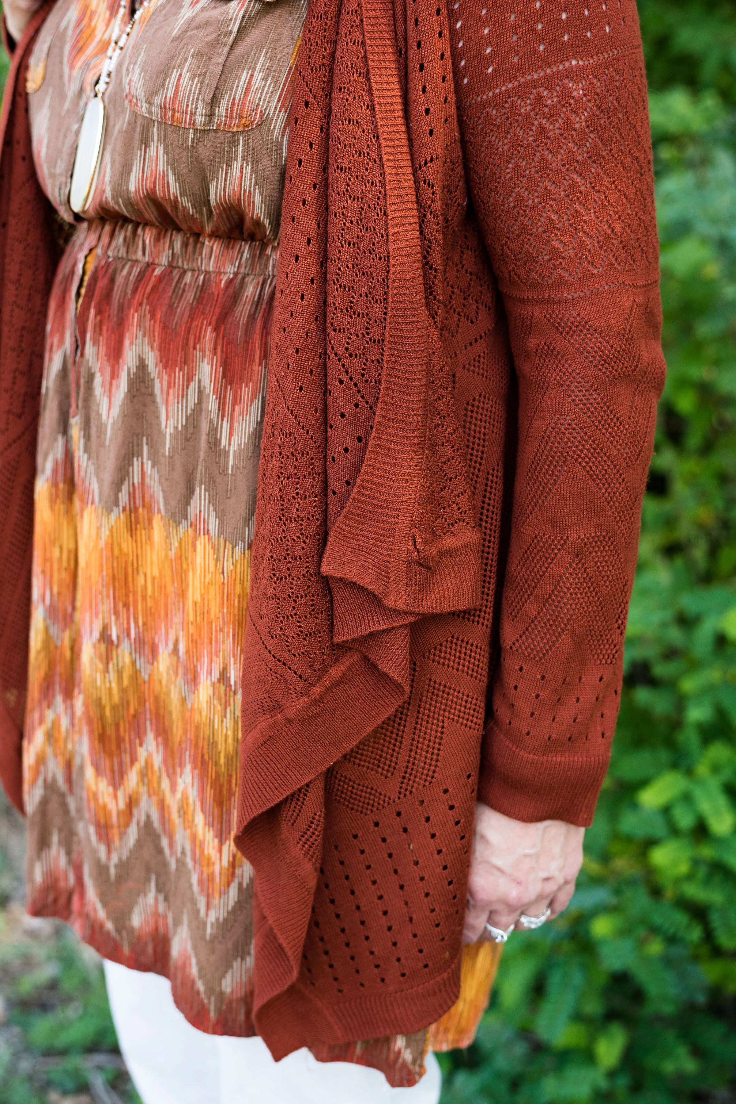
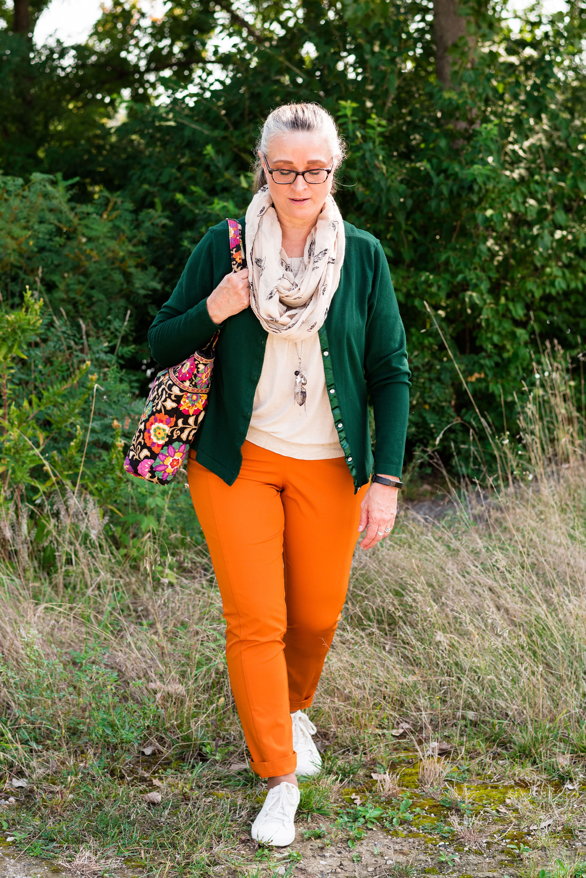
Outfit 5 - Orange Tiger and Eden

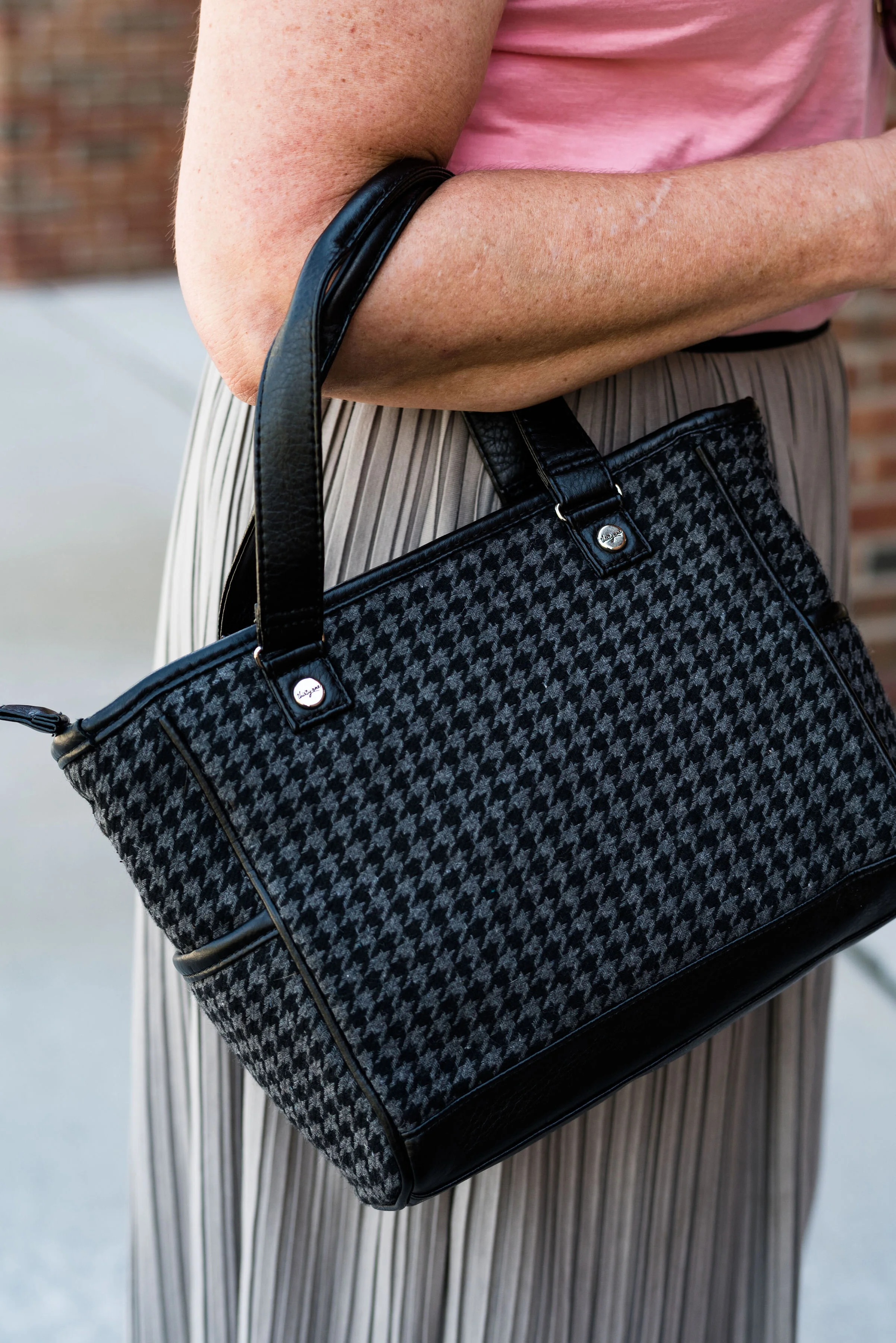
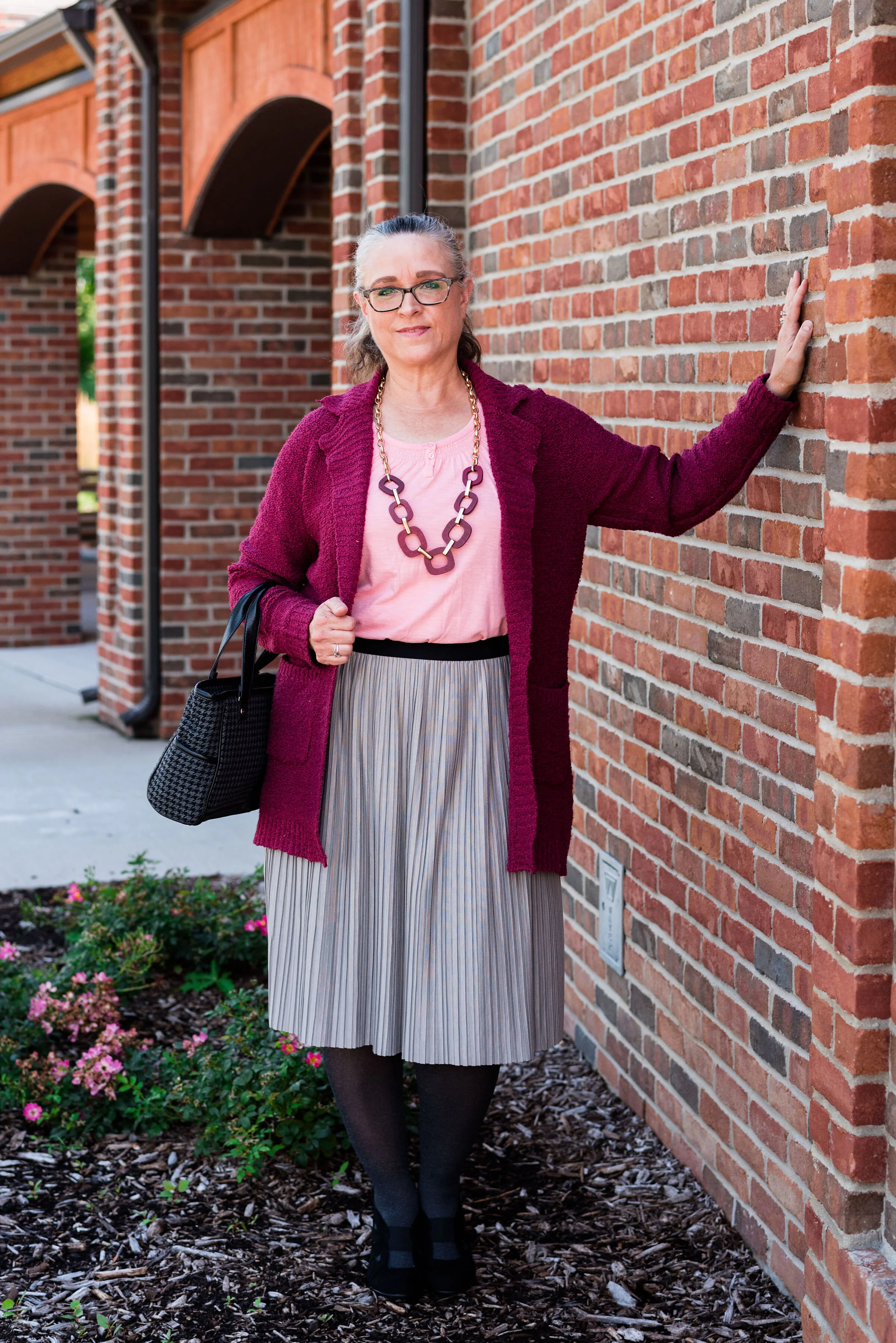
Outfit 6 - Peach Pink and Biking Red

I hope you enjoyed this look at the Pantone - Autumn/Winter - 2019 - New York palette. Which outfit was your favorite? I’d love to hear your thoughts.

Next week I’ll be starting the Pantone - Autumn/Winter - 2019 - London palette. Believe it or not, the only two overlapping colors this year were Galaxy Blue and Bluestone. Be sure to check that out next week.

Thank you all for being a part of my blogging journey. If you ever have something you would like to see me feature on the blog, send me an email. I’m open to new ideas and value your opinions and support.

Have a fabulous weekend!

Photo credit Rebecca Trumbull.

Pantone - Autumn/Winter - 2019 - Sugar Almond and Dark Cheddar

Today’s colors, in my opinion are the epitome of fall. The browns and oranges remind me of pumpkins and firewood stacked as it waits to be used. Red’s and yellows are other bright colors associated with this season and we will be seeing more of those in the London color palette, which will be coming up shortly. Let’s take a closer look at Sugar Almond and Dark Cheddar.

This thrifted, Sonoma, chevron print, dress caught my eye a few months ago and I knew it would be perfect for fall. Originally, I was going to used the waterfall cardi for the Sugar Almond color, but I actually think the colors in the dress are more suited to both of these Pantone colors.

Since I don’t normally wear dresses this short, I thought it would be fun to pair it with cropped pants. This pair of St. John’s Bay, creamy colored pants were another thrift store find. I almost didn’t get them, because I thought they were a little tight, but then, what isn’t on me right now. Ha, ha. However, I ‘m glad I put them in my cart. I think they make a cute addition to this dress. I want to try them with boots, when the weather gets colder. I might even try this dress with a chunky sweater, tights or leggings and boots. If I have success with that, I’ll post pictures either on Instagram, or I’ll do a post about it.

You can see in the above picture, the dress has a partial button front and an elastic waist. Wearing a belt with this would be another fashion forward idea, but I wanted an uninterrupted look from collar to hem, especially since I chose to wear this with cropped pants.

Let’s take just a moment to talk about the rule of thirds. The rule of thirds is a photography guideline that suggests mentally dividing your picture into thirds, horizontally and vertically. You then place the image you wish to photograph at the intersection of two lines. This can make for a more interesting picture, that draws the eye to the image.

Fashion also has a rule of thirds. The body is divided into thirds: head to waist, waist to knees and knees to feet. This is an approximation and as we all know, some people have longer necks, shorter torsos and longer legs, so each individual will be a little different. This rule is good to be aware of when putting together an outfit.

If you look at the above picture, the dress would be considered in the first two thirds of my body and the crop pants and shoes in the last third. Take a look at this article to learn more about the rule of thirds in fashion, and why it helps to keep it in mind when you dress. Dressing Your Best: Rule of Thirds.

This Pink Rose, waterfall cardi is another thrift find. I love the open weave, and as you can see, it also has the chevron pattern on it. I did not plan that. Ha, ha. I just thought the color went perfectly with the colors in the dress. This is a great piece for these fall days that are still warm.

For accessories, I went with a coppery bag and my thrifted Naturalizer shooties. I also added the pendant bead necklace as a way to bring out the cream in the dress and tie in the pants. Accessories are the best way to pull an entire outfit together and make it look finished.

What do you think of these colors? Do you wear orange? Orange is often an intimidating color to wear, but there are so many different shades and tones that there is probably one out there you could wear. Would you wear crop pants with a dress like this? Let me know your thoughts. I love to hear from you.

Be sure to check back Thursday for two more Pantone colors.

Photo and graphic credit Rebecca Trumbull.

I’ve included a few shopping links for you to look at. These are affiliate links. Any time you click on a link, I get a few pennies. If you purchase something through my links, I get a a small commission. I appreciate all your support and all opinions are my own.

Have a great week.

Pantone Autumn/Winter - 2019 - Fruit Dove and Galaxy Blue

These next two colors are described by the Pantone Color Institute as an “extroverted pink” and a “thoughtful blue”. I like that combination of terms, in the same way I like this combination of colors. We often think of extroverted people as popular, charming and talkative, while thoughtful people could be described as people who think more than they talk, or people who are on the look out for ways to help others. I am not an extrovert, but an introvert. I have a hard time in crowds, get tired of too much noise or activity and I need my alone time. Wearing a bright pink like this is my way of standing out in the crowd, without saying very much.

You might think these three colors are more spring like than fall like, but colors transcend all seasons. I do like darker, richer colors for fall and lighter, breezier colors for spring, but that is my personal opinion. What really makes an outfit more season specific are the textures and accessories you incorporate into it.

i’ve worn these bright blue Ruby Rd. pants on the blog before. You can see them with a light blue sweater, a plaid bomber jacket, and a multi-colored kimono. My friend was getting rid of these and I took them, not realizing how much I would actually wear them and used them for the blog. This royal blue color seems to keep coming around again and again.

I have had this thrifted Ralph Lauren pullover sweater for a while. I don’t wear short sleeve sweaters too often, because in the summer it is too hot and in the fall, winter and spring it is too cold. However, for some of these warm fall days, where the temps are still in the 70’s in the day and 50’s at night, a short sleeve sweater is a good option. Can you tell in the picture below I am trying to stand up straight and suck in my rolls? Ha, ha. Well, I am! Just being real!

In addition to the two New York palette colors of Fruit Dove and Galaxy Blue, I wanted to incorporate one of the classic colors. I thought it was interesting that they included this olive green, which they call Guacamole. In the past, the classic color palettes usually contained a dark blue, a gray, some sort of cream or ivory and either a camel or a shade of brown. This was the first year they included a green. At first, I thought that was a rather odd choice, but once I got used to the idea, I realized this green would work with a number of color combinations. I pulled out my velour jacket, knowing it would be a great accompanying piece for this outfit.

Since I pulled in the Guacamole, I decided to go for green accessories. My SO olive booties, the velvet floral bag and the green neck scarf bring a continuity to the outfit and tone down the bright blue and pink.

Believe me when I say, it was too hot to be wearing all of these layers. As soon as we finished at outfit, I was undressing as we walked back to the car. Ha, ha.

What do you think of this outfit? Would you wear these colors? Would you wear these colors together? Are you an introvert or an extrovert? Do you like to wear clothes that attract attention, or do you like to wear pieces that make you disappear? I’d love to hear your opinions and thoughts. Your support keeps my blog going, so leave a comment or two.

I’m leaving you with a few shopping links for pieces in these colors. These are affiliate links. All opinions are my own.

Photos and graphic credit Rebecca Trumbull.


Pantone Autumn/Winter - New York Palette - Intro

For those of you who like my Pantone color series, you’ll will be glad to know, it is finally here. Due to scheduling issues my photographer and I finally got together to take the pictures and let me tell you, it was another scorcher! Ha, ha. I don’t know why, but it seems whenever we are scheduled to do pictures the weather is unreasonable. When we did the Pantone 2019 Spring/Summer shoot it was snowing. Now for the Pantone 2019 Autumn/Winter shoot it was sunny and hot. Oh well, there is no planning for the weather around here.

This year the color palettes between New York and London are quite varied, so I decided to do this in two separate series, rather than combining the palettes. Starting on Thursday i’ll be covering just the New York palette. When that palette is finished then I will cover the London palette.

This year’s New York palette is made up of colors described with terms like spicy, adventurous, extroverted and appetizing. Hopefully these descriptors will whet your appetites to follow along with this fall’s color series.

I really like this season’s colors. I feel like there is a good mix of tones that will give all skin colors lots of choices. The palette has a wide array of colors from classic blues, reds and green, to earthy browns and oranges to lighter pastels. Some of my favorites are Bluestone, Eden and Sugar Almond.

In addition, Pantone also includes a palette of classic colors which work well to use as the foundation of your outfit or as add on colors to tone down the brighter more jazzy color combinations. I can’t wait for you to see the outfits I came up with right out of my very own closet.

Here are a few sneak peeks. Join me Thursday for the start of the series.

Photo and graphic credit, Rebecca Trumbull.