Pantone - Autumn/Winter - 2019 - London Palette Recap

It’s time for a recap of the all the Pantone - Autumn/Winter -2019 - London Palette colors. There were things about these colors that I liked better than the New York Palette, but each of them had colors that I felt comfortable wearing. I’ll explain my favorite from this series after a review of the outfits.

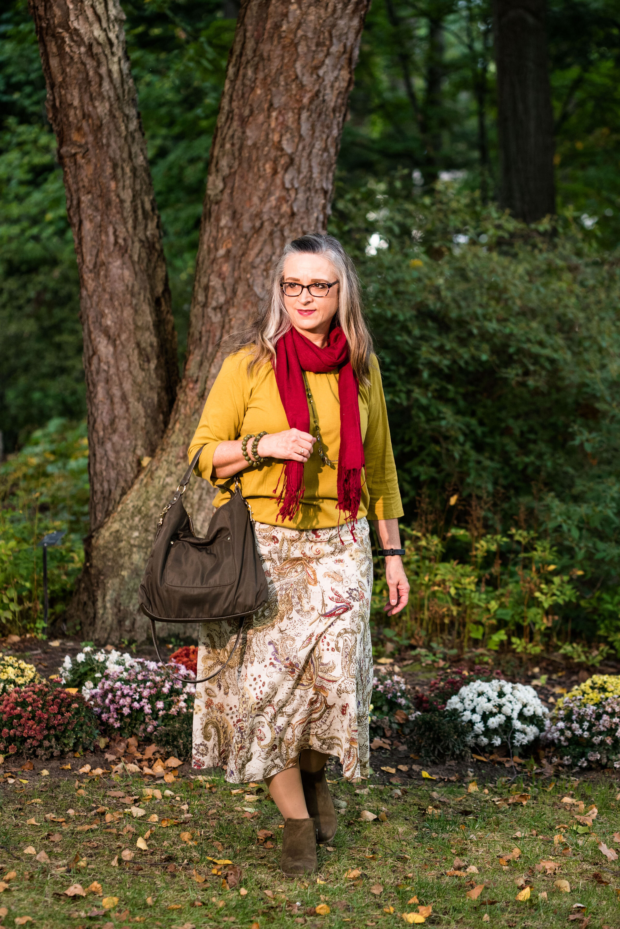
Outfit 1 - Merlot and Antique Moss

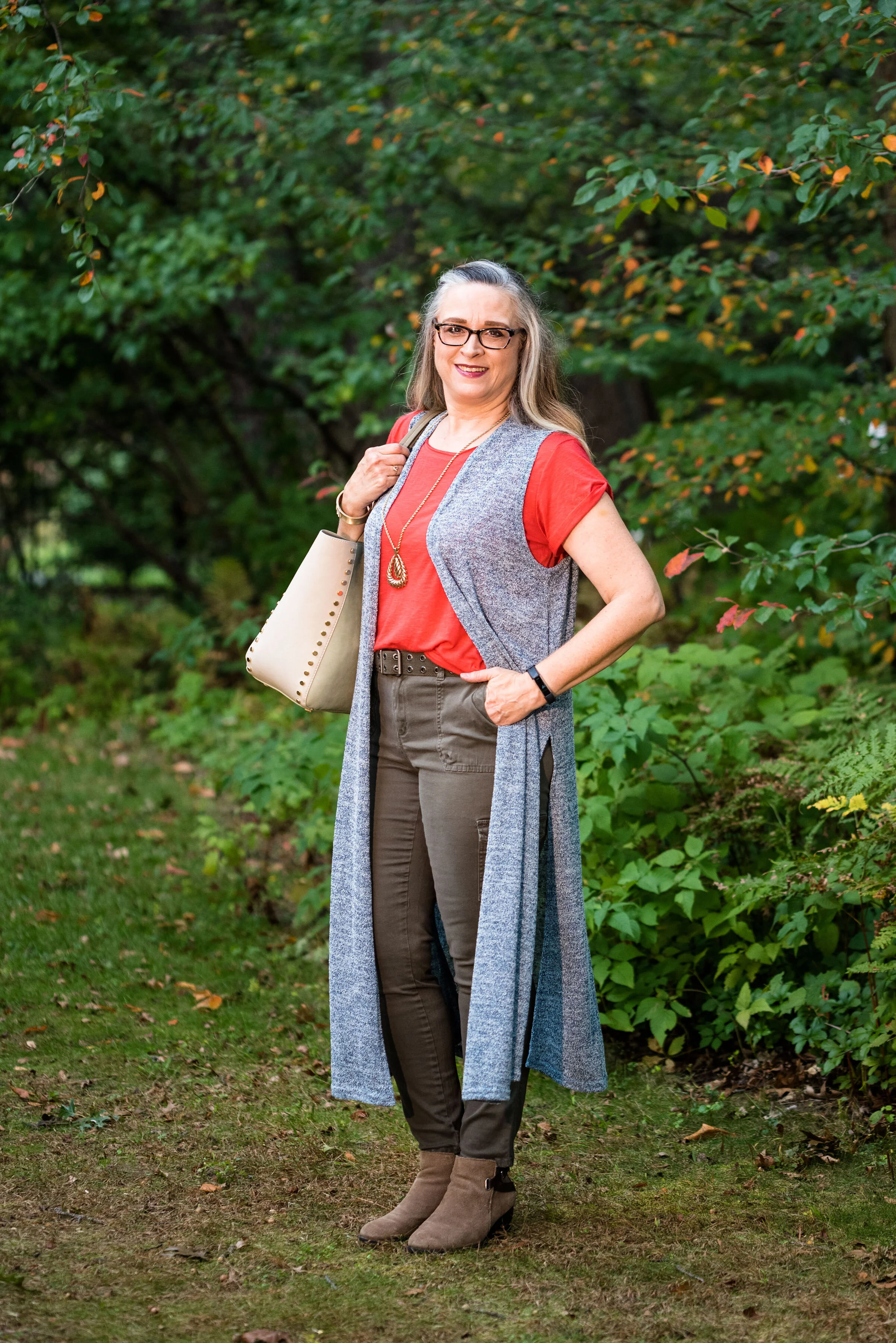
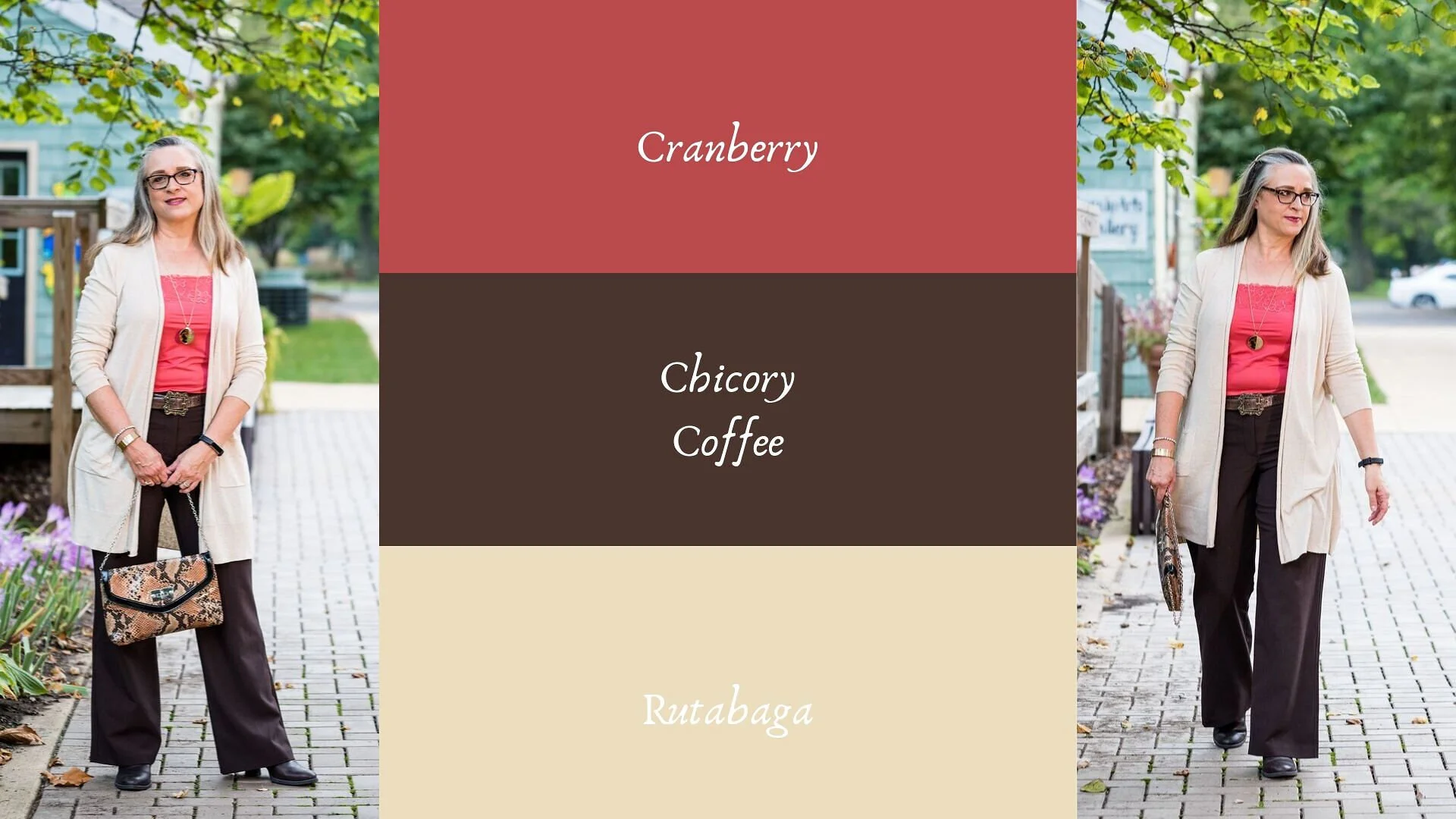
Outfit 2 - Cranberry and Chicory Coffee

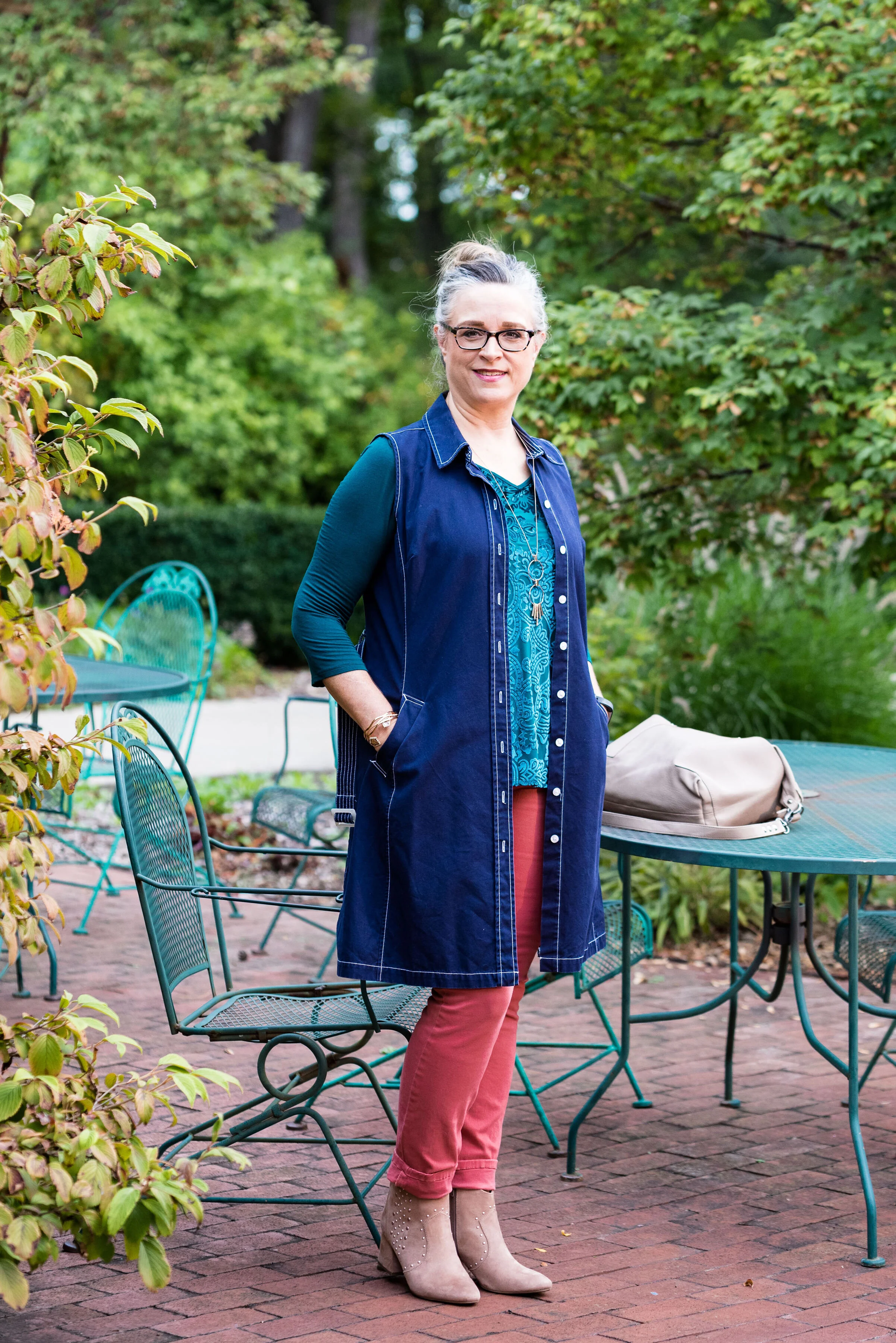
Outfit 3 - Summer Fig and Bluestone

Outfit 4 - Butterscotch and Grapeade

Outfit 5 - Crabapple and Forest Biome

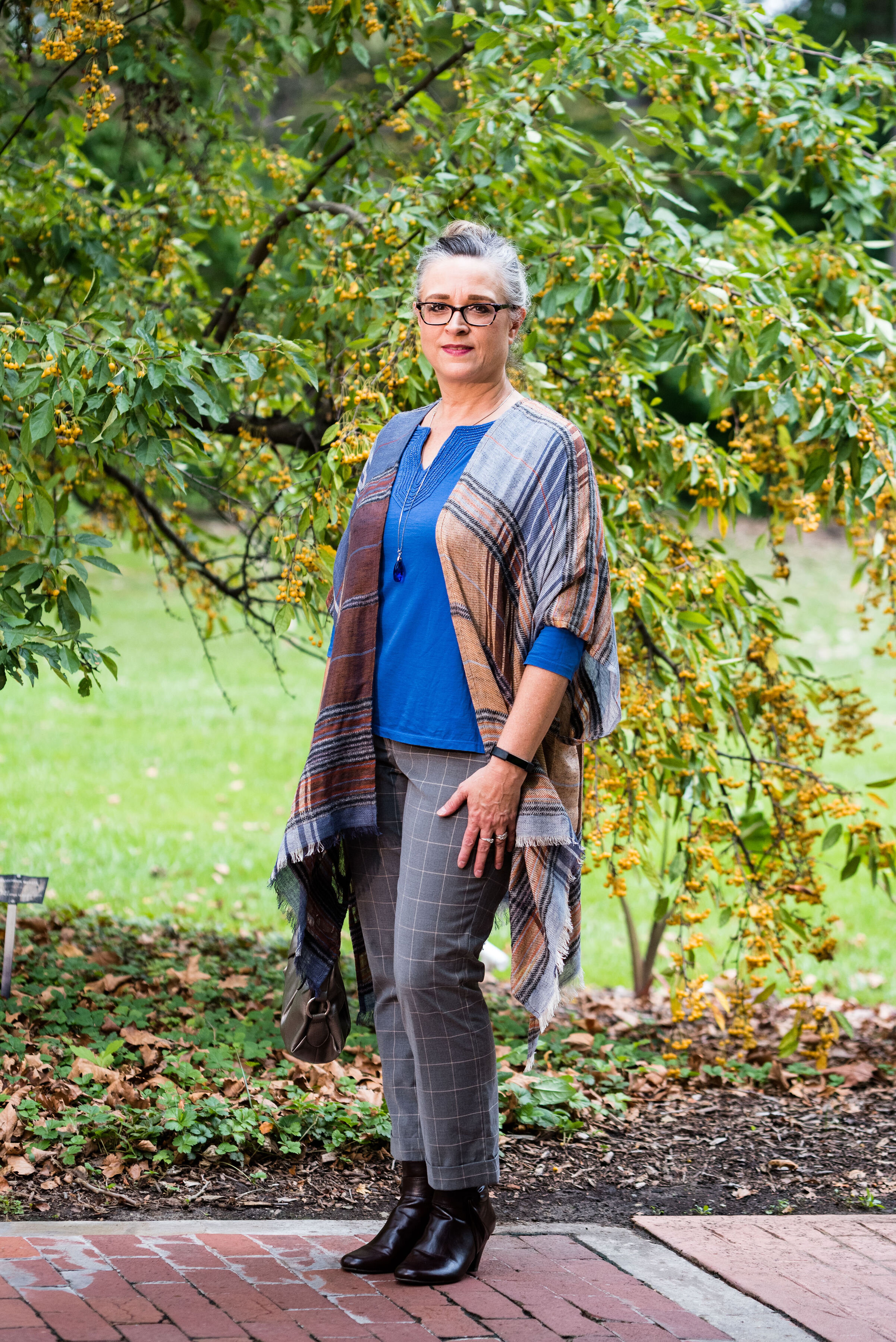
Outfit 6 - Galaxy Blue and Hazel

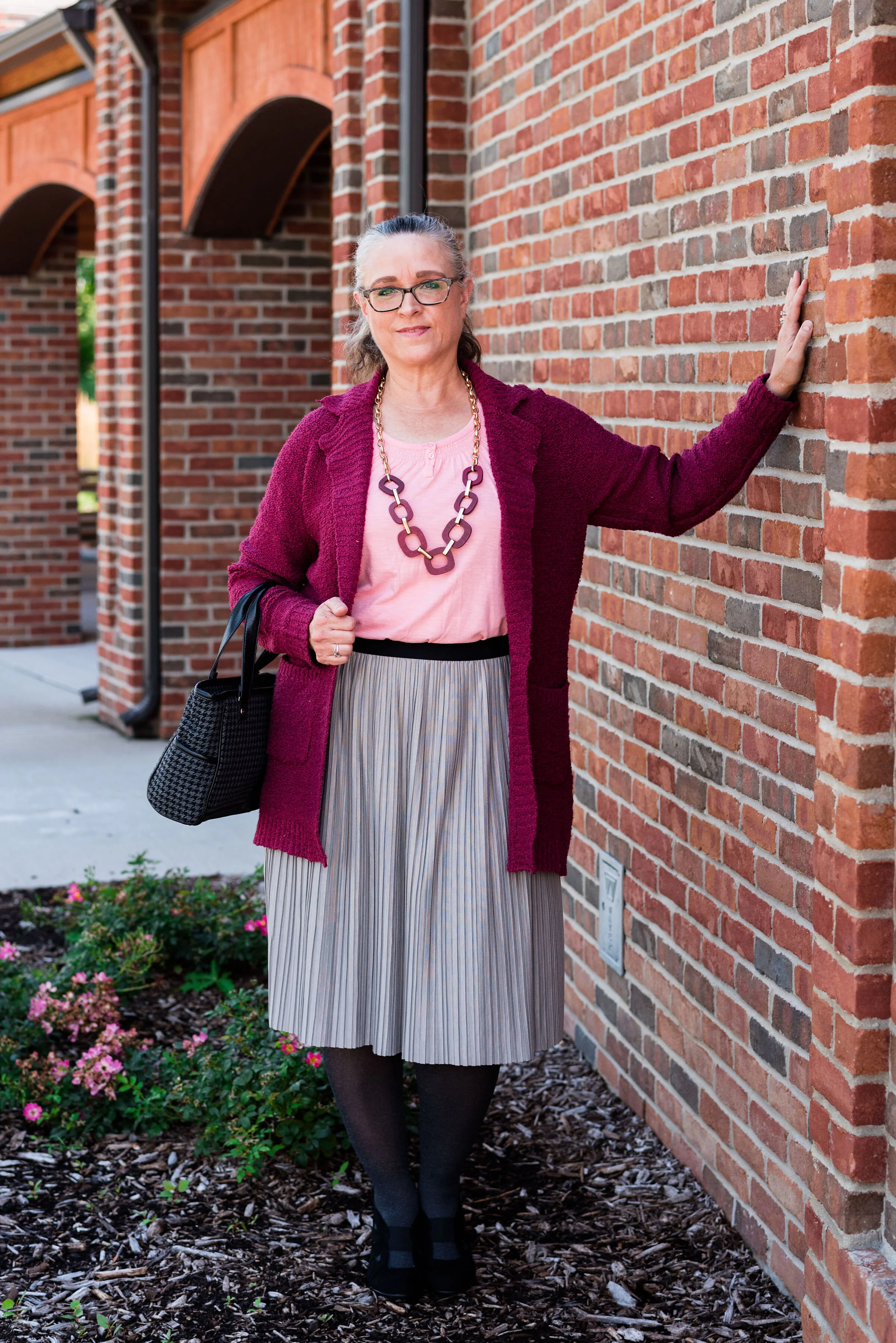
I am having a hard time picking just one outfit from this series that I liked the best. I really liked Cranberry and Chicory Coffee. I have always been a fan of browns, but I just love the result when it is combined with the medium pinky red of Cranberry. I also like the long line of this outfit and I think the long Rutabaga open front cardi helped with the illusion.

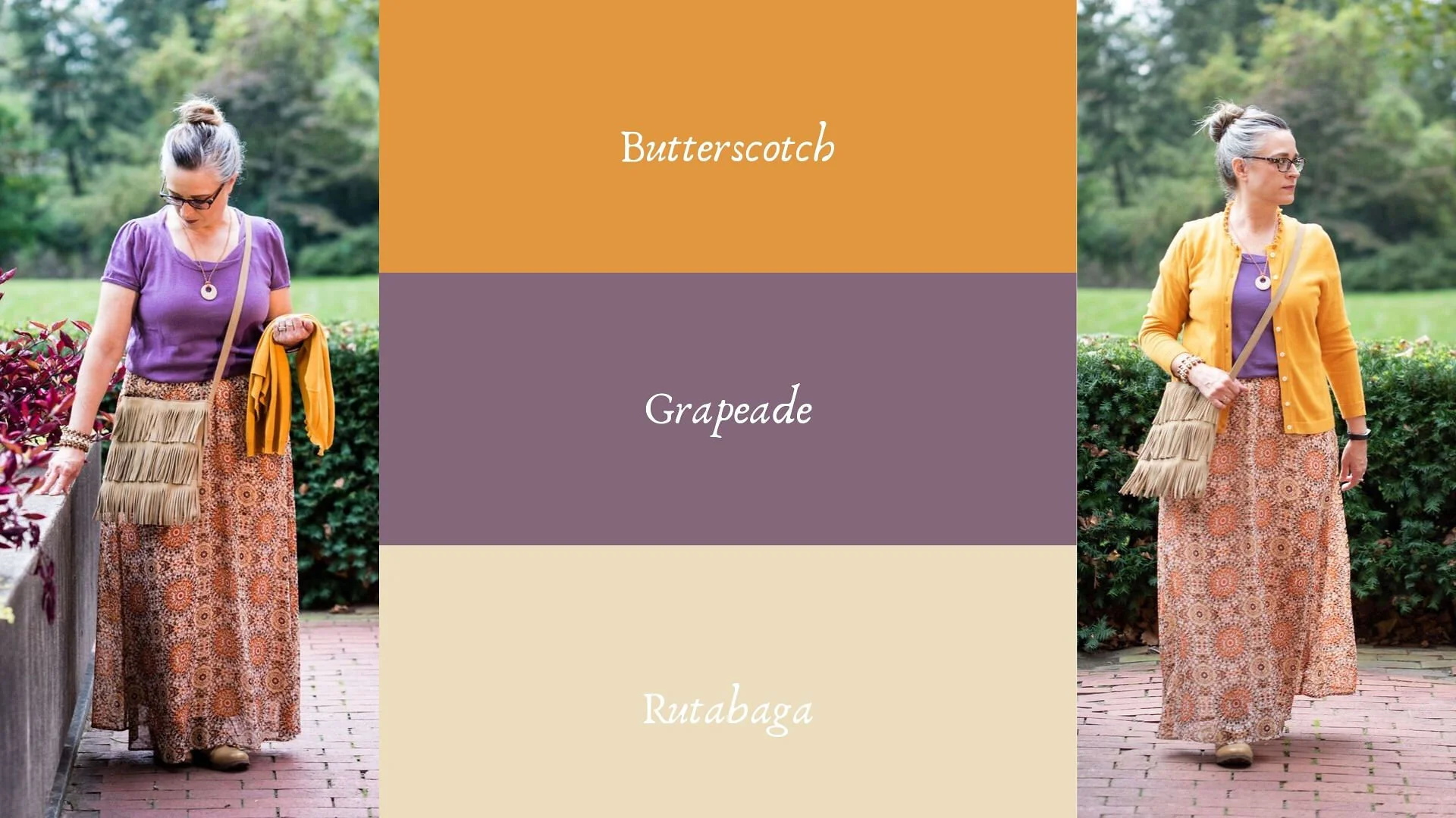
My next fave would be the boho vibe of Butterscotch and Grapeade. If you would have asked me a few years ago if I would wear an outfit with these two colors together, I would have said no way. Yellow and purple? You have to be kidding, but there is something whimsical about this outfit and the color combination is only part of it. The colors are happy and fun, but the print of the skirt, the fringe bag and the fun textured boots really give this outfit its bohemian style.

Finally, I really like the last outfit. Even though, I wouldn’t necessarily wear a color like Hazel all on it’s own, I do like the way this color pairs so well with the grays and the blues in outfit. I also like the subtle plaid print mixing. It is obvious, but it doesn’t overwhelm the eye like some print mixing is capable of doing.

Well, I’ve told you my favorites, now tell me yours. I love to hear your feedback.

i hope you enjoyed this Pantone - Autumn/Winter series. If there is anything else you would like to see, with regards to the Pantone Color Institute you can check out their website. Just click on the link.

Have a great Tuesday!

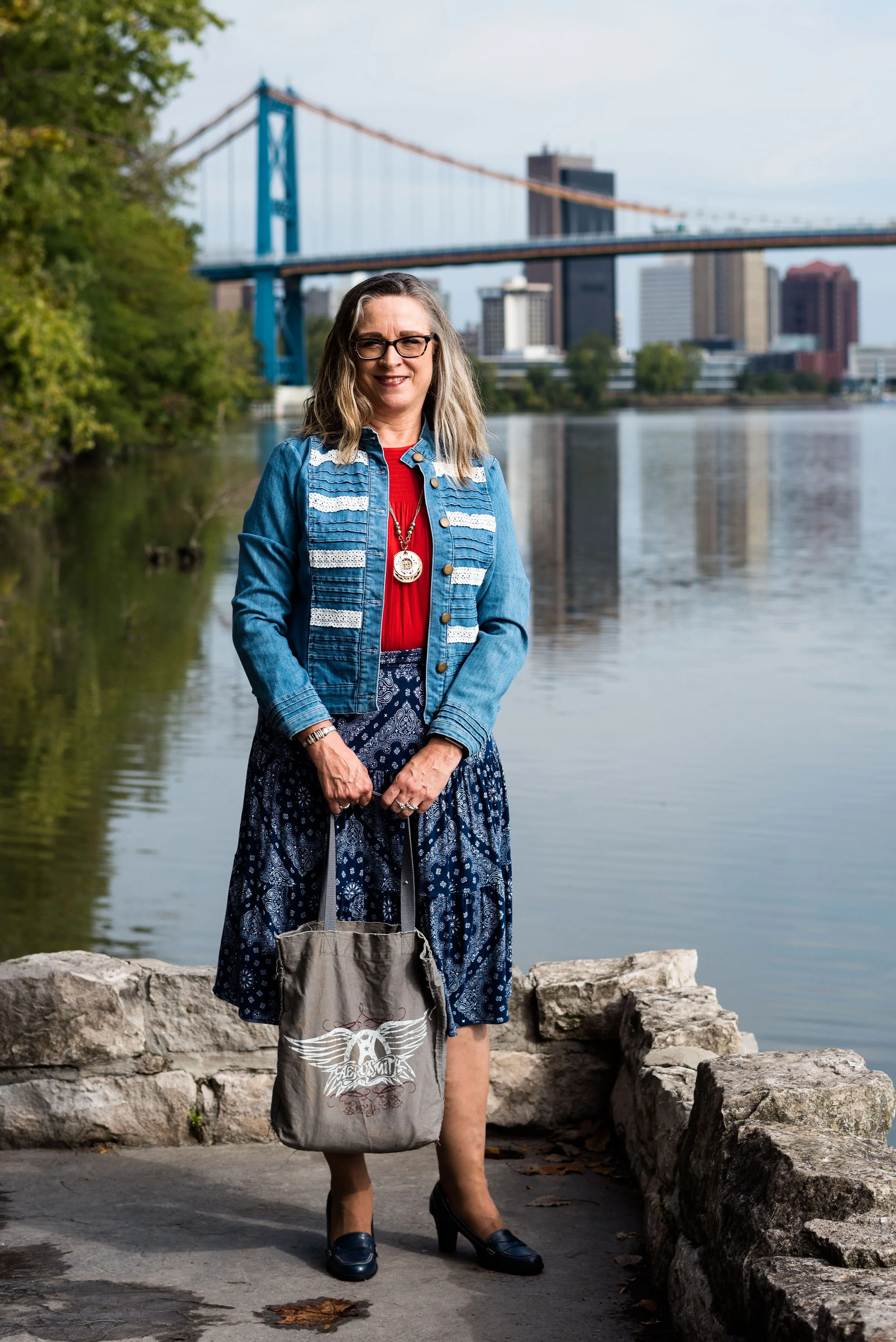
Photo credit Rebecca Trumbull.


Pantone - Autumn/Winter - 2019 - Butterscotch and Grapeade

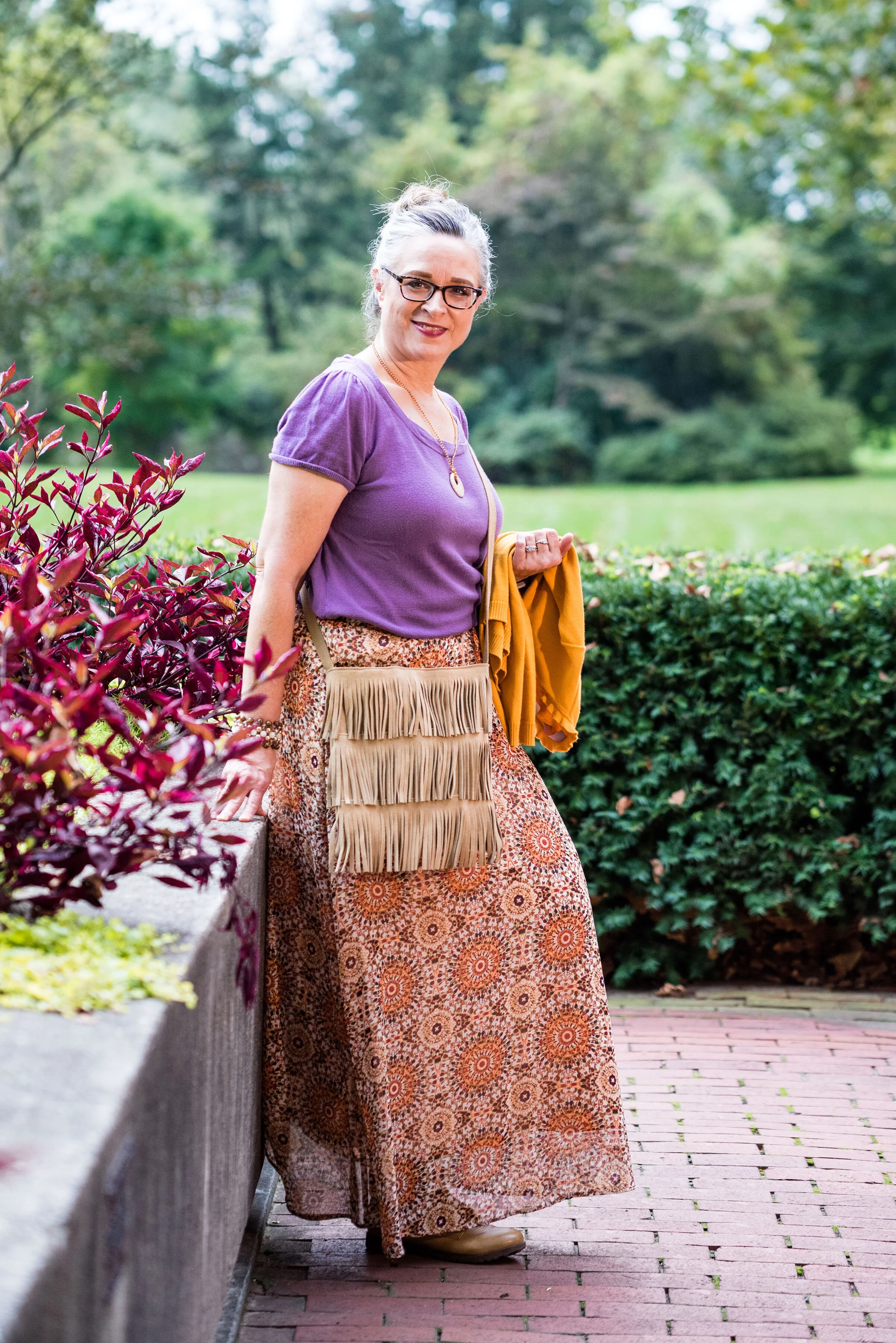
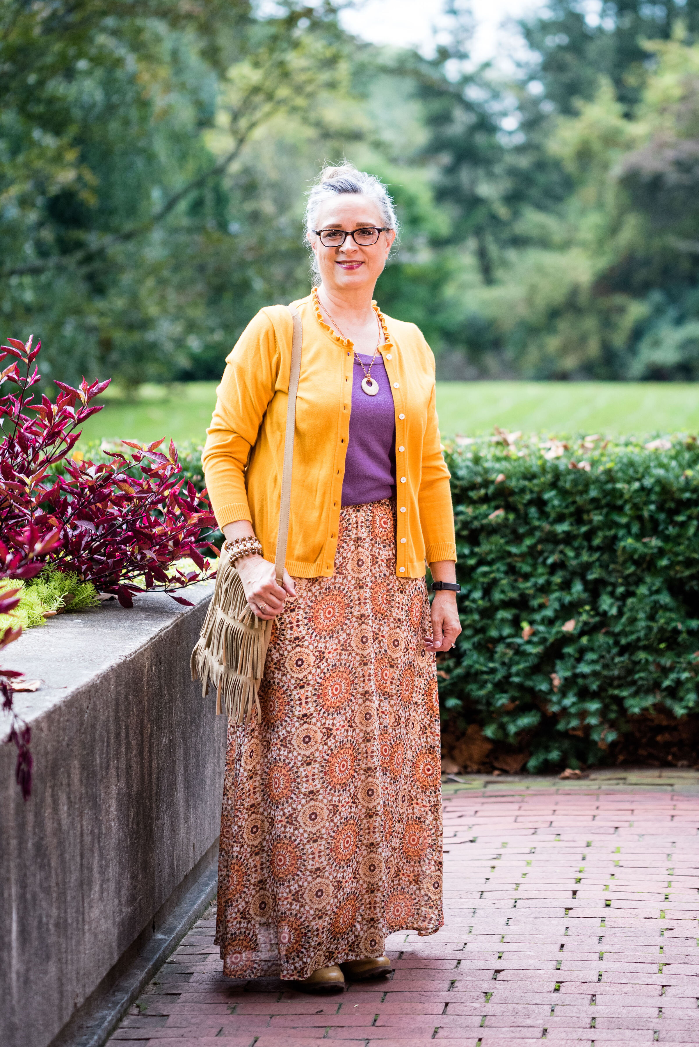
Today’s outfit features two colors from the London Autumn/Winter palette that Pantone describes as a “deliciously appealing golden yellow” and a “notable muted mauve tone.” You might wonder why I would pair purple with yellow. There was just something about this combination that I loved and when I paired them with the printed maxi skirt, I felt I had a winning outfit. Take a look.

This outfit says several things. First, it says I’m not afraid to try unusual color combinations. Second, it says you can make up your own style. The short sleeve sweater with a cardigan topper is a more classic combination, but the medallion print skirt, beaded jewelry and fringe bag scream boho. Let’s talk details.

The purple short sleeve sweater is a thrifted Loft piece. I like the scoop neck and it has plenty of stretch, but still holds its shape. I also love purple, which is trending this fall.

The Butterscotch thrifted cardigan is a brand called Callaway. When I looked it up, it appears to be a clothing brand for golfing, selling things like polo shirts, pants, jackets and other golf related pieces. The brand also has their own website which features golfing equipment like drivers, putters and bags. Neither my hubby, nor I play golf. He calls it “cow pasture pool.” He’s always got a name for everything. You can see Callaway clothing on Amazon, and on their own website, Callaway Apparel.

I may not be a golfer, but I know a quality sweater when I see one. I love the women’s fit of this cardi and the ruffle treatment around the neckline. It makes the sweater very feminine and fun.

I’ve styled this medallion print Roz & Ali brand skirt on the blog before. I got this at Dressbarn a few years ago. While it is a summer weight skirt, it is fully lined, so good for cooler temps and if you pair it with leggings or heavy tights you could wear it all winter. You can see how I paired the skirt with both an orange tank and a gold top here, and with another lighter purple color here.

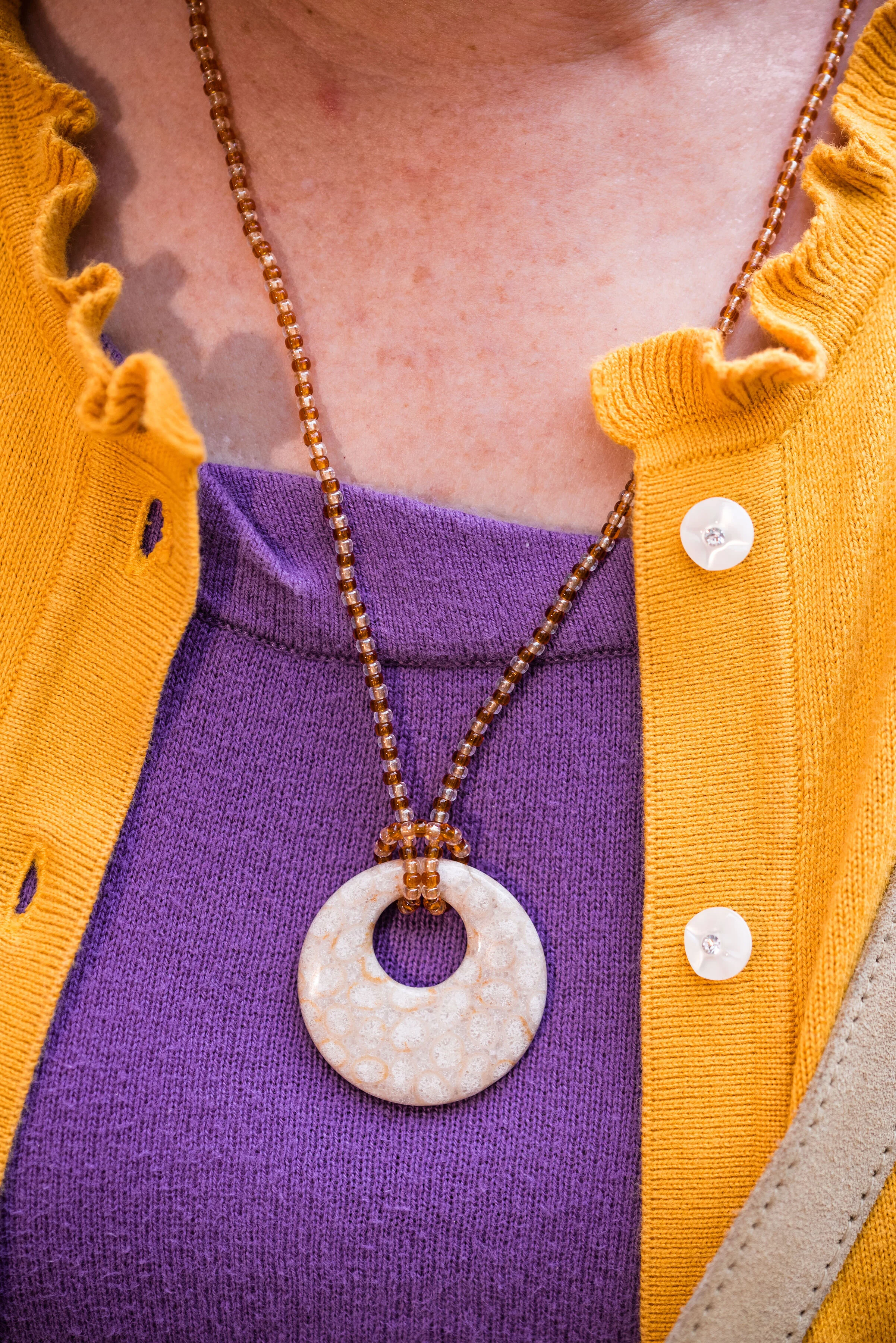
In keeping with the boho feel of the outfit, I went for a hand crafted look with my jewelry and bag. The necklace was actually made by my oldest. She was into beading as a teen and made some fun pieces, of which I still have a few.

This beaded bracelet was probably a Kohl’s or JCPenney piece from the clearance rack. I’ve had it for a while, so I don’t remember.

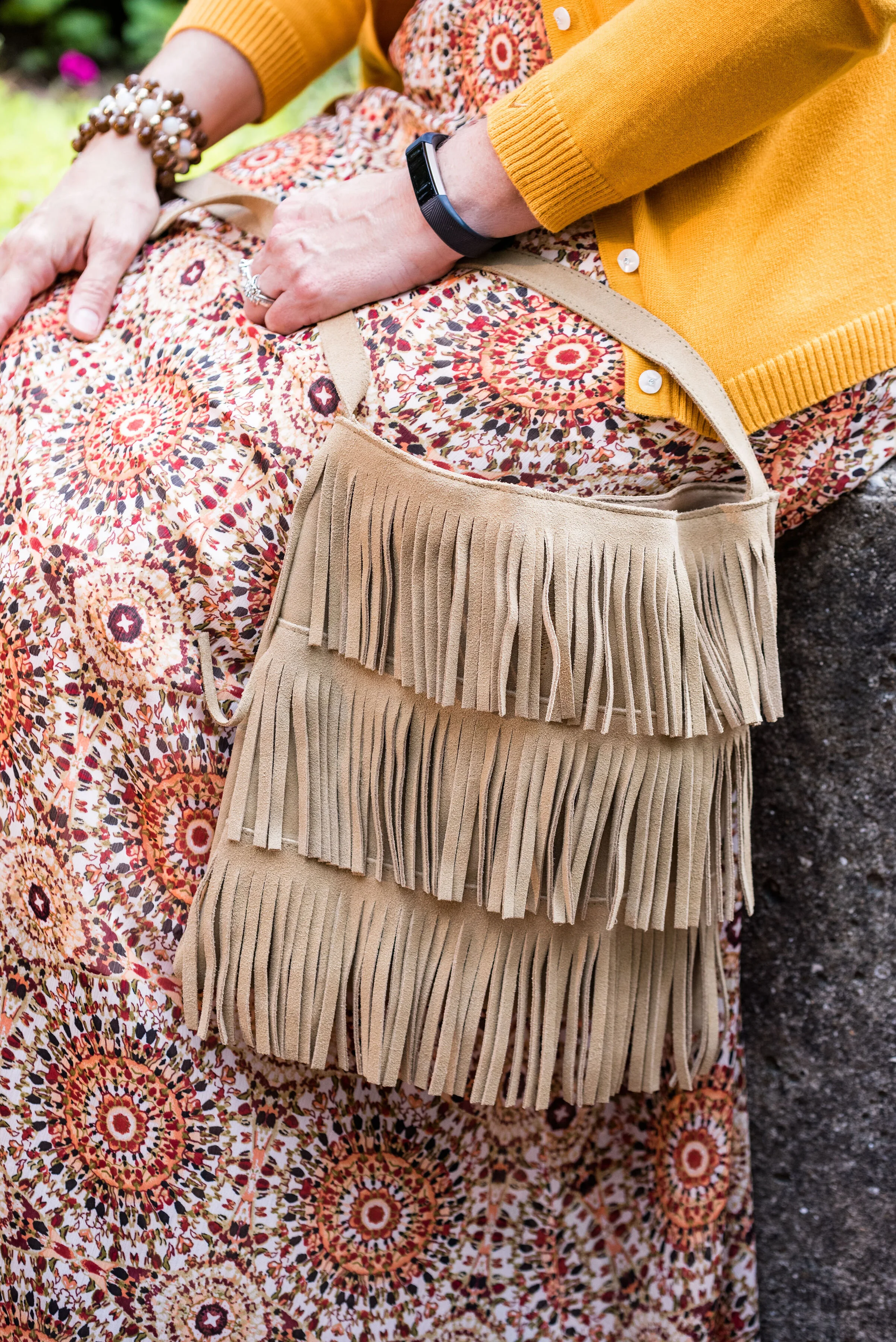
I found this fringe bag at a thrift store and knew I had to have it. It looks like it was hand made and there is no label inside. I like that it is a neutral color and long enough to be a cross body bag.

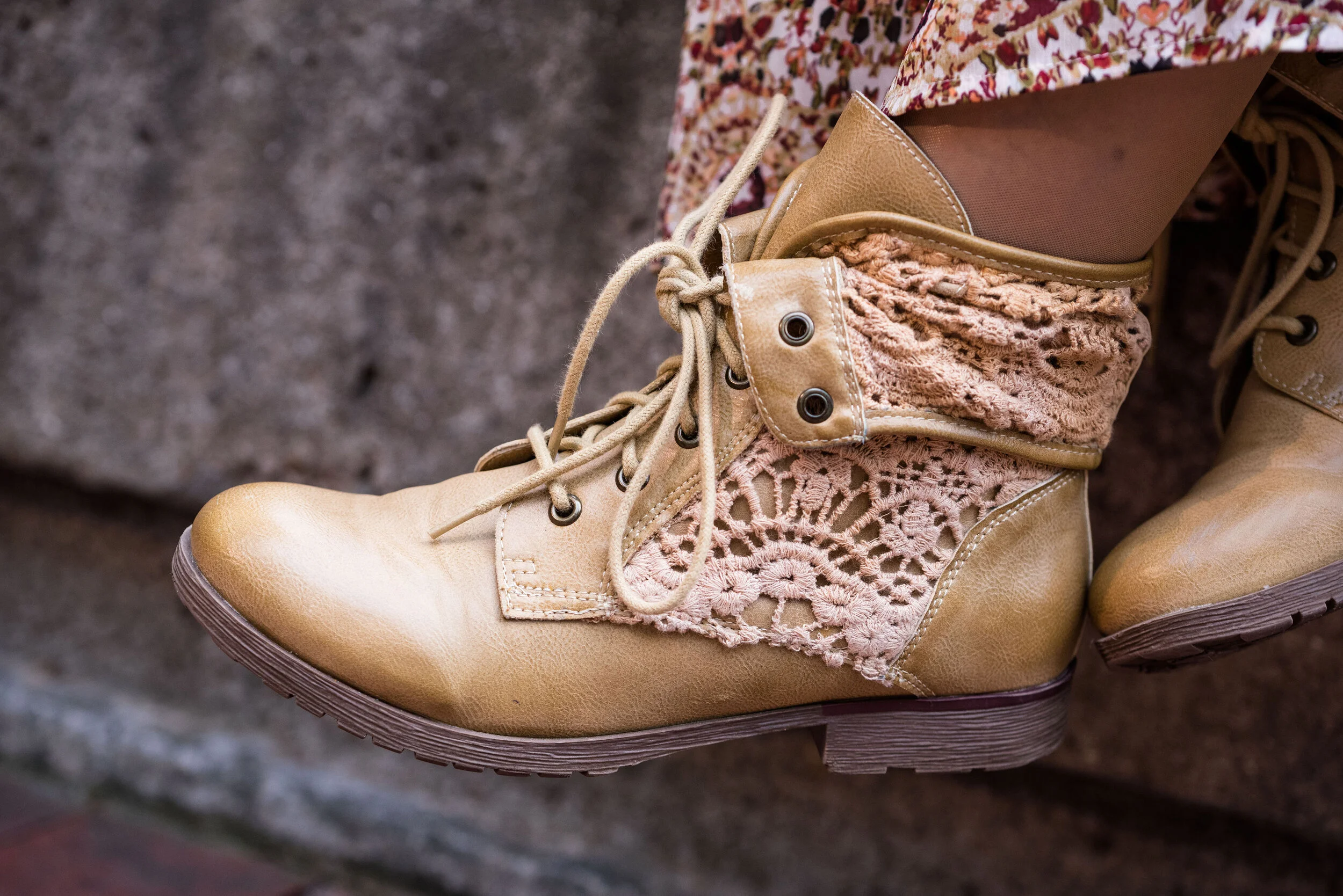
My ankle boots are another thrift store find and I thought paired well with the boho theme of the outfit. These are a brand called Rock Candy by Zigi.

What do you think of these colors? Do you have these in your closet? Would you wear yellow and purple together? I’d love to hear your thoughts. Leave me some love in the comments.

i’m including a few shopping links for things purple and yellow. The holidays are coming up. How many of you have started your Christmas shopping? I’m guilty! Life is so busy, I can’t afford to wait until the last minute. These are affiliate links. All opinions are my own.

Photo and graphic credit Rebecca Trumbull.


Pantone - Autumn/Winter - 2019 - Cranberry and Chicory Coffee

Hi everyone. The days are flying by and we are almost to Halloween. I haven’t even gotten out my decorations yet! That is how far behind I am. Maybe I should just skip Halloween and start decorating for Christmas. All the stores are doing it. Ha, ha . Well, I don’t think I’ll get that crazy, but this time of year does seem to go awfully fast. Do you get that feeling?

Today’s colors are what the Pantone Color Institute label a “vital red that adds a pungent punch to the palette,” and a “robust and tasteful” brown that, “introduces an element of heartiness.”

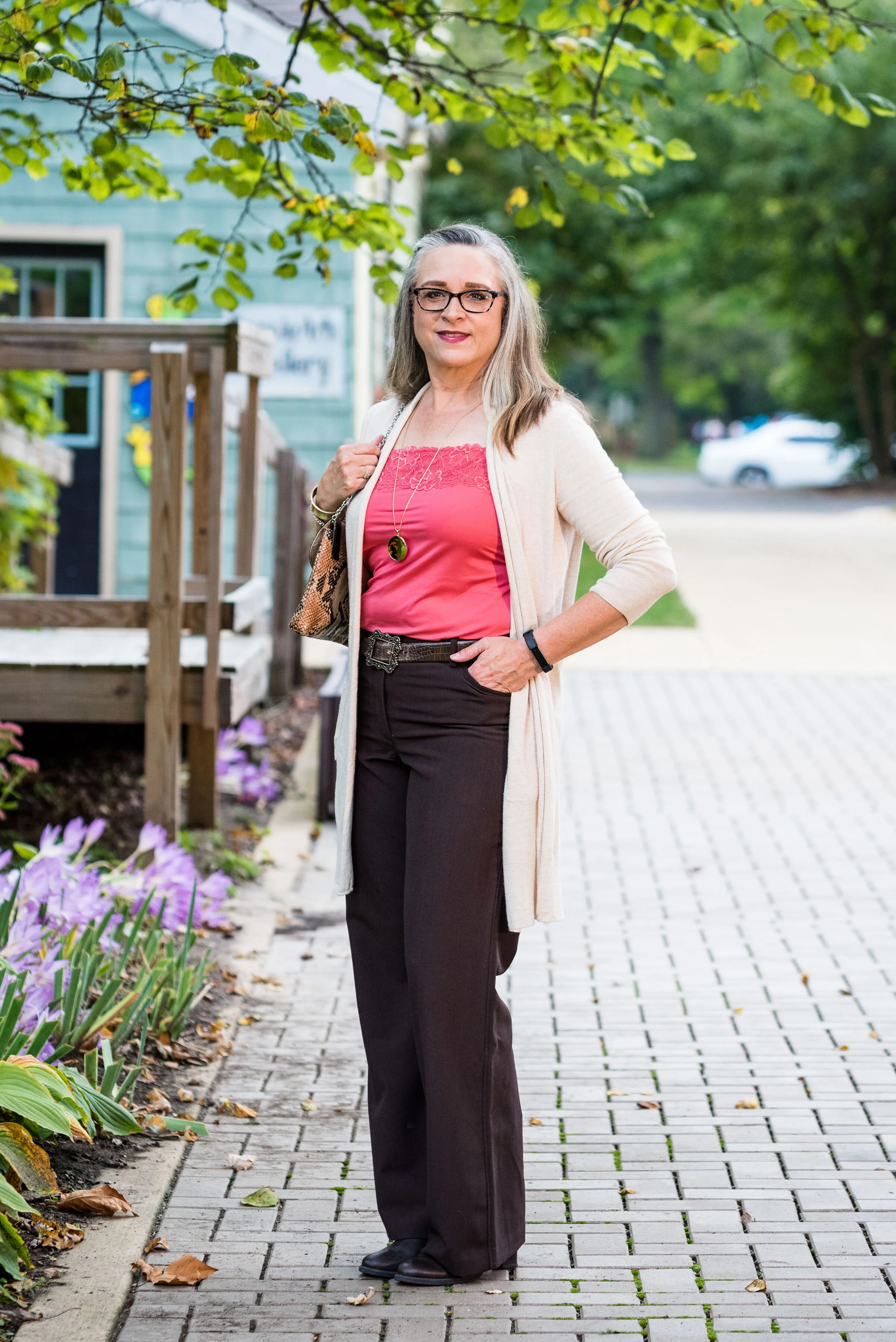
I was able to pull these pieces from my closet and decided to add the off white cardi that mimics Rutabaga from the London classic color palette.

This Cranberry cami was a recent thrift purchase. Most of my camis are pretty tight and I wear them as layering pieces under long sleeve tops and sweaters. I do not wear them to be seen, but it occurred to me that it would be nice to have something I could have more visible under an open sweater. It is Maurice’s brand. I am becoming a fan of Maurice’s. I see pieces every so often at thrift stores and recently I bought what has become one of my favorite pairs of jeans on the clearance rack. What really drew me to this cami was the pretty lace detailing.

These trousers are Worthington brand from JCPenney. Do you know how hard it is to find brown slacks? Now maybe that has changed. I have seen rust, and that more yellowy brown called cognac, but real brown is hard to find, especially a dark brown like this one.

The off white open front cardigan is Chaps brand and another clearance rack find from Kohl’s. Chaps has some nice pieces, but they do have a higher price point than I would normally pay, thus my reasoning for waiting for them to go on clearance. If I thought a particular piece is really worth paying full price for, I would buy it, but for the most part there isn’t anything that I absolutely have to have. I could shop my closet for months and come up with all sorts of new combinations, because I have so many clothes. Truth!

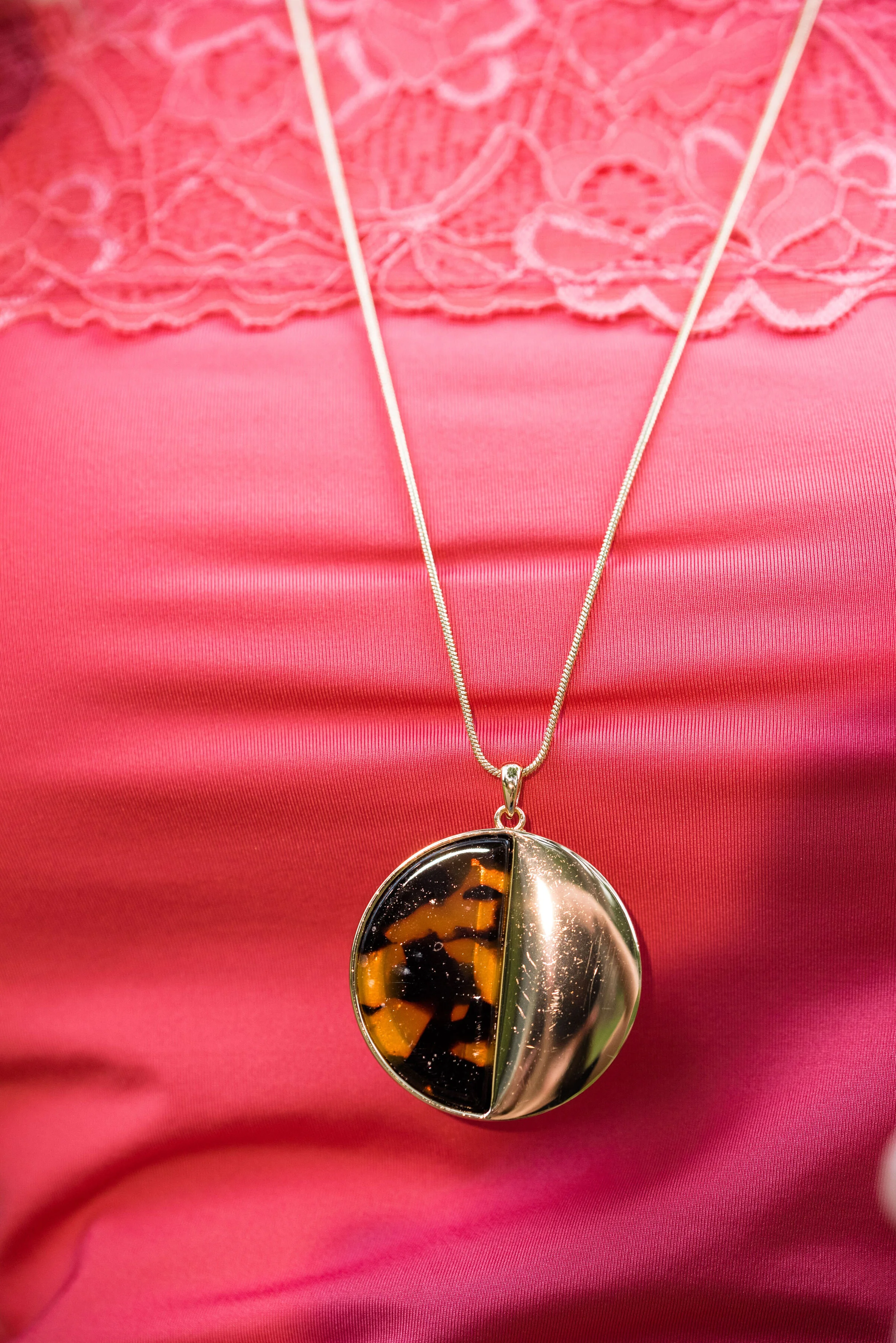
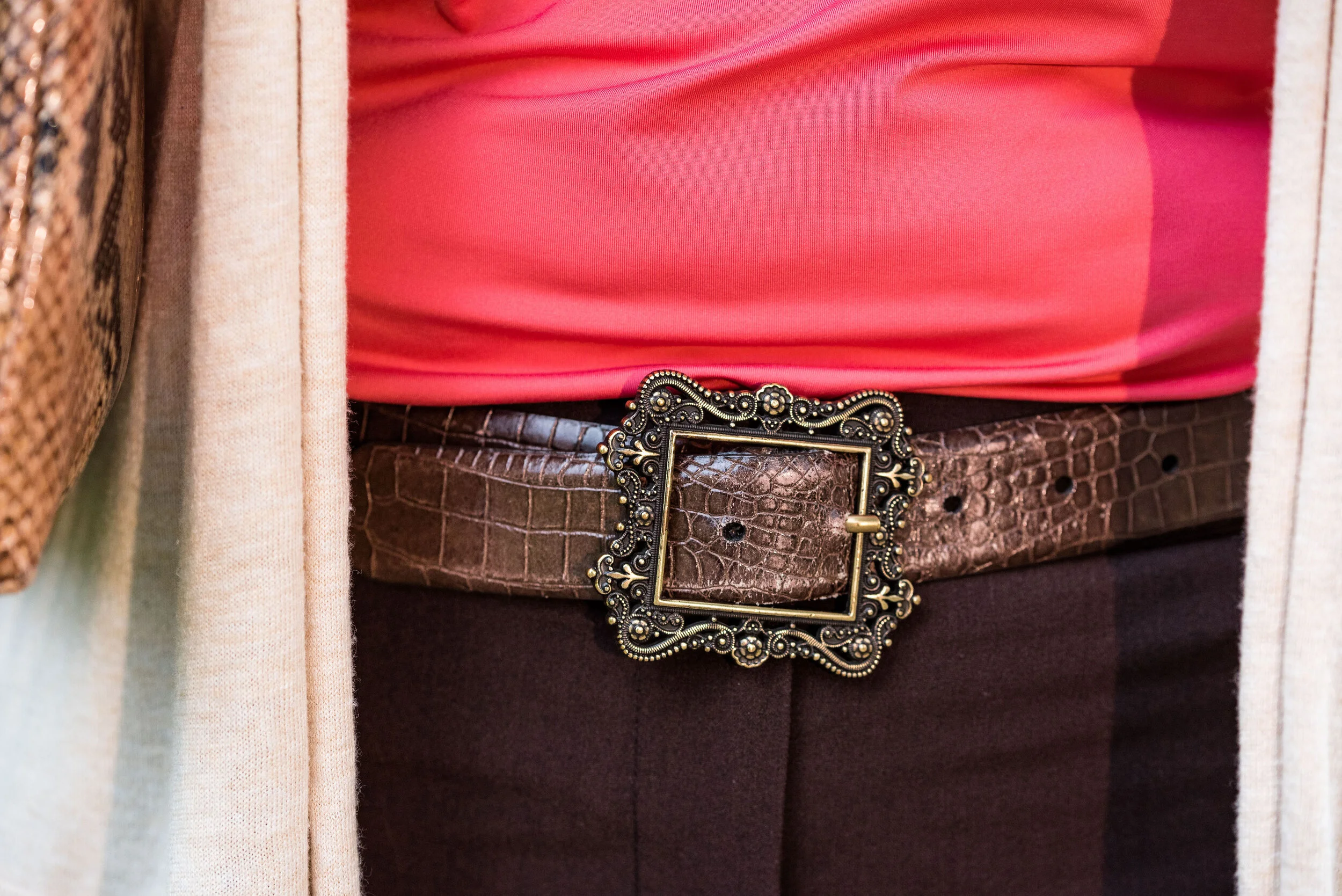
I kept the accessories minimal with my gold leopard print medallion necklace, a few gold bracelets, my snakeskin clutch, a brown belt, and brown boots. I thought this was a good outfit for complimenting with animal prints.

These are two colors that I can get behind. I love the combination and think these two work well together. What do you think? Do you have any of these colors in your closet? Do you wear camis a lot? Do you wear them more for layering or to be seen? I’d love to hear you thoughts, so leave me a comment or two in the comments section. I appreciate hearing from you and all your support.

I’m including a few shopping links for you to peruse. I hope that you find these helpful. Every click you do, gives me a few cents and I appreciate every one. These are affiliate links. All opinions are my own.

Photo and graphic credit Rebecca Trumbull.

Have a great day.


Pantone - Autumn/Winter - 2019 - New York Palette Recap

I was going to start the Pantone London color palette today, but decided to do a recap of all the New York colors. Some people have told me they like to see all of the outfits and colors together in one post, so here we go.

Outfit 1 - Chili Pepper and Bluestone

Outfit 2 - Fruit Dove and Galaxy Blue

Outfit 3 - Crème de Pêche and Rocky Road

Outfit 4 - Sugar Almond and Dark Cheddar


Outfit 5 - Orange Tiger and Eden

Outfit 6 - Peach Pink and Biking Red

I hope you enjoyed this look at the Pantone - Autumn/Winter - 2019 - New York palette. Which outfit was your favorite? I’d love to hear your thoughts.

Next week I’ll be starting the Pantone - Autumn/Winter - 2019 - London palette. Believe it or not, the only two overlapping colors this year were Galaxy Blue and Bluestone. Be sure to check that out next week.

Thank you all for being a part of my blogging journey. If you ever have something you would like to see me feature on the blog, send me an email. I’m open to new ideas and value your opinions and support.

Have a fabulous weekend!

Photo credit Rebecca Trumbull.
Pantone - Autumn/Winter - 2019 - Orange Tiger and Eden

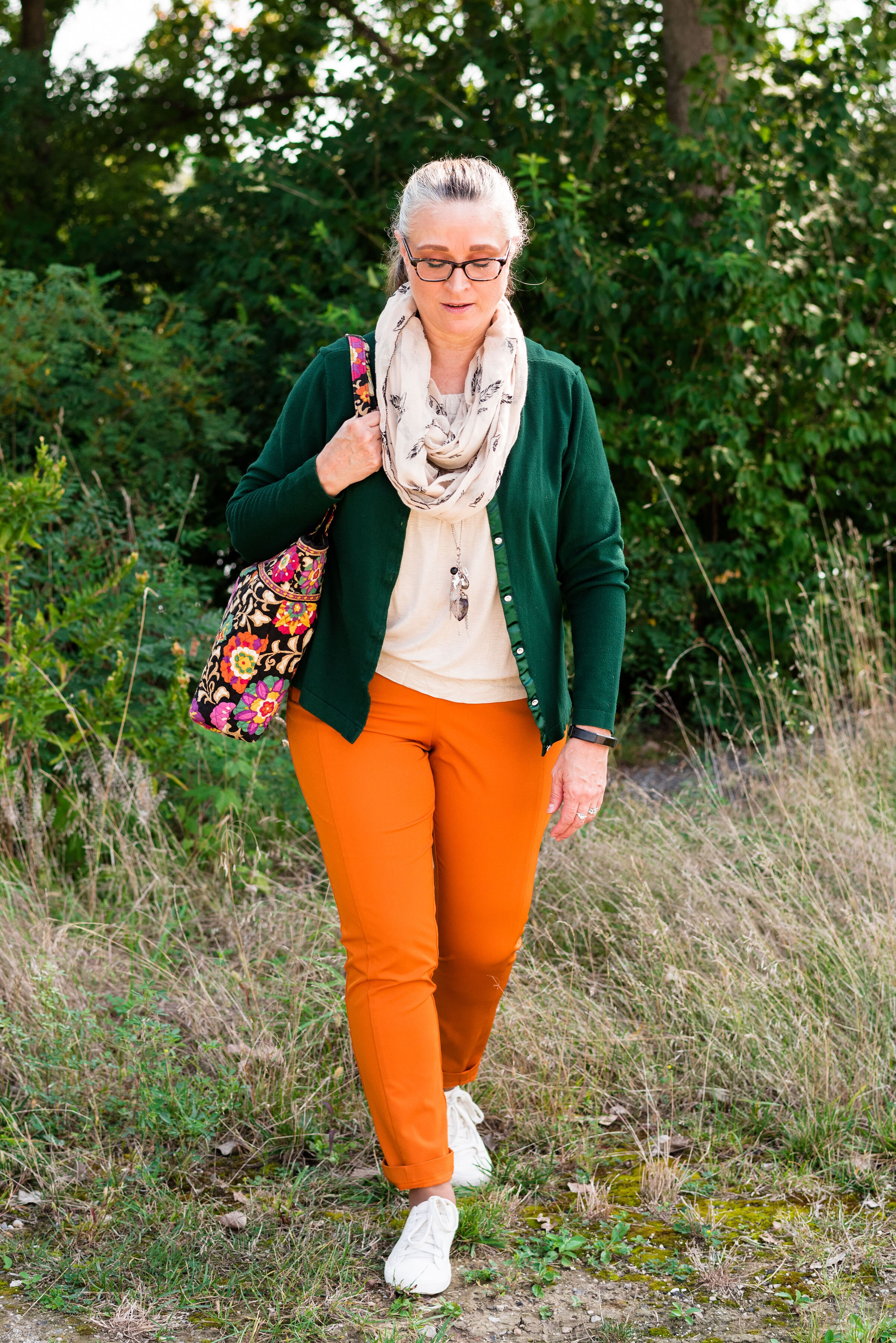
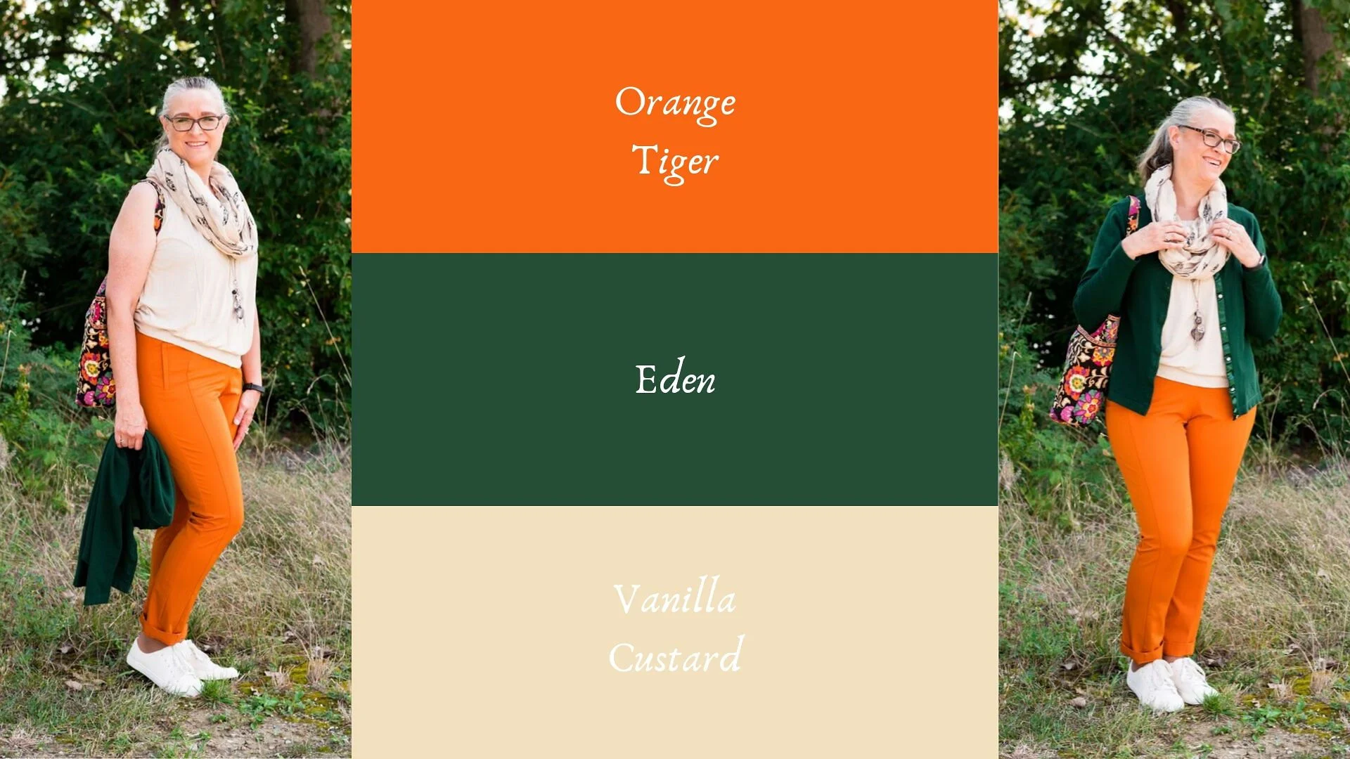
I mentioned in Tuesday’s post on Sugar Almond and Dark Cheddar, that not everyone can or wants to wear orange. I love orange, but it has to be the right shade for me to wear it near my face. Some oranges make me look sallow or washed out. Today’s colors are bold and what caused me to put these two colors together, was the contrast of dark with light, deep with bright. Today’s colors are a “fearless” Tiger Orange, and a rich “stately forest green” called Eden. I think Pantone’s description of these colors is perfect.

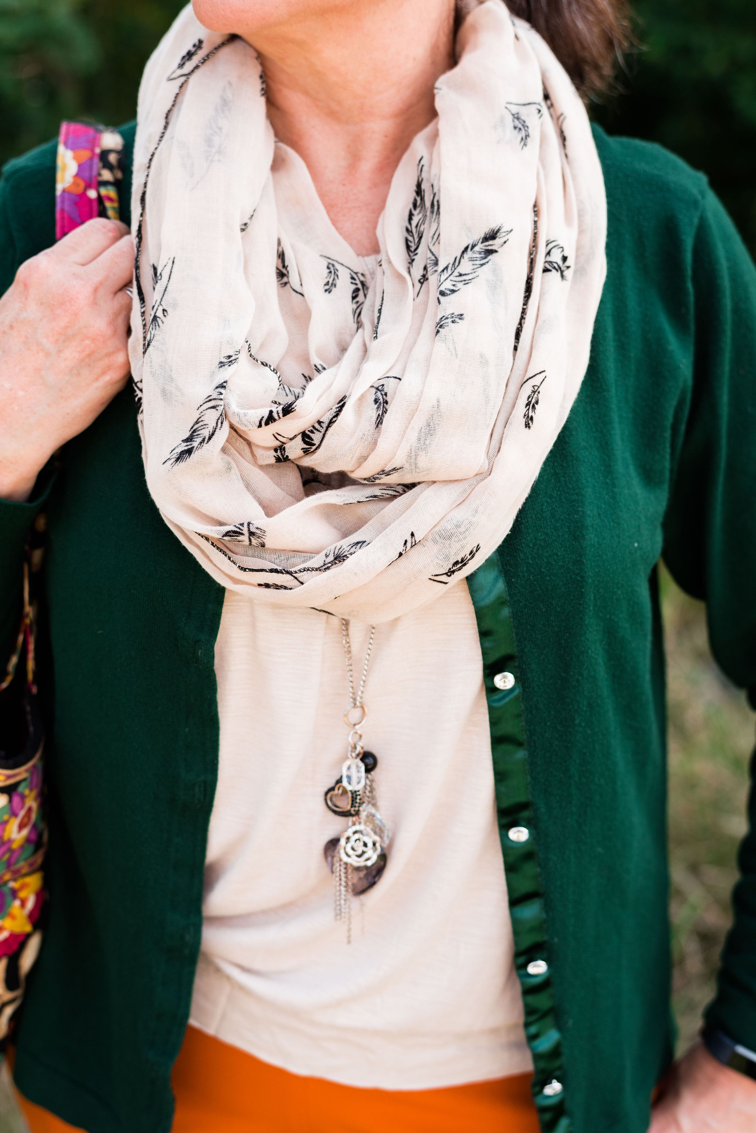
These two colors are the first in this series that I felt truly matched with the Pantone colors. I looked for a while in thrift stores for the perfect green and I really think this dark cardi nailed it. the sweater is Jaclyn Smith brand.

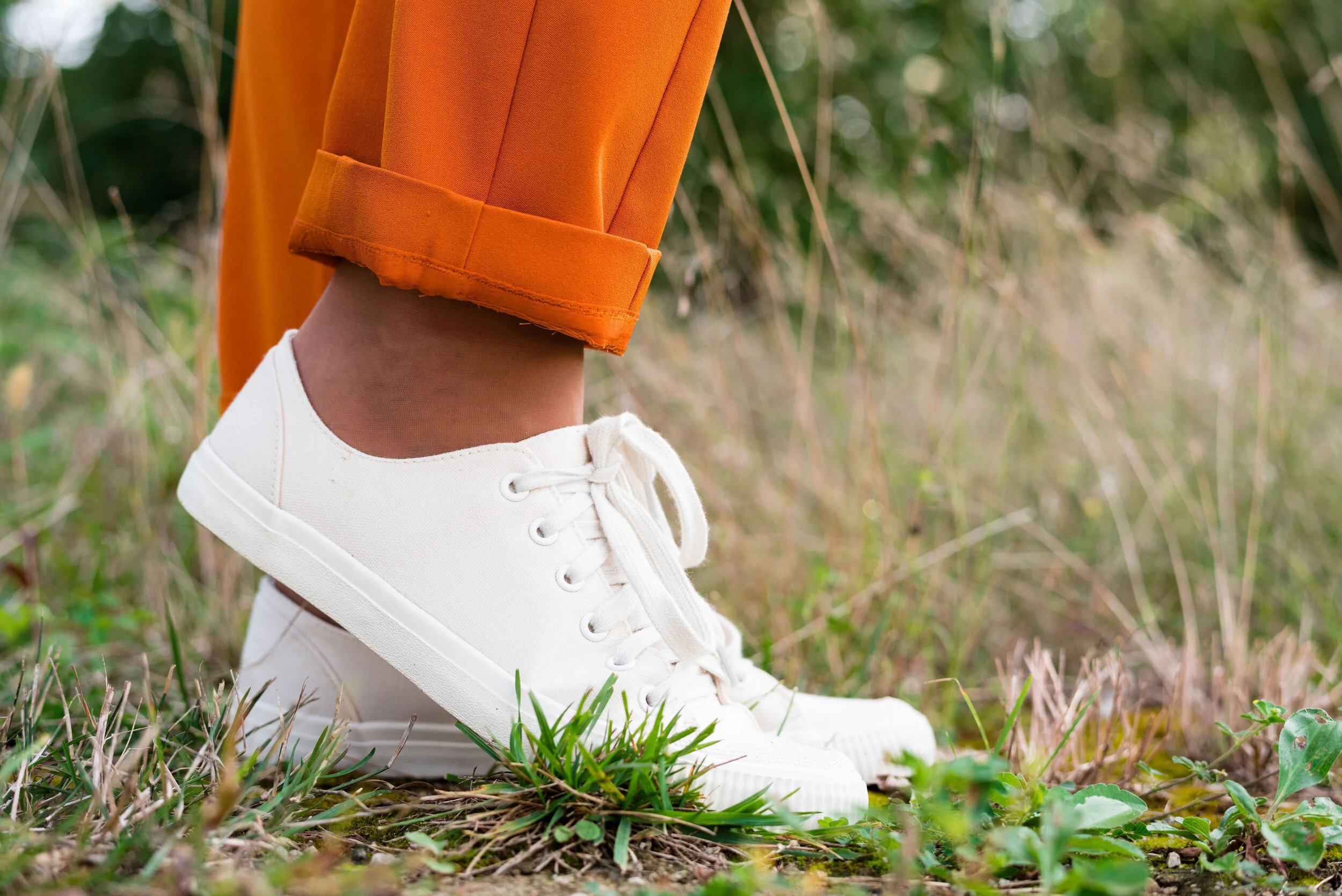
These bright orange pants are Worthington brand and I got them at JC Penney a number of years ago. These are more of a skinny leg trouser than a wide leg trouser. I got them for the bright color and do find occasions in the spring, summer and fall to wear them. You can see how I styled these with a floral tunic here.

This cream colored tank top is a thrifted Loft piece. I actually have two of them, found on different occasions, but the exact same style. This one is a large and has a sheen to it, that you can’t really see in the picture. The other one I have is a medium and is more of a true white. Why do I need two of these? Comfort and ease of wear. They work perfectly for something like this, but I will also be able to use them as a light weight under layer when the temps grow cold. The piece is banded on the bottom, making for a great fit without showing off the bulges. Here are a few to look at.

The scarf I added was another thrifted piece. I don’t have many pieces that are cream or ivory, like this. I am also looking for a cream fisherman sweater and/or turtleneck. I don’t need anything, because I am a clothes horse, but every now and then, I do realize I am lacking something I would love to incorporate into my closet. What about you? What pieces have you been hoping to add to your closet?

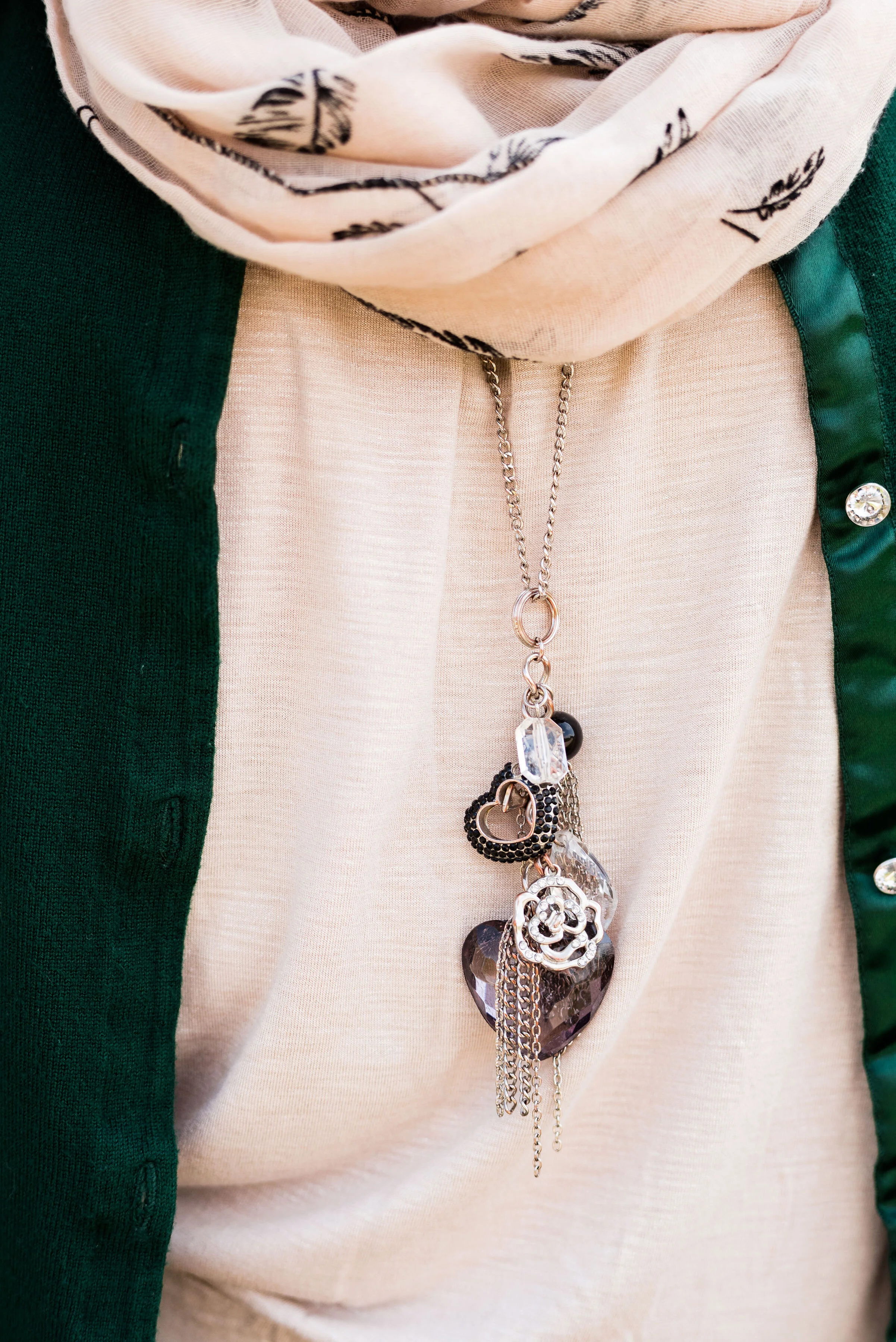
In addition to the scarf I wanted to add a long charm pendant necklace to break up the plain back drop of the tank. I think this outfit would have been equally good with a printed tank under the sweater.

My other accessories included my Vera Bradley tote bag and my thrifted Mossimo sneakers.

What did you think of this outfit? Would you wear a pair of bright orange pants like this? What is the brightest color you have ever worn in pants or a skirt? I’d love to hear you thoughts, so leave me some love in the comments.

I’ve included a few shopping links. These are affiliate links. All opinions are my own.

Photo and graphic credit Rebecca Trumbull.
Have a great weekend, everyone!