Pantone - Spring/Summer - 2021 - NY Palette - Illuminating, Rust and Ultimate Gray
I wanted to share this outfit with you first, because it contains the two colors that were chosen by the Pantone Color Institute as the colors of the year. Illuminating is a bright, sunny yellow. Pantone describes this yellow as, “Friendly and joyful, an optimistic yellow offering the promise of a sunny day.” Rust is typically a fall color, yet it is an earth tone, thus its inclusion in the spring palette. Ultimate Gray is a classic and comfortable gray that everyone can wear.

I have plenty of yellow in my closet. It is a color that has quickly become a favorite. I love the many different shades of yellow. I have mustard, sunflower, lemon, blonde and pineapple. Look up shades of yellow in your search bar and see all the fun names they give for these lovely pieces of sunshine. Illuminating is not really a different shade, but a different name for a shade that might also be called bumblebee, butter or dandelion.
Since I love the color so much, it was a no brainer that I add this thrifted, bright yellow, denim jacket to my closet. This is a brand called d & co, or denim and company. When I looked it up, it is a brand that is sold at retailers like QVC, Walmart and others. I like the relaxed style of this piece, as well as the 3/4 sleeves. It will be a great topper for cooler summer days.

We were back at the Toledo Botanical Gardens for pictures and things are starting to bloom over there. This tree was gorgeous and I had no idea what is was because the blooms were so big. It turned out to be a white magnolia. I grew up with a pink magnolia in my parents’ yard. I didn’t even know there were white ones.
You’ve seen my boho skirt on the blog before. I looked at other Rust colored options in my closet, but just wasn’t satisfied with how the outfit looked. Choosing this skirt not only gave me a print, but the perfect blend of classic and bohemian. This skirt is a brand called Notations, but I can’t remember where I got it. Ha, ha. You can see it styled with a green top and a different gray top.
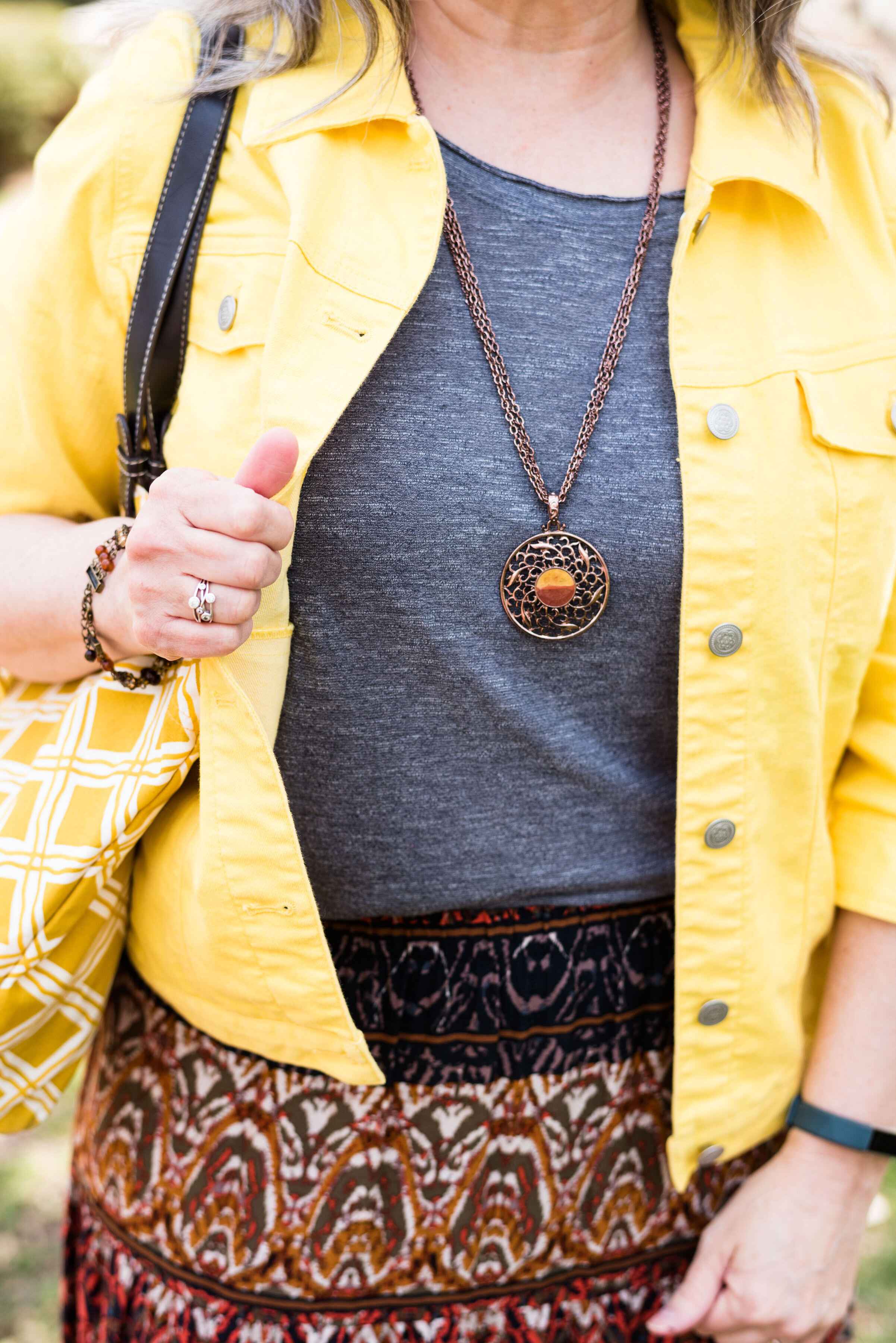
This simple Ultimate Gray tee is from Kohl’s and is SO brand. I got this one and a red one a few years ago. I love that they are light weight, but still provide coverage. The hemline is a straight cut and the length is shorter, so perfect for wearing out. I did the front tuck, just for a more polished look.
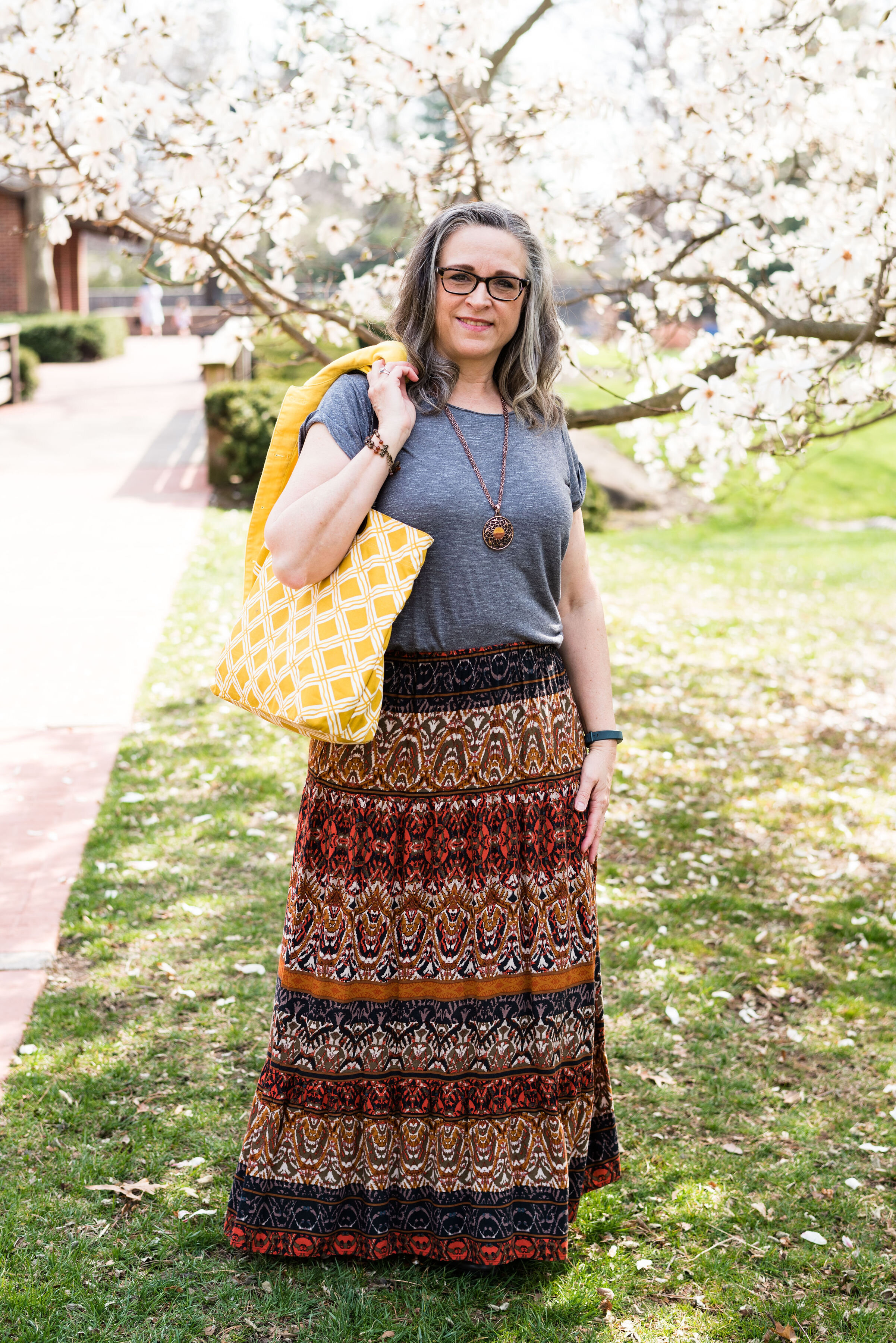
When I was rummaging through my necklaces, I saw this one and thought it would pull in both the rusty oranges in the skirt and the yellow of the jacket and bag. To go with the coppery colors I also put on my thrifted beaded bracelet. My yellow diamond patterned tote was a fun find at a thrift store. Another thrift store find, my ID Required combat boots get plenty of wear.


What do you think of these colors? Would you wear rust in the summer time or do you think it is a color strictly for fall? I’d love to hear your thoughts, so leave me some love in the comments. Your comments keep me motivated to keep providing content to you all.

I’m providing a few shopping links for you to look over in your spare time. These are affiliate links brought to you at no cost. When you click on a link, I get a few pennies, so I appreciate every click. All opinions are my own.
Photo and graphic Rebecca Trumbull.