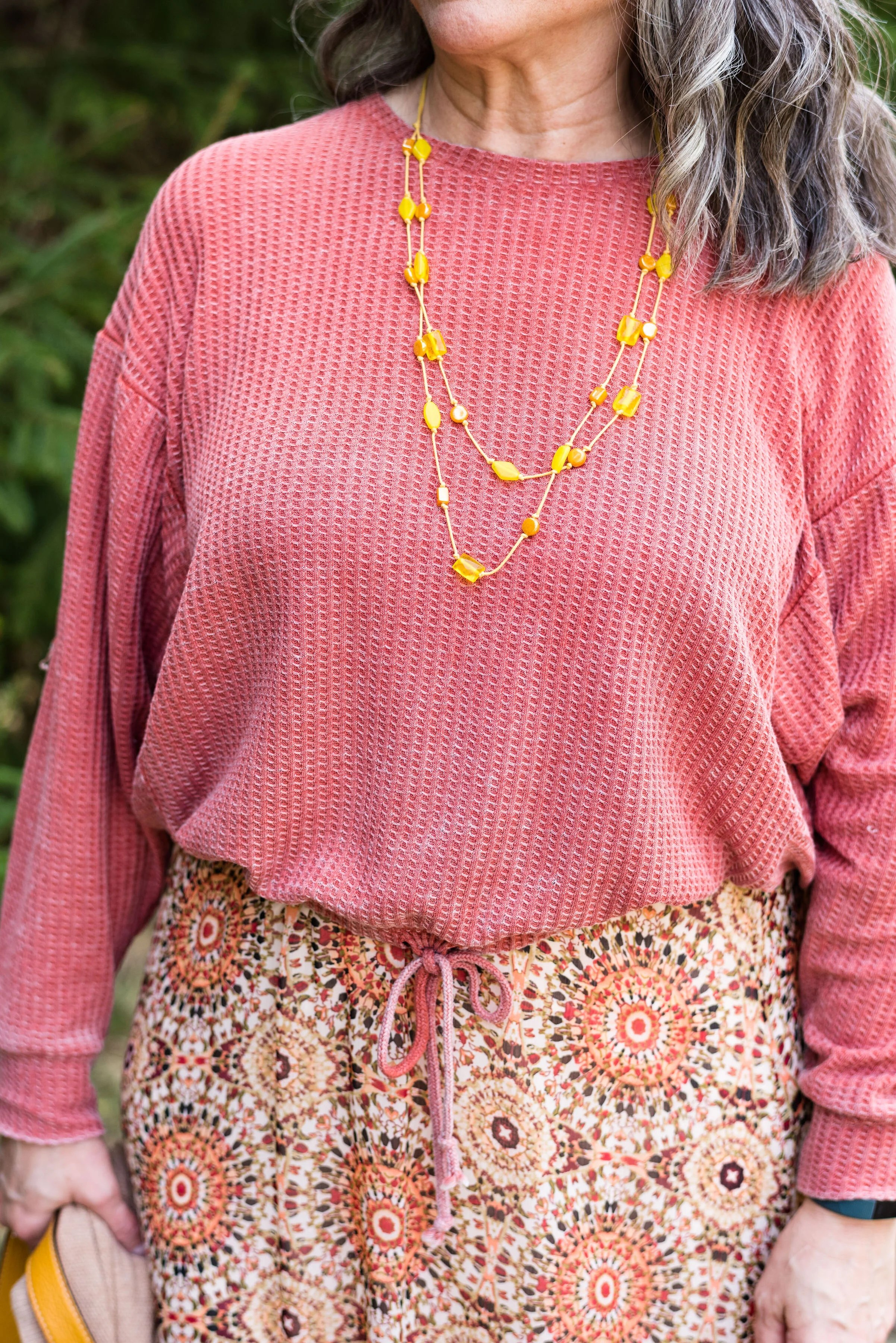
Color Play - Peach and Sea Foam Green

My grandson was here for the weekend, so I asked him to give me an unusual color combination. First he came up with orange and purple, which is definitely on my list of colors to pair in the future. He also mentioned red and green, but when I said Christmas, he decided not that. Finally, he said, “Peach and Sea Foam Green.”

We proceeded to have a mini discussion about what peach and sea foam green or blue actually look like. I finally had to Google both colors to see what the internet said. Sea Foam green is pretty straight forward. It is akin to minty green, but with a touch more blue in it. Peach, however, is another story. There are so many versions of peach: yellow-pink, pink-orange, yellow-orange…the list goes on. When you open up the peach fruit, the center is a yellowy orange, but the skin can have shades of pink in it.

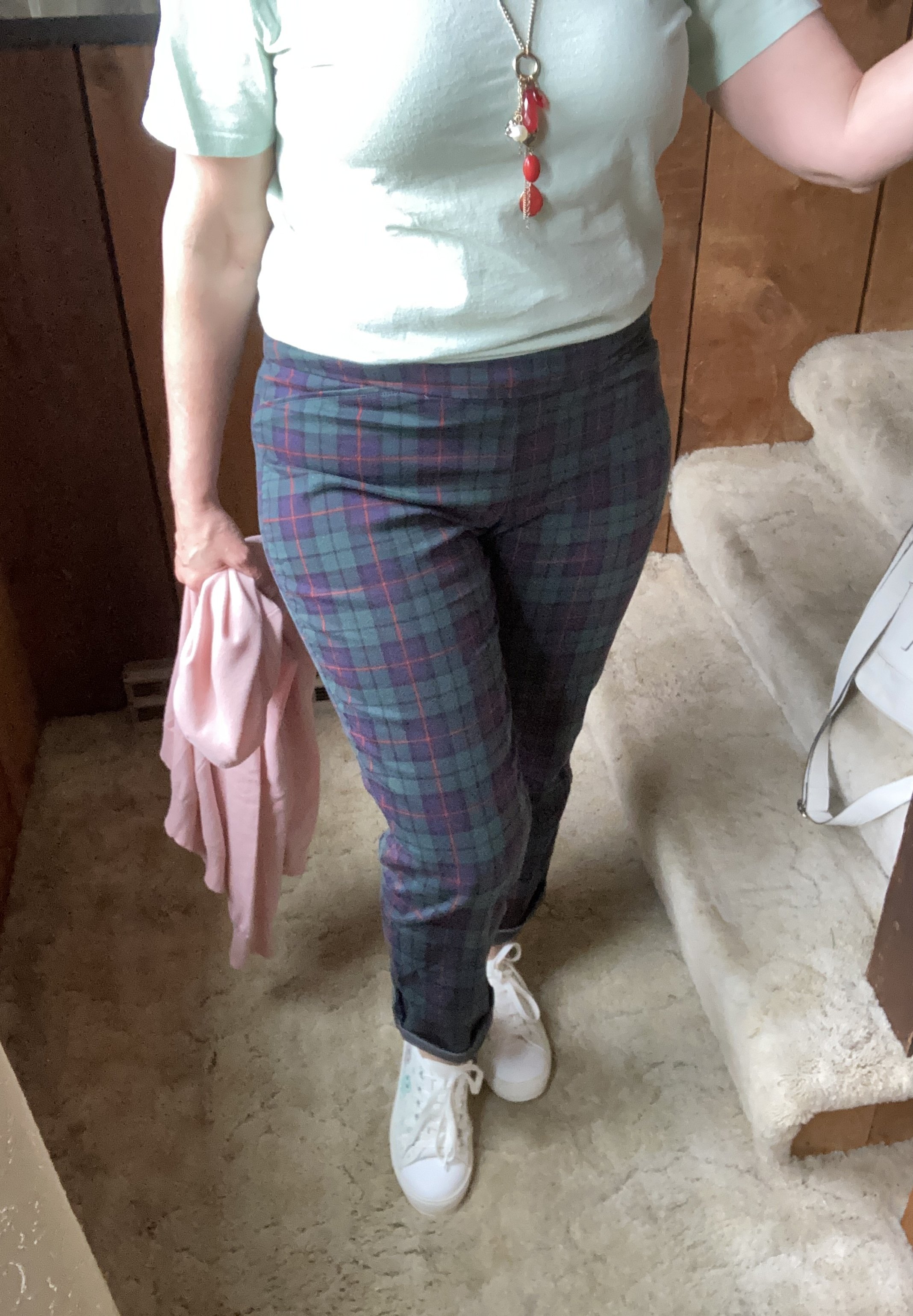
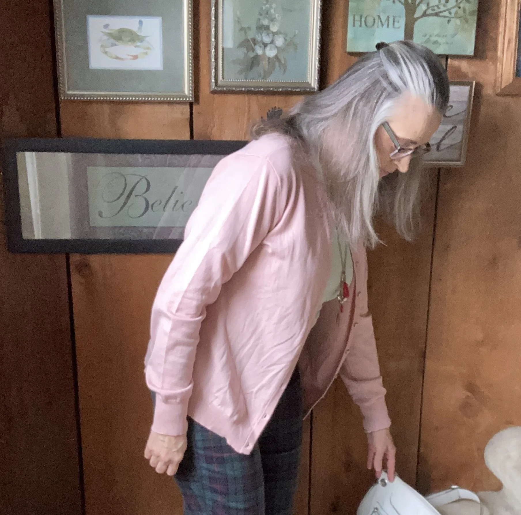
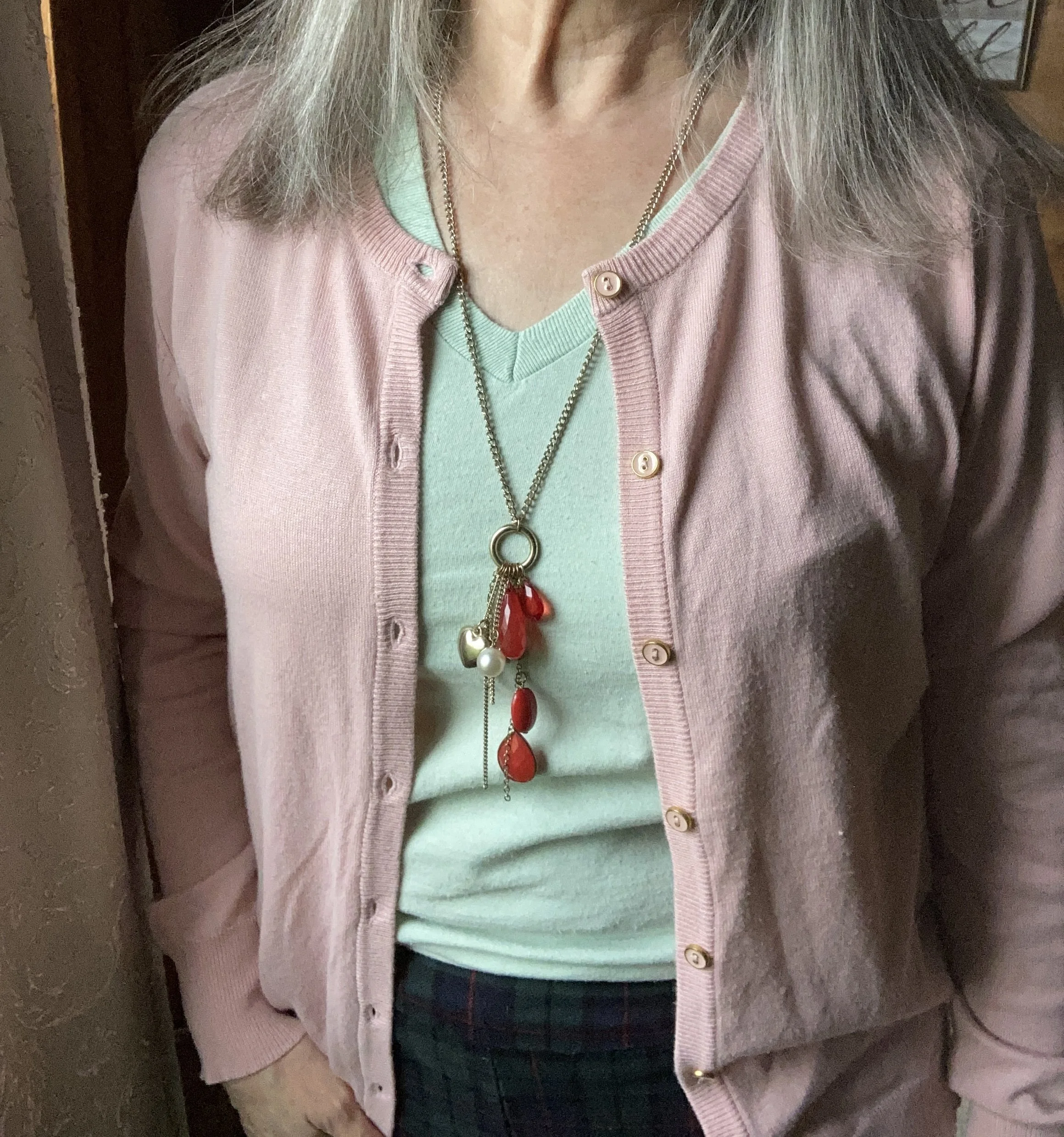
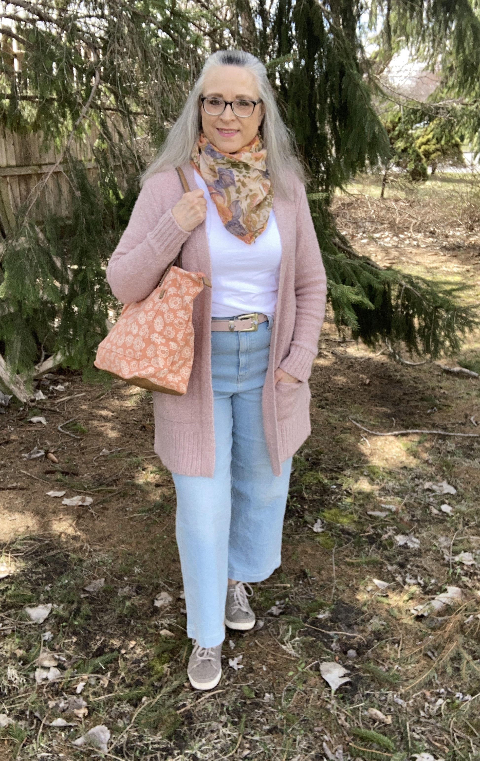
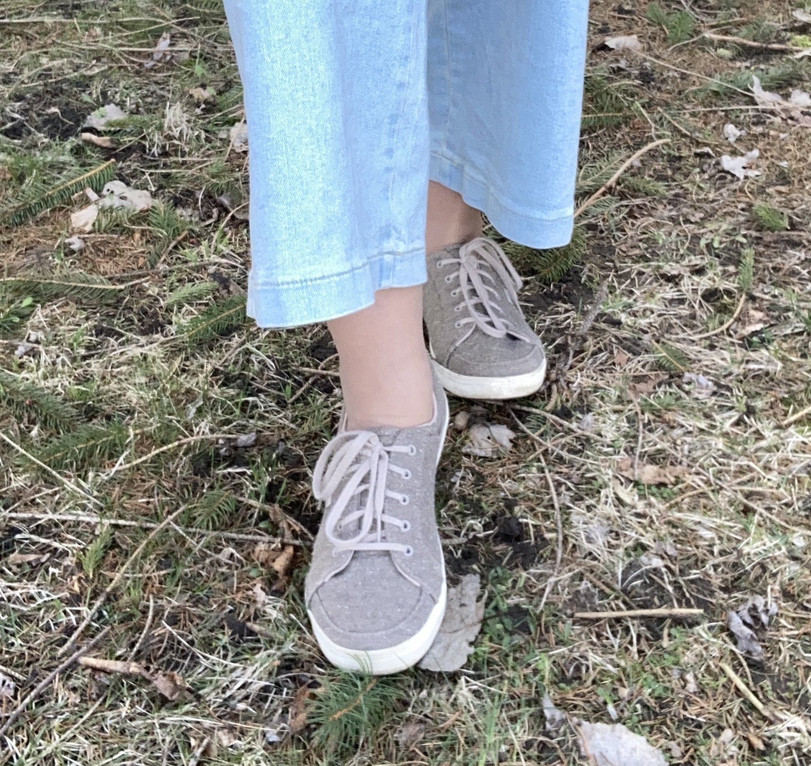
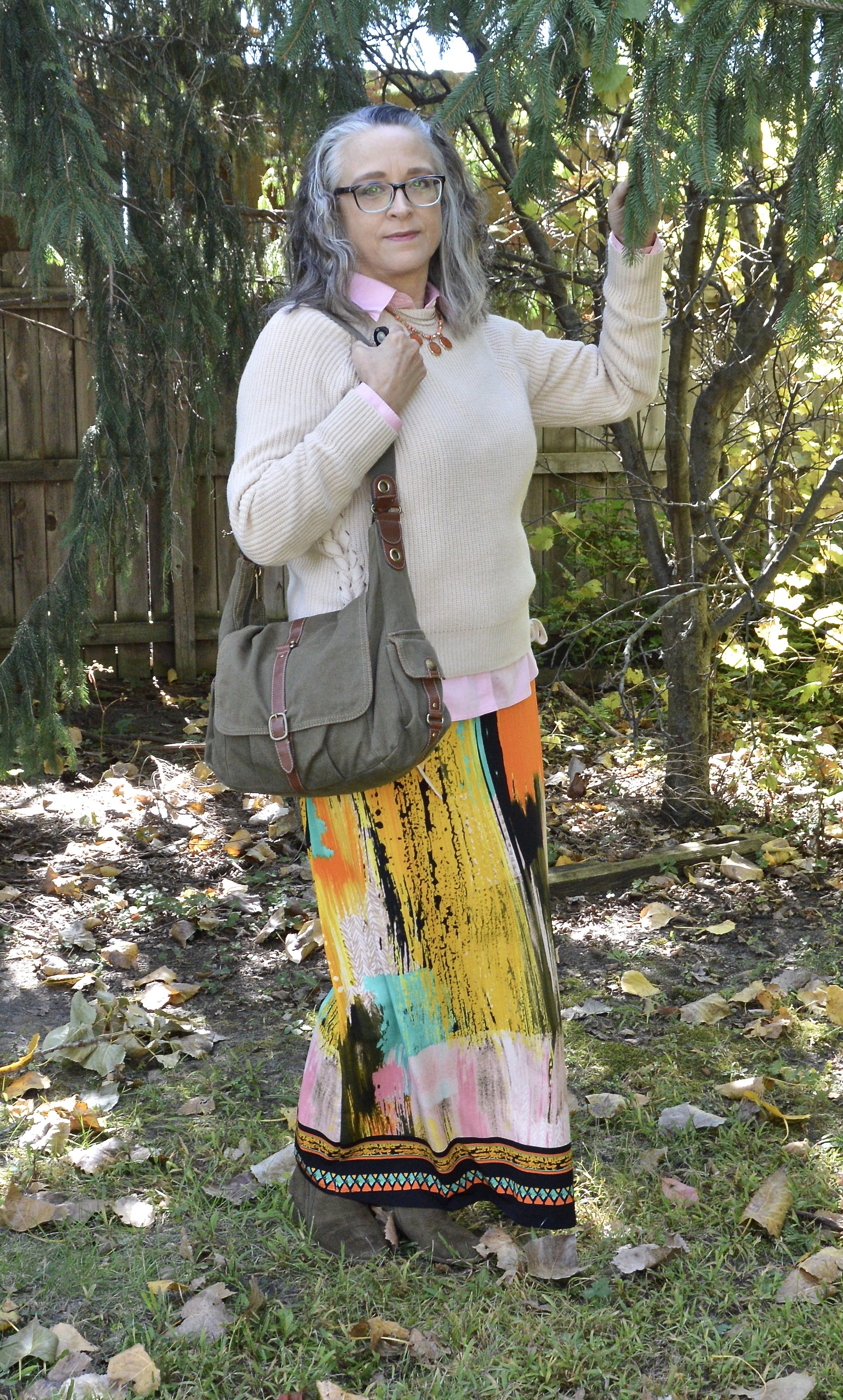
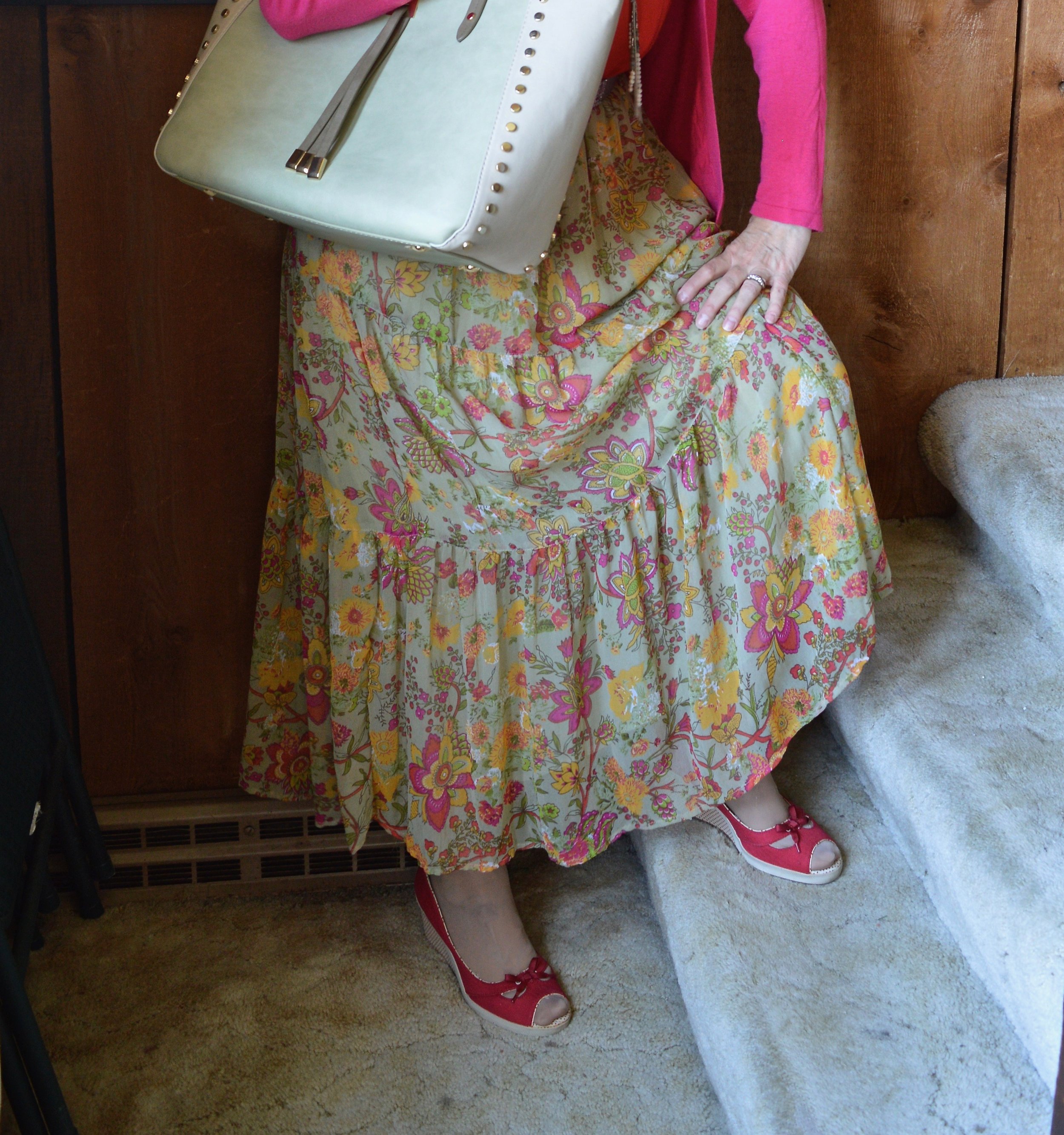
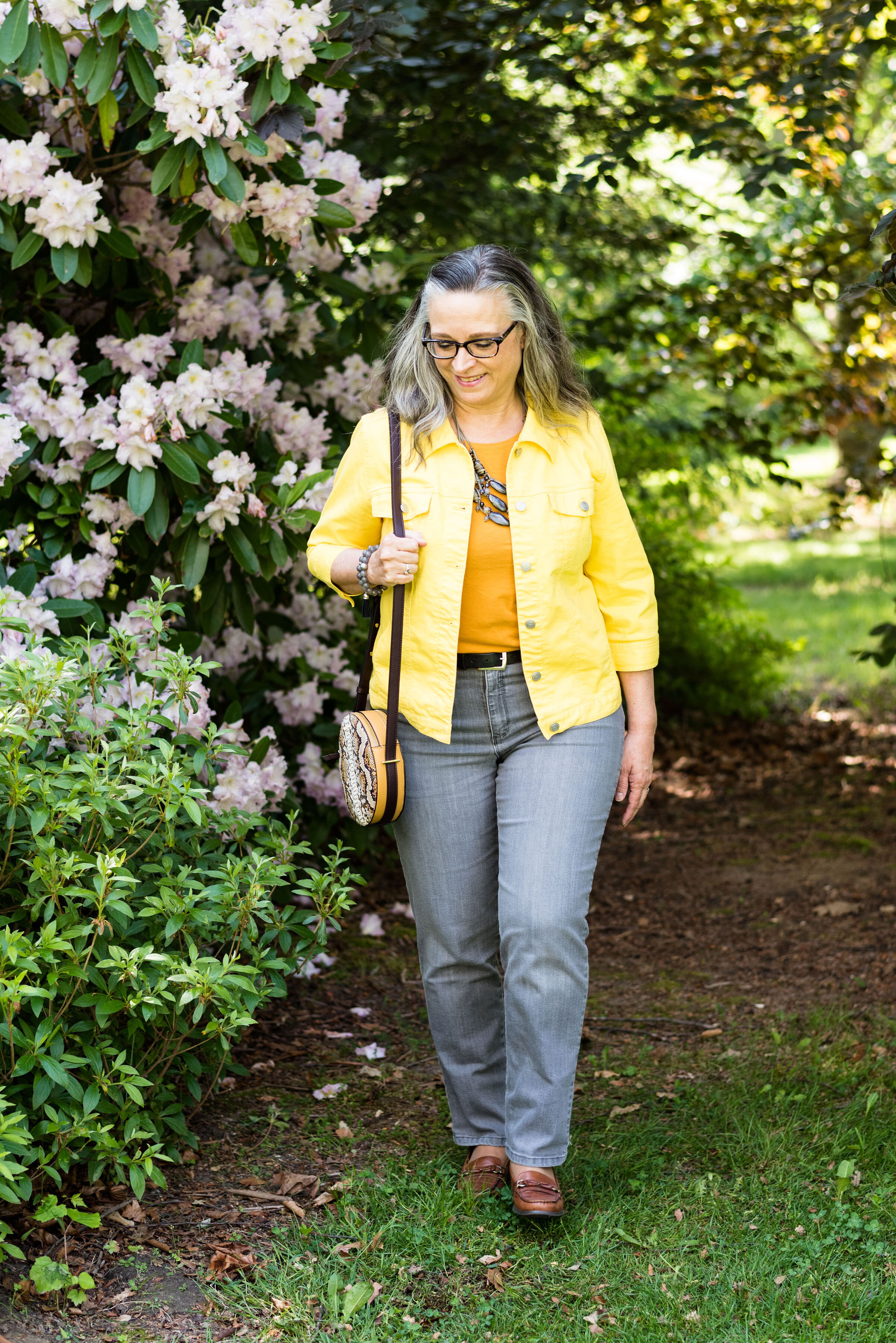
When I started looking for these colors in my closet I was leaning towards the pinky orange, but everything I have leans more towards coral than peach. I finally settled on this floral tee blouse. I call it a tee blouse because it looks and feels like a tee, but the sleeves and front have a sheer material, giving it a lovely dressy vibe. The sea foam green jeans were just right for this post.

Style Tip: Think outside the box when it comes to color. You don’t have to wear the same colors all the time, because that’s what the color gurus say you look best in. Try adding color in small amounts with a bag or shoes, or other accessories. I know I have said this before, but color is just too fun to not wear it.

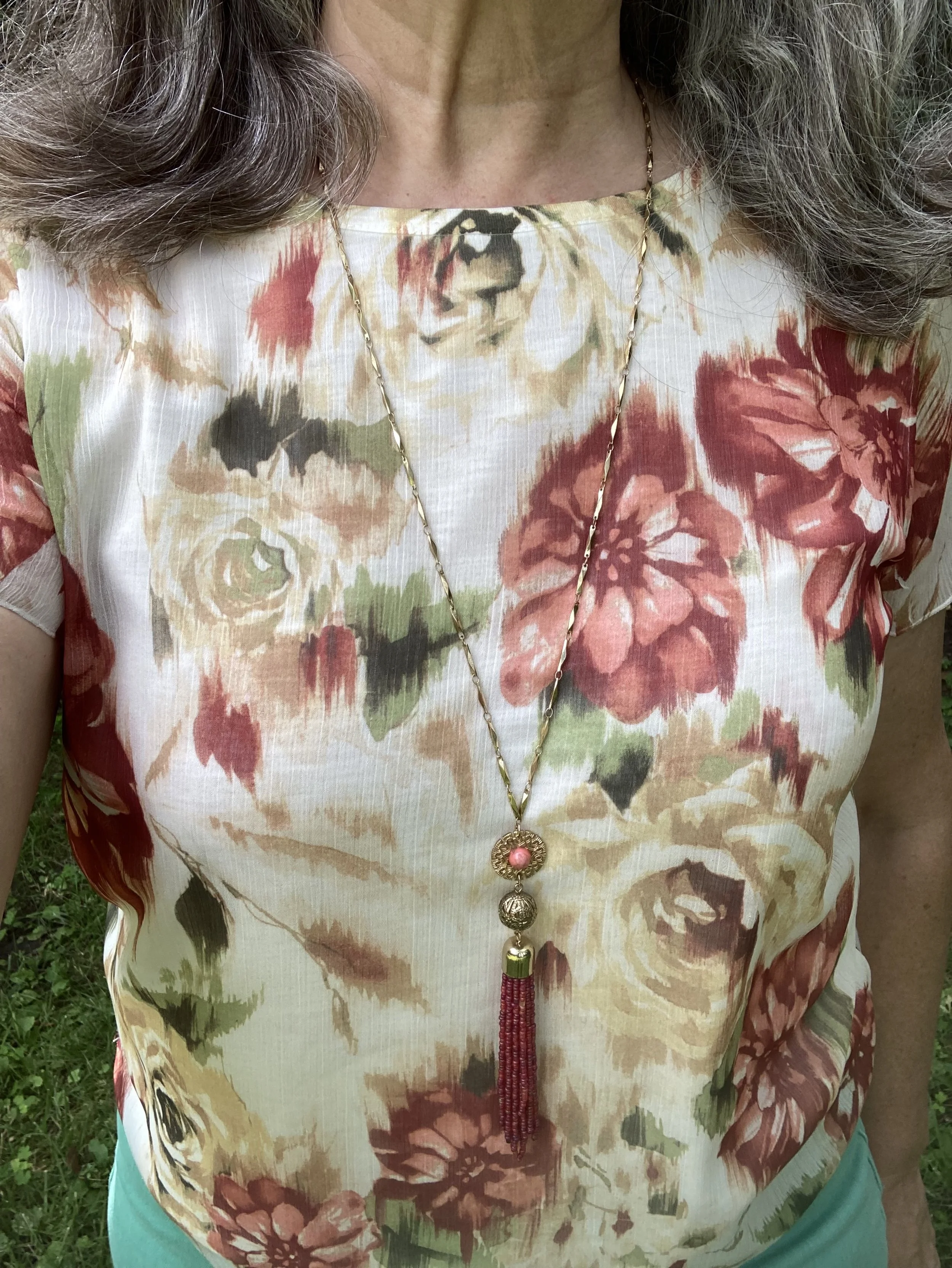
This pretty floral piece is Alfred Dunner brand and was either a thrift find or a clearance find at Kohl’s. It has been a few years, so I can’t remember. Ha, ha. I like the water color feel of the flowers. Since peach is yellow, but also pink, I thought this blend of colors a good compromise. You might not think it looks very peachy, but the point is not about perfect matches, but color inspiration.

Style Tip: Let color be a guide rather than a prison. Maybe you don’t have anything peach, or orange or yellow. Maybe your clothes revolve around neutrals. Why not use beige or tan with your sea foam green instead?

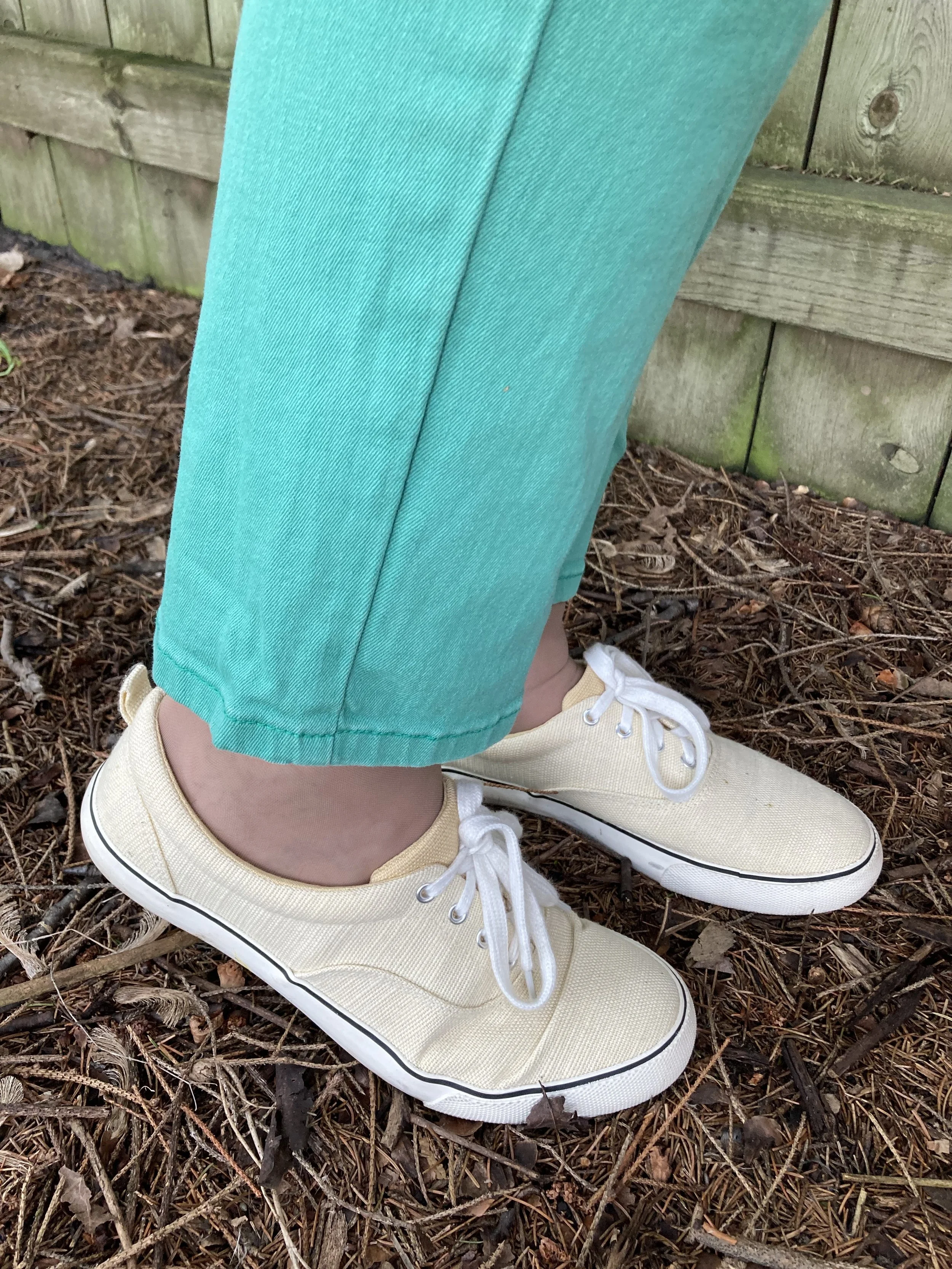
These bright green jeans are a brand called NYJD. I found these thrifting, but they do have a website and it looks like a decent brand. I love the fit and feel of these jeans. They are a bit stretchy, but not so much so they get slouchy. Check out their website, NYJD. I am not receiving anything in exchange for telling you about this retailer, it just looks like a decent place to get jeans that fit well.

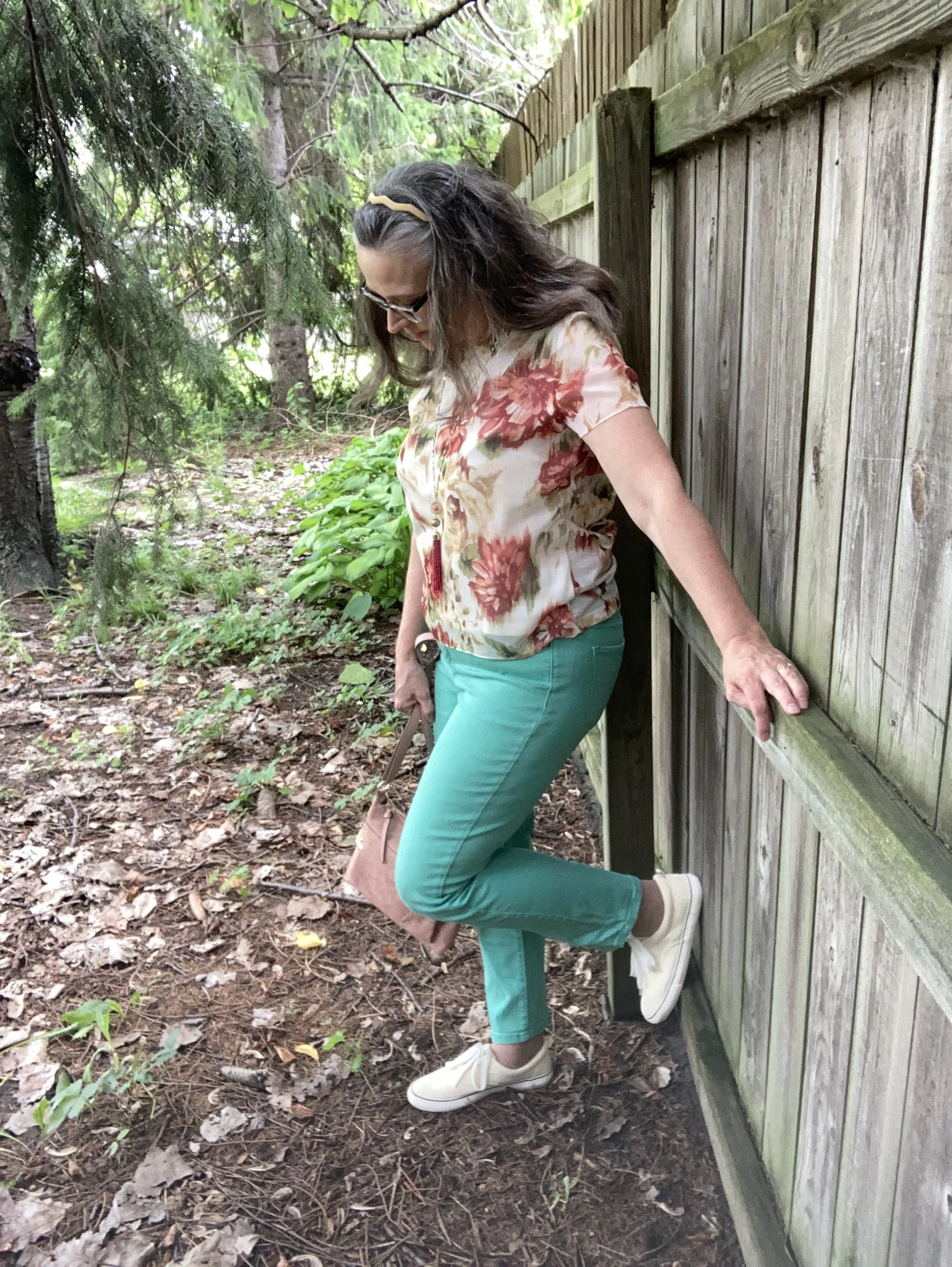
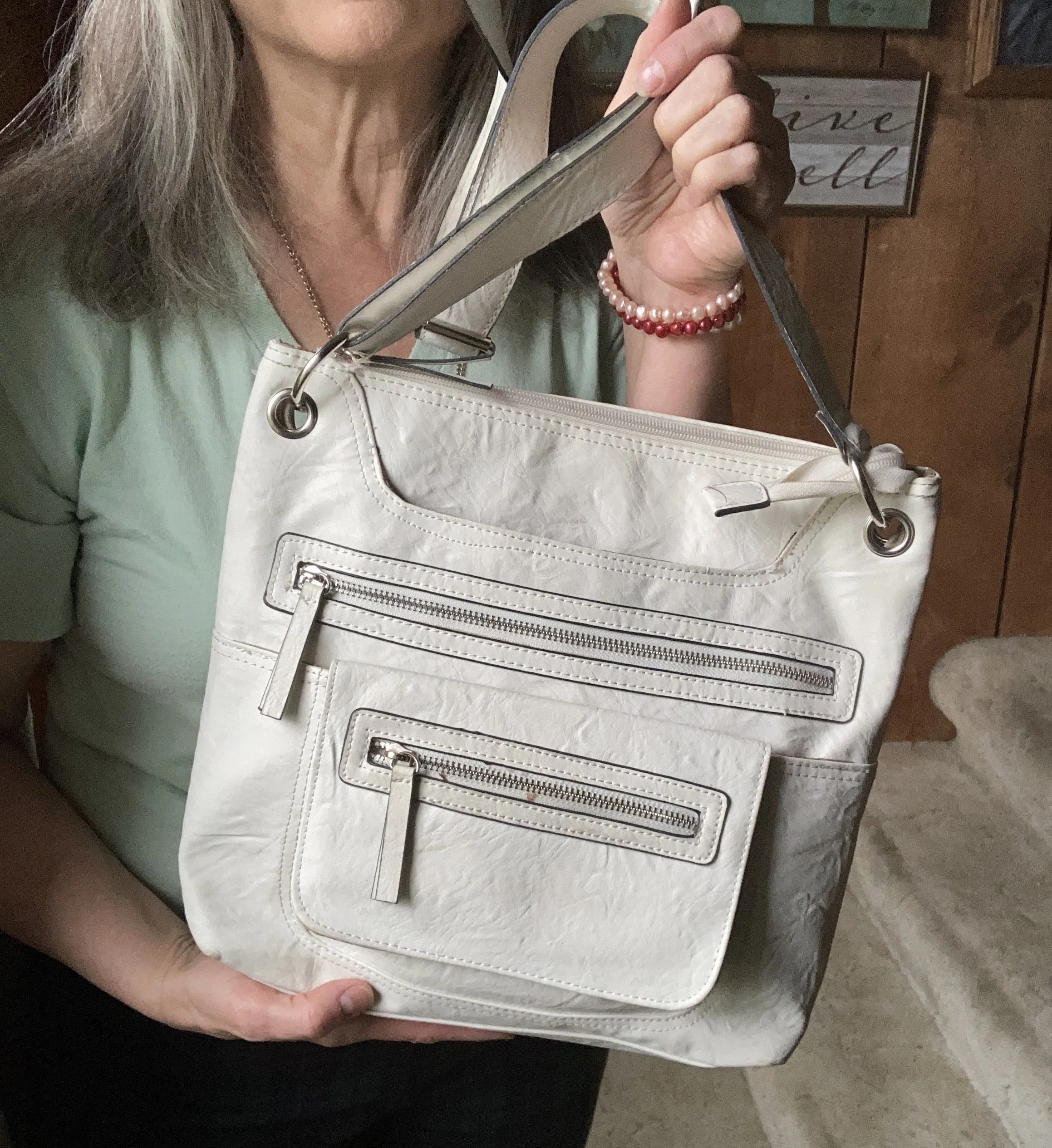
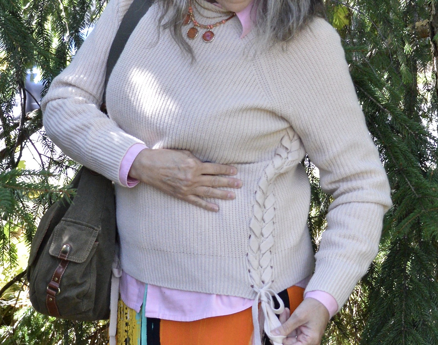
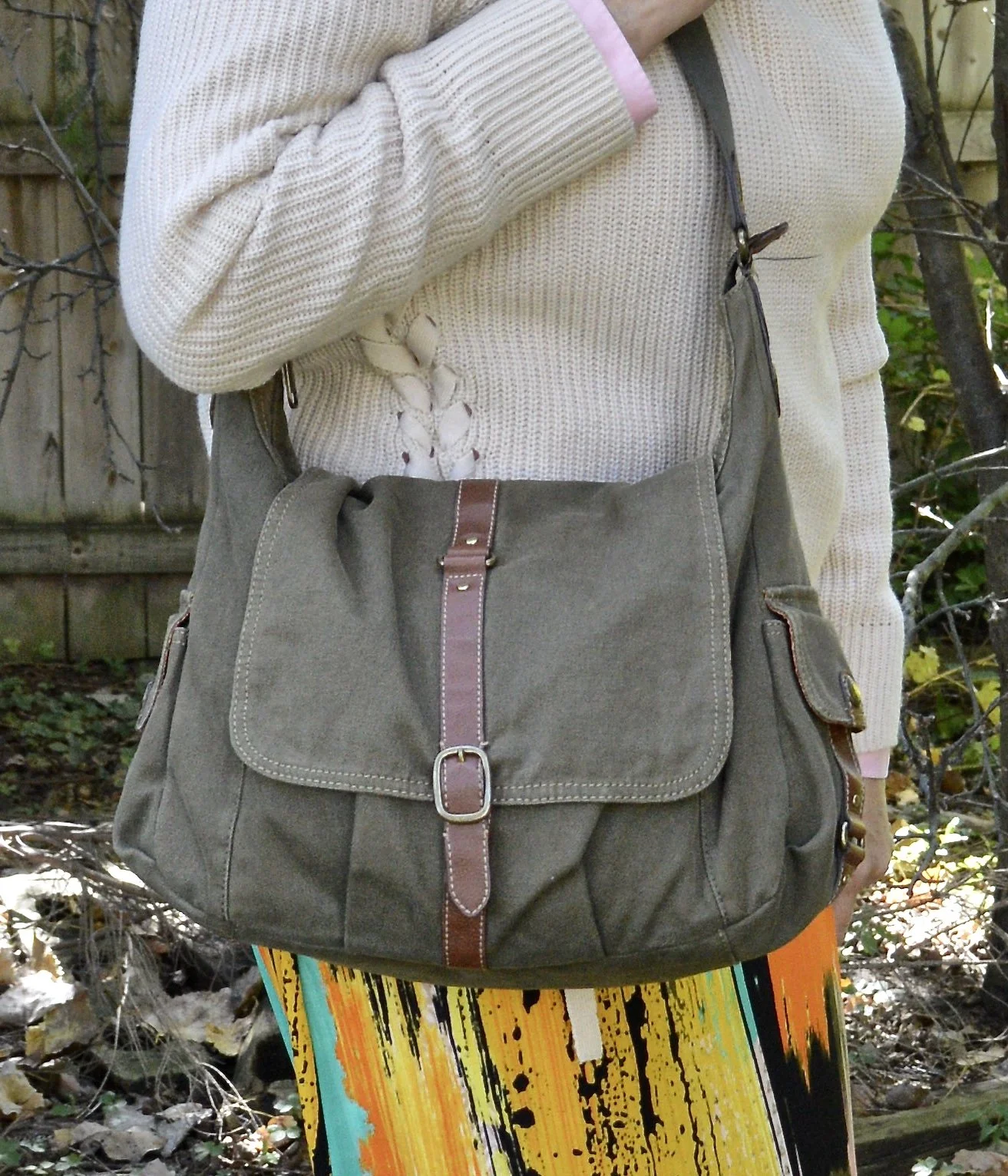
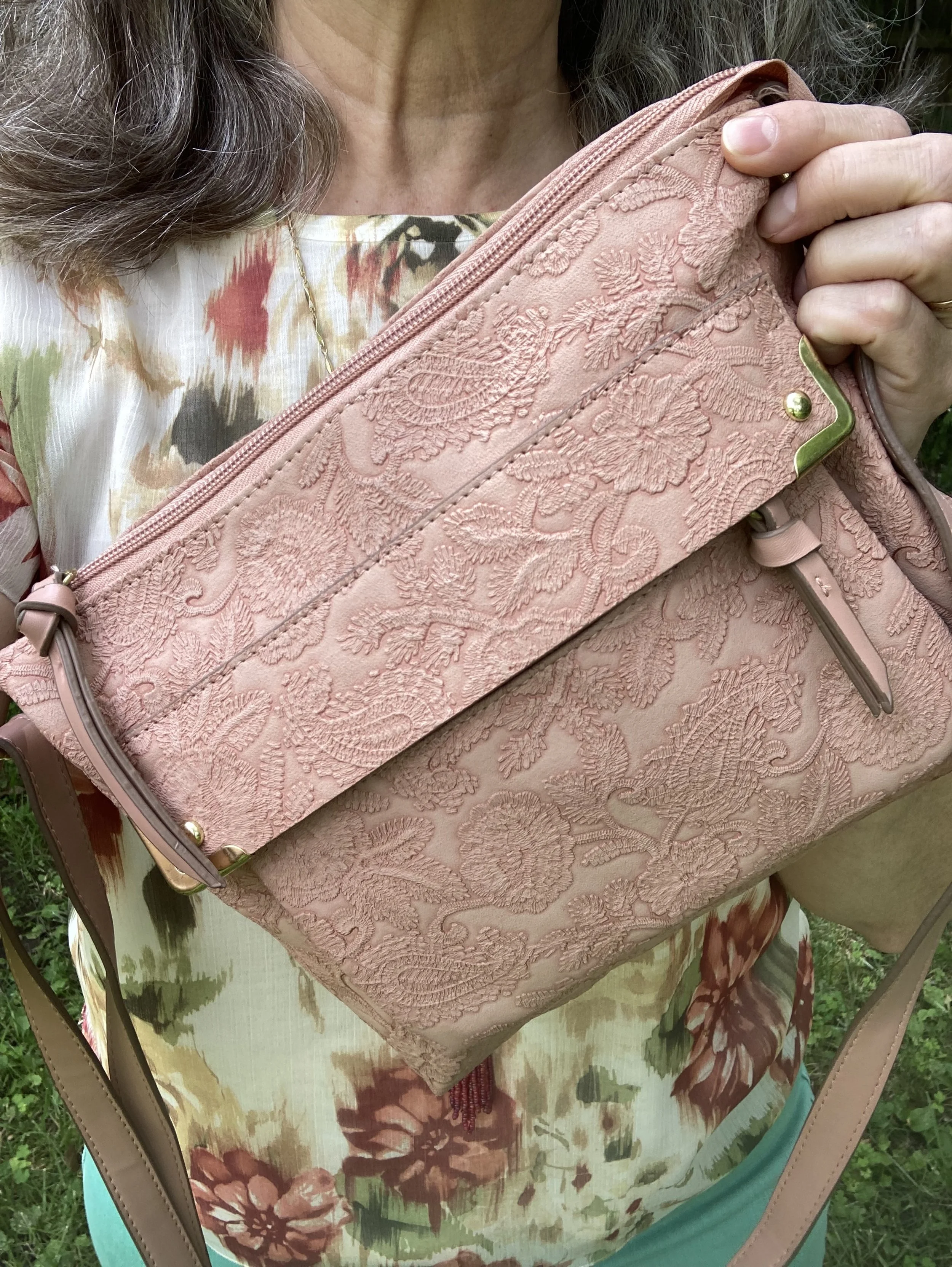
I decided to add a pinky-peach cross body bag to tie in the pink colors in the top. I also added my pale yellow Universal Thread sneakers, clearance from Target. Isn’t the embellishment on this bag so much fun? It looks like embroidery.

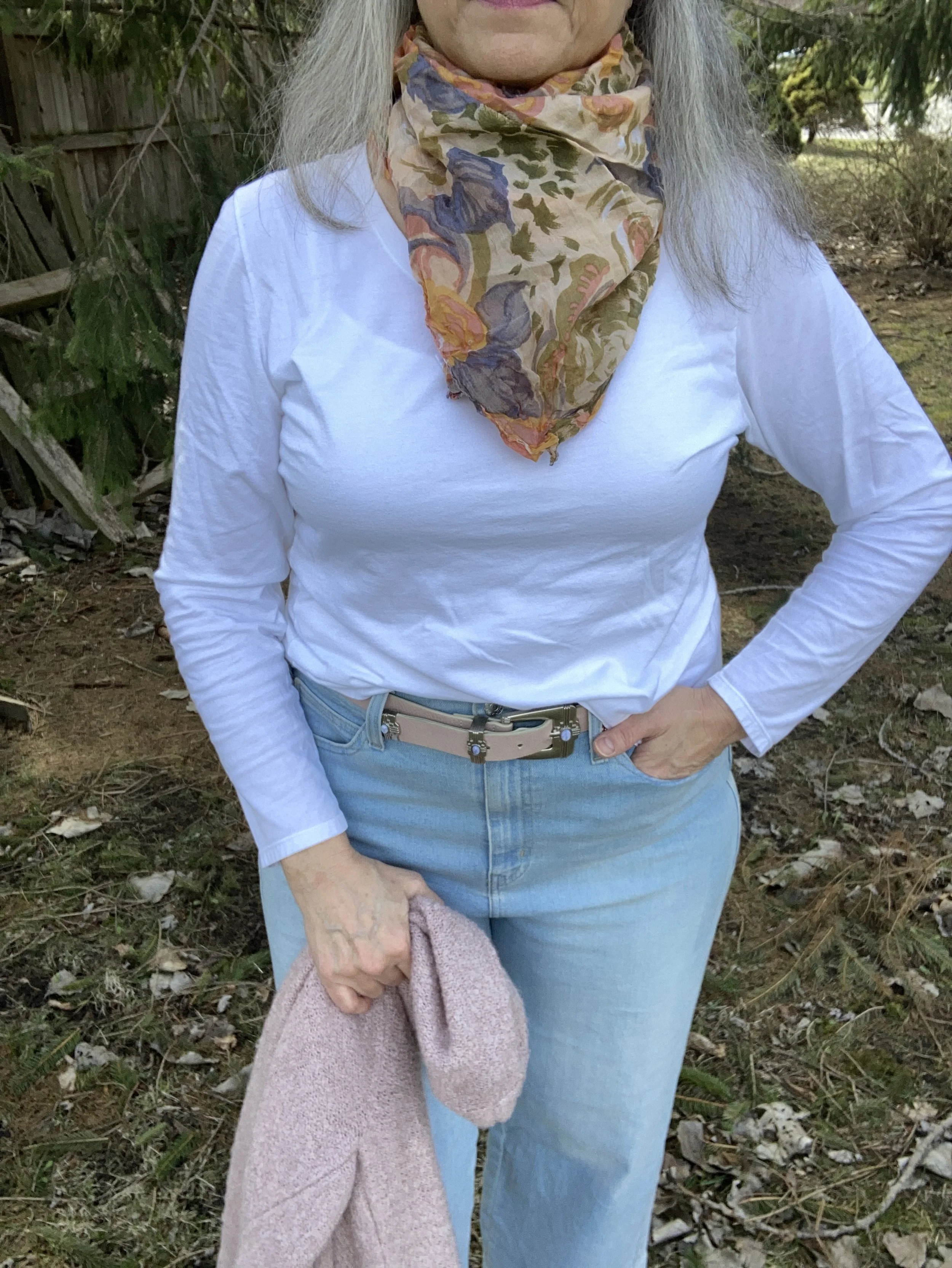
When you really pay attention you can see that this top isn’t really peach. You can also see that the green in the top, which is almost a citron green is nothing like the sea foam green of my pants, but I think the outfit works. Again, think in terms of inspiration rather than firm rules.

What do you think of this outfit? Do you think these colors work together? What is the brightest pair of pants you have in your closet? Do you have anything in the sea foam color? I love hearing your thoughts so leave a comment or two.

Don’t forget you can buy me a coffee by clicking on the link below. It is a great way to support people like me who bring you inspiration and ideas without receiving compensation for it.

Buy Me a Coffee.

I’m including some shopping links for you to peruse. These are affiliate links. I do not receive any compensation unless you buy a product through the links below. All opinions are my own.

Color Play - Dark Plaid in the Spring and Summer

Today, I am going to show you how to take a darker plaid and make it spring and summer ready. I know many of us put our darker colors away replacing them with pastels and the bright happy colors of warmer weather, but not everyone has as big of a wardrobe as I do. Indeed, for those who are more into a capsule wardrobe, this is a great way to use a darker print all year round.

I found these plaid Croft and Barrow pants a few months ago while thrifting. When I tried them on, I liked the way they fit, and knew they would be great for the holidays, but I also thought it would be fun to wear these any time of year by just adjusting what I pair them with. I decided to pull them out for this post.

As you can see in the picture below they are a simple pull on knit, thus the name inside the waist band - Effortless Stretch Pant. The older I get, the more I like that idea. Ha, ha. But then, the younger generation all wear leggings, which is really just a stretch pant, right? You can see these are perfect for Christmas with the red stripes, and green and blue plaid.

Style Tip: Roll up the hems on your straight leg pants, creating a narrow cuff, to give them a current, casual, and youthful look.

You might be wondering how I chose the sweater and the tee. I wanted to keep to the color scheme of the pants, but with lightening up the shades to a pastel, minty green, and a pastel, blush pink, it changes the feel of the whole outfit. I could have done a similar thing with a lighter reddish orange, and a lighter blue, but in similar shades to the original.

The whole idea behind Color Play is to play with colors and color combinations. I am not a color “trekkie”, boldly going where no woman has gone before in my color combinations. I still like things to look classic, polished, and put together in a way that makes a person think, wow, that’s a cool outfit. But, I still want to experiment and try new things, and I hope I am inspiring you to do that as well.

Style Tip: In order to lighten up an outfit when using a darker print, think in terms of shades of the darker print’s colors. If it is navy, evergreen and maroon, think in terms of light blue, minty green and pink.

My pink sweater was a Nordstrom Rack find, and is a brand called BYdesign. You can click on the link for a variety of color options. This is a great spring, and summer sweater as it is light weight. I got an XL, as I often like a roomier option. These are also on sale right now, so feel free to click on through.

My minty green v-neck tee is Hanes brand and a second hand find. Long sleeve and short sleeve plain colored tees are great pieces to stock up on at thrift stores. It doesn’t matter as much if they are not new as they are typically worn underneath other things.

I decided to wear a few red pieces of jewelry to coordinate with the red stripes in the pants.

My white bag is another thrift find that I typically pull out in the summer. I still have that “wear white in the warmer months” mentality, not so much about pants or tops, but definitely bags. In our current time anything goes, as they say, but we certainly still have our own personal preferences.

These cute sneakers were another thrift find. They are brand called vaisb, which looked to be a brand that used to be sold on Amazon.

What do you think of this outfit? Do you think I accomplished a spring or summer look by incorporating lighter colored pieces with the darker plaid pants? I personally like the way the outfit turned out, but I know it is not for everyone. However, the idea is to play with color. Don’t be afraid to think outside the crayon box when it comes to what colors you are brave enough to wear, and the color combinations you might create. Getting dressed should be fun and that is one of the reasons I share this blog with you.

I am including a few other shopping links below. Don’t forget to check out the BYdesign link above if you are in need of a light weight cardigan for summer. These are affiliate links. I do not earn any money from these links unless you purchase the item through the link. I provide these links to give you information and they are brought to you at no additional cost. All opinions are my own.

Buy Me A Coffee.

Outfit Inspiration - A Spring Look

Spring is here, at least the calendar says so, even if the temps don’t feel quite like it yet. As I worked on taking pictures of this outfit I was glad for my long sleeve tee and bulky, longer cardigan, because, dang it, it’s still cold outside! The sun is shining brilliantly, but not quite up to the task of warming our northern states. It will come, so we just have to be patient.

While we wait I thought it would be fun to post a few spring outfits that cater perfectly to our crazy midwestern changing weather. Fall and Spring are our transitional seasons and our temperatures can fluctuate from below freezing in the morning to the mid 70’s during the day. In addition, we can almost always expect rain, rain, more rain and plenty of wind, all of which continue to make me feel cold and want to dress in cozy layers.

Today’s Outfit Inspiration comes from Pinterest where I have a board titled Spring Fashion. Do you use Pinterest? I find that it can be a great source of inspiration and ideas from everything fashion, to holiday decor to recipes. I get tired of the same thing all the time, and I can’t tell you how many times I walk into my closet and just feel overwhelmed. Pinterest and the challenges I participate in on Instagram help me to think differently about my wardrobe and help me rediscover the joy I get from creating a fun outfit.

Style Tip: Look to other sources for outfit inspiration. Instagram, Pinterest, bloggers, and other social media platforms can be overwhelming, but they can also keep things from getting stale and get you looking at your closet with new joy. If you are not a social media kind of gal, then look at the fashion magazines at a bookstore or grocery store. Even though many of those don’t cater to your average woman, many of them can still give you color combinations, acceptable trends and outfit ideas.

The pin, which I will show you at the end is from an influencer Get Your Pretty On. Founder, Alison Lumbatis has a classic, petite, feminine style that works perfectly for busy moms. You can check out her website by clicking on the link. However, it doesn’t look like she has posted anything since last July, so I am not sure if she is still current. Anyway, the pin is for a spring outfit and features a pink cardigan, light wash jeans, a white v-neck tee, a pink tote, and neutral colored flats or sandals.

This white long sleeve tee is just a basic Hanes tee shirt. Basics like this are good to have in your wardrobe, especially if you have a more casual style. You can see I did a bit of a front tuck and added a pink belt to complement the sweater.

I actually had these Signature Levi Strauss jeans from the clearance rack at Meijer in the bag to return, but when I saw this pin, I began to think about other ways I could style these wide leg ankle pants for spring and summer and decided to keep them. They are super comfy and have a high waist that actually fits over my bulges, making it a good choice for wearing with tees that I might want to tuck in.

My thigh length, open front cardigan is Old Navy brand and was a thrift find. I’d say this has been one of my favorite sweater finds while thrifting. I love the length, the pockets, and the cozy fabric. The fact that it will be useful over three seasons is an added benefit.

Style Tip: When using an outside source for outfit inspiration, think about ways you can change up or add accessories to make the look completely your own.

As you can see I did just that with this outfit. I added this thrifted floral silk scarf for a bit a warmth, chose a coral floral Sonoma bag instead of pink to go with the coral tones in the scarf, and chose my neutral Keds sneakers instead of flats or sandals.

Here is my outfit next to the outfit I pinned.

Let me know what you think? Did I do a good job using the pin as inspiration, and did I do a good job of making the look my own? What would you do with this outfit inspiration? I always love to hear your thoughts. You inspire me to keep posting my blog posts and to keep playing with clothes!

I have added some shopping links to give you more ideas.

Buy Me a Coffee.

Have a great week!

Pantone Autumn/Winter 2022: Orange Tiger, Nosegay, and Autumn Blonde

Welcome to another outfit in my Pantone Autumn/Winter 2022 - New York Palette color series. For today’s look I combined the colors Orange Tiger, a lovely fall orange, Nosegay, a rich pastel pink and Autumn Blonde, a neutral classic for a cozy outfit with watercolor brushstrokes and southwest vibes.

When I decided to pair Nosegay and Tiger Orange I had this watercolor skirt in mind. The colors are mixed together with bold strokes and finished off with the southwest hem along the bottom of the skirt. I found this piece thrifting a few years ago and thought it would be great for spring and summer, but it seems to work for fall as well. It is a brand called ECI NY.

My light Nosegaybutton down is a thrifted Eddie Bauer piece. Originally I was thinking of wearing it over the sweater like a shacket. I ended up putting it under the sweater, but I’m not in love with how this looks.

The Autumn Blonde sweater is a recent find and is Forever 21 brand. I really like the ties along the outer seams on the torso.

I decided to grab the olive color in the skirt with my bag and booties. The Fossil bag is thrifted, and the SO booties are from a few years ago at Kohl’s.

I am not thrilled with this outfit, but life happens and I wanted to get something thrown together to at least share the Pantone colors with you. Though I love the color pink, it is not one that I use regularly in the fall. I also go more for rusty oranges rather than a bright orange like this one. What are your thoughts? Do you like these colors? How would you wear them?

I’m including a few shopping links for you to look over.

I hope you enjoyed this post. Thank you for all you love, support and feedback. I always appreciate hearing from you!

Have a great week.

Dreamy Dresses from Closet52 - The Doily Print Dress

Closet52 is on a mission to give all women affordable, quality made dresses at reasonable prices. Based in New York City, they provide dresses for work, everyday and special occasions. Their line of affordable, quality made dresses includes swing styles, a-line, sheath, maxis and more. Join me today as I style the Doily Print Dress.

This dress is all about the print. I love the fun doily pattern. If you are older, like me, then you probably had doilies around your home growing up or perhaps they were in your grandmother’s house. I always love the lacy look of a doily under a lamp on a side table or dresser. These are much more colorful than the creamy white ones I grew up with, but they definitely give the dress a lacy look.

I am very impressed with Closet52’s fabrics and details. The dress is a medium weight (polyester/spandex blend) which gives it movement and swing. This one lays very well and I did not have to worry about wearing a slip. The other detail that impressed me about all of the sleeveless dresses I picked out was that the armholes were the perfect size for me. Often the sleeveless arm holes on a piece will be too big, revealing my bra, or so small they feel constricting.

Another fabulous detail on this dress is the tie at the back of the neck. Easy on and easy off make this piece perfect for a summer party, event or dinner out after a day at the beach. The material will pack well and the fun pattern will translate into all seasons. I am already thinking about how I could add tights and ankle boots in the fall, or a blazer and skinny jeans in the winter. I love when clothing pieces have that much versatility.

For this look I simply added a few of my own elements, including a necklace, bag, combat boots, and a jacket.

There are so many ways you could style this dress from amazingly simple to wonderfully elegant. Add a pair of flip flops or sneakers for ultra casual. Add a fancy topper and heels for a night on the town. If you are looking for a dress be sure to stop by Closet52. Styles range from cute to elegant, and sizing includes regular, petites and plus size.

If you are looking for a dress be sure to stop by Closet52.

Photo credit Jessica Trumbull @ Rebecca Trumbull Photography.

This dress was gifted to me by Closet52. All opinions are my own.

Pantone Spring/Summer 2022 - NY Palette: Spun Sugar, Coca Mocha, and Perfectly Pale

Today’s Pantone colors are a blend of earthy and pastels. Spun Sugar is a light, airy blue reminiscent of hazy summer skies. Coca Mocha makes me think of a double scoop of chocolate ice cream and Perfectly Pale is the perfect summer alternative to basic white. See the actual Pantone colors here.

I think these colors are a great pairing for spring and summer. We often think of brown as a fall color, just like we think of white as only a summer color. Well, girlfriends, we definitely needing to change our thinking about color, as in all colors work at any time of year. I will forever love my darker browns, oranges, yellows and burgundies in the fall, but that doesn’t mean I won’t occasionally put them on in the heat of summer. God made color and color is good, all year round.

My Sugar Spun tee is a Sonoma piece. I don’t know that I consider myself wild, but I definitely am glad I live in a free country. That is something I never want to take for granted. I am thankful for all who have fought for so many years to keep our country the free nation it is. I have come to have a deep affection for graphic tees, especially those with words on them.

This outfit is all me. The colors work for me and the pieces are all thrift finds except the necklace, bag and sneakers. The Coca Mocha velvet blazer is a brand called SSA, and is definitely showing wear. I need to do some stitching around the cuffs as it has been wanting to come apart. But overall, I think the blazer still has some wear left in it. This is not something I would normally gravitate towards in the summer, but with our weather being so wacky, I think I will keep this available.

Style Tip: Don’t put your blazers away for spring and summer. Think of them as light weight jackets that you can throw on with cropped pants, capris and even shorts. They make any casual outfit look classy and put together.

My pants are Gloria Vanderbilt and a newer thrift purchase. I knew I wanted a few other lighter weight and lighter colored pants for spring, so this utility pair does the trick.

Style Tip: If pure white is not your bag, find light colored bottoms for summer in pale creams, tans and yellows. You’ll get a similar effect to wearing white and won’t have to worry as much about your colored underwear showing through.

Summer for me means less in the accessory department. I can’t wear most scarves as I get too hot and many of my jewelry pieces make me break out in the warmer weather. These warm months are where I turn to pieces with hippie vibes that use cording, or heavyweight string for pendants and bracelets. I am thinking about taking a few of my hubby’s metal detecting finds and turning them into jewelry, so I guess this would be the time.

My daisy necklace was a Christmas gift from my husband. I like the little quirk it has, because that’s me, just a little quirky. Ha. ha. I am also showing off my round Nine West snakeskin print bag, that I got a few seasons ago from Kohl’s on clearance. Last, but not least, I had to use my bright blue Converse again, since they went along with the Spun Sugar color.

What do you think of these colors? Do you like the colors together, or would you put them with other colors? I love hearing your thoughts and ideas. You inspire me too!

I’m including a few shopping links for you to peruse. These are affiliate links. All opinions are my own.

Have a great day!

Pantone Spring/Summer 2022 - NY Palette - Innuendo, Poinciana and Basil

Week two in my Pantone Spring/Summer 2022 series and we are looking at the New York Palette. Last week we saw a medium blue, a bright yellow and a crisp white that, put together, made a perfect spring Easter look. This week is another perfect combo for the upcoming Sunday holiday, especially if you are going to church or visiting family.

Innuendo is a bright, hot pink, while Poinciana is a simmering red. Combined with the classic light green color Basil, the look I put together says chic and classy with a splash of watermelon cooler! Let me know what you think.

I don’t often think of pairing pink and red, but for some reason I love how this turned out. The bright pink with the bright red just seems to work. Pairing them with the printed floral skirt led to a bright, colorful spring outfit perfect for Easter Sunday, or even a spring wedding or other event where you need to get more dressed up.

My bright pink open front cardigan was a thrift find and is Old Navy brand. I like to give you the brand names on things because it gives you an idea of the cut and quality of a piece. I don’t shop at Old Navy, but I certainly will grab their brand at a thrift store. This is a lighter weight piece so perfect for the warmer temps…at whatever point those arrive. Ha, ha. Here is one from Kohl’s, Shein, and Chico’s.

My Pop Sugar red smocked blouse was from Kohl’s a few seasons ago. It has ruffle details along the sleeve openings, but is otherwise sleeveless. I love the smocking detail and the shiny fabric. Check out these tops from Shein, Dia & Co, and JC Penney. You can also see in the photo below my long pendant necklace and belt. I have a beaded bracelet on as well that mimics the Basil green color, but it is mostly hidden by my sleeve. Ha, ha.

Style Tip: To get more use out of your clothes, try pairing unexpected colors together. You will not only have new ways to wear different pieces, but you’ll become a trend maker.

My skirt is a thrifted piece and the tag was torn or cut out, so I have no idea who made it, but it is a typical prairie maxi skirt. It is lined, but the lining is very sheer like the skirt, so I still felt a slip was necessary. See these from Kohl’s, Shein, and Dia & Co.

My shoes are a number of years old. I don’t wear heels or wedges much any more, so these have stayed in nice shape. These are Keds brand. I most likely got them at Kohl’s on clearance. The brand doesn’t seem to make this sort of espadrille with the wedge heel anymore, but I’ll give you some other options in my shopping links below.

My bag is also a few years old and was from Charming Charlie. We used to have a store at our mall. Now it is called something else, but still has a similar vibe to it with bags, jewelry and scarves being their main products along with a few clothes. Here are a few green tote bags from Amazon, Banana Republic, ModCloth, and Kohl’s.

What do you think of these colors? Do you think they go well together? Do you have any of these colors in your closet? I love hearing your thoughts, so leave me a comment or two.

I provided direct link shopping links above, due to changes at the affiliate site I was using. I’ve included a few shoe links through the affiliate website. I only receive a few cents when you shop through the affiliate sites. The other direct link sites I bring to you at no cost, but I also don’t make money through them. I just want you to have some shopping options.

Have a great week!

Pantone - Spring/Summer - 2021 - London Palette: Illuminating, Marigold and Ultimate Gray

Illuminating and Ultimate Gray are the two colors of the year, so just like I did for the New York Palette, I decided to pair the two colors together and for this one I added Marigold, which was also on the New York palette.

illuminating.jpg

We decided to go to the Toledo Botanical Gardens again for these pictures and we did come across some beautiful blooms. This particular bush is a rhododendron. I just did some research and found out that all azaleas are rhododendrons, but not all rhododendrons are azaleas. Whether you like azaleas or rhododendrons they are all beautiful.

Once again, I chose my recently thrifted bright yellow jacket to serve as the Illuminating color. The jacket is D&Co. (Denim and Co.). It has a nice stretch to it and I like the 3/4 length sleeves for a change of pace.

londonpantonecoloroutfitideailluminating-8.jpg

I’ve styled my medium yellow tee on the blog before. You can see it styled with a leopard print skirt. Having tees in a variety of colors comes in handy when you want to put an outfit together. This thrifted tee is Apt. 9 brand.

My Gloria Vanderbilt jeans were another Kohl’s clearance find. They are soft and stretchy, so great for my fluctuating weight. I say fluctuating, but it really doesn’t go up and down. It either stays the same or goes up. Ha, ha.

londonpantonecoloroutfitideailluminating-11.jpg

I wanted my accessories to make a statement since the outfit itself was not overwhelmingly interesting. I found this pretty layered necklace in gray tones somewhere along the way. I think it was a thrift shop nearby. I added a few beaded bracelets to tie the jewelry together.

When I decided on the thrifted tan loafers, I knew my Nine West snakeskin print circle bag would be the perfect piece to complete the whole look and bring everything together.

londonpantonecoloroutfitideailluminating-13.jpg
londonpantonecoloroutfitideailluminating-15.jpg
londonpantonecoloroutfitideailluminating-16.jpg

What do you think of these colors together? Do you like the lighter yellow of Illuminating or the richer tone of Marigold? I’d love to hear your thoughts in the comments below. I appreciate when you give me your feedback. It can be kind of lonely as a blogger, when I don’t know if anyone is reading my content or looking at my posts, so I really love to hear from you.

londonpantonecoloroutfitideailluminating-10.jpg

I am including a few shopping link for you to enjoy. These are affiliate links and are brought to you at no cost. If you click on a link I get a few pennies and I appreciate all of your clicks. I do not get paid to write my blog, I do it as a hobby and as a service to whomever wants to follow along. I hope that I inspire you to take a second look at your wardrobe and see new ways to put things together, that you never thought of before.

Photo and graphic credit Rebecca Trumbull.

Pantone - Spring/Summer - 2021 - London Palette - Intro

I am finally getting around to sharing the Pantone London Palette with you. It has been hard to get things posted in a timely fashion. Even though I would normally try to get these colors to you, much earlier in the Spring, I figure they are meant for spring and summer, so we are still okay. Today’s post will introduce you to the colors and give you a few little sneak peeks from our recent photo shoot.

londonspring2021.jpg

These are all great colors for spring and summer. The palette is a nice mix of warm and cool colors and there is likely to be a color for everyone. The classic colors, while still showcasing your typical navy, gray and creamy white, also includes a soft light brown and an mossy olive green. I really like the blues included with this palette. They make me think of tropical waters and blue skies.

Enjoy these sneak peeks.

pantonefashionideassummer-1.jpg
pantonefashionideassummer-3.jpg
pantonefashionideassummer-4.jpg
pantonefashionideassummer-5.jpg
pantonefashionideassummer-6.jpg

Be sure to check back on Thursday for the first outfit in this series. I hope you had a lovely Memorial Day weekend.

Photo and graphic credit Rebecca Trumbull.

Pantone - Spring/Summer - 2021 - New York Palette: French Blue, Cerulean and Buttercream

Today’s three color combo is the last of the Pantone Spring/Summer New York Palette. I am going to take a week off, as I hope to go visit my mom next week. In due time, I will proceed with the London Palette, but I haven’t even begun to pick out outfits. Breaking my wrist has really thrown a wrench into the works, so bear with me. I got my second Covid shot yesterday, so getting up this morning was grueling. I got the shot in my left arm, figuring it already hurts and I wanted my right arm to remain relatively pain free. I say relatively because there is some pain in my wrist and rib cage on that side, from having to do all the work. This is making me see how much I need to get back to exercising, especially weight lifting and walking since I have osteoporosis. We ladies need to take of them bones, and all the other parts as well. Ha, ha.

I thought it would be fun to pair these two blues, for a fun, casual summer look. Adding the off white of buttercream gives the outfit that perfect warm weather vibe. I kept my accessories casual to add to the picnic ready style. This would be a great outfit for a Fourth of July get together, just add some red jewelry or a bag.

frenchblue.jpg

French Blue and Cerulean are two cool colors that make me think of blue skies and water. I found this French blue plaid shirt while thrifting. I really like this medium blue for spring and summer, as opposed to a dark blue like navy. This button down is Faded Glory brand.

frenchbluepantonespringcoloroutfitideas-2.jpg

My Buttercream ankle pants have made an appearance on the blog before. These were thrifted St. John’s Bay. You can see these styled for two other Pantone series. This one is styled with a yellow button down and this with my Chevron print dress.

Cerulean is a different light blue. I like the sky blue feel of this color, yet it leans towards a bit more pastel. My top is a thrifted Ralph Lauren piece. I like that it has a lining that is similar t-shirt type material to the outside. It has a fun faux lace texture to it.

frenchbluepantonespringcoloroutfitideas-13.jpg

I kept my accessories simple. This thrifted French Blue bag was a recent find and I had to grab it since it matched the color perfectly. This is a nice small bag for carrying just the essentials.

frenchbluepantonespringcoloroutfitideas-7.jpg

My pendant necklace had little flecks of all the colors. I have been on the search for more of these large beads with the hole in the middle. It is so easy to make a necklace out of them.

frenchbluepantonespringcoloroutfitideas-5.jpg

Lastly, my thrifted Keds finally fit the Pantone color. Cerulean is the right name for these sneakers that are great for warm weather outfits.

frenchbluepantonespringcoloroutfitideas-8.jpg

What do you think of these colors? Do you have these blues in your closet? What about Buttercream? I’d love to hear your thoughts. I’d also love to hear which of these colors you would put together to make an outfit.

frenchbluepantonespringcoloroutfitideas-10.jpg

I hope you have enjoyed this look at the Pantone Spring/Summer 2021 New York Palette colors.

I am including a few shopping links, so be sure to check those out. These are affiliate links. I get a few pennies when you click on a link, so I appreciate all the clicks.

Photo credit and graphic Rebecca Trumbull.

Pantone - Spring/Summer - 2021 - NY Palette - Illuminating, Rust and Ultimate Gray

I wanted to share this outfit with you first, because it contains the two colors that were chosen by the Pantone Color Institute as the colors of the year. Illuminating is a bright, sunny yellow. Pantone describes this yellow as, “Friendly and joyful, an optimistic yellow offering the promise of a sunny day.” Rust is typically a fall color, yet it is an earth tone, thus its inclusion in the spring palette. Ultimate Gray is a classic and comfortable gray that everyone can wear.

illuminating.jpg

I have plenty of yellow in my closet. It is a color that has quickly become a favorite. I love the many different shades of yellow. I have mustard, sunflower, lemon, blonde and pineapple. Look up shades of yellow in your search bar and see all the fun names they give for these lovely pieces of sunshine. Illuminating is not really a different shade, but a different name for a shade that might also be called bumblebee, butter or dandelion.

Since I love the color so much, it was a no brainer that I add this thrifted, bright yellow, denim jacket to my closet. This is a brand called d & co, or denim and company. When I looked it up, it is a brand that is sold at retailers like QVC, Walmart and others. I like the relaxed style of this piece, as well as the 3/4 sleeves. It will be a great topper for cooler summer days.

pantone2021illuminating-7.jpg

We were back at the Toledo Botanical Gardens for pictures and things are starting to bloom over there. This tree was gorgeous and I had no idea what is was because the blooms were so big. It turned out to be a white magnolia. I grew up with a pink magnolia in my parents’ yard. I didn’t even know there were white ones.

You’ve seen my boho skirt on the blog before. I looked at other Rust colored options in my closet, but just wasn’t satisfied with how the outfit looked. Choosing this skirt not only gave me a print, but the perfect blend of classic and bohemian. This skirt is a brand called Notations, but I can’t remember where I got it. Ha, ha. You can see it styled with a green top and a different gray top.

This simple Ultimate Gray tee is from Kohl’s and is SO brand. I got this one and a red one a few years ago. I love that they are light weight, but still provide coverage. The hemline is a straight cut and the length is shorter, so perfect for wearing out. I did the front tuck, just for a more polished look.

pantone2021illuminating-15.jpg

When I was rummaging through my necklaces, I saw this one and thought it would pull in both the rusty oranges in the skirt and the yellow of the jacket and bag. To go with the coppery colors I also put on my thrifted beaded bracelet. My yellow diamond patterned tote was a fun find at a thrift store. Another thrift store find, my ID Required combat boots get plenty of wear.

pantone2021illuminating-11.jpg
pantone2021illuminating-12.jpg
pantonespring2021preview-2.jpg

What do you think of these colors? Would you wear rust in the summer time or do you think it is a color strictly for fall? I’d love to hear your thoughts, so leave me some love in the comments. Your comments keep me motivated to keep providing content to you all.

pantone2021illuminating-1.jpg

I’m providing a few shopping links for you to look over in your spare time. These are affiliate links brought to you at no cost. When you click on a link, I get a few pennies, so I appreciate every click. All opinions are my own.

Photo and graphic Rebecca Trumbull.

Pantone - Spring/Summer - 2021 - New York Palette: Introduction

I am a bit behind on the Pantone colors this year. I had a hard time getting back into the swing of regularly posting, but here I am. While we are a few weeks into spring, the Pantone colors for this season are for spring and summer. I don’t pay attention too much to their time table, because they already have the colors out for the fall/winter season. Who wants to think about fall/winter when we have barely made it into spring? Ha, ha.

Just as a quick review, the Pantone Color Institute is an entity that provides the color trends for both the fashion and interior design industries. If you go to their website you can see all sorts of information from color swatches you can order to educational opportunities. Obviously, these are not the only colors that you see trending on the runways, but Pantone is easily considered a color authority by both design areas.

Every year, Pantone chooses a color of the year. Last year it was Classic Blue. In 2019 it was Living Coral. This year they picked two colors, Illuminating, a sunny yellow and Ultimate Gray, which is a classic medium gray. Typically, the colors of the year are seen on both the New York and the London Palettes. As I have done in the past I will be starting my series with the New York Palette. This year, the palettes are quite dissimilar, which makes it more interesting for me, as I pick out outfits and for you, my lovely subscribers.

Here is the New York Palette.

ClassicColors_(12).jpg

This is a mix of jewel tones and pastels, so if you lean towards one or the other, this palette will make everyone happy. Rust is a different color for summer, but I think it can work well with many of the others colors. Once again there is a selection of classic colors, which to me are helpful if you want to tone down an outfit and just accent with the brighter colors through jewelry and other accessories.

The following are a few photos from our shoot which give you some sneak peeks at how I combined these colors.

pantonespring2021preview-1.jpg
pantonespring2021preview-2.jpg
pantonespring2021preview-3.jpg
pantonespring2021preview-4.jpg
pantonespring2021preview-5.jpg
pantonespring2021preview-6.jpg

I hope you will join me on Thursday as I start the series. Have a great day!

Photo and graphic credit Rebecca Trumbull.