Pantone - Autumn/Winter - 2021 - New York Palette: Pale Rosette, Root Beer and Olive Branch
I want to start off with an apology for my lack of consistency with the blog lately. It has been a rough couple of months and I just haven’t had the motivation to post as regularly. It seems every time I want to make more of an effort at getting more disciplined or being more consistent, I get blindsided by something. At the beginning of the summer it was a broken wrist. Mid summer, I came down with this stuff, that still has me coughing. I just have no idea if I will ever be back to “normal”, whatever that was.
There have been some good bits along the way as well. Early summer we were able to take my in-laws on a nice trip up through the Upper Peninsula, down through Michigan and back to our place where they enjoyed visiting family for a few days. I also got to see my mom, two different weeks and spend time with her. That also afforded me the opportunity to see my best girlfriend, and do some thrifting. On September 19th, our second grandson arrived. He is a doll and I am enjoying opportunities here and there to see him, even if I do have to wear a mask. He’s been born into a world of half blue faces, but that is okay, if we can give him a healthier start. He, my daughter and son-in-law are doing well.
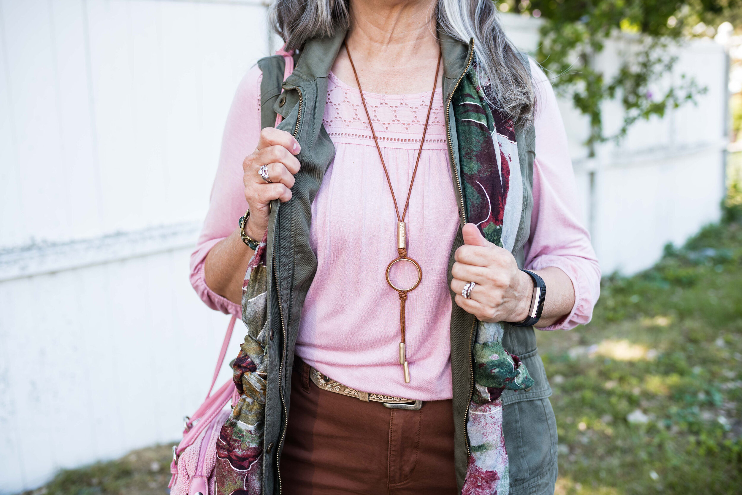
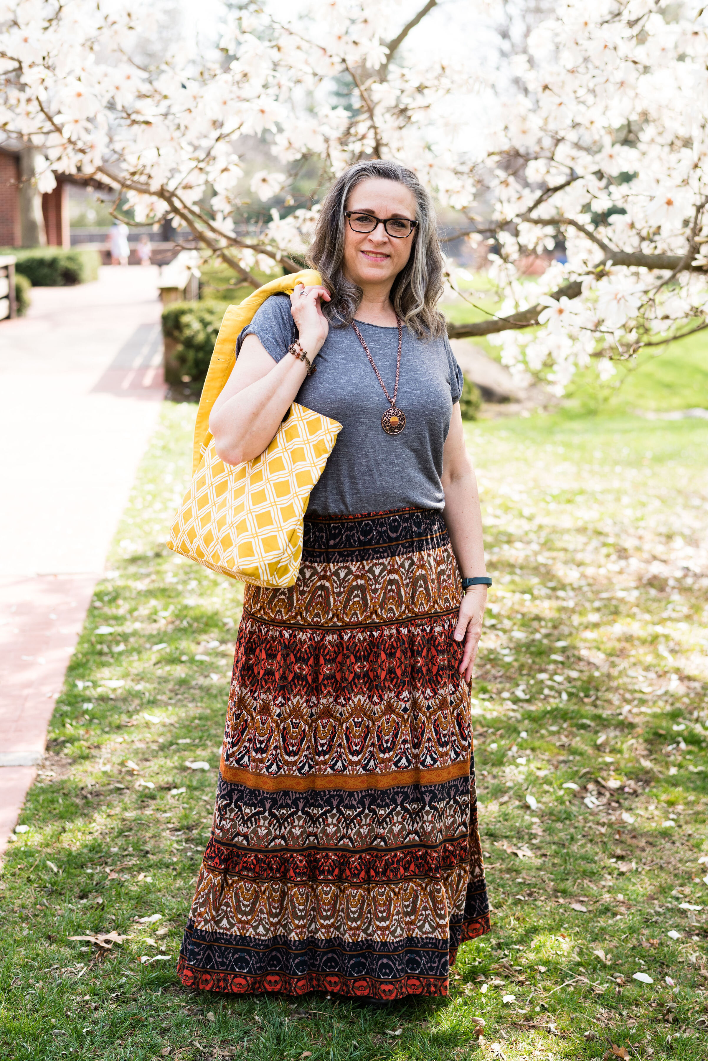
Today’s outfit revolve around three colors on the Pantone New York Palette that I thought combined well into a work wear ready fall outfit.
I am still trying to get used to seeing pastels during the fall season. This year, they were quite popular and besides this pale pink, also included a pretty lavender. I guess, we like what we like right, so pastels for me might be more of a spring and summer color scheme, while rusts, browns and burgundies are the colors I reach for in the fall. While we still live in a free country, you are in control of what colors you wear when. Ha, ha.
The Pale Rosette, 3/4 length tee is a thrifted piece, and a brand called Suzanne Betro. It is actually a longer tunic, but I just tucked it in for this outfit. I love the detailing at the bodice.
You’ve seen my Olive Branch utility vest on the blog before when I did my series on olive pieces. This vest isn’t quite the right shade. Who would have thought there are so many shades of olive? Another clearance find from Kohl’s, I don’t have a ton of Mudd pieces as it typically has more of a junior’s fit, but the few that I have, I really like.
You’ve also seen these brown trousers when I talked about wide leg pants back in the spring. I am not a big fan. I have enough bulk on my bottom. However, I will hang on to this pair, as I like the color, and occasionally it is nice to have a different option when it comes to pants. These were thrifted and are St. John’s Bay brand.
I added the multi-print scarf to add an extra dimension of color and interest to the outfit. I like how it ties the whole look together.
You can also see the fun necklace I scored while thrifting at the local shop around the corner. I have found some great jewelry there. I goes perfectly with the pants.
Even though this little thrifted, Rosetti bag screams summer, I thought it was a great way to keep this outfit looking modern and updated, yet still in tune with the fall vibes.
My SO snakeskin print boots were a clearance purchase from Kohl’s last season. I haven’t really had the opportunity to wear them very much, so hopefully this season they will be out and about.
What do you think of these colors? Do you like them combined? Do you like them each separately?
I’d love to hear your thought, so leave me some love in the comments.
As I usually do, I am adding a few shopping links in things similar to these colors. These are affiliate links. All opinions are my own.
Thanks for following along on the blog. I hope you are having a great week.
Photo credit Jessica Trumbull with Rebecca Trumbull.


