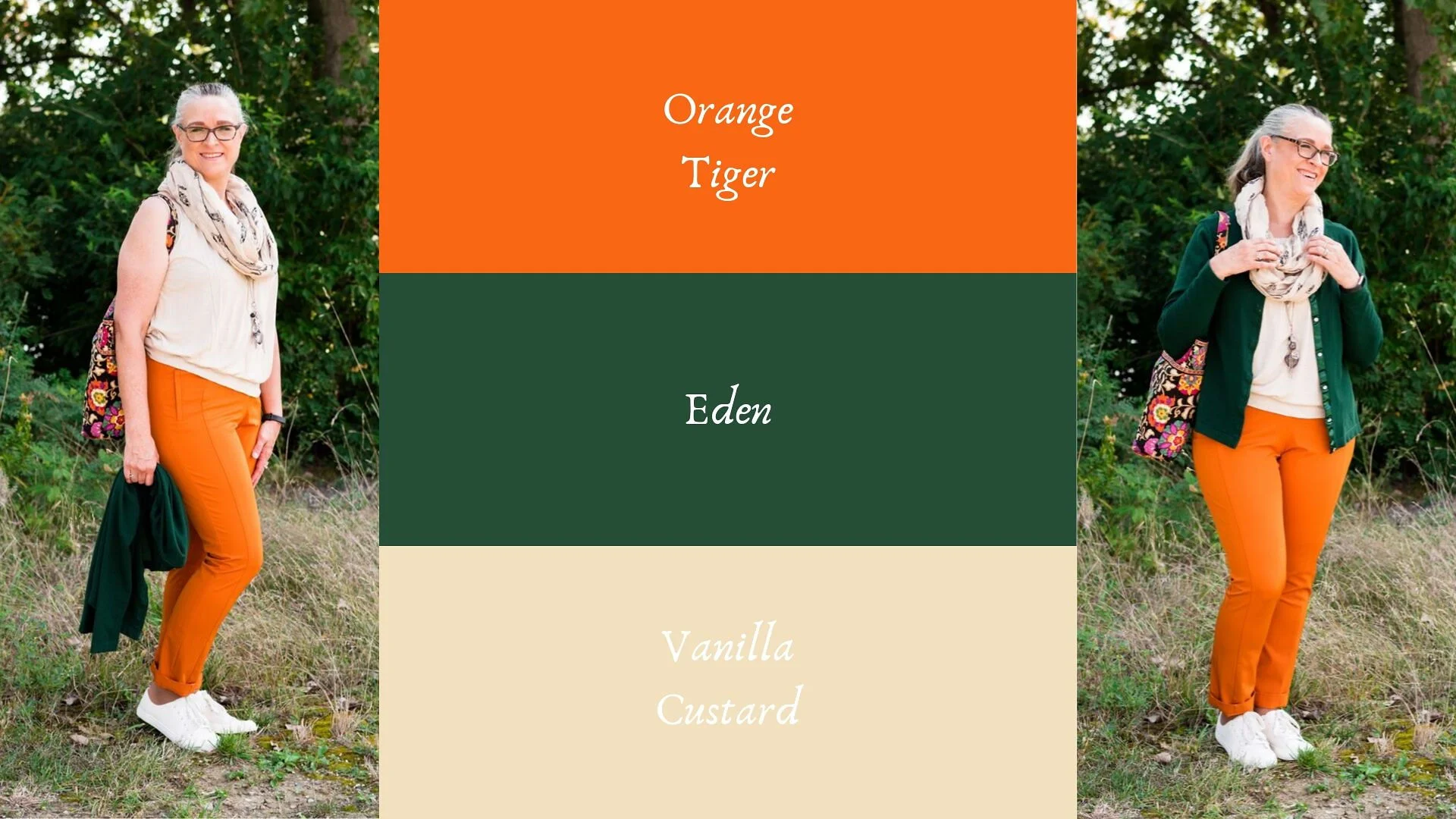
Pantone - Spring/Summer - 2021 - Raspberry Sorbet, Mint and Willow

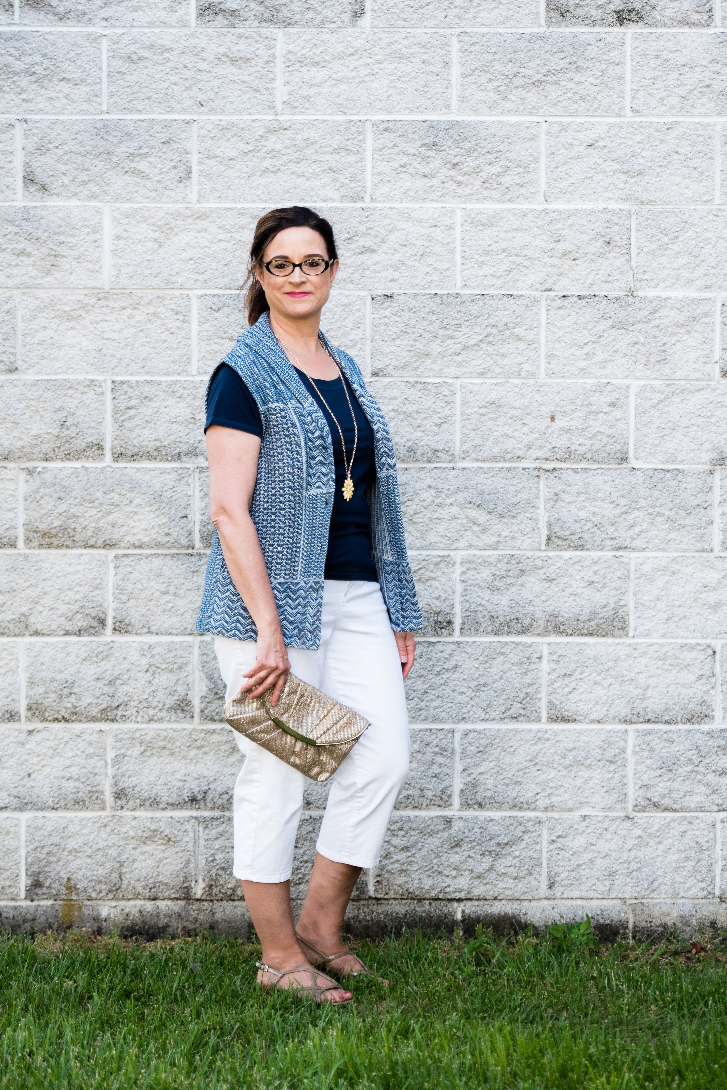
Today’s Pantone outfit revolves around a tantalizing pink, a refreshing green and another earthy color reminiscent of the weeping willow trees that hug the banks of lakes and streams. Raspberry Sorbet, Mint and Willow combine in an outfit that is both sleek, colorful and casual.

raspberrysorbet.jpg

When I think of the color mint, I am more inclined to think of the light Green Ash color from Tuesday’s post. I guess my rendering of mint is based more on ice cream and Christmas candies than it is the actual plant. The mint plant is a bright, living green, so I think the Pantone color is much truer to the natural source. My Mint green top is a thrifted Falls Creek piece. I wore it for this shoot and then I got rid of it. It has been hanging in my closet for a while and I wasn’t certain, why I didn’t reach for it more often. After putting it on, I just didn’t like how stiff the fabric was. I’m all for structured pieces, but a piece has to move with me for me to want to wear it.

raspberrysorbetpantonecolorsoutfit-4.jpg

My camouflage pants, also Falls Creek, are a recent clearance find from Meijer. They are light weight, so good for summer. Unlike some camo that is more green, these tend towards more brown and gray. The Willow color is in there as you can see in the following picture. Willow was hard color to find. Most of my pieces are more olive green and Willow has more of a brown undertone.

raspberrysorbetpantonecolorsoutfit-10.jpg

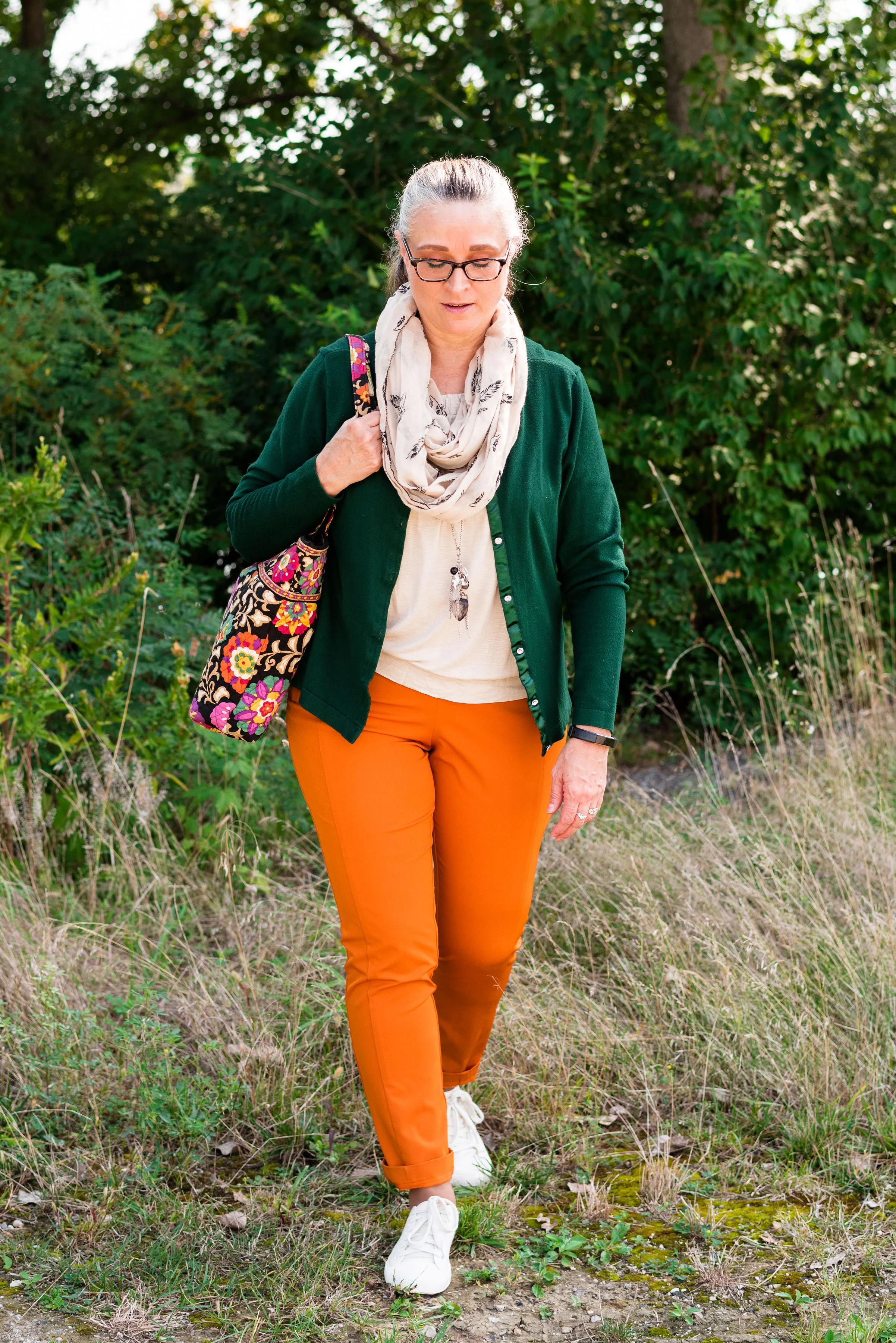
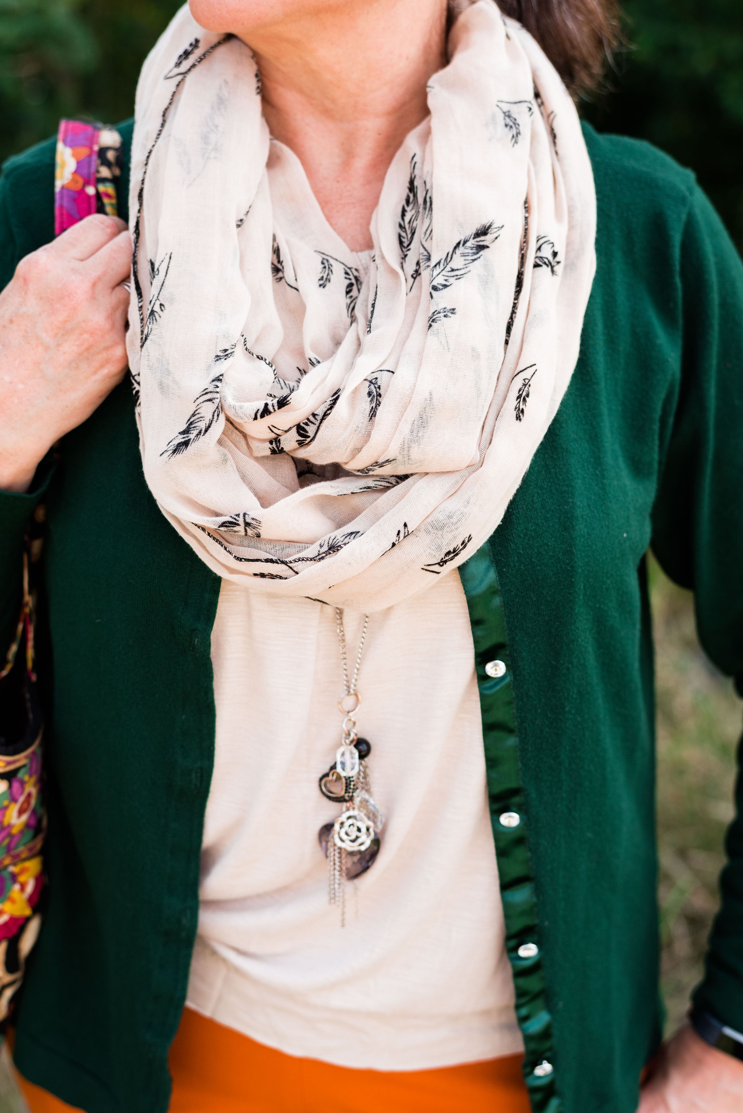
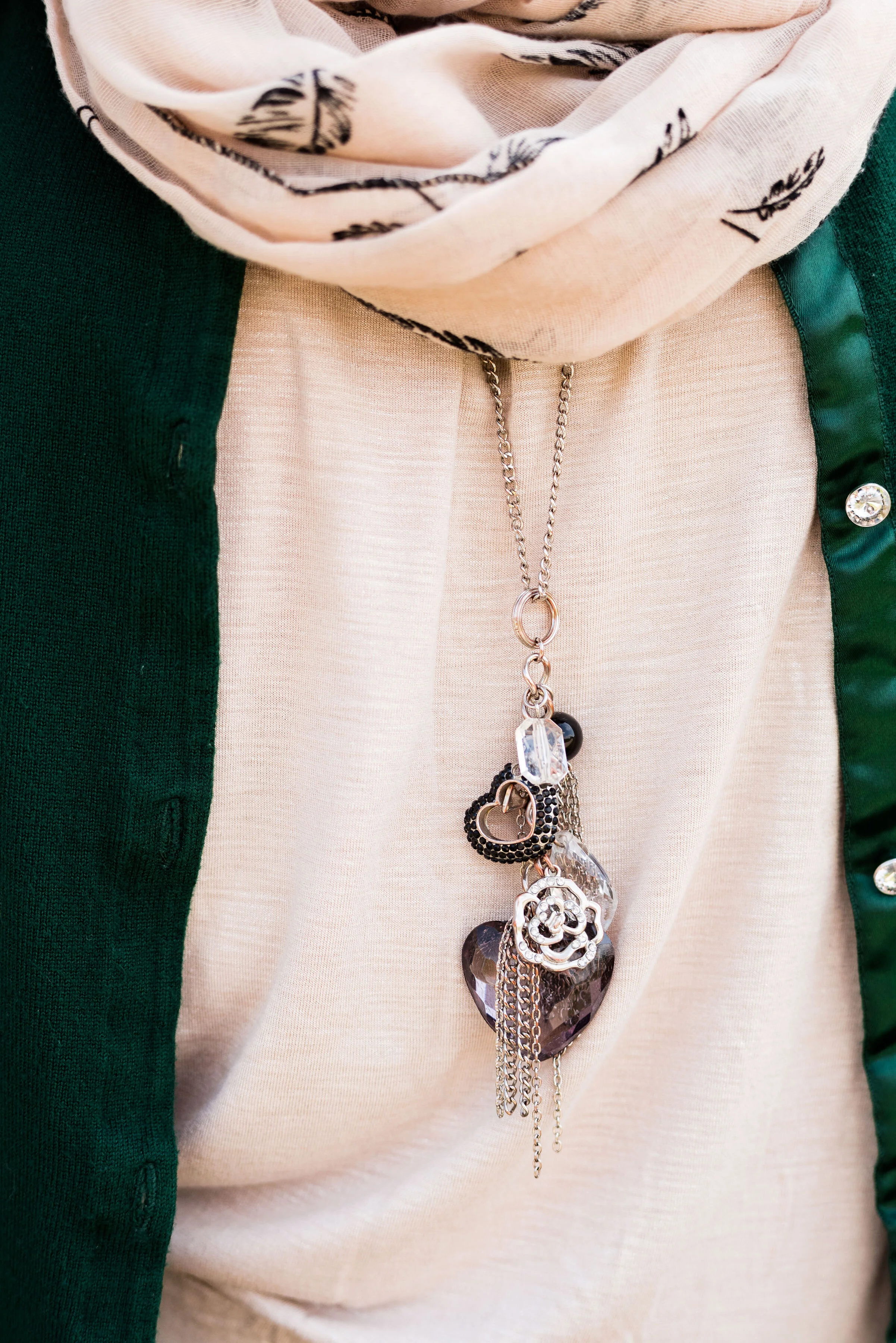
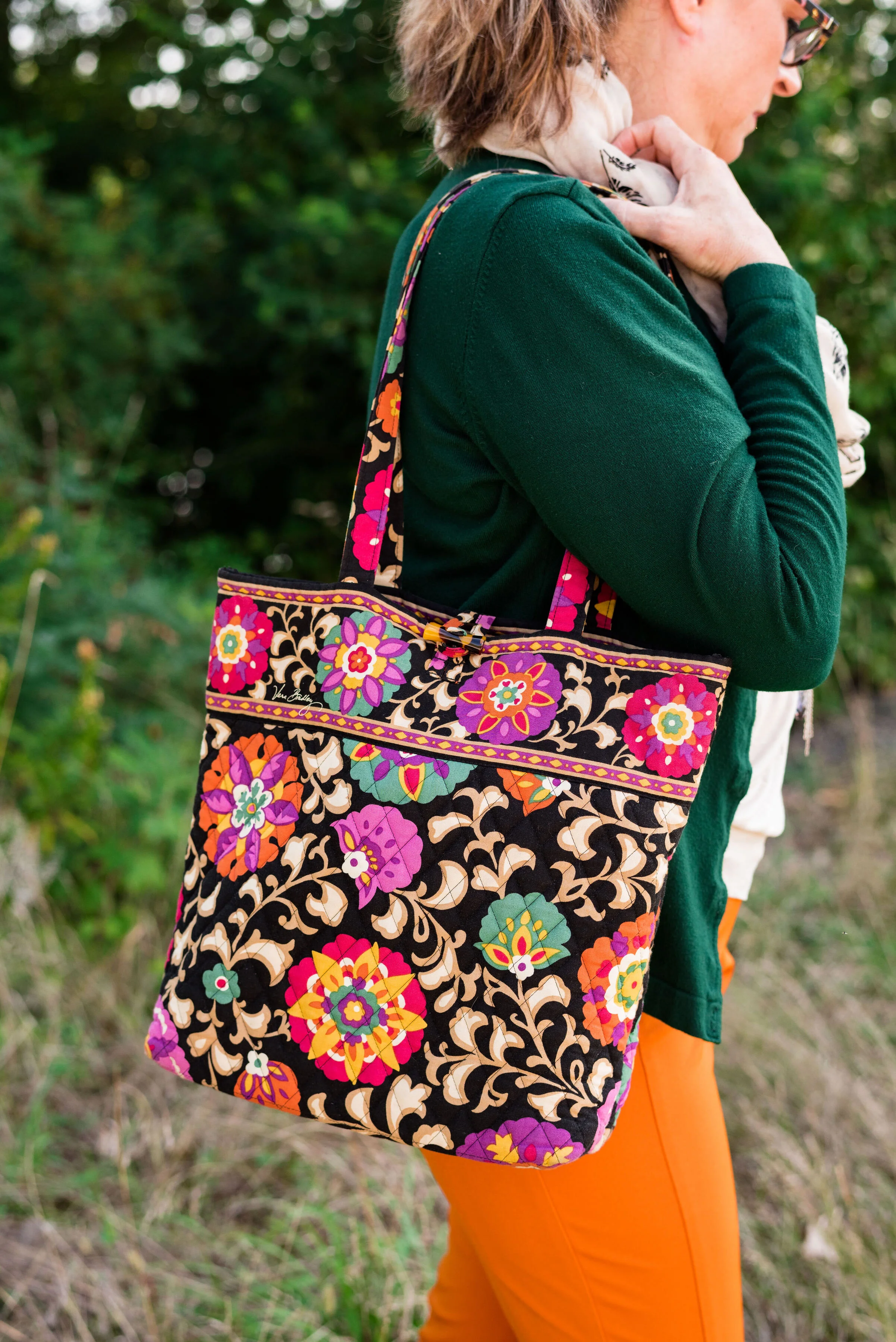
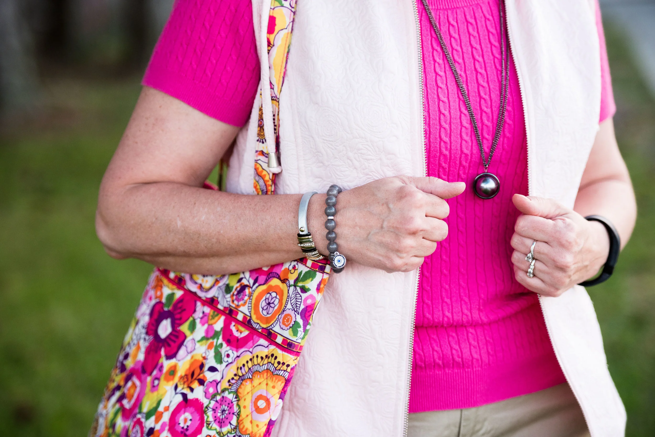
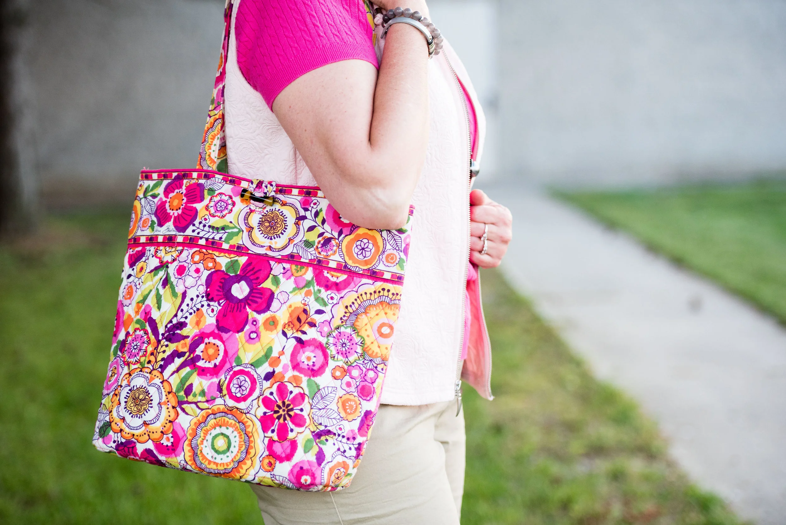
Instead of choosing another clothing piece for the Raspberry Sorbet color, I opted to include it in my accessories. My necklace, bracelets, and the Vera Bradley tote were the perfect pop of this bright, saturated pink.

raspberrysorbetpantonecolorsoutfit-6.jpg
raspberrysorbetpantonecolorsoutfit-8.jpg

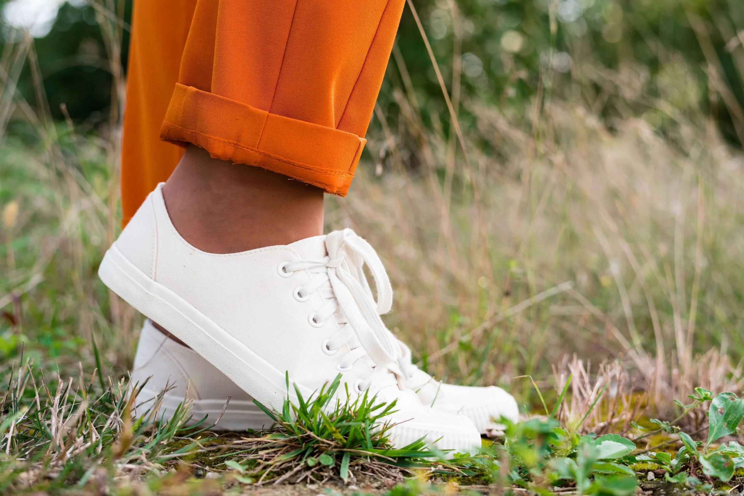
I went for my silver SO flats to tie in with the silver chains on the necklaces.

raspberrysorbetpantonecolorsoutfit-9.jpg

What do you think of these Pantone colors? Do you have the color Willow in your closet? I love to hear back from you, so leave a comment or two.

raspberrysorbetpantonecolorsoutfit-3.jpg

I’m including a few shopping links for you to peruse. These links are brought to you at no cost, but using them to purchase something gives me a few pennies as a kick back. I appreciate all your support. These are affiliate links. All opinions are my own.

Photo and graphic credit Rebecca Trumbull.

Have a great weekend everyone!

Pantone - Autumn/Winter - 2019 - Orange Tiger and Eden

I mentioned in Tuesday’s post on Sugar Almond and Dark Cheddar, that not everyone can or wants to wear orange. I love orange, but it has to be the right shade for me to wear it near my face. Some oranges make me look sallow or washed out. Today’s colors are bold and what caused me to put these two colors together, was the contrast of dark with light, deep with bright. Today’s colors are a “fearless” Tiger Orange, and a rich “stately forest green” called Eden. I think Pantone’s description of these colors is perfect.

These two colors are the first in this series that I felt truly matched with the Pantone colors. I looked for a while in thrift stores for the perfect green and I really think this dark cardi nailed it. the sweater is Jaclyn Smith brand.

These bright orange pants are Worthington brand and I got them at JC Penney a number of years ago. These are more of a skinny leg trouser than a wide leg trouser. I got them for the bright color and do find occasions in the spring, summer and fall to wear them. You can see how I styled these with a floral tunic here.

This cream colored tank top is a thrifted Loft piece. I actually have two of them, found on different occasions, but the exact same style. This one is a large and has a sheen to it, that you can’t really see in the picture. The other one I have is a medium and is more of a true white. Why do I need two of these? Comfort and ease of wear. They work perfectly for something like this, but I will also be able to use them as a light weight under layer when the temps grow cold. The piece is banded on the bottom, making for a great fit without showing off the bulges. Here are a few to look at.

The scarf I added was another thrifted piece. I don’t have many pieces that are cream or ivory, like this. I am also looking for a cream fisherman sweater and/or turtleneck. I don’t need anything, because I am a clothes horse, but every now and then, I do realize I am lacking something I would love to incorporate into my closet. What about you? What pieces have you been hoping to add to your closet?

In addition to the scarf I wanted to add a long charm pendant necklace to break up the plain back drop of the tank. I think this outfit would have been equally good with a printed tank under the sweater.

My other accessories included my Vera Bradley tote bag and my thrifted Mossimo sneakers.

What did you think of this outfit? Would you wear a pair of bright orange pants like this? What is the brightest color you have ever worn in pants or a skirt? I’d love to hear you thoughts, so leave me some love in the comments.

I’ve included a few shopping links. These are affiliate links. All opinions are my own.

Photo and graphic credit Rebecca Trumbull.

Have a great weekend, everyone!


InVESTments: Wearing Vests in the Summer - Short Knit

For the final installment in this series on wearing vests in the summer I wanted to show how to style two different shorter knit vests. While knits can be great for keeping us warm in the cooler months, we don't have to leave them in our closets over the summer. By choosing lighter weight pieces to style them with, we can still have fun wearing our cozy vests. Both of the following looks are more casual.

Look 1 - With Shorts

This light pink, zip up vest is another of my Christopher and Banks finds. I went for a subdued look with the khaki Bermuda shorts (Christopher and Banks), and taupe ankle boots, bringing in a pop of bright pink in my short sleeve sweater and bag. 

The vest has a subtle textural pattern over its entirety. The short sleeve sweater (thrifted, Ralph Lauren) also provides texture. Different textures allow pattern mixing without having to worry about clashing colors. 

I kept the jewelry simple with my gray pendant necklace and a few gray bracelets. 

A friend gave me this Vera Bradley bag for my birthday a couple years ago. It's the perfect companion for this outfit. 

I could have worn sandals, which would be expected for a summer outfit, but in keeping with thinking outside the box I opted for my SO brand ankle boots. 

Look 2 - With Capris

This knit vest by Chaps, I got at Kohl's at the end of the winter season. Isn't it a great summer piece? I styled it with a navy tee (Christopher and Banks) and white capris (Coldwater Creek)for a crisp warm weather look.

You can see the vest detail in this picture. The different weave, the cardigan feel, and the shawl type collar make a cozy statement, no matter when it is worn.

I chose to only add this light yellow flower pendant necklace for jewelry.

I've used this bag numerous times on the blog. It just adds a touch of class to so many different outfits. 

This time I went with sandals. They seem to dress up this outfit just enough.

Here are the two looks side by side. 

Which one is your favorite? Let me know in the comments section below. I always love to read your feedback. It helps me know what you like, as well as gives me a boost! Ha, ha. 

Be sure to check back Thursday for my look at a few summer sweaters on the Piece Perfect column. 

Photo credit Rebecca Trumbull. Make up Rachel Christensen.

Below are some shopping links. These are affiliate links which means if you click on them, I get a few cents. If you purchase something through a link, I get a little commission. I appreciate all your support in this manner. All opinions expressed are my own.