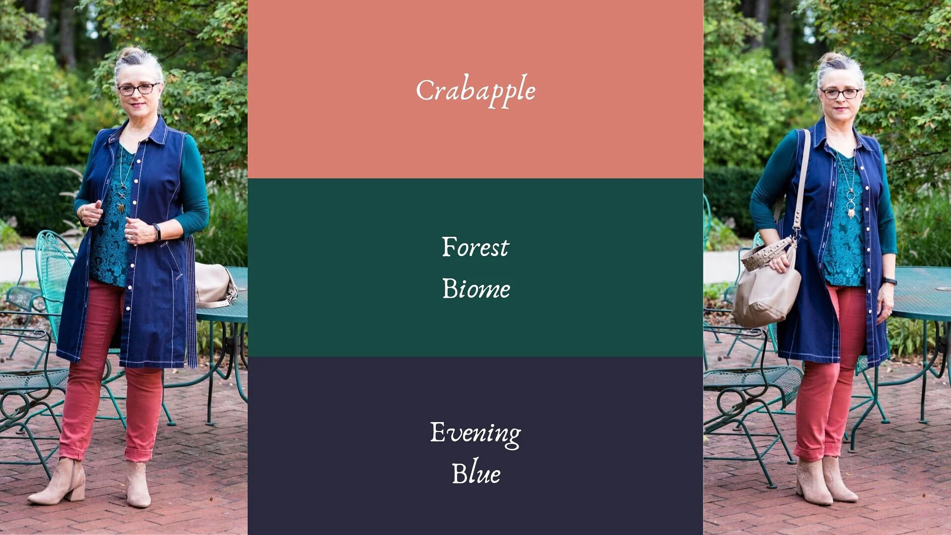
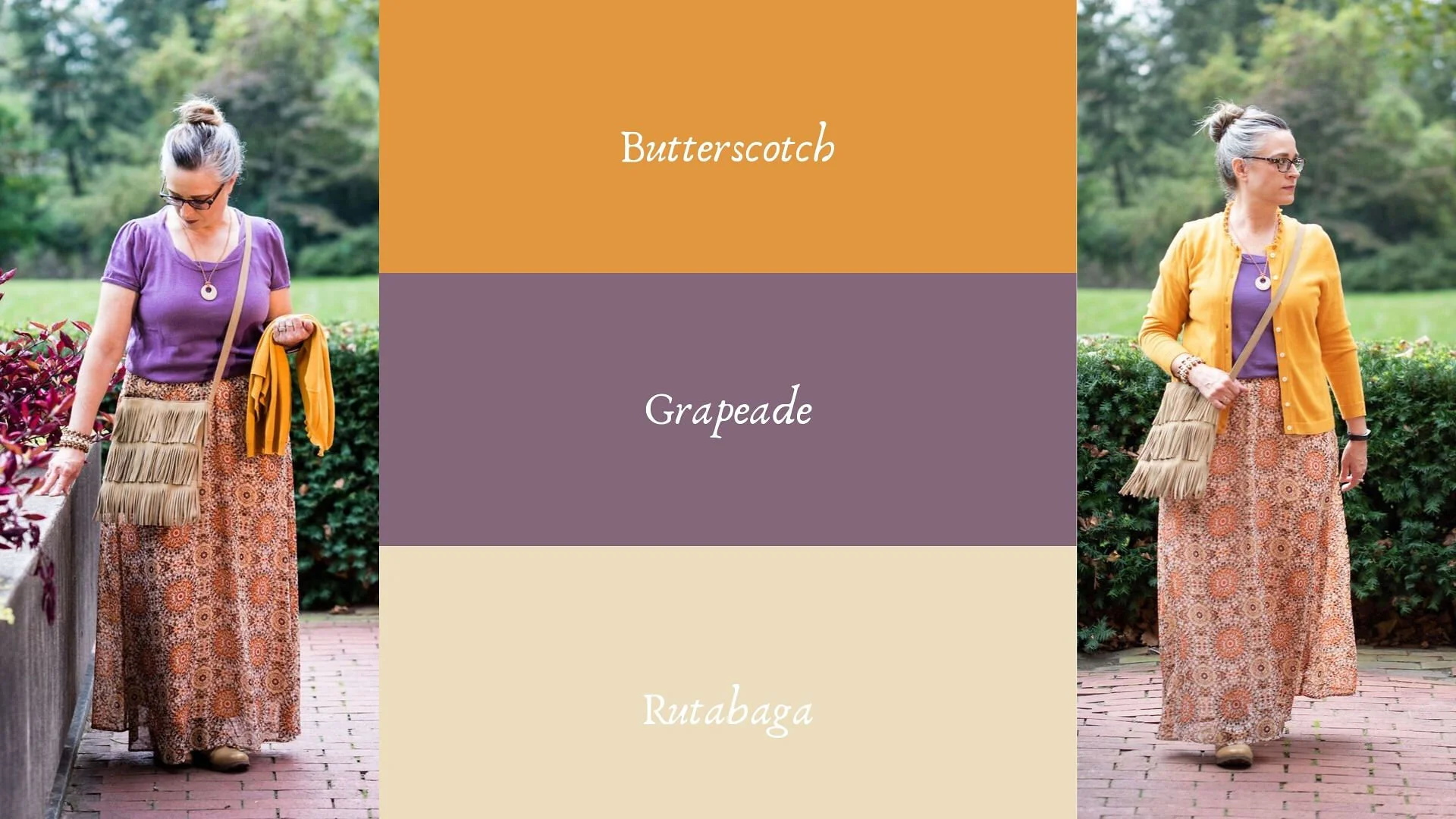
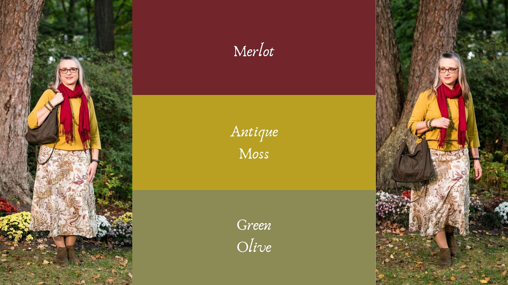
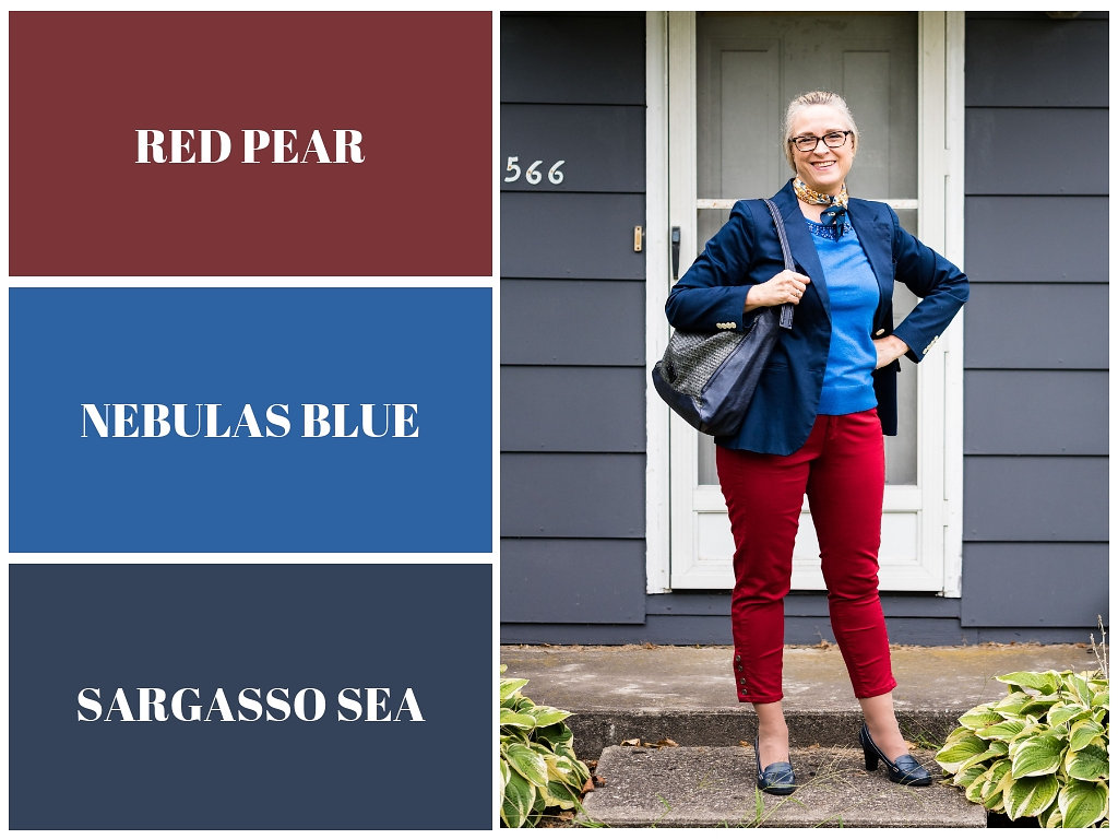
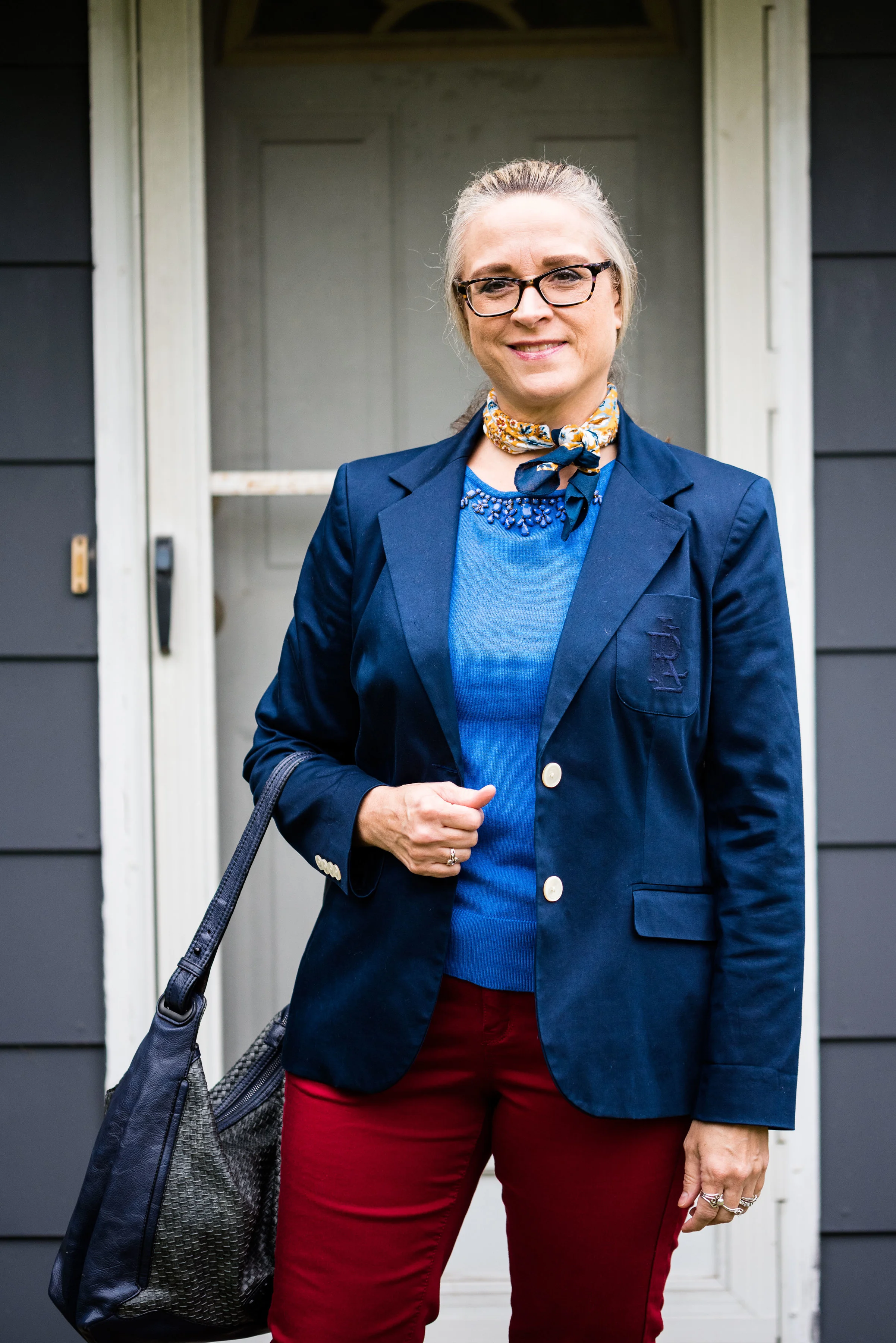
Pantone Autumn/Winter 2023 - New York Palette: Rose Violet, High Visibility, and Doe

Today I am bringing you another outfit in my Pantone Autumn/Winter color series. I find these colors on the Pantone website. My renditions of their color palette may not always be an exact match, but I shop my closet and try to find the pieces that come as close as possible to their color choices. I want you to be able to shop your wardrobe as well. You may not have all of these colors in your closet like I do, but you will certainly have two or three. The idea is to take those colors and use them in new ways to make outfits you never thought of before.

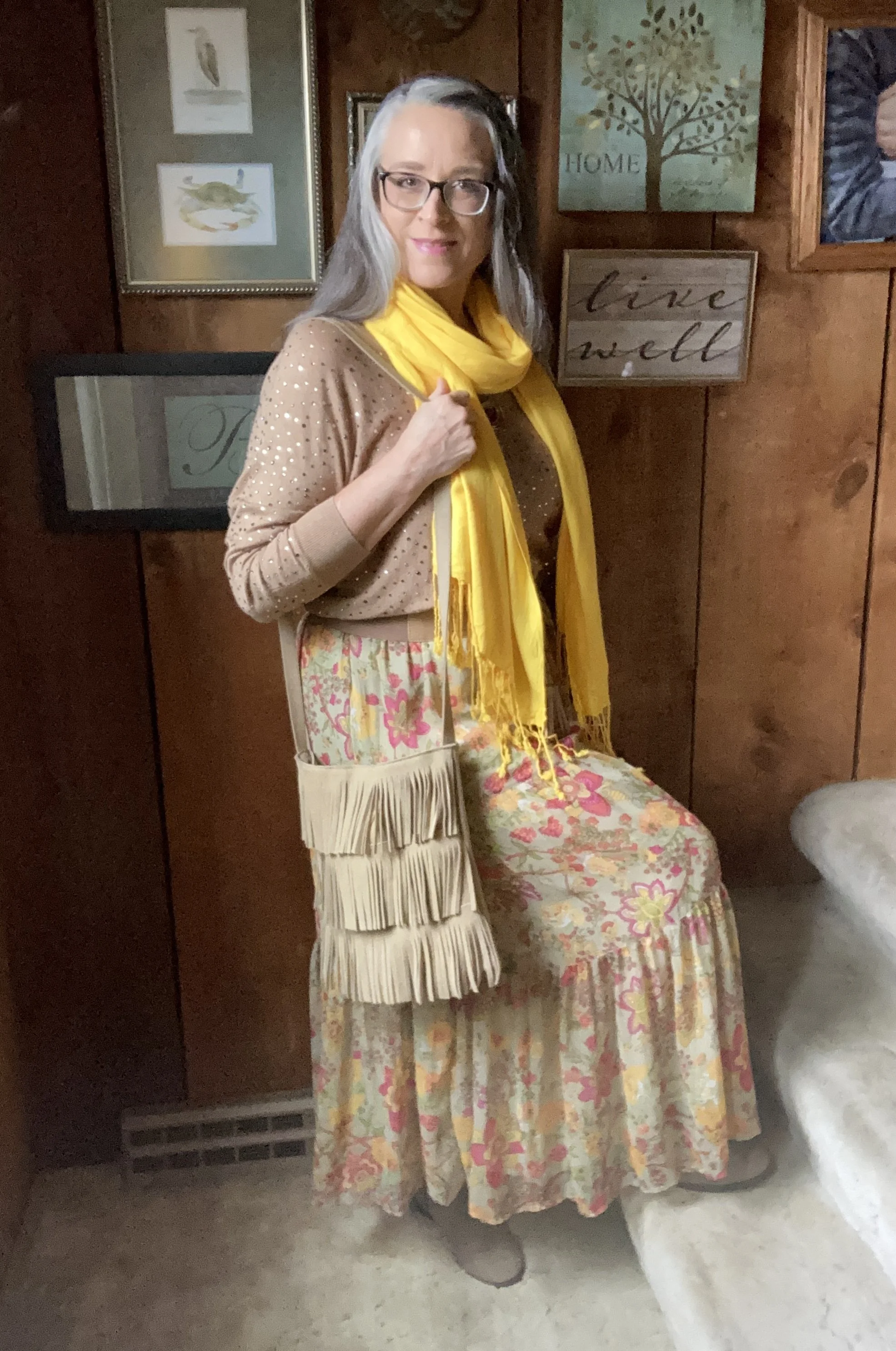
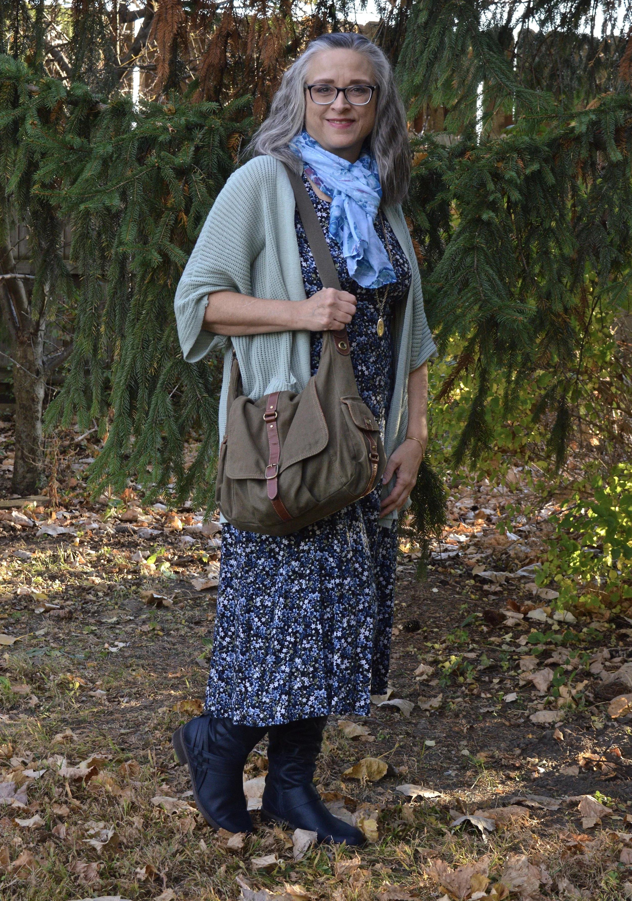
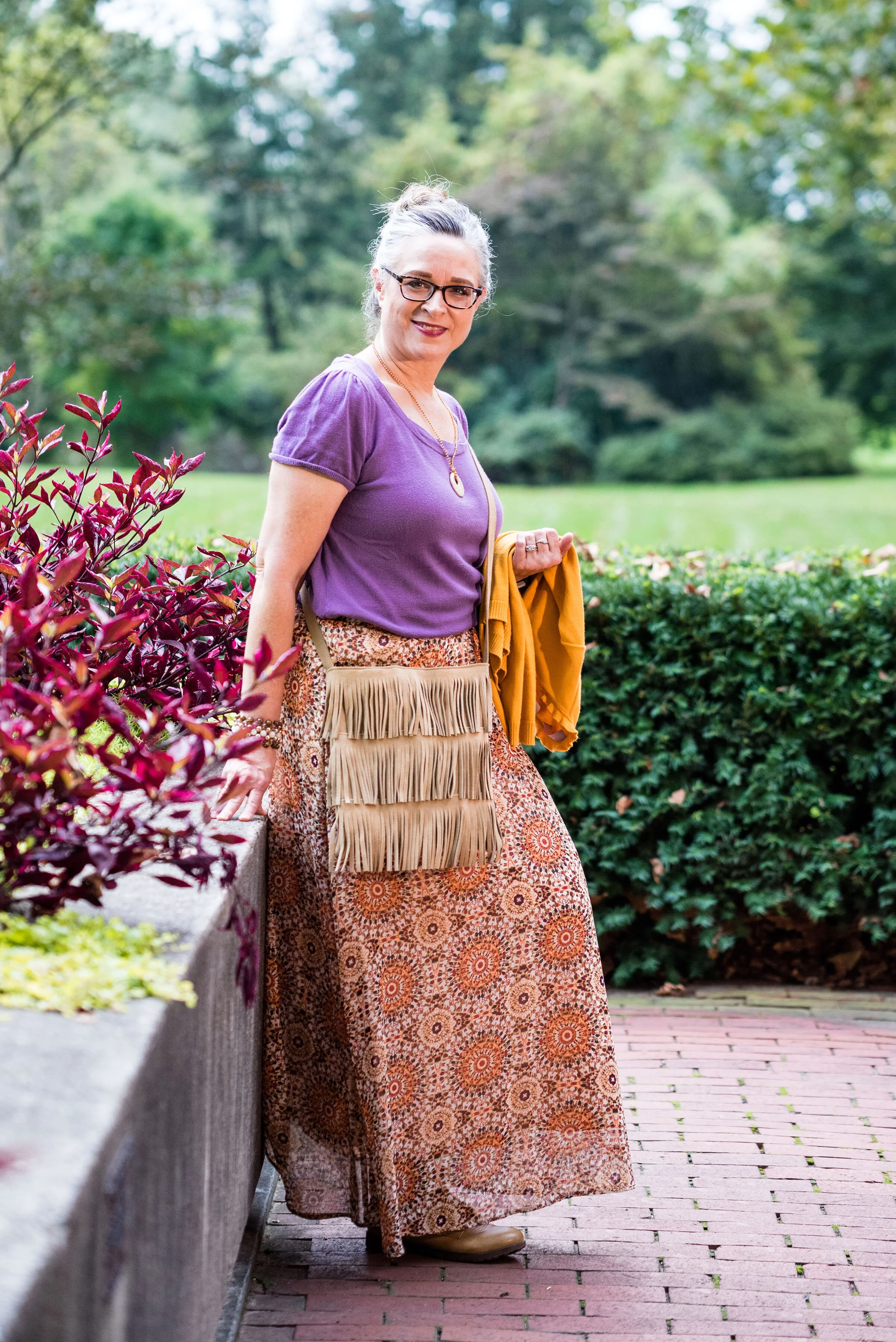
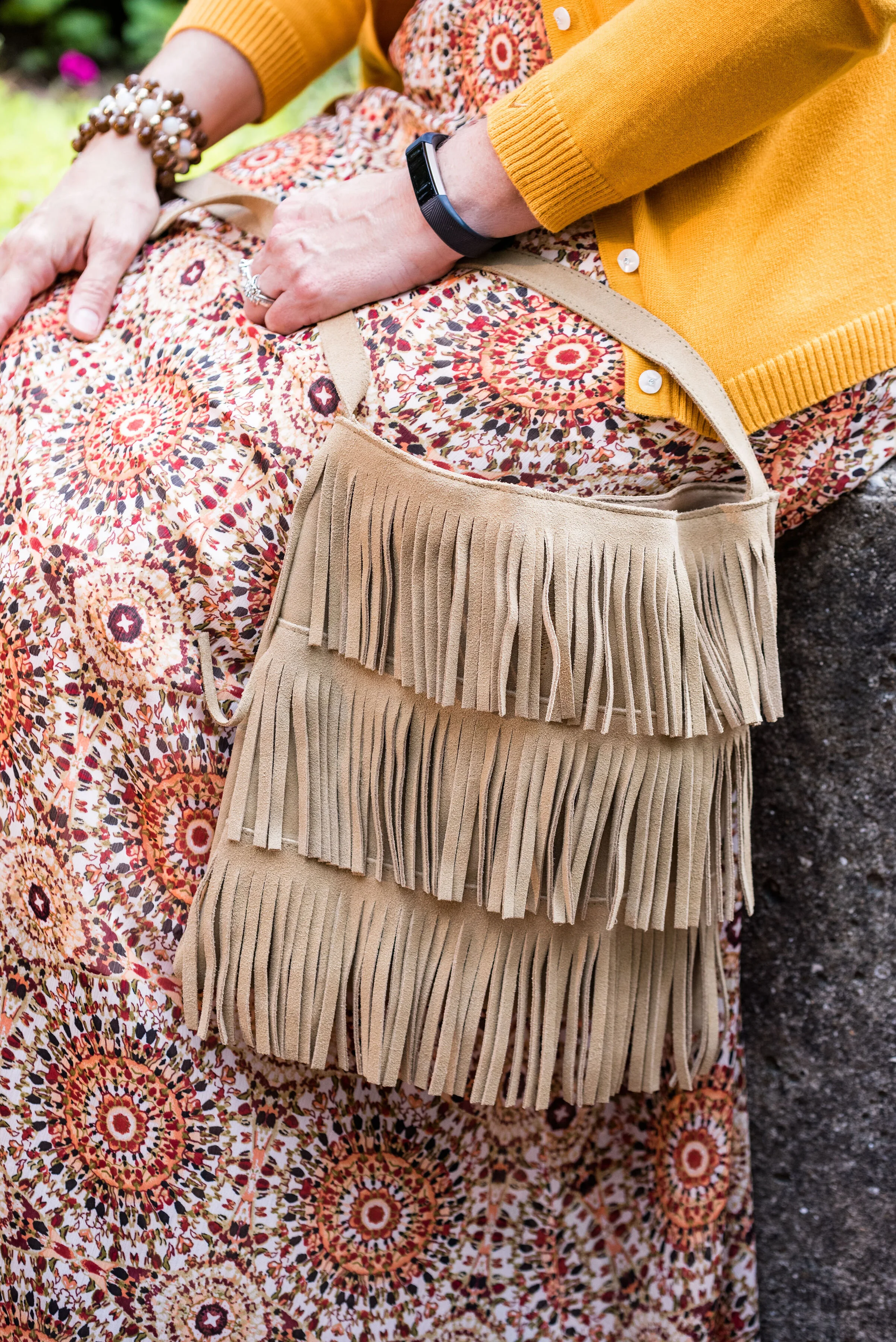
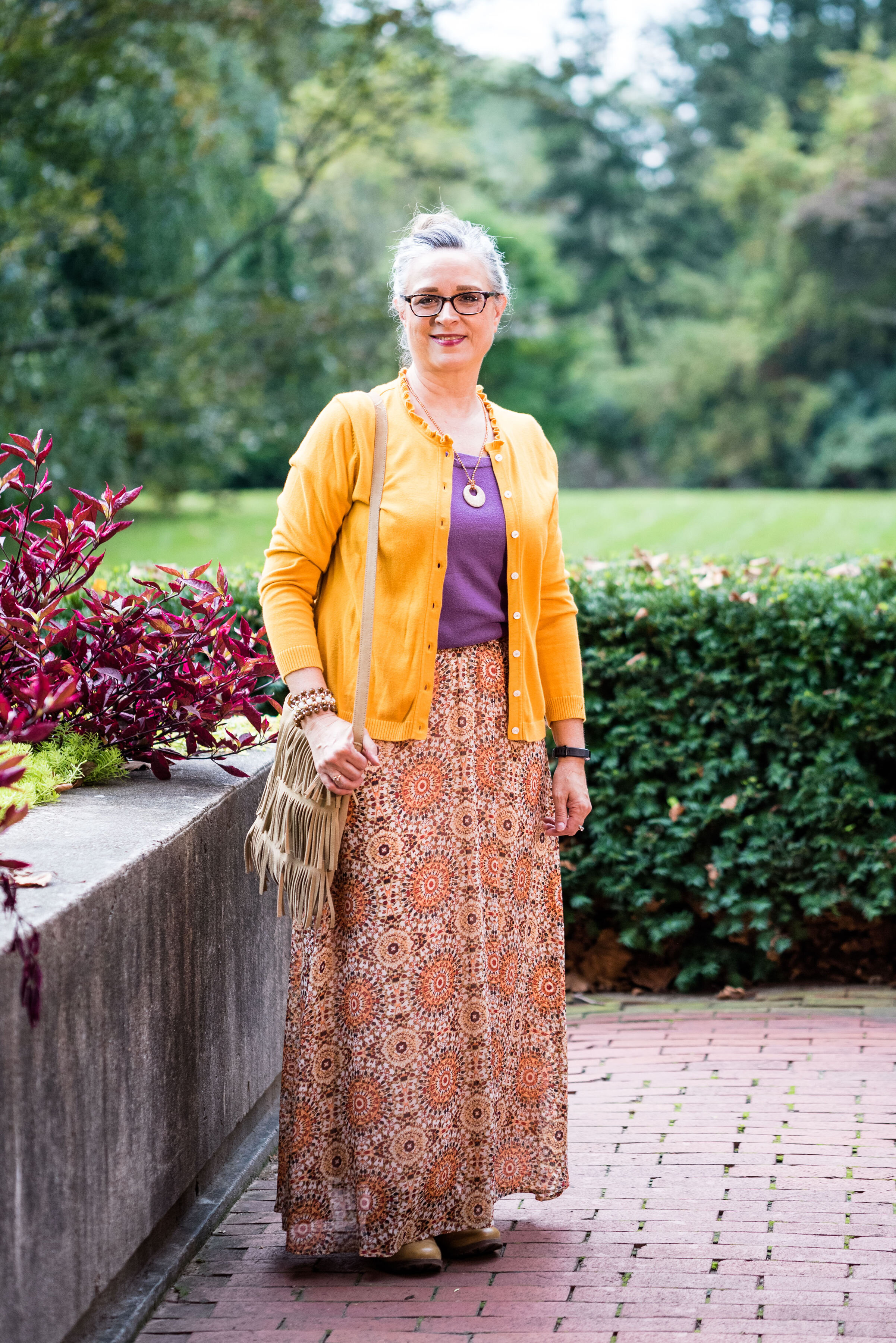
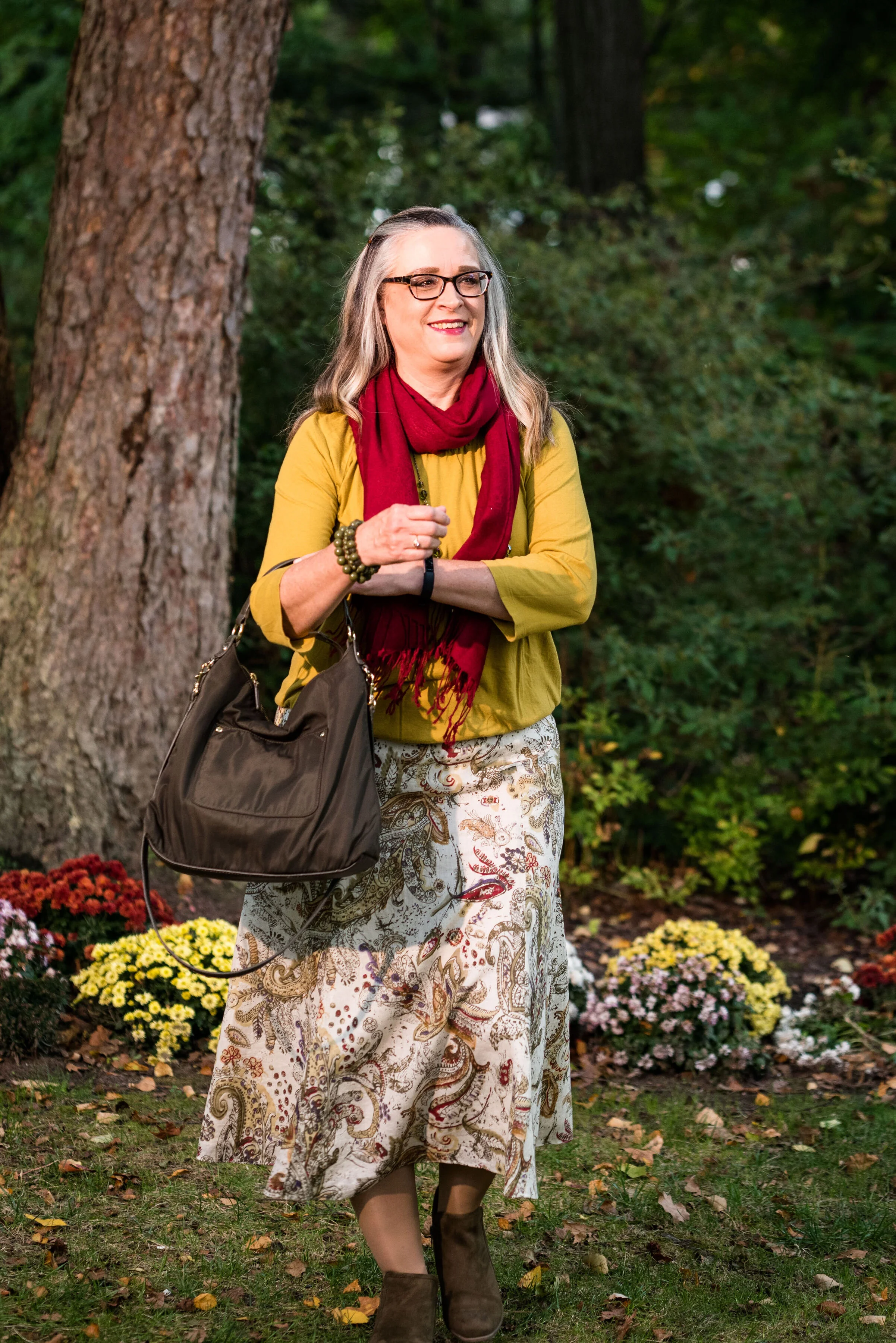
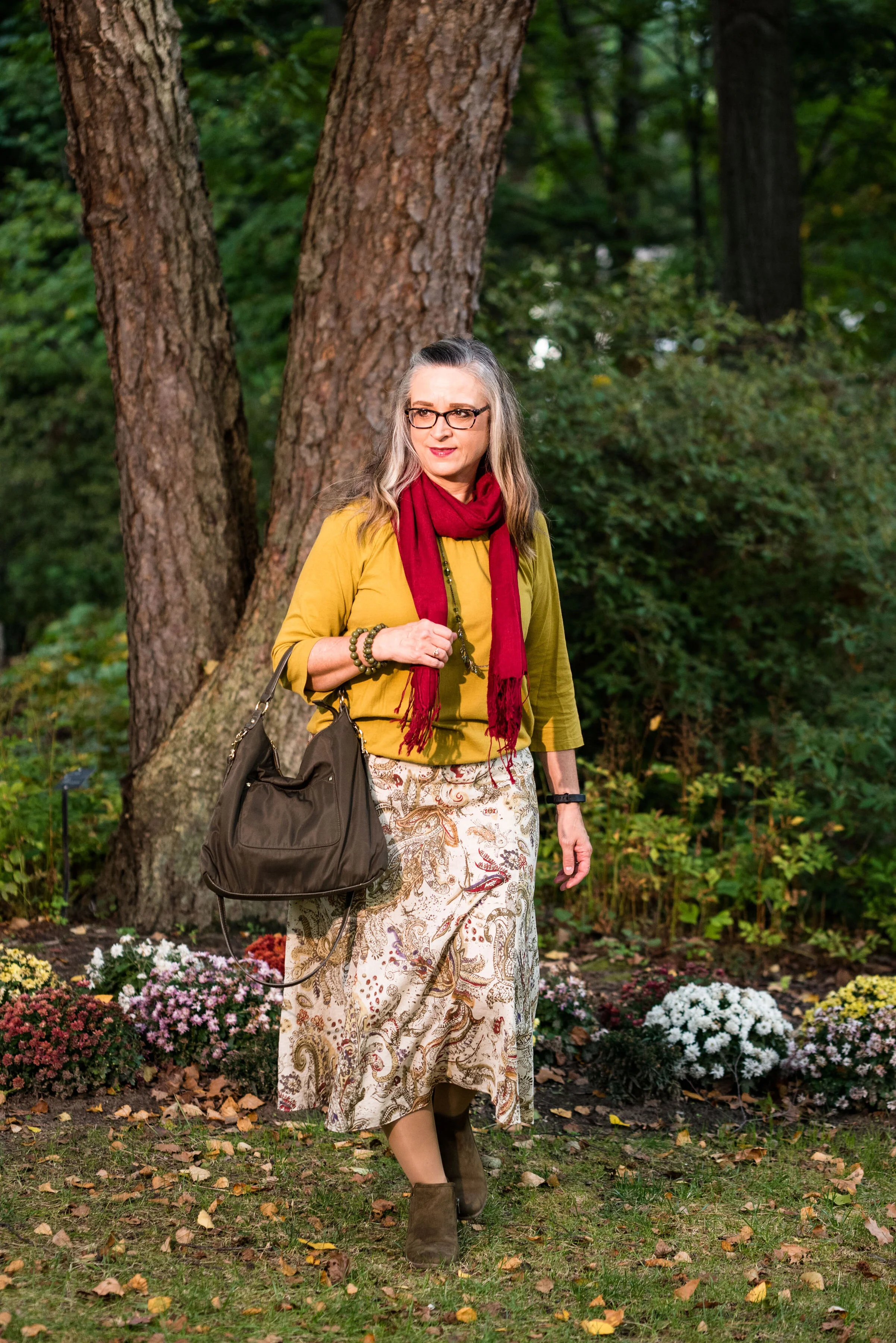
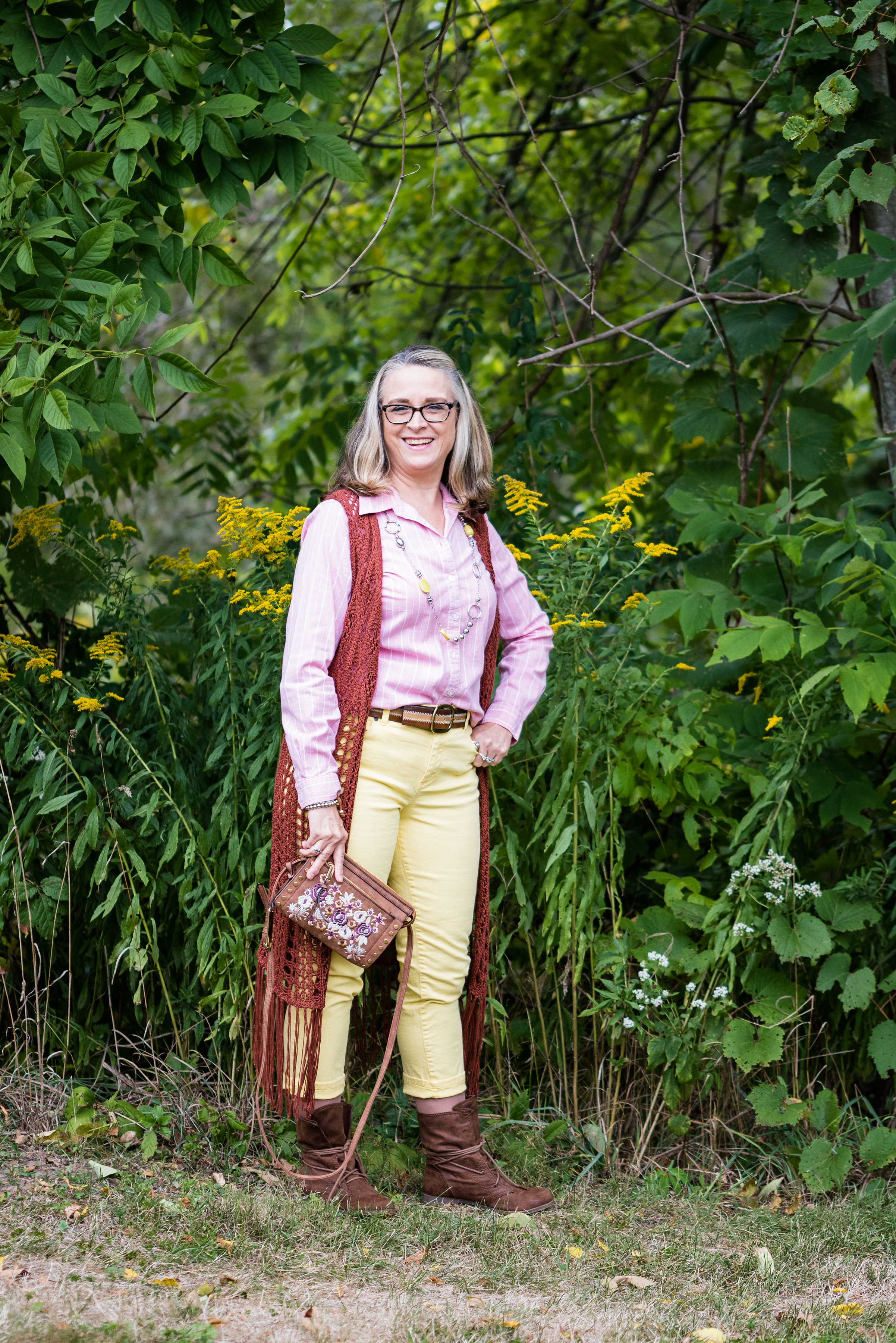
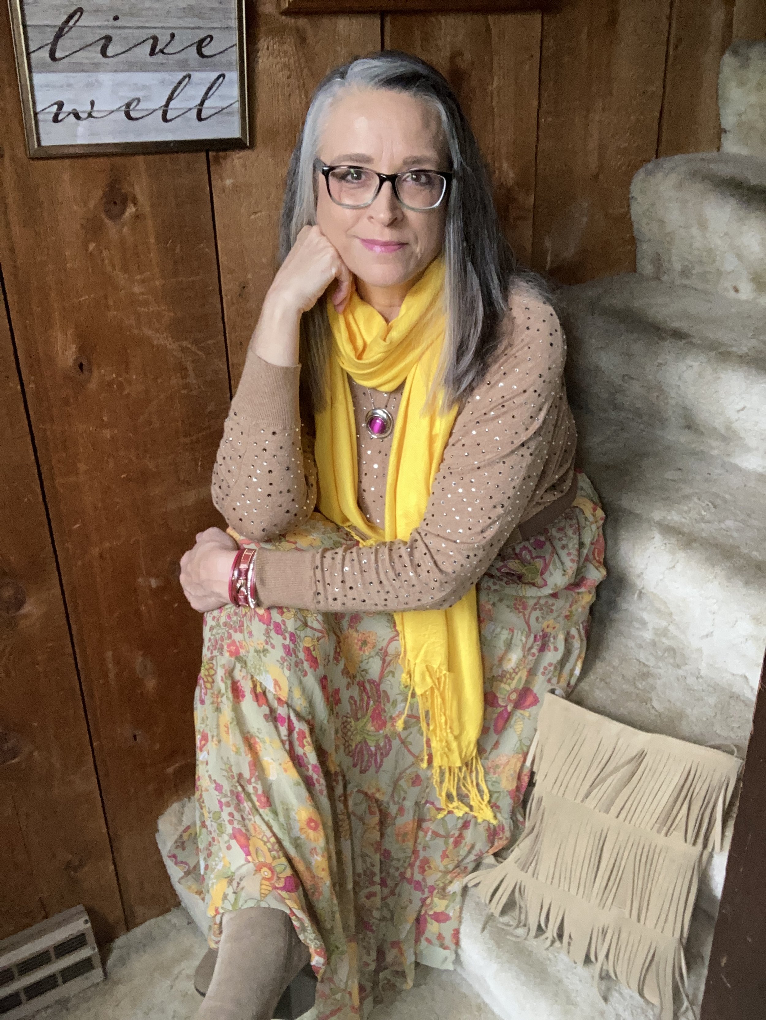
I love the boho vibe of this outfit. The bright colors, tiered skirt and fringe bag are all indicative of many Bohemian outfits.

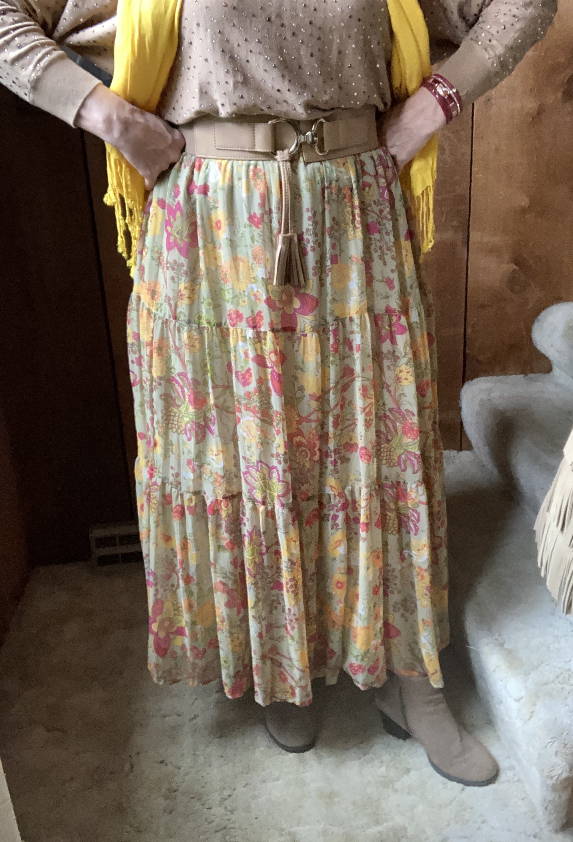
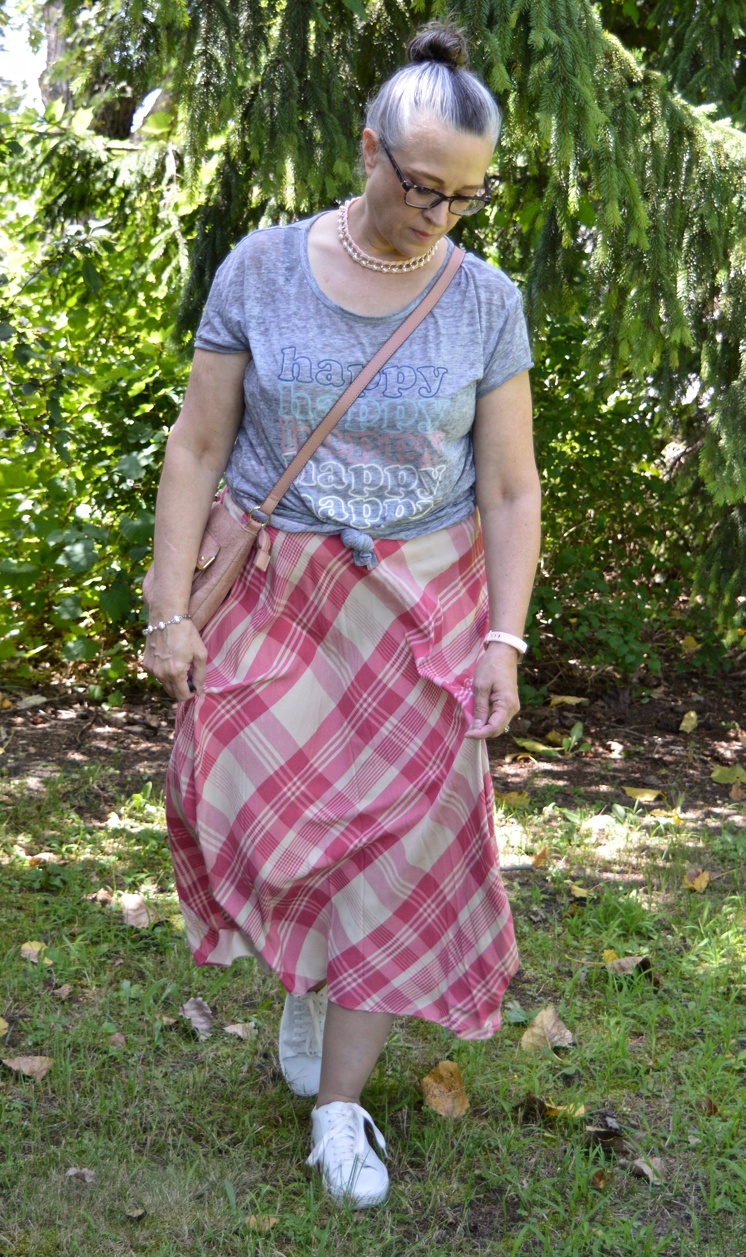
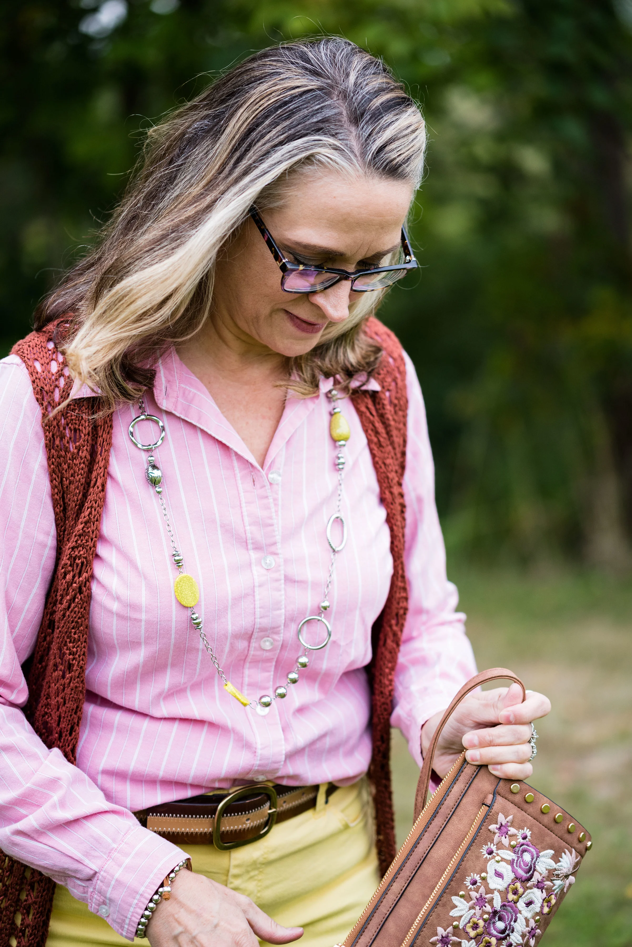
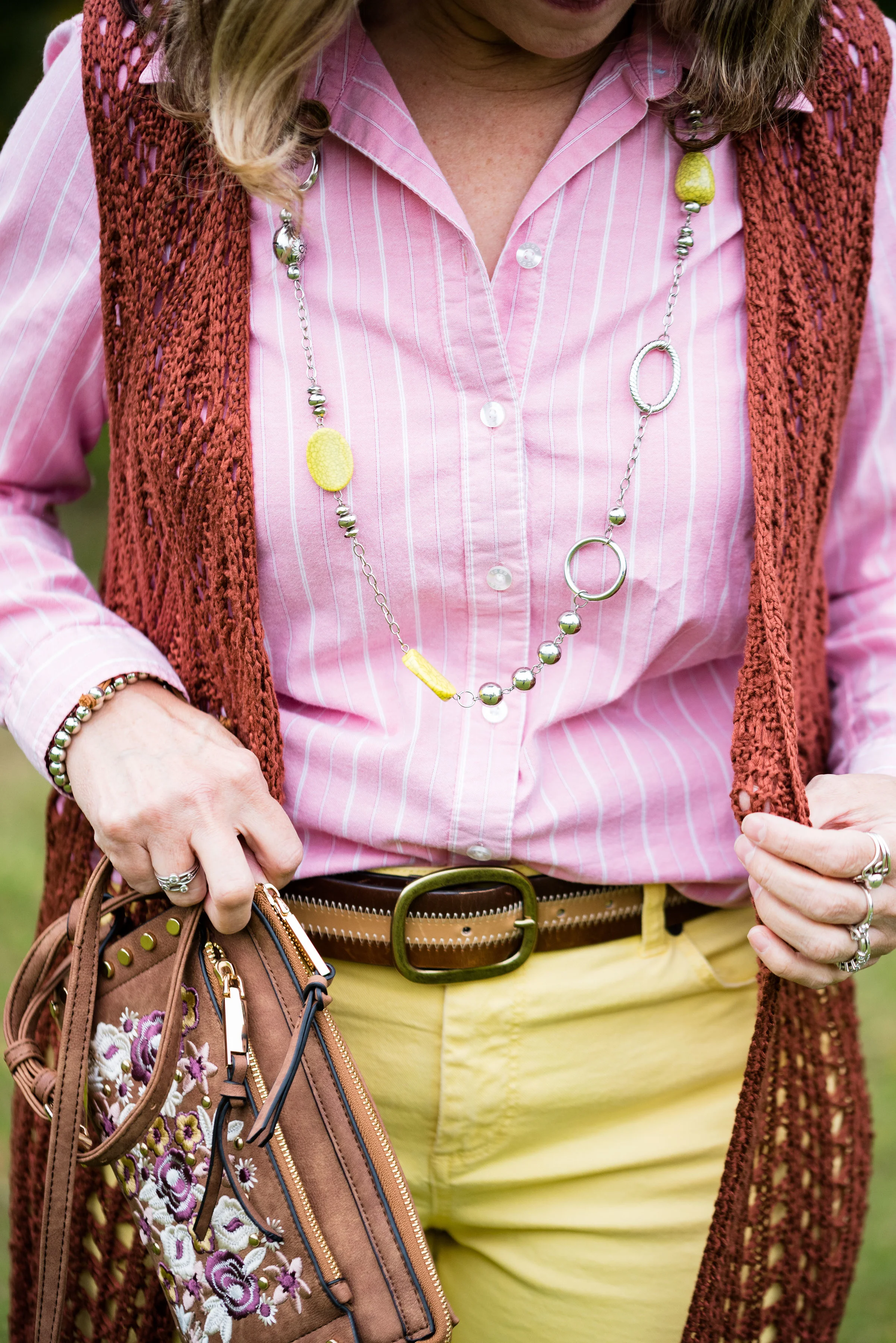
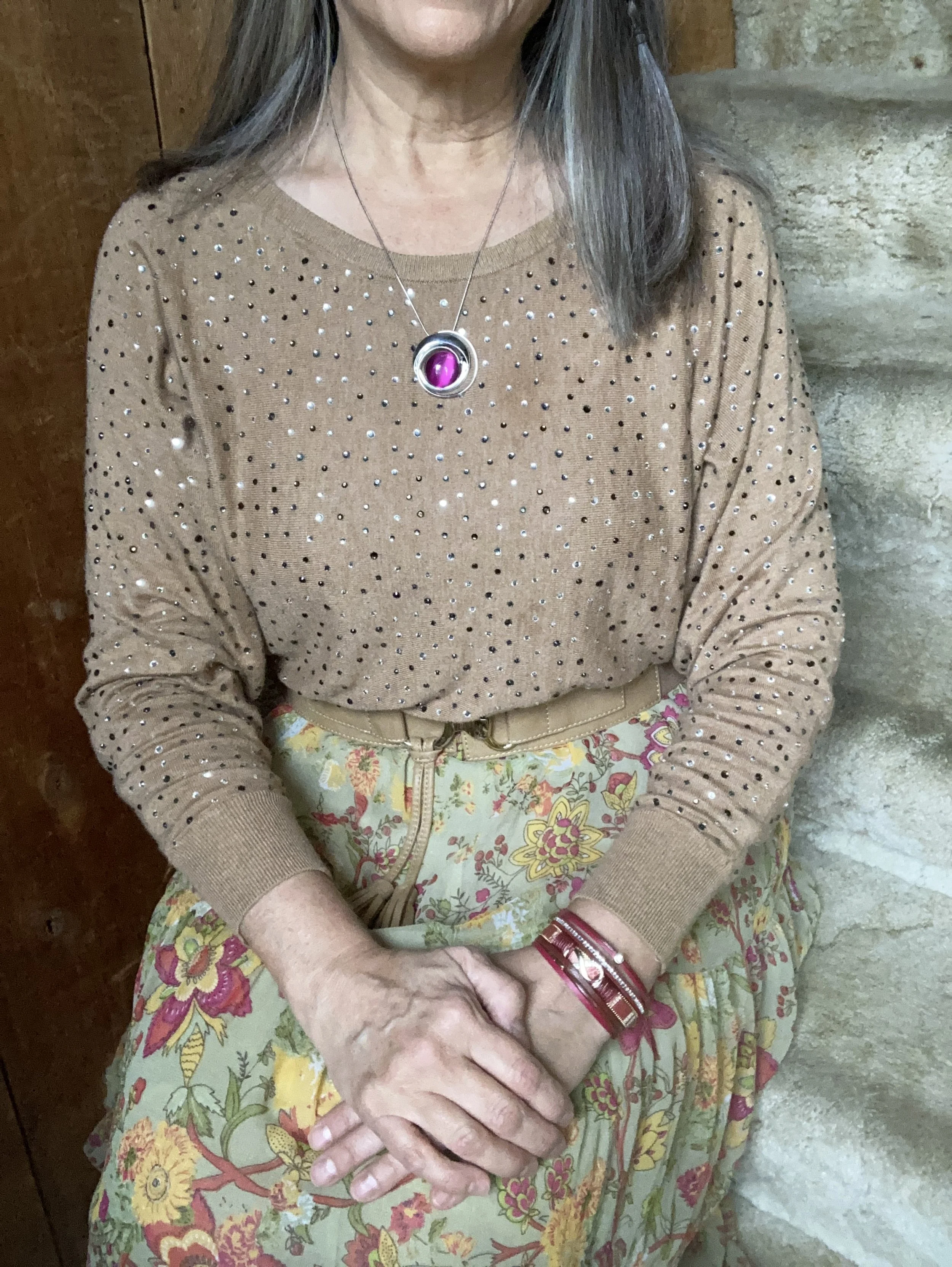
I was having a hard time decided which piece to use for the Rose Violet color. It is a bright, fuchsia pink and though I had my Button Front Maxi Dress from Closet52 (no longer in business), it was too overwhelming. I felt the bright pink and the bright yellow were needed in small doses, thus this fun, thrifted, tiered maxi skirt.

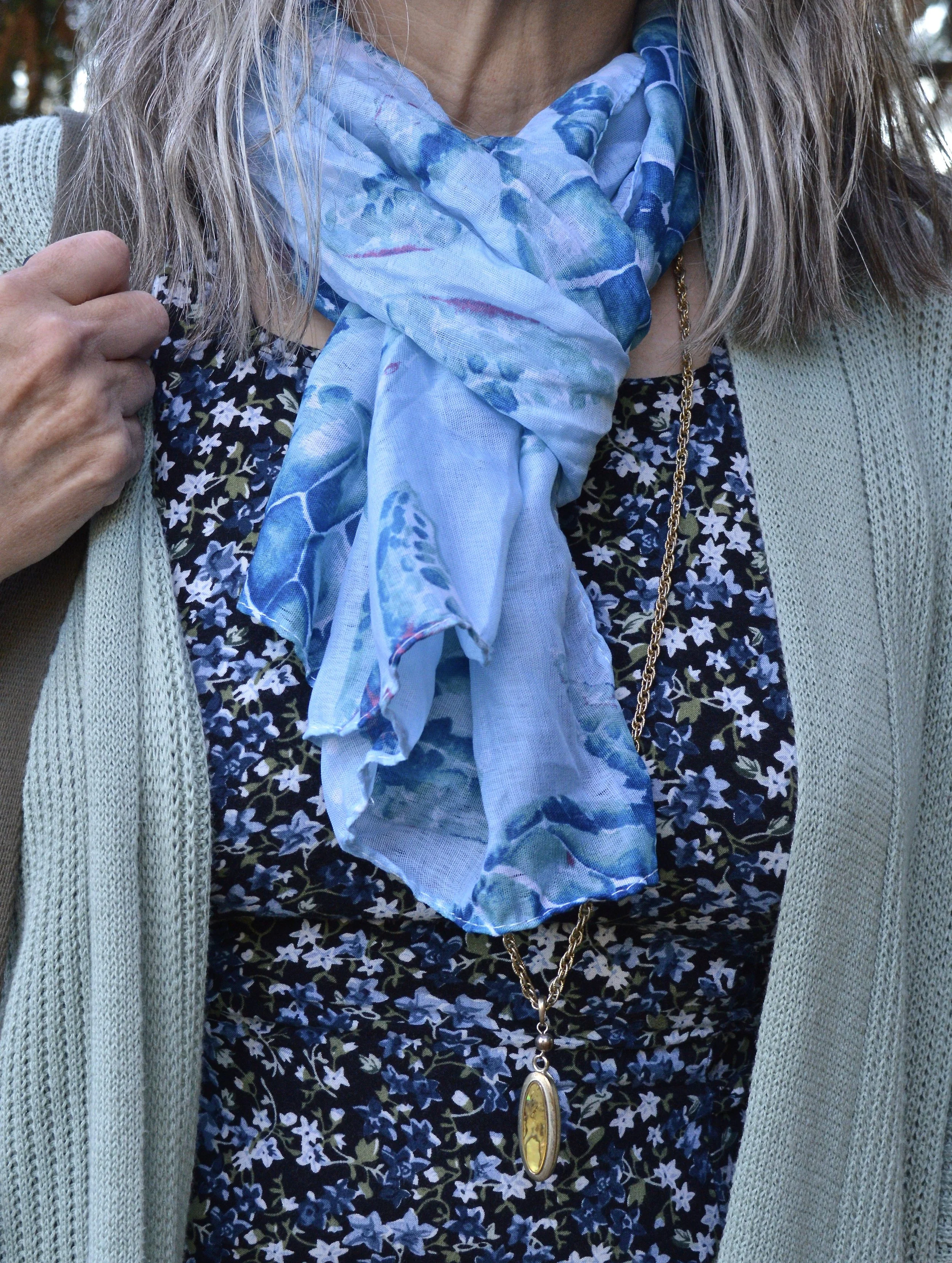
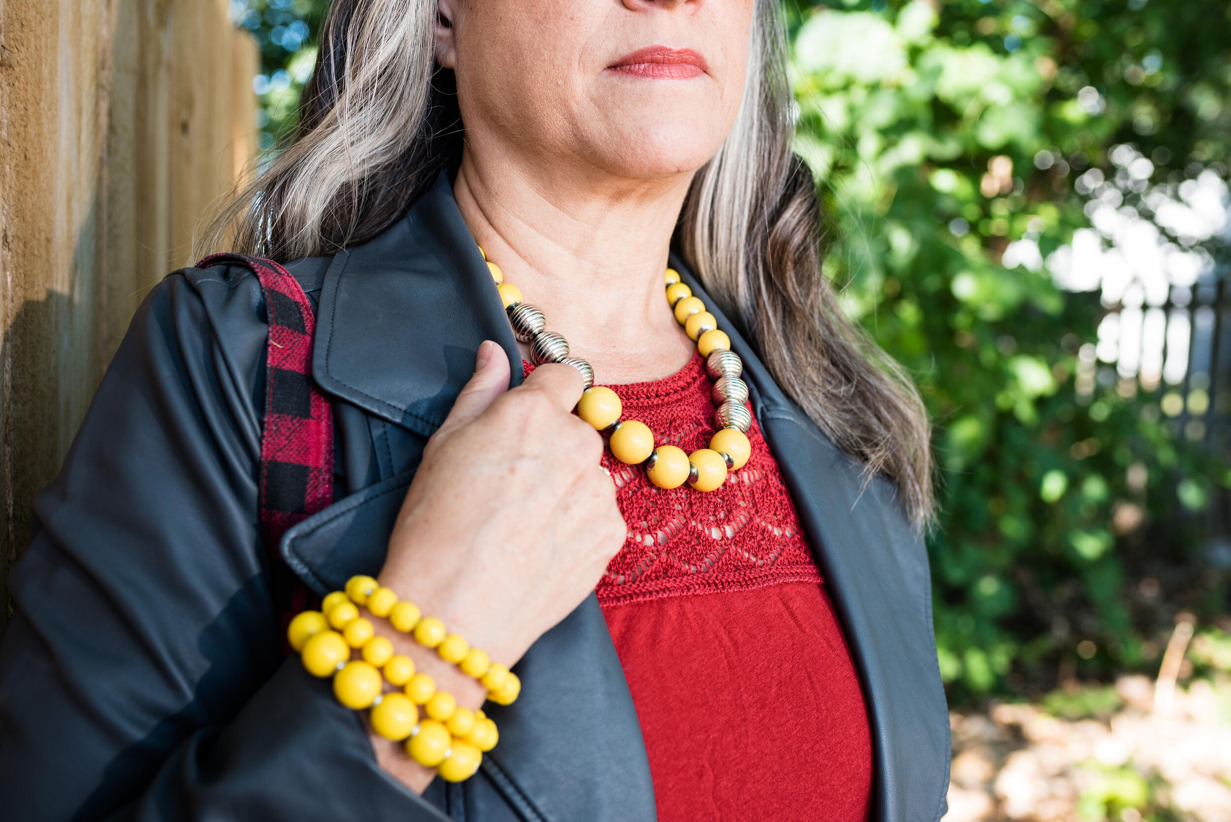
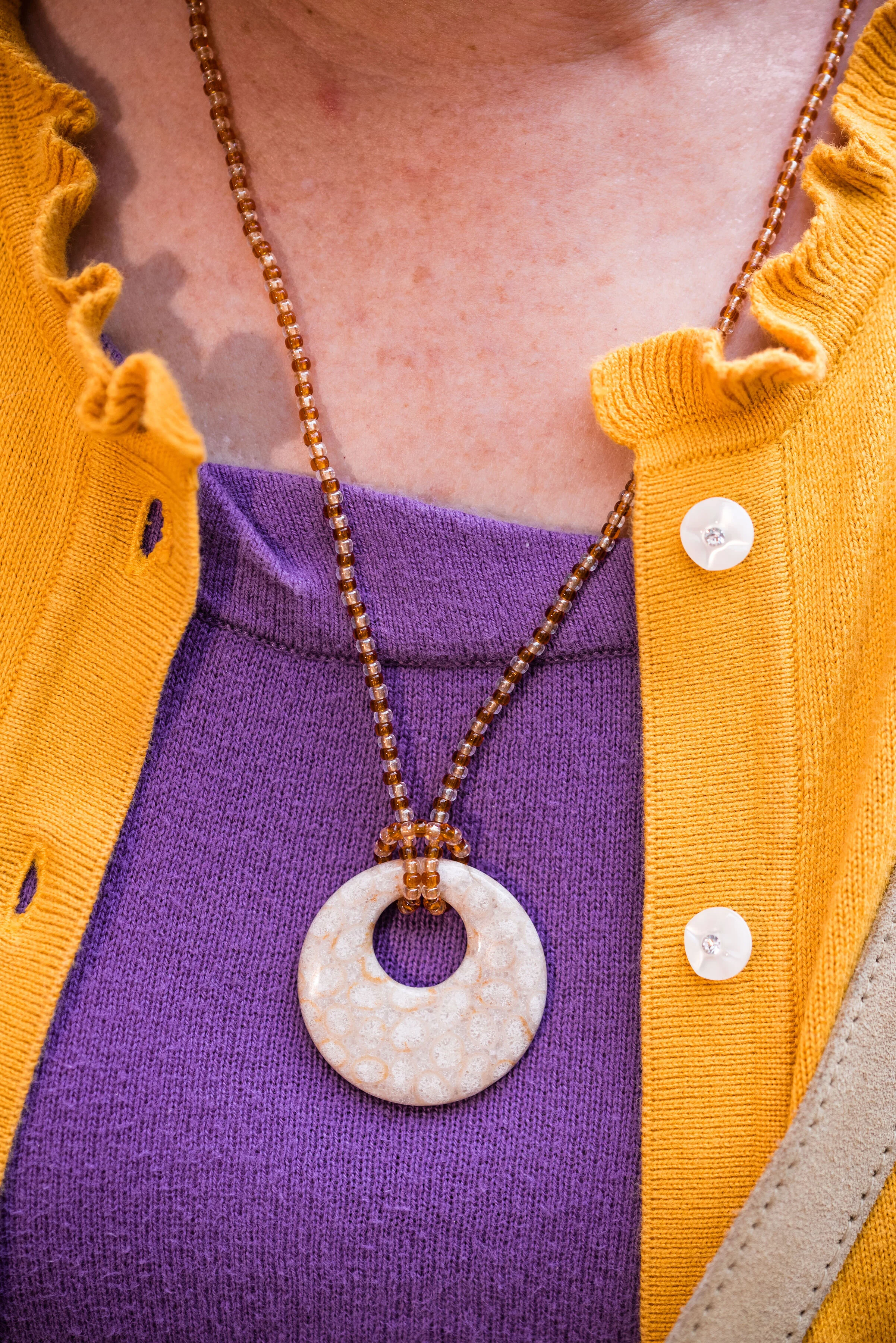
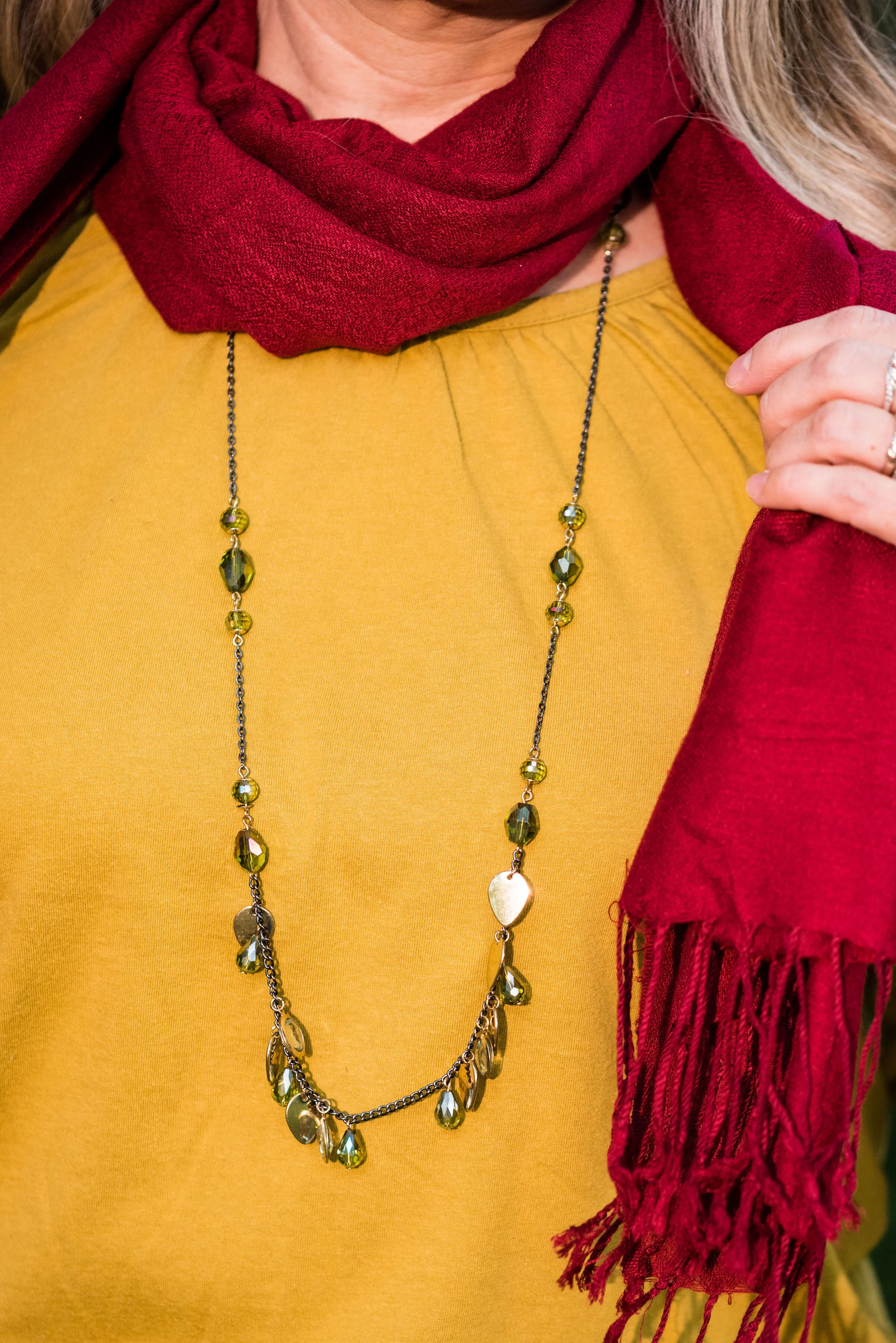
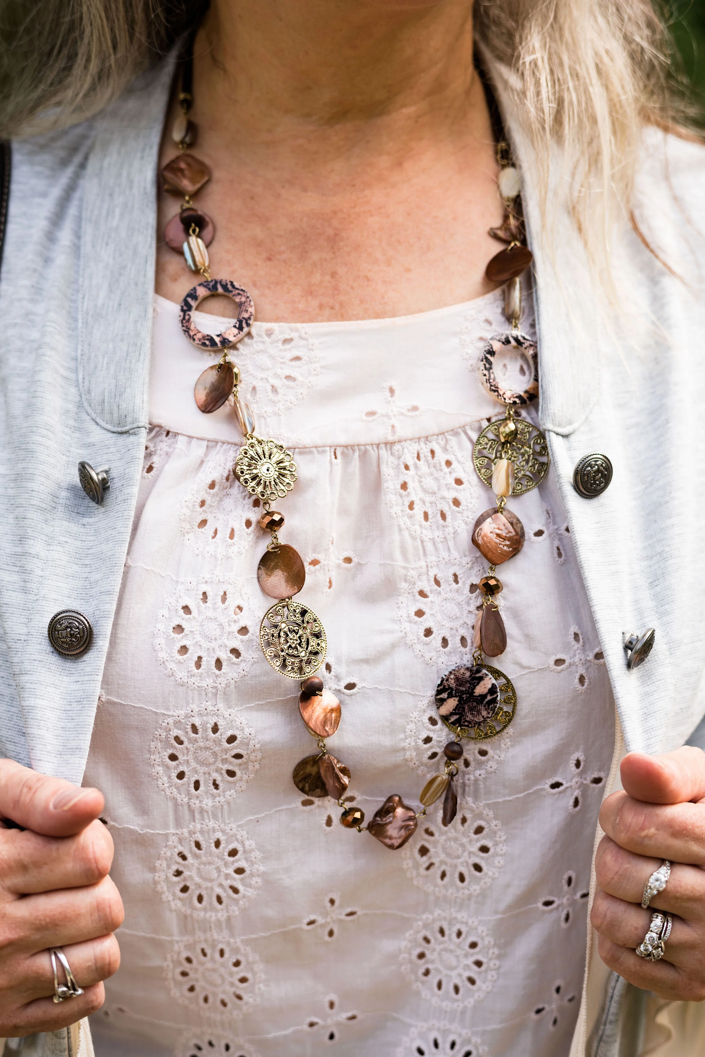
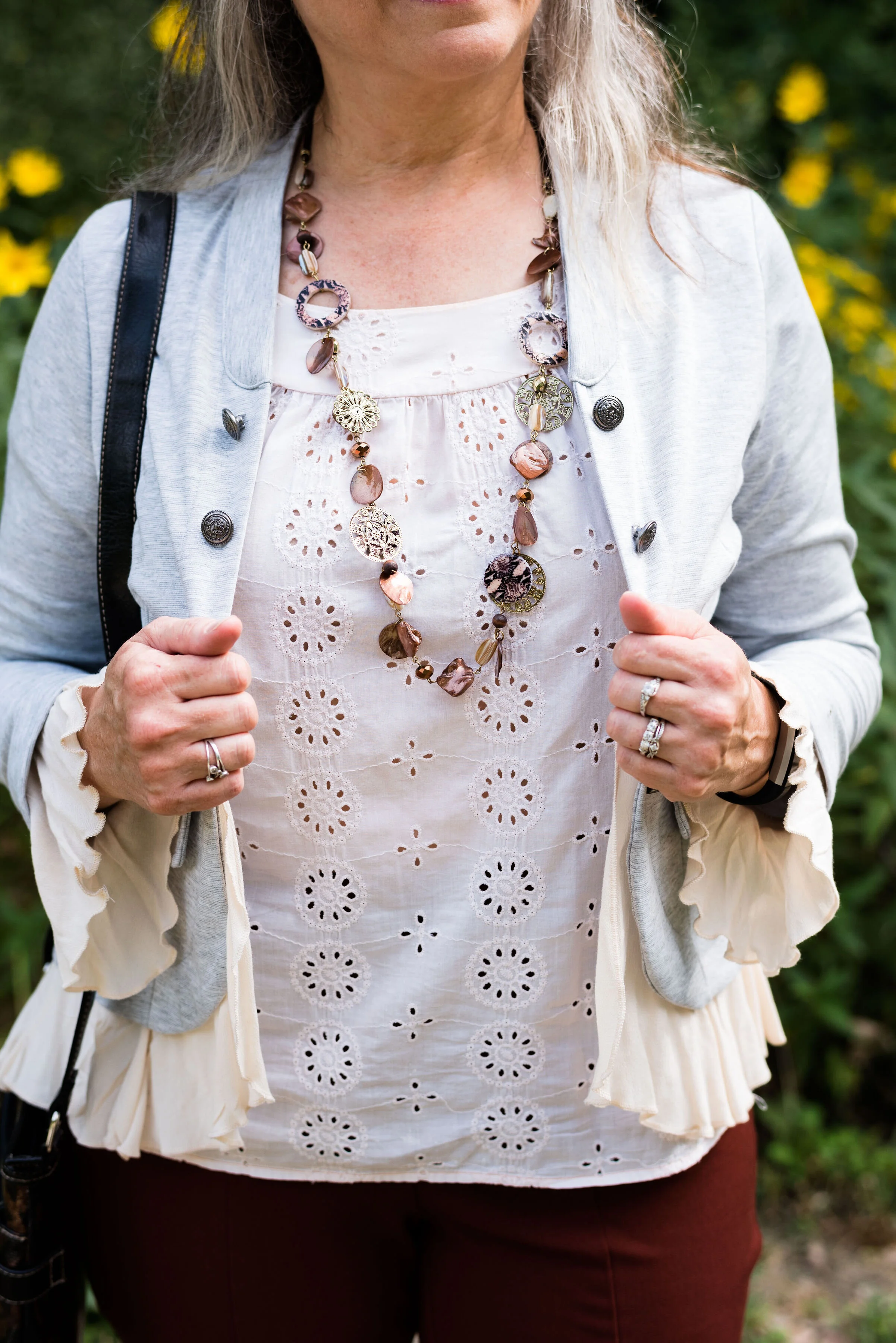
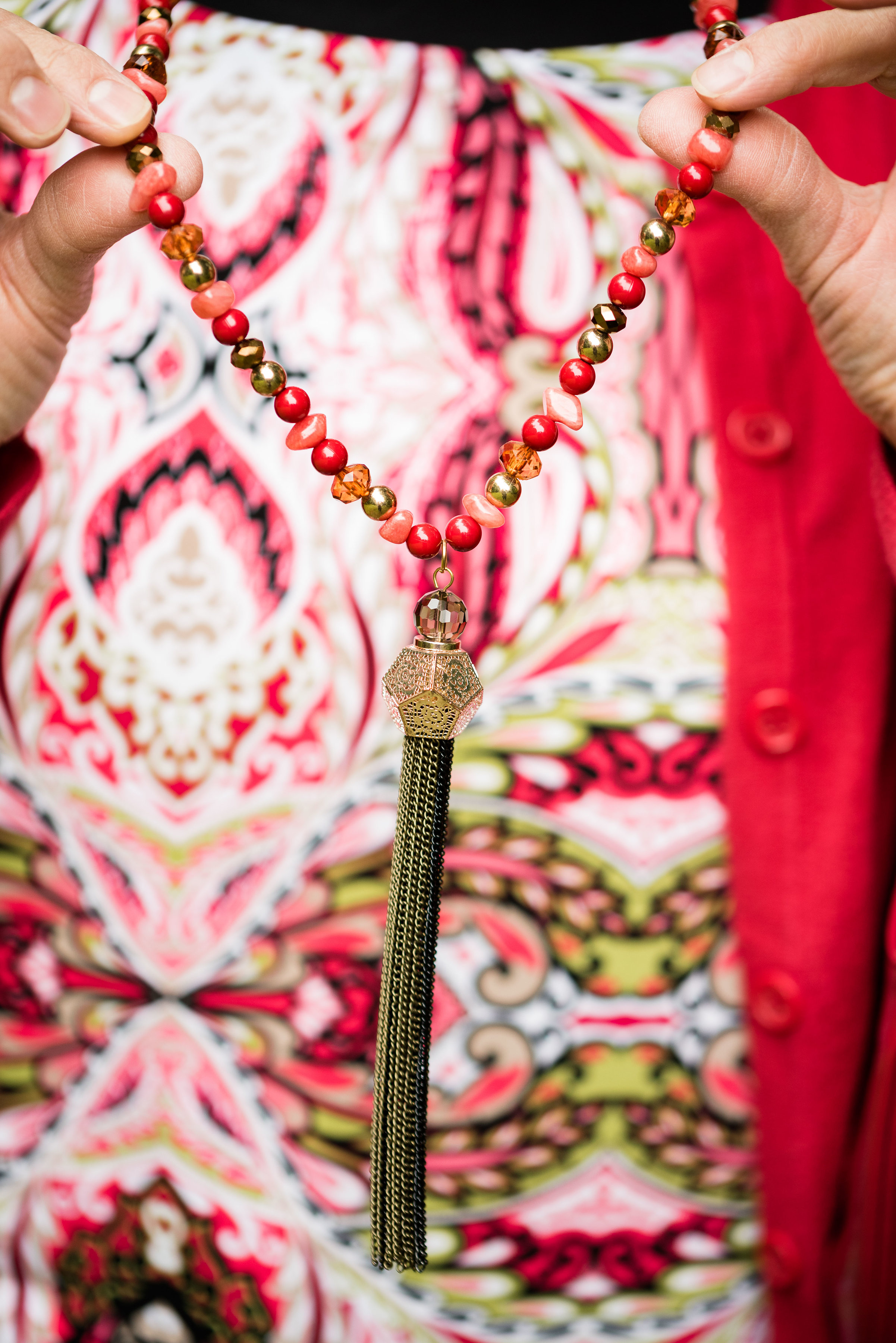
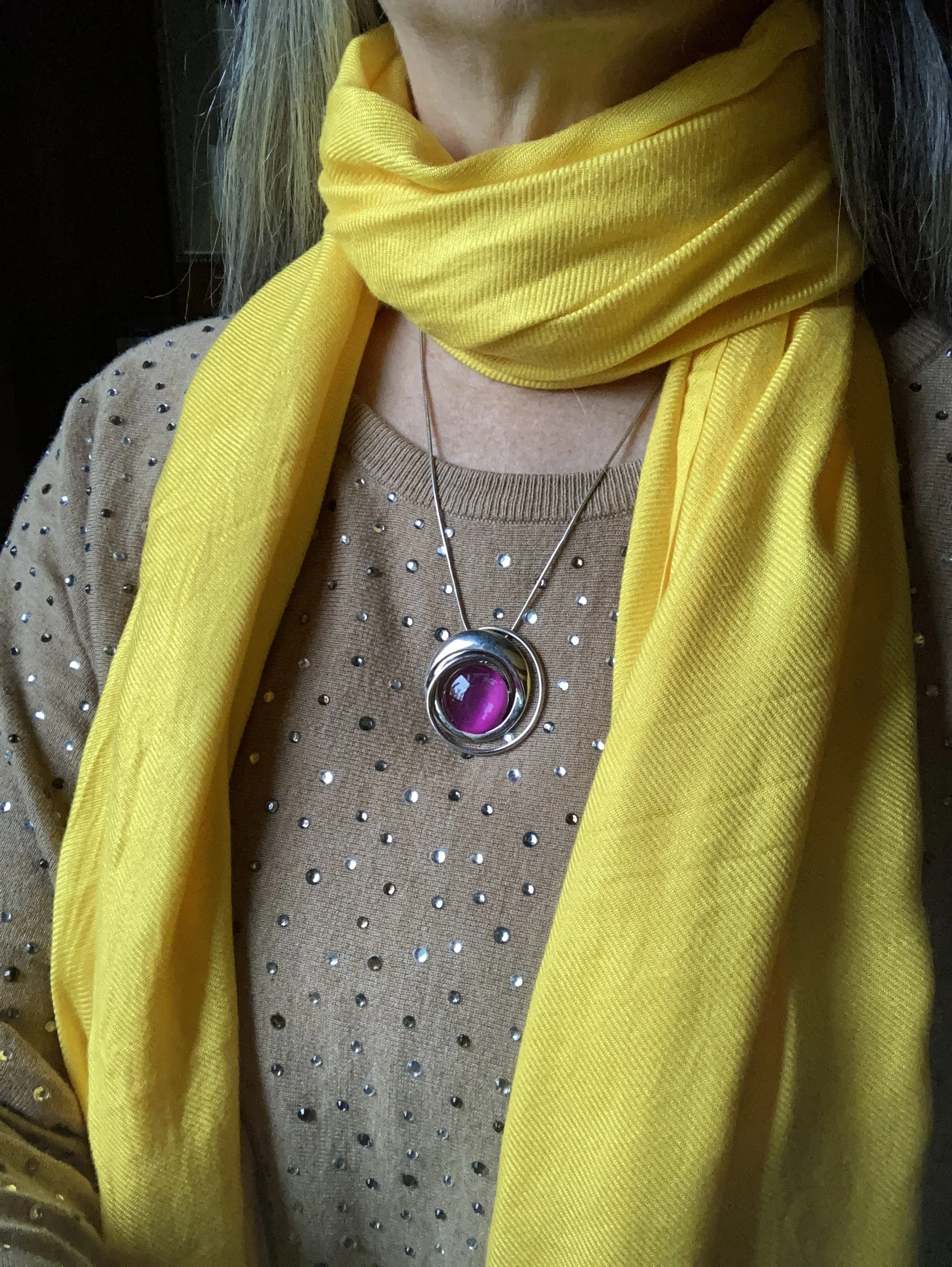
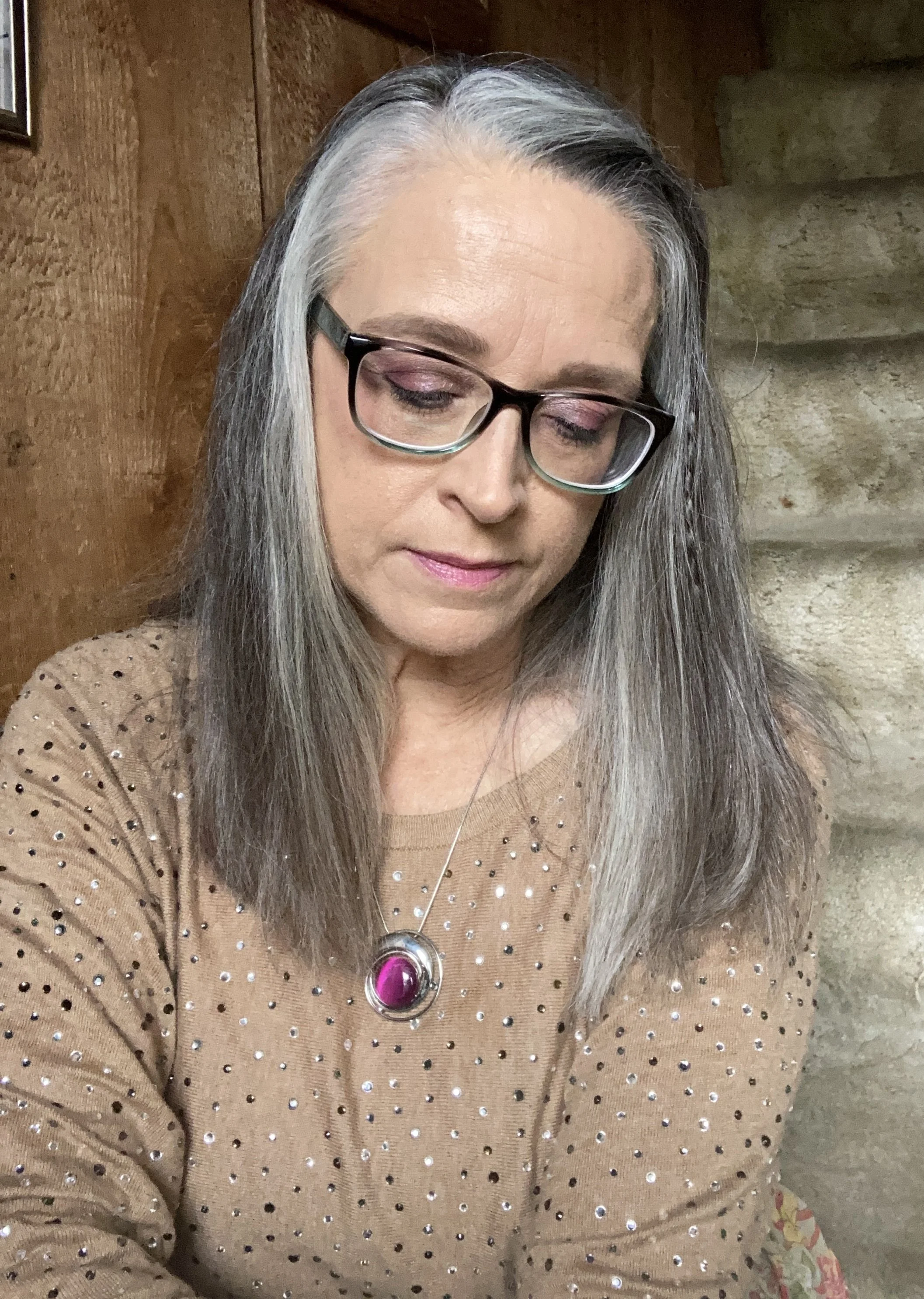
I added the old Christopher and Banks cat eye necklace to pull the Rose Violet color upwards, and I also wore make up allowing for a softer version of the bright pink on my face.

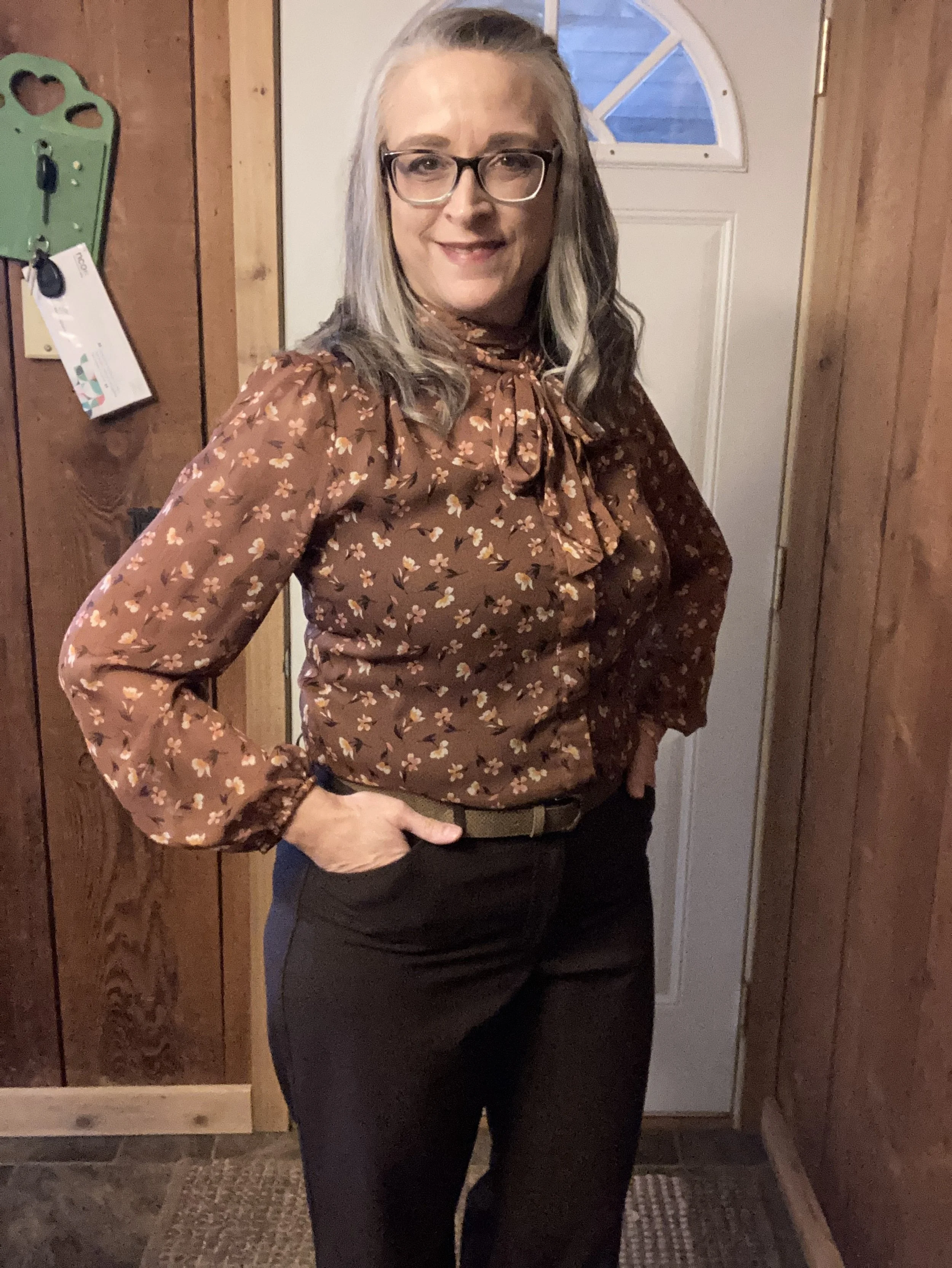
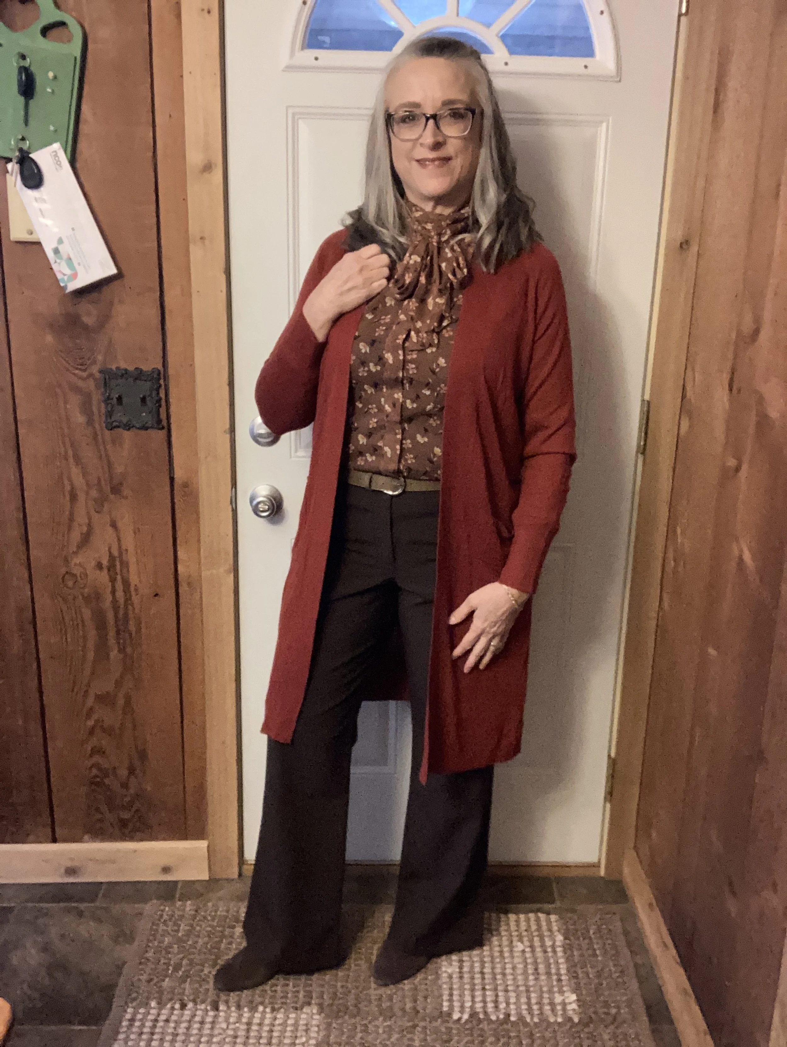
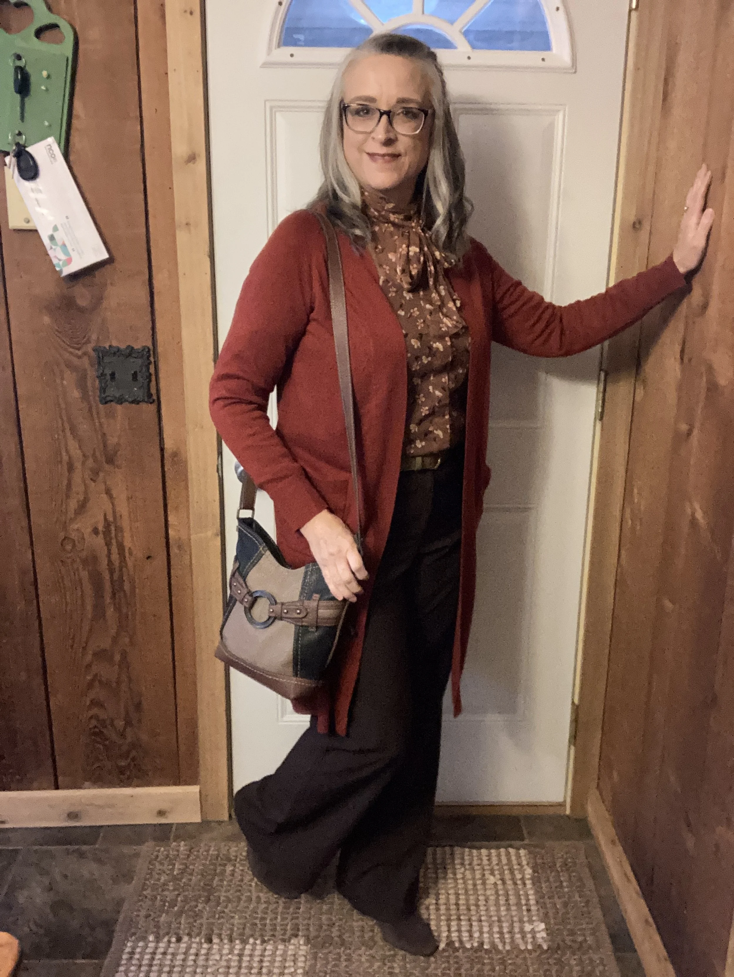
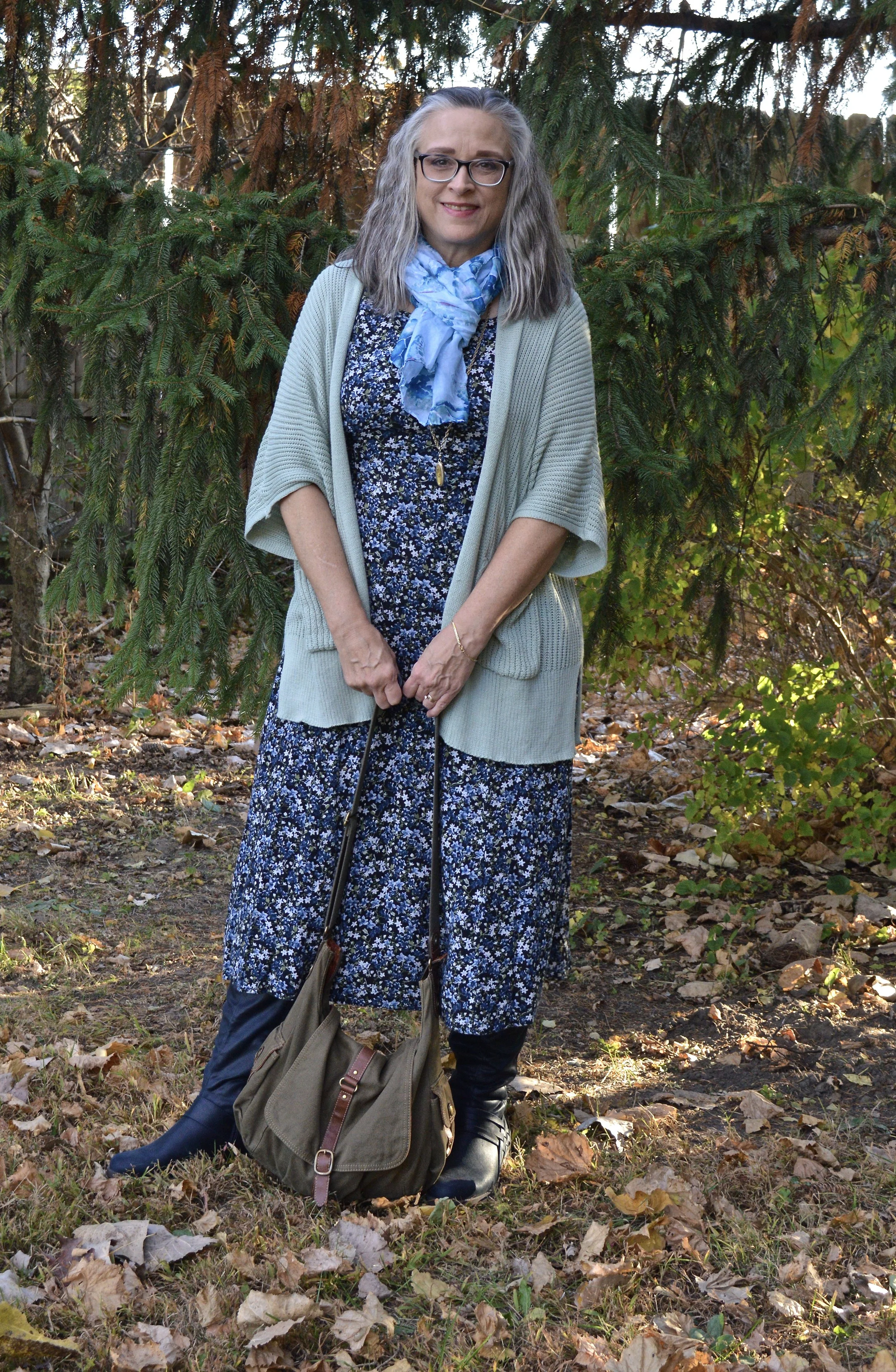
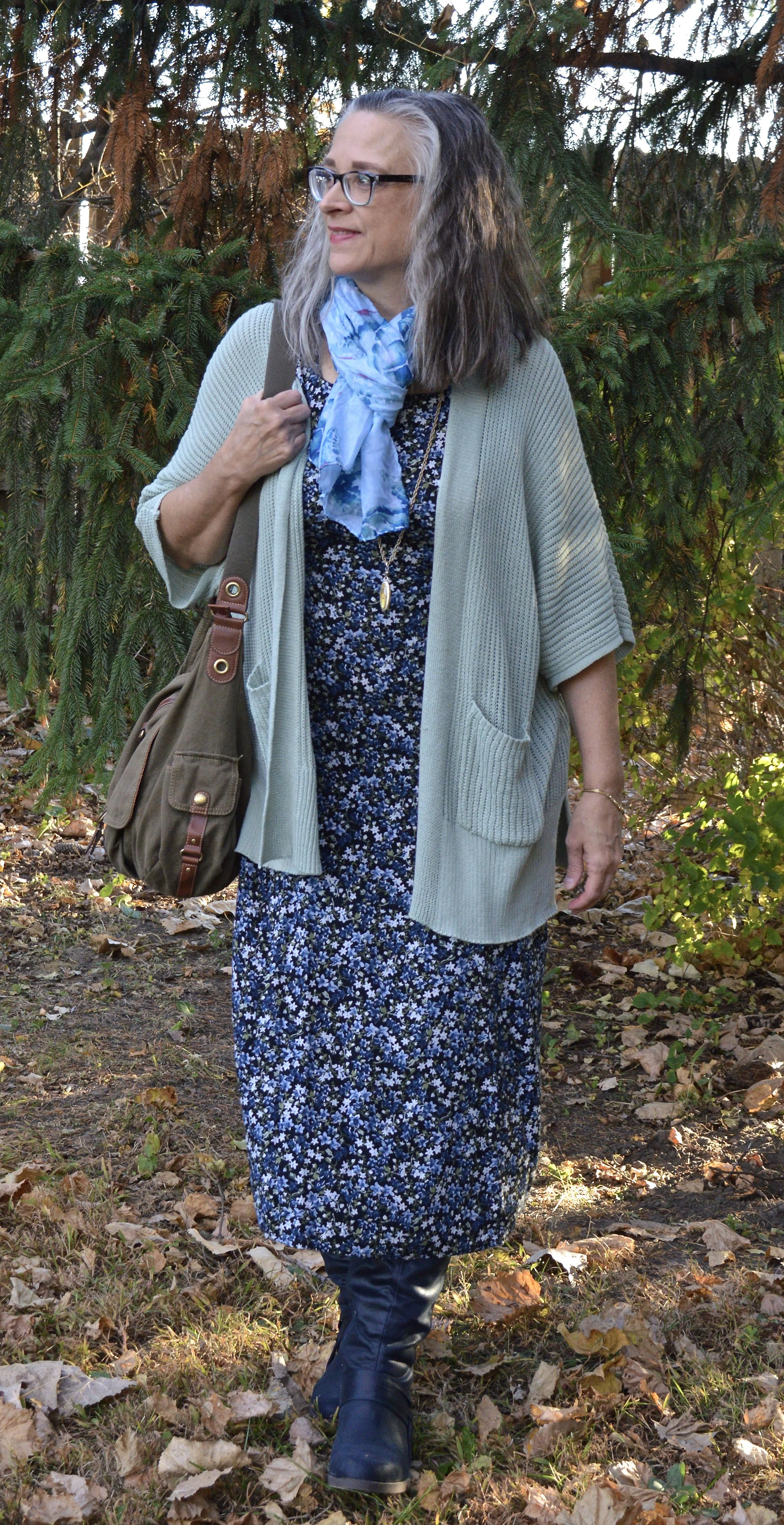
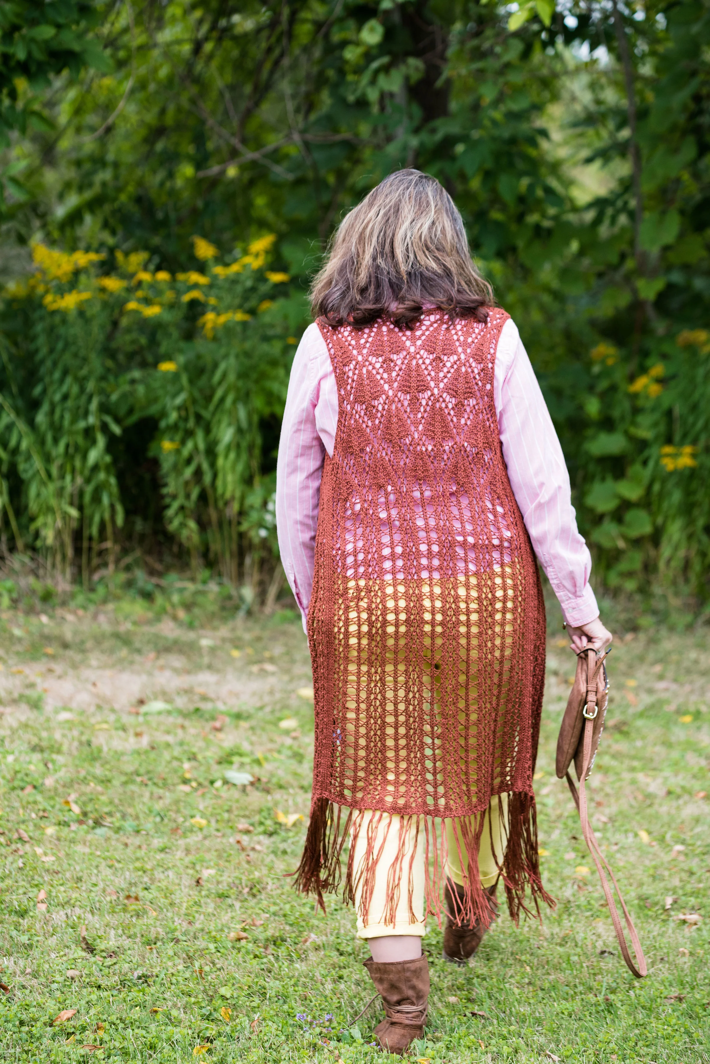
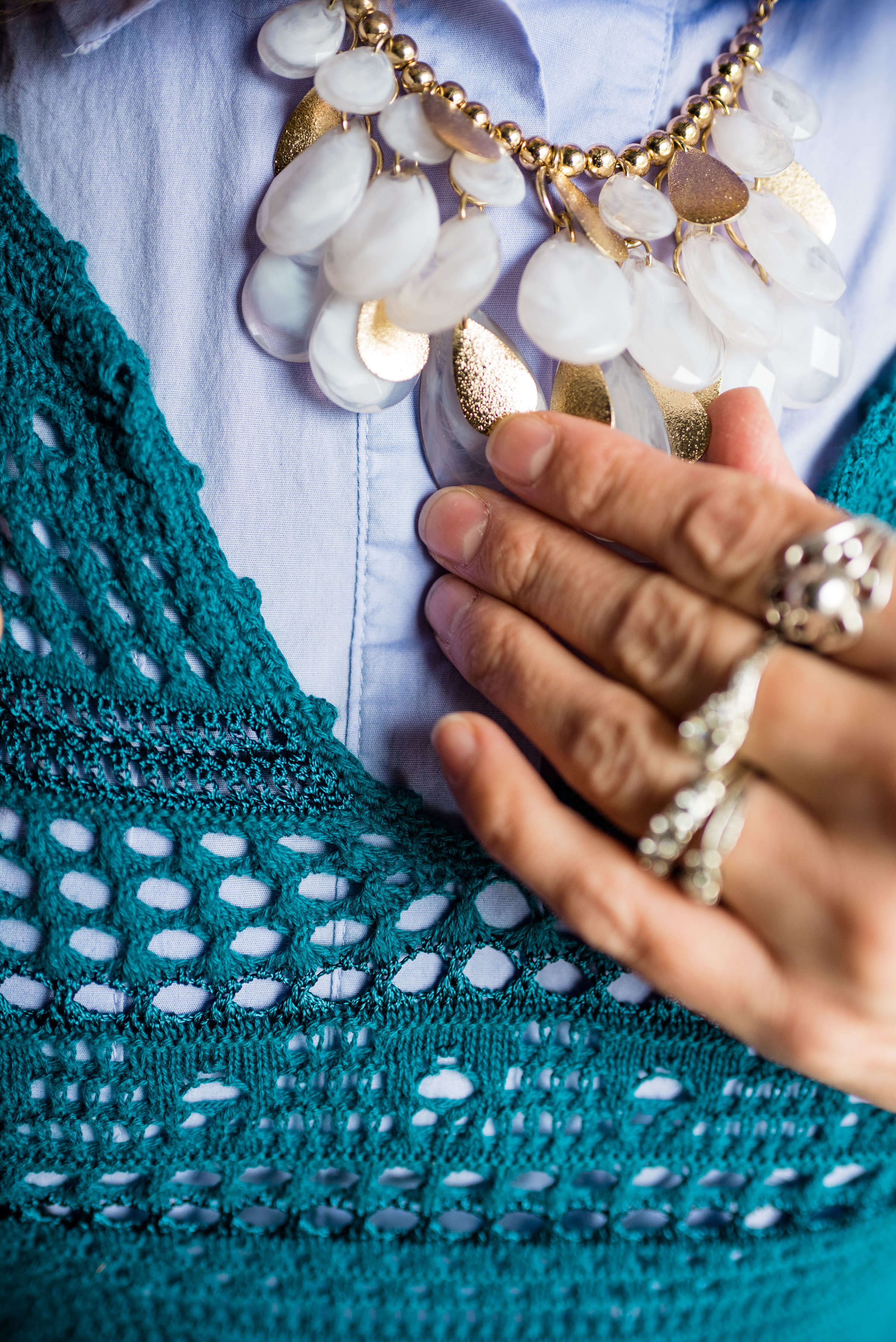
My Doe colored sweater was a fabulous thrift find. I thought the neutral color with the glistening, metallic dots would be great for the up coming holidays with a versatility that allows for dressing up or down.

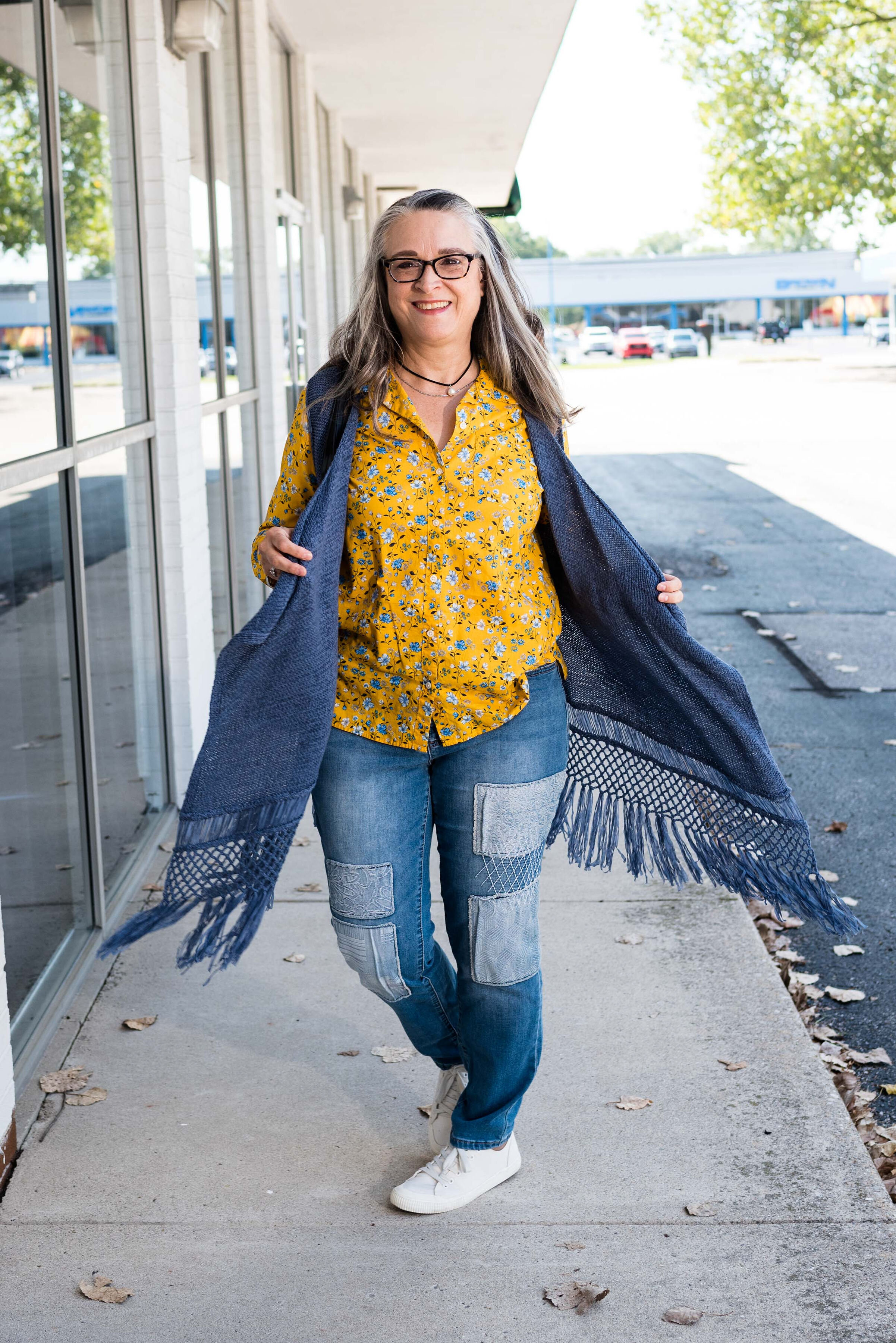
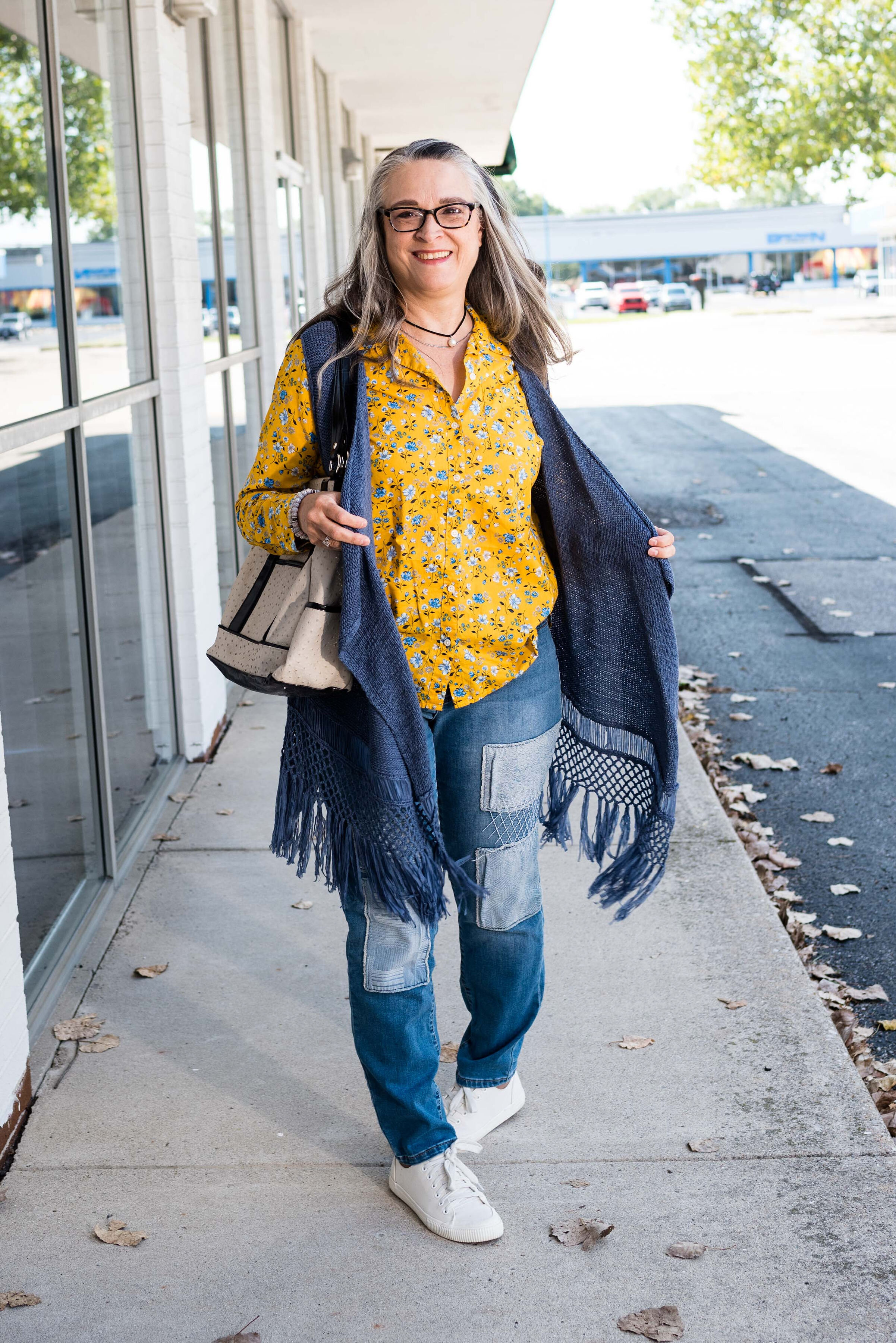
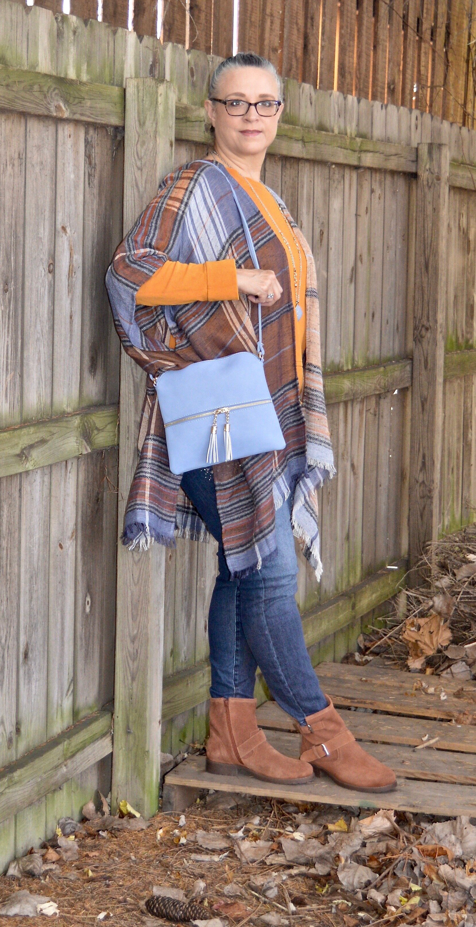
High Visibility is certainly so. This bright yellow is so cheerful and definitely a pick-me-up on a cloudy, rainy day. Again, the skirt uses a paler version of the yellow to keep the outfit completely compatible through out.

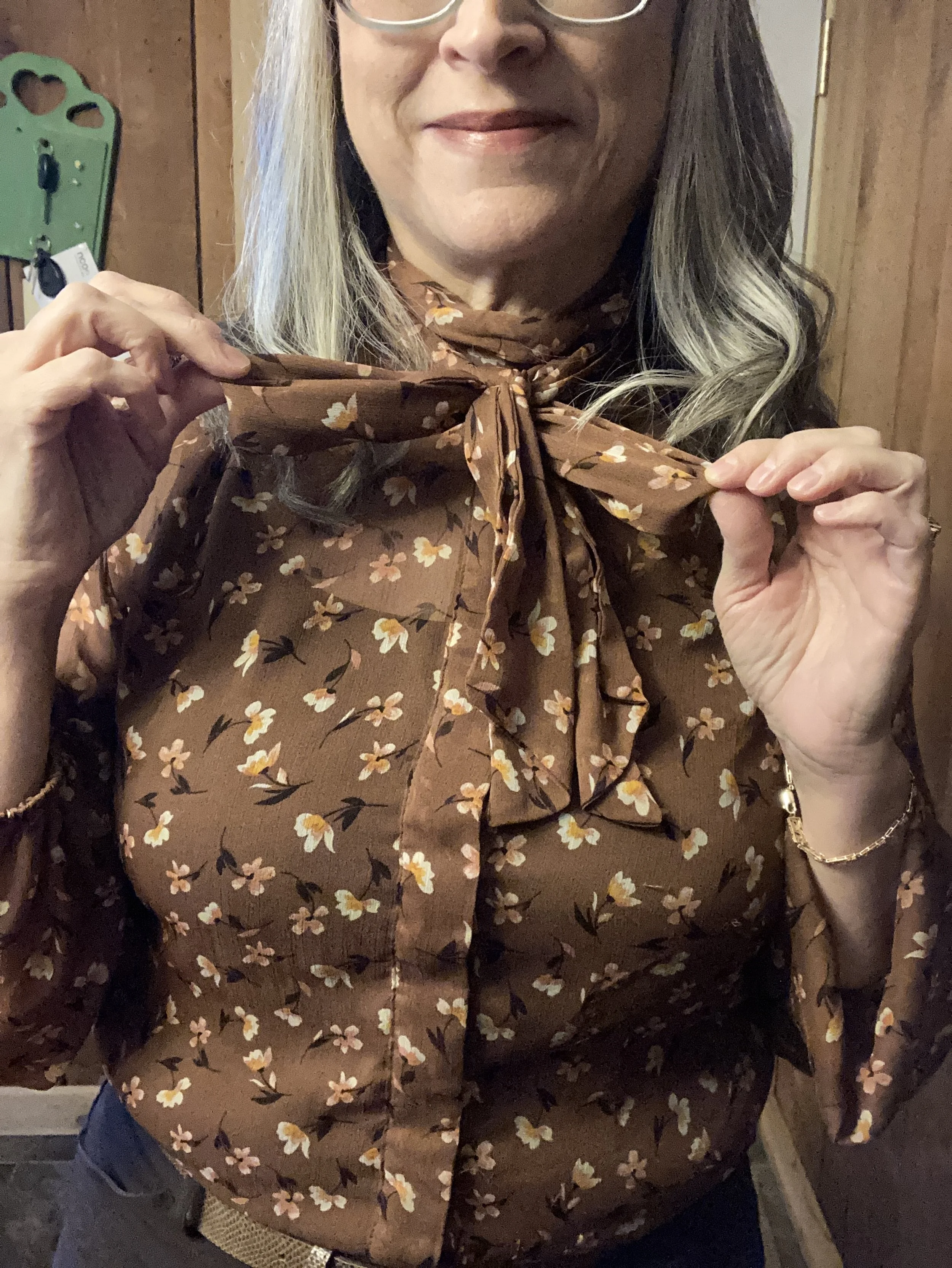
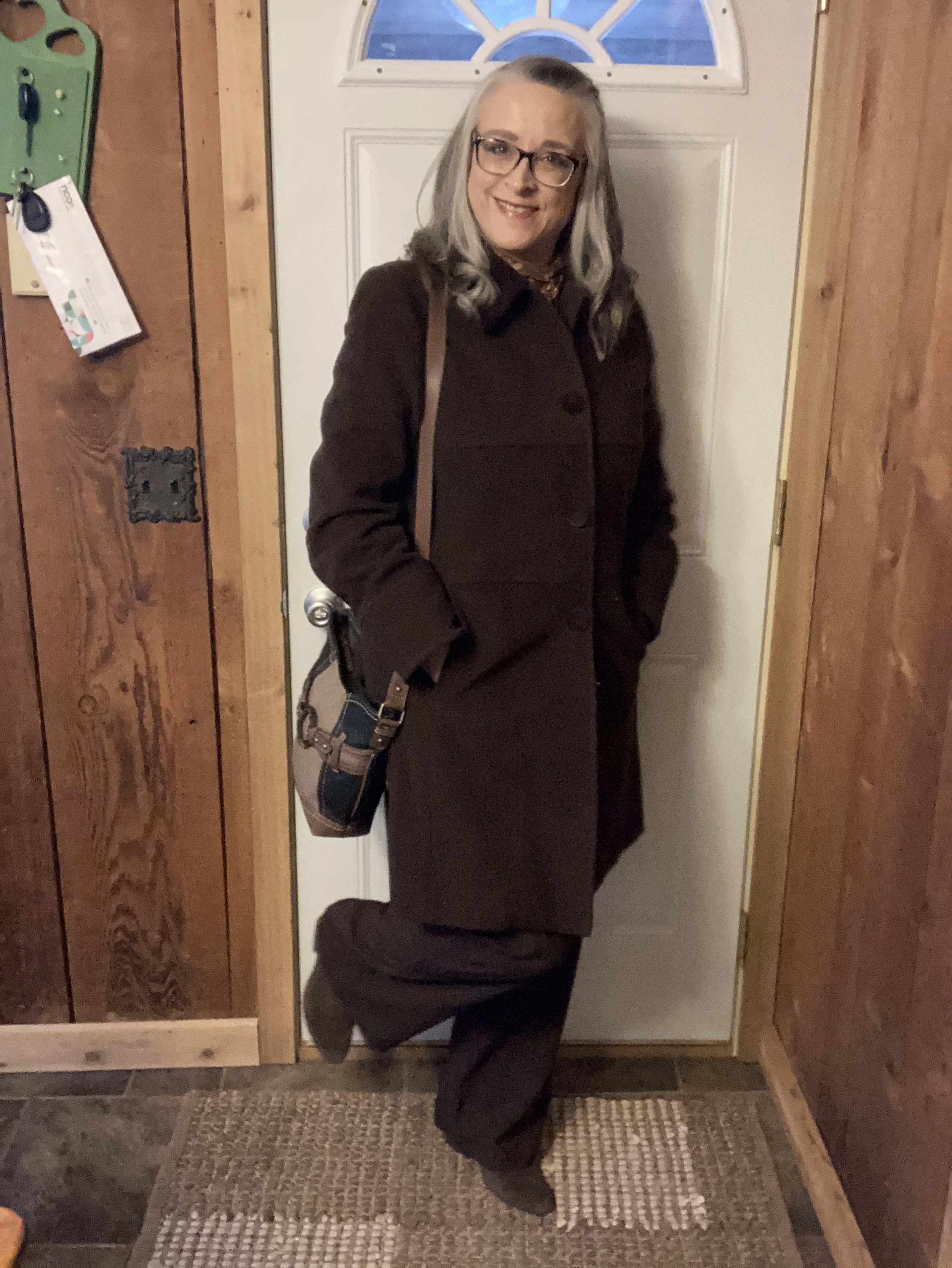
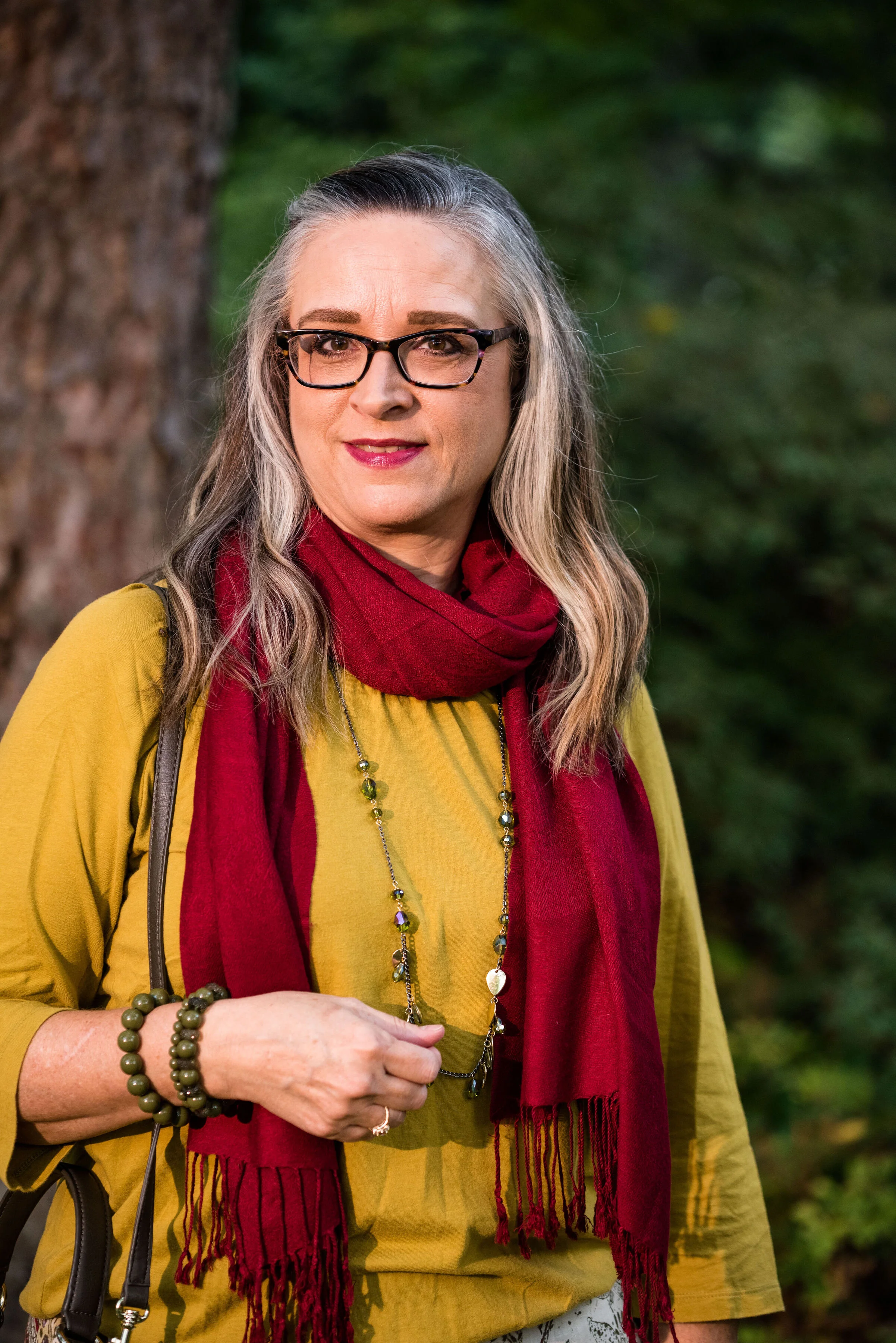
Here is another way to wear the pashmina.

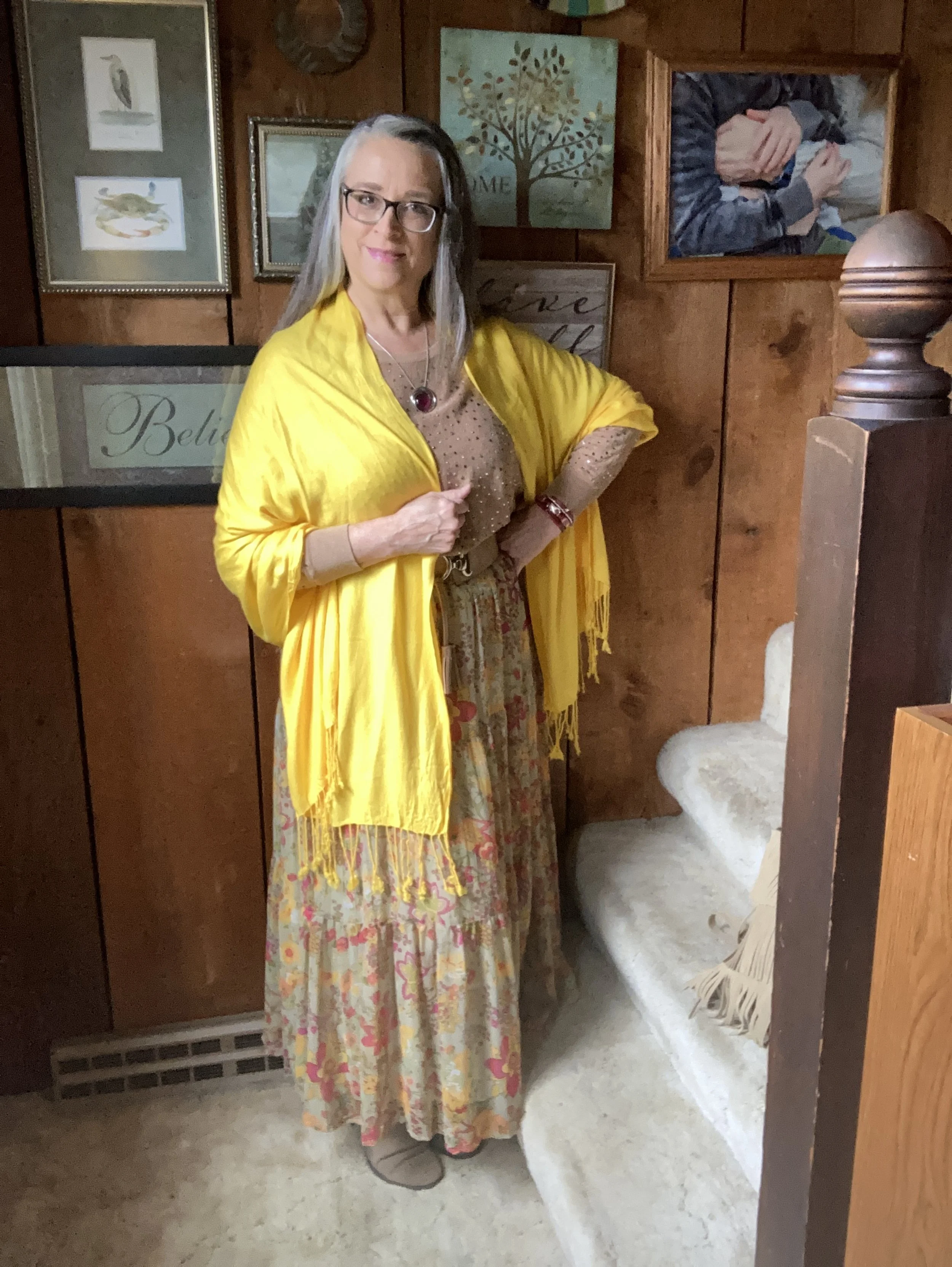
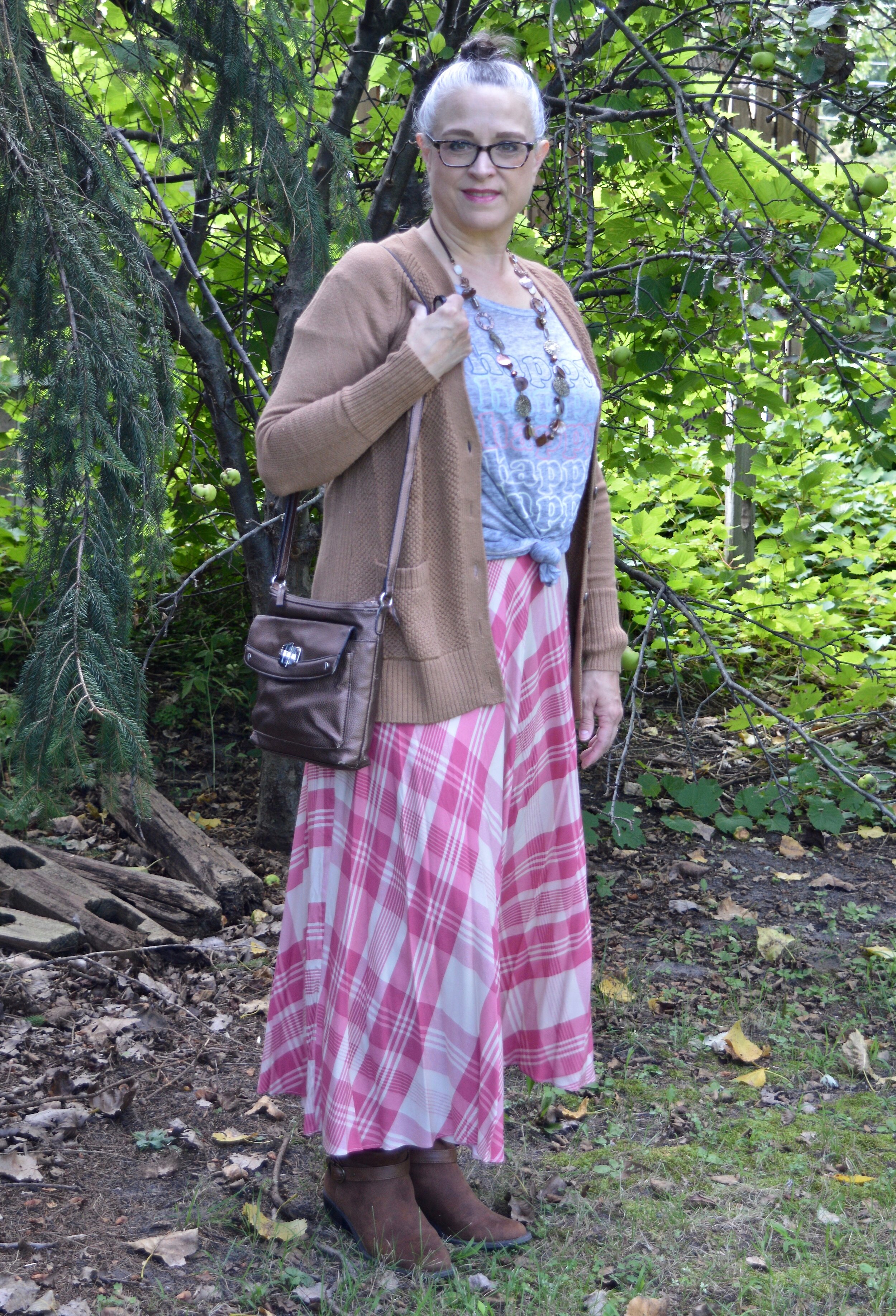
My accessories remained in the neutral shade to allow the bright pink and yellow to be the focal points for the outfit. The sweater is quite long, hanging below my bottom so I tucked it in and added the belt. It brings additional interest, texture and gives me a more refined hour glass silhouette.

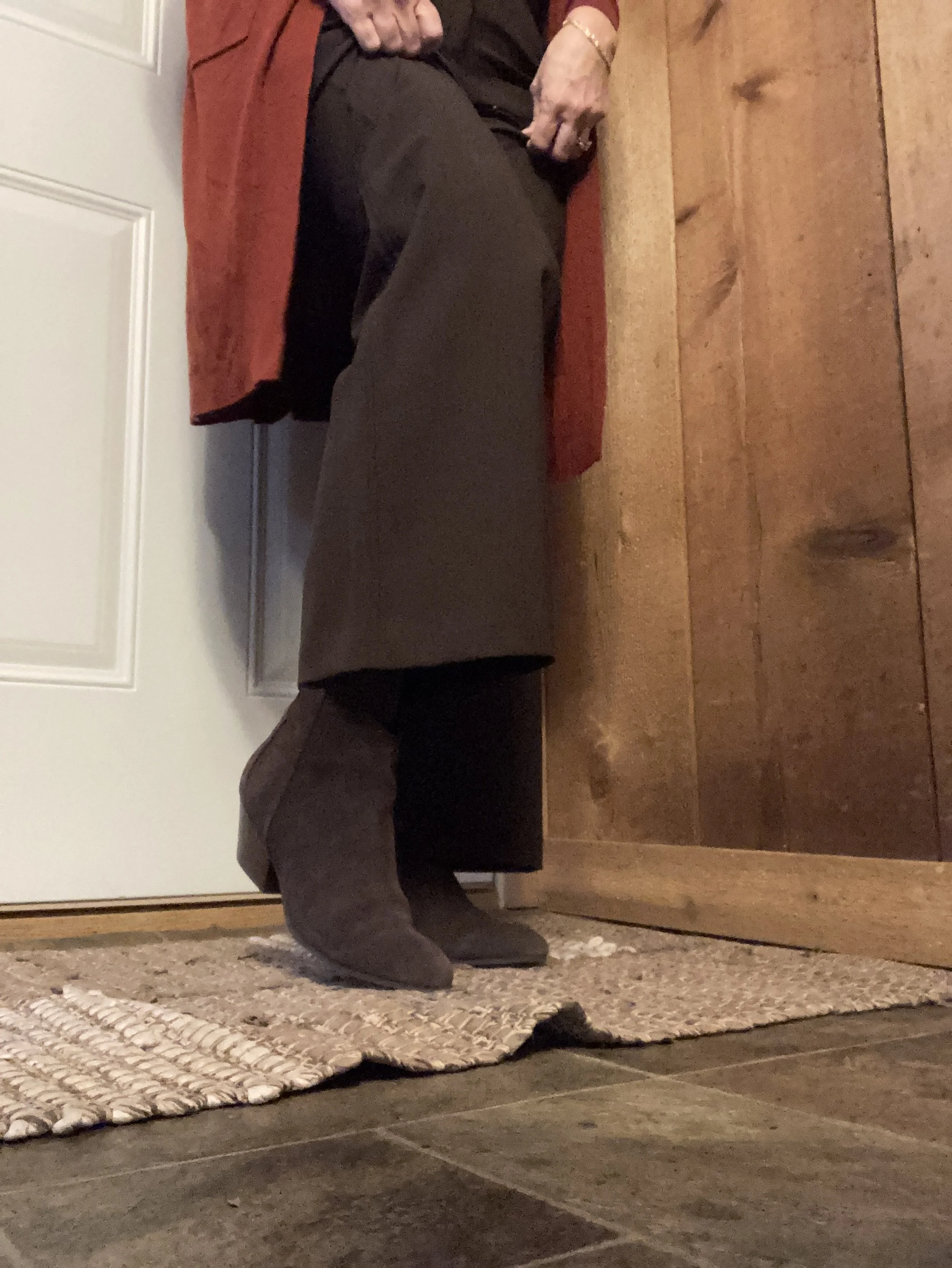
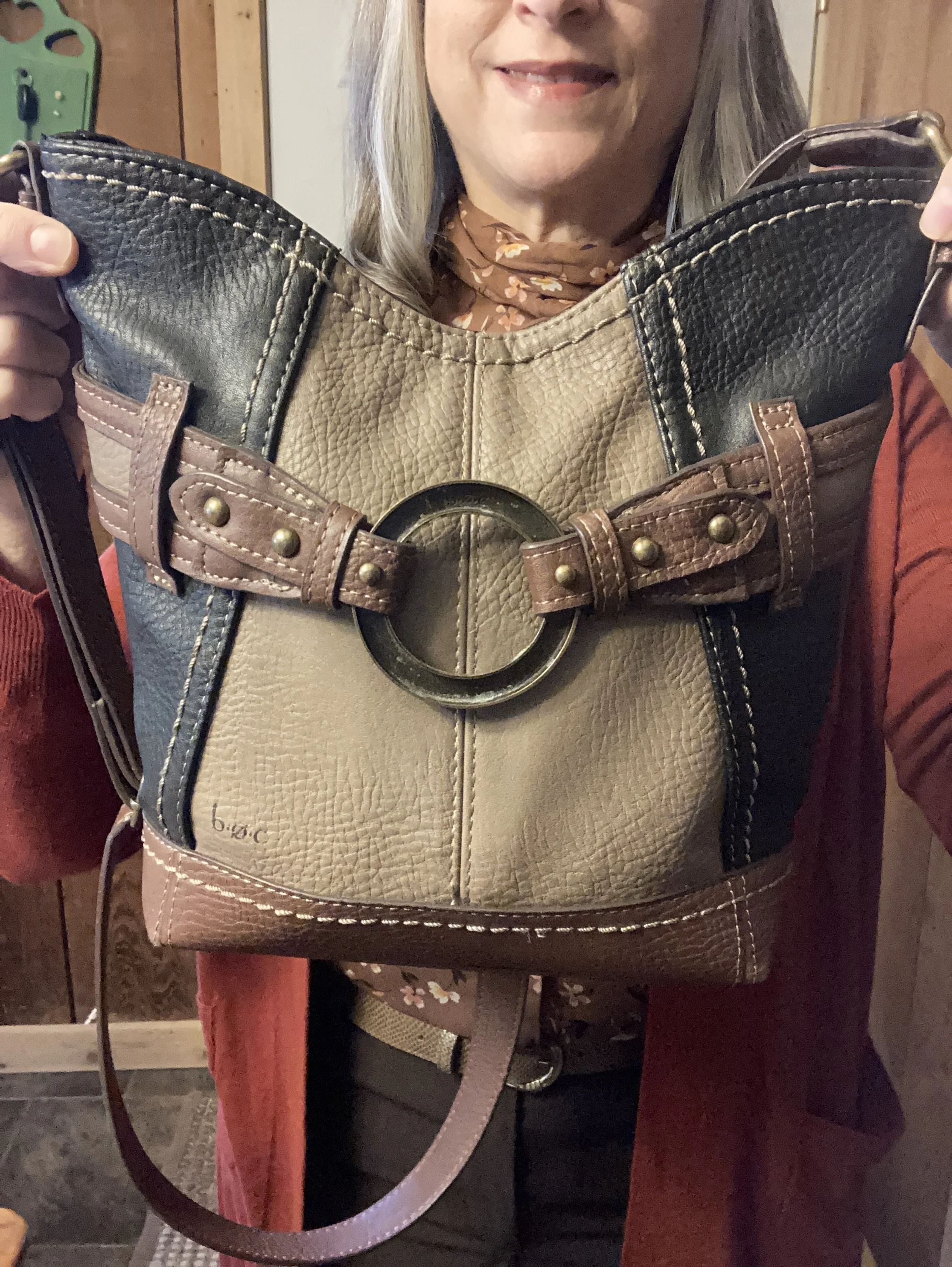
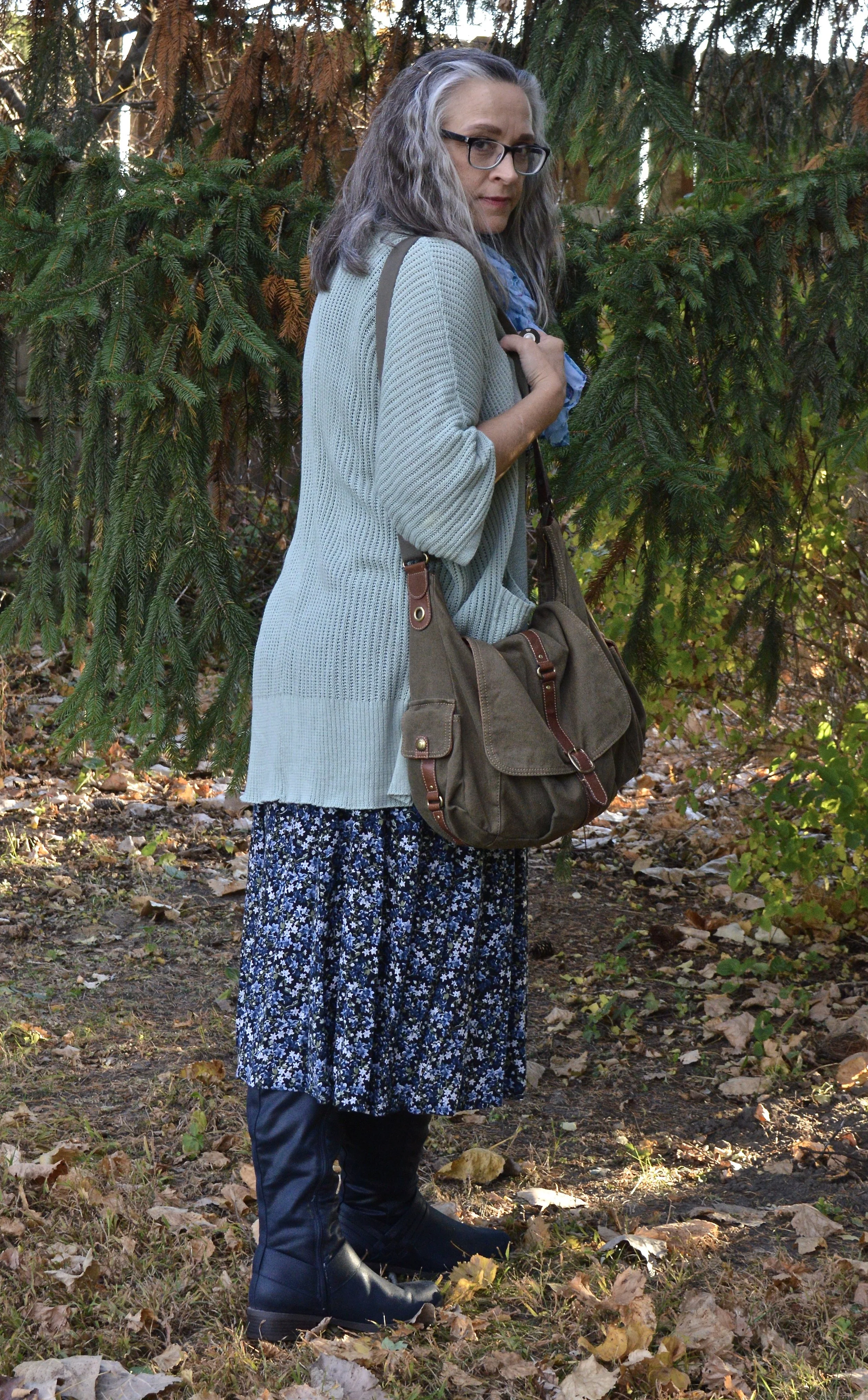
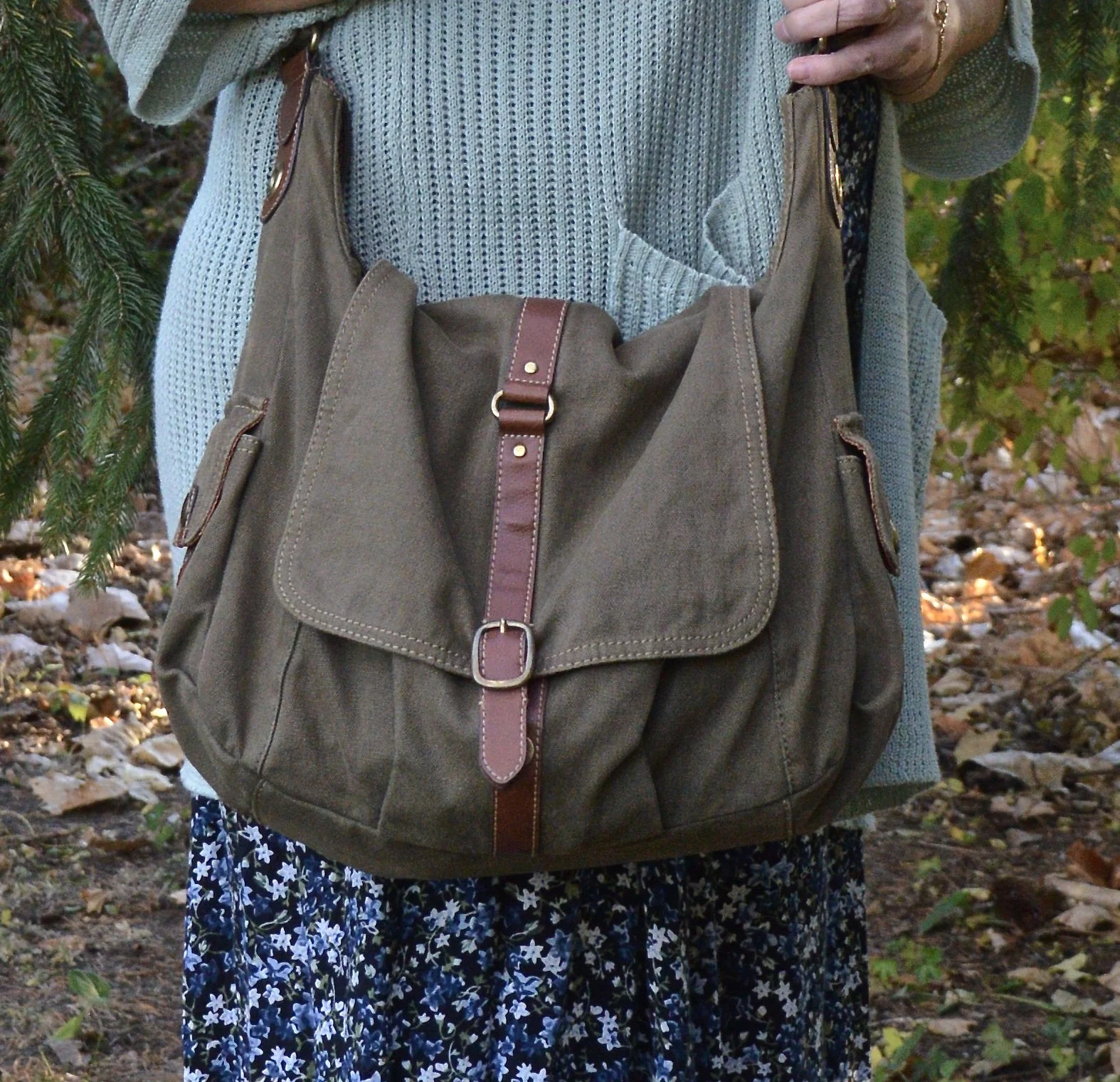
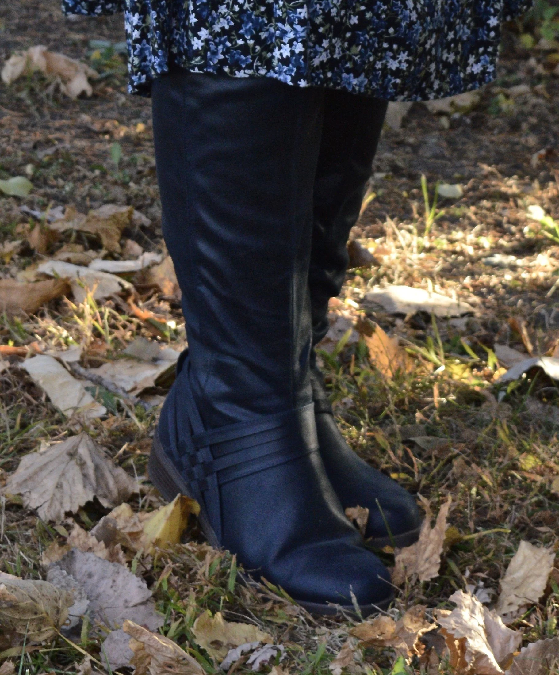
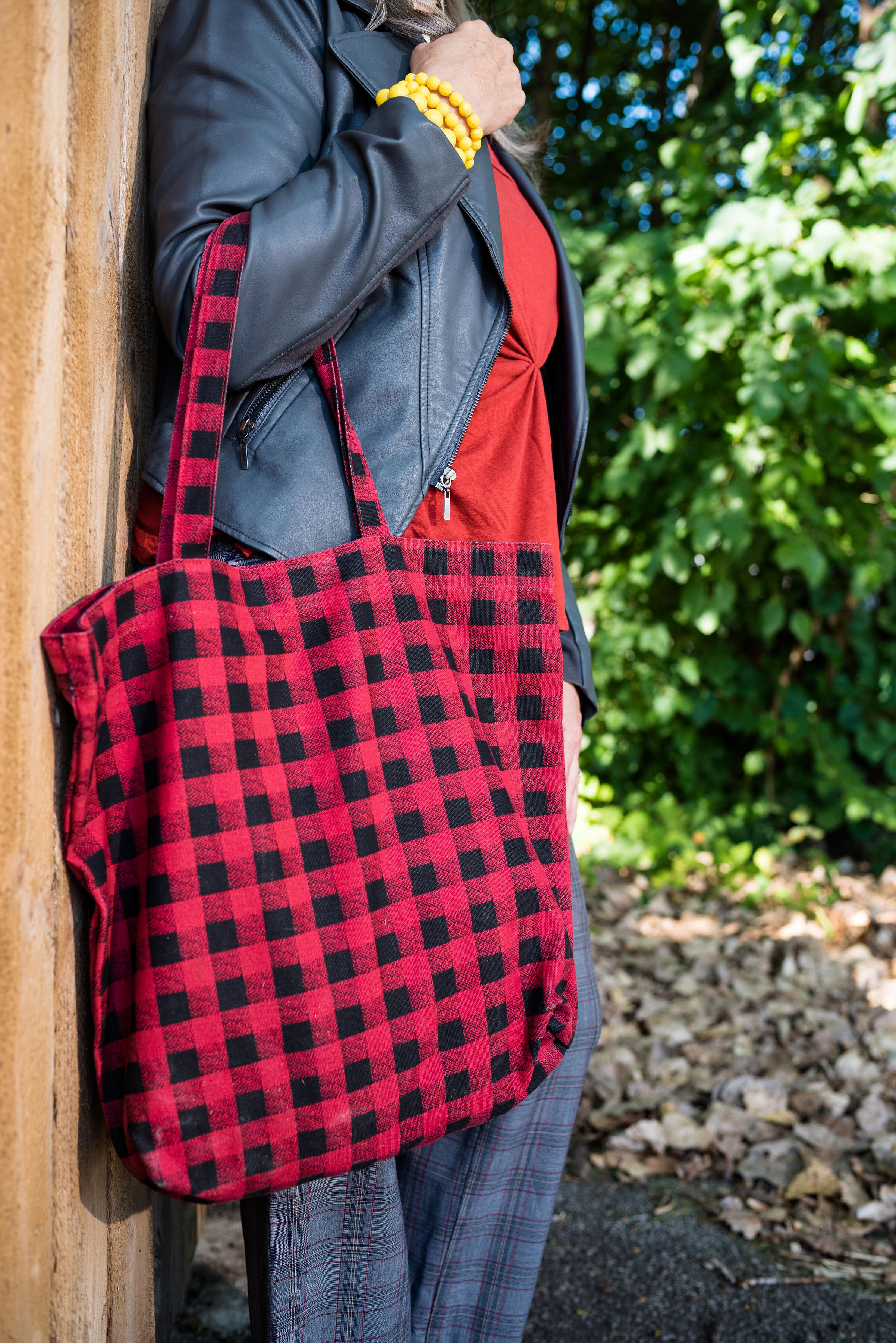
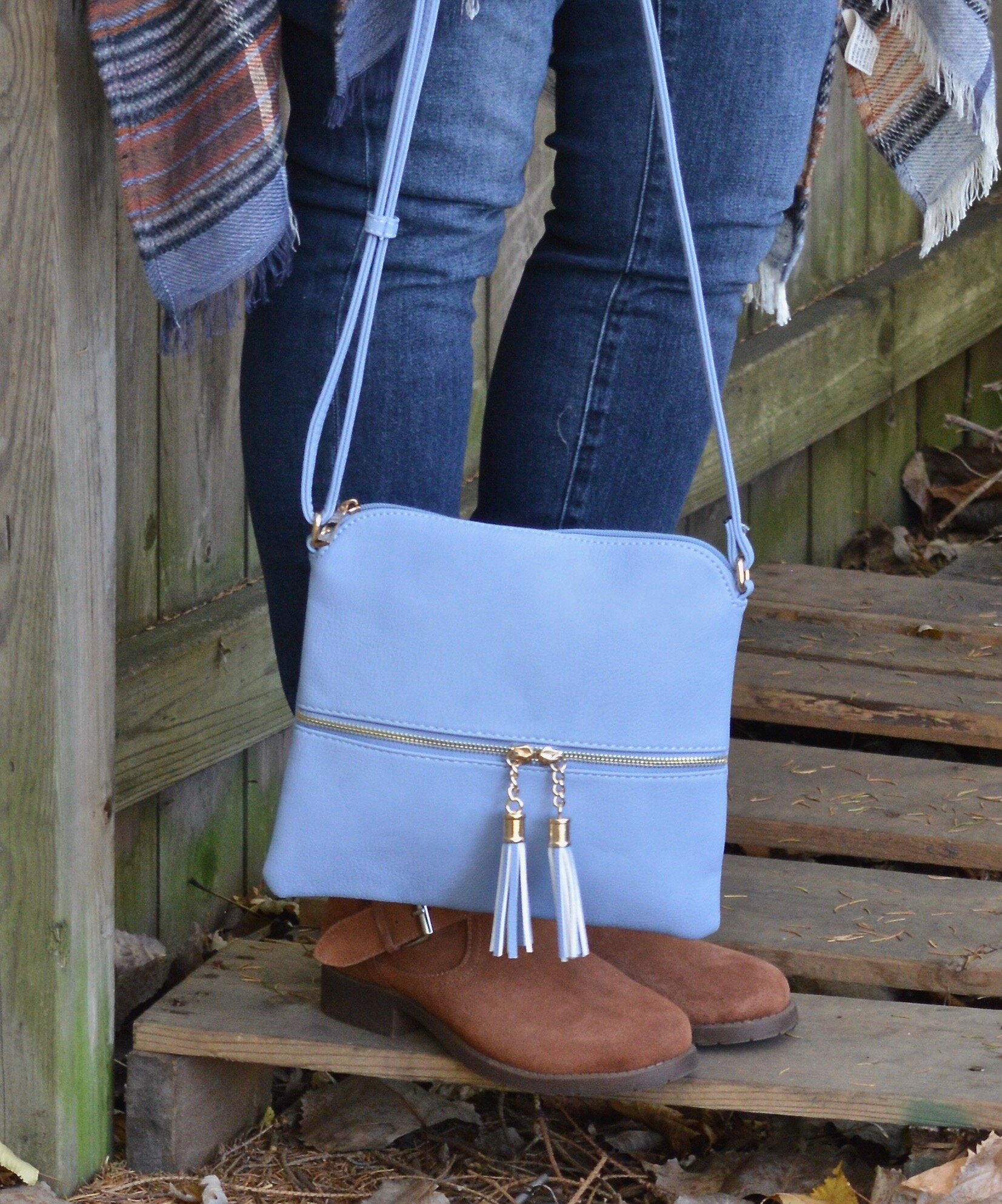
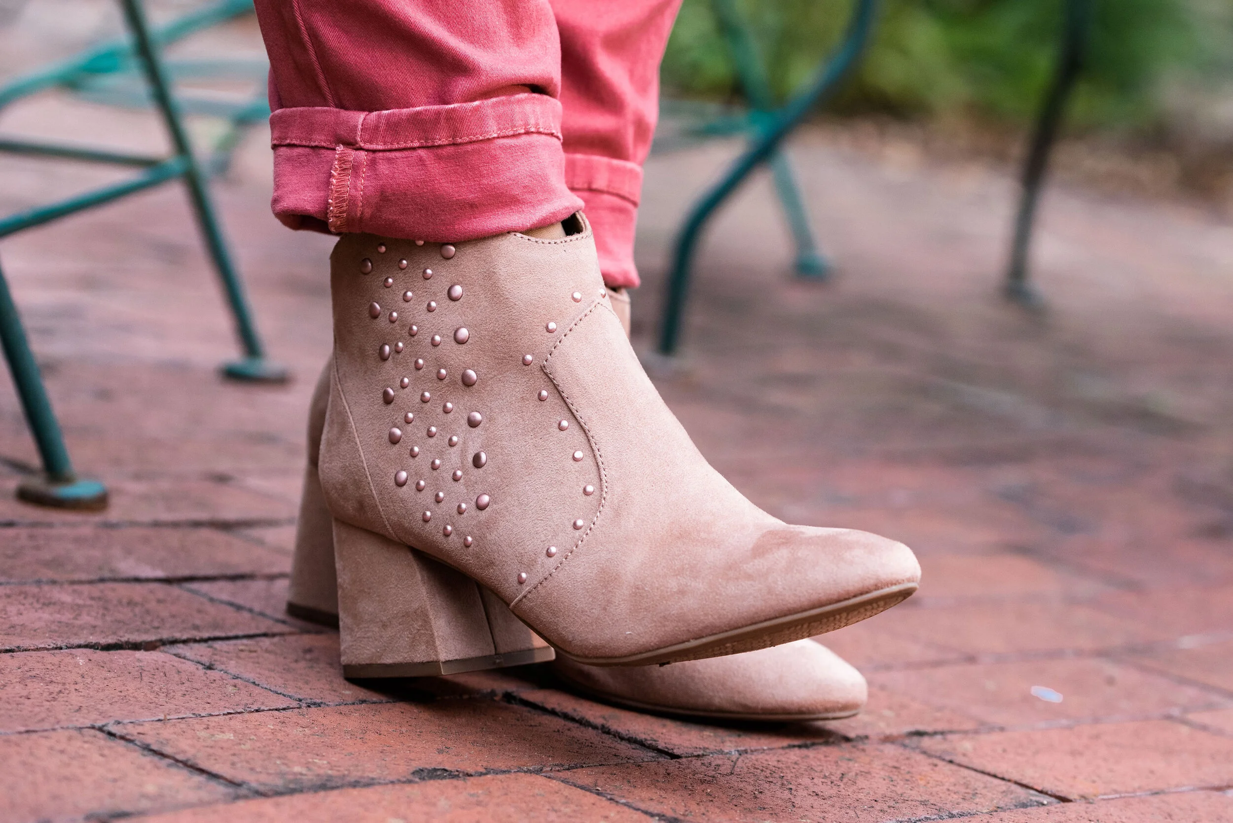
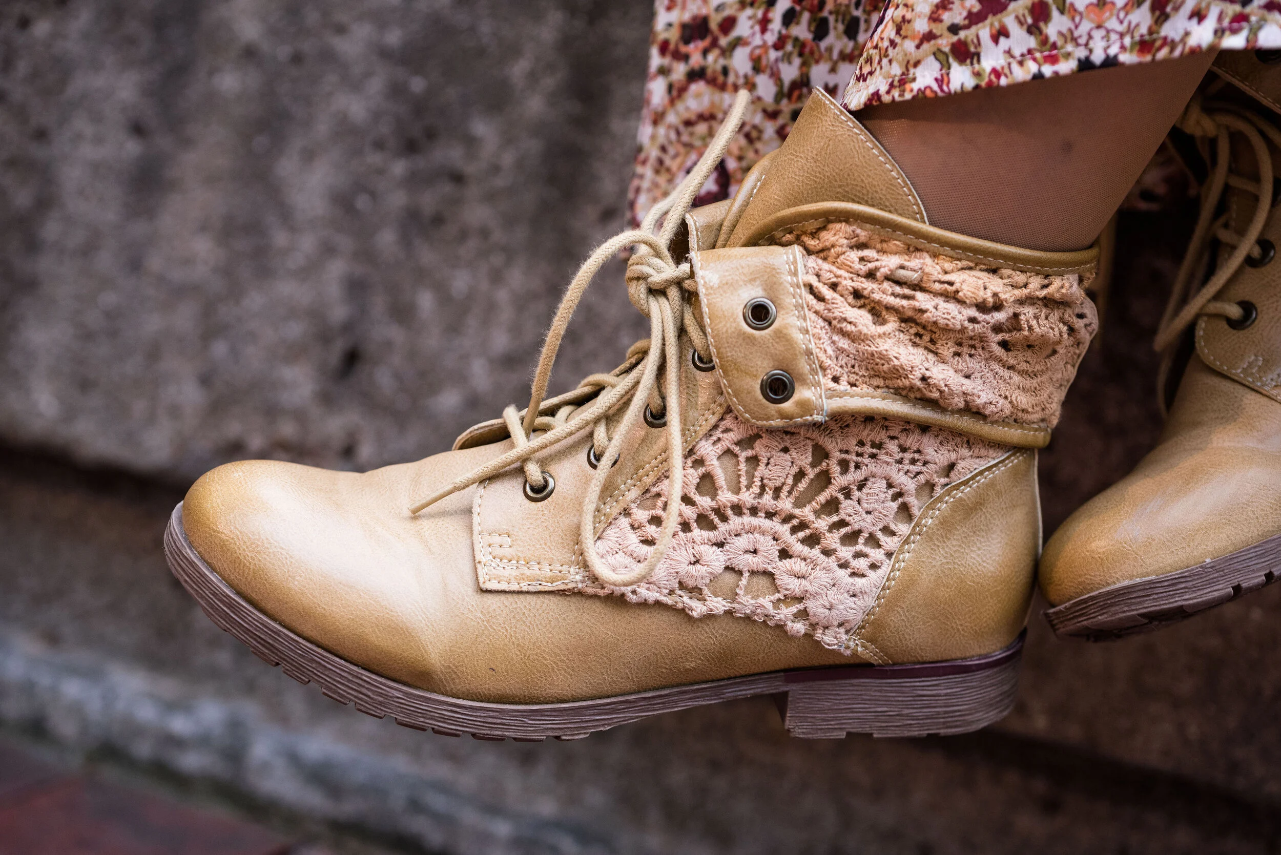
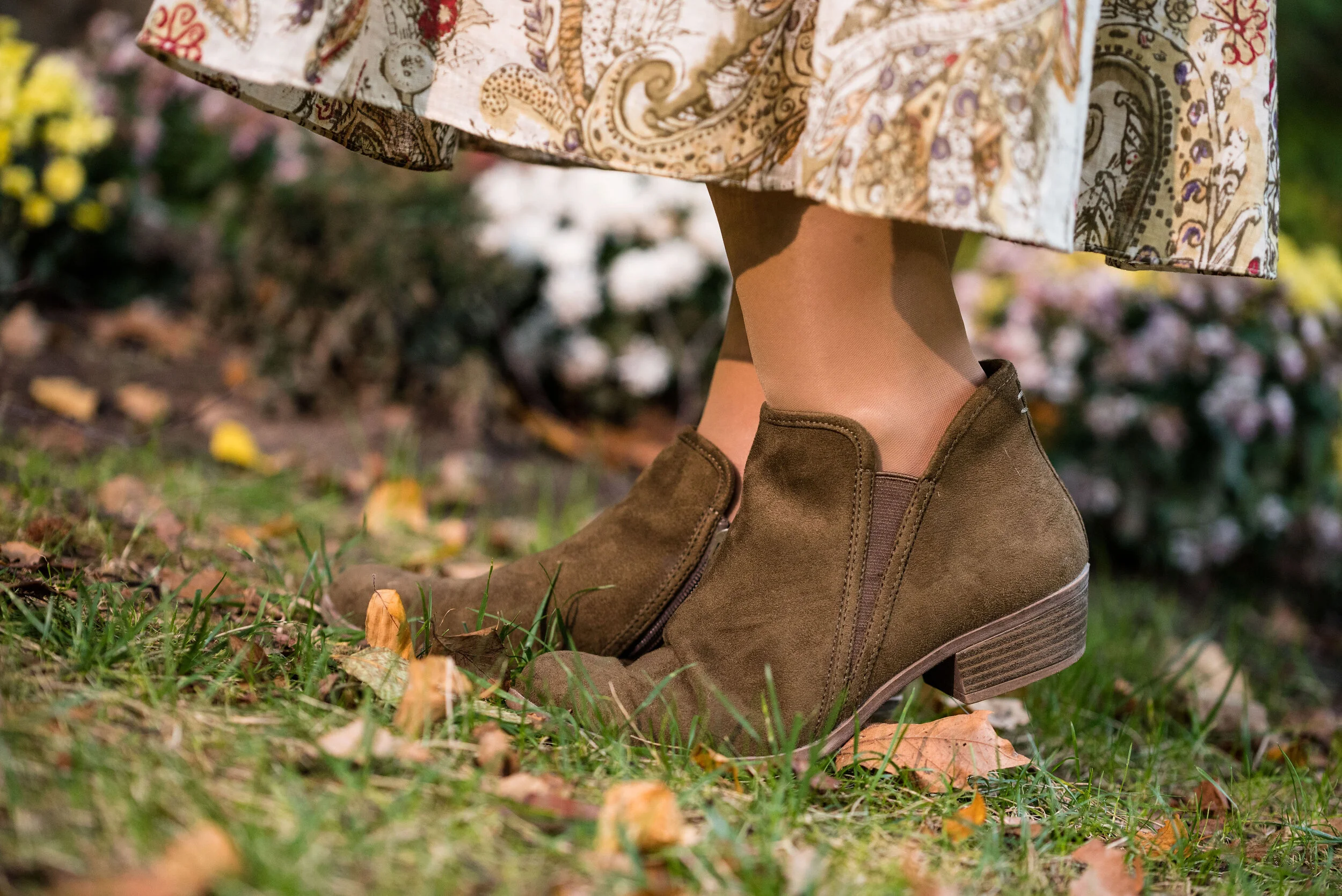
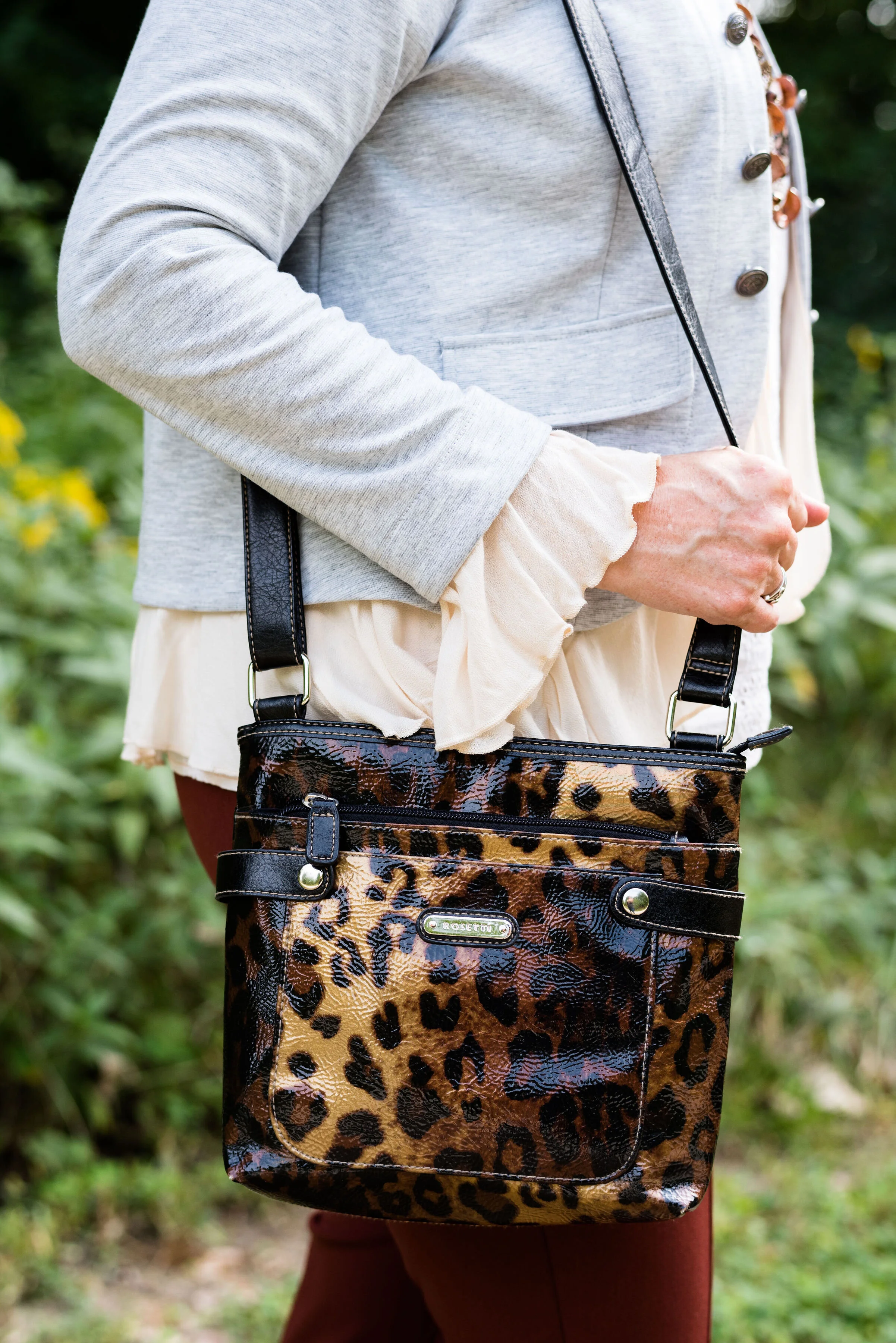
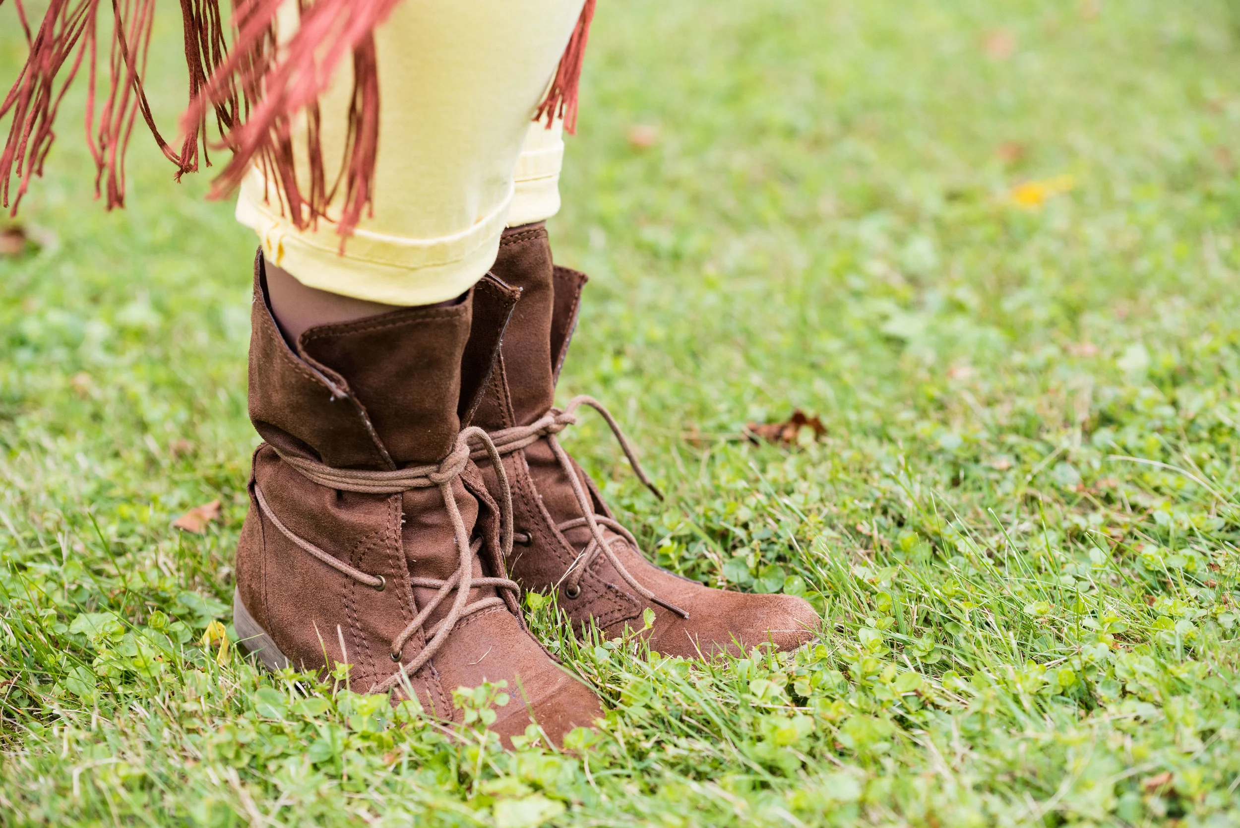
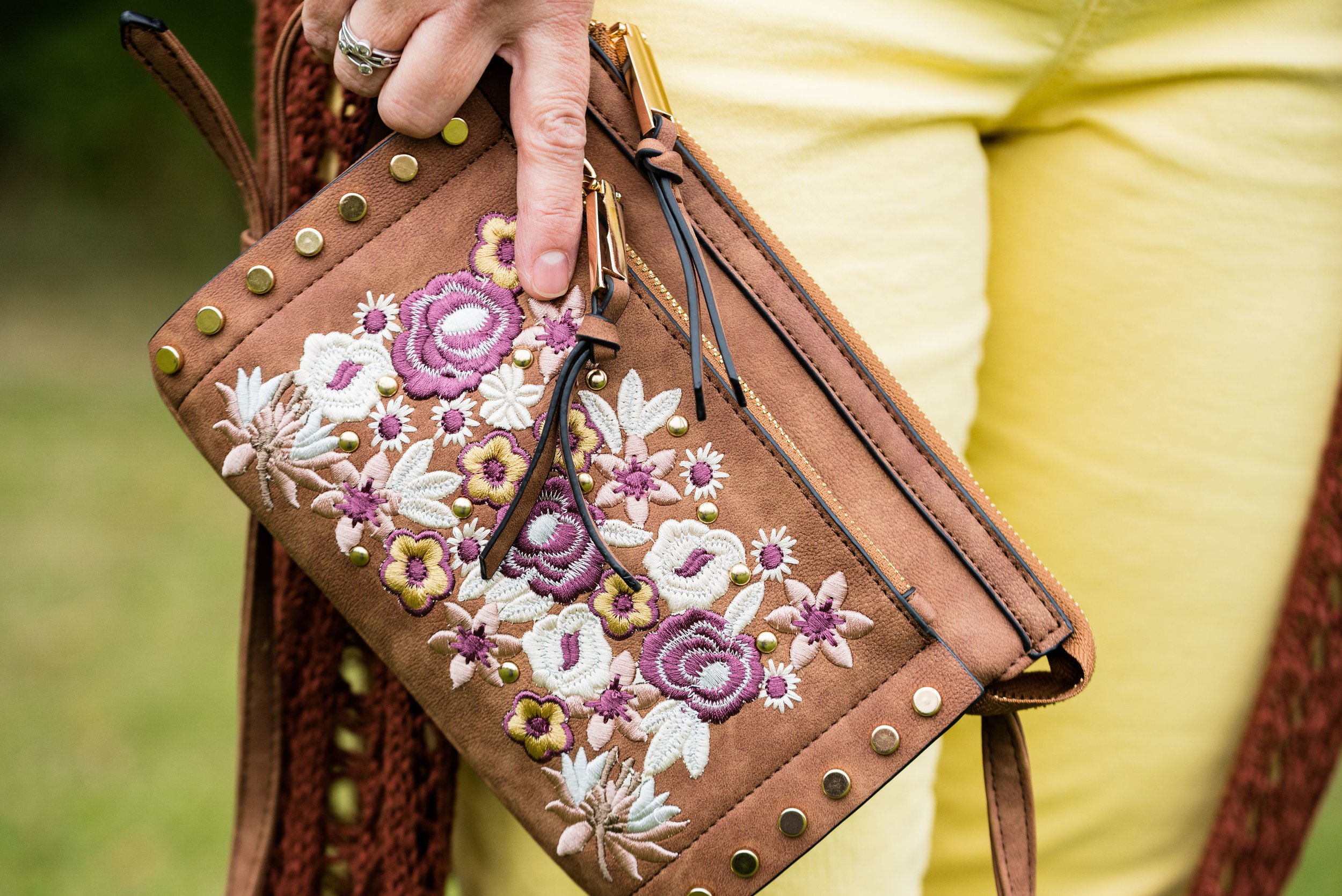
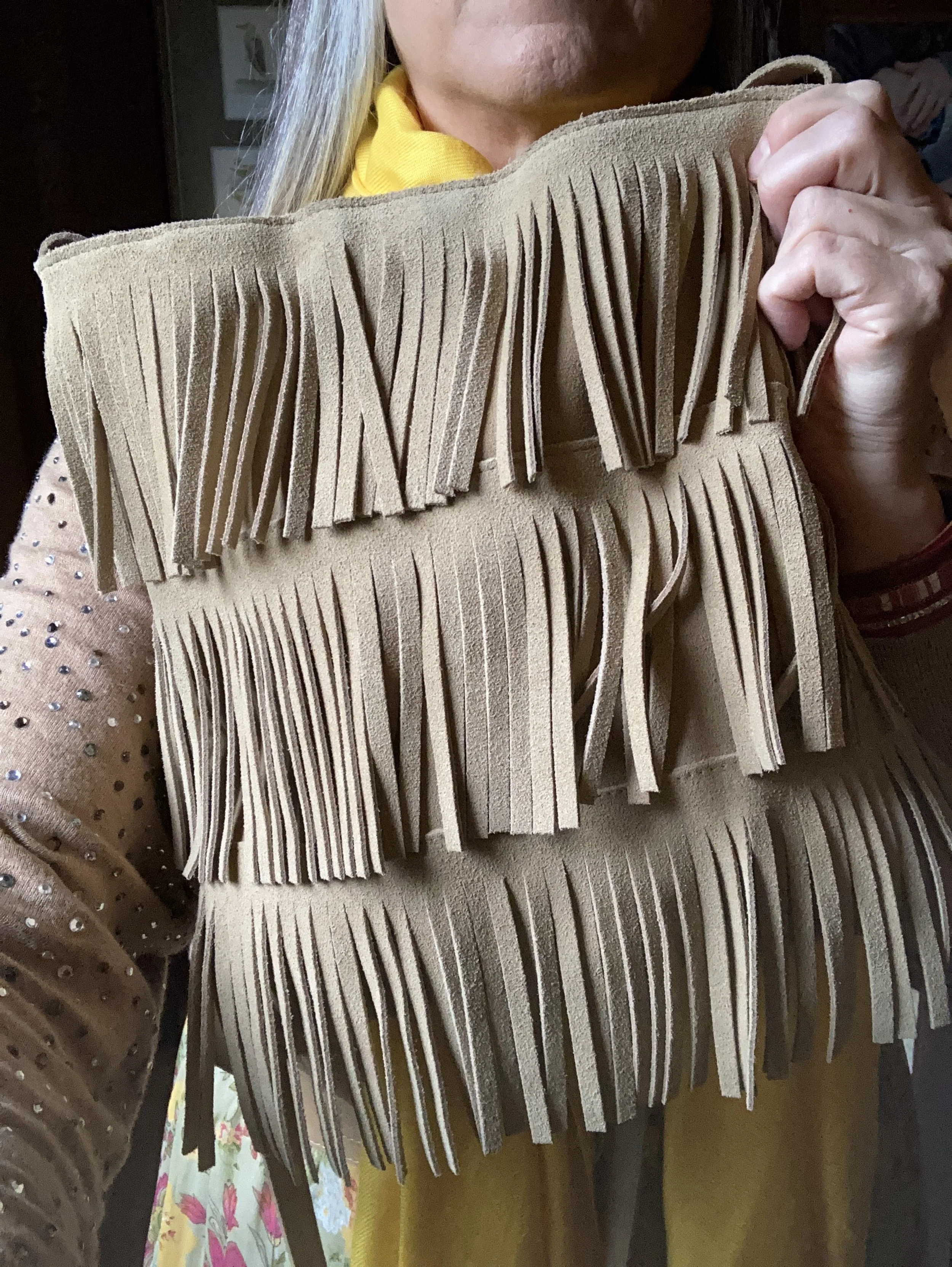
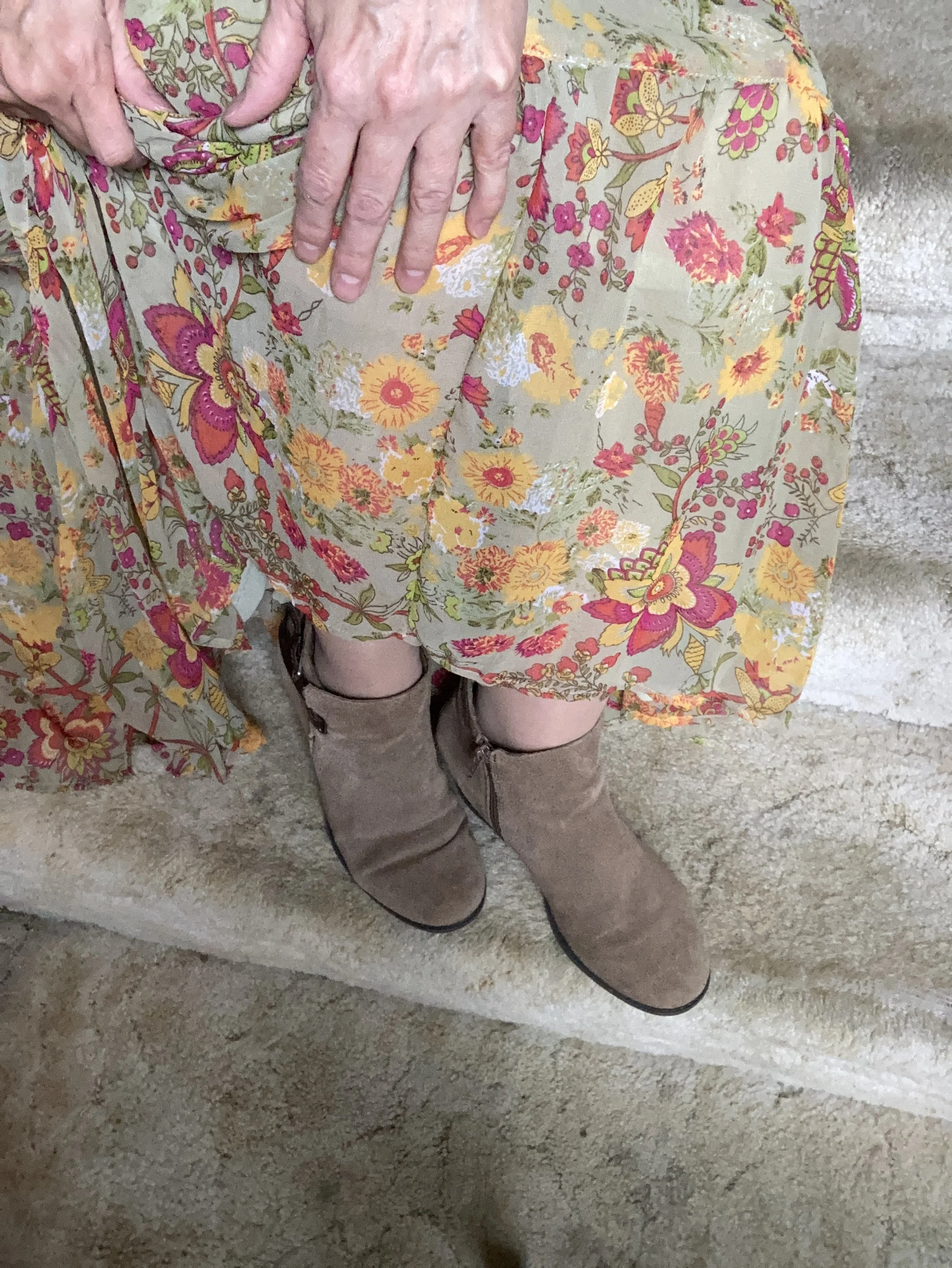
I added the thrifted fringe bag, and my older suede ankle boots which have a low heel helping to keep the skirt off the floor.

What do you think of this outfit? Do you like the combination of bright colors with more neutral colors? What would you do differently? I love to hear your ideas and thoughts, so leave me some love in the comments.

I hope you enjoyed this outfit featuring the Pantone New York Palette colors: Rose Violet, High Visibility, and Doe.

No shopping links this week, but I hope you are having a great day and a good week. Check back next Tuesday for another outfit post.

What I Wore to a Fall Wedding (or a Great Thanksgiving Outfit)

I see numerous bloggers do posts on what to wear to a wedding according to whatever season it is. Since I was actually going to a wedding, I figured it would be good content for a post. The wedding was at night and it was a very cold evening, so those factors contributed to my outfit choice.

I knew I was going to wear pants instead of a dress, but initially I was thinking black, as it is typically a more classic color. However, I saw this recently thrifted Eva Mendez floral blouse in my closet and thought it would be a pretty piece to build a dressy, but warm and comfortable outfit around.

I just loved the pussy bow tie on this piece and its pretty floral print. It is sheer, so I added a dark cami underneath for coverage. Once I chose the blouse I started looking at my pants. I have a black pair, and I think that would have worked as well, but I decided on the brown Worthington wide leg.

After I had the top and pants figured out, I knew I wanted a sweater or topper of some sort. Once again I was thinking about a black sweater or even a light pink one, but neither of those seemed the right choice. Then I remembered another more recent thrift find.

I love the duster length, the rusty color, the drape, and the lighter weight of this A New Day sweater. It makes a great layering piece and it was perfect for giving me an extra layer of warmth without making me too hot.

Besides my belt, the only accessories I had were my boots and my bag. The brown suede ankle boots were a Kohl’s purchase a couple years ago and are Nine West brand. They have a bit of a western vibe with a shorter block heel and the pointier toe. Originally, I was going to wear my “witchy” boots from last week’s post, but because my knee has been painful, I decided to not take the chance of the taller heel making things worse.

My b.o.c. bag is a hand me over from my bestie. I really like the tritone color and the large metallic ring detail. It is also a bit smaller than some of my other bags, so less weight on my shoulders and neck. I typically wear a longer bag like this as a cross body bag.

This outfit would be great for work, a night out with your significant other or going to church. This also would be perfect for your Thanksgiving Day celebration. In all honesty, when we got to the wedding, I felt a bit underdressed, but at least I was warm and comfortable. Since we were not family of the bride or groom, I didn’t feel too out of place with all the suits and dresses. Ha, ha.

To top everything off, and to stay warm, I finished the look with my ESpirit Outerwear, brown, wool, winter dress coat. This is another thrifted piece and I keep it around for just this type of occasion: to look fairly nice and also be warm.

What would you wear to a fall wedding? What do you think of this outfit? Would you wear this? How would you change it to make it your own? I’d love to hear your thoughts, so leave me a comment or two!

I hope you all have a wonderful Thanksgiving Day!

Pantone Autumn/Winter 2022 - New York Palette: Waterspout, Midnight and Loden Frost

Today’s Pantone Autumn/Winter colors include a bright blue, a dark blue and a light green. Waterspout is a bright aqua blue which seems an odd choice for an autumn palette, but the color gurus will do what they do, and actually it is rather nice to have a few brighter, lighter choices as the days get shorter and the skies begin to gray. Midnight is not really like the midnight blue crayon we all had in our big boxes of Crayolas growing up, but perhaps more like the night sky just after the sun sets, but before the stars start to come out. Loden Frost is a sage green with a little bit of depth and richness.

So far in this series, I think this is my favorite outfit. I like the combination of blues and greens and thought it was an appropriate look for a warm fall day.

I’ve styled this thrifted dress before on the blog. I have had it for years and it is getting a little snug since all my weight has done its post menopausal thing and moved to my mid section. Ha, ha. But that is the beauty of layering. You don’t notice it as much. This is a brand called Oliva Rose, however, there are numerous brands out there with that name, so I have no idea where it originated.

I found this Maurice’s brand sweater at a thrift store. I really like Maurice’s, but I try to stay out of that store. They have so many cute things every season. I like their tees, tops and jeans, but I wait for good sales and coupons, because things cost more now than ever. I am also really trying to curb my buying all around.

My sea turtle scarf is from the dollar store. Back when my oldest was pregnant and we were putting together the shower the theme was Sea creatures. I found a few cute scarves for game give aways and this was a left over. My necklace was a product of two different thrifted pieces that ended up breaking, so I put them together.

My olive Fossil hobo bag is also thrifted. It is another work horse in my closet and is continually in and out of rotation. Fossil brand is a good quality brand and while I never buy them full price, I do love when I can find one on clearance or at a thrift store. This one is a great utility bag with multiple pockets and compartments for everything you need.

I found these navy boots last year online at Kohl’s. They are Journee brand. I am not too adventurous when it comes to my boot colors. I like browns, black, and gray, but I thought it would be nice to have a navy pair, specifically of knee high boots, for a different vibe. Do you like your boots to be a more basic color, or do you like a bright, bold look for your feet?

I hope you enjoyed this post. Let me know what you think of these colors. I am including a few shopping links. These are affiliate links. When you click on a link, I get a few pennies. When you purchase the item through the provided link, I get a little bit more. I appreciate all you clicks. All opinions are my own.

I hope you are having a great week.

Pantone - Autumn/Winter - 2021 - New York Palette: Adobe, Rhodonite and Olive Branch

Due to my illness, I have neglected this little blog for a few weeks. While we are still trying to get all symptoms under control and actually find diagnoses for said symptoms, I hope to be able to get back to some semblance of regular posting, so please bear with me. To all of you who have been so supportive and loving on Facebook and Instagram, thank you. Your kind words, thoughts and prayers have been so appreciated.

The last two colors on the New York Palette for the Pantone Autumn/Winter series are my favorites. Adobe is certainly what I expect on a fall color palette and Rhodonite is a completely different blue, that I think works fabulously for the fall season. Once again, I am using Olive Branch as my classic color. As I have mentioned before, olive works well with so many other colors, and makes the transition from one season to another, smooth and seamless.

Adobe.jpg

These thrifted Michael Kors jeans might be just a smidge lighter than Adobe, but I think they work quite well. I know the world is saying skinny jeans are not in right now, but I like my skinnies and I will continue to wear them. Sure I will wear other silhouettes as well, but I especially favor skinnies in the cool weather to wear with boots.

pantonefallcolortrendsadobe-1.jpg

The dark blue tunic top, is an older Christopher and Banks piece. After I put the outfit together, I realized the tunic is less like the Rhodonite color, while the bluish purple in the print of the jacket is a closer fit.

pantonefallcolortrendsadobe-10.jpg

My jacket is a thrifted Christopher and Banks piece. It fits similarly to a jean jacket and the print is perfect for bringing on all the fall feels.

pantonefallcolortrendsadobe-11.jpg

My thrifted olive bag is Fossil brand. This is a great piece if you want something you can throw all sorts of things into. Ha, ha. A hobo bag is a good choice for travel, as it easily fits into many different spaces and yet has plenty of room for all the goodies.

You can see in the previous two pictures, I kept my jewelry simple by adding a few olive bracelets and a string of olive beads.

pantonefallcolortrendsadobe-13.jpg

You’ve seen numerous pairs of SO ankle boots on the blog, because I have them in SO many different colors. Ha, ha. See what I did there? These are great little ankle boots for fall and work with jeans, trousers, skirts and even dresses. Apparently, the affiliate program I work with is no longer using Kohl’s as one of their retailers, so here are links to the Kohl’s website for a few different styles of ankle boots. Here is the Averyy, the Chantilly, and the Barb 2. These are not an expensive boot, and that is one of the reasons I like them. They also still look pretty good after a number of seasons, but then, I don’t wear the same pair every day. I am not getting any sort of compensation to recommend these boots, I just really like them.

pantonefallcolortrendsadobe-7.jpg

What do you think of these colors? Do you like this outfit? Let me know your thoughts by leaving me some love in the comments.

I’m including a few shopping links, although it was very hard to find this color in the pants. Anyway, these are affiliate links, brought to you at no extra cost. If you purchase something through one of my links, I get a few cents. You are not charged any extra to make a purchase through my blog.

Photo credit Jessica Trumbull with Rebecca Trumbull.

Pantone - Autumn/Winter - 2021 - New York Palette: Mykonos Blue, Spring Lake and Coconut Cream

It seems that every Pantone color palette that comes through the Institute has at least one, if not two blues on it. Blue is a color that everyone can wear, whether you wear dark classic navy, casual comfortable chambray or tropical hues that take you to the beaches of the Caribbean. I have a lot of blue in my closet, but then, I have a lot of every color in my closet. Ha, ha. Blue is great for pairing with many other colors. I pair denim with every color and denim definitely falls in the range of blues. Today’s blues are wearable and most likely already in your wardrobe.

SpringLake.jpg

My colors did not really line up with these blues. Oh well, that is part of the challenge of doing this series. I don’t always get the match spot on, but that is okay. The point is to take things you already have and do something similar. It doesn’t matter if your blues are a perfect match or not. All of these pieces were things I already had.

When I picked out these pieces I really thought the pants and the vest would have matched better to Spring Lake, but now looking at the picture the pants seem to match better with the Mykonos Blue. The vest, which does seem to lean a little bit toward a gray undertone, was too dark to match the Spring Lake color. However, the patches on the pants seem to lean a little more in that direction.

pantonefallcolortrendsspringlake-2.jpg
pantonefallcolortrendsspringlake-20.jpg

The vest is a thrifted Relativity piece. I have styled this on the blog before. You can see it worn with a graphic tee. The jeans which I have styled on the blog before are thrifted and a brand called Est. 1946 Denim. You can see how I wore them with a graphic tee and cozy sweater here. Looking at the above picture, I should have rolled up the cuffs on the jeans.

When you have an asymmetrical vest with fringe, you just have to twirl!

My yellow mini floral print button down is a thrifted Old Navy piece. I decided to leave it completely untucked to add to the ultra casual vibe of this outfit.

pantonefallcolortrendsspringlake-5.jpg

I was trying to go for the Coconut Cream idea in my accessories, but again, things didn’t match up exactly. My bag was a hand-me-over from my daughter. This Miche brand bag actually has interchangeable outer shells, so for this look I used the cream colored one.

pantonefallcolortrendsspringlake-14.jpg
pantonefallcolortrendsspringlake-16.jpg

My sneakers are thrifted Mossimo.

pantonefallcolortrendsspringlake-17.jpg

What do you think of these colors? Do you like to wear blue? What color blue is your favorite?

pantonefallcolortrendsspringlake-8.jpg

Thanks for following along with the blog. I appreciate all of your clicks, likes and comments.

I am including a few shopping links for you to look over. These are affiliate links. All opinions are my own.

Have a great day.

Photo credit Jessica Trumbull with Rebecca Trumbull.

Pantone - Autumn/Winter - 2021 - New York Palette: Illuminating, Fire Whirl and Ultimate Gray

Over the weekend, I became grandmother again. My oldest daughter had a little boy and we are very excited to meet him, as soon as we can. Obviously, with all the restrictions for visitors in the hospital, we were not able to meet him before he came home.

I am going to being this Autumn/Winter series, as I usually do with the New York Palette. It wasn’t until recently that the Pantone entity added the London Palette to its long list of color tools. Today’s outfit revolves around the two Colors of the Year, the sunny yellow, Illuminating and the classic gray, Ultimate Gray.

FireWhirl.jpg

In all honesty I was having a hard time putting the outfits together for this series. I think most of it had to do with being plagued by this stupid sinus stuff and cough for so long. I am finally sleeping in my bed again, but I still have a wheezy, chronic cough. We’ll see how long it takes to get some sort of resolution, or maybe it has moved in permanently, but it is a pain. It is hard to have long conversations and I cannot sing at all, not that I really could before I got this cough, but it was better than now. Oh well, life is just that way sometimes.

The other problem I think I was having, was the weather. It was so hot, I was having a hard time really getting into styling fall outfits. I love fall, and am excited about that change, but it has just been slow to actually feel like the season to wear layers. Here in my area, by Wednesday, the highs are only going to be in the 50’s. That definitely feels like fall.

pantonefallcolortrendsfirewhirl-3.jpg

You can see that I only used Illuminating in very small doses with my yellow beaded necklace and bracelets. The Fire Whirl red tank top is a thrifted Loft piece. It is actually more of an a-line or swing silhouette, so I gathered the shirt underneath in the front, then secured the little “pony tail” with a hair band. The result is to give the top a more fitted look with a fun swirl at the front.

pantonefallcolortrendsfirewhirl-12.jpg

For this outfit, it worked out that Ultimate Gray takes center stage with just a few pops of Fire Whirl and Illuminating. My thrifted, plaid, Sag Harbor trousers are actually petites, so I expect they would be closer to an ankle pant than a crop pant, but I like the way it looks, especially with my darker gray Impo booties.

pantonefallcolortrendsfirewhirl-11.jpg

The next picture shows you a closer look a the Illuminating jewelry and the detailing on the yoke of the top. The gray moto jacket is a no name brand and I am not sure where I got it. I wanted to say it was thrifted, but for some reason, I think I bought it at a store. I really cannot remember. Is that bad? Ha, ha.

pantonefallcolortrendsfirewhirl-8.jpg

My tote bag was going to be a gift for one of my daughter’s one Christmas a few years ago and I ended up keeping it. Many times, I just end up buying too many items, so I have to return stuff, but this was a cheap purchase, I believe from Kohl’s and I really liked it.

pantonefallcolortrendsfirewhirl-9.jpg

Fire Whirl is more the color of my top, but I kind of liked the contrasting shades of red, as well as the two differing plaid patterns. It just gives the outfit a fun vibe.

pantonefallcolortrendsfirewhirl-1.jpg

What do you think of these colors? Would you pair these colors with one another? Do you have these colors in your closet? Let me know your thoughts in the comments below.

I am including a few shopping links for you to look over. These are affiliate links, brought to you at no extra cost. If you click on a link, I get a few cents, if you purchase something through my site, I get a little more. Thank you for all of your support.

Photo credit Jessica Trumbull, with Rebecca Trumbull.

Pantone - Autumn/Winter - 2021 - New York Palette: Intro

Here we are again, looking at starting another Pantone series. As we quickly ride out these last few weeks of summer most of us are already thinking about fall. We are anxious even, for our layers, cozy sweaters and boots. We like the idea of putting on a jacket as the evening cools and watching the leaves change from their varied greens to their beautiful reds, oranges and golds.

This autumn the Pantone New York palette contains a variety of colors that are both bright and light with a few that are more what we tend to say are traditional fall shades. In addition to rusty brown and fierce red, we also have a light pastel pink, a soothing green and three very different shades of blue. Illuminating and Ultimate Gray grace both the New York and London palette as they continue their year long stint as colors of the year.

NYGraphic.jpg

I hope you will join me as I begin the series next week. Hopefully I will be able to inspire you with color combinations that are slightly outside the box, but still stylish and fashionable.

Here are a few sneak peaks at what is coming up.

pantonefallcolortrendsfirewhirl-7.jpg
pantonefallcolortrendsspringlake-19.jpg
pantonefallcolortrendsfuchsiafedora-9.jpg
pantonefallcolortrendspalerosette-9.jpg
pantonefallcolortrendsadobe-12.jpg

Have a great week everyone!

Photo credit Jessica Trumbull with Rebecca Trumbull.

Thinking About Fall - Transitional Style - Lightweight Skirt

When we start thinking about fall, we are probably starting to yearn for our cozy sweaters, scarves and boots. As the weather begins its journey through the waning days of summer we know the days will still be plenty warm, but the evenings might start cooling off, especially after the sun goes down. That is a good time to think about layers. Why not pull out a few of your medium weight sweaters and a couple pairs of ankle boots and start using them, even though the start of fall on the calendar is not for another month?

Today’s outfit revolves around a light weight skirt that I picked up just a few weeks ago at Kohl’s on the clearance rack. It is obviously from this past spring, perhaps even related to Easter style, so I thought this would be a good piece to take from warm summer day, to cool weather appropriate with just a few simple changes.

DSC_0077.jpg

For a cute, breezy, summer look I thought this Chaps plaid skirt would pair well with a fun graphic tee. You have see this thrifted No Boundaries tee on the blog before. You can see it styled with a denim pencil skirt, and a fringe vest. Isn’t it funny that I did the front knot with the fringe vest as well? The shirt is a little over sized and very stretchy, so knotting it is easy. The skirt is not lined, but I wasn’t going anywhere and it is not sheer, so unless I had on a pair of dark panties, there was no show through worries.

DSC_0088.jpg

I wanted to highlight the pink and the white letters in the tee, so chose pink and pearl accessories.

DSC_0086.jpg
DSC_0083.jpg

I thought the Steve Madden white tennis shoes a good choice to keep the look fun and casual.

To make the transition to cooler weather, I once again reached for the color brown. I love brown in the fall. My husband likes the color brown on me, so I have been trying to incorporated it into a year round color, but it is often hard to find. For this look, instead of a jacket I chose my cozy, thrifted Old Navy cardigan.

DSC_0091.jpg

Once again, I chose a more chunky necklace with shades of brown, gold, and coppery bronze. I really wasn’t sure how I felt about this look, but now that I see it, I like it. Brown and pink are always a winning combo and the contrast of the gray tee gives it interest and keeps it from being overly two-toned.

DSC_0096.jpg

I went with my taller Sonoma suede boots, because I liked the more slouchy look with this casual outfit. They give it a bit more of a boho vibe. Most of the boots I own, that I have bought new I got at Kohl’s. I like both So and Sonoma brand. They fit my feet well and allow room for socks or tights. They are ultra casual, but still make an outfit look polished and complete. I’ll provide a few shopping links at the end if you are thinking about a new pair for fall.

DSC_0097.jpg

My bronze cross body bag is another staple in my closet. I bring this one out every fall.

DSC_0098.jpg

Here are the two looks side by side.

Do you have a summer skirt that you would like to wear longer? What can you add to make that skirt still useable in the cooler weather? I’d love to hear your thoughts, so leave me a comment or two.

I’m including a few shopping links. These are affiliate links. All opinions are my own

Have a great Tuesday!

Fall/Thanksgiving Outfits - Sweatshirt and Skinny Jeans - Casual

For the next few weeks I thought I would focus on outfits that could be worn for the Thanksgiving Holiday, or just as another fall outfit. Each week I will take one or two main pieces and show how to style them two different ways. This week my pieces are a pair of embellished skinny jeans, and a deep yellow sweatshirt that I grabbed from my daughter’s "to get rid of” pile.

For today’s look I wanted to go with a more casual vibe. The two pieces could be worn by themselves and be perfectly acceptable for a casual, low key Thanksgiving; just add a scarf or necklace and some sneakers or knee high boots and you are all set. I wanted to do something with a little more texture and print, so I decided to top the whole outfit with my plaid ruana that I got last year at Bass Pro Shop. It may sound a little funny, but I love their clothes. They have a little higher price point than I usually pay, but you can read the story of how my hubby surprised me with a mini shopping spree here.

Deep yellow sweatshirt, skinny jeans and plaid ruana

It is always a journey taking my own pictures. Ha, ha. Here is the ruana from more of a back and side view.

Dark Yellow sweatshirt, skinny jeans and plaid ruana

This rich yellow sweatshirt is from a local boutique Eden Fashion Boutique. I did a blog post on their Sylvania location which you can see here. Unfortunately that shop closed up during the pandemic. The original shop is still in business in Bowling Green, OH which is about a 25 minute drive. My daughter decided she didn’t wear it enough for it to warrant taking up space in her closet. I absolutely love color. It also has snaps from about the elbow up on both sleeves, which gives it a fun look. I should have taken a picture of it without the ruana. Oh well! I’ll save that for another time.

Yellow sweatshirt, skinny jeans and plaid ruana

You can see the blingy embellishment on my jeans. There are sparkles on both legs, the right is closer to the hip. These are Juicy Couture brand and I got them a year or so ago at Kohl’s on the clearance rack.

Since I wanted this to be casual, but it is also meant to be for an occasion like a Thanksgiving dinner, I added a little bit of jewelry and a bag to bring out the blue in the ruana. My long pendant necklace I use regularly. The beaded bracelet has a cute owl charm on it and the blue cross body bag was a gift a few Christmases ago from my younger daughter.

Fall outfit - blue pendant
Fall outfit - Beaded bracelet with owl
Fall outfit - blue bag

These rusty colored moto boots are a soft faux suede and have zippers on the inside of the leg. They are Steve Madden brand and I ordered them from DSW last year on clearance.

Fall outfit - rust moto boots

What do you think of this outfit? Would you wear this for a casual Thanksgiving day gathering? What might you have done differently? Leave me your thoughts in the comments. I always love to hear what you are thinking and how the blog is helping or hindering your fashion journey.

Dark yellow sweatshirt, skinny jeans and plaid ruana

This last photo is very fuzzy, but I liked the way it turned out anyway. Ha, ha. I really need to play with my camera more, so I can take better pictures. I am also a perfectionist, as if you hadn’t noticed. Ha, ha.

I’m including a few shopping links. Remember, Christmas is coming, so you might like to look over these links as possible gift ideas for you or yourself. These are affiliate links. All opinions are my own.


Pantone - Autumn/Winter - 2019 - Crabapple and Forest Biome

The next two colors in the Pantone - Autumn/Winter - 2019 - London Palette are Crabapple and Forest Biome. I grew up with crabapple trees in our back yard and I thought they were one of the prettiest of spring’s trees. We had a pink and a white, and they had a glorious scent that just floated on the air. Obviously this Crabapple color is meant to mimic, not only the pinky flowers, but the tiny little fruits that hang from the branches. As for Forest Biome, we know that it is a dark green, but I had to look up the word biome, to fully understand it. A biome is an ecological community system, such as a rain forest or dessert. Forest Biome, then would refer to an area of forested land probably brimming with pines and cedars and perhaps a few deciduous trees. Wherever they come up with the names for the colors and just what meaning they had in choosing the name, we don’t really need to know, but it is fun to think about.

My Forest Biome is a little more blue and my Crabapple is a bit more pink than their colors, but again, you get the idea. I thought Evening Blue would be a good classic color to pair the other two colors with.

This was a neat little sitting area at the Toledo Botanical Gardens where we took the pictures for this series. I’d love to have a patio like this with an English type garden all around, and fun outdoor furniture, but I have neither the resources, the time or the energy. They always say you will find time for the things you really want to do, but I think it would be more accurate to say, we can always find time for the things we know we should do. Ha, ha. My Grandson is a priority. Picking him up after school and hanging out with him when he has a day off are priorities. Do those things cause other things to be put off or put on the back burner? You bet, but that is what I choose to do because I love him and my daughter. What we really need to do, is stop beating ourselves up for all the other things we are not able to get to.

My jeans are W62 brand from dressbarn. They are very comfy and contain a good amount of stretch. I wear these again and again for work or when I just want a different color skinny jean.

This thrifted, embellished, 3/4 length sleeve top is Dana Buchman brand. I do love the swirling pattern and glistening sheen of the front portion of the top. The sleeves and the back are more like a plain jersey knit.

The dark navy vest is really a belted dress that I found at a thrift store a while ago. It is Issac Mizrahi brand and if I was thin enough, I might consider wearing it as a dress, but it works beautifully as a vest. What do you think?

I went with a little metallic bling with my accessories including a rose gold pendent and bracelets, a Madden bag that I got on clearance at Kohl’s and my SO heeled boots, which were also a clearance purchase at Kohl’s.

What do you think of these colors? Would you wear an outfit like this? I’d love to hear from you.

I’m leaving you with a few shopping links. These are affiliate links. All opinions are my own.

Have a great weekend.

Photo and graphic credit Rebecca Trumbull.


Pantone - Autumn/Winter - 2019 - Butterscotch and Grapeade

Today’s outfit features two colors from the London Autumn/Winter palette that Pantone describes as a “deliciously appealing golden yellow” and a “notable muted mauve tone.” You might wonder why I would pair purple with yellow. There was just something about this combination that I loved and when I paired them with the printed maxi skirt, I felt I had a winning outfit. Take a look.

This outfit says several things. First, it says I’m not afraid to try unusual color combinations. Second, it says you can make up your own style. The short sleeve sweater with a cardigan topper is a more classic combination, but the medallion print skirt, beaded jewelry and fringe bag scream boho. Let’s talk details.

The purple short sleeve sweater is a thrifted Loft piece. I like the scoop neck and it has plenty of stretch, but still holds its shape. I also love purple, which is trending this fall.

The Butterscotch thrifted cardigan is a brand called Callaway. When I looked it up, it appears to be a clothing brand for golfing, selling things like polo shirts, pants, jackets and other golf related pieces. The brand also has their own website which features golfing equipment like drivers, putters and bags. Neither my hubby, nor I play golf. He calls it “cow pasture pool.” He’s always got a name for everything. You can see Callaway clothing on Amazon, and on their own website, Callaway Apparel.

I may not be a golfer, but I know a quality sweater when I see one. I love the women’s fit of this cardi and the ruffle treatment around the neckline. It makes the sweater very feminine and fun.

I’ve styled this medallion print Roz & Ali brand skirt on the blog before. I got this at Dressbarn a few years ago. While it is a summer weight skirt, it is fully lined, so good for cooler temps and if you pair it with leggings or heavy tights you could wear it all winter. You can see how I paired the skirt with both an orange tank and a gold top here, and with another lighter purple color here.

In keeping with the boho feel of the outfit, I went for a hand crafted look with my jewelry and bag. The necklace was actually made by my oldest. She was into beading as a teen and made some fun pieces, of which I still have a few.

This beaded bracelet was probably a Kohl’s or JCPenney piece from the clearance rack. I’ve had it for a while, so I don’t remember.

I found this fringe bag at a thrift store and knew I had to have it. It looks like it was hand made and there is no label inside. I like that it is a neutral color and long enough to be a cross body bag.

My ankle boots are another thrift store find and I thought paired well with the boho theme of the outfit. These are a brand called Rock Candy by Zigi.

What do you think of these colors? Do you have these in your closet? Would you wear yellow and purple together? I’d love to hear your thoughts. Leave me some love in the comments.

i’m including a few shopping links for things purple and yellow. The holidays are coming up. How many of you have started your Christmas shopping? I’m guilty! Life is so busy, I can’t afford to wait until the last minute. These are affiliate links. All opinions are my own.

Photo and graphic credit Rebecca Trumbull.


Pantone - Autumn/Winter - 2019 - Merlot and Antique Moss

The first two colors from the Pantone - Autumn/Winter - London palette that I am featuring are Merlot and Antique Moss. As you can imagine, Merlot, like the wine is a rich burgundy red, while Antique Moss is a yellowy green. Often when we think of pairing red and yellow, we are concerned we will come out looking like an advertisement for McDonald’s, but let me reassure you these two colors pair in a perfectly un-Ronald like way and I love the combination.

The London color palette classic colors were just a bit different. Green Olive is comparable to Guacamole from the New York palette, with a little more of a gray tinge. My version of olive in my accessories is much darker, but you get the idea.

This Jones Wear skirt you’ve seen on the blog before. I styled it for the Pantone Fall 2017 New York Palette in a very similar fashion. I even used the same dark olive bag. Ha, ha. You can see that post here. I also used it this past spring for the Pantone Spring/Summer 2019 colors. You can see that post here. In addition you can see it with a green cardigan, here. I keep coming back to this skirt, because it works so well for these color schemes due to the reds and greens in the print of the skirt. I could easily used this printed skirt for a Christmas outfit as well, so you might see it come up again later this year. I love a versatile piece and when I purchased this skirt, I never knew how often I would use it for the blog.

We took the pictures for this series at the Toledo Botanical Gardens, which are just down the street from where my daughter lives. The gardens are beautiful in all seasons and with walking paths through the grounds, it is a lovely place to visit and I don’t do it nearly enough. In the picture below, I am watching several bus loads of kids scramble on to the grounds and thinking, “Oh boy!” Ha, ha.

I obtained this red scarf from a friend’s closet. It looked a little more like Merlot, when it was in the low light of my closet, but here it looks much brighter. However, It is not a true red, but more of a burgundy. My 3/4 sleeve tee, I’ve worn on the blog before too. It is a thrifted Sonoma piece and has elastic on the bottom, which allows for freedom of movement and bulge camouflage. Ha, ha. You can see the tee styled with boyfriend jeans and a leopard print skirt here, and with a snakeskin print skirt here.

As I said earlier, I opted for olive green accessories which included my necklace, bracelets, thrifted bag and SO booties.

What do you think of these colors? Would you wear either of these? Would you wear them together? I’d love to have your feedback. Your support means a lot to me. I always respond to your comments. Just check back in a few days if you are interested in my reply.

I’m including a few shopping links for Merlot and Antique Moss if those colors got you excited. These are affiliate links, which means I get a few cents when you click on a link. All opinions are my own.

Photo and graphic credit Rebecca Trumbull.


Pantone - Autumn/Winter - 2019 - Crème de Pêche and Rocky Road

I am not sure how the Pantone Color Institute decides the colors they are going to feature for each of their palettes. If you have been following me for a few years now, you can probably tell that many of the colors that appear on the palette are very similar to another season’s palette and are just called a different name. For example Tuesday’s Galaxy Blue was very similar to last spring’s Princess Blue.

Today’s outfit features two colors called Crème de Pêche and Rocky Road. Once again, my versions of the colors, do not look much like the Pantone colors, but it still gives us inspiration to pair to fall type colors together and pull it all together with a light gray.

My Chico pants look much more orange in comparison to the Pantone color swatch, but I do like how this pair of pull on Ponte knit pants looks combined with the light peach top.

The light peach eyelet top was a thrift find and I wear it a lot in the warmer months. You can see a closer look at that and the necklace I chose in the picture below. I thought the necklace was a good compliment because of its similar colors.

This light gray, About A Girl, jacket was a fun find on the Kohl’s clearance rack. I like the military vibe of the buttons, but the surprising feminine detail of the ruffles on the hem and sleeves.

Another Kohl’s clearance find, I got these Sonoma boots at the end of last winter season. They are a faux suede and a different look that some of my others boots. I love the slouchy and buckle details. Yes, I do have too many pairs of boots, but can a woman who lives in the midwest, have too many? Ha, ha.

Here is the thrifted Rosetti leopard cross body again. I am planning on making this my “normal” every day bag, as soon as I get around to changing things over. How many of you change your purse on a regular basis? I have many more purses and bags than I actually use. I use them for the blog, so you can see the different styles and shapes, but more often than not, I carry a cross body bag like this. It is just so convenient for hands free shopping.

Here are a few more pictures. I really liked these photos, especially with the large rock and the yellow flowers in the background.

Although my colors were off, I hope you enjoyed this outfit. Do you have a favorite pair of boots you like to wear? What color are they? What do you think of these colors from the Pantone palette? Let me know your thoughts in the comments.

I hope you have a wonderful weekend!

Photo and graphic credit Rebecca Trumbull.

Pantone Fall 2018 - Limelight, Mellow Rose and Meerkat

Of all the colors on the Pantone Fall 2018 palette, I felt Limelight and Mellow Rose were the least fall-like colors. Once again, I had to think outside the box when pairing these two light pastels together, to make the outfit seem more in keeping with a fall theme. In order to do this, I thought it would be best to pair them with Pantone’s classic color, Meerkat. Meerkat is a warm, orange brown and while it could be used in any season, It makes me think of fall leaves, bonfires and warm apple cider.

Mellow Rose is actually one of two colors that is only found on the London Palette. I am not sure why they added this and Crocus Petal, the two extra colors on their palette, but they are light, airy and more spring like. Maybe it was an attempt at bridging the gap between the seasons and reminding people that the old rules are gone and colors are seasonless.

All of the pieces in this outfit were thrifted except the bag and the boots. The Limelight colored jeans are Talbots brand and are really an ankle pant that I rolled up, so they stop at the top of my boots. The Mellow Rose button up is Izod brand and the long fringe knit vest is a brand called Sun and Shadow. I’ve styled this vest several times before. You can see those posts here and here.

I don’t remember where I got the belt, but I thought it tied in with the boots and bag quite well. I just did a front tuck with the shirt.

This bag I got at Meijer and I am not sure of the brand. It is a nice cross body bag and the embroidery on the front adds interesting color and texture. I think this can be used for all seasons.

These boots are a brand called Sugar and I got them at Kohl’s a few years ago. They are made of a suede type material and add a different look to an outfit because of the single, long, wrap tie.

I just added a simple bead and metal necklace and a bracelet for jewelry. This might be fun with a scarf or even some layered necklaces for a more bohemian look.

Here is a full length view of the vest from behind.

This is the second outfit in this series that I am not completely happy with. These colors are great, just not necessarily together, or for the season of fall. I know, I know, we can wear whatever, whenever, but if I’m not happy with it, then I’m not going to wear it. I’ve worn both of these pieces in the spring and summer. My color leanings are more bold and bright, but if you are a pastel kind of girl, then follow my friend Liz at With Wonder and Whimsy. She loves pastels and wears them all year round!

That’s all for today. Hope you are having a great Tuesday!


Pantone Fall 2018 - Russet Orange, Ultra Violet and Quiet Gray

This week’s Pantone Fall 2018 colors are a bright pumpkin orange and a deep purple we met last spring, that won Color of the Year. Russet Orange is an easy color on the eye and reminds us of those beautiful Maple trees that boast red, yellow and orange leaves. Ultra Violet might be part of your Halloween decorating. Since the combination of orange and purple has become a less dark and more party friendly Halloween pairing, I thought it would be fun to put these two colors together.

These pants I’ve worn on the blog before, here, here and here. They are Worthington brand from JC Penney. These have a side zipper and sit higher on the waist, so help to create a more smooth silhouette.

My top is an older tee from Christopher & Banks. I love the color of this top. To keep the bright colors from being too overwhelming, I chose the Pantone color Quiet Gray as a topper to polish off the look. This fun piece is from the Kohl’s clearance rack and is a brand called About A Girl. I really like the double breasted look and the feminine detailed ruffles.

I kept my accessories fairly simple. This lovely leaf necklace I found at a shop in Grayling, MI called The Main Branch Gallery. Boasting art work and crafts from local artisans it is a great place to visit if you are ever up that way.

I then finished off the look with my silver clutch and silver SO flats that I recently added to my SO shoe collection from Kohl’s. Here is a link if you are interested in other colors. They are on sale right now for only $21.99, which is a good deal for a fairly comfortable shoe that makes any outfit look a little more dressed up. I normally wear an 8.5 or a 9 and I get these in a 9.

What do you think of these two colors? Would you wear Russet Orange and Ultra Violet together? I’ve included a few shopping links below. These are affiliate links, but all opinions are my own.

Pantone Fall 2018 - Red Pear, Nebulas Blue and Sargasso Sea

Last week, I introduced you to this fall’s Pantone color palette. Now that I am just getting started with my series, I noticed their website already has the color palettes up for Spring 2019. I understand that in the fashion and interior design industries they always need to be one step ahead, or all of a sudden things have gone out of trend and disappeared. That reminds me of a verse from the book of Ecclesiastes which was written by King Solomon.

That which has been is that which will be,
And that which has been done is that which will be done.
So there is nothing new under the sun.
— Ecclesiastes 1:9 (NASB)

Even a man as wise as Solomon, knew there was nothing new under the sun. Look at the movies and books that are currently out. It is pretty much the same story, just written with different characters and a different setting. Heck, how many times have they revisited Spider Man and Predator? Ha, ha. That being said, the color palettes that come out are really nothing new. They call them by different names, make one a little more blue based or yellow based and say they are fresh and new.

However, I do enjoy color and I like to create outfits using color in combinations that may be new or different, at least for me. Following the color palettes that Pantone puts out each season allows me to do just that.

Here are the first of this fall’s palette.

Red Pear and Nebulas Blue are on both the London and New York palettes. Sargasso Sea is one of the classic colors or what I like to refer to as a grounding color. Red Pear borders on a maroon and my pants are really too red, while my version of Nebulas Blue appears spot on. Sargasso Sea is navy by any other name, but even there you can see all the different shades of navy. My Ralph Lauren thrifted blazer is almost too blue, while Sargasso Sea seems to have more gray in it. I think my loafer heels and bag are a little bit closer to the Pantone color.

I added this colorful bandana for a scarf as a way to bring together the red and blue and add a pop of yellow.

The blazer, shoes and bag were all thrifted. The bag is Simply Vera Wang; the blazer is Ralph Lauren and the loafer heels are Relativity. Everything you see in this outfit with the exception of the scarf I have styled on the blog before. It just goes to show that our closets are a great place to look for new color combinations and outfits.

What do you think of these colors? Do you think these colors represent the fall season? Why or why not? I’d love to hear your thoughts.

I have received a few messages that people are having problems commenting on my blog posts. If you an issue, please let me know. I contacted the help team for the platform that I use when I had a problem in the past and they said they couldn’t see any problem on their end. If you have an issue, please shoot me an email, so I can see how widespread the problem is.


I’ve included a few shopping links. These are affiliate links, which means I get a few cents if you click on it. All opinions are my own.

Pantone Fall 2018 - Introduction to the Color Palette

Once again, I am visiting the Pantone fall color palette. If you are unfamiliar with the Pantone Institute of Color, they are considered to be the leaders in color technology. Here is a quote from the About Us portion of their website.

Pantone provides a universal language of color that enables color-critical decisions through every stage of the workflow for brands and manufacturers. More than 10 million designers and producers around the world rely on Pantone products and services to help define, communicate and control color from inspiration to realization – leveraging advanced X-Rite technology to achieve color consistency across various materials and finishes for graphics, fashion and product design. Pantone Standards feature digital and physical color specification and workflow tools. The Pantone Color Institute™ provides customized color standards, brand identity and product color consulting as well as trend forecasting inclusive of Pantone Color of the Year, Fashion Runway Color Trend Reports, color psychology and more. Pantone B2B Licensing incorporates the Pantone Color System into different products and services, enabling licensees to communicate and reproduce approved Pantone values and improve efficiencies for their users. Pantone Lifestyle brings color and design together across apparel, home, and accessories
— Pantone website

There are two major cities in the fashion industry that put out their corresponding color palettes for each season. The graphic below shows a combination of the New York and London Fall palettes.

This year’s fall palette is a blend of traditional seasonal hues, soft pastels and pops of bright color making for an interesting color mix. You could pick one color from this palette or all of the colors and when combined with other seasonal trends such as animal prints, plaid and camo make amazing outfits that go beyond our normal expectations for fall.

In addition to the twelve colors above, last spring Pantone also began putting out a classic color palette. While these colors remain more neutral and unchanged, thus the classic descriptor, they present an option for what I call a “grounding” color for our outfits. While some people like to wear color on color, others like to have small pops of color with a more classic foundation to keep their outfits grounded and impeccable.


Next week, I will begin showing you how I put these colors together to form outfits that are both classic and colorful. For now, here are few sneak peeks. I hope you’ll join me then.

Photo credit Rebecca Trumbull.