Pantone Spring/Summer 2020 - Storm, Fiery Red and Blueberry

Last week I was really struggling with all that was going on in the world and in our country, so I only posted once, and never did send out an email. I apologize for that. Sometimes, life is like a sucker punch to the gut and you have to step back and try to catch your breath. I am going to approach the subject of all that is happening and my own response to it on my Faith page tomorrow, so just know that I do feel this is important enough to talk about, but I do not think it needs to be done on my Fashion page. Be sure to look for that post tomorrow.

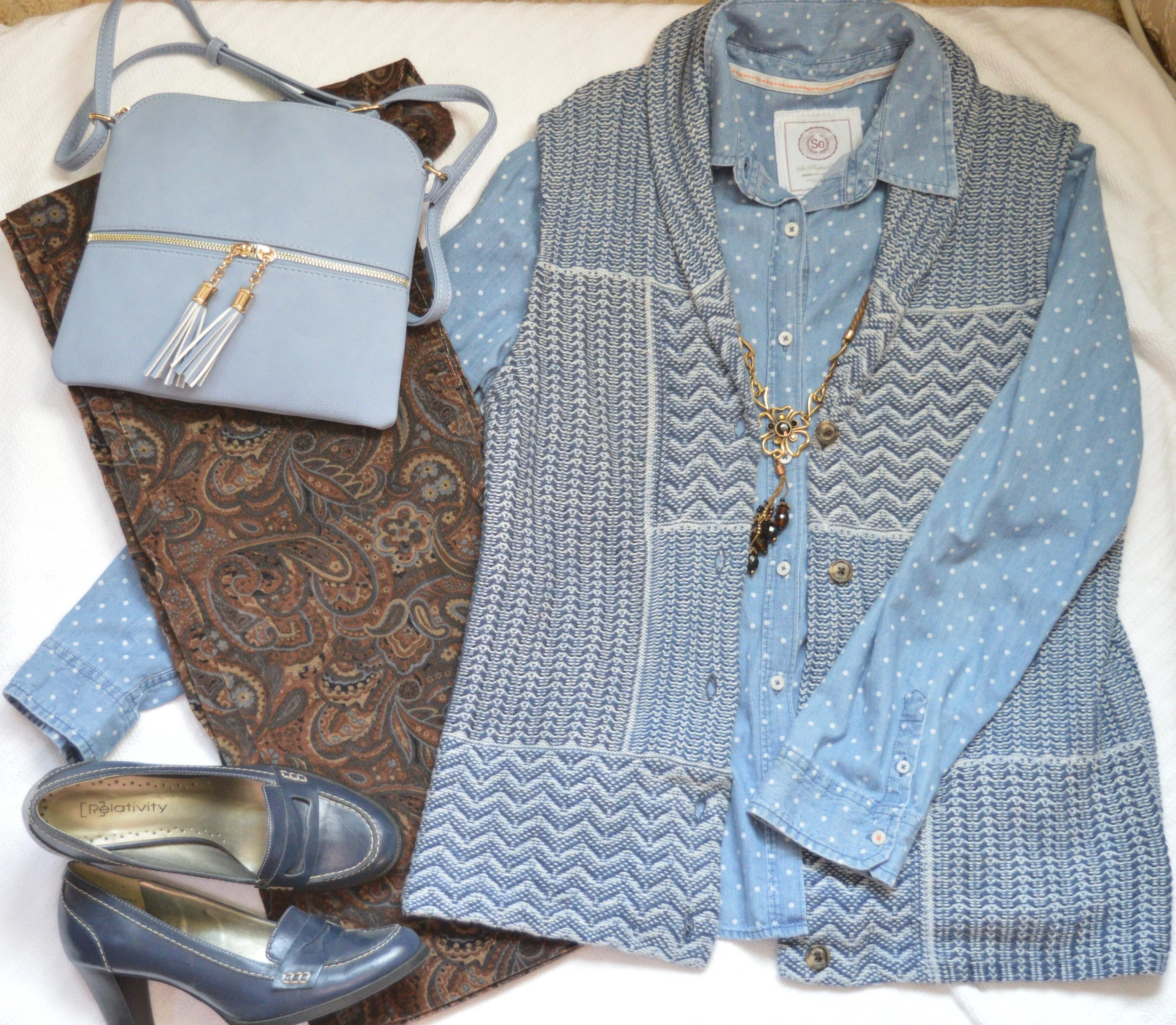
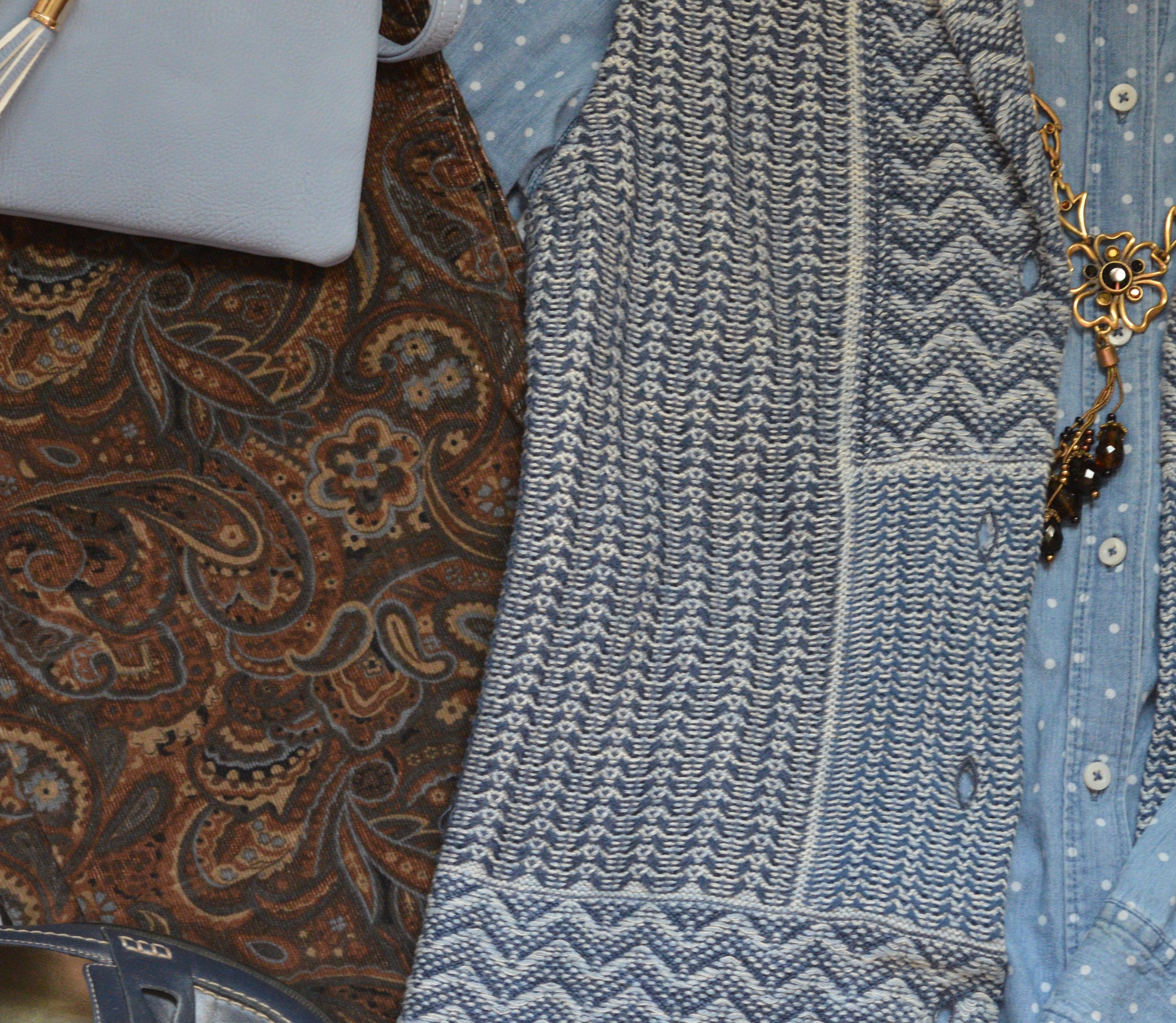
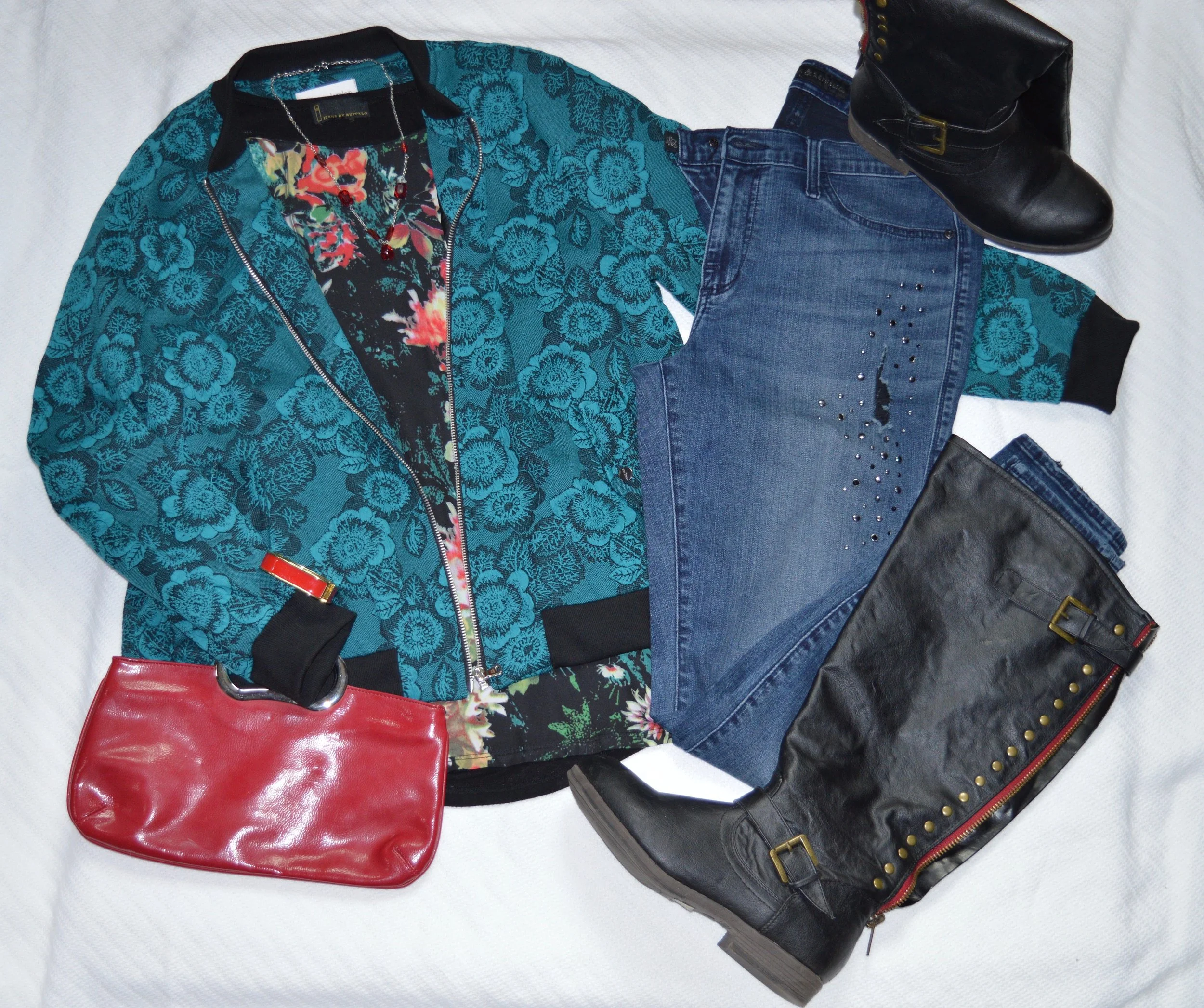
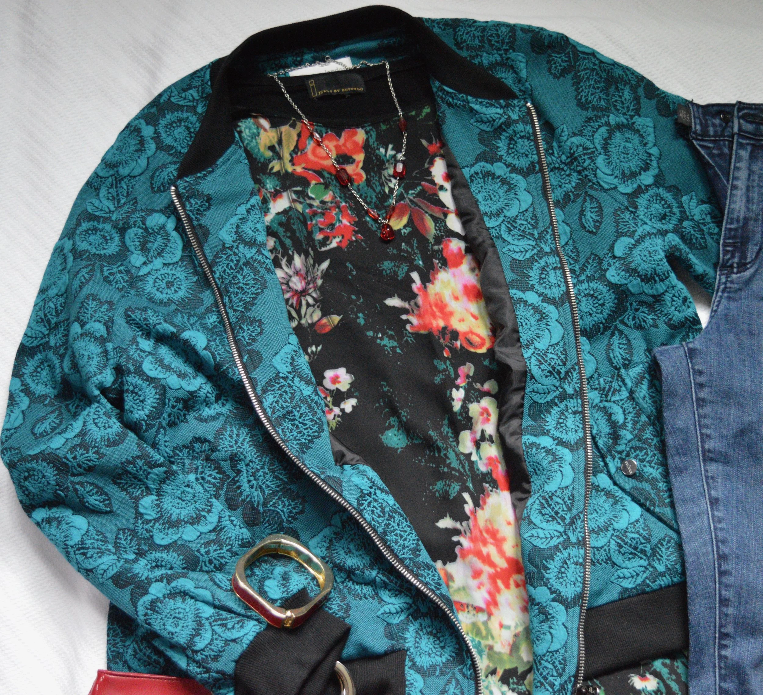
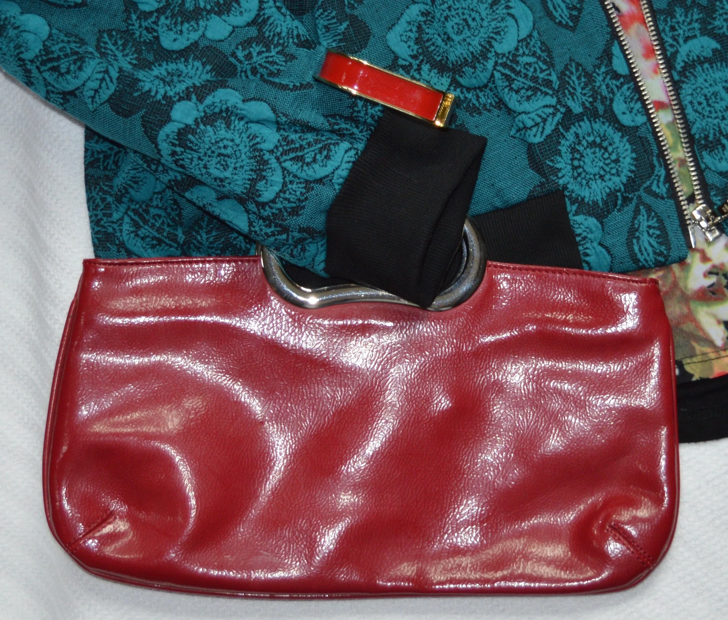
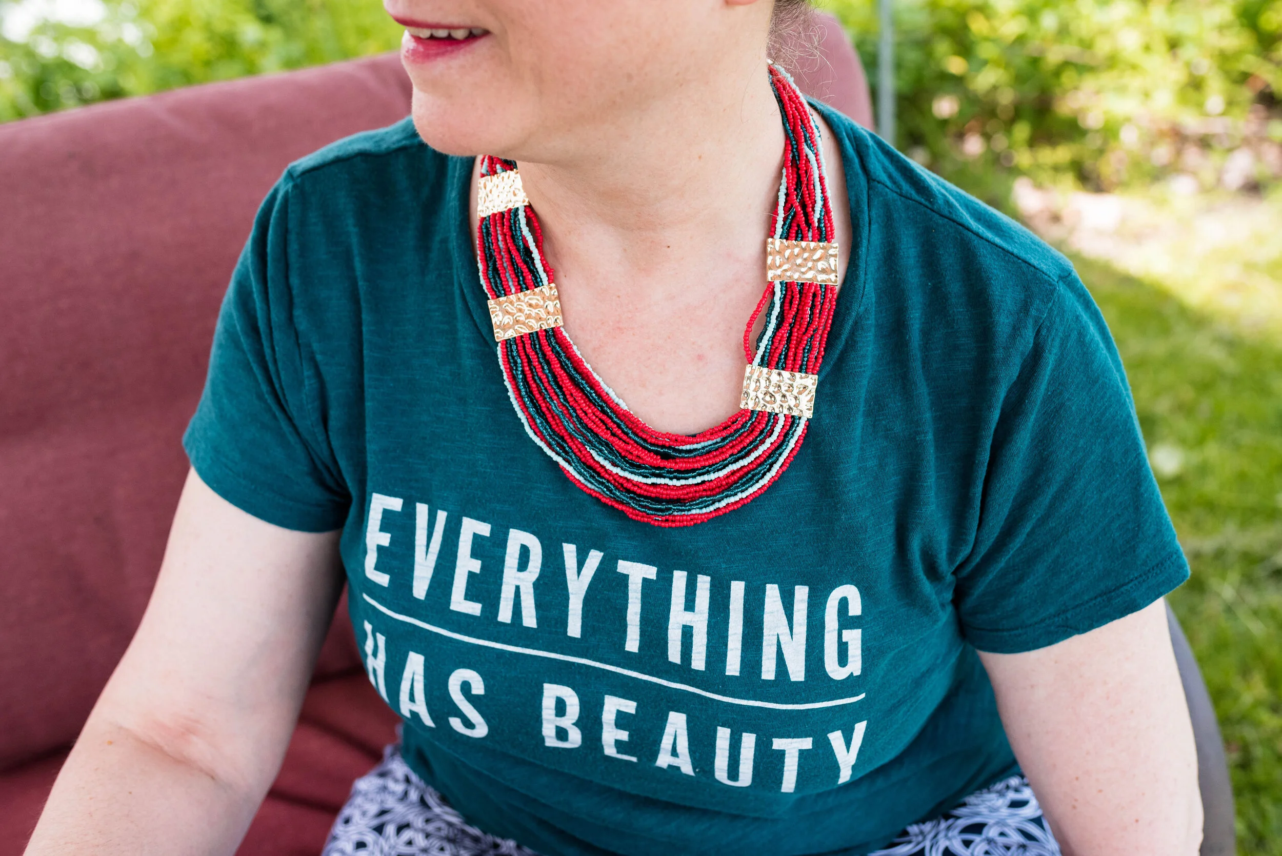
Today we are looking at two very bright and bold colors. When I thought about pairing Storm with Fiery Red, I knew I wanted to keep it as far away from looking Christmasy as possible. Obviously, Storm would never be mistaken for the typical Christmas green that we usually associate with that holiday, but things have changed. Christmas green and red are no longer the only color combinations in holiday decor. Still, I wanted this look to evoke a feeling of fierce femininity, so let me know what you think.

Pantone Spring/Summer 2020 - Storm, Fiery Red and Blueberry

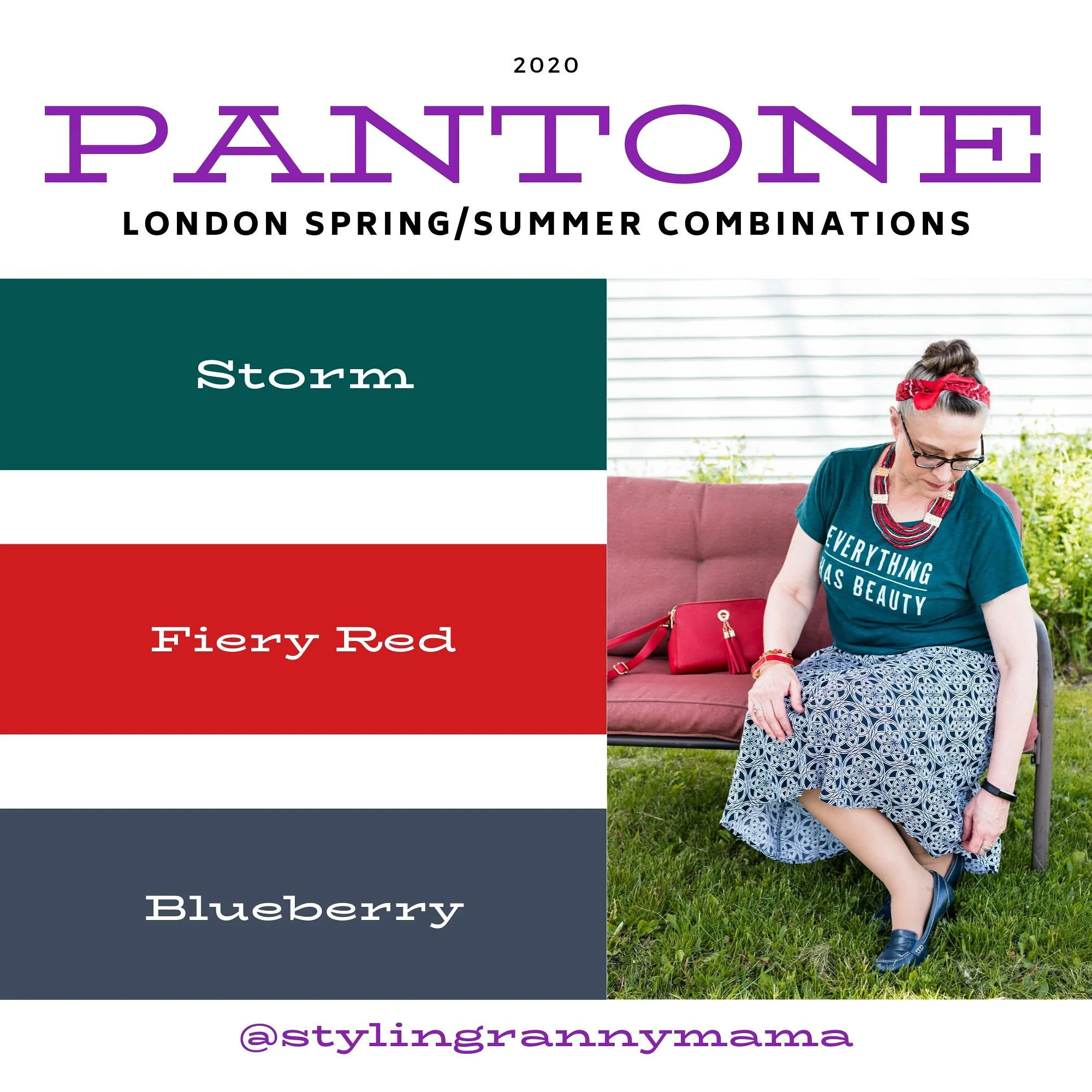
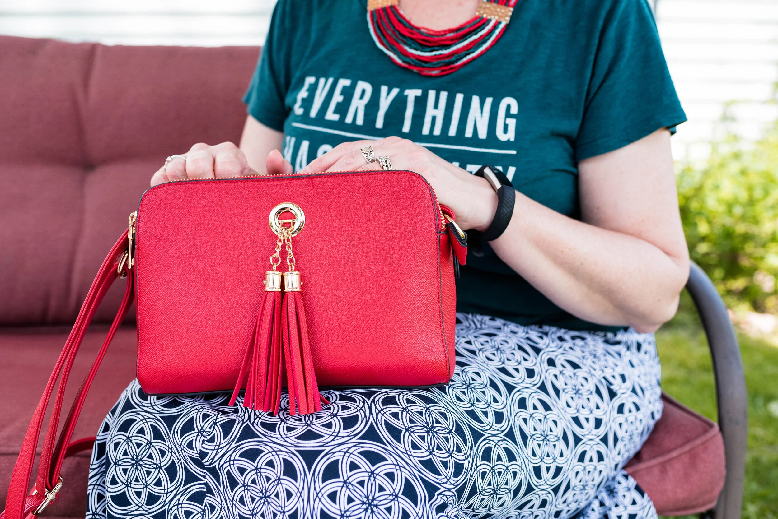
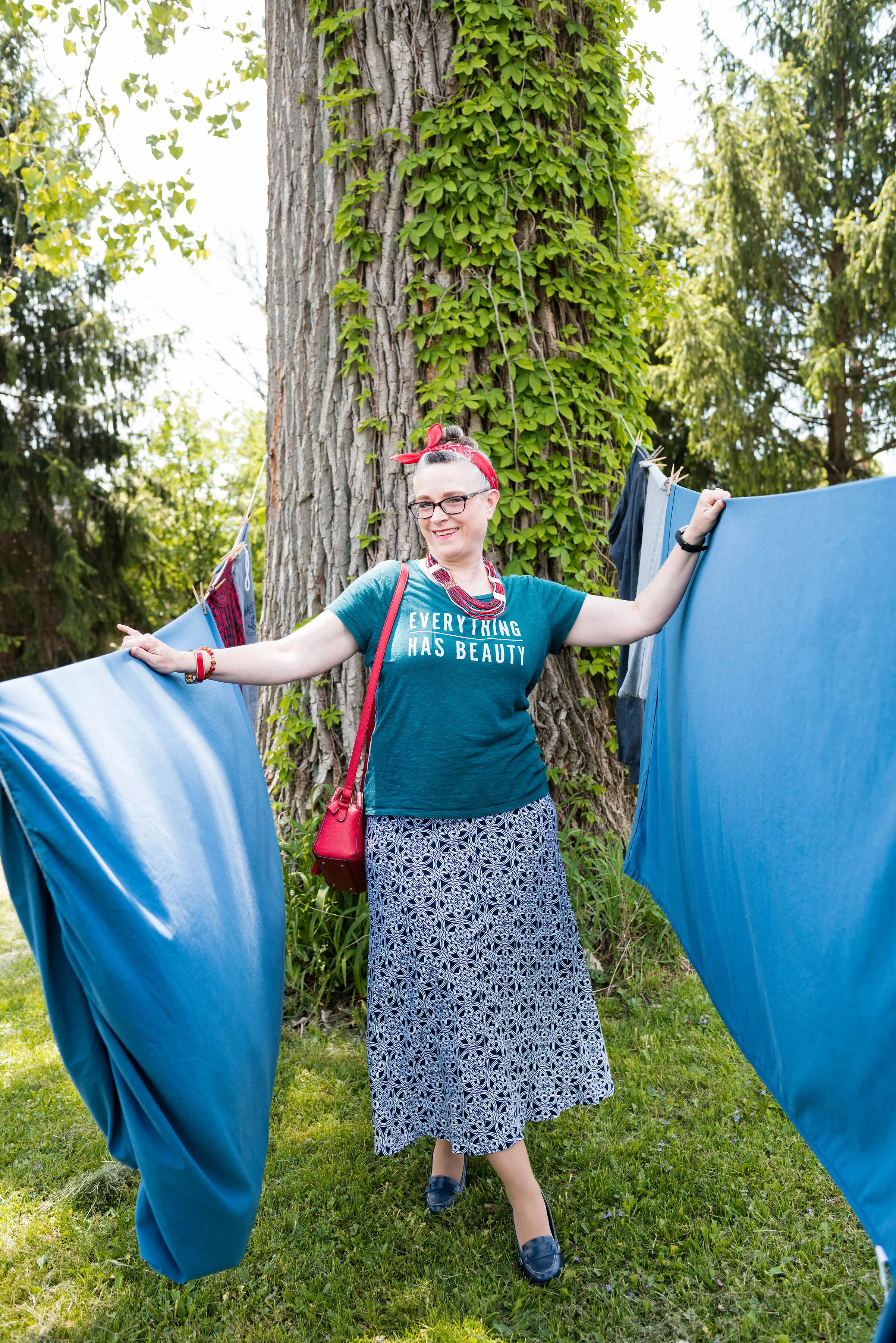
This thrifted, graphic tee from Old Navy is the perfect green and considering everything we have been going through, I love its positive message. Everything has beauty, we just need to look for it.

Pantone Spring/Summer 2020 - Storm Fiery Red and Blueberry

I had some sheets hanging out on the line on the day we took these pictures, so we had a little fun with it.

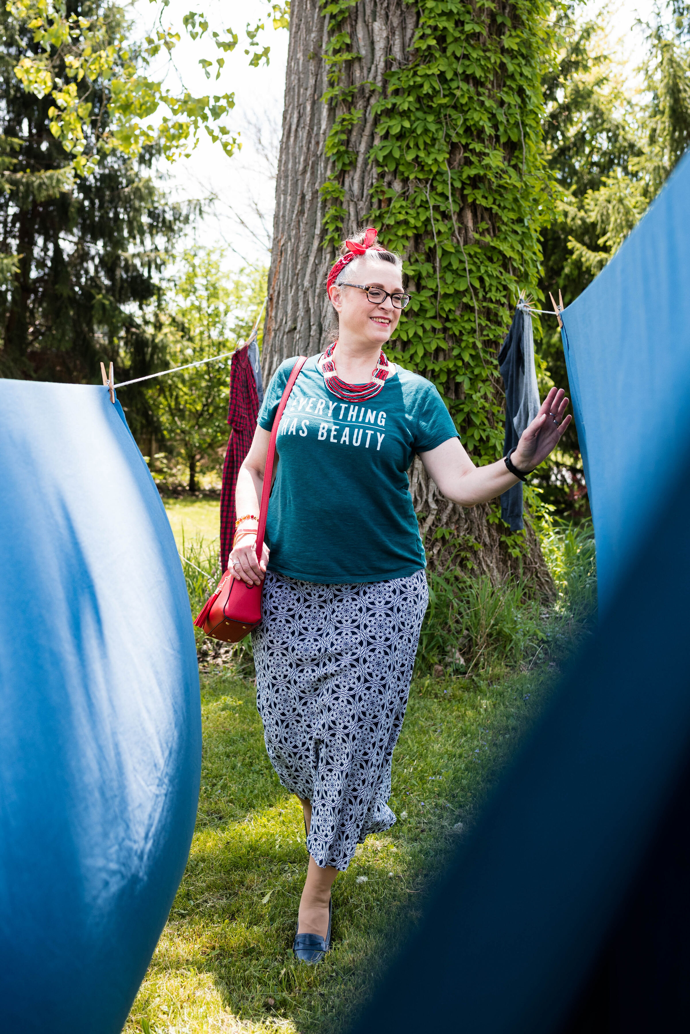
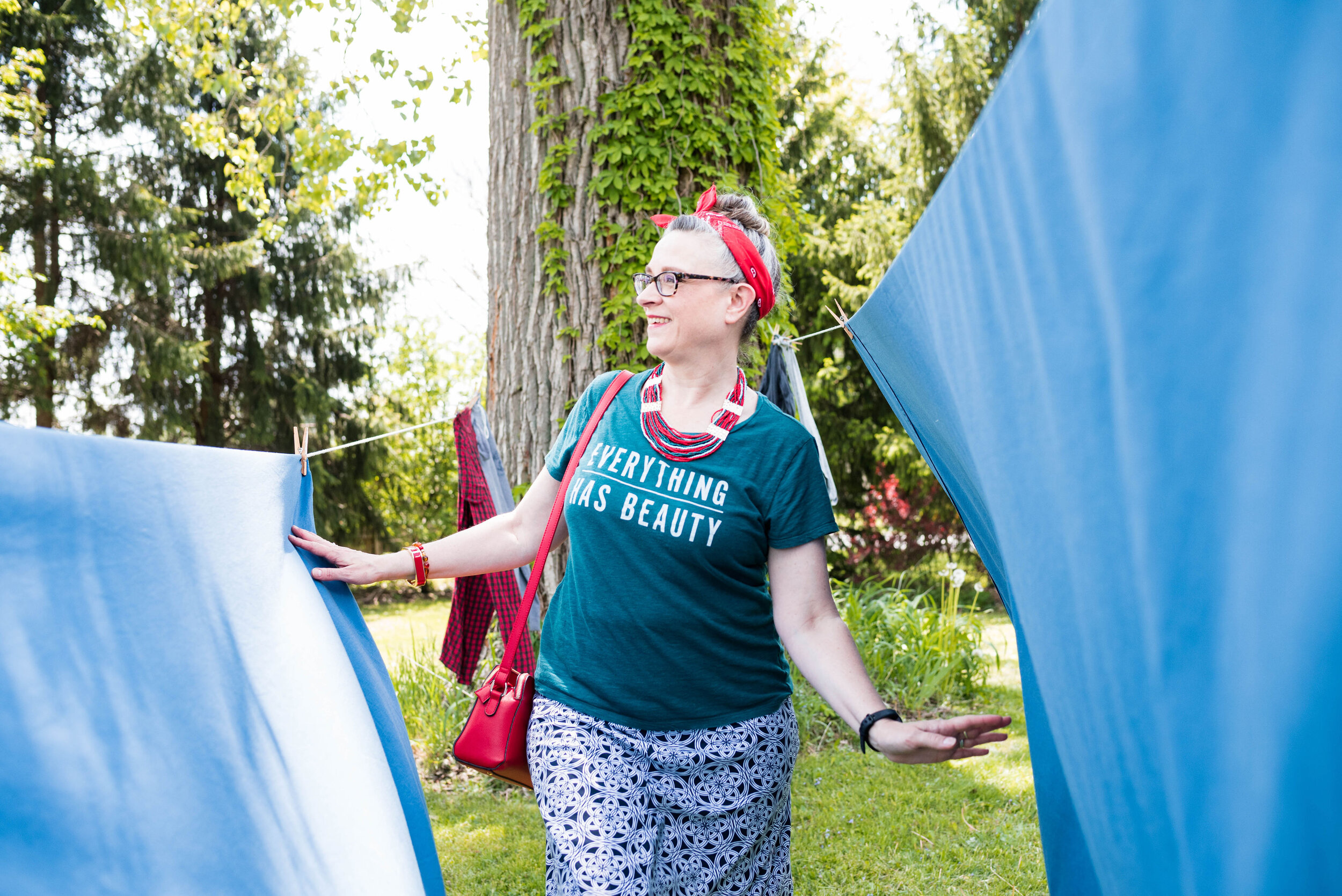
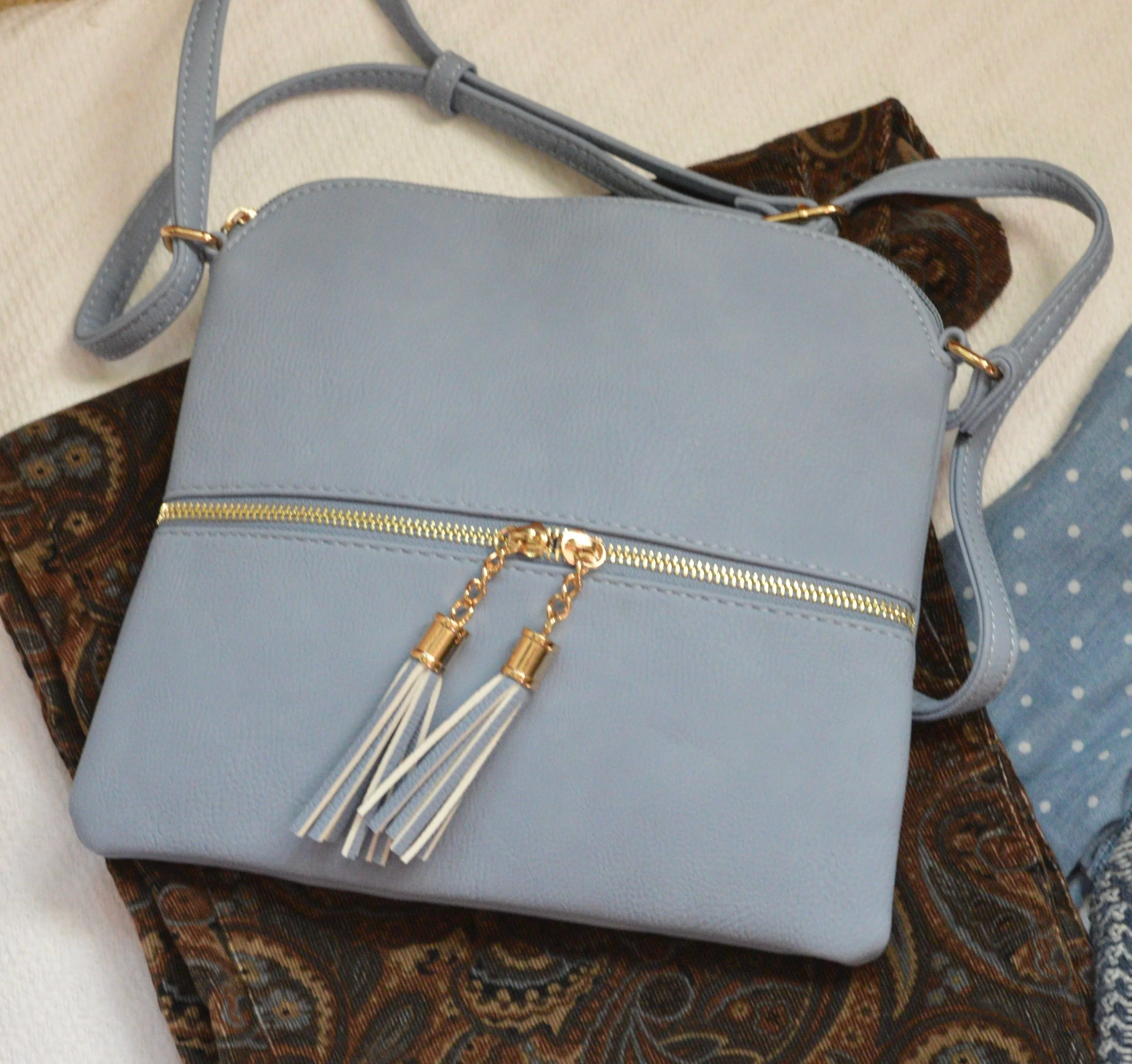
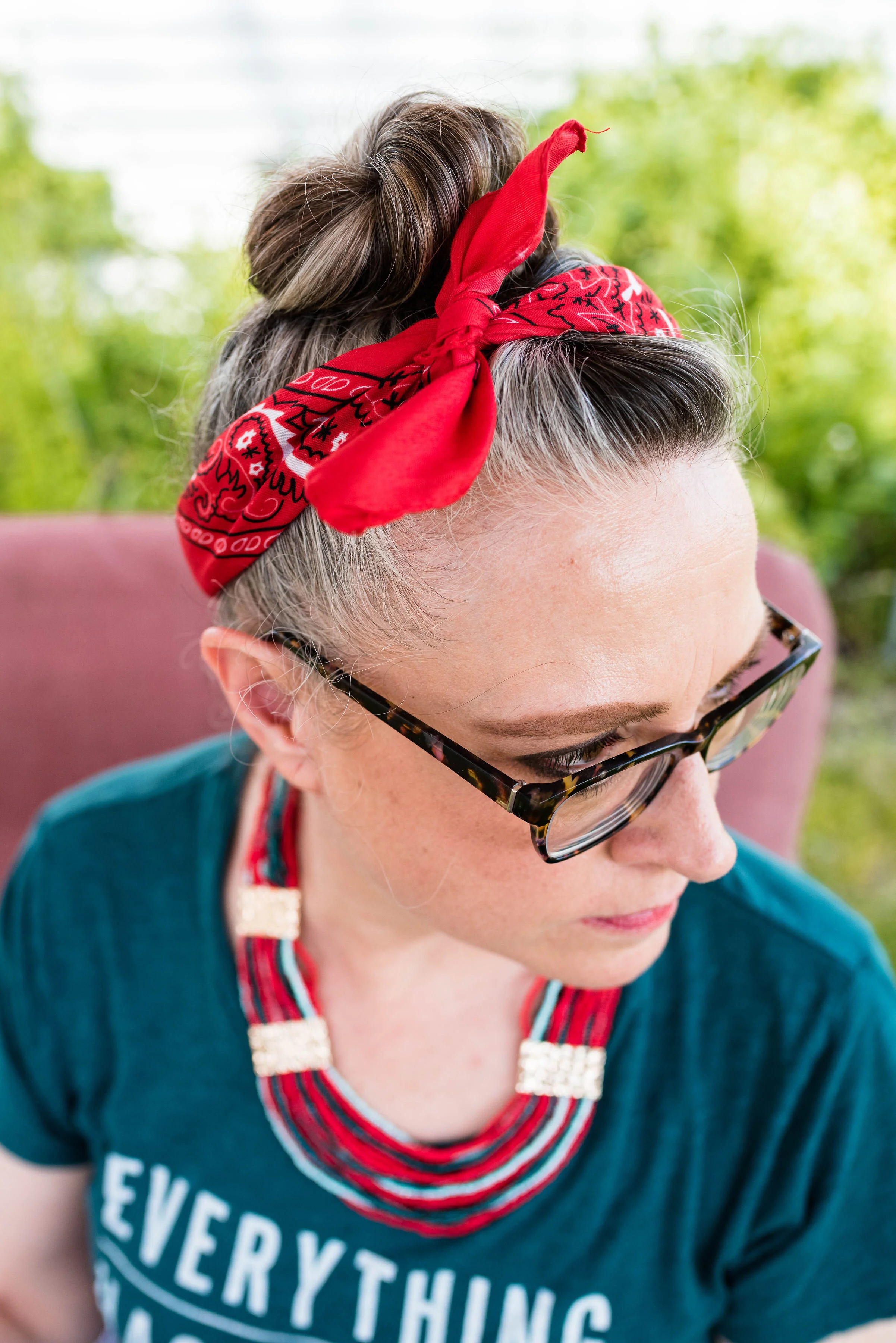
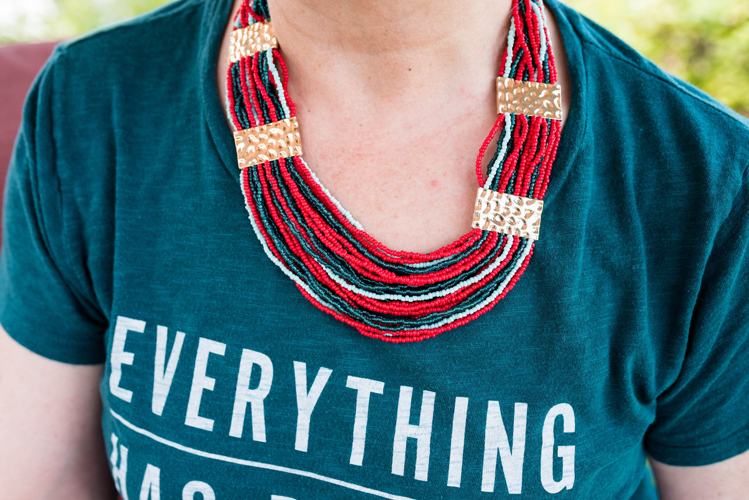
Rather than create an outfit with a full red piece, I thought I would show you an outfit where you use one color just in your accessories and wow, what a statement it makes! The Fiery Red bandana in my hair, the jewelry and the bag, add that bright red color, without being overwhelming. Some people feel less comfortable wearing bright colors and prefer to just stick to the classics, like navy, gray or black. Adding a bright color really boosts the overall look of an outfit.

Pantone Spring/Summer - Fiery Red, Storm and Blueberry
Pantone Spring/Summer 2020 - Storm, Fiery Red and Blueberry

My medallion print skirt is from Christopher and Banks last year. I like that it is light weight, and yet not at all see through. Win, win. I felt that it was a good match for the Blueberry Pantone classic color.

Pantone Spring/Summer 2020 - Storm, Fiery Red and Blueberry

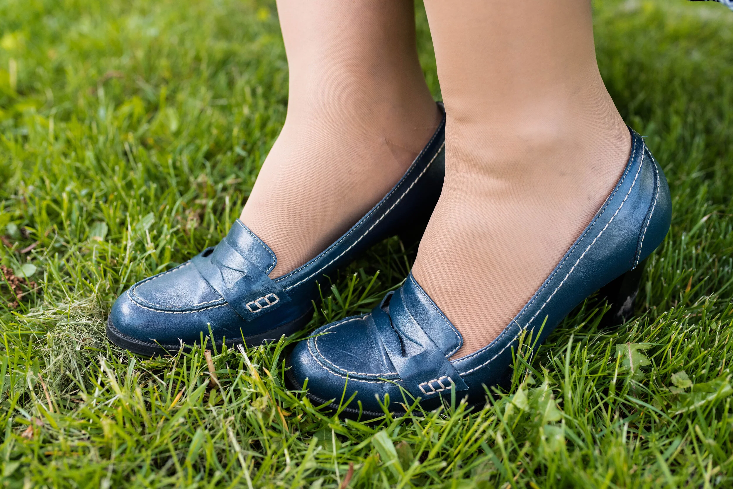
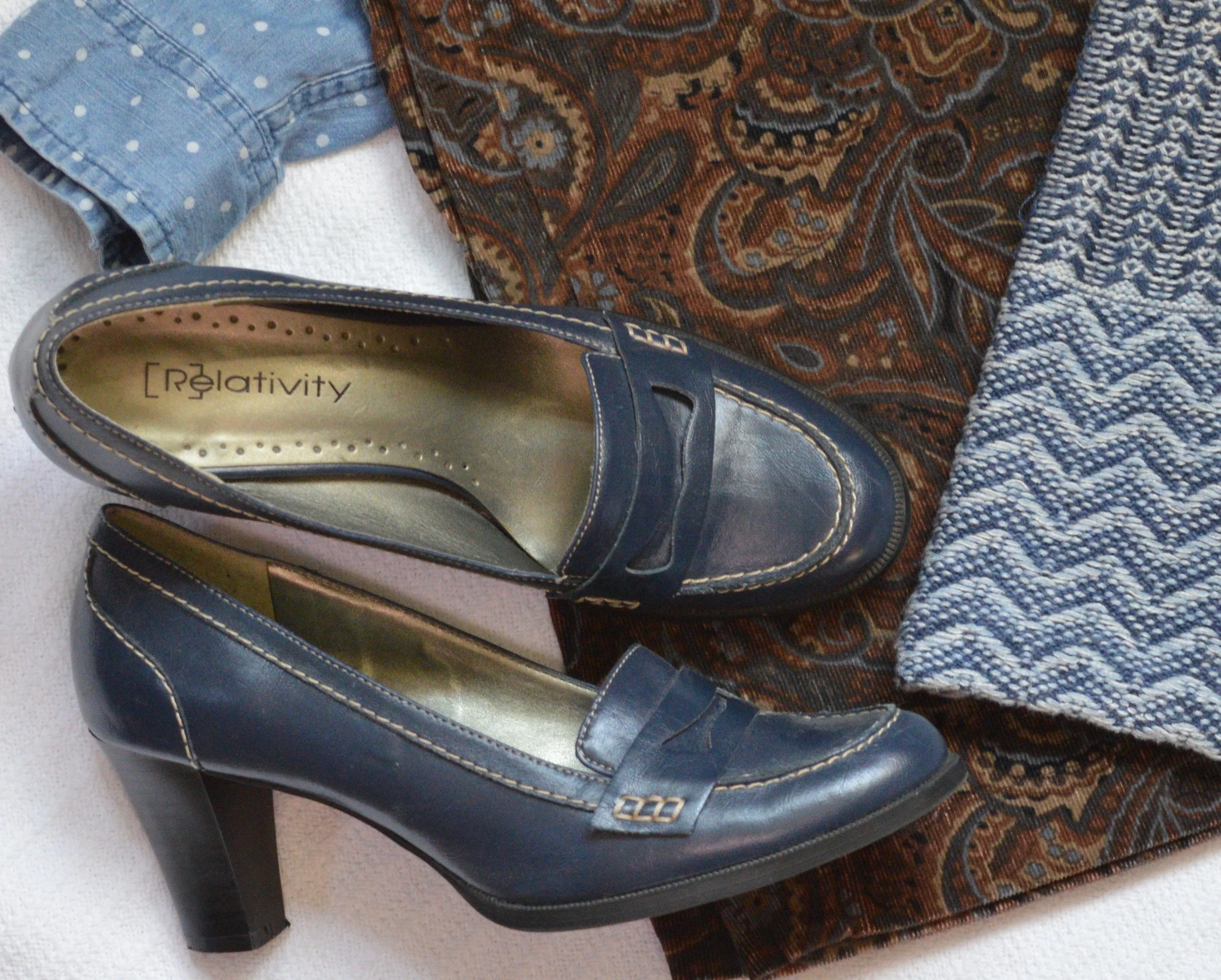
You’ve seen these loafer heels numerous times on the blog before. I got these thrifting and have had them for years, but they still look pretty good. The plus side of real leather. These are Relativity brand.

Pantone Spring/Summer 2020 - Storm, Fiery Red and Blueberry

What do you think of these colors? Do you think this was a good combination? Do you where skirts in the summer? What length skirt do you like to wear; mini, knee, midi or maxi? I would love to hear your thoughts. Thank you to all of you who regularly comment on my posts. I always look forward to your insights and of course the positive feedback is wonderful, but your negative feedback is welcome too.

I’m including a few shopping links for you to look over. I hope you are staying safe and healthy wherever you are!

Photos and graphic Rebecca Trumbull.

These shopping links are affiliate links which means I get a few pennies when you click on a link. Thanks for those clicks. All opinions are my own.


Fall Trends - 2019 - Part 3

Here we are looking at two more fall trends for 2019. Depending on who you look to for the latest info on the trends, there is some overlap. However, not all trends are the same according to all the fashion gurus. Who What Wear has a different list from Marie Claire who has a different list from Vogue and so on. When I put together my list of trends, I am taking from a few different sources and presenting you the ones I like and find interesting and plausible for us real women. Remember most trends that you see on the runways are geared toward younger women who have the stature of a fashion model, so very tall and thin. That does not mean that we cannot wear a particular trend, but pick the ones that are right for you.

Trend 5 - Head to Toe Prints

This is not a particularly new trend, but it presents itself in a bolder more, out there way. Pattern mixing has become quite common, but now the patterns are brighter and bigger. Here are some examples from a Pinterest page I discovered. I decided to go more conservative, because I was grooving on the earth tones of browns and blues. This is what I came up with.

Obviously the old time suiting that women, and men, used to wear would fall easily into this trend category. A matching plaid blazer and pants along with a bold print top and you would be stylin’ with the best of them. The thing I like about this trend is the challenge of creating a printed outfit that I would actually wear and that looks palatable to the eye, not obnoxious. Some of the outfits on that Pinterest page I would classify as obnoxious, but that is only my opinion.

I found these paisley corduroys while thrifting last spring and unfortunately won’t be able to wear them, until I get back to my lighter spring weight. Ugg. However, I loved the pattern and the heavier weight for fall and winter. They are a brand called Havana Jack’s Cafe. Do you ever wonder where they come up with the names for things?

The blue in the pants made me reach for my Chaps knit vest and my thrifted polka dot SO button up. I found the fun necklace at a second hand store and thought it would be a good addition to the outfit.

Blue seemed to be my color of choice for bag and shoes. Everything in this outfit came from my closet and has been used on the blog before. You can see the vest here and here. The pants have not. but I already explained that problem. Ha, ha.

Trend 6 - Dark Florals

I have really taken a liking to floral prints. I like the bright bold colors of spring, the soft pastel prints of summer and especially the dark floras of fall and winter. It would seem that florals are here to stay and I am glad.

I found this dark floral Jeans by Buffalo top while thrifting. I love the colors and when I went to put this flat lay together, I realized this erin london bomber jacket from Shop National would be the perfect over piece. It goes well with the green in the top and has its own floral print.

These distressed, embellished skinny jeans are Rock & Republic from Kohl’s, and I’ve had them for a while. Once again, I have grown out of them, but I refuse to get rid of them. Ha, ha.

Since the top contains some red, I chose red for my accessories, including my tall, black, studded boots that have red detailing along the zipper on the back.

This is definitely an outfit I would wear on a regular basis. The pretty florals, the layers and the skinny jeans with boots will be a regular rotation as the weather cools.

I hope you enjoyed this post. Next Tuesday I will bring you one more post on fall trends and then I hope to start my Pantone Fall 2019 - New York series.

Thanks for following and please join me next time.