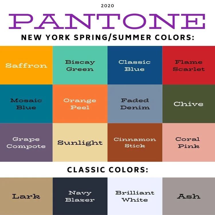
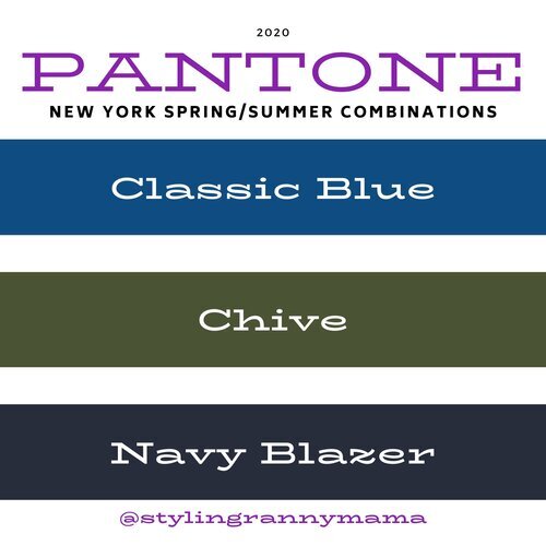
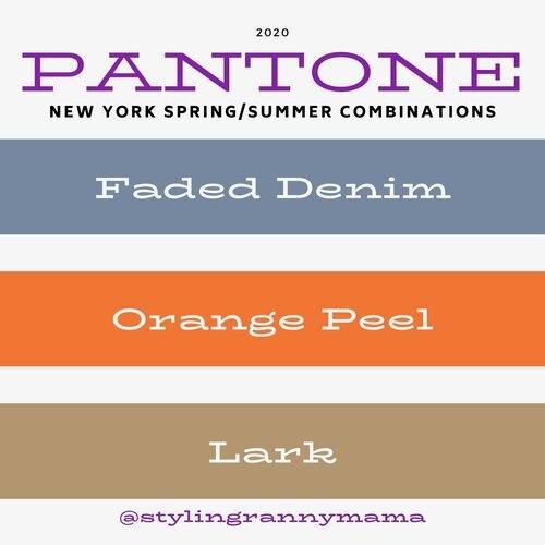
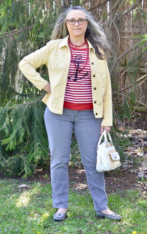
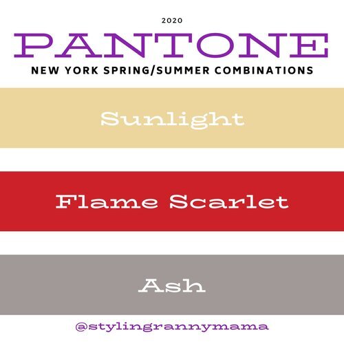
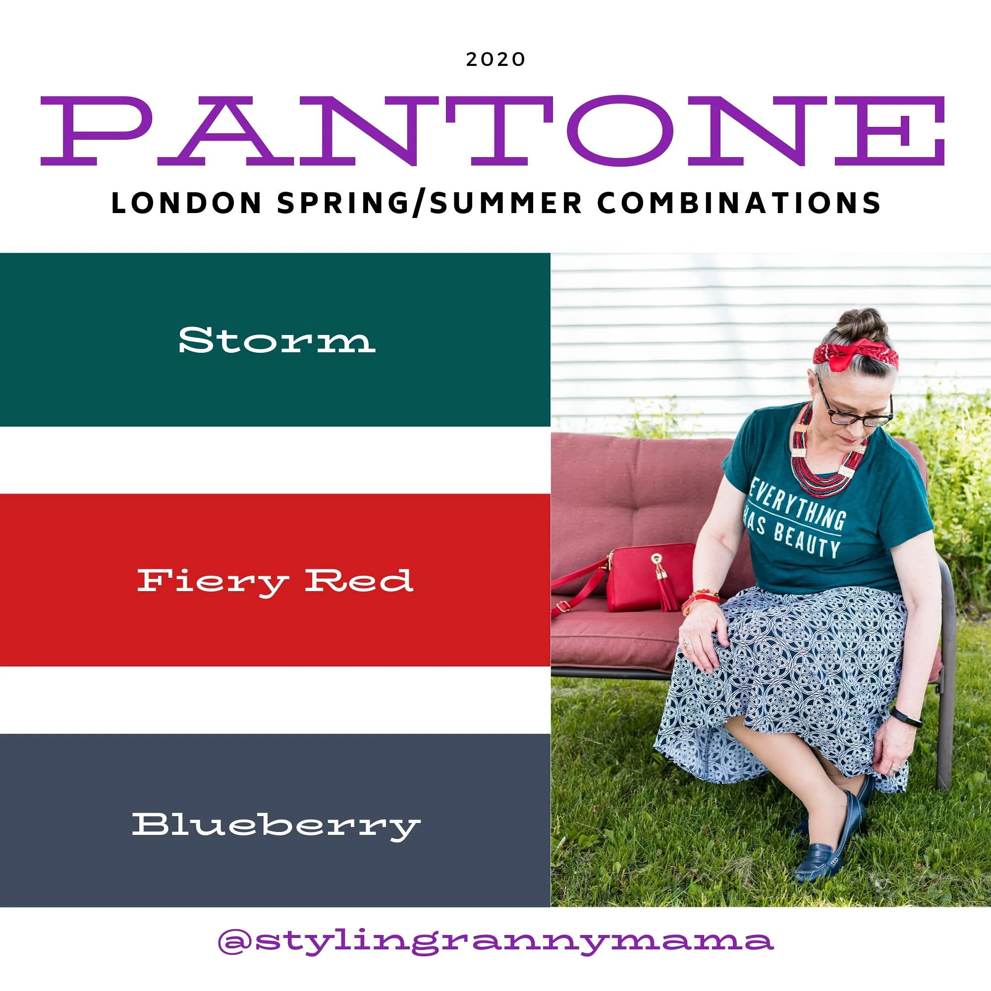
Color Play - Pantone Spring 2023 - NY Palette: Fiery Red, Empire Yellow, Blue Perennial, Light Aqua

Today I am looking at a color combining technique that is known as color blocking. Color blocking is the combination of solid colors creating distinct blocks of color. I don’t use the color block technique very often because I love prints. Many times I will combine something like a pair of jeans with a vest or sweater in a solid color, combined with a print top. I guess in that case I am almost always doing a type of color blocking. However, jeans are a type of material that don't typically look solid. Does that make sense to anyone else out there besides myself? Ha, ha.

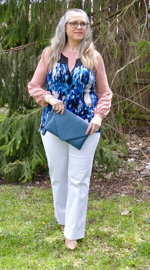
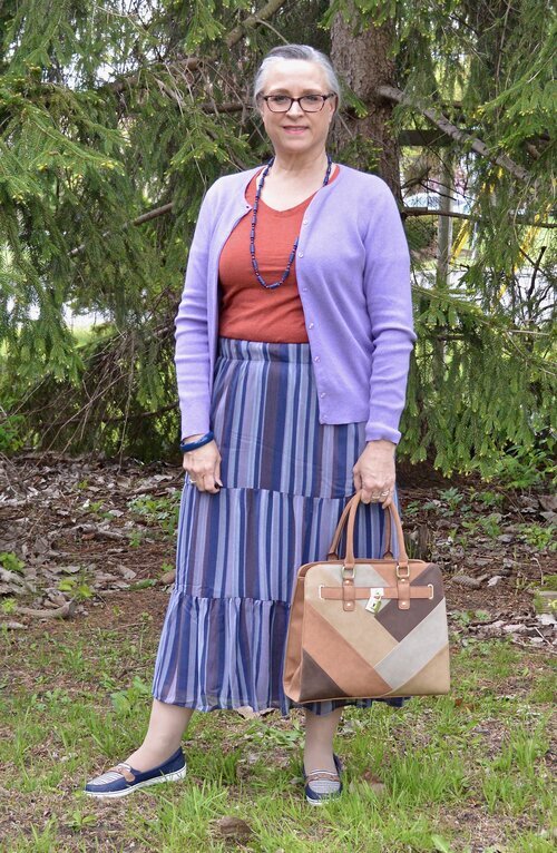
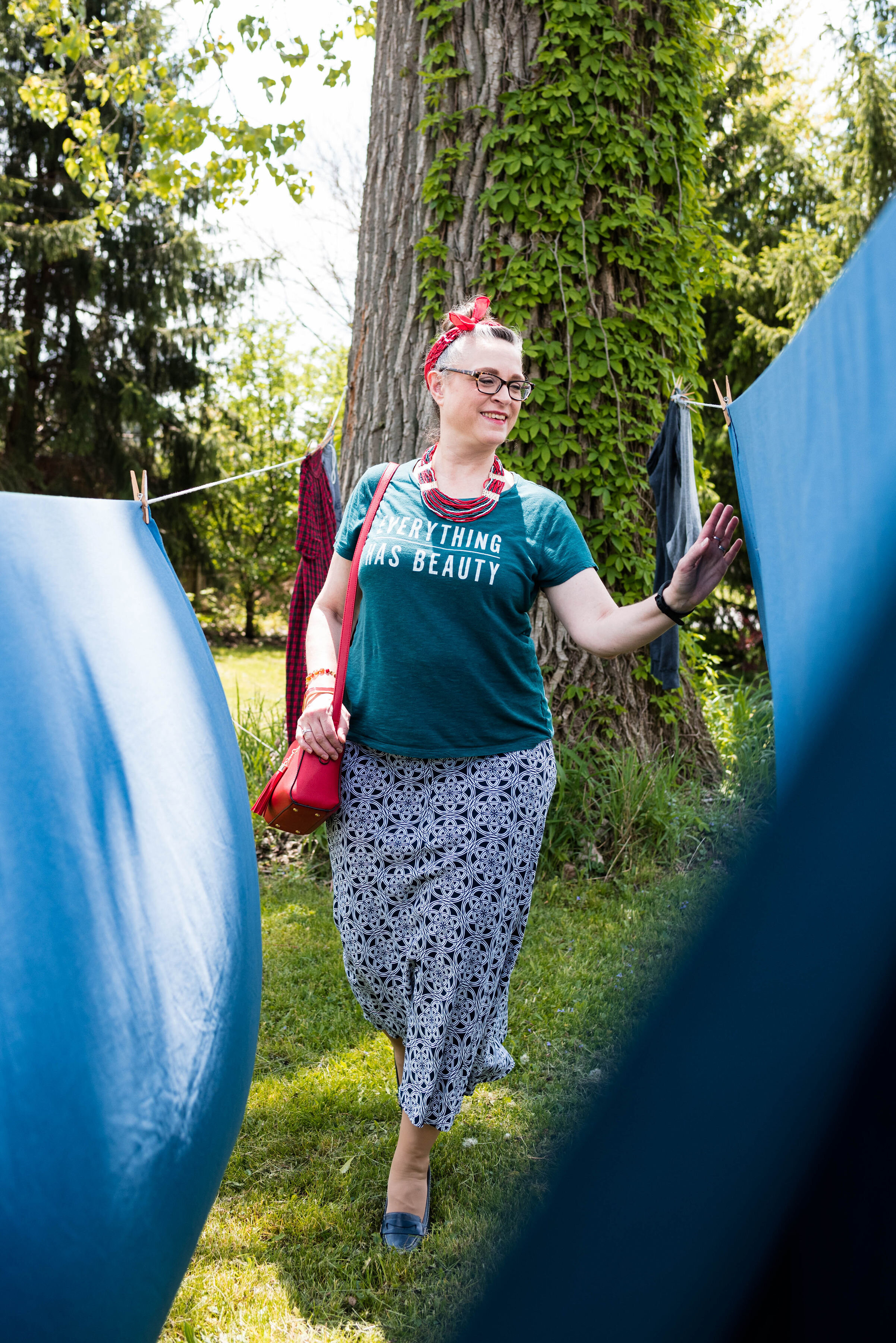
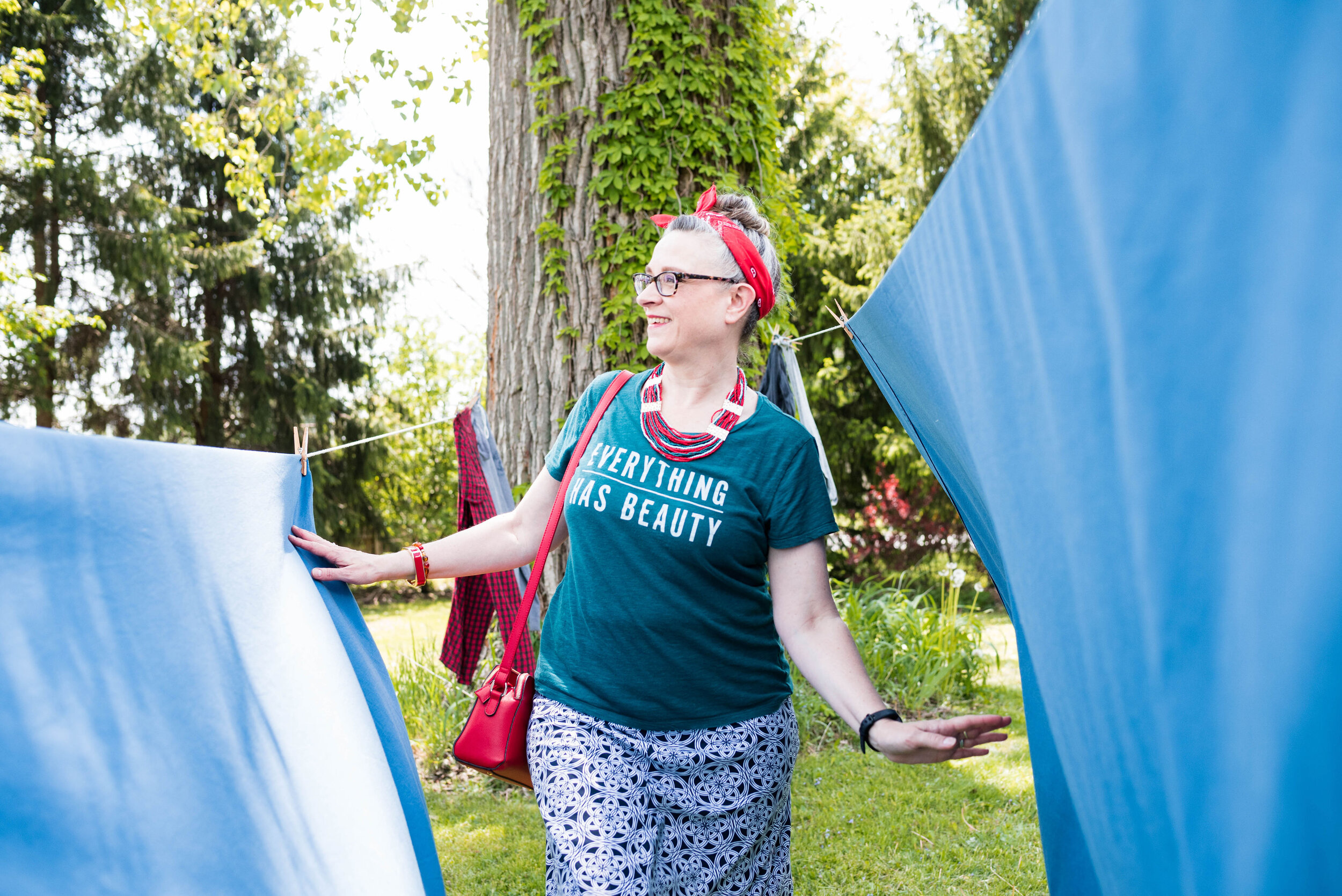
This outfit is bright and colorful and a great ensemble for the crazy fluctuating temperatures of spring.

The color block technique is a great way to combine one color with another without worrying if they match. The whole point is to combine different colors to create a fun, statement worthy outfit. All of these pieces have been in my closet for a while. I have worn each of them separately, and I have worn the vest and pants together before, but not this combination.

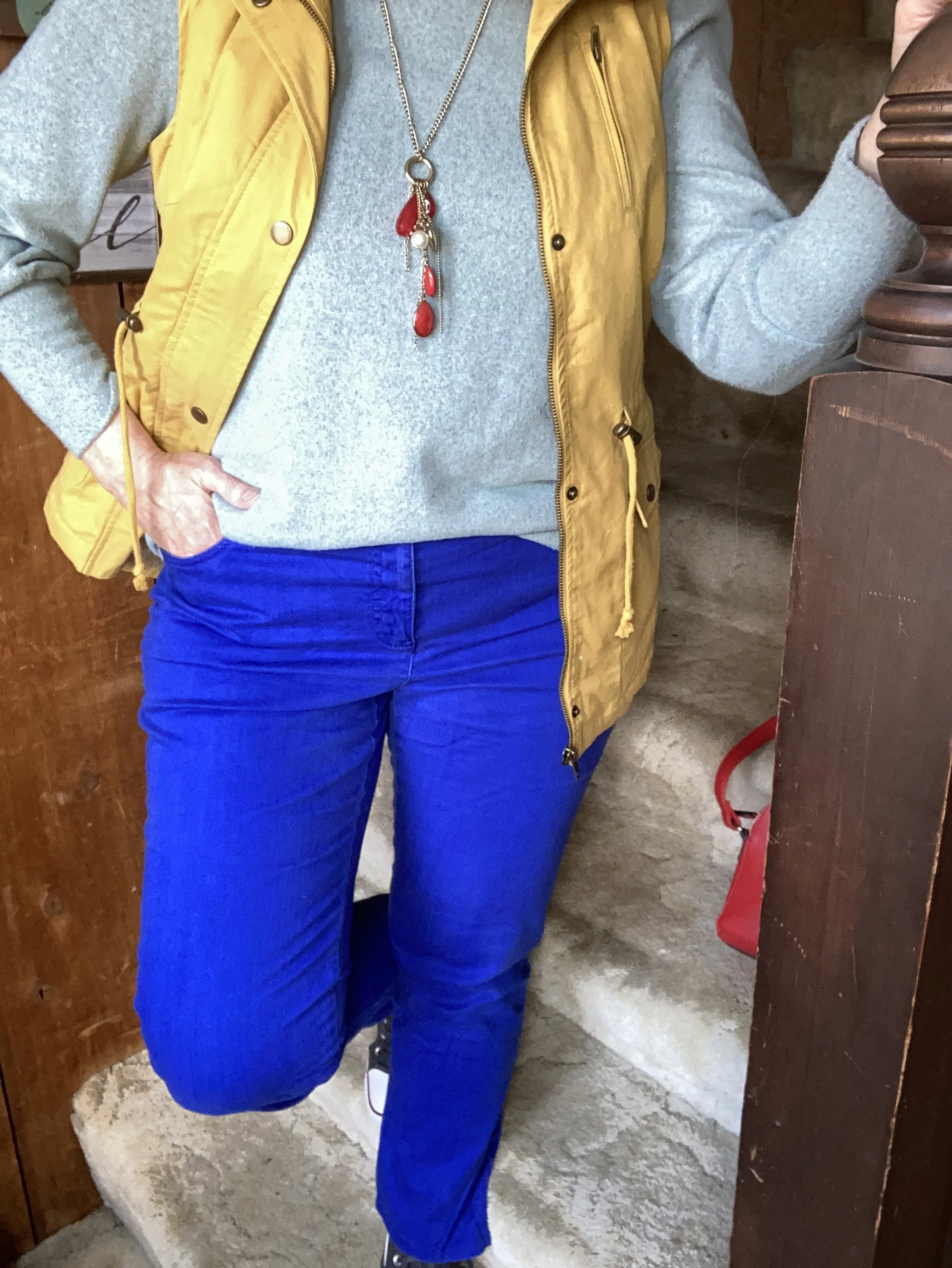
My Light Aqua top is Massini brand and was a clearance find from Kohl’s a few years ago. It is a medium weight knit with a cozy feel.

My secondhand pants have made numerous appearances on the blog and are Ruby Rd. brand. You can see a number of my posts in this one post, Why You Should Have a Pair of Colored Pants - Bright Blue. While I don’t pull these out real frequently for my day to day outfits. I have used them over and over for a special occasion or for the blog.

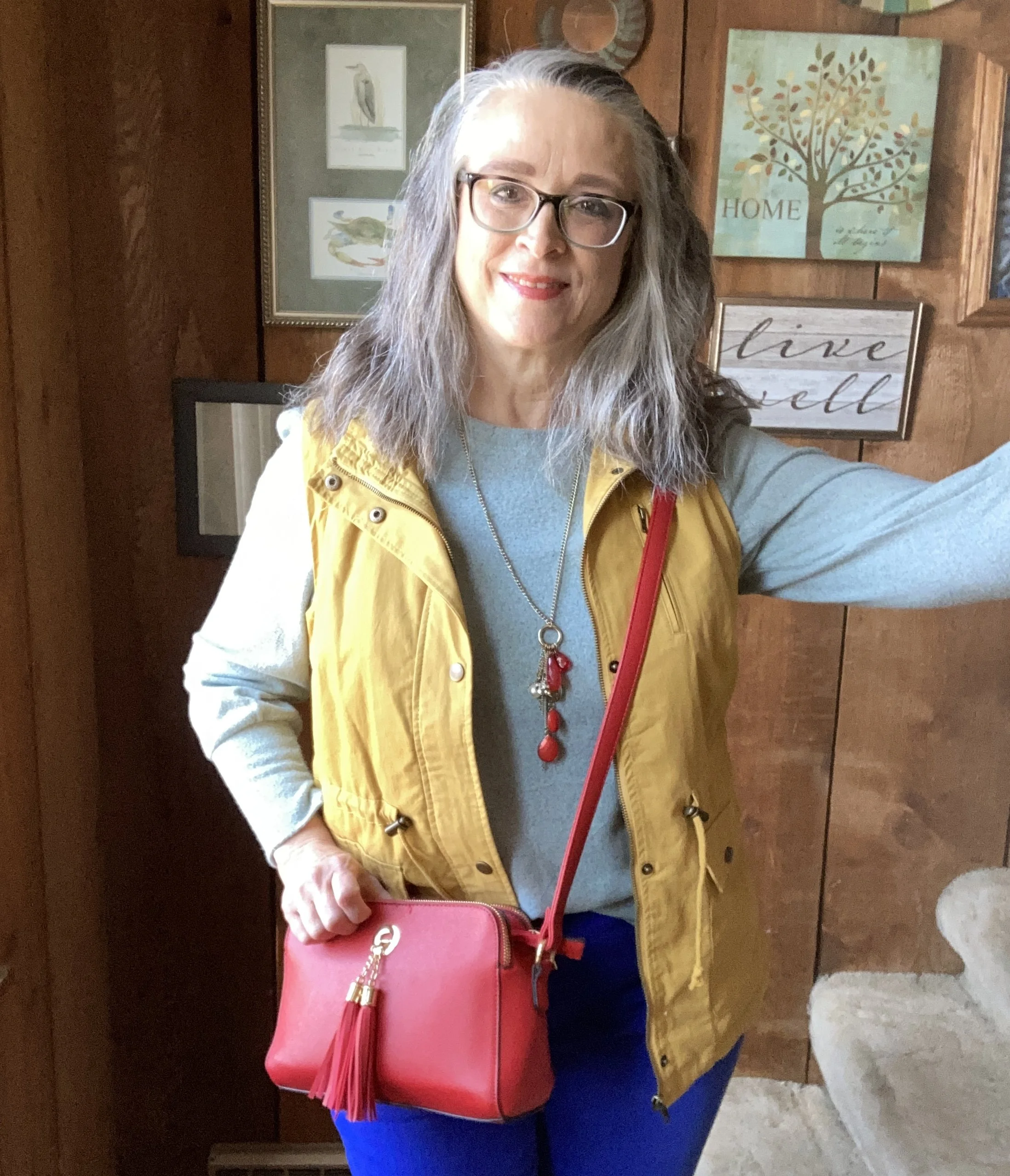
This yellow vest is a brand called Love Tree. I really like this piece. It came with a detachable hood, and the inside of the vest has a fuzzy, warm sherpa lining. I think I got this at a local boutique, but I actually cannot remember. I know, I know! Too many clothes. I’ll save my clothing muses for another day.

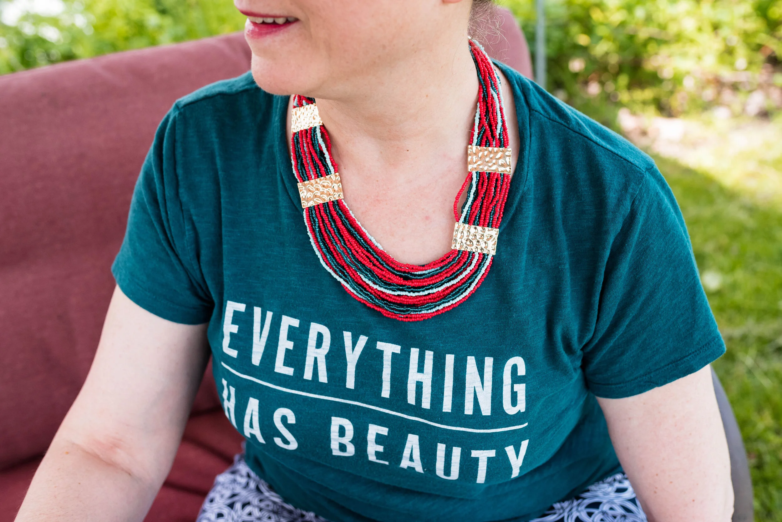
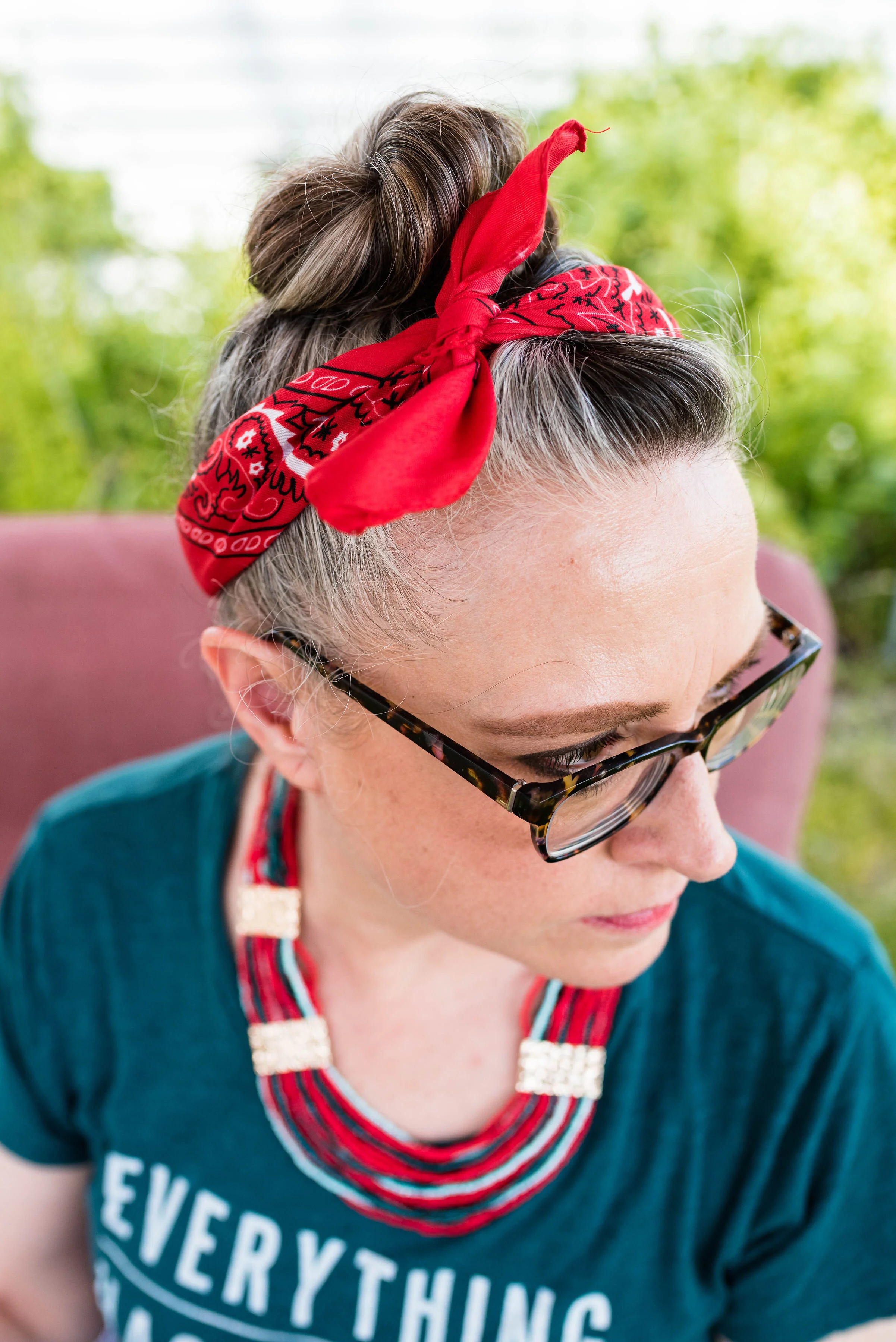
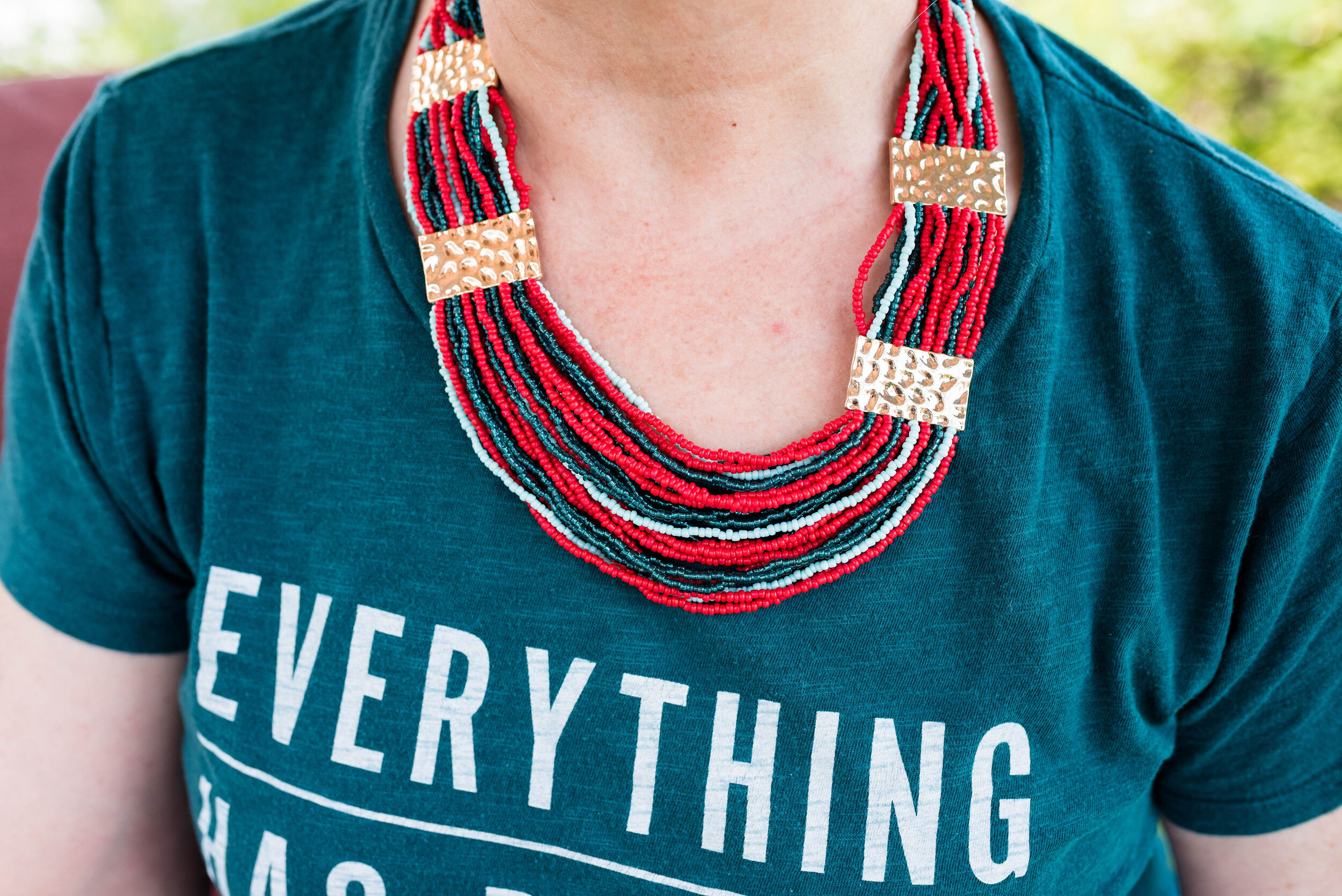
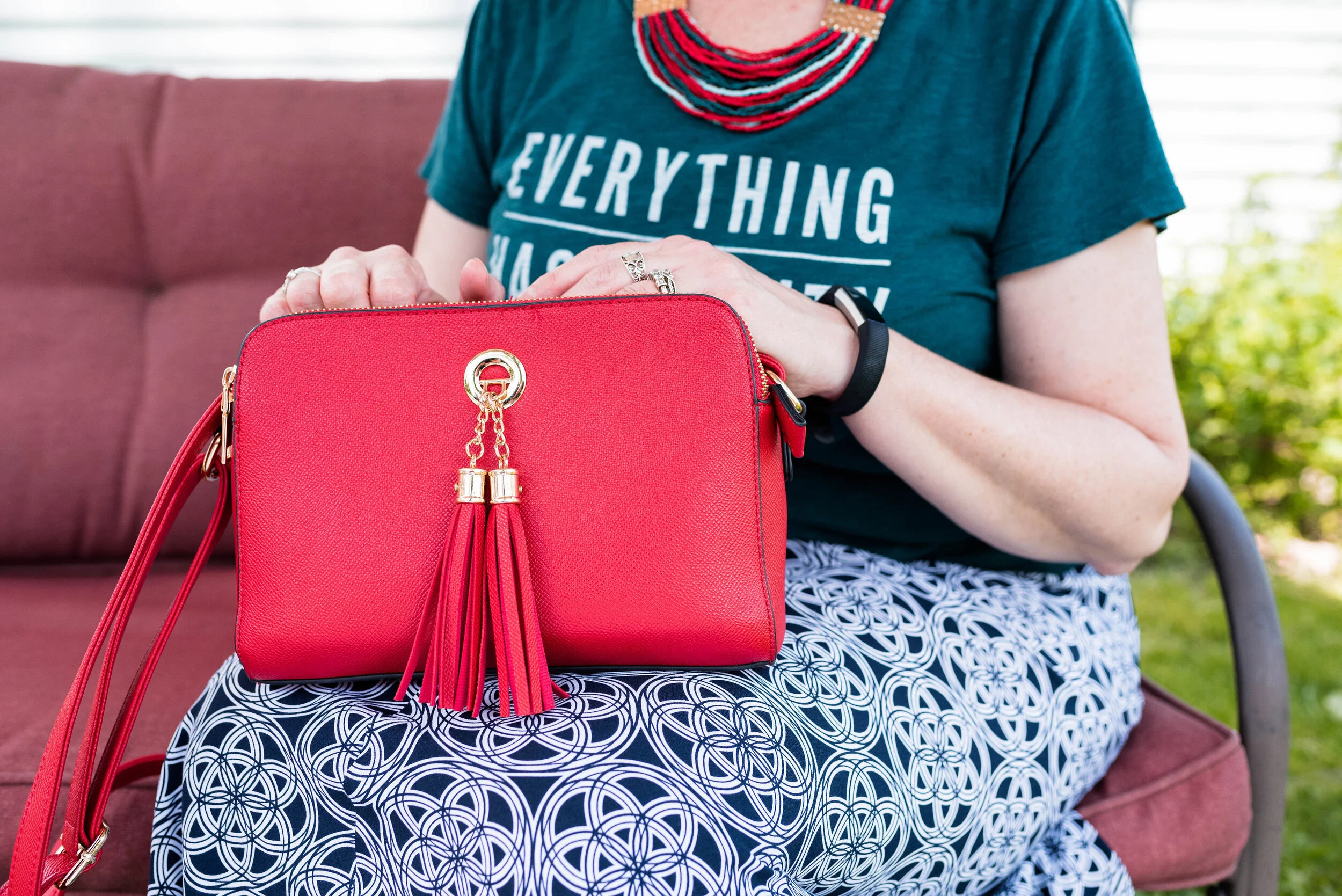
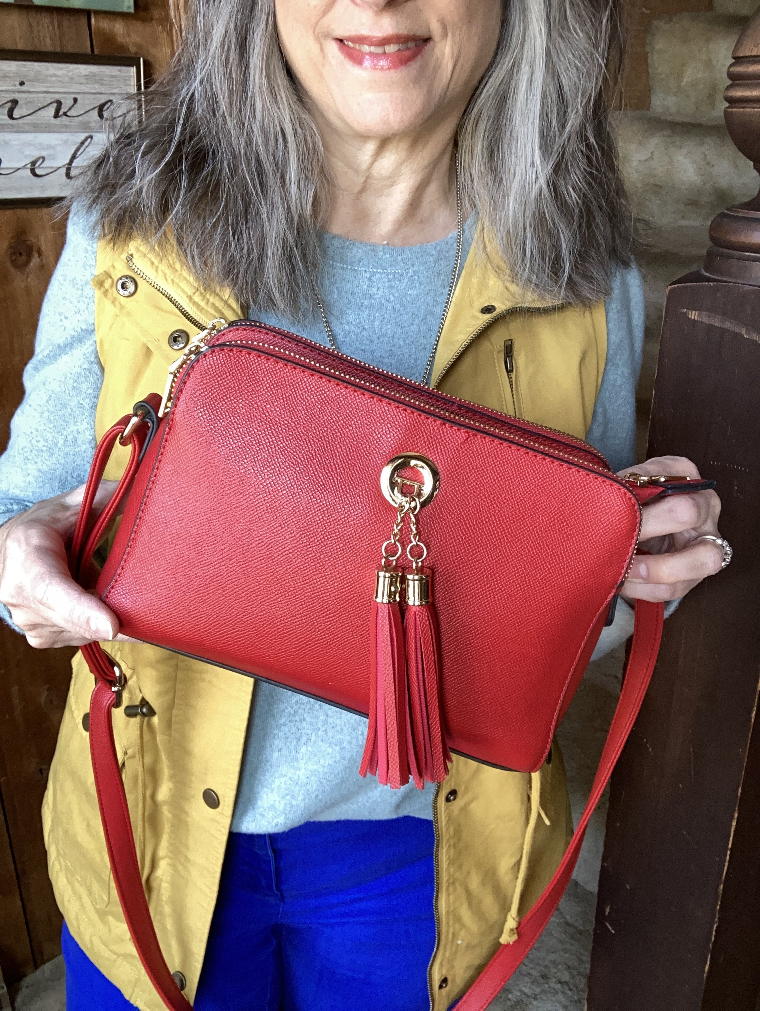
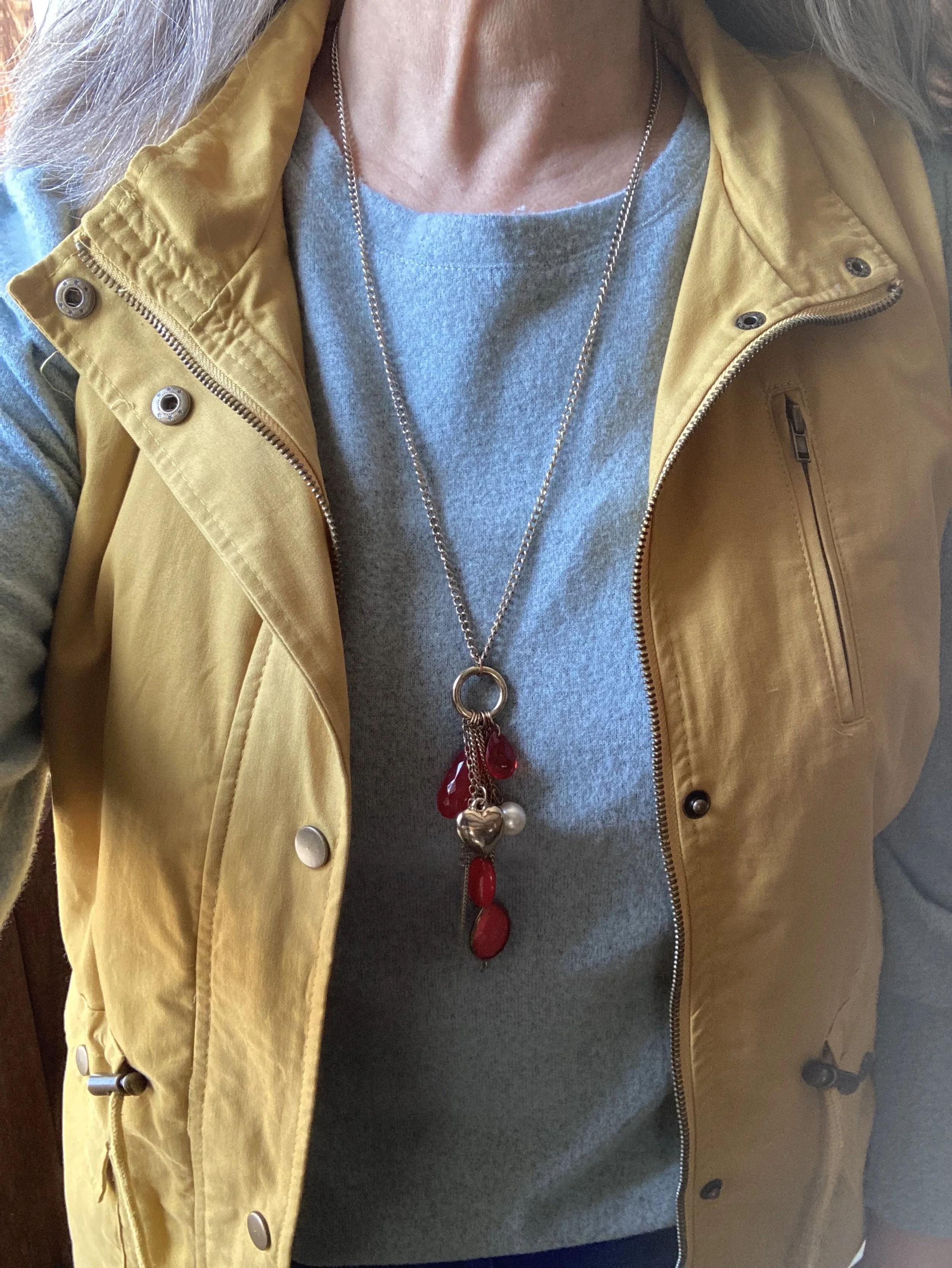
I decided to focus on Fiery Red as an accent color, so my bag, and my pendant charm necklace do the trick. Isn’t it cool, how the red pops against this already colorful outfit? I have this crossbody bag in a similar style, but different brand (both from Amazon), in black. They are great bags with three separate compartments to keep all your things organized. They are not huge, but big enough for the essentials. I’ll give a few shopping links below. A crossbody bag has become my regular go to, because I like the hands free approach. This is especially helpful when you are chasing grandkids, or shopping.

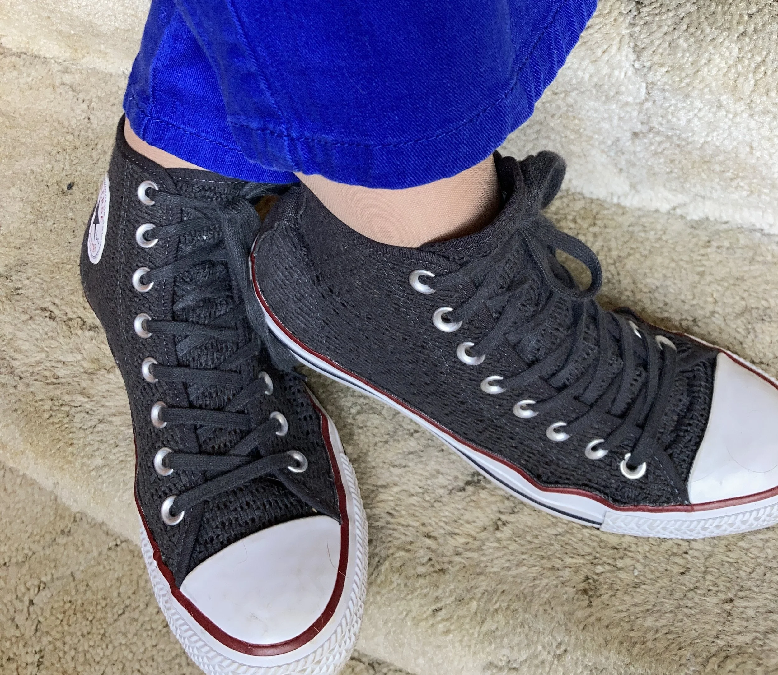
I really wasn’t sure which shoes to wear, and the only reason I ended up with my high top mesh Converse was due to the red stripe around the sole. Ha, ha. Really, my thought process for putting an outfit together is not all that complex. I tried the outfit with a pair of white sneakers first, but it just didn’t look right. I think the heaviness of the fabrics and the vest needed something a little less springy, but I also didn’t want to use knee high boots as those seemed too wintery…thus the Converse.

So what do you think of this outfit? Do you like the color blocking technique? Tell me about an outfit where you have used it. Your comments mean so much to me. You are the reason I keep this blog going, so it is wonderful to hear from you.

Please feel free to show your support for me and the blog by using my Buy Me a Coffee link. When you contribute to my page I can use that money to buy a treat when I am working on the blog at a coffee shop. I appreciate all your support.

I’m including a few shopping links. I only make money off of these links if you purchase something through a link, however, I bring these to you to give you ideas. All opinions are my own.

Have a great Tuesday!

Pantone Spring/Summer 2020 - Recap

I hope you have enjoyed this Pantone color series. Today I just want to show you a recap where you can see all the outfits in one post. Here we go.

New York Palette

Pantone Spring/Summer 2020 - New York Palette

Classic Blue, Chive and Navy Blazer

Faded Denim, Orange Peel and Lark

Sunlight, Flame Scarlet and Ash

Biscay Green, Saffron and Brilliant White

Mosaic Blue, Coral Pink and Brilliant White

Cinnamon Stick, Grape Compote and Navy Blazer

London Palette

Pantone Spring/Summer 2020 London Palette

Classic Blue, Beetroot Purple and Oyster Mushroom

Pantone Spring/Summer - London Palette

Flame Orange, Blossom and Cuban Sand

Pantone Spring/Summer 2020 - London Palette

Yellow Iris, Rose Brown and Cuban Sand

Pantone Spring/Summer 2020 - London Palette

Storm, Fiery Red and Blueberry

Pantone Spring/Summer 2020 - London Palette

Blush Beauty, Bossa Nova and Blanc de Blanc

Pantone Spring/Summer 2020 - London Palette

Tanager Turquoise, Heritage Blue and Blanc de Blanc

Pantone Spring/Summer 2020 - London Palette

Which color palette was your favorite? Which outfit did you like the best? I would love to hear your thoughts. I hope you all have a wonderful weekend. We will be celebrating Father’s Day with our kids on different days, since schedules wouldn’t allow for everyone getting together. God bless each of you with peace and joy.

All graphics and London color palette photos by Rebecca Trumbull.

Pantone Spring/Summer 2020 - Storm, Fiery Red and Blueberry

Last week I was really struggling with all that was going on in the world and in our country, so I only posted once, and never did send out an email. I apologize for that. Sometimes, life is like a sucker punch to the gut and you have to step back and try to catch your breath. I am going to approach the subject of all that is happening and my own response to it on my Faith page tomorrow, so just know that I do feel this is important enough to talk about, but I do not think it needs to be done on my Fashion page. Be sure to look for that post tomorrow.

Today we are looking at two very bright and bold colors. When I thought about pairing Storm with Fiery Red, I knew I wanted to keep it as far away from looking Christmasy as possible. Obviously, Storm would never be mistaken for the typical Christmas green that we usually associate with that holiday, but things have changed. Christmas green and red are no longer the only color combinations in holiday decor. Still, I wanted this look to evoke a feeling of fierce femininity, so let me know what you think.

Pantone Spring/Summer 2020 - Storm, Fiery Red and Blueberry

This thrifted, graphic tee from Old Navy is the perfect green and considering everything we have been going through, I love its positive message. Everything has beauty, we just need to look for it.

Pantone Spring/Summer 2020 - Storm Fiery Red and Blueberry

I had some sheets hanging out on the line on the day we took these pictures, so we had a little fun with it.

Rather than create an outfit with a full red piece, I thought I would show you an outfit where you use one color just in your accessories and wow, what a statement it makes! The Fiery Red bandana in my hair, the jewelry and the bag, add that bright red color, without being overwhelming. Some people feel less comfortable wearing bright colors and prefer to just stick to the classics, like navy, gray or black. Adding a bright color really boosts the overall look of an outfit.

Pantone Spring/Summer - Fiery Red, Storm and Blueberry
Pantone Spring/Summer 2020 - Storm, Fiery Red and Blueberry

My medallion print skirt is from Christopher and Banks last year. I like that it is light weight, and yet not at all see through. Win, win. I felt that it was a good match for the Blueberry Pantone classic color.

Pantone Spring/Summer 2020 - Storm, Fiery Red and Blueberry

You’ve seen these loafer heels numerous times on the blog before. I got these thrifting and have had them for years, but they still look pretty good. The plus side of real leather. These are Relativity brand.

Pantone Spring/Summer 2020 - Storm, Fiery Red and Blueberry

What do you think of these colors? Do you think this was a good combination? Do you where skirts in the summer? What length skirt do you like to wear; mini, knee, midi or maxi? I would love to hear your thoughts. Thank you to all of you who regularly comment on my posts. I always look forward to your insights and of course the positive feedback is wonderful, but your negative feedback is welcome too.

I’m including a few shopping links for you to look over. I hope you are staying safe and healthy wherever you are!

Photos and graphic Rebecca Trumbull.

These shopping links are affiliate links which means I get a few pennies when you click on a link. Thanks for those clicks. All opinions are my own.