Shopping Our Closets: Graphics on Clothing

Today I thought I would spend a little time talking about graphics on clothing. When I refer to graphics, I am talking about specific pictures, words, sayings or branding that make a statement. I read an article called A Brief History of Graphic Tees. I was surprised to find that the first printing of a word on a tee shirt happened in one of my favorite older movies, The Wizard of Oz. In one of the scenes after Dorothy and her companions reach the Emerald City, they are all getting cleaned up. Three workers, all wearing tees with the word "Oz” printed on them, are seen re-stuffing the Scarecrow. That was 1939.

The article goes on to show how graphic tees gained popularity being used by presidential candidates, Walt Disney, and artists like Andy Warhol. Graphic tees really took off as a “messaging platform” in the 1960’s and 70’s with the explosion of rock and roll and anti-war protests. Tee shirts became an easy way to show what you believed and who you wanted to associate with.

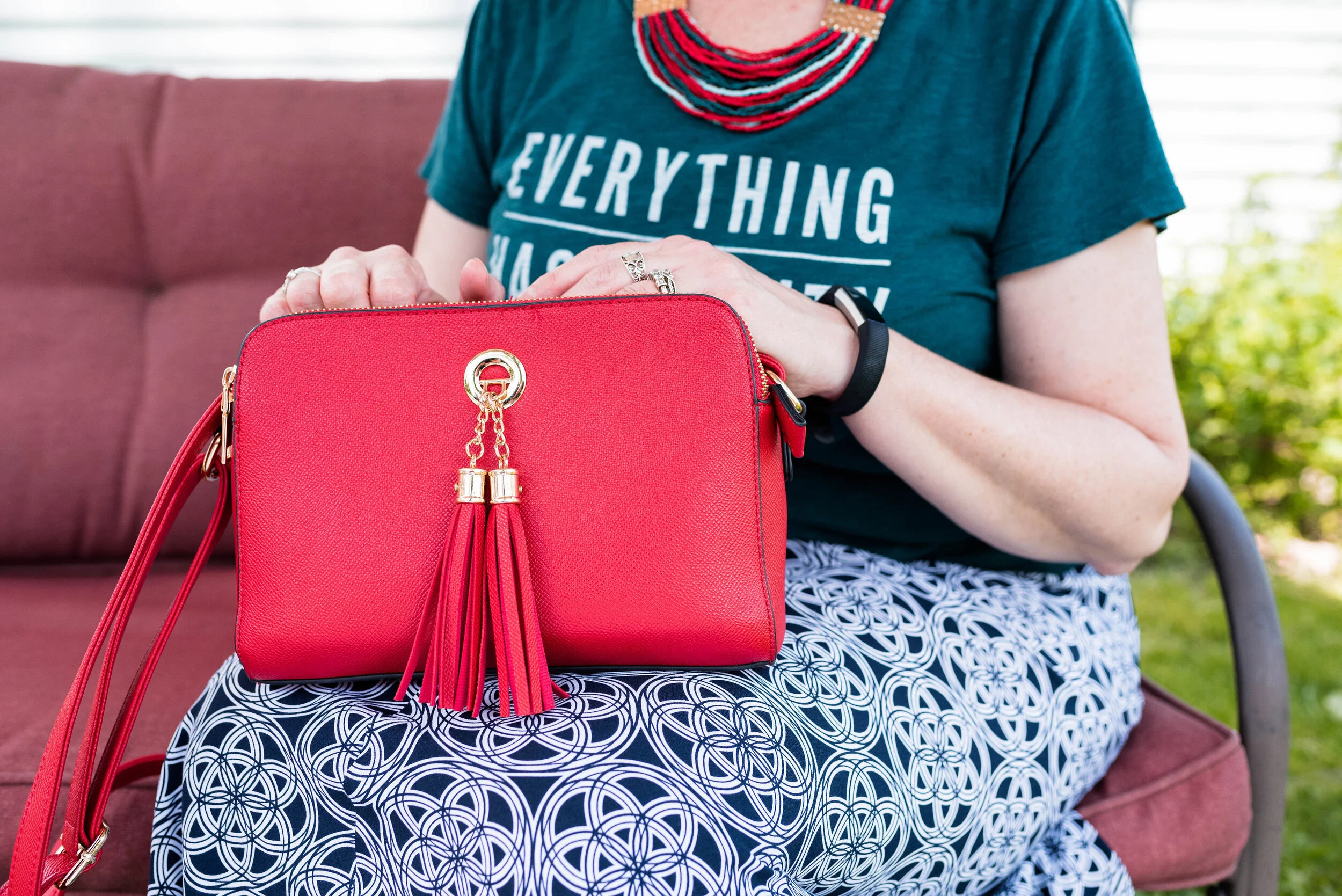
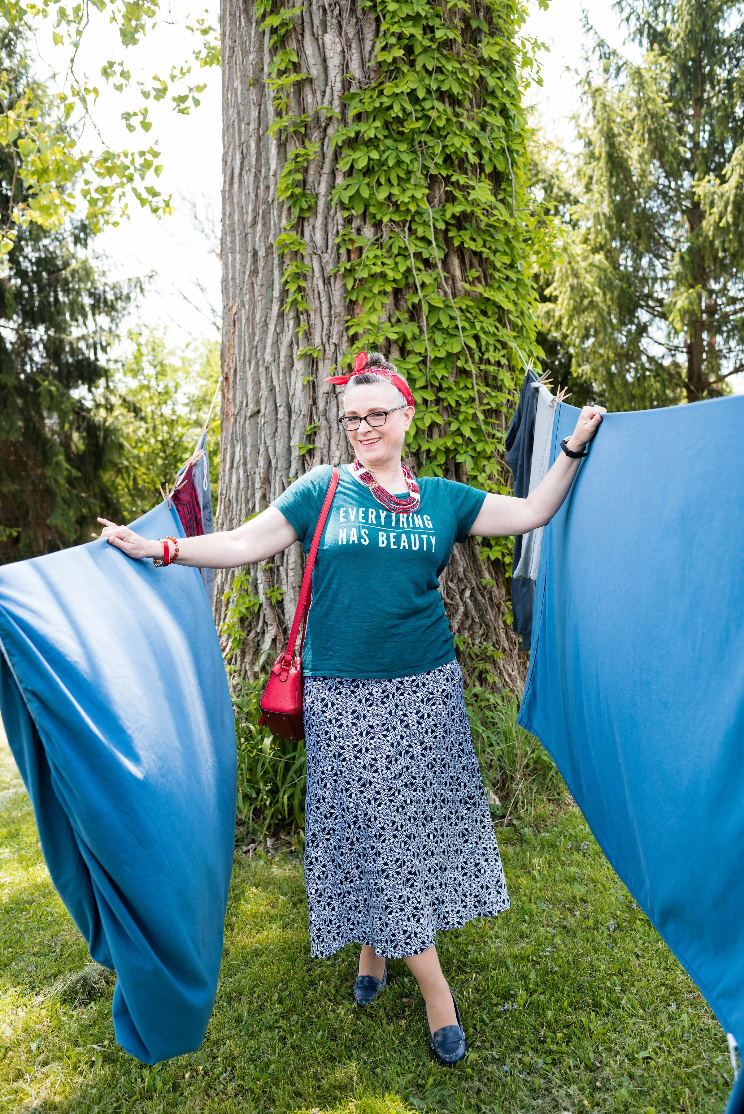
Today, graphics are not just common place on short sleeved tees, but can be seen donning sleeveless and long sleeve tees, as well as pullover sweaters, sweatshirts and tops with added textures and trims. Graphics can also be found on sneakers, bags, water bottles and bedding.

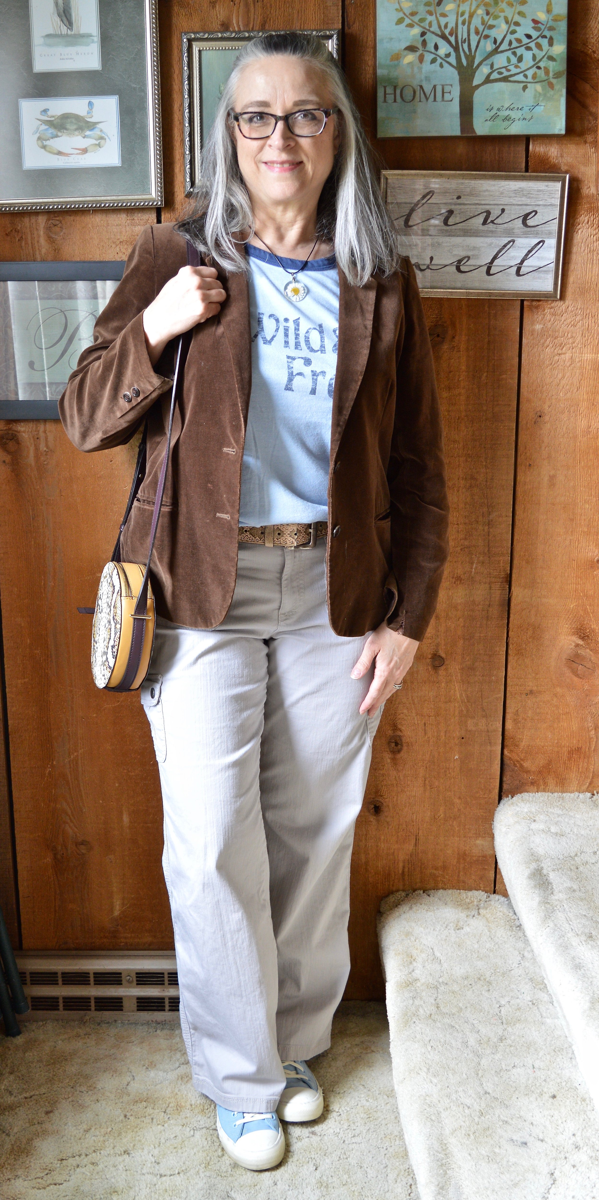
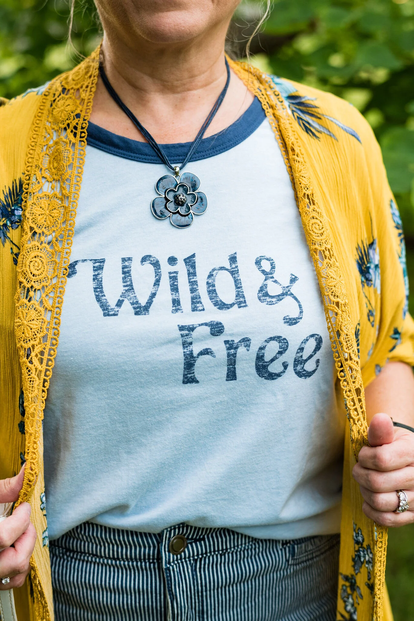
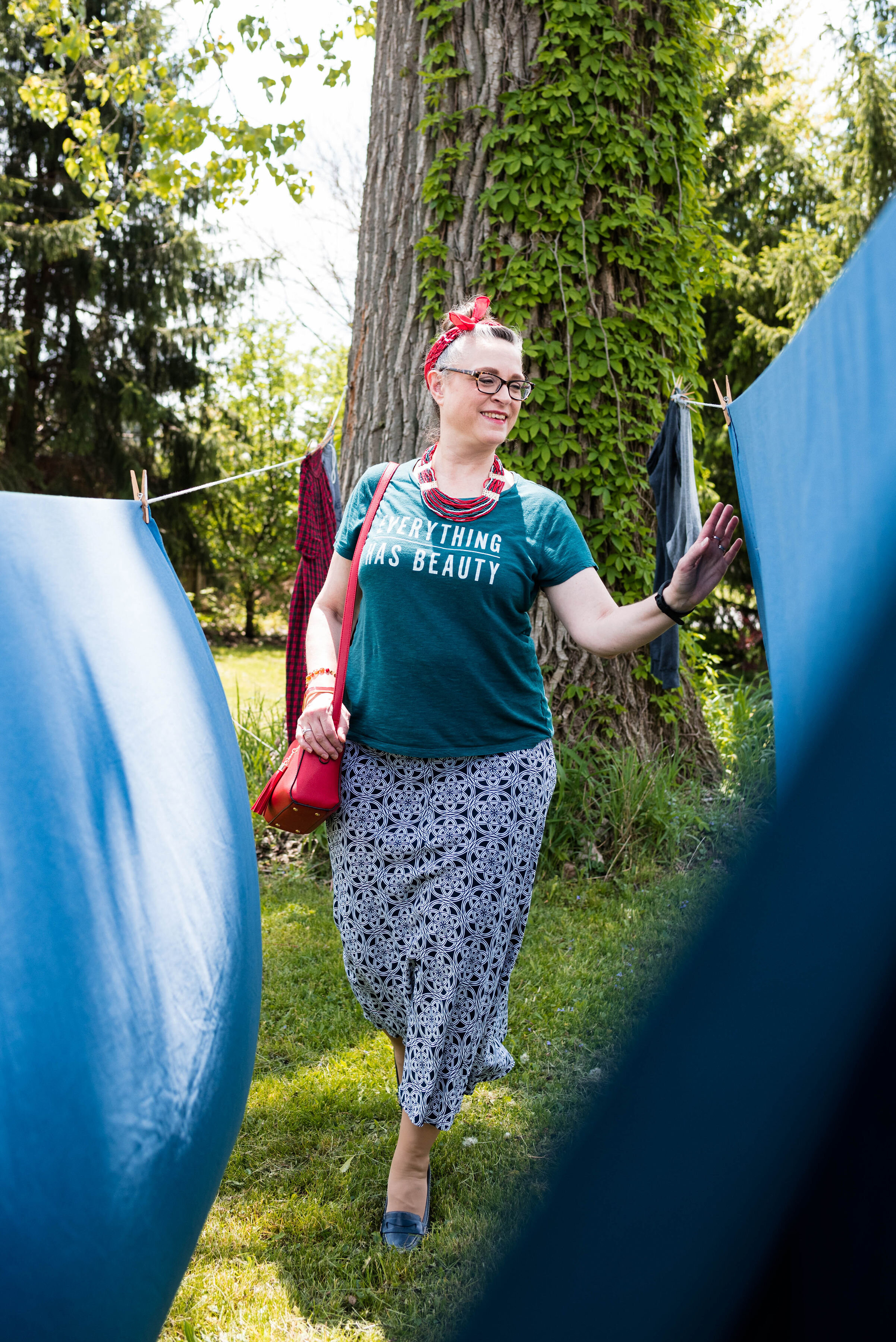
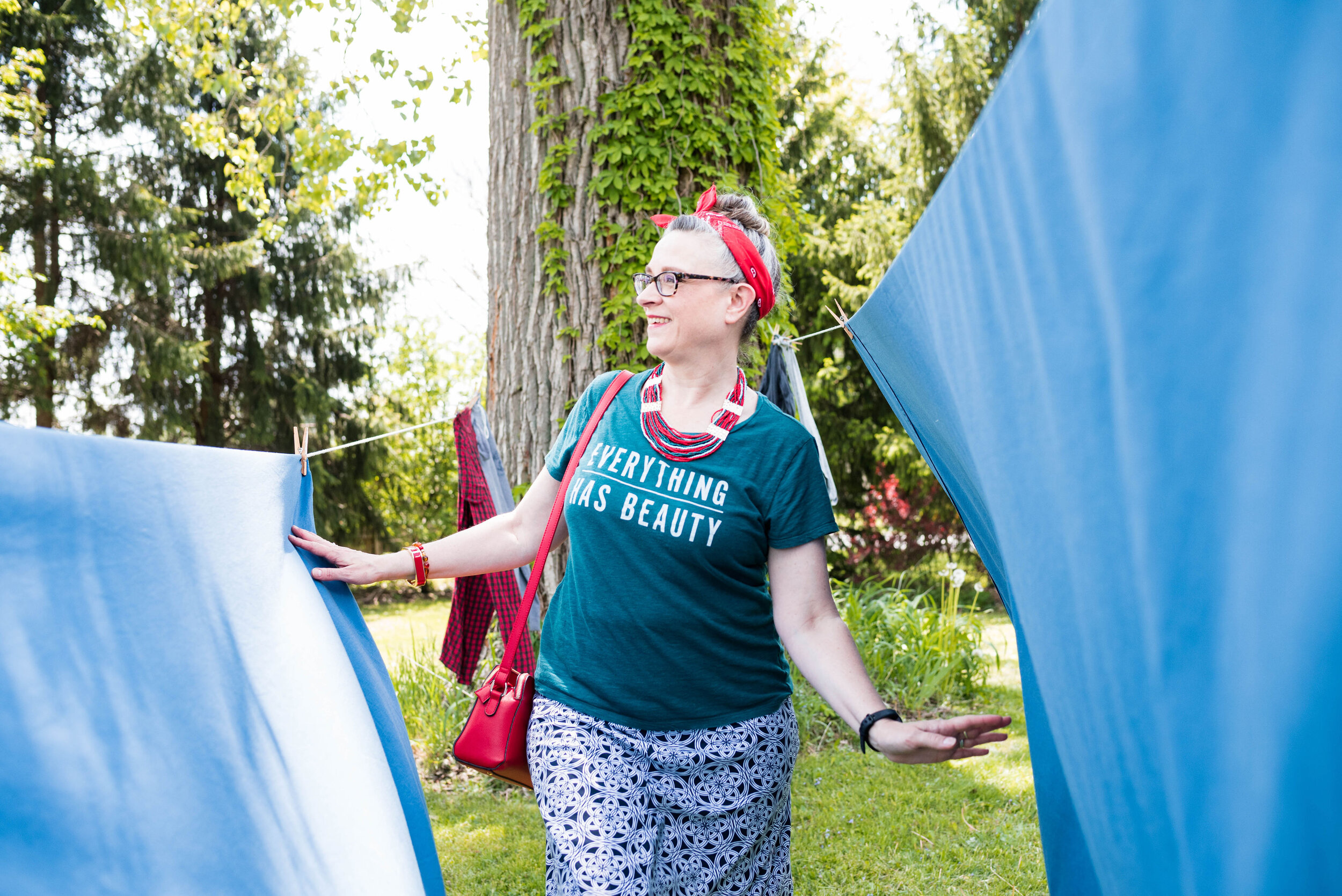
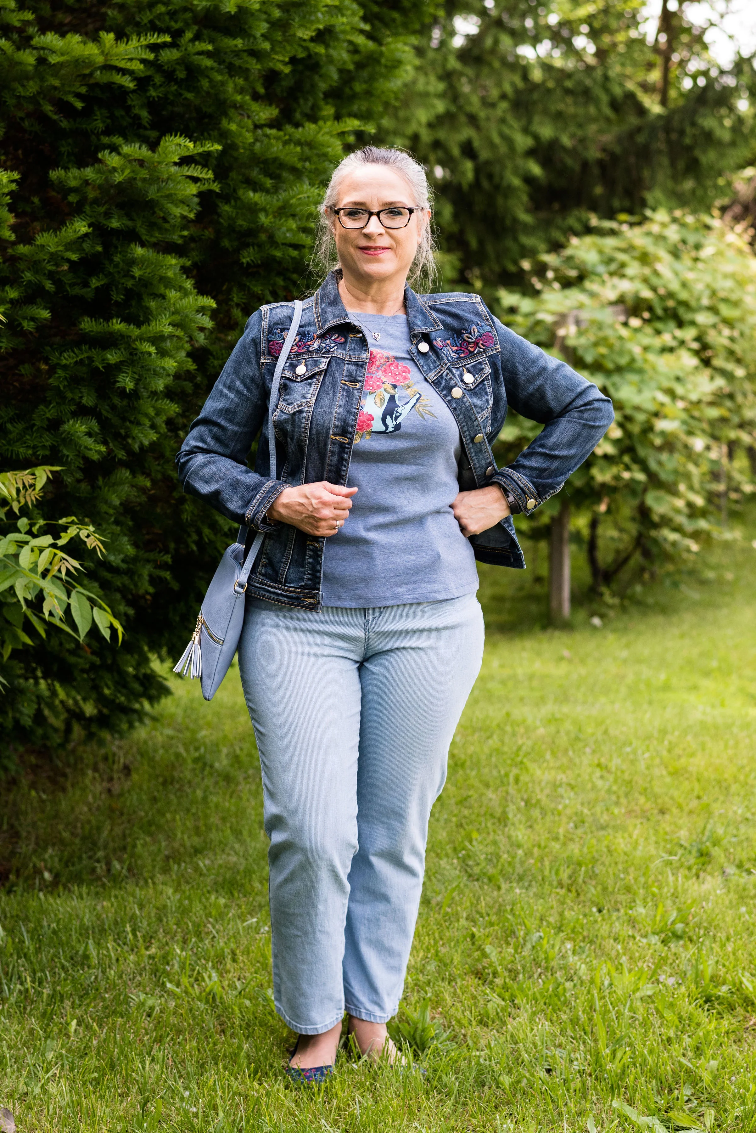
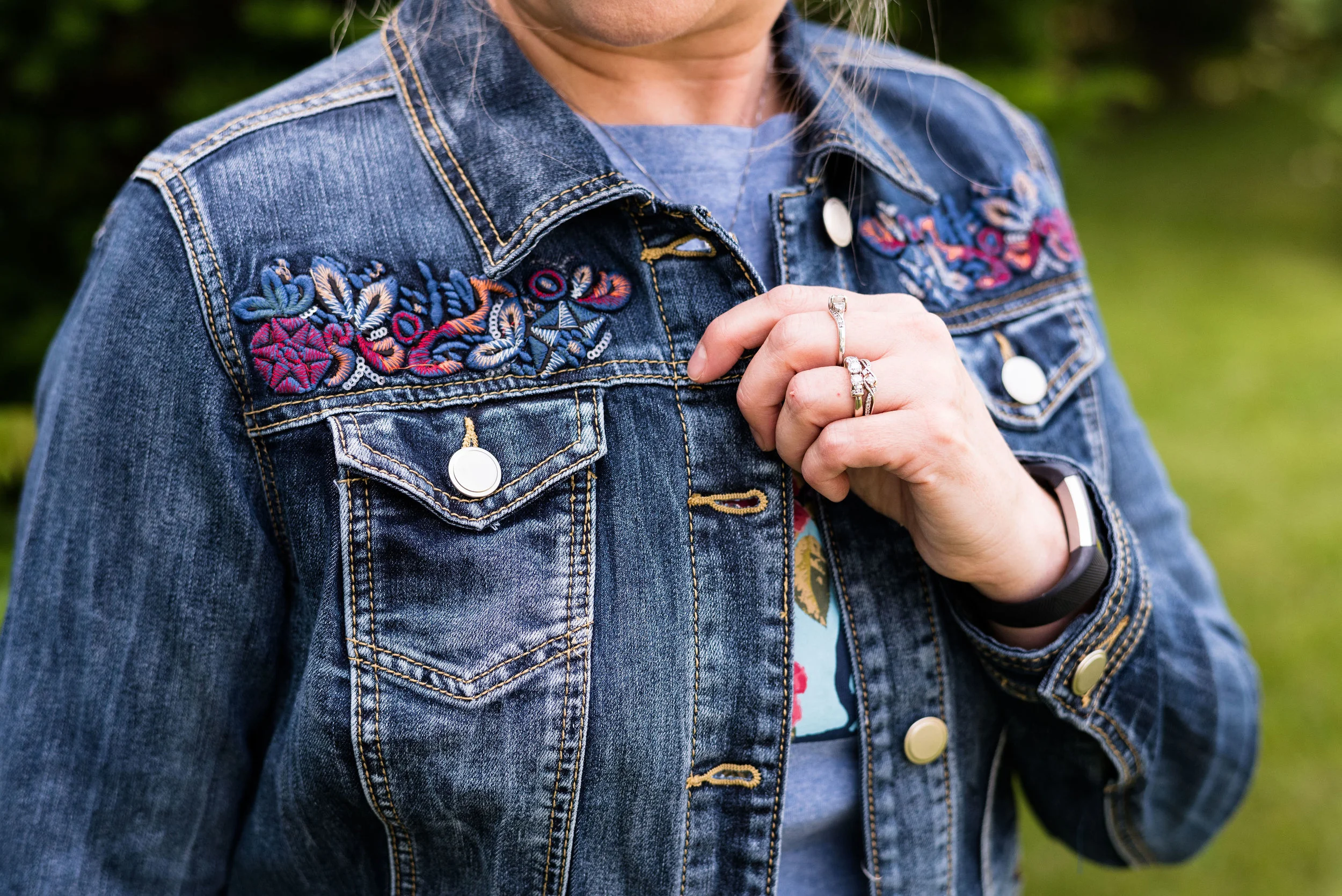
A few years ago, I came across a company called Love in Faith. All of their tees and products have to do with the Christian faith. This is not a sponsored post. I have not been given any products or money to endorse this retailer, I just like what they do, and the products they produce. Today’s outfit revolves around one of their tees.

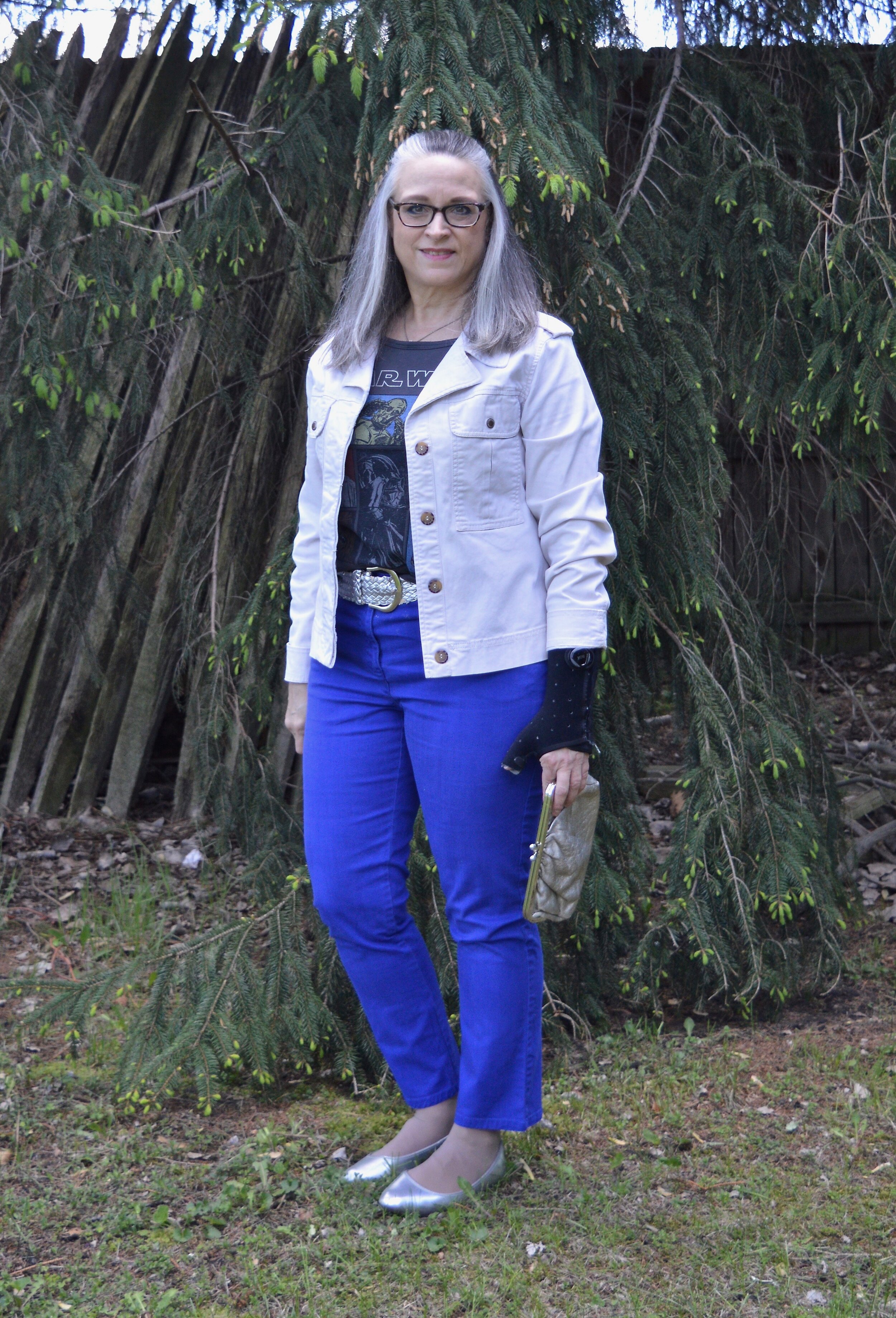
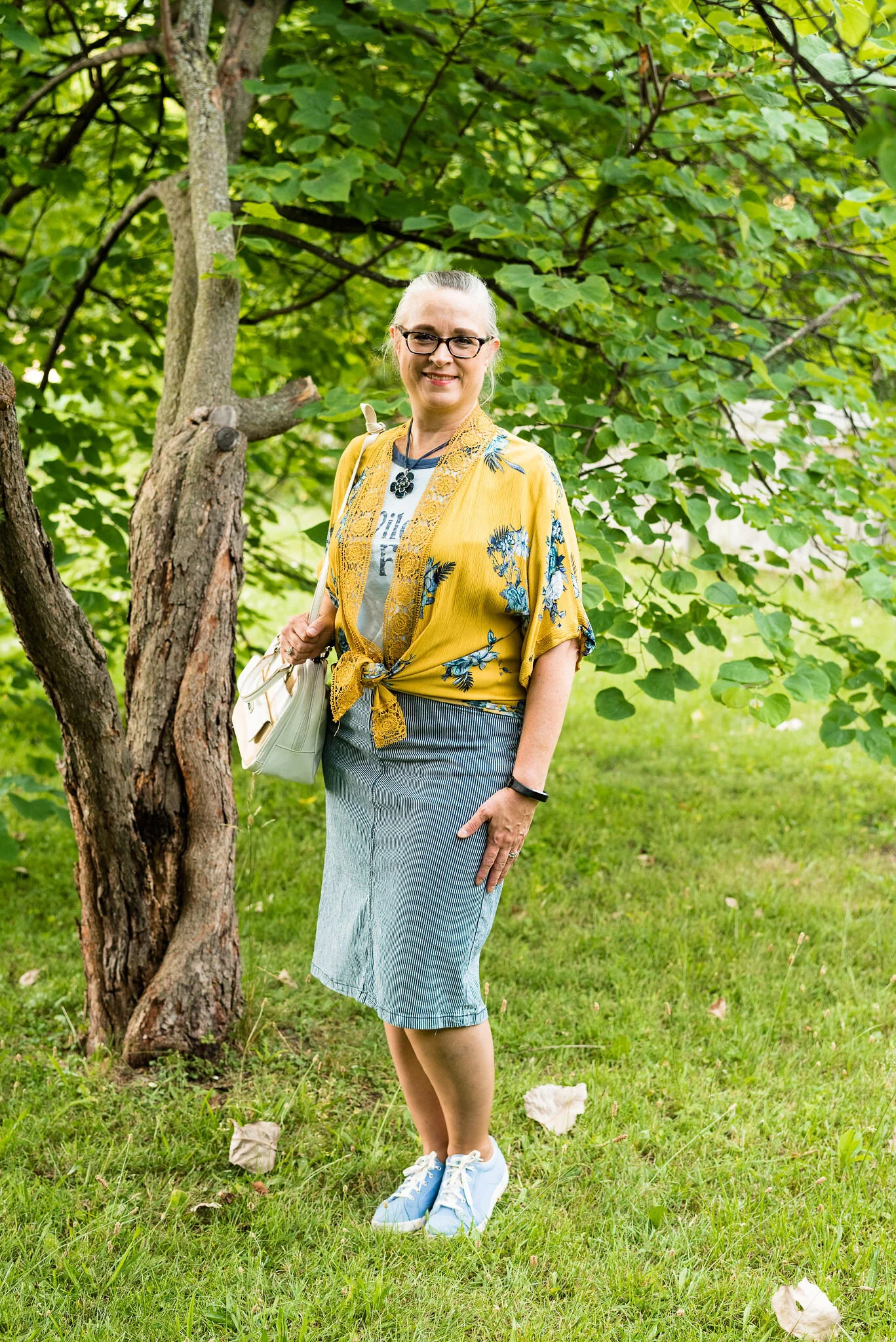
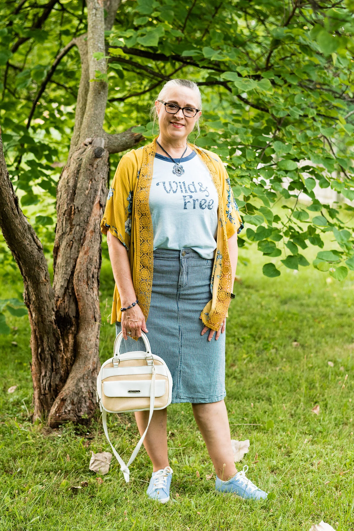
You know my style is casual, but even with a tee shirt I like to look like I made some effort in putting the outfit together. This look was entirely put together from things I already had in my closet. I have loads of tees, and over the last couple of years since I found out about Love in Faith, I have purchased a number of their fun, tees which are always spot on either with verses, lines from hymns or Christian songs, or specific holiday graphics.

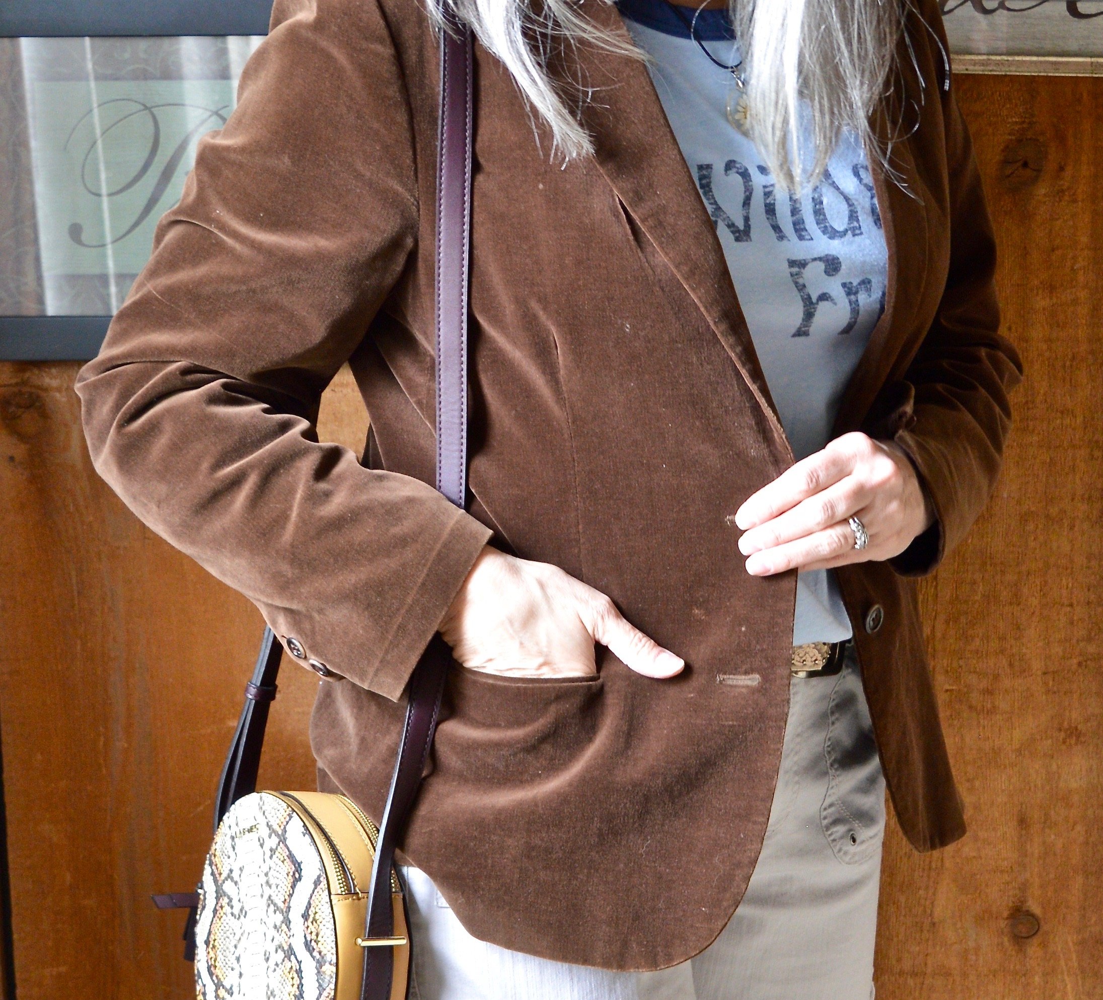
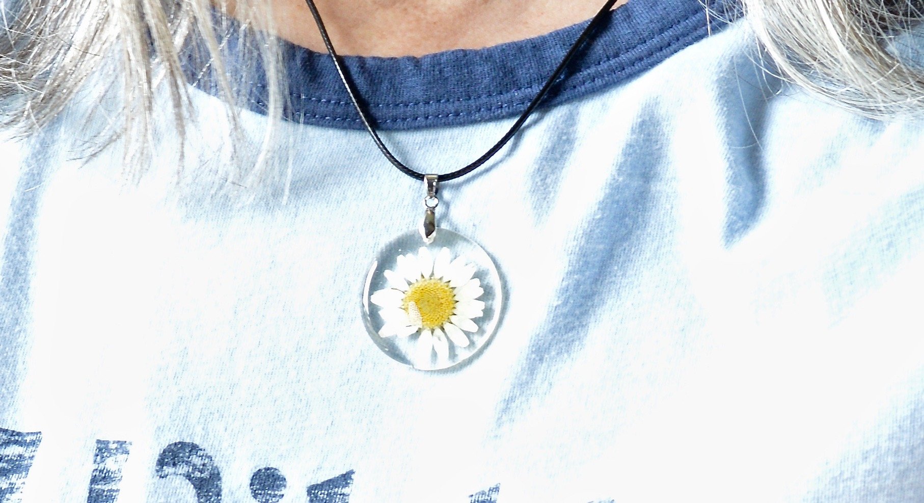
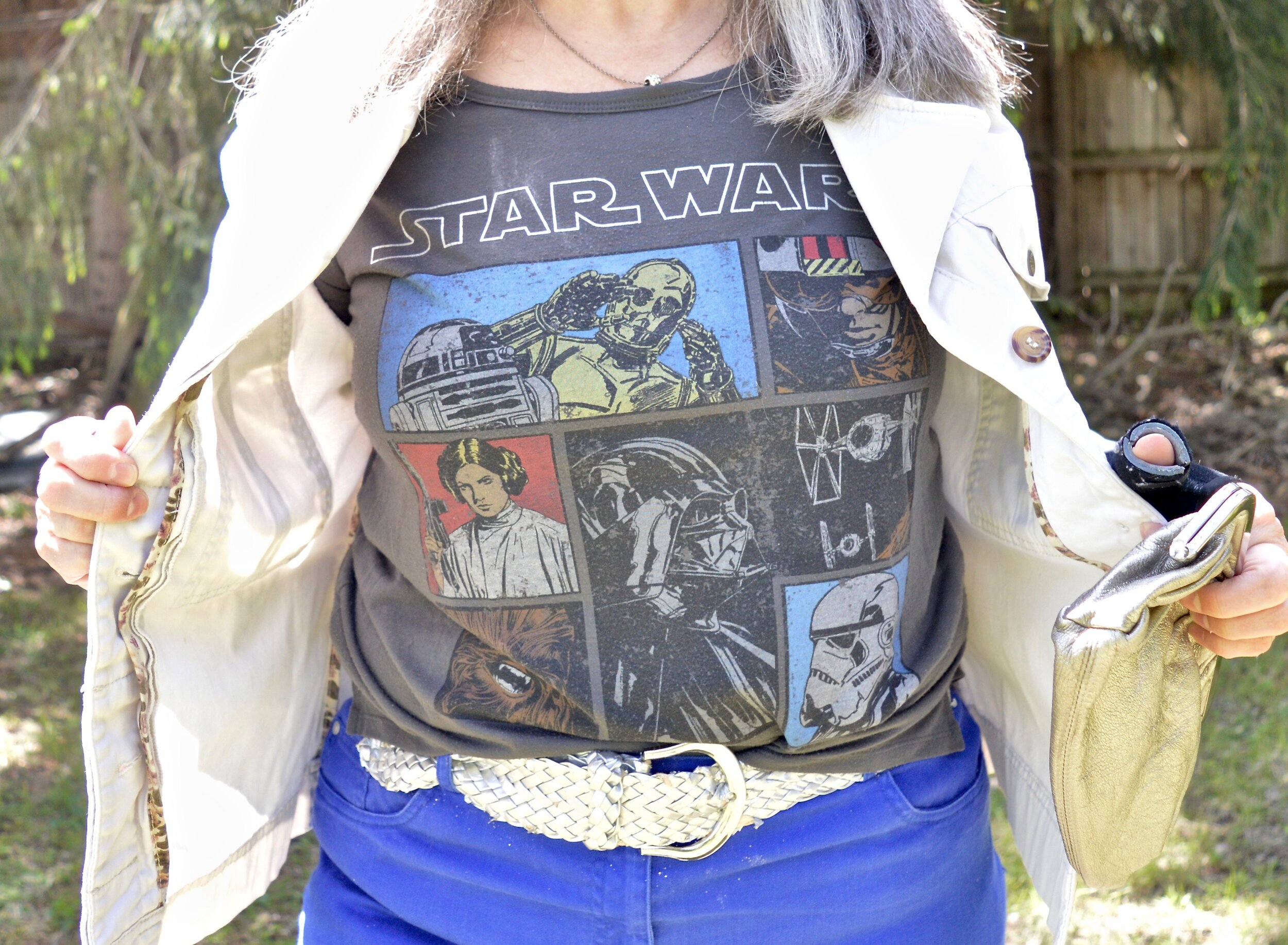
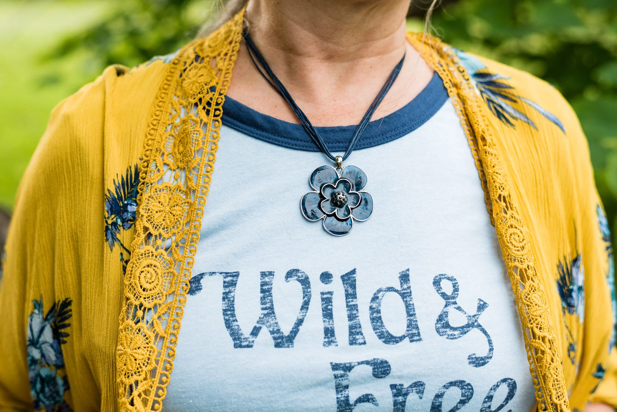
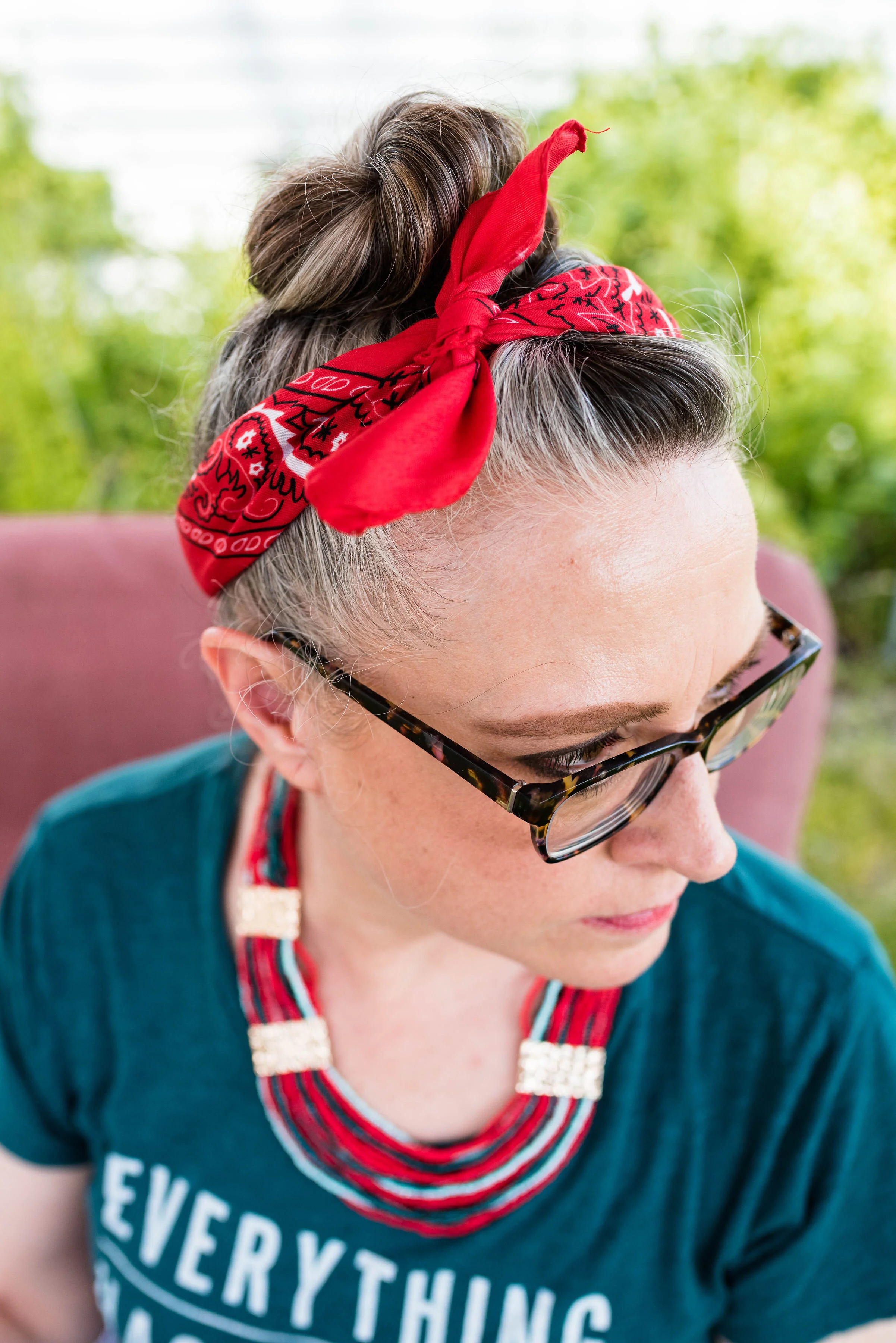
I chose this particular tee because it has the words, It is well, with my soul, which is the first line of the chorus from one of my favorite hymns, When Peace, Like a River. I was totally taken in by the bold, white flowers and the unique cognac color. I decided to layer a black tee underneath since our weather is still very unpredictable.

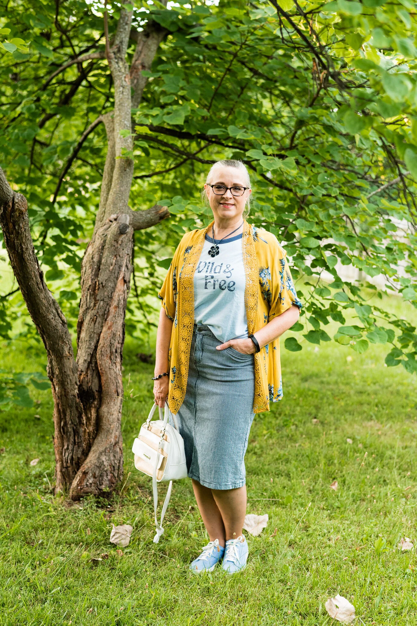
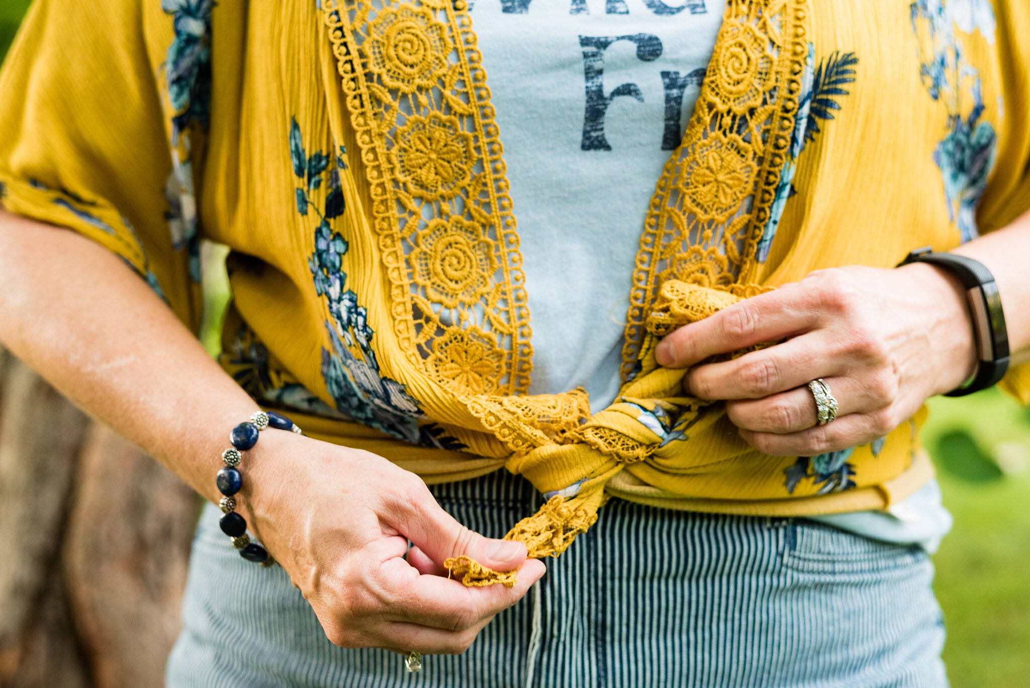
To keep me cozy I grabbed my fuzzy, chenille cardigan. This was a hand me over from my oldest. I had actually gotten this for her one Christmas a few years ago, but it didn’t really grab her attention. When I saw she was getting rid of it, I snatched it up. It is a perfect topper fall, winter and spring and it’s cream color makes it a very versatile piece.

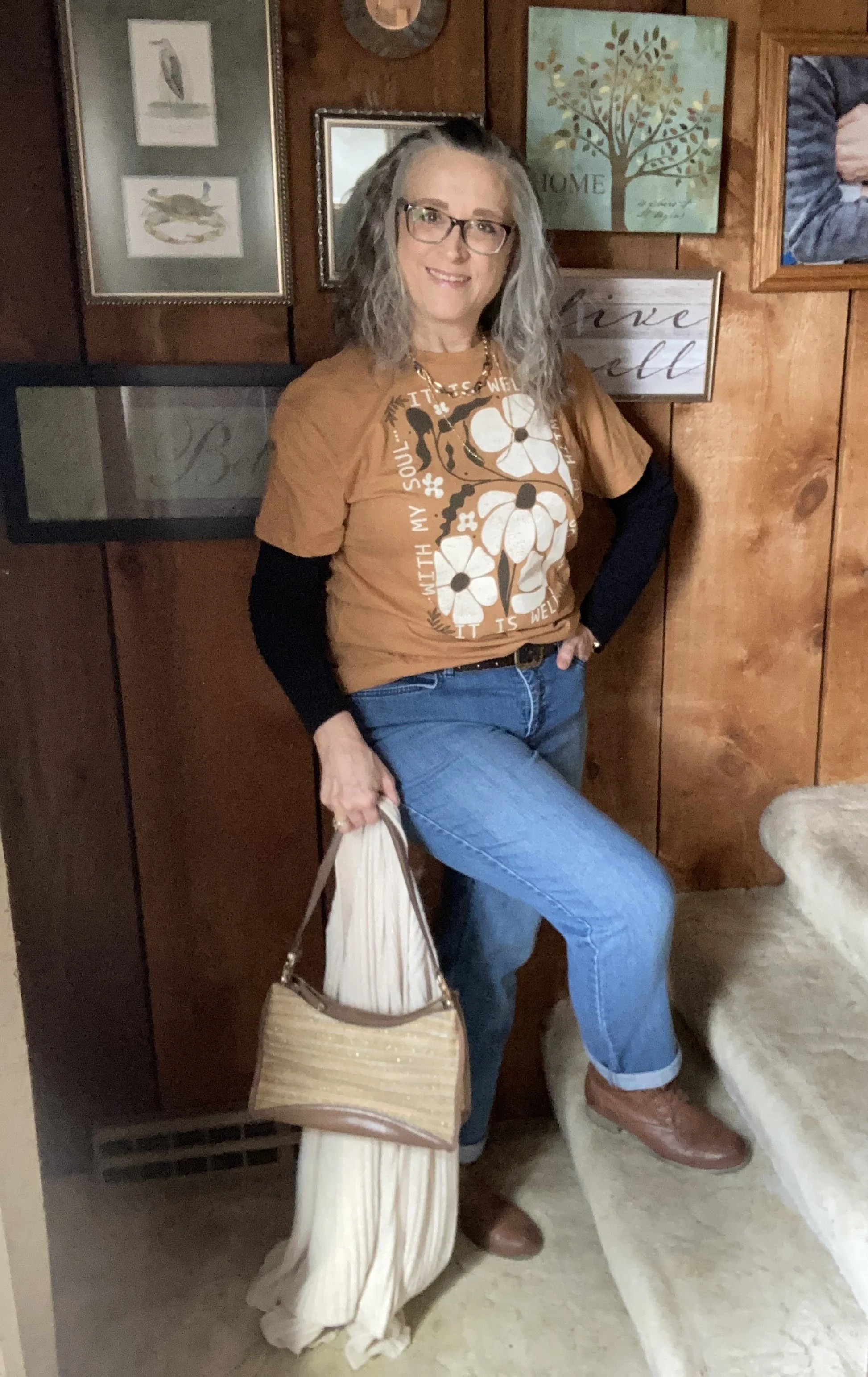
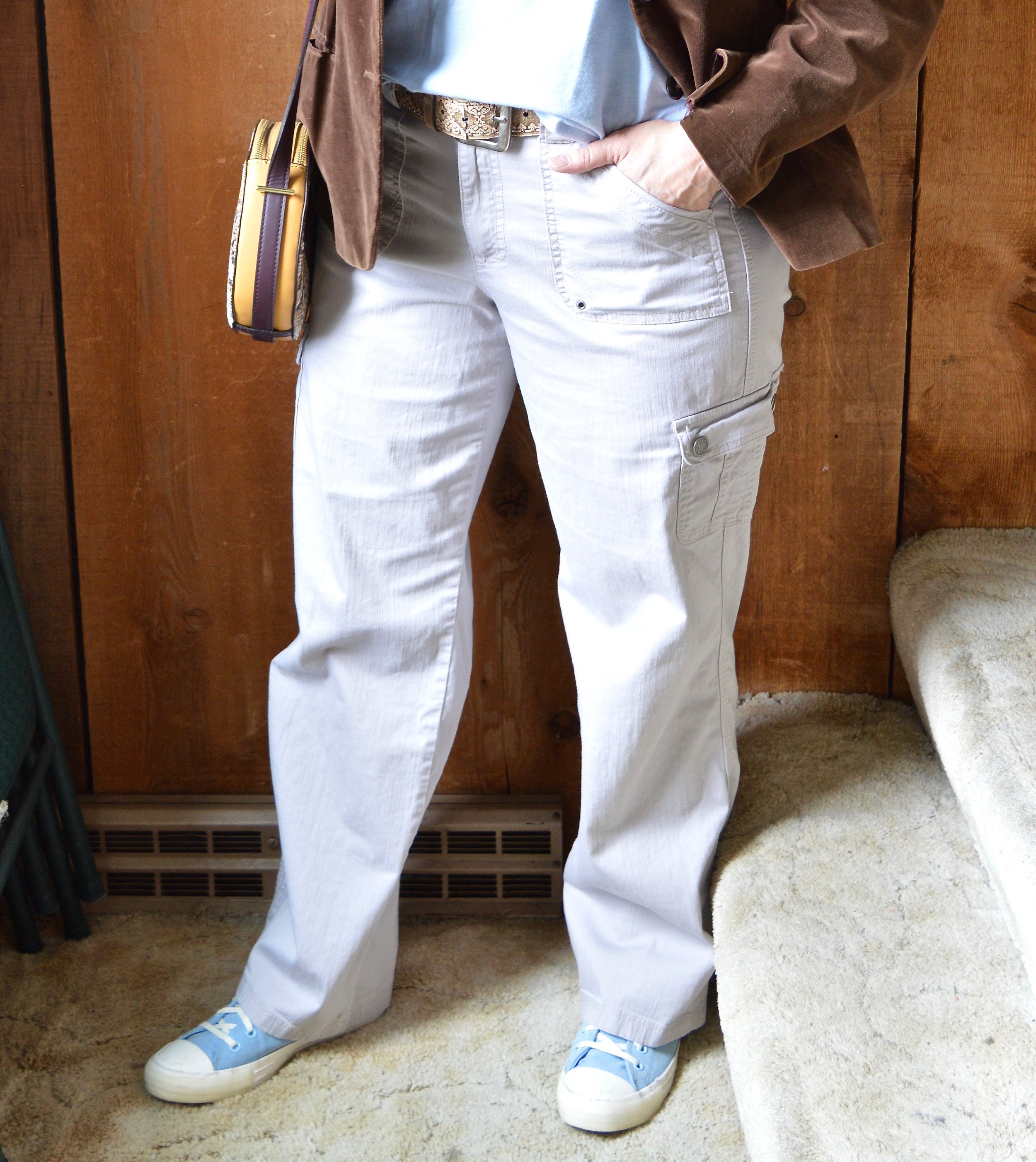
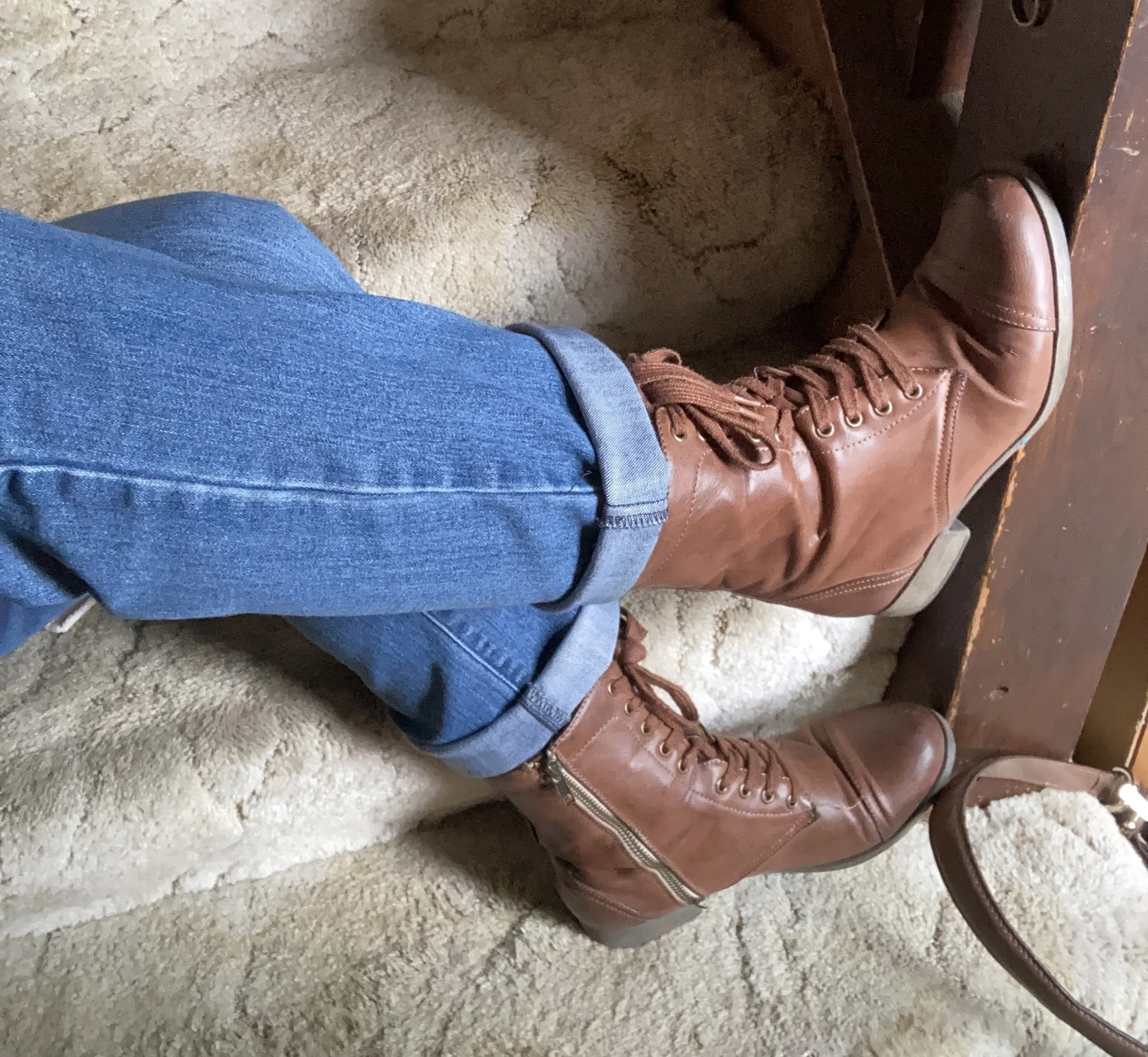
To keep this look light and more fitting for spring, I grabbed my medium wash, thrifted, Bandolino, straight leg jeans. These are very comfortable. Since they are not all that interesting, I added a hem roll on the bottom to give them more of a boyfriend vibe.

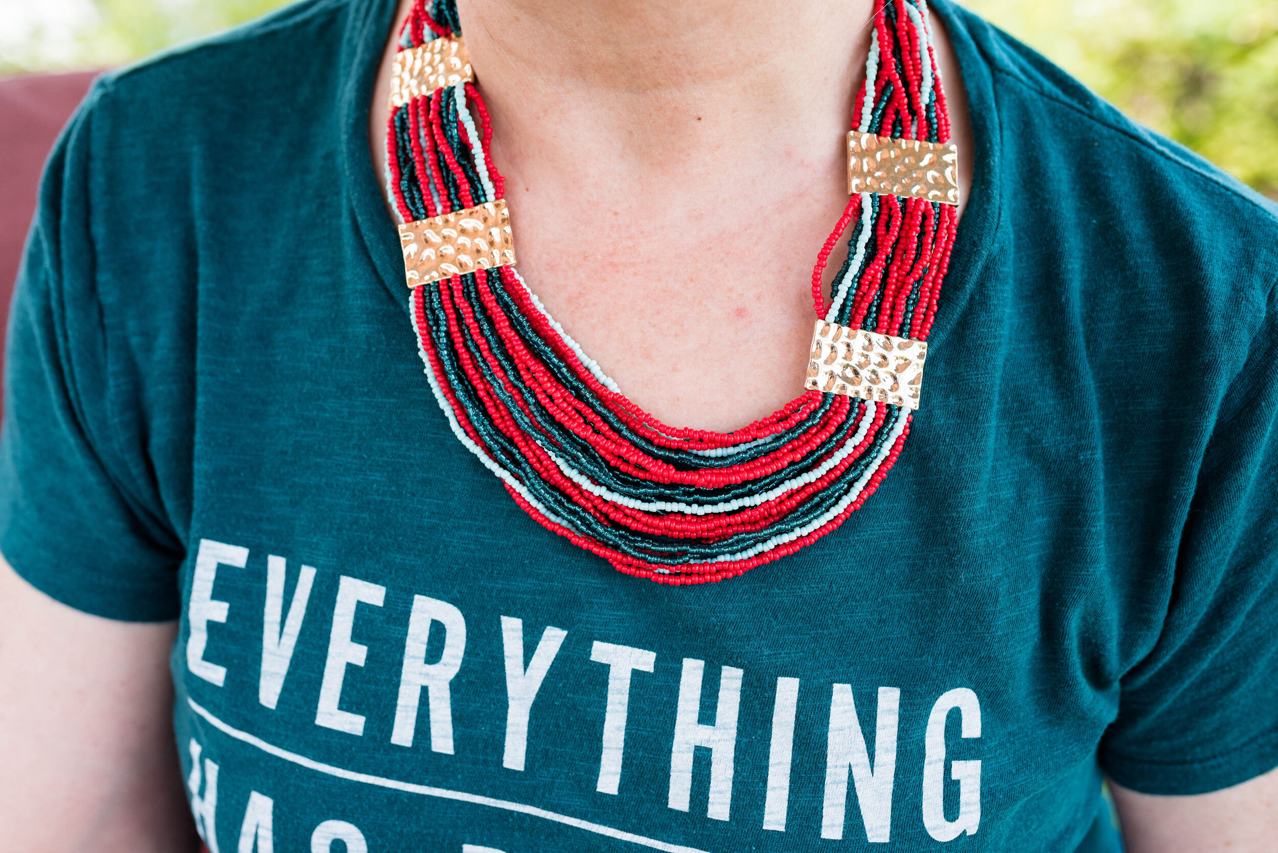
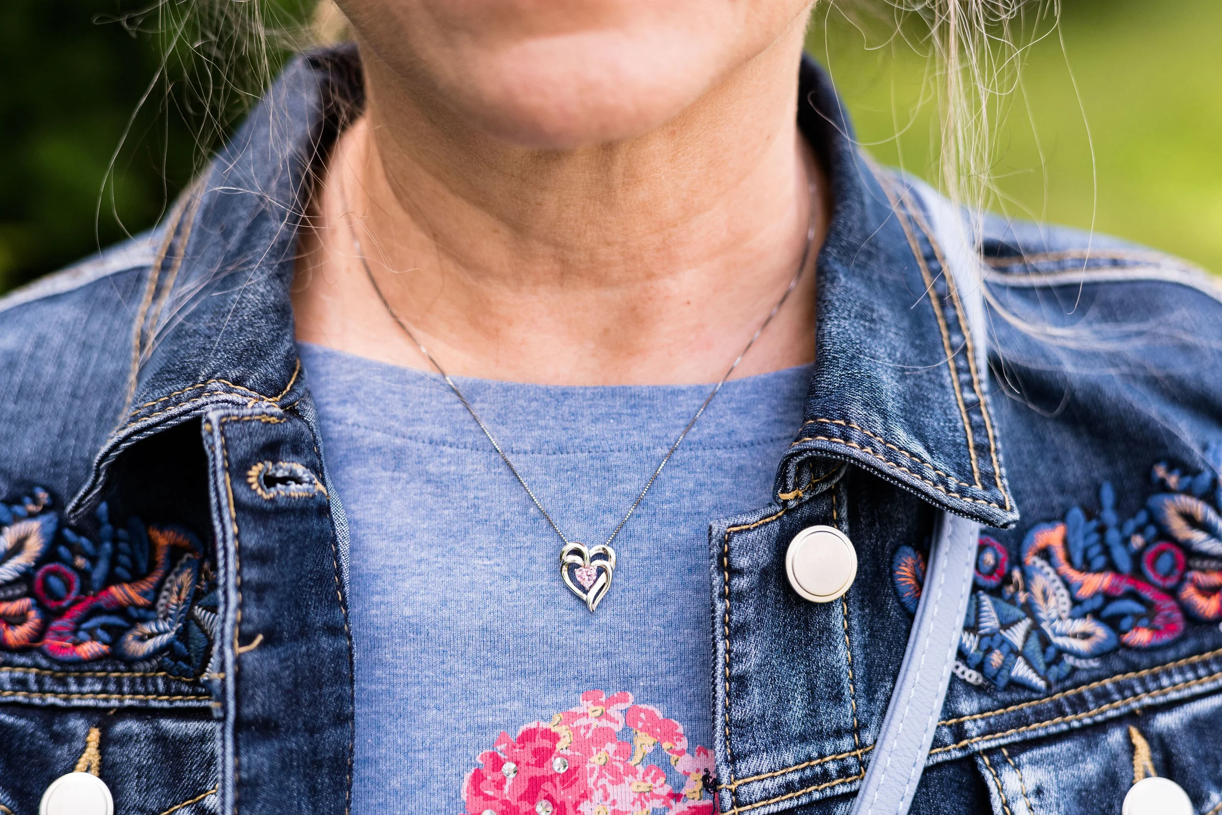
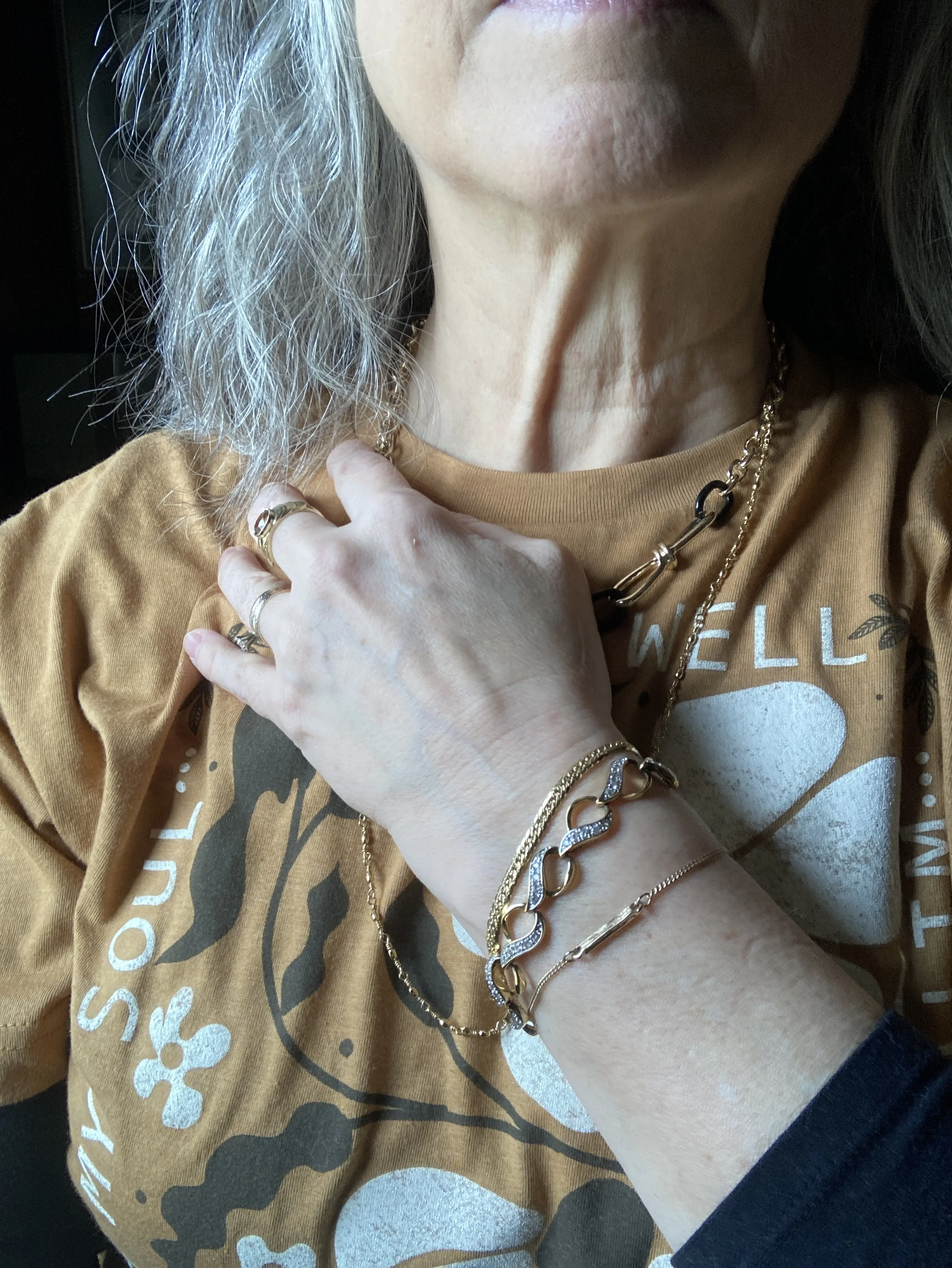
I opted for gold jewelry, but you could easily swap in white or black, or go for a more bold choice and pick a medium blue necklace or scarf to pull in the color of your jeans. That would also make the outfit look even more springy.

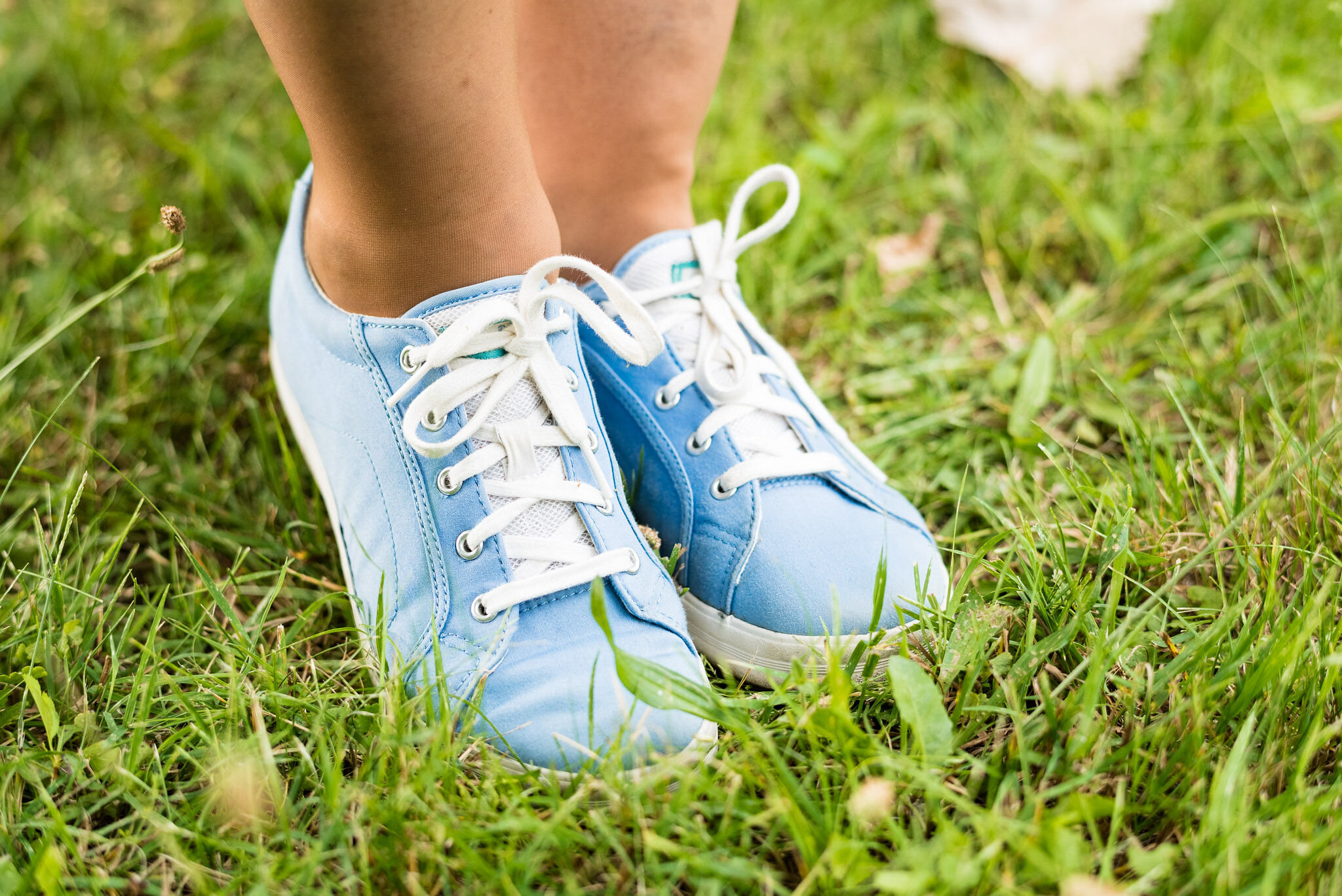
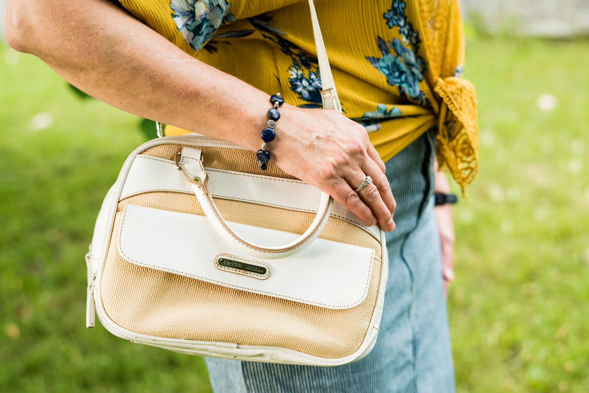
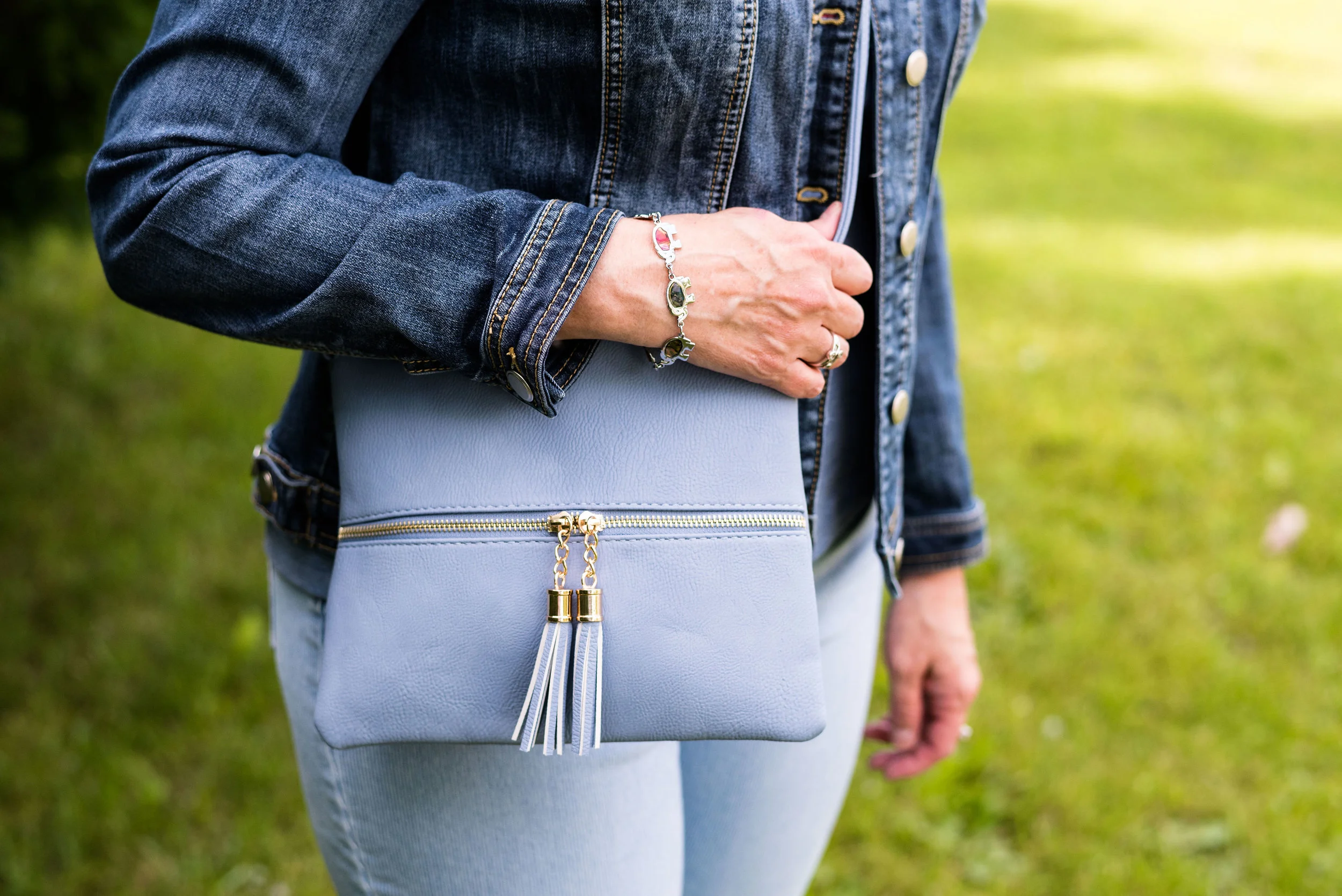
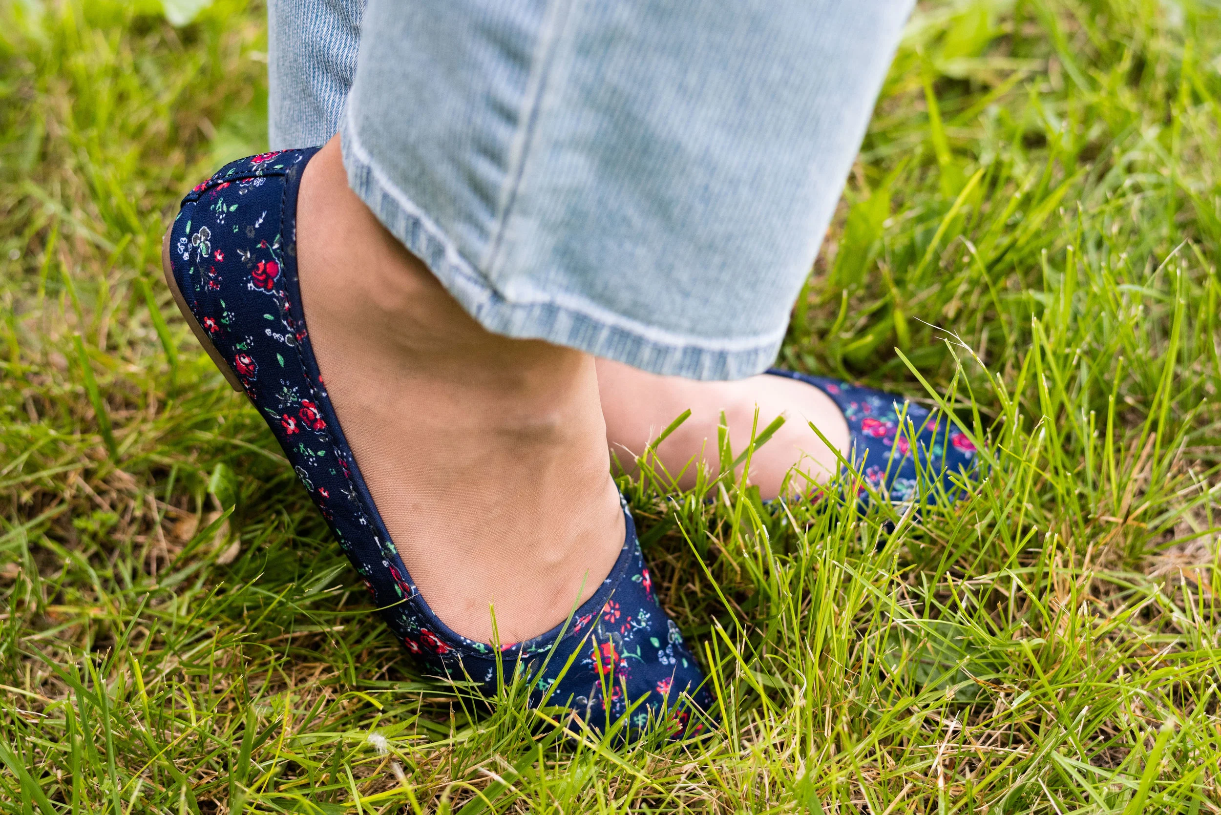
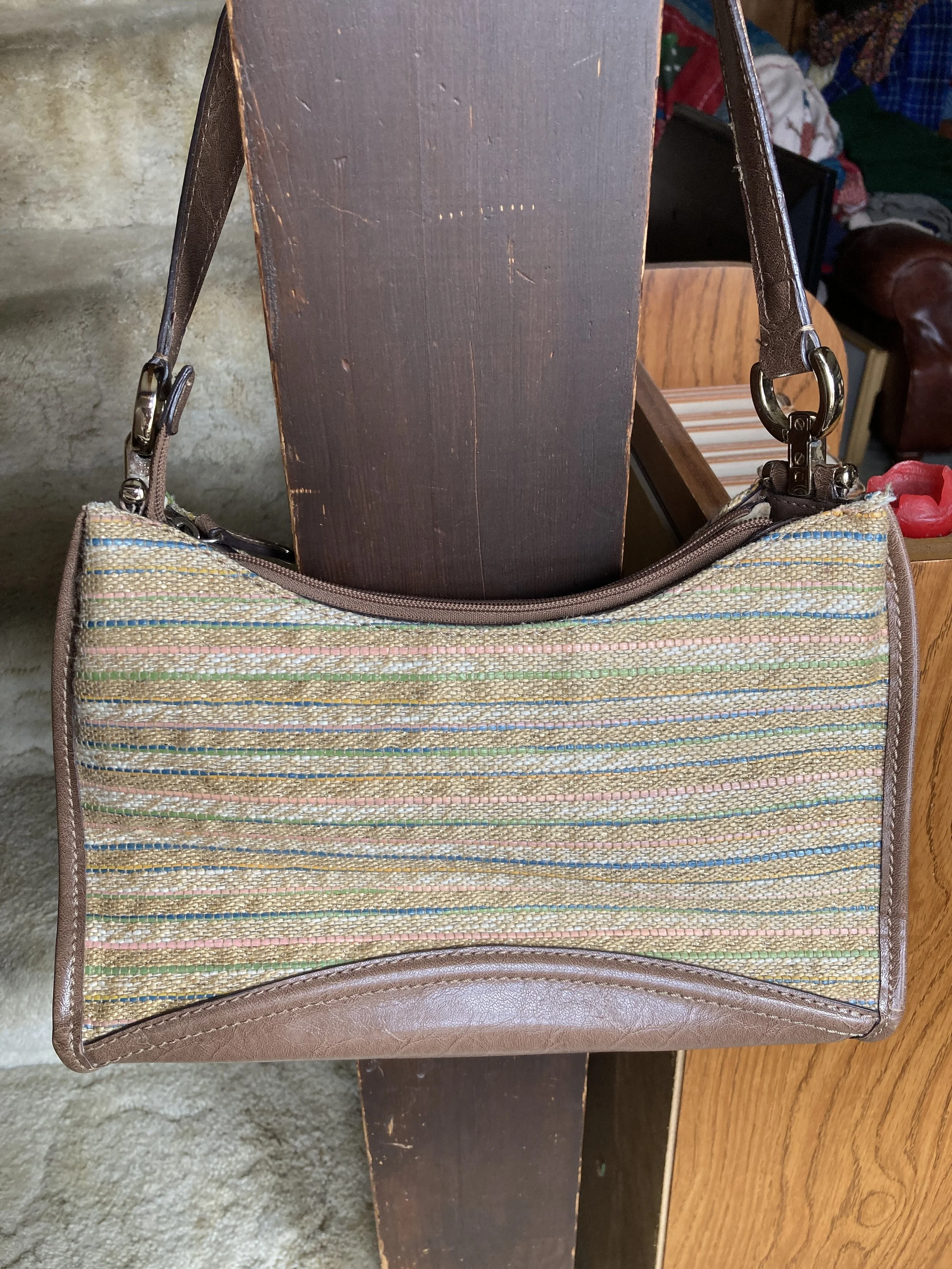
I wear these thrifted, moto boots several days a week. While they are completely man made materials, they seem to be holding up very well. My cute, little, woven bag is a recent thrift find, and I thought it would be perfect for Easter.

Do you wear graphics? If so, what sort of graphics do you wear? What do you think of this outfit? Would you wear something like this? Let me know what you think, in the comments. You can also comment on Facebook if that is easier for you. I just love to have your feedback.

Here are a few shopping links for you to look over. These are affiliate links, all opinions are my own.

Have a great week.

Pantone Spring/Summer 2022 - NY Palette: Spun Sugar, Coca Mocha, and Perfectly Pale

Today’s Pantone colors are a blend of earthy and pastels. Spun Sugar is a light, airy blue reminiscent of hazy summer skies. Coca Mocha makes me think of a double scoop of chocolate ice cream and Perfectly Pale is the perfect summer alternative to basic white. See the actual Pantone colors here.

I think these colors are a great pairing for spring and summer. We often think of brown as a fall color, just like we think of white as only a summer color. Well, girlfriends, we definitely needing to change our thinking about color, as in all colors work at any time of year. I will forever love my darker browns, oranges, yellows and burgundies in the fall, but that doesn’t mean I won’t occasionally put them on in the heat of summer. God made color and color is good, all year round.

My Sugar Spun tee is a Sonoma piece. I don’t know that I consider myself wild, but I definitely am glad I live in a free country. That is something I never want to take for granted. I am thankful for all who have fought for so many years to keep our country the free nation it is. I have come to have a deep affection for graphic tees, especially those with words on them.

This outfit is all me. The colors work for me and the pieces are all thrift finds except the necklace, bag and sneakers. The Coca Mocha velvet blazer is a brand called SSA, and is definitely showing wear. I need to do some stitching around the cuffs as it has been wanting to come apart. But overall, I think the blazer still has some wear left in it. This is not something I would normally gravitate towards in the summer, but with our weather being so wacky, I think I will keep this available.

Style Tip: Don’t put your blazers away for spring and summer. Think of them as light weight jackets that you can throw on with cropped pants, capris and even shorts. They make any casual outfit look classy and put together.

My pants are Gloria Vanderbilt and a newer thrift purchase. I knew I wanted a few other lighter weight and lighter colored pants for spring, so this utility pair does the trick.

Style Tip: If pure white is not your bag, find light colored bottoms for summer in pale creams, tans and yellows. You’ll get a similar effect to wearing white and won’t have to worry as much about your colored underwear showing through.

Summer for me means less in the accessory department. I can’t wear most scarves as I get too hot and many of my jewelry pieces make me break out in the warmer weather. These warm months are where I turn to pieces with hippie vibes that use cording, or heavyweight string for pendants and bracelets. I am thinking about taking a few of my hubby’s metal detecting finds and turning them into jewelry, so I guess this would be the time.

My daisy necklace was a Christmas gift from my husband. I like the little quirk it has, because that’s me, just a little quirky. Ha. ha. I am also showing off my round Nine West snakeskin print bag, that I got a few seasons ago from Kohl’s on clearance. Last, but not least, I had to use my bright blue Converse again, since they went along with the Spun Sugar color.

What do you think of these colors? Do you like the colors together, or would you put them with other colors? I love hearing your thoughts and ideas. You inspire me too!

I’m including a few shopping links for you to peruse. These are affiliate links. All opinions are my own.

Have a great day!

Spring Outfit with Bright Blue Pants

I thought I would come up with another outfit using my thrifted, bright blue, Ruby Rd. pants, since I was just talking about them on Tuesday. It was a beautiful day, so I managed to snap a few pictures for this post. They are never as good as my daughter’s pictures, but that is okay. This is real life, right? I never want to come across to you all as having it all together. There are so many bloggers and people who post on Instagram and it is easy to feel like we don’t measure up to their fabulous outfits, looks, or homes, but I know reality. It is messy, hard, busy and many times overwhelming. So I am trying to be as real as possible and not so great pictures are my reality, and so is my wide bottom. Ha, ha.

DSC_0005.jpg

I wanted to create a look that was casual with just a touch of sass. My Star Wars tee belonged to my oldest daughter and she didn’t want it any more. I’m all for fun graphic tees and certainly am a Star Wars fan. I am actually a bigger Star Trek fan, but Star Wars is a close second.

DSC_0012.jpg

Funny story about my thrifted silver belt. I chose the silver belt and my silver SO ballerina flats to jazz the look up a little bit, and it went with the silver lettering on the tee. When I went to pull the belt through the first belt loop a ton of the silver flaked off. I had silver dust all over my pants and my rug. Needless to say, I threw the belt in the trash when I was done with the pictures. I was disappointed, as I had great plans for that belt. Oh well, like I said, real life.

DSC_0010.jpg

I’ve styled this thrifted, white, Sanctuary, jean jacket one other time on the blog. You can see how I styled it with a leopard print skirt. This jacket is not truly denim, it is a thicker cotton material, but doesn’t have the same characteristics of denim. However, I really like it and it is a good piece for the warmer weather and something different from the traditional jean jacket.

DSC_0004.jpg

I didn’t take a picture of my little silver clutch, but you have seen it on the blog before. I chose it because it went with the belt and shoes. I do like things to match, but it is okay to not have things match as well. Many of our old fashion rules have gone by the wayside. I always go back to the idea, do what is best for you. If you like things to match, then make them match. If you want to wear purple shoes, carry a red bag and wear a green belt, you go girl! As bloggers, we are only here to give you inspiration, not tell you how you have to dress.

DSC_0015.jpg

I want to know if you have gotten yourself a pair of bright blue pants? Ha, ha. Actually, they are a little hard to find, but if you thrift shop, be sure to check there. Thrift stores will often have loads of brightly colored pants, because they are no longer trending.

I hope you enjoyed this post and one more idea on how to style those bright blue pants.

I’m including a few shopping links just for fun. These are affiliate links brought to you at no added cost. If you click on a link I get a few cents. I appreciate every click. All opinions are my own.

Have a great weekend everyone!

Pantone - Autumn/Winter - 2020 - London Palette - Strong Blue, Military Olive and Jet Stream

Happy Thursday friends! Are you all as tired as I am. When morning comes I feel like I could just stay in bed for days. I am sure some of it has to do with our current Covid life. It really is extremely disheartening to see the numbers keep rising and know that there is really nothing different we can do, other than keep on keepin’ on. I implore, those of you who don’t wear masks, to at least consider it for the sake of others. These are very hard times. Do what you can to keep yourself busy and involved in life as much as you can. I have been spending a lot of time alone, when I am not with my family and I don’t think it is good for me. As an introvert, I enjoy my alone time, but I seriously feel like my brain is turning into slush. Anyone else feeling the “squishy brain syndrome”? I have also noticed a lax in my creativity. Going places and doing different things has always fed my creative brain, but being stuck at home, well, it isn’t very interesting. Ha, ha. What do you other creatives do to keep the creative vibes flowing? I’d love to have some feedback.

Today’s outfit centers around another medium blue, olive and white. Strong Blue could be a close cousin of Classic Blue. I was fortunate to have just found this graphic tee while thrifting. I think it matched the color perfectly and I really like the message. I can do the get up part, and being kind isn’t too hard, but being awesome is a bit of a stretch. Ha, ha.

Pantone - Autumn/Winter - 2020 - Strong Blue, Military Olive and Jet Stream

This tee is a brand called Gildan. Once again, I have been exposed to a brand I had never heard of before, by thrifting. This is a basics retailer, selling tees, underwear, sweatpants and hoodies for men, women and children.

Pantone - Autumn/Winter - 2020 - London Palette - Strong Blue, Military Olive and Jet Stream

When we looked at the New York palette, Military Olive was a classic color. If you remember I wore it with Peach Nougat and Sandstone for that palette. You can click here to see the outfit again. For this look I just wanted to do something different from a solid colored sweater or jacket, and then I remembered I had this thrifted plaid piece. This is Jones NY brand and is part wool, so I can’t wear it without something long sleeved underneath. I made an exception with this outfit, because I knew I wouldn’t have it on very long. Wool makes me itch. I doesn’t matter if it is rich Merino wool or cashmere, my skin can tell the moment I put it on.

Pantone - Autumn/Winter - 2020 - London Palette - Strong Blue, Military Olive and Jet Stream

My Gloria Vanderbilt jeans have been on the blog numerous times before. They are a heavier weight, so perfect for the cooler temps of fall, winter and spring. They are really a little too white compared to the Jet Stream color which almost has a hint of tan or gray to it.

My military belt, SO ankle boots and beaded bracelets all have the Military Olive vibe.

Pantone - Autumn/Winter - 2020 - London Palette - Strong Blue, Military Olive and Jet Stream
Pantone - Autumn/Winter - 2020 - London Palette - Strong Blue, Military Olive and Jet stream
Pantone - Autumn/Winter - 2020 - Strong Blue, Military Olive and Jet Stream

I also added a heart necklace that has a sort of greenish colored stone. I think this used to belong to one of my daughters, who did not want it any more, so I snatched it. Ha, ha.

Pantone - Autumn/Winter - 2020 - London Palette - Strong Blue, Military Olive and Jet Stream

While my bag is not really Military Olive it does have an olive leaning and the blue flowers go well with the blue of the tee.

Pantone - Autumn/Winter - 2020 - London Palette - Strong Blue, Military Olive and Jet Stream

What do you think of this color combination? I like olive and blue together and I feel that olive goes with so many different blues, and really with so many different colors. It really can be used as a neutral in many situations.

Pantone - Autumn/Winter - 2020 - London Palette - Strong Blue, Military Olive and Jet Stream

I hope you are enjoying the colors on the London Palette. It is fun to experiment with color, especially when you discover, that color you thought you couldn’t wear, looks fabulous on you. Have a great rest of your week. I am including some shopping links for you to look over. These are affiliate links and are brought to you at no cost to you. If you click on a link, I get a few pennies. I offer these as a way for you to shop similar items in my posts. Since most of my items are from my closet or thrifted, I try to find items as close to mine as possible. All opinions are my own.

Keep in mind, the holidays are quickly approaching, so these shopping links may also offer you a way to shop for others you need to buy for. Enjoy.

Graphic and photo credit Rebecca Trumbull.


Kickin' It with Kimonos - Yellow Floral

It seems that floral is a very popular pattern for kimonos. I am not sure it that is because most of us use our kimonos during the warmer months as a way to level up an otherwise, “normal” outfit like a pair of jeans or shorts or if I just am more naturally drawn to the floral prints in my purchases. Today’s kimono is a shorter style, but once again is covered with a floral print, although this time a bit more tropical.

Kickin it with kimonos - yellow floral

I was on the verge of getting rid of this pretty yellow kimono. It is a brand called TruSelf and I think I got it at Walmart a few years ago. I am not real thrilled about the length of this piece. If the hemline was more asymmetrical, I think I might like it better, but for the sake of trying something different I kept it.

One of the bloggers I have followed since becoming a blogger is Jodie at Jodie’s Touch of Style. Jodie is such a warm, friendly lady, and an actual person. She isn’t at all fake, and I love that about her. Most of the fashion bloggers I follow are real women, who have their own sets of struggles and difficulties, but they are trying, just like me, to accept themselves and this process called aging. Jodie featured a post on a different way to wear your kimonos and that is where I learned this trick of tying the front to give the kimono a different look. You can see Jodie’s original post on how to make kimonos look more fitted here.

Kickin' it with kimonos - yellow floral

I tied mine differently than Jodie did in her post, but it still serves the same function, to make the kimono more fitted, rather than boxy. Here’s what it looks like tied up.

Kickin it with kimonos - yellow floral

My light blue tee is a thrifted Sonoma piece. I love graphic tees and a great place to find them are thrift stores. Whether you like band tees, place tees or just random word tees, you can find plenty of different graphics second hand. Be sure to check out the men’s section as well. I found a few tees that were perfect for my younger daughter.

Kickin' it with kimonos - yellow floral

My pin striped skirt is reminiscent of the old time railroad engineers’ caps. this was a recent online purchase from Christopher and Banks. I was looking for another pencil type skirt with a little different look than just plain denim. This works perfectly. I am looking forward to cooler weather and styling this skirt with some tights and ankle boots.

Kickin' it with kimonos - yellow floral

Since the chunky sneaker look is trendy with skirts and dresses right now, I knew I could add my bright blue thrifted Keds and be spot on. My other accessories consisted of my thrifted Jaclyn Smith bag, a navy flower pendant necklace from Christopher and Banks and a simple beaded navy bracelet.

Kickin it with kimonos - yellow floral
Kickin' it with kimonos
Kickin it with kimonos - yellow floral

Do you have a kimono in your closet that you are not sure how to wear? I hope these little posts are offering you some inspiration. Sometimes we only need a new way of looking at something to give us a whole new set of ideas for styling outfits with clothes already in our closets.

I hope you week is off to a great start.

Photo credit Rebecca Trumbull.

Have fun looking over the shopping links below. These are affiliate links. All opinions are my own.


Pantone Spring/Summer 2020 - Storm, Fiery Red and Blueberry

Last week I was really struggling with all that was going on in the world and in our country, so I only posted once, and never did send out an email. I apologize for that. Sometimes, life is like a sucker punch to the gut and you have to step back and try to catch your breath. I am going to approach the subject of all that is happening and my own response to it on my Faith page tomorrow, so just know that I do feel this is important enough to talk about, but I do not think it needs to be done on my Fashion page. Be sure to look for that post tomorrow.

Today we are looking at two very bright and bold colors. When I thought about pairing Storm with Fiery Red, I knew I wanted to keep it as far away from looking Christmasy as possible. Obviously, Storm would never be mistaken for the typical Christmas green that we usually associate with that holiday, but things have changed. Christmas green and red are no longer the only color combinations in holiday decor. Still, I wanted this look to evoke a feeling of fierce femininity, so let me know what you think.

Pantone Spring/Summer 2020 - Storm, Fiery Red and Blueberry

This thrifted, graphic tee from Old Navy is the perfect green and considering everything we have been going through, I love its positive message. Everything has beauty, we just need to look for it.

Pantone Spring/Summer 2020 - Storm Fiery Red and Blueberry

I had some sheets hanging out on the line on the day we took these pictures, so we had a little fun with it.

Rather than create an outfit with a full red piece, I thought I would show you an outfit where you use one color just in your accessories and wow, what a statement it makes! The Fiery Red bandana in my hair, the jewelry and the bag, add that bright red color, without being overwhelming. Some people feel less comfortable wearing bright colors and prefer to just stick to the classics, like navy, gray or black. Adding a bright color really boosts the overall look of an outfit.

Pantone Spring/Summer - Fiery Red, Storm and Blueberry
Pantone Spring/Summer 2020 - Storm, Fiery Red and Blueberry

My medallion print skirt is from Christopher and Banks last year. I like that it is light weight, and yet not at all see through. Win, win. I felt that it was a good match for the Blueberry Pantone classic color.

Pantone Spring/Summer 2020 - Storm, Fiery Red and Blueberry

You’ve seen these loafer heels numerous times on the blog before. I got these thrifting and have had them for years, but they still look pretty good. The plus side of real leather. These are Relativity brand.

Pantone Spring/Summer 2020 - Storm, Fiery Red and Blueberry

What do you think of these colors? Do you think this was a good combination? Do you where skirts in the summer? What length skirt do you like to wear; mini, knee, midi or maxi? I would love to hear your thoughts. Thank you to all of you who regularly comment on my posts. I always look forward to your insights and of course the positive feedback is wonderful, but your negative feedback is welcome too.

I’m including a few shopping links for you to look over. I hope you are staying safe and healthy wherever you are!

Photos and graphic Rebecca Trumbull.

These shopping links are affiliate links which means I get a few pennies when you click on a link. Thanks for those clicks. All opinions are my own.


Denim Daze 2.0 - Denim Jacket

The final piece in my Denim Daze series is a denim jacket. I have several denim jackets, all of which I love. For as long as I can remember I have liked denim jackets. Just like moto jackets, to me they seem cool and tough, but done up the right way they can be feminine and flirty. I own a simple jacket that has no embellishments in a light wash. I also have a cropped one in a medium wash that I have styled on the blog many times. A few others include a white, a light wash with white eyelet stripes and an orange one. This week I am featuring a newer one I acquired from Christopher and Banks. The characteristic that drew me to this one, was the embroidered detail.

I wanted this outfit to be casual, but still clean and fresh. These pinstriped light weight ankle pants are thrifted and Gloria Vanderbilt brand. They have become a go to summer option in my closet, when I want a little more coverage, but not the heavy weight of regular denim.

I thought this floral Croft & Barrow tee from Kohl’s went perfectly with the colors in the embroidery of the jacket. This tee was a recent purchase and has longer short sleeves and a medium weight. I love the cute pic on the front. If I had the time, and was more disciplined I would love to have more of a garden, a bit like an English garden with loads of different kinds of flowers that have some sort of uniform messiness to them.

Here is an up close of the embroidered detail. I can see wearing this into the fall with colors like rust, and maroon.

In keeping with the blue theme of my outfit, I opted for blue accessories. This cute cross body bag was gifted to my by my younger daughter for Christmas. I love the gold zippers and fringe detail.

Since I was on a floral kick I pulled out my floral SO flats. If you follow me regularly you know I love these flats and have them in four different colors. They are comfy and easy to get on and off.

I also wore a simple heart necklace with a pink stone. This was the perfect finishing touch.

Do you like to wear denim jackets? How do you like to style yours? What sort of washes do you have denim jackets in? I’d love to hear your thoughts, so leave a comment or two below.

Photo credit Rebecca Trumbull. Make up Rachel Christensen.

I’ve included a few shopping links. These are affiliate links, which means when you click on a link I get a few pennies. If you purchase something through my post, I get a small commission. All opinions are my own. Have fun shopping.


Denim Daze 2.0 - Pencil Skirt - Casual

What could be more versatile than a denim skirt? You can wear it spring, summer, winter and fall. You can dress it up or dress it down. You can wear it with heels, flip flops, ballerina flats, and boots of every configuration. A good, pencil skirt in any fabric with stretch can be a great addition to your wardrobe. It can take you from work to date night and has unlimited potential for other outfits. When I found this stretchy denim pencil skirt at a thrift store. I knew I had found a piece that would get repetitive use.

This skirt is a brand called No Faze Jeans. This brand is no longer available, except for on Poshmark and other 2nd hand retailers. This is a case, where the brand is not as important as the type of skirt. As I said before, a pencil type skirt should have a little stretch in it for bending and sitting. While I like a medium wash in a jacket or vest, a dark wash is a good choice for bottoms. Darker usually gives a slimmer profile.

For this casual look I grabbed a thrifted No Boundaries tee with the word, happy, embellishing the front in different colors. This is a light weight semi-sheer tee, so great for summer, but opaque enough that you don’t need a cami, unless you are wearing a very bright or dark bra.

This next picture shows you the front tuck. The shirt is quite long. Doing a front tuck defines your waist and provides an interesting line from front to back. Some people call this the French tuck, as well. I have mentioned this before in an earlier post, but I like the front tuck because it allows me to show off a belt, yet doesn’t take as much effort as tucking the whole piece in.

Even though the belt doesn’t match any other colors in the shirt, I like how it makes the outfit look bright and cheery, after all, the shirt does say happy.

This choker was a clearance find either at Kohl’s or Penney’s. I like that it looks dressed up, but can also be worn with something casual like this. The faux pearls add just the right class. In addition I threw on a few faux pearl bracelets to match.

Besides a cross body bag, I like a small hobo bag like this, when I don’t want to carry my full load around. This small shoulder bag is just big enough for my wallet and a few other items.

Keeping the vibe casual called for my well worn pair of sparkly gray Keds. These sneakers see a lot of wear in the warmer months and have been through the washer numerous times. I’m not sure how much longer they will hold up. Ha, ha. Who doesn’t have a pair of well worn shoes that they pull on all the time?

This is a simple outfit formula: denim skirt, graphic tee, jewelry, bag and sneakers. If you wanted to, you could swap the graphic tee out for a plain colored one and wear layers of chains, pearls or even a scarf for a whole different vibe.

Thursday, I’ll show you how I chose to dress this skirt up.

Do you own a denim skirt? Do you like to wear it? How do you like to style it? As always, I love to have your feedback. Just leave a comment below. I always read and respond to your comments, so you can check back the next time you are on the blog to see how your comment helped me out.

I’ve included a few shopping links for denim skirts. I hope you see something you like. I usually try to stick to retailers I am familiar with and I also try to include at least one plus size option. These are affiliate links. I get a few pennies when you click on a link. All opinions are my own.

Have a great Tuesday!