Pantone Spring/Summer 2020 - Recap

I hope you have enjoyed this Pantone color series. Today I just want to show you a recap where you can see all the outfits in one post. Here we go.

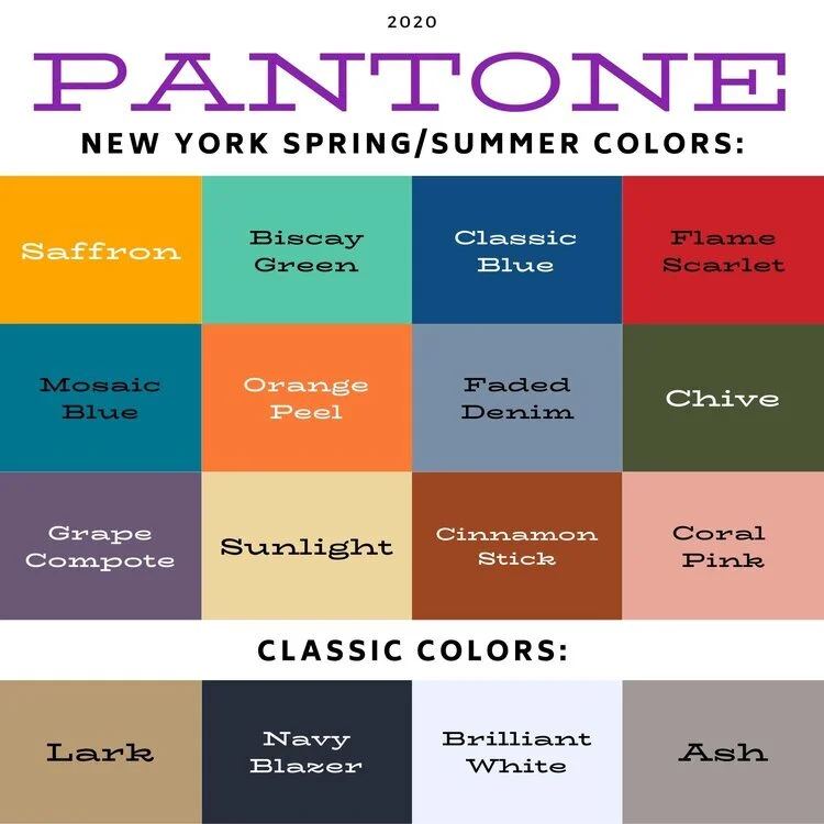
New York Palette

Pantone Spring/Summer 2020 - New York Palette

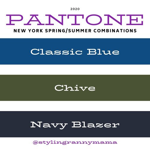
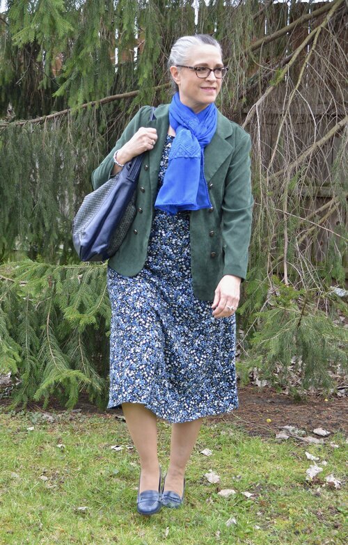
Classic Blue, Chive and Navy Blazer

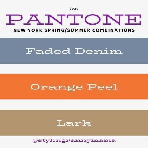
Faded Denim, Orange Peel and Lark

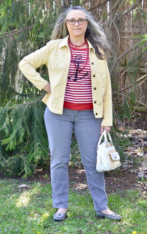
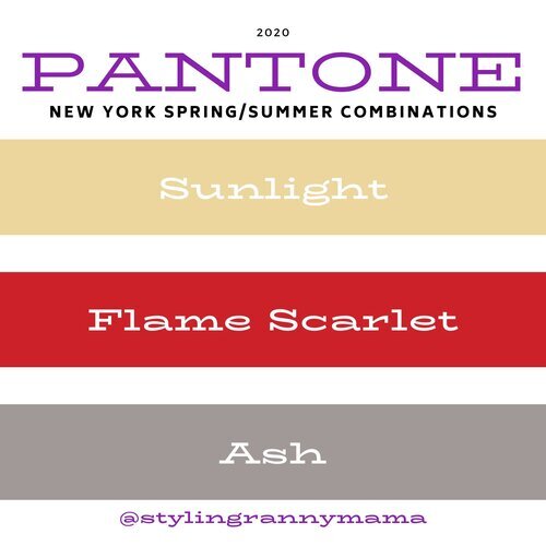
Sunlight, Flame Scarlet and Ash

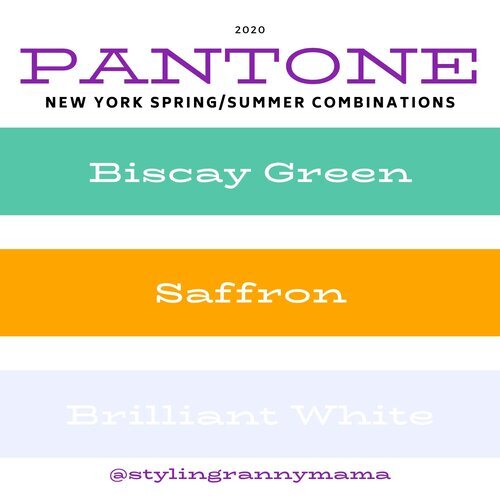
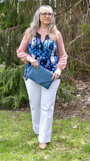
Biscay Green, Saffron and Brilliant White

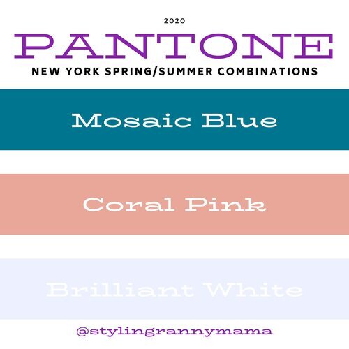
Mosaic Blue, Coral Pink and Brilliant White

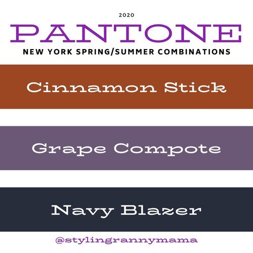
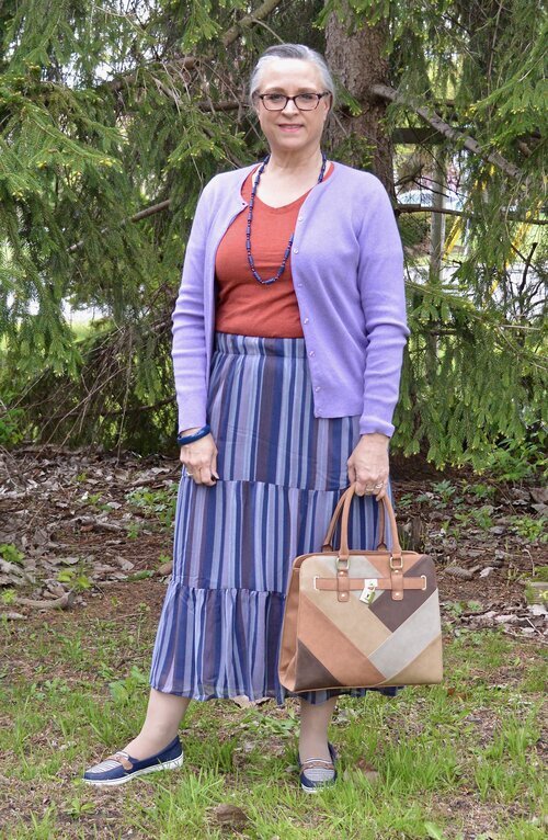
Cinnamon Stick, Grape Compote and Navy Blazer

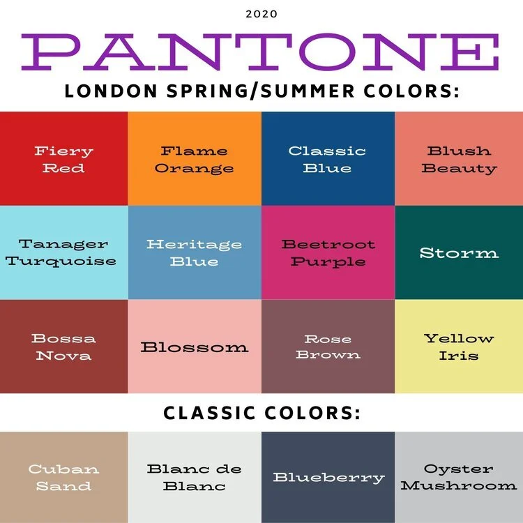
London Palette

Pantone Spring/Summer 2020 London Palette

Classic Blue, Beetroot Purple and Oyster Mushroom

Pantone Spring/Summer - London Palette

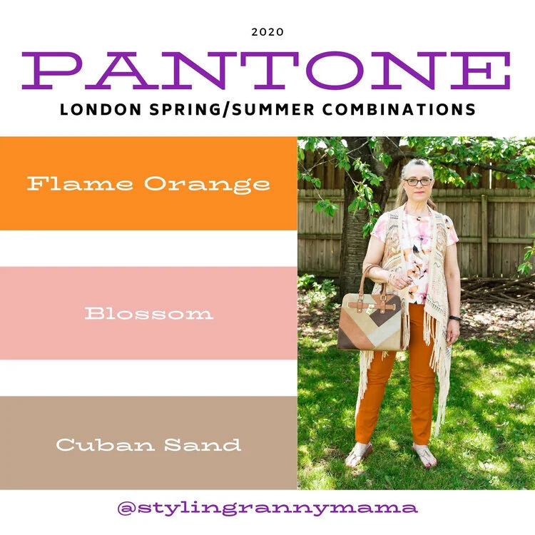
Flame Orange, Blossom and Cuban Sand

Pantone Spring/Summer 2020 - London Palette

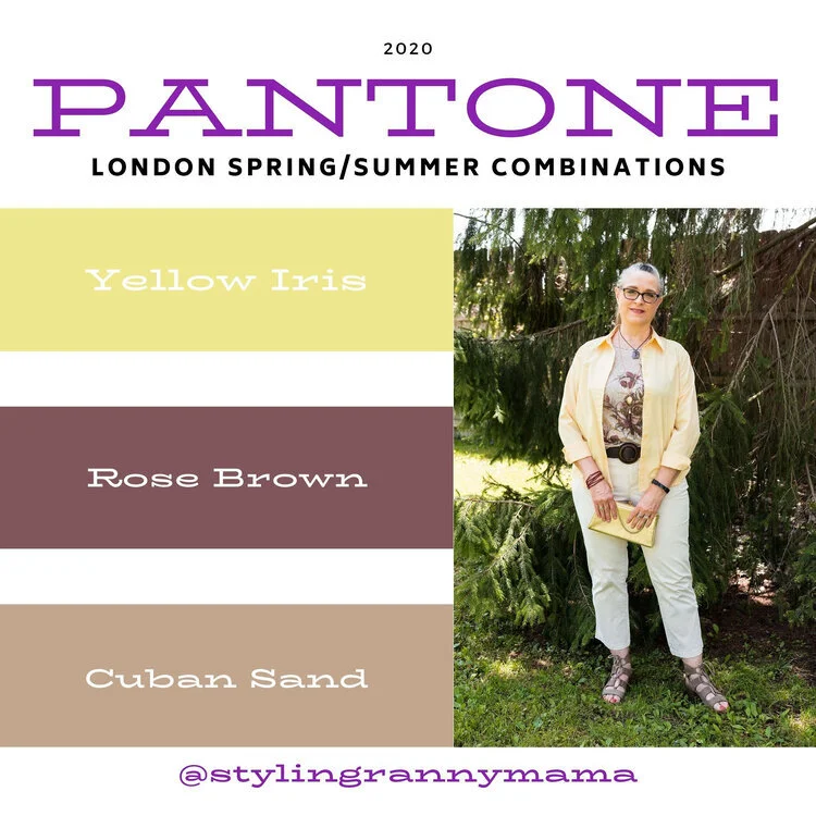
Yellow Iris, Rose Brown and Cuban Sand

Pantone Spring/Summer 2020 - London Palette

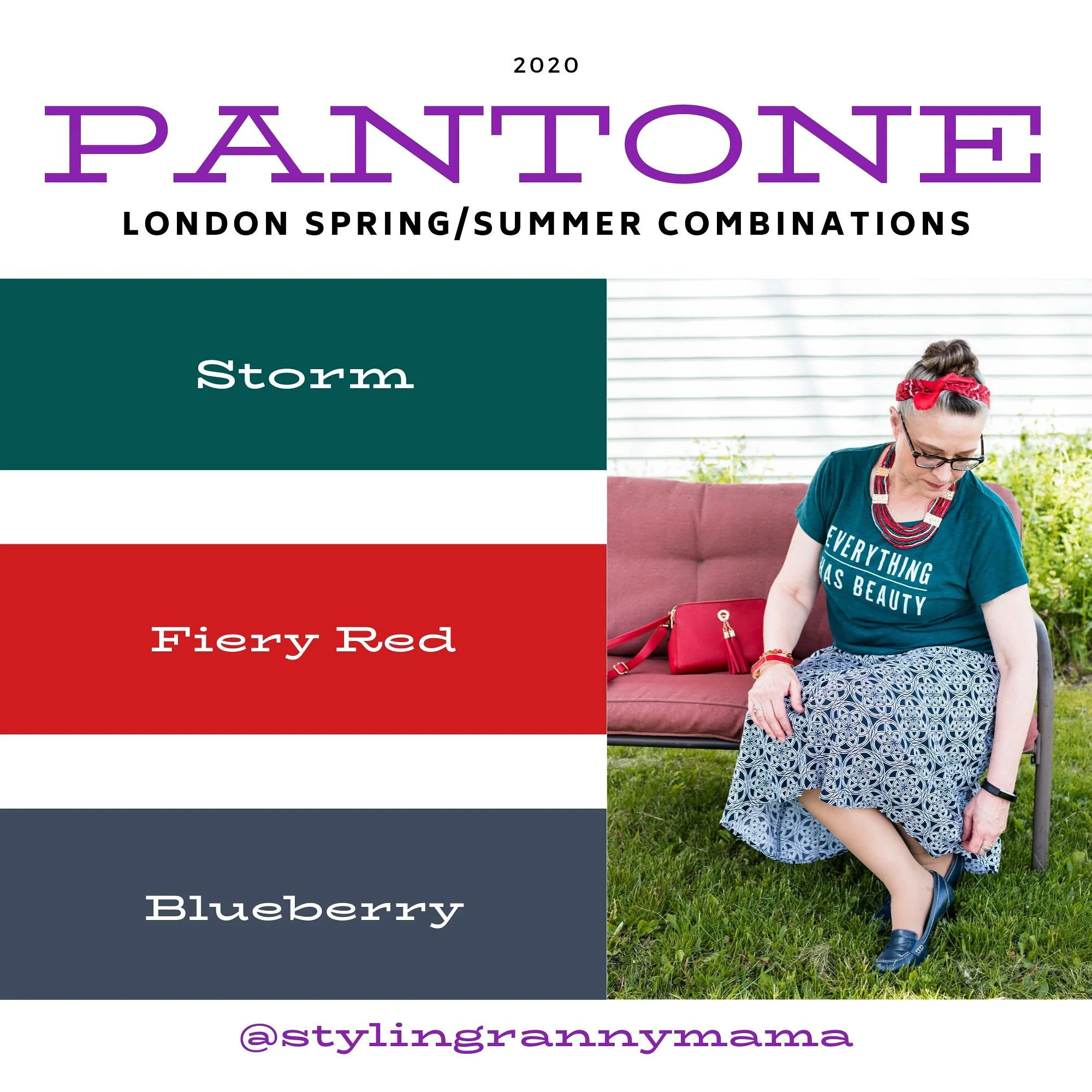
Storm, Fiery Red and Blueberry

Pantone Spring/Summer 2020 - London Palette

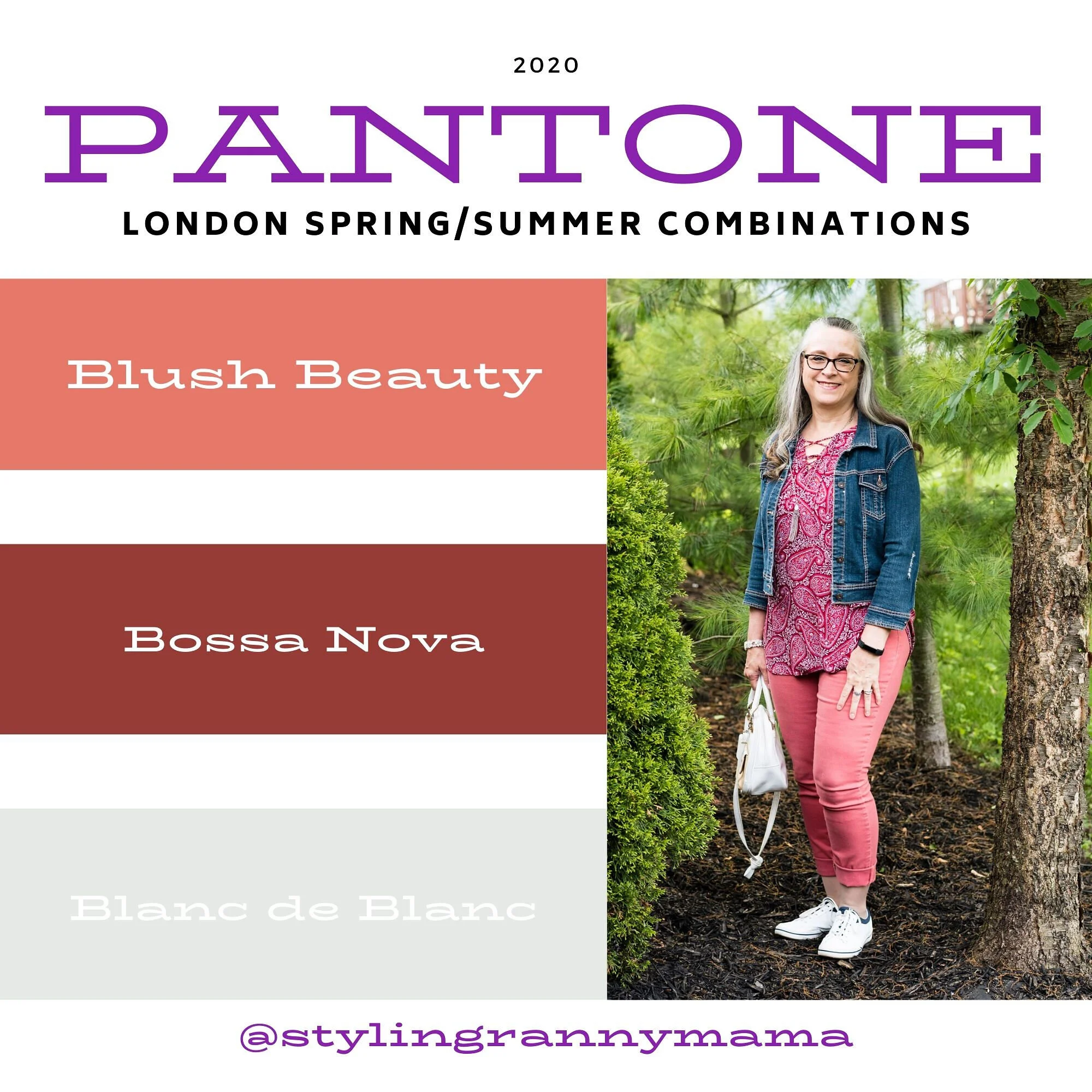
Blush Beauty, Bossa Nova and Blanc de Blanc

Pantone Spring/Summer 2020 - London Palette

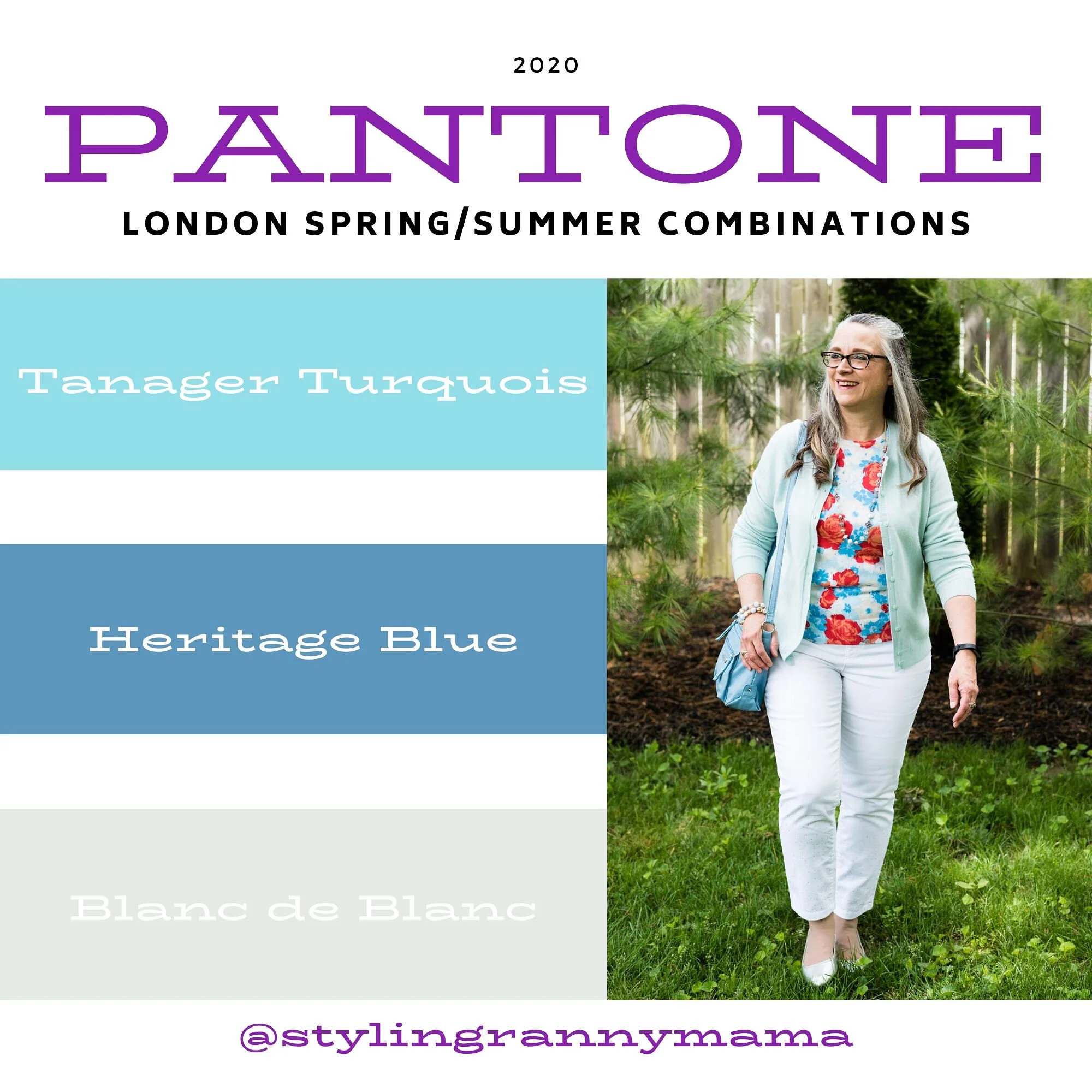
Tanager Turquoise, Heritage Blue and Blanc de Blanc

Pantone Spring/Summer 2020 - London Palette

Which color palette was your favorite? Which outfit did you like the best? I would love to hear your thoughts. I hope you all have a wonderful weekend. We will be celebrating Father’s Day with our kids on different days, since schedules wouldn’t allow for everyone getting together. God bless each of you with peace and joy.

All graphics and London color palette photos by Rebecca Trumbull.

Pantone Spring/Summer - 2020 - Blush Beauty, Bossa Nova and Blanc de Blanc

Today’s two bright colors might seem like an unlikely pairing, but then if you have been following me for a while, you know the crazier the color combo the more I want to try it. In some ways these colors combined almost make the outfit seem monochrome. Blush Beauty is a pinkish orange, so we might say it is like salmon or coral. Bossa Nova is a dark red with a little bit of a brown undertone. I added a Classic color Blanc de Blanc which is white by any other name. I know that there are shades of white, but for all intents and purposes, white is white. That’s my story and I’m sticking to it.

Pantone - Spring/Summer 2020 - Blush Beauty, Bossa Nova and Blanc de Blanc

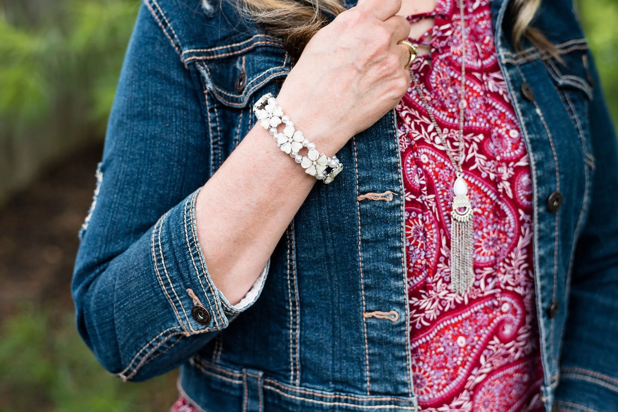
My paisley short sleeve tunic top is a thrifted Old Navy piece. It has a lace up detail that is just for show, but the print is what drew me to it. I have always like paisley. It just makes me think of the 60’s and 70’s and lots of my Dad’s old ties. Ha. ha. Here is a look at the outfit without the jacket so you get a better view of the top.

Pantone Spring/summer 2020 - Blush Beauty, Bossa Nova and Blanc de Blanc

My pants are W63 from dressbarn. I’ve styled these on the blog before. You can see them worn with a coral sweater, a multi print jacket, and with a LuLaRoe perfect tee. One thing I noticed as I looked back at these pictures and the one above, these pants are always wrinkled when I wear them. Part of that may be the material as it sticks to my legs, and part of it may be my chunky legs. Ha, ha.

Pantone Spring/Summer 2020 - Bossa Nova, Blush Beauty and Blanc de Blanc

Here you can see the lace up detail on the top and the thrifted distressed Rue 21 cropped jean jacket. This is another piece that has gotten frequent wear on the blog. See it with a floral midi dress and a maxi dress, a high-waisted skirt, dark wash jeans, and with a leopard print skirt.

Pantone Spring/Summer 2020 - Blush beauty, Bossa Nova, and Blanc de Blanc

I thought the white accessories were a good compliment to go with the white in the top. The Jaclyn Smith bag was thrifted and the Keds were a Kohl’s clearance purchase a year or two ago.

Pantone Spring/Summer 2020 - Blush Beauty, Bossa Nova and Blanc de Blanc
Pantone Spring/Summer 2020 - Blush beauty, bossa nova and blanc de blanc

What do you think of these colors together or even separately? Do you like Bossa Nova or Blush Beauty better? How are your clothes fitting these days? Ha, ha.

Pantone Spring/Summer 2020 - Blush Beauty, Bossa Nova, Blanc de Blanc

I hope you all are doing well and that you have a great weekend. Thank you all so much for following along and especially for your lovely comments. If there is ever anything you’d like to see or have me talk about on the blog, let me know. I have had someone suggest I do a video on how to tie scarves, so maybe I’ll try something like that in the fall.

I’ve included some shopping links to look over, so if you have the time, check those out. You never know when you might need something new. These are affiliate links. All opinions are my own.

Have a wonderful weekend!

Photo and graphic credit Rebecca Trumbull.

Pantone Spring/Summer 2020 - Storm, Fiery Red and Blueberry

Last week I was really struggling with all that was going on in the world and in our country, so I only posted once, and never did send out an email. I apologize for that. Sometimes, life is like a sucker punch to the gut and you have to step back and try to catch your breath. I am going to approach the subject of all that is happening and my own response to it on my Faith page tomorrow, so just know that I do feel this is important enough to talk about, but I do not think it needs to be done on my Fashion page. Be sure to look for that post tomorrow.

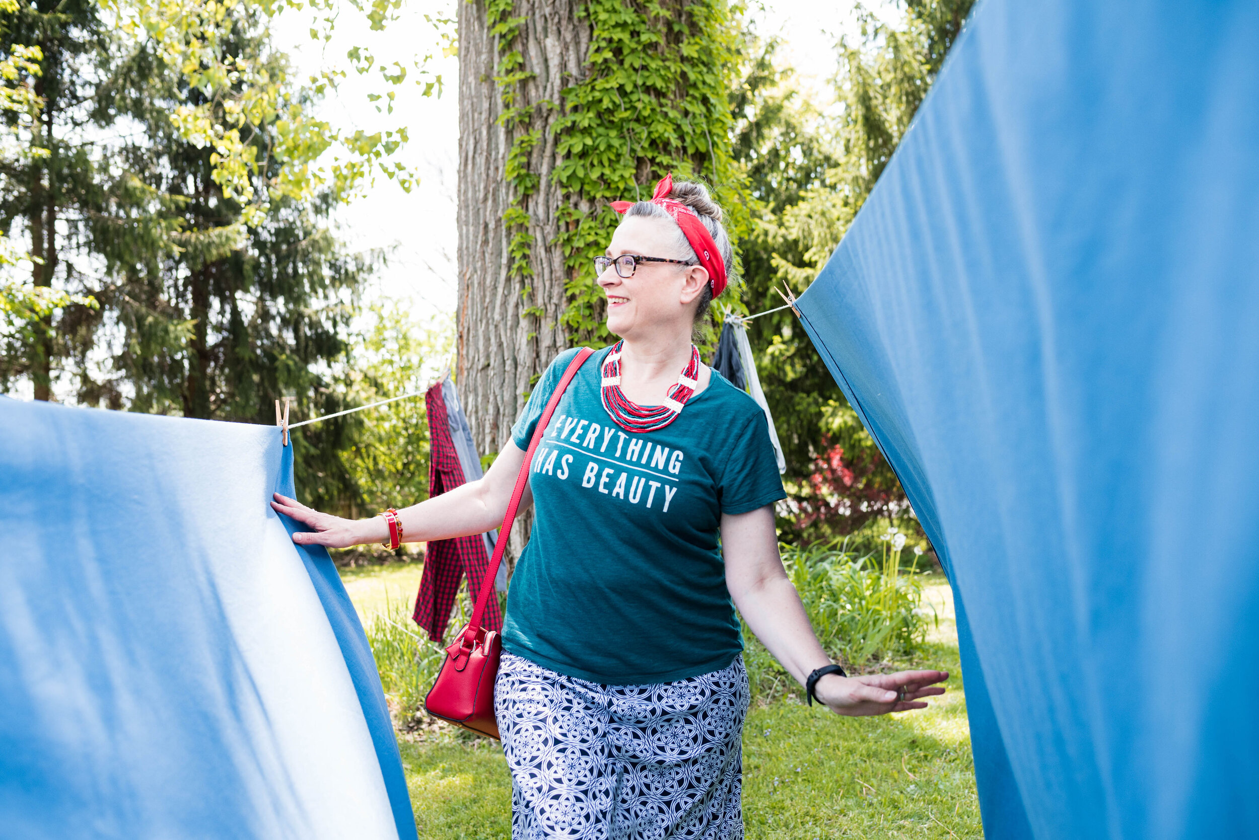
Today we are looking at two very bright and bold colors. When I thought about pairing Storm with Fiery Red, I knew I wanted to keep it as far away from looking Christmasy as possible. Obviously, Storm would never be mistaken for the typical Christmas green that we usually associate with that holiday, but things have changed. Christmas green and red are no longer the only color combinations in holiday decor. Still, I wanted this look to evoke a feeling of fierce femininity, so let me know what you think.

Pantone Spring/Summer 2020 - Storm, Fiery Red and Blueberry

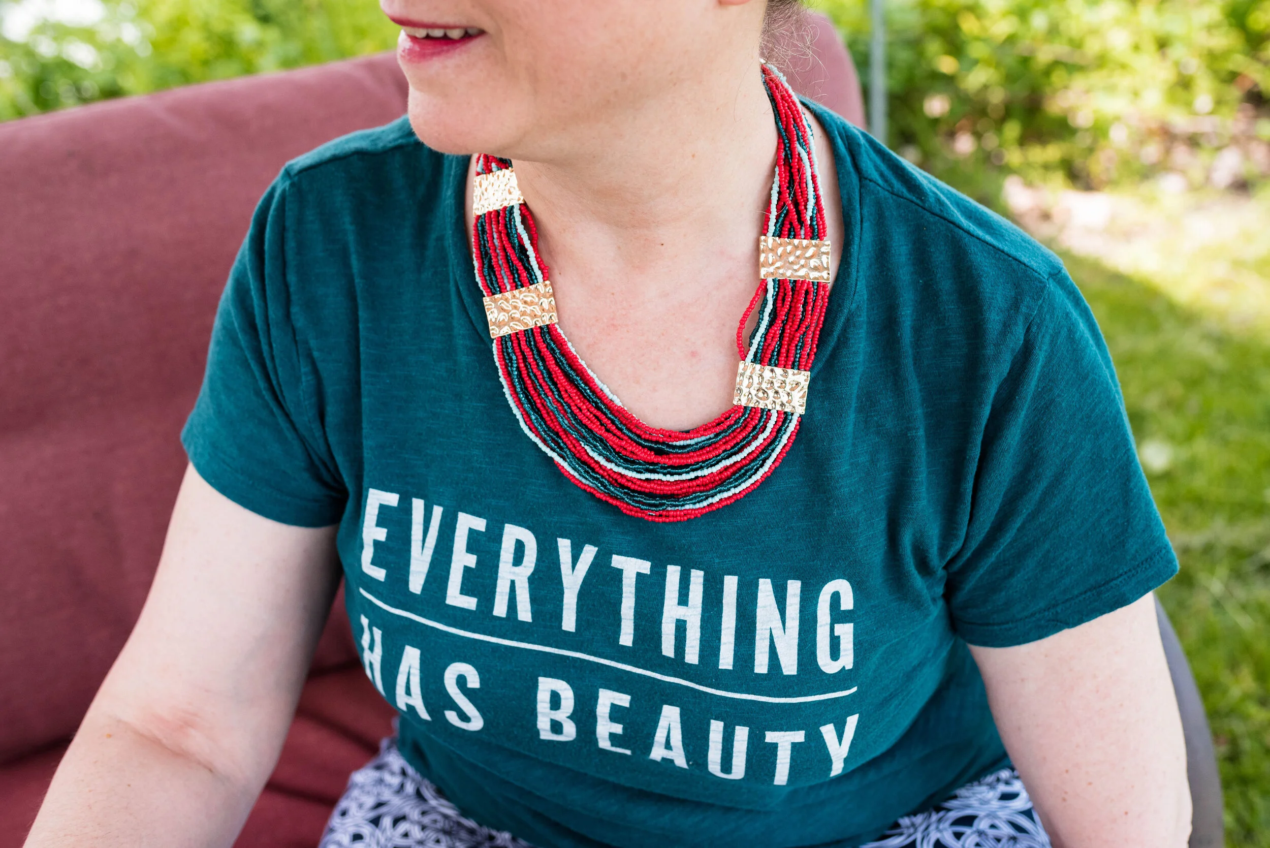
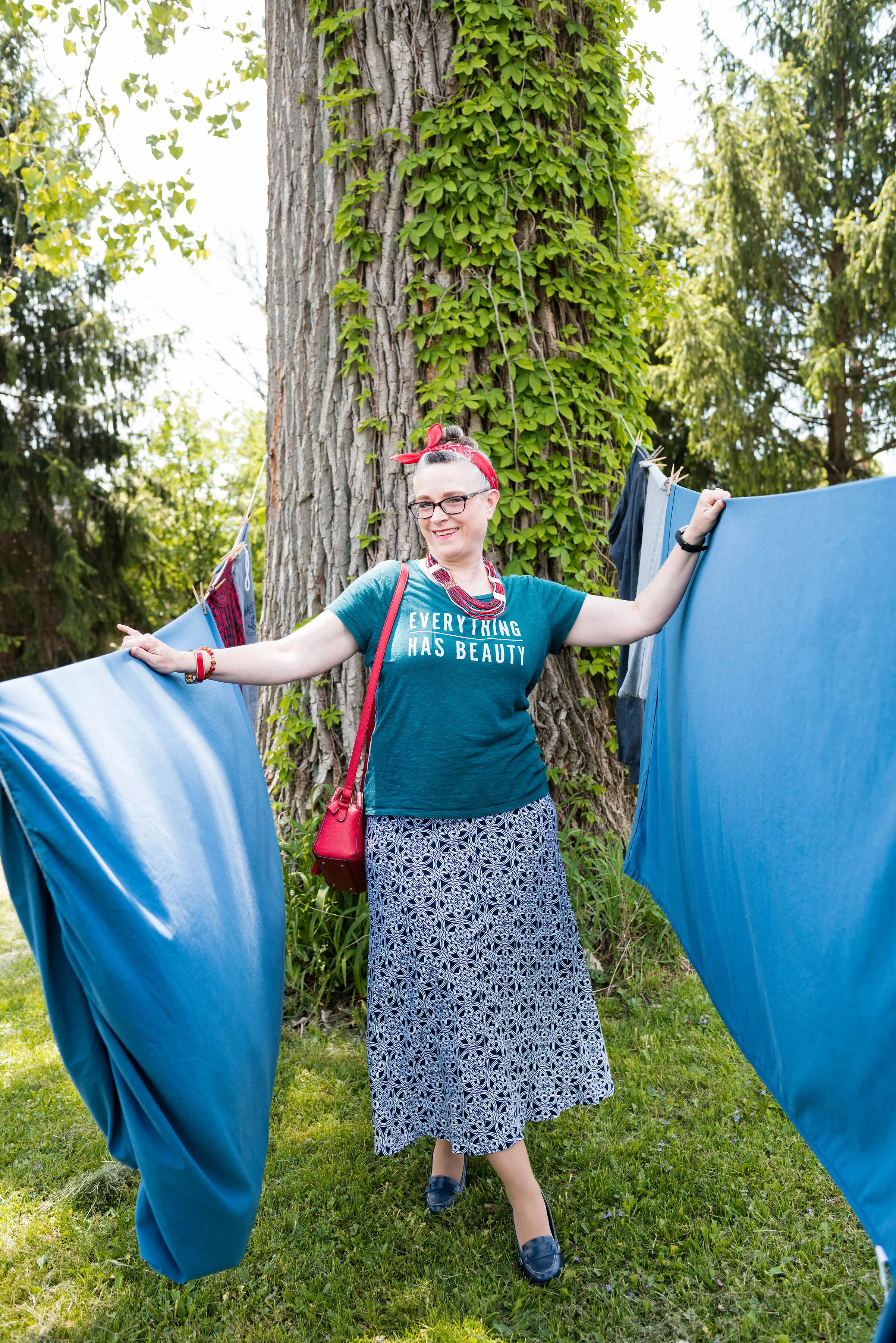
This thrifted, graphic tee from Old Navy is the perfect green and considering everything we have been going through, I love its positive message. Everything has beauty, we just need to look for it.

Pantone Spring/Summer 2020 - Storm Fiery Red and Blueberry

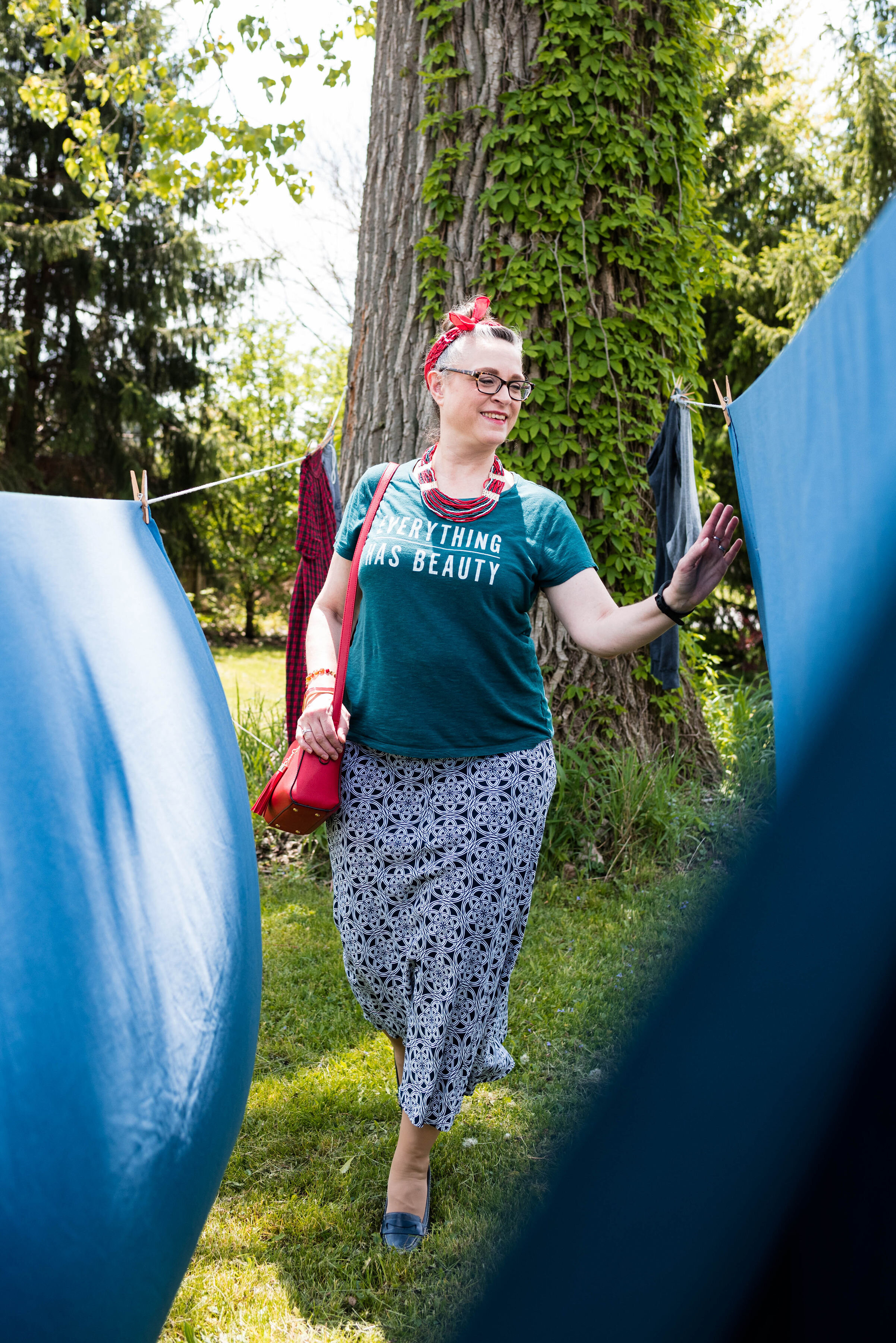
I had some sheets hanging out on the line on the day we took these pictures, so we had a little fun with it.

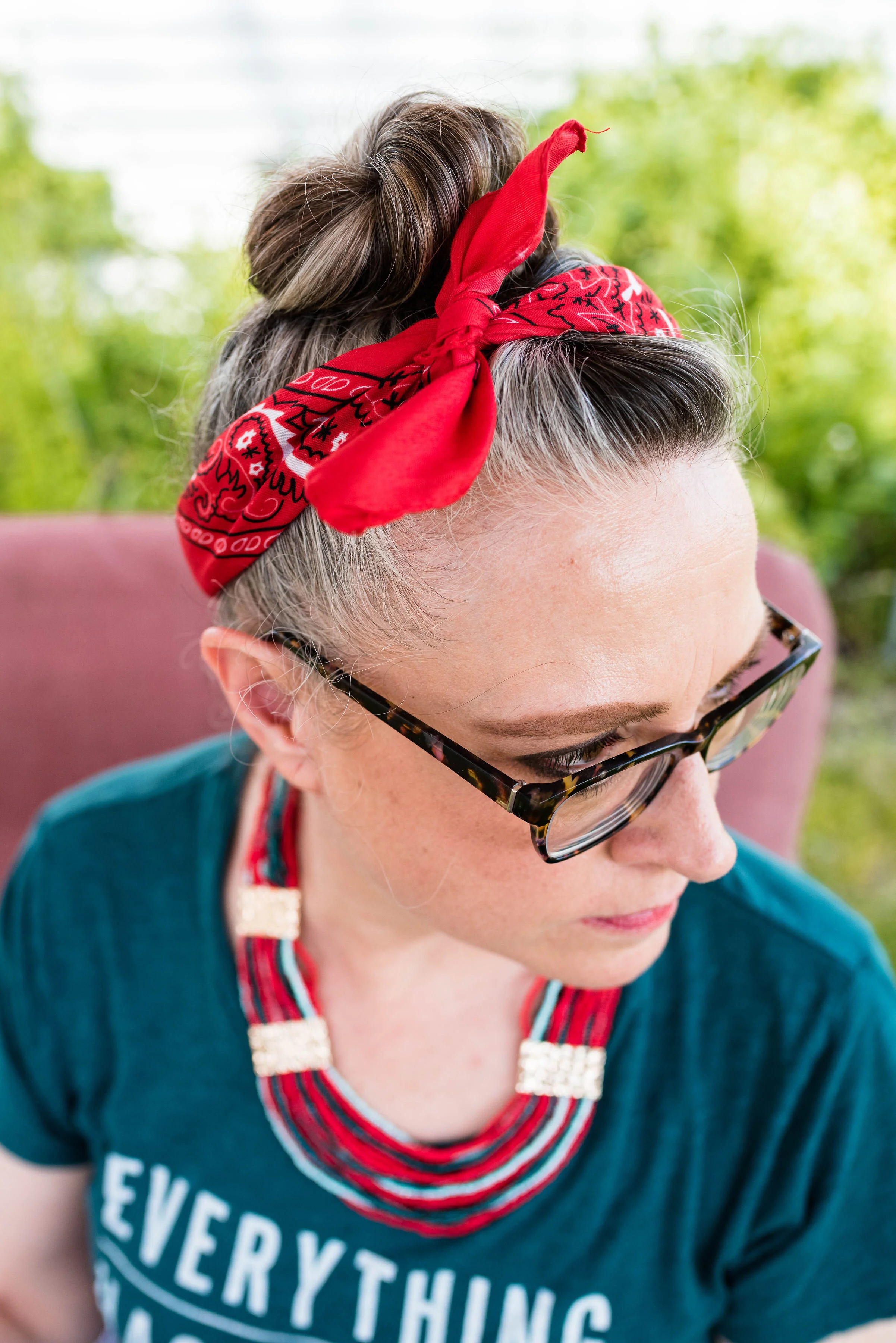
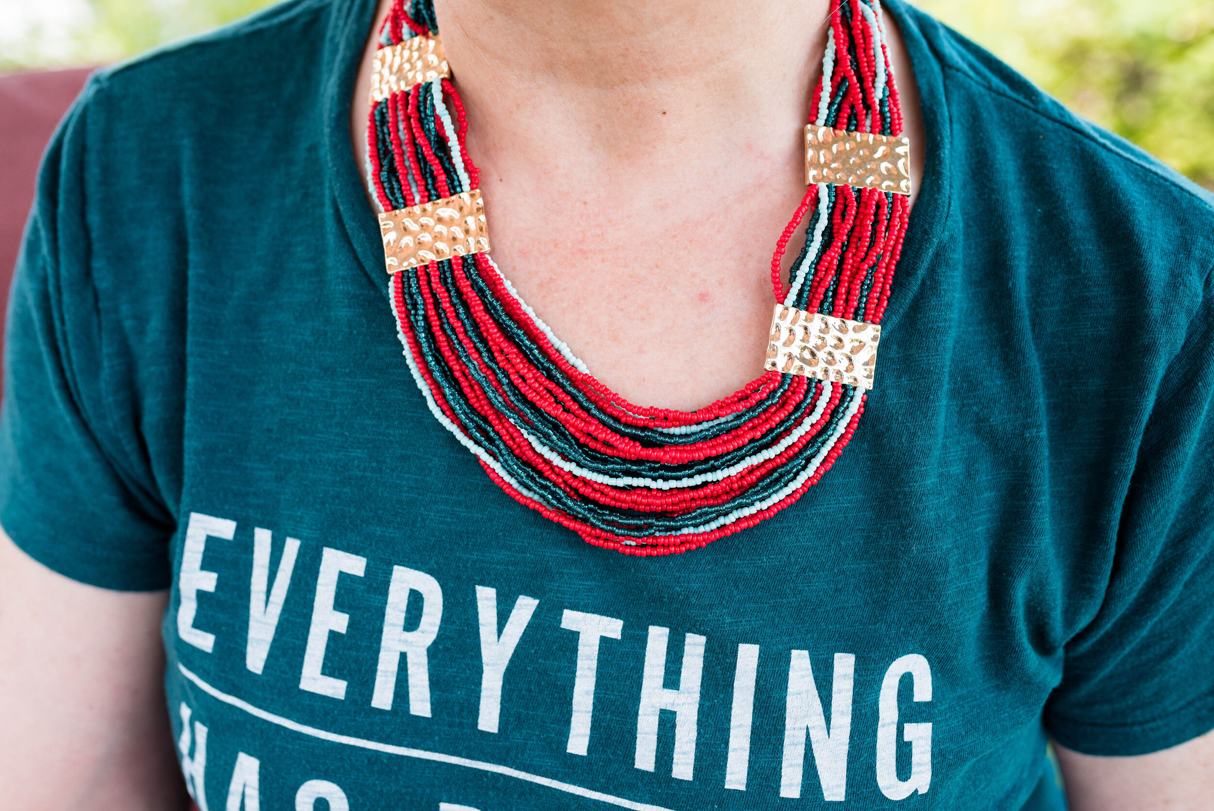
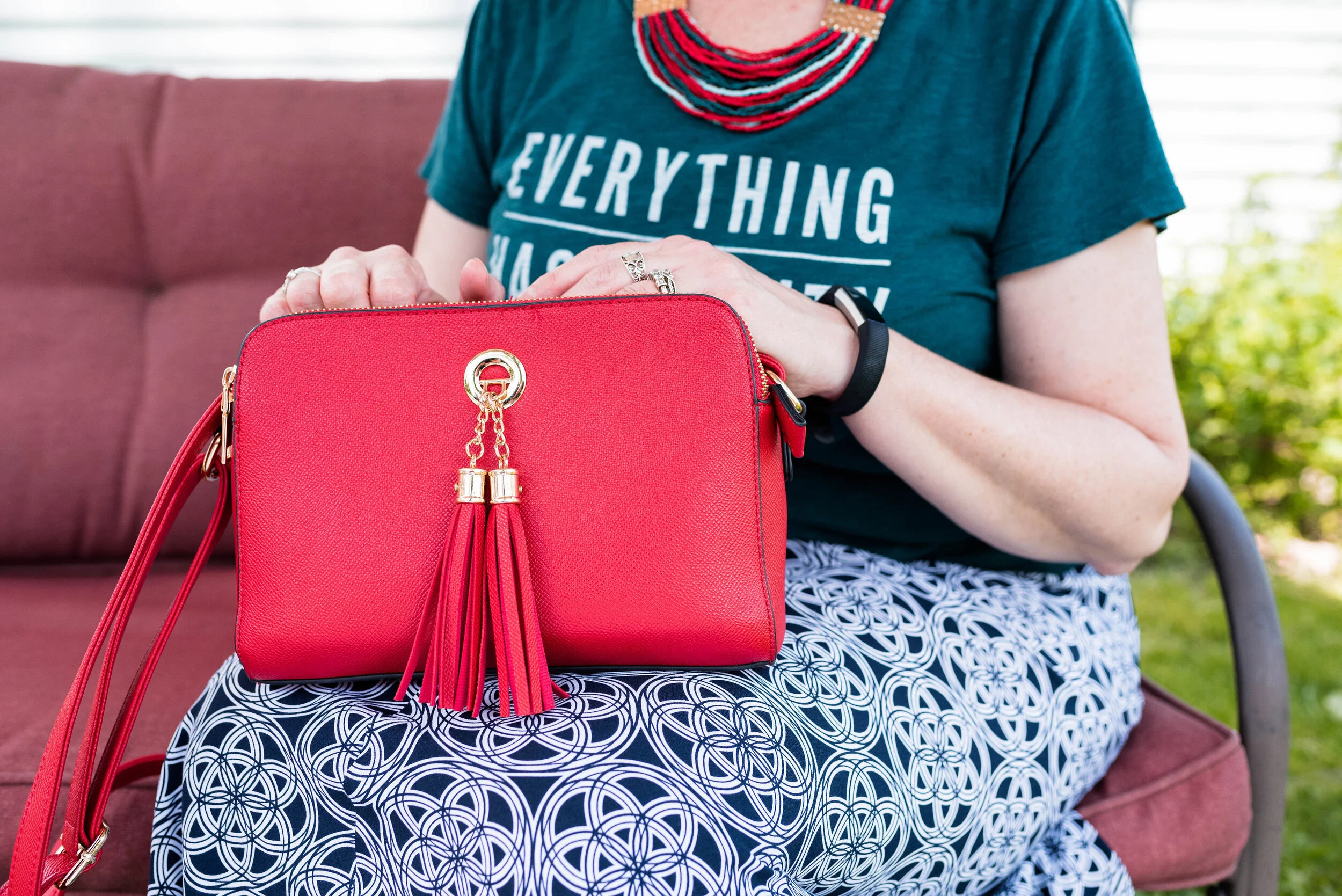
Rather than create an outfit with a full red piece, I thought I would show you an outfit where you use one color just in your accessories and wow, what a statement it makes! The Fiery Red bandana in my hair, the jewelry and the bag, add that bright red color, without being overwhelming. Some people feel less comfortable wearing bright colors and prefer to just stick to the classics, like navy, gray or black. Adding a bright color really boosts the overall look of an outfit.

Pantone Spring/Summer - Fiery Red, Storm and Blueberry
Pantone Spring/Summer 2020 - Storm, Fiery Red and Blueberry

My medallion print skirt is from Christopher and Banks last year. I like that it is light weight, and yet not at all see through. Win, win. I felt that it was a good match for the Blueberry Pantone classic color.

Pantone Spring/Summer 2020 - Storm, Fiery Red and Blueberry

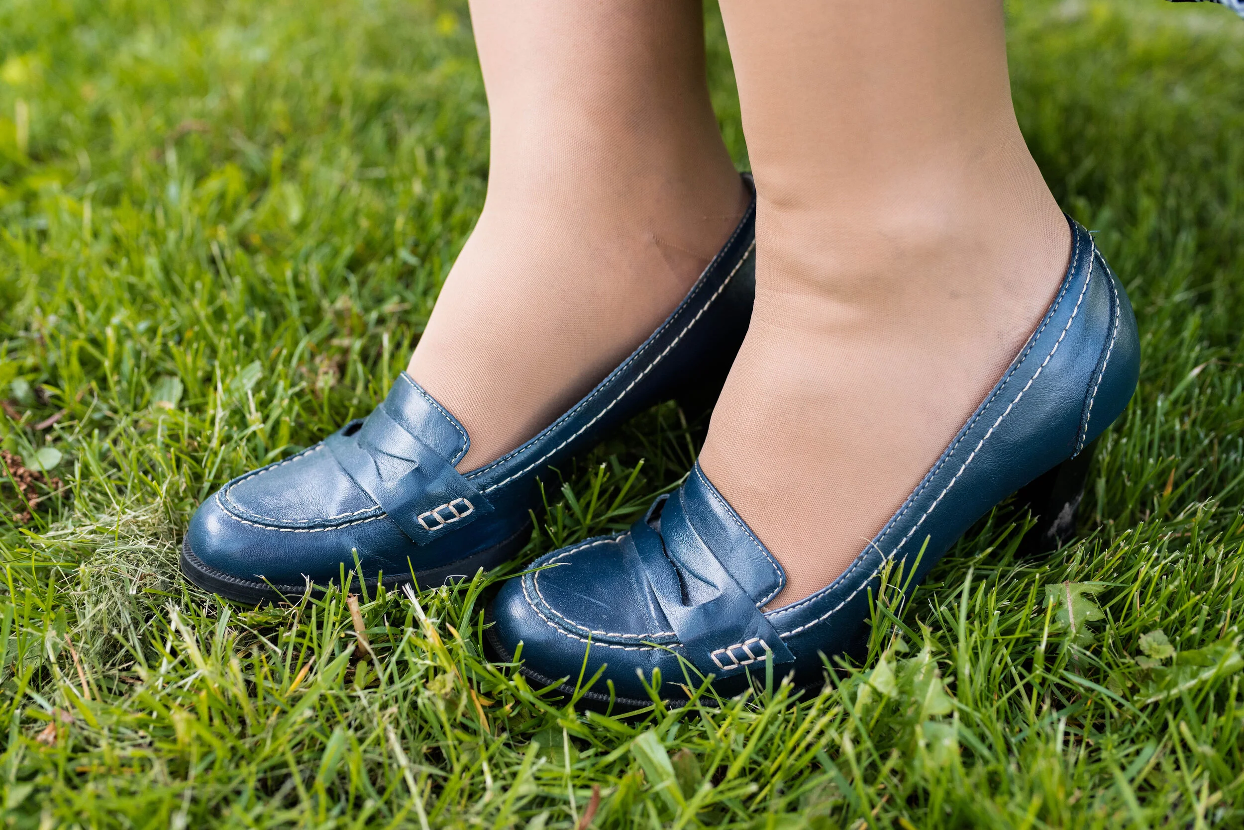
You’ve seen these loafer heels numerous times on the blog before. I got these thrifting and have had them for years, but they still look pretty good. The plus side of real leather. These are Relativity brand.

Pantone Spring/Summer 2020 - Storm, Fiery Red and Blueberry

What do you think of these colors? Do you think this was a good combination? Do you where skirts in the summer? What length skirt do you like to wear; mini, knee, midi or maxi? I would love to hear your thoughts. Thank you to all of you who regularly comment on my posts. I always look forward to your insights and of course the positive feedback is wonderful, but your negative feedback is welcome too.

I’m including a few shopping links for you to look over. I hope you are staying safe and healthy wherever you are!

Photos and graphic Rebecca Trumbull.

These shopping links are affiliate links which means I get a few pennies when you click on a link. Thanks for those clicks. All opinions are my own.


Pantone Spring/Summer - 2020 - Yellow Iris, Rose Brown and Cuban Sand

Today I am featuring two colors I was not quite sure what to do with. When I began searching for these colors in my closet I was sure I wasn’t going to be able to find them. Rose brown is an odd color; not exactly brown, but not really pink, it has a purplish feel to it. Yellow Iris was another tough one for me. I don’t have a ton of pastels in my wardrobe. I like jewel tones and earthy colors, so this pale yellow was stumping me. I have a lot of yellow in my wardrobe; bright yellow, mustard yellow, sunflower yellow, and so on, but not a lot of pale yellow. While Sunlight from the New York palette had an almost light beige or tan vibe to it, this Yellow Iris is strictly a pale yellow. This is what I came up with. Let me know what you think.

Pantone - Spring/Summer 2020 - Yellow Iris, Rose Brown and Cuban Sand

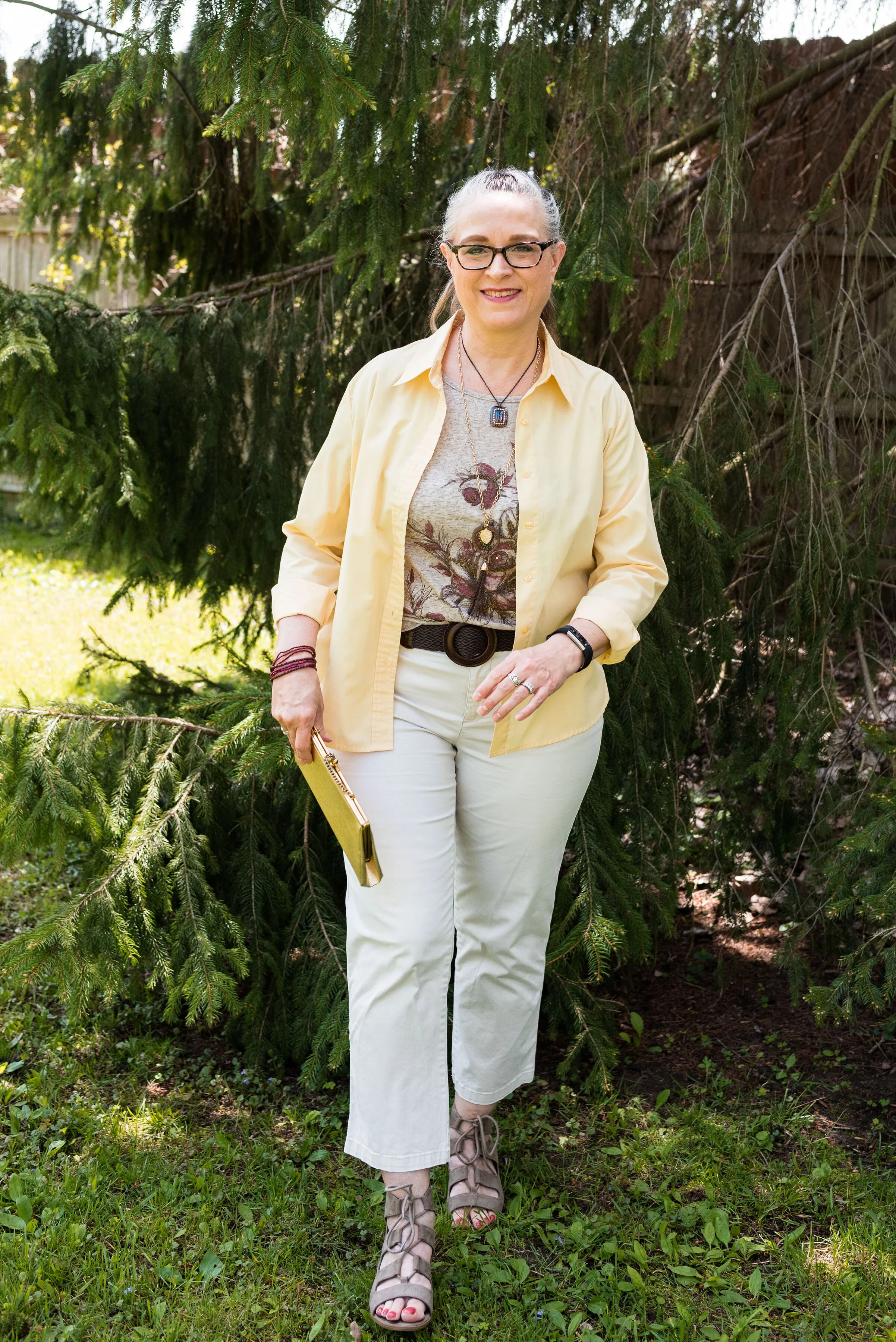
I found this floral embellished tee first when looking for these colors. The flowers bear a close resemblance to Rose Brown. This is a thrifted Christopher and Banks tee. The Yellow Iris button up is a thrifted White Stag piece and while not quite as dark as the Pantone color is similar enough. The next pieces I had that were a light yellow were too yellow. Ha, ha.

Pantone - Spring/Summer - 2020 - Yellow Iris, Rose Brown and Cuban Sand

I added this brown woven belt, because it has a bit of that Rose Brown vibe going on as do the two necklaces I chose. They are definitely a darker brown color, but different than a regular brown, and I thought they went well with the tee.

Pantone - Spring/Summer 2020 - Yellow Iris, Rose Brown and Cuban Sand

The gold in the longer necklace made me reach for my gold clutch. You can also see that I added a few simple seed bead bracelets to add a touch more of the Rose Brown color.

Pantone - Spring/Summer 2020 - Yellow Iris, Rose Brown and Cuban Sand

My white crop pants I have styled on the blog before. You can see them styled with a dress in another Pantone shoot here. These are a thrifted St. John’s Bay brand.

Pantone Spring/Summer 2020 - Yellow Iris, Rose Brown and Cuban Sand

I looked up the difference between a caged sandal and a gladiator sandal and discovered that there really is no difference. Many gladiator styles come up higher on the leg, much like a boot and involve some sort of lacing, but both gladiator and caged sandals are basically an open style of sandal with numerous straps coming across the foot. They can be open toe, thong or closed toe in variety. The gladiator style ones I have on are Massini brand. I like that they cover more of my foot than a sandal with only a few straps. They also have a small block heel, which I think makes them a little more dressy.

Pantone Spring/Summer 2020 - Iris Yellow, Rose Brown and Cuban Sand

What do you think of these colors? Are they colors you would wear? Do you have pale yellow, this purply brown in your closet? I’d love to hear your thoughts.

I am leaving you with a few shopping links. These are affiliate links. All opinions are my own.

Photos and graphic Rebecca Trumbull.


Pantone Spring/Summer - 2019 - Living Coral & Terrarium Moss

I want to take a moment to apologize for my absence this past week. I went to visit my mom and ended up bringing her home with me for a couple of weeks. We came back on Monday, and between unpacking, work and getting ready for Easter weekend, I just didn’t have the time or energy to get my blog posts done. I promise, I did try a few times, in the evening to get them written, but always ended up getting bleary eyed and needing to go to bed. Ha, ha. However, I hope to get back to a normal schedule this week, if I can get my computer to upload my pictures accurately. It’s always something!

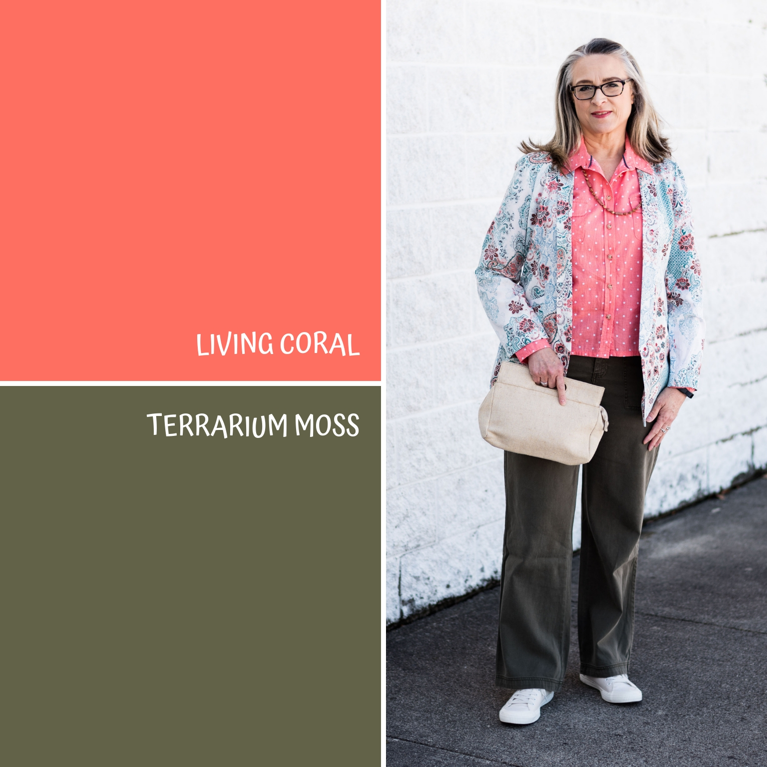
Every year the Pantone Color Institute puts together a palette of colors that are the basis for the fashion and interior design color choices. Since I started blogging three years ago, I decided to draw upon these palettes as a source of inspiration for putting outfits together. I do a series using these colors in both the spring and the fall, as these are the two palettes Pantone puts out each year. Pantone, also, chooses a color of the year. This year that color is Living Coral. I wanted to feature this pretty pinky orange color to kick off this spring’s Pantone series and decided to pair it with the darker green of Terrarium Moss.

For my Living Coral piece I chose a thrifted Liz Claiborne polka dot blouse. I actually have quite a bit of this color, so I was pleased that this was chosen as the color of the year. However, as lovely of a color as it is, it is not my favorite color, so I don’t reach for it with regularity. I’m not sure why, because it is a great color for spring and summer and it goes well with many other colors.

This fun paisley jacket was a recent clearance find at Chico’s. I don’t shop frequently at Chico’s as their prices are a bit higher than what I would normally pay for a single item of clothing. However, if you have a coupon and can use it on clearance, then you can find colorful and fun pieces like this at a significantly reduced rate.

My Sonoma pants were a clearance find from Kohl’s. They are a tad darker than the Terrarium Moss, but basically are an olive green. These are a nice weight for spring, not too heavy and not too light.

As I have done before, I wanted to incorporate one of the neutrals with each outfit. For this one I chose Sweet Corn. This is a light, airy color that reminds us of the lighter kernels of mouthwatering sweet corn. I used this canvas clutch and my thrifted Sonoma sneakers to represent this summery neutral.

What do you think of these two colors? I know many people who have Living Coral already in their closets. It is a good color for the warmer weather, as the sun begins to shine more regularly. It always makes me think of the seaside. Where as, Terrarium Moss makes me think of hiking under a canopy of trees in full leaf mode, in a place that is quiet and cool.

I’ve included a few shopping links for you to peruse featuring the colors Living Coral and Terrarium Moss. These are affiliate links, which means I get a few cents when you click on a link. I get a tiny bit more, when you make a purchase through my page. All opinions are my own.

Photo credit Rebecca Trumbull. Make up Rachel Christensen.