
Pantone Fall 2018 - Introduction to the Color Palette
Once again, I am visiting the Pantone fall color palette. If you are unfamiliar with the Pantone Institute of Color, they are considered to be the leaders in color technology. Here is a quote from the About Us portion of their website.
“Pantone provides a universal language of color that enables color-critical decisions through every stage of the workflow for brands and manufacturers. More than 10 million designers and producers around the world rely on Pantone products and services to help define, communicate and control color from inspiration to realization – leveraging advanced X-Rite technology to achieve color consistency across various materials and finishes for graphics, fashion and product design. Pantone Standards feature digital and physical color specification and workflow tools. The Pantone Color Institute™ provides customized color standards, brand identity and product color consulting as well as trend forecasting inclusive of Pantone Color of the Year, Fashion Runway Color Trend Reports, color psychology and more. Pantone B2B Licensing incorporates the Pantone Color System into different products and services, enabling licensees to communicate and reproduce approved Pantone values and improve efficiencies for their users. Pantone Lifestyle brings color and design together across apparel, home, and accessories”
There are two major cities in the fashion industry that put out their corresponding color palettes for each season. The graphic below shows a combination of the New York and London Fall palettes.

This year’s fall palette is a blend of traditional seasonal hues, soft pastels and pops of bright color making for an interesting color mix. You could pick one color from this palette or all of the colors and when combined with other seasonal trends such as animal prints, plaid and camo make amazing outfits that go beyond our normal expectations for fall.
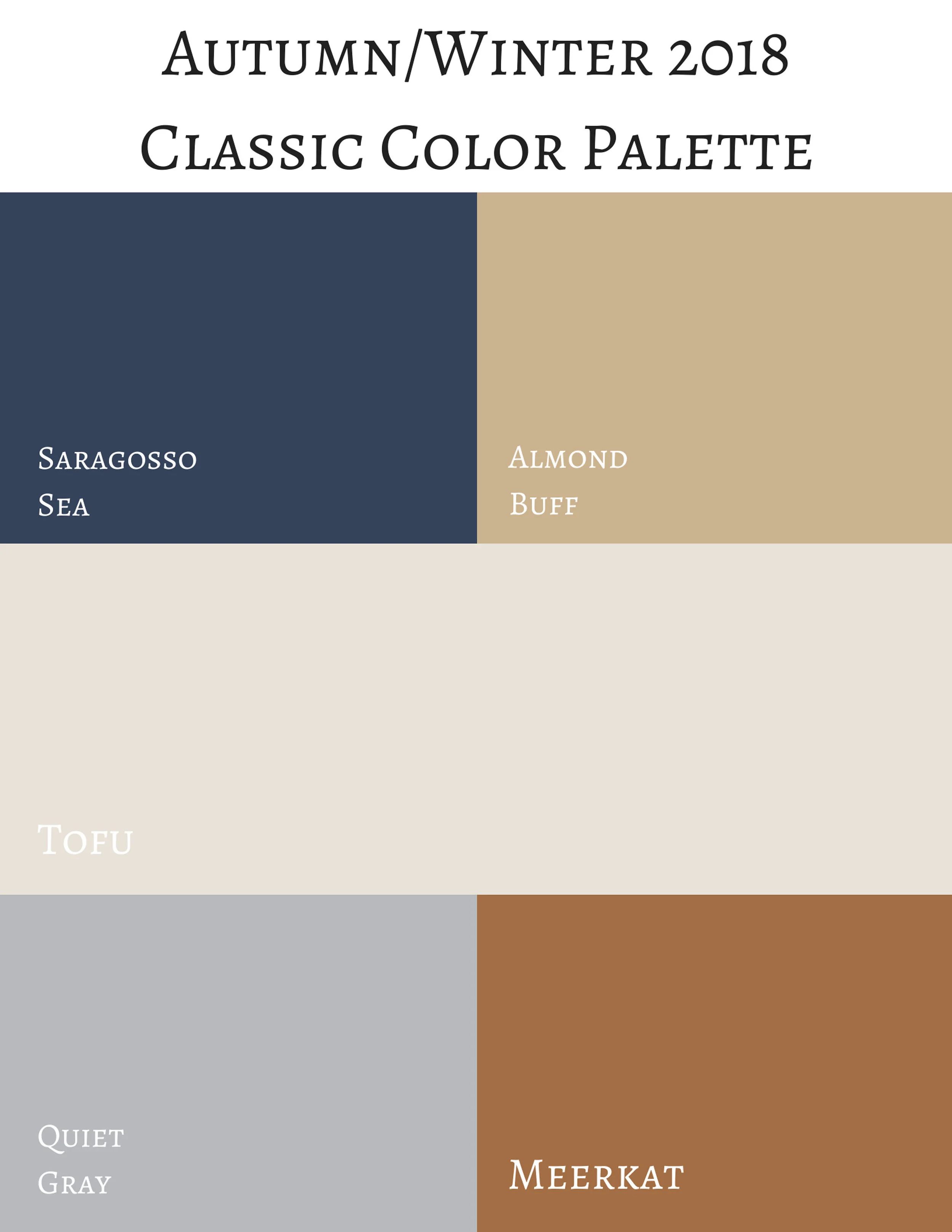
In addition to the twelve colors above, last spring Pantone also began putting out a classic color palette. While these colors remain more neutral and unchanged, thus the classic descriptor, they present an option for what I call a “grounding” color for our outfits. While some people like to wear color on color, others like to have small pops of color with a more classic foundation to keep their outfits grounded and impeccable.
Next week, I will begin showing you how I put these colors together to form outfits that are both classic and colorful. For now, here are few sneak peeks. I hope you’ll join me then.
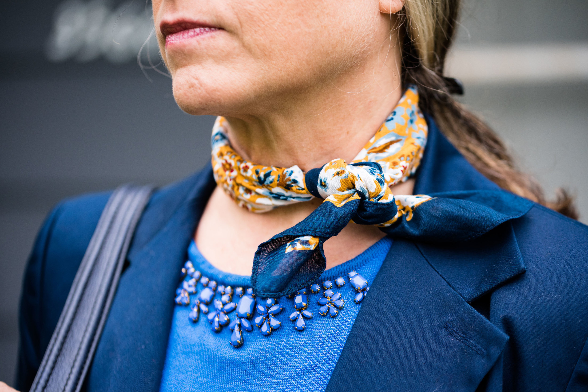
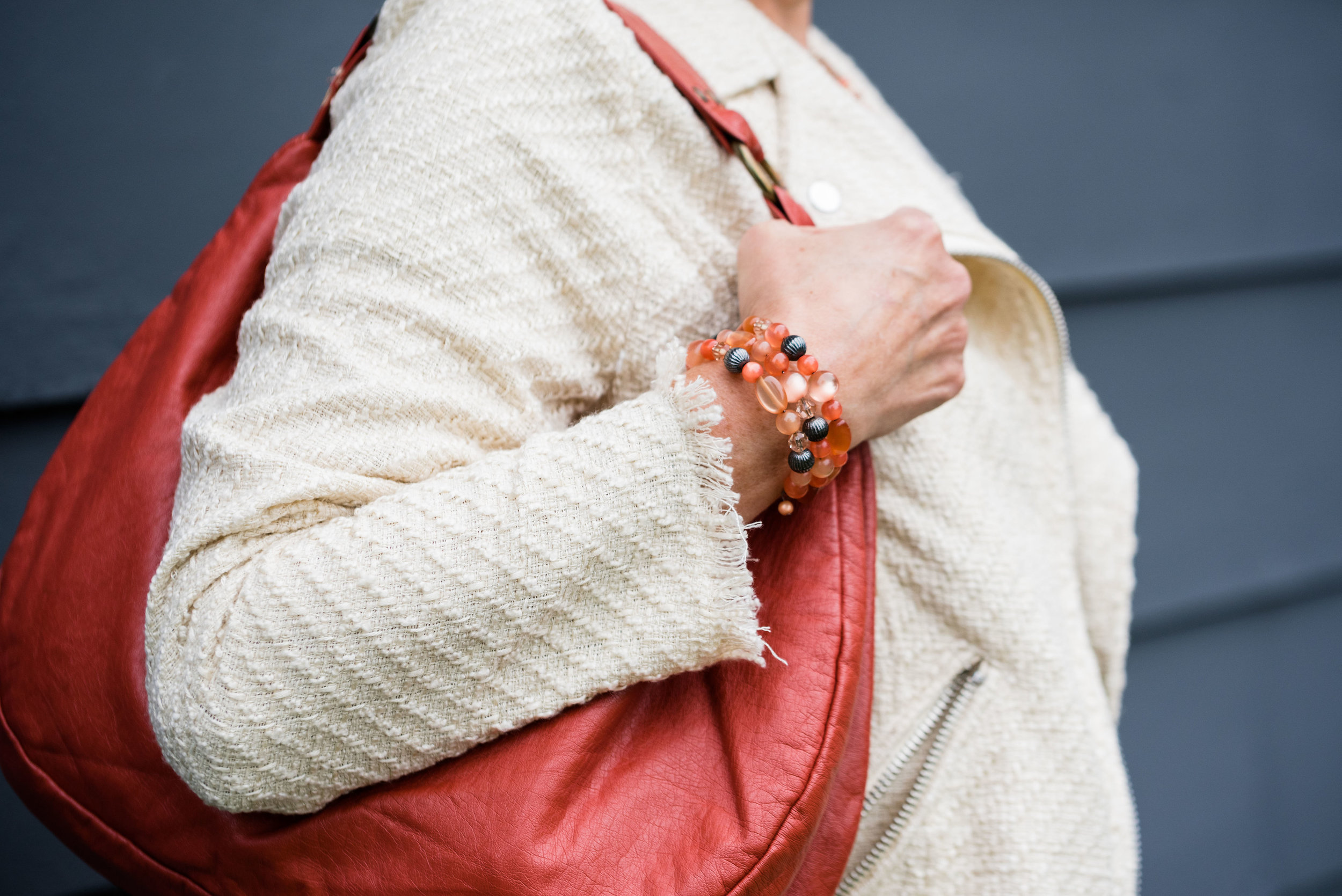
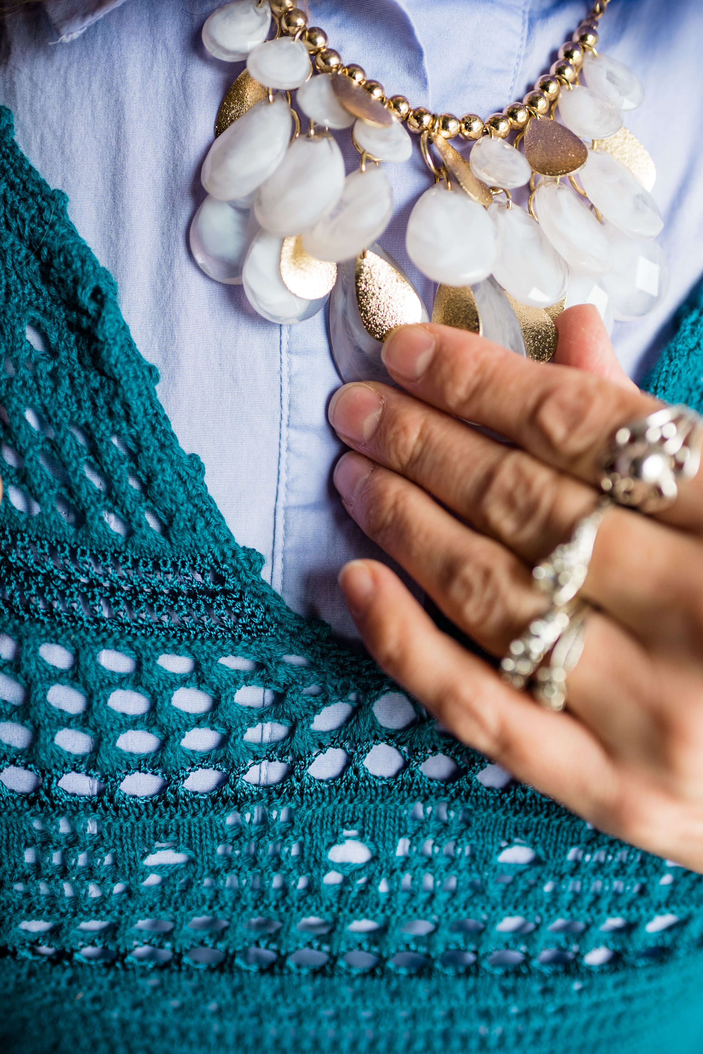
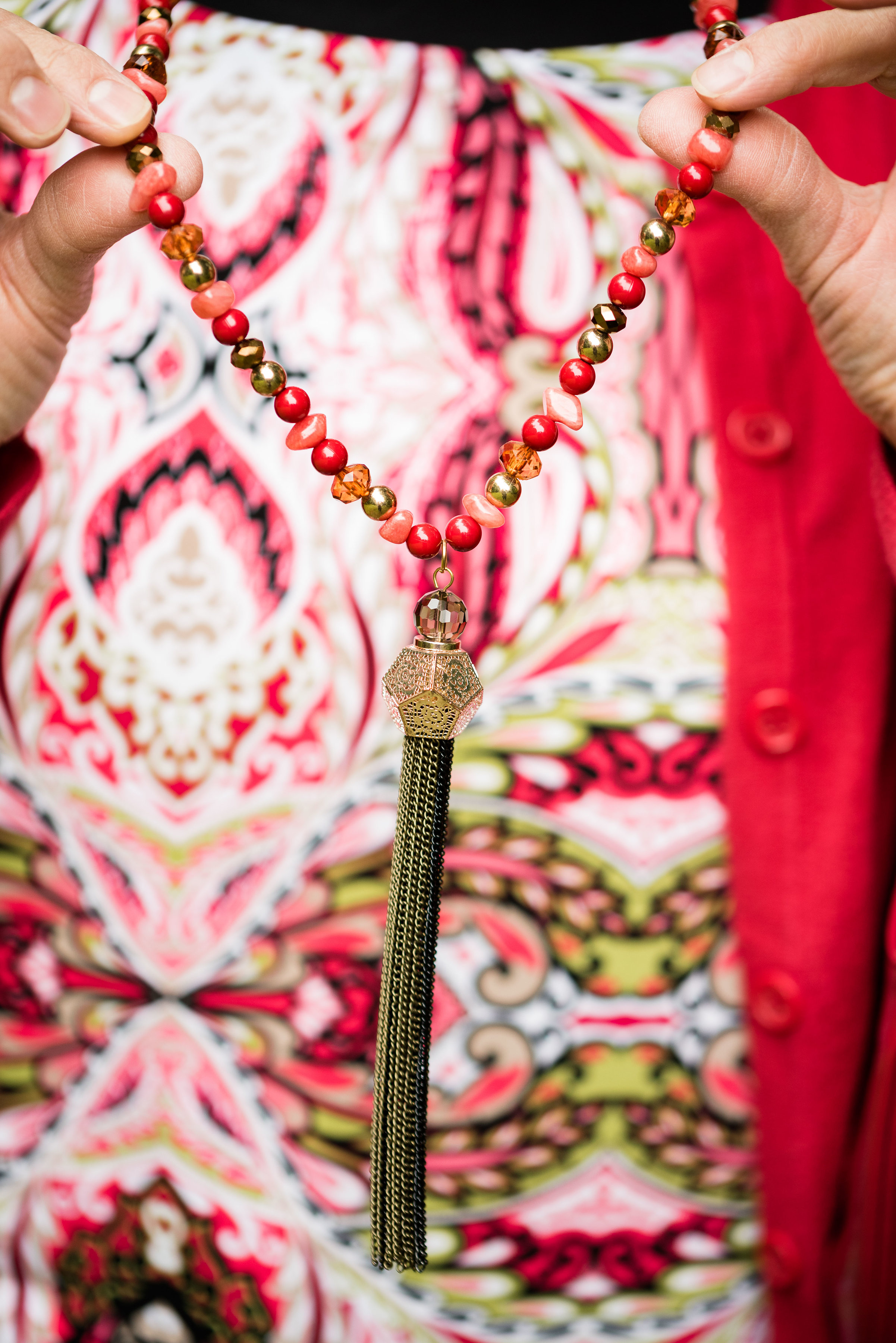
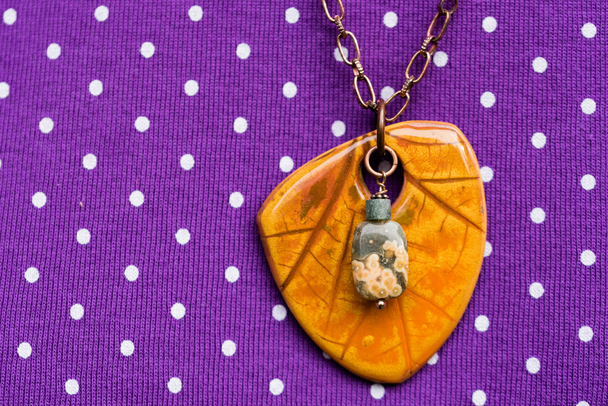
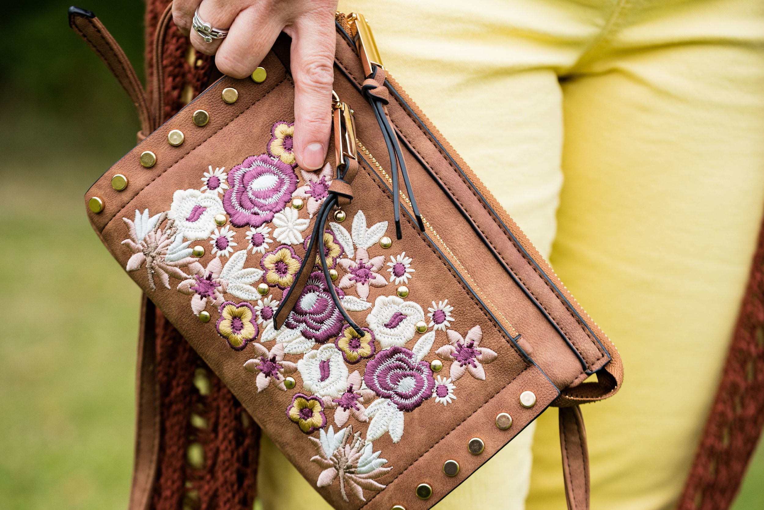
Photo credit Rebecca Trumbull.