A Month of Holiday Outfits: Inspiration - Home Alone 2: Lost in New York
I thought it would be fun to style a few outfits around a few specific Christmas themed points of inspiration like movies, books, music or even colors. Today’s outfit revolves around a sweatshirt I found recently and couldn’t wait to style.

Home Alone is a series of movies revolving around Kevin McCallister played by Macaulay Culkin. Kevin has the misfortune of being left at home alone in the first movie while his family flies to France, not realizing he isn’t with them. While they are gone Kevin must defend his home agains two bumbling, but mean robbers who are trying to steal from all the homes left empty over the holidays. In the second movie, the family, once again, get separated from Kevin at the airport, where he unwittingly boards a flight for New York City instead of the proper flight to Florida. As in the first movie, chaos ensues when Kevin runs into the same two robbers, who have escaped from jail and are looking to steal from a unique toy store that is giving their profits to a local orphanage. I love both movies.

The quote on this sweatshirt was from an old black and white movie Kevin is watching in the hotel room he gets on his dad’s credit card. The movie wasn’t a real film, but was specifically created for the Home Alone 2 movie. Here is the scene containing the quote.
I think this is one of the funnier scenes from the movie and Tim Curry, does such a great job looking mortified and terrified.
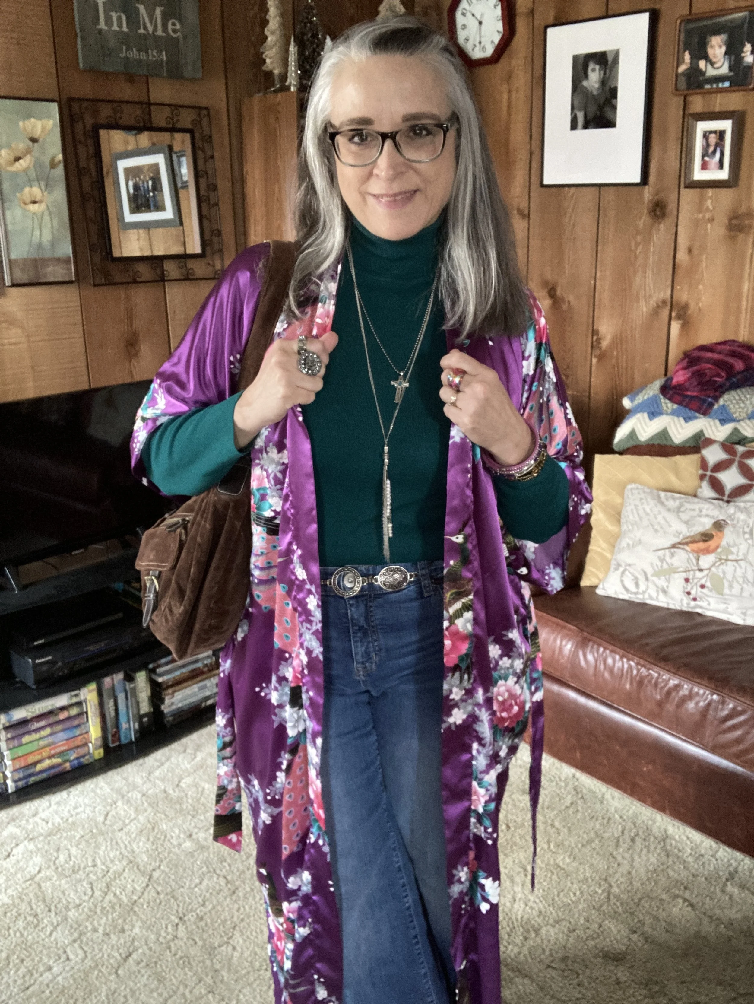
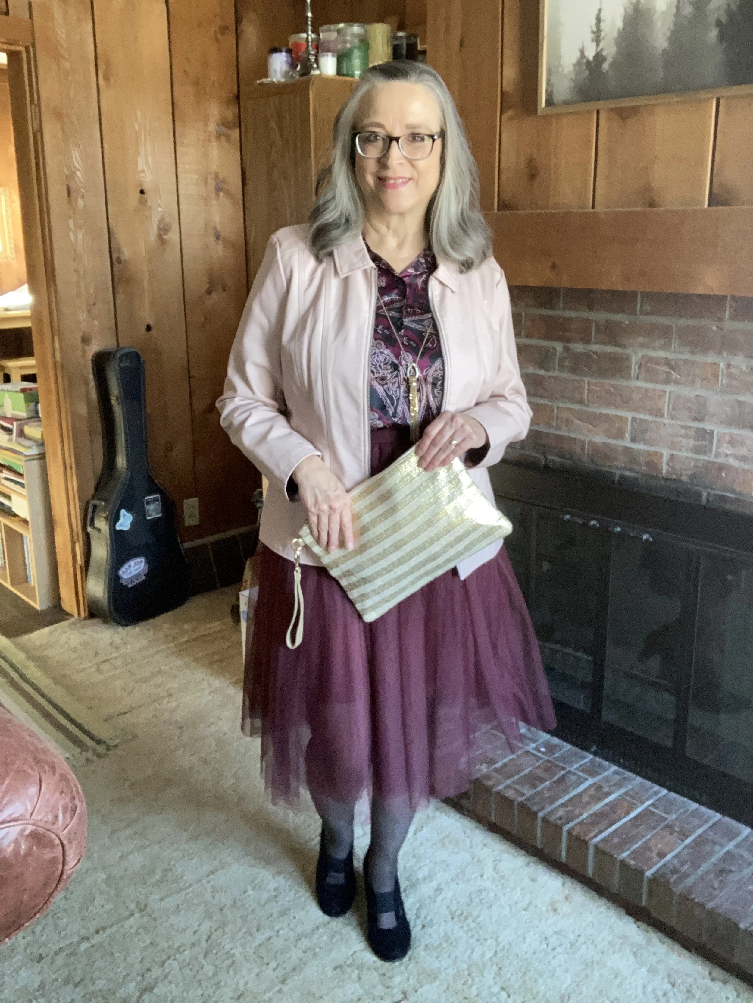
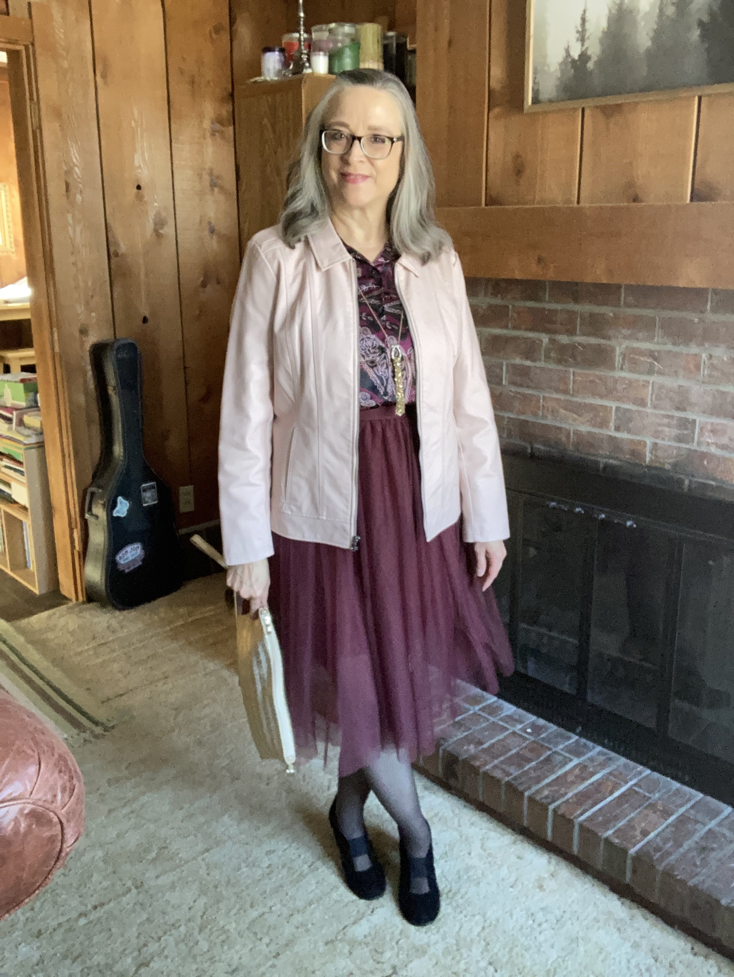
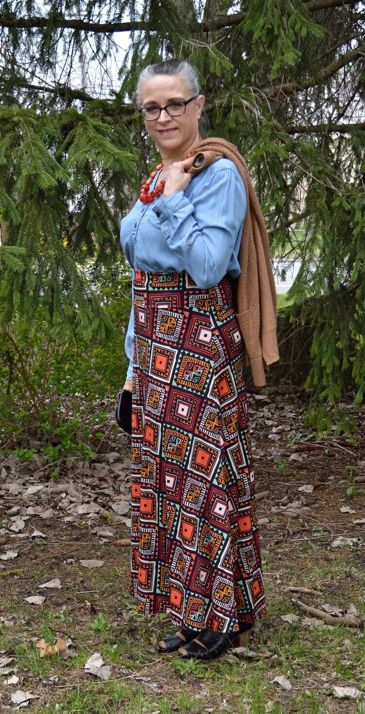
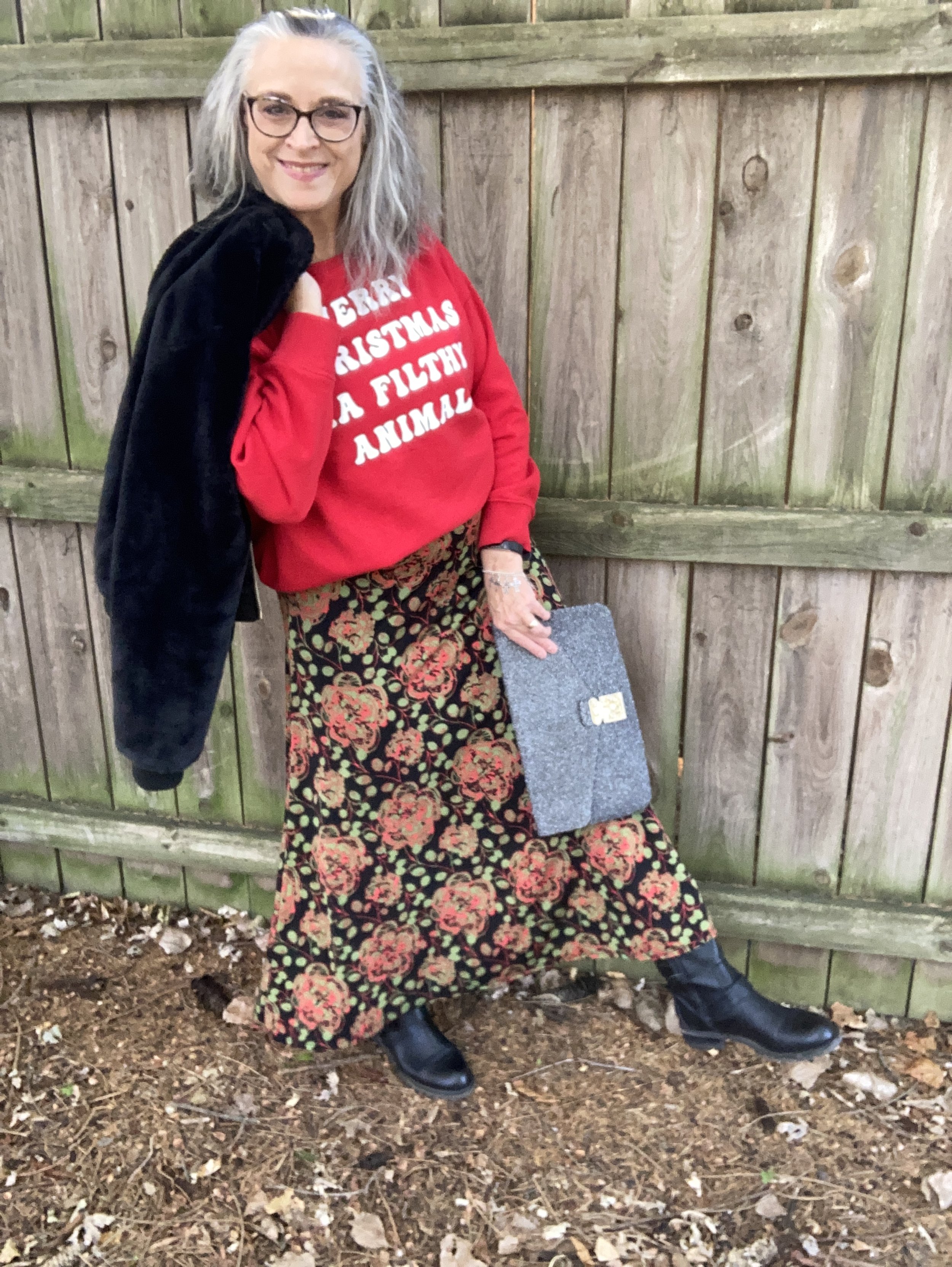
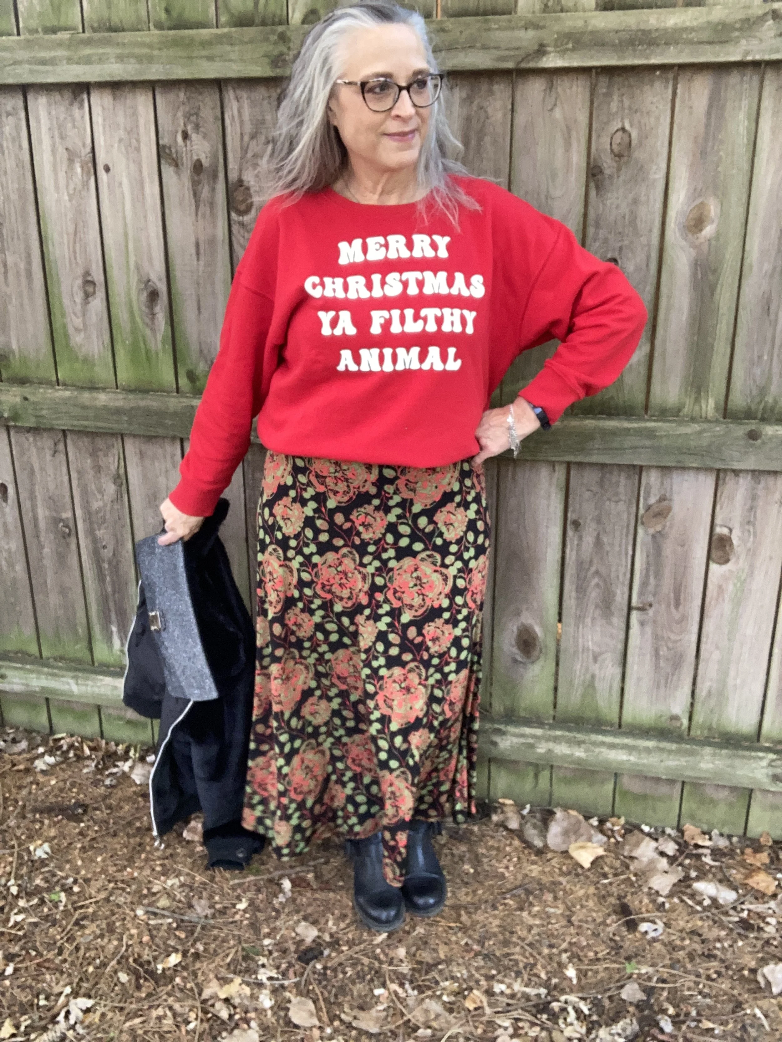
I decided to pair the bright red Holiday Time sweatshirt with this Lu La Roe skirt that was gifted to me a number of years ago. I thought the bright red in the skirt went well with the bright red sweatshirt. I have a few of these pieces in my closet, but have not purchased any more. They no longer really suit my style, but I kept a few of the ones I liked, this skirt being one of them.

To keep this look more my style, I added the fuzzy, faux fur bomber. This No Boundaries jacket was a Christmas gift from my spouse a few years ago. It is a warm, classy piece and can either dress up or dress down a look.

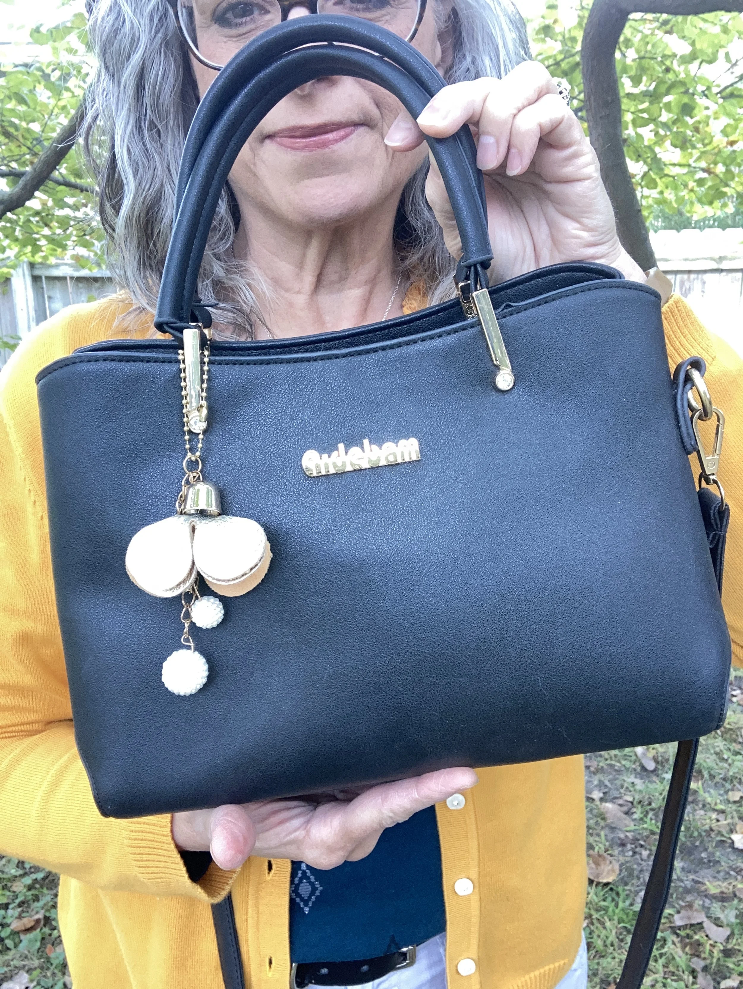
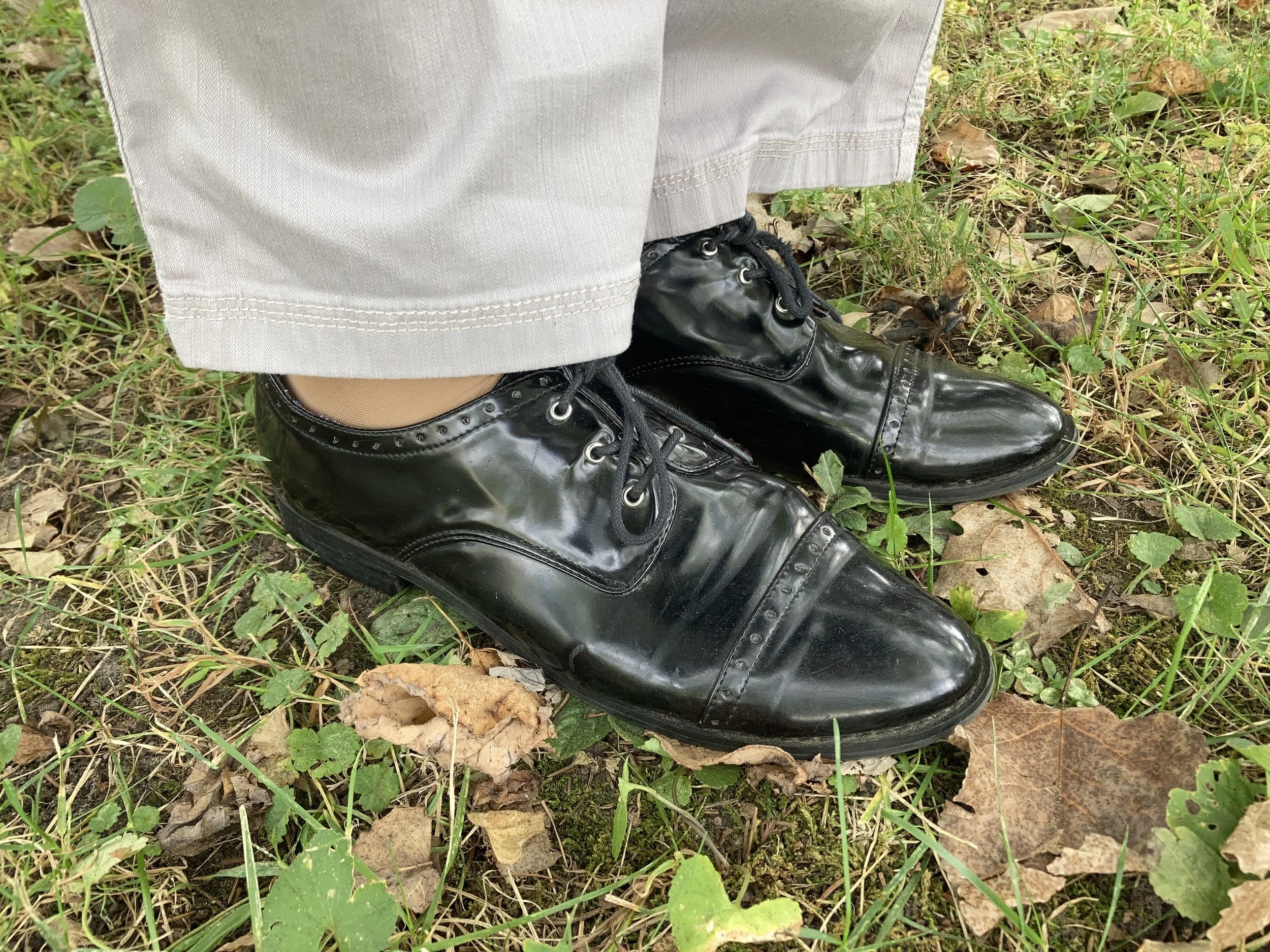
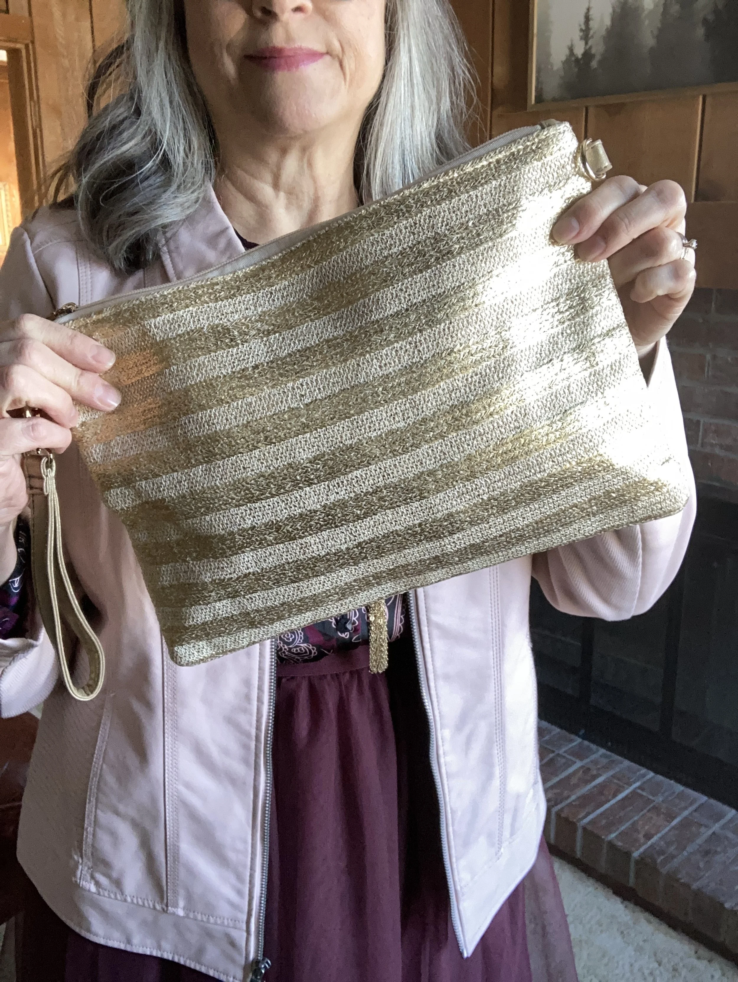
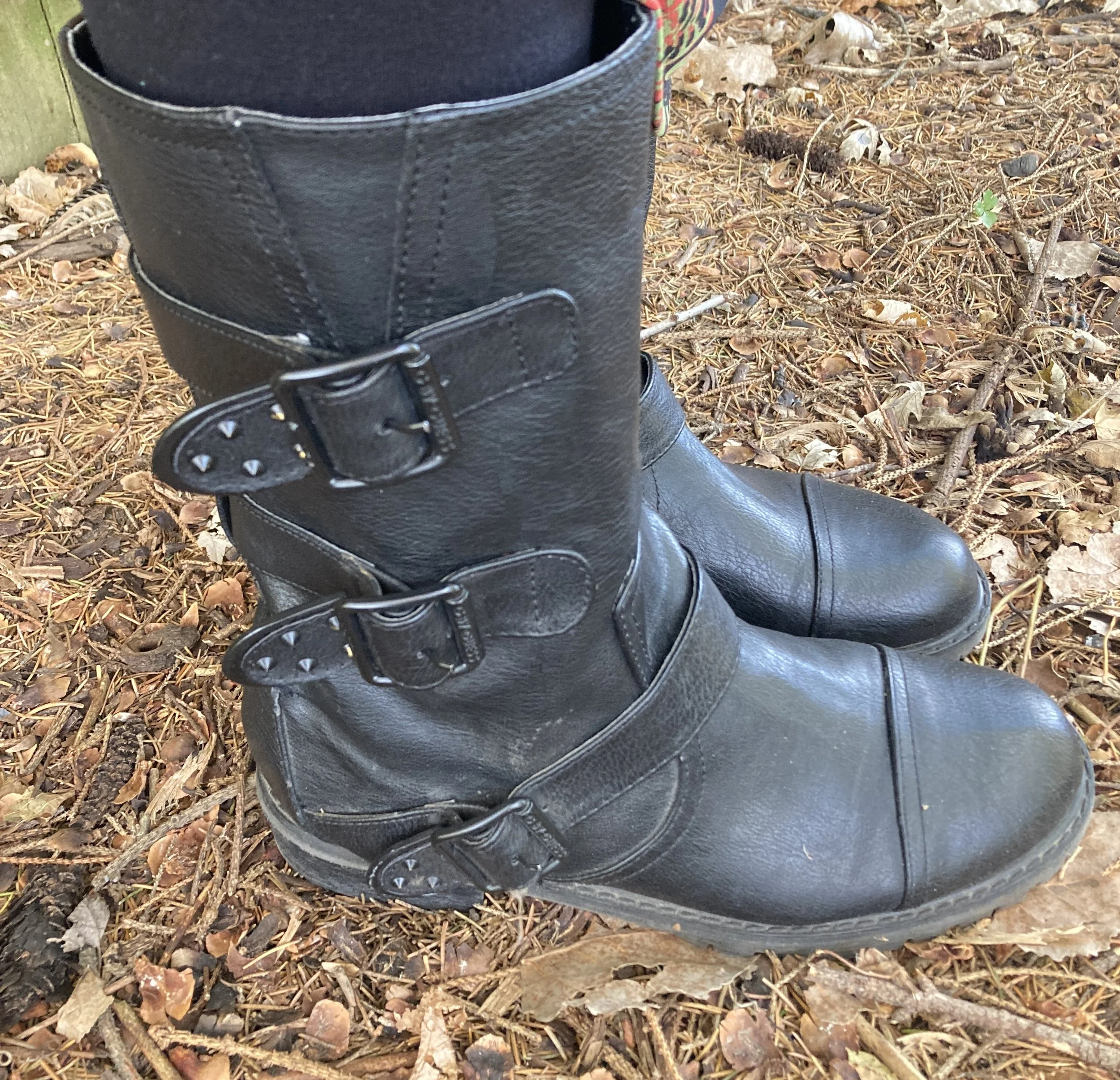
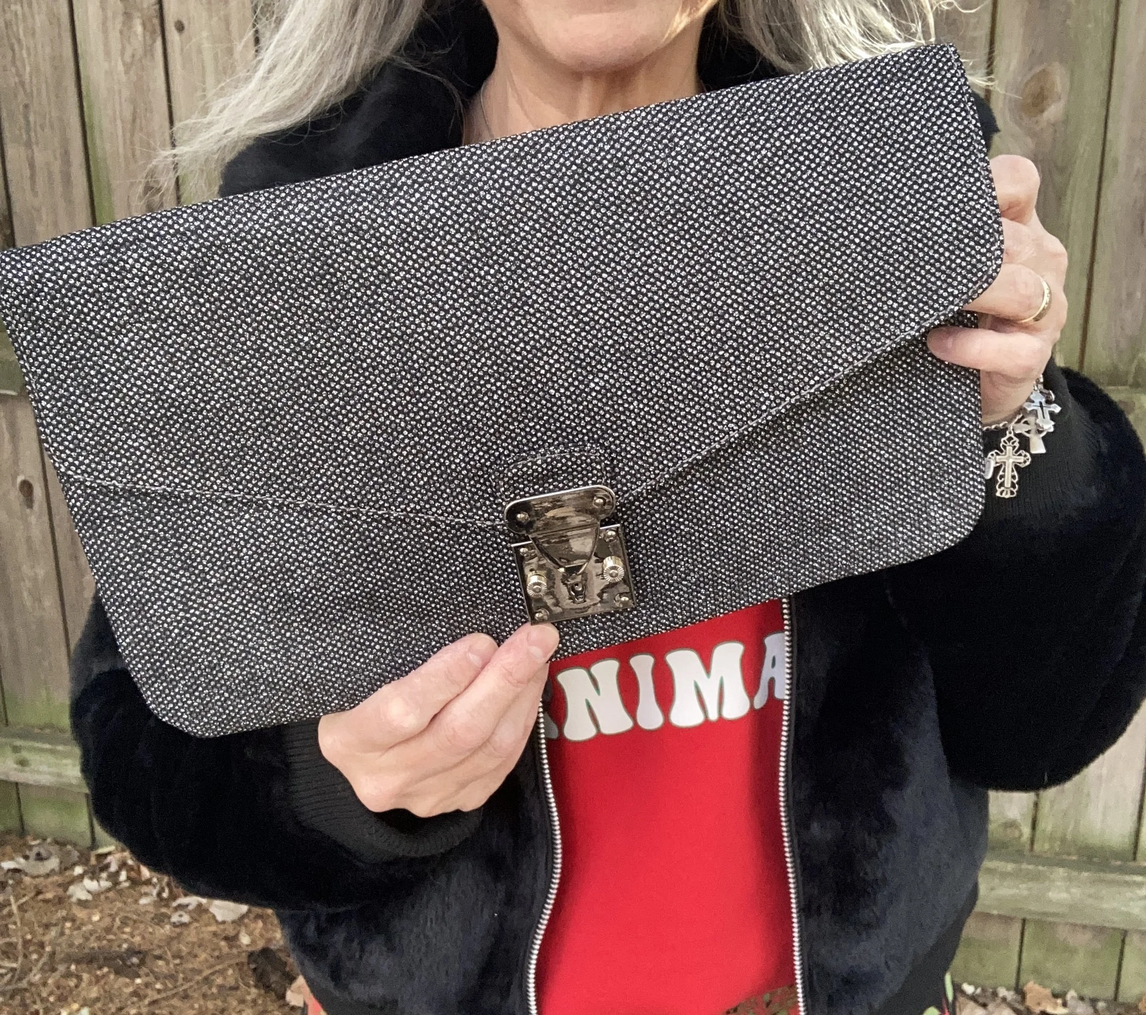
I love the contrast of feminine and masculine, girly with and edge, so I also added my second hand Guess moto boots, and grabbed my sparkly Cosmopolitan clutch

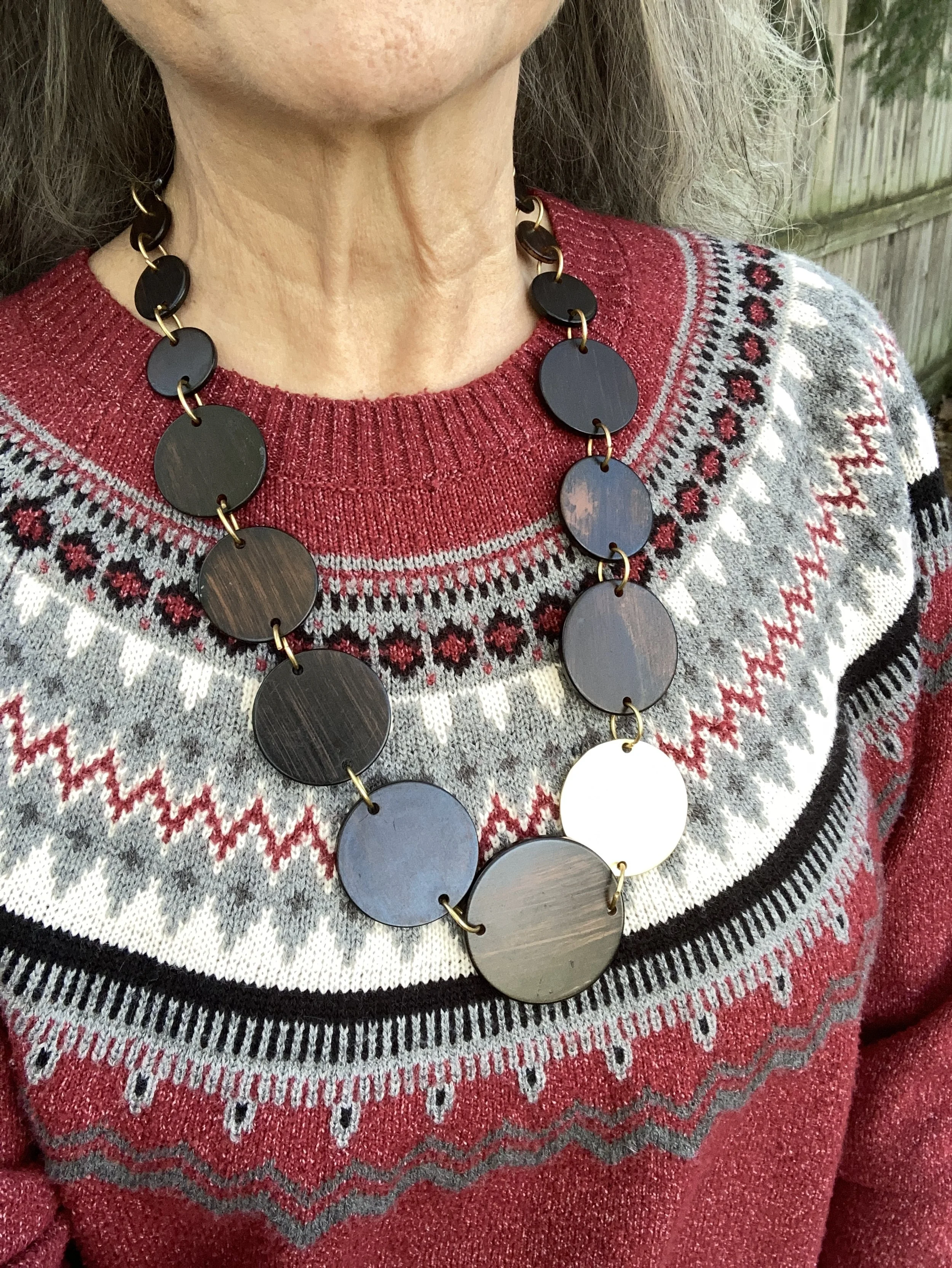
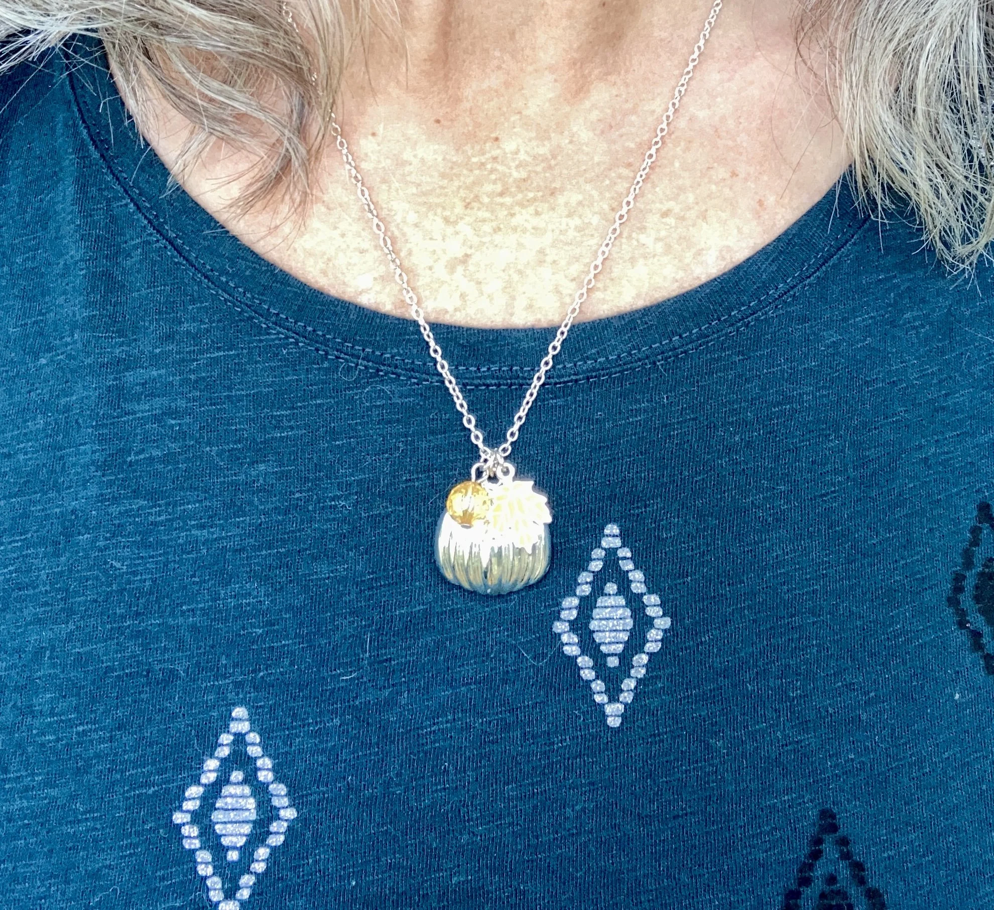
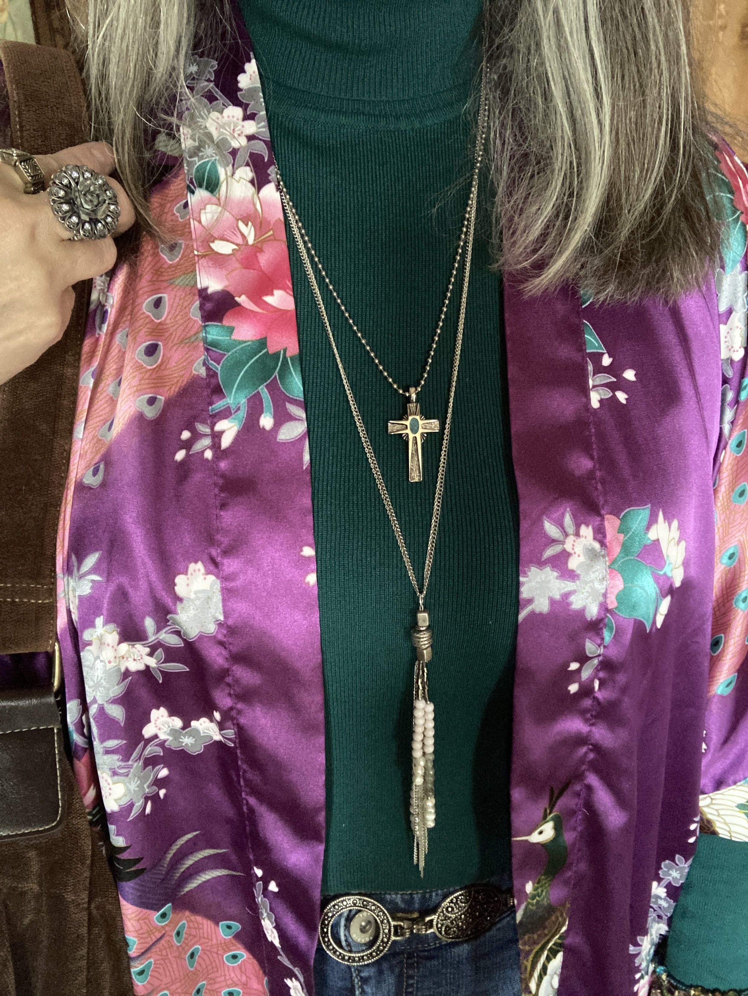
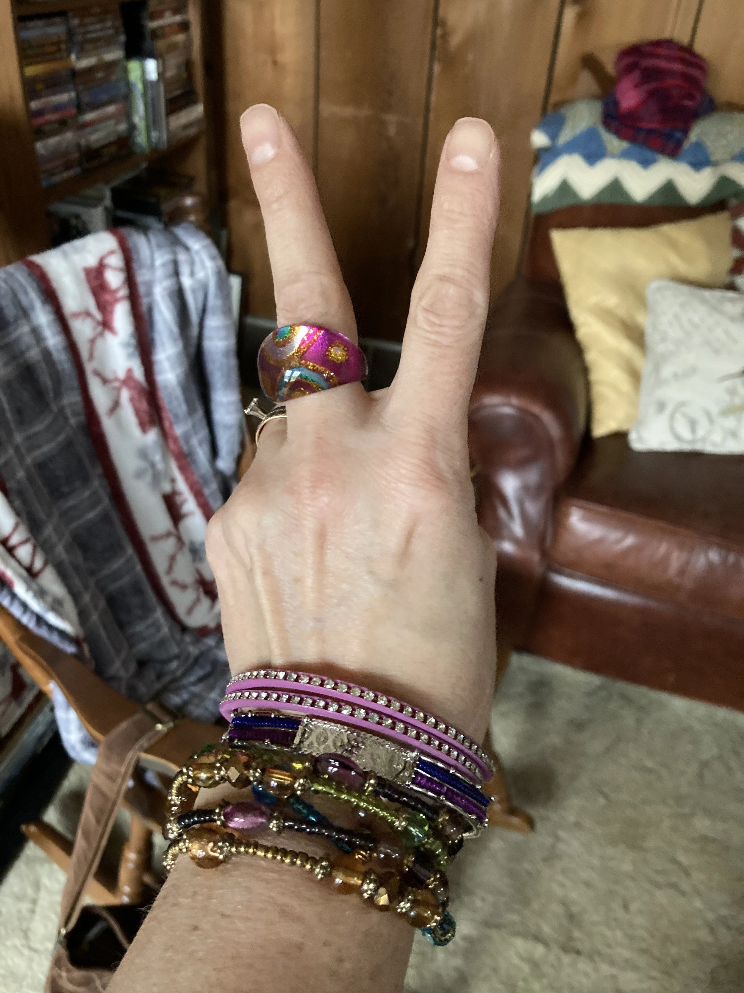
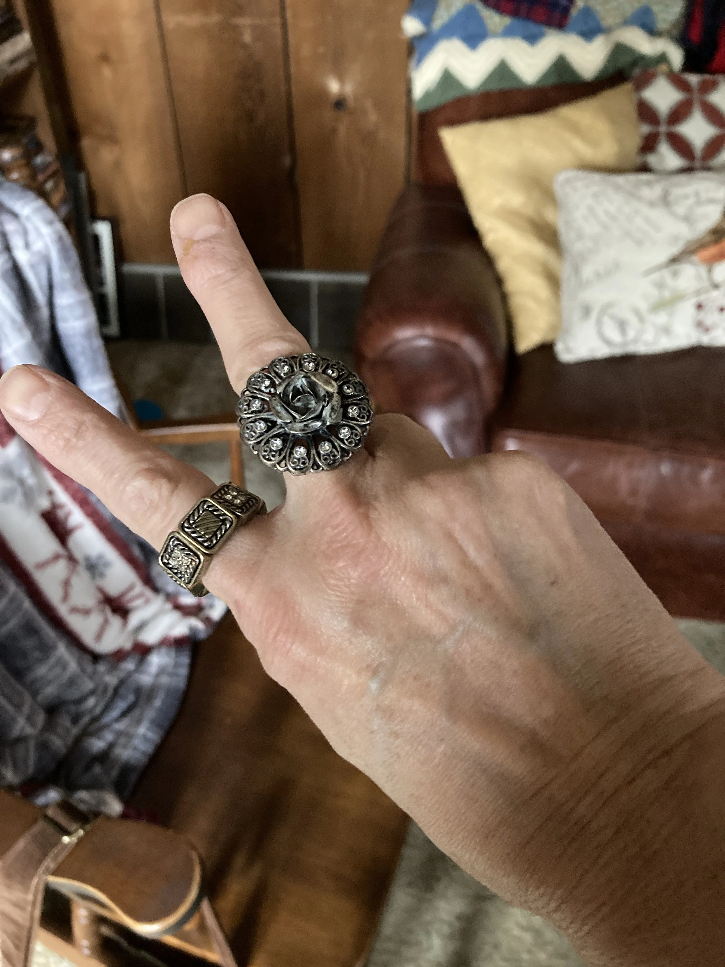
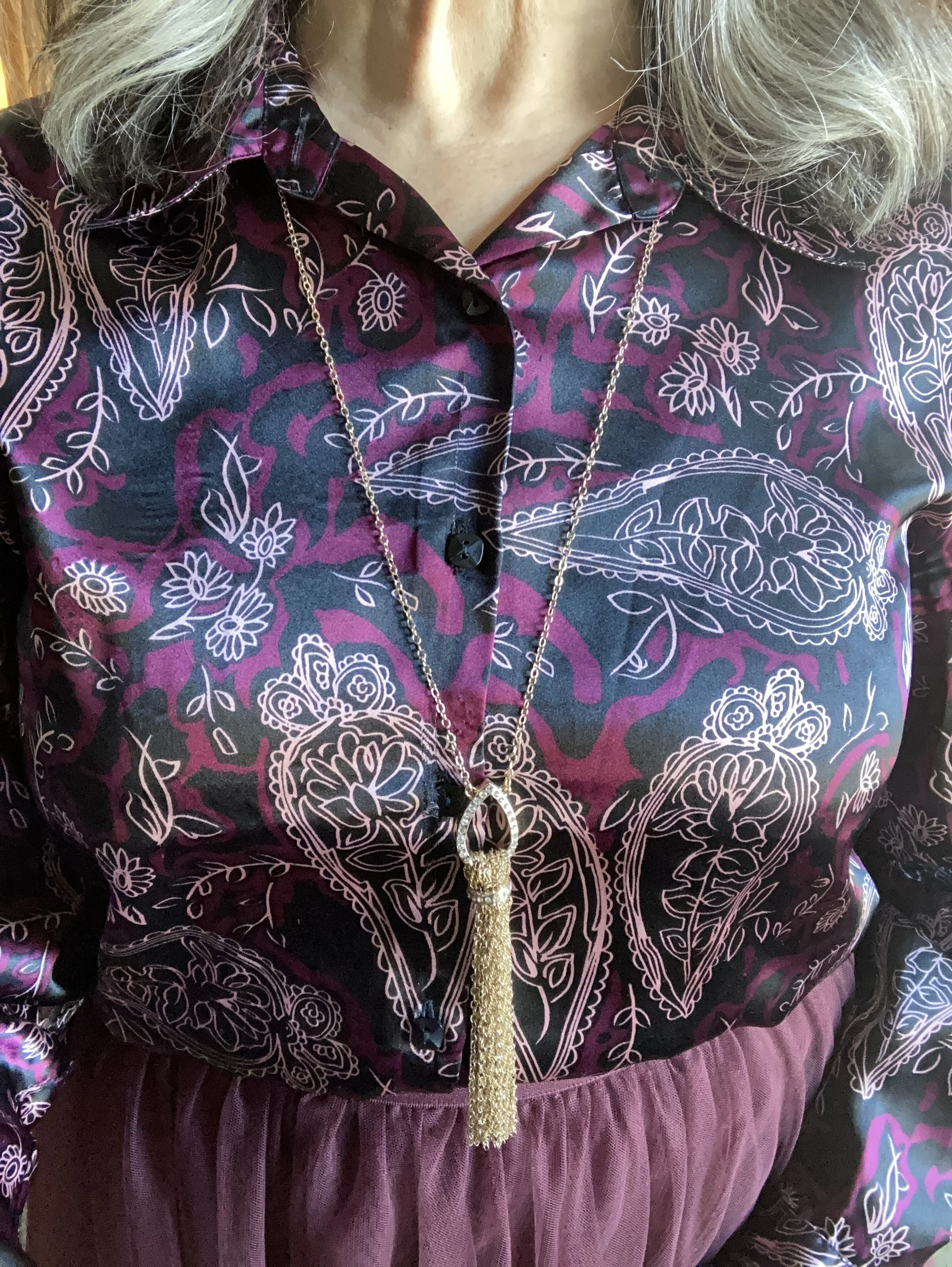
I kept my accessories very simple with a silver cross necklace and a recently thrifted cross charm bracelet.

What do you think of this outfit? Do you like the Home Alone movies? Do you like to wear red and green at Christmas time?
I hope you enjoyed this post and that it gets you thinking differently about items in your own closet. What pieces could you put together to create a similar look, but still keep it true to your own style?
I’m including a few sweatshirts and long sleeve tees for some holiday inspiration. These are affiliate shopping links. All opinions are my own. Enjoy and have a great week.