February Outfits: Color Combos - Cloudy with a Chance of Red
It’s the last week of February. I am glad that we are getting closer to spring, aren’t you? I am finishing out the month with another outfit that gives a nod to Valentine’s Day colors. Today’s look was actually inspired by an Instagram challenge to use a Pinterest pin for inspiration. You can see that pin here.
I have been wanting to get back to including a few style tips in my fashion posts to give you other ways and ideas to look at your wardrobe and what inspires you to dress the way you do. If you click on over to the pin that inspired today’s look, you will see that my outfit is not an exact copy.
Style Tip: Resources for fashion inspiration are meant to be just that, resources. Do not feel forced to buy more clothes or adopt a style that is not quite you. If it is an outfit you’d like to “copy” shop your closet for similar pieces and then add your own personal touches with shoes, bags, and accessories.
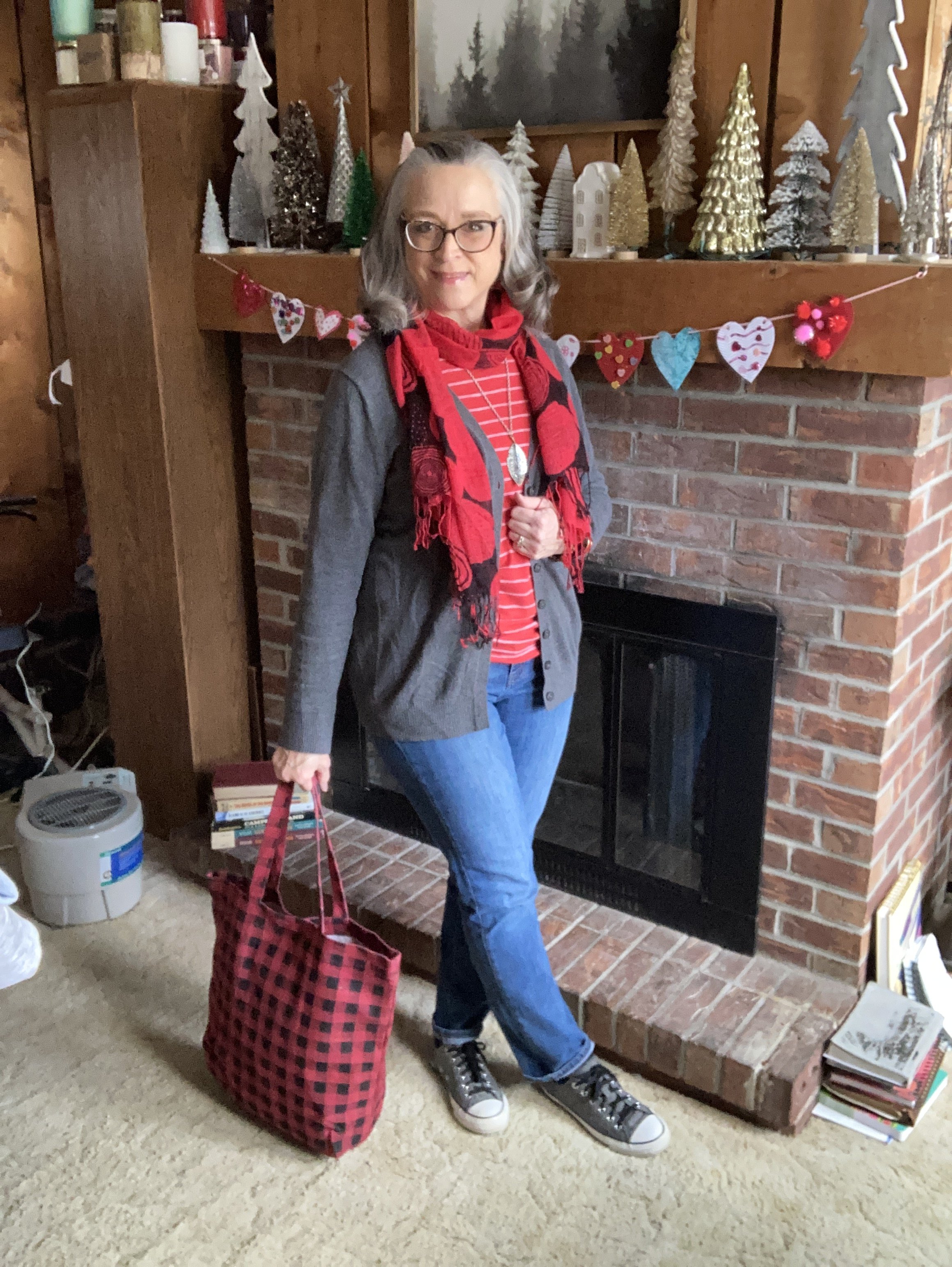
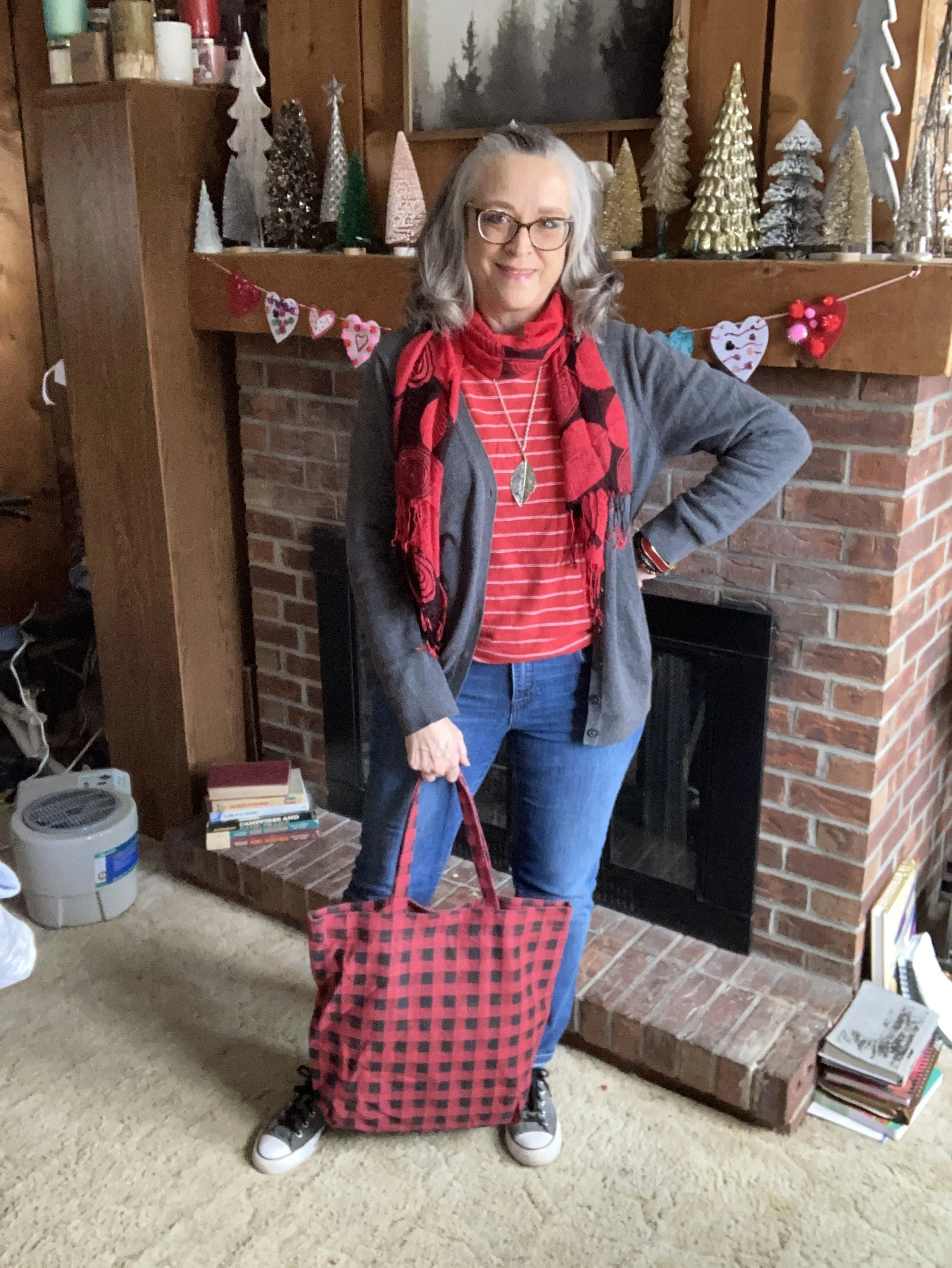
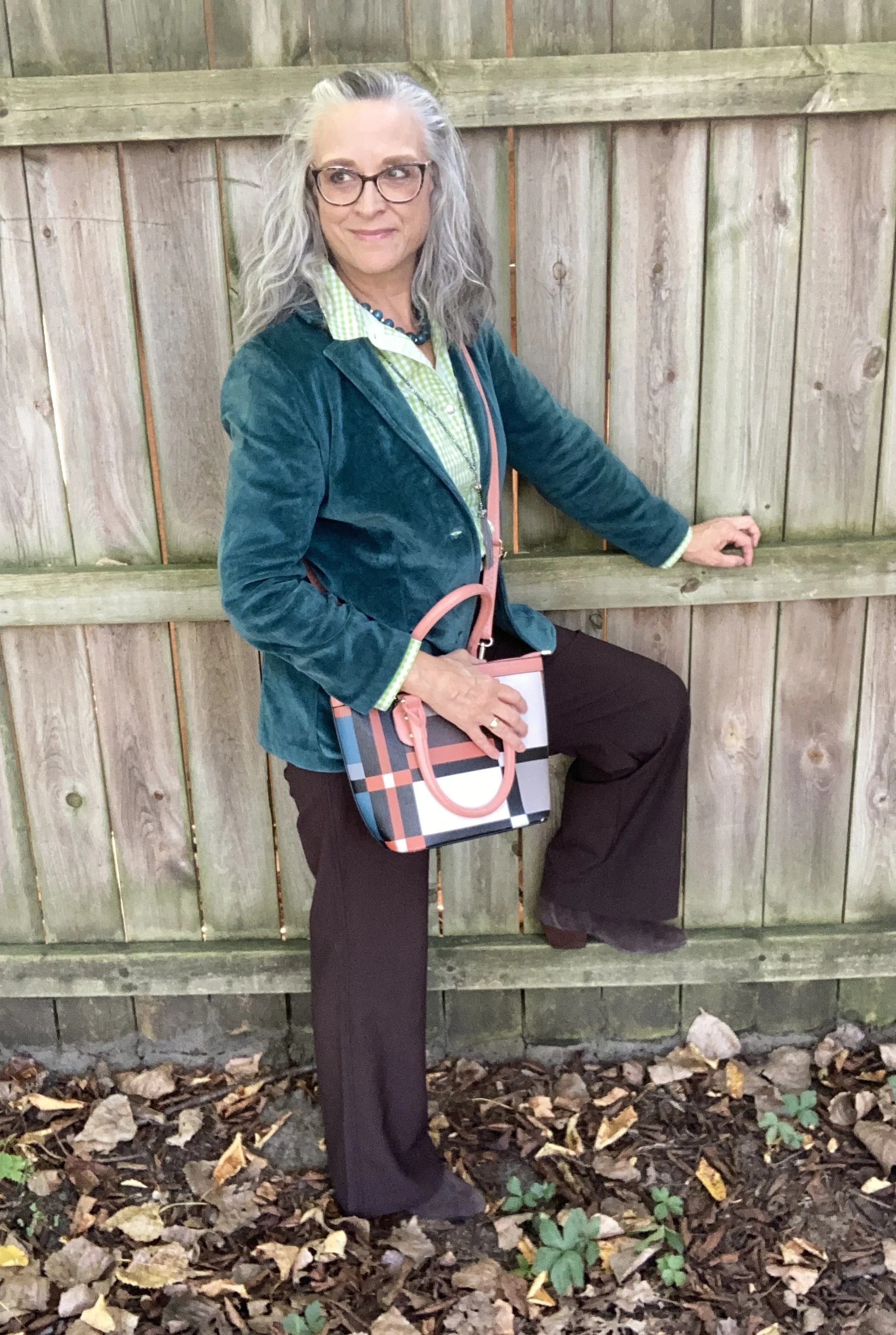
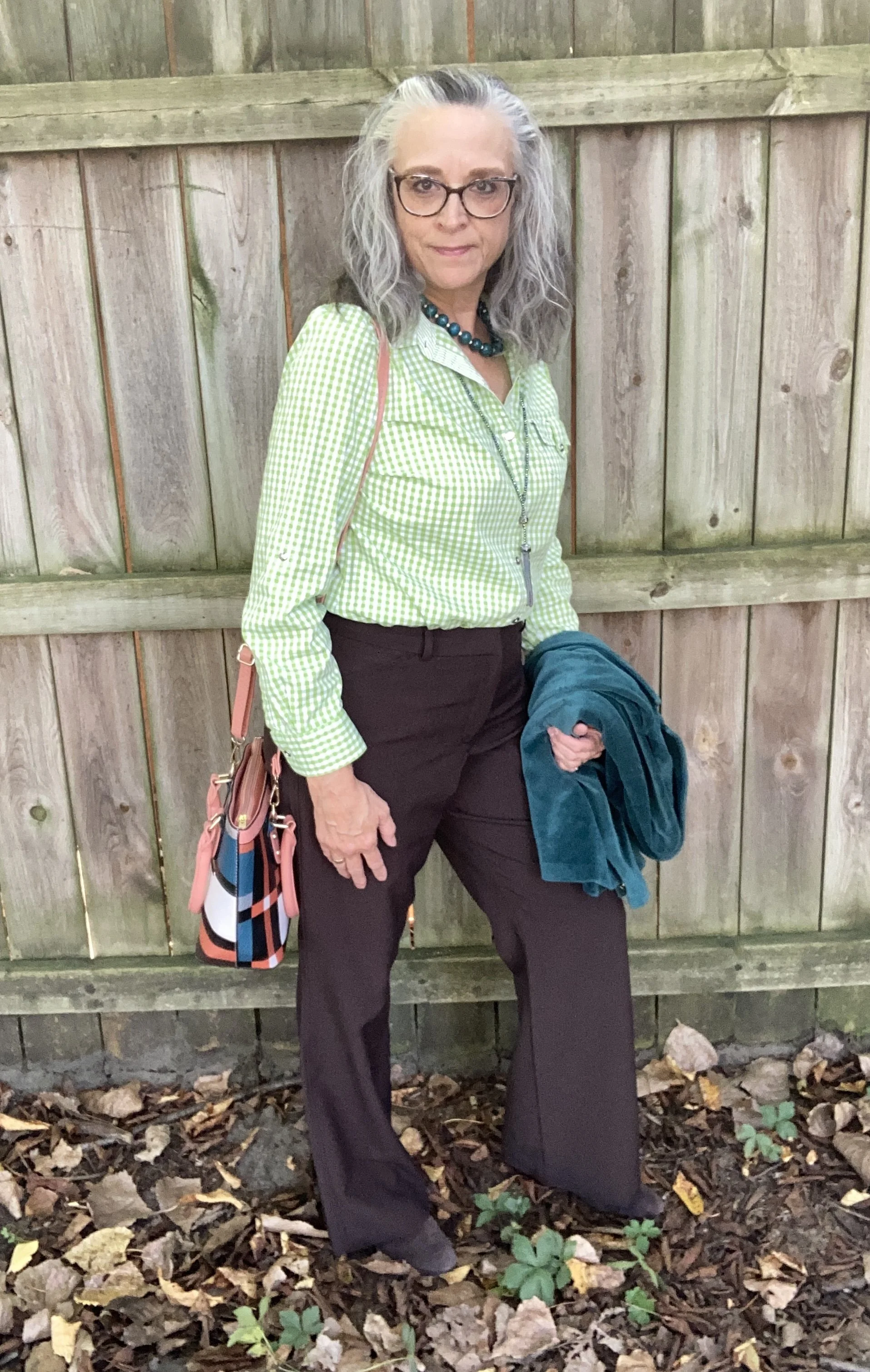
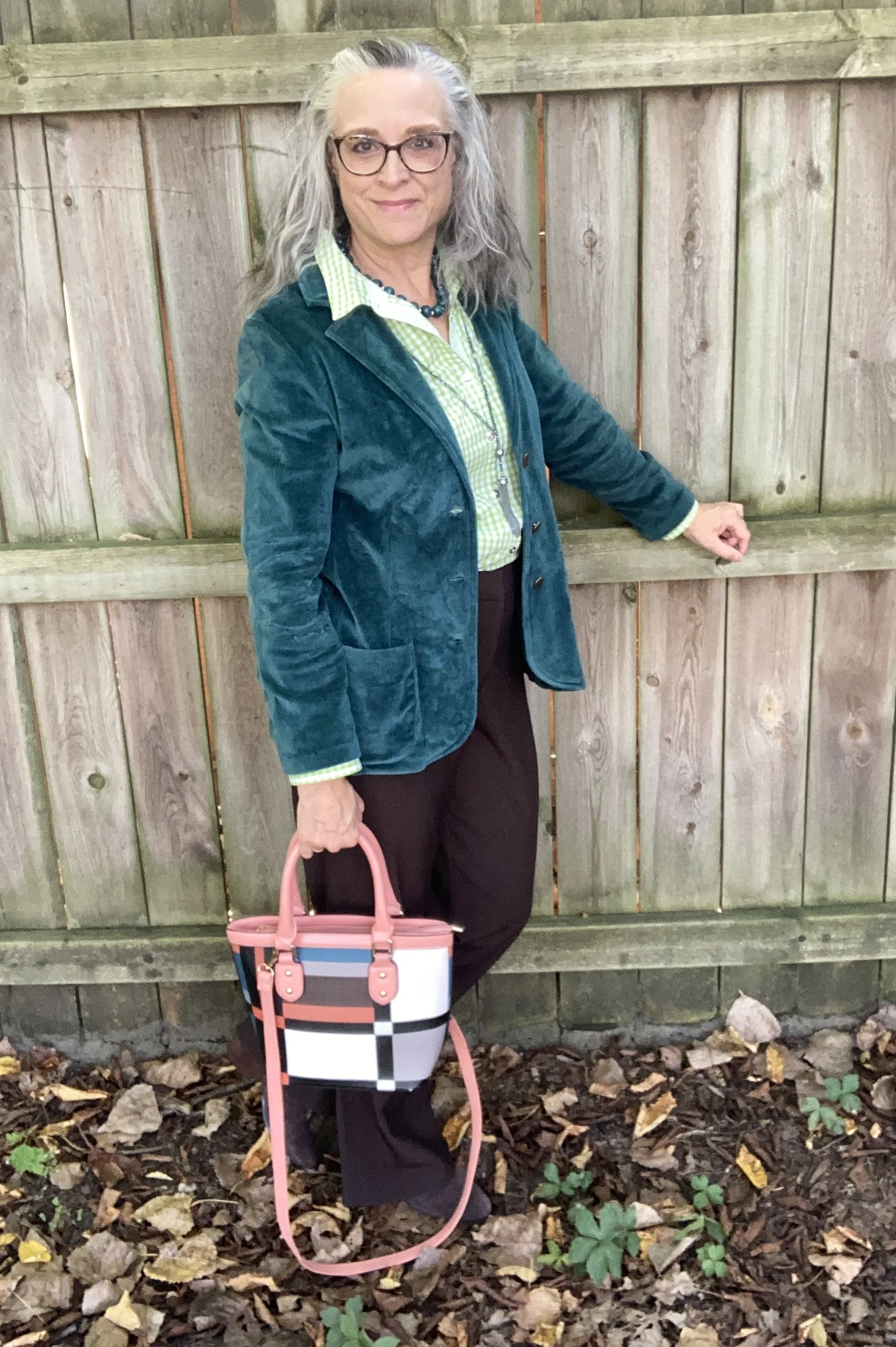
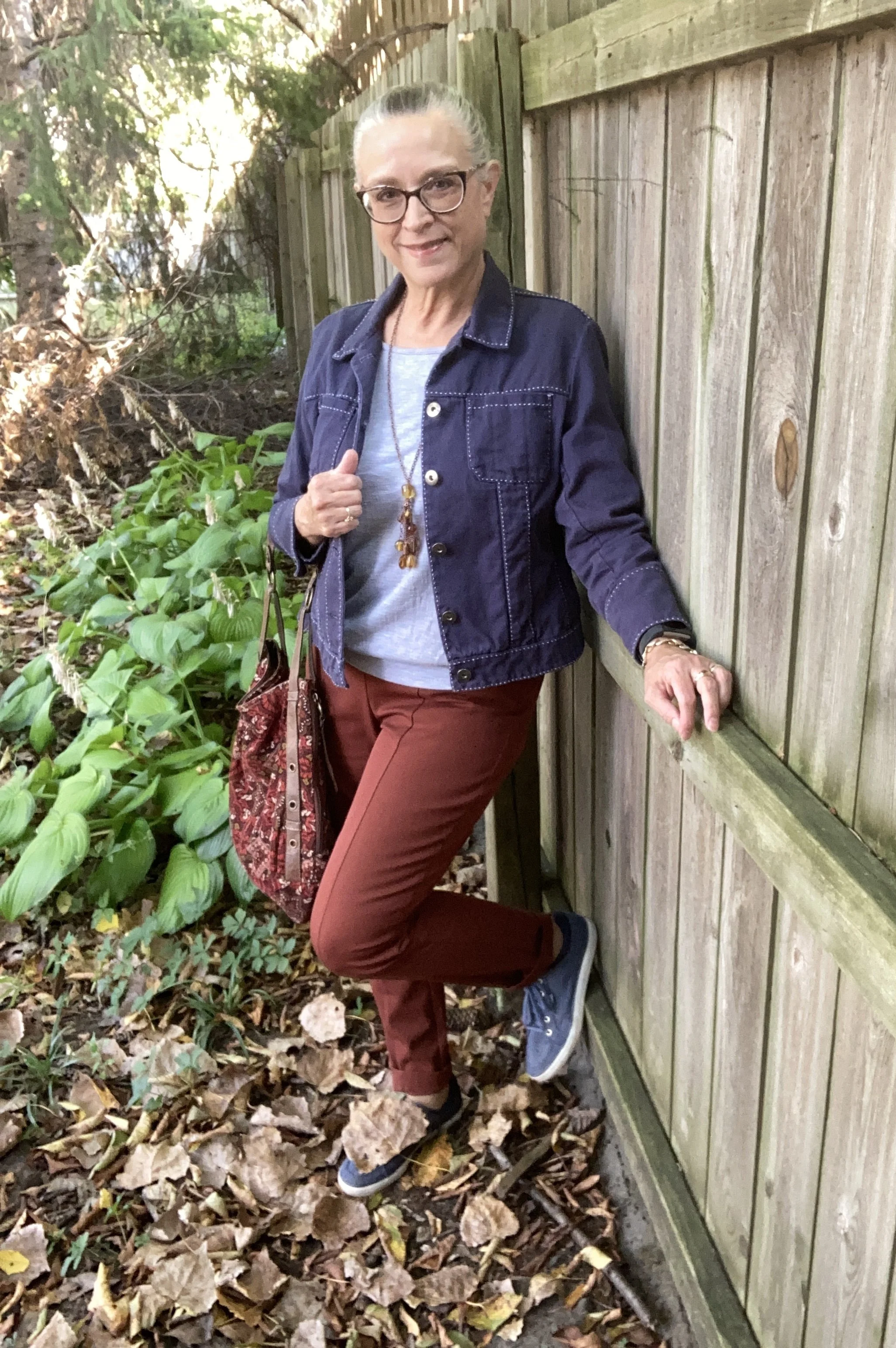
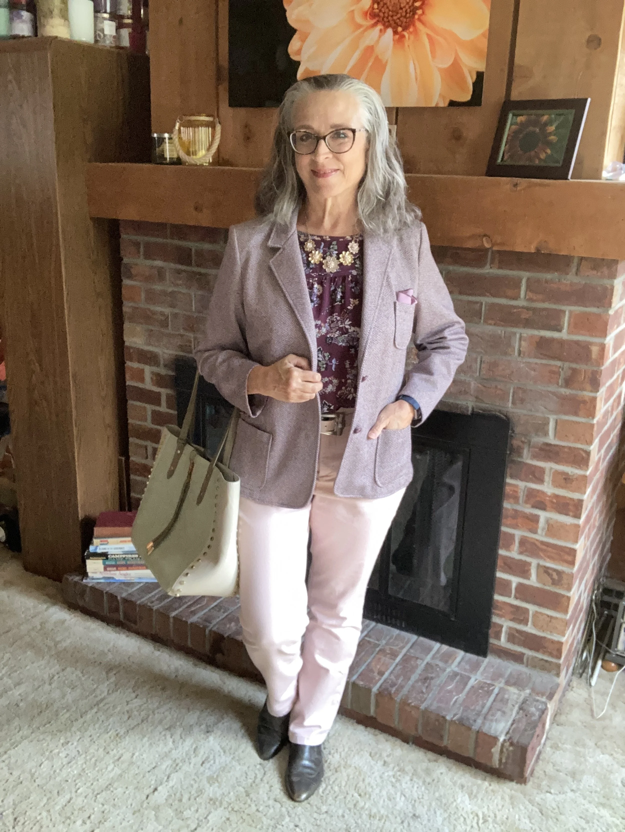
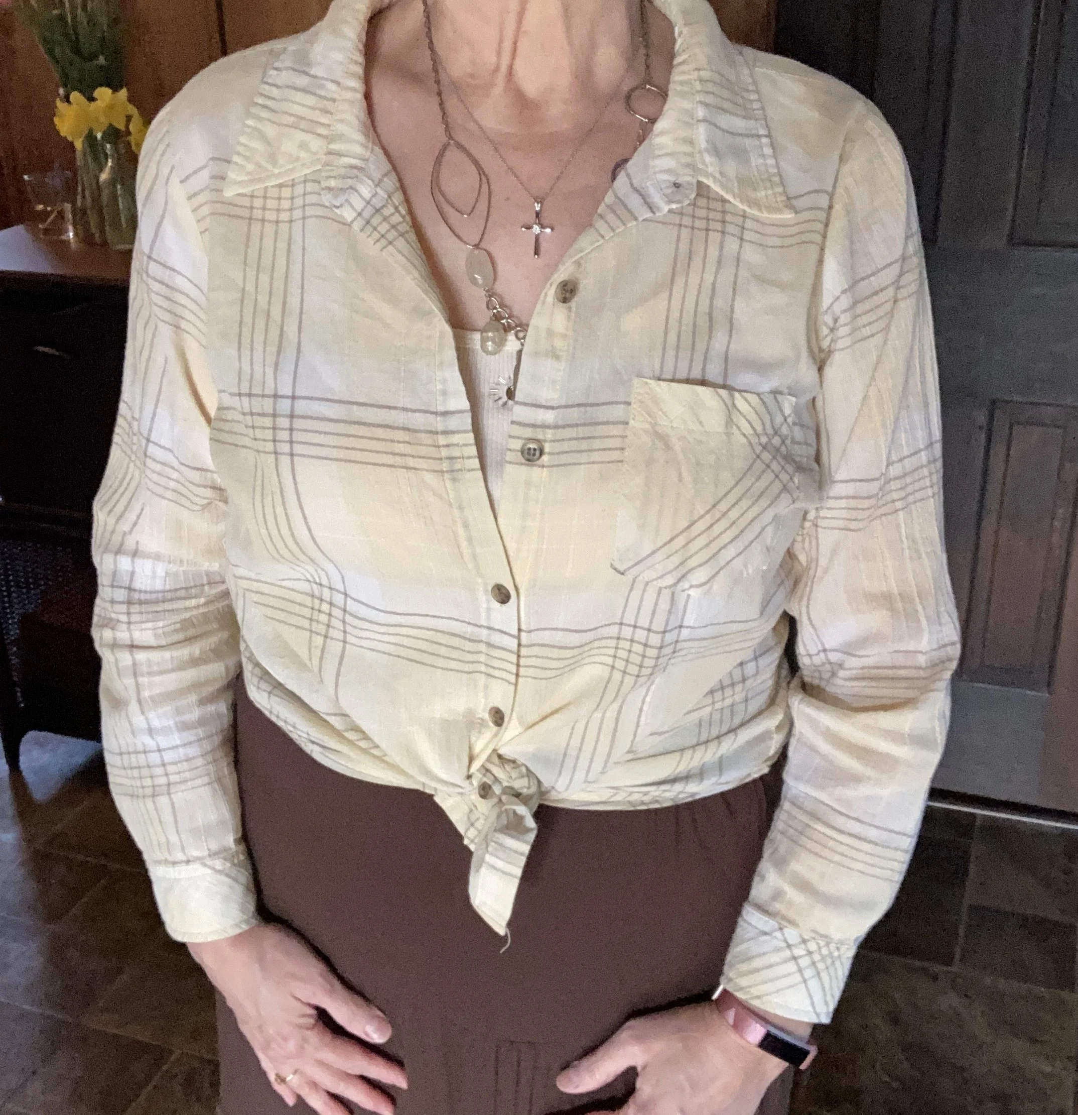
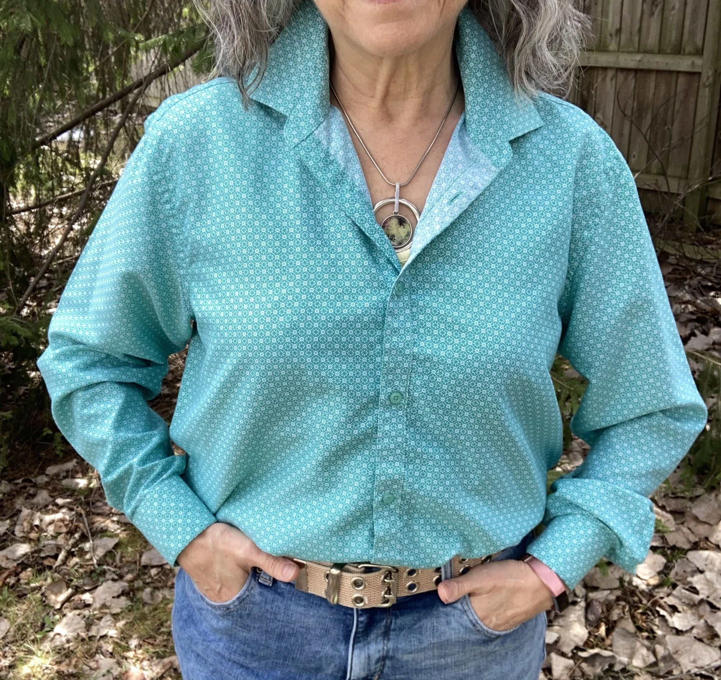
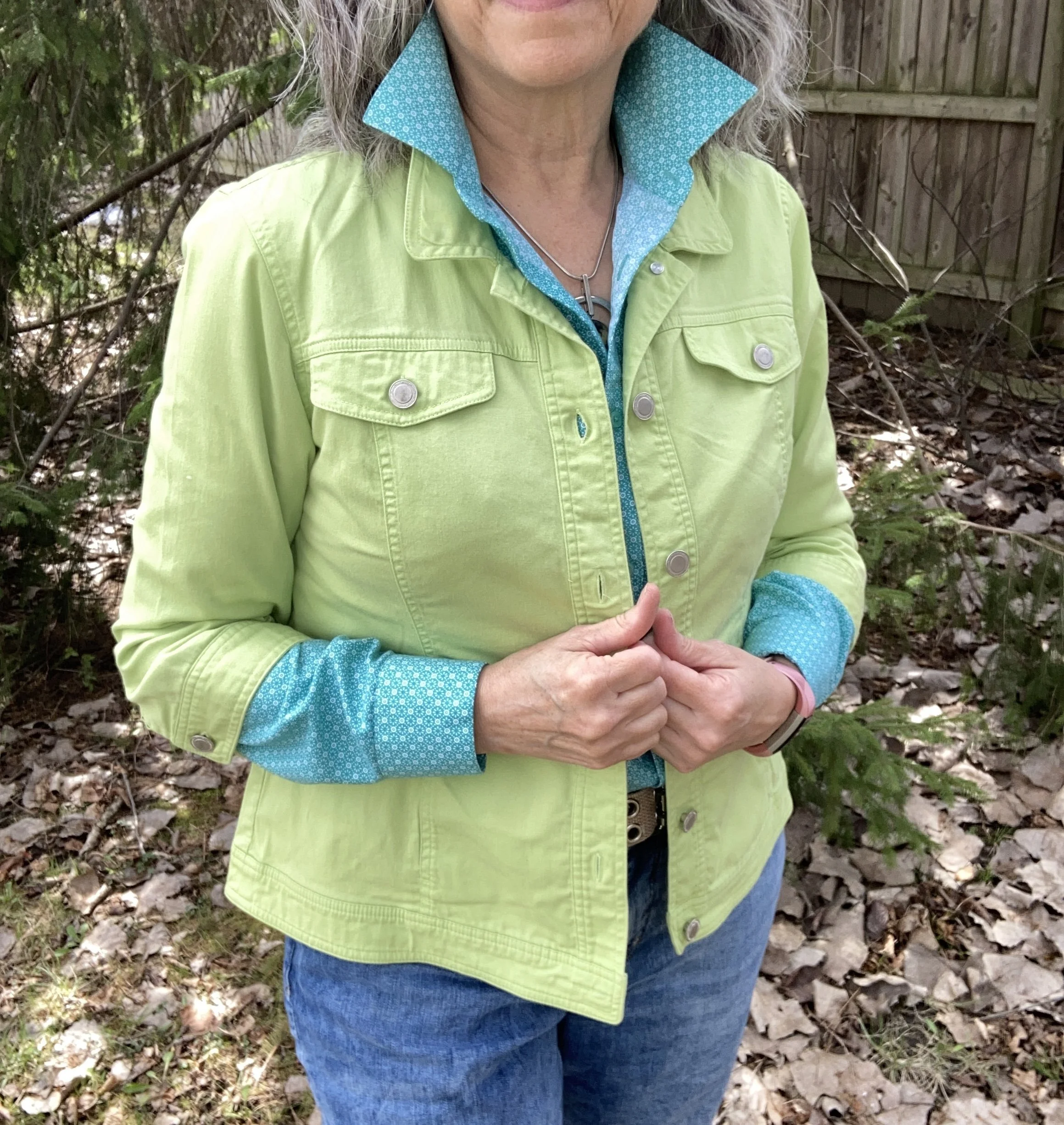
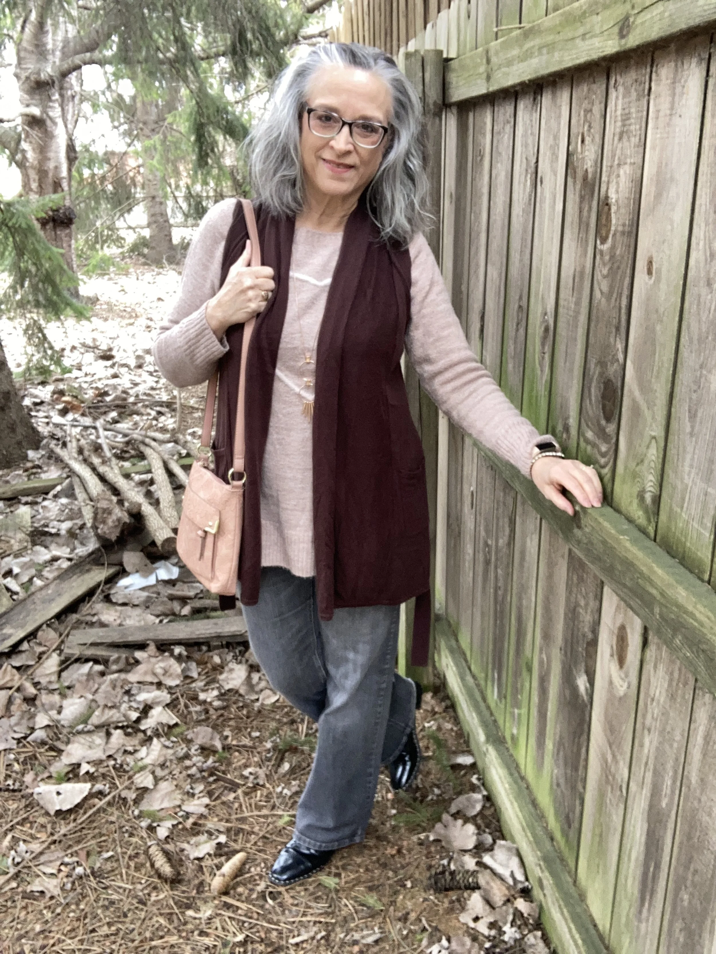
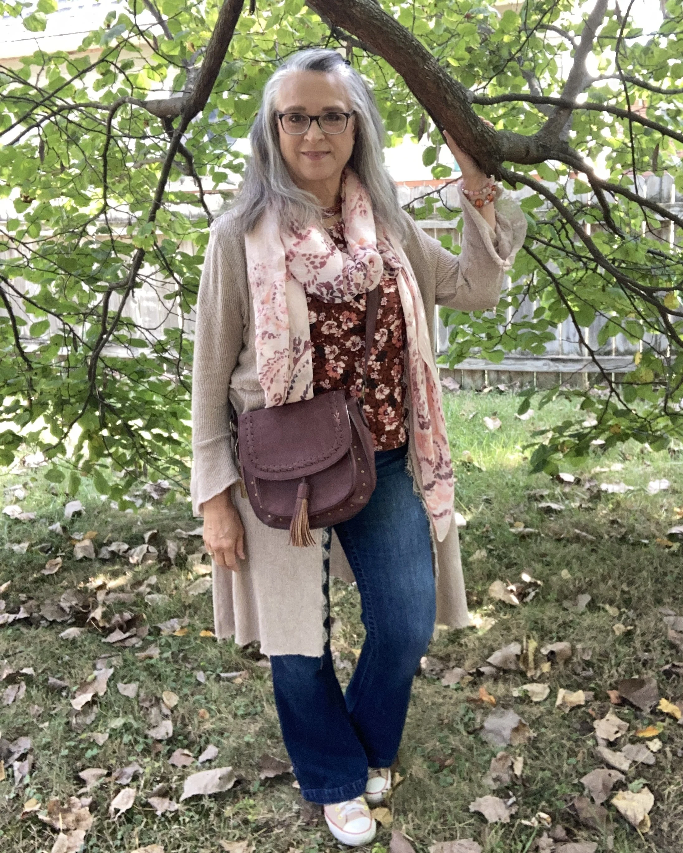
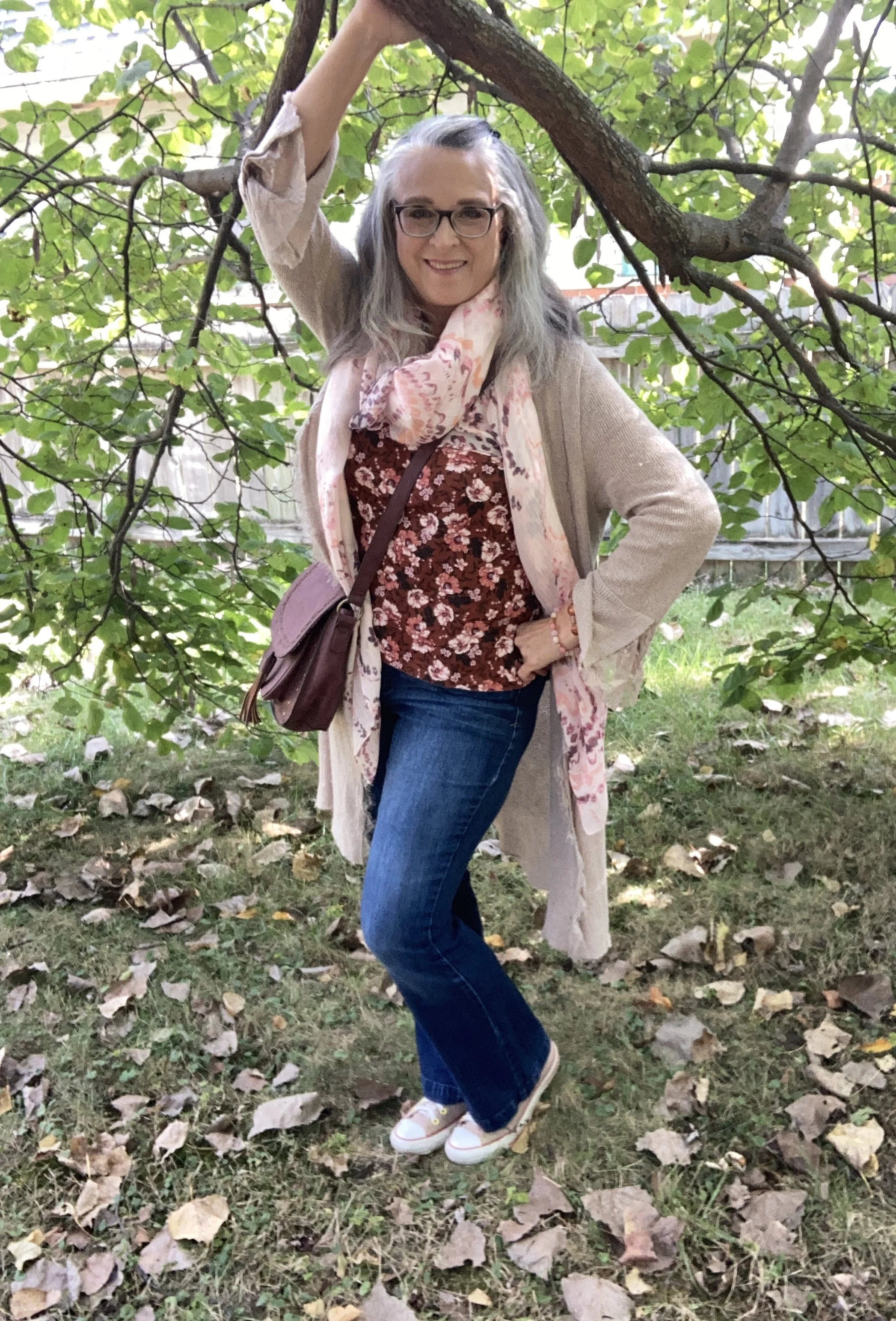
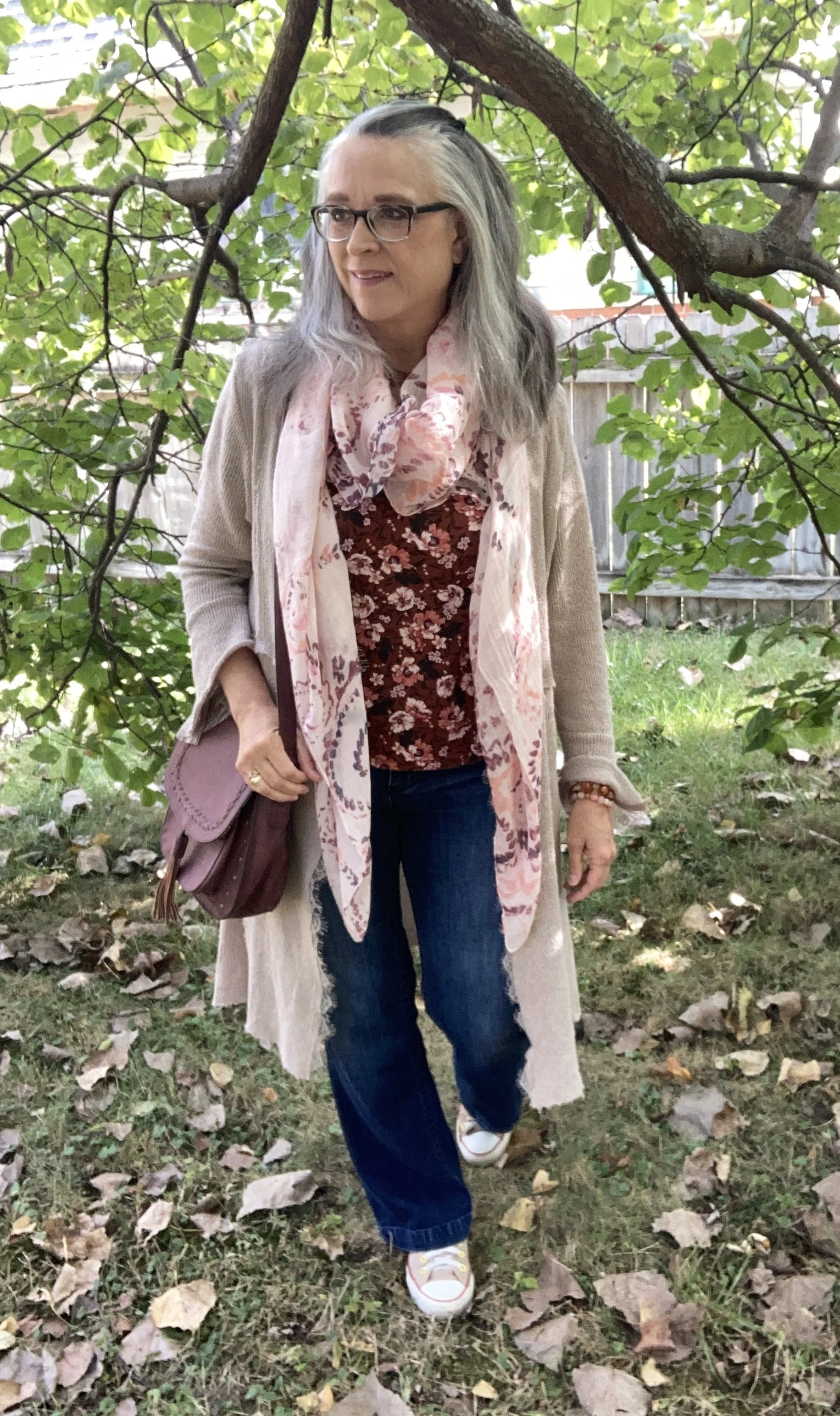
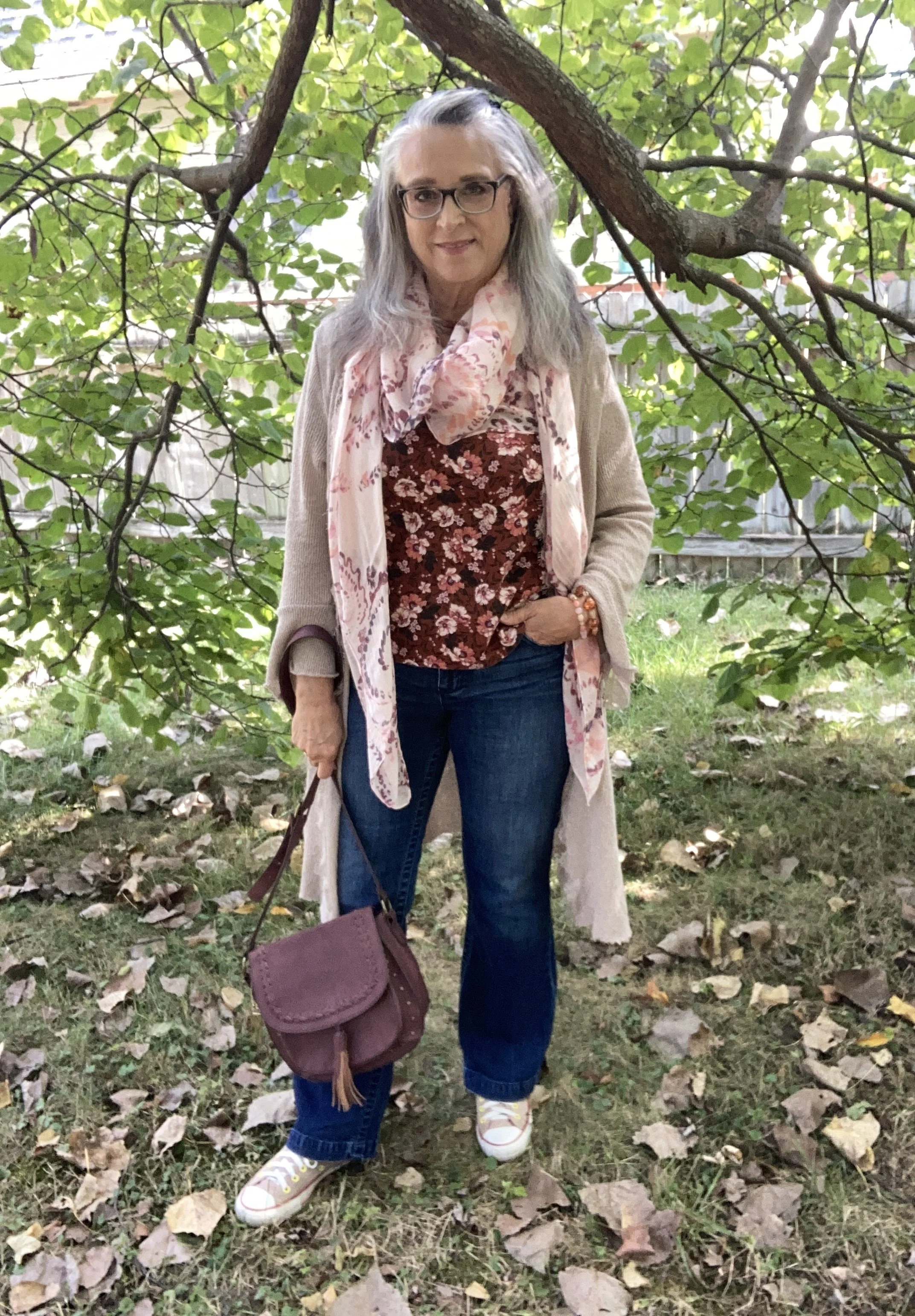
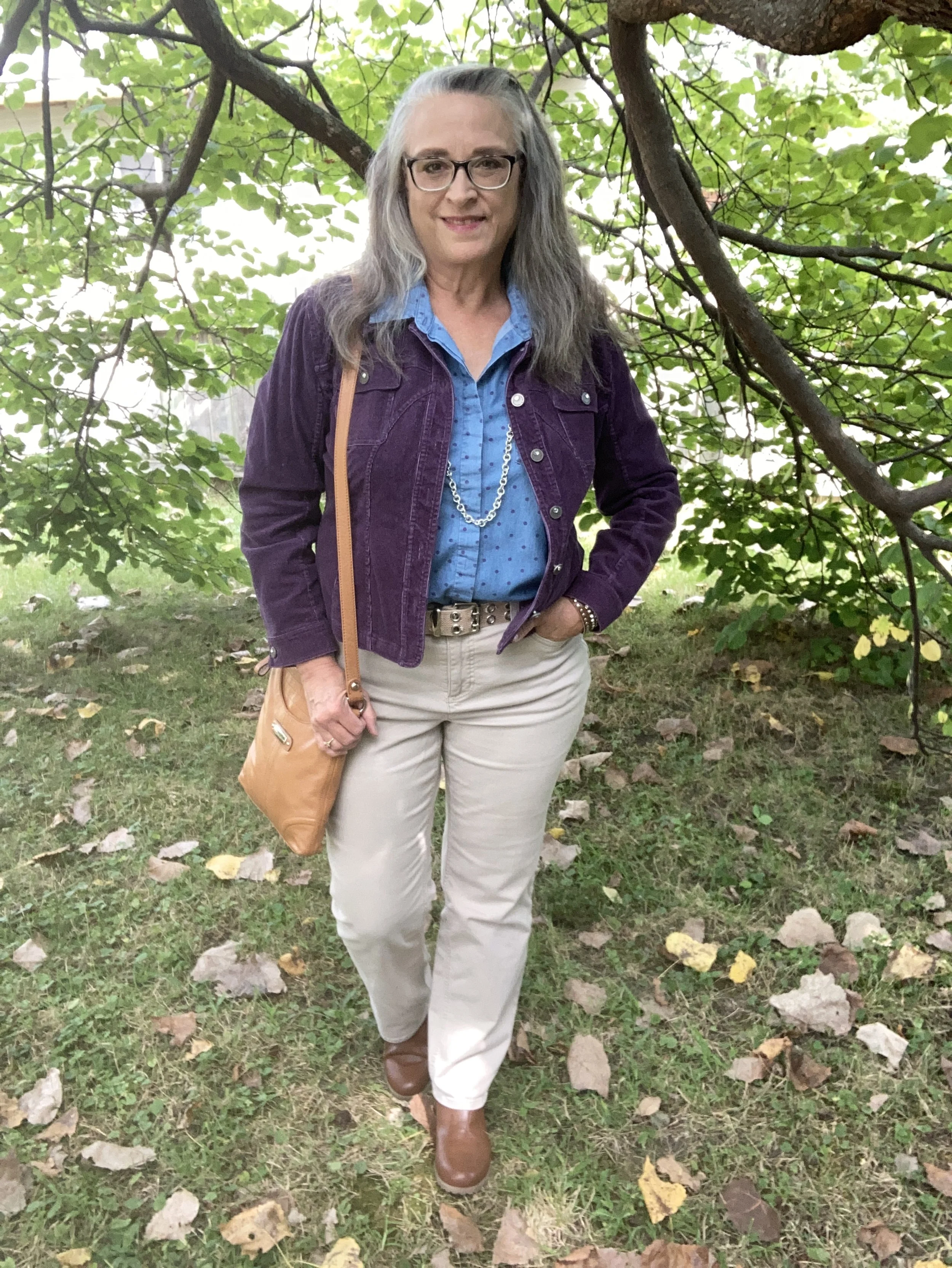
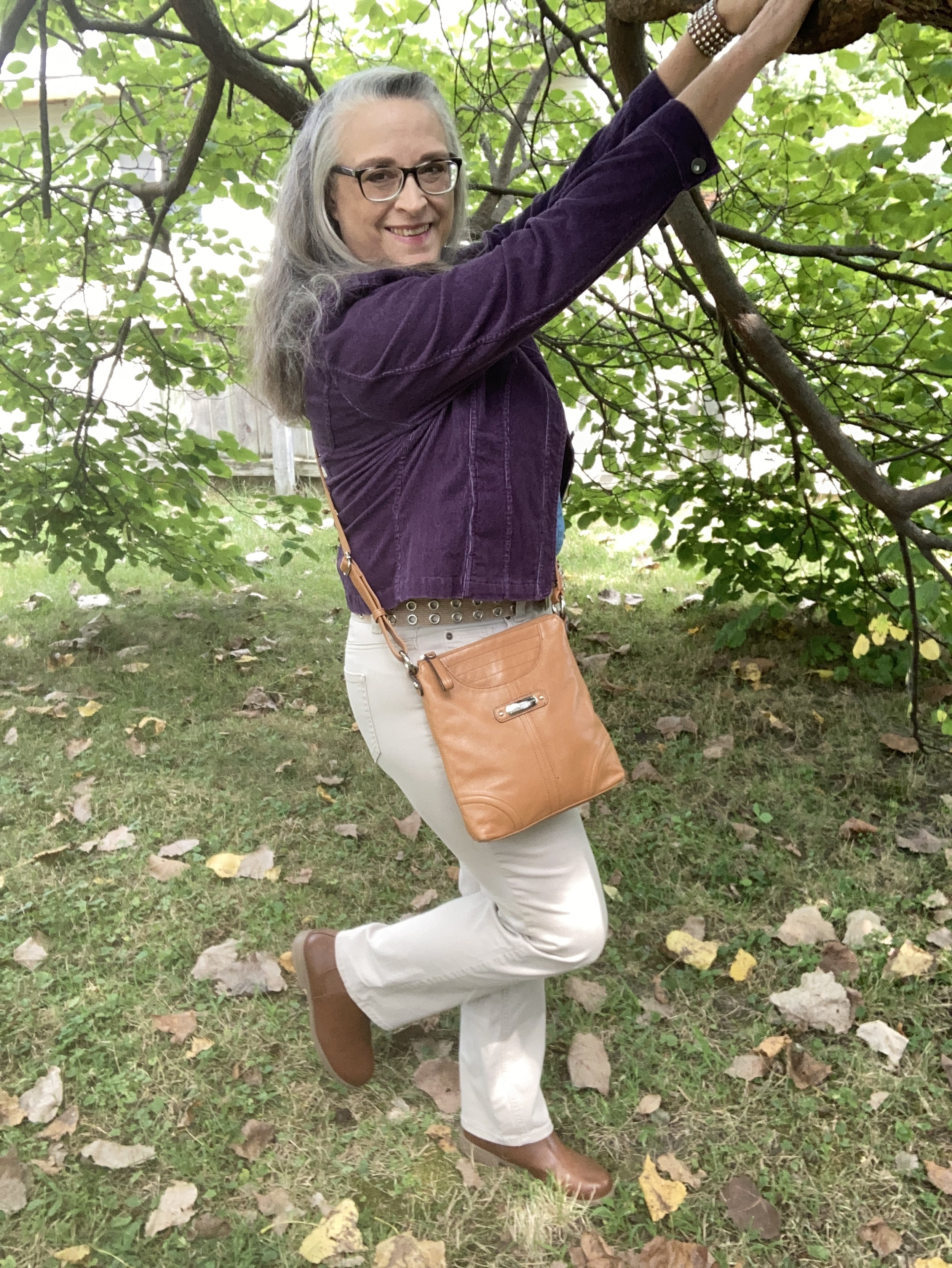
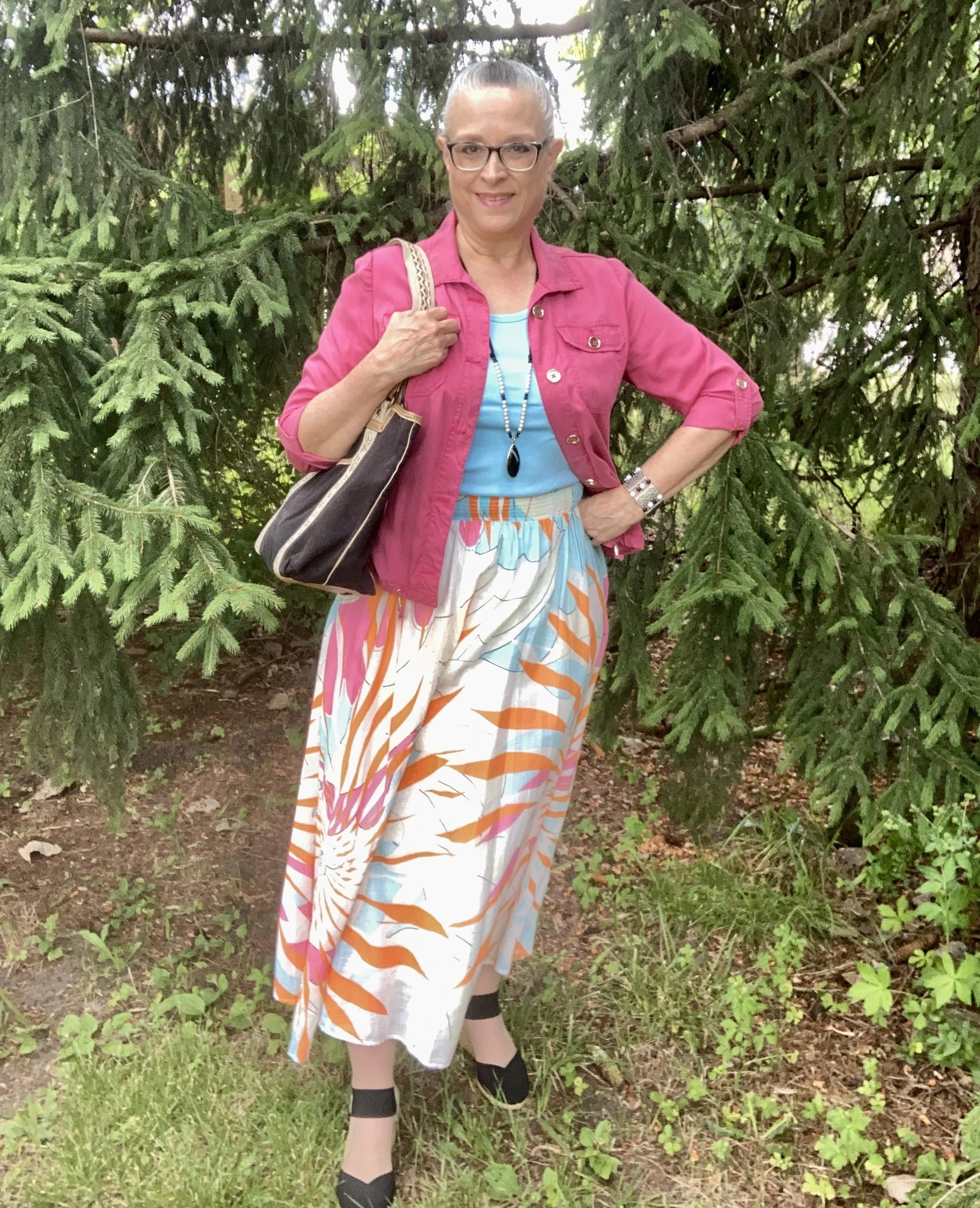
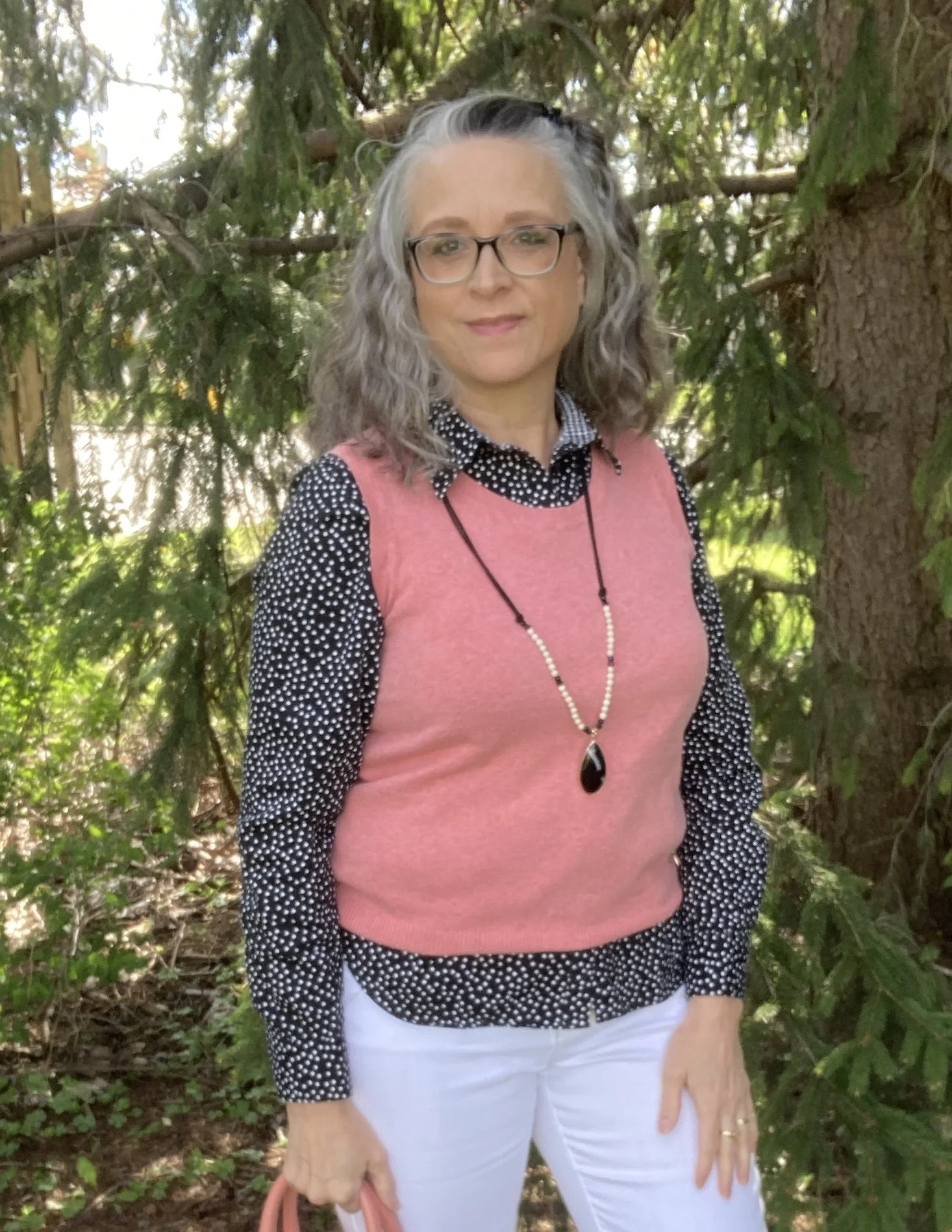
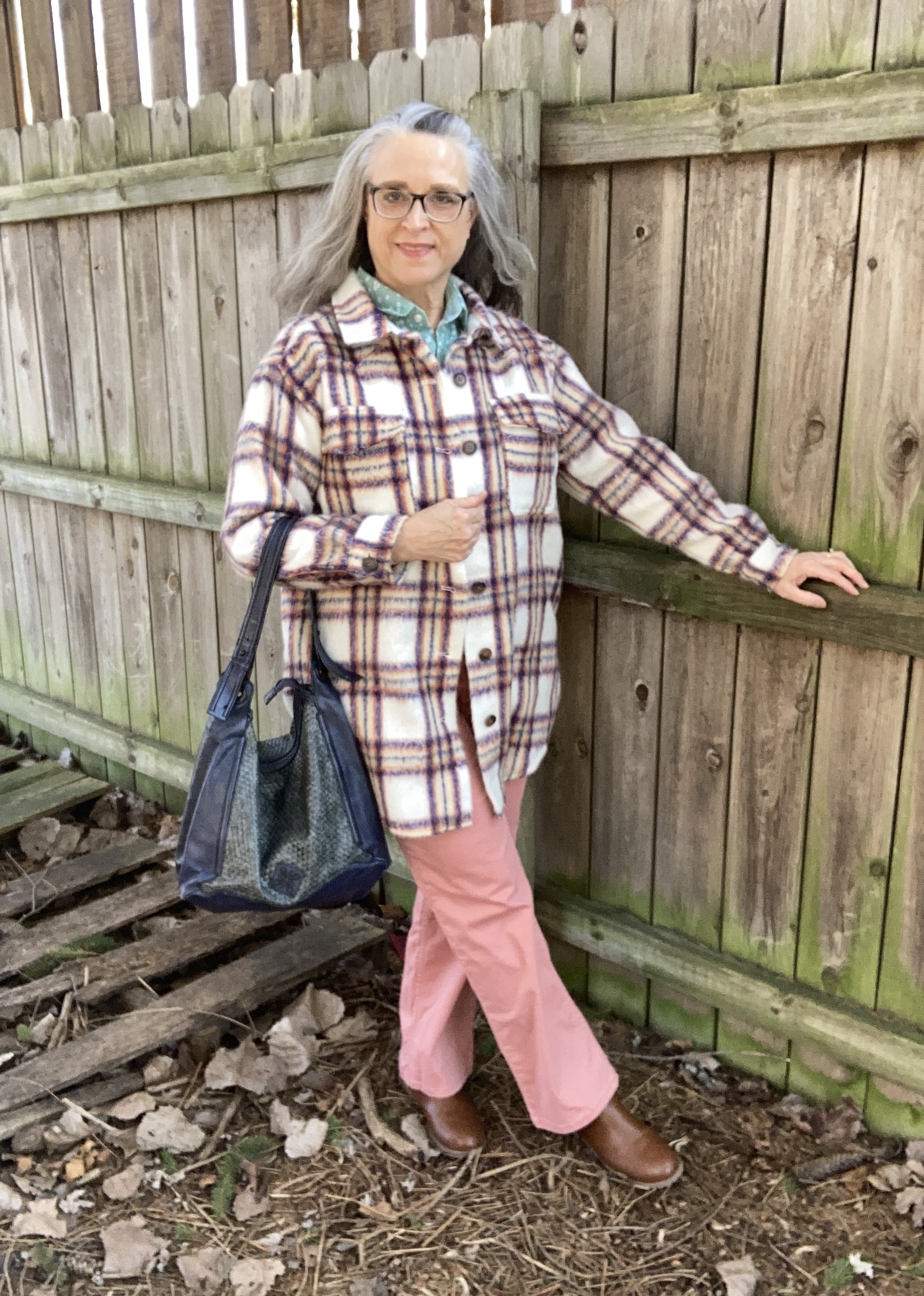
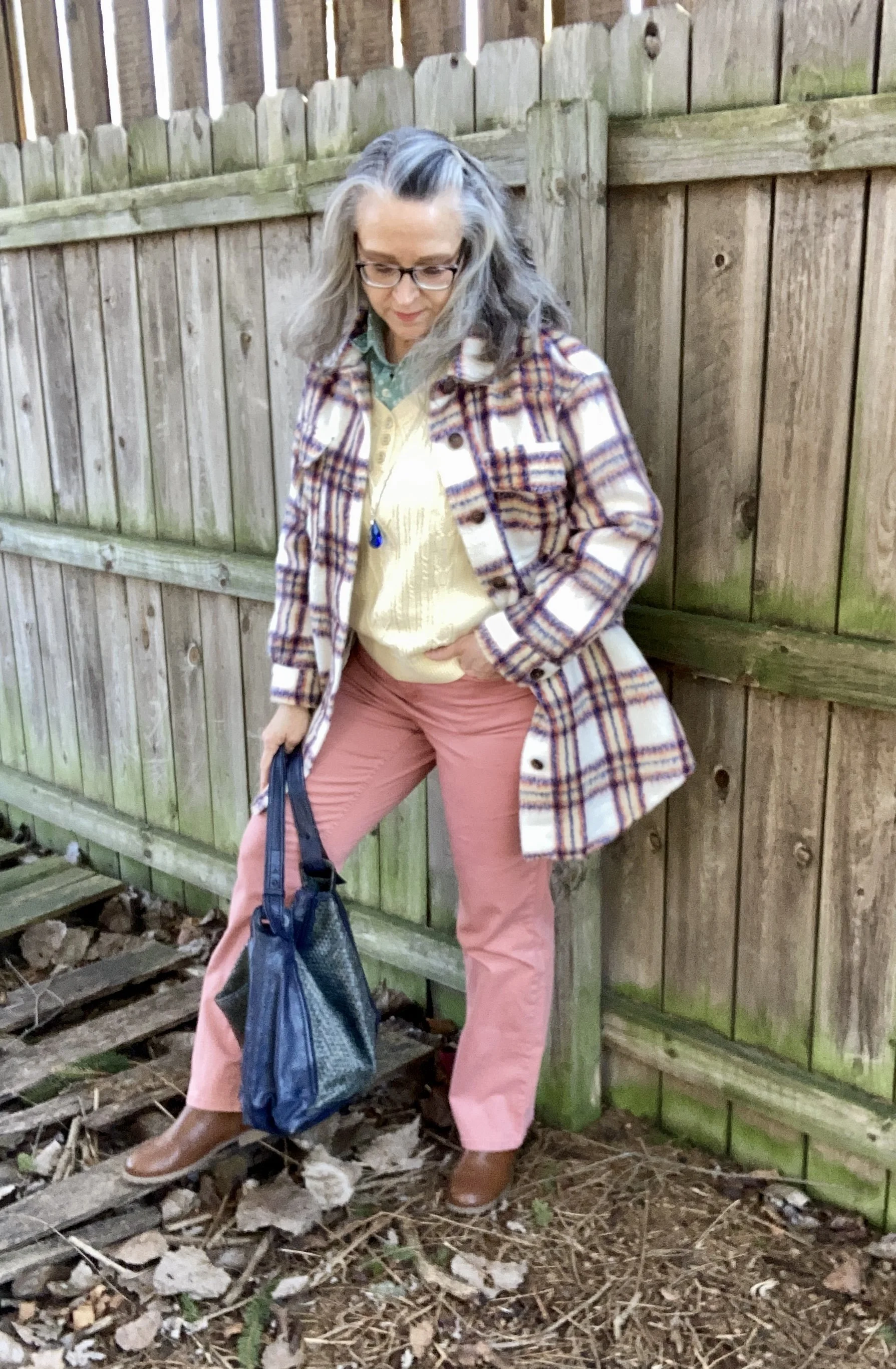
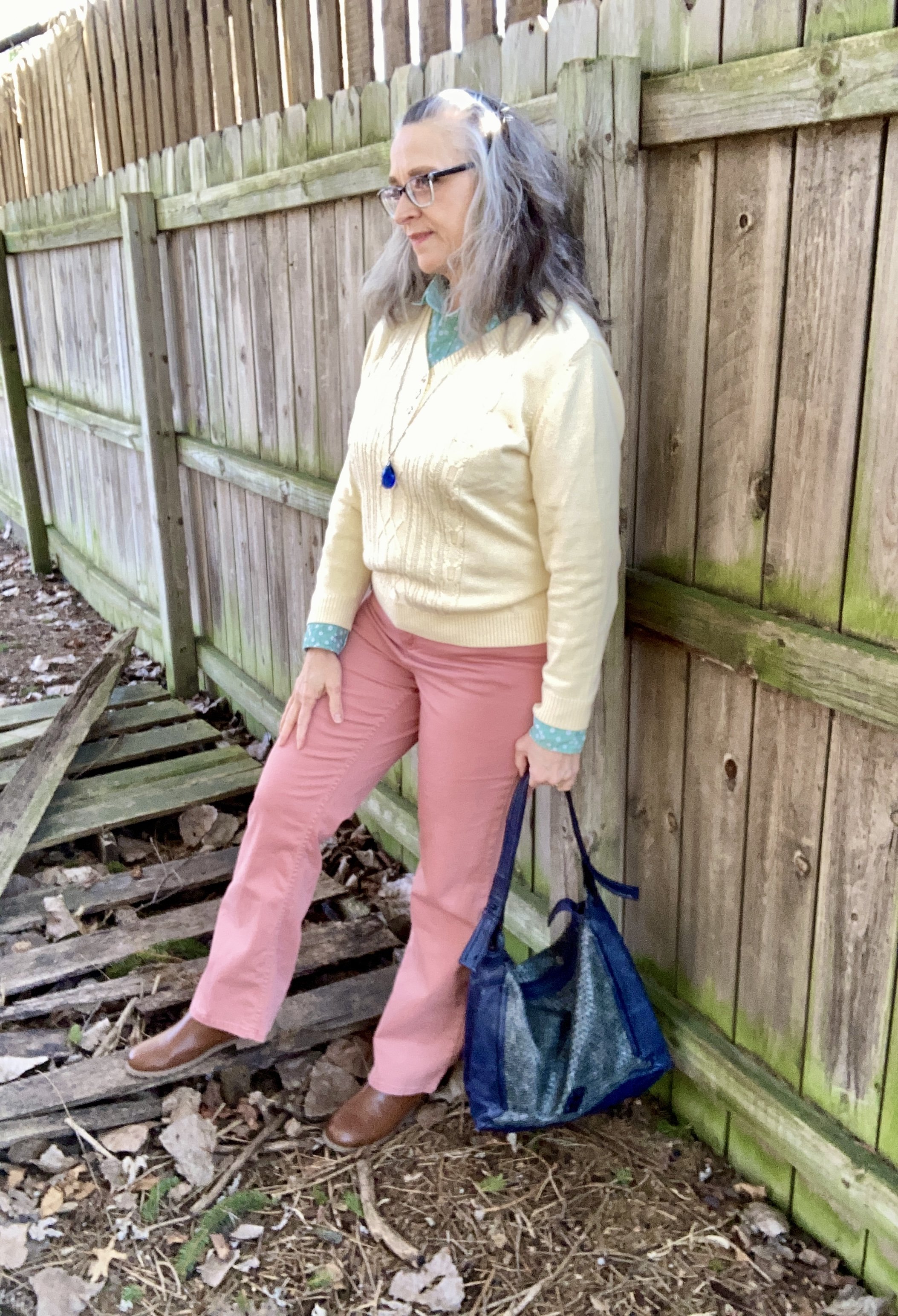
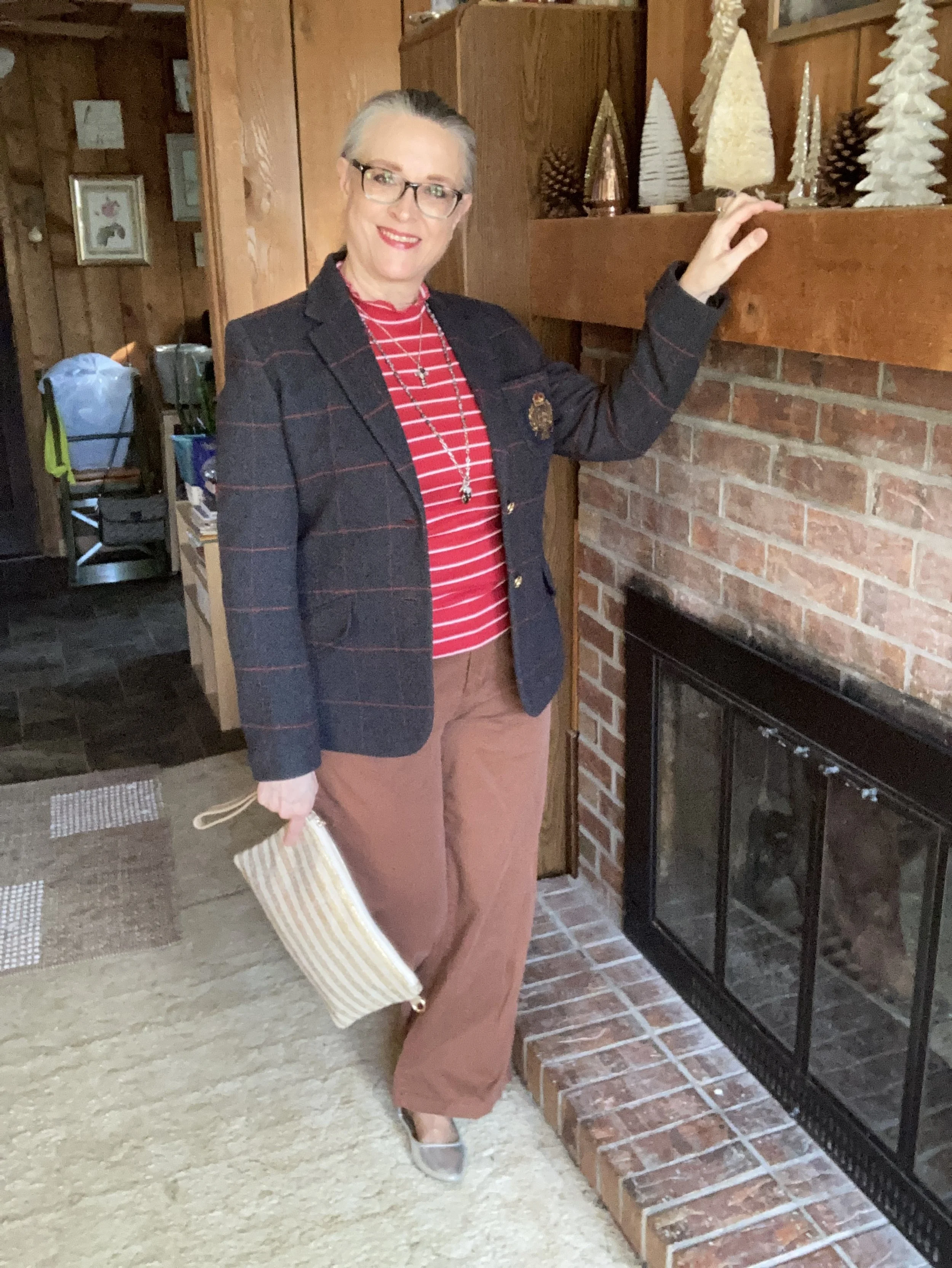
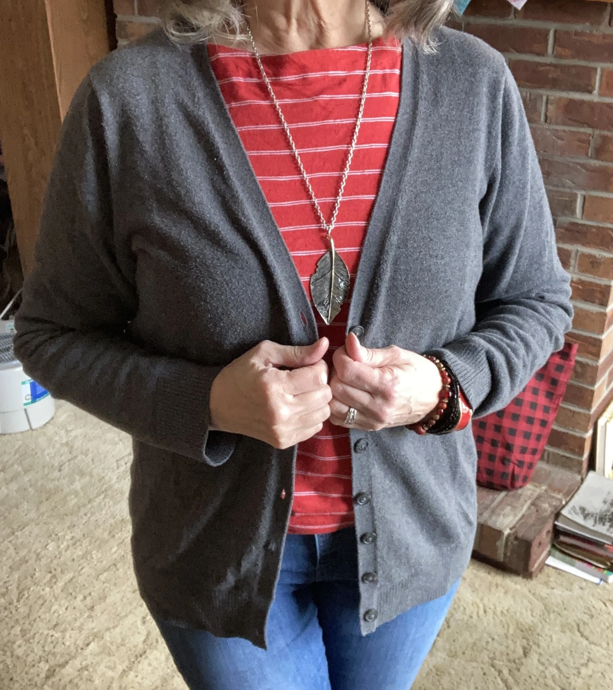
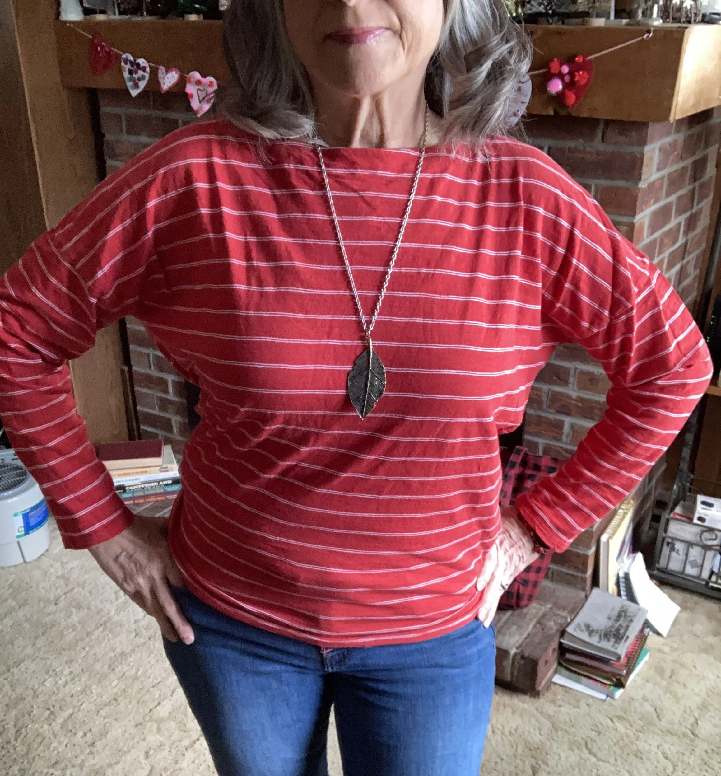
What drew me to this particular pin was the bold combination of red and gray. I love how it looks and thought it would be a perfect look to end the month of February. Plus, it is completely me: casual, cute and comfortable.
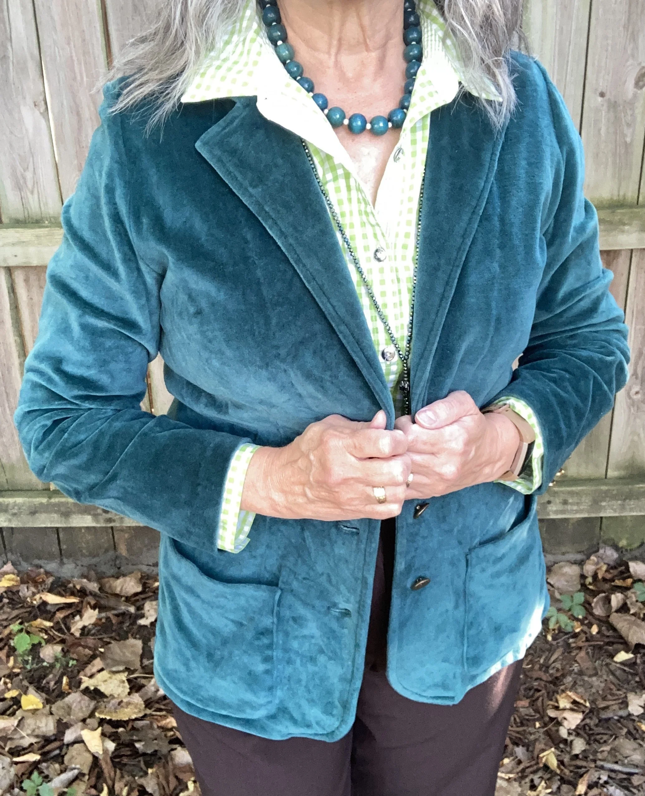
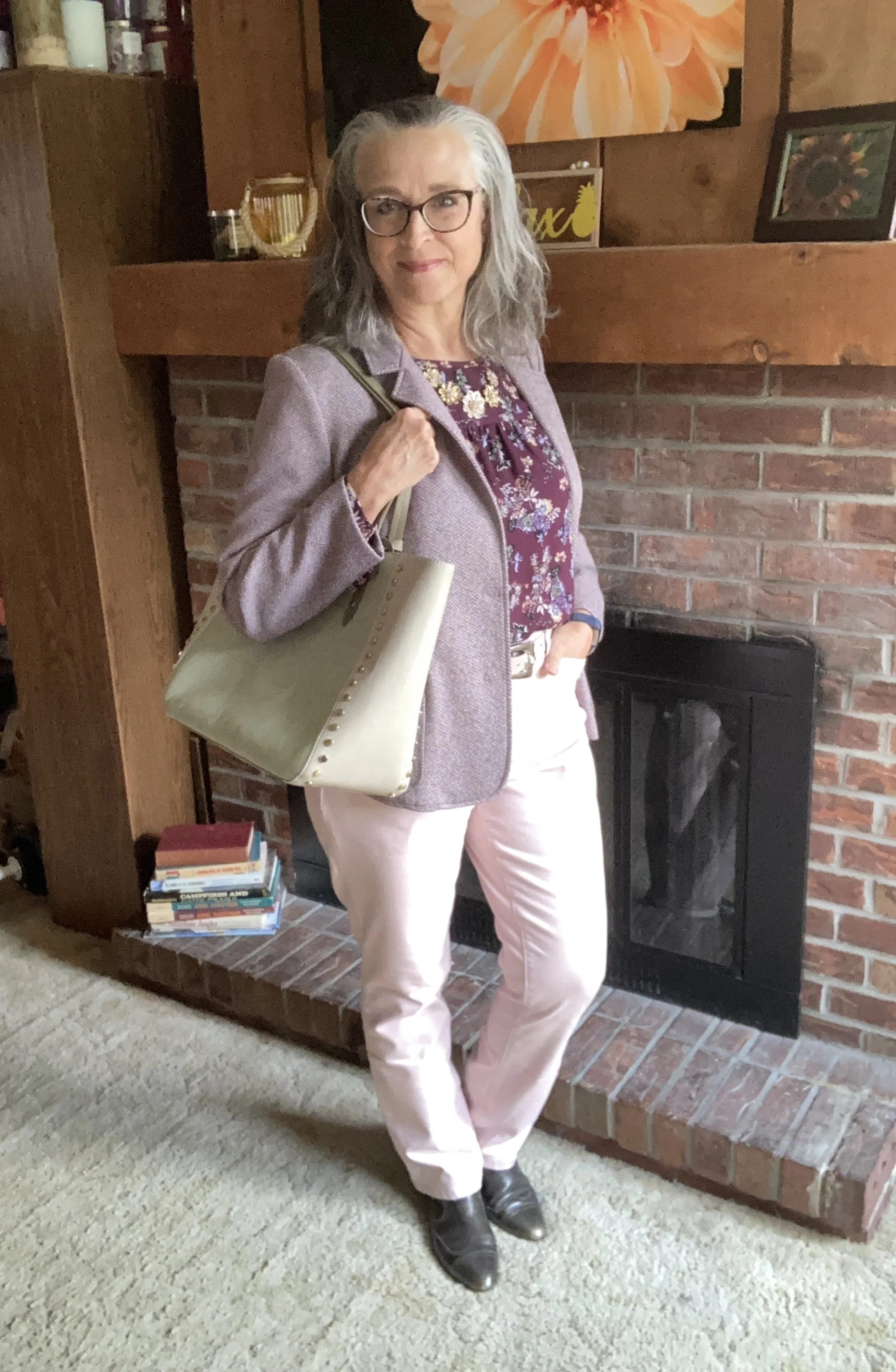
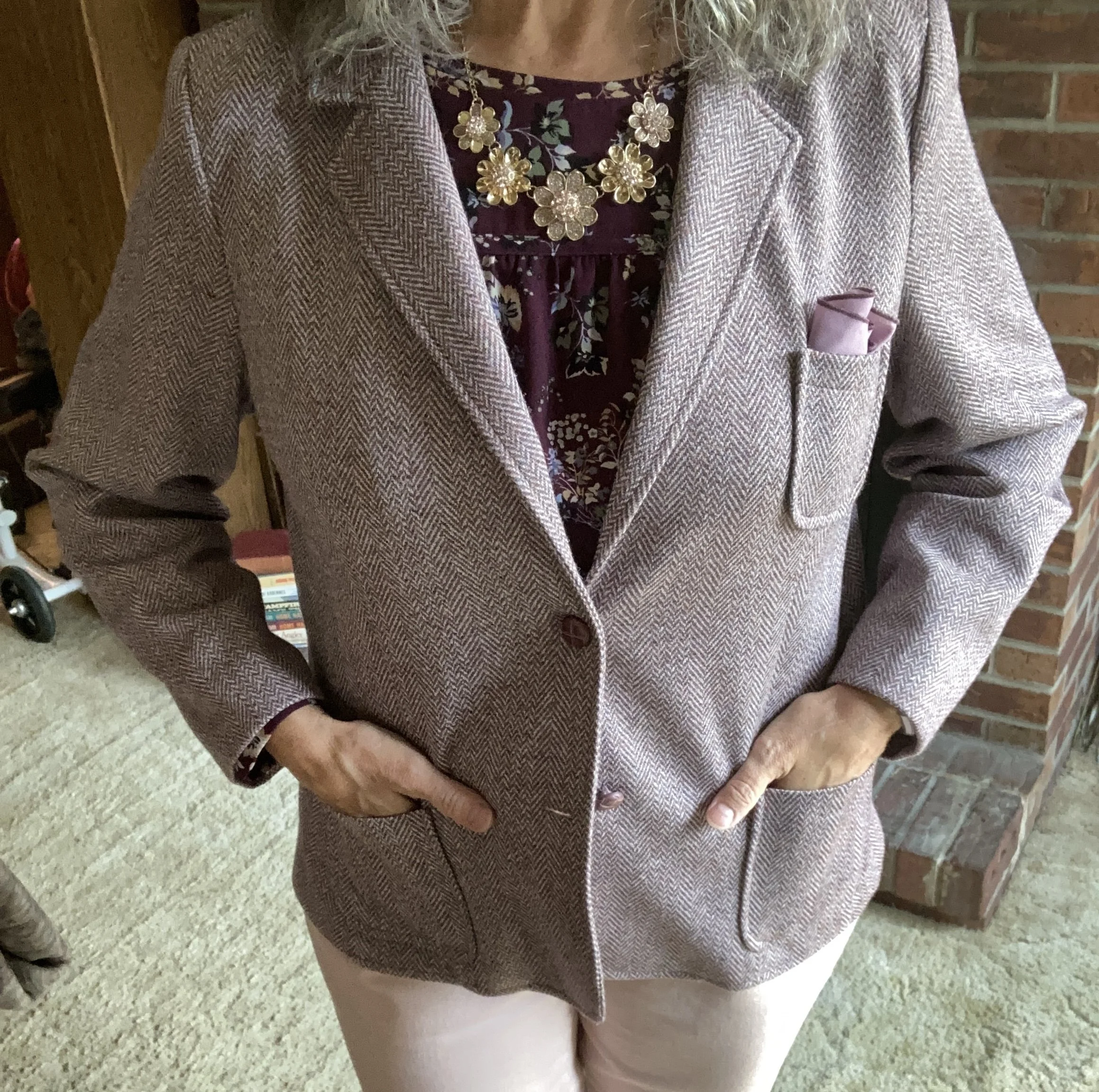
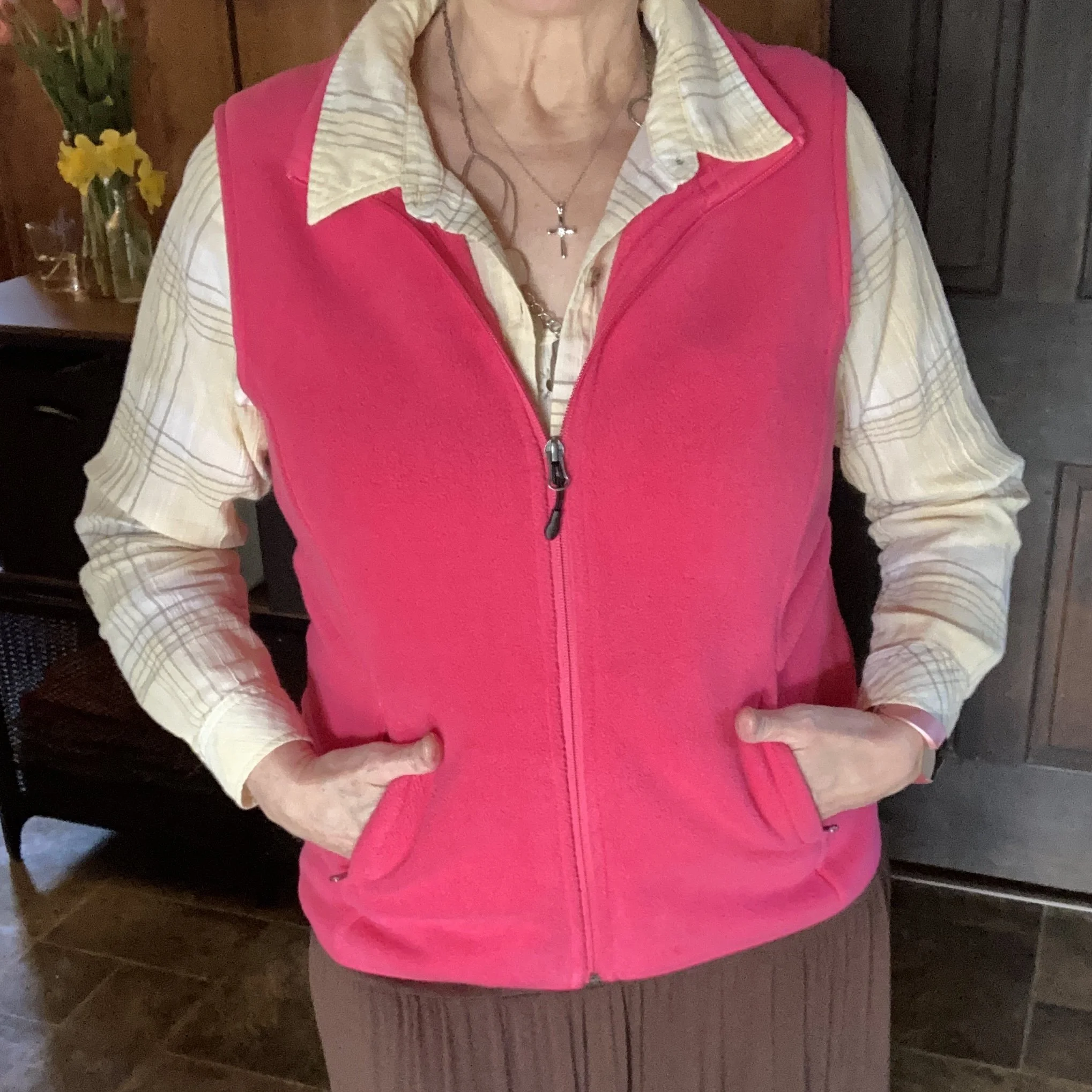
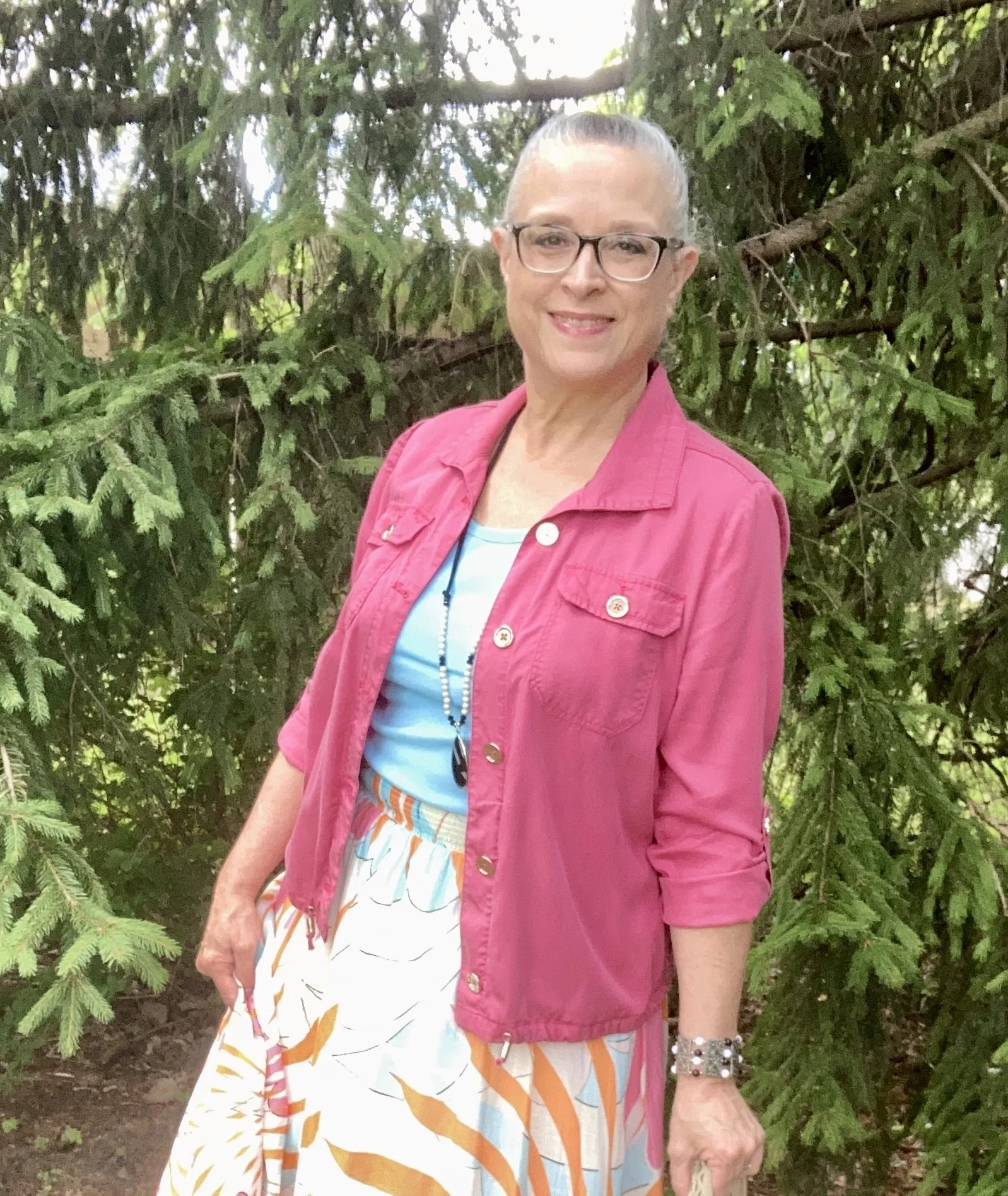
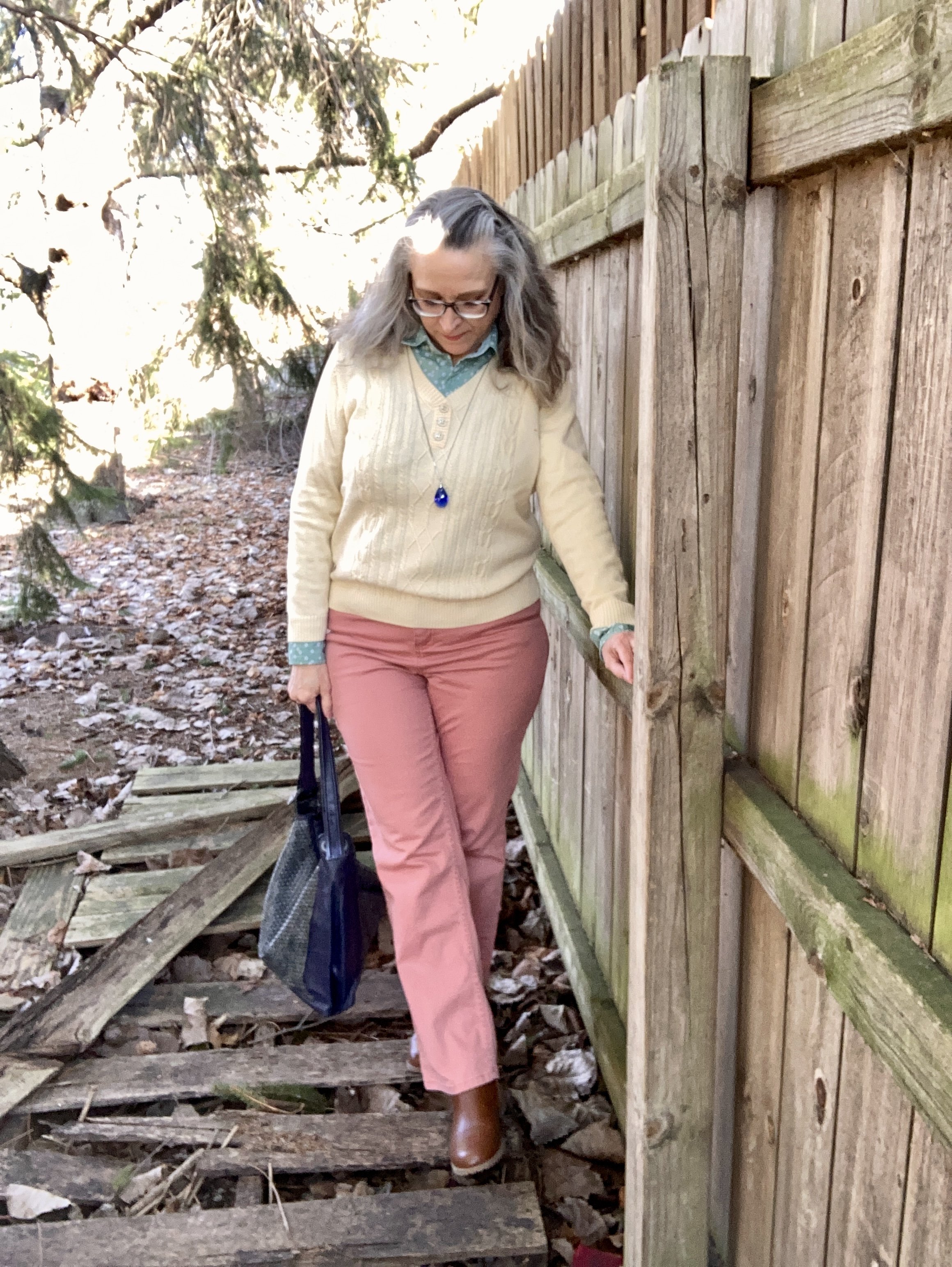
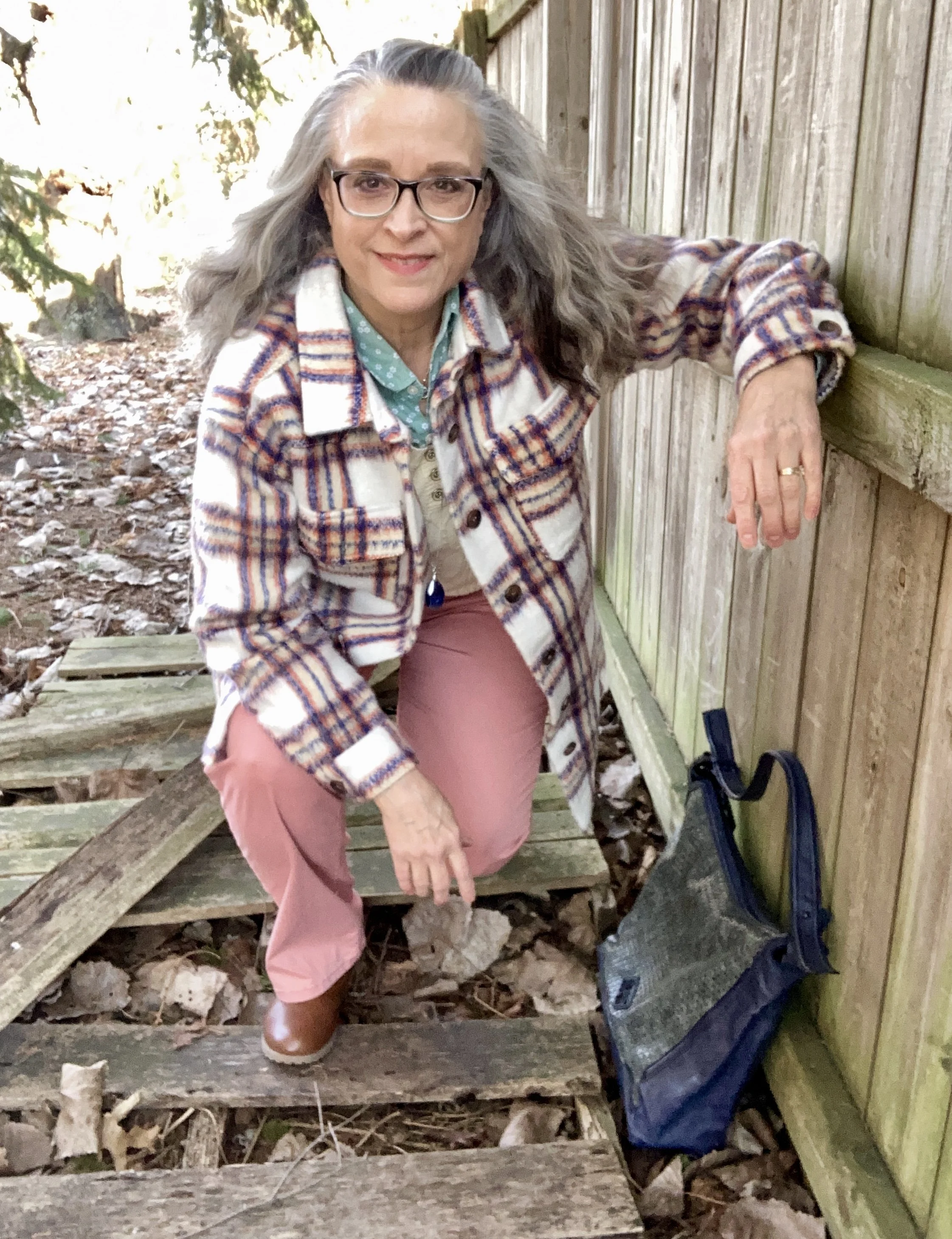
The first piece I chose was the gray cardigan. Just so you don’t think these combinations come easily to me, I spent probably an hour and numerous iterations of red sweaters and tops; gray cardigans and blazers, and washes of jeans, before I finally settled on what you see. Ha, ha.
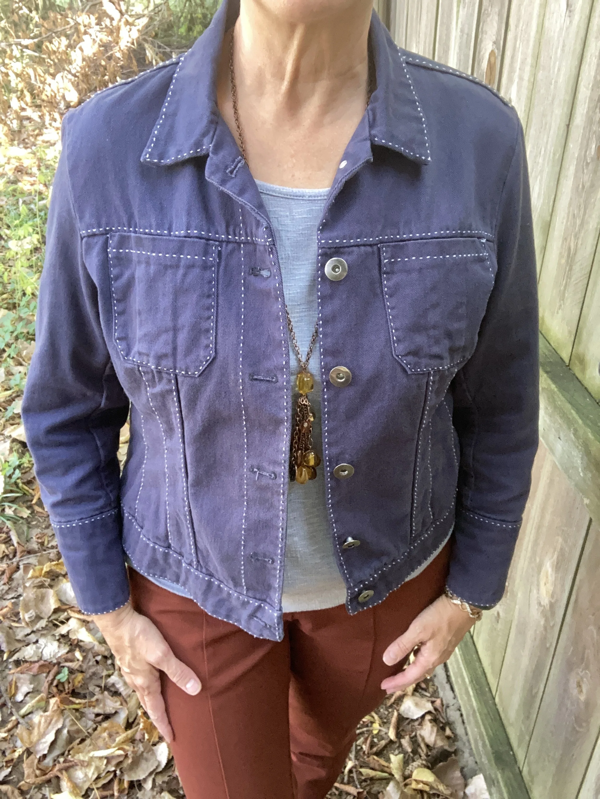
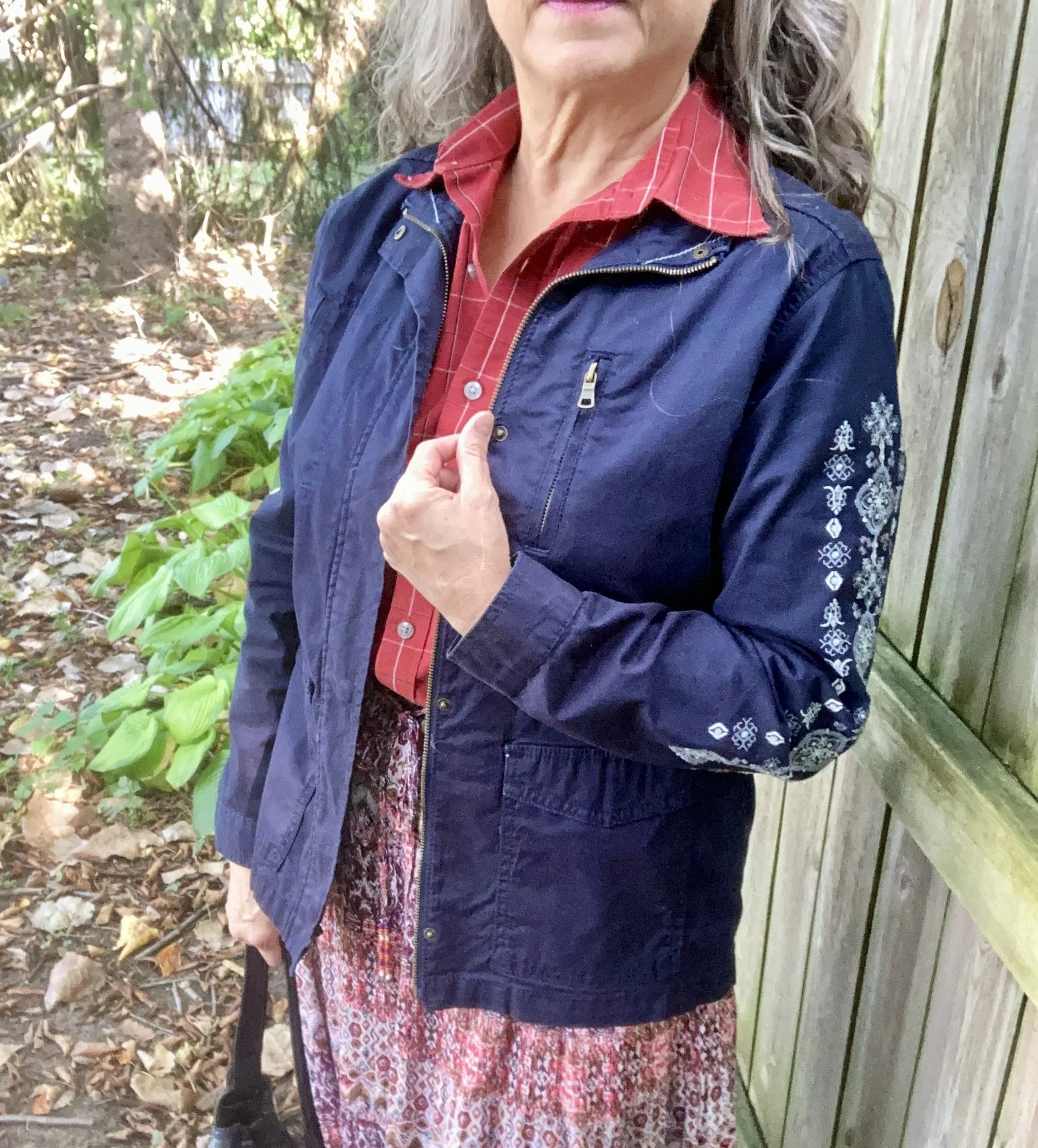
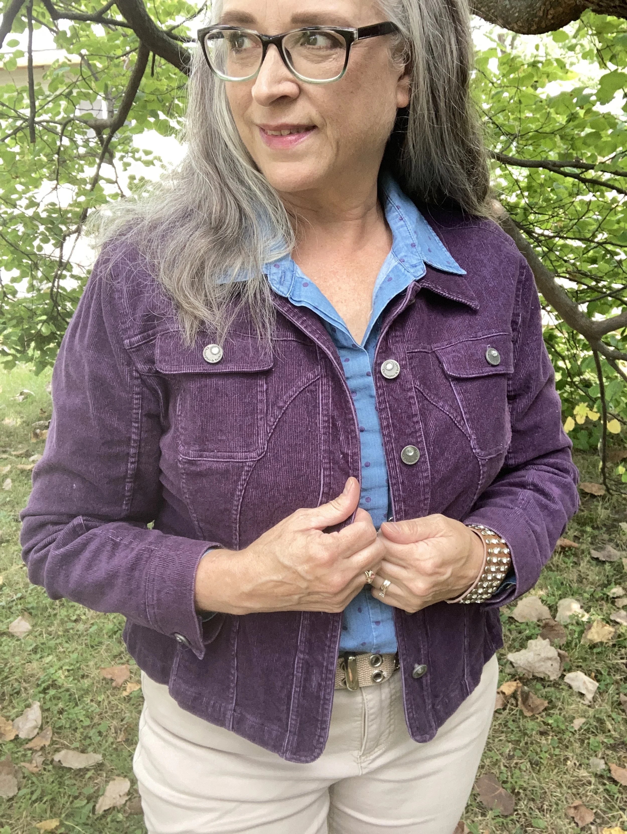
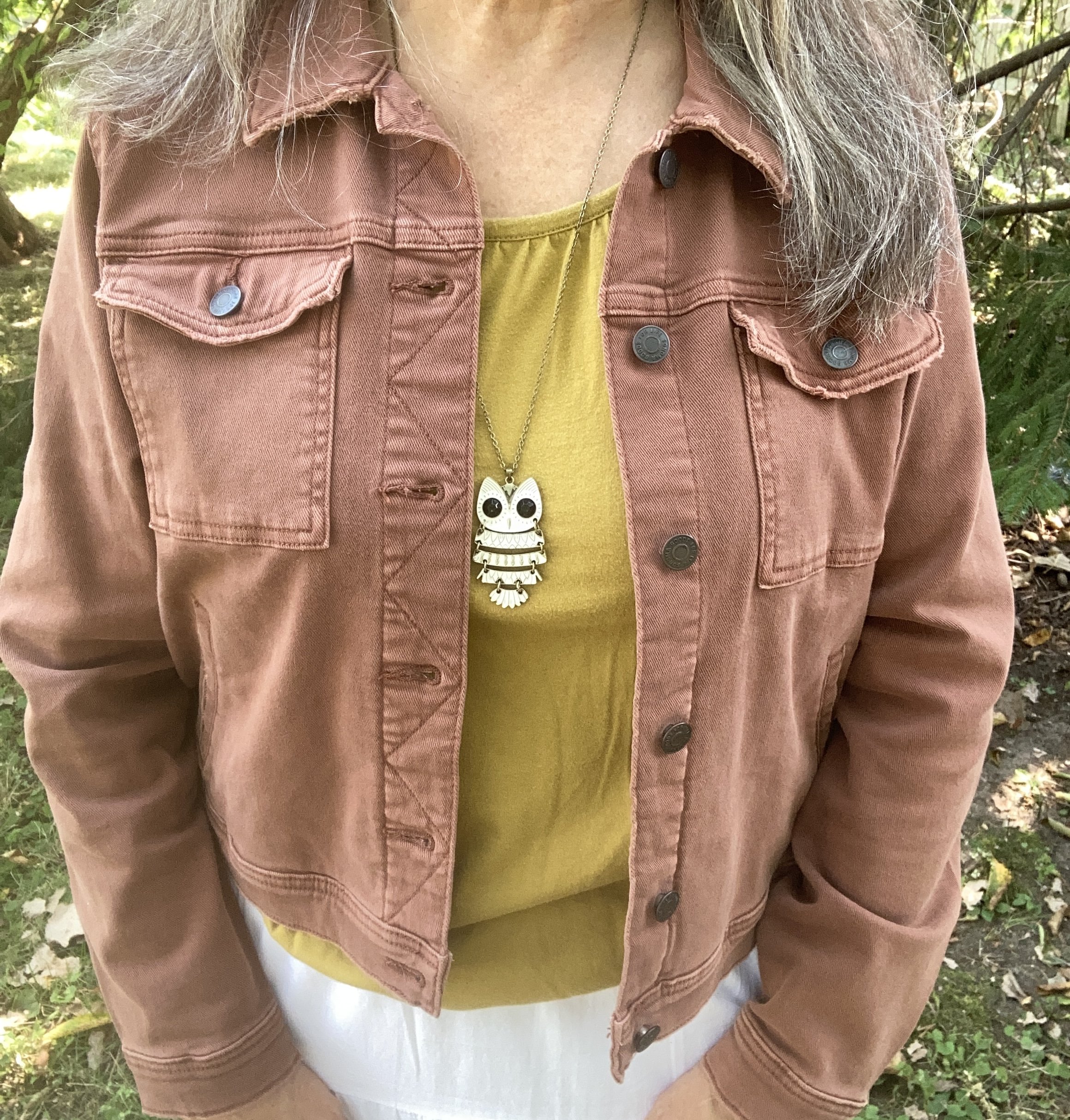
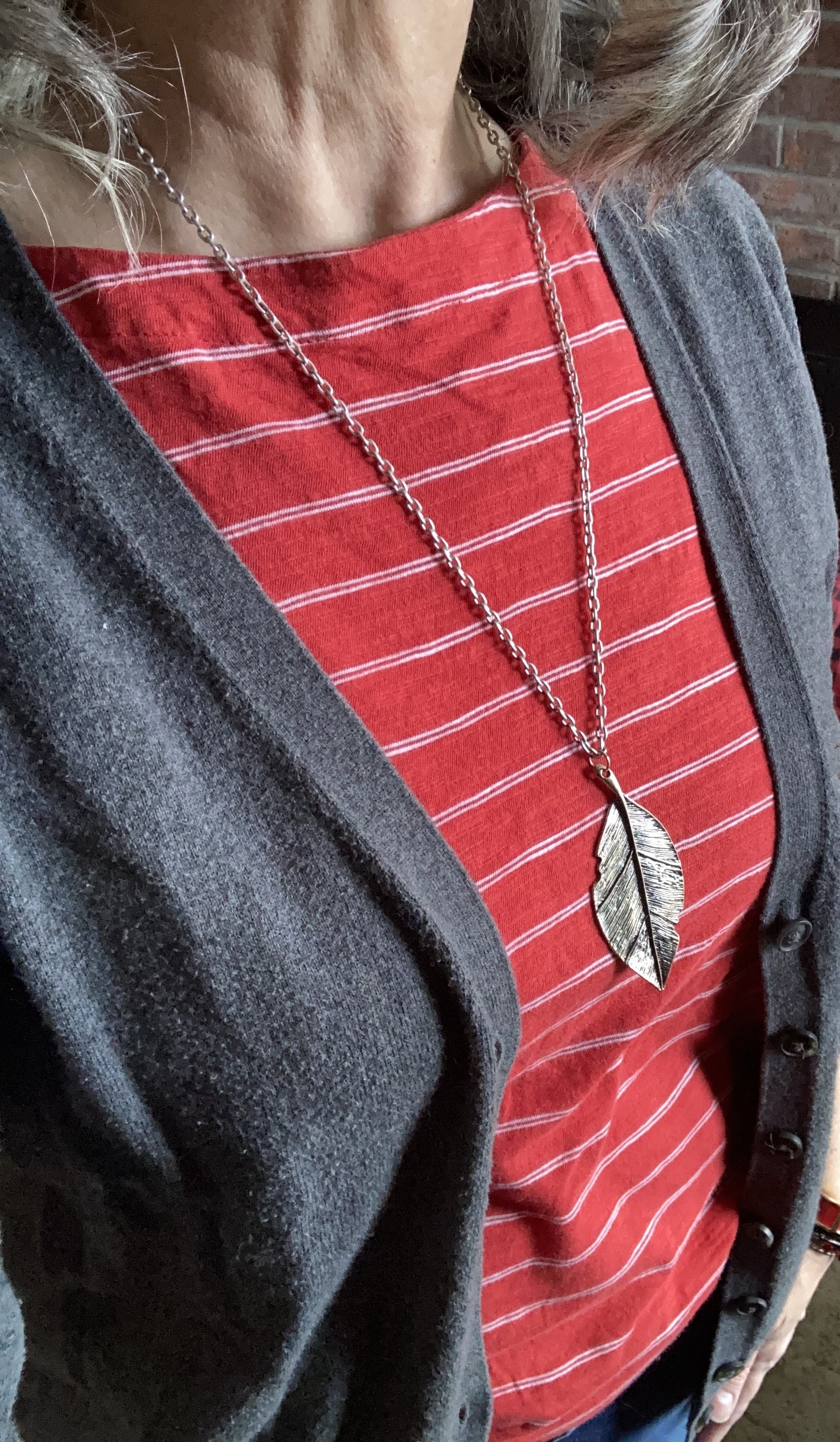
This dark gray, cardigan is Gap brand and was thrifted a number of years ago. This is a v-neck, but a crew neck would work just as well.
Style Tip: Neckline’s are important, but that doesn’t mean you can’t wear any neck line you want. Here is a good article comparing v-neck versus crew (round). Because I am more broad shouldered, I typically reach for v-necks in my cardigans, or open fronts. I do have plenty of crew neck sweaters, but more often will choose a v-neck. While the points the author is making refer to a pullover, the same points are true of cardigans. I think it’s up to you what you like to wear, and how one versus the other works for the outfit.
Here are some cute cardigans for spring from maurices, Old Navy, JC Penney, Loft, Land’s End, and Kohl’s.
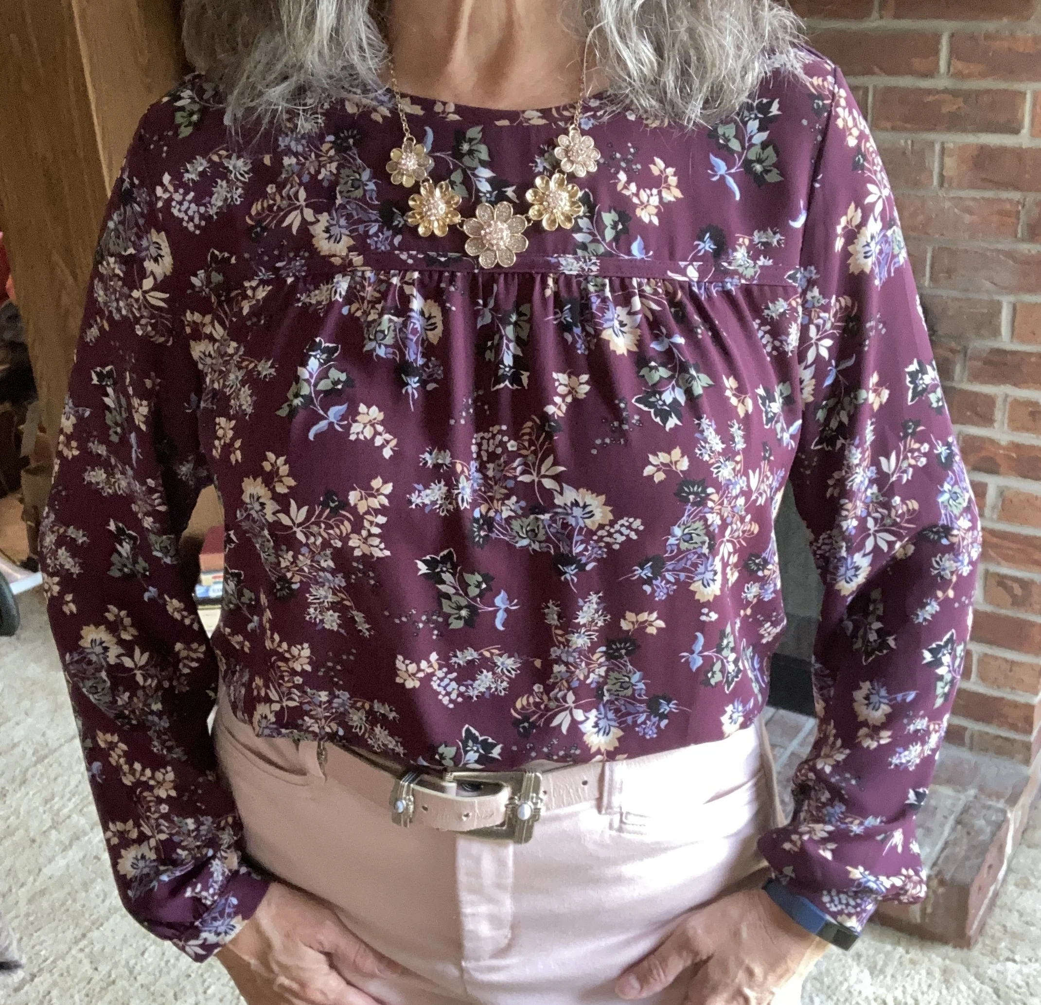
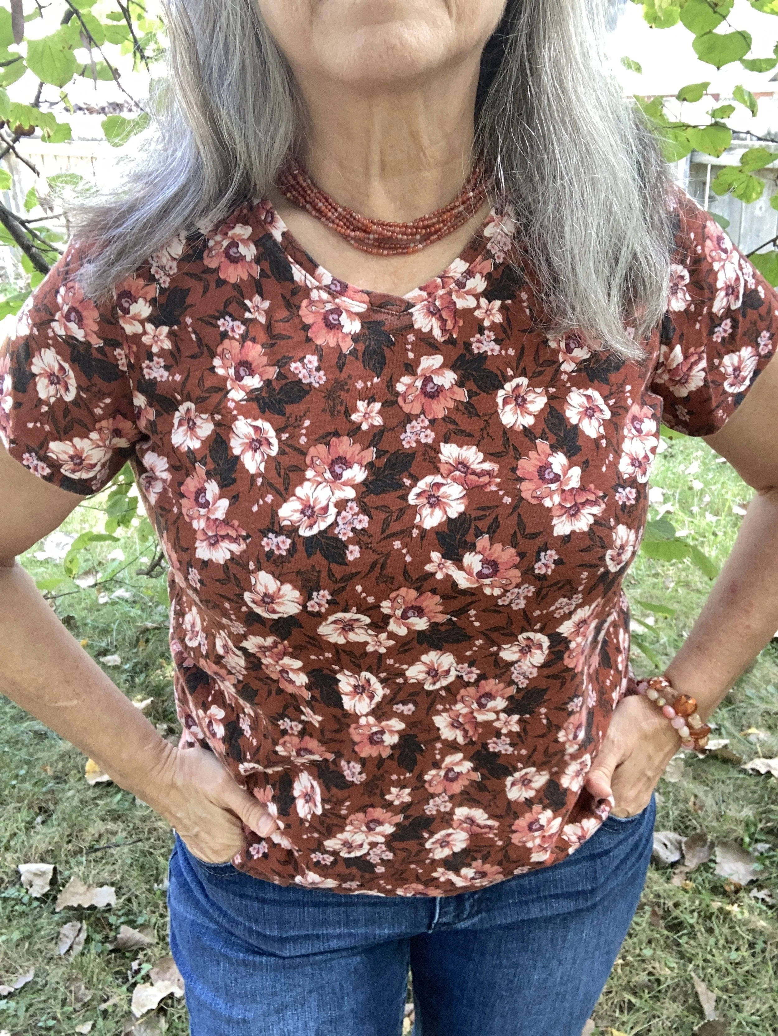
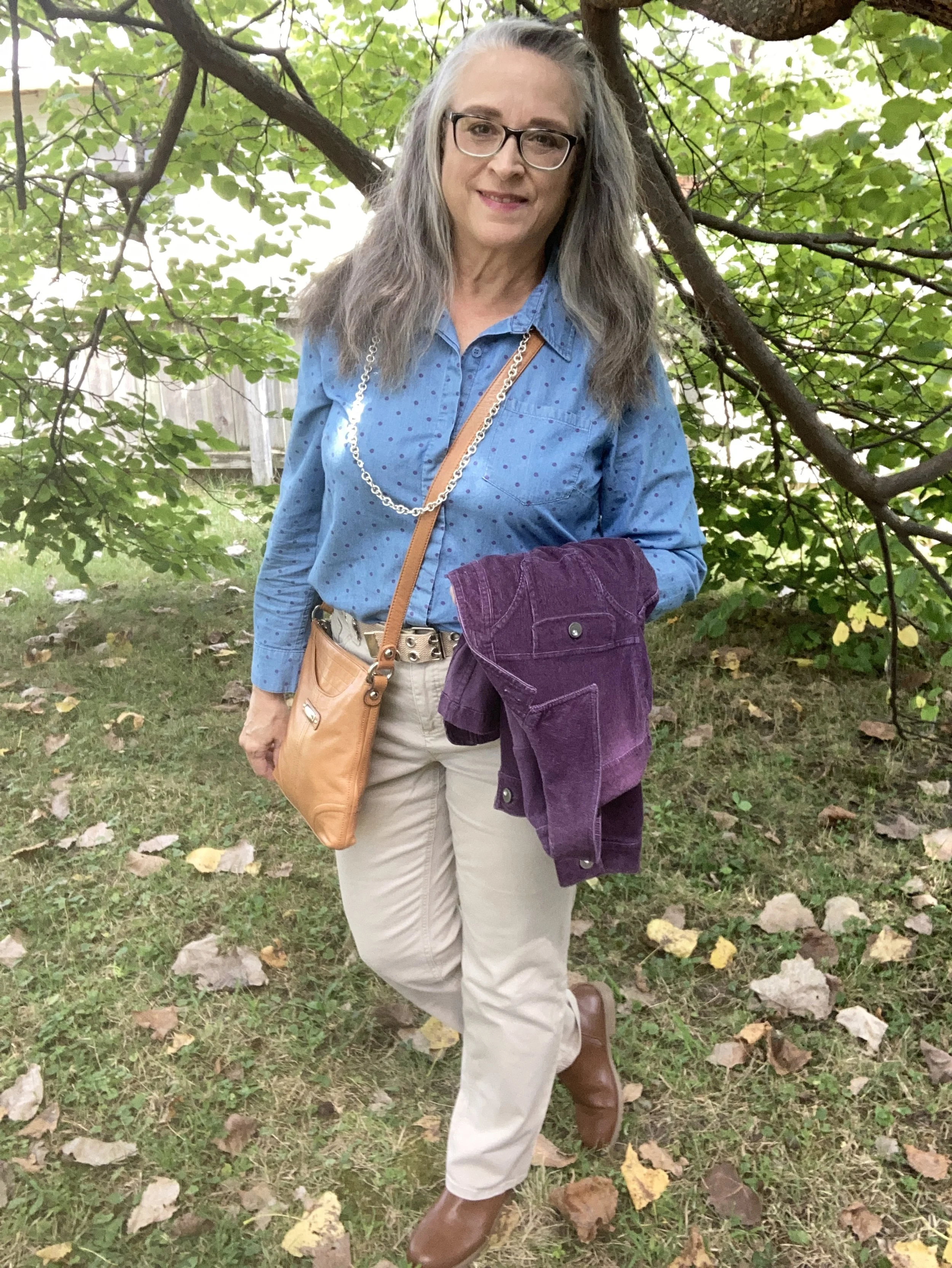
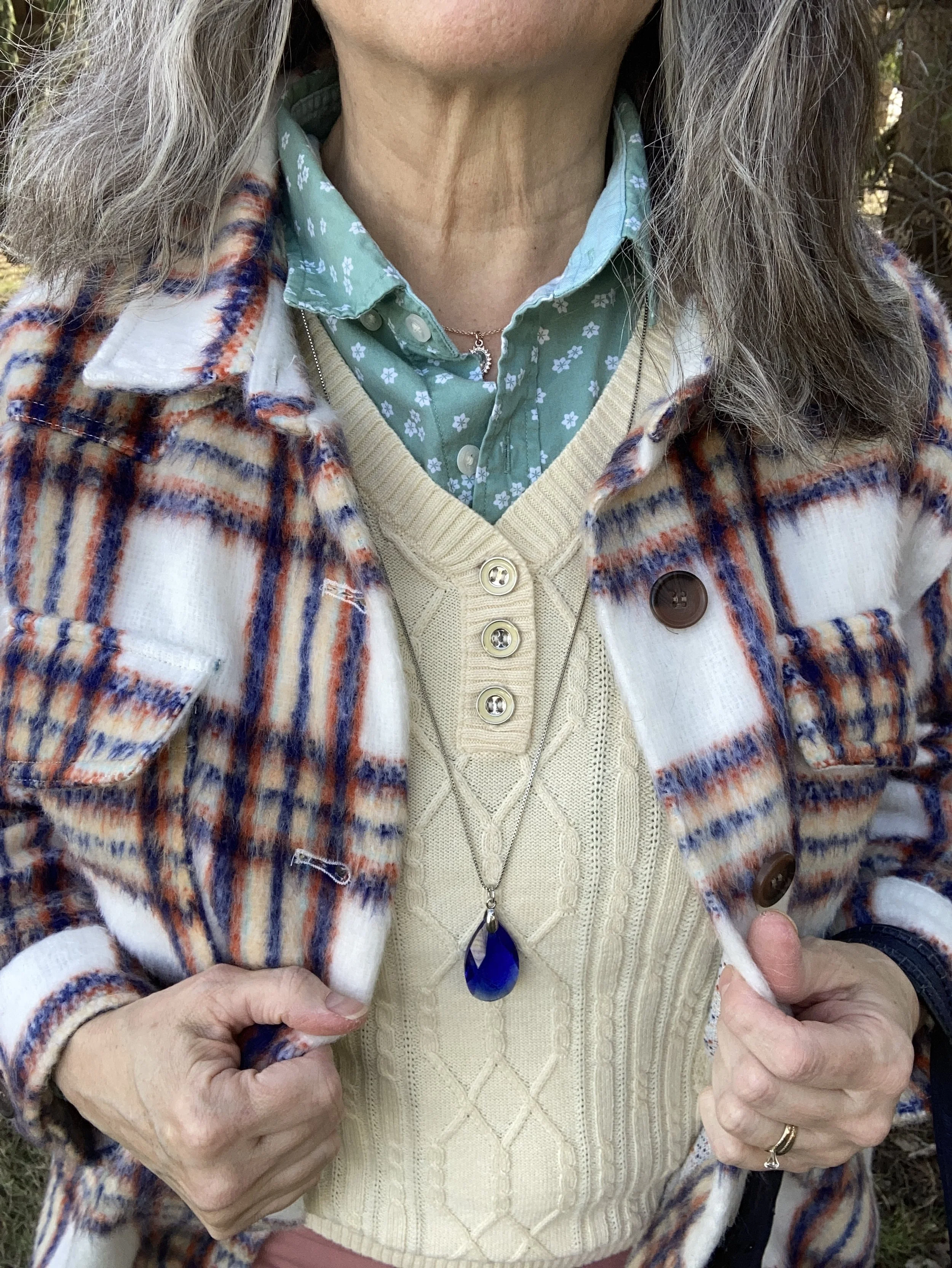
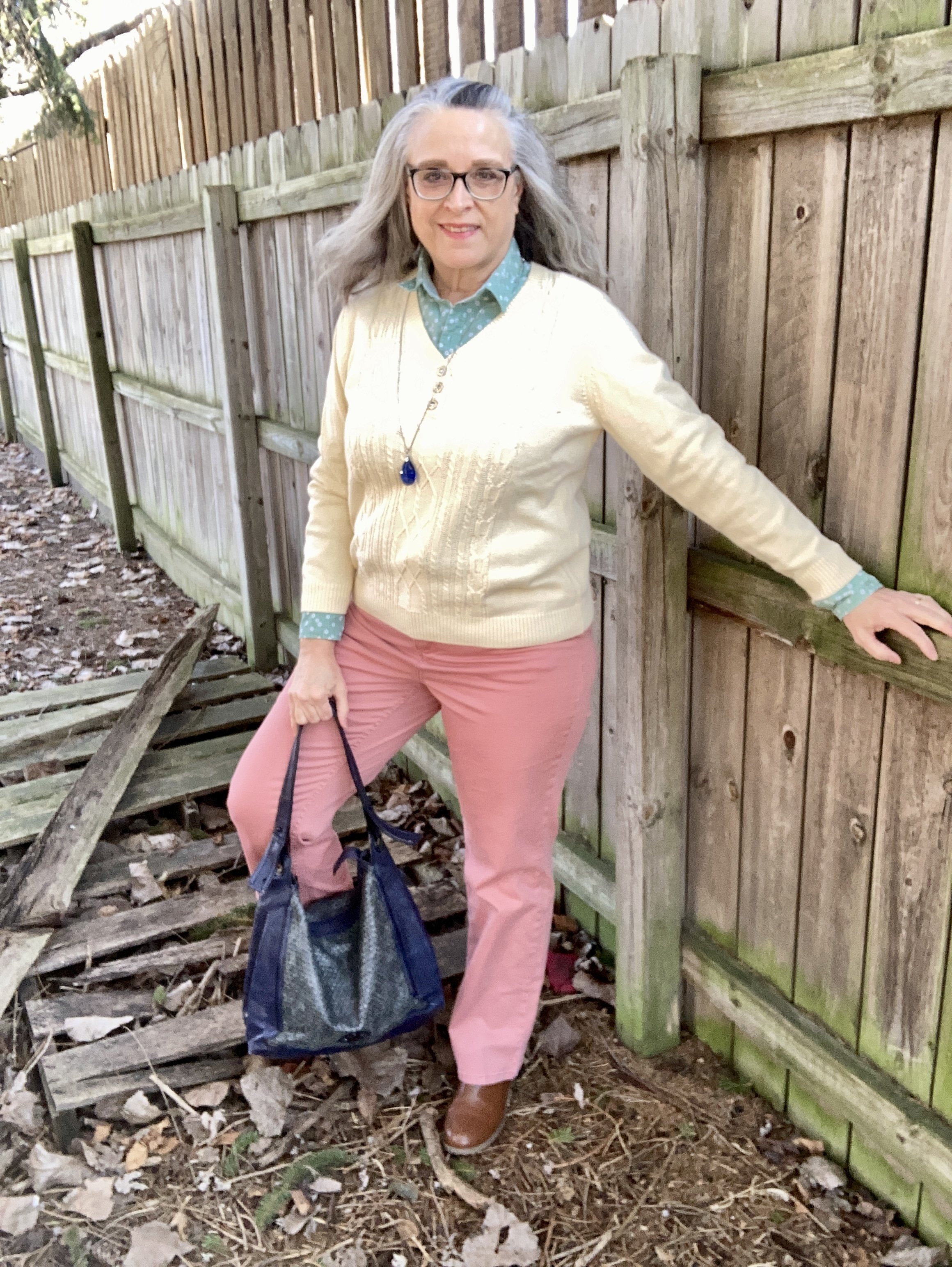
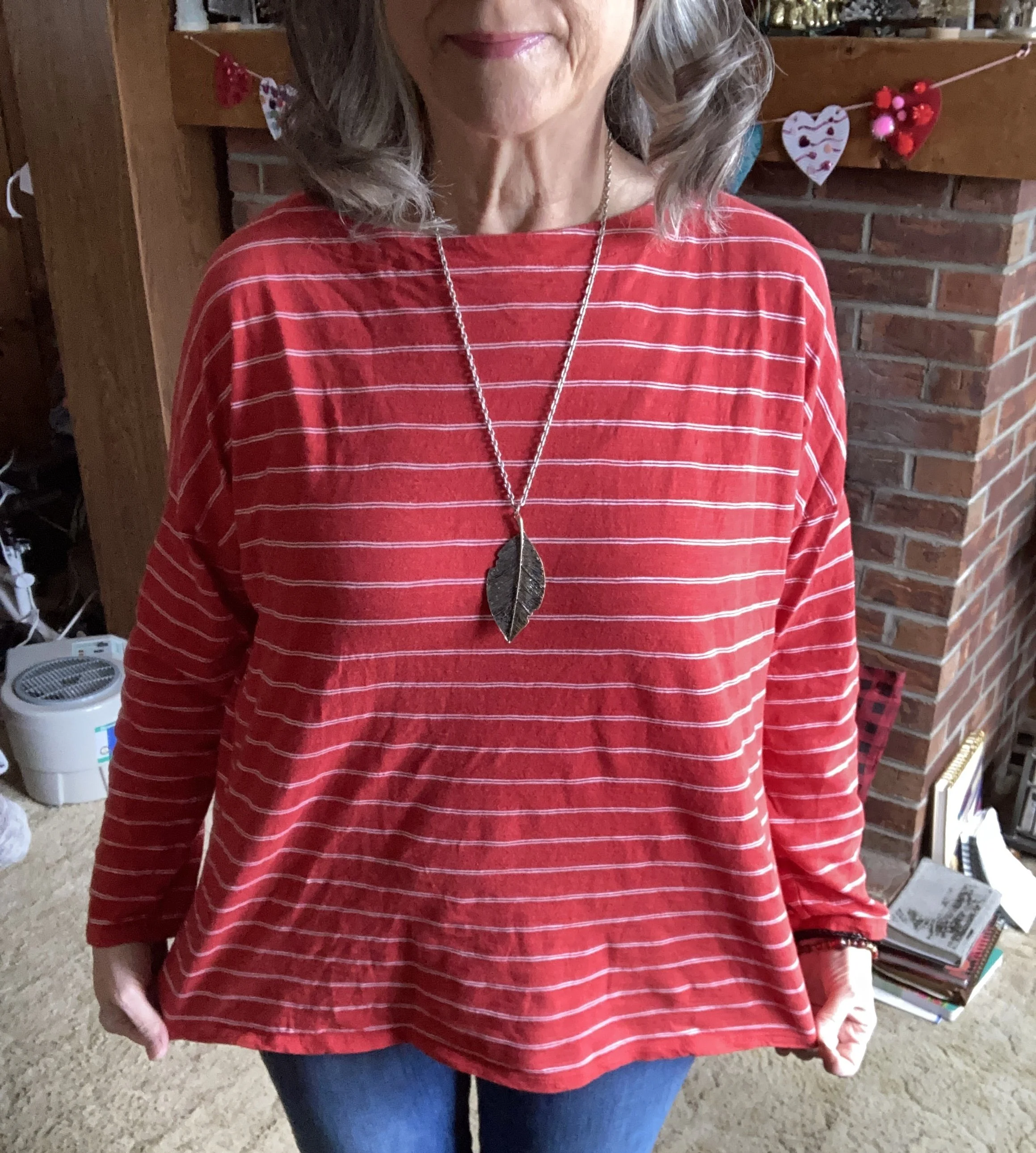
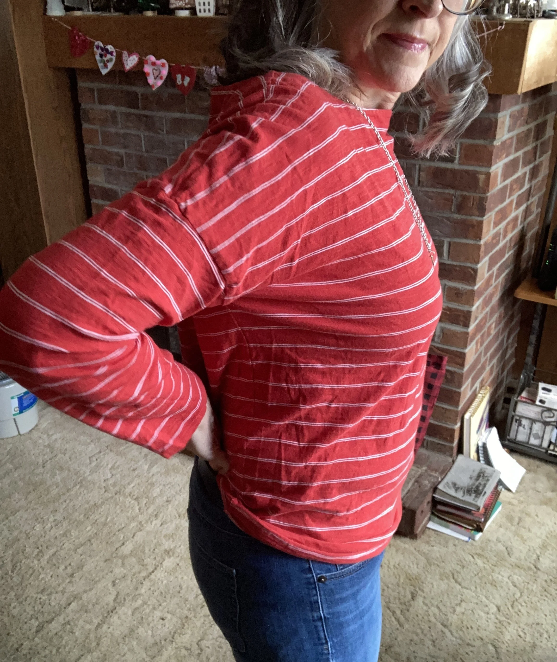
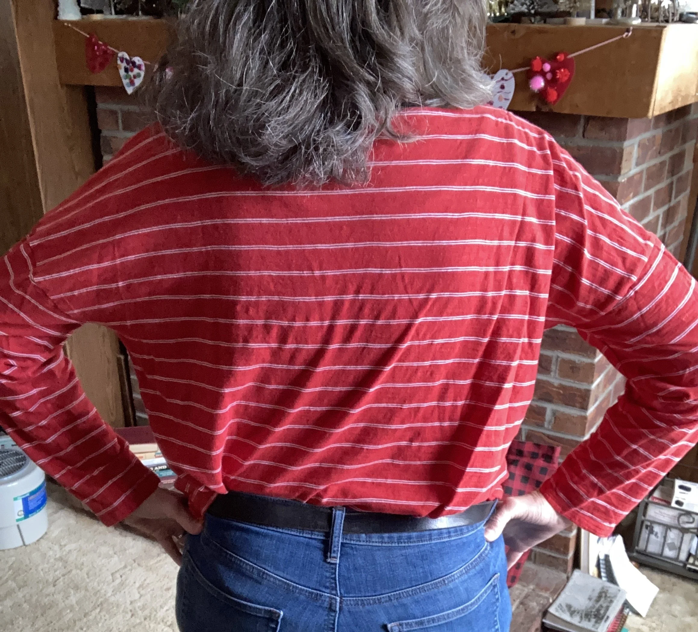
I tried on many of my red pullover sweaters and soon realized a sweater weight fabric was too bulky to wear under this lighter weight cardigan, so I began looking through my long sleeve tees and turtlenecks and settled on this thrifted J.Jill piece. An extra large, I snatched it up thinking it would look cute over cropped pants in the warmer weather, so for this look it was too big. Instead of doing a front tuck, I opted for a back tuck to make the top look more fitted. This works amazingly well, and no worries how it looks since it is covered by the cardigan.
Style Tip: Not everything has to fit exactly. There are plenty of ways to alter a piece without elaborate sewing skills. Tucking things in, rolling long hems up, using hair bands to gather fabric, and even using brooches and pins can help to make a piece more wearable. A great blogger to follow for more ideas is Jodie from Jodie’s Touch of Style. In my opinion she is one of the queen’s of fashion hacks and ideas for making your clothes work for you, no matter how big or how small.
Here is a page of red and white striped shirts from Amazon.
Style Tip: If you are looking for a particular clothing item from a regular retailer, just type what you are looking for into the search bar at the top of your browser and it will do the searching for you. This is a little easier than going to each retailer and searching through them.
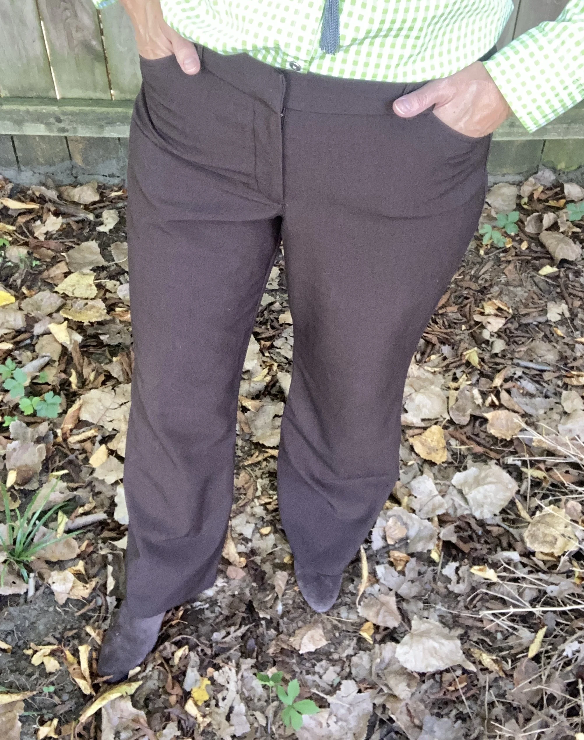
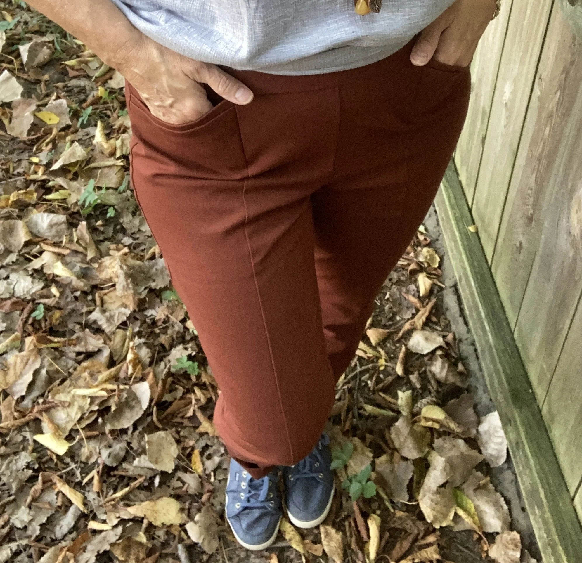
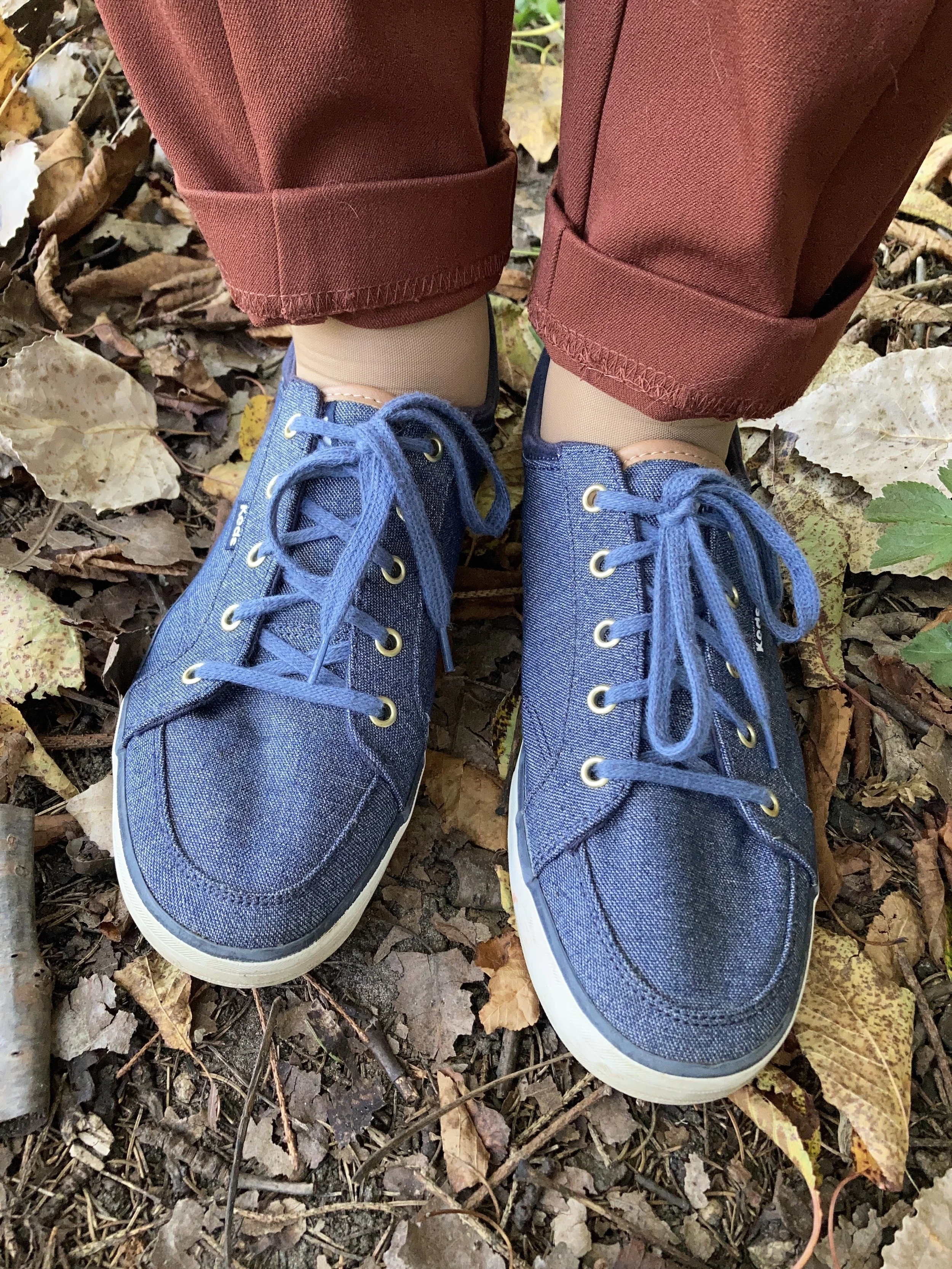
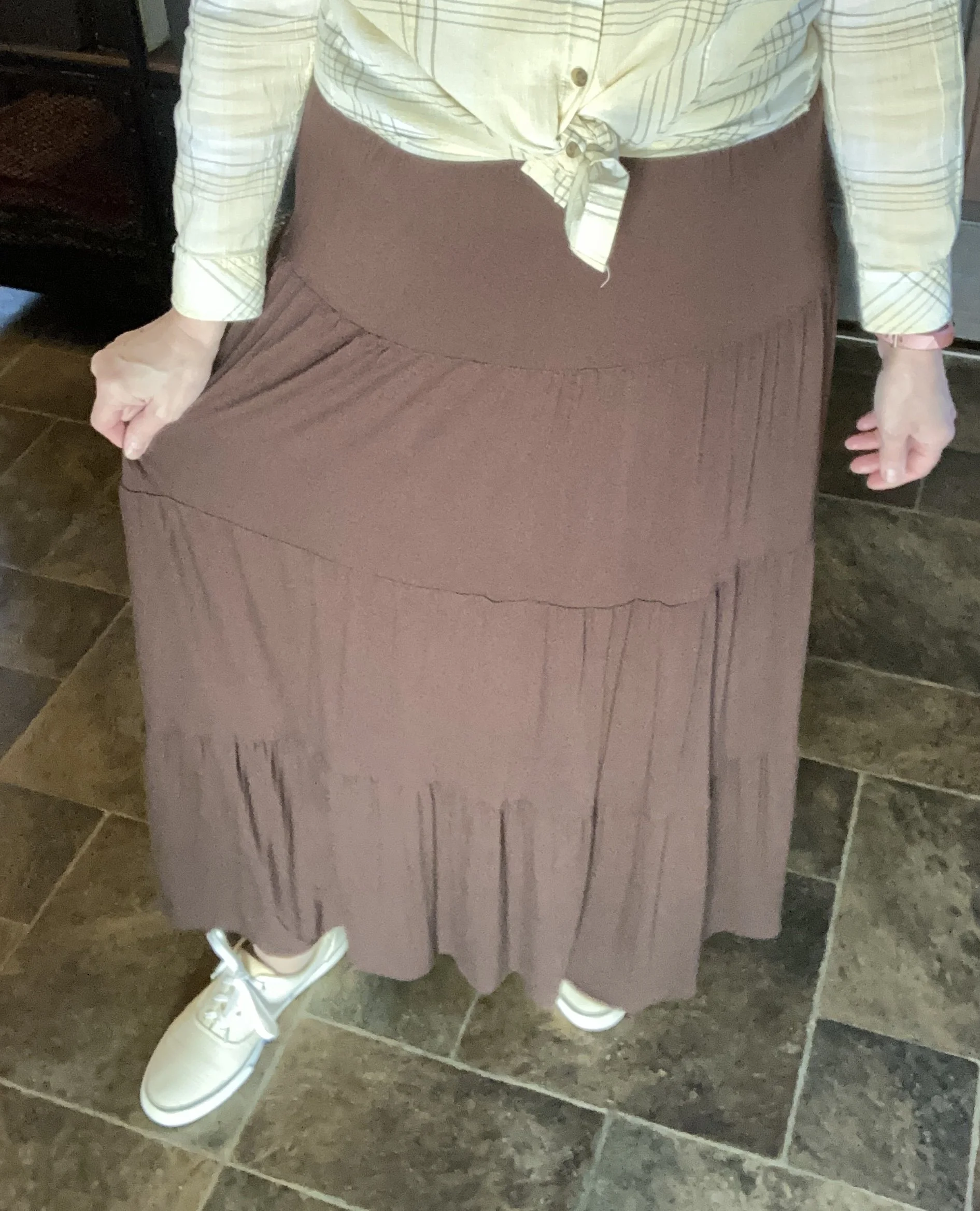
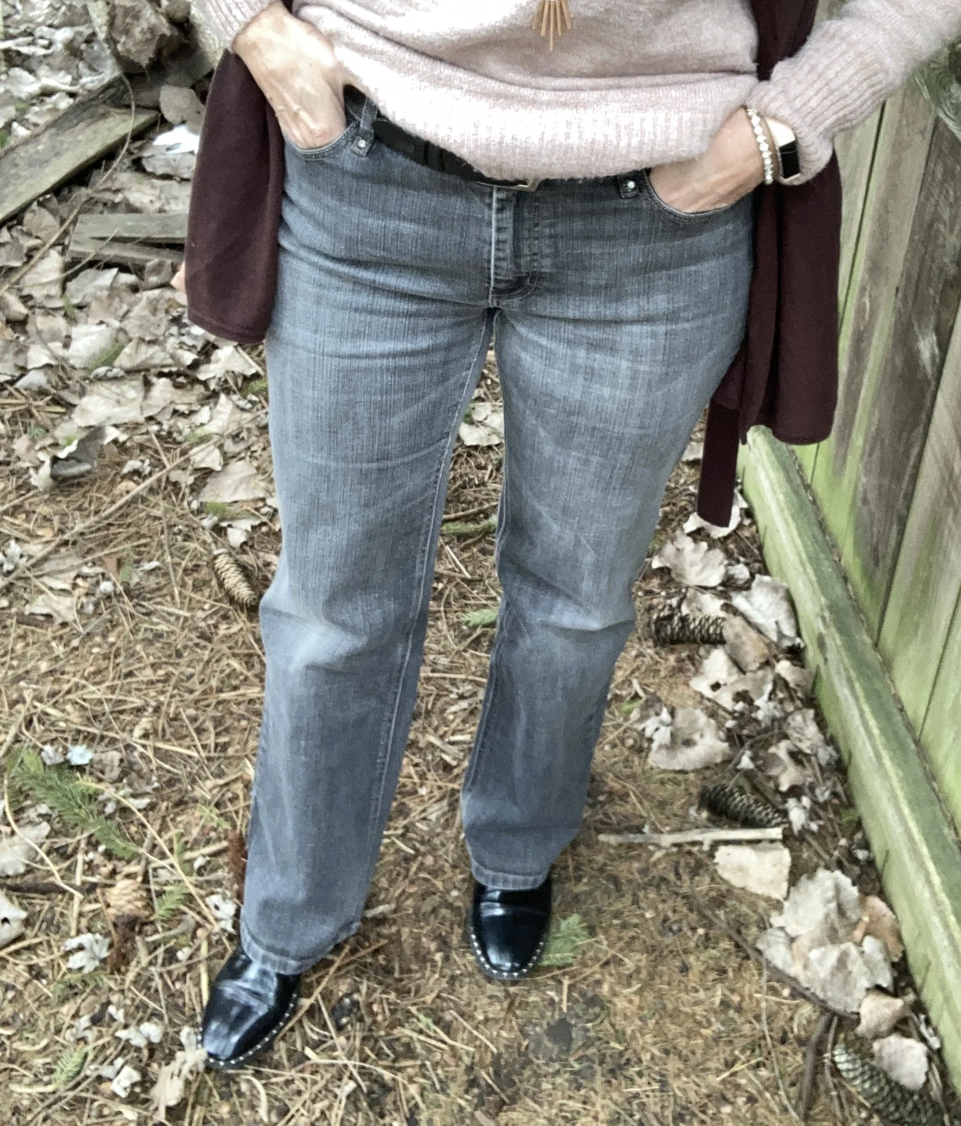
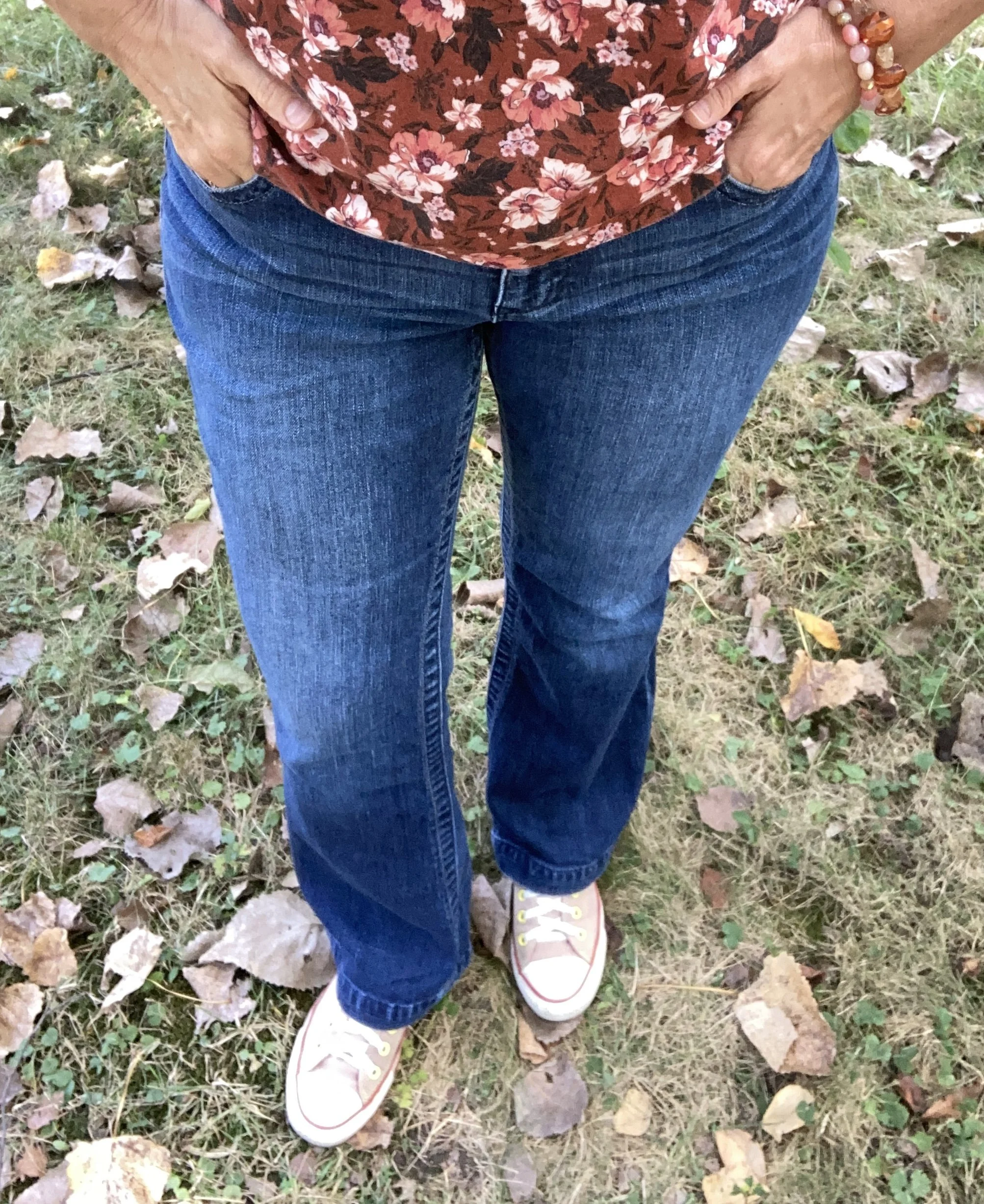
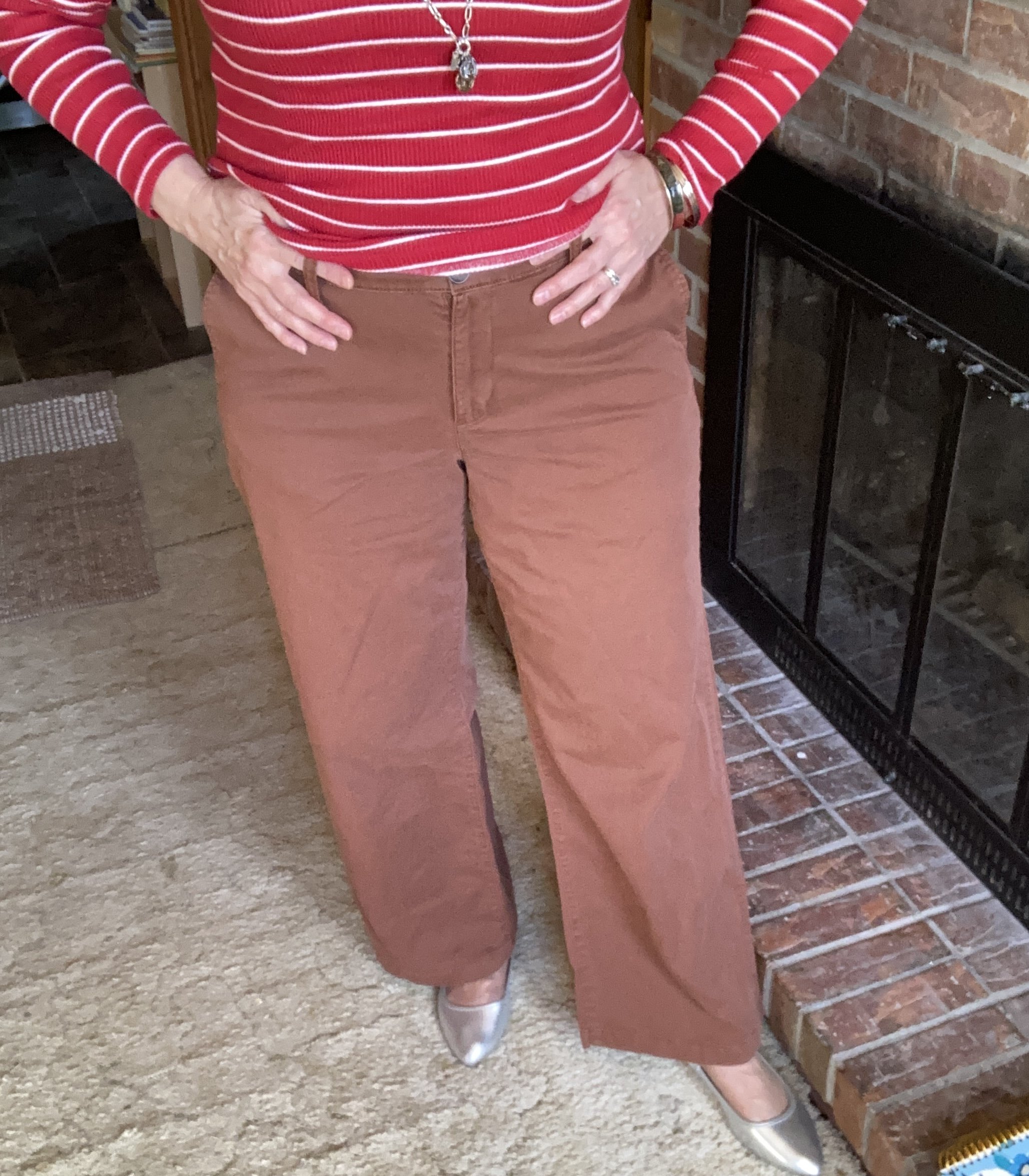
I settled on this thrifted pair of Gap, straight leg jeans. Are you, like me, still trying to figure out what shape of jeans to wear? It seems so many things are in right now, but I have found that a straight leg, not skinny, and a boot cut are both reasonably spot on for anyone to wear. The barrel jean is all the rage right now, but I am not enamored with that shape. I would need to try some on to see if I like it or not. Do any of you have experience with the barrel shaped jeans? Do you like them, and do you have a retailer you recommend?
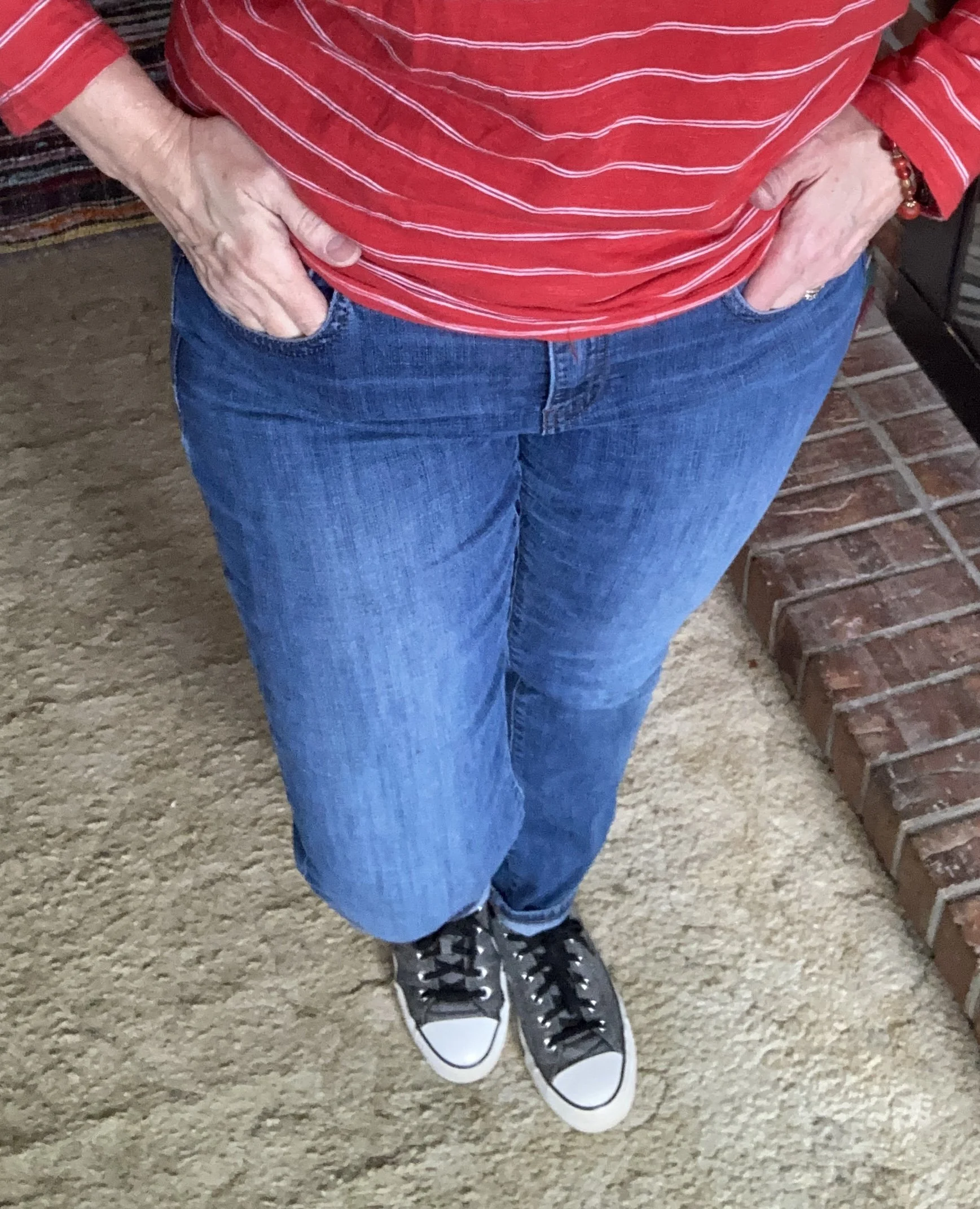
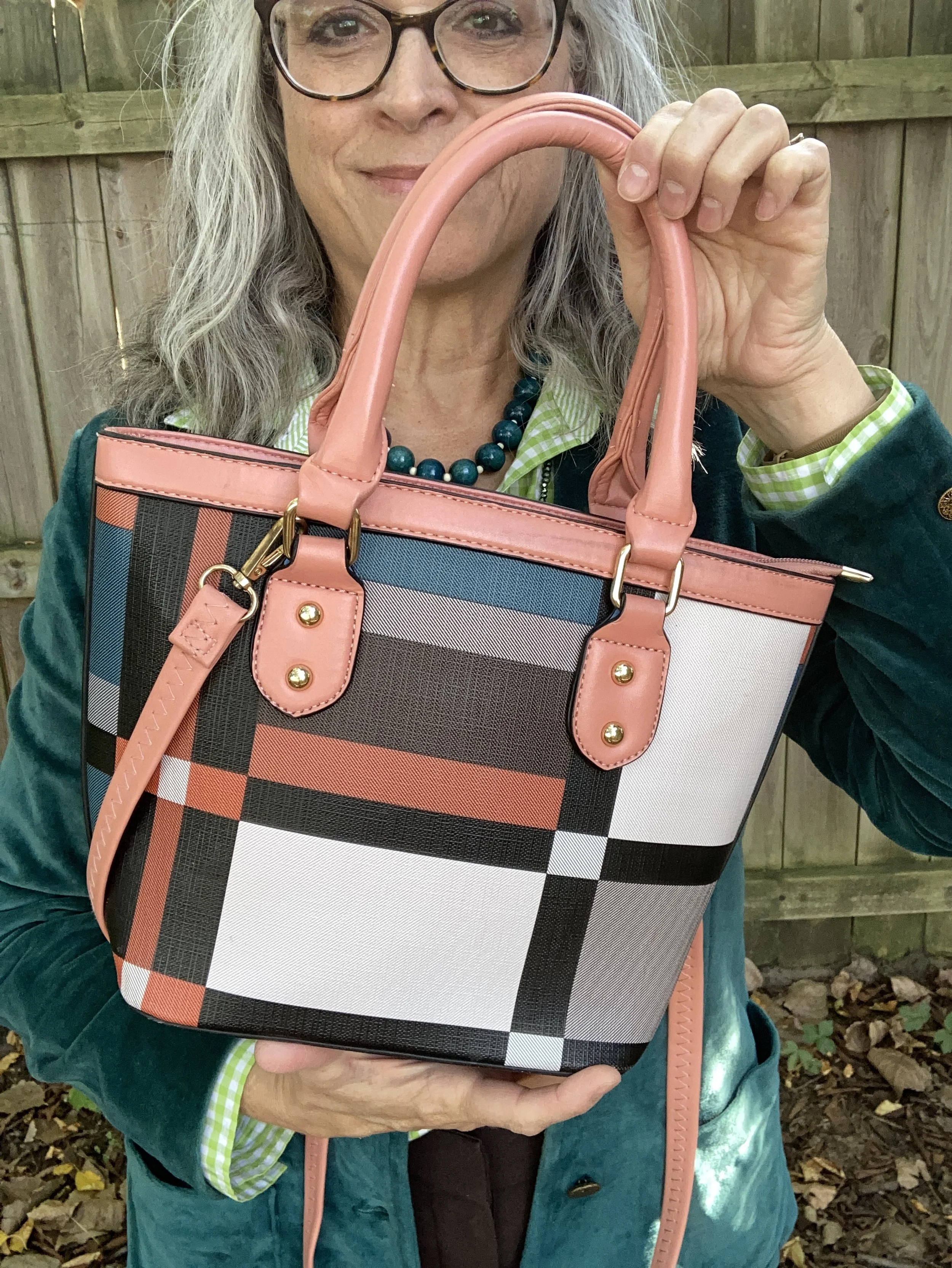
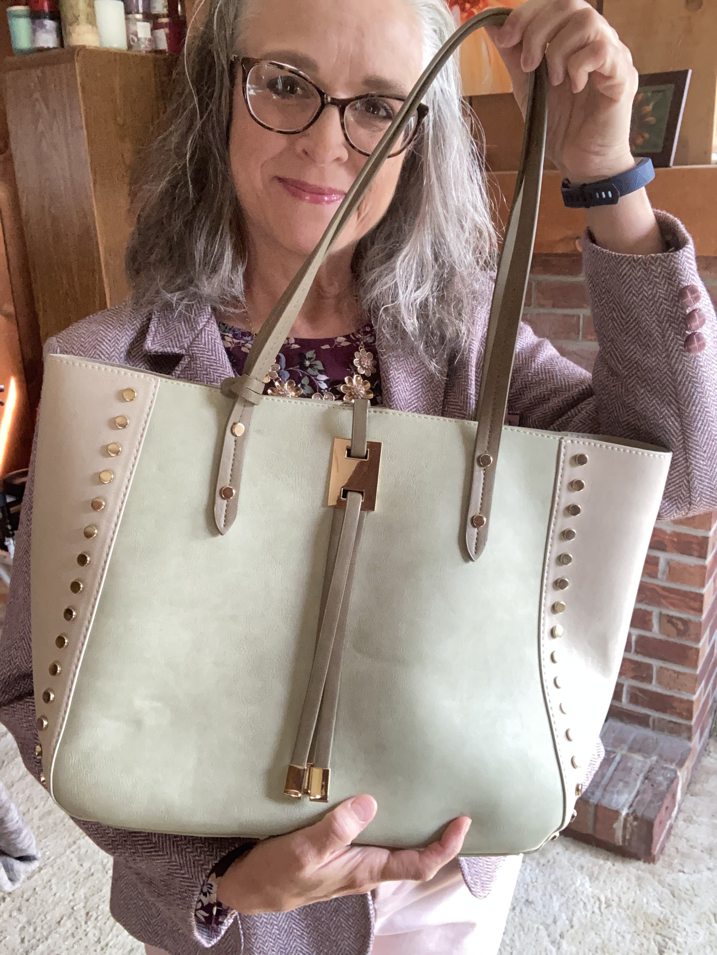
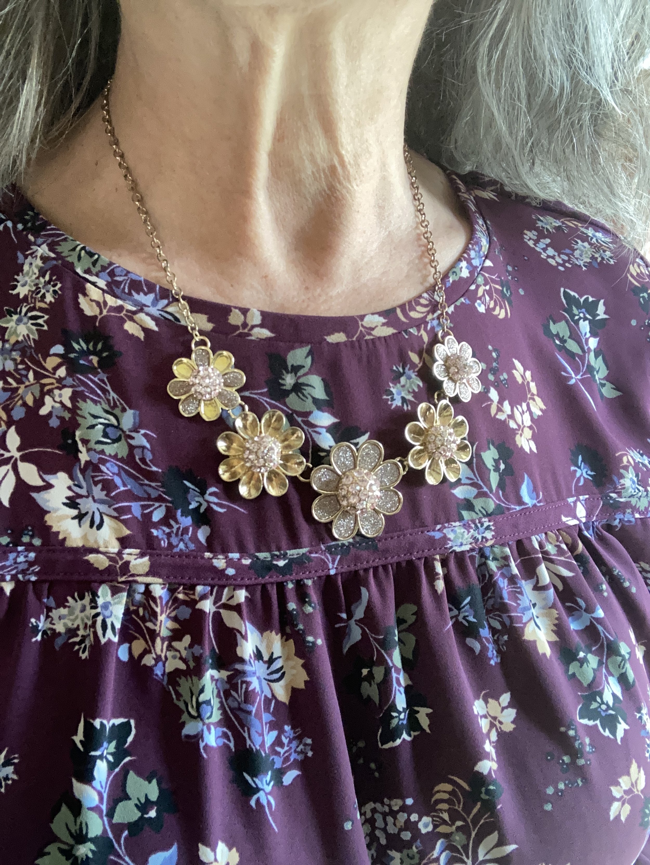
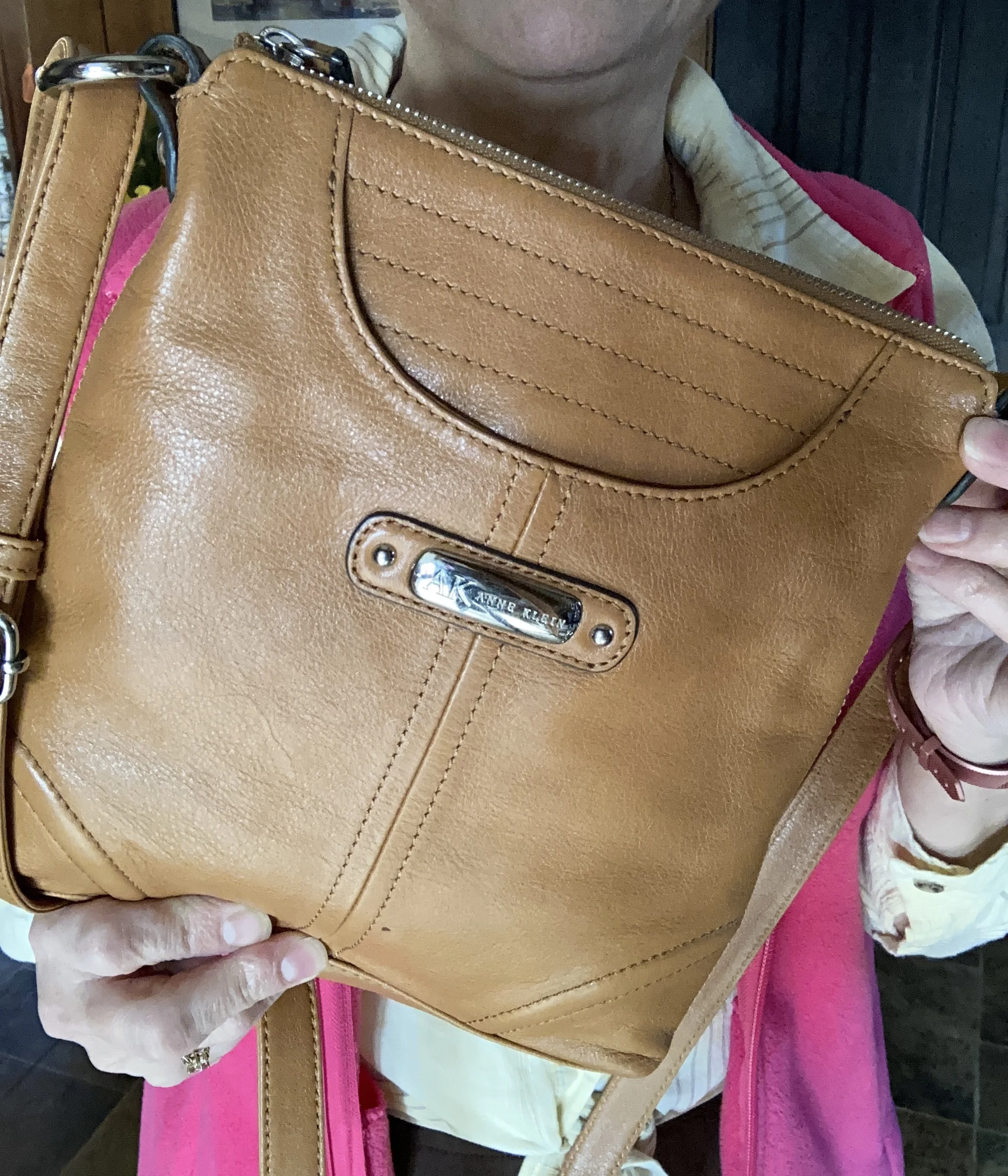
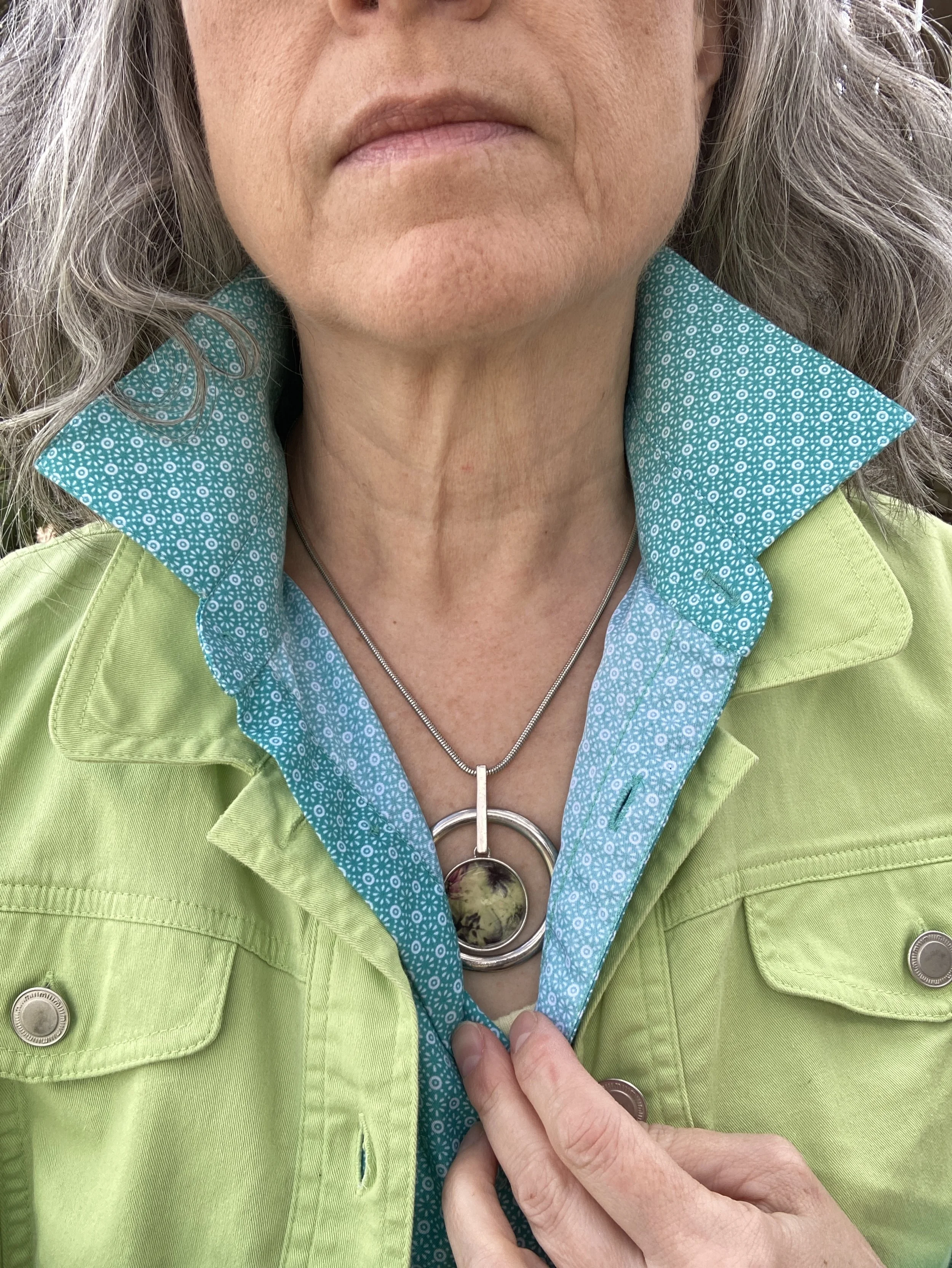
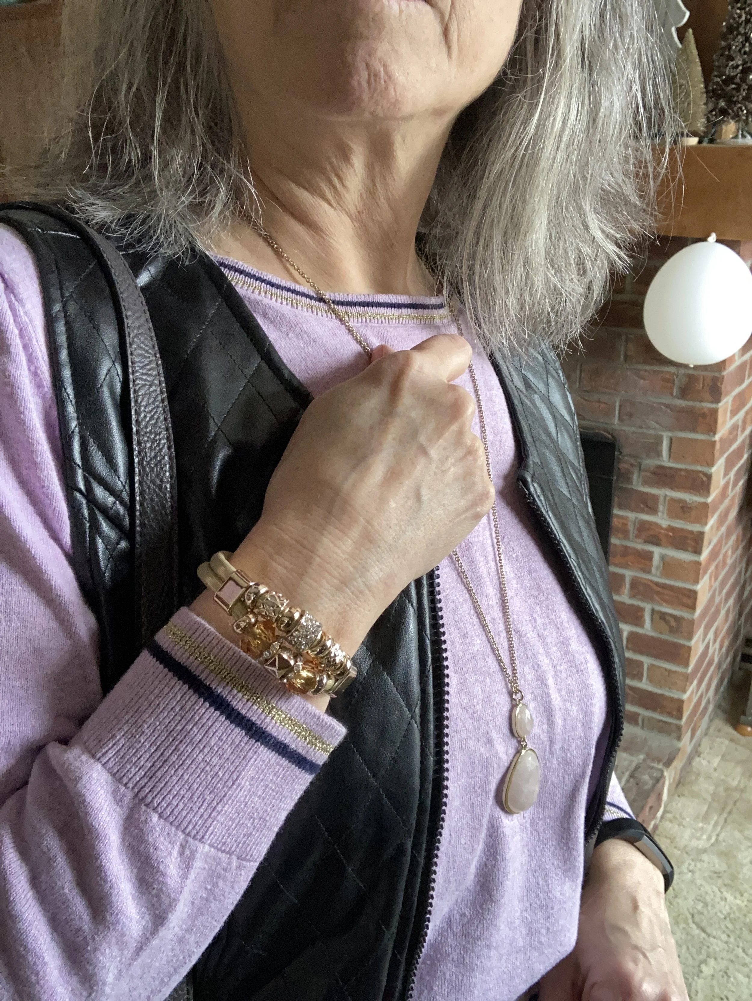
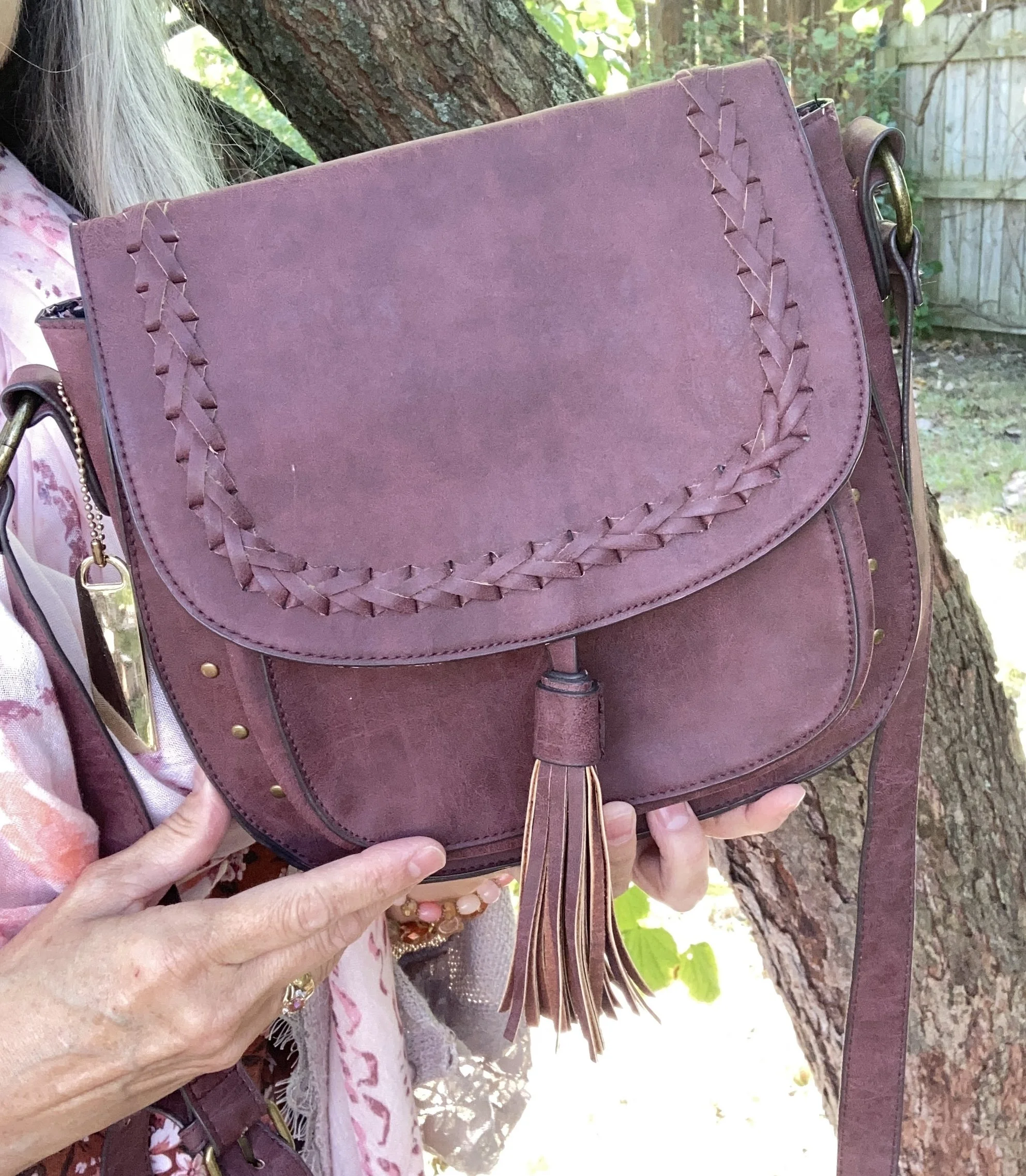
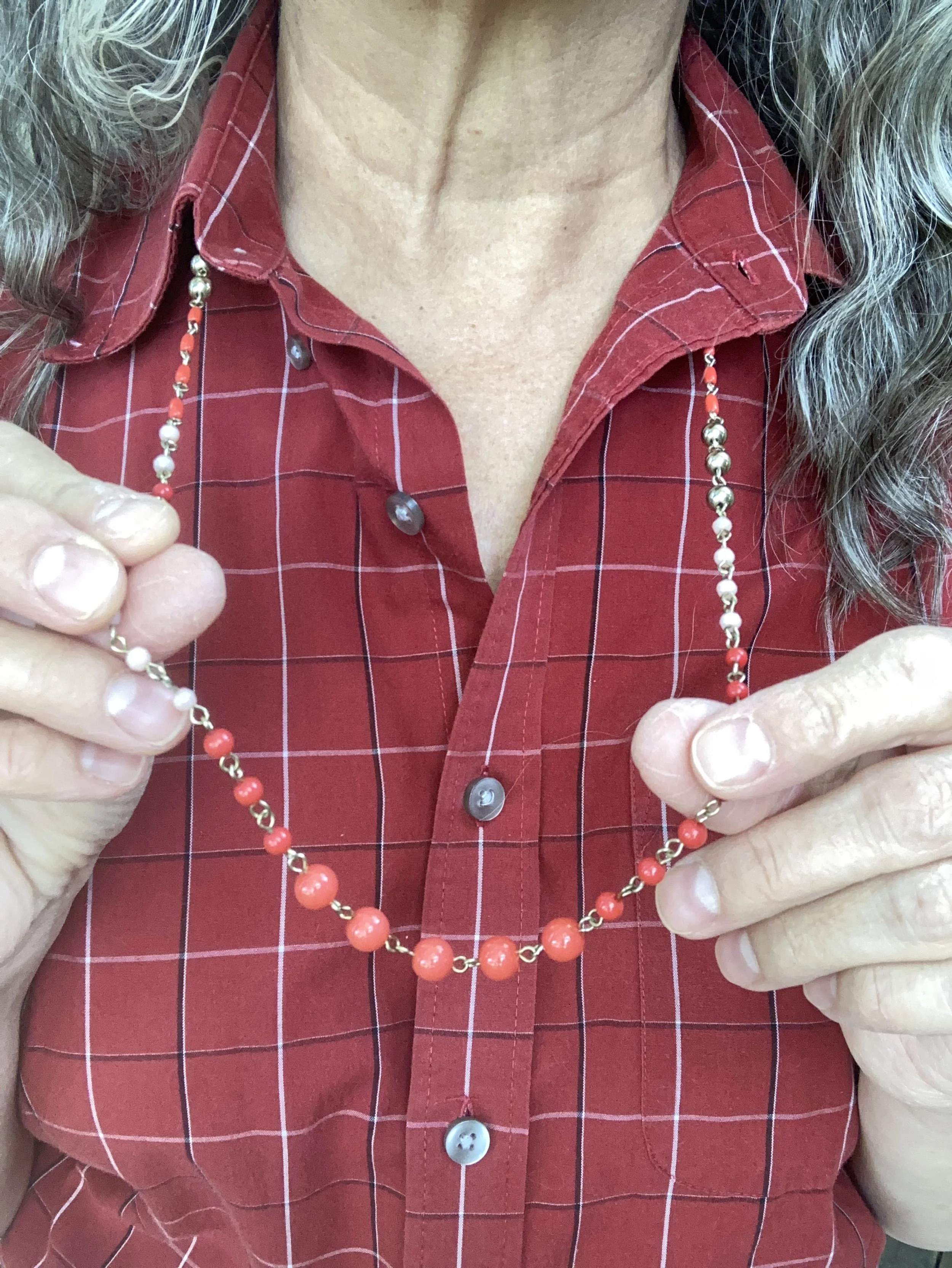
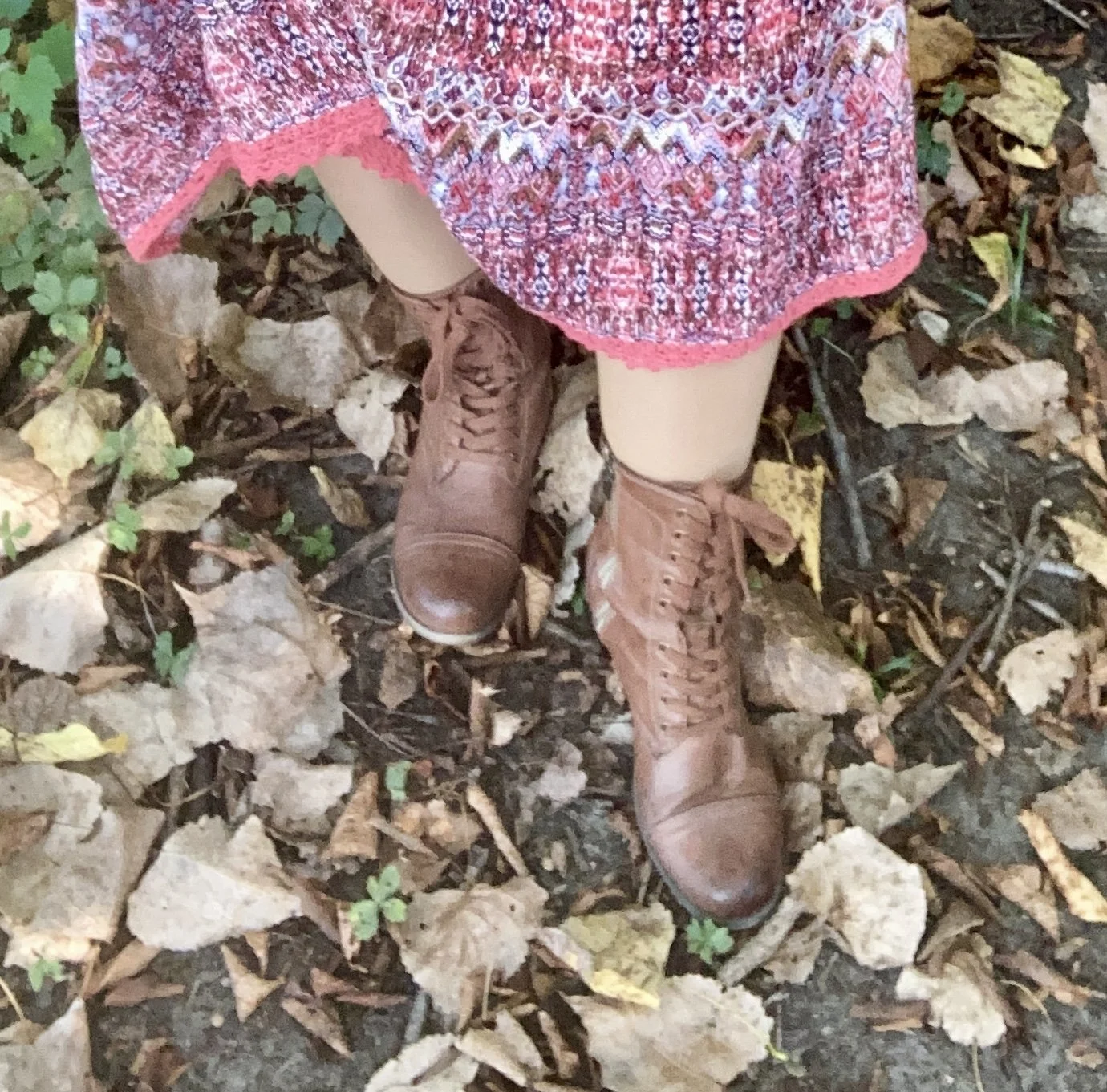
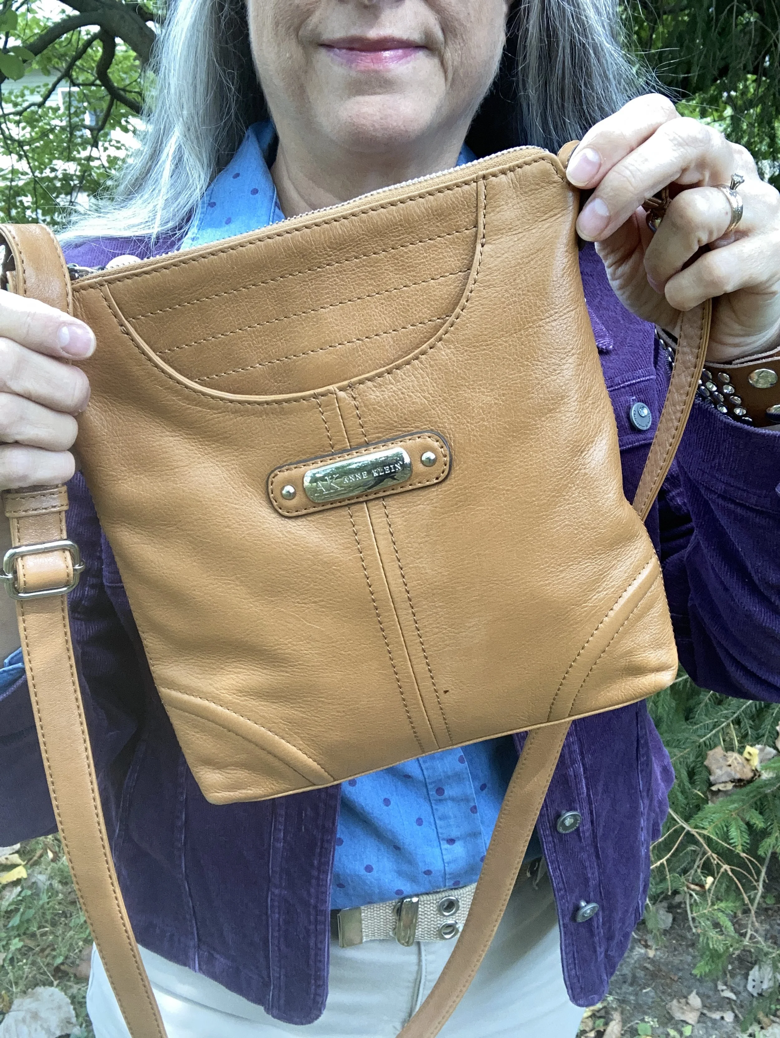
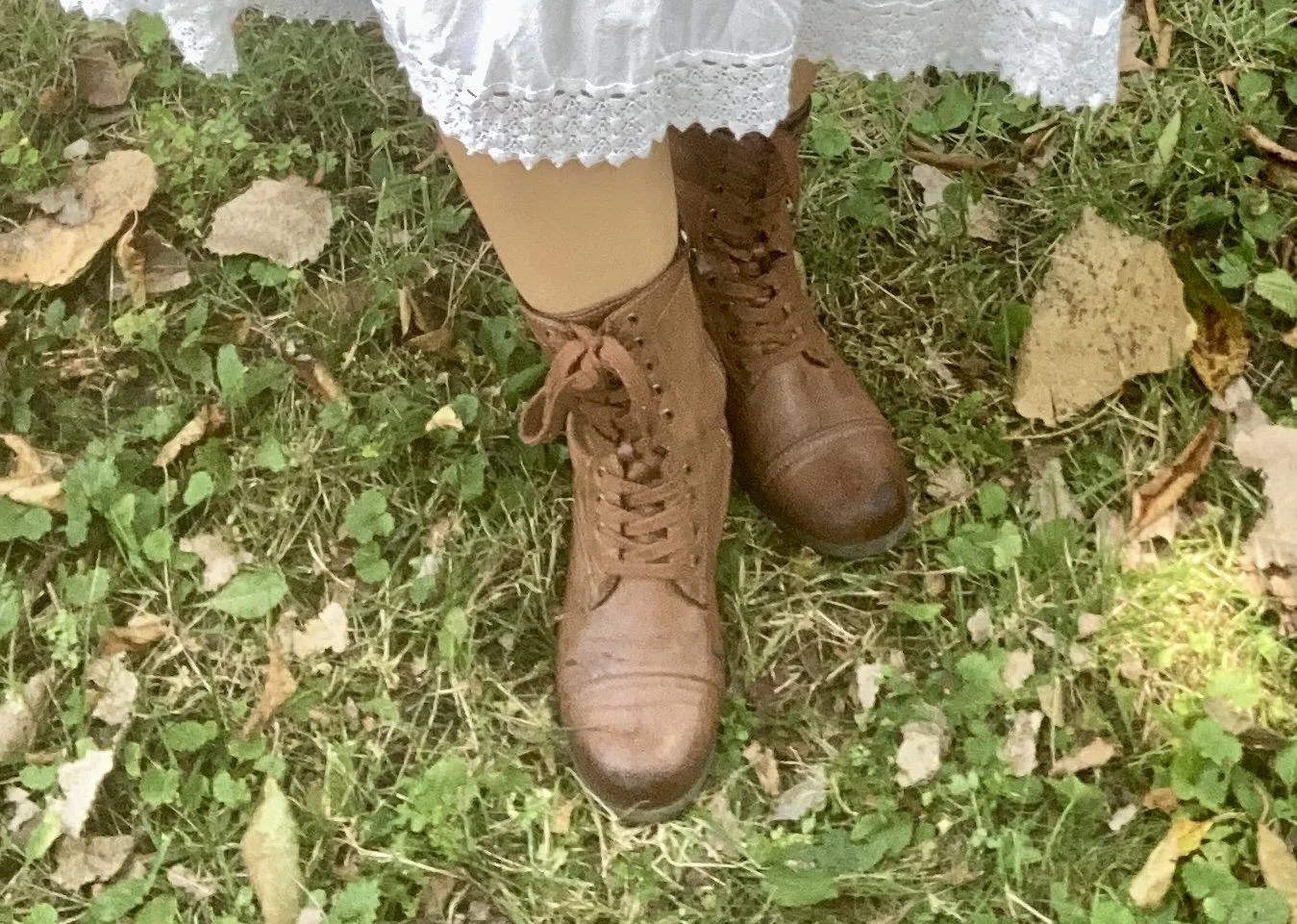
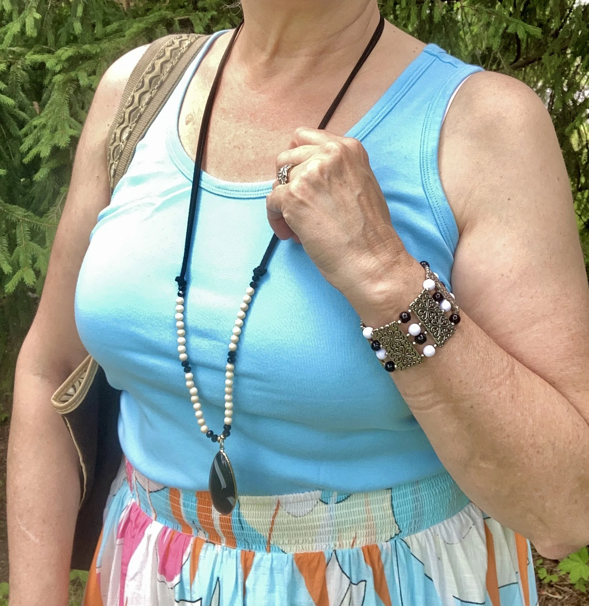
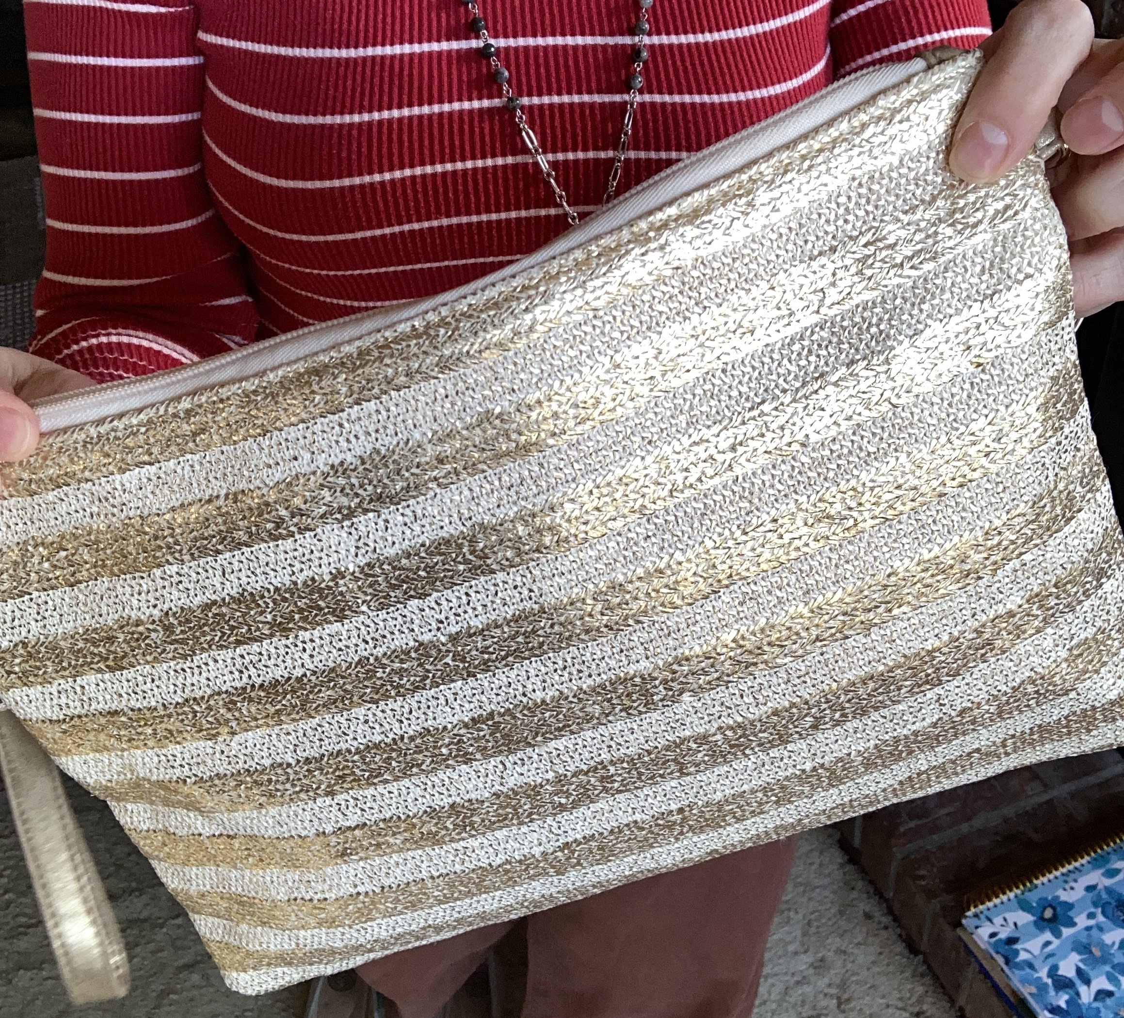
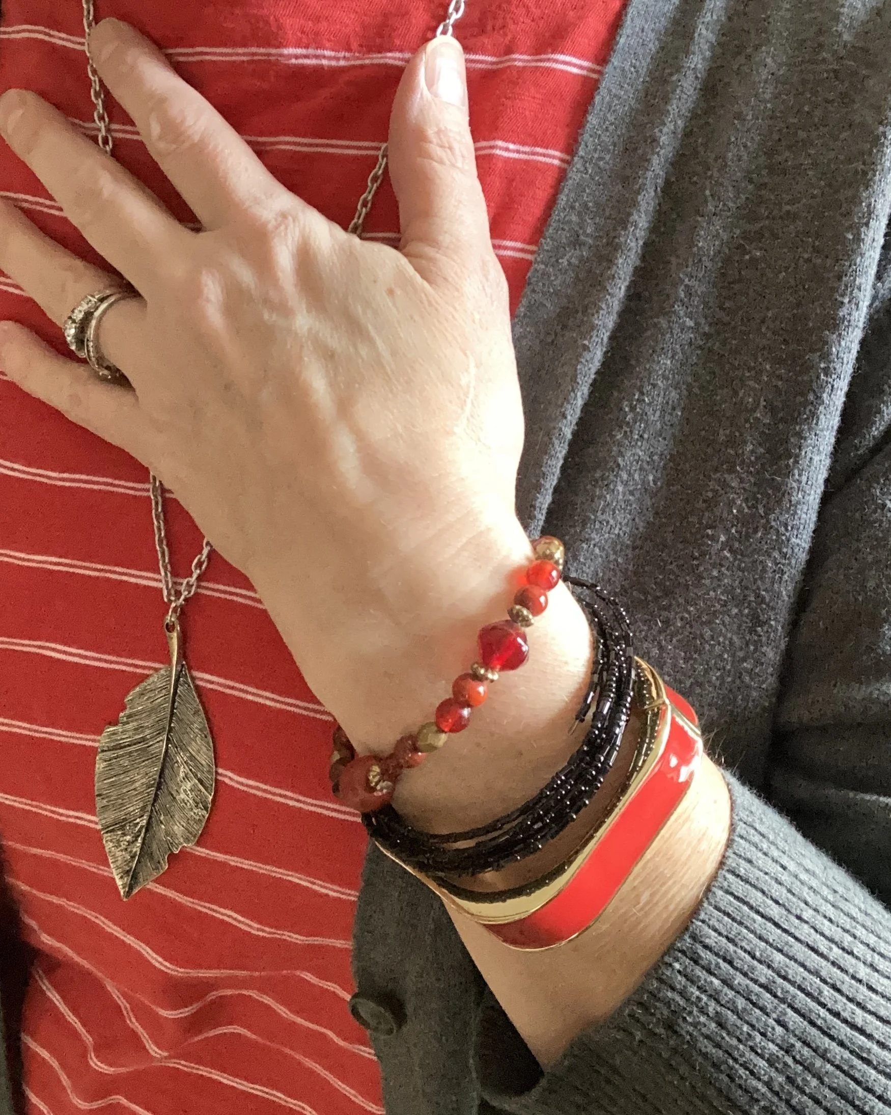
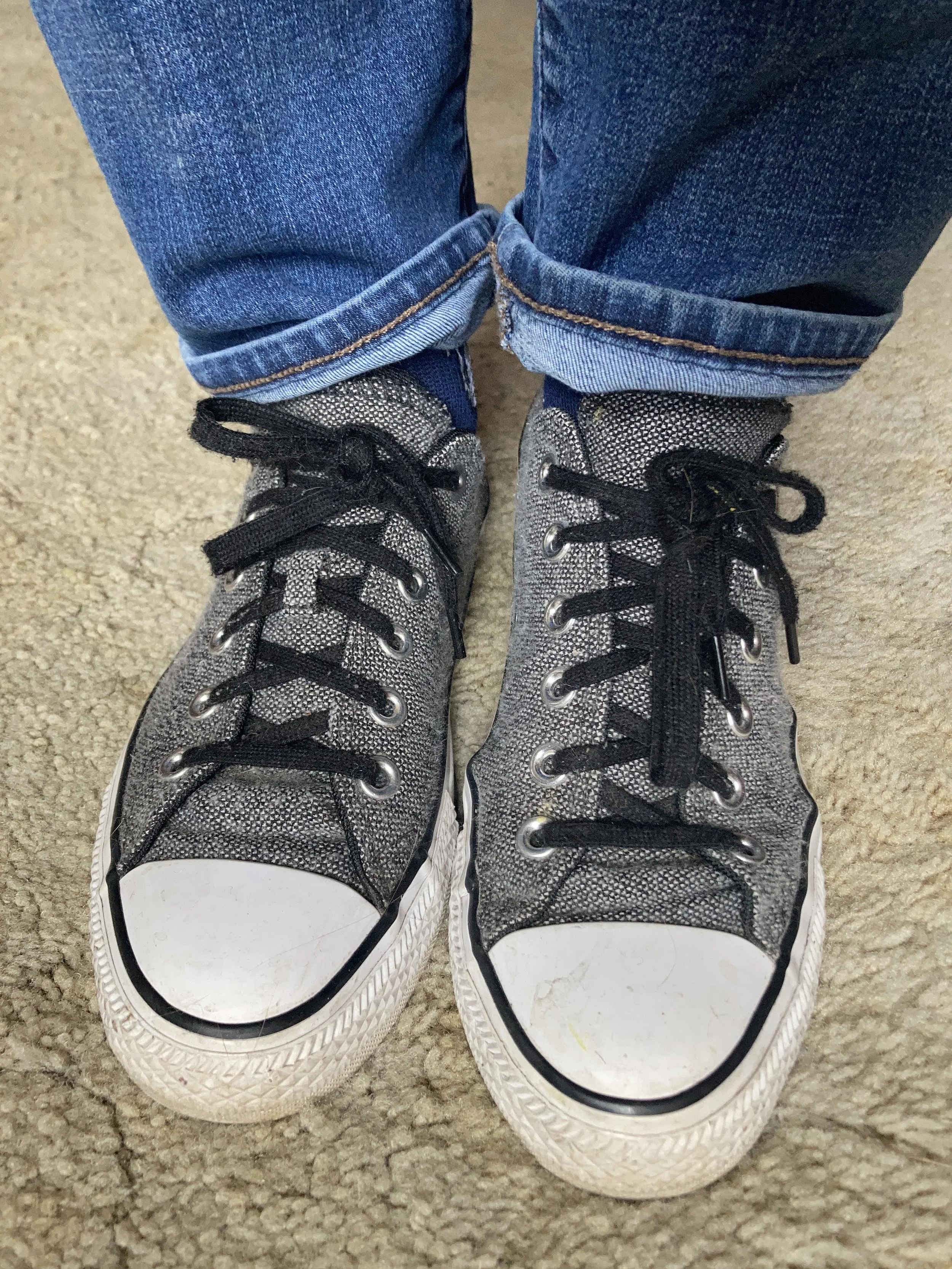
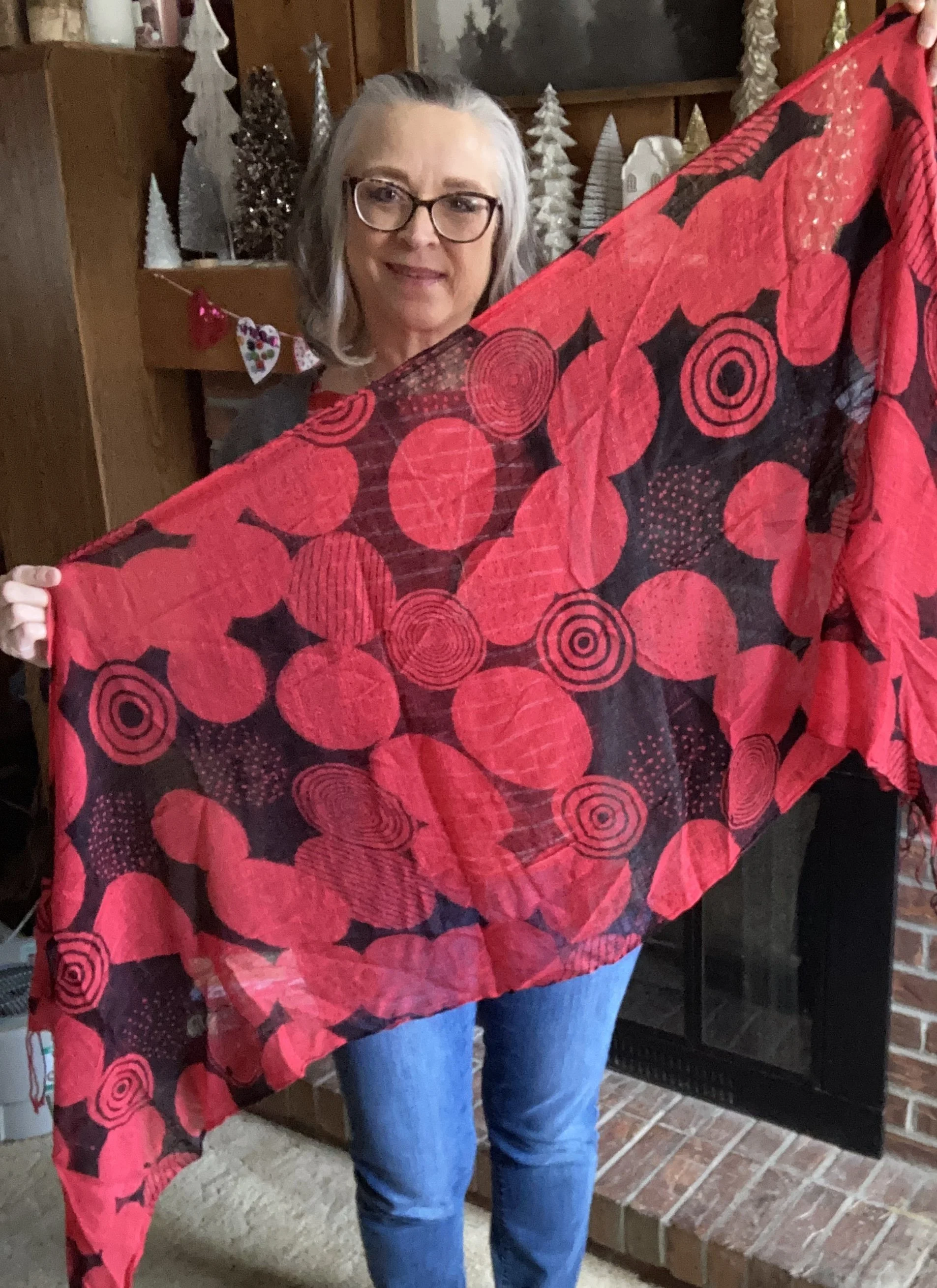
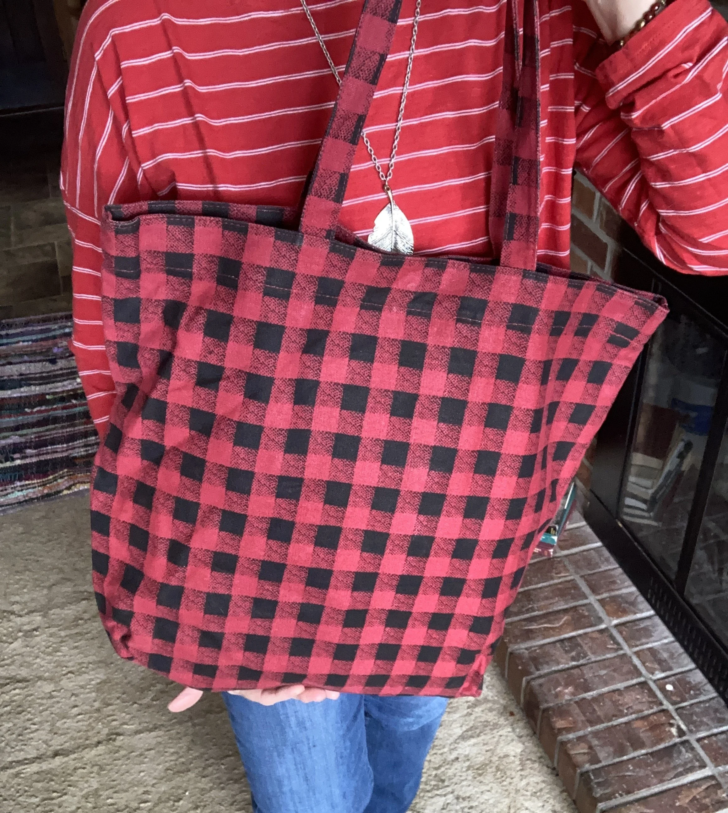
For my accessories, I went with a thrifted leaf necklace, a few bracelets, my thrifted Converse, a red and black second hand scarf, and a Buffalo print Arizona Jeans tote bag that I got from somewhere, but I can’t remember where. Ha, ha.
What do you think of this outfit? Is this something you would wear? If it is would you choose red or a different color? What color would you choose? I love to hear from you, so be sure to leave a comment if you can.