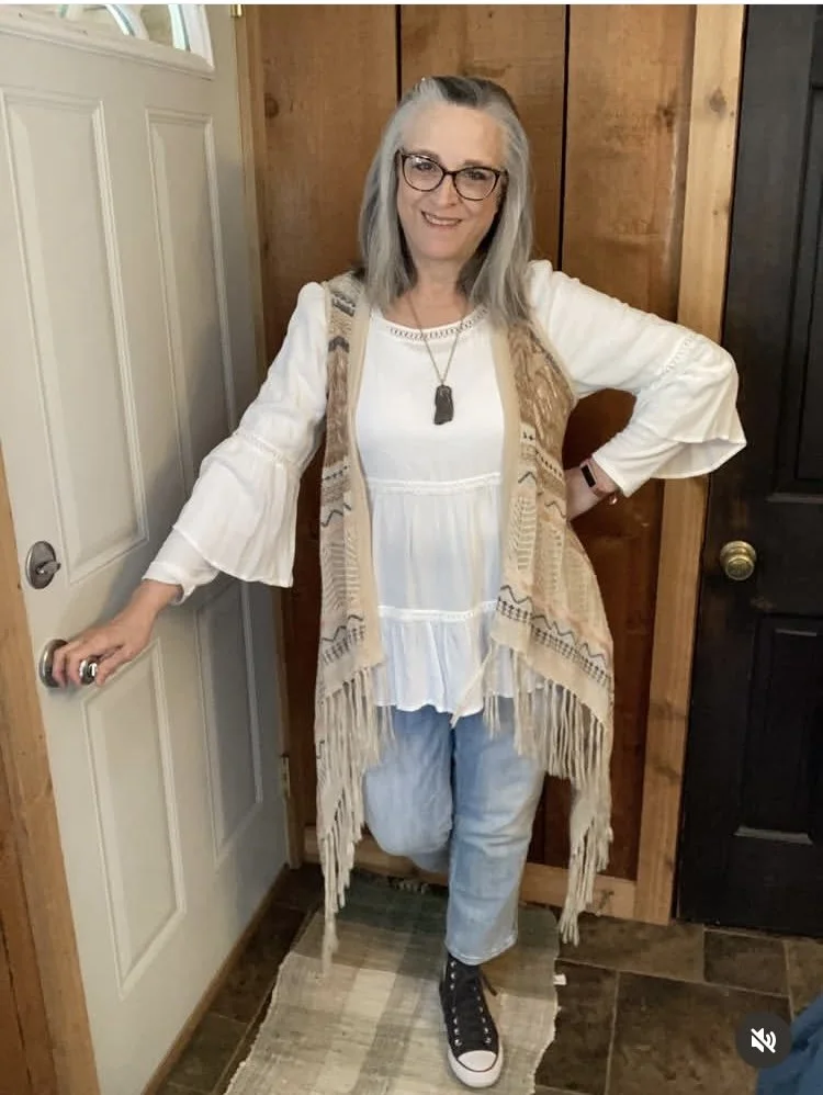
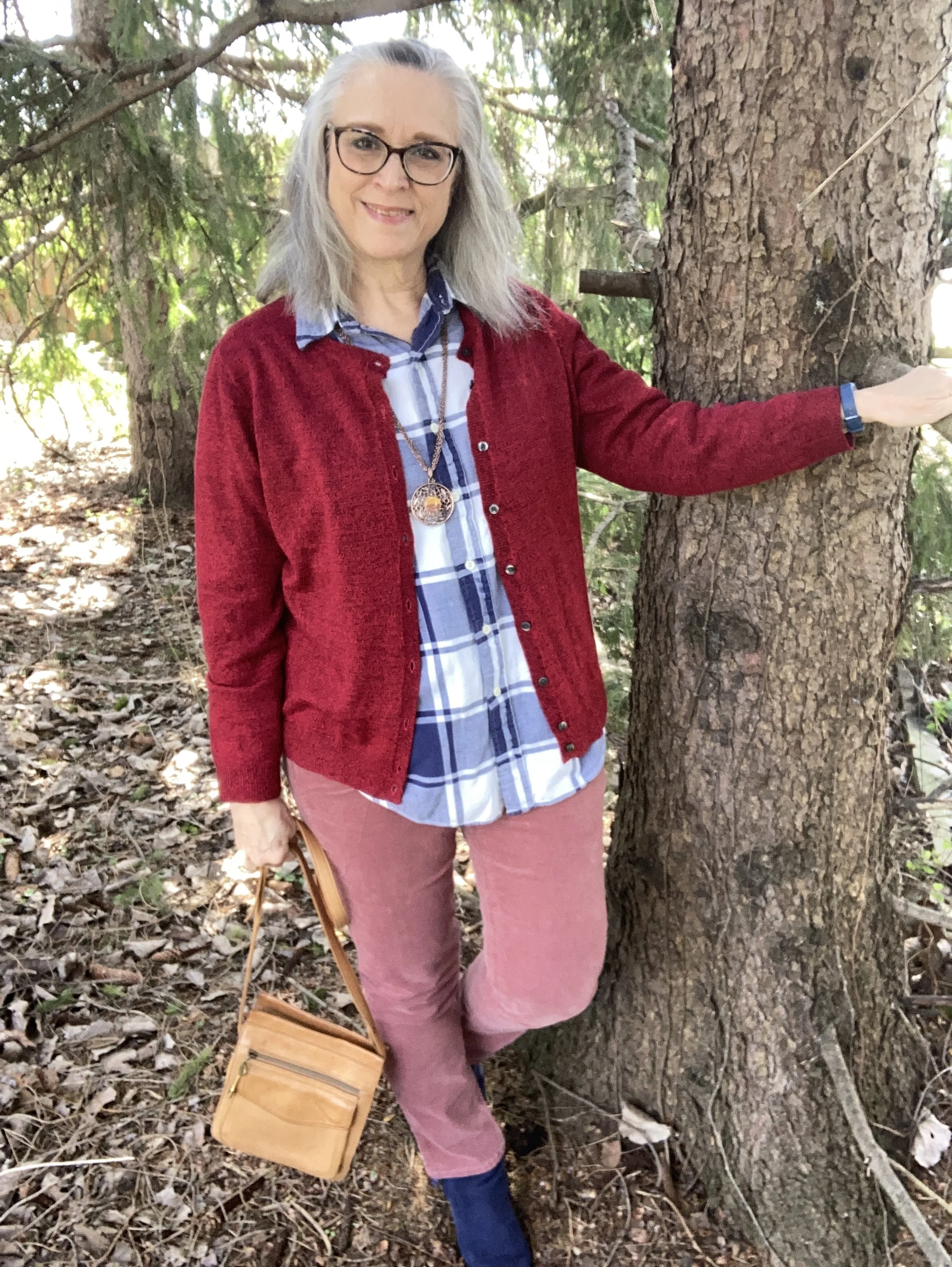
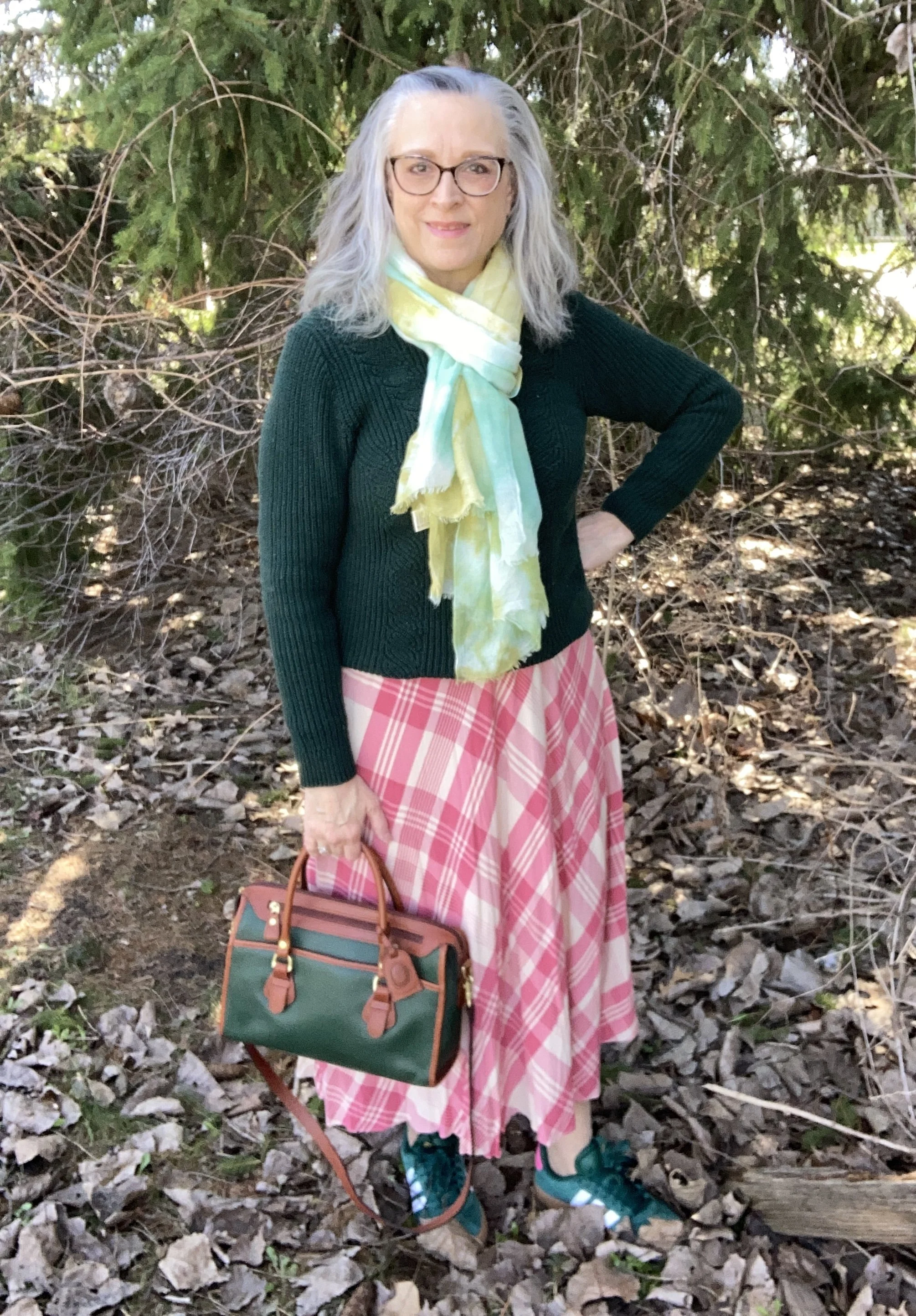
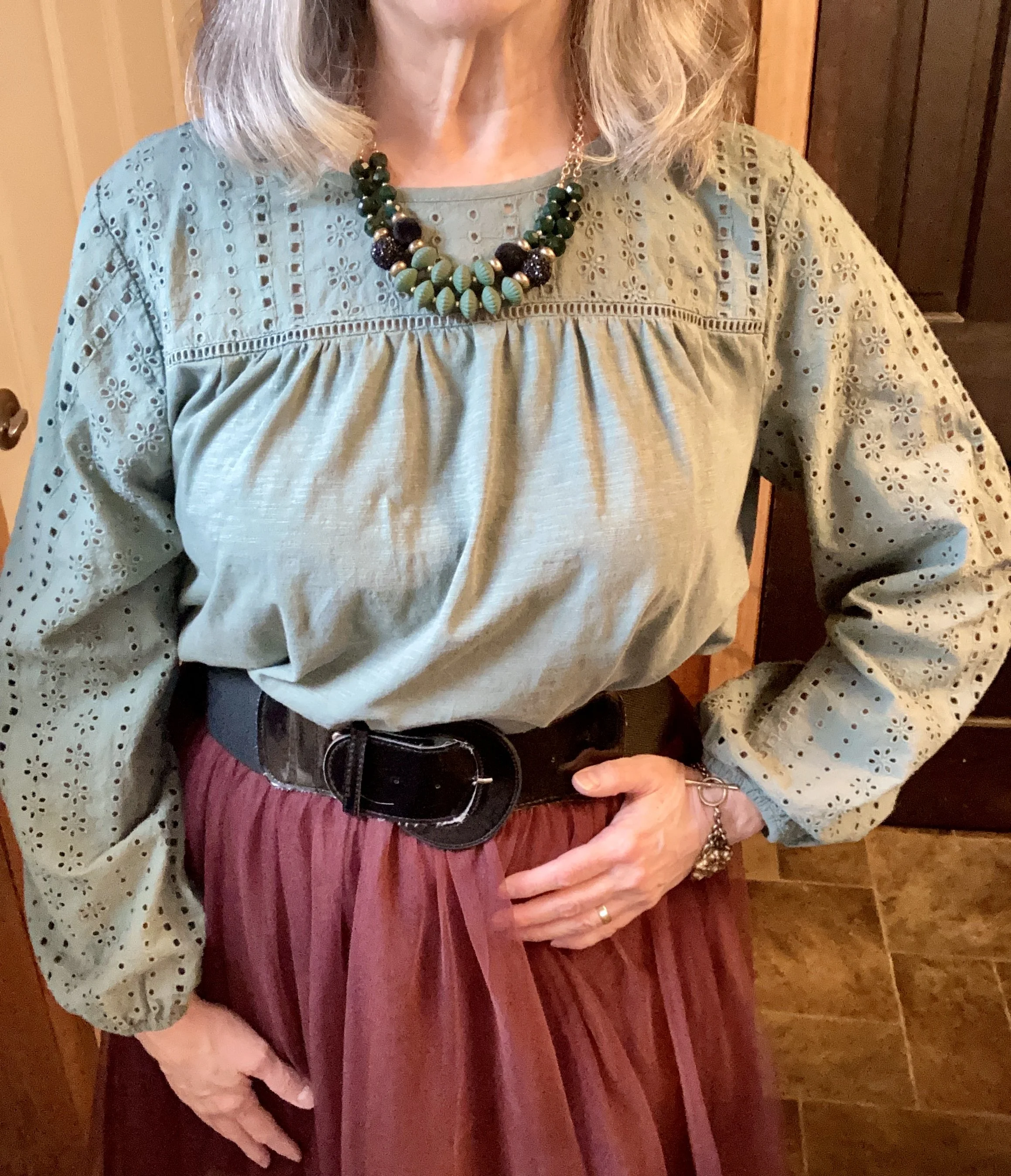
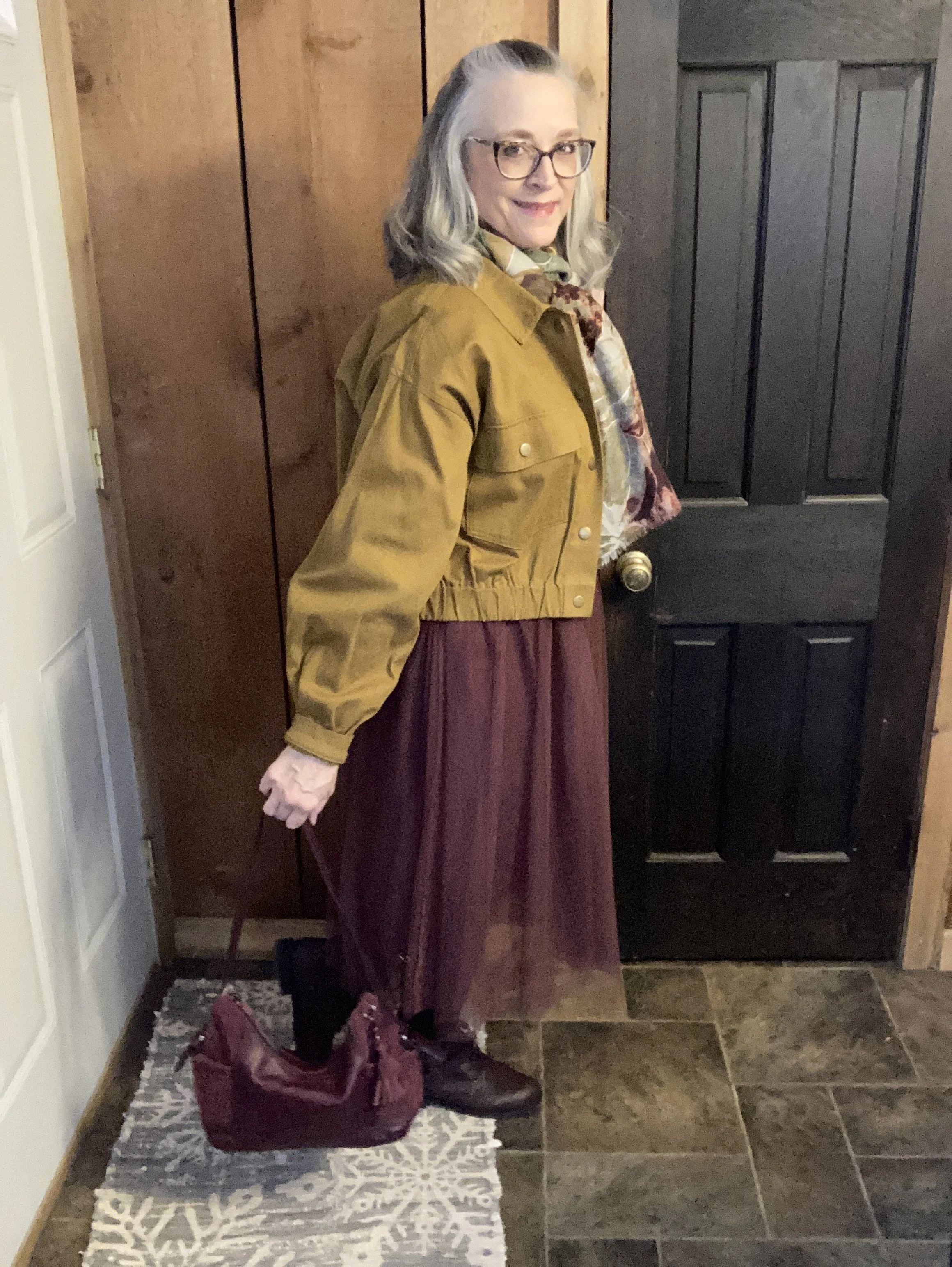
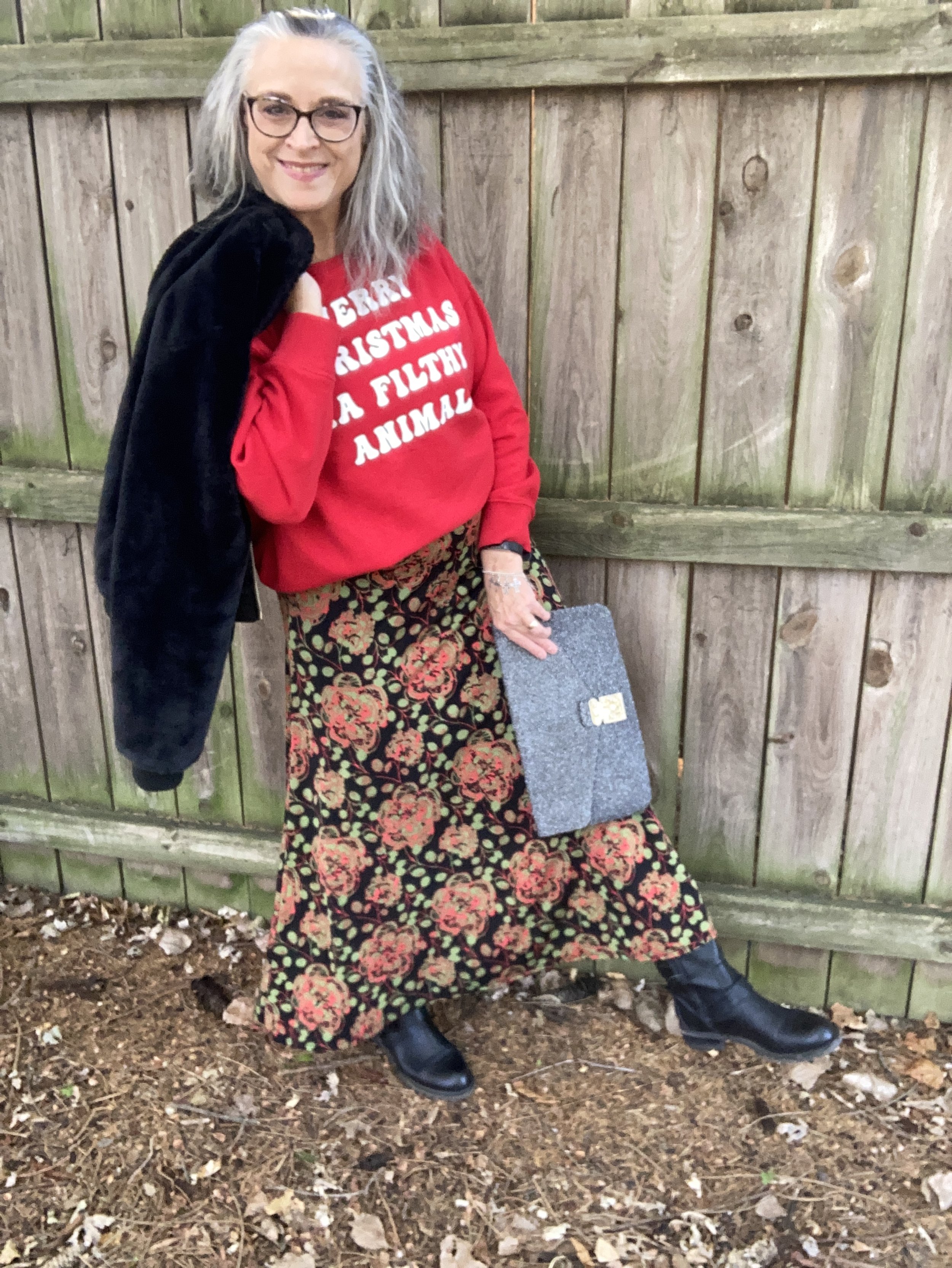
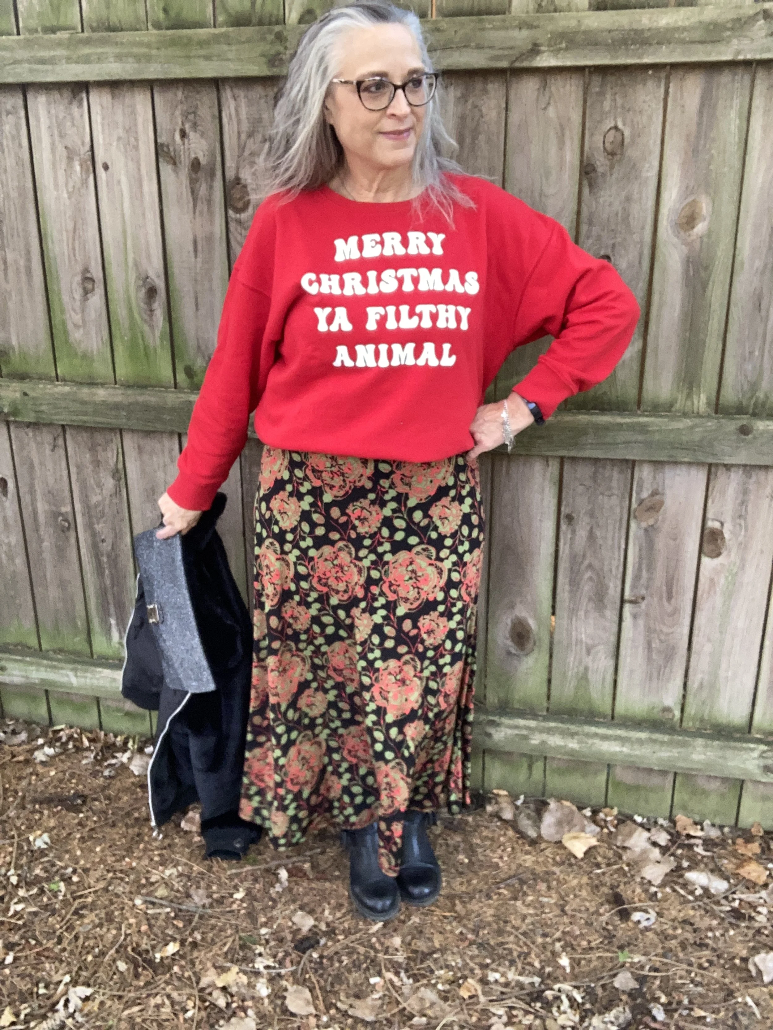
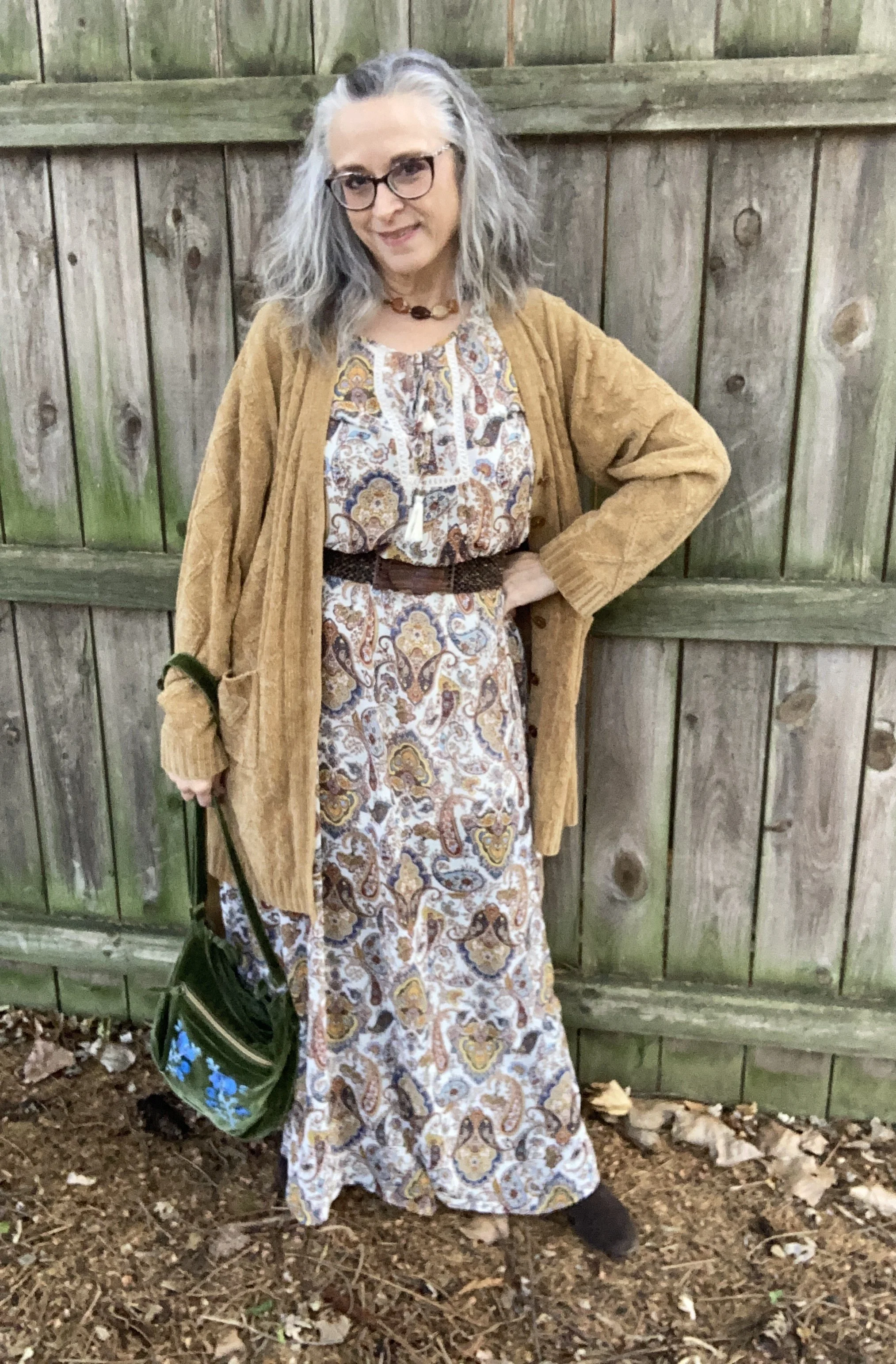
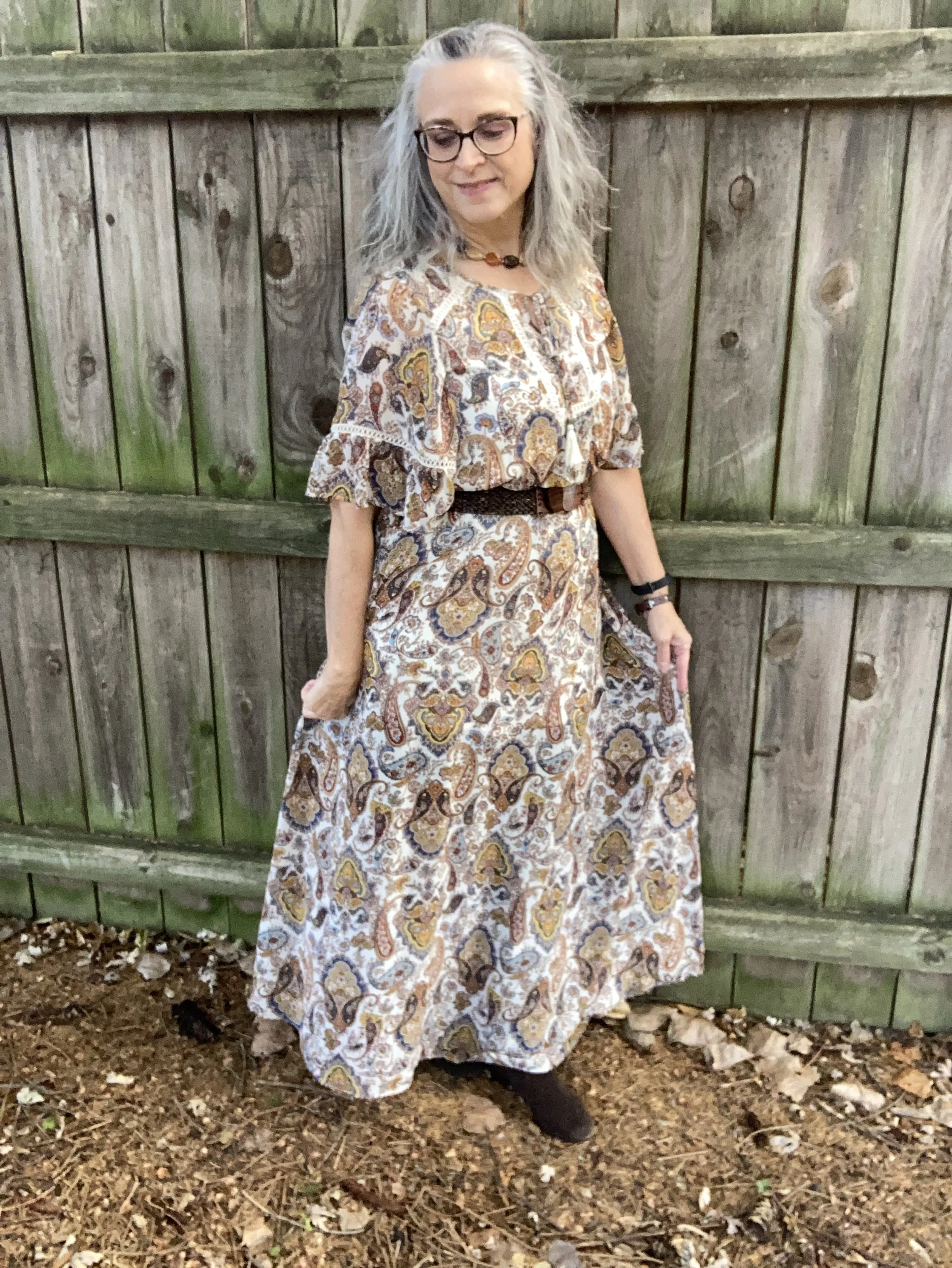
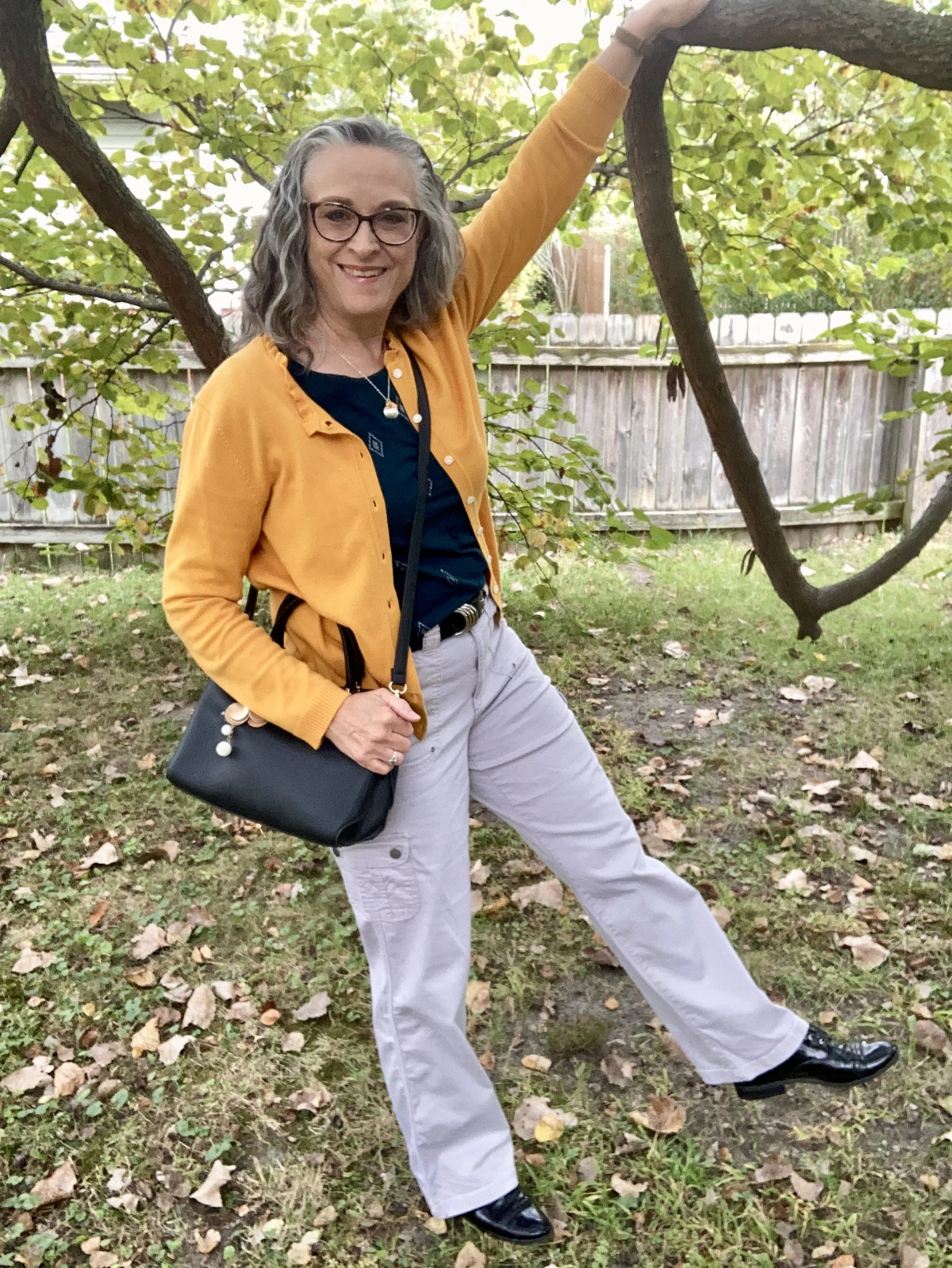
Shopping Our Closets: Casual Summer Vibes
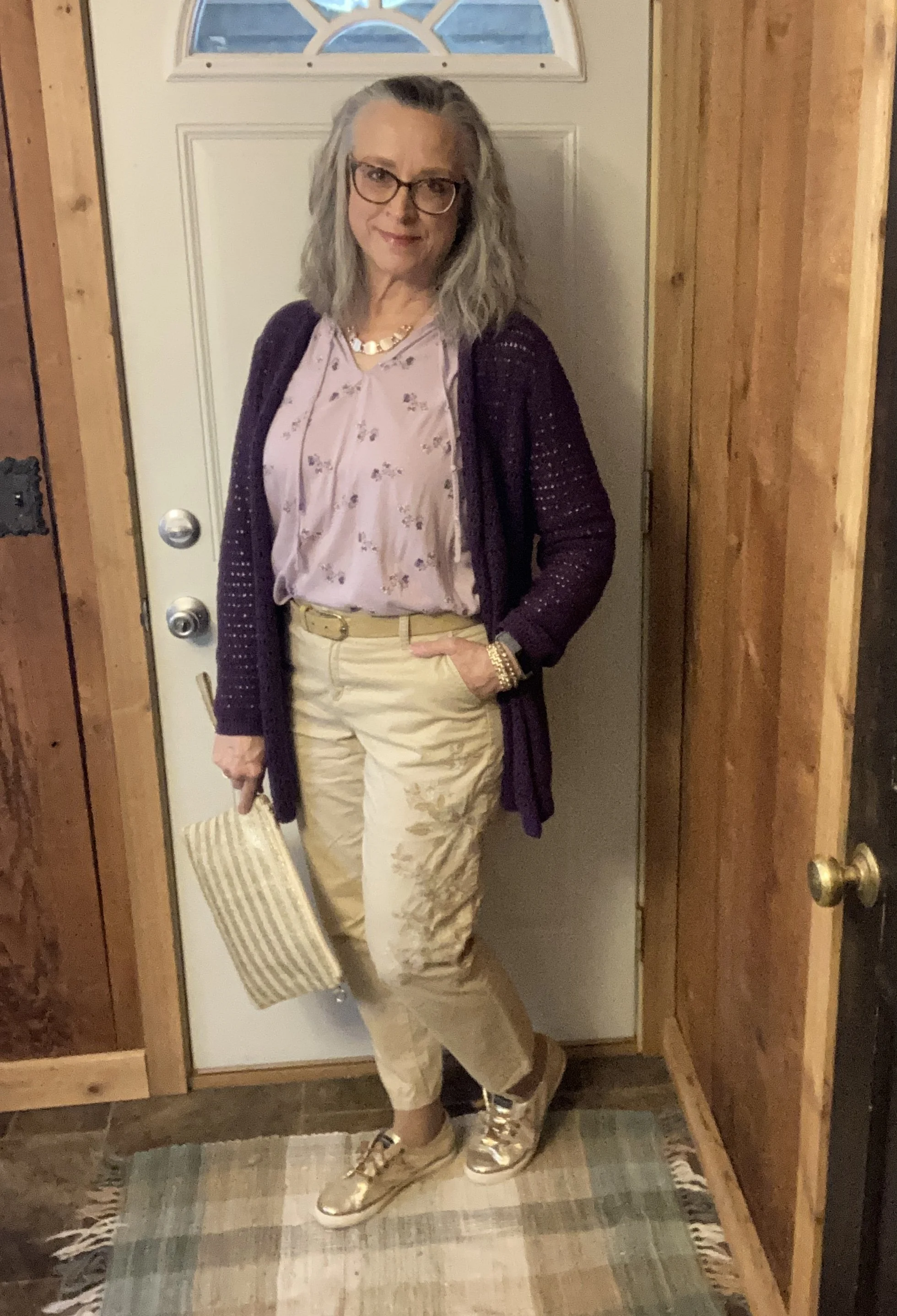
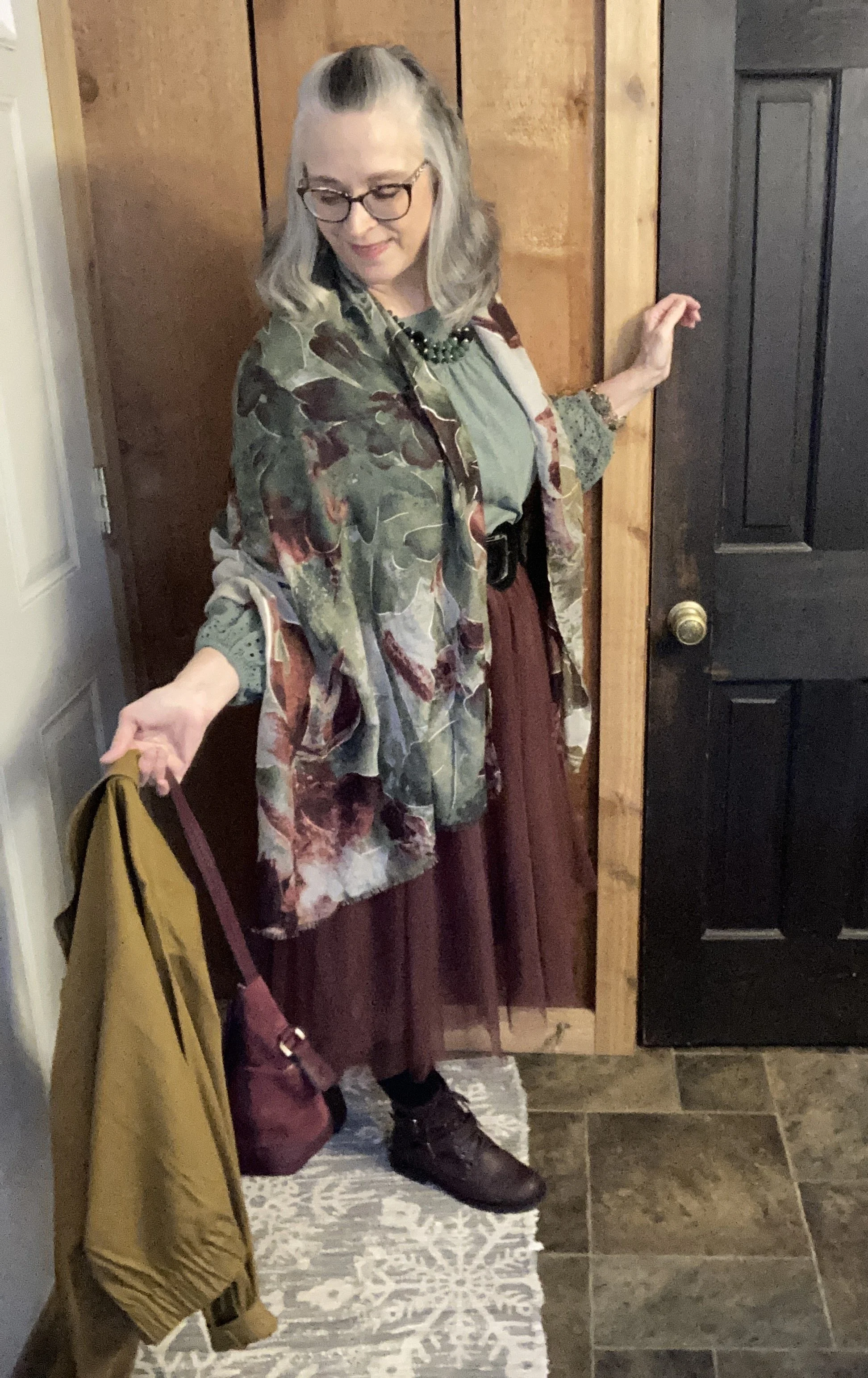
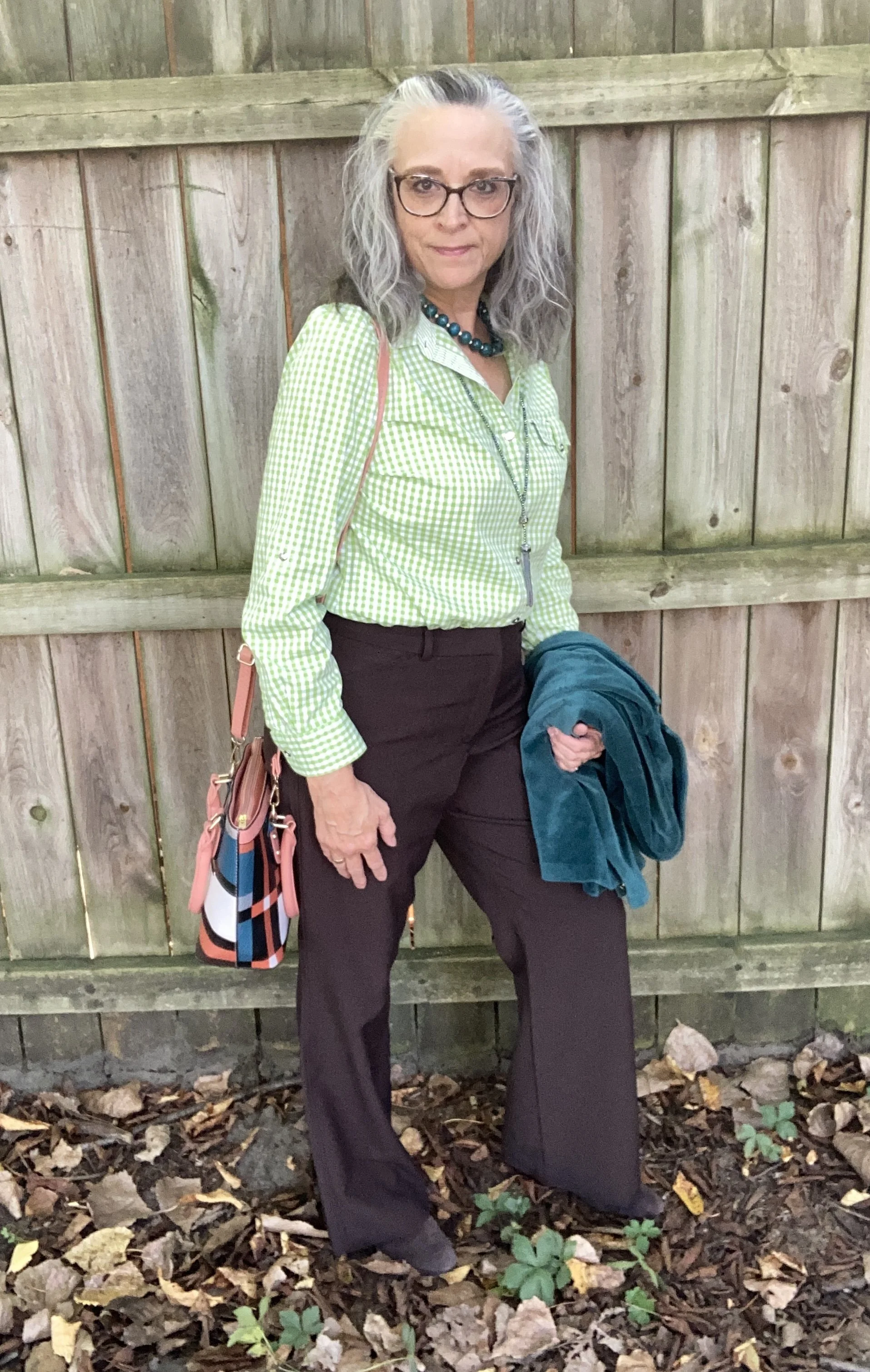
I am trying to get back to my monthly posts, at least for the summer, so this week I am shopping my closet to bring you a casual summer outfit that would be good for a coffee shop date, an afternoon of shopping or a trip to the theater with the grandkids to see a movie. We all know that indoor activities during the summer can often come with too much air conditioning, so thinking ahead about what to wear is essential for being comfortable.
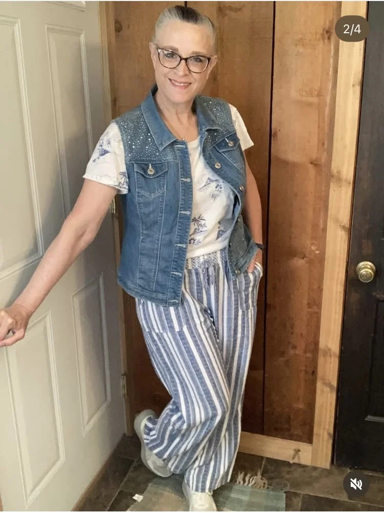
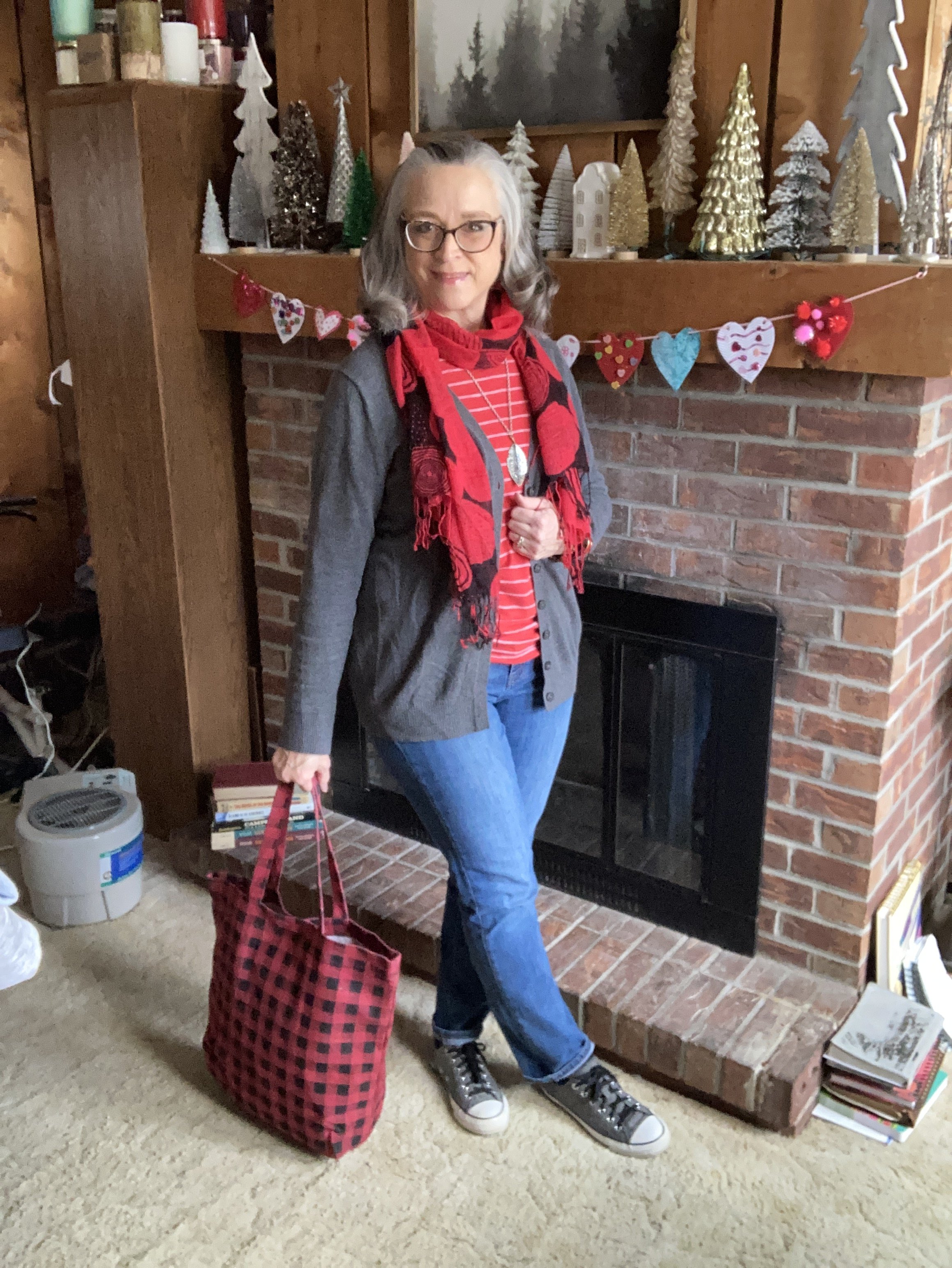
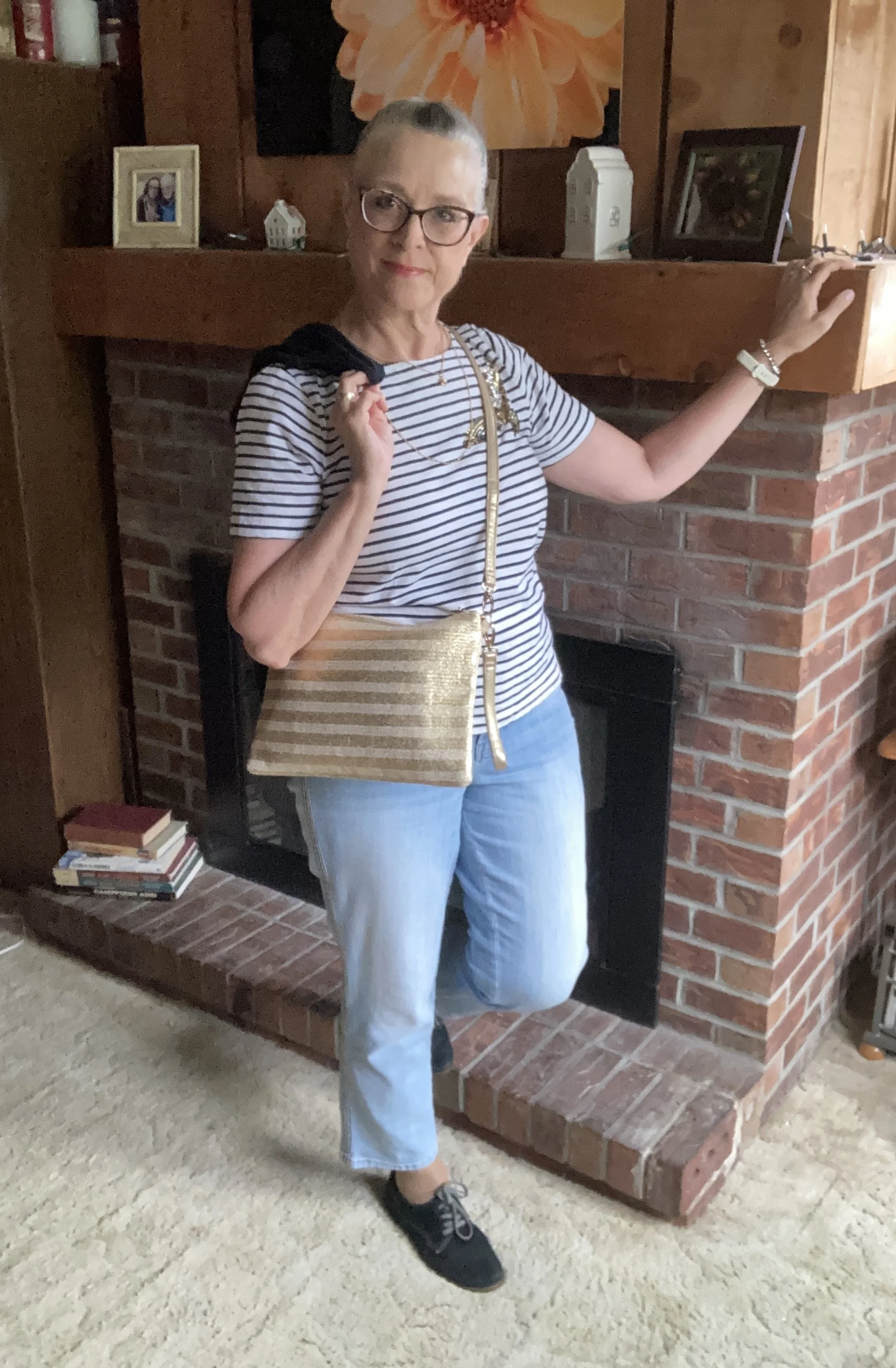
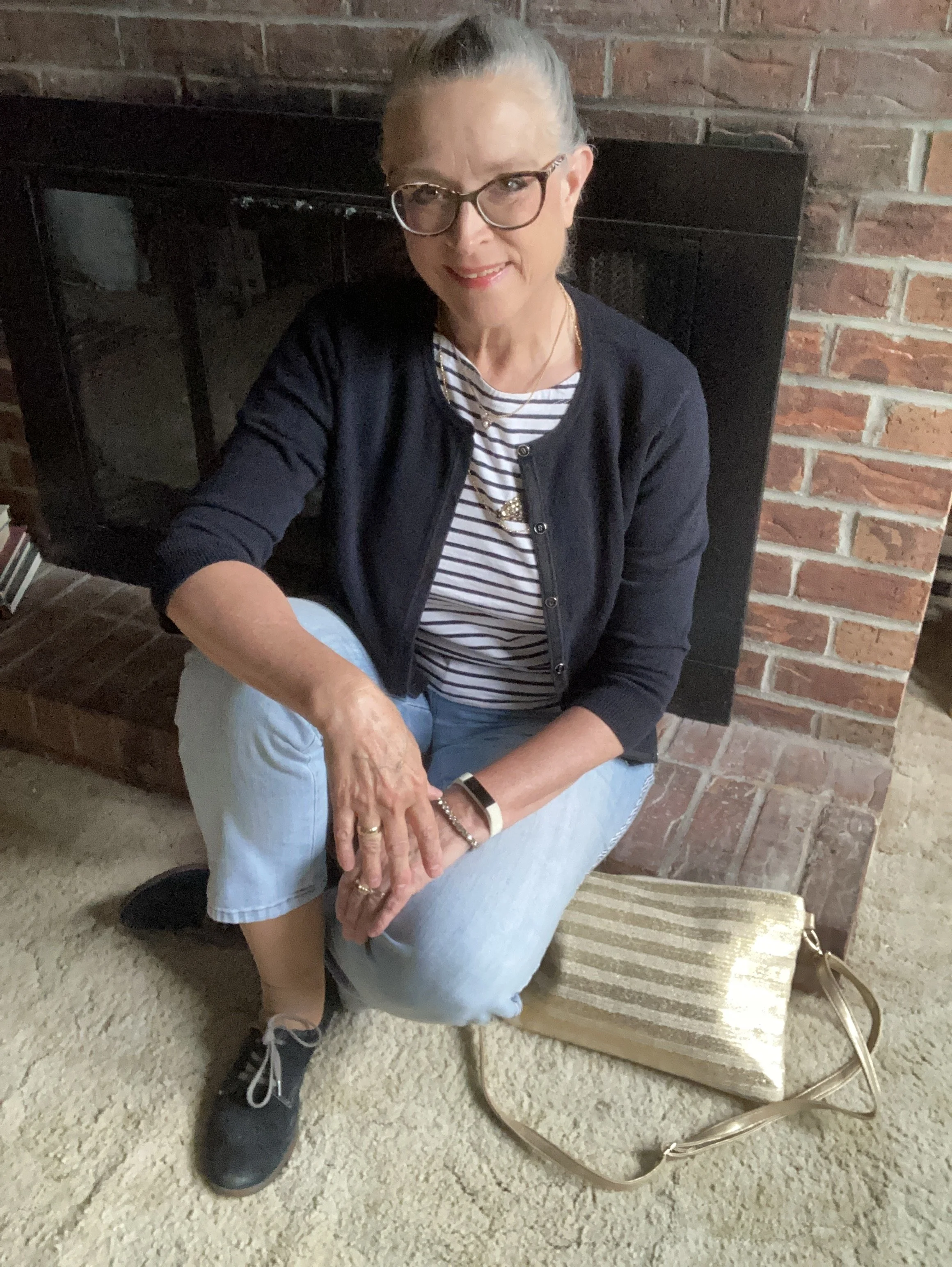
Today’s look revolves around pieces that most of us have in our closets, or at least pieces that are similar: a Breton striped tee, light wash jeans, and a light weight cardigan.

A casual look like this is easy to put together and anyone who is reading this can probably find similar pieces in your own closet. Let’s look at each piece individually.
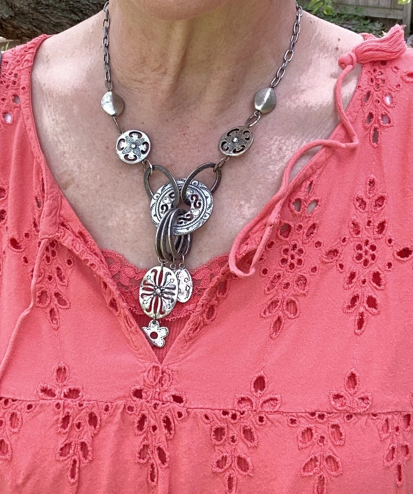
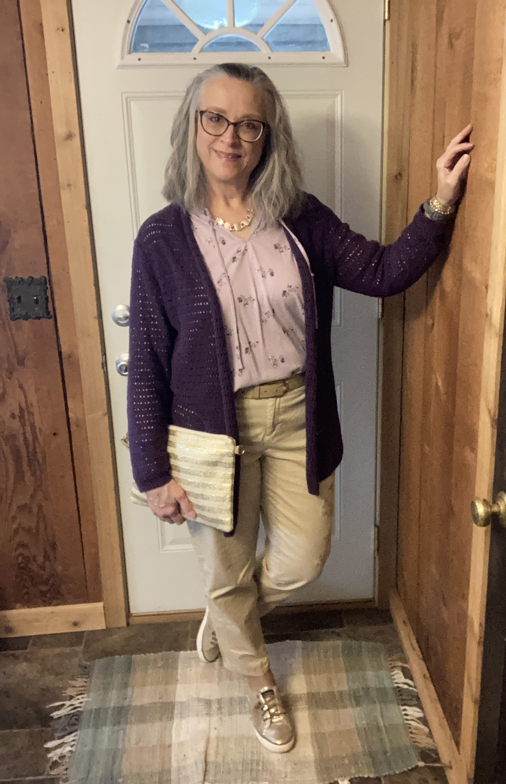
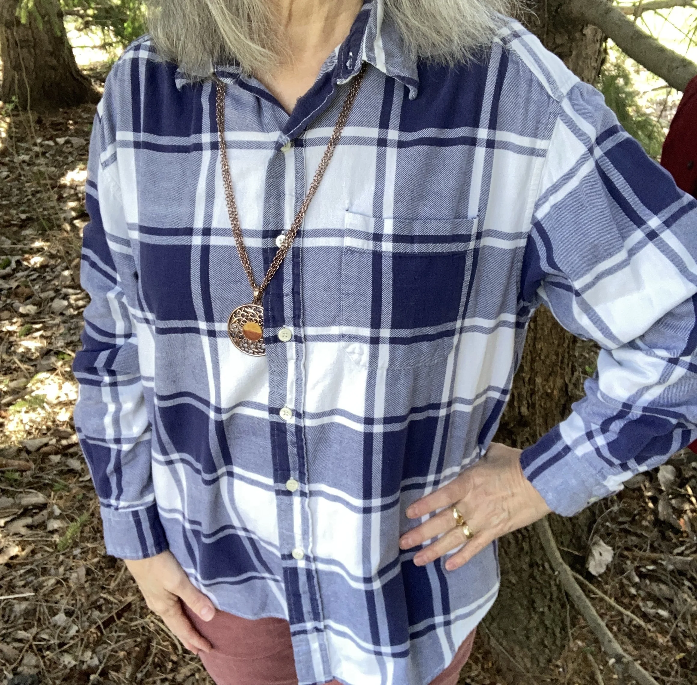
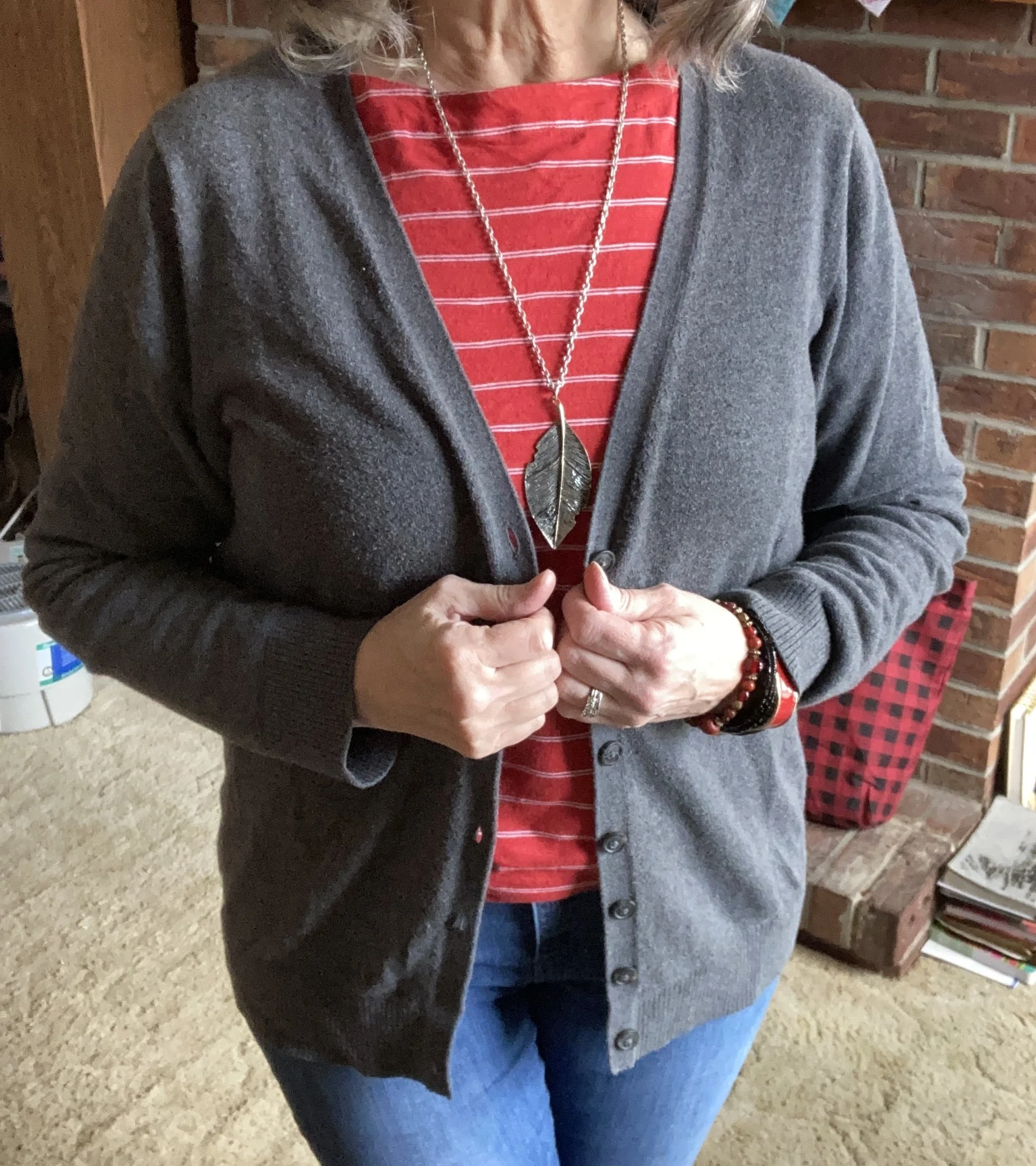
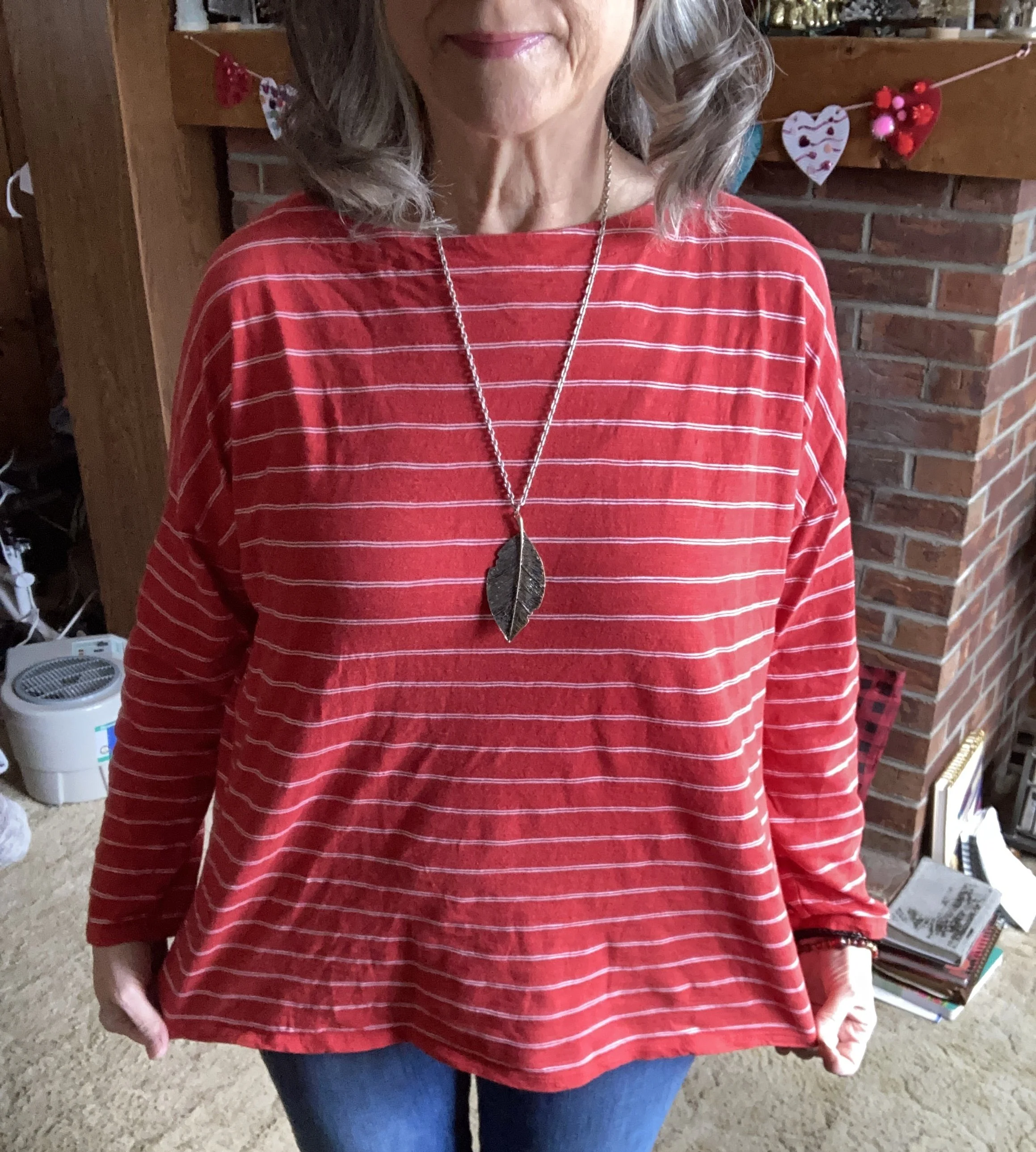
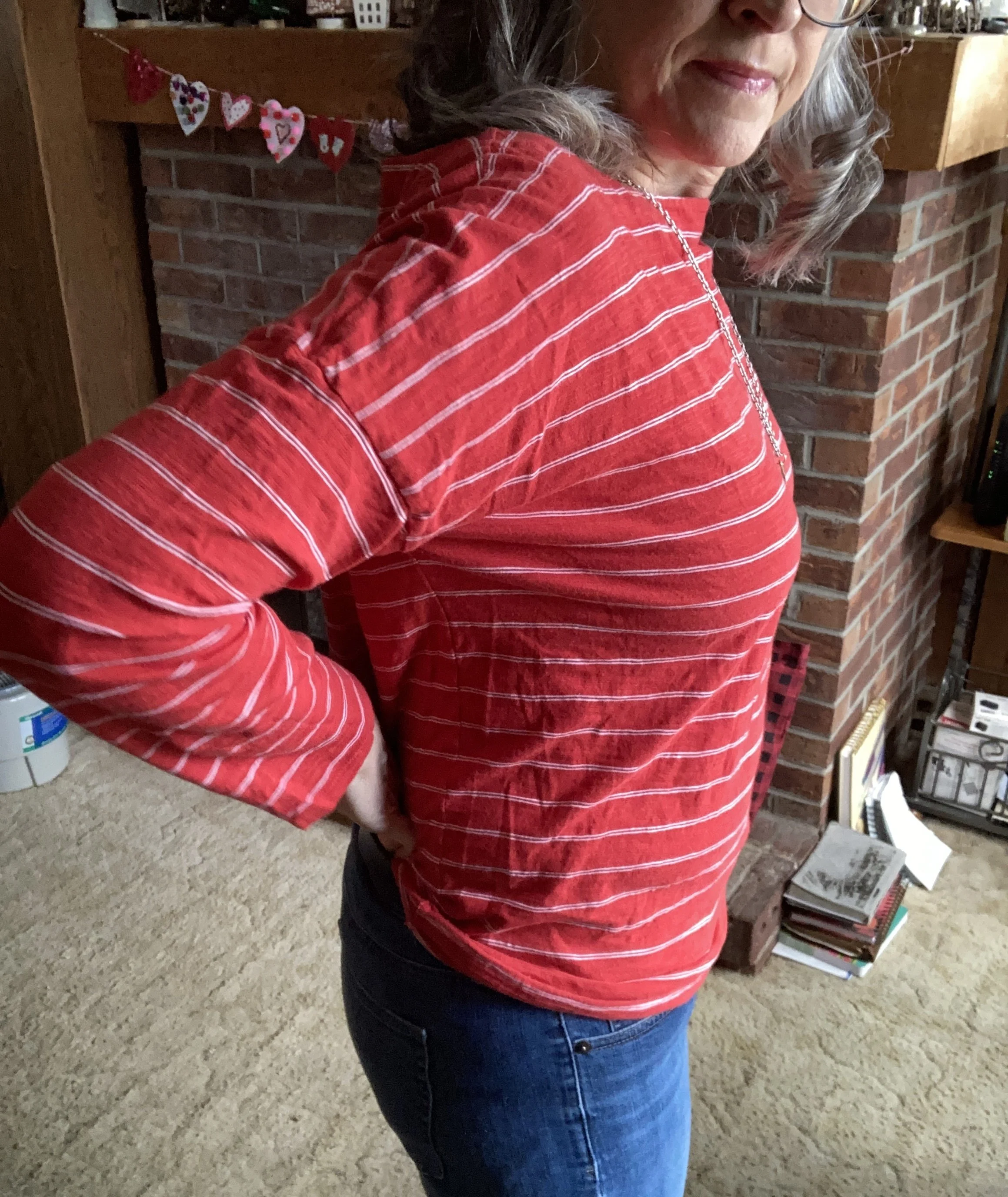
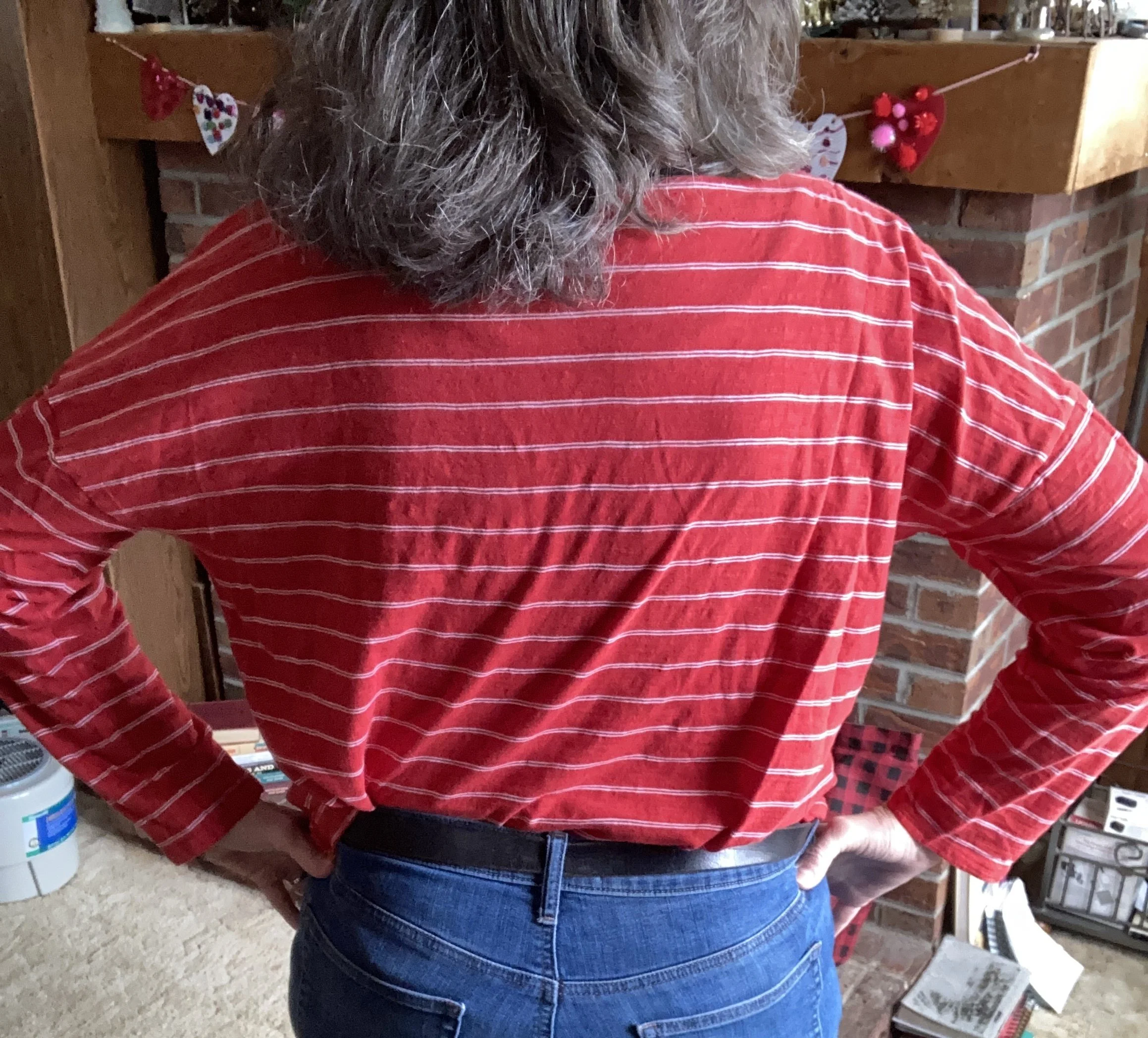
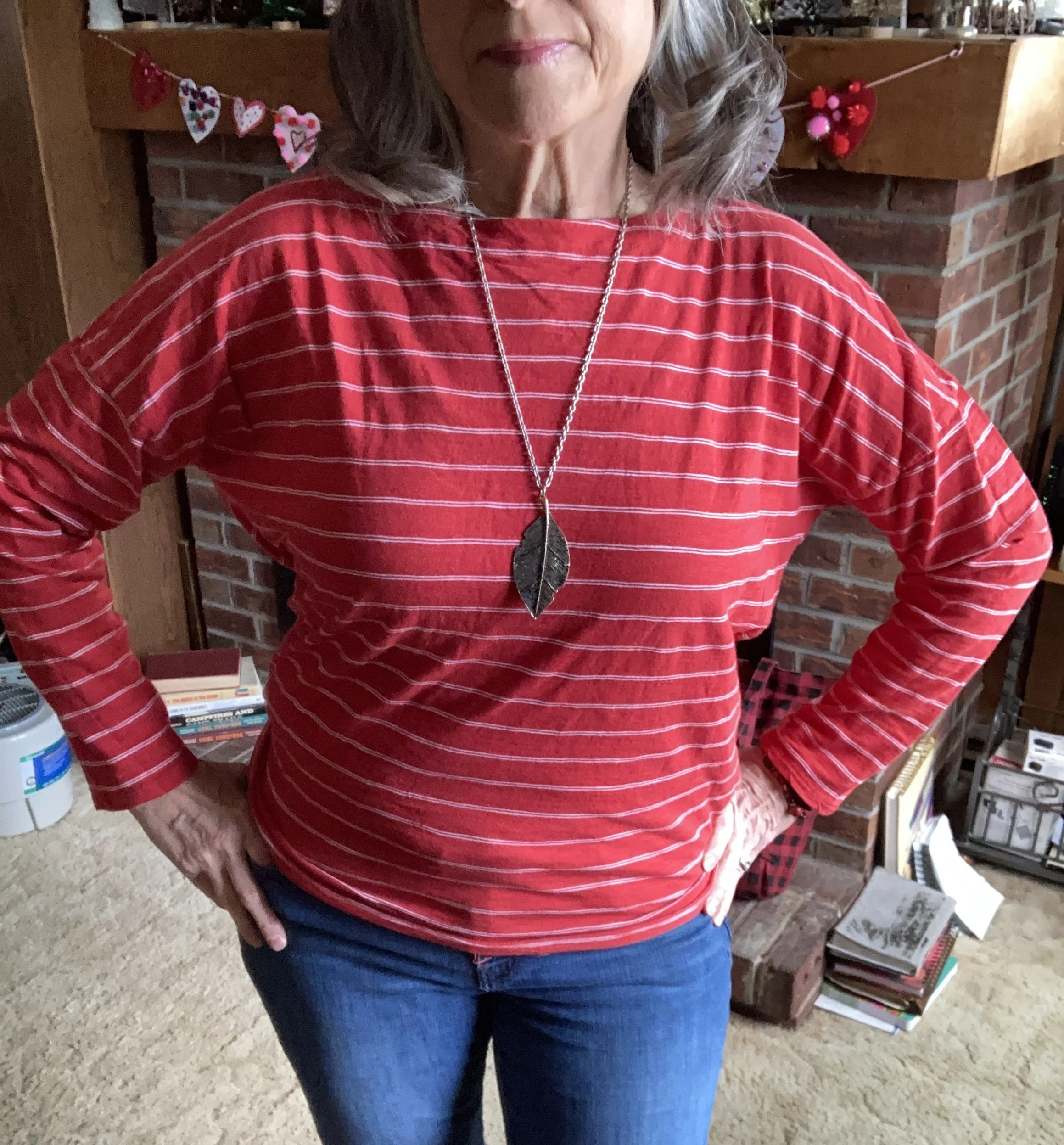
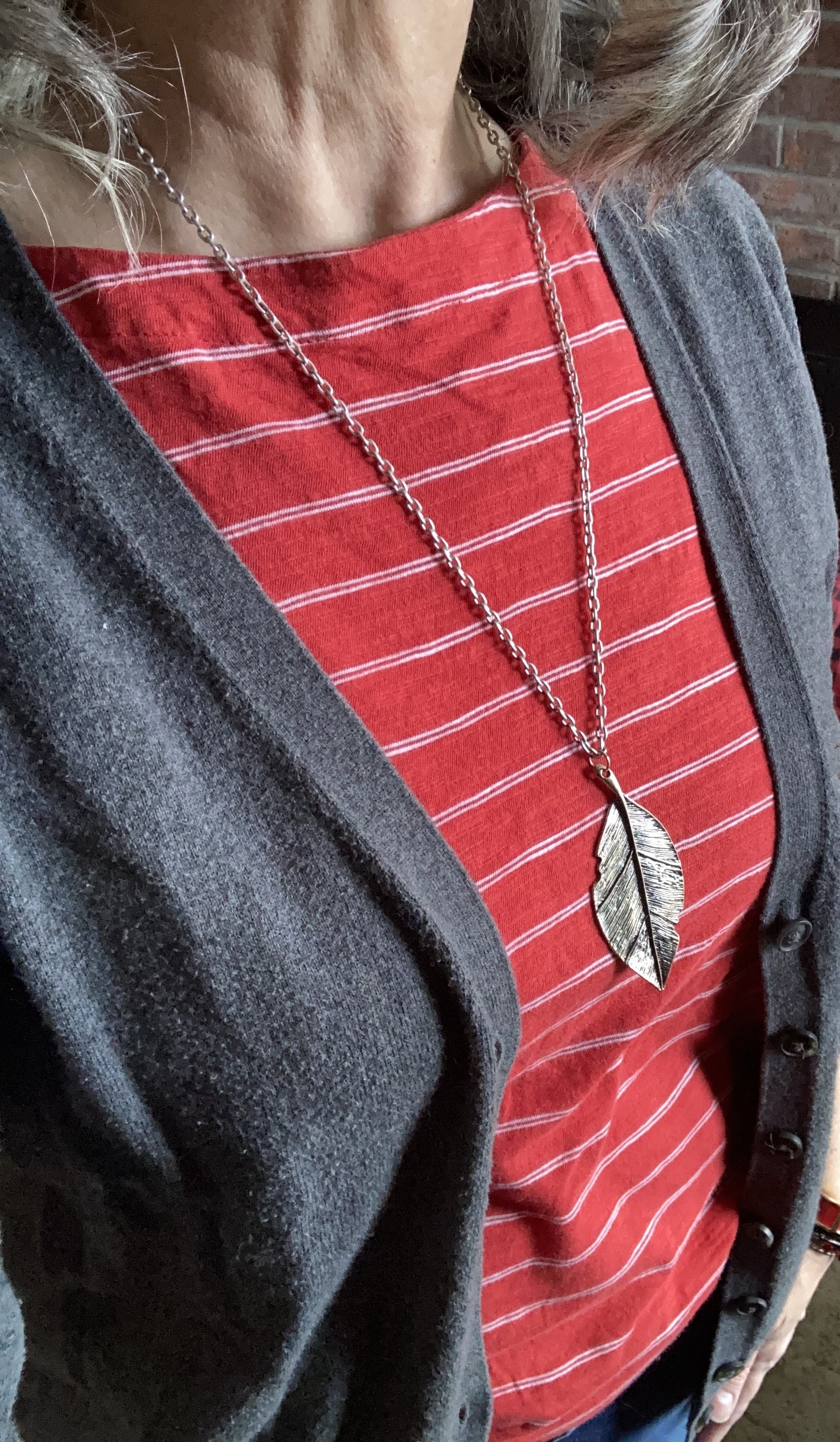
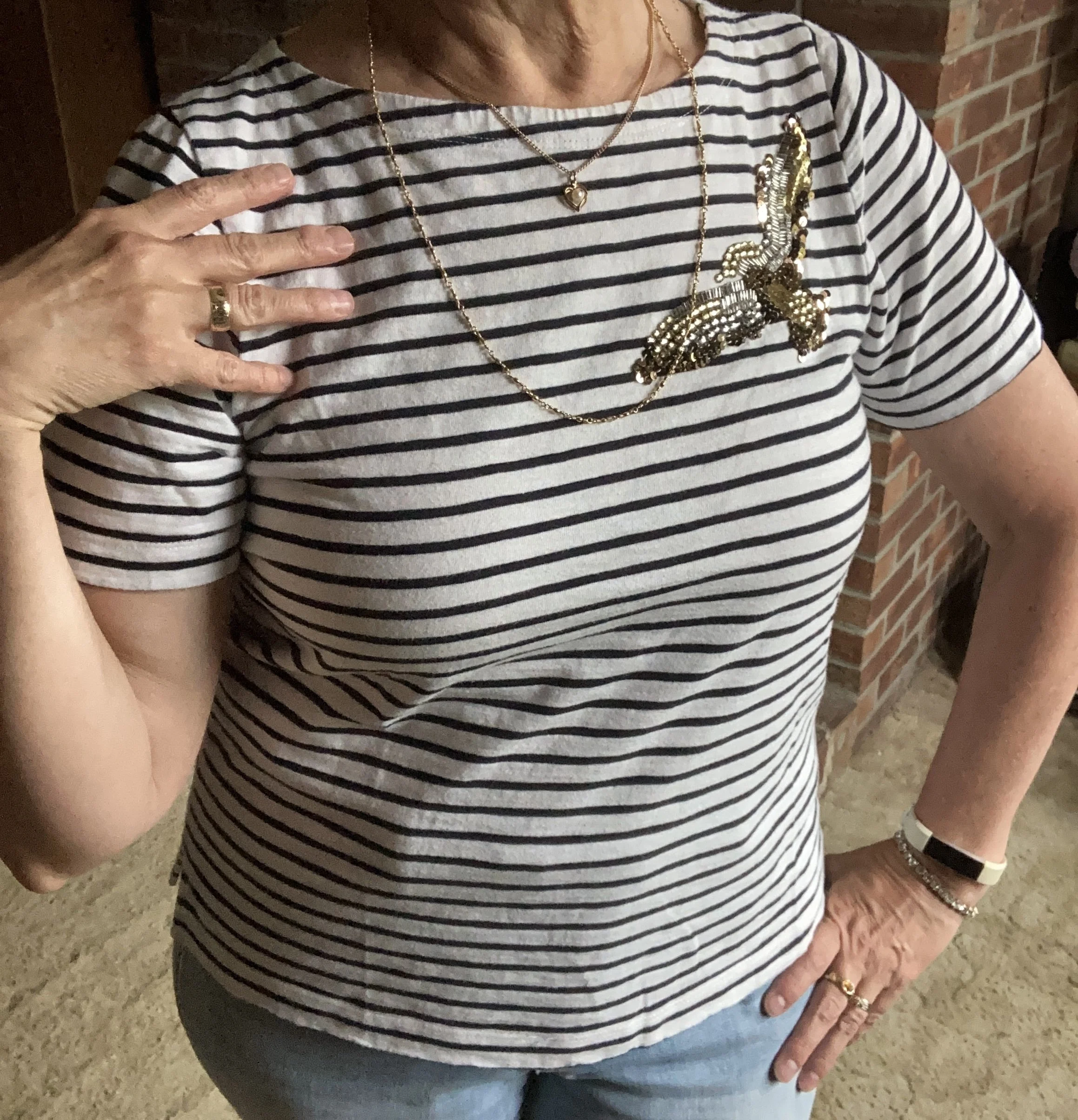
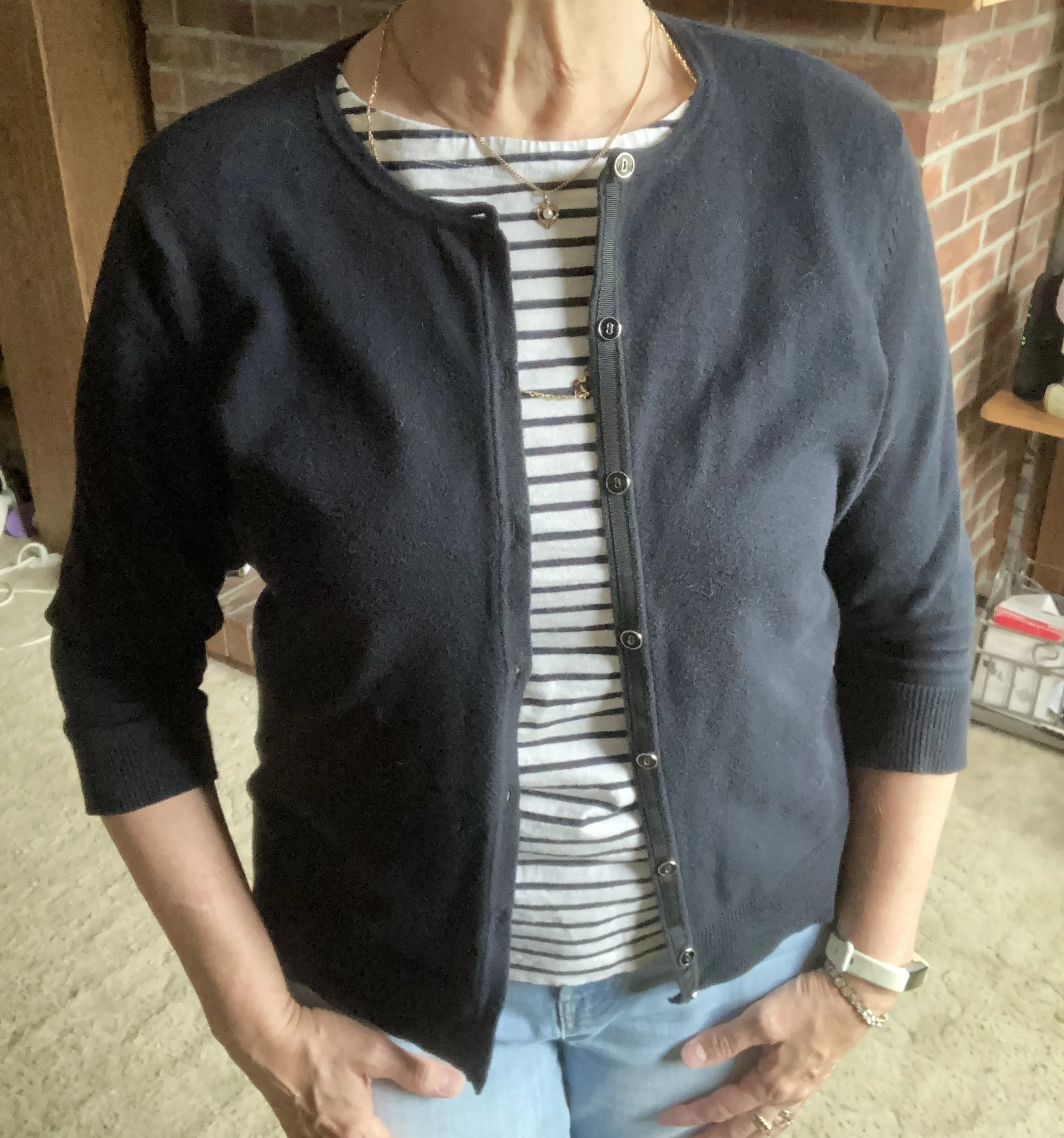
My Breton striped tee is an older thrifted piece and is J. Crew brand. I love the structure of this piece and the beautiful, sparkly bird embellishing its upper right hand corner.
I wondered what exactly made a shirt a Breton striped piece, so I looked it up. The Breton stripe originated in France and was made specifically as the official uniform for the French Navy back in 1858. The shirt was typically white with navy; the white stripe being wider than the blue, and it was usually a 3/4 length sleeve. In addition the neckline was a wide boat neck. In 1910 Coco Chanel took inspiration from the French navel uniform and it began its iconic journey through the decades as a fashion statement.
Here is an elbow length sleeve version from JCPenney; a red version from Eddie Bauer; a short sleeve version from Land’s End, and a plus-sized version from Kohl’s.
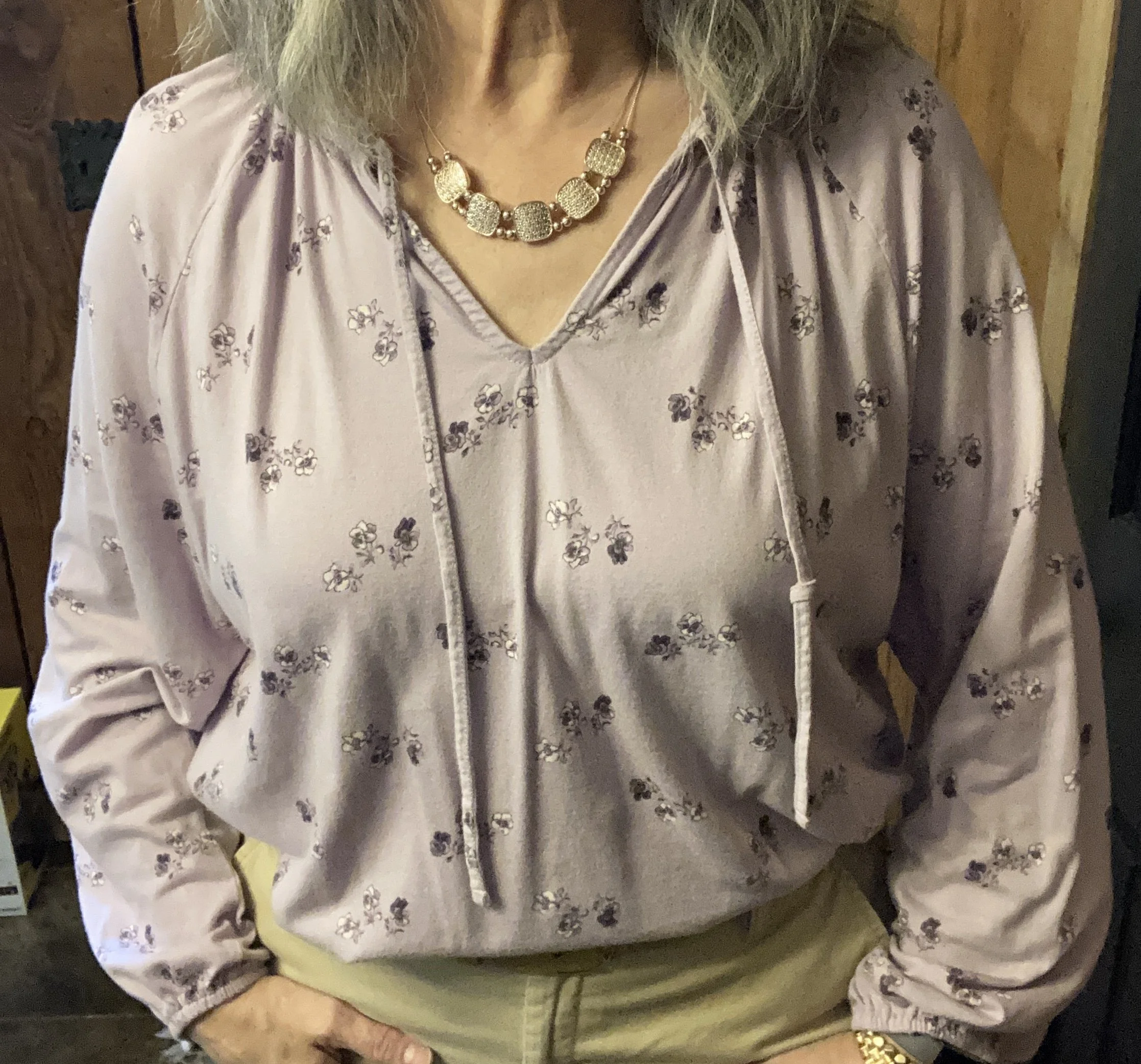
Style Tip: While tee shirts that are cotton/polyester blends are soft and comfy, they don’t always give us the coverage we desire as far as our extra rolls. A medium to heavier weight cotton will typically give you more structure, and is less see through for both your extra bits and your undergarments.
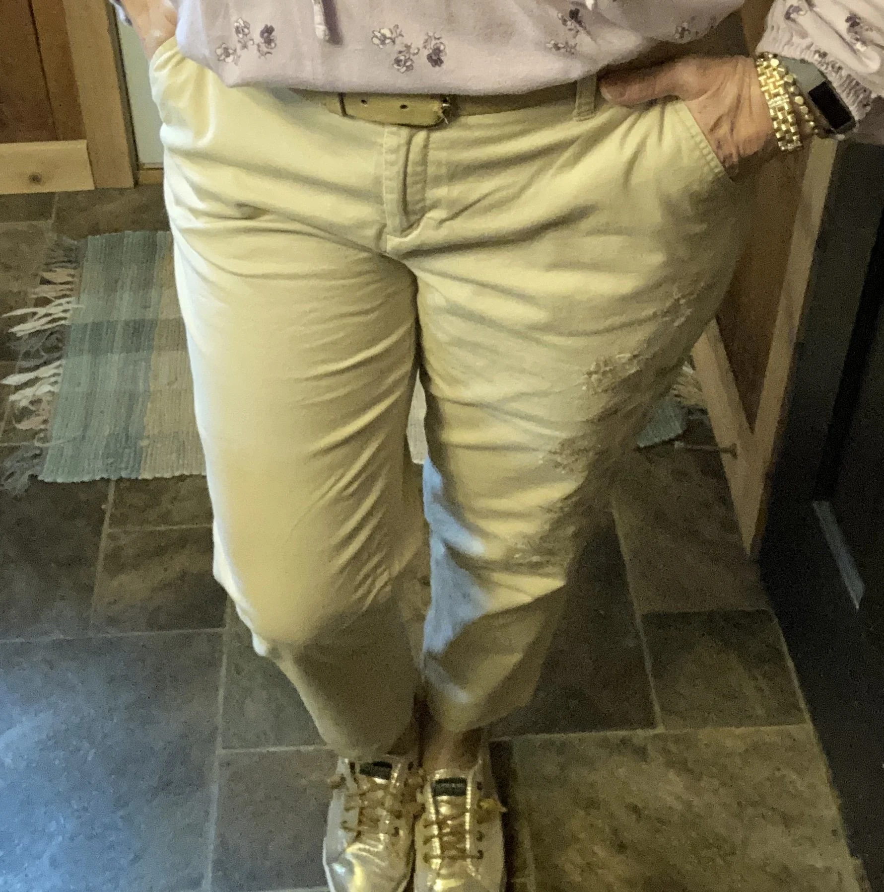
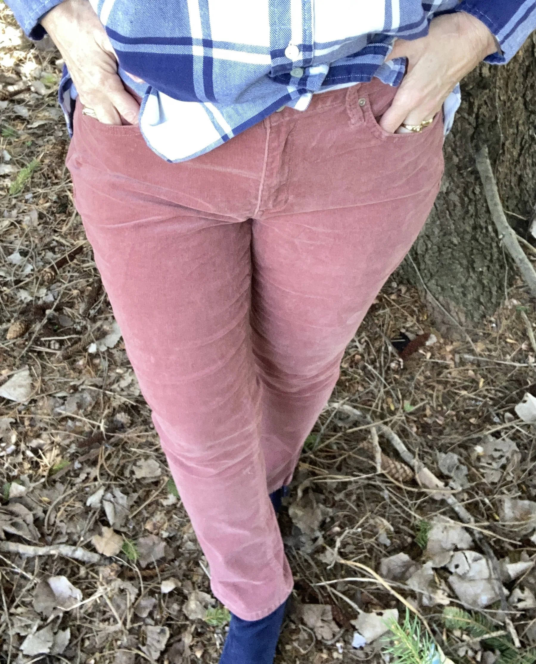
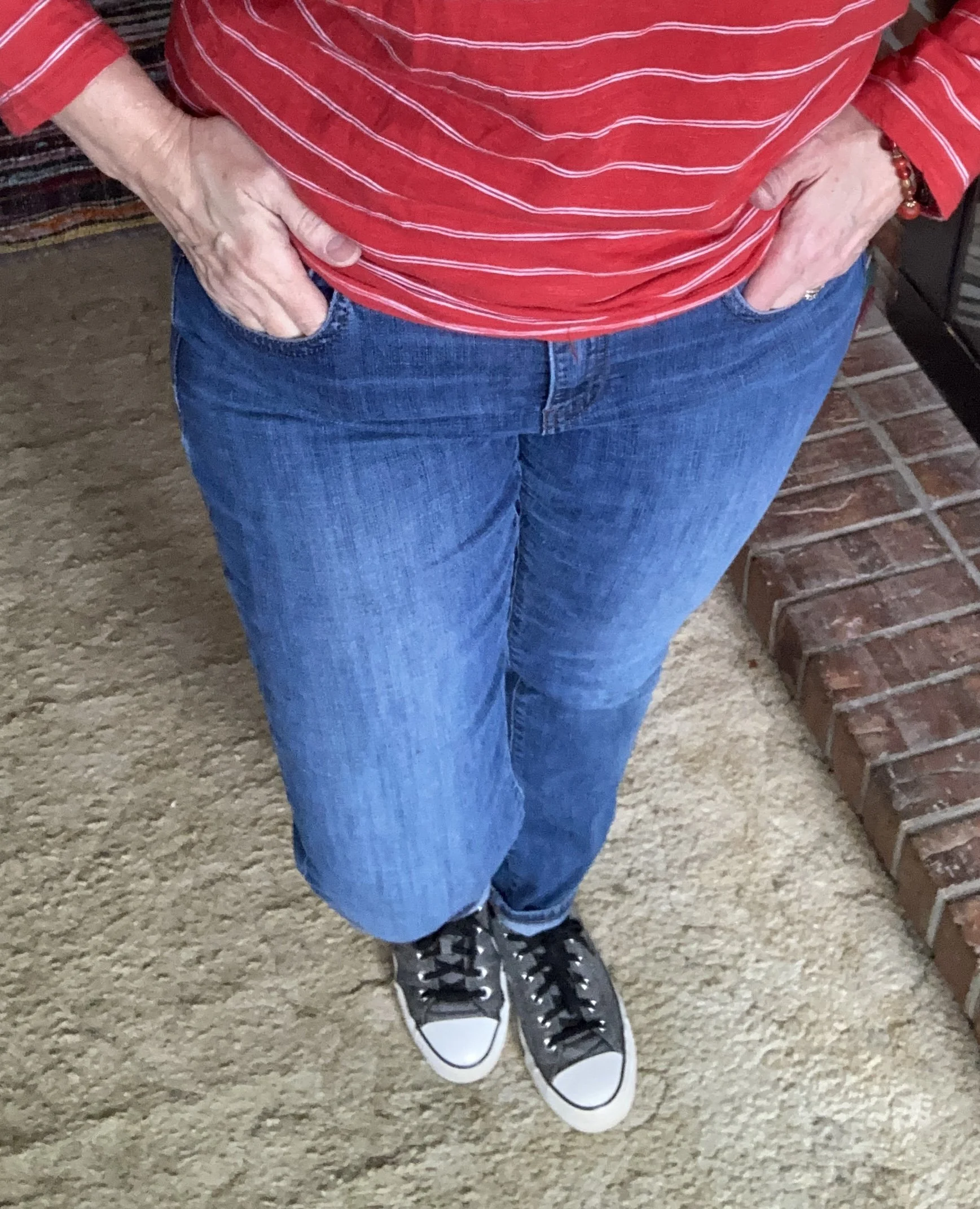
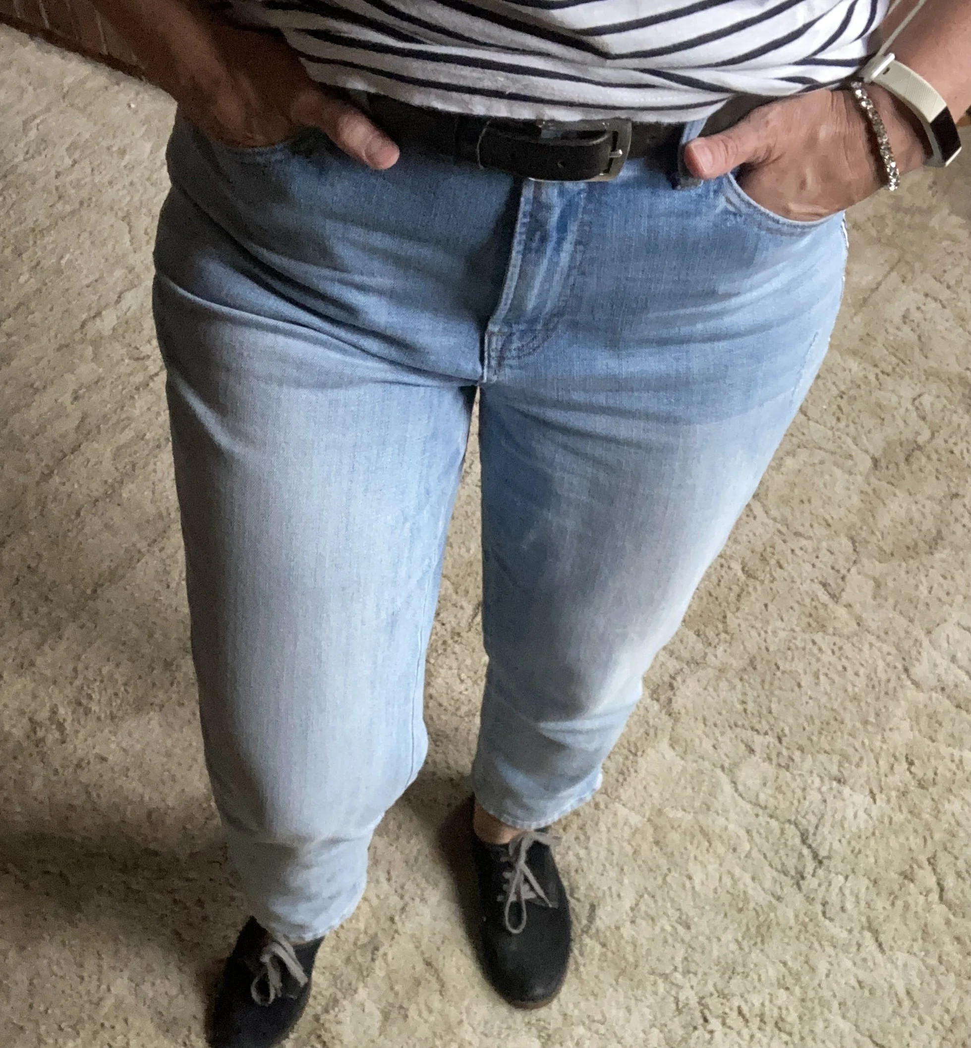
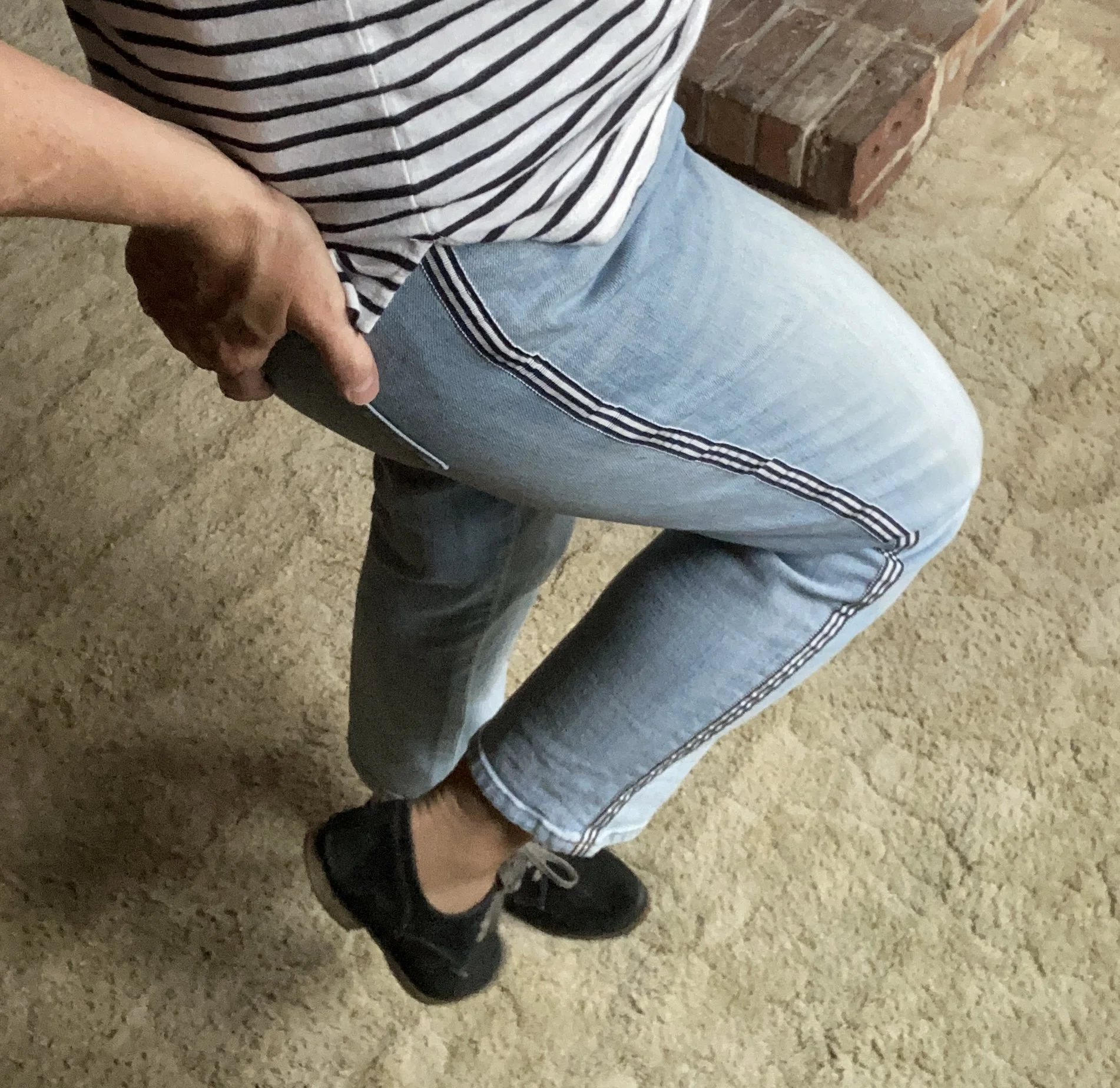
The next piece we’ll look at are my light wash, cropped jeans. I love this pair of Talbots that I found at a second hand store. They are a little heavier weight, but are soft, and I love the added detail of the stripes that go along the outside seam. Once again, the heavier weight cotton fabric is still doable for summer because it is still breathable.
Here is a mid-rise version from Land’s End; a higher rise pair from J.Jill; a lighter weight version from L.L. Bean; and this pair with the fun pocket detail from Christopher & Banks.
Style Tip: Jean washes don’t really matter any more as far as seasons are concerned, but If you are old school like me, I like to get out my light wash, and white, or bright colored jeans for summer just to lighten my wardrobe up a bit.
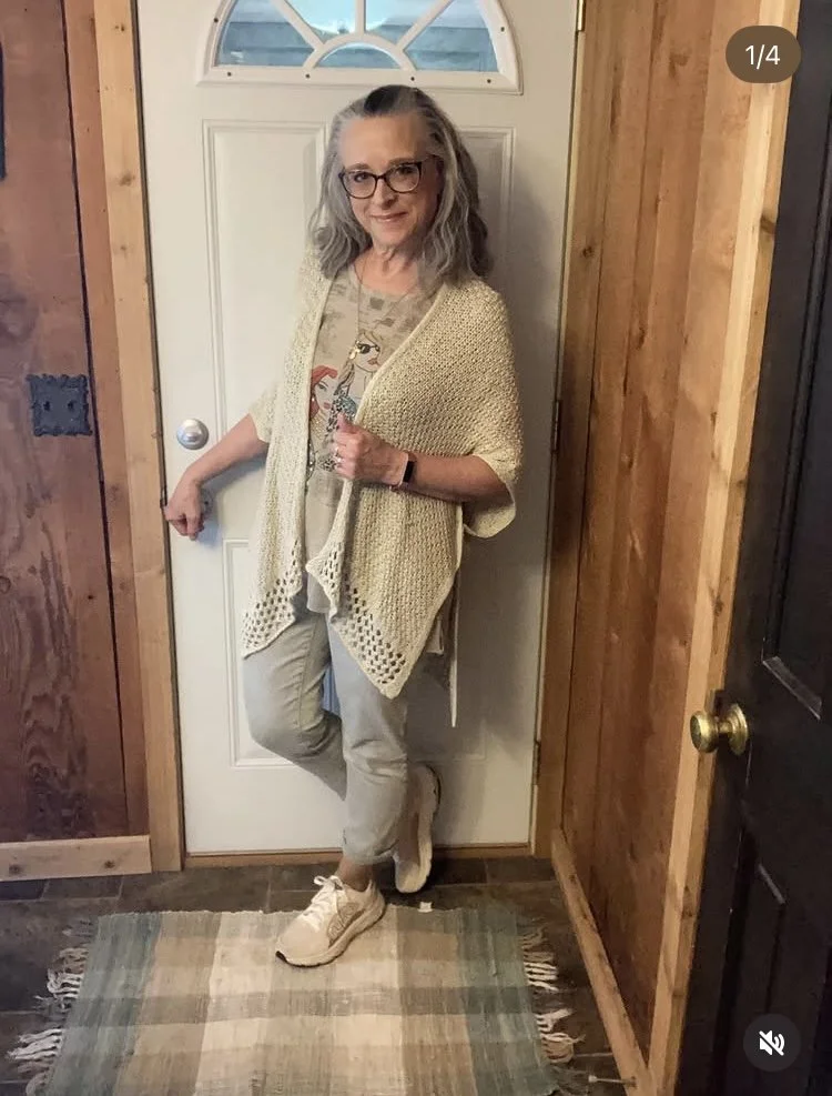
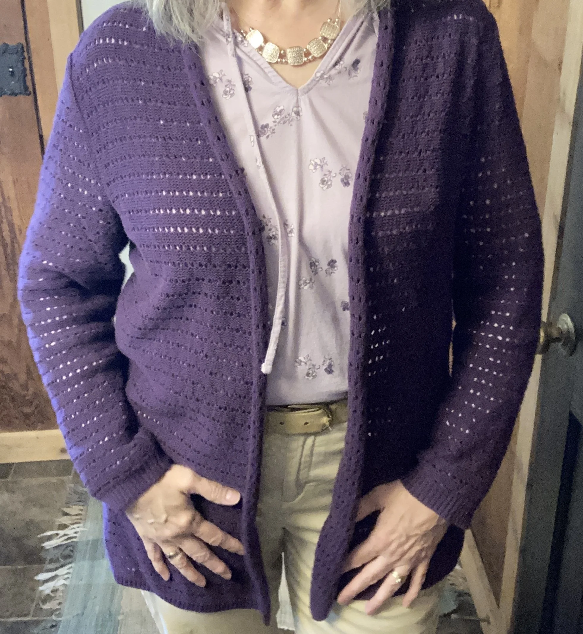
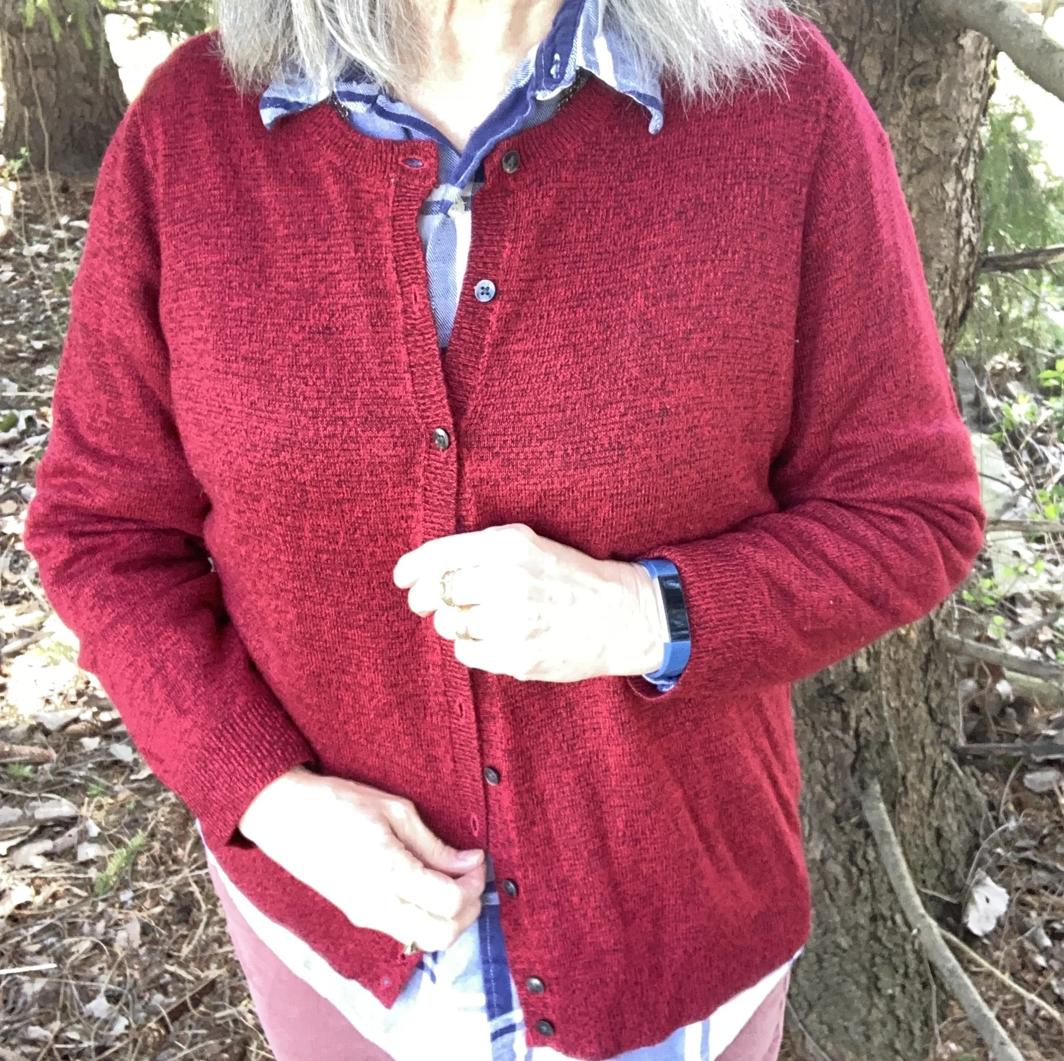
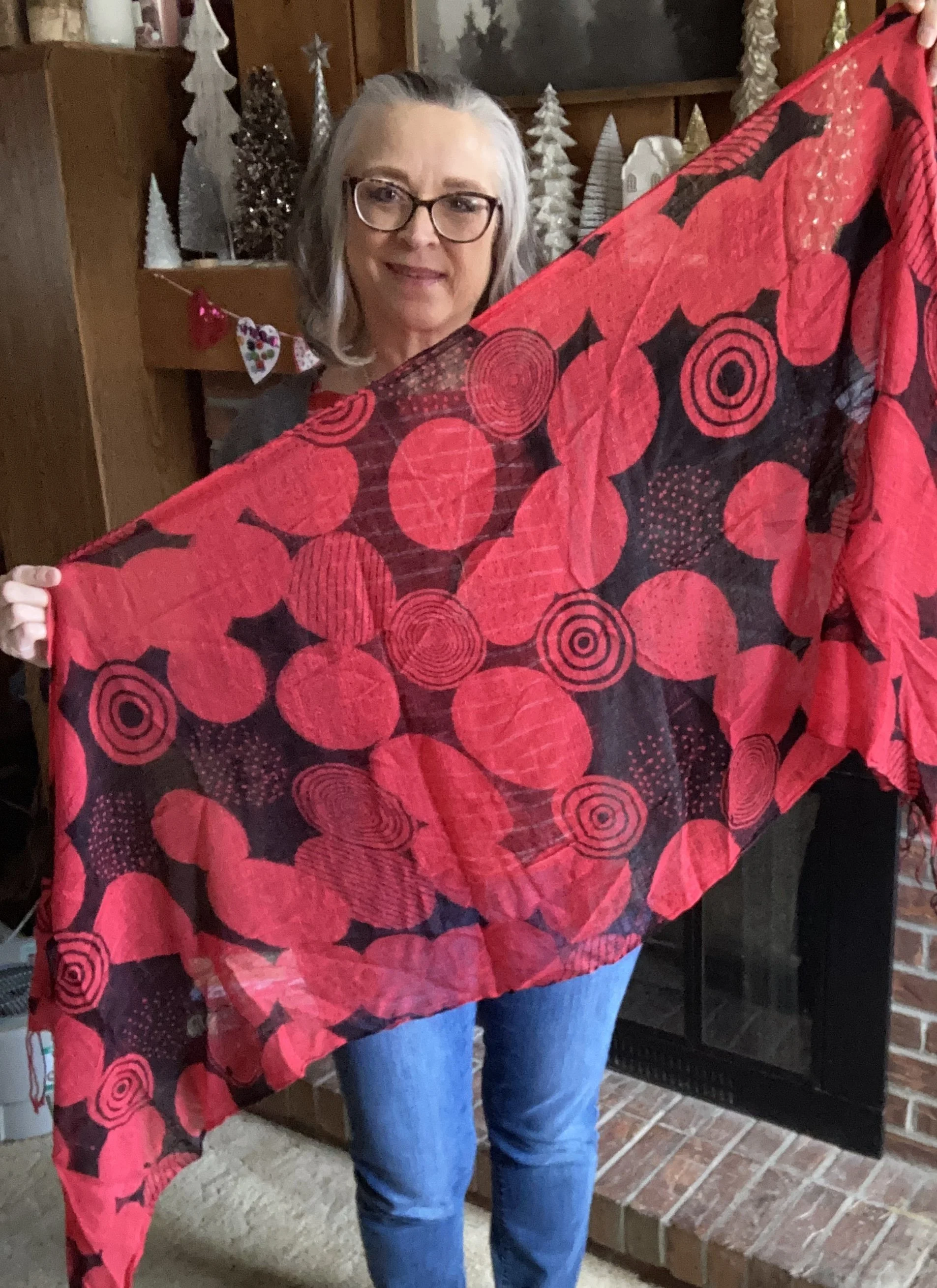
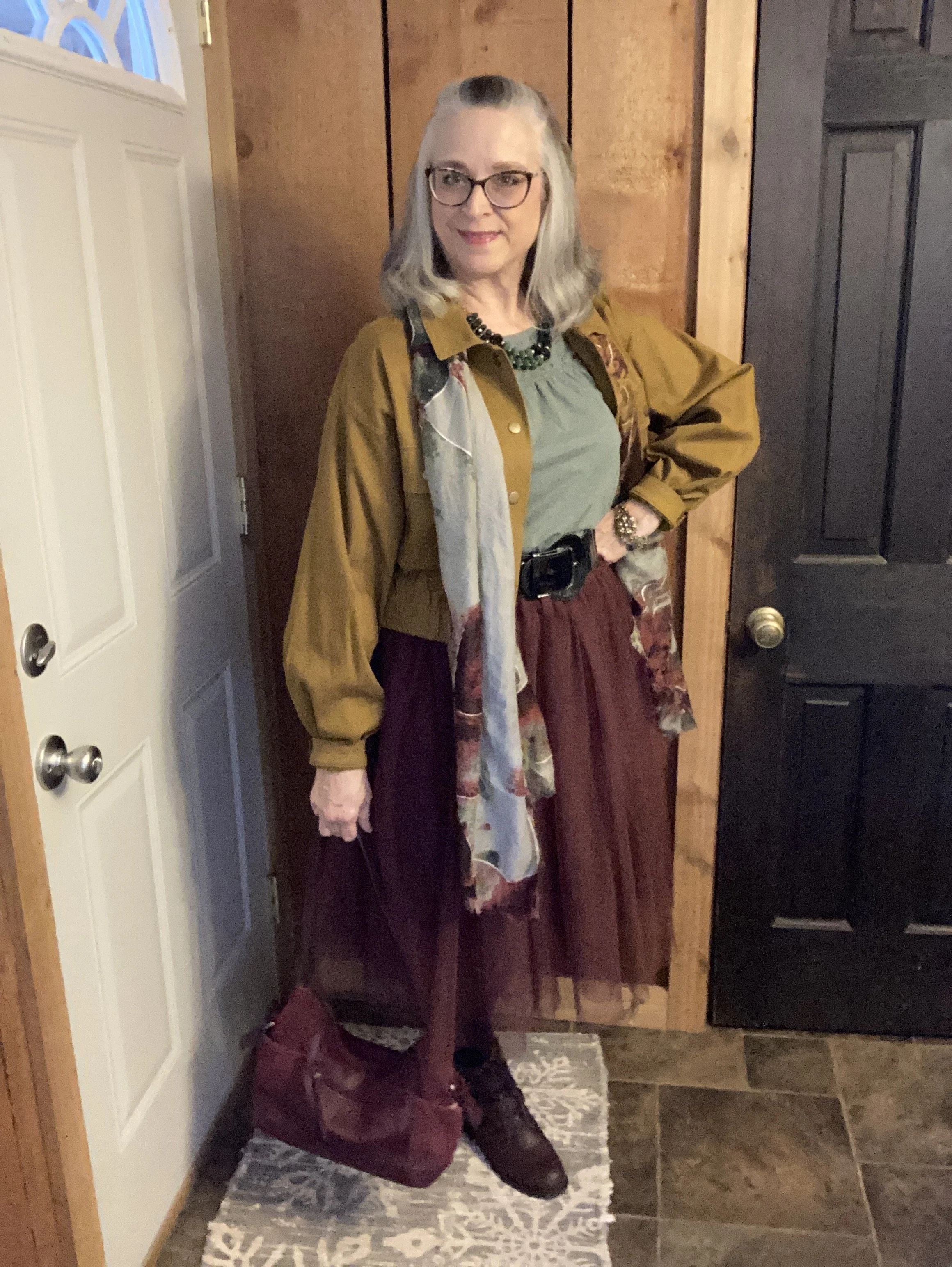
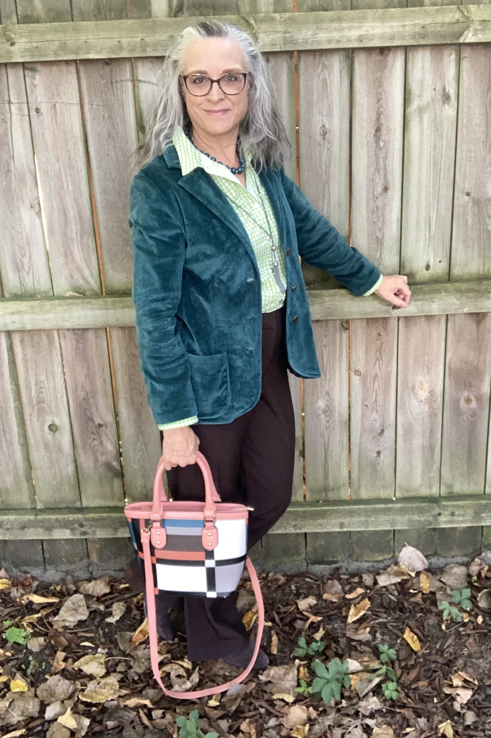
I decided to tap into the black stripes on my tee, and yes, mine are black, not navy, for the cardigan I chose. The stripes on my jeans are also black, so that added to the reason I went for a black sweater and black shoes. My cardigan is Croft & Barrow brand and I bought it at Kohl’s many years ago. Time goes so fast, it is hard to keep track. The 3/4 sleeves are perfect for when you want extra coverage, but not too much.
Here is a Croft & Barrow, open front version from Kohl’s; one from Macy’s; another version from Chico’s; and a couple from JC Penney - regular size, and plus size.
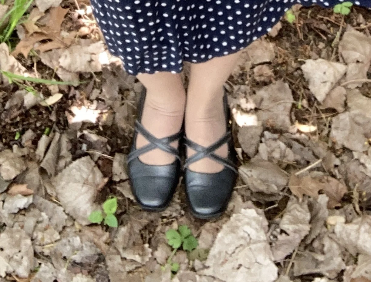
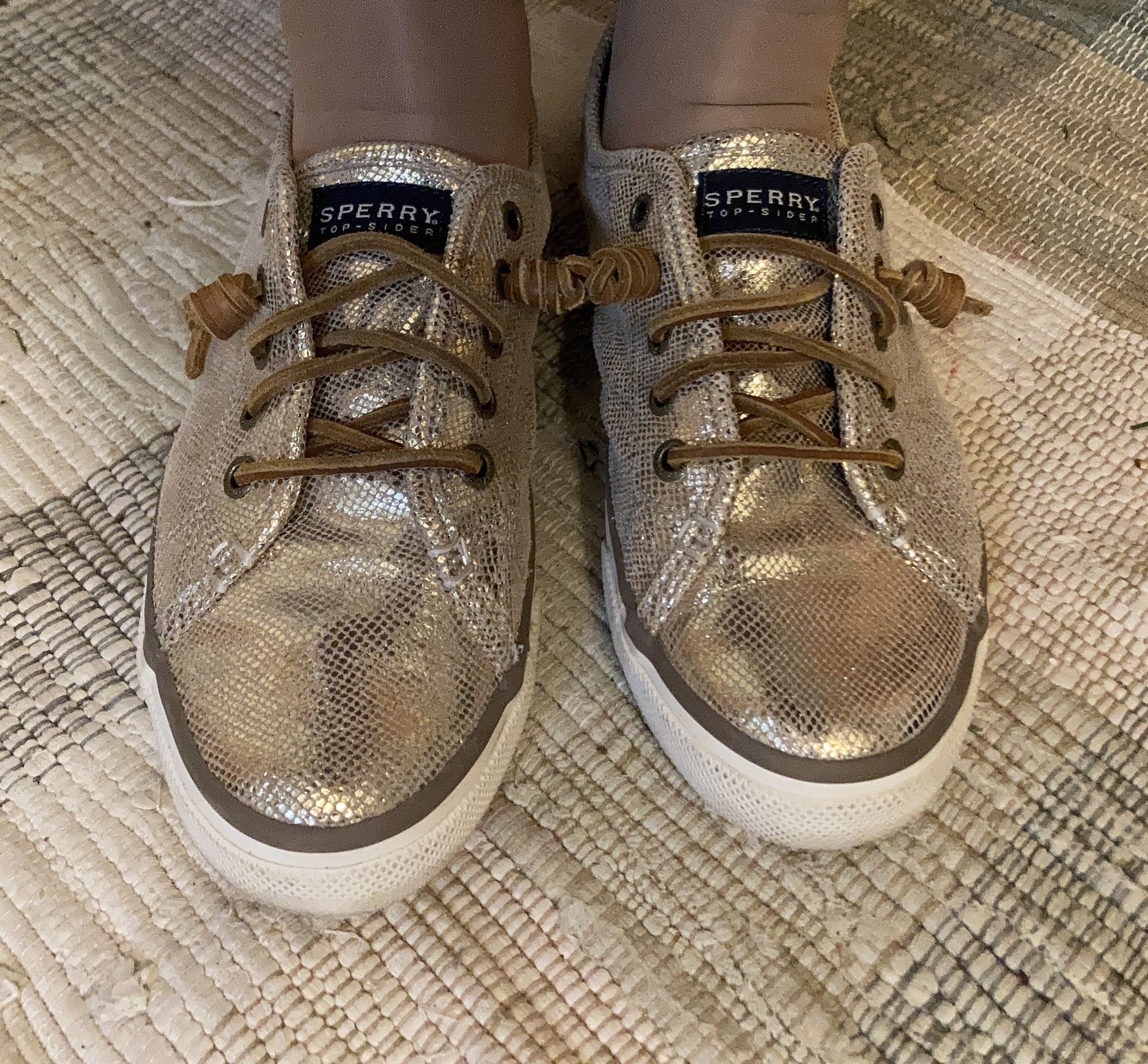
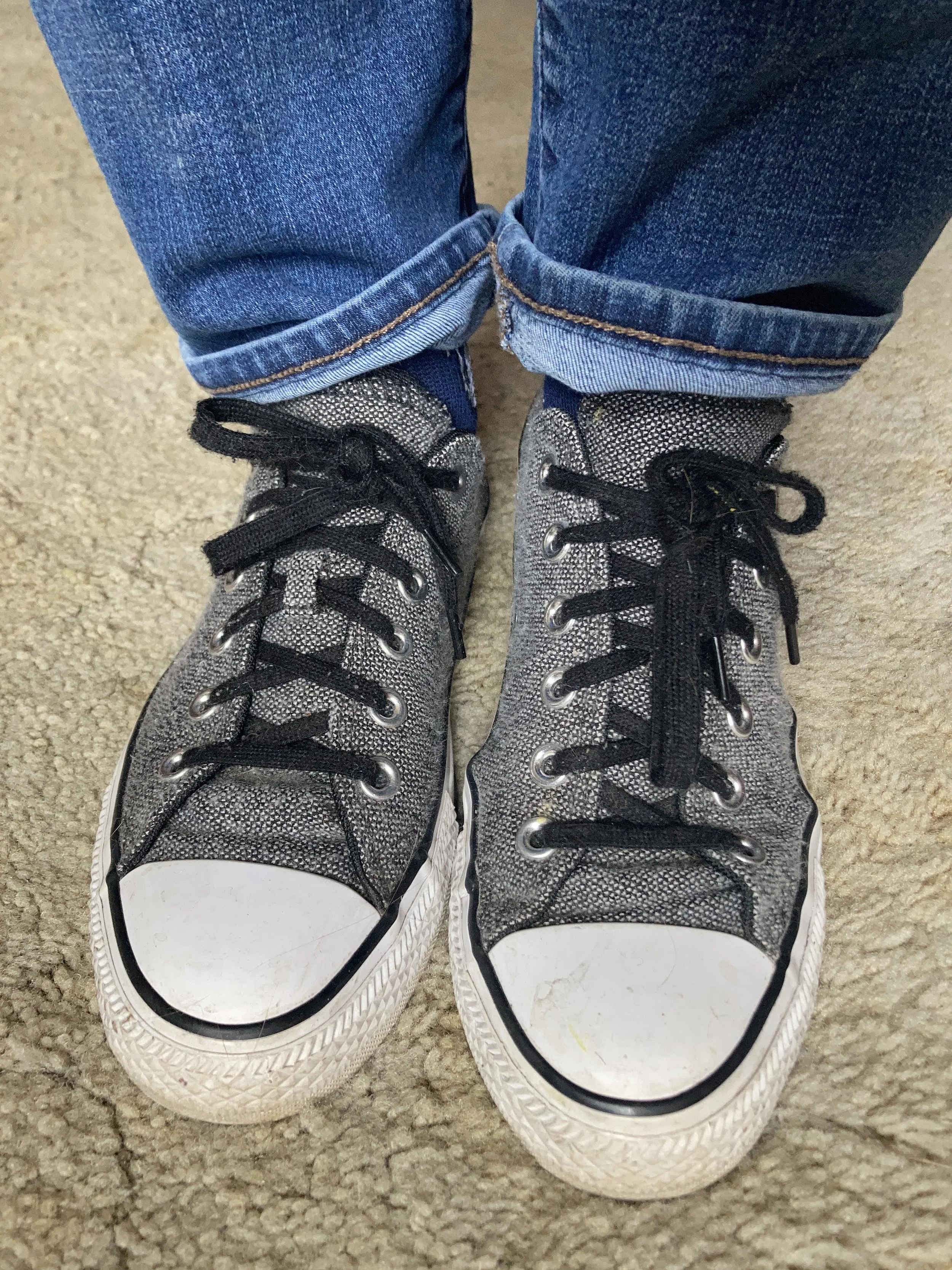
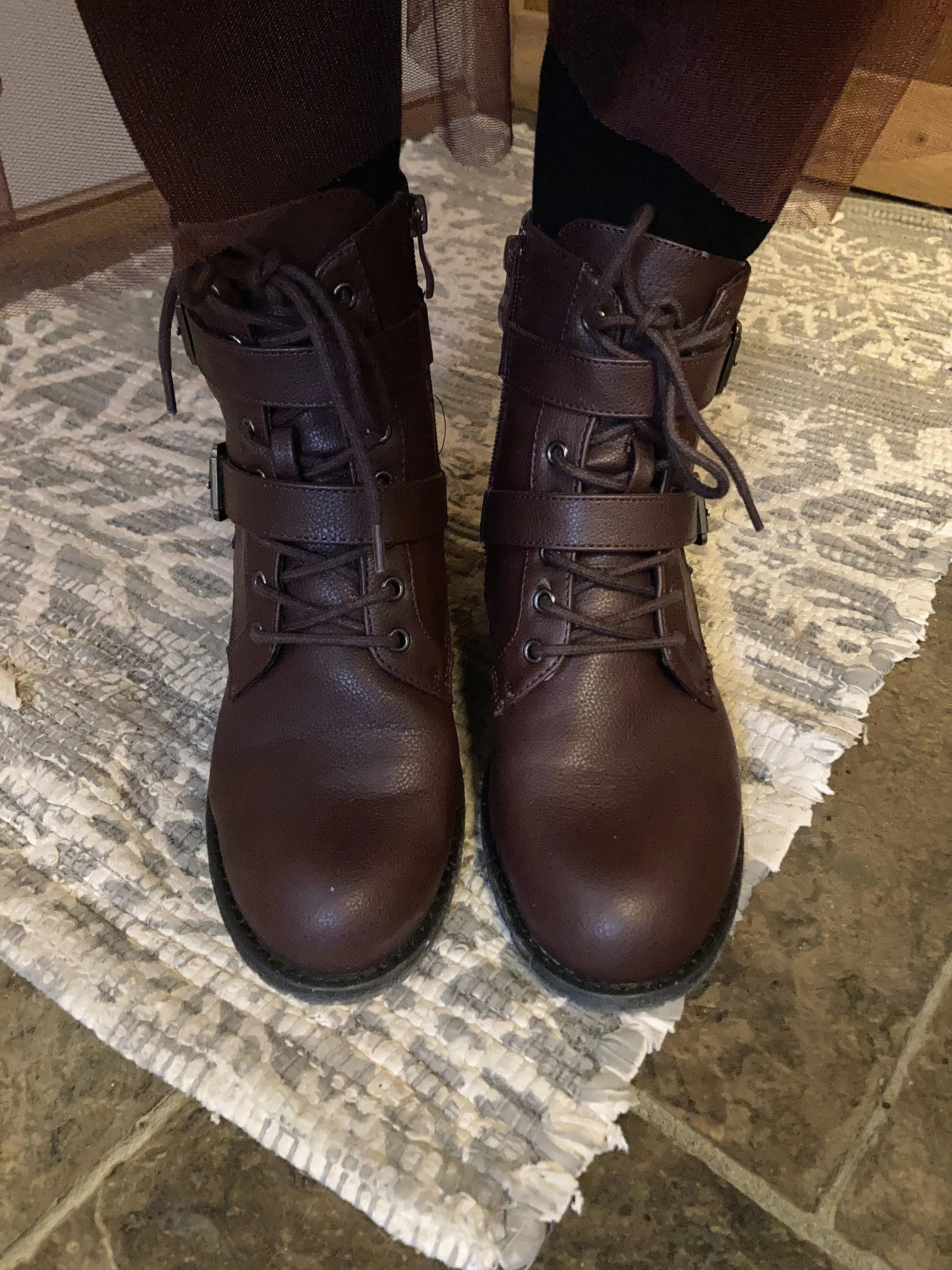
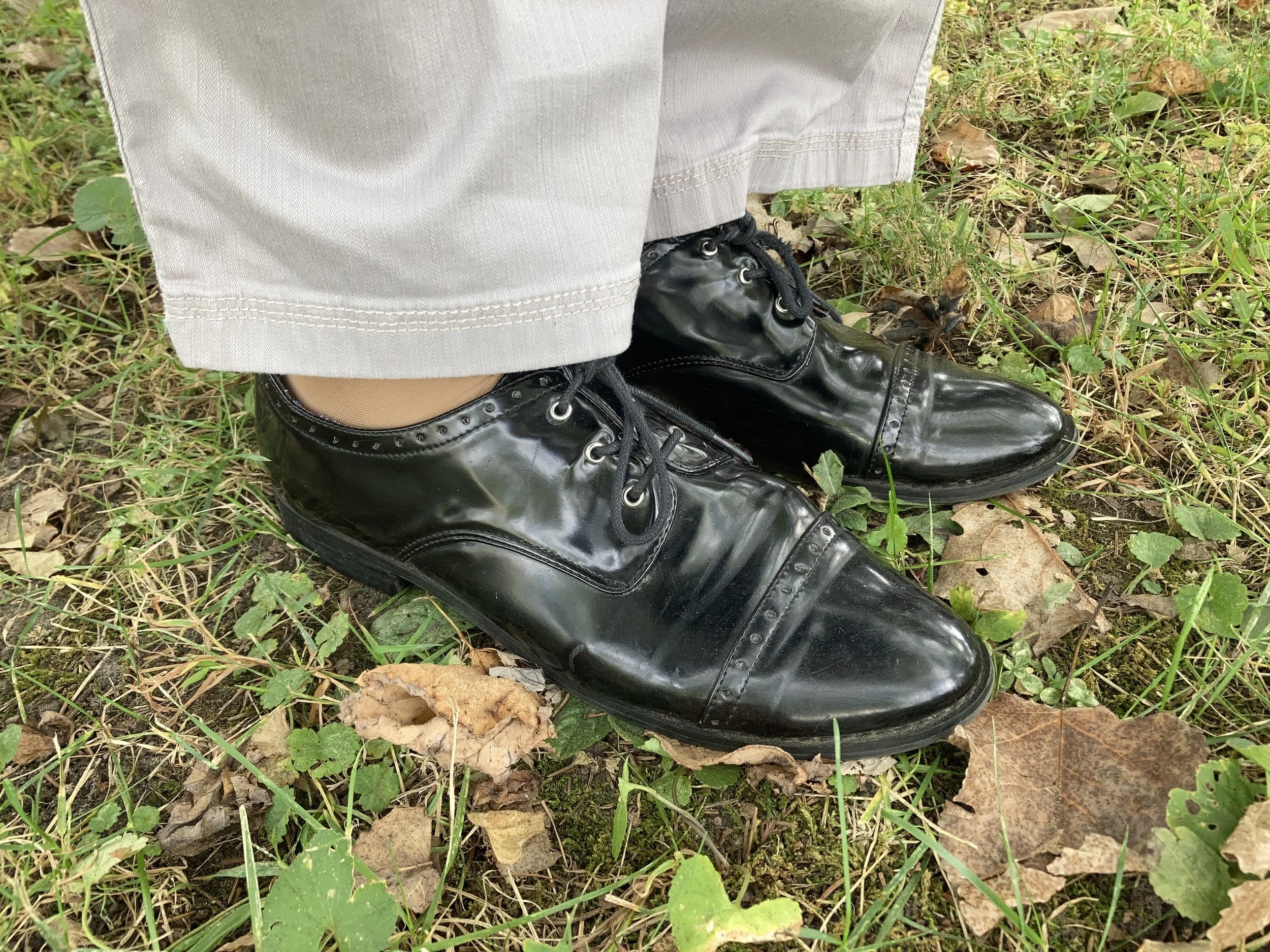
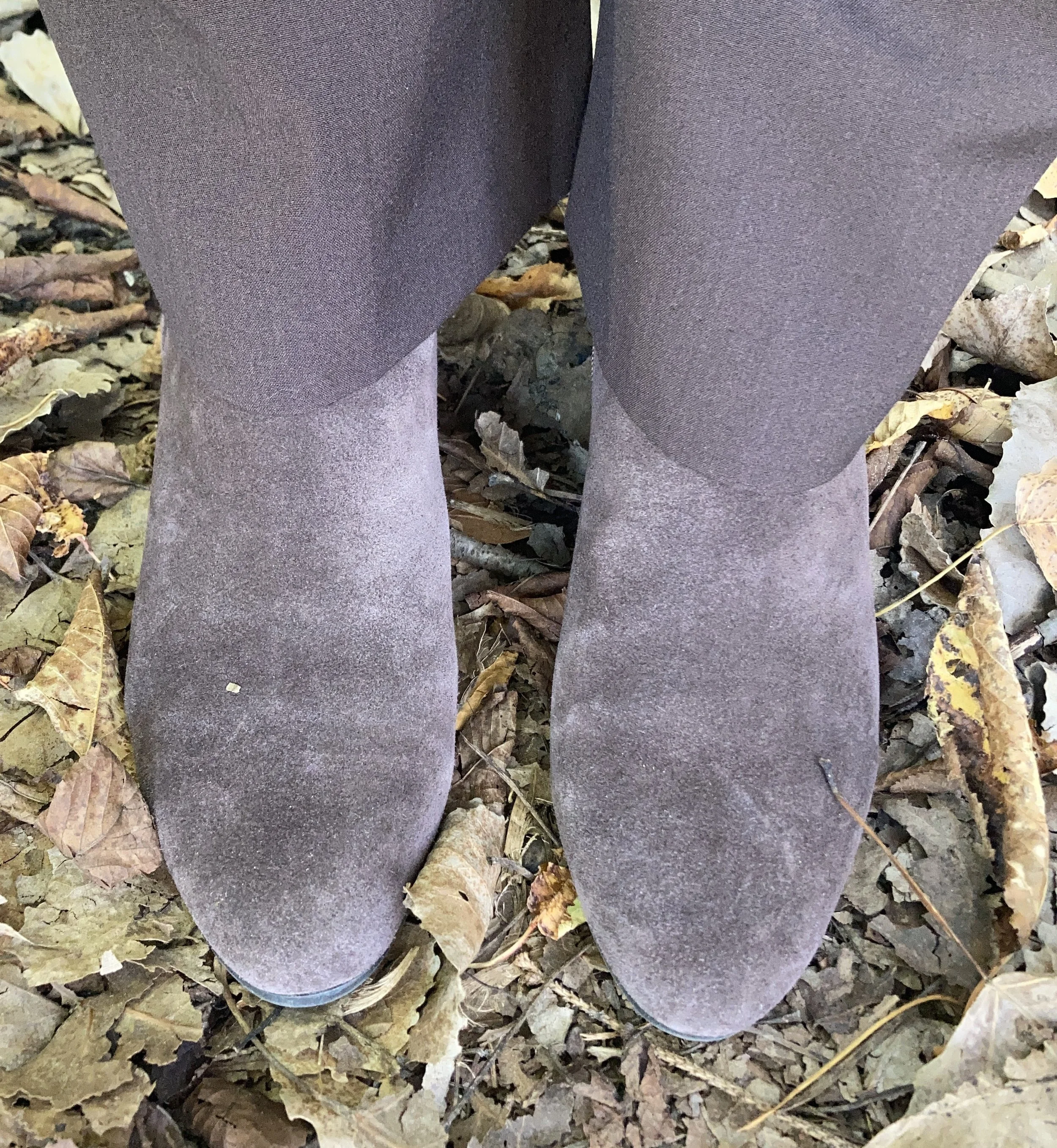
My Oxford shoes have been around for quite some time considering I haven’t worked at the university bookstore since fall of 2019, and I got these while I was still employed. These are a brand called Naya, and I got these at DSW on the clearance racks.
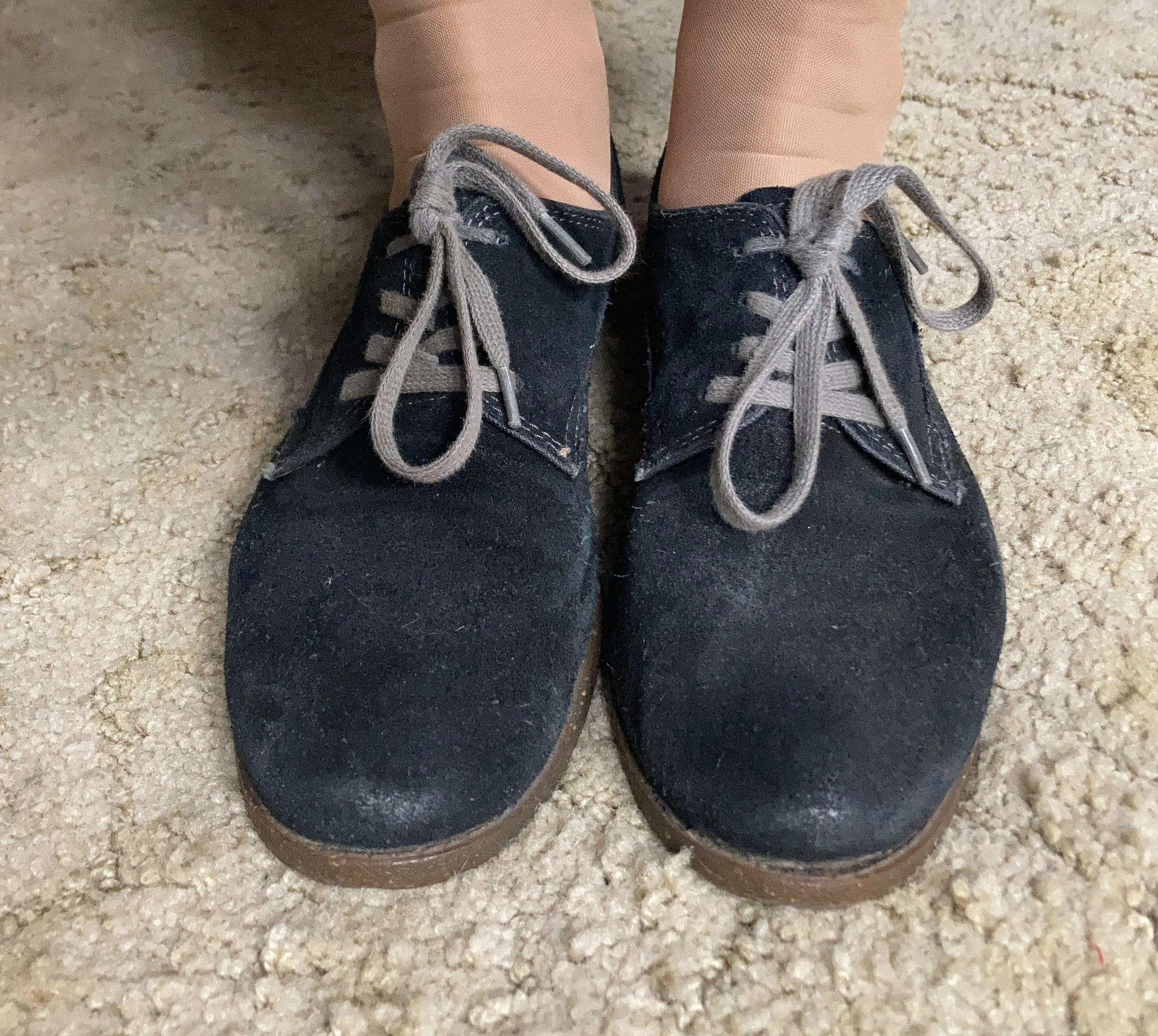

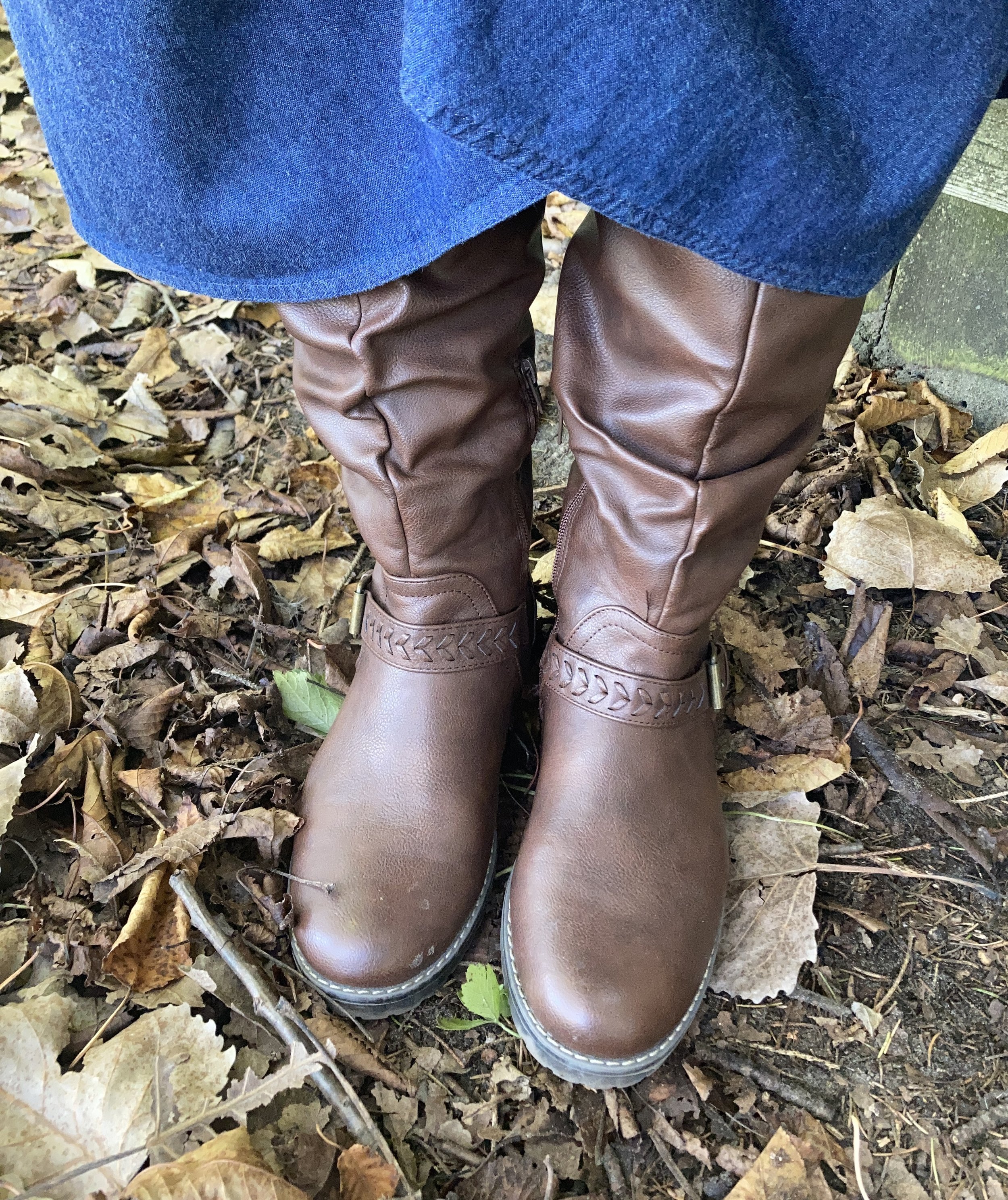
It’s funny, of all the pictures I struggle with, shoes are the worst. Ha, ha. If my feet are in them, I don’t feel like I can ever get the right angle for the picture. Either my feet look super long, as in the first picture, or my ankles look like tree stumps, as in the second picture. Ha, ha. It’s okay. I am no flighty influencer and that is okay. I just keep doing this for fun, and for you, my lovely followers!
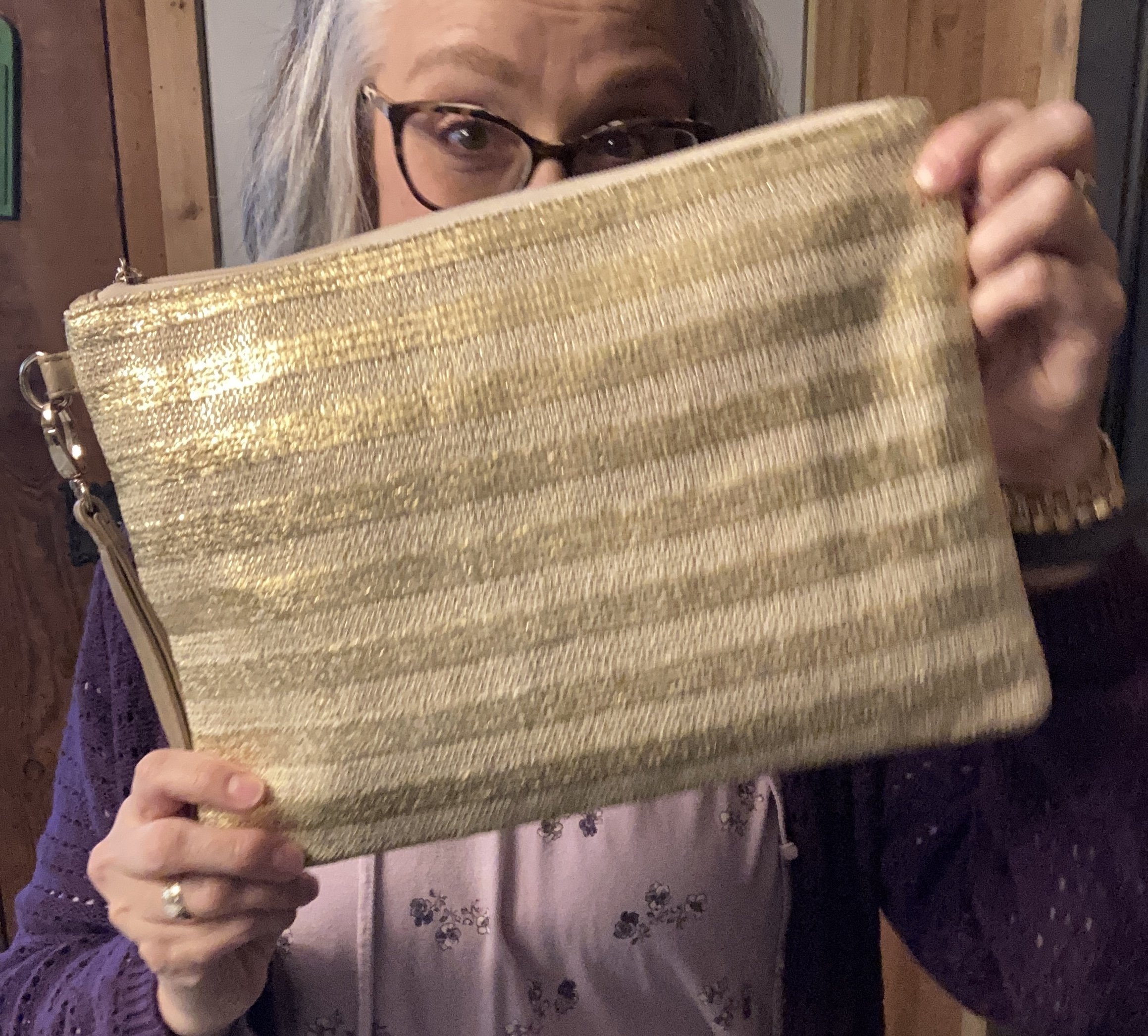
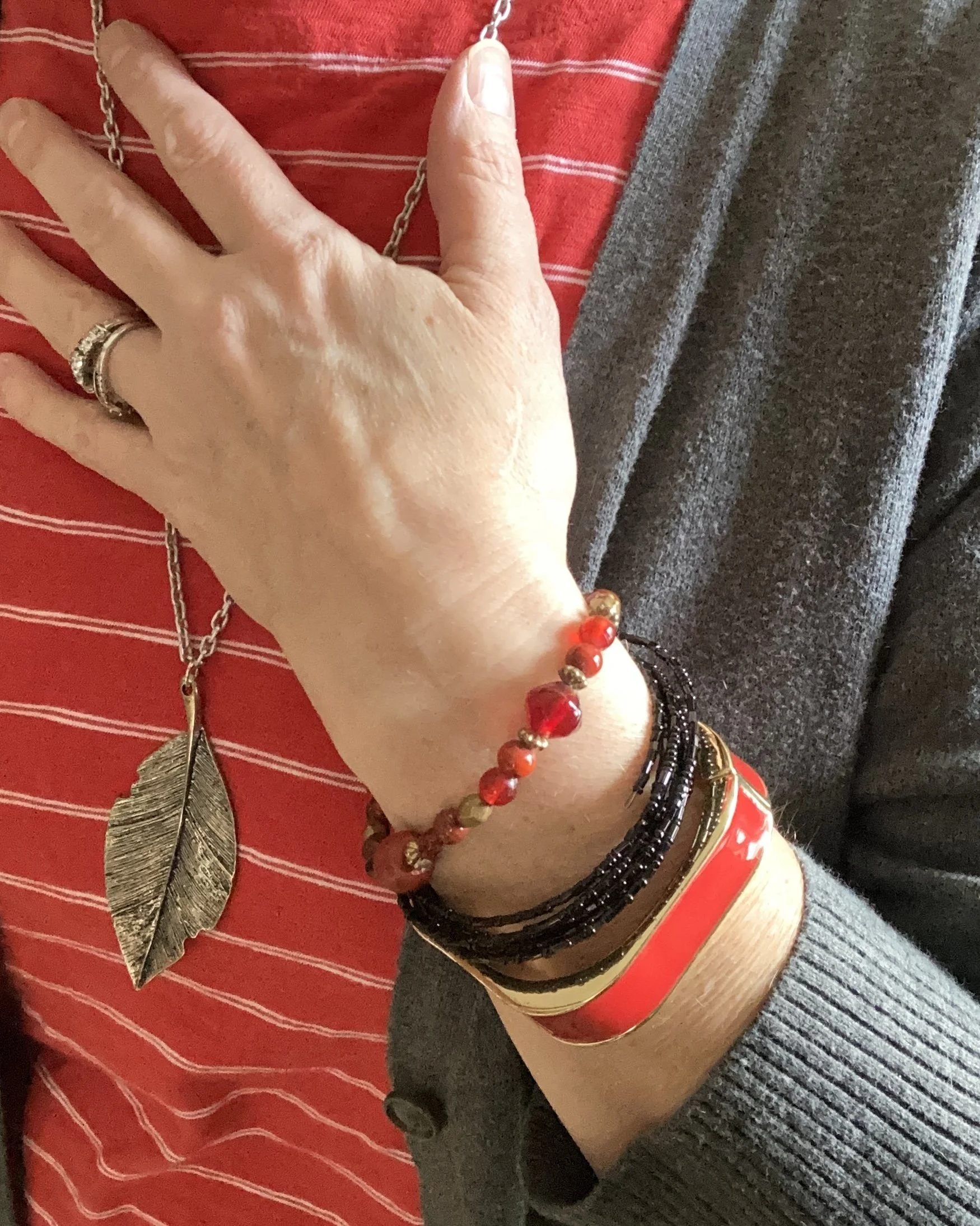
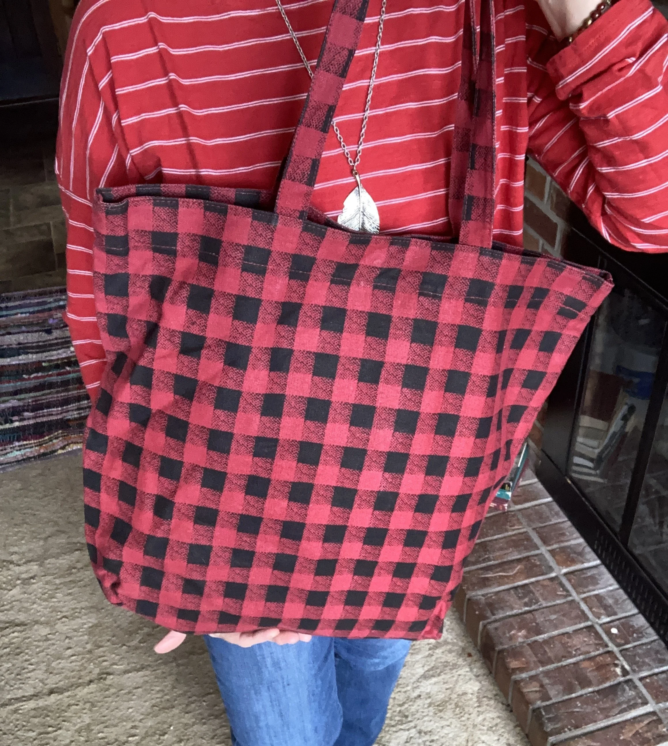
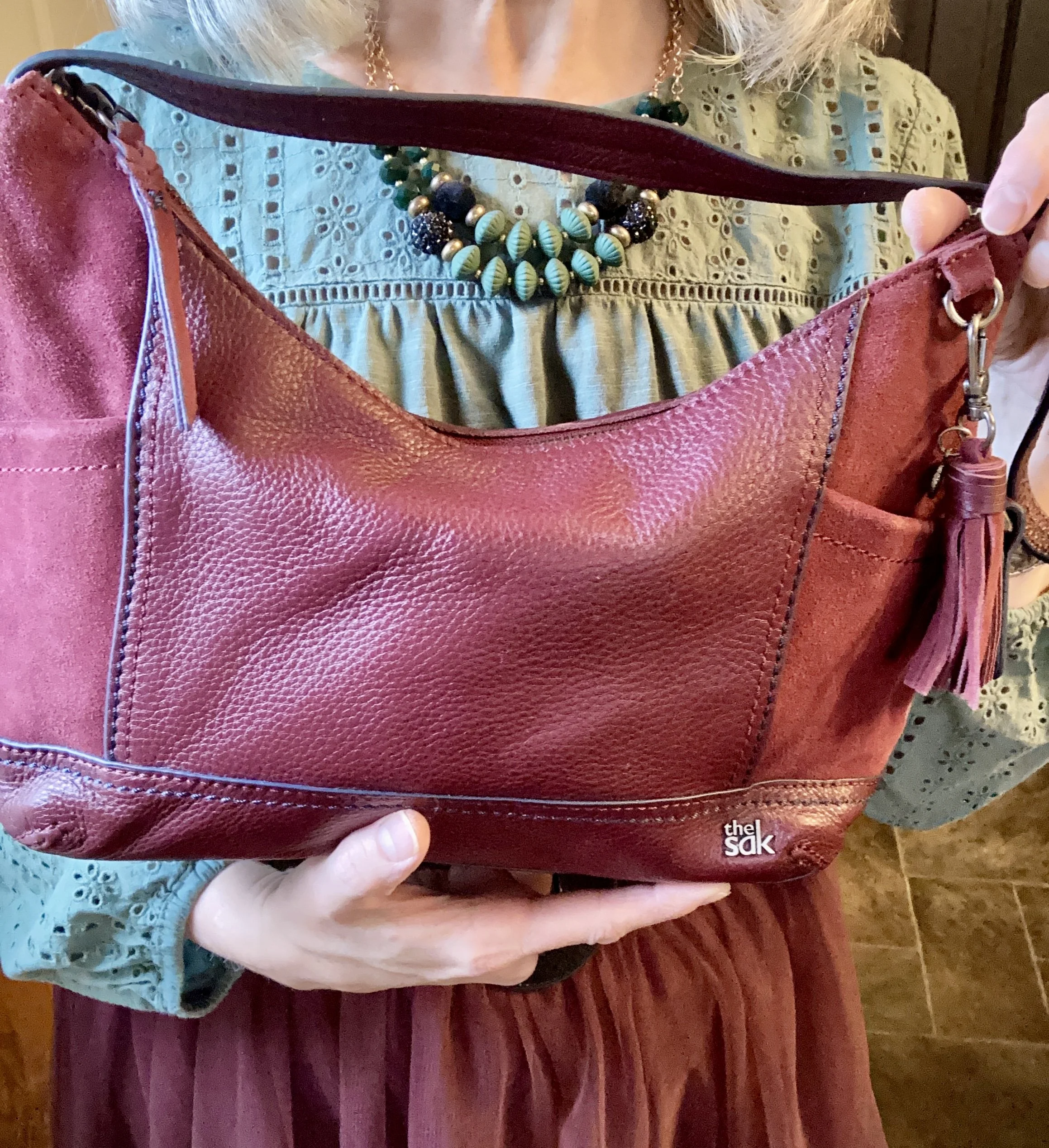
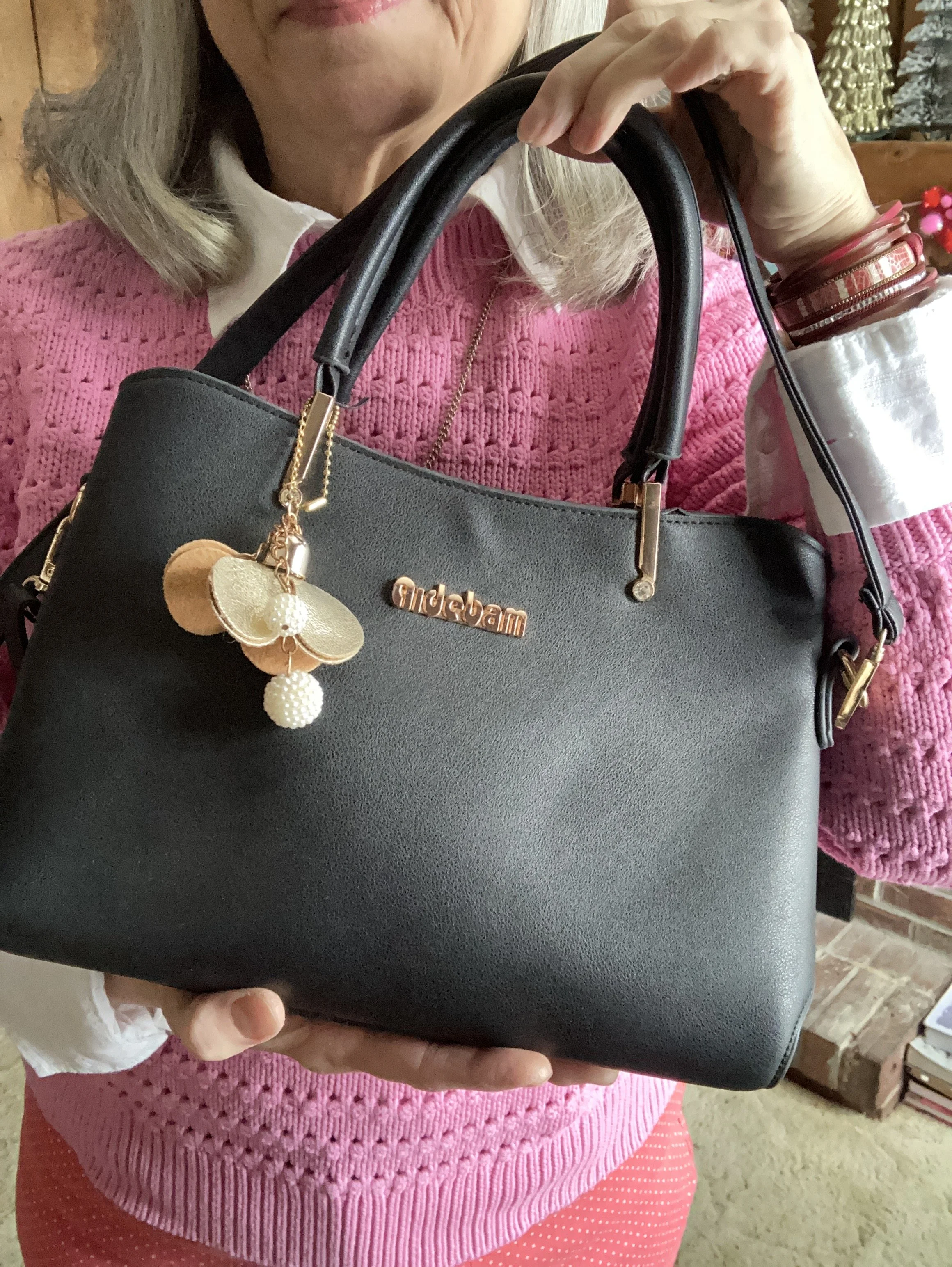
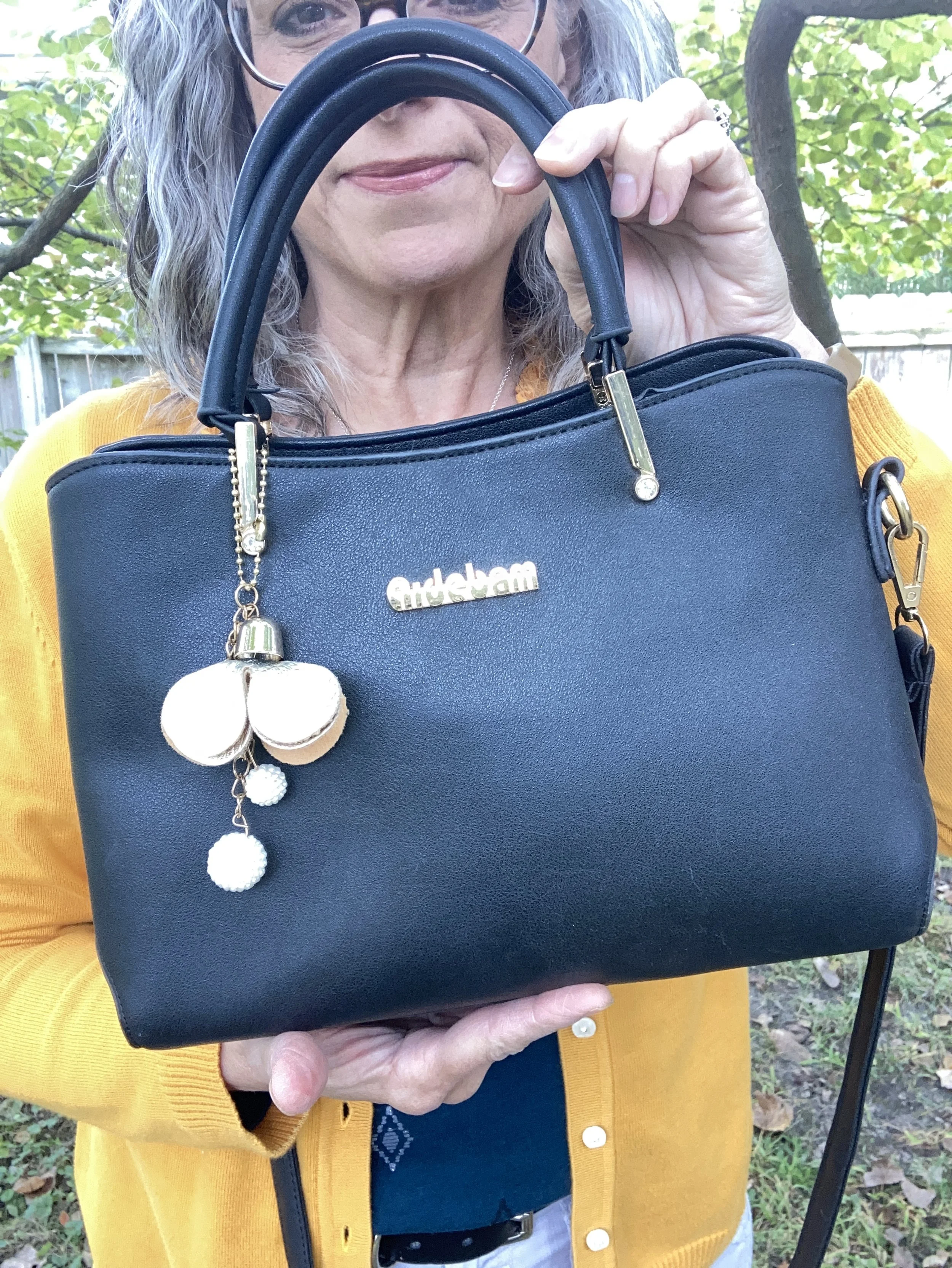
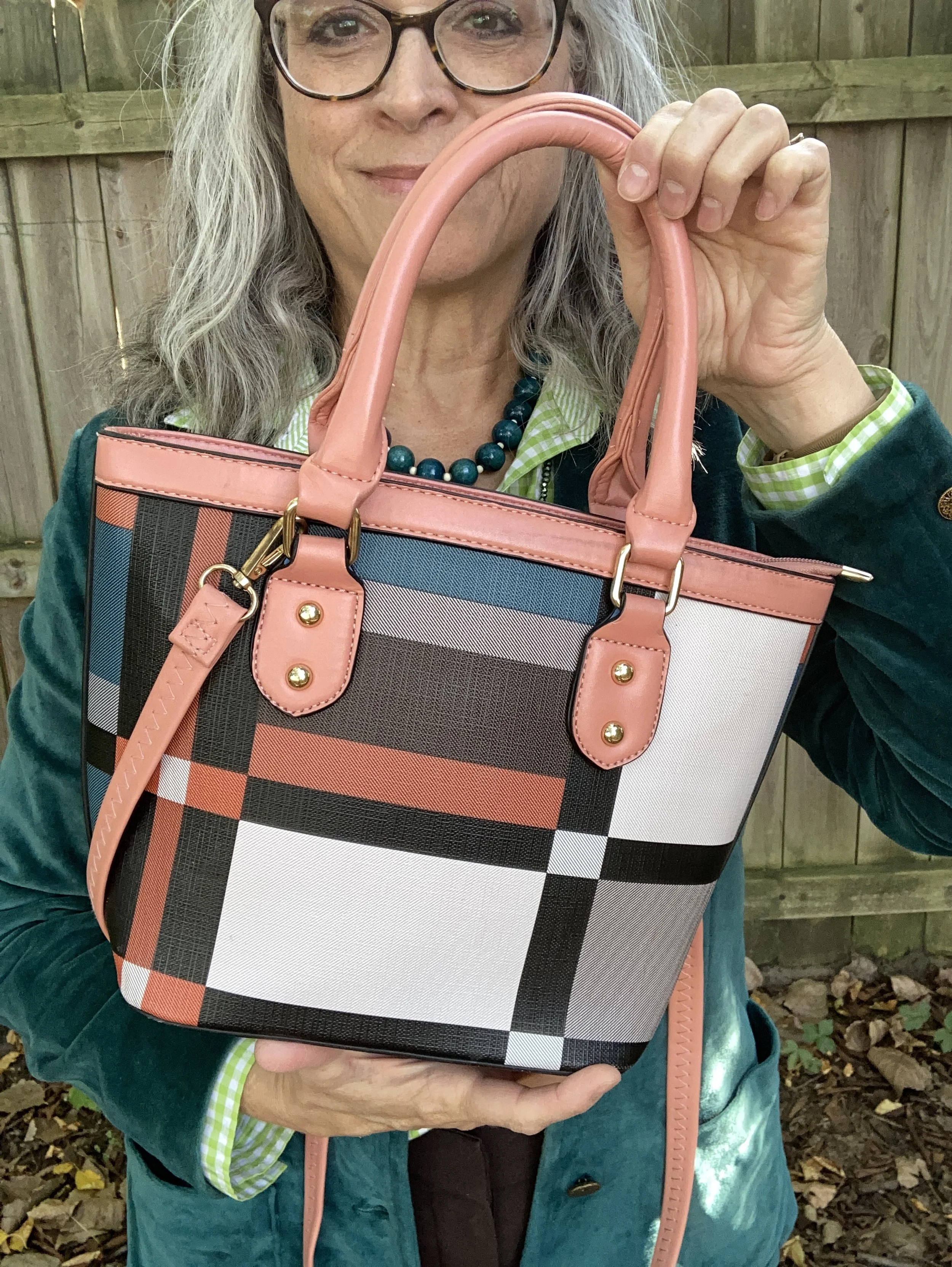
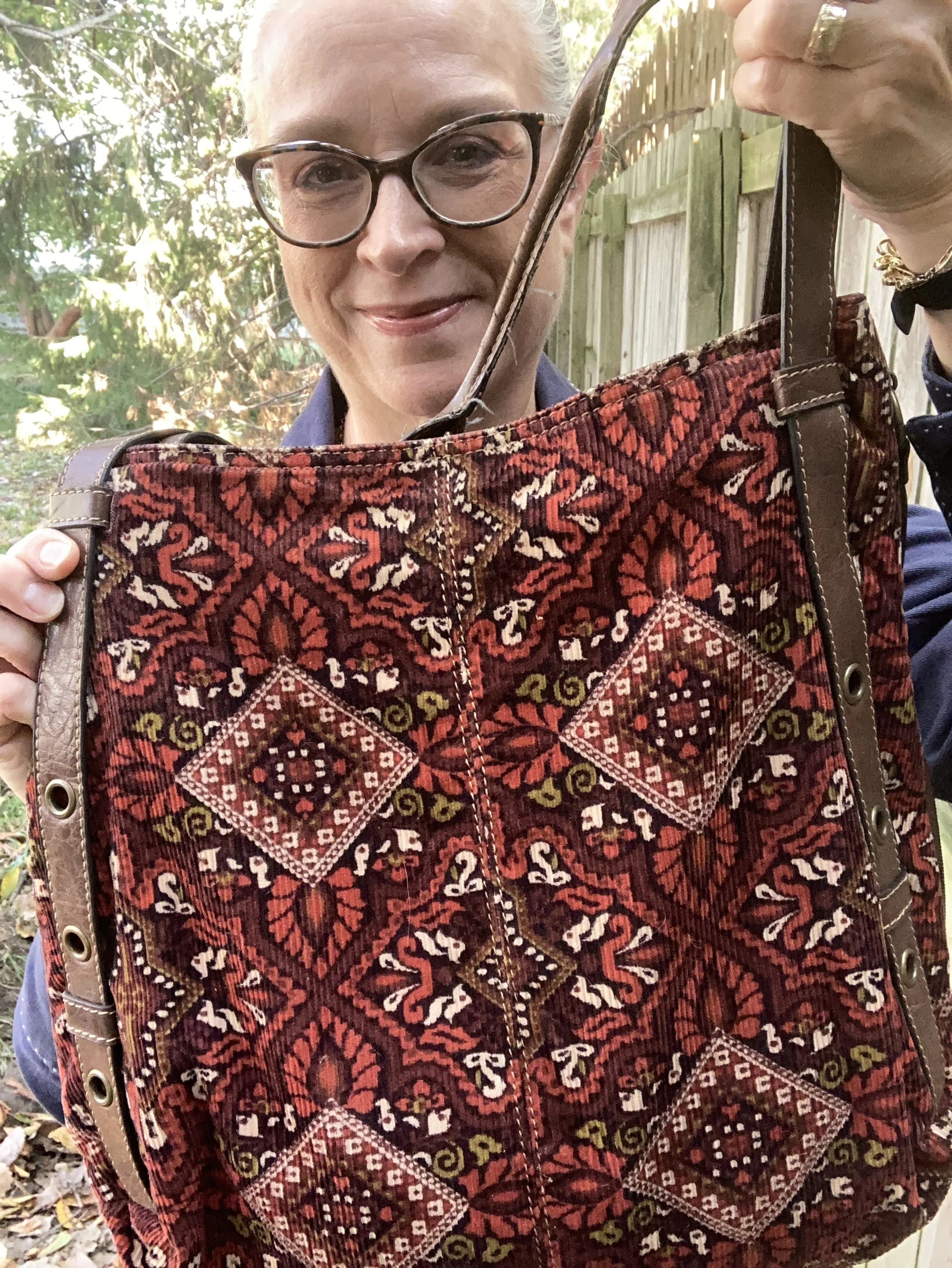
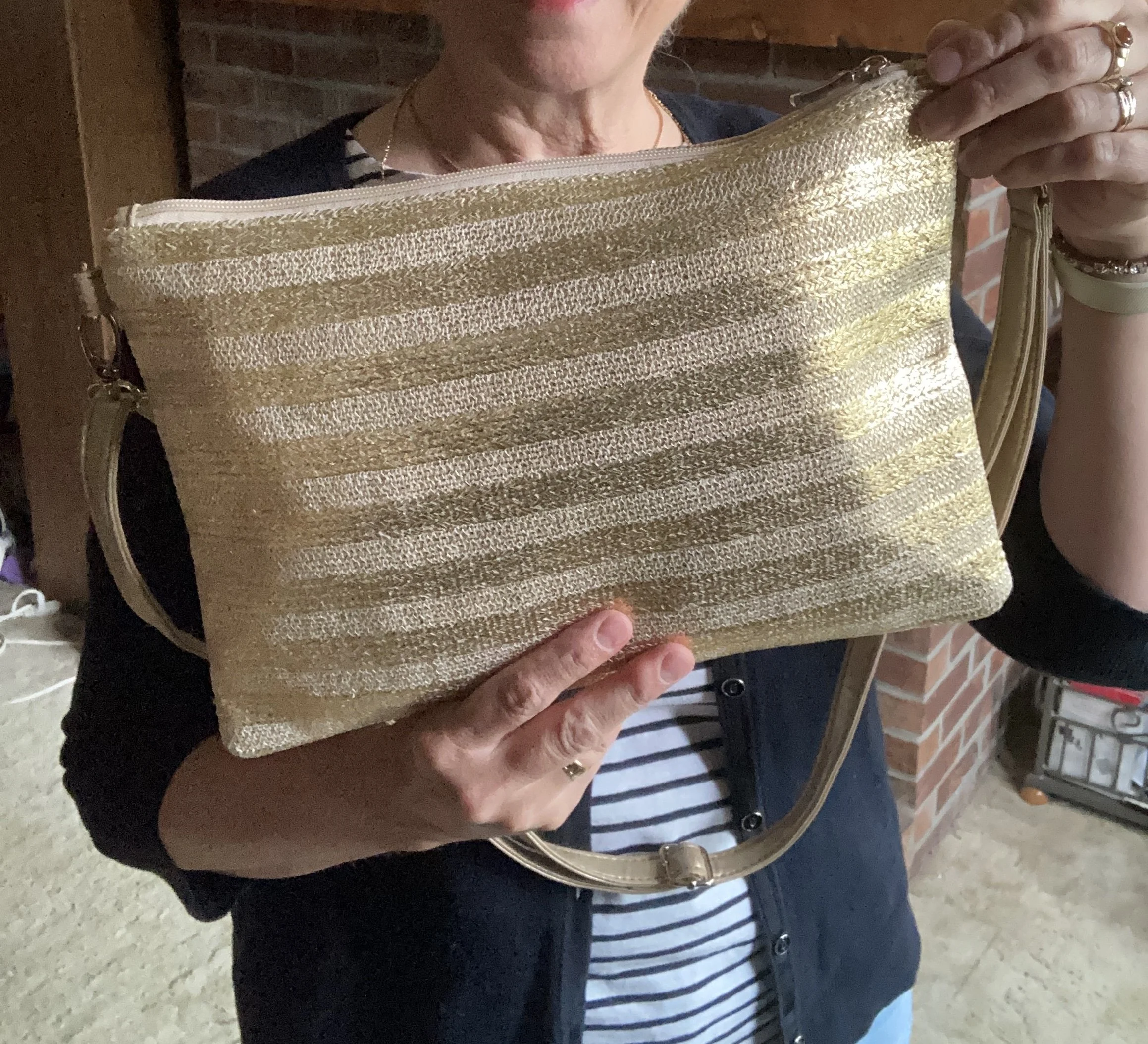
My woven bag is also thrifted, and the label says, icing, which was Claire’s Boutique’s brand for many years. I don’t shop there any more, since I no longer have young daughters, but it was a fun place to go, especially for their special sales and clearance jewelry.
Pull out your straw bags, I mean doesn’t everyone have one? They are always spot on for the warm weather months, and always seem to be trending for summer. Here is a whole page of possibilities from DSW.
What do you think of this outfit? Is this something you would wear, or that you could put together from pieces you already have in your closet? What would you do differently: wear shorts, or a skirt; pick different shoes? Let me know in the comments. I love to hear your ideas.
I hope you all have a wonderful Tuesday!