
Pantone Fall 2017 - An Intro to Two Color Palettes
This fall, the color institute known as Pantone published their usual ten color New York palette. However, this year they also published the ten color London palette. So what is a fashion blogger to do? Why, feature all twenty of these colors. Don't worry, I won't be featuring one color a week for the next twenty weeks. That would take me into January. Ha, ha.
For this series on the Pantone colors, I will be combining two colors a week. There are a few colors that overlap on both the London and the New York palettes, and many of the colors while having different names are very similar hues.
New York Palette

I decided to start the series with the London colors. The graphic above and below was put together by Rebecca, my photographer, web helper and daughter, using Pantone's color coding. The way you see the graphic will be the way I pair the colors. For example, Flame Scarlet will be paired with Otter, Primrose Pink with Navy Peony and so on.
London Palette

You might wonder what got me interested in the Pantone color palettes in the first place. I love color. I love flowers in the summer, changing leaves in the fall, orange pumpkins at Halloween, Christmas lights at Christmas and the soothing colors of nature such as a blue sky, green trees and red cardinals. With my propensity toward color it was only natural when I became interested in fashion that an interest in fashion color choices followed.
Pantone is the fashion and design industry's go to for color choice. I am not sure what the whole process looks like, as far as how they come up with the colors for each season and how those translate to fabric versus paint or graphic design, but if you start paying attention to the Pantone colors, all of a sudden you will begin to see those colors in the new season's line of clothing, home furnishings, graphics and even architectural designs for offices.
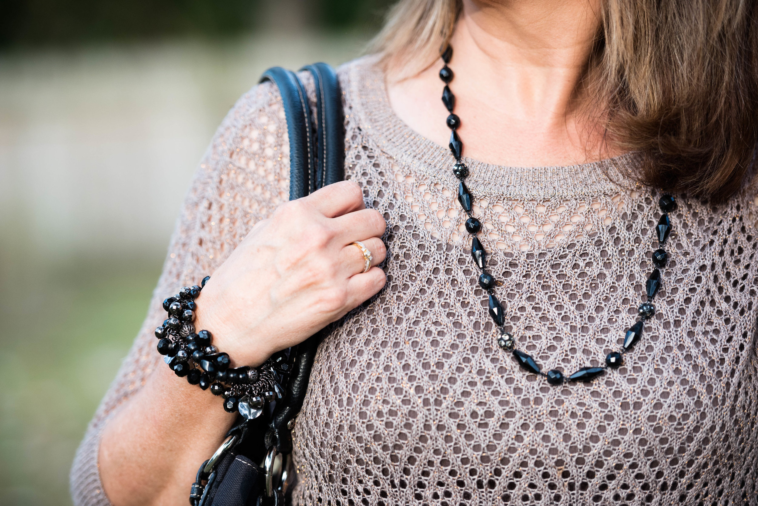
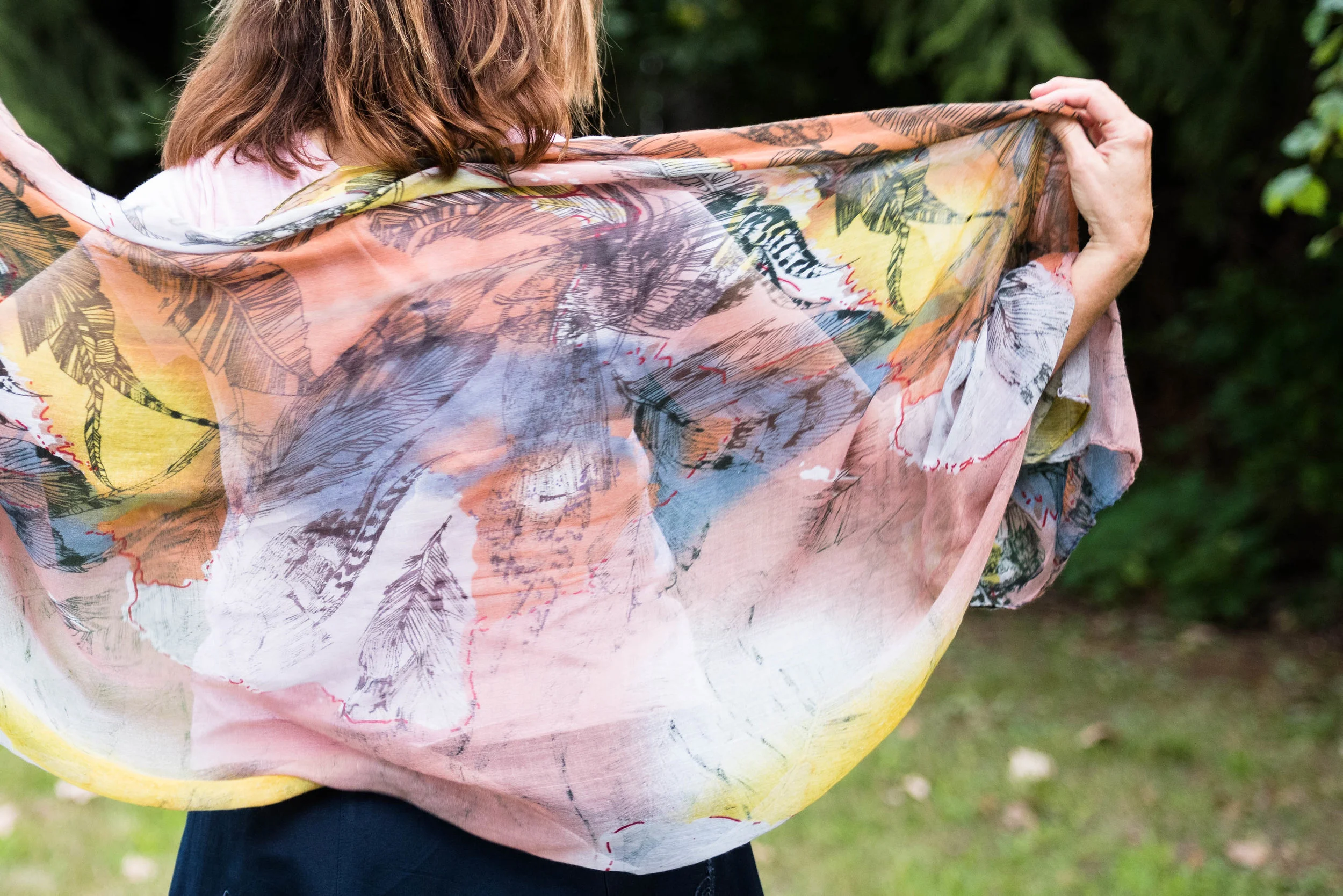
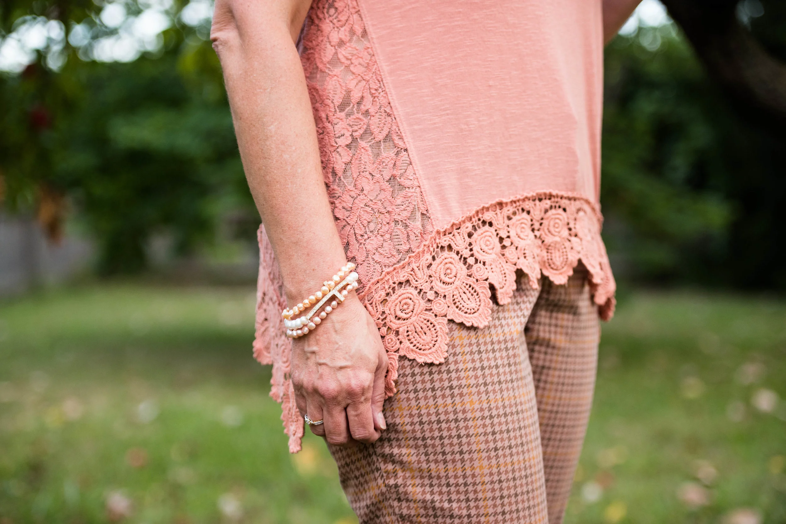
Here are some sneak peeks at what I have coming up, starting next week, with the Pantone Fall 2017 London color palette.


You can probably tell from looking at the graphic that this was not the easiest grouping of colors to work with. There are lots of pale colors as well as yellows which many people cannot wear. This palette was definitely a challenge, but I find that even more fun. Besides, it is helping my brain stay active to try to figure out how to combine pieces and colors in a ways that will be pleasing to the eye.
I hope you will join me the next five Tuesday's for my Pantone Fall 2017 London series on the blog. Thanks for stopping by! Be sure to check back on Thursday to see who my Beautiful Blogger Bests choice will be. Until then have a great Tuesday.
Photo credit Rebecca Trumbull.
Monday linking up with Catherine of Not Dressed as Lamb. Tuesday linking up with Shelbee of Shelbee on the Edge, and Jess of Elegantly Dressed and Stylish. Wednesday linking up with Hannah and Sara of The Perfect Storm.