The Pantone Fall 2017 Recap
What I want to do for this week's post is give you a recap of all the Pantone Fall 2017 colors. Instead of taking up too much of your time, reviewing what was already said about each outfit, I think you are all smart enough to go back and revisit the original post on each color combination if you want to see and read more.
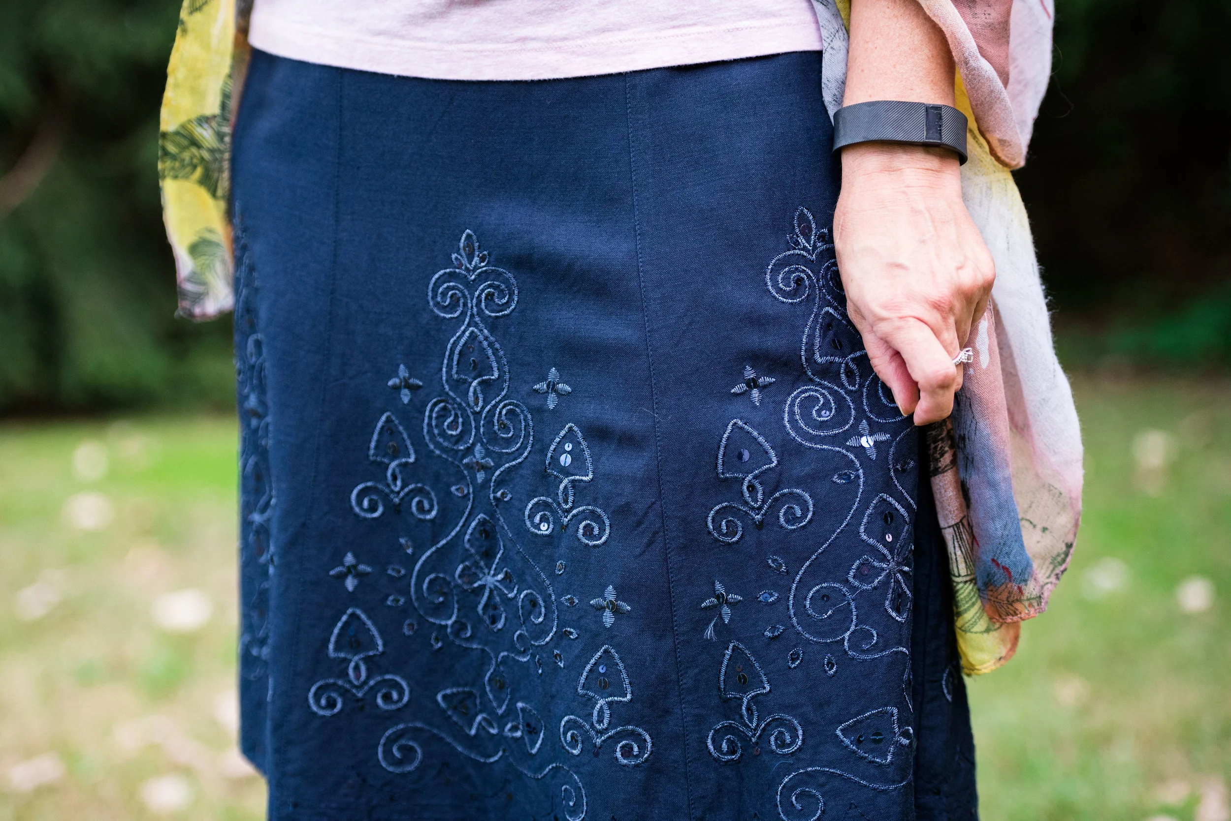
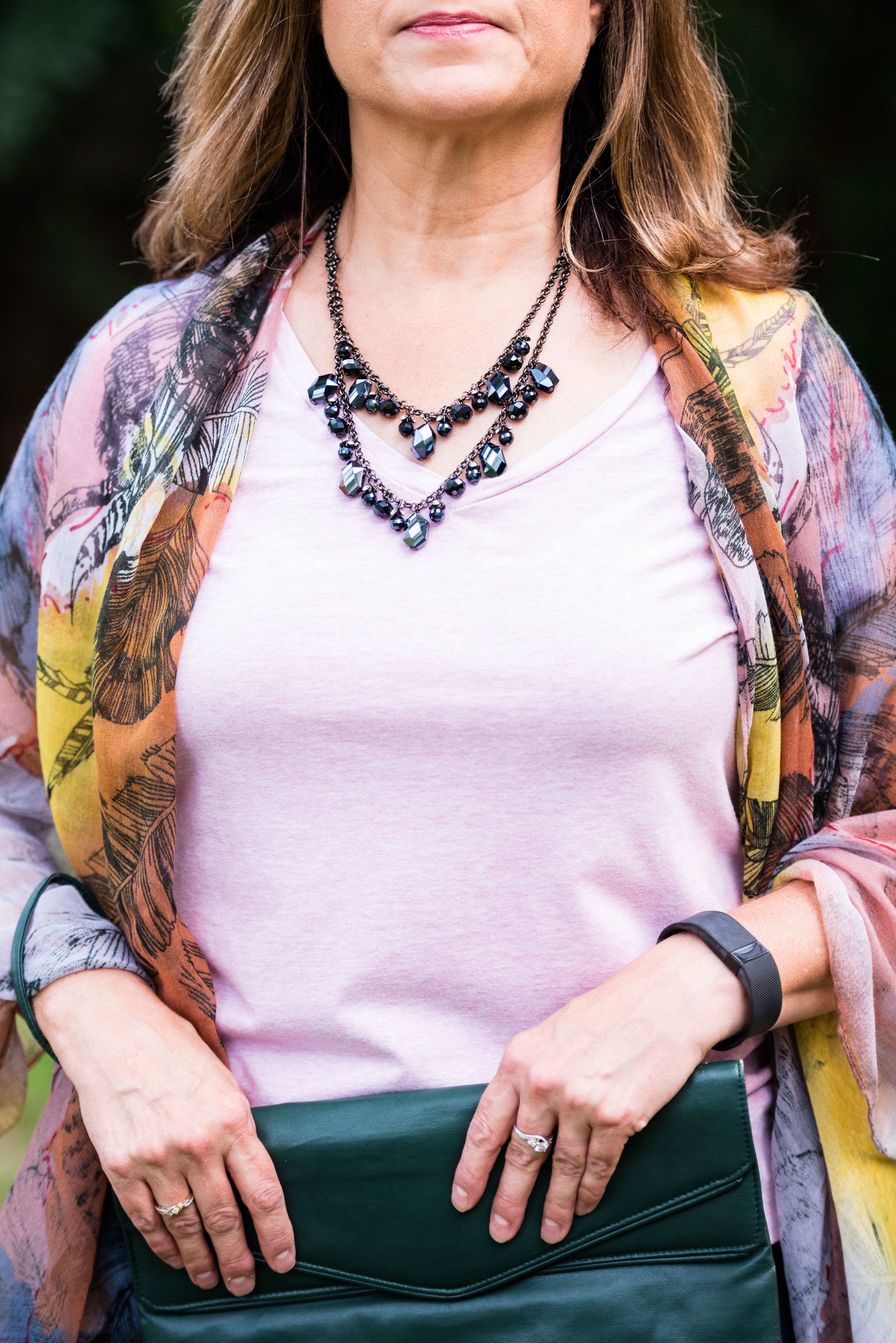
For those of you who have been following me for a while, you already know my philosophy behind using the Pantone colors on my blog. For those of you who are new here, I love color and whether it be in God's creation, a painting or an outfit, I love to see how various colors combine and contrast to create stunning visual displays. Pantone gives me a spring board from which to choose color combinations for my outfits. That being said, here are the outfits from this year's fall colors.
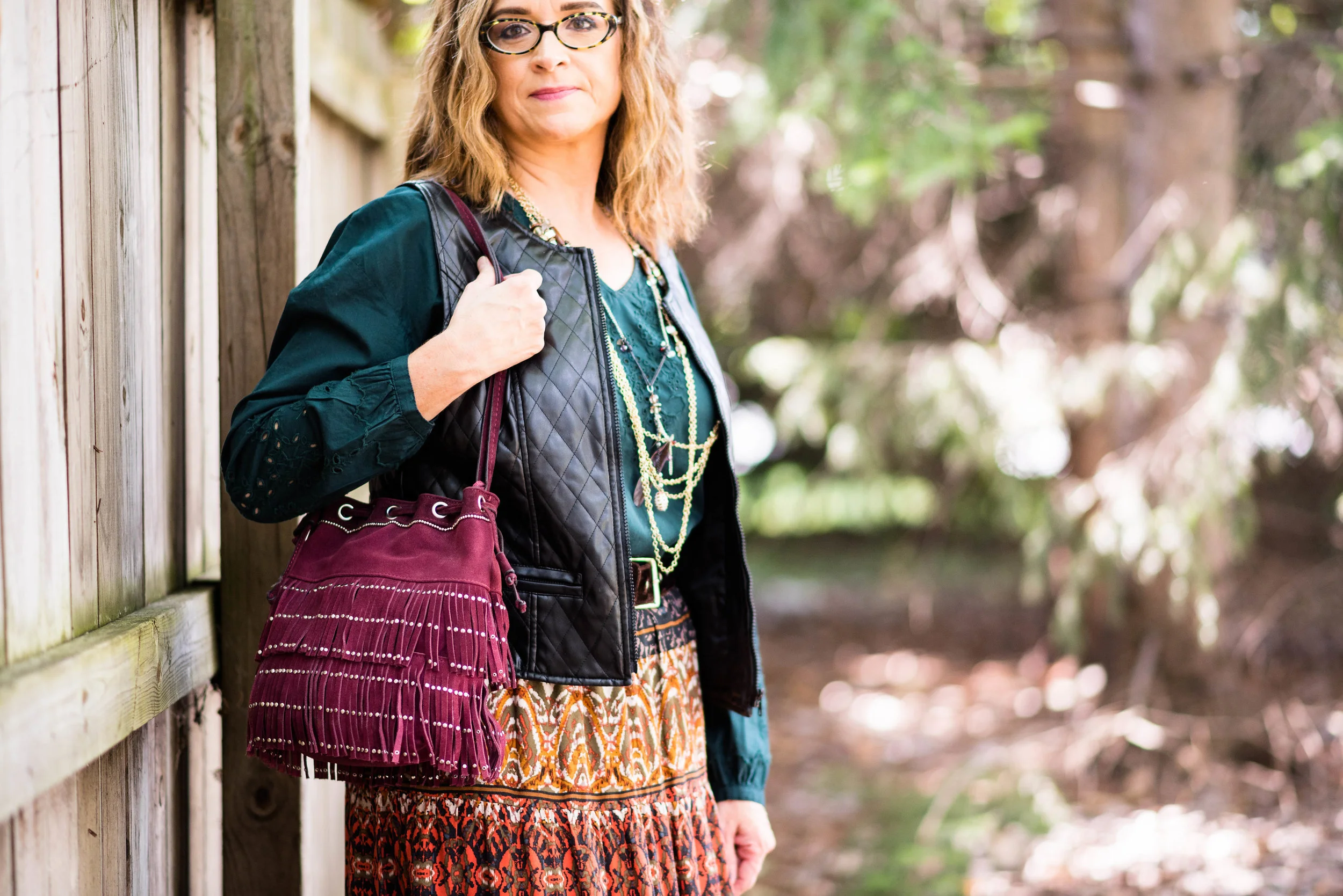
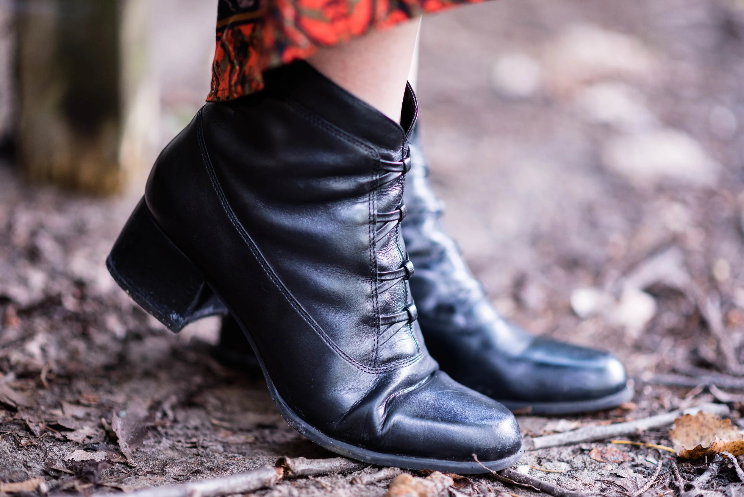
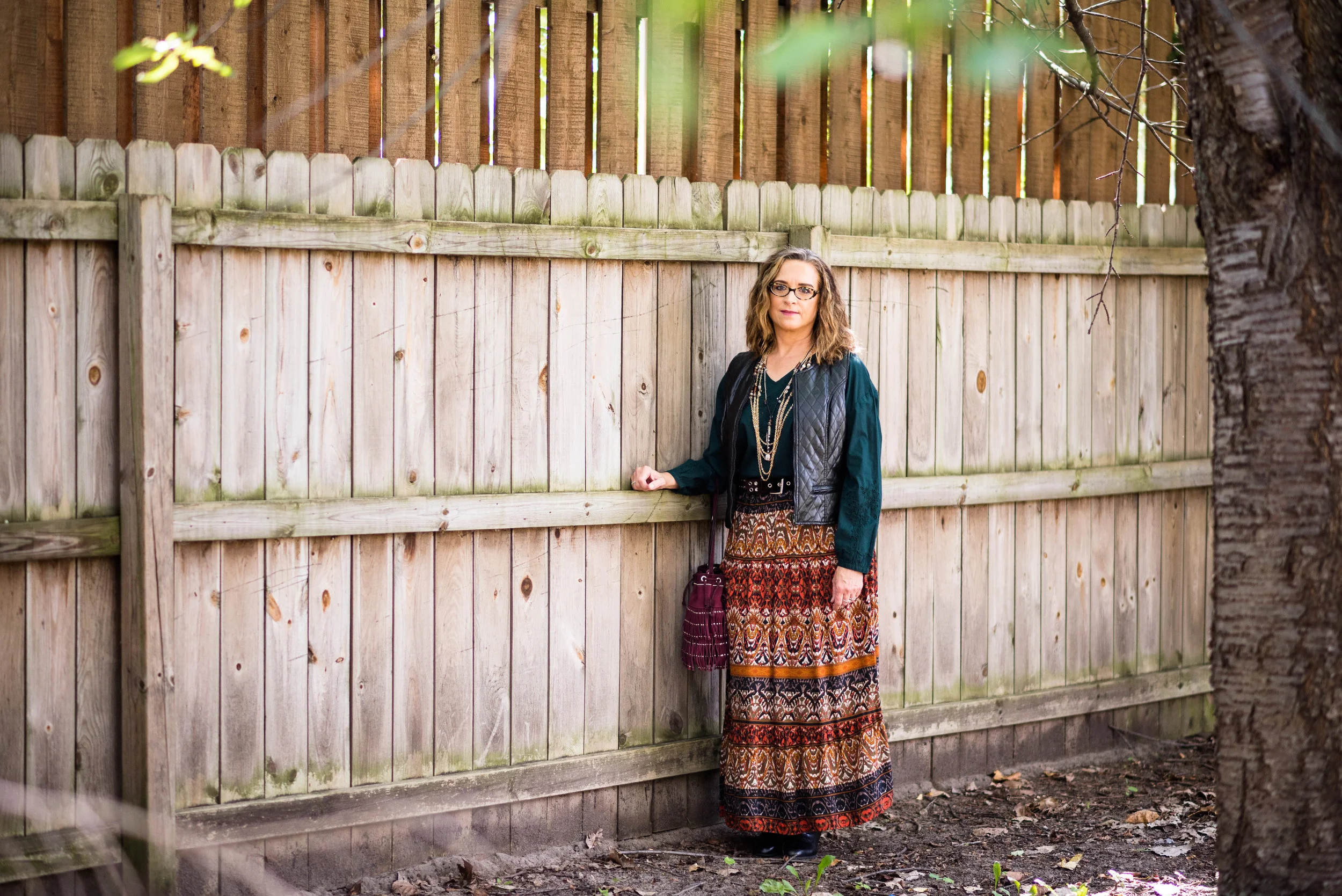
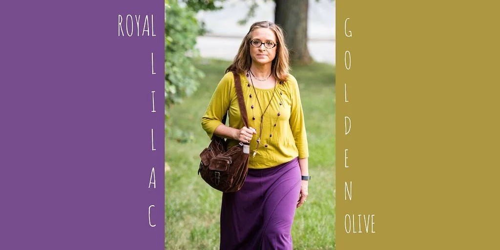
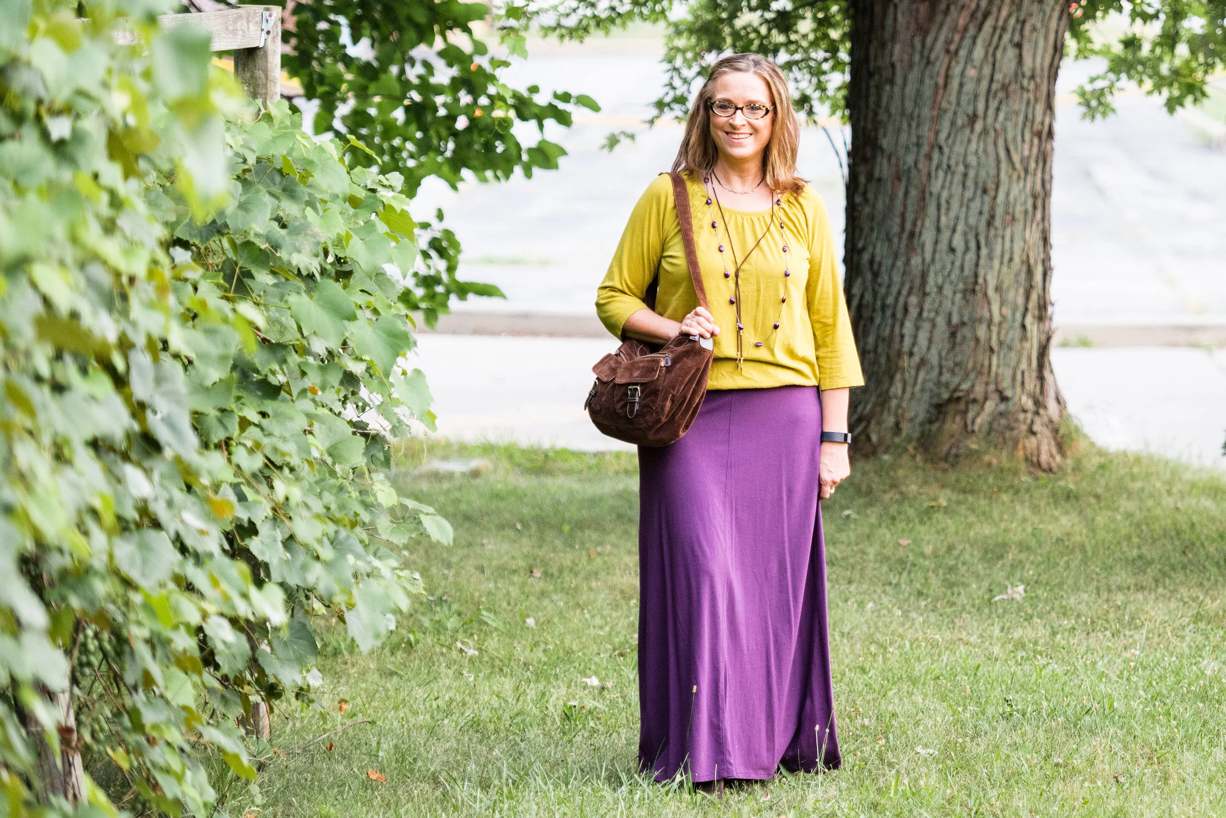
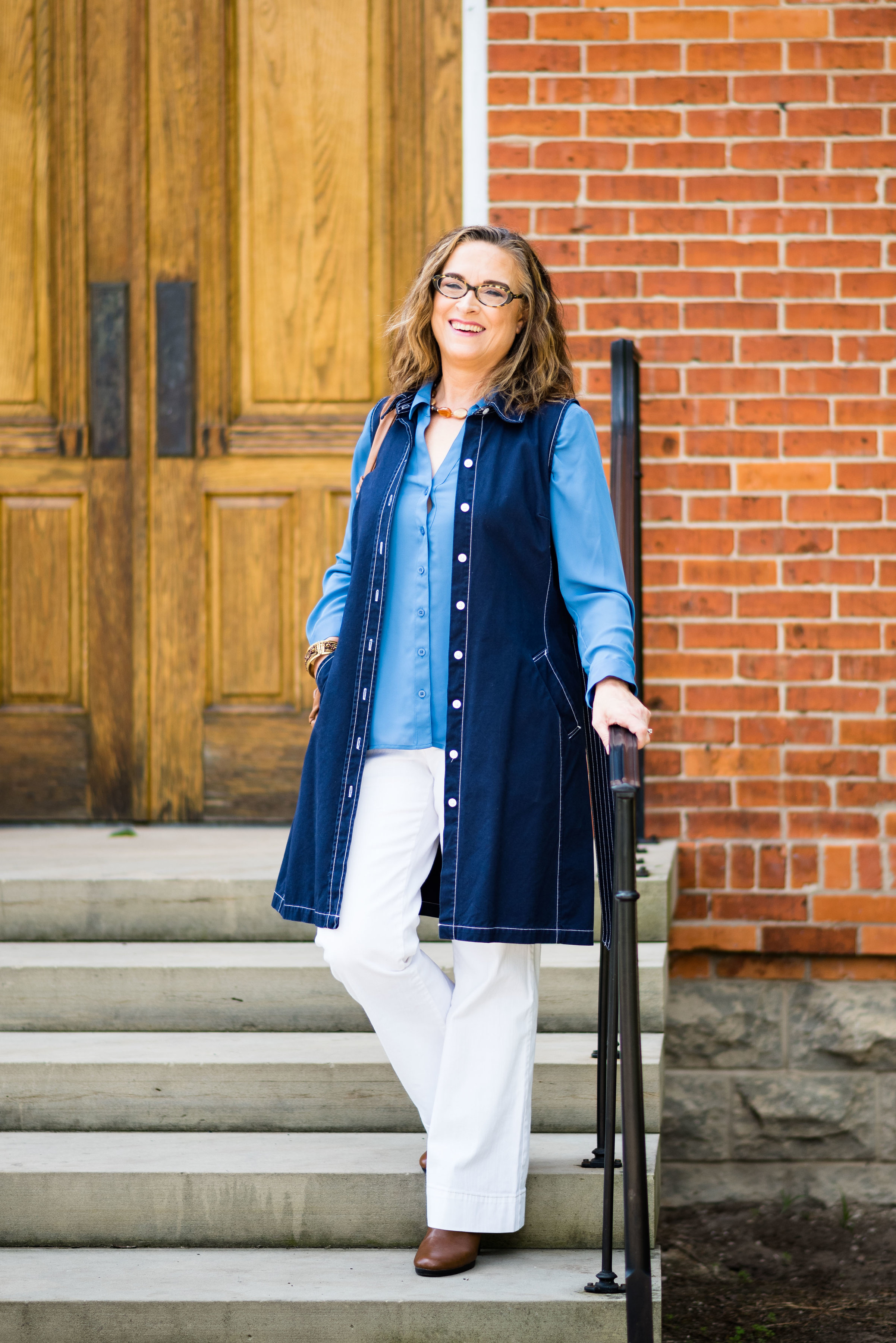
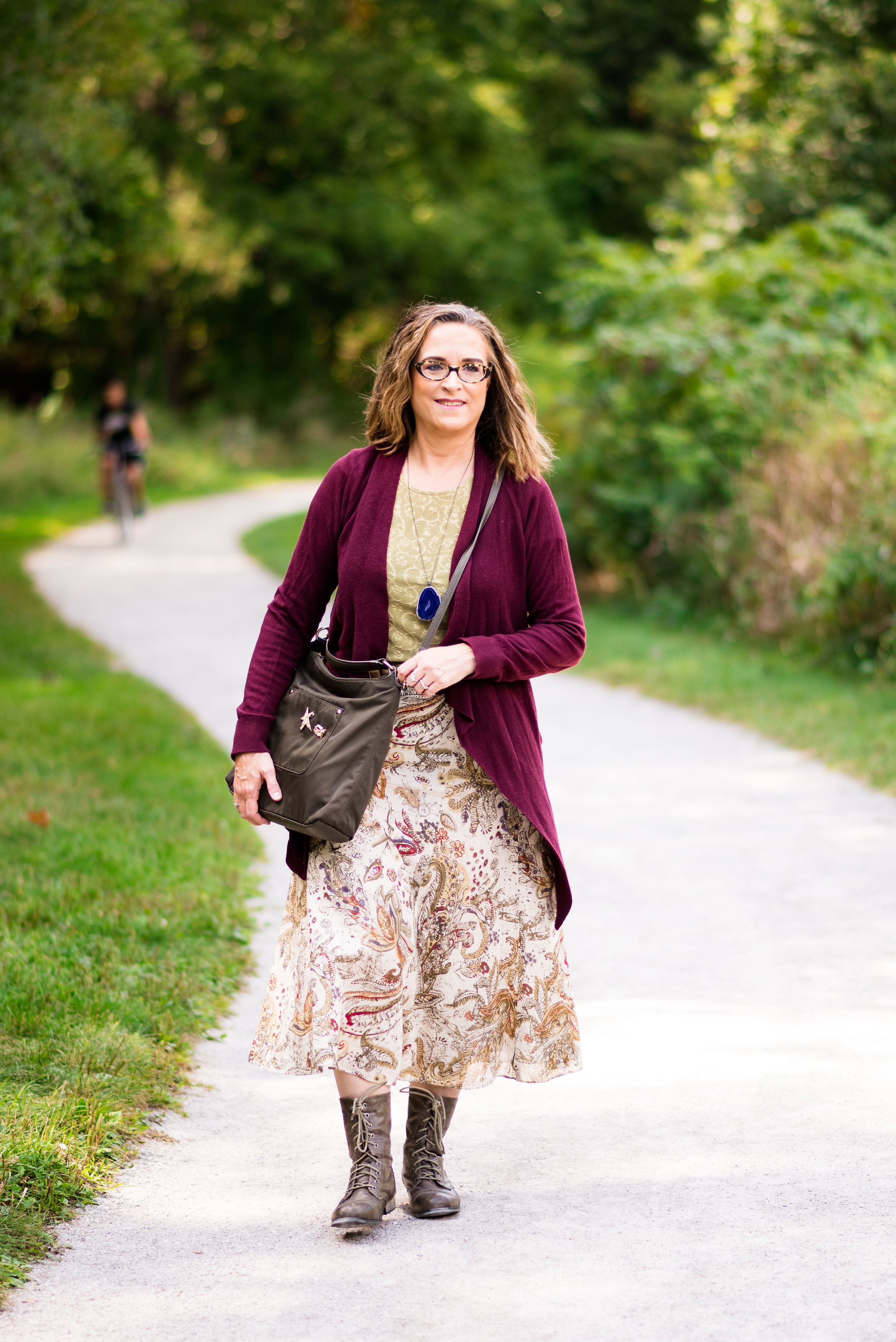
The London Palette

Here is a look at the outfits side by side.
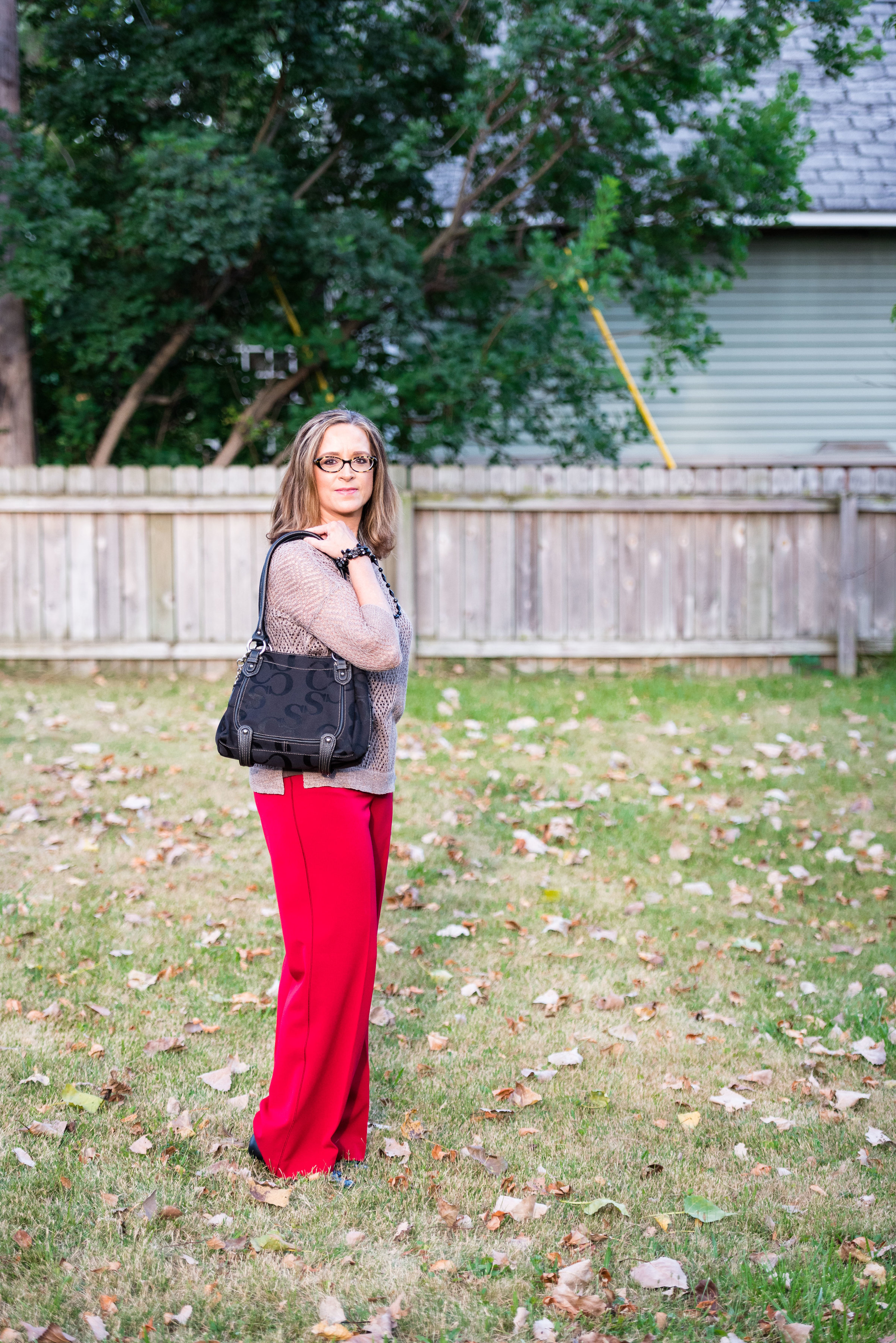
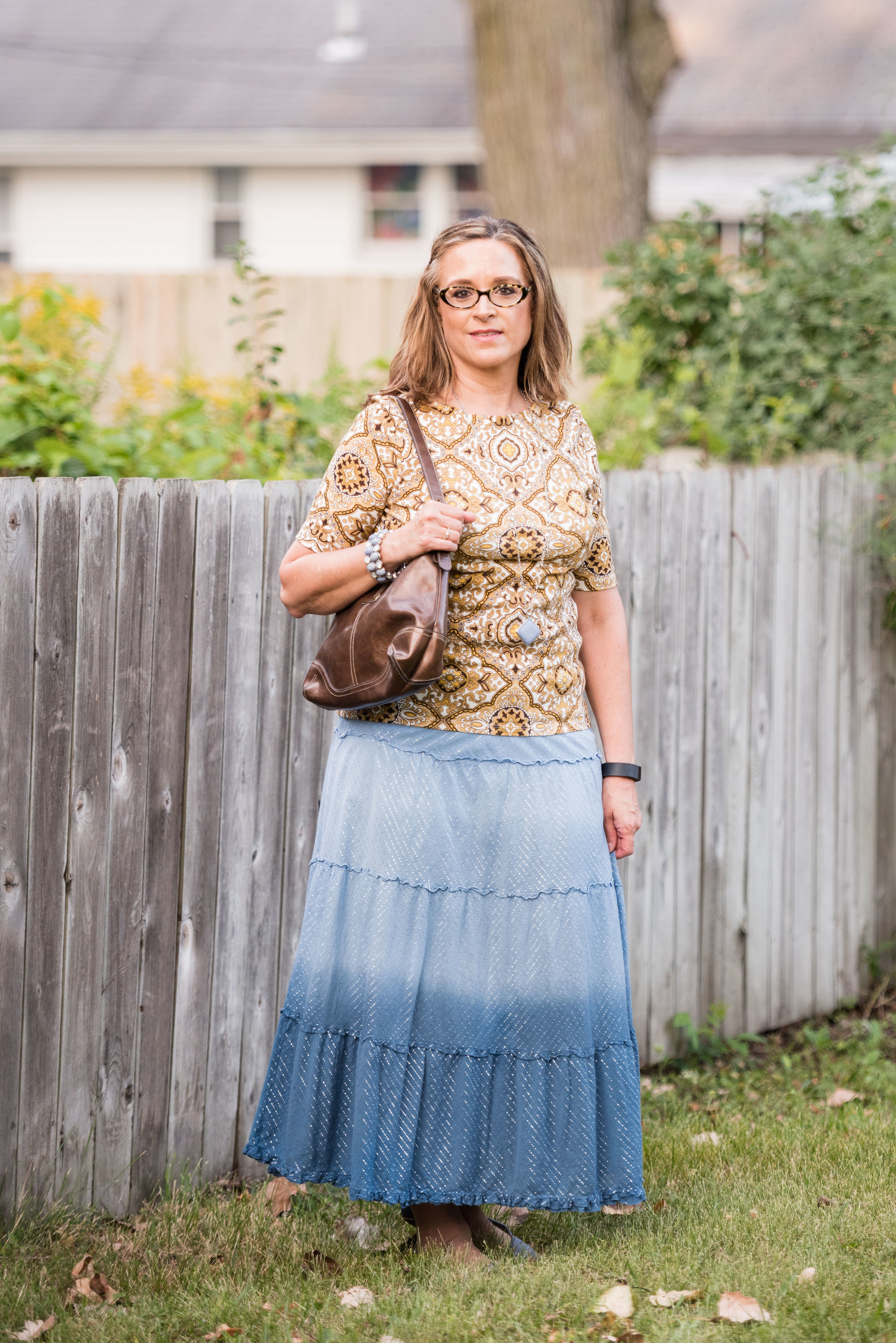
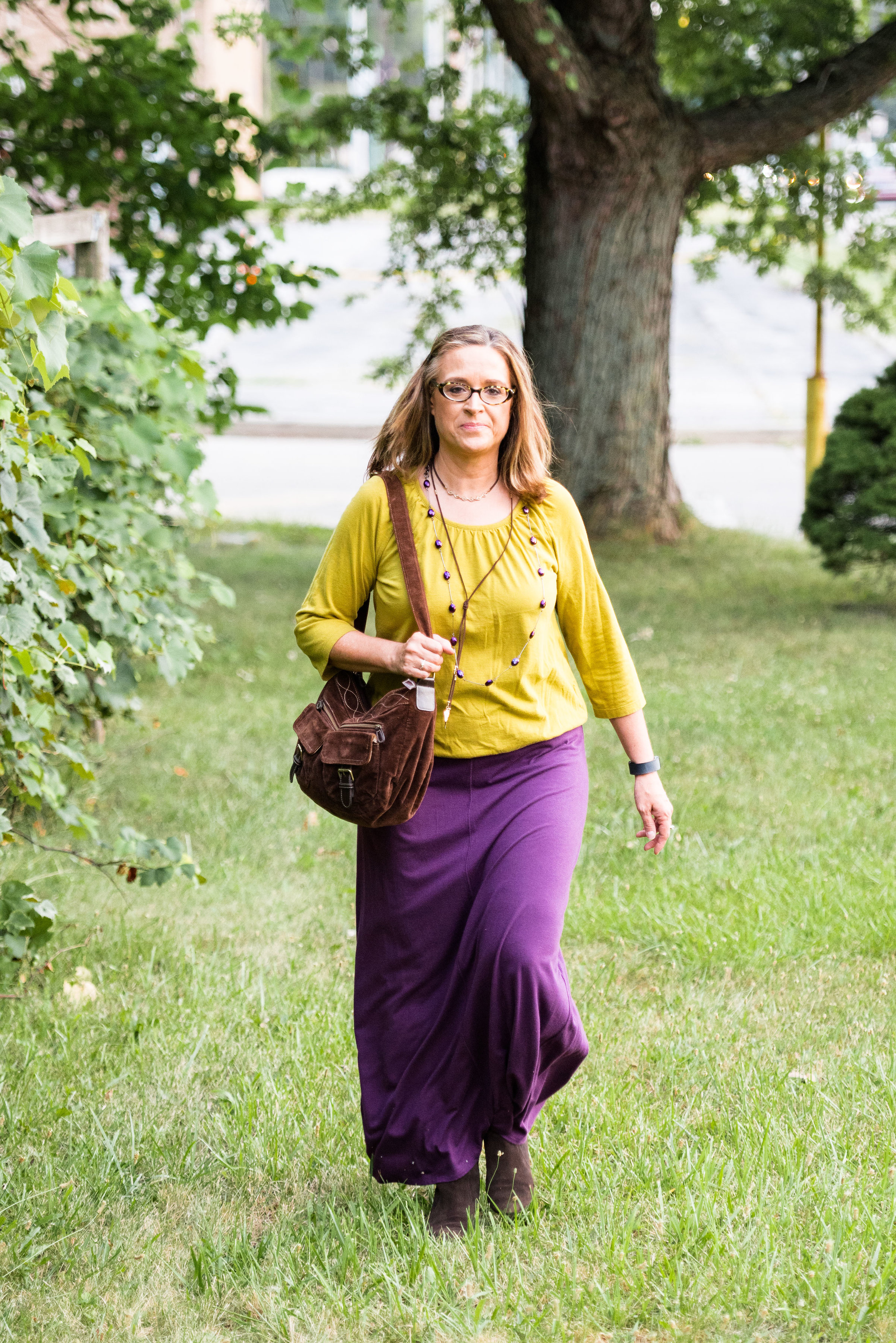
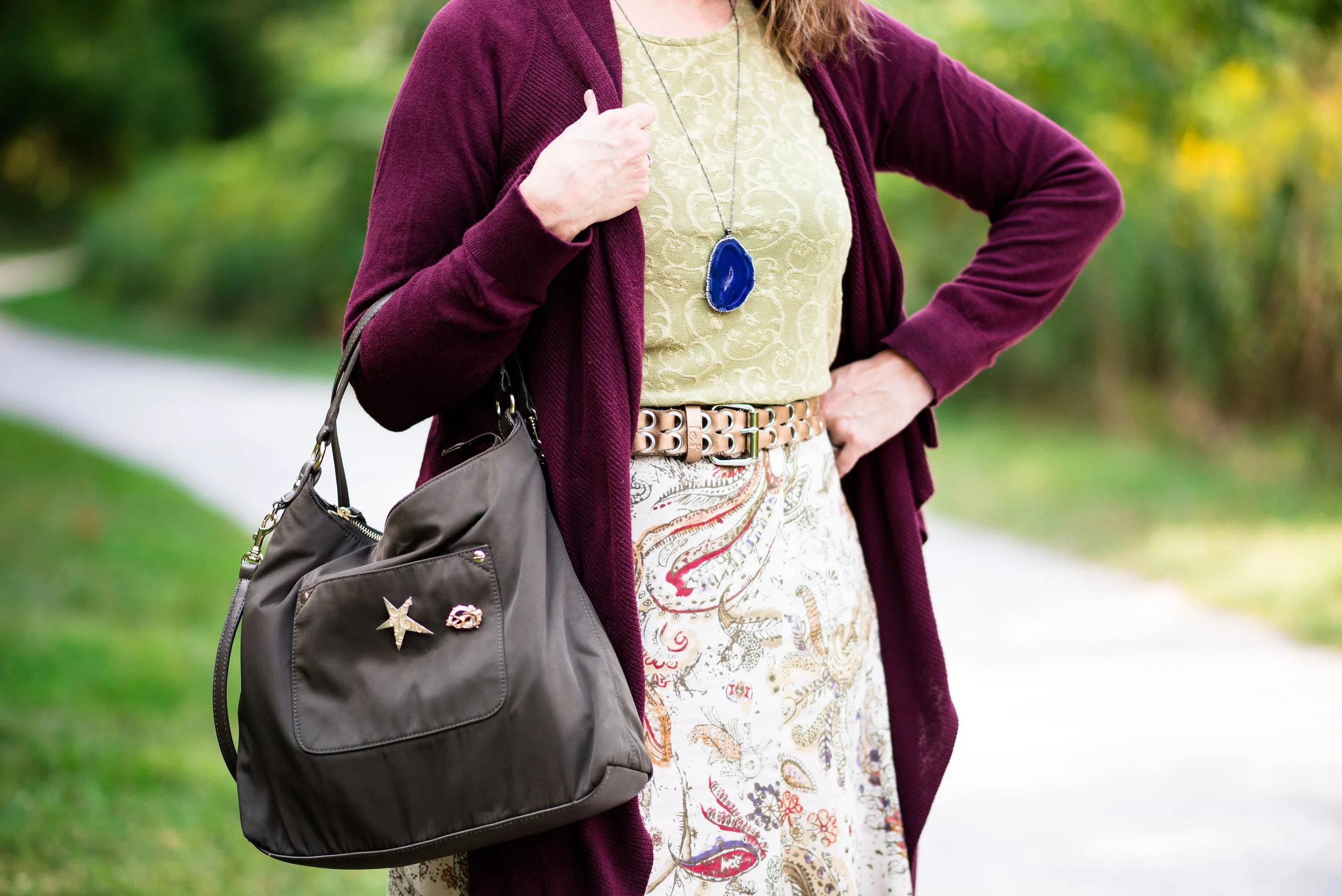
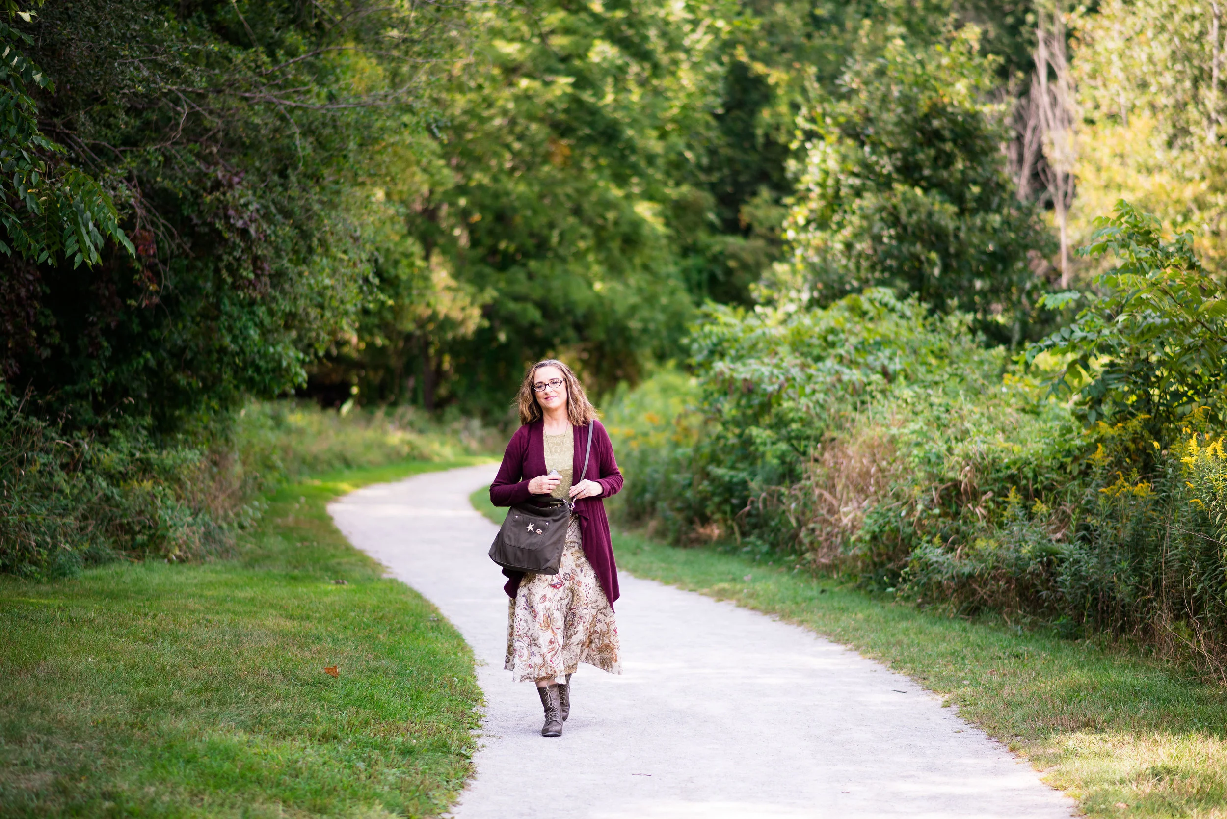
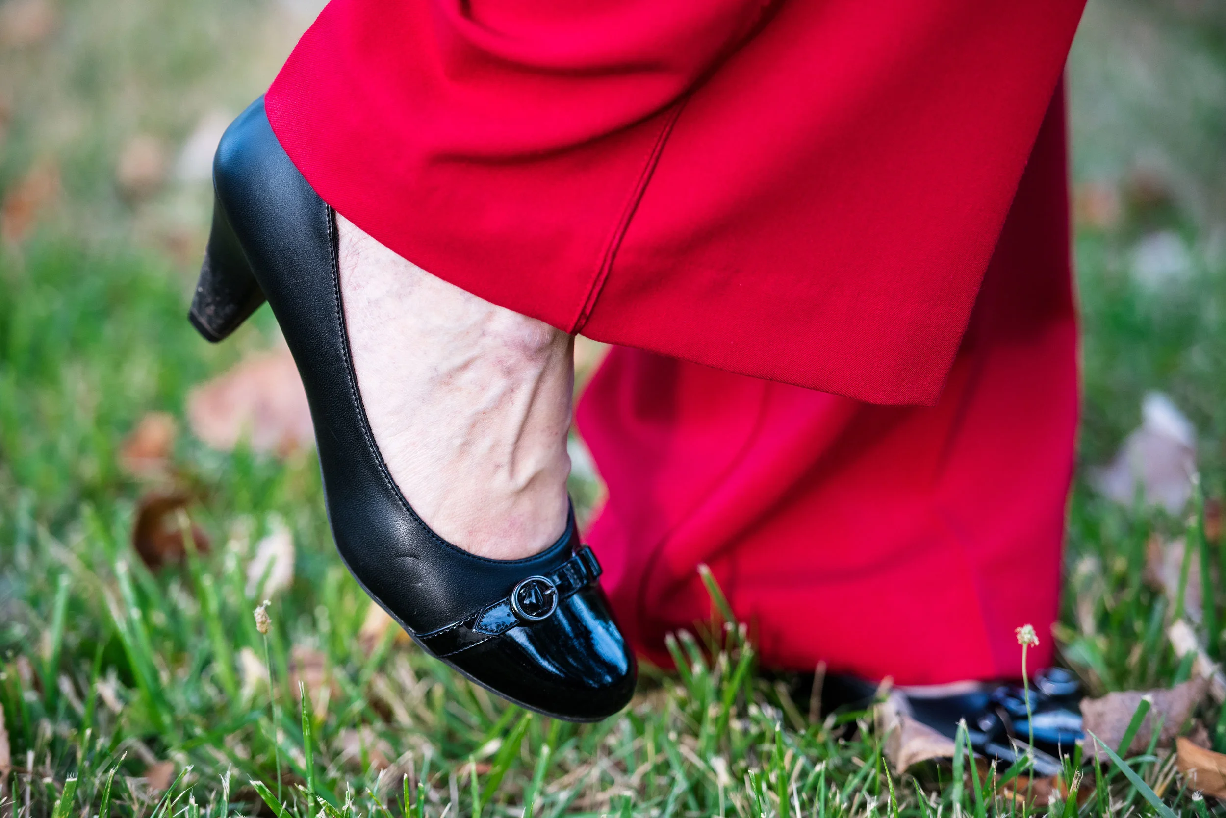
What is your personal favorite? I'd be interested to hear. Mine is the Royal Lilac and Golden Olive. I loved the richness of both of these colors, the comfort of the outfit and the Bohemian vibe that I felt it portrayed. I also felt that I looked the best in these colors, which is a revelation since I have never thought of myself as looking good in yellow. So much for those ideas that we had in the past!
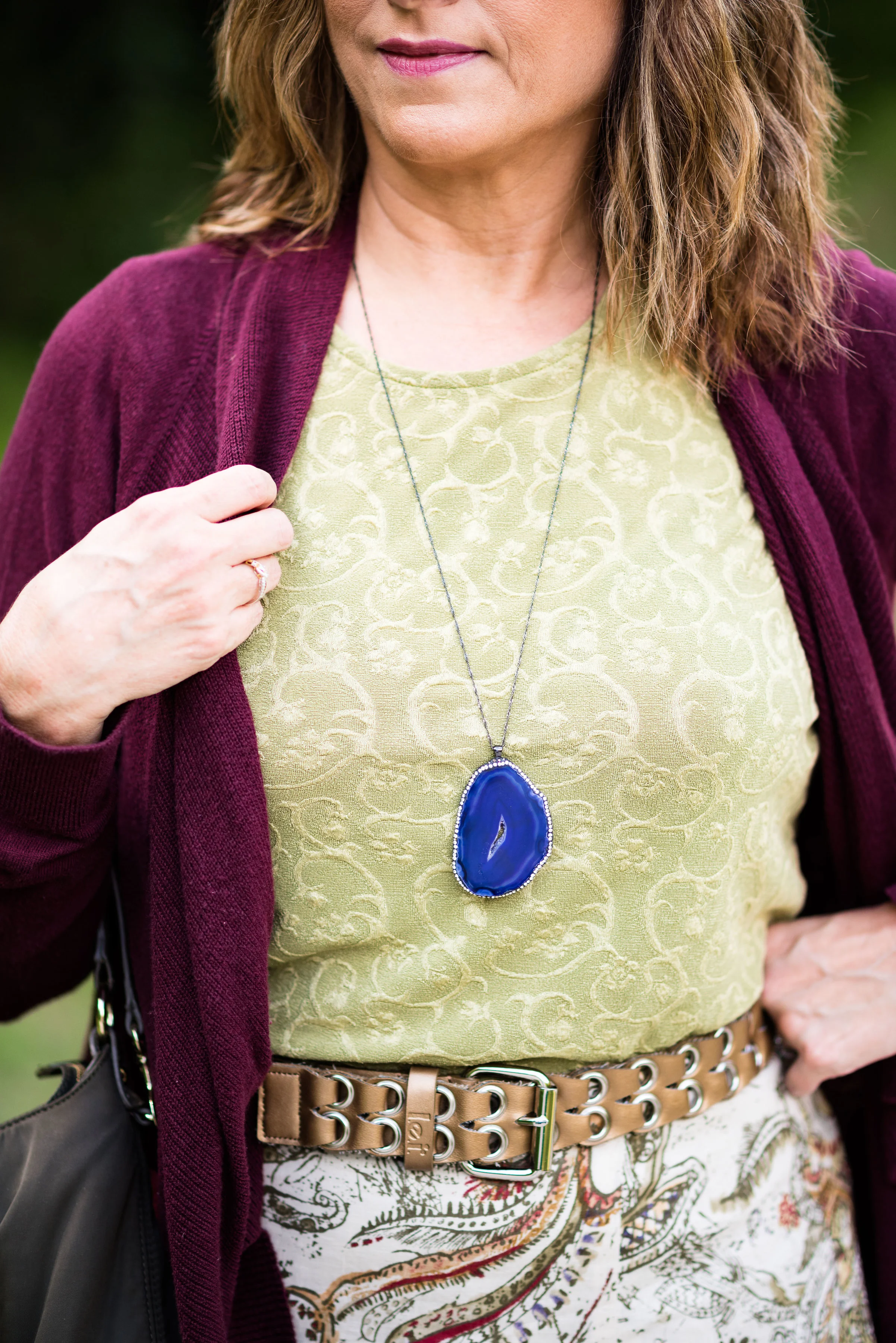
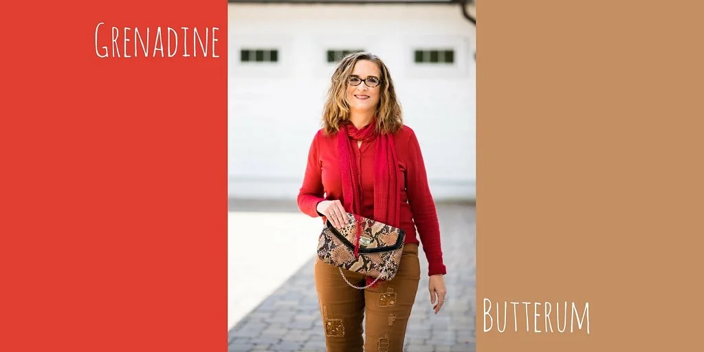
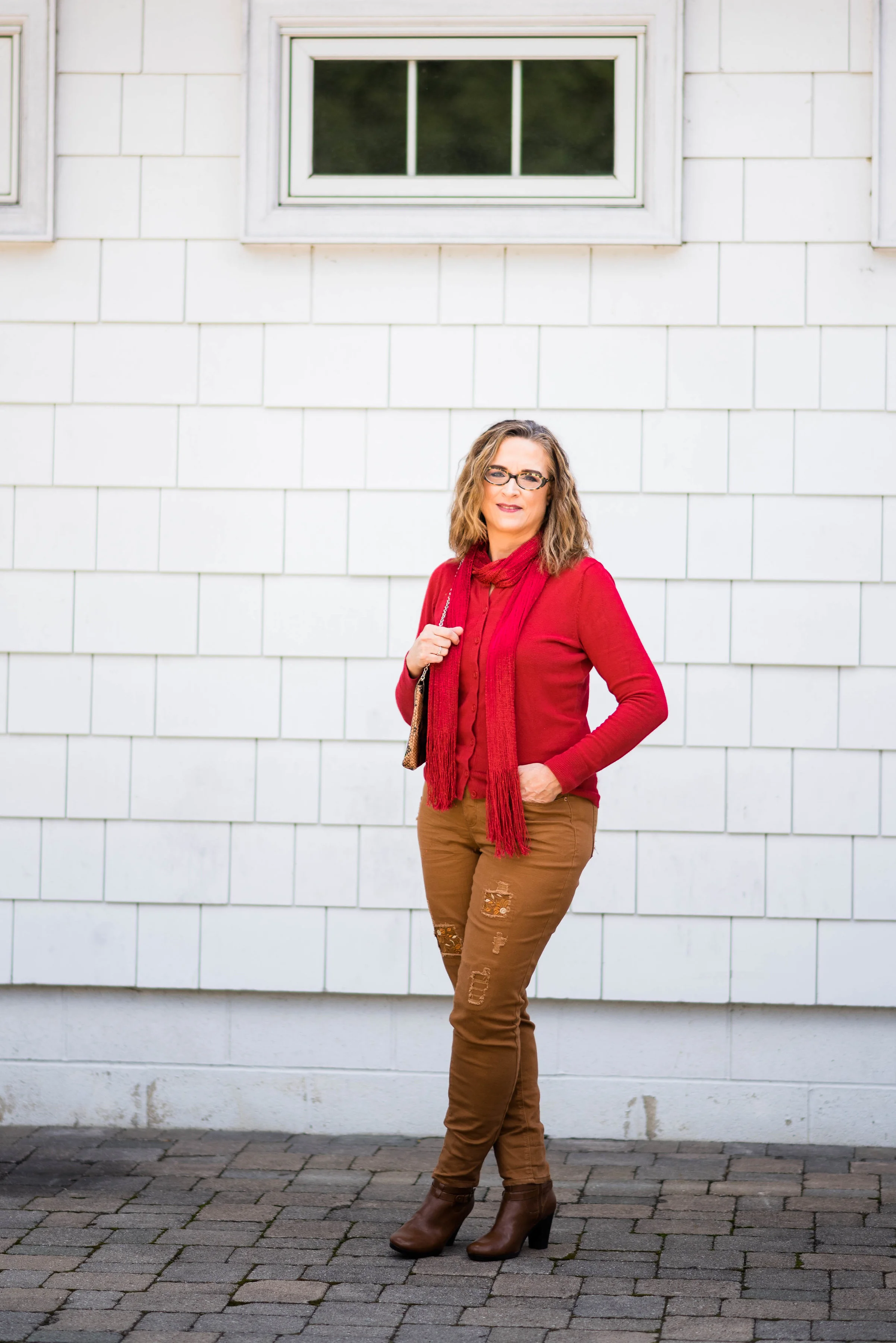
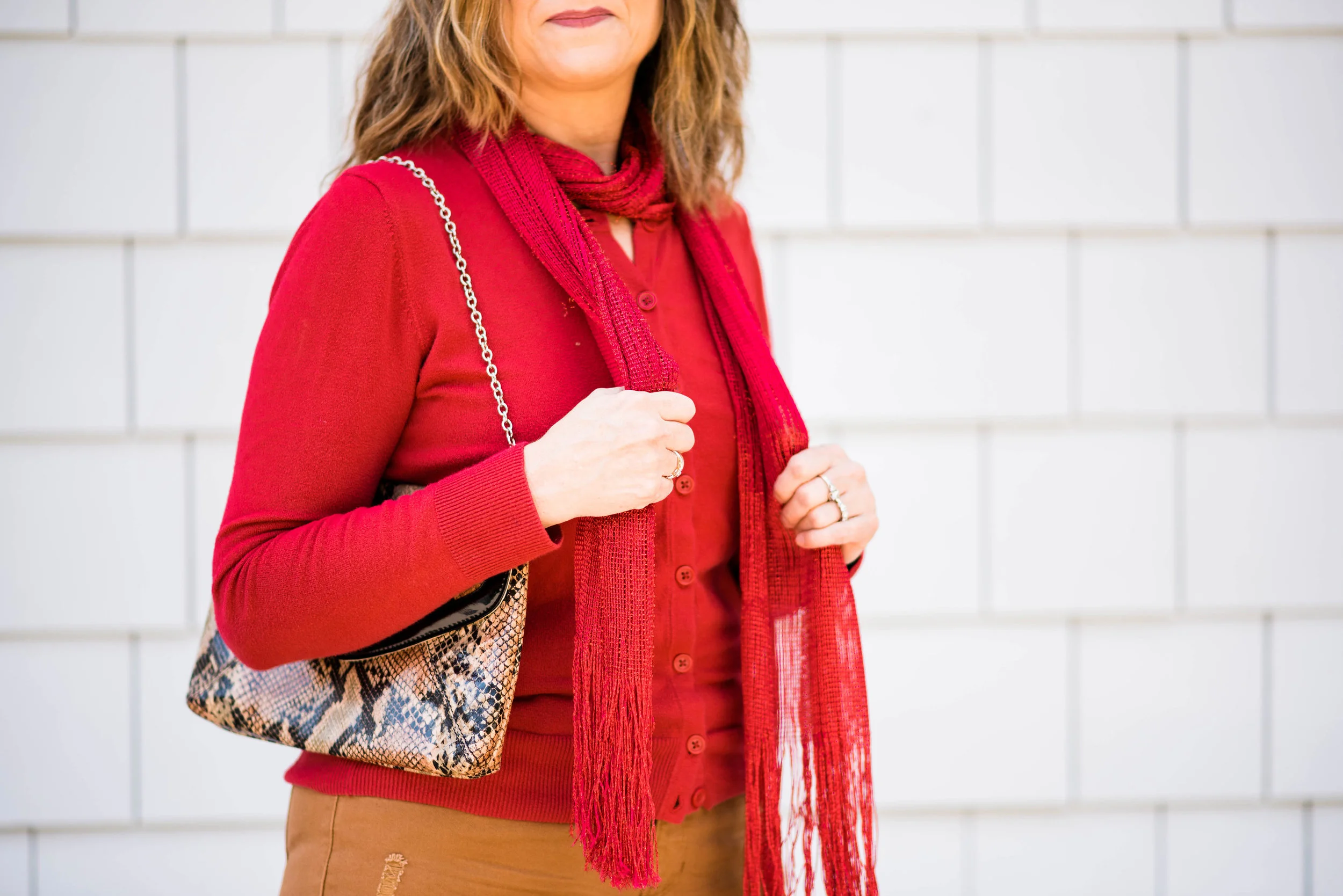
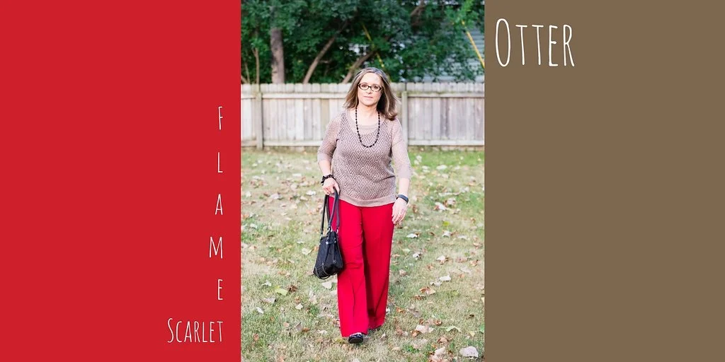
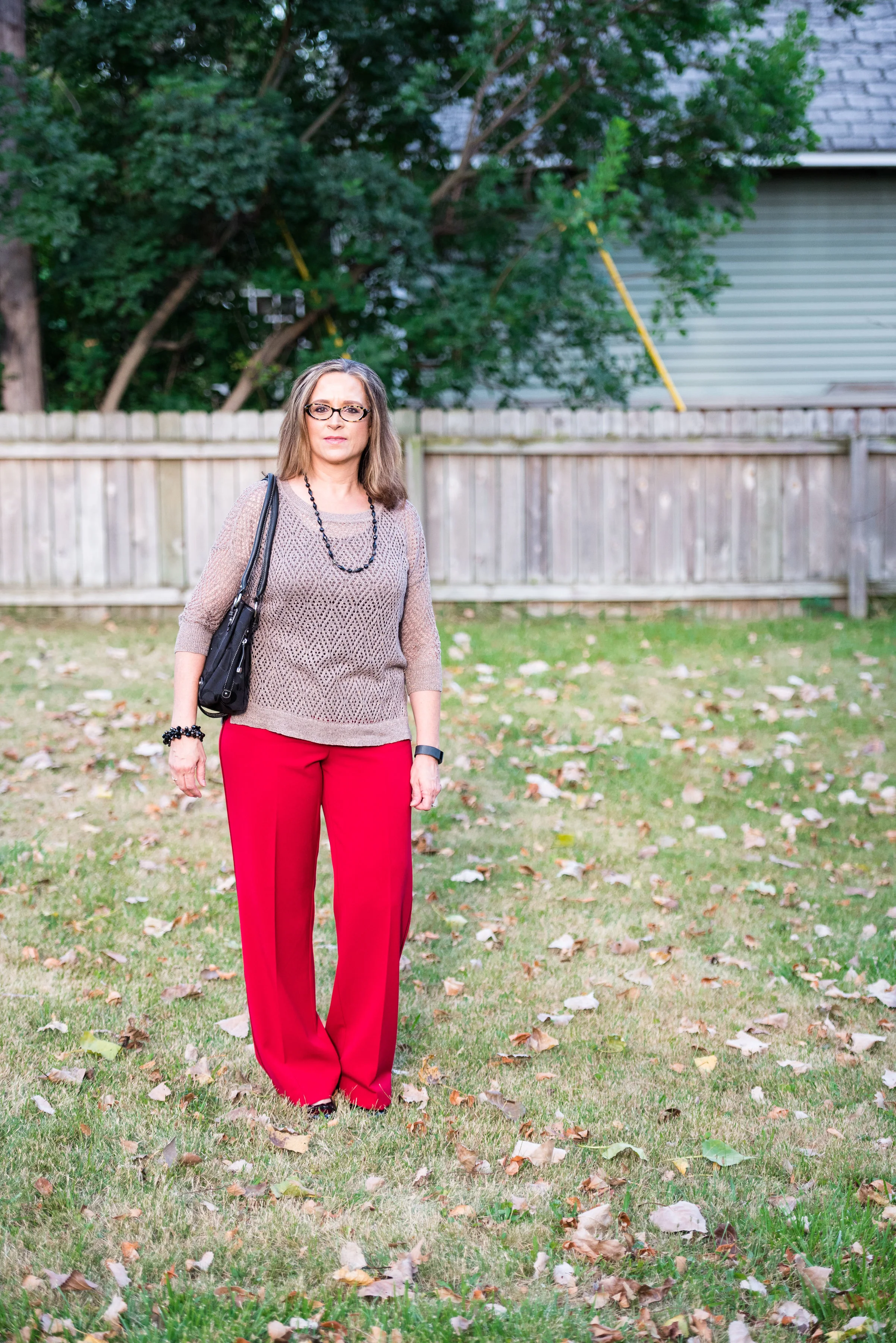
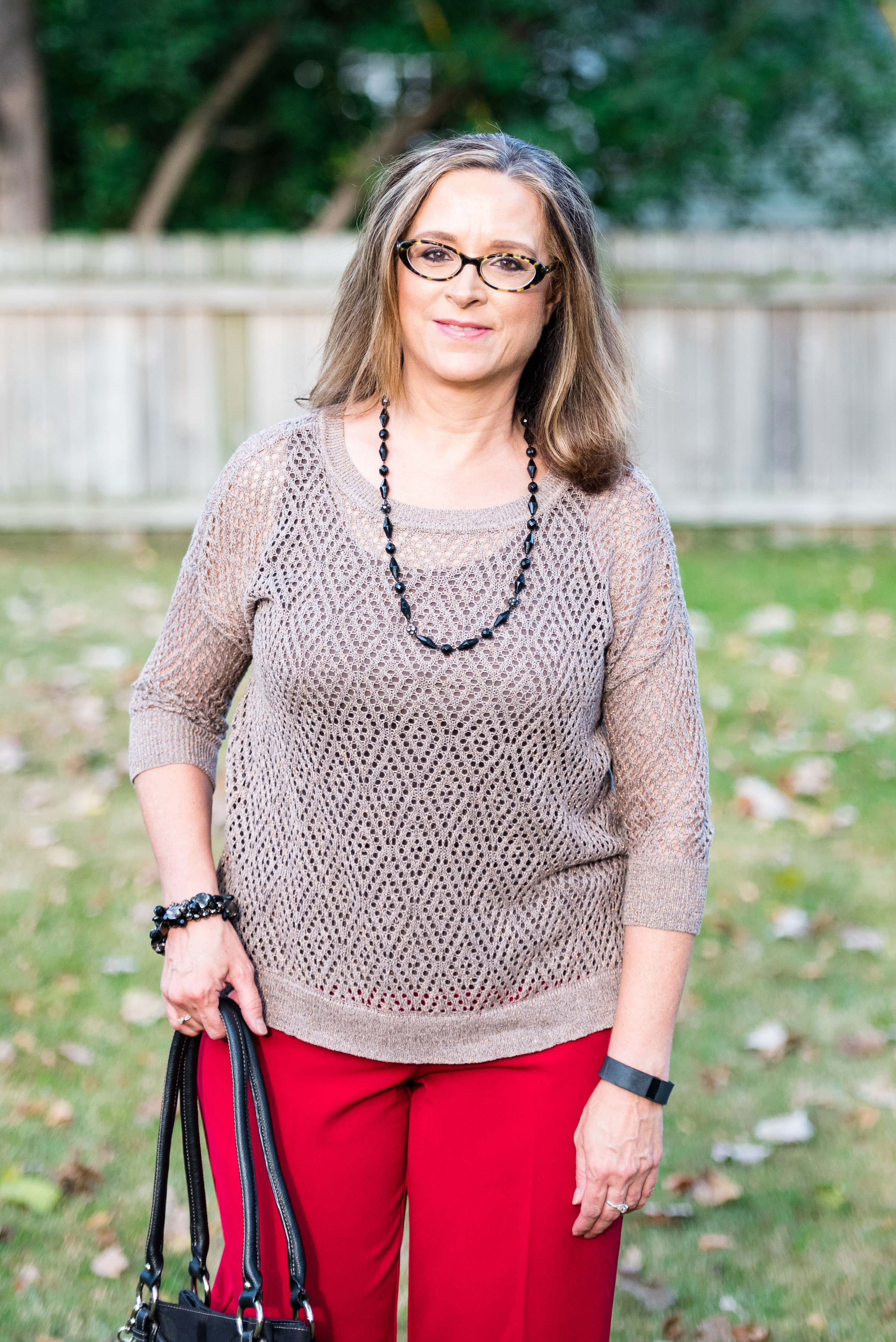
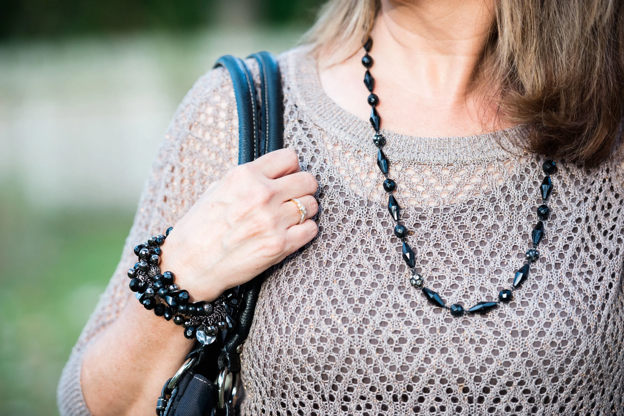
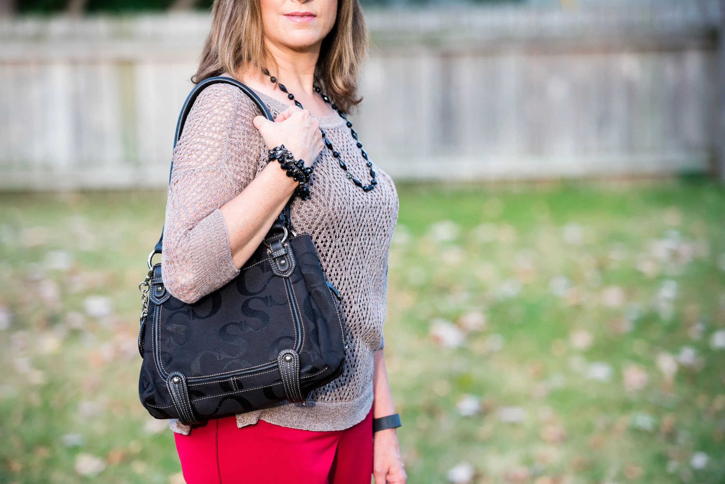
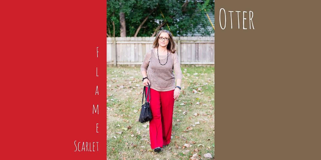
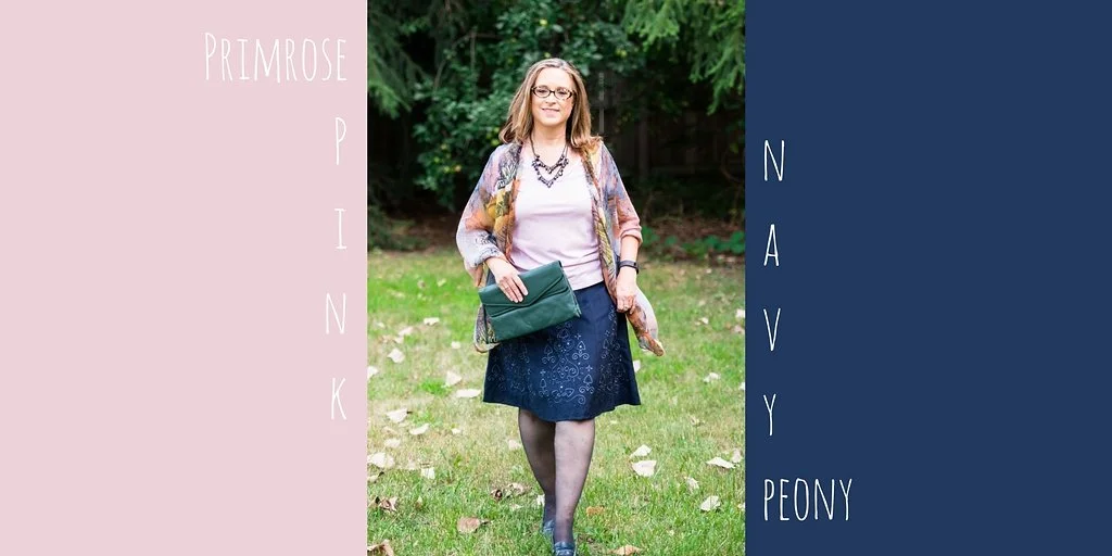
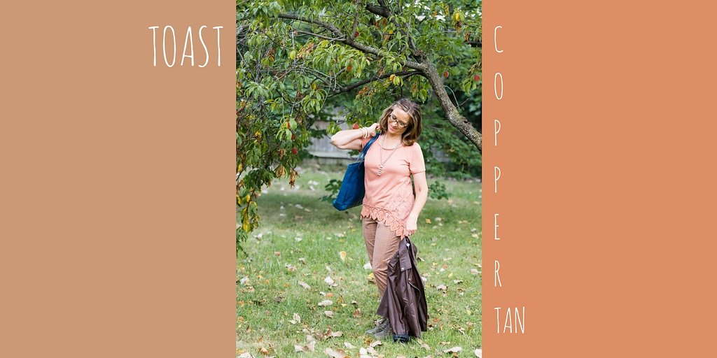
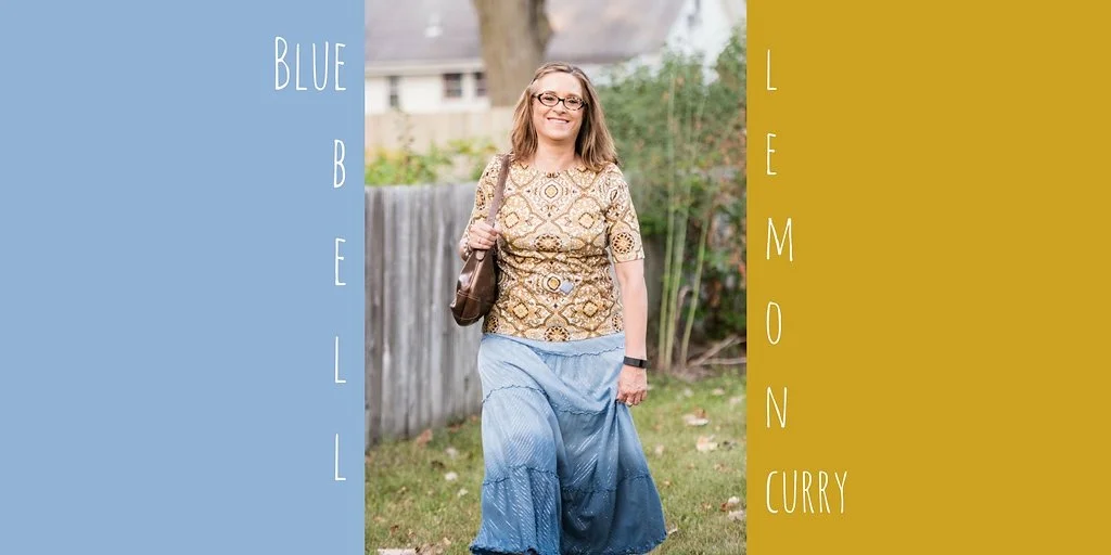
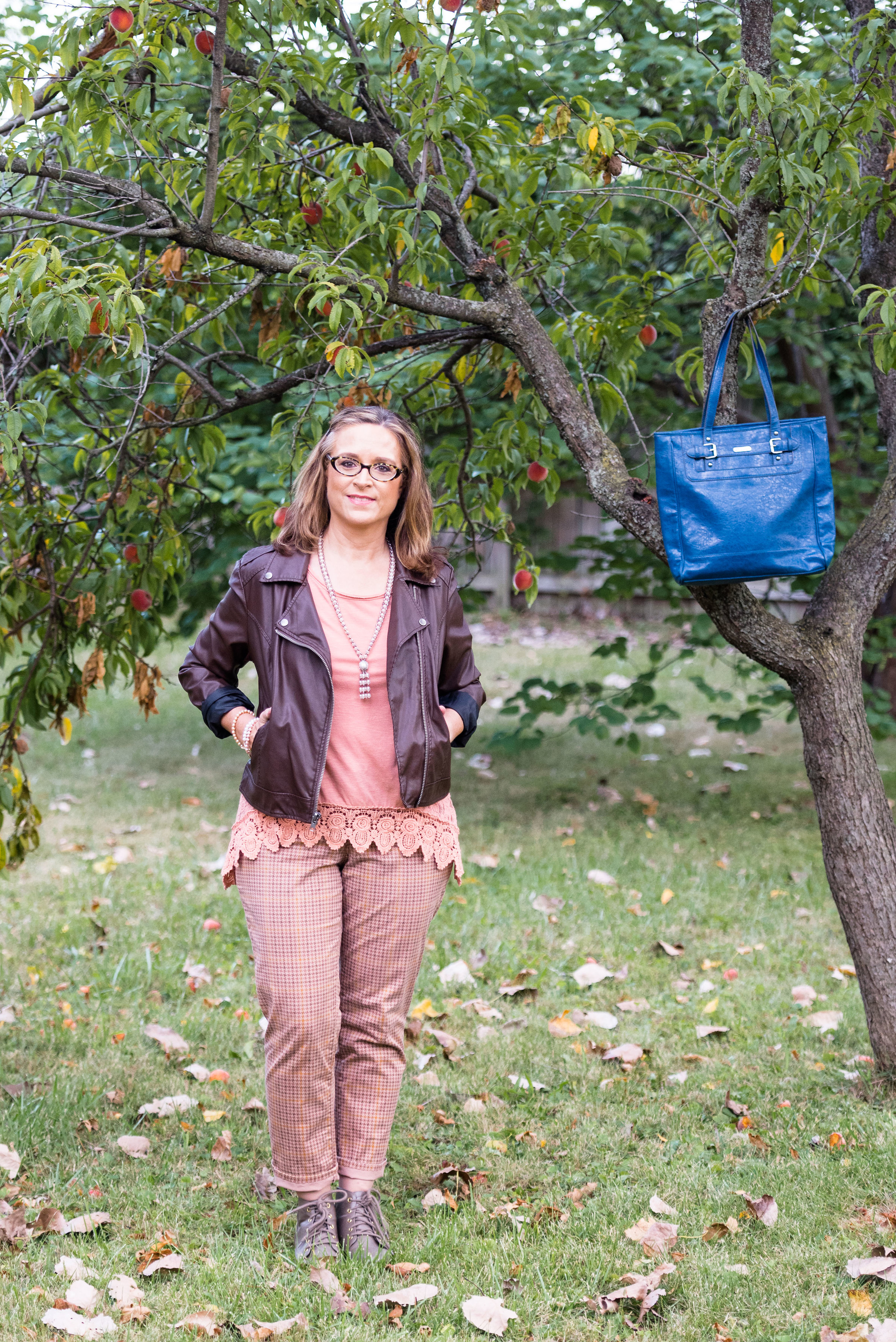
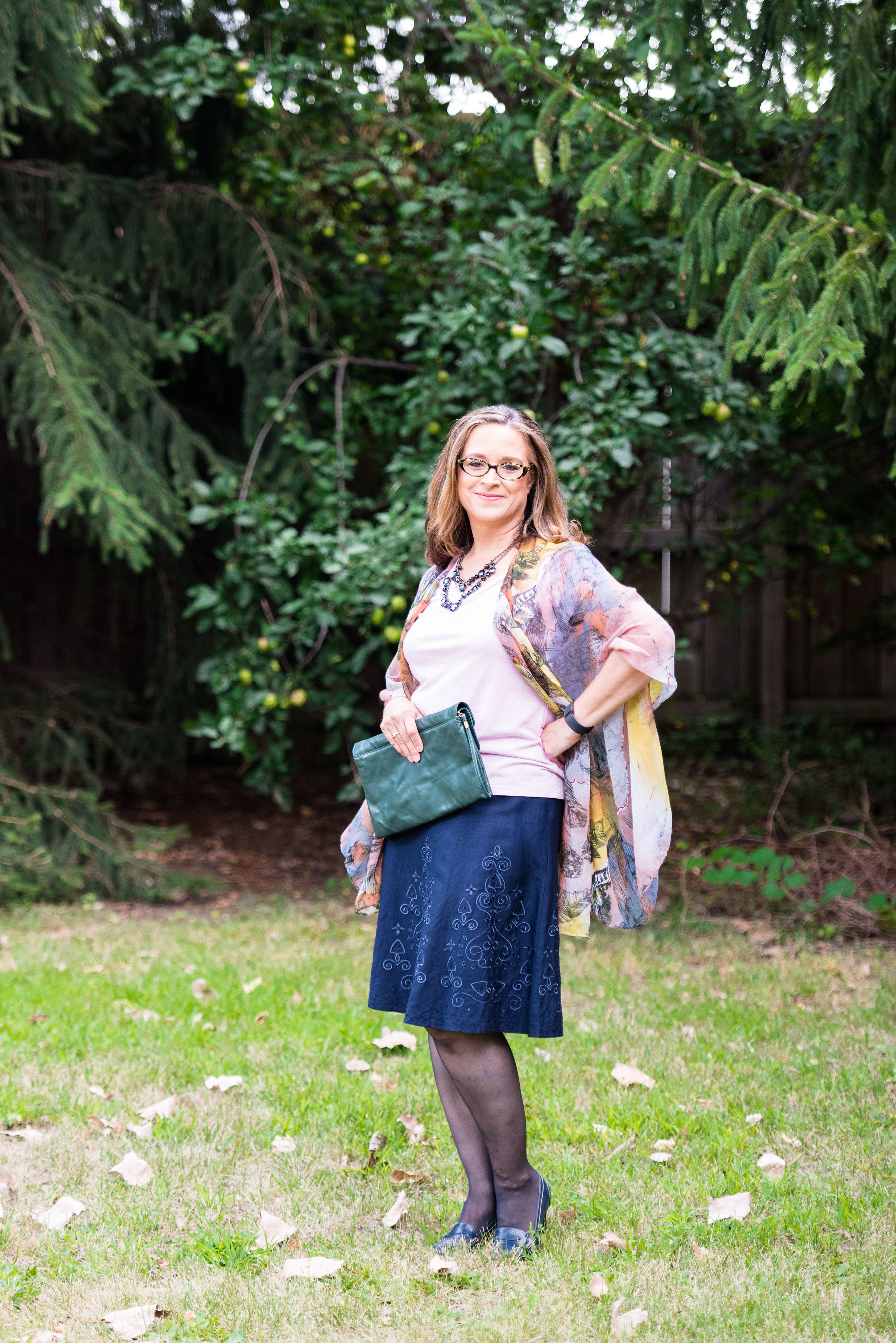
The New York Palette

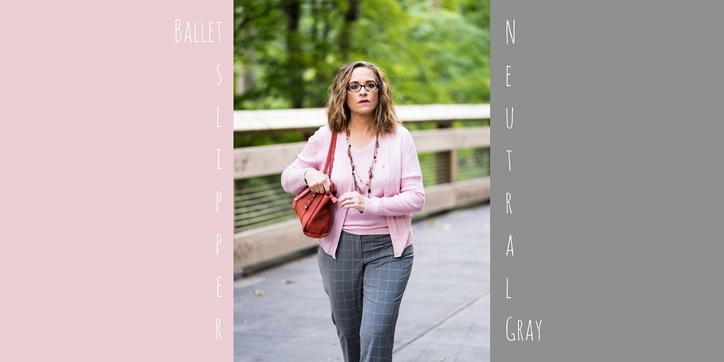

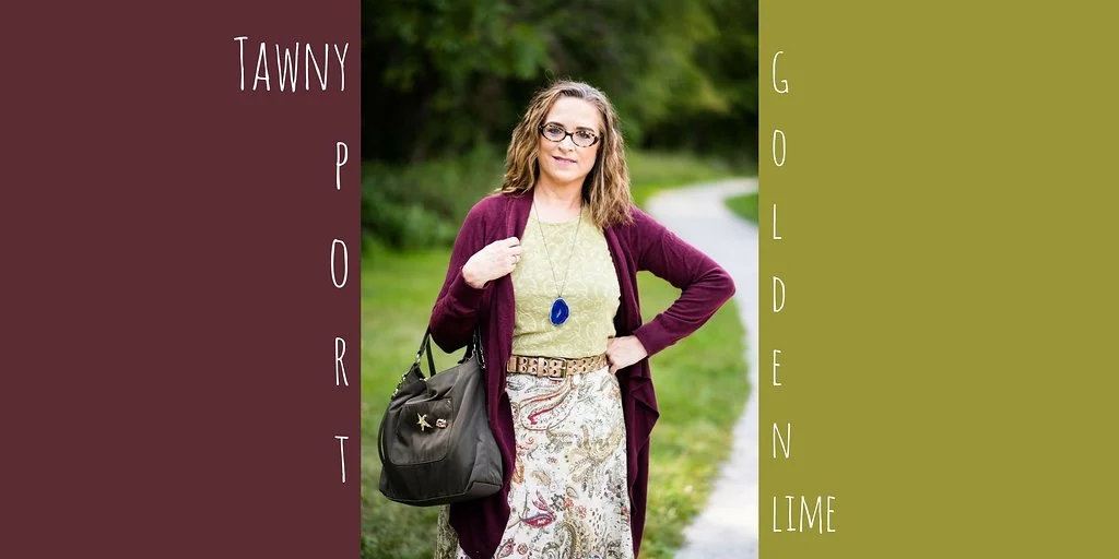

Here are the outfits side by side.

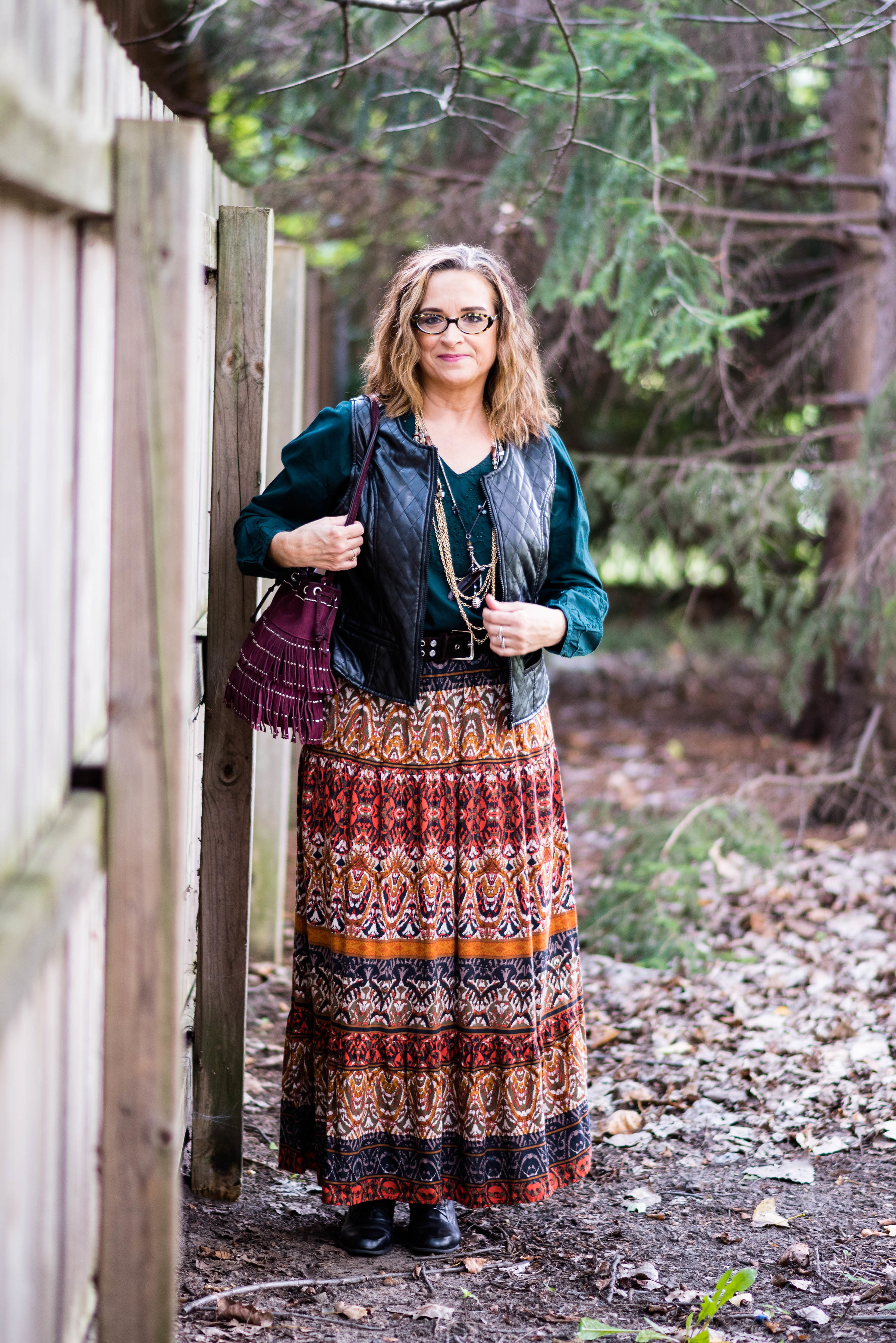
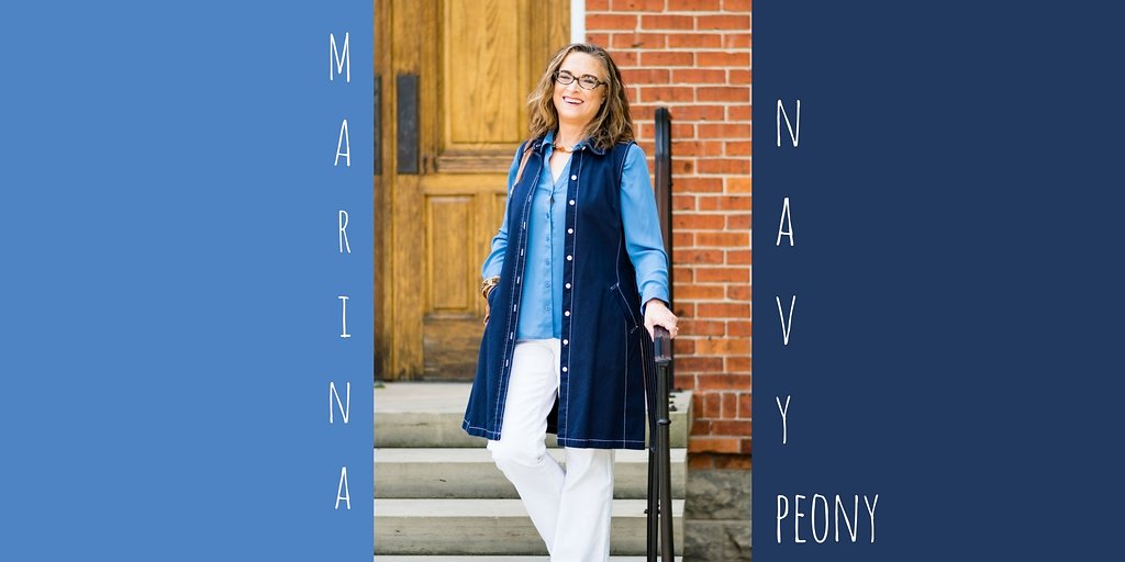
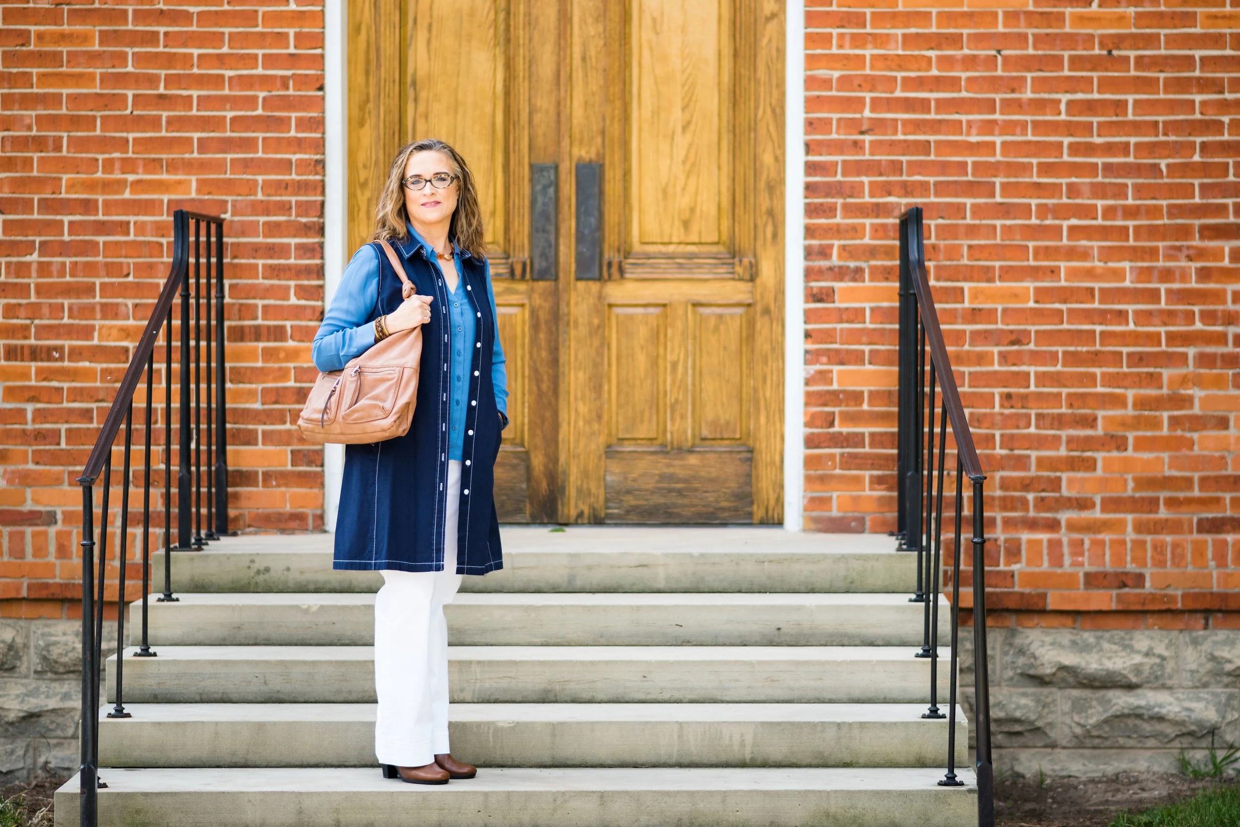
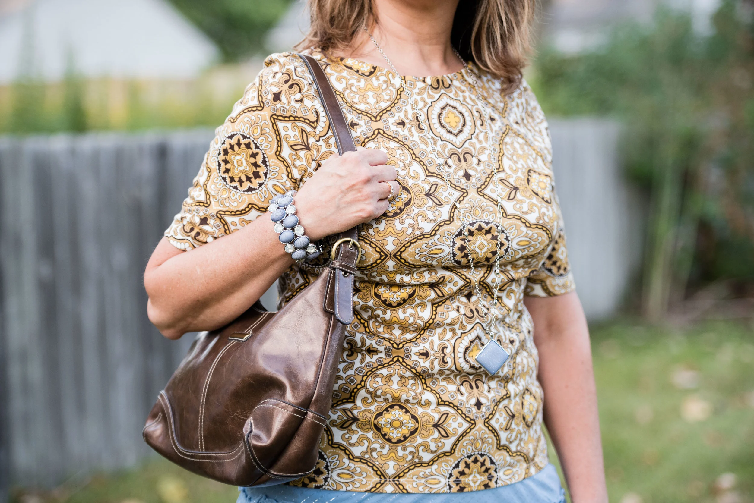
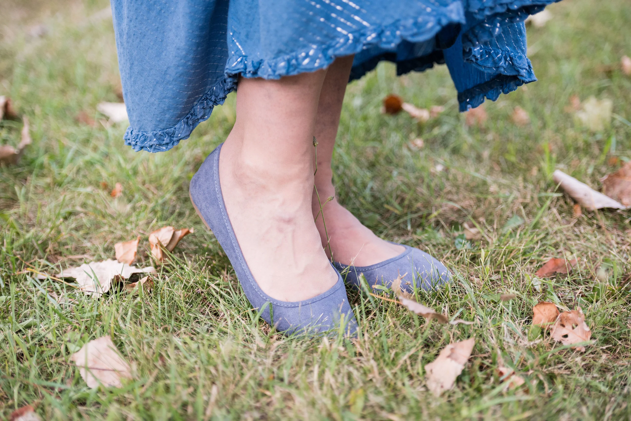
Which one of these color combinations did you like the most? Over all, I liked the New York Palette better than the London Palette. I felt the colors were deeper, richer and easier to find and work with than some of the London colors. If I had to pick one favorite I wouldn't be able to. I like the boldness of Grenadine and Butterum, the classic feel of Ballet Slipper with Neutral Gray, the perfect blend of Navy Peony and Marina, the tropical contrast of Tawny Port and Golden Olive and the fall perfection of Autumn Maple and Shaded Spruce.
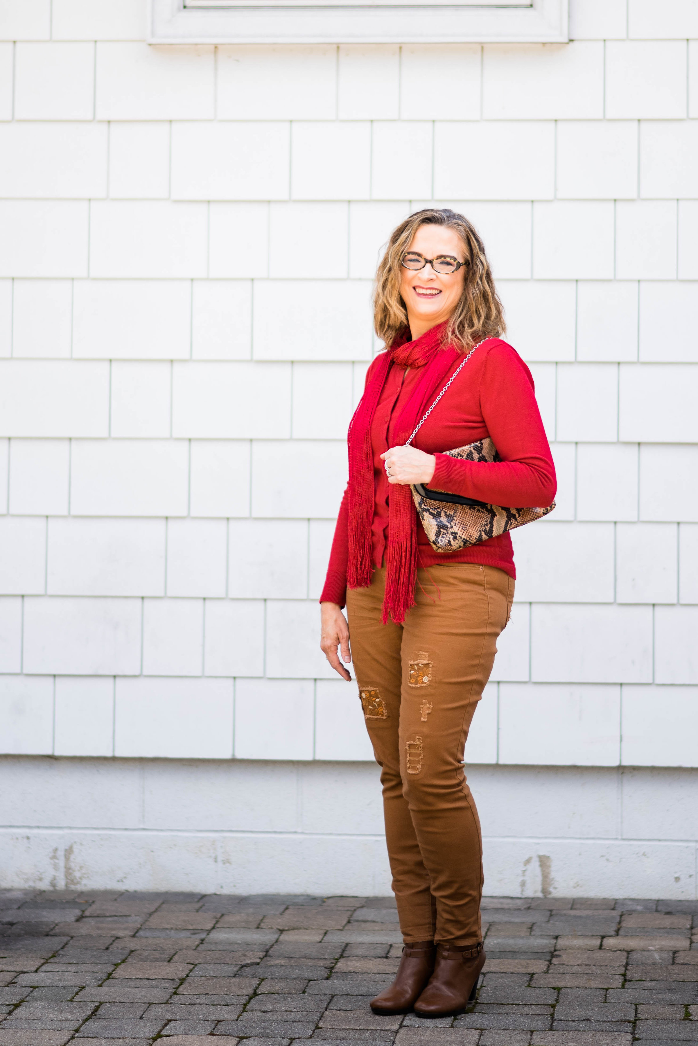
What is lovely about these colors is that you could pair any one with a totally different combination than I have and come up with an equally awesome outfit. How about Grenadine with Marina, Neutral Gray with Shaded Spruce or Autumn Maple with Navy Peony. That is the beauty of finding inspiration in the Pantone color palettes. There is so much you can do with them, long after these colors become obsolete. The Pantone Color Institute has already put out their Spring palettes! Yikes! For a sneak peek at those just click on the one you want to see: London Palette or New York Palette.
To see any of my original posts on this series just click on the link above the picture. I hope you enjoyed this series on the Fall 2017 Pantone colors.
I have decided to postpone my series on camouflage until the new year, so I will be starting a series on dressing for the holidays, next Tuesday. On Thursday I'll be starting a series on layering, which is one of my favorite things to do. I hope you'll join me.