What I Have Been Wearing Lately, and a Look Forward
Hi everyone! It has been a long while since I last posted on my Fashion page, or my Faith page. Life has been busy and filled with all manner of difficulty and struggle, so the blog has taken a back seat for a little while so my spouse and I can try to catch up and recover from all the various challenges.
I have thoughts in mind about when and how to proceed with getting back to a more regular posting schedule which I will share at the end of this post. For today, I thought enough time has passed where I could get away with another post on what I have been wearing lately using outfits I posted on Instagram.
I enjoy the ease and quickness of posting on Instagram. The descriptions are short and usually include a little blurp about a challenge I am participating in, the outfit I am wearing and what was happening on that particular day. Lately, they have been shorter than ever because I am so tired and unmotivated, but I keep trying to show up because I know if I give up I will crawl under a comfortable rock and probably never come back out. Here we go!
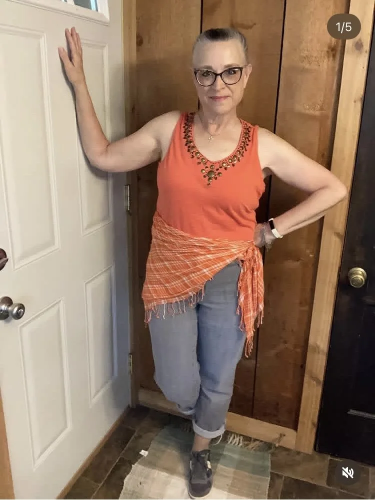
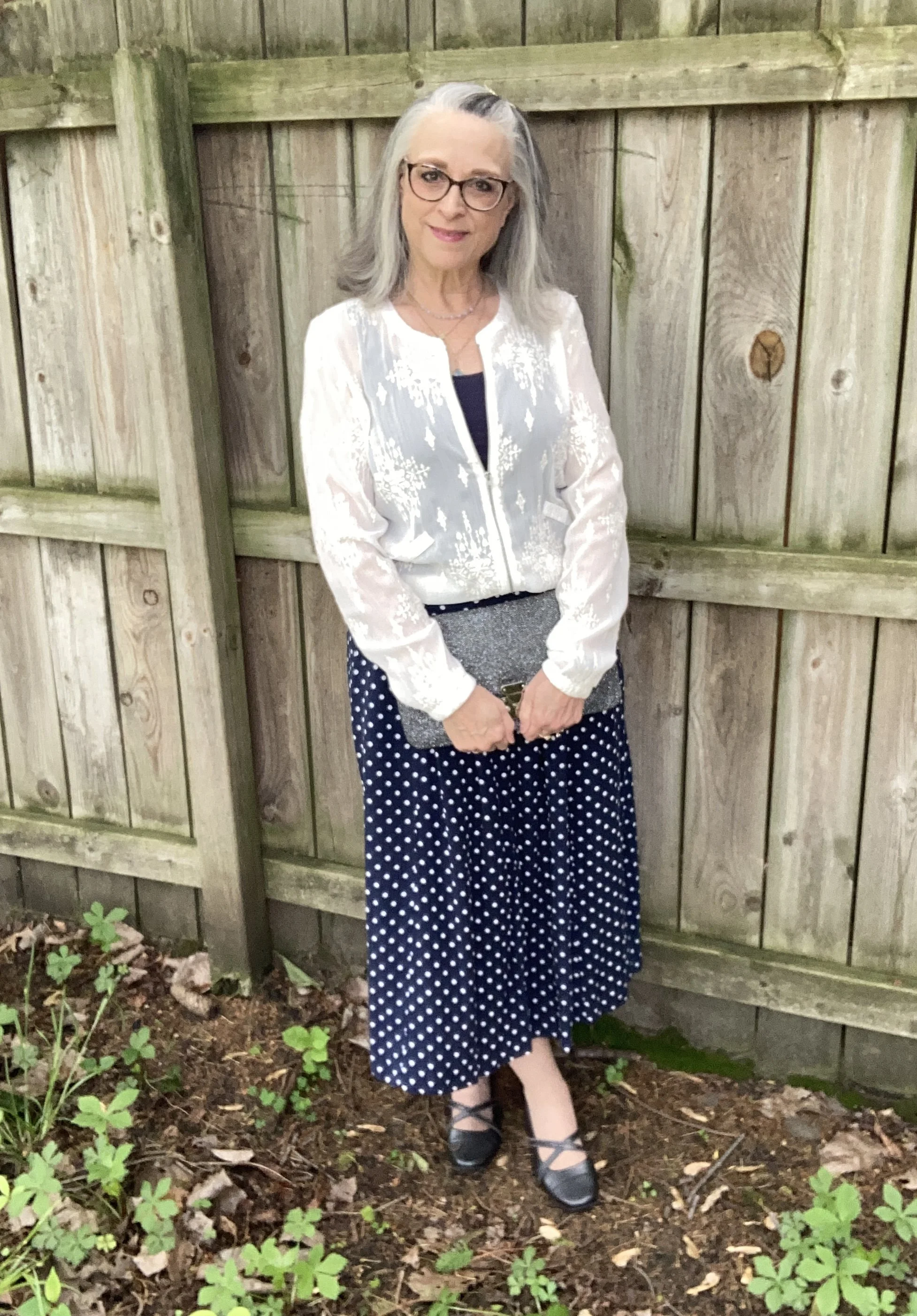
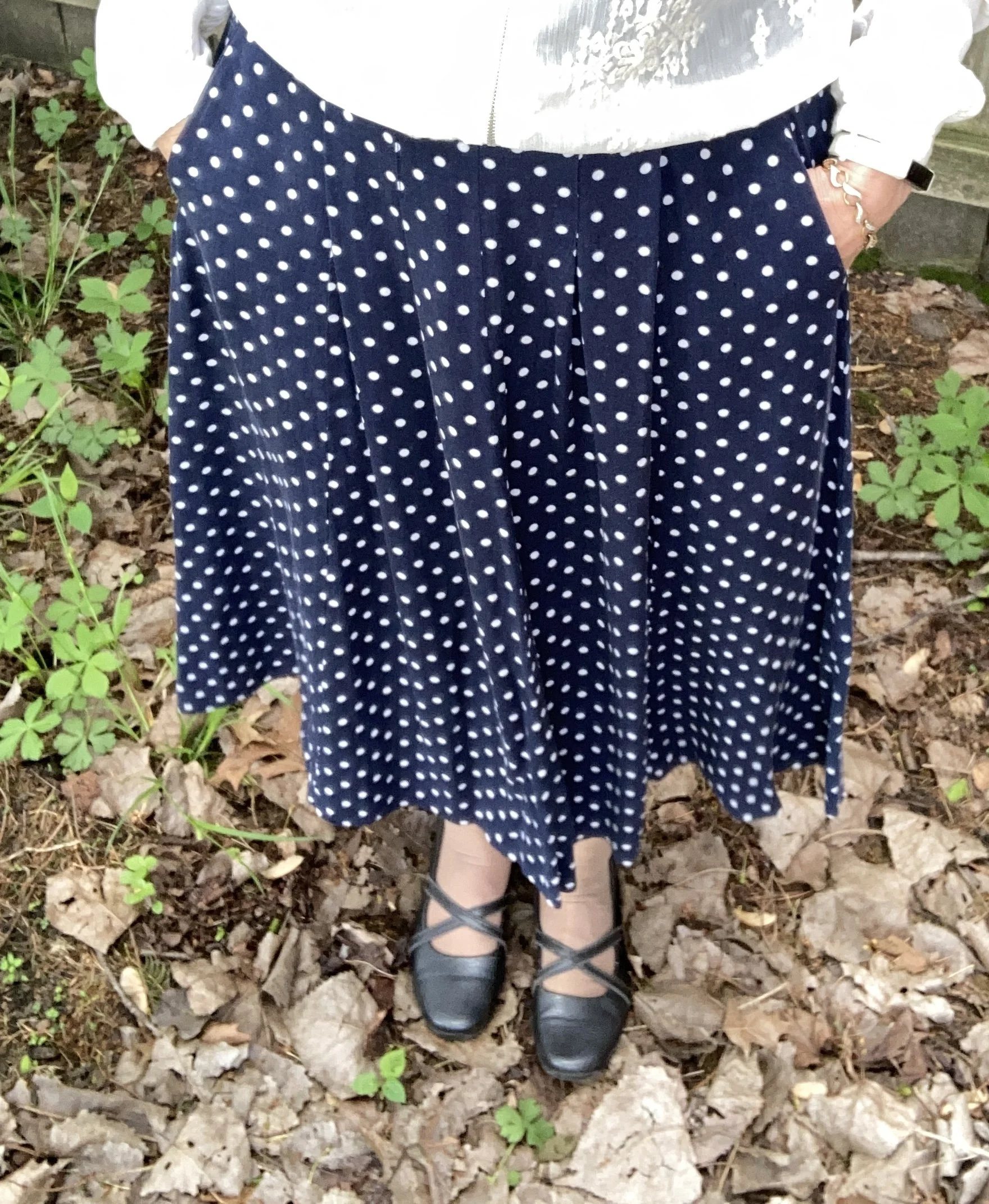
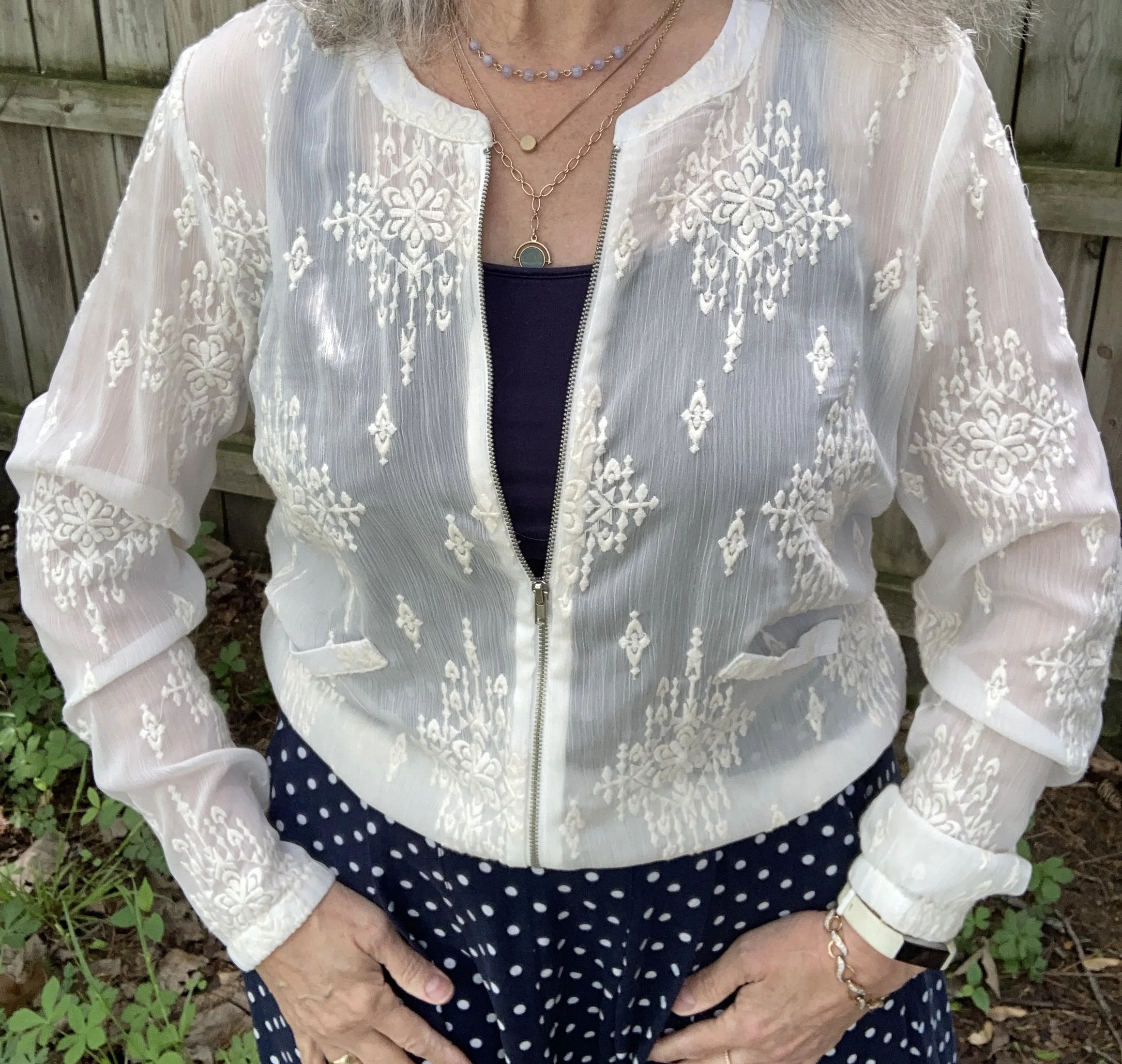
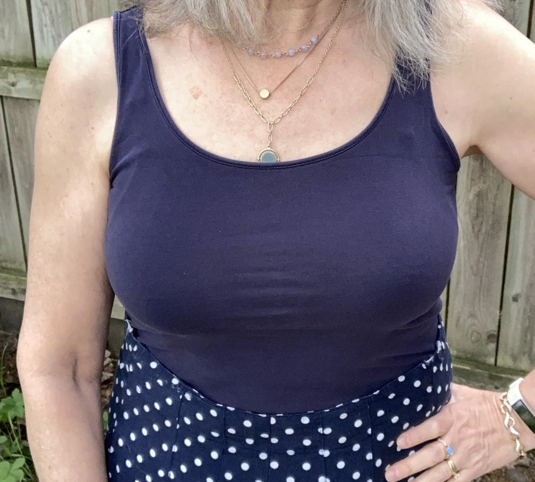
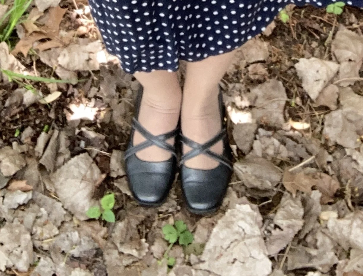
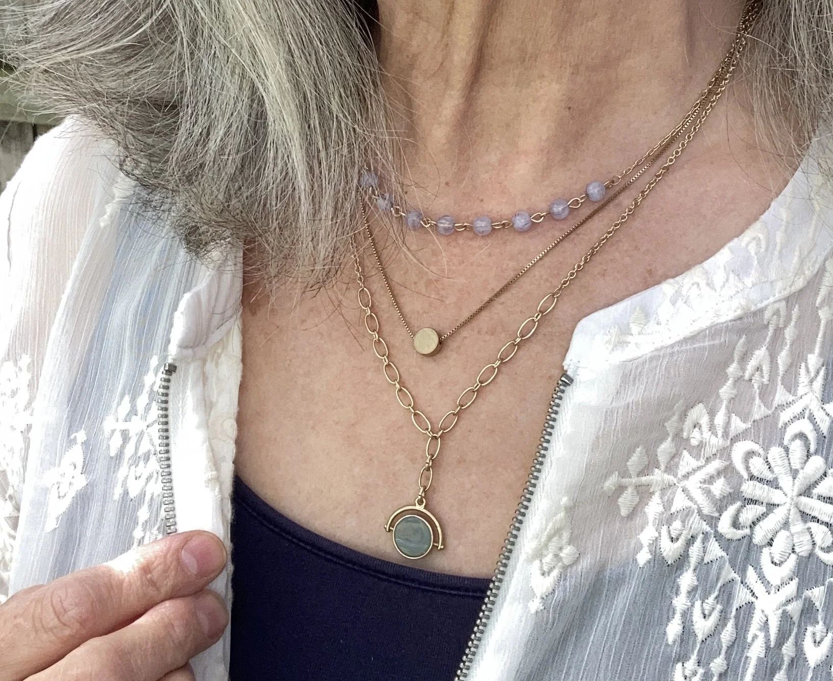
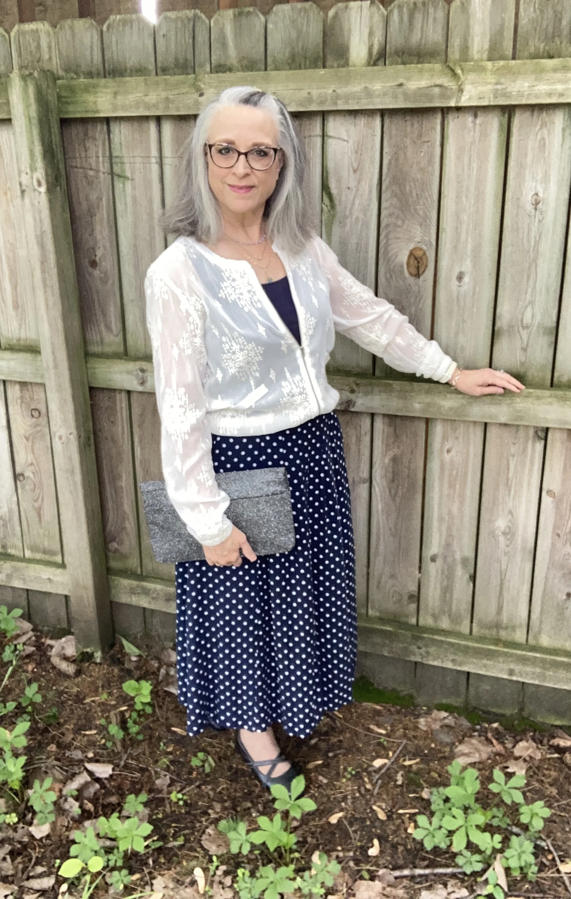
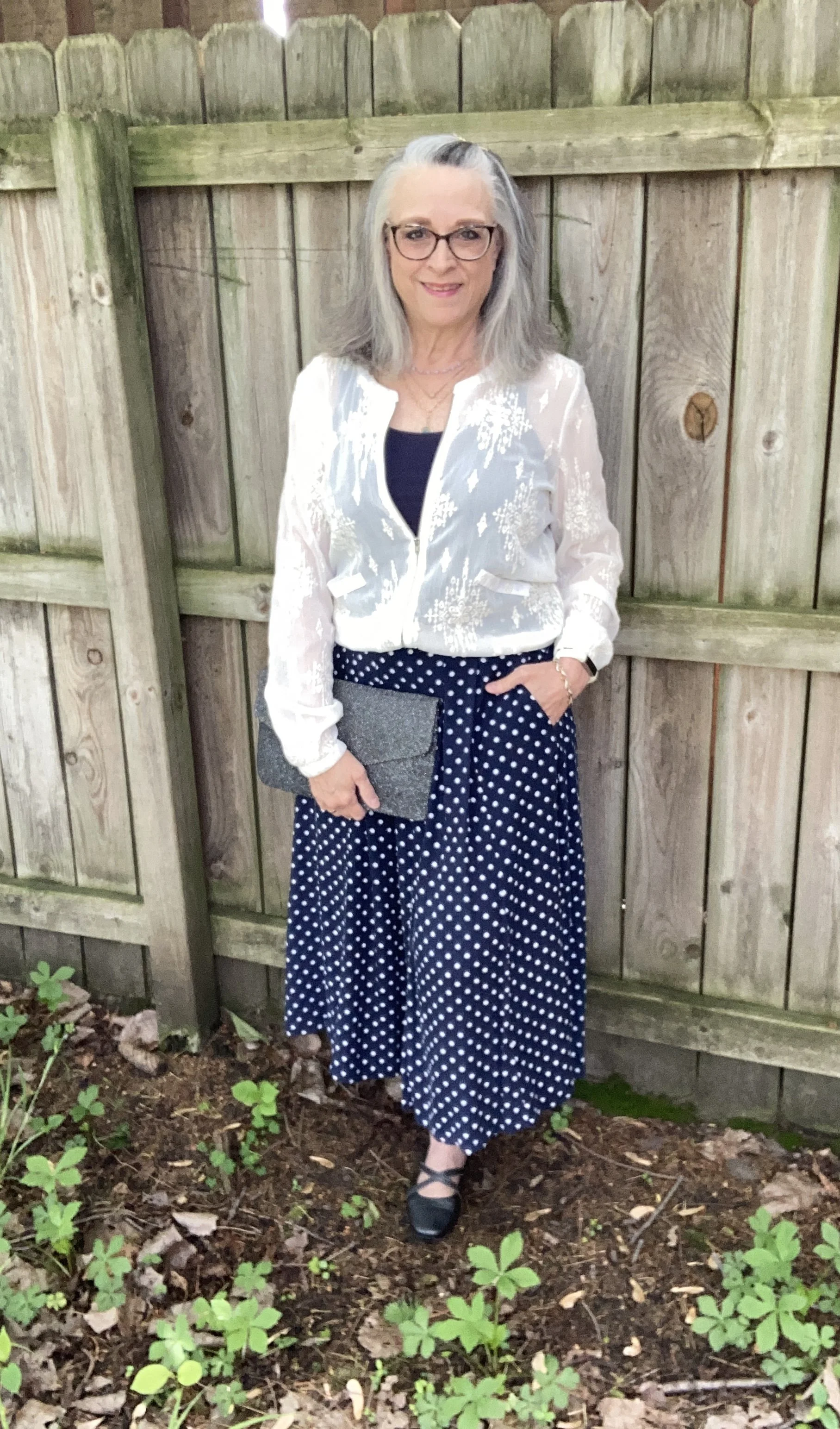
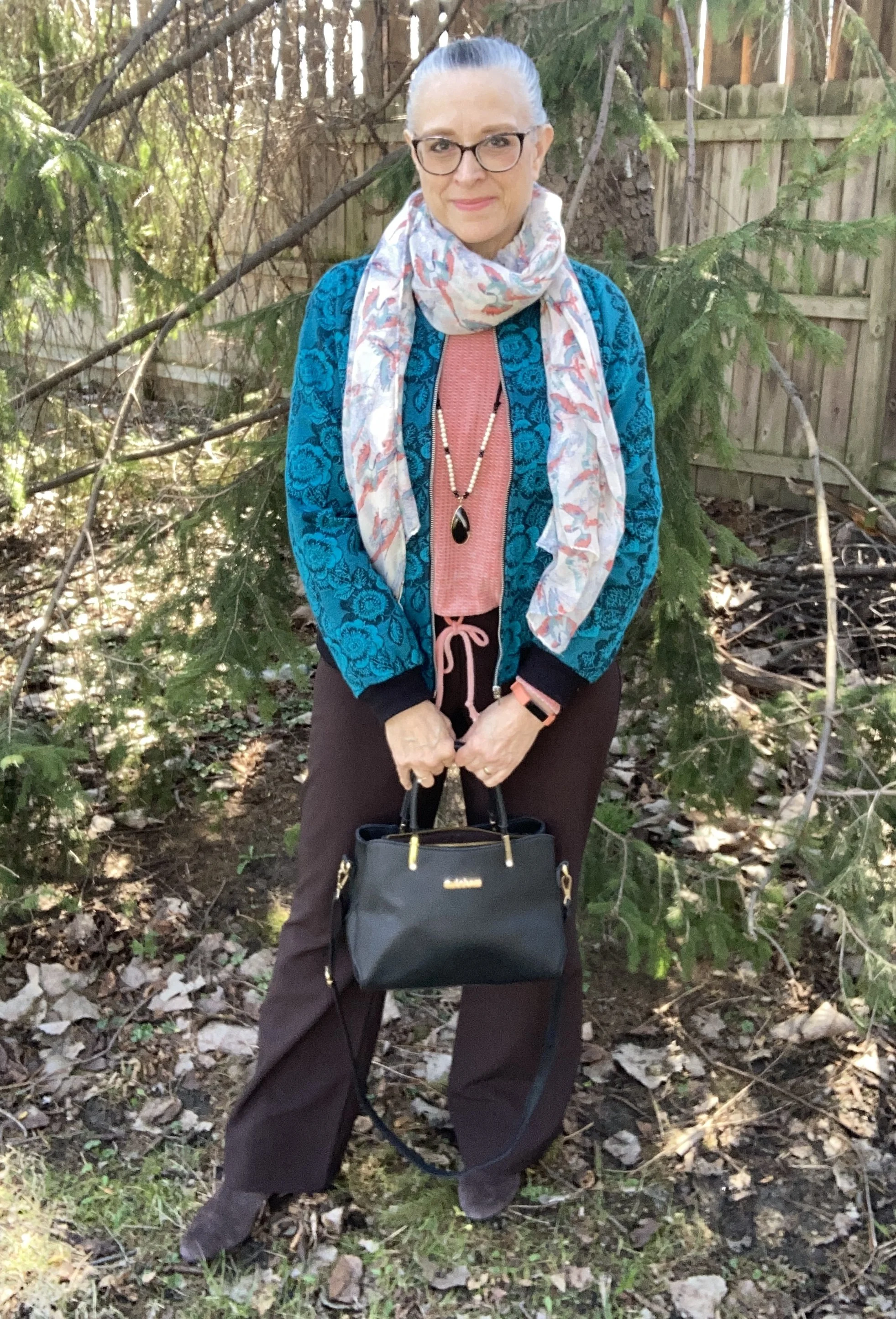
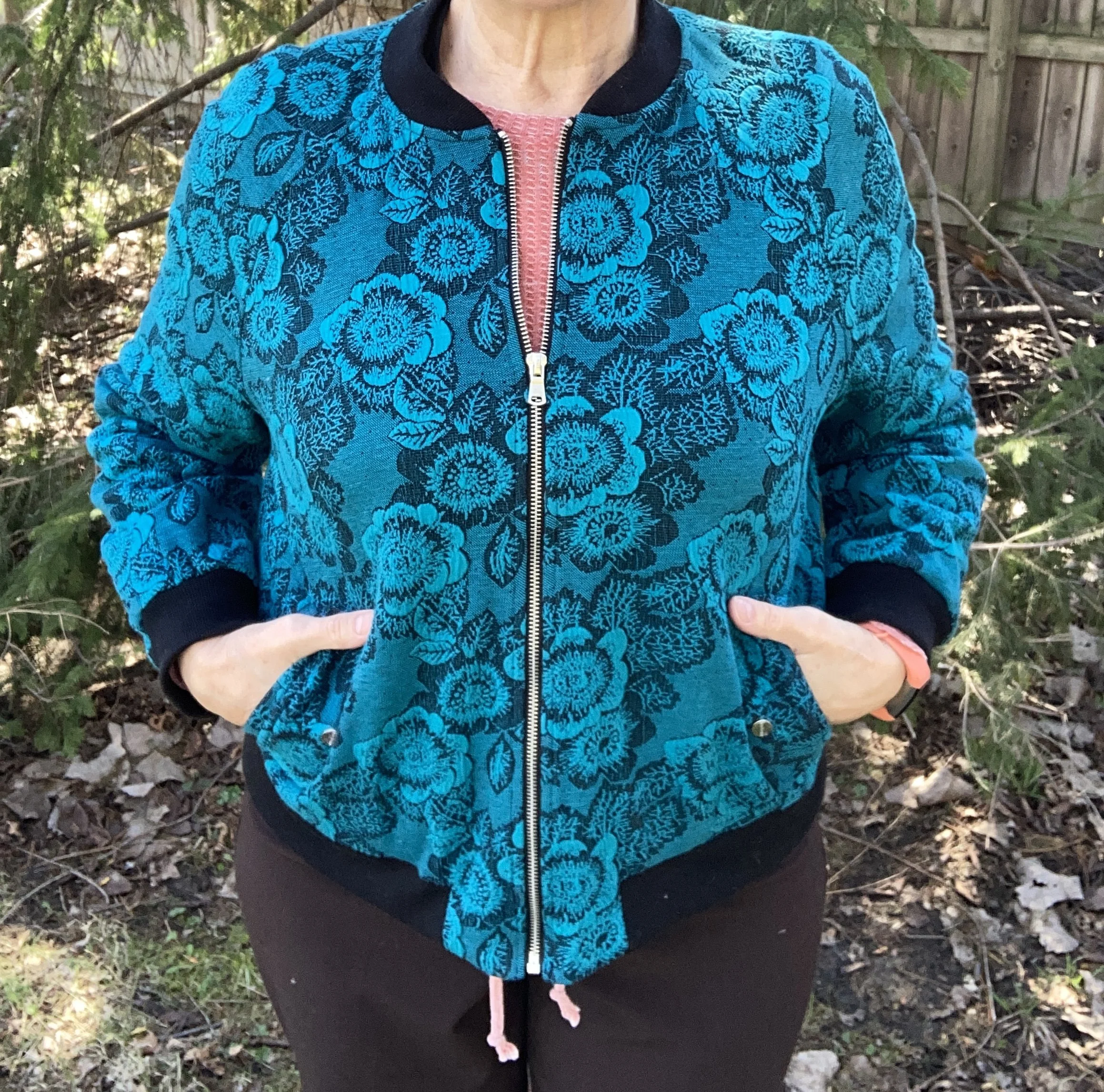
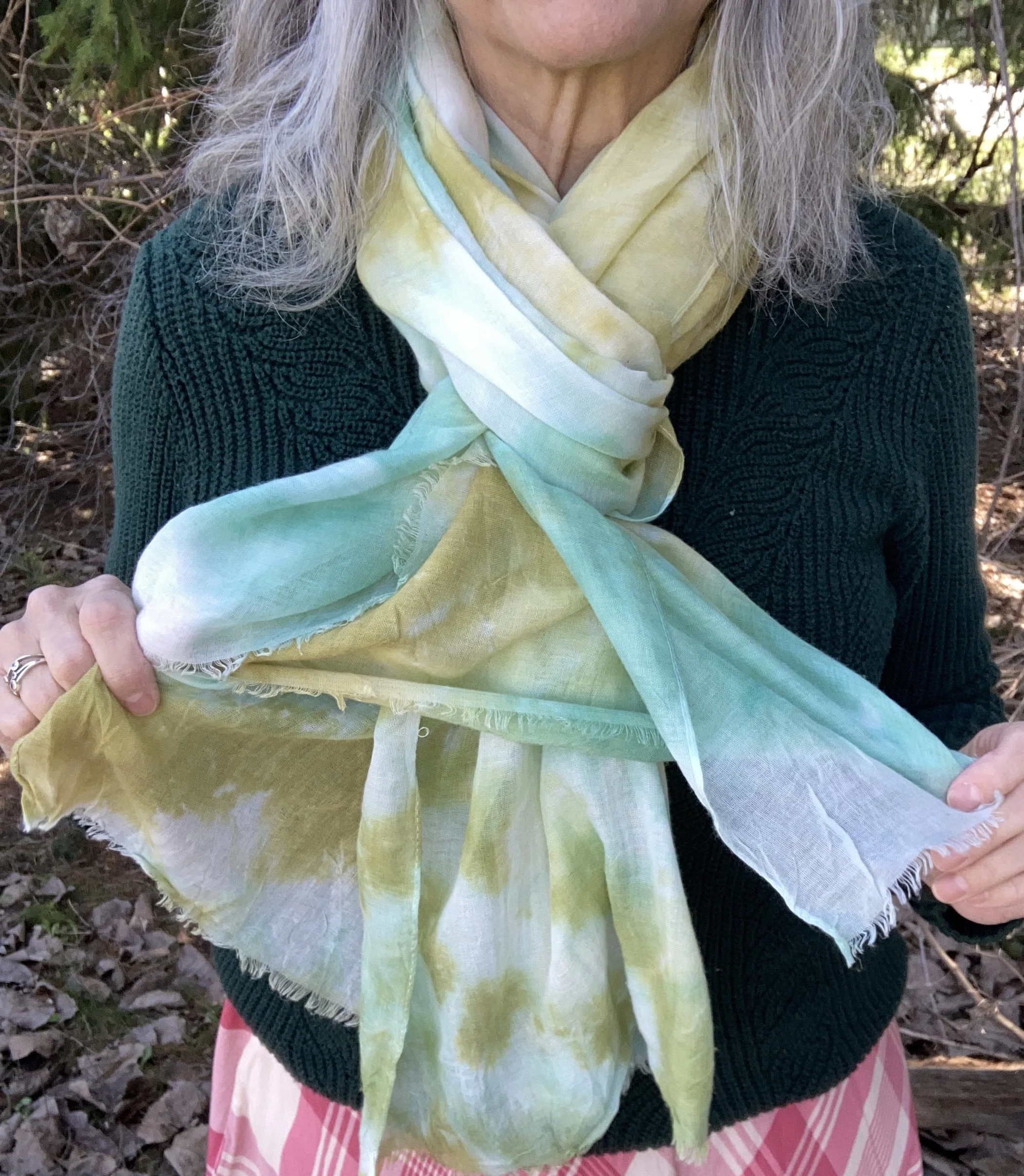
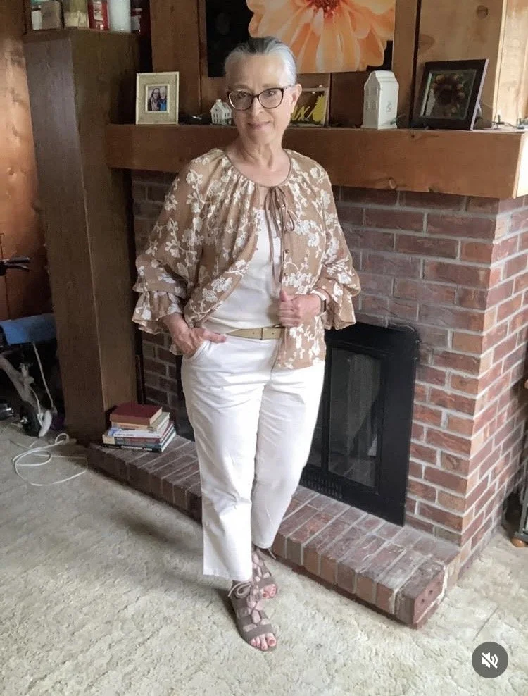
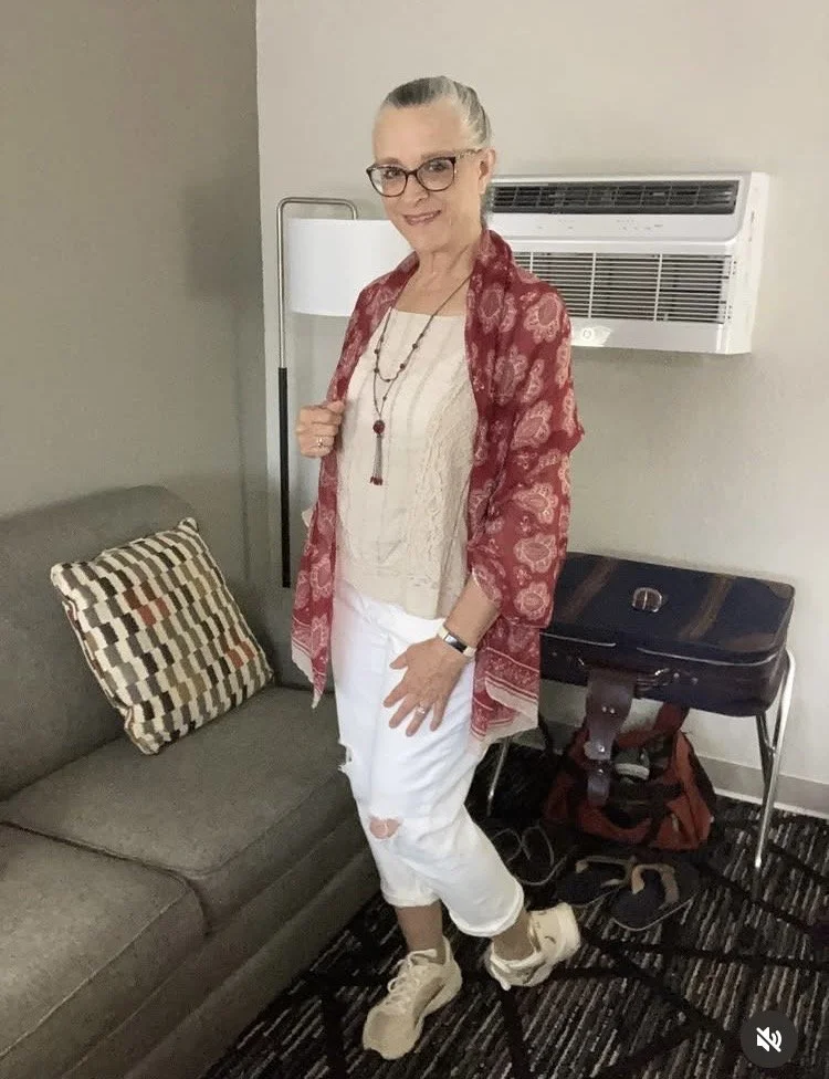
Italian Coastal Chic
I put together this fun look from the above prompt for one of the IG challenges I was participating in. The idea of an outfit that exemplified the Italian coast was way outside of my wheelhouse, so I began with Pinterest. I typed in Italian Coastal Chic and most of what popped up where beautiful, lanky women in their mid thirties dressed in lovely tiered dresses, flowy neutral pants, crisp white tees or tanks, carrying cute straw bags and wearing strappy sandals. As much as I would love to look like they did, I don’t, so I created this look from what was in my closet, using the embroidered, lace topper as a jacket of sorts over a tank top. Keeping the colors neutral definitely gives it more of a European vibe.
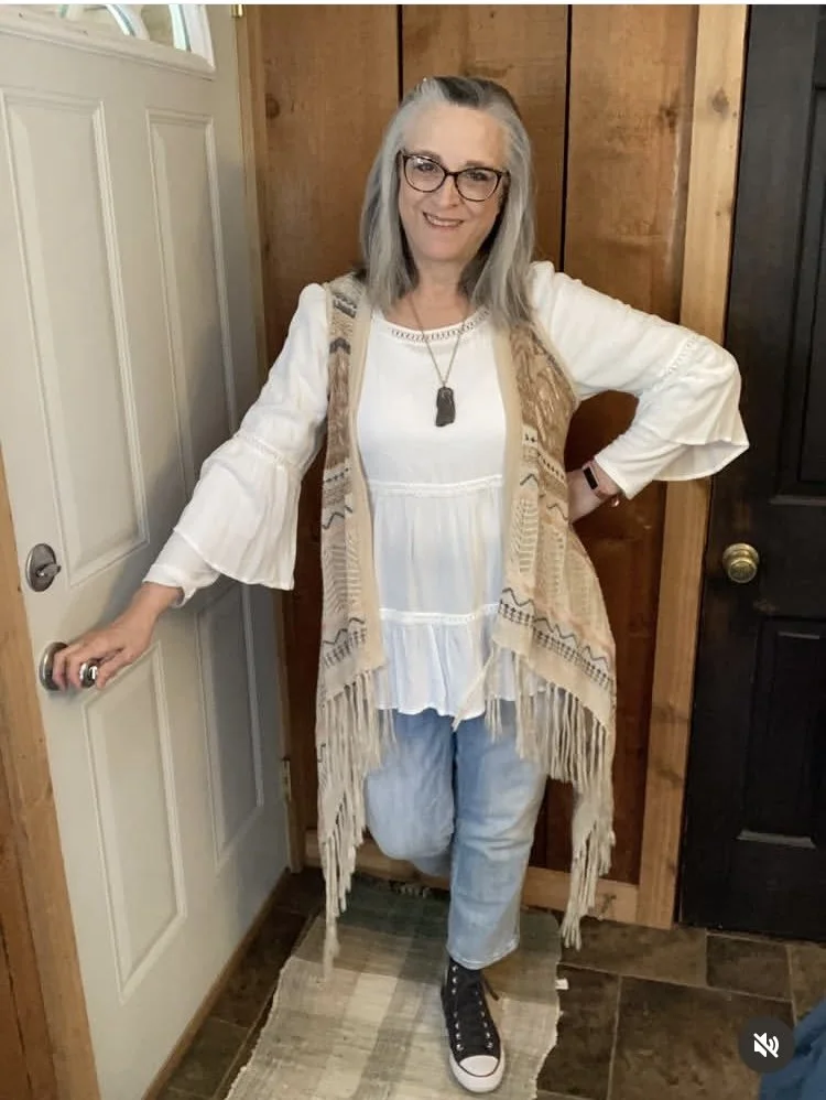
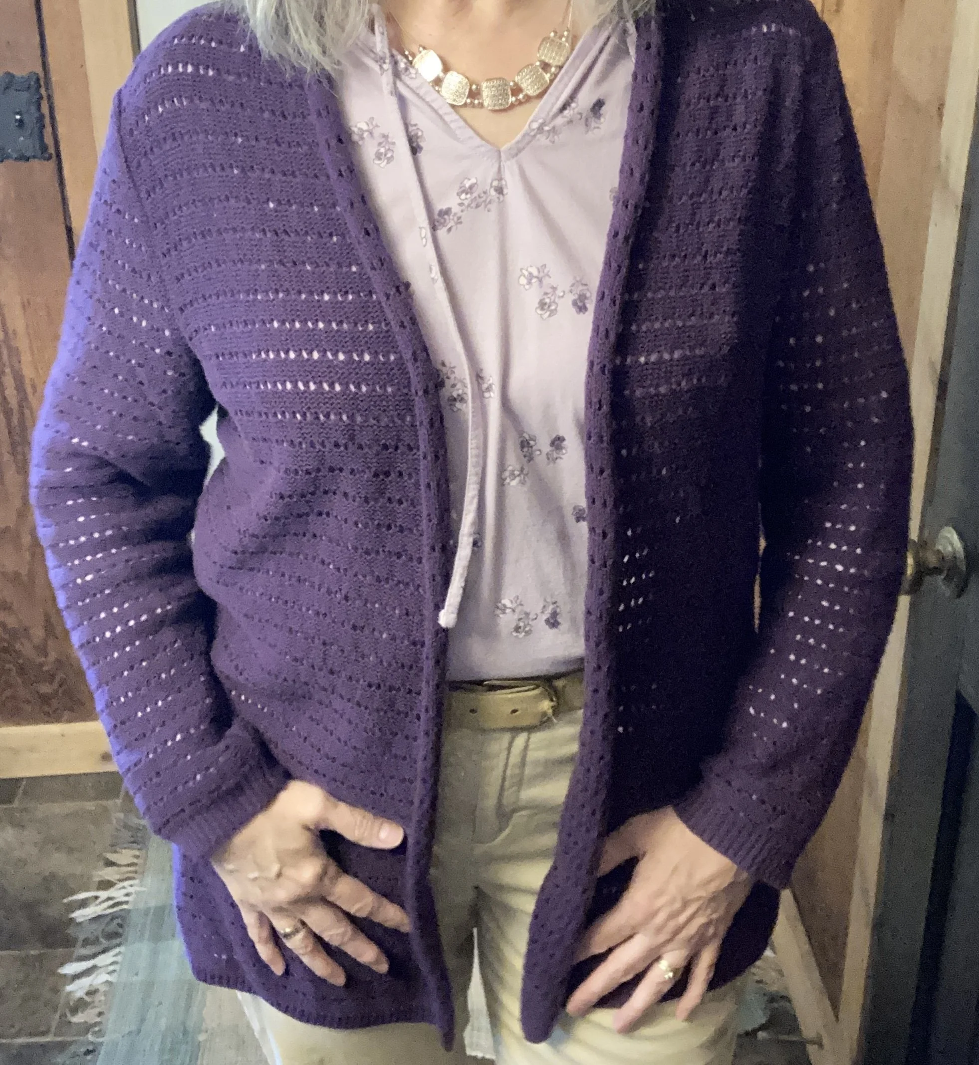
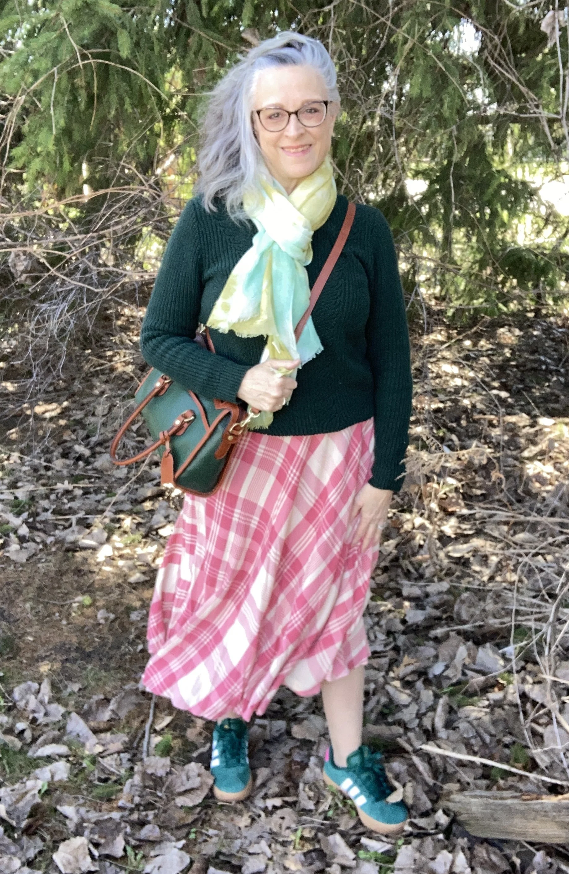
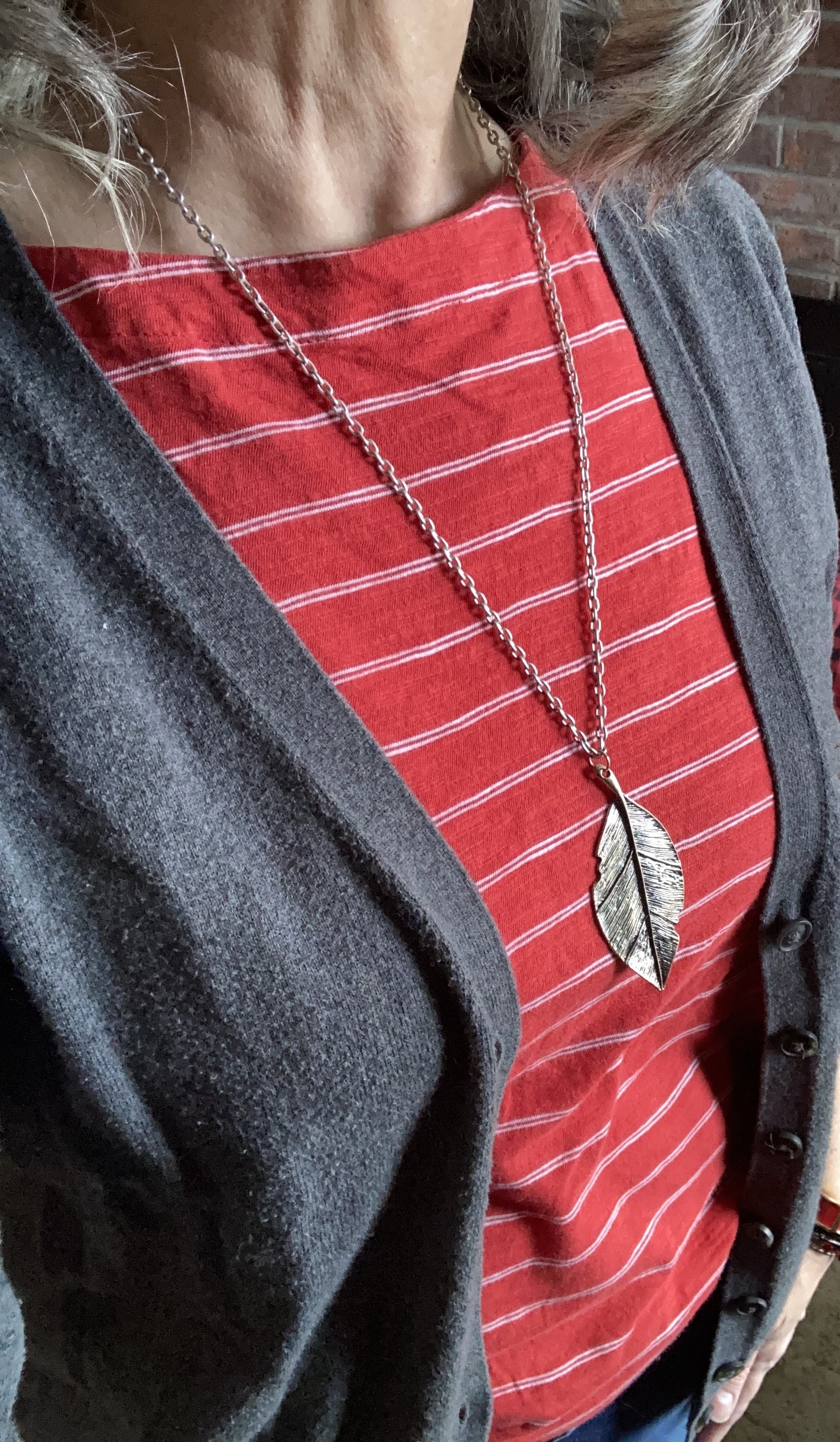
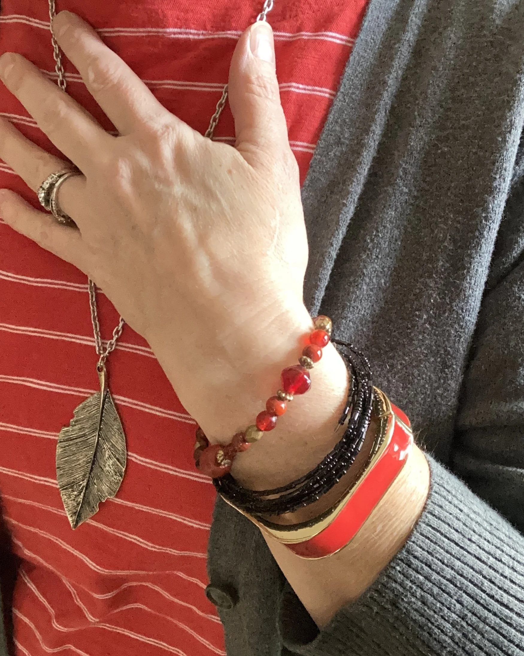
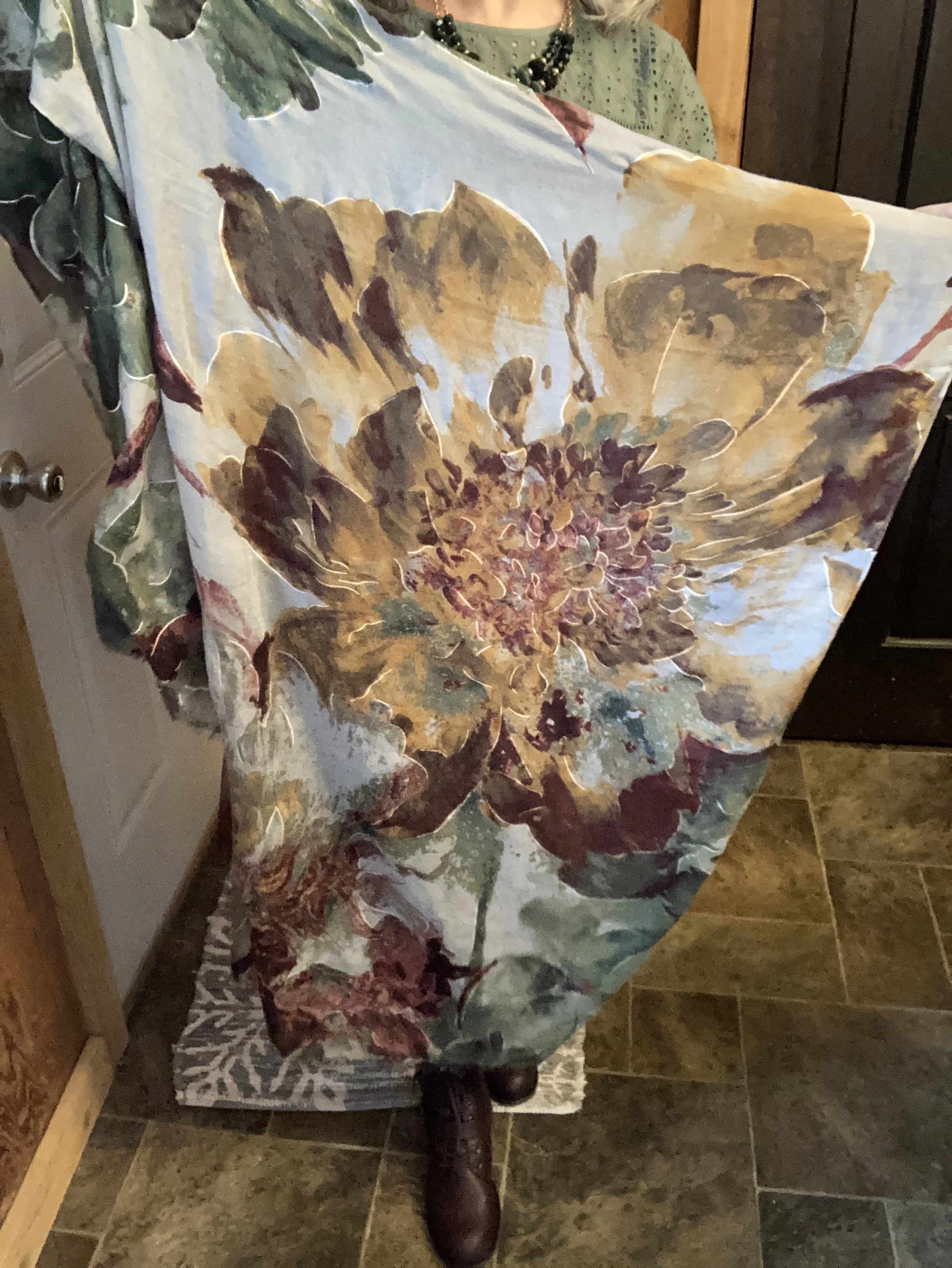
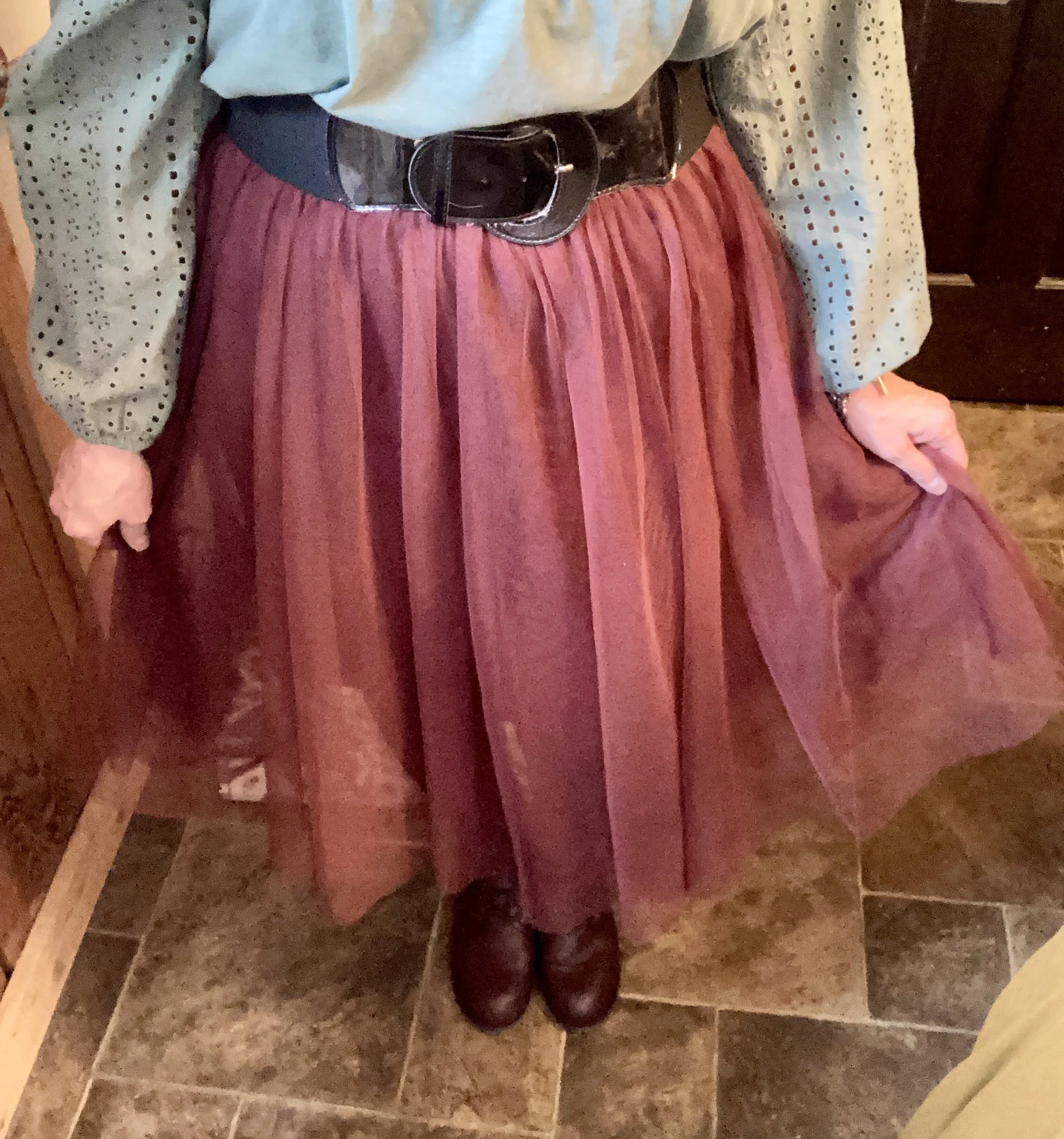
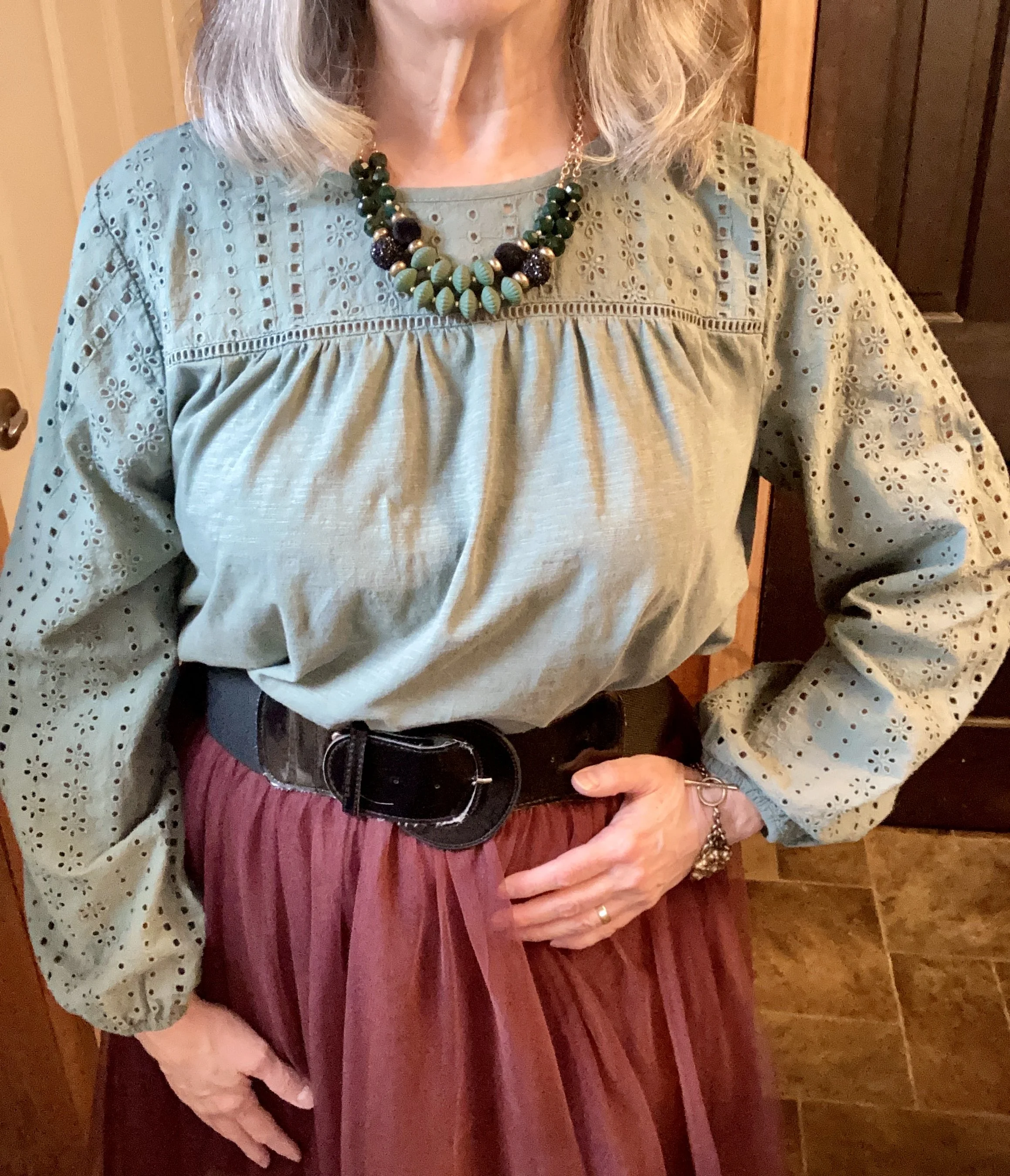
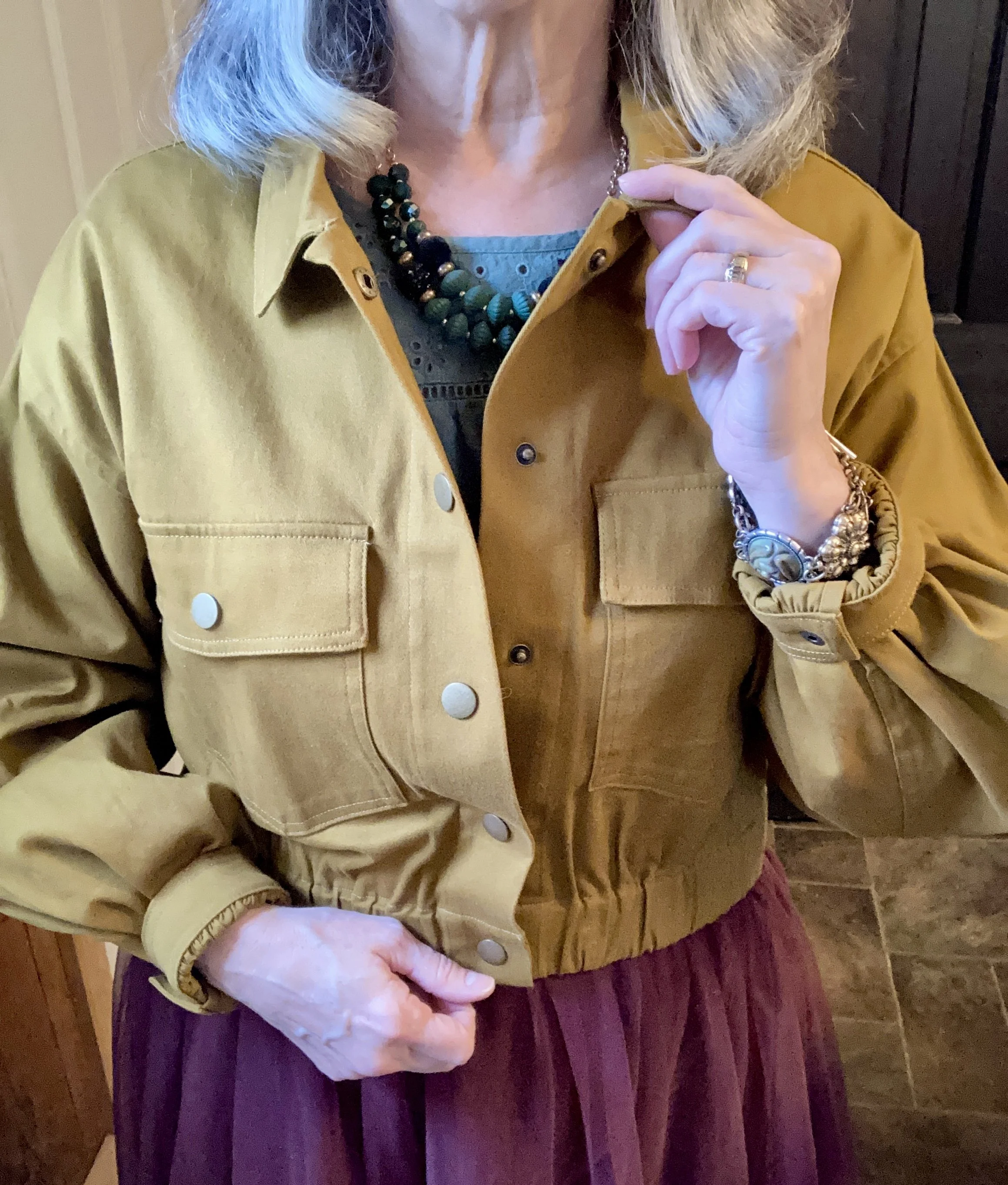
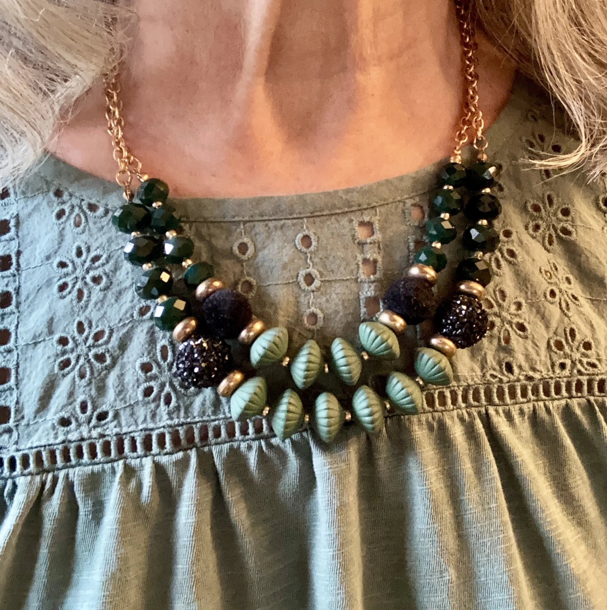
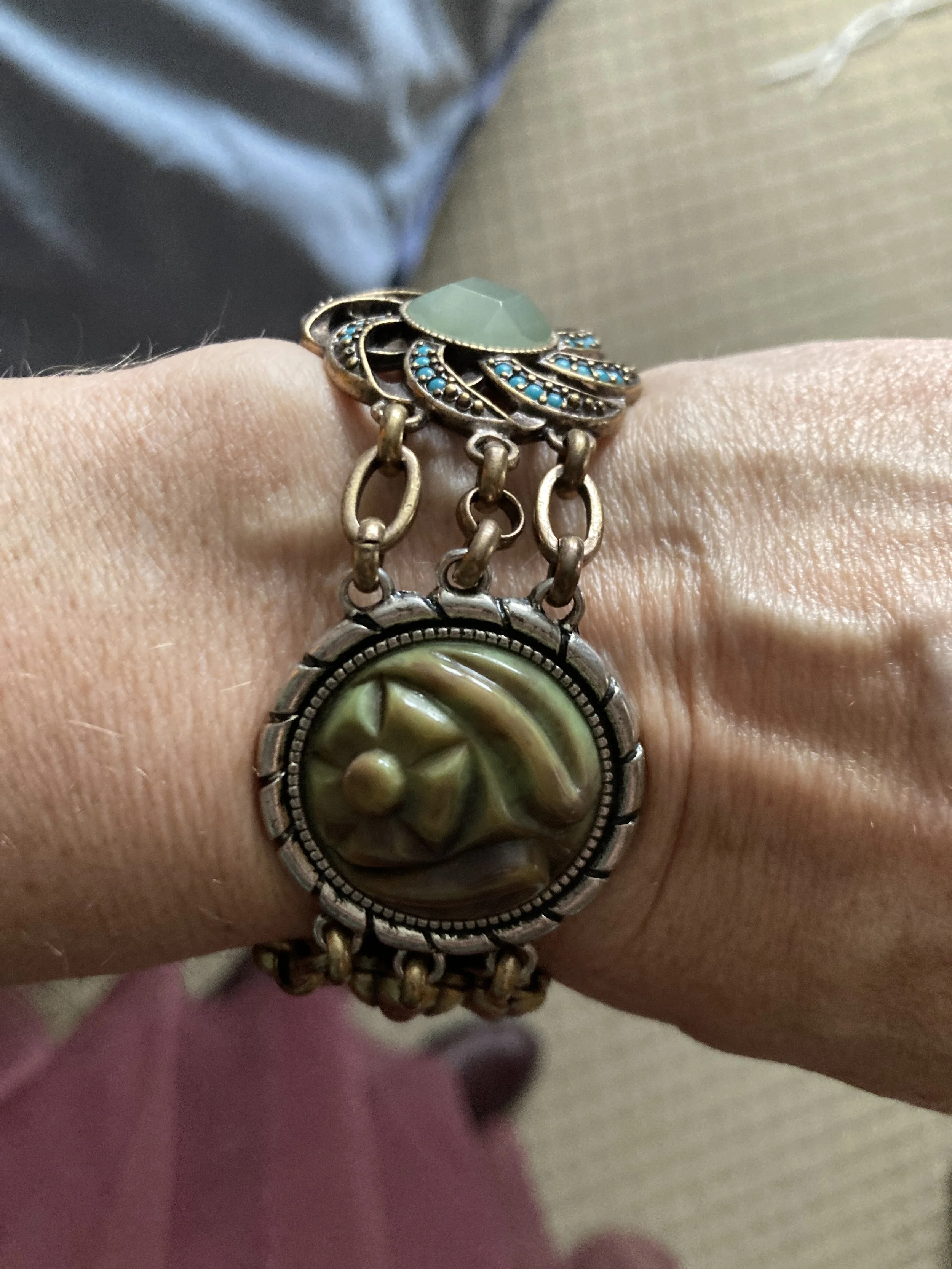
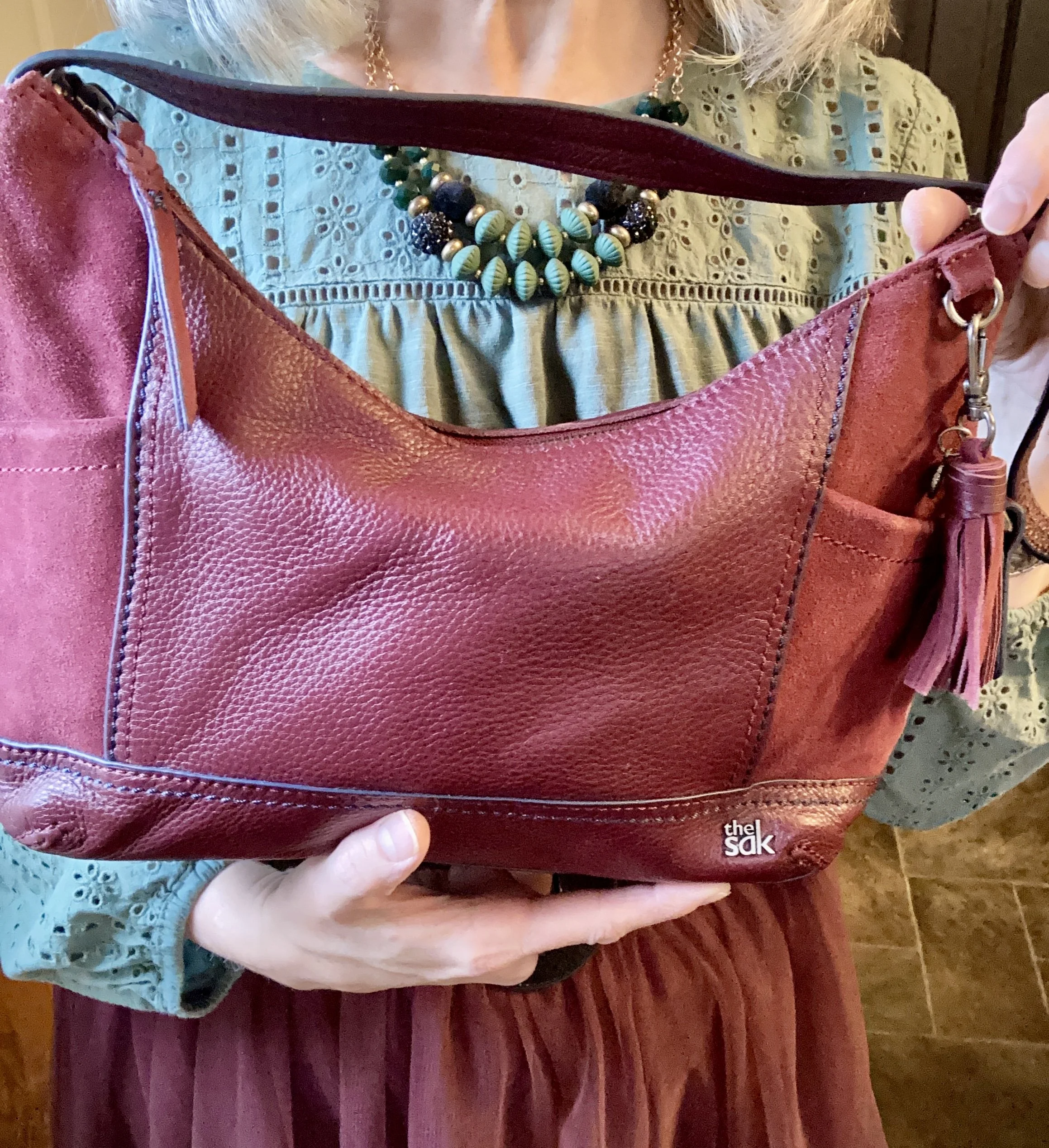
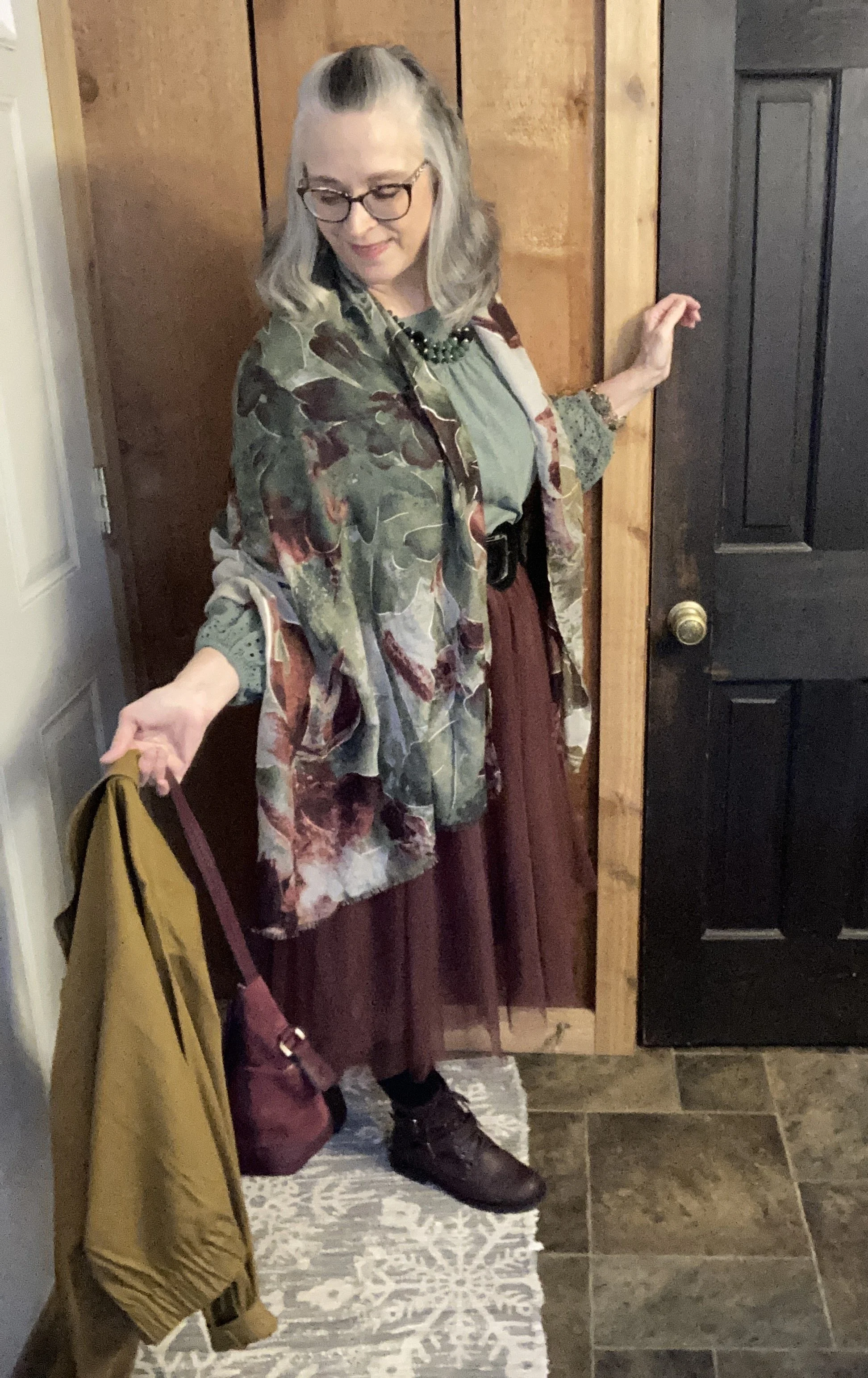
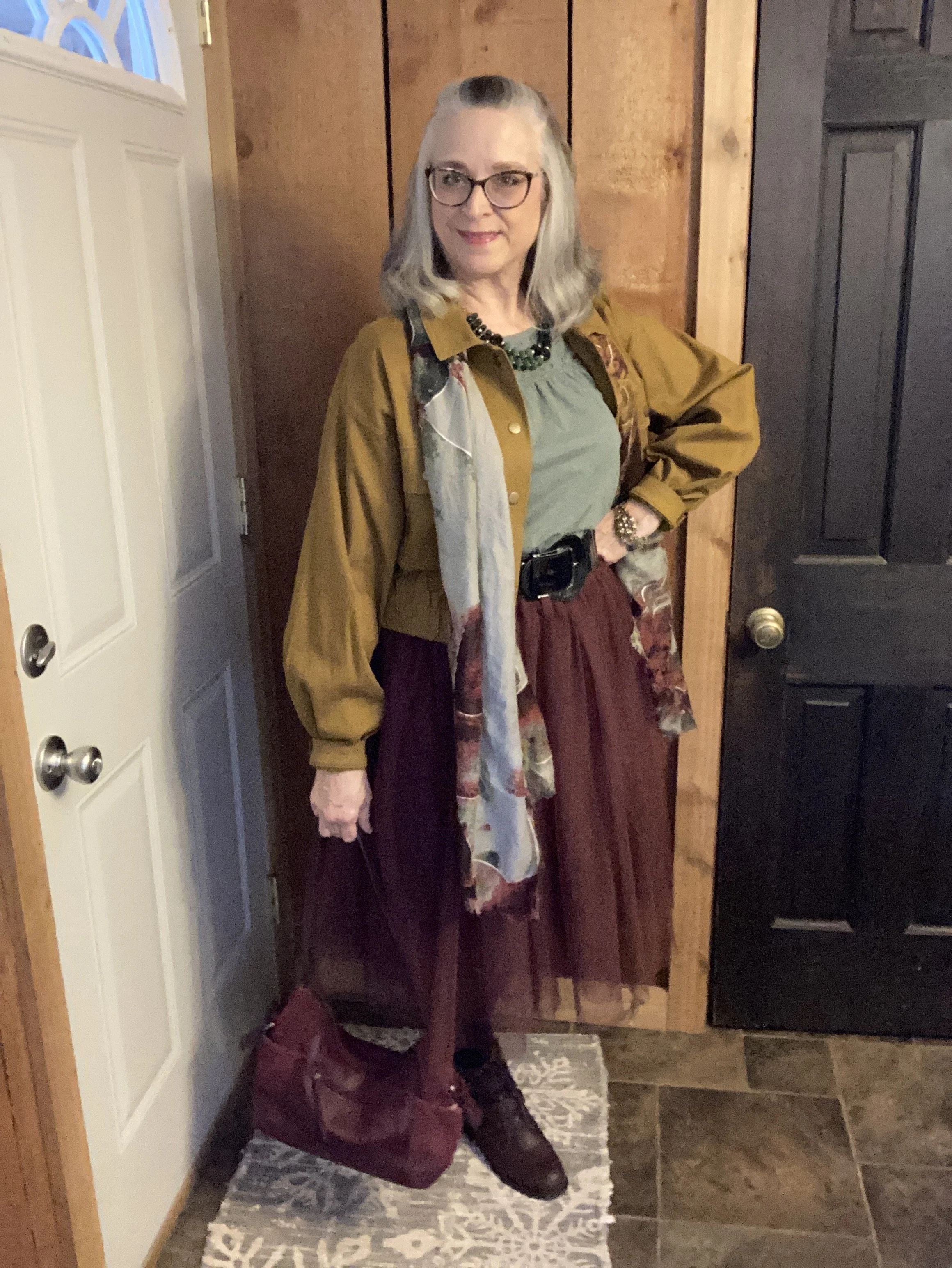
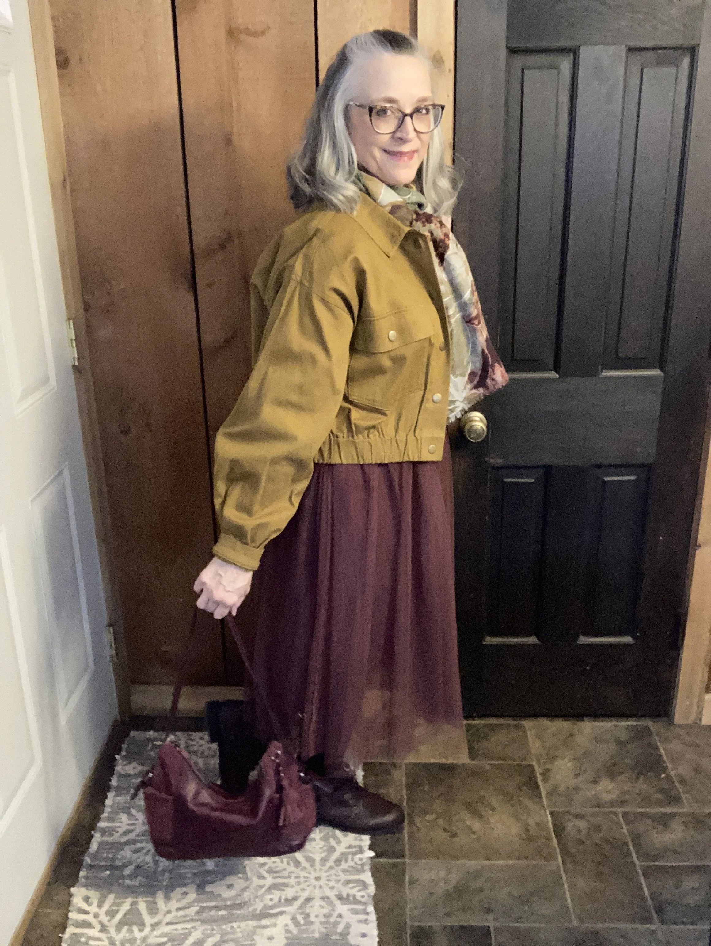
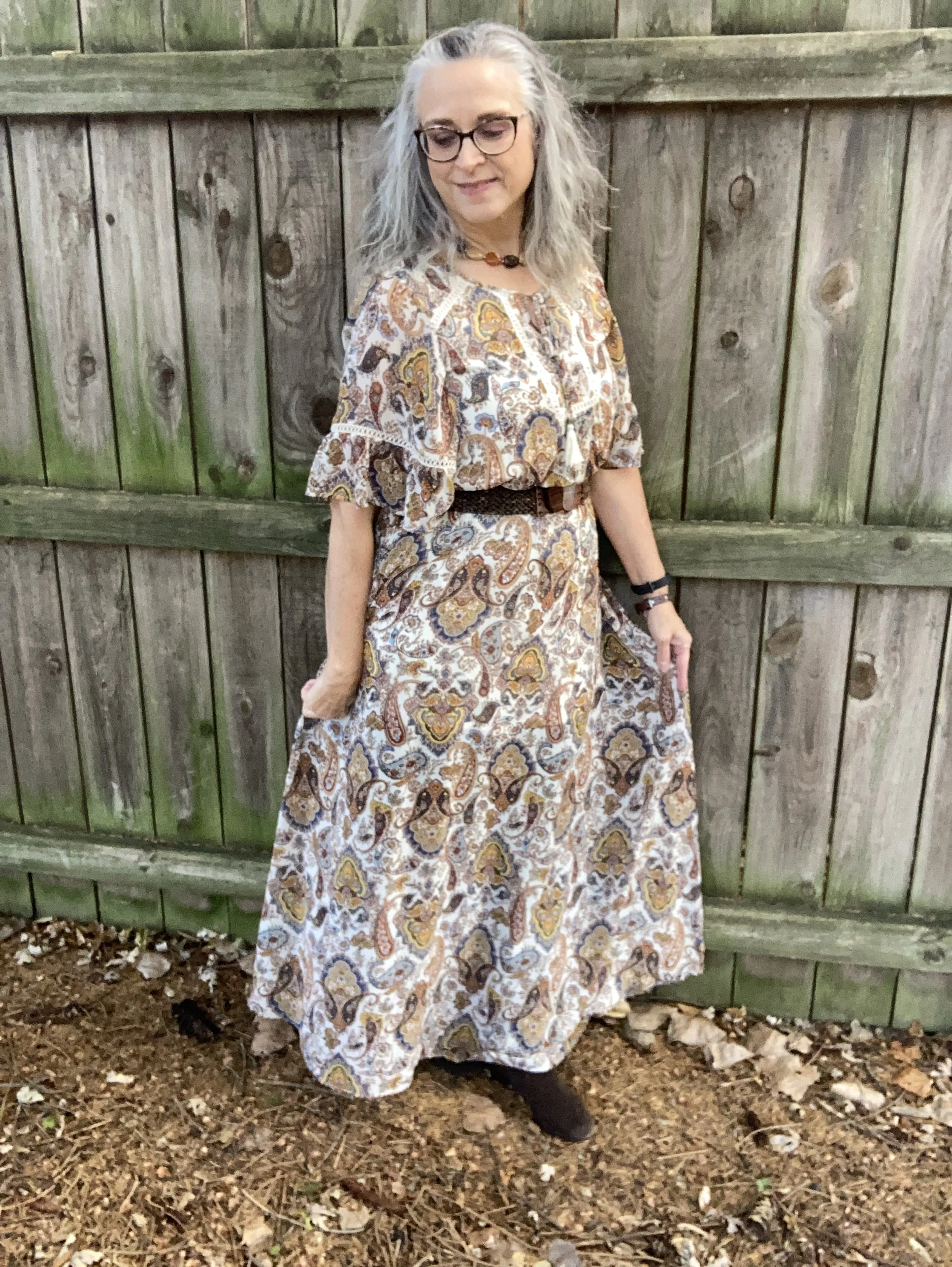
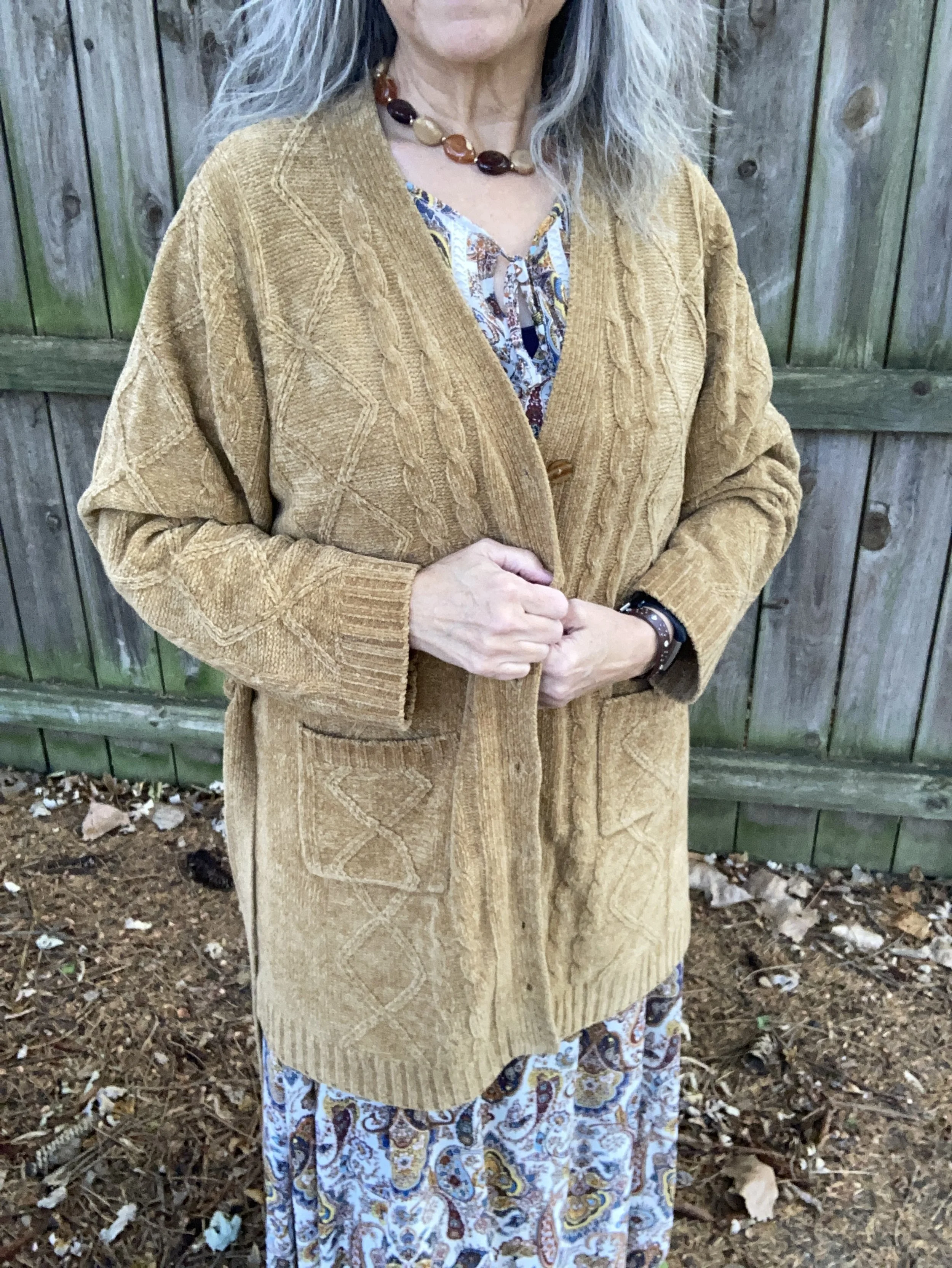
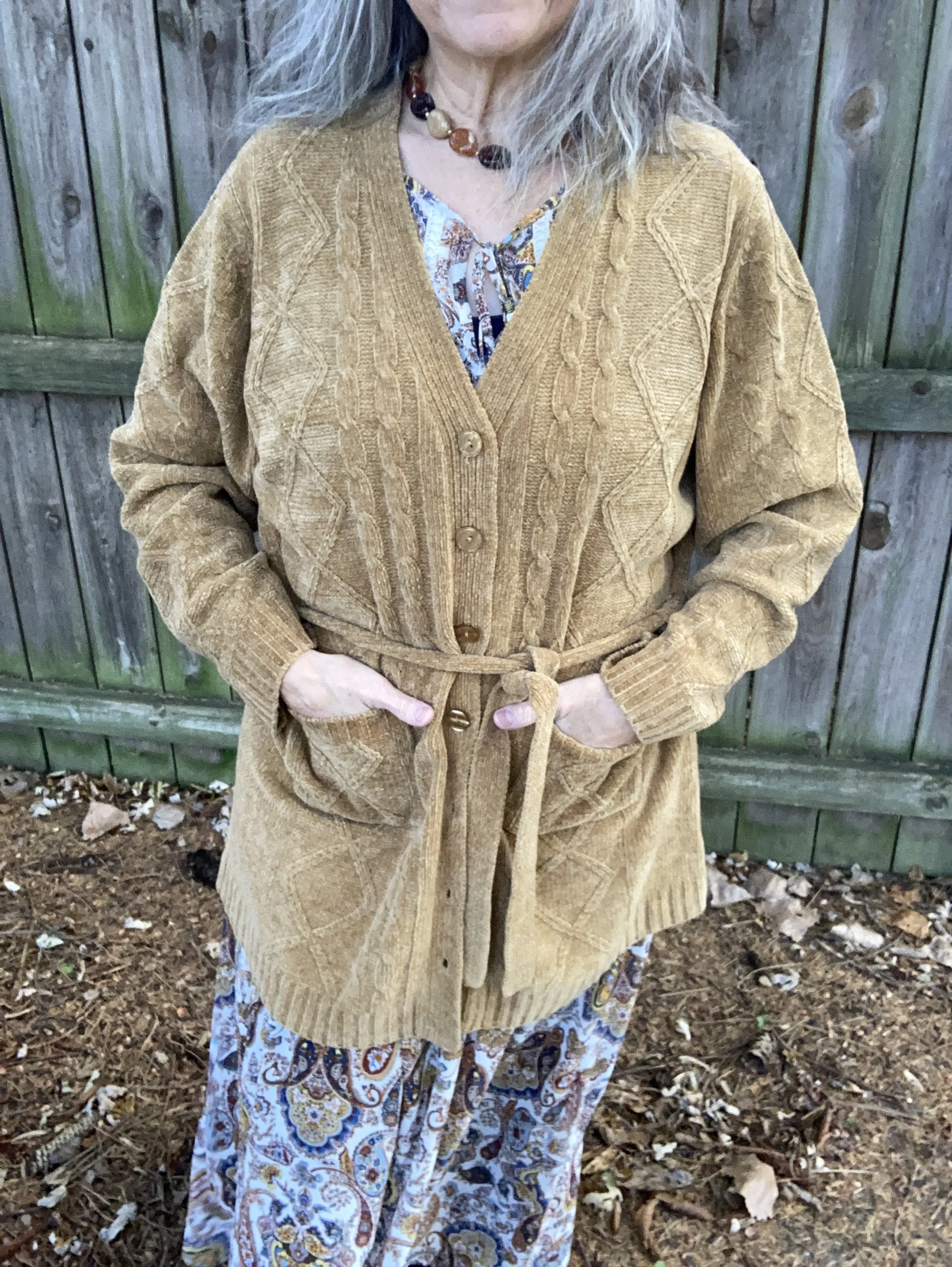
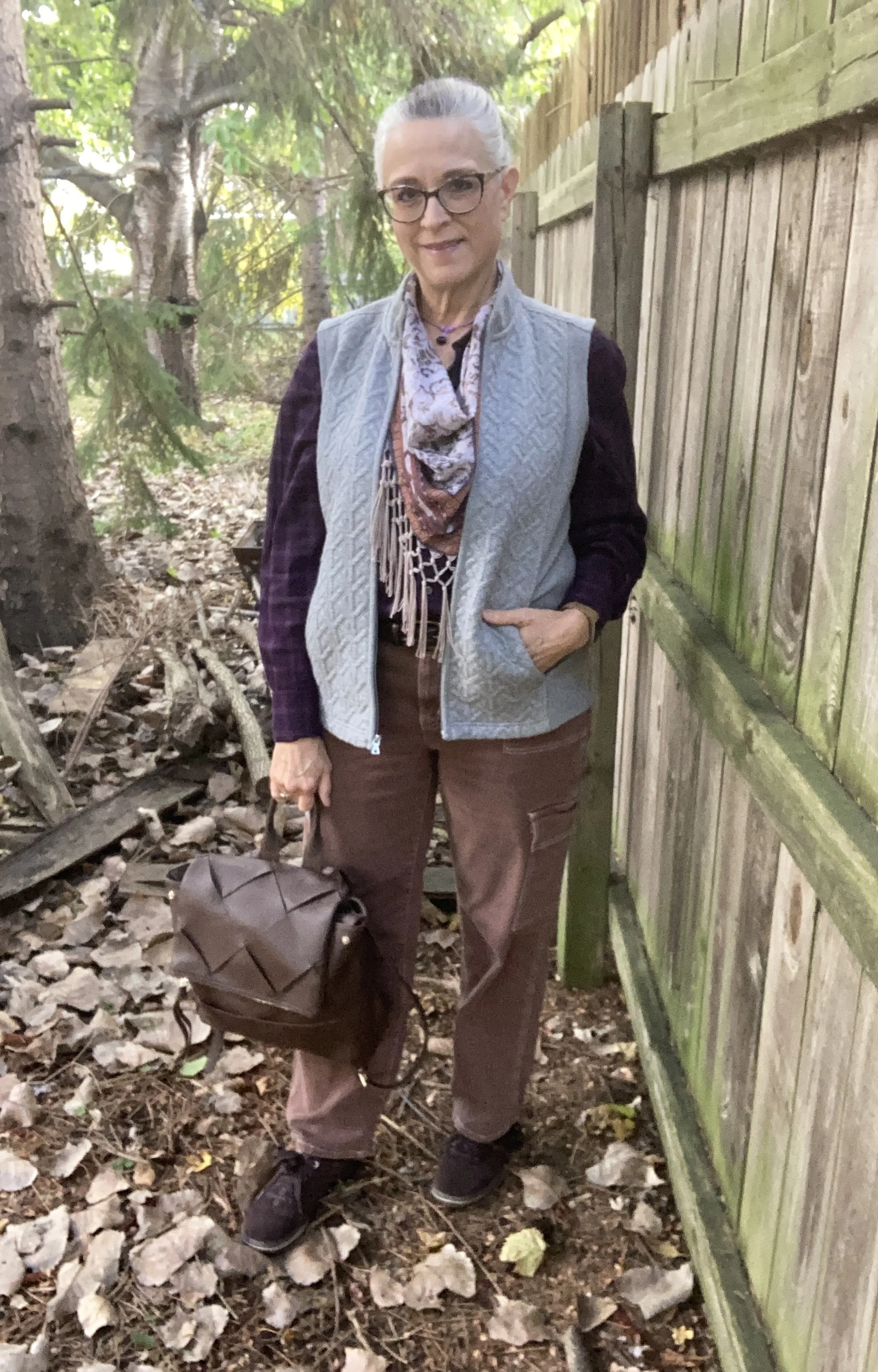
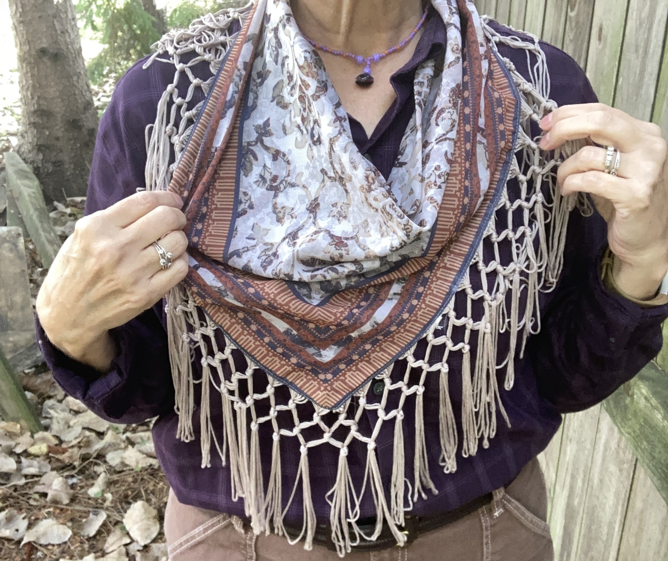
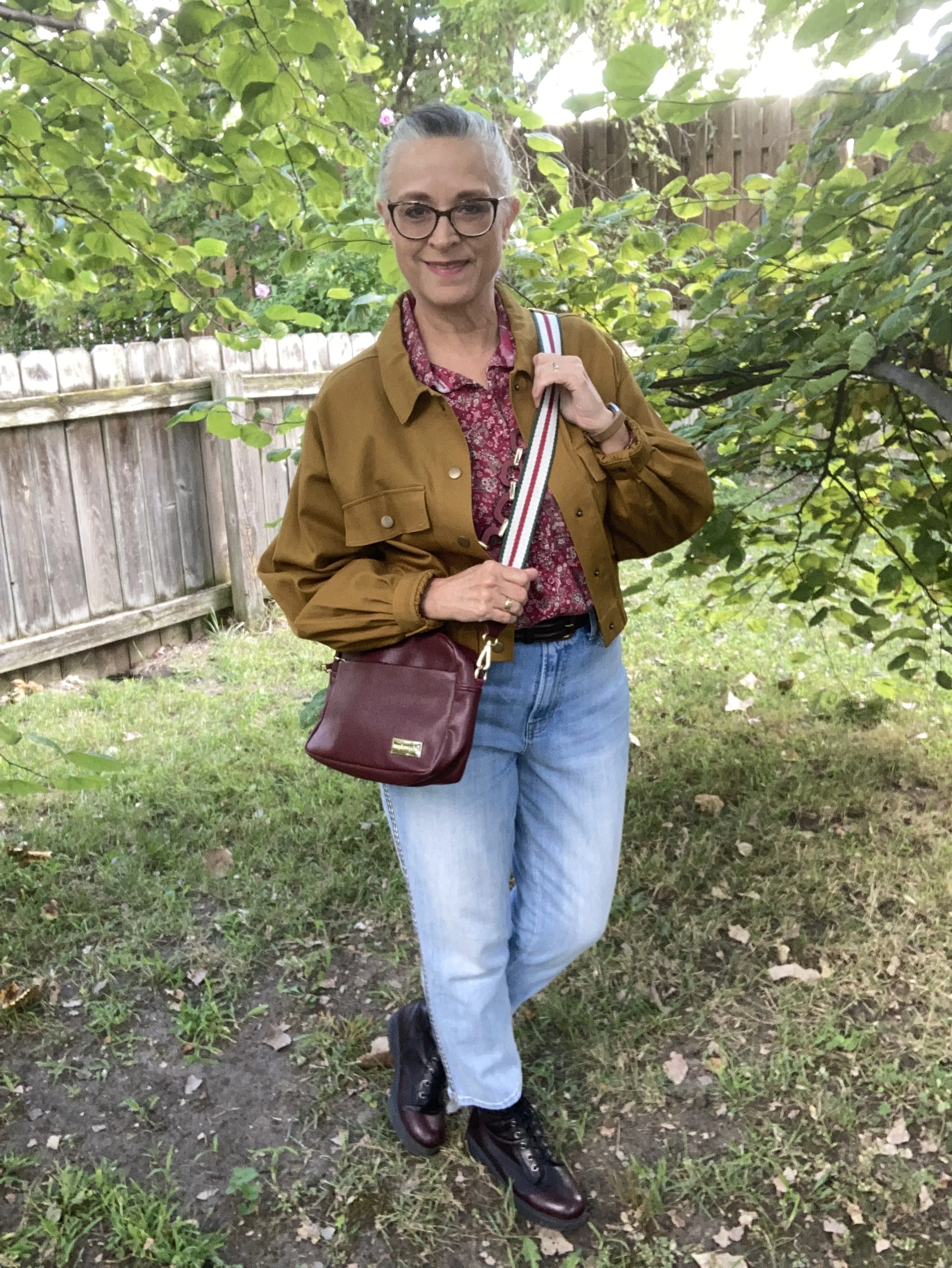
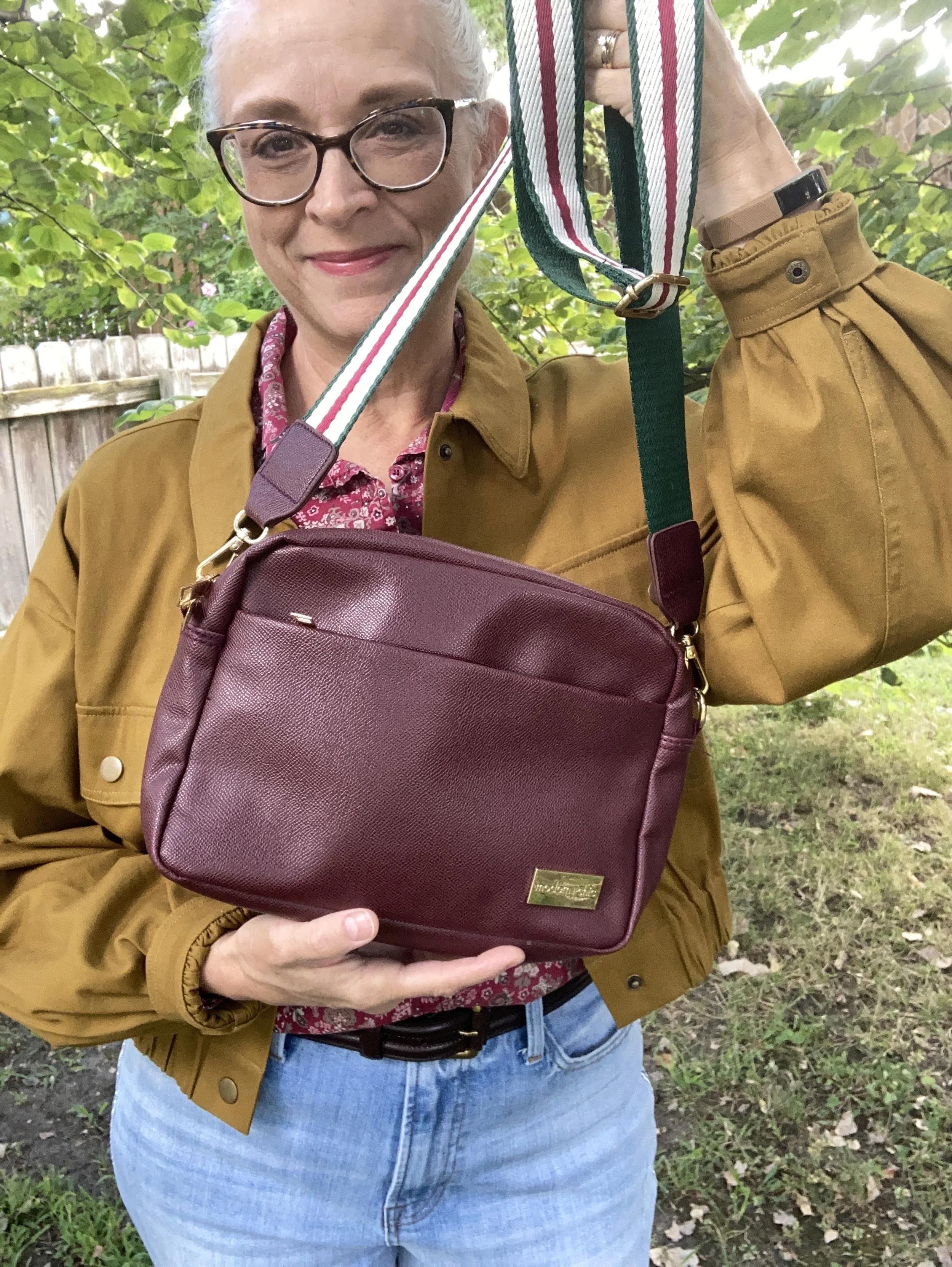
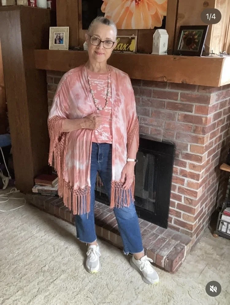
Bohemian Vibes
Most of these outfits, you will see, are the direct result of a daily Instagram challenge. The prompts are meant to inspire whoever joins to shop their own closets and come up with an outfit that goes along with the prompt. For this look the prompt was Urban Boho. I had fun combining this pretty Sonoma kimono with the thrifted tee that matched perfectly. It’s always fun when that happens.
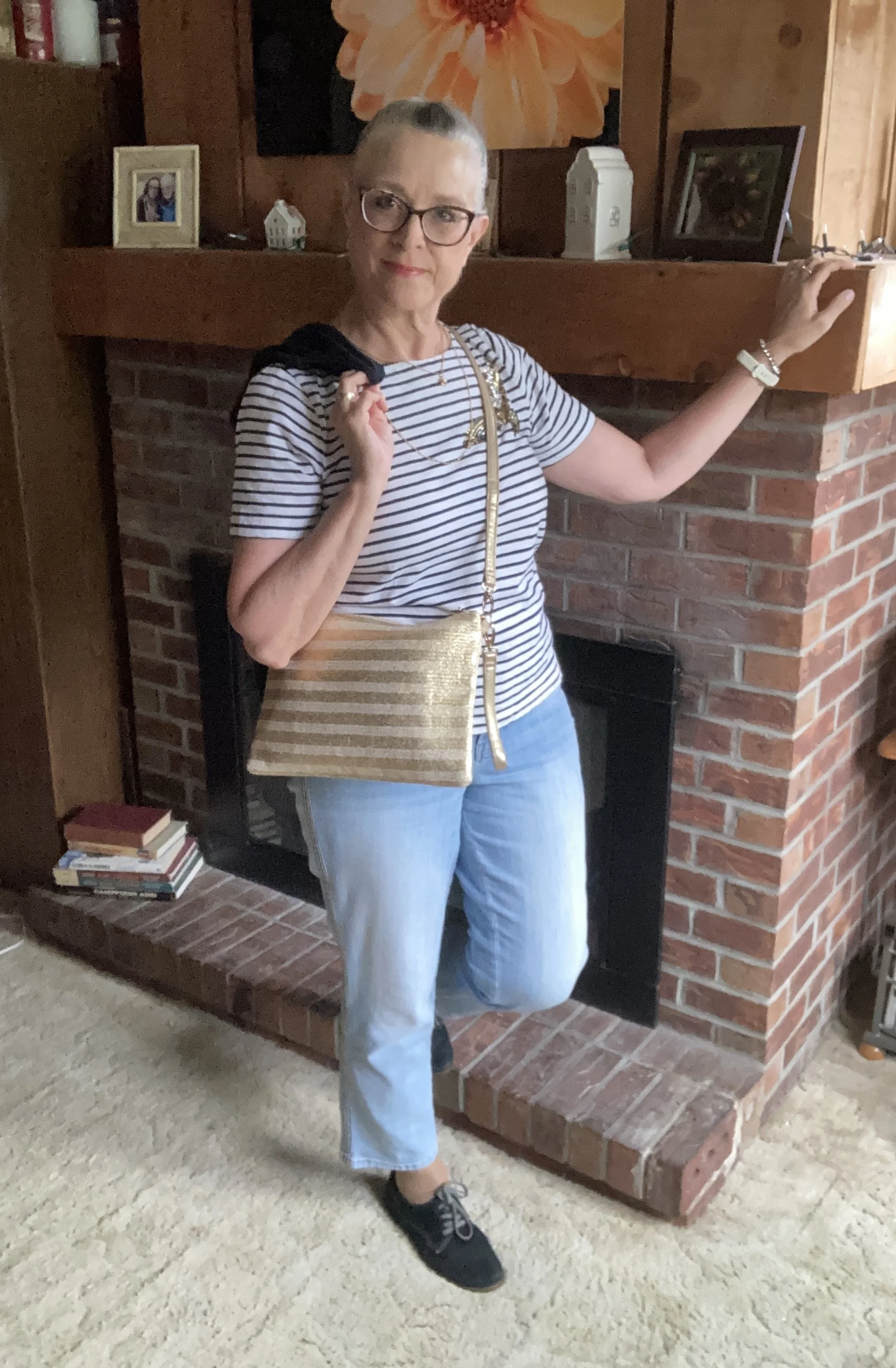
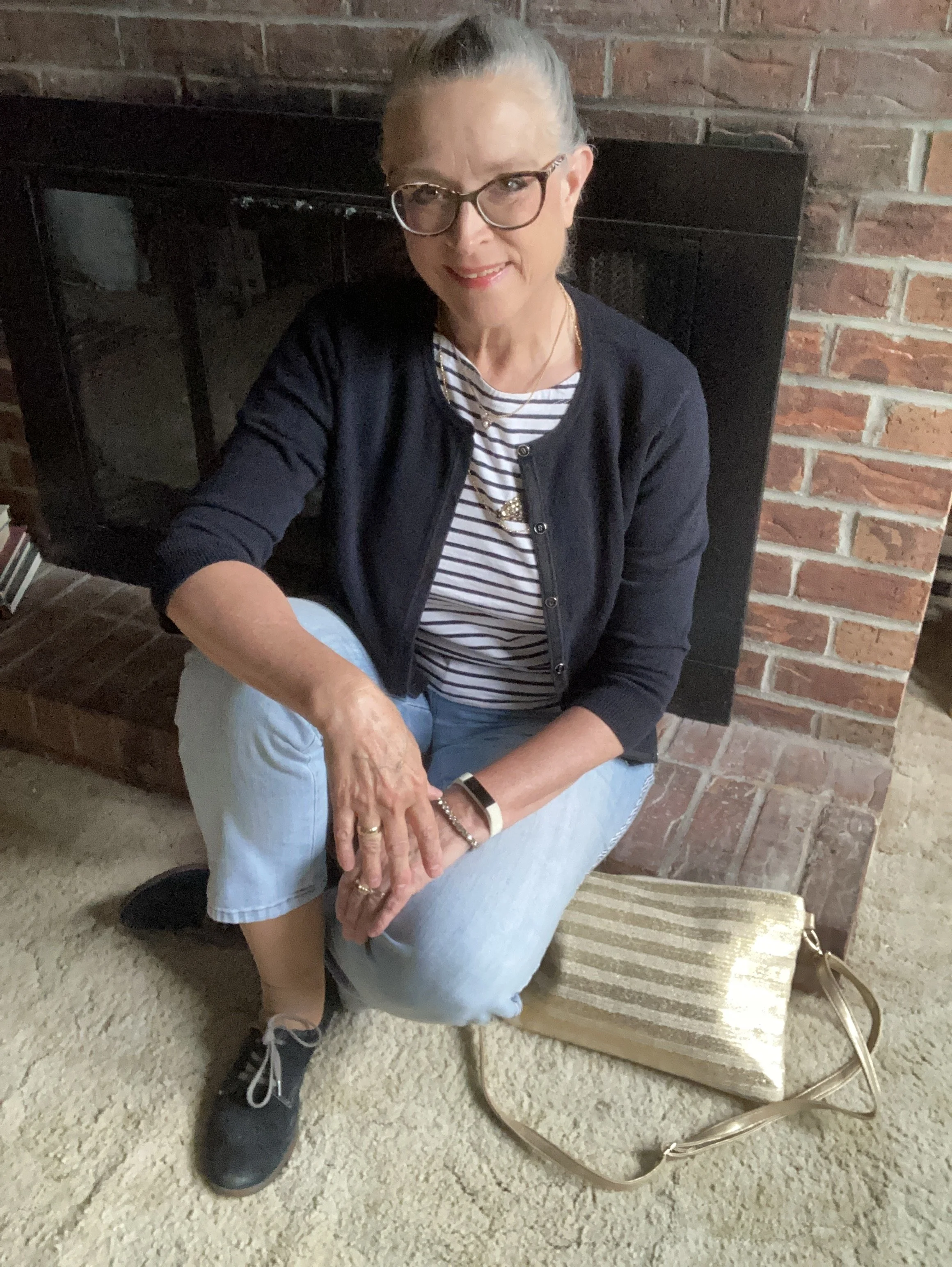
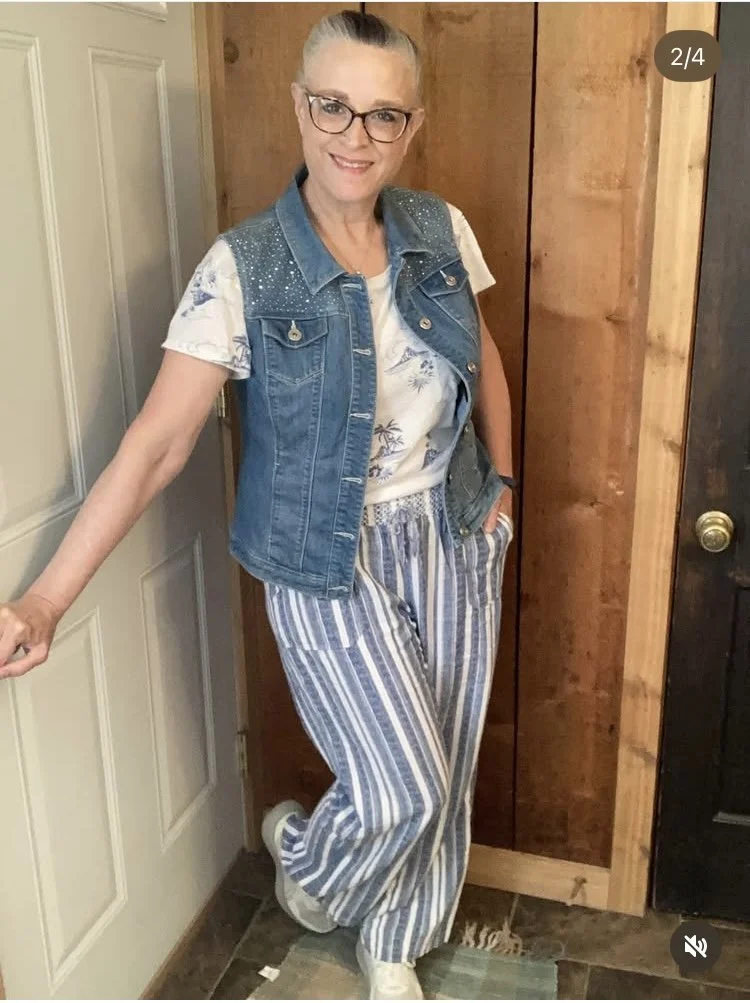
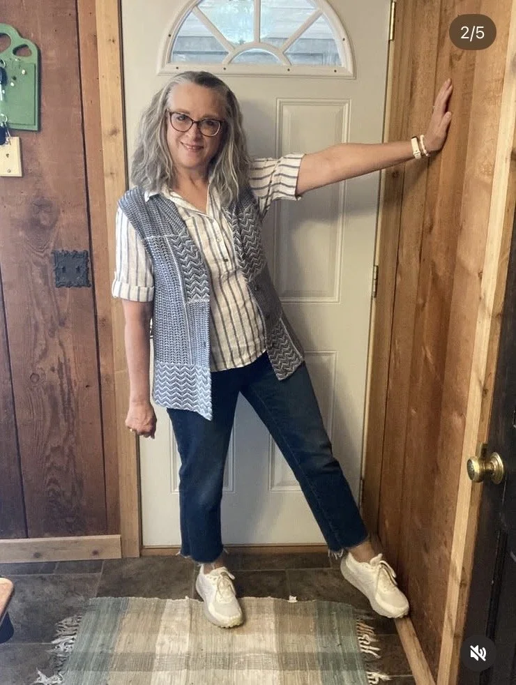
Print Mixing Fun
I always love a good print mix and this outfit was a cute combination of summer stripes and textured waves on the Chaps knit vest. Vests are great pieces for summer layering. They are perfect when you are going to an air conditioned restaurant or coffee shop.
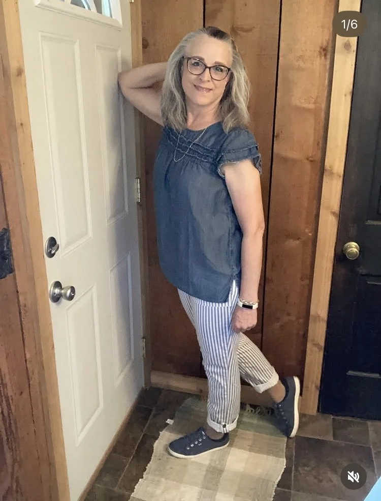
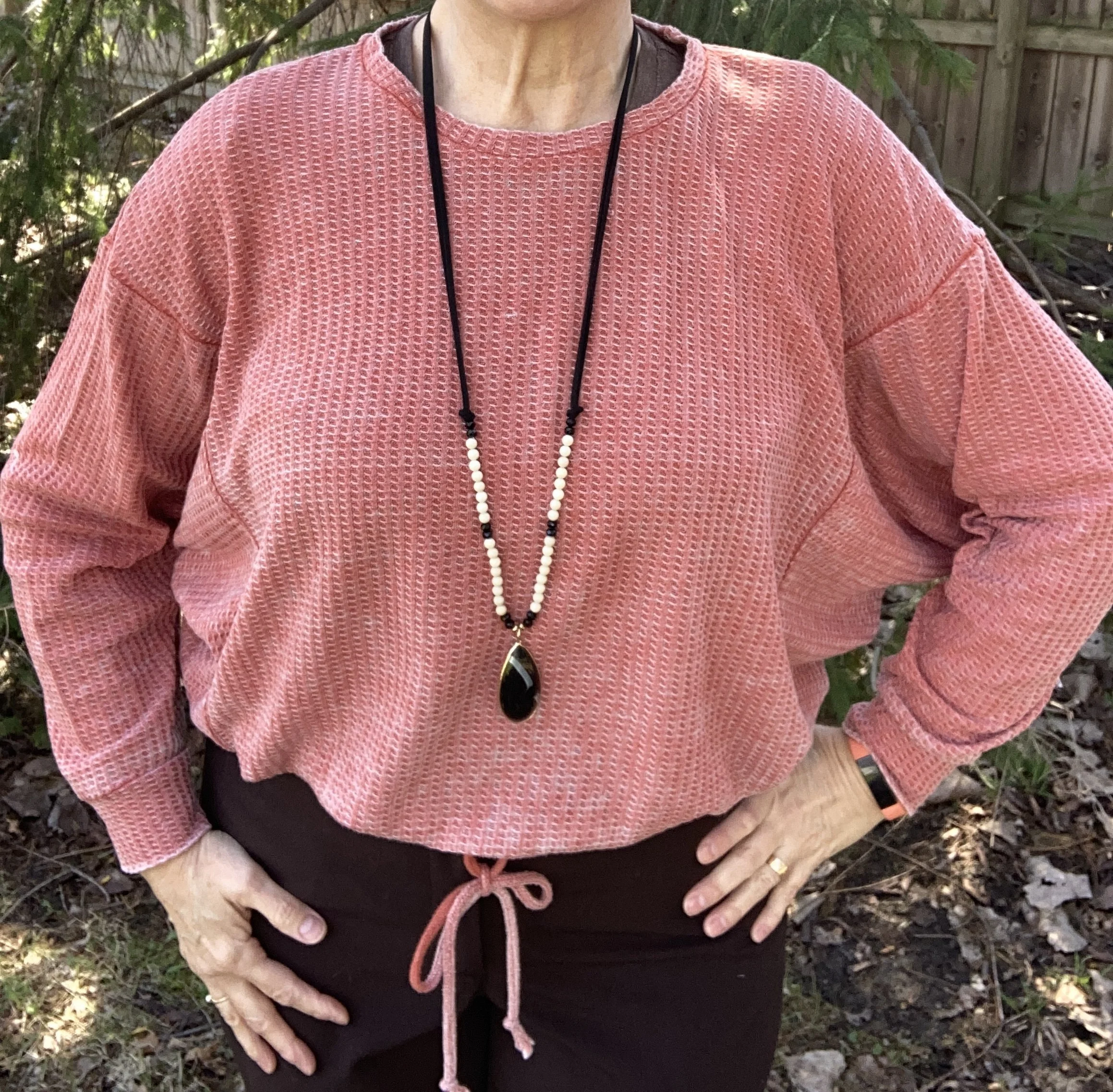
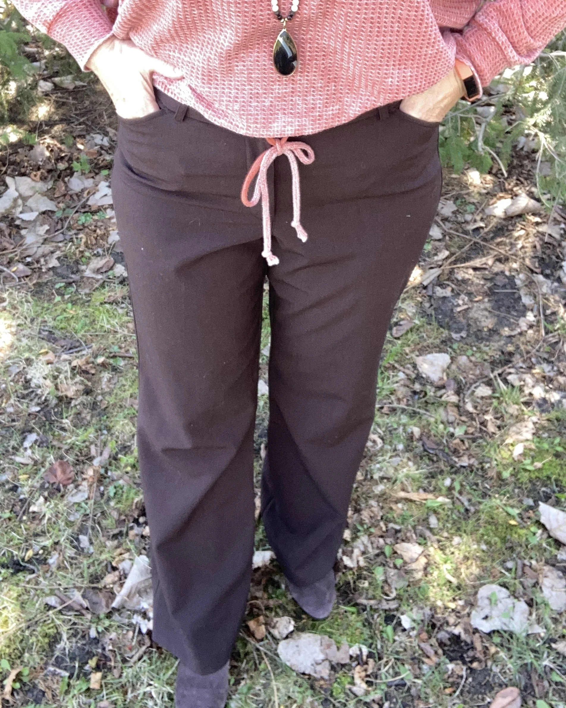
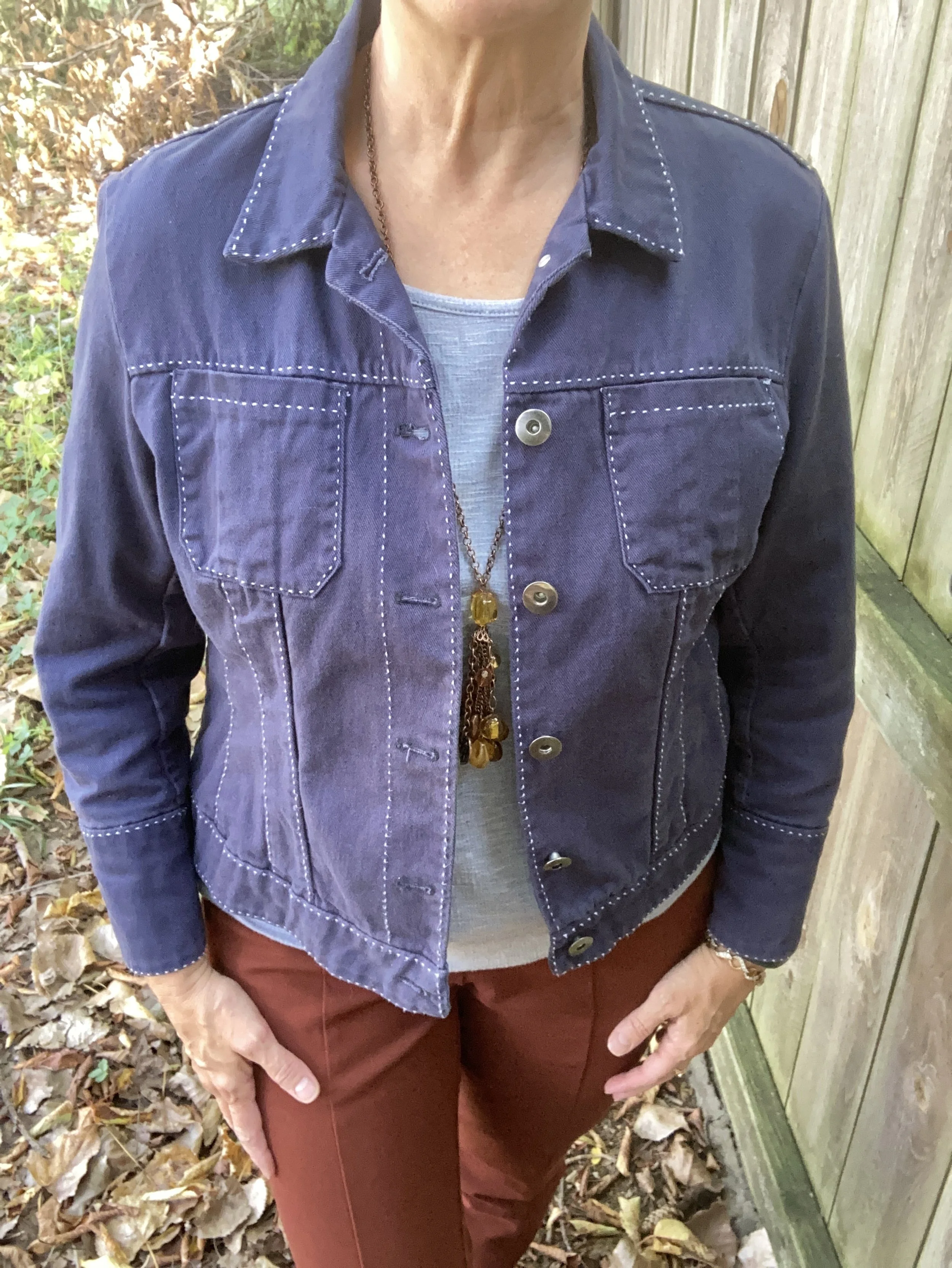
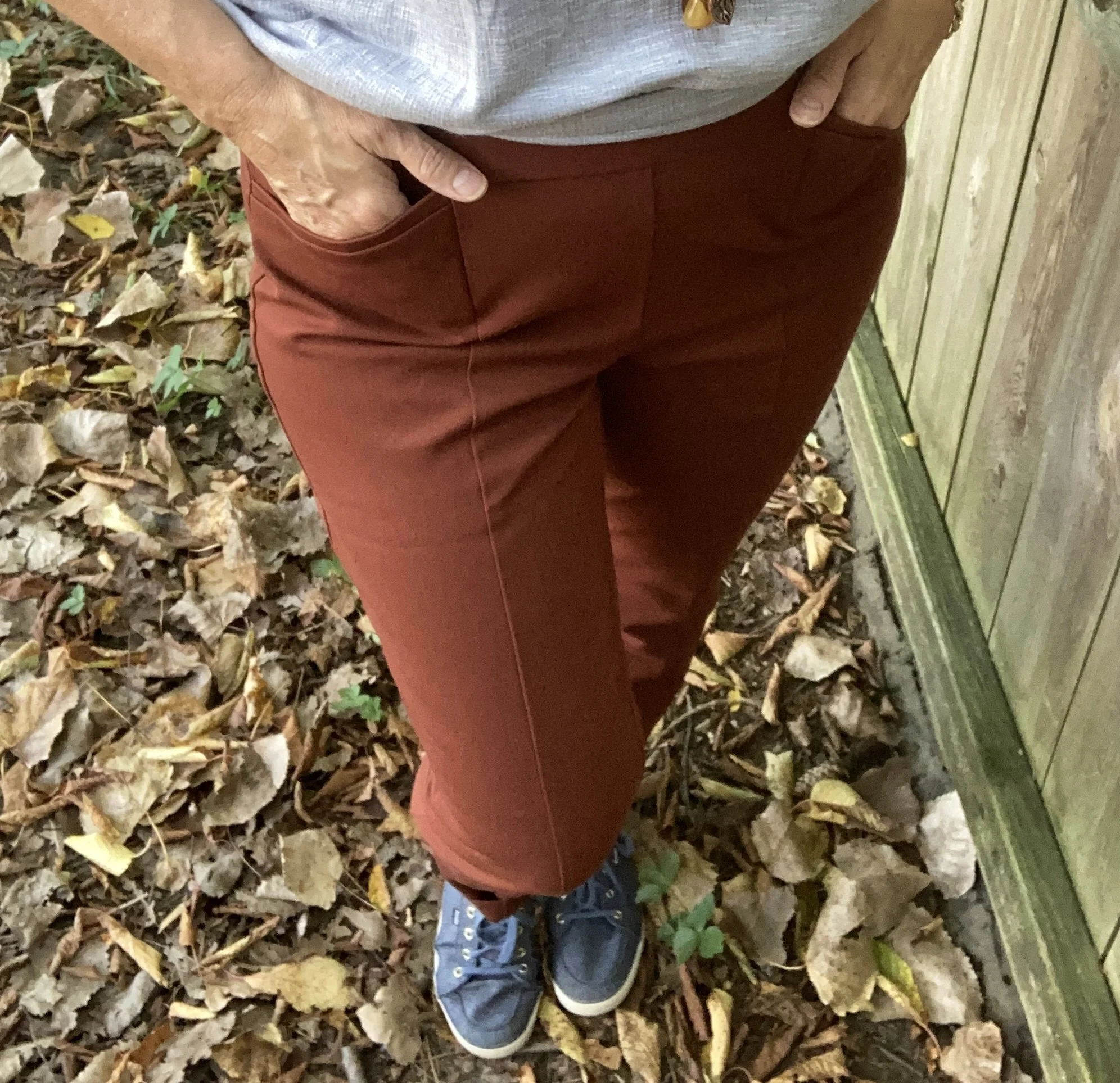
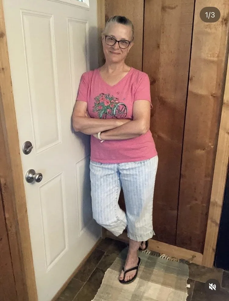
Ultra Casual
I put on this very casual look after I had housecleaned. The tee has been around for a number of years, while the wide leg capris are a brand called Westbound. They are so incredibly comfortable. The perfect pants when you just want to chillax.
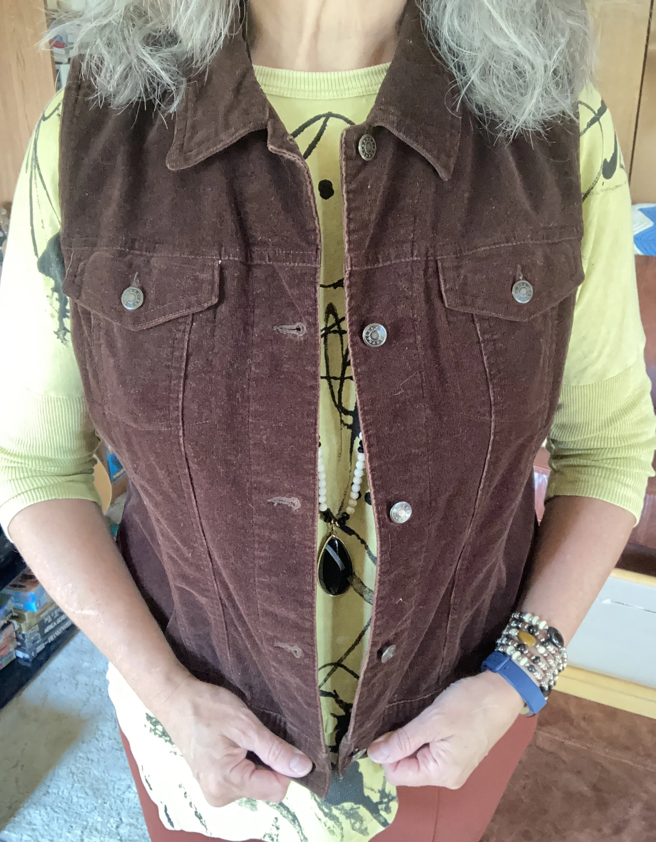
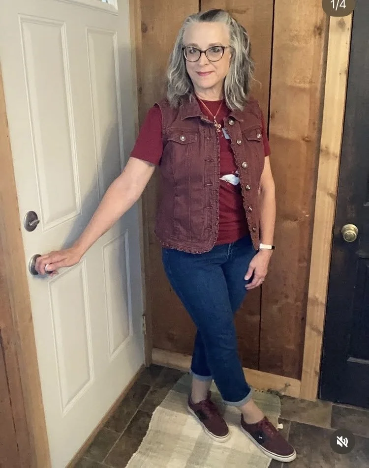
Cherry Tones
Who doesn’t love the sweet, black cherries of summer? I buy several pounds every time I get to the grocery store during the season. This outfit was born of three separate challenges: Chic Cherry Tones, “Cherry” On My Wayward Son, and Wear It. The last one had to do with sustainable pieces in our wardrobes and my focus was this cute Christopher & Banks vest that I have had for many years. It is such a well made piece and always looks great, no matter how often I wear it. That is what I look for in a sustainable piece.
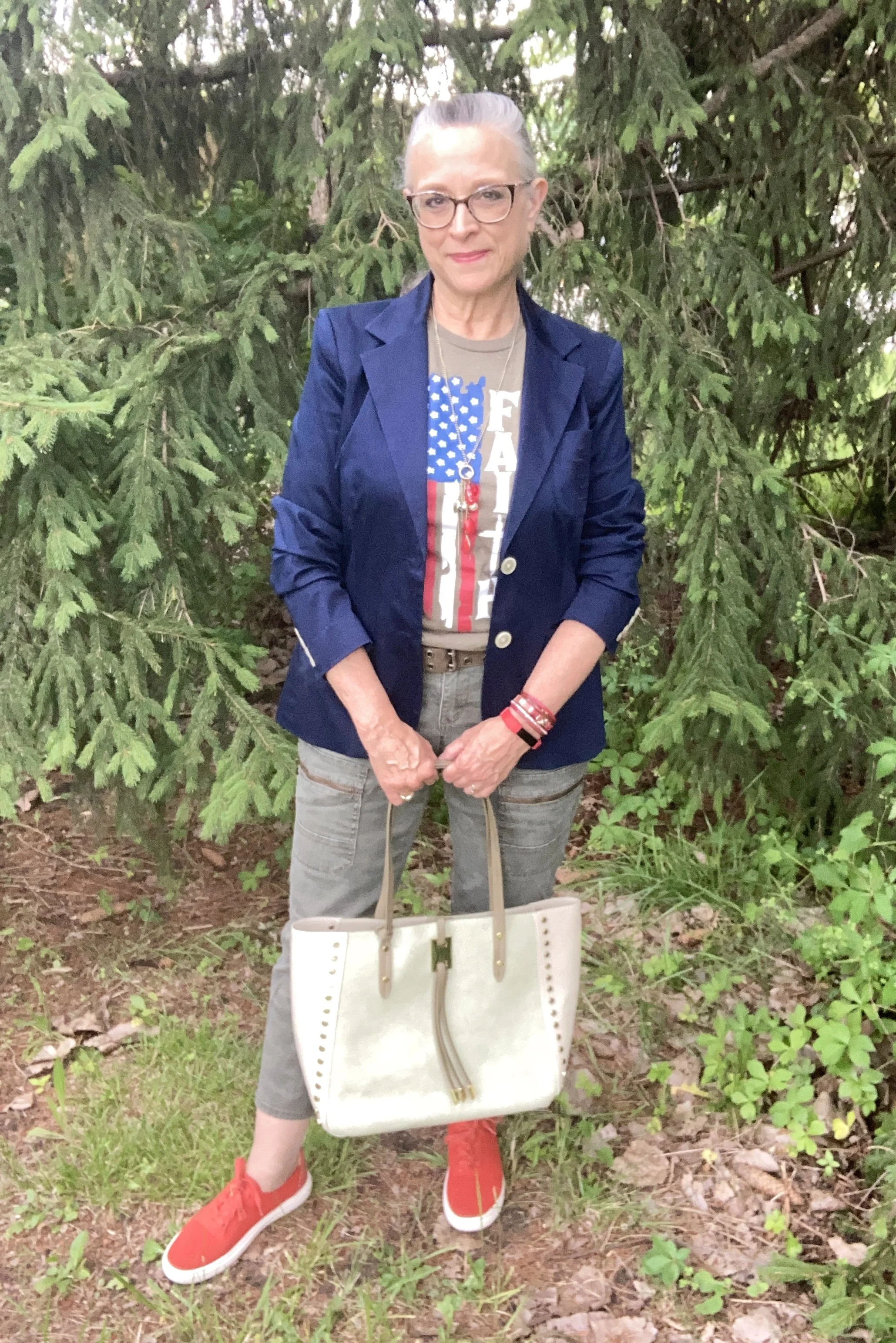
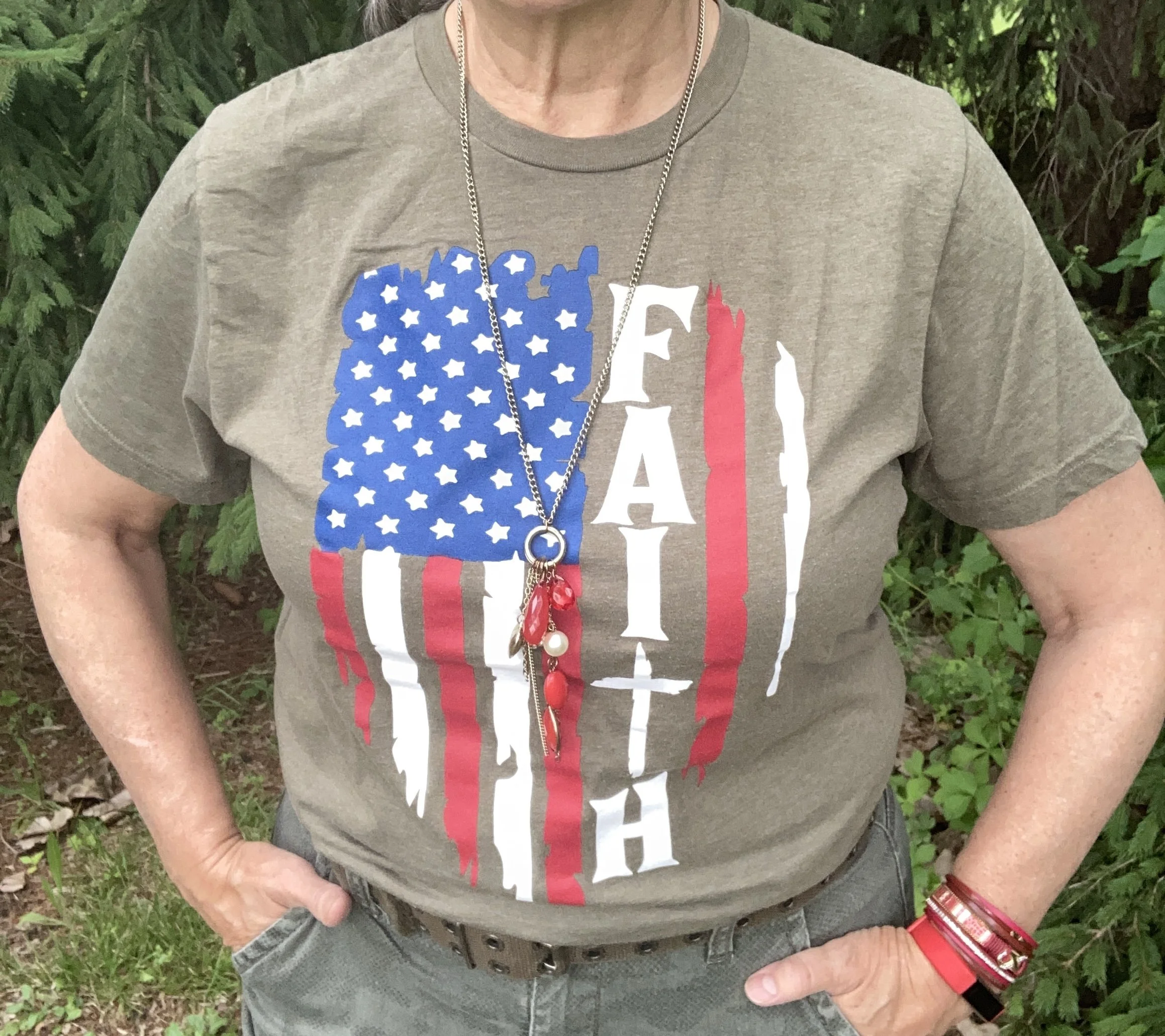
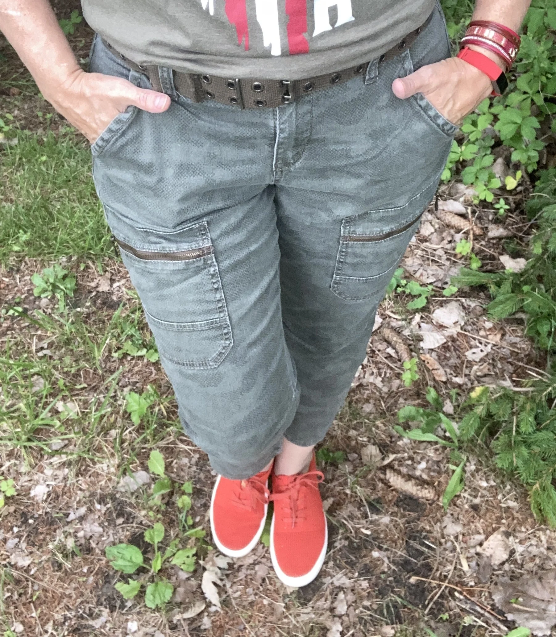
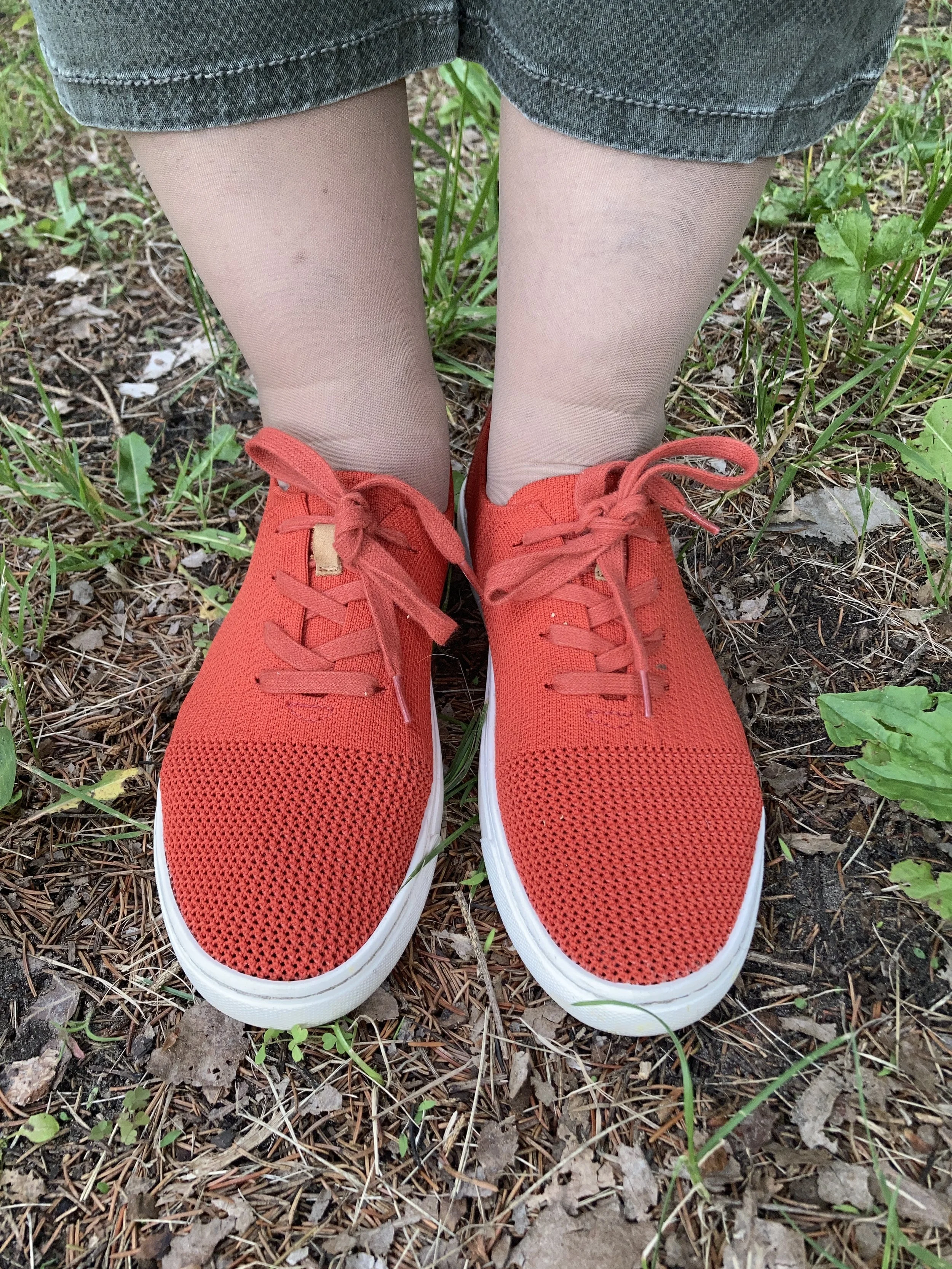
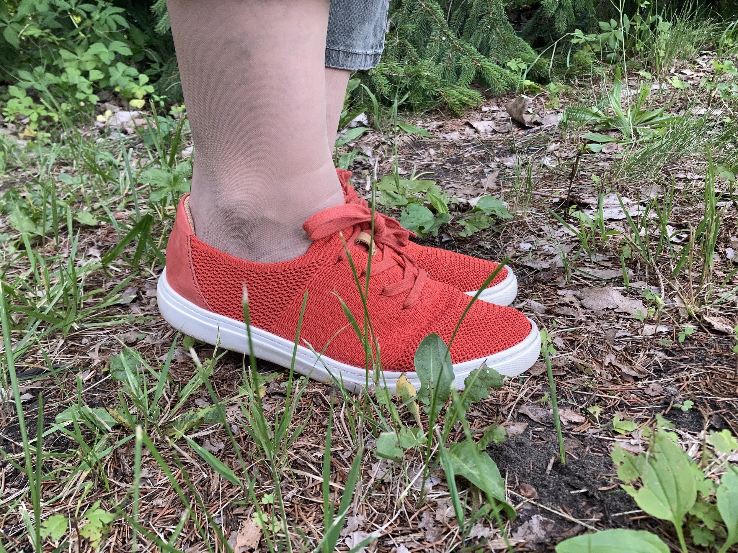
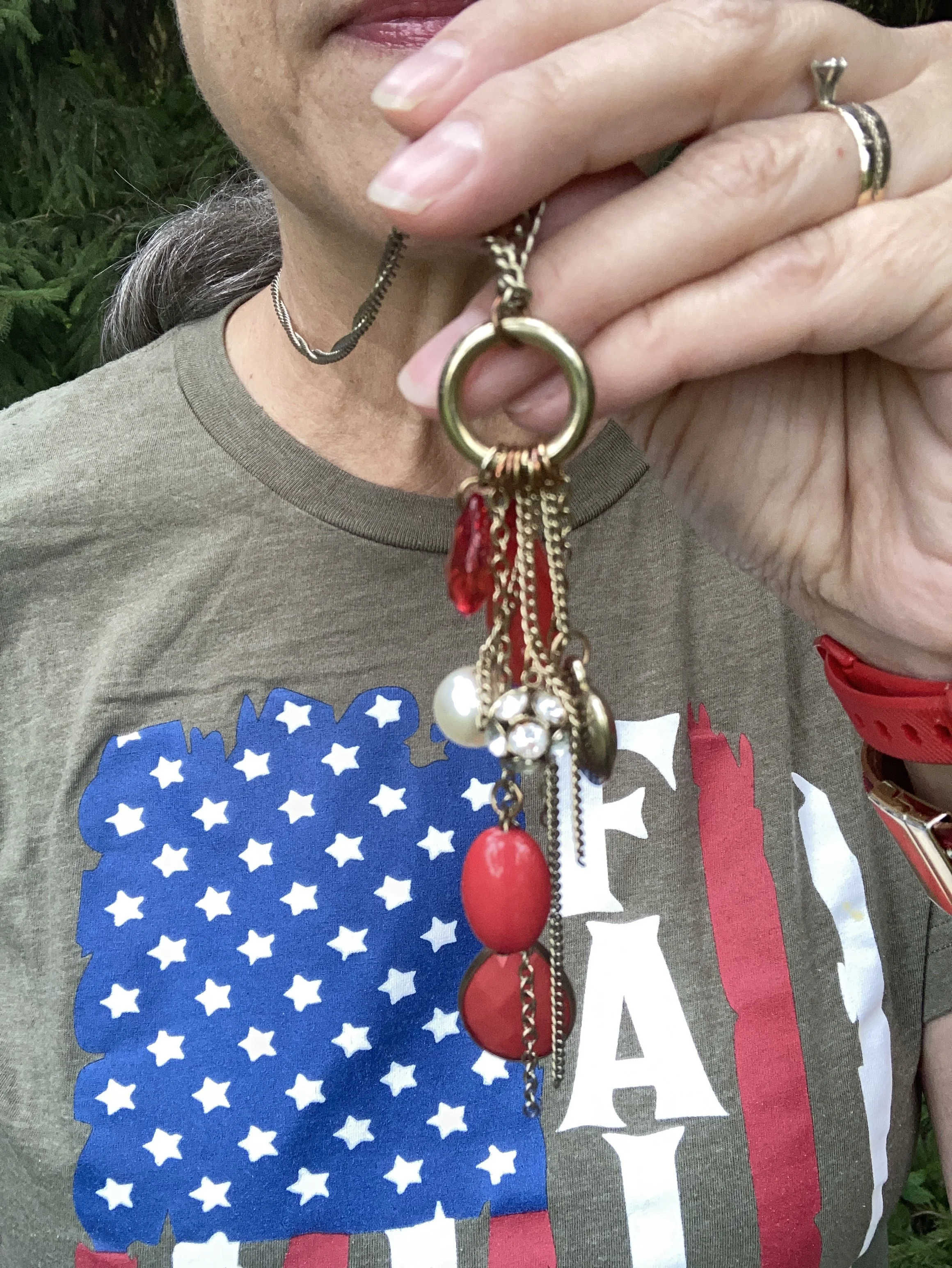
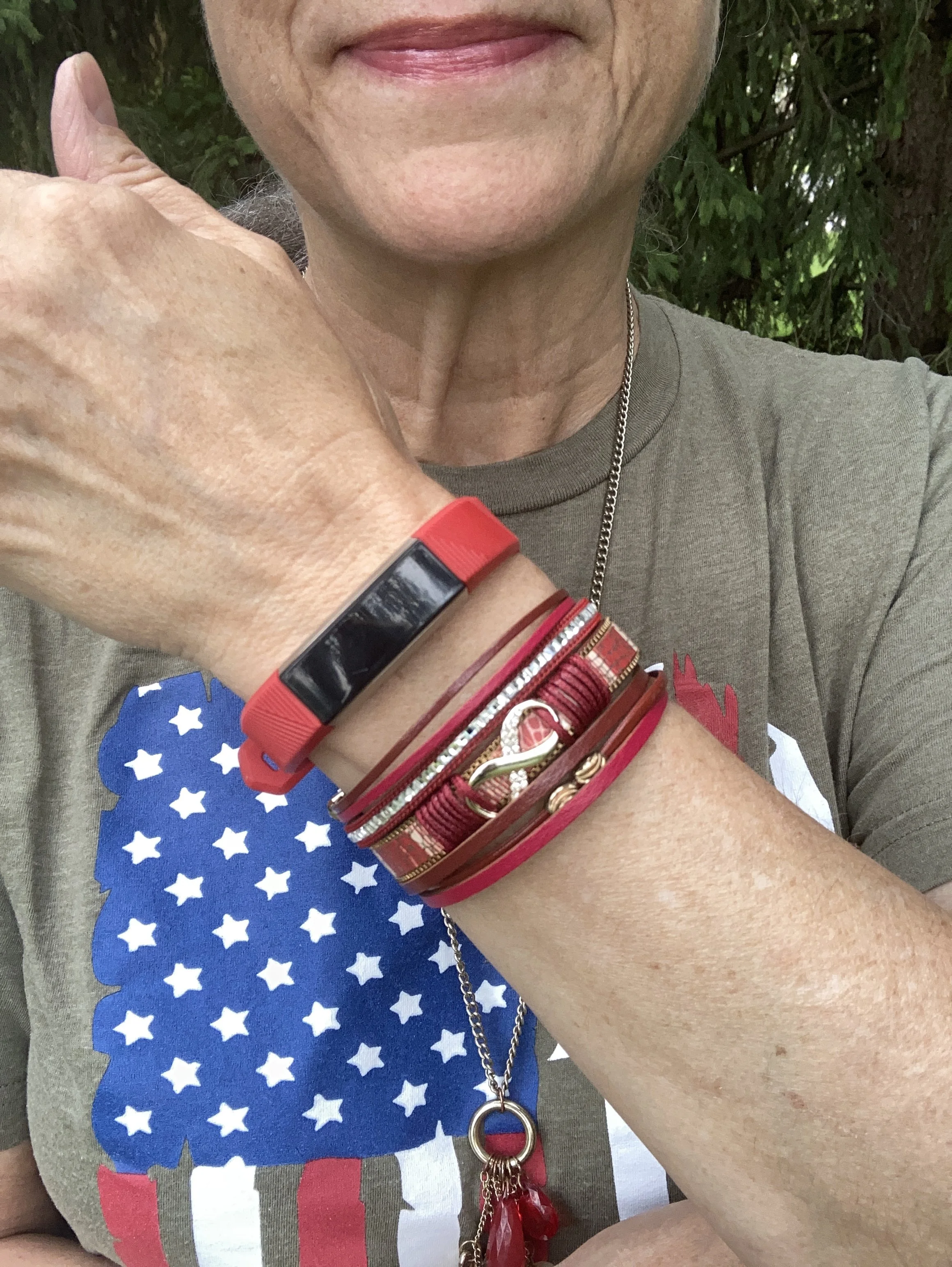
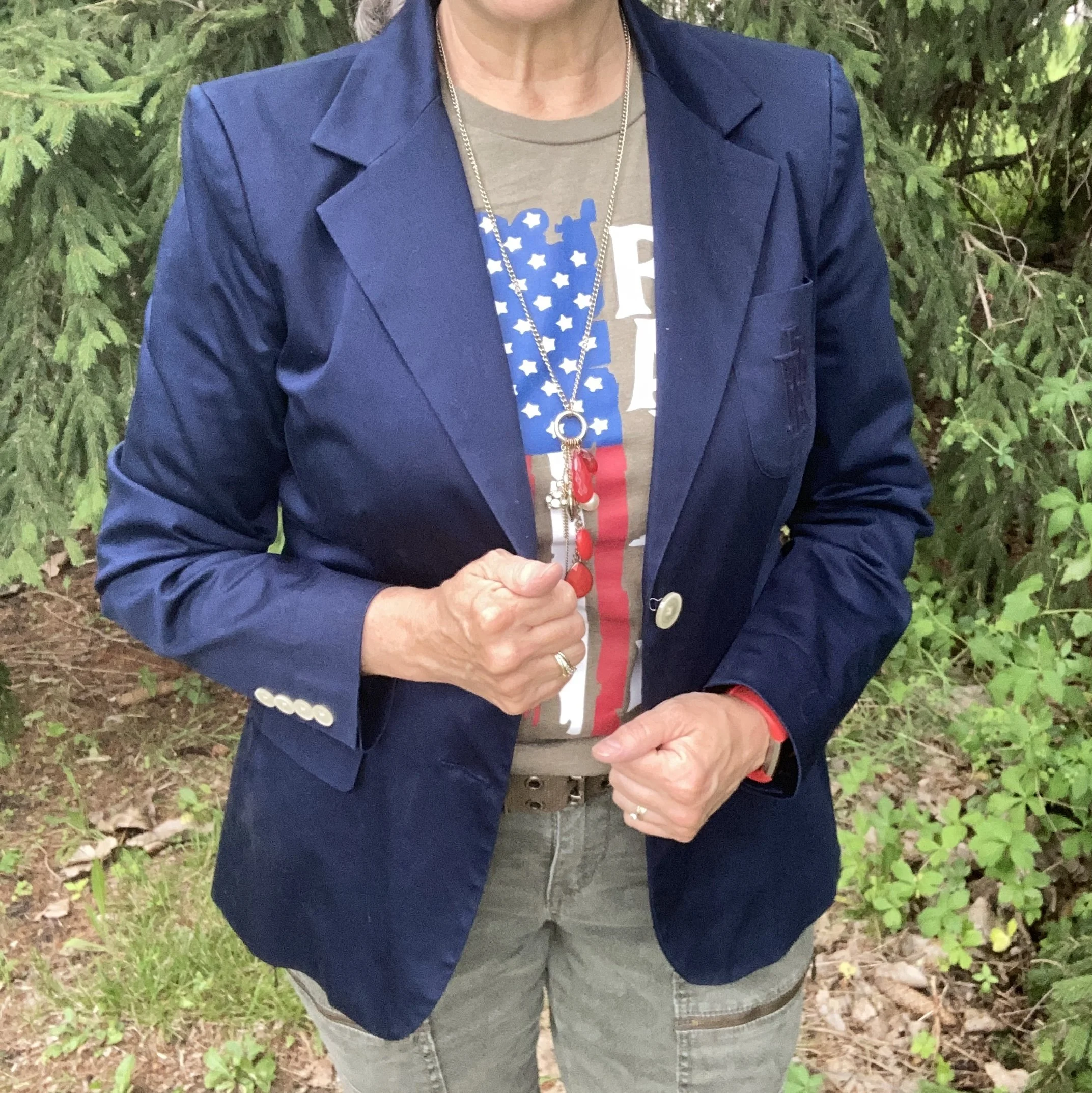
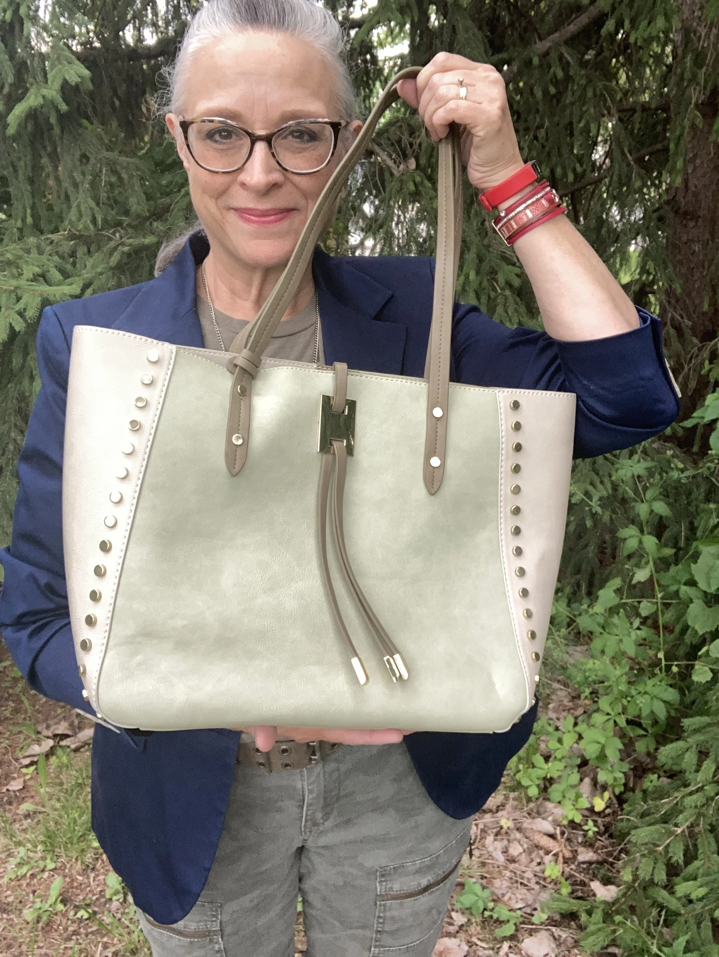
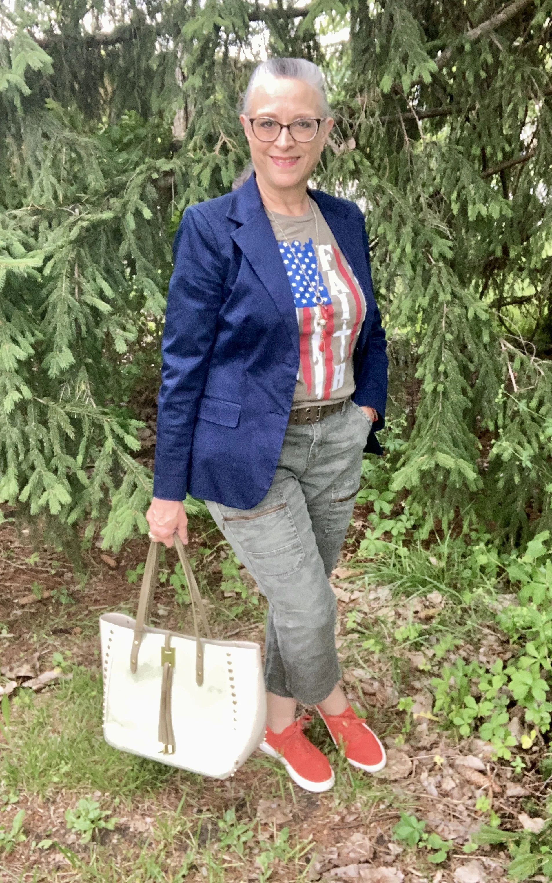
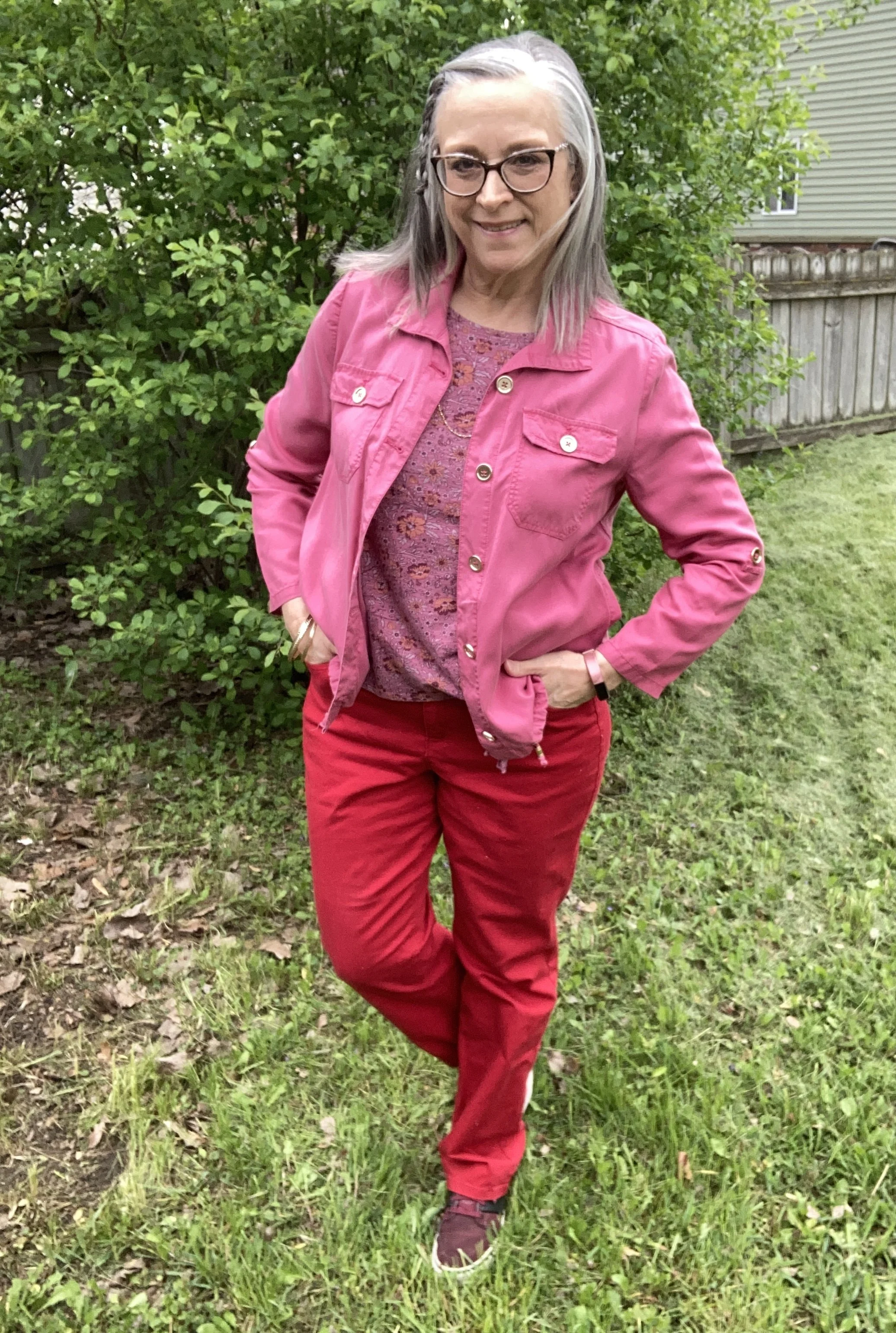
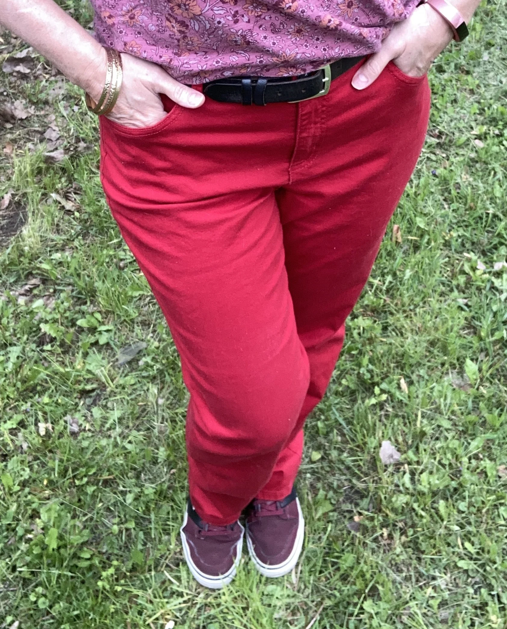
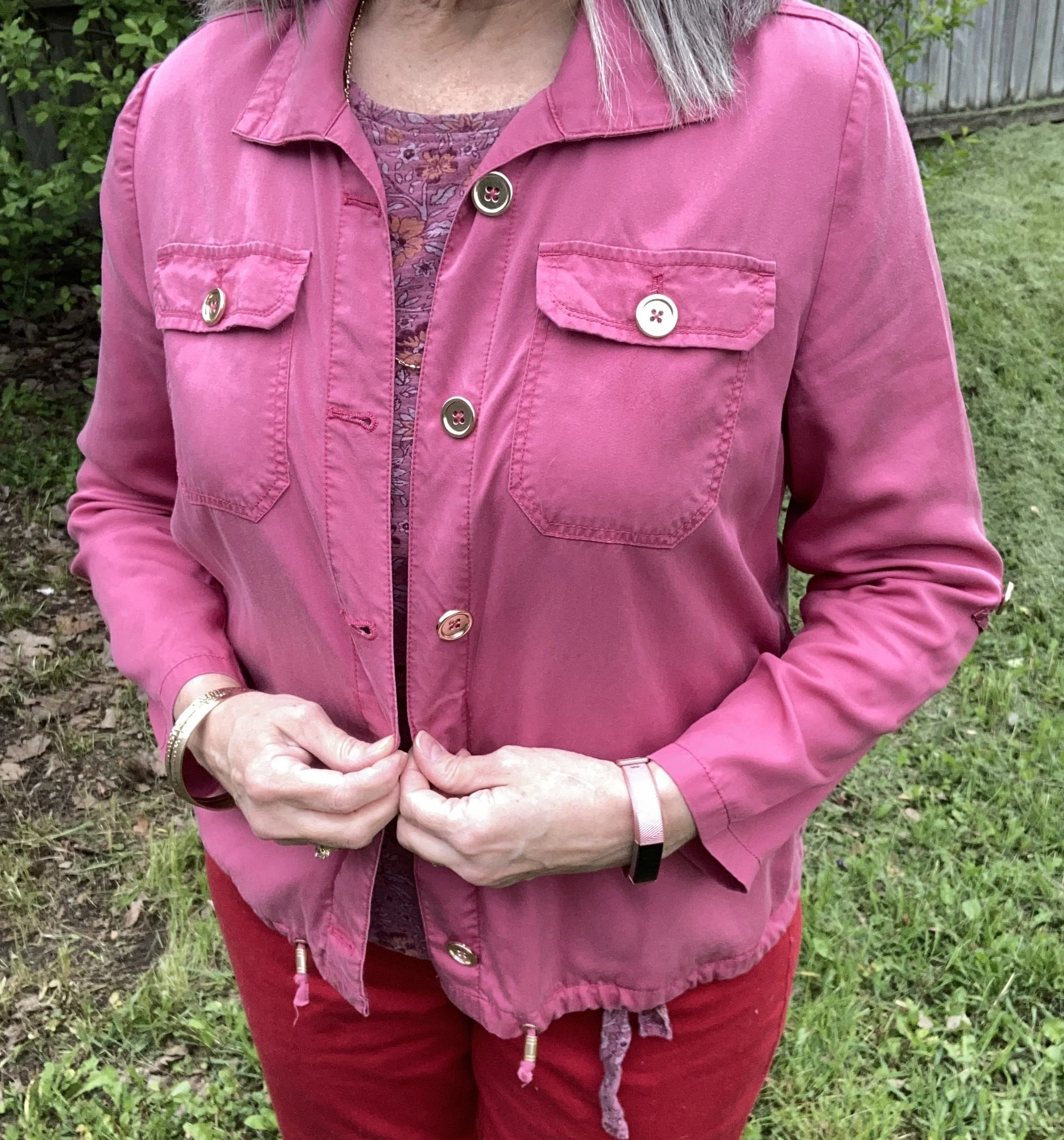
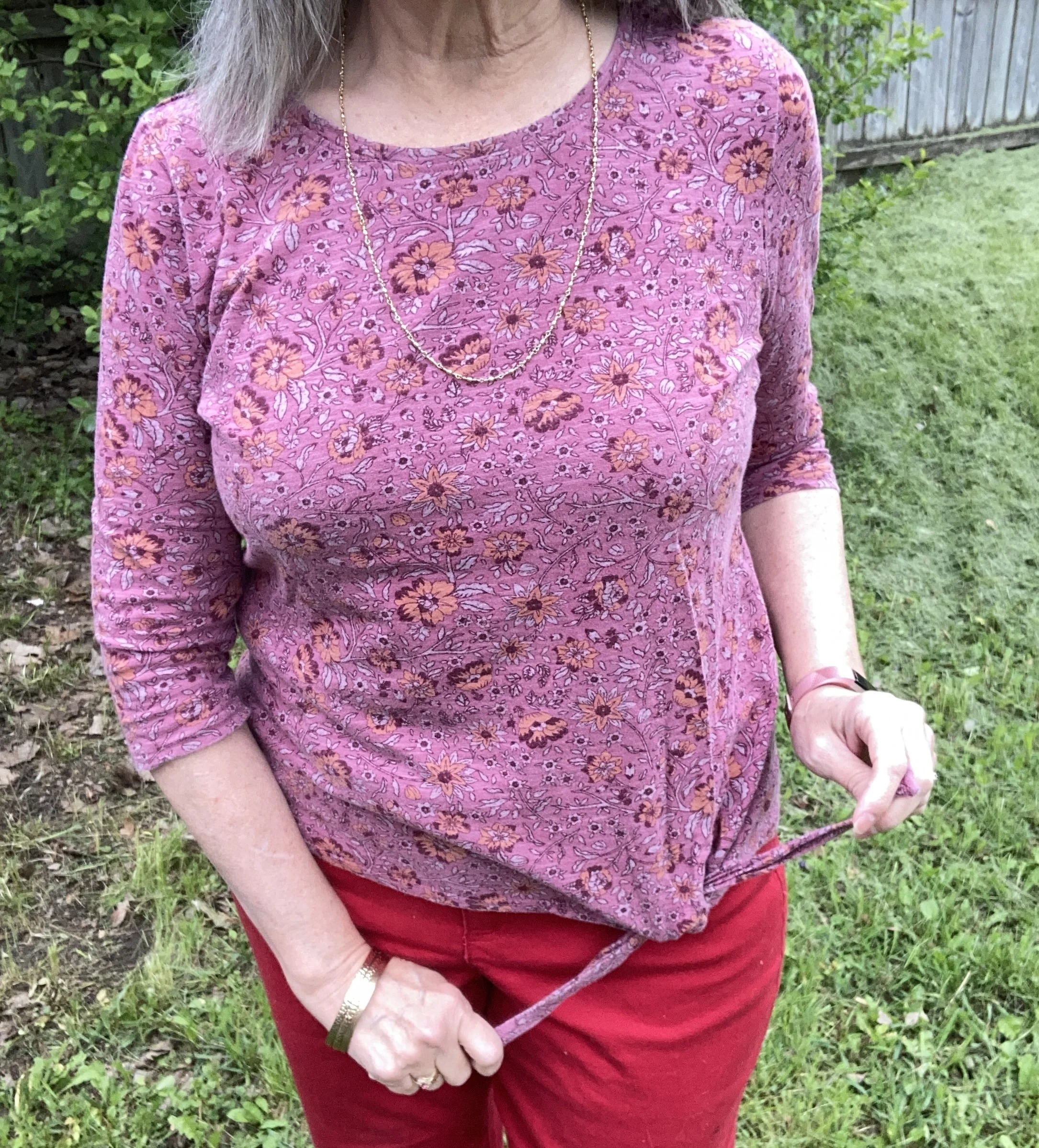
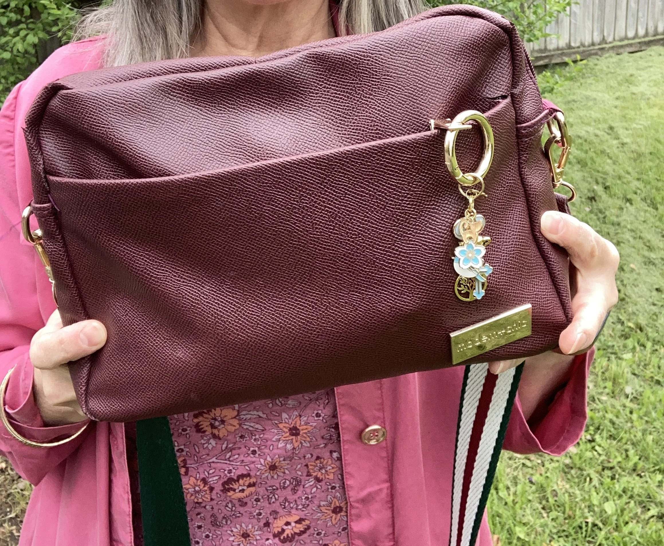
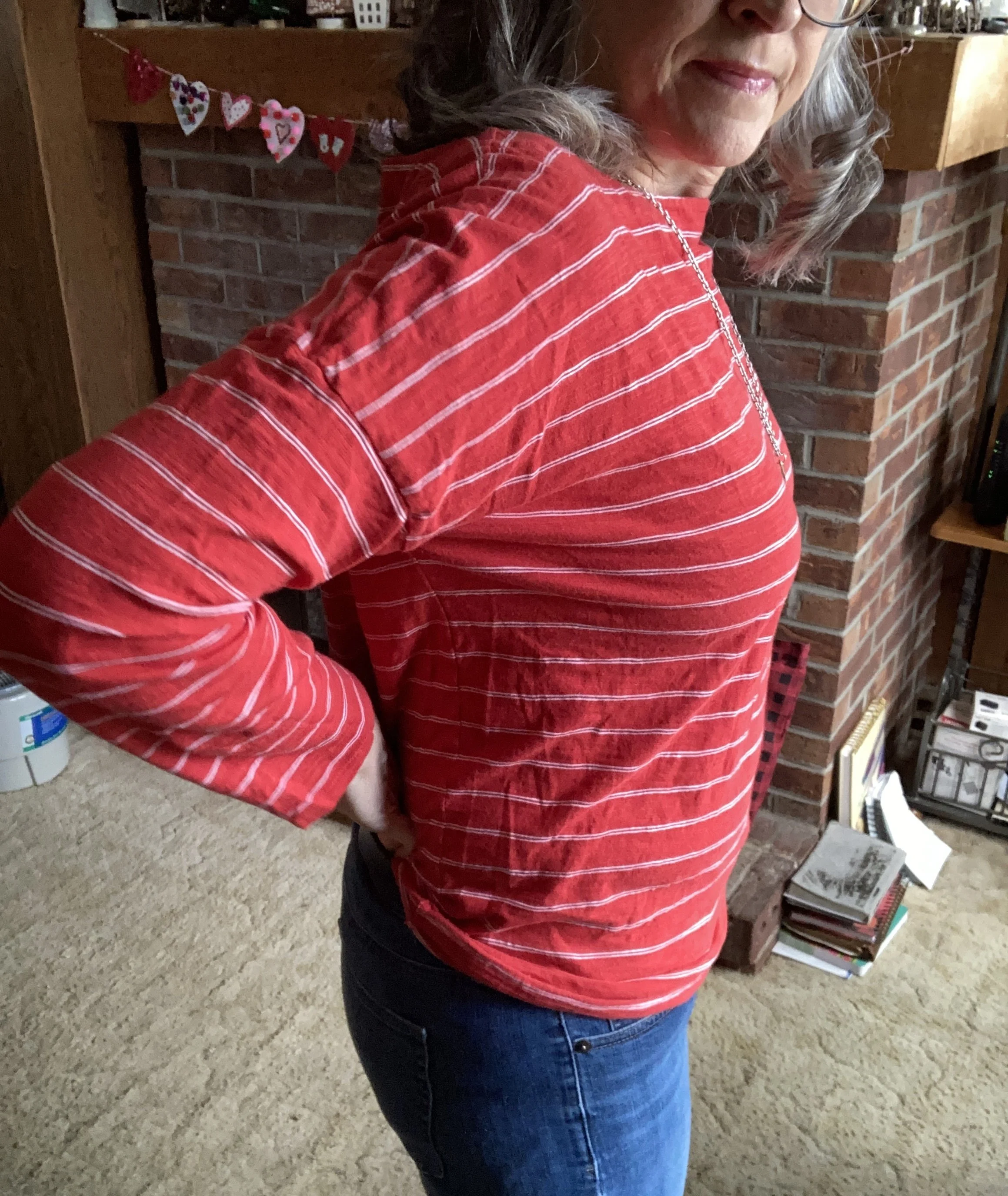
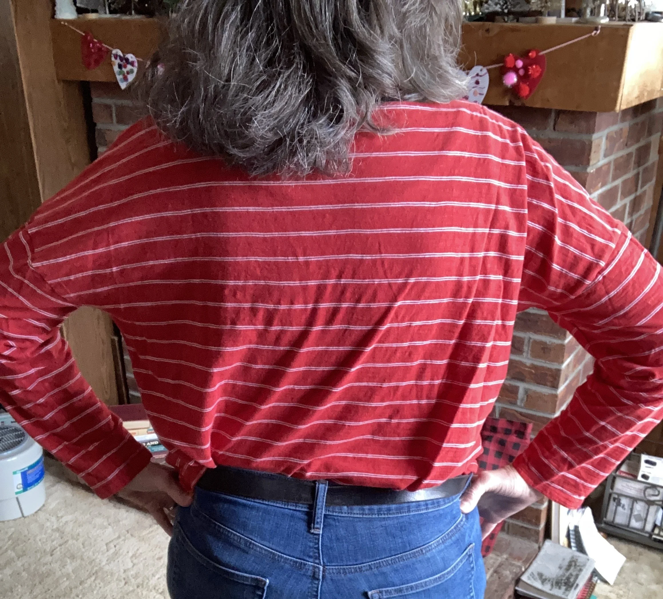
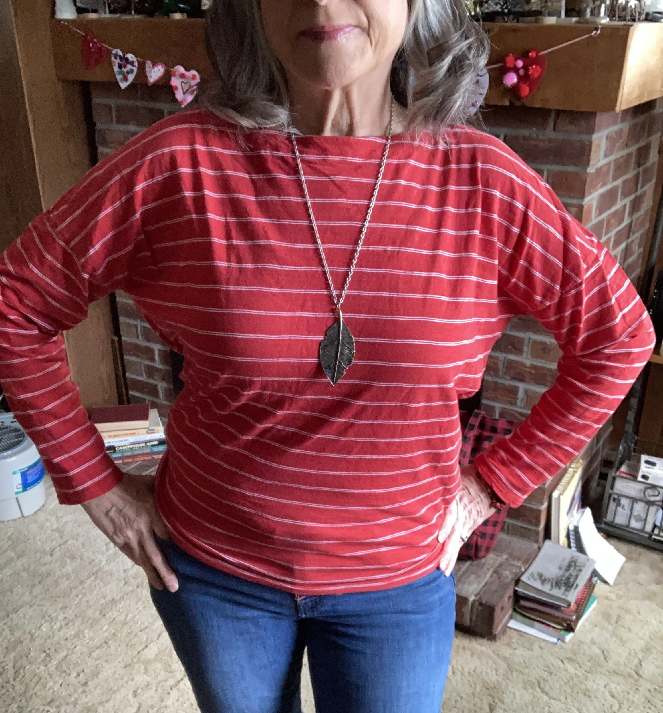
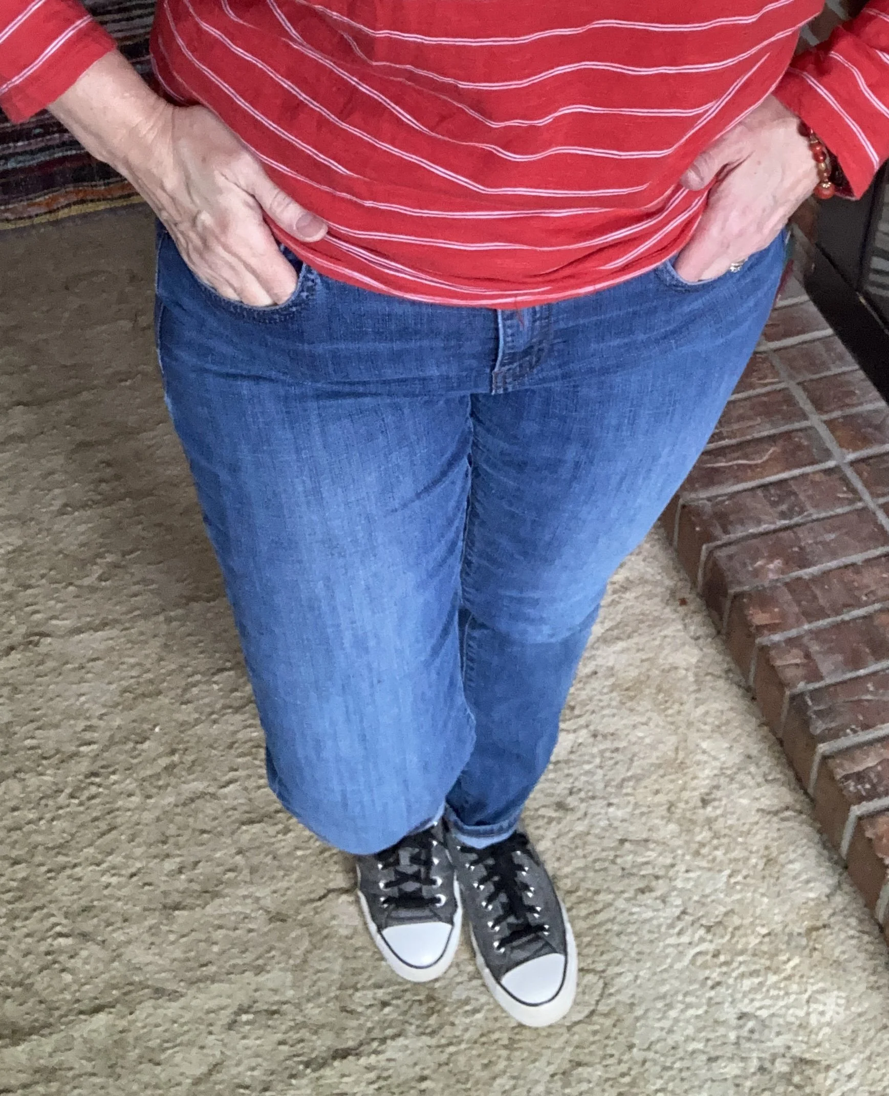
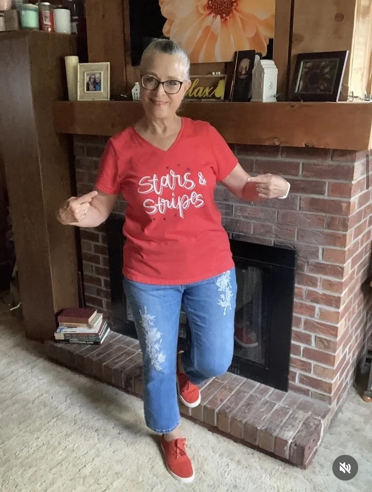
Celebrating America’s 250th Birthday
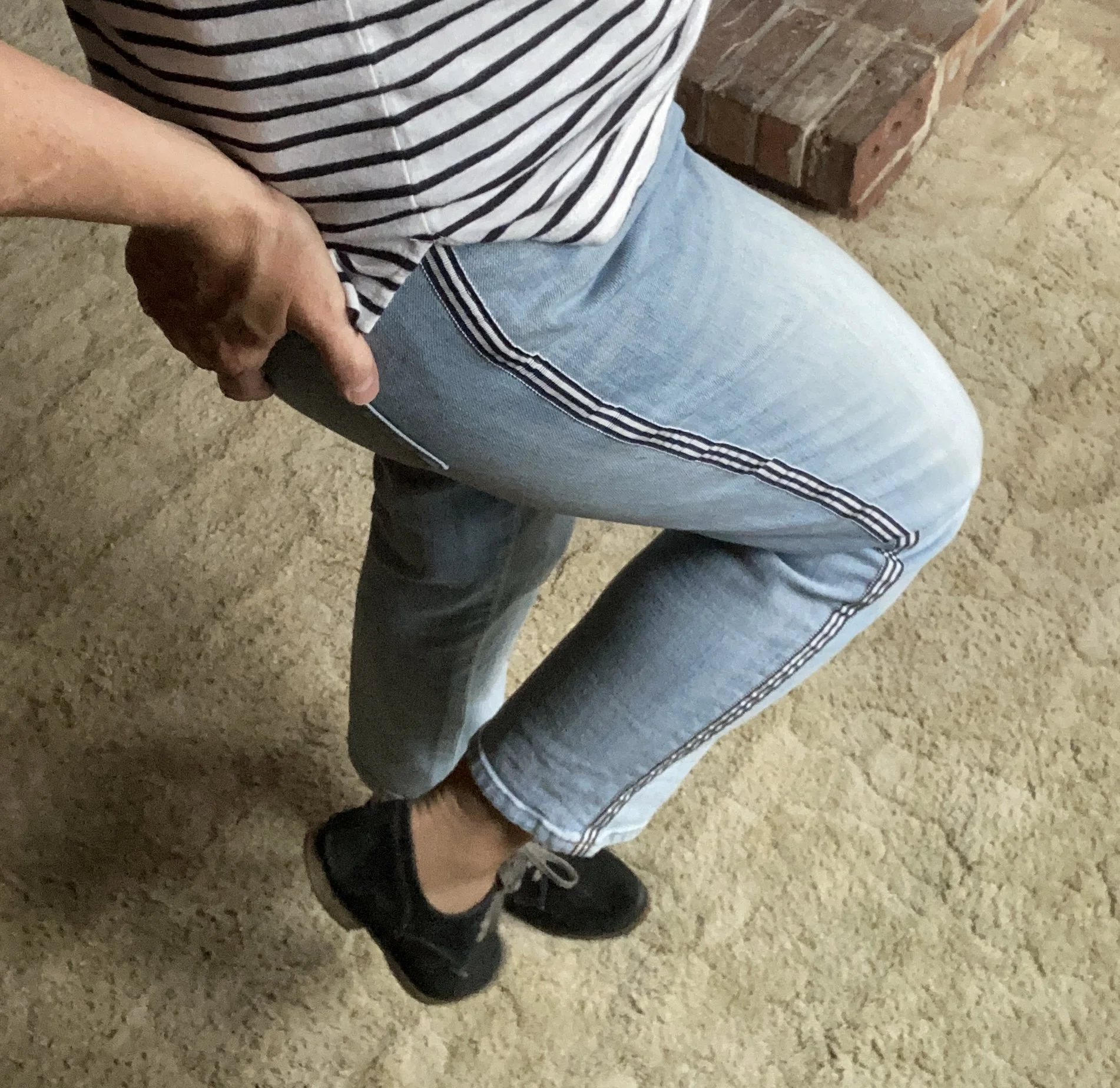
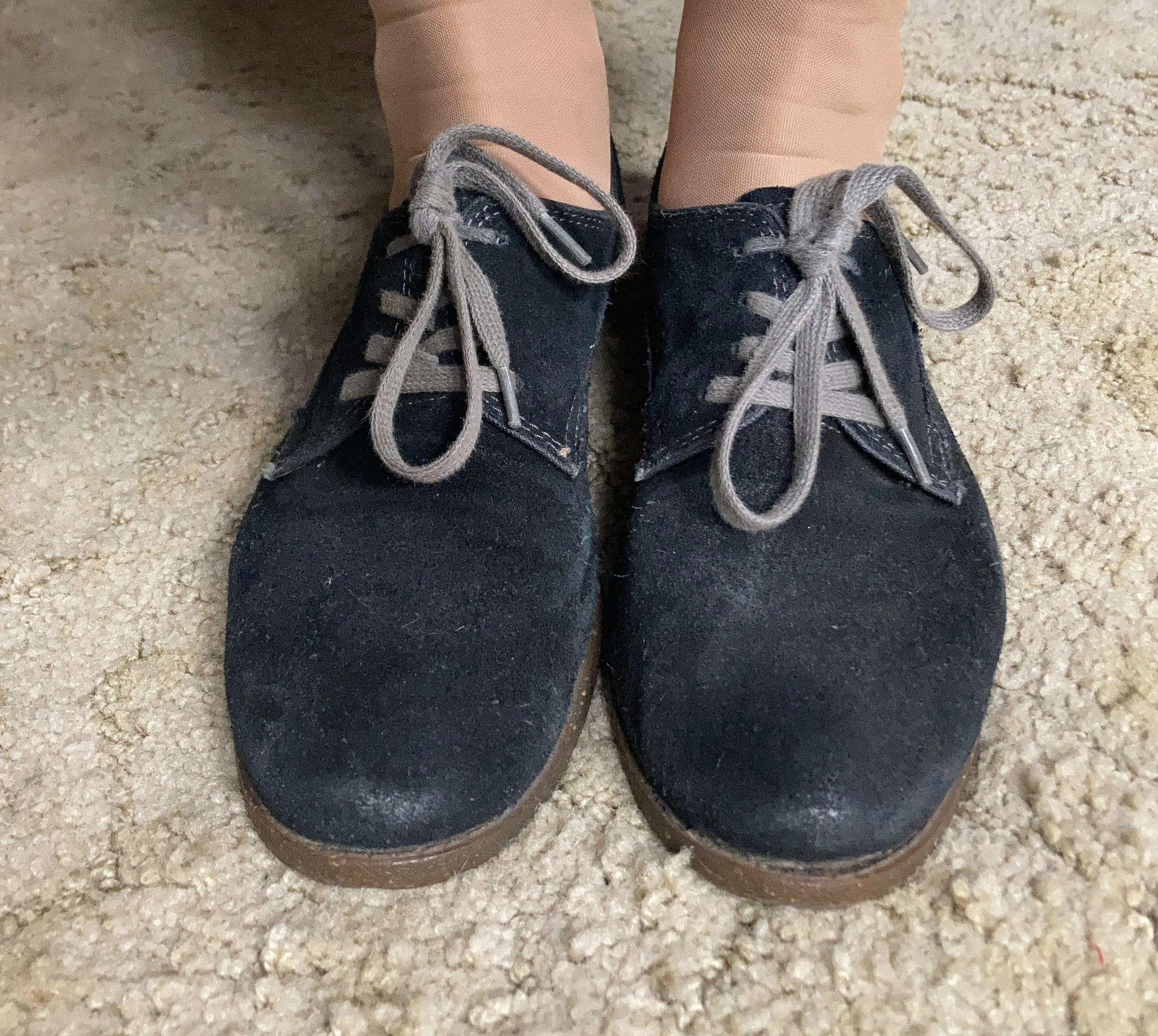
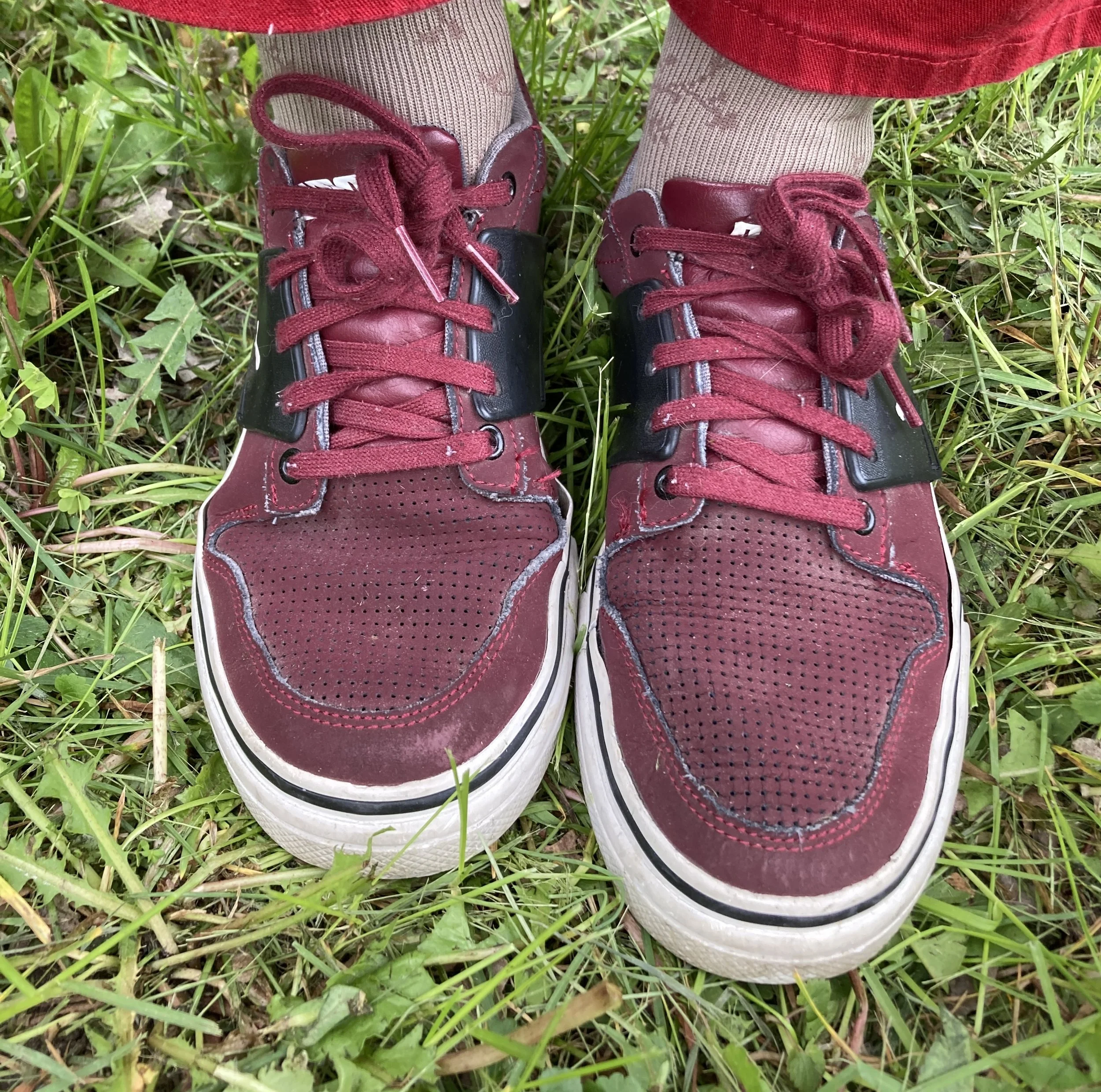
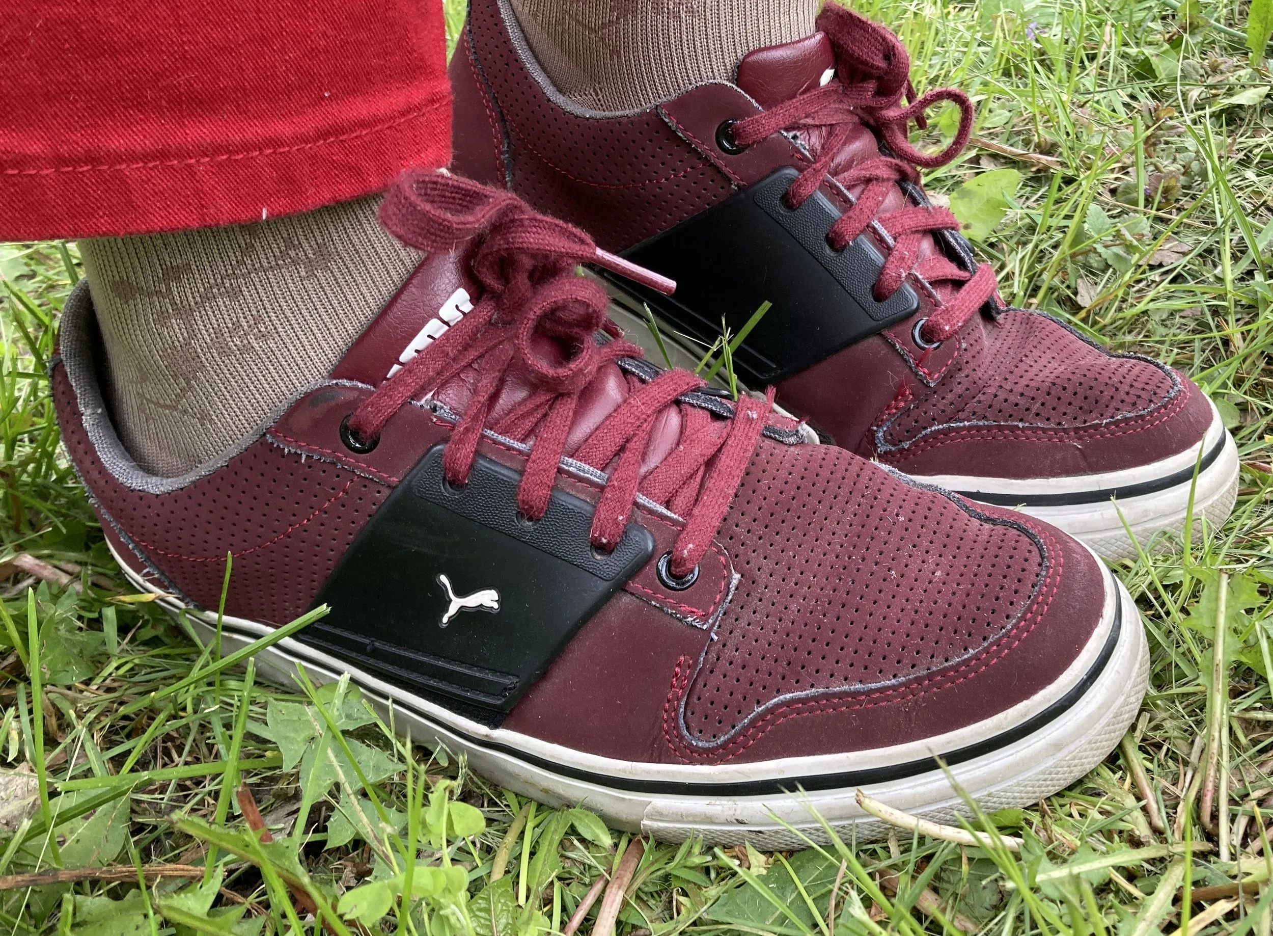
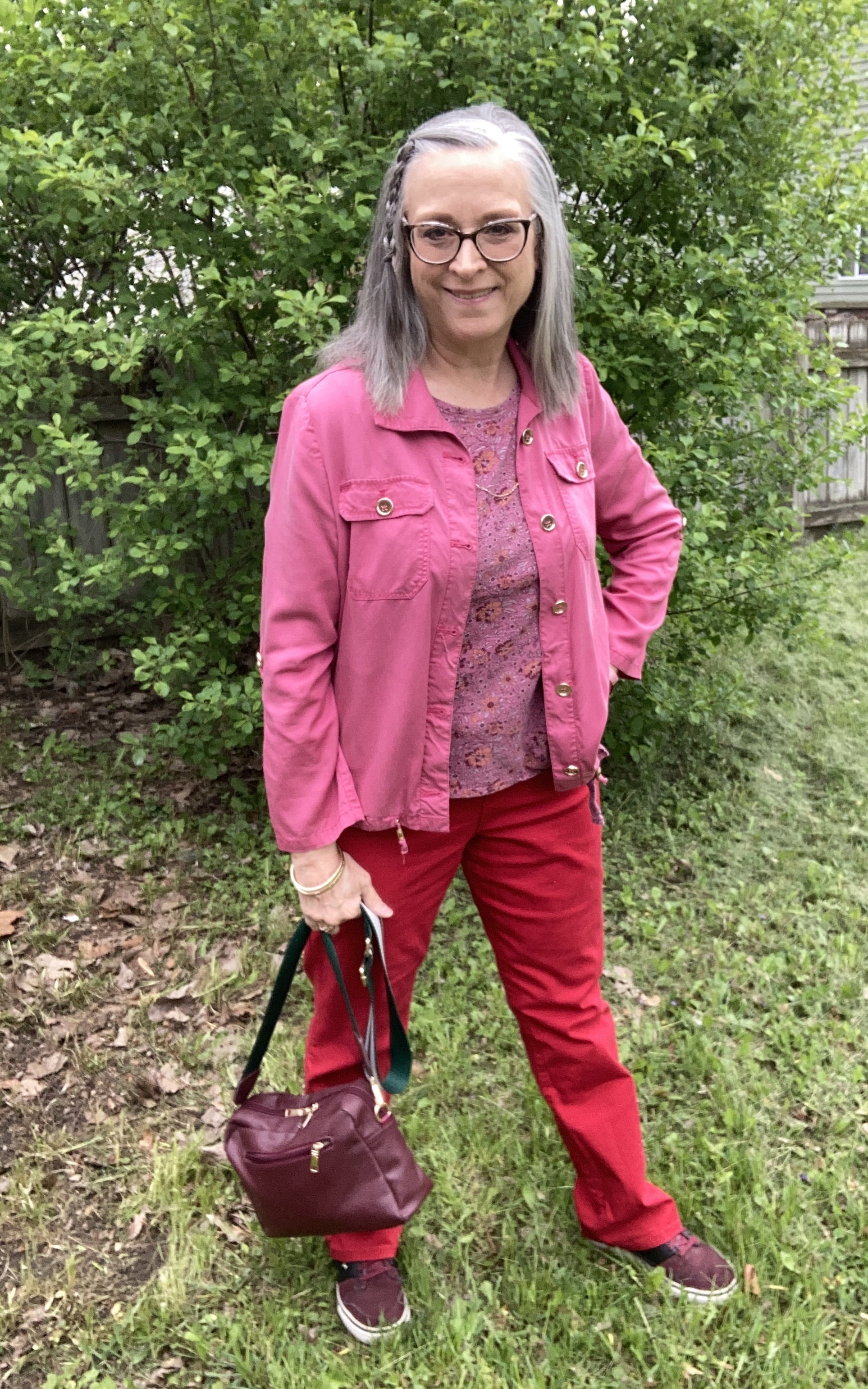
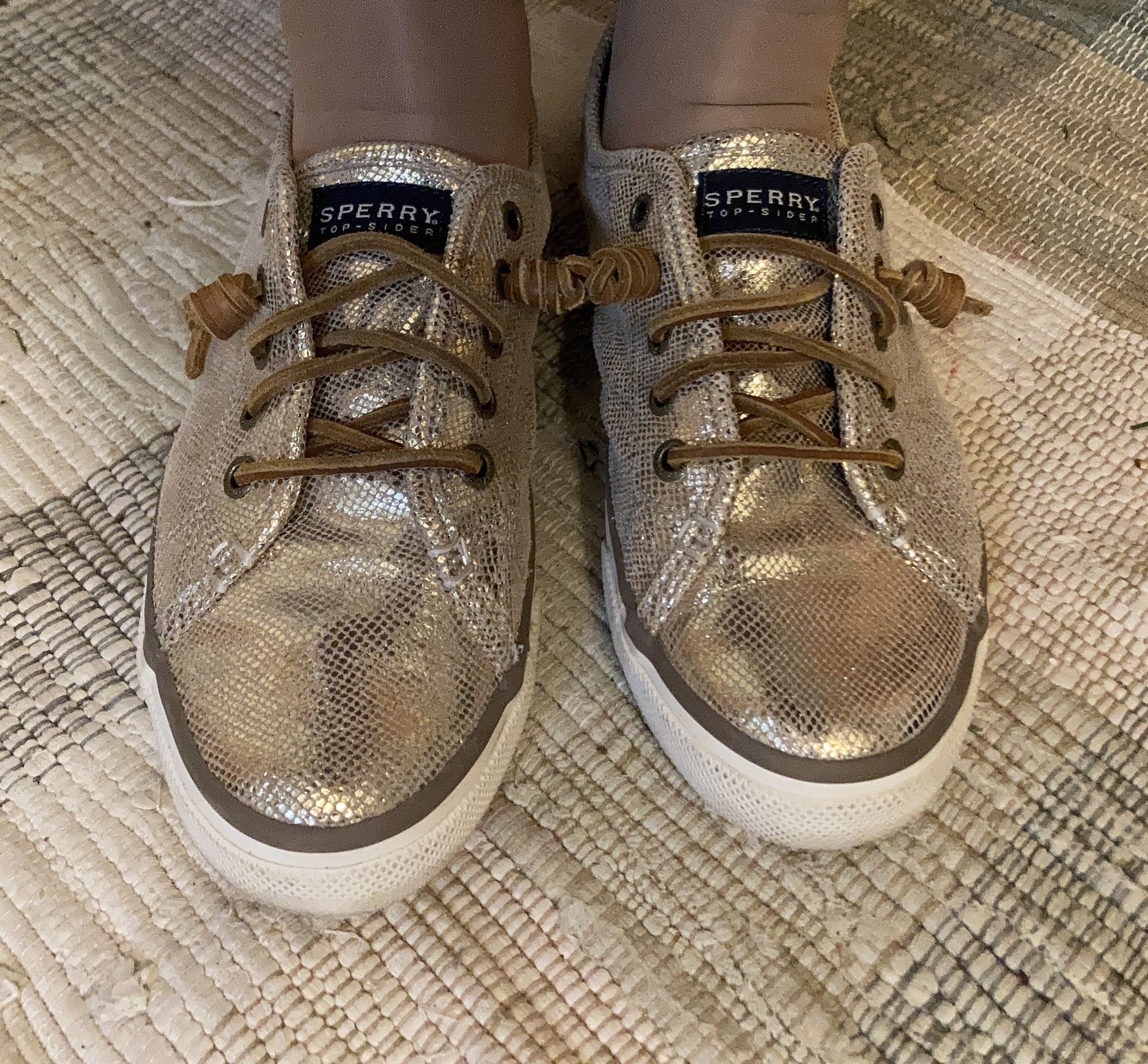
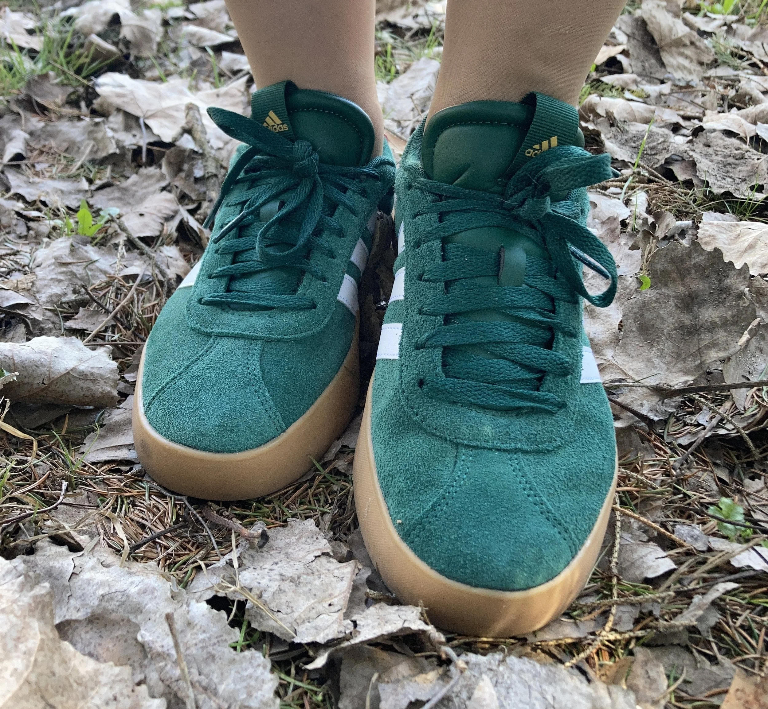
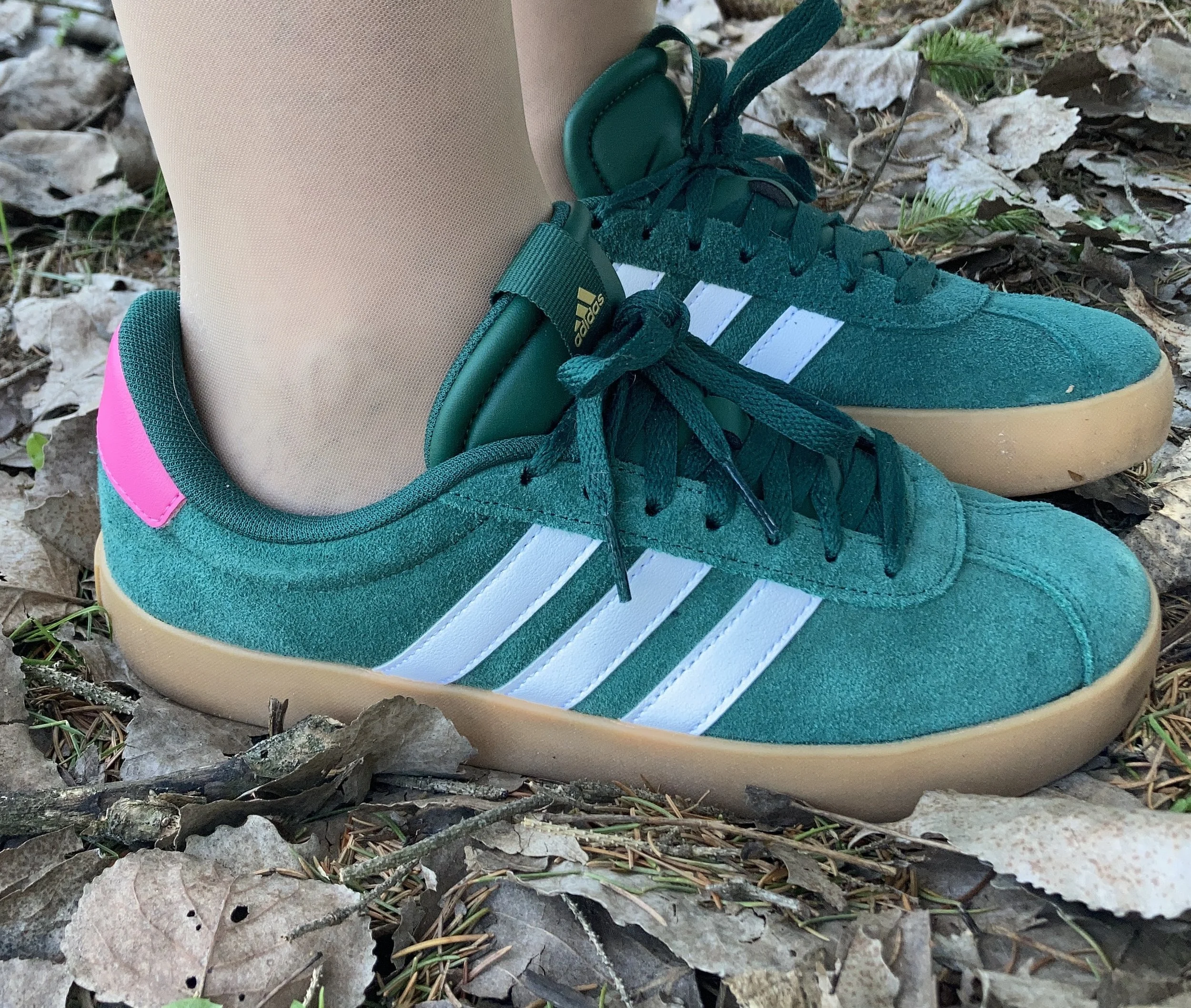
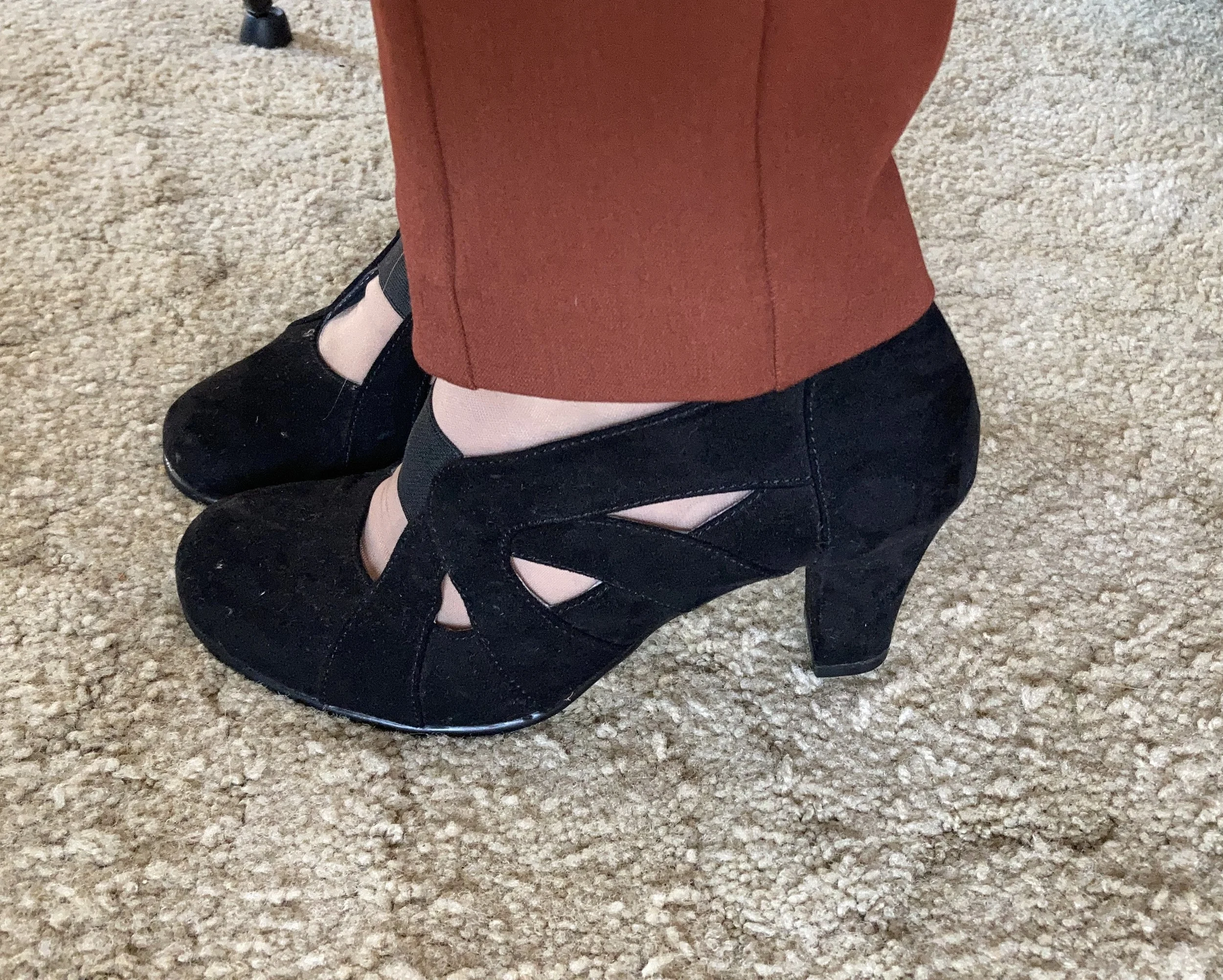
I’m showing you two outfits that I wore right around the 4th of July. I was tapping into the traditional reds, whites and blues and liked how both of these turned out. I’m so glad I found these Comfortiva red shoes. These are probably one of the best buys I have found. This brand of shoe runs around $105 new. I got them for $1. In the second outfit I am showing off a new pair of thrifted jeans with fun, floral embroidery.

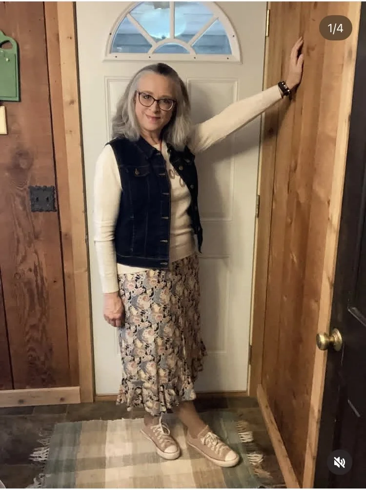
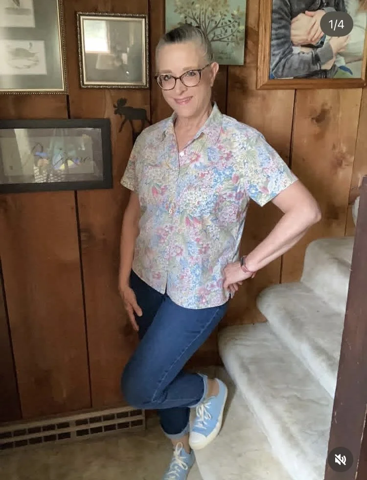
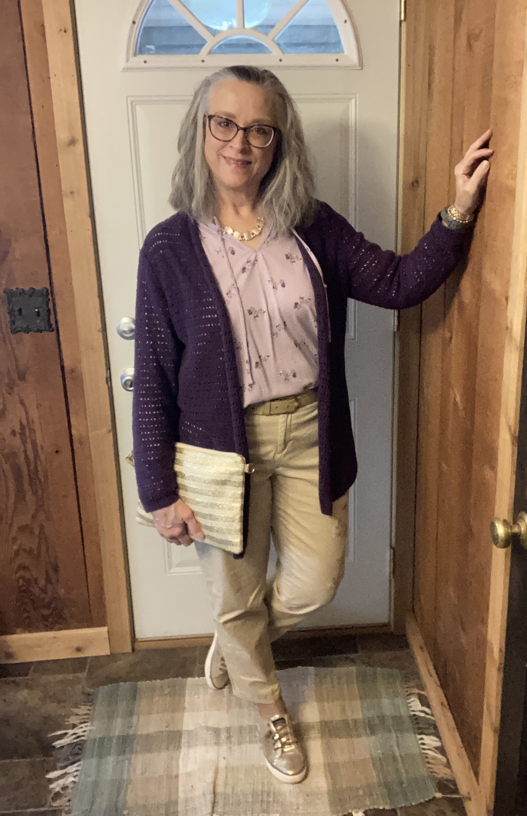
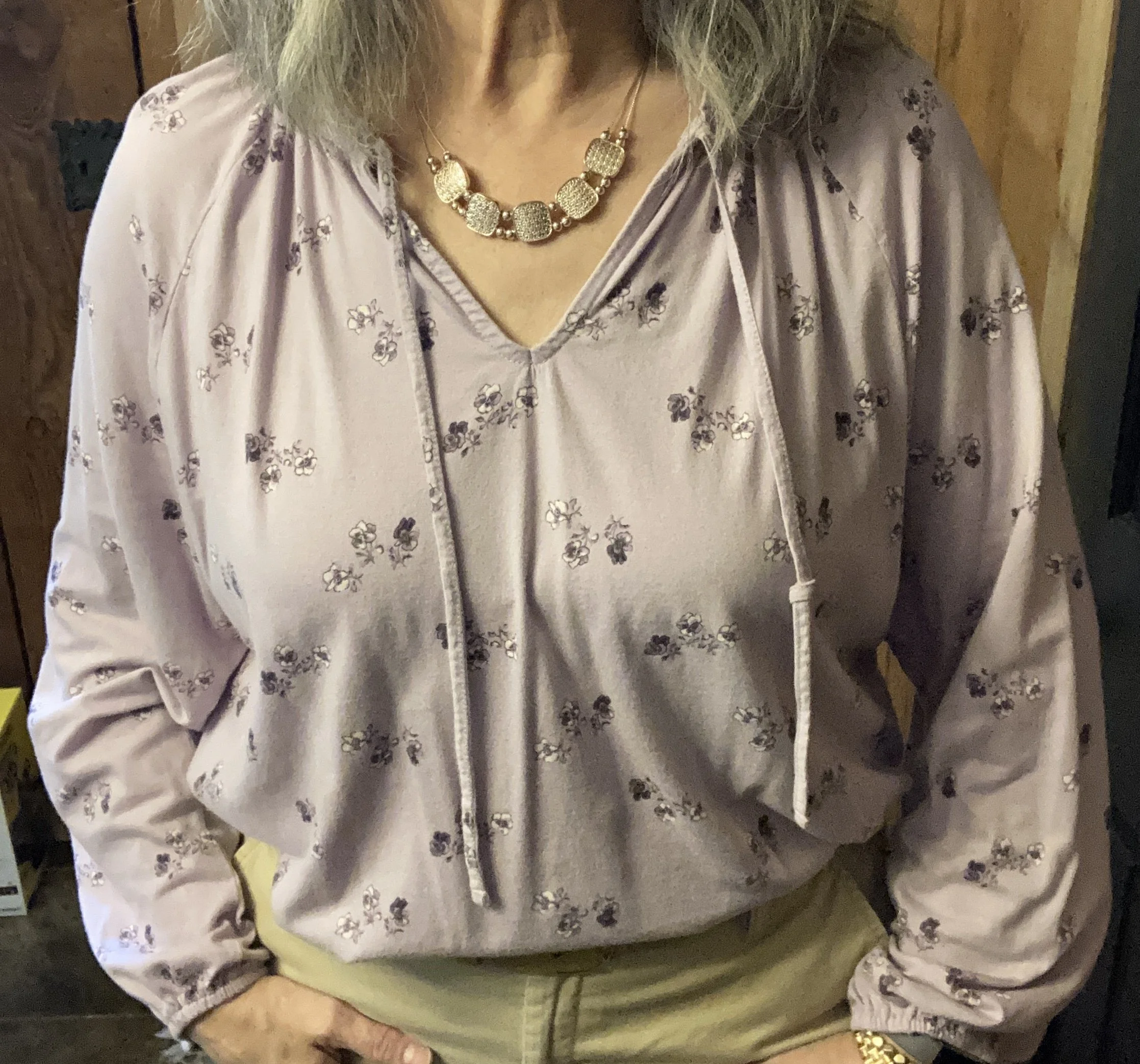
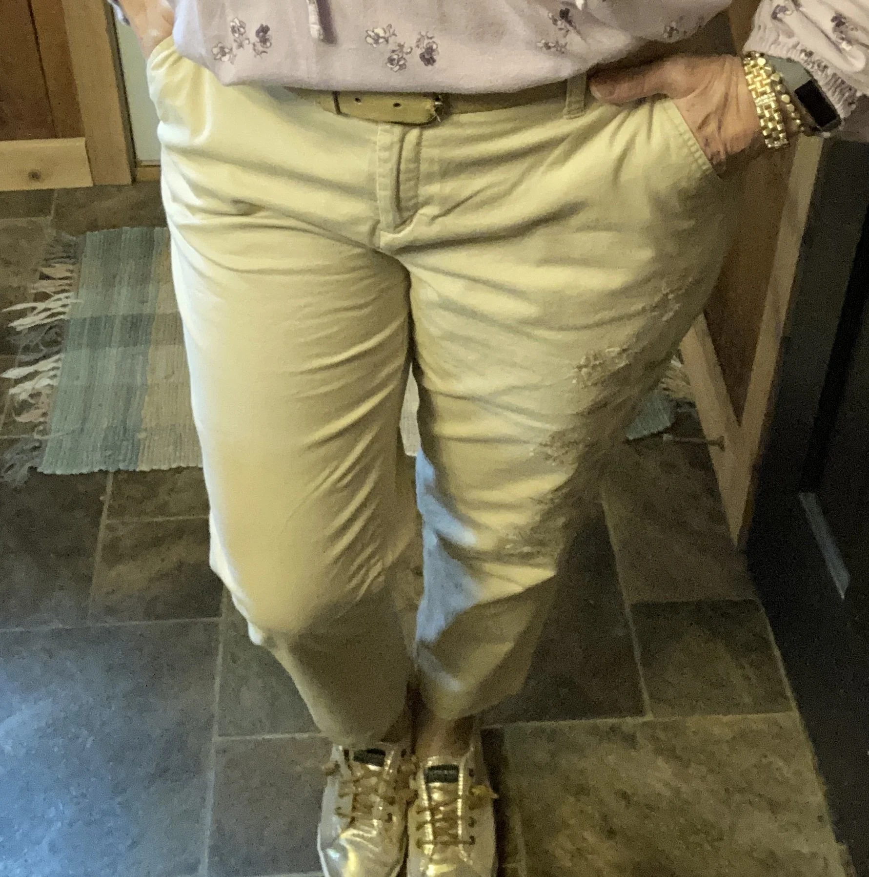
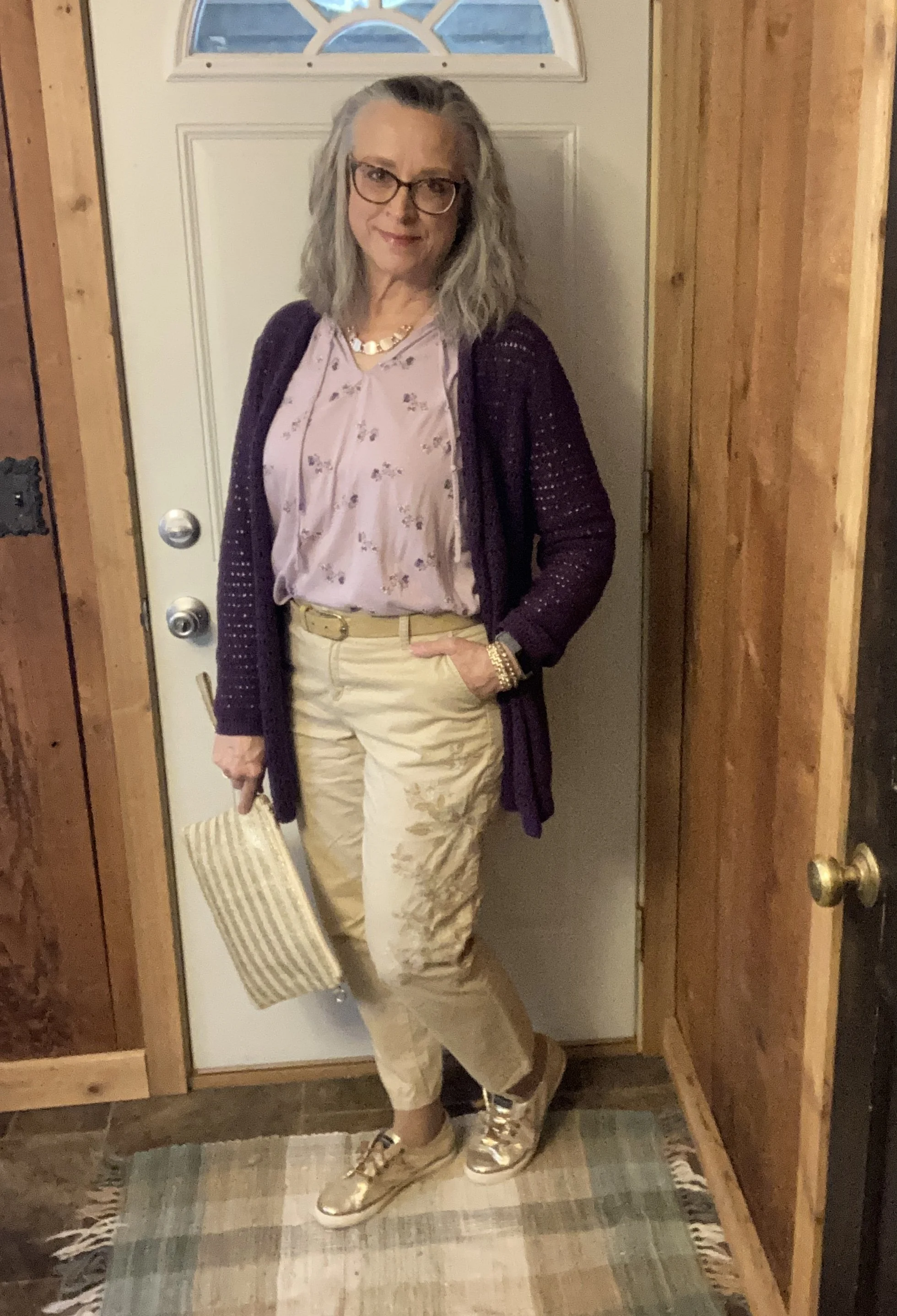
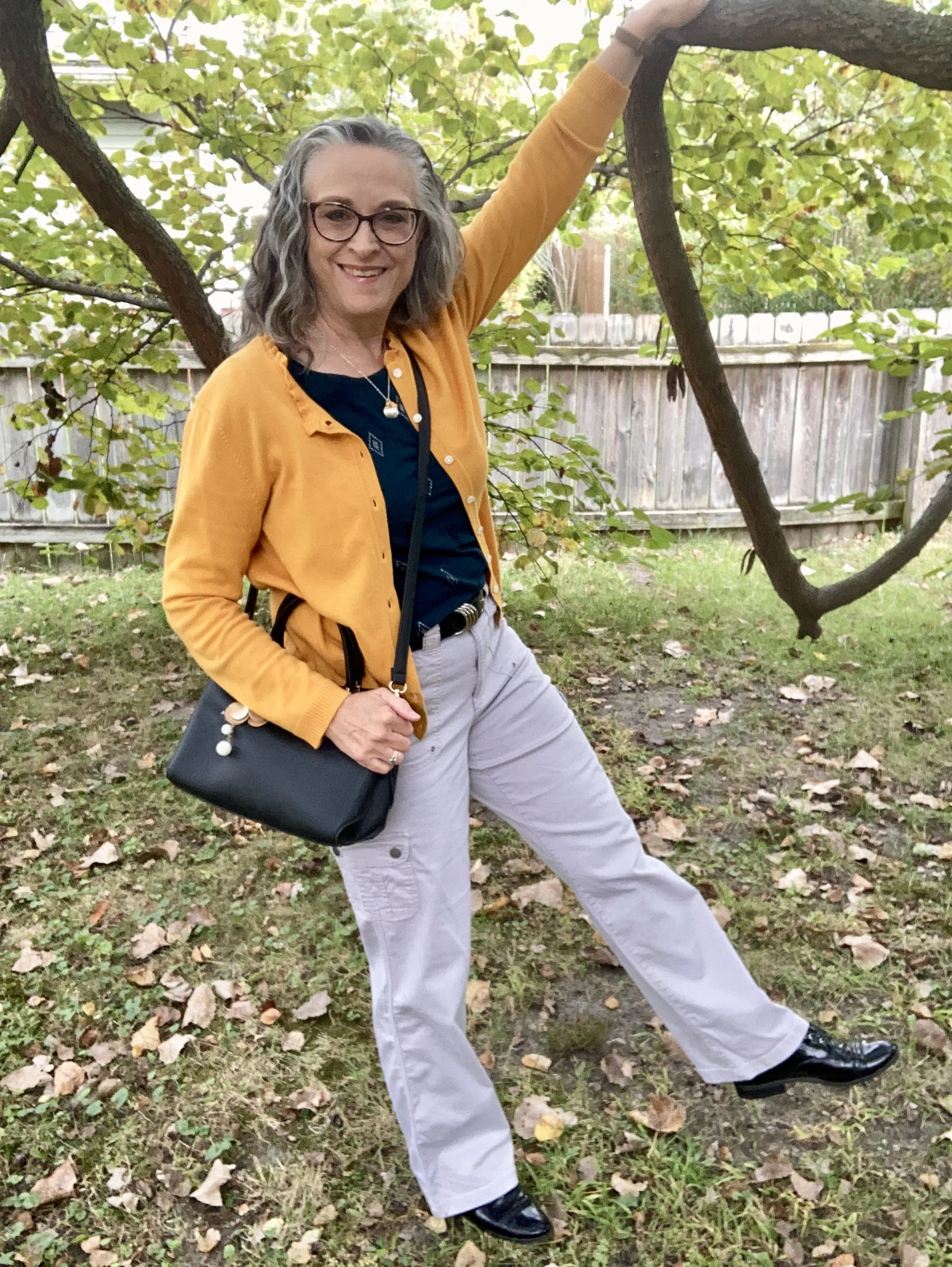
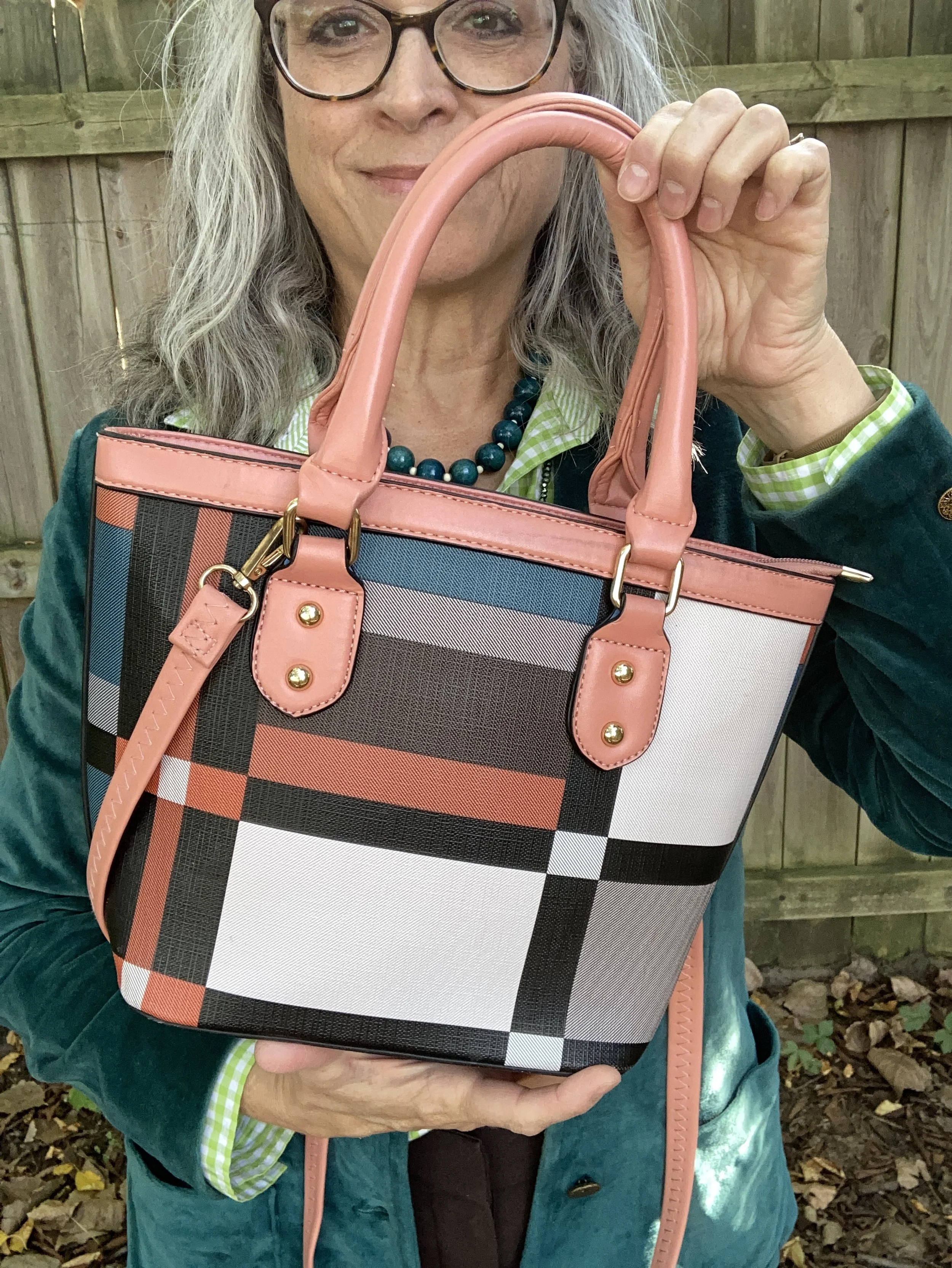
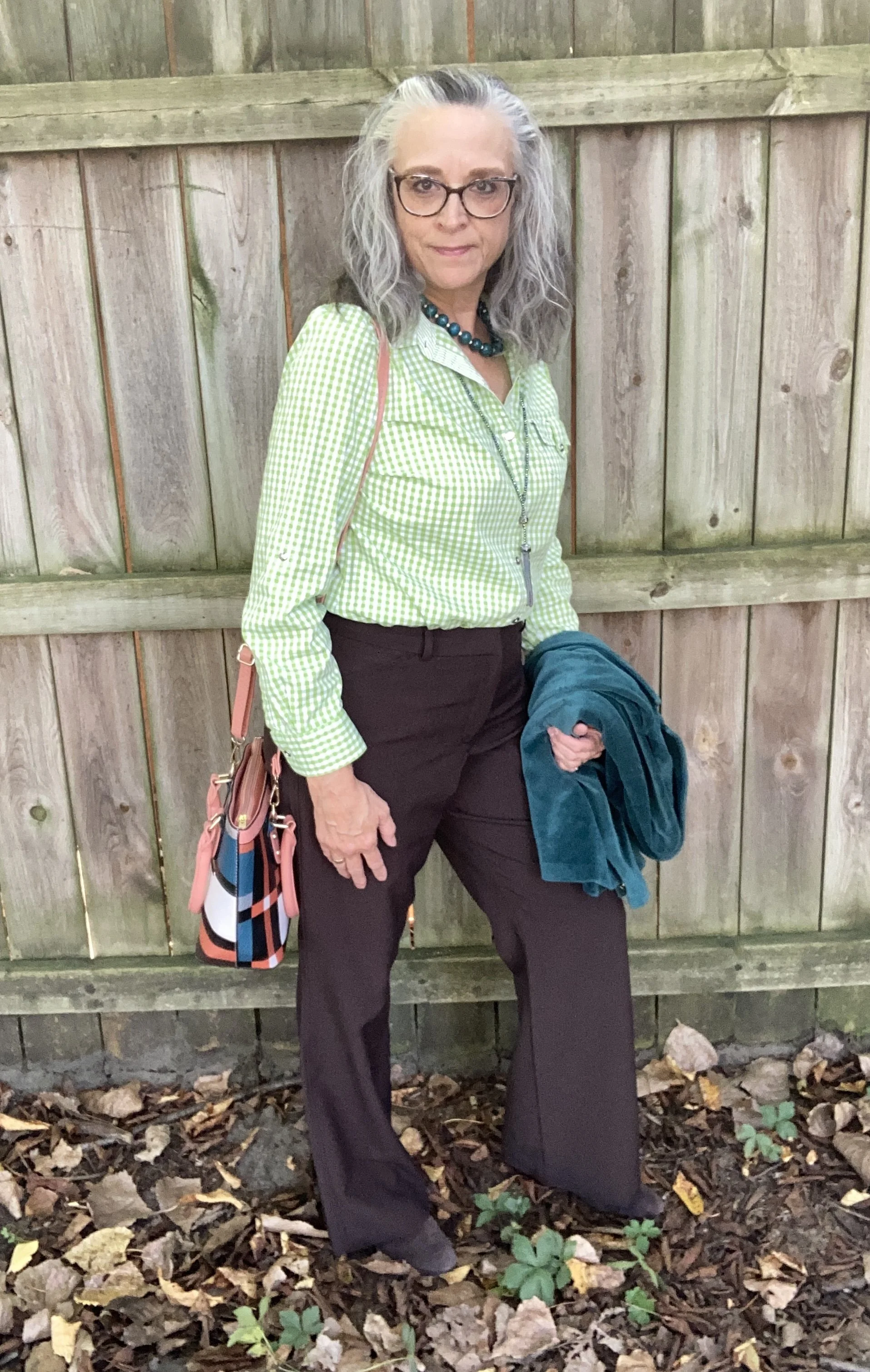
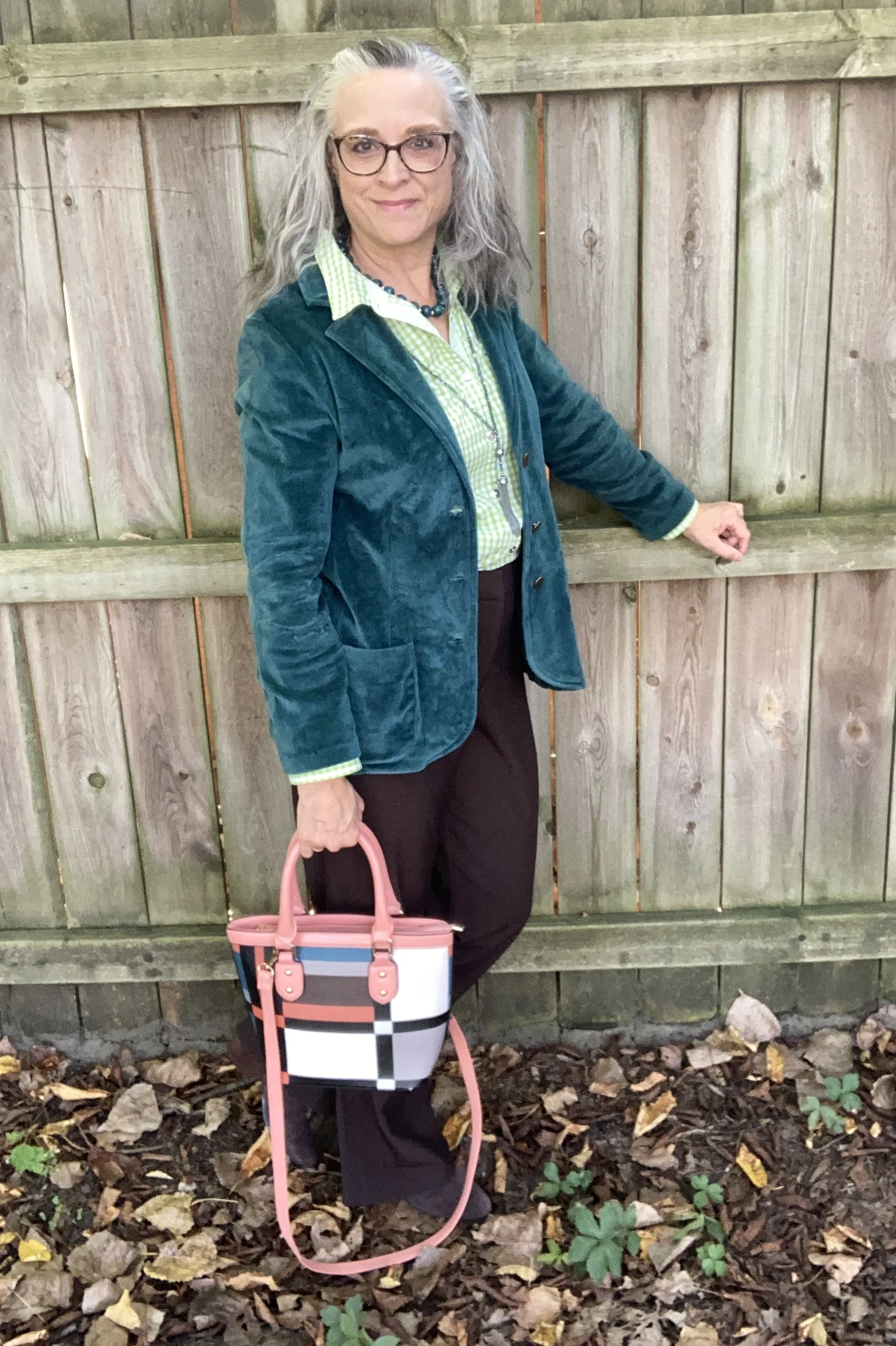
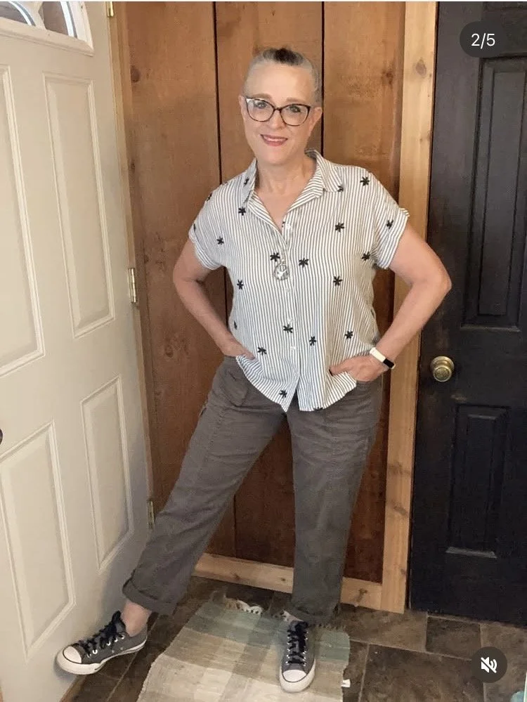
Preppy Neutrals
The highlight of this outfit is certainly the striped top with embroidered flowers. It is a brand called Jane and Delancey. I paired it with a light weight pair of Sonoma utility pants, for a breezy traveling outfit.
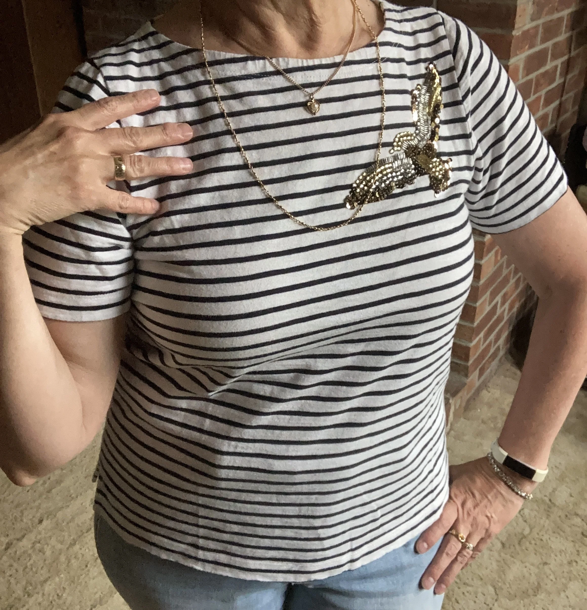
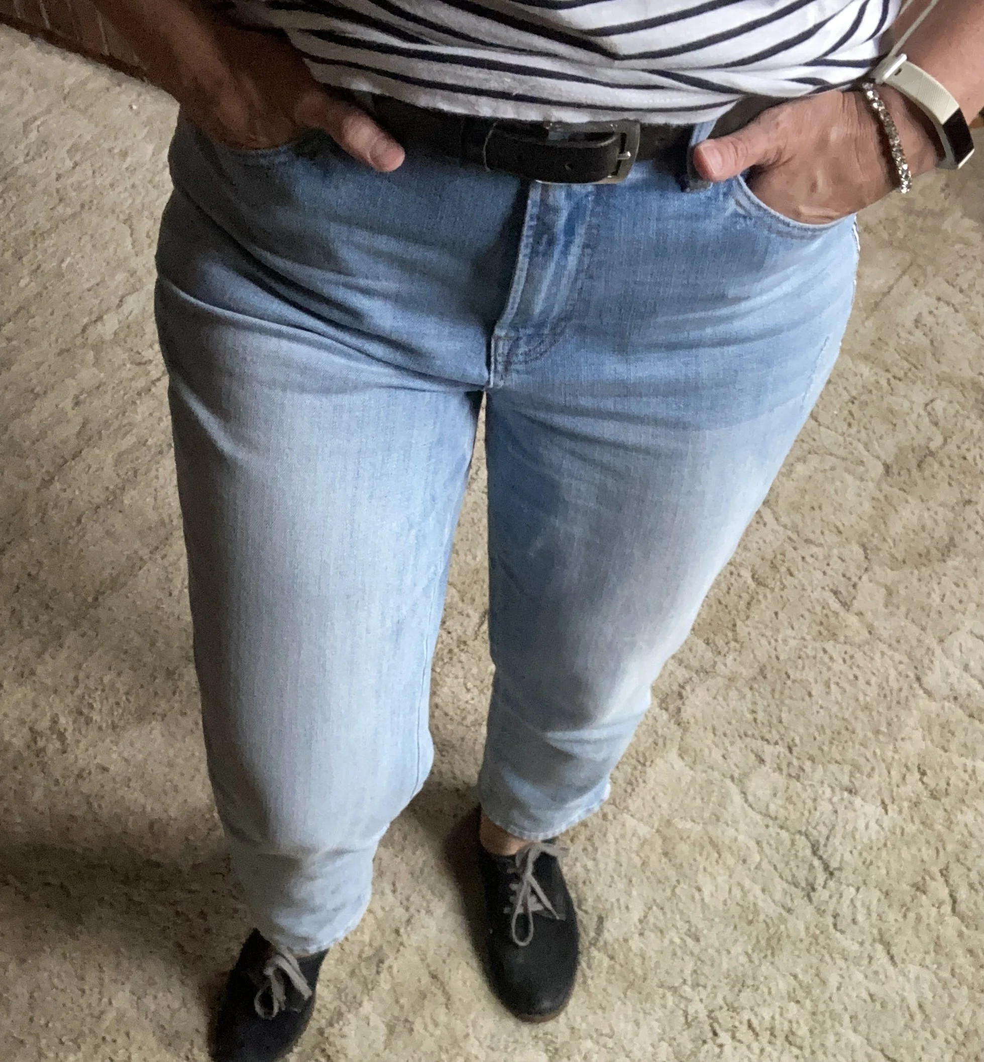
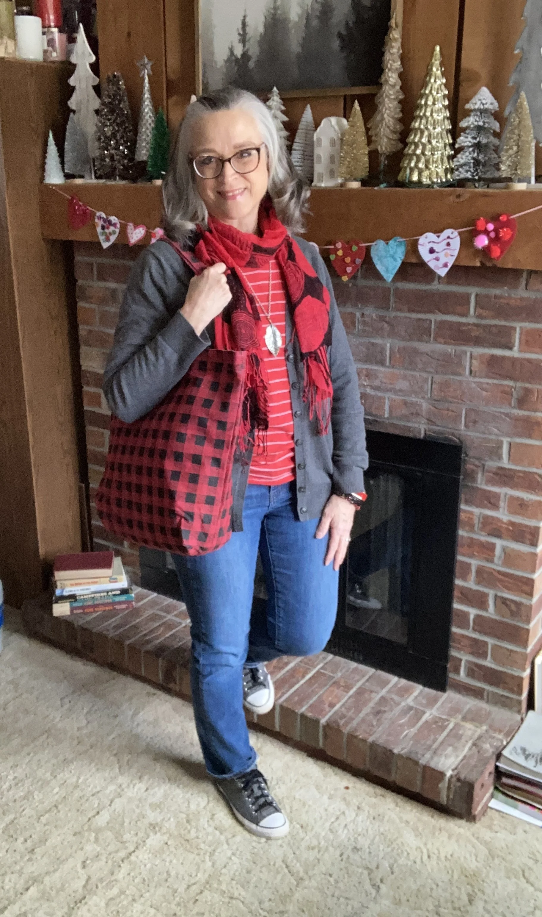
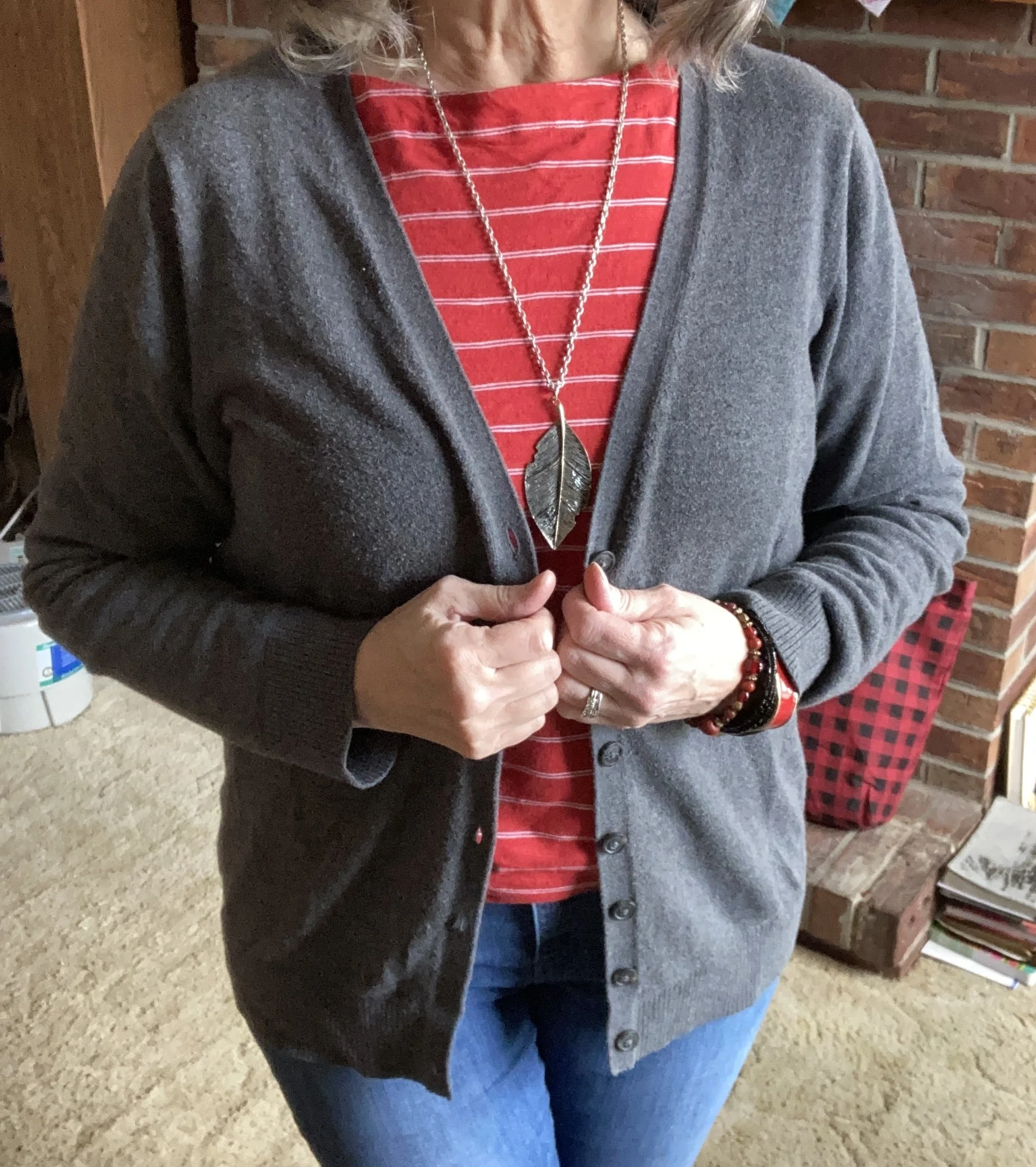
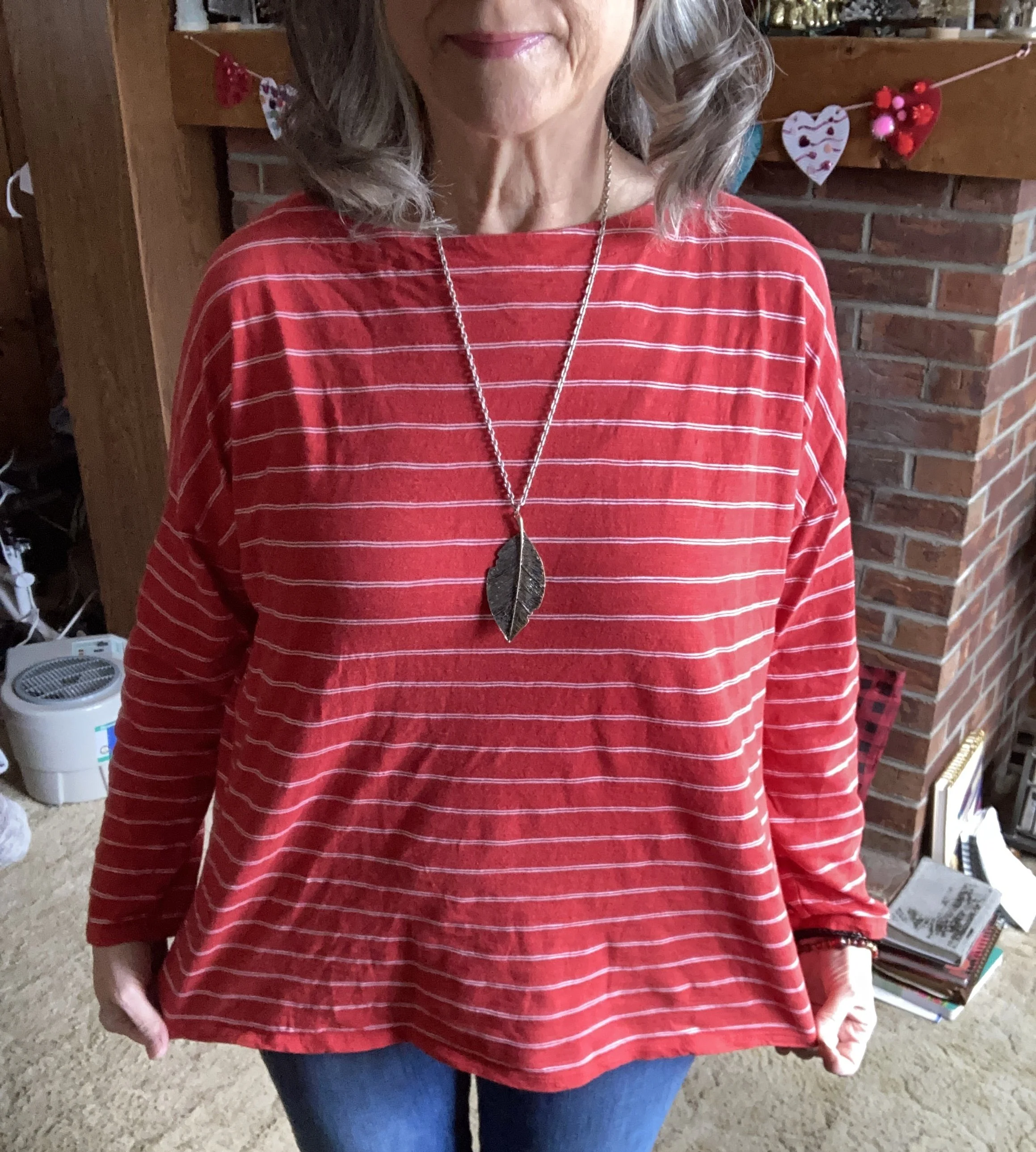
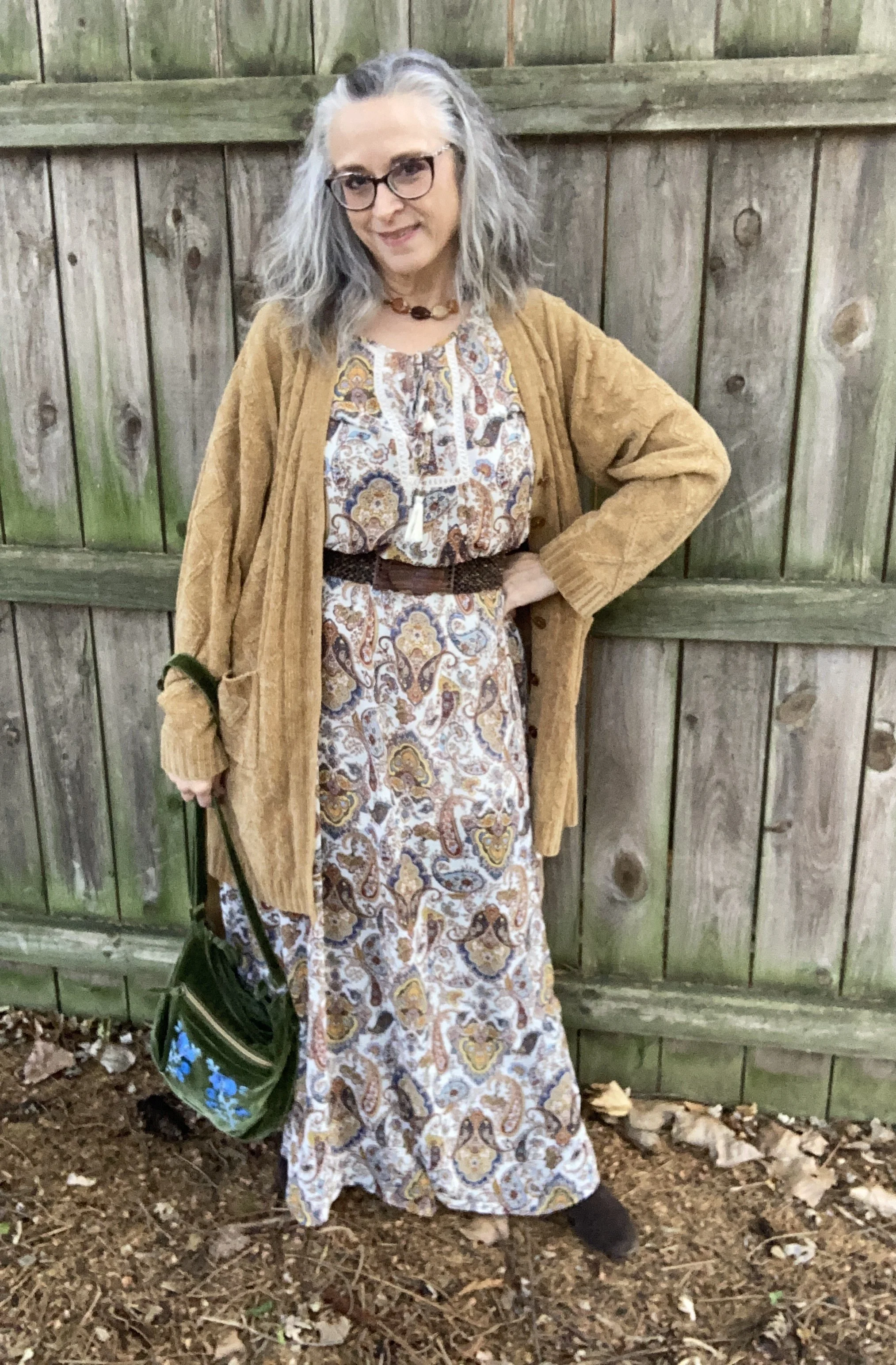
Vanilla Raspberry Fudge
This outfit revolved around two IG prompts: Vintage Revival with Distressed Denim, and Style an Outfit Based on Your Favorite Summer Treat. The pretty lace tee was a recent find, and reminded me of the bodice of an old timey dress. My favorite summer treat is ice cream from a little shop around the country from where we live, called Vanilla Raspberry Fudge. It is so creamy and delicious.
I hope you enjoyed seeing these everyday outfits. When you start feeling like your closet has gotten boring and you no longer have anything to wear, trying looking at it differently. Try taking inspiration from a painting, a paint swatch at the hardware store, or even the tiles in a public restroom. Perhaps you never thought to combine those colors before. Another way to find inspiration is by pulling out various pieces in your wardrobe without worrying about what goes with it. For instance, pull out three bottoms; perhaps a pair of jeans, a tiered skirt, and a pair of capris. Now pull out three tops that you haven’t looked at in a while. Start imagining how one of the tops could go with one of the bottoms. Now you have the beginnings of a completely new look. Add a belt, a bag, some shoes and maybe a light weight jacket or sweater and you are set to go.
I am hoping to get back to more regular posting in August, or at the latest, September. Whenever I do I will be starting with my Pantone series to kick things off for fall. Isn’t it crazy that we are already thinking about fall? The New York Palette has some very pretty colors on it this year which I will be exploring.
I hope you all are doing well, and I appreciate your patience with me and the blog. Have a great week1