Pantone Fall 2018 - Quetzal Green, Crocus Petal and Meerkat
I am on my last Pantone Fall 2018 post. I hope you have enjoyed seeing these colors and the way I have managed to put outfits together using the inspiration from the 2018 Fall palette. As in anything where fashion is concerned we can take it our leave it. Fashion is for you. It is about putting together outfits and colors that you like, make you feel confident and that you will enjoy wearing. In some ways what we wear is like our second skin. It provides a covering for a bodies and how we put that cover together can boost our self-image and help us better manage our wardrobes and our pocket books.
I have found, in the fashion realm, just like in cooking, having a source of inspiration really helps. Whether you follow a recipe or cook from memories of you and your mom or grandmother working together to make wonderful creations in the kitchen, you use that inspiration to put food on your table. In the same way inspiration for fashion can come from magazines, bloggers, color palettes or even things out in nature. That is the reason I always like to use the Pantone color palettes as a spring board for creating fun and interesting outfits.
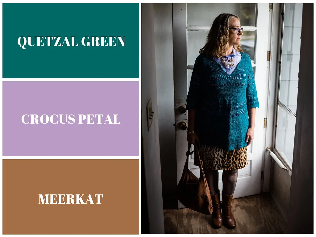
These last two colors, Quetzal Green and Crocus Petal, I decided to pair, once again, with Meerkat. Crocus Petal is a lighter, more spring like color found on the London palette. I feel that pairing it with Quetzal Green and Meerkat was the perfect way to keep the light color grounded and more fall like.
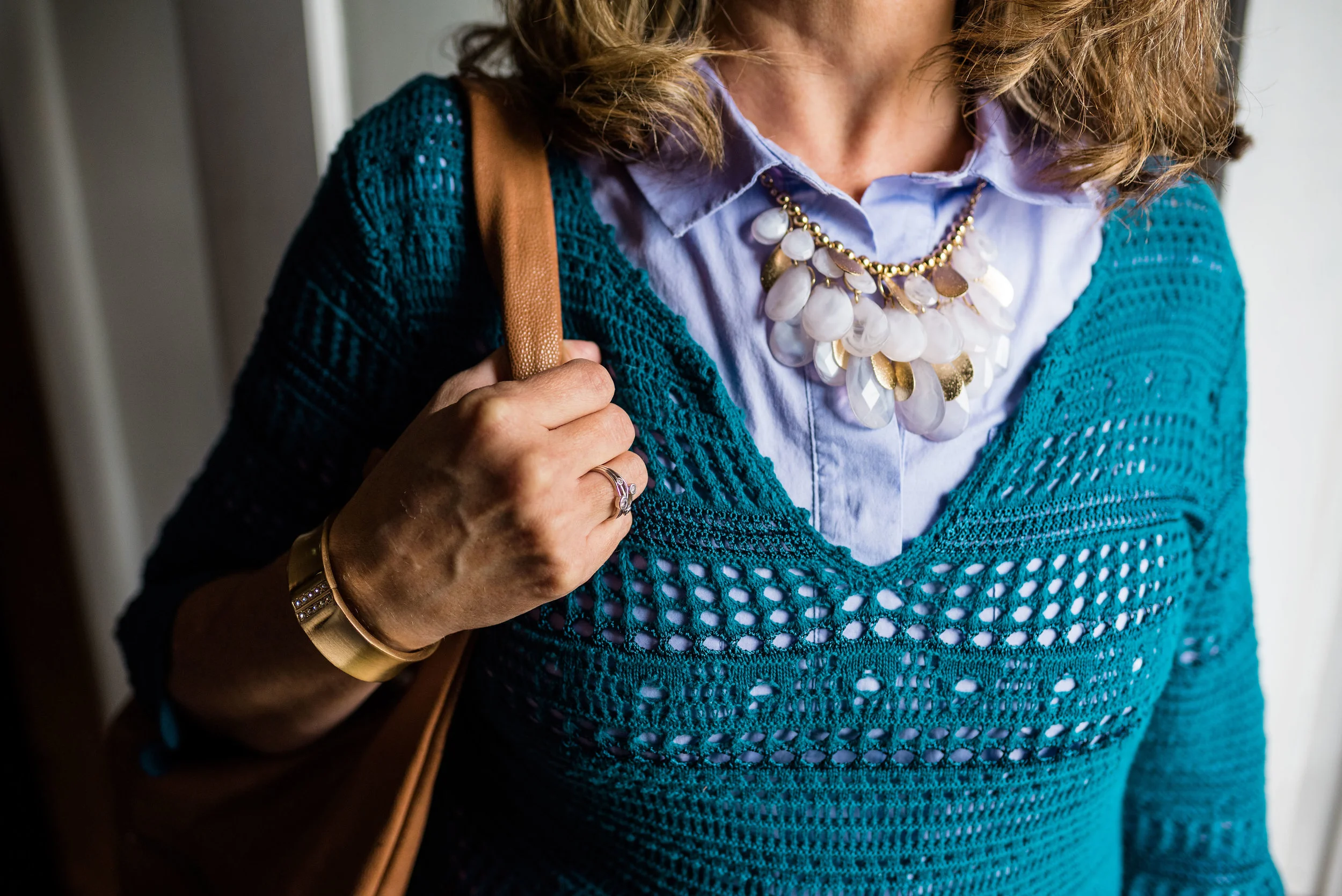
This top is a Kohl’s clearance find and is Dana Buchman brand. It is a button up with 3/4 length sleeves and a longer silhouette. It has some stretch and is more fitted. I opted to wear this bead and metal statement necklace, which incorporates the Crocus Petal color as well. I wore a simple gold cuff on my arm.
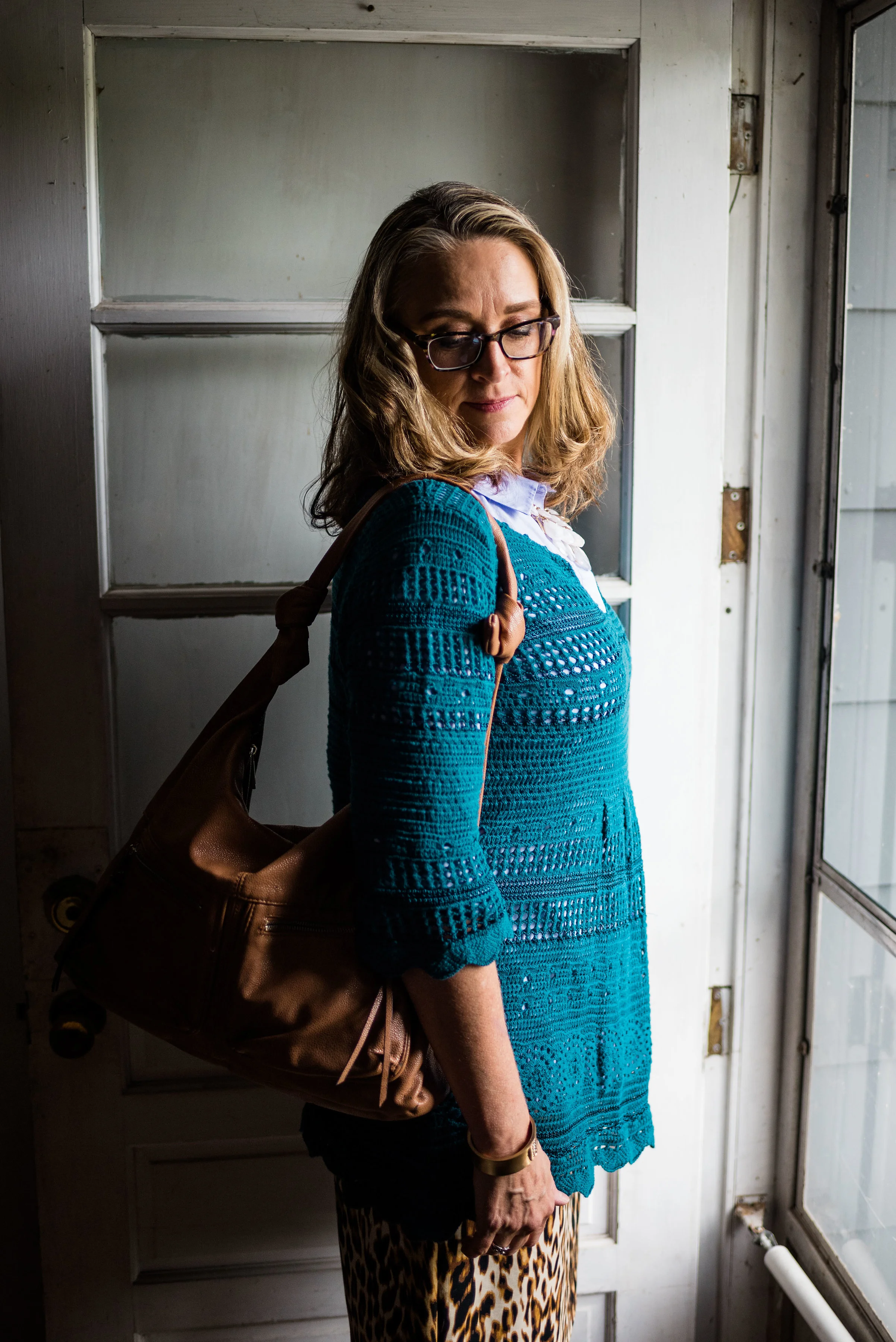
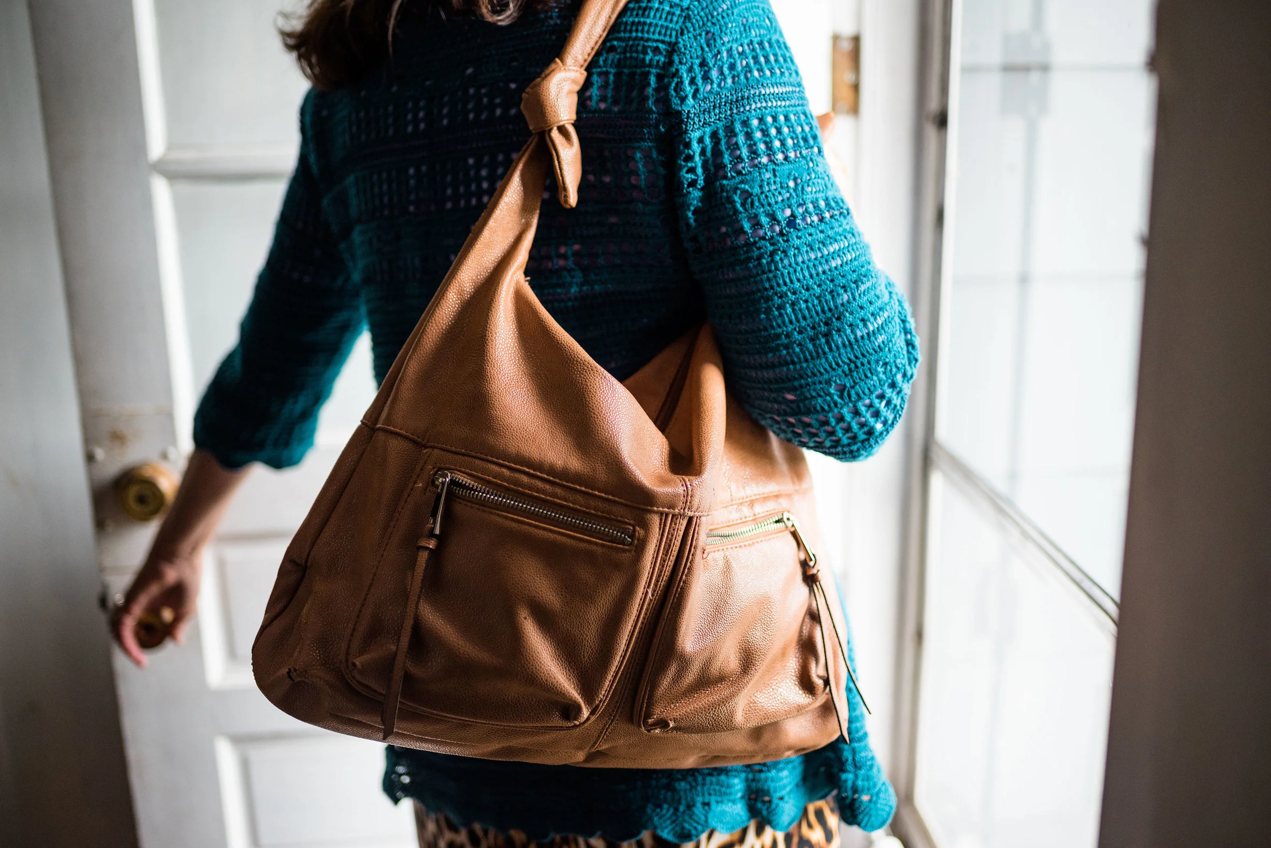
I found the open weave sweater thrifting, I love the variations in the knit. I am not a yarn girl, though I would love to be. I think this is crocheted, but it might be knit. Can any of you readers tell? Whatever it is I love the different stitch sizes and open versus more closed aspect to the piece. Here we are talking about texture again and how essential is is to making an outfit more interesting.
I thought these two colors when great with the browns, black and cream of my leopard print pencil skirt. This skirt is another JC Penney find and is Worthington brand.
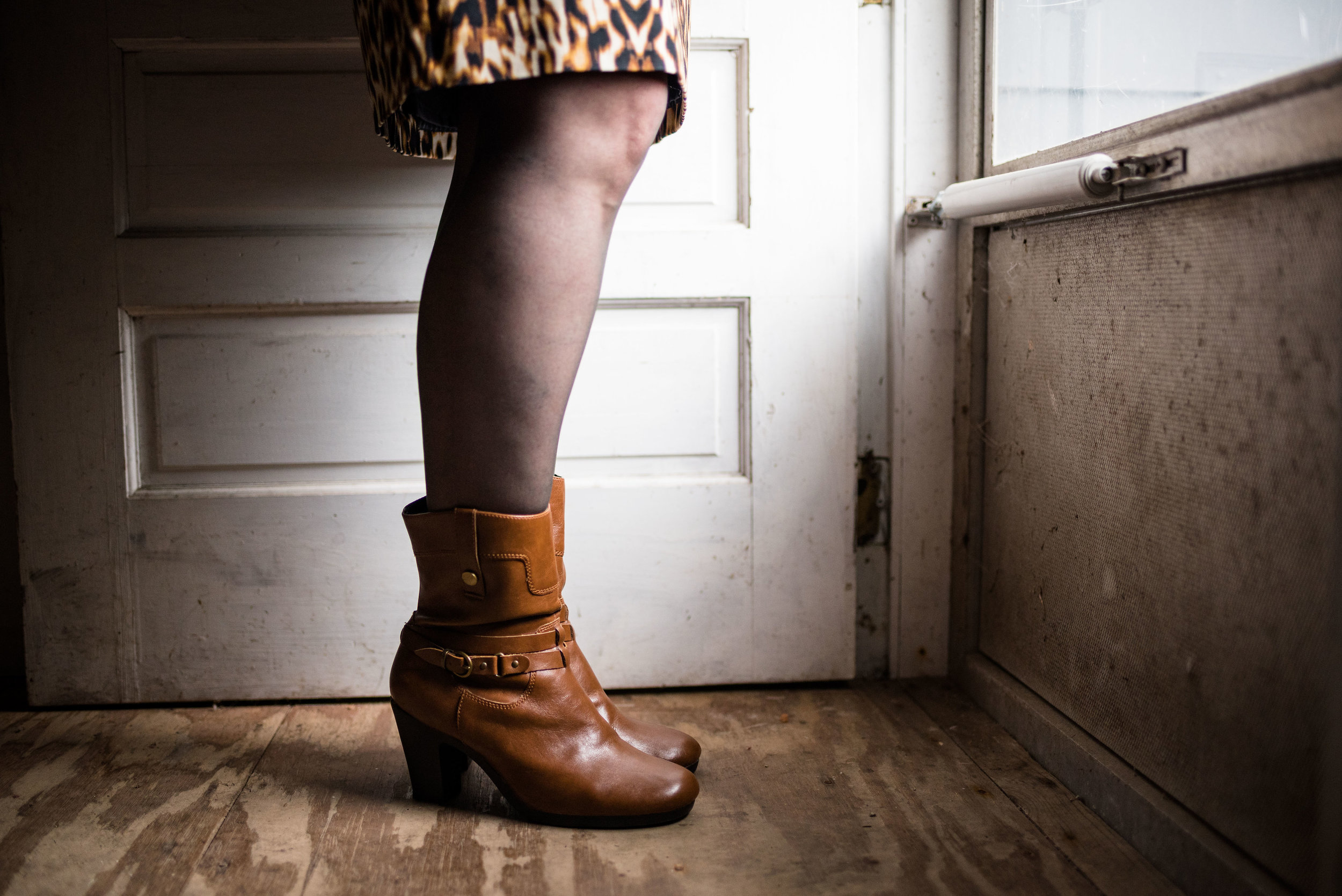
The boots, Aerosoles and bag, both thrifted were the perfect accessories to pair with this outfit. I think black would have worked well or even a cream colored boot, which are trending right now, but I love the luxe feel of the Meerkat color.
Next week I’ll have a recap of all the Pantone Fall 2018 colors. I hope you’ve enjoyed this series and that it provided you with some inspiration for trying new color combinations. Always shop your closet before going out to purchase what is currently trending. You might already have a leopard print top or the perfect color piece that matches with one of the Pantone seasonal colors.
I’ve included a few shopping links. These are affiliate links. All opinions are my own.
Have a great day.
Photo credit Rebecca Trumbull.

