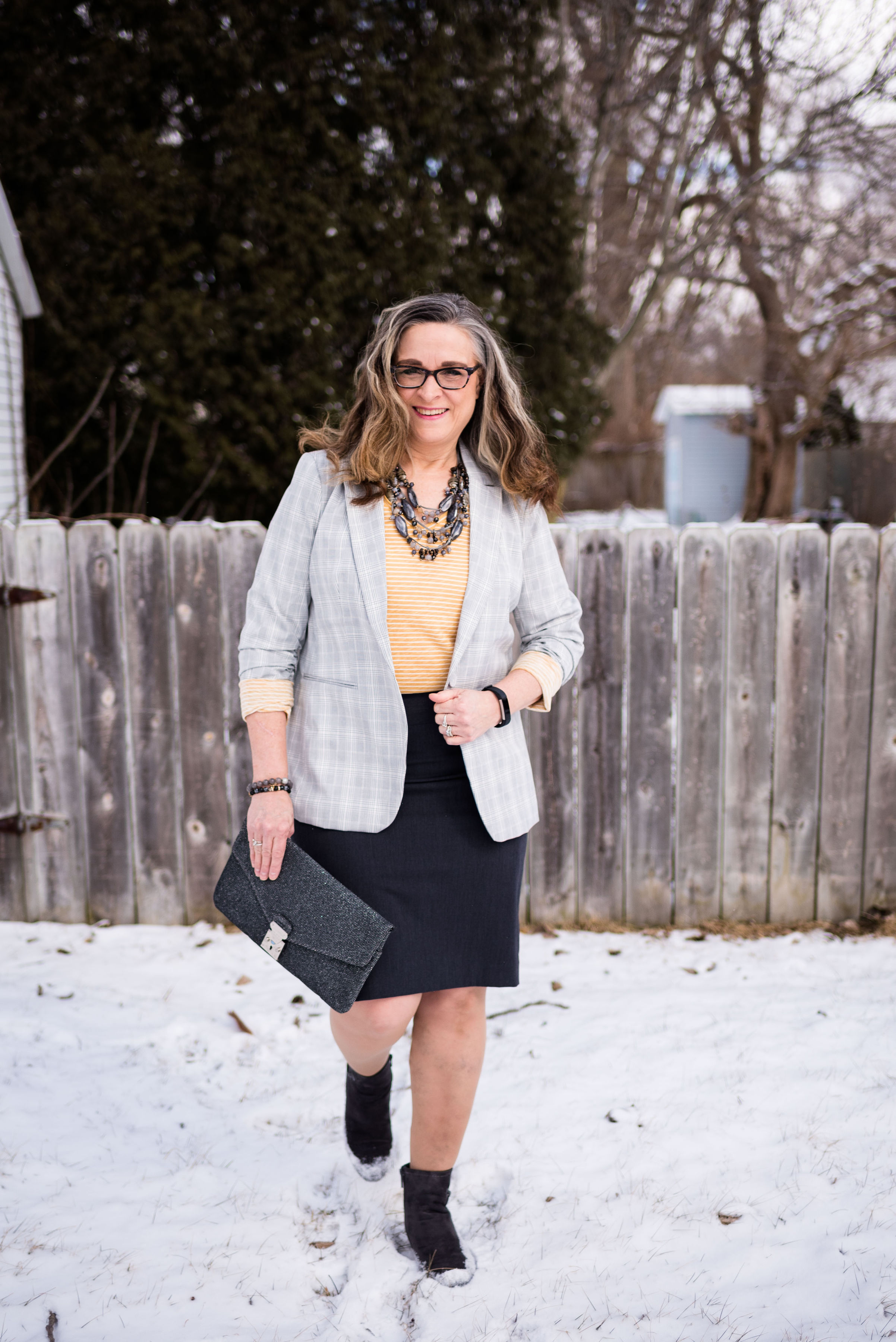
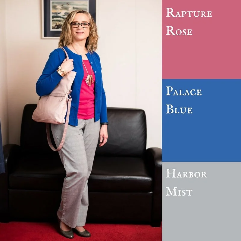
Pantone - Autumn/Winter - 2021 - New York Palette: Pale Rosette, Root Beer and Olive Branch

I want to start off with an apology for my lack of consistency with the blog lately. It has been a rough couple of months and I just haven’t had the motivation to post as regularly. It seems every time I want to make more of an effort at getting more disciplined or being more consistent, I get blindsided by something. At the beginning of the summer it was a broken wrist. Mid summer, I came down with this stuff, that still has me coughing. I just have no idea if I will ever be back to “normal”, whatever that was.

There have been some good bits along the way as well. Early summer we were able to take my in-laws on a nice trip up through the Upper Peninsula, down through Michigan and back to our place where they enjoyed visiting family for a few days. I also got to see my mom, two different weeks and spend time with her. That also afforded me the opportunity to see my best girlfriend, and do some thrifting. On September 19th, our second grandson arrived. He is a doll and I am enjoying opportunities here and there to see him, even if I do have to wear a mask. He’s been born into a world of half blue faces, but that is okay, if we can give him a healthier start. He, my daughter and son-in-law are doing well.

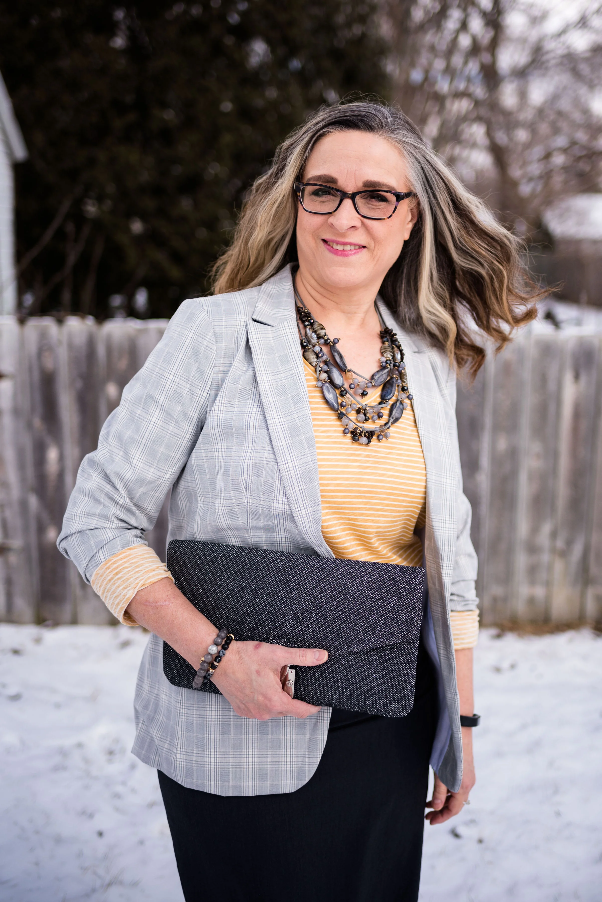
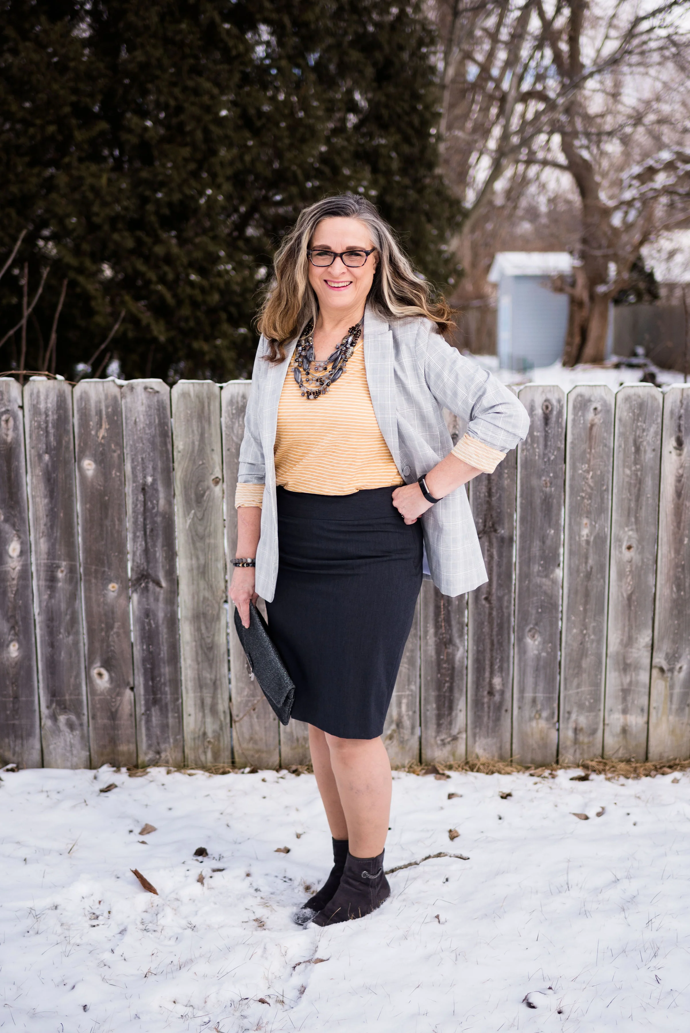
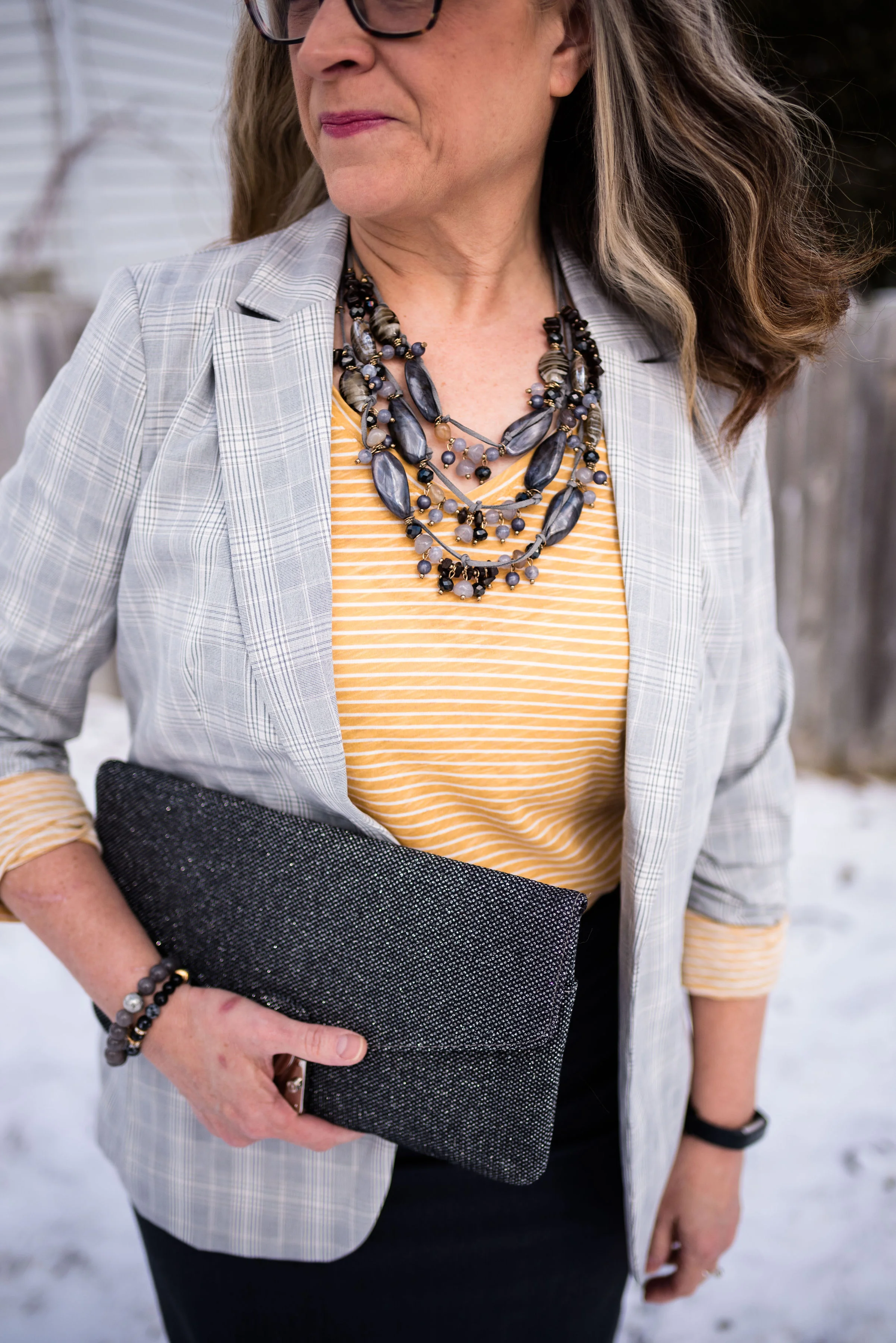
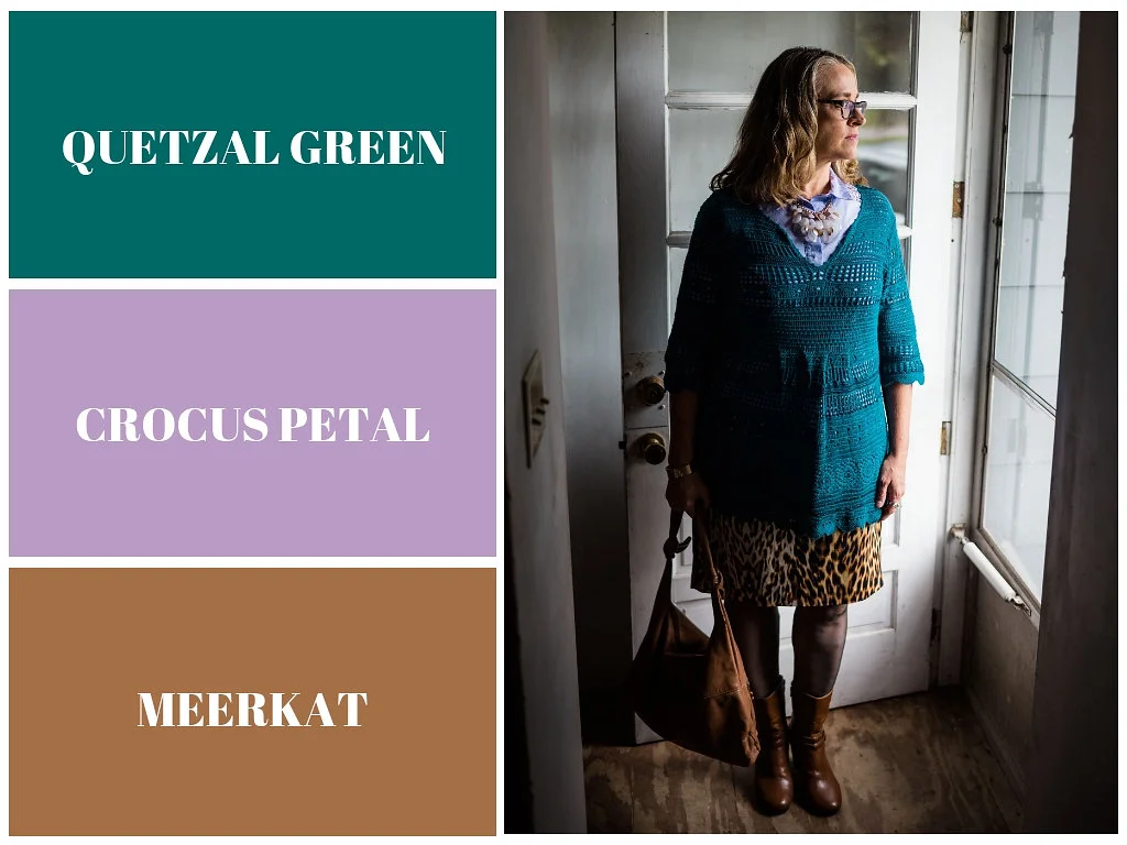
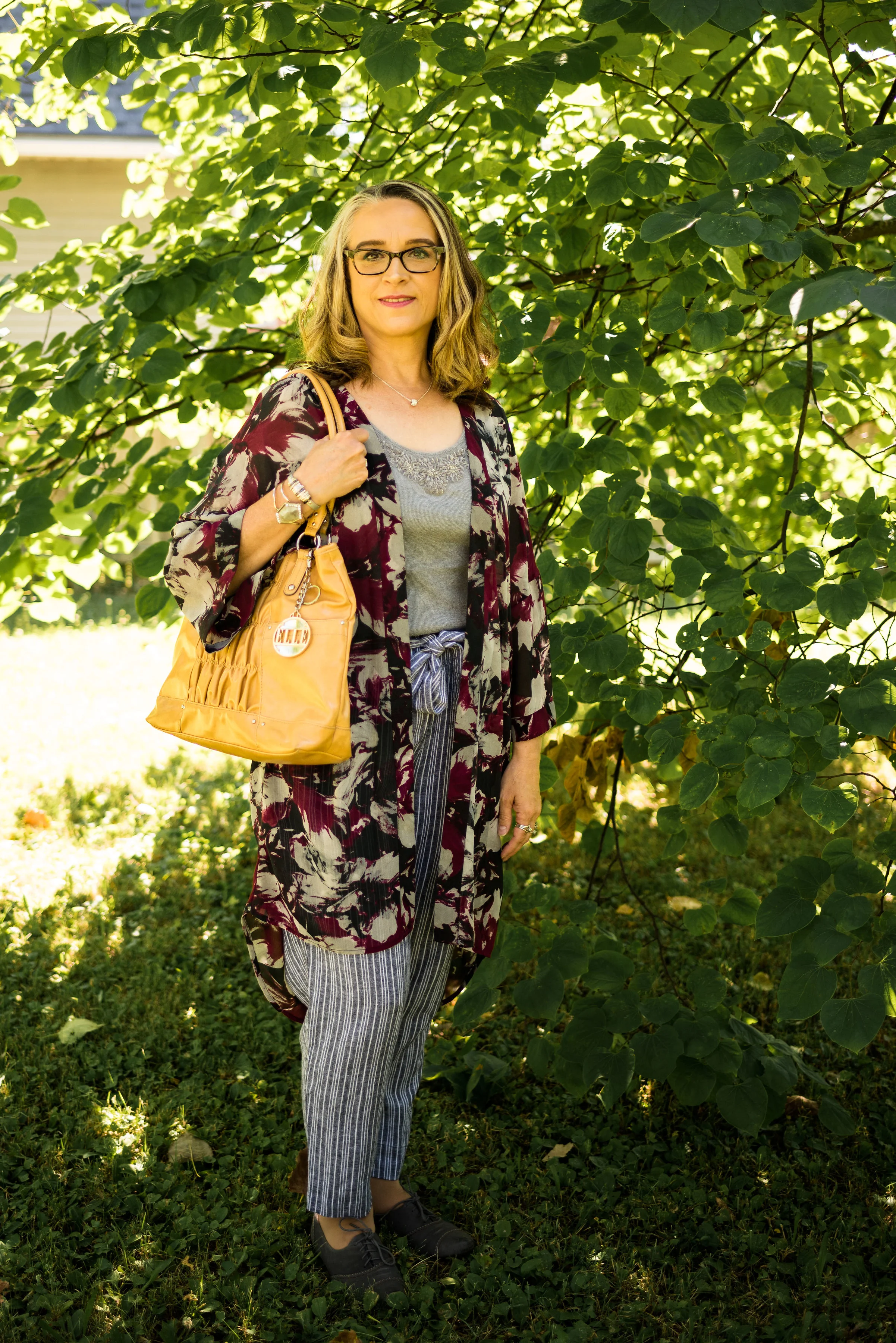
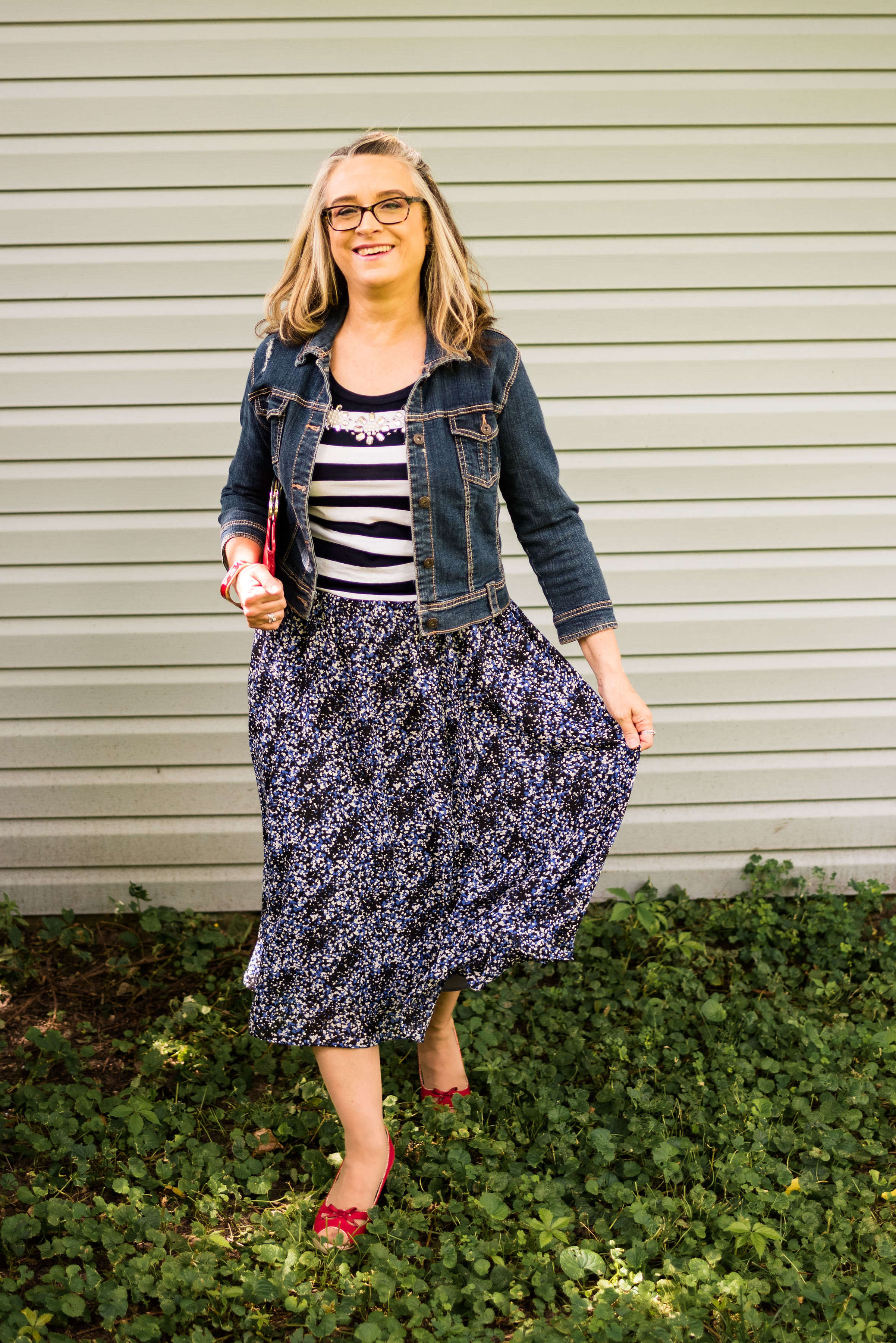
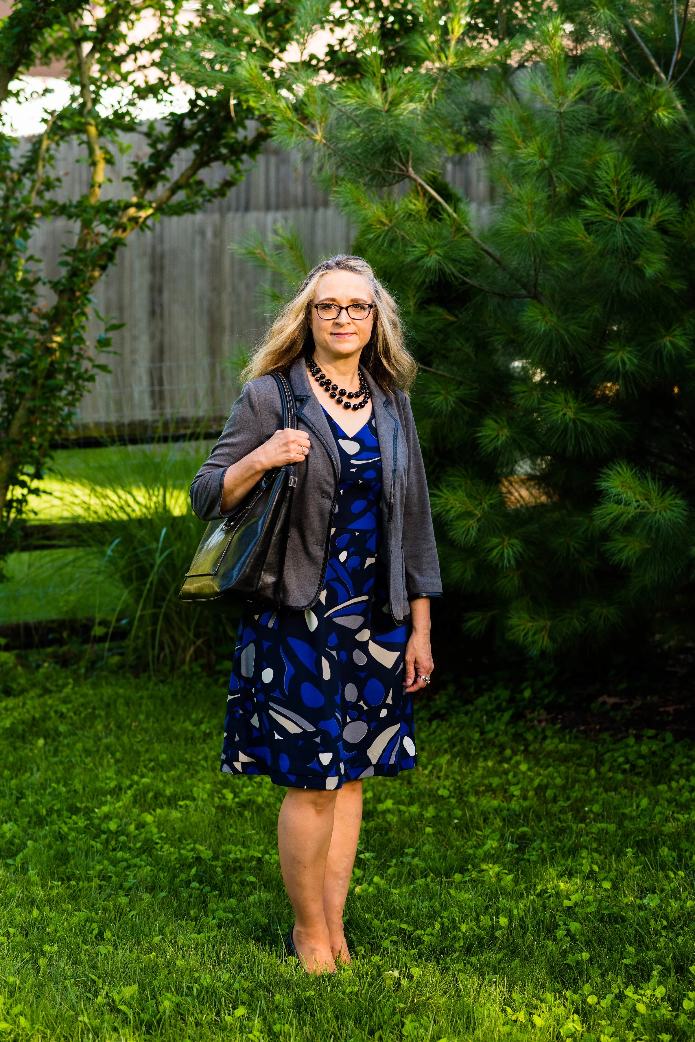
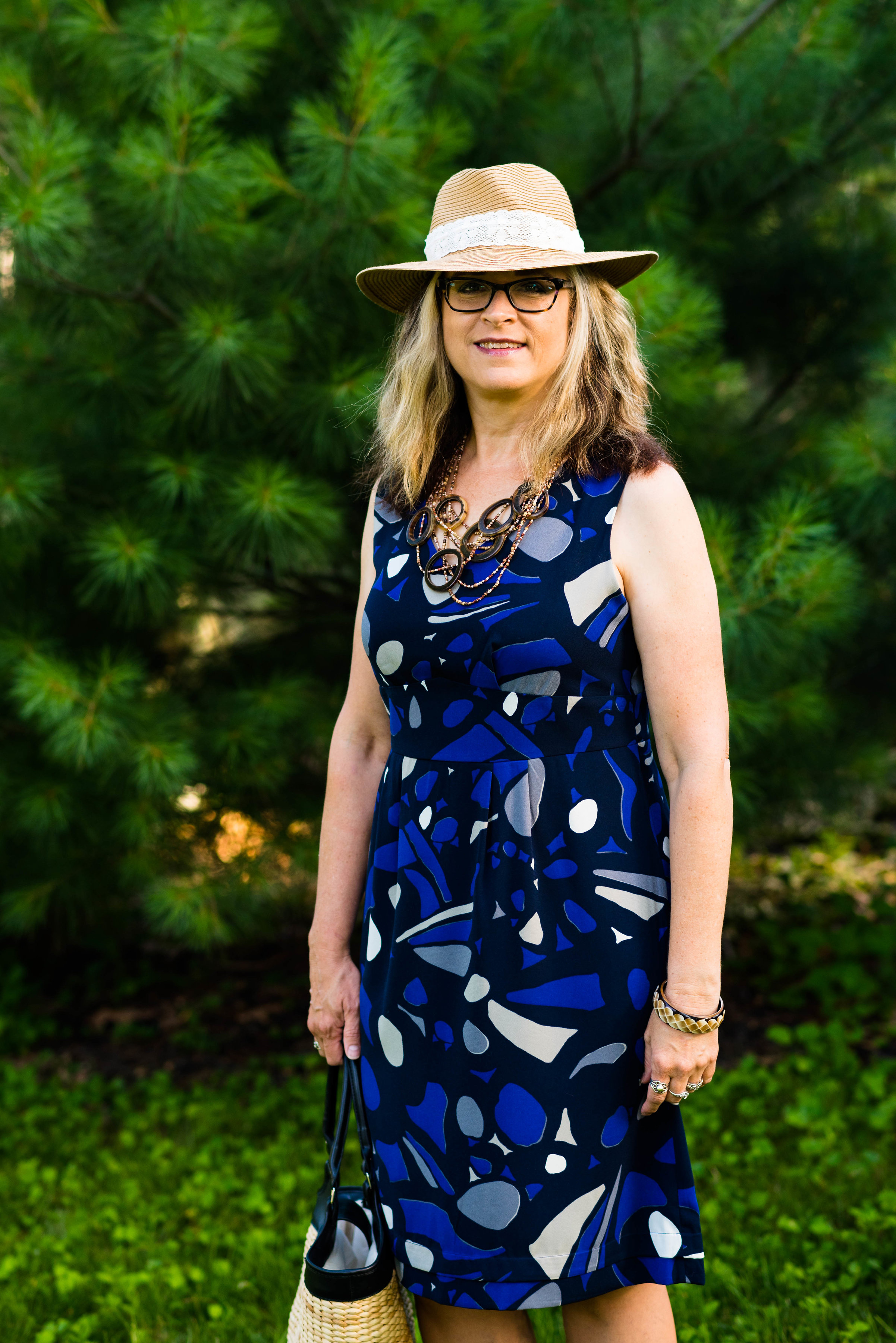
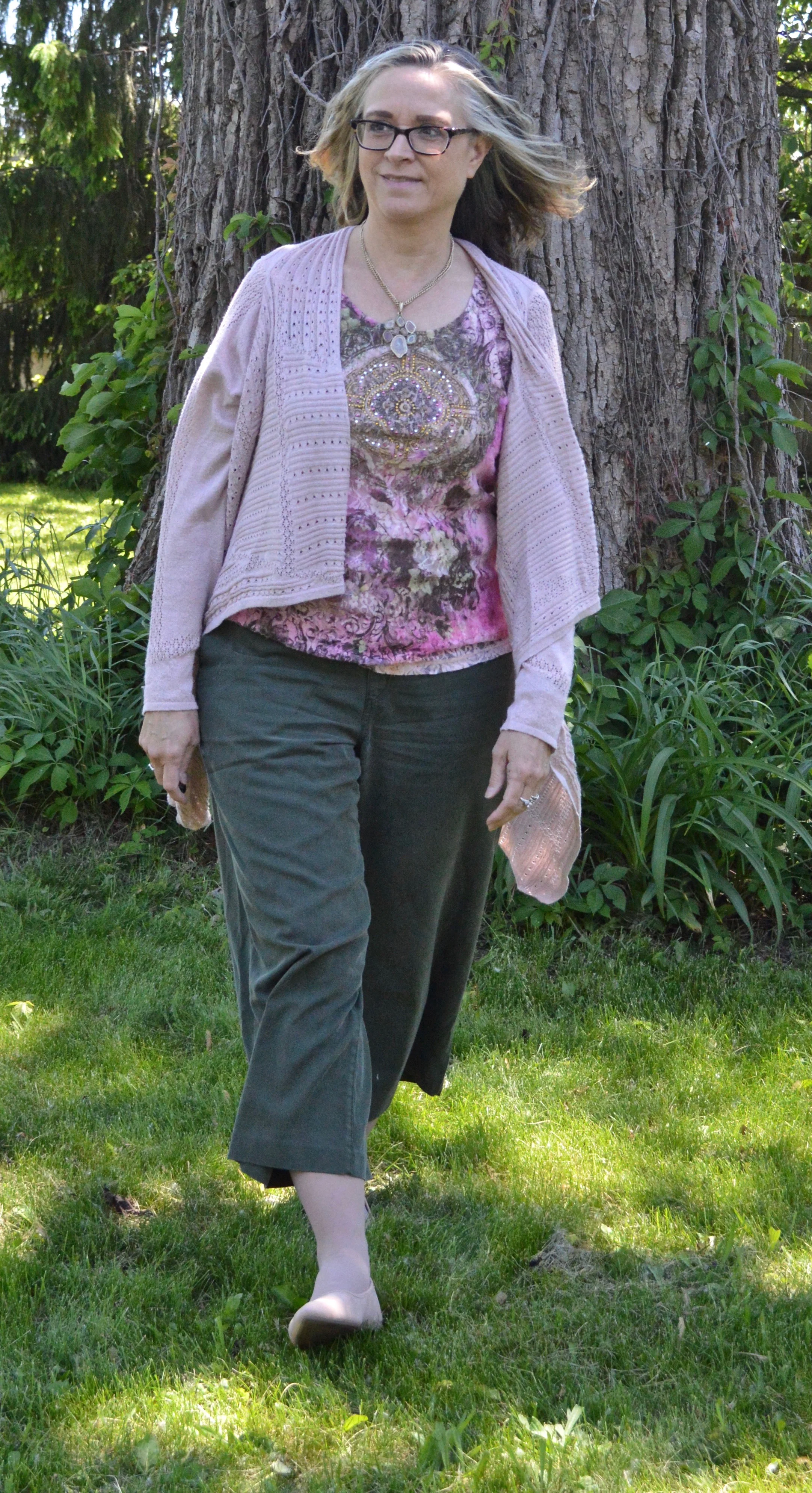
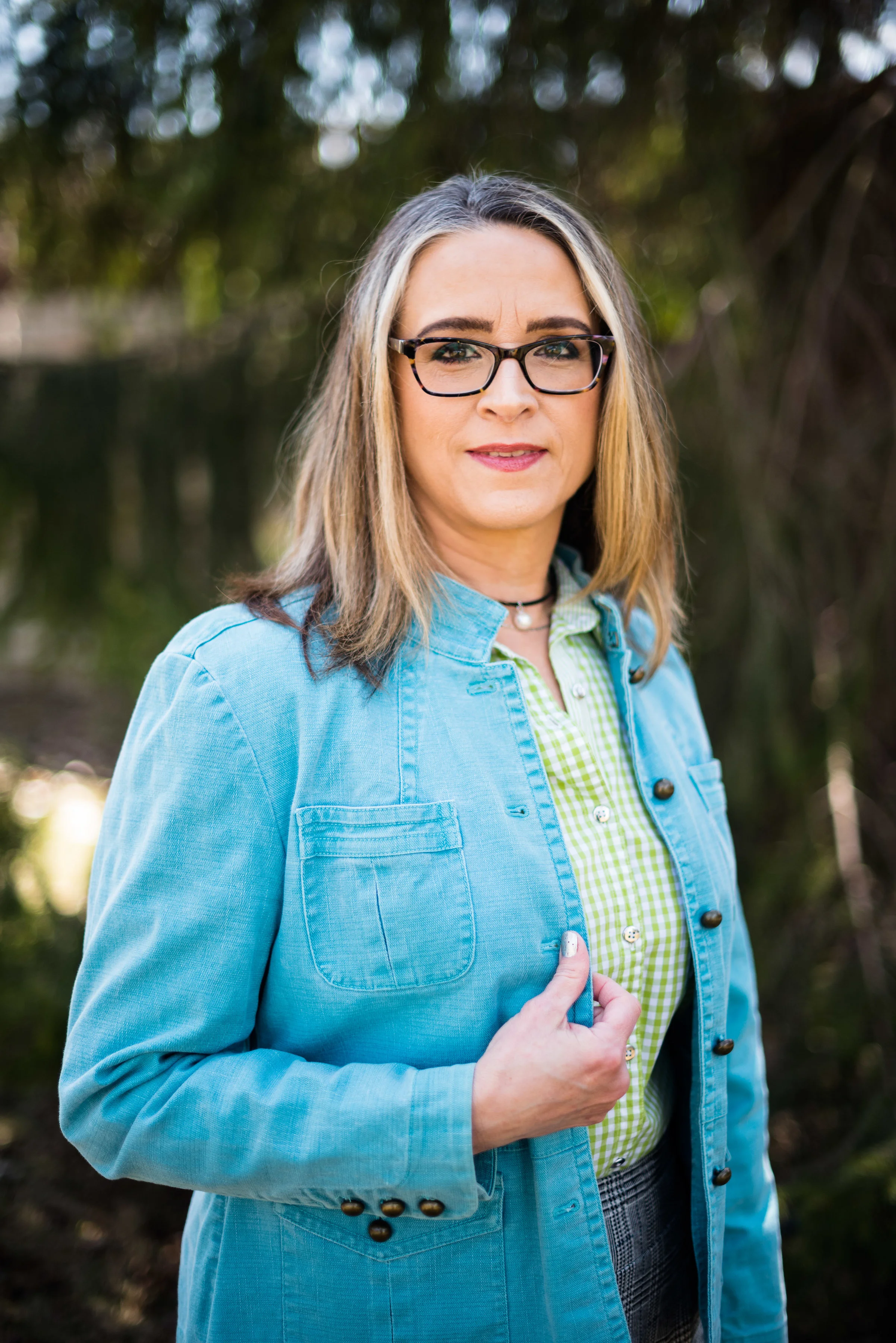
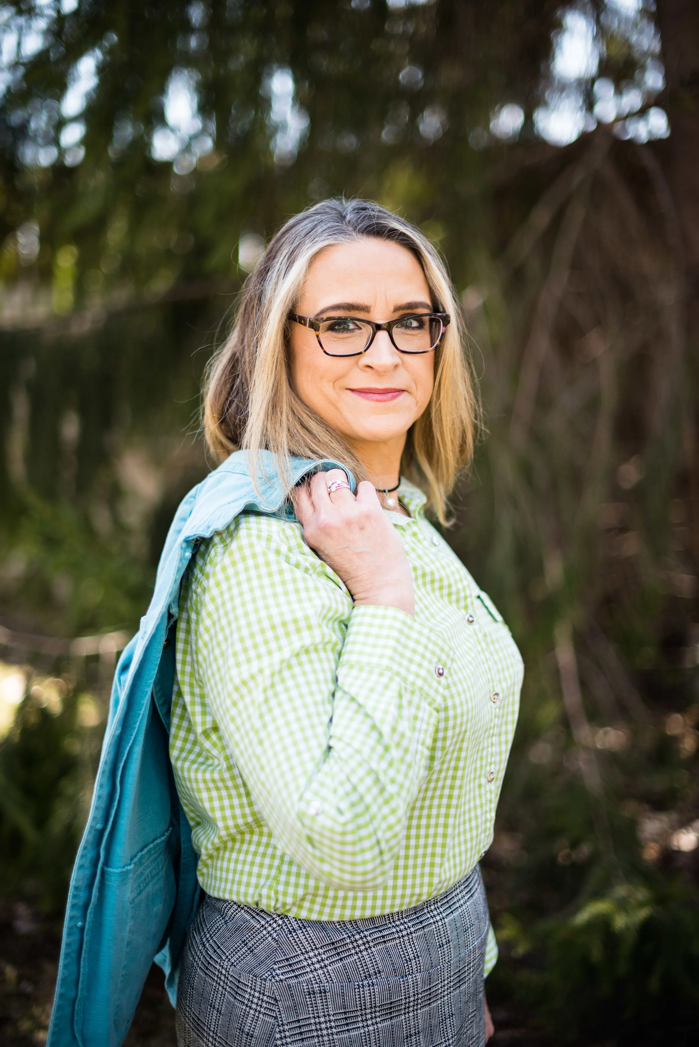
Today’s outfit revolve around three colors on the Pantone New York Palette that I thought combined well into a work wear ready fall outfit.

PaleRosette.jpg

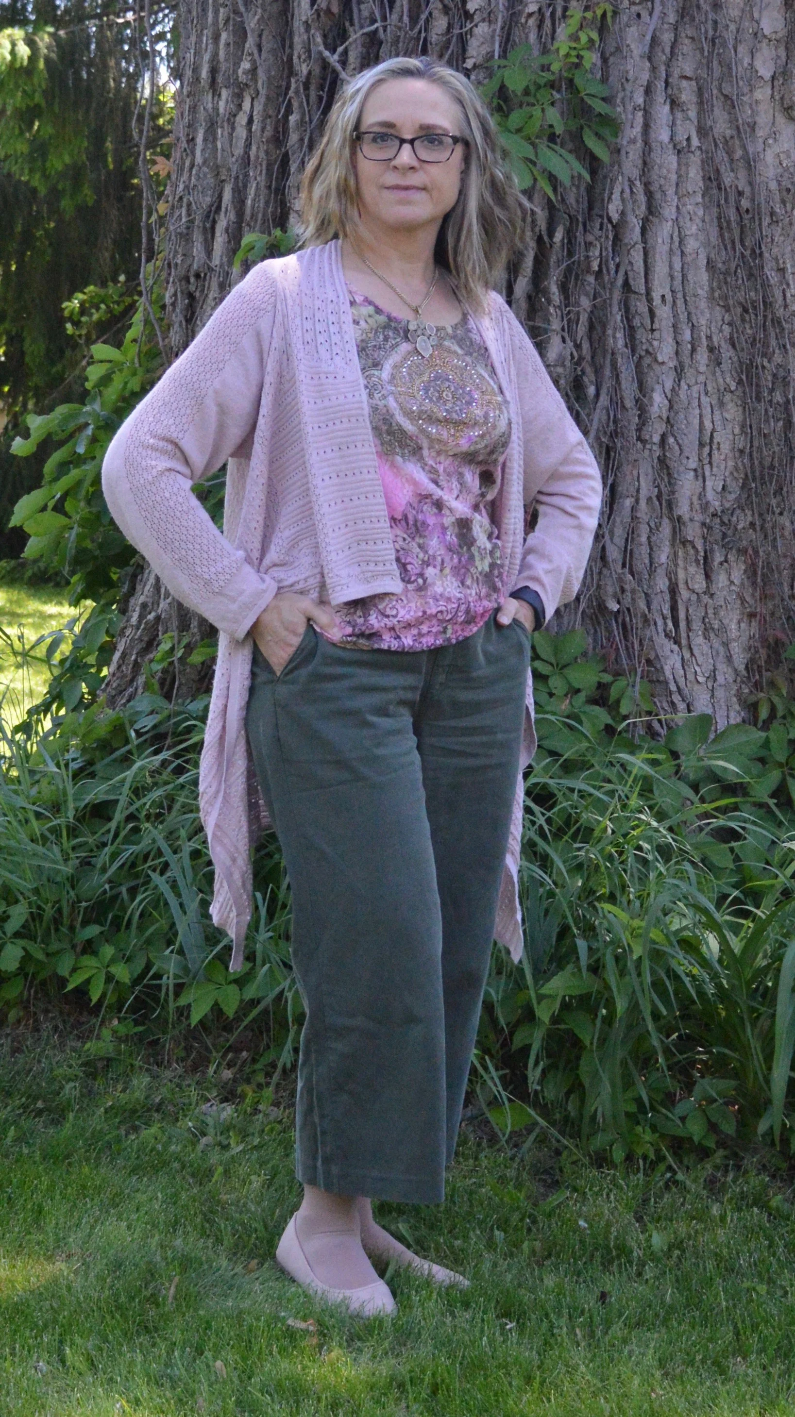
I am still trying to get used to seeing pastels during the fall season. This year, they were quite popular and besides this pale pink, also included a pretty lavender. I guess, we like what we like right, so pastels for me might be more of a spring and summer color scheme, while rusts, browns and burgundies are the colors I reach for in the fall. While we still live in a free country, you are in control of what colors you wear when. Ha, ha.

pantonefallcolortrendspalerosette-8.jpg

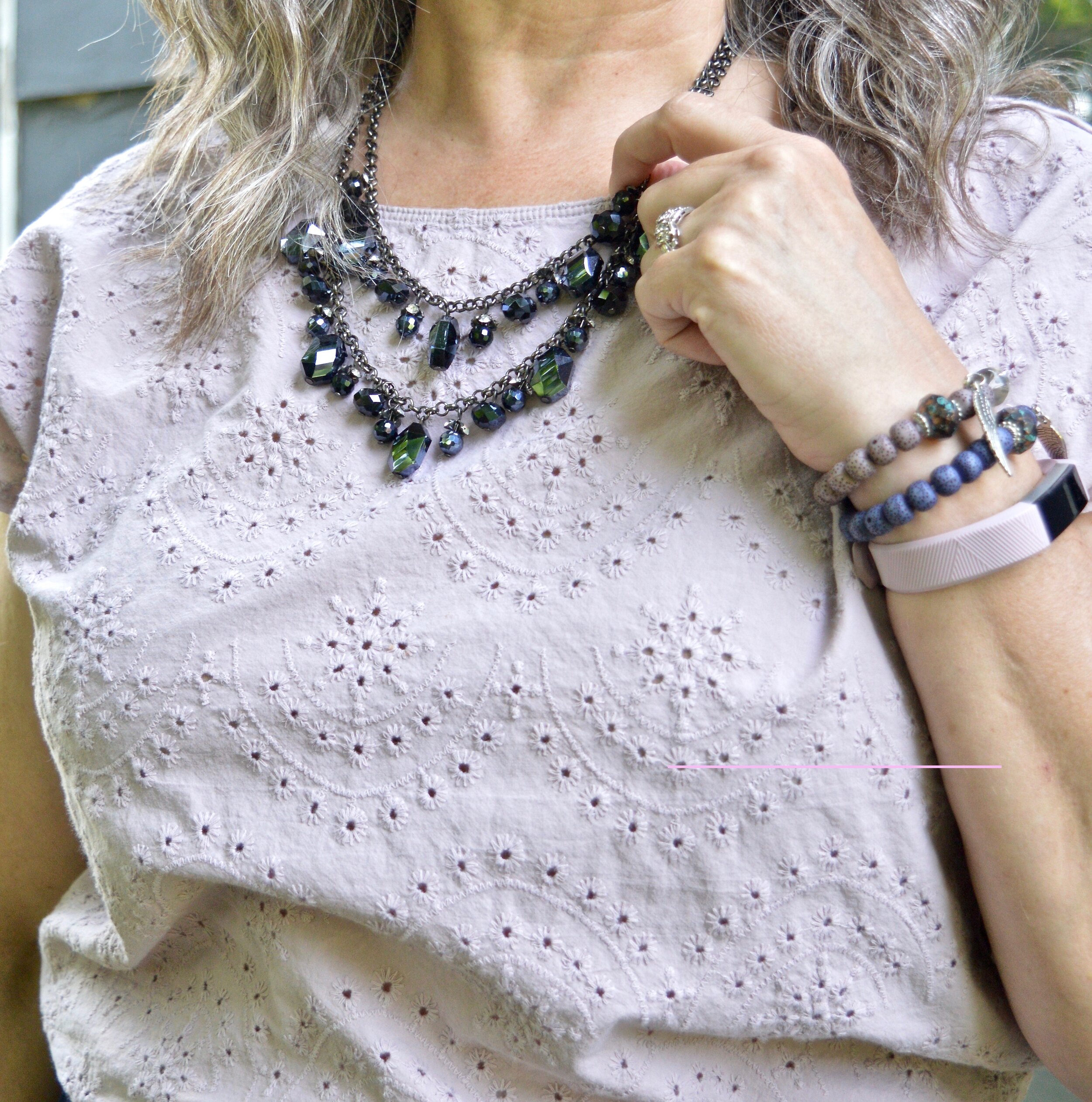
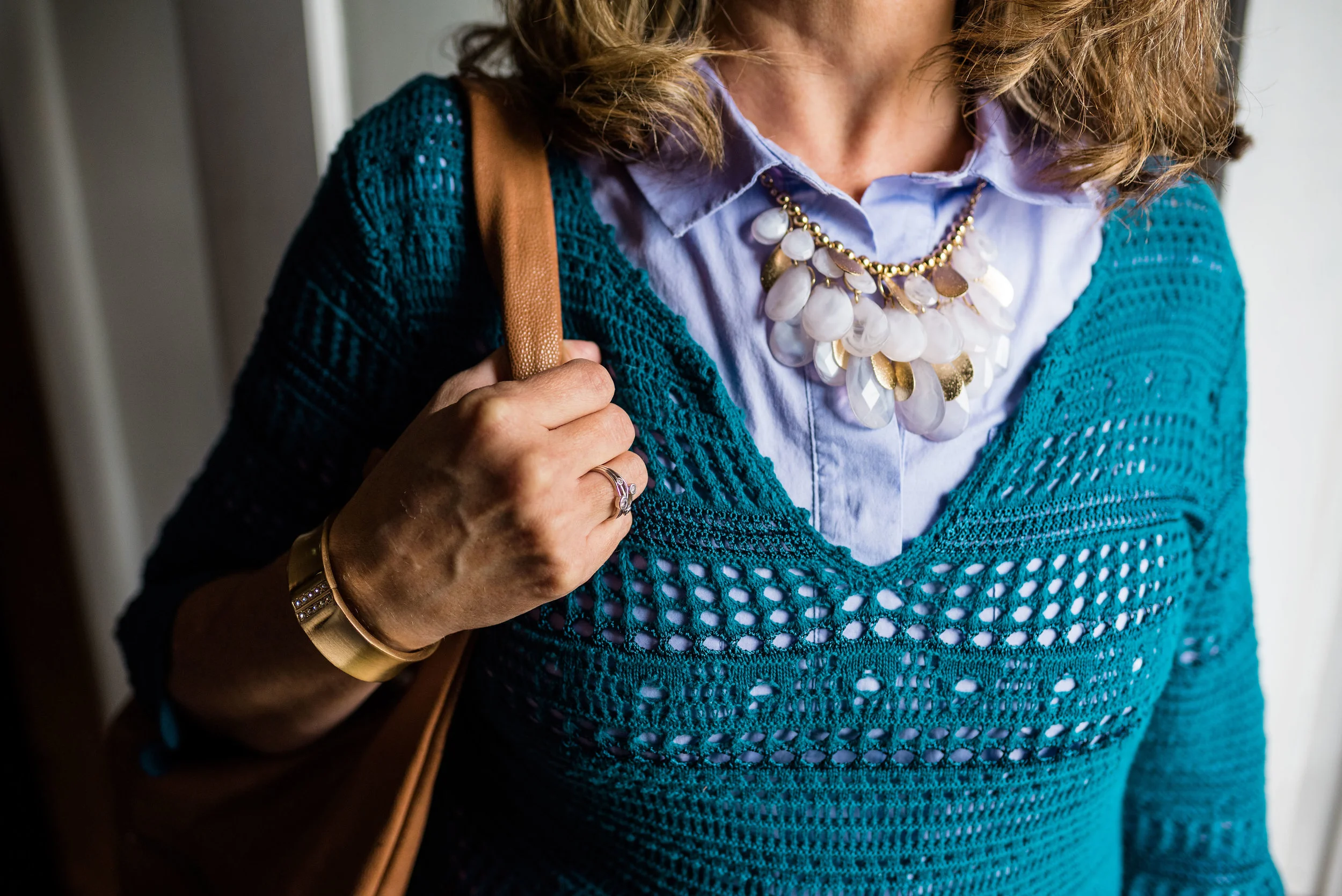
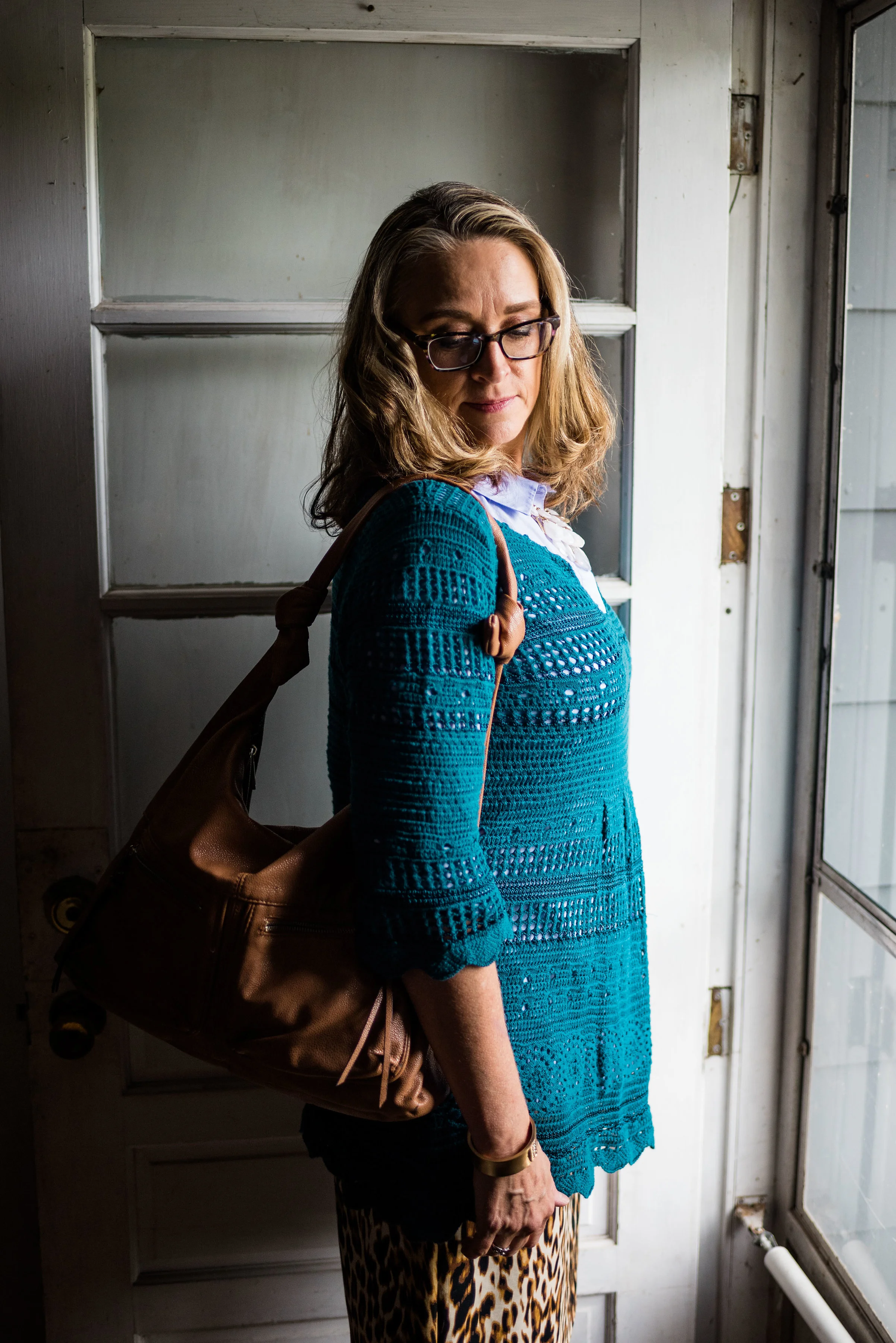
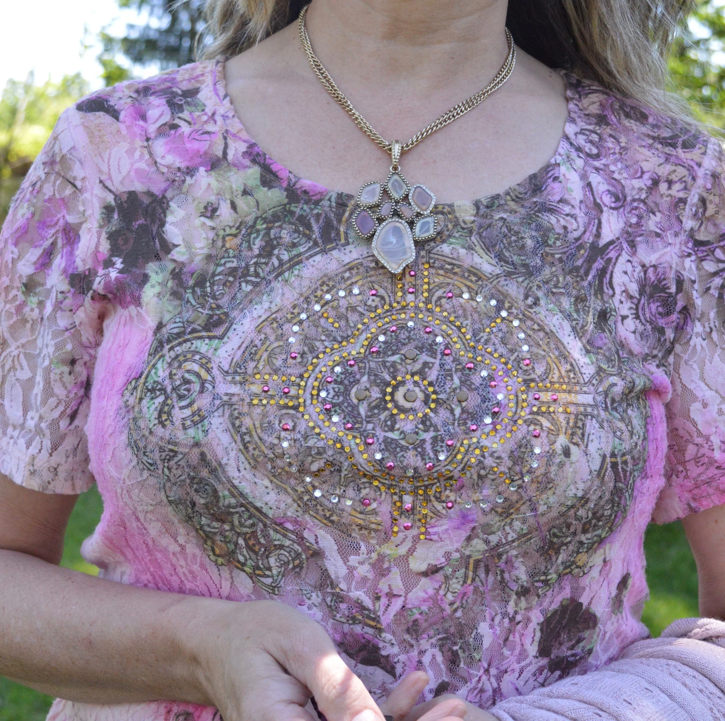
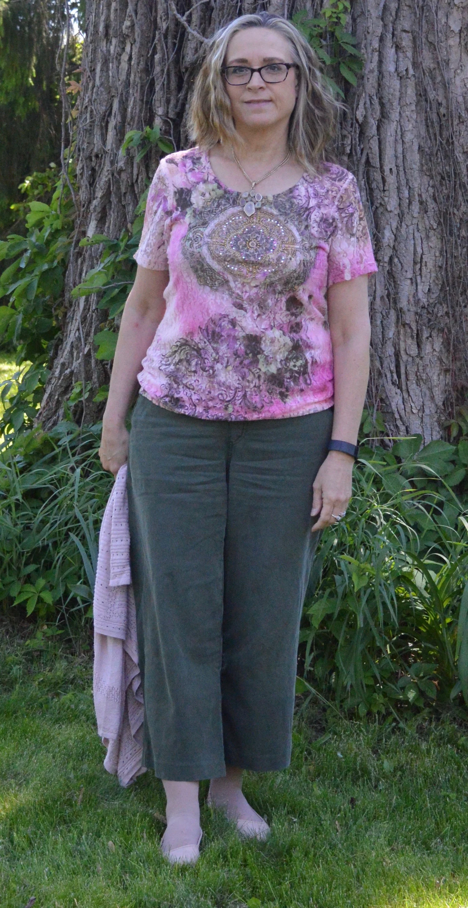
The Pale Rosette, 3/4 length tee is a thrifted piece, and a brand called Suzanne Betro. It is actually a longer tunic, but I just tucked it in for this outfit. I love the detailing at the bodice.

pantonefallcolortrendspalerosette-6.jpg

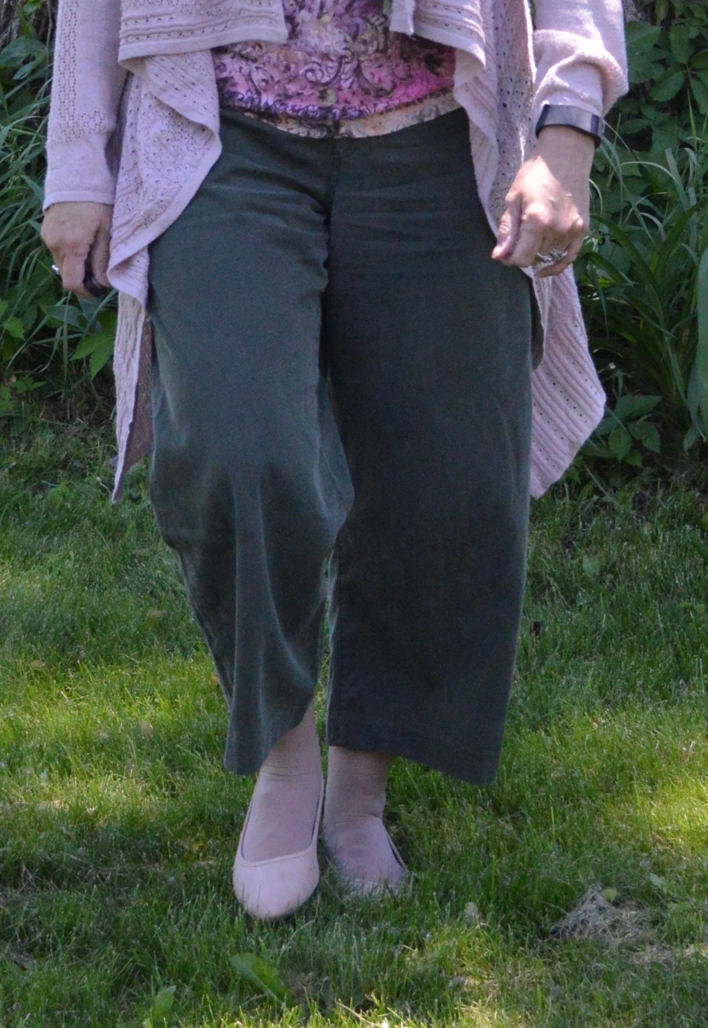
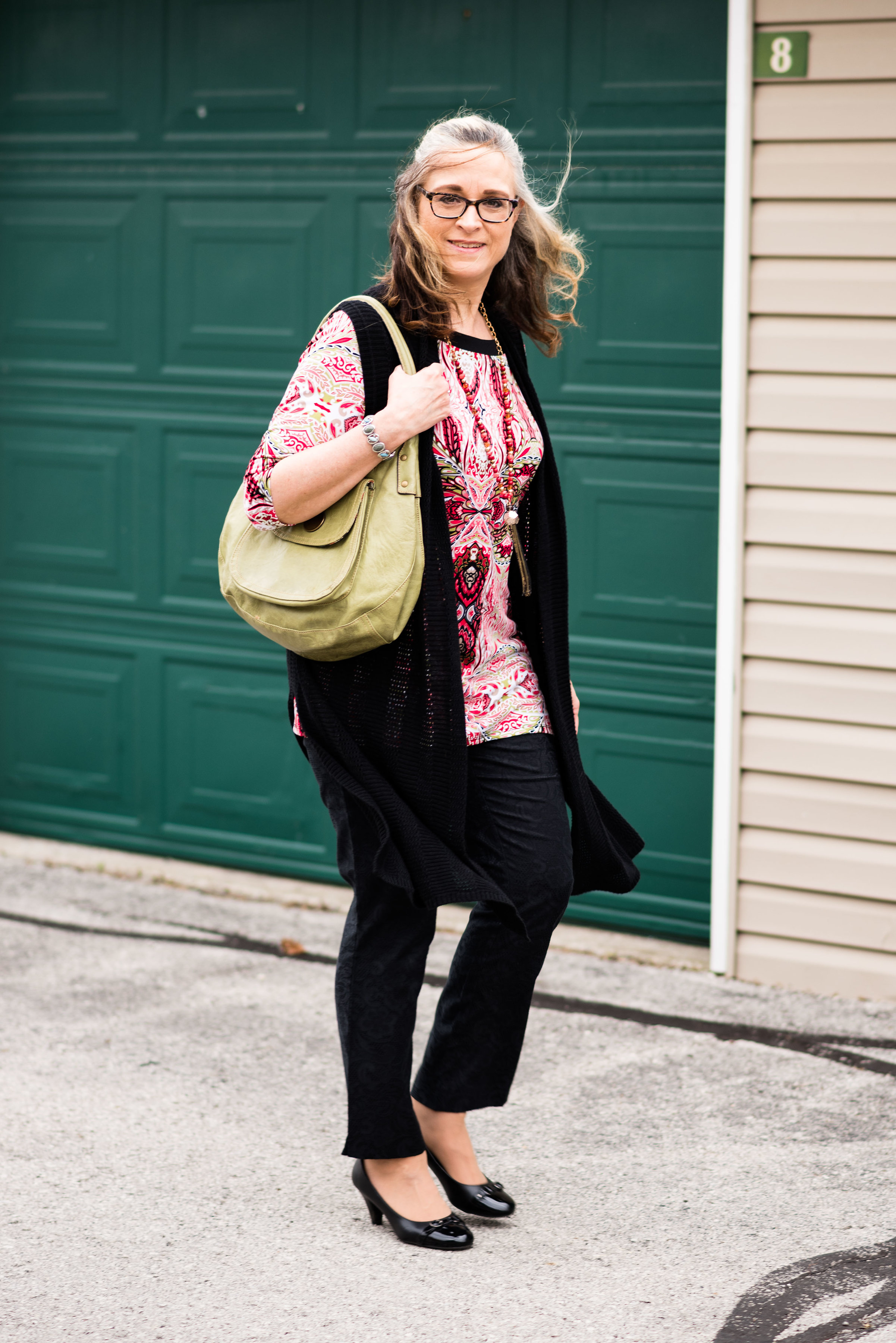
You’ve seen my Olive Branch utility vest on the blog before when I did my series on olive pieces. This vest isn’t quite the right shade. Who would have thought there are so many shades of olive? Another clearance find from Kohl’s, I don’t have a ton of Mudd pieces as it typically has more of a junior’s fit, but the few that I have, I really like.

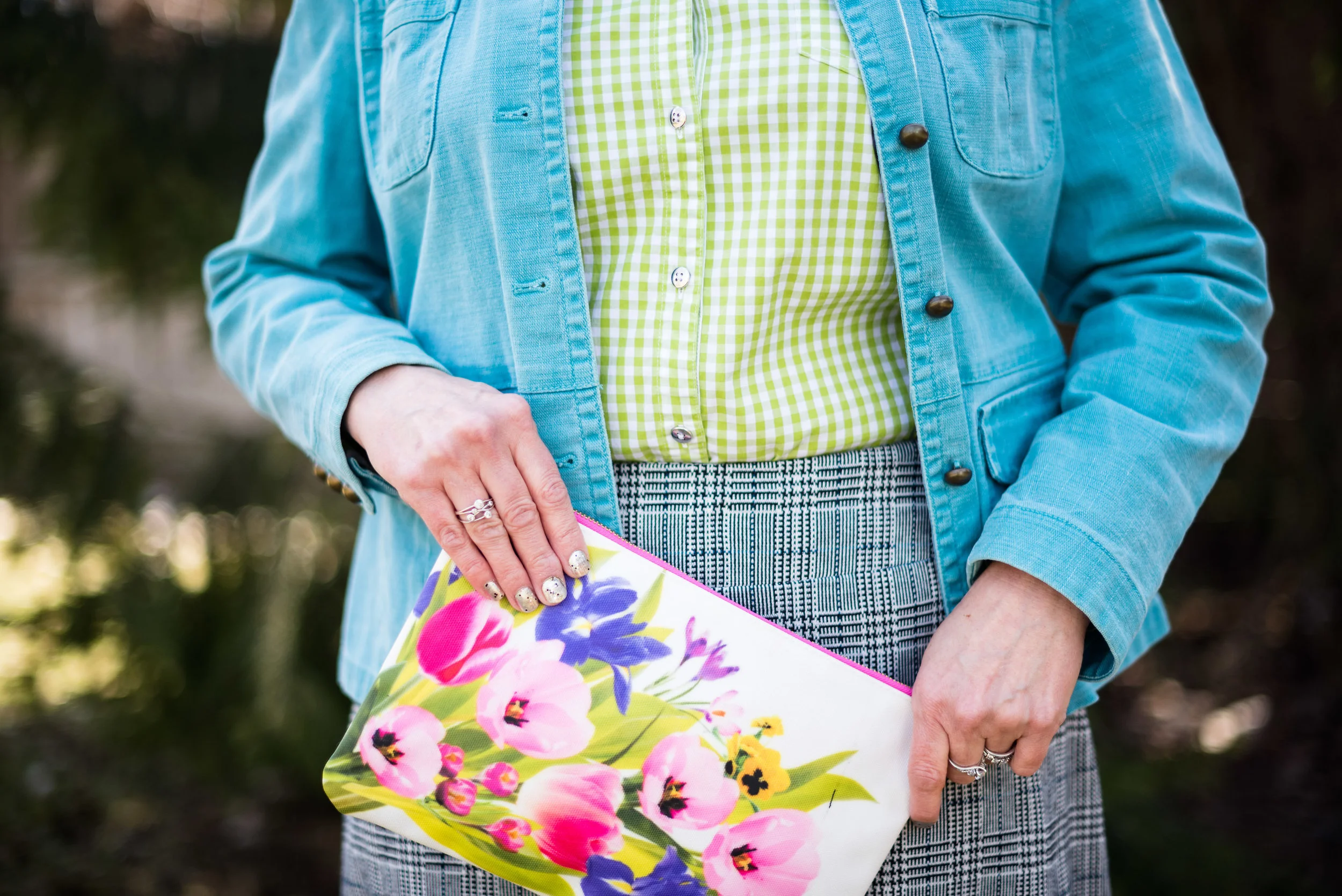
You’ve also seen these brown trousers when I talked about wide leg pants back in the spring. I am not a big fan. I have enough bulk on my bottom. However, I will hang on to this pair, as I like the color, and occasionally it is nice to have a different option when it comes to pants. These were thrifted and are St. John’s Bay brand.

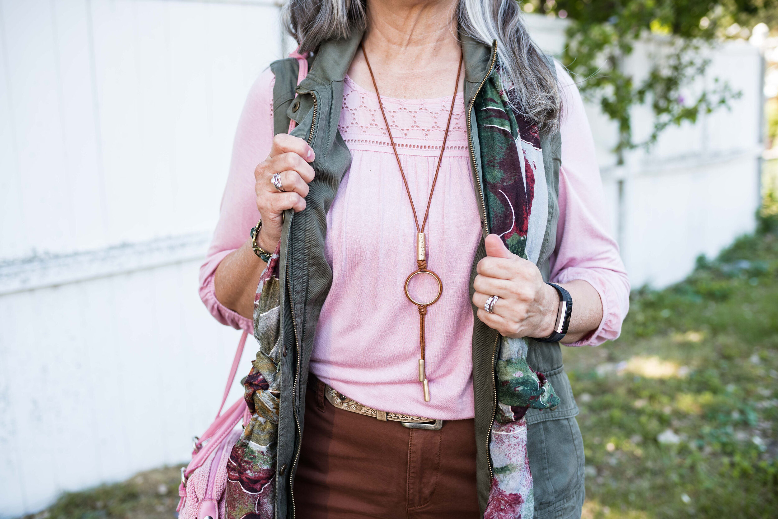
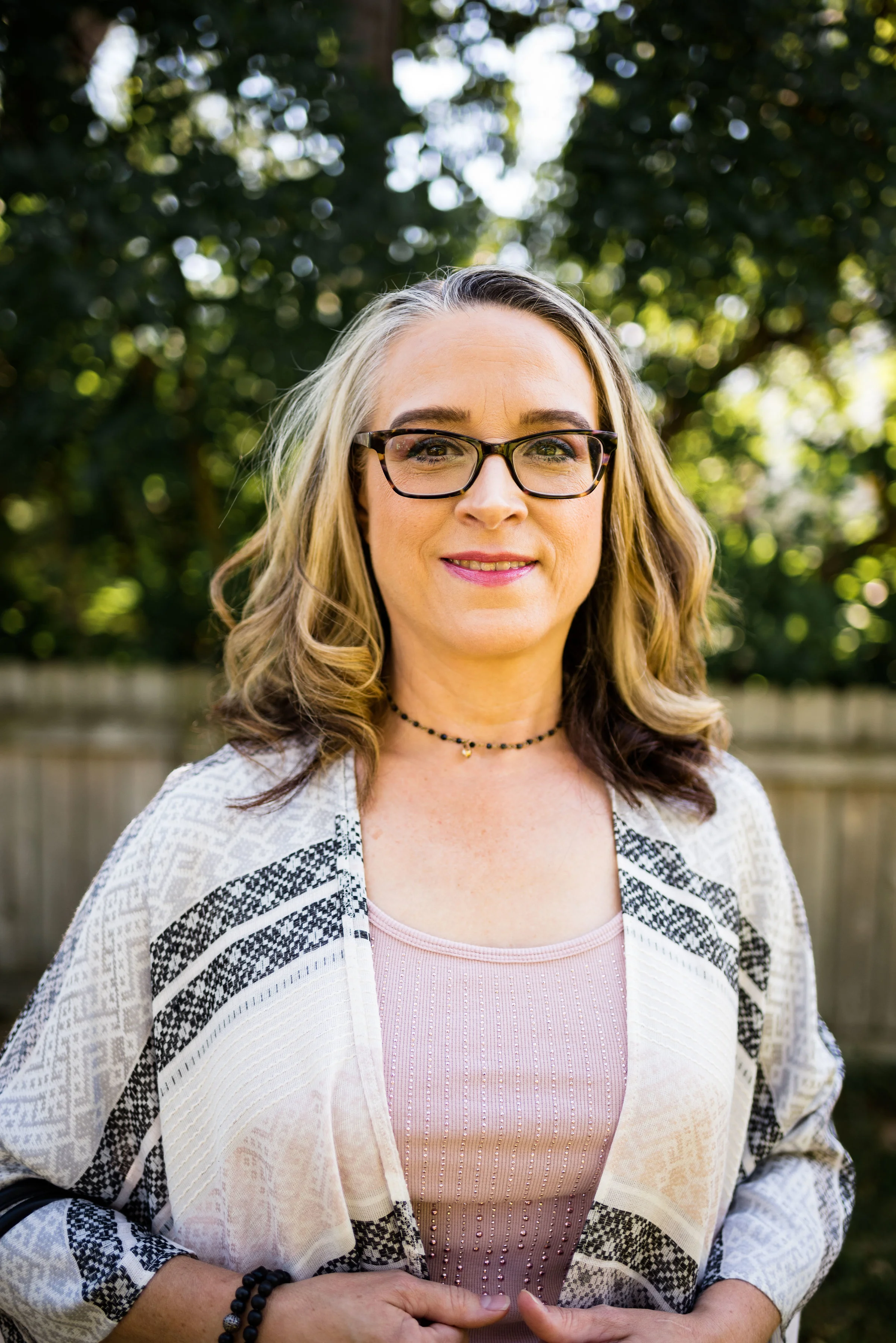
I added the multi-print scarf to add an extra dimension of color and interest to the outfit. I like how it ties the whole look together.

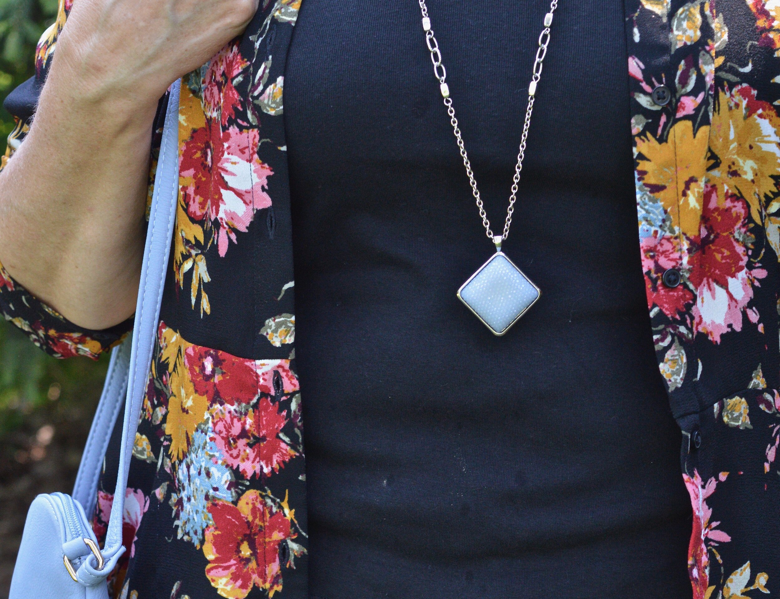
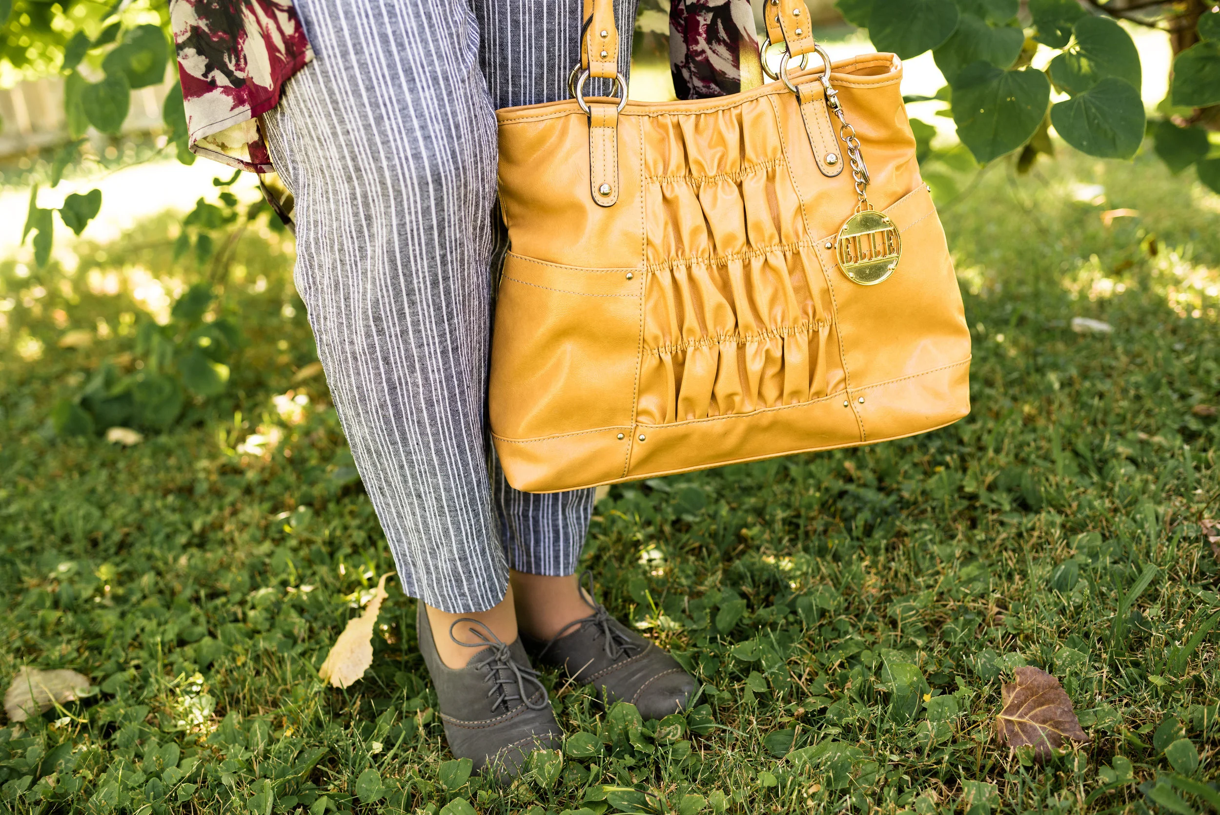
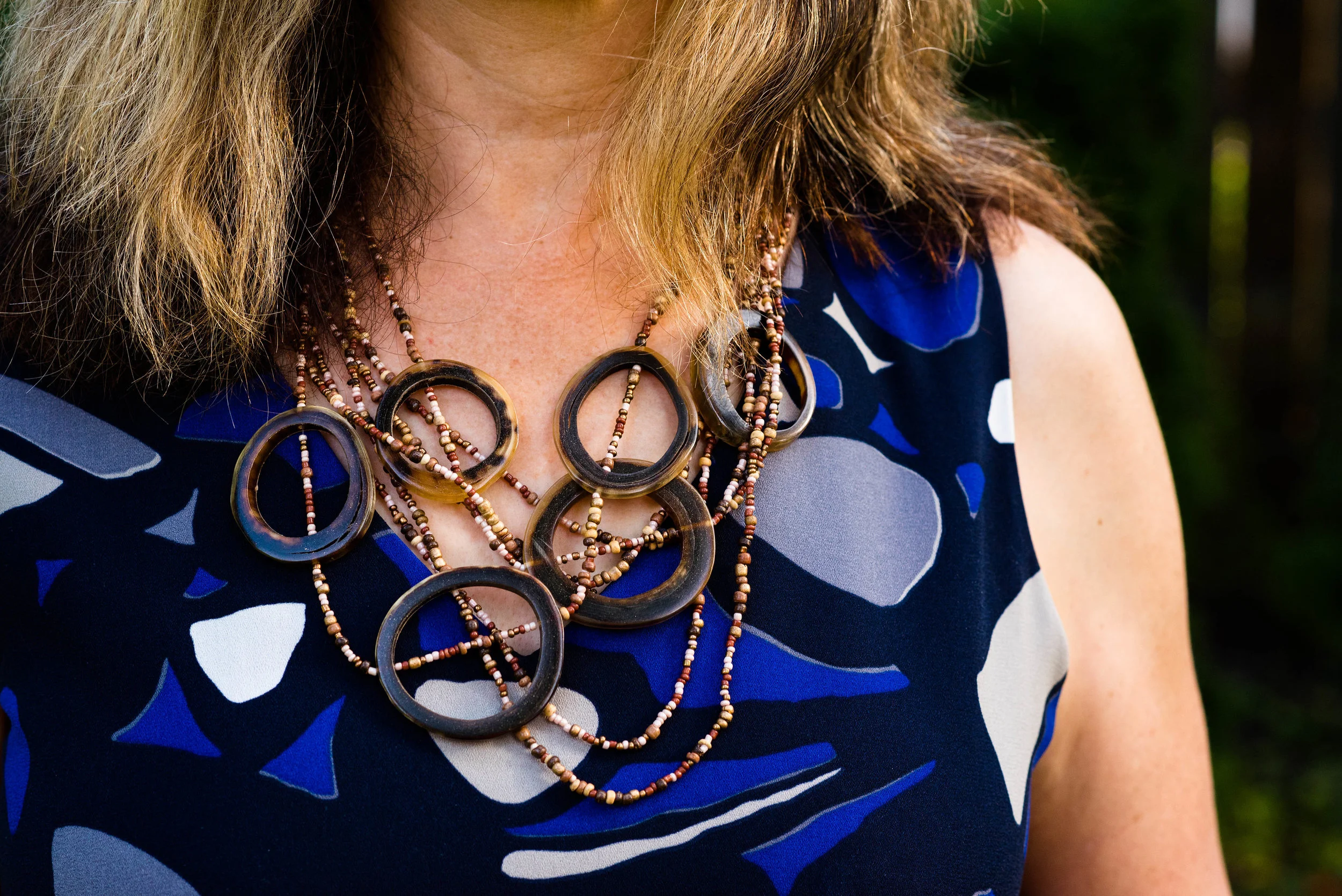
You can also see the fun necklace I scored while thrifting at the local shop around the corner. I have found some great jewelry there. I goes perfectly with the pants.

pantonefallcolortrendspalerosette-9.jpg

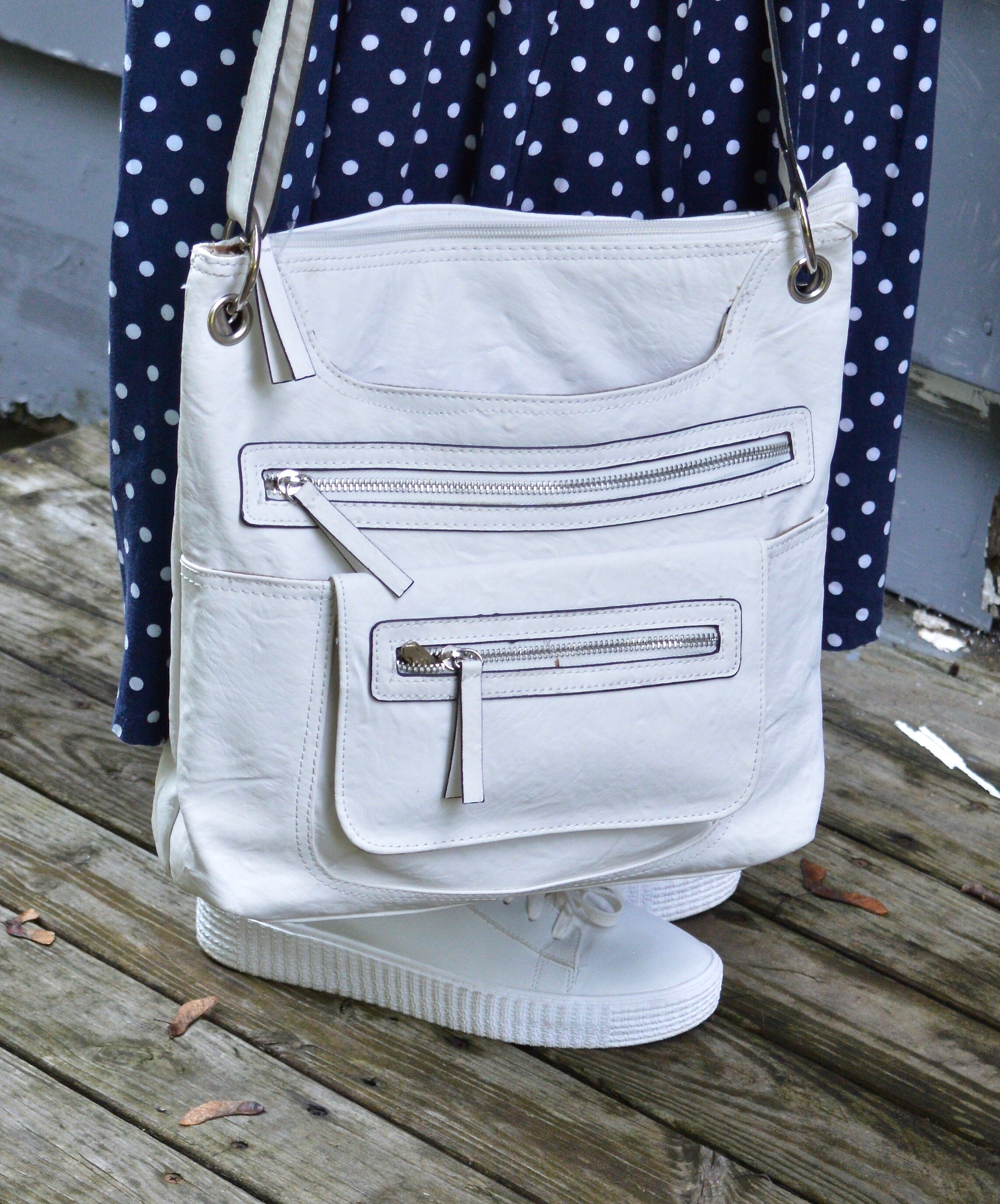
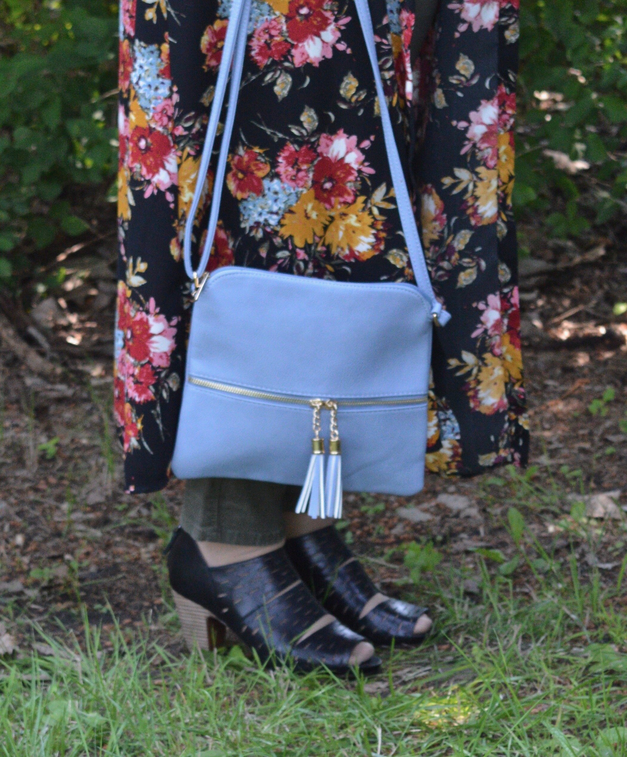
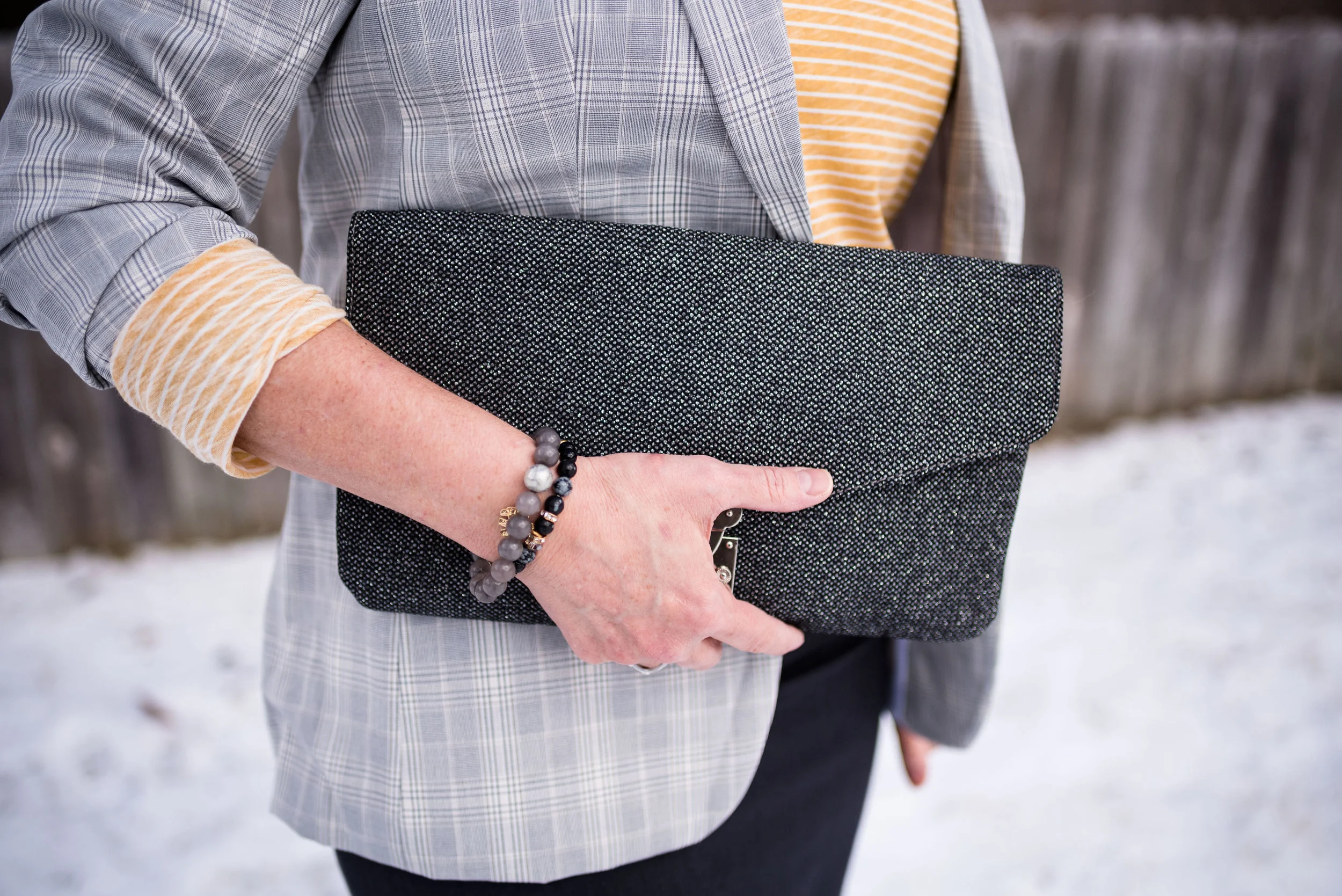
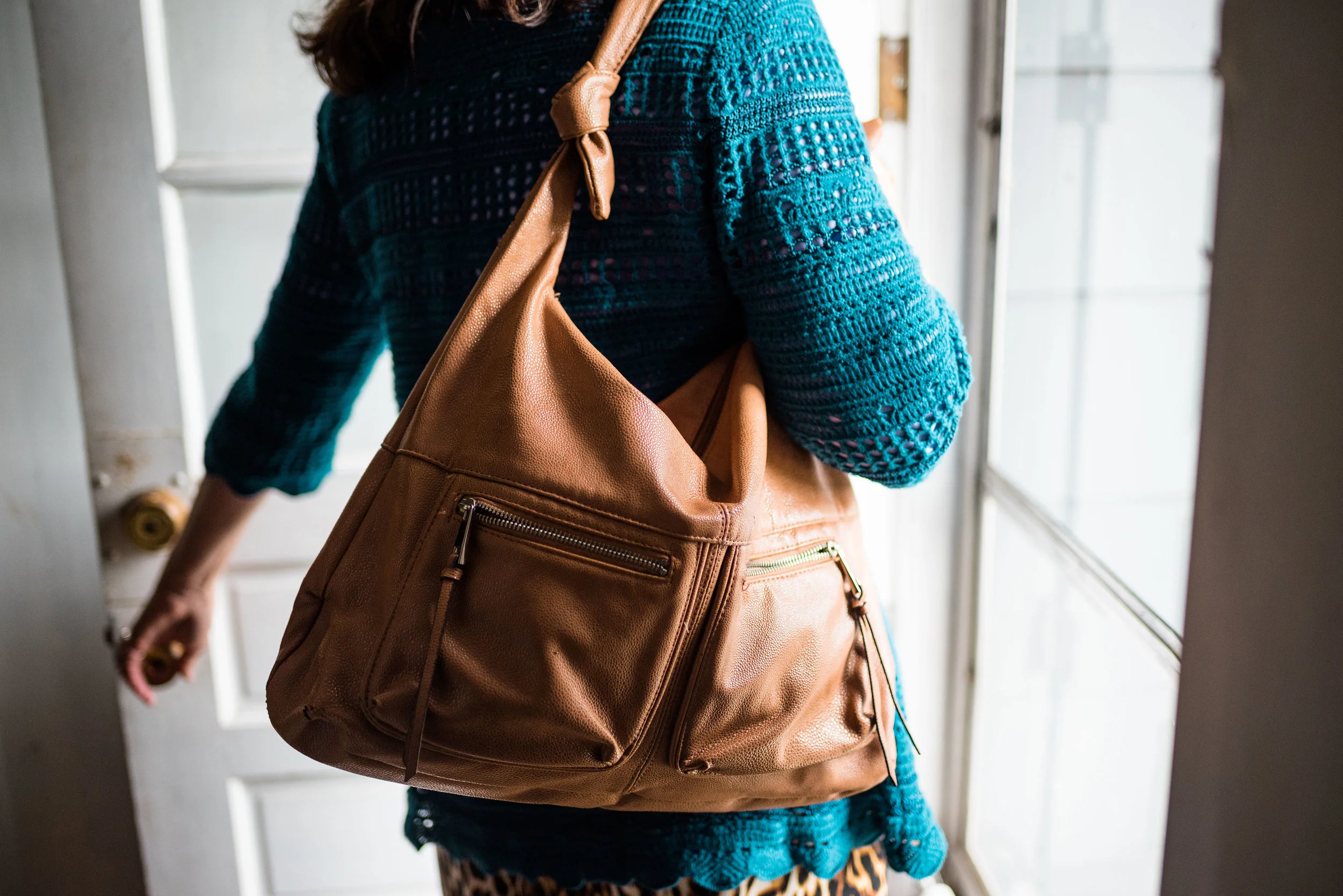
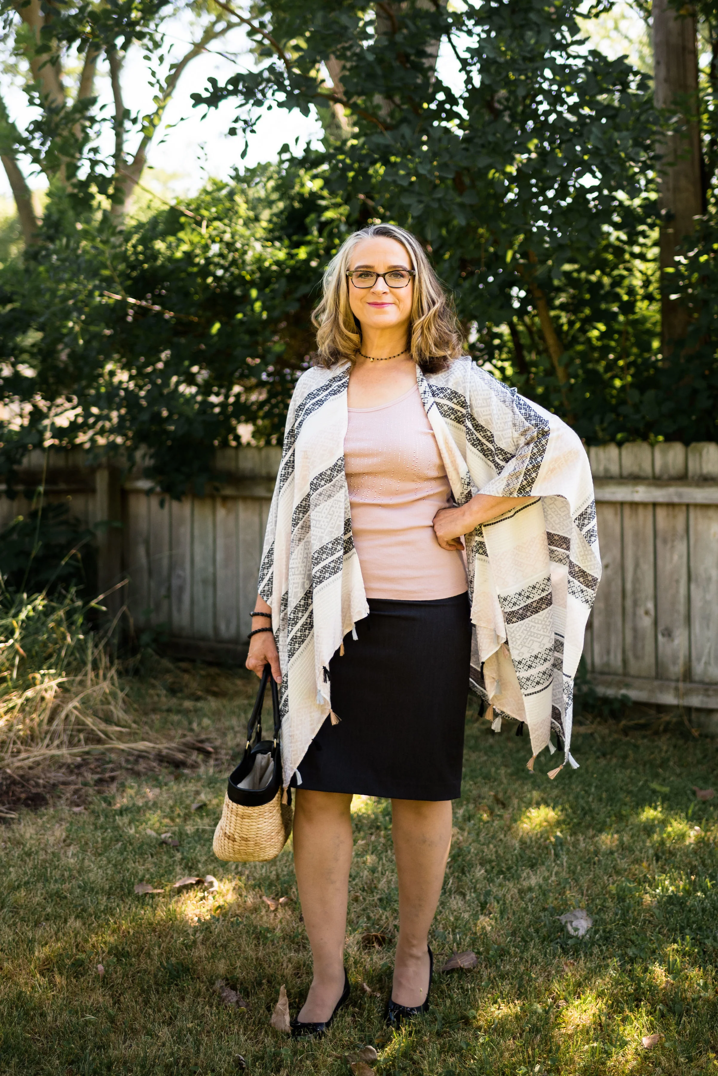
Even though this little thrifted, Rosetti bag screams summer, I thought it was a great way to keep this outfit looking modern and updated, yet still in tune with the fall vibes.

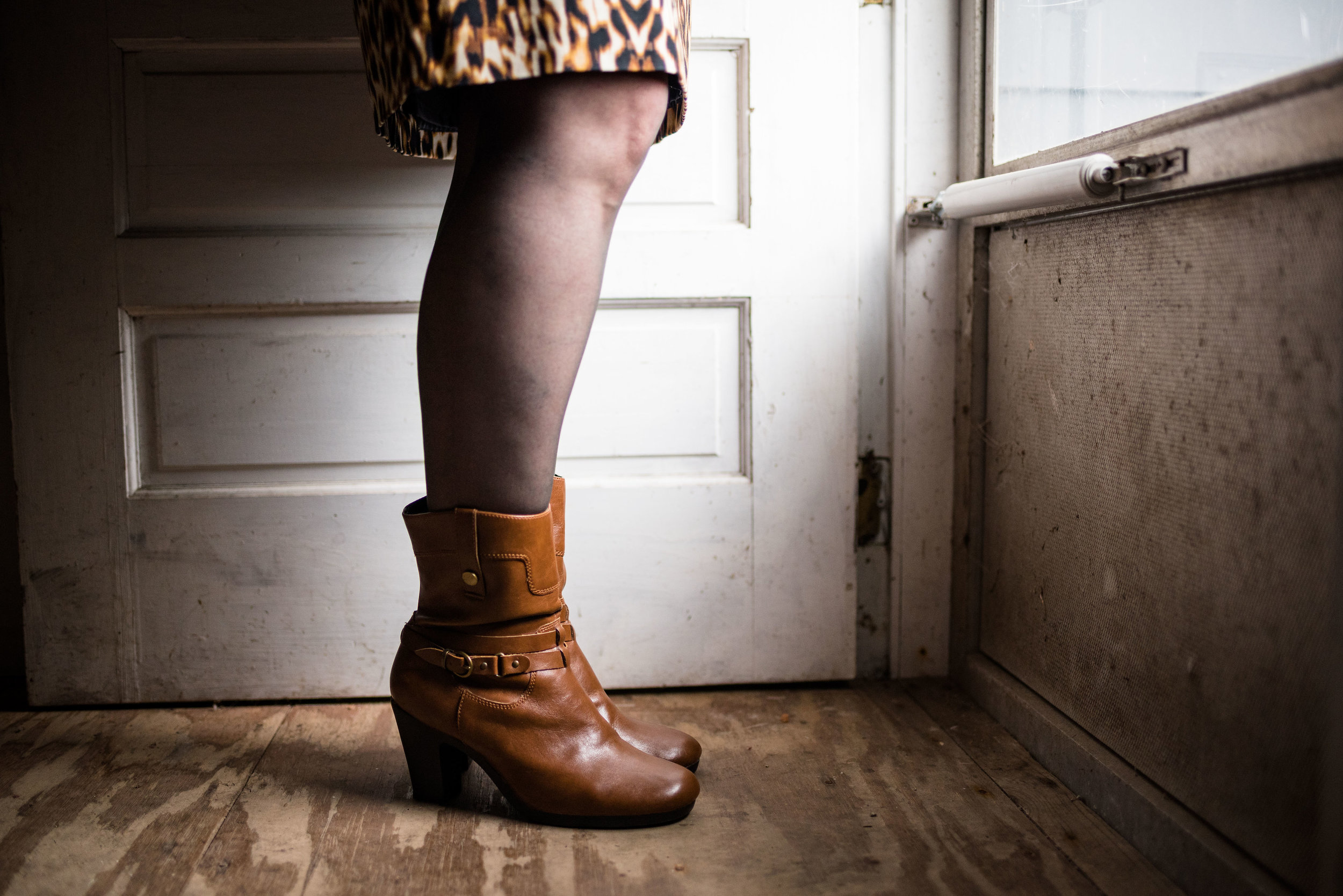
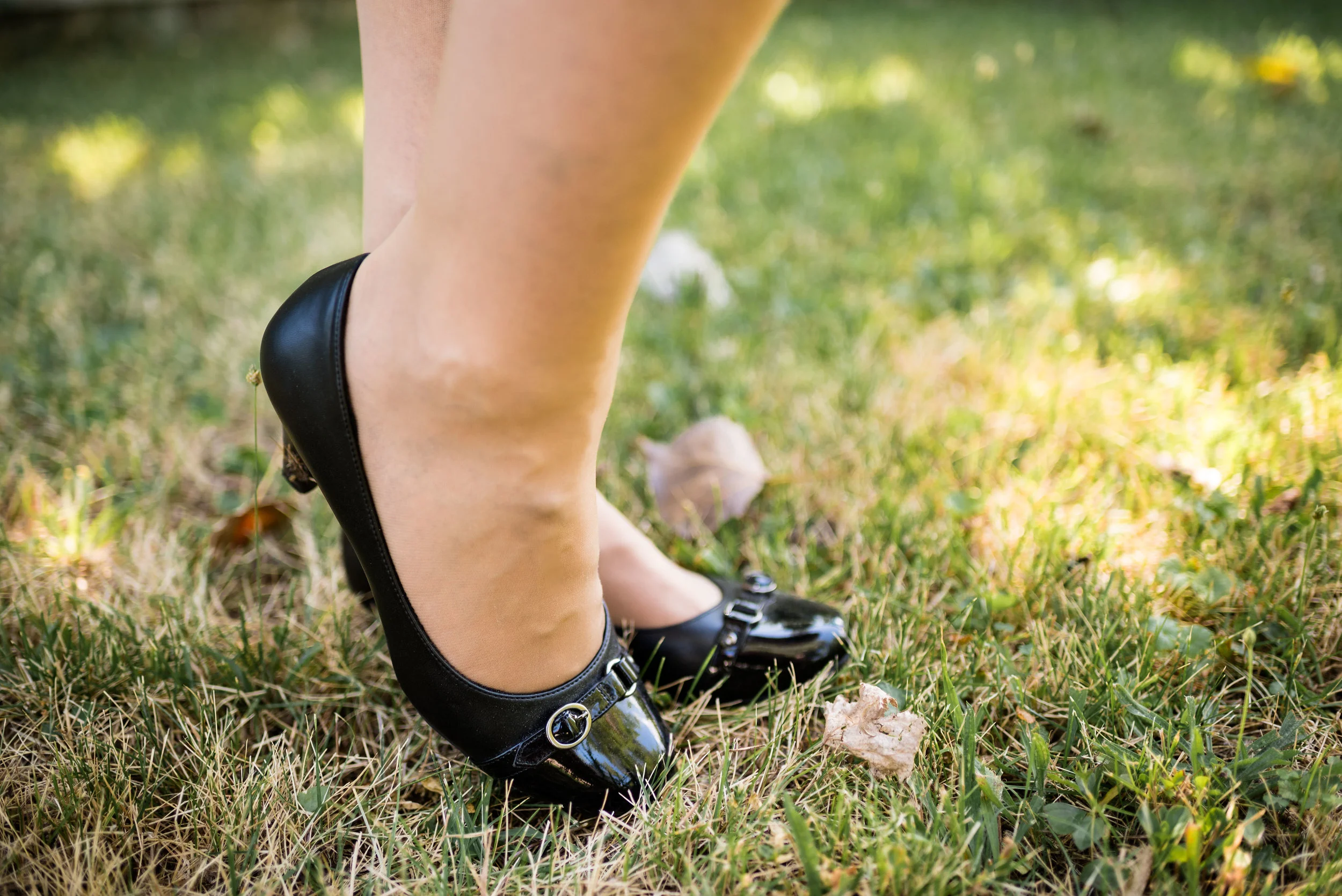
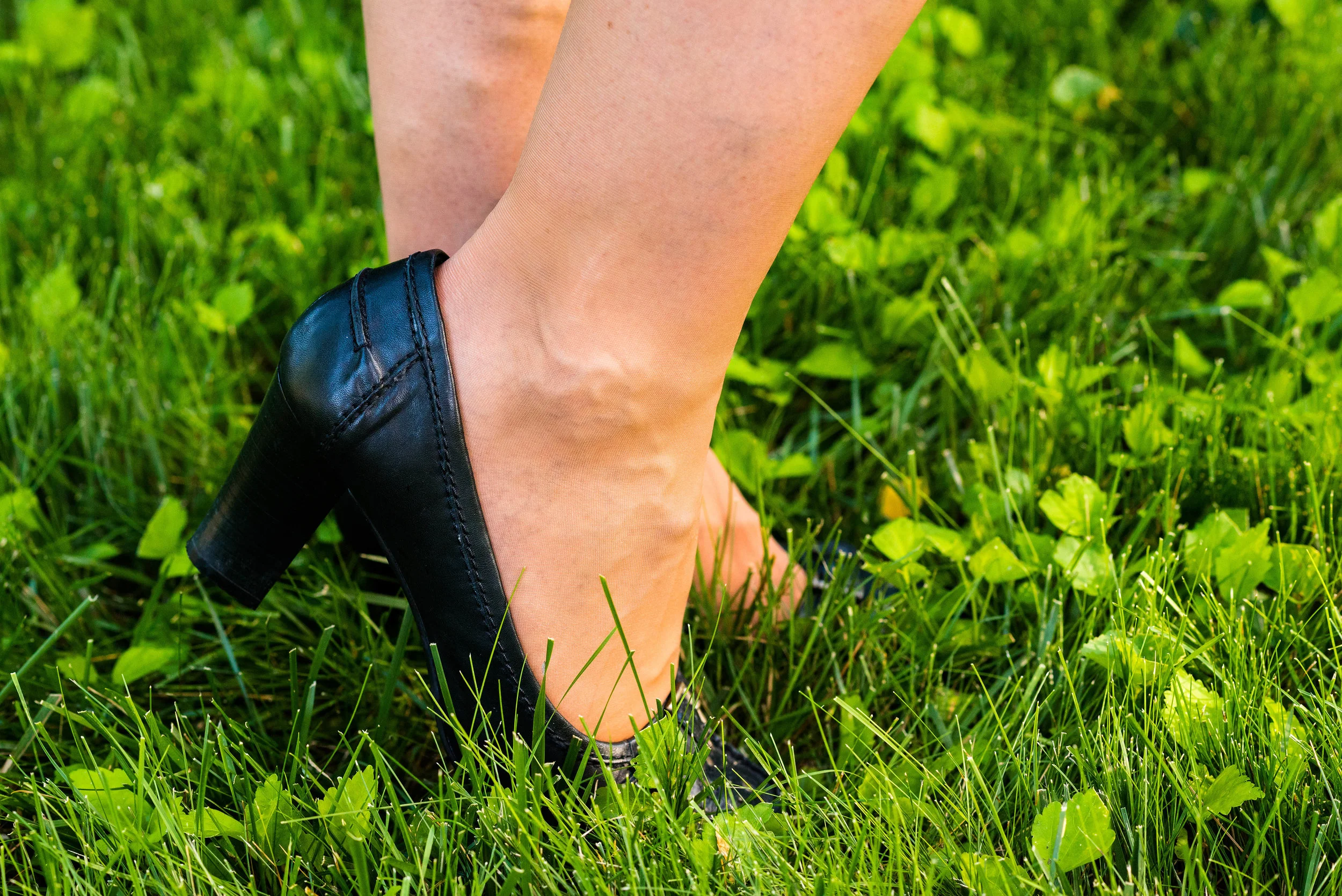
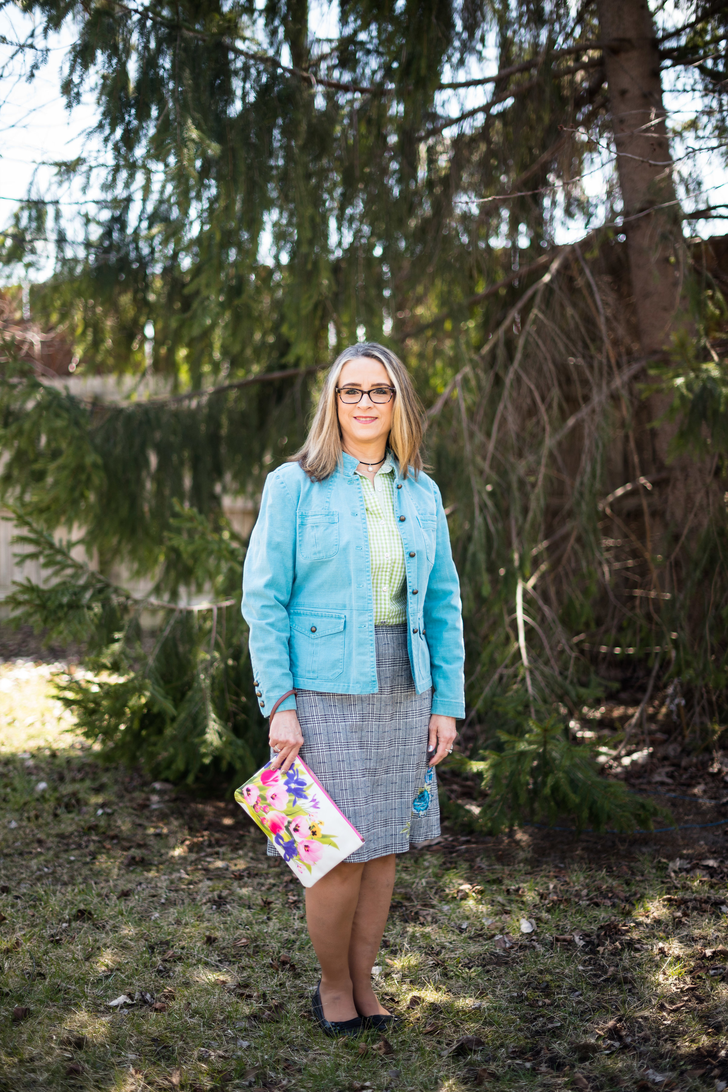
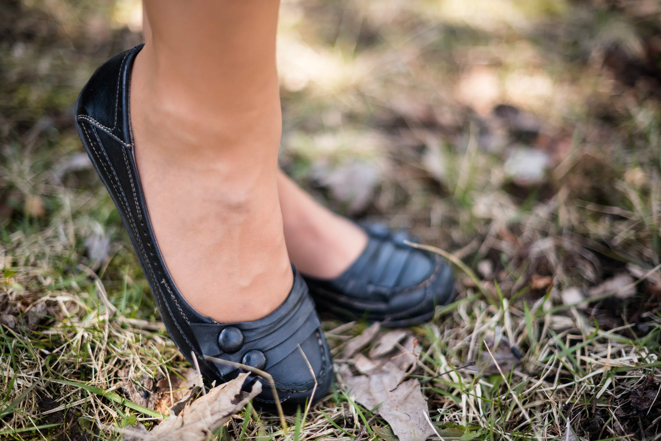
My SO snakeskin print boots were a clearance purchase from Kohl’s last season. I haven’t really had the opportunity to wear them very much, so hopefully this season they will be out and about.

pantonefallcolortrendspalerosette-10.jpg

What do you think of these colors? Do you like them combined? Do you like them each separately?

pantonefallcolortrendspalerosette-1.jpg

I’d love to hear your thought, so leave me some love in the comments.

As I usually do, I am adding a few shopping links in things similar to these colors. These are affiliate links. All opinions are my own.

Thanks for following along on the blog. I hope you are having a great week.

Photo credit Jessica Trumbull with Rebecca Trumbull.


Oh, Olive! Utility Jacket - Workwear Look

Depending on where you work, you might be able to be in your sweats or pj’s. So many people have been working at home through the Covid pandemic, that people have gotten rid of many of their business style pieces since they really have no need for them. However, many places have opened back up and have called people back into the office. When I was working as an assistant manager at a university bookstore, I could wear my jeans to work, and very often did, but I could also wear skirts or dresses if I chose to do that. Usually, when we talk about workwear style, we are talking about a business or business casual type of outfit consisting of blouses, nice pants, blazers and other similar pieces. We do have a more casual type of style that has moved into the work place in many business realms, allowing their employees to have more flexibility and comfort. I would say today’s look tends towards business casual due to the utility jacket and the tennis shoes, and I would have been perfectly comfortable wearing this to my previous job.

DSC_0030.jpg

As I told you in Tuesday’s post, I am featuring the olive utility jacket as my olive piece. This is St. John’s Bay brand from JCPenney. This jacket is roomy, so I can wear multiple layers underneath if I want to use it in the cooler weather. Right now, it is a great piece for overly air conditioned restaurants, retail spaces and business offices. This piece also has adjustable tabs at the sides to make it more fitted, as well as a double front closure which includes a full zipper and buttons.

DSC_0026.jpg

Fall Trend Alert - Lavender

Certain colors are always trending for each of the major seasons and fall is no exception. Surprisingly, rather than the typical fall hues of orange, brown or yellow, we are seeing pastels like lavender and blush. I’ll cover blush next week, but for today lavender is my color of choice. My thrifted eyelet top is Old Navy brand. I love this light weight piece.

You’ve seen my polka dot skirt on the blog before. Amazingly with my weight gain and redistribution (aka spare tires), I can still get it on. Ha ha. This older thrifted piece is a brand called Outback Red. It is a great piece for any warmer weather season, spring, summer or fall. Not a full length maxi skirt, it is more of a tea length. Another plus, it has pockets.

DSC_0027.jpg

I kept my accessories pretty low key, except my layered necklace is fairly blingy. I added a few bracelets, my white cross body bag again and my Steve Madden sneakers that I got recently at DSW.

DSC_0035.jpg
DSC_0032.jpg
DSC_0031.jpg

Do you like this outfit? What would you wear to the office? Let me know what you think.

DSC_0028.jpg

I hope you enjoyed this look. I’m including a few shopping links. These are affiliate links. All opinions are my own.

Have a great rest of your week!

Oh, Olive! Workwear Look

Tuesday I showed you a casual look with olive pants and today I am showing you a workwear look that might be doable for the office. We are looking at the color olive as a neutral. I know many of us have olive in our wardrobes and are becoming more aware of what a great color it is. Tuesday, I showed you how well it goes with orange and white. Check out today’s outfit, which combines dark florals and black for a sassy look.

DSC_0035.jpg

I found this fabulous dark floral Time and Tru dress while thrifting on one of our trips. I had started really looking over the dress racks at thrift stores recently after seeing Instagram gal, jbowenandcompany using a button up dress like a kimono. It makes a piece like this so much more versatile. When I decided to do this series on olive pieces, I knew this dress as a duster would be a perfect topper for a fun workwear look.

DSC_0027.jpg

Once again, my olive Gloria Vanderbilt skinny pants are the focal piece. This time I paired them with another neutral, black. My black v-neck polo is a sleeveless piece that I found thrifting a few weeks ago. Black and olive has always been a classic combination. Throwing the dark floral piece over the top really makes the outfit pop.

DSC_0037.jpg

You’ve seen these Clark peep toe shoeties on the blog before. They are great shoes, I just really have no place to wear them right now. I know many bloggers and Instagram babes who post outfits they are actually wearing, but some of us have a more laid back approach. I would wear these and this whole outfit if I had an office job, but right now I don’t. Still, it is fun to have choices, and to be able to show you all a few of my fun wardrobe pieces, even if I don’t wear them as often.

DSC_0039.jpg

I thought adding the light blue bag would pull out the light blue in the duster and with the dark florals it still gives the outfit a summer feel. You could have done the same thing with the light pink, yellow, or white. For the same reason I went with the light blue pendant. Just that little extra pop of color adds more interest to the outfit.

DSC_0041.jpg

What do you think of this outfit? Have you ever worn a button up dress as a duster or kimono? It is a great way to extend the use of your dresses. If you are like me, you don’t have too many excuses to wear a dress. I know some ladies wear them all the time, and if my legs were less blemished by veins, I probably would too, but using a dress in this way still gives me an excuse to get more dressed up.

DSC_0031.jpg

I hope you enjoyed this post. I am going to include a few shopping links for you to look over. These are affiliate links. All opinions are my own.

Have a great weekend. I will not be posting next week once again, as I am going to spend the week with my mom while my brother and his family are out of town. I’ll be back the following week. Until then, take care.

Pantone Fall/Winter 2020 - New York Palette - Classic Blue, Ultramarine Green and Blue Depths

The Pantone Color of the Year is Classic Blue , so once again we are featuring this medium blue color in the Pantone series. Back in January I showed you this color paired with a furry bomber jacket and plaid skirt. You can also see this color with a multi-print midi dress and with a bright pink top. Classic Blue is a blue that just about anyone can wear. If you prefer not to have this pretty blue to close to your face you could carry it in a lovely bag, or wear it as a brooch pinned on your lapel. I’ll provide a few shopping links at the end with various options.

Pantone Fall/Winter 2020 - New York Palette - Classic Blue, Ultramarine Green and Blue Depths

I didn’t really have anything that seemed to perfectly match the Ultramarine Green, at least not until after the fact. My button up is actually a thrifted men’s shirt; a brand called Zylos. It has very small greenish blue print with white and almost has more of an aqua feel to it. Oh well, I have long ago given up on the idea of trying to be perfect. Ha, ha. You can see a closer look at the pattern, and see my thrifted, fringe, pendant necklace. Actually, the necklace is probably a closer match to the Pantone green.

Pantone Fall/Winter 2020 - New York Palette - Classic Blue, Ultramarine Green and Blue Depths

My Classic Blue pants were a thrifted piece from shopping a friend’s closet. They are Ruby Road brand and I have styled them over and over on the blog. You can see them with a light blue sweater and scarf, Beetroot purple top from last spring’s series, an olive velvet jacket, a plaid bomber jacket, and a multi-print kimono.

Pantone Fall/Winter 2020 - New York Palette - Classic Blue, Ultramarine Green and Blue Depths

I also threw on a few beaded bracelets, just for fun. Sometimes wearing a scarf or jewelry isn’t so much to help with the outfit as a whole, but just to enjoy something I have. Since I rarely go any where other than the grocery store, I occasionally throw on some bracelets, just because I have them and they are pretty.

Pantone Fall/Winter 2020 - New York Palette - Classic Blue, Ultramarine Green and Blue Depths

I thought this outfit would be perfect for my round Nine West snakeskin print bag. It think it adds an element of fall color to this more classic looking outfit.

Pantone Fall/Winter 2020 - New York Palette - Classic Blue, Ultramarine Green and Blue Depths.

My shoes are my old stand by thrifted Relativity loafer heels. If I had an office job, I would probably wear these a lot. They are a nice height for a stacked heel and fairly comfortable.

Pantone - Fall/Winter 2020 - New York Palette - Classic Blue, Ultramarine Green and Blue Depths

What do you think of these colors? Do you like the Classic Blue, or do you prefer the darker tones of Blue Depths? Do you like the color Ultramarine? As it is in the graphic, it seems to be more of a forest green color, which I do like. I like how these three colors worked together into an outfit that would be perfect for a day at the office or a date night with your significant other.

My life would not be complete if I didn’t leave you with a silly picture to make you smile. When I was trying to pose, I almost fell down. Ha, ha.

Pantone - Fall/Winter - 2020 - New York Palette - Classic Blue, Ultramarine and Blue Depths

I hope you enjoyed this post and I hope you’ll leave me a comment or two. Life is lonely around here, so I love to hear from my internet and long distance friends.

I’m including a few shopping links for you to peruse. These are affiliate links. That means when you click on a link I get a few pennies. All opinions are my own.

Graphic and photo credit Rebecca Trumbull.


Pantone - Autumn/Winter - 2019 - Peach Pink and Biking Red

These are the last two colors from the Pantone - Autumn/Winter - New York palette. Peach Pink is reminiscent of coral, which never really seemed like a fall color to me, but I must remember that the old rules don’t apply…at least to some things. I know many people buy into the old adage, the rules are meant to be broken, but I don’t always believe that is the best mindset to have, and that mindset trickles down to our children and our grandchildren. As far as rules, I think that many of them are in place for our protection and our benefit. Rules like, look both ways before you cross the street, floss your teeth once a day and eat your fruits and veggies are not bad. Actually, they are for our well being. Rules about color, really no longer apply, so I am okay with wearing white after Labor Day and wearing coral in October. Why not?

The other color in this ensemble is a dark red. It reminds me of the Brick Red from my Crayola Crayon box. How many of you remember those wonderful boxes of crayons? I used to obsess about having all the similar colors arranged by shade in my box. I didn’t want to hunt around for Brick Red, so I put it in the “red” section. Ha, ha.

As you can see, once again, my colors were not perfect matches. You will see I did a little better with the London Palette, which I will be introducing on Thursday.

The heavy gauge sweater is Candies brand from the Koh’s clearance rack at end of last winter’s season. I find this is the best time to shop for those pieces you want for the season, if you don’t want to pay full price. I have found most of my non-thrifted clothing pieces this way.

My Peach Pink tank top was a thrift find from a few years ago. It is Eddie Bauer brand. You’ll be able to see the ruching on the neckline in an upcoming picture.

My Paloma gray pleated skirt was also a Kohl’s clearance find a few years ago and is Apt. 9 brand.

My chunky wood ring necklace is making an appearance again. I love this necklace my daughter gave me for Christmas. It is so handy for making a statement and pulling the colors in an outfit together. A necklace like this works much the same way a scarf will, but without the added heat around your neck.

My little thrifted Houndstooth bag works both as a satchel and a cross body. The shoulder strap is inside the bag, but can easily be taken out and attached so I can wear this for hands free activities.

I really like these black Aerosole heels. They are comfortable and stay on my feet with no slipping or sliding. I decided to add the dark tights at the last minute for two reasons. The first was to keep the leg more monochrome and thus make the legs look longer. The other was to make the outfit seem more ready for fall weather. The day we took these pics it was hot!

What do you think of this outfit? Is this something you would wear? Do you like these Pantone colors? Why or why not? I’d love to hear from you, so leave a comment or two.

I’ve included a few shopping links. These are affiliate links. All opinions are my own.

Photo and graphic credit, Rebecca Trumbull.

Have a great day.

Print Mixing Mash Up - Striped Tee - Outfit 2

On Tuesday you saw the yellow striped tee mixed with a floral kimono. If you didn’t see that you can check it out here. Today I am going to mix that same tee with a light plaid blazer for a great work wear or date night look. The reason I chose this Sonoma striped tee is simple. Stripes are easy to print mix with. As I said in my introductory post, Revisiting Print Mixing, stripes go with just about everything, even other stripes. It is relatively easy to pair stripes with florals, polka dots and plaid as I am about to show you with this outfit.

This plaid blazer I found on the clearance rack at H & M. I didn’t really need another jacket, but then I realized, I didn’t really have anything that was specifically this color and this weight. The price was too good to pass up and this cute little number is going to be a workhorse this spring and summer. I like that it has 3/4 length sleeves with shirring, making it look like they were pushed up.

Although the jacket does not contain any yellow, to match the striped tee, it does contain a lighter stripe through out. The stripe is actually more of a light tan or beige, but will have that chameleonic ability to look like whatever lighter color it is paired with. In this case, it is yellow. But I can also see this light stripe taking on a blush appearance when paired with pink.

I decided to make this more of a work look so chose my dark gray, Liz Claiborne, pencil skirt. Originally, I was going to wear my gray heels, but seeing as we are still in the throes of winter I opted for my gray, wedge heel ankle boots. I think I would have liked it a tad better if I had worn dark gray tights. What do you think? Gray hose or tights would have given a sleeker more elongated look. As it is now, I feel that my legs are cut off, both by the skirt and the boots. Live and learn

These are my favorite wedge heeled booties. I like the chain detail, the color and the fit. These are a brand called Impo.

In keeping with the gray mode I was in, I decided to keep my accessories gray as well.

This Cosmopolitan sparkly, envelope clutch is making another appearance here on the blog. I use this one whenever I am going to something worth getting dressed up for. I like that it is glitzy for those special occasions, but also chic enough to carry to work. It is a good size as well. Some clutches are so small, you can barely get your cell phone and driver’s license into them, let alone keys or other necessities. Believe me, us girls got plenty of necessities. Ha, ha.

What do you all think? Did I do okay with this first print mix mash up? Do you ever mix prints like this? I’d love to have your feedback. Leave me some love in the comments.

I’ve included a few shopping links, just for fun. These are affiliate links, which means I get a few pennies for every click you give me. If you purchase something through my site, I get a small commission. All opinions are my own.

Have a great weekend, everyone and thanks for taking time to hang out on the blog.

Photo credit Rebecca Trumbull.

Friday linking up with Nancy’s Fashion Style.


Pantone Fall 2018 - Quetzal Green, Crocus Petal and Meerkat

I am on my last Pantone Fall 2018 post. I hope you have enjoyed seeing these colors and the way I have managed to put outfits together using the inspiration from the 2018 Fall palette. As in anything where fashion is concerned we can take it our leave it. Fashion is for you. It is about putting together outfits and colors that you like, make you feel confident and that you will enjoy wearing. In some ways what we wear is like our second skin. It provides a covering for a bodies and how we put that cover together can boost our self-image and help us better manage our wardrobes and our pocket books.

I have found, in the fashion realm, just like in cooking, having a source of inspiration really helps. Whether you follow a recipe or cook from memories of you and your mom or grandmother working together to make wonderful creations in the kitchen, you use that inspiration to put food on your table. In the same way inspiration for fashion can come from magazines, bloggers, color palettes or even things out in nature. That is the reason I always like to use the Pantone color palettes as a spring board for creating fun and interesting outfits.

These last two colors, Quetzal Green and Crocus Petal, I decided to pair, once again, with Meerkat. Crocus Petal is a lighter, more spring like color found on the London palette. I feel that pairing it with Quetzal Green and Meerkat was the perfect way to keep the light color grounded and more fall like.

This top is a Kohl’s clearance find and is Dana Buchman brand. It is a button up with 3/4 length sleeves and a longer silhouette. It has some stretch and is more fitted. I opted to wear this bead and metal statement necklace, which incorporates the Crocus Petal color as well. I wore a simple gold cuff on my arm.

I found the open weave sweater thrifting, I love the variations in the knit. I am not a yarn girl, though I would love to be. I think this is crocheted, but it might be knit. Can any of you readers tell? Whatever it is I love the different stitch sizes and open versus more closed aspect to the piece. Here we are talking about texture again and how essential is is to making an outfit more interesting.

I thought these two colors when great with the browns, black and cream of my leopard print pencil skirt. This skirt is another JC Penney find and is Worthington brand.

The boots, Aerosoles and bag, both thrifted were the perfect accessories to pair with this outfit. I think black would have worked well or even a cream colored boot, which are trending right now, but I love the luxe feel of the Meerkat color.

Next week I’ll have a recap of all the Pantone Fall 2018 colors. I hope you’ve enjoyed this series and that it provided you with some inspiration for trying new color combinations. Always shop your closet before going out to purchase what is currently trending. You might already have a leopard print top or the perfect color piece that matches with one of the Pantone seasonal colors.

I’ve included a few shopping links. These are affiliate links. All opinions are my own.

Have a great day.

Photo credit Rebecca Trumbull.

Is it a Kimono or a Ruana? Week 3

If you are new to my blog or to this series, I am looking at the difference between a kimono and a ruana. You can see the definition of each as I explained it here in last week's post. This week's outfit revolves around a more traditional kimono. The first post in this series featured an outfit with a short kimono. You can see that post here. Front and center this week is a longer kimono, which to me, seems more traditional to what I think a kimono is supposed to look like as far as shape and length. 

This kimono is thrifted Massini brand. Since the kimono has a lot going on with its vivid floral print, I decided to go with a more monochrome outfit underneath. 

This gray, embellished tank is Croft and Barrow and was thrifted. The pants are Falls Creek and a recent clearance purchase from Meijer. Once again, I like the idea of print mixing stripes and floral. This time the stripes are vertical rather than horizontal and worn on the bottom rather than the top. 

No outfit is complete without a few accessories. I added a silver necklace and a couple of unique bracelets. Since the tank has the beaded embellishment I went for a simple, understated necklace. 

I have also fallen in love with the color yellow and I couldn't resist adding the bright sunflower feel of this thrifted Elle bag to the berry and gray mix. Do you think it works?

I decided on my gray oxfords instead of sandals, which makes this a work approved outfit. We can't wear open toed shoes at the bookstore. Although, I'll tell you even a shoe like this will not keep your foot from getting injured when you drop a 1st Semester Nursing package on it. Ha, ha. 

Here is a back view of the kimono. The hem line is higher in the front and lower in the back. 

What do you think of this outfit? Do you have a kimono hanging in your closet? If not, I'm sharing a few pretty ones that I found in my shopping section. I also shared how you might put them together with pants and a top. These are just suggestions. These are affiliate links. If you click on a link I get a few pennies. If you purchase something through my links, I might get a small commission. All opinions are my own. 

I hope you enjoyed today's post. I'd love to hear from you. You can also see what I am wearing on a daily basis by checking out my Instagram account. I try to post on there at least three or four days a week. 

Have a great week everyone. 

Old Becomes New - High Waisted Skirt

This week I am styling a pretty skirt that I have had in my closet for ages. I refuse to get rid of it, because I love the flowy feel of it. I'm sure it has more versatility than I think, so I pulled it out. Since I was already on the crop top band wagon, I thought I would try pairing the same blue and white crop from last Thursday's post (see here) for some fun print mixing with this high waisted skirt. 

This skirt is George brand and I got it at JC Penney, many moons ago. It has a full lining and the fabric is very light weight and flowy. It also has a high, stretchy waistline, which is very comfortable and worked perfectly with the crop top.

I loved the pop of red in last week's outfit with the crop top, so I kept them exactly the same: red patent leather clutch, red bangle and red canvas peep toe Keds. 

I added the cropped denim jacket as a solid piece to tie together the two patterns. When print mixing it is usually best to pick a smaller pattern with a larger pattern and then use a complimentary piece to pull the two patterns together. Here is a photo of  the outfit without the jacket and beside it one with the jacket. Do you think it looks better with or without the jacket?

I hope you liked this outfit. Do you have something in your closet that you are not sure how to wear? Depending on the piece think in terms of balance. Try pairing a fuller, bulkier skirt with a stream lined tee or a belted blouse. Pair skinny jeans with longer tunic tops or even dresses with the jeans rolled up. When the weather cools pair those same skinnies with bulky sweaters or sweat shirts. Wider leg pants look perfect when paired with a tighter fitting top to show off your curves. 

I always love to hear from you, so be sure to leave me a comment or two. I have learned so much from fellow bloggers and others, who leave ideas in my comments box, so please feel free. 

Have a great weekend everyone.

Is it a Kimono or a Ruana? Week 2

Last week I styled a short kimono. You can see that post here.  This week I am styling a ruana. What exactly is the difference between these two outer layer pieces? A kimono is more of a jacket. It has sleeves that can be narrow or wide, long or short. It is usually open in the front, but can come with or without a belt or tie to keep it closed. A bathrobe is really a heavy weight kimono. A ruana is one large piece of cloth that falls down the back, over the shoulders and down the front. It has no sleeve closures, rather just drapes over the shoulders and is kept in place with your arms, although I have seen and heard of people using a pin or a pretty brooch to keep them in place. A ruana is usually worn open, although the fashion police won't put you away if you wear it with a belt for a more cinched in look. 

This tasseled ruana was a spring purchase from Christopher and Banks. To make the look more streamline, I went with a tank top and a dark gray pencil skirt. Here is the outfit before adding the ruana.

You've seen this blush tank with bling before on my blog. I am an avid proponent of shopping and re-shopping my closet. The tank is Relativity brand and the pencil skirt is Liz Claiborne. Both of these pieces were thrifted. The black heels are Comfort Plus brand and the straw bag was thrifted as well. I opted for minimal jewelry with the beaded choker and a few beaded bracelets. 

The next two pictures show you the width of the ruana, which is typically a wider silhouette than a kimono.

Do you own a ruana? How do you like to wear it? Is it more of a summer weight or a fall weight? I am seeing fall styles beginning to fill the racks at most retailers. Kohl's was having some good sales on kimonos and ruanas and right now, you might find deals on the lighter weight ones that you could use for the rest of the summer and next season. 

I'd love to hear your feedback on this outfit. Would you wear something like this? I think this outfit is a great office look and the ruana would add a light layer for those overly air conditioned buildings. 

I've included a few shopping links for you to peruse. These are affiliate links, but all opinions are my own. 

Thanks for stopping by the blog and be sure to check back on Thursday to see what I am featuring on my Old Becomes New column. 

Photo credit Rebecca Trumbull. Make up Rachel Christensen

Old Becomes New - Knee Length Print Dress

I hope you all had a wonderful 4th of July. We spent Tuesday evening with some of the family and friends watching the fireworks and yesterday, I took my younger daughter out birthday shopping. My in-laws are coming into town this evening. It will be fun to see them. I am so very blessed to have married into a wonderful, caring family. 

Today's Old Becomes New column, revolves around a thrifted, knee length, print dress. When I saw this dress a while back (Note: that is another reference that I have no remembrance of when I got this - ha, ha), I thought it would be a great piece to dress up or down. I like the fun print and the colors are not conducive to a specific season, so it can be worn all year round. However, as usual, I bought it and have never worn it. Once again, I pulled it out thinking either use it or lose it. I am not one to regularly dress up, yet I have this desire to have dresses in my closet, just in case. While my hubby does occasionally get us tickets for something fancier, most events these days are not formal occasions, thus the need or the desire to figure out how to wear something I would normally consider more dressed up in a more casual way. 

Look 1 - Casual

My daughter was able to take these pics for me. Don't you love the color contrast between the green of the background and the colors of the dress? The dress is George brand, which seems to be sold both by Target and Walmart, although, as I said, I bought this at a thrift shop. This sleeveless, v-neck has a side zipper for easy on and off. 

I did a little research on dress styles so I could give you better information. This is not truly an empire waist, which rests just below the breasts, but it is also not hitting at the natural waist, plus it is more fitted due to the cinch piece that the skirt attaches too. It is also, not an a-line skirt, so I am going to term this dress a princess dress with an empire waist. Ha, ha. It is fully lined, so no worries on see through issues. This also makes it perfect for year round wear. The lining helps if you work in office air conditioning and makes it great for wearing in the fall. 

For this casual look I added my antler and bead necklace from Cabela's, a wooden bracelet, a thrifted straw bag, my MixIt hat and my Easy Spirit flat espadrilles. 

Look 2 - Work Wear

This second look adds a bit of polish and structure, making the outfit perfect for the office. This gray jacket I got from my younger daughter because she had lost some weight and it is too big for her. The jacket is a simple knit, something like a heavier sweatshirt material. It is Laundry brand. I added the black beads, a large black tote and my black loafer heels. 

Here are the two looks side by side. 

What do you think, my faithful followers? Would you keep this dress? Would you style it a similar way, or do you have some other fun ideas. I love hearing from you all and I have gotten some very good advice and ideas, so I appreciate your input. 

Hope you all have a great weekend! See you next week. 

Be sure to check out my Instagram. Since I've gotten a smart phone, I am posting on there, more often. I also have some Pinterest boards as well, that I occasionally add pins to, so you can check that out as well. Always check back on your comments, because I love to respond to your great input.

Photo credit Rebecca Trumbull

Outside the Box - Wide Leg Crop Pants

I recently acquired a pair of wide leg crop pants thinking they would be a good addition to my summer wardrobe. I have never been a big fan of wide leg crop pants. I feel that they make me look short and stubby. However, as a fashion blogger I am trying to have an open mind and try things that I wouldn't necessarily wear. That is precisely what this column is for. I found these on the clearance rack at Kohl's and figured since I didn't have to pay full price it was a good time to try this trend. 

I wore this outfit to work, so the pants were a bit wrinkly by the time I took these pics later in the afternoon. Right away, seeing this outfit, I am thinking these pants are too big. While they feel incredibly comfortable, the pieces I combined them with for this outfit just aren't working for me. I like the color combination, olive with pink and blush, but I'm looking rather, frumpy, as my hubby would say. 

I wore my blush SO flats to go with the sweater and tee. Maybe heels would have been a better choice. What do you think?

You've seen this waterfall cardigan on the blog before. You can see that post here. I love this thrifted sweater. It is light weight and I can wear it with so many outfits. The embellished tee is from Christopher and Banks from a number of years ago. 

I also wore my stained glass necklace as I thought the colors went well with the top. 

Here is a shot without the sweater. Once again, I feel like everything about the outfit is wrong. Perhaps a tighter fitting top with heels or a cropped jacket instead of the sweater, or maybe flip flops and a tank top would be better. The other thing I am feeling is that the pants are not cropped in the right place. It almost seems to me they should be just a tad shorter. 

How do you wear wide leg crop pants? Or do you not wear them? I'm going to try these a few other ways before I totally give up on them. If you have any suggestions, I'd love to hear them. 

I hope you all have a lovely weekend. Thanks for following along on the blog. See you next week.

If you like wide leg crop pants, here are a few shopping links. These are affiliate links. All opinions are my own. 

Spring Transition - Floral Dress

When dressing for spring in the mid-west, one must think in terms of layers. Either the layers need to be in the form of things like jackets or sweaters that can be taken off, or they need to be in the form of light weight fabrics that will be easy to wear even as the day warms up. My first two posts in this series centered around outfits with jackets. The first was a light weight quilted jacket from Christopher and Banks. You can see that post here. The second used a light weight bomber jacket for the top layer. You can see that post here

For this post, I am leaving the jackets behind and wearing a light weight, long sleeve floral tunic. The dress/tunic is from H & M, but I found it in a thrift store. I love the navy blue back ground and the orange, blush and light blue print. I am pairing the tunic with my pumpkin orange pants from JC Penney. I wore my same blue SO flats that I wore in my Outfit Inspiration post from last Thursday. For jewelry I kept it minimal since the top is so busy. I'm wearing a beaded choker. My bag is from Kohl's last summer season. A large woven tote, it is perfect for the beach or for travel, when you want to throw in a book or magazine. 

When the weather warms up just leave the pants behind and throw on a pair of flip flops and use this as a swimsuit cover up. I could also see this paired with white cropped pants and a pair of Keds or Converse sneakers. There are lots of options when you have a dress/tunic like this and it will cross seasons. I'm sure I will be wearing this often. 

Would you wear a piece like this? Do you have a dress in your closet that you are not sure how to wear? Try thinking outside the box, by pairing it with jeans or leggings. 

Photo credit Rebecca Trumbull

I've included a few shopping links for other pretty tunic type dresses. This post contains affiliate links. All opinions are my own. 


Spring Transition - Bomber Jacket Outfit

Last week, I started a series on transitional outfits that take us from winter to spring to summer. Last week's post featured a red jacket worn with a graphic tee, bootcut jeans and peep toe sandals. You can see that post here.

What exactly makes an outfit transitional? An outfit becomes transitional when it crosses over one season to the next or when it takes you from a daytime work wear look, to a night time date look. Usually, an outfit that transitions will incorporate different layers and things that can be taken off or swapped out easily for a different look. 

For today's look I chose another outfit from a Chico's catalogue that inspired me. This look centers around a summery dress, worn like a tunic over leggings, topped by a bomber jacket. 

I've styled this Simply Vera dress before on the blog, when we went to Florida, last December. You can see that post here. I found this cute piece on the clearance rack at Kohl's a few season's back. Here, and here are few cute styles for this season. 

This black bomber I picked up somewhere and I don't remember where! Ha, ha. It is an off brand, but I'll provide a few shopping links for jackets, bags and shoes at the end. 

These black leggings became mine, when I shopped a friend's closet. They are super comfy and thick, but not too thick. I am more inclined to wear leggings at this transitional time, as they are warm, but not overly warm. 

I chose my purply blue agate pendant necklace. I received this as a gift and it is one of my favorite pendant necklaces to wear because of its unique color and shape. Here are some very pretty options from an Etsy seller. i might need to buy myself another one, or two!

For my bag I chose this beauty that I've featured before on the blog. I really love the color and the texture of this pretty clutch, that my younger daughter gave me. It also has a strap so I can wear it as a cross body bag. It goes perfectly with the bluish green in the dress. 

I'm loving these peep toe shoeties from Clarks. They are not only cute, but comfy and the zipper up the back makes them pretty easy to get on and off. 

Here's a look at the outfit without the jacket. If it gets too warm, just take the jacket off and you have a light weight sleeveless dress. If it got real warm, you could take the leggings off as well. 

I hope you enjoyed this post. Do you have any light weight summer dresses that you are dying to wear, but don't feel that it is quite warm enough yet. This is the perfect way to extend the wearability of those pretty summer styles and still be warm and comfy. 

Thanks for stopping by the blog. Leave me some love and don't forget to check out my Instagram and Pinterest pages. 

Photo credit Rebecca Trumbull. Make up Rachel Christensen

This post contains affiliate links. If you click on a link, I get a few cents. If you purchase something through my site, I get a small commission. All opinions are my own. 

Tuesday linking up with Catherine of Not Dressed as Lamb, Jess of Elegantly Dressed and Stylish and Shelbee of Shelbee on the Edge. Thursday linking up with Jacqui of Mummabstylish.  Friday linking up with Nancy of Nancy's Fashion Style

Old Becomes New - Multi-print Tunic

For those of you who are just joining me on the blog, this Thursday column is focused on pieces that have been hanging around my closet that I rarely reach for. In March and April I devoted two posts to a suit wear jacket that I had thrifted from a few years ago. You can see those posts here and here. My final decision on the jacket was to get rid of it. I feel as though I gave it my best shot to style it various ways, seeing whether it gave me that "this is it" feeling. It never did, and after reading so many of your helpful comments, I decided to let it go. Cue Elsa! (That is Elsa from the movie Frozen, for those of you who still might be living in a cave, like me!)

This post I am devoting to an east 5th tunic that I got at JC Penney a few years ago. I love the colors, but for some reason, just wasn't sure how to style it. 

When I pulled it out, I almost immediately thought of my Apt. 9 faux lace black ankle pants. The reason I decided on these had to do with the weight of the fabric and that there were no pockets or buttons that might stick out. They are light weight, so perfect for a transitional spring outfit. 

The black knit knee length vest is a brand called harve benard which I got on clearance at Kohl's. I feel like this vest is fairly versatile, because it is an open weave and not too heavy, so can be used in most seasons.

Here you can see the bold, fun print. I wore a fringe bead necklace that blended in. I think next time I will go for something green. Speaking of the green, that was exactly why I chose my green axcess bag.

For shoes, I chose my comfort plus heels. 

What do you think of this tunic? Would you keep this, if it was in your closet? I'd love to hear your thoughts, so leave me a comment or two. 

Have a great weekend everyone! 

Photo credit Rebecca Trumbull.


Spring Transition - Red Jacket Outfit

Now that it is officially spring on the calendar and has been for over a month, and now that the temperatures are starting to feel like spring, I thought I would do a series of outfits that revolve around transitioning from winter to spring to summer. 

Here in Ohio, our temperatures can vary on any given day during the spring as much as 30 degrees. It can be 32 degrees when we head to work in the early morning and be 65 when we leave work in the afternoon. Spring dressing can often be a conundrum that is not easy to maneuver. That is why I love my layers. 

I cannot emphasize enough that layering can be, not only a way to keep warm when the temps are cool, but a way to add interest and pizzazz to any outfit. This first outfit in this series was inspired by a previous Chico's catalogue. 

The Chico's outfit included a red jacket, a graphic tee, jeans, and a chain belt. For my outfit I started with my Christopher and Banks quilted jacket. This is a perfect spring piece. It is not heavy, but has a certain amount of insulating value, so if it is cooler, it will still keep the wind out and the heat in. The jacket is fitted through the middle and has snaps for ease of closing and opening. Here is a red faux leather moto jacket from Off 5th, a cute zip up from H & M and a very similar one to mine from Kohl's.

My graphic tee, I picked up at Kohl's a few years ago. The symbols reminded me of our trip to England back in 2012. It was a wonderful trip and one to be long remembered. This one is Thakoon brand. Thakoon Pnichgul is originally from Thailand. You can read the Wikipedia article by clicking on his name. 

You can also see my chain link belt in the above picture. This one I found thrifting and has fake money hanging on it. Is this what they mean when they say "money belt"? Ha, ha. 

i got this cute choker at Nordstrom Rack a couple years ago. You can see a few other cute options here, here and here. 

I've styled these Rock & Republic boot cut jeans on the blog before. You can see that post here. These are figure and leg flattering, have some stretch and the dark wash is perfect for making an outfit have a little bit more of a dressed up feel. Here is a pair from Kohl's and they are currently on sale. 

This George satchel from Walmart keeps popping up here and there. Satchels are a great way to add structure to an outfit without actually having to wear something that is uncomfortably fitted. This bag is still available at Walmart.com and is only $19.00. While they don't have my neutral pattern they do have a floral one, that is perfect for spring and summer. Check that out here. There are lot's of pretty options from other brands, such as this Nanette Lepore version from Lord & Taylor, and this pretty pink and black floral from DSW

Let's not forget shoes. Once again I am styling these perforated peep toe sandals. You'll see these pop up on the blog through out the summer. One of the reasons I like these has to do with my varicose veins. We are often told to embrace our flaws, and show them off, rather than cover them up, but I am more about doing what makes me, and you, feel most confident. I do not like showing off my purply blue bulgy veins. I have chosen to wear support hose when I wear a skirt or a dress and wear shoes that cover more of my foot. Believe me, I love the look of a sexy, beautiful leg, but that is not what I have. However, I do have strong legs that still take me on walks and hikes and still are fairly healthy, even with the vein issues. 

These sandals still allow me to show off a pretty painted toe, but keep the more unsightly veins covered up. Plus they are pretty dang comfortable! I did have my toes painted, but they are such a light pinkish orange you can't tell from these pictures. Time to get out the dark pink polish!

These types of sandals are fairly popular and not too pricey. Here is a cute neutral wedge from Kohl's, a similar color to mine from Nordstrom, and a pretty dark blue pair from DSW

Here is a look at the tee without the jacket. 

I hope you enjoyed this outfit post. How do you make the transition from winter to spring and spring to summer? Do you like to wear layers? I'd love to hear your thoughts. If you ever want to show off your outfits, I'd love for you to post a pic on my Facebook page of an outfit I've shared that inspired you. The more the merrier. 

Be sure to follow me on Instagram and Pinterest.

This post contains affiliate links. If you click on a shopping link I get a few pennies. If you purchase something through one of my links, I get a small commission. 

I've included a few links for fun graphic tees as well. Enjoy! 

Photo credit Rebecca Trumbull. Make up Rachel Christensen

Monday linking up with Catherine of Not Dressed as Lamb. Tuesday linking up with Jess of Elegantly Dressed and Stylish. Thursday linking up with Jacqui of mummabstylish and Shelbee of Shelbee on the Edge

Outside the Box - All Over Pattern Mix

Since becoming a blogger I have learned about pattern mixing. I have done a little bit of it here and there, but usually with smaller pieces. I did a post about pattern mixing in March of last year. You can see that post here. Many of those outfits were examples of an all over pattern mix. While I have done it in the past, I thought it would be fun to revisit the all over pattern mix for a fun spring work outfit. 

I came up with the idea for this post when I did my Spring Trends post back in February. You can see that post here. When I lined up the skirt and top to show the plaid/check trend for spring I thought the combination would be perfect for a spring outfit. 

Everything in this outfit is thrifted except the shoes and bag. The skirt is a brand called Michelle. The black and white plaid is broken up in the lower left corner by two pretty embroidered flowers. 

This cute little clutch is actually a pencil pouch that I found at Barnes & Noble. It makes a great clutch and is perfect for spring. You can see how I styled an outfit around this bag in this post here. Since I was going for an all over pattern mix, I thought this bag was perfect for this outfit. 

My jacket is a brand called Madison and Max. I found this in a friend's closet. Shopping your friends' closets can be a great way to recycle and save money for all of you. 

The blouse is Jaclyn Smith brand and is a light green gingham. You can see the mixing better here.

You might feel this mix is over the top, but I really think the jacket pulls it all together and because it is a solid, keeps the mix from becoming too overwhelming. 

I decided on my black Cabela's flats. These are a great shoe for work, when I have to be on my feet. 

How are you at print mixing? Do you think this works or is it too much? I'd love to hear your thoughts in the comments. 

I've included a few shopping links for some fun printed pieces for spring. This post contains affiliate links, which means if you click on a shopping link I get a few pennies. If you purchase something through my site, I get a small commission. All opinions are my own. 

Have fun with your print mixing!

Photo credit Rebecca Trumbull. Make up Rachel Christensen.

Thursday linking up with Nicole of High Latitude Style and Jacqui at Mummabstylish. Friday linking up with Shelbee of Shelbee on the Edge, Nancy of Nancy's Fashion Style, Jennie of A Pocketful of Polka Dots, and Jo-Lynne of Jo-Lynne Shane.

Pantone Spring 2018 - Rapture Rose, Palace Blue and Harbor Mist

Once again, this week, I am featuring two more Pantone Spring 2018 colors from the London palette, along with another of the classic colors, Harbor Mist. Rapture Rose is a bright pinkish red that adds a perfect pop of color to any outfit. Palace blue evokes a feeling of royalty and will add a classic element that says regal, complimenting any style. Grounding the whole look is a soft, light gray reminiscent of mists coming off the ocean. 

My sleeveless top, doesn't quite match the Pantone color, but it is clearly a mix of pink and red, so you get the gist of the idea. My Palace Blue cardigan is from Christopher and Banks

Someone was over visiting while we were taking pictures! She's such a ham!

My trousers are Lee brand, and have a classic fit. I use this pair more often in the summer for work, as they are lighter weight. Here is a pair from Kohl's and a pair from Macy's.

You've seen this NY & Co. bag on the blog before. I thought the blush color was a good compliment to the brighter pink and blue, as well as the gray pants. 

For jewelry I went with gold accents on my necklace and bracelets. 

I thought my Comfort Plus heels by Predictions were a good work wear option. 

I think this outfit is a good option for a work day, especially if you work in an office. It shows confidence and style, as well as comfort and ease. The bright blue sweater is a great option for summer, when many places are overly air conditioned. Although, the way our weather is going here in the mid west, it might be August before we have to turn the air on. 

What do you wear to work? Would you be comfortable in an outfit like this? Do you like these colors? I'd love to hear your comments.

Here are a few more pics of my grandpuppy, Beatrice. 

i've included a few shopping links. These are meant to serve as inspiration for you, as well as provide an easy link through which you can shop. These are affiliate links, which means I get a few pennies when you click on a link and a small commission if you purchase something through my site. All opinions are my own. 

Photo credit Rebecca Trumbull. Make up Rachel Christensen

Thursday linking up with Nicole of High Latitude Style and Jacqui of Mummabstylish. Friday linking up with Nancy of Nancy's Fashion Style