Hello 60! The Writer in Me

If this is your first interaction with my blog welcome to my Fashion page. This month I celebrated my 60th birthday. I decided to spend the month celebrating me. Why not? I rarely spend a lot of time talking about how I came to be the person I am, and 60 is a pretty big deal.

Last week I did a post that gave a shout out to the decade I grew up in, the 1970’s. I was born in 1964, but it wasn’t the 60’s that most influenced my fashion or music choices. I can distinctly remember a particular pair of red cuffed, wide leg flares my mother ordered for me out of one of the sale catalogues at the time (JC Penney, and Wards were the two I grew up with). I remember standing on the toilet in the bathroom, so I could see what I looked like in the medicine chest mirror. We never had a full length mirror in our home. I was so excited to wear my mod, red pants to school that day. Do you have any good memories that revolved around clothing when you were young?

I’m gong to throw my pictures in throughout, tell my story, and then give the outfit details.

It was in 8th grade that I became a writer. Our English class was reading The Outsiders by S.E. Hinton. For some reason that story felt so real and personal. As a typical public school student I saw the divisions, the bullying, and the reality of teens being affected by their peers. I was one of them. I didn’t get bullied like some, but I never fit in. My family didn’t have a lot of money, and I often wore second hand clothes I got from my cousin. That’s probably why I remember those red pants so vividly. I had a small circle of friends and most of my social life revolved around the church.

I began to create my own Outsiders stories. After several “books”, which were hand written pieces of about 100 pages, I moved towards stories with mild sci fi slant. Gradually, I turned to trying to write historical fiction, and now my muse is fantasy. I have published a few short articles, and I do a regular monthly article in a local community news magazine, and of course I have this blog. Do I want to be a published author? Yes? Why haven’t I got there yet? I could give you a million excuses such as undisciplined, lazy, tired, busy, etc., but I think the real reason is much simpler: fear.

It takes effort, time, and something I would call heart and soul to pour out your ideas and thoughts into a cohesive work that makes sense and appeals to others. Not only do you have to write, you have to read, voraciously, books in your genre, books in other genres, and books on writing; lots and lots of books. In addition, once you’ve written your piece then comes the ripping, and tearing editing process, followed by the overwhelming questions. Where do I send this? Is it long enough? Is it short enough? Is it good enough? Should I get an agent? How do I look for an agent? The questions are endless. Believe me, to be a writer for a living is a full time job, and not for the weak. However, I am not going to give up.

I am currently working on a fantasy novel with a Christian slant involving a rag tag group of young people who have to learn how to overcome their various problems, find self acceptance and become warriors who can help save the world. In addition to that, I have a few short stories I want to fine tune and try to send either to e-zines, or contests. I would like to get a portfolio of 10 to 12 short stories that I can keep sending as I receive rejections to eventually get something published. Right now I have five short stories that need some work. I am also going to keep looking for some sort of freelance work that I could do part time. If anyone you know is hiring for remote writers, or copy editors let me know.

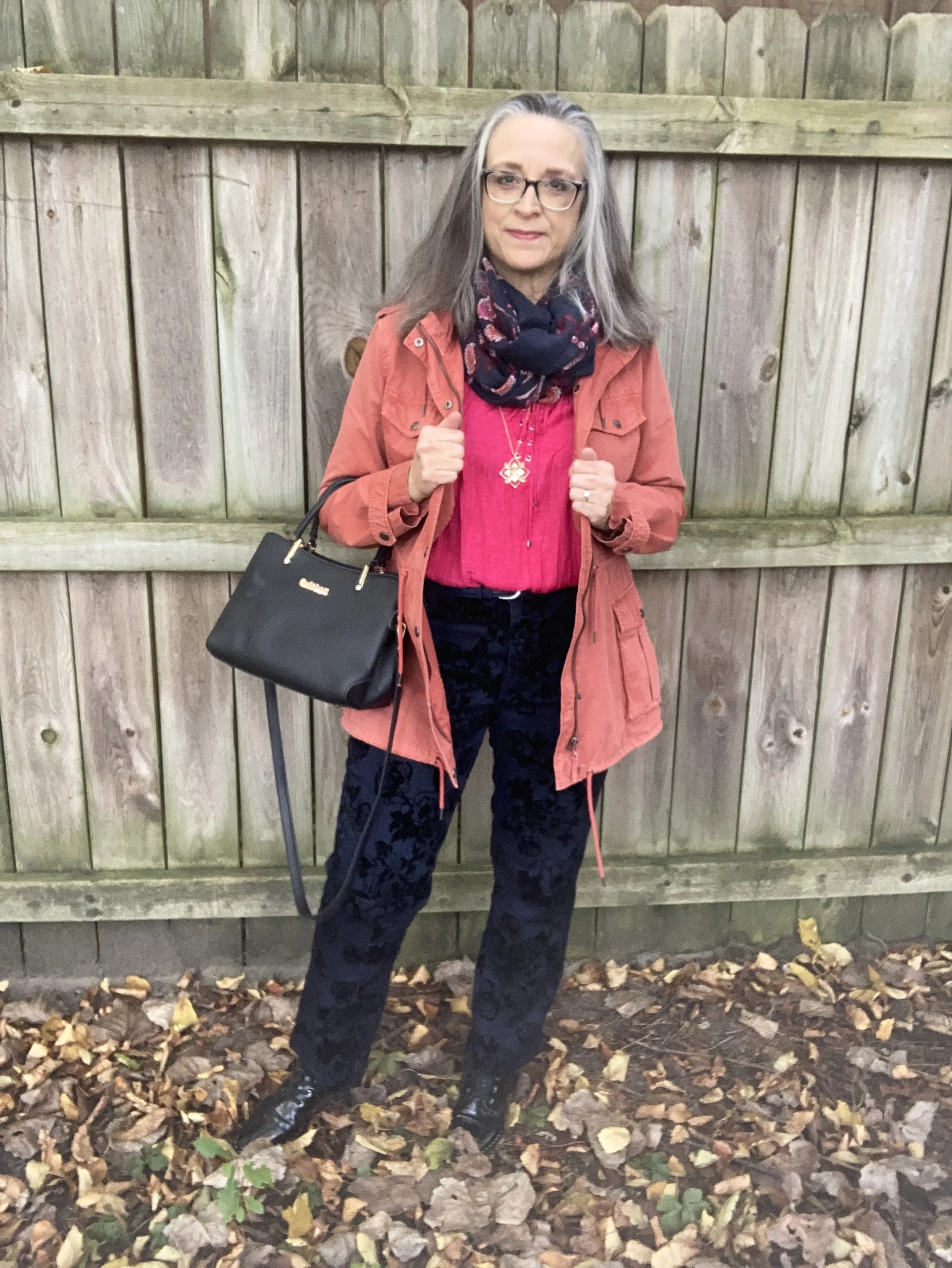
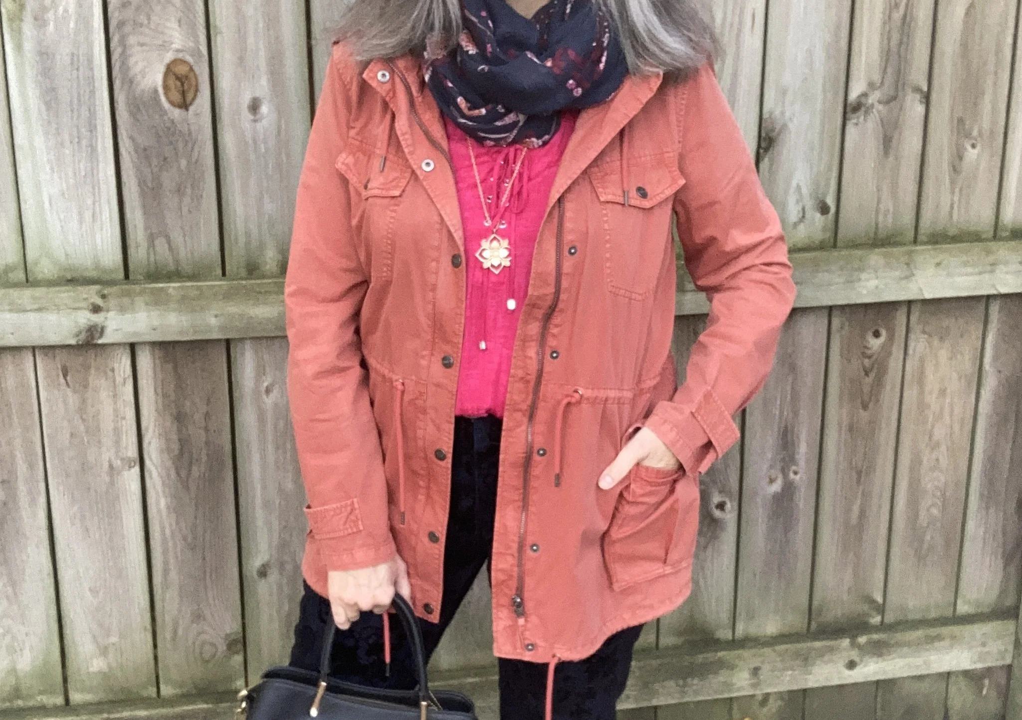
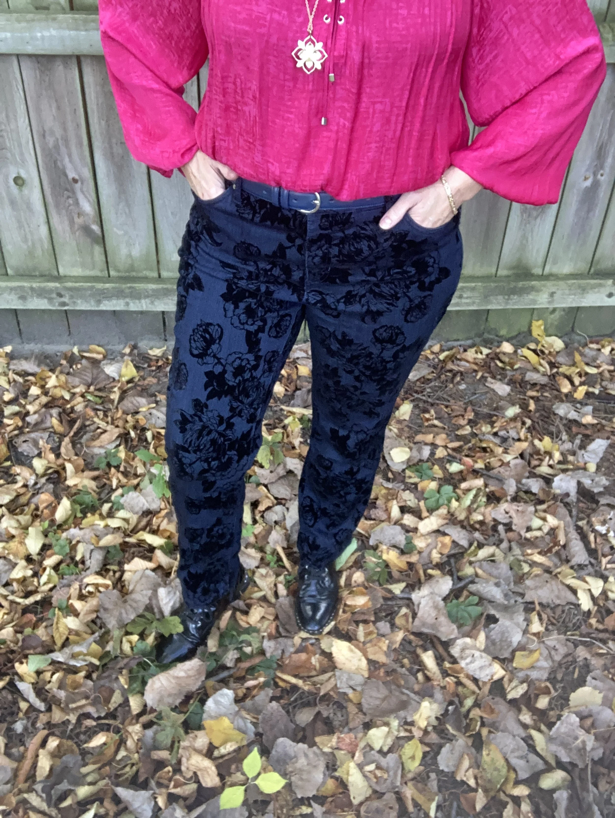
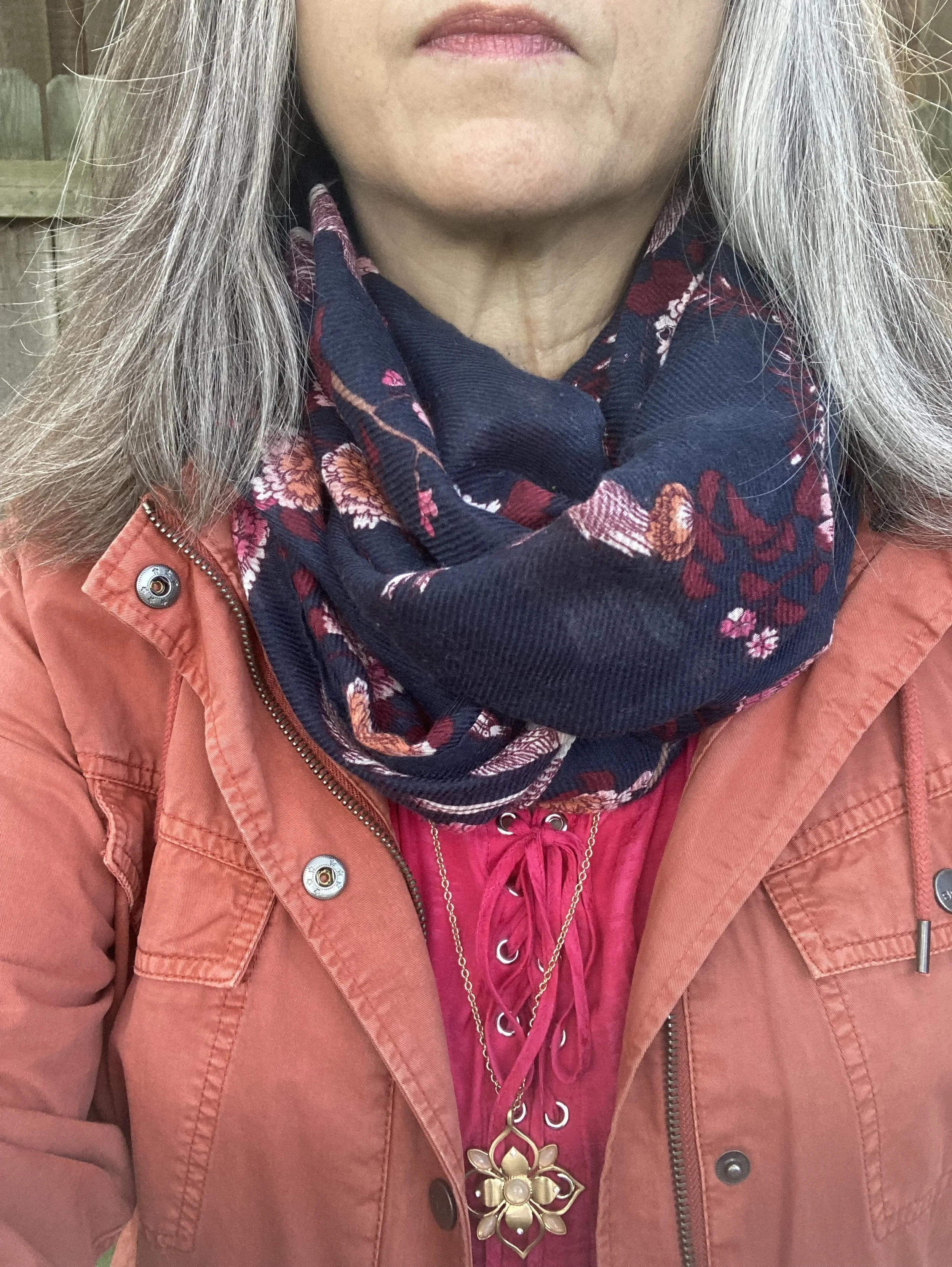
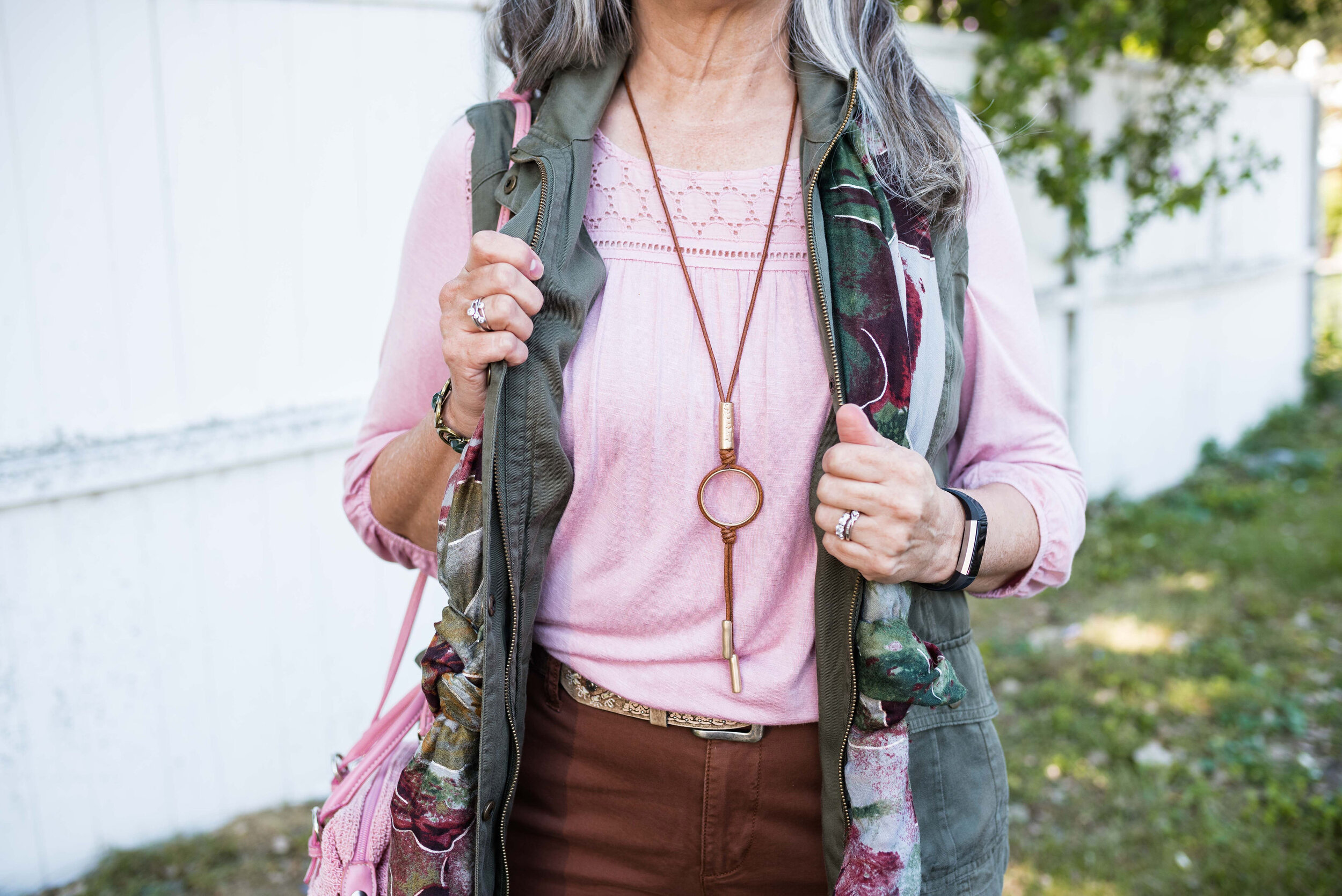
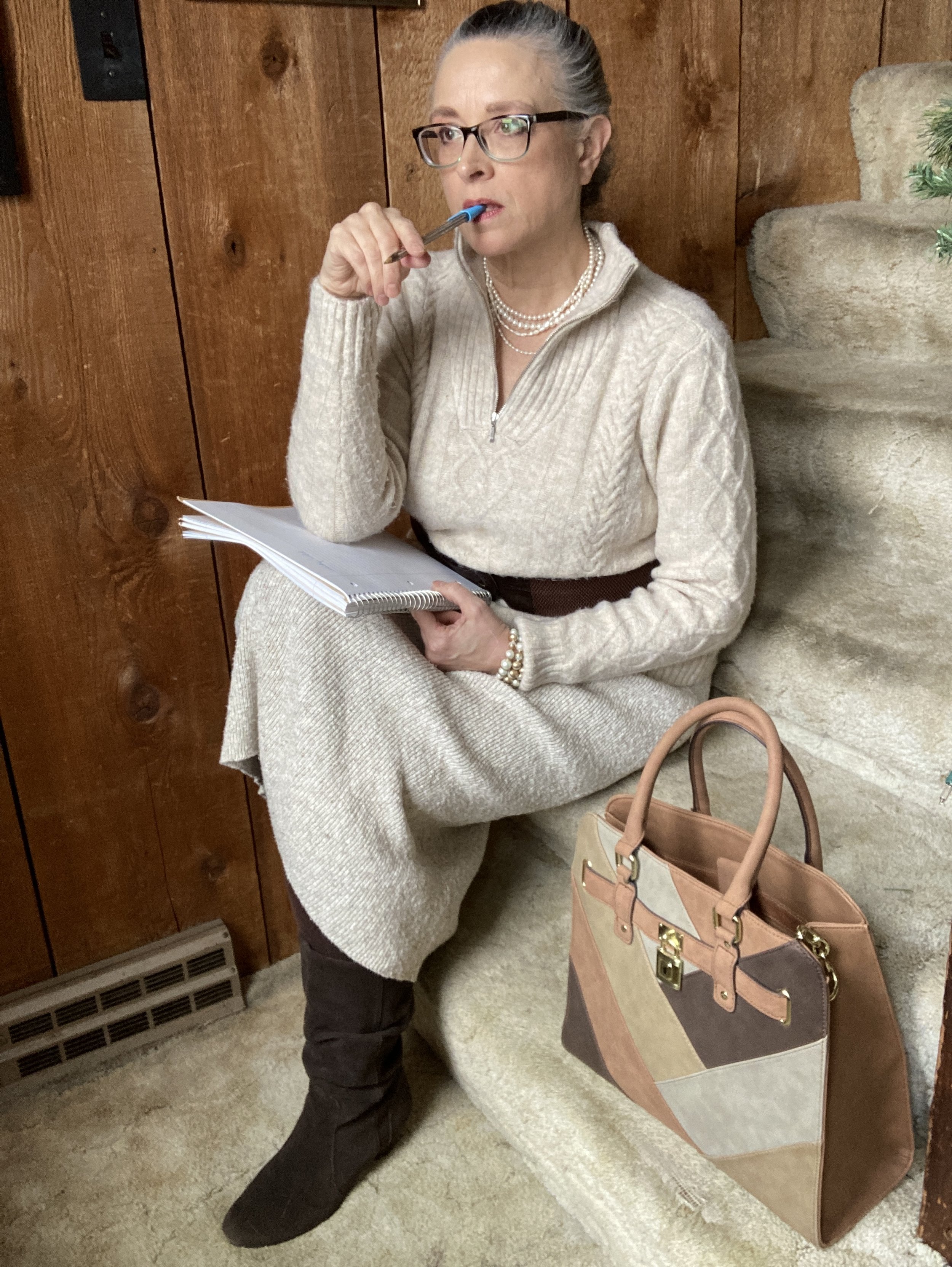
That’s enough about my writing life. Let’s look at the details of this outfit.

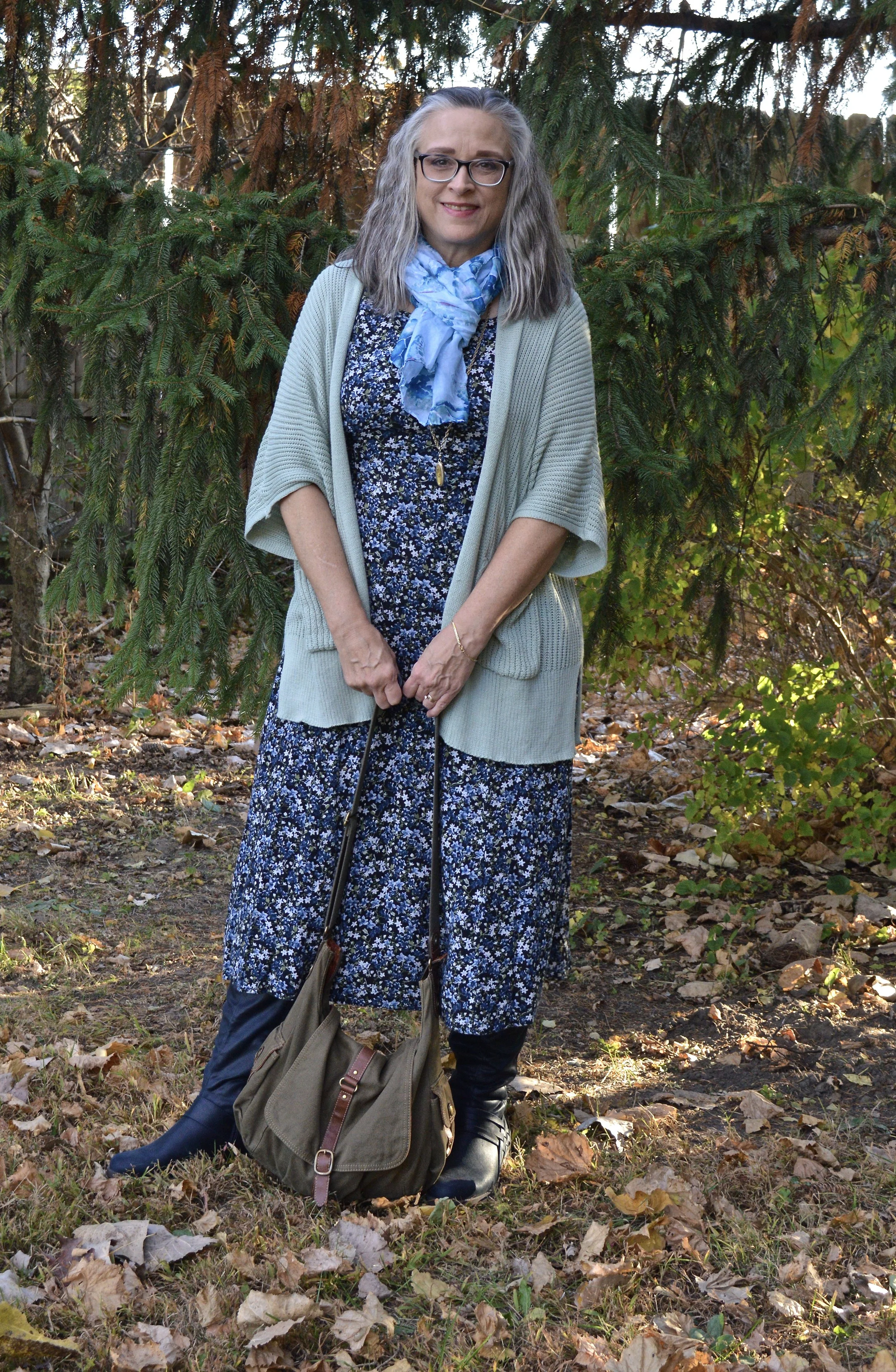
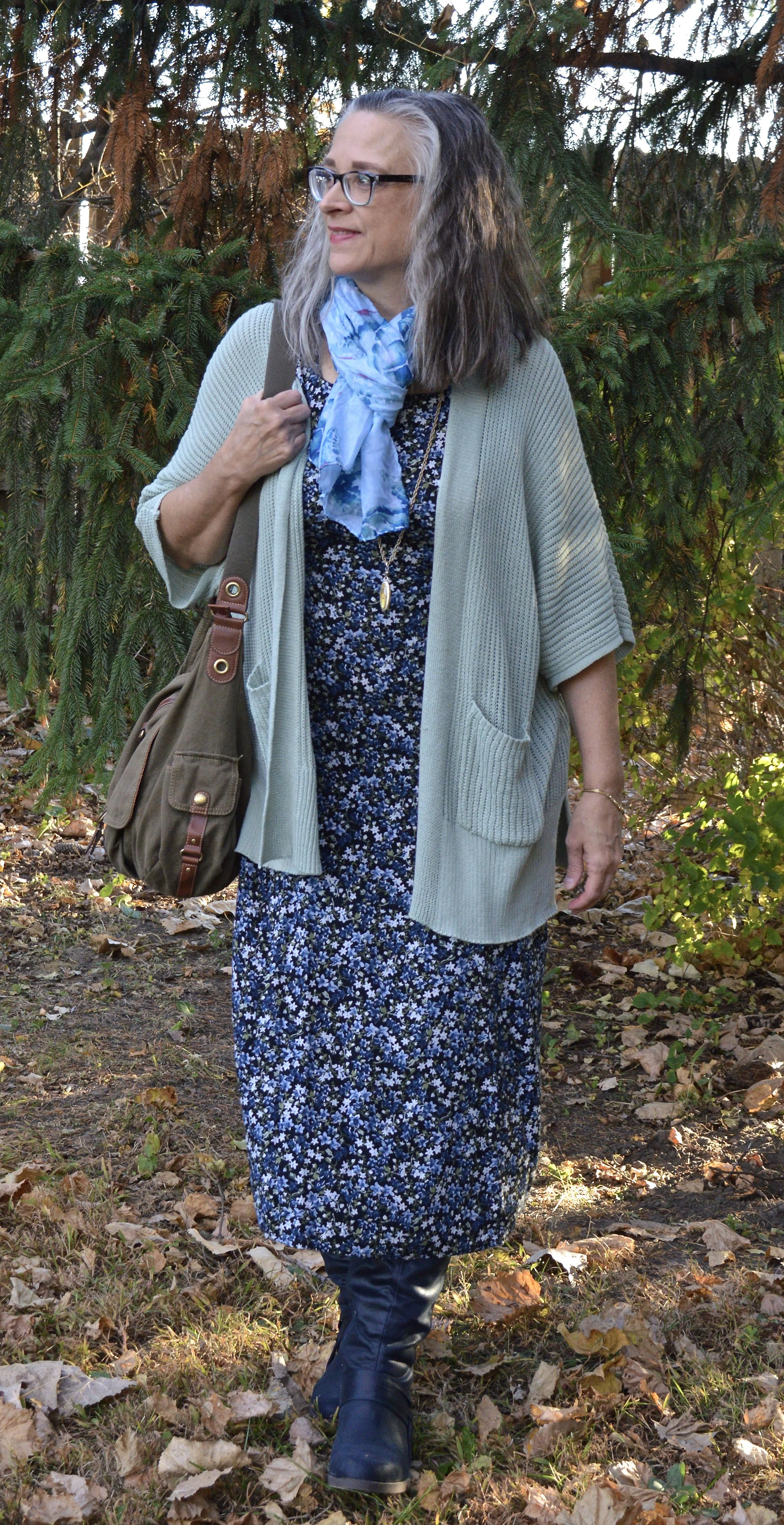
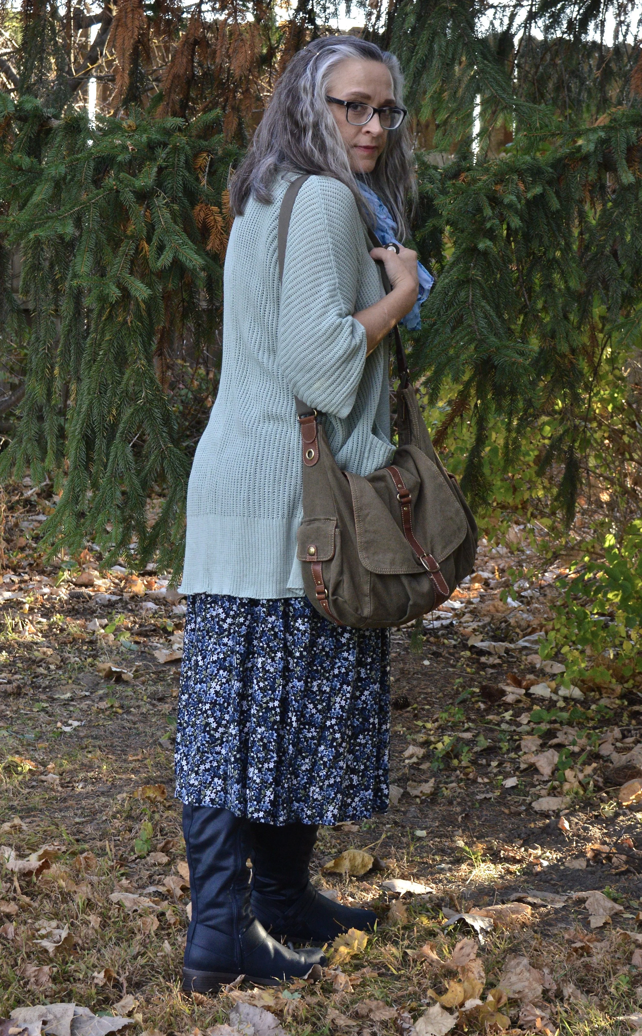
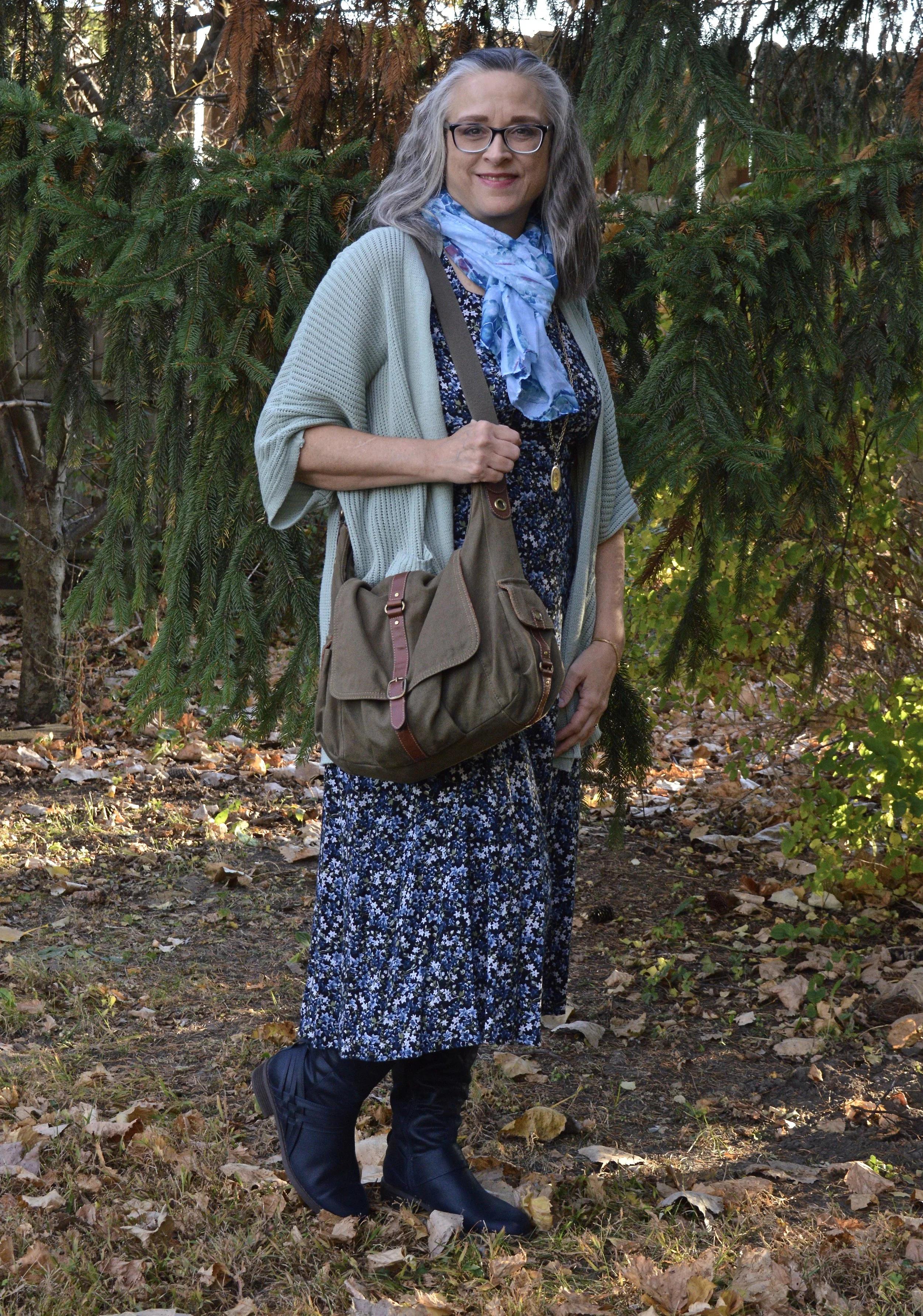
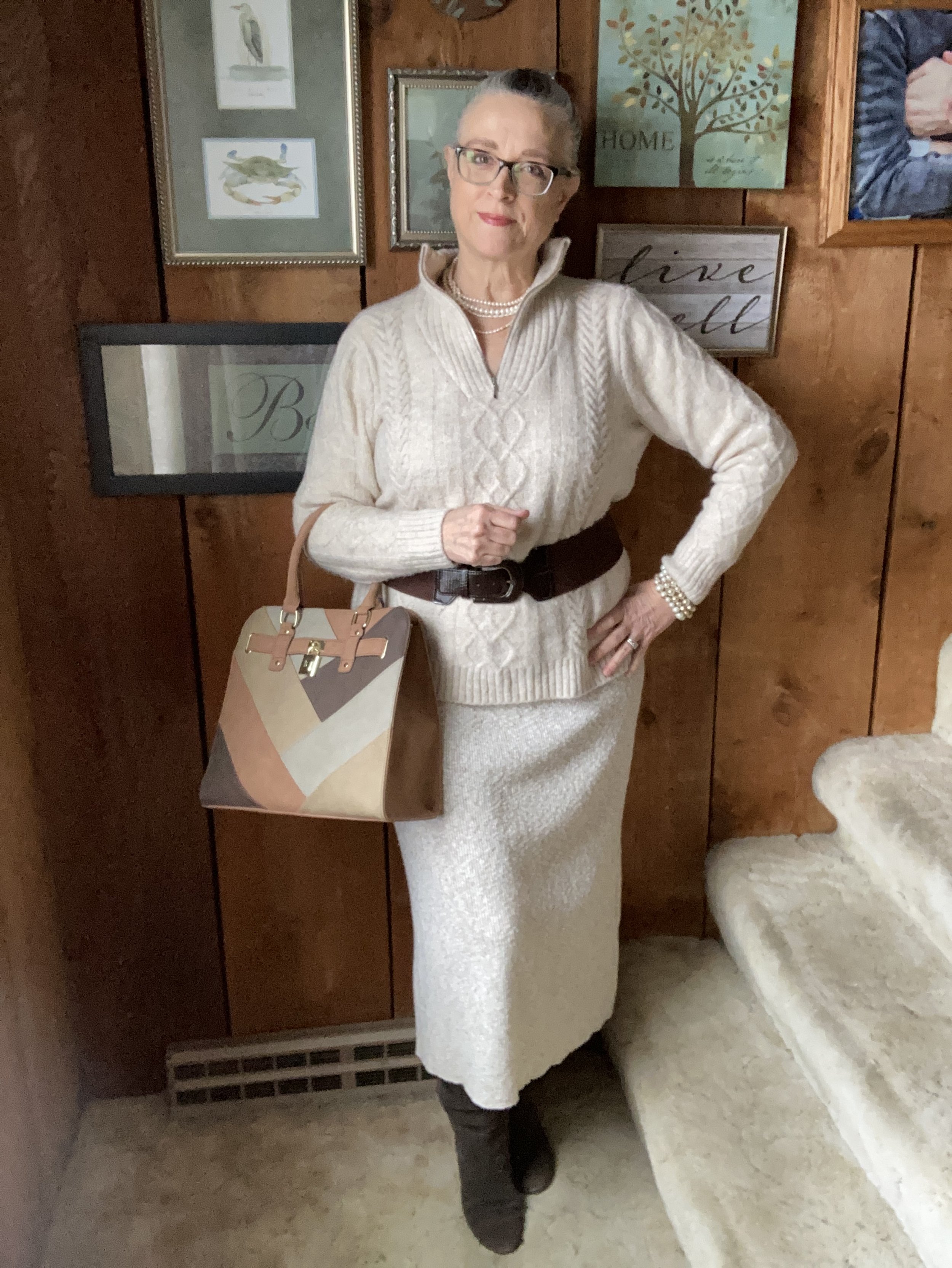
I was inspired by looking through Pinterest at 70’s and 80’s fashion when I found knit sweater outfits, either a skirt and top or a dress. I thought it would be fun to mimic that style and use a few of the 70’s accessory vibes.

My creamy zip up v-neck was a Kohl’s find a year or so ago. It is soft and warm. The skirt I found at a thrift store. I don’t usually wear sweater knit skirts or dresses, due to the hip factor. I do have wider hips and I have never felt comfortable showing off my curves like some women do, but this skirt is big enough that it doesn’t cling. It is also very warm and comfy. The brown belt adds an hour glass vibe, without being extreme.

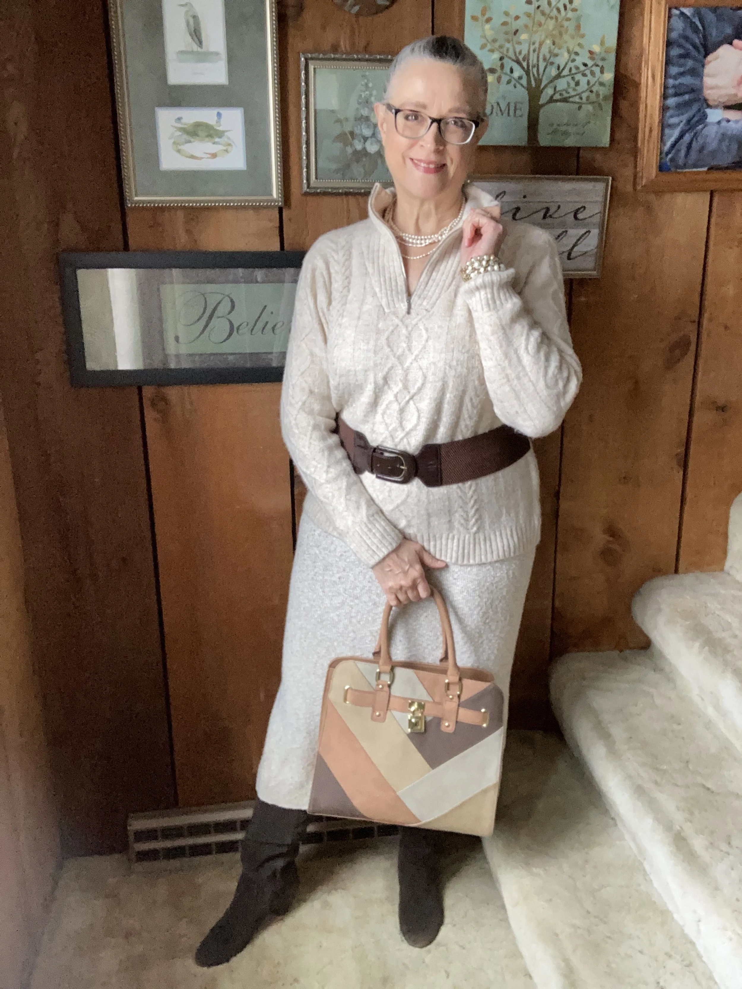
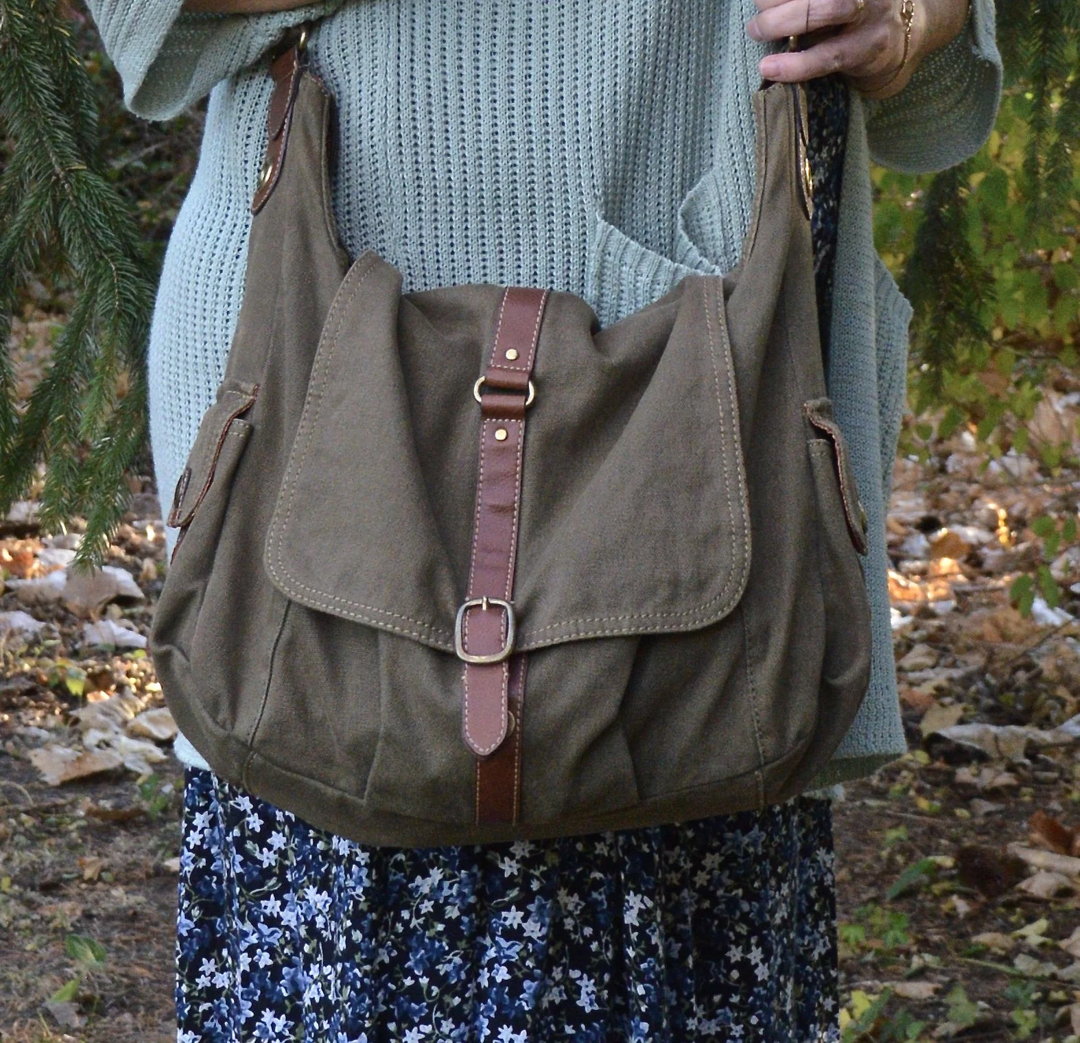
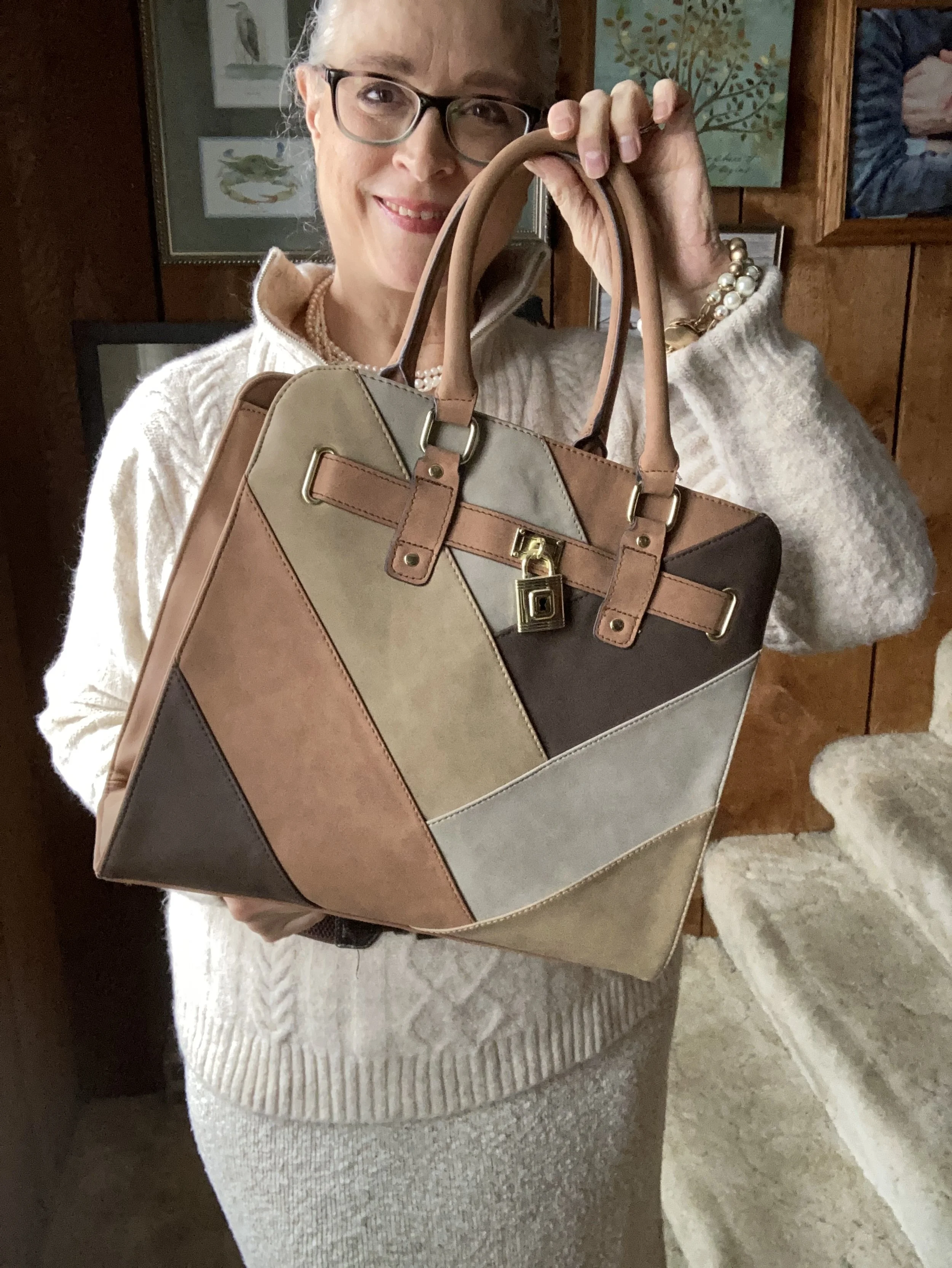
The Walmart bag is a nod to the patchwork patterns that were popular in the 70’s. Bags were shaped differently than this one, but I thought this worked as a tote bag, and purse.

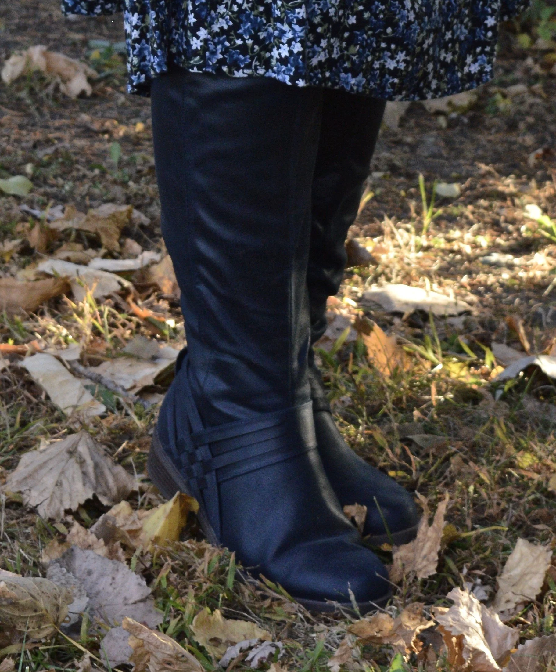
Once again I added my thrifted slouchy, suede boots.

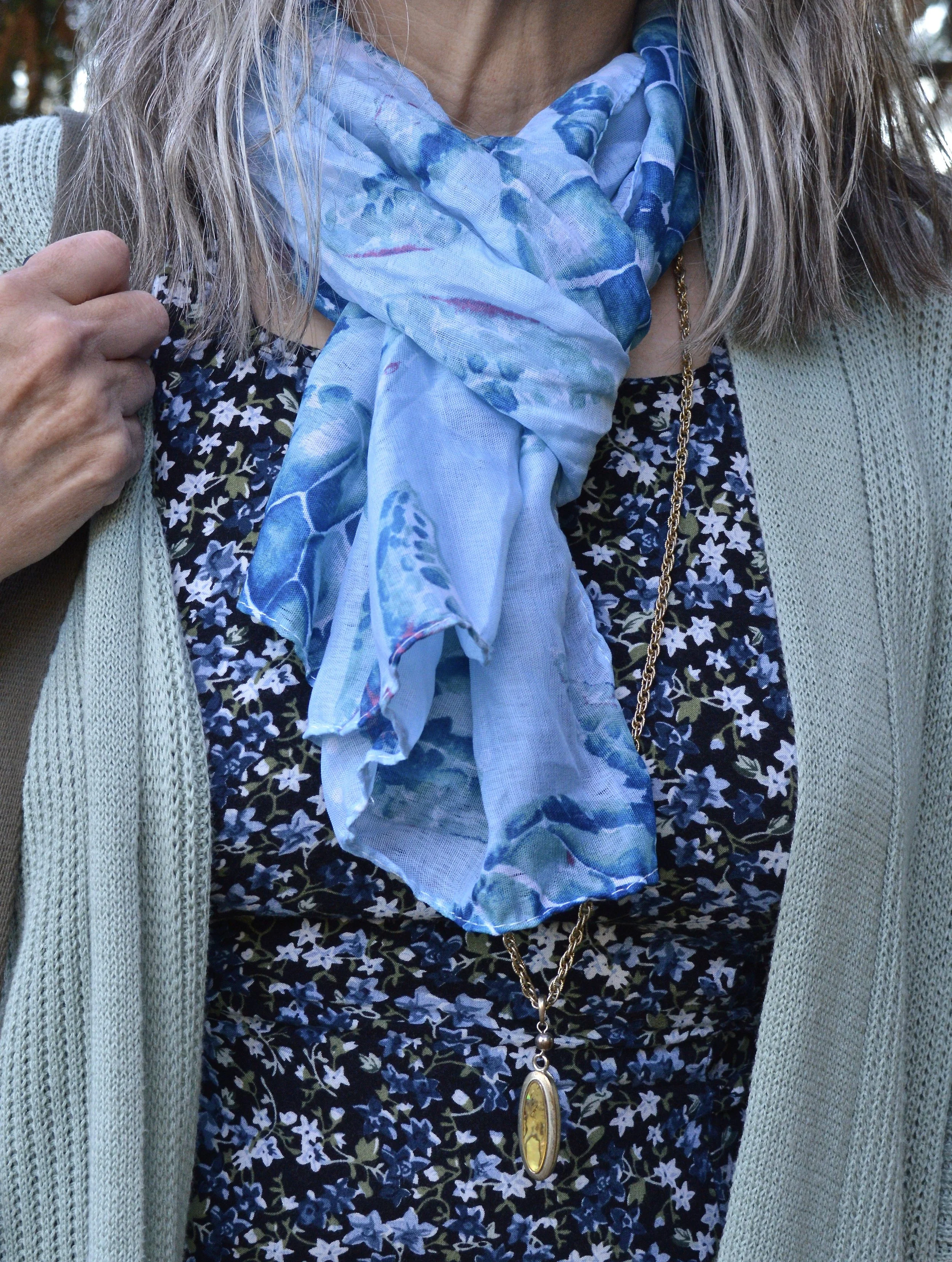
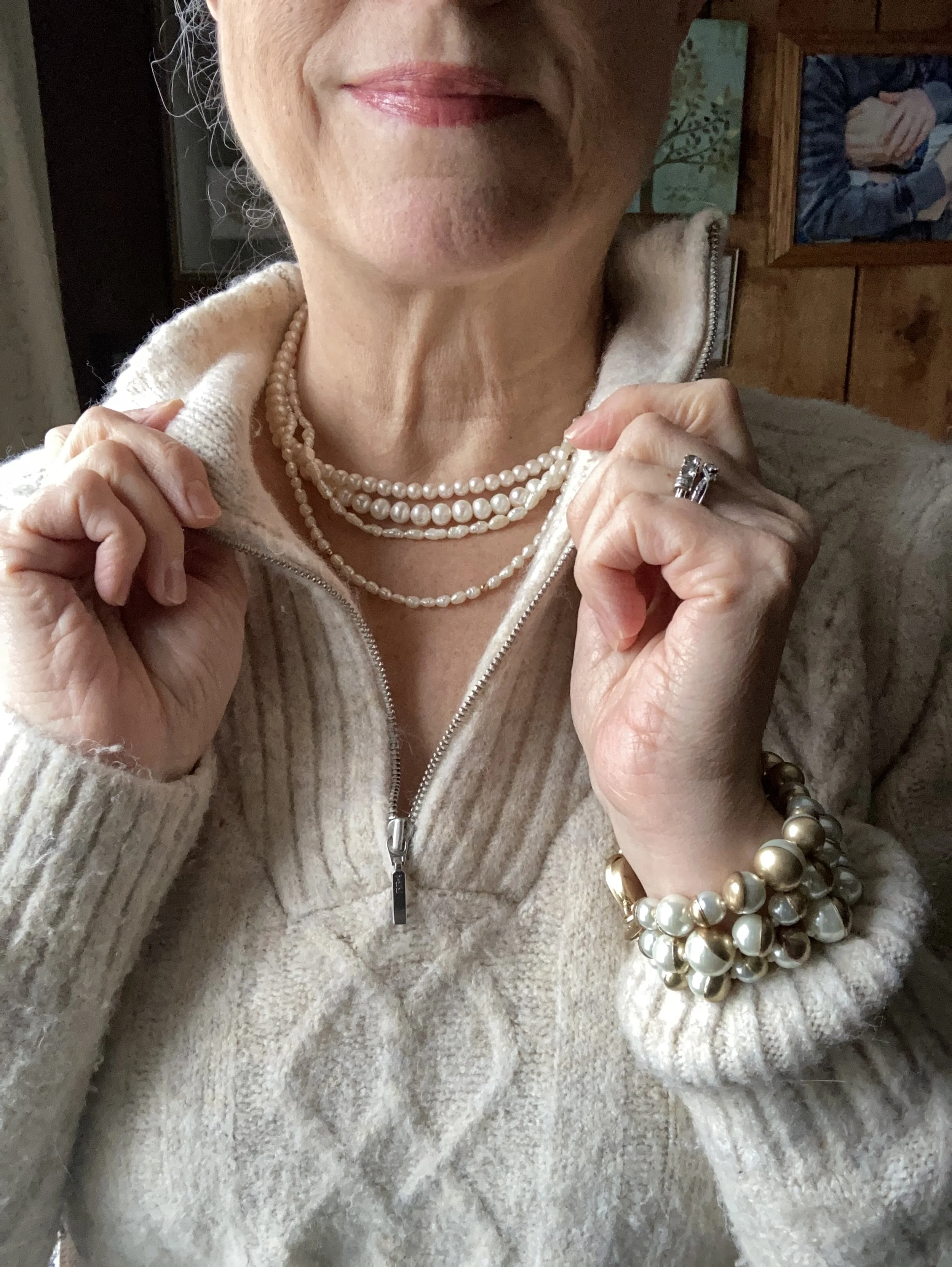
Apparently, pearls were a thing in the 70’s too. I do remember my mom wearing fake pearls to church early in the 70’s, so I guess that was a thing.

Are you a sweater dress, or sweater skirt fan? What do you think of this look? Would you wear something like this to work? Please leave a thought or two in the comments. I always love to hear from you.

Sharing a few shopping links just in case you are looking for slouchy boots, patchwork bags, or knit pieces of a similar vibe.

I hope you have a great Tuesday!

Pantone Autumn/Winter 2023 - New York Palette: Viva Magenta, Red Orange, and Eclipse

I have been wandering in the wilderness for a few weeks trying to maneuver the hard bits of life and the emotional drain that comes with it. That said, I want to keep bringing you content as often as I can and I appreciate your support and patience during these times when I am struggling.

Getting back to my Pantone color series we are looking at another combination of colors from the Autumn/Winter New York Palette. This trio is perfect for fall and I thought the classy, casual vibe of this outfit would be great for your Thanksgiving Day festivities.

I really like how this outfit turned out. Let’s look at each piece.

This Viva Magenta top was actually a piece I gifted to my daughter, but it ended up on her get rid of pile, so of course I snatched it back. Ha, ha. I have so few really classy, dress tops and I just love the bishop sleeves on this piece.

This Red Orange utility jacket was one of the first few utility pieces that I bought, so I have had it for six years. I purchased this at Nordstrom Rack because I fell in love with the color. You can see another Pantone post I did using this piece here.

Another thrift find, these Eclipse pants are so fun with their embellished velvet flowers. I have a feeling I will be pulling these out multiple times for the holidays. Not only are they unique, but they are comfy.

The accessories really pulled this whole look together. The scarf actually had all of the colors in it. My bag, and patent leather ankle boots added a classy element to the outfit, and the pendant necklace was a nice finishing touch.

What did you think of this outfit? Do you like these colors? Do you have these colors in your closet? Let me know what you think in the comments.

I hope you are having a great week!

Pantone Autumn/Winter 2022 - New York Palette: Waterspout, Midnight and Loden Frost

Today’s Pantone Autumn/Winter colors include a bright blue, a dark blue and a light green. Waterspout is a bright aqua blue which seems an odd choice for an autumn palette, but the color gurus will do what they do, and actually it is rather nice to have a few brighter, lighter choices as the days get shorter and the skies begin to gray. Midnight is not really like the midnight blue crayon we all had in our big boxes of Crayolas growing up, but perhaps more like the night sky just after the sun sets, but before the stars start to come out. Loden Frost is a sage green with a little bit of depth and richness.

So far in this series, I think this is my favorite outfit. I like the combination of blues and greens and thought it was an appropriate look for a warm fall day.

I’ve styled this thrifted dress before on the blog. I have had it for years and it is getting a little snug since all my weight has done its post menopausal thing and moved to my mid section. Ha, ha. But that is the beauty of layering. You don’t notice it as much. This is a brand called Oliva Rose, however, there are numerous brands out there with that name, so I have no idea where it originated.

I found this Maurice’s brand sweater at a thrift store. I really like Maurice’s, but I try to stay out of that store. They have so many cute things every season. I like their tees, tops and jeans, but I wait for good sales and coupons, because things cost more now than ever. I am also really trying to curb my buying all around.

My sea turtle scarf is from the dollar store. Back when my oldest was pregnant and we were putting together the shower the theme was Sea creatures. I found a few cute scarves for game give aways and this was a left over. My necklace was a product of two different thrifted pieces that ended up breaking, so I put them together.

My olive Fossil hobo bag is also thrifted. It is another work horse in my closet and is continually in and out of rotation. Fossil brand is a good quality brand and while I never buy them full price, I do love when I can find one on clearance or at a thrift store. This one is a great utility bag with multiple pockets and compartments for everything you need.

I found these navy boots last year online at Kohl’s. They are Journee brand. I am not too adventurous when it comes to my boot colors. I like browns, black, and gray, but I thought it would be nice to have a navy pair, specifically of knee high boots, for a different vibe. Do you like your boots to be a more basic color, or do you like a bright, bold look for your feet?

I hope you enjoyed this post. Let me know what you think of these colors. I am including a few shopping links. These are affiliate links. When you click on a link, I get a few pennies. When you purchase the item through the provided link, I get a little bit more. I appreciate all you clicks. All opinions are my own.

I hope you are having a great week.

Pantone - Autumn/Winter - 2021 - New York Palette: Pale Rosette, Root Beer and Olive Branch

I want to start off with an apology for my lack of consistency with the blog lately. It has been a rough couple of months and I just haven’t had the motivation to post as regularly. It seems every time I want to make more of an effort at getting more disciplined or being more consistent, I get blindsided by something. At the beginning of the summer it was a broken wrist. Mid summer, I came down with this stuff, that still has me coughing. I just have no idea if I will ever be back to “normal”, whatever that was.

There have been some good bits along the way as well. Early summer we were able to take my in-laws on a nice trip up through the Upper Peninsula, down through Michigan and back to our place where they enjoyed visiting family for a few days. I also got to see my mom, two different weeks and spend time with her. That also afforded me the opportunity to see my best girlfriend, and do some thrifting. On September 19th, our second grandson arrived. He is a doll and I am enjoying opportunities here and there to see him, even if I do have to wear a mask. He’s been born into a world of half blue faces, but that is okay, if we can give him a healthier start. He, my daughter and son-in-law are doing well.

Today’s outfit revolve around three colors on the Pantone New York Palette that I thought combined well into a work wear ready fall outfit.

PaleRosette.jpg

I am still trying to get used to seeing pastels during the fall season. This year, they were quite popular and besides this pale pink, also included a pretty lavender. I guess, we like what we like right, so pastels for me might be more of a spring and summer color scheme, while rusts, browns and burgundies are the colors I reach for in the fall. While we still live in a free country, you are in control of what colors you wear when. Ha, ha.

pantonefallcolortrendspalerosette-8.jpg

The Pale Rosette, 3/4 length tee is a thrifted piece, and a brand called Suzanne Betro. It is actually a longer tunic, but I just tucked it in for this outfit. I love the detailing at the bodice.

pantonefallcolortrendspalerosette-6.jpg

You’ve seen my Olive Branch utility vest on the blog before when I did my series on olive pieces. This vest isn’t quite the right shade. Who would have thought there are so many shades of olive? Another clearance find from Kohl’s, I don’t have a ton of Mudd pieces as it typically has more of a junior’s fit, but the few that I have, I really like.

You’ve also seen these brown trousers when I talked about wide leg pants back in the spring. I am not a big fan. I have enough bulk on my bottom. However, I will hang on to this pair, as I like the color, and occasionally it is nice to have a different option when it comes to pants. These were thrifted and are St. John’s Bay brand.

I added the multi-print scarf to add an extra dimension of color and interest to the outfit. I like how it ties the whole look together.

You can also see the fun necklace I scored while thrifting at the local shop around the corner. I have found some great jewelry there. I goes perfectly with the pants.

pantonefallcolortrendspalerosette-9.jpg

Even though this little thrifted, Rosetti bag screams summer, I thought it was a great way to keep this outfit looking modern and updated, yet still in tune with the fall vibes.

My SO snakeskin print boots were a clearance purchase from Kohl’s last season. I haven’t really had the opportunity to wear them very much, so hopefully this season they will be out and about.

pantonefallcolortrendspalerosette-10.jpg

What do you think of these colors? Do you like them combined? Do you like them each separately?

pantonefallcolortrendspalerosette-1.jpg

I’d love to hear your thought, so leave me some love in the comments.

As I usually do, I am adding a few shopping links in things similar to these colors. These are affiliate links. All opinions are my own.

Thanks for following along on the blog. I hope you are having a great week.

Photo credit Jessica Trumbull with Rebecca Trumbull.


Pantone - Autumn/Winter - 2021 - New York Palette: Fuchsia Fedora, Leprechaun, and Coconut Cream

The colors I am showing you today were ones that surprised me a bit for a fall palette. The bright Fuchsia Fedora is not a color that I have very many pieces in, thus why I used it more as an accessory color. Leprechaun was also a different choice. I was thinking there would be a darker, more forest green color, but this bright, cheeky color is what appeared on the palette. However, that is one of the reasons I like doing this color series. It forces me to think outside the box.

FuschiaFedora.jpg

Even though I wasn’t particularly fond of these colors for fall, I actually liked the way this outfit turned out. Even though the light jacket looks nothing like Coconut Cream, these colors and their combinations are just guidelines for us. Not rules…and just for fun….

I loved The Pirates of the Caribbean movie, and that whole idea of rules versus guidelines was amusing as it kept coming up in the movie and was used according who benefited the most. I guess we could take a lesson from that when we look at our closets. The combinations you put together are for your benefit. You get to decide what you like and what you don’t. You make the choice of what colors or prints to put together, and whether you want to buy into the trends or not. I think we can safely say those fashion “rules”, are really more like “guidelines.” My job as a fashion blogger is to give you ideas of how to make these combinations and hopefully inspire you to think outside your own boxes.

pantonefallcolortrendsfuchsiafedora-10.jpg

My LuLaRoe skirt was the perfect choice to build this outfit around. I actually had the thrifted striped tee already pulled out as a match for Leprechaun, and as I started figuring out which colors and pieces to put together, I remembered this skirt. I always have a little celebration party when pieces come together. When I try things on I do a little dance in front of the mirror and say, “This is it!” Ha, ha. The stripes in the tee are actually navy, but with the two prints taking center stage, you can’t really tell the colors are different.

pantonefallcolortrendsfuchsiafedora-3.jpg

My cream jacket by Sanctuary is a thrifted piece you have seen before on the blog. You can see it with a leopard print skirt and with my bright blue pants. It is actually more of a canvas than a denim, but it works much the same as a denim jacket providing light weight coverage for cooler weather and adding a casual touch to a dressier outfit.

pantonefallcolortrendsfuchsiafedora-5.jpg

You can see my Fuchsia Fedora necklace and bracelets. I think I have jewelry in just about every color under the sun, but you know, a girl can never have too many fun accessories! Is that a rule, or a guideline? Ha, ha.

pantonefallcolortrendsfuchsiafedora-8.jpg

My bestie, Stacey, gave me this beautiful, leather the Sak bag last time she came to visit. I thought the berry color went perfectly with the darker berry color in the flowers on the skirt.

pantonefallcolortrendsfuchsiafedora-9.jpg

These beautiful black suede heels never get to go anywhere, so I do like to bring them out and show them off on the blog. These are Aerosoles and I bought them a few years ago at a Clarks shoe outlet. I like that they are comfortable, have a reasonable heel, stay perfectly in place and look classy.

pantonefallcolortrendsfuchsiafedora-2.jpg

What do you think of these colors? Do you like them for fall? Now that I am thinking about it, I might need to revisit the idea of fuchsia as a fall color. I could see it with other fall colors like golden yellow, burgundy and rusty orange. Hmmm. I may have to get a little further outside of my color box.

Let me know what you think. I’m including a few shopping links for things of similar color. These are affiliate links and are brought to you at no extra cost. If you click on a link, I get a few pennies. If you purchase something through my site, I get a few more. I appreciate every click.

Have a great day!

Photo credit Jessica Trumbull with Rebecca Trumbull.